Basic Stata graphics for social science students - University ...
31
UCD GEARY INSTITUTE FOR PUBLIC POLICY DISCUSSION PAPER SERIES Basic Stata graphics for social science students Kevin Denny School of Economics & Geary Institute for Public Policy, University College Dublin Geary WP2021/02 March 15, 2021 UCD Geary Institute Discussion Papers often represent preliminary work and are circulated to encourage discussion. Citation of such a paper should account for its provisional character. A revised version may be available directly from the author. Any opinions expressed here are those of the author(s) and not those of UCD Geary Institute. Research published in this series may include views on policy, but the institute itself takes no institutional policy positions.
-
Upload
khangminh22 -
Category
Documents
-
view
1 -
download
0
Transcript of Basic Stata graphics for social science students - University ...

UCD GEARY INSTITUTE FOR PUBLIC POLICY
DISCUSSION PAPER SERIES
Basic Stata graphics for social science students
Kevin Denny
School of Economics & Geary Institute for Public Policy, University College Dublin
Geary WP2021/02
March 15, 2021
UCD Geary Institute Discussion Papers often represent preliminary work and are circulated to encourage discussion. Citation of such
a paper should account for its provisional character. A revised version may be available directly from the author.
Any opinions expressed here are those of the author(s) and not those of UCD Geary Institute. Research published in this series may
include views on policy, but the institute itself takes no institutional policy positions.
1
Basic Stata graphics for social science students
Kevin Denny 1
1. Introduction
It is often said that a picture paints a thousand words. This is certainly true when it comes to data analysis.
There are two good reasons to acquire some skills in graphing your data: (1) Graphical methods are a
powerful way for a researcher to explore their data and (2) graphs can be a very useful way of illustrating
your data and results whether it is in a presentation, a project or a thesis.
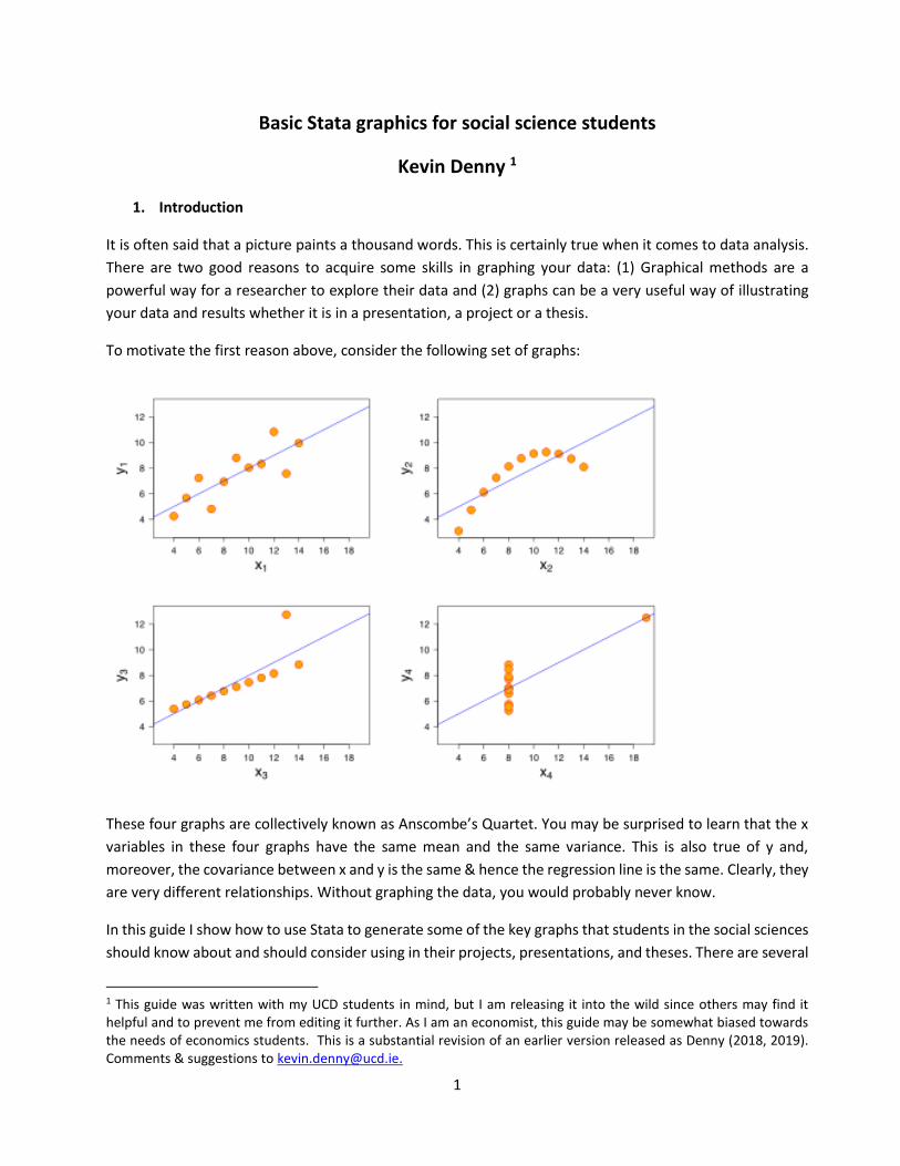
To motivate the first reason above, consider the following set of graphs:
These four graphs are collectively known as Anscombe’s Quartet. You may be surprised to learn that the x
variables in these four graphs have the same mean and the same variance. This is also true of y and,
moreover, the covariance between x and y is the same & hence the regression line is the same. Clearly, they
are very different relationships. Without graphing the data, you would probably never know.
In this guide I show how to use Stata to generate some of the key graphs that students in the social sciences
should know about and should consider using in their projects, presentations, and theses. There are several
1 This guide was written with my UCD students in mind, but I am releasing it into the wild since others may find it helpful and to prevent me from editing it further. As I am an economist, this guide may be somewhat biased towards the needs of economics students. This is a substantial revision of an earlier version released as Denny (2018, 2019). Comments & suggestions to [email protected].

2
good online treatments of Stata graphics (listed at the end). Stata’s Youtube channel has videos on graphics
which are excellent. Mitchell (2012) is a fantastic resource which you could also draw on. Andrew Jones’
(2017) guide, although designed for health econometrics, is of general interest if you are using Stata. Here I
am going to outline the main methods that I think students should know. Along the way I show a few of the
many options available to whet your appetite. The definitive source of information is the Stata Graphics
Manual which is a mere 739 pages long. A classic text on data visualization and graphics is Tufte (2001). For
a shorter guide targeted at economists see the paper by Schwabish (2014).
All the datasets I use here are either available online & can be accessed in Stata using the webuse command
or they are provided with Stata and can be accessed using sysuse. To switch from one dataset to another
you need to use clear first. Stata commands will be in bold. A basic knowledge of Stata is required. There
are two ways to create graphs in Stata. You can either (a) use a written command which can be done
interactively in the command line or written in a do-file or (b) you can use the dialogue boxes/pull-down
menus at the top.
A nice feature is that if you use the dialogue box to create a graph Stata will show you the equivalent syntax
in the output window so you can learn how to generate the graph. You could copy the syntax into a do-file
so you can repeat the exercise. I tend to use the pull-down menus to experiment until I get the graph looking
like I want. Then I copy the syntax that generates it from the output window into my do-file so I can replicate
it later.
When Stata produces a graph for you on the screen click on “file” at the top left: you can either save it or
you can open the graph editor to make further changes. Stata’s native format for graphs is .gph. If you want
to include it in a Word document or a Powerpoint file for example you can either save it to a format like
portable network graph (.png) , a tiff file (.tiff) or a postscript file (.ps) or simply cut and paste it into your
document. You may need to experiment saving to different formats to get something that works with your
document. If in doubt I suggest saving as .png. Postscript files can end up taking a lot of space if there are a
large number of data points in your graph.
A feature I will not discuss here is that you can create two graphs separately and then combine them into
one graph. Koffman (2015) has a few slides on this or help graph combine.
The Stata graphics editor has numerous options & you can customize the graph in numerous ways. It is
beyond the scope of this document to describe how. Here I am mostly going to use the graph commands
that come with Stata. However, there are some excellent user-written commands for graphics that are freely
available online. You can find and download them within Stata using the findit command. Here I will draw
on seven of these that I find particularly helpful: binscatter, cdfplot, cibar, coefplot, dstat, fabplot and
vioplot. To download the first of these, for example, just type:
findit binscatter in the Stata command line or ssc install binscatter. Hit return and follow the steps.

3
2. Distributions
When you are analysing data it is essential that you carefully explore the data before you get stuck into
modelling using it using econometric methods. You really need to get to know your data. There are a few
reasons for this. One is that exploring the data will sometimes show up anomalies, for example there might
be strange values like missing values coded as -1 or -99. The main reason is to get a sense of what the basic
patterns are. This is particularly the case for variables that you create from the raw data. It is very easy to
make a mistake – even experienced users do - so if you generate a new variable you need to check whether
it look sensible.
2.1 Univariate
We will first consider looking at the distribution of a single variable. You should certainly have a good look
at your key variables before you do any modelling.
2.1.1 Discrete variables
For a discrete (or categorical) variable you should use a histogram:
webuse fullauto
ta rep78 generates a table of this discrete variable. This is fine as far as it goes, and you may want to include
a table like this in your document particularly if this is your dependent variable. Note that to keep the table
nicely aligned as it is in Stata you need to use a fixed font format like Courier. However, it may be difficult
to get a sense of the distribution simply by looking at the table. If you are preparing a presentation, for
example, you want the audience to easily grasp what the data looks like. Let’s graph it next.
Repair |
Record 1978 | Freq. Percent Cum.
------------+-----------------------------------
Poor | 2 2.90 2.90
Fair | 8 11.59 14.49
Average | 30 43.48 57.97
Good | 18 26.09 84.06
Excellent | 11 15.94 100.00
------------+-----------------------------------
Total | 69 100.00

4
histogram rep78, discrete fraction fcolor(navy) addlabel graphregion(fcolor(white)) creates a histogram
where the heights of the bars correspond to the fractions in each category. I have changed the colour of the
bars to navy, the surrounding area to white. The addlabel option is responsible for the numeric value being
shown above the top of each bar. If you want to show percentages or absolute frequencies instead simply
replace fraction with percent or frequency, respectively.
You can generate a graph with separate histogram for different groups beside each other:
histogram rep78, discrete fraction fcolor(red) by(, title(Figure 1) note(Auto data)) by(foreign)
Notice how I have added a title and a note at the bottom. The reason the title and the note options are
inside a bracket ( by(, title… ) is to ensure that they are applied once for the whole figure as opposed to
individually for both graphs.

5
Another way of illustrating shares across categories is the pie chart. Some people really hate pie charts. I
am not one of them. That said, some pie charts are less than helpful so use them carefully. There are three
distinct ways of using pie charts in Stata. One is where the slices show the frequencies of different categories
of a given variable. This is an alternative to using a histogram. If the categories are ordered (“Very happy”
“Quite happy” …) then it makes sense to use a format like a bar chart which reflects that. Try graph pie,
over(rep78). Incidentally, the word in French for a pie chart is camembert, which is a bit cheesy.
If you would like to see what % each slice contains: graph pie, over(rep78) plabel(_all percent) .
A second case is when you have data on several variables, and you want to illustrate the share of each of
them in the total. Say you have data on a firm’s sales from three regions over time, each is stored in a
variable say Europe, Asia, Africa.
gr pie Europe Asia Africa will give you a pie chart based on total sales over time for each region.
The third case is when you want to show the share of a given variable according to categories of another
variable. Say your dataset has a variable revenue that shows the revenue from different countries. You have
another variable region that classifies those countries into three regions.
gr pie revenue, over(region) give you a pie chart based on total revenue for each region.

6
A bar chart is a useful way of comparing some characteristic of a variable (like the mean) across different
categories of a variable. For example
graph bar (mean) price, over(rep78)
graph bar (mean) price, over(rep78) over(foreign) shows the mean across categories of two variables
An alternative way of doing this where the two graphs are separate is:
graph bar (mean) price, over(rep78) by(foreign)
Note that bar charts aren’t just for means. You can use them to compare other statistics like medians,
standard deviations, maxima etc. When you use the pull-down menu there is a “Statistic” option beside the
variable. If you want the bars to be horizontal, replace bar with hbar. The mean is the default. To generate
a bar chart of standard deviations across the categories of rep78 for example try:
graph bar (sd) price, over(rep78)
0
2,0
00
4,0
00
6,0
00
me
an
of p
rice
1 2 3 4 5
0
2,0
00
4,0
00
6,0
00
8,0
00
me
an
of p
rice
Domestic Foreign
1 2 3 4 5 1 2 3 4 5

7
Stata has another type of graph which can be used to nicely illustrate differences in means or medians of a
continuous variable across categories of one or more variables.
sysuse nlsw88, clear
grmeanby race married collgrad, summarize(wage) ytitle($) ytitle(, size(medlarge)) title(Mean wage
differences) subtitle(hourly wage)
This example shows in one graph the differences in average earnings between the categories of three
variables. A glance at this graph suggests that variation in education seems to be more important than that
of marital status. Note that I have added a title to the Y axis (the “$”) and changed the size of the title. The
command line I used continues onto a second line. If you were using this in a do-file Stata has to know to
read it as one line. Entering it like this in your do-file will work:
grmeanby race married collgrad, summarize(wage) ytitle($) ytitle(, size(medlarge)) /*
*/ title(Mean wage differences) subtitle(hourly wage)
The /* */ comments out the end of the line so Stata just reads it as one line. Adding median after the “,”
(the comma) in the command will show the medians instead e.g.:
grmeanby race married collgrad, summarize(wage) median
A really useful user written command is cibar which creates bar plots showing the mean of a variable and
its confidence intervals, grouped over different values. By default, it shows 95% confidence intervals, but
this can be changed with the level() option. For example:

8
cibar wage , over(married race)
Note that the ordering of the variables in brackets matters:
cibar wage , over(race married)

9
2.1.2 Continuous variables
There are several ways to show the distribution of a continuous variable. You can use a histogram as shown
on page 4. My preferred method is to generate something called a kernel density function.
kdensity price
The smoothness of the density is controlled by a bandwidth parameter. Stata calculates a default parameter
& reports it. You can see it is 605.6 in the above example. You can over-ride this if necessary, using the
bandwidth option. For example, by reducing the bandwidth to 400 it will be less smooth. Be careful not to
over-smooth i.e. setting the bandwidth so high that you remove key features of the data. There is a handy
download akdensity which allows the bandwidth to adapt optimally to how much data there is at a
particular part of the distribution. The “norm” option superimposes a normal distribution which can be
useful if you have reasons to believe that the variable should be normal:
kdensity price, bw(400) norm xtitle(US $) title(Distribution of car prices)
0
.00
01
.00
02
.00
03
Density
0 5000 10000 15000 20000Price
kernel = epanechnikov, bandwidth = 605.6424
Kernel density estimate
0
.00
01
.00
02
.00
03
.00
04
Density
0 5000 10000 15000US $
Kernel density estimate
Normal density
kernel = epanechnikov, bandwidth = 400.0000
Distribution of car prices

10
See how I have added a title and a label for the x axis? Sometimes you may wish to superimpose two
densities on top of each other. For example, if you are looking at the distribution of earnings, it might be
useful to compare the earnings of men and women or married and unmarried people.
Use the nlsw88 data:
sysuse nlsw88, clear
kdensity wage if married==0 , addplot(kdensity wage if married==1)
The density shown in blue is for the unmarried (married==0) and red is for the married. The legend below
the graph is not very helpful unfortunately and you will need to edit it in the graphics editor so you can end
up with something like below. The dstat package, discussed on page 13, is better for doing this.
0
.05
.1.1
5
Density
0 10 20 30 40hourly wage
Kernel density estimate
kdensity wage
kernel = epanechnikov, bandwidth = 1.0162
Kernel density estimate
0
.05
.1.1
5
Density
0 10 20 30 40hourly wage
Unmarried
Married
bandwidth = 1.0162
Kernel density estimate

11
If you prefer to create the cumulative density function, then you can use the user written command cdfplot
cdfplot wage
As with kdensity, you can superimpose a normal distribution easily e.g.
cdfplot wage, normal
An alternative way of comparing the distribution of a continuous variable across categories of some other
discrete variable is a boxplot (aka “box and whisker” plot). The middle line in the box shows the median, the
bottom and top of the box show the 25th & 75th quartiles, respectively. So the height of the box is the IQR,
the inter-quartile range.
The “whiskers” from the box extend vertically to the upper and lower adjacent values. Their definition is
somewhat tricky: think of a value U= the 75th percentile + (3/2)* IQR and L= the 25th percentile – (3/2)*IQR.
The upper adjacent value is the value of x which is ≤ U. The lower adjacent value is defined as the value of
x which is ≥L.2 Essentially, the whiskers pick up the extent to which the distribution is spread out outside of
the IQR. Points outside this range are shown as dots. In the example below we show the distribution over
categories of two variables, college graduate status and marital status:
graph box wage , over(collgrad) over(married):
2 Noe that this is Stata’s implementation of box plots which goes back to the influential work of John Tukey (1977). Other approaches are possible. For example, some have the whiskers extend to the 10th & 90th percentiles instead.

12
The points at the top of each plot show that this variable is right (positively) skewed. These points can
sometimes distort the diagram so if you wish to omit them adding noout at the end of the line will do. The
command below will plot the bars horizontally and removes the outliers:
graph hbox wage, over(married) noout
Violin plots are a useful way of combining box plots and densities invented by Hintze & Nelson (1998). First
download the vioplot package (“ssc install vioplot”). Then, using the auto dataset:
vioplot mpg , over(rep78) title("Violin plot of mileage") subtitle("by repair record")
The white dot is a marker for the median, the thick line shows the interquartile range with whiskers
extending to the upper & lower adjacent values (as defined above). This is overlaid with a density of the
data.
010
20
30
40
ho
url
y w
age
single married
not college grad college grad not college grad college grad

13
There is a package dstat (Jann 2020) which provides a uniform framework for analysing univariate
distributions displaying a variety of descriptive statistics as well as various graphs. It is well worth exploring.
Some of these are graphs already shown above (like densities) but there are many useful additional features.
For example:
dstat density wage, over(union) total unconditional ll(0) graph(merge)
Here you have the density of wages for two sub-subsamples as well as the total and with confidence bands
added. Lorenz and concentration curves, important in the analysis of inequality, can also be generated for
example:
quietly dstat lorenz wage
dstat graph

14
2.2 Bivariate distributions
To examine a bivariate distribution, start with a scatterplot.
twoway (scatter price mpg , msymbol(Oh))
I used the msymbol option above to change the dots to an “O”. Scatterplots are not always very illuminating,
and you may want to adjust them. It is simple to fit and plot a linear regression to this data:
twoway (scatter price mpg) (lfit price mpg)
0
5,0
00
10
,00
015
,00
0P
rice
10 20 30 40Mileage (mpg)

15
If you replace lfit with lfitci it shows the confidence interval around the line. Using qfit instead fits a
quadratic curve (and hence qfitci instead show the confidence intervals). There is a subtle difference
between twoway (scatter price mpg) (lfitci price mpg) and twoway (lfitci price mpg) (scatter price mpg).
In the former, the points within the confidence bands are not visible so the latter is to be preferred.
If you want to show a scatterplot for two different subsets of the data try:
scatter mpg weight if foreign || scatter mpg weight if !foreign , yline(20)
0
5,0
00
10
,00
015
,00
0
10 20 30 40Mileage (mpg)
Price Fitted values

16
The blue dots refer to the first named subset (foreign cars). I have added a line corresponding to y=20 with
the yline(20) option. You can have more than one line: using say xline(3000 4000) would create vertical
lines corresponding to those values of x. You can use this if there is a particular x or y value that is
important (e.g. a particular year). This syntax is another way of creating the same basic diagram:
twoway (scatter mpg weight if foreign) (scatter mpg weight if !foreign)
Note the variable foreign is either 0 or 1 so !foreign means “not foreign” i.e. foreign==0. Another way to
see where particular values of a variable are in a scatter plot is to use the labels attached to a variable. In
this case, the variable foreign has value labels “foreign” and “domestic”. If you tabulate the variable this is
what you will see. If you want to tabulate the variable without seeing the value labels (perhaps to discover
what the underlying numeric values are, then use the nol option e.g. tab foreign, nol ).
twoway (scatter mpg weight, mlabel(foreign) msize(medium) mcolor(purple) mlabangle(45)
caption("auto data") ) (lfit mpg weight) , scheme(sj)
The graph (shown overleaf) shows that the mlabel option tells Stata to label the points based on what the
values of the foreign variable are. I have changed the angle of the label to 45 degrees, added a caption at
the bottom, changed the size and colour of the marker to medium & purple respectively and have changed
the scheme from Stata’s default to that used in the Stata Journal3. If your variable does not have value labels
it is easy to attach them: you define a label and then associate it with the variable of interest. For example,
if the foreign variable lacked value labels, this would do:
label define forlabel 0 “Domestic” 1 “Foreign”
label values foreign forlabel
Once you define a label you can apply it to other variables, for example if you create a label for a binary
yes/no variable you can apply to any variable with these choices.
3 Schemes are discussed in section 4 below.

17
Sometimes a scatter plot has so many datapoints that you end up with a graph that is not very illuminating.
Let’s switch to the nlsw88 data set to see this:
sysuse nlsw88, clear
scatter wage tenure (note this is the same as twoway (scatter wage tenure) )
010
20
30
40
ho
url
y w
age
0 5 10 15 20 25job tenure (years)

18
Not terribly clear is it? There is a handy Stata download called binscatter.4 It groups the x-axis variable into
equal-sized bins, computes the mean of the x-axis and y-axis variables within each bin, then creates a
scatterplot of these data points.
binscatter wage tenure
This illustrates that there is a positive relationship between wages and job tenure. binscatter has many nice
features that you can explore. For example binscatter wage tenure, by(race) absorb(union) plots the line
by race and absorbs (linearly controls for) another variable, union membership.
4 There is a similar package binsreg which provides more advanced statistical capabilities, see Cattaneo et al (2019)
56
78
910
wage
0 5 10 15 20tenure

19
It is possible to generate scatterplots of 3 variables i.e. with 3 dimensional graphs using a download graph3d.
These are trickier to get in a form that is helpful. If you want to produce high quality 3 dimensional graphs
you are probably better off using something else like R’s ggplot2.
Another way of illustrating the bivariate relationship between two variables is to fit a curve to the data.
Stata has several ways of doing this. A popular method is called lowess (for locally weighted scatterplot
smoothing).
lowess wage tenure, by(married) lineopts(lwidth(medthick))
Here I have also made the line thicker than the default. An alternative curve-fitting technique is local
polynomial smoothing:
lpoly wage tenure, ci lineopts(lcolor(yellow) lwidth(thick)) title(Local polynomial smoothing) note(nlsw88
data)

20
I have made the line even thicker & changed the colour to yellow and requested confidence bands with the
ci option. The confidence interval is so tight for most of the range of tenure you can’t see it here except in
the right tail where it spreads out as there is so little data. Which technique you use is partly a matter of
taste and what works best with your data.
In the first graph on page 19 I used “by(married)” to generate separate graphs for two subsets of the data.
Using twoway scatter wage tenure, by(married union) generates four separate graphs for each of the
combinations e.g. single & non-union, single & union.. etc:.
There is a download fabplot which instead of showing graphs for each subset as above, shows graphs in
which each panel contains all the points, but the particular subsets are highlighted. For example:
fabplot scatter wage tenure, by(married union)

21
So, in the top left graph, the blue dots show you where the single non-union members are in the whole
distribution. This may make it easier to pick out where in the joint distribution a particular group is.
To generate a matrix of scatterplots for several variables:
webuse auto, clear
graph matrix price mpg weight length, half
Omitting the “half” option means that the upper triangle (symmetric to the lower one) is also shown.
Price
Mileage(mpg)
Weight(lbs.)
Length(in.)
5,000 10,000 15,000
10
20
30
40
10 20 30 40
2,000
3,000
4,000
5,000
2,000 3,000 4,000 5,000
150
200
250

22
2.3 Time plots
I am less familiar with time-series data & hence with Stata’s time series graphing features but this should
get you started. If the data is time-series, it is best to use the dedicated line plot for time series command.
webuse klein, clear
tsset yr this tells Stata that this variable is the time variable.
tsline consump invest govt will graph the three variables over time:
Use twoway (tsline consump, recast(scatter)) If you do not wish the points to be connected.
To plot the correlogram i.e. autocorrelations between yt and yt-1, yt and yt-2 etc:
ac consump, lags(8)
Sometimes you have two variables and you want to illustrate the range between them over time. For
example they could be the upper and lower bounds for a given outcome, like a daily price high and low.
sysuse tsline2
twoway rarea ucalories lcalories day
020
40
60
80
1920 1925 1930 1935 1940year
consumption investment
government spending

23
For a slightly different look replace rarea with rcap or rbar.
twoway area calories day shades the area under the curve
Some time series fluctuate a lot and you may prefer to look at a smoother version of the data that removes
a lot of the short run volatility. There are a few statistical techniques to achieve this, the simplest of which
is a moving average. To graph a moving average in Stata, create it using tssmooth ma first.
tssmooth ma caloriessm = calories , window(3 1 2)
This generates a 6 year moving average with three lags, the current value and two leads. You can apply
weights to the different values if you wish. To show the original and the moving average series:
tsline cal*
The widely used Hodrick-Prescott filter for macroeconomic data is available with the tsfilter hp command.

24
You might wish to plot two or more variables which have different dimensions for example GNP and the
unemployment rate. In that case you can use a separate y axis for each of the two. Using the klein dataset:
twoway (scatter consump yr, c(l) yaxis(1)) (scatter taxnetx yr, c(l) yaxis(2))
.
To get a taste for some of the many options you can use in crafting your image. Consider this:
twoway (scatter consump yr, c(l) msymbol(Dh) mcolor(blue) msize(large) clwidth(thick) clcolor(maroon)

25
3. Graphs after estimation
After you have estimated your models there are several reasons to use graphs. One is that post-estimation,
it may be wise to examine various characteristics of the residuals or predicted values. A second is that
sometimes a plot of regression coefficients or marginal effects is an easier way of showing the results.
sysuse nlsw88, clear
reg wage age married collgrad union i.race
predict reshat , residuals
kdensity reshat , norm
This plots the residuals from the model and superimposes a normal distribution. Replace “residuals” with
“xb” to generate the predicted values. It is clear the residuals do not look normal. It is well known that the
distribution of earnings is usually close to being log-normal i.e. the log is normally distributed. If you change
the dependent variable to the log of wages & re-estimate the model you will find the residuals are
remarkably close to a normal distribution (2nd graph below)
0
.05
.1.1
5
Density
-10 0 10 20 30Residuals
Kernel density estimate
Normal density
kernel = epanechnikov, bandwidth = 0.6171
Kernel density estimate
0.2
.4.6
.8
Density
-2 -1 0 1 2Residuals
Kernel density estimate
Normal density
log wage model
kernel = epanechnikov, bandwidth = 0.0932
Kernel density estimate

26
If your data is time-series, then you should be interested in whether the residuals are autocorrelated. A
graphical way of doing this is examine the correlogram which plots the degree of autocorrelation for
different lags i.e. the autocorrelation between the residuals in period t and t-1, t and t-2 etc.
webuse klein, clear
tsset yr
reg consump totinc
predict reshat , residuals
ac reshat, lags(9) recast(connect)
The autocorrelation between residuals in periods t and t-1 is about .65. The lags fade away as we might
expect so there is little correlation between residuals in period t and t-5, say. The corrgram command
displays a table of the autocorrelations and has a crude graph of them. To plot regression coefficients there
is a user written command coefplot written by Jann (2013). By default, it shows 95% confidence intervals
but that can be changed.
sysuse auto
regress price mpg headroom trunk length turn
coefplot, drop(_cons) xline(0)
Mileage (mpg)
Headroom (in.)
Trunk space (cu. ft.)
Length (in.)
Turn Circle (ft.)
-1500 -1000 -500 0 500

27
In the example above the coefficient on each variable is the marginal effect of that variable. That is because
the price variable is assumed to be a linear function of the x variables. If any of the x variables enter non-
linearly then the marginal effect of the variable will be different at different values. Say for example if price
depends on mpg (miles per gallon) and its square:
2
0 1 2
1 2
...
2
price MPG MPG
priceMPG
MPG
= + + +
= +
Stata’s margins command comes can be used to evaluate the marginal effect at different values of mpg.
First run the model, say: regress price c.mpg##c.mpg headroom trunk length turn
margins, dydx(mpg) will give you the average marginal effect with a standard error but does not tell you
how it varies with mpg. Note that if you had created the square of mpg as a separate variable (say “mpgsq”)
& then included in the model just like another variable then margins would not provide the correct marginal
effect of mpg as Stata, in using margins, would not know what mpgsq is. That is why it is necessary to use
the c.mpg##c.mpg syntax.
margins, dydx(mpg) at (mpg=(12(4)41)) evaluates the marginal effect at different values of mpg starting at
12 and increasing by increments of 4 to 41. The results are presented in a table but it is better at this stage
to use the marginsplot command to get a nice graph of the marginal effect of mpg as it varies with mpg.
Since the model was quadratic in mpg, the marginal effect is linear (see the 2nd equation above).
With coefplot and margins there are numerous options to customize the output. I have just shown the
basics. margins can also be used with interactions between variables. For example
sysuse nhanes2
reg bpsystol agegrp##sex
margins agegrp#sex
<output omitted>
-150
0-1
00
0-5
00
0
50
010
00
Eff
ects
on
Lin
ea
r P
redic
tion
12 16 20 24 28 32 36 40Mileage (mpg)
Average Marginal Effects of mpg with 95% CIs

28
This regresses a continuous variable on a categorical age variable interacted with a dummy variable and
then calculates the marginal effects of the interactions. Typing marginsplot produces a graph with the
predicted value of the outcome for each category by sex with 95% confidence intervals. Older people have
higher (systolic) blood pressure and the age gradient is steeper for females.
4. Schemes
While you can tweak the look of graphs in many ways, one approach is to use different styles of graphs
(called schemes) that Stata has created. Taking the scatterplot we had on page 16, try:
scatter mpg weight if foreign || scatter mpg weight if !foreign , scheme(vg_teal)
Other schemes include s2color, s1mono, s2mono. Using scheme(economist) replicates the look of the
graphs in The Economist magazine. To see the different schemes available, when you open the dialogue
box for graphs, open the tab for “overall”. The “scheme” option is at the top left. Alternatively, entering
graph query, schemes in the Stata command line will provide a full list.

29
5. And finally,
If you’re not convinced of the merits of pie charts consider this:
ooOoo

30
6. References & resources
Cattaneo , Matias; Crump, Richard K; Farrell Max & Yingfie Feng (2019) Binscatter Regressions The Stata
Journal , https://arxiv.org/pdf/1902.09615.pdf
Denny, Kevin (2018) Basic Stata graphics for economics students. Geary Institute Working paper 2018/13
Denny, Kevin (2019) Data graphing and visualization with Stata in “Economics in action: topics and
resources” (eds Tiziana Brancaccio, Yota Deli, Ivan Pastine, Ciara Whelan ) , McGraw-Hill.
Hintze, Jerry & Ray Nelson (1998). Violin Plots: A Box Plot-Density Trace Synergism. The American
Statistician 52(2):181-84.
Jann, Ben (2013). coefplot: Stata module to plot regression coefficients and other results.
http://ideas.repec.org/c/boc/bocode/s457686.html
Jann, Ben (2020) dstat: Stata module to compute summary statistics and distribution functions including
standard errors and optional covariate balancing https://ideas.repec.org/c/boc/bocode/s458874.html
Jones, Andrew (2017) Data visualization and health econometrics http://eprints.whiterose.ac.uk/120147/
Koffman, Dawn (2015) Introduction to Stata 14 graphics
https://opr.princeton.edu/workshops/Downloads/2015Sep_Stata14GraphicsKoffman.pdf
Mitchell, Michael N (2012) A visual guide to Stata graphics 3rd ed. Stata Press
Schwabish, Jonathan (2014) An economist’s guide to visualizing data. Journal of Economic Perspectives,
28(1) 209-234.
Tufte, Edward (2001) The visual display of quantitative information 2nd ed. Graphics Press.
Tukey, John (1977) Exploratory Data Analysis, Addison-Wesley.
Van Kerm, Philippe (2012). Kernel-smoothed cumulative distribution function estimation with akdensity.
Stata Journal 12: 543-548.
Introduction to Stata Graphics: https://www.ssc.wisc.edu/sscc/pubs/4-24.htm
Introduction to graphs in Stata https://stats.idre.ucla.edu/stata/modules/graph8/intro/introduction-to-
graphs-in-stata/
Stata graphics tutorial http://data.princeton.edu/stata/Graphics.html