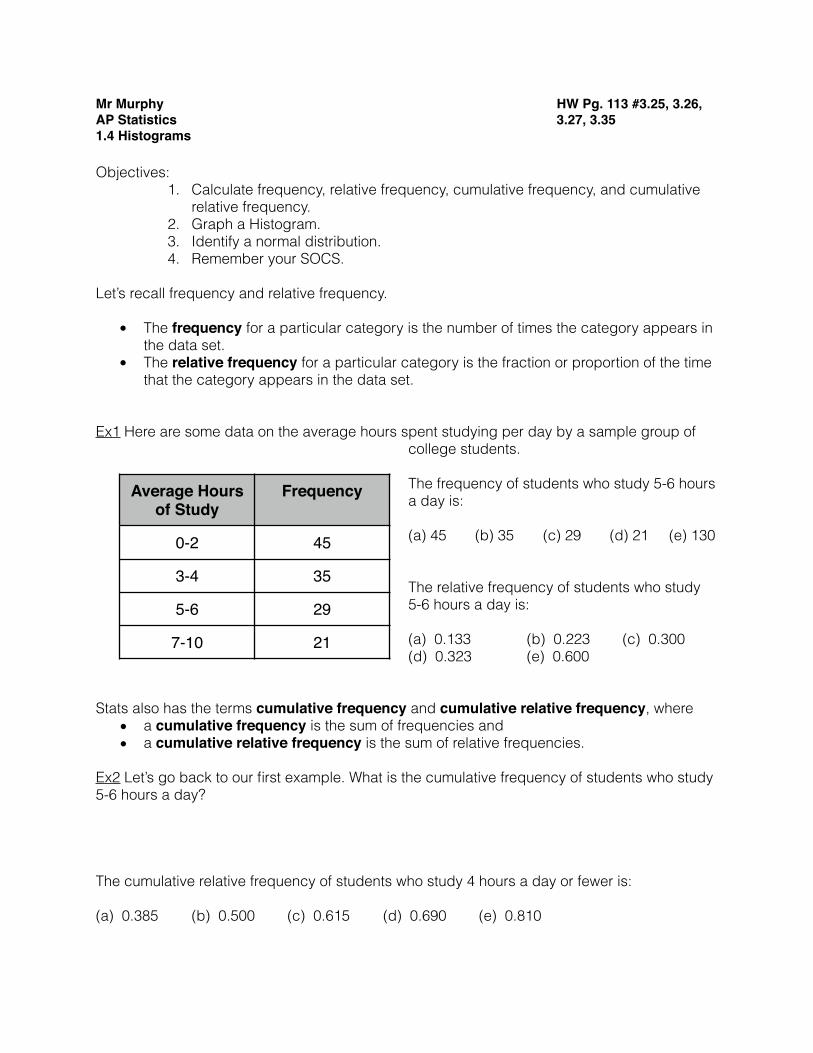
Average Hours of Study Frequency 0-2 45 3-4 35 5-6 29 7-10 21
7
Mr Murphy AP Statistics 1.4 Histograms HW Pg. 113 #3.25, 3.26, 3.27, 3.35 Objectives: 1. Calculate frequency, relative frequency, cumulative frequency, and cumulative relative frequency. 2. Graph a Histogram. 3. Identify a normal distribution. 4. Remember your SOCS. Let’s recall frequency and relative frequency. • The frequency for a particular category is the number of times the category appears in the data set. • The relative frequency for a particular category is the fraction or proportion of the time that the category appears in the data set. Ex1 Here are some data on the average hours spent studying per day by a sample group of college students. The frequency of students who study 5-6 hours a day is: (a) 45 (b) 35 (c) 29 (d) 21 (e) 130 The relative frequency of students who study 5-6 hours a day is: (a) 0.133 (b) 0.223 (c) 0.300 (d) 0.323 (e) 0.600 Stats also has the terms cumulative frequency and cumulative relative frequency, where • a cumulative frequency is the sum of frequencies and • a cumulative relative frequency is the sum of relative frequencies. Ex2 Let’s go back to our first example. What is the cumulative frequency of students who study 5-6 hours a day? The cumulative relative frequency of students who study 4 hours a day or fewer is: (a) 0.385 (b) 0.500 (c) 0.615 (d) 0.690 (e) 0.810 Average Hours of Study Frequency 0-2 45 3-4 35 5-6 29 7-10 21
-
Upload
khangminh22 -
Category
Documents
-
view
0 -
download
0
Transcript of Average Hours of Study Frequency 0-2 45 3-4 35 5-6 29 7-10 21
Mr MurphyAP Statistics1.4 Histograms
HW Pg. 113 #3.25, 3.26, 3.27, 3.35
Objectives: 1. Calculate frequency, relative frequency, cumulative frequency, and cumulative
relative frequency. 2. Graph a Histogram. 3. Identify a normal distribution. 4. Remember your SOCS.
Let’s recall frequency and relative frequency.
• The frequency for a particular category is the number of times the category appears in the data set.
• The relative frequency for a particular category is the fraction or proportion of the time that the category appears in the data set.
Ex1 Here are some data on the average hours spent studying per day by a sample group of college students.
The frequency of students who study 5-6 hours a day is:
(a) 45 (b) 35 (c) 29 (d) 21 (e) 130
The relative frequency of students who study 5-6 hours a day is:
(a) 0.133 (b) 0.223 (c) 0.300 (d) 0.323 (e) 0.600
Stats also has the terms cumulative frequency and cumulative relative frequency, where • a cumulative frequency is the sum of frequencies and • a cumulative relative frequency is the sum of relative frequencies.
Ex2 Let’s go back to our first example. What is the cumulative frequency of students who study 5-6 hours a day?
The cumulative relative frequency of students who study 4 hours a day or fewer is:
(a) 0.385 (b) 0.500 (c) 0.615 (d) 0.690 (e) 0.810
Average Hours of Study
Frequency
0-2 45
3-4 35
5-6 29
7-10 21
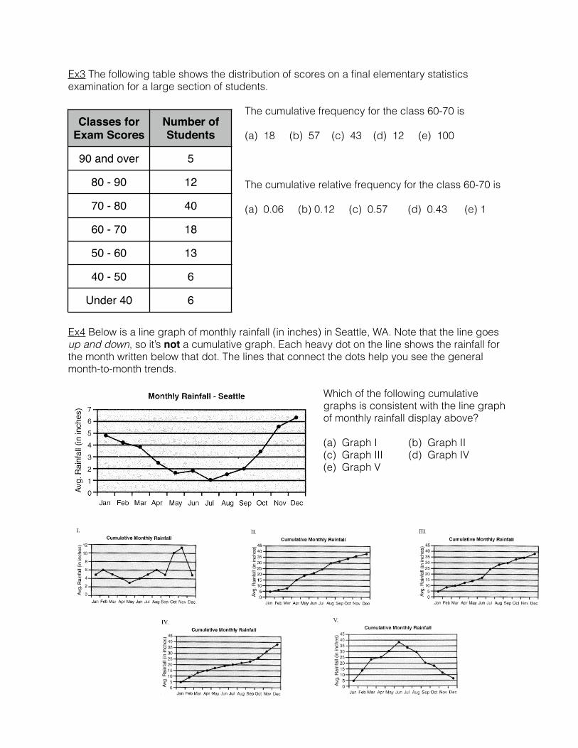
Ex3 The following table shows the distribution of scores on a final elementary statistics examination for a large section of students.
The cumulative frequency for the class 60-70 is
(a) 18 (b) 57 (c) 43 (d) 12 (e) 100
The cumulative relative frequency for the class 60-70 is
(a) 0.06 (b) 0.12 (c) 0.57 (d) 0.43 (e) 1
Ex4 Below is a line graph of monthly rainfall (in inches) in Seattle, WA. Note that the line goes up and down, so it’s not a cumulative graph. Each heavy dot on the line shows the rainfall for the month written below that dot. The lines that connect the dots help you see the general month-to-month trends.
Which of the following cumulative graphs is consistent with the line graph of monthly rainfall display above?
(a) Graph I (b) Graph II (c) Graph III (d) Graph IV (e) Graph V
Classes for Exam Scores
Number of Students
90 and over 5
80 - 90 12
70 - 80 40
60 - 70 18
50 - 60 13
40 - 50 6
Under 40 6
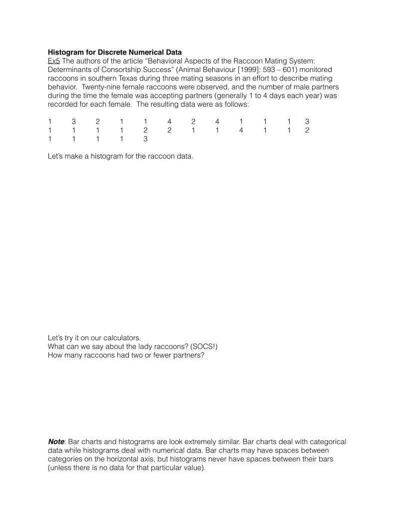
Histogram for Discrete Numerical DataEx5 The authors of the article “Behavioral Aspects of the Raccoon Mating System: Determinants of Consortship Success” (Animal Behaviour [1999]: 593 – 601) monitored raccoons in southern Texas during three mating seasons in an effort to describe mating behavior. Twenty-nine female raccoons were observed, and the number of male partners during the time the female was accepting partners (generally 1 to 4 days each year) was recorded for each female. The resulting data were as follows:
1 3 2 1 1 4 2 4 1 1 1 3 1 1 1 1 2 2 1 1 4 1 1 2 1 1 1 1 3
Let’s make a histogram for the raccoon data.
Let’s try it on our calculators. What can we say about the lady raccoons? (SOCS!) How many raccoons had two or fewer partners?
Note: Bar charts and histograms are look extremely similar. Bar charts deal with categorical data while histograms deal with numerical data. Bar charts may have spaces between categories on the horizontal axis, but histograms never have spaces between their bars (unless there is no data for that particular value).
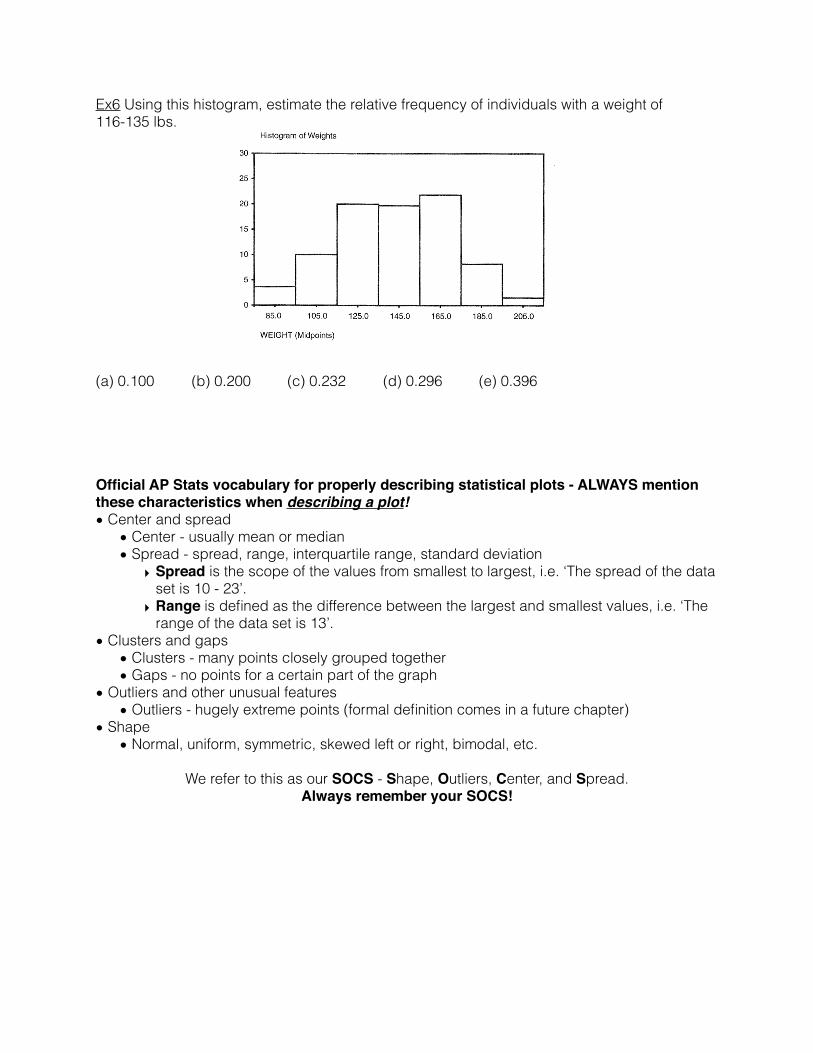
Ex6 Using this histogram, estimate the relative frequency of individuals with a weight of 116-135 lbs.
(a) 0.100 (b) 0.200 (c) 0.232 (d) 0.296 (e) 0.396
Official AP Stats vocabulary for properly describing statistical plots - ALWAYS mention these characteristics when describing a plot!• Center and spread
• Center - usually mean or median • Spread - spread, range, interquartile range, standard deviation
‣ Spread is the scope of the values from smallest to largest, i.e. ‘The spread of the data set is 10 - 23’.
‣ Range is defined as the difference between the largest and smallest values, i.e. ‘The range of the data set is 13’.
• Clusters and gaps • Clusters - many points closely grouped together • Gaps - no points for a certain part of the graph
• Outliers and other unusual features • Outliers - hugely extreme points (formal definition comes in a future chapter)
• Shape • Normal, uniform, symmetric, skewed left or right, bimodal, etc.
We refer to this as our SOCS - Shape, Outliers, Center, and Spread. Always remember your SOCS!
Normal DistributionsFor now, all you need to know about the normal distribution curve is bell-shaped, symmetric, and has an infinite base.
We will discuss the normal curve forever in statistics. It’s a big deal. This is just your first look.
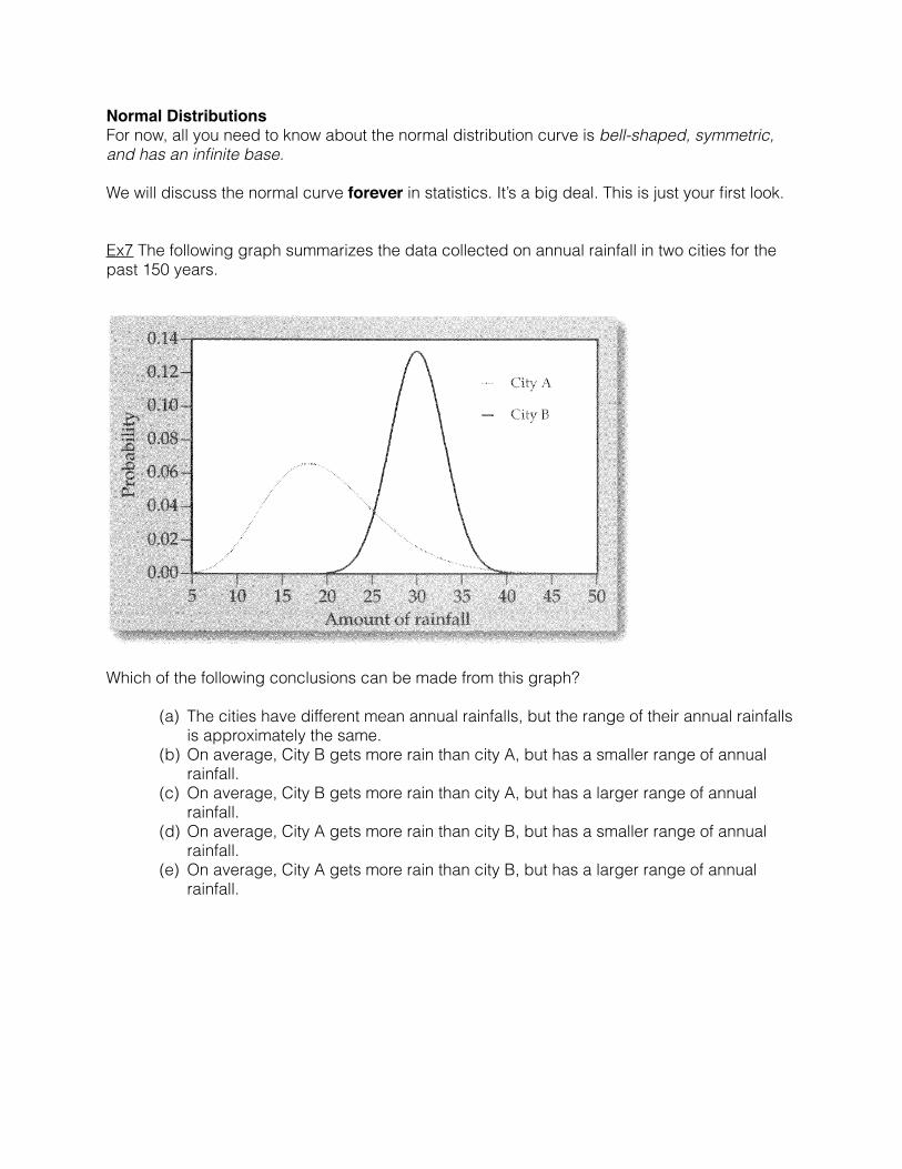
Ex7 The following graph summarizes the data collected on annual rainfall in two cities for the past 150 years.
Which of the following conclusions can be made from this graph?
(a) The cities have different mean annual rainfalls, but the range of their annual rainfalls is approximately the same.
(b) On average, City B gets more rain than city A, but has a smaller range of annual rainfall.
(c) On average, City B gets more rain than city A, but has a larger range of annual rainfall.
(d) On average, City A gets more rain than city B, but has a smaller range of annual rainfall.
(e) On average, City A gets more rain than city B, but has a larger range of annual rainfall.
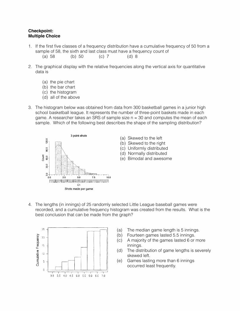
Checkpoint:Multiple Choice
1. If the first five classes of a frequency distribution have a cumulative frequency of 50 from a sample of 58, the sixth and last class must have a frequency count of
(a) 58 (b) 50 (c) 7 (d) 8 2. The graphical display with the relative frequencies along the vertical axis for quantitative
data is
(a) the pie chart (b) the bar chart (c) the histogram (d) all of the above
3. The histogram below was obtained from data from 300 basketball games in a junior high
school basketball league. It represents the number of three-point baskets made in each game. A researcher takes an SRS of sample size n = 30 and computes the mean of each sample. Which of the following best describes the shape of the sampling distribution?
(a) Skewed to the left (b) Skewed to the right (c) Uniformly distributed (d) Normally distributed (e) Bimodal and awesome
4. The lengths (in innings) of 25 randomly selected Little League baseball games were recorded, and a cumulative frequency histogram was created from the results. What is the best conclusion that can be made from the graph?
(a) The median game length is 5 innings. (b) Fourteen games lasted 5.5 innings. (c) A majority of the games lasted 6 or more
innings. (d) The distribution of game lengths is severely
skewed left. (e) Games lasting more than 6 innings
occurred least frequently.
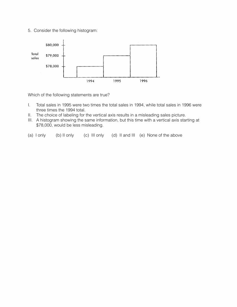
5. Consider the following histogram:
Which of the following statements are true?
I. Total sales in 1995 were two times the total sales in 1994, while total sales in 1996 were three times the 1994 total.
II. The choice of labeling for the vertical axis results in a misleading sales picture. III. A histogram showing the same information, but this time with a vertical axis starting at
$78,000, would be less misleading.
(a) I only (b) II only (c) III only (d) II and III (e) None of the above