Architecture Seminar
164
Architecture Seminar Architecture Seminar ARC U530 | G120 Spring 2009 Northeastern University School of Architecture Instructor Christina Crawford
-
Upload
khangminh22 -
Category
Documents
-
view
0 -
download
0
Transcript of Architecture Seminar

Architecture Seminar
Architecture Seminar
ARC U530 | G120Spring 2009Northeastern University School of Architecture
InstructorChristina Crawford

Architecture Seminar
ARC U530 | G120Spring 2009Northeastern University School of Architecture
InstructorChristina Crawford

This seminar introduces students to critical thinking about design outside the context of the design studio. In addition, the seminar attempts to bridge the gap between design studio and history since historical examples (with an emphasis on canonical modern and near-contemporary works) are the primary vehicle by which architectural concepts are clarified. In the lecture component of the seminar, several historical examples are employed to clarify a single architectural issue. This format serves as the critical methodology for the student presentations and final report that are required for the class. In addition, seminal theoretical texts are assigned to complement both the specific lecture topics and the general focus of the seminar. In general, the lecture and discussion topics convey the range of tactical thinking required during the design process:
The tactics of arrangement and layout and the reciprocal effects of those decisions;
Ordering tactics that provide the tools to negotiate between geometric ideals and the messy circumstances of the architectural program;
Tactics for resolving the sometimes-contradictory logic of tectonic and compositional systems into highly charged syntactical episodes.
Student work focuses upon the graphic means by which architectural tactics can be conveyed. In the early part of the semester, students work in groups to find examples of certain types of analytical diagrams that are often used to describe complex spatial and narrative experience. In the latter part of the semester, each student selects a modestly-sized building, landscape, and/or urban environment with a complex spatial sequence as a case study to analyze. In some cases, a comparison between two case studies by a single architect generates a more provocative range of observations. The primary goal of the analysis is to speculate on the specific logic of the architectural sequence and the way that the itinerary determines the broader tectonic, programmatic, and symbolic agenda of the project.
This final booklet collects and organizes the content of the students’ investigations.

ProjectsBarragan House and Studio (Luis Barragan), Tacubaya, Mexico 1947 Maria K. Babyak
Block 16 (René van Zuuk Architeckten), Almere, Netherlands 2005Alexander Davis
Casa de Retiro Espiritual (Emilio Ambasz), Seville, Spain 1975Allison Krichman
Case Study House no. 22 (Pierre Koenig), Los Angeles, California 1959 Edward Luckmann
Crow Island Elementary (Saarinen, Perkins and Will), Winnetka, IL 1939-1941Dan Krauss
Floating House (MOS), Lake Huron, ON, Canada 2007Dan Adams
Grande Bibliothèque du Québec (Patkau Architects), Montreal, Quebec 2005Laura Sehn
Kunsthaus Bregenz (Peter Zumthor), Bregenz, Austria 1993-97Sean Grummer
Lovell Beach House (Rudolf Schindler), Newport Beach, California 1926Chansan Hun
Mobius House (Ben Van Berkel & Caroline Bos), Het Gooi, Netherlands 1993-98Matthew Arnold
N85 Residence (Morphogenisis), New Delhi, India 2008Meghan Doran
Rosenthal Center for Contemporary Art (Zaha Hadid), Cincinnati, Ohio 2003Brittany Grannan
Smith House (Richard Meier), Darien, Connecticut 1965-67Jessie Carroll
Sylvan Way (Corey Papadopoli), Mount Desert Island, ME 2007-2009Lucas Carriere
Vail-Grant Residence (Pugh & Scarpa), Silverlake, California 2003Tim Loranger
4
14
26
36
48
58
68
78
94
104
112
122
132
144
154
4
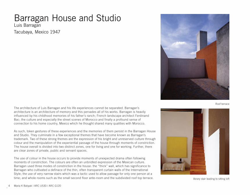
The architecture of Luis Barragan and his life experiences cannot be separated. Barragan’s architecture is an architecture of memory and this pervades all of his works. Barragan is heavily influenced by his childhood memories of his father’s ranch; French landscape architect Ferdinand Bac; the culture and especially the street scenes of Morocco and finally a profound sense of connection to his home country, Mexico which he thought shared many qualities with Morocco.
As such, token gestures of these experiences and the memories of them persist in the Barragan House and Studio. They culminate in a few exceptional themes that have become known as Barragan’s trademark. Two of these strong themes are the expression of his bright and unreserved culture through colour and the manipulation of the experiential passage of the house through moments of constriction. The house overall is divided into two distinct zones, one for living and one for working. Further, there are clear zones of private, public and servant spaces.
The use of colour in the house occurs to provide moments of unexpected drama often following moments of constriction. The colours are often an unbridled expression of the Mexican culture. Barragan used three modes of constriction in the house: the “thick” wall, which has significance to Barragan who cultivated a definace of the thin, often transparent curtain walls of the International Style; the use of very narrow stairs which was a tactic used to allow passage for only one person at a time; and whole rooms such as the small second floor ante-room and the subdivided roof top terrace.
Barragan House and StudioLuis BarraganTacubaya, Mexico 1947
Maria K Babyak | ARC U530 / ARC G120
library stair leading to sitting loft
Roof terrace

5
3rd Floor2nd FloorGround Floor
Roof Terrace - contemplation Guest room - private realmEntry Foyer - public realm

6
Entry / street elevation
Rear elevation
Image of main entry from street
View to the garden from living room
Maria K Babyak | ARC U530 / ARC G120

7
“Taller” Studio
Section

8
Programmatic volumes of fl oors
Studio and Offi ce
Maid’s Quarters
Private
Public
WORKLIVE
Maria K Babyak | ARC U530 / ARC G120

9
Circulation path according to user.
These elemental circulation patterns strip away the labyrinthine nature of the house and map the three main users and their path of travel.
Office / Client circulation
Visitor / Public circulation
Private circulation
House Keeper circulation
House Keeper circulation
Private circulation
Public Circulation VisitorClient

10
Moments of constriction and contemplation
Constriction with walls Constriction with stairs Constriction with ceiling
Maria K Babyak | ARC U530 / ARC G120

11
Use of the wall to control experience through space

12
Mapping Barragan’s use of colour in the House
Entry Corridor and FoyerStudio - double height Use of colour displays Mexican fl avour.
“He used colour to give dimension to a particular space, or to give it, in his own words, “a magic touch.”
Jose M Buendia Julbez
Terrace
Maria K Babyak | ARC U530 / ARC G120

13
Signifi cant experiences of memory
1947
1925
1902
1924
“Architecture of memory” can be best used to describe Barragan’s work. Experiences abroad and ultimately his Mexican heritage make their way in all of Bar-ragan’s works.

14
These views are cast outward through long tubes of space that house the units. Due to their construction method, much like tunnel formwork, the units are structurally self-sustaining and are pierced only where necessary for circulation. From this same reasoning the wet zone and support program are housed in a core on none circulation floors away from the façade glazing. This further more allows views of either city or water to be prominent in each individual space.
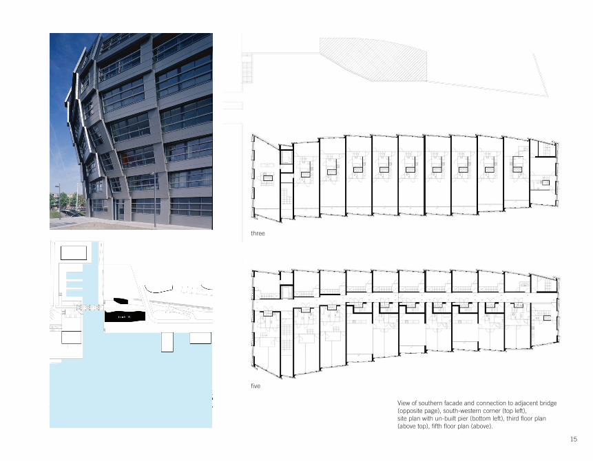
Block 16René van Zuuk Architeckten Almere, The Netherlands 2005
Block 16 lies in the midst of Almere’s downtown as a portion of an Office of Metropolitan Architecture master plan. Its site lies at the edge of a bay and is flanked on one side by an inlet to a canal, which runs through the center of the city. Because of this unique site, a dialogue is held between the building, the inlet, and the city grid. From this, a gesture to the inlet is created, with which the building bends away from the city grid, as if allowing ships to pass.
The building’s façade expresses this as well through its aluminum panels that intentionally resemble waves. These panels also express the volumes of space that sit behind as well as their inherent connection with their views. In the lower floors, the public program is housed, and is allowed to flow between façade panels by which an inward focus develops. But on the upper floors, because of the private dwelling units the volumes are constrained to their individual panel, expressing the units themselves and the outside views they take in.
Due to the tubes’ construction they are pushed or slid away from the city and towards the water, expressing the importance of the water to the building as well as life in the Netherlands.
Alexander Davis | ARC U530 / ARC G120
15
fi ve
View of southern facade and connection to adjacent bridge (opposite page), south-western corner (top left),site plan with un-built pier (bottom left), third fl oor plan (above top), fi fth fl oor plan (above).
three

16
View along the southern façade showing the articulation of the exterior skin (left), south-western corner showing half panel containing the main stair (top), view from automobile along adjacent bridge looking at western façade (above).
Alexander Davis | ARC U530 / ARC G120

17
close-up of overlapping façade elements (left), view from dock to sea wall and undulating facade (top), east elevation (above middle), north-south section (above).

18
building siting
Alexander Davis | ARC U530 / ARC G120

19
The southern façade breaks from the existing grid and bends to gesture to the canal inlet.

20
The program on the fi rst two fl oors is allowed to fl ow between façade panels as they are public program, but the private program is required to be expressed just as the façade indicates.
housing housinghousing housinghousing housinghousing housing
storagefitnesshousing housinghousing housinghousing housinghousing housing
housing housinghousing housinghousing housinghousing housing
housing housinghousing housinghousing housinghousing housing
housinghousinghousinghousing
housing housinghousing housing
housing housinghousing housing
housing housinghousing housing
housing housinghousing housing
housinghousing
housinghousinghousinghousinghousinghousing
housinghousinghousinghousinghousinghousing
parkingcommercialentry
Alexander Davis | ARC U530 / ARC G120

21
The apartments are accessed through hallways on the fourth and seventh fl oors, allowing every unit to have two stories.

22
The private program is expressed through individual façade elements as well as individual volumes of space. The structure is designed with tunnel form work in mind. These concrete tubes are pushed away from the city and closer to the water allowing for the unique appearance of the façade.
Alexander Davis | ARC U530 / ARC G120

23
3568
47
The long tubes are then divided by either a wet zone on the upper or lower fl oors, or a circulation corridor on the entry fl oors. Each program than attributes its spatial quality with either a view to the water, or a view to the city.

24
a
cd
e
b
f
The building circulation begins through the visitor entry (a) or the residents’ entry (b). The circulation than brings you to the vertical circu-lation which is housed in a half-sized facade panel (c),(d). Upon exiting to the desired horizontal circulation fl oor, the pushing of the volumes is visible as you progress down the hallway (e). The fi rst site when enter-ing into a unit is the view out to the city or to the water (f).
Alexander Davis | ARC U530 / ARC G120

25
a
a
cd
e
b
f
b
c d e f

26
Casa de Retiro EspiritualEmilio AmbaszSeville, Spain 1975
Allison Krichman | ARC U530 / ARC G120
The Casa de Retiro Espiritual, or House of Spiritual Retreat, is the ultimate house in the landscape. The house is set alone in the lush countryside of rural Spain, surrounded by groves of trees and overlooking a lake. This calm atmosphere creates the perfect setting for contemplation and relaxation and it’s union with the natural enviornment fuses the relationship between nature and architecture.
Ambasz’s main focus for the house’s design was to create harmony with the surrounding landscape, along with playing with the changes of light throughout the space and creating a carefully choreographed sequence of experiences.
As one approaches the house, he only encounters two towering white walls piercing the landscape, creating a dramatic contrast from its rural setting. Next, auditorium-like steps draw one down to an open-air patio, where the inside of the house is then introduced, since the house itself is set into the earth, allowing minimal impact to the landscape. Only upon turning around, does one notice the steep stairs on the towering walls leading up to the mirador, the balcony overlooking the landscape and used for contemplation.
The interior of the house is designed as an open living space, with smaller alcoves (kitchen, bath
and storage) along the curving interior wall. Ambasz uses a subtractive approach with these spaces, which are carved into the earth. For lighting, the inner white walls reflect sunlight filtering in through the curving skylights. As for heating and cooling, the mass of surrounding earth absorbs heat during the summer which then radiates back during the winter and cool nights.

27

28 Allison Krichman | ARC U530 / ARC G120

29
Upper fl oor plan
Ground fl oor plan
Section
Section

30
1. 2. 3.
4. 5. 6.
Site Manipulation
Allison Krichman | ARC U530 / ARC G120

31
living space.
vestibule.
private space.
mirador.
exterior patio.
Program
exterior patio
living space
vestibule
private space
mirador

32
2
1
3
4
5
6
7
Allison Krichman | ARC U530 / ARC G120
Choreographed Sequence

33
1. 2.
4. 5.
6. 7.
3.
Perspective Storyboard

34 Allison Krichman | ARC U530 / ARC G120
Daylighting

35
Heating + Cooling

36
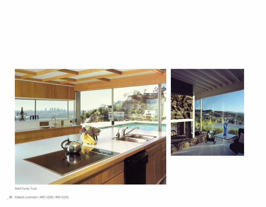
Hanging off the Hollywood hills is one of Los Angeles’ most iconic modernist homes, the Stahl House. The Stahl House was built in 1959 for the Stahl Family by California Architect Pierre Koenig as part of the Case Study program.
The Case Study Program was a program sponsored by Arts and Architecture Magazine which ran from 1945 to 1966 in which architects were commissioned to build houses in California. The program was a result of the housing boom in California at the end of World War II and was a way to explore new ideas of living. Case Study House no. 22 is an exploration of site, living and view.
The Stahl House sits on a small plot at the edge of a hill over looking the city of Los Angeles, the road almost pushes the house off the edge. The main entrance is from the open air garage, showing the importance of the automobile to the entry procession. Immediately upon entering the garage you are struck by the view of the city below. The view draws you into the pool area as you have to turn and walk over two small bridges over the pool in order to enter the house.
From the pool the transparency of the whole house is evident and you can see through to the hills beyond. The L-Shaped house shows a clear distinction between the two zones of the house, with the private side running parallel to the view and the very public living room running perpendicular. This differentiation creates a clear sense of direction as you enter the house as either a guest or a resident.
From within the house the view is brought to the interior by keeping all the utility areas to the back of the house as well as keeping them in the center of rooms to keep the windows unobstructed. Floor to ceiling windows bring in the maximum amount of views, no where is the view more clear than in the living room . The living room’s slab cantilevers off the hill as reaches into the view, penetrating it so that it goes from the single plane to through planes around the occupant. This is by far the most important room in the house.
Case Study House no. 22Pierre KoenigLos Angeles, California 1959
Edward Luckmann | ARC U530 / ARC G120
Arts and Architecture Magazine, June 1960

37
Arts and Architecture Magazine, June 1960
38 Edward Luckmann | ARC U530 / ARC G120
Stahl Family Trust

39

40 Edward Luckmann | ARC U530 / ARC G120

41
Sleeping
Living
Service

42 Edward Luckmann | ARC U530 / ARC G120Edward Luckmann | ARC U530 / ARC G120

43

44 Edward Luckmann | ARC U530 / ARC G120

45
LivingLivingLiving

46
Living
Edward Luckmann | ARC U530 / ARC G120

47

48
In 1939, the Superintendent of Schools in Winnetka, Illinois needed a new elementary school. He was quoted saying that he was looking to create “a beautiful, practical architectural embodiment of an educational philosophy.”*
The result, the Crow Island School signified a revolution in school design. The building is conceptually innovative as well as responsive to the needs of the children who will be using the space. The architects let the building grow or materialize from a desire to accommodate the people who need it. This is something worth investigating, dissecting, and admiring.
*http://rogershepherd.com/WIW/solution5/crow2.html, www.winnetka36.org/ci/ci_name.htm
Crow Island ElementaryEliel and Eero Saarinen, Perkins, Wheeler and WillWinnetka, IL 1939-1941
Dan Krauss | ARC U530 / ARC G120
t;lRIMARY SCI-lOOL
PLAY Gfl.,OUNDPf'IMARY PLAY TERRACE
Inc __ INTERMEDIATE SCJ..IOOl
0'" b:l ~YEAP-'::~Y~;f\ ,
_--<.!.:."J _1' _.--"'"o.f ~,r,•,,
BASEMENTMAIN
P l A N 5
84
SU&·PPJMARY SCHOOL

49

50
Before the architects even considered the layout of the building, many different educators were consulted in order to determine the needs of the children using the building. The architects began creating at the scale of the individual classroom, and then worked outward.
Dan Krauss | ARC U530 / ARC G120

51
This concept of starting at the classroom can be viewed as a direct manifestation of the architect’s intent of creating the best possible learning environment. The needs of the children determined the individual classroom shape and this, in turn, determined the basic design of the building.
52
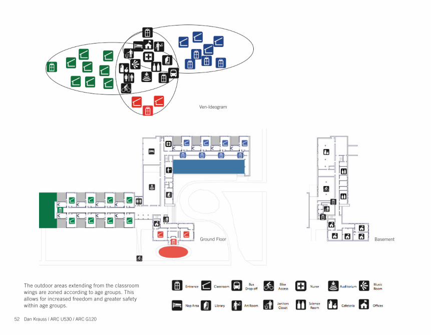
Ground Floor Basement
Entrance Classroom BusDrop off
Bike Access Nurse Auditorium Music
Room
Nap Area Library Art Room JanitorsCloset
ScienceRoom Cafeteria Offices
The outdoor areas extending from the classroom wings are zoned according to age groups. This allows for increased freedom and greater safety within age groups.
Ven-Ideogram
Dan Krauss | ARC U530 / ARC G120

53
Primary Classroom Auxiliary Classroom Private Outdoor Area
The one windowless interior wall in each cIassroom has served as the tackboard that teachers have used and loved for 50 years.
Each of the L-shaped “one-room schools” contains large sections of glass to allow light into all the rooms and the hallways.
Each classroom has its own outdoor courtyard that the class may plant and maintain.
In addition to the main classroom, each room contains a workroom plus a private lavatory.
All fixtures were placed at the proper height for the children for whom the room was intended.
The low ceilings are finished in acoustical plaster and the recessed lighting contributes a calming atmosphere to the arrangement.
Set standard for an educational classroom.
“One Room School” Primary Classroom Auxiliary Classroom Private Outdoor Area

54
High Traffic
Low Traffic
Bike Access
Kindergarten Movement
3-6 Grade Movement
1-2 Grade Movement
Dan Krauss | ARC U530 / ARC G120
The well-designed classrooms were grouped in three separate wings according to age level and connected by a core of rooms for common use.
Primary Class
1-2 Grade
3-6 Grade
Staff
Shared
Bike Access

55
In the Crow Island Elementary School the Golden Ratio is used at multiple scales. The shape for the building was not bound by any inherent site conditions, and so the Architects skillfully use this shape given by nature to prescribe the ideal shape for the building.
The use of the golden ratio holds true when you look at the individual classroom as well as when you zoom out to the larger aggregation of program

56
One of the major driving forces behind this design was access to natural light. Almost every classroom, hallway and public area had access to natural light.
Exterior Space
Threshold
Light Gradient
Dan Krauss | ARC U530 / ARC G120

57
1
1
2
2
3
3
4
4
5
5
1
23
4
5
58
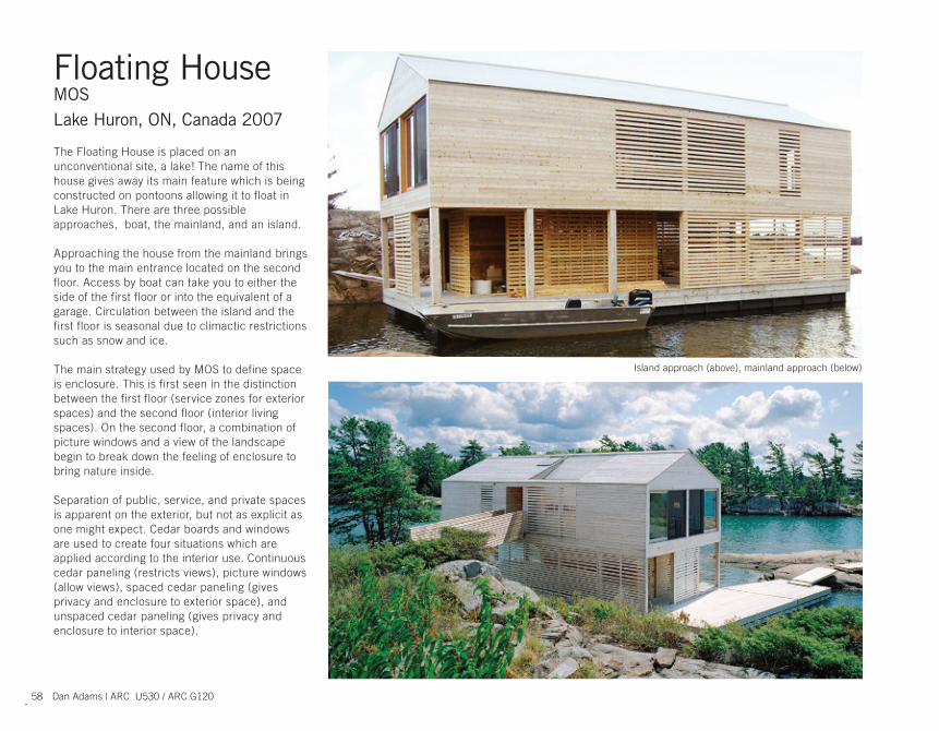
The Floating House is placed on an unconventional site, a lake! The name of this house gives away its main feature which is being constructed on pontoons allowing it to float in Lake Huron. There are three possible approaches, boat, the mainland, and an island.
Approaching the house from the mainland brings you to the main entrance located on the second floor. Access by boat can take you to either the side of the first floor or into the equivalent of a garage. Circulation between the island and the first floor is seasonal due to climactic restrictions such as snow and ice.
The main strategy used by MOS to define space is enclosure. This is first seen in the distinction between the first floor (service zones for exterior spaces) and the second floor (interior living spaces). On the second floor, a combination of picture windows and a view of the landscape begin to break down the feeling of enclosure to bring nature inside.
Separation of public, service, and private spaces is apparent on the exterior, but not as explicit as one might expect. Cedar boards and windows are used to create four situations which are applied according to the interior use. Continuous cedar paneling (restricts views), picture windows (allow views), spaced cedar paneling (gives privacy and enclosure to exterior space), and unspaced cedar paneling (gives privacy and enclosure to interior space).
Floating HouseMOSLake Huron, ON, Canada 2007
Dan Adams | ARC U530 / ARC G120
Island approach (above), mainland approach (below)

59
Organization of this house is very simple, but creates a variety of interesting relationships. Programmatic divisions make themselves apparent on the respective elevations. These different elevations then allow for lighting transitions between day and night that transform the house’s appearance.
When all of these elements are combined the house achieves a symmetrical appearance that balances a modern traditional aesthetic while maintaining the local vernacular.
Living room view (above), island approach (below), second fl oor hallway (left).

60
2
1
fi rst fl oor (top left), second fl oor (bottom left), section (top right).
Dan Adams | ARC U530 / ARC G120

61
Island approach (top left), mainland approach (bottom left), boat approach (bottom right), key (top right).

62
Enclosure of the spaces is differentiated by service zones on the fi rst fl oor and living zones on the second fl oor.
Dan Adams | ARC U530 / ARC G120Dan Adams | ARC U530 / ARC G120

63
Programmatic divisions, second fl oor (top), fi rst fl oor (bottom)
ENCLOSED OPEN
PUBLIC PRIVATESERVICE

64
Second fl oor spatial use
PU
BL
ICP
RIV
AT
E
SERVICE
L I V I N G
D I N I N G
KITCHEN
S T A I R S ENTRY
BATHROOM
P I C T U R E W I N D O W
PICTURE WINDOW
CO
UC
HE
ST
AB
LEC H A I R S
WA
TE
R V
IEW
S
FAMILYTV
CL
OS
ET
B E DSL
EE
PIN
G
DRES
SER
C L O T H E S
W A T E RV I E W S
C I R C U L A T I O N C I R C U L A T I O N
LA
MP
NI
GH
TS
TA
ND
RE
AD
ING
SH
EE
TS
S H O W E R
SI
NK
T O W E L S
SOAP
TOILET
PANTRY
C O O K I N G
FOOD D I S H E S
SINK E A T I N G
STORAGE
STORAGEO F F I C E
CLOS
ET
D E S K
COMPUTERW A T E RV I E W S
BOOKSP E N S
P R I N T E R
P A P E R
CIRCULATION
Dan Adams | ARC U530 / ARC G120

65
Second fl oor views

66
Lighting transformation
7 8 9 10 11 12 1 2 3 4 5 6 7 8 9 10 11 12 1 2 3 4 6 5
OPENINGS
SIDING
SUNRISE SUNSET
Dan Adams | ARC U530 / ARC G120
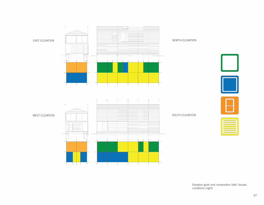
67
EAST ELEVATION
WEST ELEVATION
NORTH ELEVATION
SOUTH ELEVATION
Elevation grids and composition (left), facade conditions (right)

68
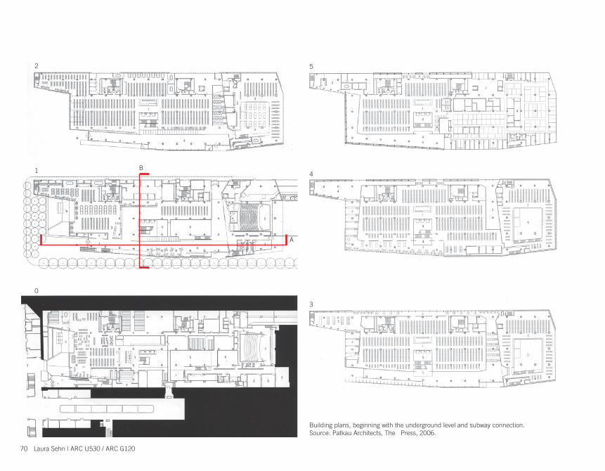
The Grande Bibliothèque is located in a vibrant neighborhood of Montreal surrounded by the city’s bus terminal, a significant university, a multi-cultural residential community, and connected directly to a major hub of the city’s subway system. The Vancouver-based firm Patkau Architects was commissioned to design the library after winning an international competition. They were asked to design a building that would act as a desirable public gathering place for Montrealers, to have a strong connection to the rest of the city, and to be an architectural icon for the province of Quebec.
The public library consists of large general, children’s and Quebec book collections, provincial archives, an auditorium, exhibit space, as well as reading and work spaces. The main concept of the building focuses on the interaction between the book stacks and the reading and work spaces for the general and Quebec collections. In one instance, the reading and work spaces wrap the book stacks, and in the other, the book stacks wrap the reading and work space. The adjacency and separation of these programs are highlighted by the wood-slatted ‘boxes’ that cut through the building.
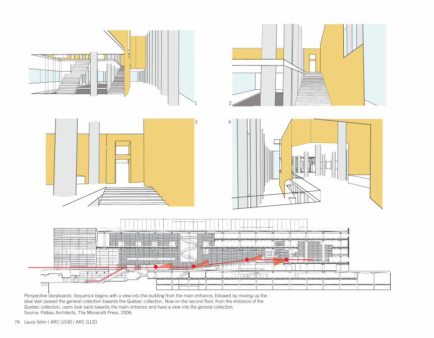
This program organization is directly associated with the circulation of the building. The long slow stair runs adjacent to the front facade and connects the main entrance up to the general and Quebec collections. At the top of this stair, the library users can circulate up and around either collection “box” and through the reading and work spaces. There is also a main stair and bank of elevators that runs through the center of the library to give quick access to all levels.
The façade very much reflects the interior organization of the building. The skin is similar to the wood boxes, such that it is made up of frosted glass slats, with varied spacing and openings to achieve a desired affect. On one side of the general collection ‘box’ and in the space between this and the Quebec collection ‘box’ are stepped worked spaces that look down and out to the street through the careful openings of the frosted glazing, making a strong visual connection with the city.
Grande Bibliothèque du QuébecPatkau ArchitectsMontreal, Quebec, 2005
Laura Sehn | ARC U530 / ARC G120
Main stair in the Grande BibliothèqueSource: Patkau Architects, The Monacelli Press, 2006.

69
Building Images, clockwise from top left: Front entrance of library; Interior photo looking towards main library entrance and second fl oor entry into general collection wood ‘box’; Interior photo of Quebec collection book stacks and work space; Photo of entrance into Quebec collection area; Photo of slow stair moving passed general collection towards Quebec collection.Source: Patkau Architects, The Monacelli Press, 2006.
70
A
B
3
2
0
1 4
5
Building plans, beginning with the underground level and subway connection.Source: Patkau Architects, The Press, 2006.
Laura Sehn | ARC U530 / ARC G120

71
Section A
Section B
Above and left: Building sections showing key building features and program distribution. Below left: Photo of frosted glass façade detail. Below right: Exte-rior photo of the Grande Bibliothèque with view of the city beyond.Source: Patkau Architects, The Monacelli Press, 2006; www.fl ickr.com

72
Blvd de
Maisonn
euve
Rue Berri
Rue St-Denis
Rue O
ntario
E.
Site infl uence diagram: The proportions of the interior space wrapping the general collection mimic the shape and orientation of the urban block on which the building sits.
Laura Sehn | ARC U530 / ARC G120

73
Building composition diagram, showing circulation, interior wood ‘boxes’ and building skin.
Building Skin
Wood Boxes
Circulation
74
Perspective storyboards: Sequence begins with a view into the building from the main entrance, followed by moving up the slow stair passed the general collection towards the Quebec collection. Now on the second fl oor, from the entrance of the Quebec collection, users look back towards the main entrance and have a view into the general collection.Source: Patkau Architects, The Monacelli Press, 2006.
1 2
3 4
Laura Sehn | ARC U530 / ARC G120

75
Grande Bibliothequedu Quebec
MontrealLibraries
ReadingSpaces
ReadingSpaces
ReadingSpaces
Children’sCollection
GeneralCollection
Central PublicLibrary
Regional Resource Library
QuebecCollection
RegionalLibraries Archives Maps Historic
Documents
Library distribution diagram: The intention for creating the Grande Bibliotheque was to gather book collections and resources from all across the Province to create one large public library and resource center.

76
General Collection
Reading areas Book stacks
Quebec Collection
Program relationship diagrams: The plan is divided in two unequal parts, where the general collection is wrapped by reading and work spaces, and, in contrast, the Quebec col-lection wraps a single central reading and work space.
This relates to the main circulation through the two col-lections, where, in both cases, it is contained within the reading and work spaces.
In the case of the general collection, its confi guration allows for views out to the city, whereas, in the Quebec collection, there are no views out, but rather looks inward on itself.
Laura Sehn | ARC U530 / ARC G120

77
Transparency/opacity diagram: The spacing of the wood slats of the ‘boxes’ that enclose the general and Quebec collections varies according to the desired views to and from the different spaces. This concept is also applied on the façade of the building in order to allow views looking into the library from outside, and views looking from the library back out to the city.Source: Patkau Architects, The Monacelli Press, 2006; www.fl ickr.com

78
The Kunsthaus Bregenz stands in the light of Lake Constance in Bregenz, Austria. Reduced to its static essentials, its function, use, construction, material, and visual form constitute a unified whole. “The building is exactly what we see and touch, exactly what we feel beneath our feet: a cast concrete, stony body. The floors and stairs are polished, the walls and ceilings have a velvet gleam.” The inner workings of the museum can be perceived from the exterior. It is clad in diffuse glass that absorbs light during the day and emits it like a lantern at night. It absorbs the light conditions that surround it, the haze of the lake, the glow of the sky, and it reflects and gives intimation of its inner life according to the angle of vision, the daylight and the weather. The building is at once something that catches the eye and compelling while also providing a sense of familiarity and subsequently fading into the background. The structure and orientation of the building are carefully arranged to guide the visitor through the art museum. Contrasts of light and dark provide the visual clues to proceed through the space, approaching the building and the galleries within. The building is simple but not in the sense that it has nothing to reveal. It’s success lies within the quality of the energy that is organized within its material and mental assemblages. It reveals a quality that goes beyond organizations to an essential quality that transcends all who experience it.
Kunsthaus BregenzPeter ZumthorBregenz, Austria 1993-97
Sean Grummer | ARC U530 / ARC G120
Entry to the Kunsthaus Bregenz (below)

79
Basement A-A B-B
Level - 1
BB
A A
Level - 2, 3, 4
The glass on the entry level to the museum is obscured, mitigating light and views.

80 Sean Grummer | ARC U530 / ARC G120

81Kunsthaus images courtesy of:
Peter Zumthor, Kunsthaus Bregenz, 1999 & Flickr

82
Material Organizations
Glass Metal Concrete
The materials used are reduced to their essential form. The minimum material palette allows for the clear and desired expression of each.
Sean Grummer | ARC U530 / ARC G120

83
Mental Organizations: Concrete
Energy is organized in the slab. Traditional construction is compiled and compressed to serve and maximize its desired effects.
Elements of a traditional fl oor construction
An effi cient slab combining the knowledge of traditional construction into a thicker integrated construction.

84
Traditional Structure
Mental Organizations: Concrete
The vertical structure of the building is also maximized. Traditional steel construction is consolidated into three primary concrete walls that in turn also provide circulatory and programmatic functions.
Sean Grummer | ARC U530 / ARC G120

85
Structure Circulation Light Control

86
Transparent Glass Diffuse GlassMental Organizations: Glass
Glass can be treated as simply something transparent or a medium in which light can be directed and controlled.
Sean Grummer | ARC U530 / ARC G120

87
The diffuse glass adds a quality to the space of a subtle glow as light collects and is bounced around within the glass.

88
Mental Organizations: Steel
Steel is relegated to the space in between. Its unique struc-tural properties allow for a rigid structure with a minimum profi le. Light is thus allowed to travel with little interruption between the exterior and interior.
Sean Grummer | ARC U530 / ARC G120

89
The images to the left show the steel structure bridging the gap between glass and concrete. Photos courtesy of Flickr.

90
The Essential Quality: Integration
The essential quality of the space is allowed to read through a play of contrasts. Light and dark, soft and hard all com-bine to form a visual progression that guides users through the space.
Sean Grummer | ARC U530 / ARC G120

91
Isolating the contrast between light and dark leads to a resemblance of the sequence users experience in the space.

92
The Essential Quality: Integration
The total integration of all aspects within the building combine to allow the building to work in its simplest function of displaying art and directing the user sequence.
1
2 3
4
4
5
5
5
6
6
6
Sean Grummer | ARC U530 / ARC G120

931
3
5
2
4
6

94
There are two causes of beauty: natural and customary. Natural is from geometry consisting in uniformity, that is equality and proportion. Customary beauty is begotten by the use, as familiarity breeds a love for things not in themselves lovely. Here lies the great occasion of errors, but always the true test is natural or geometrical beauty. Geometrical figures are naturally more beautiful than irregular ones: the square, the circle are the most beautiful, next the parallelogram and the oval. There are only two beautiful positions of straight lines, perpendicular and horizontal; this is from Nature and consequence necessity, no other than upright being firm. - Sir Christopher Wren, Parentalia
The design of Lovell Beach House was a collaborative effort between the architect, Rudolf Schindler, and the client, Dr. Lovell, The concept of the house was to produce architecture that support health and inner-beauty. The quote by Sir Christopher Wren above fully describes the intention and process of architecture design for this house. Apart from orthogonal geometry of the house, the architect employed mathematical proportions and regulating lines to question: what is a health house? By rigorously employing the scientific proportion on every single facade and floor plan, the architect and the client discovered the geometric figure that enhanced the body’s well-being.
Lovell Beach HouseRudolf SchindlerNewport Beach, California 1926
2. View from the street toward the ocean (east to west) 3. View from the ocean (west to east)
1. Aerial view of the site N
Chansan Hun | ARC U530 / ARC G120

95
The house is oriented in the east-west direction with the ocean to its west facade. When one approaches the house, he or she will notice the five site-cast concrete frames that provide structural support for the overall volume of the house. From the exterior, the sleeping porches form a rectangular volume that projects outward and is lifted high up off the ground. There are two main entry staircases that lead into two different spaces: the sleeping area and the living area. A third staircase at the back is mainly served the activity of the servant. Once in the living room, the double-height space is flooded with sunlight from the south and provides an extensive view toward the ocean. Sectionally, there is a spatial relationship between the balcony off from the sleeping porches on the third floor and the living space on the second floor.
As a whole, the architecture of the house provides natural and customary beauty, rhythm, views, privacy and natural light. The house also takes advantage of the sea breeze that blows from the beach to provide natural ventilation from the south-west facade. As the wind blows, it picks up sand with it and deposits it at the main entrance to form playground for the children underneath the sleeping porches.
The house has been transformed significantly since it was built. For instance, another beach house was built so close to the south facade that the Lovell House is hardly be seen from the street. The servant staircase no longer exists, a wall on the 13th Street side was built, the open sleeping porches are glazed, and finally, the balcony on the east facade was removed. The reasons of these changes can be related to the changes of lifestyle and the physical environment over time.
6. Interior view looking at the ocean5. View into the entry sequences
4. Axonometric without roof

96
10. Third Floor Plan9. Second Floor Plan8. Ground Floor Plan
7. North-South Section
Chansan Hun | ARC U530 / ARC G120

97
11. Original view of the house
Original Intentions
. Unglazed sleeping porches . No street wall and vegetation . Surrounded by sand and opened up to the ocean

98
Architect and Client’s Relationship
. Commission Process . Health and Physical Environment
Rudolph Schindler
Dr. Philip Lovell
Mrs. Lovell
Frank Lloyd Wright
Harriet
Sam Freeman
Oliv
e H
ill K
inde
rgar
ten
Hollywood hill house
Lovell Beach House
Sister
was
mar
ried
colleague
DirectIndirect
Architect’s infleunce
Client’s infleunce
Relationship diagram
Health
Health
Chansan Hun | ARC U530 / ARC G120

99
Health House
. Scientifi c Proportion
Triangular lines
Overall limitation of the elevation Invisible lines
Rhythm of squares
A
B C
D
E F
A
B C
D
E F
G
g
H
h
I
i
J
j
A
B C
D
E F
G
g
H
h
I
i
J
j
K
L M A
B C
D
E F
G
g
H
h
I
i
J
j
K
L M
N
O
P

100
Structure
Circulation
Space
Glazing
Living Space
Sleeping Space
Servant Space
Building Components
Health House
. Spatial Organization
Chansan Hun | ARC U530 / ARC G120

101
Health House
. Serial Perspectives
Street
Entrance
Living room

102
Health House
. Environmental Control
Passive heating and ventilation
As the direct solar radiation warms up the south-east facing facade, the south-westerly wind rushes from the ocean to replace the warmer and rising air. As the wind blows, it also picks up sand from the beach and deposits them under-neath main entrance to form a playground for the children.
Work Cited:
Quote by Sir Christopher Wren:Rowe, Colin. The Mathematics Of The Ideal Villa And Other Essays. The MIT Press, Cambridge, Massachusetts, 1976
Original drawings:University of California, Santa Barbara, Architectural Draw-ing Collection, hereafter UCSB-ADC
Proportional Diagrams:Sarnitz, August E. Proportion and Beauty-The Lovell Beach House by Rudolph Michael Schindler, Newport Beach, 1922-1926
Images:www.google.com/image
All other diagrams:Drawn by Chansan Hun
Chansan Hun | ARC U530 / ARC G120

103
Transformation
. Lifestyle . Physical Environment
LIVINGCookingLIVINGLIVINGServant stair was removed
The kitchen was modified to have more connectionto the main salon
Outdoor sleeping porches were glazed
A nearby building was built and it almost blocks the entire south-east facade
Concrete walls were built on the sidewalk
Invasion of privacy& security
Lines of viewMigration
Inward | contained
Surrounding buildingsLovell Beach House
Changes over time

104
The Mobius house inherits its name from the mobius shape, a double helix which creates a continuous path that turns over on itself. Van Berkel & Bos used the mobius shape as the concept behind the organization of the program. The house is designed for a family of four. Both of the parents work from home and need living and working space within. The mobius shape being a continues plane allows Van Berkel & Bos to organize the program in a non hierarchical manner. The continues plane of the mobius shape lends itself to the 24 hour living and working cycle of the family.
The private program pieces like the bed rooms and studios are placed at the extremities of the mobius shape to allow privacy and autonomy within the home. At the areas where the continues planes intersect Van Berkel & Bos places the public spaces where the family can enjoy and share time together.
Although Van Berkel & Bos did not express the mobius shape explicitly in the elevation of the house, the over all form resembles the mobius shape or figure eight. The home is constructed from two main materials, concrete and glass. Wood is also used in very particular areas to help accentuate the concrete volumes within the house. The concrete and glass are constantly creating different surfaces on the interior and exterior. Glass is used as interior and exterior walls and ceilings. Concrete creates parts of the floor, walls, ceiling, and floating boxes. The materials are exchanging places to enhance the notion of a twisting plane.
Mobius HouseBen Van Berkel & Caroline BosHet Gooi, Netherlands 1993-98
Matthew Arnold | ARC U530 / ARC G120
105

106
StorageGuest RmBath RmCirculation
Studio 1
Bed RmBath RmCirculation
Garage
StorageMeeting RmKitchen
VerandahLiving Rm
Roof Below
Open to Below
Bed Rm
Bath Rm
Studio 2
Bed RmRoof TerraceBed Rm
Bed RmStudio 2Beyond
Bed Rm Bed Rm Bath Rm
Storage Meeting Rm VerandahBeyond
Living Rm
Ground Floor PlanLower Level Floor Plan Upper Floor Plan
Matthew Arnold | ARC U530 / ARC G120

107
Circulation Spine

108
Program organization along mobius shape
1 2 3 4 5 6 7 8 9 10 11 12 13 14 15 16 17 18 19 20 21 22 23 240
Child 1Child 2
FatherMother
PublicPrivate Private
SleepingWorking
FamilySpace
SleepingWorking
24 hour family cycle
Matthew Arnold | ARC U530 / ARC G120

109
Living RoomCirculationMaster Bed RoomStudio 1CirculationLiving Room
Studio 2 Bed Rooms

110
Interior Concrete Furniture
Hanging Boxes
Glass
Matthew Arnold | ARC U530 / ARC G120

111
Perspective 1
Perspective 2
Perspective 3
Perspective 4
1
2
3
4

112
The N85 Residence was built in 2008 and is located in New Delhi, India. It was designed for Manit and Sonali Rastogi and their family who were moving to an upscale neighborhood south of the city. The family consists of Manit and Sonali, their children and a parent.
The couple who own the house are also its architects. The new home serves not only as their residence but as their office as well. Three levels sit above ground and act as the family’s home. Below grade is the architecture studio of Morphogenesis.
The house has many programmatic challenges. The need for privacy and a space for the family to relax needed to blend seamlessly with a space to entertain to constant stream of people who come through on a daily basis. The raumplan, a technique used by Adolf Loos, was an inspiration in dealing with such challenges.
The house uses a host of sustainable techniques to reduce its impact on the environment as well as to help the building and its occupants cope with the harsh humid climate of India.
Meghan Doran | ARC U530 / ARC G120
N85 ResidenceMorphogenisisNew Delhi, India 2008

113
©2
©2009 Google
The city of New Delhi is located in northern India to the west of the Yumana RIver. The radial plan has its main hub located next to a large bend in the river with rings radiating outward. The house is to the south of the city center in an upscale neighborhood next to one of these main rings, which serve as the transportation infrastructure.

114 Meghan Doran | ARC U530 / ARC G120
The house has to accommodate a large amount of program. The “L” shape works well to separate the private and public areas. The sleeping and more private rooms sit at the back along the short arm of the L. The public and entertaining spaces occupy the long arm and greet the visitor when they approach from the street.

115
The house is divided into three main zones:1. private-sleeping, breakfast area2. family-dining room, family room3. public-living room, main dining room

116 Meghan Doran | ARC U530 / ARC G120
The N85 residence uses similar techniques as the Alpine Villa. The social gathering space is below the more private refl ective space.
Alpine Villa, Adolf Loos

117
From one direction the interior courtyard is perceived as a volume pushing through to the fl oor above.
From the other direction it is seen as a dividing space between living and dining rooms.

118 Meghan Doran | ARC U530 / ARC G120
The interior courtyard is one of the spatial moments where the space is perceived as a volume.
The interior courtyard from the lower fl oor extends up through the study creating a double height space when seated in the courtyard below.
Once you make your way onto the deck and turn to look back at where you’ve just been, you notice that the study is its own volume carved from the larger mass of the building.

119
The overall massing of the house is made up of two ele-ments, the thermal mass and the program,that fi t together like puzzle pieces.
In reality the large amount of glass used throughout give the house a light open feel, in contrast to the thickness of the thermal mass. The large chunky mass of the puzzle disap-pears and the fl oor plates seem to fl oat in the larger mass.
The lap pool on the third fl oor uses harvested rain water. The heat from the sun evaporates the water instead of heating a roof or deck surface and adding to the overall temperature of the house.

120 Meghan Doran | ARC U530 / ARC G120
The fl oor to ceiling glazing is able to be opened and allow a breeze to penetrate the house and carry the hot air up through the house to openings in the roof.
The thermal massing wall absorbs heat during the day and releases away from the house and its occupants. The basic concept of thermal mass is to have the heat from the sun seek out a cool dense material such a stone or concrete and absorb it during the day. Then at night the stored heat transfers to the cool air in the room.
The fl oor to ceiling glazing along the north and east facades allow the maximum amount of natural light and air to penetrate the house.
The trees along the east side of the property shade the house reducing the need for air conditioning.

121
Thermal Mass Wall
Floor to Ceiling Fenestration
Trees
Average House65 tons of A/C
N8510 tons of A/C
one = 5 tons of air conditioning

122
“Contemporary art is about pushing the envelope, and this building does that literally.”
The Rosenthal Center for Contemporary Art is the first building in the United States by Zaha Hadid. The museum occupies one of the busiest corners in the city and receives a great deal of foot traffic. This became an inspiration for the “urban carpet” or concrete sidewalk which starts at the curb and continues into the building becomes the thick exterior wall that is the back bone of the center.
Because of the small site, the building had to go up rather than out. Therefore a scissor-cut dramatic stair carries the visitor up to the galleries. It also allows for an atrium which lets natural light filter down from the large skylight above the stairway. All of the galleries are like barnacles as they attach to the stair which hangs off the back wall.
From the street the building appears to the inverse of what is typically expected; all of the solid pieces are resting on a thin curtain wall. The needs of the galleries require the solid boxes which protrude out of the building. Meanwhile the public spaces such as the lobby and circulation as well as the offices are all glass allowing maximum light.
The black aluminum of the stair and railings stand out against the gray concrete and the blue-toned glass. The interior is left quite plain to allow the art be what stands out. The building has become what it holds inside, a piece of contemporary art.
Rosenthal Center for Contemporary ArtZaha HadidCincinnati, Ohio 2003
Brittany Grannan | ARC U530 / ARC G120
View of main entrance off corner (above), 3D Model perspective view of front elevation (top right), Aerial view of the entire structure (middle right), Perspective from Walnut Street of South Elevation (middle right), Main staircase and “urban carpet” becoming the wall (right).

123
South ElevationEast Elevation

124
Second Floor
Ground Floor
Fourth Floor
Third Floor
Brittany Grannan | ARC U530 / ARC G120

125
Sixth Floor
Fifth Floor South Long Section
East Cross Section

126
East 6th Street
Walnut Street
East 6th Street Elevation Walnut Street Elevation
Walnut Street ViewAerial of Site Context
Brittany Grannan | ARC U530 / ARC G120

127
Pilotis
Solid Sections of Facade
Ribbon Windows

128 Brittany Grannan | ARC U530 / ARC G120

129
StorageUrban Carpet
Galleries
Main StaircaseMain Staircase
StorageUrban Carpet
Galleries

130
Time (Minutes)
Floor
10987654321
EXIT
7”
11”
16”
4.5”Hadid’s Stair Typical Stair
Brittany Grannan | ARC U530 / ARC G120

131

132
The Smith House by Richard Meier expresses two themes typical of Meier’s work. the first being the play of the horizontal and the diagonal—this is most evident in the plan and sectional logics. The second theme is the play of the heavy vs. light and the solid vs. void. This is illustrated in the facade composition as well as the structural implications. These two themes are essential to understanding the work of Richard Meier, particularly the Smith House.
The formal articulation is not unlike that of Le Corbusier 1920-1930. Not only are the forms similar, but also the concept of the architectural promenade. Though the departure from Le Corbusier takes place in Meier’s rigorous plan. The idea of regularity for Meier transcends the facade implications of Corbusier and manifests itself in the plan.
The Smith House is situated on a rural site overlooking Long Island Sound in Darien, Connecticut. The white structure, characteristic of Meier, intensifies the colors produced by the picturesque landscape. The white color also plays up the formal intentions and formal rigor of Meier.
Smith HouseRichard MeierDarien, CT 1965-67
Jessie Carroll | ARC U530 / ARC G120
www.GreatBuildings.com
http://ack2001.net/sub_Info/sub_Architecture_Timeline/sub_1960_s/img/1967EisenmanHouseSmith.png

133
The fi rst theme of the horizontal vs. the diagonal is evident in the siting of the Smith House.
The main road and driveway are parallel to each other. The house itself is sited 45 degrees from the axis of approach. The form of the Smith House is dependent upon the golden section / perfect rectangle.
http://www.architectenwerk.nl/architectenpraktijko2/images/douglas2.jpg
45
Diagonal vs. Horizontal: Site
Golden Section Site Plan
45 45

134 Jessie Carroll | ARC U530 / ARC G120
1
2
First Floor Plan Second Floor Plan
Third Floor Plan Roof Plan

135
http://www.architectenwerk.nl/architectenpraktijko2/images/douglas2.jpg
3
example of a caption that migdescribe the images / diagram(left) (above) or (below)
ght ms
1
East Elevation South Elevation
West Elevation
North Elevation
All drawings by Jessie Carroll
1
2

136 Jessie Carroll | ARC U530 / ARC G120
Geometric Relationships
Orthogonal vs. Diagonal: Plan
Building on “Site”
Horizontal Circulation
Vertical Circulation
note: diagonal interior / exterior relationship
Related Geometries
First Floor Plan Second Floor Plan Third Floor Plan Roof Plan

The rigor in the plan offers a diagonal relationship to describe vertical circulation and related geometries include the studio and the fi replace.
The orthogonal bands offer horizontal means of circulation.
Orthogonal vs. Diagonal
Axonometric Diagram
Exterior Diagonal Relationship
137

Jessie Carroll | ARC U530 / ARC G120
Solid vs. Void: Elevations
South ElevationWater ViewPublic
North ElevationStreet ViewPrivate
East Elevation
West Elevation
Heavy Private Facade
Light Public Facade
138

=ba cl br
+ +
Private Program
Public Program
Closed Structure
Solid vs. Void: Structure + Program
Open Structure
139

Jessie Carroll | ARC U530 / ARC G120
1
2
3
Promenade
The formal ambition of Richard Meier is not unlike that of Le Corbusier from 1920-1930. The sense of the promenade was essential to the understanding of the experience of the form and the space to both Meier and Le Corbusier. It is expressed in the off-axis approach to the Smith House and the delay of view.
Also, the theory or practice of regulating lines is inherent in the work of Meier and Le Corbusier. In the work of Meier, the regulating line is not so much evident in the elevation, but more so in the rigor of the plan. Le Corbusier instead promoted the free plan but practiced rigor in the elevation.
Precedent: Le Corbusier 1920-1930
140

1 2 3
141

Jessie Carroll | ARC U530 / ARC G120
Villa Garchefrom Villas of Le Corbusier 1920-1930, Tim Benton
Villa Meyerfrom Villas of Le Corbusier 1920-1930, Tim Benton
142

Smith Housedrawn by Jessie Carroll
Villa Garchedrawn by Richard Meier in Richard Meier Architect
143

144144 Lucas Carriere | ARC U530 / ARC G120
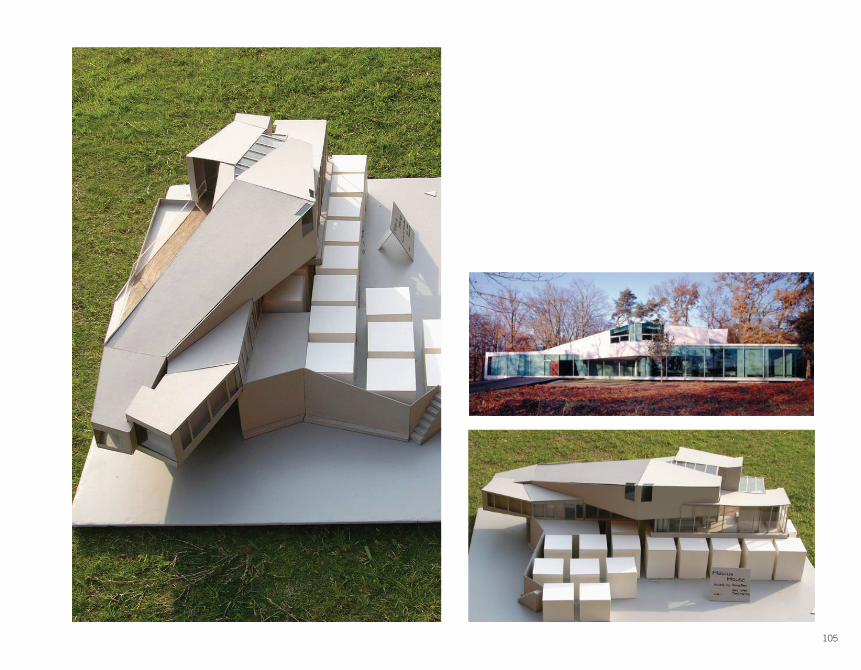
Buried deep into the heavily wooded forests of a Maine island, the Sylvan Way residence, designed by architect Corey Papadopoli acts as a series of framed views of nature. Using ingenuity to achieve dramatic architectural moments and forms while overcoming financial limitations, the dimensions, scale, and building materials incorporated into the project were all of equal consideration in the design process. While a simple geometric expression in plan, elevation, and section, the structural systems discretely incorporated into the building allow for both unobstructed views of nature as well as an ability to withstand the typical snow loads of a New England winter. The building is a true expression of a wooded getaway and uses its connection with nature and the site to make its bounded living area seemingly infinite.
Sylvan WayCorey PapadopoliMount Desert Island, ME 2007-09
145145
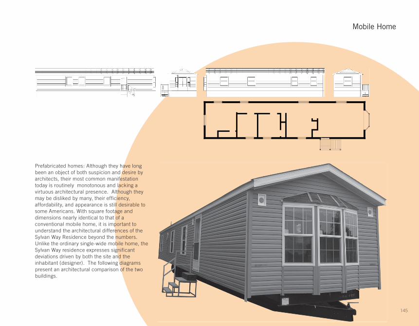
Prefabricated homes: Although they have long been an object of both suspicion and desire by architects, their most common manifestation today is routinely monotonous and lacking a virtuous architectural presence. Although they may be disliked by many, their efficiency, affordability, and appearance is still desirable to some Americans. With square footage and dimensions nearly identical to that of a conventional mobile home, it is important to understand the architectural differences of the Sylvan Way Residence beyond the numbers. Unlike the ordinary single-wide mobile home, the Sylvan Way residence expresses significant deviations driven by both the site and the inhabitant (designer). The following diagrams present an architectural comparison of the two buildings.
Mobile Home

146
=
Sylvan Way
146

147147
=
Mobile Home
147

148
Sylvan Way
Lucas Carriere | ARC U530 / ARC G120
1
3
5
2
4
6
1
2
3
4
5
6
1 2 3 4 5 6
Lucas Carriere | ARC U530 / ARC G120

149
Mobile Home
1 2 3 4 5 6
APPROACH
1
3
5
2
4
6
1
2
3
4
5
6
3
149

150
BEDBATHKITCHENDININGLIVINGPORCHOTHER
TOTAL FT2
13551
13513513513520
746
Sylvan Way
Lucas Carriere | ARC U530 / ARC G120150

151
PROGRAMPROGRAM
BEDBATHKITCHENDININGLIVINGPORCHOTHER
TOTAL FT2
228619580
13021
117
732
Mobile Home
151

152
PRIVACY
Sylvan Way
Lucas Carriere | ARC U530 / ARC G120

153
Mobile Home
SPATIAL QUALITY

154
The Vail Grant Residence is most notably defined by its relationship with the hillside it occupies. The mass of the building reads as a single, twisted, rectangular tube that both dives into and jumps away from the hillside; it blurs the boundary between natural and artificial.
This form is generated by the challenges and opportunities created by the site. Three defining aspects of the site that affect the design include severe topography, stunning views, and the presence of a Neutra house directly adjacent to the site which code deems cannot be visually obstructed. The tube design allows the house to sit deep into the hillside, like a tunnel or cave, not obstructing views while still providing largely glazed walls in certain areas. All aspects of the site are addressed through this abstract design.
This strange form is basically a ‘U’ with two arms springing from the hillside. The space is divided into four sections based upon two variables. Public spaces are placed in the upper arm to take full advantage of the views and of the terrace on the hillside; private spaces are placed within the second, lower arm. Service spaces requiring little glazing are placed in the rear of the house, literally in the hill; living spaces, where views are more important, lie at the front of the house where glazing is prominent.
Environmental and economical friendliness were important to the client and are featured in many aspects of the design. The shell of the tube was constructed with a material that is formed by two rigid sheets of foam held together by wire mesh and coated with concrete. These Structural Concrete Insulating Panels (SCIP’s) are very good insulators and reduce the cost of heat and air conditioning. They are also prefabricated from recycled materials and produce little construction site waste. The tube design and location provide many advantages: thermal heat from the ground helps to warm the house, natural light enters through the glazing, natural ventilation circulates through the tube, and the cave design means no retaining walls were constructed.
Vail-Grant ResidencePugh & Scarpa 2003Silverlake, California
Tim Loranger | ARC U530 / ARC G120
(Top) Photograph of architect’s model, (Bottom) View from top of stair looking toward living space and view beyond

155
basement plan fi rst fl oor plan second fl oor plan

156
section
(Above) Front view of the house from the street with the Neutra house on the right(Below) View of a model from the same angle as the section
Tim Loranger | ARC U530 / ARC G120

157
Los Angeles Silverlake Reservoir
view of hill view from hill

158
topography
outward view
view of Neutra house
key aspects of site
Tim Loranger | ARC U530 / ARC G120

159
“Tube” form
1 2
3 4

160 Tim Loranger | ARC U530 / ARC G120
spatial hierarchy

161
spatial hierarchy

162
circulation + views
1 2
3
4
5
Tim Loranger | ARC U530 / ARC G120

163
construction
“Tube” form
environment