Accessibility Tips for PowerPoint Transcript - eSAIL
28
Accessibility Tips for PowerPoint Presenter: Sandra R. Childers Introduction 0:00 Welcome to the Accessibility Tips for PowerPoint webinar!
-
Upload
khangminh22 -
Category
Documents
-
view
0 -
download
0
Transcript of Accessibility Tips for PowerPoint Transcript - eSAIL

Accessibility Tips for PowerPoint
Presenter: Sandra R. Childers
Introduction 0:00
Welcome to the Accessibility Tips for PowerPoint webinar!

My name is Sandra Childers if you haven’t met me before.
I am the Web & Information Designer here at eSAIL, and I am also eSAIL’s residential
accessibility expert.
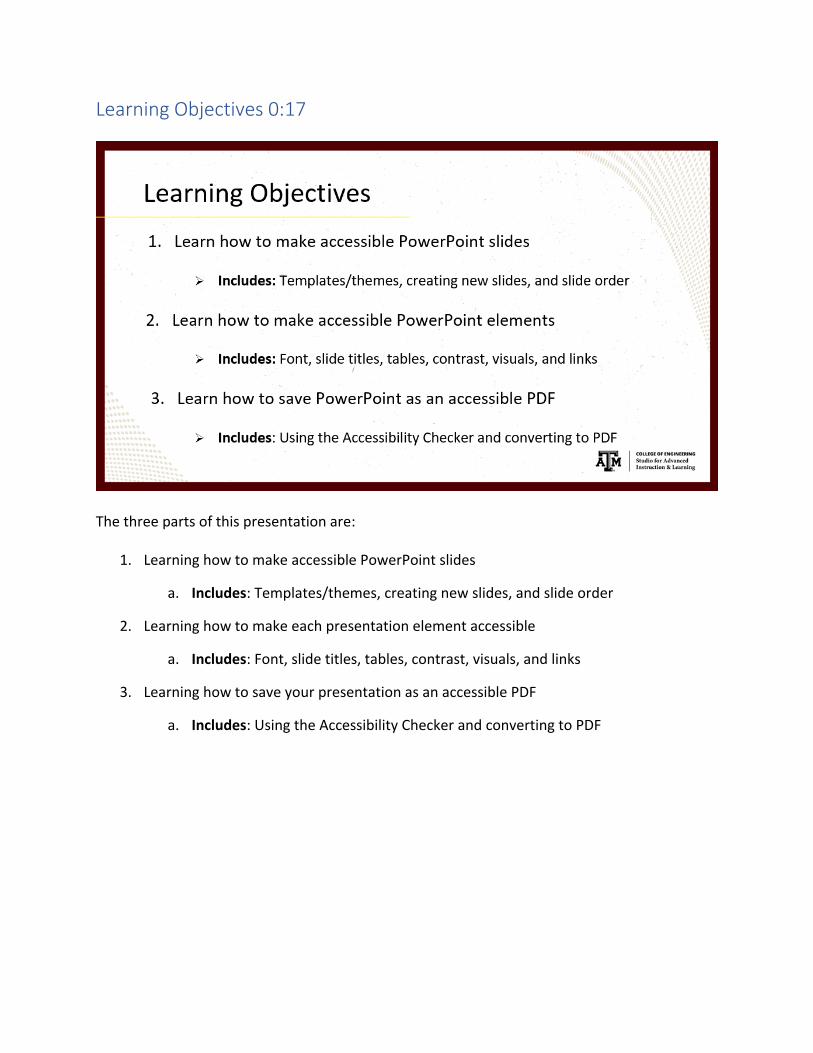
Learning Objectives 0:17
The three parts of this presentation are:
1. Learning how to make accessible PowerPoint slides
a. Includes: Templates/themes, creating new slides, and slide order
2. Learning how to make each presentation element accessible
a. Includes: Font, slide titles, tables, contrast, visuals, and links
3. Learning how to save your presentation as an accessible PDF
a. Includes: Using the Accessibility Checker and converting to PDF

PowerPoint Accessibility 0:35
PowerPoint-specific accessibility is about using accessible templates and themes, creating new
slides, and using pre-built slide order or fixing slide order.

Templates & Themes 0:47
This image shows the “Create New Presentation” screen. You can get here by opening a fresh
PowerPoint [instance] or going to File > New. When you enter the word “accessible” into the
search bar, PowerPoint searches for all templates or themes the developer has tagged as
“accessible.”
These are going to be your accessible themes and templates. Starting from an accessible
template or theme will greatly help you create an accessible PowerPoint presentation.

Creating Accessible Slides 1:19
If you click “New Slide” on the Home tab and use these pre-built slides like “Title and Content”
and “Section Header” as is, you’re going to be good to go with slide order.
But, if you add or delete any elements on the slides, like an image or a table, you may need to
change the elements’ order.

Slide Order 1:37
By default, screen readers read the title of the slide first, then the additional content on the
slide in the order in which it was added.
If you’re not familiar, a screen reader is software that will read accessible documents and web
pages for people who are blind or have any visual or sometimes cognitive disabilities.
So, if you add content in the order that it’s meant to be read, which is typically from top-to-
bottom, then your slide should be read by screen readers in a logical order.
However, it’s always a good idea to check your slide’s order just in case, especially if you’ve
added something or deleted something, making sure it’s read in a logical order to anybody
using a screen reader.
I’ve added a screenshot here of this slide’s order so we could see it, but I’m also going to show
it to you really quick. So, as this slide says, if you go to the Home tab and click “Arrange,” which
is in this Drawing area, you get this dropdown menu.
The only thing really available here is the “Selection Pane” at the bottom, besides “Align.”
So, clicking “Selection Pane” opens the “Selection Pane” as you see here on the right side. It
looks weird because the title is on the bottom, but the reading order actually goes from

bottom-to-top, so the title should stay at the bottom because that’ll be the first thing that’s
read.
Then we have our “Text Placeholder 2” and then “Picture 4.” If you double-click these [names],
you can rename them so they make sense to you. Sometimes there are 50+ layers within these
slides, so you don’t want “Text Placeholder 2” to 50 or anything like that.
So, you can rename these however you want to. You can drag and drop to move [the elements]
wherever you want to. Now, this “Text Placeholder 2” would be read first, then the title, and
then “Picture 4.”
A [screen reader’s] not going to read the image because that’s not possible. It’s going to read
the alt text you set for it. We’ll talk about alt text on a later slide.
Element Accessibility 4:13
There are many other aspects to creating an accessible PowerPoint presentation, not all specific
to PowerPoint. Some could be for Word and possibly other Microsoft Office products.

Font Recommendations 4:25
These Font Recommendations are PowerPoint specific. We want to use a large font size,
probably 18 point or larger, so everyone can see it depending on what type of screen or device
they’re using.
You want to use familiar sans or sans-serif fonts like Calibri or Arial to reduce reading load. I’ve
been asked before if Calibri and Arial are the only fonts that we can use, and that’s not true.
They mentioned Times New Roman, which is a very popular font, so it’s totally reasonable to
use that font. You just don’t want to make it so they have to learn cursive or something in the
middle of trying to read your PowerPoint presentation.
It’s really hard to follow if you’re trying to learn the content at the same time.
You also want to include ample white space between sentences and paragraphs. Here, we’re
talking about line spacing, like this one bullet, the line spacing between the first and second
line.
This white space is also about paragraph spacing, which could be “bullet spacing” in this case.
So, make sure that there’s enough spacing here for people to tell the difference between one
bullet to the next or one paragraph to the next.

People who have dyslexia describe seeing text “swim together” on a page, making a line of text
“compress” into the line below, which is why we want extra [line] spacing here. They often see
text “merge or distort,” so we should make it as clear as possible. We should have some space
there.
We also want to avoid using all [capitals] and excessive italics. So, all caps, just in general, are
really hard to read. You see this in “legalese.” It’s as if they’re don’t want us to read it because
most everyone skips this hard-to-read text.
Thus, we don’t want to use all caps if at all possible.
This “excessive italics” that I’m putting here: it’s bold, it’s italic, and it’s underlined. The main
part that’s wrong about this is the underline. We don’t want to use that because that may make
people think that it’s a link instead of just important text.
So, instead of doing this, you could use a larger font, you could still use the bold, and you could
still use the italic. Just try not to use the underline, and limit the number of times you’re using
italics and bold so that you’re not overdoing it.
Slide Titles 6:56
Every slide must have a title, even if it’s hidden off-slide. The linked webpage will give you
instructions on how to have a title but move it off-slide.

Each title should be unique. People who are blind, have low vision, or have a reading disability
rely heavily on slide titles to navigate through your presentation.
Students can skim or use a screen reader to quickly scan the list of slide titles and skip straight
ahead to the slide they need, so this means your title should be unique and descriptive of the
slide contents so students can easily find what they’re looking for.
You don’t want to have multiple slides with the same title so that they know, “Which slide do I
go to get this type of content?”
Creating Tables and Headers 7:43
Table data within the slide above:
Letter Grade Percentage
A 90 – 100%
B 80 – 89.99%
C 70 – 79.99%
D 60 – 69.99%
F 59.99% and below

When we’re creating a table [in PowerPoint], we’re going to go to the Insert tab and use this
table button at the left.
We can decide which size we want: we can click there, we can press Enter, we can use the
arrow keys to go up and down and left and right to choose the size of your table.
I want to point out this “Draw Table” feature. You do not want to use this feature because it
will not end up [creating] an accessible table.
So, I’m just going to click “Table” to stop since I already have a table created.
You also don’t want to merge or split cells. You want to use as simple a table structure as
possible.
Say these two headers were merged together. When I get to this data cell, if I were using a
screen reader, the screen reader wouldn’t know what header to read for that data cell because
we’ve lost the association between the column header and its data.
It’s expecting to have one column header here to go with this column cell. So, once you click
into a table, the table tools area will show up here at the top above the tabs. It adds two new
tabs to your tab list. It’s got “Design” and “Layout.” We’re going to focus on “Design” right now.
If your table’s top row contains column headers as we’ve got here, you want to [check] “Header
Row” in the top-left corner where the table style options are; this says that I’ve got a header
row. If your table’s first column contains row headers, you want to check “First Column.”

Table Styles 9:27
The next slide talks about setting table styles, and I’m going to use this table to show you how
to do that.
If you go back to the Design tab, there are pre-set Table Styles you can use here based on
“Header Row” being checked only. I can change this to whatever I want.
You want to make this have as much contrast as possible, so it’s easy to read, and that’s what
I’ve done with this table.
If I had “First Column” checked, different options would become available in Table Styles. Then I
can switch this style to one with the header row and the first column highlighted.
I’m going to uncheck “First Column” to get my table back to normal and click away because I
don’t want to change my table’s style.
The only thing that’s not been said on the Table Styles slide is that we want to select a style in
which the table headers are clearly identified visually, which is why we’ve got that big, bold
header column to stand out in that table.

Contrast 10:34
We need to use sufficient contrast for text and its background color. PowerPoint’s Accessibility
Checker can help you find insufficient contrast within your content, and we’ll talk more about
that Accessibility Checker in a few minutes.
The highest possible contrast is black text on a white background and white text on a black
background. It’s used very frequently because it is the easiest to read.
I’ve recently learned that even though there’s high contrast with colors that are opposites on
the color wheel, like red and green, you don’t want to use those colors together. They’re too
bright for people to see well, even though they’ve got a high contrast.
WebAIM’s Contrast Checker is a great tool to check your contrast. Since we’re a university that
accepts federal funding, we must reach Level AA compliance. That is stated within the contrast
checker web page. You won’t have to do any calculations; the tool will tell you when you enter
the colors what the ratio is.

Color 11:45
Speaking again about color, we want to ensure that color is not the only means of conveying
information. People who are blind, have low vision, or are colorblind might miss out on the
meaning conveyed by particular colors.
For example, hyperlinks should be blue and underlined so people who are colorblind know the
text is a link, even if they can’t see the color.
For someone with a certain type of colorblindness, that link might appear as gray, but they can
still see the underline, so they know this is a link.
You can turn on the Windows Grayscale Filter or Mac Grayscale Filter to scan your slides for
color-coding. The colors that appear as a lighter gray are likely culprits if you don’t have an
additional indicator.
We’ve got another example of this with forms if you use the color red to indicate required
fields. You’ll notice in many forms that they also have an asterisk (*) on those required fields.
That is the extra indicator you need for people who cannot see that red color.

Visuals (images, graphics, shapes, charts, etc.) 12:50
These include images, graphics, shapes, charts, all sorts of things. Visual content meant to
convey meaning must have alternative or “alt” text descriptions.
Alt text helps people who can’t see the visual understand what’s important about that visual,
and that’s something you can set for them.
Content that adds no meaning should be marked as “decorative,” so screen readers will ignore
them.i
A good example of a decorative image was my headshot image at the beginning of this
presentation when I had my name in text right below it.
Normally, I would insert the instructor’s name as the alt text for a headshot because there’s
nothing more about that image you need to describe in that instance.
But, considering my name is right below my image in the text, it would be redundant to put
“Sandra R. Childers” in the alt text as well.
That’s part of the alt text “Shoulds and Should Nots” on the next slide, so I’m a little ahead of
myself, but that’s a good example of a decorative image.

If we had something like a shape here, like a border to this slide content, that is also a great
example of a decorative image. It doesn’t add any real meaning to your content; it’s just there
as decoration or to separate some content from other content.
These are examples of decorative images that could be marked as “decorative” and will
disappear from screen readers.
A little caveat for decorative images: If you have an older version of PowerPoint or Microsoft
Office, you may not have the option to mark images as “decorative.”
Instead, insert the word “decorative” into the alt text, so students using a screen reader don’t
think they’re missing out on important information.ii
We also want to avoid using alt text and images as the sole method of conveying important
information.
For example, in PowerPoint, you wouldn’t want to change your slide title to an image and hide
text within that image because you suddenly don’t have a slide title anymore.
If you must have text within an image, repeat that text somewhere within the slide. Then, in the
image’s alt text, you could briefly describe the image and mention the text is stated within the
slide.
You can use PowerPoint’s Accessibility Checker to find missing alt text. It will show up as an
error, so it should be really easy to find images that haven’t been marked either with alt text or
you mark it as a decorative image.
Linked here, the “Alt Texts: The Ultimate Guide” is a fantastic guide for learning how to write alt
text for your visuals. I highly recommend going there.

“Alt” Text Shoulds 15:39
Some alt text guidelines: we want them accurate and equivalent – they should present the
same content or function as the image does for your sighted students.
You want to be succinct - no longer than a short sentence or two.
You want them to end with a period (.), so screen readers will pause afterward.
We also don’t want alt text to be redundant, like I talked about with the headshot picture and
name.
You don’t want to repeat info that’s already in the surrounding text.
You also don’t want to use phrases like “image of” or “graphic of.”
Screen readers will state when they’ve encountered a graphic, so you’d hear something like
“graphic, graphic of.” We don’t want to confuse our students or add extra information that’s
not necessary.
You also want alt text to match its context to surrounding content. Meaning, if you’re talking
about a certain topic, your visuals’ alt text should at least be related to that topic somehow.
Having the same image in one presentation and another does not mean their alt text will be the
same.

Hyperlinks/Links 16:45
Next, we’re talking about hyperlinks or links; those are basically the same thing.
Links should be descriptive and meaningful outside of context, and they should help people
know where they’re going.
Because screen readers can read links as a list, link text can be heard outside its context without
any of its surrounding text, so it must be meaningful without that text, sort of like when you
can tab from link to link to link in a web browser, you don’t have any of that.
I mean, if you’re sighted, you can see all the content around there, but if you’re blind, you have
no surrounding content to read. You only know what’s in the link’s text.
So, that’s why we want them to be descriptive and help people know where they’re going.
I’ve got a couple of link examples to discuss with you regarding those guidelines.

Link Example #1 17:31
If we want links to be descriptive and meaningful out of context, URLs are out. URLs are read by
screen readers character-by-character, so for this URL (http://aggiehonor.tamu.edu/) you’d
hear “H T T P colon slash aggie honor dot tamu dot edu.” If the screen reader can recognize
words within the URL, it will read the words. Still, if you think about some of those super long
URLs with hashes at the end, it’s going to be a lot of useless and extraneous information. That’s
not really helpful for your sighted students either.
URLs, in general, are not descriptive or meaningful and could be downright difficult to
understand through a screen reader (or even visually).
A good example here: “Students are expected to understand and abide by the ‘Aggie Honor
Code.’” That tells me right away I’m going to be reading about the Aggie honor code, telling me
where I’m going, and it’s descriptive and meaningful without any context whatsoever.
I don’t really know what will happen when I go to the “Aggie honor” website; that could be
almost anything. We might know because we’re A&M people, but others may not necessarily
know where they’re going with that URL, even if they can see it.

Link Example #2 18:48
So, in the second link example, based on guideline number two, we’ve got a “Click Here” link.
“Click Here” links actually break both guidelines because they’re meaningless outside of
context, and they give no indication of where you’d be going.
The “contact Disability Resources” link clearly sends us to the Disability Resources’ contact
page.
If you have multiple “click here” links within a slide and they’re going to different places, that is
not helpful for someone who can’t see the surrounding context at all.
Thus, we want to avoid “click here” or “read more” links.

Converting to an Accessible PDF 19:27
To convert PowerPoint to an accessible PDF, we need to start with an accessible PowerPoint
presentation.
That includes following guidelines we’ve already talked about plus using PowerPoint’s
Accessibility Checker to find issues within your presentation.

Use PowerPoint’s Accessibility Checker 19:45
First, we’re going to add the Accessibility Checker to your Quick Access Toolbar. That will make
it quick to find and easily reusable.
The Quick Access Toolbar in PowerPoint and Word (and maybe in other Microsoft Office
products): here, you’ve got this top-left list here of icons; this is your Quick Access Toolbar.
If we click on the down arrow, we see the “Customize Quick Access Toolbar” option; that’s what
we want to do, so I’m going to click there.
We’re going to go down to “More Commands” and click there, and this window will give us a
list of Popular Commands, but the Accessibility Checker is not within that list.
We’re going to change this to the “All Commands” list, which will show everything in
alphabetical order. I’m going to scroll down a little bit here, and click on “Accessibility Checker,”
and then add it with the “Add >>” button in the middle.
This section on the right is everything that will appear in your Quick Access Toolbar, and it’s in
an order I’ve set right now.
You can change the order by using the up and down arrow buttons here on the right. You can
remove an item if you don’t want it in your list using the “<< Remove” button.

This order here from top-to-bottom equates to left-to-right in the Quick Access Toolbar. I
always put my Accessibility Checker at the top so it’s the first thing I get to because I use it
really often.
So, if you click “OK,” that will update your Quick Access Toolbar. Now, you have this “Check
Accessibility” icon.
I’m going to click on it to show you what it does. On the right, it opens this “Accessibility
Checker” panel.
It should contain a list of errors and warnings [if your document contains any]. I’ve fixed all my
errors, so they’re not going to show up here, but each slide that I have modified from the
original pre-built slide, the [Accessibility Checker] will always ask that I check to ensure they’re
in the correct reading order.
Any error or warning you see here will include this “Additional Information” section at the
bottom. It tells you why to fix it and gives you steps for how to fix it. It’s giving you a lot of
information here.
It has a “Read more about making documents accessible” link as well so you can get Microsoft
Support for every accessibility error in PowerPoint that is found. This is a great resource for
fixing all issues you may find within your PowerPoint presentations.
File > Save As to Convert to PDF 22:24

To convert to PDF, we’re just going to “Save As” to PDF. We don’t want to use the “Print to
PDF” function or the “Save As Adobe PDF” function. Those will not provide you an accessible
PDF.
Using the first instruction on this slide, we’re going to go to File > Save As, but first, this is the
“Print” function I was talking about, and this is the “Save As Adobe PDF” plugin.
If you don’t have [Save As Adobe PDF], that is because you don’t have Adobe Acrobat installed
on your machine.
When you install Adobe Acrobat, it adds this “Save As Adobe PDF” plugin, but the problem is,
we have this title here, “Accessibility Tips for PowerPoint.” This title should transfer over when
the PowerPoint presentation is converted to a PDF. Otherwise, Acrobat flags it as an
accessibility error. Unfortunately, the “Save As Adobe PDF” plugin doesn’t transfer this title
over for some reason.
So, that’s why I always use the “Save As” function.
When we click “Save As,” Word first asks you where you wish to save the file. I’m going to put it
in the Current Folder.
The “Save as type” will always show up as the current file type, so we’re looking at a
“PowerPoint.” We want to change this to “PDF (*.pdf).”
Notice some of the settings change for you.
If you missed the “Title” before, this is a great place to enter a title. Because you need that title,
and it’s going to create an error [in the PDF] – possibly in eCampus, but definitely in Canvas.
Canvas will show an error [for the uploaded PDF] if you don’t have that title.
“Standard Publishing” is fine. We also want to “Open the PDF after publishing,” so you can
check out your PDF once it’s been created.
I’m going to click on “Options…” now. Mostly, we’re paying attention to the “Include Non-
Printing Information” section here. We want to ensure both of these items are checked so that
you will get an accessible PDF at the end.
The second one, “Document structure tags for accessibility,” is important. No PDF will be
accessible without those [structure] tags, so this must be checked for [your PDF] to be a
readable PDF for people using a screen reader.

Once you get your options correct, you want to click “OK.” And now you’re done with this;
you’ve got everything here correct.
To convert to PDF, you want to “Save,” then you’ve got your PDF that looks exactly like the
slides had looked before.
Just in case, you want to check this to make sure that the formatting isn’t off or something’s
missing, but that is the PDF that should be created.
And, it should be – assuming you didn’t have any [accessibility] errors in your PowerPoint –
there shouldn’t be any errors in this PDF either.
Accessibility Resources 25:06
We’ve got a few accessibility resources I want to share with you. There’re a lot of resources
available for making your content accessible.
Microsoft Support has extremely thorough tutorials that help with all aspects of accessibility for
each Microsoft program. I highly recommend checking these out. It has instructions for
different versions of Windows and Mac computers, so however you’re creating your
PowerPoints or Word documents, this will get you through that.
• Creating Accessible PowerPoint Presentations

• Creating Accessible Word Documents
I’ve also added WebAIM’s Contrast Checker because it can be very useful in helping you find
colors that have enough contrast for your presentations.
Then, there’s our IT Accessibility group at A&M. They have their own accessibility training
available. They’re working on a campus-wide “Accessibility Awareness” course right now that
was in beta testing this last December. It looks pretty good, so I’m really excited for that to
come out.
Lastly, I’ve been building an Accessibility Series of tutorials for creating accessible documents
and PowerPoint presentations. The series is growing as fast as I can get it to.
Cheat Sheet (Accessibility Instructions) 26:19
So, I told you a lot about how we need alt text and all that stuff, but I didn’t tell you how to do
it. So, I have a “Cheat Sheet” so to speak. It gives you instructions on how to do everything
we’ve discussed within PowerPoint.
A lot of those instructions should also help within Word. All of that will be made available to
you.
Contact eSAIL 26:39

I want to show you the last slide. Here is our contact information to ask for help with
accessibility or course support.
You can email us at [email protected] or go to our website [LearnTech.engr.tamu.edu]
to get more information.
i All decorative images should be given the alt text of “decorative” since the “Mark as decorative” checkbox is not currently skipping over images as Microsoft intended. ii This is why we need to have “decorative” in every decorative image’s alt text.