Audit Planning Audit Certification Ghosh-Jilani Report - WIRC ...
Upload
khangminh22Category
view
0download
0
Accessibility Audit – Content Report 1
Accessibility Content Audit
WAI Double-A Compliance (WAI/AA)
Organisation – Vivid Homes
URL https://www.vividhomes.co.uk
Ref (HA-FIRS-37417)
Accessibility Audit – Content Report 2
Date of preparation 30 July 2020
Prepared by Penny Everett – Web Accessibility Consultant
Prepared for VerseOne Technologies Ltd
http://www.verseone.com
Accessibility Audit – Content Report 3
Contents
Introduction ............................................................................................................................ 4
The Web Content Accessibility Guidelines .................................................................................. 5
Perceivable (1) ............................................................................................................................................. 5
Operable (2) ................................................................................................................................................. 5
Understandable (3) ...................................................................................................................................... 5
Robust (4) .................................................................................................................................................... 6
How the Audit was conducted? ................................................................................................. 8
Explanation of the Scoring System .............................................................................................................. 9
The Score Table ..................................................................................................................... 10
Link text not meaningful when read out of context .................................................................................. 10
Readability ................................................................................................................................................. 11
News tags ................................................................................................................................................... 12
Vivid Homes YouTube video ...................................................................................................................... 12
Site Map ..................................................................................................................................................... 14
Warning the user in advance – file format and size .................................................................................. 14
Notes to accompany the Score Table ........................................................................................ 15
Action Plan ............................................................................................................................. 31
Recommendations .................................................................................................................. 32
Future Conformance .................................................................................................................................. 32
Ongoing testing of your website ............................................................................................................... 32
Accessibility Audit – Content Report 4
Introduction
Congratulations on commissioning an Accessibility Audit of your website.
Conducting an accessibility audit on any website is very cost effective because no one member of staff within most organisations will be able to do this
satisfactorily without undergoing lengthy training. They will not have sufficient knowledge of this extremely comprehensive aspect of publishing a website to
ensure that the various regulations, in this respect, have been met.
In order to make sure that every person who is involved in your website will be able to understand the outcomes of this Audit, no matter what level of
technical engagement, we have made every endeavour to avoid jargon and to increase understanding of this complex subject.
This report provides a detailed assessment of the accessibility of your website based on specialist analysis. It will tell you what problems disabled people may
have accessing your site and explain clear guidelines as to how these problems may be fixed in the Notes pages. It will also tell you which level of compliance
is currently met.
Please note that audits are carried out under rigorous conditions and every effort is made to establish any non-compliance with the current Web Content Accessibility Guidelines. No guarantee is made that every error has been identified and the validity of this audit report applies to the date of the test only.
Accessibility Audit – Content Report 5
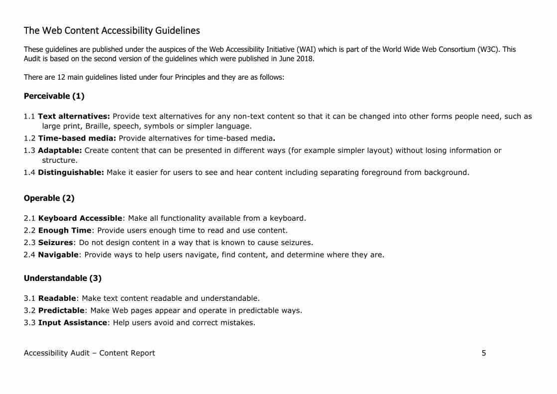
The Web Content Accessibility Guidelines
These guidelines are published under the auspices of the Web Accessibility Initiative (WAI) which is part of the World Wide Web Consortium (W3C). This
Audit is based on the second version of the guidelines which were published in June 2018.
There are 12 main guidelines listed under four Principles and they are as follows:
Perceivable (1)
1.1 Text alternatives: Provide text alternatives for any non-text content so that it can be changed into other forms people need, such as
large print, Braille, speech, symbols or simpler language.
1.2 Time-based media: Provide alternatives for time-based media.
1.3 Adaptable: Create content that can be presented in different ways (for example simpler layout) without losing information or
structure.
1.4 Distinguishable: Make it easier for users to see and hear content including separating foreground from background.
Operable (2)
2.1 Keyboard Accessible: Make all functionality available from a keyboard.
2.2 Enough Time: Provide users enough time to read and use content.
2.3 Seizures: Do not design content in a way that is known to cause seizures.
2.4 Navigable: Provide ways to help users navigate, find content, and determine where they are.
Understandable (3)
3.1 Readable: Make text content readable and understandable.
3.2 Predictable: Make Web pages appear and operate in predictable ways.
3.3 Input Assistance: Help users avoid and correct mistakes.
Accessibility Audit – Content Report 6
Robust (4) 4.1 Compatible: Maximize compatibility with current and future user agents, including assistive technologies.
Accessibility Audit – Content Report 7
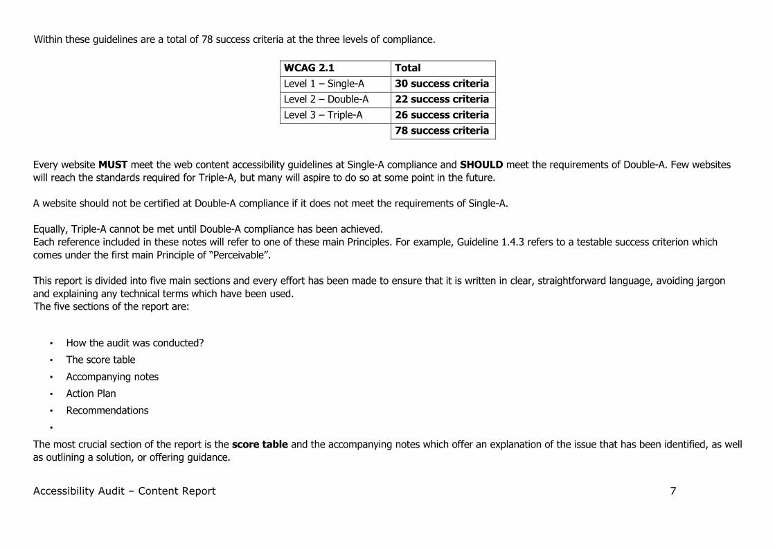
Within these guidelines are a total of 78 success criteria at the three levels of compliance.
WCAG 2.1 Total
Level 1 – Single-A 30 success criteria
Level 2 – Double-A 22 success criteria
Level 3 – Triple-A 26 success criteria
78 success criteria
Every website MUST meet the web content accessibility guidelines at Single-A compliance and SHOULD meet the requirements of Double-A. Few websites
will reach the standards required for Triple-A, but many will aspire to do so at some point in the future.
A website should not be certified at Double-A compliance if it does not meet the requirements of Single-A.
Equally, Triple-A cannot be met until Double-A compliance has been achieved.
Each reference included in these notes will refer to one of these main Principles. For example, Guideline 1.4.3 refers to a testable success criterion which
comes under the first main Principle of “Perceivable”.
This report is divided into five main sections and every effort has been made to ensure that it is written in clear, straightforward language, avoiding jargon
and explaining any technical terms which have been used.
The five sections of the report are:
• How the audit was conducted?
• The score table
• Accompanying notes
• Action Plan
• Recommendations
•
The most crucial section of the report is the score table and the accompanying notes which offer an explanation of the issue that has been identified, as well
as outlining a solution, or offering guidance.
Accessibility Audit – Content Report 8
How the Audit was conducted?
Random pages are selected for auditing purposes and it is recommended that a nominated member of staff from your organisation conducts a series of
checks on the entire site, plus any new pages that are published after the date of this Audit. See details of testing that can be carried out by yourselves under the section entitled Recommendations. Your website can then be formally audited on an annual (or regular) basis.
Manual tests were carried out for accessibility as well as the use of an automated validating tool to assess the accuracy of the coding used on your web
pages. Your website was tested using different screen resolutions and several commonly-used browsers.
Additional testing has also been conducted using a screen reader (NVDA) for the blind, as well as establishing the ease of functionality for a keyboard user –
such as someone who uses Assistive Technology – plus users who are cognitively impaired, for instance those who have dyslexia.
The level of language used has been assessed using a readability score to establish how many years of education are required to understand the content of
your web pages.
The ease of navigation and consistency of style has also been assessed. This is because cognitively impaired users need to follow familiar patterns when
processing data.
If you intend to use self-certificated Web Accessibility Initiative icons which denote Single-A, Double-A or Triple-A conformance, you should place them on
each web page at the level achieved for that individual page unless the entire website complies with that level. For example, an icon at Triple-A conformance
should not be used for the entire website if any of the web pages do not comply with that level of conformance.
Note. Any minor errors which are spotted during the audit, such as ‘typos’ are brought to your attention, but bear in mind these may not be the only minor
errors that can be found. This would involve a proof-reading exercise which does not form part of an Accessibility Audit.
Please note:
Password protected areas of your website have not been audited as this would require authentication. Unless permission
has been granted.
Accessibility Audit – Content Report 9
Explanation of the Scoring System The score table details which elements need attention as they provide a "Pass” or “Fail" score against the WCAG. The relevant compliance will
also have been checked to establish whether the website has met Single-A or Double-A certification. We also provide, where appropriate,
useful accessibility tips which we advise you to incorporate in your website.
The following abbreviations for the different types of disabled user have been used in this section of the report:
VI Visually impaired, including screen reader users, magnification users, and people with colour deficiencies
CI Cognitively impaired, including dyslexics, and foreign language speakers
MI Motor impaired, including non-mouse users
HI Hearing impaired, including born deaf
SP Seizure prone
Please note that any issues that have been given the notation “Advisory” are based on the published findings of Jacob Neilson the world-
renown authority on usability and accessibility. There is an additional charge if you wish your site to be formally assessed for usability using a
‘live’ panel of disabled users.
Accessibility Audit – Content Report 10
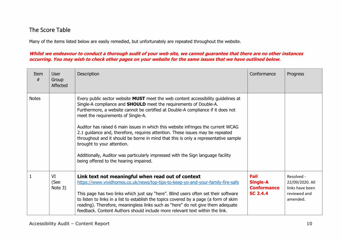
The Score Table
Many of the items listed below are easily remedied, but unfortunately are repeated throughout the website.
Whilst we endeavour to conduct a thorough audit of your web site, we cannot guarantee that there are no other instances occurring. You may wish to check other pages on your website for the same issues that we have outlined below.
Item
#
User
Group
Affected
Description Conformance Progress
Notes Every public sector website MUST meet the web content accessibility guidelines at
Single-A compliance and SHOULD meet the requirements of Double-A.
Furthermore, a website cannot be certified at Double-A compliance if it does not
meet the requirements of Single-A.
Auditor has raised 6 main issues in which this website infringes the current WCAG
2.1 guidance and, therefore, requires attention. These issues may be repeated
throughout and it should be borne in mind that this is only a representative sample
brought to your attention.
Additionally, Auditor was particularly impressed with the Sign language facility
being offered to the hearing impaired.
1 VI
(See
Note 3)
Link text not meaningful when read out of context https://www.vividhomes.co.uk/news/top-tips-to-keep-yo-and-your-family-fire-safe
This page has two links which just say “here”. Blind users often set their software
to listen to links in a list to establish the topics covered by a page (a form of skim
reading). Therefore, meaningless links such as “here” do not give them adequate
feedback. Content Authors should include more relevant text within the link.
Fail
Single-A
Conformance
SC 2.4.4
Resolved -
22/09/2020. All
links have been
reviewed and
amended.
Accessibility Audit – Content Report 11
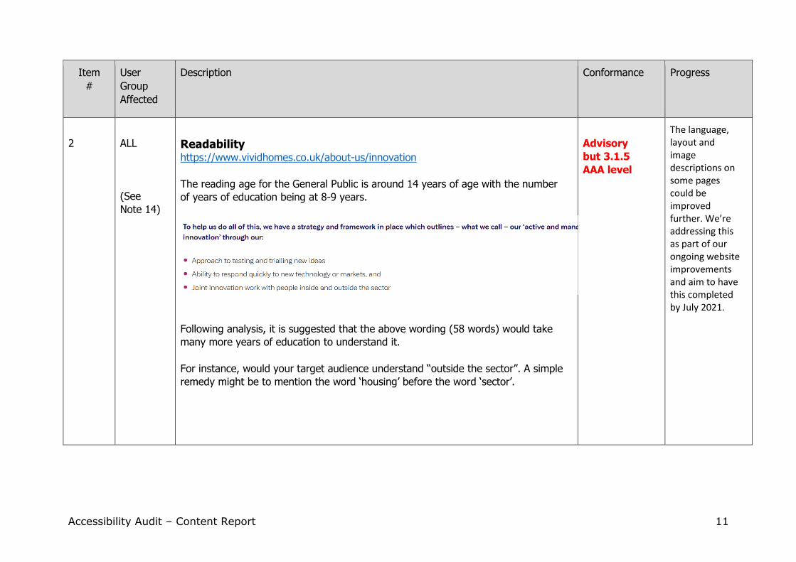
Item
#
User
Group
Affected
Description Conformance Progress
2
ALL
(See
Note 14)
Readability https://www.vividhomes.co.uk/about-us/innovation
The reading age for the General Public is around 14 years of age with the number
of years of education being at 8-9 years.
Following analysis, it is suggested that the above wording (58 words) would take
many more years of education to understand it.
For instance, would your target audience understand “outside the sector”. A simple
remedy might be to mention the word ‘housing’ before the word ‘sector’.
Advisory
but 3.1.5
AAA level
The language, layout and image descriptions on some pages could be improved further. We’re addressing this as part of our ongoing website improvements and aim to have this completed by July 2021.
Accessibility Audit – Content Report 12
Item
#
User
Group
Affected
Description Conformance Progress
3 ALL
News tags https://www.vividhomes.co.uk/news
The drop down menu shows a meaningless News tag.
Visitors to your website will not understand what topic the
news link will lead them to:
/news?tag=283
Functionality Resolved:
01/09/2020.
The tag was
removed and all
other tags
reviewed.
4 HI
(See
Note 27)
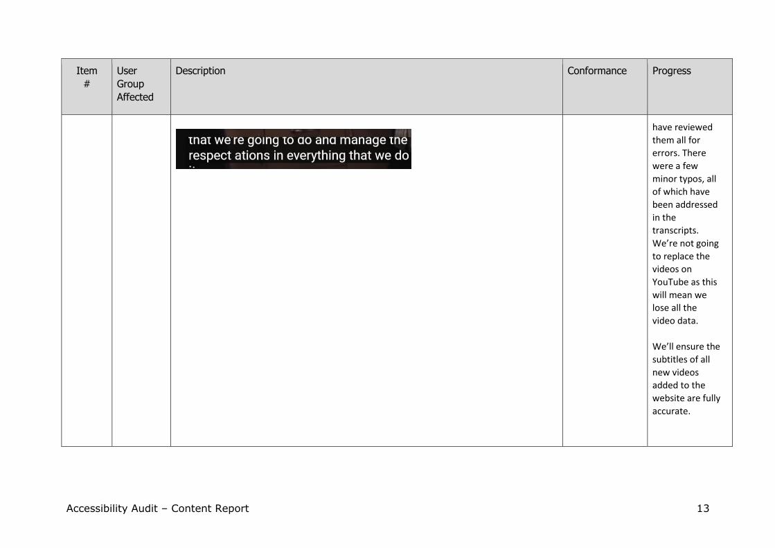
Vivid Homes YouTube video Social media YouTube footer link
Most speakers have very good enunciation, but
when a speaker has an accent the automatic
sub-titling may not work as well. Therefore, it is
always best for Content Authors to edit the
captioning that has been automatically added by the YouTube software after
uploading.
Fail
Single-A
Conformance
SC 1.2.2
22/09/2020:
We’ve added
transcripts for
all of our videos,
to make them
more accessible.
We manually
add subtitles to
our videos and
Accessibility Audit – Content Report 13
Item
#
User
Group
Affected
Description Conformance Progress
have reviewed
them all for
errors. There
were a few
minor typos, all
of which have
been addressed
in the
transcripts.
We’re not going
to replace the
videos on
YouTube as this
will mean we
lose all the
video data.
We’ll ensure the
subtitles of all
new videos
added to the
website are fully
accurate.
Accessibility Audit – Content Report 14
Item
#
User
Group
Affected
Description Conformance Progress
5 ALL
Site Map https://www.vividhomes.co.uk/about-us/media-centre/blogs-dont-use
Access to the above page should be removed from the site if the Content Authors
do not wish their visitors to know of its existence.
Advisory Resolved:
01/09/2020.
The sitemap
was reviewed in
full and
updated.
6 ALL
(See
Note 28)
Warning the user in advance – file format and size https://www.vividhomes.co.uk/about-us/vfm/annual-report-financial-statements
On this page there is a link to a PDF document, but the user is not told of the name
of the document, or the file size, nor whether they will be opening the document in
a new window prior to selecting the link.
Click here to view the PDF Note. Auditor came across many links to PDF documents whereby the user was not
informed prior to opening of the file format, file size or whether the document is
going to be opened in a new window. This information all needs to be fed back to
the user prior to clicking on the link.
Fail
Single-A
Conformance
SC 3.2.2
Resolved -
22/09/2020. All
links to
documents have
been reviewed
and amended.
Accessibility Audit – Content Report 15
Notes to accompany the Score Table
Note 1
Success Criteria 1.1.1 Non-text Content: Text that is presented to the user has a text
alternative that serves the equivalent purpose, with some exceptions see below.
(Single-A)
Decorative images: do not require alternative text for screen reader users because they do not
impart any information to a sighted user.
Additional note
Note 5 covers images which require alternative text.
Note 2
Success criteria 1.4.1 – Use of Colour (colour dependency): Colour is not used as the only visual
means of conveying information, indicating an action, prompting a response, or distinguishing a
visual element. (Single-A)
This includes forms, e.g. “All fields in red are mandatory”. Colour can be used, but another method
of identifying mandatory fields such as using an asterisk ( * ) must also be used.
Additional note
Referring to a red asterisk is acceptable because colour deficient users are still able to discern which
fields are mandatory by observing the asterisks. This is only providing that another coloured asterisk
is not used elsewhere in the form.
Note 3
Success criteria 2.4.4 – Link Purpose (In Context): Single-A compliance requires that the purpose of each link can be determined from the link text alone.
This means that links must be meaningful when read by the user without the surrounding text. The
reason for this is that the visually impaired often set their screen reader software to initially read
only the headings and the links on a web page. They do this in order to help them decide whether
the web page is relevant to them and worth investigating further.
Note 4
Success criteria 3.1.3 and 3.1.4 - Jargon, acronyms, abbreviations and idioms: From an accessibility
viewpoint, you are advised to offer a definition for any jargon that has been used and expand the
full meaning of an acronym, abbreviation or idiom (common saying) the first time it appears on a
web page. Any subsequent instances can then be linked to a Glossary.
If you wish to meet Triple-A compliance you should adopt a method that will expand these
abbreviations.
Accessibility Audit – Content Report 16
Note 5
Success criteria Single-A 1.1.1 – Alternative text: Provide text alternatives for any non-text content so that it can be changed into other forms people need, such as large print, Braille, speech, symbols or simpler language. (Single-A)
It is imperative that you endeavour to give a disabled user an equivalent experience when visiting
your website. This is particularly relevant to visually impaired users accessing images.
Informative Images without text: The alternative text should describe the image (or its
destination if it is linked to another web page or web site) see Additional Note. and it is not
necessary to use words such as “image”, “picture”, “photo” as the screen reading software will state
“image” to the visually impaired user.
Informative Images with text: If an image has informative text then the same text must be
repeated in the alternative text. This is not to be confused with title text which is optional and is
aimed at sighted users who may benefit from additional information about the image being
displayed as a ‘tool tip’.
See also Note 1 – Decorative images and Note 37 - Linked images.
Note 6
Success criteria 3.2.4 - Components that have the same functionality within a set of Web pages are identified consistently. (Double-A)
• To avoid confusing users, links with the same destination must have the same description.
• No link should link to the web page it is on as this will confuse the user. Therefore, a
repeated menu with links back to the homepage for every page should not have a link to the
home page on the home page.
• Text links should be consistently formatted.
Note 7
Success criteria 3.2.1 – When any component receives focus, it does not initiate a change of focus. Also 3.2.2 - Changing the setting of any user interface component does not automatically cause a change of context unless the user has been advised of the behaviour before using the component. (Single-A) New Window
Visually impaired users are disorientated when a link opens in a new window as pressing the
[Backspace] will not return them to their original position before they selected the link. This also
unsettles some cognitively impaired users who feel lost when presented with a new window.
Therefore, it is advisable to add title text (tooltip) stating “opens in a new window”.
Note. The main screen reading software now reads the title text to the blind user.

Accessibility Audit – Content Report 17
Additional Note
File format and file size: Always inform the user of the file format before they click on a link which
opens a file. For example, a link to a PDF should indicate this by adding the characters (PDF) as well
the file size.
Note 8
Success criteria 1.3.2 - Meaningful sequence: Hierarchy of headings in sequential order. (Single-A) Headings should be in order of importance, for example starting with H1 then H2, H3 within a
section of text. This is because screen reader software will read out headings in hierarchical
importance and many screen reader users will set the software to read out the main heading on a
page.
This will help the disabled user to decide whether to “read” the rest of the contents of the page. For
this reason, all web pages should have a main heading (H1).
It is also very important that all headings are descriptive in relation to the text they cover. This will
help many users, including those users with dyslexia and the visually impaired, to make sense of the
content. It will also help your website in the search engine listings. This is because search engine
spider/crawlers will often identify your website from the keywords which are used both in the
headings and the first paragraph of each web page. For this reason, the composition of the first
paragraph of text is extremely important and should repeat the words within the text which are also
in the associated descriptive heading. This practice will also help the cognitively impaired.
Note 9
Success Criteria 1.4.2 - Audio Control: If any audio on a Web page plays automatically for more than 3 seconds, either a mechanism is available to pause or stop the audio, or a mechanism is available to control audio volume independently from the overall system volume level. (Single-A)
You are advised to avoid placing any audio on your website which starts automatically because it
will compete with the screen reader voice and confuse the visually impaired user.
Note 10
Success Criteria 2.4.2 – Page Titled: Web pages have titles that describe topic or purpose. (Single-A) The title of the page will appear at the very top of the screen when viewed through a browser and
will be the default label for bookmarks as well as being stored in the user’s browser history. RSS
feeds also use page titles to generate a headline and search engines use them to index your page.
The page title needs to be made up of as few characters as possible (less than 64 characters in total
bearing in mind that a content management system may add the organisation’s name to the page
title as well which should only appear last if it is added).
Content Authors must be made aware that when they create new web pages that the page must be
given a meaningful title (when out of context) and which covers the topic of the page. This allows
users to quickly, and easily identify, whether the information contained in the Web page is relevant
to their needs as well as screen reader users being able to hear the page title first when they focus
on a web page.
Accessibility Audit – Content Report 18
Note 11
Success Criteria 1.3.3 – Sensory Characteristics: Instructions provided for
understanding and operating content do not rely solely on sensory characteristics of
components such as shape, size, visual location, orientation, or sound. (Single-A)
Braille users read content line by line (on a special keyboard) within individual areas of content,
therefore, words such as “left” or “right” referring to data beyond their immediate reading area may
well confuse them.
For example, in the following wording: “The links to the left contain information on a variety of
subjects which we hope you find useful.” it would be better to say “The links listed in the left-hand
menu of this page contain information on a variety of subjects...”
This is because visually impaired users who use Braille will be familiar with the term “menu” and will
understand that you are referring to something outside their current reading area which they will
then be able to locate.
It is also worth remembering that many dyslexics are not able to tell their right from their left.
Note 12
Advisory...
Appropriate tone
“Firm, fair and friendly” is the phrase often used when giving users guidance on a website. It is very
easy to forget that however kindly, or helpful, a content editor meant a remark it might seem to the
user that they are being dictated to, make them lack confidence, or that they are being ‘scolded’ in
some way, or...worse still...patronised!
The ideal scenario would be to ask someone else to read through the guidance and then ask their
opinion as to how they feel the wording affects them.
Note 13
Success criteria 2.4.5 – More than one way is available to locate a Web page within a set of Web
pages except where the Web Page is the result of, or a step in, a process. (Double-A)
Disabled users find it difficult to navigate and use various components. A search box and a site map
are seen as alternative ways of locating a web page.
Note 14
Success criteria 3.1.5 – When text requires reading ability more advanced than the lower secondary
education level, supplementary text should be provided. (Triple-A)
Ensure that your website can be understood by the public, or your target audience.
Accessibility Audit – Content Report 19
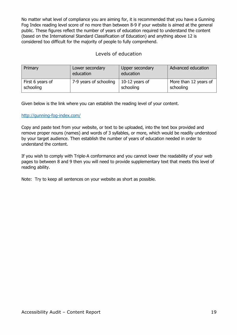
No matter what level of compliance you are aiming for, it is recommended that you have a Gunning
Fog Index reading level score of no more than between 8-9 if your website is aimed at the general
public. These figures reflect the number of years of education required to understand the content
(based on the International Standard Classification of Education) and anything above 12 is
considered too difficult for the majority of people to fully comprehend.
Levels of education
Primary Lower secondary
education
Upper secondary
education
Advanced education
First 6 years of
schooling
7-9 years of schooling 10-12 years of
schooling
More than 12 years of
schooling
Given below is the link where you can establish the reading level of your content.
http://gunning-fog-index.com/
Copy and paste text from your website, or text to be uploaded, into the text box provided and
remove proper nouns (names) and words of 3 syllables, or more, which would be readily understood
by your target audience. Then establish the number of years of education needed in order to
understand the content.
If you wish to comply with Triple-A conformance and you cannot lower the readability of your web
pages to between 8 and 9 then you will need to provide supplementary text that meets this level of
reading ability.
Note: Try to keep all sentences on your website as short as possible.
Accessibility Audit – Content Report 20
Note 15
Success criteria 1.3.1 – Info and Relationships (Single-A):
Compliance for Tables:
• Provide a description for data tables
• Provide a descriptive summary for complex data tables
Using the caption element to describe a table allows screen reading software to navigate directly to
the caption for a table if one is present.
The caption element should be used whether or not the table includes a summary attribute. The
caption element identifies the table whereas the summary attribute gives an overview of the
purpose of the table, or explains how to navigate the table (a table with merged cells for example).
If both the caption element and the summary attribute are used, the caption should not duplicate
information in the summary.
Note. The summary attribute is not seen by sighted users – it is there for the sole purpose of
supporting screen reader users.
Accessibility Audit – Content Report 21
Additional Note
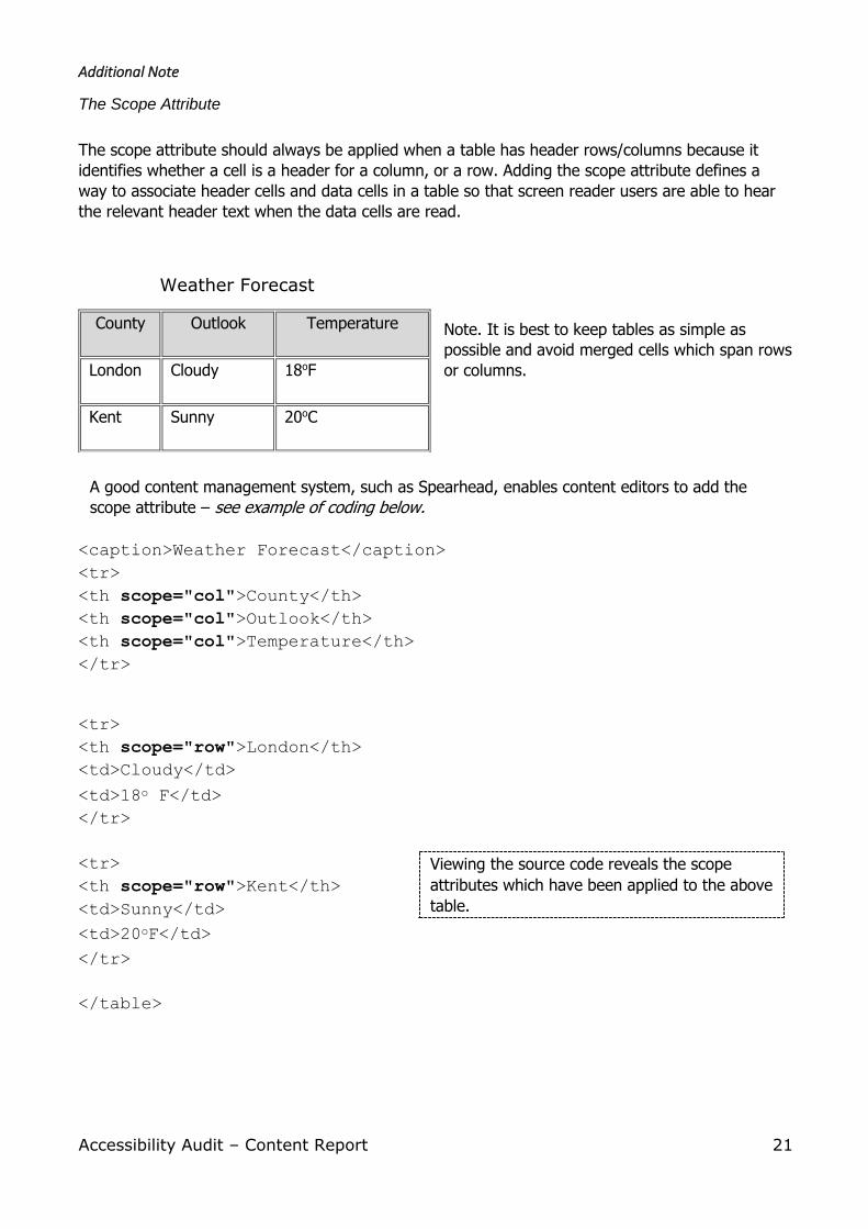
The Scope Attribute
The scope attribute should always be applied when a table has header rows/columns because it
identifies whether a cell is a header for a column, or a row. Adding the scope attribute defines a
way to associate header cells and data cells in a table so that screen reader users are able to hear
the relevant header text when the data cells are read.
Weather Forecast
Note. It is best to keep tables as simple as
possible and avoid merged cells which span rows
or columns.
A good content management system, such as Spearhead, enables content editors to add the
scope attribute – see example of coding below.
<caption>Weather Forecast</caption>
<tr>
<th scope="col">County</th>
<th scope="col">Outlook</th>
<th scope="col">Temperature</th>
</tr>
<tr>
<th scope="row">London</th>
<td>Cloudy</td>
<td>18o F</td>
</tr>
<tr>
<th scope="row">Kent</th>
<td>Sunny</td>
<td>20oF</td>
</tr>
</table>
County Outlook Temperature
London Cloudy 18oF
Kent Sunny 20oC
Viewing the source code reveals the scope
attributes which have been applied to the above
table.
Accessibility Audit – Content Report 22
Note 16
We recommend that document files over 1MB always warn users that it is a large file.
File size download calculations can be obtained from the following website:
http://downloadtimecalculator.com/
Additional Note
Staff may need training on converting graphics and PowerPoint slides to suitable sizes for uploading
to the web as well as creating PDF files which have graphics. For instance, a huge reduction in PDF
file size is often possible by ensuring that images are of a suitable resolution for the web (72 dpi) as
opposed to print quality which is much higher.
Note 17
Advisory...
File naming conventions.
It is always best to use a relevant file name, even for images, which describes the contents. File
names such as img016Xb.jpg or iP621.pdf mean nothing to a user. Additionally, uploading a file with
spaces in its name will result in the spaces being replaced with the three characters: %20
For example, How%20to%20find%20us.pdf
Therefore, you are advised to replace any spaces with an underscore, or hyphen, to make file
names easier for users to identify, e.g. How_to_find_us.pdf
Note 18
Usability...
Vertical Scrolling.
Dyslexics often have short-term memory problems and causing them to have to go “beyond the
fold”, i.e. to scroll down after they have viewed the first screen, may mean that they lose the
thread. If this cannot be avoided we suggest you repeat the topic briefly, but in different wording,
to remind the dyslexic of the main subject they are currently viewing.
It is always best to write content in what’s known as bite-sized chunks with a heading and no more
than 2 or 3 paragraphs for each topic and even better if you can get your main message across on
one screen without the need for scrolling when, say, using a laptop or tablet..
Accessibility Audit – Content Report 23
Note 19
Advisory...
Accessibility Help Page.
All websites are advised to have an Accessibility Help page and many organisation link to the BBC’s
accessibility help page. Users are not normally interested in the technical aspect of how you meet
the needs of the disabled user – that is really an internal issue for your organisation.
The most important issue with regard to accessibility is that you offer help to any user who is having
difficulty accessing any part of your website. Help should be available via several methods owing to
the many varied disabilities you may be required to assist, i.e. telephone, email, on line form, post.
Additional Note
Age-related users may even appreciate a simple demo at the organisation’s offices for organisations
such as Housing Associations.
Note 20
Usability...
Typos/Spelling.
It is always advisable to check for spelling/typos before uploading content as some errors are not
easily spotted by the originator and unfortunately these minor mistakes can affect screen the
reading software user. This is because the software will pronounce the mis-spelling which may
sound nothing like the original word.
Note 21
Success Criteria – 2.4.6 Headings and Labels: Headings and labels describe topic or
purpose. (Double-A)
Content Authors should be made aware of the importance of using relevant headings. This is
because screen reader users will listen to all the headings on a web page in order to decide whether
to read the rest of the content on the page. (A form of skim-reading.)
It also helps dyslexics to focus on the subject they are currently reading; providing there are not too
many paragraphs under each heading. Topics with more than two or three paragraphs should
ideally be broken down into sub-headings.
Elements which have labels (e.g. forms, menus) should also describe the topic/purpose. This is
usually the designer’s job.
Accessibility Audit – Content Report 24
Note 22
Usability...
Formatting text for dyslexics.
If you are using a content management system, then you have styles already set and agreed by
your organisation. The choice of font and line spacing should always take into consideration disabled
users. The Guidelines (from 2.1) have in place that it must be possible for a user to adjust the line
spacing of the text.
Therefore, it is essential that Content Authors format any content to comply with the agreed styles.
Copying and pasting text from a Word document, if it is not then formatted to a set style, may well
cause an infringement of the Guidelines.
Dyslexics in particular have great difficulty in keeping to a line of text and will find that they may
jump from line to line if the text is too close to the next line. They will also prefer to read plain fonts
such as Verdana or Arial. Here again, the Guidelines (from 2.1) state that it must be possible to
adjust the font.
Note: Content Authors should select a style for headings and content consistently to help those
users who would find it difficult if similar content was formatted in a different style.
Note 23
Advisory...
Explanatory text/pictorial information required.
Content Authors may possibly forget how advanced their skills have become when accessing their
own website. Your target audience may be unfamiliar with the tools that you provide and one way
of establishing how user-friendly your website would be to run a full-blown usability test using a
group of disabled users.
For example, wording such as “pass your mouse over the area” then not explaining to the user that
they need to click on any relevant part of the image may leave some users confused. Yet the action
may be second nature to members of staff in the organisation.
Additionally, many dyslexics will benefit from the use of pictures that impart information. For any
essential information (such as how to deal with an emergency), it is always advisable to add images
that will depict the main subject of a paragraph, or topic.
We also recommend essential information is provided in different formats. For example: PDF for
the full information and an EasyRead version for the cognitively impaired.
Producing documents in EasyRead format is not a straight forward process – it is not a case of
simply summarising the main document. For this reason, many organisations outsource this service.
Accessibility Audit – Content Report 25
When we test your website we endeavour to spot areas where additional explanation, or illustration,
is required and will advise accordingly, but when content is added after the date of this report your
organisation will need to be vigilant in this respect.
Note 24
Usability...
Title text v. Alternative text.
Alternative text added to an image is for screen reader users to listen to and Title text which is
displayed when a mouse rolls over an image is a method of giving additional ‘essential’ information
to sighted users.
Up-to-date screen reading software can read both Alternative text and Title text and therefore you
should avoid repeating text in order that a visually impaired person does not have to hear the same
wording twice.
Additional Note
There is no point in describing an image to sighted users unless the message that the image is
meant to portray is not obvious, or needs further explanation.
Note 25
Success Criteria 3.2.2 On input: Changing the setting of any user interface component does not
automatically cause a change of context unless the user has been advised of the behaviour before
using the component. (Single-A)
Submit button on a form.
The older user often finds it stressful when completing a form on a web page and you are advised
to give them as much feedback as possible.
• Users should be able to fully understand what action will be taken when they click on the
[Submit] button of a form.
• Consistency between the title of the form at the top and the submit button of the form at the
bottom is very important.
• For optimal clarity, the submit button should Include a verb and a noun. The verb indicates the
action being taken, and the noun indicates the data being submitted. For example, [Submit
complaint].
Accessibility Audit – Content Report 26
Note 26
Success Criteria 1.3.1 Info and Relationships: Information, structure, and relationships
conveyed through presentation can be programmatically determined or are available in
text. (Single-A)
The intent of this Success Criterion is to ensure that information and relationships that are implied
by visual, or auditory, formatting are preserved when the presentation format changes.
This somewhat technical criterion actually means that headings, numbered lists and bulleted lists,
amongst other things, should be formatted so that assistive technology such as screen readers can
inform the user that they are reading a heading or a list of items.
Note. Bulleted lists in a Word document are not necessarily formatted into bullets if they are copied
on to a web page. They may appear as a series of full stops. If this is the case the screen reader
software will not inform the user that this is a list.
Note 27
Success Criteria 1.2.2 – Captions are provided for all pre-recorded audio content in synchronised
media. (Single-A)
As a minimum requirement all videos with voice sound should have an accompanying verbatim
transcript and for Double-A compliance the client will need to also add audio descriptions (AD). This
refers to adding an additional description to explain any relevant actions that the actors are
performing, or scenes they are portraying, such as:
"tenant empties rubbish into dustbin"
(In order to help the visually impaired listening to the video, this
should also be included in the accompanying AD.)
Additionally, any relevant sounds should be described for the hearing impaired, for example:
"bikers revving up their engines and creating a loud noise in unison" (to help the hearing
impaired).
See table below for details of WCAG 2.0 requirements for video:
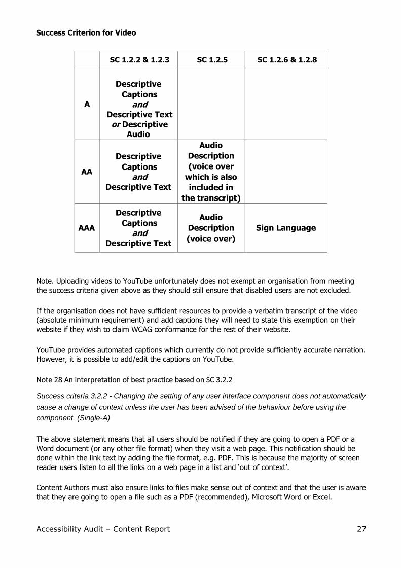
Accessibility Audit – Content Report 27
Success Criterion for Video
SC 1.2.2 & 1.2.3 SC 1.2.5 SC 1.2.6 & 1.2.8
A
Descriptive
Captions
and
Descriptive Text
or Descriptive
Audio
AA
Descriptive
Captions
and
Descriptive Text
Audio
Description
(voice over
which is also
included in
the transcript)
AAA
Descriptive
Captions
and
Descriptive Text
Audio
Description
(voice over)
Sign Language
Note. Uploading videos to YouTube unfortunately does not exempt an organisation from meeting
the success criteria given above as they should still ensure that disabled users are not excluded.
If the organisation does not have sufficient resources to provide a verbatim transcript of the video
(absolute minimum requirement) and add captions they will need to state this exemption on their
website if they wish to claim WCAG conformance for the rest of their website.
YouTube provides automated captions which currently do not provide sufficiently accurate narration.
However, it is possible to add/edit the captions on YouTube.
Note 28 An interpretation of best practice based on SC 3.2.2
Success criteria 3.2.2 - Changing the setting of any user interface component does not automatically
cause a change of context unless the user has been advised of the behaviour before using the
component. (Single-A)
The above statement means that all users should be notified if they are going to open a PDF or a
Word document (or any other file format) when they visit a web page. This notification should be
done within the link text by adding the file format, e.g. PDF. This is because the majority of screen
reader users listen to all the links on a web page in a list and ‘out of context’.
Content Authors must also ensure links to files make sense out of context and that the user is aware
that they are going to open a file such as a PDF (recommended), Microsoft Word or Excel.
Accessibility Audit – Content Report 28
1. Example of a link to a PDF file: know-your-rights-leaflet.pdf
Result: “Further information can be found in the Know Your Rights Leaflet (PDF) 416KB“
2. Naming of PDF files:
The naming of PDF files when they are uploaded on to the CMS is also important. Whilst the
name of the file can be different from the link text there are certain points to bear in mind.
a) Leaving spaces between words, for instance, replaces the space with the characters %20
which makes it difficult for some users (dyslexics and screen reader users) to read the
file name. Replace the spaces with underscores, but remember to remove the
underscores in the link text if you are using the same wording as the file name.
b) Keep the file name as short as you can yet at the same time ensure that it is fully
descriptive and avoid using non alpha-numeric characters such as & which should always
be written in full, e.g. “and”.
Additional Note
Any file format that users may not be familiar with should be accompanied with an explanation as to
which program is associated with the file extension. Bear in mind that if you are using the latest
version of Microsoft Office, you would be advised to save the document in a previous version of
Office, e.g. filename.doc and not filename.docx – although we advise saving in PDF as most users of
assistive technology will be able to “read” this format. Not all users will have Microsoft Office on
their computers, but the majority will have Adobe Reader.
Note 29
Success Criteria 3.3.2 – Labels or instructions are provided when content requires user input
(Single-A).
The intent of this Success Criterion is to help users avoid making mistakes when their input is
required, e.g. form filling. To help avoid mistakes provide simple instructions and cues for entering
information. Some users with disabilities may be more likely to make mistakes than users without
disabilities and recovery from mistakes may be more difficult. Establishing a ‘mistake avoidance’ is
an important strategy for assisting users with disabilities.
People with disabilities rely on well documented forms and procedures to interact with a page. Blind
users need to know exactly what information should be entered into form fields and what the
available choices are. Simple instructions visually connected to form controls can assist users with
cognitive disabilities or those accessing a page using a screen magnifier.
Avoid cluttering the page with unnecessary information but provide important cues and instructions
that will benefit people with disabilities. Too much information, or instruction, can be just as much
of a hindrance as too little. The goal is to make certain that enough information is provided for the
user to accomplish the task without undue confusion, or navigation.
Accessibility Audit – Content Report 29
Note 30
Usability
Visually impaired users who use screen readers often list all the headings on a page. This will
include any orphan headings (empty heading codes). If these have been left in the source code the
blind user will still hear the word heading and will wonder if they have been excluded in some way.
Additional note
These orphan codes can be revealed when viewing the source code in the CMS.
Note 31
Usability
Motor impaired users often have difficulty selecting elements on a page if they are too close
together. For this reason, good use of white space will considerably help those who have, for
instance, hand tremors.
Note 32
Success Criteria 1.4.3 – The visual presentation of text and images of text has a
contrast ratio of at least 4.5:1 (Double-A).
The intent of this Success Criterion is to provide enough contrast between text and its background
so that it can be read by people with moderately low vision (who do not use contrast-enhancing
assistive technology).
Note 33
Success Criteria 2.1.1 – All functionality of the content is operable through a keyboard interface
(Single-A).
The intent of this Success Criterion is to ensure that, wherever possible, content can be operated
through a keyboard, or keyboard interface.
Note 34
Success Criteria 2.4.1 – A mechanism is available to bypass blocks of content that are repeated on
multiple Web pages (Single-A).
The intent of this Success Criterion is to allow people (who navigate sequentially through content) a
more direct access to the primary content of the web page. For example, “Skip to Content” which
the designer would normally put in place.
Accessibility Audit – Content Report 30
Note 35
Success Criteria 2.4.7 – Any keyboard operable user interface has a mode of operation where the
keyboard focus indicator is visible (Double-A).
The intent of this Success Criterion is to ensure that there is at least one mode of operation where
the keyboard focus indicator can be visually located. This refers to keyboard users, who press the
[Tab] key to navigate links and buttons etc, to be able to see where there focus is on the page.
Note 36
Usability
English text should be left-aligned. Centred on more than one line is very difficult for users with
dyslexia to read.
Note 37
Success criteria 3.2.2 - Changing the setting of any user interface component does not automatically
cause a change of context unless the user has been advised of the behaviour before using the
component. (Single-A)
Use of images as links: If an image is a link to another web page within your website, or an external
website, the destination should be stated within the alternate text instead of a description of the
image. This is so the blind screen reader user is aware of where they will land if they invoke the
link.
Additional note
For instance, if the Company logo links to your home page it should state “home page” in the
alternative text not “logo”.
Note 38
Usability
Superfluous title text.
Title text should only be added to link text, or images, if it provides additional information. For
instance, adding title text to a Contact Us button which says “Contact Us” is pointless because only
sighted users can see title text so they just see a repeat of the text on the button.
Bear in mind that keyboard only users who do not use a pointing device will not see title text and
some blind screen reader users will not hear the title text. Therefore, these two groups of people
may be unaware of any additional information that has been added using the title text attribute.
Accessibility Audit – Content Report 31
Action Plan
In order to demonstrate that you are acting in an anticipatory manner towards disabled visitors of
your website, we highly recommend the preparation of a portfolio. This is in order to be able to
deal efficiently and effectively with any possible complaints should they arise. A web developer that
has an up-to-date Usability and Accessibility Portfolio will considerably assist a company’s defence
should they be accused of excluding a disabled person from accessing data on their website.
This audit report should be included within the portfolio as evidence of how seriously your
organisation has taken the rights of the disabled user in that you have arranged for a Usability and
Accessibility Audit of your website.
The Portfolio should
• identify the problems that have been outlined within this audit
• outline a time scale for solving each problem
• include a “Work in Progress” tick list showing a tick against each item as it has been dealt
with.
Note. Not all problems that this Audit has highlighted may necessarily be solvable and you should
state reasons as to why your company feels that the solving of a disability issue is not a “reasonable
adjustment” within the constraints of staff time, or the financial resources of the Company.
Emails and correspondence with relevant details, such as being granted the use of images with
copyright, could also be included in the portfolio together with any other relevant documentation
that a lawyer could use in the organisation’s defence should you be taken to Court with regard to
your website.
Accessibility Audit – Content Report 32
Recommendations
It is absolutely essential that the comments within the “Notes to accompany the Score Sheet” are
dealt with by a relevant member as soon as it is feasible to do so.
We also recommend that the Action Plan is put into place.
Future Conformance We further recommend that you conduct an annual Usability and Accessibility Audit on your website
and that each report is included in your portfolio.
Ongoing testing of your website A series of simple tests should be conducted by yourselves on every new web page which is
published after the date of this Audit. There are a huge range of issues that require testing, but for
the purposes of ensuring that the main issues are tested the following list has been devised in order
to conduct basic usability and accessibility testing:
• Spell checking and proof reading carried out
• Readability level of new content is satisfactory for target audience
• Consistency of style with rest of website
• Consistency of navigation with rest of website
• Colour contrast ratio conducted (if not built in to the functionality of the website).
• Hierarchy of headings checked
• Relevant alternate text used on images (unless decorative)
• Links (both internal and external) are fully working
• All functionality can be accessed via a keyboard
• Form coding uses descriptive labels and offers user guidance for completion
• No colour dependency has been used
• User is able to make sense of the website when style sheets are removed
Last but not least...
Always bear in mind that you should strive towards the user being given control and you should
endeavour to give them an equal experience, regardless of disability, when visiting your web pages.
Copyright © 2022 FDOKUMEN