7 TOOLS OF QUALITY & PROBLEM SOLVING
115
By MQS Office 7 TOOLS OF QUALITY & PROBLEM SOLVING OBSERVATION RECORD WEEK 1 WEEK 2 WEEK 3 WEEK 4 ERROR TOTAL WRONG TEL.NO ROUTINE DAIRY OMITS TYPING FILING 24 8 18 38 110 64 4 266 OTHERS TOTAL 66 56 67 77 IIII III IIII I IIII IIII I IIII II I IIII I IIII I IIII I IIII IIII IIII IIII IIII IIII IIII IIII IIII IIII IIII IIII IIII IIII IIII IIII IIII IIII IIII IIII IIII IIII IIII IIII IIII IIII IIII IIII IIII IIII IIII II I I IIII IIII IIII IIII IIII IIII IIII IIII IIII IIII II IIII IIII IIII
-
Upload
khangminh22 -
Category
Documents
-
view
0 -
download
0
Transcript of 7 TOOLS OF QUALITY & PROBLEM SOLVING
By
MQS Office
7 TOOLS OF QUALITY
&
PROBLEM SOLVING
OBSERVATION RECORD
WEEK 1 WEEK 2 WEEK 3 WEEK 4ERROR TOTAL
WRONG
TEL.NO
ROUTINE
DAIRY
OMITS
TYPING
FILING
24
8
18
38
110
64
4
266
OTHERS
TOTAL 66 56 67 77
IIII III IIII I IIII IIII
I IIII II I
IIII I IIII I IIII I
IIII IIII IIII IIII IIII IIIIIIII IIII
IIII IIII IIII IIII IIII IIII IIII IIII IIIIIIII IIIIIIII IIII IIII IIII IIII IIII IIII IIII IIIIIIII IIII IIII
II I I
IIII IIII IIII IIII IIII IIII IIII IIIIIIII IIII IIIIII IIII IIII

2
“Why do we need Quality ?”
3
Why do we need ‘Quality’ ?
In 1985, Bill Smith, an engineer at Motorola
(Father of Six Sigma) presented a paper which
concluded that …
“If a product was found defective & corrected
during the production process, other defects
were bound to be missed and found later by the
customer during early use of the product….
However, when the product is manufactured
error free, it rarely fails during early use by
the consumer …”
A Quote from Bill Smith ...
4
Problem Solving Technique
Problem Types
Unknown Known
Kn
ow
n
Root Cause
Solution
DC
BA
Simple
Problems
Really WorthSolving &
Challenging
Question of
Implementation
Require High
Level of Tech.
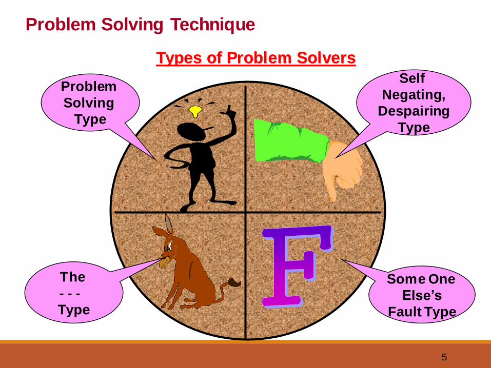
5
Problem Solving Technique
Types of Problem Solvers
Problem
Solving
Type
The
- - -
Type
Some One
Else’s
Fault Type
Self
Negating,
Despairing
Type

6
productspeople
processes
outcomesresults
benefits
Lens of organisation
Lens of customer
Whose perspective should we look at?
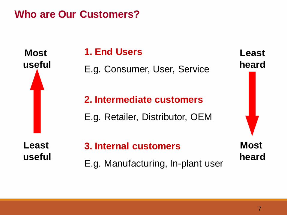
7
1. End Users
E.g. Consumer, User, Service
2. Intermediate customers
E.g. Retailer, Distributor, OEM
3. Internal customers
E.g. Manufacturing, In-plant user
Most
useful
Least
useful
Least
heard
Most
heard
Who are Our Customers?
8
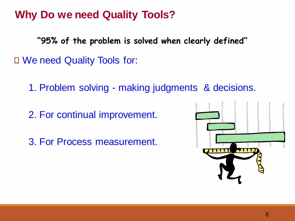
Why Do we need Quality Tools?
We need Quality Tools for:
1. Problem solving - making judgments & decisions.
2. For continual improvement.
3. For Process measurement.
“95% of the problem is solved when clearly defined”

9
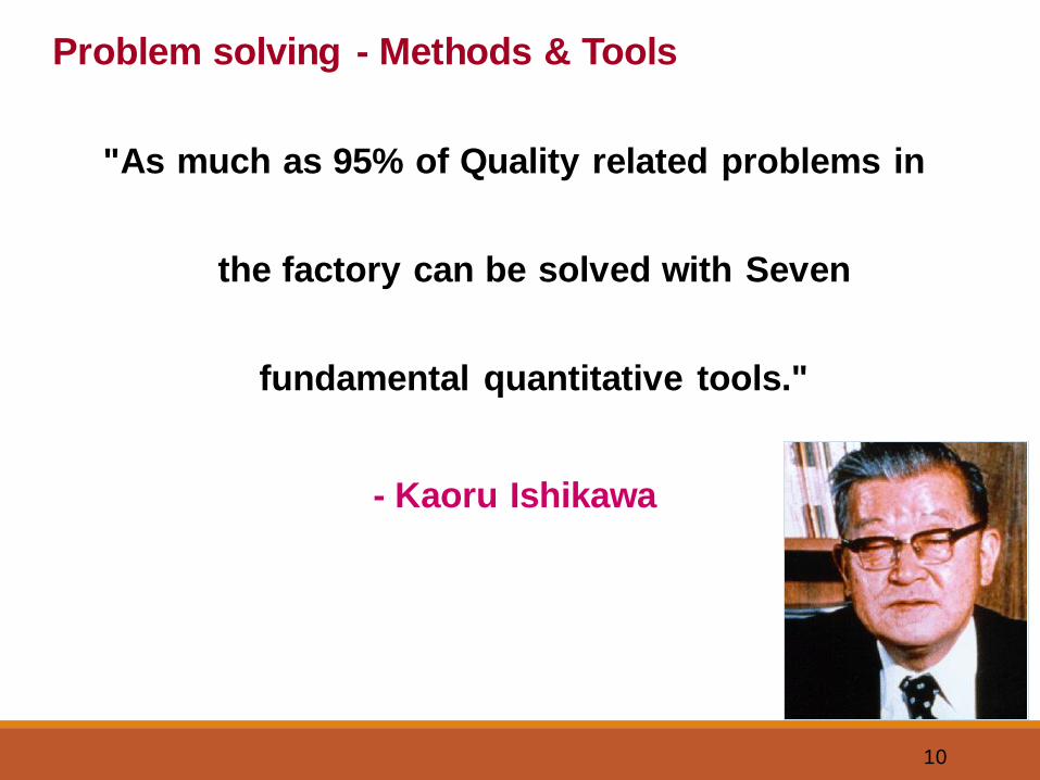
Problem solving - Methods & Tools
What methods & Tools do we have for Problem Solving?
10
"As much as 95% of Quality related problems in
the factory can be solved with Seven
fundamental quantitative tools."
- Kaoru Ishikawa
Problem solving - Methods & Tools
11
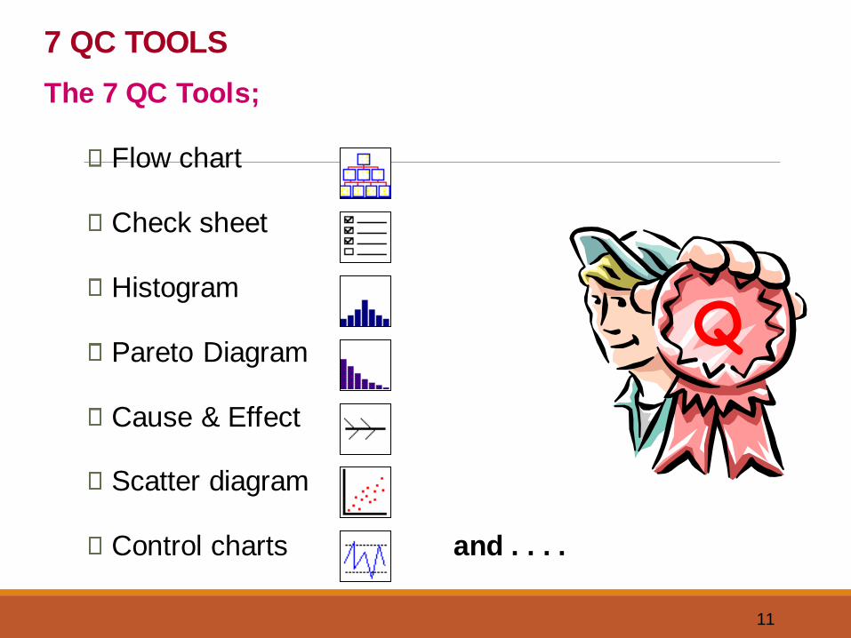
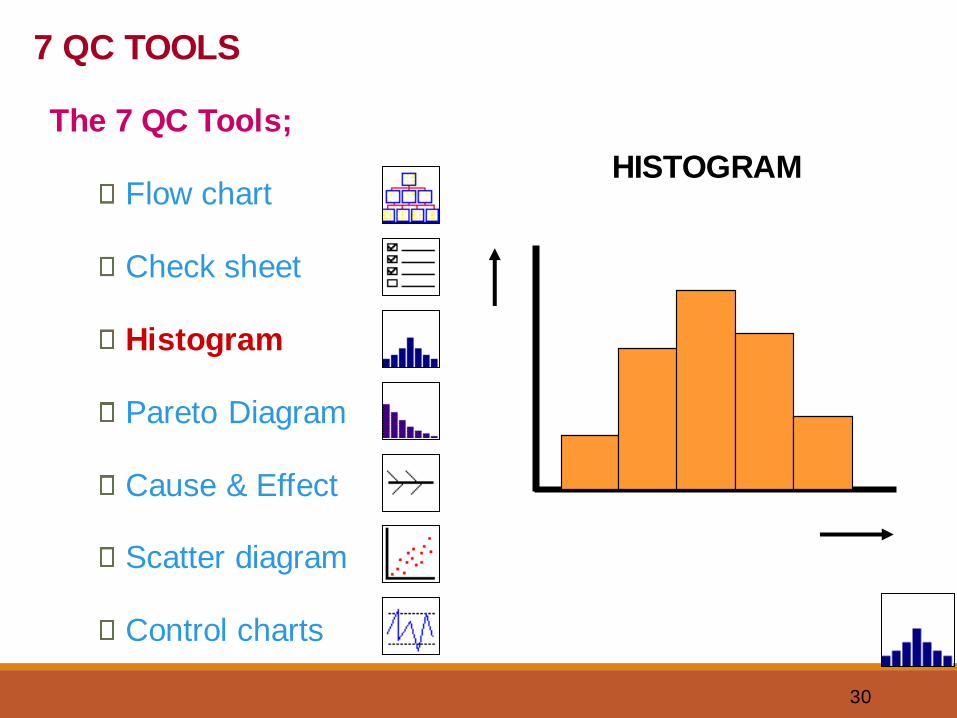
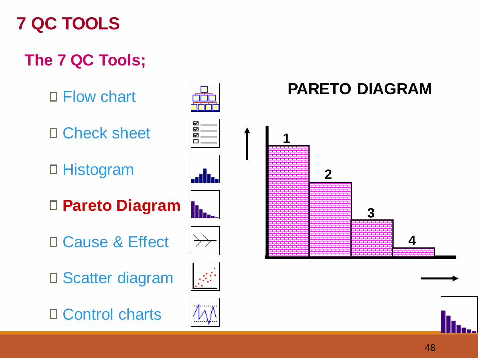
7 QC TOOLS
Q
The 7 QC Tools;
Flow chart
Check sheet
Histogram
Pareto Diagram
Cause & Effect
Scatter diagram
Control charts and . . . .
12
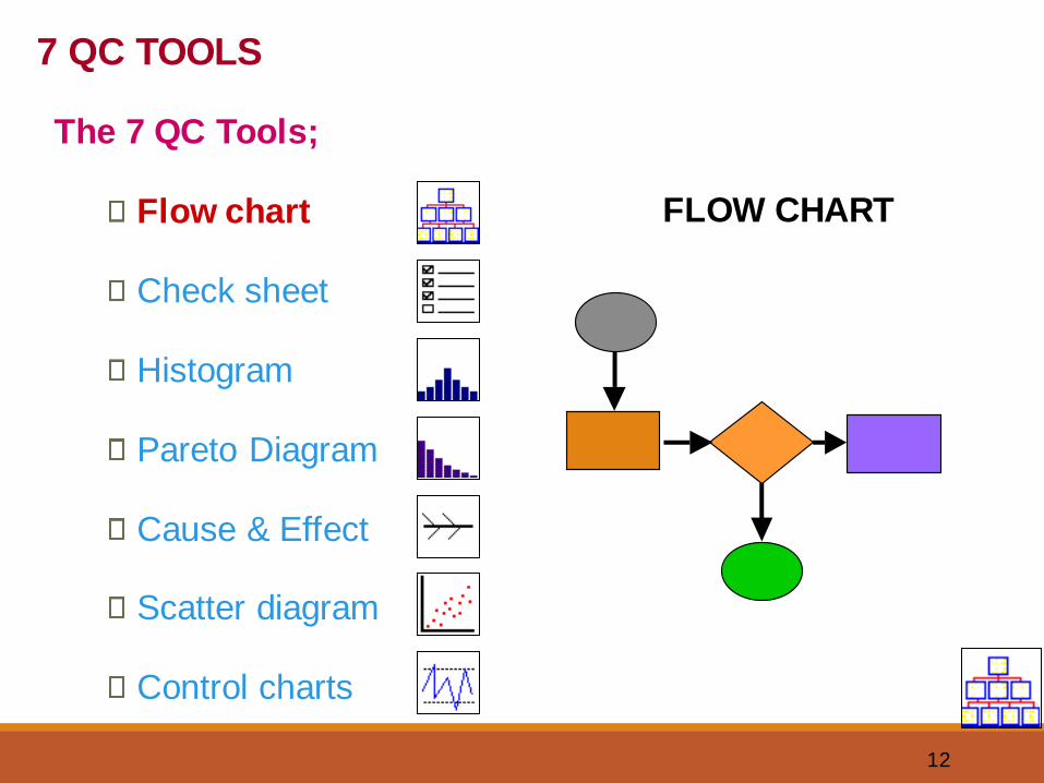
FLOW CHART
7 QC TOOLS
The 7 QC Tools;
Flow chart
Check sheet
Histogram
Pareto Diagram
Cause & Effect
Scatter diagram
Control charts
13
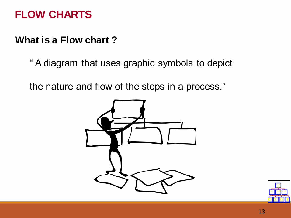
FLOW CHARTS
What is a Flow chart ?
“ A diagram that uses graphic symbols to depict
the nature and flow of the steps in a process.”
14
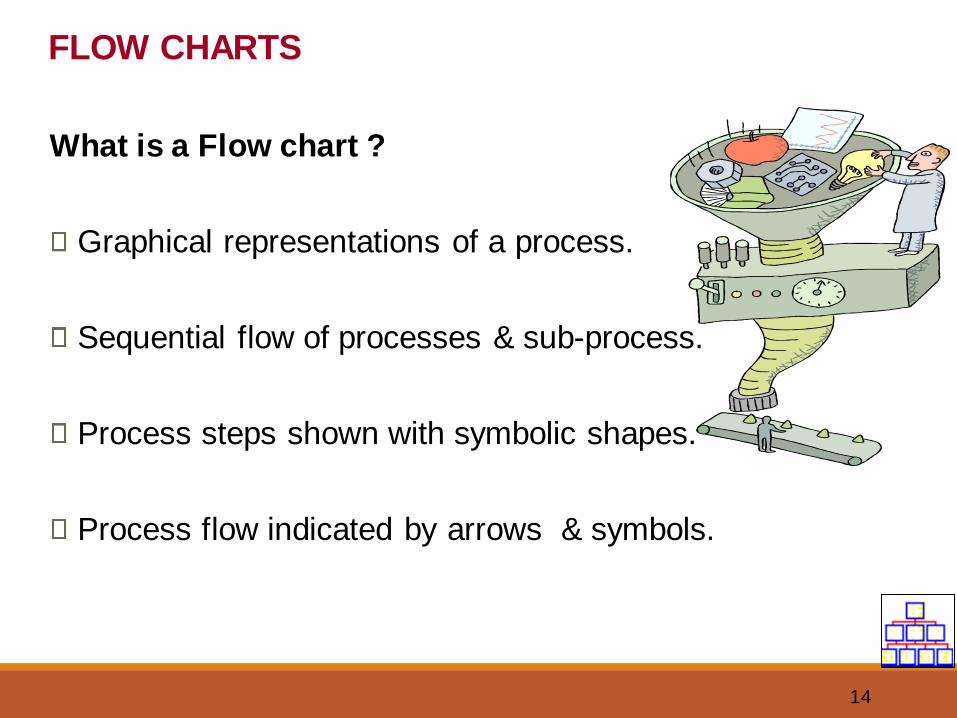
What is a Flow chart ?
Graphical representations of a process.
Sequential flow of processes & sub-process.
Process steps shown with symbolic shapes.
Process flow indicated by arrows & symbols.
FLOW CHARTS
15
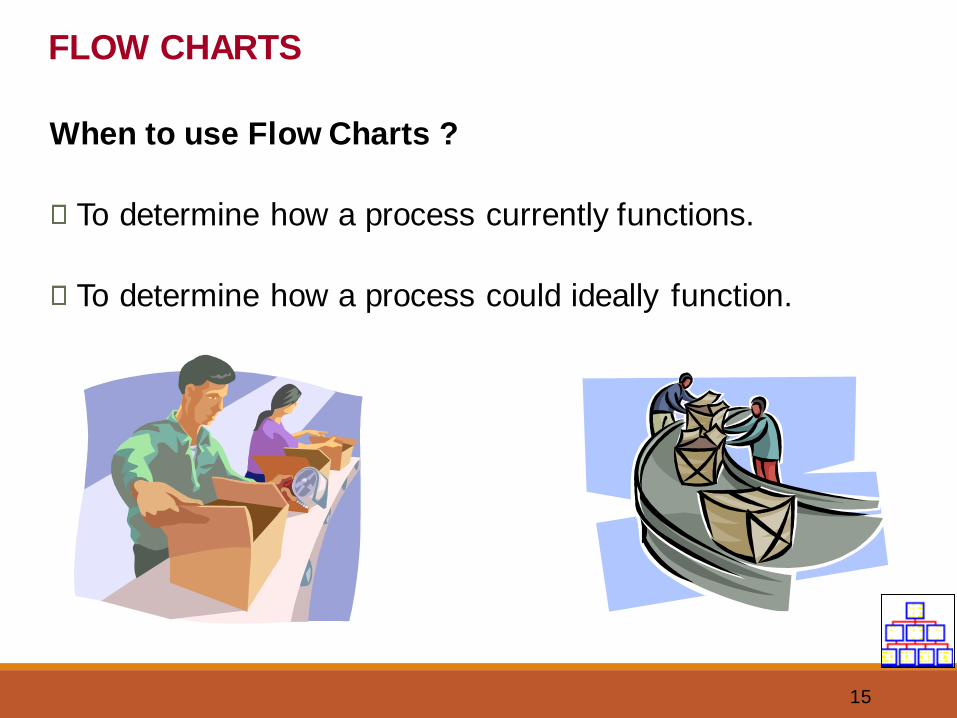
When to use Flow Charts ?
To determine how a process currently functions.
To determine how a process could ideally function.
FLOW CHARTS
16
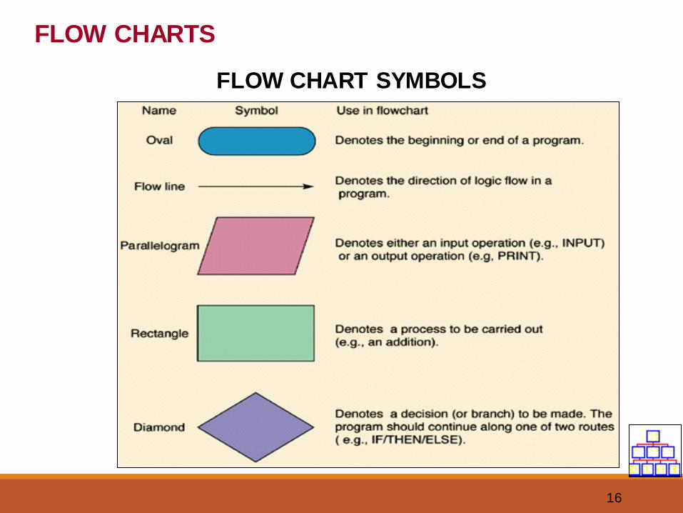
FLOW CHARTS
FLOW CHART SYMBOLS
17
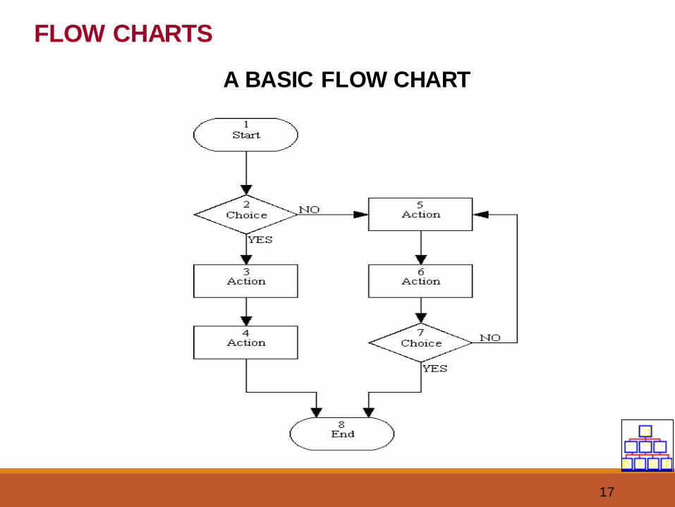
FLOW CHARTS
A BASIC FLOW CHART
18
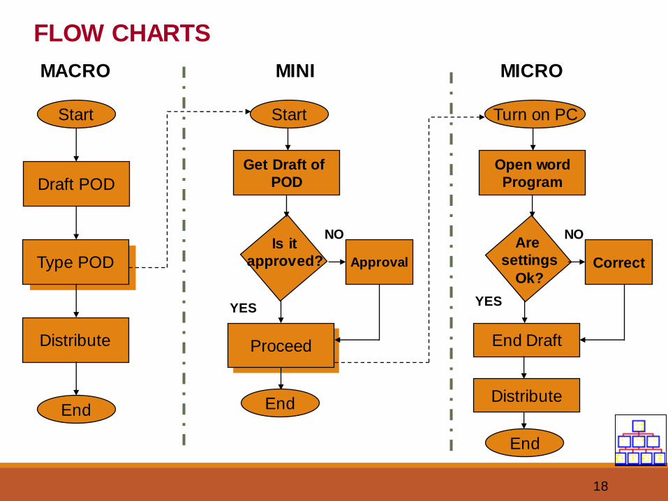
FLOW CHARTS
Start
Draft POD
Type POD
Distribute
End
MACRO MINI MICRO
Start
Get Draft of
POD
Is it
approved?
Proceed
YES
NO
End
Turn on PC
Open word
Program
Are
settings
Ok?Approval
NO
YES
End Draft
Correct
Distribute
End
19
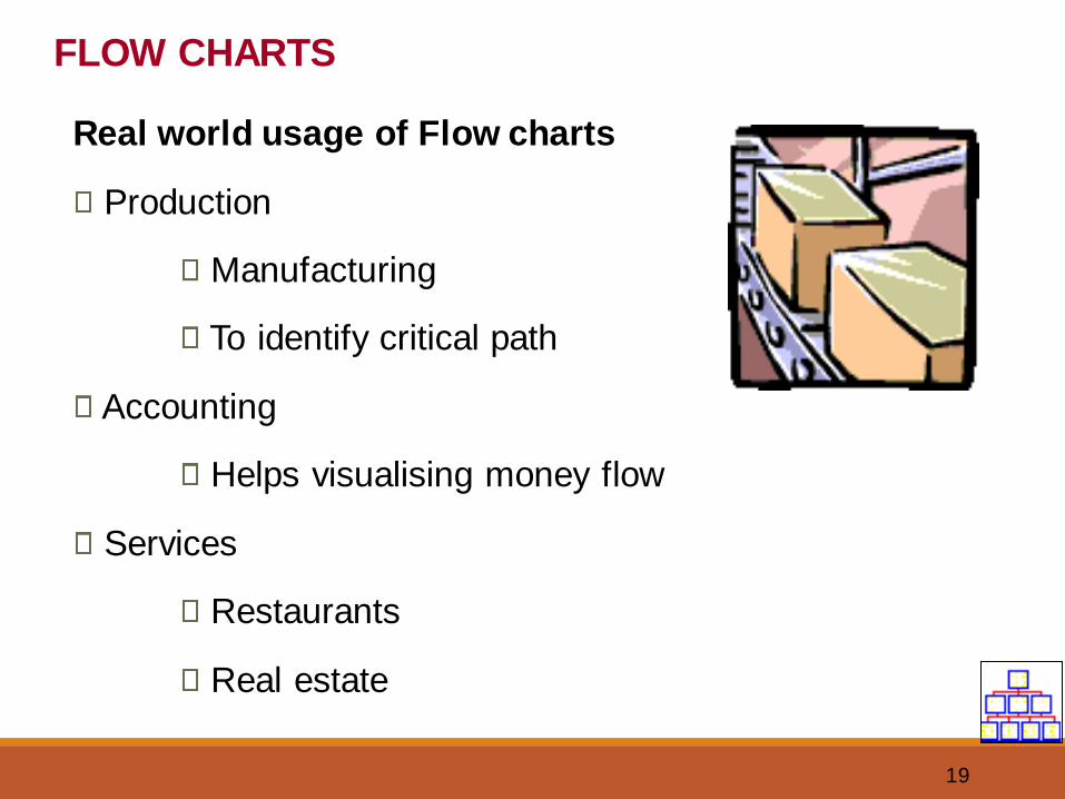
Real world usage of Flow charts
Production
Manufacturing
To identify critical path
Accounting
Helps visualising money flow
Services
Restaurants
Real estate
FLOW CHARTS
20
Benefits of Flow Charts
Create Visual map of process.
To identify time lags & NVA steps.
Identify process that need improvement.
Determine major & minor inputs in the process.
Promotes process understanding.
Depicts customer - supplier relationship.
FLOW CHARTS
21
FLOW CHART
1. Examples of Flow chart:
• In-house Process Flow chart
• Supplier Process Flow chart
22
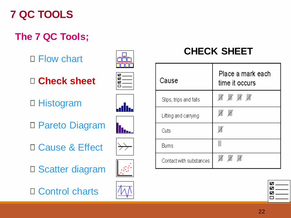
CHECK SHEET
7 QC TOOLS
The 7 QC Tools;
Flow chart
Check sheet
Histogram
Pareto Diagram
Cause & Effect
Scatter diagram
Control charts
23
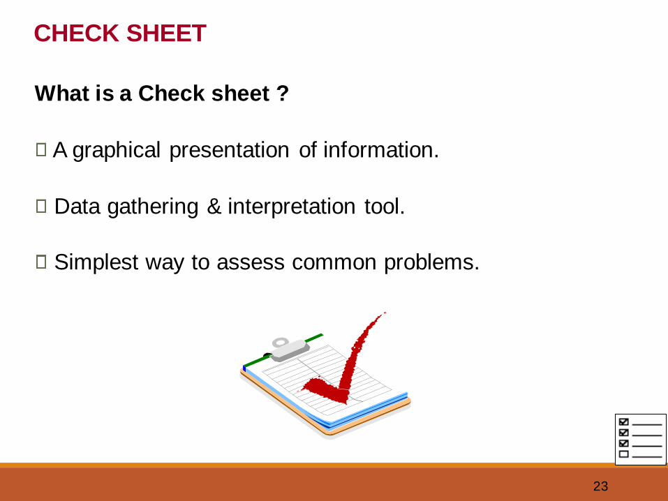
CHECK SHEET
What is a Check sheet ?
A graphical presentation of information.
Data gathering & interpretation tool.
Simplest way to assess common problems.
24
CHECK SHEET
When to use a Check sheet ?
To distinguish between fact & opinion.
To gather data about how often a problem occurs.
To gather data about the type of problem.
25
CHECK SHEET
How to create a Check sheet ?
What is the Problem?
Why should data be collected?
Who will use the information being collected?
Who will collect the data?
26
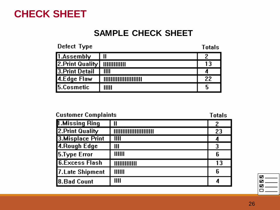
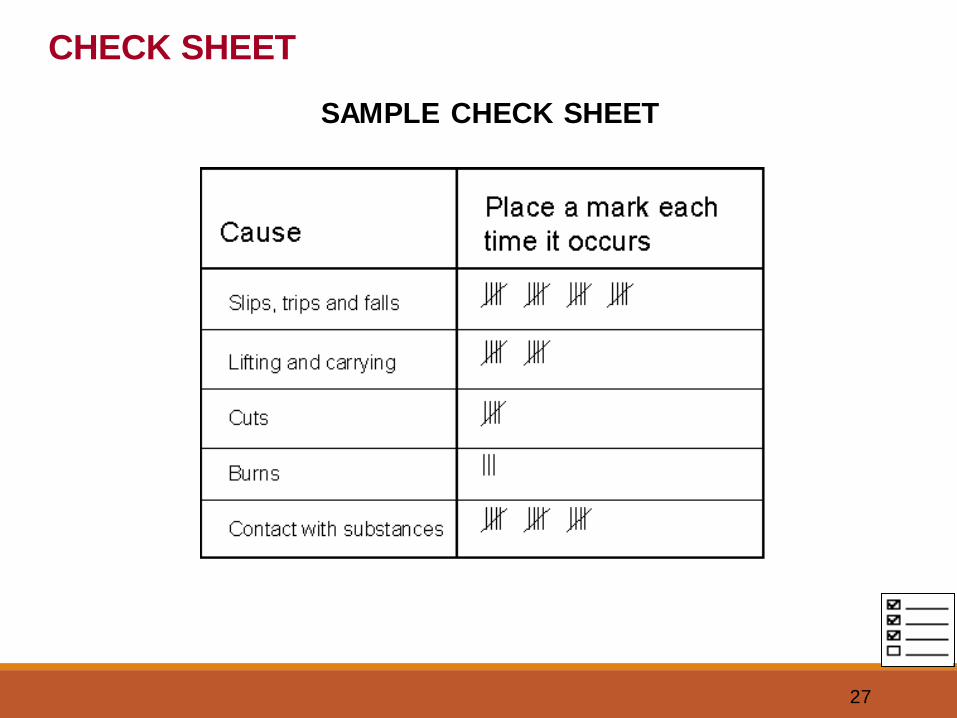
SAMPLE CHECK SHEET
CHECK SHEET
27
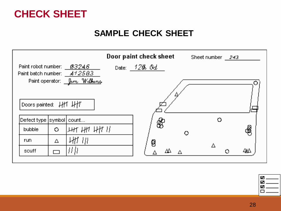
CHECK SHEET
SAMPLE CHECK SHEET
28
CHECK SHEET
SAMPLE CHECK SHEET
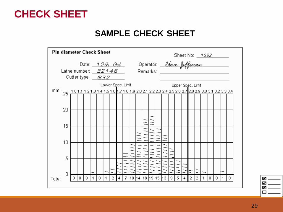
29
CHECK SHEET
SAMPLE CHECK SHEET
30
HISTOGRAM
7 QC TOOLS
The 7 QC Tools;
Flow chart
Check sheet
Histogram
Pareto Diagram
Cause & Effect
Scatter diagram
Control charts
31
What is a Histogram ?
A vertical bar chart that depicts distribution of data.
It is a one time snap shot of a process performance.
A tool to determine the frequency of occurrence of data.
A graphical information communicating tool.
Compares process results with specification limits.
HISTOGRAM
32
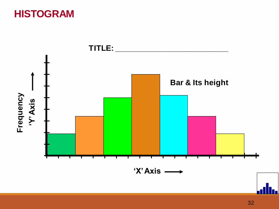
HISTOGRAM
TITLE: __________________________
‘X’ Axis
‘Y’ A
xis
Fre
qu
en
cy
Bar & Its height
33
When to use a Histogram ?
To summarize large data sets graphically.
To compare measurements to specifications.
To communicate information to the team.
Assist in decision making.
HISTOGRAM
34
HISTOGRAM
Constructing a Histogram
Step 1: Count number of data points
Step 2: Summarize on a tally sheet
Step 3: Compute the range
Step 4: Determine number of intervals
Step 5: Compute interval width
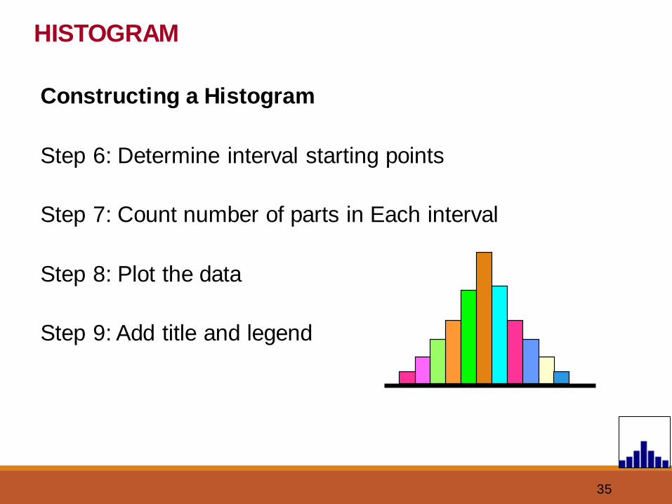
35
HISTOGRAM
Constructing a Histogram
Step 6: Determine interval starting points
Step 7: Count number of parts in Each interval
Step 8: Plot the data
Step 9: Add title and legend
36
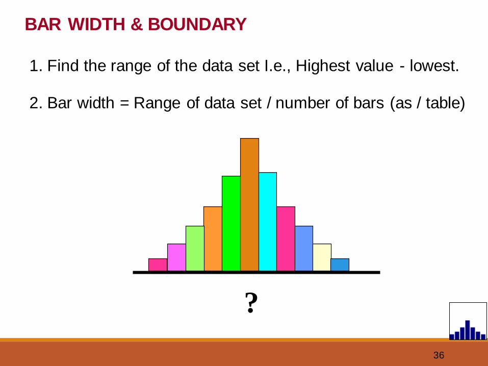
BAR WIDTH & BOUNDARY
1. Find the range of the data set I.e., Highest value - lowest.
2. Bar width = Range of data set / number of bars (as / table)
?
37
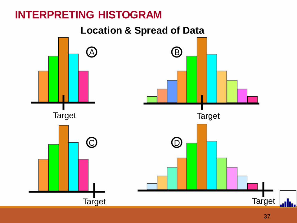
INTERPRETING HISTOGRAM
Location & Spread of Data
A
Target
B
Target
D
Target
C
Target
38
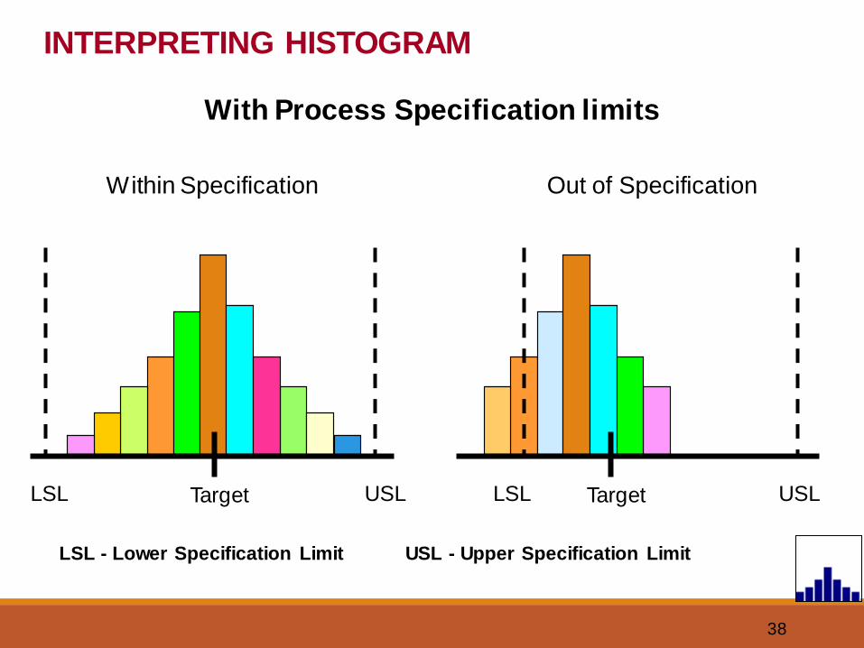
INTERPRETING HISTOGRAM
With Process Specification limits
Within Specification Out of Specification
TargetLSL USL TargetLSL USL
LSL - Lower Specification Limit USL - Upper Specification Limit
39
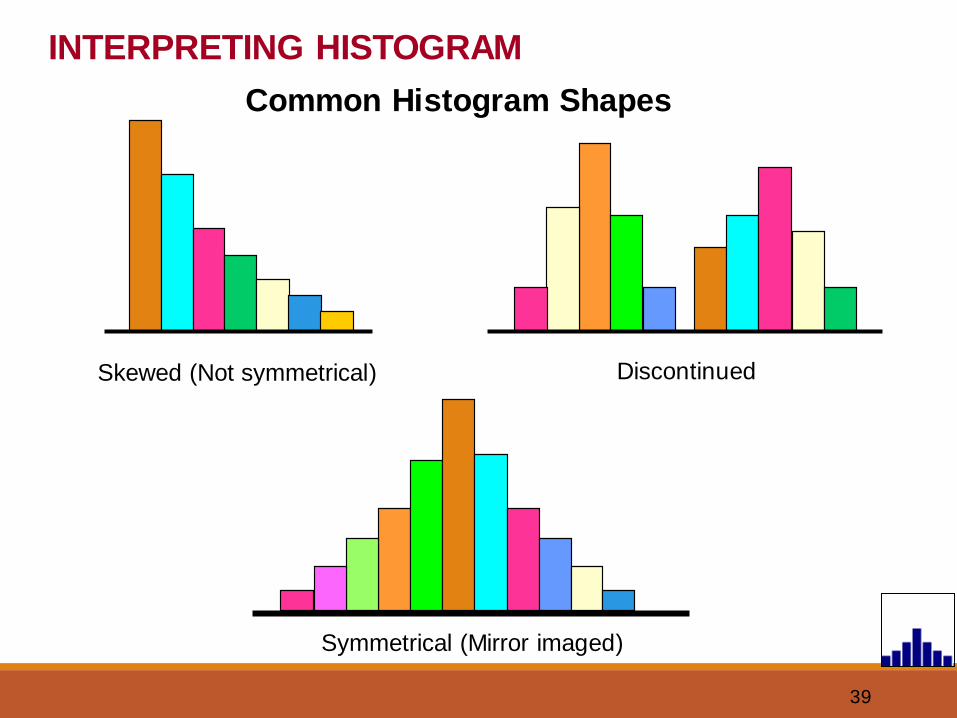
INTERPRETING HISTOGRAM
Common Histogram Shapes
Skewed (Not symmetrical) Discontinued
Symmetrical (Mirror imaged)

40
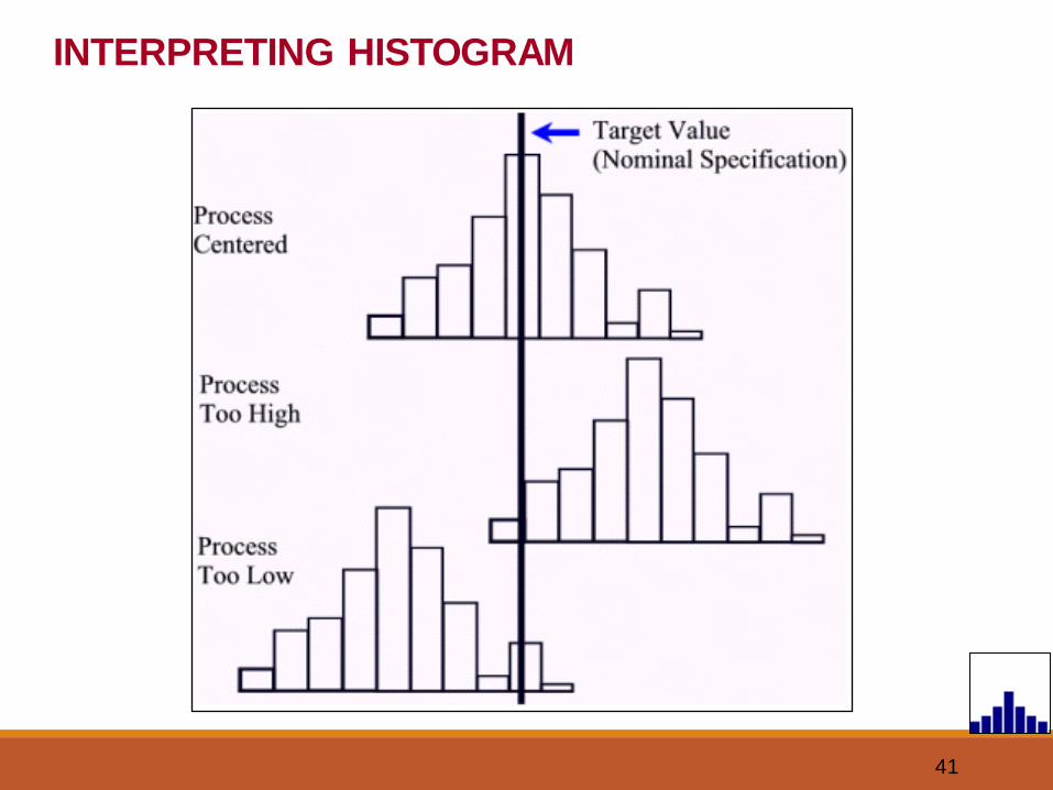
INTERPRETING HISTOGRAM
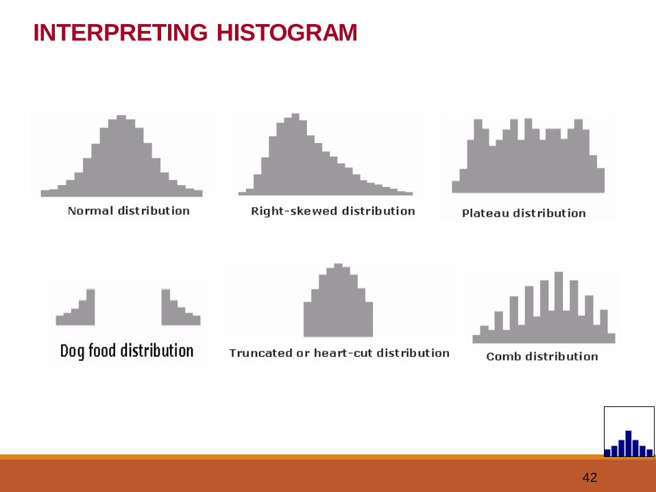
41
INTERPRETING HISTOGRAM
42
INTERPRETING HISTOGRAM
43
Benefits of Histogram
To know whether process produces within specification.
To know whether process is stable & predictable.
Process monitoring & centering.
HISTOGRAM
44
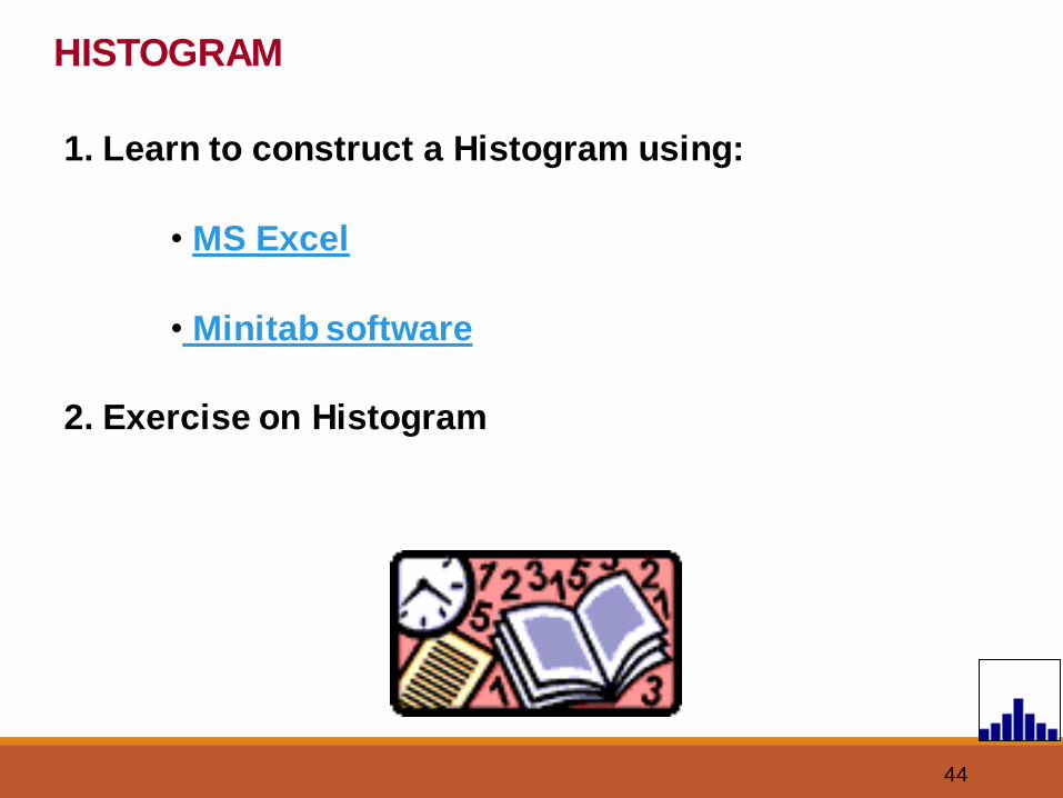
HISTOGRAM
1. Learn to construct a Histogram using:
• MS Excel
• Minitab software
2. Exercise on Histogram
45
C1
Fre
qu
en
cy
222018161412
10
8
6
4
2
0
Histogram of C1
Descriptive Statistics: C1
Variable Mean St Dev Minimum Median Maximum Skewness KurtosisC1 17.741 2.357 11.500 18.000 22.000 -0.27 -0.46
HISTOGRAM
46
HISTOGRAM
Histogram
0 1 0
3
12
8
16
9
5
0
0
5
10
15
20
0 11.5 13 14.5 16 17.5 19 20.5 22 23.5
Gap in mm
Fre
quency
Bin Frequency
0 0
11.5 1
13 0
14.5 3
16 12
17.5 8
19 16
20.5 9
22 5
23.5 0
More 0
47
VISUALS
How a Histogram is generated ?
48
PARETO DIAGRAM
1
2
3
4
7 QC TOOLS
The 7 QC Tools;
Flow chart
Check sheet
Histogram
Pareto Diagram
Cause & Effect
Scatter diagram
Control charts
49
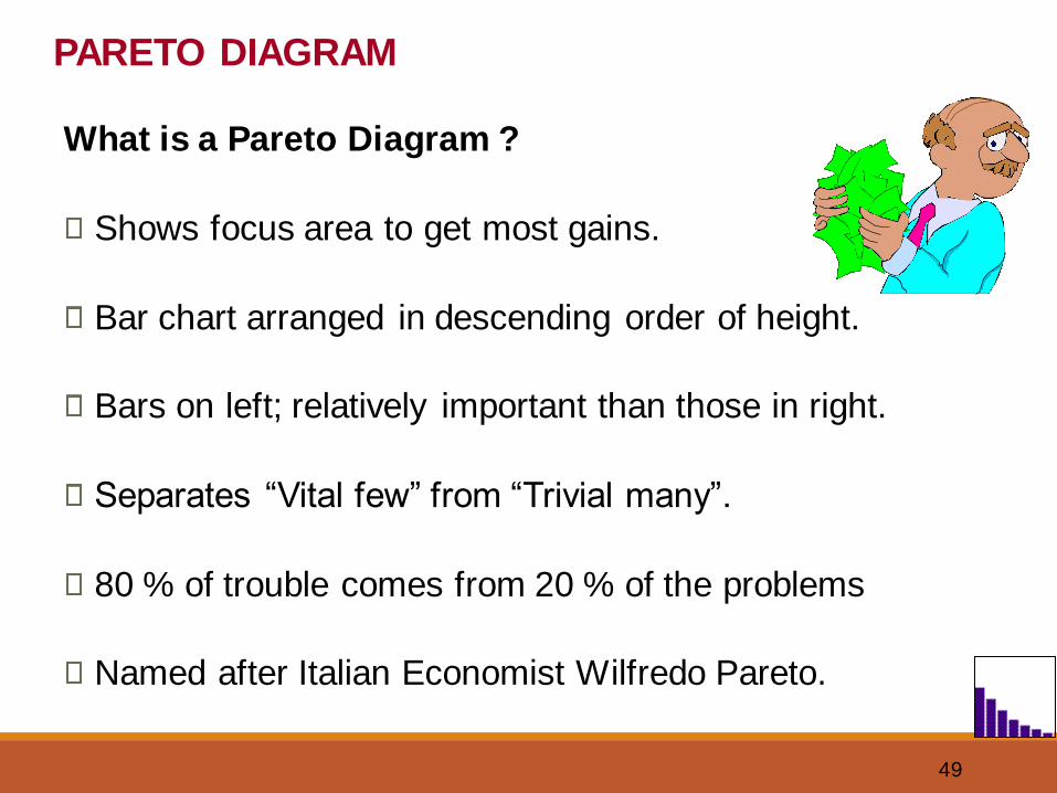
What is a Pareto Diagram ?
Shows focus area to get most gains.
Bar chart arranged in descending order of height.
Bars on left; relatively important than those in right.
Separates “Vital few” from “Trivial many”.
80 % of trouble comes from 20 % of the problems
Named after Italian Economist Wilfredo Pareto.
PARETO DIAGRAM
50
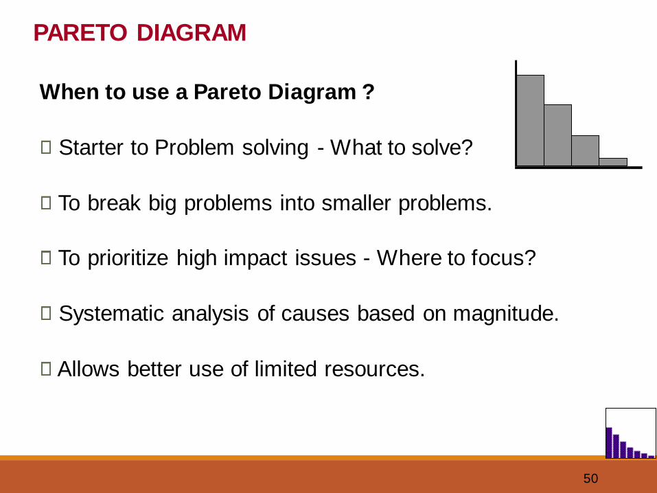
When to use a Pareto Diagram ?
Starter to Problem solving - What to solve?
To break big problems into smaller problems.
To prioritize high impact issues - Where to focus?
Systematic analysis of causes based on magnitude.
Allows better use of limited resources.
PARETO DIAGRAM
51
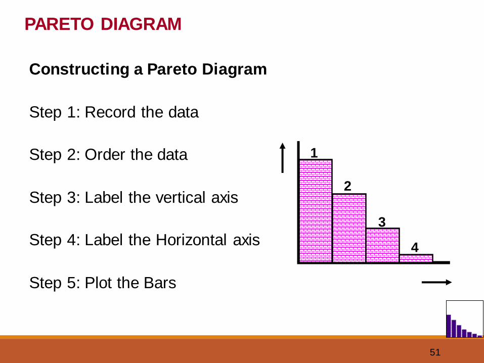
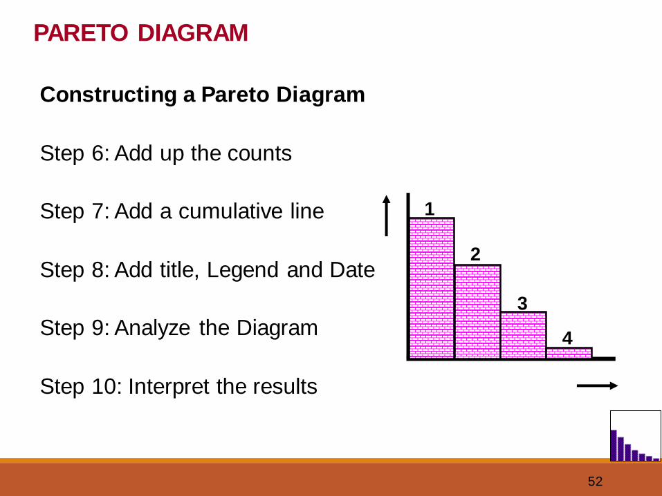
PARETO DIAGRAM
Constructing a Pareto Diagram
Step 1: Record the data
Step 2: Order the data
Step 3: Label the vertical axis
Step 4: Label the Horizontal axis
Step 5: Plot the Bars
1
2
3
4
52
PARETO DIAGRAM
Constructing a Pareto Diagram
Step 6: Add up the counts
Step 7: Add a cumulative line
Step 8: Add title, Legend and Date
Step 9: Analyze the Diagram
Step 10: Interpret the results
1
2
3
4
53
Benefits of Pareto Diagram
Identifies ‘Major Few’ problems.
Improves team performance & effectiveness.
Before & After tracking of a problem in single chart.
PARETO DIAGRAM
54
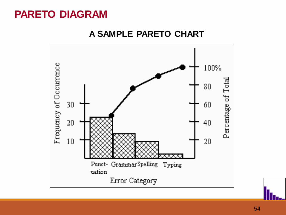
A SAMPLE PARETO CHART
PARETO DIAGRAM
55
1. Learn to construct a Pareto Diagram using:
• Pareto Excel - Example
• Minitab software
2. Exercise on Pareto Diagram.
PARETO DIAGRAM
56
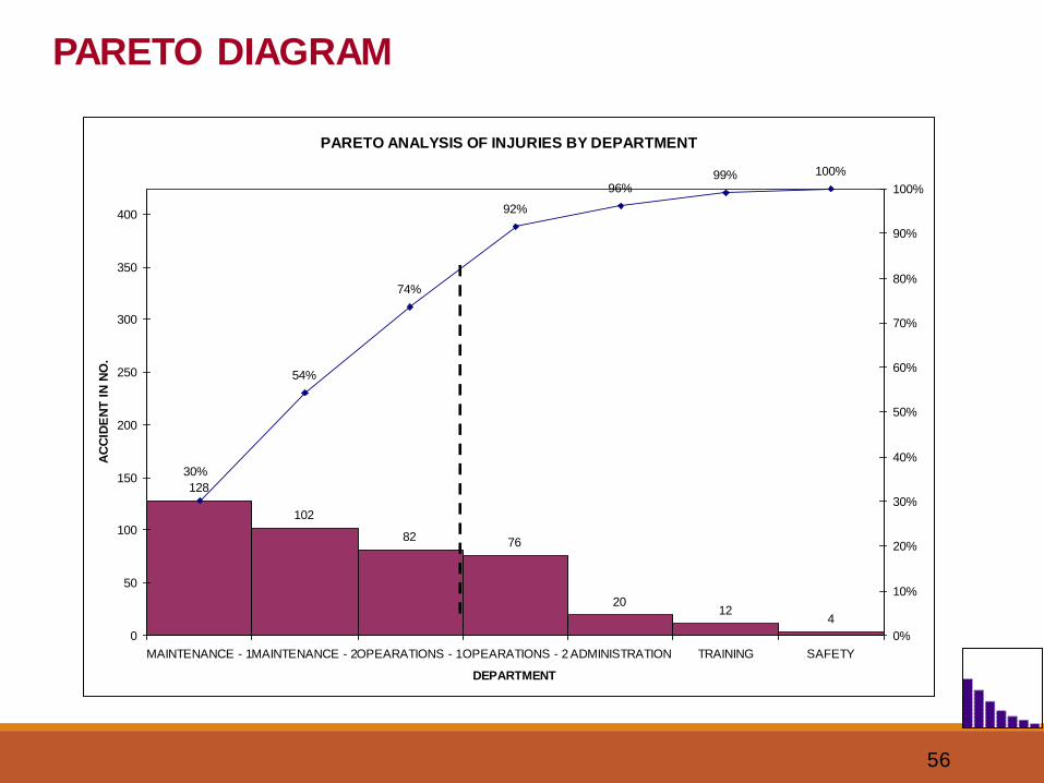
PARETO ANALYSIS OF INJURIES BY DEPARTMENT
128
102
82 76
2012
4
54%
74%
92%
96%99% 100%
30%
0
50
100
150
200
250
300
350
400
MAINTENANCE - 1MAINTENANCE - 2OPEARATIONS - 1OPEARATIONS - 2 ADMINISTRATION TRAINING SAFETY
DEPARTMENT
AC
CID
EN
T I
N N
O.
0%
10%
20%
30%
40%
50%
60%
70%
80%
90%
100%
PARETO DIAGRAM
57
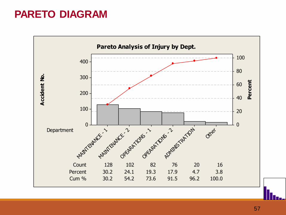
Accid
en
t N
o.
Pe
rce
nt
Department
Count
24.1 19.3 17.9 4.7 3.8
Cum % 30.2 54.2 73.6 91.5
128
96.2 100.0
102 82 76 20 16
Percent 30.2
Othe
r
ADMINIS
TRAT
ION
OPEA
RATIONS
- 2
OPEAR
ATIO
NS -
1
MAI
NTEN
ANCE
- 2
MAINT
ENAN
CE -
1
400
300
200
100
0
100
80
60
40
20
0
Pareto Analysis of Injury by Dept.
PARETO DIAGRAM
58
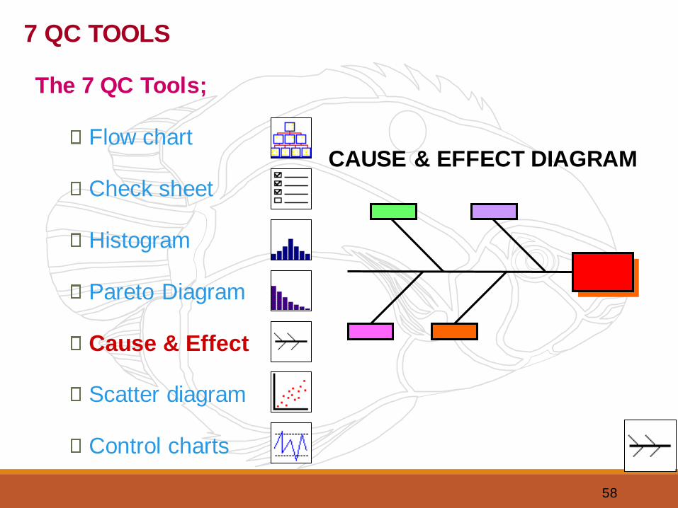
CAUSE & EFFECT DIAGRAM
7 QC TOOLS
The 7 QC Tools;
Flow chart
Check sheet
Histogram
Pareto Diagram
Cause & Effect
Scatter diagram
Control charts
59
What is a Cause & Effect Diagram ?
A graphical tool that helps identify, sort and
display possible causes of a problem or
Quality characteristic.
CAUSE & EFFECT DIAGRAM
60
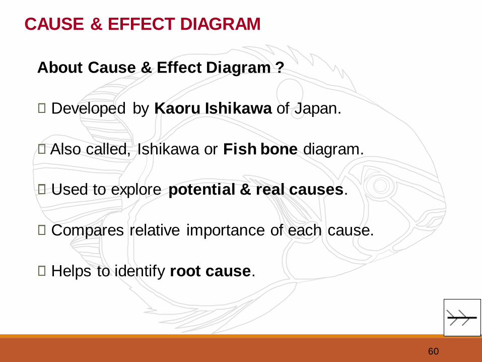
About Cause & Effect Diagram ?
Developed by Kaoru Ishikawa of Japan.
Also called, Ishikawa or Fish bone diagram.
Used to explore potential & real causes.
Compares relative importance of each cause.
Helps to identify root cause.
CAUSE & EFFECT DIAGRAM
61
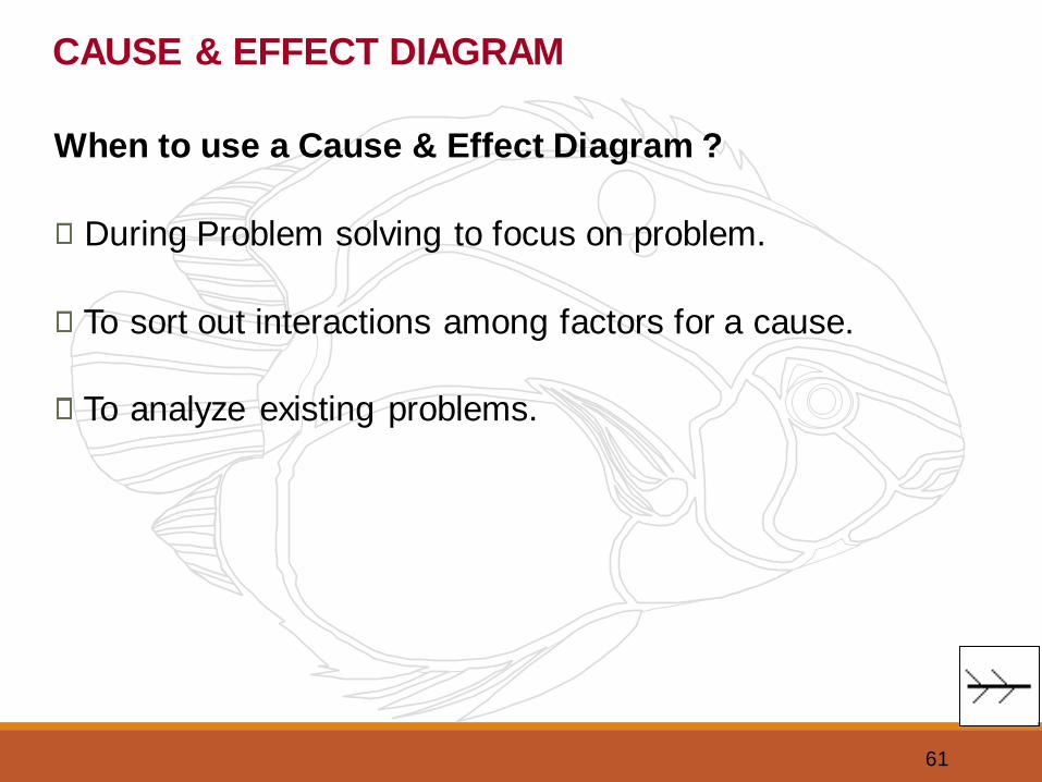
When to use a Cause & Effect Diagram ?
During Problem solving to focus on problem.
To sort out interactions among factors for a cause.
To analyze existing problems.
CAUSE & EFFECT DIAGRAM
62
CAUSE & EFFECT DIAGRAM
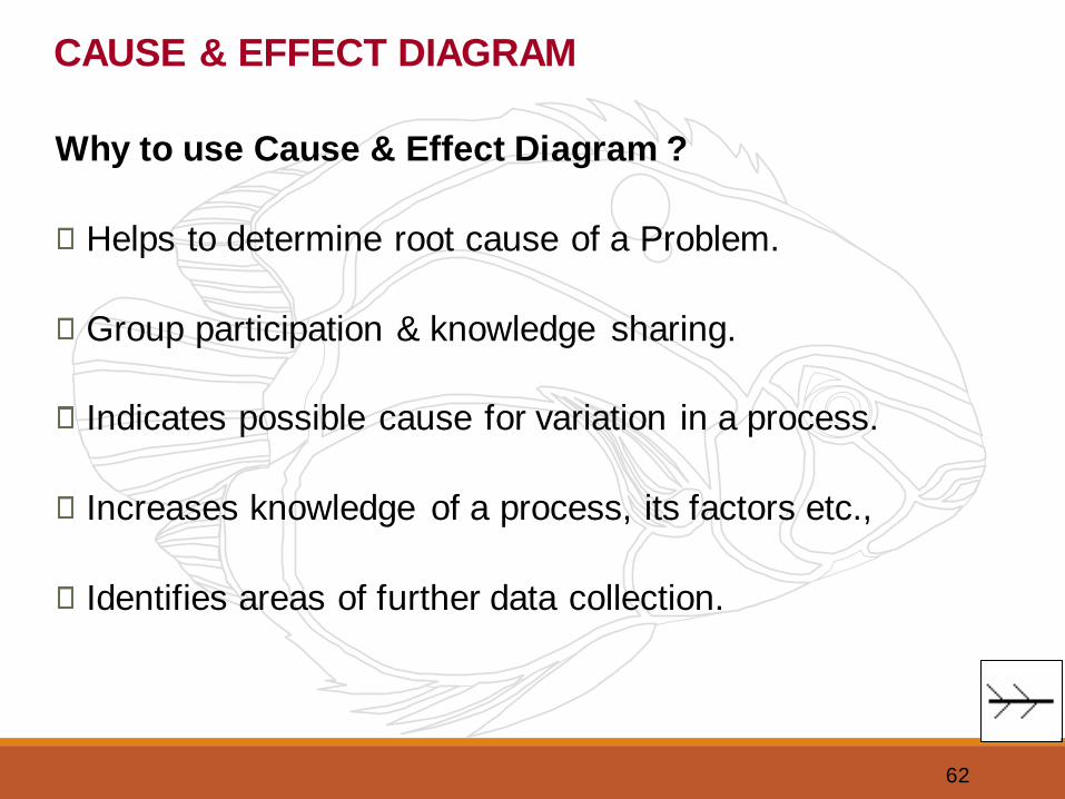
Why to use Cause & Effect Diagram ?
Helps to determine root cause of a Problem.
Group participation & knowledge sharing.
Indicates possible cause for variation in a process.
Increases knowledge of a process, its factors etc.,
Identifies areas of further data collection.
63
CAUSE & EFFECT DIAGRAM
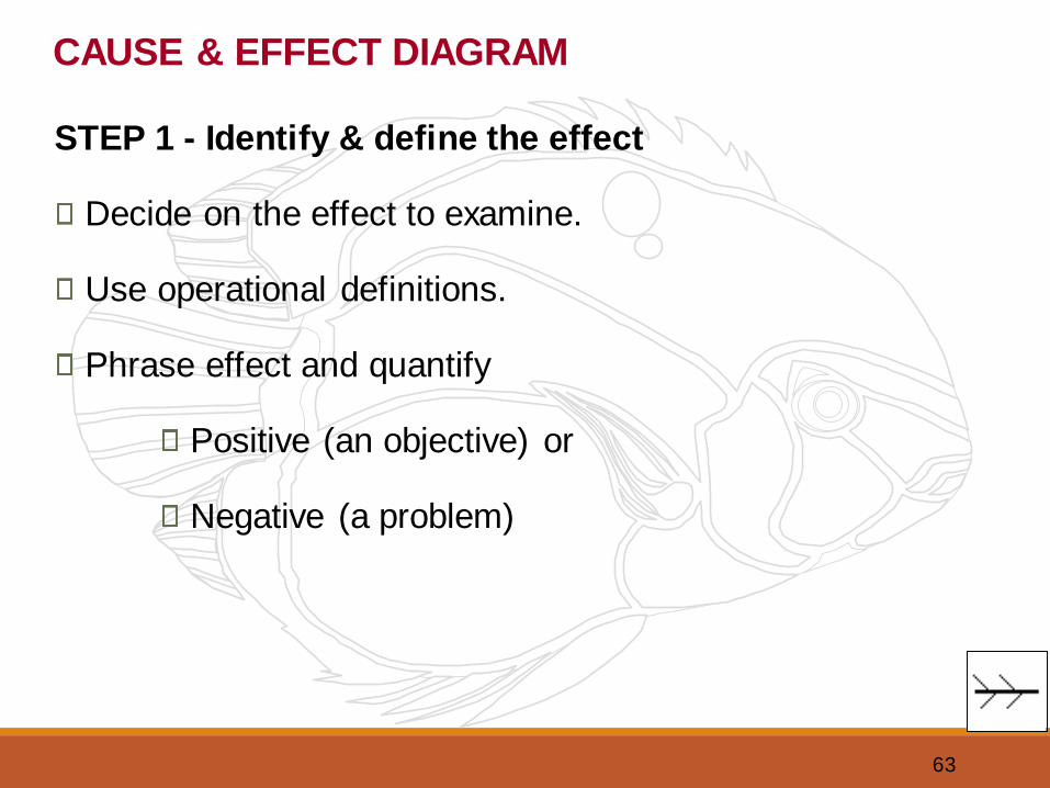
STEP 1 - Identify & define the effect
Decide on the effect to examine.
Use operational definitions.
Phrase effect and quantify
Positive (an objective) or
Negative (a problem)
64
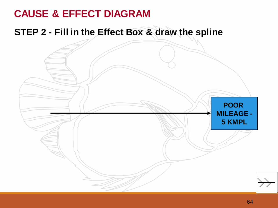
STEP 2 - Fill in the Effect Box & draw the spline
CAUSE & EFFECT DIAGRAM
POOR
MILEAGE -
5 KMPL
65
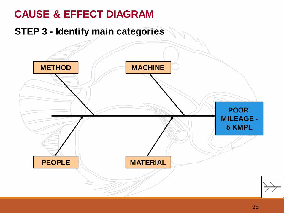
STEP 3 - Identify main categories
CAUSE & EFFECT DIAGRAM
POOR
MILEAGE -
5 KMPL
MACHINEMETHOD
PEOPLE MATERIAL
66
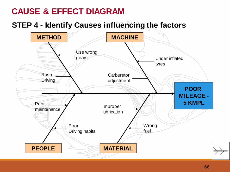
STEP 4 - Identify Causes influencing the factors
CAUSE & EFFECT DIAGRAM
POOR
MILEAGE -
5 KMPL
MACHINEMETHOD
PEOPLE MATERIAL
Under inflated
tyres
Use wrong
gears
Carburetor
adjustment
Rash
Driving
Poor
maintenance
Poor
Driving habits
Improper
lubrication
Wrong
fuel
67
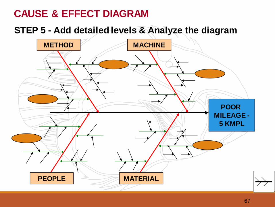
STEP 5 - Add detailed levels & Analyze the diagram
CAUSE & EFFECT DIAGRAM
POOR
MILEAGE -
5 KMPL
MACHINEMETHOD
PEOPLE MATERIAL
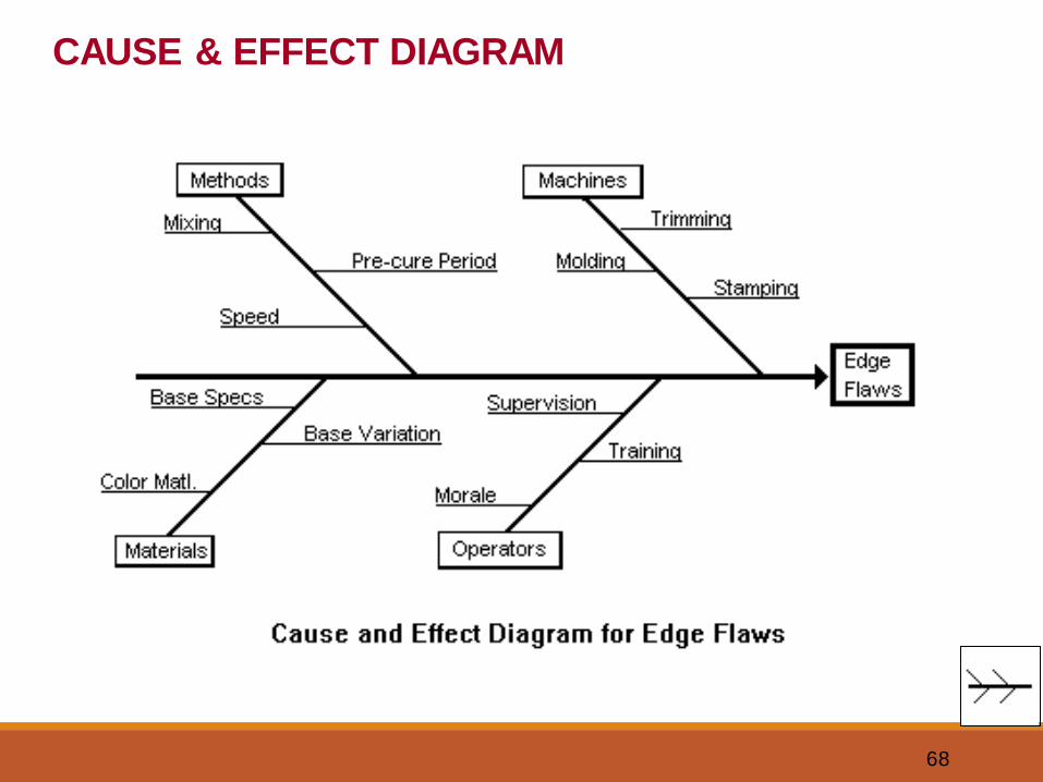
68
CAUSE & EFFECT DIAGRAM
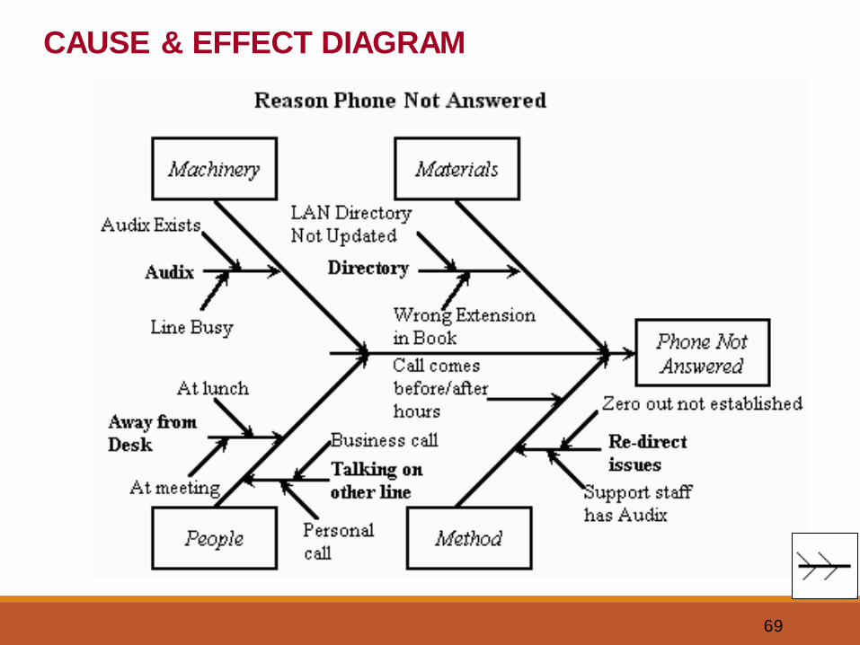
69
CAUSE & EFFECT DIAGRAM
70
CAUSE & EFFECT DIAGRAM
Benefits of Cause & Effect Diagram
Focus is on ‘Causes’ rather than on ‘Symptoms’
Indicates possible causes of variation.
Improves team performance & effectiveness.
Improves process knowledge.
Encourages group participation.
71
1. Learn to construct a Cause & Effect Diagram using:
• Cause & Effect Diagram Generator
• Minitab software
2. Exercise on Cause & Effect Diagram
CAUSE & EFFECT DIAGRAM
72
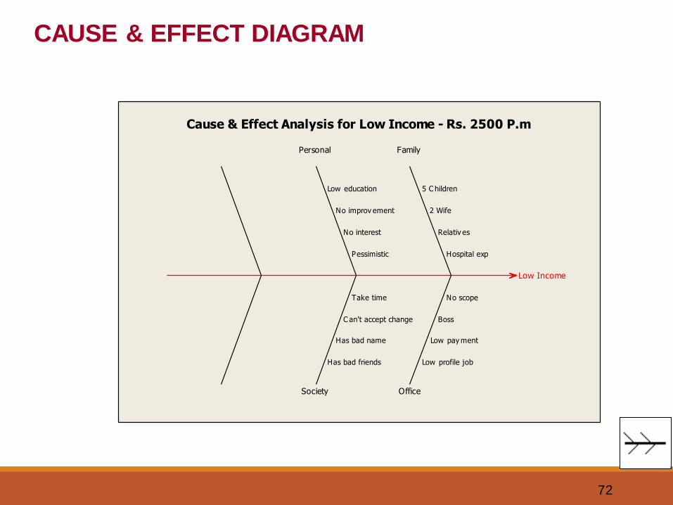
Low Income
Society
Personal
Office
Family
Hospital exp
Relativ es
2 Wife
5 C hildren
No scope
Boss
Low pay ment
Low profile job
Pessimistic
No interest
No improv ement
Low education
Take time
C an't accept change
Has bad name
Has bad friends
Cause & Effect Analysis for Low Income - Rs. 2500 P.m
CAUSE & EFFECT DIAGRAM
73
SCATTER DIAGRAM
7 QC TOOLS
The 7 QC Tools;
Flow chart
Check sheet
Histogram
Pareto Diagram
Cause & Effect
Scatter diagram
Control charts
74
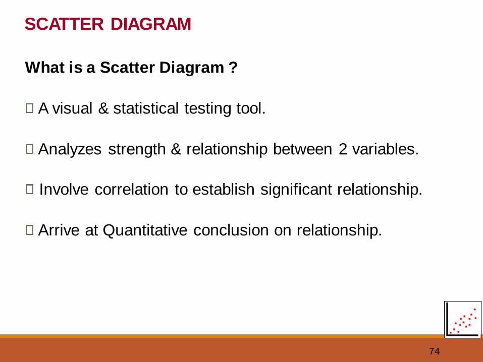
SCATTER DIAGRAM
What is a Scatter Diagram ?
A visual & statistical testing tool.
Analyzes strength & relationship between 2 variables.
Involve correlation to establish significant relationship.
Arrive at Quantitative conclusion on relationship.
75
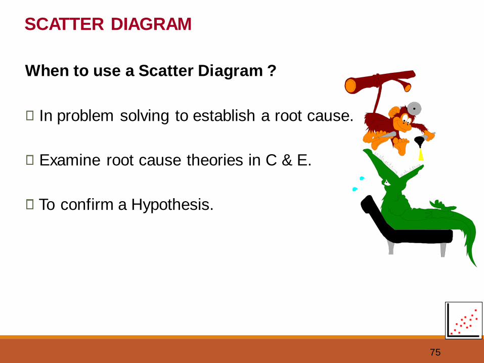
SCATTER DIAGRAM
When to use a Scatter Diagram ?
In problem solving to establish a root cause.
Examine root cause theories in C & E.
To confirm a Hypothesis.
76
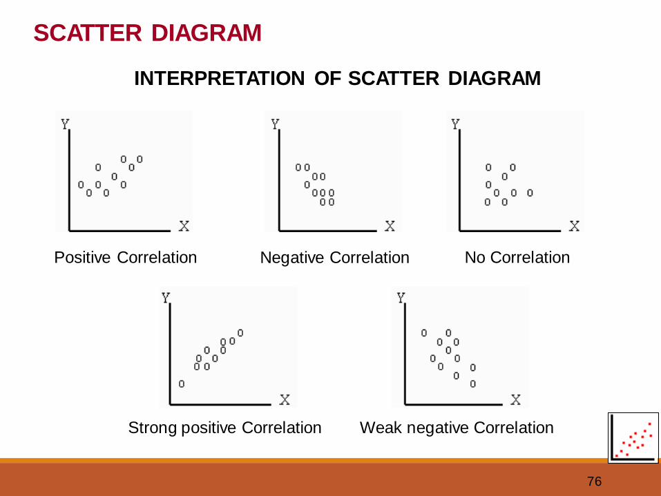
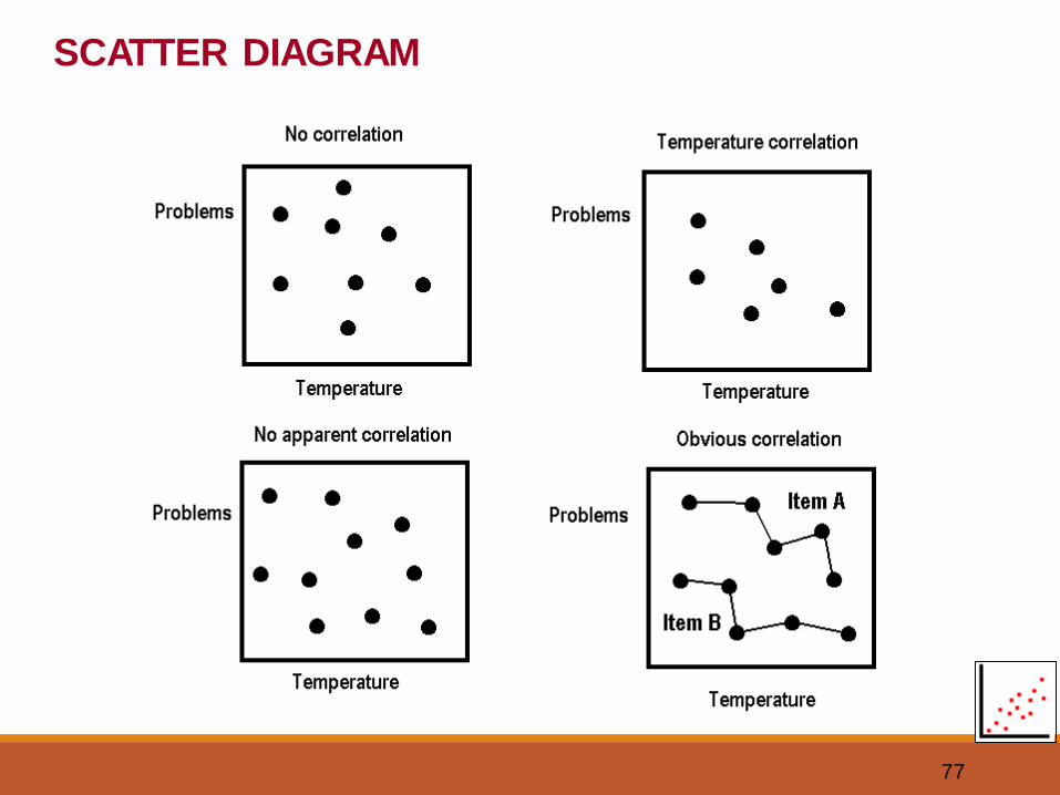
SCATTER DIAGRAM
Positive Correlation Negative Correlation No Correlation
Strong positive Correlation Weak negative Correlation
INTERPRETATION OF SCATTER DIAGRAM
77
SCATTER DIAGRAM
78
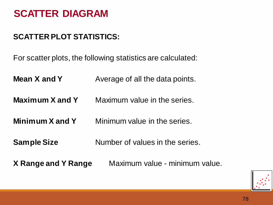
SCATTER DIAGRAM
SCATTER PLOT STATISTICS:
For scatter plots, the following statistics are calculated:
Mean X and Y Average of all the data points.
Maximum X and Y Maximum value in the series.
Minimum X and Y Minimum value in the series.
Sample Size Number of values in the series.
X Range and Y Range Maximum value - minimum value.
79
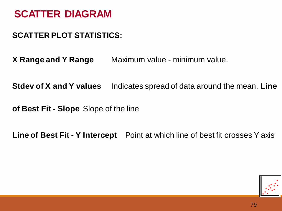
SCATTER DIAGRAM
SCATTER PLOT STATISTICS:
X Range and Y Range Maximum value - minimum value.
Stdev of X and Y values Indicates spread of data around the mean. Line
of Best Fit - Slope Slope of the line
Line of Best Fit - Y Intercept Point at which line of best fit crosses Y axis
80
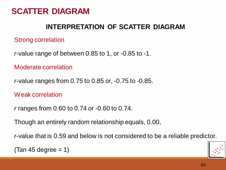
Strong correlation
r-value range of between 0.85 to 1, or -0.85 to -1.
Moderate correlation
r-value ranges from 0.75 to 0.85 or, -0.75 to -0.85.
Weak correlation
r ranges from 0.60 to 0.74 or -0.60 to 0.74.
Though an entirely random relationship equals, 0.00,
r-value that is 0.59 and below is not considered to be a reliable predictor.
(Tan 45 degree = 1)
INTERPRETATION OF SCATTER DIAGRAM
SCATTER DIAGRAM
81
SCATTER DIAGRAM
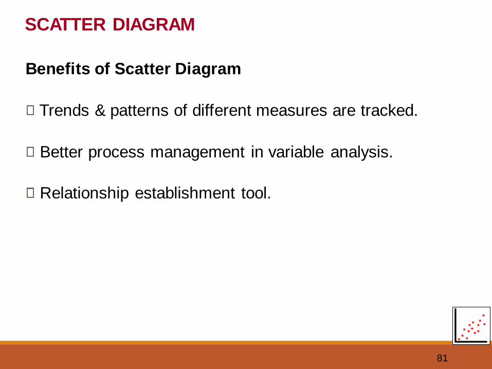
Benefits of Scatter Diagram
Trends & patterns of different measures are tracked.
Better process management in variable analysis.
Relationship establishment tool.
82
1. Learn to construct a Scatter Diagram using:
• Scatter diagram using MS Excel
• Minitab software
2. Exercise on Scatter Diagram
SCATTER DIAGRAM
83
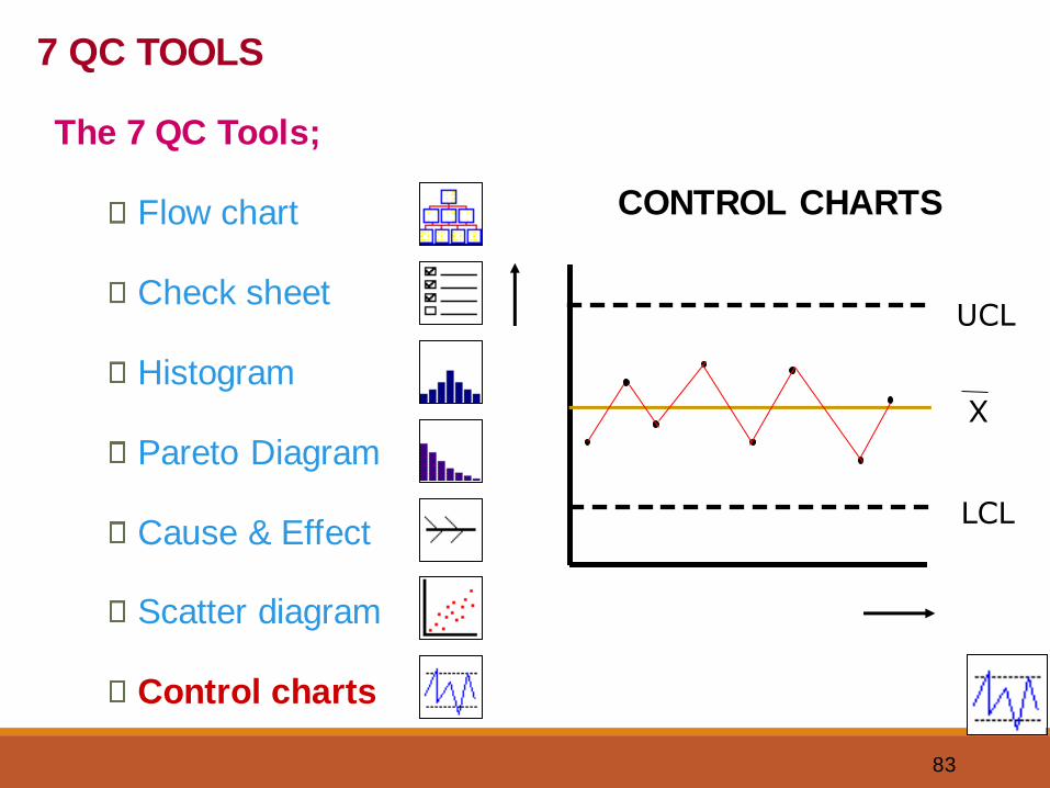
CONTROL CHARTS
LCL
UCL
X
7 QC TOOLS
The 7 QC Tools;
Flow chart
Check sheet
Histogram
Pareto Diagram
Cause & Effect
Scatter diagram
Control charts
84
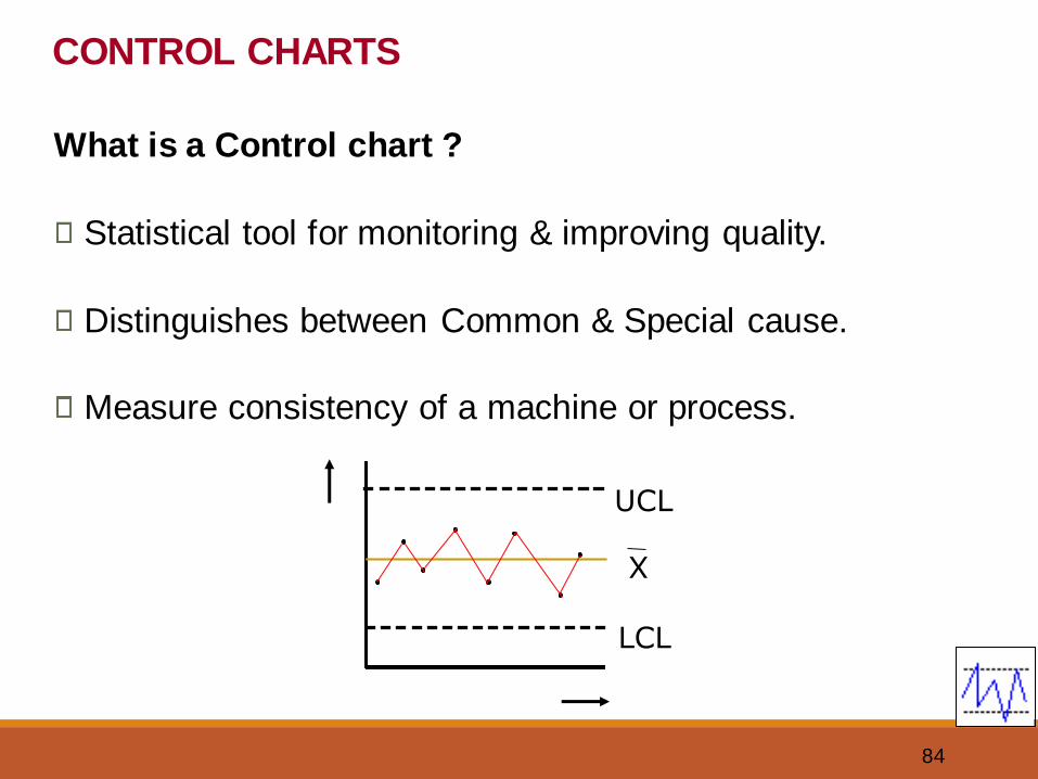
CONTROL CHARTS
What is a Control chart ?
Statistical tool for monitoring & improving quality.
Distinguishes between Common & Special cause.
Measure consistency of a machine or process.
LCL
UCL
X
85
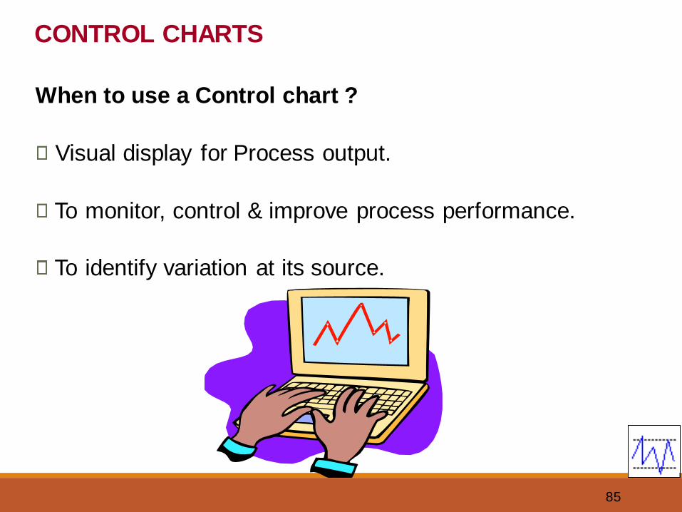
CONTROL CHARTS
When to use a Control chart ?
Visual display for Process output.
To monitor, control & improve process performance.
To identify variation at its source.
86
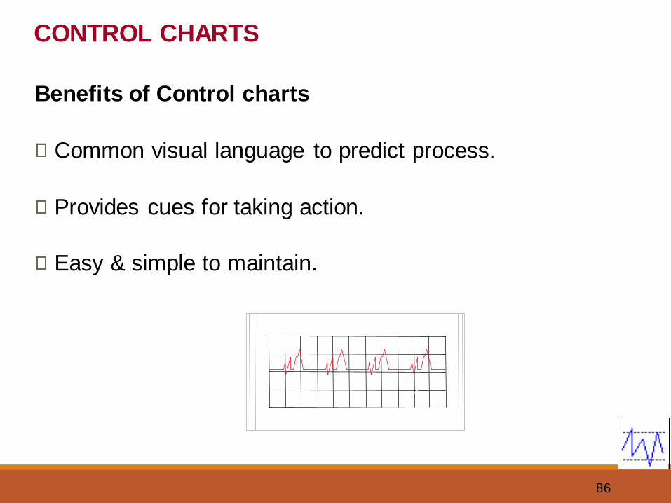
CONTROL CHARTS
Benefits of Control charts
Common visual language to predict process.
Provides cues for taking action.
Easy & simple to maintain.
87
1. Learn to construct a Control Chart using:
• MS Excel
• Minitab software
2. Exercise on Control charts
CONTROL CHARTS
88
VISUALS
How a Control chart is generated ?

89
OTHER QC TOOLS
90
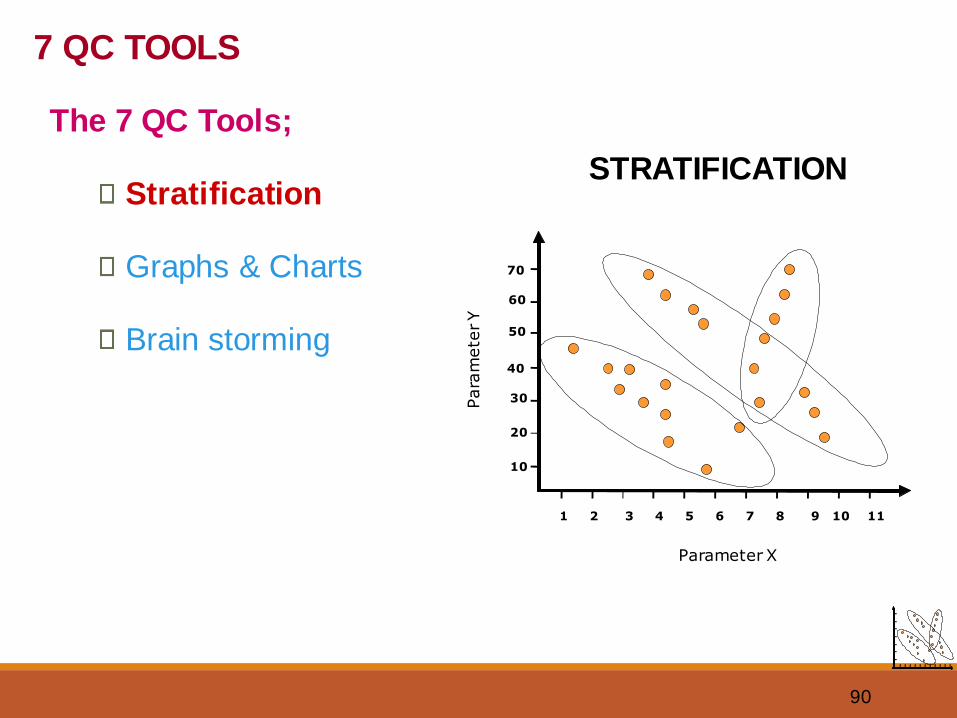
STRATIFICATION
1 2 3 4 5 6 7 11
10
20
30
40
50
60
70
8 9 10
Parameter X
Para
mete
r Y
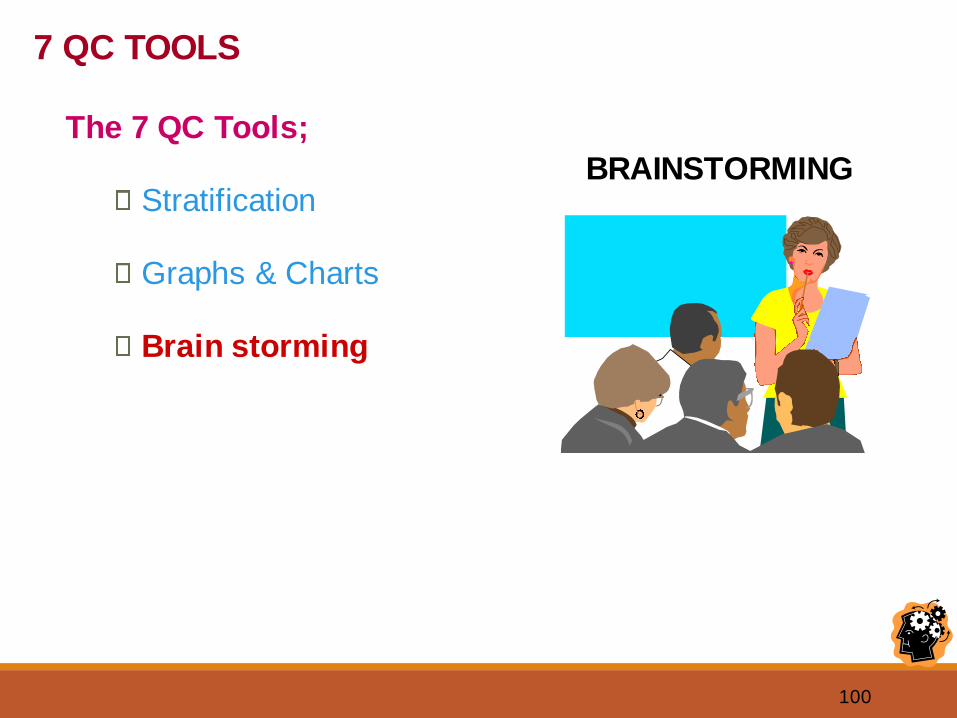
7 QC TOOLS
The 7 QC Tools;
Stratification
Graphs & Charts
Brain storming
91
STRATIFICATION
What is Stratification ?
A technique used to analyze and divide a universe of
data into homogeneous groups (Strata)
Involves observing data, splitting them into distinct layers
& doing analysis to see a different process.
Often these events, represent multiple sources that need
to be treated separately.
92
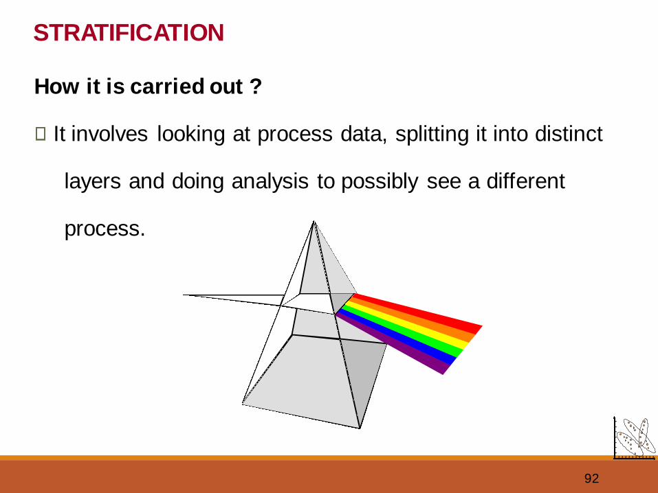
STRATIFICATION
How it is carried out ?
It involves looking at process data, splitting it into distinct
layers and doing analysis to possibly see a different
process.
93
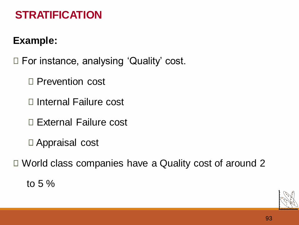
Example:
For instance, analysing ‘Quality’ cost.
Prevention cost
Internal Failure cost
External Failure cost
Appraisal cost
World class companies have a Quality cost of around 2
to 5 %
STRATIFICATION
94
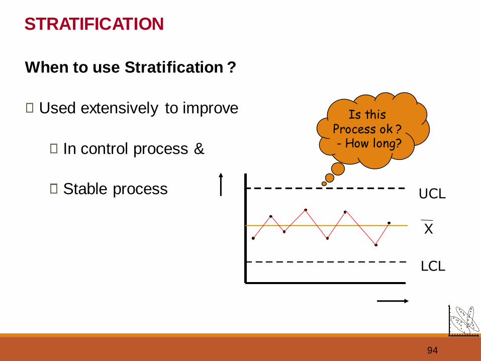
When to use Stratification ?
Used extensively to improve
In control process &
Stable process
STRATIFICATION
LCL
UCL
X
Is this Process ok ? - How long?
95
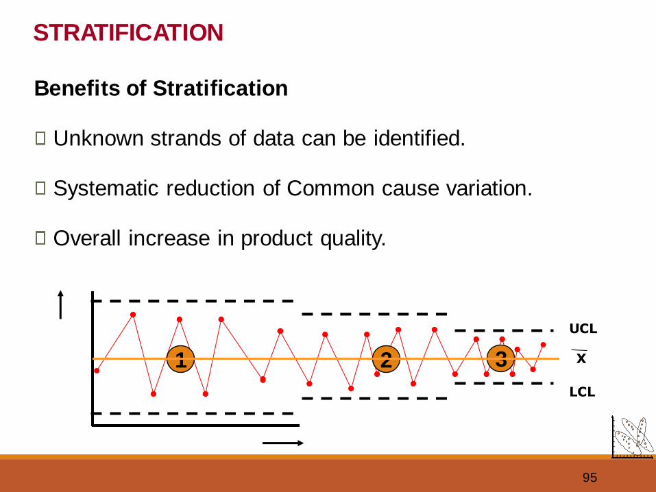
Benefits of Stratification
Unknown strands of data can be identified.
Systematic reduction of Common cause variation.
Overall increase in product quality.
STRATIFICATION
1 2
LCL
UCL
X3
96
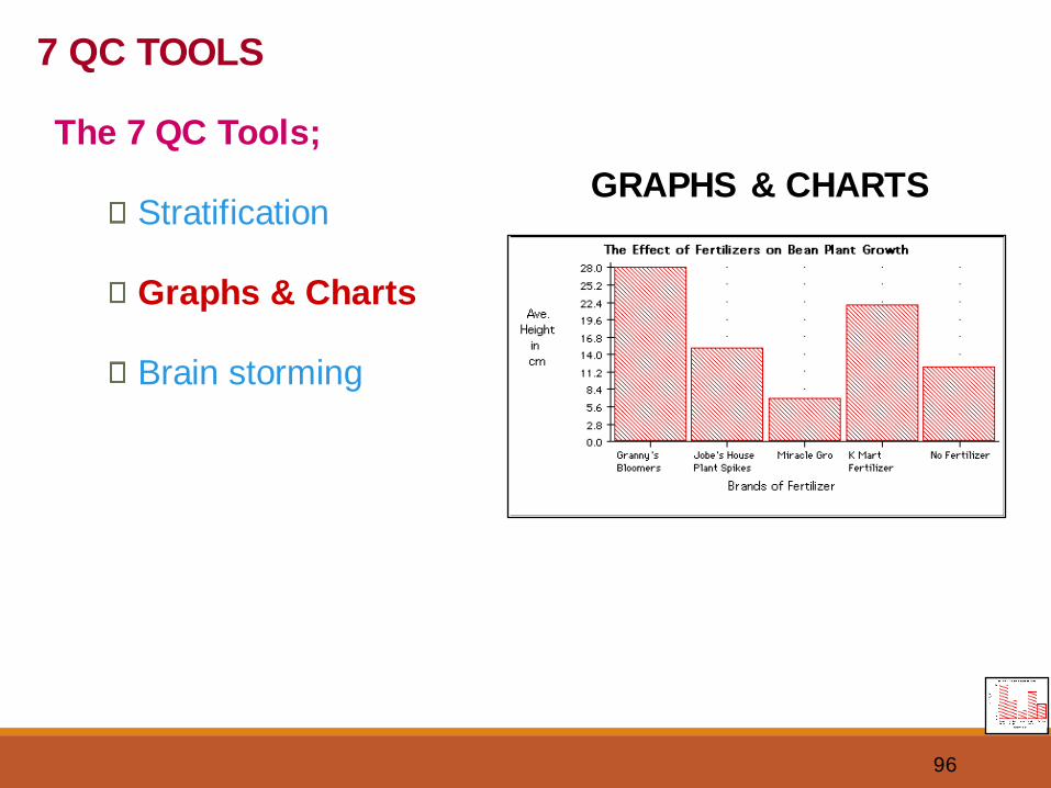
GRAPHS & CHARTS
7 QC TOOLS
The 7 QC Tools;
Stratification
Graphs & Charts
Brain storming
97
What are Graphs & Charts?
A technique used to communicate information visually.
Complicated information is made easy to understand
individually and comparatively using Graphs & Charts.
Basic types include;
1. Bar graph
2. Line graph
3. Pie or Circle graph
GRAPHS & CHARTS
98
1. Learn to construct Graphs & Charts using:
• MS Excel worksheet
2. Exercise on Graphs & Charts
GRAPHS & CHARTS
99
VISUALS
Some Sample Graphs ...
100
BRAINSTORMING
7 QC TOOLS
The 7 QC Tools;
Stratification
Graphs & Charts
Brain storming
101
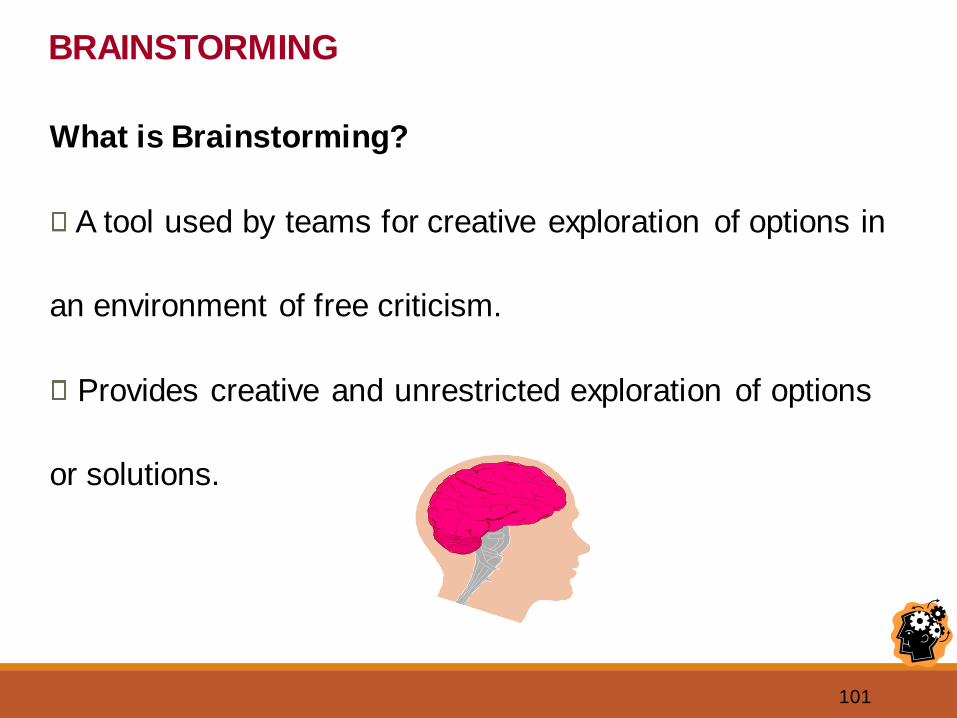
What is Brainstorming?
A tool used by teams for creative exploration of options in
an environment of free criticism.
Provides creative and unrestricted exploration of options
or solutions.
BRAINSTORMING
102
BRAINSTORMING
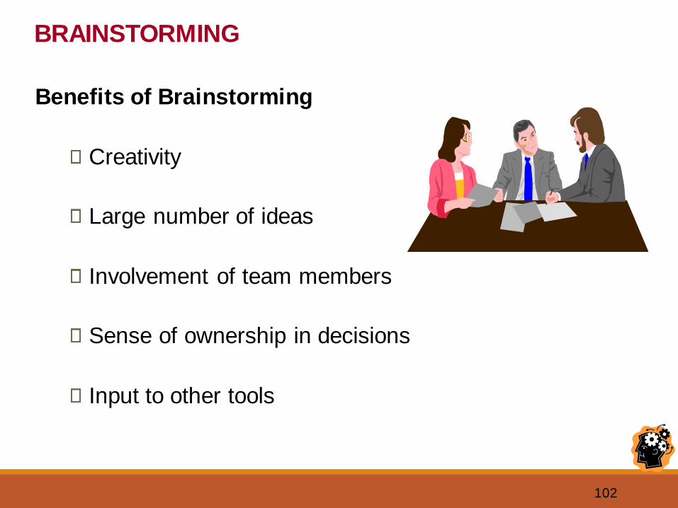
Benefits of Brainstorming
Creativity
Large number of ideas
Involvement of team members
Sense of ownership in decisions
Input to other tools
103
BRAINSTORMING
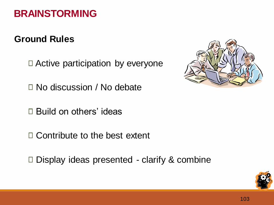
Ground Rules
Active participation by everyone
No discussion / No debate
Build on others’ ideas
Contribute to the best extent
Display ideas presented - clarify & combine
104
BRAINSTORMING
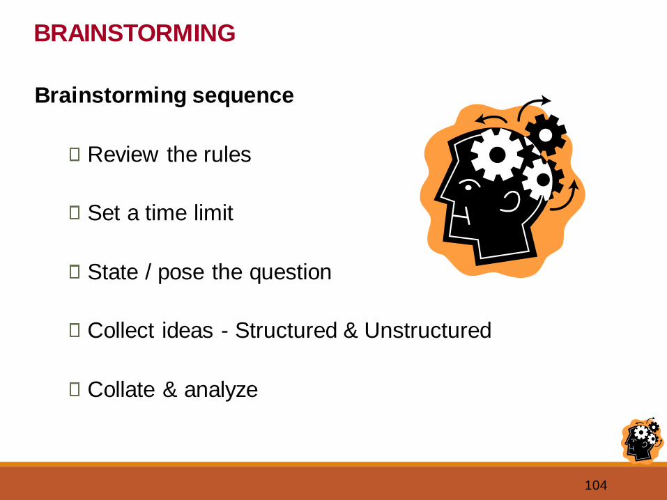
Brainstorming sequence
Review the rules
Set a time limit
State / pose the question
Collect ideas - Structured & Unstructured
Collate & analyze
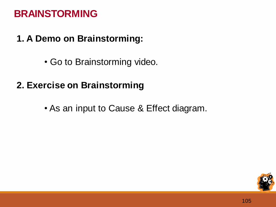
105
1. A Demo on Brainstorming:
• Go to Brainstorming video.
2. Exercise on Brainstorming
• As an input to Cause & Effect diagram.
BRAINSTORMING
106
VISUALS
A Sample Brainstorming Session ...
107
Check Sheet
Pareto Chart
•••
••
A B C D E Other
20
40
60
80100%
50%
75%
25%
Histogram
Control Chart
Flow
Chart
START
PROCESS
STEPS
DECISION
STOP
IS IS NOT
WHAT?
WHO?
WHERE?
WHEN?
HOW MUCH?
Is/Is Not AnalysisCapability Study
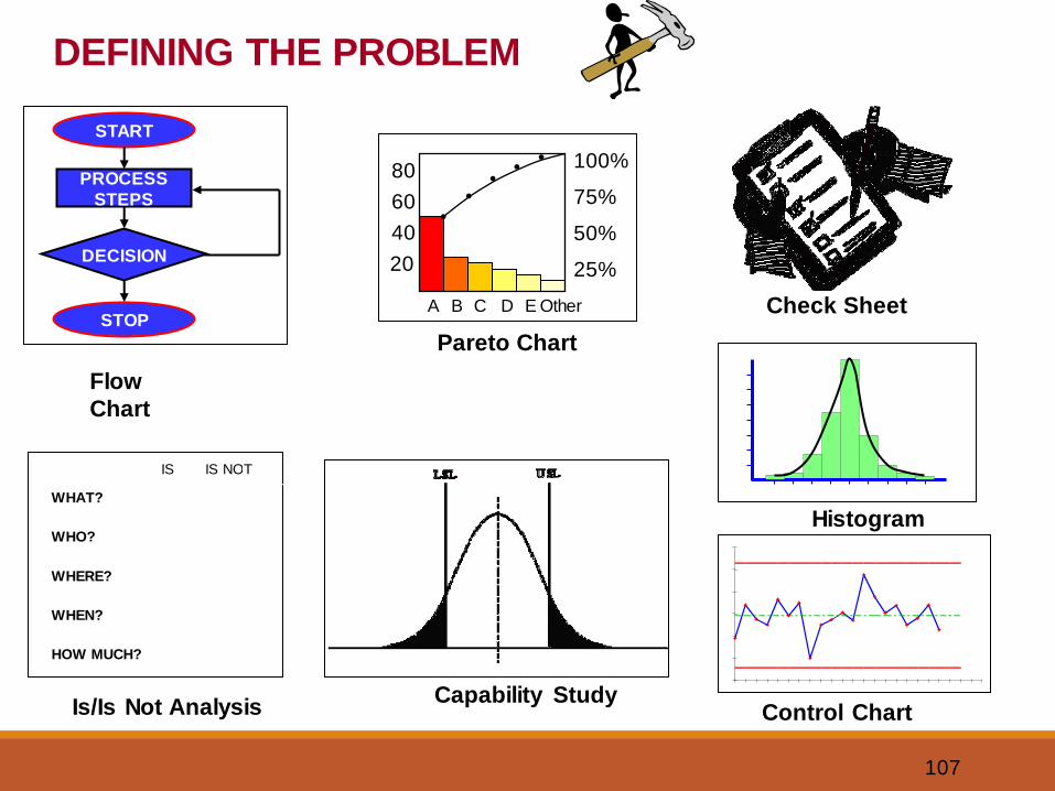
DEFINING THE PROBLEM
108
NGT
Total
A 1 3 1 1 6
B 3 4 4 2 13
C 2 1 3 3 9
D 4 2 2 4 12
The Nominal Group Technique [NGT] provides away to give everyone in the group an equal voice in
problem selection.
Brainstorming
Brainstorming is a procedure that allows a group toexpress problem areas, ideas, solutions, or needs. It
allows each participant to state their opinion in a non-threatening environment. Brainstorming helps a groupcreate many ideas in as short a time as possible.Brainstorming can be used in two ways: structured orunstructured.
OperationalDefinitions
Operational definitions give a clear communicablemeaning to a concept which enables individuals towork on a system based on basic guides ofunderstanding. There are no gray areas.
Raw Data
ABCDOther
100 %
75 %
50 %
25 %
Pareto Chart
A Pareto Chart is a special form of vertical bar graph that helps you
to determine which problems to solve in what order. Doing a
Pareto Chart based on either a Check List or other forms of data
collection helps direct attention and efforts to the truly important
problems.*
*You will generally gain more by working on the tallest bar than tackling the smaller bars.
Pareto Chart
CAUSE & EFFECT DIAGRAM [FISHBONE]
A Cause & Effect Diagram is used when you need toidentify, explore, and display the possible causes of aspecific problem or condition. “Fishboning”
represents a sophisticated form of brainstorming.
EFFECT
Cause Cause
Cause CauseCause
A Problem Statement is tool usedto document a Probletunity.
ProblemStatement
A Problem Statement isdivided into three parts: thecurrent situation or existingstate of the problem, theimpact the problem has onthe organization, and thedesired state one would liketo achieve by solving theproblem or improving theprocess.
Define the Team
Team Members
Name Role
John Team Leader
Mary Coach
Bob Teacher
Susan Custodian
Bill Secretary
Jane Driver
Wayne Student
Purpose & Vision
Average
_ _ _ _ _ _ _ _ _ _ _ _ _ _ _ _ _ _ _ _ _ _ _ _ _ Upper Control Limit [UCL]
_ _ _ _ _ _ _ _ _ _ _ _ _ _ _ _ _ _ _ _ _ _ _ _ _
Lower Control Limit [LCL]
CONTROL CHART
Time
Measu
rem
ent
A Control Chart is simply a Run Chart with statisticallydetermined upper and lower control limit lines drawn on
either side of the process average. Being in control[meaning no data points fall outside the control limits]simply means the process is consistent.
Average
RUN CHART
Time
Measu
rem
ent
A Run Chart is used to monitor a process to seewhether or not the long-range average ischanging.
Run Charts are the simplest quality tool toconstruct and use.
RestrainingForces
DrivingForces
Force Field Analysis isa visual listing of possible
forces driving orpreventing change.
A Force Field Analysis isuseful if a qualityimprovement team wantsto find out what isdriving, slowing, or notallowing change at all.
Hint: removing arestraining force willmake for more progressthan creating drivingforces.
FORCE FIELD ANALYSIS
INTERRELATIONSHIP
Cause
Cause Cause
Cause
Cause
Cause
An Interrelationship Diagraph is used tostudy the relationship between the causesand discover the “root cause” of a problem.
INTERRELATIONSHIP
Cause
Cause Cause
Cause
Cause
Cause
If a relationship can be
established, lines are
drawn between two
causes. Analysis leads to
drawing arrows between
causes and effects.
CHECKLISTS or sheets are simple easy-to-understandforms used to determine whether and with what
frequency specified events are taking place. Check listssupply the necessary data for creating Run Charts andother continuous improvement tools.
CHECKLIST
Date Total
Category 1 Data Data
Category 2 Data Data
Category 3 Data Data
Category 4 Data Data
Decision
ProcessStep
Stop
Start
FLO
WCH
ART
A Flowchart is a pictorialrepresentation showing allof the steps of a process.Flowcharts are used to“document” a process. Bycreating and studyingflowcharts teams can oftenuncover sources of troubleas well as solutions toproblems. Many of us arevisual learners. “Let’sflowchart it” is a mostimportant step in problemsolving.
The Plan-Do-Study-Act [PDSA] Cycle The Plan-Do-Study-Act [PDSA] Cycle
PlanPlan
DoDo
ActAct
StudyStudy
DelightedCustomers
Systems Progress
Systems Progress is a visual technique usedto answer the questions: “Where did we start?Where are we now? Where are we going?
Pilot Project
Pilot Projects provide evidence that proposedinnovations or improvements will work. PilotProjects are the “DO” of the Plan-Do-Study-Act[PDSA] Cycle.
Five Whys?
The Five Whys? are simply a process ofasking Why? at least five times in a row
to detect the root cause or meaning of aparticular problem or situation.
Why? Why?
Why? Why?
Why?
BAR CHART
C
ategor
y
Survey Results In Percent
A Bar Chart displays collected data onparallel horizontal bars for comparativeanalysis. Lengths are proportional tocollected data.
COLUMN CHART
Category
Num
ber
A Column Chart is a vertical bar graphthat displays collected data in parallelcolumns whose lengths are proportional tospecific amounts in sets of data.
SURVEY
1. xxxxxxxxxx
2. xxxxxxxxxx
3. xxxxxxxxxx
determiningquality.
Compile the resultsusing a Checklist
and display themusing a Bar Chart,
Column Chart, or
Pareto Chart.
Surveys are used when a project isplanned, to prove the need and demand of
the customer, or to test a group for
Project Bulletin Board
RED ITEMS REQUIRE ACTION WITHIN 30 DAYS.
1.
2.3.
1.
2.3.
YELLOW ITEMS ARE SCHEDULED TO MOVE INTO RED.
1.
2.3.
GREEN ITEMS CAPTURE ALL IMPROVEMENT SUGGESTIONS.
Completed Items move to the
Successful Projects Board.
Items must be organized into segments
capable of being addressed within 30 days.
Items move into yellow as space permits.
P RIOR K NO WLED GE ASS ESSMEN T Hig h Sc ho ol Cu s tod ia l QIP Surve y
0
1
2
3
4
U nd e rs to o d th e 2 -Jo b C on c ep t p rio r to
train in g.
U nd e rs to o d th e 8 5- 15 Ru le p rio r to
train in g.
Un de rst oo d t he i de a o f " C us to m e r-Dr iven
Qu alit y " p rio r to train in g.
Un d ers to od t h at I a m a c u st om er t oo pr ior
to train in g.S er ie s1
A Radar Chart illustrates relationshipsbetween characteristics of plotted data
points in relation to the whole picture.Radar Charts can give a second
interpretation to the same set of data in
a Bar or Column Chart.
CORRELATION CHART
Factor 2
Fact
or 1
A Correlation Chart measures the performanceof one factor compared to another and helpsdetermine what relationship. if any, exists. Thecorrelation is based on the pattern of data points.
Negative Correlation
Positiv
e
Cor
relatio
n
No Correlation
100 %
90 %
80 %
70 %
ETC.
Consensogram
A Consensogram is a statistical survey that measuresan entire groups perception of effort, commitment,
understanding, etc. The question asked is decided bythe leader, group, team, or organization. TheConsensogram is used when you have a group of peopleand wish to see their view on an issue.
Pie Chart
A Pie Chart is used to display data which isrepresented by a circle [100 percent] and isthen broken down into slices.
The Pie Chartshows the mostimportant problemareas by givingthem a larger pieceof the pie. PieCharts are easy toread and areeffective with allage groups.
Scores
Freq
uenc
y
HISTOGRAM
A Histogram is a specialized Column Graph usedto illustrate the stability of a process. Thegreatest number of units are pictured at the midpoint with roughly an equal number of units oneither side of that point. See the example below.
Process A
Process B
Process A illustrates greater
variation than Process B.
Process C illustrates even less
variation than Process B.
Process C
Stratification helps analyze cases in which datamay actually mask the real facts.
This is often the case when the recorded data isfrom many sources but is treated as one number.
Stratification breaks down single numbers intomeaningful categories to focus corrective action.
Time
Measu
rem
ent
Time
Measu
rem
ent
A and B
Combined A Alone
B Alone
Stratification
A and B Combined
Imagineering
Imagineering is a Brainstorming technique usedto identify what an individual or group envisions asthe perfect project, process, or system. Anotherterm used for Imagineering is idealized design.
The facilitator or leadermust clearly state theobjective of theImagineering session.
Example:
“What would be the perfect
learning environment?”
Flow Tree
A Flow Tree helps to break downoutcomes into major subcategories orcapacities. It is an integral part of aCapacity Matrix [See].
Capacity Matrix
Know
ledge
Unders
tandin
gApplic
ation
Anal
ysis
Aim or Capacity Breakdown
Result
ParkingLot
? I/O
+What is going well?
A Parking Lot is a place where groupparticipants can anonymously communicatewith facilitators or group leaders.
.
What needs improvement
What question do you have?What are the issues or observations.
Affinity Diagram
The Affinity Diagram is the result of an interactivedata collection method which allows groups of people
to identify and process large quantities of ideas in avery short time. It is a non-judgmental way to collectand process ideas. A question is posed. Teammembers individually Brainstorm silently writing ideas
on 3”x3” stickynotes.
Team members
randomly place
them in the middle
of the table.
Ideas are grouped
into like categories.
Finally, a header
note is placed at
the top of each
column.
PROJECT
STEPS
1.
2.
3.
4.
5.
Time
Ganntt Chart
A Ganntt Chart is used for planning schedules andmanaging projects. A Ganntt Chart is useful when doing a
project where one stage depends upon another. It alsomakes it obvious which steps can be done simultaneously.
Present Organization
1.
2.
3.
4.
Future Organization
1.
2.
3.
4.
Positive Forces That Create Growth
1.
2.
3.
4.
5.
6.
Negative Forces That Create Growth
1.
2.
3.
4.
5.
6.
+
-
Tran
sition
Perio
d
Quality
of W
ork Lif
e
A Bone Diagram is a systems reflection tool, which helps
organizations clarify their current and desired state. It also
identifies the forces driving and preventing progress toward the
desired change. It combines the Systems Progress and Force
Field Analysis Tools.
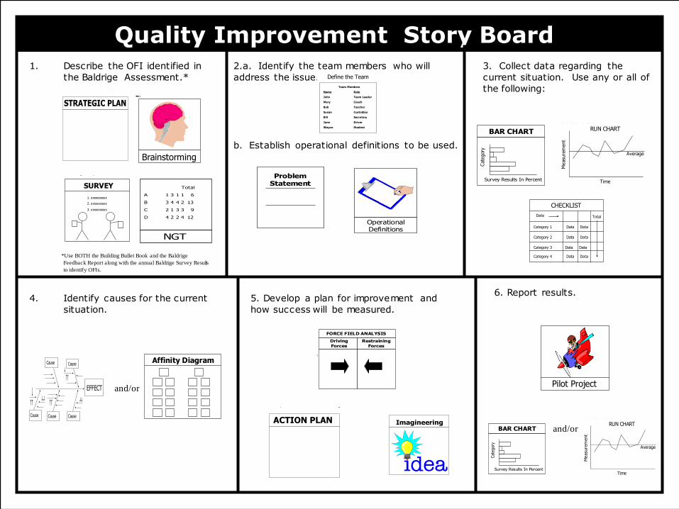
Quality Improvement Story Board2.a. Identify the team members who will address the issue.
b. Establish operational definitions to be used.
1. Describe the OFI identified in the Baldrige Assessment.
3. Collect data regarding the current situation.
5. Develop a plan for improvement and how success will be measured.
6. Report results.4. Identify causes for the current situation.
ACTION PLAN
Action Plan refers to a series of connected steps that are designed to accomplish a goal or objective. Action plans include details of shorter- and longer-term performance projections, responsible personnel, resource commitments and time horizons for accomplishment. Action plan development represents the critical stage
in planning when strategic objectives and goals are made specific so that effective organization-wide understanding and deployment are possible.
STRATEGIC PLAN
The Strategic Plan refers to all aspects of organization level planning and the deployment of action plans. This includes primarily the development and deployment of an organizational mission, key measures of mission fulfillment, and strategies that take into account key student and stakeholder requirements. Strategic
Planning has a results-oriented focus and seeks to align all daily work within the organization with the over-all organizational direction.
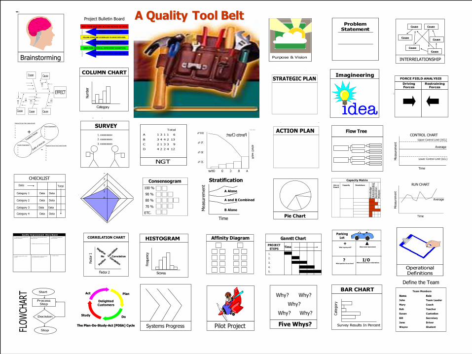
A Quality Tool Belt
109
Quality Improvement Story Board2.a. Identify the team members who will
address the issue.
b. Establish operational definitions to be used.
1. Describe the OFI identified in
the Baldrige Assessment.*
*Use BOTH the Building Bullet Book and the Baldrige
Feedback Report along with the annual Baldrige Survey Results
to identify OFIs.
3. Collect data regarding the
current situation. Use any or all of
the following:
5. Develop a plan for improvement and
how success will be measured.
6. Report results.
and/or
4. Identify causes for the current
situation.
and/or
Imagineering
Imagineering is a Brainstorming technique used to identify what an individual or group envisions as the perfect project, process, or system. Another term used for Imagineering is idealized design.
The facilitator or leader must clearly state the objective of the Imagineering session.
Example:
“What would be the perfect learning environment?”
Define the Team
Team Members
Name Role
John Team Leader
Mary Coach
Bob Teacher
Susan Custodian
Bill Secretary
Jane Driver
Wayne Student
OperationalDefinitions
Operational definitions give a clear communicablemeaning to a concept which enables individuals towork on a system based on basic guides ofunderstanding. There are no gray areas.
A Problem Statement is tool usedto document a Probletunity.
ProblemStatement
A Problem Statement isdivided into three parts: thecurrent situation or existingstate of the problem, theimpact the problem has onthe organization, and thedesired state one would liketo achieve by solving theproblem or improving theprocess.
SURVEY
1. xxxxxxxxxx
2. xxxxxxxxxx
3. xxxxxxxxxx
determiningquality.
Compile the resultsusing a Checklist
and display themusing a Bar Chart,
Column Chart, or
Pareto Chart.
Surveys are used when a project isplanned, to prove the need and demand of
the customer, or to test a group for
Affinity Diagram
The Affinity Diagram is the result of an interactivedata collection method which allows groups of people
to identify and process large quantities of ideas in avery short time. It is a non-judgmental way to collectand process ideas. A question is posed. Teammembers individually Brainstorm silently writing ideas
on 3”x3” stickynotes.
Team members
randomly place
them in the middle
of the table.
Ideas are grouped
into like categories.
Finally, a header
note is placed at
the top of each
column.
CAUSE & EFFECT DIAGRAM [FISHBONE]
A Cause & Effect Diagram is used when you need toidentify, explore, and display the possible causes of aspecific problem or condition. “Fishboning”
represents a sophisticated form of brainstorming.
EFFECT
Cause Cause
Cause CauseCause
Pilot Project
Pilot Projects provide evidence that proposedinnovations or improvements will work. PilotProjects are the “DO” of the Plan-Do-Study-Act[PDSA] Cycle.
NGT
Total
A 1 3 1 1 6
B 3 4 4 2 13
C 2 1 3 3 9
D 4 2 2 4 12
The Nominal Group Technique [NGT] provides away to give everyone in the group an equal voice in
problem selection.
Average
RUN CHART
Time
Measu
rem
ent
A Run Chart is used to monitor a process to seewhether or not the long-range average ischanging.
Run Charts are the simplest quality tool toconstruct and use.
BAR CHART
C
ategor
y
Survey Results In Percent
A Bar Chart displays collected data onparallel horizontal bars for comparativeanalysis. Lengths are proportional tocollected data.
CHECKLISTS or sheets are simple easy-to-understandforms used to determine whether and with what
frequency specified events are taking place. Check listssupply the necessary data for creating Run Charts andother continuous improvement tools.
CHECKLIST
Date Total
Category 1 Data Data
Category 2 Data Data
Category 3 Data Data
Category 4 Data Data
Average
RUN CHART
Time
Measu
rem
ent
A Run Chart is used to monitor a process to seewhether or not the long-range average ischanging.
Run Charts are the simplest quality tool toconstruct and use.
BAR CHART
C
ategor
y
Survey Results In Percent
A Bar Chart displays collected data onparallel horizontal bars for comparativeanalysis. Lengths are proportional tocollected data.ACTION PLAN
Action Plan refers to a series of connected steps that are designed to accomplish a goal or objective. Action plans include details of shorter- and longer-term performance projections, responsible personnel, resource commitments and time horizons for accomplishment. Action plan development represents the critical stage
in planning when strategic objectives and goals are made specific so that effective organization-wide understanding and deployment are possible.
STRATEGIC PLAN
The Strategic Plan refers to all aspects of organization level planning and the deployment of action plans. This includes primarily the development and deployment of an organizational mission, key measures of mission fulfillment, and strategies that take into account key student and stakeholder requirements. Strategic
Planning has a results-oriented focus and seeks to align all daily work within the organization with the over-all organizational direction.
RestrainingForces
DrivingForces
Force Field Analysis isa visual listing of possible
forces driving orpreventing change.
A Force Field Analysis isuseful if a qualityimprovement team wantsto find out what isdriving, slowing, or notallowing change at all.
Hint: removing arestraining force willmake for more progressthan creating drivingforces.
FORCE FIELD ANALYSIS
Brainstorming
Brainstorming is a procedure that allows a group toexpress problem areas, ideas, solutions, or needs. It
allows each participant to state their opinion in a non-threatening environment. Brainstorming helps a groupcreate many ideas in as short a time as possible.Brainstorming can be used in two ways: structured orunstructured.
110
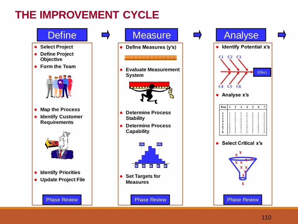
Define Measure Analyse⚫ Identify Potential x’s
⚫ Analyse x’s
⚫ Select Critical x’s
Phase Review
Run 1 2 3 4 5 6 7
1 1 1 1 1 1 1 12 1 1 1 2 2 2 23 1 2 2 1 1 2 24 1 2 2 2 2 1 15 2 1 2 1 2 1 26 2 1 2 2 1 2 17 2 2 1 1 2 2 18 2 2 1 2 1 1 2
Effect
C1 C2
C4
C3
C6C5
x
xx
xx
xx
xx
x
x
⚫ Select Project
⚫ Define Project Objective
⚫ Form the Team
⚫ Map the Process
⚫ Identify Customer Requirements
⚫ Identify Priorities
⚫ Update Project File
Phase Review
⚫ Define Measures (y’s)
⚫ Evaluate Measurement System
⚫ Determine Process Stability
⚫ Determine Process Capability
⚫ Set Targets for
Measures
15 20 25 30 35
LSL USL
Phase Review
THE IMPROVEMENT CYCLE
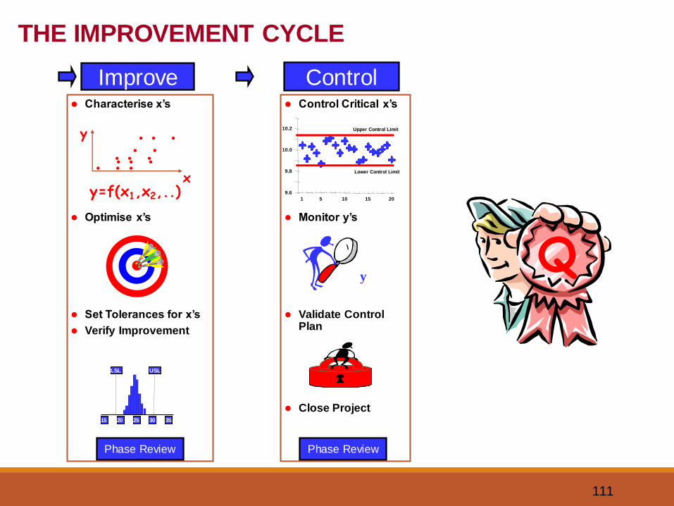
111
Improve Control⚫ Control Critical x’s
⚫ Monitor y’s
⚫ Validate Control Plan
⚫ Close Project
1 5 10 15 20
10.2
10.0
9.8
9.6
Upper Control Limit
Lower Control Limit
y
Phase Review
⚫ Characterise x’s
⚫ Optimise x’s
⚫ Set Tolerances for x’s
⚫ Verify Improvement
15 20 25 30 35
LSL USL
Phase Review
y=f(x1,x2,..)
y
x
. . .. . .. .. . .. . .
THE IMPROVEMENT CYCLE
Q
112
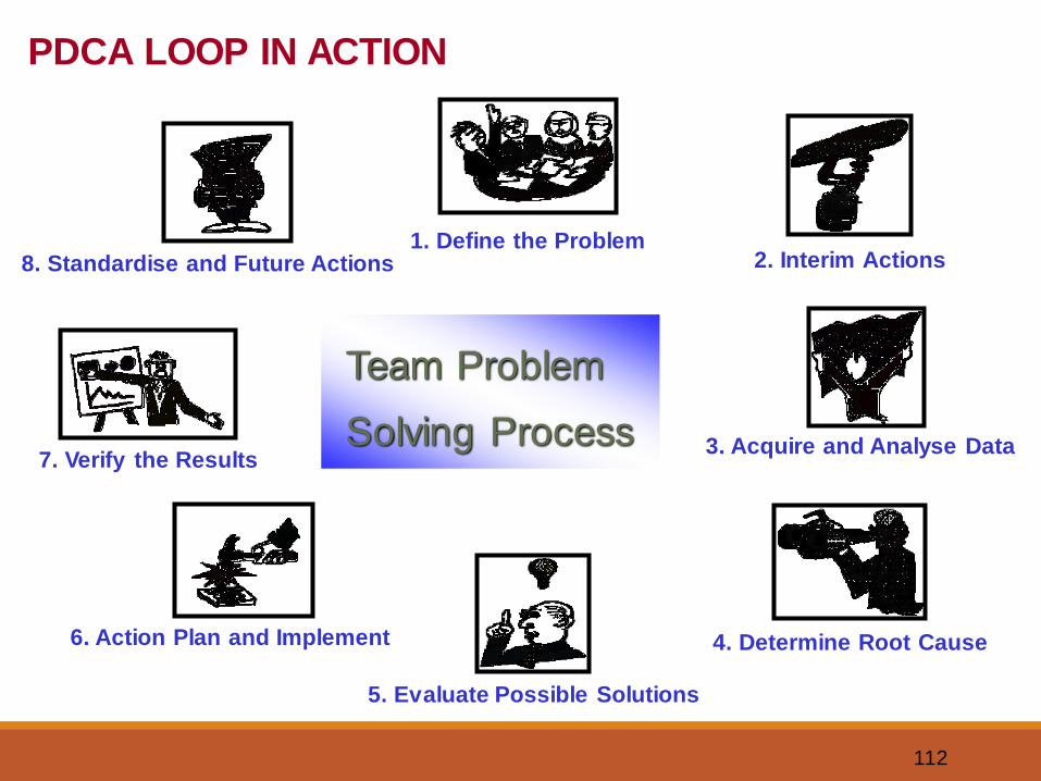
1. Define the Problem2. Interim Actions
3. Acquire and Analyse Data
4. Determine Root Cause
5. Evaluate Possible Solutions
6. Action Plan and Implement
7. Verify the Results
8. Standardise and Future Actions
Team Problem
Solving Process
PDCA LOOP IN ACTION
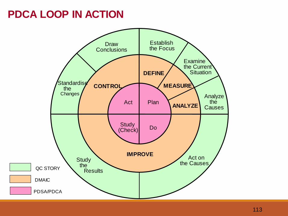
113
QC STORY
DMAIC
PDSA/PDCA
DrawConclusions
Establish the Focus
Examine the Current
Situation
Analyzethe
Causes
Act on the Causes
IMPROVE
DEFINE
MEASURE
ANALYZE
CONTROLStandardise
the Changes
Study the
Results
Plan
DoStudy
(Check)
Act
PDCA LOOP IN ACTION
114
SUMMARY
The tools listed above are ideally utilized in reducing the process
variability or identifying specific problems in the process. In any
case, the tools should be utilized to ensure that all attempts at
process improvement include:
• Analysis
• Improvement
• Monitoring
• Implementation
115
QUESTIONS ?