
7-QC Tools - Chools
106
7-QC Tools www.chools.in
-
Upload
khangminh22 -
Category
Documents
-
view
0 -
download
0
Transcript of 7-QC Tools - Chools

7-QC Tools
www.chools.in

Process
Input Output
A Value adding
Transformation
Raw Material Finished or
Intermediate
Product
All work is accomplished by a process
Opportunities to
Measure
What is a Process
www.chools.in

Improvement
Change from current level of performance to a superior
level and staying there
Sporadic
Chronic
Breakthrough
Bad
Good
www.chools.in

Understanding Variation
Variation
Assignable
(Special Cause)
Chance
(Random Cause)
Sporadic
Very Few
Large contribution
Easy to identifyand eliminate
Random
Large in number
Small contribution
Difficult to identify and
eliminate
www.chools.in

CTQ
CTQ
CTQ
CTQ
CTQ
CTQ
CTQ
CTQ
CTQ
CTQ
CTQ
CTQ
CTQ
1 2 3 4 5 6 7 8 9 1
0
1
1
1
2
1
3
1
4
1
5
1
6
1
7
1
8
19 20
Process flow diagram Process
CTQs
Product CTQs
High
correlation
Product Process Mapping
www.chools.in

What is a problem?
Problem is an unsatisfied
performance in product/ service.
www.chools.in

A problem could be
• nonconformance
• scrap
• chronic rework
• recurring accepted on deviation poor yield
• customer complaint
• machine breakdown
• low process capability
• loosing customers
• reducing market share
• late delivery, etc.
www.chools.in

Known approaches for problem solving
Traditional method: requires no
factual analysis or observations
Symptom Remedy
Scientific and methodical.
Symptom Root Cause Remedy
www.chools.in

Steps of Problem Solving
1. Definition - Identify and defining the problem
2. Observation/Measure - Investigating the features of the
problem
3. Analysis - Finding the root causes
4. Actions - Establishing and implementing
countermeasures
5. Check - Ensuring the effectiveness of the
remedies & countermeasures
- Results v/s Plan
6. Standardization - Holding the gains
7. Conclusion - Reviewing the problem solving
approach and identifying next problem
www.chools.in

Check sheet
Pareto Diagram
Stratification
Cause and Effect Diagram
Scatter diagram
Histogram
Graphs & Charts
7-QC Tools
www.chools.in

Check Sheet
www.chools.in

A convenient and compact
format to facilitate data gathering
& to quantify the current status or
magnitude of the problem
What is check sheet?
www.chools.in

Data Collection
What is Data ?
Data is a numerical expression of an activity
Quantitative Qualitative
• Measurable
e.g. :Length,
Temperature
• Countable
e.g. :Number of
defects
• Subjective assessment
e.g. :Score in a
beauty contest
www.chools.in

Population, Sample and Data
Sample Data
Action
Random
Sampling
Measurement
/ Observation
Objectives of Data Collection
• To know and quantify the status
• To monitor the process
• To decide acceptance or rejection
• To analyse and decide the course of action
Population
(Lot)
www.chools.in

Define the purpose
Decide the type of analysis
Define the period of data collection
Is the the required data already available ?
How to collect data?
www.chools.in

Proper sampling procedure
Proper choice of instruments
Calibration of instruments used
Availability of standards for sensory
characteristics
Adequate lighting and other
test/ inspection facilities.
For Proper Data Collection
www.chools.in

Simplify of data gathering
Provide preliminary summarisation
Provide a basis for statistical analysis
Problem monitoring
Direction of trouble shooting
Purpose of Check Sheet
www.chools.in

Areas of application
Production: Measurements on process parameters,
No. of defects in products,
Location of defect.
Raw Material: No of defects,location of defects,
Measurement on Quality Characteristics.
Maintenance: Maintenance time, down time,
Machine wise break-down,
Causes of break down.
www.chools.in

Type of check sheets
Purpose of Checking Type of Check Sheet
Determine defect details Defective item check sheet
Determine occurrence of defects
by day, week, operator, machine etc
Defect factor check sheet
Determine where defects occur Defect location check sheet
Determine dispersion of dimensions,
hardness, weight etc.
Process distribution check
sheet
Inspect machines or equipment or
check the operating procedure
Inspection and validation
check sheet
www.chools.in

Production Process Distribution Check sheet
Diameter of Component X
Department : Operator :
Specification : Dates : to
Frequency of occurrenceMeasurement
(cms) 5 10 15 20 25 30 35 40 45 50 Total
0.950.960.970.980.991.001.011.021.031.041.05
llllllllllllllllllllllllllllllllllllllll
lllllllllllllllllllllll
llllllllllllllllllll
lllllllllllllllll
llllllllllll
lllll
llll llll l
1371725422618641
www.chools.in

Location Check sheet
X = Dirt
D = Dent
S = Scratch
B = Bubble
Hood Paint DefectsName: ____
Date: ____
Model: ____ DD D
S
XXX
B X
No. inspected: _____
www.chools.in

PARETO DIAGRAM
www.chools.in

A tool to select vital few and few trivial many.
80-20 Rule
www.chools.in

Pareto chart by effect
To find out what the major problem is Viz.
Quality: Defects, Faults , Failures, Complaints,
Repairs, Returned items etc.
Cost: Amount of loss, Expenses
Delivery: Stock, Shortages, Delay in delivery,
Default in payment.
Safety: Accidents, Breakdowns, mistakes.
www.chools.in

Pareto chart by Cause
To find out what the major problem is Viz.
Operator Shift, Group,
Experience, Skill.
Machine Machines,
Equipment,
Tools
Raw material Manufacturer, lot
Operational method Conditions, Order,
Method
www.chools.in

Uses of Pareto diagram
Find out the most important item/defect.
Ratio of each item to the whole.
Degree of improvement after remedial action in
some limited area.
Improvement in each item/defect compared before
and after correction.
www.chools.in

How to prepare a Pareto diagram
Decide which item to be studied.
Stratify the problem according to sources (by defects,
by supplier etc.) and tabulate the corresponding data.
Arrange the stratified items in descending order of value
and draw a bar diagram.
Draw a curve showing the cumulative % above the bar
chart starting from the greatest value.
www.chools.in

Pareto Analysis for inspection of product ABC
0%
10%
20%
30%
40%
50%
60%
70%
80%
90%
100%
Bubbles
Rough
Finish
Scrat
ches
Damag
ed P
ackin
g
Wea
k co
rner
Crack
Stains
Defects
Pe
rce
nta
ge
De
fects
www.chools.in

STRATIFICATION
www.chools.in

The method of grouping data by common points or characteristics
to understand similarities and characteristics of data is called
stratification.
www.chools.in

Such classification helps in obtaining vital
information by distinguishing and comparing
data in different class or strata.
It also identifies the key strata to concentrate on
www.chools.in

The stratification may be based on machines, operators, shifts or
any other source of variation.
www.chools.in
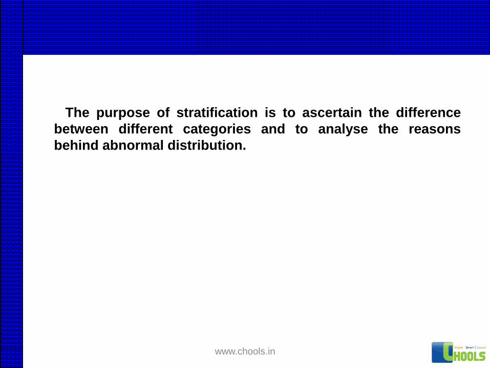
The purpose of stratification is to ascertain the difference
between different categories and to analyse the reasons
behind abnormal distribution.
www.chools.in

IDENTIFY STRATIFICATION CRITERIA FOR COLLECTING
DATA ON HOUSE KEEPING DEFECTS:
RESULT: # OF DEFECTS PER AUDIT
STRATIFICATION CRITERIA:
• TYPE OF DEFECTS
• LOCATION
• DATE & TIME
• AUDITED BY
• PEOPLE IN THE LOCATION
• INFRASTRUCTURES AVAILABLEwww.chools.in

TYPE OF STRATIFICATION CRITERIA:
• IDENTITY: e.g. product name, reference no. …
• MACHANICAL:
• OPERATIONAL:
• TECHNICAL:
• ENVIRONMENTAL
• MEASUREMENT:
• BEHAVIOURAL/SKILL RELATED
• TIME RELATED:
• ROLE, RESPONSIBILITY & AUTHORITY RELATED:www.chools.in

Areas of application
Raw material
Rejection % in supplier wise and batch wise.
Production
Stratification as per Machine, Shift, operator
etc. of rejections.
Engineering and design
Stratification of drawing errors draftsman wise.
www.chools.in

USE OF STRATIFICATION:
REVIEW ADEQUACY OF PRESENTLY USED DATA
COLLECTION MODE LIKE REGISTER, LOGBOOK etc.
INTRODUCING NEW DATA COLLECTION MODE
COLLECTION OF DATA FOR ANY SPECIFIC
PURPOSE
BEFORE CHECKSHEET
www.chools.in

BRAIN STORMING
www.chools.in

Basic Rules for Brainstorming
Defer evaluation
Fantasize freely
Generate quantity
Build on ideas
www.chools.in

Generate Quantity
Generate as many ideas as possible.
A pearl diver will be more successful in finding
pearls, when he brings up 200 oysters than when
he surfaces only 15-20 oysters.
www.chools.in

Cause & Effect Diagram
(Optional)
Tree Diagram
&
Affinity Diagram
www.chools.in

Organizing
Potential Causes
www.chools.in

Looking for Relationships
Graphic displays can help you structure possible causes in order to find
relationships that will shed new light on your problem.
Objective
Means/Objective
Means/Objective
Means/Objective
Means/Objective
Means/Objective
Means
Means
Means
Means
Means
Means
Means
Means
Means/ObjectiveAffinity Diagram
Cause & Effect Diagram Tree Diagram
www.chools.in

Cause-and-Effect Diagram
Cause-and-effect
diagrams graphically
display potential
causes of a problem.
The layout shows
cause-and-effect
relationships
between the
potential causes.
Problem
Men Machine
Material Method
www.chools.in

Cause-and-Effect Diagram Features
Causesgrouped byrelationship
to eachother
Arrowsindicate thedirection of
potentialcause-and-
effect
Potential causesat lower level
would contributeto cause at next
level up
Narrowly definedproblem forms
head of the fish;causes listed on
the diagramshould potentiallycontribute to this
problem
One “spine” leadsinto head (problem
statement).Contributingcauses are
arranged onsmaller and
smaller “bones.”
Power Bulb
Plug/Cord Lamp
Lamp
Doesn’t
Turn OnSwitch
Broken
Switch
Missing
No Contact
Corroded
Vandal
Cord Cut
Chewed
by Dog
Not Plugged In
Assembly error
Missing
Loose
Is Bill
Paid?
Is Current
On?
Old
Burned
Out
Broken
Replace
Bulb
Storm
Power Outage
Power Plant
Failure
Circuit Breaker
No House
Current
Unpaid Bill Wall Switch
Turned Off
High humidity
www.chools.in

Blinker
base
crack
Method Machine
Operator
Terminal dim.
variation
Unskilled
operator
negligence
fatigue
Worn-out punch
Unequal
Punch level
Material
Base material
not ok
Base dim.
variation
Wrong sequence
of operation
Pressure
variationOversize
d Locator
Punch & locator
misalignment
Stopper
not
working
Dust in locatorWidth of Base
less
Flash in slot
of
base
Hardness
Lgth dim. variation
Width dim. variation
Warpage
Uneven leg
thickness
Thickness variation
Slot dim variation
Lgth variation
Width variation
Wrong placement of
terminal in slot
Interchange of terminal in slots
Wrong placement of
base in fixture locator
Height of
Stopper
less/more
Play of base in
locator slot
Offset of terminal
CL and Punch CL
Narrowly definedproblem forms
head of the fish;causes listed on
the diagramshould potentiallycontribute to this
problem
www.chools.in

Why Use Cause-and-Effect Diagrams
To stimulate thinking
during a brainstorm
of potential causes
To understand
relationships between
potential causes
To track which
potential causes
have been investigated,
and which proved to contribute
significantly to the problem
www.chools.in

When to Use Cause-and-Effect
Diagrams
Use a Cause-and-Effect Diagram:
When there is so large a number of potential
causes that it is difficult to focus the analysis.
When there is a lack of clarity about the
relationship between different potential causes.
www.chools.in

Effective Use of Cause-and-Effect
Diagrams
Have a narrowly defined problem to start with.
This should come from your work in Measure.
Capture cause-and-effect relationships between units and sub-units.
Causes on the diagram must be verified with datato confirm that they are real causes.
Bulb
Burned out
Lamp does not burnLoose
www.chools.in

How to Create a Cause-and-Effect Diagram
1. Review the Focused Problem Statement
2. Identify Possible Causes
3. Sort Possible Causes into Reasonable Clusters
4. Choose a Cluster and label a main Bone
5. Develop and Arrange Bones for that Cluster
6. Develop Other Main Bones
www.chools.in

Avoid Common Mistakes
Do not use this tool as an alternative form of outlining
Do not use the tool to list potential solutions
SwitchCord
Lamp
Lamp does
not burn
Cycle time too
Long
Offer premium
People
Increase headcount
Plug
www.chools.in
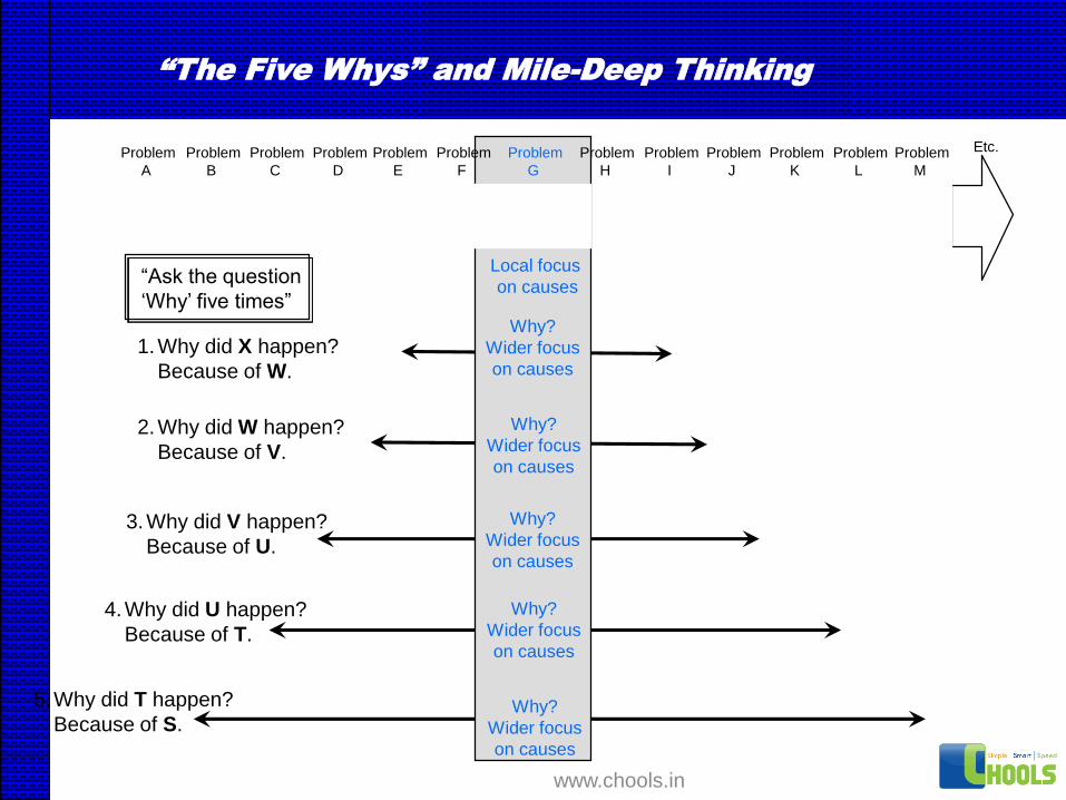
“The Five Whys” and Mile-Deep Thinking
Problem
A
“Ask the question
‘Why’ five times”
Local focus
on causes
Problem
B
Problem
C
Problem
D
Problem
E
Problem
F
Problem
G
Problem
H
Problem
I
Problem
J
Problem
K
Problem
L
Problem
M
Etc.
Why?
Wider focus
on causes
Why?
Wider focus
on causes
Why?
Wider focus
on causes
Why?
Wider focus
on causes
Why?
Wider focus
on causes
1.Why did X happen?
Because of W.
2.Why did W happen?
Because of V.
3.Why did V happen?
Because of U.
4.Why did U happen?
Because of T.
5.Why did T happen?
Because of S.
www.chools.in

The “Might Cause” Check
Helps to confirm the items listed are potential causes
Helps to check relationships between items
<smallest bone>
<next largest bone>
<next largest bone>
<main bone>
<head (problem statement)>
might cause
which might cause
which might cause
which might cause
Might Cause Check
www.chools.in

Might Cause Example
<smallest bone>
<next largest bone>
<next largest bone>
<main bone>
<head (problem statement)>
might cause
which might cause
which might cause
which might cause
Might Cause Check
High humidity
Corrosion
No contact
Lamp does not turn on
www.chools.in

Cause and Effect Diagram for high
petrol consumption
High Petrol
Consumption
Procedure Driver Vehicle
MaterialsMaintenanceRoad
Restrictions
No turnOne way
Circuitous
Road
Frequent
stops
Crossings
Traffic
Speed Breakers
Steep
Poor
condition
Potholes Irregular
servicing
False
economy
Negligence
Clogged
filters
Low pressureIgnorance
Faulty
pressure
Tyres
Petrol
Oil
Not changed
Low level
Incorrect viscosity
ImpuritiesIncorrect
Octane no.
Additives
SparesSpurious
Inferior
Impatience
Craze
Always
late
Riding on
clutch
Lack of
awareness
Poor
anticipation
Wrong
gears
Poor
skill
Wrong
culture
Bad
attitude
Inexperience
Body
Heavy
Shape
Technical
details
Carburetor
Spark plugs
LifeContacts
Fuel mix
Engine
High H.P
Cylinders
www.chools.in
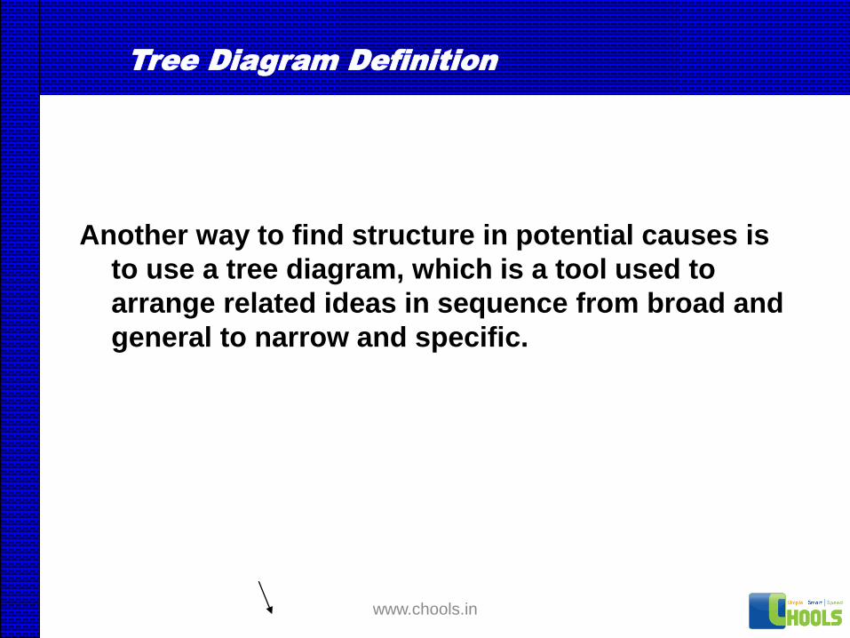
Tree Diagram Definition
Another way to find structure in potential causes is
to use a tree diagram, which is a tool used to
arrange related ideas in sequence from broad and
general to narrow and specific.
www.chools.in

Causal Tree Diagram Features
Lines connectrelated series of
causes
Most specificcauses appear to
the far rightProblem
appears at farleft with the
potentialcauses
branchingout to the
right.
Order Entry
ORDER ENTRY
CYCLE TIME
IS TOO LONG
ORDERS W/O
PROBLEMS
35%
ORDERS WITH
PROBLEMS
65%
RAW
MATERIAL
SHORTAGE
27%
CODE NOT
ON FILE
25%
FORMULA ON
“LOCK HOLD”
1%
NO C OF A
PRIORITIES NOT KNOWN
ARRIVES IN BATCHES
R.M. SHORTAGE
WAIT @ FILLING
GRINDER AVAILABILITY
WRONG QUANTITY
WRONG LOCATION
FORMULA NOT ON FILE
NEW CONTAINER SIZE
SWITCH FROM PURCH.
TO PRODUCT
DIDN'T KNOW DATA
WAS NEEDED
NEW FORMULA
DISCONTINUED R.M.
PURGED FORMULA
NOT SURE WE'LL GET AN ORDER
ORDER BEFORE OR WITH APPROVAL
ORDERS ARRIVE IN BATCHES
FORMULA ON FILE BUT NOT APPROVED
NOTIFICATION OF NEXT BATCH
PROBLEM W/PREVIOUS BATCH
ALTERNATE FORMULA
UNPLANNED USAGE
REJECTED @ LAB
LONG APPROVAL TIME
PARTIAL SHIPMENTS
LATE DELIVERIES
LATE ORDERING
LONG MFG. TIME
INVENTORY ACCURACY
USE ALTERNATE R.M.
USE SALVAGE MAT'L
CHANGE BATCH SIZE
LEFT OVERS
R.G.
Levels of Whys are reflected
As you move out to the right
www.chools.in
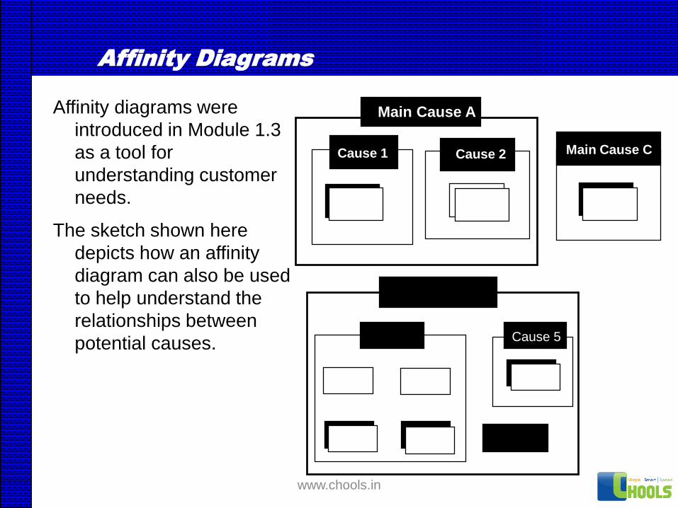
Affinity Diagrams
Affinity diagrams were
introduced in Module 1.3
as a tool for
understanding customer
needs.
The sketch shown here
depicts how an affinity
diagram can also be used
to help understand the
relationships between
potential causes.
Main Cause B
Cause 4 Cause 5
Cause 6
Main Cause A
Cause 1 Cause 2 Main Cause C
www.chools.in

HISTOGRAM
www.chools.in

Histogram is a graph that displays the
distribution of data
www.chools.in

Histogram is characterised by three
constituents
•A center ( mean)
•A width (spread)
•An over all shape
www.chools.in

How to make a Histogram
Select a sample of size N.
Record the measurements.
Determine the range.
Decide the number of classes.
Determine the boundary or class limits.
Prepare frequency distribution.
Construct histogram.
www.chools.in

Data on Metal Block thickness (in mm)
3.56 3.46 3.48 3.50 3.42 3.43 3.52 3.49 3.44 3.50
3.48 3.56 3.50 3.52 3.47 3.48 3.46 3.50 3.56 3.38
3.41 3.37 3.47 3.49 3.45 3.44 3.50 3.49 3.46 3.46
3.55 3.52 3.44 3.50 3.45 3.44 3.48 3.46 3.52 3.46
3.48 3.48 3.32 3.40 3.52 3.34 3.46 3.43 3.30 3.46
3.59 3.63 3.59 3.47 3.38 3.52 3.45 3.48 3.31 3.46
3.40 3.54 3.46 3.51 3.48 3.50 3.68 3.60 3.46 3.52
3.48 3.50 3.56 3.50 3.52 3.46 3.48 3.46 3.52 3.56
3.52 3.48 3.46 3.45 3.46 3.54 3.54 3.48 3.49 3.41
3.41 3.45 3.34 3.44 3.47 3.47 3.41 3.38 3.54 3.47
www.chools.in

Frequency Table
Class
no.
Class
Boundaries
Mid-value Frequen
cy
1
2
3
4
5
6
7
8
9
3.275 – 3.325
3.325 – 3.375
3.375 – 3.425
3.425 – 3.475
3.475 – 3.525
3.525 – 3.575
3.575 – 3.625
3.625 – 3.675
3.675 – 3.725
3.30
3.35
3.40
3.45
3.50
3.55
3.60
3.65
3.70
3
3
9
33
37
10
3
1
1
www.chools.in

Histogram for Metal Block Thickness
3 3
9
33
37
10
31 1
0
5
10
15
20
25
30
35
40
45
3.3 3.35 3.4 3.45 3.5 3.55 3.6 3.65 3.7
Thickness (in mm)
Fre
qu
ency
www.chools.in

Histogram for Bearing Thickness
5
12
18
29
41
31
22
17
9
3
0
5
10
15
20
25
30
35
40
45
5.24 5.28 5.32 5.36 5.4 5.44 5.48 5.52 5.56 5.6
Thickness (in mm)
Fre
qu
ency
www.chools.in

Applications of Histograms
Shape and Smoothness
Comparison to Specification limits
Comparison to Sources of Variability
Outlier Detection
Before and After Comparison
www.chools.in

Comparison of Histogram with Specification Limits
www.chools.in

Types of Histograms
www.chools.in

Types of Histograms
Bell shaped
Symmetrical shape with a peak in
middle representing a normal
histogram
www.chools.in

Types of Histograms
Double peaked
Two normal distributions with two
peaks in middle indicating more
than one distribution at work
www.chools.in

Types of Histograms
Plateau
More than one distribution at work
www.chools.in

Types of Histograms
Comb
Alternative peaks showing
possible errors in data
collection and analysis
www.chools.in

Types of Histograms
Skewed
An asymmetrical shape - positively
or negatively skewed - usually
reflecting limits in the specification
on one side
www.chools.in

Types of Histograms
Truncated
Usually being a part of a normal
distribution with part of it having
been removed.
www.chools.in

Types of Histograms
Isolated peak
Two normal distributions
suggesting two processes taking
place at the same time.
www.chools.in

Types of Histograms
Edged peaked
A normal distribution curve with a
large peak at one end indicating
errors in data recording.
www.chools.in

SCATTER DIAGRAM
www.chools.in

If two types of data, x and y,
are related in that x
increases or decreases
with y, a correlation exists
between them.
www.chools.in

A scatter diagram is a
chart that expresses the
relationship between two
such data types.
www.chools.in

Some examples of relationship
• Cutting speed and tool life
• Moisture content and thread elongation
• Breakdown and equipment age
• Temperature and lipstick hardness
• Striking pressure and electrical current
• Temperature and percent foam in soft
drinks
www.chools.in

Scatter diagram on Automotive Speed vs. Mileage
15
20
25
30
35
40
25 35 45 55 65 75
Speed (km/h)
Mil
eage
(km
/Lit
)
www.chools.in

A scatter diagram depicts the
relationship as a pattern that
can be directly read.
www.chools.in

Different Scatter diagram Patterns
www.chools.in

If y increases with x, then x
and y are positively
correlated.
www.chools.in

If y decreases as x increases,
then the two types of data
are negatively correlated.
www.chools.in

If no significant relationship
is apparent between x and y,
then the two data types are
not correlated.
www.chools.in

How to make a Scatter diagram
• Collect 30 to 50 pairs of quantitative data (x
and y).
• Choosing units that express the range of the x
and y values, draw an x scale along the
horizontal axis and a y scale along the vertical
axis.
• Plot the data pairs (x, y) as points on a scatter
diagram.
www.chools.in

Data on Conveyor Speed and Severed Length
Sl. No. Conveyor Speed
(cm/sec)
Severed Length(mm)
Sl. No. Conveyor Speed
(cm/sec)
Severed Length(mm)
1
2
3
4
5
6
7
8
9
10
11
12
13
14
15
8.1
7.7
7.4
5.8
7.6
6.8
7.9
6.3
7.0
8.0
8.0
8.0
7.2
6.0
6.3
1046
1030
1039
1027
1028
1025
1035
1015
1038
1036
1026
1041
1029
1010
1020
16
17
18
19
20
21
22
23
24
25
26
27
28
29
30
6.7
8.2
8.1
6.6
6.5
8.5
7.4
7.2
5.6
6.3
8.0
5.5
6.9
7.0
7.5
1024
1034
1036
1023
1011
1030
1014
1030
1016
1020
1040
1013
1025
1020
1022
www.chools.in
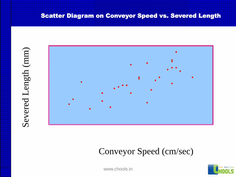
Scatter Diagram on Conveyor Speed vs. Severed Length
1000
1005
1010
1015
1020
1025
1030
1035
1040
1045
1050
5 5.5 6 6.5 7 7.5 8 8.5 9
Conveyor Speed (cm/sec)
Sev
ered
Len
gth
(m
m)
www.chools.in

Uses of Scatter Diagram
If an increase in y depends on increase in x, then, if x is
controlled y will be naturally controlled.
If x is increased, y will increase somewhat. Then y seems
to have causes other than x.
www.chools.in

GRAPHS and CHARTS
www.chools.in

Graphs and charts are pictorial
representation of the data, making it easy to
spot trends, ratios and comparisons among
different groups of data.
www.chools.in

The more common types of graphs and
charts are Line graphs, Bar charts and Pie
charts.
www.chools.in

Purpose of Graphs and Charts
To present the numerical data in an easy-
to-plot visual form.
www.chools.in

Purpose of Graphs and Charts
Line graphs are used to depict change or
variation over time.
www.chools.in

Purpose of Graphs and Charts
Bar charts are used for comparing
quantities between persons, regions, time
intervals etc.
www.chools.in

Purpose of Graphs and Charts
Pie charts are used to show percentages
or proportions of different components
of a specific item.
www.chools.in

Procedure for making Graphs and Charts
Select the type of chart or graph most suitable for the
type of data.
Decide the units and scale of items to be shown on X-
axis and Y-axis
Fill the information on the graph sheet.
Join the required points to complete lines or bars.
Colour or shade the lines or bars to distinguish between
different groups or classes.
Provide appropriate title.
www.chools.in

% Defectives for different Weeks for product XYZ
Week Number
3
3.5
4
4.5
5
5.5
6
6.5
7
7.5
1 2 3 4 5 6 7 8 9 10
% D
efec
tives
www.chools.in

Average Production in different months
Month
80
70
60
75
68
76
0
10
20
30
40
50
60
70
80
90
Jan Feb Mar Apr May Jun
Av
g. P
rod
uct
ion (
Ton
s)
www.chools.in

Horizontal Bar Graph
15
30
40
15
0 5 10 15 20 25 30 35 40 45
Excellent
Very Good
Average
Poor
Per
son
nel
Per
form
ance
Percentage
www.chools.in

Comparison of Machines A & B
for weekly Rejection
11
5
10
21
23
10
43
13
20
14
11
6
8
13
20
15 15
11
0
5
10
15
20
25
1 2 3 4 5 6 7 8 9 10
Week Number
% R
ejec
tion
www.chools.in

Comparison of Machines A & B
for Units Produced
263 285201
435
133
375321 307 294
348
244
336
221
257
275
422
281 317299
358
0
100
200
300
400
500
600
700
800
900
1 2 3 4 5 6 7 8 9 10
Week Number
Unit
s P
roduce
d
www.chools.in

Pie Chart for
Customer returned watches
A - Glass Broken
B - Stop
C - Matt. Trouble
D - Defective Dial
E - Regulation
F - Stem Loose
G - Others A
43%
B27%
C
12%
D6%
E
4%
F
3%
G
5%
www.chools.in

STRATIFICATION
WHAT DATA?
CHECKSHEET FOR
DEFECTSDEFECT
TYPE
TALLY
MARKS
A ///// /// //
B //// ///// ////
C /// /
TOTAL
CHECKSHEET
HOW EASILY
TO COOLECT DATA?
A B C D OTHERS
PARETO DIAGRAM
WHAT ARE OUR
PRIORITY AREAS?
USL
HISTOGRAMHOW DO THE DA
TA VARY?
MAN M/C
MATL. METHOD
CAUSE & EFFECT
DIAGRAM WHAT ARE
THE CAUSES?
Y
X
SCATTER DIAGRAM WHAT IS THE APPARENT
RELATIONSHIP BETWEEN
CAUSE (X) & EFFECT(Y)?
TIME
GRAPHS & CHARTS HOW DOES IT
VARY OVER TIME?
www.chools.in
![arXiv:0804.3742v1 [gr-qc] 23 Apr 2008](https://static.fdokumen.com/doc/165x107/6322df89117b4414ec0c14b7/arxiv08043742v1-gr-qc-23-apr-2008.jpg)


![arXiv:0907.2174v1 [gr-qc] 13 Jul 2009](https://static.fdokumen.com/doc/165x107/6326a3566d480576770ce2c4/arxiv09072174v1-gr-qc-13-jul-2009.jpg)


![arXiv:1604.08930v1 [gr-qc] 29 Apr 2016](https://static.fdokumen.com/doc/165x107/631b60e0209fbf85b505c577/arxiv160408930v1-gr-qc-29-apr-2016.jpg)


![arXiv:2101.00266v2 [gr-qc] 27 Apr 2021](https://static.fdokumen.com/doc/165x107/633d4d213b2e9906160b9e05/arxiv210100266v2-gr-qc-27-apr-2021.jpg)