
Web Performance e as plataformas de venda online
138
Web Performance e as plataformas de venda online JOÃO PEDRO FERNANDES GAMEIRO Outubro de 2019
-
Upload
khangminh22 -
Category
Documents
-
view
1 -
download
0
Transcript of Web Performance e as plataformas de venda online

Web Performance e as plataformas devenda online
JOÃO PEDRO FERNANDES GAMEIROOutubro de 2019

Web Performance and e-commerce platforms
João Pedro Fernandes Gameiro
Dissertação para obtenção do Grau de Mestre em
Engenharia Informática, Área de Especialização em
Engenharia de Software
Orientador: Ana Madureira
Porto, Outubro 2019

ii

iii
Acknowledgements
I would like to thank my advisor Dra. Ana Madureira for a great deal of support and
assistance, and their availability to answer my questions whenever needed.
I would also like to thank to my family for their wise counsel and sympathetic ear. You
are always there for me, especially for my mom there were indispensable.
Finally, there are my friends, specially Rui Meireles, who were of great support in
deliberating over problems and findings, as well as providing happy distraction to rest my mind
outside of my research.

iv

v
Resumo
As plataformas de venda de produtos online têm estado cada vez mais presentes na sociedade
e no dia a dia das pessoas, sendo vendidos produtos de várias categorias como por exemplo,
de vestuário, artigos tecnológicos, decoração, alimentação, entre outros. Todo o processo de
compra online pode ditar o sucesso de uma empresa, sendo crucial garantir que todos os
clientes tenham uma ótima experiência de compra sem qualquer tipo de fricção, pois estes
impedimentos podem fazer com que o consumidor desista da sua intenção. Como
consequência, não se pode menosprezar nenhum tipo de consumidor sendo imprescindível
garantir que as aplicações de venda online possam ser acedidas com o mesmo nível de
qualidade em qualquer tipo de ambiente ou dispositivo. A fluidez e a usabilidade de uma
aplicação podem ser afetadas por vários fatores como por exemplo, as infraestruturas de
telecomunicações, a capacidades de processamento dos diferentes dispositivos móveis, entre
outros.
Com o intuito de atingir uma experiência de compra fluída para todos os consumidores, será
necessário desenvolver um protótipo focado no desempenho e na usabilidade, sendo, por isso,
necessária a pesquisa e a implementação de conceitos relacionados com estes temas.
Subsequentemente, este protótipo será implementado com o auxílio de vários padrões de
performance, como por exemplo: a criação de um caminho crítico para o utilizador; a separação
da aplicação em diferentes secções e o carregamento assíncrono de componentes.
Foram concretizados dois tipos de testes para analisar a qualidade e a eficácia do protótipo. A
fim de averiguar a usabilidade da aplicação foi realizado um inquérito de modo a verificar se o
público alvo sentiu algum tipo de dificuldade na interação com o protótipo desenvolvido.
Adicionalmente, foi também executada uma bateria de testes de desempenho de modo a
comparar a aplicação desenvolvida com outras plataformas de venda online.
Por fim, esta dissertação deve realçar a importância do tema de web performance e como este
está diretamente interligado com o comportamento consumidores, apresentando boas práticas
de desenvolvimento que devem ser seguidas para qualquer outro tipo de projeto ou aplicação.
Palavras-chave: Desempenho, Plataformas e-commerce, Caminho crítico, Usabilidade,
Renderização no servidor e browser, Performance e Carregamento assíncrono.

vi

vii
Abstract
Online sales have been increasingly more present in society and in people’s daily lives. It has
become more and more common to buy an item online, whether it is clothing, consoles,
decorative items or others. The user journey in e-commerce platforms can dictate the success
of a company, being crucial to ensure that all customers have a seamless experience without
any interference, so they don't give up on the purchase. Consequently, every user should be
able to have a fluent and consistent purchase experience, being the responsibility of the e-
commerce platforms to ensure every web application provides a seamless journey for every
consumer. However, the user experience can be affected by external factors like network speed,
the hardware capacity of processing data, among others.
In order to have a fast and flawless shopping experience, it was necessary to develop a
prototype with a performance vision, where it was required to have an analysis and
implementation of technical concepts, such as asynchronous loading and server side rendering.
More specifically, it was implemented a diversity of performance patterns like the identification
of the critical path, loading of external assets asynchronously and the split of application into
different segments.
Furthermore, it was essential to evaluate the quality and effectiveness of the developed
prototype, so it was performed two different battery tests. In the first place, it was conducted
a usability survey to understand if the consumers are really having a seamless and fast purchase
experience. Secondly, and by the end, it was executed a performance test with the help of an
external platform to gather different metrics and compare the developed prototype against
other e-commerce platforms.
Lastly, this dissertation must act as awareness of the benefits of web performance and how it
directly affects the consumer's behaviour, being a reference for good practices to any other
web application.
Keywords: Performance, E-commerce platforms, Critical path, Usability, Server-side
rendering, Performance sensation and Asynchronous loading.

viii

ix
Index
1 Introduction ............................................................................... 1
1.1 Context ..........................................................................................1
1.2 Problem Description ...........................................................................2
1.3 Objectives .......................................................................................2
1.4 Approach ........................................................................................3
1.5 Document Structure ...........................................................................3
2 Literature Review ........................................................................ 5
2.1 Theoretical Framework ........................................................................5 2.1.1 Human-Computer Interaction ..........................................................5 2.1.2 E-commerce ...............................................................................6 2.1.3 Phycology Of Web Performance ........................................................7 2.1.4 Flow Mental State ........................................................................8 2.1.5 Time Perceived By The User ............................................................8 2.1.6 Effects Of Breaking The Flow ...........................................................9 2.1.7 Localized Experience .................................................................. 10
2.2 Technical Framework ........................................................................ 13 2.2.1 Web development ...................................................................... 13 2.2.2 Roundtrip Latency ...................................................................... 14 2.2.3 Rendering Performance ............................................................... 18 2.2.4 Render Blocking ........................................................................ 20 2.2.5 Web Typography ........................................................................ 22 2.2.6 JavaScript ............................................................................... 26 2.2.7 Webpack ................................................................................. 28 2.2.8 React ..................................................................................... 30 2.2.9 PRPL Pattern ............................................................................ 31 2.2.10 WebPageTest ........................................................................... 32
2.3 Summary ....................................................................................... 33
3 Value of Analysis ....................................................................... 34
3.1 New Concept Development Model ......................................................... 34
3.2 Opportunity Identification .................................................................. 35
3.3 Opportunity Analysis ......................................................................... 36 3.3.1 Environment Problem .................................................................. 36 3.3.2 Application Problem ................................................................... 37 3.3.3 Advantages Of Web Performance .................................................... 38 3.3.4 Disadvantages Of Web Performance ................................................. 39
3.4 Idea Generation And Enrichment .......................................................... 39
3.5 Idea Selection ................................................................................. 40 3.5.1 Analytic Hierarchy Process (AHP) .................................................... 41

x
3.5.2 Hierarchic Division ..................................................................... 41 3.5.3 Priority Definition ...................................................................... 42 3.5.4 AHP Conclusion ......................................................................... 44
3.6 Concept Definition ........................................................................... 44
3.7 Business Model Canvas ...................................................................... 44
3.8 Summary ...................................................................................... 45
4 Analysis and Design .................................................................... 46
4.1 Atomic Design ................................................................................ 46
4.2 Architectural Design ......................................................................... 48 4.2.1 Alternative Design ..................................................................... 51
4.3 Logical View .................................................................................. 52
4.4 Process View .................................................................................. 53
4.5 Development View ........................................................................... 56
4.6 Summary ...................................................................................... 57
5 Implementation ......................................................................... 58
5.1 Components ................................................................................... 58 5.1.1 Button ................................................................................... 58 5.1.2 Image .................................................................................... 59 5.1.3 Layout ................................................................................... 61 5.1.4 Spinner................................................................................... 62 5.1.5 Link ....................................................................................... 63
5.2 Pages ........................................................................................... 63 5.2.1 Home Page .............................................................................. 64 5.2.2 Product Listing Page ................................................................... 65 5.2.3 Product Details Page ................................................................... 66 5.2.4 Bag ....................................................................................... 67 5.2.5 Checkout ................................................................................ 68 5.2.6 Confirmation ............................................................................ 69
5.3 Build Process .................................................................................. 70 5.3.1 JavaScript Optimization ............................................................... 70 5.3.2 Code Splitting & Caching .............................................................. 71 5.3.3 Styles Optimization .................................................................... 74
5.4 Render Engine ................................................................................ 74
5.5 Database Cache .............................................................................. 77
5.6 Unit Tests ..................................................................................... 79
5.7 Summary ...................................................................................... 79
6 Test and Evaluation .................................................................... 81
6.1 Evaluating Methodology ..................................................................... 81
6.2 User Satisfaction ............................................................................. 82
xi
6.2.1 Inquiry ................................................................................... 83
6.3 Performance Tests ........................................................................... 93 6.3.1 Homepage ............................................................................... 94 6.3.2 Product Listing Page ................................................................... 97 6.3.3 Product Details Page .................................................................. 100 6.3.4 Weight Comparison ................................................................... 102
6.4 Summary ...................................................................................... 104
7 Conclusions ............................................................................. 106
7.1 Summary ...................................................................................... 106
7.2 Achieved Goals .............................................................................. 107
7.3 Limitations And Future Work .............................................................. 107

xii

Figures List
Figure 1 - Retail e-commerce sales worldwide from 2014 to 2021 (in billion U.S. dollars) [3] ... 7
Figure 2 – Perceived Time [15] ..................................................................................................... 9
Figure 3 – Comparison between mobile delays and stressful tasks [16] ................................... 10
Figure 4 - Negotiation process between a browser and web server [22] .................................. 14
Figure 5 – Example of DNS-Prefetch .......................................................................................... 16
Figure 6 – Effects of Preconnect [23] ......................................................................................... 16
Figure 7 – Example of Pre-connect ............................................................................................ 16
Figure 8 – Example of Prefetch .................................................................................................. 17
Figure 9 – Example of Preload ................................................................................................... 17
Figure 10 - Browser processing pipeline: HTML, CSS, and JavaScript [21] ................................ 18
Figure 11 – Example of a Dom tree [25] .................................................................................... 18
Figure 12 – Example of a CSSOM tree [25] ................................................................................ 19
Figure 13 – Example of Render tree [25] ................................................................................... 20
Figure 14 – Example of loading different CSS depending on the viewport ............................... 21
Figure 15 – Example of asynchrony CSS ..................................................................................... 22
Figure 16 - Example of asynchrony CSS with preload ................................................................ 22
Figure 17 – Percentage of sites with custom fonts [29] ............................................................ 22
Figure 18 - Example of loading a web font [29] ......................................................................... 23
Figure 19 – FOUT and FOIT experience [29] .............................................................................. 25
Figure 20 – Growth of JavaScript [35] ........................................................................................ 27
Figure 21 - Evolution of Time to Interactive [36] ....................................................................... 28
Figure 22 – WebPack dependency graph [38] ........................................................................... 29
Figure 23 – Example of using a modern and legacy bundler ..................................................... 30
Figure 24 – Progressive rendering [46] ...................................................................................... 32
Figure 25 – Interface of WebPageTest ....................................................................................... 33
Figure 26 – NCD Model ( New Concept Model) ......................................................................... 35
Figure 27 – Comparison of internet speed around the world [50] ............................................ 37
Figure 28 – Google estimative of the impact in performance ................................................... 39
Figure 29 – Hierarchical Tree Decision Diagram ........................................................................ 41
Figure 30 – Representation of atomic design [61] ..................................................................... 48
Figure 31 – Sequence diagram of the interaction between user and server ............................ 49
Figure 32 – Splitting the assets in critical and non-critical ......................................................... 50
Figure 33 – Standard Client-Server application ......................................................................... 51
Figure 34 –High-Level Diagram representing the application system ....................................... 53
Figure 35 - Process View of displaying product page ................................................................ 55
Figure 36 – Development View of the project ........................................................................... 56
Figure 37 – Transition between a normal button to the loading state ...................................... 59
Figure 38 – Usage example of picture tag.................................................................................. 60
Figure 39 – Transaction from the grey image to the product image ......................................... 61
Figure 40 – Layout component used in different pages. ........................................................... 62

xiv
Figure 41 – Usage of spinner component .................................................................................. 62
Figure 42 – Purchase Workflow ................................................................................................. 64
Figure 43 – Interface of Home Page ........................................................................................... 65
Figure 44 – Interface of Products Listing Page ........................................................................... 66
Figure 45 – Interface of Product Details Page ............................................................................ 67
Figure 46 – Interface of Bag Page ............................................................................................... 68
Figure 47 – Interface of Checkout Page ..................................................................................... 69
Figure 48 – Interface of Confirmation Page ............................................................................... 70
Figure 49 – Example of a code splitting graph [76] .................................................................... 71
Figure 50 – Generated assets from the code splitting process .................................................. 72
Figure 51 – Example of preload asset ........................................................................................ 73
Figure 52 – Server-Side Rendering ............................................................................................. 75
Figure 53 – Client-Side Rendering .............................................................................................. 75
Figure 54 – Static Rendering....................................................................................................... 76
Figure 55 – Connection between the Database and the Pages ................................................. 78
Figure 56 – Example of dispatching an action to store info related to the list of products ....... 78
Figure 57 – Guideline distributed for the audience ................................................................... 84
Figure 58 – Inquiry Question 1: Gender of the audience ........................................................... 85
Figure 59 - Inquiry Question 2: Age of the audience ................................................................. 85
Figure 60 - Inquiry Question 3: Price spectrum of mobile phones ............................................ 86
Figure 61 - Inquiry Question 4: Network velocity from the audience ........................................ 86
Figure 62 – Inquiry Question 5: Locale where candidate answer the survey ............................ 87
Figure 63 - Inquiry Question 6: Level (1-5) of stress from the public ......................................... 87
Figure 64 – Inquiry Question 7: Frequency of buying online ..................................................... 88
Figure 65 – Inquiry Question 8: Reasons to abandon an online purchase................................. 88
Figure 66 – Inquiry Question 9: Websites used by the audience to shop online ...................... 89
Figure 67 – Inquiry Question 10: Level of satisfaction (0-5) using the homepage ..................... 89
Figure 68 – Inquiry Question 11: Level of satisfaction (0-5) using the product listing page ...... 90
Figure 69 - Inquiry Question 12: Level of satisfaction (0-5) using the product details page ..... 90
Figure 70 - Inquiry Question 13: Level of satisfaction (0-5) using the bag page ........................ 91
Figure 71 - Inquiry Question 14: Level of satisfaction (0-5) using the checkout page ............... 91
Figure 72 - Inquiry Question 15: Level of satisfaction (0-5) when navigating between pages .. 92
Figure 73 - Inquiry Question 16: Level of Performance (Yes-No) using the application ............ 92
Figure 74 – Homepage comparison of first-time visitors ........................................................... 95
Figure 75 - Homepage comparison of repeated visitors ............................................................ 95
Figure 76 – Homepage percentual comparison of visual progress ............................................ 96
Figure 77 – Homepage comparison of graphics progress .......................................................... 96
Figure 78 – Product Listing Page comparison of first-time visitors ............................................ 97
Figure 79 – Product Listing Page comparison of repeated visitors ............................................ 98
Figure 80 - Product Listing Page percentual comparison of visual progress.............................. 99
Figure 81 – Product Listing Page comparison of graphic progress ............................................ 99
Figure 82 – Product Details Page comparison of first-time visitors ......................................... 100
Figure 83 – Product Details Page comparison of repeated visitors ......................................... 100

xv
Figure 84 – Product Details Page percentual comparison of visual progress .......................... 101
Figure 85 – Product Details Page comparison of graphic progress ......................................... 102
Figure 86 – Comparison of cost of viewing a website per country [97] .................................. 103
Figure 87 – Comparison of weight of each page from the applications .................................. 103

xvi

Tables List
Table 1 - Country Cultural Dimensions [17] ............................................................................... 11
Table 2 - Preference for Purchasing from Local versus Foreign Websites [17] ......................... 12
Table 3 - Latency overhead of a single HTTP request [21] ......................................................... 15
Table 4 - Comparison of browser performance features........................................................... 17
Table 5 – Font Formats by browser support [32] ...................................................................... 23
Table 6 - Different browser behaviour when loading fonts [33] ............................................... 25
Table 7 – Growth of JavaScript .................................................................................................. 27
Table 8 - Criterion Comparison Matrix ....................................................................................... 42
Table 9 - Normalized Criterion Comparison Matrix ................................................................... 43
Table 10 - Alternative Weight per Criterion ............................................................................... 43
Table 11 - Business Model Canvas ............................................................................................. 44
Table 12 - Comparison between rendering solutions [77] ........................................................ 77
Table 13 – Likert Scale [84] ........................................................................................................ 82
Table 14 – Survey Response Scale ............................................................................................. 83
Table 15 – Cost of viewing homepage in USD dollars .............................................................. 104
Table 16 – Homepage First View .............................................................................................. 115
Table 17 – Homepage Repeated View ..................................................................................... 115
Table 18 – List of Products Page First View.............................................................................. 116
Table 19 – List of Products Page Repeated View ..................................................................... 116
Table 20 – Details of Product Page First View ......................................................................... 116
Table 21 – Details of Products Page Repeated View ............................................................... 117

xviii

Acronyms and Symbols
Acronyms List
ACK - Acknowledge
B2C – Business to Consumer
CPU - Central Processing Unit
DNS – Domain Name System
GDPR – General Data Protection Regulation
HCI – Human Computer Interaction
HTTP - Hypertext Transfer Protocol
TCP – Transmission Control Protocol
TCP/IP – Transmission Control Protocol/Internet Protocol
SYN – Synchronize
SYN-ACK - Synchronize-Acknowledge
UTF-8 - Unicode Transformation Format implemented in HTML,
JavaScript, PHP and others

xx

1
1 Introduction
In this chapter is presented the context of the problem, a brief description, an illustration of the
objectives and the chosen approach to tackle this issue. Lastly, in order to provide a better
reading experience and ensuring the reader can understand all the concepts efficiently is
explained the document structure.
1.1 Context
The origin of the internet started in 29 of October in 1969, when a connection was established
between the University of California and Stanford Research Institute, both in California. Then,
twenty-five years later, in March 1989, Tim Berners-Lee that worked in CERN (European
Organization for Nuclear Research) officially formulated a proposal of the Internet or “Mesh”,
as it has been called at the beginning. Over the years, it has evolved to the World Wide Web as
it is known today [1].
With the creation of these twin flowers, the network infrastructure and the software
infrastructure, it was formed an excellent opportunity for the growth of the digital era. The
internet has become the principal communication channel between more than a third of the
world’s population and have made millions of people both new consumers and new creators of
information [1].
As can be seen, the internet has suffered a significant evolution since the last decades being
progressively more present in the society daily basis. However, it was too complicated and slow
to access this communication channel, so the smartphone was conceived to meet this necessity.
The smartphone has ushered in this new technology age, a small device that is only four inches
long enables the sharing of real-time information and knowledge making possible to transform
lifestyles in a matter of days. People use smartphones to obtain, share and exchange
information whenever they desire. The speed of information processing is accelerating, and

2
real-time communication is becoming universal and is no longer constrained by time and space
accelerating the development of any business unit [2].
Companies started to see the real value from the internet and have seen a great opportunity to
quickly gain a new range of clients with a simple investment. As a result, the e-commerce
market was born and started to earn a reputation among the world population. The society
started to trust in these new companies and change their purchase habits from offline to online.
Around 2014, the e-commerce businesses were valued in 1336 billion dollars and over the years
never stopped growing at high speed, valuing an astronomical value in 2018, about 2842 billion
dollars [3].
1.2 Problem Description
The websites needed to jump into a whole new level, they needed to handle more consumers,
more features, more information as well as being accessible and straightforward for every
buyer. These new users are always searching for more functionalities, better design and urging
for faster experiences.
However, not all countries and cultures have the financial capabilities to acquire the latest
generation mobile phone or provide a decent network infrastructure. Consequently, some
customers are not able to have a fluent and consistent purchase experience, therefore it is the
obligation from the e-commerce platforms to ensure every web application provide a seamless
journey on every consumer in any environments with the same quality level.
The online platforms needed to be as fast as possible for all type of users independently of the
access conditions, and at the same time providing an unforgettable experience. As regards the
consumers will share their purchase experience with their friends and family and making the
business growth as itself without any type of investment.
Nowadays, the load time of a website is rated at the highest and the most requested criteria
from the users. The urge of seeing online content can have a massive impact on businesses,
knowing that 53% of mobile site visits are abandoned if pages take longer than 3 seconds to
load. Furthermore, the performance metrics aren´t the most significant factor, how as a human
being perceive speed and response of a website is of utmost importance [4].
1.3 Objectives
The main objective of this thesis is to understand the environment of online sales, as it will be
studied the impact of the web performance and test the different methodologies in order to
provide a seamless and fast online experience.
Therefore, the sub-objectives for this project are the following:

3
• Study consumer behaviour on the internet and how the surrounding
environment affects his cognitive decisions. Understanding when the user
accesses the internet in their daily routine, the quality of the network condition
and finally their mind state and temperament during a shop experience;
• Analyse the state of web development, using the latest technologies to improve
user experience in low-end devices and slow connections. Additionally, it is
necessary to contemplate the reusability of modules and the communication
across them;
• Development of a prototype with a performance vision where will be applied
the studied technologies. Also, it will be conducted a usability survey in order
to understand the effectiveness of this application.
1.4 Approach
In this project, it is intended to confirm the importance of having a fast user experience and
how it can directly impact the business. Firstly, it will be studied all the concepts related to the
e-commerce sector, as the human-computer interaction, the psychology of web performance,
the study of online sales and how people perceived the time and speed.
Secondly, it will be studied the newest technologies and methodologies in order to develop a
web application and how the user devices will then execute the applications. Thereafter, it is
going to be designed and constructed a prototype application with the studied development
practices.
In the end, it is performed a user testing session to evaluate the usability of the application and
analyse the behaviour of the users. After processing all the gathering data, it is carefully
exanimated in order to make conclusions, like identifying programming paradigms and design
methodologies that should be applied in the web development.
1.5 Document Structure
This document is structured in 7 chapters. The initial part (the chapter 1,2,3) is composed by an
overview of the problem and an enumeration of all key concepts related to it. More significantly,
it is going to be presented a technical and business overview of the theme, as well as a
demonstration of the market value analysis.
Secondly, it will be presented the technical section composed by the chapter 4 and 5. In this
unit, it is going to be explained the best practices and implementation details used to build and
design the prototyped application. Therefore, it will be described the architecture of the
application as well as all the chosen design patterns recurring to UML diagrams.

4
Thereafter in chapter 6, it is conducted a user testing with the objective of testing the concepts
and paradigms applied in the prototype. After analysing the feedback from user testing it will
be explained the conclusions drawn and evaluated the usability and experience of the
application.
In the last chapter, it is listed a summary of the major conclusions and future work.

5
2 Literature Review
In the world of web development, the performance topic is often a deferred topic that is only
brought to the discussion when it is has become a serious and complex problem. This subject
must not be ignored and should be taken in consideration at the start of any project, since it is
directly correlated with the sales of the business that can be a key factor to success.
In this chapter, it is provided a global contextualization of the performance topic understanding
how is affecting the success of e-commerce platforms and how much value it can bring to a
business. This chapter is structured in two subchapters that are: theoretical framework and
technical framework.
2.1 Theoretical Framework
In this section, it is presented an overview of theoretical contents to complement and
consolidate the knowledge needed to effectively understand the work developed under this
master thesis.
2.1.1 Human-Computer Interaction
“Human Computer Interaction (HCI) is the disciple concerned with the design, evaluation and
implementation of interactive computing systems for human use and with the study of major
phenomena surrounding them.” [5].
A simple user interface may be crucial to have a higher affluence of users in a web application,
so a more aesthetics design is the predominant factor in gaining the users attention and laurels.
The ability to design user interfaces that it attracts the user’s attention and enhances the user
experience is always a challenge for the UI designers [6].

6
Given that, everything done with computers is through a user interface—hardware and
software combined. Since the interface is the communication channel that connects the
platforms and the consumers, the design starts to gain more importance and the HCI evolved
to be less focused on engineering and more design-centric, studying how interfaces can affect
our decisions and behaviour’s [7].
As a result of the evolving process the HCI [7] research area can be broken down like this:
• Usability how efficiently we accomplish tasks and how interactive design affects what
we do with it;
• User experience How interactive the design makes us feel with the use of application,
if it is entertaining, enjoyable, and aesthetically pleasing.
As the above state suggest, the interaction between humans and computers are growing along
the technology becoming more present in the day to day of the consumers. These interfaces
must provide a remarkable and straightforward user experience, so the consumers, on their
own, can complete their task feeling the sensation of satisfaction and at the same time
appreciating the design.
Furthermore, the consumer`s does not like to feel powerless and lost in a web experience, they
need to have control of the application or at least have a perception of what is happening. So,
the websites cannot display a white cover before loading the website, even in slow connections.
It is needed to display at least some interfaces giving feedback to the consumers, even though
a simple loader so the user does not quit the website [8].
The action of leaving a website because it is slow and unresponsive is very present in the digital
market even more in the platforms e-commerce, as most of the purchases are stimulated by
impulse actions and must not have any type of impediment.
2.1.2 E-commerce
“E-commerce, also known as electronic commerce or internet commerce, refers to the buying
and selling of goods or services using the internet, and the transfer of money and data to
execute these transactions. E-commerce is often used to refer to the sale of physical products
online, but it can also describe any kind of commercial transaction that is facilitated through
the internet.” [9].
In the first quarter of 2018, of just over $1.2 trillion total in retail sales, only $114 billion, or
9.3%, came from e-commerce. The growth in e-commerce sales has been linear since 1999,
projecting to surpass 10% of overall retail sales in the fourth quarter of 2018 [10].
As it is shown in Figure 1, the e-commerce market is a growing business that will not stop so
soon. At the year of 2018, it has been a revenue of 2 842 billion dollars, and it is expecting to
reach 4878 billion dollars in the year 2021, with a growth of 70% in just three years [3].

7
Figure 1 - Retail e-commerce sales worldwide from 2014 to 2021 (in billion U.S. dollars) [3]
“However, future adoption is not evenly distributed across the globe. E-commerce is already
leading the way in Asia-Pacific with a 13% penetration rate but will not reach the top spot in
Western Europe within the next five years.” [11].
One of the global powers that are pushing the boundaries of online market is the continent of
Asia with the best digital infrastructure in the world combined with a high propensity to
embrace the latest technology led the digital revolution. With conjunction of the evolution of
technology it has one of the highest percentages of online retail sales, about 17%.
Not so far behind is the North America, USA and Canada combined, it is accounting for 16% of
retail sales, starting to invest in eliminating friction in digital commerce. Lastly, there is the
Western Europe considered a mixed bag as a result of the diversity of countries and technology
evolution between them [11].
As it can be seen, the ecommerce is by far a business that will be dead soon with a great
ambition ready to reach new horizons and cultures. So, the platforms need to be prepared for
this growth offering a remarkable user experience, so the costumers can trust the online
platforms and buy goods and services from them.
2.1.3 Phycology Of Web Performance
“Over the past 40-something years, there’s been a great deal of fascinating research into how
human beings engage with technology. These studies—many of which have findings that have
persisted over the years—demonstrate that we do not just want our technology to be fast, but
at a deep neurological level, we need it to be fast. And because these needs are deeply rooted
in our neural wiring, they are unlikely to change, no matter how much we might wish they could.”
[12].

8
“One of the most often-discussed complaints about the Web experience is the delay users
frequently encounter while browsing. A delay occurs when a user clicks on a hyperlink and
nothing seems to happen for several seconds. Several recent studies have determined that
delay is one of the most important aspects of E-Commerce quality” [13].
Previous research has shown that user frustration increases when page load times exceed eight
to ten seconds, without feedback. Newer evidence shows that broadband users are less
tolerant of web page delays than narrowband users. A survey found that 33% of broadband
shoppers are unwilling to wait more than four seconds for a web page to load, whereas 43% of
narrowband users will not wait more than six seconds [14].
One of the simplest rules for effective communication is to have a response within two seconds
of a request. A wait longer than this value breaks concentration and affects productivity, also
known as the flow in the words of a psychologist [14].
2.1.4 Flow Mental State
Flow is a state of concentration so focused that it amounts to absolute absorption in an activity,
feeling pleasurable and satisfying that brings happiness to the person experiencing it. This
feeling does not come from leisure activities but instead comes from times of intense
concentration on a difficult task [14].
The following list are considered difficult: optimizing a trello board, learning a new language or
buying an item on the internet. The user while completing tough tasks requires a lot of focus
and the more it is needed the more pleasure he will have. So, when he is accomplishing their
goals, and having achieved flow, he will feel pleasure and joy.
2.1.5 Time Perceived By The User
When the consumers are submerged in the flow state, they lost track of time, and time feeling
an accelerated sensation. Typically, this happens when we as humans are doing some task that
we really love, like reading a great book. With this example in the period of lecture most likely
the time might be flying and having lost the perception of time. Nonetheless, the opposite effect
happens when reading a boring book, the time seems never ending and a minute’s start to take
hours and so on.
“When you are using a fast website or service, you go in, you get the job done, and you leave
satisfied. However, if the site or service is slow, you are more than aware of its
shortcomings.”[14].
Perception of time passing has many influence factors including age of user, geography and
culture, environment, emotions and a lot of others. However, the human perceives load times
as being 15% slower than they actually are, especially when waiting for slow pages, time seems
9
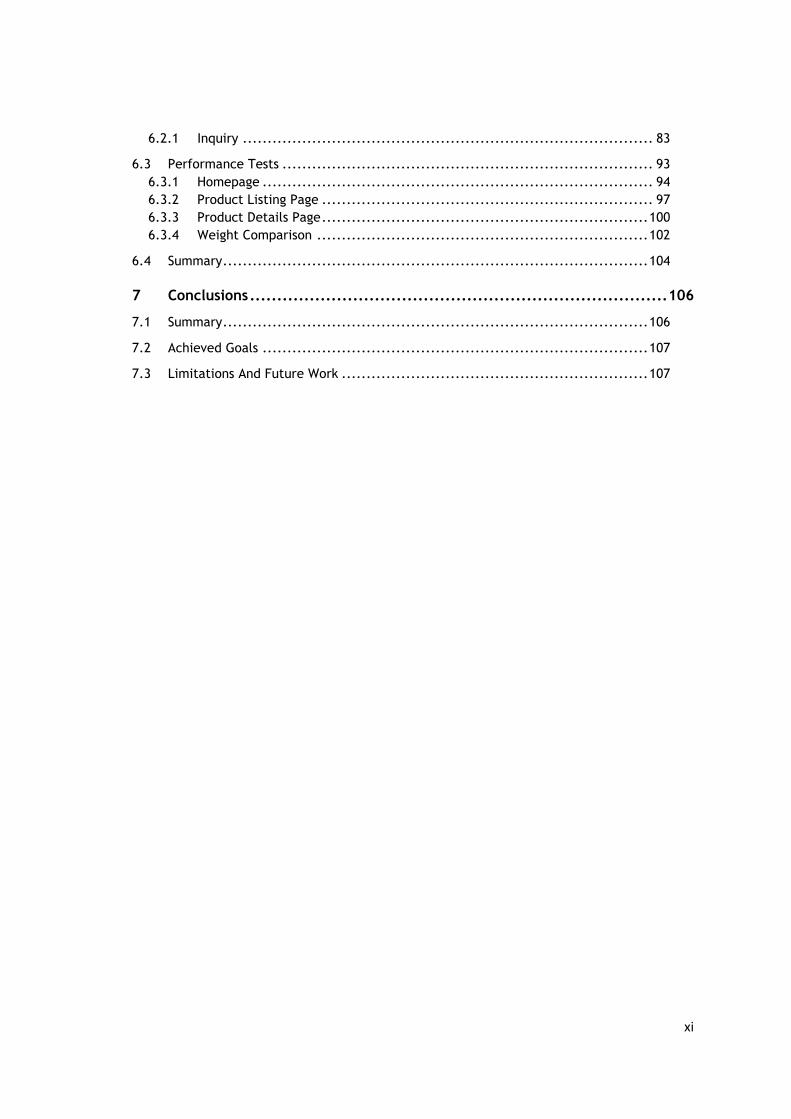
to crawl. Furthermore, memories of waiting to load a website will be longer enclosure to 35%,
as Figure 2 shows.
Figure 2 – Perceived Time [15]
2.1.6 Effects Of Breaking The Flow
The problem of flow state is that is a fragile state, being very prone to any interruption and
distraction that can pull out the concentration. As a result, the user can feel frustrated or even
angry, even more in many cases can happen they leave page if it took more than 3 seconds to
respond.
There was conducted a study that measured brainwave activity while participants completed
tasks using either a 5 MB or 2 MB connection. Test participants that used the 2 MB connection
had to concentrate 50% more when completing the tasks, causing more stress and irritation.
Furthermore, 79% of users won’t return to a site where they had an unsatisfying experience
and as living proof Amazon lost 1% of sales for every 100 milliseconds increase in page load
time [15].
As it can be stated, the need for speed is firmly connected to our deep neurological level
affecting the human decisions, resulting in fluctuations of humour and capable of turning a
relaxed time into a high level of stress.
Figure 3 illustrates the results of an experiment to show how the user experience directly affects
the emotional state. This analysis was executed based on a neuroscience test, that used
advanced technology to measure emotional responses to varied smartphone experiences. In
ultimate cases, the outcomes determined that a mobile delay can be as equivalent to the same
level of anxiety when taking a math test or watching a horror movie alone. Additionally, this
effect can raise the heart rates to an average of 38 per cent putting the consumers into a high
level of uncomfortable feeling [16].

10
Figure 3 – Comparison between mobile delays and stressful tasks [16]
2.1.7 Localized Experience
In the world of e-commerce, the website is perhaps the only way a firm communicates with its
customers. Therefore, its appearance and structure encourage or discourage a consumer’s
purchase intentions. In the marketing literature website features such as layout, appeal,
graphics, readability, and ease-of-use have been considered to affect consumers’ clicking
frequency [17].
Nowadays the world is split in a conjunction of societies with very different cultures that dictate
their values, beliefs and behaviours.
“Culture is a system of values and norms that are shared among a group of people and that
when taken together constitute a design for living.” [17].
Since the divergence between the consumers is so huge it is necessary to adapt each website
to any region of the globe. With this approach it is possible to build trust, satisfaction and
ultimately loyalty for diverse range of consumers in electronic markets, which is a huge concern
to every business. In order to understand how national culture is related to social psychological
phenomena such as confidence and loyalty, it was used the theory of Hofstede's1 that has four
dimensions of culture: individualism-collectivism, uncertainty avoidance, power distance, and
femininity-masculinity [17].
Individualism-collectivism focuses on an individual’s relationships with others. In an
individualist society, individuals are expected to consider personal interests over interests of
the group.
1 Hofstede's cultural dimensions theory is a framework for cross-cultural communication [18]

11
Uncertainty avoidance characterizes how societies accommodate high levels of uncertainly and
ambiguity in the environment. Members of high uncertainly avoidance societies seek to reduce
personal risk.
Power distance addresses the extent to which a society accepts unequal distributions of power
in organizations and institutions. In low power distance cultures, there is a tendency to maintain
a philosophy of equal rights for all, without acquiescence to those in power.
Finally, in feminine societies there is emphasis on quality of life and relationships. Cultures that
focus on material success and assertiveness are considered more masculine in orientation.
Despite many consumers from multiple cultures, it was chosen four different countries in order
to be analysed that are: United States, Canada, Germany and Japan. The main reason of this
selected countries is related to the percentage of online users that access internet to consume
products, since the most common language is English speakers (35,6%), followed by Chinese
(12,2%), Japanese (9,5%), Spanish (8%) and German (7%) [17].
Table 1 - Country Cultural Dimensions [17]
Country Dimensions US CAN GER JAPN
Individualism 91 80 67 46
Uncertainty avoidance 46 48 65 92
Masculine 62 52 66 95
Power Distance 40 39 35 54
With the help of Table 1 it is possible to see that exists a lot of differences in the cultures
resulting in a wide range of consumer preferences including attitudes toward advertising, brand
loyalty, consumption patterns and perceived risk.
When cultural elements are considered in website design it directly affects the way a user
interacts with the site. As a result, a website must be designed for a targeted customer segment
with the right mindset, being necessary to identify and study strategic customer group culture
and understand what the most valuable consumers are to the business itself.
In this research task, participants responded to survey questioning about their user experience,
the website chosen to this test was a local version of Samsung site2 versus a foreign version,
2 The local sites are: Canada (https://www.samsung.com/ca/),USA (https://www.samsung.com/us/), Germany (https://www.samsung.com/de/), and Japan (https://www.samsung.com/jp/) The Foreign site, Hong Kong, can be found at https://www.samsung.com/hk/.

12
which was a Hong Kong site. Initially participants viewed the homepage, and then were
requested to navigate the site to choose a cell phone they would hypothetically purchase [17].
Table 2 - Preference for Purchasing from Local versus Foreign Websites [17]
% Most Likely % Most unlikely
Local Site
Canada 40.7% 40.7%
USA 37.9% 44.8%
Germany 33.4% 40%
Japan 7% 68%
Foreign Site
Canada 26% 65%
USA 17.2% 32%
Germany 20.0% 40%
Japan 17.8% 43%
With the visualisation of Table 2, it supports that exits differences of trust, satisfaction, loyalty
and design preferences across cultures for the websites. This finding suggests participants
variously viewed their local sites, and overall had more similar perceptions of the foreign
Samsung site. In all cases, when viewing the local site, it was important to trust the vendor, that
the website was seen as credible and that information on the site could be trusted.
Additionally, the design and aspect of a website can also be very controversial in different
countries, as the Japanese customer reported they liked the brighter colours of the foreign site
and found the colours on the local site “cold”, and that images are badly designed [17].
However, the aspect of a website must be taken in consideration when opening the e-
commerce into new markets that have different cultures, like China. As an example, the colour
green can have different significates, in eastern cultures symbolizes youth and fertility, in
Indonesia is a forbidden and in China is a taboo colour for men [19].
In conclusion, a website needs to have an appealing web design in every language, identical and
immaculate across all languages providing a seamless experience in every point of access
around the world.

13
2.2 Technical Framework
In this chapter it will be presented technical concepts related to the project, being crucial to
understand the context of the problem, technical aspects of the developed prototype and
needed to figure out conclusions of the project.
2.2.1 Web development
The world of web development needs to evolve at the same velocity of the e-commerce
business request`s new features and requisites. As a result, there are engineers always
developing new tools and improving frameworks supporting these new demands handling new
business rules, new legal norms like GDPR – General Data Protection Regulation [20], processing
more data and even providing a remarkable user experience. The evolution of the Web over
the course has given us at least three different classes of experience: the hypertext document,
rich media web page, and interactive web application.
• Hypertext document - Hypertext documents were the genesis of the World Wide Web,
the plain text version with some basic formatting and support for hyperlinks. This may
not sound exciting by modern standards, but it proved the premise, vision, and the
great utility of the World Wide Web [21].
• Web page - The HTML working group and the early browser vendors extended the
definition of hypertext to support additional hypermedia resources, such as images and
audio, and added many other primitives for richer layouts. The era of the web page has
arrived, allowing us to produce rich visual layouts with various media types: visually
beautiful but mostly non-interactive, not unlike a printed page.
• Web application - Addition of JavaScript and later revolutions of Dynamic HTML
(DHTML) and AJAX shook things up once more and transformed the simple web page
into an interactive web application, which allowed it to respond to the user directly
within the browser. This paved the way for the first full-fledged browser applications,
such as Outlook Web Access (originator of XMLHTTP support in IE5), ushering in a new
era of complex dependency graphs of scripts, stylesheets, and markup [21].
Finally, the web application transformed the simple web page, which used media as an
enhancement to the primary content in the markup, into a complex dependency graph: markup
defines the basic structure, stylesheets define the layout, and scripts build up the resulting
interactive application and respond to user input, potentially modifying both styles and markup
in the process.
Furthermore, the business starts to see it was possible to automatize complex process that
were slow and heavier for humans. The websites started to be more user friendly and intelligent,
accomplish the long tasks in less time and with fewer resources, like exchange stock options,
buy an item online or see the duration of a planned trip related to the current street traffic.

14
So, in order to have a sustainable growth the client-side frameworks were starting to be more
adopted and have a significant impact on the web development. With this approach it is
possible to have a clean structure of components, with each of them a single responsibility.
However, it has a principal disadvantage that it is necessary to load more resources to the
device that access the website. So, it is crucial to have a well-defined management of this
resources, deciding the exact moment when a resource is needed and optimizing it.
2.2.2 Roundtrip Latency
A single HTTP request for a required resource may incur anywhere from hundreds to thousands
of milliseconds of network latency overhead in a mobile network.
Figure 4 - Negotiation process between a browser and web server [22]
In part, this is due to the high roundtrip latencies, but we also can’t forget the overhead of
process between server and browsers, as state in the Figure 4.
The browser creates a thread to handle the new request and initiates a Domain Name System
(DNS) lookup at a remote DNS server, which provides the browser with the IP address for a
specified URL.

15
Next, the browser negotiates a Transmission Control Protocol (TCP) three-way handshake with
the remote web server to establish a Transmission Control Protocol/Internet Protocol (TCP/IP)
connection. This handshake consists of synchronize (SYN), synchronize-acknowledge (SYN-ACK),
and acknowledge (ACK) messages that are passed between the browser and the remote server
[22].
After the TCP connection has been established, the browser sends an HTTP GET request over
the connection to the web server. The web server finds the resource and returns it in an HTTP
response, the status of which is 200 to indicate a good response. If the server cannot find the
resource or generates an error when trying to interpret it, or if it is redirected, the status of the
HTTP response will reflect these as well. Following the most common of them are: 404 Page not
found, 500 Server error or a 301 Permanent Redirection [22].
This negotiation process is very structured and well defined on one hand in the best case, the
radio is already in a high-power state, the DNS is pre-resolved, and an existing TCP connection
is available: the client may be able to reuse an existing connection and avoid the overhead of
establishing a new connection. On the other hand, if the connection is busy, or non-existent,
then we must incur a few additional roundtrips before any application data can be sent [21].
In slow connections these communications can be very harmful to the user and really impact
their user experience. In the Table 3 it is an example of a latency overhead in slow connections,
assuming a 100ms roundtrip time for 4G and a 200ms roundtrip time for 3.5G+ networks.
Table 3 - Latency overhead of a single HTTP request [21]
3G 4g
Control Panel 200 – 2,500 50 – 100
DNS Lookup 200 100
TCP Handshake 200 100
TLS Handshake 200 - 400 100 – 200
HTTP Request 200 100
Total 200–3500 100–600
It is possible to observe that the control panel, network packages with the responsibility to
guarantee the consistency of the data transferred, alone can add hundreds to thousands of
milliseconds of overhead. Another slow step, it concerns in the Transport Layer Security (TLS)
responsible to establish a secure tunnel between the server and brewers which came with a
cost of two more roundtrips. In summary, this overhead can reach at entire seconds of latency
overhead for 3G, and roughly half a second for 4G networks [21].

16
With all these problems identified the browsers start focus on performance and released some
tools in order to solve this problem and reduce the high cost roundtrips. The most handful
solutions are the following: dns-lookup, pre-connect, pre-fetch and preload. However, these
tools are not yet available in all browsers since some of them like IE does not support pre-
connect.
The DNS-Lookup is the most basic task since the browser only performs a DNS lookup on the
background while the user is browsing, without affecting any of the user experience. This can
be helpful when downloading assets from external domains or having a link to an external
website.
Figure 5 – Example of DNS-Prefetch
Preconnect allows the browser to setup early connections before an HTTP request is sent to the
server, including DNS lookups, TLS negotiations, TCP handshakes. An application may not know
the full resource URL ahead of time due to conditional loading logic, user permissions or other
reasons. However, if the origin from which the resources are going to be fetched is known, then
a preconnect hint is a perfect fit. The browser can set up the necessary sockets ahead of time
and eliminate the costly eliminating roundtrip latency and saves time for users [23].
Considering a typical web application that requires a specific font from an external resource like
Google Fonts, the Figure 6 represents an effective use of the preconnect reducing half second
of delay improving the user experience without any jumping frames. In addition, preconnect it
is also supported via an HTTP header.
Figure 6 – Effects of Preconnect [23]
It maybe temped to think that we should the pre-connect is the best toll instead of dns-lookup,
however the support from the browsers are not the same. Since the pre-connect is not fully
supported in the Internet Explorer and Edge against the dns-lookup is supported by all browsers.
Figure 7 – Example of Pre-connect

17
Prefetch is a low priority resource hint that allows the browser to fetch resources in the
background, in idle time, that might be needed later and store them in the browser’s cache [24].
This might be handy when downloading additional resources that will be necessary for the next
steps of a user journey, for example downloading the resources of a product page in a listing
page of products when the user will most probably click in a product to see the details.
Figure 8 – Example of Prefetch
Finally, it exists the preload link also available to anticipable download resources, like images,
fonts, style, scripts or even HTML markup. Preload is different from prefetch in that it focuses
on current navigation and fetches resources with high-priority, allowing the resources which
are initiated via CSS and JavaScript to be preloaded [24]. Optimizing these critical resources will
be able to get these resources instantons from the browser cache without making any requests,
that can be very painful in low end networks.
Figure 9 – Example of Preload
In conclusion, the decision of each optimization tool to be used in an e-commerce platform
should always be taken into discussion with the help of data analysis, considering the
percentage of browsers usage of the consumers. One approach might be supported in one
browser but if many users does not even use the browser the efforts will be in vain and will not
prove any type of improvement.
Table 4 - Comparison of browser performance features
Internet Explorer Safari Chrome Firefox
DNS-lookup Supported Supported Supported Supported
Preconnect Not Supported Supported Supported Supported
Prefetch Supported Not Supported Supported Supported
Preload Not Supported Supported Supported Not
Supported
As it is possible to analyse in the Table 4 it exists a discrepancy of implemented features along
the browsers, so it is crucial to know your customer and know their behaviours in order to
effectively use the correct approach.

18
2.2.3 Rendering Performance
After the browser receives the response of the server and passes for all the steps detailed in
the section 2.2.2, it is time to quickly analyse all bytes and paint a layout for the user. This
process can be very complex due to a dependency graph of scripts, stylesheets, and markup in
the web application. In this section, it will be explained all these tasks and subtasks are execute,
like how the parsing, layout, and scripting pipelines must come together to paint the pixels to
the screen. In Figure 10 it is visually represented all the steps mentioned and the interaction
between them.
Figure 10 - Browser processing pipeline: HTML, CSS, and JavaScript [21]
The browsers start to read the raw bytes of HTML and translate them to individual characters
based on specified encoding (typically is UTF-8), followed by the tokenizing process that
converts strings of characters into distinct tokens like the <html> or <body>. Each token has a
specific meaning and its own set of rules, then the browsers start to construct “objects” with
these tokens and define their properties and rules, this process is called lexing [25].
Finally, it is constructed the Document Object Model (DOM) a tree data structure that contains
all the HTML markup with the relationship between them, capturing the parent-child relation.
The HTML object is a parent of the body object, the body is a parent of the paragraph object,
and so on with all the nodes [25]. In Figure 11, it is possible to visualize a DOM object
constructed from a simple page that contains some text, a single image and a link to an external
stylesheet resource.
Figure 11 – Example of a Dom tree [25]

19
While the browser is constructing the DOM, if it encounters a link tag in the head section of the
document referencing an external CSS stylesheet it will immediately dispatch a request.
Anticipating that this resource is crucial to render the page and paint the node objects with the
correct styles.
As like the HTML process, the browsers still need to convert the bytes from CSS file into
something that can have a visual impact with the right styles for each element. The whole
process is composed of the following steps: convert bytes to characters, identify tokens, convert
tokens to nodes, and build the CSSOM tree [25].
Figure 12 – Example of a CSSOM tree [25]
When computing the final set of styles for any object on the page, the browser starts with the
most general rule applicable to that node and then recursively refines the computed styles by
applying more specific rules, for example if there is a style applied to the parent node like body
all child elements have this style applied to them, in Figure 12 it is possible to visualize this
procedure. Once again, every calculation made for the browser it is not free and it will cost time,
in the example above the CSSOM only affect eight elements on the page and it takes 0.6
milliseconds, so in bigger the web application the bigger the page the more time it will be
necessary to be processed [25].
Both tree objects, DOM and CSSOM, are independent capturing different aspects of the
document: one describes the content, and the other describes the style rules that need to be
applied to the document. So, the browsers need to merge these two trees into a render tree
which is then used to compute the layout of each visible element and serves as an input to the
paint process that renders the pixels to screen.
This process is composed in three parts: transverse each visible node, find the appropriate
matching CSSOM rule and emit the visible nodes with content and their computed styles. Some
nodes are not eligible for this process like the script tags, meta tags and others, also if it exists
some CSS rule that hides the element it will be omitted in the render tree. In Figure 13 it is an
example of a render tree, a result of the combination of Figure 11 and Figure 12. It is possible

20
to identify that the span tag is not visible due the CSS rule and so it is not emitted in the render
tree.
Figure 13 – Example of Render tree [25]
After the construction of the render tree, it is possible to proceed to the layout stage (Figure
10). At this point, the browser has calculated which nodes should be visible and their computed
styles, but we have not calculated their exact position and size within the viewport of the device.
The output of this process is a “box model” which precisely captures the exact position and size
of each element within the viewport and transform the relative measurements of the CSS rules
into absolute pixels on the screen [25].
Finally, it is possible to go through the latest step the Paint or “rasterizing”. This process is
responsible for converting each visible node of the render tree to actual pixels on the screen
with the right styles and geometry.
2.2.4 Render Blocking
The process of rendering a web page it is very complex and has some crucial points that can
affect the whole process, so it is very important to have a consistency flow with any fault
allowing the browser to work efficiently in order to provide a good user experience to the
customer.
One of the most common issues that can significantly delay the rendering processes is the
render blocking when waiting for an external asset. As it was possible to state, the render tree
process requires both the DOM and the CSSOM to construct the render tree.
This creates an important performance implication: both HTML and CSS are rendering blocking
since the HTML it is necessary to render the elements and the CSS rules to paint these elements.
This blocking barrier is necessary in order to have an optimize job from the browser because
the browser will only paint some pixels when it is ensured that has the right styles and not
render two times one without styles and another with styles. This might see a non-issue but in
large websites, the paint step can take significant time affecting the user journey. Basically, it
means that the browser won't render any processed content until the CSSOM is fully
constructed, so the user can view only the result with the right styles and elements without any
intermedium junky interfaces, or as known as Flash of Unstyled Content (FOUC) [26].

21
As matter of fact, it is important to keep CSS lean, deliver it as quickly as possible, and use media
types and queries to unblock rendering, leading the browsers to acquire control of the
rendering process and make the right optimizations.
“A media query consists of a media type and zero or more expressions that check for the
conditions of particular media features (…) By using media queries, we can tailor our
presentation to specific use cases, such as display versus print, and also to dynamic conditions
such as changes in screen orientation, resize events, and more” [26]
When declaring the style sheet assets, it is necessary to decide to use the right media type and
queries because of the great impact on the critical rendering path performance of a website.
So, the first step is to analyse the designs and CSS rules and determinate which styles can be
joined together forming a meaningful interface.
For example, if some styles are only used in desktop separate the CSS file in two files:
desktop.css and mobile.css and use the right media to load the correct styles in each device, in
Figure 14 it is a code example of this possible solution.
Figure 14 – Example of loading different CSS depending on the viewport
Furthermore, there is a vastness range of conditions that can be merged together with right
operators and the being applied in this media property. Even some of them can be dynamically
evaluated when the page is loaded, like determining the orientation of the device that can be
portrait or landscape 3.
Even when reducing the size of CSS and selecting each style for the appropriate page or device,
it might be not necessarily reaching an acceptable level of performance that improves the
experience. Sometimes render blocking can be desirable because the browser doesn`t want to
have extra work to render the page before it has the CSS it needs. Not all our CSS files are critical
enough to delay access to the page content and it is possible to load resources asynchrony
without any type of render blocking.
There are two approaches that can be considered to have an asynchronous load of styles: use
a special media condition or it can be used the preload attribute in the link element, only in
modern browsers more on section 2.2.2. Both methods rely on the same behaviour listening
the event onload fired for the browser when the DOM is fully constructed and showed to the
user.
The media must be set a stylesheet link's media attribute to a media type that does not match
the user’s current browsing environment. In Figure 15 it is possible to visualise this method,
3 List of all possible rules and operators - https://www.w3schools.com/tags/att_link_media.asp
22
basically, the media attribute is set to a nonexistence value of the browser and when the
browser fires the onload event the media will have the value all that applies to every browser.
Figure 15 – Example of asynchrony CSS
In Figure 16 it is demonstrated a similar approach but with a modern attribute, preload. It will
wait to fire the onload event by the browsers and then will change the rel attribute to a
stylesheet, forcing the browser to re-render the website with these new styles.
Figure 16 - Example of asynchrony CSS with preload
2.2.5 Web Typography
“Typography is what comes between the author and the reader. This is as true on the web as it
is in any other medium. If a text has anything at all significant to say, it needs a typographer’s
care, which will in turn be repaid by the reader’s attention. If you design websites or use CSS
then you are a typographer whether you know it or not” [27].
“A web font, just like any other visual stimulus, has work to accomplish. It does have a value
and a position in the designer’s toolkit because a web font is one of the most effective ways to
display the intent of the text.”[28].
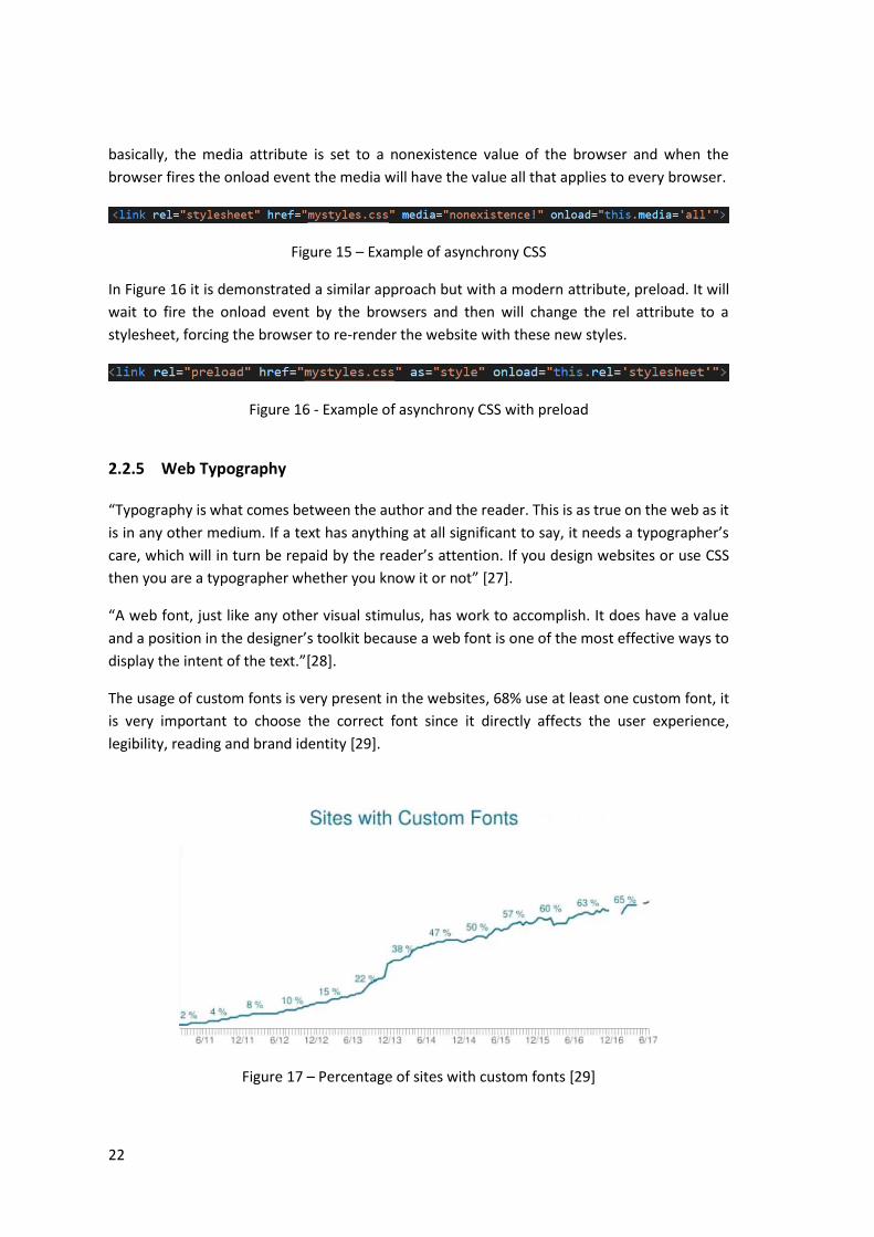
The usage of custom fonts is very present in the websites, 68% use at least one custom font, it
is very important to choose the correct font since it directly affects the user experience,
legibility, reading and brand identity [29].
Figure 17 – Percentage of sites with custom fonts [29]

23
Typography lets you create a certain atmosphere and have a personality. It can be modern,
vintage, romantic, shy or tough just by choosing the right typeface and arranging it correctly.
[29]. Even the fonts size of a website is a critical factor influencing the quality of reading time
and legibility. If the targeted users are older adults it is very important to choose a bigger font
as over the years the human vision start to decay his accuracy and quality [30].
However, the fonts don´t come at free, for every member of a typeface family used in a website,
it requires another font file to be downloaded and parsed by the browser even before the text
is rendered. In some cases, summing all the font files can reach a significant amount of data,
like 500kb, that in low connectivity bands can interfere with the painting and rendering of a
web page [31].
Each browser has a different strategy to deal with web fonts, and some of them have evolved
their strategies over time due to both performance and perceived user experience. One of the
most common ways to load web fonts on a page is to include a CSS @font-face style with a src
attribute for a font file [29], as shown in the Figure 18.
Figure 18 - Example of loading a web font [29]
Since there are many different font formats, it's common to include multiple font files with
different formats in the CSS rule so each browser can load the inherited supported font type.
This is necessary because it doesn´t exist agreement between all browsers to choose a standard
font type. In Table 5 represents the browser support for each type of font. If possible, it should
be always used the format WOFF2 since it can offer a 30% compression reducing the size of the
font [32] and is being adopted by all the browsers with the exception of internet explorer.
Table 5 – Font Formats by browser support [32]
EOT OTF/TTF WOFF WOFF2 SVG
Internet Explorer 6 - 8
X
Internet Explorer 9+
X X X
Edge X X X
Firefox X X X

24
Chrome X X X
Safari X X X X
Opera X X X
IOS Safari X X X X
Android X X
Chrome in Android X X X
Though, the best type of font is to use a standard font that is supported by default for every
browser, meaning it is not necessary to have any kind of network overhead in order to display
a custom font.
So, the first concern to be analysed is how much essential is to have a custom font in a specific
product. A huge majority of the online business need to have a strong and iconic brand, one of
the most crucial elements to build recognized product is the use of a custom font with a unique
typography, for example Google, Amazon, Facebook and others. So, it is necessary to think in a
performant strategy to load the customs fonts without impacting in the user experience.
Even when using the smallest font type, the WOFF2, it can affect the render of the page. This
process of loading fonts carries an important hidden implication that may delay text rendering:
the browser must construct the render tree, which is dependent on the DOM and CSSOM trees,
explained in section 2.2.4, before it knows which font resources it needs to render the text. As
a result, font requests are delayed well after other critical resources, and the browser may be
blocked from rendering text until the resource is fetched [33].
Typically, there are two major issues when loading fonts that can differ among the browsers:
FOUT (Flash of Unstyled Text) and FOIT (Flash of Invisible Text).
• Flash of Unstyled Text (FOUT) was the old default in Chrome and Firefox. Basically, text
would display very quickly and then once the web fonts loaded the page would flash as
browser restyled all of the fonts, displaying a junky interface. This flash of unstyled text
was a very noticeable usability issue and was considered undesirable [29].
• Flash of Invisible Text (FOIT) was the answer to the usability problem, but it introduced
a delay in rendering. Instead of rendering content immediately, the styled content is
invisible until the font is loaded. This is why sometimes you will see first paint trigger
way before start render on a page load time; some invisible content was painted to the
screen, waiting for a font to load so that it can be rendered [29].
In Figure 19 it is possible to visualise these two problems. The DOM element is styled in a
sequentially way, and the typography is in a "font stack". The browser will try to render the first
font in a stack if it is not possible it will jump to the second font in the stack and will follow this

25
sequence until it displays the text. Nonetheless, if none of the custom fonts can be applied the
browser will use a default font to display the text.
Figure 19 – FOUT and FOIT experience [29]
When a custom font fails to load, a browser will display the text with a fallback font, and then
swap to the custom font out once it becomes available. This mostly will look like a FOUT, but it
would only occur with a very long timeout of three seconds, this timeout can vary on the
browser`s used [29].
In Table 6 it is possible to visualise the different timeout times and behaviours by each browser
[33] :
• Chrome and Firefox have a three second timeout after which the text is shown with the
fallback font. If the font manages to download, then eventually a swap occurs, and the
text is re-rendered with the intended font;
• Internet Explorer has a zero second timeout rendering the text immediately. If the
requested font is not yet available, a fallback is used, and text is re-rendered later once
the requested font becomes available;
• Safari has no timeout behaviour just a simple baseline network timeout.
Table 6 - Different browser behaviour when loading fonts [33]
Browser Timeout Swap
Chrome 3 seconds Yes
Opera 3 seconds Yes
Firefox 3 seconds Yes

26
Internet explorer 0 seconds Yes
Safari N/A N/A
Furthermore, to ensure consistency moving forward, the CSS Working Group has proposed a
new font-face descriptor, font-display, and a corresponding property for controlling how a
downloadable font renders before it is loaded. Nowadays this property is supported by all the
browsers except for Edge and Internet explorer. The font display property has three significant
lifetime periods [33] :
1. The block period is the first period. If the font face is not loaded, any element
attempting to use it must instead render with an invisible fallback font face. If the font
face successfully loads during the block period, the font face is then used normally;
2. The font swap period occurs immediately after the font block period. During this period
if the font face is not loaded, any element attempting to use it must instead render with
a fallback font face. If the font face successfully loads during the swap period, the font
face is then used commonly;
3. The font failure period occurs immediately after the font swap period. If the font face
is not yet loaded when this period starts, it’s marked as a failed load, causing a standard
font fallback. Otherwise, the browsers uses a regular font.
In order to minify the impact of loading fonts it is important to analyse what is the best strategy
to load the custom font, testing various approaches and comparing to each other identifying
the best one with less junky pixels. Also, it is important to provide the best performant font
type so the browser can select the most convenient one.
Additionally, it can be used the pre-load link, explained in the section 2.2.2, to force the browser
to immediately start the request to the custom fonts instead of waiting for the parse of DOM
and CSSOM trees. Other method to reduce the jumping frames in the user`s screen is to use a
default font stack provided by the browser that best match with the custom font, since
nowadays it already exists some tools4 to achieve this work. Nevertheless, the critical question
that should be asked if is necessary to have a custom font and what are the aggregated benefits
with it.
2.2.6 JavaScript
“Building interactive sites can involve sending JavaScript to your users. Often, too much of it
(…), JavaScript is still the most expensive resource we send to mobile phones, because it can
delay interactivity in large ways.” [34].
4 Tool to match fonts - https://meowni.ca/font-style-matcher/

27
The JavaScript can be an essential instrument to provide a remarkable user experience or be an
unbeatable barrier forcing the users to quit from the journey with the tiredness of waiting to
boot up the website.
This technology is the most expensive part of a web application since it can take up to fourteen
seconds or more to load and get an interactive website on mobile device. The median webpage
today currently ships about 350 Kilobyte of minified and compressed JavaScript. Meaning that
uncompressed bloats up to over 1Megabyte of script a browser needs to process, pushing the
boundaries of reasonable waiting time for users, see section 2.1.3 and 2.1.5. A large factor of
this cause is how long it takes to download code on a mobile network and then process it on a
mobile CPU [34].
Figure 20 – Growth of JavaScript [35]
With the help of Figure 20 it is easily identified the steady growth of JavaScript always tending
to increase the number of bytes download since 2011. In Table 7 it is possible to see the growth
of JavaScript assets over the last years, in terms of numbers there is a boost of over 383.65% in
mobile and 193.18% in desktop since 2012.
Table 7 – Growth of JavaScript5
Year Desktop % Mobile %
2012 133.5KB 74KB
2014 223,8KB 67.64% 144,6Kb 95.41%
5 Numbers taken from https://beta.httparchive.org/reports/state-of-javascript

28
2016 291.1KB 30.07% 232.8kb 61%
2018 391.4KB 34.46% 357.9KB 53.74%
A principal side effects of this growth is the increase of needed time for a website to be
interactive for the users, responding to clicks, and other interactions. This effect has a specific
metric called time to interactive (TTI), explained in section 6.3. The users will see the website
composed by links, buttons, forms, images and they will start to click on these elements thinking
that the site is prepared to work as expected. However, the browser will just ignore this input
because it is mostly occupied with the process of the JavaScript.
In Figure 21 it is represented the median time to interactive across all types of sites. The records
only have been collected since 2017, starting at 1º June of 2017 the median was 12.1 seconds,
followed the 1º January of 2018 with 12,3 seconds and in 1º January of 2019 was 9.4 seconds.
it is possible to identify a slightly tendency to decrease since 2017 but the number is manly
constants, in most of the cases supressing a remarkable user experience.
Figure 21 - Evolution of Time to Interactive [36]
2.2.7 Webpack
Webpack is a static module bundler for modern JavaScript applications. When webpack
processes your application, it internally builds a dependency graph which maps every module
your project needs and generates one or more bundles [37].

29
Figure 22 – WebPack dependency graph [38]
Basically, the webpack need´s an entry point of an application and then will go through all
modules and dependencies, combining them together into JavaScript files. The output from
webpack is configurable in terms that the developer team has the power to decide how much
files are going to be generated and if they want to stick combined some third parties or not.
Additionally, the webpack can parse files that are not JavaScript like stylesheets, images or even
HTML since the only requisite is have a specific loader for each file type. So, the consumers can
create their customers loaders and share them between the internet, encouraging the open
source mindset since the webpack is itself a crowdfunding application.
In terms of performances, this tool has already a prebuild features that can be used like code-
splitting and tree-shaking.
Code splitting is one of the most compelling features of webpack. This feature allows you to
split your code into various bundles which can then be loaded on demand or in parallel. It can
be used to achieve smaller bundles and control resource load prioritization which, if used
correctly, can have a major impact on load time [37]. Furthermore, the code splitting feature
can become even more efficient when using new flags to preload and prefetch other
components. Basically, webpack will analyse the code and if encounter a preload/prefect
indicator will add a link to html, see section 2.2.2, when the parent modules are loaded.
Tree shaking is a form of dead code elimination. The term "tree shaking" comes from the mental
model of your application and its dependencies as a tree-like structure. Each node in the tree
represents a dependency that provides distinct functionality for your app [39]. In other words,
if for example it is imported an external library with a size of 150kb and if it is only used a small
part of it like 20kb, the webpack will only import the small part for the output bundle saving
130kb and preventing the consumer to download this dead code.
Webpack can even be used in a more optimized way, as with the evolution of browsers some
features have been implemented and others are still under discussion. These new features
simplify the code or enables new key functionalities that the business is demanding, so the
developers start to use them.

30
However, not all browsers are evolving at the same velocity and if the application is needed to
be supported in older browsers and using these new methods is necessary to add more code,
the polyfill´s, to create these new methods in the older browser providing a stable application
in every browser.
Nevertheless, with webpack it can be generated two bundles for a modern browser and legacy
browser optimizing the bundle. So, the modern browser if supports the new features will load
the modern bundler and the legacy browser will load the corresponding bundler. In Figure 23
is presented an example of loading a modern bundle and a legacy bundle.
Figure 23 – Example of using a modern and legacy bundler
Browsers that understand type="module" ignore scripts with a nomodule attribute. This means
you can serve a module-based payload to module-supporting browsers while providing a fall
back to other browsers [40]. In terms of statistics these methodology can have an impact, on
average, about 25% smaller [41].
In sum, it is very important to be proactively keeping your applications as thin as possible using
the latest features and keeping track of the developments from web technologies since it can
improve JavaScript files resulting in a better user experience.
2.2.8 React
React is a JavaScript library for building user interfaces. This library makes it painless to create
interactive UIs, designing simple views for each state in your application and will efficiently
update and render just the right components when your data changes [42].
One of the most important aspects of React is the fact that you can create components, which
are like custom, reusable HTML elements, to quickly and efficiently build user interfaces. React
also streamlines how data is stored and handled, using state and props [43].
React is an abstraction layer between the DOM and the developer, since the developer does
not need to concern about any type of DOM modification since this framework will keep up to
date every element in the page corresponding to the state of application. This diff is possible to
the use of powerful algorithm, Reconciliation, identifying the differences between actual state
and the next state. With this framework it is easier to Build encapsulated components that
manage their own state, then compose them to make complex UIs [42].
This tool was selected to develop the prototyped application as it is one of the most popular
frontend frameworks with a great community that is very supportive providing immense list of
tutorials and documentation. Also, the learning curve is very small and is used by a long range
of large companies as Facebook, Uber, Netflix, Reddit, PayPal and so on [44].

31
2.2.9 PRPL Pattern
Over the years the web has evolved from a document-centric platform to a first-class
application platform. Thanks to advancements in the platform itself and in the tools and
techniques used to build apps, users can do virtually anything on the web they can do in a native
app [45].
At the same time, the bulk of computing has moved from powerful desktop machines with fast,
reliable network connections to relatively underpowered mobile devices with connections that
are often slow, flaky or both. This is especially true in parts of the world where the next billion
users are coming online [45].
PRPL is a pattern for structuring and serving Progressive Web Apps (PWA), with an emphasis on
the performance of app delivery and launch, standing for [45]:
• Push critical resources for the initial URL route.
• Render initial route.
• Pre-cache remaining routes.
• Lazy-load and create remaining routes on demand.
This pattern was conceived with three main objectives: reduce time to interactive on first use
and mobile devices; maximum cache efficiency, especially during the evolution of the
application and simplify the development and deployment.
In the first topic, push critical resources, it is necessary to analyse every resource from the
website and prioritise them in order. In order to not block the render with unnecessary assets
when exists critical files still to be downloaded and are necessary to the interface. Additionally,
it can be used the insertion of inline JavaScript and CSS in the HTML page so the browser can
start to build the DOM and CSSOM without waiting for any additional request. However, this
solution needs to be applied carefully because the document request will start to increase its
size significantly.
In terms of the topic, render initial route, it exists an example of the division of the application
into two bundles, above the fold (critical) and below the fold (non-critical). Since the critical
bundle is immediately rendered to the user and the other bundle is required asynchronously.
In Figure 24 it is an example of the correct use of this topic resulting in a better experience for
the user.
The other two topics, pre-cache routes and lazy loaded routes, can happen when the user
switches routes, the app lazy-loads any required resources that have not been cached yet and
creates the required views [45]. Subsequent, the repeated visits of those routes should be
immediately interactive to the user without having any type of wait.

32
Figure 24 – Progressive rendering [46]
PRPL is more about a mindset and a long-term vision for improving the performance of the
mobile web than it is about specific technologies or techniques. PRPL is inspired by a suite of
modern web platform features, but it’s possible to apply the pattern without hitting every letter
in the acronym or using every feature [45].
2.2.10 WebPageTest
WebPageTest [47] is an application to measure web applications capable of calculating a huge
diversity of performance metrics, like time to first render, time to interactive, speed index, time
to the first byte, time to DOM finished and others. It is also configurable enough to run scripts
in the test runs like clicking and navigating in the site simulating a real user.
“WebPageTest is a tool that was originally developed by Yahoo for use internally and was open-
sourced in 2008 (…) The platform is under active development on GitHub and is also packaged
up periodically and available for download if you would like to run your own instance” [47]
Furthermore, this tool can also simulate the run of performance tests in a various number of
places around the globe like North America, Europe, Asia and Oceania. It can be configurable
the network speed, the number of tests to be executed in a test run, capture a video of the run,
compare runs and even select the device to be tested. This tool is very reliable because it really
executes the test in real devices without throttling the browser to simulate a slow device.
Nevertheless, this application also provides the capability of running their private instances in
an external server to have an independent machine always available and to execute tests with
sensitive data like usernames and passwords.

33
Figure 25 – Interface of WebPageTest
2.3 Summary
This section presents a contextualization about web performance topic, explaining why this is a
multifaceted problem with an inherited connection to our human anatomy that cannot be
neglected.
Furthermore, it is shown a technical overview of the current world in the web development
environment, explaining which tools and concepts are related to the performance topic and
should be kept in mind to better understand this thesis.
In conclusion, the reader should have a deeper overview of the web performance concept and
what tools are available to best tackle it.

34
3 Value of Analysis
In this chapter it will be presented the value analysis of the current project with the purpose of verifying the value for the customer and business analysis. “Value analysis is an examination of the function of parts and materials in an effort to reduce cost and/or improve product performance. The primary objective of value analysis is assess how to increase the value of an item or service at the lowest cost without sacrificing quality.” (Nicola, Susana 2016).
“The analysis concerns the function of a product to meet the demands or application needed
by a customer. To meet this functional requirement the review process must include an
understanding of the purpose to which the product is used.” [48]
As it can be seen the definition of value is very subjective and combines an enormous
influencing factor that can be different considering the business and the customer. So on, the
following analysis of value will be supported with the use of NCD (New Concept Model) in order
to understand the use of a product, as well as the functional specification in order to be valuable
to the customer. Moreover, it is also used the Canvas Model to easily identify the business
metrics, key patterns, consumers and an economic vision of the project.
3.1 New Concept Development Model
The creation of a new product was proved to be insurmountable because there was neither a
common language nor a clear and consistent definition of the key elements of the front-end
process. As a result, to have homogeneity in the process and having a common language
between all the intervenient the New Concept Development (NCD) model was developed. The
model consists of three key parts [49]:

35
• Front end elements
o Opportunity Identification
o Opportunity Analysis
o Idea Generation and Enrichment
o Idea Selection
o Concept Definition
• Engine that powers the elements
• External influencing factors.
Figure 26 – NCD Model ( New Concept Model)
“The New Concept Development Model (NCD) provides a common language and definition of
the key components of the Front End of Innovation. The engine, which represents senior and
executive-level management support, powers the five elements of the NCD model. The outer
area denotes the influencing factors that affect the decisions of the two inner parts.” [49]
3.2 Opportunity Identification
In the latest years, the online sales have been growing at the speed of light, becoming a business
estimated to a value of 2 842 billion dollars in 2018 (cf. in the section 2.1.2). Along with this
expansion, the companies started to invest in the online services improving their design´s and
functionalities. Focusing on the consumer's demands, analysing their cultures and daily routines,
starting to use the Business-to-Consumer (B2C) methodology.
A website of e-commerce is the only gate that an internet vendor can use to communicate with
the customers. Therefore, its appearance and interactions encourage or discourage a

36
consumer’s purchase intentions. In the marketing literature, website features such as layout,
appeal, graphics readability, and ease-of-use have been considered to affect consume [17].
One of the main contributors to have a frictionless user experience is to have a fast and
interactive website along with the user journey without facing any type of hard decision or
cracked functionality (cf. in the section 2.1.3). Therefore, the users needed to be cherished and
feel excited and happy in their purchase, not wishing to wait more than 3 seconds to a page be
loaded [4]. Furthermore, the median load time of a site to become interactive it is 14seconds,
a number that is truly impressive and impacting the user emotions [34].
3.3 Opportunity Analysis
Since we can see the effect of web performance correlated with the revenue of sales, the
performance topic always should be considered at the beginning of the project starting from
the designs.
However, there are multiple causes to this problem, as a matter of fact, it exists environment
problems mostly related to the consumer, some of them are: connection of speed internet and
characteristics of the phone like data processing or memory storage. Additionally, there is
another type of root of causes to this problem that can be mitigated by the business itself as
using the correct performance guidelines.
3.3.1 Environment Problem
The devices used to navigate on the internet are very dissimilar among them since we can go
through an expensive phone like the latest iPhone which has the latest processor until we reach
a cheap phone like Moto G4. Though this fact can be easily overlooked it should not be, because
it can exist a difference of 9 seconds unit page interactives comparing this to phones.
So, when developing web applications, there should be granted quality and good user
experience to all users. This can be achieved with execution a test battery with real devices in
real networks without emulating these conditions that are not so trustworthy. There is a free
tool that uses real devices to run performance tests and collect trustful data (cf. in the section
2.2.10).
Alongside with device problem, it also exists a huge divergence on internet connection
depending on the access country, as it can be seen in Figure 27. Overall the global internet
speed average is up from 16.6 Mbps (Megabytes per second) to 16.9 Mbps since the majority
analysed countries are highly developed cities like Singapore, Netherlands, Norway and South
Korea [50].

37
Figure 27 – Comparison of internet speed around the world [50]
Seeing the Figure 27, there might be pitfall thinking it exists a good internet connection around
the world and everybody can have a good user journey on the web. In the meantime, it exists a
lot of entry barriers to access some digital content in some countries, like China, India or North
Korea.
China is one of the best examples to highlight the divergence of performance and how it can a
website seems fast in some location and another’s not. The main reason for this effect is the
existence of the Great Firewall and the fact that has blocking rules denying some external
requests on a particular page. Furthermore, these requests can be executed too early resulting
in a blank page that has a negative user experience and forcing the user to exit the website [51].
Another country that suffers from infrastructure issues is India. Regarding the average speed
connection of 9.1 megabytes per second, it exists a limitation in the number of parallel accessing
a cell tower [52]. However, with this problem, it still can be achieved a frictionless user
experience, as is the case of Ola web application, a cab aggregator. This digital platform has
invested in improving their technology and performance that results in an increase of 68% in
mobile traffic and a rise of 30% in conversion rate [53].
3.3.2 Application Problem
In contrary of the section 3.3.1, it exists another type of problems, application problems, that
can also affect the perceived performance in the website, and can be easily solved with the
right investment of resources in this issue.
One of the main problems of many web applications is not having real users testing the
application in the development stage. Actuality, it is possible to only discover some problems
of user experience in the final stage of development, having a huge development cost to solve
them. The most effective solution is to include regular user sessions that can test the website

38
in different devices and environmental conditions, so all the edge cases can be exposed and
corrected on earlier stage of the project.
Another type of problem is not having a development team aware of the performance topic,
always developing in the dark without any type of reliable metrics that show if the website is
fast or slow. This can be really a controversial theme because some people can think that the
website is fast enough, and another person not, so the definition of the performance metrics
and thresholds are crucial to have everybody aligned. With the definition of performance
budget and having an incremental performance test that can show if the website is degrading
or improving in terms of performance can be very beneficial. Because a specific feature can
seem very valuable to the user but if it forces the performance budget to be broken it might
not be so suitable to the business.
Furthermore, another critical point to have a performant application is the layouts. In this topic
it is very important to start designing the application with the performance mindset. Defining
what are the most critical sections of a website and what should be the user capable to see and
interact in the first render. After the critical render, all the information below should be
required asynchrony and not affection the first page load.
In addition, there are major problems with the use of too large images that can easily overflow
the internet channel and block some critical requests. This should be taken into consideration
and can be solved with the use of different images sizes per device, like a mobile device does
not need an image as dense as a desktop need`s to have a higher resolution.
Lastly, it also exists a performance problem with the use of custom fonts. These fonts may be
very special and can give a special layout to the website, however, if these fonts impact the user
experience it should be considered the use of native fonts provided by the operating system of
the consumers.
3.3.3 Advantages Of Web Performance
One of the main advantages of web performance is the increase in revenue even at very low
percentages like 1%. Though in some digital platform like Walmart or Amazon, this can be a real
a turning decision to a business success knowing that the revenue of Amazon is 177.9 billion
dollars and Walmart is 500,3 billion dollars [54].
In one case, Amazon has calculated that a slowdown of one second on the website can result
in a decrease of 1.6 billion dollars of revenue each year (Eaton, 2012) [54]. Additionally,
Walmart even goes further and calculated that only a delay of 100 milliseconds can mean in a
drop of 1% of revenue. As it can be seen the investment of performance might be a turnover of
business to become successful and profitable [55].
Even when analysing the impact of performance in smaller e-commerce’s platforms can be
relevant, for example, a website with 200 thousand dollars in monthly revenue with a page load

39
time of 10 seconds, a median value [56]. A small reduction of 1 second in this metric can mean
an increase of 271 thousand dollars annually, as it can be shown in Figure 28 6.
Figure 28 – Google estimative of the impact in performance
3.3.4 Disadvantages Of Web Performance
As it can be stated the correct use of web performance can have a lot of benefits even for the
development team or the business itself.
However, the development of a fast website with a great user experience can be easily
discarded. When there are tight deadlines it is tempting to choose the development of new
features in deterioration of having a performance mindset. Also, the development team need
to have awareness of the performance topic including time to learn and study the best
methodologies that are used in web development and what will be the metrics that have
significant impacts in the users. Testing a website in terms of performance it requests time to
have a careful analysis and see the critical request that is delaying the first page render, this
process might take more time than a simple validity check of the features.
In terms of infrastructure, it is also needed to have specific machines to this purpose, like a
machine with an isolated web instance and performance machine that can make tests to the
applications instances. Since it is needed to have a stable measurement, so the development
team know if the application is really degrading and are not false positive issues.
3.4 Idea Generation And Enrichment
When was discussed what will be the focus of this project and the best strategy to analyse the
user experience problems in the online sales on a short and medium term, it was identified
three possible solutions:
6 This estimative was done with the use of the Google performance calculator (https://www.thinkwithgoogle.com/feature/mobile/).

40
1. Web Assembly - Build a website with this new framework that is upcoming in the world
of web development, allowing the developers to write an application using a high-level
language Objected Oriented like C/C++ and then compiled to a binary format
interpreted by the browser.
2. Improvement of Web Development – Analyse the current problems of web applications
and understand what the best approaches to tackle this problem, like a load of
asynchronous code, optimizing the images. Additionally, the
3. Development of an Artificial intelligence System with the focus of user experience –
Build a system that was capable to be auto adjustable in terms of layouts according to
the user behaviour and configurations.
The first idea is to investigate and build a prototype with this new framework, web assembly,
that can be capable of being revolutionary and change the state of web development. However,
it is on the early stage and most companies cannot afford to change the paradigm of
development taking an enormous amount of resources to do this shift. Furthermore, the
developer team will not be able to reuse web components that are already developed.
The second idea suggest analysing the current state of e-commerce platforms, seeing their most
critical pain points and how the performance can have a huge impact on the behaviour of the
users. The user journey is one of the key principals to the consumer`s concerns being very
important to have a frictional experience as stated in section 3.3.3 and 2.1.3.
The third solution is in the area of Artificial Intelligence with the objective to build a system that
will analyse all the interactions in the website, identifying some pain points or improvements
and then change the style and see what were the outcomes of these changes in terms of
business numbers. So, after some experiences, the website will be fully optimized with a high
increase in sales without any intervention of human being.
3.5 Idea Selection
In order to have a pragmatic and affordable solution to best tackle the performance problem,
it was chosen the second option. This option is the less disruptive and easier to be adopted in
the short and midterm, allowing the online platforms to improve their user journey without
daggling their business objectives.
In this project, it will be developed a prototype following the software development guidelines
with a performance vision and providing a remarkable experience for the user. Analysing the
most pain points for the consumer and identifying all possible solutions to solve the problem,
choosing the best one in terms of complexity, technology and effort.
During this development, it will be incrementally measured important performance metrics
that impact the user experience, will be detailed in section 6, and for taking this data it will be
used the application WebPageTest described in the section 2.2.10.

41
Furthermore, it will be also studied how it can be possible to have different experiences
considering the user, as like a Chinese consumer can have a light version of the website because
of the low internet speed, see section 3.3.1, and a Germany user can have a totally different
experience.
3.5.1 Analytic Hierarchy Process (AHP)
The Analytic Hierarchy Process (AHP) is a decision-making tool which was developed in 1980 by
Thomas L. Saaty. This method is usually used in explaining complex decision-making problems
and has several attributes by modelling the amorphous problems studied into hierarchical
elements. An important component of a hierarchical system is the main objective, the criteria
that affect the objective, and alternatives available for the problem [57].
3.5.2 Hierarchic Division
With the use of the AHP method the problem is structured in different hierarchical levels, the
first level corresponds to the purpose of the problem, the second level contains all criteria
aiming to defining a good solution and by the end the third level list all the possible solutions.
Regarding the ideas generated (section 3.4), it was designed the following hierarchical tree
decision as it showed in Figure 29.
Figure 29 – Hierarchical Tree Decision Diagram
The final solution should be evaluated according to: how effectively and efficiently is the
solution for the user, how complex it is the solution in order to be implemented in an existing

42
project, how easily it is adopted by the development team and the more relevant how much
resources it will be necessary to integrate these methodologies and best practices [58].
According to the main objective and the four evaluation criteria, three alternatives exist that
can be considered a possible solution: build a new website with new technology web assembly
or analyse the current web development world and improve the user experience.
3.5.3 Priority Definition
In order to compare each standard, firstly should be ranked against each other choosing a scale
from one to nine in terms of significance.
The scale can be described as follow: number one represents that both elements have the same
mean, number three means one Element have a slight importance, number five signifies one
criterion has a strong importance among other, number seven indicates that one element has
very strong priority and number nine means to be extremely valuable comparing to other
criteria. All the odd number´s in this scale represents the intermedium values between the
graduations.
Table 8 - Criterion Comparison Matrix
Criteria’s Effectiveness/
Efficiency Easy
Adaptation Complexity
Implementation Cost
Effectiveness/ Efficiency
1
1
6 6
Easy Adaptation
1 1 6 4
Complexity 1/6 1/6 1 4
Implementation Cost
1/6 1/4 1/4 1
Total 14/6 29/12 53/4 15
Table 8 is the result of the comparison between all these criteria’s and it can be observable that
the most weight is the Effectiveness/Efficiency and the Easy Adaptation.

43
Table 9 - Normalized Criterion Comparison Matrix
Criteria’s Effectiveness/
Efficiency Easy
Adaptation Complexity
Implementation Cost
Effectiveness/ Efficiency
0,4285
0,4137
0,4528 0,4000
Easy Adaptation
0,4285 0,4137 0,4528 0,2666
Criteria’s
Effectiveness/ Efficiency
Easy Adaptation
Complexity Implementation
Cost
Complexity 0,0714 0,0689 0,0754 0,2666
Implementation Cost
0,0714 0,1034 0,0188 0,0666
Sum 1,0000 0,9997 0,9998 0,9986
After defining the scale between the criteria’s, it is necessary to calculate a normalized matrix
with each associated weight.
Table 10 - Alternative Weight per Criterion
Criteria’s Weight
Effectiveness/ Efficiency
42,4%
Easy Adaptation
39%
Complexity 12%
Implementation Cost
6,6%

44
3.5.4 AHP Conclusion
Having obtained the relative weight of each criterion in relation to each other, it is possible to
evaluate and choose the correct solution. Comparing both, the second alternative is the one
that has the most valuable following these criteria, because it does not insert any breaking
change and can be used in any project even legacy ones. Also has a very low learning curve to
the development team since it can be easily adapted and put it to production servers in a brief
time. Furthermore, in the third solution, it will be also necessary to have a huge amount of data
in order to have a solid AI system.
3.6 Concept Definition
The growth of online sales is inevitable and it up to all e-commerce platforms being aware of
this expansion in order to make sure it follows a sustainable and healthy path. So, all the
technologies related to the business need to be innovated and adapted to all new markets.
Therefore, as pointed in the section 3.3.3 performance can really impact the gross merchandise
volume (GVM) letting a company even improving its sales and maybe have a new customer
from the other side of the planet.
3.7 Business Model Canvas
“A business model describes the rationale of how an organization creates, delivers, and
captures value” [59].
The canvas model is presented as being a standardized format of describing well-known
business model patterns so that it can be presented in a quick, simple, and visual format sharing
the essentials of business. [59].
A possible business model that could be applied to the present context is presented in Table 11.
Table 11 - Business Model Canvas
Key
Partners
Key Activities
Performance Examination
Software Development
Analyse of society trends
Value Proposition Provide a frictionless user experience, promoting the retention of customer.
Customer Relationship
Technological companies
Customer Segment
Mass Market, since everyone can be a possible customer and enjoy the benefits of a good user experience.

45
Key Resources Developers Understanding of human behaviour E-commerce platforms
Channels
Every digital device (phone, tablet, computer)
Cost Structure Salary Machines and Mobile Phones to execute performance tests
Revenue Stream
Online sales will increase resulting in an increase of business revenue opening their market to the world
In a business perspective, the web performance topic at first glance might not present a short
come high value. However, in an e-commerce environment it can have a substantial impact on
the sales as it will be possible to acquire new consumers and allowing the current users to
purchase with less interruptions. In terms of investments, it is necessary to spend resources in
the development team, like improving the knowledge of the developers, and the server
infrastructure to provide tooling for related to the performance metrics
3.8 Summary
With the reading of this section, it is possible to see the business value of this thesis, explaining
the advantages and disadvantages of investing in web performance when developing an online
application.
Additionally, it is explained why the topic of web performance was chosen against the other
two topics, web assembly and artificial intelligence. Moreover, it is presented a business canvas
model where it is given a different overview, sharing the essentials of a business.

46
4 Analysis and Design
In this chapter it is described the software architectural design of the web application, giving a
detailed description of the chosen patterns and comparing to other possible solutions
presenting the advantages and disadvantages of each alternative.
“Software architecture is those decisions which are both important and hard to change. This
means it includes things like the choice of programming language, something architects
sometimes gloss over or dismiss. Both aspects land squarely on the economics of software
development. Said another way, software architecture is those decisions which, if made poorly,
will make a project either succeed or fail, in a needlessly expensive way.” [60].
In the following sections, it will be explained the pattern Atomic design [61], injunction with the
4+1 architecture view model, decomposing the whole systems into different views of a software
system facilitating the understanding of the whole application.
4.1 Atomic Design
Atomic design is a methodology composed of five distinct stages: atoms, molecules, organisms,
templates and pages. Working together to create an interface design system in a more
deliberate and hierarchical manner. Allowing to create and maintain robust design systems in
a simple and scalable way, permitting to have higher quality and more consistent in user
interfaces [61].
With this design, it is possible to have consistency and reusability in the code base of project,
the creation of components should have two main requirements: a single responsibility,
abstract to the business context and being reusable in different parts of the application.
The single responsibility principle (SRP) is a very popular and effective software design pattern
from SOLID principles. The SOLID pattern is composed of five elements: Single Responsibility

47
Principle, Open-closed principle, Liskov substitution principle, Interface segregation Principle
and Dependency inversion principle.
The SRP states for that a class should have one and only one reason to change, meaning that a
class should have only one job, however, in this context instead of a class, it is a component
having only one responsibility [62]. So, whenever a new feature is required it is only needed to
change one component and not all the components of an application.
Aligned with the single responsibility principle it is also present the principle does not repeat
yourself (DRY) allowing to reuse a simple component in different parts of a website, improving
the speed of delivery with a maintainable and scalable mindset. This approach allows to each
component being a unit of work with a firm foundation that has well defined interface and
is covered by his own tests [63]. With this methodology it is possible to have a scalable growth
reducing the amount of duplicated code, because instead of creating a new component every
time it is needed now it can be reused an existence component in any context with the
insurance that is working as expected.
The five elements of the atomic design are [61]:
• Atoms, that are the basic building blocks of matter [61]. They are the simplest elements
of an application with a simple logic or in some cases none, that renders some basic
HTML tags, for example, an input, a button or a label. These elements are typically
aggregated in other bigger elements with a more significant relevance;
• Molecules, that are groups of atoms bonded together and are the smallest fundamental
units of a compound. These molecules take on their own properties and serve as the
backbone of reusable components. However, molecules can become complex and an
easy rule of thumb to mitigate this concern is the molecules are a simple combination
of atoms built for reuse [61];
• Organisms, that are groups of molecules joined together to form a relatively complex,
distinct section of an interface. Letting to have more concrete blocks with meaningful
components with a defined context so the user can start to use them. A typical example
of an organism is the header of a page where the user can see the logo, search form
and have primary navigation to the rest of the website. Building up from molecules to
organisms encourages creating standalone, portable, reusable components [61];
• Templates, that consist mostly of groups of organisms stitched together to form pages,
providing context to all these relatively abstract molecules and organisms. It’s where it
starts to see the design coming together and start seeing things like layout in action.
Templates begin their life as HTML wireframes, but over time increase fidelity to
ultimately become the final deliverable [61];

48
• Pages, that are specific instances of templates, being the highest level of fidelity and
the most tangible building block. In this stage, placeholder content is replaced with real
representative content to give an accurate depiction of what a user will ultimately see.
This step is essential as it’s where it is tested the effectiveness of the design system.
Viewing everything in context allows to loop back to modify our molecules, organisms,
and templates to better address the real context of the website [61].
In Figure 30, it is possible to visualise a how the different components are composed following
the atomic design. The atoms, molecules, and organisms that comprise our interfaces do not
live in a different area, and the templates and pages are indeed composed of smaller parts. The
parts of our designs influence the whole, and the whole influences the parts
Figure 30 – Representation of atomic design [61]
4.2 Architectural Design
As can be seen in section 4.1, the prototype application is going to be sliced in an enormous
number of logical components that composed together will be presented to the user. However,
this approach it is not enough to provide a seamless user experience to the customer it is also
necessary to analyse how these components will be delivered to the user and then rendered in
the browser, that in some devices and slow network means a significant amount of time as
analysed in the section 2.2.2 and 2.2.3.
This process must be progressive and should never impact the user journey affecting or delaying
the user interactions. So, with the help of new frontend frameworks, like React (section 2.2.8),
enables to render the components in the browser of the user. This process relying’s on the use
of JavaScript modifying the DOM to render new interfaces.
With this methodology of rendering the components in the client side can be very useful in slow
connections because it is not necessary to have additional request´s to the server requiring
resources for the new page. After the rendering the first page, it is possible to load the assets
from the next page in the idle time of the browser, optimizing the roundtrips and reducing the
network traffic, following the Lazy load pattern explained in section 2.2.9. So, when the user
are navigating throw the application it will seem they have an instant load of the new pages
without having any wait time.

49
In Figure 31, it is possible to visualize this approach of rendering/requesting assets for a web
application.
Figure 31 – Sequence diagram of the interaction between user and server
Supossing the customer wants to buy an online product, he will be prompted with the home
page when he can see the logo of the company, navigation system, some products and even
information about the phone number and email in case of having a problem with their purchase.
When the browser makes a request for page 1 the server will respond with the HTML document
then the browser will parse it and then make the request for the CSS and JS assets.
After requesting the resources of the current page, the browser will have idle TCP sockets
available to request the new assets of the next page, that might be the product listing page. At
this moment, the web application can be optimized and starts to load the components of page
2. Allowing to pre-cache the remaining routes of the website, one more rule of the PRPL pattern,
section 2.2.9.
Whenever the user decides to go through the next page the browser will previously have the
assets cached and can start immediately render this page. Without making any extra request,
providing an instantaneous navigation eliminating any probability of the user quit of the
purchase intention derived of waiting time.
Additionally, if the application has a well-defined scope for each component some of them will
not be necessary to download them again, as for the example the header a footer component
can always be cached reducing the number of bytes download. These components might be
equal across all the website and whenever the user changes the page it is not be necessary to

50
make an additional request and process them again because they will be in the cache of the
browser.
Furthermore, the correct use of this approach can have a tremendous performance impact for
the user. Nevertheless, it can even push the boundaries in the first render, when splitting the
application in two bundles, one with components that are critical for the user journey and
another with non-critical. Improving the critical resources for the initial render, another
principle of the PRPL pattern (section 2.2.9). In Figure 32, it is possible to observe this principle
and understand the sequence of the events.
Figure 32 – Splitting the assets in critical and non-critical
Nonetheless, this approach is not a golden rule and should be tested in the targeted web
application because it may depend on the dependencies of the project or even in some legacy
projects the cost may merit the time to be done. Additionally, it may also be not so beneficial
for the business depending on the current access conditions and devices of the targeted
customers. Because if every customer has the latest phone and exceptional network a load of
big assets in contrast to small assets will not be noticed in the user experience.

51
4.2.1 Alternative Design
In contrast to the previous approach, it also exists the standard methodology of loading assets
in many website applications spread all over the internet. This approach is very simple and can
be very beneficial to business that does not feel the necessity to have a performant user journey.
In Figure 33 it is a representation of this architecture.
Figure 33 – Standard Client-Server application
In the first approach, the users will have a fast user journey without any waiting time, feeling a
fluent and instantaneous experience. However, the metric Time to Interactive (TTI), see section
6.3, might be delayed because of the amount of JavaScript code processed that can growth
exponential with the evolution of the project. These might happen if does not exist any type of
policy when adding new features and third-party libraries to the project without any concern
of the performance impact.
The last one will not be optimized for slow connections with unnecessary roundtrips to the
server that may cost critical time for the user. Furthermore, if the business might want to
acquire new clients from other´s countries with slow connections, the website will not be
prepared to it, resulting in bad user experience. In contrast, this method will have a good metric
of first paint since it will not be necessary to process any JavaScript before presenting the page.

52
Comparing both approaches, the first one has more advantages and when is corrected applied
can be very beneficial to customers providing a remarkable user experience, directly impacting
the online sales, as explained in section 3.3.
4.3 Logical View
The E-commerce application is going to be developed following the best practices of software
developing with a focus on reusability and composition in order to maintain healthy growth and
scalability. In the Logical view, it is possible to visualise how the application is separated and
analyse the main concepts and responsibilities of the different areas, in Figure 34 it is
represented the architecture of the system. The whole system is split into two major layers:
• Client-side layer
• Application Layer
The client-side layer is composed of the customer that will interact with the user interface
provided by the application responding to every action performed by the users. The user
interface is provided by the application layer since it is the e-commerce website itself. However,
the application layer is sub consequently divided into two more layers:
• Presentation layer
• Business logic layer
The presentation layer is responsible for all the components/pages rendered in the user
interface as well as the styles and controllers to determinate which components will be visible.
This layer is only composed by presentation components containing logic related to the
interface and none to the business rules. One example of this relationships is showing a product
page in sale, the presentation components are responsible to correctly show the item image
and price with the specific styles and handlers to receive intentions from the user. However,
the data related to the item is provided by components from the business logic layer maybe
requesting to the backend or checking in the database for the data needed.
The business logic layer is responsible for business rules of e-commerce application, this layer
will have a well-defined interface with the presentation layer where it will be possible to
transmit information needed to be shown to the user. Additionally, the business layer it will
also manage the data persisted in the application, choosing when is necessary to make a
request to the backend or simply retrieve information from the cache service, reducing
inefficient network requests.
Furthermore, this layer is mainly composed of components that only interact with business logic
and not any type of visual aspect. For example, the parsing process, normalizing structures,
getting data from the backend server or even manage the database to decide if the cached data
is still valid or it is to make new requests to the server.

53
With this architecture, it is possible to have a clear separation of responsibility between the
components. It will not exist duplication of code and it can have simple unitary tests that only
test one part of the system. Another advantage is the scalability of the application since many
components can be shared among the project and even with other projects outside of the e-
commerce context, accelerating the development process, improving the quality of the
components and ensuring the correct abstraction in the components.
Figure 34 –High-Level Diagram representing the application system
4.4 Process View
The process view can be described at several levels of abstraction, each level addressing
different concerns. A process is a grouping of tasks that form an executable unit. Processes
represent the level at which the process architecture can be tactically controlled. The software
is partitioned into a set of independent tasks, a task is a separate thread of control, that can be
scheduled individually on one processing node [64].
In this process view, it will be presented the process of viewing a product page explaining how
the messages between the components flow starting at the very beginning with the user
requesting the page until the end of the backend server. In Figure 35 it is illustrated these
process view.
54
Nevertheless, in this example it is only represented the use case of seeing the product page, all
the other pages like Home, Product listing Page, Product details page, Checkout, Bag use the
same architecture.
1. At the start, the user requests to the navigation in the browser inserting the
corresponding URL for the product page.
2. Then the Application will call the component Product Page to render itself, the
component will firstly get the data related to the product from the Repository that is
allocated inside the Business Layer.
3. The repository will get the data from the database
a. If this data is filled it will immediately respond with the data or make a request
to the server.
b. If this data is empty the page component will start a request to the backend
and after the response will call the method store from the Repository
component. Then the repository component will dispatch an action to the
database in order to store the received data from the backend server.
4. After the Product page getting all the necessary data it will call the render method of
Layout Component and the Product page to join all the layouts and show the final
interface to the user.

55
Figure 35 - Process View of displaying product page

56
4.5 Development View
The development architecture focuses on the actual software module organization on the
software development environment. The subsystems are organized in a hierarchy of layers,
each layer providing a narrow and well-defined interface to the layers above it. The
development architecture of the system is represented by module and subsystem diagrams,
showing the ‘export’ and ‘import’ relationships [64].
In Figure 36, it is possible to visualize the relationships between the components of the
application, essentially split into two different areas: Presentational Layer and Business Layer,
as explained in section 4.3. This application was developed with the support of React
Framework, section 2.2.8 , using the atomic design dividing the application into small
components that can be reused and tested as single unit possible to be used alone or inside a
context.
The Presentation Layer contains all the presentational components responsible for the styles
and interface of the application. The application is the largest component that contains
different pages. Inside these pages exists other components, the layout of the application that
is shared with other pages using the pattern PRPL, explained in section 2.2.9, and other smaller
components like organisms and molecules. These smaller components are responsible for each
part of the website like the header and the content, however, inside these components, it exists
another component, the atoms the smallest component like an image or a button.
In the Business Layer, it remains all the business logic alongside with the data management that
is needed by the presentational components. All communications between the presentational
components and business layer occur between dispatch of different actions from a request to
a backend until a simple change on a field. This architecture is very similar to an architecture of
events since the presentation layer will fire an event and then the business layer will catch the
event process a pipeline of methods and then return the required data.
Figure 36 – Development View of the project

57
4.6 Summary
After reading this chapter it is possible to have a high-level overview of the architecture of the
prototype, using the 4+1 architecture view model. Moreover, it is presented the pattern used
to divide the components, the Atomic design, allowing to have a clear division of responsibilities
and how the data flows within the application.

58
5 Implementation
This chapter explains the implementation details of the project as well as the motivation behind
each decision taken, explaining the advantages and disadvantages of other possible solutions.
Additionally, it is described the optimizations made through the application to have a
performant user experience and what the most important factors impacting the user journey.
Furthermore, the objectives of this section are:
• Describe the architecture of the application and connections between the components
• Optimization techniques used to have a better user experience
• Explanation of the chosen render methodology in conjunction with the pattern PRPL
5.1 Components
In this section, it is presented the components from the web application that were designed
and developed with a performance vision, having features that improves the user experience
in slow network connections. Furthermore, it will be described the interface of different
components in order to explain how to use them in diverse contexts contributing to the
reusability.
5.1.1 Button
The most popular manifestation of call to action in web interfaces comes in the form of clickable
buttons that when clicked, perform an action, for example, "add to cart", or "place order".
Another type of action is leading to a web page with additional information, for example, "go
to checkout" or " shop now" it asks the user to take action [65].

59
In the e-commerce environment, it is very important to have a perfectly working button that
correctly responds to the user interactions and shows different interface visuals in different
contexts like:
• normal - the button appears normal and every time the user clicks it, it will perform the
associated action.
• disable - the button is disabled appearing a different interface and ignoring all the user
actions performed in the website. This state is typically used when the user cannot
walkthrough to the next step because it exists an error on the page like an address form.
However, these two states might seem enough for a typical e-commerce website but in slower
networks, a page transaction or actions like “add to cart” can take such a duration that impacts
the user experience. In these actions it is needed to execute a request to the backend server
and can take an extensive time that will be noticed by the customer. He will think the website
is broken and not responding to their action, but the website is working and not showing any
indicator to the user. Therefore, it is crucial to have an intermedium state to show to the user,
between the user clicks in the button until his action is really performed, the loading state:
• loading – intermedium state presented to the user, showing that some process is
happening so the user does not feel the website is broken.
In Figure 37 it is possible to view the two different phases of the button, the normal and the
loading state. An example the usage of loading state is on the bag view that has a button to the
checkout view. When the user clicks on the checkout button it will show the loading state, that
in this case is a spinner component, see section 5.1.4, and when all assets from the checkout
page are ready the transaction is executed. With this approach the user will know that
something is happening and not feeling frustrated thinking the website is broken.
Figure 37 – Transition between a normal button to the loading state
5.1.2 Image
Images often account for most of the downloaded bytes on a web page and often occupy a
significant amount of visual space, translated to number it is 21% of the total webpage weight7.
As a result, optimizing images can often yield some of the largest byte savings and performance
improvements for your website: the fewer bytes the browser has to download, the less
7 Detailed statistic of web page weight https://httparchive.org/reports/page-weight?view=grid

60
competition there is for the client's bandwidth and the faster the browser can download and
render useful content on the screen [66].
One of the simplest and most effective image optimization techniques is to ensure that we are
not shipping any more pixels than needed to display the asset at its intended size in the browser.
The overhead of shipping unnecessary pixels, only to have the browser rescale the image on
our behalf, is a big missed opportunity to reduce and optimize the total number of bytes
required to render the page [66].
In order to deliver different images sizes to different viewports it was created a new HTML tag
the <picture>. The <picture> tag gives web developers more flexibility in specifying image
resources. Instead of having one image that is scaled up or down based on the viewport width,
multiple images can be designed to more nicely fill the browser viewport. The <picture>
element holds two different tags: one or more <source> tags and one <img> tag, as it is possible
to visualize in Figure 38 [67].
Figure 38 – Usage example of picture tag
The browser will use the first <source> element with a matching hint and ignore any following
<source> tags. The <img> element is required as the last child tag of the <picture> declaration
block, in order to provide backward compatibility for browsers that do not support the
<picture> element, or if none of the <source> tags matched. Presently, following the website
caniuse8, it only exists two browsers that do not support the picture element: Internet explorer
and opera.
Furthermore, the usage of picture tag may not be enough to always deliver an excellent user
experience to the customers especially on low-connectivity or mobile networks. When the
images are being downloaded it will show an empty grey box as you wait for images to
download. This is a problem in developing markets such as India, where many people new to
the web and primarily use 2G networks [68].
Therefore, to minimize the impact of loading images it was used an approach of showing a
smaller and grey image at first and then show the image with high quality where the user can
see every detail. In the e-commerce project this strategy was used in the product listing page
and product details page. The first image is more than a simply grey square it is a traced svg in
8 List of different features supported by the browsers https://caniuse.com/#feat=picture

61
grey scale of the real image that will be used, basically all images of the website are processed
by a toll node-potrace9 to generate a light image of every product.
Figure 39 – Transaction from the grey image to the product image
In Figure 39 it possible to visualize the effect from the grey image to the product image, this
improvement might seem insignificant, however in term of numbers, the grey image has a size
of 0.8kb and the product image has a size of 7,53kb that is a decrease of 98%. This improvement
is even more noticed in the e-commerce page the list of products where a single page can load
a huge number of images like 30 or 40.
Finally, the image component has all these optimization features that improve the user
experience and encapsulates all the logic. So all over the project, it is only necessary to use the
Image with the right source path to it and then the image component will handle all the rest of
the work, using the right picture tag and generating the traced SVG in building time.
5.1.3 Layout
With the performance vision aligned with the PRPL pattern explained in the section 2.2.9, it was
developed a layout component or as known as app shell model. This component is focused in
the performance centric vision that permits to the user to have a reliably and instantly loads on
your users' screens, like what you see in native applications [69].
The app "shell" is the minimal HTML, CSS and JavaScript required to power the user interface
can ensure instant, reliably good performance to users on repeat visits. This means the
application shell is not loaded from the network every time the user visits and even when
navigation on the website this component will not be downloaded twice because it will be
cached in the browser [69].
The layout component has the header component that contains the navigation component
enabling the user to navigate thought the application and has also a cart image that is a link to
the checkout page. Also, at right of the component it exists an image that is the logo of the e-
commerce platform, and when is clicked it will redirect the user to the Homepage. Furthermore,
9 Tool to generate light images of an SVG https://github.com/tooolbox/node-potrace

62
these links are visual components that are wrapped in the Link component in order to have a
more optimized journey.
Figure 40 – Layout component used in different pages.
This component will only be downloaded once whenever the user enters on the application
decreasing the number of bytes needed to be downloaded when the customer is navigating in
the application.
5.1.4 Spinner
The spinner component is very light and small component responsible for showing a spinner
that is very handful to transmit to the customer the feeling that is something happening in the
website, so the user does not quite the website with the sense that is broken. This component
was created with the reusability mindset to be reused in different parts of the website, in order
to use it is only required to import the component and simply use it. In Figure 41 is possible to
see the spinner component displayed in the product listing page, in this example it was
necessary to show the spinner until the request with the products data is required to the
backend server.
Figure 41 – Usage of spinner component

63
5.1.5 Link
The Link component is a high order component (HOC) that does not have any visual aspect, only
containing logic related to linking between pages. A HOC is an advanced technique in React for
reusing component logic, enabling to inject logic into a component without having to change it
[70]. This pattern is very similar to very well-known software design pattern, Adapter.
“Adapter is about creating an intermediary abstraction that translates, or maps, the old
component to the new system. Clients call methods on the Adapter object which redirects them
into calls to the legacy component. This strategy can be implemented either with inheritance
or with aggregation.” [71].
This component is compatible with any other component, it is just necessary to indicate what
is the provided link of the application related to a specific page, so the logic of transaction to a
page will be injected to the component wrapped.
When a page component is rendered it is verified if it exists any link component inside the
viewport, if so, it is started a low-priority request for each existent’s links. Then it is also added
an event to all link components to detect if the user has the mouse over that link. If this event
is triggered it will instigate a high priority request starting to immediately download the specific
assets to that link. This practice is very useful because the customer will have an instant page
transaction and the probability of the user navigates to a specific link when the mouse is over a
link very high [72].
5.2 Pages
In this section, it is described all the developed pages in the e-commerce application. These
pages were created with the objective of simulating a real e-commerce website.
Firstly, the users will start the user journey at the home page where they can see images from
the two types of products, the men and women products. Then the customer can choose a type
of product that wants to see and will navigate to another page, the product listing page. In this
page it is displayed a list of products depending on the chosen type, for each product will show
associated information to it, like an image, a title and a price.
Subsequently, the user clicks on an item, he will be redirected to the product details page where
he can see all the details of this product and choose the suitable variants, like the product size
or the number of products. After choosing the size and the quantity he can add the product to
the bag with a click on a button at the bottom of page. Then the user will follow to the bag page
where it can see all the items in added to the current cart.
After the verification of items on the bag, the user can click at the bottom button of the bag
page where he will start the last part of the purchase journey, the checkout. In the checkout

64
page, the user can insert his address and then see the confirmation page where he can verify
the products purchased and address information.
In Figure 42 it is possible to visualise the purchase workflow of a normal customer in an e-
commerce website. However, it is not visually represented every possible transaction between
each page in order to have a simpler and more understandable diagram.
Figure 42 – Purchase Workflow
In order to have a faster experience it was used the server-side render engine to render all of
the page’s method instead of shipping assets to be executed in the client-side, this methodology
is further explained in section 5.5.
Additionally, all of the developed pages are composed by the layout component, explained in
section 5.1.3. Regarding this methodology, it is possible to have a more seamless experience
through the use of the application, because whenever the user enters in a different page it is
only necessary to download the content of the page and not the structure of itself. Since the
layout component will be already cached in the browsers optimizing the network requests.
5.2.1 Home Page
The Home page is the introduction page to the user purchase journey in the e-commerce
application. This page is mainly composed by images about the type of products, that in this
prototype system were only used the gender type: the men and women.
After the user clicks on some of this image, he will be redirected to the product listing page.
Alternatively, the user can click in the top right of the page where it has two placeholders for
each type of product that will end on the same page, the listing products page.
Also, the images and placeholders are wrapped in the Link component, so when the page is
loaded it will start the preload of the next possible pages that are, the bag and the listing page
of products. Also, all of these images are fully optimized to low-end connectives using the Image
component to render a preview image as it is possible to see in Figure 43.

65
Figure 43 – Interface of Home Page
5.2.2 Product Listing Page
The product listing page (PLP) is responsible to show a list of products, in this project it was only
used two types of variants of products, however, this component was developed to support any
type of products from suitcases, jewellery and so on.
Before this page is rendered it will check if the data from the list of products is available at the
database, if so, it will instantly show the list of products. If not, it will start a request to the
backend showing an intermedium spinner until the request is done. Then, the response from
the backend will render the list of products and store the data in the database. This workflow
is very similar to the Product page that is explained in section 5.2.3.
This page component is a composition of simple visual components without any type of logic
and components that carries a lot of business rules. The visual components are the spinner, the
image, the layout, and the link component, with this approach the page is correctly using the
atomic design pattern, being an aggregator of other tinier components.
In contrast, the business components are just a single one, the repository component where it
is handled all the database logic from storing it to retrieve it. In this example, the component
will try to get the data from the database and in the negative case, it will make a request to the
backend. After receiving the response from the server, the repository will fire an event to the
database with the required data in order to be store. Therefore, if the user navigates back to
this page, he will immediately see the products and the request to the backend will not be
required.
Furthermore, the product listing page has an additional optimization feature. Typically, a list of
products is very long, and every product needs an image to be rendered. So, if every product

66
image is rendered at the same time it can lead to an overflow of the network bridge, with an
enormous number of unnecessary requests. Consequently, the user can enter in a frozen state
where he will click on the website and her actions will be ignored due to this excess.
Consequently, this problem must be solver to have a seamless experience, so when the page is
displayed in the user device it is only possible to show some images in a determined viewport.
These are the meaningful images to the user because these images are currently being seen by
him, so it was given a high priority to these images and all above the fold content were delayed.
Therefore, it was developed a methodology to detect what are the images inside the viewport
of the device and immediately download them. However, when the user starts scrolling down
the page it will be triggered new requests to render the following images corresponding to what
the user is viewing. This event was possible to achieve using the mouse scroll down event from
the mouse and calculate what are the images inside the device viewport.
In Figure 44 it is possible to see the different state of the listing product page, from the request
to the backend to the fully downloaded where it can be seen the images from the list of
products.
Figure 44 – Interface of Products Listing Page
5.2.3 Product Details Page
The product details page (PDP) is responsible to show all the details from a specific product.
This page show’s a bigger image where it possible to analyse from the colour of the item until
the high-strength filaments of sewing threads. Below the image, it is presented the price of the
product and some variants that the customer can choose. In this prototyped e-commerce
application, it was only developed two variants, the size and the number of products. However,
the page was constructed to support another type of variants like the colour, the style, the
category and others.
Nevertheless, it also exists information about the history behind the item that can be founded
after the product variants and before the add to cart button. This website section can contain

67
any type of information that may be relevant to the customer purchase, for example, the story
of the cloth piece, the collection that the piece belongs, the composition of the product or even
the details of the designer of the product.
In terms of components, this page is primarily composed by the image component, as it can be
seen in Figure 45, the add to cart button and the dropdowns where the user can select the size
and the quantity. These dropdowns are just a visual component where it is only saved the
selected value every time the user interacts with them. In contrast, the add to cart button is a
junction of a visual component, the button component explained in section 5.1.1, and a
business component, the repository component.
These connections are very similar to the product listing page because if the user enters directly
in the page product details it is obligatory to have data to be shown. As for, if this data is not
stored in the database it is necessary to make a request to the backend server and store it in
the database. Concerning this case, it is important to show some visual indicator
communicating that the request is happening. Thereafter, it is used the component spinner as
it is in the page list of products, see Figure 44.
Figure 45 – Interface of Product Details Page
5.2.4 Bag
The Bag page is responsible to show the list of products that a customer contains in his bag.
This page is the intermedium page between product details page and the checkout page, where
it is possible to verify the items that are going to be bought as well as the variants associated.
In case the user doesn´t want to buy a particular product, it is possible to delete it from the bag
and only buying the desired ones.
The delete action consists of firing an event to the database with the specific product that is
going to be deleted, so the bag page is only possible to render the bag cart without having any

68
type of business rules related to managing the bag cart. In this application, it was not used any
type of request to the backend and only updating the database in the browser side. However,
in the real world, this may not be possible due to the possible rules and flows associated with
the delete operation.
After verifying the products contained in the bag the user can go to the checkout page. This
workflow can be achieved with a click on the checkout button that is placed at the bottom of
the page, similar to the product details page and checkout page to keep consistency in the user
interface along with the application. This action will simply make a request to the backend and
then redirect the customer to the checkout page.
However, as the delete action, the backend server was simplified without having any type of
warehouse or reservation rules. So, to have an approximation to the real world, the request to
the backend was delayed in 2 seconds to have a similar sensation of being in an e-commerce
platform. As for, with this delay it is necessary to show some visual content so the user will see
a spinner component inside the button component to transmit that the request is being
executed.
Figure 46 – Interface of Bag Page
5.2.5 Checkout
The checkout page is the penultimate page before the user finishes his purchase workflow, in
this page the user can insert the information associated with the delivery of his purchase and
the payment details.
Regarding the high sensitivity and importance of payment info like credit card number and ccv,
these input fields were discarded and not implemented in this prototyped application. Because

69
nowadays it exists norms and rules properly identified to ensure the security of data being
inserted in an e-commerce website, as may know as PCI compliance10.
However, in order to have more closeness to a real-world example, it was developed the
shipping section where the user can insert data regarded the delivery address. This prototype
of application does not store any type of user information.
After inserting the shipping address, the customer can make the last verification of the products
that are going to be purchased just as the associated variants and click on the place order button.
This action is going to firstly make a request to the backend and then redirect the user to the
last page, the confirmation page. This request has also been delayed in 2 seconds similar to the
checkout action in the bag page in order to maintain the nearness to a production e-commerce
platform.
In the same way of the bag page approach, since the request from the place order action until
it is fully executed it is necessary to show some visual content, a spinner in the bottom button,
as it is possible to visualize in the Figure 47.
Figure 47 – Interface of Checkout Page
5.2.6 Confirmation
Lastly, the user will end up at the confirmation page where he finishes up his purchase journey.
This page was developed with the purpose of show some gratefulness to the users of the inquiry
that are going to be inquired as explained in the section 6.1 .
10 Payment Card Industry checklist https://www.bigcommerce.com/blog/pci-compliance/#what-is-the-pci-dss

70
Figure 48 – Interface of Confirmation Page
5.3 Build Process
In this chapter, it is going to be presented the build process of the web application where it is
handled the JavaScript and CSS optimizations, elimination of unused code and even the assets
generated in order to take the maximum efficiency from the browser cache.
5.3.1 JavaScript Optimization
In 2004 it was introduced the first JavaScript minifier tool as a way to shrink JavaScript files
before placing them into a production environment. This simple tool removed spaces, tabs, and
comments from JavaScript files, effectively decreasing the size compared to the original source
file. Decreasing the size of JavaScript code results in faster downloads and better user
experience [73].
Nowadays, these tools have become more powerful and effective like:
• Mangling - Reduce names of local variables and functions to single-letters.
• Compressor - JavaScript language optimizations like join consecutive variable
statements, discard unused code, simplifying conditional expressions, remove
unreachable code among others.
In this thesis, it was used the minifier UglifyJS tool to build the JavaScript’s files into fully
optimized files. It was used the standard configuration that is capable of effectively compress
the code, since this work does not include any highly complex code. However, it was necessary
to integrate this plugin with the webpack, explained in section 2.2.7. This was a simple task, due

71
to the already existence of a plugin uglifyjs-webpack-plugin11. It was only necessary to install
the plugin and add it to the webpack configuration, as explained in the official documentation
of react [74].
5.3.2 Code Splitting & Caching
Code splitting is one of the most compelling features of webpack. This feature allows you to
split your code into various bundles which can then be loaded on demand or in parallel. It can
be used to achieve smaller bundles and control resource load prioritization which, if used
correctly, can have a major impact on load time [75].
This process can be complicated and may lead to performance issues if not correctly configured.
Nevertheless, in this project with the architecture of atomic designs and the design of pages
components, it was straightforward to have an efficient code splitting of the e-commerce
application. Also, it exists a plugin Gatsby12 to help in this process where it is only necessary to
create a folder with the pages and then tool will take care of his work.
In Figure 49 it is possible to visualise an example of the generated graph in a code splitting
process. This is a demonstration image in order to be simpler to explain the code-splitting
process. Yet, in Figure 50 it Is represented an example of the generated assets from the e-
commerce application.
Figure 49 – Example of a code splitting graph [76]
11 https://github.com/webpack-contrib/uglifyjs-webpack-plugin 12 https://www.gatsbyjs.org/docs/how-code-splitting-works/#prefetching-chunks

72
Firstly, it is necessary to understand how the name of each bundle is generated. The webpack
bundles the application which yields a deployable production directory, and once the contents
of this folder have been deployed to a server, the browsers will hit that server to grab the site
and its assets. The last step can be time-consuming, which is why browsers use a technique
called caching. This allows sites to load faster with less unnecessary network traffic, however,
it can also cause headaches when you need new code to be picked up.
Regarding this problem, webpack has developed a feature in order to generate a unique hash
number based on the content of a file. Thereafter, whenever the content of a specific file has
been changed it will be generated a new hash as well. In this case, the name of the generated
bundles follows the next standard “[name]-[contenthash].js”. So, in the build process, the
[name] will be replaced by the name of the chunk and the [contenthash] is the hash generated
by the webpack.
In the second place, webpack will internally navigate throw each dependency of all pages and
the components and will generate the most optimized graph of dependencies. In Figure 49, it
exists two pages sharing a bunch of external libraries, webpack found these common
dependencies and created separated chunks for them. Additionally, it is created two more
bundles: one for webpack runtime engine and another for the Gatsby core application
responsible to coordinate the download of assets in the runtime of the application.
Figure 50 – Generated assets from the code splitting process

73
So, when the user hits the first page it will download 5 assets related to that page, one from the
page itself, two more from the external libraries and another two assets related to the core app,
including the webpack engine and the Gatsby engine. Then when the user navigates to the
second page, the same process will happen but with the page 2. However, some of the
necessary assets are already cached in the browser, reducing the roundtrips latency and
improving the user experience. Another advantage of using the code split is the drop of
duplicated requests for the same libraries. Webpack will analyse the dependencies and
identifying the duplications of packages, generating a single asset that will be referenced in all
over the application instead of having multiple references of the same library in the application
forcing the browser to download the same code twice of times [75].
The code splitting process can also improve the user experience in prefetching and preloading
assets of the future pages:
• prefetch: resource is probably needed for some navigation in the future
• preload: resource might be needed during the current navigation
When a page is rendered it is necessary to download all his dependencies. For each dependency,
it is necessary to make a network request. However, these requests can be anticipated with the
use of the preload link since it will not be necessary to wait for the finish of the parse DOM
object, explained in the section 2.2.3. So, in the process of rendering a page, it will be added at
the head all the necessary links to each dependency optimizing the download of the assets.
Additionally, at the bottom of the page it will be only added the script tags for the dependency,
as it is possible to visualize in Figure 51.
Figure 51 – Example of preload asset
Moreover, it is also added more links to another chunks, the chunks of the future pages. These
links will use the prefetch methodology instructing the browser to only start download these
assets in the idle time without interfering the render process of the current page.
As an example, in the product listing page it will be added links related to the Product details
assets in order to be downloaded. So, when the user is going to be redirected to the Product
Details Page all the necessary assets are already downloaded without having to wait for the
download of these assets.

74
5.3.3 Styles Optimization
In the meantime, it is also important to have an efficient delivery of styles on the application so
the user can see the visual content sooner. In this application as the size of the styles were short
and it isn´t imported any type of styles framework, it was developed a strategy to bundle all
styles from the different pages and inline the styles at the head section of the DOM page.
Consequently, it will not exist any type of render blocking or roundtrip latency because it is not
necessary to have additional requests for the styles of the application.
This approach has a very effect on small/medium applications where the styles are not so big,
however in large applications it is necessary to have a deeper analyse what is the best method
of having inline styles or have separated bundles to be downloaded. The second approach has
a significant improvement in caching the assets in the browser without being necessary to
download them in another page of application.
5.4 Render Engine
“As developers, we are often faced with decisions that will affect the entire architecture of our
applications. One of the core decisions web developers must make is where to implement logic
and rendering in their application. This can be a difficult, since there are a number of different
ways to build a website. “ [77]
Nowadays, with the growth of web applications alongside with the amount of JavaScript
needed to be processed it is important to choose the correct render engine in order to have a
fluent user experience in every device. It exists two main diverse engines:
• Server-Side Rendering - rendering a client-side or universal app to HTML on the server;
• Client-Side Rendering - rendering an app in a browser, generally using the DOM.
Firstly, it is important to explain some performance terminologies in order to have a solid
understanding when they are used in this analysis:
• Time to First Byte (TTFB)- seen as the time between clicking a link and the first bit of
content coming in;
• First Paint (FP) - The first time any pixel gets becomes visible to the user;
• First Contentful Paint (FCP) - the time when requested content, for example the text of
an article, or a image of a product, becomes visible;
• Time To Interactive (TTI) - the time at which a page becomes interactive responding to
the user events like clicking, scrolling.
Server rendering generates the full HTML for a page on the server in response to navigation this
is typically a .net application with the razor engine. This method avoids additional round-trips
for data fetching and templating on the client, since it’s handled before the browser gets a
response. In terms of metrics it produces a fast First Paint (FP) and First Contentful Paint (FCP).

75
Running page logic and rendering on the server makes it possible to avoid sending lots of
JavaScript to the client, which helps achieve a fast Time to Interactive (TTI) [77].
Figure 52 – Server-Side Rendering
Server-side render approach can work well for a large spectrum of device and network
conditions and opens up interesting browser optimizations, the users are unlikely to be left
waiting for CPU-bound JavaScript to process before they can use the site. However, there is one
primary drawback to this approach: generating pages on the server takes time, which can often
result in a slower Time to First Byte (TTFB) [77].
Client-side rendering (CSR) means rendering pages directly in the browser using JavaScript and
DOM API. All logic, data fetching, templating and routing are handled on the client rather than
the server. This approach is often used in Single Page Applications, where all the routes are in
the client side without being necessary to make requests to the backend server [77].
The primary downside to Client-Side Rendering is that the amount of JavaScript required tends
to grow as an application grows. This becomes especially difficult with the addition of new
JavaScript libraries, polyfills and third-party code, which compete for processing power and
must often be processed before a page’s content can be rendered [77].
Figure 53 – Client-Side Rendering
Many modern frameworks, libraries and architectures make it possible to render the same
application on both the client and the server. These techniques can be used for Server
Rendering, however it’s important to note that architectures where rendering happens both on

76
the server and on the client are their own class of solution with very different performance
characteristics and trade-offs [77].
Furthermore, these variants are a combination of the server side and client side where it is used
the most advantageous properties from each one. These engines have some benefits and
drawbacks, so it is required to analyse the web application and understand what the best engine
that most helps the users to have a good user experience. In this e-commerce prototype, it was
chosen the Static Rendering approach that will be following explained.
Static rendering happens once at build-time producing a separate HTML file for each URL ahead
of time. This method offers a fast First Paint, First Contentful Paint and Time To Interactive. The
difference is that static rendering happens once at build time manages to achieve a consistently
fast Time To First Byte, while server rendering happens on-demand, as the user requests each
file [77].
Figure 54 – Static Rendering
In fact, since the site’s responses are all generated ahead of time, it is possible to store the
HTML responses all over the world on a CDN. This will tremendously improve the website
response times [78]
On the order hand, one of the downsides of using static rendering is that individual HTML files
must be generated for every possible URL. This can be challenging or even infeasible when it is
not possible to predict what those URLs will be ahead of time, or for sites with a large number
of unique pages [77].
In Table 12 it is possible to visualize an extensive comparison between the different rendering
engines, the server side, client side and the static rendering. Regarding this analysis, it is
possible to choose the most profitable architecture to the e-commerce application. So as this
application at the moment doesn`t support an extensive range of routes it is possible to choose
the static rendering at the build time, taking advantage of the CDN and preload/prefetch
techniques. In the build process, it is generated all the HTML pages for each route and whenever
a user hit some route it is returned the HTML according to that route. However, with the grow
of an e-commerce website can lead to have a countless number of routes, if so in that case it is
necessary to analyse all the available engines and might use another render engine like server-
side render engine.
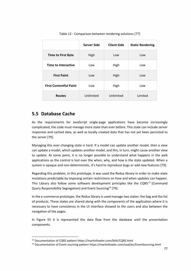
77
Table 12 - Comparison between rendering solutions [77]
Server Side Client-Side Static Rendering
Time to First Byte High Low Low
Time to Interactive Low High Low
First Paint Low High Low
First Contentful Paint Low High Low
Routes Unlimited Unlimited Limited
5.5 Database Cache
As the requirements for JavaScript single-page applications have become increasingly
complicated, the code must manage more state than ever before. This state can include server
responses and cached data, as well as locally created data that has not yet been persisted to
the server [79].
Managing this ever-changing state is hard. If a model can update another model, then a view
can update a model, which updates another model, and this, in turn, might cause another view
to update. At some point, it is no longer possible to understand what happens in the web
applications as the control is lost over the when, why, and how is the state updated. When a
system is opaque and non-deterministic, it's hard to reproduce bugs or add new features [79].
Regarding this problem, in this prototype, it was used the Redux library in order to make state
mutations predictable by imposing certain restrictions on how and when updates can happen.
This Library also follow some software development principles like the CQRS 13 (Command
Query Responsibility Segregation) and Event Sourcing14 [79].
In the e-commerce prototype, the Redux library is used manage two states: the bag and the list
of products. These states are shared along with the components of the application where it is
necessary to have consistency in the UI interface showed to the users and also between the
navigation of the pages.
In Figure 55 it is represented the data flow from the database until the presentation
components.
13 Documentation of CQRS pattern https://martinfowler.com/bliki/CQRS.html 14 Documentation of Event sourcing pattern https://martinfowler.com/eaaDev/EventSourcing.html

78
Figure 55 – Connection between the Database and the Pages
When using the library redux it is easy to connect a component to the state from the database,
just wrap the specific component within a function connect provided from the library. Now,
these components have already access to read from the database, in contrast, to write in the
database it is necessary to dispatch some actions through the dispatch method also provided
by the redux library.
In Figure 55, it is possible to visualize one example of the connections between the product
listing page and the database. The data flow starts when the page is rendered, so the page will
get the data from the database through the repository interface.
If this data already exists in the database is going to be returned thereafter and render the page
component and all the aggregated components. In contrast, if this data is empty the repository
will make a request to the backend and then call a store method form the repository in order
to save the requested data.
It is possible to visualize in Figure 56 a piece of code where it is executed a requested to the
backend and then call the method storeProducts provided by the Repository component. Then
the Repository component is responsible to communicate with the database through
dispatching the specific actions.
Figure 56 – Example of dispatching an action to store info related to the list of products
Furthermore, with this architecture the only component responsible with communication with
the database is the Repository, so it is following the software development patterns with only
a responsibility by each class/component. Also, in the future if the redux library is deprecated
and it should be replaced by a new one it is only necessary to change the repository component
and not the entire application.

79
5.6 Unit Tests
Unit tests have the narrowest scope of all the tests that can have different definition depending
on the project so a unit test can range from a single method to an entire class. These tests have
the responsibility to make sure that a certain unit of your codebase works as intended. This
output from the unit test that every feature of an application is working as intended is very
important to continue develop new functionalities and new tests. Regarding this feedback, the
development team have full confidence to release new version´s knowing the users will not
experience any broken experience improving the speed of delivering new products [80].
In this project, as well as on a huge amount of React projects it was used auxiliary tools, Jest15
and Enzyme16, to help to develop the unit tests. These frameworks facilitate the testing of react
components as it is possible to ensure the data is flowing correctly between the components,
the component is correctly rendered in a certain state or even simulate real user interactions
like clicking and interacting with the components.
With the atomic design, it is even simpler to have unit tests since the smaller components will
have a high number of unit and simpler tests and for the bigger components, the unit tests will
just need to ensure that the communication between the smaller components is made
effectively. without having duplicated tests and complex tests with a significant overhead of
mocked dependencies.
Moreover, in terms of methodology for developing tests it was used the standard 3A´s, Arrange,
Act and Assert [81]:
• Arrange - Set up the object to be tested. It may be needed to surround the object with
the correct dependencies for testing purpose, as might be test objects or the real
services [81].
• Act - Act on the object triggering the feature that is being tested. This can be through
like executing some method of a class or fire some event [81].
• Assert – Make claims about the tested object, verifying that the output of the test is the
correct one and the state of the component is the pretended [81].
5.7 Summary
In this chapter, it is described the whole development process of the prototyped application,
explaining all the components and pages built and how they are composed within themselves.
Additionally, it is presented the tools and techniques used in the build process to improve the
performance of the application and optimizing the generated assets used by the browser, like
images, styles and JavaScript code. Plus, it is explained the different render engines that can be
15 Website of jest framework- https://jestjs.io/ 16 Website of Enzyme module- https://airbnb.io/enzyme/

80
used to render a web application, and which one was used to the prototyped giving the
frictionless experience to the consumer.
Lastly, it is shown an overview of how the application manages the data flow, focusing on
reducing the number of network requests and how it was tested the different components of
the application.

81
6 Test and Evaluation
This chapter will illustrate the whole process of test and evaluation during the present project,
presenting the metrics to be used, describing the hypotheses, as well as the process and tests
used in order to test those hypotheses.
6.1 Evaluating Methodology
The Evaluation Methodology is a structured plan to help others to understand what the various
phases are needed to do a quality and valid evaluation. This Methodology consists of four main
steps along, as follows [82]:
• Define the parameters of the evaluation - it will be defined the evaluation parameters
with a global vision and how the results will be used, what decisions need to be made.
Knowing these requirements in advance facilitates finding reliable criteria and
determining the evidence needed;
• Design the methods used for the evaluation - Determining how to collect the data
includes deciding what form of evidence (such as test questions, observation of
behaviour, performance) will be used and how it will be collected. The evidence
collection plan includes how, when, and where the information will be collected[82];
• Set standards and collect evidence - Once it is determined what evidence will be
collected, a scale must be set to describe how the quality is judged. This scale could be
a number scale, a rubric, or a description. After the scale and the decisions to be made
are known, it should be setting standards for decisions. These standards define “quality”
based on what will be reported by the evaluator;
• Report and make decisions – In this step, it is necessary to make an evaluation report,
so it can be analysed outcomes against the standards that have been set. Also, this
report must include summaries of outcomes of all evaluations. Furthermore, it should
be documented any material for future use;

82
In the present case, it will be executed two tests: the first is a survey oriented in usability to
understand what the user feelings are when interacting with the application and the other it is
a detailed comparison between the prototype developed and other e-commerce platforms.
6.2 User Satisfaction
Usability can be defined as the degree to which a given piece of software assists the person
sitting at the keyboard in accomplishing a task, as opposed to becoming an impediment. [83].
To measure user satisfaction, it will be conducted a survey with diverse questions about
usability. It will be possible to understand if the consumer felt any type of impediment when
using the application and if the application was junky or slow during the purchase period.
Before this inquiry, it will present a guideline to the users, so they make a full flow of the
purchase simulating a real experience, entering on the homepage, go to a listing page of
products select a product and finalize the purchase in the checkout page.
After finalizing a purchase, it will be analysed when and where the user buys online, if it is in
home, work or in transports. Then, it will be analysed the most painful impediments when
buying an online product, analysing what is the most block up task forcing a user to give up of
buying.
Moreover, the people surveyed will be segmented by age forming three different groups, a
teenager group from fifteen to twenty-five, then a young group from twenty-five to thirty-five
and an older group from thirty-five to fifty-five.
With this segmentation, it is possible to understand how age can influence the sensation of
performance and how much time a user can wait without feeling uncomfortable. Each question
of the survey is categorized with a value of Likert scale:
Table 13 – Likert Scale [84]
Strongly Agree Agree Neutral Disagree Strongly Disagree
5 4 3 2 1
The scale consists of several statements, or Likert items, to which respondents specify their
level of agreement by marking, for each statement, one of several ordered response
alternatives [85].
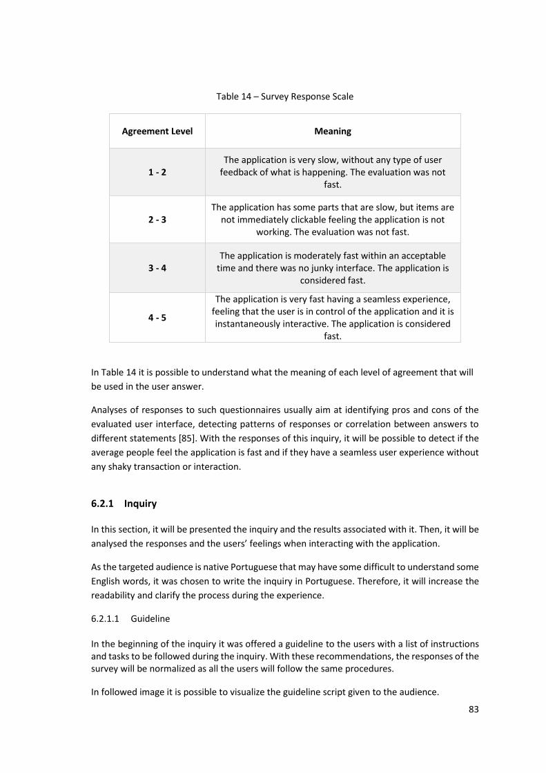
83
Table 14 – Survey Response Scale
Agreement Level Meaning
1 - 2 The application is very slow, without any type of user
feedback of what is happening. The evaluation was not fast.
2 - 3 The application has some parts that are slow, but items are
not immediately clickable feeling the application is not working. The evaluation was not fast.
3 - 4 The application is moderately fast within an acceptable
time and there was no junky interface. The application is considered fast.
4 - 5
The application is very fast having a seamless experience, feeling that the user is in control of the application and it is instantaneously interactive. The application is considered
fast.
In Table 14 it is possible to understand what the meaning of each level of agreement that will
be used in the user answer.
Analyses of responses to such questionnaires usually aim at identifying pros and cons of the
evaluated user interface, detecting patterns of responses or correlation between answers to
different statements [85]. With the responses of this inquiry, it will be possible to detect if the
average people feel the application is fast and if they have a seamless user experience without
any shaky transaction or interaction.
6.2.1 Inquiry
In this section, it will be presented the inquiry and the results associated with it. Then, it will be
analysed the responses and the users’ feelings when interacting with the application.
As the targeted audience is native Portuguese that may have some difficult to understand some
English words, it was chosen to write the inquiry in Portuguese. Therefore, it will increase the
readability and clarify the process during the experience.
6.2.1.1 Guideline
In the beginning of the inquiry it was offered a guideline to the users with a list of instructions and tasks to be followed during the inquiry. With these recommendations, the responses of the survey will be normalized as all the users will follow the same procedures.
In followed image it is possible to visualize the guideline script given to the audience.

84
Figure 57 – Guideline distributed for the audience
6.2.1.2 Results of the Inquiry
This survey was responded by 32 people and is composed of 16 questions. The first 6 questions
were related to the user itself and all the variables related to the workspace where and how he
realized the inquiry. These questions were aimed to analyse the public in terms of technology,
gender, age, cell phone price, network speed and actual level of stress.
Following these questions, it is presented three questions to understand if the users are
comfortable with the online shopping, what are the main reasons to no purchase in a website
and which websites they usually used to shop online.
Lastly, it will be presented seven questions related to the experience in buying at the
prototyped developed understanding if the users felt any impediment or frictionless experience.
It was conducted, six questions analysing the level of satisfaction during the purchase from each
page of the website: homepage, product listing page, product details page, bag and checkout.
Those interrogations have to be answered within a linear scale from 1-5 to facilitate the user's
replies, plus one last question to understand if the whole experience during the online purchase

85
were somehow slow or junky. In case the user responds positively to the previous question it
will be prompted and empty form to describe their unfortunate experience.
Figure 58 – Inquiry Question 1: Gender of the audience
Figure 59 - Inquiry Question 2: Age of the audience
With the images above, Figure 58 and Figure 59, is possible to visualize the differences of the
audience. This contrasting is favourable to have a more divergence and entropy response as the
users have different personalities, perceptions of time, level of stress and others.
In terms of age, the users were segmented in three different groups: 15-25 corresponding to
65.6%, 26-35 corresponding to 12.5% and 36-55 corresponding to 21.9%. This distribution is not
accurate as it should be, however, it is enough to have a different type of opinions and
interactions.
The price spectrum of mobile phones possessed by the inquires is represented in Figure 60.
➢ 71.85%, 23 persons, have a phone that cost less than 400€

86
Figure 60 - Inquiry Question 3: Price spectrum of mobile phones
Figure 61 - Inquiry Question 4: Network velocity from the audience
Question 4 was written in order to understand what type of network velocity the public was
using. The results are:
➢ 59.37% of users used a mobile network
➢ 18.75% have a maximum speed of 1.6 megabytes per second and 150ms of round time
trip.
In Figure 62 is possible to visualize where did the public take the survey. None of the users
answered that was in public transport, café, university or other. This aspect is related to the
duration of the survey that might reach 15 minutes and the users preferred a more friendly
space. In contrast, for a smaller task is more probable to use a cell phone in different places like,
metro or bus. Therefore, it is important that even in slow connectivity to assure the user has a
good experience when interacting with a website.

87
Figure 62 – Inquiry Question 5: Locale where candidate answer the survey
Figure 63 - Inquiry Question 6: Level (1-5) of stress from the public
Even the inquiries being in their known and friendly places, 37.5% of them are in stress mode,
having answered with 3 or more to the question what your current level of stress is. This anxiety
effect can have an impact on the user feelings, more details in section 2.1.
With the help of Figure 64 is possible to analyse the frequency of purchasing online showing
how much comfortable are the users with this new type of shopping. 84.4% of the users are
buying online at least more than one time per month, meaning this habit is not new and is
regularly practised in their lives.

88
Figure 64 – Inquiry Question 7: Frequency of buying online
Figure 65 – Inquiry Question 8: Reasons to abandon an online purchase
To increase the visibility of Figure 65, the labels of the horizontal axis were reduced to letters.
The following list associates the letters from the image to the chosen reasons to not buying
online from the audience.
• A – Not trusting in the website
• B – Does not deliver to an address
• C – Purchase flow is too complex
• D – It is necessary to wait too much time to view any content
• E – My clicks are ignored by the application
• F – The design of the website is obsolete

89
As this question the users were able to choose more than one answer, as it was obtained
58 responses from the 32 users.
As a result, 34.48% of consumers will leave their online purchase due to performance issues
like not showing any content or the clicks of the users are ignored by the application.
Figure 66 – Inquiry Question 9: Websites used by the audience to shop online
Additionally, it is also important to examine where the audience are used to buy online being
represented in the Figure 66. In this question, the users answered with 78 entries of 14 different
stores. However, the most popular e-commerce platforms are eBay, Amazon and Gearbest,
resulting in 48.71% of the users with 38 entries. These three applications will be further
analysed and compared to the developed prototyped in section 6.3.
The following eight questions are related to the experience of buying in the developed
prototyped.
Figure 67 – Inquiry Question 10: Level of satisfaction (0-5) using the homepage

90
In the Homepage, more than 65% of the inquiries answered between 4 and 5 that is the
maximum possible response. The median response from this page was 4.15 with only 18%
responded with 1 or 2 from the linear scale. However, it was the page with the highest median
of the inquiry.
This page might be the most critical in any web application as the median of the users will have
the first impression of the brand in this page.
Figure 68 – Inquiry Question 11: Level of satisfaction (0-5) using the product listing page
In the e-commerce environment, the product listing page might be the most difficult page to
deliver a frictionless and fast interface as it is responsible to show a lot and heavy information,
like images, icons, texts and others.
As explained in the section 6.4, it was developed some techniques to improve the usability of
this page and it can be considered a success as only 6,25 % of the inquiries answered 1 or 2 in
this question.
These results might be related to the injected delay of two seconds when presenting the
products to the users, resulting in a worse experience for the consumers.
Figure 69 - Inquiry Question 12: Level of satisfaction (0-5) using the product details page

91
In the product details page were the most accurate results were most of the inquiries, 75%,
answered between 4 and 5. In terms of the median it was 4.12 the second best after the
homepage.
Figure 70 - Inquiry Question 13: Level of satisfaction (0-5) using the bag page
In the bag page the users felt the usability of the page were very similar to the product details
page, only having a 3,12 % answering 1 in the linear scale. However, the results were more
dispersed between the answer 3 and 5 but remained at a high score with a median of 4,06.
Figure 71 - Inquiry Question 14: Level of satisfaction (0-5) using the checkout page
In this page, the were also very high as the median of the answers were 4,09, alike the other
last pages, the product details page and the bag. In terms of numbers, this was the only page
were none of the inquiries responded with a 1 from the linear scale.

92
As it can be seen with the images above, the users answered in median 4.06 in a scale of 1-5
when using the different pages of the application. In terms of statistics, the median for each
page it is presented the following results:
➢ Homepage – 4.15
➢ Products listing page – 3.87
➢ Product details page – 4.12
➢ Bag page – 4.06
➢ Checkout page – 4.09
Overall, all the pages had a positive result in term of perceived performance, that is the most
important factor in an e-commerce platform, as a user perception of speed is more powerful
than any other metric.
Figure 72 - Inquiry Question 15: Level of satisfaction (0-5) when navigating between pages
In terms of navigation within the pages, the user also felt it was fast answering with an average
of 4.06. As similar to the analysed pages, it is an impressive number meaning the user does not
notice any type of delay and the usage of the cache was effective.
Figure 73 - Inquiry Question 16: Level of Performance (Yes-No) using the application

93
The latest question, how the user felt the application was broken, is only answered by one
person with the following statement:
➢ The application does not load the list of products.
At last, in Figure 72 it is represented the entries to the most meaningful question to a web
experience if the user has ever felt the application was broken. 93.8% of the audience
responded with negative meaning that they have not felt any type of problem or junky
interfaces that significantly impact their user experience forcing them to quit from the purchase
intention.
6.3 Performance Tests
In the performance tests, it will be analysed the developed prototyped in terms of performance
metrics and how it stands to compare to other e-commerce platforms, like Amazon, eBay, Gear
Best and Continente.
These applications were chosen due to the level of popularity and network traffic being the
most recognized websites worldwide to buy any product online with an enormous diversity of
products. Nevertheless, the website Continente was chosen in order to have a smaller online
platform than Amazon and eBay and also a it is local website used by the population surveyed
in the section before, 6.2.
These tests were performed with the help of an external platform, WebPageTest [47], explained
in section 2.2.10. The output data from this test will gather important performance metrics as
speed index, time to interactive, page load time and start rendering:
• Speed Index - The Speed Index is the average time at which visible parts of the page are
displayed, taking the visual progress of the visible page loading and computes an overall
score for how quickly the content painted. It is expressed in milliseconds and
dependent on the size of the viewport [86];
• Time to Interactive – Time to Interactive (TTI) measures the time until the page being
loaded is considered usable and will respond to user input. Being composed by the
following rules: the page has displayed useful content; event handlers are registered
for most visible page elements and the page responds to user interactions within 50
milliseconds [87];
• Page Load Time - The Load Time is measured as the time from the start of the initial
navigation until the beginning of the window load event (onload) [86];
• Start render - The Start Render time is the first point in time that something was
displayed to the screen. Before this point, the user was staring at a blank page. This
does not necessarily mean the user saw the page content, it could just be something as
simple as a background colour, but it is the first indication of something happening for
the user [86].

94
These metrics will be tested in two different environments, one in a first view where the
browser has no cache and cookies and another with a repeated view that is done immediately
after the first view and taking advantage of the browser cache. These two approaches will
simulate a first-time visitor and re-visitor, allowing to see if the resources are effectively cached
in the browser.
Moreover, it was chosen three different pages from each e-commerce platform to collect the
metrics: the homepage, the product listing page and the product detail.
These three pages were chosen due to the impact on the purchase experience, as the user will
first navigate in these pages to search and collect any information of the product he wants to
buy, from images, price, descriptions and others. So, these pages are crucial to dictate the
success of selling an item since the user encounter any difficulty in these pages will simply quit
from the application.
For each page it was executed eighteen tests, nine tests for the first-time visitor and other nine
tests for the repeated visitors, then it was collected only the metrics from the median run. Since
it is possible to remove any outlier’s data that may negatively impact the accuracy of this
analysis. The whole spectrum of metrics resulting from the web performance test of the
different pages is displayed in Appendix, simplifying this section without having too much
information that can difficult the readability.
In terms of infrastructure, these tests were executed using a 3G slow network connect, 400kb
per seconds and a Motorola Moto G417, that is one of the most used phones around the entire
world.
At last, it will be analysed the weight of each page from all e-commerce platforms in terms of
megabytes to have a different perspective, that it doesn’t matter the weight of website content
but how it is incrementally delivered to the customer. Also, it will be shown some interesting
facts as how much it costs to access these websites in different countries around the world like,
Canada, Germany, Angola and China.
6.3.1 Homepage
The Homepage is the earth of an e-commerce platform as it will be open by almost every user
that came from an external source as the search engines like Google [88], Bing [89]or
DuckDuckGo [90] that are very used by the society.
Therefore, it is important to have a pleasant initial experience providing a fast experience to
the consumers as they will start their purchase journey in this page, also a first good impression
can dictate if the user will buy some item or immediately leave the website.
17 Technical Information about Moto G4 - https://www.gsmarena.com/motorola_moto_g4-8103.php

95
As it is possible to visualize in Figure 74 and in Figure 75, the website SpeedyEcommerce, the
prototype developed, is the fastest application in every metric due to the performance
techniques used, see the section 4 and 5.
Figure 74 – Homepage comparison of first-time visitors
Figure 75 - Homepage comparison of repeated visitors
Subsequently, it follows the eBay [91] and Amazon [92] that has near results, but the Amazon
has a better user journey because it delivers more content in a fewer seconds, as it states the
Speed Index metric. Then, it becomes the Gearbest [93]and by last the Continente [94] that is
necessary to wait 15 seconds to show any content to the users.

96
Figure 76 – Homepage percentual comparison of visual progress
Figure 77 – Homepage comparison of graphics progress
In Figure 76 and Figure 77 it is possible to compare the e-commerce platforms in visual
perspective, showing how the applications provide content to the user's browsers. The
SpeedyEcommerce is almost instantaneously to the user showing a skeleton at 3.5 seconds and
the latest interface at 7.0 seconds being ready to be interacted by the consumers. Therefore,
these results are impressive as successfully breaks the paradigm of 3 seconds to load a web

97
page, explained in section 3.2. Then, at the 5.5 seconds timespan, the eBay and Gearbest
started to review some graphic content and being interactive to the users at 25 seconds and 37
seconds, that is not the ideal experience for the customers.
These high numbers can be a red flag to the e-commerce platforms as it can be stressful to the
users clicking in the websites and their actions being ignored. This slow experience is directly
related to the amount JavaScript processed in the browsers that can lead to a stress feeling on
the consumers, more details in section 6.3.4.
In contrast, Amazon delivers the website fully loaded at 10 seconds being interactive to the
users at 12 seconds, only 2 seconds after the content is exposed, resulting in a pleasant
purchase experience as the intentions from the users will be processed by the application.
At last, the Continent application has the worst online experience as it only starts to show some
content to the users at 15 seconds, only a superficial image on the top bar, and then only after
70 seconds that the website is visually completed and interactive to the user, not following any
performance guidelines.
6.3.2 Product Listing Page
In the world of online shopping, most e-marketers understand that product pages play a
significant role in the buyer’s journey – as they are the main interface between products and
users. In fact, product listing pages play a huge role in the buyer journey and the subsequent,
dreaded conversion rate [95]. In this page, it is also relevant to have a progressive strategy to
load the products as this page is mainly composed of highly pixeled images that can easily block
the network traffic of the browser.
Figure 78 – Product Listing Page comparison of first-time visitors

98
Figure 79 – Product Listing Page comparison of repeated visitors
Regarding Figure 78 and Figure 79, it is possible to compare the different list of products page
among the five platforms. The SpeedyEcommerce is the fastest application between the results,
only Amazon and eBay are lower in the metric Speed Index.
This discrepancy is associated to the network request to get information of the items to be
displayed, that in the case of SpeedyEcommerce was added a delay of 2 seconds to simulate a
real network request to an external server. However, this difference is minimal as in the first-
time visitor the Amazon has 8.2 seconds and SpeedyEcommerce 10.1 seconds. Then, in
repeated visitors this divergence also exists since eBay has 3.5 seconds, Amazon has 4.0 seconds
and SpeedyEcommerce has 4.3 seconds.
Furthermore, the other two applications Continente and Gearbest have worse results. In first
time visitors, it is necessary to wait for more than 30s to have both application interactive and
even in repeated view it has weak performance, 18 seconds to Continente and 16 seconds to
Gearbest.
Moreover, in Figure 80 and Figure 81 it is possible to visualize the different loading approaches
of each website. Firstly, at the timespan 3 seconds it becomes the SpeedyEcomerce showing
some visuals to the user, specifically the layout component in conjunction with the spinner
component, both documented in the section 5.1.3 and 5.1.4.
Then, eBay presents the skeleton of the interface at 6.0 seconds and images of the products at
7.0 seconds. Amazon only shows the interface at 8 seconds, but the page is already interactive
at the time is presented. GearBest shows content at 10 seconds and then at 16 seconds is
already possible to visualize some images, using the same approach of progressive loading as
SpeedyEcomerce.

99
Finally, Continente is the worst application, showing content to the consumers at 18 seconds
and is only possible to visualize the image of the products at 36 seconds.
Figure 80 - Product Listing Page percentual comparison of visual progress
Figure 81 – Product Listing Page comparison of graphic progress

100
6.3.3 Product Details Page
This page is very similar to the Product listing page, as it is mainly composed by the images of
the items and information about the product for example the construction process, where it
was manufactured, the composition materials or others. Therefore, it is crucial to have a
pleasant experience in visiting this page as the user will be focused to review all of this
information and if the website is junky or slow the consumer will just quit from the purchase.
Figure 82 – Product Details Page comparison of first-time visitors
Figure 83 – Product Details Page comparison of repeated visitors

101
Visualizing Figure 82 and Figure 83 is possible to figure out that SpeedyEcommerce is the fastest
website, unless in the speed index and time to interactive that in first-time visitors Amazon has
best values. However, in the first-time visitors, SpeedyEcommerce has taken 10.9 seconds and
Amazon 9.6, resulting in a difference of 1.3 seconds. This gap will not be noticed by the user as
he will be seeing the first view with the layout component and a loader, as is possible to visualize
in Figure 85.
Additionally, the result of 11.4 seconds in the speed index in the SpeedyEcommerce is a
consequence of the 2 seconds delays when occurs the request to the backend server, similar to
the previously tested page, Product Listing Page.
Afterwards, it is presented Amazon and eBay that have near results but in the first-time visitor,
Amazon is significantly better with the results of speed index 7.4 seconds and 9.6 for time to
interactive. On the other hand, eBay has the result of speed index 12.3 seconds and 23.9
seconds to became interactive that is the highest time of all e-commerce platforms in this page.
At last, Continente and Gearbest are the worst applications in terms of performance with the
results of, in first-time visitors, speed index of 18.7 seconds, time to interactive of 19.8 seconds
and speed index of 24.8 seconds and time to interactive of 21.0 seconds. Nevertheless, in the
repeated visitors these numbers have become close of the other applications but are still high
impacting the experience of purchase to the consumers.
Figure 84 – Product Details Page percentual comparison of visual progress
In the Figure 84 and Figure 85, it is presented the loading experiences of all applications.
SpeedyEcommerce is again accomplishing the rule of 3 seconds to display some interface but it

102
only presents the image of the product at 12 seconds. Amazon and eBay are faster and present
the image of the product with low quality at 7.5 seconds, however, it is not presented anything
before this timespan. GearBest is fast to display the page to the user showing the bottom bar
at 7 seconds but only presenting the image at 19 seconds. Finally, Continente does not have a
progressive loading of visuals only showing content to the user at 15.5 seconds that may stress
the user with the long wait time.
Figure 85 – Product Details Page comparison of graphic progress
6.3.4 Weight Comparison
Measuring the weight of a web page is not as simple as it might look, it is necessary to count
every byte from the different assets, JavaScript, CSS, HTML, fonts, images, videos and others.
Additionally, it can exist another external factor´s from the application that may influence this
metric, as advertisements, external widgets or third-party cookies.
Load time is clearly directly impacted by the overall page weight. A heavyweight page will
always take longer to load than a lightweight one. A heavy page is always bad, but it is worth
noting that excess page weight tends to hurt the user experience [96].
Moreover, a less often discussed aspect of page weight is cost to the user. Bandwidth is never
truly free “unlimited” data plans typically have a point at which they are stopped or throttled.
Admittedly, in many scenarios cost is not a central issue: smartphones are sold with reasonable
data plans in many countries and the average user rarely roams. However, in some countries,
sometimes cost is absolutely a central issue, to the point that people simply don't visit heavy
sites [97].

103
In Figure 86, it is possible to visualize the minutes of work necessary to view an average website.
Brazil and Mexico are the top countries, where is necessary to work more than 8 minutes to
simply view a website that may even be open in a miss click.
Figure 86 – Comparison of cost of viewing a website per country [97]
As a result, it is important to think how much it may cost to see a website in a specific country,
and if this website want to gather new costumer it is important to take in consideration the
weight of a page.
Following this explanation, it was conducted an analysis of weight of the three different pages,
homepage, product listing page and product details page from the e-commerce platforms. With
this examination, it will be possible to view the discrepancy of each page comparing to the
others and how much it can cost to view that page in some countries of the world, like Canada,
Germany, Angola and China.
Figure 87 – Comparison of weight of each page from the applications
The results of this test are represented in Figure 87. SpeedyEcommerce have the smallest pages
comparing to other competitors, only being necessary to download 0.33 megabytes in

104
homepage, 0.23 megabytes in list of products and 0.34 megabytes. eBay is the followed
platform having also a small weight in their pages, with a mean of 0.57 megabytes of the three
pages. Then, Gearbest and Amazon have worse results, corresponding to mean of 1.13
megabytes and 1.6 megabytes. At last, Continent is the worst e-commerce platform with a
mean of 2.16 megabytes, since only the homepage has a weight of 2.16 megabytes
Table 15 – Cost of viewing homepage in USD dollars
SpeedyEcommerce Continente GearBest Amazon eBay
Canada 0,04 0,38 0,25 0,33 0,07
Germany 0,03 0,25 0,16 0,21 0,05
Angola 0,01 0,11 0,07 0,10 0,02
China 0,02 0,14 0,09 0,12 0,03
In Table 15 it is represented the cost of viewing the homepage of the different e-commerce in the different countries. It is possible to identify that Continent and Amazon are the most expensive websites to view, existing a huge discrepancy to eBay and SpeedyEcommerce. In Canada exists a difference of 0,29 USD dollars from Amazon and SpeedyEcommerce for just viewing the homepage.
These numbers were collected from the website whatdoesmysitecost18, these costs are based on data from the ITU (Internal Telecommunications Union), choosing the operator with the largest market share in the country, using the least expensive plan and including taxes.
6.4 Summary
This chapter describes the full strategy performed to test the developed prototyped at different
spectrums, as usability by performing a user inquiry and a performance audit gathering relevant
metrics that can affect the user experience. Moreover, it was compared the prototyped
application to other high known websites as, Amazon, eBay, GearBest and Continente.
The user inquiry was responded by 32 people and is composed of 16 questions. The objectives
of these questions are to analyse the consumer's habits of online purchase and feedback from
the purchase flow in the prototyped application. With the collected data, it was possible to
conclude that the developed application was a success as most of the users, 93.8%, did not feel
any type of impediment during the questioning.
18 Website to analyse the cost of viewing a web application - https://whatdoesmysitecost.com/

105
Lastly, it was conducted a test that analyses the different costs of seeing a website using a basic internet plan.

106
7 Conclusions
In this chapter is described the developed work during this master thesis as well as some
relevant evidence from each section. Additionally, it will be presented a consolidation of all
reached objectives followed by a list of constraints, difficulties and future work.
7.1 Summary
Performance is a topic that have been emerging in the world of web development, but the
impact of this problem has not been recognized by every business unit as it should be. So, the
main objective of this thesis is to understand how the web performance can be impacting a
business, more specifically the online sales. After this research, it was investigated and
developed a solution to best tackle this problematic.
Firstly, in chapter 1 was described the problem and the context where is inserted. Also, it is
presented the objectives of this thesis and the approach chosen to best tackle this problem.
Subsequently, in State of the art, in chapter 2, was explained the problem in two visions:
theoretical and technical. In theoretical section was described the issue related to the
consumers and how it affects them when they are buying online products. In the technical part,
was given a detailed overview of all the chosen technical frameworks and a walkthrough of how
it relates to the problem.
In chapter 3, the section value analysis, was possible to validate the real value of this problem
in the actual world, presenting an analysis of the opportunity with all the advantages and
disadvantages of investing in web performance.

107
Analysis and design, located in section 4, presented the design of the project in junction with
all the details of the architecture. This section defines the skeleton of the developed prototype
where it is possible to recognise the ethical practices of software development.
Finally, the Evaluation chapter illustrated how successful was the developed prototype. It is
delimited the different criteria´s to evaluate the solution and defined a test plan. In this case,
the test plan is a consolidation of a survey to assess the usability and a performance test to
compare the application against other e-commerce platforms.
7.2 Achieved Goals
The assumption of this master thesis was to analyse the best practices and implements them in
an e-commerce prototype allowing the consumers to have a fluent shop experience even in low
network conditions and slower devices. Therefore, this objective is considered achieved as all
the pages and components of the application were developed using performance techniques.
Additionally, all the components of the application were developed with a performance
mindset so it can be shared in other projects, being easily adapted and reducing the costs of
implementing.
In terms of user’s perception, the usability survey showed that more than 90% of users have a
flawless shop experience without any type of performance problem. More specifically, the
results of the performance of the whole pages were higher than 4 in a scale from 0 - 5, except
the page product listing page that was 3.8. So, the main objective of developed prototyped that
is providing a frictionless experience can be judged as accomplished as none of the users felt
any type of impediment or friction during the purchase process.
Furthermore, the developed prototype in the performance tests analysing the metrics: speed
index, time to interactive, page load time and start to render were significantly better than the
other e-commerce platforms, Amazon, eBay, Gear Best and Continente.
For illustration, in the homepage the speed index, one of the most important metrics, it was
5,87 seconds for first-time view and 2,04 seconds for repeated views. These numbers are
significantly lower than the other e-commerces, as an example, Amazon had 7,8 seconds for
first-time visitors and 3,56 seconds for repeated views or even multinational online platform
Gearbest that had 43.73 seconds in first-time visitor and 9.6 seconds in the repeated view.
7.3 Limitations And Future Work
During the development phase and the evaluation process were verified some limitations that
should be taken in consideration for future work.
In implementation process of the prototyped application, it was identified the following topics
that could be improved in further versions:

108
➢ Using a loading bar in the page of products listing page
This page was the slowest page indicated by the user’s survey, so one of the possible solutions
to reduce this effect is change the loader indicator, using a loader with the percentage of time
necessary to the page be fully rendered. As a result, the user will have a notion of the necessary
time to be waited to reduce their stress level.
➢ Only show any loader if the waiting time is larger than 2 seconds
In this prototyped every time the it was necessary to execute some heavier task it was displayed
a spinner component even when this process might be completed instantaneously. One of the
examples of this inefficient use of this component is in the page’s product listing page and
product details page where is necessary to make a request to the backend and the amount of
time necessary to this task depend on the network speed. This component should only be
displayed to the consumers if the process takes more time than a threshold like 2 seconds,
resulting in the users only seeing the spinner component if necessary.
➢ Supporting offline users with progressive web apps
The prototyped application could support offline navigation without network access using the
services works19. However, this functionality is not fully implemented by all browser but the
popular browsers like Google Chrome and Firefox already support this feature.
➢ Have a more diverse audience in the inquiry
The usability survey was only responded by 32 users mainly Portuguese consumers, only analysing one region Portugal. It is necessary to have a broader audience around the world to increase the heterogeneity of answers, ensuring the prototyped application will also deliver a good shop experience in other cultures and populations.
➢ Use web typography optimizations
Due to time constraints and since there was no meaningful impact of web fonts in the user experience provided by the developed prototyped, it was not applied any specific strategy in loading web fonts. Nevertheless, for further research, this topic may be highly helpful to improve the user experience as the download of a heavy web font can hide the entire text´s in an interface, affecting the usability of the application. Therefore, it is important to have a linear method to load web fronts guaranteeing that the user experience is not affected.
19 Documentation of service worker - https://developers.google.com/web/fundamentals/primers/service-workers/

109
References
[1] G. Press, “A Very Short History Of The Internet And The Web,” Forbes. [Online]. Available: https://www.forbes.com/sites/gilpress/2015/01/02/a-very-short-history-of-the-internet-and-the-web-2/. [Accessed: 01-Dec-2018].
[2] H.-C. Song, “Analysis of the global smartphone market and the strategies of its major players,” p. 21.
[3] OpenSignal, “• Global retail e-commerce market size 2014-2021 | Statista,” Feb-2018. [Online]. Available: https://www.statista.com/statistics/379046/worldwide-retail-e-commerce-sales/. [Accessed: 01-Dec-2018].
[4] Google and AWWARDS, Brain Food, Speed Maters. 2014. [5] R. M. Baecker, Readings in Human-Computer Interaction: Toward the Year 2000.
Elsevier, 2014. [6] N. U Bhaskar et al., “General Principles of User Interface Design and Websites,” 2011. [7] C. Wodehouse, “How Human-Computer Interaction Helps Guide Better UI Design,”
2017. [Online]. Available: https://www.upwork.com/hiring/development/human-computer-interaction-ui-design/. [Accessed: 29-Dec-2018].
[8] J. BIXBY, “Psychology and Web Performance: Some quick facts and ideas,” Web Performance Today, 29-Jul-2010. [Online]. Available: http://www.webperformancetoday.com/2010/07/29/psychology-and-web-performance-some-quick-facts-and-ideas/. [Accessed: 29-Dec-2018].
[9] “Ecommerce Definition - What is Ecommerce,” Shopify. [Online]. Available: https://www.shopify.com/encyclopedia/what-is-ecommerce. [Accessed: 03-Jan-2019].
[10] D. Kopf, “With Amazon leading the way, e-commerce is approaching 10% of all US retail sales,” Quartz. [Online]. Available: https://qz.com/1329442/with-amazon-leading-the-way-e-commerce-is-approaching-10-of-all-us-retail-sales/. [Accessed: 03-Jan-2019].
[11] M. Grant, “E-commerce Set For Global Domination -- But At Different Speeds,” Forbes. [Online]. Available: https://www.forbes.com/sites/michellegrant/2018/08/14/e-commerce-set-for-global-domination/. [Accessed: 03-Jan-2019].
[12] T. Everts, “1. The Psychology of Web Performance - Time Is Money [Book],” 2016. [Online]. Available: https://www.oreilly.com/library/view/time-is-money/9781491928783/ch01.html. [Accessed: 29-Dec-2018].
[13] G. D. Hughes and D. C. Chafin, “Turning new product development into a continuous learning process,” Journal of Product Innovation Management, vol. 13, no. 2, pp. 89–104, Mar. 1996.
[14] “The Psychology of Web Performance - how slow response times affect user psychology,” 2018. [Online]. Available: http://www.websiteoptimization.com/speed/tweak/psychology-web-performance/. [Accessed: 29-Dec-2018].
[15] “The psychology of web performance,” The Uptrends Blog, 13-Jun-2018. [Online]. Available: https://blog.uptrends.com/web-performance/the-psychology-of-web-performance/. [Accessed: 05-Feb-2019].
[16] “Streaming delays mentally taxing for smartphone users: Ericsson Mobility Report,” Ericsson.com, 17-Feb-2016. [Online]. Available: https://www.ericsson.com/en/press-releases/2016/2/streaming-delays-mentally-taxing-for-smartphone-users-ericsson-mobility-report. [Accessed: 19-Sep-2018].

110
[17] D. Cyr, C. Bonanni, and J. ilsever, “Design and e-Loyalty Across Cultures in Electronic Commerce,” in Proceedings of the 6th International Conference on Electronic Commerce, New York, NY, USA, 2004, pp. 351–360.
[18] A. M. Soares, M. Farhangmehr, and A. Shoham, “Hofstede’s dimensions of culture in international marketing studies,” Journal of Business Research, vol. 60, no. 3, pp. 277–284, Mar. 2007.
[19] “Symbolism Of Colors and Color Meanings Around The World,” The Shutterstock Blog, 03-Apr-2015. .
[20] D. Tannenbaum, “How to make a website GDPR compliant,” TechRadar, 22-May-2018. [Online]. Available: https://www.techradar.com/news/how-to-make-a-website-gdpr-compliant. [Accessed: 20-Feb-2019].
[21] I. Grigorik, High Performance Browser Networking. 2013. [22] T. Barker, “A primer on performance of web applications,” O’Reilly Media, 25-Sep-2015.
[Online]. Available: https://www.oreilly.com/learning/primer-on-performance-of-web-applications. [Accessed: 28-Jan-2019].
[23] I. Grigorik, “Eliminating Roundtrips with Preconnect - igvita.com,” 17-Aug-2015. [Online]. Available: https://www.igvita.com/2015/08/17/eliminating-roundtrips-with-preconnect/. [Accessed: 29-Jan-2019].
[24] B. Jackson, “Resource Hints - What is Preload, Prefetch, and Preconnect?,” KeyCDN, 23-Jan-2018. [Online]. Available: https://www.keycdn.com/blog/resource-hints. [Accessed: 29-Jan-2019].
[25] I. Grigorik, “Constructing the Object Model | Web Fundamentals,” Google Developers, 29-Jan-2019. [Online]. Available: https://developers.google.com/web/fundamentals/performance/critical-rendering-path/constructing-the-object-model. [Accessed: 30-Jan-2019].
[26] I. Grigorik, “Render Blocking CSS | Web Fundamentals,” Google Developers, 29-Jan-2019. [Online]. Available: https://developers.google.com/web/fundamentals/performance/critical-rendering-path/render-blocking-css. [Accessed: 03-Feb-2019].
[27] R. Rutter, Web Typography. . [28] R. Rendle, “In Defense of Webfonts • Robin Rendle,” 18-Mar-2016. [Online]. Available:
https://robinrendle.com/notes/in-defense-of-webfonts/#the-value-of-a-webfont. [Accessed: 19-Mar-2019].
[29] P. CALVANO, “Performance and Usage Implications of Custom Fonts,” 25-Jul-2017. [Online]. Available: https://developer.akamai.com/blog/2017/07/25/performance-and-usage-implications-custom-fonts. [Accessed: 19-Mar-2019].
[30] M. Bernard, C. H. Liao, and M. Mills, “The Effects of Font Type and Size on the Legibility and Reading Time of Online Text by Older Adults,” in CHI ’01 Extended Abstracts on Human Factors in Computing Systems, New York, NY, USA, 2001, pp. 175–176.
[31] M. Kurtuldu, “Introduction to variable fonts on the web | Web Fundamentals,” Google Developers, 22-Feb-2019. [Online]. Available: https://developers.google.com/web/fundamentals/design-and-ux/typography/variable-fonts/. [Accessed: 19-Mar-2019].
[32] “The Missing Guide to Font Formats: TTF, OTF, WOFF, EOT & SVG,” Creative Market, 24-Nov-2015. [Online]. Available: https://creativemarket.com/blog/the-missing-guide-to-font-formats. [Accessed: 20-Mar-2019].
[33] Ilya Grigorik, “Web Font Optimization | Web Fundamentals,” Google Developers, 12-Feb-2019. [Online]. Available: https://developers.google.com/web/fundamentals/performance/optimizing-content-efficiency/webfont-optimization. [Accessed: 26-Mar-2019].

111
[34] A. Osmani, “The Cost Of JavaScript In 2018,” Addy Osmani, 01-Aug-2018. . [35] Httparchive, “State of JavaScript.” [Online]. Available:
https://beta.httparchive.org/reports/state-of-javascript. [Accessed: 04-Feb-2019]. [36] Httparchive, “Loading Speed.” [Online]. Available:
https://httparchive.org/reports/loading-speed#ttci. [Accessed: 04-Feb-2019]. [37] “webpack.” [Online]. Available: https://webpack.js.org/. [Accessed: 11-Feb-2019]. [38] “Webpack for React.” [Online]. Available: http://www.pro-
react.com/materials/appendixA/. [Accessed: 11-Feb-2019]. [39] J. Wagner, “Reduce JavaScript Payloads with Tree Shaking | Web Fundamentals,” Google
Developers, 30-Oct-2018. [Online]. Available: https://developers.google.com/web/fundamentals/performance/optimizing-javascript/tree-shaking/. [Accessed: 11-Feb-2019].
[40] A. Osmani and M. Bynens, “Using JavaScript modules on the web | Web Fundamentals,” Google Developers, 29-Jan-2019. [Online]. Available: https://developers.google.com/web/fundamentals/primers/modules. [Accessed: 11-Feb-2019].
[41] S. Kanodia, “Smart Bundling: How To Serve Legacy Code Only To Legacy Browsers,” Smashing Magazine, 15-Oct-2018. [Online]. Available: https://www.smashingmagazine.com/2018/10/smart-bundling-legacy-code-browsers/. [Accessed: 11-Feb-2019].
[42] “React – A JavaScript library for building user interfaces.” [Online]. Available: https://reactjs.org/index.html. [Accessed: 11-Feb-2019].
[43] “Getting Started with React – An Overview and Walkthrough,” Tania Rascia, 19-Aug-2018. .
[44] A. Kumar, “React vs. Angular vs. Vue.js: A Complete Comparison Guide - DZone Web Dev,” dzone.com, 20-Aug-2018. [Online]. Available: https://dzone.com/articles/react-vs-angular-vs-vuejs-a-complete-comparison-gu. [Accessed: 30-May-2019].
[45] A. Osmani, “The PRPL Pattern | Web Fundamentals,” Google Developers, 29-Jan-2019. [Online]. Available: https://developers.google.com/web/fundamentals/performance/prpl-pattern/. [Accessed: 11-Feb-2019].
[46] K. Mathews, “Web Performance 101—also, why is Gatsby so fast?,” GatsbyJS, 13-Sep-2017. [Online]. Available: https://www.gatsbyjs.org. [Accessed: 12-Feb-2019].
[47] “WebPageTest - About.” [Online]. Available: https://www.webpagetest.org/about. [Accessed: 12-Feb-2019].
[48] N. Rich and M. Holweh, “Value Analysis Value Engineering,” VALUE ENGINEERING, p. 32. [49] P. Koen et al., “Providing Clarity and A Common Language to the ‘Fuzzy Front End,’”
Research-Technology Management, vol. 44, no. 2, pp. 46–55, Mar. 2001. [50] “The State of LTE - OpenSignal.” [Online]. Available:
https://opensignal.com/reports/2018/02/global-state-of-the-mobile-network. [Accessed: 14-Jan-2019].
[51] “Web Performance in China is Different - Catchpoint Blog,” Catchpoint’s Blog - Web Performance Monitoring, 30-Mar-2016. .
[52] S. Dhapola, “Average Indian getting 9.14 MB per second Internet speeds, not fastest but capable: Ookla COO,” The Indian Express, 27-Feb-2018. .
[53] “Ola drives mobility for a billion Indians with Progressive Web App | Web,” Google Developers. [Online]. Available: https://developers.google.com/web/showcase/2017/ola. [Accessed: 14-Jan-2019].

112
[54] K. Eaton, “How One Second Could Cost Amazon $1.6 Billion In Sales,” Fast Company, 15-Mar-2012. [Online]. Available: https://www.fastcompany.com/1825005/how-one-second-could-cost-amazon-16-billion-sales. [Accessed: 15-Jan-2019].
[55] J. BIXBY, “4 awesome slides showing how page speed correlates to business metrics at Walmart.com,” Web Performance Today, 28-Feb-2012. [Online]. Available: http://www.webperformancetoday.com/2012/02/28/4-awesome-slides-showing-how-page-speed-correlates-to-business-metrics-at-walmart-com/. [Accessed: 15-Jan-2019].
[56] httparchive, “Loading Speed.” [Online]. Available: https://beta.httparchive.org/reports/loading-speed#ol. [Accessed: 15-Jan-2019].
[57] M. M. Ulkhaq, W. R. Wijayanti, M. S. Zain, E. Baskara, and W. Leonita, “Combining the AHP and TOPSIS to Evaluate Car Selection,” in Proceedings of the 2Nd International Conference on High Performance Compilation, Computing and Communications, New York, NY, USA, 2018, pp. 112–117.
[58] C. Marins, “O USO DO MÉTODO DE ANÁLISE HIERÁRQUICA (AHP) NA TOMADA DE DECISÕES GERENCIAIS – UM ESTUDO DE CASO,” p. 11, 2009.
[59] A. Osterwalder, Y. Pigneur, and T. Clark, Business model generation: a handbook for visionaries, game changers, and challengers. Hoboken, NJ: Wiley, 2010.
[60] M. Fowler, “Making architecture matter: O’Reilly Open Source Convention: OSCON, July 20 - 24, 2015 in Portland, OR,” 23-Jul-2015. [Online]. Available: https://conferences.oreilly.com/oscon/open-source-2015/public/schedule/detail/43535. [Accessed: 08-Feb-2019].
[61] B. Frost, “Atomic Design,” Brad Frost, 10-Jun-2013. [Online]. Available: http://bradfrost.com/blog/post/atomic-web-design/. [Accessed: 09-Feb-2019].
[62] S. Oloruntoba, “S.O.L.I.D: The First 5 Principles of Object Oriented Design,” Scotch. [Online]. Available: http://scotch.io/bar-talk/s-o-l-i-d-the-first-five-principles-of-object-oriented-design. [Accessed: 09-Feb-2019].
[63] “SOLID and DRY.” [Online]. Available: https://feeds2.feedburner.com/CSharperImage. [Accessed: 09-Feb-2019].
[64] P. Kruchten, “Architectural Blueprints—The ‘4+1’ View Model of Software Architecture,” p. 15, Nov. 1995.
[65] J. Gube, “Call to Action Buttons: Examples and Best Practices,” Smashing Magazine, 13-Oct-2009. [Online]. Available: https://www.smashingmagazine.com/2009/10/call-to-action-buttons-examples-and-best-practices/. [Accessed: 19-Apr-2019].
[66] I. Grigorik, “Image Optimization | Web Fundamentals,” Google Developers, 12-Feb-2019. [Online]. Available: https://developers.google.com/web/fundamentals/performance/optimizing-content-efficiency/image-optimization. [Accessed: 20-Apr-2019].
[67] “HTML picture tag.” [Online]. Available: https://www.w3schools.com/tags/tag_picture.asp. [Accessed: 25-Apr-2019].
[68] “The technology behind preview photos,” Facebook Code, 06-Aug-2015. . [69] A. Osmani, “The App Shell Model | Web Fundamentals,” Google Developers, 12-Feb-
2019. [Online]. Available: https://developers.google.com/web/fundamentals/architecture/app-shell. [Accessed: 25-Apr-2019].
[70] “Higher-Order Components – React.” [Online]. Available: https://reactjs.org/docs/higher-order-components.html. [Accessed: 27-Apr-2019].
[71] “Design Patterns and Refactoring.” [Online]. Available: https://sourcemaking.com/. [Accessed: 27-Apr-2019].
[72] “Gatsby Link,” GatsbyJS. [Online]. Available: https://www.gatsbyjs.org. [Accessed: 27-Apr-2019].

113
[73] N. C. Zakas, “Better JavaScript Minification,” A List Apart, 20-Apr-2010. . [74] “Optimizing Performance – React.” [Online]. Available:
https://reactjs.org/docs/optimizing-performance.html. [Accessed: 01-May-2019]. [75] “Code Splitting,” webpack. [Online]. Available: https://webpack.js.org/guides/code-
splitting/#dynamic-imports. [Accessed: 01-May-2019]. [76] “Code Splitting and Prefetching | GatsbyJS.” [Online]. Available:
https://www.gatsbyjs.org/docs/how-code-splitting-works/#prefetching-chunks. [Accessed: 01-May-2019].
[77] A. Osmani and J. Miller, “Rendering on the Web | Web,” Google Developers, 01-May-2019. [Online]. Available: https://developers.google.com/web/updates/2019/02/rendering-on-the-web. [Accessed: 01-May-2019].
[78] J. K. Nelson, “Static vs. Server Rendering,” Frontend Armory, 15-Dec-2018. [Online]. Available: https://frontarm.com/james-k-nelson/static-vs-server-rendering/. [Accessed: 05-May-2019].
[79] “Motivation · Redux,” 03-Dec-2018. [Online]. Available: https://redux.js.org/. [Accessed: 06-May-2019].
[80] H. Vocke, “The Practical Test Pyramid,” martinfowler.com, 26-Feb-2018. [Online]. Available: https://martinfowler.com/articles/practical-test-pyramid.html. [Accessed: 11-May-2019].
[81] B. Wake, “3A – Arrange, Act, Assert,” XP123, 26-Apr-2011. . [82] M. Baehr and E. College, “Evaluation Methodology,” 2004. [83] V. V. Ingleshwar, “Usablity Testing for the Web,” Queue, vol. 5, no. 5, pp. 34–37, Jul.
2007. [84] R. Likert, “A technique for the measurement of attitudes,” Archives of Psychology, vol.
22 140, pp. 55–55, 1932. [85] F. Petrillo, A. S. Spritzer, C. D. S. Freitas, and M. Pimenta, “Interactive Analysis of Likert
Scale Data Using a Multichart Visualization Tool,” in Proceedings of the 10th Brazilian Symposium on Human Factors in Computing Systems and the 5th Latin American Conference on Human-Computer Interaction, Porto Alegre, Brazil, Brazil, 2011, pp. 358–365.
[86] “Speed Index - WebPagetest Documentation.” [Online]. Available: https://sites.google.com/a/webpagetest.org/docs/using-webpagetest/metrics/speed-index. [Accessed: 07-Feb-2019].
[87] “Time to Interactive | Tools for Web Developers,” Google Developers. [Online]. Available: https://developers.google.com/web/tools/lighthouse/audits/time-to-interactive. [Accessed: 07-Feb-2019].
[88] “Google.” [Online]. Available: https://www.google.com/. [Accessed: 03-Oct-2019]. [89] “Bing.” [Online]. Available: https://www.bing.com/. [Accessed: 03-Oct-2019]. [90] “DuckDuckGo — Privacidade, simplificada.,” DuckDuckGo. [Online]. Available:
https://duckduckgo.com/. [Accessed: 03-Oct-2019]. [91] “Eletrônicos, Automóveis, Moda, Colecionáveis, Cupons e muito mais,” eBay. [Online].
Available: https://pt.ebay.com. [Accessed: 03-Oct-2019]. [92] “Amazon.com: Online Shopping for Electronics, Apparel, Computers, Books, DVDs &
more.” [Online]. Available: https://www.amazon.com/. [Accessed: 03-Oct-2019]. [93] “Gearbest: Affordable Quality, Fun Shopping.” [Online]. Available:
https://www.gearbest.com/. [Accessed: 03-Oct-2019].

114
[94] “Continente - o seu Hipermercado para Compras Online.” [Online]. Available: https://www.continente.pt/pt-pt/public/Pages/homepage.aspx. [Accessed: 03-Oct-2019].
[95] A. Brebion, “The Definitive Guide to Creating Perfect Product Listing Pages in 2019,” AB Tasty, 05-Jun-2018. [Online]. Available: https://www.abtasty.com/blog/product-listing-pages-optimization/. [Accessed: 10-Jul-2019].
[96] R. Cremin, “Measuring page weight,” DeviceAtlas, Oct-2018. [Online]. Available: https://deviceatlas.com/blog/measuring-page-weight. [Accessed: 20-Jul-2019].
[97] R. Cremin, “Understanding web page weight,” DeviceAtlas, Oct-2018. [Online]. Available: https://deviceatlas.com/blog/understanding-web-page-weight. [Accessed: 20-Jul-2019].

115
Appendix
Table 16 – Homepage First View
Page Load Time Start render Speed Index Time to
Interactive
SpeedyEccomerce 6.502 2.808 5.872 5.26
Continente 78.363 14.709 41.572 15.411
Gearbest 28.198 4.03 43.736 37.657
Amazon 67.013 7.471 7.808 12.45
Ebay 9.228 4.555 12.265 25.03
Table 17 – Homepage Repeated View
Page Load Time Start render Speed Index Time to
Interactive
SpeedyEccomerce 0.677 1.058 2.04 0.926
Continente 10.039 5.429 11.101 12.43
Gearbest 9.163 4.132 9.657 12.396
Amazon 15.098 3.366 3.568 8.137
Ebay 5.061 4.051 4.097 14.275

116
Table 18 – List of Products Page First View
Page Load Time Start render Speed Index Time to
Interactive
SpeedyEccomerce 6.034 2.834 10.187 5.469
Continente 52.198 15.052 26.706 30.142
Gearbest 25.619 8.995 28.682 30.788
Amazon 20.177 8.103 8.261 8.021
Ebay 14.962 5.613 13.12 14.307
Table 19 – List of Products Page Repeated View
Page Load Time Start render Speed Index Time to
Interactive
SpeedyEccomerce 0.729 1.066 4.363 4.261
Continente 14.208 5.276 10.473 18.031
Gearbest 12.842 5.711 13.032 16.24
Amazon 5.196 4.004 4.079 6.199
Ebay 7.227 3.267 3.516 5.374
Table 20 – Details of Product Page First View
Page Load Time Start render Speed Index Time to
Interactive
SpeedyEccomerce 6.063 2.862 11.451 10.98

117
Continente 39.014 16.014 18.772 19.826
Gearbest 20.175 6.27 24.849 21.041
Amazon 35.682 5.534 7.431 9.683
Ebay 13.994 6.677 12.291 23.931
Table 21 – Details of Products Page Repeated View
Page Load Time Start render Speed Index Time to
Interactive
SpeedyEccomerce 0.746 1.061 4.48 3.928
Continente 17.218 5.383 6.421 18.273
Gearbest 10.273 3.583 10.003 14.655
Amazon 9.323 5.295 5.368 9.378
Ebay 5.471 4.206 5.833 10.204