Visualizing Basic Accounting Flows: Does XBRL + Model + Animation = Understanding
28
The International Journal of Digital Accounting Research Vol. 10, 2010 pp. 27-54 ISSN: 1577-8517 Submitted October 2009 DOI: 10.4192/1577-8517-v10_2 Accepted March 2010 Visualizing Basic Accounting Flows: Does XBRL + Model + Animation = Understanding? Byron Marshall. Oregon State University, USA. Kristian Mortenson 1 . Oregon State University, USA. [email protected] Amy Bourne. Oregon State University, USA. Kevin Price. Oregon State University, USA. Abstract: The usefulness of XBRL (eXtensible Business Reporting Language) in facilitating efficient data sharing is clear, but widespread use of XBRL also promises to support more effective analysis processes. This format should allow managers, investors, regulators, and students to aggregate, compare and analyze financial information. This study explores an XBRL-based visualization tool that maps the organization of financial statements captured in the XBRL formalism into a graphical representation that organizes, depicts, and animates financial data. We show that our tool integrates and presents profitability, liquidity, financing, and market value data in a manner recognizable to business students. Our findings suggest the promise of XBRL-based visualization tools both in helping students grasp basic accounting concepts and in facilitating financial analysis in general. Key words: XBRL, Visualization, Financial Analysis, Accounting Education 1. INTRODUCTION In today‟s global and interconnected economy, efficient and effective methodologies for communicating organizational financial information are increasingly important. Effective communication, in this context, means organizing useful data for a variety of stakeholders, and storing that data in an accessible location and format to support 1 Data is available from the corresponding author upon request.
Transcript of Visualizing Basic Accounting Flows: Does XBRL + Model + Animation = Understanding

The International Journal of Digital Accounting Research
Vol. 10, 2010 pp. 27-54
ISSN: 1577-8517
Submitted October 2009
DOI: 10.4192/1577-8517-v10_2 Accepted March 2010
Visualizing Basic Accounting Flows: Does XBRL +
Model + Animation = Understanding?
Byron Marshall. Oregon State University, USA.
Kristian Mortenson1. Oregon State University, USA. [email protected]
Amy Bourne. Oregon State University, USA.
Kevin Price. Oregon State University, USA.
Abstract: The usefulness of XBRL (eXtensible Business Reporting Language) in facilitating efficient data sharing is clear, but widespread use of XBRL also promises to support more effective analysis processes. This format should allow managers, investors, regulators, and students to aggregate, compare and analyze financial information. This study explores an XBRL-based visualization tool that maps the organization of financial statements captured in the XBRL formalism into a graphical representation that organizes, depicts, and animates financial data. We show that our tool integrates and presents profitability, liquidity, financing, and market value data in a manner recognizable to business students. Our findings suggest the promise of XBRL-based visualization
tools both in helping students grasp basic accounting concepts and in facilitating financial analysis in general.
Key words: XBRL, Visualization, Financial Analysis, Accounting Education
1. INTRODUCTION
In today‟s global and interconnected economy, efficient and effective methodologies
for communicating organizational financial information are increasingly important.
Effective communication, in this context, means organizing useful data for a variety of
stakeholders, and storing that data in an accessible location and format to support
1 Data is available from the corresponding author upon request.

28 The International Journal of Digital Accounting Research Vol. 10
regulation and shared analysis. Transparency in financial reporting is generally good for
many stakeholders. Investors and regulators want to be able to accurately aggregate and
analyze the financial position and operations of various organizations. While the wide-
spread adoption of XBRL (eXtensible Business Reporting Language) has already shown
itself useful in reducing the cost of sharing accounting data, its usefulness in supporting
analysis is still more promise than fact.
XBRL is an XML (eXtensible Markup Language) standard developed by an
international non-profit consortium of major companies, organizations and government
agencies as a freely available, open standard for communicating financial and business
information (XBRL International 2009a). XBRL uses XML because XML was designed
for cross-platform use and can be self-describing (World Wide Web Consortium 2008).
Thus, it is the common denominator in many or even most distributed systems. The rising
use of XBRL promises increased efficiency in regulatory reporting processes, increased
transparency in financial reporting for a wider audience, and improved support for 3rd
party analysis. In short, XBRL largely maintains the paradigms embedded in existing
financial data but packages that data up to help organizations create and users leverage
interoperable financial data.
Consolidated sets of financial statements such as those frequently presented in XBRL
contain data relevant to several business issues including liquidity, profitability,
financing, and valuation. To address this assortment of concerns, a variety of types of
data are required including data representing financial position as of a particular moment,
data summarizing the transactions during a period (sometimes matching revenues to
expenses), data on operational vs. non-operational activities, and estimates for amounts
that are not directly observable. Correctly interpreting traditional statements requires the
reader to understand accounting principles and procedures in a context of fundamental
business concepts.
Little work has been done to explore the construction and utility of generalizable
visualizations of accounting flows even though vast experience with data visualization
suggests that visually representing data can assist with some analysis tasks. Perhaps this
is because of the complexity of the paradigms underlying modern financial statements or
because of the historical difficulty of aggregating data generated by disparate systems.
Adoption of the interoperable XBRL standard may represent an opportunity to deploy
visualizations tools to help organizational stakeholders more quickly or effectively
access, compare, and analyze financial data. It seems even more likely that a visualization

Marshall, Mortenson, Bourne & Price Visualizing Basic Accounting Flows… 29
tool could be helpful in teaching the substance and interaction of important accounting
concepts to students.
Some business students learning accounting principles are taught the mechanics of
journal entries with debits and credits, others are not. But in either case a general sense of
the connection between accounting practice and business concept is important. Consider,
for example the following list of the learning objectives from a representative course
which does teach debits and credits, not just concepts.
1. Each student shall be able to analyze basic business economic events to
determine their effect on accounts and financial statements.
2. Each student shall have a basic understanding of the accounting cycle, be able
analyze economic events and prepare simple journal entries.
3. Each student shall be able to interpret and analyze accrual and cash flow
information presented in accounts.
4. Each student shall be able to interpret and analyze financial statements.
5. Each student shall have a basic understanding the principles of internal control
and be able to apply them to relatively straight forward situations to identify strengths
and weaknesses.
6. Each student shall be able to analyze issues relating to inventory, receivables,
long-lived assets, liabilities and stockholders’ equity and recommend appropriate
accounting treatment.
For five out of six of these objectives (italicized for emphasis), students are supposed
to learn to connect the flow of funds as it relates to a business issue to financial statement
components. A course which does NOT teach debits and credits might be expected to rely
just as much or more on the connection between financial statement data and business
processes. While the mechanics of the accounting cycle, journal entries, and studying
financial statements are certainly important and valid as ways to make this connection
clear, visualizing the flows may also be pedagogically useful.
This work seeks to explore the feasibility of an accounting flow visualizer (AFV). An
effective AFV would need to have reasonable access to data sources (able to interpret
XBRL in this case), express data related to important business issues, and be understood
by users. The initial versions of the Accounting Flow Visualizer described in this article
generates animated visualizations of accounting data using a model adapted from Torben

30 The International Journal of Digital Accounting Research Vol. 10
Thomsen‟s early work on the Business Instrument Panel. Tags found in the XBRL
standard (and the source financial statements from which the XBRL is drawn) are
mapped to the visualization‟s parameters. Finally, experimentation was conducted to see
if students are able to accurately interpret the diagrammatic components and match them
to key business issues.
2. BACKGROUND
An effective AFV will build on XBRL‟s strengths and model key business/accounting
concepts.
XBRL: Efficiently Sharing Accounting Data
XML languages are a staple in distributed E-Commerce systems. Web services
generally both describe themselves and provide data to clients using XML. Databases and
office automation tools such as spreadsheets and word processers increasingly support
XML to facilitate data sharing between platforms, locations, and organizations. Progress
is being made in representing workflows in XRL (Exchangeable Routing Language) (Van
der Aalast and Kumar 2003). XML is used to store web page contents for dynamic
rendering based on contextual parameters. In the world of finance and accounting, the rise
of XBRL is revolutionizing inter-organizational financial data sharing processes (XBRL
International 2009a).
In general, an XBRL document includes context elements that identify reporting
periods for income statements and cash flow statements, and points in time for balance
sheets. Each context element is given an internal context id for use in the document, an
external identifier to reference the financial entity to which this context applies, and
appropriate dates (Garbellotto 2009). Besides that, the remaining data is a long list of
items that reference the context and the appropriate “tag” selected from an extensive list
of defined terms spread across a collection of standardized taxonomies. There are
thousands of pre-defined XBRL tags. While taxonomy definitions, link, and tuple tags
delineate relationships between items, the underlying XML structure is essentially flat
with no nesting of elements within other elements. In addition, users can extend XBRL,
defining their own new tags for special circumstances.
XBRL was developed with input from major companies, organizations, and
government agencies who formed a non-profit consortium called XBRL International.
They suggest that: XBRL is a language for the electronic communication of business and
financial data which is revolutionising business reporting around the world. It provides

Marshall, Mortenson, Bourne & Price Visualizing Basic Accounting Flows… 31
major benefits in the preparation, analysis and communication of business information. It
offers cost savings, greater efficiency and improved accuracy and reliability to all those
involved in supplying or using financial data (XBRL International 2009a). While XBRL
was created with the intention of facilitating data sharing, the tag taxonomies focus on
representing data from traditional financial statements.
A variety of commercial tools are available to help organizations adapt to XBRL
requirements. JustSystems‟ xfy XBRL viewer is an application for rendering and viewing
multidimensional XBRL statements used by the State of Oregon Controller‟s Office
(JustSystems 2008). Altova Missionkit 2009 for enterprise XML developers includes
tools to render, edit, and validate XBRL, edit taxonomies using a graphical interface, and
transform XBRL to and from databases, Excel 2007, and XML (Altova 2009). UBmatrix
offers several tools for using XBRL, including a taxonomy designer, report builder, and
its Enterprise Application Suite which is designed for the development of large-scale
XBRL allocations (UBmatrix 2007). It includes a taxonomy manager and administrative
controls to provide security. Allocation Solutions‟ DataXchanger software is a user-
friendly XBRL conversion and rendering software built for desktop and server
environments (Allocation Solutions 2009). They have also released a "DX Express"
version that can be used in global settings. These are only a few of the available tools.
While such tools clearly have a market and provide value, they tend to support the
creation of XBRL from existing financial statement data.
If XBRL is to fulfill its role as an interoperable data format that supports multiple
users and various tasks, it must be demonstratively possible to repurpose the data for
tasks other than printing traditional financial statements. XBRL was naturally developed
based on the familiar financial statements as an organizational paradigm. This is clearly a
strength for regulatory reporting and data sharing within and between accountants and
financial professionals because the terminology is well understood (XBRL International
2009b). Some work has been done showing that financial statement search capabilities
built on XBRL data do help people find key data in electronic statements (Hodge et al
2004). But the cognitive burden associated with digesting printed financial statements
may or may not be reduced by current tools for processing XBRL data.
Among the traits listed in its "Core Competency Framework" the American Institute
of Certified Public Accountants (AICPA) has expressed a need for accountants to
demonstrate an ability to see the „big picture‟ of a company‟s operations (AICPA 2009).
Yet less experienced users of financial statements have been shown to process financial

32 The International Journal of Digital Accounting Research Vol. 10
information in an unstructured manner, demonstrating a lack of understanding among the
relations of various financial statement items (Frederickson and Miller 2004, Hunton and
McEwen 1997). Accounting researchers have long anticipated financial information
visualization tools that help users develop a more comprehensive understanding of how
changes in various financial items affect a company's overall operations (Wallman1997).
But such tools have received little research attention.
Key Accounting Concepts to be Modeled
Helping students understand accounting procedures in light of underlying business
concerns is a key goal for accounting courses. Topics covered in introductory financial
accounting and financial statement analysis course materials relate to the students
understanding of liquidity, profitability, financing, and valuation. Organizational
accounting flows provide key information relevant to these generalizable business issues.
However, an understanding of several more technical accounting concepts is needed to
translate the data in traditional statements into information that helps a reader evaluate an
organizations financial status. These concepts should have a strong influence on the
nature of a useful visualization.
Important time-related issues include the matching principle and snapshot versus
period-based reporting. The current value of assets, liabilities, and owners‟ equity are
reported as end-of-period balances. In contrast, income statements and cash flow
statements summarize the activities of the organization during a given time period. We
might say that income statements generally reflect the expected financial effect of recent
operations. Income statements match revenues to costs. Tabulating collections and
purchases without matching could lead to incorrect profitability assessment. Including
non-operational events in with current results might distort profitability analysis in a
different way. To effectively communicate financial information a visual model of
financial flows needs to allow for these and other issues.
Financial statement analysis depends to a large extent on comparative analysis, as in
ratios. Pie charts and bar graphs are only two of many widely used visual devices for
comparing the size of two numbers. Previous research has demonstrated that people are
able to effectively evaluate data based on the size of elements in a drawing or picture
although relative size judgments are subject to a number of possibly confounding factors
(Croxton 1932, Kridder et al 2001). In any case it is clear that dashboards, graphs, and
charts are useful in presenting and analyzing financial data. Notions such as liquidity (the
availability of cash to meet current expenses), profitability (the portion of sales resulting

Marshall, Mortenson, Bourne & Price Visualizing Basic Accounting Flows… 33
in profit or the productivity of assets in generating profits), financing (the proportion of
debt as compared to equity), and valuation (methods of establishing the economic value
of a company) are key business concerns that are addressed by the data in financial
statements. Such analysis tasks frequently require the integration and understanding of
both accounting and business processes and the ability to integrate different types of data
drawn from different statements.
Skilled accountants and others with appropriate training and experience can often
distill both an overall notion and a number of details from a set of consolidated
statements. But because of the complex and integrated nature of such analysis tasks,
novice users (including students and many other stakeholders) may be able to benefit
from a consolidated financial visualization.
Visually Modeling Financial Statement Data
Torben Thomsen proposed and performed some initial tests on the Business
Instrument Panel, an integrated visual model of an organization‟s financial data
(Thomsen 1990). The apparent goal of his line of work is to “Reinvent Accounting” using
a complete model of accounting expressed in a network paradigm of hills, holes, and
flows. In addition to easily anticipated representations of purchases and sales as key
operational flows, differentiation of long and short term assets, tracking of in and out
flows of financing, a depiction of paid in versus earned capital, and several other novel
yet key notions from this work are relevant an integrated representation of accounting
data. His notions include:
1. Incurred interest, taxes, and profit as a combined “Value Added” flow to express
an organization‟s contribution to external stakeholders;
2. An organization's total “Market Power” as the net of payables and receivables
plus cash to depict the resources available for purchasing goods and services or
rewarding stakeholders;
3. Deferred taxes as a stakeholder investment in the company; and
4. Long and short term assets as “Goods” (breaking down the percentage of each)
with depreciation depicted as a flow from long term goods into short term goods,
denoting the use of assets in the production of saleable goods and services.
A thoughtful look at these notions shows how assets and liabilities (states – hills or
holes in Thomsen‟s terminology) can be meaningfully integrated with both profitability

34 The International Journal of Digital Accounting Research Vol. 10
data (e.g., value added flows) and liquidity information (in the relative size of the
organization‟s market power). Thomsen‟s model is complete in that it accounts for and
balances all the economic flows of an organization. Some versions of his model have also
depicted the market capitalization of firms as a contrast to balance sheet values to help the
user quickly display the market‟s perception of the organization‟s tangible and intangible
assets. In later work Thomsen develops some more complex variations of the
visualization intending to account for varied business situations and to further develop his
notion that accounting should move from fragmented lists to an integrated network model
(Thomsen 2003). While such adaptations may yet prove valuable in developing a robust
visualization model, the less complex early version described above was a good starting
point for our development of a generalized yet useful XBRL-based visualization tool.
Figure 1 shows a static view of the animated AFV. It integrates readily available
financial data in a simplified but analysis-oriented diagram. Selected flows of funds
(generally from the income and cash flow statements) are displayed as circles and ending
balances (generally from the balance sheet) are shown as rectangles. Wedges are used to
overlay commonly compared amounts. The relative geometric areas of components depict
the dollar amount of corresponding values. The AFV is markedly similar to Thomsen‟s
original Business Instrument Panel despite some important differences. Perhaps the most
fundamental variation is that the AFV does not attempt to be complete by modeling all
economic events with their corresponding beginning and ending balances. Rather it seeks
to understandably yet accurately depict data relevant to key financial issues. The diagram
includes a number of visual components as explained in Table 1.
Both position and color connect related items. Dark green elements relate to
ownership interests. Light green components relate to other financial stakeholders, i.e.,
taxing agencies and creditors. Positional clues include superimposed wedges on circles;
the alignment of related market power elements supports comparison; and lines that
divide related states within a single figure. These clues are intended to support
comparison and ease the burden of analysis.
Like the current format of widely accepted financial statements in use today, this
diagram represents a compromise between various possible utilities. Accruals and the
matching principle influence some values (e.g., sales, purchases, and the profit wedge)
while cash based notions drive the financing and distribution flows. Many non-
operational flows are not directly depicted. Instead the results of these flows are
expressed in the size of the state rectangles. Using circles for flows and rectangles for

Marshall, Mortenson, Bourne & Price Visualizing Basic Accounting Flows… 35
states provides potentially meaningful visual signals but may inordinately influence the
ability of users to accurately compare magnitudes. This visual layout of the AFV reflects
several incremental changes from previous diagrams aimed at verifying the basic notion
that an integrated picture can recognizably map available financial statement data to
important business issues.
Figure 1. Accounting Animated Flow Visualizer Diagram
The visualization highlights data relevant to previously listed business issues
addressed by standard financial statement data. Profitability can be assessed as it relates

36 The International Journal of Digital Accounting Research Vol. 10
to Sales Revenue in the Profit wedge. The size of the wedge can also be visually
compared to assets, debt, owners‟ equity, and market value. Liquidity information is
displayed in the Market Power box and in the size difference between the Receivables,
Cash/Equivalents, and Payables rectangles. The mix of sources of financing is presented
in the central box. Other financing-related activities are also displayed in the Financing
and Distributions flow circles. Valuation issues are addressed in part by the Market
Capitalization rectangle shown as a thicker, colored square and also by the sizes of asset
boxes.
While the visualizations presented in this study are all for a single company, it is
likely that simultaneously displaying and animating several companies or a company and
some sort of computed industry average proxy may well be the most important eventual
application of this tool outside the educational sphere.
Transitions between periods are animated to help users more quickly identify trends or
anomalous events. Although current reporting techniques provide data periodically
(usually fiscal quarters and years) we developed animations that interpolate between
periods. The idea is that relative changes may be more evident to users when they see
elements shrink, grow, or remain the same over a number of periods. Users can control
the animation by clicking on the period to which they want to move. If the visualization
currently shows year one in a five year annually periodic data set, clicking year four
animates how the data changes from year one to year two, then from two to three, and
finally from three to four. The animations pause briefly when the actual sizes
corresponding to a particular set of statements is reached. Each transition and each pause
are allocated the same amount of time and text denotes the current period or transition
periods as appropriate. Both forward and backward animations in the data set are
possible. As with other parameters in the tool, these behaviors might be sub-optimal and
therefore usefully altered in future versions.
The AFV uses linear animations. That is the length of a line, position of a point, radius
of an ellipse, or height of a square changes by the same amount in any given second of an
animation. Admittedly, this may or may not be optimal. When a circle‟s radius increases
from one to two inches the area increases by much more than a factor of two. Naturally
when a new period is reached, the areas correctly align with the data values. However,
half way through the animation the proportion of change in area may not be exactly half
and will vary for different shapes. Since the thrust of the visualization is more for

Marshall, Mortenson, Bourne & Price Visualizing Basic Accounting Flows… 37
comparing relative magnitudes and highlighting trends, this limitation may not have
much practical significance.
Table 1. Accounting Flow Visualizer Elements Explained
An endless variety of business data visualizations are potentially useful. Our diagram
is intended to focus specifically on accounting flow information available in standard
XBRL documents. This makes some sense for students learning about accounting. It also
makes sense as we explore the analysis utility of XBRL as opposed to its impact on
reporting efficiency.
Element Shape Comments
Sales Revenue Tan circle
Accrual-based data from the income statement - Profit - Dark green wedge
- Taxes and Interest Incurred - Light green wedge
Purchases Tan circle Labor costs and general and admin costs are included
- Capital Purchases - Tan wedge
Investor Box Central Square Investor claims – balance sheet data
- Deferred Taxes and Debt - Light green rectangle Lines divide then subdivide to distinguish portions
- Earned and Paid in Capital - Dark green rectangle
Market Capitalization - Red rectangle Share price times shares outstanding
Market Power Tan square (lower)
Available funds to purchase goods and services - Receivables and Cash - Adjacent tan
rectangles
- Payables - Red rectangle
Goods Tan box (top) Indicates the ratio of long short term assets
- Long Term/Inventory - Line on the goods box Inventory is short term assets less Market Power
- Depreciation Flow - Dark circle in top box Long term assets are used up to generate sales
Financing Tan circle lower left Net movement of funds from financing activities
Distributions Circle lower right Funds paid out to investors - cash basis
- Taxes & Interest/
Dividends
- Dark green wedge - Dividends, taxes, and interest to external
stakeholders

38 The International Journal of Digital Accounting Research Vol. 10
Mapping XBRL to the Diagram
Figure 2 highlights the AFV‟s design which aims to collect and visualize XBRL data.
Nearly all of the data we use can be expressed in standard XBRL tags. The focus of this
study is not the appropriateness of the existing XBRL taxonomies or the differences
between available taxonomies or taxonomy components. Instead, we explore the
feasibility of a useful analytical visualization drawn primarily from XBRL tags. To
explore the format and content of XBRL as it relates to the previously described
visualization, we first evaluated a dated but widely distributed Microsoft XBRL data set
tabulating how it would be used to prepare a visualization. We also looked at a set of
Adobe statements built using the current US-GAAP XBRL standards (Microsoft 2009).
Although an older set of concepts are tagged in the Microsoft data, the distribution of tags
is still of interest.
The key concepts/tags stored in the Microsoft dataset were codified by the US chapter
of XBRL International as United States Financial Reporting Primary Term Elements or
usfr-pte. Although the usfr-pte model is not included in the later version of XBRL, XBRL
document analysis tools such as the AFV will naturally focus on fundamental accounting
concepts that will be widely understood and, therefore, be included in the more general
taxonomy specifications such as usfr-pte. Over time, it will be important to “map” our
model concepts to other tag sources such as those for international data or those for
specific industries.
XBRL also allows for extensions to report data that does not match up with standard
tags. A company can make up its own tags (and should provide the corresponding
definitions) to allow for such reporting. This poses an issue for developers of
generalizable tools. To whatever degree such individualized tags include data relevant to
an analysis task, tools will have to look for and report on the existence of custom tags.
While this issue is pertinent to the AFV, pressure from regulators, analysts, investors, and
accounting firms should keep the potential proliferation of tags somewhat in check (SEC
2009). Further, creators of XBRL documents are expected to use standardized tags from
approved taxonomies whenever possible in creating data for public consumption. The
commonly recognized business concepts included in our visualization are likely to be
covered by the standardized tag sets.
As an early voluntary XBRL SEC filer, Microsoft has created XBRL documents for
several years. XBRL documents and corresponding HTML financial statements are
available at www.sec.gov for Microsoft (MSFT) annual reports for a several year period.

Marshall, Mortenson, Bourne & Price Visualizing Basic Accounting Flows… 39
We considered the following questions as we compared the data available in the 2003-
2004 Microsoft filings to both our model requirements and the tag set specified in the
usfr-pte taxonomy.
<xbrl>
<namespaces />……
<context>…..</context>
<usfr-
pte:InventoriesNet>45171
…
</xbrl>
XBRL Taxonomies
Organizational Financial Data
XBRL Documents
XBRL to Accounting Model and Visualization
<usfr-pte:Depreciation>
<usfr-pte:InvetoriesNet>
<usfr-pte:ProvisionIncomeTaxes>
<usfr-pte:CapitalAdditionsNet>
<usfr-pte:OperatingExpenses >
<usfr-pte:SalesRevenueNet >
<usfr-pte:AdditionalPaidCapital >
<usfr-pte:PaymentDividends>
<usfr-pte:ReceivablesNet>
<usfr-pte: CashCashEquivalents >
XBRL Tag
Figure 2. The Accounting Flow Visualizer processes financial data prepared by organizations in XBRL
format, organizes it into an integrated model of financial performance, and depicts the results in an animated,
colorful schematic.
What is actually in the dataset?
Is the data needed to support the model present?
How much of the data in the XBRL filing is needed to populate the model?
What impact do company specific tags have?
What complicating issues arise in translating the Microsoft data into our model?
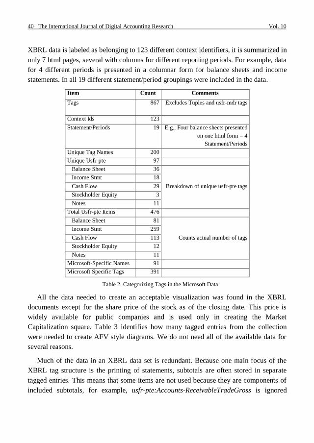
Table 2 characterizes the tags found in the Microsoft documents. We eliminated
housekeeping tags such as the root and namespace declaration tags as well as tuple tags
which link together facts in other tags, and tags from the usfr-mda taxonomy which
specifies classes of items for Management's Discussion and Analysis. These did not
report on values we depict. A quick counting of tags revealed 867 tag instances (items
reported) including 200 different tag names. Of these 391 (91 unique names) were
Microsoft extensions to the XBRL taxonomy. Fortunately, these extended tags were used
to provide extra information that was not needed for our visualization model. The same
financial data is also presented HTML form in the downloadable collection. Although the
40 The International Journal of Digital Accounting Research Vol. 10
XBRL data is labeled as belonging to 123 different context identifiers, it is summarized in
only 7 html pages, several with columns for different reporting periods. For example, data
for 4 different periods is presented in a columnar form for balance sheets and income
statements. In all 19 different statement/period groupings were included in the data.
Item Count Comments
Tags 867 Excludes Tuples and usfr-mdr tags
Context Ids 123
Statement/Periods 19 E.g., Four balance sheets presented
on one html form = 4
Statement/Periods
Unique Tag Names 200
Unique Usfr-pte 97
Balance Sheet 36
Breakdown of unique usfr-pte tags
Income Stmt 18
Cash Flow 29
Stockholder Equity 3
Notes 11
Total Usfr-pte Items 476
Balance Sheet 81
Counts actual number of tags
Income Stmt 259
Cash Flow 113
Stockholder Equity 12
Notes 11
Microsoft-Specific Names 91
Microsoft Specific Tags 391
Table 2. Categorizing Tags in the Microsoft Data
All the data needed to create an acceptable visualization was found in the XBRL
documents except for the share price of the stock as of the closing date. This price is
widely available for public companies and is used only in creating the Market
Capitalization square. Table 3 identifies how many tagged entries from the collection
were needed to create AFV style diagrams. We do not need all of the available data for
several reasons.
Much of the data in an XBRL data set is redundant. Because one main focus of the
XBRL tag structure is the printing of statements, subtotals are often stored in separate
tagged entries. This means that some items are not used because they are components of
included subtotals, for example, usfr-pte:Accounts-ReceivableTradeGross is ignored

Marshall, Mortenson, Bourne & Price Visualizing Basic Accounting Flows… 41
because it is included in usfr-pte:ReceivablesNet, and others are ignored because they are
subtotals that summarize data we use in more detail e.g., usfr-pte:StockHoldersEquity
which is broken down into paid in and earned capital in our visualization model.
Item Count
Balance Sheet Items
Unique Tag Names 52
Used 22
Unused 30
Components of Used Subtotals 8
Subtotals of Used Components 7
Items Not Relevant to AFV Diagrams 15
Income Statement Items
Unique Tag Names 19
Used 8
Unused 11
Components of Used Subtotals 3
Subtotals of Used Components 2
Items Not Relevant to AFV Diagrams 6
Cash Flow Statement Items
Unique Tag Names 18
Used 8
Unused 10
Components of Used Subtotals 8
Subtotals of Used Components 2
Items Not Relevant to AFV Diagrams 0
Statement of Stockholders’ Equity Items
Unique Tag Names 15
Used 0
Unused 15
Components of Used Subtotals 5
Subtotals of Used Components 0
Items Not Relevant to AFV Diagrams 10
Table 3. Usfr-pte Tags Used to Create AFV Diagrams for the Microsoft Data
In other cases, reported data is simply not included in our model. In particular, many
reported values describe non-operational data flows. We show such data selectively. For
example, we report cash financing flows to chart investment (debt or equity) in the

42 The International Journal of Digital Accounting Research Vol. 10
company but we do not display flows for write-downs of assets that do not appropriately
match with current sales. So, while we depict deprecation in a flow from long to short
term assets we do not depict a non-operational journal entry such as the write down of
goodwill in a declining, purchased subsidiary as a flow. Instead, the user would need to
recognize the impact of significant events of that type in the change of the size of the
earned capital or long term asset boxes. Future versions of the AFV could be customized
to individual preferences, and will likely allow additional data to be displayed in response
to mouseovers, button clicks, or other environmental conditions.
Microsoft‟s XBRL data provides a few specific challenges that are representative of
problems that can arise with the mapping process. Microsoft‟s XBRL contains no tag for
interest expense or a note in the footnotes about amount of interest paid, both of which
are needed to correctly display the AFV. Further investigation into Microsoft‟s financial
position revealed however, that this is because Microsoft has no long-term debt financing
and thus owes no interest. While this is not an inherent problem, as any missing detail
data is accounted for by usage of other summary tags, it could cause some confusion to a
reader as to why a section of the standard visualization may not be present.
In January 2009, XBRL International (XBRL 2009c) released a new version of the us-
gaap taxonomy to be used in SEC filings. It is extensive and, as with previous versions,
includes many items not necessary for the AFV. Because the AFV does not depend on
the same labels as the financial statements, the only us-gaap tags that need to be mapped
are those expressing direct numerical data present on the financial statements; only tags
of the “xbrli:monetaryItem” type are required. Thus the number of tags to consider in
establishing a mapping from XBRL to the AFV is reduced from 13,452 (the number of
tags found in the US_GAAP taxonomy) to 6,091. For example, we can safely ignore
2,706 abstract items and some 1,945 stringItem type tags which cannot contain numeric
values.
To explore the viability of our mapping approach based on the latest US GAAP
version of XBRL we successfully mapped a recent XBRL SEC submission for Adobe to
the AFV. Of Adobe‟s 269 lines of element data, 244 tags used the us-gaap prefix
including 96 unique tag names. Thirteen tags used the dei prefix, all of which are unique
tags; and twelve Adobe specific tags (prefix adbe) involved six unique tags names. Of the
forty-three tags related to the Statement of Financial Position we used twenty-three.
Seven were components of mapped values and five were subtotals. For the income
statement, we used only seven out of twenty-seven, ignoring eleven components and five

Marshall, Mortenson, Bourne & Price Visualizing Basic Accounting Flows… 43
subtotals. For the Statement of Cash Flows we used twelve out of thirty-one tags omitting
eleven components and three subtotals. The rest of the numeric tags from these
statements were not relevant to the visualization.
As with the Microsoft data, few company-specific items needed to be considered
although we did employ Adobe specific tags for PrepaidExpensesOtherAssets and
InvestmentAndLeaseReceiveable. More investigation is needed to see if we could have
avoided using these tags while still achieving an accurate depiction. We did not try to
determine if Adobe‟s use of these tags was contrary to best practices. The current version
of the XBRL Preparers Guide recommends using an existing tag whenever possible.
(XBRL 2009d, p. 28)
Constructing the Accounting Flow Visualizer
The AFV was engineered for the internet. Some XBRL data is already available and
as more companies are required to file, more will become available. These files will be
available through the familiar http (hypertext transfer protocol) used by the AFV to
access data. Xpath queries convert XML documents into systematically processable data.
And the program will run in a client‟s browser through a Microsoft Silverlight plug-in.
Silverlight leverages Microsoft‟s Visual Studio .Net development tools to create
sophisticated applications deployed to web browsers (Microsoft). Program codes are
stored in a .xaml file specifying initial instructions for the browser and in .Net code
pages. A compiled version is stored on a web server. An html (hypertext markup
language) page provides needed instructions so the browser can download and execute
the Silverlight application. The freely available Silverlight plug-in must be installed for
the browser to run the application. This deployment structure is similar to that used with
Flash or Realplayer applications. On the server side, little or no installation is required.
Our implementation was simply copied to web-shared folder on an Apache web server
with no additional configuration required.
A table matches recognized XBRL tags to modeled states and flows and groups them
by period. So far, this mapping is relatively simple. However, because of issues discussed
in the previous section, we expect that logic beyond simple mapping will be needed to
account for data stored in extended tags, data available from multiple sources in an XBRL
document, or data with other representational variations. XBRL documents generally
refer to multiple statements and thus have multiple context ids. Additional user
interactions will likely need to be developed in production-level software to select the
44 The International Journal of Digital Accounting Research Vol. 10
context ids to be visualized, accept share price data, and account for conflicts or
anomalies observed in an imported dataset.
The values are then translated into visualization parameters. Scaling factors are
computed to represent values as circles, rectangles, or wedges while fitting into available
screen space. While the current implementation does not allow the user to adjust the
scale, that feature would be both desirable and technically possible.
3. EXPERIMENTAL DESIGN
To assess students‟ ability to interpret the AFV diagrams and map identifiable
components to important business concepts, we tested the AFV on undergraduate
students in an introductory financial accounting class at a major university. The presenter
informed students that participation was voluntary, that answers would be kept
anonymous, and that there was no extrinsic incentive (e.g., money, extra credit) to
participate. Of the 45 students in class, 41 choose to participate to some extent. Of those
41, 34 provided answers to all questions (21 male and 13 female, all between the ages of
18 and 30).
The testing instrument consisted of printed instructions, figures, and questions. To
enforce the idea that all students were being asked to evaluate the same information, the
instructions and figures were projected on a screen at the front of the class. Students
began by reading a brief one or two sentence summary of four accounting concepts:
liquidity, financing, profitability, and market value. Students then answered questions
designed to test their understanding of the four concepts.
The presenter then provided a 10 minute tutorial introducing the AFV and explaining
what each component represented and which financial statement was the source for the
data. Following the tutorial, students answered questions designed to test their
understanding of the AFV and its components. Students were provided with a color AFV
image representing one year of operations (representing data from Intel) and asked to
answer questions by (1) estimating the relative magnitude between AFV components and
(2) identifying the structure and flow of financing. Finally, students were provided with
four equally scaled color AFV images representing four years of operations (based on
Intel data) and asked to answer questions about trends and changes in AFV components.
The images used are shown in Appendix A. Following the collection of data the
presenters demonstrated the animated version of the tool and held a question answer
session to gather feedback.

Marshall, Mortenson, Bourne & Price Visualizing Basic Accounting Flows… 45
4. RESULTS
Results from the experiment are presented in Tables 4 to 7 and represent responses
from 34 students. Table 4 presents the percentage of correct responses to questions about
the four accounting concepts: liquidity, financing, profitability, and market value.
Question # / Concept
Mean Percentage of
Correct Responses
1. Financing 94.12%
2. Liquidity † 83.82%
3. Market Value 94.12%
4. Profitability † 88.24% † Two questions were averaged.
Minimum and maximum correct response
values are 76.47% and 100% respectively.
Table 4. Understanding of Accounting Concepts
When more than one question tested the same concept the percentage of correct
responses were averaged. Students correctly answered questions between 83% and 94%
of the time indicating a reasonably good understanding of the four concepts.
Question # / Concept Correct Response %
1. Boxes (States) 91.18%
2. Circles (Flows) 91.18%
3. Related Colors 100.00%
4.Balance Sheet as source for Boxes 90.91%
5. Income Statement or Statement of Cash Flows as source for Circles 94.12%
6. Wedges 91.18%
7. Market Value Line 91.18%
Table 5. Understanding the Accounting Flow Visualizer
Table 5 presents the percentage of correct responses to questions about the AFV.
These questions were asked after the tutorial explaining the components and financial
statement sources of the AFV. Students answered at least 90% of the questions about the
shape and source of components correctly. Of particular interest is the perfect response
rate when students were asked about the meaning and use of colors. As a whole, students
demonstrated a solid overall understanding of the separate AFV components and sources.
Tables 4 and 5 provided us with a reasonable degree of confidence that after a short

46 The International Journal of Digital Accounting Research Vol. 10
tutorial the students were able to understand both the basic accounting concepts and the
components of the AFV used to represent those concepts.
Table 6 presents student responses to questions requiring them to analyze the
company‟s performance for one year. The first five questions in the table required
students to provide a numerical estimate while the last three provided multiple choice
answers. For questions 1, 2, and 5 the mean estimates provided were not significantly
different from the actual values at the 95% level (p<=.05). The high percentages of
correct responses to questions 7 (90.91%) and 8 (94.12%), which relate to the type and
flow of financing, are similar to the response rate in related questions in Tables 4 and 5.
Question 6 asked students to compare the relative size of the purchases flow to the
sales revenue flow. The sales revenue flow is actually 10% larger than the purchases
flow, a value we (and 75% of students) did not think was distinguishable. This lower
correct response rate may be an indicator that changes in circles may not be noticeable
when the circle gets above a certain size (Kridder et al 2001).
Question # / Concept
% Correct
Responses Actual Value
Mean Response
(Standard Deviation) z-score
1. Estimate profit as a
percentage of sale revenue - 22.31% 22.89% (.046) 0.72 *
2. Estimate profit as a
percentage of assets - 27.39% 29.87% (.178) 0.78 *
3. Estimate profit as a
percentage of retained earnings - 28.94% 35.17% (.169) 2.02
4. Estimate dividend payout
percentage - 22.60% 35.69% ( .112) 6.61
5. Estimate debt financing - 7.33% 9.09% (.062) 1.57 *
6. Relative size of Purchases
and Revenue Flows 75.00% - - -
7. Primary source of financing
(capital structure) 90.91% - - -
8. Direction of Financing Flow 94.12% - - -
* At the 95% significance level the mean student estimate is not significantly different from the
actual value.
Table 6. Correctness of Responses in Single-Year Analysis Tasks
Table 7 presents student responses to questions requiring them to analyze trends and
changes in the firm‟s performance over four years. The percentage of correct responses
for questions 1 thru 5 ranges from 79.41% to 97.06% indicating that students were able to

Marshall, Mortenson, Bourne & Price Visualizing Basic Accounting Flows… 47
correctly identify changes as well as trends in a company‟s performance across time using
the AFV. Question 6 relates to trends in market value across four years and has the
lowest correct response rate in the experiment, 48.48%. In years four, five, and seven the
size of the market value is relatively unchanged and is slightly obscured behind the asset
state box; however, in the sixth year market value decreases enough to create some visual
white space between this asset state box and the market value box. This may explain the
lower correct response if students primarily focus on year six when answering the
question. When responses indicating a decrease or no change of market value are
aggregated 81.81% of responses are accounted for.
Question # / Concept †
% Correct
Response
1. Change in capital purchases 91.18%
2. Change in profitability 97.06%
3. Trend in liquidity 79.41%
4. Trend in financing (capital structure) 84.38%
5. Trend in dividend policy 94.12%
6. Trend in market value 48.48% †"Change" refers to a comparison between two years. "Trend" refers to
change over three or four years.
Table 7. Correctness of Responses in Multi- Year Analysis Tasks
5. DISCUSSION
Tables 4 – 6 provide some evidence that students understood the concepts of liquidity,
profitability, market value and the mix of financing for a company, were able to associate
those concepts to the visualization, and estimated some relative proportions with
surprising accuracy.
The primary purpose of the experiment was validation of students‟ ability to associate
business concepts to recognizable components of the visualization. We are encouraged
that, following a brief tutorial, students were able to correctly interpret the visual
components used in the tool. That is, circles for flows, boxes for states, and colors that
tied together related items. We are further encouraged that students were able to associate
those components with financial statement sources, correctly mapping filled-in squares to
the balance sheet and circles to income statements and cash flow statements. The results
here were not all correct, but since this was during the first two weeks of an introductory
accounting class, the students were likely still developing their conceptual understanding
48 The International Journal of Digital Accounting Research Vol. 10
of the content and function of the statements. We believe these initial results are
encouraging enough to warrant further development of the tool.
The size estimates were surprisingly accurate. While these numbers do not tell us
much by themselves, they establish a basis for comparison as we experiment with
different formats in future versions of the AFV. Students did well in estimating the
percentage associated with a pie wedge (a familiar graphical metaphor) but less well in
comparing wedges to each other or to other shapes. This is demonstrated in Table 6,
questions 3 and 4 which asked students for estimates of dividends as a percentage of
profit (one wedge compared to another wedge) and profit compared to assets (wedge vs.
square). Improving the formulation of the diagrams will be an ongoing effort in our line
of work.
We also noted encouraging anecdotal responses from students to the instructor after
we left. Some students said they liked the visualizations, thought it showed things well,
and that they wished they could use it at work.
6. CONCLUSION AND FUTURE WORK
This line of work aims to explore the feasibility of the AFV. Can XBRL data be
meaningfully translated in a visual depiction? Can the available data be meaningfully
integrated in so as to address key analysis questions? Can users correctly interpret the
visualization? The results presented here are encouraging.
The basic visual metaphors were understandable as representing key business issues.
This result is in line with less formal feedback received from accounting practitioners.
The current experimentation is not of sufficient scope to draw broad conclusions but the
results are promising enough to suggest that further exploration of integrated
visualizations of financial statement data can be useful in presenting business/accounting
concepts to students at least, to other less-savvy stakeholders probably, and perhaps also
for more sophisticated analysts who want to quickly summarize or compare financial
position of an organization of organizations.
The source data available in XBRL seems to be largely sufficient and appropriately
organized to support potentially useful visualizations. Details described above deserve
attention. For example, should multiple indicators of the same magnitude be tabulated
and compared? What additional information (such as share price as of the end of the
period) is needed to support useful analysis tools?

Marshall, Mortenson, Bourne & Price Visualizing Basic Accounting Flows… 49
Visual details also need more exploration. Can people effectively compare the area of
rectangles and circles? Would other shapes be more effective? Do the animations add
value in helping users recognize trends or avoid missing key indicators? In short, these
results are encouraging but ask a number of potentially interesting questions.
7. REFERENCES
AICPA (2009): AICPA Core Competency Framework for Entry into the Accounting
Profession (The Framework). http://www.aicpa.org/edu/corecomp.htm
ALLOCATION SOLUTIONS (2009): Two New XBRL Conversion/Publishing Solutions
Expand Tool Options for the U.S. and International Markets. http://www.allocationsolutio
ns.com/press.html
ALTOVA (2009): Powerful XBRL Tools. http://www.Altova.com/MissionKit
CROXTON, F. E. (1932): "Graphic Comparisons by Bars, Squares, Circles, and Cubes",
Journal of the American Statistical Association, vol. 27, n. 177: 54-60. http://dx.doi.org/1
0.2307/2277880
FREDERICKSON, J.; MILLER, J. (2004): "The effects of pro forma earnings disclosures
on analysts' and nonprofessional investors' equity valuation judgments", The Accounting
Review, vol. 79, n. 3: 667-686. http://dx.doi.org/10.2308/accr.2004.79.3.667
GARBELLOTTO, G. (2009): Extensible Business Reporting Language (XBRL): What's
In It, Institute of Internal Auditors Research Foundation, http://www.theiia.org/bookstore/
product/extensible-business-reporting-language-xbrl-whats-in-it-for-internal-auditors-13
97.cfm
HODGE, F.; KENNEDY, S. J.; MAINES, L. A. (2004): "Does search-facilitating
technology improve the transparency of financial reporting?", The Accounting Review,
vol. 79, n. 3: 687-703.
HUNTON, J.; MCEWEN, R. (1997): "An assessment of the relation between analysts'
earnings forecast accuracy, motivational incentives and cognitive information search
strategy", The Accounting Review, vol. 72, n. 4: 497-516.
JUSTSYSTEMS CORP. (2008): JustSystems‟ xfy XBRL viewer Enables XBRL
rendering for the Public Sector. http://na.justsystems.com/content-solutions-xbrl-public-
sector

50 The International Journal of Digital Accounting Research Vol. 10
KRIDDER, R. E.; RAGHUBIR, P.; KRISHNA, A. (2001): "Pizzas: π or Square?
Psychophysical Biases in Area Comparisons", Marketing Science, vol. 20, n. 4: 405-426.
http://dx.doi.org/10.1287/mksc.20.4.405.9756
MICROSOFT (2009): What is Silverlight? http://www.microsoft.com/silverlight/
overview/business.aspx
SEC (2009): Final Rule: Interactive Data to Improve Financial Reporting. http://www.se
c.gov/rules/final/2009/33-9002.pdf
THOMSEN, C.T. (1990): "Business instrument panel: a new paradigm for interfacing
with financial data", in Proceedings of the SIGCHI conference on Human factors in
computing systems: Empowering people, ACM, Seattle, Washington, United States.
THOMSEN, C.T. (2003): "Reinventing Accounting: 500", BIP, P.O. Box 11435, San
Bernardino, CA 92423-1435.
UBMATRIX (2007): Enterprise Application Suite. http://www.ubmatrix.com/products/en
terprise_application_suite.htm
VAN DER AALST, W.M.P.; KUMAR, A. (2003): "XML-Based Schema Definition for
Support of Interorganizational Workflow", Information Systems Research, vol. 14, n. 1:
23-46. http://dx.doi.org/10.1287/isre.14.1.23.14768
WALLMAN, STEVEN M.H. (1997): "The Future of Accounting and Financial
Reporting, Part IV: “Access” Accounting", Accounting Horizons, vol. 11, n. 2: 103-116.
WORLD WIDE WEB CONSORTIUM (2008): Extensible Markup Language (XML) 1.0
(Fifth Edition). http://www.w3.org/TR/xml/
XBRL INTERNATIONAL (2009a): An Introduction to XBRL. http://www.xbrl.org/Wha
tIsXBRL/
XBRL INTERNATIONAL (2009b): XBRL Cases. http://www.xbrl.org/CaseStudies/
XBRL INTERNATIONAL (2009c): US GAAP Taxonomies, Release 2009. http://xbrl.us
/taxonomies/Pages/US-GAAP2009.aspx, consulted July 22, 2009.
XBRL INTERNATIONAL (2009d): XBRL Preparers Guide. http://xbrl.us/Documents/Pr
eparersGuide.pdf, consulted July 22, 2009.

Marshall, Mortenson, Bourne & Price Visualizing Basic Accounting Flows… 51
APPENDIX A: AFV Images Representing Four Years of Operations Data from
Intel.
Four AFV diagrams based on Intel‟s annual reports used for the multi-year analysis
tasks. Note the significant variation in market value and profitability and the depiction of
an ongoing and extensive stock buyback program depicted in the financing flows.

52 The International Journal of Digital Accounting Research Vol. 10

Marshall, Mortenson, Bourne & Price Visualizing Basic Accounting Flows… 53

54 The International Journal of Digital Accounting Research Vol. 10