Using PUMS to Calculate Geographic Mobility in New York City
48
University of Pennsylvania University of Pennsylvania ScholarlyCommons ScholarlyCommons Culture and Social Wellbeing in New York City—2014-2017 Social Impact of the Arts Project 10-2017 Using PUMS to Calculate Geographic Mobility in New York City Using PUMS to Calculate Geographic Mobility in New York City Mark J. Stern University of Pennsylvania, [email protected] Follow this and additional works at: https://repository.upenn.edu/siap_culture_nyc Part of the Arts and Humanities Commons, Public Policy Commons, Sociology Commons, and the Urban Studies and Planning Commons Stern, Mark J., "Using PUMS to Calculate Geographic Mobility in New York City" (2017). Culture and Social Wellbeing in New York City—2014-2017. 6. https://repository.upenn.edu/siap_culture_nyc/6 The paper discusses use of the ACS one-year Public Use Microdata Samples (PUMS) to assess change between 2007 and 2015 for New York City’s 55 Public Use Microdata Areas (PUMAs), which closely follow New York’s community board system. The public use data include a migration question that identifies both residents who lived in the same house and those who moved but remained in the same PUMA during the previous year. The paper uses SIAP’s Cultural Asset Index (CAI)—which integrates data on nonprofit cultural organizations, for- profit cultural firms, resident artists, and cultural participation in NYC—to estimate the concentration of cultural assets in New York neighborhoods and its relationship to measures of neighborhood change. The Culture and Social Wellbeing in New York City project was undertaken by SIAP in collaboration with Reinvestment Fund, a community development financial institution, with support by the Surdna Foundation, the NYC Cultural Agenda Fund in the New York Community Trust, and the University of Pennsylvania. The research was conducted between 2014 and 2017. This paper is posted at ScholarlyCommons. https://repository.upenn.edu/siap_culture_nyc/6 For more information, please contact [email protected].
-
Upload
khangminh22 -
Category
Documents
-
view
2 -
download
0
Transcript of Using PUMS to Calculate Geographic Mobility in New York City

University of Pennsylvania University of Pennsylvania
ScholarlyCommons ScholarlyCommons
Culture and Social Wellbeing in New York City—2014-2017 Social Impact of the Arts Project
10-2017
Using PUMS to Calculate Geographic Mobility in New York City Using PUMS to Calculate Geographic Mobility in New York City
Mark J. Stern University of Pennsylvania, [email protected]
Follow this and additional works at: https://repository.upenn.edu/siap_culture_nyc
Part of the Arts and Humanities Commons, Public Policy Commons, Sociology Commons, and the
Urban Studies and Planning Commons
Stern, Mark J., "Using PUMS to Calculate Geographic Mobility in New York City" (2017). Culture and Social Wellbeing in New York City—2014-2017. 6. https://repository.upenn.edu/siap_culture_nyc/6
The paper discusses use of the ACS one-year Public Use Microdata Samples (PUMS) to assess change between 2007 and 2015 for New York City’s 55 Public Use Microdata Areas (PUMAs), which closely follow New York’s community board system. The public use data include a migration question that identifies both residents who lived in the same house and those who moved but remained in the same PUMA during the previous year. The paper uses SIAP’s Cultural Asset Index (CAI)—which integrates data on nonprofit cultural organizations, for-profit cultural firms, resident artists, and cultural participation in NYC—to estimate the concentration of cultural assets in New York neighborhoods and its relationship to measures of neighborhood change. The Culture and Social Wellbeing in New York City project was undertaken by SIAP in collaboration with Reinvestment Fund, a community development financial institution, with support by the Surdna Foundation, the NYC Cultural Agenda Fund in the New York Community Trust, and the University of Pennsylvania. The research was conducted between 2014 and 2017.
This paper is posted at ScholarlyCommons. https://repository.upenn.edu/siap_culture_nyc/6 For more information, please contact [email protected].

Using PUMS to Calculate Geographic Mobility in New York City Using PUMS to Calculate Geographic Mobility in New York City
Abstract Abstract New York City’s remarkable population growth over recent decades has heightened concerns about gentrification and displacement. In this paper, SIAP uses census data drawn from the annual American Community Survey (ACS) to identify patterns of geographic mobility common in New York City Public Use Microdata Areas (PUMAs) during the past decade. Major findings include: 1) New York City residents tend to move less frequently than those of other major cities; 2) the city displays two distinct dimensions of geographic mobility—one associated with high population turnover (number of residents moving in and out of a neighborhood) and a second associated with net population change (shifts in the ethnic and educational composition of the area); and 3) the presence of cultural assets in the neighborhood is associated with high turnover, but not with shifts in the ethnic and educational composition of the area. The paper concludes with observations about how these different patterns might affect residents’ experience of rapid neighborhood change.
Disciplines Disciplines Arts and Humanities | Public Policy | Sociology | Urban Studies and Planning
Comments Comments The paper discusses use of the ACS one-year Public Use Microdata Samples (PUMS) to assess change between 2007 and 2015 for New York City’s 55 Public Use Microdata Areas (PUMAs), which closely follow New York’s community board system. The public use data include a migration question that identifies both residents who lived in the same house and those who moved but remained in the same PUMA during the previous year.
The paper uses SIAP’s Cultural Asset Index (CAI)—which integrates data on nonprofit cultural organizations, for-profit cultural firms, resident artists, and cultural participation in NYC—to estimate the concentration of cultural assets in New York neighborhoods and its relationship to measures of neighborhood change.
The Culture and Social Wellbeing in New York City project was undertaken by SIAP in collaboration with Reinvestment Fund, a community development financial institution, with support by the Surdna Foundation, the NYC Cultural Agenda Fund in the New York Community Trust, and the University of Pennsylvania. The research was conducted between 2014 and 2017.
This working paper is available at ScholarlyCommons: https://repository.upenn.edu/siap_culture_nyc/6

A SIAP Working Paper:
Using PUMS to Calculate Geographic Mobility in New York City
Mark J. Stern
University of Pennsylvania Social Impact of the Arts Project
October 2017
PLEASE DO NOT CITE OR QUOTE WITHOUT AUTHOR’S PERMISSION. This paper was prepared as part of the Social Impact of the Arts Project (SIAP) study of Social Wellbeing, Neighborhood Transformation, and the Arts undertaken with support by the Surdna Foundation. The views expressed are solely those of the author. For more information: Mark J. Stern, Professor of Social Policy & History l [email protected] Co-‐director, Urban Studies Program University of Pennsylvania l School of Social Policy & Practice 3701 Locust Walk l Philadelphia, PA 19104-‐6214 USA SIAP archives: http://repository.upenn.edu/siap_culture_nyc/

1
Neighborhoods are always changing. Yet, rapid neighborhood change poses a particular challenge. Communities that take years to construct webs of relationships and meaning can be undone as the entrance and exit of inhabitants and changing real estate realities affect the quality of community life for both longer-‐term and new residents.
No single measure can capture all dimensions of neighborhood change. In this paper we use census data, specifically, the annual American Community Survey by the U.S. Census Bureau, to assess the contribution it can make to our understanding of the phenomenon.
Data and methods
American Community Survey (ACS) five-‐year census tract files
For the past several years, the University of Pennsylvania’s Social Impact of the Arts Project (SIAP) has been using the 5-‐year census tract files for the American Community Survey (ACS) to study geographic mobility.1 This work has taken advantage of the fact that the ACS is an annual survey and that it includes a question on where respondents lived a year earlier, which allows us to estimate the proportion of tract residents who lived in the same house as they did the year before. The logic of our approach is fairly straightforward. It assumes that everyone who was not living in the “same house” as the previous year moved from a different census tract.
Based on this assumption, we can use the following formula to estimate the number of people who “moved out” of the tract in the previous year:
Number of people who moved out in previous year = Population in year 1 + people who moved into tract between years 1 and 2 -‐ population in year 2.
Because the “moved in” term is equal to the population in year 2 minus those living in the same house, this equation reduces to:
Number of people who moved in in previous year = Population in year 1 – population in same house in year 2.
1 Mark J. Stern (December 2014). “Geographic mobility, displacement, and the arts in three cities,” SIAP Working Paper. Philadelphia: University of Pennsylvania, Social Impact of the Arts Project.

2
Obviously, the formula skips over a couple of problems. First, some people didn’t move out, but died. Second, some people lived in a different house in the same census tract. Although these problems influence the absolute figures for in-‐and out-‐migration, they would not have a profound impact on estimating differential migration across a city’s census tracts.
Two other problems are more likely to confound the calculation of mobility. First, because American Community Survey tract data are five-‐year files, the year-‐to-‐year calculation is really a 5-‐year to 5-‐year calculation in which the middle four years (say in the case of comparing 2008-‐12 and 2009-‐13—2009-‐12) are counted twice. Second, the ACS estimates have been plagued by larger than desirable sampling error (or margin-‐of-‐error or MOE), so in a case where only 10-‐15 percent of the population moves in a particular year, the confidence interval around a particular tract’s estimates is often larger than the figure itself. The confidence intervals around individual tracts may be too large to draw reliable estimates. Certainly, this may explain the “speckled” look of the map of geographic mobility at the tract level.
Figure 1. Average population turnover (sum of percent of in-‐migrants and out-‐migrants), New York City census tracts, 2010-‐14. Source: American Community Survey

3
In our March 2017 report on culture and social wellbeing in New York City2, we addressed these issues by running analyses at the Neighborhood Tabulation Area (NTA) level. Because the number of cases per NTA is higher than at the tract, the standard errors also tend to shrink. For example, a map of the same variable at the NTA level looks like the one below.
Figure 2. Average population turnover, New York City Neighborhood Tabulation Areas, 2010-‐14. Source: American Community Survey Obviously, analysis by NTA gives up a lot of detail but also reduces the amount of error present in any particular tract estimate.
2 Mark J. Stern and Susan C. Seifert (March 2017). The Social Wellbeing of New York City’s Neighborhoods: The Contribution of Culture and the Arts. Philadelphia: University of Pennsylvania, Social Impact of the Arts Project.

4
American Community Survey (ACS) one-‐year Public Use Microdata Samples (PUMS)
In this paper, we take a different approach. Instead of using the five-‐year files, we’ve chosen to use the one-‐year ACS Public Use Microdata Samples (PUMS)—that is, one-‐percent samples for each year that include data on individuals.3 This approach provides several benefits. First, because we have data on individuals, it provides more flexibility to the analysis. Instead of using the Census Bureau’s decisions about what variables and categories to use, the researcher can make her own decisions. Second, because the data are for one year, we can truly compare 2012 with 2013 instead of 2008-‐12 with 2009-‐13.
The one obvious drawback of this approach has to do with geography. The smallest geography in the PUMS file is the Public Use Microdata Area or PUMA. These units tend to average a bit fewer than 150,000 residents, which makes them much less precise than the NTAs. New York City, which has nearly two hundred NTAs, has just 55 PUMAs.
On the plus side, in a city like New York, the number of PUMAs is large enough to give a sense of variation across the city. An added bit of utility is provided by the ways PUMAs are defined in New York. They closely follow the community board system used by the city for limited local governance. So, although they aren’t neighborhoods, PUMAs are administrative units that are familiar to many residents.4
The biggest benefit of the public use data, however, is the format of the migration question included in the file. The detailed form of the question identifies both residents who lived in the same house and those who moved but remained in the same PUMA during the previous year.
Apart from its methodological usefulness, the breakdown of the data makes a substantive point. Between 2014 and 2015, eighty-‐nine percent (89%) of New Yorkers did not move, and ninety-‐four percent (94%) either did not move or stayed in the same PUMA during the previous year.
3 Steven Ruggles, Katie Genadek, Ronald Goeken, Josiah Grover, and Matthew Sobek (2015). Integrated Public Use Microdata Series: Version 6.0 [dataset]. Minneapolis: University of Minnesota. http://doi.org/10.18128/D010.V6.0. 4 Each PUMA is associated with multiple neighborhoods. For ease of identification, we’ve used a set of shorter names (PUMA short) that focus on the main neighborhood associated with each. A map of PUMAs and NTAs is included in the Appendix.

5
Census Year: 2015 Frequency Percent
Valid Under 1 year of age 110,147 1.3
Same house 7,604,345 88.9
Different house, moved within state, within PUMA
456,345 5.3
Different house, moved within state, between PUMAs
168,204 2.0
Moved between contiguous states 48,023 .6
Moved between non-‐contiguous states
72,355 .8
Abroad one year ago 92,519 1.1
Total 8,551,938 100.0
Table 1. Residence a year earlier, New York City, 2015 Source: American Community Survey Given the heightened concerns about gentrification and displacement in New York City, we might imagine that the city has been experiencing massive rearranging of its population in recent years. To assess this concern, we use a very simple measure: what percent of the city’s residents lived in the same house as they had a year earlier. The following table, from the public-‐use microdata of the American Community Survey for 2010-‐14 underlines that in a national context, New Yorkers are a very stable population. Only four small cities—Livonia, Michigan; East Los Angeles, California; Paterson, New Jersey; and Yonkers, New York—had residential stability rates higher than New York City. New York’s stability rate—89 percent of persons over 1 year of age—is a full five percentage points above the national average. Indeed, the next most stable major city—Philadelphia—is 3.6 percentage points less stable, while a host of cities have rates in the 75-‐80 percent range.
If New York was experiencing really widespread displacement, we would expect to find it in the next category—people who moved within the same state. Here again, the overview of New York works against the widespread displacement hypothesis. In fact, New York’s figure of 8.1 percent is less than half that of several cities.
So, the first finding of the paper is that New York City is not characterized by widespread residential mobility. To the contrary, New Yorkers are more likely to live in the same house as last year at far higher rates than most Americans. At the same time, we recognize that another housing problem in New York City—the high proportion of the population facing severe housing cost burden—is one reason for the relative immobility of the City’s residents.

6
Cities (with census code) Same house
Moved within state
Moved from another state or abroad
3670: Livonia, MI 92.1 5.6 1.1 1910: East Los Angeles, CA 91.4 7.2 0.3 5210: Paterson, NJ 88.6 8.3 1.7 7590: Yonkers, NY 88.1 9.0 1.5 4610: New York, NY 88.0 8.1 2.6 5330: Philadelphia, PA 84.4 11.2 3.1 3730: Los Angeles, CA 84.3 12.5 2.0
National average 83.9 12.1 2.9 6290: San Francisco, CA 83.9 11.7 3.6 1750: Detroit, MI 83.0 14.6 1.1 4570: New Orleans, LA 82.7 12.3 4.1 4110: Miami, FL 82.6 12.8 3.5 1190: Chicago, IL 82.3 13.4 3.0 530: Baltimore, MD 81.4 14.5 2.7 1330: Cleveland, OH 79.1 17.3 2.3 7230: Washington, DC 78.7 10.4 9.6 2890: Houston, TX 78.4 17.0 3.1 5370: Pittsburgh, PA 77.9 16.2 4.9 3260: Kansas City, MO 77.7 15.8 4.8
Table 2. U.S. cities with highest rates of residential stability, 2010-‐14 Source: American Community Survey However, these citywide figures could hide the fact that particular populations—particularly vulnerable groups like older residents, the poor, African Americans, or Hispanics—have higher rates of residential mobility in the city. Here again, the citywide averages do not suggest that New Yorkers are moving—either forced or voluntary—at high rates. Fully 90 percent of African Americans had not moved in the previous year. People living in poverty were somewhat less stable (85 percent) but still well above the national average and only a few percentage points below the citywide average. Hispanics in New York were generally about as stable as the entire population.

7
Percent living in same house as in previous year, 2010-‐14
Cities with highest level of residential stability (with census code)
Total population
African American
Living in poverty
Hispanic
3670: Livonia, MI 92.1 58.4 90.0 81.9 1910: East Los Angeles, CA 91.4 88.6 87.7 91.6 5210: Paterson, NJ 88.6 89.9 86.8 87.7 7590: Yonkers, NY 88.1 86.3 82.5 85.4 4610: New York, NY 88.0 90.2 85.4 88.2 5330: Philadelphia, PA 84.4 86.7 79.8 80.4 3730: Los Angeles, CA 84.3 83.1 79.8 86.3
U.S. Average 83.9 80.6 73.9 82.0 6290: San Francisco, CA 83.9 86.1 77.3 85.4 1750: Detroit, MI 83.0 83.7 76.7 79.0 4570: New Orleans, LA 82.7 86.2 79.9 76.4 4110: Miami, FL 82.6 80.8 79.9 84.4 4930: Oakland, CA 82.6 84.7 77.2 82.8 1190: Chicago, IL 82.3 82.4 76.2 85.8 530: Baltimore, MD 81.4 83.4 75.4 70.2 1330: Cleveland, OH 79.1 79.3 70.6 73.9 7230: Washington, DC 78.7 83.5 73.8 78.6 5350: Phoenix, AZ 78.6 69.8 72.6 79.1 2890: Houston, TX 78.4 75.9 70.7 78.8 5370: Pittsburgh, PA 77.9 81.0 67.1 71.9
Table 3. Indicators of residential stability, U.S. cities with highest rates of stability, 2010-‐14 Source: American Community Survey
Census tract data tell the same story about New York’s residential stability. The median populated tract in New York City saw about 90 percent of its residents live in the same house as they had the previous year. At the far extreme, ten percent of tracts had 19 percent of their residents who had not lived in the same house the year before.

8
Neighborhood Tabulation Area Percent in same house
Battery Park City-‐Lower Manhattan 69.8
Midtown-‐Midtown South 72.5
Morningside Heights 72.6
East Village 73.8
Murray Hill-‐Kips Bay 75.4
Ozone Park 76.2
Clinton 77.2
Gramercy 77.5
SoHo-‐TriBeCa-‐Civic Center-‐Little Italy 77.5
Stuyvesant Town-‐Cooper Village 77.6
West Village 77.6
Hudson Yards-‐Chelsea-‐Flatiron-‐Union Square 77.8
Table 4. Percent of residents living in same house as in previous year, by Neighborhood Tabulation Areas with lowest rates of housing stability, New York City, 2010-‐14 Source: American Community Survey
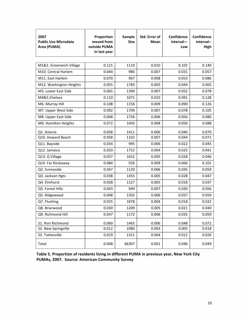
The PUMS data still contain sampling error, but the individual files allow us to estimate it more accurately.5 For example, in 2007 we have the following data (Table 5 on two pages) for the percent of the population who moved into a PUMA in the previous year. Standard errors run between one-‐half and one percent. While this leaves a fair amount of potential error, one generally can differentiate between low and high mobility PUMAs.
5 The ACS files are stratified samples that must be weighted to provide accurate population estimates. For most of the estimates in this paper, we use the PERWT variable to calculate total population size. However, in order to estimate sampling error, we use a weight that divides PERWT by its average figure (123). This produces a population estimate equal to the actual sample size, which allows for an estimate of standard errors and confidence intervals.

9
Public Use MIcrodata Area (PUMA)6
Proportion moved from
outside PUMA in last year
Sample Size
Std. Error of Mean
Confidence interval—
Low
Confidence interval-‐-‐
High
B1&2. Hunts Point 0.095 1197 0.008 0.079 0.112 B10. Co-‐op City 0.029 990 0.005 0.018 0.039
B11. Pelham Parkway 0.026 1023 0.005 0.016 0.035
B12. Wakefield 0.036 1186 0.005 0.026 0.047
B3&6.Belmont 0.061 1235 0.007 0.048 0.075
B4. Concourse 0.058 1108 0.007 0.044 0.072 B5. Morris Heights 0.033 1037 0.006 0.022 0.044
B7. Bedford Park 0.041 977 0.006 0.028 0.053
B8. Riverdale 0.068 909 0.008 0.052 0.085
B9. Castle Hill 0.043 1334 0.006 0.032 0.054
K1. Greenpoint 0.045 1170 0.006 0.033 0.057 K10. Bay Ridge 0.043 1021 0.006 0.031 0.056
K11. Bensonhurst 0.017 1478 0.003 0.011 0.024
K12. Borough Pk 0.017 1403 0.003 0.010 0.024
K13. Brighton Beach 0.033 869 0.006 0.021 0.044
K13. Flatbush 0.016 1287 0.004 0.009 0.023
K15. Sheepshead Bay 0.024 1102 0.005 0.015 0.033
K16. Ocean Hill Brownsville
0.036 959 0.006 0.024 0.048
K17. E. Flatbush 0.025 1088 0.005 0.016 0.034
K18. Canarsie 0.010 1629 0.002 0.005 0.014
K2. Brooklyn Heights Ft. Greene
0.089 941 0.009 0.071 0.108
K3. Bedford-‐Stuyvesant 0.042 1003 0.006 0.029 0.054
K4. Bushwick 0.039 1044 0.006 0.028 0.051
K5. East New York 0.036 1271 0.005 0.025 0.046
K6. Park Slope 0.066 869 0.008 0.050 0.083
K7. Sunset Park 0.039 1176 0.006 0.028 0.050
K8. Crown Heights 0.036 1031 0.006 0.025 0.047
K9. Crown Hgts South 0.038 892 0.006 0.025 0.050
6 The number and name assigned to each PUMA is based on the Community District number and name for each of the five boroughs. B = Bronx, K = Brooklyn, M = Manhattan, Q = Queens, and S = Staten Island.
10
2007 Public Use MIcrodata Area (PUMA)
Proportion
moved from outside PUMA
in last year
Sample
Size
Std. Error of
Mean
Confidence interval—
Low
Confidence interval-‐-‐
High
M1&2. Greenwich Village 0.121 1119 0.010 0.102 0.140
M10. Central Harlem 0.044 986 0.007 0.031 0.057
M11. East Harlem 0.070 967 0.008 0.053 0.086
M12. Washington Heights 0.055 1783 0.005 0.044 0.065
M3. Lower East Side 0.065 1390 0.007 0.052 0.078
M4&5.Chelsea 0.110 1071 0.010 0.091 0.128
M6. Murray Hill 0.108 1156 0.009 0.090 0.126
M7. Upper West Side 0.092 1709 0.007 0.078 0.105
M8. Upper East Side 0.068 1756 0.006 0.056 0.080
M9. Hamilton Heights 0.072 1043 0.008 0.056 0.088
Q1. Astoria 0.058 1411 0.006 0.046 0.070 Q10. Howard Beach 0.058 1102 0.007 0.044 0.071
Q11. Bayside 0.034 995 0.006 0.022 0.045
Q12. Jamaica 0.033 1752 0.004 0.025 0.041
Q13. Q Village 0.037 1631 0.005 0.028 0.046
Q14. Far Rockaway 0.084 926 0.009 0.066 0.101
Q2. Sunnyside 0.047 1120 0.006 0.035 0.059
Q3. Jackson Hgts 0.038 1455 0.005 0.028 0.047
Q4. Elmhurst 0.028 1127 0.005 0.018 0.037
Q5. Forest Hills 0.043 949 0.007 0.030 0.056
Q5. Ridgewood 0.048 1502 0.006 0.037 0.059
Q7. Flushing 0.025 1878 0.004 0.018 0.032
Q8. Briarwood 0.030 1209 0.005 0.021 0.040
Q9. Richmond Hill 0.047 1172 0.006 0.035 0.059
S1. Port Richmond 0.060 1465 0.006 0.048 0.072 S2. New Springville 0.012 1080 0.003 0.005 0.018
S3. Tottenville 0.019 1321 0.004 0.012 0.026
Total 0.048 66307 0.001 0.046 0.049
Table 5. Proportion of residents living in different PUMA in previous year, New York City PUMAs, 2007. Source: American Community Survey

11
Figure 3. Proportion of residents living in different PUMA in previous year, New York City PUMAs, 2007. Source: American Community Survey
Measures of geographic mobility
Our procedure for calculating measures of geographic mobility is similar to that used in previous papers. We use the percent of residents who moved in from outside the PUMA as our estimate of in-‐migration. We use this figure and the population at point A and point B to estimate the number and percent of people who moved out of the PUMA in the previous year. We make these estimates of in-‐ and out-‐migration for the entire PUMA and for two sets of sub-‐populations—based on race/ethnicity and on educational attainment—relevant for the displacement debate.7 For race/ethnicity, we estimate the proportion of blacks and Hispanics who moved out and the number of non-‐Hispanic whites who moved in during the previous year. For educational attainment, we estimate the proportion of adults (over the age of 25) with a BA degree or more who moved in
7 Our estimates of geographic mobility are dependent on residents having stable characteristics in the first and second year. Therefore, we use educational attainment as our measure of socio-‐economic status because it is more likely than poverty status or income to remain the same over a year.
PUMA
12
and the proportion of adults with a high school degree or less who moved out. Finally, we estimate the net migration by race/ethnicity and by educational attainment. Using these data we calculate three novel measures:
• Turnover rate: sum of the percent of residents who moved in and out of the PUMA in the previous year.
• Education churn: square root of the product of the percent of adults with a high-‐school degree or less who moved out of the PUMA and the percent of adults with a BA degree or more who moved in.
• Ethnic churn: square root of the product of the percent of blacks and Hispanics who moved out of the PUMA and the percent of non-‐Hispanic whites who moved in.
The last two measures vary from 0 (if either the in-‐migration or out-‐migration figure is zero) to 100 (if all of one group moved out and all of another moved in).
In our previous work, we have become aware of a flaw in our ethnic and educational churn indexes, which is particularly relevant in New York. Although these measures identify areas where one group is being displaced by another, they also identify places where both groups are characterized by high turnover but little change in their overall share of the population. For example, a place where 20 percent of lower-‐educated adults moved out and 20 percent of higher-‐educated adults moved in will have an education churn score of 20 percent. However, in some cases the 20 percent out-‐migration of lower-‐educated adults might be complemented with the in-‐migration of 20 percent of adults with the same low educational attainment. Therefore, the churn data must be compared to the overall turnover percentage and the net change data to draw correct conclusions.
One other social characteristic complicates the New York picture. A number of neighborhoods in the city have experienced a rapid increase in their population, typically associated with new residential construction. In these cases, the ethnic or educational profile of a neighborhood can change significantly without a decrease in the absolute size of any group.
Population increase
Net change in ethnic composition
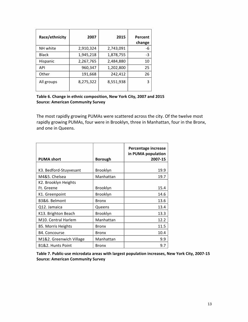
An important dimension of the changing demographic profile of New York City has been the city’s overall growth of population. Between 2007 and 2015, according to the ACS, the total population of the city grew from 8.27 to 8.55 million, an increase of 3.3 percent. This increase was accompanied by a significant shift in the city’s ethnic composition. The non-‐Hispanic white and black populations declined by six and three percent, respectively. This decline was balanced by increases of 10 percent among Hispanics, 25 percent among Asian-‐Pacific Islanders, and 26 percent among other races (including more than one).
13
Race/ethnicity 2007 2015 Percent change
NH white 2,910,324 2,743,091 -‐6 Black 1,945,218 1,878,755 -‐3 Hispanic 2,267,765 2,484,880 10 API 960,347 1,202,800 25 Other 191,668 242,412 26
All groups
8,275,322 8,551,938 3
Table 6. Change in ethnic composition, New York City, 2007 and 2015 Source: American Community Survey
The most rapidly growing PUMAs were scattered across the city. Of the twelve most rapidly growing PUMAs, four were in Brooklyn, three in Manhattan, four in the Bronx, and one in Queens.
PUMA short Borough
Percentage increase in PUMA population
2007-‐15
K3. Bedford-‐Stuyvesant Brooklyn 19.9 M4&5. Chelsea Manhattan 19.7 K2. Brooklyn Heights Ft. Greene Brooklyn 15.4 K1. Greenpoint Brooklyn 14.6 B3&6. Belmont Bronx 13.6 Q12. Jamaica Queens 13.4 K13. Brighton Beach Brooklyn 13.3 M10. Central Harlem Manhattan 12.2 B5. Morris Heights Bronx 11.5 B4. Concourse Bronx 10.4 M1&2. Greenwich Village Manhattan 9.9 B1&2. Hunts Point Bronx 9.7
Table 7. Public-‐use microdata areas with largest population increases, New York City, 2007-‐15 Source: American Community Survey
14
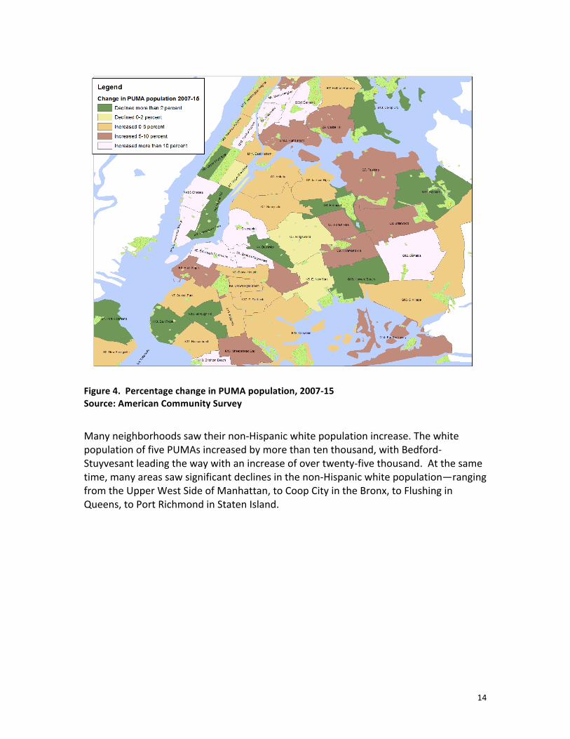
Figure 4. Percentage change in PUMA population, 2007-‐15 Source: American Community Survey
Many neighborhoods saw their non-‐Hispanic white population increase. The white population of five PUMAs increased by more than ten thousand, with Bedford-‐Stuyvesant leading the way with an increase of over twenty-‐five thousand. At the same time, many areas saw significant declines in the non-‐Hispanic white population—ranging from the Upper West Side of Manhattan, to Coop City in the Bronx, to Flushing in Queens, to Port Richmond in Staten Island.

15
PUMA
Change in non-‐Hispanic white
population, 2007-‐15
Change in non-‐Hispanic white population as
percent of 2007 population
Highest percentage increases K16. Ocean Hill Brownsville 2,105 261.5 K3. Bedford-‐Stuyvesant 25,747 166.6 B4. Concourse 1,990 129.9 K4. Bushwick 12,677 125.5 K9. Crown Hgts South 13,359 117.5 M10. Central Harlem 11,204 112.6 K17. E. Flatbush 1,980 85.5 K8. Crown Heights 8,888 45.8 B1&2. Hunts Point 891 32.8 K2. Brooklyn Heights Ft. Greene 14,834 31.1 M11. East Harlem 3,834 30.4 B9. Castle Hill 1,326 20.5 M12. Washington Heights 7,791 20.2
Greatest decline in non-‐Hispanic white population 2007-‐15
Q13. Q Village -‐5,921 -‐20.6 K18. Canarsie -‐12,810 -‐21.2 M7. Upper West Side -‐36,695 -‐22.6 K11. Bensonhurst -‐25,546 -‐24.8 S1. Port Richmond -‐19,504 -‐24.9 B11. Pelham Parkway -‐11,151 -‐28.8 Q7. Flushing -‐25147 -‐29.8 Q9. Richmond Hill -‐11,299 -‐30.4 Q11. Bayside -‐20,388 -‐31.1 Q4. Elmhurst -‐3,294 -‐31.4 Q12. Jamaica -‐1,682 -‐35.7 B5. Morris Heights -‐649 -‐37.7 B10. Co-‐op City -‐24,277 -‐42.6 K5. E. New York -‐4,077 -‐46.8
Table 8. PUMAs with largest increases and decreases in non-‐Hispanic white population, New York City, 2007-‐15 Source: American Community Survey

16
Much of the displacement narrative concerns neighborhoods in which significant numbers of whites are moving into a neighborhood and African Americans are moving out. Below is a table of the city’s neighborhoods with the largest declines in numbers in the black population between 2007 and 2015. Clearly, central Brooklyn shows the clearest evidence of black residents being replaced by non-‐Hispanic whites. During this period, the two Crown Heights PUMAs together lost over thirty-‐two thousand black residents and gained twenty-‐two thousand non-‐Hispanic whites. In Bedford-‐Stuyvesant, just under twelve thousand black residents were replaced with more than twenty-‐five thousand white residents, which explain the large increase in the PUMA’s population. Along similar lines, in Brooklyn Heights/Fort Greene just under six thousand black residents were replaced with almost fifteen thousand whites. The other notable shift from black to white residents was in upper Manhattan—Hamilton Heights and Central Harlem—where together the black population declined by more than twenty thousand and the white population increased by sixteen thousand.
Table 9. Change in non-‐Hispanic white and black population, New York City PUMAs with largest decreases in black population, 2007-‐15 Source: American Community Survey
PUMA
Change in white population
Change in black population
K8. Crown Heights 8,888 -‐17,619 K9. Crown Heights South 13,359 -‐14,781 M9. Hamilton Heights 4,980 -‐12,174 K3. Bedford-‐Stuyvesant 25,747 -‐11,643 Q10. Howard Beach -‐1,572 -‐10,466 M10. Central Harlem 11,204 -‐8,571 Q13. Q Village -‐5,921 -‐6,733 B12. Wakefield -‐133 -‐6,078 K2. Brooklyn Heights Ft. Greene 14,834 -‐5,893

17
If we combine the shifting numbers of blacks and whites in each PUMA with changes in the total population, we can evaluate the changing percentage of blacks and whites. Unsurprisingly, the two percentages are correlated. More surprising, however, is the relatively small number of PUMAs that record relatively high increases of whites and decreases of blacks as a percent of total population. By this measure, Hamilton Heights and Central Harlem in Manhattan and Bedford-‐Stuyvesant, Crown Heights, and Brooklyn Heights/Fort Greene in Brooklyn stand out as the primary areas of rapid racial change.
Figure 5. Scatterplot. Percent change in non-‐Hispanic black and white population, New York City PUMAs, 2007-‐15 Source: American Community Survey

18
Net change in educational attainment
The educational attainment profile of the city’s population also changed over these years. Overall, the proportion of the adult population that had at least a bachelor’s degree increased from 33 percent in 2007 to 37 percent in 2015. As with ethnicity, certain PUMAs benefited from increased educational attainment more than others. Bushwick and Greenpoint in Brooklyn and Astoria in Queens showed the largest increases during these years in the share of the population with at least a BA. As shown on the following table and scatterplot, changes in educational attainment were weakly correlated with changes in the ethnic composition of the PUMA, with an r-‐square of only .21.
PUMA
Change in BA plus, 2007-‐15
Change in non-‐Hispanic
white, 2007-‐15
K4. Bushwick 14.7 11.0 Q1. Astoria 13.8 1.5 K1. Greenpoint 13.4 0.4 K6. Park Slope 13.3 5.3 M1&2. Greenwich Village 11.5 -‐3.2 K10. Bay Ridge 10.7 -‐9.6 M3. Lower East Side 10.6 1.9 K8. Crown Heights 10.2 7.1 M10. Central Harlem 9.9 6.7 M11. East Harlem 8.9 3.0 K2. Brooklyn Heights Ft. Greene 8.7 5.8 K3. Bedford-‐Stuyvesant 8.6 15.1 Q2. Sunnyside 7.6 -‐2.8
Table 10. Percentage change in the BA-‐plus and non-‐Hispanic white population, New York City PUMAs, 2007-‐15 Source: American Community Survey

19
Figure 6. Scatterplot. Percent change in non-‐Hispanic white and in BA and higher educational attainment, New York City PUMAs, 2007-‐15
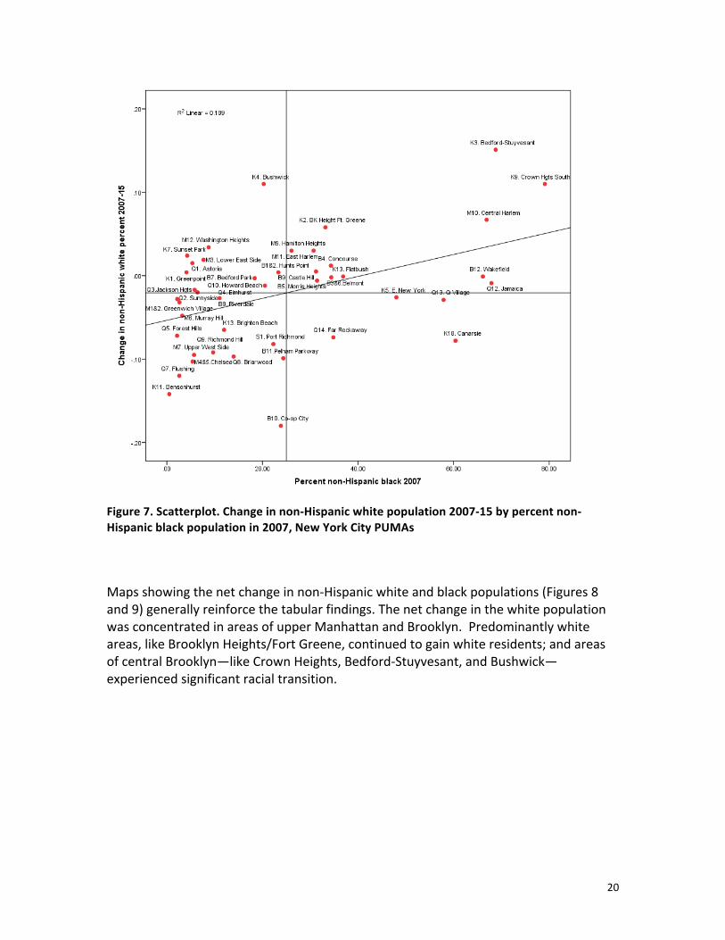
Increases in the white population often occurred in sections of the city that had historically been predominantly African American, as shown on the scatterplot in Figure 7. Again, central Brooklyn neighborhoods like Bedford-‐Stuyvesant and Crown Heights showed the strongest association between increases in their white population and their ethnic composition in 2007. Central Harlem and Brooklyn Heights/Fort Greene, where the racial transition began well before 2007, still saw its non-‐Hispanic white population increase markedly.
20
Figure 7. Scatterplot. Change in non-‐Hispanic white population 2007-‐15 by percent non-‐Hispanic black population in 2007, New York City PUMAs
Maps showing the net change in non-‐Hispanic white and black populations (Figures 8 and 9) generally reinforce the tabular findings. The net change in the white population was concentrated in areas of upper Manhattan and Brooklyn. Predominantly white areas, like Brooklyn Heights/Fort Greene, continued to gain white residents; and areas of central Brooklyn—like Crown Heights, Bedford-‐Stuyvesant, and Bushwick—experienced significant racial transition.

21
Figure 8. Percent change in non-‐Hispanic white population, New York City PUMAs, 2007-‐15
Figure 9. Percent change in non-‐Hispanic black population, New York City PUMAs, 2007-‐15

22
The map of changes in the college-‐educated population is a bit more difficult to describe. Areas in the highest quintile (over 9 percent increase) included most of the neighborhoods with increased white population in upper Manhattan and Brooklyn, as well as several sections of Queens and the Bronx.
Figure 10. Percent change in adults with at least a BA, New York City PUMAs, 2007-‐15

23
As the previous tables and figures indicate, although there is a correlation between the net change in the BA-‐plus and non-‐Hispanic white population between 2007 and 2015, the association is not perfect. Certainly, it’s clear that a number of neighborhoods in central Brooklyn—Including Bushwick, Crown Heights, and Bed-‐Stuy—have experienced both trends. At the same time, a number of neighborhoods—as shown in the lower right quadrant of the scatterplot on Figure 11—saw their BA-‐plus percentage increase as their non-‐Hispanic white population declined, typically because of an increase in the Hispanic or Asian population.
Figure 11. Scatterplot. Change in percent of adults with BA or plus and change in non-‐Hispanic whites, 2007-‐2015 Source: American Community Survey
24
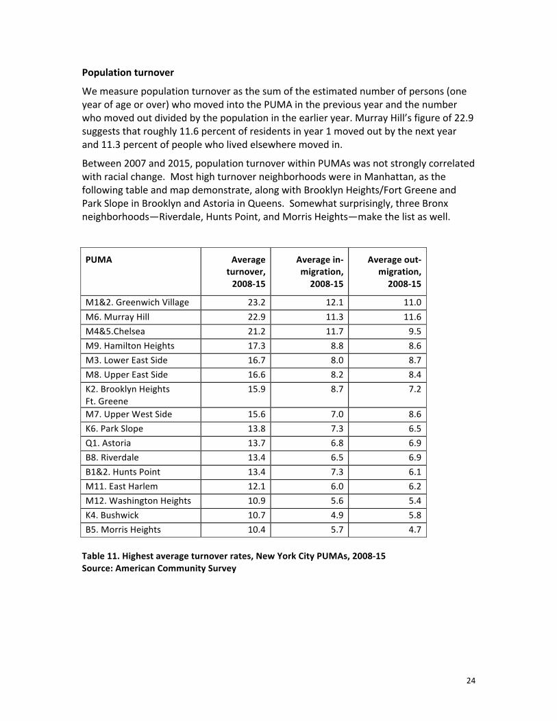
Population turnover
We measure population turnover as the sum of the estimated number of persons (one year of age or over) who moved into the PUMA in the previous year and the number who moved out divided by the population in the earlier year. Murray Hill’s figure of 22.9 suggests that roughly 11.6 percent of residents in year 1 moved out by the next year and 11.3 percent of people who lived elsewhere moved in.
Between 2007 and 2015, population turnover within PUMAs was not strongly correlated with racial change. Most high turnover neighborhoods were in Manhattan, as the following table and map demonstrate, along with Brooklyn Heights/Fort Greene and Park Slope in Brooklyn and Astoria in Queens. Somewhat surprisingly, three Bronx neighborhoods—Riverdale, Hunts Point, and Morris Heights—make the list as well.
PUMA Average turnover, 2008-‐15
Average in-‐migration, 2008-‐15
Average out-‐migration, 2008-‐15
M1&2. Greenwich Village 23.2 12.1 11.0 M6. Murray Hill 22.9 11.3 11.6 M4&5.Chelsea 21.2 11.7 9.5 M9. Hamilton Heights 17.3 8.8 8.6 M3. Lower East Side 16.7 8.0 8.7 M8. Upper East Side 16.6 8.2 8.4 K2. Brooklyn Heights Ft. Greene
15.9 8.7 7.2
M7. Upper West Side 15.6 7.0 8.6 K6. Park Slope 13.8 7.3 6.5 Q1. Astoria 13.7 6.8 6.9 B8. Riverdale 13.4 6.5 6.9 B1&2. Hunts Point 13.4 7.3 6.1 M11. East Harlem 12.1 6.0 6.2 M12. Washington Heights 10.9 5.6 5.4 K4. Bushwick 10.7 4.9 5.8 B5. Morris Heights 10.4 5.7 4.7 Table 11. Highest average turnover rates, New York City PUMAs, 2008-‐15 Source: American Community Survey
25
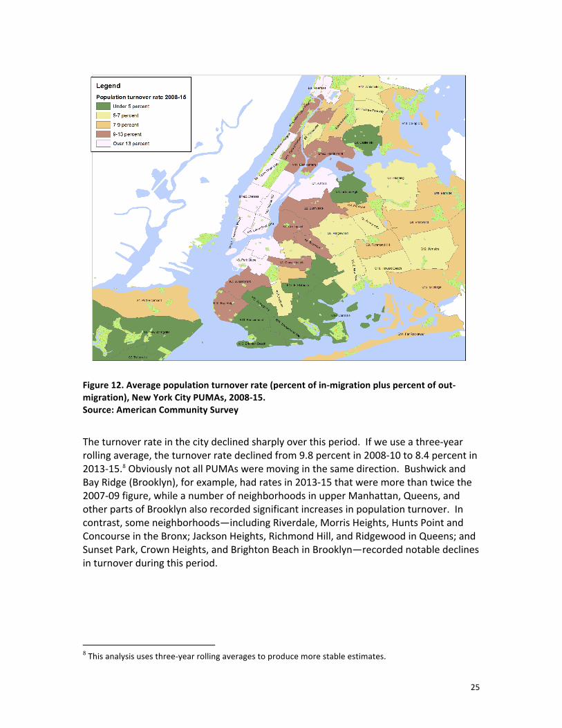
Figure 12. Average population turnover rate (percent of in-‐migration plus percent of out-‐migration), New York City PUMAs, 2008-‐15. Source: American Community Survey
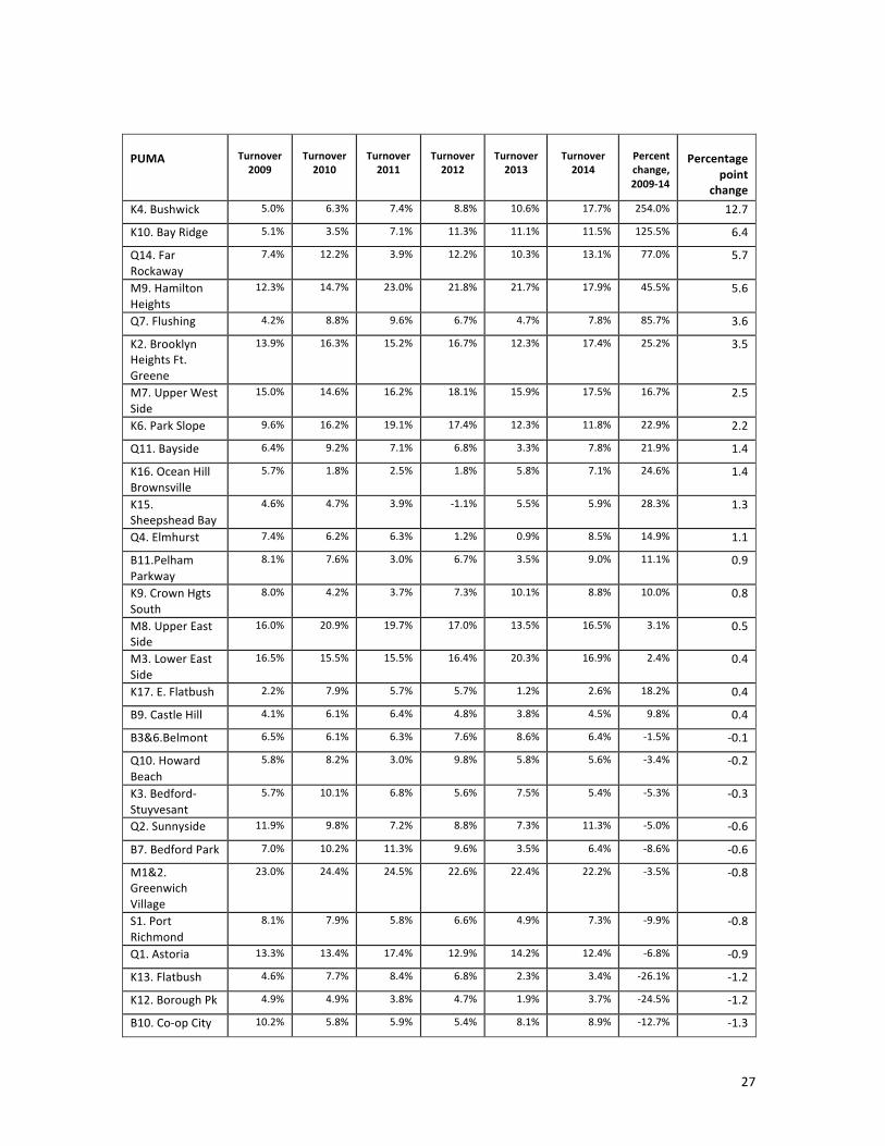
The turnover rate in the city declined sharply over this period. If we use a three-‐year rolling average, the turnover rate declined from 9.8 percent in 2008-‐10 to 8.4 percent in 2013-‐15.8 Obviously not all PUMAs were moving in the same direction. Bushwick and Bay Ridge (Brooklyn), for example, had rates in 2013-‐15 that were more than twice the 2007-‐09 figure, while a number of neighborhoods in upper Manhattan, Queens, and other parts of Brooklyn also recorded significant increases in population turnover. In contrast, some neighborhoods—including Riverdale, Morris Heights, Hunts Point and Concourse in the Bronx; Jackson Heights, Richmond Hill, and Ridgewood in Queens; and Sunset Park, Crown Heights, and Brighton Beach in Brooklyn—recorded notable declines in turnover during this period.
8 This analysis uses three-‐year rolling averages to produce more stable estimates.

26
Figure 13. Change in turnover rate, three-‐year rolling averages, 2008-‐10 to 2013-‐15, New York City PUMAs Source: American Community Survey
27
PUMA
Turnover 2009
Turnover 2010
Turnover 2011
Turnover 2012
Turnover 2013
Turnover 2014
Percent change, 2009-‐14
Percentage
point change
K4. Bushwick 5.0% 6.3% 7.4% 8.8% 10.6% 17.7% 254.0% 12.7
K10. Bay Ridge 5.1% 3.5% 7.1% 11.3% 11.1% 11.5% 125.5% 6.4
Q14. Far Rockaway
7.4% 12.2% 3.9% 12.2% 10.3% 13.1% 77.0% 5.7
M9. Hamilton Heights
12.3% 14.7% 23.0% 21.8% 21.7% 17.9% 45.5% 5.6
Q7. Flushing 4.2% 8.8% 9.6% 6.7% 4.7% 7.8% 85.7% 3.6
K2. Brooklyn Heights Ft. Greene
13.9% 16.3% 15.2% 16.7% 12.3% 17.4% 25.2% 3.5
M7. Upper West Side
15.0% 14.6% 16.2% 18.1% 15.9% 17.5% 16.7% 2.5
K6. Park Slope 9.6% 16.2% 19.1% 17.4% 12.3% 11.8% 22.9% 2.2
Q11. Bayside 6.4% 9.2% 7.1% 6.8% 3.3% 7.8% 21.9% 1.4
K16. Ocean Hill Brownsville
5.7% 1.8% 2.5% 1.8% 5.8% 7.1% 24.6% 1.4
K15. Sheepshead Bay
4.6% 4.7% 3.9% -‐1.1% 5.5% 5.9% 28.3% 1.3
Q4. Elmhurst 7.4% 6.2% 6.3% 1.2% 0.9% 8.5% 14.9% 1.1
B11.Pelham Parkway
8.1% 7.6% 3.0% 6.7% 3.5% 9.0% 11.1% 0.9
K9. Crown Hgts South
8.0% 4.2% 3.7% 7.3% 10.1% 8.8% 10.0% 0.8
M8. Upper East Side
16.0% 20.9% 19.7% 17.0% 13.5% 16.5% 3.1% 0.5
M3. Lower East Side
16.5% 15.5% 15.5% 16.4% 20.3% 16.9% 2.4% 0.4
K17. E. Flatbush 2.2% 7.9% 5.7% 5.7% 1.2% 2.6% 18.2% 0.4
B9. Castle Hill 4.1% 6.1% 6.4% 4.8% 3.8% 4.5% 9.8% 0.4
B3&6.Belmont 6.5% 6.1% 6.3% 7.6% 8.6% 6.4% -‐1.5% -‐0.1
Q10. Howard Beach
5.8% 8.2% 3.0% 9.8% 5.8% 5.6% -‐3.4% -‐0.2
K3. Bedford-‐Stuyvesant
5.7% 10.1% 6.8% 5.6% 7.5% 5.4% -‐5.3% -‐0.3
Q2. Sunnyside 11.9% 9.8% 7.2% 8.8% 7.3% 11.3% -‐5.0% -‐0.6
B7. Bedford Park 7.0% 10.2% 11.3% 9.6% 3.5% 6.4% -‐8.6% -‐0.6
M1&2. Greenwich Village
23.0% 24.4% 24.5% 22.6% 22.4% 22.2% -‐3.5% -‐0.8
S1. Port Richmond
8.1% 7.9% 5.8% 6.6% 4.9% 7.3% -‐9.9% -‐0.8
Q1. Astoria 13.3% 13.4% 17.4% 12.9% 14.2% 12.4% -‐6.8% -‐0.9
K13. Flatbush 4.6% 7.7% 8.4% 6.8% 2.3% 3.4% -‐26.1% -‐1.2
K12. Borough Pk 4.9% 4.9% 3.8% 4.7% 1.9% 3.7% -‐24.5% -‐1.2
B10. Co-‐op City 10.2% 5.8% 5.9% 5.4% 8.1% 8.9% -‐12.7% -‐1.3
28
K1. Greenpoint 8.9% 11.2% 9.0% 9.6% 9.4% 7.2% -‐19.1% -‐1.7
S3. Tottenville 3.5% 2.0% 2.7% 4.1% 2.8% 1.8% -‐48.6% -‐1.7
M6. Murray Hill 22.6% 23.4% 29.7% 22.9% 23.1% 20.7% -‐8.4% -‐1.9
K18. Canarsie 3.2% 4.0% 5.4% 3.5% 1.9% 1.0% -‐68.8% -‐2.2
K11. Bensonhurst
8.4% 5.7% -‐0.3% 1.1% 4.1% 6.2% -‐26.2% -‐2.2
Q12. Jamaica 7.3% 6.1% 7.0% 4.6% 5.5% 4.8% -‐34.2% -‐2.5
K5. E. New York 8.0% 8.4% 6.9% 3.7% 3.2% 5.1% -‐36.3% -‐2.9
B12. Wakefield 8.3% 5.6% 5.5% 5.9% 8.5% 5.3% -‐36.1% -‐3
Q13. Q Village 8.7% 9.3% 7.9% 8.2% 8.0% 5.5% -‐36.8% -‐3.2
M10. Central Harlem
11.1% 13.7% 6.4% 4.7% 6.1% 7.8% -‐29.7% -‐3.3
M11. East Harlem
15.5% 13.0% 9.0% 10.4% 8.4% 12.1% -‐21.9% -‐3.4
Q5. Forest Hills 7.5% 7.4% 8.9% 7.8% 9.9% 4.0% -‐46.7% -‐3.5
S2. New Springville
6.8% 11.4% 10.8% 3.9% 3.1% 3.0% -‐55.9% -‐3.8
M12. Washington Heights
13.5% 10.6% 9.5% 8.4% 7.8% 9.6% -‐28.9% -‐3.9
Q8. Briarwood 11.3% 8.7% 10.8% 6.1% 5.8% 7.1% -‐37.2% -‐4.2
B1&2. Hunts Point
15.9% 15.0% 12.6% 11.0% 9.3% 11.3% -‐28.9% -‐4.6
K7. Sunset Park 13.3% 11.6% 14.5% 7.3% 9.3% 8.5% -‐36.1% -‐4.8
B4. Concourse 6.5% 7.7% 7.0% 9.5% 5.8% 1.7% -‐73.8% -‐4.8
Q3. Jackson Hgts 8.4% 8.4% 7.1% 1.3% 4.9% 3.4% -‐59.5% -‐5
Q9. Richmond Hill
11.2% 10.6% 9.3% 4.8% 9.4% 6.0% -‐46.4% -‐5.2
K8. Crown Heights
12.7% 9.1% 11.1% 7.5% 9.2% 6.2% -‐51.2% -‐6.5
Q5. Ridgewood 9.2% 5.5% 11.0% 8.4% 6.6% 2.6% -‐71.7% -‐6.6
K13. Brighton Beach
4.4% 3.4% 5.6% 1.5% -‐0.4% -‐2.3% -‐152.3% -‐6.7
B8. Riverdale 18.3% 19.8% 13.3% 9.3% 10.1% 9.7% -‐47.0% -‐8.6
B5. Morris Heights
14.5% 13.5% 18.1% 12.0% 10.4% 3.9% -‐73.1% -‐10.6
M4&5. Chelsea 26.2% 25.1% 25.9% 20.1% 21.3% 15.6% -‐40.5% -‐10.6
Total 9.8% 10.1% 9.8% 8.7% 8.3% 8.4% -‐13.9% -‐1.356
Table 12. Annual turnover rate (three-‐year rolling average), New York City PUMAs, 2009-‐14 Source: American Community Survey
Note: Year is the mid-‐point of a three-‐year rolling average.

29
Relationship of turnover to ethnic and educational change
Turnover by PUMA was weakly correlated with the net educational change in the population. The vast majority of high turnover neighborhoods—like Greenwich Village and Chelsea in Manhattan—also saw an increase in their average educational attainment, but the same could be said for many low turnover neighborhoods, as shown on the scatterplot below.
Figure 14. Scatterplot. Change in percent with BA or higher by average turnover rate, New York City PUMAs, 2007-‐15 Source: American Community Survey
A similar pattern was present in the relationship between population turnover and ethnic change. A number of the highest turnover neighborhoods—including Hamilton Heights and the Lower East Side in Manhattan—also experienced significant shifts in the ethnic composition. However, others—like Manhattan’s Upper East Side and Upper West Side—actually experienced a decline in their non-‐Hispanic white percentage during these years. Finally, several neighborhoods that experienced rapid ethnic change—like Central Harlem in Manhattan and Crown Heights South and Bedford-‐Stuyvesant in Brooklyn—had below average population turnover.

30
Figure 15. Scatterplot. Change in percent non-‐Hispanic white by average population turnover rate, New York City PUMAs, 2007-‐2015 Source: American Community Survey
Educational churn
We calculate educational churn as the square root of the product of the percent of adults with a high-‐school degree or less who moved out of a PUMA in the previous year and the percent of adults with a BA or more who moved in during the year.
The following figure plots New York City’s PUMAs along the two variables that make up the educational churn index. Neighborhoods that would have the highest scores on this index are in the upper right quadrant—places with a high percent of BAs moving into the area and many high school graduates moving out. Out of the 55 PUMAs in the city, only six have above average scores on both. Most of the high-‐turnover neighborhoods are in the upper left quadrant, places with high in-‐migration of BAs but relatively low rates of displaced adults with a high school degree or less. As the names of these areas make clear, these are already affluent areas that attracted more well-‐educated residents.

31
Figure 16. Scatterplot. Average out-‐migration of adults with high-‐school degree or less and in-‐migration of those with a BA or more education, New York City PUMAs, 2008-‐15 Source: American Community Survey
A list of the PUMAs with the highest educational churn index underlines this pattern. Most of the PUMAs on the list had much higher in-‐migration of BAs than out-‐migration of those with lower educational attainment. Among the highest educational churn areas, only the Lower East Side and East Harlem stand out as having a considerable volume of in-‐ and out-‐migration.

32
PUMA Average educational
churn, 2008-‐15
Average in-‐migration BA plus, 2008-‐15
Average out-‐migration less than HS grad, 2008-‐15
M9. Hamilton Heights 3.1 4.4% 1.6% M4&5.Chelsea 3.0 7.0% 0.8% M6. Murray Hill 3.0 6.9% 1.1% M1&2. Greenwich Village 2.7 7.8% 1.2% K2. Brooklyn Heights Ft. Greene
2.7 6.0% 0.5%
B8. Riverdale 2.7 2.7% 2.7% M8. Upper East Side 2.6 6.0% 0.3% M12. Washington Heights 2.5 2.5% 1.6% M7. Upper West Side 2.4 5.0% 0.3% M11. East Harlem 2.1 2.6% 3.1% M3. Lower East Side 1.8 2.8% 3.8% Q1. Astoria 1.8 4.2% 2.0% K6. Park Slope 1.7 6.1% 1.4%
Table 13. Educational churn index, New York City PUMAs, 2008-‐15 Source: American Community Survey
Figure 17. Educational churn index, New York City PUMAs, 2008-‐15 Source: American Community Survey

33
Ethnic churn
In contrast to educational churn, ethnic churn in New York City neighborhoods shows a very strong pattern. A quarter of the city’s PUMAs display both a sharp in-‐migration of non-‐Hispanic whites and out-‐migration of blacks and Hispanics in the neighborhood. These neighborhoods generally share two characteristics: they were already higher-‐income neighborhoods in the early 2000s, and they have the highest population turnover rates in the city. In addition to established predominantly white neighborhoods like the Upper East Side (Manhattan) and Park Slope (Brooklyn), a few transitional neighborhoods—like Greenpoint (Brooklyn) and Hamilton Heights (Manhattan)—are also included in this group.
Figure 18. Scatterplot. Average in-‐migration of non-‐Hispanic whites and out-‐migration of black and Hispanics, New York City PUMAs, 2008-‐15 Source: American Community Survey

34
PUMA Average ethnic churn 2008-‐15
Average in-‐migration non-‐Hispanic whites
2008-‐15
Average out-‐migration blacks
and Hispanics 2008-‐15
M1&2. Greenwich Village 8.6 8.7% 8.4% M6. Murray Hill 7.7 7.3% 8.1% M4&5.Chelsea 7.1 7.1% 7.0% M8. Upper East Side 6.1 5.6% 6.7% M7. Upper West Side 5.8 4.7% 7.1% K6. Park Slope 5.1 5.7% 4.5% K2. Brooklyn Heights Ft. Greene
4.8 5.6% 4.1%
Q1. Astoria 4.1 4.2% 4.0% M3. Lower East Side 4.0 4.0% 3.9% M9. Hamilton Heights 3.9 4.1% 3.7% K1. Greenpoint 3.0 3.6% 2.6% K10. Bay Ridge 3.0 2.4% 3.8% B8. Riverdale 2.9 2.6% 3.2% Table 14. Average in-‐migration of non-‐Hispanic whites and out-‐migration of black and Hispanics, New York City PUMAs with highest ethnic churn index, 2008-‐15 Source: American Community Survey

35
Figure 19. Ethnic churn index, New York City PUMAs, 2008-‐15 Source: American Community Survey
Patterns of rapid neighborhood change
The previous sections of this paper support the idea that neighborhood change in New York in a multi-‐faceted process. Certainly, there is ample evidence to support the concern that classic gentrification—the displacement of one less-‐privileged social group by one that is more privileged—is affecting a number of neighborhoods, but this hardly accounts for all of the social processes that we’ve uncovered. In particular, we’ve found a lack of fit between neighborhoods undergoing net population change–change between point A (year 1) and point B (year 2)—and population turnover—the rate at which some individuals and groups enter and leave the neighborhood annually. Finally, the change profile of other neighborhoods has been driven by the city’s rapid population growth in recent years.
In order to bring some order to this complex field, we used factor analysis—a data reduction technique—to take the variables we’ve analyzed so far and assess if they can be sorted into a few meaningful groups. The following table displays the variables included in the analysis and their factor loading, that is, how strongly the individual variable influences the factors.

36
As Table 15 shows, the analysis produced two factors, which together explained 74 percent of the variance in all of the variables. The first factor was most strongly related to our measures of population turnover and in-‐ and out-‐migration. It had the highest loadings for overall turnover, out-‐migration of blacks and Hispanics and in-‐migration of people with BAs and non-‐Hispanics whites. The second factor was most strongly associated with the increase in the non-‐Hispanic white population and declines in the black population.
Variable Turnover factor
Ethnic and educational
change factor Average turnover, 2008-‐15 0.922 Change in non-‐Hispanic white percent, 2007-‐15 0.925 Change in BA or higher percent, 2007-‐15 0.421 0.637 Change in non-‐Hispanic black population percent, 2007-‐15
0.100 -‐0.772
Average out-‐migration blacks and Hispanics, 2008-‐15 0.896 -‐0.404 Average in-‐migration BA plus, 2008-‐15 0.975 Average out-‐migration HS grad or less, 2008-‐15 -‐0.118 0.352 Average in-‐migration non-‐Hispanic whites, 2008-‐15 0.989
Table 15. Factor analysis, factor loading. New York City PUMAs, 2008-‐15 Source: American Community Survey. Note: factor loading below .1 were suppressed.
A scatterplot of the two factors sorts PUMAs into four groups (Figure 20). A small number of neighborhoods (top right quadrant) had high scores on both factors, including Brooklyn Heights/Fort Greene and Park Slope in Brooklyn and Hamilton Heights and the Lower East Side in Manhattan. These neighborhoods experienced rapid rates of in-‐ and out-‐migration and a net change in their population composition over time. Another set of neighborhoods (bottom right quadrant) experienced high levels of turnover but little change in their population profile over time. By in large these are affluent white neighborhoods that had many people moving in and out, but the inflows looked similar to the outflows. The third population group (upper left quadrant) did not see a large percentage of their population move in or out in a particular year, but nevertheless experienced significant change in their population profile between 2007 and 2015. Finally, the vast majority of PUMAs ended up in the bottom left quadrant, neighborhoods that experienced neither high population turnover nor net change over time.

37
Figure 20. Scatterplot. Turnover and ethnic and educational change factors, New York City PUMAs, 2008-‐15 Source: American Community Survey.
We classified PUMAs using 0.5 standard deviation above average as our cutoff. Based on this criterion, five PUMAs—9 percent of the total—experienced both turnover and net change; seven areas (13 percent) displayed high turnover but little net change; and nine areas (16 percent) experienced only net change over time.

38
The following table (Table 16 on two pages) shows a variety of indicators for the PUMAs in each of these categories. The table largely confirms what the scatterplot shows. One additional element is the role of population change in influencing other forms of neighborhood change. The areas experiencing both types of change—population turnover and ethnic and educational change—and those experiencing only net population change had much higher than average levels of population growth. Among the first group, Brooklyn Heights/Fort Greene and Park Slope recorded increases of 15 and 7 percent, respectively, between 2007 and 2015. Among the ethnic and change only category, three neighborhoods experienced increases of over ten percent—Concourse in the Bronx (10 percent), Central Harlem (12 percent), and Bedford Stuyvesant (20 percent). The high turnover only neighborhoods are interesting with respect to population change as well. Four out of seven saw their population decline between 2007 and 2015, with the Upper West Side having the largest decline (12 percent). Yet, the other three neighborhoods recorded increases of 10, 15, and 20 percent.
PUMA Turnover factor
Ethnic and education change factor
Average ethnic churn 2008-‐15
Average education churn 2008-‐15
Change in non-‐Hispanic white percent 2007-‐15
Change in BA or higher percent 2007-‐15
Popu-‐lation change (%)
K2. Brooklyn Heights Ft. Greene 1.67 1.04 4.80 2.67 0.06 0.09 15.43
K6. Park Slope 1.76 0.97 5.06 1.73 0.05 0.13 7.24
M3. Lower East Side 1.04 0.82 3.97 1.84 0.02 0.11 -‐5.05
M9. Hamilton Heights 1.21 0.98 3.91 3.11 0.03 0.07 1.54
Q1. Astoria 1.24 0.64 4.08 1.84 0.02 0.14 0.02
Total 1.38 0.89 4.36 2.24 0.04 0.11 3.84

39
PUMA Turnover factor
Ethnic and education change factor
Average ethnic churn 2008-‐15
Average education churn 2008-‐15
Change in non-‐Hispanic white percent 2007-‐15
Change in BA or higher percent 2007-‐15
Popula-‐tion change (%)
TURNOVER ONLY
B8. Riverdale 0.50 -‐0.28 2.92 2.67 -‐0.03 0.05 -‐0.83
K1. Greenpoint 0.77 0.49 3.05 1.07 0.00 0.13 14.56 M1&2. Greenwich Village 3.19 -‐0.19 8.57 2.74 -‐0.03 0.12 9.92
M4&5.Chelsea 2.49 -‐0.96 7.08 2.99 -‐0.10 0.06 19.75
M6. Murray Hill 2.72 -‐0.65 7.68 2.99 -‐0.05 0.07 -‐2.51
M7. Upper West Side 1.43 -‐1.80 5.78 2.43 -‐0.10 -‐0.03 -‐11.70
M8. Upper East Side 1.67 -‐1.43 6.11 2.60 -‐0.07 -‐0.03 -‐1.55
Total 1.82 -‐0.69 5.88 2.50 -‐0.05 0.05 3.95
ETHNIC AND EDUCATIONAL CHANGE ONLY
B4. Concourse -‐0.75 0.72 0.00 0.00 0.01 0.06 10.40
K3. Bedford-‐Stuyvesant -‐0.52 2.78 0.00 0.35 0.15 0.09 19.92
K4. Bushwick 0.16 1.81 1.09 0.65 0.11 0.15 -‐6.06
K7. Sunset Park -‐0.12 0.76 1.35 1.54 0.02 0.05 1.96
K8. Crown Heights 0.25 2.06 1.89 1.54 0.07 0.10 1.02
K9. Crown Hgts South -‐0.43 2.01 0.00 1.28 0.11 0.05 3.00
M10. Central Harlem -‐0.16 2.00 0.75 1.01 0.07 0.10 12.24
M11. East Harlem 0.24 0.74 1.67 2.09 0.03 0.09 0.62
Q10. Howard Beach -‐0.73 0.76 0.47 0.00 -‐0.01 0.06 -‐1.61
Total -‐0.23 1.51 0.80 0.94 0.06 0.08 4.61
Table 16. Indicators of neighborhood change, by type of change, New York City PUMAs, 2008-‐15 Source: American Community Survey

40
Figure 21. Type of neighborhood change, New York City PUMAs, 2008-‐15 Source: American Community Survey
Cultural assets and neighborhood change
SIAP’s interest in neighborhood change, of course, is associated with the conventional wisdom that cultural assets are one of the stimulants of gentrification. In this final section, we investigate the relationship between our various measures of neighborhood change and SIAP’s Cultural Asset Index (CAI), which uses data on nonprofit cultural organizations, for-‐profit cultural firms, resident artists, and cultural participation to estimate the overall concentration of cultural resources of New York’s neighborhoods.
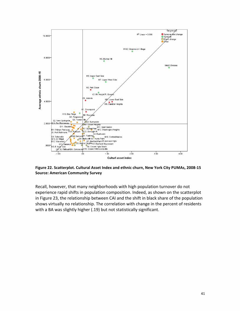
At first glance, it appears that cultural assets are indeed strongly associated with the ethnic churn of the population. As the scatterplot in Figure 22 suggests, the relationship between cultural assets and ethnic churn (the extent to which African Americans and Hispanics are moving out of a neighborhood and non-‐Hispanic whites are moving in), with a correlation coefficient of .77, is very strong. The correlation of CAI with the educational churn index, with a correlation coefficient of .69, is not quite as strong.
41
Figure 22. Scatterplot. Cultural Asset Index and ethnic churn, New York City PUMAs, 2008-‐15 Source: American Community Survey
Recall, however, that many neighborhoods with high population turnover do not experience rapid shifts in population composition. Indeed, as shown on the scatterplot in Figure 23, the relationship between CAI and the shift in black share of the population shows virtually no relationship. The correlation with change in the percent of residents with a BA was slightly higher (.19) but not statistically significant.

42
Figure 23. Scatterplot. Cultural Asset Index and change in non-‐Hispanic black population, New York City PUMAs, 2007-‐15 Source: American Community Survey
This split between the relationship of Cultural Asset Index to population turnover and net population change is confirmed if we use our two geographic mobility factors. Although the turnover factor is strongly correlated with CAI, there is no relationship between CAI and the net ethnic and educational change factor.
Cultural Asset Index
Turnover factor Pearson Correlation .817**
Sig. (2-‐tailed) .000
N 55
Racial change factor Pearson Correlation .051
Sig. (2-‐tailed) .711
N 55
Table 17. Correlation coefficients. Geographic mobility factors and Cultural Asset Index, New York City PUMAs, 2008-‐15 Source: American Community Survey

43
Conclusion
With geographic mobility, as in so many ways, New York City displays patterns that are different from those in most U.S. cities. Notably, we found that relative to many urban communities, New York sustains a high level of residential stability. Despite concerns about the prevalence of gentrification, New Yorkers are in fact more likely to live in the same house as they did last year at far higher rates than most Americans.
Over the past several decades, however, the city has also experienced remarkable population growth, which has affected many established African American neighborhoods. Population growth in these neighborhoods has been the result of new construction, the rehabilitation of previously vacant properties, and the displacement of existing residents. The most dramatic example of this pattern is Bedford-‐Stuyvesant in Brooklyn. In 2007, the neighborhood was 69 percent African American and only 12 percent white. By 2015, Bed-‐Stuy’s population had increased from 125,657 to 150,691. That figure, however, combined increases of twenty-‐six thousand non-‐Hispanic whites and nearly eight thousand Hispanics with a decline of more than eleven thousand African Americans.
Another rapid change pattern that we have identified is the effect of high population turnover, that is, a neighborhood’s rate of in-‐ and out-‐migration over a given period. From 2007 to 2015, the high-‐income neighborhoods of Manhattan had dizzyingly high rates of population turnover and ethnic churn, but their ethnic composition was not profoundly different at the end of the period than it was at the start. A neighborhood like Murray Hill, for example, lost nearly eight-‐thousand whites and over four-‐thousand Hispanics, while gaining two-‐thousand black residents and over seven-‐thousand Asian Pacific Islanders. Yet, given its annual population turnover rate of nearly 25 percent, these shifts hardly registered.
A final pattern of rapid neighborhood change combined population turnover and significant ethnic and educational shifts. Hamilton Heights in upper Manhattan is representative of this pattern. It actually lost more black residents than Bedford-‐Stuyvesant between 2007 and 2015 (over twelve thousand), who were replaced by four thousand whites, two thousand Hispanics, and four thousand Asian Pacific Islanders. These ethnic shifts were combined, however, with relatively high population turnover and a moderate educational churn.
Geographic mobility analysis also allows us to achieve more precision in specifying the relationship between cultural assets and neighborhood change. Although cultural assets were correlated with our ethnic and educational churn indexes, they demonstrated virtually no relationship with the net change in the racial composition of the area.
44
Looking at these patterns of change over time helps us make sense of the conventional wisdom about the relationship between the arts and neighborhood change. Many neighborhoods with a strong cultural sector have high population turnover. Specifically, residents are likely to witness many black and Hispanic residents moving out and non-‐Hispanic whites moving in. These neighborhoods ARE experiencing rapid neighborhood change. More than 10 percent of residents at point B are likely to be different from those at point A. However, in most cases, this turnover does not lead to a permanent change in the ethnic composition of the neighborhood.
As noted in our introduction, there is no single metric that can document the complexity of neighborhood change. In this paper, we have used census data drawn from the annual American Community Survey to identify patterns of geographic mobility common in New York City neighborhoods between 2007 and 2015. In a companion paper,9 our Reinvestment Fund colleagues have used the gap between incomes and housing costs to identify another dimension of rapid neighborhood change—displacement risk. Rather than seeing one or another approach as the single best way to measure change, we suggest that assessing the strengths and weaknesses of each allows us to build a fuller understanding of the complex processes that are changing New York and other American cities.10
9 Ira Goldstein, Emily Dowdall, and Colin Weidig (October 2017). Understanding neighborhood change: An approach to assessing displacement risk among NYC residents. Philadelphia: Reinvestment Fund. 10 We cannot easily compare Reinvestment Fund’s Displacement Risk Ratio (DRR) analysis to our geographic mobility analysis. However, as a general conclusion we can note that neighborhoods with a high DRR also saw significant ethnic change, while neighborhoods with high turnover were associated with high Cultural Asset Indexes.

APPENDIX
New York City’s Public Use Microdata Areas and Neighborhood Tabulation Areas