Using Argumentation visualization to foster transparency of ...
33
Using Argumentaon Visualizaon to Foster Transparency of Development Processes: An Evaluaon Study Universitätsverlag der TU Berlin Research papers in informaon systems management Band 19 Mathias Riechert | Sophie Biesenbender | Jörg Becker | Rüdiger Zarnekow
-
Upload
khangminh22 -
Category
Documents
-
view
5 -
download
0
Transcript of Using Argumentation visualization to foster transparency of ...

Using Argumentation Visualization to Foster Transparency of Development Processes: An Evaluation Study
Universitätsverlag der TU Berlin
Research papers in information systems management Band 19
Mathias Riechert | Sophie Biesenbender | Jörg Becker | Rüdiger Zarnekow


Mathias Riechert | Sophie Biesenbender | Jörg Becker | Rüdiger Zarnekow Using Argumentation Visualization to Foster Transparency of
Development Processes: An Evaluation Study

The scientific series Research papers in information systems management of the Technische Universität Berlin is edited by: Prof. Dr. Rüdiger Zarnekow

Research papers in information systems management | 19
Using Argumentation Visualization to Foster Transparency of Development Processes:
An Evaluation Study
Mathias Riechert Sophie Biesenbender
Becker Jörg Rüdiger Zarnekow
Universitätsverlag der TU Berlin

Bibliographic information published by the Deutsche Nationalbibliothek The Deutsche Nationalbibliothek lists this publication in the Deutsche Nationalbibliografie; detailed bibliographic data are available on the Internet at http://dnb.dnb.de. Universitätsverlag der TU Berlin, 2018 http://verlag.tu-berlin.de Fasanenstr. 88, 10623 Berlin Tel.: +49 (0)30 314 76131 / Fax: -76133 E-Mail: [email protected] This work – except for quotes, figures and where otherwise noted – is licensed under the Creatice Commons Licence CC BY 4.0 http://creativecommons.org/licenses/by/4.0/ Cover image: Myriams-Fotos | https://pixabay.com/de/gefrorene-seifenblase-seifenblase-1943224/ | CC0 Creative Commons Layout/Typesetting: Mathias Riechert ISBN 978-3-7983-3023-8 (online) ISSN 2191-639X Published online on the institutional Repository of the Technische Universität Berlin: DOI 10.14279/depositonce-7147 http://dx.doi.org/10.14279/depositonce-7147

7
1 Introduction ........................................................................................................................ 8
2 Theoretical Foundations ..................................................................................................... 9
3 Evaluation Case ................................................................................................................ 10
4 Method ............................................................................................................................. 10
4.1 Survey design ............................................................................................................ 10
4.2 Evaluating the perceived transparency of processes ................................................. 11
4.3 Treatments ................................................................................................................. 13
4.4 Survey sampling ........................................................................................................ 15
4.5 Statistical analyses ..................................................................................................... 16
5 Results .............................................................................................................................. 17
5.1 Descriptive analysis ................................................................................................... 17
5.2 Confirmatory factor analysis ..................................................................................... 21
5.3 Regression analysis.................................................................................................... 23
6 Discussion ........................................................................................................................ 26
7 Limitations ....................................................................................................................... 27
8 Conclusion ........................................................................................................................ 28
9 Acknowledgements .......................................................................................................... 29
10 Literature .......................................................................................................................... 29
8
Using Argumentation Visualization to Foster Transparency of Development Processes: An Evaluation Study
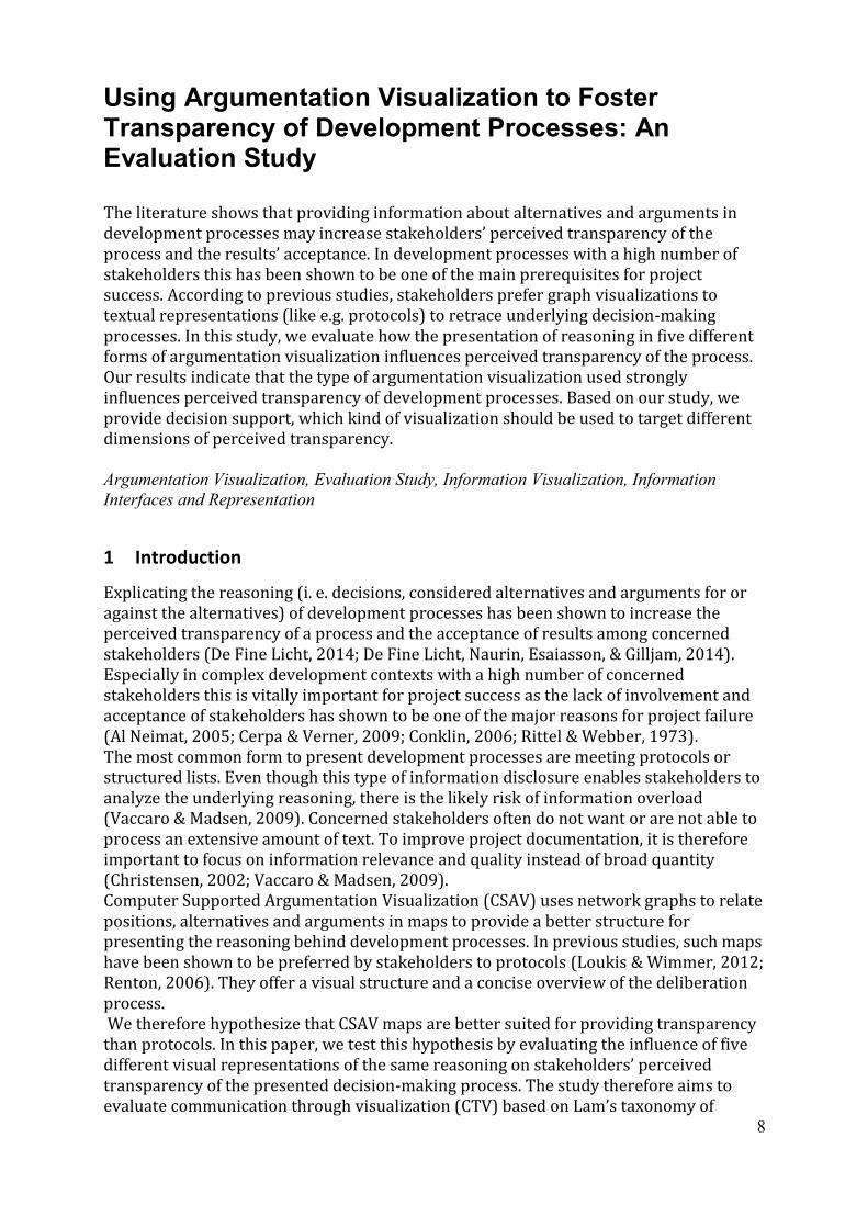
The literature shows that providing information about alternatives and arguments in development processes may increase stakeholders’ perceived transparency of the process and the results’ acceptance. In development processes with a high number of stakeholders this has been shown to be one of the main prerequisites for project success. According to previous studies, stakeholders prefer graph visualizations to textual representations (like e.g. protocols) to retrace underlying decision-making processes. In this study, we evaluate how the presentation of reasoning in five different forms of argumentation visualization influences perceived transparency of the process. Our results indicate that the type of argumentation visualization used strongly influences perceived transparency of development processes. Based on our study, we provide decision support, which kind of visualization should be used to target different dimensions of perceived transparency. Argumentation Visualization, Evaluation Study, Information Visualization, Information
Interfaces and Representation
1 Introduction
Explicating the reasoning (i. e. decisions, considered alternatives and arguments for or against the alternatives) of development processes has been shown to increase the perceived transparency of a process and the acceptance of results among concerned stakeholders (De Fine Licht, 2014; De Fine Licht, Naurin, Esaiasson, & Gilljam, 2014). Especially in complex development contexts with a high number of concerned stakeholders this is vitally important for project success as the lack of involvement and acceptance of stakeholders has shown to be one of the major reasons for project failure (Al Neimat, 2005; Cerpa & Verner, 2009; Conklin, 2006; Rittel & Webber, 1973). The most common form to present development processes are meeting protocols or structured lists. Even though this type of information disclosure enables stakeholders to analyze the underlying reasoning, there is the likely risk of information overload (Vaccaro & Madsen, 2009). Concerned stakeholders often do not want or are not able to process an extensive amount of text. To improve project documentation, it is therefore important to focus on information relevance and quality instead of broad quantity (Christensen, 2002; Vaccaro & Madsen, 2009). Computer Supported Argumentation Visualization (CSAV) uses network graphs to relate positions, alternatives and arguments in maps to provide a better structure for presenting the reasoning behind development processes. In previous studies, such maps have been shown to be preferred by stakeholders to protocols (Loukis & Wimmer, 2012; Renton, 2006). They offer a visual structure and a concise overview of the deliberation process. We therefore hypothesize that CSAV maps are better suited for providing transparency than protocols. In this paper, we test this hypothesis by evaluating the influence of five different visual representations of the same reasoning on stakeholders’ perceived transparency of the presented decision-making process. The study therefore aims to evaluate communication through visualization (CTV) based on Lam’s taxonomy of

9
visualization evaluation (Lam, Bertini, Isenberg, Plaisant, & Carpendale, 2012). The scope of the paper is to evaluate how the prototypes developed in the present study compare with conventional state-of-the-art techniques. The remainder of the paper is structured as follows. In Section 2 introduces the case study. Section 3 discusses the theoretical background of argumentation visualization and the evaluation of perceived transparency. Section 4 describes the evaluation method and Section 5 presents the results of the evaluation. The paper closes with a conclusion in Section 6.
2 Theoretical Foundations
Computer Supported Argumentation Visualization (CSAV) is concerned with the presentation and perception of reasoning and argumentation processes. Issue Based Information Systems (IBIS) is the most commonly widely notation to model structures of reasoning (Scheuer, Loll, Pinkwart, & McLaren, 2010). In IBIS lines of reasoning are modelled as network graphs with issues, alternative positions and arguments supporting or challenging the alternatives as interconnected nodes. CompendiumLD (download from: http://compendiumld.open.ac.uk/download.html), which also supports exporting interactive web maps, is an open-source tool for modelling IBIS. Existing studies found that users perceive visual argumentation maps as more useful than textual representations (Loukis & Wimmer, 2012; Renton, 2006). In a parallel study (Riechert, 2018), we describe how information visualization principles can be used to improve existing visual representations of Compendium LD for complex argumentation networks with >1600 nodes. In the aforementioned article, we describe the development of two visual representations (an expandable tree structure and a stacked circle map) for visualizing lines of reasoning. We expect, that structured visualizations with a user interface to switch between different levels of detail on demand are easier to navigate and search and therefore result in higher perceived process transparency than textual representations. Different forms of visual representations are discussed as part of the method section (Section 4). There are currently more than 39 different definitions of transparency in the fields of marketing, accounting and finance, information technology, political science, management, public health and communciations (Dapko, 2012). What is understood by the term varies strongly along and inside those fields. Furthermore, most of them define transparency by its antecedents (Dapko, 2012, p. 12) and not by itself. In the field of information technology for example, transparency is primarily conceptualized in terms of information exchanged or provided to the public (Dapko, 2012, p. 34; Eggert & Helm, 2003; Hofstede, 2003; Hultman & Axelsson, 2007; Vaccaro, 2006). We follow Dapko that this interpretation of transparency as information disclosure (Dapko, 2012, p. 12) is an antecedent, rather than a true measure of transparency (DeKinder & Kohli, 2008). Out of the definitions of transparency we therefore follow Rawlins: “Transparency is the deliberate attempt to make available all legally releasable information—whether positive or negative in nature—in a manner that is accurate, timely, balanced, and unequivocal, for the purpose of enhancing the reasoning ability of publics and holding organizations accountable for their actions, policies, and practices.” (Rawlins, 2008). Only two empirical studies have developed a quantitative measurement model for transparency so far:

10
Rawlins (Rawlins, 2008) was the first to develop a scale measure for organizational transparency. His transparency model encompasses three transparency reputation traits (integrity, respect for others, openness) and four transparency efforts (participation, substantial information, accountability, and secretiveness). In Dapko’s (Dapko, 2012) scale measure the factors effort, reciprocity and negative information are conceptualized. In four empirical studies testing her scale measure, only effort and reciprocity were found to be significant dimensions Different from previous studies, our goal is to measure perceived transparency of a process rather than perceived transparency of an organization. We therefore build on and adopt the effort traits of Rawlins model because the reciprocity item of Dapko’s scale is hardly transferable to a process perspective on transparency. The scale development is discussed as part of the method description in Section 4.
3 Evaluation Case
We analyze the standard development project ‘Research Core Dataset’ (RCD). The project was carried out over a period of 24 months (October 2013 – September 2015). It was initiated by the German Council of Science and Humanities with the goal to establish a shared set of standard definitions for research information (about staff, publications, third-party funding, patents, young researchers and research awards) for the German science system. More than 48 different stakeholder groups were directly involved in the development process. The project involved representatives of universities, non-university research institutions, ministries, research information system vendors and scientific societies. The specification process was organized in four groups with eight experts each. Each group held up to six meetings lasting 1–2 days with 8 hours discussion time per meeting. The project group “definitions and data formats” conceptualized and defined research information for all areas stated above. To combine internal expertise with real-world evaluation of the proposed definitions, the procedure combined development workshops and a feedback phase with representatives of pilot organizations, non-university research institutions, funding organizations and vendors of research information systems. After the feedback phase, further rounds of discussion took place to integrate external feedback (more than 1,800 comments were incorporated in the project) into the definition specification. The result of the development process is a policy and standard specification for the whole German science system. The concepts and definitions specified in the process lay the foundation of how information about research activities and processes is to be processed and potentially used in future evaluation exercises (e.g. for the purpose of allocating and distributing funding among research organizations). For this reason, not only the participating stakeholders but all members of the German science system are in a way affected by the specification process and its results. This study addresses researchers as the main target group of the RCD (see method section).
4 Method
4.1 Survey design Our goal is to evaluate the influence of different visual representations on the transparency of the process. For this purpose, we surveyed scientists asking for the perceived transparency of the standard development process. A random sample of

11
German professors was invited to participate in the study (see Section 4.4). In the survey, we first showed them a set of generic questions (operationalizing the control variables, see Section 4.2) followed by one out of five treatments (see Section 4.3) with a brief tutorial of its functionality and use of the visualization. The participants were then asked to consult the visualization in order to study and retrace discussed options, alternatives and arguments, which preceded the eventual decision and definition. It was up to the participants to decide when to return to the questionnaire. Finally, the participants were asked a set of questions to measure the perceived transparency of the RCD development process. The questions were based on Rawlins’ transparency model. The results were analyzed as discussed in Section 4.2.
4.2 Evaluating the perceived transparency of processes Based on Rawlins (Rawlins, 2008), we conceptualize process transparency as the perceived effort to find and understand relevant information. It has been argued that analyzing transparency requires a more holistic view than to simply disclose information (by merely making it available)(Dapko, 2012, p. 12). The following table lists the questions used by Rawlins in his study to measure transparency of an organization (Rawlins, 2008) as well as the adapted questions of this study to evaluate the influence of visualizations on perceived transparency of a standardization process.
Table 1: Control variable questions
Dimension (control variables)
Question
Age group Which age group do you assign yourself to? Subject In wich subject did you achieve your highest degree? Gender Which gender are you? Managerial authority Select: No managerial authority | managerial authority
1–10 | managerial authority 11–50 | managerial authority >50
Visualization expertise (read)
I read visualizations (e.g. mind maps, organigrams, network diagrams) at work.
Visualization expertise (create)
I create visualizations (e.g. mind maps, organigrams, network diagrams) at work.
Visualization expertise (theory)
I know about theoretical visualization concepts and theories.
Previous process awareness Did you know about the project before this study? Positive attitude towards project
I have a positive attitude towards the project.
Positive attitude towards organization
I assess the work of the German Council of Science and Humanities positively.
More process transparency desired
I would prefer more information about the decision processes in the project.
Understandability of the visualization tutorial
The tutorial was understandable.
Usability of the visualization I have the feeling that I am able to use the visualization functions.
The following questions (column on the right-hand side) were part of the questionnaire as dimensions of transparency:

12
Table 2: Adapted transparency questions
Original item (foucs: transparency of an organization) (Rawlins, 2008)
Adapted item (focus: transparency of a process) as used in this study
Pa1: Involves people like me to help identify the information I need.
Pa1: Helps me identify the information I need.
Pa2: Provides detailed information to people like me.
Pa2: Provides access to detailed information.
Pa3: Makes it easy to find the information people like me need.
Pa3: Makes it easy to find the information I need.
Su1: Provides information that is relevant to people like me.
Su1: The visualization communicates the information that is relevant to me.
Su2: Provides information that could be verified by an outside source, such as an auditor.
Su2: The visualization enables me to explain the development process to third parties.
Su3: Provides information that is complete.
Su3: According to my perception the system provides complete information.
Su4: Provides information that is easy for people like me to understand.
Su4: According to my perception the system provides easy access to information.
Su5: Provides information that is reliable. Su5: According to my perception the information is reliable.
Su6: Presents information to people like me in language that is clear.
Su6: Presents information in a clear way.
Ac1: Presents more than one side of controversial issues.
Ac1: Controversial issues are presented in a balanced way.
Not in the original set. Ac2: Arguments for and against the decisions taken are communicated in a balanced way.
Ac2: Is forthcoming with information that might be damaging to the organization.
Ac3: Controversial issues are communicated openly.
Ac3: Provides information that can be compared to industry standards.
Ac4: Discussed alternatives are communicated in a balanced way.
Se1: Provides only part of the story to people like me.
Left out because of the similarity to Se2 for visualization cases.
Se2: Often leaves out important details in the information it provides to people like me.
Se1: Important details are left out in the information presentation.
Se3: Provides information that is full of jargon and technical language that is confusing to people like me.
Se2: Presents information in an unnecessarily confusing way.
Se4: Provides information that is intentionally written in a way to make it difficult to understand.
Se3: Provides information that is intentionally presented in a way that makes it difficult to understand.
Se5: Is slow to provide information to people like me.
Se4: Presents information in an unnecessarily complicated way.
Note: Abbreviations refer to the following dimensions of transparency: (1) Pa: participation, (2) Su: substantial information, (3)
Ac: accountability, (4) Se: secretiveness.

13
4.3 TreatmentsWe evaluate six different visual representations of the same discussion contents (i. e. the discussion process of the RCD project). Figure 2 shows screenshots of the treatments (visualizations). In the following, each treatment is briefly introduced. For a more extensive discussion of the treatments see Riechert, 2018; Riechert, Biesenbender, & Quix, 2016. T1: Protocol We evaluate protocols as they are the most commonly used representation of reasoning and discussion. The visual representation of the protocol in this study is split in two parts. On the left side, the link menu with all available protocols is displayed. On the right side, the protocol content is made available. The protocols are anonymized. T2: Compendium Web Map Compendium Web Maps are exported from the RCD project’s argumentation models in IBIS notation in Compendium LD. They show the network graph of all interconnected alternatives, arguments and final decisions. When the user clicks on a node, details are opened in a new browser window. Previous research implies that those Web Maps are preferred over protocols in experimental studies. Again, the visual prototype is split in two parts. On the left side, the linked list of all other available web maps is displayed. On the right side, the original Compendium Web Maps are shown. T3: HTML Argumentation Table The third representation shows all alternatives, arguments and final decisions in an interactive HTML table. The representation contains an index table and a detail table. The index table holds the hierarchical structure, the detail table shows all definitions, alternatives and arguments. All elements are linked. Therefore, navigation through the hierarchy is possible in the detail table as well. The tables can be searched, sorted and filtered by tags.
Figure 1: Tutorial introducing the layout and functions (in German)
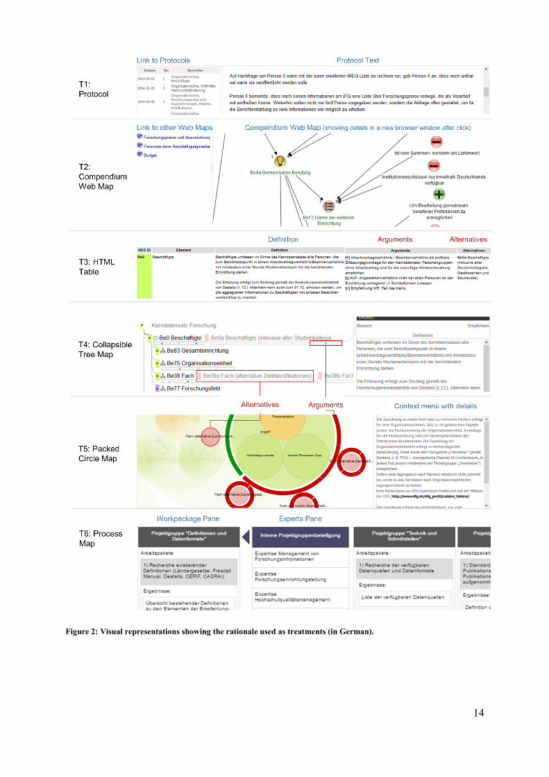
14
Figure 2: Visual representations showing the rationale used as treatments (in German).

15
T4: Collapsible Tree This representation is similar to the windows explorer. Elements and hierarchies are displayed below each other. When clicking an element, its sub-elements are shown. Alternatives are shown next to the elements, arguments are shown below the elements. On the right side, a detail menu shows detail information while hovering. In contrast to the argumentation table or the Compendium web map, no click is required to get this information. The development and the evaluation of the visual quality are described in detail in Riechert (2018). T5: Packed Circles This representation shows the hierarchy and its contents as circles placed on top of each other. Alternatives are shown as circles around the selected circle, arguments as circle segments around each alternative circle. The development and the evaluation of the visual quality are described in detail in Riechert (2018). T6: Process Map This representation shows the work packages of the overall process. When hovering a package, the experts contributing to the work packages are documented. Interactive tutorial All prototypes include a short interactive tutorial, introducing the central layout and functions of the prototypes. The tutorial, which is part of the survey questionnaire (see Section 4.1) is depicted in Figure 1
4.4 Survey sampling Out of 17,256 invited professors at German universities 1,978 started the questionnaire (11.5 %). Out of them, we dropped all answers with an answering time of less than 5 minutes (1,418 cases remaining), with no answers (1,305 cases remaining), with the same answer in all transparency questions (1,240 cases remaining). Since we want to apply a non-maximum likelihood estimator for a factor analysis (see Section 4.5), we include questionnaires with complete answers to the transparency questions (see Table 2) only. This condition is met in 542 complete cases. In order to identify potential outlier cases we computed DFBETAs for all transparency-item combinations (bivariate regression) and manually checked cases with |𝐷𝐹𝐵𝐸𝑇𝐴| ≥
2/√𝑛. Based on the results, 54 cases with particularly high 𝐷𝐹𝐵𝐸𝑇𝐴 (|𝐷𝐹𝐵𝐸𝑇𝐴| ≥ 0.14) were dropped from the analysis. Finally, 488 cases were used for the factor analysis. Bryant and Yarnold (1995) state that the subjects-to-variables-ratio for a factor analysis should not be lower than five. This criterion is met with a minimum sample of 488 >17 ∗ 5 cases (17 transparency items, see Table 2). The Kaiser-Meyer-Olkin factor adequacy of the items is very good with an overall MSA of 0.95 and no item’s MSA being lower than 0.88. To interpret the representativity, we compare the number of responding professors per gender, per age group and per subject category with the population according to the German statistical office (Destatis) of 2015 (Table 3). Regarding gender and age group, our sample distribution is very similar to the statistical population of professors at German univeristies. Overall, the sample demographics match approximately those of the population. The sample includes slightly less participants from the disciplines of law, economics and

16
social science and more mathematicans than to be expected, but we do not believe that this systematically skews the responses regarding perceived transparency.
Table 3: Sociodemographic characteristics of the survey sample and the statistical population
Variable Destatis Sample
n % n %
Gen
der
Female 10535 23% 100 21%
Male 35809 77% 386 79%
total 46344 486
Ag
e g
rou
p
21–30 64 0% 2 0%
31–40 4662 10% 31 6%
41–50 15197 33% 176 36%
51–60 18140 39% 203 42%
61–70 8281 18% 71 15%
Total 46344 483
Subje
ct
Humanities 4596 10% 89 18%
Sports 257 1% 2 0%
Business, Law and Social
Science 13386 29% 98 20%
Mathematics, Natural Sciences 6417 14% 143 29%
Medicine, Health Sciences 3848 8% 56 11%
Agricultural, Forest, Nutrition
and Veterinary sciences 1165 3% 10 2%
Engineering Sciences 12216 27% 83 17%
Art 3706 8% 6 1%
Total 45591 487
As the descriptive table of the visualization expertise in Table 4 shows, self-selection processes regarding previous project awareness, managerial authority and visualization expertise are unlikely. Seventy percent of the participants did not know the project and visualized contents. Managerial authority is also reasonably distributed taking into consideration that only professors were invited to the survey. Visualization expertise in terms of reading visualization is highest, visualization expertise in terms of knowing visualization theories is lowest. It is not only visualization experts that finished the questionnaire, the distribution seems to be balanced in a way that is to be expected from professors.
4.5 Statistical analyses As the instrument for measuring transparency was validated by Rawlins (2008) before, we use confirmatory factor analysis to test the adapted instrument for perceived process transparency. For the factor analysis, we use structural equation modeling (SEM) of R’s Lavaan package. We chose R because its open-source computation algorithm allows free and

17
transparent reproducibility tests. SEM uses factor analysis and multiple regressions to test the strength of items in a structural relationship. This allows us to test whether the observed variables measure latent variables in a reliable and valid way (Rawlins, 2008). Furthermore, we test the reliability of each item by computing Cronbach’s reliability alphas for each item for the different dimensions of transparency. Finally, we use regression analysis to test whether the control variables introduced in Section 4.2 (see Table 1) have an influence on perceived transparency.
5 Results
5.1 Descriptive analysis Descriptive statistics for the categorical and ordinal variables are found in Table 4. Seventy percent of the sample did not know the RCD project and its results visualized. Regarding managerial authority, 82 percent of the respondents fall into the categories “managerial authority over 1–10 persons” or “managerial authority over 11–50 persons”. Only 5 % of the participants stated to have no managerial authority, while 13 % indicated to manage more than 50 persons. As professors mostly have managerial authority, this distribution seems to be a fitting representation of the population.
Table 4: Descriptive statistics for the categorical and ordinal variables
previous_project_awareness
value N raw % valid % cumulative %
FALSE 341 69.88 69.88 69.88
TRUE 147 30.12 30.12 100.00
missings 0 0.00
total N=488 · valid N=488 · x̄=1.30 · σ=0.46
subject
Value N raw % valid % cumulative %
Humanities 89 18.24 18.28 18.28
Business, Law and Social Science 98 20.08 20.12 38.40
Agricultural, Forest, Nutrition and
Veterinary sciences 10 2.05 2.05 40.45
Engineering Sciences 83 17.01 17.04 57.49
Mathematics, Natural Sciences 143 29.30 29.36 86.86
Medicine, Health Sciences 56 11.48 11.50 98.36
Sports 2 0.41 0.41 98.77
Art 6 1.23 1.23 100.00
Missings 1 0.20
total N=488 · valid N=487 · x̄=3.61 · σ=1.82

18
managerial_authority
Value N raw % valid % cumulative %
no managerial authority 26 5.33 5.33 5.33
managerial authority 1–10 222 45.49 45.49 50.82
managerial authority 11–50
177 36.27 36.27 87.09
managerial authority >50 63 12.91 12.91 100.00
Missings 0 0.00
total N=488 · valid N=488 · x̄=2.57 · σ=0.78
visualization_expertise_read
value N raw % valid % cumulative %
daily 116 23.77 23.87 23.87
weekly 157 32.17 32.30 56.17
monthly 114 23.36 23.46 79.63
yearly 41 8.40 8.44 88.07
never 58 11.89 11.93 100.00
missings 2 0.41
total N=488 · valid N=486 · x̄=2.52 · σ=1.27
visualization_expertise_create
value N raw % valid % cumulative %
daily 36 7.38 7.41 7.41
weekly 135 27.66 27.78 35.19
monthly 134 27.46 27.57 62.76
yearly 86 17.62 17.70 80.45
never 95 19.47 19.55 100.00
missings 2 0.41
total N=488 · valid N=486 · x̄=3.14 · σ=1.23
visualization_expertise_theory
value N raw % valid % cumulative %
daily 19 3.89 3.93 3.93
weekly 32 6.56 6.63 10.56
monthly 82 16.80 16.98 27.54
yearly 99 20.29 20.50 48.03
never 251 51.43 51.97 100.00
missings 5 1.02
total N=488 · valid N=483 · x̄=4.10 · σ=1.14
Visualization expertise is strongest with regard to reading visualizations, less common with respect to creating visualizations, and least prevalent concerning visualization

19
theory. This distribution meets our expectation. The sample covers a range from very high visualization expertise to rather low visualization expertise.
Table 5: Descriptive statistics for metric variables
Variable vars n missings missings
(%) mean sd median Min max skew
more_transparency_de
sired
1 143 345 70.7 3.9 1.62 4 0 6 –0.69
positive_attitude_towa
rds_
project
2 145 343 70.29 3.77 1.81 4 0 6 –0.7
positive_attitude_towa
rds_
organization
3 449 39 7.99 4.21 1.4 5 0 6 –0.99
tutorial_understandabi
lity
4 469 19 3.89 3.52 1.6 4 0 6 –0.43
prototype_usability 5 465 23 4.71 3.68 1.59 4 0 6 –0.5
PA1_hel_ide_inf 7 488 0 0 3.08 1.55 3 0 6 –0.24
PA2_acc_rel_inf 8 488 0 0 3.65 1.51 4 0 6 –0.49
PA3_eas_fin_inf 9 488 0 0 2.81 1.5 3 0 6 –0.08
SU1_com_rel_inf 10 488 0 0 2.95 1.54 3 0 6 –0.13
SU2_ena_exp_pro 11 488 0 0 2.86 1.59 3 0 6 –0.08
SU3_com_inf 12 488 0 0 3.21 1.62 3 0 6 –0.25
SU4_eas_acc_inf 13 488 0 0 2.94 1.63 3 0 6 –0.12
SU5_rel_inf 14 488 0 0 3.26 1.58 3 0 6 –0.34
SU6_cle_rep 15 488 0 0 2.86 1.71 3 0 6 –0.09
AC1_con_pre_bal 16 488 0 0 2.81 1.43 3 0 6 –0.19
AC2_arg_pre_bal 17 488 0 0 2.8 1.47 3 0 6 –0.14
AC3_con_iss_pres_op
e
18 488 0 0 2.86 1.53 3 0 6 –0.14
AC4_alt_pre_bal 19 488 0 0 2.81 1.47 3 0 6 –0.2
SE1_inf_lef_out 20 488 0 0 2.42 1.55 2 0 6 0.38
SE2_pre_unn_con 21 488 0 0 3.24 1.78 3 0 6 –0.06
SE3_int_pre_diff_und 22 488 0 0 3.35 1.77 4 0 6 –0.13
SE4_inf_und_unn_dif 23 488 0 0 2.45 1.85 2 0 6 0.42
The descriptive statistics for the metric variables are shown in Table 5. All metric items use a 7-Lickert scale ranging from 0–strongly disagree to 6–strongly agree. The transparency items (from row 7 onwards) can be interpreted as follows: The higher the mean or median value is, the higher the respondents’ agreement to the respective statement (see Table 2) – and hence perceived transparency. As with the original model by Rawlins (2008), the questions of the items of the secretiveness dimension (SE1-SE4) are negative (a high value implies low transparency here).
20
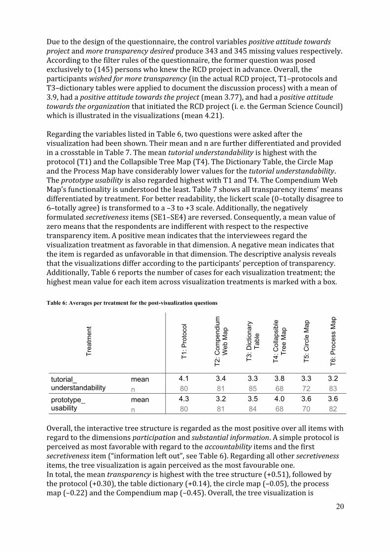
Due to the design of the questionnaire, the control variables positive attitude towards project and more transparency desired produce 343 and 345 missing values respectively. According to the filter rules of the questionnaire, the former question was posed exclusively to (145) persons who knew the RCD project in advance. Overall, the participants wished for more transparency (in the actual RCD project, T1–protocols and T3–dictionary tables were applied to document the discussion process) with a mean of 3.9, had a positive attitude towards the project (mean 3.77), and had a positive attitude towards the organization that initiated the RCD project (i. e. the German Science Council) which is illustrated in the visualizations (mean 4.21). Regarding the variables listed in Table 6, two questions were asked after the visualization had been shown. Their mean and n are further differentiated and provided in a crosstable in Table 7. The mean tutorial understandability is highest with the protocol (T1) and the Collapsible Tree Map (T4). The Dictionary Table, the Circle Map and the Process Map have considerably lower values for the tutorial understandability. The prototype usability is also regarded highest with T1 and T4. The Compendium Web Map’s functionality is understood the least. Table 7 shows all transparency items’ means differentiated by treatment. For better readability, the lickert scale (0–totally disagree to 6–totally agree) is transformed to a –3 to +3 scale. Additionally, the negatively formulated secretiveness items (SE1–SE4) are reversed. Consequently, a mean value of zero means that the respondents are indifferent with respect to the respective transparency item. A positive mean indicates that the interviewees regard the visualization treatment as favorable in that dimension. A negative mean indicates that the item is regarded as unfavorable in that dimension. The descriptive analysis reveals that the visualizations differ according to the participants’ perception of transparency. Additionally, Table 6 reports the number of cases for each visualization treatment; the highest mean value for each item across visualization treatments is marked with a box.
Table 6: Averages per treatment for the post-visualization questions
Tre
atm
ent
T1: P
roto
col
T2: C
om
pe
ndiu
m
Web
Ma
p
T3:
Dic
tion
ary
Table
T4: C
olla
psib
le
Tre
e M
ap
T5: C
ircle
Ma
p
T6: P
rocess M
ap
tutorial_ understandability
mean 4.1 3.4 3.3 3.8 3.3 3.2
n 80 81 85 68 72 83
prototype_ usability
mean 4.3 3.2 3.5 4.0 3.6 3.6
n 80 81 84 68 70 82
Overall, the interactive tree structure is regarded as the most positive over all items with regard to the dimensions participation and substantial information. A simple protocol is perceived as most favorable with regard to the accountability items and the first secretiveness item (“information left out”, see Table 6). Regarding all other secretiveness items, the tree visualization is again perceived as the most favourable one. In total, the mean transparency is highest with the tree structure (+0.51), followed by the protocol (+0.30), the table dictionary (+0.14), the circle map (–0.05), the process map (–0.22) and the Compendium map (–0.45). Overall, the tree visualization is

21
perceived to provide transparency 16 % better on the likert scale compared to the Compendium map.
Table 7: Treatment means for each transparency item
Mean per Treatment
7 point lickert scale:
T1 (N=85)
T2 (N=88)
T3 (N=83)
T4 (N=72)
T5 (N=74)
T6 (N=86)
–3 strongly disagree
–
+3 strongly agree
Pro
toco
l
Co
mp
en
diu
m
Ma
p
Tab
le
Tre
e M
ap
Circle
Ma
p
Pro
cess
PA1 helps me identify information I need
0.06 –0.41 0.33 0.65 –0.04 -0.05
PA2 provides access to detailed information
0.86 0.24 1.00 1.18 0.31 0.36
PA3 makes it easy to find information
–0.24 –0.81 0.05 0.36 –0.15 -0.27
PA mean
0.23 –0.33 0.46 0.73 0.04 0.02
SU1 communicates relevant information
–0.04 –0.55 0.17 0.60 –0.20 -0.20
SU2 enables me to explain process
0.13 –0.70 –0.27 0.28 –0.05 -0.14
SU3 complete information
0.60 –0.24 0.56 0.64 –0.05 -0.19
SU4 easy access to information
0.19 –0.83 0.03 0.54 0.01 -0.20
SU5 reliable information
0.67 –0.36 0.51 0.78 –0.14 0.14
SU6 clear presentation –0.15 –1.08 –0.08 0.56 0.04 0.01
SU mean
0.23 –0.63 0.16 0.56 –0.07 –0.10
AC1 controversies are presented balanced
0.48 –0.37 –0.24 0.06 –0.34 -0.72
AC2 arguments are presented balanced
0.55 –0.40 –0.21 0.03 –0.31 -0.85
AC3 controversial issues are presented openly
0.58 –0.27 –0.15 0.10 –0.27 -0.78
AC4 alternatives are presented balanced
0.52 –0.39 –0.28 0.04 –0.30 -0.70
AC mean
0.53 –0.36 –0.22 0.06 –0.30 –0.76
SE1 details left out
1.00 0.46 0.73 0.75 0.34 0.23
SE2 presentation unnecessarily confusing
–0.27 –0.80 –0.13 0.36 –0.11 -0.38
SE3 intentionally presented difficult to understand
–0.35 –0.89 –0.34 0.32 –0.24 -0.47
SE4 information understanding unnecessarily difficult
0.54 –0.27 0.74 1.36 0.64 0.40
SE mean
0.23 –0.37 0.25 0.70 0.16 –0.05
total mean
0.30 –0.45 0.14 0.51 –0.05 –0.22
5.2 Confirmatory factor analysis We use the variables as specified in Section 4.2 in a confirmatory factor analysis to measure the degree of variability and to test whether the variables are associated with specific factors (i. e. transparency and its four dimensions). As shown in Figure 3, the

22
confirmatory factor analysis supports the four-factor model. All the standardized regression weights between the latent variables (participation, substantial information, accountability and secretiveness) and the scale items exceed 0.56. Additionally, the four dimensions load strongly (>0.69) to perceived transparency. As secretiveness is negatively associated with transparency (see Table 2), the negative loading confirms our theoretical expectations.
Table 8: Reliability Alphas for Items in Each Factor
Factor / Scale N of Cases N of Items Alpha
Participation 488 3 0.87 Substantial Information 488 6 0.93 Accountability 488 4 0.97 Secretiveness 488 5 0.86
Moreover, we test the reliability alphas of each factor. As shown in Table 8 all factors have high reliability alphas with participation being the lowest (>0.87).
Figure 3: Confirmative Factor Loadings (ULSM) of Perceived Transparency. The fourth factor is a reversed-item
factor.
The Chi-square of the model is 1052.05 (P-value = 0.0 with 115 degrees of freedom). However, due to the large sample size, the p-value is not a good measure for the model fit. Since our goal is to confirm Rawlins’ model in a different setting we follow Rawlins by also using the robust unweighted least square (ULSM) estimation technique to evaluate the goodness of fit. Standardized root mean square (SRMR) and goodness of fit index (GFI) are the most commonly used absolute fit indices for ULSM. We add three relative fit indices normed fit index (NFI), parsimonious normed fit index (PNFI), and the Tucker-Lewis index (TLI). Finally, we include the comparative fit index (CFI) and the

23
relative noncentrality index (RNI) as noncentality-based indices. The ULSM estimation results in strong fit indices (with SRMR= 0.05, GFI= 1.00, NFI= 0.99, PNFI= 0.84, TLI= 0.99, CFI= 0.99, and RNI=0.99).
5.3 Regression analysis Next, we analyze whether the control variables from Section 4.2 are correlated with the perceived transparency of the treatments. To obtain a transparency score for each case, we use the factor loadings of the confirmative factor model to compute a weighted average for each dimension of transparency (participation, substantial information, accountability and secretiveness). These factors are then used to compute a weighted overall transparency average for each case. The regression analysis is computed separately for each treatment and control variable. The estimate (est), R-Square (R²) and the number of observations (N) are reported in Table 9 for each of the treatment-specific analyses. Note that we grouped the following variable values to ensure a sufficient number of observations: For managerial authority, the parameter values “managerial authority over 0–10 persons” and “managerial authority for more than 10 persons” were defined. For the visualization expertise variables (read, create and theory) the parameter values “daily–weekly”, “monthly” and “yearly–never” were formed. The subject variable had to be grouped into just two groups because of the low number of observations for certain disciplines. Finally, the age group levels were reduced into two groups (21–50 and >51 years) to ensure sufficient sample sizes for the correlation analyses. After grouping, no combination of level, variable and treatment had an N (number of observations) smaller than 15. To present all results across all treatments in one table we only provide the range of intercepts here. A complete table with all intercepts and standard errors can be found in the online appendix. The regression analysis reveals that the effect of the categorical control variable subject is not significant, a finding that is confirmed by the subject-specific analysis (without grouping). We do not find any significant correlation between previous process awareness and perceived transparency across all treatments. Therefore, viewers who did not know of the presented project in advance did not perceive visualization transparency differently than viewers who were familiar with the standardization project prior to the study. The gender variable is only significant to the 0.05 level for T3 and T6, and the corresponding R² are low (0.04 for both). The correlation between gender and transparency therefore is negligible. Managerial authority is not correlated with perceived transparency in our sample except for the sub-sample evaluating T2 Compendium Web Map (on a .01 significance-level). Professors with high staff management responsibilities tend to perceive transparency higher than professors with a small chair (but only regarding the T2 sub-sample). Although the estimate of 0.42 is quite high (on a 7 point lickert scale), the R²- value is rather low. For all other treatments, the managerial background of the viewer does not change the perception of the transparency provided by the visualization.

24
Table 9: Regression analysis results for all variables (significant variables highlighted) for perceived transparency
A positive correlation is found between visualization expertise (read) and perceived transparency for the treatments T2, T5 and T6, but not for T1, T3, and T4. It is important to note that T2, T5 and T6 are rather exotic and T1, T3, and T4 are common visual representations. Viewers who read visualizations often (daily or weekly) perceive the process presented in the visualization as significantly more transparent than viewers who rarely (yearly or never) read visualizations when being confronted with uncommon visualizations. A similar but weaker pattern is found for viewers who create visualizations. Regarding unusual representations (T2 and T6), the perceived transparency of the process is significantly higher for viewers creating visualizations on a regular basis than for viewers who seldomly do so. However, the findings do not confirm this pattern regarding with the variable visualization theory (only in the case of T3, though with a rather low R²). The variable age group is negatively correlated with perceived transparency for the visual representations T1 protocol and T3 HTNM table. However, we do not find any significant effect regarding the other treatments. Older participants perceive protocol representations and HTNM tables as less transparent compared to younger participants, while this effect was not found for other treatments. The degree to which more process transparency is desired is not significantly correlated with perceived transparency for any treatment. In other words, viewers who wish for more transparency in the actual RCD standardization project do not differ from those who do not in terms of their perception of the transparency provided by the visualization.
Est R² N Est R² N Est R² N Est R² N Est R² N Est R² N Intercepts
.11 .05 25 .12 .05 24 -.10 .04 28 -.06 .01 19 .02 .00 18 .10 .06 29 2.31-3.54
.11 .08 27 .15 .11 24 .34*** .59 28 .2* .22 19 .27* .32 18 .19** .27 29 1.7-2.78
.08 .03 79 .27*** .26 78 .16* .08 81 .09 .03 64 .3*** .21 65 .19*** .13 82 1.61-2.82
.17*** .18 80 .29*** .33 81 .3*** .37 85 .24*** .25 68 .39*** .53 72 .22*** .21 83 1.6-2.47
.16*** .15 80 .26*** .26 81 .21*** .20 84 .17** .12 68 .37*** .41 70 .2*** .18 82 1.59-2.5
managerial authority >10 (Ref.: 0-10) -.16 .01 85 .42* .07 83 -.02 .00 86 .17 .02 72 .18 .01 74 .09 .00 88 2.56-3.27
monthly .03 -.24 -.07 .24 .23 -.24
yearly-never -.21 -.44* -.15 .15 -.6* -.83***
monthly -.37* .15 -.21 -.06 .34 -.09
yearly-never -.20 -.34. -.23 -.16 -.32 -.61***
monthly -.08 -.14 .65. -.17 -.60 .22
yearly-never -.35 -.23 .67* -.18 -.07 -.01
age group
(Ref. 21-50)>51 -.32* .06 85 .14 .01 83 -.57*** .15 85 .02 .00 72 -.33 .03 74 -.03 .00 88 2.7-3.33
previous project
aw arenessTrue (Ref.: False) .00 .00 85 -.03 .00 83 -.19 .01 86 .19 .01 72 -.10 .00 74 .27 .03 88 2.71-3.19
subject
(Ref. Humanities,
Social Sciences,
Art and Sports)
Engineering
Sciences,
Mathematics,
Natural Sciences,
Medicine and
Agricultural
Sciences
-.09 .00 85 .26 .02 83 .32. .05 85 .19 .02 72 -.11 .00 74 .15 .01 88 2.61-3.25
genderFemale (Ref.:
Male)-.09 .00 85 .23 .01 82 -.4. .04 86 -.08 .00 71 .09 .00 74 .34. .04 88 2.73-3.22
Signif. codes: 0 *** .001 ** .01 * .05 .
cate
gorical
2.43-3.46
2.87-3.35
2.93-3.23
metr
ic (
0-6
)ord
inal
Process Map
T1 T2 T3 T4 T5 T6
Protocol
Comp. Web
Map HTNM Table
Collapsible
Tree Map Circle Map
83
visualization
expertise read
(Ref.: daily-w eekly)
.02 85 .05
visualization
expertise create
(Ref.: daily-w eekly)
visualization
expertise theory
(Ref.: daily-w eekly)
more transparency desired
positive attitude tow ards project
positive attitude tow ards organization
tutorial understandability
visualization usability
86.01 86 .02 72 .10 74 .16
88.02 86 .01 72 .09 74 .1482.05 84 .06
.05 85 .01 85.07 85 .01 72 .04 74 .0182

25
A strong highly significant correlation is found between positive attitude towards the project and perceived transparency for T3, T4, T5 and T6. However, this finding is limited generalizability, because – by definition – the estimate excludes participants that did not know the RCD project prior to this study (345 out of respondents). The effects range from 0.19 to 0.34 with moderate explanatory power (R² values range between 0.22 and 0.59). Positive attitude towards the organization (organizing the process presented in the visualization; i. e. the German Science Council) is also strongly and significantly correlated to perceived transparency for T2, T3, T5 and T6. The German Council for Science and Humanities) is supposed to be widely known among the participants of the survey. Viewers who have a positive attitude towards the organization responsible for the process perceive transparency as higher than viewers who are rather critical of the organization. The estimates range from 0.16 to 0.27 and the R² values from 0.08–0.33. Understandability of the visualization tutorial is strongly, significantly (with significance levels of 0.001 across all treatments) and positively correlated with perceived transparency. Respondents who assess the visualization tutorial’s understandability as high also perceive the process presented in the visualization as relatively transparent. The estimates range from 0.17 to 0.39 and the R² values from 0.18 to 0.53. Similarly, we find a strong and significant (significance level of 0.001 across all treatments) correlation between usability of the visualization and perceived transparency. The estimates range from 0.16 to 0.37 and the R² values from 0.12 to 0.37.
Figure 4: Correlation of the control variables without treatment differentiation
Figure 4 shows the correlations of the control variables without differentiation across treatments. In line with the findings of the differentiated analysis, the variables with

26
only few or minor correlations do not show any significant effects in the cross-treatment analysis.
6 Discussion
We do not find any significant correlation between subject, more transparency desired, previous project awareness, more transparency desired on one side and perceived transparency on the other. No matter which visual representation is used, these variables are likely to not have an effect on perceived transparency. For increasing transparency through visualization, it therefore does not matter whether the users know the actual project, which background they have and whether they prefer more transparency in the actual standardization project. For the variable gender, we find minor correlations with low R² and a significance level of 0.05 for T3 (HTNM Table) and T6 (Process Map). Consequently, we regard gender to have a negligible effect on perceived transparency. Managerial authority is correlated with regard to T2 Compendium web maps only with a rather low R² (0.07) and a 0.01 significance level. Again, we regard this correlation as negligible because the effect does not sustain regarding other treatments. Consequently, the transparency provided by the visualizations is not influenced by the degree of managerial authority. Age group is correlated to perceived transparency only for T1 protocol and T2 Compendium web map. Older users report lower transparency ratings compared to younger users (estimates –.32 and –.57). As this affects the two most common visualization forms (contrary to the other more exotic ones) one possible explanation could be that older users have become more sceptical with regard to established representation techniques. Our results indicate that expertise in viewing and creating visualizations is positively correlated with the perceived transparency of the process regarding exotic treatments (T2, T5 and T6). Here, viewers who are inexperienced with visualizations (and rather used to protocols, table representations or windows explorer-like trees) perceive the visualization’s ability to communicate transparency as significantly lower than do experienced users. As these effects are not significant with respect to the relatively established forms of visualization, we expect this finding to be caused mainly by accustomization and experience of users. Therefore, supplementing the use of the developed visualizations with high-quality tutorials is of high importance to use the full potential of visualizations in terms of communication and transparency building. This finding is in line with the result that the perceived understandability of the tutorial is strongly correlated (at a significance level of 0.001) with perceived transparency across all treatments. Out of the analysed variables, the estimates and R² values are the highest with tutorial understandability. Viewers who have a positive view on the RCD standardization process presented in the visualization are more likely to rate transparency higher regardless of the type of visualization except for T1 protocol and T2 compendium web map. This effect is strongest with T3 HTNM table, where perceived transparency rises by 0.34 (on a Lickert scale) for each 1 higher Lickert level of positive attitude (R² of .59). The effects for the other treatments (T4, T5 and T6) are not as strong but still strongly significant and positive. A similar but weaker pattern is found between the (positive) attitude towards the organization responsible for the process and perceived transparency (significant effect for all treatments but T1 and T4). The more respondents perceive the organization as positive, the higher is their perceived transparency rating. The observed

27
relationship does, however, not hold regarding visualizations T1 (protocol) and T4 (collapsible tree). Finally, another very strong correlation is found between the perception of visualization usability and perceived transparency. The effects are highly significant (significance level of 0.001) across all treatments and vary from 0.16 to 0.37 with the more exotic treatments having higher correlation estimates. Again, accustomization seems to be the main cause for the differences.
7 Limitations
This study focusses on a single case only. However, we draw from existing research with regard to development of visualization, transparency models and regression techniques. Therefore, the results can be compared to existing findings. Nevertheless, it is desirable to evaluate the robustness of the adapted transparency model in different contexts and future studies. In the policy case considered in this analysis, the German Council of Science and Humanities was the driver of a large-scale standardization project for agreeing on a set concepts and definitions for research information. These circumstances in two possible biases in the findings: Firstly, it is possible that participants reject the visualizations mostly because they are critical of the underlying policy goal (i. e. standardization of research information) and expect negative personal consequences from the policy. Secondly, it is conceivable that their attitude towards the organization creates a bias for their response behaviour. We expect these biases to exist in other cases too. This kind of bias is also reflected in the significant correlations between positive attitude towards organization and positive attitude towards project on one side and perceived transparency on the other. We dropped 54 out of 542 cases using the DFBETAs criterion (|𝐷𝐹𝐵𝐸𝑇𝐴| ≥ 0.14). Without this cleaning, we had Heywood cases in the second order transparency model (with all dimensions loading to an overall transparency), which would have undermined the interpretability of the results. Note that such a data cleaning would not have been necessary for the calculation of a first order model (like suggested by Rawlins) with a focus on the four dimensions of transparency. Nevertheless, our goal was to use the overall transparency scores in the correlation analysis of the study, which made it necessary to drop a relatively high number of cases. Regarding the test design, we did not ask the same user several times regarding multiple visualizations but showed different treatments to randomly assigned groups. For our target group (professors at German universities) it would have been unacceptable to fill out the same questionnaire more than once with regard to different visualizations, because of the length and time of the questionnaire. A final and very important limitation is the participants’ limited scope of exposure to the treatments (i. e. the visualizations). Our findings are limited to a first impression of visualized contents. We did not test how the visualizations analysed are used in long-term or repeated applications. Some of the main strengths of the more structured but less common forms of representations (especially for Compendium Web Maps or the Circle Map) tend to provide better access by higher degrees of structurization. Therefore, it is possible that these forms unfold their potential in long-term usage studies. The present study focuses on the first impression of perceived transparency by the broad public. Future studies will be needed to compare the findings of the first-impression application to a long-term use scenario.

28
8 Conclusion
In this study, we adapted Rawlins’ model to assess the perceived transparency of organizations to evaluate a visualization’s ability to increase the perceived transparency of a development process. After cleaning, the data with DFBETAs the model was applied to a policy use case with very good absolute, relative and non-centrality-based fit indices. We used a survey among professors at German universities (488 complete responses after cleaning) to evaluate six treatments (forms of visualization) regarding their influence on perceived transparency of a policy development process. The six treatments differ strongly with respect to their ability to enhance perceived transparency. Our evaluation allows choosing the most favourable visualization regarding a specific set of dimensions of interest. Overall, the Collapsible Tree Map (T4) is to choose if the maximum overall transparency is the goal. If accountability is the main goal, however, traditional protocols (T1) are suited better than Collapsible Tree Maps (T4). In previous research Compendium Web Maps have been found to be more intuitive to read than protocols. Our study reveals, that this does not hold when it comes to represent complex argumentation spaces with more than 300 elements or topics of discussion. Regarding perceived transparency, the usage of Compendium Web Maps (T2) results in a much lower perceived transparency than all other forms of representations. We do not find any significant correlations between academic subject, more transparency desired, previous project awareness, more transparency desired and perceived transparency. Furthermore, from the regression analysis we draw the practical conclusion, that an optional high-quality visualization tutorial is a key element for increasing perceived transparency. This is further supported by the observation that visualization experts are better equipped to read the information communicated by the visualizations. The more users get into the visualization with the help of a high-quality tutorial, the higher the perceived transparency achieved by using the visualization will be. We find that usability of the visualization and perceived transparency are strongly correlated. In order to maximize the transparency of the process, the usability of the visualization should be taken seriously. Usability heuristics from Nielson (Nielsen, 2005) might be used as structuring frameworks. A further practical conclusion refers to the correlation between the attitude towards the process and organization and perceived transparency. All representations except for the protocol and the collapsible tree map provide more transparency if the attitude towards the organization is higher. Therefore, in case of controversial processes, these two representations prove to be most “attitude-resistant” (and hence, convincing). Future work might work on improving the visualization tutorials. The tutorials used for this study were positively evaluated by the survey participants (with mean rates ranging from 3.2 to 4.1 on a 7 point Lickert scale depending on the treatment). Their strong influence on the perceived transparency found in the regression analysis makes it worthwhile to improve tutorials to the expectations and needs of the user. Furthermore, the visualizations can be further improved regarding usability. Overall, their usability was regarded positively (ranging from 3.2 to 4.3 on a 7 point Lickert scale depending on the treatment). Any improvement in the visualization’s usability is likely to influence the perceived transparency of the process. The measurement model might be reapplied in different contexts and cases to test its validity and to better evaluate the robustness of the findings. Decision-making processes with high numbers of stakeholders involved might potentially benefit from the application of argumentation visualization. Possible application scenarios encompass

29
requirements engineering processes, organizational change processes, or policy development processes.
9 Acknowledgements
We thank Daniel Sirtes and David Johann (both DZHW) for detailed discussions about methodology and interpretation of the results.
10 Literature
Al Neimat, T. (2005). Why IT projects fail. Retrieved from
http://projectperfect.com.au/downloads/Info/info_it_projects_fail.pdf
Bryant, F. B., & Yarnold, P. R. (1995). Principal-components analysis and exploratory and
confirmatory factor analysis. Retrieved from http://psycnet.apa.org/psycinfo/1995-
97110-004
Cerpa, N., & Verner, J. M. (2009). Why Did Your Project Fail? Commun. ACM, 52(12), 130–
134. https://doi.org/10.1145/1610252.1610286
Christensen, T. (2002). Corporate communication: The challenge of transparency. Corporate
Communications: An International Journal, 7(3), 162–168.
Conklin, J. (2006). Wicked problems & social complexity. CogNexus Institute Napa, USA.
Dapko, J. (2012). Perceived firm transparency: Scale and model development. Graduate
Theses and Dissertations. Retrieved from http://scholarcommons.usf.edu/etd/4025/
De Fine Licht, J. (2014). Policy area as a potential moderator of transparency effects: An
experiment. Public Administration Review, 74(3), 361–371.
De Fine Licht, J., Naurin, D., Esaiasson, P., & Gilljam, M. (2014). When Does Transparency
Generate Legitimacy? Experimenting on a Context-Bound Relationship. Governance,
27(1), 111–134.
DeKinder, J. S., & Kohli, A. K. (2008). Flow signals: How patterns over time affect the
acceptance of start-up firms. Journal of Marketing, 72(5), 84–97.
Eggert, A., & Helm, S. (2003). Exploring the impact of relationship transparency on business
relationships: A cross-sectional study among purchasing managers in Germany.
Industrial Marketing Management, 32(2), 101–108.
Hofstede, G. J. (2003). Transparency in netchains. Information Technology for a Better Agri-
Food Sector, Environment and Rural Living. Debrecen University, Debrecen,
Hungary, 17–29.
Hultman, J., & Axelsson, B. (2007). Towards a typology of transparency for marketing
management research. Industrial Marketing Management, 36(5), 627–635.
Lam, H., Bertini, E., Isenberg, P., Plaisant, C., & Carpendale, S. (2012). Empirical studies in
information visualization: Seven scenarios. Visualization and Computer Graphics,
IEEE Transactions On, 18(9), 1520–1536.
Loukis, E., & Wimmer, M. (2012). A multi-method evaluation of different models of
structured electronic consultation on government policies. Information Systems
Management, 29(4), 284–294.
Nielsen, J. (2005). Ten usability heuristics. Useit. Com.
Rawlins, B. (2008). Give the emperor a mirror: Toward developing a stakeholder
measurement of organizational transparency. Journal of Public Relations Research,
21(1), 71–99.
Renton, A. (2006). Seeing the point of politics: exploring the use of CSAV techniques as aids
to understanding the content of political debates in the Scottish Parliament. Artificial
Intelligence and Law, 14(4), 277–304.

30
Riechert, M. (2018). Improving Argumentation Visualization of Multi-Stakeholder
Development Processes - A Prototyping Case. Research Papers in Information
Systems Management, 18. http://dx.doi.org/10.14279/depositonce-6743
Riechert, M., Biesenbender, S., & Quix, C. (2016). Developing and Standardising Definitions
for Research Information: Framework and Methods of Successful Process
Documentation. Procedia Computer Science. Retrieved from
http://dspacecris.eurocris.org/handle/11366/504
Rittel, H. W., & Webber, M. M. (1973). Dilemmas in a general theory of planning. Policy
Sciences, 4(2), 155–169.
Scheuer, O., Loll, F., Pinkwart, N., & McLaren, B. M. (2010). Computer-supported
argumentation: A review of the state of the art. International Journal of Computer-
Supported Collaborative Learning, 5(1), 43–102.
Vaccaro, A. (2006). Privacy, security, and transparency: ICT-related ethical perspectives and
contrasts in contemporary firms. In Social inclusion: Societal and organizational
implications for information systems (pp. 245–258). Springer. Retrieved from
http://link.springer.com/chapter/10.1007/0-387-34588-4_17
Vaccaro, A., & Madsen, P. (2009). Corporate dynamic transparency: the new ICT-driven
ethics? Ethics and Information Technology, 11(2), 113–122.

Bisher erschienene Bände der Schriftenreihe
Research Papers in Information Systems Management ISSN 2191-639X (online) ISSN 2196-8187 (print)
Band 01 Zarnekow, Rüdiger; Kolbe, Lutz M.; Erek, Koray; Schmidt, Nils-Holger Studie: Nachhaltigkeit und Green IT in IT-Organisationen. Status quo und Handlungs-empfehlungen ISBN (online) 978-3-7983-2263-9 DOI 10.14279/depositonce-2656 Published online 2010
Band 02 Repschläger, Jonas; Zarnekow, Rüdiger Studie: Cloud Computing in der IKT-Branche. Status-quo und Entwicklung des Cloud Sourcing von KMUs in der Informations- und Kommuni-kationsbranche in der Region Berlin Branden-burg ISBN (online) 978-3-7983-2305-6 DOI 10.14279/depositonce-2819 Published online 2011
Band 03 Zarnekow, Rüdiger; Erek, Koray; Löser, Fabian; Wilkens, Marc Referenzmodell für ein nachhaltiges Informa-tionsmanagement ISBN (print) 978-3-7983-2385-8 4,90 Euro ISBN (online) 978-3-7983-2378-0 DOI 10.14279/depositonce-3080 Published 2011
Band 04 Erek, Koray; Schmidt, Nils-Holger; Löser, Fabian; Samulat, Peter Nachhaltigkeitsmanagement bei der Axel Springer AG. Auf dem Weg zu einer Green IT ISBN (online) 978-3-7983-2400-8 DOI 10.14279/depositonce-3081 Published online 2012
Band 05 Erek, Koray; Schmidt, Nils-Holger; Schilling, Thomas Green IT bei Bayer Business Services ISBN (online) 978-3-7983-2401-5 DOI 10.14279/depositonce-3082 Published online 2012
Band 06 Erek, Koray; Schmidt, Nils-Holger; Glau, Thomas Green IT im IT-Dienstleistungszentrum Berlin ISBN (online) 978-3-7983-2402-2 DOI 10.14279/depositonce-3083 Published online 2012
Band 07 Erek, Koray; Schmidt, Nils-Holger; Löser, Fabian Nachhaltigkeitsorientiertes IT-Management bei einem internen IT-Dienstleister ISBN (online) 978-3-7983-2403-9 DOI 10.14279/depositonce-3084 Published online 2012
Band 08 Opitz, Nicky; Erek, Koray; Henseler, Rainer Green IT im Bundesverwaltungsamt ISBN (online) 978-3-7983-2485-5 DOI 10.14279/depositonce-2996 Published online 2012
Band 09 Schmidt, Nils-Holger; Erek, Koray; Kusiak, Katja; Stelzer, Timo Green IT bei der SAP AG ISBN (online) 978-3-7983-2486-2 DOI 10.14279/depositonce-3430 Published online 2012
Band 10 Schmidt, Nils-Holger; Erek, Koray; Kusiak, Katja Green IT bei der Üstra Hannoversche Verkehrsbetriebe ISBN (online) 978-3-7983-2487-9 DOI 10.14279/depositonce-3431 Published online 2012
Band 11 Opitz, Nicky; Erek, Koray; Rekers, Jan; Dahlem, Markus Green IT bei der Deutschen Bank AG ISBN (online) 978-3-7983-2488-6 DOI 10.14279/depositonce-3432 Published online 2012
Band 12 Repschläger, Jonas; Hahn, Christopher; Zarnekow, Rüdiger Studie: Handlungsfelder im Cloud Computing. Relevanz und Reifegrade des Cloud Computings in typischen Prozessphasen ISBN (online) 978-3-7983-2491-6 DOI 10.14279/depositonce-3439 Published online 2012
Band 13 Repschläger, Jonas; Zarnekow, Rüdiger Umfrage zur Anbieterauswahl & Markt-transparenz im Cloud Computing ISBN (online) 978-3-7983-2501-2 DOI 10.14279/depositonce-3508 Published online 2013
Band 14 Limbach, Felix; Kübel, Hannes; Zarnekow, Rüdiger Kooperativer Breitbandausbau in Deutschland. Eine Expertenbefragung unter Unternehmens-führern und Kooperationsverantwortlichen der deutschen Telekommunikationsbranche ISBN (print) 978-3-7983-2589-0 5,90 Euro ISBN (online) 978-3-7983-2590-6 DOI 10.14279/depositonce-3689 Published 2013

Band 15 Repschläger, Jonas; Zarnekow, Rüdiger; Meinhardt, Nils; Röder, Christoph; Pröhl, Thorsten Vertrauen in der Share Economy. Studie: Analyse von Vertrauensfaktoren für Online-Profile ISBN (online) 978-3-7983-2775-7 DOI 10.14279/depositonce-4517 Published online 2015
Band 16 Zarnekow, Rüdiger; Pröhl, Thorsten Preisvorteile durch frei konfigurierbare Instanzen im Rahmen des Cloud Computing ISBN (online) 978-3-7983-2839-6 DOI 10.14279/depositonce-5387 Published online 2016
Band 17 Schlesinger, Daniel; Zarnekow, Rüdiger; Repschläger, Jonas Analyse der Wohnungsbewertungen von Airbnb ISBN (online) 978-3-7983-2844-0 DOI 10.14279/depositonce-5404 Published online 2016
Band 18 Riechert, Mathias Improving argumentation visualization of multi-stakeholder development – a prototyping case ISBN (online) 978-3-7983-2994-2 DOI 10.14279/depositonce-6743 Published online 2018

Universitätsverlag der TU Berlin
Using Argumentation Visualization to Foster Transparency of Development Processes: An Evaluation Study
The literature shows that providing information about alternatives and arguments in development processes may increase stakeholders’ perceived transparency of the process and the results’ acceptance. In development processes with a high number of stakeholders this has been shown to be one of the main prerequisites for pro-ject success. According to previous studies, stakeholders prefer graph visualizations to textual representations (like e.g. protocols) to retrace underlying decision-making processes. In this study, we evaluate how the pre-sentation of reasoning in five different forms of argumentation visualization influences perceived transparency of the process. Our results indicate that the the type of argumentation visualization used strongly influences perceived transparency of development processes. Based on our study, we provide decision support, which kind of visualization should be used to target different dimensions of perceived transparency.
ISBN 978-3-7983-3023-8 (online)
9 783798 330238I S B N 9 7 8 - 3 - 7 9 8 3 - 3 0 2 3 - 8 http://verlag.tu-berlin.de