The Quality Toolbox
599
-
Upload
khangminh22 -
Category
Documents
-
view
0 -
download
0
Transcript of The Quality Toolbox


The Quality ToolboxSecond Edition
Nancy R. Tague
ASQ Quality PressMilwaukee, Wisconsin

American Society for Quality, Quality Press, Milwaukee 53203© 2005 by ASQAll rights reserved. Published 2005Printed in the United States of America
12 11 10 09 08 07 06 05 5 4 3 2 1
Library of Congress Cataloging-in-Publication Data
Tague, Nancy R., 1955–The quality toolbox / Nancy R. Tague.—2nd ed.
p. cm.Includes bibliographical references and index.ISBN 0-87389-639-4 (soft cover, perfect bind : alk. paper)1. Group problem solving. 2. Self-directed work teams. I. Title.
HD30.28.T33 2004658.4'036—dc22 2004029947
ISBN 0-87389-639-4
No part of this book may be reproduced in any form or by any means, electronic, mechanical,photocopying, recording, or otherwise, without the prior written permission of the publisher.
Publisher: William A. TonyAcquisitions Editor: Annemieke HytinenProject Editor: Paul O’MaraProduction Administrator: Randall Benson
ASQ Mission: The American Society for Quality advances individual, organizational, andcommunity excellence worldwide through learning, quality improvement, and knowledge exchange.
Attention Bookstores, Wholesalers, Schools, and Corporations: ASQ Quality Press books,videotapes, audiotapes, and software are available at quantity discounts with bulk purchases forbusiness, educational, or instructional use. For information, please contact ASQ Quality Press at800-248-1946, or write to ASQ Quality Press, P.O. Box 3005, Milwaukee, WI 53201-3005.
To place orders or to request a free copy of the ASQ Quality Press Publications Catalog, includingASQ membership information, call 800-248-1946. Visit our Web site at www.asq.org orhttp://qualitypress.asq.org.
Printed on acid-free paper
Preface to the First Edition
The idea for this book originated when a group of facilitators in my company, welldown the road of quality improvement, asked me to teach them new tools to usewith their quality teams. They were stuck in a rut of using just a few familiar
standards: brainstorming, multivoting, fishbone and Pareto diagrams. Their knowledgeof the wide choice of methods and techniques that can be used in quality improvementwas limited. Frustrated at being able to teach so few of the available tools in a trainingsession, I decided to create a reference that they could use to locate and learn new toolson their own.
The question they asked after, “What tools exist?” was, “When do we use them?”The facilitators knew far more tools than they commonly used, but they did not knowhow to choose and apply tools at appropriate times during the process of quality improve-ment. So woven through the reference book was guidance on fitting the tools into thequality improvement process.
Since then, the book has been used with groups just getting started with qualityimprovement. It gives them more confidence with the basic tools and the quality improve-ment process they have learned. It also gives them a way to continue learning just-in-time, as they encounter needs for new methods. Team members, as well as facilitatorsand team leaders, have copies of the Toolbox on their shelves and refer to it between orduring meetings.
Sometimes anything labeled “quality” is considered separate from day-to-day activ-ities, but quality improvement extends into many areas that are not labeled “quality.”Anyone planning strategy, solving a problem, developing a project plan, seeking ideas oragreement from other people, or trying to understand the customer better can use thesetools to produce higher quality outcome more easily. By whatever name we call it, qual-ity improvement should be a significant part of everything that every one of us does.
The Quality Toolbox is a comprehensive reference to a variety of methods and tech-niques: those most commonly used for quality improvement, many less commonlyused, and a half dozen created by the author—not available elsewhere. The reader willfind the widely used seven basic quality control tools (for example, fishbone diagramand Pareto chart) as well as the newer management and planning tools, sometimes
xxi

called the seven new QC tools (for example, affinity diagram and arrow diagram). Toolsare included for generating and organizing ideas, evaluating ideas, analyzing processes,determining root causes, planning, and basic data-handling and statistics.
Most reference books of statistical techniques do not include other quality improve-ment tools. Yet, those improving the quality of their work will need both kinds of toolsat different times. This is true in both manufacturing and service organizations. In serviceorganizations, and business and support functions of all organizations, people often fearstatistical tools. They do not understand when and how to call upon their power. Bycombining both types of tools and providing guidance for when to use them, this bookshould open up the wide range of methods available for improvement.
The book is written and organized to be as simple as possible to use so that anyonecan find and learn new tools without a teacher. Above all, The Quality Toolbox is aninstruction book. The reader can learn new tools or, for familiar tools, discover newvariations or applications. It also is a reference book. It is organized so that a half-remembered tool can be found and reviewed easily and so that the reader can quicklyidentify the right tool to solve a particular problem or achieve a specific goal.
With this book close at hand, a quality improvement team becomes capable of moreefficient and effective work with less assistance from a trained quality consultant. I hopethat quality and training professionals also will find the Toolbox a handy reference andquick way to expand their repertoire of tools, techniques, applications, and tricks.
xxii Preface to the First Edition

Table of Contents
List of Figures and Tables . . . . . . . . . . . . . . . . . . . . . . . . . . . . xiii
Preface to the First Edition . . . . . . . . . . . . . . . . . . . . . . . . . . . xxi
Preface to the Second Edition . . . . . . . . . . . . . . . . . . . . . . . . . . xxiii
Acknowledgments . . . . . . . . . . . . . . . . . . . . . . . . . . . . . . . . xxv
Chapter 1 How to Use This Book . . . . . . . . . . . . . . . . . . . . . . . 1The Tool Matrix . . . . . . . . . . . . . . . . . . . . . . . . . . . . . . . 2The Tools . . . . . . . . . . . . . . . . . . . . . . . . . . . . . . . . . . 4Generic Tools . . . . . . . . . . . . . . . . . . . . . . . . . . . . . . . . 6
Chapter 2 Mega-Tools: Quality Management Systems . . . . . . . . . . . 13The Evolution of Quality . . . . . . . . . . . . . . . . . . . . . . . . . . 13Total Quality Management . . . . . . . . . . . . . . . . . . . . . . . . . 14Quality Function Deployment . . . . . . . . . . . . . . . . . . . . . . . 16ISO 9000 . . . . . . . . . . . . . . . . . . . . . . . . . . . . . . . . . . 19Malcolm Baldrige National Quality Award . . . . . . . . . . . . . . . . . 21Benchmarking . . . . . . . . . . . . . . . . . . . . . . . . . . . . . . . . 23Six Sigma . . . . . . . . . . . . . . . . . . . . . . . . . . . . . . . . . . 27Lean Manufacturing . . . . . . . . . . . . . . . . . . . . . . . . . . . . . 30Combining Mega-Tools . . . . . . . . . . . . . . . . . . . . . . . . . . . 33
Chapter 3 The Quality Improvement Process . . . . . . . . . . . . . . . . 35The Benefits of an Improvement Process . . . . . . . . . . . . . . . . . . 35A Generic Quality Improvement Process . . . . . . . . . . . . . . . . . . 36The Ten-Step Quality Improvement Process . . . . . . . . . . . . . . . . 38Tools for Team Effectiveness . . . . . . . . . . . . . . . . . . . . . . . . 47Guidance Questions Checklist . . . . . . . . . . . . . . . . . . . . . . . 51
Chapter 4 Quality Improvement Stories . . . . . . . . . . . . . . . . . . . 55Medrad, Inc.: Freight Processing Team . . . . . . . . . . . . . . . . . . . 55
vii

Pearl River School District . . . . . . . . . . . . . . . . . . . . . . . . . 65St. Luke’s Hospital: Charging Standards . . . . . . . . . . . . . . . . . . 69ZZ-400 Manufacturing Unit . . . . . . . . . . . . . . . . . . . . . . . . 78Other Improvement Stories . . . . . . . . . . . . . . . . . . . . . . . . . 88
Chapter 5 The Tools . . . . . . . . . . . . . . . . . . . . . . . . . . . . . . 93ACORN Test . . . . . . . . . . . . . . . . . . . . . . . . . . . . . . . . 93Affinity Diagram . . . . . . . . . . . . . . . . . . . . . . . . . . . . . . 96
Thematic Analysis . . . . . . . . . . . . . . . . . . . . . . . . . . . 99Arrow Diagram . . . . . . . . . . . . . . . . . . . . . . . . . . . . . . . 100
PERT Chart . . . . . . . . . . . . . . . . . . . . . . . . . . . . . . 107Balanced Scorecard . . . . . . . . . . . . . . . . . . . . . . . . . . . . . 111Benchmarking . . . . . . . . . . . . . . . . . . . . . . . . . . . . . . . . 116Benefits and Barriers Exercise . . . . . . . . . . . . . . . . . . . . . . . 118Box Plot . . . . . . . . . . . . . . . . . . . . . . . . . . . . . . . . . . . 121Brainstorming . . . . . . . . . . . . . . . . . . . . . . . . . . . . . . . . 126
Round-Robin Brainstorming . . . . . . . . . . . . . . . . . . . . . . 127Wildest Idea Brainstorming . . . . . . . . . . . . . . . . . . . . . . 127Double Reversal . . . . . . . . . . . . . . . . . . . . . . . . . . . . 128Starbursting . . . . . . . . . . . . . . . . . . . . . . . . . . . . . . . 129Charette Procedure . . . . . . . . . . . . . . . . . . . . . . . . . . . 130
Brainwriting . . . . . . . . . . . . . . . . . . . . . . . . . . . . . . . . . 1326–3–5 Method . . . . . . . . . . . . . . . . . . . . . . . . . . . . . 133Crawford Slip Method . . . . . . . . . . . . . . . . . . . . . . . . . 133Pin Cards Technique . . . . . . . . . . . . . . . . . . . . . . . . . . 134Gallery Method . . . . . . . . . . . . . . . . . . . . . . . . . . . . . 134
Cause-and-Effect Matrix . . . . . . . . . . . . . . . . . . . . . . . . . . 135Checklist . . . . . . . . . . . . . . . . . . . . . . . . . . . . . . . . . . 139Check Sheet . . . . . . . . . . . . . . . . . . . . . . . . . . . . . . . . . 141
Defect Concentration Diagram . . . . . . . . . . . . . . . . . . . . . 143Contingency Diagram . . . . . . . . . . . . . . . . . . . . . . . . . . . . 146Contingency Table . . . . . . . . . . . . . . . . . . . . . . . . . . . . . 148Continuum of Team Goals . . . . . . . . . . . . . . . . . . . . . . . . . 150Control Chart . . . . . . . . . . . . . . . . . . . . . . . . . . . . . . . . 155
Variable Control Charts . . . . . . . . . . . . . . . . . . . . . . . . 160–X and R Chart . . . . . . . . . . . . . . . . . . . . . . . . . . . . . 160–X and s Chart . . . . . . . . . . . . . . . . . . . . . . . . . . . . . . 167Chart of Individuals . . . . . . . . . . . . . . . . . . . . . . . . . . 168Moving Average–Moving Range Chart . . . . . . . . . . . . . . . . 172Target Chart . . . . . . . . . . . . . . . . . . . . . . . . . . . . . . 175Attribute Control Charts . . . . . . . . . . . . . . . . . . . . . . . . 177p Chart . . . . . . . . . . . . . . . . . . . . . . . . . . . . . . . . . 178np Chart . . . . . . . . . . . . . . . . . . . . . . . . . . . . . . . . 182c Chart . . . . . . . . . . . . . . . . . . . . . . . . . . . . . . . . . 184
viii Table of Contents

u Chart . . . . . . . . . . . . . . . . . . . . . . . . . . . . . . . . . 186Short Run Chart . . . . . . . . . . . . . . . . . . . . . . . . . . . . 189Group Chart . . . . . . . . . . . . . . . . . . . . . . . . . . . . . . 194Other Control Charts . . . . . . . . . . . . . . . . . . . . . . . . . . 196
Correlation Analysis . . . . . . . . . . . . . . . . . . . . . . . . . . . . 197Cost-of-Poor-Quality Analysis . . . . . . . . . . . . . . . . . . . . . . . 199Criteria Filtering . . . . . . . . . . . . . . . . . . . . . . . . . . . . . . 203
Battelle Method . . . . . . . . . . . . . . . . . . . . . . . . . . . . 205Critical-to-Quality Analysis . . . . . . . . . . . . . . . . . . . . . . . . . 207Critical-to-Quality Tree . . . . . . . . . . . . . . . . . . . . . . . . . . . 211Cycle Time Chart . . . . . . . . . . . . . . . . . . . . . . . . . . . . . . 215Decision Matrix . . . . . . . . . . . . . . . . . . . . . . . . . . . . . . . 219Decision Tree . . . . . . . . . . . . . . . . . . . . . . . . . . . . . . . . 224Design of Experiments . . . . . . . . . . . . . . . . . . . . . . . . . . . 225Effective–Achievable Chart . . . . . . . . . . . . . . . . . . . . . . . . . 233Failure Modes and Effects Analysis (FMEA) . . . . . . . . . . . . . . . 236Fault Tree Analysis . . . . . . . . . . . . . . . . . . . . . . . . . . . . . 243Fishbone Diagram . . . . . . . . . . . . . . . . . . . . . . . . . . . . . . 247
Cause Enumeration Diagram . . . . . . . . . . . . . . . . . . . . . . 249Process Fishbone . . . . . . . . . . . . . . . . . . . . . . . . . . . . 249Time-Delay Fishbone . . . . . . . . . . . . . . . . . . . . . . . . . 249CEDAC . . . . . . . . . . . . . . . . . . . . . . . . . . . . . . . . . 250Desired-Result Fishbone . . . . . . . . . . . . . . . . . . . . . . . . 250Reverse Fishbone Diagram . . . . . . . . . . . . . . . . . . . . . . . 250
5W2H . . . . . . . . . . . . . . . . . . . . . . . . . . . . . . . . . . . . 252Flowchart . . . . . . . . . . . . . . . . . . . . . . . . . . . . . . . . . . 255
Macro Flowchart . . . . . . . . . . . . . . . . . . . . . . . . . . . . 257Top-Down Flowchart . . . . . . . . . . . . . . . . . . . . . . . . . . 258Detailed Flowchart . . . . . . . . . . . . . . . . . . . . . . . . . . . 259Deployment Flowchart . . . . . . . . . . . . . . . . . . . . . . . . . 264Several-Leveled Flowchart . . . . . . . . . . . . . . . . . . . . . . . 267
Force Field Analysis . . . . . . . . . . . . . . . . . . . . . . . . . . . . 268Gantt Chart . . . . . . . . . . . . . . . . . . . . . . . . . . . . . . . . . 271Graph . . . . . . . . . . . . . . . . . . . . . . . . . . . . . . . . . . . . 274
Bar Chart . . . . . . . . . . . . . . . . . . . . . . . . . . . . . . . . 280Dot Chart . . . . . . . . . . . . . . . . . . . . . . . . . . . . . . . . 283Pie Chart . . . . . . . . . . . . . . . . . . . . . . . . . . . . . . . . 287Line Graph . . . . . . . . . . . . . . . . . . . . . . . . . . . . . . . 289High–Low Graph . . . . . . . . . . . . . . . . . . . . . . . . . . . . 291
Histogram and Other Frequency Distributions . . . . . . . . . . . . . . . 292Polygon Chart . . . . . . . . . . . . . . . . . . . . . . . . . . . . . 299Stem-and-Leaf Display . . . . . . . . . . . . . . . . . . . . . . . . . 300Point Graph . . . . . . . . . . . . . . . . . . . . . . . . . . . . . . . 301Percentile Graph . . . . . . . . . . . . . . . . . . . . . . . . . . . . 302
Table of Contents ix
Cumulative Distribution Function (CDF) Graph . . . . . . . . . . . 304Cumulative Polygon Graph . . . . . . . . . . . . . . . . . . . . . . 304
House of Quality . . . . . . . . . . . . . . . . . . . . . . . . . . . . . . 305Hypothesis Testing . . . . . . . . . . . . . . . . . . . . . . . . . . . . . 314Importance–Performance Analysis . . . . . . . . . . . . . . . . . . . . . 323Is–Is Not Matrix . . . . . . . . . . . . . . . . . . . . . . . . . . . . . . . 330List Reduction . . . . . . . . . . . . . . . . . . . . . . . . . . . . . . . . 334Matrix Diagram . . . . . . . . . . . . . . . . . . . . . . . . . . . . . . . 338Meeting Evaluation . . . . . . . . . . . . . . . . . . . . . . . . . . . . . 345Mind Map . . . . . . . . . . . . . . . . . . . . . . . . . . . . . . . . . . 349Mistake-Proofing . . . . . . . . . . . . . . . . . . . . . . . . . . . . . . 351Multi-Vari Chart . . . . . . . . . . . . . . . . . . . . . . . . . . . . . . 356Multivoting . . . . . . . . . . . . . . . . . . . . . . . . . . . . . . . . . 359
Sticking Dots . . . . . . . . . . . . . . . . . . . . . . . . . . . . . . 361Weighted Voting . . . . . . . . . . . . . . . . . . . . . . . . . . . . 361Multi-Stage Picking-Out Method (MPM) . . . . . . . . . . . . . . . 362
Nominal Group Technique (NGT) . . . . . . . . . . . . . . . . . . . . . 364Normal Probability Plot . . . . . . . . . . . . . . . . . . . . . . . . . . . 365
Probability Plot . . . . . . . . . . . . . . . . . . . . . . . . . . . . . 368Quantile-Quantile Plot . . . . . . . . . . . . . . . . . . . . . . . . . 369
Operational Definition . . . . . . . . . . . . . . . . . . . . . . . . . . . 370Paired Comparison . . . . . . . . . . . . . . . . . . . . . . . . . . . . . 372
Forced Choice . . . . . . . . . . . . . . . . . . . . . . . . . . . . . 374Numerical Prioritization . . . . . . . . . . . . . . . . . . . . . . . . 374
Pareto Chart . . . . . . . . . . . . . . . . . . . . . . . . . . . . . . . . . 376Weighted Pareto Chart . . . . . . . . . . . . . . . . . . . . . . . . . 379Comparative Pareto Charts . . . . . . . . . . . . . . . . . . . . . . . 380
Performance Index . . . . . . . . . . . . . . . . . . . . . . . . . . . . . 383PGCV Index . . . . . . . . . . . . . . . . . . . . . . . . . . . . . . . . . 387Plan–Do–Study–Act Cycle . . . . . . . . . . . . . . . . . . . . . . . . . 390
Standardize–Do–Study–Adjust Cycle . . . . . . . . . . . . . . . . . 393Plan–Results Chart . . . . . . . . . . . . . . . . . . . . . . . . . . . . . 393PMI . . . . . . . . . . . . . . . . . . . . . . . . . . . . . . . . . . . . . 397Potential Problem Analysis . . . . . . . . . . . . . . . . . . . . . . . . . 399Presentation . . . . . . . . . . . . . . . . . . . . . . . . . . . . . . . . . 403Prioritization Matrix . . . . . . . . . . . . . . . . . . . . . . . . . . . . 408
Analytical Criteria Method . . . . . . . . . . . . . . . . . . . . . . 409Consensus Criteria Method . . . . . . . . . . . . . . . . . . . . . . 413Combination ID/Matrix Method . . . . . . . . . . . . . . . . . . . . 416
Process Capability Study . . . . . . . . . . . . . . . . . . . . . . . . . . 420Process Decision Program Chart . . . . . . . . . . . . . . . . . . . . . . 428Project Charter . . . . . . . . . . . . . . . . . . . . . . . . . . . . . . . 431Project Charter Checklist . . . . . . . . . . . . . . . . . . . . . . . . . . 435Radar Chart . . . . . . . . . . . . . . . . . . . . . . . . . . . . . . . . . 437
x Table of Contents

Regression Analysis . . . . . . . . . . . . . . . . . . . . . . . . . . . . . 440Relations Diagram . . . . . . . . . . . . . . . . . . . . . . . . . . . . . 444
Matrix Relations Diagram . . . . . . . . . . . . . . . . . . . . . . . 446Repeatability and Reproducibility Study . . . . . . . . . . . . . . . . . . 448Requirements Table . . . . . . . . . . . . . . . . . . . . . . . . . . . . . 457Requirements-and-Measures Tree . . . . . . . . . . . . . . . . . . . . . 461Run Chart . . . . . . . . . . . . . . . . . . . . . . . . . . . . . . . . . . 463Sampling . . . . . . . . . . . . . . . . . . . . . . . . . . . . . . . . . . 466Scatter Diagram . . . . . . . . . . . . . . . . . . . . . . . . . . . . . . . 471SIPOC Diagram . . . . . . . . . . . . . . . . . . . . . . . . . . . . . . . 475Stakeholder Analysis . . . . . . . . . . . . . . . . . . . . . . . . . . . . 476Storyboard . . . . . . . . . . . . . . . . . . . . . . . . . . . . . . . . . . 481Stratification . . . . . . . . . . . . . . . . . . . . . . . . . . . . . . . . . 485Survey . . . . . . . . . . . . . . . . . . . . . . . . . . . . . . . . . . . . 487
Questionnaire . . . . . . . . . . . . . . . . . . . . . . . . . . . . . . 489E-Survey . . . . . . . . . . . . . . . . . . . . . . . . . . . . . . . . 490Telephone Interview . . . . . . . . . . . . . . . . . . . . . . . . . . 492Face-to-Face Interview . . . . . . . . . . . . . . . . . . . . . . . . . 493Focus Group . . . . . . . . . . . . . . . . . . . . . . . . . . . . . . 494
Table . . . . . . . . . . . . . . . . . . . . . . . . . . . . . . . . . . . . . 499Tree Diagram . . . . . . . . . . . . . . . . . . . . . . . . . . . . . . . . 501Two-Dimensional Chart . . . . . . . . . . . . . . . . . . . . . . . . . . . 505Value-Added Analysis . . . . . . . . . . . . . . . . . . . . . . . . . . . 507Voice of the Customer Table . . . . . . . . . . . . . . . . . . . . . . . . 510Why–Why Diagram . . . . . . . . . . . . . . . . . . . . . . . . . . . . . 513Wordsmithing . . . . . . . . . . . . . . . . . . . . . . . . . . . . . . . . 516Work-Flow Diagram . . . . . . . . . . . . . . . . . . . . . . . . . . . . 519
Appendix . . . . . . . . . . . . . . . . . . . . . . . . . . . . . . . . . . . . . . 523Table A.1: Table of Area Under the Normal Curve . . . . . . . . . . . . . 523Table A.2: Control Chart Constants . . . . . . . . . . . . . . . . . . . . . 525
Resources . . . . . . . . . . . . . . . . . . . . . . . . . . . . . . . . . . . . . 527
Index . . . . . . . . . . . . . . . . . . . . . . . . . . . . . . . . . . . . . . . 545
Table of Contents xi

1
How to Use This Book
Acarpenter with only a hammer, a screwdriver, a pair of pliers, and a straight-blade saw can build cabinets that are functional, but plain and crude. Thecarpenter with many different tools at hand will be able to create unique and
well-crafted items and solve problem situations. Like a carpenter’s toolbox, The Quality Toolbox provides you with a choice of many
tools appropriate to the wide variety of situations that occur on the road to continuousimprovement. In fact, 148 different tools and variations are described with step-by-stepinstructions.
What is a quality tool? Webster defines a tool as: “Any implement, instrument, orutensil held in the hand and used to form, shape, fasten, add to, take away from, orotherwise change something . . . . Any similar instrument that is the working part of apower-driven machine . . . . Anything that serves in the manner of a tool; a means.”1 Sotools are relatively small, often parts of a larger unit; they do something; each isdesigned for a very specific purpose. Thus, concepts are not tools, because they don’tdo anything, and methodologies or systems are not tools, because they are large and dotoo many things, although each of these have been called tools. Quality tools are thediagrams, charts, techniques and methods that, step by step, accomplish the work ofquality improvement. They are the means to accomplish change.
If the Toolbox were only a step-by-step guide to many tools, it would be difficult touse. No one wants to read such a book cover to cover. How can you know a tool will beuseful if you don’t already know the tool? Several aids help guide you to the right toolfor the situation.
1

THE TOOL MATRIX
The Tool Matrix (Table 1.1, page 8) lists all the tools in the book and categorizes themin three different ways to help you find the right one. To search for a tool, ask yourselfthree questions:
1. What do we want to do with this tool? A carpenter who wants to cut somethingwill look for some type of saw, not for a screwdriver. Quality improvement tools alsocan be grouped according to how they are used.
Project planning and implementing tools: When you are managingyour improvement project.
Idea creation tools: When you want to come up with new ideas ororganize many ideas.
Process analysis tools: When you want to understand a work processor some part of a process. Processes start with inputs coming fromsuppliers, change those inputs, and end with outputs going tocustomers.
Data collection and analysis tools: When you want to collect data oranalyze data you have already collected.
Cause analysis tools: When you want to discover the cause of aproblem or situation.
Evaluation and decision-making tools: When you want to narrow a group of choices to the best one, or when you want to evaluate how well you have done something. This includes evaluating project results.
The tools in the Tool Matrix are grouped according to these categories. Notice thatsome tools show up in several categories. These versatile tools can be used in a varietyof ways.
2. Where are we in our quality improvement process? A carpenter would usefine sandpaper only when the cabinet is almost done. Some tools are usefulonly at certain steps in the quality improvement process.
If you are not sure what this question means, read chapter 2. It describes ten stepsof a general process for quality improvement. This process was deliberately written inordinary, commonsense language. A translation to standard quality terminology isshown beside it. Your organization’s process probably is written differently and hasmore or fewer steps. However, you should be able to find all the elements of yourprocess in the ten-step process.
1
6
2103948
57
2 Chapter One: How to Use This Book
01.H1224.ch1(001-012).qxd 4/22/05 1:23 PM Page 2

In the Tool Matrix, the columns list the ten steps. Each step of the process in whicha tool can be used is marked with an X. The versatile tools that appear in several cate-gories often have different steps marked from category to category, as their use changes.
3. Do we need to expand or to focus our thinking? The process of qualityimprovement goes through alternating periods of expanding our thinking tomany different ideas and focusing our ideas to specifics. The expanding
period is creative and can generate new and innovative ideas. The focusing period is ana-lytical and action oriented. To obtain results, you eventually have to stop consideringoptions, decide what to do, and do it!
See Figure 1.1 for an illustration of how the expand–focus sequence works. Tochoose the most worthwhile problem to attack, first expand your thinking to many dif-ferent problems—big, small, annoying, and expensive problems—by analyzing theprocess and collecting data. Next, focus your thinking: with evaluation tools, use a setof criteria to choose one well-defined problem to solve.
The Tool Matrix 3
Expand
Focus
Expand
Focus
Expand
Focus
Identifyproblems
Problemwell defined
Analyzecauses
Root causeidentified
Generatesolutions
Solutionchosen
E - X - P - A - N - DFocus
Your Thinking
Figure 1.1 Expand–focus sequence.

Now, expand your thinking to many possible causes of the problem using tools likethe fishbone diagram or is–is not matrix. Could it be this? Could it be that? Maybewhat’s happening is. . . . After getting lots of ideas, use methods such as data collection,analysis, and logical reasoning to narrow all possible causes to the few that really arethe culprits.
Finally, expand your thinking once again to many ways to solve the problem, usingtools like idea creation and data analysis. From a variety of solutions, use evaluationtools to choose the one most likely to work in your unique circumstances.
Some tools are designed specifically to help you expand your thinking. Others aredesigned solely to help you focus. A few encompass both modes: the first few steps ofthe tool expand your thinking and the final steps lead you through focusing. Some toolscan either expand or focus your thinking, depending on how and when they are used.For example, flowcharts can be used to expand your thinking to all possible problemsin a process, or they can guide a group to focus on the one way everyone has agreed aprocess will operate from this time forward.
The third column of the Tool Matrix shows an E for expansion or an F for focus-ing. Tools that encompass both modes or that can be used for either purpose are indi-cated by E/F.
Example
Let’s look at an example of the Tool Matrix in use. Suppose your team has tested a solu-tion; it worked, and you are ready to install it throughout your organization. Supposethat as you are beginning to plan how to do that, your team wants to consider whatmight go wrong. How do you find potential tools to help you?
First ask, “What do we want to do with this tool?” You need to plan and implement,so look at the Tool Matrix in the group labeled “Project planning and implementingtools.” There are 28 tools in that group.
Then ask, “Where are we in our quality improvement process?” You are at step 9:“If it worked, how can we do it every time?” or, in quality jargon, “Standardize.” On theTool Matrix, under the column for that step, you find 24 tools marked with an X.
Your third question is, “Do we need to expand or focus our thinking?” By consid-ering everything that might go wrong, you are expanding your thinking, so you elimi-nate the 11 tools marked F. That leaves 13 possible tools.
What next? Now you are ready to turn to chapter five, the main part of the book,and browse through the tools.
THE TOOLS
The tools are listed in alphabetical order, rather than by categories, so that whenever youknow the name of the tool, you know exactly where to find it. Each tool has six sections.
4 Chapter One: How to Use This Book

• Description. A few sentences explain what the tool is and what it does. In addition, the icons you saw on pages 2 and 3 appear again to remind you towhat category the tool belongs, at what steps of the process the tool can beused, and whether it is an expanding or focusing tool.
• When to Use. This section describes the situations in which you would want touse this tool. A situation might be a particular stage of the quality improvementprocess, a certain kind of problem, or after another tool has been used. If two or more situations should be true when the tool is used, “and . . .” links thestatements. Otherwise, “or . . .” shows that the tool can be used if any of the statements are true. “Especially” means that the statement following is a situation where the tool is particularly useful.
• Procedure. A step-by-step numbered procedure guides you through using thetool. This section is very basic, so you can always use it as a quick reference.
• Example. You are introduced to a situation when the tool was appropriate for a team’s situation, and the tool’s use is explained. Calculations, the thinkingbehind various steps, and the conclusions that could be drawn also areexplained. Some of these examples are fictional; others are based on actual situations. Whenever a tool involves a chart or diagram, an example or drawingis shown.
• Variations. When the tool can have several different appearances or methods,the step-by-step procedure for each variation is written out. Often, examples areprovided for the variation. Occasionally, separate “description,” “when to use,”or “considerations” sections are also necessary. In most cases, the variation hasa unique name. Occasionally it is simply called “Variation.”
• Considerations. This section includes tips, tricks, and warnings—notes to help you use the tool more easily, avoid problems, or add additional flair orsophistication. Thus, this section adds all the detail and color that were omittedfrom the basic procedure.
Example
Let’s return to the example, with your team ready to spread a solution throughout theorganization. What happens after using the Tool Matrix to narrow the list of tools to 13?Browse through those 13 tools, reading just the “Description” and “When to Use.”When you flip to the contingency diagram, you will read, “The contingency diagramuses brainstorming and a negative thinking process to identify how process problemsoccur or what might go wrong in a plan. Then the negative thinking is reversed to gen-erate solutions or preventive measures.” When do you use this? “When planning imple-mentation of a phase of a project, especially the solution,” and “Before launching achange.” That sounds like exactly what you need.
The Tools 5

But you should continue browsing through all 13 tools. You will discover thatpotential problem analysis and process decision program chart are designed for simi-lar purposes and applications. Then read the sections for each of the three tools care-fully in order to decide which one is most appropriate for your team’s situation.
GENERIC TOOLS
If you walked into a hardware store and asked for “a saw,” the clerk would respond,“What kind of saw?” “Saw” is a name for a broad group of tools; there are many spe-cific saws designed for particular purposes. Similarly, there are several generic kinds ofquality tools that can be customized for particular purposes.
For example, “graph” is a general name for a generic tool. There are hundreds oftypes of graphs—line graphs, bar charts, pie charts, box plots, histograms, controlcharts, and so on—which have been developed over the years to respond to specificneeds or uses for graphs. People have named and described these graph variations sothat others won’t have to keep reinventing the wheel, or the graph, in this case.
Anyone familiar with the general definition of graph—“a visual display of numer-ical data to achieve deeper or quicker understanding of the meaning of the numbers”—might devise a new way of displaying data to suit a particular need. That type of graphmight be used only once, or it might become another named graph that others with thesame need could use.
Quality improvement practitioners are creative and inventive, so many tool varia-tions have been devised. This book does not include many that are straightforwardapplications of the generic tool, which is especially common with check sheets, matri-ces and tables. It does include ones that are in some way unique, where there was a cre-ative or conceptual jump between the generic tool and the variation. Separate entries areallotted for tools that have complex procedures (such as the control chart) or a narrowerapplication (such as the decision matrix). Otherwise, the variation is described underthe generic tool’s listing. Each of the generic tools has its own entry.
So what are these generic tools? Here is a list, with examples of unique variations:
Check sheet and checklist: defect concentration diagram, project charterchecklist, guidance questions
Flowchart: deployment flowchart, macro flowchart, process mapping, top-down flowchart, work flow diagram
Graph: control chart, histogram, Pareto chart, run chart, scatter diagram
Matrix Diagram: decision matrix, prioritization matrix, house of quality
Table: contingency table, check sheet, stakeholder analysis table, voice of thecustomer table
6 Chapter One: How to Use This Book

Tree Diagram: decision tree, fault tree analysis, process decision programchart, why–why diagram
Two-Dimensional Chart: effective–achievable chart, Kano model,plan–results chart
Learn the generic tools first, and then the variations will be easier.Once you are familiar with the generic tools, you too might improvise to develop a
tool variation that fits a particular need. If it is widely applicable, share your new toolwith others.
Now you know how to use this book to identify and learn the tools that are mostuseful in your specific situation. You might be wondering, “How do all these tools fittogether to create improvements?” The next chapter, “Mega-Tools: QualityManagement Systems,” discusses the organizationwide processes into which the toolsfit. Chapter 3, “The Quality Improvement Process,” outlines the improvement modeland types of tools used each step of the way, and Chapter 4, “Quality ImprovementStories,” tells how four teams actually used the tools to improve their work.
ENDNOTE
1. Michael Agnes, ed., Webster’s New World College Dictionary, 4th edition (Foster City,CA: IDG Books Worldwide, 2000).
Generic Tools 7

Table 1.1 Tool matrix.
1 2 3 4 5 6 7 8 9 10Charter Customer Current Oppor- Root Stan-
Tool E/F & Plans Needs State tunities Causes Changes Do It Monitor dardize Learnings
ACORN test F X
Arrow diagram F X X X X
Balanced scorecard F X X X X X X
Barriers and benefits exercise E X X X X
Checklist (generic) F X X X X
Contingency diagram E X X
Continuum of team goals F X X X
Flowchart (generic) E/F X X X X X X X X X X
Force-field analysis E X X X X
Gantt chart F X X X X
Matrix diagram (generic) F X X X X X X
Meeting evaluation F X X X X X X X X X X
Mind map E X X X X X X X X X
Operational definitions F X X X X X X X X X X
Plan–do–study–act cycle F X X X X X X X X X X
Plan–results chart F X X X
Potential problem analysis E/F X X X
Presentation F X X X X X X X X
Process decision program chart E/F X X X
Project charter F X X X X X X X X X X
Project charter checklist F X
Relations diagram E/F X X X X X
Continued
8Th
e Too
l Matrix
Project Planning
and Implementing
Tools

1 2 3 4 5 6 7 8 9 10Charter Customer Current Oppor- Root Stan-
Tool E/F & Plans Needs State tunities Causes Changes Do It Monitor dardize Learnings
Stakeholder analysis E/F X X X X X
Storyboard E/F X X X X X X X X X X
Table (generic) E/F X X X X X X X X X X
Tree diagram (generic) E X X X X X X X X X X
Two-dimensional chart (generic) F X X X X X X X X X
Wordsmithing E/F X X X X X X X
Affinity diagram E/F X X X X X X X X
Benchmarking E/F X X X
Brainstorming E X X X X X X X
Brainwriting E X X X X X X X
Desired-result fishbone E X
5W2H E X X X X X
Mind map E X X X X X X X X X
NGT E X X X X X X X
Relations diagram E/F X X X X X X X X
Storyboard E/F X X X X X X X X
Benchmarking E/F X X X
Cause-and-effect matrix F X X
Cost-of-poor-quality analysis E X X X
Critical-to-quality analysis E X X X X
Critial-to-quality tree F X X X
Failure modes and effects analysis E X X X
5W2H E X X X
Continued
The To
ol M
atrix9
Project Planning
and Implementing
Tools
Idea Creation
Tools
ProcessAnalysis
Tools

1 2 3 4 5 6 7 8 9 10Charter Customer Current Oppor- Root Stan-
Tool E/F & Plans Needs State tunities Causes Changes Do It Monitor dardize Learnings
Flowchart (generic) E/F X X X X X X X X X
House of quality F X X X
Matrix diagram (generic) F X X X X X X X
Mistake-proofing F X X X X
Relations diagram E/F X X X X X X X
Requirements table E X X X X X
Requirements-and-measures tree E X X X X X
SIPOC diagram E/F X X
Storyboard E/F X X X X X X
Tree diagram (generic) E/F X X X X X X X
Value-added analysis E X X X
Work flow diagram E/F X X X X X X
Balanced scorecard F X X X X X X
Benchmarking E/F X X X
Box plot F X X X X X X X
Check sheet (generic) F X X X X X X
Contingency table F X X X X
Control chart F X X X X X X
Correlation analysis F X X X X
Cycle time chart F X X X X
Design of experiments F X X
Graph (generic) F X X X X X X X X X X
Histogram F X X X X X X X
Continued
10Th
e Too
l Matrix
ProcessAnalysis
Tools
Data Collection
and Analysis
Tools

1 2 3 4 5 6 7 8 9 10Charter Customer Current Oppor- Root Stan-
Tool E/F & Plans Needs State tunities Causes Changes Do It Monitor dardize Learnings
Hypothesis testing F X X X X X
Importance–performance analysis F X X X X X
Normal probability plot F X X X X X X
Operational definitions F X X X X X X X X
Pareto chart F X X X X X X
Performance index F X X X X X
PGCV index F X X X X X
Process capability study F X X X X
Radar chart F X X X X X
Regression analysis F X X X X
Repeatability and reproducibility study F X X X X X X
Run chart F X X X X X X
Sampling F X X X X X X X
Scatter diagram F X X X
Stratification F X X X X X X X X
Survey E/F X X X X X X X X
Table (generic) E/F X X X X X X X X X X
Voice of the customer table E X X
Contingency diagram E X X
Failure modes and effects analysis E/F X X
Fault tree analysis E X
Fishbone diagram E X
Continued
The To
ol M
atrix11
Data Collection
and Analysis
Tools
Cause Analysis
Tools

Continued
1 2 3 4 5 6 7 8 9 10Charter Customer Current Oppor- Root Stan-
Tool E/F & Plans Needs State tunities Causes Changes Do It Monitor dardize Learnings
Force-field analysis E X X
Is–is not matrix F X
Matrix diagram (generic) F X X
Pareto chart F X
Relations diagram E/F X X
Scatter plot F X
Stratification F X
Tree diagram (generic) E X X
Why–why diagram F X
Criteria filtering F X X X X
Decision matrix F X X X
Decision tree F X X X X X
Effective–achievable chart F X X X
Reverse fishbone diagram F X
List reduction F X X X X
Matrix diagram (generic) F X X X X X
Multivoting F X X X X
Paired comparisons F X X X X
PMI F X X X X
Prioritization matrix F X X X X
Tree diagram (generic) F X X X X X X X X
Two-dimensional chart (generic) F X X X X X X X X X
12Th
e Too
l Matrix
CauseAnalysis
Tools
Evaluation and
Decision-Making Tools

2
Mega-Tools: QualityManagement Systems
Discussions of quality tools often include huge mechanisms with cryptic namessuch as QFD, ISO, Six Sigma, and lean. Although sometimes called “tools,”these are really systems for organizing and managing improvement across an
organization. They involve philosophical concepts and methodologies as well as col-lections of smaller tools.
While a blueprint might be called a tool, a carpenter would consider it in a differ-ent category from screwdrivers and hammers. Similarly, these quality mega-tools aredifferent from the specific tools that are the primary focus of this book. This chapterwill provide overviews of the major quality improvement systems to help clarify whatthey are and how the tools of this book are used within them. First, however, we mustset the context with a brief history of quality improvement.
THE EVOLUTION OF QUALITY
The story actually begins in the middle ages with craftsmen’s guilds, but we’ll start withWalter A. Shewhart, a Bell Laboratory statistician. In the 1920s, based on earlier Englishwork in agriculture, he developed control charts and the principles of modern statisticalprocess control. Shewhart’s statistical principles were applied in American industry inthe 1930s but lost favor after World War II as the booming market gave American man-ufacturing easy primacy.
Dr. W. Edwards Deming, a statistician who worked for the USDA and the CensusBureau, learned statistical process control from Shewhart and taught it to engineers andstatisticians in the early 1940s. He became frustrated that managers did not understandthe benefits of these methods and therefore did not support them. After World War II,he went to Japan to advise on census issues and in the early 1950s was invited to
13

lecture to the Union of Japanese Scientists and Engineers (JUSE) on quality control.At the time, “Made in Japan” was a synonym for low-quality junk. Deming taughtJapanese industrialists statistical and managerial concepts and told them that by apply-ing these concepts, they could have the world asking for their products.
Dr. Joseph M. Juran was an electrical engineer trained in industrial statistics atWestern Electric. Like Deming, he applied his knowledge in Washington, D.C., duringWorld War II. Like Deming, he was invited to lecture to the JUSE, focusing on planningand management’s responsibilities for quality. Drs. Deming and Juran were both deco-rated by Emperor Hirohito.
Deming had been right. By the 1970s, American auto and electronics industries werereeling from Japanese high-quality competition. In 1980, a TV documentary titled, “IfJapan Can, Why Can’t We?” got the attention of American companies. Teams went toJapan to study what Toyota, Mitsubishi, Nissan, and others were doing, and Drs. Demingand Juran were suddenly in demand as consultants to American CEOs. Major corpora-tions, including the Big Three automakers—Ford, General Motors, and Chrysler—beganprograms of quality management and statistical quality control. The new quality philos-ophy taught that the quality of incoming materials was important, so these companiespressed their suppliers to begin quality efforts as well. Those suppliers turned to theirsuppliers, and quality programs cascaded through American industry.
TOTAL QUALITY MANAGEMENT
Total Quality Management (TQM) is any quality management system thataddresses all areas of an organization, emphasizes customer satisfaction, anduses continuous improvement methods and tools. TQM is based on the con-cepts taught by quality management gurus Deming, Juran, Crosby, Ishikawa,and others.
Listening to Deming and Juran and observing the methods that had yielded such successin Japan, American quality programs emphasized far more than just statistics. Approachesthat embraced the entire organization, not just the production area, and that included achange in management style, not just statistical tools, came to be called Total QualityManagement (TQM).
TQM was the name used in 1985 by the Naval Air Systems Command for its pro-gram. Since then, the term has been widely adopted and does not refer to a specificprogram or system. Practitioners of TQM might follow a program based primarily onDeming’s fourteen management points, the Juran Trilogy (quality planning, quality con-trol, and quality improvement), Philip Crosby’s Four Absolutes of Quality Management,or some customized composite. Regardless of the flavor, TQM programs include threecomponents: management philosophy, an improvement process or model, and a set oftools that include the seven quality control (QC) tools.
All of the quality gurus agree that a fundamental cause of quality problems in anyorganization is management. The leaders of organizations adopting TQM usually needto make fundamental changes in their management philosophy and methods. Common
14 Chapter Two: Mega-Tools: Quality Management Systems

elements of any TQM program include senior management leadership of quality,employee involvement and empowerment, customer-defined quality and a focus on cus-tomer satisfaction, a view of work as process, and continuous improvement.
An improvement process or model provides the “how-to” for specific improve-ments. It is a framework for teams or individuals to follow each time they tackle aspecific issue. Chapter 3 discusses improvement processes and defines the generic ten-step model used in this book.
Tools are the means for action, as discussed in Chapter 1. The most fundamentaltools and the first ones developed are the seven quality control tools.
Tools: The Seven QC Tools and the Seven MP Tools
The seven QC tools were first emphasized by Kaoru Ishikawa, professor of engineeringat Tokyo University and father of quality circles. His original seven tools were: cause-and-effect diagram (also called Ishikawa or fishbone chart), check sheet, Shewhart’s con-trol charts, histogram, Pareto chart, scatter diagram, and stratification. Some lists replacestratification with flowchart or run chart. They are variously called the seven qualitycontrol tools, the seven basic tools, or the seven old tools. Regardless of the name, a setof seven simple yet powerful tools are used in every system of quality improvement.
In 1976, the JUSE saw the need for tools to promote innovation, communicateinformation, and successfully plan major projects. A team researched and developed theseven new QC tools, often called the seven management and planning (MP) tools orsimply the seven management tools. Not all the tools were new, but their collection andpromotion were. The seven MP tools are: affinity diagram, relations diagram, treediagram, matrix diagram, matrix data analysis, arrow diagram, and process decisionprogram chart (PDPC). The order listed moves from abstract analysis to detailed plan-ning. All of the old and new tools are included in this book, with the exception of matrixdata analysis. That tool, a complex mathematical technique for analyzing matrices, isoften replaced in the list by the similar prioritization matrix, which is included here.
The seven new tools were introduced in the United States in the mid-1980s withhoshin planning, a breakthrough strategic planning process that links visionary goals towork plans. Through the 1980s and 1990s, many people provided innovative additionsto the concepts, methods, and tools of quality improvement. Genichi Taguchi developednew methods of applying experimental design to quality control. Masaaki Imai popu-larized the term and concept kaizen, which means small, continuous improvements,often using the PDSA cycle. Quality function deployment (QFD), benchmarking, ISO9000 and ISO 14000, the Baldrige Award, Six Sigma, theory of constraints, and leanmanufacturing are all either new developments or revitalization and repackaging ofprior concepts and methods.
Problems and Benefits
TQM doesn’t always generate the hoped-for results. In the last decade, it was sometimesconsidered a fad that had flashed and was dying. However, enough organizations have
Total Quality Management 15

used it with outstanding success that, to paraphrase Mark Twain, the reports of its deathhave been greatly exaggerated. Applying any system of quality management requiressuch tremendous change to an organization’s culture that it is very difficult to accom-plish. Picking out just the pieces that are appealing or easy won’t work. Imitating asuccessful organization won’t work either, because their starting point and their organi-zation were different than yours. Quality management can only be successful with agreat deal of learning, intense analysis, hard work, and focused attention over an extendedperiod of time.
The next sections describe some of the most recent innovations to quality manage-ment. These systems are the mega-tools we discussed at the beginning of this chapter.Each is an evolutionary step beyond the foundations laid by Deming, Juran, and theearly Japanese practitioners of quality.
QUALITY FUNCTION DEPLOYMENT
Quality function deployment (QFD) is a structured process for planning thedesign of a new product or service or for redesigning an existing one. QFD firstemphasizes thoroughly understanding what the customer wants or needs. Thenthose customer wants are translated into characteristics of the product or ser-vice. Finally, those characteristics are translated into details about the processeswithin the organization that will generate the product or service.
History and Applications
QFD was developed by Dr. Yoji Akao for Japanese tire and ship manufacturing in thelate 1960s and early 1970s. Previous quality methods had addressed only problemsthat arose during production. With QFD, customer satisfaction dictates product andprocess design, so that customers are happy with the first and every product rolling outof production.
QFD was introduced to the United States in 1983 and has since spread around theworld. Originally applied to manufacturing, it has been used to design services asdiverse as police work, healthcare, law, kindergarten and college curricula, and a real-istic, interactive dinosaur for a theme park.
Benefits and Problems
QFD shortens the design time and reduces the costs of achieving product or serviceintroduction. The planning stage may take longer than without QFD, but expensive cor-rections and redesigns are eliminated. Eventually, fewer customer complaints, greatercustomer satisfaction, increased market share, and higher profits are achieved.
QFD requires cross-functional teams. It establishes a focus on the customer through-out the organization. And in its final steps, quality control measures are generated that
16 Chapter Two: Mega-Tools: Quality Management Systems
ensure customer satisfaction after process start-up. As a result, QFD can be much morethan a simple tool or planning process. It can be a key element of an organization’s qual-ity system.
Because of the emphasis on cross-functional teams and customer focus, introducingQFD into an organization may clash with the existing culture. This is a double-edgedsword. Done thoughtfully, QFD can lead to the additional benefits of increased team-work and customer focus. Done without considering the cultural conflicts, QFD can fail.
If you want to introduce QFD into your organization, learn more through readingand training, and enlist experienced assistance. Like any large-scale endeavor usingnew methods and requiring cultural change, the first efforts must be carefully planned,and benefit greatly from the insights of someone who has “been there, done that.” QFDcan be a powerful system to take an organization beyond preventing problems to trulypleasing the customer.
Tools and Methods
The house of quality is a key tool in QFD. The house of quality starts with customerrequirements, stated in the voice of the customer, and relates them to quality character-istics of the product or service. From the house, decisions are made about which char-acteristics to emphasize and specific numerical targets to aim for in their design. Seehouse of quality in Chapter 5 for more information about this tool.
Sometimes the house of quality is considered synonymous with QFD. But QFD ismuch more than one diagram. In the full QFD process, after you determine targets forcritical characteristics, those characteristics must be translated into details about partsor components (for manufacturing applications) or functions (for service applications).In turn, those details must be translated into process designs and finally into specifictask descriptions and procedures. Diagrams structured like the house of quality are typ-ically used for those steps. Other tools, such as matrices, tables, and tree diagrams, areused within the QFD process to analyze customers, reliability, safety, or cost and todeploy the plans into action.
Satisfying Customers and the Kano Model
Customer satisfaction is the primary goal in QFD. A model of customer satisfactiondeveloped by Noriaki Kano is often considered when QFD is applied. The model saysthat customer requirements fall into three groups: satisfiers, dissatisfiers, and delightersor exciters. (Kano called the groups one-dimensional attributes, must-be attributes, andattractive attributes.)
Satisfiers are requirements customers usually state if asked about their require-ments. As satisfiers are increased, customer satisfaction increases. An example might bea computer’s memory capacity or speed.
Dissatisfiers are requirements customers don’t even think to mention, yet withoutthem they would be very upset. They’re expected or taken for granted. For example, a
Quality Function Deployment 17

power cord for a computer is a dissatisfier, because that unstated requirement has thepotential to create great customer dissatisfaction if it is not met.
Delighters or exciters are extras customers haven’t even imagined, yet if they wereoffered, the customer would be thrilled. They’re the whiz-bang features that make a cus-tomer say, “Wow!” An example might be a computer that doesn’t need passwordsbecause it recognizes fingerprints or voice waves. Without the delighter, the customerisn’t dissatisfied. After all, the customer has never even dreamed of that feature! Butwhen it is provided, the customer’s satisfaction increases dramatically.
One unusual feature of delighters is that today’s delighter becomes tomorrow’s sat-isfier or dissatisfier. CD drives in computers were delighters when first introduced.Now they’re expected to be present, and their features are satisfiers.
Kano’s model is drawn as a two-dimensional chart (Figure 2.1). Moving from leftto right, more or better requirements are provided. Moving from bottom to top, satis-faction increases.
The three lines represent the three types of requirements. Satisfiers follow thestraight line through the intersection of the two axes. Satisfaction increases linearly asmore or better satisfiers are provided.
Dissatisfiers follow the curved line at the bottom of the graph. When dissatisfiersare missing, satisfaction plummets. (Remember, dissatisfiers are features customersexpect.) As dissatisfiers are added, satisfaction stabilizes.
Delighters follow the curved line at the top of the graph. Satisfaction isn’t affectedwhen they’re missing, but when they are added, satisfaction skyrockets.
18 Chapter Two: Mega-Tools: Quality Management Systems
Requirements
Satisfaction
Dissatisfiers
Delighters
Satisfiers
Figure 2.1 Kano model.

How does the Kano model affect QFD? When you are gathering customer require-ments, find creative ways to gather delighters and dissatisfiers, which customers willnot normally mention. Also, the numerical methods applied in the house of qualityshould be modified if the requirements are delighters or dissatisfiers, which do not fol-low linear relationships with satisfaction. Various methods developed to do this can befound in recent books and papers on QFD.
ISO 9000
ISO 9000 is a set of international standards for quality. Organizations areaudited and certified against the requirements of the standard. The standardincludes elements that are considered important in a quality management sys-tem, from senior management responsibility to documentation to continuousimprovement. Customers of a certified organization can be assured that theirsupplier has minimum acceptable practices in place.
History and Applications
Quality standards have their roots in the 12th century practice of hallmarking silver. Toprotect customers, an item was tested at an assay office, and if it met minimum standardsof silver content, it was stamped with a hallmark.
Starting in 1959, the US and UK defense departments issued standards for qualitycontrol to ensure that materials, parts, and equipment provided by suppliers were ofsuitable quality. No one wanted bombs that wouldn’t explode—or exploded prema-turely! Government inspectors visited suppliers to ensure compliance to the standards.Other standards proliferated through the 1960s: by NASA’s space program, NATO,Canadian and British electrical utilities, the UK’s Ministry of Defence. All these stan-dards were based on a philosophy of inspecting the product for quality after productionand required auditing by the customer’s inspectors. In Britain alone, 17,000 inspectorswere employed by the government.
During the 1970s, the approach changed from customers’ inspection of their sup-pliers to independent, third-party inspectors performing this function. The term “qual-ity assurance” also became prevalent, rather than “quality control.” In 1979, the Britishstandards office issued BS 5750, covering quality assurance in nonmilitary applications.Other countries followed suit. Finally, in 1987, the International Organization forStandardization (known as ISO, from the Greek word meaning “equal”), an alliance ofthe standards bodies of 91 countries worldwide, issued the ISO 9000 series of standardsto facilitate international trade. It was essentially identical to BS 5750.
Use of ISO 9000 spread rapidly, as customers required it of their suppliers in orderto be assured of a minimum level of quality practice. In 1994, ISO issued minor revi-sions to the standard. However, concern was widespread about whether the standardspromoted quality approaches that reflected post–World War II knowledge about man-aging quality. In 2000, ISO issued a major revision of the standard, reducing the number
ISO 9000 19

of documents in the series and placing more emphasis on concepts such as workprocesses and customer satisfaction. Transition to the new standard was required byDecember 2003.
For suppliers to the automotive industry, ISO/TS 16949:2002 follows the format ofISO 9001:2000 but adds additional requirements. This standard will supplant QS-9000,a standard published by Ford, General Motors, and DaimlerChrysler. ISO 14001, a stan-dard for environmental management systems, is aligned with ISO 9001:2000 for easyintegration of environmental and quality management systems.
What ISO 9000 Requires
The ISO 9000 series consists of three documents: Fundamentals and vocabulary(ISO 9000), Requirements (ISO 9001), and Guidelines for performance improve-ments (ISO 9004). (The numerical jump between 9001 and 9004 is because the origi-nal series had two other documents that were eliminated.) There are other supplementaldocuments in the ISO 9000 family.
The major sections of ISO 9001:2000 are:
• Quality management system and documentation requirements
• Management responsibility
• Resource management
• Product realization, including customer-related processes, design anddevelopment, purchasing, and production and service provision
• Measurement, analysis and improvement
Organizations wishing to be certified against ISO 9000 must study the standard,assess where they are in compliance and where practices are lacking, then make changesto their quality management system. Training, standardization of procedures, documen-tation, and internal auditing are usually required. Then accredited auditors are hired toaudit the organization, and if the organization passes, it is certified. Periodic surveil-lance and recertification audits are required to maintain certification.
Problems and Potential
The first (1987 and 1994) version of ISO 9000 was criticized for its emphasis on inspec-tion, control of nonconforming product, and documentation. It reflected a traditionalquality control approach of “inspect-in quality.” It could work with modern total qual-ity management concepts, especially if used within the final standardization step of animprovement process, but it had to be creatively applied by people who had learnedelsewhere the principles of TQM. By itself, it led to an outmoded management system.
ISO 9001:2000 was intended to incorporate current quality management principles,as well as to be more user-friendly. Its changes included greater emphasis on processes,
20 Chapter Two: Mega-Tools: Quality Management Systems

customer satisfaction, the role of top management, data analysis, and continualimprovement. Eight quality management principles are included, although their use isnot required for certification: customer focus, leadership, involvement of people,process approach, system approach to management, continual improvement, factualapproach to decision making, and mutually beneficial supplier relationships.
One major criticism of any standard-based approach is that it guarantees only min-imum levels of system development and performance. This is understandable, sincestandards were born out of a need to guarantee a minimum level of quality to customers.Proponents argue that the recent changes will lead an organization through cycles ofimprovement that will take it beyond minimum requirements.
Past experience has shown that when applied well, ISO 9000 standards can benefitthe organization by ensuring consistency and sustainability of its quality managementsystem. As of this writing, the changes to ISO 9000 are too new to assess whether thestandard alone can form the foundation of an effective quality management system.
MALCOLM BALDRIGE NATIONAL QUALITY AWARD
The Malcolm Baldrige National Quality Award (MBNQA) is an annualnational award given to high-performing organizations (or divisions). It wascreated to help US businesses focus on the systems and processes that wouldlead to excellent performance and improve their global competitiveness. TheMBNQA criteria provide a guide for developing management systems thatcan achieve high levels of quality, productivity, customer satisfaction, andmarket success.
History and Applications
In 1950, the Union of Japanese Scientists and Engineers instituted the annual DemingPrize to reward companies showing excellence in product quality. The prize and itscriteria, based on Dr. Deming’s teachings, are believed to be a significant motivatingfactor in the “Japanese miracle”—the transformation of the Japanese economy follow-ing World War II.
In 1987, when such a transformation was desired for American businesses, asimilar award was established by an act of Congress, named after a recently-deceased Secretary of Commerce who believed strongly in the importance of qualitymanagement to America’s prosperity and strength. The National Institute of Standardsand Technology (NIST) administers the award jointly with the American Societyfor Quality.
Originally, awards could be given in three categories: manufacturing, service, andsmall business. Since 1999, awards also can be given in the categories of education andhealthcare. Not all categories are awarded every year, and some years there are multi-ple winners in a category.
Malcolm Baldrige National Quality Award 21

Dozens of other quality awards—local, state, and in other countries—have beenmodeled on the MBNQA. Even Japan has created a new award—the Japan QualityAward—that is similar to the Baldrige.
Criteria, Process, and Benefits
The award criteria were not permanently fixed. Instead, they are continually reviewedand modified based on proven practices of the best-performing companies in the world.Factors considered are how widespread and broadly applicable a practice is and evi-dence of links to performance results. Therefore, the MBNQA criteria are an up-to-dateguide to the latest consensus on management systems and practices that lead to perfor-mance excellence.
The criteria are built around seven major categories, based on key organizationalprocesses. (See Figure 2.2.) Leaders drive the organization through leadership, strategicplanning, and customer and market focus. The work of the organization is accomplishedthrough human resource focus and process management. All these processes are sup-ported by measurement, analysis, and knowledge management. Finally, business resultsshow the outcomes of the other processes and provide feedback. The results categoryincludes not only financial results, but also results in areas of customer focus, productand service, human resources, organizational effectiveness, and governance and socialresponsibility.
The criteria do not require any particular organizational structure, systems,improvement methods or tools. Instead they state necessary elements of a successfulquality management system. The scoring guidelines indicate the relative importance ofthe elements.
Many managers and organizations around the world use the criteria to help them buildhigh-performing management systems, without any intention of applying for the award.Although the number of applicants in any year is usually less than a hundred, millions of
22 Chapter Two: Mega-Tools: Quality Management Systems
4Measurement, Analysis, & Knowledge Management
2StrategicPlanning
3Customer
and MarketFocus
1Leadership
6Process
Management
7BusinessResults
5Human
ResourceFocus
Work Core OutcomesDriver Triad
Figure 2.2 Baldrige Award categories.

copies of the criteria have been distributed. In addition, the criteria are not copyrighted,can be copied freely and are available at the NIST Web site. (See Resources.)
An organization applies for the award by submitting a 50-page written application.Each application is reviewed by at least eight members of the board of examiners, whichis composed of several hundred volunteer quality experts. High-scoring applicants receivesite visits from a team of reviewers. All applicants receive detailed written feedback ontheir strengths and improvement opportunities.
Many organizations have found that the self-scrutiny required in applying for theaward and the feedback from reviewers have been valuable guides to further improve-ment. Other organizations use the criteria, write an application, but then do their ownreview and feedback. The MBNQA criteria have become a diagnostic tool to assess anorganization’s status compared to best-in-class and to identify areas for further work.
Not only do the criteria identify critical elements for creating a high-performingorganization, but also winners of the award must share detailed information on how theywere able to change their cultures and achieve success. One example of the results ofthis sharing is the Six Sigma process, developed by Motorola, recipient of the MBNQAin 1988, and now used widely around the world.
BENCHMARKING
Benchmarking is a structured process for comparing your organization’s workpractices to the best similar practices you can identify in other organizationsand then incorporating these best ideas into your own processes.
In surveying, a benchmark is a permanent mark with known position and altitude. It isused as a reference point when other positions around it are measured. In business, to“benchmark” has for many years meant comparing your own products, services, orfinancial results to those of your competitors. In quality improvement, benchmarkinghas attained a new, very specific meaning.
Robert C. Camp, author of the book that introduced benchmarking to the world,defined it in his book’s title: Benchmarking: The Search for Industry Best Practices thatLead to Superior Performance. Jack Grayson, founder of American Productivity andQuality Center (APQC), has said, “Benchmarking is the practice of being humbleenough to admit that someone else is better at something, and being wise enough tolearn how to match them and even surpass them at it.”
History
Xerox Corporation developed benchmarking in the early 1980s. The patent protectionon their copying process had expired, and suddenly they were faced with competitorsselling product below Xerox’s costs. Xerox’s manufacturing organization studied theprocesses of their Japanese subsidiary and their competitors, applied the best ideas totheir own processes, and turned the business around. Soon after, benchmarking became
Benchmarking 23

a companywide effort, one of three pillars of the effort to attain “leadership throughquality.” (The other two were employee involvement and their quality process.)
Camp was one of the Xerox benchmarking pioneers. In his book, he credits the firstuse of benchmarking to the Japanese manufacturers who in the 1960s and 1970s chal-lenged the supremacy of American manufacturing with Japanese quality improvements.They visited American factories and offices in droves, asking questions and taking pic-tures. A Japanese word, dantotsu, means “best of the best,” and that is what they wereseeking. Wherever and whenever they found a good idea, they adopted it. For example,they saw bar coding in American grocery stores and began using it to control manufac-turing processes.
Xerox, however, developed, formalized and promoted benchmarking. They used themethod in support and service operations as well as manufacturing. Camp’s bookspread the word. When the Baldrige guidelines came out in 1987, they required organi-zations to seek “world-class” operations for comparison, and in 1991 the guidelinesbegan using the word “benchmarks.” Organizations began banding together into con-sortiums or clearinghouses to conduct benchmarking studies together, since a largestudy can be very expensive. The APQC’s International Benchmarking Clearinghouseis the oldest such consortium, begun in 1992. Others have been established in HongKong, by government agencies such as NASA and the Department of Energy for theirdivisions and contractors, and by industry groups. Widespread use of the Internet andother computer technology has made gathering and sharing information easier. Todaybenchmarking remains an important “mega-tool” for any organization serious aboutimproving its competitiveness.
What’s Different About Benchmarking
For years, companies have analyzed their competitors’ products or services, studyingwhat is different from their own. Sometimes they use the word benchmarking to referto this effort. Managers talk about “benchmarking performance,” meaning comparingoperating measurements or results within their industry. However, in the kind of bench-marking we’re talking about, it’s more important to know how something was done.That’s why the definition of benchmarking refers to processes or practices—thingspeople do. Any practice can be benchmarked, from customer satisfaction measurementto warehouse handling.
Benchmarking also looks for enablers, elements of the organization’s culture, envi-ronment, structure, skills, and experience that help make the practice possible. Acomputer-based practice may work well in an organization with a “computer culture”but be hard to adapt to an organization lacking computer training and support groups.
The definition also says “best.” Benchmarking is not interested in keeping up withthe Joneses, or even inching ahead. Benchmarking is about leap-frogging to clear supe-riority. This is the difference between benchmarking and most other quality improve-ment techniques, which focus on incremental improvement. The words “step-change,”“quantum leap,” and “breakthrough” are often used with benchmarking.
24 Chapter Two: Mega-Tools: Quality Management Systems

Another difference with this kind of benchmarking is where you look for best prac-tices. In the past, companies have had a tunnel-like focus on their competitors: trying tocatch up, stay even, or get ahead. With benchmarking, you look anywhere for the bestpractices you can find.
Since the focus is on practices, it doesn’t matter whether the organization uses thatpractice for the same purpose you do. You might look in organizations in your ownindustry but competing in different markets, or you might look in very different com-panies. For example, drug and candy manufacturers both use handling and packagingprocesses involving small objects and high standards of cleanliness. If a hospital wantsto benchmark the process for delivering charts, lab samples, and medicines, they mightstudy pizza or package delivery. The most innovative ideas come from cross-industrybenchmarking—like grocery-store bar codes moving to factories and hospitals.
Besides looking outside, benchmarkers do internal benchmarking. Especially in largeorganizations, the same practice is often done differently in different locations. By stan-dardizing across the organization the best internal practice, immediate gains are achieved.
Finally, benchmarking involves an unusual amount of cooperation between organi-zations. Instead of secret reverse-engineering of your competitor’s product or secret-shopping in your competitor’s store, benchmarking is characterized by openness andsharing. Partners exchange information and data about their practices and results.Certain topics such as pricing strategies legally must not be revealed, but a wide rangeof other types of information can be shared, even with competitors.
The Benchmarking Process and Tools
Xerox developed a ten-step process. Other organizations modified the process to fittheir cultures, so you may see as few as four or as many as nine steps. Fortunately, allthe processes have the same essential components. They are just grouped and describedin different ways. For example, some processes put “identify partner organizations” inthe planning phase and other processes put it in the data collection phase.
See benchmarking in Chapter 5 for a simplified description of the process. Whenyou are ready to begin benchmarking, you will need many more details than can be pro-vided in this book.
Often, the benchmarking process is drawn as a circle. After changes have been putin place and superior performance achieved, you recycle and do it again. Not only mustyou select other processes to benchmark, you must periodically revisit ones you havealready studied. The world does not stand still; “best” is a moving target. You mustrecalibrate your benchmarks periodically in order to maintain superior performance.
The benchmarking process is a complete improvement model in itself. However,benchmarking often is listed as a tool to be used within an improvement or reengineer-ing process to identify stretch goals or unique solutions. See benchmarking in Chapter 5for more information.
Since benchmarking is a complete improvement methodology, many of the tools inthis book can be used during the process. The most important ones are: prioritization
Benchmarking 25

tools for selecting a topic and partners, flowcharts for understanding your process andyour partners’, surveys and questionnaires, and data analysis tools.
Benefits . . .
The biggest benefit of benchmarking is that it can create huge leaps in performance.Instead of tweaking the process and creating gradual improvement, you can jump toanother level. The Z chart (Figure 2.3) shows the difference between incremental qual-ity improvement and benchmarking breakthroughs. (The chart also shows that often thebest-practice organization is better at incremental improvement, too.)
Benchmarking establishes goals that are ambitious yet realistic—after all, someoneelse is already doing it. Complacency can be shaken up by seeing what others areachieving. Benchmarking encourages creativity and innovation and promotes an atti-tude of learning.
Benchmarking also keeps you from reinventing wheels, which wastes energy andresources. Because you are not starting from scratch, changes can be developed andimplemented more quickly. Getting better gets faster.
. . . and Problems
Benchmarking doesn’t always bring such shining results. Some organizations have triedand discarded it as the latest fad that doesn’t work. Usually, those organizations made amistake in how they approached it. Some of these mistakes are common to all quality
26 Chapter Two: Mega-Tools: Quality Management Systems
Benchmarkingrecommendations
implemented
Performance
Time
Gap found duringbenchmarking
Future gap ifno changesare made
Incremental improvement
Best practices trend
Figure 2.3 Z chart.

management systems: inadequate management support, inappropriate scope, inade-quate resources, and giving up after only one attempt. After all, the first time is alwaysthe hardest. Other mistakes unique to benchmarking are the “not invented here” syn-drome, skipping the planning or adapting phases, and benchmarking before one’s ownprocesses are clearly understood and under control. See benchmarking in Chapter 5 formore details.
Benchmarking is an ongoing process. After the first study, an organization shouldidentify the next critical success factor and benchmark that . . . then the next . . . thenthe next . . . .
SIX SIGMA
Six Sigma* is an organization-wide approach used to achieve breakthroughimprovements tied to significant bottom-line results. Unlike previous TQMapproaches, Six Sigma specifies exactly how the organization’s managersshould set up and lead the effort. Key features are the use of data and statisticalanalysis, highly trained project leaders known as Black Belts and Green Belts,project selection based on estimated bottom-line results, and the dramatic goalof reducing errors to about three per million opportunities.
History and Applications
Traditional statistical process control (SPC) standards called for improving defect levelsmeasured in percentages (parts per hundred). In the 1980s, Motorola realized that thiswas nowhere near adequate to meet their competition. They needed to measure defectsin parts per million. The company also realized that its quality problems were causedby the way it managed the organization.
Motorola developed and implemented Six Sigma Quality, a unique approach to dra-matically improving quality. In 1988, Motorola became one of the first winners of thenew Malcolm Baldrige National Quality Award. Because winners are required to sharetheir methods, Six Sigma Quality became public knowledge. Other companies beganusing and improving on it, especially GE and AlliedSignal. In the 1990s and 2000s, itspread to thousands of other organizations.
Six Sigma programs have reported huge savings when applied to complex, evenorganizationwide problems that need breakthrough solutions. It is best focused onreducing variation in any major process from the production floor to headquartersoffices. Customer requirements, defect prevention, and waste and cycle time reductionare the kinds of issues that Six Sigma addresses. Small or local problems do not needthe major investment of a Six Sigma project and are better handled by local or depart-mental teams.
Six Sigma 27
* Six Sigma is a registered trademark and service mark of Motorola, Inc.

What Does Six Sigma Mean?
Sigma—written with the Greek letter s—is a measure of a process’s variation orspread. The process is improved by making that spread smaller, producing output thatis more consistent and has fewer defects or errors. Under traditional quality standards,the spread is reduced until the specification limit is 3s away from the process mean.(See Figure 2.4.) With this standard, 0.135 percent of output still would be outside thespecifications. This unacceptable output generates cost of poor quality: lost time,money, and customers.
With Six Sigma Quality, process variation is squeezed even more, reducing s untilthe specification limit is 6s away from the mean. (See Figure 2.5.) Notice that the spec-ification limit has not moved but the measuring stick—s—is smaller. An assumption ismade that over time the mean might shift as much as 1.5s. With these conditions, unac-ceptable output would be only 3.4 per million, or 0.00034 percent. This is six sigmaperformance.
Common measures of performance in Six Sigma programs are sigma levels anddefects per million opportunities. The assumptions and mathematics involved in calcu-lating these metrics have been questioned by statisticians.1 However, the goal of achiev-ing process capability of 2.0, which corresponds to six sigma, is highly appropriate fortoday’s demanding world. Organizations undertaking Six Sigma strive for these near-perfect error rates in their processes.
28 Chapter Two: Mega-Tools: Quality Management Systems
Mean 1s 2s 3s–1s–2s–3s
Lowerspecificationlimit
Upperspecificationlimit
Figure 2.4 “3s” process.
Mean 3s 6s–3s–6s
Lowerspecificationlimit
Upperspecificationlimit
Figure 2.5 “6s” process.

Methods and Tools
Six Sigma prescribes an improvement process known as DMAIC: define, measure, ana-lyze, improve, control.
• Define the improvement project’s goals, deriving them from customer needs or wants.
• Measure the current process and establish metrics to monitor progress toward goals.
• Analyze the current process to understand problems and their causes.
• Improve the process by identifying and piloting solutions to the problems.
• Control the improved process with standardization and ongoing monitoring.
For developing a new product or process or for processes that need total overhaul,there is a modified version called Design for Six Sigma (DFSS). A process often usedin DFSS is called DMADV: define, measure, analyze, design, verify.
After each phase of DMAIC or DMADV, a tollgate review is held. Standardizedchecklists and questions ensure that all the necessary work of that phase has been done.
Most of the tools of Six Sigma are familiar from TQM, SPC, and other improve-ment methodologies. All the seven basic QC tools are used. Sampling, measurementsystem analysis, hypothesis testing, correlation, and regression analysis are importantbecause of an emphasis on using data to make decisions. Some tools have been modi-fied from more general tools and are applied in specific ways within Six Sigma, suchas project charter, SIPOC diagram, CTQ trees, and cause-and-effect matrix.
Other mega-tools often are used. During the define phase, gathering and hearing thevoice of the customer (VOC) is an important concept from QFD. Sometimes called atool, VOC is really an umbrella that includes specific tools such as surveys, e-surveys,focus groups, interviews, customer complaints, and so on. During the analyze phase, thepower of design of experiments is often applied. Benchmarking, SPC, and even ISO9000 have been used within the Six Sigma methodology.
What makes Six Sigma different is not the tools but the focused way in which theyare applied. Six Sigma demands intelligent use of data, emphasizing statistical analysisand designed experiments. It also takes advantage of the widespread use of personalcomputers and statistical software, making once-onerous calculations quick and simple.
Six Sigma in the Organization
The methodology of Six Sigma goes beyond the improvement process and tools.Improvement is driven by projects carefully selected by the organization’s leaders to ensureimpact on key stakeholders (customers, shareholders, and/or employees), integration withthe organization’s goals, and bottom-line results. Senior managers are champions or spon-sors of improvement projects. Perhaps most noticeable in Six Sigma companies is the cadreof highly trained project leaders known as Green Belts and Black Belts.
Six Sigma 29

Green Belts spend 5 to 10 percent of their time managing a Six Sigma project,working with a cross-functional team. Black Belts work full time with multiple SixSigma projects, leading teams and advising Green Belts. Generally, after several yearsworking in Six Sigma, Black Belts move to different jobs and other employees aretrained to fill their roles. Eventually the organization is leavened with employees well-versed in the philosophy and methods of Six Sigma.
One of the most common reasons for failure of quality improvement efforts hasbeen lack of guidelines for establishing and leading the effort and, as a result, unevensupport from top management. Six Sigma uses the most powerful methods and tools ofprevious quality improvement efforts and adds to them a blueprint for how the organi-zation’s leaders should lead the effort. In that sense, Six Sigma may be viewed as a mat-uration of the learning and work about quality improvement that took place from the1920s through the 1980s.
LEAN MANUFACTURING
Also called lean production, lean enterprise, or simply lean
Lean manufacturing refers to a system of methods that emphasize identifyingand eliminating all non-value-adding activities—waste—from a manufacturingor manufacturing support organization. Processes become faster and lessexpensive. Lean manufacturing is characterized by fast cycle times, just-in-timemethods, pull systems, little or no inventory, continuous flow or small lot sizes,production leveling, and reliable quality. Lean organizations are efficient, flex-ible, and highly responsive to customer needs.
History and Applications
Although the principles, concepts, and tools of lean manufacturing are often credited toTaiichi Ohno, an engineer at Toyota, Ohno himself said he learned many of his ideasfrom Henry Ford and Ford Motor Company. As with Shewhart’s statistical process con-trol, American industry forgot the concepts it had developed and relearned them fromthe Japanese in the 1980s. The term lean was coined in 1990 by an MIT research team.
The concepts of constraint management (theory of constraints or TOC) and syn-chronous flow manufacturing (SFM) were developed by Dr. Eliyahu Goldratt and pop-ularized through the 1992 book The Goal. These concepts are complementary to leanmanufacturing.
The concepts of lean require changes in support functions such as product andprocess design, purchasing, shipping, and, indeed, throughout the entire supply chain. Anorganization implementing lean concepts in all these ways is called a lean enterprise.
By addressing waste reduction, lean manufacturing efforts solve problems of cycletime reduction, standardization, flexibility, and quick response to customer needs.
30 Chapter Two: Mega-Tools: Quality Management Systems
While the concepts of waste reduction could apply anywhere, for waste is certainlypresent in service industries and office functions as well as in manufacturing, many ofthe techniques of lean are specific to manufacturing and have to be translated to applyoutside manufacturing environments.
Although lean manufacturing has the potential to revitalize manufacturing, itsprinciples, while widely known, are not yet widely applied. Like every other system oforganizational improvement, implementation requires difficult organizational and cul-tural change.
Identifying Waste
Waste is much more than scrap and defects. Ohno defined seven forms of waste: defec-tive product (costs of poor quality, including final inspections, scrap, and rework),inventory (both finished product and work-in-process), overproduction, non-value-added processing, transportation of goods (both within and outside the factory), motion(of people, tools, or product), and waiting.
Even value-added activities often have components of waste. How many turns ofthe wrench are required before the nut is seated? Is the product rotated to be able toreach the bolt? How many times is the tool picked up and put down?
Masaaki Imai says that value is added at brief moments—“Bang!”—and everythingelse in the process step is waste. Think about the process of firing a gun 300 years ago,when powder, wad, and ball were separately dropped into the gun barrel and rammedwith a rod before the gun could finally be fired. Firing the gun was the value-added step;everything else was waste. Although that process was taken for granted then, today werecognize how wasteful it was of time, motion, materials, and even human lives. Oncenon-value-added components of any process are recognized, we can begin to think ofways to eliminate them.
Constraint management and synchronous flow manufacturing are approaches thatcome from Goldratt’s Theory of Constraints but fit beautifully with lean concepts. Aconstraint is the slowest process step: the bottleneck. Under constraint management,improvement efforts are focused at the constraint, because increasing throughput any-where else will not increase overall throughput. Time lost at other process steps can bemade up, but time lost at the constraint is lost forever. Synchronous flow manufacturingmodifies just-in-time and pull system approaches so that the constraint sets the pace forthe rest of the process. Under the Theory of Constraints, even traditional cost accountingmethods used to plan production are turned upside down, so that the true costs of waste-ful processes become clear.
Methods and Tools
Because lean manufacturing starts with identifying waste, tools such as value-addedanalysis and value stream mapping are used along with the seven QC tools and an
Lean Manufacturing 31

improvement process such as kaizen. Mistake-proofing is widely used in lean. Becauseof the emphasis on adding value, linkage of customer needs to process activities isoften accomplished through QFD. Lean concepts find their way into product andprocess design, which is called design for manufacturing (DFM) or design for assem-bly (DFA).
An important tool unique to lean is 5S, named after five Japanese words thatroughly translate to sort (seiri), set (seiton), shine (seiso), standardize (seiketsu), andsustain (shitsuke). Sometimes the 5Ss are translated into CANDO: clearing up, arrang-ing, neatness, discipline, and ongoing improvement. One basic idea behind 5S is thatwaste hides in clutter and dirt. An oil leak is noticeable on an uncluttered, clean, whitefloor. The other basic idea of 5S is that rooting out waste requires continual, focusedattention and commitment.
Many of the tools of lean are techniques or systems that solve common waste prob-lems in manufacturing. Pyzdek2 has described lean as offering “a proven, pre-packagedset of solutions” to waste. These include:
• Autonomation, or machines that sense conditions and adjust automatically
• Factory layout variations, such as cellular manufacturing (machines organized around the part), and flexible processes (maneuverable tools that can be quickly reconfigured)
• Just-in-time, in which materials are received and operations performed just before they are needed by downstream processes
• Level loading, which aims to create a consistent, market-sensitive production schedule
• Preventive maintenance, which reduces unplanned downtime through well-functioning equipment
• Pull systems, in which the pace of downstream activities “pulls” work into the beginning of the process
• Quick changeover methods or setup reduction, such as single-minute exchange of die (SMED), which eliminate long machine downtimes between tasks
• Single-unit processing, or at least small lot processing, to eliminate the waste of batch-and-queue operation
• Standardization, to keep waste from creeping back into the process
• Visual controls, such as warning lights or lines on the floor to mark reorder levels
32 Chapter Two: Mega-Tools: Quality Management Systems

COMBINING MEGA-TOOLS
Lean manufacturing focuses on speed and efficiency: eliminating waste.
Six Sigma focuses on quality: eliminating defects through reduced variation.
MBNQA focuses on leadership: implementing management systems for performance excellence.
Benchmarking focuses on best practices: seeking great ideas for breakthroughimprovements.
ISO 9000 focuses on consistency: eliminating unpleasant surprises throughstandardization and discipline.
Quality function deployment focuses on customers: creating products andservices they want.
These approaches are compatible with one another. Many organizations are suc-cessfully combining mega-tools. For example, a foundation of ISO 9000 will bringorder to an undisciplined organization and create a base on which to build improve-ments through Six Sigma and lean. Six Sigma plus lean equals a system that can addresscomplex problems of process variation as well as the very different problems of cycletime. MBNQA criteria can guide senior management to establish the organizationalsystems and culture that will support improvement. QFD and benchmarking often areexplicitly listed as tools needed for Six Sigma, lean, or MBNQA.
Other mega-tools from outside the quality arena can be integrated with your qual-ity management system. For example, TRIZ (pronounced “trees”) is a system for ana-lyzing difficult problems and developing innovative ideas. It was developed quiteseparately from the Japanese and American evolution of quality improvement, begin-ning in communist USSR during the 1950s. (TRIZ is the acronym for a Russian phrasemeaning “theory of inventive problem solving.”) TRIZ’s originator, GenrichAltshuller, had the idea that great innovations contain basic principles which can beextracted and used to create new innovations faster and more predictably. TRIZ’s prin-ciples, methodology, tools, and knowledge base emerged from the study of several mil-lion historical innovations. First used for commercial applications in the 1980s, it wasintroduced to the rest of the world in 1991 and has been applied not only to technologybut also to business, social systems, arts, and other nontechnical areas. Quality practi-tioners saw how valuable it is for generating innovative ideas and have combined it withQFD, Six Sigma, and other quality mega-tools. TRIZ is too complex to be covered inthis book, but it is a valuable addition to the toolbox of anyone who is looking for inno-vative product or process improvements or who must solve problems containing inher-ent contradictions.
Combining Mega-Tools 33

Each of these mega-tools should be chosen based on the needs of the organization.Don’t pick up a hammer, then look around for things you can pound. Decide what youwant to build and what starting materials you have, then choose the tools that willaccomplish your goals.
ENDNOTES
1. See, for example, Donald J. Wheeler, “The Six-Sigma Zone,” SPC Ink (Knoxville, TN:SPC Press, 2002). ww.spcpress.com/ink_pdfs/The%20Final%206%20Sigma%20Zone.pdf(accessed March 5, 2004).
2. Thomas Pyzdek, The Six Sigma Handbook (New York: McGraw-Hill, 2003).
34 Chapter Two: Mega-Tools: Quality Management Systems
3
The Quality Improvement Process
An improvement process or model is one of the fundamental elements in anyquality management system. It is a guide, a framework, a road map. In our car-pentry analogy, it’s the step-by-step process of building cabinets: first, obtain a
plan; second, assemble materials; next, construct the base, and so on to the final steps,attach hardware and install in location. Regardless of what the cabinets will look like orwhat function they will serve, the basic method for doing the work will be the same.Similarly, in quality programs, an improvement process provides a consistent methodfor doing the work of improvement.
THE BENEFITS OF AN IMPROVEMENT PROCESS
A quality improvement process presents a series of steps to think about and workthrough. These steps help you ask questions, gather information, and take actions effec-tively and efficiently. Thus, a quality improvement process provides a framework thatguides you from the initial improvement challenge to successful completion of the effort.
A quality improvement process’s biggest benefit is to prevent you from skippingimportant steps along the way. For example, groups might not think about their cus-tomers, or they jump to a solution without first understanding root causes. Following aquality improvement process will keep you from making these mistakes.
A quality improvement process also helps a group work together and communicatetheir progress to others. Everyone knows what you are trying to accomplish at any pointand where you are headed next.
A quality improvement process can be used in any time frame. While it often takesmonths to work a difficult problem through the entire process, it’s also useful when
35

improvement ideas must be generated quickly. In an hour or two, the process can guideyour thinking through various aspects of a situation to a well-founded plan.
Also, a quality improvement process can be used by anyone. While improvementteams most often employ the process, it can be used by any group or individual, fromplant site to executive offices.
A GENERIC QUALITY IMPROVEMENT PROCESS
Different organizations use different improvement processes or models. The most basicis the plan–do–study–act cycle. Six Sigma uses DMAIC—design, measure, analyze,implement, control. This book uses a detailed, generic ten-step process. In this chapterand throughout the book, this model will demonstrate how the process of improvementproceeds and how tools are used within the process.
Figure 3.1 shows the ten-step quality improvement process. It uses ordinary, com-mon-sense language. Each step is also rewritten in terminology commonly used in qual-ity programs. Both are included so one or both phrases will communicate clearly to you.
A third way of understanding the quality improvement process is shown in Figure3.2. This flowchart shows that the sequence of working through the process might not
36 Chapter Three: The Quality Improvement Process
Common Terminology Quality Terminology
1. What do I or we want to accomplish? Identify charter and make initial plans.
2. Who cares and what do they care Identify customers and requirements.about?
3. What are we doing now and how well Assess current state.are we doing it?
4. What can we do better? Define preferred state, gaps betweencurrent and preferred state, andimprovement opportunities.
5. What prevents us from doing better? Identify barriers and root causes.(What are the underlying problems?)
6. What changes could we make to do Develop improvement solutions and better? plans.
7. Do it. Implement plans.
8. How did we do? If it didn’t work, Monitor results; recycle if necessary.try again.
9. If it worked, how can we do it every Standardize.time?
10. What did we learn? Let’s celebrate! Conclude project, identify lessons learned, and recognize accomplishment.
Figure 3.1 Ten-step quality improvement process.

A Generic Quality Improvement Process 37
Measure
Yes
No
Who cares and what do they careabout? (Customers and requirements)
What are we doing now and howwell are we doing it?
(Current state)
Measure
What changes could we maketo do better?
(Solutions and plans)
Howdid we do?
(Monitor andrecycle)
Whynot?
Poorexecution
Not sowell
Wrongcause
Poorsolution
Great!
Doesthe process need more
changes?
What did we learn?Let’s celebrate!
(Conclude, learn, and recognize)
What keeps us from doing better?(Root causes)
Measure
How can we do it right every time?(Standardize)
Measure
Do it.(Implement)
Measure
What do we want to accomplish?(Charter and plans)
What can we do better?(Preferred state, gaps, and
opportunities)
Measure
Figure 3.2 Ten-step quality improvement process flowchart.

proceed smoothly from first step to last. One might need to go back and adjust the char-ter, or return to an earlier step when a change does not work, or recycle to work on asecond change after implementing a first. Also, because measurement is significant inany quality improvement process, the flowchart shows which steps of the process havemeasurement as a key element.
This process was described as “detailed” because it has more steps than most, andas “generic” because all ten steps can be found within any other improvement model. Itwas written with more steps in order to separate the different perspectives and questionsnecessary in an improvement project. Because the point of this book is to help you fig-ure out when to use which tool, a detailed model allows better matching of tools withtheir appropriate uses.
If your organization has an official improvement process, it will be written differ-ently from this one and have a different number of steps. You should, however, be ableto find all the elements of the ten-step process in your process. For example, SixSigma’s DMAIC might be roughly matched to the ten-step process like this:
• “Define” includes steps 1, 2, and some aspects of 3.
• “Measure” completes step 3.
• “Analyze” includes steps 4 and 5.
• “Improve” combines steps 6, 7, and 8.
• “Control” concludes with steps 9 and 10.
The rest of this chapter discusses each step of this quality improvement process indetail, offering tips to make the quality improvement process itself a powerful tool forimprovement.
THE TEN-STEP QUALITY IMPROVEMENT PROCESS
1. What do we want to accomplish?
Identify charter and make initial plans.
Identifying Your Charter
• The charter statement should be provided by the steering committee when theteam is established.
• It is essential to spend time and effort in group discussions and in communica-tion with the steering committee to make sure that a good charter statement isagreed upon and understood by everyone.
• Agreement among the team members and steering committee about the scopeof the project (how broad or narrow) is important.
• Could you explain the importance of your project to external customers?
38 Chapter Three: The Quality Improvement Process
• If you started with a fuzzy charter that has since been clarified, consider whetherthe team still has the right members to address the new, focused charter.
• Idea creation, high-level process analysis, and decision-making tools areespecially useful here.
Making Initial Plans
• Although you may not know much detail yet, lay out a general plan includingkey steps. See Figure 5.62, page 259, a top-down flowchart, for an example of a plan.
• Try setting milestones backward. Do you have a deadline for finishing? When do you want to have a solution ready to put in place? When will youhave finished studying how things are now? How much time will you allow for gathering customer input?
• Do you have review points (sometimes called tollgates) established withmanagement or a steering committee? Such reviews can establish timing foryour key milestones.
• Filling in bars and diamonds on a Gantt chart will reflect the team’saccomplishments and sustain motivation.
• As you move through your quality improvement process, revise and updateyour plan. You will be able to add more specifics later.
• The project planning and implementing tools are especially useful here.
2. Who cares and what do they care about?
Identify customers and their requirements.
• Products and customers can be identified for each output on the flowchart.Supplies and suppliers can be identified for each flowchart input.
• Talk with each of your key customers and suppliers about what they need.
• Invite key customers and suppliers to sit on teams or involve them throughinterviews.
• Concepts from Kano’s model of customer satisfaction (page 18) are useful in understanding how to ask customers about their requirements and how tounderstand what they tell you.
• Never try to go past this step without getting direct input from real, livecustomers.
• Several process analysis tools are designed especially for this step, as well as data collection and analysis tools that collect and analyze voice-of-the-customer data.
The Ten-Step Quality Improvement Process 39

3. What are we doing now and how well are we doing it?
Assess current state.
Defining the Process
• For most situations, you will begin this step by drawing a flowchart.
• Include cost-of-quality steps: inspection, rework, delays, what happens whenthings go wrong.
• Start with a simple flowchart that shows the big picture, then draw one withmore detail. For example, you could start with a top-down flowchart and add detail for critical steps. Convert a detailed flowchart into a deploymentflowchart to show who is involved when.
• Need more detail? Pick a key step in your process and draw a flowchart showing that step’s substeps. Trying to handle both explicit detail and a largescope on your flowchart at the same time could overwhelm your team.
• As much as possible, involve people who do the process.
• Carefully identify inputs and outputs to capture interfaces and cross-functionalactivities.
• In some situations, a flowchart isn’t applicable. It is still important to under-stand the current state before you proceed.
• Try considering the current state from your customer’s point of view.
• Based on your new knowledge of the process, is the charter statement stillvalid? Do you have all the right people on the team?
• Not surprisingly, process analysis tools are especially useful here. Don’t overlook several idea creation tools that help you work with the “big picture.”
Collecting and Analyzing Data
• To answer the question “How well are we doing?” you usually must start takingmeasurements in this step.
• How will you know when you have improved? That is one of the questions you are trying to answer with measurement. Develop measurements that willanswer that question for you later.
• Study customer requirements and flowcharts to help determine appropriate elements to measure.
• Consider both process and product measures. Process measures tell how thingsare running, while they are running. Product measures tell you results, after theprocess is finished. You need both kinds of indicators.
40 Chapter Three: The Quality Improvement Process

• When planning data collection, think about how the data will be analyzed andused. This affects what kind of data you will want to collect and how you willcollect it. Sometimes the format that will be used for analysis can also be usedfor collection.
• A written data collection plan provides a guide throughout the rest of theimprovement process. It should include what will be measured; how often; how the data will be obtained, including sampling instructions; how the datawill be recorded; control limits (if control charts are used); specification oraction limits; action guidelines; and who is responsible. See operational definitions for more information on creating clear data collection plans.
• The measurement system should be studied here to ensure that measurementsare producing reliable results.
• Almost all of the data collection and analysis tools are useful here.
4. What can we do better?
Define preferred state, gaps between current and preferred state, and improvementopportunities.
Defining the Preferred State
• First, expand your thinking and identify many possibilities. What would the best look like? What are all the things you could do better?
• This is an expansion point; get as many ideas as the group can generate.
• Many teams have an almost irresistible urge to jump to solutions at this point.Often, a problem statement is really a premature solution in disguise: “We don’thave enough people.” It is an important role of the facilitator to keep the teamfocused on problems and causes until both are well understood.
• Draw an ideal flowchart and then determine the gap between what is really happening and the ideal. The ideal should eliminate all rework, checking,approvals, delays, fixing of errors—anything that finds or solves problems.
• Think boldly and creatively when envisioning the ideal state. Do not take anything for granted; question all assumptions. The methods of lateral thinking, developed by Edward de Bono, can be very powerful at this step. (See Resources at the end of this book.)
• If there are no problem areas in your flowchart, include more detail.
• The other tools listed on the Tool Matrix for this step can be combined with theflowchart of what is happening today to create the ideal flowchart. Or, thosetools alone may make it clear where opportunities for improvement lie.
The Ten-Step Quality Improvement Process 41

• For processes where time is important, use a cycle time flowchart to identifyhow long each step should take and where slowdowns and waits now occur.
• Compare your measurements to customer needs.
• Idea creation tools and the expanding process analysis tools are especiallyuseful here.
Determining Gaps and Improvement Opportunities
• After expanding your thinking to lots of improvement opportunities, focus onthe most significant.
• Whenever possible, use data to confirm problems.
• Often, using several data analysis tools gives more insight than just one.
• It is always preferable to prioritize with data, rather than with opinions.
• Use list reduction or multivoting as filters to reduce a long list of ideas to amanageable number.
• Focus on the most significant ways to improve. What will really make a difference to your customers? What will make a long-term difference to yourorganization?
• Exception to the previous statement: If your team is new, it may be a good ideato go for a quick success with an easier objective in order to learn. Identify ashort-term, easily achievable opportunity. These are often called low-hangingfruit. You can later go back and work on more difficult problems.
• Set challenging targets for improvement. Challenging targets generate break-throughs. They motivate people to stretch themselves and to find ways toachieve dramatic improvements.
• Most of the data collection and analysis tools can be used here, as well as thefocusing process analysis tools plus the evaluation and decision-making tools.
5. What prevents us from doing better? (What are theunderlying problems?)
Identify barriers and root causes.
Identifying Possible Causes
• Again, first expand your thinking to many potential causes.
• The root cause is the fundamental, underlying reason for a problem. The rootcause is what causes a problem to happen repeatedly. If you do not identify the root cause, you are just putting a bandage on the problem. It will probablyhappen again. When you remove the root cause, you have fixed it permanently.
42 Chapter Three: The Quality Improvement Process

• Explore many ideas before zeroing in on one root cause to solve.
• Thorough probing to root causes will lead you to broad, fundamental issues.Often management policies will be involved—such as training or the design of a system.
• Solving a problem at a deep, fundamental level often will solve other relatedissues. Remember “inch-wide, mile-deep”: choose narrow scopes, but digdeeply into them for best results.
• Idea generation tools as well as the expanding process analysis and cause analysis tools are useful here.
Focusing on the Root Cause
• When you have identified many potential causes, focus on the true root cause.
• Use data to be sure you have the right cause.
• When planning data collection, think about how the data will be analyzed andused. This affects what kind of data you will want to collect and how.
• Some root causes can be verified only by trying out a solution.
• You can return later to work on causes not chosen to be tackled the first time.
• The focusing cause analysis tools and many data collection and analysis toolsare useful here.
6. What changes could we make to do better?
Develop improvement solutions and plans.
Generating Potential Solutions
• Once again, generate lots of possible solutions before settling on one.
• All too often, groups start planning to carry out their first idea. Play with additional ideas and you will probably be able to improve on your first one.
• Get as many solutions as possible, realistic or crazy.
• This is another place where it is important to think boldly and creatively.Lateral thinking methods can help you break out of conventional thinking tooriginal ideas. (See Resources.)
• Consider combining two merely OK solutions into one hybrid great solution.
• Ask your customers and suppliers to help develop solutions to problems thataffect them.
• Use idea creation tools as well as expanding process analysis tools.
The Ten-Step Quality Improvement Process 43

Choosing the Best Solution
• When you have several workable solutions, evaluate them carefully to focus on the best one.
• Ask two types of questions when evaluating potential solutions: How well willthis solution achieve the desired results? (How effective will it be?) How suc-cessful are we likely to be in carrying out this solution? (How achievable is it?)
• Brainstorm evaluation criteria. What factors need to be considered under thebroad headings of “effective” and “achievable”? These become headings of adecision matrix.
• How could a solution be changed to eliminate problems that show up on thedecision matrix?
• After a decision matrix has been completed, summarize with an effective–achievable chart.
• Discussion about consensus may be important here. What does consensusmean? How can we be sure we have achieved it?
• If possible, involve in the decision process those who will participate in carryingout the solution, including customers and suppliers. You will increase their buy-in.
• Before choosing a solution, the team may need to ask, “Do we have enoughinformation to choose a solution?”
• The evaluation and decision-making tools are especially useful here. Dataanalysis tools are also invaluable to determine optimum process settings.
Plan the Change
• When a solution is chosen, plan carefully how you will carry it out.
• The more carefully developed your plan, the easier implementation will be.
• A good plan includes what, who, when.
• Be sure to include contingency planning. What can go wrong? Who or whatwill stand in the way? Identify potential obstacles or barriers and decide how toavoid or overcome them. Plan and put in writing how you will react in theworst-case scenario.
• Have you considered the human elements that will affect your success? Whowill feel threatened? What new procedures will be hard to remember?
• Be sure to plan measurement, both to determine the results of the change and tomonitor how well your plan was implemented.
• Project planning and implementing tools are valuable here. Cause analysis toolsare useful for contingency planning.
44 Chapter Three: The Quality Improvement Process

7. Do it!
Implement solution.
• If possible, test the chosen solution on a small scale. Choose a subset of theeventual full scope of your plan, such as one region, one unit, or one class.Choose a typical subset, but avoid one with big or unusual obstacles. Be surecustomers are involved. Plan to continue your test long enough to observe problems. If you are successful, in step 9 you can expand your solution to thefull scope.
• As you roll out your plan, be alert for unexpected observations and problemswith data collection.
• Does your solution appear to be creating other problems?
• Be patient.
• Project planning and implementing tools and data collection tools are most useful here. Process analysis tools developed in previous steps are also helpfulfor communicating the changed process.
8. How did we do? Try again if necessary.
Monitor results. Recycle if necessary.
• Did you accomplish your implementation plan? Did you accomplish yourobjectives and original charter? The answers to these two questions will indicate whether you need to recycle, and to where.
• If you didn’t accomplish what you had hoped, three reasons are possible. Your plan may have been poorly executed. You may have developed a poorsolution. Or, you may have attacked the wrong cause. You will recycle to step 7 for better execution, to step 6 for a better solution, or to step 5 to find the right cause.
• When you review results, ask whether your targets have been achieved, not just whether there was a change.
• If you plan to test solutions to other root causes or other problems in the sameprocess, it may be better to return to step 4 or 5 now. When all your tests aredone, you can go on to step 9 and expand all your changes to the entire processat one time.
• Process analysis tools developed in previous steps continue to be used now.Data collection and analysis tools are critical for monitoring improvement.Some of the project planning and implementing tools such as the plan–resultschart and the continuum of team goals are important for determining whetherthe overall project goals were met.
The Ten-Step Quality Improvement Process 45

9. If it worked, how can we do it every time?
Standardize.
• In this step, you introduce to everyone changes that you tested on a trial basis.Also, you make sure that whatever changes have been made become routine.You prevent any slipping back into the same old problems. There are severalaspects to standardizing an improved process.
• First, “new and improved” won’t do much good unless it is used consistentlythroughout the organization. Plan to expand your test solution to everywhere it applies.
• Second, everyone involved in the new process must know what to do. Formal and informal training is essential to spread a new process throughoutthe organization.
• Document new procedures. This will make training and ongoing control easier.Flowcharts and checklists are great ways to document procedures.
• Make sure documentation and checklists are easily available in the workplace.
• Third, humans don’t like change. Advertise the benefits of the new process so people will want the change. Use dramatic transitional aids to help peopleunderstand and remember new ways of doing things. Make the change as easyas possible for the people involved.
• Fourth, plan for problems. Ask, “What is most likely to go wrong?”
• Set up indicators that will flag a problem about to occur. Also try to set up indicators that things are running well.
• A control plan documents critical variables, how they are monitored, desiredconditions, signals that indicate problems, and appropriate response to thosesignals.
• Consider all elements of the new process: people, methods, machines, materials,and measurement. Have they all been standardized?
• Finally, it is critical to identify who owns the improved process, including respon-sibility for continued tracking of measurements. A process owner will hold thegain the team has made and set new targets for continuous improvement.
• Your standardization plan also should have a way to monitor customers’changing needs.
• Idea creation and expanding process analysis tools help you be creative inextending improvements elsewhere. Focusing process analysis tools and projectplanning and implementing tools are used to lock in improvements throughoutthe organization. Measurements must be standardized with data collection andanalysis tools.
46 Chapter Three: The Quality Improvement Process
10. What did we learn? Let’s celebrate!
Conclude project, identify lessons learned, and recognize accomplishment.
• Don’t quit yet! Take some time to reflect, learn, and feel good about what youhave accomplished.
• Use your charter statement, implementation plans, and team minutes to remindyou of the process your team has followed.
• Identify and record what you have learned about teamwork, improvements,the improvement process you followed, gathering data, and your organization.What went well? What would you do differently next time?
• Use your organization’s structure (steering committee, quality advisors, best-practice database, newsletters, conferences, and so on) to share your learning.
• Do you have ideas about how to improve your organization’s improvementprocess? Use this project’s successes and missteps to improve how other teams function.
• You have worked, struggled, learned, and improved together; that is importantto recognize. Plan an event to celebrate the completion of your project.
• Endings often cause painful feelings; this may affect your last few meetings. Be aware of this and acknowledge it if it occurs. Planning your celebration canhelp deal with this.
• If yours is a permanent team, celebrate the end of each project before you go on to a new one.
• If your team is scheduled to disband, ask yourselves, “Is there some otheraspect of this project, or some other project, that this team is ideally suited totackle?” Your momentum as a successful team may carry you to even greaterimprovements.
• Idea creation tools are used to extract learnings from your experiences. Projectplanning and implementing tools are used to organize and document learningsand to transfer them elsewhere in the organization.
• Congratulations!
TOOLS FOR TEAM EFFECTIVENESS
While individuals can improve their own work, it takes a group to improve a process.And let’s face it: it’s hard to get a group of diverse people to mesh well enough to per-form smoothly the many sequential tasks of the quality improvement process. A teammight have incredible knowledge and creativity but still flounder because team membersdon’t work well together. To be successful, a quality improvement team must master not
Tools for Team Effectiveness 47

only the quality improvement process and quality tools but also the challenges of groupeffectiveness.
The broad topics of group dynamics and team management are beyond the scope ofthis book. However, here are some basic facilitation tools, including team roles, thathelp any group function more effectively and efficiently.
Facilitator
Quality improvement teams are most effective and efficient when they have a facilita-tor. This role may be filled by the team leader or by another individual, from eitherwithin the work group or a resource group. The more critical or highly visible the pro-ject, the more important it is that the team be guided by someone specially trained andexperienced in facilitation skills.
Regardless who acts as facilitator, his or her most important function is focusing onmeeting and project process, not content. Content means ideas and suggestions, prob-lems and solutions, data and analysis. Process means how work is done: keeping meet-ings on track, enabling contributions from all team members, dealing with groupproblems, following the quality improvement process, and using appropriate qualitytools correctly. The first three process topics are well covered in books on groupdynamics and team management. The latter two aspects of process directly relate to thesubject of this book. Of course, the team leader (if that is a separate role) and team mem-bers also can and should help with these tasks. But until a team has experience, membersrely on the facilitator to guide them through the quality improvement process, to sug-gest tools, and to lead the group through the tools’ procedures.
It’s worth repeating: having a facilitator who is focused on process is the most valu-able tool for getting more out of meetings and making the project move forward rapidly.
Planning and Agenda
The project leader and facilitator (if these are two separate roles) should plan the meet-ing together, with input from team members. These questions can help with the planning:
• What is the purpose of the meeting?*
• At what step are we in our quality improvement process?*
• What results are desired from the meeting?*
• Who should be there—or need not be there?*
• What pre-meeting work should be completed? What information should bebrought to the meeting?*
• What methods and tools will be used?*
• What alternate methods and tools could be used if this plan doesn’t work?
• Which of these tools is the group familiar with? Which will need to be taught?
48 Chapter Three: The Quality Improvement Process

• What materials are needed?
• What is the best sequence of activities?*
• How long should each topic take?*
• What issues or problems might arise? How will they be handled?
Items marked with an asterisk should be included on an agenda sent to meeting atten-dees in advance. This allows everyone to come to the meeting prepared to contribute.
Flipchart
Nothing has yet taken the place of the basic flipchart for capturing and displaying agroup’s ideas. Once ideas are captured on flipchart pages, the group can see them,reflect on them, build on them, and make progress. Flipchart pages can be posted aroundthe meeting room as a constant display, unlike transparencies. Flipcharts also generatea record that can be taken from the meeting room and transcribed, unlike most white-boards. (Some whiteboards do print a copy, but it is too small to display for the group.)Following are some tips on using flipcharts:
• Use markers that don’t bleed through the paper.
• Have a variety of different colored markers. Black, blue, purple, and green canbe seen best, but red is good for adding emphasis. Avoid yellow and orange—they become invisible at a distance. Use different colors to add meaning.
• Whenever you use flipcharts, have tape with you—strong enough to hold thepages but gentle enough not to peel paint. (Or substitute tacks if meeting roomwalls have tack strips or pinboard.) As a page is completed, tear it off and postit on a wall where everyone can see it. Don’t just flip the page over (despite thename of this tool) or the ideas will be unavailable to the group.
• See the brainstorming considerations (page 131) for other suggestions aboutcapturing ideas on flipcharts.
Whiteboard
• Whiteboards are useful for creating large diagrams, such as a fishbone or treediagram. The kind that can make copies are even more useful for such tasks.
• Whiteboards are also useful for tasks that don’t need to be preserved, such astallying paired comparisons.
• Use a whiteboard instead of a flipchart if it’s big enough for all the anticipatedideas and a permanent record isn’t necessary (are you sure?) or if youabsolutely have no choice—but then be prepared for someone to spend timeafter the meeting transcribing the information.
Tools for Team Effectiveness 49

• Plan the size and layout of your writing carefully so that you won’t run out ofroom on the whiteboard before the group runs out of ideas.
Parking Lot
Title a flipchart page with those words and post it on the wall before the meeting. Whenan idea arises that is off-subject, write it on the parking lot without discussing it. As themeeting proceeds, if a parking lot item becomes relevant, bring it into the discussionand cross it off the parking lot. At the end of the meeting, review the items left in theparking lot. Assign action items, if appropriate; retain items for future meetings (putthe idea in the meeting record); or drop the item if the group agrees.
Scribe
In fast-paced or large meetings, have someone other than the facilitator capture ideason the flipchart or whiteboard. This frees the facilitator to call upon contributors,manage discussion, help summarize complicated ideas, monitor time, and otherwiserun the meeting.
• Rotate the scribe job. Otherwise the person acting as scribe never gets to participate as fully as the others.
• In a really hectic meeting, such as a fast and furious brainstorming session,two simultaneous scribes may be necessary, writing alternate contributions.
• Scribing can help involve someone who seems remote from the discussion.
• The scribe can contribute ideas to the discussion too. However, if you are scribing, you should never just write your idea. Instead, switch to a participantrole for a moment, get recognition from the facilitator, stop scribing, and stateyour idea to the group. Then go back to scribing by writing your idea.
Other Roles
• A timekeeper keeps track of how much time has been spent on a topic and howmuch time is left. The group agrees in advance how much time is appropriate;having a timekeeper then frees the rest of the group (including the facilitator) to focus on the subject, methods, or tools instead of thinking about time.
• Use a timekeeper to meet the group’s needs. A timekeeper may be necessaryonly during one exercise. Or if time has been a problem for the group, the timekeeper may be needed throughout the meeting.
• A note taker keeps track of major discussion points, decisions made, actionitems, assignments, deadlines, and items set aside for future work. The notetaker later prepares the meeting record.
50 Chapter Three: The Quality Improvement Process

• The note taker is not the scribe. The scribe writes ideas on the flipchart orwhiteboard for all to see. The note taker takes notes for the record.
• Roles are often combined. For example, the facilitator may act as timekeeperand/or note taker. However, knowing they are separate functions can help yourteam share responsibilities.
Action List
An ongoing list of action items keeps track of what the team agreed should be done,who agreed to do it, when it should be completed, and status. This list should bereviewed at the end of every meeting. Meeting records should include the updatedaction list. See Medrad’s corrective action tracker (page 63) for an example.
Meeting Record
After the meeting, the note taker combines his or her notes plus key information fromflipchart work into a meeting record sent to participants, managers, sponsors, and anyother stakeholders who need to stay informed of the project’s progress.
Meeting Evaluation
Evaluating the meeting and the team’s progress gets everyone thinking about process.See meeting evaluation in Chapter 5 (page 345) for more information.
GUIDANCE QUESTIONS CHECKLIST
A team’s management, steering committee, or quality advisor often is not sure how bestto provide guidance and support to the team. The following questions can be asked toprobe what the team is doing and help guide it through the process. Team members alsocould ask themselves these questions.
Some of the questions are general and can be asked throughout the quality improve-ment process. Others relate to particular steps of the process.
The following questions can be asked throughout the improvement process:
• Have you revisited your charter to see if it is still appropriate?
• What is the purpose of what you are doing?
• Show me your data.
• How do you know?
• Where are you in the quality improvement process? What step?
• What will you do next?
Guidance Questions Checklist 51

• What tools did you use? What tools do you plan to use?
• Are you on schedule?
• What are your major milestones over the next couple of months?
• Do you have the resources you need?
• Do you have the knowledge and skills you need?
• What obstacles are you running into?
• What can I or we do to help remove obstacles?
• What people issues have you encountered?
• What have you learned?
The following questions are related to specific steps of the process:
1. Charter and plans
• Where does your charter lie on the continuum of team goals?
• What is your goal?
• How is your goal linked to organizational goals and objectives?
• What is the scope of your project? Is it manageable?
• Do you have the right people on your team from all the functions involved?
• How will your team meet? How will you communicate outside meetings?
2. Customers and needs
• Who are your customers?
• How have you obtained information about your customers’ needs?
• What are your customers’ needs?
• Have you translated your customers’ needs into specific, measurablerequirements?
• How are you involving your customers in your quality improvementprocess?
3. Current state
• Do you have an “as-is” flowchart of your process? How was it developedand verified?
• What have you done to analyze your flowchart for problems?
• What are the key measures of current performance?
52 Chapter Three: The Quality Improvement Process
• Have you verified the reliability of the measurement system?
• How will you measure improvement?
• How will you know you are improving?
4. Preferred state, gaps, and improvement opportunities
• What is your vision of the ideal process?
• In a perfect world, how would this process be done?
• What are the gaps between customers’ requirements and current performance?
• Did you identify any quick fixes or low-hanging fruit?
• Has your project goal changed as a result of studying the current process?
5. Root causes
• Why? Why? Why? Why? Why?
• What is the root cause of this problem?
• What other causes were studied and eliminated?
• How did you verify this cause?
6. Solutions and plans
• What alternative solutions have you evaluated?
• What methods did you use to encourage creative solutions?
• What criteria did you use to choose the best solution?
• What constraints prevented you from choosing different solutions?
• How does this solution address the root cause(s)?
• Did you do a test or pilot? What did you learn from it?
• What is your implementation plan?
• What are the possible problems? What are your contingency plans?
• How will you communicate your plan?
• How will you monitor your plan?
• How will we know if the plan is successful?
7. Implement
• What problem are you trying to address with this action?
• Are things going according to plan? On schedule?
Guidance Questions Checklist 53

• How are the changes being received?
• What are you doing to deal with problems you are encountering?
8. Monitor and recycle
• What results did you get?
• Does the process performance meet the customers’ requirements?
• What were the gaps between actual results and your goal?
• If it did not work, was it because of the wrong solution or the wrong root cause?
• If it did not work, how do you plan to try again?
9. Standardize
• Have the process changes been standardized? How?
• What ongoing measurement is in place?
• Is there new documentation? Work instructions or procedures?
• Has routine training been modified?
• What indicators or measures will tell us if the process starts to regress?
• Are appropriate actions documented for foreseeable problems?
• Is a plan for continual improvement in place?
• Who is responsible for this process? Is this person prepared to take overmonitoring and improvement?
• How will a change in customer requirements be identified and met?
• Are additional improvements needed in this process?
• Is there someplace else this solution or improvement could be applied?
10. Conclude, learn, and recognize
• What did you learn from this experience with the quality improvementprocess?
• How can the organization take advantage of what you have learned?
• What changes should the organization make to improve the improvementprocess?
• How can your knowledge and experience continue to be applied? Is theresomething else you want to work on?
• How would you like to be recognized for your accomplishments?
54 Chapter Three: The Quality Improvement Process

4
Quality Improvement Stories
Stories and examples often are the best teachers. This chapter presents case studiesthat show how groups actually use the tools within the quality improvementprocess. Since there is a tendency to think of statistical tools as used just in man-
ufacturing and other kinds of tools just in offices, these stories also illustrate how bothkinds of tools have value in both settings.
This chapter concentrates on showing how the tools are used together to createimprovement. To understand how this book can help you find tools that fit a particularneed, refer to Chapter 1.
Three of these case studies are from organizations that have earned the MalcolmBaldrige National Quality Award (MBNQA) for their achievements. The last story is acomposite of several teams’ experiences.
MEDRAD, INC.: FREIGHT PROCESSING TEAM
Medrad designs and manufactures products used in medical imaging procedures suchas MRI, CT scanning, and cardiovascular imaging. This 1300-employee company, head-quartered near Pittsburgh, Pennsylvania, distributes and services its products world-wide. Medrad started its total quality management process in 1988 and six years laterbegan using MBNQA criteria to assess and improve its business management system.In 1995, the company achieved certification to ISO 9000. Medrad first applied for theMBNQA in 1996, using feedback from the examiners to create cycles of improvement.After five applications and four site visits, in 2003 Medrad was the sole manufacturingrecipient of the Malcolm Baldrige National Quality Award.
Medrad has used a balanced scorecard since 1997 to set organizationwide goals.Figure 4.1 shows their five long-term goals, which are supported by short- and long-term
55

targets and “Top 12” corporate objectives. In turn, departments, teams, and individualsdevelop actions to help accomplish these goals. (See balanced scorecard for moredetails.) The following story describes a project whose three objectives addressed fourof the scorecard goals. For their “best practice” use of improvement processes and toolsand their results, this team received a top honor, Gold Team, in Medrad’s President’sTeam Award recognition program.
Define
Managers in the accounting department wanted to reduce the work required to processfreight invoices in order to free up people to do more value-added work, to eliminate atemporary position, and also to prepare the department to handle future companygrowth. Although the goal was clear, how to accomplish it was not. With the help of aperformance improvement facilitator from Medrad’s Performance Excellence Center,they drafted goals and objectives and identified several areas of possible improvement.When they constructed a high-level Pareto analysis, one area jumped out: freightpayables. This process of paying freight bills involves verifying the rates charged, deter-mining which cost center within Medrad should be charged for each shipment, puttingdata into computer systems, and finally paying the bill. The facilitator chose to use theSix Sigma DMAIC methodology, because project conditions matched that methodologywell: existing process, unknown causes, and unknown solutions.
A project plan and charter were developed. Figure 4.2 shows the charter after anupdate midway through the project. (Names have been changed here and throughout thestory for privacy. See project charter for more discussion of this charter.) Three specific
56 Chapter Four: Quality Improvement Stories
Corporate Goal Target
Exceed financials CMB (profit) growth > revenue growth 1
PriorityCorporate Objective
2C
Grow the company Revenue growth > 15% per year 3O
4N
6F
7I
8D
12E
Improve quality andproductivity
Grow CMB (profit) per employee > 10% per year
5N
10T
Improve customersatisfaction
Continuous improvement in Top Box ratings 9I
11A
Improve employeegrowth and satisfaction
Continuous improvement in employee satis-faction above best-in-class Hay benchmark
See # 5L
Figure 4.1 Medrad: balanced scorecard.
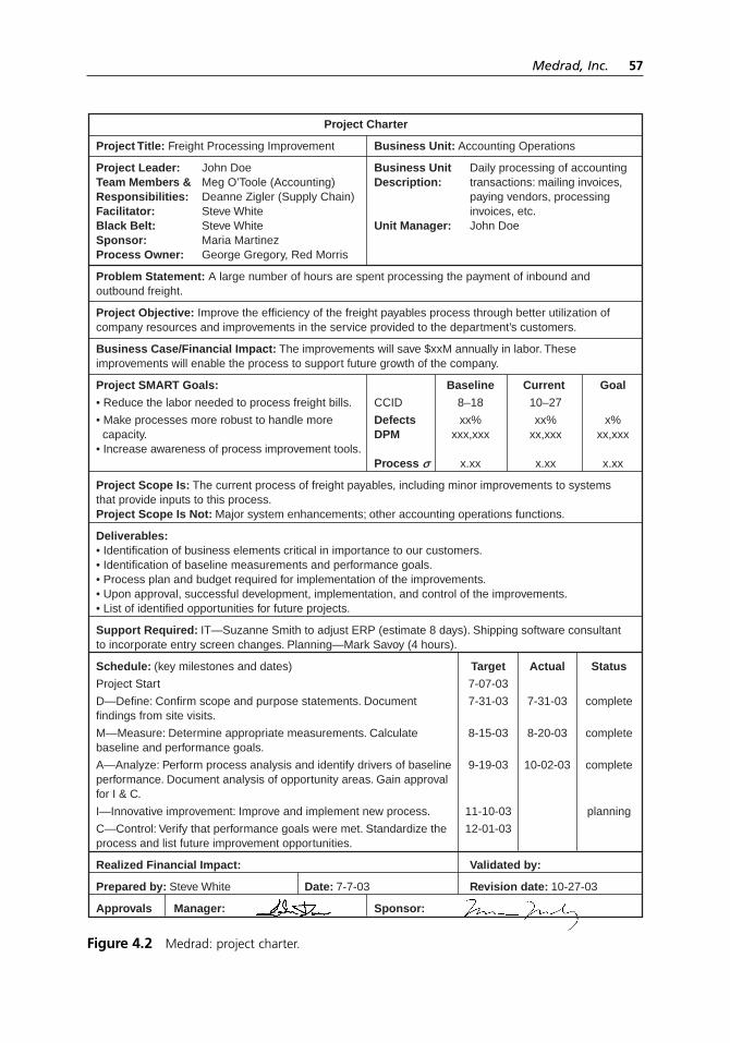
Medrad, Inc. 57
Project Charter
Project Title: Freight Processing Improvement Business Unit: Accounting Operations
Project Leader: John Doe Business Unit Daily processing of accountingTeam Members & Meg O’Toole (Accounting) Description: transactions: mailing invoices,Responsibilities: Deanne Zigler (Supply Chain) paying vendors, processing Facilitator: Steve White invoices, etc.Black Belt: Steve White Unit Manager: John DoeSponsor: Maria MartinezProcess Owner: George Gregory, Red Morris
Problem Statement: A large number of hours are spent processing the payment of inbound and outbound freight.
Project Objective: Improve the efficiency of the freight payables process through better utilization of company resources and improvements in the service provided to the department’s customers.
Business Case/Financial Impact: The improvements will save $xxM annually in labor. These improvements will enable the process to support future growth of the company.
Project SMART Goals: Baseline Current Goal
• Reduce the labor needed to process freight bills. CCID 8–18 10–27
• Make processes more robust to handle more Defects xx% xx% x% capacity. DPM xxx,xxx xx,xxx xx,xxx• Increase awareness of process improvement tools.
Process r x.xx x.xx x.xx
Project Scope Is: The current process of freight payables, including minor improvements to systems that provide inputs to this process.Project Scope Is Not: Major system enhancements; other accounting operations functions.
Deliverables:• Identification of business elements critical in importance to our customers.• Identification of baseline measurements and performance goals.• Process plan and budget required for implementation of the improvements.• Upon approval, successful development, implementation, and control of the improvements.• List of identified opportunities for future projects.
Support Required: IT—Suzanne Smith to adjust ERP (estimate 8 days). Shipping software consultant to incorporate entry screen changes. Planning—Mark Savoy (4 hours).
Schedule: (key milestones and dates) Target Actual Status
Project Start 7-07-03
D—Define: Confirm scope and purpose statements. Document 7-31-03 7-31-03 completefindings from site visits.
M—Measure: Determine appropriate measurements. Calculate 8-15-03 8-20-03 completebaseline and performance goals.
A—Analyze: Perform process analysis and identify drivers of baseline 9-19-03 10-02-03 completeperformance. Document analysis of opportunity areas. Gain approval for I & C.
I—Innovative improvement: Improve and implement new process. 11-10-03 planning
C—Control: Verify that performance goals were met. Standardize the 12-01-03process and list future improvement opportunities.
Realized Financial Impact: Validated by:
Prepared by: Steve White Date: 7-7-03 Revision date: 10-27-03
Approvals Manager: Sponsor:
Figure 4.2 Medrad: project charter.
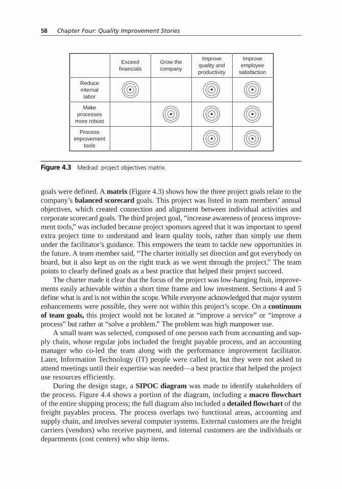
goals were defined. A matrix (Figure 4.3) shows how the three project goals relate to thecompany’s balanced scorecard goals. This project was listed in team members’ annualobjectives, which created connection and alignment between individual activities andcorporate scorecard goals. The third project goal, “increase awareness of process improve-ment tools,” was included because project sponsors agreed that it was important to spendextra project time to understand and learn quality tools, rather than simply use themunder the facilitator’s guidance. This empowers the team to tackle new opportunities inthe future. A team member said, “The charter initially set direction and got everybody onboard, but it also kept us on the right track as we went through the project.” The teampoints to clearly defined goals as a best practice that helped their project succeed.
The charter made it clear that the focus of the project was low-hanging fruit, improve-ments easily achievable within a short time frame and low investment. Sections 4 and 5define what is and is not within the scope. While everyone acknowledged that major systemenhancements were possible, they were not within this project’s scope. On a continuumof team goals, this project would not be located at “improve a service” or “improve aprocess” but rather at “solve a problem.” The problem was high manpower use.
A small team was selected, composed of one person each from accounting and sup-ply chain, whose regular jobs included the freight payable process, and an accountingmanager who co-led the team along with the performance improvement facilitator.Later, Information Technology (IT) people were called in, but they were not asked toattend meetings until their expertise was needed—a best practice that helped the projectuse resources efficiently.
During the design stage, a SIPOC diagram was made to identify stakeholders ofthe process. Figure 4.4 shows a portion of the diagram, including a macro flowchartof the entire shipping process; the full diagram also included a detailed flowchart of thefreight payables process. The process overlaps two functional areas, accounting andsupply chain, and involves several computer systems. External customers are the freightcarriers (vendors) who receive payment, and internal customers are the individuals ordepartments (cost centers) who ship items.
58 Chapter Four: Quality Improvement Stories
Improveemployee
satisfaction
Improvequality andproductivity
Reduceinternallabor
Makeprocesses
more robust
Processimprovement
tools
Grow thecompany
Exceedfinancials
Figure 4.3 Medrad: project objectives matrix.

The next step was to interview stakeholders to understand the perspectives of ship-ping department and cost center personnel. Then the team created as-is process maps.Eight flowcharts were required, because the process is different for each carrier andsometimes for inbound and outbound shipments. Figure 4.5 shows the map created for
Medrad, Inc. 59
A cost centerneeds apackageshipped
Shippingprocesses
package withinshipping system
Freight vendorpicks up
package anddelivers it
A cost centerrequests anitem to be
shipped to them
Freight vendordelivers
package toMedrad
Receivingaccepts
shipment andprocesses it
Vendor invoicesMedrad forpayment of
freight service
AccountingOperationsprocesses
invoice
ERP cuts acheck andsends tovendor
ERP applieschanges to costcenter
Suppliers• Shipping• Receiving• Freight vendors• ERP software system• Shipping system• Accounting Operations resources
Inputs• Vendor invoice• Shipping system data• Shipper software• ERP software system• Shipping logs• Receiving logs• Labor
Outputs• ERP record• Vendor check• Freight expense allocated to cost center
Customers• Cost centers• Vendors
ProcessAccountingOperations
FreightInvoiceProcess
Figure 4.4 Medrad: SIPOC diagram.
Check costallocation field for appropriate id
Directlink matches cost
center id toaccount #
Pull upinvoices dueon Directlink
8min
2–3min
40min
Key in costcenter id or
delivery # intoDirectlink 6
min
Approval ofinvoice inDirectlink
20min
10min
6min
4min
Transmit paymentinfo in Directlink—enter check #
and hit send 6min
Gather more info. Get sales order # or look through packing lists for cost center id 540
min
Carrier C Invoice Process
Occurrence: once per wk# Shipments: 1,200/wk
Total time: 642 min.
Can you determine
fromdata?
Delivery# or cost id
exists?
Can you determine
fromdata?
Yes
Yes
YesNo
No
No
Pnroyl ftm tmoncjkeomsjd osidm
dlei sile ljoied
Pnroyl ftm tmoncjkeomsjd osidm
dlei sile ljoied
Pnroyl ftm tmoncjkeomsjd osidm
dlei sile ljoied
Figure 4.5 Medrad: as-is process map.

carrier C. Most of the process steps are deliberately blurred in this reproduction of themap, except for two that the team identified as contributing most to excessive labor.(The circles with times were added later in the project.)
According to team members, creating the process maps was another best practicethat contributed to their project’s success. They identified waste such as redundantwork, complexity, missing handoffs. Those team members whose work processes touchgained a side benefit: they now understand better what the other does and how theirwork affects the other.
Measurement
When the project began, no measurement tools existed for determining how much timethe processes required or how many errors were encountered. The team developed atable (Figure 4.6) in a spreadsheet to capture this information. The team members fromaccounting and supply chain tracked how long each step of each process took. One time-consuming step was researching missing cost center numbers (CCIDs), so they alsotracked how often those numbers were missing. Columns to the left of the double lineshow collected data. Columns to the right are calculated values. Tracking continuedthroughout the project.
Times for each step of the processes were added to the process flowcharts. CarrierC’s flowchart shows 540 minutes per week spent researching missing CCID numbers.The metrics were used to create control charts: a chart of individuals for processingtimes and a p-chart for percentages of missing CCIDs. Each batch was a day’s pro-cessed invoices, so batch size varied, making the p chart appropriate. Figure 4.7 showsthe p-chart near the end of the project.
Analysis
A simplified decision matrix was used with a two-phase procedure to prioritizeimprovement opportunities. Figure 4.8 shows the first five rows of the matrix. Processsteps that contributed to excessive time are listed in the rows as potential improvementopportunities. The second column from the right shows the minutes spent annually oneach step, the first criteria. For only the most time-consuming steps, the team assessedthe second criteria, difficulty of improvement, on a scale of 1 to 5. An opportunity with
60 Chapter Four: Quality Improvement Stories
Date
19 Aug
22 Aug
#Shipments
714
818
#Invoices
20
84
CarrierA
CarrierC
x
x
Vendor TypeCarrier
BStartTime
1445
0845
EndTime
1635
1042
# CCIDMissing
169
159
TotalTime
110
127
# CCIDMissing/
Shipment
0.24
0.19
Min/Shipment
0.15
0.16
Figure 4.6 Medrad: project metrics table.

huge potential time savings scored 5 in difficulty, because improvement would requiremajor changes in companywide procedures. Because the project’s scope was restrictedto low-hanging fruit, that opportunity was eliminated from consideration.
Each of the opportunities chosen in the prioritization step was analyzed for rootcauses, using a variation of the fishbone diagram analysis. Instead of drawing the
Medrad, Inc. 61
# Shipments
# Missing CCIDS
% Missing
UCL
LCL
670
137
20
24.9
15.6
480
59
12
25.7
14.7
714
169
24
24.7
15.7
818
159
19
24.4
16.0
847
151
18
24.3
16.1
630
194
31
25.0
15.4
953
166
17
24.1
16.3
1179
151
13
10.3
5.5
1151
114
10
10.3
5.5
866
86
10
10.7
5.2
1056
51
5
10.4
5.4
992
70
7
10.5
5.3
451
85
18
11.7
4.1
1183
71
6
10.3
5.6
795
97
12
10.8
5.0
1121
60
5
10.3
5.5
1339
82
6
10.1
5.7
1335
109
8
10.1
5.7
736
51
7
10.9
4.9
792
77
10
10.8
5.0
1498
61
4
10.0
5.8
929
38
4
10.6
5.3
1483
107
7
10.0
5.8
937
98
10
10.5
5.3
1116
67
6
10.3
5.5
803
97
12
10.8
5.0
1202
63
5
10.2
5.6
1054
100
9
10.4
5.4
1 2 3 4 5 6 7 8 9 10 11 12 13 14 15 16 17 18 19 20 21 22 23 24 25 26 27 28
35%
30%
25%
20%
15%
10%
5%
0%
p = 20.2%
p = 7.9%
Mapped deliveryfield to CCID
Figure 4.7 Medrad: p chart.
Rank
1
2
3
4
5
Ref #
1
11
4A
5
9
Type
Carrier C
Carrier B outbound
Carrier B outboundsales
Carrier B outboundand inbound
Carrier B inbound
Process Step
Check costallocation field ID
Look up delivery # inERP to get CCID
Post w/clearing
Delivery # not found/PA process
Research to find thePO of non-inventoryshipments
WeeklyShipments
1200
70
70
50
25
AnnualShipments
62,400
3,640
3,640
2,600
1,300
Average Minutes perShipment
0.19
2
3.54
1.76
3
AnnualImpact of
Step(minutes)
11,856
7,280
12,886
4,576
3,900
Difficulty ofImprovement
1 = Easy5 = Difficult
2
2
5
Figure 4.8 Medrad: decision matrix.

traditional fish skeleton, flipchart pages were headed with the categories of causes—people, environment, technology, procedures, and so on—and as the team brainstormed,causes were placed onto appropriate pages. The facilitator explains, “We didn’t intro-duce the fishbone because sometimes just its structure makes it seem more complexthan it really is.” One cause of missing CCIDs was incorrect numbers keyed in by ship-ping personnel. Another cause was no number keyed in, and a cause for that was theCCID missing on the packing slip turned in by the shipper.
Brainstorming was used again to identify solutions for the causes. Some causesrequired additional research. IT people were brought in to develop solutions to computerissues. The causes of missing CCIDs were first labeled “skill and knowledge issues”under the “people” category, and training solutions were discussed. As the conversationwent deeper, the team realized that training would work until turnover occurred and train-ing didn’t happen or a different message was communicated. The team asked themselveshow technology could ensure that the CCID is entered. Their mistake-proofing solutionhad two parts. CCID became a required data entry field, to prevent omitting the number;and a drop-down list showed all cost center numbers, to reduce data entry errors.Mistake-proofing the CCID entry, another best practice, required the team to take theirthought process to another level to find a systemic solution.
Some of the solutions changed the process maps. To-be flowcharts were drawn forthe new processes. Figure 4.9 shows as-is and to-be flowcharts for one carrier. Again, thesteps of the process are intentionally blurred here; what is important is how much simplerthe new process became. Some process maps did not change. All these process maps canbe used in the future for training.
62 Chapter Four: Quality Improvement Stories
Hudyl notrssapdwotd
Hudyl notrssapdwotd
Hudyl notrssapdwotd
Hudyl notrssapdwotd
Hudyl notrssapdwotd
Hudyl notrssapdwotd
Hudyl notrssapdwotd
pnblxr wnv
Hudyl notrssapdwotd
pnblxr wnvGwtnd?
Gwtnd?
Xyz Xyz
Hudyl notrssapdwotd
pnblxr wnvXyz
Hudyl notrssapdwotd
pnblxr wnvXyz
Hudyl notrssapdwotd
pnblxr wnvXyz
Hudyl notrssapdwotd
Hudyl notrssapdwotd
Xyz
YpniYpni
Yes
No
Notrssapdwotd
Xyz
Notrssapdwotd
Xyz
Figure 4.9 Medrad: as-is and to-be process maps.
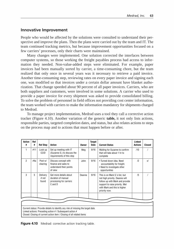
Innovative Improvement
People who would be affected by the solutions were consulted to understand their per-spective and improve the plans. Then the plans were carried out by the team and IT. Theteam continued tracking metrics, but because improvement opportunities focused on afew carriers’ processes, only their charts were maintained.
Many changes were implemented. One solution corrected the interfaces betweencomputer systems, so those working the freight payables process had access to infor-mation they needed. Non-value-added steps were eliminated. For example, paperinvoices had been manually sorted by carrier, a time-consuming chore, but the teamrealized that only once in several years was it necessary to retrieve a paid invoice.Another time-consuming step, reviewing rates on every paper invoice and signing eachone, was modified so that invoices under a certain dollar amount have blanket autho-rization. That change speeded about 90 percent of all paper invoices. Carriers, who areboth suppliers and customers, were involved in some solutions. A carrier who used toprovide a paper invoice for every shipment was asked to provide consolidated billing.To solve the problem of personnel in field offices not providing cost center information,the team worked with carriers to make the information mandatory for shipments chargedto Medrad.
To manage project implementation, Medrad uses a tool they call a corrective actiontracker (Figure 4.10). Another variation of the generic table, it not only lists actions,responsible parties, targeted completion dates, and status, but also relates actions to stepson the process map and to actions that must happen before or after.
Medrad, Inc. 63
Action#
1
2
3
Ref #
#11
#4a
5
Ref Step
Look upCCID
Post w/clearing
Delivery# notfound
Action
Set up meeting with IT(Suzanne S.) to discuss the requirements of this step
Discuss concept withfinance and sales tounderstand their pointsof view
Get more details aboutduration of manualprocessing for carriers C and D
Current status: Provide details to identify any risk of missing the target date.Linked actions: Preceding action # / Subsequent action #Closed: Closing of current action item / Closing of all related items
Owner
Meg
John
Deanne
TargetDate
9/16
9/16
9/16
Current Status
Waiting for Suzanne to confirm that will take about 1 hr to complete
• Turned down idea. Need accountability for freight.• Need to investigate other opportunities
This is on Mark S.’s list, but not high priority. Deanne will follow up with Mark and provide support to raise priority. Met with Mark and this is higher priority now.
LinkedActions
/10
/2
/5
Closed
/
x/
/
Figure 4.10 Medrad: corrective action tracking table.

When the CCID data entry was changed in the computer system, the results wereimmediate. On the control charts, the percentage of missing CCIDs and the timerequired to process invoices both dropped dramatically when that change was made andstayed at that lower level. (The percentage of missing CCIDs is not zero because of ship-ments dropped off at carriers’ facilities outside Medrad.) Overall, significant labor savingswere achieved. For example, processing time for one carrier’s invoices was reduced bymore than six hours per week.
The team considers ongoing measurement to be another best practice. The facilitatorexplains, “Often people can feel the results, but they don’t have a quantitative measure forthe impact of the project. Using tools like these, it was very easy to communicate topeople what our impact was, what the savings were. And it gives the team a feeling ofaccomplishment because it’s visual; they can see the impact they had by participatingin this project.”
Control
Responsibility for the improved freight payables process was handed off to the func-tional groups. Because these groups were involved throughout the project, the disband-ing of the team and hand-off to the groups was seamless. The measurement tools werepassed to accounting so they could continue to monitor performance.
“We have a lot of ideas for things that we see us working on in the future,” says oneteam member, “but for the purpose of our team, it had to have an end point.” The nextstep is “benchmarking, benchmarking, benchmarking”: learning from best-practice com-panies in the area of freight processing. They also plan to extend this project’s improve-ments to other types of shipments and other carriers.
The team highlighted the five best practices that had contributed to their success.They also identified lessons they had learned from challenges they encountered. Forexample, they learned that during the planning stage, they should consider competing pro-jects and commitments, not only current ones but also ones that will occur throughout theexpected time frame of the project. Their project had to be lengthened and team membershad to juggle too many balls because of other important activities in their regular jobs.
Another important lesson was about getting started. Despite Medrad’s strong con-tinuous improvement culture, “sometimes projects seem more complex, maybe requiremore project management experience or different tools that people don’t feel they haveexpertise using,” says this project’s facilitator. “They brought me into the picture. ‘Howwould we go about this? What tools would we use?’ Take small bites. You’re sittingthere looking at a gigantic cookie, and it’s a little intimidating. Small bites out of theproject have large impact.”
Another team member said, “Sometimes you’re concentrated so much on what youdo every day, and you know all these different issues. So on a project you’re not reallysure where to start. You get bogged down with talking about all these things, and youdon’t really solve anything. You don’t know what direction to go in and don’t know howyou’re supposed to lay it out. Even something as simple as a process map—you don’teven think to do that sometimes. By having him [the facilitator] on our team, it helped
64 Chapter Four: Quality Improvement Stories

us step back and realize how not to get bogged down with all the other issues and to findways to get moving in the right direction. Actually, it was a joy, and it was one of thebest projects I’ve been on, because we were so focused and because of the quality toolswe used as a group.”
PEARL RIVER SCHOOL DISTRICT
Pearl River School District (PRSD), located 25 miles north of New York City, has cre-atively adapted the tools and methods of quality to fit its needs. They explain, “We dealwith people. Our students are our customers, and the product we deliver is to allow themto achieve to their highest ability.” Pearl River has applied the principles of continuousimprovement so well that results over a twelve-year period earned them the MalcolmBaldrige National Quality Award in 2001.
Pearl River’s “Golden Thread” is a tree diagram (Figure 4.11) that communicateshow districtwide goals are translated into subgoals and individual projects. Surveys areused extensively to gather input from students, faculty, staff, and community. (See treediagram and survey for details.)
Pearl River uses data extensively to monitor performance on everything they do.A computerized data warehouse automatically pulls in data from a variety of sourcesand makes it easily available in tables or graphs, stratified in whatever way is neededfor analysis. Root cause analysis is applied to any areas needing improvement. Theyview their work as processes and have studied and flowcharted dozens of key pro-cesses, from teacher recruitment and hiring to maintenance work orders. They use theplan–do–study–act (PDSA) cycle extensively. Figure 4.12 shows how they have
Pearl River School District 65
Improvedacademicperformance
Academicachievement
Regents’ diploma rate
4th and 8th NYSexam results
Collegeadmissions
Lag indicator
Lag indicator
Lead indicator
Lead indicator
Lead indicator
Lead indicator
Project
Project
Project
Project
Align 5–12 math curriculum
Implement year 2 technology plan
Replace grade 7 assessment
Implement grades 5–8 differentiatedinstruction
Figure 4.11 Pearl River: tree diagram.
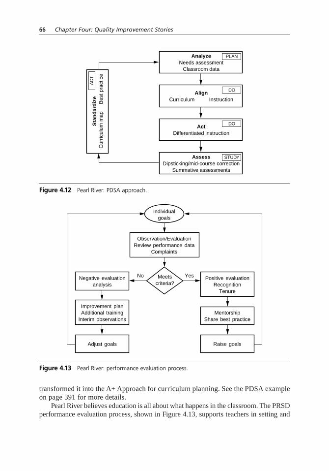
transformed it into the A+ Approach for curriculum planning. See the PDSA exampleon page 391 for more details.
Pearl River believes education is all about what happens in the classroom. The PRSDperformance evaluation process, shown in Figure 4.13, supports teachers in setting and
66 Chapter Four: Quality Improvement Stories
AnalyzeNeeds assessment
Classroom data
PLAN
AlignCurriculum Instruction
DO
ActDifferentiated instruction
DO
AssessDipsticking/mid-course correction
Summative assessments
STUDY
Sta
nd
ard
ize
Cur
ricul
um m
ap
Bes
t pra
ctic
e
AC
T
Figure 4.12 Pearl River: PDSA approach.
Meetscriteria?
No YesNegative evaluationanalysis
Improvement planAdditional training
Interim observations
Adjust goals
Positive evaluationRecognition
Tenure
Observation/EvaluationReview performance data
Complaints
MentorshipShare best practice
Raise goals
Individualgoals
Figure 4.13 Pearl River: performance evaluation process.
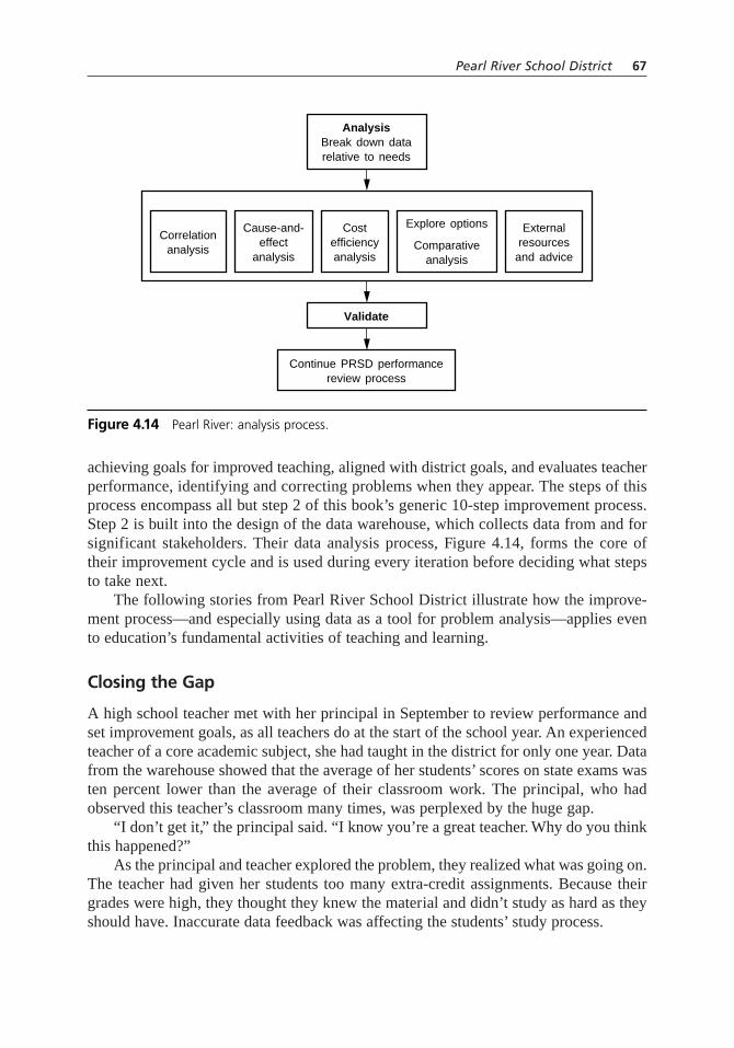
achieving goals for improved teaching, aligned with district goals, and evaluates teacherperformance, identifying and correcting problems when they appear. The steps of thisprocess encompass all but step 2 of this book’s generic 10-step improvement process.Step 2 is built into the design of the data warehouse, which collects data from and forsignificant stakeholders. Their data analysis process, Figure 4.14, forms the core oftheir improvement cycle and is used during every iteration before deciding what stepsto take next.
The following stories from Pearl River School District illustrate how the improve-ment process—and especially using data as a tool for problem analysis—applies evento education’s fundamental activities of teaching and learning.
Closing the Gap
A high school teacher met with her principal in September to review performance andset improvement goals, as all teachers do at the start of the school year. An experiencedteacher of a core academic subject, she had taught in the district for only one year. Datafrom the warehouse showed that the average of her students’ scores on state exams wasten percent lower than the average of their classroom work. The principal, who hadobserved this teacher’s classroom many times, was perplexed by the huge gap.
“I don’t get it,” the principal said. “I know you’re a great teacher. Why do you thinkthis happened?”
As the principal and teacher explored the problem, they realized what was going on.The teacher had given her students too many extra-credit assignments. Because theirgrades were high, they thought they knew the material and didn’t study as hard as theyshould have. Inaccurate data feedback was affecting the students’ study process.
Pearl River School District 67
AnalysisBreak down datarelative to needs
Validate
Continue PRSD performancereview process
Costefficiencyanalysis
Explore options
Comparativeanalysis
Externalresources
and advice
Cause-and-effect
analysis
Correlationanalysis
Figure 4.14 Pearl River: analysis process.

The teacher changed her approach. She also continued to reflect on what was hap-pening in her classroom. In addition to reducing extra-credit assignments, she wasquicker to recommend struggling students for the math lab, and she started reviews forthe state exam earlier.
The following year, the gap had completely disappeared. Her students’ classroomaverage remained high, and the average of their state exam scores matched their class-room work.
Pearl River High School’s principal says she has used data to study all kinds ofproblems, now that she understands its power. “The power of data lies not only in study-ing figures but also in knowing what figures to study.” State exam scores alone wouldnot have indicated how the teacher’s approach needed changing. The cause could havebeen anything from teaching the wrong material to poor classroom management skills.However, comparing two sets of data gave additional information about the current statethat led to the correct cause of the problem.
Focusing on the Cause
In another instance, the performance of a brand-new teacher in an academic subject wasnot satisfactory. A huge percentage of his students failed the midterm exam. Again, thecause could have been anything from a group of kids with poor study skills to poorteaching to a poorly designed exam. Before a quarterly performance review, the princi-pal did several data comparisons.
First, she compared the midterm exam scores of this teacher’s students to otherteachers’ students. These kids did significantly worse. The cause was not the exam.
Second, she compared grades in these students’ other classes to their grades in thissubject. They were doing well elsewhere. The cause was not the student’s study skillsor learning capacity.
Third, she compared the results on this midterm exam, which is a departmentwideexam, to results on classroom quarterly exams, which are prepared by the teacher. Thestudents had performed well on the quarterly exams. Poor teaching was probably notthe cause, unless the teacher’s tests were badly designed.
These comparisons pointed to a different cause: the teacher was not teaching thesame material as the other teachers. The teacher and principal could now begin to seekconfirmation of this cause and plan changes.
When data is used for problem solving, judgmental issues like personalities canbe avoided. “The discussion is cooler and cleaner,” says Pearl River’s principal. “Notnecessarily more pleasant, but on a different, less emotional plane.” While education’sresults are dependent on what happens inside classrooms between teachers and students,the field has no monopoly on emotionally charged issues. Every organization functionsthrough people and therefore is full of potentially explosive emotional land mines.Thoughtful use of data can help us weave through those land mines and focus on trueproblem causes.
68 Chapter Four: Quality Improvement Stories

ST. LUKE’S HOSPITAL: CHARGING STANDARDS
St. Luke’s Hospital is the largest hospital in Kansas City, Missouri, with 450 doctors,over 3000 employees, and almost 600 beds. For many years it has been committed tototal quality and continuous improvement. In 1995, the hospital began using theMBNQA criteria to help it strive for excellence. By 2003, St. Luke’s success in improv-ing healthcare, patient satisfaction, and bottom-line results earned it the MalcolmBaldrige National Quality Award.
Although it is a not-for-profit hospital, like any organization it must manage itsfinancial resources so that it can continue to fulfill its three-part mission of outstandinghealth care, medical education, and research. St. Luke’s uses a planning process based onan organizationwide balanced scorecard (Figure 4.15), deployed throughout the orga-nization with 90-day action plans in all departments.
The following story illustrates how the principles and tools of quality improvementwere applied to a hospital process that overlapped medical care and financial accounting.It also demonstrates that the steps of the improvement process need not be addressed instrict sequential order, if the project suggests a different organization. St. Luke’s uses afive-step improvement process, but the ten-step process is indicated here as anotherillustration of those steps.
The Problem
Hospitals itemize patient charges to include supplies used and services that are aboveand beyond normal nursing care on the unit. For example, if a patient receives a cardiaccatheterization, the catheter and dressings should be itemized. After the procedure, the
St. Luke’s Hospital 69
Clinical andAdministrative
Quality
Financial People
CustomerSatisfaction
Growth andDevelopment
Strategy & Vision
Figure 4.15 St. Luke’s: balanced scorecard.

nurse on the unit closely monitors the patient for about four hours, watching for com-plications, and that special nursing care also is charged.
But in the fast-paced, high-pressure nursing units at St. Luke’s, these charges oftenwere not captured. A mistake-proofing system had been devised to make it easy tocapture charges for supplies. Each item had a yellow sticker, and when the item wasused for a patient, the sticker was removed from the item and placed on the patient’scard. But many charges were missed anyway. The hospital’s charge audit departmentreviews records when requested by insurance companies, looking for invalid charges,but the auditors discovered the opposite problem: an overwhelming percentage ofpatient records were missing charges. Because not every record is audited, the true costto the hospital’s bottom line was unknown, but St. Luke’s knew they were losing a lotof money.
Team Formation
To solve this problem, the Performance Improvement (PI) Steering Committee char-tered a team to develop new charging standards. Eleven team members representedevery nursing unit, different positions from nursing director to staff nurses to unit sec-retaries, different functions such as information services (IS) and accounting, a facili-tator from quality resources, and a director-level team leader. (Step 1: What do we wantto accomplish?)
Because of the high priority of this issue, the steering committee and team leader-ship decided to accelerate the project with an approach that was unusual at the time,although St. Luke’s has since adopted it for other projects. The team met only fourtimes—but those meetings lasted all day long. With meetings every Friday and workassignments between meetings, the project kicked off at the beginning of April androlled out a new process in July. Many people complain that quality improvement pro-jects take too long. St. Luke’s has proved it doesn’t have to be so!
The most-used tool was an L-shaped matrix that hung on the wall throughout allthe team meetings. (See Figure 4.16.) Only the column and row labels were filled in.Brainchild of the team leader, it visually conveyed two intersecting dimensions of thecharging problem. (Step 1.) The charging process has three phases: knowing what to
70 Chapter Four: Quality Improvement Stories
What tocharge
Entering thecharge
Auditing thecharge
Knowledge Resources Accountability
Figure 4.16 St. Luke’s: L-shaped matrix.
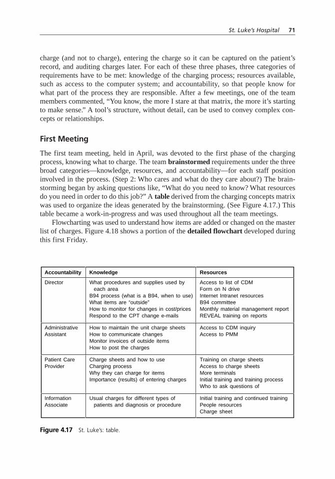
charge (and not to charge), entering the charge so it can be captured on the patient’srecord, and auditing charges later. For each of these three phases, three categories ofrequirements have to be met: knowledge of the charging process; resources available,such as access to the computer system; and accountability, so that people know forwhat part of the process they are responsible. After a few meetings, one of the teammembers commented, “You know, the more I stare at that matrix, the more it’s startingto make sense.” A tool’s structure, without detail, can be used to convey complex con-cepts or relationships.
First Meeting
The first team meeting, held in April, was devoted to the first phase of the chargingprocess, knowing what to charge. The team brainstormed requirements under the threebroad categories—knowledge, resources, and accountability—for each staff positioninvolved in the process. (Step 2: Who cares and what do they care about?) The brain-storming began by asking questions like, “What do you need to know? What resourcesdo you need in order to do this job?” A table derived from the charging concepts matrixwas used to organize the ideas generated by the brainstorming. (See Figure 4.17.) Thistable became a work-in-progress and was used throughout all the team meetings.
Flowcharting was used to understand how items are added or changed on the masterlist of charges. Figure 4.18 shows a portion of the detailed flowchart developed duringthis first Friday.
St. Luke’s Hospital 71
Accountability
Director
AdministrativeAssistant
Patient CareProvider
InformationAssociate
Knowledge
What procedures and supplies used by each areaB94 process (what is a B94, when to use)What items are “outside”How to monitor for changes in cost/pricesRespond to the CPT change e-mails
How to maintain the unit charge sheetsHow to communicate changesMonitor invoices of outside itemsHow to post the charges
Charge sheets and how to useCharging processWhy they can charge for itemsImportance (results) of entering charges
Usual charges for different types of patients and diagnosis or procedure
Resources
Access to list of CDMForm on N driveInternet Intranet resourcesB94 committeeMonthly material management reportREVEAL training on reports
Access to CDM inquiryAccess to PMM
Training on charge sheetsAccess to charge sheetsMore terminalsInitial training and training processWho to ask questions of
Initial training and continued trainingPeople resourcesCharge sheet
Figure 4.17 St. Luke’s: table.

Between the first and second meetings, team members had assignments to visit thehospital units, interview people doing the work, and find out exactly how the chargingprocess was currently being done. (Step 3: What are we doing now and how well are wedoing it?)
Second Meeting
The second Friday was devoted to phase two of the charging process, entering thecharge. The day began with individuals reporting what they had learned from the units.The meeting room’s walls were hung with many different flowcharts, showing that eachunit had its own variation of the process. Another member had gathered all the chargingforms used in the units. Again, they were all different. The team discussed the problemsand opportunities represented by the variations. (Step 4: What can we do better?)
The team continued to work on the charging standards table (Step 2). They alsobegan working on a fishbone diagram (Figure 4.19) to identify the causes of inaccuratecharging. (Step 5: What are the underlying problems?) The fishbone revealed to theteam how complex the process really is. Then they developed a detailed flowchart(Figure 4.20) of a generic, ideal process for collecting and capturing charges. “Day one”and “day two” of the to-be flowchart were done during this meeting. (Step 6: Whatchanges could we make to do better?)
72 Chapter Four: Quality Improvement Stories
Need toupdate price
Executive councilmust approve
Isnew item aprocedure?
No
Yes
Info re: newprocedure/supply
received fromdoctors/vendors/Med Products
committee
Unit-purchaseditem (“Outside”)
has changein cost
B94 formcompleted fornew chargesor changes
Procedure costchanges due to staff time,
skill level
Charge Master Additions/Changes
Figure 4.18 St. Luke’s: detailed flowchart.

St. Luke’s Hospital 73
Equipment
Processes People
Inaccuratecharging
Documents in the chart thatsupport charting don’t agree
Charges need either doctor’sorder or unit protocol
No documentation tosupport the charge
Not available 24/7for each patient
Not descriptiveNot available foraudit/follow-up
Lack of required elements
24 to 24 time framenot followed
No backup systemCharge sheets not complete
No clear process for unusualcharges or unusual patients
No clear communicationchannels with nursing units
Patient ID'd by name, not acct number
Multipleactive accts
Preadmit accts with chargesnot converted to inpatient acct
No process to verifythe acct number
Directors not asked forfeedback by their bosses
To unit re: failed claims etc.
REVEAL reports
Not all chargesavailable to allunits
HCFA changes
Update/change processcumbersome and unclear
Not enough
Downtime
Methods
Training
Corporatecompliance
Charge mastercommittee
Charging islow priority
Don’t see how chargesfit into big picture
Perceived lack ofappropriate profit motive
Changes in personnel (float,agency, new hires, job changes)
Interface errorhandling
Duplicate entry ofcharges needed
No access toapplicable reports
N drivePMM
Do we have enough peopleto do this effectively?
Do we have the rightpeople doing this?
Floats, esp. IA’s
Lack of backup/resources
Can’t know usual charges/procedures on patients
Why charge for someprocedures and not others?
Charge management comitteedoesn’t review prior to sending out
Too long, doesn’trelate to individualdepartment
Sent to no oneor everyone
To individual employee
No info re: lost charges
Don’t know how to use
B94 form requests info thedirector doesn’t know
Complicatedinputs
InitialSubsequent
Change memos
Assumption: if theitem is chargeable
its already onthe CDM
Hard to read
No accuracy checks
Not in job descriptions
In STAREven more
in Cerner
Date of service versusdate of posting
High variationbetween units
Not clearlydefined
Not updated toreflect CDM
Medical record
Charge records
Daily charging process
Charging for wrongprocedure impacts HIM
Patient accounting
Selecting the correct account
Accountability not clearlydefined through the hierarchy
Lack of feedback
Audit tools
Charge master
Computers
STAR charge entryInterfaces
Computer access/training
Lack of resource (PEOPLE)for individual departments
Lack of effective rewards
Lack of clearcommunication lines
Relying too much on cliniciansto think about charging
Lack of buy-in
Staffing
Documents
Figure 4.19 St. Luke’s: fishbone diagram.
Charge recordplaced in pt
room/chart atmidnight or time
of pt arrival
Pt name, accountnumber verified
by licensed caregiver
Chargesentered by
charge entrypersonnel
Return to chargeentry person for
revisions (delete/credit)
Charge record collectedat midnight or dischargeand delivered to charge
entry personnel
Departmental chargelog compared tocharge records
including pt typereview
Obtain chargerecord or
reconstructfrom chart?
Procedureperformed or dept-
specific supply item used
Visual audit ofcharge record
and charge inquiry
Charge recordfiled
Revisions made(delete/credit)
Feedback providedto appropriate person
Charge record filed
Report to chargeaudit person
Charge audit e-mails director re:
call and action taken
Licensedcaregiver
documentscharge items oncharge record
Call charge audit 932-2496 for instructions
Routinecharge (on
chargerecord)?
Chargescorrect?
Chargescorrect?
Physician’sorder or dept
protocol exists for procedure/
item?
Charge recordreceived for everypt who received
services?
Charge recordreceived for everypt who received
services?
Assigned licensed caregiver
working againtoday?
Obtainorder
Person performingprocedure
documents inmedical record
Entry noted oncharge record
(initials)
Day
Thre
eDa
y Tw
oDa
y On
e
Midnight Daily Charging Process Cost Center:
Licensed caregiver responsible for the patienttakes these actions on day 1
Charge entry person for departmenttakes these actions on day 2
Charge audit person for departmenttakes these actions on day 3
Yes
No
No
NoNo
No
No
No
Yes
Yes
Yes
Yes
Yes
Yes
Figure 4.20 St. Luke’s: to-be detailed flowchart.

In the week between meetings two and three, a subteam designed a new chargingform, with standard information plus areas that could be customized by each unit.Because the charging code depends on location as well as the item—a bandage in ERhas a different charge code than a bandage in ICU—each unit had to be able to list itsown unique codes. (Step 6.)
Third Meeting
The third meeting was devoted to the third phase of the charging process: auditing thecharge. Additional representatives from IS attended this meeting. The team reviewedthe reports that were available from the computer system (Step 3) and redesigned them(Step 4). In one case, a new report was needed. For charging it is important to knowwhat patients were on a unit the previous day, but no existing report gave that informa-tion. One of the IS people volunteered to develop a new “patients who were here” report.Brainstorming was used to plan new and redesigned reports, asking questions such as,“What do we want on the report? What do we not want on the report? What’s on therenow that isn’t helpful? What do we need in place of that?” (Step 4.)
The team also continued work on the charging standards table (Step 2) and the fish-bone diagram (Step 5), adding information related to auditing. “Day three” was addedto the daily charging process flowchart, showing audit activities. (Step 6.)
Fourth Meeting
The fourth Friday was devoted to planning implementation. (Step 6: What changes couldwe make to do better?) During previous meetings, the group had begun to realize that ateam could never be responsible for the new process. Instead, it had to be embedded intothe organization’s job responsibilities and accountabilities. Fortunately, St. Luke’s has awell-developed performance management system, with clear job descriptions and a goal-setting process for each individual that relates to the organization’s core values. One ofthe core values is resource management, which clearly ties to the charging process.
The team developed a process and time line for rolling out the new process, sum-marized in a Gantt chart. (See Figure 4.21.) Communications, training, and documen-tation were included.
During the afternoon of this last meeting, the quality resources director led the teammembers in a short course on skills of team leadership. This was considered both areward for the team members, who enjoyed the training, and a way of capitalizing onthe experience the team members had gained by increasing their skills for use on futureprojects. (Step 10: What did we learn? Let’s celebrate!)
Implementation
The PI steering committee approved the new process, and the rollout began. (Step 7: Doit!) A meeting was held at the end of May for all the unit directors, attended by seniormanagement, for a presentation communicating the new standards, processes, and forms.
74 Chapter Four: Quality Improvement Stories

Each director received a packet of materials, containing baseline data for that unit,examples of new and redesigned forms and reports, and the timeline for implementation.
The blank charging concepts matrix used throughout the project had now beentransformed into documents capturing process details. The directors’ packets included adocument organized by the three phases of the process, describing what happens andwho does it. (See Figure 4.22.) But the team went a step further and gave the directors
St. Luke’s Hospital 75
ID
Charging Standards Implementation Timeline
1
2
3
4
5
6
7
8
Task Name StartDate
5/28/01
5/29/01
6/5/01
6/5/01
6/11/01
6/18/01
6/25/01
7/1/01
5/29/01
6/4/01
6/5/01
6/8/01
6/15/01
6/29/01
6/29/01
7/2/01
1d
5d
0d
4d
5d
10d
5d
1d
EndDate
Director’s meetingto introducestandards anddocumentsDirectors completedocumentsDirectors turn indocumentsCharge Std Leadership prepares materials for department trainingDepartment meetingsof Charge ResourcePersons
IS training as neededDepartmentorientation
GO LIVE
Dura-tion
May 01 Jun 0127 28 29 30 31 1 2 3 4 5 6 7 8 9 10 11 12 13 14 15 16 17 18 19 20 21 22 23 24 25 26 27 28 29 30 1
Figure 4.21 St. Luke’s: Gantt chart.
Section 2: Entering the Charge
Directors will be accountable for the following for each cost center assigned to the director:
• Designating the position(s) responsible for completing the Charge Record (charge sheet or medical record document used to enter charges)
• Designating the position(s) responsible for charge entry
The Charge Entry Person will be accountable for the following:
• Validating that Charge Records were completed for all patients receiving services within that revenue center for the identified 24-hour period, even if there were no charges
• Validating the patient type, date of service, and account number
• Ensuring that all charges are entered within five days of discharge (date of discharge is day one)
The organization will be held accountable for providing the following resources and training:
• Training on charge entry and charge inquiry in STAR and any other software used to post charges for that revenue center
• How to identify the patient type and correct account number
• Clearly defined written process for charging
• Communicating the importance of accurate charging and its impact on the organization
Figure 4.22 St. Luke’s: policy document.

a second document. It contained the same information, but it was organized by job role.For each role, it listed what the person does in each phase of the charging process, whatknowledge and skills are needed, and the computer access required for the tasks. (SeeFigure 4.23.) A third document, based on the second, was a checklist for the directorto list employees and check off training completed and computer access available. (SeeFigure 4.24 for a portion of this checklist.) The team saw that it was important to pro-vide multiple tools that give information in the way people will need to use it.
The directors also received the generic daily charging process flowchart. At thebottom were seven questions, such as “Where is the charge record placed in your unit?”and “What are the titles/names of charge entry persons?” After the meeting, the direc-tors provided answers to the questions, and the team prepared a customized flowchartfor each unit.
Team members provided computer training as needed to unit employees. The weekbefore the transition, unit directors held orientations with their staff to prepare them forthe rollout. On the “go-live” day, everyone began using the new process.
76 Chapter Four: Quality Improvement Stories
Cost Center(s) Number Name of person completing form:
_______________________ _________ __________________________________ Ext: _______
Responsibility: Charge Entry Person
Accountabilities:
1. Validating that charge records were completed for all patients receiving services within that cost center for the identified 24-hour period, even if there were no charges
2. Validating the patient type, date of service, and account number
3. Ensuring that all charges are entered within five days of discharge (date of discharge is day one)
Computer Access Needed:
• Access to charge entry and charge inquiry in STAR
Training Needed:
• What are customary charges for patients on that unit
• Charge entry and charge inquiry in STAR
• How to identify the patient type and appropriate account number
• Revenue center charging process
• The importance of accurate charging and its impact on the organization
Position of this person: _______________________________________________________________
Charging Standards Roles & Positions
Figure 4.23 St. Luke’s: roles document.

How Did We Do?
One of the directors commented after the directors’ meeting that it was the first he hadattended where it was very clear at the end what he needed to do. The team’s care withdefining responsibilities and resources paid off with a smooth, successful implementation.
Figure 4.25 shows a line graph of average charges per patient per day (CPPD),starting in June before the process was implemented and continuing through the rest ofthe year. (Step 8: How did we do?) (For confidentiality, the actual data has been masked.)August shows a spike, as everyone paid extra attention to the new process. Chargesdropped in September, then gradually began increasing.
The team had recognized that continuing responsibility for maintaining chargingstandards had to be embedded in the organization. One indication of continuing attentionto the new process was that departments chose to include charging standards goals intheir 90-day action plans for the balanced scorecard’s financial goal. Each unit devel-oped its own metrics for monitoring accuracy. (Step 9: How can we do it every time?)
St. Luke’s Hospital 77
Charge Entry Person
Name
Place a check in the box if the training is COMPLETE or the person has access.
TrainingID
Patient
Computer AccessCustomary
Charges
Charge
Entry
Charge
Process Importance
Charge
Entry
Figure 4.24 St. Luke’s: checklist.
Average Charges per Patient DayAll Departments—2001
June
XXX
XXX
XXX$
XXX
XXX
XXX
July August September October November December
Figure 4.25 St. Luke’s: line graph.

A labor-intensive analysis of charging error rates had been done when the team firstformed. A year later, the analysis was repeated. Figure 4.26 shows a bar graph com-paring error rates in eight different units before and after the changes. (Step 8.) (Again,actual data has been masked.) In all cases but one, the improvement is obvious and dra-matic. The one exception in unit 5 occurred because the regular person was on vacationmost of that month; the following month, error rates dropped to a very low number. Unit7’s improvement appears small; however, that unit has extremely large charges, so evena small improvement contributes greatly to the bottom line.
ZZ-400 MANUFACTURING UNIT
The story of ZZ-400, a chemical manufacturing unit, is a composite of the experiencesof several real teams, plus some fiction to tie them all together. Each of the figuresshown here is repeated in Chapter 5, with more explanation, as an example of that tool.
ZZ-400 is the company’s nickname for one of its products. The workers in the ZZ-400 unit, one of many within a large chemical plant, operate the continuous manufac-turing process around the clock. They are supported by central facilities that service allunits in the plant: analytical laboratory, maintenance shop, shipping and receiving, engi-neering services, and administrative functions such as accounting and human resources.
ZZ-400 began its quality improvement process at the same time as the rest of theplant, after training in quality concepts, methods, and tools. A team volunteered to worktogether to plan initial projects.
Step 1: What do we want to accomplish?
A sign had hung on the control room wall for over a year, designed by several of theunit operators:
78 Chapter Four: Quality Improvement Stories
Charging Error RatesPre-Implementation versus Post-Implemention Analysis
XXX
XXX
XXX
XXX%
XXX
XXX
XXX
XXX
Unit 1 Unit 2 Unit 3 Unit 4 Unit 5 Unit 6 Unit 7 Unit 8
May 01May 02
Figure 4.26 St. Luke’s: bar graph.
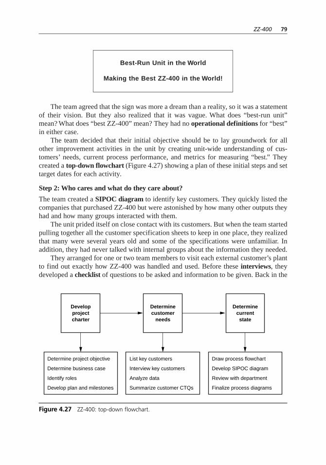
The team agreed that the sign was more a dream than a reality, so it was a statementof their vision. But they also realized that it was vague. What does “best-run unit”mean? What does “best ZZ-400” mean? They had no operational definitions for “best”in either case.
The team decided that their initial objective should be to lay groundwork for allother improvement activities in the unit by creating unit-wide understanding of cus-tomers’ needs, current process performance, and metrics for measuring “best.” Theycreated a top-down flowchart (Figure 4.27) showing a plan of these initial steps and settarget dates for each activity.
Step 2: Who cares and what do they care about?
The team created a SIPOC diagram to identify key customers. They quickly listed thecompanies that purchased ZZ-400 but were astonished by how many other outputs theyhad and how many groups interacted with them.
The unit prided itself on close contact with its customers. But when the team startedpulling together all the customer specification sheets to keep in one place, they realizedthat many were several years old and some of the specifications were unfamiliar. Inaddition, they had never talked with internal groups about the information they needed.
They arranged for one or two team members to visit each external customer’s plantto find out exactly how ZZ-400 was handled and used. Before these interviews, theydeveloped a checklist of questions to be asked and information to be given. Back in the
Best-Run Unit in the World
Making the Best ZZ-400 in the World!
ZZ-400 79
Determinecustomer
needs
Developprojectcharter
Determinecurrentstate
Determine project objective
Determine business case
Identify roles
Develop plan and milestones
List key customers
Interview key customers
Analyze data
Summarize customer CTQs
Draw process flowchart
Develop SIPOC diagram
Review with department
Finalize process diagrams
Figure 4.27 ZZ-400: top-down flowchart.

unit, a task team developed an L-shaped matrix (Figure 4.28) that showed each cus-tomer’s product specifications and choice of packaging and delivery options.
They also interviewed representatives of the internal groups. That information wassummarized in a requirements table. Because maintenance and analytical lab play acrucial day-to-day role in keeping the unit running, the team asked for a representativefrom each group to join the team.
Step 3: What are we doing now and how well are we doing it?
The team began to focus on its processes. A detailed flowchart of the manufacturingprocess was already a daily tool. To decide which process variables to monitor, every-one reviewed the newly collected customer specifications as well as their own expertknowledge of the most sensitive variables in the process. Collecting all this input, theyset up control charts for each critical process characteristic (Figure 4.29) with histori-cal data used to establish control limits. The entire unit began monitoring its manufac-turing process with the control charts.
Step 4: What can we do better?
In order to know where they could improve, the team had to define “best-run unit” and“best ZZ-400.” First, team members brainstormed (Figure 4.30) a list of over 30 indi-cators of “best.” To make some sense out of all these ideas, they used an affinity dia-gram. They modified the procedure slightly to allow for the fact that the entire team wason shiftwork and wanted to minimize meetings. On a rarely used door in the controlroom, members set up sticky notes with the brainstormed ideas on them and passedalong a request for everyone to work with the notes whenever they had time. After sev-eral days, a natural grouping and some headings had emerged (Figure 4.31).
80 Chapter Four: Quality Improvement Stories
Purity %
Trace metals (ppm)
Water (ppm)
Viscosity (cp)
Color
Drum
Truck
Railcar
> 99.2
< 5
< 10
20–35
< 10
✔
> 99.2
—
< 5
20–30
< 10
✔
> 99.4
< 10
< 10
10–50
< 15
✔
> 99.0
< 25
—
15–35
< 10
✔
CustomerD
CustomerM
CustomerR
CustomerT
Customer Requirements
Figure 4.28 ZZ-400: L-shaped matrix.

ZZ-400 81
X and R or Moving Average–Moving Range Chart
Process:
Date#1#2#3#4#5#6SumAvg.Range
Ave
rage
Ran
ge
ZZ-400Purity % PW 3/29/05
99.88
99.799.6
100.0
99.5
99.0
.5
0
UCL
X
LCL
R
0.199.65
3/499.799.4
0.399.55
3/599.499.3
0.199.35
3/699.599.8
0.399.65
3/799.799.4
0.399.55
3/899.699.9
0.399.75
3/999.399.2
0.199.25
3/1099.699.3
0.399.45
3/1199.599.6
0.199.55
3/1299.799.6
0.199.65
3/1399.699.8
0.299.70
3/1499.599.4
0.199.45
3/1599.799.8
0.199.75
3/1699.799.3
0.499.50
3/1799.499.5
0.199.45
3/1899.699.7
0.199.65
3/1999.299.5
0.399.35
3/2099.799.6
0.199.65
3/2199.499.3
0.199.35
3/2299.599.6
0.199.55
3/23
Variable: Units:X:
Limits set by:UCLR:
Date:R:UCLx: 99.20 99.54 0.59 0.18LCLx:
UCL
Figure 4.29 ZZ-400: –X and R chart.
Possible Performance Measures
% purity
% trace metals
Maintenance costs
# of emergency jobs
lbs. produced
Environmental accidents
Material costs
Overtime costs
# of pump seal failures
Viscosity
Cpk values
Safety
Days since last lost-time
% rework or reject
Hours downtime
% uptime
# of OSHA recordables
# of customer returns
Customer complaints
Overtime/total hours worked
$/lb. produced
Raw material utilization
Yield
Utility cost
ppm water
Color
Service factor
Time between turnarounds
Hours worked/employee
lbs. waste
Housekeeping score
% capacity filled
Figure 4.30 ZZ-400: brainstorming.
04.H1224.ch4(055-092).qxd 4/7/05 4:45 PM Page 81

82 Chapter Four: Quality Improvement Stories
PROPOSEDPERFORMANCE
MEASURES
PRODUCTQUALITY
% purity % tracemetals
VOLUME
lbs.produced
%capacity
filled
Color Viscosity ppmwater
MAINTENANCE
Main-tenance
costs
# ofemergency
jobs
Servicefactor
Timebetween
turnarounds
# ofpump seal
failures
Hoursdowntime
%uptime
SAFETY ANDENVIRONMENTAL
Environ-mental
accidents
House-keepingscore
# ofOSHA
recordables
Days sincelast
lost-timelbs. waste
MANUFACTURINGCOST
Main-tenance
costs
Hrs worked
Employee
Materialcosts
Overtimecosts
Overtime
Total hours
Rawmaterial
utilization
Yield Utilitycosts
$ per lb.produced
Cpkvalues
Customercomplaints
# ofcustomerreturns
% reworkor reject
Figure 4.31 ZZ-400: affinity diagram.

The affinity diagram defined five broad areas of performance—product quality,equipment maintenance, manufacturing cost, production volume, and safety and envi-ronmental. The team used list reduction to select one overall measure for each area.Those five measures became the basis for a performance index (Figure 4.32).
The team had data on current performance from their work in step 3, but theyneeded to establish goals for “best” performance. It was easy to set zero as the target forrework, unplanned downtime, and safety and environmental warnings. For volume andcost goals, they went back to data from their customer and business group interviews.
Those interviews also helped them prioritize their work in the five performanceareas. Product quality, most heavily weighted on the performance index and mostimportant to external customers, was one of the first areas for improvement. New vol-unteers formed a team and were given a project charter, recommended by the first teamand supported by plant management.
ZZ-400 Purity Team
Step 1: What do we want to accomplish?
This team was given a very specific objective: increase ZZ-400 purity process averageand reduce its variation so that all product meets the tightest specification of 99.4 per-cent without rework. They went quickly through steps 2 through 4, since the first teamhad covered much of the groundwork.
Step 2: Who cares and what do they care about?
The team reviewed the customer interview information to learn more about the prob-lems encountered by customers when low or variable-purity product entered theirprocesses. From the business group interviews, they learned that not only did theexpense of rework increase product cost, but also the lost capacity prevented the busi-ness group from expanding sales.
Step 3: What are we doing now and how well are we doing it?
They studied the process flowchart, process control charts, and other historical produc-tion data. While the process was usually in control, as shown in Figure 4.29, occasion-ally it went out of control, dipping below 99.0 percent purity.
Step 4: What can we do better?
They talked to R&D chemists and engineers to learn that it was possible for purity toconsistently achieve 99.95 percent with the equipment they had. They decided that theirgoals would be first to eliminate the out-of-control periods, second to decrease varia-tion around the average, and third to raise the average.
Step 5: What prevents us from doing better? (What are the underlying problems?)
As they discussed possible causes of the periodic drop in purity, one of the ideas vol-unteered was a traditional but unproven belief around the unit that overall puritydropped whenever traces of iron showed up. The subteam decided to test this belief.
ZZ-400 83
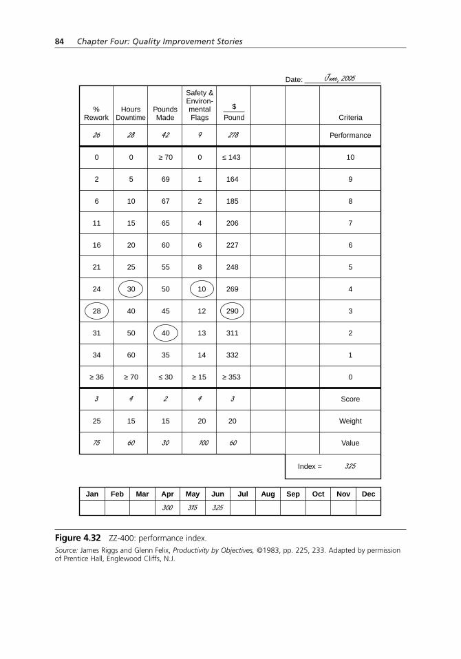
84 Chapter Four: Quality Improvement Stories
%Rework
26 28 42 9 278
June, 2005
Performance
Date:
10
9
8
7
6
5
4
3
2
1
0
Score
Weight
Value
Jan Feb Mar Apr May Jun Jul Aug Sep Oct Nov Dec
Index = 325
0 0 ≥ 70 0 ≤ 143
2 5 69 1 164
6 10 67 2 185
11 15 65 4 206
16 20 60 6 227
21 25 55 8 248
24 30 50 10 269
28 40 45 12 290
31 50 40 13 311
34 60 35 14 332
≥ 36 ≥ 70 ≤ 30 ≥ 15 ≥ 353
3 4 2 4 3
25 15 15 20 20
75 60 30
300 315 325
100 60
HoursDowntime
PoundsMade
Safety &Environ-mentalFlags
$
Pound Criteria
Figure 4.32 ZZ-400: performance index.Source: James Riggs and Glenn Felix, Productivity by Objectives, ©1983, pp. 225, 233. Adapted by permissionof Prentice Hall, Englewood Cliffs, N.J.

A scatter diagram (Figure 4.33) of purity and iron content showed no relationshipbetween the two variables. Then the mechanic reminded everyone that there were threereactors. Maybe the reactors were different enough that their data should not be com-bined. The team modified the scatter diagram, this time using stratification to separatethe three reactors’ data. (Figure 4.34) Sure enough, for two of the reactors, increased
ZZ-400 85
Purity vs. Iron
9 points 3 points
3 points 9 points
Iron (parts per million)
% P
uri
ty
100.0
99.5
99.0
98.5
98.00.10 0.20 0.30 0.40 0.50 0.60 0.70
Figure 4.33 ZZ-400: scatter diagram.
Purity vs. Iron
Iron (parts per million)
% P
uri
ty
100.0
99.5
99.0
98.5
98.00.10
Reactor 2Reactor 3
0.20 0.30 0.40 0.50 0.60 0.70
Reactor 1
Figure 4.34 ZZ-400: stratified scatter diagram.

iron was related to decreased purity. Regression analysis (Figure 4.35) confirmedthe relationship.
The team now knew that iron was one cause of lower purity. But why was iron inthe process? Where was it coming from? All members of the unit worked on a time-delay fishbone (Figure 4.36), to identify possible sources of iron. The flowchart wasexamined to determine what was different about reactor 1, which did not show increasediron. They examined control charts and log sheets to try to understand what else washappening when the problem occurred. An is–is not diagram (Figure 4.37) was used tobring together everything they knew about the situation.
The diagram revealed that the problem occurred at the same time as pump preven-tive maintenance, and only when one particular spare pump was operated. That pumpwas used for reactors 2 and 3; another was used for reactor 1.
They asked “Why?” again. Why did that pump cause problems? Pump data sheetsrevealed that the pump was made of carbon steel, not stainless steel like the other twopumps and necessary for the fluid it pumped. That fluid rusts carbon steel, producing iron.
Why was that pump different? Maintenance records revealed the root cause. Thespare pump for reactors 2 and 3 had been installed during a midnight emergency andnever replaced. Maintenance and unit crews weren’t sufficiently aware of materials ofconstruction needed for different fluids.
86 Chapter Four: Quality Improvement Stories
Purity vs. Iron
Iron (parts per million)
% P
uri
ty99.5
100.0
99.0
98.5
98.00.10.0
Reactor 2Reactor 3
0.2 0.3 0.4 0.5 0.6 0.7
Reactor 1
Figure 4.35 ZZ-400: regression analysis.

ZZ-400 87
Iron inProduct
Measurement
Lab error
Rust nearsample point Inexperienced
analyst
Materials of construction
E583P584
P560P573
#2#3
E470
Rusty pipes
Heat exchanger leak
In
OutMaintenance
Exp
osed
pip
eTo
ols
Ope
ning
line
sIro
n to
ols
Exc
hang
ers
Rea
ctor
s
Pum
ps
Pip
es
Raw materials Analytical procedure
Lab solvent contamination Sampling
Supplier City Supplier 1
Supplier 2Plantsystem
Truck
Analyst
Supplier
Supplier
Supplier
DB
T
In lab
Dirty bottles
At sample point
E470
E583
At reactor
Iron tools
Supplier
H2 0
AK
W-2
Calibration
Not follow
ed
In labIm
proper
calibration
Calculation
Solvent contamination
Materials Methods
Environment Manpower Machines
Figure 4.36 ZZ-400: fishbone diagram.
IsDescribe what
does occur
Problem Statement:Iron contaminationin ZZ-400
What objects are affected?What occurs?
When does the problem occur?When first? When since?How long? What patterns?Before, during, after other events?
Extent of problemHow many problems?How many objects or situations have problems?How serious is the problem?
Who is involved? (Do not use this question to blame.)To whom, by whom, near whom does this occur?
Where does the problem occur? • Geographical • Physical • On an object
Purity dropsIron increases
Lasts about one shiftAbout once a monthOften during same week as pump PMWhen P-584C runs
Purity drops from 99% range to 98% rangePuts us out of specIron up to 0.65 (3 × normal)
Mechanics doing pump PM
Reactors 2 and 3
Only iron increases
Just P-584C
Mechanics usually around
Not reactor 1
Other metal impuritiesIncrease in moistureChange in color
ContinuousAny particular shiftAny other pump than P-584C
Purity below 98.2%Pluggage problemOther specification problems
Reactor 1
Is NotDescribe what
does not occur, though it reasonably might
DistinctionsWhat standsout as odd?
Figure 4.37 ZZ-400: is–is not diagram.Source: © Copyright, Kepner-Tregoe, Inc. Reprinted with permission.
Step 6: What changes could we make to do better?Step 7: Do it.
A stainless steel pump was quickly ordered and installed.
Step 8: How did we do? If it didn’t work, try again.
During the next preventive maintenance cycle, the process stayed in control.The team knew they weren’t finished. Variation and process average were still unac-
ceptable. They recycled back to step 5 to search for root causes of those problems.
Step 9: If it worked, how can we do it every time?
In the meantime, the team members realized that if the wrong equipment could beinstalled once, it could happen again. They set out to educate themselves about mater-ial of construction standards. The team studied information provided by engineeringthen summarized the facts in a T-shaped matrix showing material of constructionrelated both to specific pieces of equipment and to the various liquids that the unithandled. Presentations were made to each shift and to the maintenance crew, and thewritten documents were placed in unit maintenance guides.
Step 10: What did we learn? Let’s celebrate!
Plant management knew that material-of-construction errors could happen throughoutthe plant, so they asked the team to find a way to share their work. The team created alarge storyboard (Figure 4.38) that traveled around the plant. Other units adapted thematerials matrix for their processes.
OTHER IMPROVEMENT STORIES
Woven through the examples in this book are other quality improvement stories, ficti-tious and real. To help you compare tools or see how tools link together, those storiesare listed here along with the tools they illustrate.
Catalog Retailer
Contingency table page 148House of quality page 308Hypothesis test page 318SIPOC diagram page 475Voice of the customer table page 511
88 Chapter Four: Quality Improvement Stories

Other Improvement Stories 89
Iron-Free ZZ-400
How will weprevent this fromhappening again?
Presentations
Unit documentation
T-shaped matrix
How did wefind the root
cause?
Why did puritydrop?
Iron
Stratified scatter plot
Control chartWhat wasthe problem?
Out-of-controlpurity
RUSH
Why was P-584Cdifferent? Maintenance
records
Work Order
Routine
P-584C not
running
Rush
Call
Tom
x783
CS
Why was P-584Ccreating iron? Pump data
sheetsP-584C
carbon steelP-584A,Bstainless st
How did wefix it?
Control chart
Purchase Order #23
1 stainless steel pump
P-584C
Why was thereiron? Is–is not matrix
Purity vs. Iron
Iron (parts per million)
% P
uri
ty
100.0
99.5
99.0
98.5
98.00.10 0.20 0.30 0.40 0.50 0.60 0.70
IsDescribe what
does occur
Problem Statement:Iron contaminationin ZZ-400
What objects are affected?What occurs?
When does the problem occur?When first? When since?How long? What patterns?Before, during, after other events?
Extent of problemHow many problems?How many objects or situations have problems?How serious is the problem?
Who is involved? (Do not use this question to blame.)To whom, by whom, near whom does this occur?
Where does the problem occur? • Geographical • Physical • On an object
Purity dropsIron increases
Lasts about one shiftAbout once a monthOften during same week as pump PMWhen P-584C runs
Purity drops from 99% range to 98% rangePuts us out of specIron up to 0.65 (3 × normal)
Mechanics doing pump PM
Reactors 2 and 3
Only iron increases
Just P-584C
Mechanics usually around
Not reactor 1
Other metal impuritiesIncrease in moistureChange in color
ContinuousAny particular shiftAny other pump than P-584C
Purity below 98.2%Pluggage problemOther specification problems
Reactor 1
Is NotDescribe what
does not occur, though it reasonably might
DistinctionsWhat standsout as odd?
Figure 4.38 ZZ-400: storyboard.

Education
Brainstorming: double reversal page 128Brainstorming: Charette procedure page 131Line graph page 289List reduction page 335Radar chart page 438
Manufacturing: Filling an Order
Cost-of-poor-quality analysis page 200Detailed flowchart page 260Macro flowchart page 257Value-added analysis page 508Work-flow diagram page 520
Medical Group: Chronic Illness Management Program
Potential problem analysis page 400Process decision program chart page 429Stakeholder analysis page 478
Medical: Other Examples
Cycle time chart page 217Table page 499
Restaurant: Parisian Experience
ACORN test page 95Continuum of team goals page 151Critical-to-quality analysis page 208Decision matrix page 221Deployment flowchart page 265Mistake-proofing page 352
Restaurant: Ben-Hur’s Pizza
Cause-and-effect matrix page 136Critical-to-quality tree page 2125W2H page 253
90 Chapter Four: Quality Improvement Stories

Another Restaurant
Importance–performance analysis page 327PGCV page 388Two-dimensional chart page 506
Survey Development Team
Criteria filtering page 204Effective–achievable chart page 234Multivoting page 360Sampling page 467
Other Improvement Stories 91

5
The Tools
ACORN test
Description
The ACORN test is a check on a mission or project charter goal statement to determinewhether it is well-defined.
When to Use
• When writing the mission of either an organization or a project team, or . . .
• While drafting a project charter goal, to guide its development, or . . .
• When the project charter goal has been written, as a check on its quality, or . . .
• When writing subgoals
Procedure
Ask the following questions about the statement of the mission or project charter goal:
A—Accomplishment. Does the goal describe results rather than behaviors?Could fulfillment of the goal be verified if the people responsible for itwere not there?
1
93

C—Control. Do the group’s actions determine whether the goal is accomplished? If it depends on actions of others, it is not within the group’s control.
O—Only Objective. If this and only this were accomplished, would it beenough? If something else also is required, then subgoals have been identified, not the true goal. (Subgoals do not have to pass the O part of the test.)
R—Reconciliation. Will accomplishing this goal prevent another group withinthe organization from accomplishing its goal? Or, does another groupshare the same goal? Two groups should not be addressing either thesame goal or conflicting goals. (Subgoals do not have to pass the R partof the test.)
N—Numbers. Can the goal be measured? It must be possible to generate practical, cost-effective data to measure the goal. Measurement will indicate whether or not the goal has been achieved.
Examples
Engineering Department
The engineering department of a manufacturing company has drafted this missionstatement:
The Engineering Department serves the business units, manufacturing depart-ment, and our customers by being the best at designing and constructing safe,environmentally responsible, easily maintained and operated facilities—better,faster, and at lower total cost than anyone else.
The department checks the statement against the ACORN test.
A—Engineering has a tangible accomplishment when the mission is fulfilled:the steel and concrete of a manufacturing plant.
C—Engineering has broad control over its projects, although R&D, manufac-turing, and business units provide input and have veto power.
O—Engineering’s only function is designing and managing the constructionof new facilities.
R—No one else has this function, so the mission is reconcilable.
N—Numbers are routinely available for project schedule and cost as well assafety, environmental, and operational performance. However, the groupdecided it must develop an operational definition and measures for“better,” which everyone intuitively understands to mean best technologyand methods.
94 ACORN test
Parisian Experience Restaurant
The Parisian Experience Restaurant Customer Satisfaction (PERCS) team wrote thischarter statement as it began its work:
The PERCS team will improve the customer satisfaction ratings of our restau-rant by 20%.
This draft failed the ACORN test. Team members realized they do not have controlover customer satisfaction ratings: every waiter, chef, cashier, and manager plays a part.So they tried again with the following statement:
The PERCS team will direct and support the continuing improvement of cus-tomer satisfaction with our restaurant.
That statement failed the ACORN test, too. This time, the statement describedbehaviors (“direct and support”), not accomplishments. What is the team really goingto do? Back to the drawing board for draft number three, which passed the test:
The PERCS team will identify opportunities to improve customer satisfactionwith our restaurant. It will develop and recommend plans that transform thoseopportunities into value for our customers and our business.
Considerations
• If a goal statement does not pass the ACORN test, it may actually be in conflictwith the goals of the entire company or institution.
• An overall mission statement must pass all five parts of the ACORN test. A sub-goal will never pass the O (only objective) part of the test. It may not pass the R(reconcilable) part either, if this goal needs to be balanced against another. But itmust pass the A (accomplishment),C (control), and N (numbers) tests.
Example: Two subgoals of the Engineering Department, to build plants quicklyand to build them so they are easily maintained, may not be completely reconcil-able with each other. It may add time to the design phase of a project to obtaininput from maintenance. These two subgoals must be balanced in order for thedepartment to achieve its mission.
• When the mission of an organization is well defined according to the ACORN test, one can proceed to evaluate performance against that mission in a meaningful way.
ACORN test 95

affinity diagram
Also called: affinity chart, K-J methodVariation: thematic analysis
Description
The affinity diagram organizes a large number of ideas into their natural relationships.This method taps the team’s creativity and intuition. It was created in the 1960s byJapanese anthropologist Jiro Kawakita.
When to Use
• When you are confronted with many facts or ideas in apparent chaos, or . . .
• When issues seem too large and complex to grasp
• And when group consensus is necessary
Typical situations are:
• After a brainstorming exercise, or . . .
• When analyzing verbal data, such as survey results, or . . .
• Before creating a tree diagram or storyboard
Procedure
Materials needed: sticky notes or cards, marking pens, large work surface (wall, table,or floor).
1. Record each idea with marking pens on a separate sticky note or card. (During a brainstorming session, write directly onto sticky notes or cards if you suspectyou will be following the brainstorm with an affinity diagram.) Randomly spreadnotes on a large work surface so all notes are visible to everyone. The entire teamgathers around the notes and participates in the next steps.
2. It is very important that no one talk during this step. Look for ideas that seem to be related in some way. Place them side by side. Repeat until all notes aregrouped. It’s okay to have “loners” that don’t seem to fit a group. It’s all right to move a note someone else has already moved. If a note seems to belong in two groups, make a second note.
1
6
210394
5
96 affinity diagram

3. You can talk now. Participants can discuss the shape of the chart, any surprisingpatterns, and especially reasons for moving controversial notes. A few morechanges may be made. When ideas are grouped, select a heading for each group.Look for a note in each grouping that captures the meaning of the group. Place itat the top of the group. If there is no such note, write one. Often it is useful towrite or highlight this note in a different color.
4. Combine groups into supergroups if appropriate.
Example
The ZZ-400 manufacturing team used an affinity diagram to organize its list of potentialperformance indicators. Figure 5.1 shows the list team members brainstormed. Becausethe team works a shift schedule and members could not meet to do the affinity diagramtogether, they modified the procedure.
They wrote each idea on a sticky note and put all the notes randomly on a rarelyused door. Over several days, everyone reviewed the notes in their spare time andmoved the notes into related groups. Some people reviewed the evolving pattern severaltimes. After a few days, the natural grouping shown in Figure 5.2 had emerged.
Notice that one of the notes, “Safety,” has become part of the heading for its group.The rest of the headings were added after the grouping emerged. Five broad areas of
affinity diagram 97
Possible Performance Measures
% purity
% trace metals
Maintenance costs
# of emergency jobs
lbs. produced
Environmental accidents
Material costs
Overtime costs
# of pump seal failures
Viscosity
Cpk values
Safety
Days since last lost-time
% rework or reject
Hours downtime
% uptime
# of OSHA recordables
# of customer returns
Customer complaints
Overtime/total hours worked
$/lb. produced
Raw material utilization
Yield
Utility cost
ppm water
Color
Service factor
Time between turnarounds
Hours worked/employee
lbs. waste
Housekeeping score
% capacity filled
Figure 5.1 Brainstorming for affinity diagram example.

98 affinity diagram
PROPOSEDPERFORMANCE
MEASURES
PRODUCTQUALITY
% purity % tracemetals
VOLUME
lbs.produced
%capacity
filled
Color Viscosity ppmwater
MAINTENANCE
Main-tenance
costs
# ofemergency
jobs
Servicefactor
Timebetween
turnarounds
# ofpump seal
failures
Hoursdowntime
%uptime
SAFETY ANDENVIRONMENTAL
Environ-mental
accidents
House-keepingscore
# ofOSHA
recordables
Days sincelast
lost-timelbs. waste
MANUFACTURINGCOST
Main-tenance
costs
Hrs worked
Employee
Materialcosts
Overtimecosts
Overtime
Total hours
Rawmaterial
utilization
Yield Utilitycosts
$ per lb.produced
Cpkvalues
Customercomplaints
# ofcustomerreturns
% reworkor reject
Figure 5.2 Affinity diagram example.

performance were identified: product quality, equipment maintenance, manufacturingcost, production volume, and safety and environmental.
This example is part of the ZZ-400 improvement story in Chapter 4.
Considerations
• The affinity diagram process lets a group move beyond its habitual thinking and preconceived categories. This technique accesses the great knowledge andunderstanding residing untapped in our intuition.
• Very important “Do nots”: Do not place the notes in any order. Do not determinecategories or headings in advance. Do not talk during step 2. (This is hard forsome individuals!)
• Allow plenty of time for step 2. You can post the randomly-arranged notes in apublic place and allow grouping to happen over several days.
• Most groups that use this technique are amazed at how powerful and valuable atool it is. Try it once with an open mind and you will be another convert.
• Use markers. With regular pens, it is hard to read ideas from any distance.
thematic analysis
Description
Thematic analysis is a method for analyzing open-ended questions or any nonnumeri-cal information by an iterative process of sorting and looking for relationships.
When to Use
• When analyzing responses to open-ended questions on surveys (questionnaires,interviews, or focus groups) or . . .
• When analyzing results of benchmarking, or . . .
• When analyzing any nonnumeric information amassed during research
Procedure
1. From each response, extract key ideas or themes. Record each theme separately,with a reference linking it to its source. If using a computer, spreadsheet cells areideal for this. Or you can write each theme on a sticky note or slip of paper.
affinity diagram 99

2. Physically rearrange the records into a small number of categories—four to eightis ideal—with similar themes. Name each category. Code them, such as 1, 2, 3,4 . . . or A, B, C, D . . . , and label each theme with its category code.
3. Working with one category at a time, look for patterns in the themes andrearrange the records into subcategories with similar themes. Again code eachsubcategory, such as 1.1, 1.2 . . . or A1, A2 . . . and label each theme’s record.
4. Continue this process until no new relationships suggest themselves. Differentnumbers of subcategories and levels can exist side by side.
Considerations
• Thematic analysis is related to processes used in social science research, such asethnography.
• It takes advantage of the power of personal computers to easily sort text, althoughit can be done manually with pieces of paper.
• Other instructions for this analysis require defining categories first and then rearranging the records. The method given here uses the power of the affinity diagram process to find patterns and relationships intuitively without languageimposing structures.
• This method differs from the affinity diagram in that one level is sorted and identified before the next level is addressed. The process alternates between intuitive and language-based thinking.
arrow diagram
Also called: activity network diagram, network diagram, activity chart, node diagram,CPM (critical path method) chartVariation: PERT (program evaluation and review technique) chart
Description
The arrow diagram shows the required order of tasks in a project or process, the bestschedule for the entire project, and potential scheduling and resource problems and theirsolutions. The arrow diagram lets you calculate the critical path of the project. This isthe flow of critical steps where delays will affect the timing of the entire project andwhere addition of resources can speed up the project.
1
6
9
7
100 affinity diagram

When to Use
• When scheduling and monitoring tasks within a complex project or process withinterrelated tasks and resources, and . . .
• When you know the steps of the project or process, their sequence, and how longeach step takes, and . . .
• When project schedule is critical, with serious consequences for completing theproject late or significant advantage to completing the project early
Procedure
Materials needed: sticky notes or cards, marking pens, large writing surface (newsprintor flipchart pages)
Drawing the Network
1. List all the necessary tasks in the project or process. One convenient method is towrite each task on the top half of a card or sticky note. Across the middle of thecard, draw a horizontal arrow pointing right.
2. Determine the correct sequence of the tasks. Do this by asking three questions foreach task:
• Which tasks must happen before this one can begin?
• Which tasks can be done at the same time as this one?
• Which tasks should happen immediately after this one?
It can be useful to create a table with four columns—prior tasks, this task,simultaneous tasks, following tasks.
3. Diagram the network of tasks. If you are using notes or cards, arrange them insequence on a large piece of paper. Time should flow from left to right andconcurrent tasks should be vertically aligned. Leave space between the cards.
4. Between each two tasks, draw circles for events. An event marks the beginning orend of a task. Thus, events are nodes that separate tasks.
5. Look for three common problem situations and redraw them using dummies orextra events. A dummy is an arrow drawn with dotted lines used to separate tasksthat would otherwise start and stop with the same events or to show logicalsequence. Dummies are not real tasks.
Problem situations:
• Two simultaneous tasks start and end at the same events. Solution: Use adummy and an extra event to separate them. In Figure 5.3, event 2 and thedummy between 2 and 3 have been added to separate tasks A and B.
arrow diagram 101

• Task C cannot start until both tasks A and B are complete; a fourth task,D, cannot start until A is complete, but need not wait for B. (See Figure 5.4.)Solution: Use a dummy between the end of task A and the beginning of task C.
• A second task can be started before part of a first task is done. Solution: Addan extra event where the second task can begin and use multiple arrows tobreak the first task into two subtasks. In Figure 5.5, event 2 was added, splittingtask A.
6. When the network is correct, label all events in sequence with event numbers inthe circles. It can be useful to label all tasks in sequence, using letters.
Scheduling: Critical Path Method (CPM)
7. Determine task times. The task time is the best estimate of the time that each taskshould require. Use one measuring unit (hours, days, or weeks) throughout, forconsistency. Write the time on each task’s arrow.
8. Determine the critical path. The critical path is the longest path from thebeginning to the end of the project. Mark the critical path with a heavy line or color. Calculate the length of the critical path: the sum of all the task times on the path.
102 arrow diagram
B
A
2
31
Figure 5.3 Dummy separating simultaneous tasks.
A B
D C
Figure 5.4 Dummy keeping sequence correct.

9. Calculate the earliest times each task can start and finish, based on how longpreceding tasks take. These are called earliest start (ES) and earliest finish (EF).Start with the first task, where ES = 0, and work forward. Draw a square dividedinto four quadrants, as in Figure 5.6. Write the ES in the top left box and the EFin the top right. For each task:
Earliest start (ES) = the largest EF of the tasks leading into this one
Earliest finish (EF) = ES + task time for this task
10. Calculate the latest times each task can start and finish without upsetting theproject schedule, based on how long later tasks will take. These are called lateststart (LS) and latest finish (LF). Start from the last task, where the latest finish isthe project deadline, and work backwards. Write the LS in the lower left box andthe LF in the lower right box.
arrow diagram 103
A
B
2
B
AAStart Continue
2
3
3
4
1 2
1
Figure 5.5 Using an extra event.
ESEarliest
start
LFLatestfinish
EFEarliestfinish
LSLateststart
Figure 5.6 Arrow diagram time box.
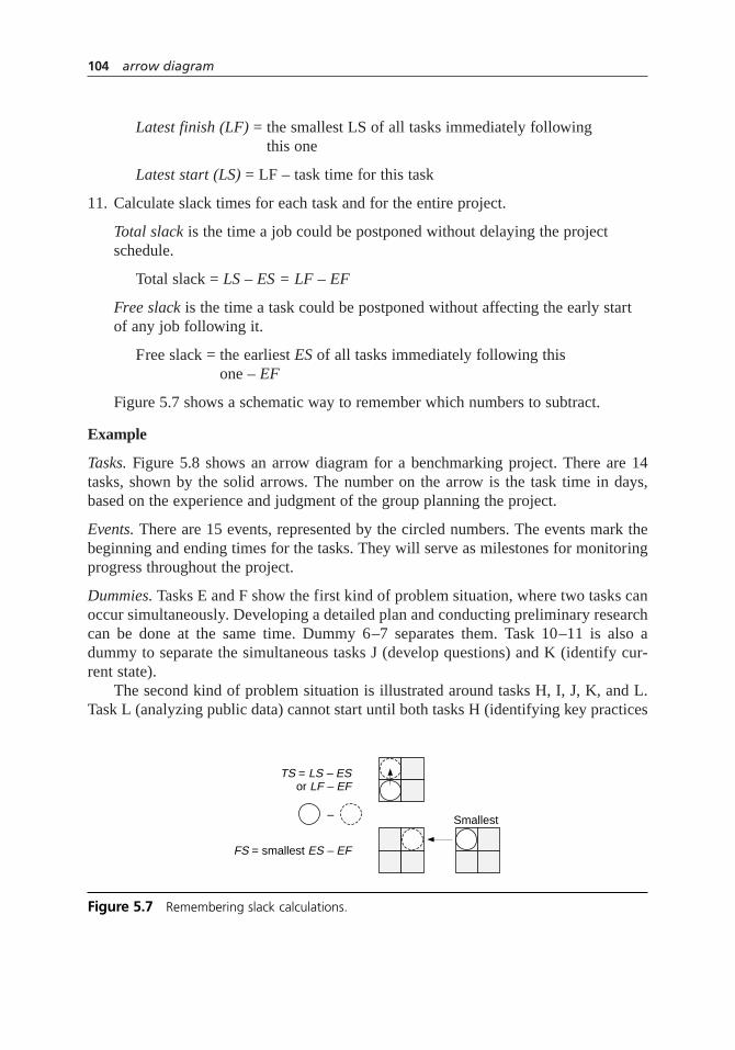
Latest finish (LF) = the smallest LS of all tasks immediately following this one
Latest start (LS) = LF – task time for this task
11. Calculate slack times for each task and for the entire project.
Total slack is the time a job could be postponed without delaying the projectschedule.
Total slack = LS – ES = LF – EF
Free slack is the time a task could be postponed without affecting the early startof any job following it.
Free slack = the earliest ES of all tasks immediately following this one – EF
Figure 5.7 shows a schematic way to remember which numbers to subtract.
Example
Tasks. Figure 5.8 shows an arrow diagram for a benchmarking project. There are 14tasks, shown by the solid arrows. The number on the arrow is the task time in days,based on the experience and judgment of the group planning the project.
Events. There are 15 events, represented by the circled numbers. The events mark thebeginning and ending times for the tasks. They will serve as milestones for monitoringprogress throughout the project.
Dummies. Tasks E and F show the first kind of problem situation, where two tasks canoccur simultaneously. Developing a detailed plan and conducting preliminary researchcan be done at the same time. Dummy 6–7 separates them. Task 10–11 is also adummy to separate the simultaneous tasks J (develop questions) and K (identify cur-rent state).
The second kind of problem situation is illustrated around tasks H, I, J, K, and L.Task L (analyzing public data) cannot start until both tasks H (identifying key practices
104 arrow diagram
TS = LS – ES or LF – EF
FS = smallest ES – EF
– Smallest
Figure 5.7 Remembering slack calculations.

arrow diagram 105
1
Benchmarking Project
6
109
12
5 A—Develop broad plan 0 5 TS = 33 8 FS = 0
2
2 B—Get approval 5 7 TS = 38 10 FS = 0
3
10 C—Identify team 7 17 TS = 310 20 FS = 0
4
2
2
2
6
6
0
0
0
0
1510
D—Train team 17 19 TS = 320 22 FS = 019 21TS = 5
24 26FS = 2 5
4
3
11
12
2
4
F—Conduct preliminary research
E—Develop detailed plan
23 38TS = 427 42FS = 1
26 28 TS = 440 42 FS = 11
G—Identify BM partners and schedule visits
39 45TS = 948 54FS = 6
M—Visit BM partners
J—Dev
elop BM
q
uestions
26 37 TS = 531 42 FS = 2
19 23 TS = 322 26 FS = 0
N—Develop new process 39 51 TS = 342 54 FS = 0
O—Finalize new process 51 53 TS = 354 56 FS = 0
P—Get approval for implementation
53 57 TS = 356 60 FS = 0
7
*H—Identify key practices, measures, and documentation
23 26 TS = 528 31 FS = 0
L—Analyze public data
33 39 TS = 336 42 FS = 0
8
I—Collect public data
K—Identify current state
11
13
14
15
23 33 TS = 326 36 FS = 0
*
Figure 5.8 Arrow diagram example.
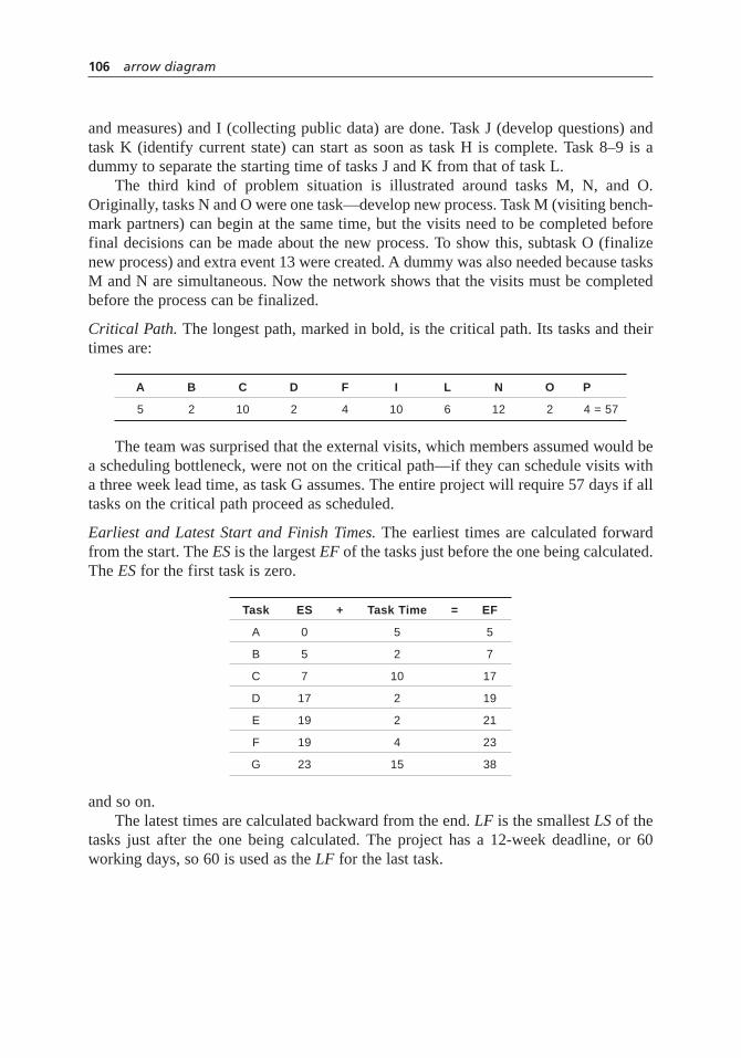
and measures) and I (collecting public data) are done. Task J (develop questions) andtask K (identify current state) can start as soon as task H is complete. Task 8–9 is adummy to separate the starting time of tasks J and K from that of task L.
The third kind of problem situation is illustrated around tasks M, N, and O.Originally, tasks N and O were one task—develop new process. Task M (visiting bench-mark partners) can begin at the same time, but the visits need to be completed beforefinal decisions can be made about the new process. To show this, subtask O (finalizenew process) and extra event 13 were created. A dummy was also needed because tasksM and N are simultaneous. Now the network shows that the visits must be completedbefore the process can be finalized.
Critical Path. The longest path, marked in bold, is the critical path. Its tasks and theirtimes are:
A B C D F I L N O P
5 2 10 2 4 10 6 12 2 4 = 57
The team was surprised that the external visits, which members assumed would bea scheduling bottleneck, were not on the critical path—if they can schedule visits witha three week lead time, as task G assumes. The entire project will require 57 days if alltasks on the critical path proceed as scheduled.
Earliest and Latest Start and Finish Times. The earliest times are calculated forwardfrom the start. The ESis the largest EFof the tasks just before the one being calculated.The ES for the first task is zero.
Task ES + Task Time = EF
A 0 5 5
B 5 2 7
C 7 10 17
D 17 2 19
E 19 2 21
F 19 4 23
G 23 15 38
and so on.The latest times are calculated backward from the end. LFis the smallest LSof the
tasks just after the one being calculated. The project has a 12-week deadline, or 60working days, so 60 is used as the LF for the last task.
106 arrow diagram

Task LF – Task Time = LS
P 60 4 56
O 56 2 54
N 54 12 42
M 54 6 48
L 42 6 36
and so on. All these times are shown beside each task, in the four-box grid.
Slack Times. The slack times for each task are shown beside each grid. Because 60 dayshave been allotted for the project and the critical path adds up to 57 days, there is slacktime for all the tasks. For each of the tasks on the critical path, the total slack is three,the slack time for the entire project. The tasks not on the critical path have up to ninedays total slack.
Surprisingly, there is free slack of six days for visiting the benchmark partners, sosix days of scheduling problems with the partners can be tolerated without delayinglater tasks. There is total slack of nine days for the visits, so if the project is on sched-ule up to that task, nine days’ delay in making visits will not affect the project comple-tion date.
Compare this diagram with the Gantt chart example (Figure 5.67, page 272). Bothshow the same project. Relationships and dependencies between tasks are clearer on thearrow diagram, but the Gantt chart makes it easier to visualize progress.
program evaluation and review technique(PERT) chart
This variation allows for uncertain time estimates for individual tasks. Draw the net-work as in steps 1 through 6 (pages 101–2) of the basic procedure. For scheduling,replace step 7 with:
7. Make three estimates of the time required for each task.
• Minimum (a)—if everything went right
• Most likely (m)—the normal time required; an average of the times if the taskwere done repeatedly
• Maximum (b)—if everything went wrong
Show all three times on the diagram, separated by dashes: 3–5–8. Next calculatethe expected time (tE) and the variance (s2) for each task.
ta m b b a
E =+ +
=−
4
6 62
2
σ
arrow diagram 107

Go on to steps 8 through 11 (pages 102–104). Use expected time tE instead of tasktime. Then add this step:
12. Determine the probability (P) that the project will be finished by its deadline,TD.Calculate three numbers.
TE = total expected time = the sum of the expected times tE for all the critical path tasks
s 2TE
= total variance = the sum of the variances for all the critical path tasks
Look up the value for Z on the table of area under the normal curve (Table A.1). Thenumber read from the center of the table,P, is the probability that the project will befinished by its deadline.
Example
To demonstrate these calculations, we will use a critical path with only four tasks. Table5.1 shows the minimum, most likely, and maximum time estimates (a, m, and b), theexpected time (tE) and the variance (s2). If the deadline for the project is 25 days, then
ZT TD E
TE
=−
σ 2
108 arrow diagram
Table 5.1 PERT example.
Task a – m – b tE r2
A 2 – 5 – 10
B 5 – 8 – 12
C 3 – 6 – 8
D 2 – 4 – 6
TE = 23.3 s 2TE
= 5.2
TD = 25 Z
P
= − =
=
25 23 3
5 20 75
0 77
.
..
.
6 26
0 42
−
= .2 16 6
64 0
+ + = .
8 36
0 72
−
= .3 24 8
65 8
+ + = .
12 56
2 32
−
= .5 32 12
68 2
+ + = .
10 26
1 82
−
= .2 20 10
65 3
+ + = .

Z = 0.75. Looking up 0.75 on Table A.1 shows that P = 0.77. The probability of com-pleting the project in 25 days or less is 77 percent.
It may seem surprising that there is a 23 percent chance of not meeting the dead-line, since the total expected time (TE) for the project is 23.3 days, less than the dead-line. Remember, however, that each task’s time estimate had a worst case. Ifeverything went wrong and all the worst-case estimates came true, the project wouldrequire 36 days.
Considerations
• If any task on the critical path is delayed, all tasks on the critical path will bepushed back. If there is no slack in the overall project, the project will be delayed.
• The timing of tasks with some free slack can be left to the judgment of thosehandling the task, as long as they do not delay the task more than the amount offree slack. Example:The team making benchmark visits can spread its scheduleover 12 days instead of the planned six days without consulting with the rest ofthe project team.
• When tasks without free slack are delayed, the times and slack for all followingjobs must be recalculated.
• Slack time can be negative. Example:If the time allotted for the benchmarkingproject was less than 57 days, or if the critical path tasks become delayed by morethan three days, the slack time would become negative, and ways to make up thattime would have to be found.
• To speed up a project schedule, find ways to increase resources or reduce scopeonly for those tasks on the critical path. Speeding up tasks not on the critical path will have no effect on the overall project time. It may be possible to moveresources from noncritical tasks to critical ones. Example:To complete the benchmarking project in 10 weeks instead of 12, ways might be found to identifythe team faster (task C), to get public data more quickly (task I), to get fasterapprovals (tasks B and P), or to speed up any of the other six tasks on the critical path. Collapsing the visit schedule (tasks G or M) will not complete the project sooner.
• However, when critical path tasks are shortened, the entire network must be recalculated. New tasks may now be on the critical path, and they can be examined for opportunities to shorten the schedule. Example: In the benchmarkproject, if a way were found to collect public data (task I) in five days instead of 10, scheduling visits (task G) would now lie on the critical path.
• Another way to shorten the project time is to rethink the sequence of tasks on the critical path. If some of them can be done simultaneously, total project timecan be reduced.
arrow diagram 109

• In the arrow diagram process, involve a team of people who have broad knowledge about the project or process.
• The easiest way to construct the diagram when first laying out the sequence is to find the path with the most tasks. Lay out that path first, then add other parallel paths.
• No loops are allowed in the network of tasks. A loop would be a sequence wheretask A is followed by task B, followed by task C, followed by task A.
• The length of an arrow is not related to the amount of time the task takes. Arrowlengths depend simply on the way you have chosen to depict the network of tasks.
• A common notation labels tasks with their starting and ending events. A task thatstarts at event 4 and ends at event 7 would be labeled task 4–7.
• For complex networks of tasks, computer software can make constructing andupdating the chart quick. Software can also easily construct a Gantt chart andarrow diagram from the same data, ensuring that the two are always consistentwith each other as the project progresses and updates are made.
• This chart fills some of the same functions as the Gantt chart. It analyzes the project’s schedule more thoroughly, revealing the critical path and dependenciesbetween tasks. However, the Gantt chart is easier to construct, can be understoodat a glance, and can be used for monitoring progress.
• An alternative way of drawing the network is to represent tasks by circles or rectangles (nodes) and connect them with arrows showing sequence. That formatis essentially a flowchart. Task time is written within the node, ES and LS arewritten to the left, separated by a colon (for example, 7:10 for task C), and EF and LF are similarly written to the right. For PERT analysis, the three time estimates are usually written on the arrow leaving the node. This alternative drawing method is easier to draw, but the one described in this book’s procedureshows milestones more clearly.
• A variety of names have been used for this diagram. In general, they are all considered activity network diagrams. The drawing procedure detailed in thisbook is called activities on the arc or activities on the arrow and the resulting diagram is named arrow diagram. Arrow diagram and activity network diagramare names used in various descriptions of the seven MP tools. The alternativedrawing method described above results in activities on the nodeand the resultingchart is named node diagram. Both methods of scheduling, PERT and CPM, canbe used with either form of diagram. Activity chart is another name sometimesused. However, that name has been used for the Gantt chart as well, potentiallyleading to confusion. Since several names exist for each of these diagrams, itseems simpler to avoid using the name activity chart.
110 arrow diagram

balanced scorecard
Description
The balanced scorecard is a set of measures that gives a quick overall view of the per-formance of an organization or business unit. Measures are grouped into four perspec-tives: customer, internal business, innovation and learning, and financial. Within eachperspective, measures chosen by the organization reflect its business strategy. At everylevel of the organization, measures, targets, and actions are chosen that support theoverall organization scorecard. Thus, the balanced scorecard allows everyone to plan forand monitor improvement on the issues most important to the organization’s success.
When to Use
For senior managers:
• When developing the organization’s mission and strategy, or . . .
• When communicating the mission and strategy throughout the organization,or . . .
• When planning programs and initiatives to achieve the organization’s goals,or . . .
• Later, when routinely reviewing the organization’s performance
For everyone in the organization:
• Only after a balanced scorecard has been created for the entire organization orbusiness unit
• When planning what areas to address for improvement, or . . .
• When assessing how well current processes are meeting the needs of the customeror the organization, or . . .
• When setting improvement goals and planning how to achieve them, or . . .
• When planning what measures to use to monitor your improvement efforts, eitherduring initial trial of a new solution or during standardization
Procedure
The entire process of developing a balanced scorecard is beyond the scope of this book.Here is a simplified outline to show the general concepts.
1 239
87
balanced scorecard 111

For senior management:
1. Reach a consensus on the vision and strategy of the organization.
2. Consider what each of these four perspectives means for the organization:
• Customer
• Internal business
• Innovation and learning
• Financial
Decide whether the names should be changed to make the perspectives moremeaningful for the organization, or even if a perspective should be added.
3. For each perspective, choose no more than five measures that would indicateprogress toward achieving the organization’s strategy.
4. Choose ambitious targets for each measure that, when achieved, will bring theorganization closer to its vision of excellence.
At every level of the organization—group or individual—the process is very similar:
1. Review the balanced scorecards for the organization and for the unit to which youbelong. Make sure you understand what will be measured and what thosemeasures say about what is important to the organization.
2. Within each of the perspectives, choose no more than five measures at your levelthat indicate your contribution to the organizational measures.
3. Choose ambitious targets for your measures. This becomes your level’s balancedscorecard.
Everyone in the organization puts the balanced scorecard into action with these steps:
4. Identify actions that will achieve the targets. For each action, identify whichmeasures will indicate success of the actions.
5. Set intermediate milestones for improvement in the measures. Include when themilestone will be reached as well as the numeric target.
6. Review the scorecard measures regularly. Adjust actions, milestones, targets, oreven measures or strategy when necessary.
Example
Medrad, Inc., recipient of the 2003 Malcolm Baldrige National Quality Award, uses abalanced scorecard approach to ensure that the whole organization focuses on its strat-egy and vision and to guide making decisions and prioritizing resources. They have
112 balanced scorecard

renamed the perspectives using terms more meaningful to their organization and addedan extra one to the standard four. Their perspectives are: exceed the financials (finan-cial), grow the company (innovation and learning), improve quality and productivity(internal business), improve customer satisfaction (customer), and improve employeegrowth and satisfaction.
Figure 5.9 shows the organization’s scorecard. Each of the five goals has a definedmeasurement method and a target. These long-term goals rarely change from year toyear. Each year during the strategic planning process, senior managers confirm thescorecard goals and targets as well as 12 corporate objectives called the Top 12. Two ofthe objectives—achieve financials and achieve scorecard objectives—never change; therest are one- to three-year programs critical to achieving the scorecard goals. Eachmonth, the CEO communicates to all employees on the company’s performance on thescorecard goals, and the finance department publishes monthly scorecard goal resultson the intranet.
Departments, teams, and employees create their own objectives supporting thescorecard goals and the Top 12 objectives. This process is called waterfalling. Manydepartments have their own scorecards to monitor their waterfalled goals. When cross-functional projects are selected, one of the criteria is the impact on scorecard goals.Figure 5.10 shows how the objectives of the freight processing improvement team sup-ported Medrad’s corporate scorecard goals. Team members’ individual annual objec-tives included this project, thus linking their performance assessment and evaluation tocorporate priorities.
balanced scorecard 113
Corporate Goal Target
Exceed financials CMB (profit) growth > revenue growth 1
PriorityCorporate Objective
2C
Grow the company Revenue growth > 15% per year 3O
4N
6F
7I
8D
12E
Improve quality andproductivity
Grow CMB (profit) per employee > 10% per year
5N
10T
Improve customersatisfaction
Continuous improvement in Top Box ratings 9I
11A
Improve employeegrowth and satisfaction
Continuous improvement in employee satis-faction above best-in-class Hay benchmark
See # 5L
Figure 5.9 Balanced scorecard example.

See the Medrad story in Chapter 4 (page 55) for more information about theirimprovement process. Also, see the St. Luke’s Hospital story on page 69 for anotherexample of a balanced scorecard.
Considerations
• The four perspectives were chosen to reflect the four most important aspects oforganizational success:
– Customer perspective: What do our customers think is important? How do theythink we are doing?
– Internal business perspective: In what business processes must we excel tosatisfy our customers and shareholders?
– Innovation and learning perspective: Do we know how to change and improve,to keep up with a changing world?
– Financial perspective: Are the changes we make affecting the bottom line?
• Sometimes organizations using the scorecard change the names or add a perspective to reflect their unique circumstances. For example, 2003 Baldrigewinner St. Luke’s Hospital of Kansas City uses for its perspectives customer satisfaction, clinical and administrative quality, growth and development,financial, and people.
• Traditionally, organizations tracked only financial measures. The other three operational measures provide a more complete picture of the sustainability of any financial results.
• The balanced scorecard is most successful when the measures reflect factors that are truly critical to the success of the organization. Then the actions chosen
114 balanced scorecard
Improveemployee
satisfaction
Improvequality andproductivity
Reduceinternallabor
Makeprocesses
more robust
Processimprovement
tools
Grow thecompany
Exceedfinancials
Figure 5.10 Project objectives support balanced scorecard goals.

to affect these measures will be ones that really matter. Because time and people-power are limited in any organization, the scorecard should show only a small set of the most critical measures and actions.
• The scorecard is balanced because it prevents an organization from creatingimprovements in one area that hurt the organization in another. For example,focusing only on financial measures could lead an organization to undermineproduct quality or timely delivery, which would upset customers and ultimatelylose sales.
• The balanced scorecard also helps a group think about which of several ways of accomplishing a goal would be best for the organization overall. What effectswill each solution have on all four perspectives of the scorecard?
• Because “what you measure is what you get,” the balanced scorecard is used more broadly as a management system. The thinking required to develop the measures makes it a powerful tool for focusing strategy. Senior managers clarifytheir vision and strategy, set a limited number of critical goals for the organiza-tion, and set priorities for actions to accomplish the goals. Organizations that useit as a management system get much greater results than those who adopt it onlyfor performance measurement.
• Measures must be cascaded throughout the organization. At every level, a groupmust select measures, targets, and actions that will contribute to the changesdesired by the organization.
• The balanced scorecard approach is a top-down way of setting goals that gets everyone pulling in the same direction. Goal-setting that works in the opposite direction—starting with frontline workers and moving toward uppermanagement—creates an organization with mismatched, even contradictory,goals.
• Everyone must agree what the words of the scorecard mean. See operationaldefinitions.
• Communication throughout the organization about the purpose, meaning, and data of the scorecard is critical.
• The assumptions and decisions that went into creating the scorecard should bereviewed frequently. Is the data available and accurate? Do the measures reallycapture all aspects of the vision the organization wants to achieve? Is the strategyleading us to our vision? Do changed circumstances call for changes in our measures, actions, or targets? The balanced scorecard is not cast in stone. Itshould be modified as the organization learns what measures are linked best to its strategy and what strategies lead to success.
• This is just an overview of a complex subject. See Resources for more information.
balanced scorecard 115

benchmarking
Description
Benchmarking is a structured process for comparing your organization’s work practicesto the best similar practices you can identify in other organizations and then incorpo-rating the best ideas into your own processes.
When to Use
• When you want breakthrough improvements, and . . .
• When you need fresh ideas from outside your organization, and . . .
• After your own processes are well understood and under control
Procedure
Plan
1. Define a tightly focused subject of the benchmarking study. Choose an issuecritical to the organization’s success.
2. Form a cross-functional team. During the first step and this one, management’sgoals and support for the study must be firmly established.
3. Study your own process. Know how the work is done and measurements of theoutput.
4. Identify partner organizations that may have best practices.
Collect
5. Collect information directly from partner organizations. Collect both processdescriptions and numeric data, using questionnaires, telephone interviews, and/orsite visits.
Analyze
6. Compare the collected data, both numeric and descriptive.
7. Determine gaps between your performance measurements and those of yourpartners.
8. Determine the differences in practices that cause the gaps.
1
64
116 benchmarking

Adapt
9. Develop goals for your organization’s process.
10. Develop action plans to achieve those goals.
11. Implement and monitor plans.
Example
The example for the Gantt chart, Figure 5.67 on page 272, describes a typical plan fora benchmarking study. The arrow diagram example, Figure 5.8 on page 105, discussesthe same study.
Considerations
• Various benchmarking processes have been published that range from four to tensteps. The procedure here is intended to simplify a complex process. Beforebeginning to benchmark, study the references listed in the Resources.
• This process is a quality improvement model. The major difference between it andother models is that benchmarking gets ideas from outside the organization,whereas other improvement methods get ideas from within. Also, the benchmark-ing process is usually focused on a subject where dramatic changes, not incremen-tal improvements, are needed.
• If you are using benchmarking as a tool within another improvement process,steps 1 through 3 and 9 through 11 are probably included in the other process.
• Before an organization can achieve the full benefits of benchmarking, its ownprocesses must be clearly understood and under control. Before jumping intobenchmarking, an organization should establish a quality improvement processthat teaches it how to improve and how to work together across functions.
• Benchmarking studies require significant investments of manpower and time—upto a third of the team’s time for five or more months—so management mustchampion the process all the way through. They also must be ready and willing tomake changes based on what is learned.
• Too broad a scope dooms the project to failure. A subject that is not critical to theorganization’s success won’t return enough benefits to make the study worth-while.
• Inadequate resources can also doom a benchmarking study. This problem can becaused by taking on too large a subject or underestimating the effort involved. Butit also can be caused by inadequate planning. The better you prepare, the moreefficient site visits will be.
benchmarking 117

• Sometimes site visits are not necessary if information can be transferred in otherways. Using technology well also reduces costs.
• It’s tempting to say, “Let’s just go see what Platinum Star Corporation does. Wedon’t need all that up-front work.” Don’t. The planning phase sets the stage formaximum learning from your partners.
• A phrase has been coined for benchmarking that skips the planning and adaptingphases: industrial tourism. If you don’t transform what you’ve learned intochanges to your organization, you’ve wasted a lot of time, money, and effort.
• Sometimes changes are rejected because “that won’t work here,” “we already triedthat,” or “we’re different”—the notorious “not invented here” syndrome. Thisproblem can be avoided by establishing strong management support up front,including on the benchmarking team people who actually do the process, andcommunicating well to the organization the benchmarking process, the specificfindings, and proposed changes.
• During the first project, the organization is learning the benchmarking processwhile doing it. The first time doing something usually is difficult. Hang in there,then go benchmark something else.
• See benchmarking in Chapter 2 for more information about this mega-tool.
benefits and barriers exercise
Description
The benefits and barriers exercise helps individuals see both personal and organiza-tional benefits of a proposed change. It also identifies perceived obstacles to accom-plishing the change so they can be addressed in design. Most importantly, it generatesindividual and group buy-in to the change.
When to Use
• When trying to decide whether to proceed with a change, or . . .
• When trying to generate buy-in and support for a change, or . . .
• After a concept has been developed, but before detailed design of a plan, to identify obstacles that need to be considered in the design
6
109
7
118 benchmarking
• Especially for major changes, such as launching a quality effort or implementing arecognition program
Procedure
Materials needed: flipchart paper, marking pen, and masking tape for each group of fiveto seven people; paper and pen or pencil for each individual.
1. Explain the purpose of the exercise and how it will be done. Emphasize thateveryone’s active involvement is important. Divide the participants into groups of five to seven each and assign breakout rooms and leaders, who have beencoached in advance on their role.
2. Do benefits first. Show the group this statement, written on flipchart paper and posted where all can see:
Assume that it is now two years in the future and we have been successful inimplementing [name of concept or change]. What benefits do you see for your-self as an individual, for your work group, and for the company as a whole?
3. Within each small group, brainstorm benefits using the nominal group technique(NGT) method. (See nominal group technique for details on this structuredbrainstorming method.) Collect ideas by category in either of two ways:
• Conduct three separate NGT sessions, first collecting benefits for the individual, then for the work group, then for the company.
• Or, conduct one NGT, and mark each idea when collected with a code (such as I, W, C) indicating who benefits.
4. Within each small group, use multivoting to choose the top three benefits in eachof the three categories. (See multivotingfor more detail on this prioritizationmethod.) Let each participant vote for his or her top five in each category. Eachgroup selects a spokesperson. Allow 1 to 11⁄2 hours for steps 3 and 4.
5. Reassemble the entire group. Each spokesperson reports on:
• Briefly, how the exercise went, such as the extent of participation and howmuch agreement there was
• The top three benefits in each category (a total of nine benefits)
6. Follow with barriers. Show the group this statement:
What are the barriers that we as an organization are going to have to overcomein order to make [name of concept or change] a success and thereby achieve thebenefits?
benefits and barriers exercise 119
7. Within each small group, brainstorm barriers using the NGT method. Do not separate individual, work group, and company barriers.
8. Within each small group, identify the top three barriers, again using multivoting.A different spokesperson should be selected. This breakout session should last 45minutes to an hour.
9. Reassemble the entire group. Each spokesperson reports the group’s top three barriers.
10. Someone with respected leadership involved in the change, such as the project champion, should acknowledge the benefits and barriers and state that they will be considered in the design of the change.
11. After the meeting, transcribe the flipchart pages from all the groups and sendthem to the participants with the meeting notes.
Variation for a small group
When the group is too small to form several breakout groups, spokespersons are notneeded. At step 5, the facilitator should ask the group to discuss briefly how the exer-cise went. Step 9, of course, is omitted.
Example
A work team looking for ways to improve safety performance decided to adopt a newapproach, safety circles. They had given everyone in the unit information about safetycircles and details about their plan. Because they knew that doubts and resistance werelikely, they also planned a benefits and barriers exercise. The unit worked differentshifts around the clock, so the team conducted four separate sessions. The first shift wasnot able to see the other groups’ ideas until later, but the remaining shifts had the oppor-tunity to compare their ideas immediately with ideas from the groups that had alreadydone the exercise. After the exercise, some members of the unit were enthusiastic andothers had a wait-and-see attitude, but all were willing to try the approach. Using thebarriers identified during the exercise, the team modified and launched its plan.
Considerations
• When the proposed change is major and involves a lot of emotion and potentialresistance, it is valuable to do this exercise with enough people to form severalbreakout groups. Fifteen to 28 individuals are ideal. Hearing other groups gener-ate similar ideas validates each individual’s ideas and feelings and reinforces each individual’s commitment.
120 benefits and barriers exercise

• An outside facilitator can be valuable if the change is significant and participantsare high-ranking.
• Individuals must be familiar with the proposed change before the exercise can be done.
• During report-backs, the facilitator should listen for and comment on similaritiesbetween the small groups’ ideas.
• All perceived barriers must be taken seriously and addressed in the design of the plan.
Conducting the NGT
• The small-group leaders should be experienced with using NGT and multivoting.
• Avoid discussing ideas until after the lists are completed. Also avoid respondingto barriers until the end.
• The brainstorming rule of “no criticism, no censoring” applies.
• Whoever is writing the ideas should write what the speaker says as closely as possible. If the idea must be shortened, ask the speaker if the summary capturesthe idea accurately.
• Write large enough that everyone can read the ideas. Generally, that means lettersabout two inches high.
• As a page is filled, tear it off and tape it to the wall where it can be seen by theentire group.
box plot
Also called: box-and-whisker plot
Description
The box plot is a graph that summarizes the most important statistical characteristics ofa frequency distribution for easy understanding and comparison. Information aboutwhere the data falls and how far it spreads can be seen on the plot. The box plot is apowerful tool because it is simple to construct yet yields a lot of information.
6
3948
57
box plot 121

When to Use
• When analyzing or communicating the most important characteristics of a batchof data, rather than the detail, and . . .
• When comparing two or more sets of data, or . . .
• When there is not enough data for a histogram, or . . .
• When summarizing the data shown on another graph, such as a control chart orrun chart
Procedure
1. List all the data values in order from smallest to largest. We will refer to the totalnumber of values, the count, as n. We will refer to the numbers in order like this:X1 is the smallest number; X2 is the next smallest number; up to Xn , which is thelargest number.
2. Medians. Cut the data in half. Find the median—the point where half the valuesare larger and half are smaller.
• If the total number of values (n) is odd: the median is the middle one. Count (n + 1)/2 from either end.
median = X(n + 1)/2
• If the total number of values (n) is even: the median is the average of the two middle ones. Count n/2 and n/2 + 1 from either end. Average those twonumbers:
median = (Xn/2 + Xn/2+1)/2
3. Hinges. Cut the data in quarters. Find the hinges—the medians of each half.
• If n is even, the median is the average of Xn/2 and Xn/2 + 1. Take the values from 1to Xn/2 and find their median just as in step 2. This is the lower hinge.
• If the total number of values is odd, the median is X(n + 1)/2. Take the values from1 to the median and find their median, just as in step 2. This is the lower hinge.
Do the same with the values at the upper end to find the upper hinge.
4. H-spread. Calculate the distance between the hinges, or H-spread:
H-spread = upper hinge – lower hinge
5. Inner fences. These are values separating data that are probably a predictable partof the distribution from data that are outside the distribution. Inner fences arelocated beyond each hinge at 11⁄2 times the H-spread, a distance called a step.
122 box plot

upper inner fence = upper hinge + 1.5 × H-spread
lower inner fence = lower hinge – 1.5 × H-spread
6. Outer fences. Data beyond these values are far outside the distribution anddeserving of special attention. Outer fences are located one step beyond the innerfences.
upper outer fence = upper inner fence + 1.5 × H-spread
lower outer fence = lower inner fence – 1.5 ×H-spread
7. To draw the box plot, first draw one horizontal axis. Scale it appropriately for therange of data.
• Draw a box with ends at the hinge values.
• Draw a line across the middle of the box at the median value.
• Draw a line at each inner fence value.
• Draw a dashed crossbar at the adjacent value, the first value inside the innerfences.
• Draw whiskers, dashed lines from the ends of the box to the adjacent values.
• Draw small circles representing any outsidedata points: beyond the innerfences but inside the outer fences.
• Draw double circles to represent far outdata points: beyond the outer fences.
8. If you are comparing several data sets, repeat the procedure for each set of data.
9. Analyze the plot. Look for:
• Location of the median
• Spread of the data: how far the hinges and fences are from the median
• Symmetry of the distribution
• Existence of outside points
Example
Suppose two bowling teams, the Avengers and the Bulldogs, have the scores shown inFigure 5.11. Which team is better? We will draw a box plot of each team’s scores andcompare the two plots.
1. The scores are already in order from smallest to largest. There are 14 scores foreach team, so n = 14.
box plot 123

2. Median. There is an even number of scores, so the median is the average of thetwo middle ones. We must count n/2 and n/2 + 1 from one end.
n/2 = 14/2 = 7 and n/2 + 1 = 8
Count to the seventh and eighth scores in each group and average them.
3. Hinges. We must find two medians, first of values 1 through 7 and then of values8 through 14. There are seven values in each half, an odd number, so we count (7+ 1)/2 = 4 from either end.
lower hinge A = 142 upper hinge A = 160
lower hinge B = 152 upper hinge B = 163
4. H-Spread. The distance between hinges is
H-spread = upper hinge – lower hinge
H-spread A = 160 – 142 = 18
H-spread B = 163 – 152 = 11
5. Inner fences.
upper inner fence = upper hinge + 1.5 × H-spread
upper inner fence A = 160 + 1.5 × 18 = 160 + 27 = 187
upper inner fence B = 163 + 1.5 × 11 = 163 + 16.5 = 179.5
lower inner fence = lower hinge – 1.5 ×H-spread
lower inner fence A = 142 – 27 = 115
lower inner fence B = 152 – 16.5 = 135.5
Median A
Median B
=+
=
=+
=
149 150
2149 5
155 159
215
.
77
124 box plot
Bowling Scores
The Avengers
126 134 137 142 145 148 149 150 155 157 160 165 170 198
The Bulldogs
103 139 147 152 153 154 155 159 161 163 163 165 176 183
Hinge Median Hinge
Figure 5.11 Data for box plot example.

6. Outer fences.
upper outer fence = upper inner fence + 1.5 ×H-spread
upper outer fence A = 187 + 27 = 214
upper outer fence B = 179.5 + 16.5 = 196
lower outer fence = lower inner fence – 1.5 ×H-spread
lower outer fence A = 115 – 27 = 88
lower outer fence B = 135.5 – 16.5 = 119
Figure 5.12 is the box plot of the two teams’ scores. While the Avengers have a starand the Bulldogs have a poor player, overall the Bulldogs tend to score higher than theAvengers. The Bulldogs’ smaller spread also indicates they score more consistently.
Variations
The box plot was created by John W. Tukey. Many variations have been proposed forcalculating, drawing, and using box plots. Whenever you use a variation on the basicbox plot, draw solid lines beyond the hinges to indicate that you are not conforming toTukey’s rules. Some variations are:
• Simple box plot. Instead of calculating and drawing fences and outliers,draw lines from the ends of the box (hinge values) to the highest and lowest data values.
• Modified box plot. Calculate the arithmetic average of all the data values andshow it with a dot on the box plot. The closer the average is to the median, themore symmetrical the distribution.
• Modified-width box plot. When using two or more box plots to compare severaldata sets, the widths of the boxes can be drawn proportional to the sample size of the data sets.
box plot 125
100 110 120 130 140 150
Bowling Scores
160 170 180 190 200
Avengers
Bulldogs
Figure 5.12 Box plot example.

• Parentheses can be drawn on the plot to represent 95% confidence limits.
• Ghost box plot or box-plot control chart. A box plot can be drawn with dottedlines directly on a control chart or other graph of individual data points to show a summary of the data. This variation is especially useful if several plots are drawn showing sequential subgroups of the data. For example,draw one ghost box plot in the middle of a set of 15 data points prior to a process change and another in the middle of the next set of 15 data points after the change.
brainstorming
Variations: round robin brainstorming, wildest idea brainstorming, double reversal,starbursting, charette procedureSee also: nominal group technique, brainwriting, contingency diagram, and fishbonediagram
Description
Brainstorming is a method for generating a large number of creative ideas in a shortperiod of time.
When to Use
• When a broad range of options is desired, and . . .
• When creative, original ideas are desired, and . . .
• When participation of the entire group is desired
Procedure
Materials needed: flipchart, marking pens, tape, and blank wall space.
1. Review the rules of brainstorming with the entire group:
• No criticism, no evaluation, no discussion of ideas.
• There are no stupid ideas. The wilder the better.
• All ideas are recorded.
• Piggybacking is encouraged: combining, modifying, expanding others’ ideas.
1
6
2109
45
126 box plot

2. Review the topic or problem to be discussed. Often it is best phrased as a why, how, or what question. Make sure everyone understands the subject of the brainstorm.
3. Allow a minute or two of silence for everyone to think about the question.
4. Invite people to call out their ideas. Record all ideas, in words as close as possible to those used by the contributor. No discussion or evaluation of any kind is permitted.
5. Continue to generate and record ideas until several minutes’ silence produces no more.
Example
Read the Medrad, St. Luke’s Hospital, and ZZ-400 improvement stories in Chapter 4 forexamples of brainstorming used within the quality improvement process.
Variations
There are many versions of brainstorming. The basic one above is sometimes calledfree-form, freewheeling, or unstructured brainstorming. In addition to the variationsdescribed below, see brainwritingand nominal group technique.
round-robin brainstorming
When to Use
• When dominant group members stifle other members’ ideas. However, in a groupwithout that problem, this method can stifle creativity or cause impatience.
Procedure
At step 4, go around the group and have each person in turn say one idea. If they haveno ideas on that turn, they may pass. Stop the brainstorming when everyone passes.
wildest idea brainstorming
When to Use
• To rekindle ideas when people are running out, or . . .
• To spark creativity when the ideas previously generated are unimaginative
brainstorming 127
Procedure
In step 4, allow only outrageous and unrealistic ideas. After step 5, ask the group to lookat the ideas and see if they can be modified into realistic ones.
double reversal
When to Use
• When the purpose of your brainstorming is to develop problem solutions, and . . .
• When people are running out of ideas, to rekindle their imaginations, or . . .
• When the ideas previously generated are unimaginative, to spark creativity
Procedure
1. Review the rules of brainstorming with the entire group.
2. Review the topic or problem to be discussed. Make sure everyone understands the subject of the brainstorm.
3. Then, reverse the topic statement so that you’re thinking about its opposite: howto make the problem worse or how to cause the opposite of the desired state.
4. Allow a minute or two of silence for everyone to think about the question.
5. Invite people to call out their ideas for making the problem worse. Record allideas on a flipchart, in words as close as possible to those used by the contributor.No discussion or evaluation of any kind is permitted.
6. Continue to generate and record ideas until several minutes’ silence produces no more.
7. Look at each idea and reverse it. Does the reversed statement lead to any newideas? On a separate flipchart page, capture the reversal and any new ideas.
Example
A group of teachers was brainstorming solutions to the problem, “How to encourageparents to participate more in their children’s education.” They reversed the statement:“How to discourage parents from participating in their children’s education.” Here aresome of their ideas, how they were double-reversed, and new ideas those led to.
128 brainstorming

Idea Reversal/New Ideas
• Keep school doors locked • Keep school doors unlocked
• Open school for evening andweekend activities
• Open school library to public
• Make teachers and principal seem • Make teachers and principal seem remote and forbidding real and human
• Share staff’s personal backgroundwith parents
• Never tell parents what children • Always tell parents what children are studying are studying
• Send parents advance informationabout major projects or units of study
• Never communicate with parents • Always communicate with parents
• Collect parents’ e-mail addresses
• Provide teachers’ e-mailaddresses
starbursting
When to Use
• To identify potential problems with previously brainstormed ideas, or . . .
• To identify issues that must be considered before implementing an idea, or . . .
• To identify concerns about various ideas when trying to narrow a list of possibilities
Procedure
Follow the basic procedure above, with these changes:
2. Either display a list of previously brainstormed ideas or identify one idea that willbe the focus.
brainstorming 129

4. Have people call out questions they think need to be answered. All questions arerecorded. If a previously brainstormed list of ideas is the focus of starbursting, ithelps to number ideas on the first list and write the appropriate number next toeach question.
charette procedure
When to Use
• When a large group must develop ideas about several facets of a problem or project
Procedure
1. Before the meeting, determine how many people will be present and plan forbreaking into small groups of five to eight people each. Appoint as manyfacilitators as there will be small groups.
2. Determine in advance, perhaps with a small planning group, what issues need tobe brainstormed. Assign an issue to each facilitator. If there are more small groupsthan issues, some issues will be assigned to more than one facilitator. Do notassign more than one issue to a facilitator.
3. In the meeting, divide the participants into the small groups. Direct each group tosit together in a circle, with a facilitator and a flipchart. Announce a time limit forthis activity.
4. Each group brainstorms ideas related to the facilitator’s topic, following the basicprocedure above. The facilitator records all ideas on a flipchart.
5. When the allotted time is up, each facilitator rotates to another group, taking theflipchart with him or her.
6. Each facilitator reviews with the new group the topic and the ideas alreadygenerated. The group brainstorms on that topic, adding ideas to the flipchart.
7. Repeat steps 5 and 6 until all groups have discussed every issue. If some groupsdiscuss an issue more than once, that’s okay. The flipchart will contain additionalideas on which they can piggyback.
8. During the last rotation, the group should identify the most significant ideas.
9. Everyone comes back together in a large group. Each facilitator displays his orher flipchart and summarizes the ideas generated.
130 brainstorming

Example
The two dozen faculty members of a school met to plan a program to encourage parentparticipation. Four issues were identified for discussion:
What after-school activities can the faculty promote to get parents into the school?
How can the faculty seem more real and human to parents?
How can parents be involved in student projects and curriculum units?
What are the best ways to communicate with parents?
Four teachers had been designated facilitators. The rest of the faculty divided intofour groups of five teachers each. Each group discussed each topic for 15 minutes. Afteran hour, the group reconvened to review all ideas and plan the next steps.
Considerations
• Judgment and creativity are two functions that cannot occur simultaneously.That’s the reason for the rules about no criticism and no evaluation.
• Laughter and groans are criticism. When there is criticism, people begin to evaluate their ideas before stating them. Fewer ideas are generated and creativeideas are lost.
• Evaluation includes positive comments such as “Great idea!” That implies thatanother idea that did not receive praise was mediocre.
• The more the better. Studies have shown that there is a direct relationship betweenthe total number of ideas and the number of good, creative ideas.
• The crazier the better. Be unconventional in your thinking. Don’t hold back anyideas. Crazy ideas are creative. They often come from a different perspective.Crazy ideas often lead to wonderful, unique solutions, through modification or by sparking someone else’s imagination.
• Hitchhike. Piggyback. Build on someone else’s idea.
• Unless you’re using the round-robin variation, encourage people to rapidly speakwhatever ideas pop into their heads. The recording of ideas must not slow downthe idea-generation process. If ideas are coming too fast to keep up with, haveseveral people record ideas.
• When brainstorming with a large group, someone other than the facilitator shouldbe the recorder. The facilitator should act as a buffer between the group and therecorder(s), keeping the flow of ideas going and ensuring that no ideas get lostbefore being recorded.
brainstorming 131

• The recorder should try not to rephrase ideas. If an idea is not clear, ask for arephrasing that everyone can understand. If the idea is too long to record, workwith the person who suggested the idea to come up with a concise rephrasing. The person suggesting the idea must always approve what is recorded.
• Keep all ideas visible. When ideas overflow to additional flipchart pages, post previous pages around the room so all ideas are still visible to everyone.
• Brainstorming is not the only way to generate ideas. Many more creativity toolshave been developed than can be squeezed into this book. For example, powerfultools called lateral thinking have been developed by Dr. Edward de Bono basedon how the brain organizes information. These proven techniques do not dependon spontaneous inspiration but use specific methods to change concepts and per-ceptions and generate ideas. These tools have been used for purposes as varied as new product development and transforming the 1984 Olympic games. TheResources lists sources of creativity tools.
• See affinity diagram, list reduction, multivoting, and starbursting (above) for ways to work with ideas generated by brainstorming.
brainwriting
Variations: 6–3–5 method, Crawford slip method, pin cards technique, gallery method
Description
Brainwriting is a nonverbal form of brainstorming. Team members write down theirideas individually. Ideas are shared through an exchange of papers, then additional ideasare written down.
When to Use
Just as in brainstorming, brainwriting is used . . .
• When a broad range of options is desired, and . . .
• When creative, original ideas are desired, and . . .
• When participation of the entire group is desired
But try brainwriting instead of brainstorming if any of the following are true:
• When a topic is too controversial or emotionally charged for a verbal brainstorming session, or . . .
1
6
2109
45
132 brainstorming
• When participants might feel safer contributing ideas anonymously, or . . .
• To encourage equal participation, when verbal brainstorming sessions are typically dominated by a few members, or . . .
• When some group members think better in silence, or . . .
• When ideas are likely to be complex and require detailed explanation
Procedure
Materials needed: a sheet of paper and pen or pencil for each individual.
1. Team members sit around a table. The facilitator reviews the topic or problem tobe discussed. Often it is best phrased as a why, how, or what question. Make sureeveryone understands the topic.
2. Each team member writes up to four ideas on a sheet of paper. He or she placesthe paper in the center of the table and selects another sheet.
3. Up to four new ideas are added to the list already on the sheet. That sheet goesback in the center and another sheet is chosen.
4. Continue this way for a predetermined time (usually 15 to 30 minutes) or until no one is generating more ideas. The sheets are collected for consolidation and discussion.
6–3–5 method
1. Six people sit around a table. (That is the 6.) The facilitator reviews the topic orproblem to be discussed. Often it is best phrased as a why, how, or what question.Make sure everyone understands the topic.
2. Each person writes down three ideas. (That is the 3.)
3. After five minutes, sheets are passed to the left. (That is the 5.)
4. Continue the process in five-minute blocks until all participants have their ownsheets back.
5. Collect sheets for consolidation and discussion.
Crawford slip method
When to Use
• When preserving anonymity is so important that papers cannot be shared becausehandwriting might be recognized, and . . .
brainwriting 133
• When the need for anonymity outweighs the value of sharing ideas to fostercreativity
Procedure
1. Review the topic or problem to be discussed. Often it is best phrased as a why,how, or what question. Make sure everyone understands the topic.
2. Every participant individually brainstorms ideas on his or her own sheet of paperuntil the allotted time is up.
3. Papers are collected. Later, the facilitator privately consolidates the ideas into one list.
4. The consolidated list of ideas is presented to the group for discussion and selection.
pin cards technique
Materials needed: sticky notes, index cards, or slips of paper; marking pen for eachindividual; large work surface (wall, table, or floor).
Instead of using sheets of paper in the basic or 6–3–5 methods, use index cards,slips of paper, or sticky notes. Write one idea per card, slip, or note. Place completedcards on a large working surface for review and discussion.
As an additional variation, each participant is given paper of a unique color. His orher new ideas are always written on that color, to allow easy identification of the sourceof ideas.
gallery method
When to Use
• When a group has been sitting a long time and needs activity, or . . .
• When a large group is involved, or . . .
• When ideas are needed about several clearly defined aspects of a topic
Procedure
Materials needed: flipchart paper, marking pen for each individual
1. Post blank flipchart pages around the room. Be generous with paper. For a smallgroup, post as many pages as there are participants.
2. (Optional) If the topic has several issues or questions that must be considered,label the pages with those issues or questions.
134 brainstorming
3. Review with the group the topic or problem to be discussed. If pages have beenlabeled in step 2, review them. Make sure everyone understands the topic.
4. Every participant goes to a flipchart page and writes up to four ideas or until a predetermined time is reached (often five minutes). Then he or she moves to another position.
5. The process continues until everyone has reviewed all the pages, and no moreideas are being generated. All flipchart pages are collected for consolidation and discussion.
Considerations
• Use a nonverbal tool when the team needs quiet time or when quieter membersmight not contribute fully.
• Passing sheets allows team members to build on each other’s ideas withoutcrushing them in the process.
• The 6–3–5 method works well for developing one or a few ideas. The emphasiscan be placed on adding to the existing ideas on the page, rather than creating a list of scattered ideas. By the way, the method still works if you have five oreight people!
• Writing ideas individually on index cards, paper slips, or sticky notes, as in thepin cards technique, makes it easy to follow up with an organizing tool like the affinity diagram.
• See brainstorming for more information about basic principles of idea generation.
• See nominal group technique for a tool that combines brainstorming andbrainwriting.
cause-and-effect matrix
Also called: C&E matrix
Description
A cause-and-effect matrix links steps of a process with customer requirements. Ratingrequirements for importance and rating the relevance of each process step to eachrequirement helps you understand which aspects of the process are most significant insatisfying the customer.
1 2
cause-and-effect matrix 135

When to Use
• After identifying critical-to-quality (CTQ) characteristics through QFD or a CTQtree and . . .
• When determining which aspects of a process have the greatest impact on cus-tomer requirements, and . . .
• When determining where to focus improvement efforts
Procedure
1. Obtain or develop a list of key process output variables, usually customerrequirements. These are often called critical-to-quality (CTQ) characteristics. A house of quality or a critical-to-quality tree can be used. These should be at alevel of detail appropriate for the analysis you need. Write the output variables as column headings of an L-shaped matrix.
2. Assign a relative weight to each output variable, based on its importance to thecustomer. Write it with the column heading.
3. Obtain or develop a list of key process input variables. These may be processsteps from a macro flowchart. They should be at a level of detail comparable tothat of the output variables and appropriate for the analysis. Write them as rowlabels of the matrix.
4. Evaluate each input variable against each output variable, looking for whether theinput influences the output. Ask, “If we changed this variable, would we see aresulting change in the output?” Use a rating scale where a low value means littleor no change, a medium value means some change, and a high value means greatchange. Common rating scales are 1, 2, 3 or 1, 3, 5 or 1, 4, 9. Write the rating inthe intersection cell.
5. Multiply the rating by the importance weight, and add the resulting productsacross each row. The rows with the highest totals are the input variables that havethe greatest influence on important outputs.
6. As a check, add the products from step 5 down each column. The column totalsshould reflect the output variables’ relative importance. If they do not, you mayhave errors in the ratings, missing input variables, output variables that cannot beaffected by the process, or process linkages that have not been recognized.
Example
Ben-Hur’s Pizza wishes to add home delivery to their services in order to expand theirbusiness. They have surveyed current and potential customers to determine what wouldmake them order Ben-Hur pizza instead of a competitors’ or instead of a different kindof food.
136 cause-and-effect matrix

Summarized VOC data told them that when customers order-in pizza, they want“hot pizza, now, with my choice of toppings and crusts, at a reasonable cost.” They alsodetermined the relative importance of each requirement. A high-level process mapshowed five main steps of their process: developing the menu and recipes, buying andstoring supplies and ingredients, making and baking the pizza, packaging, and delivery.This information was placed in a cause-and-effect matrix (Figure 5.13).
Each cell of the matrix was considered, asking “If we changed this process step,could it affect this customer requirement?” For example, menu and recipes have noeffect on whether the pizza arrives hot. However, a more complicated recipe or a pizzawith lots of toppings could take longer to prepare than a simple one, so they rated amoderate influence on “now.” Menu and recipes have a great deal of influence on thecustomer’s choices and on how much they have to charge for the pizza to cover theircosts. The other large influence on “reasonable price” is their buying and storingprocess, because high-priced suppliers will drive up their costs, as will ordering moreingredients than they can use before they go bad or storing them so they do not keep.
The rest of the ratings were filled in, products written below the diagonal lines, andtotals calculated. Delivery is the process step with the greatest influence on customersatisfaction, followed by menu and recipe development. Notice that the column totalswouldn’t suggest that “choice” ties for first in importance, or that “price” is least impor-tant. Studying the matrix reveals why: Only one process step strongly affects “choice”and “now,” while two strongly affect “hot” and “price.” Ben-Hur Pizza should keep thisin mind when they plan where to focus their efforts.
cause-and-effect matrix 137
CTQs
Process steps 8 6 8 5
1
45 113
91
45
91
154
72248
453268
58248
58672
2085472
168 114 128 120
4 9 9
1 1 4 9
1 4 1 1
9 1 1 1
9 9 1 4
Menu andrecipes
Buying andstoring
Making andbaking
Packaging
Delivery
Hot pizza Now
Choice oftoppings
and crustsReasonable
price Totals
Figure 5.13 Cause-and-effect matrix example.

Considerations
• This tool can be used at a high level, using process steps from a macro flowchartor SIPOC diagram and customer requirements in their own words. As processanalysis continues, it can be used again at lower levels, with steps from a detailedprocess map and CTQs developed with a CTQ tree.
• Customers can be internal or external. Be sure to obtain true customer inputinstead of guessing about requirements and importance.
• This is called a “cause-and-effect” matrix because you are searching for inputs in therows that cause the results, or effects, represented by the output variables or CTQs,in the columns. In Six Sigma shorthand, the causes are called X’s and the effects arecalled Y’s. You want to be able to make changes to X’s in order to make the Y’smatch customer needs. In shorthand again, you are looking for a relationship Y =f(X) where the CTQ values (Y) are a function of how you set process variables (X).
• When you look for potential changes in step 4, either positive or negative changesget the same rating. Do not use negative scores for negative changes. Magnitudeof change is all you are looking for.
• If members of the team disagree on the ratings, do not average the results or takea vote. Instead, discuss the ratings to learn what each person is thinking about.One person may be aware of an influence that the others are overlooking.
• This tool does not take into account the customer’s view of current performanceon this or similar products or services. This is important information to considerbefore deciding what areas of the process need improvement. Importance–perfor-mance analysis is one tool that can be used for this purpose.
• Sometimes ratings in this matrix are adjusted to include current performance. Ifyou choose to do this, the interpretation of results must change. Results no longershow pure cause and effect. The rows with the highest totals are the process stepsthat have the greatest influence on important customer requirements relative tohow well they are currently being satisfied. When performance changes, such asafter improvements are made, the matrix will change. As more factors are rolledinto one assessment, the interpretation becomes more difficult.
• A full-blown quality function deployment includes this type of analysis whenparts or function characteristics are translated into process designs.
• While it’s not necessary to write down the rating × importance products, it makesthe calculations easier and errors less likely.
• The results of this tool are often used to develop a control plan or as input to FMEA,a multi-vari chart, correlation or regression analysis, or design of experiments.
• This tool is a variation of the decision matrix but used for a different purpose. Seedecision matrix for more information.
138 cause-and-effect matrix

checklist
Also called: work procedure, confirmation check sheet
Description
A checklist is a predetermined list of items, actions, or questions that are checked off asthey are considered or completed. A type of check sheet, this is a generic tool.
When to Use
• When a process or procedure with many steps must be performed over and over, or . . .
• When a process or procedure is done infrequently and might be forgotten,or . . .
• When you are beginning an activity that will have multiple steps or lots of detail, especially if it is something you’ve never done before, or . . .
• When you are beginning a project that will not be completed for a long time,or . . .
• When the same set of questions or issues can be applied repeatedly to differentcases, or . . .
• When actions or steps of a process must be done in a certain order, or . . .
• When it is important that no item on the list is omitted
Specific situations that often use checklists:
• Work procedures
• Safety checks
• Audits
• Project reviews
• Event planning
• Meeting planning
Procedure
If a checklist does not already exist:
198
7
checklist 139

1. Decide what the purpose and scope of the checklist should be.
2. Research and/or brainstorm items that should be on the checklist.
3. Write the list of items. Be as clear and concise as possible.
4. Decide whether the order of the items is important. If so, determine the properorder. Also determine what must be done if a step is missed.
5. If the checklist will be used repeatedly, prepare a form listing the items andproviding a place for checking off or dating completed items. If the order of steps is important, be sure to include that instruction on the form and directionsfor what to do if a step is skipped.
6. If the checklist will be used repeatedly, test it with people who did not helpprepare it. Look for errors, omissions, illogical order, or unclear language.
If a checklist already exists, or after you have prepared your own checklist:
7. Keep the checklist where it will be easily available during the process,procedure, or activity.
8. Refer to the checklist every time the process, procedure, or activity is performed.
9. Check off or write the date as each item is done.
10. When the checklist is completed, make sure that every item has been checked off.
11. If the order of steps in a process or procedure is important and if an item isdiscovered unchecked when later items are done, follow the checklist’sinstructions for skipped steps.
Example
The ten-step quality improvement process in this book, or the process your organizationfollows, is a checklist. Every set of procedures in this book is also a checklist. Preparedchecklists in this book include the project charter checklist and 5W2H. Checklistsencountered in daily life include meeting agendas, to-do lists, grocery lists, and toyassembly instructions. See the St. Luke’s Hospital and ZZ-400 stories in Chapter 4 forexamples of using checklists within the quality improvement process.
Considerations
• Prepared checklists are widely available. For example, checklists that will guide the work of a project team can be found in books about teams or qualitymanagement. Such checklists are a condensation of other people’s hard-won experience. Benefit from them!
140 checklist

• When you use a prepared checklist, feel free to review it in light of your parti-cular situation and revise it as necessary. But before eliminating an item, thinkhard about why it’s on the checklist and whether it’s applicable to your situation.
• Before you jump into a new phase of a project, prepare a checklist of critical steps to take and perhaps another one of issues you don’t want to overlook. The time spent will be well repaid.
• When you are creating a checklist for steps of a process, prepare a flowchart firstto determine what the steps are and their sequence.
• At step 3, you might give the preliminary list of items from step 2 to the person inthe group who is best with words. Writing by committee is difficult. Alternatively,if correct wording is a sensitive issue, consider using wordsmithing to includeeveryone’s ideas.
• Review the operational definitions tool and be sure terms in your checklist areunambiguous.
• In step 7, be creative. Consider putting up a poster of the checklist on the wall near the work area. Or hang from a hook a clipboard with the checklist. If you usea checklist in every team meeting, keep it in the file folder you bring to the meet-ings. Or print it on the reverse side of the team agenda. For checklists that will befrequently used by a large number of people, consider laminated pocket-size cards.
• In step 8, never assume you remember the items on the checklist. The whole pointof a checklist is to keep you from forgetting something, and if you’ve forgotten,you don’t know you’ve forgotten! Look at the checklist to make sure.
• If items absolutely must be done in a certain order, use mistake-proofing so thatan incorrect order is impossible.
• A checklist is a specialized form of the generic check sheet. See check sheet formore information.
check sheet
Variation: defect concentration diagramSee also: checklist
Description
A check sheet is a structured, prepared form for collecting and analyzing data. This is ageneric tool that can be adapted for a wide variety of purposes.
3948
57
check sheet 141

When to Use
• When data can be observed and collected repeatedly by the same person or at the same location, and . . .
• When collecting data on the frequency or patterns of events, problems, defects,defect location, defect causes, and so forth, or . . .
• When collecting data from a production process
Procedure
1. Decide what event or problem will be observed. Develop operational definitions.
2. Decide when data will be collected and for how long.
3. Design the form. Set it up so that data can be recorded simply by making checkmarks or Xs or similar symbols and so that data does not have to be recopied for analysis.
4. Label all spaces on the form.
5. Test the check sheet for a short trial period to be sure it collects the appropriatedata and is easy to use.
6. Each time the targeted event or problem occurs, record data on the check sheet.
Example
Figure 5.14 shows a check sheet used to collect data on telephone interruptions. The tickmarks were added as data was collected over several weeks’ time. What days are worstfor interruptions? Which interruptions are most frequent? This check sheet wasdesigned in the same format as a contingency table, so that the data can be analyzedwith chi-square hypothesis tests without recopying into a different format.
142 check sheet
Reason
Wrong number
Info request
Boss
Total
Day
Telephone Interruptions
Mon Tues Wed Thurs Fri Total
12 6 10 8 13 49
19
10
20
Figure 5.14 Check sheet example.

See also Figure 5.181, page 492 a check sheet for tracking telephone interviews.Read the ZZ-400 story in Chapter 4 for an example of using a check sheet within thequality improvement process.
defect concentration diagram
Also called: concentration diagram, defect map, defect location check sheet, locationdiagram
Description
A defect concentration diagram is a check sheet using an actual image of the object orarea where problems could occur. During data collection, observed defects, mistakes, orproblems are marked on the picture where they occurred.
When to Use
• When you are investigating defects, mistakes, or problems that occur on aphysical object or within an area
• Especially when you suspect that the physical pattern of occurrence might provide clues to the cause of the problem
Procedure
1. Decide what object or area will be observed. Develop operational definitions.
2. Decide when data will be collected and for how long.
3. Design the form. Draw a clear picture of the object or a map of the area, showingall significant features. Make it large and uncluttered enough that data can becollected directly on the picture.
4. If different kinds of defects, mistakes, or problems will be observed, decide onsymbols for each kind. Put a legend on the form showing the symbols and whatthey mean.
5. Test the diagram for a short trial period to be sure it collects the appropriate dataand is easy to use.
6. Each time an observation occurs, record it on the diagram.
7. When the data collection period is over, analyze the data for patterns and trendsthat might indicate causes. If a visual analysis is inconclusive, you can measuredistances between occurrences and analyze those measurements statistically.
check sheet 143
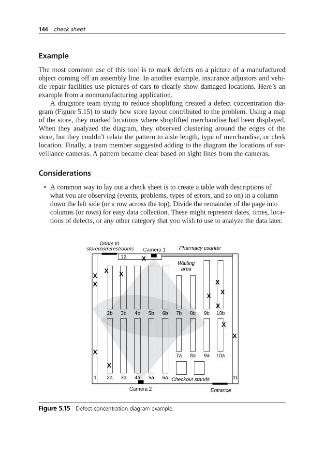
Example
The most common use of this tool is to mark defects on a picture of a manufacturedobject coming off an assembly line. In another example, insurance adjustors and vehi-cle repair facilities use pictures of cars to clearly show damaged locations. Here’s anexample from a nonmanufacturing application.
A drugstore team trying to reduce shoplifting created a defect concentration dia-gram (Figure 5.15) to study how store layout contributed to the problem. Using a mapof the store, they marked locations where shoplifted merchandise had been displayed.When they analyzed the diagram, they observed clustering around the edges of thestore, but they couldn’t relate the pattern to aisle length, type of merchandise, or clerklocation. Finally, a team member suggested adding to the diagram the locations of sur-veillance cameras. A pattern became clear based on sight lines from the cameras.
Considerations
• A common way to lay out a check sheet is to create a table with descriptions ofwhat you are observing (events, problems, types of errors, and so on) in a columndown the left side (or a row across the top). Divide the remainder of the page intocolumns (or rows) for easy data collection. These might represent dates, times, loca-tions of defects, or any other category that you wish to use to analyze the data later.
144 check sheet
2b
2a1
3b
12
3a
4b
4a
5b
5a
6b
6a 11
7b
7a
8b
Waitingarea
Pharmacy counter
Entrance
Checkout stands
Doors to storeroom/restrooms Camera 1
Camera 2
8a
9b
9a
10b
10a
XX
X X
X
X
X
X
X
X
X
X
X
Figure 5.15 Defect concentration diagram example.

• Consider what information about the sources of the data might be important in analysis. Set up the check sheet so that data is captured. It’s easier to capture information when the data is generated than to try to reconstruct it later. Sometimes it’s impossible to capture additional information later. See stratification for ideas about information you might need to capture.
• When designing your form, use illustrations whenever possible. This makes the check sheet easier to use and can reveal patterns during your later analysis.For example, to collect data on damaged packages, include a sketch of the package and have data collectors put an X where they see the damage. See defect concentration diagram for more information about this tool, sometimescalled a defect location check sheet.
• Think about how data is received or how you will want to analyze it later, andconsider keeping separate sheets for different aspects of the collection or analysis.For example, if different people handle international and domestic shipments, useseparate check sheets for international and domestic shipment errors.
• Keep the check sheet near the point where the data to be recorded will occur. For example, if you are monitoring types of telephone interruptions, keep thecheck sheet next to the telephone. This will help you collect the data consistently.
• If observations occur frequently, you may choose to record samples rather thanevery observation. In step 2, decide when an observation will be recorded. Youmay decide to use a time interval (every 30 minutes) or a frequency (every fifthphone call). See samplingfor more information.
• A checklist (page 139) is a variation sometimes called a confirmation check sheet.
Defect Concentration Diagram
• A physical object might be a manufactured item rolling off an assembly line,an item that might have been damaged in shipment or handling, or a form thatworkers or customers must fill out.
• An area might be an office building, a laboratory, a warehouse, or a store (retailand/or storage areas).
• To study errors made in filling out a form, use a copy of the form as your defectconcentration diagram.
• Include just enough detail on your picture so that the location of the problem isclear, but not enough that the picture is too cluttered to mark on.
• Use colored pens or pencils to mark the defects, so they are easily seen on theblack-and-white picture. (But don’t do this if you will need to photocopy the completed diagram for analysis or presentation.)
check sheet 145

• When you are analyzing the data, try to look at it with a fresh eye if patternsaren’t obvious. For example, turn the diagram upside down. Or have someoneunfamiliar with the object or area look at the diagram. Alternatively, add moredetail to the diagram—detail that was originally left out to unclutter the picture—and see if a pattern becomes obvious.
contingency diagram
Description
The contingency diagram uses brainstorming and a negative thinking process to iden-tify how process problems occur or what might go wrong in a plan. Then the negativethinking is reversed to generate solutions or preventive measures.
When to Use
• When identifying problem causes, or . . .
• When developing solutions to problems, or . . .
• When planning implementation of a phase of a project, especially the solution,or . . .
• Before launching a change
• Especially when negative thinking is preventing the group from generating ideas
Procedure
1. Identify your topic—the problem or the proposed action plan—and write itprominently on a flipchart.
2. Brainstorm how to make things go wrong. For a problem:
• How can we make the problem happen?
• How could we make it worse?
For a plan or action:
• How can our plan be made to fail?
• What assumptions are we making that could turn out to be wrong?
6 5
9
7
146 check sheet
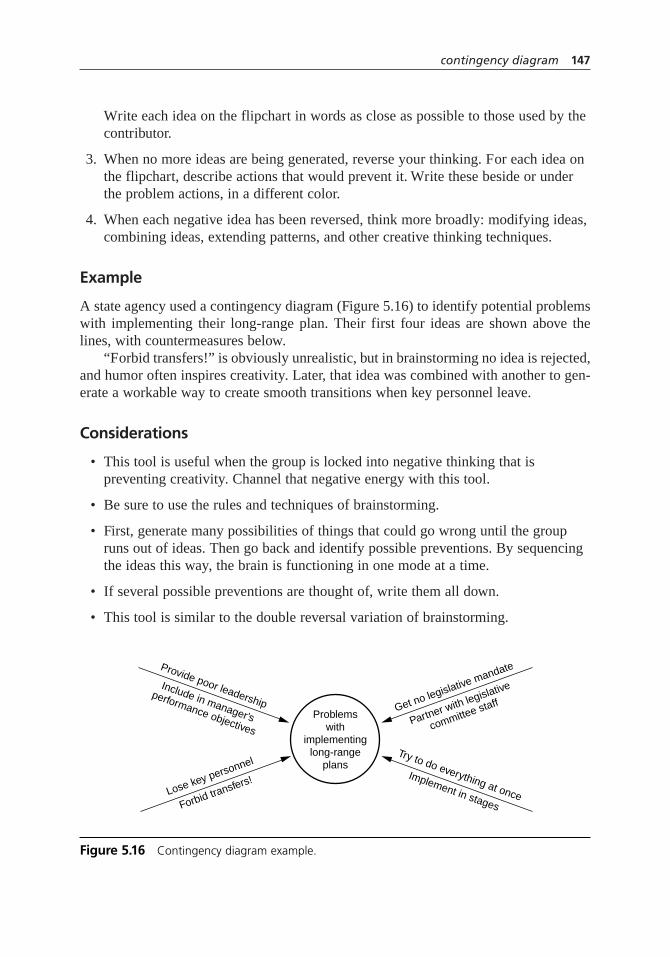
Write each idea on the flipchart in words as close as possible to those used by thecontributor.
3. When no more ideas are being generated, reverse your thinking. For each idea onthe flipchart, describe actions that would prevent it. Write these beside or underthe problem actions, in a different color.
4. When each negative idea has been reversed, think more broadly: modifying ideas,combining ideas, extending patterns, and other creative thinking techniques.
Example
A state agency used a contingency diagram (Figure 5.16) to identify potential problemswith implementing their long-range plan. Their first four ideas are shown above thelines, with countermeasures below.
“Forbid transfers!” is obviously unrealistic, but in brainstorming no idea is rejected,and humor often inspires creativity. Later, that idea was combined with another to gen-erate a workable way to create smooth transitions when key personnel leave.
Considerations
• This tool is useful when the group is locked into negative thinking that is preventing creativity. Channel that negative energy with this tool.
• Be sure to use the rules and techniques of brainstorming.
• First, generate many possibilities of things that could go wrong until the groupruns out of ideas. Then go back and identify possible preventions. By sequencingthe ideas this way, the brain is functioning in one mode at a time.
• If several possible preventions are thought of, write them all down.
• This tool is similar to the double reversal variation of brainstorming.
contingency diagram 147
Problemswith
implementinglong-range
plans
Get no legislative mandate
Partner with legislative
committee staff
Try to do everything at once
Implement in stagesLose key personnel
Forbid transfers!
Provide poor leadership
Include in manager’s
performance objectives
Figure 5.16 Contingency diagram example.
• For a more rigorous analysis of what could go wrong in a project, see processdecision program chart and potential problem analysis.
contingency table
Description
A contingency table organizes categorical data for better analysis. It is composed ofcolumns and rows that represent two different ways of analyzing the same set of data.Create a contingency table before doing a chi-square hypothesis test for variable inde-pendence or for comparing several groups’ distributions across several categories.
When to Use
• When the data are counts of various categories, and . . .
• When the data are cross-classified, that is, classified one way into a set ofcategories and classified another way into a different set of categories
• Especially before doing a chi-square hypothesis test
Procedure
1. Determine the categories into which the data are classified. If the categories areordinal, determine the appropriate order. Decide which categories will be the rows and which will be the columns. If only one categorization represents groupsinto which the respondents are divided, such as male and female, it is customaryto put it in the rows.
2. Create a table with two more columns and two more rows than you need for the categories. The extra columns are for category labels and totals. Label thecolumns and rows.
3. Write in each cell (a box of the table) the number of occurrences for the categoryrepresented by the row and the category represented by the column. Fill in thetotals. The lower right cell of the table is the total number of occurrences. (If youare using a spreadsheet, enter summation formulas in the cells of the row andcolumn for totals.)
Example
A catalog clothing retailer wanted to know whether proposed changes to its product linewould be similarly received in different parts of the country. They conducted a random
348
5
148 contingency diagram

survey of 750 customers. After describing the proposed new products, they asked thecustomers to estimate their likelihood of buying, using an ordinal scale from veryunlikely to very likely.
The resulting data was categorized in two ways: by the customer’s estimate of buy-ing likelihood and by geographical region. Because the geographical regions representgroups of customers, those categories are placed in the rows. The contingency tablelooked like Figure 5.17.
See the second example of hypothesis testingto learn how the contingency tablewas used to answer the company’s question.
Another Example
The same company planned to change the format and style of their catalog. Theywanted to know if the new format would be effective at increasing orders. As a test, theysent 200,000 copies of the spring catalog in the new version to randomly selected cus-tomers. The other 1,800,000 catalogs were in the traditional version.
The data are shown in a 2 × 2 contingency table, Figure 5.18. This table is usefulfor analyzing proportions between two groups when one of the classifications’ values
contingency table 149
VeryUnlikely
SomewhatUnlikely
SomewhatLikely
VeryLikely Total
W
SW
SE
MW
NE
Total
23
43
39
17
33
155
34
58
56
26
29
203
48
41
82
19
51
241
31
37
49
16
18
151
136
179
226
78
131
750
Figure 5.17 Contingency table example.
StandardCatalog
TestCatalog Total
Did buy
Didn’t buy
Total
34,852
1,765,148
1,800,000
4,972
195,028
200,000
39,824
1,960,176
2,000,000
Figure 5.18 2 × 2 contingency table example.
are yes/no, pass/fail, accept/reject, or something similar. In this format, the data canbe entered into hypothesis testing software or an online calculator to determine whetherthe proportions are significantly different. (They are. The new catalog is effective atincreasing orders.)
Considerations
• The total number in the lower right cell of the table can be used as a check forerrors. It should equal both the sum of all the row totals and the sum of all thecolumn totals.
• Computer spreadsheets are often useful for doing the math associated withcontingency tables. The procedure here can be used for setting up a contingencytable in a spreadsheet. In step 2, “draw” by placing labels in the appropriatespreadsheet cells.
• Check sheets can be designed so that they look just like the contingency table thatwill be required for analyzing the data later. See the example for check sheets andnotice the similarity to a contingency table.
continuum of team goals
Description
The continuum of team goals shows how general or specific a goal or mission statementis. Used to foster communication, it helps everyone involved clarify their understand-ing of a team’s purpose.
When to Use
• To stimulate and structure discussion about a team’s goal or mission statement;especially
• When writing or improving a project goal or mission statement, or . . .
• In a steering committee or other management group discussion, to clarify thescope of a task to be assigned to a project team, or . . .
• When a team is first discussing their assignment and team members may have different ideas about its scope, or . . .
• In a meeting between the team and management, to achieve common understandingof the project scope, either at the beginning of the project or when it has stalled
110
8
150 contingency table

Procedure
1. If a goal or mission statement already exists, write it on a flipchart or overheadtransparency so that all participants can see it.
2. Draw a continuum scale (Figure 5.19) on a flipchart or overhead transparency so that all participants can see it. Have each participant decide where along thecontinuum scale he or she would place the group’s assignment, based on his orher understanding of what is expected of the project team. This can be done orallyor in writing. If a goal or mission statement already exists, each participant alsoshould decide where the statement falls along the continuum.
3. Record all participants’ responses. Discuss the group chart until consensus is reached on the project scope. Be sure to consider whether this scope isappropriate.
4. If necessary, rewrite the goal or mission statement to reflect the consensusunderstanding of the project scope.
Examples
Below are examples of possible goals for the Parisian Experience restaurant. None areright or wrong. The best goal depends on what a group needs to accomplish and priorwork that has been done by this group or others.
Our customers choose and return to the Parisian Experience restaurantbecause we offer the most authentic and tastiest French cuisine in the state, pro-vided with unobtrusive and thoughtful service in an atmosphere of relaxed lux-ury that captures the feeling of cosmopolitan France.
Any mission statement written to describe an organization’s purpose should be atthe far left of the continuum because it includes all aspects of the organization.
Service Process Product Problem PlanAll
continuum of team goals 151
Improveall services
and activities
Broad focusSolution not knownLittle or no prior work orFew assumptions
Narrow focusSolution known or assumed
Much prior workor
Many assumptions
Implementa plan
Solvea problem
Improvea product
Improvea process
Improvea service
Figure 5.19 Continuum of team goals.

The customer satisfaction team will identify opportunities to improve customersatisfaction with our restaurant and will develop and recommend plans thattransform those opportunities into value for our customers and our business.
This statement is located between “Improve all services and activities” and “Improvea service.” Since the scale is continuous, goals may fall between the tick marks. Whilemany services will be examined by the team (for example, providing gourmet food andluxurious atmosphere), activities such as buying ingredients or hiring employees will notbe considered because they do not directly affect customer satisfaction.
Enable quick, convenient, and unobtrusive payment.
It may seem odd to call “enabling payment” a service, but helping that necessaryexchange to happen painlessly is indeed a service. This goal focuses the team onimproving that service by whatever means it can create. The team is free to improve thecurrent process or to devise a completely new one, such as restaurant membership withmonthly billing.
Improve the process of presenting the bill and collecting payment.
This time, the team members are restricted to making the current process for pay-ment better. They do not have the freedom to devise a totally new method for the cus-tomer to pay.
Improve the layout of the bill.
This goal is even more focused, and the team even more restricted, not just to a cur-rent process but to a current product: the piece of paper that functions as the bill. Althoughthe team may completely change the format, its solution should still involve a piece ofpaper functioning as a bill. Note that no particular problem is defined in this statement.
Make the bill format easier for customers to read.
Service Process Product Problem PlanAll
Service Process Product Problem PlanAll
Service Process Product Problem PlanAll
Service Process Product Problem PlanAll
Service Process Product Problem PlanAll
152 continuum of team goals
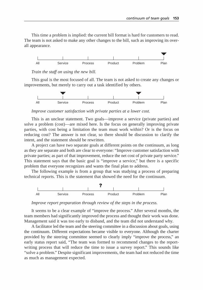
This time a problem is implied: the current bill format is hard for customers to read.The team is not asked to make any other changes to the bill, such as improving its over-all appearance.
Train the staff on using the new bill.
This goal is the most focused of all. The team is not asked to create any changes orimprovements, but merely to carry out a task identified by others.
Improve customer satisfaction with private parties at a lower cost.
This is an unclear statement. Two goals—improve a service (private parties) andsolve a problem (cost)—are mixed here. Is the focus on generally improving privateparties, with cost being a limitation the team must work within? Or is the focus onreducing cost? The answer is not clear, so there should be discussion to clarify theintent, and the statement should be rewritten.
A project can have two separate goals at different points on the continuum, as longas they are separate and both are clear to everyone: “Improve customer satisfaction withprivate parties; as part of that improvement, reduce the net cost of private party service.”This statement says that the basic goal is “improve a service,” but there is a specificproblem that everyone recognizes and wants the final plan to address.
The following example is from a group that was studying a process of preparingtechnical reports. This is the statement that showed the need for the continuum.
Improve report preparation through review of the steps in the process.
It seems to be a clear example of “improve the process.” After several months, theteam members had significantly improved the process and thought their work was done.Management said it was too early to disband, and the team did not understand why.
A facilitator led the team and the steering committee in a discussion about goals, usingthe continuum. Different expectations became visible to everyone. Although the charterprovided by the steering committee seemed to clearly imply “improve the process,” anearly status report said, “The team was formed to recommend changes to the report-writing process that will reduce the time to issue a survey report.” This sounds like“solve a problem.” Despite significant improvements, the team had not reduced the timeas much as management expected.
Service Process Product Problem PlanAll
Service Process Product Problem PlanAll
Service Process Product Problem PlanAll
continuum of team goals 153

Early discussion of expectations, using the continuum, would have prevented theconflict and provided better focus for the effort. Also see the project charter checklistexample on page 436 for another way the team could have discussed their assignment.See the Medrad story on page 58 for another continuum example.
Considerations
• If the continuum is new to participants, the facilitator of the meeting should startby explaining it, using an example such as the restaurant.
• If different people place a project in different places on the continuum, the issue is not “Who is right?” but rather “What is right?” The appropriate scope needs tobe determined, then clarified, so everyone understands it the same way, and theproject statement needs to be rewritten so it clearly conveys to everyone what isexpected of the team.
• Where a goal statement belongs along the continuum depends not on the resultsof accomplishing the goal, but on the freedom or constraints the statement givesthe team. For example, the goal, “Install new software XYZ on all PCs” may have the result of improving computer service. However, this statement does notallow the team to consider and choose how best to improve service; the team isasked only to implement a specific plan.
• Generally, more creativity and broader improvement result from goals farther lefton the continuum. Always consider whether a goal’s scope can be expanded to apoint farther left on the continuum, unless the goal logically follows from workthat already has been done. Think more broadly than the immediate problem athand or the current way of doing things. Set goals that challenge you to developcreative alternatives that eliminate problems instead of just fixing them, that add value rather than just efficiency. This is especially critical between the twocontinuum points of improving a process and improving a service. Look just a little further than the process you currently operate to ask what service thatprocess is intended to provide. Would you be willing to provide that service in a different way, if someone could think of one?
Example: Instead of the restaurant asking a team to improve the payment process,the team could be asked to enable unobtrusive and thoughtful payment that doesnot disturb the relaxed, luxurious atmosphere. This subtle difference, focused onthe restaurant’s mission, frees the team to imagine creative ways to handle thefinancial side of the transaction.
• To facilitate discussion, try having each person describe which words in the mission statement caused the placement of his or her mark.
• When determining whether the scope is appropriate, consider such things as overall organizational goals, makeup of the team, budget constraints, and timingexpectations.
154 continuum of team goals
• The team’s and management’s scopes must match, so that the team’s efforts willsupport the organization’s overall strategy and their solutions will be readilyaccepted and supported.
control chart
Also called: statistical process controlVariations:
variables charts:–X and R chart (also called averages and range chart),
–X and s chart,
chart of individuals (also called Xchart, X-R chart, IX-MR chart, XmR chart, movingrange chart), moving average–moving range chart (also called MA–MRchart), targetcharts (also called difference charts, deviation charts, and nominal charts), CUSUM(also called cumulative sum chart), EWMA (also called exponentially weighted mov-ing average chart), multivariate chart (also called Hotelling T2)
attributes charts:p chart (also called proportion chart),np chart,c chart (also calledcount chart),u chart.
charts for either kind of data: short run charts (also called stabilized charts or Zcharts), group charts (also called multiple characteristic charts)
Description
The control chart is a graph used to study how a process changes over time. Data areplotted in time order. A control chart always has a central line for the average, an upperline for the upper control limit, and a lower line for the lower control limit. These linesare determined from historical data. By comparing current data to these lines, one canmake conclusions about whether the process variation is consistent (in control) or isunpredictable (out of control, affected by special causes of variation).
There are many types of control charts. Each is designed for a specific kind ofprocess or data. Control charts for variable data are used in pairs. The top chart moni-tors the average, or the centering of the distribution of data from the process. The bottomchart monitors the range, or the width of the distribution. If your data were shots in tar-get practice, the average is where the shots are clustering, and the range is how tightlythey are clustered. Control charts for attribute data are used singly.
When to Use
• When controlling ongoing processes by finding and correcting problems as theyoccur, or . . .
• When predicting the expected range of outcomes from a process, or . . .
3948
57
control chart 155
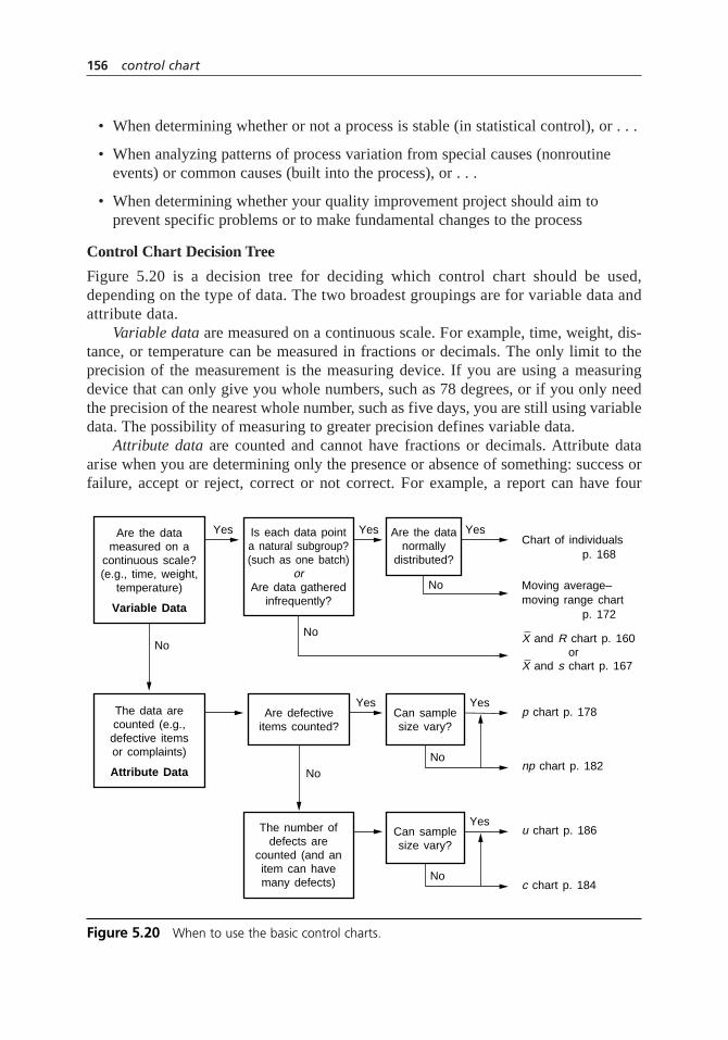
• When determining whether or not a process is stable (in statistical control), or . . .
• When analyzing patterns of process variation from special causes (nonroutineevents) or common causes (built into the process), or . . .
• When determining whether your quality improvement project should aim toprevent specific problems or to make fundamental changes to the process
Control Chart Decision Tree
Figure 5.20 is a decision tree for deciding which control chart should be used,depending on the type of data. The two broadest groupings are for variable data andattribute data.
Variable data are measured on a continuous scale. For example, time, weight, dis-tance, or temperature can be measured in fractions or decimals. The only limit to theprecision of the measurement is the measuring device. If you are using a measuringdevice that can only give you whole numbers, such as 78 degrees, or if you only needthe precision of the nearest whole number, such as five days, you are still using variabledata. The possibility of measuring to greater precision defines variable data.
Attribute data are counted and cannot have fractions or decimals. Attribute dataarise when you are determining only the presence or absence of something: success orfailure, accept or reject, correct or not correct. For example, a report can have four
156 control chart
Are the datameasured on a
continuous scale?(e.g., time, weight,
temperature)
Variable Data
The data arecounted (e.g.,defective itemsor complaints)
Attribute Data
Are defectiveitems counted?
Can samplesize vary?
Can samplesize vary?
Is each data pointa natural subgroup?(such as one batch)
orAre data gathered
infrequently?
The number ofdefects are
counted (and anitem can havemany defects)
Are the datanormally
distributed?
Yes Yes
Yes
No
YesChart of individuals
p chart p. 178
np chart p. 182
u chart p. 186
c chart p. 184
X and R chart p. 160 orX and s chart p. 167
p. 168
moving range chartMoving average–
p. 172
Yes
Yes
No
No
No
No
No
Figure 5.20 When to use the basic control charts.

errors or five errors, but it cannot have 41⁄2 errors. A longer discussion of attribute datacan be found on page 177.
Basic Procedure
1. Choose the appropriate control chart for your data.
2. Determine the appropriate time period for collecting and plotting data.
3. Follow the procedure for that control chart on the following pages to collect data,construct your chart, and analyze the data.
4. Look for out-of-control signals on the control chart. When one is identified, markit on the chart and investigate the cause. Document how you investigated, whatyou learned, the cause, and how it was corrected.
• A single point outside the control limits. In Figure 5.21, point sixteen is above the UCL.
• Two out of three successive points are on the same side of the centerline andfarther than 2sfrom it. In Figure 5.21, point four sends that signal.
• Four out of five successive points are on the same side of the centerline andfarther than 1sfrom it. In Figure 5.21, point eleven sends that signal.
• A run of eight in a row are on the same side of the centerline. Or ten out ofeleven, twelve out of fourteen, or sixteen out of twenty. In Figure 5.21, pointtwenty-one is eighth in a row above the centerline.
• Obvious consistent or persistent patterns that suggest something unusual aboutyour data and your process.
control chart 157
0 1 2 3 4 5 6 7 8 9 10 11 12 13 14 15 16 17 18 19 20 21 22 23 24 25
UCL = 3σ
LCL = 3σ
2σ
1σ
Average
1σ
2σ
Time
X
X
X
X
Figure 5.21 Out-of-control signals.

5. Continue to plot data as they are generated. As each new data point is plotted,check for new out-of-control signals.
6. When you start a new control chart, the process may be out of control. If so, thecontrol limits calculated from the first 20 points are conditional limits. When youhave at least 20 sequential points from a period when the process is operating incontrol, recalculate control limits.
Considerations
Out-of-Control Signals
• Some control charts have special requirements for their out-of-control signals.Check the analysis section of the particular control chart.
• The distribution of ranges is not symmetrical but skewed right. Therefore, onewould expect more points below
–R than above it. To allow for this, the fourth
out-of-control signal is often modified for range charts to require a run of 12points in a row below
–R.
• These signals are based on statistics. The points plotted from an in-control processare random but, taken together, match a predictable distribution, such as a normalcurve. The out-of-control signals highlight patterns that are statistically unlikely to be random outputs of that distribution, such as too many points far from thecenterline. In Figure 5.21, the last three out-of-control signals show more outputabove and far from the average than one would expect from a random process,an indication that the process average has shifted up.
• The signals do not indicate whether patterns are desirable or undesirable. A change in the process may be toward better performance or toward worse performance. It is just as important to do something to understand and maintaingood performance as it is to eliminate bad performance.
• Additional out-of-control signals are often used. For example:
– Fifteen points in a row within 1sof the centerline
– Six points in a row steadily increasing or decreasing
– Fourteen points in a row alternating up and down
– Eight points in a row all farther than 1sfrom the centerline, on either side
– A jump of 4s
– Additional rules for runs and trends
158 control chart

• However, using too many out-of-control signals can cause a false positive—a problem signaled when one doesn’t really exist. (This is called a type I error. Seehypothesis testing for more information.) Every out-of-control signal has a smallprobability of occurring from random chance. For example, an in-control processwill generate a point outside the control limits 0.27 percent of the time. When many signals are used simultaneously, those small chances multiply. Using just foursignals—single point out, two-out-of-three, four-out-of five, and eight-in-a-row—the chance of a false positive is one in twelve. Use no more than four or five signals, or you will be looking frequently for problems that don’t exist. For mostprocesses, just a few signals, plus thinking carefully about what the charts might berevealing about your process, will reveal many improvement opportunities.
• The out-of-control signals listed on the previous page and in the procedure are not in order of probability but rather in an order that aids remembering. Forexample, four out of five points on one side of the centerline is less probable thana single point outside the control limits. Thus, four out of five is a more sensitivesignal than the single point outside. See Hoyer and Ellis in the Resources for adiscussion of the probabilities and sensitivities of different signals.
• There is also such a thing as a type II error: an out-of-control process that does notshow any of the out-of-control signals. For example, if the process average shiftsslightly, the standard out-of-control signals will be slow to identify the change.
• Out-of-control signals should be marked on the chart. Put an X beside the pointthat completes the pattern, or circle the set of points that form the signal.
Autocorrelation
• The time period chosen for collecting and plotting data should be based on howfast variation occurs in the process. The process should have time to changebetween samples. If not, the data will be autocorrelated.
• For example, suppose liquid is continually flowing both into and out of a tank sothat the contents are completely replaced every three hours. If you are monitoringconcentration, you should not plot it more often than every three hours. Datataken more frequently will be autocorrelated. Temperature is a variable that isoften autocorrelated because it usually does not change rapidly.
• A good test for autocorrelation is to use correlation analysis or a scatter diagramto graph the measurement taken at one time against the measurement taken at theprevious time. If samples are being taken too frequently, the scatter diagram willshow correlation. See scatter diagram or correlation analysis for more information.
Control Limits
• Control limits are not specification limits. In fact, specification limits shouldnever be placed on a control chart. Specifications reflect customer requirements,whereas control limits reflect the historical performance of the process.
control chart 159
05b.H1224.ch5(139-196).qxd 4/7/05 4:46 PM Page 159

• Control limits should be recalculated only when the process has experienced a permanent change from a known cause and at least 20 plot points have beengenerated by the changed process. You should not recalculate limits after each 20 points or subgroups or after each page of the chart.
• Choose numerical scales that include the values for the control limits plus a little extra.
Other Considerations
• For controlling an ongoing process, control charts are most useful when plotted as soon as the data is generated and analyzed by the people who are working with the process. Collecting lots of data on a check sheet and plotting them bycomputer later will create charts that are prettier but of limited use.
• Computer software is available for generating control charts. Sometimes computerized control systems in manufacturing automatically generate controlcharts. These are useful to remove the labor required and to ensure that calcu-lations are accurate. However, computers should never substitute for the mostimportant aspect of control charting: people who understand the purpose andmeaning of the charts and who watch them closely, using them as a tool tomonitor and improve their processes.
• Blank control chart forms and worksheets are provided for each type of chart.Permission is granted to copy these charts for individual use.
• Control charts are easy and powerful to use, but they are often applied incorrectly.The more knowledgeably they are used, the more they can improve your pro-cesses. This summary contains only the basics of control charts, intended as a reference. The theory behind them and fine points about their use are beyond thescope of this book. Take a class, study some books, or obtain expert help to getthe most value out of control charts in your processes.
variable control charts––X and R chart
Also called: averages and range chart
Description
The –X (pronounced X-bar) and R chart is a pair of control charts used to study variable
data. It is especially useful for data that does not form a normal distribution, although itcan be used with normal data as well. Data are subgrouped, and averages and ranges foreach subgroup are plotted on separate charts.
160 control chart

When to Use
• When you have variable data, and . . .
• When data are generated frequently, and . . .
• When you want to detect small process changes
• Especially in manufacturing, where a sample of four or five pieces may be usedto represent production of several hundred or thousand pieces
Procedure
Construction
1. Determine the appropriate time period for collecting and plotting data. Determinethe number of data points per subgroup (n). Collect at least 20n data points tostart the chart. For example, with subgroup size of three, 60 data points will beneeded to create 20 subgroups.
2. If the raw data do not form a normal distribution, check whether the averages ofthe subgroups form a normal distribution. (The normality test can be used.) If not,increase the subgroup size.
3. Calculate––X (X-double-bar),
–R (R-bar), and the control limits using the worksheet
for the –X and R chart or moving average–moving range chart (Figure 5.22) and the
chart for –X and R or moving average–moving range (Figure 5.23).
4. On the “Average” part of the chart, mark the numerical scale, plot the subgroupaverages, and draw lines for the average of the averages and for the control limitsfor X. On the “Range” part of the chart, mark the numerical scale, plot the ranges,and draw lines for the average range and for the control limits for R.
5. Continue to follow steps 4, 5, and 6 of the basic procedure.
Analysis
1. Check the R chart for out-of-control signals. All the signals listed on page 157 canbe used.
2. If the R chart is in control, check the –X chart for out-of-control signals. All the
signals listed on page 157 can be used.
control chart 161

162 control chart
Process: _____________________________ Calculated by: _________________________
Data dates: __________________________ Calculation date: ______________________
Step 1. Calculate average X_
and range R (the difference between the highest and lowest values) for each subgroup. Record on chart.
Number of values in each subgroup = n = _______
Number of subgroups to be used = k = _______
Step 2. Look up control limit factors.
n A2 D3 D4
2 1.880 — 3.267 A2 = _______3 1.023 — 2.5744 0.729 — 2.282 D3 = _______5 0.577 — 2.1146 0.483 — 2.004 D4 = _______7 0.419 0.076 1.924
Step 3. Calculate averages (X__
and R_
).
Sum of the averages = ΣX_
= _______
Average of the averages = X__
= ΣX_
÷ k
= _______ ÷ _______ = _______
Sum of the ranges = ΣR = _______
Average of the ranges = R_
= ΣR ÷ k
= _______ ÷ _______ = _______
Step 4. Calculate control limits.
3s estimate for X_
chart = 3s X– = A2 × R
_
= _______ × _______ = _______
Upper control limit for X_
chart = UCLX– = X
__+ 3s X
–
= _______ + _______ = _______
Lower control limit for X_
chart = LCLX– = X
__– 3s X
–
= _______ – _______ = _______
Upper control limit for R chart = UCLR = D4 × R_
= _______ × _______ = _______
Lower control limit for R chart = LCLR = D3 × R_
= _______ × _______ = _______
Figure 5.22–X and R chart or moving average–moving range chart worksheet.
< <
<<

con
trol ch
art163
Process:
Date
#1
#2
#3
#4
#5
#6
Sum
Avg.
Range
Ave
rage
Ran
geVariable: Units:
X: R:
Limits set by:
UCLR:
Date:
UCLx: LCLx:
Figure 5.23–X and R chart or moving average–moving range chart.

Example
The ZZ-400 team collected a set of 40 values, arranged in time sequence, for productpurity. The histogram in Figure 5.24 indicates that the data are slightly skewed, as datathat are being pushed toward 100 percent or zero percent often are. The team will trysubgrouping the data by twos. Figure 5.25 shows the subgrouped data.
164 control chart
0
5
10
99.2 99.4 99.6
ZZ-400 Purity
99.8
Figure 5.24 Histogram of–X and R chart example.
X and R or Moving Average–Moving Range Chart
Process:
Date#1#2#3#4#5#6SumAvg.Range
Ave
rage
Ran
ge
ZZ-400Purity % PW 3/29/05
99.88
99.799.6
100.0
99.5
99.0
.5
0
UCL
X
LCL
R
0.199.65
3/499.799.4
0.399.55
3/599.499.3
0.199.35
3/699.599.8
0.399.65
3/799.799.4
0.399.55
3/899.699.9
0.399.75
3/999.399.2
0.199.25
3/1099.699.3
0.399.45
3/1199.599.6
0.199.55
3/1299.799.6
0.199.65
3/1399.699.8
0.299.70
3/1499.599.4
0.199.45
3/1599.799.8
0.199.75
3/1699.799.3
0.499.50
3/1799.499.5
0.199.45
3/1899.699.7
0.199.65
3/1999.299.5
0.399.35
3/2099.799.6
0.199.65
3/2199.499.3
0.199.35
3/2299.599.6
0.199.55
3/23
Variable: Units:X:
Limits set by:UCLR:
Date:R:UCLx: 99.20 99.54 0.59 0.18LCLx:
UCL
Figure 5.25–X and R chart example.
05b.H1224.ch5(139-196).qxd 4/7/05 4:47 PM Page 164
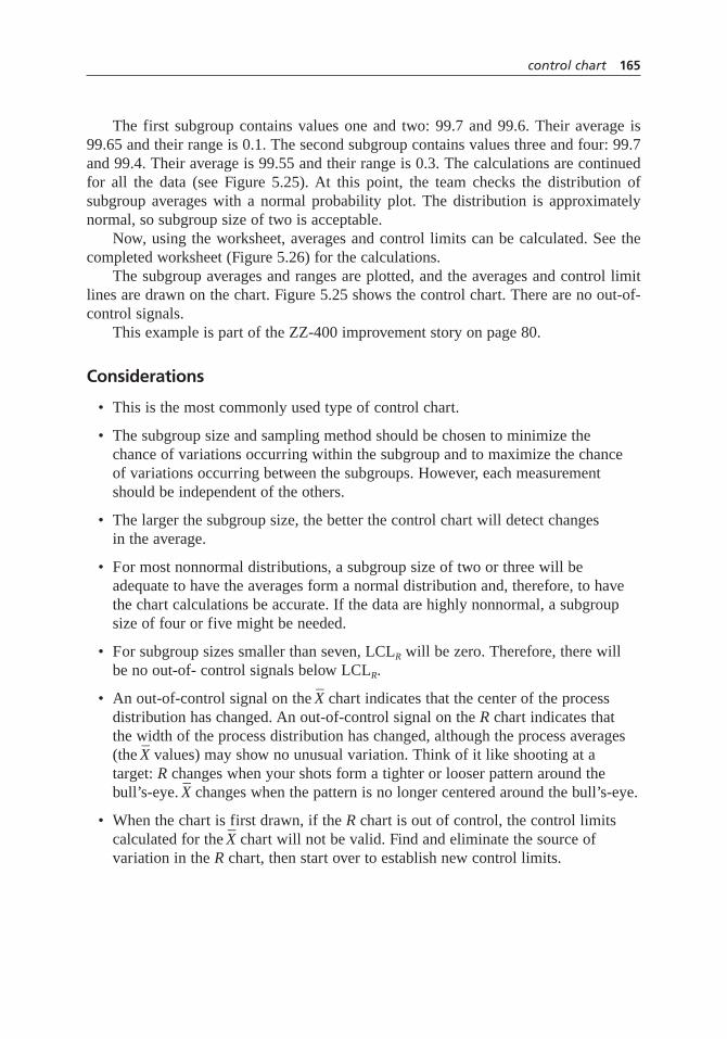
The first subgroup contains values one and two: 99.7 and 99.6. Their average is99.65 and their range is 0.1. The second subgroup contains values three and four: 99.7and 99.4. Their average is 99.55 and their range is 0.3. The calculations are continuedfor all the data (see Figure 5.25). At this point, the team checks the distribution ofsubgroup averages with a normal probability plot. The distribution is approximatelynormal, so subgroup size of two is acceptable.
Now, using the worksheet, averages and control limits can be calculated. See thecompleted worksheet (Figure 5.26) for the calculations.
The subgroup averages and ranges are plotted, and the averages and control limitlines are drawn on the chart. Figure 5.25 shows the control chart. There are no out-of-control signals.
This example is part of the ZZ-400 improvement story on page 80.
Considerations
• This is the most commonly used type of control chart.
• The subgroup size and sampling method should be chosen to minimize the chance of variations occurring within the subgroup and to maximize the chance of variations occurring between the subgroups. However, each measurementshould be independent of the others.
• The larger the subgroup size, the better the control chart will detect changes in the average.
• For most nonnormal distributions, a subgroup size of two or three will beadequate to have the averages form a normal distribution and, therefore, to havethe chart calculations be accurate. If the data are highly nonnormal, a subgroupsize of four or five might be needed.
• For subgroup sizes smaller than seven, LCLR will be zero. Therefore, there will be no out-of- control signals below LCLR.
• An out-of-control signal on the –X chart indicates that the center of the process
distribution has changed. An out-of-control signal on the R chart indicates that the width of the process distribution has changed, although the process averages(the
–X values) may show no unusual variation. Think of it like shooting at a
target:R changes when your shots form a tighter or looser pattern around thebull’s-eye.
–X changes when the pattern is no longer centered around the bull’s-eye.
• When the chart is first drawn, if the R chart is out of control, the control limitscalculated for the
–X chart will not be valid. Find and eliminate the source of
variation in the R chart, then start over to establish new control limits.
control chart 165

166 control chart
Process: _____________________________ Calculated by: _________________________
Data dates: __________________________ Calculation date: ______________________
Step 1. Calculate average X_
and range R (the difference between the highest and lowest values) for each subgroup. Record on chart.
Number of values in each subgroup = n = _______
Number of subgroups to be used = k = _______
Step 2. Look up control limit factors.
n A2 D3 D4
2 1.880 — 3.267 A2 = _______3 1.023 — 2.5744 0.729 — 2.282 D3 = _______5 0.577 — 2.1146 0.483 — 2.004 D4 = _______7 0.419 0.076 1.924
Step 3. Calculate averages (X__
and R_
).
Sum of the averages = ΣX_
= _______
Average of the averages = X__
= ΣX_
÷ k
= _______ ÷ _______ = _______
Sum of the ranges = ΣR = _______
Average of the ranges = R_
= ΣR ÷ k
= _______ ÷ _______ = _______
Step 4. Calculate control limits.
3s estimate for X_
chart = 3s X– = A2 × R
_
= _______ × _______ = _______
Upper control limit for X_
chart = UCLX– = X
__+ 3s X
–
= _______ + _______ = _______
Lower control limit for X_
chart = LCLX– = X
__– 3s X
–
= _______ – _______ = _______
Upper control limit for R chart = UCLR = D4 × R_
= _______ × _______ = _______
Lower control limit for R chart = LCLR = D3 × R_
= _______ × _______ = _______
Figure 5.26–X and R chart example worksheet.
<
<<
<
ZZ-400 Purity PW
3/4 – 3/23/05 3/29/05
2
20
1.880
3.267
1991
1991 20 99.54
3.6
3.6 20 0.18
1.880 0.18 .34
99.54 .34 99.88
99.54 .34 99.20
3.267 0.18 0.59

––X and s chart
Description
An –X and s chart is very similar to an
–X and R chart, with one exception: the standard
deviation of the sample,s, is used to estimate subgroup variation. Computer software isdesirable for performing the calculations.
When to Use
• When you have variable data, and . . .
• When enough data is available that subgroup size is 10 or greater, or . . .
• When you must rapidly detect very small process changes
Procedure
Follow the procedure for constructing an –X and R chart. However, instead of an R chart,
you will construct an schart. Substitute the following formulas:
s chart:
–X chart:
Values of A3, B3, and B4 can be found in Table A.2.
Example
The Joint Commission on Accreditation of Healthcare Organizations (JCAHO) is iden-tifying standardized performance measures to support performance improvement withinhospitals and to permit rigorous comparison between hospitals. In the focus area ofpneumonia treatment, one of the measures is antibiotic timing: time from initial hospi-tal arrival to first dose of antibiotic. While some studies have used attribute data, mea-suring the proportion of patients who received antibiotic within the recommended time,the Joint Commission chose to measure timing as variable data, both to emphasize
UCL
LCL
X
X
X A s
X A s
= +
= −
3
3
sX X
ni=−( )−( )
Σ2
1calculated for each subbgroup
UCL
LCL
s s k
B s
B s
s
s
= ÷
=
=
Σ
4
3
control chart 167

continuous improvement and to be able to statistically analyze trends over time. In theUnited States, almost 1000 patients per month enter hospitals with pneumonia, so thereis ample data for using an
–X and s chart. –
X ands charts look just like –X andR charts. Figure 5.33, page 182 shows an
–X and
s chart used in a short-run situation.
Considerations
• To calculate control limits for the average chart, do not use an overall scalculatedfrom all the data. This will inflate the control limits if the process is not in control. Instead, calculate sfor each subgroup, then average those to calculate s.
chart of individuals
Also called:X chart,X-R chart,IX–MR chart,XmR chart, moving range (MR) chart
Description
The chart of individuals is a pair of control charts used to study variable data that arenot generated frequently enough for an
–X and R chart and that form a normal distribu-
tion. Data are not subgrouped. Individual data points are plotted on one chart, and thedifferences between successive points, the moving ranges, are plotted on the second.
When to Use
• When you have variable data, and . . .
• When the distribution of data from the process is normal, and . . .
• When you cannot use an –X and R chart because frequent data are costly or not
available, such as with destructive testing or a slowly changing process, or . . .
• When you cannot use an –X and R chart because the measurement remains
constant for a relatively long period before the process changes, such as in batchoperations where conditions within each batch are constant
Procedure
Construction
1. Determine the appropriate time period for collecting and plotting data. Collect atleast 20 data points, arranged in time order, from the process to be studied.
2. Determine if the distribution of the data is normal. See histogramfor a discussionof normal distribution, and see normality testfor ways to determine whether it is normal.
168 control chart

3. Calculate the average, called –X (X-bar), and the control limits using the worksheet
for chart of individuals (Figure 5.27) and the chart of individuals form (Figure 5.28).
4. On the “value” part of the chart, mark the numerical scale, plot the individualvalues, and draw lines for the average and the control limits for X. On the “movingrange” part of the chart, mark the numerical scale, plot the moving ranges, anddraw lines for the average moving range and the UCLMR. (LCLMR is zero.)
5. Continue to follow steps 4, 5, and 6 of the basic procedure.
control chart 169
Figure 5.27 Chart of individuals worksheet.
Process: _____________________________ Calculated by: _________________________
Data dates: __________________________ Calculation date: ______________________
Step 1. Calculate X_
.
Number of values = k = _______
Sum of the values = ΣX = _______
Average = X_
= ΣX ÷ k
= _______ ÷ _______ = _______
Step 2. Calculate MR–––
.
Calculate the ranges (the difference between two consecutive data points) andrecord on the form. Ignore negative signs.
Number of moving ranges = k – 1 = _______
Sum of the moving ranges = ΣMR = _______
Average moving range = MR–––
= ΣMR ÷ (k – 1)
= _______ ÷ _______ = _______
Step 3. Calculate control limits.
Estimate 3 standard deviations = 3sX = 2.66 × MR–––
= 2.66 × _______ = _______
Upper control limit for X chart = UCLX = X_
+ 3sX
= _______ + _______ = _______
Lower control limit for X chart = LCLX = X_
– 3sX
= _______ – _______ = _______
Upper control limit for MR chart = UCLMR = 3.267 × MR–––
= 3.267 × _______ = _______
<
<<

170co
ntro
l chart
Process:Variable: Units:
X: MR:
Limits set by:
UCLMR:
Date:
UCLx: LCLx:
Date
Time
Value
Range
Val
ueM
ovin
g R
ange
Figure 5.28 Chart of individuals.

Analysis
1. Check the “moving range” part of the chart for out-of-control signals. All thesignals listed on page 157 can be used.
2. If the chart is in control, check the “value” part of the chart for out-of-controlsignals. All the signals listed on page 157 can be used.
Example
Figure 5.29 shows the “value” portion of the chart of individuals drawn by a team work-ing to reduce the elapsed time between completing a technical survey and issuing thereport. The team had more than two years of historical data. The initial control limits arecalculated from data taken the first year. This chart shows the second half of the data.
There is an out-of-control signal around points 70 to 76: seven points in a rowbelow the average. If the team had been keeping a control chart at the time, it shouldhave investigated what was different then about the process. Notice the period betweenreports 95 and 117 when the process went wildly out of control. The team identified aspecial cause: new people in the group.
Immediately following that period, the team implemented its first improvements.Notice the drop in both the average and the UCL.
Also see the Medrad story on page 60 for another example of the use of a chart ofindividuals within the improvement process.
control chart 171
0
20
40
60
80
100
120
140
160
80 85 90 95 100 105 110 115
Personnelchange
Implementedteam’s changes
UCL
UCL
120 125 130 13570 75
Day
s to
Issu
e R
epo
rt
Report Number
XX
Figure 5.29 Chart of individuals example.

Considerations
• The chart of individuals does not pick up process changes as quickly as the –X and
R chart. If you have a choice between them, use the –X and R chart.
• When data come from a nonnormal distribution (such as a skewed distribution),the control limits of a chart of individuals will not represent the process accurately.Depending on the situation, those limits will result in many more or many lessout-of-control signals than are actually occurring. Use an
–X and R chart or moving
average–moving range chart instead.
• Although the same word, range, is used in this chart and the –X and R chart, they
are calculated and interpreted differently. The chart of individuals does not separate variation in the process distribution’s width from variation in the average, as the
–X and R chart does.
moving average–moving range chart
Also called:MA–MR chart
Description
The moving average–moving range (MA–MR) chart is a pair of control charts used tostudy variable data that are not generated frequently enough for an
–X and R chart, espe-
cially data that do not form a normal distribution. Data are subgrouped in a unique way:each successive subgroup drops the oldest measurement from the previous subgroupand adds one new one. This chart detects small process changes better than the chart ofindividuals.
When to Use
• When you have variable data, and . . .
• When you cannot use an –X and R chart because frequent data are costly or not
available, such as with destructive testing or a slowly changing process, or . . .
• When you cannot use an –X and R chart because the measurement remains
constant for a relatively long period before the process changes, such as in batchoperations, and . . .
• When you cannot use a chart of individuals because the data are not normally distributed, or . . .
• When you want to detect small process changes
172 control chart
Procedure
Construction
1. Determine the appropriate time period for collecting and plotting data. Determinethe number of data points per subgroup (n). Collect at least 20 + n – 1 data pointsto start the chart. For example, with a subgroup size of three, you will need 22data points.
2. Arrange data in subgroups and calculate subgroup averages and ranges, asfollows. Subgroup averages and ranges are calculated differently for the MA–MRchart than for the
–X and R chart.
a. Record the first n individual values in the first column on the moving averagechart (Figure 5.23, page 163). These values form the first subgroup.
b. Drop the oldest value from the subgroup and record the remaining values inthe second column, starting at the top. Write the next value in the bottomposition to complete the second subgroup.
c. Continue the process for all the data. You should finish with n – 1 fewersubgroups than there are individual values.
d. Calculate the average (MA) and range (MR) for each subgroup. See theexample for a sample calculation.
3. If the raw data do not form a normal distribution, check whether the averages of the subgroups do. (See normality test for how to do this.) If not, increase thesubgroup size.
4. Calculate——MA (MA-bar),
——MR (MR-bar), and the control limits using the work-
sheet for the –X and R chart or moving average–moving range chart (Figure 5.22,
page 162).
5. On the “Average” part of the chart, mark the numerical scale, plot the subgroupaverages, and draw lines for
——MA and for the averages’ control limits. On the
“Range” part of the chart, mark the numerical scale, plot the ranges, and drawlines for
——MA and the range control limits.
6. Continue to follow steps 4, 5, and 6 of the basic procedure.
Analysis
1. Check the moving range chart for out-of-control signals. “Points outside thecontrol limits” is the only valid signal. Do not check for runs or trends. Thesesignals are not valid because the same individual values are included in more than one subgroup.
control chart 173
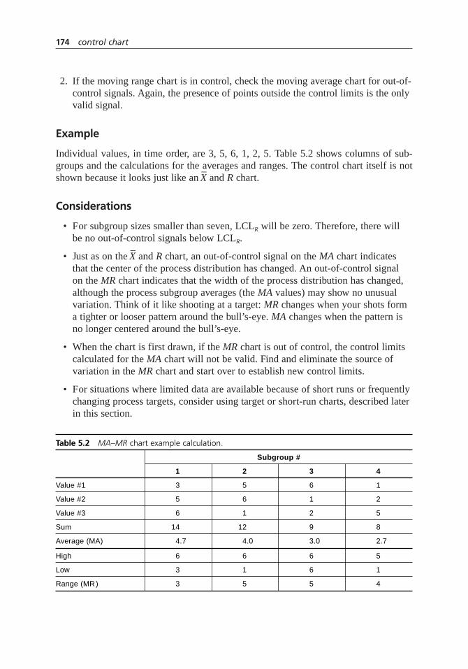
2. If the moving range chart is in control, check the moving average chart for out-of-control signals. Again, the presence of points outside the control limits is the onlyvalid signal.
Example
Individual values, in time order, are 3, 5, 6, 1, 2, 5. Table 5.2 shows columns of sub-groups and the calculations for the averages and ranges. The control chart itself is notshown because it looks just like an
–X and R chart.
Considerations
• For subgroup sizes smaller than seven, LCLR will be zero. Therefore, there will be no out-of-control signals below LCLR.
• Just as on the –X and R chart, an out-of-control signal on the MA chart indicates
that the center of the process distribution has changed. An out-of-control signal on the MR chart indicates that the width of the process distribution has changed,although the process subgroup averages (the MA values) may show no unusualvariation. Think of it like shooting at a target:MR changes when your shots forma tighter or looser pattern around the bull’s-eye. MA changes when the pattern isno longer centered around the bull’s-eye.
• When the chart is first drawn, if the MR chart is out of control, the control limitscalculated for the MA chart will not be valid. Find and eliminate the source ofvariation in the MR chart and start over to establish new control limits.
• For situations where limited data are available because of short runs or frequentlychanging process targets, consider using target or short-run charts, described laterin this section.
174 control chart
Table 5.2 MA–MR chart example calculation.
Subgroup #
1 2 3 4
Value #1 3 5 6 1
Value #2 5 6 1 2
Value #3 6 1 2 5
Sum 14 12 9 8
Average (MA) 4.7 4.0 3.0 2.7
High 6 6 6 5
Low 3 1 6 1
Range (MR ) 3 5 5 4

target chart
Also called: difference chart, deviation chart, or nominal chart
Description
A target chart is a variation that can be used with any of the basic variable charts. Itallows the same characteristic from different parts or products to be plotted on onechart. The numbers plotted on the chart and used for calculating control limits are dif-ferences between the measured values and target values.
When to Use
• When you have variable data, and . . .
• When the same process generates different parts or products, each of which has adifferent target (set point, specification, and so on) for the characteristic you wantto monitor, and . . .
• The variability (standard deviation) is the same for each different part or product
Procedure
1. Determine which basic control chart (chart of individuals,–X and R, or
–X and s) is
appropriate for the situation.
2. Determine the target value for each part or product. You may use historical data or specification limits. Common choices of targets are:
a. The centerline from an existing control chart for the variable.
b. The average from previous production data.
c. The control chart centerline or production data average for a similar variable.
d. The midpoint between upper and lower specification limits.
e. A value that a process expert (operator, machinist, engineer) recommends.
f. For one-sided specifications, a value at least three standard deviations awayfrom the specification.
3. Follow the specific procedure for constructing the appropriate basic control chart,with the following changes. For each data point, calculate:
–Xt =
–X – Target (
–X and R or
–X and s chart)
or Xt = X – Target (chart of individuals)
control chart 175

Plot –Xt or Xt on the chart, and use it instead of
–X or X for all calculations. The
vertical scale on the –Xt or Xt chart will have zero at or close to the centerline, with
values above and below zero showing the deviation from target. For an –X and R or–
X and s chart, each subgroup must contain only data from one part or product. Youcannot change parts or products within a subgroup. The range calculations will bethe same as if you had used
–X.
4. When the part or product changes, draw a vertical line on the chart and identifythe part or product.
5. Analyze the charts for out-of-control signals. If the range chart is out of control,examine the culprit data separately. You may need to construct a separate controlchart for the data with different variations. Alternatively, you may need to use ashort-run control chart.
6. If the range chart is in control, analyze the –Xt or Xt chart. In addition to the usual
signals, examine the distance between the centerline and the zero line. This showshow far the process is from target. Notice whether particular parts or products areconsistently off target in one direction or the other.
Example
Figure 5.30 shows a target chart of individuals for a paint-mixing process. Each point rep-resents a different batch of paint. The variable being monitored is the solids content of thepaint. Each of five types of paint, A through E, requires different solids content. By using
176 control chart
E D A E
Old supplier
Target IX
0.00–0.02
Target
0.49 UCL
–0.53 LCL
CL
New supplier
A D A E BC A B CD
MR
Subgroup
0.62
0.19
0.001 2 3 4 5 6 7 8 9 10 11 12 13 14 15 16 17 18 19 20
UCL
CL
LCL
Figure 5.30 Target chart example.

a target chart and plotting the actual solids content minus that paint’s target value, all datacan be plotted on one chart. Vertical lines show where the paint type changed.
At subgroup 14, the MR chart was out of control. Out-of-control ranges cannot beused to calculate control limits for their accompanying Xcharts. Investigation showedthat the out-of-control situation was caused by changing suppliers and should not recur.That point was removed and the remaining MR data was used to calculate control limitsfor the target Xchart.
Considerations
• Target charts are useful for job shops, just-in-time, and short runs. They reducethe amount of paperwork, since separate charts aren’t needed for each part orproduct, and let you start charting sooner, since you need only 20 data points from all production runs, not from each. Most important, they let you focus onchanges in the process, regardless of part or product.
• By marking the chart every time the part or product changes, you can monitortrends or special causes affecting just one part as well as those affecting the entire process.
• Occasionally, circumstances require the process to be aimed at a point differentfrom the midpoint between specifications. In these cases, the judgment of aprocess expert should guide the choice of targets.
• Target charts cannot be used for attribute data. Instead, use short-run charts.
attribute control charts
Two kinds of attribute data arise in control charting. In the first kind, each item iseither entirely good or entirely bad. This is called the number or percentage of defec-tive or nonconforming items. For example, a car coming off an assembly line is eitheraccepted or rejected; paperwork is accurate or inaccurate. This kind of data is placedon p or np charts.
In the second kind of data, each item can have multiple defects or flaws. This iscalled the number or proportion of defects or nonconformities. For example, you maycount how many bubbles are in a car’s paint or how many errors are found in a report.This kind of data is placed on c or u charts.
The same situation can be analyzed for nonconforming items or for nonconformi-ties. It depends upon which measurement you decide is most useful to study. You couldconstruct a pchart for the number of inaccurate reports. It would not show how manyerrors there are. Or you could construct a u chart for the number of errors. It would notshow how many reports are inaccurate.
Attribute data contain less information than variable data. For example, a part maybe nonconforming because it is the wrong length. Attribute data tells us only that the
control chart 177

part is nonconforming. Variable data tell us exactly how long the part is and thereforehow far off it is. Charting lengths would give much more information about the processthan charting the number of nonconforming items. Whenever possible, chart variabledata instead of attribute data.
The terms “defect” and “defective” can have legal implications. Therefore, thisbook uses the more generic terms “nonconformity” and “nonconforming item.”
p chart
Also called: proportion chart
Description
The p chart is an attribute control chart used to study the proportion (fraction or per-centage) of nonconforming or defective items. Often, information about the types of non-conformities is collected on the same chart to help determine the causes of variation.
When to Use
• When counting nonconforming items (not total number of nonconformities) and . . .
• When the sample size varies
Procedure
Construction
1. Gather the data.
a. Define a sample. It should be large enough to contain several nonconformingitems.
b. Determine the number of samples (k) to collect before calculating controllimits. Collect data from at least 20 samples.
c. For each sample, count the total number of items (n) and the number ofnonconforming items (X). Calculate the proportion nonconforming,p = X/n.
d. Record the values of X, n, and p on the attribute chart (Figure 5.31).
2. Mark the numerical scale and plot the values of p on the chart. Connectconsecutive points.
3. Calculate the average proportion nonconforming–p and the control limits, usingthe p chart worksheet (Figure 5.32). If sample sizes are within 20 percent of each other, calculate only one set of control limits, using an average sample
178 control chart
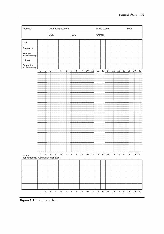
control chart 179
Process:
Date
Time of lot
Numbernonconforming
Lot size
Proportionnonconforming
Type ofnonconformity Counts for each type
Data being counted: Limits set by:
1 2 3 4 5 6 7 8 9 10 11 12 13 14 15 16 17 18 19 20
1 2 3 4 5 6 7 8 9 10 11 12 13 14 15 16 17 18 19 20
1 2 3 4 5 6 7 8 9 10 11 12 13 14 15 16 17 18 19 20
LCL:UCL: Average:
Date:
Figure 5.31 Attribute chart.

180 control chart
p Chart Worksheet
Proportion nonconforming items; sample size varies
Process: _____________________________ Calculated by: _________________________
Data dates: __________________________ Calculation date: ______________________
Step 1. Calculate average.Total number of nonconforming items = ΣXi = ______Total number of items in all samples = Σni = ______Average proportion nonconforming items = –p = ΣXi ÷ Σni = ______ ÷ ______ = ______
Step 2. Calculate 3rp.
Smallest sample size ns calculates outer 3spo Largest sample size nl calculates inner 3spi
Step 3. Calculate control limits.Outer Limits Inner LimitsUpper control limit UCLpo Upper control limit UCLpi
Lower control limit LCLpo Upper control limit UCLpi
Step 4. If a point is between inner and outer limits, calculate and plot exact limits forits sample size ni:
LCLp i= − −( ) ÷
=
p p p n3 1
______ _____ _____ __________ __________
− × ÷= −=
3
UCLp i= + −( ) ÷
=
p p p n3 1
______ _____ _____ __________ __________
+ × ÷= +=
3
= −= − =
p 3 ˆ
______ ______ ______
σ pi= −= − =
p 3 ˆ
______ ______ ______
σ po
= += + =
p 3 ˆ
______ ______ ______
σ pi= += + =
p 3 ˆ
______ ______ ______
σ po
n
p p n
l
pi
=
= −( ) ÷
______
ˆ3 3 1σ ll
= × ÷=
3 ______ ______ ____________
n
p
p
s
po
=− = − =
=
______
______ ______
ˆ
1 1
3 3σ 1
3
−( ) ÷
= × ÷
p ns
______ ______ _____________=
If sample size varies by less than 20%, you may use an average sample size –n.–n = Σni ÷ k k = number of samples
= ______ ÷ ______ = ______Use only the left column of calculations, and use –n instead of ns. Omit step 4.
• The number of items, ni, in each sample can be different for each sample.• The number of nonconforming items in each sample is Xi.• Plot pi = Xi ÷ ni.
Figure 5.32 p chart worksheet.

size–n. Use just the left column of the worksheet. If sample sizes vary by morethan 20 percent, calculate two sets of control limits: inner and outer upper controllimits and inner and outer lower control limits.
4. Draw lines for–p and the control limits on the chart and label them.
5. Continue to follow steps 4, 5, and 6 of the basic procedure.
Analysis
Check the chart for out-of-control signals. All the signals listed on page 157 can beused, except for this change to the “single point outside” signal when using inner andouter limits:
• If a point falls between the inner and outer limits, calculate exact control limits forthat point. Use the actual sample size for that point and the formulas on the p chartworksheet. The process is out of control if the point falls outside these limits.
Examples
Here are some data requiring a pchart:
• Number of inaccurate invoices per day. The number of invoices processed daily varies.
• Number of off-color batches per week. Batch processing time varies.
• Number of defective assemblies per shift. Production rate varies.
Figure 5.33 shows a p chart used to monitor invoices missing cost center numbers.This chart is from the Medrad Freight Processing Team story on page 60. The dramaticdrop occurred when the team introduced a change to the process. The chart is out ofcontrol, but process changes were new. The control limits are conditional.
On Medrad’s chart, control limits are shown for each point. This helps you see howchanging sample size affects the limits. To calculate just inner and outer control limits(as in step 3) for the set of data after the process change, the largest sample size, 1498for point 21, and the smallest sample size, 451 for point 13, would be used. The innerand outer limits are the limits calculated for those points. Exact lower limits need to becalculated only for points falling between 4.1 and 5.8 (points 11, 16, 21, 22, and 27) andexact upper limits only for points falling between 10.0 and 11.7 (point 24).
Considerations
• If the number of items per sample varies, you must use a p chart. If all the sampleshave the same number of items, you can use either the np chart or p chart.
• Each item is either conforming or nonconforming. Do not count multiple noncon-formities per item. If you wish to count several nonconformities per item, use a c chart or u chart.
control chart 181

• Theoretically, control limits should be calculated for each different sample size.Charts done this way show a control limit line that looks like a city skyline,changing around every data point, as illustrated in the example. Practically, using an average sample size works as long as sample sizes do not vary by more than 20percent. When they vary more than that, using inner and outer control limits reducesthe labor of calculation to just the occasions when points fall between those lines.
• If a sample is larger or smaller than the ones used to calculate inner and outerlimits, recalculate those limits or calculate exact limits for that point.
• See also short run chartsfor another way to simplify control limits.
np chart
Description
The np chart is an attribute control chart used to study the number of nonconforming ordefective items. Often, information about the types of nonconformities is collected onthe same chart to help determine the causes of variation.
When to Use
• When counting nonconforming items (not total number of nonconformities),and . . .
182 control chart
# Shipments
# Missing CCIDs
% Missing
UCL
LCL
670
137
20.4
24.9
15.6
480
59
12.3
25.7
14.7
714
169
23.7
24.7
15.7
818
159
19.4
24.4
16.0
847
151
17.8
24.3
16.1
630
194
30.8
25.0
15.4
953
166
17.4
24.1
16.3
1179
151
12.8
10.3
5.5
1151
114
9.9
10.3
5.5
866
86
9.9
10.7
5.2
1056
51
4.8
10.4
5.4
992
70
7.1
10.5
5.3
451
85
18.8
11.7
4.1
1183
71
6.0
10.3
5.6
795
97
12.2
10.8
5.0
1121
60
5.4
10.3
5.5
1339
82
6.1
10.1
5.7
1335
109
8.2
10.1
5.7
736
51
6.9
10.9
4.9
792
77
9.7
10.8
5.0
1498
61
4.1
10.0
5.8
929
38
4.1
10.6
5.3
1483
107
7.2
10.0
5.8
937
98
10.5
10.5
5.3
1116
67
6.0
10.3
5.5
803
97
12.1
10.8
5.0
1202
63
5.2
10.2
5.6
1054
100
9.5
10.4
5.4
1 2 3 4 5 6 7 8 9 10 11 12 13 14 15 16 17 18 19 20 21 22 23 24 25 26 27 28
35%
30%
25%
20%
15%
10%
5%
0%
p = 20.2%
p = 7.9%
Mapped deliveryfield to CCID
Figure 5.33 p chart example.

• When the sample size does not vary
Procedure
Construction
1. Gather the data.
a. Define a sample. It should be large enough to contain several nonconformingitems, and its size must be constant. Determine the sample size,n.
b. Determine the number of samples to collect before calculating control limits.Collect data from at least 20 samples.
c. For each sample, count the number of nonconforming items,X.
d. Record the values ofX and n on the attribute chart (Figure 5.31, page 179).Ignore the row for proportion nonconforming.
2. Mark the numerical scale and plot the values of X on the chart. Connectconsecutive points.
3. Calculate the average number of nonconforming items n–p and the control limits,using the np chart worksheet (Figure 5.34).
4. Draw lines for n–p and the control limits on the chart and label them.
5. Continue to follow steps 4, 5, and 6 of the basic procedure.
Analysis
Check the chart for out-of-control signals. All the signals listed on page 157 can be used.
Example
Here are some data requiring an np chart:
• Number of defective drums per lot. The lot size is always 60.
• Number of broken cookies in a 24-cookie package.
• Number of defective CDs in a random sample of 100 CDs.
Considerations
• For an np chart, all samples must have the same number of items. If the numberof items in a sample varies, use the p chart.
• Each item is either good or bad. If you wish to count multiple nonconformitiesper item, use a c or u chart.
control chart 183

c chart
Also called: count chart
Description
The c chart is an attribute control chart used to study the number of nonconformities ordefects. Often, information about the types of nonconformities is collected on the samechart to help determine the causes of variation.
When to Use
• When counting nonconformities (not the number of nonconforming items), and . . .
• When the sample size does not vary, and . . .
• When the opportunity for nonconformities does not vary from one sample to the next
184 control chart
np Chart Worksheet
Number of nonconforming items; sample size is constant
Process: _____________________________ Calculated by: _________________________
Data dates: __________________________ Calculation date: ______________________
Step 1. Calculate average.Sample size = n = ______Number of samples = k = ______Total number of nonconforming items = ΣXi = ______ Average number of nonconforming items = n–p = ΣXi ÷ k = ______ ÷ ______ = ______
Step 2. Calculate 3rnp.
Step 3. Calculate control limits.Upper control limit UCLnp Lower control limit UCLnp
= −= − =
np 3 ˆ
______ ______ ______
σnp= += + =
np 3 ˆ
______ ______ ______
σnp
3 3 1
3 1
ˆ
______ _
σnp = × −( )= × −
np p
______
______ ____________
( )= ×=
3
p np n= ÷= ÷=
______ ____________
• The number of items, ni, in each sample must be the same.• Plot Xi, the number of nonconforming items in a sample.
Figure 5.34 np chart worksheet.

Procedure
Construction
1. Gather the data.
a. Define a sample. It should be large enough that nonconformities have a chanceto occur, and its size must be constant.
b. Select the number of samples to be collected before calculating control limits.Collect data from at least 20 samples.
c. For each sample, count the number of nonconformities (c).
d. Record the values of c on the attribute chart (Figure 5.31, page 179). Ignorethe rows for sample size and proportion nonconforming.
2. Mark the numerical scale and plot the values of c on the chart. Connectconsecutive points.
3. Calculate the average number of nonconformities –c and the control limits, usingthe c chart worksheet (Figure 5.35).
control chart 185
c Chart Worksheet
Number of nonconformities; sample size is constant
Process: _____________________________ Calculated by: _________________________
Data dates: __________________________ Calculation date: ______________________
Step 1. Calculate average.Number of samples = k = ______Total number of nonconformities = Σci = ______Average number of nonconforming items = –c = Σci ÷ k = ______ ÷ ______ = ______
Step 2. Calculate 3rc.
Step 3. Calculate control limits.Upper control limit UCLc Lower control limit LCLc
= −= − =
c 3 ˆ
______ ______ ______
σc= += + =
c 3 ˆ
______ ______ ______
σc
3 3
3
ˆ
____________
σc =
==
c
• The number of items in each sample must be the same.• Plot ci, the total number of nonconformities in a sample.
Figure 5.35 c chart worksheet.

4. Draw lines for–c and the control limits on the chart and label them.
5. Continue to follow steps 4, 5, and 6 of the basic procedure.
6. On the bottom section of the chart, tally different types of nonconformities.
Analysis
Check the chart for out-of-control signals. All the signals listed on page 157 can be used.
Examples
Here are some data requiring a cchart:
• Number of errors per 100 invoices
• Fabric flaws per 10 square feet
• Number of black specs in one gram of product
Considerations
• Each sample must have the same opportunity for nonconformities to occur. For example, number of errors per report would not be appropriate for a c chart if the reports vary in length. A more appropriate sample would be number oferrors per 10 pages.
• For a c chart, more than one nonconformity can be counted per item. If you wishto count how many items are nonconforming, use a p or np chart.
• The counts of each type of nonconformity at the bottom of the worksheet can beused to construct a Pareto chart or do other analysis.
u chart
Description
The u chart is an attribute control chart used to study the proportion of nonconformi-ties or defects. A proportion is used instead of a count when the opportunity for non-conformities changes from one sample to another, and so the fair way to expressfrequency of nonconformities is on a per-unit basis. Often, information about thetypes of nonconformities is collected on the same chart to help determine the causesof variation.
186 control chart

When to Use
• When counting nonconformities (not the number of nonconforming items), and . . .
• When the sample size varies, or . . .
• When the opportunity for nonconformities changes from one sample to the next
Procedure
Construction
1. Gather the data.
a. Define a sample. It should be large enough so that nonconformities have achance to occur.
b. Select the number of samples to be collected before calculating control limits.Collect data from at least 20 samples.
c. For each sample, determine the total sample size n,that is, the opportunity fornonconformities within the sample. Determine the number of nonconformities(c). Calculate the proportion of nonconformities per unit,u = c / n.
d. Record the values of c, n, and u on the attribute chart (Figure 5.31, page 179).
2. Mark the numerical scale and plot the values of u on the chart. Connectconsecutive points.
3. Calculate the average number of nonconformities–u and the control limits, usingthe u chart worksheet (Figure 5.36). If sample sizes are within 20 percent of each other, calculate only one set of control limits, using an average group size n.Use just the left column of the worksheet. If sample sizes vary by more than 20percent, calculate two sets of control limits: inner and outer upper control limitsand inner and outer lower control limits.
4. Draw lines for–u and the control limits on the chart and label them. If you havecalculated inner and outer limits, draw all four control limits.
5. Continue to follow steps 4, 5, and 6 of the basic procedure.
6. On the bottom section of the chart, tally different types of nonconformities.
Analysis
Check the chart for out-of-control signals. All the signals listed on page 157 can beused, except for this change to the “single point outside” signal when using inner andouter limits:
control chart 187

188 control chart
u Chart Worksheet
Proportion nonconformities; sample size varies
Process: _____________________________ Calculated by: _________________________
Data dates: __________________________ Calculation date: ______________________
Step 1. Calculate average.Total number of nonconformities = Σci = ______Total of all samples’ sizes = Σni = ______Average proportion nonconformities = –u = Σci ÷ Σni = ______ ÷ ______ = ______
Step 2. Calculate 3ru.
Smallest sample size ns calculates outer 3suo Largest sample size nl calculates inner 3sui
Step 3. Calculate control limits.Outer Limits Inner LimitsUpper control limit UCLuo Upper control limit UCLui
Lower control limit LCLuo Lower control limit LCLui
Step 4. If a point is between inner and outer limits, calculate and plot exact limits forits sample size ni:
LCLu i= − ÷
= −
u u n3
3_____ ______ __________ __________
÷= −=
UCLu i= + ÷
= +
u u n3
3_____ ______ __________ __________
÷= +=
= −= − =
u 3 ˆ
______ ______ ______
σui= −= − =
u 3 ˆ
______ ______ ______
σuo
= += + =
u 3 ˆ
______ ______ ______
σui= += + =
u 3 ˆ
______ ______ ______
σuo
n
u nl
ui l
=
= ÷
=
______
ˆ
____
3 3
3
σ
___ ____________
÷=
n
u ns
uo s
=
= ÷
=
______
ˆ
____
3 3
3
σ
___ ____________
÷=
If sample size varies by less than 20%, you may use an average sample size –n.–n = Σni ÷ k k = number of samples
= ______ ÷ ______ = ______Use only the left column of calculations, and use –n instead of ns. Omit step 4.
• The sample size, ni, for each sample can be different for each sample.• The number of nonconformities in each sample is ci.• Plot ui = ci ÷ ni.
Figure 5.36 u chart worksheet.

• If a point falls between the inner and outer limits, calculate exact control limits for that point. Use the actual sample size for that point and the formulas on the u chart worksheet. The process is out of control if the point falls outsidethese limits.
Examples
Here are some data where the opportunity for nonconformities,n, changes, requiring au chart:
• Defects per window pane. n= pane area (several sizes are manufactured)
• Bad solders per circuit board. n= number of solders on a board (boards vary in complexity)
• Changes to engineering drawings per week. n = number of drawings finished per week
Considerations
• For a u chart, more than one nonconformity can be counted per sample. If youwish to count the number of items nonconforming, use a p or np chart.
• Theoretically, control limits should be calculated for each different sample size.Charts done this way show a control limit line that looks like a city skyline,changing around every data point. Practically, using an average sample size works as long as sample sizes do not vary by more than 20 percent. When theyvary more than that, using inner and outer control limits reduces the labor of calculation to just the occasions when points fall between those lines.
• If a sample is larger or smaller than the ones used to calculate the inner and outerlimits, recalculate those limits or calculate exact limits for that point.
• See also short run charts for another way to simplify control limits for u charts.
• The counts of each type of nonconformity at the bottom of the worksheet can beused to construct a Pareto chart or do other analysis.
short run chart
Also called: stabilized chart, Z chart
Description
A short run chart is a variation that can be used with any of the basic charts. It allowsa characteristic from different parts or products to be plotted on one chart, even when
control chart 189
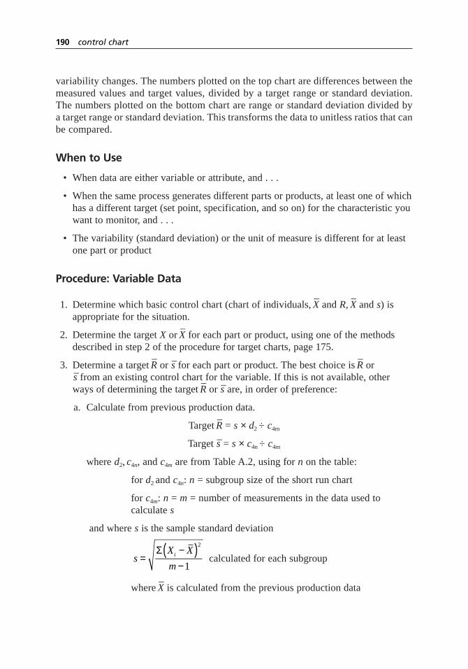
variability changes. The numbers plotted on the top chart are differences between themeasured values and target values, divided by a target range or standard deviation.The numbers plotted on the bottom chart are range or standard deviation divided bya target range or standard deviation. This transforms the data to unitless ratios that canbe compared.
When to Use
• When data are either variable or attribute, and . . .
• When the same process generates different parts or products, at least one of whichhas a different target (set point, specification, and so on) for the characteristic youwant to monitor, and . . .
• The variability (standard deviation) or the unit of measure is different for at leastone part or product
Procedure: Variable Data
1. Determine which basic control chart (chart of individuals,–X and R,
–X and s) is
appropriate for the situation.
2. Determine the target Xor –X for each part or product, using one of the methods
described in step 2 of the procedure for target charts, page 175.
3. Determine a target –R or –s for each part or product. The best choice is
–R or
–s from an existing control chart for the variable. If this is not available, otherways of determining the target
–R or –s are, in order of preference:
a. Calculate from previous production data.
Target –R = s × d2 ÷ c4m
Target –s = s × c4n ÷ c4m
whered2, c4n, and c4m are from Table A.2, using for non the table:
for d2 and c4n: n = subgroup size of the short run chart
for c4m: n = m = number of measurements in the data used tocalculate s
and where sis the sample standard deviation
calculated for each subgroup
where –X is calculated from the previous production data
sX X
mi=−( )−
Σ2
1
190 control chart

b. Control chart or previous production data for a similar variable. Use theformulas in (a) if you use production data.
c. Calculation from process tolerance stated by a process expert (operator,machinist, engineer):
Target –R = d2 × tolerance width ÷ 6 CpkGOAL
Target –s = c4 × tolerance width ÷ 6 CpkGOAL
Here and in section d below,d2 and c4 are from Table A.2, using n= subgroup size of the short run chart and CpkGOAL is the goal for the processcapability index.
d. Calculation from specification limits:
Target –R = d2 × (USL – LSL) ÷ 6 CpkGOAL
Target –s = c4 × (USL – LSL) ÷ 6 CpkGOAL
Or for one-sided specifications:
Target –R = d2 × |Specification limit – Target Xor
–X | ÷ 3CpkGOAL
Target –s = c4 × |Specification limit – Target Xor –X | ÷ 3CpkGOAL
4. Follow the specific procedure for constructing the appropriate basic control chart,with these changes. (For a chart of individuals,
–X = X, since n = 1.)
–X or X chart: Plot (
–X – Target) ÷ Target
–R
Centerline = 0
UCL = A2
LCL = –A2
R chart: Plot R ÷ Target –R
Centerline = 1
UCL = D4
LCL = D3
s chart: Plot s ÷ Target –s
Centerline = 1
UCL = B4
LCL = B3
Each subgroup must contain only data from one part or product. You cannotchange parts or products within a subgroup.
control chart 191

5. When the part or product changes, draw a vertical line on the chart and identifythe part or product.
6. Analyze the charts for out-of-control signals. When the chart is new, if eitherchart is out of control, the initial target values may have been inaccurate. Update the targets to reflect the actual process, or, if possible, adjust the processto meet the targets.
7. If the range chart is in control, analyze the –Xt or Xt chart. In addition to the usual
signals, notice whether particular parts or products are consistently off target inone direction or the other.
Example
Figure 5.37 shows a short run –X and s chart. The torque of self-locking nuts is being
measured for three different locking systems. Each locking system has a different targettorque and a different target standard deviation, based on historical data. The produc-tion rate is high, so ten samples are taken per batch of nuts and an
–X and s chart is appro-
priate. Vertical lines show where production changed to a different locking system. Standard deviation for types B and C is higher than the historical data. Type A’s
torque has decreased from historical data, while type B’s has increased and type C’sappears to be in control.
192 control chart
1.716
1.000
0.284
1
Short run s chart
2 3 4 5 6 7 8 9 10 11 12 13 14 15 16 17 18 19 20
UCL
CL
LCL
0.975
0.000
–0.975
Type A Type B Type C Type A Type C Type B
UCL
CL
LCL
Short run X chart
Figure 5.37 Short run–X and s chart example.

Procedure: Attribute Data
1. Determine which attribute control chart (p,np, c, or u) is appropriate for thesituation.
2. Using the worksheet for the appropriate chart, determine a target average (–p, n–p,–c, or –u ) for each part or product. If historical data is not available, use one of theother methods described in step 2 of the procedure for target charts, page 175.
3. Each time data is collected from the process, use formulas from the attribute chart worksheet to calculate the appropriate attribute (p,np, c, or u) and s. Then calculate:
Z = (attribute – target average) ÷s
Plot Z on the short run chart. UCL = 3, LCL = –3, and centerline = 0.
5. When the part or product changes, draw a vertical line on the chart and identifythe part or product.
6. Analyze the charts for out-of-control signals. When the chart is new, if the chart is out of control, the initial target values may have been inaccurate. Update thetargets to reflect the actual process, or, if possible, adjust the process to meet the targets. Notice whether particular parts or products are consistently off targetin one direction or the other.
Considerations
• Short run charts are useful for job shops, just-in-time, and short runs. They reduce the amount of paperwork, since separate charts aren’t needed for each part or product, and let you start charting sooner, since control limits are knownbefore any data is collected. Most important, they let you focus on changes in the process, regardless of part or product.
• There are disadvantages to short-run charts. Compared to traditional charts, morecalculations must be made every time a point is plotted. Also, because the chartsare dimensionless and the numbers are different from process-generated numbers,it’s harder to analyze the results and to catch errors.
• By marking the chart every time the part or product changes, you can monitortrends or special causes affecting just one part as well as those affecting the entire process.
• Short run pcharts and ucharts can be used to create consistent control limits,instead of the shortcuts described with the basic pchart and uchart procedures.
• Short run charts, target charts, and even the basic control charts can be used when a process is just starting, even before there are twenty data points. However,different constants must be used in the control limit formulas. See Pyzdek formore information.
control chart 193
group chart
Also called: multiple characteristic chart
Description
A group chart is a variation that can be used with any of the basic control charts. Itallows the same type of measurement at different locations or from different processstreams to be plotted on one chart. When group charts are combined with target or shortrun charts, even different types of measurements can be tracked on the same chart.
When to Use
• When you want to monitor on one chart similar measurements at multiple locations, such as diameters at different points along a part or temperatures at several thermocouples, or . . .
• When you want to monitor on one chart several types of measurements, such as all analytical results for a batch of chemicals or several different dimensions of a part
Procedure
1. Determine which basic control chart (chart of individuals,–X and R,
–X and s, p,
np, c, or u) is appropriate for the situation. Determine also whether a target chartor short run chart is required to handle different process aims or differentstandard deviations.
2. Collect data in groups. Each group contains all the measurements from one part, product, batch, or sampling time. If
–X and R or
–X and s is the appropriate
basic chart, place the data in each group into subgroups, as usual, and calculatesubgroup averages. Each subgroup must contain data from only one location orone type of measurement. If appropriate, use formulas from the target chart orshort run chart procedures to adjust X,
–X, or the attribute value.
3. In each group, choose the largest plot point value (MAX) and the smallest plotpoint value (MIN). Plot these values at the same x-axis position, one above theother. Label each point with its location or type of measurement. If a range chartis appropriate, similarly plot the largest and smallest ranges.
4. Follow the appropriate basic, target, or short run control chart procedure tocalculate centerlines and control limits. Use all the measurements, not just theMAX and MIN, in the calculations. However, use control limits only if the datastreams from which the measurements are taken are independent.
194 control chart

5. Analyze the charts for overall trends or patterns and any patterns within a group.If you are using control limits, analyze the charts for out-of-control signals.
Example
Figure 5.38 shows a group –X and R chart. The diameter of a cylindrical part is measured
at three different locations along the shaft to determine shaft uniformity. Four parts aremeasured for each subgroup. The average is calculated for each location, and then thehighest and lowest averages are plotted on the
–X chart. Similarly, the highest and lowest
ranges (not necessarily the ranges of the locations plotted on the –X chart) are plotted on
the R chart. Each point is coded A, B, or C to indicate which location it represents.Several points have two letters, indicating that two locations had the same value.
Control limits are not used because measurements from the three locations are notindependent. A shaft that is smaller at location A is likely also to be smaller at locationsB and C.
Location C’s diameter is consistently smaller than A and B. Location C also con-sistently appears as the lowest value on the range chart, indicating its variation is lessthan that of A and B.
Considerations
• Group charts can be useful in situations where the sheer number of locations or process streams being tracked makes traditional SPC overwhelming. If a wall
control chart 195
78
77
76
75
74
73
72
B
A
AA B
CB C C
C
XX = 74.5
12
10
8
6
4
2
0
B
B A
CB
BA
AC
1 2 3
Group
4 5
CC
AC
Range
R = 3.3
Figure 5.38 Group–X and R chart example.

full of control charts is being ignored, or if charts are not being kept at all becausethere would be too many, group charts may be a useful compromise to ensure thatsignificant process changes are identified.
• Data that fall between the MAX and MIN values are not seen on the charts.Therefore, many out-of-control situations signaled by patterns and trends are notvisible. At any given time, only the two most deviant measurements show up on the charts. For this reason, groups should not contain more than about fivelocations, process streams, or types of measurements.
• Another disadvantage of group charts is the large amount of calculating required.Computerizing the calculations can help.
• Group short run charts can be used to follow a part or product throughout its processing.
other control charts
Many other control charts have been developed to fit particular situations. SPC softwareoften generates a variety of control charts. Some of the more common ones are listedbelow. You can find more detail about these and other specialized charts in SPC refer-ences or courses.
• CUSUM (cumulative sum). This control chart is used with variable data to detectsmall drifts in the process average. It does not detect large shifts as well as thestandard charts. Unlike standard charts, all previous measurements are included in the calculation for the latest plot point. The value plotted is the running sum of the differences between each subgroup’s value and a target value. If the mean shifts, the CUSUM values will trend upward or downward. Sometimes amask resembling a sideways V is used to test for out-of-control signals. Withcomputerized CUSUM charts, a spreadsheet is used for the same purpose.
• EWMA (exponentially weighted moving average, also called geometricallyweighted moving average). Like CUSUM, this control chart is used with variabledata to detect or to compensate for small drifts in the process average. It does notdetect larger shifts as well as the standard charts. Previous measurements areincluded in the calculation for the latest plot point. However, unlike CUSUM,newer values are given more weight than older ones. A weighting factor λ(lambda) is chosen to make the chart more or less sensitive to small shifts andnoise in the data. λ is usually between 0.2 and 0.4. At λ = 1, the EWMA chartgives no weight to older values and becomes an
–X and R chart.
• Multivariate (also called Hotelling T2). This control chart for variable data is usedto monitor related characteristics. One characteristic might affect another or athird characteristic might affect both of them. All characteristics can be monitoredtogether on one multivariate chart.
196 control chart

correlation analysis
Description
Correlation analysis helps quantify a linear relationship between two variables. Theanalysis generates a correlation coefficient r that tells whether the relationship is linear,how strong it is, and whether the correlation is positive or negative.
When to Use
• When you have paired numerical data, and . . .
• After drawing a scatter plot of the data that suggests a linear relationship, and . . .
• When you want a statistical measure of how well a line fits the data
Procedure
While correlation analysis can be done manually, computer software makes the calcu-lations easier. Follow the instructions accompanying your software.
The analysis will calculate the correlation coefficient r, which lies between –1 and 1.
• If r is close to zero, the two variables are not linearly related.
• The closer r is to 1 or –1, the stronger the linear relationship of the two variables.
• Positive r means that x is small when y is small and x is large when y is large.
• Negative r means that x is small when y is large, and vice versa.
Example
Figures 5.39 through 5.42 show scatter plots of data with different relationships. Figure5.39 shows an almost perfect positive linear relationship with r = 0.98. Figure 5.40shows a weaker negative linear relationship with r = –0.69. The data points are scatteredmore widely than in Figure 5.39. In Figure 5.41, the two variables are not related, andr = –0.15. In Figure 5.42, correlation analysis calculated the same r, –0.15. However, inthis case it is clear that the variables are related, although not linearly.
Considerations
• If r = 0, there is no linear relationship. However, there could be a perfect curvedrelationship, as in Figure 5.42. Always draw a scatter plot of the data first to seewhat kind of relationship to expect. Correlation analysis provides meaningfulresults only with linear relationships.
348
5
correlation analysis 197

198 correlation analysis
Figure 5.39 Strong positive linear correlation.
Figure 5.40 Weak negative linear correlation.
Figure 5.41 No correlation.
Figure 5.42 Nonlinear correlation.
• Correlation analysis quantifies the strength of the relationship between twovariables, but does not calculate a regression line. If you want to find the best line through the data, see regression analysis.
• The coefficient of determination, r 2, calculated in regression analysis is the squareof the correlation coefficient r.
cost-of-poor-quality analysis
Also called: cost-of-quality analysis, red and green circle exercise
Description
A cost-of-poor-quality analysis is a way of studying a process’s flowchart to identifypotential problems. Cost of poor quality means costs incurred because things are notdone right the first time and every time. The analysis helps a team look critically at indi-vidual steps of a process to find opportunities for improvement.
When to Use
• When flowcharting a process, to be sure that cost-of-poor-quality activities areincluded, or . . .
• After flowcharting a process, to identify problems, potential causes, and areas inwhich to concentrate improvement efforts
Procedure
1. Obtain or draw a detailed flowchart of the process.
2. Identify all process steps (including recycle loops) that incur costs of quality:inspection, fix, and damage control. (See “Considerations” for definitions of these costs.) Draw a red circle (red for Stop) around those steps or recycles.
3. If few or no steps have red circles, ask, “What can go wrong? How do we tell if things go wrong? How does the process handle things going wrong?”If necessary, add missing steps to the flowchart that show how problems are handled.
4. For each red circle, ask, “What process step, done perfectly, would allow us toeliminate this red-circled step?” Draw a green circle (green for Go) around eachstep identified here.
34
5
cost-of-poor-quality analysis 199

5. The green circles show steps to examine for ways to prevent problems and to seekimprovement in general. Green circles will contain the root causes of problemsidentified by the red circles.
6. (Optional) Determine actual cost data for all red-circled activities. Use this data toprioritize improvements.
Example
Figure 5.43 shows a cost-of-poor-quality analysis for the flowchart for filling anorder. (This is the same example as the detailed flowchart, Figure 5.63, page 261.)Unfortunately, this book is printed in black and white, so you will have to imagine redand green.
Imagine the dotted circles are red: inspections, fixes (including rework), and damagecontrol. They were drawn first. Note that on this flowchart, all the decision diamondsfollow checking (inspection) steps. Also, the two recycle loops are fix steps.
There are no damage-control steps because the scope of this flowchart is not broadenough to show what happens when things go wrong with the external customer. Whatif a good customer is mistakenly refused credit? Or the customer is unhappy with thedelivery date? Or the wrong product is shipped? Or the bill is incorrect? If those possi-bilities were shown, they would be circled in red.
At the next step in the analysis, preventions for each red (dotted) circle are soughtin previous boxes on the flowchart. For “Inspect product” → “Is product good?” andthe recycle loop flowing from the “No” answer, the prevention is “Make product.” Ifproduct were made perfectly each time, the inspection would be unnecessary. Imaginethat the solid circle around “Make product” is green.
For “Inspect materials” → “Are materials good?” and the recycle loop flowingfrom that decision diamond, the preventions are “Order materials” and “Vendor.” Noticethat although we don’t control what the vendors do, their processes cause us to add aninspection step. That is why it is important to involve suppliers in your quality improve-ment efforts.
If the flowchart scope were large enough to include problems with the external cus-tomer, then green circles would be drawn around “Check credit,” “Schedule shipment,”“Ship product,” and “Prepare bill.” Doing these right prevents damage control later.
For three of the red (dotted) circles, no opportunities for prevention can be foundon this flowchart. “Are materials in inventory?” depends on the material inventoryprocess; “Is product in inventory?” depends on the product inventory process; “Is creditgood?” depends on the credit process (and also on the customer). Names of thoseprocesses have been written in and circled with green. The team may decide that toimprove the order-filling process, the material inventory process that links with itshould be studied.
Notice that this analysis does not find all forms of waste in the process. Comparethis analysis to the value-added analysis example, page 508, which uses the same order-filling process. There, the two wait steps are identified as waste.
200 cost-of-poor-quality analysis
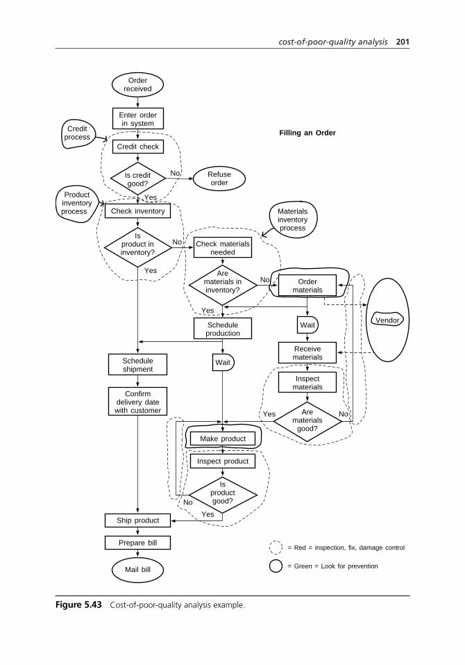
cost-of-poor-quality analysis 201
= Red = inspection, fix, damage control
= Green = Look for prevention
Orderreceived
Mail bill
Refuseorder
Materialsinventoryprocess
Filling an Order
Enter orderin system
Creditprocess
Productinventoryprocess
Check materialsneeded
Scheduleproduction
Inspect product
Ordermaterials
Receivematerials
Inspectmaterials
WaitVendor
WaitScheduleshipment
Confirmdelivery datewith customer
Credit check
Check inventory
Make product
Prepare bill
Ship product
Is creditgood?
No
Yes
Isproduct ininventory?
Arematerials
good?
Isproductgood?
Arematerials ininventory?
No
No
No
No
Yes
Yes
Yes
Yes
Figure 5.43 Cost-of-poor-quality analysis example.

Considerations
• Cost of poor quality has traditionally been called “cost of quality.” More and moreoften, the phrase is changed to reflect the fact that it’s poor quality that incurscosts, not quality.
• There are three types of activities that incur costs to be eliminated:
Inspection: Testing, inspecting, or checking to determine whether a failure orerror has occurred. For example, proofreading, countersigning a document.
Fix: Correcting, reworking, or disposing of errors or poor output that areidentified before the customer is affected. For example, redoing a report whenwrong information is discovered in it.
Damage control: Correcting, reworking, or disposing of errors or poor outputthat are identified after the customer is affected. Also, handling problems thatarise because the customer has been affected, including explaining to the customer how we are solving the problem.
• There is a fourth type of cost of quality: prevention. It is preferable (cheaper andeasier) to handle problems through prevention rather than waiting until inspection,fix, or damage control are needed. Quality improvement is based on preventingproblems from occurring. Through a cost-of-poor-quality analysis, you can iden-tify process steps that are inspection, fix, or damage control (red circles) in orderto determine prevention measures (green circles) that can reduce or even eliminatethose steps.
• The process steps circled in red may never actually disappear. We are all human,so we will never be perfect. However, thinking about the ideal, perfect worldhelps us to see where to focus improvement efforts. For example, we may alwayswant to do some sort of inspection to check whether product is good. But toimprove the process, we should work on getting better at making product, ratherthan getting better at checking.
• If a flowchart has few or no red circles, it may have been drawn with very littledetail, as a macro flowchart. Cost-of-poor-quality analysis can be done only withflowcharts that include enough detail to show the problems and fixes.
• Often, opportunities for improvement will be found beyond the boundaries ofyour flowchart. A narrow scope may have been the best way to draw the part ofthe process in which you were interested. However, do not limit yourself to thatscope when you identify opportunities for improvement.
• Cost data can be used to prioritize improvement opportunities. Be cautious,however, when you do this. As Dr. Deming said, “The true cost of poor quality is unknown and unknowable.” The largest costs of fix and damage control, suchas wasted capacity and lost customer goodwill, may be difficult or impossible toassess. Do not make a decision based on cost data if some costs are unknown,
202 cost-of-poor-quality analysis
and do not present such data to decision makers without educating them aboutunknown costs.
• As the example shows, not all forms of waste in the process will be found withthis analysis. Costs of poor quality are waste, but other forms of waste abound,such as delays and unnecessary movement. This analysis does the best job ofidentifying costs of poor quality. Follow up with value-added analysis to findother forms of waste.
criteria filtering
Variation: Battelle method
Description
Criteria filtering evaluates and prioritizes a list of options. The team establishes crite-ria and then evaluates each option against those criteria. This tool is less rigorous thansome of the other evaluation tools, so it can be used quickly. Criteria filtering is oftenused as the third phase of list reduction.
When to Use
• After a list of options has been narrowed by the first two techniques of list reduction, and . . .
• When a list of options must be narrowed to a smaller list, or . . .
• When a list of options must be narrowed to a final choice, and the decision is not significant enough to spend the time required by a more rigorous tool
Procedure
Materials needed: flipchart, marking pen.
1. Brainstorm criteria for ranking the options. Record the criteria on a flipchart.
2. Discuss the criteria and decide on a final list.
3. Rank-order the criteria in terms of importance, most significant to least. The teamshould reach consensus on the rankings.
4. Create an L-shaped matrix of options and criteria. Evaluate each option againstthe first criterion by asking for yes or no votes to the question, “Does this ideasatisfy this criterion?” Then evaluate all options against the second criterion, and
1
6
2
4
criteria filtering 203

so on, until all the criteria have been addressed. If team members agree, simplywrite “yes” or “no.” If there is disagreement, tally votes.
5. Tabulate the votes.
6. Discuss the results of this criteria ranking to help guide the team towardconsensus. A numerical count of yes and no answers should not automaticallygenerate the team’s decision.
7. If too many choices still remain, go to one of these options:
• Look for overlooked criteria.
• Discuss the remaining choices to see if there is a clear favorite.
• Use a more rigorous tool, such as the decision matrix.
• Use multivoting.
Example
A team decided to conduct periodic surveys of their entire department, located inoffices across the country. They needed to choose one survey method from those avail-able. They listed the survey methods, then identified four criteria. Those criteriabecame the first four column headings of Figure 5.44, ranked in order of decliningimportance from left to right.
They evaluated each method first against their most important criterion,“Anonymous.” Two methods did not meet that criterion. To save time, they immediatelyeliminated those two and did not evaluate them against the other criteria. Two of theremaining methods, face-to-face and telephone interviews, would only meet theanonymity criterion if the interviews and analysis were done by neutral individuals out-side the department. From then on, the group evaluated those two methods with thatapproach in mind.
204 criteria filtering
Written questionnaire Yes
Anonymous?
Yes (non-dept.interviewers)
Yes (non-dept.interviewers)
No
No
Yes
Yes
Easy forrespondent?
Yes
Yes
—
—
Yes
Yes
Low cost toadminister?
No
Yes
—
—
Yes
Yes
Low effort toadminister?
No
No
—
—
Yes
Face-to-faceinterviews
Telephone interviews
Focus group
No
Likely to becompletedquickly?
No
Yes
—
—
Yes
E-mail survey
Web-based survey
Figure 5.44 Criteria filtering example.

Their second most important criterion, “Easy for respondent,” was met by all themethods. The third and fourth criteria differentiated the travel- and labor-intensiveinterviews from the written methods.
That still left two methods, written questionnaire and Web-based survey, which metall criteria. They could review the three criteria in a decision matrix, evaluating howwell each option met their criteria. But first, they thought about the two remainingoptions and considered if an overlooked criterion differentiated the two methods.Someone suggested that a written questionnaire arriving in the mail was likely to be lostin a stack of papers, whereas a Web-based survey would be more likely to get an imme-diate response. The group realized they had missed a fourth criterion, “Likely to becompleted quickly,” which allowed them to select their preferred method.
See list reduction for another example of criteria filtering.
Battelle methodThis variation consists of a series of filters, starting with easy, low-cost ones then movingto more difficult, higher-cost ones. This method reduces the number of options to whichexpensive analysis must be applied.
When to Use
• When there are many options to consider, and . . .
• When some of the criteria to be considered are costly (in time or resources) to evaluate
Procedure
1. Identify culling criteria that are easily answered yes–no questions. If there aremany, group them into a series of filters.
2. Create an L-shaped matrix of options and criteria. Evaluate each option againsteach criterion in the first group. Eliminate any option receiving a “no” responseto any of the criteria.
3. Repeat with each group of criteria, if there were more than one.
4. Identify rating criteria, which may be more costly to answer but are still yes–noquestions. Group the criteria so that all in one group are equally costly to answer,in terms of time or resources.
5. Determine a cut-off number of “yes” answers, below which options will beeliminated.
6. Using an L-shaped matrix to record responses, evaluate each remaining optionagainst each criterion, starting with the least costly group of criteria. Eliminateoptions rating below the cut-off.
criteria filtering 205

7. Repeat with each group of criteria, if there were more than one.
8. Finally, identify scoring criteria, which may use numerical ratings, high–medium–low ratings, or other scoring methods. Again, group them so that all in one groupare equally costly to answer. Assign weights to each of the criteria.
9. Determine a cut-off score below which options will be eliminated.
10. Once more, evaluate each remaining option against each criterion, starting withthe least costly group of criteria. Multiply the rating by the criteria weight todetermine each option’s score for each criterion. Sum the totals for each option.Eliminate options scoring below the cut-off.
Considerations
• Criteria for project selection or problem solution often include these issues:time, cost, manpower required or available, knowledge required, training, safety,legality, authority, effectiveness, impact, enthusiasm (of the team and others).
• List reduction can be used in step 2 to quickly and methodically review the brainstormed list of criteria, eliminate duplicates and inappropriate ideas, andgenerate a final list of criteria.
• Phrase criteria as questions with yes or no answers, rather than qualities to berated low, medium or high. That’s what makes this tool quick. If you need tocompare the degree to which options meet the criteria, use the decision matrix.
• Always phrase your criteria so that “yes” is desirable and “no” is undesirable. You don’t want to eliminate an excellent option because you forgot that “no” onone question is good.
• If you discuss the most important criteria first, sometimes the answer—or anarrowed list of choices—will become obvious before you spend time on lessimportant criteria.
• Sometimes this tool is used to separate easily accomplished activities, called“low-hanging fruit,” from ones that are harder to accomplish. However, often the greatest benefit is obtained from the harder-to-accomplish projects. Therefore,ease of accomplishment—time and resources required—should be less importantthan effectiveness and impact criteria. One exception: When a new team is beginning work, a good way to learn is by tackling low-hanging fruit first.
• The Battelle method can efficiently reduce a list of options. Be careful to useinitial screens that are appropriate for culling. The third part of this three-partprocess is actually a decision matrix, which is explained more thoroughly on page 219.
206 criteria filtering

• Two tools—decision matrix and prioritization matrix—evaluate options morerigorously. One of them should be used instead of criteria filtering for finaldecisions about major issues, such as which project to select or which solution to implement. Also see the effective–achievable chart for a tool that separatesease-of-accomplishment criteria from effectiveness criteria and visually compareshow well various options meet criteria. Paired comparisons can be used for adecision based on individual preferences rather than criteria.
critical-to-quality analysis
Description
A critical-to-quality (CTQ) analysis is a way of studying the flowchart of a process toidentify quality features or characteristics most important to the customer and to findproblems. The analysis studies inputs and outputs and identifies the steps that influencethe quality of process outputs.
When to Use
• When identifying the quality features or characteristics most important to thecustomer, or . . .
• When drawing a detailed flowchart of a process, to be sure that steps critical toachieving quality are included, or . .
• After flowcharting a process, to identify problems and their potential causes,or . . .
• Whenever looking for opportunities for improvement in a process
Procedure
1. Obtain or draw a detailed flowchart of the process.
2. Study the output side of the flowchart and answer who, what, when, where,and how.
• Who receives the output?
• What is the output? (for example, information, printed form, authorization,service)
234
5
critical-to-quality analysis 207
05c.H1224.ch5(197-242).qxd 4/22/05 1:35 PM Page 207

• When is it needed? (time and frequency)
• Where on the flowchart does it come from?
• How critical is it to the receiver? How critical is its timing?
Use customer input to answer the when and how questions. Write the answers to these questions on the flowchart, using whatever symbols your group findsmeaningful. Common markings are a box or oval for who, an arrow for where,words on the arrow for what, diamonds or circles for when and how.
3. Look at the input side of your flowchart and answer who, what, when, where,and how.
• Who provides the input?
• What is the input? (for example, information, printed form, authorization,raw material)
• When is it received? (time and frequency)
• Where on the flowchart is it received? Used?
• How critical is it? How critical is its timing?
Write the answers to these questions on the flowchart, using your own symbols.
4. For each output, list your customer’s needs. (For example: On time? Correct?Complete? Easy to use?) Again, use customer input to answer these questions.Evaluate whether the output meets those needs.
5. For each input, list your needs as a customer. Evaluate whether the input meetsyour needs.
6. Find critical-to-quality steps.
• Steps where the quality of output can be affected: hurt or helped
• Steps where an input determines what happens next in the process
• Steps where you can measure whether inputs or outputs are meeting needs
Mark or color these steps so they stand out.
7. Study these critical-to-quality steps to identify problems in your process.
Example
A team from the Parisian Experience restaurant was working on the problem of guestswaiting too long. They had drawn a deployment flowchart (Figure 5.64, page 266) of theprocess for seating guests. They did a critical-to-quality analysis to look for problemareas. To simplify the analysis, they focused on subsections of the flowchart, startingwith the maitre d’s activities.
208 critical-to-quality analysis
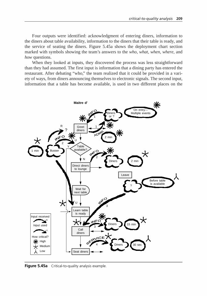
Four outputs were identified: acknowledgment of entering diners, information tothe diners about table availability, information to the diners that their table is ready, andthe service of seating the diners. Figure 5.45a shows the deployment chart sectionmarked with symbols showing the team’s answers to the who, what, when, where, andhow questions.
When they looked at inputs, they discovered the process was less straightforwardthan they had assumed. The first input is information that a dining party has entered therestaurant. After debating “who,” the team realized that it could be provided in a vari-ety of ways, from diners announcing themselves to electronic signals. The second input,information that a table has become available, is used in two different places on the
critical-to-quality analysis 209
Greetdiners
Leave
Diners 2 min
2 min
1 min Busser
Diners or ?
Maitre d'
On entry—Multiple events
?
Before tableis available
Direct dinersto lounge
Learn tableis ready
Calldiners
Input received
Input used
How critical?
High
Medium
Low
R
U
Seat diners
Diners
Diners4
3
2
3
1
1
R
?
U
Y2
N
U
30 sec
15 min
Tableavailable?
Wait fornext table
Figure 5.45a Critical-to-quality analysis example.

flowchart, with the earlier one more critical, since diners are less committed and mightleave. Also, the flowchart does not show where that information is received, becausethat part of the process is ill-defined.
Most of the inputs and outputs were identified by finding places on the deploymentflowchart where flow moved between players. However, the third input, informationthat a dining party has left before their table became available, wasn’t even on the chart.The team discovered it while discussing possible situations. The restaurant’s currentprocess doesn’t have a way of getting that information to the maitre d’. Time could bewasted paging or searching for that party while other diners wait.
Figure 5.45b summarizes steps 4 and 5, the team’s analysis of needs and their eval-uation of whether those needs are currently met. Clearly, the maitre d’ is not receivingneeded input.
The team identified the following steps as critical-to-quality:
210 critical-to-quality analysis
Output
1 Within 2 minutes of entering restaurant ✗Courteous ✔Welcoming ✔
2 Within 2 minutes of entering restaurant ✗Accurate time estimate ✗Complete alternatives for wait ✔Courteous ✔Understanding ✔
3 Within 15 minutes of wait ✗Easily heard ✔Impossible to miss call ✗
4 Within 30 seconds of arrival from lounge ✔Appropriate pace for individuals ✔High style ✔Courteous ✔
1 Easy to hear or see entry, regardless of ✗ distractions or activity
2 Within 1 minute after table ready ✗Info captured whether or not maitre ✗ d’ at station
3 Know before table becomes available ✗
Customer Needs Met?
Input Our Needs Met?
Figure 5.45b Criteria-to-quality analysis example.
Next Page

• Greet diners. Here the timing and tone of the output can create lasting impressions.An input directly affects this step.
• Table available? Here the input determines what happens next in the process anddirectly affects wait time, the key measurement of customer satisfaction.
• Direct diners to lounge. Here the way in which information is provided can keepor lose customers and make their waiting experience pleasant or frustrating.
• Call diners. Here preoccupied diners may not recognize their call, greatly lengthening their wait. Also, measurement of waiting time can be done here.
Considerations
• If you have trouble answering any of the questions, your flowchart may not be detailed enough. Do one of two things. You can include more detail on theflowchart, expanding each step into its substeps. Or, if the flowchart covers abroad scope, narrow your focus, choosing just one section of the process andexpanding it.
• Customer input may be direct, such as interviews and focus groups. Or it may be indirect, from sources such as complaint data, warranty data, purchasing data,and customer observation.
critical-to-quality tree
Also called: CTQ tree, critical-to tree, CTX tree, critical-to flowdown
Description
The critical-to-quality tree helps translate the voice of the customer—customer needsand wants stated in their own words—into measurable product or process characteris-tics stated in the organization’s terms and with performance levels or specifications thatwill ensure customer satisfaction.
When to Use
• After collecting voice of the customer (VOC) data, and . . .
• When analyzing customer requirements, and . . .
• Before determining which quality characteristics should be improved, especiallywhen customer requirements are complex, broad, or vague
234
critical-to-quality tree 211
Previous Page

Procedure
1. List customer requirements for the product or service in their own words. Placeeach requirement in a box in the first tier of a tree diagram.
2. Address the first requirement. Ask questions to make the requirement morespecific. Useful questions include:
• What does this really mean to the customer?
• What does this mean for each subsystem or step in our process?
• How could we measure this?
Don’t get too specific too fast. Keep the answers only one step more detailed thanthe first tier. Write answers in a second tier of the tree diagram.
3. Do a “necessary and sufficient” check of the answers. Ask two questions:
• “Is meeting each of these characteristics necessary in order for the customer to be satisfied that the initial requirement was met?” If the requirement can beachieved without meeting a characteristic, that characteristic should be removed.
• “Would meeting all these characteristics be sufficient for the customer to be satisified that the initial requirement was met?” If the characteristics are not sufficient, decide what is missing and add it.
4. Repeat steps 2 and 3 for each answer in the second tier, creating a third tier.Continue until you have reached characteristics at a level of detail that aremeaningful to the organization and can be measured.
5. Repeat steps 2 through 4 for each customer requirement identified in step 1. It is not necessary that each branch of the tree be the same length.
6. Check that all the characteristics at the end of each branch are measurable. Use operational definitions to clarify them. These are critical-to-quality (CTQ)characteristics.
7. Define targets for each measure.
Example
Ben-Hur’s Pizza wishes to add home delivery to their services in order to expand theirbusiness. They have surveyed current and potential customers to determine what wouldmake them order Ben-Hur pizza instead of a competitors’ or instead of a different kindof food. Summarized VOC data told them that when customers order-in pizza, theywant “hot pizza, now, with my choice of toppings and crusts, at a reasonable cost.” Tolearn what this means in more detail, they constructed a CTQ tree. The branch for“now” is shown in Figure 5.46.
212 critical-to-quality tree

“Now” could mean three things to the customer: “whenever I want pizza,” “quickand easy to order,” and “delivered ASAP.” These characteristics relate to three broadaspects of pizza delivery service, from the customer’s point of view: service availabil-ity, ordering the service, getting the service. Each of these chararacteristics is translatedinto statements that are measurable and more meaningful to Ben-Hur.
While the first two translate readily into actionable CTQs, “delivered ASAP” takesseveral more levels because “getting the service”—the customers’ point of view—iscomposed of multiple process steps from Ben-Hur’s point of view. Targets are assignedto each CTQ that will allow Ben-Hur to fine-tune its process to satisfy customers.
Later in its design process, Ben-Hur will assess how its current pizza-making processmeasures up against those targets and identify design elements of the new home-deliveryservice that will enable them to meet the targets. For example, they might design anorder-taking checklist that allows an order to be taken with just a few checkmarks, andthey might streamline the pizza-making process to eliminate wasted motion. Those greatideas—the hows—don’t belong on the CTQ tree. When they came up during discussionof the CTQs, they were written on a separate flipchart and saved for later.
Considerations
• CTX is shorthand for “critical to something.” Here, CTQ means “critical to quality.”Sometimes characteristics affecting delivery, cost, or schedule are differentiated asCTD, CTC, or CTS. That’s the reason for the name “critical-to tree,” which coulduse any of these characteristics. (Be careful using acronyms, however. SometimesCTC means “critical to customer” and CTS means “critical to satisfaction,” both of which refer to the customer requirements at the beginning of the tree.)
critical-to-quality tree 213
Wait time 0 min
“Now”
Serviceavailable
11 AM–12 PM
Minimumtime from callto front door
Answer on1st ring
Call length< 45 sec
WheneverI wantpizza
Quick andeasy toorder
Out-the-doortime < 20 min
Delivery time < 15 min
Make time < 2 min
Queue time < 8 min
Bake time 9 min
Package time < 1 minDeliveredASAP
Figure 5.46 Critical-to-quality tree example.
• CTQs are specific characteristics of the process or product that are critical(essential) to the customers’ perception of quality, that can be measured, and that the organization can control. CTQ target values are set so that when achieved, the customer’s needs are met. In other words, CTQs are the customers’needs translated into the processes of your organization.
• VOC data often have been organized with tools such as the affinity diagram or its variation, thematic analysis. Look back at the affinity diagram when makingthe CTQ tree. Ideas within a broad grouping may become characteristics at lowerlevels of the tree.
• While VOC data usually must be grouped and summarized, retain the customers’words as much as possible before making the CTQ tree. For example, if customers say, “I want pizza now” do not summarize that as “Fast delivery.”Such interpretations may be incomplete (as the example shows) or wrong, as well as a translation into the language of the organization’s process, which should only happen later as you develop the tree.
• It’s easy to get sidetracked into discussions of how to accomplish the CTQs. Stay with the whats during this procedure. When hows come up in discussion,write them down and get back to the whats.
• The CTQ tree may have only two levels or many more, depending on thecomplexity of the product or service. If the product is a computer, the tree will have many levels; if it is a bolt, it will have only a few.
• One way of determining when you have drilled down far enough is when it isabsurd to go any further. In the pizza example, it would be absurd to ask, “Whatdoes it mean to bake for nine minutes?” That process step cannot be subdivided,and the characteristic is clear and measurable in the organization’s terms, so it is a good CTQ.
• For a complex product or service, it may be useful to construct first a tree diagram that analyzes the product or service into its systems, subsystems, andbasic components. Use as many or as few levels as necessary. Then, when makingthe CTQ tree, relate each of its levels to matching levels of the product or servicetree. For the pizza example, the service was first divided, from the customer’spoint of view, into availability, ordering, and receiving. Later, the receiving pro-cess was analyzed from Ben-Hur’s point of view into queue, making, baking,packaging, waiting, and delivery, each of which can have distinct CTQs.
• You need not drill down to the most fundamental level immediately. Working at a higher level can help you understand your system and be able to focus first onthe most critical areas.
• Characteristics at intermediate levels of the tree are called drivers. These elementsof the process can be controlled in order to meet the customers’ needs or wants.
214 critical-to-quality tree

Often the drivers are called Xs and the characteristics they influence (on theprevious level) are called Ys. Y = f(X) is a mathematical shortcut for saying “Y is a function of X,” that is, Y depends upon X and adjusting X will change Y. Ateach level, there are Xs that affect the Ys of the previous level, which in turn areXs affecting the Ys before them. If you follow this sequence from the ends of thebranches to the beginning, you see that controlling the CTQs at the tips of the treedetermines whether the customer requirements at the beginning are met. Eventually,process characteristics that affect CTQs will be identified. See cause-and-effectmatrix for a related tool that does this.
• After completing the CTQ tree, if there are too many CTQ characteristics, decidewhich should be the focus of your improvement efforts. A decision-making toolsuch as decision or prioritization matrices can be used to narrow the list. Criteriawould include which CTQs affect customer satisfaction the most and which arewithin the project scope. Alternatively, a cause-and-effect matrix can be used tolink process steps to CTQ characteristics and identify which process steps affectthe most important CTQ characteristics.
• When you have identified project CTQs, projects will be aimed at improvingthese factors, and your project metrics will be based on their measurements.
• The critical-to-quality concept is central to Six Sigma projects.
• A more structured way to identify CTQs is through quality function deployment.See house of quality and quality function deployment for more information.
• See tree diagram for more information on the generic tool. See requirementstable and requirements-and-measures tree for additional tools for studying customer requirements and measures. Also, “Considerations” for the requirements-and-measures tree provides additional ideas about good measures.
cycle time chart
Variations: cost–cycle time chart, value/non-value-added cycle time chart
Description
A cycle time chart is a graph that visually shows how much time is spent at each stepof a process. Often it also shows associated costs and/or whether the steps are value-adding or non-value-adding.
348
5
cycle time chart 215

When to Use
• When studying a process to reduce its cycle time, and . . .
• When analyzing or communicating cycle time of “as-is” or “should-be” processes,or . . .
• After improving a process, to analyze or communicate the new cycle time
Procedure
1. Develop or obtain a detailed flowchart or deployment flowchart of the process.Number each step sequentially.
2. Determine how much time each step actually takes. Add the times for all steps todetermine the total cycle time for the process.
3. Decide what information, in addition to cycle time, you wish to include on yourgraph. Some possibilities are: cost for each step, cumulative cost, and whethereach step is value- or non-value-adding. Collect or assemble the information.
4. Draw a graph with the x-axis representing time. Determine the scale needed sothat the full line equals the total cycle time. Using that scale, mark off distances to represent the cycle times of each step, starting with step 1 on the left. Labeleach space with the step number.
5. Draw bars for each step. Choose a method based on what additional informationyou wish to show.
a. To show only cycle time: Draw bars for each step that are all the same heightand as wide as the x-axis distance you marked off. For waits or delays, do notdraw a bar.
b. To show whether a step is value- or non-value-adding: Draw bars for value-adding steps above the line. Draw bars for non-value-adding steps below theline. Or, shade or color each bar to indicate real value-adding, organizationalvalue-adding, and non-value-adding activities. Or use both methods. Again,for waits or delays, do not draw a bar. This method creates a value/non-value-added cycle time chart.
c. To show each step’s cost: Scale the y-axis so that the top of its range is slightly larger than the highest cost. For each step, draw a bar with the heightrepresenting its cost. You may shade or color each bar to indicate the value-added category. This method and the next one create cost–cycle time charts.
d. To show cumulative cost: Scale the y-axis so that the top of its range isslightly larger than the total cost. For step one, draw a vertical line at the rightside of its space, representing step one’s cost. Draw a line between the originand the top of that line. For step two, draw a vertical line at the right side of
216 cycle time chart

its space, representing the sum of the costs for step one and step two. Draw aline across the top of that space, connecting the tops of the first vertical lineand the second one. Continue for each step of the process. You may shade orcolor each bar to indicate the value-added category.
6. Write clarifying information on the chart: cycle time for each step, total cycletime, actual costs, or any other information you think is necessary tocommunicate clearly.
Example
A medical clinic improvement team is tackling office visit cycle time—the total elapsedtime from the patient’s arrival to departure. They flowcharted the process and did avalue-added analysis, shown in Figure 5.47. (See value-added analysis on page 507 formore explanation of this step.) They collected data by having patients and/or staffrecord actual times during a visit. The average times for each process step are shown inthe cycle time chart of Figure 5.48.
They chose to show real value-adding (RVA) steps unshaded above the line and orga-nizational value-adding (OVA) steps unshaded below the line. Non-value-adding (NVA)steps would have been shaded below the line, but all NVA steps are waits, for which barsare not drawn. The chart shows that less than half of the cycle time is spent in activitiesthat add value for the patient. Almost half is spent in totally non-value-added waiting.
Costs were allocated to each step by first calculating an hourly cost for staff andfacilities then multiplying the time spent in that step by the hourly cost. Figure 5.49shows a cumulative cost–cycle time chart. (They realize that the costs do not capturethe costs of patient dissatisfaction, such as patients who switch to another clinic or thosewho arrive late for an appointment, disrupting the schedule, because they assume theywill have to wait anyway.)
While the team already knew cycle time was a problem and that patients were dis-satisfied, the charts helped them to grasp the extent of the problem and communicate it
cycle time chart 217
Checksin
Arrives
Leaves
OVA NVA
5 minutes
Exam bydoctor
RVA
15 minutes
Dresses
RVA
3 minutes
Checksout
OVA
5 minutes
Undresses
RVA
3 minutes
Led toexam room
RVA
2 minutes15 minutes
Waits inwaitingroom
NVA
10 minutes
Waits inexamroom
Figure 5.47 Value-added analysis for cycle time.

to management and the rest of the staff. These charts will also be compared with similarcharts drawn during and after process changes, to illustrate the extent of improvement.
Considerations
• Often the steps in a process vary from minutes to hours to days. It is not possibleto show a step that takes only minutes in proportion to a step that takes days. Inthat case, show the longer steps proportional to one another and simply show theshorter ones as narrow as you can without their vanishing. You may also show ascale break along the x-axis for a step that is much longer than the rest.
218 cycle time chart
1 2 3 4 5 6 7 8
5 m 15 m 2m 3m 10 m
Total cycle time = 58 minutes
15 m
RVA
3m 5 m
OVA
NVA
Figure 5.48 Cycle time chart example.
RVA
OVA
NVA
StepCycle Time
Cost
1 2 3 4 5 6 7 8
Figure 5.49 Cumulative cost–cycle time chart example.

• If a process branches into alternate or parallel activities, you will have to getcreative. One option, for methods a and b above, is to branch the x-axis just as theprocess branches and show alternate or simultaneous steps one above the other.This approach will make it clear how long each sequence takes and where delaysare caused by waiting for the other part of the process to be completed. Bar heightcan still represent cost, although you cannot use the y-axis to read costs directly.Another option with methods a or b is to identify the critical path and show onlythose activities. If you are using methods c or d, you must show all the steps inorder to include all costs. In that case, put the steps in approximate sequence anddon’t worry about the fact that one parallel branch has to follow another.
• See value-added analysis for more information about classifying activities bytheir value.
decision matrix
Also called: Pugh matrix, decision grid, selection matrix or grid, problem matrix,problem selection matrix, opportunity analysis, solution matrix, criteria rating form,criteria-based matrixSee also: cause-and-effect matrix
Description
A decision matrix evaluates and prioritizes a list of options. The team first establishesa list of weighted criteria and then evaluates each option against those criteria. This isa variation of the L-shaped matrix.
When to Use
• When a list of options must be narrowed to one choice, and . . .
• When the decision must be made on the basis of several criteria, and . . .
• After the list of options has been reduced to a manageable number by list reduction
Typical situations are:
• When one improvement opportunity or problem must be selected to work on,or . . .
• When only one solution or problem-solving approach can be implemented, or . . .
• When only one new product can be developed
1
64
decision matrix 219
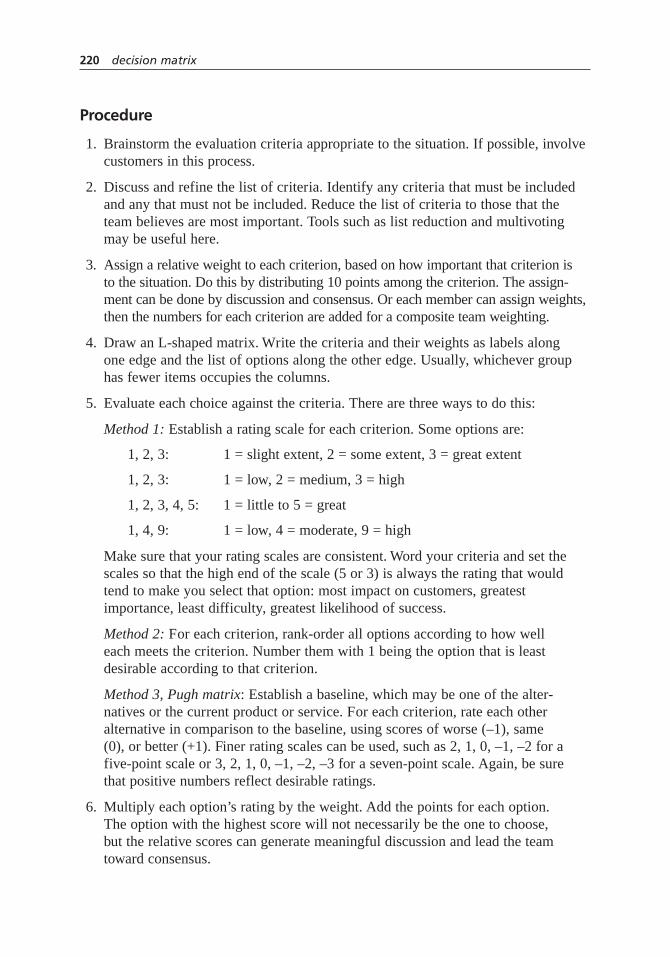
Procedure
1. Brainstorm the evaluation criteria appropriate to the situation. If possible, involvecustomers in this process.
2. Discuss and refine the list of criteria. Identify any criteria that must be includedand any that must not be included. Reduce the list of criteria to those that theteam believes are most important. Tools such as list reduction and multivotingmay be useful here.
3. Assign a relative weight to each criterion, based on how important that criterion is to the situation. Do this by distributing 10 points among the criterion. The assign-ment can be done by discussion and consensus. Or each member can assign weights,then the numbers for each criterion are added for a composite team weighting.
4. Draw an L-shaped matrix. Write the criteria and their weights as labels along one edge and the list of options along the other edge. Usually, whichever grouphas fewer items occupies the columns.
5. Evaluate each choice against the criteria. There are three ways to do this:
Method 1: Establish a rating scale for each criterion. Some options are:
1, 2, 3: 1 = slight extent, 2 = some extent, 3 = great extent
1, 2, 3: 1 = low, 2 = medium, 3 = high
1, 2, 3, 4, 5: 1 = little to 5 = great
1, 4, 9: 1 = low, 4 = moderate, 9 = high
Make sure that your rating scales are consistent. Word your criteria and set thescales so that the high end of the scale (5 or 3) is always the rating that wouldtend to make you select that option: most impact on customers, greatestimportance, least difficulty, greatest likelihood of success.
Method 2: For each criterion, rank-order all options according to how welleach meets the criterion. Number them with 1 being the option that is leastdesirable according to that criterion.
Method 3, Pugh matrix: Establish a baseline, which may be one of the alter-natives or the current product or service. For each criterion, rate each otheralternative in comparison to the baseline, using scores of worse (–1), same(0), or better (+1). Finer rating scales can be used, such as 2, 1, 0, –1, –2 for afive-point scale or 3, 2, 1, 0, –1, –2, –3 for a seven-point scale. Again, be surethat positive numbers reflect desirable ratings.
6. Multiply each option’s rating by the weight. Add the points for each option. The option with the highest score will not necessarily be the one to choose,but the relative scores can generate meaningful discussion and lead the teamtoward consensus.
220 decision matrix
Example
Figure 5.50 shows a decision matrix used by the customer service team at the ParisianExperience restaurant to decide which aspect of the overall problem of “long wait time”to tackle first. The problems they identified are customers waiting for the host, thewaiter, the food, and the check.
The criteria they identified are “Customer pain” (how much does this negativelyaffect the customer?), “Ease to solve,” “Effect on other systems,” and “Speed to solve.”Originally, the criteria “Ease to solve” was written as “Difficulty to solve,” but thatwording reversed the rating scale. With the current wording, a high rating on each cri-terion defines a state that would encourage selecting the problem: high customer pain,very easy to solve, high effect on other systems, and quick solution.
“Customer pain” has been weighted with 5 points, showing that the team considersit by far the most important criterion, compared to 1 or 2 points for the others.
The team chose a rating scale of high = 3, medium = 2, and low = 1. For example,let’s look at the problem “Customers wait for food.” The customer pain is medium (2),
decision matrix 221
Customerpain
5
Criteria
Problems
High—Nothingelse forcustomerto do
3 × 5 = 15
Customerswait forhost
Customerswait forwaiter
Customerswait forfood
Customerswait forcheck
Medium— Involves hostand bussers
2 × 2 = 4
High—Getscustomeroff to badstart
3 × 1 = 3
High—Obser-vations showadequateempty tables
3 × 2 = 6 28
Decision Matrix: Long Wait Time
18
16
13
Medium—Customerscan eatbreadsticks
2 × 5 = 10
Medium— Involves hostand waiters
2 × 2 = 4
Medium—Customerstill feelsunattended
2 × 1 = 2
Low— Waitersinvolved inmanyactivities
1 × 2 = 2
Medium—Ambiance isnice
2 × 5 = 10
Low—Involveswaiters andkitchen
1 × 2 = 2
Medium—Might result inextra trips tokitchen forwaiter2 × 1 = 2
Low—Kitchenis design/spacelimited
1 × 2 = 2
Low—Customerscan relaxover coffee,mints1 × 5 = 5
Medium—Involveswaiters andhost
2 × 2 = 4
Medium—Customerswaiting fortables mightnotice2 × 1 = 2
Low—Computerizedticket systemis needed
1 × 2 = 2
Ease tosolve
2
Effect onother systems
1
Speed tosolve
2
Figure 5.50 Decision matrix example.

because the restaurant ambiance is nice. This problem would not be easy to solve (lowease = 1), as it involves both waiters and kitchen staff. The effect on other systems ismedium (2), because waiters have to make several trips to the kitchen. The problem willtake a while to solve (low speed = 1), as the kitchen is cramped and inflexible. (Noticethat this criteria has forced a guess about the ultimate solution: kitchen redesign. Thismay or may not be a good guess.)
Each rating is multiplied by the weight for that criterion. For example, “Customerpain” (weight of 5) for “Customers wait for host” rates high (3) for a score of 15. Thescores are added across the rows to obtain a total for each problem. “Customers wait forhost” has the highest score at 28. Since the next highest score is 18, the host problemprobably should be addressed first.
Also see the Medrad story on page 60 for an example of a decision matrix used toprioritize improvement opportunities.
Considerations
• A very long list of options can first be shortened with a tool such as multivotingor list reduction.
• Criteria that are often used fall under the general categories of effectiveness,feasibility, capability, cost, time required, support, or enthusiasm (of team and of others). Here are other commonly used criteria:
For selecting a problem or an improvement opportunity: Within control of the team, financial payback, resources required (for example, money and people), customer pain caused by the problem, urgency of problem,team interest or buy-in, effect on other systems, management interest or support, difficulty of solving, time required to solve.
For selecting a solution: Root causes addressed by this solution; extent of resolution of problem; cost to implement (for example, money and time);return on investment; availability of resources (people, time); ease of implementation; time until solution is fully implemented; cost to maintain (for example, money and time); ease of maintenance; support or opposition to the solution; enthusiasm by team members; team control of the solution;safety, health, or environmental factors; training factors; potential effects on other systems; potential effects on customers or suppliers; value to customer; potential problems during implementation; potential negative consequences.
• This matrix can be used to compare opinions. When possible, however, it is betterto use it to summarize data that has been collected about the various criteria.
222 decision matrix

• Subteams may be formed to collect data on the various criteria.
• Several criteria for selecting a problem or improvement opportunity requireguesses about the ultimate solution. For example: evaluating resources required,payback, difficulty to solve, and time required to solve. Therefore, your rating ofthe options will be only as good as your assumptions about the solutions.
• It’s critical that the high end of the criteria scale (5 or 3) always is the end youwould want to choose. Criteria such as cost, resource use, and difficulty can cause mix-ups: low cost is highly desirable! If your rating scale sometimes rates a desirable state as 5 and sometimes as 1, you will not get correct results. You can avoid this by rewording your criteria. Say “low cost” instead of “cost”; “ease” instead of “difficulty.” Or, in the matrix column headings, write what generates low and high ratings. For example:
Importance Cost Difficulty
low = 1 high = 5 high = 1 low = 5 high = 1 low = 5
• When evaluating options by method 1, some people prefer to think about just one option, rating each criteria in turn across the whole matrix, then doing thenext option, and so on. Others prefer to think about one criteria, working downthe matrix for all options, then going on to the next criteria. Take your pick.
• If individuals on the team differ in their ratings, discuss them to learn from eachother’s views and arrive at a consensus. Do not average the ratings or vote for themost popular one.
• In some versions of this tool, the sum of the unweighted scores is also calculatedand both totals are studied for guidance toward a decision.
• When this tool is used to choose a plan, solution, or new product, results can be used to improve options. An option that ranks high overall but has low scoreson criteria A and B can be modified with ideas from options that score well on A and B. This combining and improving can be done for every option, and then thedecision matrix used again to evaluate the new options.
• The prioritization matrices are similar to this tool but more rigorous. Also see the effective–achievable chart for a tool that separates ease-of-accomplishmentcriteria from effectiveness criteria and visually compares how well variousoptions meet criteria. Paired comparisons can be used for a decision based onindividual preferences rather than criteria. The cause-and-effect matrix is a variation of this tool used to understand the linkages between process steps andcustomer requirements.
decision matrix 223

decision tree
Also called: decision process flowchart, logic diagram, key
Description
A decision tree is a sequenced set of questions that lead to a correct decision or prob-lem solution. It is a specialized tree diagram, but often it reads like a flow diagram.Typically, the tree is developed by people with expert knowledge of situations that arelikely to occur repeatedly. Later, the tree is used by people without specialized knowl-edge to make decisions quickly without help.
When to Use
• When a situation requiring a decision or problem solution will arise repeatedly,and . . .
• When the thought process for making the decision is known and can be laid out as a series of questions
• Typical applications of decision trees include troubleshooting, emergency response,and documenting procedures that are complex, critical, or seldom used
Procedure
1. Define the kind of situation in which the decision tree will be used. Develop astatement of the decision to be made or problem to be solved. Write it on a stickynote and place it at the far left of the work surface.
2. Brainstorm questions that must be answered to reach the correct decision. Foreach question, note what the possible answers are. Usually, these will be yes–noor a small set of a choices. Write each question and its answers on a note andplace it on the work surface. Let sequence guide you if that is helpful, but do not be too concerned about correct order yet.
3. Decide whether the questions must be asked in a particular sequence. If not,choose an efficient order. Sequence the questions by arranging the cards on the work surface. Show the link between an answer and the next question with an arrow.
4. Review the tree for missing questions or answers. Review the questions to be surethey will be clearly understood and correctly answered by others.
6
394
7
224 decision tree

5. Test the tree. Create scenarios that reflect a range of different situations, and workthrough the tree for each one. Modify the tree if any problems are found.
6. Give people without expert knowledge the scenarios and ask them to use the treeto make decisions. If they do not reach the correct decision, identify thequestion(s) where the error occurred and modify the tree.
Example
Figure 5.20 on page 156, the control chart selection tree, and Figure 5.68 on page 276,the graph decision tree, are examples of decision trees.
Considerations
• Often certain questions must precede others.
• If there is no natural sequence for the questions, then choose an order that in mostcases will lead to a decision as quickly as possible. Questions identifying commonsituations should come before less common ones.
• In a tree with a series of yes–no questions, try to arrange the tree so that the yeses and nos are positioned consistently. Otherwise users are likely to makeerrors if they don’t notice that the position of the yeses and nos has switched.
design of experiments (DOE)
Also called: D of E, designed experiments
Description
Design of experiments is a method for carrying out carefully planned experimentson a process. By using a prescribed plan for the set of experiments and analyzing thedata according to certain procedures, a great deal of information can be obtainedfrom a minimum number of experiments. More than one variable can be studied atone time, so experimentation is less costly. In addition, interactions between vari-ables can be identified. Usually, design of experiments involves a series of experi-ments that start by looking broadly at a great many variables and then focus on thefew critical ones.
Described here is the “classical” approach. Other DOE methods, developed byJapanese engineer Dr. Genichi Taguchi, emphasize first minimizing variation and thenachieving target values. Taguchi methods, sometimes called robust design, are applied
6 5
design of experiments (DOE) 225
05c.H1224.ch5(197-242).qxd 4/22/05 1:36 PM Page 225

to product and process design so that the process is robust, or insensitive to variation inuncontrollable variables, which Taguchi calls noise. His “loss function” (see Figure5.51) teaches that the farther a quality characteristic is from its target because of varia-tion, even if it is within the customer’s tolerances, the greater the customer dissatisfac-tion and the cost to the producer.
A third set of methods, developed by American engineer Dorian Shainin and taughtby Keki Bhote, addresses difficult chronic problems. This approach to DOE is part of abroader problem-solving methodology that includes other statistical tools such as multi-vari charts and components search. (One of these tools, paired comparisons, is differentfrom the tool of that name in this book.) Mathematically simpler than the other twoDOE approaches, the Shainin approach is used most often in manufacturing of compo-nent assemblies. A process of elimination identifies the Red X, the cause responsible formost of the process variation.
When to Use
• When you are studying a process whose output can be measured numerically,and . . .
• When you want to learn how key variables affect the output, and . . .
• When you want to know which variables are important and which are not, or . . .
• When you want to change the process average, or . . .
• When you want to reduce process variation, or . . .
• When you want to set process variables so the output will not be greatly affectedby uncontrollable changes (you want to make the process robust)
226 design of experiments (DOE)
Lowertolerance
Uppertolerance
Target
Cost orCustomer
Dissatisfaction
Quality Characteristic
Figure 5.51 Taguchi’s loss function.
05c.H1224.ch5(197-242).qxd 4/22/05 1:36 PM Page 226

Procedure
It is beyond the scope of this book to provide a procedure detailed enough that you couldconduct and analyze designed experiments. This section will provide an overview to helpyou understand the ideas and methods involved. Before doing your own design of exper-iments, consult specialized books or secure training, and enlist the help of experts.
Usually, design of experiments is carried out in two broad phases:
Phase I: Screening Experiment. An experiment that studies many key variables.The purpose is to identify which ones significantly affect the output andwhich do not. When many variables are included, the results cannot providegood information about interactions of factors with each other.
Phase II: Optimization Study. One or more experiments that study just a few key variables. These experiments provide better information about interactions.
General Procedure*
1. Identify the process to be studied and the purpose of the study.
2. Identify the output measurement(s) that you want to improve. (This is called the response.)
3. Determine measurement precision and accuracy, using tools such as repeatabilityand reproducibility studies.
4. Identify potential key variables that you can control and that might affect theoutput. (These are called factors.) Use tools such as brainstorming, flowcharts,and fishbone diagrams. Identify each factor as A, B, C, and so on.
5. Choose the settings, or levels, for each factor. Usually two levels will be used foreach. If the variable is quantitative, choose high and low levels. If the variable isqualitative, choose two different settings and arbitrarily call them high and low.Designate the high setting with + and the low one with –: A+, A–, B+, B–, and so on.
6. Determine and document the experimental design. This includes:
• All the different combinations of levels (called runs or treatments), specifyingwhich variables will be at which settings
• How many times each treatment will be done (called replication)
• The sequence of all the trials, preferably chosen using a method that ensuresrandom order (called randomization)
7. Identify other variables that might interfere with the experiment. Plan how youwill control or at least monitor them.
design of experiments (DOE) 227
* This procedure is adapted from Larry B. Barrentine, An Introduction to Design of Experiments: A SimplifiedApproach (Milwaukee: ASQ Quality Press, 1999).
05c.H1224.ch5(197-242).qxd 4/22/05 1:36 PM Page 227
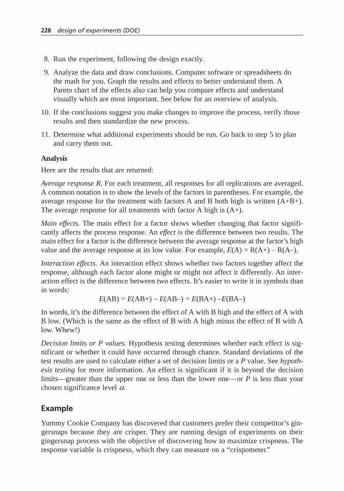
8. Run the experiment, following the design exactly.
9. Analyze the data and draw conclusions. Computer software or spreadsheets do the math for you. Graph the results and effects to better understand them. APareto chart of the effects also can help you compare effects and understandvisually which are most important. See below for an overview of analysis.
10. If the conclusions suggest you make changes to improve the process, verify thoseresults and then standardize the new process.
11. Determine what additional experiments should be run. Go back to step 5 to planand carry them out.
Analysis
Here are the results that are returned:
Average response R. For each treatment, all responses for all replications are averaged.A common notation is to show the levels of the factors in parentheses. For example, theaverage response for the treatment with factors A and B both high is written (A+B+).The average response for all treatments with factor A high is (A+).
Main effects. The main effect for a factor shows whether changing that factor signifi-cantly affects the process response. An effect is the difference between two results. Themain effect for a factor is the difference between the average response at the factor’s highvalue and the average response at its low value. For example, E(A) = R(A+) – R(A–).
Interaction effects. An interaction effect shows whether two factors together affect theresponse, although each factor alone might or might not affect it differently. An inter-action effect is the difference between two effects. It’s easier to write it in symbols thanin words:
E(AB) = E(AB+) – E(AB–) = E(BA+) –E(BA–)
In words, it’s the difference between the effect of A with B high and the effect of A withB low. (Which is the same as the effect of B with A high minus the effect of B with Alow. Whew!)
Decision limits or P values. Hypothesis testing determines whether each effect is sig-nificant or whether it could have occurred through chance. Standard deviations of thetest results are used to calculate either a set of decision limits or a P value. See hypoth-esis testing for more information. An effect is significant if it is beyond the decisionlimits—greater than the upper one or less than the lower one—or P is less than yourchosen significance level a.
Example
Yummy Cookie Company has discovered that customers prefer their competitor’s gin-gersnaps because they are crisper. They are running design of experiments on theirgingersnap process with the objective of discovering how to maximize crispness. Theresponse variable is crispness, which they can measure on a “crispometer.”
228 design of experiments (DOE)
05c.H1224.ch5(197-242).qxd 4/22/05 1:36 PM Page 228

They have already done screening studies on a wide range of variables and learnedthat baking temperature and shortening manufacturer are most significant. Baking tem-perature, a quantitative variable, will be set at levels of 350 and 400 degrees F. Shorteningmanufacturer, a qualitative variable, has two possibilities. They will arbitrarily assign the“high” value to Tall Shortening Company and the “low” value to Slick Oil Inc.
They will do a full factorial experiment, trying every combination of every level.
A+B+ A+B– A–B+ A–B–
Two factors at two levels each requires four treatments. Each will be replicatedonce, so the experiment will have eight trials in all. A random sequence is determinedby writing each trial on a slip of paper and drawing slips. They document this experi-mental design.
Other process variables are fixed, and the experiment is run. The results are shownin Figure 5.52. The analysis is shown in Figure 5.53. The manufacturer’s effect E(B) is
design of experiments (DOE) 229
7973
Low –350°
High +Tall
6266
Low –Slick
6674
BakingTemperature
(A)
ShorteningManufacturers
(B) 9387
High +400°
Figure 5.52 Design of experiments example results.
A– B+R = 76
A+ B+R = 70
R (B+) = 73
E (A) = 80 – 70 = 10
E (B) = 73 – 77 = –4
E (AB) = (70 – 76) – (90 – 64) = –16
Decision limits = ±8.6
R (B–) = 77
R (A+)= 80
R (A–)= 70
A– B–R = 64
A+ B–R = 90
Figure 5.53 Design of experiments example analysis.
05c.H1224.ch5(197-242).qxd 4/22/05 1:36 PM Page 229
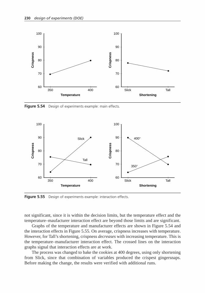
not significant, since it is within the decision limits, but the temperature effect and thetemperature–maufacturer interaction effect are beyond those limits and are significant.
Graphs of the temperature and manufacturer effects are shown in Figure 5.54 andthe interaction effects in Figure 5.55. On average, crispness increases with temperature.However, for Tall’s shortening, crispness decreases with increasing temperature. This isthe temperature–manufacturer interaction effect. The crossed lines on the interactiongraphs signal that interaction effects are at work.
The process was changed to bake the cookies at 400 degrees, using only shorteningfrom Slick, since that combination of variables produced the crispest gingersnaps.Before making the change, the results were verified with additional runs.
230 design of experiments (DOE)
60
70
80
90
100
350 400
Cri
spn
ess
Temperature
60
70
80
90
100
Slick Tall
Cri
spn
ess
Shortening
Figure 5.54 Design of experiments example: main effects.
60
70
80
90
100
350
Slick
Tall
400
400°
350°
Cri
spn
ess
Temperature
60
70
80
90
100
Slick Tall
Cri
spn
ess
Shortening
Figure 5.55 Design of experiments example: interaction effects.
05c.H1224.ch5(197-242).qxd 4/22/05 1:36 PM Page 230

Considerations
• Traditionally, experiments addressed one factor at a time. Not only did this lead to more trial runs, which meant higher cost, but this approach didn’t discoverinteractions between factors. Design of experiments is therefore a more efficientand more powerful approach.
• Conducting designed experiments can be costly in terms of manpower, training,process time, and sometimes lost raw materials and product. However, the returnsfrom an investment in this powerful technique can be substantial.
• Design the experiment carefully. Steps 1 through 7 of the procedure are all about planning, which is inexpensive. Step 8, actually running the experiment,is the costly part. Step 9, analysis, can be repeated or corrected. But after theexperiment is run, the design cannot be changed.
• Also see multi-vari chart for a tool useful for preliminary analysis using historicalor process data.
Screening Experiments and Optimization Studies
• Fractional factorial or Plackett-Burman. These are two different kinds of designsfor screening experiments, carefully chosen to provide the most information forthe smallest number of runs. For example, a Plackett-Burman screening design for11 potential factors would require 12 runs. Not all combinations of all levels andall factors are tried, so not all interactions can be estimated. (See “confounding,”below.) Statistical software packages and DOE books give treatment patterns forthese designs.
• In addition to identifying which factors are critical, screening designs can tell you which factors don’t really matter. Sometimes those factors can be set to more economical levels or can be left uncontrolled, leading to cost savings.
• Larger designs can provide lots of information efficiently. However, when experiments get too big, they become expensive and hard to manage.
• Full factorial. This is a design in which the treatments include all combinations of factors. This design is used for optimization studies. The number of treatmentsneeded is the number of levels raised to the n power, where n is the number offactors. So, for an experiment with three factors and two levels each, a full factorial design would need 23 = 2 × 2 × 2 = 8 treatments. An experiment with 11 potential factors would need 211 or 2048 treatments. This is why screeningexperiments are done first to reduce the number of factors.
Planning a Designed Experiment
• Clear understanding of the experiment’s objective is important. The type of analysis or the interpretation of the results may change with different objectives.In the cookie example above, if the experimenters did not care how crisp the
design of experiments (DOE) 231
05c.H1224.ch5(197-242).qxd 4/22/05 1:36 PM Page 231

gingersnap was as long as it did not vary much, they would decide to use shortening from Tall Shortening Company.
• Replication means doing a treatment more than once, repeating everything,including the complete setup. Replication reduces the effect of random variationon the results.
• Randomization means selecting a sequence by a means in which every possiblesequence is equally likely. This is important to prevent unknown or uncontrolledvariables from causing trends in the results. See sampling for more informationabout randomization. Sometimes it is impossible or too costly to randomize afactor. A procedure called blocking lets you do all the trials with one setting of the factor and then all the trials with the other setting. The statistical design needs to include the blocking.
• Different approaches are required when selecting levels for a screening experi-ment than for an optimization study. In screening experiments, levels are chosento represent opposite extremes of possible operating conditions—without, ofcourse, creating a dangerous or impossible situation. Wide levels make differencesin the results more obvious. In optimization studies, levels are more tightly spacednear the level found to be best in the screening experiment.
• If levels of a factor are closely spaced, the difference between the resulting outputs(the effect of the factor) is smaller. As a result, more data is needed to prove thatsuch differences are significant, and more replications will be needed to eliminatethe influence of variation or experimental error.
• Using two levels produces only a linear model of the output, since two pointsdefine a line. You don’t know anything about what happens in between. Usingthree levels is useful if you suspect the behavior between extremes is nonlinear.
Common Issues with Results
• Interaction means the effects of two factors acting together differs from what you would predict from the separate effects of either one. The response to onefactor depends on the level of another factor. In the cookie example, the effect of increased temperature with Slick shortening is greater than expected, and theeffect with Tall shortening is actually the reverse of what you would expect from looking at temperature alone. Discovering interactions is one of DOE’s great benefits.
• An interaction effect can be graphed in two different ways, as shown in Figure5.55. Try both to see which conveys key information better.
• Confounding is a problem that arises when fractional factorial or Plackett-Burman designs are used. These designs are much more efficient—12 runsinstead of 2048 for 11 factors—but that efficiency comes with a price. Someeffects cannot be distinguished. For example, the effect of the interaction of
232 design of experiments (DOE)
05c.H1224.ch5(197-242).qxd 4/22/05 1:36 PM Page 232

factors A and B might actually be the interaction effect of factors C and D. AB and CD are said to be confounded. Techniques such as reflection, which doubles the number of trials, eliminate some of the confounding, but not all the confounded interaction effects can be eliminated. That is one reason thatscreening designs are usually followed by optimization studies using full factorialanalysis. Screening designs will identify the key factors and possibly some majorinteractions. Optimization studies will clarify the interactions. (A full discussionof confounding is beyond the scope of this book.)
Analysis
• The math is straightforward arithmetic, but there’s a lot of it. Data analysis is usually done with computers. Spreadsheets can be used, but statistical packagesinclude design plans and make the analysis easier.
• However, software cannot substitute for a thorough understanding of the logicbehind designed experiments in order to make correct conclusions and resultingprocess changes. Therefore, the hardest and most critical part of design of experiments is planning and carrying out the experiments.
• The data can be used to construct a mathematical model that will predict theresponse for any factor settings between the high and low levels.
• Variation analysis has not been included here. Consult a DOE book, trainingcourse, or expert for more information.
effective–achievable chart
Also called: impact–effort chart, project desirability chart
Description
The effective–achievable chart is a two-dimensional chart used for prioritizing possiblechoices. It provides a visual comparison of multiple choices based on two dimensions:how effective each choice would be and how achievable it is.
When to Use
• When deciding among a list of options, such as goals to achieve, problems toinvestigate, methods to follow, or solutions to implement, and . . .
• When a quick comparison between options is desired, or . . .
• When communicating a decision to others in the organization
1
64
effective–achievable chart 233

Procedure
1. For each choice, ask the following two questions:
First, how effective will this choice be? That is,
• How well will this method accomplish our purposes? or . . .
• How well will this solution solve the problem? or . . .
• How well will solving this problem contribute to overall improvement? or . . .
• How well will achieving this goal support our overall mission?
Second, how achievable is this choice? How easy will it be to accomplish?Consider what resources are required and the likelihood of success.
2. For each question, decide whether that choice rates “high” or “low.” Finerdistinctions are not necessary. Rate the choice in relation to the other choices,not on an absolute basis.
3. Write each choice in the box corresponding to its combination of effective andachievable ratings.
4. Choices should be chosen or prioritized in the following order:
Highest—box A
2—box B
3—box C
Lowest—box D
Example
Figure 5.56 shows an effective–achievable chart used by a team to decide how to gatheremployee opinions. The team’s six options were placed on the chart, based on groupconsensus of effectiveness and achievability.
Face-to-face interviews of a 10 percent random sample were judged to be low inachievability because they require a lot of time and people, but they were judged to behighly effective at gathering opinions. Low achievability and high effectiveness placesthat option in box B. Focus groups over lunch are highly achievable—inexpensive andquickly accomplished—but they were not considered to be very effective at getting agood sample of employee opinions. High achievability and low effectiveness places thatoption in box C. The other options were placed on the chart similarly.
The group decided to start with telephone surveys, which was the only option bothhighly effective and highly achievable. If needed, group members would follow up withface-to-face interviews.
234 effective–achievable chart

Considerations
• Ratings should be relative. Every choice is effective and achievable, or it wouldnot be on your list. Compare choices to each other.
• Before using this tool, it can be useful to brainstorm evaluation criteria. Whataspects of effectiveness need to be considered? Of achievability? You might usethese aspects as headings for a decision matrix to evaluate each choice. Then use the effective–achievable chart to summarize your understanding.
• For project selection, sometimes this tool is called an impact–effort chart or project desirability chart, and the questions become: “How much impact will this project have?” and “How much effort will it require?”
• A similar chart called a control–impact chart asks the questions, “Is this action in our control?” and “How much impact would this action have?”
• This is not the best tool for making a decision involving many criteria or whensome criteria are much more important than others. In those cases, use a decisionor prioritization matrix.
• This is a variation of the generic two-dimensional chart. See its entry for moreinformation.
effective–achievable chart 235
Mail-out survey
Effective
High
Low
Low
Priority: A = 1 B = 2 C = 3 D = 4
High
C
A
D
B
How to Gather Employee Opinions
Achievable
Telephone interviews(10 percent random
sample)
Administer survey atmandatory meeting
Face-to-face interviews(10 percent random
sample)
E-mail survey
Focus groups over lunch
Mail-in postcard incompany newsletter
Figure 5.56 Effective–achievable chart example.
failure modes and effectsanalysis (FMEA)
Also called: potential failure modes and effects analysis; failure modes, effects, and crit-icality analysis (FMECA)
Description
Failure modes and effects analysis (FMEA) is a step-by-step approach for identifyingall possible failures in a design, a manufacturing or assembly process, or a final prod-uct or service. “Failure modes” means the ways, or modes, in which something mightfail. Failures are any errors or defects, especially ones that affect the customer, and canbe potential or actual. “Effects analysis” refers to studying the consequences, or effects,of those failures.
The failures are prioritized according to how serious their consequences are, howfrequently they occur, and how easily they can be detected. The purpose of the FMEAis to take actions to eliminate or reduce failures, starting with the highest-priority ones.An FMEA also documents current knowledge and actions about the risks of failures, foruse in continuous improvement.
FMEA is used during design to prevent failures. Later it is used for control, beforeand during ongoing operation of the process. Ideally, FMEA begins during the earliestconceptual stages of design and continues throughout the life of the product or service.
Begun in the 1940s by the United States military, FMEA was further developed by theaerospace and automotive industries. Several industries have formalized FMEA standards.What follows is an overview and reference. Before undertaking an FMEA process, learnmore about standards and specific methods in your organization and industry throughother references and training.
When to Use
• When a process, product, or service is being designed or redesigned, after QFDand before the design is finalized, or . . .
• When an existing process, product, or service is being applied in a new way,or . . .
• Before developing control plans for a new or modified process, or . . .
• When improvement goals are planned for an existing process, product, or service,or . . .
94
5
6 5
236 failure modes and effects analysis (FMEA)
• When analyzing failures of an existing process, product, or service
• And periodically throughout the life of the process, product, or service
Procedure
This is a general procedure. Specific details may vary with standards of your organiza-tion or industry.
1. Assemble a cross-functional team of people with diverse knowledge about theprocess, product or service, and customer needs. Functions often included are:design, manufacturing, quality, testing, reliability, maintenance, purchasing (andsuppliers), sales, marketing (and customers), customer service.
2. Identify the scope of the FMEA. Is it for concept, system, design, process, orservice? What are the boundaries? How detailed should we be? Use flowcharts toidentify the scope and to make sure every team member understands it in detail.(From here on, we’ll use the word “scope” to mean the system, design, process,or service that is the subject of your FMEA.)
3. Fill in the identifying information at the top of your FMEA form. Figure 5.57shows a typical format. The remaining steps ask for information that will go intothe columns of the form.
4. Identify the functions of your scope. Ask, “What is the purpose of this system,design, process, or service? What do our customers expect it to do?” Name it with a verb followed by a noun. Usually you will break the scope into separatesubsystems, items, parts, assemblies, or process steps and identify the function of each.
5. For each function, identify all the ways that it could fail to happen. These arepotential failure modes. If necessary, go back and rewrite the function with moredetail to be sure the failure modes show a loss of that function.
6. For each failure mode, identify all the consequences on the system, relatedsystems, process, related processes, product, service, customer, or regulations.These are potential effects of failure. Ask, “What does the customer experiencebecause of this failure? What happens when this failure occurs?”
7. Determine how serious each effect is. This is the severity rating, S. Severity is usually rated on a scale from 1 to 10, where 1 is insignificant and 10 iscatastrophic. If a failure mode has more than one effect, write on the FMEA tableonly the highest severity rating for that failure mode.
8. For each failure mode, determine all the potential root causes. Use tools classified in this book as cause analysis tools, as well as the best knowledge and experience of the team. List all possible causes for each failure mode on the FMEA form.
failure modes and effects analysis (FMEA) 237

238failu
re mo
des an
d effects an
alysis (FMEA
)
Function
Dispenseamount ofcashrequestedby customer
Does notdispense cash
Customerverydissatisfied
Incorrect entryto demanddeposit system
Discrepancy incash balancing
Out of cash
Machine jams
Power failureduringtransaction
Internal low-cash alert
Internal jamalert
None
8 5
3
2
5
10
10
200
240
160
45
24
16
PotentialFailureMode
PotentialEffects(s)of Failure
PotentialCause(s)of Failure
CurrentProcessControls
RecommendedAction(s)
Responsibilityand TargetCompletion
Date
Action Results
Action Taken S O D RPN
CRIT
S O D RPN
CRIT
Dispenses toomuch cash
Bank losesmoney
Discrepancyin cashbalancing
Bills stucktogether
Denominationsin wrong trays
Loading pro-cedure (riffleends of stack)
Two-personvisualverification
6 2
3
7
4
84
72
12
18
Takes toolong to dispense cash
Customersomewhatannoyed
Heavycomputernetwork traffic
Powerinterruptionduringtransaction
None
None
3 7
2
10
10
210
60
21
6
Figure 5.57 FMEA example.

9. For each cause, determine the occurrence rating, O. This rating estimates theprobability of failure occurring because of that cause during the lifetime of yourscope. Occurrence is usually rated on a scale from 1 to 10, where 1 is extremelyunlikely and 10 is inevitable. On the FMEA table, list the occurrence rating foreach cause.
10. For each cause, identify current process controls. These are tests, procedures,or mechanisms that you now have in place to keep failures from reaching thecustomer. These controls might prevent the cause from happening, reduce thelikelihood that it will happen, or detect failure after the cause has alreadyhappened but before the customer is affected.
11. For each control, determine the detection rating, D. This rating estimates howwell the controls can detect either the cause or its failure mode after they havehappened but before the customer is affected. Detection is usually rated on a scale from 1 to 10, where 1 means the control is absolutely certain to detect theproblem and 10 means the control is certain not to detect the problem, or nocontrol exists. On the FMEA table, list the detection rating for each cause.
12. (Optional for most industries) Is this failure mode associated with a criticalcharacteristic? Critical characteristics are measurements or indicators that reflectsafety or compliance with government regulations and need special controls. If so, a column labeled “Classification” receives a Y or to show that specialcontrols may be needed. Usually, critical characteristics have a severity of 9 or 10 and occurrence and detection ratings above 3.
13. Calculate the risk priority number, RPN = S × O × D. Also calculate Criticality = S × O, by multiplying severity by occurrence. These numbers provide guidancefor ranking potential failures in the order they should be addressed.
14. Identify recommended actions. These actions may be design or process changesto lower severity or occurrence. They may be additional controls to improvedetection. Also note who is responsible for the actions and target completion dates.
15. As actions are completed, note results and the date on the FMEA form. Also, notenew S, O, or D ratings and new RPN.
Example
A bank performed a process FMEA on their ATM system. Figure 5.57 shows part of it—the function “dispense cash” and a few of the failure modes for that function. The optional“Classification” column was not used. Only the headings are shown for the rightmost(action) columns.
Notice that RPN and criticality prioritize causes differently. According to the RPN,“machine jams” and “heavy computer network traffic” are the first and second highest risk.One high value for severity or occurrence times a detection rating of 10 generates a highRPN. Criticality does not include the detection rating, so it rates highest the only cause with
failure modes and effects analysis (FMEA) 239

medium to high values for both severity and occurrence: “out of cash.” The team shoulduse their experience and judgement to determine appropriate priorities for action.
Considerations
• It is not necessary to complete all of one step before moving on to the next. Beginwith the information you have. Collect information that is available. Recycle andmake your FMEA more complete as your team digs deeper or more informationbecomes available.
• Your organization or industry may have tables specifying the rating scales forseverity, occurrence, and detection as well as the criteria for each number on the scale. Table 5.3 shows typical criteria. Sometimes a scale of 1 to 5 is used.Whatever scale and criteria you use, be sure to document them with your FMEA.
240 failure modes and effects analysis (FMEA)
Table 5.3 Criteria for severity–occurrence–detection ratings.
Criteria
Rating Severity Occurrence Detection
1 Not noticeable to customer. Highly unlikely. < 1 in 1.5 Almost certain to detect million opportunities. failure.
2 Some customers will notice. Very Extremely rare. 1 in Excellent chance of minor effect on product or system. 150,000 opportunities. detecting failure: 99.99%
3 Most customers notice. Minor Rare. 1 in 15,000 High chance of detecting effect on product or system. opportunities. failure: 99.9%
4 Customer slightly annoyed. Few. 1 out of 2000 Good chance of detecting Product or system slightly opportunities. failure: 95%impaired.
5 Customer annoyed. Noncritical Occasional. 1 out of 500 Fair chance of detecting aspects of product or system opportunities. failure: 80%impaired.
6 Customer experiences discomfort Often. 1 out of 100 Might detect failure: 50%or inconvenience. Noncritical opportunities.elements of product or system inoperable.
7 Customer very dissatisfied. Frequent. 1 out of 20 Unlikely to detect failure:Partial failure of critical elements opportunities. 20%of product or system. Other systems affected.
8 Customer highly dissatisfied. Repeated. 1 out of 10 Very unlikely to detectProduct or system inoperable, opportunities. failure: 10%but safe.
9 Customer safety or regulatory Common: 1 out of 3 Highly unlikely to detect compliance endangered, with opportunites. failure: 5%warning.
10 Catastrophic. Customer safety Almost certain. > 1 out Nearly certain not to or regulatory compliance of 2 opportunities. detect failure, or no endangered, without warning. controls in place

• There are two basic types of FMEA: design and process. The design FMEA(DFMEA) looks at components, assemblies, parts, and other aspects of a product’sdesign, with the objective of eliminating failures caused by poor design. Somereferences also describe a system FMEA, which is done very early in the design,at the conceptual stage, looking at the system broadly. Process FMEAs (PFMEA)address the steps of the process, with the objective of eliminating failures causedby the process and identifying process variables that should be controlled. Somereferences describe a service FMEA, which can be thought of as a process FMEAwhere the process is the delivery of a service. Both process and service FMEAsrequire studying the five Ms of a fishbone analysis: machines (equipment),manpower (people), materials, methods, and measurement.
• If you are doing a design FMEA, functions can be identified from customerexpectations, safety requirements, government regulations, and your organiza-tion’s requirements. QFD, which often precedes FMEA, is an excellent source of functions.
• If you are doing a process or service FMEA, functions are usually the steps of the process. Use block diagrams, process flow diagrams, and task analysis to help define them.
• Functions are actions. What does this thing do? If you don’t have a verb in yourfunction definition, then it isn’t an action. Typical actions are open, filter, control,seal, move. Hint: If you can put “will not” or “cannot” in front of the word, thenit’s a verb. For example: will not open, cannot move.
• To expand your thinking to all potential failure modes, consider this checklist ofways that a function might be lost. Not all items on this checklist will apply inevery situation, but going through the list may keep you from missing a failuremode. Examples are for a stovetop heating element and its function, “heats.”
• What does the procedure mean in step 5: “If necessary, rewrite the function withmore detail to be sure the failure modes show a loss of that function”? For theexample of the stovetop heating element, the function statement must indicate
■■ No function at all Does not get hot
■■ Partial function Outer ring does not heat
■■ Complete function but only some of Sometimes heats, sometimes does notthe time
■■ Early or late function Takes five minutes to get hot
■■ Gradual loss of function Does not maintain temperature
■■ Too much function Becomes superheated
■■ Something else unexpected happens Generates smokealong with function
failure modes and effects analysis (FMEA) 241

how long it should take to achieve temperature. Otherwise, “takes five minutes toget hot” may or may not be a failure. Similarly, the temperature that the elementis expected to achieve at each setting should be specified in order for “becomessuperheated” to be a failure.
• If you brainstorm potential effects, your list may include extremely rare but catastrophic effects. For example, for the failure mode “light bulb burns out,” aneffect may be someone tripping, falling, and suffering severe injury—if the bulbburns out at night in a stairwell. One way to deal with these rare situations is togroup all such effects together under a separate failure mode—“light bulb burnsout under critical conditions”—and assign that mode its own severity, occurrence,and detection ratings. This is called Procedure for Potential Consequences.
• Because cause analysis can be difficult and time-consuming, begin with the highest-risk failures.
• Neither RPN nor criticality are foolproof methods for determining highest riskand priority for action. Severity, occurrence, and detection are not equallyweighted; their scales are not linear; and the mathematics hides some surprises.For example, each of the three scales can have values from 1 to 10, so RPN can range from 1 to 1000—yet there are only 120 possible RPN values. Use RPN and criticality as guides, but also rely on your judgment. Effects with veryhigh severity and any chance of occurrence must be addressed!
• Taking action transforms the FMEA from a paper chase into a valuable tool. By taking action, especially to reduce severity and occurrence ratings, you canprevent problems; reduce design, development, and start-up time and cost;improve customer satisfaction; and gain competitive advantage.
• The FMEA process relies on other tools to gather information or ideas. Some of the tools often used with FMEA are:
– Tables, matrices, and checklists
– Brainstorming, affinity diagrams, and other idea creation tools
– Flowcharts and other process analysis tools
– All the cause analysis tools, especially fault tree analysis, Pareto charts,why–why, and is–is not
– Control charts, design of experiments, graphs, histograms, scatter diagrams,statistical analysis, and other data collection and analysis tools
• Software is available for preparing FMEA forms. These packages make it easierto revise and update the FMEA.
• Various industries, such as automotive and electromechanical, have developeddetailed standards for FMEA. Ask for guidelines from your industry associationor your industry’s division of the American Society for Quality.
242 failure modes and effects analysis (FMEA)

fault tree analysis
Also called: FTA
Description
Fault tree analysis uses a tree diagram to study a specific failure of a system, process,or product. The failure may have already happened, or it may be potential. Workingbackward from the failure, all the ways in which situations or events can combine tolead to the failure are identified, back to fundamental events or root causes. When prob-abilities of each cause are known, the probability of failure can be calculated. The pri-mary purpose of fault tree analysis is to identify changes that can reduce or eliminatethe chance of failure.
When to Use
• During design or redesign of a system, process, product, or service, to identifycauses of a potential failure and look for ways to prevent that failure, or . . .
• After an accident, error, or other failure has occurred, to identify its causes andprevent future occurrences
• Especially when the system is complicated, with multiple interrelated causes of failure
Procedure
1. Identify the system or process that will be examined, including boundaries thatwill limit your analysis. Flow diagrams are useful here.
2. Identify the type of failure that will be analyzed. Define it as narrowly andspecifically as possible. This is called the top event. Draw a rectangle at the top of the diagram and write a description of the failure in it.
3. Identify events that may be immediate causes of the top event. Write these eventsat the level below the event they cause.
4. For each event, ask “Is this a basic failure? Or can it be analyzed for its immediatecauses?” If this event is a basic failure, draw a circle around it. If it can beanalyzed for its own causes, draw a rectangle around it. If appropriate, use theother event symbols in Table 5.4.
5
fault tree analysis 243

5. Ask, “How are these events related to the one they cause?” Use the gate symbolsin Table 5.5 to show the relationships. The lower-level events are the input events.The one they cause, above the gate, is the output event.
6. For each event that is not basic, repeat steps 3, 4, and 5. Continue until allbranches of the tree end in a basic or undeveloped event.
244 fault tree analysis
Table 5.4 Event symbols.
Symbol Event Name Meaning
Event Event that can be analyzed into more basic causes
Basic event Independent event that is not the result of other causes; root cause
Undeveloped Event that will not be analyzed into causes event because of insufficient information or
unimportance
Conditional Event that is the condition for an inhibit event gate
Transfer Link to continuation of diagram in different place
or
Table 5.5 Gate symbols.
Symbol Gate Name Output Event Is Caused If: To Reduce Risk Efficiently:
AND All input events occur at the Eliminate at least one of the input events,same time. and failure is prevented.
PAND All of the input events occur Eliminate at least one of the input events,Priority AND in sequence from left to right. or change the sequence in which they
occur, and failure is prevented.
OR Any one of the input events Eliminate as many input events asoccurs. possible, beginning with the most likely
one; each one reduces risk.
XOR Only one of the input events Eliminate as many input events asExclusive OR occurs, not more than one. possible, beginning with the most likely
one; each one reduces risk. Or ensurethat more than one event occurs, andfailure is prevented.
Inhibit Input event occurs at the Eliminate either input event orsame time as conditional conditional event, and failure isevent. prevented.
Voting At least m (number) of the Eliminate input events, beginning with(m-out-of-n input events occur. the most likely one; when there are gate) only m – 1 input events left, failure
is prevented.
m

7. (Optional) To determine the mathematical probability of failure, assign probabili-ties to each of the basic events. Use Boolean algebra to calculate the probabilityof each higher-level event and the top event. Discussion of the math is beyond thescope of this book. FTA software makes the calculations easier.
8. Analyze the tree to understand the relations between the causes and to find waysto prevent failures. Use the gate relationships to find the most efficient ways toreduce risk. Focus attention on the causes most likely to happen, using proba-bilities or your knowledge of the system.
Example
Figure 5.58 is a fault tree for a highway safety issue: single-vehicle accidents in whichthe vehicle overturns. Most of the gates are OR, but at the third level, events are linkedby AND gates. For example, for a vehicle to overturn off the road, three events mustoccur: the vehicle must leave the road, no object must be in its path to stop it, and a side-ways force must be imparted to the vehicle. “Vehicle leaves road” is followed by a trans-fer symbol, because that event has multiple causes, which are not explored on thissection of the diagram. Similarly, the events on the bottom level are linked to continu-ations elsewhere.
The fault tree suggests several ways to reduce the risk of a vehicle overturning. Ateach AND gate, eliminating one of the input events will prevent the output event.Therefore, guardrails can prevent overturned vehicle accidents off the road by placing
fault tree analysis 245
Single vehicle accident:vehicle overturns
Vehicle overturnson road
Vehicle overturnsoff road
Vehicleleaves road
Noobject in
path1
Sidewaysforce
Vehicle suddenlychanges direction
Driver doesnot recover
Slopedshoulder
Mech-anicalfailure
Driverlacksskill
Vehicleout ofcontrol
Driverover-
corrects
Driverresponsedelayed
Driverswerves
Vehicleskids
2 3 4 5
Figure 5.58 Fault tree analysis example.

an object in the vehicle’s path. At OR gates, eliminating any of the input events reducesthe risk of the failure. Level road shoulders, non-skid tires, and training drivers torecover from skids all can help reduce the risk of overturned vehicles.
Considerations
• Each level of the diagram should represent a tiny step away from the event aboveand toward the basic causes. Resist the urge to take large jumps, or you mightmiss important branches of the tree.
• Consider these possibilities when you are looking for immediate causes of a failure:
– No input
– Human error during installation or operation
– Primary failure: age, fatigue, random failure
– Secondary failure: operation under conditions outside design limits, stress from the environment (vibrations, earthquake, moisture)
– Command fault: unintended operation after failure of a control
• The gates and events shown in the tables are the most commonly used. There aremany others that can be used in complex situations.
• When an inhibit gate is used, the conditional event can be a fault or a situation.Only when the conditional event is present does the input event cause the output event. However, the conditional event is not a cause of the output event. With the AND gate, the two or more input events jointly cause the output event.
• A fault tree is one of the few tree diagrams that are usually drawn vertically,with the tree’s trunk at the top and the branches below.
• If you are constructing a fault tree manually, consider using sticky notes for each event and for the gates. Different colors can be used for the different types of events and gates. This will let you change the tree easily while it is being developed. See tree diagram for more information on constructing trees.
• The earlier fault tree analysis is used, the more economical it is. Early in design,potential failures can be eliminated by changing drawings and specifications. Late in design or after the process is running, eliminating failures may requirehardware or software changes or retraining of personnel. Waiting until a failureoccurs is the most expensive option, because of the cost in dissatisfied customers,damaged equipment, or human life and limb.
• Computer software for generating fault trees makes the process easier. Use software if the tree will be complex or if you need to calculate probabilities.
246 fault tree analysis

• Another mathematical analysis defines the minimal cut set, which is the smallest combination of causes that results in the top event. Use software for that analysis also.
• Fault tree analysis shares features with the why–why diagram but is more structured. At each level of the fault tree, asking “Why?” leads to causes at the next lower level.
• Fault tree analysis is a deductive method. You start with a failure event and workyour way backward to specific causes. In contrast, failure modes and effects analysis is an inductive method. You start with specific failures and work your way forward to consequences of those failures. As a result, FMEA is a broaderprocess, used for analyzing entire systems or processes. FTA is a narrower process,applied to one failure at a time. It can be used within the FMEA process to under-stand the causes of failure modes.
fishbone diagram
Also called: cause-and-effect diagram, Ishikawa diagramVariations: cause enumeration diagram, process fishbone, time-delay fishbone, CEDAC(cause-and-effect diagram with the addition of cards), desired-result fishbone, reversefishbone diagram
Description
The fishbone diagram identifies many possible causes for an effect or problem. It can beused to structure a brainstorming session. It immediately sorts ideas into useful categories.
When to Use
• When identifying possible causes for a problem
• Especially when the team’s thinking tends to fall into ruts
Procedure
Materials needed: flipchart or whiteboard, marking pens.
1. Agree on a problem statement (effect). Write it at the center right of the flipchartor whiteboard. Draw a box around it and draw a horizontal arrow running to it.
2. Brainstorm the major categories of causes of the problem. If there is difficultyhere, use generic headings: methods, machines (equipment), people (manpower),
5
fishbone diagram 247

materials, measurement, environment. Write the categories of causes as branchesfrom the main arrow.
3. Brainstorm all the possible causes of the problem. Ask “Why does this happen?” As each idea is given, the facilitator writes it as a branch from theappropriate category. Causes can be written in several places if they relate toseveral categories.
4. Ask again, “Why does this happen?” about each cause. Write subcauses branching off the causes. Continue to ask “Why?” and generate deeper levels of causes. Layers of branches indicate causal relationships.
5. When the group runs out of ideas, focus attention to places on the fishbone where ideas are few.
Example
Figure 5.59 is the fishbone diagram drawn by the ZZ-400 manufacturing team to try tounderstand the source of periodic iron contamination. This example is part of the ZZ-400 improvement story in Chapter 4. The team used the six generic headings to promptideas. Layers of branches show thorough thinking about the causes of the problem. Forexample, under the heading “Machines,” the idea “materials of construction” showsfour kinds of equipment and then several specific machine numbers. Some ideas appearin two different places. “Calibration” shows up under “Methods,” as a factor in the ana-lytical procedure, and also under “Measurement,” as a cause of lab error. “Iron tools”
248 fishbone diagram
Iron inProduct
Measurement
Lab error
Rust nearsample point Inexperienced
analyst
Materials of construction
E583P584
P560P573
#2#3
E470
Rusty pipes
Heat exchanger leak
In
OutMaintenance
Exp
osed
pip
eTo
ols
Ope
ning
line
sIro
n to
ols
Exc
hang
ers
Rea
ctor
s
Pum
ps
Pip
es
Raw materials Analytical procedure
Lab solvent contamination Sampling
Supplier City Supplier 1
Supplier 2Plantsystem
Truck
Analyst
Supplier
Supplier
Supplier
DB
T
In lab
Dirty bottles
At sample point
E470
E583
At reactor
Iron tools
Supplier
H2 0
AK
W-2
Calibration
Not follow
ed
In labIm
proper
calibration
Calculation
Solvent contamination
Materials Methods
Environment Manpower Machines
Figure 5.59 Fishbone diagram example.

can be considered a “Methods” problem when taking samples or a “Manpower” problemwith maintenance personnel.
Also see the St. Luke’s Hospital story on page 72 for another example of a fishbonediagram used within the improvement process. See the Medrad story on page 61 for anexample of a nontraditional way to conduct a fishbone exercise.
cause enumeration diagram
Materials needed: sticky notes or cards, marking pens, large work surface (wall, table,floor), flipchart paper.
1. Agree on the problem statement.
2. Brainstorm all possible causes, using any brainstorming technique. (Seebrainstorming and NGT.) Record on sticky notes or cards. Continue until thegroup has run out of ideas.
3. Using an affinity diagram, group the causes and determine headings.
4. Using the headings as main causes, arrange the ideas on a fishbone drawn onflipchart paper.
5. Use the fishbone to explore for additional ideas, especially where there are fewideas on the fishbone.
process fishbone
Also called: production process classification diagramMaterials needed: flipchart paper, marking pens.
1. Identify the problem to be studied. Develop a flow diagram of the main steps of the process in which the problem occurs. There should be fewer than 10. Draw them as a series of boxes running horizontally across a flipchart page,with arrows connecting the boxes.
2. Draw a separate fishbone for each step of the process. Take each one in turn andbrainstorm causes arising from each step. Also, consider the handoff from onestep to another and the causes of quality problems that occur there.
3. Continue to brainstorm subcauses, as in the first procedure.
time-delay fishbone
Materials needed: flipchart paper, marking pens, tape, large wall space.
1. Begin a fishbone as in steps 1 and 2 of the main procedure.
fishbone diagram 249

2. Hang the diagram in a well-traveled area with pens nearby. Allow people to addto the diagram over a certain time frame, say a week or two.
More people can participate this way. Even those who have not been trained infishbones will catch on and join in.
Example
In the ZZ-400 unit, ideas were needed from everyone about the source of iron, but mem-bers of the four shifts were never all together. The team hung a flipchart page with thefishbone skeleton on the control room wall and asked people to contribute ideas when-ever they could. The result was a detailed fishbone that everyone had thought about anddiscussed for two weeks. This example is part of the ZZ-400 improvement story inChapter 4.
CEDAC (cause-and-effect diagram with theaddition of cards)
CEDAC, developed by Dr. Ryuji Fukuda, is a disciplined problem-solving methodwrapped around a fishbone diagram analysis. After an improvement target and metricshave been determined, causes are brainstormed, written on colored cards, sorted intocategories, and placed on a fishbone diagram. Ideas for improvement are written oncards of a different color and also placed on the diagram. As in the time-delay fishbone,the diagram is located in a public area where a group can see it, think about it, and addto it over time. Every improvement idea is studied for its possible value to the organi-zation. See Resources for additional information.
desired-result fishbone
Instead of stating a problem, state a desired result. Then brainstorm ways to achieve theresult. Or, state the desired result as a question, such as “How can we achieve our goal?”
reverse fishbone diagram
Also called: backward fishbone, action and effect diagram, AED, solution impact diagram
6
6
250 fishbone diagram

When to Use
• When choosing between alternative solutions, or . . .
• When evaluating the potential consequences of one or more solutions or actions
Procedure
Follow the basic fishbone diagram procedure, but instead of writing a problem state-ment, write a proposed solution or action. Brainstorm by asking, “What effect could thishave?” Be sure to consider positive and negative effects, and distinguish between themby writing them in different colors or circling negative effects. If several actions arebeing evaluated, do a separate diagram for each one and compare effects.
Considerations
• The fishbone diagram broadens the team’s thinking. We all tend to think in ruts attimes. Determining major categories in advance, or using the generic ones, and thenfocusing on those categories where ideas are few will get a team out of its ruts.
• A traditional and widely used set of generic categories is the five Ms: machines,manpower, materials, methods, and measurement. Because they all begin with M,it is easy to remember them. However, many people consider the word manpowerto be exclusionary. You may wish to use the five Ms to remember the categories,then substitute people for manpower. Other words that are sometimes substitutedinclude equipment, facilities, or technology instead of machines and policies orpractices instead of methods.
• Think broadly about the problem. Consider the environment, policies, externalfactors. Consider all causes, not just those within your control. It can be useful to understand them all.
• The hardest part of facilitating a fishbone session is deciding where to write an idea. Let the group tell the facilitator where to write it. This gets membersthinking about the relationships between the causes and the effect. If membersbelieve it belongs in different places, explore whether different ideas or differentaspects of an idea are being considered.
• Have someone outside the team review the diagram for fresh ideas.
• Force field analysis can be used immediately after a fishbone diagram (cause-and-effect diagram) in a combination called CEFFA (cause-and-effect/force field analysis). Each cause identified on the fishbone becomes the subject of aforce field analysis. Not only does this combination move a group quickly from problem to causes to potential solutions, but also overlooked causes can be uncovered during the force field analysis.
• If a problem occurs frequently, possible causes from a fishbone diagram can bemade into a checklist for quickly pinpointing the source of the problem.
fishbone diagram 251

5W2H
Also called: 5W2H method, 5W2H approach, five Ws two Hs
Description
5W2H is a method for asking questions about a process or problem. Its structure forcesyou to consider all aspects of the situation. The five Ws are who, what, when, where,and why. The two Hs are how and how much (or many).
When to Use
Most often, it is used:
• When analyzing a process for improvement opportunities, or . . .
• When a problem has been suspected or identified but must be better defined
But with modification, it can also be used in any of these situations:
• When planning a project or steps of a project (such as data collection or rollingout changes)
• When reviewing a project after completion
• When writing an article, report, or presentation
Procedure
1. Review the situation under study. Make sure everyone understands the subject ofthe 5W2H.
2. Develop appropriate questions about the situation for each of the question words,as in Table 5.6. The order of asking questions is not important.
3. Answer each question. If answers are not known, create a plan for finding them.
4. What you do next depends on your situation:
• If you are planning a project, let your questions and answers help form your plan.
• If you are analyzing a process for improvement opportunities, let your questionsand answers lead you into additional questions about possible changes.
1
6
1098
394
252 5W2H

• If you are defining a problem, let your questions and answers lead you intocause analysis.
• If you are reviewing a completed project, let your questions and answers lead you into additional questions about modifying, expanding, or standardizingyour changes.
• If you are preparing an article, report, or presentation, include answers to thequestions in your text.
Example
Ben-Hur’s Pizza plans to add home delivery to their services in order to expand theirbusiness. They use 5W2H to identify and begin to resolve some of the issues anddetails. First they brainstormed questions, shown in the center column of Figure 5.60.Once they had generated all the questions they could think of, they began to developanswers. Note that they didn’t have all the answers. Those marked with * require moreresearch or process analysis.
Considerations
• Table 5.6 shows typical questions. The third column shows additional questionsyou might ask in step 4 if you were seeking improvement opportunities. Don’t letthis list limit you. Your situation may suggest more or different questions.
• 5W2H is a kind of checklist. In this one, however, you have to come up with thequestions. This checklist only provides the first word of each question to remindyou of the kinds of questions you should ask.
5W2H 253
Table 5.6 5W2H questions.
5W2H Typical Questions for Processes Improvement Questions
Who? Who does this? Should someone else do it?Who should be involved but is not? Could fewer people do it?Who is involved but shouldn’t be? Could approvals be eliminated?Who has to approve?
What? What is done? Does every step have to be done?What is essential? Are steps omitted?
When? When is this activity started? Can it be done at a different time?When does it end? Can cycle time be shortened?When is it repeated? Can it be done less frequently?
Where? Where is this activity done? Can it be done elsewhere?
Why? Why do we do this? Can it be eliminated?Can another group do it?Can it be outsourced?
How? How is this done? Is there a better way?
How Much? How much does it cost? How much less could it cost?

254 5W2H
5W2H Questions Answers
Who? Who will order-in pizza?
Who will take orders?Who will make the pizzas?Who will make deliveries?
Working parents, school groups, offices, DINKs, shut-ins . . .Cashier, wait staffRegular kitchen crewNew hires: high school/college kids
What? What pizzas should be on the menu?What should we call this service?
Same selection as in-storeBen-Hur’s Chariot Service
When? When should we start this service?
When (hours) should it be available?
May 15 (* do Gantt chart to confirm this date is feasible)11 a.m. to midnight
Where? Where should our delivery area be?Where will we store boxes?Where will delivery vehicles park?
8 mile radiusCabinet by back doorReserve spaces by back door
Why? Why will people order-in pizza?
Why should they order from us?
Parties, meetings, TV specials, too tired to go out or cookSuperior pizza, wide selection
How? How will we take orders?How will we keep pizzas hot?How will we hire delivery people?How will we handle super-high volume?
How will we advertise our service?
Checklist padBuy insulated sleevesAds in window; school placement officesStaff up; advertise pre-orders for known high-volume daysRadio, TV, refrigerator magnets, introductory coupons
How much?
How many?
How much should delivery cost?How much should the pizzas cost?How many delivery people do we need?
How much will delivery people earn?How much time from order to front door?
How many pizzas per day will be delivered?
Free(see separate price list)Start with: afternoons 1, weekends and evenings 2Minimum wage + tips35 minutes (*analyze process to see if feasible)*Study competition to determine
Figure 5.60 5W2H example.

• The is–is not matrix is a similar tool used to study problems. Compare them tosee which would be better for your situation.
• The “How much or how many” question can be aimed at cost or time (how much)or resources (how many). Answers to those questions will be an upper limit on thebenefits possible from improvements.
• The 5W1H structure has been around a long time. Journalists have always beentaught that a good newspaper story must include who, what, when, where, why,and how. This tool adds an extra H.
flowchart
Also called: process flowchart, process flow diagramVariations: macro flowchart, top-down flowchart, detailed flowchart (also called processmap, micro map, service map, or symbolic flowchart), deployment flowchart (also calleddown-across or cross-functional flowchart), several-leveled flowchartSee also: arrow diagram, SIPOC diagram, and work-flow diagram
Description
A flowchart is a picture of the separate steps of a process in sequential order. Elementsthat may be included are: sequence of actions, materials or services entering or leavingthe process (inputs and outputs), decisions that must be made, people who becomeinvolved, time involved at each step, and/or process measurements. The process describedcan be anything: a manufacturing process, an administrative or service process, a pro-ject plan. Usually listed as one of the seven QC tools, this is a generic tool that can beadapted for a wide variety of purposes.
When to Use
• To develop understanding of how a process is done, or . . .
• To study a process for improvement, or . . .
• To communicate to others how a process is done, or . . .
• When better communication is needed between people involved with the sameprocess, or . . .
1
6
2103948
57
1
6
23948
57
flowchart 255

• To document a process, or . . .
• When planning a project
Basic Procedure
Materials needed: sticky notes or cards, a large piece of flipchart paper or newsprint,marking pens.
1. Define the process to be diagrammed. Write it at the top of the work surface.Discuss and decide on the boundaries of your process: Where or when does theprocess start? Where or when does it end? Discuss and decide on the level ofdetail to be included in the diagram.
2. Brainstorm the activities that take place. Write each on a card or sticky note.Sequence is not important at this point, although thinking in sequence may helppeople remember all the steps.
3. Arrange the activities in proper sequence.
4. When all activities are included and everyone agrees that the sequence is correct,draw arrows to show the flow of the process.
5. Review the flowchart with others involved in the process (workers, supervisors,suppliers, customers) to see if they agree that the process is as drawn.
Several variations follow. Still other flowcharts are listed as separate tools because theycan be used for different situations. See: arrow diagram, SIPOC, and work-flow diagram.
Considerations
• Don’t worry too much about drawing the flowchart the “right way.” The right wayis the way that helps those involved understand the process.
• Identify and involve in the flowcharting process all key people who are involvedwith the process. This includes those who do the work in the process: suppliers,customers, and supervisors. Involve them in the actual flowcharting sessions byinterviewing them before the sessions and/or by showing them the developingflowchart between work sessions and obtaining their feedback.
• Do not assign a “technical expert” to draw the flowchart. People who actuallyperform the process should construct the flowchart.
• Computer software is available for drawing flowcharts. Software is useful fordrawing a neat final diagram, but the method given here works better for themessy initial stages of creating the flowchart.
• The facilitator’s role is to be sure all members participate, to ask the rightquestions to uncover all aspects of the process, and to help team members capture all their ideas in the language of the flowchart.
256 flowchart

• Keep all parts of the flowchart visible to everyone all the time. That is why flipchart or newsprint should be used rather than transparencies or a whiteboard.
• Several sessions may be necessary. This allows members time to gather infor-mation or to reflect on the process. Even if the flowchart seems to be finished inone session, plan a review at a second session, to allow reflection time.
macro flowchart
Also called: high-level flowchart, high-level process map
Description
A macro flowchart shows only the major steps of the process.
When to Use
• When you need to understand or communicate a big-picture view of the majorsteps in a process, or . . .
• Before drawing a more detailed flowchart
Procedure
Follow the basic procedure above. At step 2, include only major activities.
Example
Figure 5.61 is a macro flowchart of an order-filling process. See the Medrad story onpage 58 for another example of a macro flowchart.
Considerations
• If you have more than six or eight steps, consider whether you are including toomuch detail for a broad overview.
flowchart 257
Orderreceipt
Creditcheck
Inventorycheck Production Shipment Billing
Figure 5.61 Macro flowchart example.
• Often the words on a macro flowchart are nouns, showing broad categories ofactions or names of subprocesses, rather than verbs showing specific actions.Nouns are used in the example, such as “Credit check” and “Production.” Theycould have been written as verbs: “Check credit” and “Make product.” Thinkingin verbs sometimes leads to excessive detail.
• Decisions, delays, and recycle loops are usually not shown on a macro flowchart.The only symbols you should need are rectangles and arrows. Inputs and outputsare sometimes shown.
• Macro flowcharts do not reveal costs of poor quality.
top-down flowchart
Description
A top-down flowchart shows the major steps of a process and the first layer of substeps.
When to Use
• When you need to understand or communicate the major steps of a process plusthe key activities that constitute each step
• When you want to focus on the ideal process
• When you can’t see the forest for the trees
Procedure
1. Define the process to be diagrammed, as in step 1 of the basic procedure.
2. Brainstorm the main steps in the process. There should be about six or eight.Write each on a card or note and place them in a line across the top of your paper.
3. Brainstorm the major substeps of the first main step. Again, there should be nomore than six or eight. Write each on a card and place them in order verticallybelow the first main step.
4. Repeat for each main step.
5. When the group agrees that you have all the steps and substeps and that thesequence is correct, draw horizontal arrows leading from one main step to thenext. Draw arrows pointing down from each main step to the first substep. Youcan draw arrows pointing down between substeps, but they are not necessary. Do not draw an arrow below the last substep of each vertical column.
6. Review the flowchart with others involved in the process (workers, supervisors,suppliers, customers) to see if they agree that the process is as drawn.
258 flowchart

Example
A group beginning a quality improvement project drew a top-down flowchart (Figure5.62) to guide the first phase of the effort. The major steps are: develop project charter,determine customer needs, determine current state. Under each major step are four sub-steps that detail what must be done to accomplish each step. This example is part of theZZ-400 improvement story in Chapter 4.
Considerations
• This is a fast method for flowcharting a process.
• This flowchart focuses on the essential components of a process or project. By comparing it to the way things are really done, the sources of waste and complexity can quickly become obvious.
• Use the top-down flowchart to get an overview of the entire process or project,then construct detailed flowcharts of particular steps as needed.
• The main steps, across the top of the chart, are the same as the main steps of amacro flowchart. The “Considerations” for a macro flowchart also apply here.
detailed flowchart
Also called: process map, micro map, symbolic flowchart
Description
The detailed flowchart shows major and minor activities, decisions, delays, recycleloops, inputs and outputs, and any other details necessary to capture exactly how aprocess is done.
flowchart 259
Develop projectcharter
Determine project objective
Determine business case
Identify roles
Develop plan and milestones
Determinecustomer
needs
List key customers
Interview key customers
Analyze data
Summarize customer CTQs
Determinecurrentstate
Draw process flowchart
Develop SIPOC diagram
Review with department
Finalize process diagrams
Figure 5.62 Top-down flowchart example.

When to Use
• When a team begins to study a process, as the first and most important step inunderstanding the process, or . . .
• When searching for improvement opportunities in a process (called as-is), or . . .
• When designing an improved process (called should-be or to-be), or . . .
• At any step in the improvement process, as a reference for how the process isdone, or . . .
• When training people on a process, or . . .
• When documenting how the process is performed
Procedure
Construction
Follow steps 1 to 3 of the basic procedure. Then:
4. Have you included steps that take place to correct problems or when somethinggoes wrong? Have you included decisions that must be made and the alternateactions that depend on the decisions? If not, add those.
5. List inputs and outputs at each step of the process. Write each on a note and placeat the appropriate point in the process flow.
Conclude with steps 4 and 5 of the basic procedure.
Example
Figure 5.63 is a flowchart of the process for filling an order, from the time the order isreceived until the bill is mailed. An end point occurs early in the process if the poten-tial customer’s credit is not good. The flowchart also shows an output to and an inputfrom the vendor in the middle of the process. The process is complicated enough thatteam members moved sticky notes around several times and added forgotten stepsbefore they settled on the final flow.
Analysis reveals two delays (“Wait”) and two recycle loops if raw materials orproduct aren’t good. Cost-of-poor-quality analysis also will reveal several inspectionsteps. (See the cost-of-poor-quality analysis example and Figure 5.43, page 201, whichshows the same process.) Compare this flowchart with two other flowcharts of the sameprocess: Figure 5.61, a macro flowchart, and Figure 5.189, page 520, a work-flow dia-gram. Read all the improvement stories in Chapter 4 for other examples of detailedflowcharts.
260 flowchart

flowchart 261
Orderreceived
Mail bill
Refuseorder
Filling an Order
Enter orderin system
Check materialsneeded
Scheduleproduction
Inspect product
Ordermaterials
Receivematerials
Inspectmaterials
WaitVendor
WaitScheduleshipment
Confirmdelivery datewith customer
Credit check
Check inventory
Make product
Prepare bill
Ship product
Is creditgood?
No
Yes
Isproduct ininventory?
Arematerials
good?
Isproductgood?
Arematerials ininventory?
No
No
No
No
Yes
Yes
Yes
Yes
Figure 5.63 Detailed flowchart example.

Considerations
Construction
• The following symbols are commonly used in detailed flowcharts:
One step in the process; the step is written inside the box. Usually,only one arrow goes out of the box.
Direction of flow from one step or decision to another.
Decision based on a question. The question is written in the diamond.More than one arrow goes out of the diamond, each one showing thedirection the process takes for a given answer to the question. (Oftenthe answers are yes and no.)
Delay or wait
Link to another page or another flowchart. The same symbol on theother page indicates that the flow continues there.
Input or output
Document
Alternate symbols for start and end points
• An as-is process map shows the process as it currently is, warts and all. Thisshould include recycle loops, rework, delays, excessive handoffs, and any othernon-value-added steps.
• To be sure you’ve included all as-is steps, ask questions like:
– Is the flow the same for special times like month-end or year-end? Whathappens on a holiday? After normal business hours?
– What would happen if a substitute or new employee operated the process?
– What unexpected things might the customer do (especially in an interactiveservice process)?
– Do some people do things differently than others?
Use cost-of-poor-quality analysis, critical-to-quality analysis, or value-addedanalysis to be sure you’ve included all the warts in your current process.
• A should-be process map shows the ideal process. Non-value-added steps areeliminated, the flow is streamlined, and all other improvements are incorporated.
262 flowchart

• Convert a macro or top-down flowchart into a detailed flowchart by identifyingkey steps or steps that cause problems, and flowchart each of these in more detail.It is often not necessary to create detailed flowcharts of an entire process.
• If a detailed flowchart of the entire process is needed, work on major steps sepa-rately. It is easier to focus on part of the process than to deal with the entire thingat once. Try using the approach of the several-leveled flowchart variation below.
• Detailed flowcharts can include additional information about each step. Timerequired (actual, estimated, and/or theoretical) can be added for cycle time analy-sis. Cost, method of measurement, and average measurement results are otherinformation that can be included if they are relevant to the analysis or the way the flowchart will be used.
• Here are good questions to ask as a detailed flowchart is being developed.*
– Where does the [service, material] come from?
– How does the [service, material] get to the process?
– Who makes this decision?
– What happens if the decision is yes?
– What happens if the decision is no?
– Is there anything else that must be done at this point?
– Where does the [product, service] of this process go?
– What tests or inspections are done on the product at each part of the process?
– What tests or inspections are done on the process?
– What happens if the test or inspection is failed?
Note that these are “what, where, how, who?” questions. It is not helpful to ask“why?” while flowcharting. Save that question for later.
Analysis
Some methods of analyzing detailed flowcharts are :
• Cost-of-poor-quality analysis (page 199), critical-to-quality analysis (page 207),and value-added analysis (page 507)
• Draw a flowchart of the ideal (should-be) process and compare it to the actual (as-is) process.
• Convert the flowchart to a SIPOC diagram (page 475): Identify inputs andoutputs; define suppliers, customers, and their requirements.
• Convert to a deployment chart: Who does what when? (See variation following.)
flowchart 263
* John T. Burr, “The Tools of Quality; Part I: Going with the Flow(chart),” Quality Progress 23, no. 6 (June 1990):64–67. Reprinted with permission.

• Convert to a work-flow diagram (page 519) to identify physical inefficiencies.
• Classify each input as either controllable (C), noise (N), or standard methods (S).Controllable inputs can be changed to affect the outputs, for example, oven tem-perature in a pizza shop. For each controllable input, identify the target setting andits upper and lower limits. Noise are inputs that either cannot be controlled or aretoo expensive or difficult to control, for example, the humidity in the pizza shop.Standard methods are procedures for running the process, such as the pizza recipe.
• Analyze cycle time. Identify time requirements and label each step with actualtime needed and theoretical time required. Identify holds or delays. Find the critical path. Collect data if necessary to determine true time requirements.
• Identify: large inventories, large lot sizes, long changeover times, long cycle time.(Note: These production-derived terms apply to office work, too.)
• Identify places in the process where those involved do not agree about correctsteps or sequence.
• Mistake-proof the process. Identify common mistakes or problems at each step ofprocess. What can go wrong? See mistake-proofing.
deployment flowchart
Also called: down-across, cross-functional flowchart
Description
A deployment flowchart is a detailed flowchart that also shows who (which person orgroup) performs each step.
When to Use
• When several different individuals or groups are involved in a process at differentstages, or . . .
• When trying to understand or communicate responsibilities, or . . .
• When identifying supplier–customer relationships, internal or external, or . . .
• When studying how sequential or parallel steps affect cycle time, or . . .
• When allocating and tracking responsibilities on a project
Procedure
1. Begin with steps 1, 2, and 3 of the basic procedure. If a macro, top-down, ordetailed flowchart has already been drawn, you have an excellent start.
264 flowchart
2. On a flipchart page or newsprint, list all players (individuals or groups) involvedin the process. List them across the top or down the left side, whichever is thenarrower dimension of the paper. Draw lines between each, extending the fulldimension of the paper. Optional: Include columns or rows beside the players for“Actual Time” and “Theoretical Time.”
3. Starting at the beginning of the process, place the card or note with the first stepof the process in the column (or row) of the player responsible for that step. Placethe second step a little farther along, to indicate later time sequence, opposite that step’s key player. Continue to place all steps opposite the person or groupresponsible. Place them as though along a timeline, with time moving away fromthe names. If two steps happen simultaneously or the sequence is unimportant,place the cards or notes at equal distances along the timeline.
4. Some process steps involve two players: “Joe telephones Sally.” For these, make asecond card to place opposite the second name. Write the action from the point ofview of the second player: “Sally receives phone call.”
5. Draw arrows between cards to show the flow of the process.
6. (Optional) In the column (or row) labeled “Actual Time,” write opposite each stephow long that step currently requires. In the column (or row) labeled “TheoreticalTime,” write opposite each step how long it should take in an ideal process. Thetheoretical time for a step that does not add value should be zero.
7. Review the flowchart with others involved in the process (workers, supervisors,suppliers, customers) to see if they agree that the process is as drawn.
Example
Figure 5.64 shows the deployment flowchart of the Parisian Experience restaurant’sprocess for seating guests, drawn by the team trying to solve the problem of guests wait-ing to be seated. The key players are the maitre d’, the diners, the busser, the waiter, andlounge staff. Notice that several steps involve two players and are written twice, fromboth points of view: “Order drinks” and “Take drink order”; “Call diners” and “Hearcall”; “Seat diners” and “Take seats”; “Order meal” and “Take order.”
Notice that the arrows follow the sequence of the process, not necessarily theactions of any player. For example, there is no arrow for the maitre d’ linking “Call din-ers” and “Seat diners,” because the maitre d’ cannot seat them until they hear the calland leave the lounge. After the diners leave the lounge, the flow goes back to the maitred’ to seat them. Although this step is simultaneous with the diners’ action of taking theirseats, the diners cannot act until the maitre d’ does.
The team can identify some opportunities for changes from this diagram. For exam-ple, being seated and ordering from the menu now are sequential steps. Perhaps thediners could be given their menus and have their orders taken while they are waiting fora table. The two places where the diner waits for a waiter are obviously opportunitiesfor improvement.
flowchart 265

266 flowchart
Greetdiners
Bustable
Notifymaitre d’
Direct dinersto lounge
Learn tableis ready
Give menus todiners and
describe specials
Calldiners
Enterrestaurant
Go to lounge
Order drinks Take drink order
Make drinks
Hear call
Leave lounge
Take seats
Read menuand decide
Ordermeal
Takeorder
Seat diners
Serve drinks
LoungeBusser
Leave
Diner WaiterMaitre d’
Waitfor next
table
Drinkand wait
Wait forwaiter
Wait forwaiter
Willingto wait
Tableavailable?
N
N
Y
Istable
ready?
Y
Y
Figure 5.64 Deployment flowchart example.

Considerations
• You may wish to indicate primary and secondary or multiple responsibility byplacing a step under two names with different symbols or colors.
• Optional step 6 (and the optional part of step 2) are for doing a cycle-time analysis.
• Often it is easier first to construct a detailed flowchart and then to convert it to adeployment chart—especially if this tool is new to the team.
• Look for sequential steps carried out by different players that could be donesimultaneously.
• When the process flow moves between players, a customer–supplier relationshipis involved.
• The “Considerations” for a detailed flowchart also apply here.
several-leveled flowchart
Description
The several-leveled flowchart combines macro and detailed flowcharts. This tool isactually multiple flowcharts of the same process. The first level is a macro flowchart,followed by detailed flowcharts each showing one increasing level of complexity. Eachstep is numbered, for example, 2.0. On a successive page, where more detail is shown,each step is given a number linking it to the original, such as 2.1, 2.2, and so on. Anotherlevel of detail for step 2.1 would be numbered 2.1.1, 2.1.2, 2.1.3, and so on.
When to Use
• When both high-level and detailed views of the same process need to beavailable, such as:
• When documenting a process, or . . .
• When training people on a process, or . . .
• When making a presentation about a process
Procedure
Use the procedures of the macro flowchart and the detailed flowchart, but combine themin this way:
1. Create a macro flowchart of the process. Number each step 1.0, 2.0, 3.0, and soon. This is level 0.
2. For each major step, create another flowchart showing the major substeps. These charts will be equivalent to the vertical sections of a top-down flowchart.Number each substep with the number of its major step, followed by a period and a sequential number: 1.1, 1.2, 1.3, and so on. These are level 1.
flowchart 267

3. Continue to develop lower-level charts showing increasing levels of detail.Number steps by adding a period and a sequential number to the number of the step being detailed. For example, a chart showing more detail of step 3.1.4would be numbered 3.1.4.1, 3.1.4.2, 3.1.4.3, and so on.
4. As always, review the flowchart with others involved in the process (workers,supervisors, suppliers, customers) to see if they agree that the process is as drawn.
Example
For the group beginning a quality improvement project whose top-down flowchart isshown in Figure 5.62, page 259, two levels of a several-leveled flowchart would looklike Figure 5.65.
force field analysis
Description
Force field analysis clarifies opposing aspects of a desired change:
• Driving or positive forces that support an action or situation
• Restraining or negative forces that hinder it
When opposing forces are equal, no change can occur. For a change to happen, the dri-ving forces must be stronger than the restraining forces. When all the forces have beenconsidered, plans can be made that will encourage the desired change.
6 5
6
109
7
268 flowchart
Level 0
1.0Developprojectcharter
2.0Determinecustomerneeds
3.0Determinecurrentstate
Level 1
2.1List keycustomers
2.2Interviewkeycustomers
2.3Analyzedata
2.4SummarizecustomerCTQs
Figure 5.65 Several-leveled flowchart example.

When to Use
• When the team is planning a change, such as implementation of a solution, or . . .
• When the team is identifying causes of a problem
Procedure
1. Write the desired change, or the problem, at the top of a flipchart or board. Drawa vertical line below it.
2. Brainstorm all the driving forces that support the change, or cause or enable theproblem to occur. Write each one on the left side of the line. Decide how strongthat force is, and draw between the words and the line right-pointing arrowswhose size or length represent that strength.
3. Brainstorm all the restraining forces that prevent the action from happening, orprevent or hinder the problem from occurring. Write each one on the right side of the line. Again decide how strong each force is, and draw left-pointing arrowsrepresenting that strength.
4. For a desired change, discuss means to diminish or eliminate the restrainingforces. For a problem, discuss means to diminish or eliminate the driving forces.Focus especially on the strongest forces.
Example
Figure 5.66 is a force field analysis created by someone who wanted to lose weight. Let’scall him Sam. “Health threat,” “negative self-image,” and “clothes that don’t fit” wereamong the forces making him want to lose weight. Unsympathetic friends and family,genetic traits, and years of bad eating habits were among the forces preventing it.
force field analysis 269
Losing Weight
Driving Forces
Health threat Lack of time to cook
Restraining Forces
Cultural obsession with thinness
Genetic traits
Plenty of thin role modelsUnsympathetic friends and family
Embarrassment Lack of money for exercise equipmentNegative self-imageBad advicePositive attitude toward
exercise Years of bad eating habitsClothes don’t fitAmount of sugar in prepared foods
Temptation in the pantry
Figure 5.66 Force field analysis example.

For Sam, becoming more aware of health consequences, berating himself, or refus-ing to buy new clothes were not enough. Those actions only strengthened the drivingforces. Instead, Sam explored ways to weaken or eliminate the restraining forces. Forexample, his friends and family could be coached on being supportive. Cooking lessonsor cookbooks could teach how to make healthy food attractive and interesting, to coun-teract years of bad eating habits. Unfortunately, some restraining forces, such as Sam’sgenetic traits, cannot be changed. But if enough restraining forces are weakened, Samcan lose weight.
Considerations
• Think of the driving forces as pushing the centerline toward the right. Think of the restraining forces as pushing the centerline toward the left. When the twosets of forces are equal, the current state will be maintained, with the line stayingin the center. To accomplish a change, the centerline must be moved by adjustingthe forces.
• Strengthening the forces supporting a desired change often leads to a reaction that reinforces the opposing forces. First develop ways to reduce or eliminate theopposing forces, then ways to strengthen the driving forces.
• When you use force field analysis to study a problem, you must reverse yourthinking. Driving forces are undesirable, causing the problem. Restraining forcesare desirable, preventing the problem from occurring. Look for ways to reduce or eliminate the driving forces.
• Try to write a problem as too high or too low a level of something. This helpslater to identify forces that raise or lower the level. For example, the problem“cumbersome update process” might be described as “too high a level ofcomplexity in the update process.”
• Instead of drawing arrows of different sizes, you can rate the forces’ strengths on a scale from 1 to 5.
• If the group believes the same force needs to be written on both sides of thearrow, that force needs to be discussed more to understand which aspects drivethe change and which aspects prevent it. Identify the driving and restraining elements and write them, not the force that was first named.
• Force field analysis can be used immediately after a fishbone diagram (cause-and-effect diagram) in a combination called CEFFA (cause-and-effect/force field analysis). Each cause identified on the fishbone becomes the subject of aforce field analysis. Not only does this combination move a group quickly fromproblem to causes to potential solutions, but also overlooked causes can beuncovered during the force field analysis.
270 force field analysis

Gantt chart
Also called: milestones chart, project bar chart, activity chart
Description
A Gantt chart is a bar chart that shows the tasks of a project, when each must take place,and how long each will take. As the project progresses, bars are shaded to show whichtasks have been completed. People assigned to each task also can be shown.
When to Use
• When scheduling and monitoring tasks within a project, or . . .
• When communicating plans or status of a project, and . . .
• When the steps of the project or process, their sequence, and their duration areknown, and . . .
• When it is not necessary to show which tasks depend upon completion of previous tasks
Basic Procedure
Construction
1. Identify the tasks that need to be done to complete the project. Also identify key milestones in the project. This may be done by brainstorming a list or bydrawing a flowchart, storyboard, or arrow diagram for the project. Identify thetime required for each task. Finally, identify the sequence. Which tasks must befinished before a following task can begin, and which can happen simultaneously?Which task must be completed before each milestone?
2. Draw a horizontal time axis along the top or bottom of a page. Mark it off in anappropriate scale for the length of the tasks (days or weeks).
3. Down the left side of the page, write each task and milestone of the project inorder. For events that happen at a point in time (such as a presentation), draw adiamond under the time the event must happen. For activities that occur over aperiod of time (such as developing a plan or holding a series of interviews), drawa bar under the appropriate times on the timeline. Align the left end of the barwith the time the activity begins, and align the right end with the time the activityconcludes. Draw just the outlines of the bars and diamonds; don’t fill them in.
4. Check that every task of the project is on the chart.
1
6
9
7
Gantt chart 271

Using the Chart
5. As events and activities take place, fill in the diamonds and bars to showcompletion. For tasks in progress, estimate how far along you are and fill in that much of the bar.
6. Place a vertical marker to show where you are on the timeline. If the chart isposted on the wall, an easy way to show the current time is with a heavy darkstring and two thumbtacks.
Example
Figure 5.67 shows a Gantt chart used to plan a benchmarking study. Twelve weeks areindicated on the timeline. There are two milestone events, presentations of plans for theproject and for the new process developed in the study. The rest of the tasks are activi-ties that stretch over periods of time.
The chart shows the status at Tuesday of the sixth week. The team has finishedseven tasks, through identifying key practices, measures, and documentation. This is themost hectic part of the project, with three time-consuming activities that must happensimultaneously. The team estimates it is one-fourth finished with identifying bench-mark partners and scheduling visits; one-fourth of that bar is filled. Team members have
272 Gantt chart
0Week
Develop broad plan
1 2 3 4 5
Benchmarking Study
Current date
6 7 8 9 10 11 12
Present plan to council
Identify team
Train team
Develop detailed plan
Conduct preliminary research
Identify key practices, measures, and documentationIdentify benchmark partners and schedule visits
Collect public data
Analyze public data
Identify current state
Develop benchmark questions
Visit benchmark partners
Develop new process
Finalize new process
Present new process plan to council
Figure 5.67 Gantt chart example.

not yet begun to identify the current state. They are behind schedule for those two tasks.They are halfway through collecting public data, which puts them slightly ahead ofschedule for that task. Perhaps they need to reallocate their workforce to be able to coverthose three activities simultaneously.
There is a fourth activity that could be happening now (develop benchmark ques-tions), but it is not urgent yet. Eventually the team will have to allocate resources tocover it too, before visits can begin.
Compare this chart with the arrow diagram example (Figure 5.8, page 105). Bothshow the same project. Relationships and dependencies between tasks are clearer on thearrow diagram, but the Gantt chart makes it easier to visualize progress.
The St. Luke’s Hospital story on page 74 has another example of a Gantt chart, usedwithin the improvement process.
Variation
This version is similar to a deployment chart in that it shows responsibilities for tasks. Thisversion can be done instead of the method above or in addition to it, as a second chartbelow the other one.
Complete steps 1 and 2 as described in the basic procedure.
3. Down the left side of the page, list the people or groups who will have directresponsibility for the project tasks.
4. Transfer each task of the project from the flowchart, storyboard, or arrowdiagram. Represent it as a bar opposite the person or group responsible. Align the end tail of the bar with the date that activity begins, and align the right endwith the date that activity concludes. Write the task above the bar.
5. Check that every task is on the activity chart as a bar. Review the chart witheveryone named on it for their agreement.
Use the chart as described in the basic procedure.
Considerations
• The chart can be prepared in several layers, with major steps in a top layer anddetail in subsequent layer(s). This method is analogous to a several-leveled flowchart, which could be used as a starting point for the Gantt chart.
• Sometimes Gantt charts are drawn with additional columns showing details suchas the amount of time the task is expected to take, resources or skill level needed,or person responsible.
• The variation that shows tasks opposite people or groups responsible allows aquick assessment of who is not engaged in a project task or, conversely, who may be overloaded.
Gantt chart 273
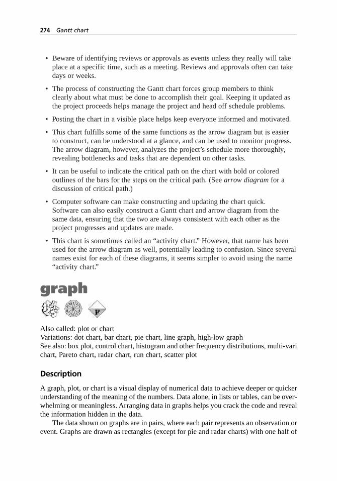
• Beware of identifying reviews or approvals as events unless they really will takeplace at a specific time, such as a meeting. Reviews and approvals often can takedays or weeks.
• The process of constructing the Gantt chart forces group members to think clearly about what must be done to accomplish their goal. Keeping it updated asthe project proceeds helps manage the project and head off schedule problems.
• Posting the chart in a visible place helps keep everyone informed and motivated.
• This chart fulfills some of the same functions as the arrow diagram but is easier to construct, can be understood at a glance, and can be used to monitor progress.The arrow diagram, however, analyzes the project’s schedule more thoroughly,revealing bottlenecks and tasks that are dependent on other tasks.
• It can be useful to indicate the critical path on the chart with bold or colored outlines of the bars for the steps on the critical path. (See arrow diagram for adiscussion of critical path.)
• Computer software can make constructing and updating the chart quick. Software can also easily construct a Gantt chart and arrow diagram from the same data, ensuring that the two are always consistent with each other as the project progresses and updates are made.
• This chart is sometimes called an “activity chart.” However, that name has beenused for the arrow diagram as well, potentially leading to confusion. Since severalnames exist for each of these diagrams, it seems simpler to avoid using the name“activity chart.”
graph
Also called: plot or chartVariations: dot chart, bar chart, pie chart, line graph, high-low graphSee also: box plot, control chart, histogram and other frequency distributions, multi-varichart, Pareto chart, radar chart, run chart, scatter plot
Description
A graph, plot, or chart is a visual display of numerical data to achieve deeper or quickerunderstanding of the meaning of the numbers. Data alone, in lists or tables, can be over-whelming or meaningless. Arranging data in graphs helps you crack the code and revealthe information hidden in the data.
The data shown on graphs are in pairs, where each pair represents an observation orevent. Graphs are drawn as rectangles (except for pie and radar charts) with one half of
1
6
2103948
57
274 Gantt chart

the data pair identified on the horizontal edge (called the x-axis) and the other half onthe vertical edge (called the y-axis). Dots, lines, bars, or symbols show the locationwithin the rectangle that represents the observation, the pair of data.
This is a generic tool. Many different kinds of graphs are available, depending onthe kind of data and the purpose of the graph.
When to Use
• When analyzing data, especially to find patterns or trends in the numbers, or . . .
• When communicating data to others in a report or presentation
Graph Decision Tree
Figure 5.68 is a decision tree to help you decide what kind of graph would display yourdata most effectively. The correct graph depends on what kind of data you have andwhat the purpose of your graph will be.
Data can be categorical or numerical. There are two kinds of categorical data.Nominal data are names or labels of categories. Ordinaldata have an order and aresometimes numbers, but the intervals between them are not necessarily uniform. Doingarithmetic with ordinal numbers isn’t meaningful. Rankings and ratings are ordinaldata. Numerical data can be integers or continuous (variable) numbers, including frac-tions or decimals.
If the pairs of data you wish to graph include categorical data, use the top part ofthe decision tree. Examples of such pairs:
• A list of problems (nominal data) and the number of times each problem occurred(numerical data): Pareto chart.
• Categories of customer service such as responsiveness and accuracy (nominaldata) and performance ratings from 1 to 5 for each category (ordinal data):radar chart.
• Different zip codes (nominal data: even though they’re named with numbers,the data are really locations) and the population in each (numerical data): bar or dot chart.
• Under 1, 1–5, 6–10, 11–20, over 20 years of experience (ordinal data) and thenumber of survey respondents in each (numerical data): bar or dot chart. Note that the year brackets are unequal.
When the data pairs are both numerical data, use the bottom part of the chart. Forexample:
• Data shows how long each of 200 customers waited for service. You want thegraph to show how good or bad wait times are overall. The data pairs you willplot are minutes (numerical data) and how many customers waited that long(numerical data): histogram or polygon chart.
graph 275

• Same data. You want to see if wait times are changing over time. The data pairsyou will plot are when each customer came in (numerical data) and how long thatcustomer waited (numerical data): control chart.
Don’t be confused when you have several data sets consisting of pairs of numericaldata and categories labeling the different data sets. Despite the presence of categories,if it’s numerical data you’re graphing, use the lower part of the decision tree. The cate-gories will become labels or symbols on your graph. For example:
276 graph
Categoricaldata
(labeled orclassified)
Kindof Data
Purposeof Graph
Compare or rankcategories
Categories are problemsor problem causes Pareto chart
Categories are criteria forperformance or progress
5 or fewer categoriesand none similar in size
Everything else
Show categoriesadding up tothe whole
Identify sources ofvariation within a process
Numericaldata
Radar chart
Bar chart orDot chart
Pie chart
Multi-vari chart
Show howfrequentlyvalues occur
Show how onevariable changesas another (usuallytime) increases
Look for relationshipbetween two variables
At least 50data points
Show countsas bars Histogram
Show counts aspoints on a curve
Show cumulativeoccurrences
Summarize data’soverall patterns
Show actual valuesAny amountof data
Little data
Polygon chart
CDF graph orPercentile graph
Stem and leaf display
Box plot
Point graph
Scatter plot
High–low graph
Only a few time intervals
Not enough datafor control limits
Enough datafor control limitsAnalyze or
monitor processvariation
Everything else
Show fluctuations withineach time period
Bar chart orDot chart
Control chart
Run chart
Line graph
Figure 5.68 Graph decision tree.

• You wish to show the monthly values (numerical data) of the Dow Jones,NASDAQ, and S&P indexes (categorical data) over the last 20 years (numericaldata). You will graph monthly values against months on a line graph. Each indexforms a data set, and so will have its own labeled line.
• You wish to know whether class size (numerical data) affects test scores (numerical data). You have data grouped by school district (categorical data). You plot size against score on a scatter plot and use different symbols for the different districts.
Basic Procedure
1. Collect or assemble the data to be shown on your graph. Decide whether you have any categorical data or only numerical data. Decide what you want to studyor to show with the graph.
2. Decide what kind of graph should be used. Through the rest of this basicprocedure, also check the procedure and example sections of the chosen graph’s entry for guidance.
3. Determine the range (lowest number to highest number) you need to show on thegraph for each set of data. If two sets of data will be plotted on the y-axis, theymust both have the same units of measure. Choose the scale for each axis to be as large as or slightly larger than the range.
4. Draw the axes (sometimes called scale lines) and tick marks to show thenumerical scale or data labels. Write numbers or labels next to the tick marks and write the unit of measure for numerical data.
5. Determine appropriate symbols for the data. Plot the data. Add a legend forsymbols.
6. If appropriate, draw reference lines for important values, such as the average,against which all the data must be compared. To note a significant number on thescale, such as the time a change was made, place a marker (an arrow and a note)along the scale line.
7. Complete the graph with title and date. Add notes, if necessary.
8. Analyze the graph. What does it teach? What additional graphing, analysis,investigation, or data collection does it suggest?
Considerations
Basic Graph Design Principles
• The two most important principles of good graphs are:
– Make it easy for the viewer to quickly see the data.
– Eliminate anything unnecessary.
graph 277

• Unnecessary elements may include grid lines, many tick marks, many numbersopposite tick marks, notes and labels inside the graph area, cross-hatching, barsinstead of lines.
• Make every mark on the graph do enough work to earn the right to be there.
Symbols
• Make symbols dark and big—easy to see.
• If several symbols will fall on top of one another and be hard to distinguish,use symbols that look like Y, X, or * (called sunflowers). The number of linesradiating from the center of the symbol indicates how many data values fall onthat spot. Or, you can use more sophisticated graphs, such as logarithmic scales,or plot residuals to eliminate overlap.
• If you must place labels next to data symbols, place them so that the eye caneasily distinguish the data alone. Place the labels outside a central area occupiedby just the data symbols. If that is not possible, make the data symbols veryprominent and the label lettering thin and unobtrusive.
• Connect points only when showing time sequence on a line graph, run chart, orcontrol chart. An exception: lines are often used on a multi-valued dot chart tomake patterns stand out.
Scales and Scale Lines
• It is conventional to show time along the bottom edge of a graph, proceeding left to right. For cause-and-effect graphs, show cause along the bottom edge and effect along the left edge.
• Choose a scale that is only as large as or slightly larger than the range of data. Try not to have any areas of the graph that aren’t working to show your data. Thescale does not have to include zero. Exception: With a bar graph, the scale mustinclude zero or the bar lengths are meaningless. Notice how in Figure 5.69, wherethe scale starts with 20, comparing bar lengths is misleading.
• If two graphs will be compared, their scales must be the same. If this is impossiblebecause of very different absolute values (say, one graph with data around 10 andanother with data around 1000) then at least be sure that the lengths that representone unit are the same.
• Use a scale break when a large region of the graph will have no data in it. Scalebreaks must extend across the entire graph, as in Figure 5.70, not just across thescale line. Do not connect data symbols across a scale break. Do not use scalebreaks with bar graphs.
278 graph
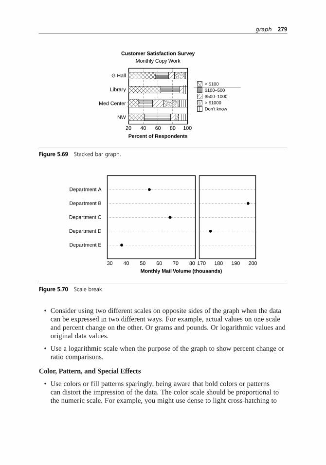
• Consider using two different scales on opposite sides of the graph when the datacan be expressed in two different ways. For example, actual values on one scaleand percent change on the other. Or grams and pounds. Or logarithmic values andoriginal data values.
• Use a logarithmic scale when the purpose of the graph to show percent change orratio comparisons.
Color, Pattern, and Special Effects
• Use colors or fill patterns sparingly, being aware that bold colors or patterns can distort the impression of the data. The color scale should be proportional tothe numeric scale. For example, you might use dense to light cross-hatching to
graph 279
20 40 60
Percent of Respondents
Monthly Copy WorkCustomer Satisfaction Survey
80 100
G Hall
Library
Med Center
NW
< $100$100–500$500–1000> $1000Don’t know
Figure 5.69 Stacked bar graph.
Department E
Department D
Department C
Department B
Department A
30 8070605040
Monthly Mail Volume (thousands)
170 180 190 200
Figure 5.70 Scale break.

represent high to low values. Avoid highly contrasting colors or patterns withclose values. The darker or bolder one will look larger than it really is and thelighter one smaller. See pie chart for an illustration of this. Also notice how the fill patterns in Figure 5.69 play tricks with the eye.
• Where colors or fill patterns are essential to designate multiple data sets (such as in a group bar chart), be sure that the colors or patterns are different enough to be distinguished.
• Avoid 3-D effects. They confuse the eye and are distracting.
Reproduction
• Graphs copied on a machine often become harder to read, especially if they arereduced. A good test: Copy it at two-thirds reduction, then copy the copy at two-thirds reduction. If it survives that test, it will be readable under most conditions.
• Don’t use color to differentiate areas, bars, symbols, or lines if the graph might becopied on a black-and-white copier.
bar chart
Description
The bar chart is the most common way to show categorical data. Values are indicatedby the length of a bar—a long, narrow rectangle—or sometimes of a line. The Paretochart is a specialized bar chart.
When to Use
• When you have categorical data
Procedure
Follow the basic procedure on page 277, but replace steps 3 through 5 with the following:
3. Determine the highest number you need to show on the graph. You must start the scale with zero. If two sets of data will be plotted, they both must have thesame units of measure. Choose the scale for the numerical axis to be as large as or slightly larger than the range.
4. Write labels for the categories either down the left side or across the bottom.Mark the numerical scale, starting with 0, on whichever edge does not have the labels.
5. Draw a bar or line for each value. Fill each bar with a light gray shading or f ill pattern.
280 graph

Examples
A university services department conducted a customer satisfaction survey. Figure 5.71is a horizontal bar chart of the results from the library copy center. Notice that the barsstart at zero, although none of them are shorter than five. For other examples of barcharts, see Pareto chart and the chart used in the St. Luke’s Hospital improvement storyon page 78.
Considerations
• The numerical scale must start at zero, or the length of the line, the visual indica-tor of numerical value, will be meaningless. Similarly, there should be no break in the scale line. There is one exception to this: If one bar is so much longer thanthe others that including its value in the scale would make it hard to see differ-ences among the other bars, it can be broken. Its value should be clearly written at the top of the bar.
• Avoid crosshatching, which is visually distracting. Even better, eliminate theedges of the bar and draw only the shading. Or, eliminate the bar and use a line to indicate length. The bar creates redundant parallel lines which confuse the eye.
• Bars can be horizontal or vertical. Time is normally shown with vertical bars.One advantage of horizontal bars is that there is more room to write labels oneabove the other on the left side. Choose the format that makes the graph clearestto your viewers.
• There must be spaces between bars, to show that the scale is not continuous. Inhistograms, there is no space between bars.
• Most of the considerations for dot charts also apply to bar charts.
graph 281
0 1 2 3 4 5 6 7
Customer Satisfaction SurveyLibrary Copy Center
Timeliness
Problem solving
Technical competence
Helpfulness
Quality of product
Range of services
Follow-through
Figure 5.71 Bar chart example.

Variation: Pareto chart
The Pareto chart is a bar chart used to show relative importance of problems or problemcauses. The measurement may be frequency of occurrence or cost expressed in moneyor time. Because this is such an important quality tool, it has its own entry on page 376.
Variations: grouped or clustered bar chart, stacked bar chart
These charts are different ways to show multi-way or cross-classified data. These aredata that are classified one way into a set of categories and classified another way intoa different set of categories. You want to show both groupings on one graph.
In the grouped or clustered bar chart, labels for one set of categories are shownalong an axis. Beside each label are multiple bars, one for each category of the otherclassification. Usually, the grouped bars are coded with colors or fill patterns.
In the stacked or divided bar chart, one bar is divided into several sections along itslength to show values of components. This kind of chart is not recommended. Thehuman eye and brain cannot compare lengths that are not aligned.
Examples
Figure 5.72 is a grouped bar chart showing survey results for four different copy centerlocations. All results from the survey are shown together. Fill patterns were chosen sothat adjacent bars are different from each other. Notice, however, how distracting the fillpatterns are. Shades of gray or colors would have been better.
282 graph
0 1 2 3 4 5 6 7
Customer Satisfaction SurveyAll Copy Centers
Timeliness
Problem solving
Technical competence
Helpfulness
Quality of product
Range of services
Follow-through
G Hall Library Med Center NW
Figure 5.72 Grouped bar chart example.

This grouping, with criteria down the left edge and bars for each location, makes iteasy to compare locations’ ratings on each criterion. The chart could have been drawnwith locations along the left edge and bars for each criterion. That arrangement wouldhave made studying each location’s results easier. Choose a grouping that makes it easyto do whichever analysis is needed.
Figure 5.69, page 279, showed a stacked bar chart reporting demographic data fromthe copy center survey. Which location had more customers spending between $100 and$500, G Hall or the Med Center? It’s impossible to tell, which is why this kind of chartis not recommended.
dot chart
Also called: point chart
Description
The dot chart is an excellent graph for displaying categorical data. Values are indicatedby positions of dots opposite a scale and sometimes also by the length of a line to the dot.
When to Use
• When you have categorical data
Procedure
Follow the basic procedure as on page 277 except:
4. At step 4, write the labels along the left edge of the graph. Place tick marks andtheir numbers along the top and/or bottom edges.
5. Place a large dot for each data point opposite its label. Draw faint dotted linesbetween the labels and the dots. If the numerical scale does not begin at zero,continue the line to the right side of the graph.
Example
In Figure 5.73, a dot chart shows the same data as the bar chart of Figure 5.71. Becausea dot chart’s scale need not start at zero, less space is wasted with this graph and the areaof interest—between 5 and 7—can be enlarged. This chart has the values sequencedfrom smallest to largest, which makes it easy to see at a glance which criteria rated bestand worst. The bar chart could have been sequenced like this too. However, if severalcharts will be compared, as in this example, one sequence for the categories should beused consistently.
graph 283
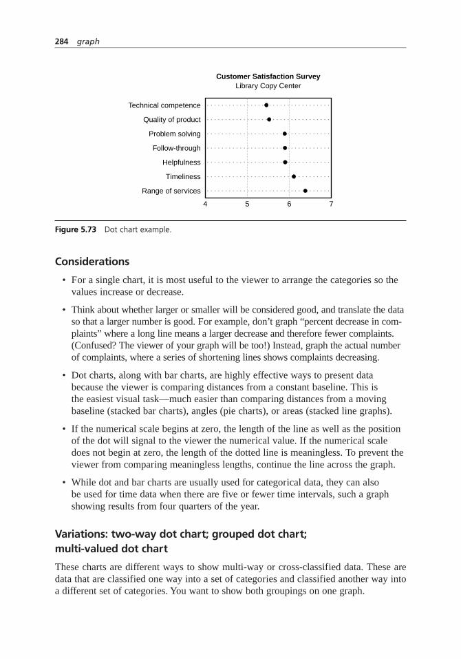
Considerations
• For a single chart, it is most useful to the viewer to arrange the categories so thevalues increase or decrease.
• Think about whether larger or smaller will be considered good, and translate the dataso that a larger number is good. For example, don’t graph “percent decrease in com-plaints” where a long line means a larger decrease and therefore fewer complaints.(Confused? The viewer of your graph will be too!) Instead, graph the actual numberof complaints, where a series of shortening lines shows complaints decreasing.
• Dot charts, along with bar charts, are highly effective ways to present databecause the viewer is comparing distances from a constant baseline. This is the easiest visual task—much easier than comparing distances from a movingbaseline (stacked bar charts), angles (pie charts), or areas (stacked line graphs).
• If the numerical scale begins at zero, the length of the line as well as the positionof the dot will signal to the viewer the numerical value. If the numerical scaledoes not begin at zero, the length of the dotted line is meaningless. To prevent theviewer from comparing meaningless lengths, continue the line across the graph.
• While dot and bar charts are usually used for categorical data, they can also be used for time data when there are five or fewer time intervals, such a graphshowing results from four quarters of the year.
Variations: two-way dot chart; grouped dot chart; multi-valued dot chart
These charts are different ways to show multi-way or cross-classified data. These aredata that are classified one way into a set of categories and classified another way intoa different set of categories. You want to show both groupings on one graph.
284 graph
4 5 6 7
Customer Satisfaction SurveyLibrary Copy Center
Technical competence
Range of services
Timeliness
Helpfulness
Follow-through
Problem solving
Quality of product
. . . . . . . . . . . . . . . . . . . . . . . . . . . . . . . . . .
. . . . . . . . . . . . . . . . . . . . . . . . . . . . . . . . . .
. . . . . . . . . . . . . . . . . . . . . . . . . . . . . . . . . .
. . . . . . . . . . . . . . . . . . . . . . . . . . . . . . . . . .
. . . . . . . . . . . . . . . . . . . . . . . . . . . . . . . . . .
. . . . . . . . . . . . . . . . . . . . . . . . . . . . . . . . . .
. . . . . . . . . . . . . . . . . . . . . . . . . . . . . . . . . .
Figure 5.73 Dot chart example.

In the two-way dot chart, each category from the second classification is drawn asa separate dot chart. The charts are placed side by side using one set of categories onthe far left showing the first classification. Each separate chart is titled at the top toshow the categories of the second analysis.
In the grouped dot chart, the left edge of the graph shows categories for both waysof slicing the data. All the categories for the second classification are grouped togetherrepeatedly under each category of the first classification.
In the multi-valued dot chart, all the values for the second classification are placedon the same line opposite the categories for the first classification. Different symbolsare keyed to the categories of the second classification. This is a common way of dis-playing satisfaction survey results, where areas to be rated are usually placed on the ver-tical edge and the Likert rating scale is placed along the horizontal edge. Differentsegments of the survey population are shown with different symbols. For this use, thechart is sometimes called “multiple rating matrix.” See survey for more information.
Examples
Figure 5.74 shows a two-way dot chart analyzing the same customer satisfaction data asin the bar charts: seven criteria and four locations. The first analysis is the seven dif-ferent criteria; those labels are at the far left. The data for each location is on a separatedot chart. This arrangement makes it easy to study each location separately.
Figure 5.75 shows a grouped dot chart of the same survey data. This time, all fourlocations for timeliness are grouped together, then all four locations for follow-through,and so on. This method of grouping allows easy location-to-location comparison foreach criterion. Notice that the NW location ranks highest on all criteria, and G Hallranks second-highest on all except range of services and problem solving.
graph 285
. . . . . . . . . . . .
. . . . . . . . . . . .
. . . . . . . . . . . .
. . . . . . . . . . . .
. . . . . . . . . . . .
. . . . . . . . . . . .
. . . . . . . . . . . .
. . . . . . . . . . . .
. . . . . . . . . . . .
. . . . . . . . . . . .
. . . . . . . . . . . .
. . . . . . . . . . . .
. . . . . . . . . . . .
. . . . . . . . . . . .
. . . . . . . . . . . .
. . . . . . . . . . . .
. . . . . . . . . . . .
. . . . . . . . . . . .
. . . . . . . . . . . .
. . . . . . . . . . . .
. . . . . . . . . . . .
. . . . . . . . . . . .
. . . . . . . . . . . .
. . . . . . . . . . . .
. . . . . . . . . . . .
. . . . . . . . . . . .
. . . . . . . . . . . .
. . . . . . . . . . . .
65 7
Customer Satisfaction Survey
Timeliness
G Hall
Problem solving
Technical competence
Helpfulness
Quality of product
Range of services
Follow-through
65 7
Library
65 7
Med Center
65 7
NW
Figure 5.74 Two-way dot chart example.

The data could have been grouped the other way: All seven criteria for first loca-tion, then all seven criteria for the second location, and so on. That grouping—similarto the grouping of Figure 5.74—would have allowed easy criterion-to-criterion com-parison for each location, but would have made it harder to see the pattern we noticedbetween locations. So it is useful to group your data different ways to see what youcan learn.
Figure 5.76 shows a multi-valued dot chart of the same data. While the graph ismore compact, it requires a legend, and patterns are harder to discern. Connecting dotson a graph usually represents a time sequence, but it is common with this type of chartto make patterns stand out.
radar chart
Also called: web chart, spider chart
The radar chart looks like a spiderweb, with spokes and connecting lines. It is used totrack or report performance or progress on multiple criteria. Because its purpose is sospecialized, it is described in its own entry on page 437.
286 graph
. . . . . . . . . . . . . . . . . . . . . . . . . . . . . . .
. . . . . . . . . . . . . . . . . . . . . . . . . . . . . . .
. . . . . . . . . . . . . . . . . . . . . . . . . . . . . . .
. . . . . . . . . . . . . . . . . . . . . . . . . . . . . . .
. . . . . . . . . . . . . . . . . . . . . . . . . . . . . . .
. . . . . . . . . . . . . . . . . . . . . . . . . . . . . . .
. . . . . . . . . . . . . . . . . . . . . . . . . . . . . . .
. . . . . . . . . . . . . . . . . . . . . . . . . . . . . . .
. . . . . . . . . . . . . . . . . . . . . . . . . . . . . . .
. . . . . . . . . . . . . . . . . . . . . . . . . . . . . . .
. . . . . . . . . . . . . . . . . . . . . . . . . . . . . . .
. . . . . . . . . . . . . . . . . . . . . . . . . . . . . . .
. . . . . . . . . . . . . . . . . . . . . . . . . . . . . . .
. . . . . . . . . . . . . . . . . . . . . . . . . . . . . . .
. . . . . . . . . . . . . . . . . . . . . . . . . . . . . . .
. . . . . . . . . . . . . . . . . . . . . . . . . . . . . . .
. . . . . . . . . . . . . . . . . . . . . . . . . . . . . . .
. . . . . . . . . . . . . . . . . . . . . . . . . . . . . . .
. . . . . . . . . . . . . . . . . . . . . . . . . . . . . . .
. . . . . . . . . . . . . . . . . . . . . . . . . . . . . . .
. . . . . . . . . . . . . . . . . . . . . . . . . . . . . . .
. . . . . . . . . . . . . . . . . . . . . . . . . . . . . . .
. . . . . . . . . . . . . . . . . . . . . . . . . . . . . . .
. . . . . . . . . . . . . . . . . . . . . . . . . . . . . . .
. . . . . . . . . . . . . . . . . . . . . . . . . . . . . . .
. . . . . . . . . . . . . . . . . . . . . . . . . . . . . . .
. . . . . . . . . . . . . . . . . . . . . . . . . . . . . . .
. . . . . . . . . . . . . . . . . . . . . . . . . . . . . . .
. . . . . . . . . . . . . . . . . . . . . . . . . . . . . . .
654 7
Customer Satisfaction Survey
TimelinessG Hall
LibraryMed Center
NW
Follow-throughG Hall
LibraryMed Center
NW
Range of servicesG Hall
LibraryMed Center
NW
Quality of productG Hall
LibraryMed Center
NW
HelpfulnessG Hall
LibraryMed Center
NW
Technical competenceG Hall
LibraryMed Center
NW
Problem solvingG Hall
LibraryMed Center
NW
All Copy Centers
Figure 5.75 Grouped dot chart example.

pie chart
This kind of chart should be used with caution. This is a common way to show cate-gorical data. A circle is divided into wedges to show relative proportions of categoriesthat add up to a total. However, the human eye and brain cannot compare angles verywell. In Figure 5.77, which location had more survey respondents, G Hall or the library?Instead of the pie chart, use a dot graph or a bar chart, which do better jobs of compar-ing values. In this pie chart, the problem is worsened, first because the similar wedgesare positioned so that the 3-D perspective distorts their sizes, and also because stronglycontrasting colors emphasize the library wedge.
The pie chart does one (and only one) thing well: it emphasizes that the parts sumto 100 percent. If you need to use a pie chart for this reason, be sure to write the valuesor percentages on or beside each wedge, as in Figure 5.78. But think hard about whether
graph 287
. . . . . . . . . . . . . . . . . . . . . . . . . . . . . . . . . .
. . . . . . . . . . . . . . . . . . . . . . . . . . . . . . . . . .
. . . . . . . . . . . . . . . . . . . . . . . . . . . . . . . . . .
. . . . . . . . . . . . . . . . . . . . . . . . . . . . . . . . . .
. . . . . . . . . . . . . . . . . . . . . . . . . . . . . . . . . .
. . . . . . . . . . . . . . . . . . . . . . . . . . . . . . . . . .
. . . . . . . . . . . . . . . . . . . . . . . . . . . . . . . . . .
4 5 6 7
Customer Satisfaction SurveyAll Copy Centers
Timeliness
Problem solving
G Hall Library Med Center NW
Technical competence
Helpfulness
Quality of product
Range of services
Follow-through
Figure 5.76 Multi-valued dot chart example.
Survey Respondents
NW
G Hall
Library
Med Center
Figure 5.77 Poor pie chart.

a different chart would communicate your data better if the size difference between anytwo wedges is not obvious or if you have more than five wedges. Also, choose colorsor fill patterns that are proportional to the wedge sizes, with the largest wedges beingdarkest. Don’t use dark and light to differentiate closely sized wedges; the darker onewill appear larger than it is, like the library in the pie in Figure 5.77.
frequency distributions
Frequency distributions count the number of times each value occurs in a set of data.For example, a frequency distribution of average temperature data would show howmany times the average temperature was 50 degrees, how many times it was 51 degrees,and so on. Many different graphs are available to show frequency data.
A histogram graphs each value in a data set (on the x-axis) against how often thevalue occurs (on the y-axis). A histogram is the most commonly used graph to show fre-quency distributions. It looks very much like a bar chart, but there are important differ-ences between them.
Because the histogram is such an important quality tool, it has its own entry on page292. Other graphs that show frequency distributions are described in the same section.
The polygon chart (page 299) takes the shape of a histogram but links the frequencyvalues with a line instead of showing bars.
The stem-and-leaf display (page 300) is a variation of the histogram where theactual value is used as the symbol for the data point.
The point graph (page 301) is useful with small data sets. It graphs each data pointas a small circle along a vertical line.
The cumulative polygon graph, percentile graph, and CDF (cumulative distributionfunction) graph (page 302–4) add up frequencies of values as they increase, showinghow many or what percentage or fraction of measurements are less than or equal toeach value.
288 graph
NW
G Hall
219 10
8282
Library
MedCenter
Survey Respondents
Figure 5.78 Acceptable pie chart.

box plot
The box plot (page 121) summarizes significant features of a distribution but does notshow all the data. It is especially useful for comparing two or more distributions orwhen there aren’t enough data for a histogram.
line graph
Description
A line graph is the simplest kind of graph for showing how one variable, measured onthe vertical y-axis, changes as another variable, on the horizontal x-axis, increases. Thedata points are connected with a line. The x-axis variable is usually time or its equiva-lent and is called the independent variable. The y-axis variable is called the dependentvariable, because its value depends on the value of the independent variable.
When to Use
• When the pairs of data are numerical, and . . .
• When you want to show how one variable changes with another, continuousvariable, usually time, and . . .
• Only when each independent variable is paired with only one dependent variable
Procedure
Follow the basic procedure on page 277, adding this at step 5:
Connect points with lines. If several categories of dependent variables are beingtracked against the same independent variable, label the lines or use different linetypes for each. Add a legend for line types.
Example
Figure 5.79 shows a line graph of SAT average scores over a ten-year period. There aretwo categories of scores, math and verbal. The growing difference between math andverbal averages is instantly obvious. Also see the line graph used in the St. Luke’sHospital improvement story on page 77.
Considerations
• If the dependent variable may have several values for each value of the independent variable, use a scatter plot.
graph 289

• If your independent variable is an event that happens regularly and sequentially intime, you can consider it equivalent to time. Examples are: samples, batches, shifts.
• Use straight lines to connect points. Make sure the data points are big enough to show up through the line, unless individual values are not important.
• With multiple lines, be sure the viewer can tell the lines apart, especially wherethey cross. If this is a problem, place two separate graphs side-by-side. When you do this, there is always a tradeoff between the eye being able to distinguishthe data sets and having to jump back and forth between the two graphs to makecomparisons.
• Sometimes two lines are graphed with the intent of comparing their values. If the slopes of the lines are changing, the eye will not be able to make accuratecomparisons. Instead, plot the differences between the two data sets.
Variation: cumulative line graph
Also called: area chart, stacked line graph, stratum chart
This kind of chart is not recommended. Cumulative line graphs are similar to stackedbar charts in that they show how various components add up to a total. The value ofeach component is measured from the top of the next-lower component to the bottomof the next-higher one.
The problem with these graphs is the same as the problem with stacked bar graphs:The eye and brain cannot compare distances that are not aligned. Also, since the purposeof all line graphs is to look for trends over time, trends within middle components aremasked or exaggerated by the shifting baseline.
290 graph
490
Math scores
495
500
505
510
515
520
1992 1993 1994 1995 1996 1997 1998 1999 2000 2001 2002
SA
T S
core
s
Verbal scores
Average SAT Scores of Entering College Classes
Figure 5.79 Line graph example.

These graphs only work if the components are fairly regular, with no strong trends.A better alternative is to show each component as a separate line whose value is mea-sured from the zero point of the vertical scale. A line for the total can be shown if needed.
control chart, run chart, multi-vari chart
Control charts and run charts are line graphs used to analyze process variation overtime. A control chart is used when there is enough data to calculate control limits. A runchart is used when there is not. Because these are such important quality tools, theyhave their own entries on pages 155 and 463. A multi-vari chart is a unique chart usedto study the sources of process variation, especially when the sources represent cate-gorical data, such as different machines. It has its own entry on page 356.
high–low graph
Description
High–low graphs are used for data that fluctuate within each time period. Stock prices,weather data, and energy usage are typical applications.
Procedure
Follow the basic procedure on page 277, except for this change to step 5:
The high and low values during each time period are plotted one above the other,and a vertical line is drawn connecting them. Do not connect points from differenttime periods.
Example
Figure 5.80 is a high–low graph of daily temperatures during one month.
scatter diagram
Also called: scatter plot, X–Y graph
A scatter diagram is used to look for relationships between variables. One variable maycause a second to change, or a third factor may affect both of them. Scatter diagramscan reveal such relationships or can verify that the variables are independent. Becausethis is such an important quality tool, it has its own entry on page 471.
graph 291

histogram and otherfrequency distributions
Includes polygon chart, stem-and-leaf display, point graph, percentile graph, CDFgraph, cumulative polygon graph.
Description
A frequency distribution shows how often each different value in a set of data occurs. Ahistogram is the most commonly used graph to show frequency distributions. It looksvery much like a bar chart, but there are important differences between them.
Other graphs for frequency distributions are included in this section. The polygonchart takes the shape of a histogram but connects the frequency values with a line insteadof showing bars. The stem-and-leaf display preserves individual values by using them assymbols for the data point. The point graph shows each data point as a small circle alonga vertical line. The percentile graph and cumulative polygon graph show how manymeasurements (or what percentage of measurements) are less than or equal to each value.
When to Use
• When the data are numerical, and . . .
6
3948
57
292 graph
25
30
35
40
45
50
55
60
65
1Dec 2 3 4 5 6 7 8 9 10 11 12 13 14 15 16 17 18 19 20 21 22 23 24 25 26 27 28 29 30 31
Temp
Figure 5.80 High–low graph example.
• When you want to see the shape of the data’s distribution, especially:
• When determining whether the output of a process is distributed approximatelynormally, or . . .
• When analyzing whether a process can meet the customer’s requirements, or . . .
• When analyzing what the output from a supplier’s process looks like, or . . .
• When seeing whether a process change has occurred from one time period toanother, or . . .
• When determining whether the outputs of two or more processes are different, or . . .
• When you wish to communicate the distribution of data quickly and easily to others
The graph decision tree (Figure 5.68 on page 276) can help decide which graph ismost appropriate for your data and purpose.
Procedure
Construction
1. Collect at least 50 consecutive data points from a process. If you don’t have thatmuch data, use the point graph variation.
2. Use the histogram worksheet (Figure 5.81) to set up the histogram. It will helpyou determine the number of bars, the range of numbers that go into each bar,and the labels for the bar edges. After calculating W in step 2, use your judgmentto adjust it to a convenient number. For example, you might decide to round 0.9 to an even 1.0. The value for W must not have more decimal places than the numbers you will be graphing.
3. Draw x- and y-axes on graph paper. Mark and label the y-axis for counting data values. Mark and label the x-axis with the L values from the worksheet. The spaces between these numbers will be the bars of the histogram. Do not allow for spaces between bars.
4. For each data point, mark off one count above the appropriate bar with an X or by shading that portion of the bar. For numbers that fall directly on the edge of a bar, mark the bar to the right.
Analysis
1. Before drawing any conclusions from your histogram, satisfy yourself that theprocess was operating normally during the time period being studied. If anyunusual events affected the process during the time period of the histogram, youranalysis of the histogram shape probably cannot be generalized to all time periods.
2. Analyze the meaning of your histogram’s shape. See “Considerations” for sometypical shapes and their meanings.
histogram and other frequency distributions 293

Example
The Bulldogs bowling team wants to improve its standing in the league. Team membersdecided to study their scores for the past month. The 55 bowling scores are
103 107 111 115 115 118 119 121 122 124 124125 126 127 127 129 134 135 137 138 139 141142 144 145 146 147 148 148 149 150 151 152153 153 154 155 155 155 156 157 159 160 161163 163 165 165 167 170 172 176 177 183 198
294 histogram and other frequency distributions
Process: _____________________________ Calculated by: _________________________
Data dates: __________________________ Date: _______________________________
Step 1. Number of bars
Find how many bars there should be for the amount of data you have. This is a ballparkestimate. At the end, you may have one more or less.
Number of Number ofdata points bars (B)
50 789
100 10 B = ______11
150 1213
200 14
Step 2. Width of bars
Total range of the data = R = largest value – smallest value
= ______ – ______ = ______
Width of each bar = W = R ÷ B
= ______ ÷ ______ = ______
Adjust for convenience. W must not have more decimal places than the data.
W = ______
Step 3. Find the edges of the bars
Choose a convenient number, L1, to be the lower edge of the first bar. This number canbe lower than any of the data values. The lower edge of the second bar will be W morethan L1. Keep adding W to find the lower edge of each bar.
L1 L2 L3 L4 L5 L6 L7 L8 L9 L10 L11 L12 L13 L14___ ___ ___ ___ ___ ___ ___ ___ ___ ___ ___ ___ ___ ___ ___
Figure 5.81 Histogram worksheet.

Using the table on the histogram worksheet, they estimate B,the number of bars, tobe 7. The highest score was 198 and the lowest was 103, so the range of values is
R = largest – smallest
R = 198 – 103 = 95
Then the width of each bar is
W = R ÷ B
W = 95 ÷ 7 = 13.6
The bowling scores have no decimal places, so the bar width must have no decimalplaces either. They round 13.6 up to 14. Because 14 is an awkward number to workwith, they decide to adjust W to 15. Choosing 100 to be the lower edge of the first bar,the lower edges of the other bars are
100 + 15 = 115
115 + 15 = 130, and so on
Figure 5.82 shows the histogram they drew. They seem to have a double-peaked, orbimodal, distribution: a group of players who score in the low 100s and another moretalented group that scores in the mid-100s. To improve the team’s standing, memberscan try to improve everyone’s score, which would shift the entire histogram to the right.Or they could focus their efforts on improving the poorer players, which would narrowthe distribution, making the team as a whole more consistent.
histogram and other frequency distributions 295
0
5
10
15
20
Bowling Scores
145130115100 160 175 190
Figure 5.82 Histogram example.

Considerations
• Here are typical histogram shapes and what they mean.
Normal. A common pattern is the bell-shaped curve known as the normal distribu-tion (Figure 5.83). In a normal distribution, points are as likely to occur on one sideof the average as on the other. Be aware, however, that other distributions look sim-ilar to the normal distribution. Statistical calculations such as the normal probabilityplot or goodness-of-fit tests must be used to prove a normal distribution. However,if the histogram has a different shape, it proves that the distribution is not normal.
Don’t let the name “normal” confuse you. The outputs of many processes—perhaps even a majority of them—do not form normal distributions, but that does notmean anything is wrong with those processes. For example, many processes have anatural limit on one side and will produce skewed distributions. This is normal—meaning typical—for those processes, even if the distribution isn’t named normal!
Skewed. The skewed distribution (Figure 5.84) is unsymmetrical because a naturallimit prevents outcomes on one side. The distribution’s peak is off center towardthe limit and a tail stretches away from it. For example, a distribution of analysesof a very pure product would be skewed, because the product cannot be more than100 percent pure. Other examples of natural limits are holes that cannot be smallerthan the diameter of the drill bit or call-handling times that cannot be less than zero.These distributions are called right- or left-skewed according to the direction of thetail. Figure 5.84 is right-skewed.
296 histogram and other frequency distributions
Figure 5.83 Normal distribution.
Figure 5.84 Skewed distribution.

Double-peaked or bimodal. The bimodal distribution (Figure 5.85) looks like theback of a two-humped camel. The outcomes of two processes with different distri-butions are combined in one set of data. For example, a distribution of productiondata from a two-shift operation might be bimodal, if each shift produces a differentdistribution of results. Stratification often reveals this problem.
Plateau. The plateau (Figure 5.86) might be called a multimodal distribution. Severalprocesses with normal distributions are combined. Because there are many peaksclose together, the top of the distribution resembles a plateau.
Edge peak. The edge peak distribution (Figure 5.87) looks like the normal distri-bution except that it has a large peak at one tail. Usually this is caused by faulty
histogram and other frequency distributions 297
Figure 5.85 Bimodal (double-peaked) distribution.
Figure 5.86 Plateau distribution.
Figure 5.87 Edge peak distribution.

construction of the histogram, with data lumped together into a group labeled“greater than. . . .”
Comb. In a comb distribution (Figure 5.88), the bars are alternately tall and short.This distribution often results from rounded-off data and/or an incorrectly con-structed histogram. For example, temperature data rounded off to the nearest 0.2degree would show a comb shape if the bar width for the histogram were 0.1 degree.
Truncated or heart-cut. The truncated distribution (Figure 5.89) looks like a nor-mal distribution with the tails cut off. The supplier might be producing a normaldistribution of material and then relying on inspection to separate what is withinspecification limits from what is out of spec. The resulting shipments to the cus-tomer from inside the specifications are the heart cut.
Dog food. The dog food distribution (Figure 5.90) is missing something—resultsnear the average. If a customer receives this kind of distribution, someone else is
298 histogram and other frequency distributions
Figure 5.88 Comb distribution.
Figure 5.89 Truncated or heart-cut distribution.
Figure 5.90 Dog food distribution.

receiving a heart cut. Even though what the customer receives is within specifica-tions, the product falls into two clusters: one near the upper specification limit andone near the lower specification limit. This variation often causes problems in thecustomer’s process.
• A histogram is the appropriate graph to use when the data are numerical. If thedata are categorical (nominal or ordinal) use a bar chart. The bars in a bar charthave spaces between them. The bars in a histogram touch to indicate that thenumerical scale is continuous.
• Take care before acting based on your histogram if the data is old. The processmay have changed since your data were collected.
• If there are few data points, interpret the histogram cautiously. Any conclusions drawnfrom a histogram with less than 50 observations should be seriously questioned.
• Any interpretation of a histogram shape is only a theory that must be verified bydirect observation of the process.
• A histogram cannot be used to definitely conclude that a distribution is normal.There are other distributions that are similar in appearance. See normal probabilityplot for more information.
• If a process is stable, the histogram can predict future performance. If a process is not stable, the histogram merely summarizes past performance. If you discoverthat an unusual event occurred during the time period of your histogram, then anyanalysis of the histogram may apply only to that time period.
• Another tool, the box plot, is used to summarize the most important character-istics of a batch of data. It can be used instead of a histogram, especially when there are too few data points for a histogram. See box plot.
• See graph for more information about constructing clear and useful graphs.
polygon chart
Description
The polygon chart is very similar to a histogram. Instead of bars representing the countfor each value, a point marks the count, and the points are connected with lines. The resultis a polygon outlining the distribution’s shape. Sometimes you will see a polygon chartcalled a histogram, especially when there is so much data that the line becomes smooth.
Procedure
Follow the histogram procedure, except change step 4:
histogram and other frequency distributions 299

4. Above the midpoint of each interval on the x-axis, place a point opposite the y-axis mark that represents the appropriate count. Draw straight lines between adjacent points. Draw straight lines from the outermost points to the x-axis.
Example
Figure 5.91 is a polygon chart of the Bulldog’s bowling scores.
stem-and-leaf display
Description
The stem-and-leaf display is a type of histogram that shows individual data values. Thelast significant digit of each value becomes the symbol marking that value on the graph.
Procedure
1. Decide which digits in the data are changing. Out of this group, choose the two or three digits on the left that are most significant. Of these, the digit on the rightwill be the leaf, and the one or two on the left will be the stem.
2. Draw a vertical line on the page. To the left of the line, write the stems in orderfrom smallest to largest in a column.
3. To the right of the line, write opposite each stem the leaf of each data value thathas that stem. Do not use any digits to the right of the leaf.
4. Write a legend on the graph indicating how to read the numbers.
300 histogram and other frequency distributions
0
5
10
15
20
100 115 130 145 160 175 190 205
Fre
qu
ency
Bowling Scores
Figure 5.91 Polygon chart example.

Example
Figure 5.92 shows the Bulldogs’ bowling scores in a stem-and-leaf display. Only thetwo right digits are changing, but the Bulldogs would like the left digit to become a two(and it could become a zero), so they decide to include it for the future. They decide alldigits are significant. The rightmost digits (ones) are the leaves: 3, 7, and so on. Theother two digits (tens and hundreds) are the stems: 10, 11, 12, and so forth. The first row10 | 37 indicates the scores 103 and 107. The display shows the same double-peakeddistribution we saw with the histogram, even though the intervals are not the same.
point graph
Description
A point graph is useful for showing frequency distributions when there are few datapoints. Each piece of information is graphed along a vertical line as a small circle. Thisgraph becomes ineffective when circles start overlapping so much that the viewer can-not tell how many circles lie together. A histogram should be used in that case.
Procedure
1. Mark a line with tick marks to show the numerical scale for the data. The line canbe horizontal or vertical. Write the unit of measure.
2. In a line parallel to the scale line, draw a small circle to represent each data point.If two points have the same value, separate them slightly so both are visible.
3. If you are comparing more than one data set, draw the circles for each data set onseparate, parallel lines.
histogram and other frequency distributions 301
Bowling Scores
10 37
11 15589
12 124456779
13 45789
14 124567889
15 012334555679
16 0133557
17 0267
18 3
19 8Leaf = 1
10 | 3 = 103
Figure 5.92 Stem-and-leaf display example.

Example
Figure 5.93 shows two point graphs comparing two distributions: the time required toprocess invoices before making changes and the time required after the process has beenstreamlined. The improvement is clear.
percentile graph
Also called: quantile graph
Description
The percentile graph shows what percentage of observations are less than or equal toeach value. As you move from left to right along the x-axis, the percentages accumu-late. The value plotted at the far right side of the graph is 100 percent. Sometimes, thepercentile graph is drawn with percentile on the x-axis and values on the y-axis.
When to Use
• When you are more interested in what percentage of the data lies at or below eachvalue than the individual counts for each value
Procedure
1. List all the values in the data set in sequence from smallest to largest. Give themsequence numbers from one, the smallest, to the largest. If there are n valuesaltogether, the percentile for each number is
302 histogram and other frequency distributions
Timeto Process
Invoice(minutes)
BeforeChange
AfterChange
2
4
6
8
10
12
14
16
Figure 5.93 Point graph example.

When there are multiple occurrences of the same value, use the highest sequencenumber to calculate the percentile for that value.
2. Draw the axes and tick marks for the scales. The y-axis range will be the range ofvalues in the data set. The x-axis scale will range from 0 to 100 percent.
3. Mark a dot in the graph opposite the value on the y-axis and the percentile on thex-axis.
Example
To make the calculation clear, this example uses only ten numbers. The method is morevaluable with a larger data set. The heights of ten children are (in inches) 62, 57, 55, 56,57, 53, 58, 60, 57, 55. These are listed in sequence from smallest to largest, with thesequence numbers and the percentile.
Sequence Number Value Percentile
1 53 0.5 ÷ 10 × 100 = 5 2 55 3 55 2.5 ÷ 10 × 100 = 25 4 56 3.5 ÷ 10 × 100 = 35 5 576 577 57 6.5 ÷ 10 × 100 = 65 8 58 7.5 ÷ 10 × 100 = 75 9 60 8.5 ÷ 10 × 100 = 85
10 62 9.5 ÷ 10 × 100 = 95
The resulting percentile graph is Figure 5.94. With it, you can answer questionssuch as: “Three-quarters of the heights are below what value?” The 75th percentile is
percentilesequence number
=−
×0 5
100.
n
histogram and other frequency distributions 303
52
54
56
58
60
62
0 20 40 60 80 100
Hei
gh
t (I
nch
es)
Percentile
Children’s Heights
. . . . . . . . . . . . . . . . . . . . . . . . . . . . . . . . . . . . . . . . . . . . . . . . .
. . . . . . . . . . . . . . . . . . . . . . . . . . . . . . . . . . . . . . . . . . . . . . . . .
. . . . . . . . . . . . . . . . . . . . . . . . . . . . . . . . . . . . . . . . . . . . . . . . .
. . . . . . . . . . . . . . . . . . . . . . . . . . . . . . . . . . . . . . . . . . . . . . . . .
. . . . . . . . . . . . . . . . . . . . . . . . . . . . . . . . . . . . . . . . . . . . . . . . .
Figure 5.94 Percentile graph example.
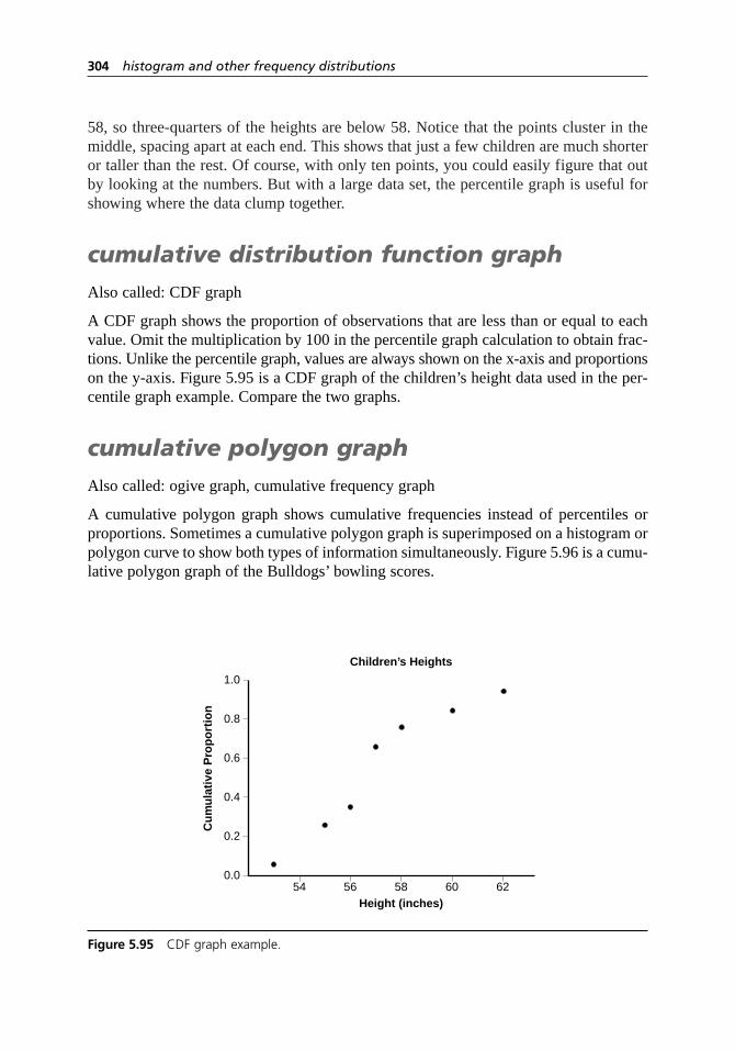
58, so three-quarters of the heights are below 58. Notice that the points cluster in themiddle, spacing apart at each end. This shows that just a few children are much shorteror taller than the rest. Of course, with only ten points, you could easily figure that outby looking at the numbers. But with a large data set, the percentile graph is useful forshowing where the data clump together.
cumulative distribution function graph
Also called: CDF graph
A CDF graph shows the proportion of observations that are less than or equal to eachvalue. Omit the multiplication by 100 in the percentile graph calculation to obtain frac-tions. Unlike the percentile graph, values are always shown on the x-axis and proportionson the y-axis. Figure 5.95 is a CDF graph of the children’s height data used in the per-centile graph example. Compare the two graphs.
cumulative polygon graph
Also called: ogive graph, cumulative frequency graph
A cumulative polygon graph shows cumulative frequencies instead of percentiles orproportions. Sometimes a cumulative polygon graph is superimposed on a histogram orpolygon curve to show both types of information simultaneously. Figure 5.96 is a cumu-lative polygon graph of the Bulldogs’ bowling scores.
304 histogram and other frequency distributions
0.0
0.2
0.4
0.6
0.8
1.0
54 56 58 60 62
Cu
mu
lati
ve P
rop
ort
ion
Height (inches)
Children’s Heights
Figure 5.95 CDF graph example.

house of quality
Also called: HOQ, QFD matrix, requirement matrix
Description
The house of quality is the first diagram used in quality function deployment (QFD) toplan design or improvement of a product or service. It combines several matrices andcharts into one massive diagram. The structure of the “house” is shown in Figure 5.97.
Building the house of quality starts with analyzing information about what the cus-tomer wants, in the rows of the matrix. Added to this is information about quality attrib-utes of the product or the service, in the columns. Relationships among these sets ofinformation, in the central part of the matrix and at the edges, guide decisions about thenew design.
As a result, customer needs are translated into technical specifications for the prod-uct or service, for a design that maximizes customer satisfaction.
When to Use
• When analyzing customer requirements, and . . .
• When customer requirements must be translated into the organization’s language,especially . . .
234
house of quality 305
0
10
20
30
40
50
60
100 110 120 130 140 150 160 170 180 190 200
Fre
qu
ency
Score
Bulldogs’ Bowling Scores
Figure 5.96 Cumulative polygon graph example.
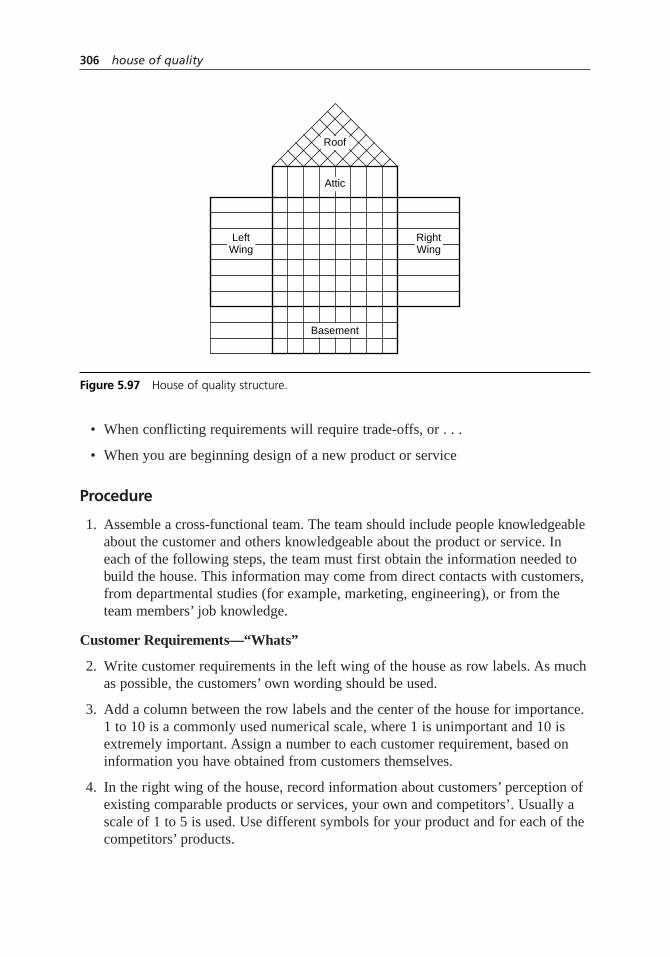
• When conflicting requirements will require trade-offs, or . . .
• When you are beginning design of a new product or service
Procedure
1. Assemble a cross-functional team. The team should include people knowledgeableabout the customer and others knowledgeable about the product or service. Ineach of the following steps, the team must first obtain the information needed tobuild the house. This information may come from direct contacts with customers,from departmental studies (for example, marketing, engineering), or from theteam members’ job knowledge.
Customer Requirements—“Whats”
2. Write customer requirements in the left wing of the house as row labels. As muchas possible, the customers’ own wording should be used.
3. Add a column between the row labels and the center of the house for importance.1 to 10 is a commonly used numerical scale, where 1 is unimportant and 10 isextremely important. Assign a number to each customer requirement, based oninformation you have obtained from customers themselves.
4. In the right wing of the house, record information about customers’ perception ofexisting comparable products or services, your own and competitors’. Usually ascale of 1 to 5 is used. Use different symbols for your product and for each of thecompetitors’ products.
306 house of quality
Roof
Attic
LeftWing
RightWing
Basement
Figure 5.97 House of quality structure.

5. (Optional) You may choose to add additional information about customer require-ments. Information sometimes included: customer complaints, sales points, targetvalue for competitive position, scale-up factor, absolute weight. See “Consider-ations” for more information.
Product or Service Characteristics—“Hows”
6. In the attic of the house, write product or service characteristics as columnheaders. Choose characteristics that directly affect the customer requirements andare measurable. Word them in the technical terms used within your organization.
7. Add another row in the attic with symbols indicating whether the characteristicneeds to increase or decrease to better meet customer requirements. Commonsymbols are + and – or ↑ and ↓.
8. (Optional) You may choose to add more information about product or servicecharacteristics. Information sometimes included: cost, cost of servicing complaints,technical difficulty.
Relationships
9. In the center of the house, use the matrix between customer requirements (rows)and product or service characteristics (columns) to identify relationships betweenthem. Use symbols to indicate whether a relationship between the requirementand the characteristic is positive or negative and how strong it is.
10. On the roof of the house, use the matrix to identify correlations between productor service characteristics. Use symbols indicating whether a relationship ispositive or negative and how strong it is.
Objective Measurements
11. In the basement of the house, create a row identifying the measurement unit foreach of the product or service characteristics.
12. Also in the basement of the house, record data on the performance of existingcomparable products or services, your own and competitors’. Or you can use arelative scale of 1 to 5 and different symbols for each organization, as thecustomers’ assessments were done.
Analyze and Set Targets
13. (Optional) Determine weights for each of the product or service characteristics.Assign a numerical scale to the relationship symbols in the center of the house.Commonly used scales for weak, strong and, very strong relationships are 1,3, 5, or 1, 3, 9. Starting with the first column, multiply each relationship numberby the importance (or absolute weight, if used) of that customer requirement. Add the results down the entire column. The sum is the weight for that
house of quality 307

characteristic. In the next row, rank-order the product or service characteristics,starting with 1 for the characteristic with the highest weight.
14. Determine targets for the measurements of each product or service characteristic.Synthesize all the information in the house of quality to decide on appropriatetargets for the new design. Record the targets in a row in the basement of the house.
Example
A catalog clothing retailer used quality function deployment to plan improvements totheir telephone customer service. The Great Calls Team, composed of customer servicereps, trainers, product specialists, call center managers, and IS (information system)specialists, constructed the house of quality shown in Figure 5.98.
This company excels at providing product information to the customer, throughongoing training of telephone reps on new products plus a corps of product specialiststo back them up. They have two leading competitors. Competitor 1 has a reputation forfriendly telephone reps that customers enjoy talking to. These reps are also empowered
308 house of quality
CompetitivePerformanceAssessment
Customers’CompetitiveAssessment
Impo
rtanc
e
Cheerful, friendly people
Answers to my questions
Enjoyable experience
Accurate order
Problems resolved quickly
Measurement unit
Targets
Weight
Current performance
+ R
eps’
pro
duct
kno
wle
dge
+ R
eps’
IS k
now
ledg
e
+ R
eps’
tele
phon
e kn
owle
dge
C
all l
engt
h
E
rror
rate
+ F
ollo
w-u
p au
thor
ity
Relationships
Strong 5
Medium 3
Weak 1
Us
Competitor 1
Competitor 2
1 2 3 4 5
6
7
9
4
5
5
Score1–100
94 84 48 6 8 1
62 63 75 28 54 59
94 90 92 3.5 3 5
Score1–100
Score1–100 Minutes % Auth.
level
4
3
2
1
– –
Figure 5.98 House of quality example.
to make decisions about resolving customers’ problems, such as authorizing no-costreturns and replacements. Competitor 2 is known for running a very tight ship, withstrict control on costs such as cost per call and error rate.
Through a series of customer interviews, the QFD team extracted the qualities cus-tomers experience during a telephone order that would make them choose one retailerover another. (They were careful to avoid characteristics of the products themselves,which was the subject of a different study.) These requirements went in the rows of thematrix. Customers’ importance ratings and assessments of each retailer’s performancewere added to the matrix.
After considerable brainstorming, discussion, and list reduction, they identified ser-vice characteristics to place in the columns. “Telephone presence” was a score derivedfrom monitoring calls to assess a list of items such as using the customer’s name andsaying key phrases. The relationships between IS knowledge and the requirements of“cheerful, friendly people” and “enjoyable experience” were hotly debated, with mostarguing that they were totally unrelated. The customer service reps on the team con-vinced the others that it’s hard to be cheerful and personable while you’re strugglingwith the computer system. The managers realized that two of their favorite measure-ments, call length and error rate, were negatively related to each other.
Estimates of each competitor’s performance on service characteristics wereobtained through contracted market research studies. The results matched customers’perceptions. Predictably, competitor 2, with its heavy emphasis on managing costs,excelled at reducing error rate and rated very low on telephone presence. However, theyalso had limited follow-up authority within their autocratic organization, which hurttheir call length measurements.
The Great Calls Team decided they would obtain the biggest competitive advantagefrom improving their customer service reps’ telephone presence. Along with that, theyplanned to increase the reps’ follow-up authority. Error rate and call length were tar-geted for moderate improvements. Product and IS knowledge were already strong points,so no new emphasis was planned for product knowledge and only moderate improve-ment in IS knowledge, through simplifying the order screens. With these changes, theyhoped to position themselves as the catalog sales company providing the most excep-tional service customers had ever received.
Considerations
• QFD and house of quality are complicated processes that require experience inorder to gain the benefits. The information here is only a reference. Before usingthe house of quality, enlist experienced assistance or attend specialized training.
• When assembling a team, consider including these functions: engineering, R&D,production or manufacturing, sales, marketing, distribution, customer service,purchasing. For services, include the functions that actually perform the service as well as functions that support them. The product or service you are designingand your organization’s structure will dictate which functions should be included.
house of quality 309

• In the QFD process, the “Hows” of one matrix are frequently cascaded to anothermatrix, where they become the “Whats” and new “Hows” are developed.
• The house of quality is just one step in the QFD process. In fact, QFD sometimescan be done without the HOQ. The founder of QFD, Dr. Akao, said, “The houseof quality alone does not make QFD.” See Chapter 2 for more information aboutthe entire QFD process.
Customer Requirements
• Customer requirements are sometimes called customer attributes, customer needs,demanded quality, voice of the customer, or just VOC.
• To identify customer requirements, voice of the customer tools are useful. Anaffinity diagram can be used to group similar requirements. A tree diagram is often used to delve into details. Sometimes the house of quality shows the levels of the tree diagram to the left of the requirements themselves. Be sure thatall characteristics are from the same level of the tree.
• Consider requirements of customers who are not end users of your product.Requirements of parties such as regulatory agencies and retailers may beimportant. See requirements matrixfor a tool to help identify customers.
• As much as possible, capture the exact language the customer uses to describe his or her requirements. The house of quality will translate that language into onemore understandable to your organization for product and service characteristics.If customer requirements are translated before they reach the diagram, you intro-duce an opportunity for errors.
• Relative importance is usually based on what customers report as important to them. However, if it is possible to assess their actions, sometimes that moreaccurately indicates what they truly consider important.
• The customers’ perception of existing comparable products or services is some-times called “customer competitive assessment” or “competitive benchmarking.”
• Study the patterns in the right wing of the house to identify advantages you haveover your competition that you want to retain, weaknesses you want to eliminate,and opportunities to stand out from the competition.
• “Sales point” or “selling point” is sometimes used to indicate how much sales will improve if that customer requirement is satisfied. A requirement that willdelight the customer can be given a score of 1.5 or 2 to show its greater com-petitive value. See the Kano model on page 17 for a discussion of why not allcustomer requirements are created equal. Using sales points does not reflect thenonlinear relationship between performance and customer satisfaction on require-ments that are “delighters.” Other mathematical methods, beyond the scope of this book, have been developed to handle nonlinearity.
310 house of quality

• A competitive target value is sometimes used to show how the team would like its improved product or service to rank in customers’ perceptions. The same 1 to 5 scale is used. The scale-up factor is the target value divided by the current customer rating of your product. For example, suppose on “easy to open,” the customer rates your product 2. Your team decides the target value,how customers would rate the future product, should be 3. The scale-up factor is 1.5 (3 ÷ 2). The larger the scale-up factor, the harder the improvement will beto achieve but the more impressive it will be to the customer.
• If sales points or targets and scale-up factors are used, an absolute weight shouldbe calculated. Simply multiply the importance rating by the scale-up factor andselling point.
Product and Service Characteristics
• These are often called engineering characteristics. That term is not being usedhere so that the house of quality’s use in service applications will be clear.Another term sometimes used is quality attributes.
• Aff inity and tree diagrams are useful here too. Use them to group characteristicsand to develop detail. Sometimes the house of quality shows the levels of the tree diagram above the characteristics. Be sure that all characteristics are from the same level (usually third) of the tree. Other useful tools for developing thesecharacteristics are brainstorming and list reduction techniques.
• Scores for technical difficulty or cost, sometimes placed in the basement of thehouse, reflect how hard it will be to change that characteristic.
Relationships
• The center of the house is often called the relationship matrix.
• A variety of different symbols and scales are used for relationships. Choose whatmakes sense and feels comfortable to your team. Common symbols are:
Strong positive Strong positive Strong Strong positive
Positive Positive Medium Weak positive
Negative Negative Weak or Negative
Strong negative Strong negativepossible
• Sometimes different colors are used to differentiate relationships determined byexperimentation or statistical calculations from ones determined by the teams’judgment or intuition.
• Odd patterns of relationship symbols in the center of the house can indicatepossible problems.
house of quality 311

Empty row—This customer requirement is not met by any product or servicecharacteristics. A new characteristic must be identified.
Empty column—This characteristic is not necessary for any customer requirements. Did you miss a customer requirement? If not, eliminate the characteristic.
Row with no strong relationships—It will be difficult to meet customerrequirements without at least one strong relationship to a characteristic.Rethink the relationships, or look for another characteristic.
Column with no strong relationships or entire matrix with few strong relationships—Characteristics should have a strong relationship to at least one requirement. Rethink the characteristic(s).
Identical rows or portions of rows—The customer requirements may not be from the same level of detail. Use a tree diagram to analyze therequirements.
Row or column with many relationships—The requirement or characteristicmight be a cost, safety, or reliability issue. Remove the item from thematrix and save to use in an analysis devoted solely to that issue. Or,there maybe be a problem with levels, as in the previous item.
Relationships form diagonal line—Characteristics are simply requirementsreworded, or vice versa. Reconsider both. Make sure the requirements are the voice of the customer, and the characteristics are the voice of theengineer or service designer.
• The roof of the house is frequently called the correlation matrix.
• Often the relationships in the roof of the house are simplified to positive (+) and negative (–).
• The roof matrix shows similar and conflicting characteristics. It also shows sideeffects and unintended consequences of characteristics. As a result, this part of the house reveals trade-offs between various design options that have to be considered.
• If trade-offs between characteristics are not thought through, the results could be unfilled customer requirements, poor quality, changes in your process and/orthe product or service very late in the development process, and increased cost.Resolving the trade-offs during QFD leads to shortened development time.
Objective Measurements
• Gathering data about performance of your and competitive products or services is sometimes called technical competitive assessment or technical benchmarking.The tool called benchmarking usually goes beyond gathering this data to under-standing how differences arise.
312 house of quality
• The performance data in the basement should match the customer’s performanceperceptions in the right wing. If not, recheck your measurements. If they still don’tmatch, consider whether customers are being influenced by preconceived ideas.
Analyze and Set Targets
• The calculated weights for characteristics reflect which ones are strongly linked to the most important customer requirements.
• The targets are the whole point of the house of quality. While many features ofthe house are optional, targets are not.
• When you set targets, you have the choice of leaving the current performancevalue unchanged, improving it a small amount, or improving it a lot.
• Do not use a range for targets. If you choose a range, the easiest end of the range is likely to become the target, which may not be ambitious enough. Choose a precise number.
• There is no fixed procedure for setting targets. Your situation is unique. Your team must study the insights the house of quality gives you and decide what goals make sense in your marketplace and for your organization. Ideally, you will choose to focus on things that are most important to customers and that your competition now does better than you.
Other Issues
• The size of the house of quality can quickly become overwhelming as the numberof requirements and characteristics increases. If you have 20 requirements and 30characteristics, the house will have more than 1000 relationships to determine.This problem has been the focus of many studies. If your house of quality is large,fi rst eliminate any duplicate requirements. Then, consider eliminating trivialrequirements, such as ones mentioned by only a few customers or ones with thelowest importance. Another approach is to group customer requirements and do a separate HOQ for each group. However, this might miss some correlations andtrade-offs. Other solutions, mathematical methods beyond the scope of this book,can be found in the Resources and by searching the current quality literature.
• Another problem is multiple groups of customers with different, even contradic-tory, requirements. One solution is to design different products or services, usingdifferent houses of quality for each. If that is not possible, you could identify themost important customer group and satisfy only their requirements. This mightlose current or potential customers. A third approach uses averages. First, assigneach customer group a relative importance. Then calculate the overall importancerating for each requirement by multiplying the relative importance of each customer group by the importance rating that group gave to that requirement and adding the results for each group. No one’s requirements are perfectly satisfied, but no one is completely ignored either.
house of quality 313
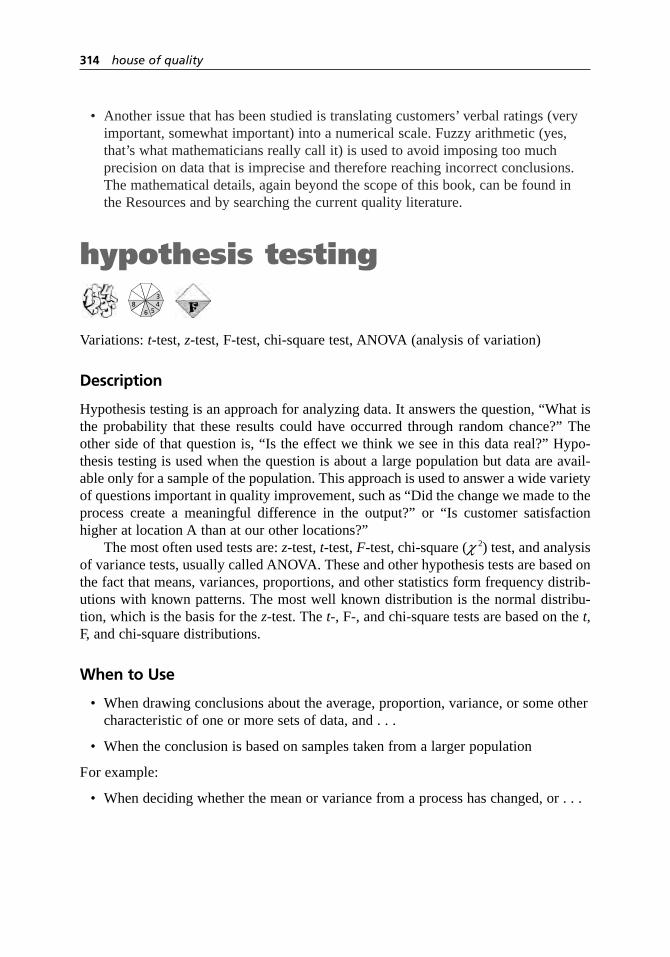
• Another issue that has been studied is translating customers’ verbal ratings (veryimportant, somewhat important) into a numerical scale. Fuzzy arithmetic (yes,that’s what mathematicians really call it) is used to avoid imposing too much precision on data that is imprecise and therefore reaching incorrect conclusions.The mathematical details, again beyond the scope of this book, can be found inthe Resources and by searching the current quality literature.
hypothesis testing
Variations:t-test,z-test, F-test, chi-square test, ANOVA (analysis of variation)
Description
Hypothesis testing is an approach for analyzing data. It answers the question, “What isthe probability that these results could have occurred through random chance?” Theother side of that question is, “Is the effect we think we see in this data real?” Hypo-thesis testing is used when the question is about a large population but data are avail-able only for a sample of the population. This approach is used to answer a wide varietyof questions important in quality improvement, such as “Did the change we made to theprocess create a meaningful difference in the output?” or “Is customer satisfactionhigher at location A than at our other locations?”
The most often used tests are:z-test,t-test,F-test, chi-square (c2) test, and analysisof variance tests, usually called ANOVA. These and other hypothesis tests are based onthe fact that means, variances, proportions, and other statistics form frequency distrib-utions with known patterns. The most well known distribution is the normal distribu-tion, which is the basis for the z-test. The t-, F-, and chi-square tests are based on the t,F, and chi-square distributions.
When to Use
• When drawing conclusions about the average, proportion, variance, or some othercharacteristic of one or more sets of data, and . . .
• When the conclusion is based on samples taken from a larger population
For example:
• When deciding whether the mean or variance from a process has changed, or . . .
6
348
5
314 house of quality

• When deciding whether the means or variances of several data sets are different,or . . .
• When deciding whether two proportions from two different data sets are different,or . . .
• When deciding whether the true proportion, mean, or variance is equal to (orgreater or less than) a certain number
Procedure
The procedure for hypothesis testing has three parts: understanding the problem to besolved and planning the test (steps 1, 2, and 3 below), number-crunching that is usuallydone by computer (steps 4 and 5), and applying the numerical results to the problem(step 6). While computers can handle the math, understanding the concepts underlyinghypothesis testing is crucial to the first and third parts.
If hypothesis testing is new to you, start by reading the definitions of terms in“Considerations.” These definitions explain the concepts of hypothesis testing. Thencome back and read the procedure.
Hypothesis testing cannot be covered in detail in this book. This procedure is anoverview and a quick reference. For more information, consult a statistics reference ora statistician.
1. Determine the decision or conclusion that must be made about your data. Identifythe appropriate test for the decision. The decision about which test to use dependson the purpose of the test and also upon the kind of data. Use Tables 5.7 and 5.8, which summarize frequently used hypothesis tests, or consult a statistician for help.
2. Phrase the null hypothesis and the alternative hypothesis. Determine also if thetest is two-tailed, left-tailed, or right-tailed.
3. Choose the significance level,a.
4. Calculate the test statistic. Computer software is usually used.
5. Determine the P-value for the test statistic. Use a statistical table or a computerprogram for that statistic’s distribution. For a z-test, you can use Table A.1, thearea under the normal curve.
6. Compare the P-value to a for a right- or left-tailed test or to a/2 for a two-tailed test. If the P-value is less, reject the null hypothesis and conclude that the alternate hypothesis is probably true. Otherwise, do not reject the nullhypothesis, and conclude that there is not enough evidence to support thealternate hypothesis.
hypothesis testing 315

Table 5.7 Hypothesis tests for means, variances, and proportions.
Compare mean to a given value lo. H0: m = mo
• When s is known
• When s is unknown and• When sample size n ≥ 30
• When s is unknown and• When sample size n < 30 and• When data distribution is normal
Compare two means to each other. H0: m1 = m2
• When s1 and s2 are known and• When samples are independent
• When s1 and s2 are unknown and• When sample sizes n1 and n2 ≥ 30 and• When samples are independent
• When s s are unknown and t-Test: Formulas are • When sample sizes n1 or n2 < 30 and complicated and depend • When data distribution is normal and on whether s1 = s2. • When samples are independent Use computer software.
• When samples are paired and• When sample sizes n1 and n2 ≥ 30
• When samples are paired and• When sample size n < 30
Compare three or more means to one another. H0: m1 + m2 + m3 = etc.
• When samples are independent and ANOVA: Consult • When data distribution is normal and statistician or statistics • When s1 = s2 = s 3 = etc. reference.
Compare proportion to given value po. H0: p = po
• When samples are independent and• When expected frequencies npo and
(1 – po)n ≥ 5
Compare two proportions to each other. H0: p1 = p2
• When samples are independent and• When n1 and n2 ≥ 30
Compare standard deviation to given value ro. H0: σ = σo
• When data distribution is normal
Compare two standard deviations to each other. H0: σ1 = σ2
• When data distribution is normal
For other purposes or when conditions are not met, consult a statistician or statistical reference.
m = true mean of population
mo = hypothesized valueof mean
–x = mean of sample
σ = true standarddeviation ofpopulation
s = standard deviation of sample
n = sample size
df = degrees of freedom
d = –x1 – –x2–d = mean of d values
sd = standard deviation of d values
n = number of sample pairs
p = true proportion inpopulation
po = hypothesized valueof proportion
p = proportion in sample
n = sample size–p = weighted average
of p1 and p2
σ = true standard deviation of population
σo = hypothesized standard deviation of population
s = standard deviation of sample
n = sample size
df = degrees of freedom
zx
n=
− µσ
o
/
zx
s n=
− µo
/
tx
s nn=
−= −
µo df/
1
zx x
n n=
−
( )+( )1 2
12
1 22
2σ σ/ /
zx x
s n s n=
−
( )+( )1 2
12
1 22
2/ /
316 hypothesis testing
zd
s nd
=/
td
s nn
d
= = −/
df 1
zp
n=
−
−( )π
π πo
o o1 /
zp p
p p n n
pn p n p
n n
=−
−( ) ( )+( )( )=
++
1 2
1 2
1 1 2 2
1
1 1 1/ /
22
χσ
22
2
11=
−( )= −
n sn
o
df
F s sn
== −
12
22
1 1/
df for numeratordf for denominnator = −n2 1

Alternate Procedure
Follow steps 1, 2, 3, and 4 of the previous procedure. Then:
5. Using a statistical table or a computer program, determine the critical value(s) of the test statistic and the rejection region as follows. The z-test is used as anexample. For t, F,or chi-square test, replace the zwith t, F, or c 2.
Type of Test Critical Value(s) Rejection Region
left-tailed test –za z < –za
right-tailed test za z > za
two-tailed test –za /2 and za /2 z < –za /2 or z > za /2
6. Compare the test statistic to the rejection region. If the test statistic lies in the rejection region, reject the null hypothesis and conclude that the alternatehypothesis is probably true. Otherwise, do not reject the null hypothesis, andconclude that there is not enough evidence to support the alternate hypothesis.
hypothesis testing 317
Table 5.8 Chi-square hypothesis tests for categorical data.
Chi-Square Tests• When data are counts (frequencies) within categories, and• When all O ≥ 1, at least 80% of O ≥ 5, and N ≥ 20.These tests are always right-tailed.
Compare several groups’ frequency distributions (proportions) across several categories.H0: The groups do not differ in the distributions (proportions) of categories.Determine whether two variables are independent.H0: Variable 1 and variable 2 are independent.
First, construct contingency table with groups or variable 1 in r rows and with categories or variable 2 in c columns. Then for each cell:
O = actual (observed) value of cell
C = sum of all values in its column
R = sum of all values in its row
N = total of all observed values
E = expected value of cell =
Compare two proportions to each other. H0: p1 = p2
This is a specialized case of the test above, with r = 2 and c = 2.The results are equivalent to a z-test for two proportions.
Goodness of fit: Compare an observed frequency distribution to an expected or theoretical distribution.H0: Observed distribution is the same as expected distribution.
Oi = x2i = observed value in distribution 2
Ei = n2p1i = expected value in distribution 2 if its proportions were the same asdistribution 1
k = number of categories
C RN×
χ 2
2
1 1
=−( )
= −( ) −
∑O E
E
r c
summed over all cells
df (( )
χ 2
2
1
=−( )
= −
∑O E
E
k
i i
ik
df

Example: t-Test
A grocery store receives 50-pound boxes of apples from a supplier. They pay a fixed priceper box. The supplier assures them that the mean weight of each box is indeed 50 pounds.The produce team randomly samples 10 boxes and weighs them. The weights are:
50.1 49.6 50.3 49.9 49.5 49.7 50.0 49.6 49.7 50.2
Are they being cheated?Phrased statistically, the produce team’s question is, “Is the mean weight of apple
boxes we receive less than 50 pounds?” The null hypothesis is, “The mean of the boxes’weights equals 50 pounds” and the alternate hypothesis is, “The mean of the boxes’weightsis less than 50 pounds.” They decide to use a significance level of 5%.
On Table 5.7, they look at tests for comparing a mean to a given value. The true sis unknown, the sample size is less than 30, and they assume the distribution of boxweights is normal. Therefore, they will use a t-test. Because the alternate hypothesisincludes “less than,” they need a left-tailed test.
They enter their data in an online calculator and get the following results:
Sample mean = 49.86 Standard deviation = .28t = –1.583 P = 0.07
Since P is larger than 0.05, they cannot reject the null hypothesis. They do not haveevidence that they are being cheated. Figure 5.99 shows the t distribution, the test sta-tistic t = –1.583, and the area under the curve beyond that value, P = 0.07.
Using the alternate procedure, they could have determined from a t table that fora = 0.05 and df = 9, the critical value of ta = –1.833. With a left-tailed test, the rejec-tion region is any zvalue less than –1.833. The test statistic, –1.583, does not lie in therejection region, so they do not reject the null hypothesis.
Figure 5.100 shows the t distribution, the critical value, the rejection region, and thearea under the curve equal to a= 0.05. Comparing the two graphs shows how the twoprocedures are different ways of looking at the same situation. For this left-tailed situ-ation, whenever the test statistic tis greater than the critical value ta , the area under thecurve to the left of t—the P value—will be larger than a, the area under the curve tothe left of ta .
Example: Chi-Square Test
A catalog clothing retailer wanted to know whether proposed changes to its product linewould be similarly received in different parts of the country. They had randomlyselected 750 customers, described the proposed new products, and asked them to esti-mate their likelihood of buying. They categorized the data by geographical groups andset up a contingency table with five rows and four columns, seen in Figure 5.17 forcontingency table on page 149.
From Table 5.8, the appropriate test is chi-square, to compare several groups’ dis-tributions across several categories. This test is always right-tailed. The null hypothesiscan be stated, “The five regional groups of customers do not differ in the distributions
318 hypothesis testing
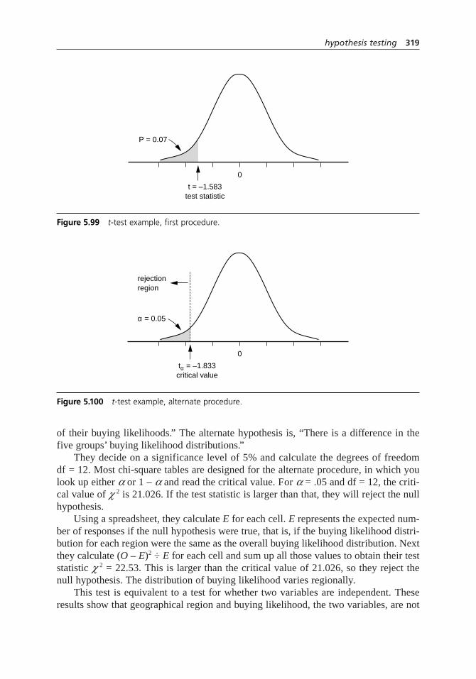
of their buying likelihoods.” The alternate hypothesis is, “There is a difference in thefive groups’ buying likelihood distributions.”
They decide on a significance level of 5% and calculate the degrees of freedomdf = 12. Most chi-square tables are designed for the alternate procedure, in which youlook up either aor 1 – aand read the critical value. For a= .05 and df = 12, the criti-cal value of c2 is 21.026. If the test statistic is larger than that, they will reject the nullhypothesis.
Using a spreadsheet, they calculate Efor each cell. Erepresents the expected num-ber of responses if the null hypothesis were true, that is, if the buying likelihood distri-bution for each region were the same as the overall buying likelihood distribution. Nextthey calculate (O – E)2 ÷ E for each cell and sum up all those values to obtain their teststatistic c 2 = 22.53. This is larger than the critical value of 21.026, so they reject thenull hypothesis. The distribution of buying likelihood varies regionally.
This test is equivalent to a test for whether two variables are independent. Theseresults show that geographical region and buying likelihood, the two variables, are not
hypothesis testing 319
0
α = 0.05
tα = –1.833critical value
rejectionregion
Figure 5.100 t-test example, alternate procedure.
0
P = 0.07
t = –1.583test statistic
Figure 5.99 t-test example, first procedure.

independent. Knowing a customer’s region, one can predict whether that customer ismore likely to buy the new product line.
Another Example: Chi-Square Test
The same retailer planned to change the format and style of their catalog and wanted toknow if the new format would be effective at increasing orders. As a test, they sent200,000 copies of the spring catalog in the new format to randomly selected customers.The other 1,800,000 catalogs were the traditional version. See the contingency tableexample and Figure 5.18 on page 149 for the 2 × 2 contingency table used to organizetheir data.
The chi-square test will compare two proportions to each other. The null hypothe-sis is, “The proportion of customers buying from the test catalog is the same as the pro-portion buying from the standard catalog.”
They use a significance level of 5%. For comparing proportions, there is one degreeof freedom. The critical value of c2 for a = .05, with 1 degree of freedom, is 3.841. Thetest statistic c2 is 278. Therefore, they reject the null hypothesis and conclude thatthe proportion of customers buying from the catalog with the new format is signifi-cantly different than those buying from the old catalog.
Considerations
• Like most subjects, statistics has specialized language that is a shortcut forexpressing frequently used concepts. Here are definitions of terms used in thisprocedure:
Test. One of the statistical tests, such as z, t, F,or chi-square. Knowing which testshould be used is the trickiest part of the procedure. The choice depends uponboth the kind of data and what kind of decision needs to be made about the data.
Hypothesis. A statement expressed as fact, which will be proved or disproved bythe test.
Null hypothesis, Ho. The hypothesis that you want to test, that the data resultedfrom chance. It’s called “null” because often (but not always) the null hypothesissays there is no difference between two sets of data or between a parameter calcu-lated from the data and a given value.
Alternate hypothesis, Ha. The hypothesis that must be true if the null hypothesis isfalse. Usually, the alternate hypothesis implies that the data resulted from a realeffect, not chance.
Statistic. A general term for any calculated number that summarizes some aspectof the sample data. Averages, means, variances, and proportions are all statistics.
Test statistic. The calculated number used to test the null hypothesis. For eachkind of test, there is a formula for the appropriate test statistic. It is chosen so that
320 hypothesis testing

if the null hypothesis is true (the data resulted from chance), the statistic comesfrom a well known distribution, such as the normal distribution for the z-test.
Two-tailed, right-tailed, left-tailed. Describes whether the test is concerned with both sides of the frequency distribution (two-tailed) or just one side. If thealternate hypothesis includes ≠ (not equal to) in its expression, a two-tailed test is needed. If the alternate hypothesis includes < (less than), a left-tailed test is needed. If the alternate hypothesis includes > (greater than), a right-tailed test is needed. Chi-square tests are always right-tailed.
P value. The probability that the test statistic could have occurred by chancewithin the test’s known distribution. The P value equals the area under the curvebeyond the test statistic’s value. (See Figure 5.99, page 319.) The smaller the P value, the more sure we can be that the effect is real and not merely chance.Because the various test distributions are well known, these probabilities can befound in tables or computer programs.
Significance level, a . A number reflecting how sure we must be that the effect isnot due to chance before we will decide it is real. Usually, significance levels of1%, 5%, or 10% (a= 0.01, 0.05, or 0.10) are chosen. For example, if for a one-tailed test a= 0.05, then we will decide the effect is real only if the result couldbe obtained by random chance less than 5% of the time, that is, P < 0.05.
Critical value. The value of the test statistic when its probability is exactly a. Thearea under the curve in the tail beyond the critical value(s) equals a. (See Figure5.100.) For a two-tailed test, there are two critical values, one at each tail, wherethe area beyond each equals a/2. The critical value, written as ±za or ±za/2, isdetermined from a table or computer program.
Rejection region. The region of the frequency distribution where, if the test statis-tic falls there, the null hypothesis will be rejected. For a left-tailed test, these values are in the tail of the distribution less than the critical value. For a right-tailed test, these values are in the tail of the distribution greater than the criticalvalue. For a two-tailed test, the region includes both tails.
Confidence level. 1 – a.
Confidence interval. A range of values that has a high probability of containingthe test statistic if chance is causing the results. The rejection region is the areaoutside the confidence interval. Significance level, confidence level, and confi-dence interval are related in this way: If a= 0.05 and the confidence level is 95%, then values lying within a 95% confidence interval are accepted as possiblyoccurring solely by chance. The null hypothesis cannot be rejected. The definitionof confidence intervals is tricky. 95% confidence interval does not mean that 95%of all values in the distribution lie in that range. Instead, it means that if you havea value that is part of the distribution, 95% of all intervals one might constructbased on sample data will contain that value.
hypothesis testing 321
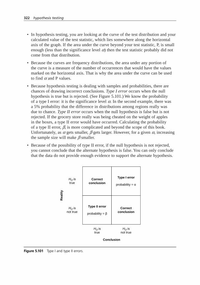
• In hypothesis testing, you are looking at the curve of the test distribution and yourcalculated value of the test statistic, which lies somewhere along the horizontalaxis of the graph. If the area under the curve beyond your test statistic, P, is smallenough (less than the significance level a) then the test statistic probably did notcome from that distribution.
• Because the curves are frequency distributions, the area under any portion of the curve is a measure of the number of occurrences that would have the valuesmarked on the horizontal axis. That is why the area under the curve can be usedto find aand P values.
• Because hypothesis testing is dealing with samples and probabilities, there arechances of drawing incorrect conclusions. Type I error occurs when the nullhypothesis is true but is rejected. (See Figure 5.101.) We know the probability of a type I error: it is the significance level a. In the second example, there was a 5% probability that the difference in distributions among regions really was due to chance. Type II error occurs when the null hypothesis is false but is notrejected. If the grocery store really was being cheated on the weight of apples in the boxes, a type II error would have occurred. Calculating the probability of a type II error,b, is more complicated and beyond the scope of this book.Unfortunately, as a gets smaller,b gets larger. However, for a given a,increasingthe sample size will make bsmaller.
• Because of the possibility of type II error, if the null hypothesis is not rejected,you cannot conclude that the alternate hypothesis is false. You can only concludethat the data do not provide enough evidence to support the alternate hypothesis.
322 hypothesis testing
Correctconclusion
Type I error
probability = α
Correctconclusion
Conclusion
Rea
lity
HO isnot true
HO isnot true
HO istrue
HO istrue
Type II error
probability = β
Figure 5.101 Type I and type II errors.

• Many Web sites have calculators that can compute test statistics and test distribu-tion values. You input the data and the calculator computes the test statistic, prob-abilities, and/or critical intervals. However, it is crucial to know which test to useand how to interpret the results.
• “Paired” samples means two sample sets contain matched pairs of related observations, for example, measurements of the same sample before and aftertreatment or measurements of the same sample by two different instruments. The hypothesis being tested is usually that the means of the two sets of samplesare equal, or in other words, the mean of the differences between the pairs is zero. This test is often called paired comparisons. It is one of the tools used in the Shainin design of experiments methodology. (See design of experiments formore information.) This is not the same tool as paired comparison described onpage 372.
• See contingency table for a tool used to organize data before a chi-square test.
• Other hypothesis tests are available for other conditions. For example, when thedata’s distribution is not normal, a variety of nonparametric tests are available. Itis beyond the scope of this book to summarize all hypothesis tests. If conditionson the tables do not match your data, consult a statistician for help with the appro-priate test.
importance–performanceanalysis
Also called: customer window
Description
The importance–performance analysis studies customers’ perceptions about both theimportance and the performance of products or services. It can help organize discus-sions with customers about their needs and perceptions. It also compares customers’perceptions to those of the organization, looking for differences that might indicateincorrect priorities.
When to Use
• When surveying customer satisfaction, and . . .
23948
importance–performance analysis 323

• When setting priorities for product or service changes based on customer perceptions
Such as:
• When identifying products, services, or their features whose improvement wouldmost increase customer satisfaction, or . . .
• When identifying products, services, or their features which should have changedemphasis: increased, reduced, or eliminated, or . . .
• When comparing customer satisfaction between customer segments or betweenyour organization and a competitor
Procedure
Data Collection
1. Identify the products, services, or features that you want evaluated. Usually, youwill study either the selection of products or services offered or the features ofone particular product or service. From here on, the products, services, or featuresunder study will be called “output.”
2. Develop a survey. Set it up so that each question asks for an output to be ratedtwice on a numerical scale of 1 to 5 or 1 to 7. One rating is how important theoutput is to the customer (importance) and the other rating is the quality of thatoutput (performance). Typical scales are:
Importance Performance
5 = Critical 5 = Greatly exceeds expectations
4 = Important, but not critical 4 = Exceeds expectations
3 = Of some value 3 = Meets expectations; adequate
2 = Nice to have, but not necessary 2 = Needs some improvement
1 = Not needed 1 = Consistently lacking
3. Identify customer groups you want to survey, and select key customers or arepresentative sampling of customers. Administer the survey.
4. Identify key participants in the process of providing the outputs. (We’ll call them“suppliers.”) Administer the same survey to them. Their importance rating shouldreflect how important they think the output is to the customer. Their performancerating should reflect their opinion of the output’s quality.
5. Calculate an average for each answer for the customers and the suppliers, andrecord the ratings on a table like Table 5.9. Alternatively, you may choose torecord ranges of responses (highest to lowest) or, if the number of respondents is small, individual responses.
324 importance–performance analysis
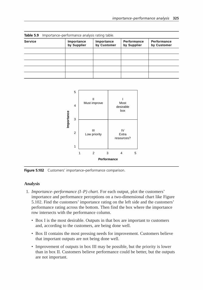
Analysis
1. Importance–performance (I–P) chart. For each output, plot the customers’importance and performance perceptions on a two-dimensional chart like Figure5.102. Find the customers’ importance rating on the left side and the customers’performance rating across the bottom. Then find the box where the importancerow intersects with the performance column.
• Box I is the most desirable. Outputs in that box are important to customers and, according to the customers, are being done well.
• Box II contains the most pressing needs for improvement. Customers believethat important outputs are not being done well.
• Improvement of outputs in box III may be possible, but the priority is lowerthan in box II. Customers believe performance could be better, but the outputsare not important.
importance–performance analysis 325
Table 5.9 Importance–performance analysis rating table.
Service Importance Importance Performance Performanceby Supplier by Customer by Supplier by Customer
IIMust improve
IMost
desirablebox
IVExtra
resources?
Performance
Imp
ort
ance
5
4
3
2
1
1 2 3 4 5
IIILow priority
Figure 5.102 Customers’ importance–performance comparison.
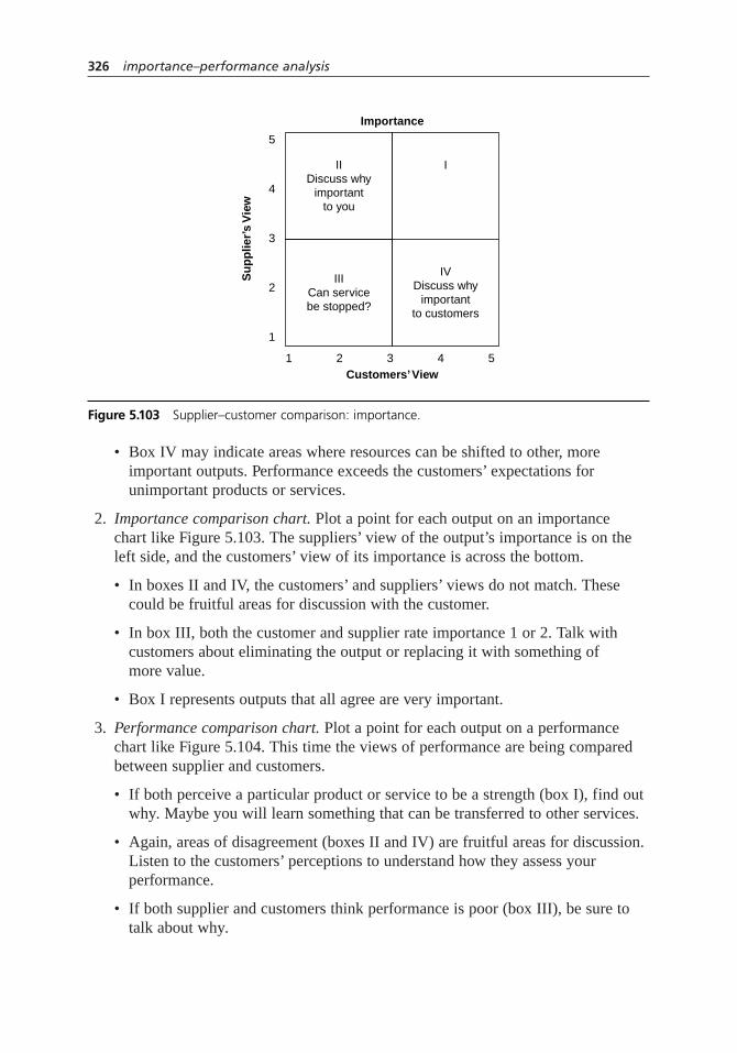
• Box IV may indicate areas where resources can be shifted to other, more important outputs. Performance exceeds the customers’ expectations for unimportant products or services.
2. Importance comparison chart. Plot a point for each output on an importance chart like Figure 5.103. The suppliers’ view of the output’s importance is on theleft side, and the customers’ view of its importance is across the bottom.
• In boxes II and IV, the customers’ and suppliers’ views do not match. Thesecould be fruitful areas for discussion with the customer.
• In box III, both the customer and supplier rate importance 1 or 2. Talk with customers about eliminating the output or replacing it with something of more value.
• Box I represents outputs that all agree are very important.
3. Performance comparison chart. Plot a point for each output on a performancechart like Figure 5.104. This time the views of performance are being comparedbetween supplier and customers.
• If both perceive a particular product or service to be a strength (box I), find outwhy. Maybe you will learn something that can be transferred to other services.
• Again, areas of disagreement (boxes II and IV) are fruitful areas for discussion.Listen to the customers’ perceptions to understand how they assess your performance.
• If both supplier and customers think performance is poor (box III), be sure totalk about why.
326 importance–performance analysis
IIDiscuss why
importantto you
I
IVDiscuss why
importantto customers
Customers’ View
Importance
Su
pp
lier’
s V
iew
5
4
3
2
1
1 2 3 4 5
IIICan servicebe stopped?
Figure 5.103 Supplier–customer comparison: importance.

Example
A restaurant identified six products and services that they wanted to study to improvecustomer satisfaction. An importance–performance questionnaire was given both torestaurant customers and to management and employees. The average ratings are shownin Table 5.10.
I–P Chart
For each service, a code placed on Figure 5.105 shows the customer’s perception ofimportance and performance.
• Breakfast (B) was rated 4.2 in importance and 3.9 in performance, so it goes inbox I. Lunch, dinner, and bar also fall in box I, which is most desirable.
importance–performance analysis 327
IIListen to
customers’view of poorperformance
ICan strengths
be usedelsewhere?
IVListen to the
customers’ viewof good
performance
Customers’ View
Performance
Su
pp
lier’
s V
iew
5
4
3
2
1
1 2 3 4 5
IIIWhat are theproblems?
Figure 5.104 Supplier–customer comparison: performance.
Table 5.10 Importance–performance analysis example: rating table.
Importance Importance Performance PerformanceService by Restaurant by Customers by Restaurant by Customers
Breakfast (B) 4.1 4.2 4.9 3.9
Lunch (L) 4.7 4.9 4.4 4.1
Dinner (D) 4.9 4.9 4.6 4.4
Lounge/bar (Bar) 2.2 3.2 3.1 4.8
Carryout (C) 1.8 1.5 2.8 4.6
Private parties (P) 3.9 4.7 4.1 2.5

• Private parties was rated high (4.7) in importance but low (2.5) in performance. It falls in box II. The restaurant should take action to understand the gap and toimprove performance.
• Carryout (C) was rated low in importance (1.5) although it was high in perfor-mance (4.6), so it falls in box IV. The restaurant might want to divert resourcesfrom this area to improve private party service.
Importance Comparison Chart
A comparison of customers’and restaurant’s importance ratings are shown in Figure 5.106.
• Both the customers and the restaurant consider carryout (C) relatively unimpor-tant. The restaurant could redesign this service to provide greater customer valueor eliminate it and assign those resources to more valued services.
Performance Comparison Chart
A comparison of customers’and restaurant’s performance ratings are shown in Figure 5.107.
• Both the customers and the restaurant rate performance high for breakfast (B),lunch (L), and dinner (D). By discussing these services the restaurant may learnhow to improve private parties (P), where the restaurant rates its performancehigher than the customers do.
• The customers’ high evaluation of the bar is interesting, especially compared tothe medium rating by the restaurant. Maybe the bar employees are missing somewell-deserved positive feedback. The restaurant may be able to learn somethingabout its customers’ expectations by discussing bar and carryout service with
328 importance–performance analysis
IIP
B
L D
C
Bar
III
I
IV
Performance
Imp
ort
ance
5
4
3
2
1
1 2 3 4 5
Figure 5.105 Importance–performance analysis example: customers’ comparison.

them. Customers think both are very well done while the restaurant thinks perfor-mance is just adequate.
• Overall, private parties (P) look like a great opportunity for improvement. Bothcustomers and restaurant rate importance high, but in the eyes of the customers,the restaurant overrates its own performance.
importance–performance analysis 329
II
PB
L
D
C
Bar
III
I
IV
Customers’ View
Importance
Res
tau
ran
t’s V
iew
5
4
3
2
1
1 2 3 4 5
Figure 5.106 Importance–performance analysis example: importance comparison.
II
P
B
LD
C
Bar
III
I
IV
Customers’ View
Performance
Res
tau
ran
t’s V
iew
5
4
3
2
1
1 2 3 4 5
Figure 5.107 Importance–performance analysis example: performance comparison.
Next Page

Considerations
• The comparisons are made to learn from rather than to argue with the customer.The customer’s perception is always “right.” Our job is to learn why the customerfeels that way and then to apply that knowledge toward improvement. Listen tothe voice of the customer.
• Notice that there is no I–P chart for the suppliers’ ratings. This is not an error. The suppliers’ perceptions are important only in comparison to the customers’.
• Useful tools for identifying customers, products and services in step 1 includebrainstorming, NGT, multivoting, requirements table, requirements-and-measurestree, and SIPOC.
• Numerical scales should be 1 to 5 or 1 to 7. Larger ranges make it harder for therespondent to differentiate between ratings; smaller ranges do not provide enoughdifferentiation. Using an odd maximum number is desirable so there is a middlevalue that means “meets expectations.”
• It might be useful to show data as ranges rather than points for averages, especiallyif the raw data shows great variation in responses to single questions. See box plotfor ideas about showing ranges of data. Or, with small surveys, you could ploteach respondent’s answers individually.
• See PGCV index for a way to convert the importance and performance data intonumerical summaries that can be statistically analyzed.
• See surveys for general information about planning, carrying out, and analyzing acustomer survey.
• A perceptual map is a more general tool to study customer perceptions of anycharacteristics. See two-dimensional chartsfor more information.
is–is not matrix
Description
The is–is not matrix guides the search for causes of a problem. By isolating who, what,when, where, and how about an event, it narrows investigation to factors that have animpact and eliminates factors that do not have an impact. By comparing what the prob-lem is with what the problem is not, we can see what is distinctive about this problem,which leads to possible causes.
5
330 importance–performance analysis
Previous Page
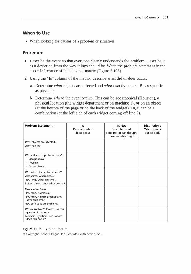
When to Use
• When looking for causes of a problem or situation
Procedure
1. Describe the event so that everyone clearly understands the problem. Describe itas a deviation from the way things should be. Write the problem statement in theupper left corner of the is–is not matrix (Figure 5.108).
2. Using the “Is” column of the matrix, describe what did or does occur.
a. Determine what objects are affected and what exactly occurs. Be as specific as possible.
b. Determine where the event occurs. This can be geographical (Houston), aphysical location (the widget department or on machine 1), or on an object (at the bottom of the page or on the back of the widget). Or, it can be acombination (at the left side of each widget coming off line 2).
is–is not matrix 331
IsDescribe what
does occur
Problem Statement:
What objects are affected?What occurs?
When does the problem occur?When first? When since?How long? What patterns?Before, during, after other events?
Extent of problemHow many problems?How many objects or situations have problems?How serious is the problem?
Who is involved? (Do not use this question to blame.)To whom, by whom, near whom does this occur?
Where does the problem occur? • Geographical • Physical • On an object
Is NotDescribe what
does not occur, though it reasonably might
DistinctionsWhat standsout as odd?
Figure 5.108 Is–is not matrix.© Copyright, Kepner-Tregoe, Inc. Reprinted with permission.

c. Determine when the event occurs. When did it happen first? When since? What patterns of occurrence have you noticed? Date, time, day, and seasoncan all be important to the solution. Also, when the event occurs in relation to other events (before, after, during) can be significant.
d. Determine how many or how much— the extent of the problem. How manyobjects or occurrences had problems? How many problems? How serious are they?
e. Determine who is involved in the event. To whom, by whom, near whom doesit occur? However, this analysis should never be used to assign blame—onlyto determine cause.
3. Use the “Is not” column of the matrix to identify circumstances that could occurbut do not. Again use the what, where, when, how many or much (extent), andwho questions.
4. Study the “Is” and “Is not” columns to identify what is different or unusual about the situations where the problem is compared to where it is not. Whatstands out as being odd? What changes have occurred? Write your observations in the column headed “Distinctions.”
5. For each distinction, ask, “Does this distinction relate to a change we knowabout?” and “How could this distinction (or change) have caused our problem?”Write down all possible causes, including both what caused the problem and how it did so.
6. Test all possible causes by asking, “If this is the cause, does it explain every item in the “Is” and “Is not” columns?” The most likely cause must explain every aspect of the problem.
7. If possible, plan an experiment to verify the cause(s) you have identified.Depending on the cause, either try to duplicate the problem by “turning on”the cause, or try to stop the problem by reversing a change that caused it.
Example
In the ZZ-400 manufacturing unit, a subteam was trying to understand the source of ironin its product. (This example is part of the ZZ-400 improvement story in Chapter 4.)The problem, which occurred periodically, caused product purity to drop below speci-fication. The team had learned from a stratified scatter diagram that the problem onlyoccurred in reactors 2 and 3, not reactor 1. An is–is not matrix (Figure 5.109) broughttogether everything the team learned about the situation from a variety of other analy-sis tools, historical data, and its members’ expert knowledge.
One of the mechanics noticed that the calendar tracking the problem looked justlike the calendar for pump preventive maintenance (PM). So the team marked “Often
332 is–is not matrix
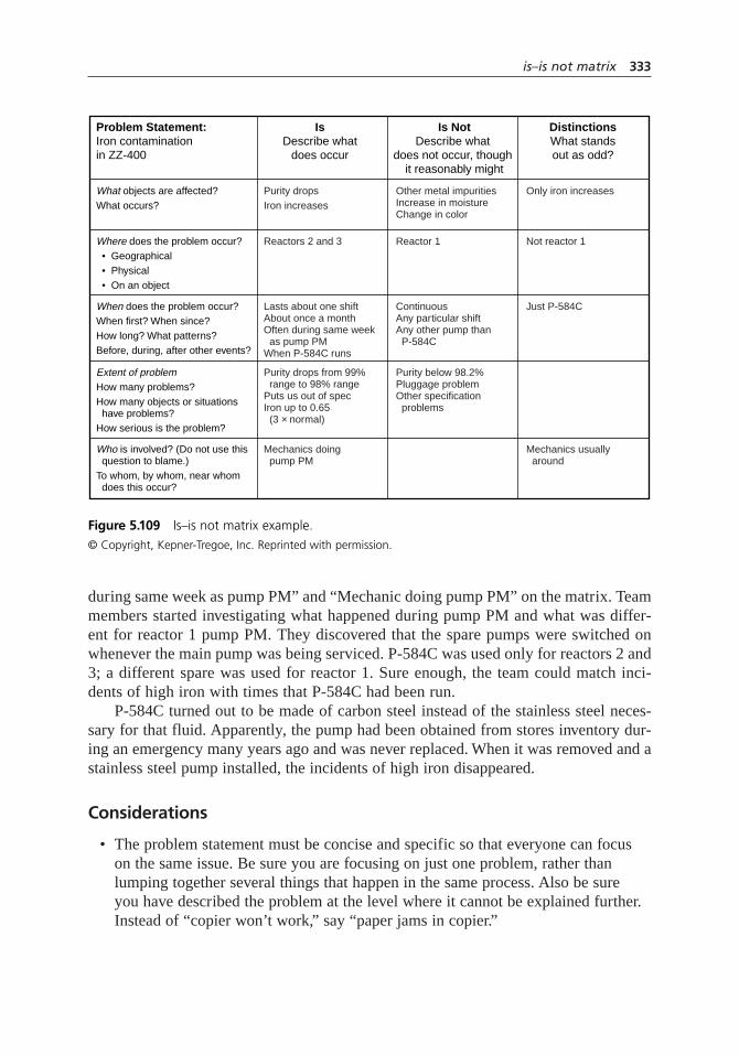
during same week as pump PM” and “Mechanic doing pump PM” on the matrix. Teammembers started investigating what happened during pump PM and what was differ-ent for reactor 1 pump PM. They discovered that the spare pumps were switched onwhenever the main pump was being serviced. P-584C was used only for reactors 2 and3; a different spare was used for reactor 1. Sure enough, the team could match inci-dents of high iron with times that P-584C had been run.
P-584C turned out to be made of carbon steel instead of the stainless steel neces-sary for that fluid. Apparently, the pump had been obtained from stores inventory dur-ing an emergency many years ago and was never replaced. When it was removed and astainless steel pump installed, the incidents of high iron disappeared.
Considerations
• The problem statement must be concise and specific so that everyone can focuson the same issue. Be sure you are focusing on just one problem, rather thanlumping together several things that happen in the same process. Also be sure you have described the problem at the level where it cannot be explained further.Instead of “copier won’t work,” say “paper jams in copier.”
is–is not matrix 333
IsDescribe what
does occur
Problem Statement:Iron contaminationin ZZ-400
What objects are affected?What occurs?
When does the problem occur?When first? When since?How long? What patterns?Before, during, after other events?
Extent of problemHow many problems?How many objects or situations have problems?How serious is the problem?
Who is involved? (Do not use this question to blame.)To whom, by whom, near whom does this occur?
Where does the problem occur? • Geographical • Physical • On an object
Purity dropsIron increases
Lasts about one shiftAbout once a monthOften during same week as pump PMWhen P-584C runs
Purity drops from 99% range to 98% rangePuts us out of specIron up to 0.65 (3 × normal)
Mechanics doing pump PM
Reactors 2 and 3
Only iron increases
Just P-584C
Mechanics usually around
Not reactor 1
Other metal impuritiesIncrease in moistureChange in color
ContinuousAny particular shiftAny other pump than P-584C
Purity below 98.2%Pluggage problemOther specification problems
Reactor 1
Is NotDescribe what
does not occur, though it reasonably might
DistinctionsWhat standsout as odd?
Figure 5.109 Is–is not matrix example.© Copyright, Kepner-Tregoe, Inc. Reprinted with permission.

• The greater the level of detail in describing “Is” and “Is not,” the greater the likelihood of determining the cause.
• Examples of specific descriptions of “Is”: “The report begins normally then stopsin loop three.” “A grinding sound came from the engine, then it slowed to 20 mph.”
• The “Is not” column requires thinking about what could be occurring but is not.For example: “Is not occurring at the Pittsburgh location.” “Is not happening on weekends or at night.” “Is not happening while daily reports print.” “Is notcontinuous.” “Is not happening with B team.”
• If you cannot find a cause, either get more information for the “Is” and “Is not”columns, or work through the matrix again more carefully. Consider involvingmore people that have knowledge of the problem.
list reduction
Description
List reduction is a set of techniques that are used to reduce a brainstormed list of options(such as problems, solutions, measures) to a manageable number.
When to Use
• After brainstorming or some other expansion tool has been used to generate along list of options, and . . .
• When the list must be narrowed down, and . . .
• When the list of options may have duplicate or irrelevant ideas, and . . .
• When the group members together should think through the reasons for eliminating choices to reach consensus
Procedure
Materials needed: flipchart or whiteboard, marking pen
Wide Filter
1. Post the entire list of brainstormed ideas so that everyone can see all items.
2. For each item, ask the question, “Should this item continue to be considered?”Get a vote of yeses and nos. A simple majority of yes responses keeps the item on the list. If an item does not get a majority of yes votes, mark it with brackets.
1
6
2
4
334 is–is not matrix

3. After all items have been evaluated by the wide filter, ask the team members,“Does anyone want to put any of the bracketed items back on the list?” Any itemsthat are mentioned by even one team member are left on the list. Remainingbracketed items are crossed off.
Combining Ideas
4. Label the first idea on the list number 1. Look at the second idea. Ask, “Doesanyone think this is a different idea from number 1?” If one person thinks thesecond idea is different, label the second idea number 2. If all agree that the twoitems really are the same, eliminate one or develop new wording to combine thetwo ideas.
5. Similarly, compare item number 1 to all other items on the list, one at a time.
6. Take item number 2 and compare it to each item below it on the list. Continue towork down the list until all the ideas have been compared pairwise. Every ideashould be either numbered or eliminated.
Criteria Filtering
Conclude with criteria filtering. For the procedure, see this tool’s separate entry.
Example
A committee was formed by a local school board to identify opportunities forschool–community partnerships. Initially, they had brainstormed answers to the ques-tion, “If there were no constraints, how would the ‘ideal’ partnership between school,community, and parents look in the future?” The list of 39 ideas had to be reduced to amanageable number of real possibilities for the next three years.
As the committee went through their list with a wide filter, they realized that manyof the items were results they hoped to see. Those were bracketed, but labeled so theideas could be saved as possible measurements of success. They also bracketed “pool”and “library,” which were goals too big to start with.
When the facilitator asked, “Does anyone want to put any of the bracketed itemsback on the list?” members expressed concern that two “results” had no related initia-tive listed. So they put back reworded ideas, italicized. Someone else believed a com-munity library of some sort might be achievable. The other bracketed ideas werecrossed off.
Next they worked on combining ideas. Numbers 1, 2, and 3 seemed unique.Number 4, “volunteer coordinator,” was combined with “volunteers-in-schools pro-gram.” Many ideas on the list were about communication. By doing comparisons one ata time, according to the procedure, the group reduced six communication items to three.
Several items on the list were features of other items. For example, “lots of commu-nication to community” and “wide open pipeline of information flow” could be part ofany communication plan, Web site, or newsletter. That principle helped them combine
list reduction 335

other ideas. But when they discussed “transportation,” although it was a feature of sev-eral other ideas, several people thought the issue was so critical and difficult that itneeded to be treated separately. It was left on the list.
After methodically combining ideas, the group’s flipchart looked like Figure 5.110.Thirty-eight ideas had been reduced to 18. That was still too many items to tackle, sothe group moved into criteria filtering. They brainstormed and ranked a list of criteriafor choosing three-year projects, shown in Figure 5.111, with 1 most important.
They made an L-shaped matrix (Figure 5.112) with criteria as the column headingsand their remaining 18 options as row labels. Grants might be available for certain pro-grams, so they wrote “Grant?” under the cost criterion. The library proponent proposedseveral feasible options, but cost was unknown without research. When they looked at
336 list reduction
[eliminate drop-out problem] result1 alternative education opportunities
[high college entry ratio] result[more career opportunities here] result[every business participating] result
2 recruit business participation3 “service learning” projects for students
volunteer coordinator[lots of volunteers in schools] result
4 volunteers-in-schools program—with coordinator5 annual community surveys
newsletterslots of communication to communitywide open pipeline of information flowe-mails
6 communication plan7 school–community Web site8 community center equipped and functional
[lots of people using community center] result9 educational opportunities for parents and
community with child care provided[lots of parents using these opportunities] result
[reduced drug problems] result[reduced alcohol problems] result[reduced child abuse problems] result[reduced teen sex problems] result[kids reading on grade level] result
10 [community library]11 active preschool program
data collection for accountability[children enter school with pre-literacy skills] result
12 community recreation district13 after-school kids’ programs14 transportation15 mentoring program16 tutoring program
child care for parents attending trainingcommunitywide learning opportunities
17 community computer labplace for kids to hang out safely[swimming pool]
18 community newsletter publicizing needs, programs, honoring heroes, etc.—frequent publication
Figure 5.110 List reduction example.
Cost within our budget or grant available – 1Community will support enthusiastically – 4Builds community participation with schools – 2Can have noticeable impact on educational results – 3
Figure 5.111 List reduction example: criteria.

the “enthusiasm” criterion, they realized that most of the items would be a hard sell intheir community, which was why their project was needed in the first place.
Each option was evaluated against all four criteria. The ten starred items had eachreceived three or four yeses and became the working list of possible projects. Theseitems were assigned to group members for further research and analysis.
Read the ZZ-400 story in Chapter 4 for another example of list reduction.
Considerations
• Any of the three sections can be used separately. However, because combiningideas and criteria filtering are more complex, they are easiest to use after the listhas been reduced at least once by a wide filter.
list reduction 337
Cost Feasible?Builds
Participation?EducationImpact?
CommunityEnthusiasm?
NoYesNoYes1. Alternative education opportunities
NoNoYesYes2. Recruit business participation
NoYesYesYes3. “Service learning” projects *
NoYesYesYes4. Volunteers-in-schools program *
NoNoNoYes5. Annual community surveys
NoNoYesYes6. Communication plan
NoIf kids do it!YesYes7. School–community Web site *
YesNoYesNo8. Community center equipped and functional
YesYesYesGrant?9. Educational opportunities for parents and community *
YesYesYes???10. Community library *
NoYesYesNo11. Preschool program
NoNoYesNo12. Community recreation district
YesYesYesGrant?13. After-school kids’ programs *
YesWhen enablesother programs
YesGrant?14. Transportation *
NoYesYesYes15. Mentoring program *
NoYesYesYes16. Tutoring program *
NoNoYesNo17. Community computer lab
NoIf kids do it!YesYes18. Community newsletter *
Figure 5.112 List reduction example: criteria filtering.

• During wide filter and combining ideas, the opinion of one person is enough tokeep an item on the list. It is valuable to listen to that person’s reasons for keepingthe item alive.
• In the third part of list reduction, use criteria filtering only to generate a reducedlist or to select one item if the decision is not critical. Paired comparisons couldalso be used if the decision should be based on individual preferences rather thanon criteria. To make final decisions about major issues, such as which project toselect or which solution to implement, use a decision matrix or prioritizationmatrix, which evaluate options more rigorously.
• Another tool to narrow long lists is multivoting. The effective–achievable matrix is a tool that separates ease-of-accomplishment criteria from effectiveness criteriaand visually compares how well various options meet criteria.
matrix diagram
Also called: matrix, matrix chart
Description
The matrix diagram shows the relationship between two, three, or four groups of infor-mation. It also can give information about the relationship, such as its strength, the rolesplayed by various individuals, or measurements. Six differently shaped matrices are pos-sible: L-, T-, Y-, X-, C-, and roof-shaped, depending how many groups must be compared.This is a generic tool that can be adapted for a wide variety of purposes.
When to Use
• When trying to understand how groups of items relate to one another, or . . .
• When communicating to others how groups of items relate to one another
1
6
2109
6 5
2103948
7
1
6
2109
7
338 list reduction
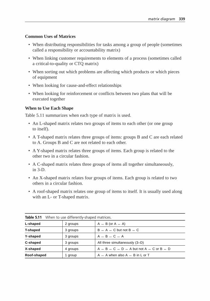
Common Uses of Matrices
• When distributing responsibilities for tasks among a group of people (sometimescalled a responsibility or accountability matrix)
• When linking customer requirements to elements of a process (sometimes called a critical-to-quality or CTQ matrix)
• When sorting out which problems are affecting which products or which pieces of equipment
• When looking for cause-and-effect relationships
• When looking for reinforcement or conflicts between two plans that will be executed together
When to Use Each Shape
Table 5.11 summarizes when each type of matrix is used.
• An L-shaped matrix relates two groups of items to each other (or one group to itself).
• A T-shaped matrix relates three groups of items: groups B and C are each relatedto A. Groups B and C are not related to each other.
• A Y-shaped matrix relates three groups of items. Each group is related to the other two in a circular fashion.
• A C-shaped matrix relates three groups of items all together simultaneously,in 3-D.
• An X-shaped matrix relates four groups of items. Each group is related to twoothers in a circular fashion.
• A roof-shaped matrix relates one group of items to itself. It is usually used alongwith an L- or T-shaped matrix.
matrix diagram 339
Table 5.11 When to use differently-shaped matrices.
L-shaped 2 groups A ↔ B (or A ↔ A)
T-shaped 3 groups B ↔ A ↔ C but not B ↔ C
Y-shaped 3 groups A ↔ B ↔ C ↔ A
C-shaped 3 groups All three simultaneously (3–D)
X-shaped 4 groups A ↔ B ↔ C ↔ D ↔ A but not A ↔ C or B ↔ D
Roof-shaped 1 group A ↔ A when also A ↔ B in L or T
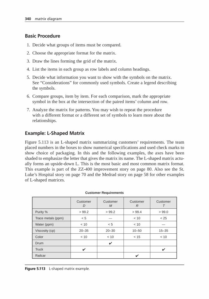
Basic Procedure
1. Decide what groups of items must be compared.
2. Choose the appropriate format for the matrix.
3. Draw the lines forming the grid of the matrix.
4. List the items in each group as row labels and column headings.
5. Decide what information you want to show with the symbols on the matrix. See “Considerations” for commonly used symbols. Create a legend describing the symbols.
6. Compare groups, item by item. For each comparison, mark the appropriatesymbol in the box at the intersection of the paired items’ column and row.
7. Analyze the matrix for patterns. You may wish to repeat the procedure with a different format or a different set of symbols to learn more about therelationships.
Example: L-Shaped Matrix
Figure 5.113 is an L-shaped matrix summarizing customers’ requirements. The teamplaced numbers in the boxes to show numerical specifications and used check marks toshow choice of packaging. In this and the following examples, the axes have beenshaded to emphasize the letter that gives the matrix its name. The L-shaped matrix actu-ally forms an upside-down L. This is the most basic and most common matrix format.This example is part of the ZZ-400 improvement story on page 80. Also see the St.Luke’s Hospital story on page 70 and the Medrad story on page 58 for other examplesof L-shaped matrices.
340 matrix diagram
Purity %
Trace metals (ppm)
Water (ppm)
Viscosity (cp)
Color
Drum
Truck
Railcar
> 99.2
< 5
< 10
20–35
< 10
✔
> 99.2
—
< 5
20–30
< 10
✔
> 99.4
< 10
< 10
10–50
< 15
✔
> 99.0
< 25
—
15–35
< 10
✔
CustomerD
CustomerM
CustomerR
CustomerT
Customer Requirements
Figure 5.113 L-shaped matrix example.

Example: T-Shaped Matrix
Figure 5.114 is an example of a T-shaped matrix relating four product models (group A)to their manufacturing locations (group B) and to their customers (group C).
The matrix can be examined in different ways to focus on different information. Forexample, concentrating on model A, it is produced in large volume at the Texas plantand in small volume at the Alabama plant. Time Inc. is the major customer for modelA, while Arlo Co. buys a small amount. If we choose to focus on the customer rows, welearn that only one customer, Arlo, buys all four models. Zig buys just one. Time makeslarge purchases of A and D, while Lyle is a relatively minor customer.
The ZZ-400 story has on page 88 an example of a T-shaped matrix used within theimprovement process.
Example: Y-Shaped Matrix
Figure 5.115 is a Y-shaped matrix showing the relationships between customer require-ments, internal process metrics, and the departments involved. Symbols show thestrength of the relationships: primary relationships, such as the manufacturing depart-ment’s responsibility for production capacity; secondary relationships, such as the linkbetween product availability and inventory levels; minor relationships, such as the dis-tribution department’s responsibility for order lead time; and no relationship, such asbetween the purchasing department and on-time delivery.
The matrix tells an interesting story about on-time delivery. The distribution depart-ment is assigned primary responsibility for that customer requirement. The two metricsmost strongly related to on-time delivery are inventory levels and order lead time. Ofthe two, distribution has only a weak relationship with order lead time and none withinventory levels. Perhaps the responsibility for on-time delivery needs to be reconsid-ered. Based on the matrix, where would you put responsibility for on-time delivery?
matrix diagram 341
Texas plant
Mississippi plant
Alabama plant
Arkansas plant
Large volume Small volume
Zig Corp.
Arlo Co.
Lyle Co.
Time Inc.
Products—Customers—Manufacturing Locations
Model A Model B Model C Model D
Figure 5.114 T-shaped matrix example.

Example: C-Shaped Matrix
Think of C meaning cube. Because this matrix is three-dimensional, it is difficult todraw and infrequently used. If it is important to compare three groups simultaneously,consider using a three-dimensional model or computer software that can provide a clearvisual image. Figure 5.116 shows one point on a C-shaped matrix relating products,customers, and manufacturing locations. Zig Company’s model B is made at theMississippi plant.
Example: X-Shaped Matrix
Figure 5.117 extends the T-shaped matrix example into an X-shaped matrix by includ-ing the relationships of freight lines with the manufacturing sites they serve and the cus-tomers who use them. Each axis of the matrix is related to the two adjacent ones, butnot to the one across. Thus, the product models are related to the plant sites and to thecustomers, but not to the freight lines.
A lot of information can be contained in an X-shaped matrix. In this one, we canobserve that Red Lines and Zip Inc., which seem to be minor carriers based on volume,are the only carriers that serve Lyle Co. Lyle doesn’t buy much, but it and Arlo are theonly customers for model C. Model D is made at three locations, while the other mod-els are made at two. What other observations can you make?
342 matrix diagram
Customer
requirements
On-time deliv
ery
Product av
ailabilit
y
Departments
involvedOrderPlanning
Purchasing
Distribution
Manufacturing
Internal process metrics
Responsibilities for Performance to Customer Requirements
Carrier performance
Order lead time
Inventory levels
Production capacity
Primary relationship
Secondary relationship
Minor relationship
Figure 5.115 Y-shaped matrix example.

matrix diagram 343
Arlo
TX
A
B
C
D
MSAL AR Lyle Time Zig
Figure 5.116 C-shaped matrix example.
Texas plant
Manufacturing Sites—Products—Customers—Freight Lines
Mississippi plant
Alabama plant
Arkansas plant
Zig Corp.
RedLines
ZipInc.
World-wide
TransSouth
ModelA
ModelB
ModelC
ModelD
Arlo Co.
Lyle Co.
Time Inc.
Small volume
Large volume
Figure 5.117 X-shaped matrix example.

Example: Roof-Shaped Matrix
The roof-shaped matrix is used with an L- or T-shaped matrix to show one group ofitems relating to itself. It is most commonly used with a house of quality, where it formsthe “roof” of the “house.” In Figure 5.118, the customer requirements are related to oneanother. For example, a strong relationship links color and trace metals, while viscosityis unrelated to any of the other requirements.
Considerations
• Sometimes relationship is indicated with just an X or a blank, to indicate yes orno: involved or not, applicable or not, relationship exists or not. But the matrix is more useful with symbols that give more information about the relationshipbetween the items. Two kinds of information are most common.
– How strong the relationship is between the two items
– If the items are a person and an activity, the role the person plays in that activity
• Here are some frequently used sets of symbols.
Strong relationship + Positive relationshipModerate relationship Neutral relationshipWeak or potential relationship – Negative relationshipNo relationship
S Supplier ↑ Item on left influences item at topC Customer ← Item at top influences item on leftD Doer The arrows usually are placed next to O Owner another symbol indicating the strength
of the relationship.
344 matrix diagram
Purity Tracemetals
Water Viscosity Color
Figure 5.118 Roof-shaped matrix example.

Create your own symbols or letters that are instantly recognizable to you or your audience.
• The L-shaped matrix is the most common, but it might not be the most useful for your application. Think about the groups of data you have and their possiblerelationships, review the other formats, then consider whether a different matrixmight give more insight or show your point more clearly.
• Many tools in this book are matrices that are designed for a specific purpose. For example, the decision matrix is designed to relate potential choices to a list of criteria. For these specialized matrices, steps 1, 2, and sometimes 5 of this procedure are already done for you.
• Some tools that have “matrix” in their names are really two-dimensional charts.See two-dimensional matrix for more information about this generic tool.
meeting evaluation
Description
The meeting evaluation helps a team work better together by identifying areas wherethe team could be more effective or efficient.
When to Use
• When a group is meeting together regularly to work on a project, and . . .
• At the end of each meeting, or . . .
• At a midpoint of each meeting, or . . .
• Every several meetings
Procedure
1. Decide on a set of evaluation questions. This can be done by the team, thefacilitator, or by a department or organization for use by all teams. Reproduceblank forms.
2. As a team, decide whether you want to evaluate each meeting (recommended fora new team) or do periodic evaluations.
3. Decide whether you want to do the evaluations at the end of the meeting or earlierin the agenda.
1
6
2103948
57
meeting evaluation 345
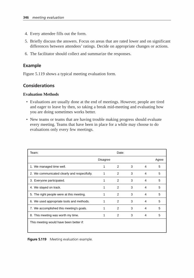
4. Every attendee fills out the form.
5. Briefly discuss the answers. Focus on areas that are rated lower and on significantdifferences between attendees’ ratings. Decide on appropriate changes or actions.
6. The facilitator should collect and summarize the responses.
Example
Figure 5.119 shows a typical meeting evaluation form.
Considerations
Evaluation Methods
• Evaluations are usually done at the end of meetings. However, people are tiredand eager to leave by then, so taking a break mid-meeting and evaluating how you are doing sometimes works better.
• New teams or teams that are having trouble making progress should evaluateevery meeting. Teams that have been in place for a while may choose to do evaluations only every few meetings.
346 meeting evaluation
Team: Date:
Disagree Agree
1. We managed time well. 51 2 3 4
2. We communicated clearly and respectfully. 51 2 3 4
3. Everyone participated. 51 2 3 4
4. We stayed on track. 51 2 3 4
5. The right people were at this meeting. 51 2 3 4
6. We used appropriate tools and methods. 51 2 3 4
7. We accomplished this meeting’s goals. 51 2 3 4
8. This meeting was worth my time. 51 2 3 4
This meeting would have been better if:
Figure 5.119 Meeting evaluation example.
• Some teams find it useful to focus on trouble spots. Choose an aspect of team performance that the team would like to improve, such as staying on topic duringdiscussions. For several meetings, evaluate only that aspect. When performanceimproves, choose another aspect to address.
• Alternatively, different evaluation forms could be used at different meetings toprobe details of communication, time management, teamwork, project manage-ment, using quality principles, and so on.
Evaluation Form
• There are as many evaluation formats and sets of questions as there are teams.Decide what the group is comfortable with and finds useful.
• Questions should address two different areas of performance: team effectivenessand team efficiency. Team effectiveness is about whatyou’re doing, such as identifying significant issues, applying quality improvement principles, andaccomplishing goals. Team efficiency is about how you’re doing that, such ascommunicating well, spending time on the right matters, sharing work, and using appropriate tools.
• Use mainly questions that can be answered on a numerical scale so the evaluation can be quickly filled out by circling numbers. Scales of 1 to 5 or 1 to 6 work best. Yes–no responses are less desirable because they don’t allow for shades of gray.
• Write each question so that the same end of the scale is always preferable. Forexample, do not combine “The meeting started on time” with “We spent too muchtime off topic.” Instead, write “We stayed on topic” so that for both questions,“agree” is the preferred response.
• Another way to write items is with paired descriptors and a numerical scalebetween them. For example:
Stayed on topic 5 4 3 2 1 Went off topic
Managed time well 5 4 3 2 1 Managed time poorly
• Following are typical subjects included on evaluations. Use the ones that yourteam finds most helpful. Different items can be written for each subject. Forexample, “good communication” can mean a variety of things such as “We listened well to each other’s opinions” or “We were open in expressing ourselves.”
Efficiency
Good time management
Good meeting pace
meeting evaluation 347
Having clear purpose(s)
Having and following agenda
Full participation of all attendees
Staying on topic
Good communication between attendees
Courtesy and respect between attendees
Using appropriate quality tools
Team members working between meetings
Staying on schedule with project plan
Effectiveness
Working on the right things
Accomplishing assigned work
Focusing on work processes and system issues
Looking for root causes
Using data
Involving the right people
• Keep your evaluation form short. One way to do this is to use one broad questionfor a subject rather than several detailed ones. Then, if the team rates itself low on that subject, you can use discussion or later evaluations to probe for the source of the problem. For instance, the example starts with, “We managed timewell.” If the team rates time management low, an evaluation with more detaileditems could be used to study the problem, such as: “We started on time.” “Weended on time.” “Our discussions stayed on topic.” “We spent the majority of our time on the most important issues.”
• A few open-ended questions can be useful. Examples:
What made this meeting more useful?
What suggestions do you have for the facilitator or meeting leader?
• See survey for more information about writing questions and rating scales.
• The wide subject of team behavior and performance is critical to quality improve-ment teams but is beyond the scope of this book. Be sure your team gets trainingand guidance in how teams form and interact.
348 meeting evaluation

Mind Map®
Also called: mind flow, brain web
Description
A Mind Map* is a graphic representation of ideas. A main subject is shown in the centerof the page. Main topics radiate from it like spokes of a wheel, and related ideas branchfrom those. The graphic uses images and symbols, lines and arrows, various text fontsand sizes, color, and humor. Think of it as a multidimensional outline, instead of a tradi-tional linear one. Or a brainstorm with form, instead of a page of random ideas.
The viewer can see key ideas and links between ideas at a glance, then look closerat specific sections for details. Also, ideas are expressed in a way that matches the waythe brain works, making understanding and remembering easier. This tool is usefulwhenever clear thinking, learning, or memory are required.
When to Use
1
6
210394
57
Mind Map 349
Figure 5.120 When to use a Mind Map.
* Mind Map is a registered trademark of the Buzan Organisation used with enthusiastic permission.
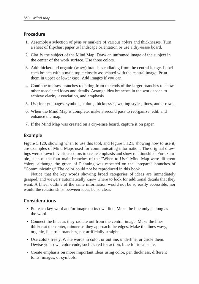
Procedure
1. Assemble a selection of pens or markers of various colors and thicknesses. Turn a sheet of flipchart paper to landscape orientation or use a dry-erase board.
2. Clarify the subject of the Mind Map. Draw an unframed image of the subject inthe center of the work surface. Use three colors.
3. Add thicker and organic (wavy) branches radiating from the central image. Labeleach branch with a main topic closely associated with the central image. Printthem in upper or lower case. Add images if you can.
4. Continue to draw branches radiating from the ends of the larger branches to showother associated ideas and details. Arrange idea branches in the work space toachieve clarity, association, and emphasis.
5. Use freely: images, symbols, colors, thicknesses, writing styles, lines, and arrows.
6. When the Mind Map is complete, make a second pass to reorganize, edit, andenhance the map.
7. If the Mind Map was created on a dry-erase board, capture it on paper.
Example
Figure 5.120, showing when to use this tool, and Figure 5.121, showing how to use it,are examples of Mind Maps used for communicating information. The original draw-ings were drawn in various colors to create emphasis and show relationships. For exam-ple, each of the four main branches of the “When to Use” Mind Map were differentcolors, although the green of Planning was repeated on the “prepare” branches of“Communicating.” The color could not be reproduced in this book.
Notice that the key words showing broad categories of ideas are immediatelygrasped, and viewers automatically know where to look for additional details that theywant. A linear outline of the same information would not be so easily accessible, norwould the relationships between ideas be so clear.
Considerations
• Put each key word and/or image on its own line. Make the line only as long as the word.
• Connect the lines as they radiate out from the central image. Make the linesthicker at the center, thinner as they approach the edges. Make the lines wavy,organic, like true branches, not artificially straight.
• Use colors freely. Write words in color, or outline, underline, or circle them.Devise your own color code, such as red for action, blue for ideal state.
• Create emphasis on more important ideas using color, pen thickness, differentfonts, images, or symbols.
350 Mind Map

• Show associations between ideas using lines, arrows, color codes, and similar fonts.
• The more of these suggestions you use, the better you will tap into the creativeprocesses of your brain.
• Be creative! Find ways of creating Mind Maps that work best for you and the way your brain thinks.
mistake-proofing
Also called: poka-yoke, fail-safing
Description
Mistake-proofing, or its Japanese equivalent poka-yoke (pronounced to rhyme with“mocha okay”), is the use of any automatic device or method that either makes it impos-sible for an error to occur or makes the error immediately obvious once it has occurred.
6
109
7
mistake-proofing 351
Figure 5.121 Mind Map example.Source: Buzan Centres Ltd. Reproduced with permission.

When to Use
• When a process step has been identified where human error can cause mistakes or defects to occur, especially:
• In processes that rely on the worker’s attention, skill, or experience, or . . .
• In a service process, where the customer can make an error which affects the output, or . . .
• At a hand-off step in a process, when output or (for service processes) the customer is transferred to another worker, or . . .
• When a minor error early in the process causes major problems later in theprocess, or . . .
• When the consequences of an error are expensive or dangerous
Procedure
1. Obtain or create a flowchart of the process. Review each step, thinking aboutwhere and when human errors are likely to occur.
2. For each potential error, work back through the process to find its source.
3. For each error, think of potential ways to make it impossible for the error to occur.Consider elimination—eliminating the step that causes the error; replacement—replacing the step with an error-proof one; or facilitation—making the correctaction far easier than the error.
4. If you cannot make it impossible for the error to occur, think of ways to detect the error and minimize its effects. Consider inspection method, setting function,and regulatory function. (See “Considerations” for more information.)
5. Choose the best mistake-proofing method or device for each error. Test, thenimplement it.
Example
The Parisian Experience Restaurant wished to ensure high service quality through mis-take-proofing. They reviewed the deployment chart of the seating process shown inFigure 5.122 and the critical-to-quality analysis shown in Figure 5.45 (page 209). Theyidentified human errors on the part of restaurant staff or customers that could cause ser-vice problems.
The first potential error occurs when customers enter. The maitre d’ might notnotice that a customer was waiting if the maitre d’were escorting other customers to theirtable, checking on table status, or conferring with kitchen staff. The mistake-proofingdevice was an electronic sensor on the entrance door sending a signal to a vibrating
352 mistake-proofing

mistake-proofing 353
Greetdiners
Bustable
Notifymaitre d’
Direct dinersto lounge
Learn tableis ready
Give menus todiners and
describe specials
Calldiners
Enterrestaurant
Go to lounge
Order drinks Take drink order
Make drinks
Hear call
Leave lounge
Take seats
Read menuand decide
Ordermeal
Takeorder
Seat diners
Serve drinks
LoungeBusser
Leave
Diner WaiterMaitre d’
Waitfor next
table
Drinkand wait
Wait forwaiter
Wait forwaiter
Willingto wait
Tableavailable?
N
N
Y
Istable
ready?
Y
Y
Figure 5.122 Restaurant’s deployment chart.

pager on the maitre d’s belt, to ensure that the maitre d’ would always know when some-one entered or left the restaurant. Other mistake-proofing methods replaced the processsteps requiring the maitre d’ to leave the front door to seat customers.
A possible error on the customers’ part was identified at the step when diners arecalled from the lounge when their table is ready. They might miss the call if the loungeis noisy, if they are engrossed in conversation, or if they are hard-of-hearing. Themistake-proofing chosen by the team was to replace the step of the process in which themaitre d’ called the customer’s name over the loudspeaker. Instead, during the greetingstep, the maitre d’ notes a unique visual identifier of one or more members of the party.When the table is ready, the busser notifies the waiter, who comes to the maitre d’ andlearns how to identify the customers. The waiter finds the customers in the lounge,escorts them to their table, gives them menus, and takes additional drink orders. Notonly does this mistake-proofing method eliminate a customer-caused problem, itimproves the restaurant ambiance by eliminating the annoying loudspeaker, keeps themaitre d’ at the front door to greet customers, creates a sense of exceptional servicewhen the waiter magically knows the customers, and eliminates additional waiting timeat the handoff between maitre d’ and waiter.
This example shows mistake-proofing used in a service process, because serviceapplications are less common and less obvious than those for production. Other exam-ples are provided below to clarify the concepts discussed in “Considerations.” Also seethe Medrad story on page 62 and the St. Luke’s Hospital story on page 70 for otherexamples of this tool.
Considerations
• The basic classes of mistake-proofing devices are limit switches, counters, guidepins, alarms, and checklists. See checklist for more information on that tool. Forthe others, consult a book on mistake-proofing. Hundreds of mistake-proofingdevices have been developed for use on assembly lines and other manufacturingprocesses.
• Although developed in production industries, mistake-proofing is equally appli-cable to service processes. For example, mistake-proofing has been creativelyapplied in healthcare, where human error can be fatal.
• When reviewing the process for potential errors, look for handoffs, transfer ofmaterials and information, or data entry. Look for steps where identity matchingis critical or conditions must be just right. In service processes, look for errors inthe task, in the treatment of customers, or in physical aspects of the service envi-ronment. Customers also can cause errors by failing to do things right on theirend: bring appropriate materials, provide the right information, specify theirneeds, follow instructions, provide feedback, or follow up after the transaction.
• A key principle of mistake-proofing is minimizing the time between error andfeedback. If an error is made at the beginning of the process but not detected until
354 mistake-proofing

the end, not only is the output defective, but also the error might have beenrepeated many times, or it might be too late to find the reason for the error. Withmistake-proofing, the error is caught immediately and both its consequences andits cause can be corrected immediately. Shigeo Shingo said, “Errors will not turninto defects if feedback and action take place at the error stage,” and, “Defects areerrors passed downstream.”
• Mistake-proofing methods and devices are categorized in three dimensions:inspection methods, setting functions, and regulatory functions.
Inspection Methods
• Three kinds of inspection are used to provide rapid feedback. They are classifiedbased on who does the operation and where in the process the inspection takesplace relative to the possible error.
• Successive inspection is done at the next step of the process by the next worker,as when the waiter checks the food on the tray before delivering it to the table.
• Self-inspection means a worker checks his own work immediately after doing it.An example is a surgical tray specific to the type of operation, with indentions for each instrument, which the surgeon checks to make sure all instruments wereremoved from the patient. Self-inspection is preferable to successive inspection,although both are after-the-fact.
• Source inspection checks before the process step takes place that conditions arecorrect. Often it is automatic and keeps the process from proceeding until condi-tions are right, such as an interlock that will not allow an oven door to be openedafter self-cleaning until temperature drops to a safe level. Source inspection ispreferable to the other kinds, because it keeps errors from occurring.
• Note that these types of 100% inspection, called “informative inspection,” arevery different from “judgment inspection,” in which bad product is sorted fromgood at the end of the process. Judgment inspection is not an effective approachfor managing or improving quality.
Setting Functions
• Setting functions are the methods by which a process parameter or productattribute is inspected for errors.
• The contact or physical method checks a physical characteristic such as diameteror temperature, often using a sensor. For example, a computer cable’s pin patternensures it can only be plugged in the right way into the right location. The tem-perature interlock on self-cleaning ovens is another example.
• The motion-step or sequencing method checks the process sequence to make suresteps are done in order. Power saws will not operate unless a brake release buttonis pushed concurrently with the trigger.
mistake-proofing 355
• The fixed-value or grouping and counting method counts repetitions or parts or weighs to ensure completeness. The surgical tray discussed above is an example, as well as weighing a complex order before shipping to ensure all partsare enclosed.
• A fourth setting function is sometimes added:information enhancement. Thismakes sure information is available and perceivable when and where required. An example is giving car repair customers pagers so they can be notified whentheir car is ready.
Regulatory Functions
• Regulatory functions are signals that alert the workers that an error has occurred.
• Warning functions are bells, buzzers, lights and other sensory signals. Considerusing color-coding, shapes, symbols, and distinctive sounds. Warning functionsrequire a person to take action to prevent or remedy the error.
• Control functions prevent the process from proceeding until the error is corrected(if the error has already taken place) or conditions are correct (if the inspectionwas a source inspection and the error has not yet occurred). Control functions are more restrictive and more powerful than warning functions. Self-checkout stations in stores will not allow a second item to be scanned until the customerplaces the first item in the bag, which rests on a sensor. The stations also issue a warning and prevent further action if an item is placed in the bag without being scanned.
multi-vari chart
Description
The multi-vari chart shows which of several sources of variation are the greatest con-tributors to total variation and may reveal other patterns in the variation.
When to Use
• When studying sources of variation in a process, and . . .
• When you wish to identify the most important sources of variation, and . . .
• When the output characteristic is a variable measurement
5
356 mistake-proofing

Procedure
1. Identify the possible sources of variation you wish to study. Create a samplingtree showing the combinations of settings for sources A, B, and C.
2. Create a graph with the y-axis representing the output characteristic. Divide the x-axis into a section for each setting of the A source, the top level of the samplingtree. Divide each of those sections into subsections for each setting of the B source.Points plotted in a vertical line show the measurements at different settings ofsource C.
3. Calculate the mean of the values in the first line of points. Mark the value alongthe line with a symbol different from the points. Repeat for each B group in thefi rst section of the chart.
4. Connect the means of the B groups within the first section of the chart.
5. Calculate the mean of all values in the first section. (This will be the average of the means calculated in step 3.) Mark the value with a third symbol at thecenterline of the section.
6. Repeat steps 3, 4, and 5 for each section of the chart representing each setting of source A.
7. Connect the symbols for the overall means for each section.
8. Analyze the chart to identify the greatest source of variation and any patterns of variation.
Example
Figure 5.123 shows a sampling tree set up by Yummy Cookie Company as they try tounderstand why the crispness of their gingersnaps varies so much. Source A is the dayof the week. Source B is different batches within the day. Source C is different cookieswithin the batch. They will sample three cookies per batch, two batches per day, forthree days.
multi-vari chart 357
MonSource A: Day
1Source B: Batch
2 31Source C: Cookie 2 31
2
Tues
1
2 31 2 31
2
Wed
1
2 31 2 31
2
Figure 5.123 Multi-vari sampling tree example.

The results are shown in Figure 5.124. Open squares show the average crispnessof the three cookies in a batch. Large dots show the average crispness of all cookiessampled in a day.
Variation within a batch and from day to day are much smaller than betweenbatches during a day. Interestingly, each day the second batch has higher values than thefi rst. They will plan more studies to identify differences between batches and the reasonfor the consistent pattern.
Considerations
• The data used in this analysis can be historical data or data taken during operationof the process. Select representative data that spans about 80 percent of the outputvariable’s typical range.
• The sources contributing to variation are treated as categorical data, even if theycould be variable, such as location on a machine or time. Examples of categoricalsettings are high–low; short–long; on–off; lots 1, 2, and 3; day 1, 2, and 3;positions 1 through 5.
• At least three samples are recommended at the lowest level of the sampling tree.
• The ideal sampling plan is balanced, with the same number of B settings for eachA setting, and the same number of C settings for each B. However, even if thesampling plan is not balanced, every possible combination must have at least onedata point.
• A nested design means that one source of variation is found within another. Most typical are nested designs with three types of variation:positional, variationfrom one position to another within a unit; cyclical, variation from one unit toanother; and temporal,variation from one time to another. The cookie exampleshows a nested design with variation within a batch, from batch to batch,
358 multi-vari chart
60
70
80
90
100
Batch 1 Batch 2Mon
Cri
spn
ess
Batch 1 Batch 2Tues
Batch 1 Batch 2Wed
Figure 5.124 Multi-vari chart example.
and from day to day. With nested designs, data should be kept in the order it is generated.
• A crossed design means that the three sources of variation can be manipulatedindependently. For example, if Yummy Cookie Company studied two differentsweeteners, two different ovens, and two different baking times, they would use a crossed design. Interactions can be identified with crossed designs. (See designof experiments for more information about interactions.) With crossed designs, thedata can be placed in different order to reveal different patterns.
• The variation sources can be either controllable or noise. In the example, all thesources are controllable. If Yummy decided to study ambient temperature as apossible source of variation, that would be noise: an uncontrollable environmentalfactor. Samples would be taken with room temperature at the high and low endsof its typical range.
• If source C data points are so close that they are hard to distinguish, place the vertical line at a slight angle to separate the points better.
multivoting
Also called: NGT voting, nominal prioritizationVariations: sticking dots, weighted voting, multiple picking-out method (MPM)
Description
Multivoting narrows a large list of possibilities to a smaller list of the top priorities orto a final selection. Multivoting is preferable to straight voting because it allows an itemthat is favored by all, but not the top choice of any, to rise to the top.
When to Use
• After brainstorming or some other expansion tool has been used to generate along list of possibilities, and . . .
• When the list must be narrowed down, and . . .
• When the decision must be made by group judgment
Procedure
Materials needed: flipchart or whiteboard, marking pens, 5 to 10 slips of paper for eachindividual, pen or pencil for each individual.
1
6
2
4
multivoting 359

1. Display the list of options. Combine duplicate items. Affinity diagrams can beuseful to organize large numbers of ideas and eliminate duplication and overlap.List reduction may also be useful.
2. Number (or letter) all items.
3. Decide how many items must be on the final reduced list. Decide also how manychoices each member will vote for. Usually, five choices are allowed. The longerthe original list, the more votes will be allowed, up to 10.
4. Working individually, each member selects the five items (or whatever thenumber of choices allowed) he or she thinks most important. Then each memberranks the choices in order of priority, with the first choice ranking highest. Forexample, if each member has five votes, the top choice would be ranked five, thenext choice four, and so on. Each choice is written on a separate paper, with theranking underlined in the lower right corner.
5. Tally votes. Collect the papers, shuffle them, then record on a flipchart orwhiteboard. The easiest way to record votes is for the scribe to write all theindividual rankings next to each choice. For each item, the rankings are totalednext to the individual rankings.
6. If a decision is clear, stop here. Otherwise, continue with a brief discussion of thevote. The purpose of the discussion is to look at dramatic voting differences, suchas an item that received both 5 and 1 ratings, and avoid errors from incorrectinformation or understandings about the item. The discussion should not becomepressure on anyone to change their vote.
7. Repeat the voting process of steps 4 and 5. If greater decision-making accuracy isrequired, this voting may be done by weighting the relative importance of eachchoice on a scale of 1 to 10, with 10 being most important.
Example
A team had to develop a list of key customers to interview. First, members brainstormeda list of possible names. Since they wanted representation of customers in three differ-ent departments, they divided the list into three groups. Within each group, they usedmultivoting to identify four first-choice interviewees. This example shows the multi-voting for one department.
Fifteen of the brainstormed names were in that department. Each team member wasallowed five votes, giving five points to the top choice, four to the second choice, andso on down to one point for the fifth choice. The votes and tally are shown in Figure5.125. (The names are fictitious, and any resemblance to real individuals is strictly coin-cidental.) Although several of the choices are emerging as agreed favorites, significantdifferences are indicated by the number of choices that have both high and low rank-ings. The team will discuss the options to ensure that everyone has the same informa-tion, then vote again.
360 multivoting

sticking dots
Materials needed: flipchart paper, marking pens, colored round adhesive labels.Follow the basic procedure, except individuals vote by placing round adhesive
labels next to their choices, one dot per choice, and writing the ranking on the dot. Thismethod can be used for voting by a large group that cannot be assembled at one timebut who can all visit the flipchart with the list of options. Another use of this method isto differentiate the choices of different segments of the voting population by givingthem different colored dots.
weighted voting
This variation normally results in fewer ties and allows the members to express the rel-ative strength of their preferences better than 3–2–1 voting. The procedure is the sameas multivoting except step 4:
4. Each member has a number of points equal to either the number of items or 11⁄2 times the number of items. The members distribute these points over theirchoices. For example, one person may assign all points to one choice about whichthat person cares fervently, while another may distribute points equally amongthree top choices.
Example
This time the survey team gives each member 15 points (same as the number of names)to distribute. The results are shown in Figure 5.126.
Notice that Al’s strong opinion about Joan is expressed by giving her almost halfhis votes. Terry and Pete are at the other extreme: they have equally divided their pointsamong their choices. Rhonda and Martha show preferences among their choices.
This voting method separated the choices more than the other method did. Thegroup should next discuss these results.
multivoting 361
1. Buddy Ellis2. Susan Legrand 2 + 5 = 73. Barry Williams4. Lisa Galmon 5 + 2 + 1 = 85. Steve Garland
Votes in rank order: Rhonda’s votes: 4, 9, 12, 2, 8 Martha’s votes: 10, 8, 15, 12, 11 Terry’s votes: 6, 10, 12, 9, 15 Al’s votes: 8, 6, 11, 10, 4 Pete’s votes: 2, 9, 14, 4, 6
6. Albert Stevens 5 + 1 + 4 = 107. Greg Burgess8. Joan McPherson 1 + 4 + 5 = 109. Donald Jordan 4 + 2 + 4 = 1010. Sam Hayes 4 + 5 + 2 = 11
11. Mike Frost 1 + 3 = 412. Luke Dominguez 3 + 3 + 2 = 813. Joe Modjeski14. Paul Moneaux 315. Chad Rusch 1 + 3 = 4
Figure 5.125 Multivoting example.
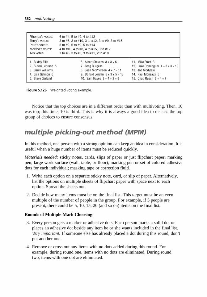
Notice that the top choices are in a different order than with multivoting. Then, 10was top; this time, 10 is third. This is why it is always a good idea to discuss the topgroup of choices to ensure consensus.
multiple picking-out method (MPM)
In this method, one person with a strong opinion can keep an idea in consideration. It isuseful when a huge number of items must be reduced quickly.
Materials needed: sticky notes, cards, slips of paper or just flipchart paper; markingpen; large work surface (wall, table, or floor); marking pen or set of colored adhesivedots for each individual; masking tape or correction fluid.
1. Write each option on a separate sticky note, card, or slip of paper. Alternatively,list the options on multiple sheets of flipchart paper with space next to eachoption. Spread the sheets out.
2. Decide how many items must be on the final list. This target must be an evenmultiple of the number of people in the group. For example, if 5 people arepresent, there could be 5, 10, 15, 20 (and so on) items on the final list.
Rounds of Multiple-Mark Choosing:
3. Every person gets a marker or adhesive dots. Each person marks a solid dot orplaces an adhesive dot beside any item he or she wants included in the final list.Very important: If someone else has already placed a dot during this round, don’tput another one.
4. Remove or cross out any items with no dots added during this round. Forexample, during round one, items with no dots are eliminated. During round two, items with one dot are eliminated.
362 multivoting
1. Buddy Ellis2. Susan Legrand 53. Barry Williams4. Lisa Galmon 65. Steve Garland
Rhonda’s votes: 6 to #4, 5 to #9, 4 to #12Terry’s votes: 3 to #6, 3 to #10, 3 to #12, 3 to #9, 3 to #15Pete’s votes: 5 to #2, 5 to #9, 5 to #14Martha’s votes: 4 to #10, 4 to #8, 4 to #15, 3 to #12Al’s votes: 7 to #8, 3 to #6, 3 to #11, 2 to #10
6. Albert Stevens 3 + 3 = 67. Greg Burgess8. Joan McPherson 4 + 7 = 119. Donald Jordan 5 + 3 + 5 = 1310. Sam Hayes 3 + 4 + 2 = 9
11. Mike Frost 312. Luke Dominguez 4 + 3 + 3 = 1013. Joe Modjeski14. Paul Moneaux 515. Chad Rusch 3 + 4 = 7
Figure 5.126 Weighted voting example.

5. If any remaining items were marked twice (that is, have more dots than the roundnumber), correct that with masking tape or correction fluid.
6. Count the number of items remaining. If it is less than 1.3 times the target numberfor the final list, go to step 7. Otherwise, return to step 3 for another round.
Rounds of Single-Mark Choosing:
7. Go around the room, with each person choosing one item to include in the finallist. Continue until the target number of items has been chosen.
8. Review all the items that have been eliminated. If any team member thinks aneliminated item is needed, the team discusses it and by consensus can add it backto the list. Do this only for an agreed-upon number of items, typically one or two.
Considerations
• Multivoting does not guarantee consensus. Consensus is a decision that all individuals can live with and support. Discussion after multivoting will indicatewhether the team has reached consensus. All individuals should have the oppor-tunity to voice their opinions and arguments for or against an option. Consensus is reached when everyone is willing to actively support the decision, even thoughthe option may not be that individual’s preference.
• Multivoting incorporates several principles that have been shown to be importantin arriving at accurate group decisions. First, independent voting takes placebefore discussion. The pattern is “judgment–talk–judgment.” Second, voting by ranking rather than “majority rules” leads to more accurate decisions.
• Discussion after each round of multivoting can be useful in arriving at the best choice and in reaching consensus. Are the results surprising? Are there objections? Does the group want to discuss pros and cons of the top choices and vote again?
• It can be valuable to begin a multivoting session by brainstorming and discussinga list of criteria that are important to the current decision.
• To determine the most critical problem or the most significant root cause,multivoting should not be used in place of good data collection and analysis.
• To make final decisions about major issues, such as which project to select orwhich solution to implement, use the decision matrix or prioritization matrix,which evaluate options more rigorously. Paired comparisons can be used for adecision based on individual preferences rather than criteria.
• Another tool for narrowing long lists is list reduction. The effective–achievable matrix is a tool that separates ease-of-accomplishment criteria from effectiveness criteria and visually compares how well various options meet criteria.
multivoting 363

nominal group technique(NGT)
Description
Nominal group technique (NGT) is a structured method for group brainstorming thatencourages contributions from everyone.
When to Use
• When some group members are much more vocal than others, or . . .
• When some group members think better in silence, or . . .
• When there is concern about some members not participating, or . . .
• When the group does not easily generate quantities of ideas, or . . .
• When all or some group members are new to the team, or . . .
• When the issue is controversial or there is heated conflict
Procedure
Materials needed: paper and pen or pencil for each individual, flipchart, markingpens, tape.
1. State the subject of the brainstorming. Clarify the statement as needed untileveryone understands it.
2. Each team member silently thinks of and writes down as many ideas as possible,for a set period of time (5 to 10 minutes).
3. Each member in turn states aloud one idea. Facilitator records it on the flipchart.
• No discussion is allowed, not even questions for clarification.
• Ideas given do not need to be from the team member’s written list. Indeed, astime goes on, many ideas will not be.
• A member may “pass” his or her turn, and may then add an idea on a subsequent turn.
Continue around the group until all members pass or for an agreed-upon length of time.
1
6
2109
45
364 nominal group technique (NGT)

4. Discuss each idea in turn. Wording may be changed only when the idea’soriginator agrees. Ideas may be stricken from the list only by unanimousagreement. Discussion may clarify meaning, explain logic or analysis, raise and answer questions, or state agreement or disagreement.
5. Prioritize the ideas using multivoting or list reduction.
Considerations
• NGT usually concludes with a prioritization process. However, using the brain-storming process alone is valuable, so this book separates the two processes.
• Discussion should be equally balanced among all ideas. The facilitator should not allow discussion to turn into argument. The primary purpose of the discussionis clarification. It is not to resolve differences of opinion.
• Keep all ideas visible. When ideas overflow to additional flipchart pages, post previous pages around the room so all ideas are still visible to everyone.
• See brainstorming for other suggestions to use with this tool.
normal probability plot
Variations: probability plot, quantile–quantile (Q–Q) plot
Description
This graph is used to check whether a set of data takes the form of a normal distribu-tion. It is a scatter diagram of the actual data versus a number that represents the normaldistribution. If the data are from a normal distribution, the plot will form a straight line.In general, probability plots can be used to determine whether the data form any knowndistribution, such as binomial or Poisson.
When to Use
• When a tool or method you wish to use requires the data to be from a normaldistribution, and . . .
• For best results, when you have 50 or more data points
For example:
• To determine whether a chart of individuals is appropriate for the data
3948
57
normal probability plot 365

• When choosing subgroup size for an–X and R chart, to determine whether that subgroup size is large enough that the subgroup averages form a normal distribution
• Before calculating process capability index Cp or Cpk
• Before choosing a hypothesis test that is valid only for normal distributions
Procedure
Usually, you will simply enter your data into computer software, which will generatethe plot. Calculation details are provided here so that you can understand what the pro-gram is doing and how to interpret it, and so you can do simple plots yourself.
1. Sequence the data from the lowest to the highest value. Number them from one to n.
2. Calculate the quantile number for each value. If iis the sequence number:
3. Find the value of the normal distribution that matches each quantile number. On the table of area under the normal curve (Table A.1), locate the quantilenumber in the body of the table. Then read the z value from the left and top edges of the table.
4. Plot pairs of values as in a scatter diagram: each data value with its matching zvalue. Put the data value on the y-axis and the normal distribution’s z on the x-axis. You will plot n pairs of numbers.
5. Draw a line that fits most of the data. If your data were a perfect normal distri-bution, the dots would form a straight line. Examine the shape of the dots com-pared to the line you have drawn to judge how well your data compare to thenormal distribution. See “Considerations” for typical shapes. A correlationcoefficient may be calculated to determine how well the line fits the plot.
Example
This example uses only 20 values to make the calculations easier to follow. Table 5.12has the 20 values in numerical order, in the column labeled “process data.” They havebeen numbered from 1 to 20.
The next step is calculating the quantile numbers. For the first value, 9, the calcu-lation is
Quantile number=−
=−
= =i
n
0 5 1 0 5
20
0 5
200 025
. . ..
Quantile number=−i
n
0 5.
366 normal probability plot

Similarly, for the second value, the calculation is
And you can see the pattern now: the third quantile number is 2.5 ÷ 20, the fourthis 3.5 ÷ 20, and so on to the last one, 19.5 ÷ 20.
Now look up the z values on the normal curve table. In this table, the first two dig-its for z are at the left edge of the row, and the last digit is at the top of the column. Thefi rst quantile number, 0.025, is in the row starting with –1.9, in the column headed by0.06. So z = –1.96. Each quantile number is looked up in the same way.
Some of the quantile numbers are between two values on the table, so they need tobe interpolated. For example, the fourth quantile number, 0.175, is about halfwaybetween 0.1736 and 0.1762. The z for 0.1736 is –0.94, and the z for 0.1762 is –0.93.Halfway between those numbers is z = –0.935.
Now plot pairs of process data and z values. Figure 5.127 shows the result, with thebest straight line drawn through the points. Notice that the points are above the line at
Quantile number= =1 5
200 075
..
normal probability plot 367
Table 5.12 Normal probability plot example calculations.
Process Quantile zdata number
1 9 .025 –1.960
2 11 .075 –1.440
3 11 .125 –1.150
4 13 .175 –0.935
5 14 .225 –0.755
6 15 .275 –0.595
7 16 .325 –0.455
8 17 .275 –0.320
9 19 .425 –0.190
10 21 .475 –0.065
11 23 .525 0.065
12 25 .575 0.190
13 26 .625 0.320
14 26 .675 0.455
15 28 .725 0.595
16 32 .775 0.755
17 36 .825 0.935
18 37 .875 1.150
19 43 .925 1.440
20 62 .975 1.960
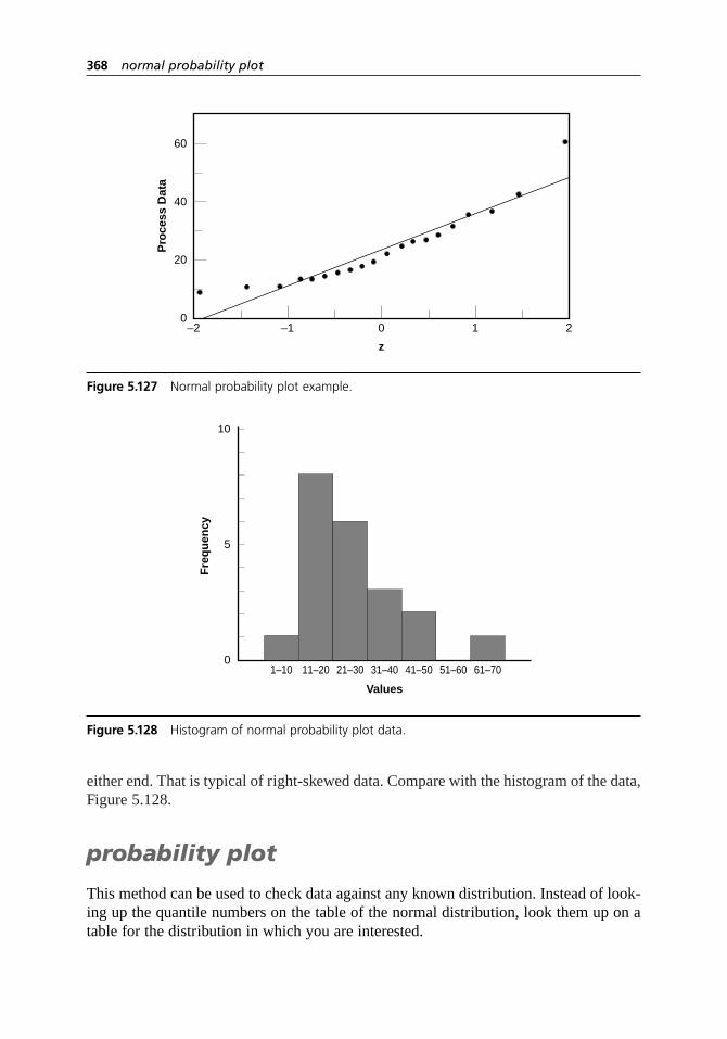
either end. That is typical of right-skewed data. Compare with the histogram of the data,Figure 5.128.
probability plot
This method can be used to check data against any known distribution. Instead of look-ing up the quantile numbers on the table of the normal distribution, look them up on atable for the distribution in which you are interested.
368 normal probability plot
0
20
40
60
–2 –1 0 1 2
Pro
cess
Dat
a
z
Figure 5.127 Normal probability plot example.
5
10
01–10 11–20 21–30 31–40
Values
41–50 51–60 61–70
Fre
qu
ency
Figure 5.128 Histogram of normal probability plot data.

quantile–quantile plot
Similarly, any two sets of data can be compared to see if they come from the same dis-tribution. Calculate quantile numbers for each distribution. Plot one on the x-axis andthe other on the y–axis. Draw a 45-degree reference line. If the two sets of data comefrom the same distribution, points will lie close to the reference line.
Considerations
• Normal probability plots can be drawn in a variety of ways. In addition to the procedure given here, the normal distribution can be represented by probabilitiesor percentiles. The actual data may be standardized or placed on the x-axis.
• In this format, if the data does form a straight line, the mean of its normal distrib-ution is the y-axis intercept, and the standard deviation is the slope of the line.
• Figure 5.129 shows how some common differences from the normal distributionlook on a normal probability plot.
Short tails. If tails are shorter than normal, the shape of the points will curveabove the line at the left and below the line at the right—an S (for short) ifyou tip your head to the right. This means the data is clustered closer to themean than a typical normal distribution.
Long tails. If tails are longer than normal, the shape of the points will curvebelow the line at the left and above the line on the right—a backward S. Thismeans there are more outlying data points than in a typical normal distribu-tion. A bimodal distribution can also take this shape.
Right-skewed. A right-skewed distribution has a short tail on the left and a long tail on the right. The shape of the probability plot forms an upwardcurve, or U, compared to the line. A distribution truncated on the left also willshow this shape.
Left-skewed. A left-skewed distribution has a long tail on the left and a short tailon the right. The shape of the points forms a downward curve compared to theline. A distribution truncated on the right also will show this shape.
normal probability plot 369
Short tails Long tails Right-skewed Left-skewed
Figure 5.129 Shapes of normal probability plots.

• If a normal probability plot is drawn with the axes reversed, the distortions also will be reversed. For example, a left-skewed distribution will form a U-shaped curve.
• Remember that your process should be in control to make valid judgments aboutits shape.
• While drawing a histogram can be a first step toward understanding your data’sdistribution, histograms are not good for determining whether the data form a particular distribution. The eye is not good at judging curves, and other distri-butions form curves that are similar. Also, histograms of small data sets may notlook normal when actually they are. Normal probability plots are better ways toassess the data.
• Another way to determine whether data fits a distribution is using goodness-of-fit tests, such as the Shapiro-Wilk W test, the Kolmogorov-Smirnov test, or the Lilliefors test. The details of such tests, done by most statistical software, arebeyond the scope of this book. Consult a statistician for guidance in choosing thecorrect test and interpreting the results. See hypothesis testing to understand thegeneral principles behind these tests and the results they generate.
• Your best choice is to have the statistical software generate a normal probabilityplot and perform a goodness-of-fit test. This combination will give you visualunderstanding of your data as well as statistical criteria for deciding whether it isor is not normal.
operational definition
Description
Operational definitions are usable definitions of important terms and procedures inmeasurement or data collection. They remove ambiguity from words or operations thatcan be interpreted in different ways. The purpose of operational definitions is obtainingresults that are consistent and meaningful.
1
6
2103948
57
6
23948
57
370 normal probability plot

When to Use
• When developing and using any form of data collection, or . . .
• When establishing metrics to monitor performance, or . . .
• When establishing customer requirements or product specifications
Procedure
1. Ask:
• What characteristic will we measure?
• How will we measure this characteristic?
2. Mentally or actually run through the data collection procedure. Note opportunitiesfor differences in equipment, procedures, criteria, and the data collectors them-selves. Identify all potential variation and decide how each will be handled. Anoperational definition must be defined for each potential source of variation.
3. Consider three elements for each operational definition:
a. How will data be sampled?
b. What procedure or test will be followed?
c. What are the criteria to be satisfied?
4. Discuss the definitions until consensus is reached.
5. If possible, conduct a trial run, with all data collectors observing the same data.Compare the data collected and resolve any differences. Repeat the trial run untilvariation is minimized.
Example
An organization had a goal of increasing customer satisfaction by 25 percent. It neededoperational definitions for measuring this goal. Discussion led to these definitions:
We will survey a random sample of 10 percent of our customer base each quar-ter, using questionnaire B. The customer satisfaction rating will consist of theoverall average of all sampled customers’ scores and the standard deviation ofthe responses (formulas attached). Our goal is to increase the average by 25percent while maintaining or reducing the standard deviation.
A team member pointed out that of the three elements in step 3, the test (3b) wasdefined by the survey and the criteria (3c) were defined by the stated method of calculation,
operational definition 371

but the method of sampling still was not defined. The team added the following opera-tional definition for random sample of 10 percent:
Say we have n customers. With a random-number generator we will generate aset of n/10 random numbers between one and n. Using the numbered customerdatabase, we will choose the customers whose numbers correspond to thoserandom numbers.
Also read the ZZ-400 story on page 79 for an example of using the concept of oper-ational definition to think about a group’s goals.
Considerations
• Operational definitions are easily overlooked because we all make assumptionswithout realizing it.
• Here’s another way to understand the term “operational definition”:
Operational: Do we all agree what to do?
Definition: Do we all agree what every word means?
paired comparison
Variations: forced choice, numerical prioritization
Description
Paired comparison narrows a list of options to the most popular choice. It combines theindividual preferences of all team members to arrive at a group decision. Normally,evaluation criteria are not explicitly considered when this tool is used. (Paired compar-ison is also the name of a statistical tool. See hypothesis testing for a description of thisother “paired comparison,” and see design of experimentsfor a description of theShainin methodology, which uses this tool.)
When to Use
• When a list of options must be narrowed to one choice, and . . .
• After the list of options has been reduced to a manageable number by list reduction or some other wide screening tool, and . . .
• When individual preferences are more important than criteria or an objectively“correct” decision
1
6
2
4
372 operational definition

Procedure
Materials needed: flipchart or whiteboard, marking pen.
1. List options as row labels down the left side of an L-shaped matrix. Number or letter each option sequentially. For column headings, write all pairs ofcomparisons. To do this methodically, pair each option with all succeedingoptions. If there are noptions, there will be n× (n–1)/2 pairs.
2. Start with the first column, option A versus option B. Each group member votes for one of these two options. Votes are tallied in the two rows opposite these two options.
3. Continue to vote one column at a time until all pairs have been voted upon.
4. Add across each row to obtain the total votes for each option. (Each column’s sumshould equal the number of people voting.) If the top vote-getters are close, checkto be sure the comparison of those options matches the results of the total vote.
Example
A keynote speaker must be selected for a conference. The seven-member program com-mittee whittled a long brainstormed list of names down to four possibilities. Supposewe could see inside their minds and know that the committee members ranked the fourchoices like this, in order from most to least preferred:
Member 1: C B A D
Member 2: B D C A
Member 3: B C A D
Member 4: A D C B
Member 5: B A D C
Member 6: C D B A
Member 7: C B D A
After they vote, the paired comparison matrix shown in Figure 5.130 is the result.
paired comparison 373
A. Dave Barry
A vs. B A vs. C A vs. D B vs. C
— — —
B vs. D
— — —
C vs. D
— — —
— — —
Total
7
14
13
8
B. Sally Ride
C. Steven Spielberg
D. Ralph Nader
Figure 5.130 Paired comparison example.

Sally Ride has the most total votes, so she wins. Or does she? Ride and Spielbergwere very close in total votes, and Spielberg was preferred in a direct comparison of thetwo. Strong preferences for Ride versus the other two options skewed the numbers.(Members’ individual preferences are given above so you can verify for yourself thatthose opinions lead to this result.) The committee decided Spielberg was the preferredchoice. Now, does he have an opening in his schedule?
forced choice
This tool also compares each option to every other option, but split opinions are notrecorded, only the majority vote.
Procedure
1. List all options so they are visible to everyone.
2. Compare the first option to the second. Put a tally mark beside the better option. Compare the first to the third, the fourth, and so on, until the first optionhas been compared to all others.
3. Compare the second option to the third, the fourth, and so on.
4. Continue to compare each option to every one below it on the list, tallying which is preferred.
5. The option with the most tally marks is preferred.
Example
With the committee members privately ranking the choices as in the first example, theresult for forced choice is shown in Figure 5.131.
numerical prioritization
This method allows everyone to make choices silently before individual results arecombined.
374 paired comparison
Dave Barry
Sally Ride
Steven Spielberg
Ralph Nader
Figure 5.131 Forced choice example.

Procedure
Materials needed: flipchart, marking pen, paper and pen or pencil for each individual.
1. List all the options so they are visible to everyone. Code them with numbers or letters.
2. Each individual draws columns on a sheet of paper, one fewer columns than thereare options. In the first column, choice A is paired with every other choice. In thesecond column, choice B is paired with every other choice following B, and soon, as shown in Figure 5.132.
3. Each individual starts with the first column, comparing the first option with every other option and circling his or her preference. In the second column, thesecond option is compared with all later options, and so on.
4. Each person counts how many times each number is circled and writes it next tothat option’s code.
5. When everyone has finished, combine the results. All individual counts for each option are added to obtain a group total. This can be done in two ways:Go around the room, have people call out their numbers, and tally them on aflipchart. Or turn in the papers and have one person tally results. The option withthe largest total is the most popular. As in paired comparison, if two options areclose, check that a direct comparison of those two matches the final result.
Example
The chart filled out by member 1 is shown in Figure 5.132. Member 1’s numbers wouldbe added with the other members’ to arrive at the group’s total.
Considerations
• This tool does not explicitly use decision criteria. However, criteria are likely to be in people’s minds, so a discussion of appropriate criteria before voting may beuseful. Sometimes this tool is adapted to evaluate criteria by doing multiple
paired comparison 375
B
C
D
A = 1 B = 2 C = 3 D = 0
A
A
A
C
D
B
B DC
Figure 5.132 Numerical prioritization example.

rounds of voting, each time considering just one criterion. This is not recom-mended. If criteria are important, numerous, or not simple, choose a decision-making tool that explicitly evaluates and weights criteria. See decision matrix,prioritization matrix, effective–achievable matrix, or criteria filtering.
• The number of comparisons increases rapidly with the number of options. Sixoptions require 15 comparisons; nine options require 36. Reduce the list first!
• Numerical prioritization is done silently and individually, so it is useful whengroup members want to reflect upon their choices or if some members tend topressure others vocally.
Pareto chart
Also called: Pareto diagram, Pareto analysisVariations: weighted Pareto chart, comparative Pareto charts
Description
A Pareto chart is a bar graph. The length of the bars represent frequency or cost (moneyor time), and they are arranged in order from longest on the left to shortest on the right.Therefore, the chart visually shows which situations are more significant.
When to Use
• When analyzing data about the frequency of problems or causes in a process,and . . .
• When there are many problems or causes and you want to focus on the most significant, or . . .
• When analyzing broad causes to their specific components, or . . .
• When communicating with others about your data
Procedure
1. Decide what categories you will use to group items.
23948
5
5
376 paired comparison
2. Decide what measurement is appropriate. Common measurements are frequency,quantity, cost, or time.
3. Decide what period of time the chart will include.
4. Collect the data, recording the category each time. Or assemble data that already exists.
5. Subtotal the measurements for each category.
6. Determine the appropriate scale for the measurements you have collected. Themaximum value will be the largest subtotal from step 5. If you will do optionalsteps 8 and 9, the maximum value will be the sum of all subtotals from step 5.Mark the scale on the left side of the chart.
7. Construct and label bars for each category. Place the tallest at far left, then thenext tallest, and so on. If there are many categories with small measurements,they can be grouped as “other.”
Steps 8 and 9 are optional but are useful for analysis and communication.
8. Calculate the percentage for each category: the subtotal for that category divided by the total for all categories. Draw a right vertical axis and label it with percentages. Be sure the two scales match. For example, the left measure-ment that corresponds to one-half should be exactly opposite 50 percent on theright scale.
9. Calculate and draw cumulative sums: Add the subtotals for the first and secondcategories, and place a dot above the second bar indicating that sum. To that sum add the subtotal for the third category, and place a dot above the third bar for that new sum. Continue the process for all the bars. Connect the dots,starting at the top of the first bar. The last dot should reach 100 percent on theright scale.
Example
Figures 5.133 and 5.134 are nested Pareto charts. Figure 5.133 shows how many cus-tomer complaints were received in each of five categories. Figure 5.134 takes the largestcategory, “documents,” from Figure 5.133, breaks it down into six categories of docu-ment-related complaints, and shows cumulative values.
If all complaints cause equal distress to the customer, working on eliminating doc-ument-related complaints would have the most impact, and of those, working on qual-ity certificates should be most fruitful.
Also see the Medrad story on page 56 for an example of Pareto analysis used toidentify an improvement project.
Pareto chart 377

378 Pareto chart
0
10
20
30
40
0%
100%
80%
60%
40%
20%
Qualitycertificate
error
Invoiceerror
Qualitycertificatemissing
Packing listerror
Types of Document ComplaintsSecond Quarter 2005
Wrongquantity
Other
Figure 5.134 Pareto chart with cumulative line.
0
10
20
30
40
Documents Productquality
Packaging
Types of Customer ComplaintsSecond Quarter 2005
Delivery Other
Figure 5.133 Pareto chart example.
weighted Pareto chart
Description
In a weighted Pareto chart, each category is assigned a weight, which lengthens orshortens the bars. This reflects the relative importance or cost of each category.
When to Use
• When a Pareto analysis is appropriate, and . . .
• When the categories do not result in equal cost or pain to the organization, or . . .
• When there are more opportunities for one category to occur than another
Procedure
1. Decide what categories you will use to group items.
2. Decide what measurement is appropriate. Common measurements are frequency,quantity, cost, or time. Assign weights to each category to reflect their relativeimportance, cost, or opportunity for occurrence.
3. Decide what period of time the chart will include.
4. Collect the data, recording the category each time. Or assemble data that already exists.
5. Subtotal the measurements for each category. Multiply each subtotal by thatcategory’s weight.
6. Determine the appropriate scale for the measurements you have collected. The maximum on the scale will be the largest number you calculated in step 5. If you will do the optional steps, the maximum will be the sum of all the resultsfrom step 5. Mark the scale on the left side of the chart.
7. Construct and label bars for each category. Place the tallest at far left, then thenext tallest, and so on. If there are many categories with small measurements,they can be grouped as “other.”
Continue with optional steps 8 and 9 as in the basic procedure, using the calculatednumbers from step 5 (subtotal × weight) to calculate percentages and cumulative sums.
Example
Document errors are a minor hassle for the customer, but product quality problems cancause real headaches. Weights have been estimated for customer complaints to reflecttheir importance.
Pareto chart 379

Documents 1
Product quality 3
Packaging 1
Delivery 2
Other 0.5
Figure 5.135 shows a weighted Pareto chart using the same data as Figure 5.133.Product quality has become the first priority.
comparative Pareto charts
Description
Comparative Pareto charts place two or more Pareto charts side by side to compare twoor more sets of data. The data differ in some fundamental way but can be analyzed usingthe same categories.
When to Use
• When a Pareto or weighted Pareto chart is appropriate, and . . .
• When you wish to compare two or more sets of data, and . . .
• When all sets of data will be analyzed using the same categories, and . . .
• When each set of data differs from the others on a significant variable
380 Pareto chart
0
20
40
60
80
100
Productquality
DeliveryDocuments Packaging
Weighted Customer Complaints
Other
Figure 5.135 Weighted Pareto chart example.

Such as:
• Comparing data from different processes
• Comparing data from different times
• Comparing data before and after process changes, to assess improvement
Procedure
Follow the basic procedure. In step 6, choose one chart to be the base, whose bars youwill sequence in descending height from left to right. Usually choose the one with thelargest vertical scale. For the other charts, keep the same sequence of categories onthe horizontal scale and the same vertical scale. Comparison of charts will be easier.
Example
Figure 5.136 shows customer complaints before and after a project aimed at eliminatingquality-related complaints.
Considerations
• The Pareto chart was developed by Dr. Joseph Juran. He named it after a 19th-century Italian economist named Vilfredo Pareto, whose work provided the first example of the unequal distribution Juran called the Pareto principle:80 percent of an effect comes from 20 percent of the causes. While the percent-ages aren’t always exactly 80/20, usually a “vital few” can be identified that will provide greater payback than the “useful many.” (Juran first said “trivialmany” but later renamed them to indicate that all problems are worth eradicating.)
Pareto chart 381
0
20
40
60
80
100
Productquality
DeliveryDocuments Packaging
Weighted Customer Complaints—March
Other0
20
40
60
80
100
Productquality
DeliveryDocuments Packaging
Weighted Customer Complaints—October
Other
Figure 5.136 Comparative Pareto chart example.

• The best Pareto chart uses a measurement that reflects cost to the organization. If every category identified has equal cost or pain to the organization, then frequency is a good measurement. If not, it is more useful to measure dollars,time, or some other indicator of cost. If it is possible to measure cost or timedirectly, do so. If not, use a weighted Pareto chart and estimate weights for eachcategory to translate frequency into cost.
• Weights need to be used if there is more opportunity for occurrence in one category than another. Suppose you are monitoring telephone response timebetween different departments. If customer support receives 800 calls a day,while billing receives only 80 calls a day, customer support has 10 times moreopportunity to respond quickly (or slowly). The data from each group should beweighted to enable accurate comparisons. Dividing by the number of calls putseverything on an equal basis. The general rule then is: multiply by a weight of“1/area of opportunity.”
• Check sheets are often used at step 4 of the procedure to collect data.
• Pareto charts are a wonderful communication tool. Tables of data draw yawns,but a Pareto chart instantly tells a story.
• Figure 5.137 is a blank worksheet that can be used to collect data or to draw ahorizontal Pareto chart. Permission is granted to copy it for individual use.
382 Pareto chart
Processor variable
Variable or factor
Total
Timebeginning ________ Ending ________
Occurrences Count %
Figure 5.137 Pareto chart worksheet.

performance index
Also called: objectives matrix
Description
The performance index monitors performance when several characteristics contribute tooverall quality. A family of several measurements is rolled into one overall number.
When to Use
• When monitoring step-by-step improvement over time toward a goal, and . . .
• When there are several customer requirements to consider as you measure overallperformance, or . . .
• When monitoring large amounts of information for problems and trends
Procedure
Setting Up the Chart
1. Define the mission or objectives of the organization, system, or job to bemeasured.
2. Select indicators of key performance criteria based on the mission or objectives.Three to seven is a typical number of indicators. Write the performance indicatorsin the boxes across the top of the chart (Figure 5.138).
3. Establish current performance levels for each indicator. As a rule of thumb, aboutthree months’ performance should be reviewed to determine current performance.Enter current performance levels in the boxes on the chart opposite the number 3.
4. Establish goals. Choose a specific time period (say, a year) and determine realisticgoals for that period. Enter these goals in the boxes opposite the number 10.
5. Establish mini-goals to correspond to the boxes between 3 and 10. Considerwhether different resources and effort will be required to accomplish each mini-goal. If so, you may want to make the numerical distance between mini-goals smaller when more resources or effort are required. If there are no suchconsiderations, you can set the mini-goals so the distance from each one to thenext is equal. Write the mini-goals in the boxes opposite the scores of 4 to 9.
6. Establish minimum performance levels. These will be the lowest performancelevels you can imagine occurring. Enter these levels in the boxes opposite the 0.
13948
performance index 383

384 performance index
Performance
Date:
10
9
8
7
6
5
4
3
2
1
0
Score
Weight
Value
Jan Feb Mar Apr May Jun Jul Aug Sep Oct Nov Dec
Index =
Criteria
Figure 5.138 Performance index.Source: James Riggs and Glenn Felix, Productivity by Objectives, ©1983, pp. 225, 233. Adapted by permissionof Prentice Hall, Englewood Cliffs, N.J.

7. Determine performance levels for scores of 1 and 2, taking into considerationslow periods and slumps. Write these in the appropriate boxes.
8. Assign weights to each indicator to show relative importance. The sum of theweights must equal 100. Enter weights in the boxes opposite “weight” at thebottom of the chart.
9. Make copies of this chart to use each time you calculate the index.
10. Monitor performance for several cycles of your process(es). If needed, adjust thecurrent performance levels, the weights, the number of indicators, and so on.
Using the Chart
11. On a regular predetermined frequency (weekly, monthly, quarterly) collect dataand record results on a blank chart. Enter the actual measure for each indicatoropposite “performance.”
12. Circle the actual performance for each indicator. If a mini-goal is not obtained,circle the next worse performance level.
13. For each indicator, determine the performance score (0–10) opposite the circledperformance number. Write that number opposite “score” at the bottom of the chart.
14. Multiply each score by its weight factor to generate the weighted value. Write this number opposite “value.”
15. Add all the “values.” The sum is the performance index.
16. You may wish to plot performance indexes on a graph, with time on the x-axisand the index on the y-axis. When you begin, the index should be 300, becausethat is the score for current performance. The goal is 1000.
Example
Figure 5.139 is the performance index form for June for a manufacturing group. Theitalicized numbers were written on the photocopied form this month. Note that poundsmade, with a performance score of 2, has deteriorated since the chart was established,although the other measures have remained steady or improved. Read the ZZ-400improvement story on page 83 to see how this tool was used within their improvementprocess.
Considerations
• Do not change the numbers used to calculate the chart within a monitoring period,or comparisons will be meaningless.
performance index 385

386 performance index
%Rework
26 28 42 9 278
June, 2005
Performance
Date:
10
9
8
7
6
5
4
3
2
1
0
Score
Weight
Value
Jan Feb Mar Apr May Jun Jul Aug Sep Oct Nov Dec
Index = 325
0 0 ≥ 70 0 ≤ 143
2 5 69 1 164
6 10 67 2 185
11 15 65 4 206
16 20 60 6 227
21 25 55 8 248
24 30 50 10 269
28 40 45 12 290
31 50 40 13 311
34 60 35 14 332
≥ 36 ≥ 70 ≤ 30 ≥ 15 ≥ 353
3 4 2 4 3
25 15 15 20 20
75 60 30
300 315 325
100 60
HoursDowntime
PoundsMade
Safety &Environ-mentalFlags
$
Pound Criteria
Figure 5.139 Performance index example.Source: James Riggs and Glenn Felix, Productivity by Objectives, ©1983, pp. 225, 233. Adapted by permissionof Prentice Hall, Englewood Cliffs, N.J.

• You may wish to revise the chart annually or on some other long time frame.When you do, ask whether important current indicators are missing, whethersome are no longer needed, whether priorities (weights) have changed. Also ask whether customers are still satisfied with the goals and whether you havebecome capable of better performance than the goals indicate.
• Best-of-class benchmarking can be valuable for setting challenging but realistic goals.
• Involve your customers when you determine indicators and set goals, minimums,and weights.
• Don’t let an overall good score mask difficulties on a single indicator.
PGCV index
Also called: potential gain in customer value index
Description
The PGCV index numerically summarizes customers’ perceptions about both the impor-tance and the performance of products or services. It allows statistical analysis of cus-tomer satisfaction data.
When to Use
• When surveying customer satisfaction, and . . .
• When setting priorities for product or service changes based on customerperceptions, and . . .
• When a numerical summary is desirable for compactness, precise comparison,or further analysis
Such as:
• When identifying products, services, or their features whose improvement wouldmost increase customer satisfaction, or . . .
• When identifying products, services, or their features that should have changedemphasis: increased, reduced, or eliminated, or . . .
• When comparing customer satisfaction between customer segments or betweenyour organization and a competitor
23948
PGCV index 387
Procedure
1. Identify the products, services, or features that you want evaluated. Usually youwill study either the selection of products or services offered or the features ofone particular product or service. (From here on, the products, services, orfeatures under study will be called “output.”)
2. Develop a survey. Set it up so that each question asks for an output to be ratedtwice on a numerical scale of 1 to 5 or 1 to 7. One rating is how important theoutput is to the customer (importance) and the other rating is the quality of that output (performance). Typical scales are:
Importance Performance
5 = Critical 5 = Greatly exceeds expectations
4 = Important, but not critical 4 = Exceeds expectations
3 = Of some value 3 = Meets expectations; adequate
2 = Nice to have, but not necessary 2 = Needs some improvement
1 = Not needed 1 = Consistently lacking
3. Identify customer groups you want to survey, and select key customers or arepresentative sampling of customers. Administer the survey.
4. For each output, calculate “achieved customer value” (ACV), “ultimately desiredcustomer value” (UDCV), and “potential gain in customer value” (PGCV).
ACV = I × P
UDCV = I × Pmax
PGCV = UDCV – ACV
I = Importance rating
P = Performance rating
Pmax = highest possible performance rating
5. Compare the PGCV values of all the outputs. Higher PGCV values representoutputs whose improvement would provide the greatest boost in customersatisfaction.
Example
A restaurant identified six products and services that they wanted to study to improvecustomer satisfaction. An importance–performance questionnaire was given to restau-rant customers. (This is the same example as the related importance–performanceanalysis.) The average customer ratings and the PGCV calculations are shown inFigure 5.140.
388 PGCV index

The PGCV indices are compared in a bar chart in Figure 5.141. Graphs communi-cate information more quickly than tables, so graphing PGCV results is a good idea.
Private parties, with a PGCV value of 11.7, should be the first priority for improve-ment. Compare these results to those in the importance–performance analysis example.
Considerations
• In step 1, think about what you really want to do with the information. If youwant to improve a particular product or service, collect importance–performancedata about features of that product or service. If you want to change the selectionof products or services you offer customers, collect importance–performance dataabout the products or services, not about their features.
PGCV index 389
Service PGCVI × PmaxI × PPI
Breakfast 4.621.016.43.94.2
Lunch 4.424.520.14.14.9
Dinner 2.924.521.64.44.9
Lounge/bar 0.616.015.44.83.2
Carryout 0.67.56.94.61.5
Private parties 11.723.511.82.54.7
Figure 5.140 PGCV index example calculations.
0
2
4
6
8
10
12
P DLB CBar
PG
CV
Figure 5.141 PGCV index example.

• It is possible to collect information about features and then sum the data for each product or service to compare information about the selection of products or services. However, because collecting data is expensive, do this only if youreally need both kinds of information.
• Absolute values of PGCV scores are not meaningful. The meaning comes fromcomparing them to other outputs to determine their relative value to customers.
• Before comparing PGCV scores, be sure that the surveys’ numerical scales werethe same.
• Because information is grasped more quickly from a graph than a table, graphPGCV scores that you are comparing when you communicate the results. Bar ordot charts are good ways to show this data. If you are comparing several groups,such as different customer segments, grouped bar charts and grouped or two-waydot charts would be useful.
• See survey for more information about developing and administering surveys.
• If you want to use PGCV indexes for more detailed analysis, consult a statisticianfor help.
plan–do–study–act cycle
Also called: PDSA, plan–do–check–act (PDCA) cycle, Deming cycle, Shewhart cycleVariation: standardize–do–study–adjust (SDSA) cycle (also called standardize–do–check–act or SDCA cycle)
Description
The plan–do–study–act cycle (Figure 5.142) is a four-step model for carrying out change.Just as a circle has no end, the PDSA cycle should be repeated again and again for con-tinuous improvement. PDSA is a basic model that can be compared to the ten-stepimprovement process, but also it can be applied on a small scale, such as within everystep of an improvement process.
When to Use
• As a model for continuous improvement, such as:
• When starting a new improvement project, or . . .
• When developing a new or improved design of a process, product, or service,or . . .
1
6
2103948
57
390 PGCV index

• When defining a repetitive work process, or . . .
• When planning data collection and analysis in order to verify and prioritizeproblems or root causes, or . . .
• When implementing any change
Procedure
1. Plan. Recognize an opportunity and plan the change.
2. Do. Test the change. Carry out a small-scale study.
3. Study. Review the test, analyze the results, and identify what you learned.
4. Act. Take action based on what you learned in the study step. If the change did not work, go through the cycle again with a different plan. If you were successful,incorporate the learnings from the test into wider changes. Use what you learnedto plan new improvements, beginning the cycle again.
Example
Pearl River School District, 2001 recipient of the Baldrige Award, uses the PDSA cycleas a model for defining most of their work processes, from the boardroom to the class-room. PDSA is the basic structure for the organization’s overall strategic planning,needs analysis, curriculum design and delivery, staff goal-setting and evaluation, provi-sion of student services and support services, and classroom instruction.
Figure 5.143 shows their A+ Approach to Classroom Success. This is a continuouscycle of designing curriculum and delivering classroom instruction. Improvement is nota separate activity. It is built into the work process.
The A+ Approach begins with a “plan” step called “analyze.” In this step, students’needs are analyzed by examining a range of data available in Pearl River’s electronicdata “warehouse,” from grades to nationally standardized tests. Data can be analyzed forindividual students as well as stratified by grade, gender, or any other subgroup. Because
plan–do–study–act cycle 391
AC
T
PLAN
STUDY
DO
Figure 5.142 Plan–do–study–act cycle.

PDSA does not specify how to analyze data, a separate data analysis process (Figure 4.14)is used here as well as in other processes throughout the organization.
The A+ Approach continues with two “do” steps. “Align” asks what national andstate standards require and how they will be assessed. Teaching staff also plans cur-riculum by looking at what is taught at earlier and later grade levels and in other disci-plines to assure a clear continuity of instruction throughout the student’s schooling.Teachers develop individual goals to improve their instruction where the “analyze” stepshowed any gaps.
The second “do” step is called “act.” This is where instruction is actually provided,following the curriculum and teaching goals. Differentiated instruction is used based oneach student’s learning rates and styles and varying teaching methods.
The “study” step is called “assess.” Formal and informal assessments take placecontinually, from daily teacher “dipstick” assessments to every-six-weeks progressreports to annual standardized tests. Teachers also can access comparative data on theelectronic database to identify trends. High-need students are monitored by a specialchild study team. Throughout the school year, if assessments show students are notlearning as expected, mid-course corrections are made such as reinstruction, changingteaching methods, teacher mentoring, and consulting. Assessment data becomes inputto the analyze step during the next cycle.
The “act” step is called “standardize.” When goals are met, the curriculum designand teaching methods are standardized. Teachers share best practices in formal andinformal settings. Results from this cycle become input for the “analyze” phase of thenext A+ cycle.
See the Pearl River story on page 65 to learn more about their PDSA-basedimprovement process.
392 plan–do–study–act cycle
AnalyzeNeeds assessment
Classroom data
PLAN
AlignCurriculum Instruction
DO
ActDifferentiated instruction
DO
AssessDipsticking/mid-course correction
Summative assessments
STUDY
Sta
nd
ard
ize
Cur
ricul
um m
ap
B
est p
ract
ice
AC
T
Figure 5.143 Plan–do–study–act example.

standardize–do–study–adjust (SDSA) cycleAlso called: standardize–do–check–act (SDCA) cycle
This cycle is used to standardize improvements.
1. Standardize. Through training and documentation, a revised process is standardizedthroughout the organization.
2. Do. The process is operated.
3. Study. Does output meet customer needs? Are the improvements being retained?
4. Adjust. Revise the process, if necessary, to hold the gains or meet customer needs.
Considerations
• The most important aspect of PDSA is that it is a cycle, not a linear process.Feedback from one round of improvement loops into the next round of improve-ment. The cycle never ends.
• PDSA is a model for implementing change. Many organizations use it as one of their quality improvement processes. However, it does not detail the key steps of understanding customers, collecting and analyzing data, prioritizingopportunities, and identifying root causes. Supplement it with other processes for those key steps, as in the example.
• The ten-step quality improvement process is an expansion of PDCA. Steps 1 to 6are plan, 7 is do, 8 is study, and 9 and 10 are act.
• Study is often called check, sometimes evaluate, and occasionally assess, learn,or review.
plan–results chart
Description
Typically, we look at results on a one-dimensional scale—were we successful orweren’t we? It is more useful to look at two dimensions:
• Did we accomplish the plan we developed?
• Did we achieve our desired results?
The plan–results chart, a variation of the generic two-dimensional chart, looks atboth dimensions. It is an analytical tool to guide the team’s thinking about the outcomeof a project and the next steps.
1098
plan–results chart 393

When to Use
• After a solution has been tested, or . . .
• After a project has been implemented, or . . .
• When a project is floundering, about to be or already labeled dead
Procedure
1. Draw a square and divide it into four quadrants, as in Figure 5.144. On thehorizontal edge, label the left half “plan not accomplished” and the right half“plan accomplished.” On the vertical edge, label the bottom half “results notaccomplished” and the top half “results accomplished.”
2. Think about the plan, solution, or strategy that your team put in place and carriedout. Was it successfully accomplished? Did you do what you had planned to do?Choose “plan accomplished” or “plan not accomplished.”
3. Think about the results that your plan was intended to accomplish. Were theysuccessfully accomplished? Choose “results accomplished” or “results notaccomplished.”
4. The words you have chosen on the edges intersect in one of the four boxes of thechart. The words in the box provide guidance about how to think about yourresults and your next actions.
394 plan–results chart
You got lucky—but will it last?
Determine causesof results
Recycle to causes orsolutions if necessary
Congratulations!
Move on to thenext step
??
Was your plan notdone well?
Recycle to implementing
Or, is it not workable?Recycle to causes
or solutions
Bad plan
Recycle to causesor solutions
Planaccomplished
Resultsnot
accomplished
Resultsaccomplished
Plannot accomplished
Figure 5.144 Plan–results chart.

• Plan accomplished, results accomplished. This is the ideal situation. Everything seems to have worked well. Move on to the next step in yourimprovement process.
• Plan accomplished, results not accomplished. Something was wrong with theplan. It may not have been effective or appropriate. Or it may not be addressingthe true root cause of the problem. Do more analysis to learn which is the caseand whether you need to recycle to solutions or causes.
• Plan not accomplished, results not accomplished. In this situation, you cannotknow if the problem lies with the execution of the plan or the plan itself. Usually,you should first go back and carry out the plan correctly. If you recognize thatthe plan is no good, you should find a better plan or reanalyze the root cause.
• Plan not accomplished, results accomplished. Somehow you got lucky.Determine the causes of the results. Analyzing process measures, not justresults measures, can help indicate what is going on. If your analysis shows that the results are temporary, you may need to recycle. Return to implementinga better plan, choosing a better solution, or finding the true root cause.
Example
There was a continuing problem with office mail being delivered late or not at all. ThePony Express team developed a new system for mail collection, sorting, and delivery.Team members developed and taught a training class for all mailroom employees tointroduce the new system.
Case A. The training classes and rollout of the new system went without a hitch. Amonth later, data show that mail is still late and lost. Analysis: Plan accomplished,results not accomplished. (See Figure 5.145.) Something was wrong with the plan.Maybe the new system doesn’t effectively solve the problems, or maybe the team hadn’tidentified the real problems. More analysis is called for, then recycling.
Case B. Results on a quiz administered after training averaged 58 percent correct, andspot checks show that the new system is not being followed. Yet, to everyone’s surprise,results after a month show far fewer lost and late pieces of mail. Analysis: Plan notaccomplished, results accomplished. Maybe the Hawthorne effect is at work here: muchattention was focused on correct mail delivery. But will those results slide after the atten-tion goes away? Analyze process measures and figure out why results have improved.
Case C. All the trainees complained about the new system being confusing and harderto use than the old one. And mail is still late and lost. Analysis: Plan not accomplished,results not accomplished. The problem could be execution: poor training and rollout ofthe new system. Or maybe the new system really isn’t better than the old one. The PonyExpress team must decide whether they should provide better training or go back to thedrawing board.
plan–results chart 395

Considerations
• Many groups never review projects or steps of a project. Regular reviews willimprove your rate of success. This is the essential study step of the PDSA cycle.
• When results are not accomplished, do not get discouraged. Above all, do not quit. Use analytical tools to understand the cause of your difficulty. Causeanalysis tools may be especially useful.
• Initial failures can yield valuable lessons that will make your second attemptsuccessful.
• When results are accomplished, but the plan was not: Too often we are tempted to collect our winnings and move on. Before you give in to that temptation,think about what caused the good results. Were they caused by a special cause,a temporary environmental factor, or a Hawthorne effect? Will they last?
• The Hawthorne effect is named after a famous study of the relationship betweenlighting conditions and productivity. Raising the lighting improved productivity—and so did lowering it! Researchers found that just focusing attention can createpositive results. The problem with the Hawthorne effect is that the positive resultsare temporary. The Hawthorne effect often is alive and well in quality improve-ment efforts as unusual attention is focused on specific areas.
• Many groups are quick to claim success and move on to the next challenge.Understanding what caused your results is important for the success of the rest of this project and future ones.
396 plan–results chart
You got lucky
Case B
Congratulations!
??
Case C
Bad plan
Case A
Planaccomplished
Resultsnot
accomplished
Resultsaccomplished
Plannot accomplished
Figure 5.145 Plan–results chart example.

PMI
Description
PMI stands for plus, minus, interesting. This process structures a discussion to identifythe pluses, minuses, and interesting points about an idea.
When to Use
• When evaluating an idea, such as a proposed solution
• Especially when the group is being one-sided in its thinking, aware of onlyadvantages or only disadvantages, or . . .
• When members of the group are polarized and arguing
Procedure
Materials needed: flipchart or whiteboard, marking pen.
1. Review the topic or problem to be discussed. Often it is best phrased as a why,how, or what question. Make sure the entire team understands the subject of the PMI.
2. Brainstorm pluses—positive aspects of the idea.
3. Brainstorm minuses—negative aspects of the idea.
4. Brainstorm interesting points or implications of the idea. These might be neutralaspects, questions or points to explore, or unusual features.
Example
A work group was looking for ideas to improve safety performance. One day Chris toldthe subteam about the safety approach her neighbor’s company used, which involvedsafety circles where individuals could confront coworkers’ unsafe behavior. The imme-diate reaction of the team members was skepticism and disinterest, but George suggestedthat they evaluate the idea before discarding it. They used PMI to explore various aspectsof the concept.
Addressing pluses first, they generated the ideas at the top of Figure 5.146. Thenthey focused on minuses. Finally, they listed interesting points.
At the end of the exercise, the group decided the approach had real possibility. Theywanted to pursue it further.
1
6
94
PMI 397

Considerations
• PMI is similar to the familiar process of listing pros and cons. However, thestructure of the exercise and the addition of I—interesting points—makes it more powerful.
• It is important to do one step at a time, in the sequence listed. For example, donot go back and forth between pluses and minuses. By directing attention to oneside of an issue at a time, a better view of the entire issue is developed.
• The entire group should look at each side of the issue together. Do not modify theprocedure to assign pluses to one subgroup, minuses to another, and interestingpoints to a third. Thinking together, individuals can drop assumptions and positionsto arrive jointly at a better evaluation of the idea.
• If the group is too large to use this tool together, break into smaller groups, eachof which generates pluses, minuses, and interesting points. Then join together andshare lists.
398 PMI
PlusesMore attention to safetyFocus on behaviorRaise awareness of unsafe actsUp close and personalSupport for confronting unsafe behaviorCreates more teamworkLearn to be honest with each otherPositive effect in other areas of our livesKeep each other alert
MinusesToo personal!What would we talk aboutPeople wouldn’t say what they really thinkToo busy to take the timeNo one to lead groupCould cause hard feelingsUsual people would dominateAlready have safety training and meetings
InterestingPeer pressure doesn’t affect just kidsOwnership for safety belongs where?We want to be bestHow does it work at XYZ Company?Different from safety approach we’ve hadEach person’s behavior affects everyone else’s safety
Figure 5.146 PMI example.

• Interesting points can lead to modifications and adaptations of an idea that in itspresent form is not practical.
• This tool can be used by individuals as well as by groups.
potential problem analysis
Also called: PPA
Description
Potential problem analysis systematically identifies what might go wrong in a planunder development. Problem causes are rated for their probability of occurrence andhow serious their consequences are. Preventive actions are developed as well as contin-gency plans in case the problem occurs anyway. By using PPA, smooth implementationof a plan is more likely.
When to Use
• Before implementing a plan, and . . .
• When something might go wrong, especially . . .
• When the plan is large and complex, or . . .
• When the plan must be completed on schedule, or . . .
• When the price of failure is high
Procedure
1. Identify broad aspects of the plan that are vulnerable to disruption or failure.
2. For each aspect, identify specific problems that could occur. Write problems inthe first column of a table structured like Figure 5.147.
3. For each problem, estimate its risk by rating as high, medium, or low both theprobability of the problem occurring and the seriousness of its consequences.Write those assessments under the problem statement. Prioritize the problems by deciding which risks you are willing to accept.
Continue with the following steps for the problems whose risks are unacceptable,recording information on the table. Do steps 4 to 6 for each problem before addressingthe next problem.
6
9
7
potential problem analysis 399

4. Identify possible causes, where appropriate, and write them in the second column.
5. (Optional) For each cause, rate as high, medium, or low the probability of itsoccurrence, recorded in the column headed P, and the seriousness of itsconsequences, recorded in the column headed S.
6. For each cause (or problem, if causes were not detailed), identify preventiveactions that would eliminate or reduce its chance of occurring. Write it in the fifthcolumn. Rate the residual risk, the probability and seriousness of the cause evenwith the preventive action in place, and record it in the next column.
7. For each cause whose residual risk is unacceptable, develop a contingency plan tominimize the consequences of the problem if the preventive action fails. Identifywhat should be done, who is responsible, and what trigger will set the plan intoaction. Record the plan in the last column.
Example
Figure 5.147 shows a potential problem analysis for a medical group planning to improvethe care of patients with chronic illnesses such as diabetes and asthma through a new
400 potential problem analysis
Chronic Illness Management Program
Problem
Staff resists rolechanges Probability H Seriousness H
Involve staff in roledefinitions
“Not inventedhere” syndrome
M L L
Training: role playing,what-ifs, ISsimulations
Feelinginadequate innew roles
• Refresher training• Shadow mentor• IS simulations• Responsible: Dr. Peters, CIMP Champion• Trigger: Negative responses to weekly survey
H H M
Causes P S Preventive Action Contingency PlanRes.Risk
Visit clinic with CIMPin place
No perceivedadvantage
H M L
• Good up-front system definition• Realistic budget
Registry systemnot ready ontime Probability M Seriousness H
Contractnegotiations drag
M H L
• Good up-front system definition• Extensive software review• Set absolute no- change date
Last minutechanges
• Modify IS module of training• Follow-up training on delayed features• Responsible: Maria Hernandez, IS analyst• Trigger: System shakedown errors
H H M
Figure 5.147 Potential problem analysis example.
chronic illness management program (CIMP). The broad aspects of the program vulner-able to disruption were new staff roles, computer system changes, and patient partici-pation. In each of these areas, the planning team identified specific problems that mustbe considered to ensure success of the program. Two of the potential problems withunacceptable risks are shown on the chart with their analyses.
Of three potential causes of staff resistance, two have low residual risk after pre-ventive actions. The remaining cause has a contingency plan in case the problem occursdespite the preventive action. Similarly, the second problem has only one cause need-ing a contingency plan.
For the second problem, notice that the preventive action “good up-front definition”will prevent both causes.
This example is also used for the process decision program chart to allow you tocompare the two tools.
Considerations
• This is one of several tools that can be used for contingency planning. It analyzessituations more rigorously than PDPC or the contingency diagram. Of the less rigorous tools, PDPC is more systematic than the contingency diagram. FMEA,the most rigorous of them all, is appropriate for new or redesigned processes,products, or services.
• Advantages of this tool are that it specifically addresses causes, rates risk, andseparates preventive actions from contingency plans. An advantage of PDPC isthat it starts with a tree diagram of the implementation plan to identify problems.Consider combining these tools: start with PDPC to identify problems, then usePPA to analyze them.
• Vulnerable aspects of a plan include:
– Planned actions that might fail to occur
– Anything being done for the first time
– Anything done under a tight deadline
– Anything done from a distance
– Anything under the management or responsibility of more than one person
• Ask what? when? where? and how many? or how much? to identify specific problems. These are similar to the questions used in the is–is not matrix. Here is a checklist of other questions that can be used:
– What inputs must be present? Are there any undesirable inputs linked to thegood inputs?
– What outputs are we expecting? Might others happen as well?
potential problem analysis 401

– What is this supposed to do? Is there something else that it might do instead or in addition?
– Does this depend on actions, conditions, or events? Are these controllable or uncontrollable?
– What cannot be changed or is inflexible?
– Have we allowed any margin for error?
– What assumptions are we making that could turn out to be wrong?
– What has been our experience in similar situations in the past?
– How is this different from before?
– If we wanted this to fail, how could we accomplish that?
• Identifying every potential problem can overwhelm you, leading to overlookingthe most serious problems or abandoning the analysis. In PPA, focus on whereyou are most vulnerable, on what would hurt the most.
• Identifying potential causes is not always appropriate. For example, if a potentialproblem is that it might rain on the day of a big event, causes are not useful.
• To rate risk, scales of 1 to 5 or 1 to 10 are sometimes used. If you think you needto assess risk that precisely, consider using FMEA instead.
• Preventive actions may not seem possible. You can’t prevent rain. However, youcan prevent rain from disrupting an event by holding it under shelter. If preventiveactions are truly impossible, contingency plans become your life preserver.
• If a problem is identified for which no preventive or contingent actions can bedevised, you must decide whether to accept the risk or to create and select analternative plan without the risk. Thus, PPA can keep you from embarking on adisastrous course.
• The original version of this tool did not include probability and severity ratings.Adding those steps formalizes the process of focusing on the most significantproblems, which otherwise would have to be done intuitively.
• This tool can be transformed into potential opportunity analysis (POA) by brainstorming possible opportunities instead of problems, identifying promotingactions instead of preventive actions, and developing plans to capitalize on theoccurrence instead of contingency plans to mitigate the occurrence. Both PPA and POA try to look into the future for unplanned events. PPA is looking for negative events; POA is looking for positive events.
• Potential problem analysis is above all an attitude: we can look into the future,foresee what might happen, and change the future for the better.
402 potential problem analysis

presentation
Description
Presentations are formal spoken reports. They communicate to others what you havedone or what you plan to do, with the purpose of asking for something (support, approval,resources) or helping the audience do something similar. Usually, visual images or propsare used to clarify and enhance the message.
When to Use
• When communicating plans or results to management to gain or confirm theirsupport, or . . .
• When requesting approval, funding, manpower, or other resources, or . . .
• When concluding one phase of a project and requesting approval to move to thenext phase, such as at a tollgate review, or . . .
• When explaining your project to customers or others before requesting informa-tion from them or after making an improvement to their product or service, or . . .
• Before implementing a change, to inform and get buy-in from those who will beaffected, or . . .
• When sharing your best practices or lessons learned with other groups
Procedure
1. Define the subject of the presentation. Determine how much time you will have, where the presentation will be made, and what audiovisual facilities will be available.
2. Identify the audience. Determine who they are: either individual names, for apresentation to a small group of people you know, or demographic or affiliationinformation, for a larger group. Determine what they want to know about thesubject, and write it down.
3. Identify the main ideas you wish to communicate, keeping your audience’s needs in mind. Depending on the subject, a model or structure such as yourimprovement process may be useful as a checklist for ideas. In other situations,brainstorming or nominal group technique may be more beneficial. Summarizethe ideas on cards or sticky notes in a few words. These are not notes forspeaking, just notes for planning.
1 21039
857
presentation 403

4. Determine the best sequence of ideas. Play around with the cards, trying differentapproaches. An affinity diagram, mind map, storyboard, or flowchart may beuseful tools.
5. For every main point, decide how you will explain it. Plan visual aids such asgraphs and diagrams that show your message. Decide how you will summarizeeach point so it communicates something the audience wants to know.
6. Create visuals that support the main ideas. If possible, plan them so that theybecome the notes to remind you what to say.
7. If you need additional notes, consider using a mind map or flowchart. Never write out your speech and read it.
8. Brainstorm possible questions. Have answers prepared. If necessary, have backupvisual aids for anticipated questions. If you list two dozen or more questions,include more information in the presentation.
9. Practice your presentation, first alone and then in front of friendly, honestlisteners. Revise the presentation until it feels comfortable, connects with theaudience’s needs, and fits within the allotted time with allowance for questions.
10. In the 10 or 15 minutes before your presentation, review the list of what youraudience wants to know from step 2. Think about the opening few sentences ofyour presentation. Breathe deeply.
11. When your presentation time comes, stand up. Introduce yourself, if necessary.Speak clearly. Move within the space you have. Tell your story. Stop on time.
Example
The St. Luke’s Hospital story on page 74 and the ZZ-400 story on page 88 provideexamples of presentations used within improvement processes.
Considerations
Before the Presentation
• Create a checklist of questions about your audience, then get answers. Dependingon your situation, items on the checklist might be: their prior knowledge,experience, values, concerns, attitudes, expectations, or restrictions within theirsituation. These elements may affect what they need to hear and how they willreceive your presentation.
• The most basic structure for a presentation is deceptively simple:opening,body, conclusion. If you (and your audience) can’t clearly identify those three segments, something’s wrong with the presentation. A more detailed structure for presentations is Ron Hoff’s “All About Them”:
404 presentation

– Issue or opportunity the audience cares about
– Your unique point of view on their issue or opportunity
– Evidence to support that point of view
– Your idea or proposal, to resolve the issue or opportunity
– What they should do next
• Lists are memorable. They help an audience hang onto your main points, to see where you’re headed and, when the presentation is over, where they’ve been.(Notice how many lists are in this book? Every tool description is written in theform of a list.) Make lists of your main points, of the steps in getting from A to Z,of what they need to do.
• While planning, think of your presentation as a TV show and each main idea as a scene within the show. Each of these scenes should last less than six minutes.Longer than that and the audience will mentally cut to a “commercial,” even ifyou keep talking! The scenes strung together should tell your entire story. If morethan one presenter will tell the story, alternate presenters with every scene.
• Each scene should contain a “flag”—a summarizing statement that drives homethe point you are making. The flag is more compelling if you relate it to youraudience and what they want to know. For example, suppose the ZZ-400 team is making a presentation about the iron problem described in chapter 4, and theyare concluding the scene about root cause analysis:
Okay flag: “So the point here is that persistence in asking the data ‘Why?’finally led us to our root cause.”
Compelling flag when speaking to another improvement team: “So the pointhere is that you should never stop asking your data ‘Why?’ until you’vereached your root cause.
Compelling flag when speaking to their management: “So the point here isthat using the analysis tools we learned in last spring’s training to ask the data ‘Why?’ finally led us to the root cause of a problem that was wasting 10 percent of our capacity.
• A presentation should not be a mystery story. The audience should know from the beginning your main point and how it relates to them. Summarize at thebeginning, as you go through, and at the end. Remember this old saying: “Tell’em what you’re going to tell them; tell ’em; then tell ’em what you told them.”By the way, this saying reflects the basic three-point structure mentioned above.
• If you need more notes than your audiovisual slides provide, use only words and brief phrases, written large and dark. Notes are only cues. The idea is toglance at your notes and immediately know what to say next. Index cards, with
presentation 405
only a few notes per card, work better than sheets of paper, where it is easy tolose your place. Number the cards sequentially, again in big bold writing.
• Practice your presentation multiple times, first alone until you are comfortablewith the material, then with friendly but honest listeners. Start practicing withoutaudiovisual equipment, then add it later. If possible, practice in the room wherethe real presentation will be made. If that is not possible, try to use a similar roomand audiovisual equipment. Videotape your presentation and watch it severaltimes—the first time to get over the shock of seeing yourself on tape and subsequent viewings to identify ways to improve.
• Practice responding to questions, both the ones you’ve prepared and off-the-wallones your listeners shoot at you.
• If the presentation will have more than one presenter, such as several members ofa team each handling a different section, one person should be overall “director.”That person should know the overall purpose of the presentation, understand the audience’s needs, know each presenter’s strengths to assign parts accordingly,and be willing and able to give constructive criticism to each presenter, includingadvice about visuals. The presenters and director should rehearse together. Include Q&A practices.
Audio-Visuals
• People have different learning styles. Some receive information best visually, othersthrough hearing, and still others through motion and activity (kinesthetically). The best presentations communicate in multiple ways to reach everyone. Yourslides should support your presentation, but they should not be the presentation.
• Enliven your presentation with images, graphs, photos, color, humor. Use objectsas props. Draw a diagram on a flipchart or whiteboard. If you are using slides,intersperse these other elements to hold the audience’s attention.
• It is not necessary—in fact, it is distracting and boring—for the visuals to repeatwhat you say. On slides with text, aim to have no more than three or four lines,each with no more than three or four words. If you have many slides with justwords, ask yourself if they’re all necessary. Choose text fonts and colors for readability, not flashiness. Also, graphs and diagrams should convey their messages with a minimum of words on the slide.
• Presentation software, such as Microsoft PowerPoint or Corel Presentations,is widely used because it helps you easily create, change, store, transport, and present audiovisuals. A wide variety of visual effects—images and photos,symbols and graphics, background colors and borders, as well as text—are easily manipulated. The dimensions of sound and motion also can be added toincorporate all the modes of receiving information.
406 presentation

• The animation features available in presentation software add interest and a kinesthetic element. Analyze your audience to determine how much animation is appropriate. Within one slide, use only one type of animation. For example,have all lines of text fly in from the left. If the slide includes a table, graph, orgraphic, avoid animation. The slide is already busy enough.
• Presentation software gives you the choice of running the slide show automaticallyor manually. If your presentation must move quickly, within strict time limits, andwithout pauses for questions or discussion, choose automatic. Otherwise choose tocontrol the slide progression manually.
• Remember that youwill make the presentation, not your slides. It is good to havetimes when no image is visible, especially when you want the audience to focuson you and your message. Use the projector’s pause button or project a dark slideduring these times, so the audience’s attention moves to you.
Handouts
• With presentation software, you can create presentation notes that print besidesmall images of your slides. Use these notes to include details you want youraudience to remember.
• If you will print and photocopy presentation slides and notes for handouts, keepthat in mind when choosing slide backgrounds. Dark colors look good whenprojected, but do not print or copy well.
• Handouts are best distributed at the end of the presentation, unless they containdetails that the audience must study immediately to understand your points. Inthat case, give the audience a moment of silence to look at the written informa-tion. If people are studying handouts, they aren’t listening to you. Let peopleknow at the beginning that they will receive detailed notes, so they can listen and watch instead of writing.
During the Presentation
Do Don’t
Stand up Write down then memorize or read a speech
Move around Lean on a podium, chair, or wall
Keep eye contact with the audience Keep hands in pockets or fiddle with an object
Read the audience and adjust Use wordy slides
Let visuals show your points Read exactly what is written on the slide
Keep the pace brisk Darken the room to show slides
Stay within your time limit Apologize for any aspect of your presentation
• As you speak, move around as much as possible within the space you have. You and your audience will feel more comfortable. Point to a feature on a graph,
presentation 407

advance the audiovisual machine, write on a flipchart, or simply cross to the other side. Do not stand still gripping a podium, table, or chair.
• Watch your audience’s body language and adjust your presentation based on whatyou see. If they’re bored, liven your delivery or have a stretch break. If they’repuzzled, ask what is causing confusion and explain a different way.
• Speak to the entire audience when you answer a question. Assume everyonewants to know the answer. Repeat the question if there’s a chance the audiencecouldn’t hear it—or if you need to buy time to think.
• You will be nervous. That’s good—it gives you energy. If you start getting sonervous that your presentation is in trouble, breathe deeply and concentrate on the audience. What do they need to hear from you? What can you offer them?Nervousness is about you. Great presentations are about them.
prioritization matrix
Variations: analytical criteria method (also called full analytical criteria method), con-sensus criteria method, combination ID/matrix method
Description
A prioritization matrix is an L-shaped matrix that uses pairwise comparisons of a listof options to a set of criteria in order to choose the best option(s). This is the most rig-orous, careful, and time-consuming of the decision-making tools described in this book.First, the importance of each criterion is decided. Then each criterion is considered sep-arately, with each option rated for how well it meets the criterion. Finally, all the ratingsare combined for a final ranking of options. Numerical calculations ensure a balancebetween the relative importance of the criteria and the relative merits of the options.
Three different versions of the prioritization matrix are available, depending on thesituation: analytical criteria method, consensus criteria method, and combination ID(interrelationship diagram)/matrix method.
When to Use
• When a list of options (initiatives, projects, solutions, major equipment or keypersonnel selection) must be reduced to one or a few choices, and . . .
• When three or more important criteria must be considered, especially when some are subjective, and . . .
1
6
2
4
408 presentation

• When the decision is important to the organization’s success, with seriousconsequences for a wrong choice
• Such as: when selecting initiatives, projects, or improvement opportunities; whendeciding which opportunities will receive resources and which will not; whenchoosing the best solution for significant problems; when making major equip-ment purchase decisions; when making key personnel decisions
• And, when the decision-makers are willing to invest time and effort into thedecision-making process
• Also, when prioritizing any list, such as when asking customers to prioritizedesired product features
analytical criteria method
When to Use
• When the situations listed for “when to use” any prioritization matrix are true,and . . .
• When the decision is extremely important, with grave consequences for a wrongchoice, or . . .
• When all decision-makers must agree with and support the final decision, or . . .
• When individuals have pet projects or hidden agendas, or . . .
• When individuals disagree about the importance of the criteria
Procedure
1. Clarify the goal. Use operational definitions where possible. Make sure everyoneunderstands and agrees on what is to be decided.
Criteria Weighting
2. List criteria that the decision must meet.
3. Create an L-shaped matrix. It should have equal numbers of rows and columns,one more than the number of criteria to allow for labels. List the criteria as rowlabels and, in the same order, as column headings. The diagonal of cells where the row and column labels are the same will not be used, so block them out, suchas by shading them.
4. In the first row under the column headings, compare the first criterion to thesecond criterion. Which is more important, and how much more? Write in the cell your rating of the relative importance, using this scale:
prioritization matrix 409
1 = row is equally important as column
5 = row significantly more important than column
10 = row extremely more important than column
1⁄5 = row significantly less important than column
1⁄10 = row extremely less important than column
Always rate the criterion in the row label compared to the criterion in the column label.
5. Write the inverse of the rating (1,1⁄5, or 1⁄10) in the cell diagonally opposite, the onein the column of the first criterion and the row of the second criterion.
6. Continue to compare each pair of criteria. Always write the inverse of your ratingin the cell diagonally opposite.
7. Add the ratings across each row to get a row total. Convert the fractions (1⁄5, 1⁄10) to decimals (0.2, 0.1).
8. Add the row totals to get a grand total.
9. Divide each row total by the grand total. These numbers are the relative weightsof the criteria. Later, they will be used in the final matrix. If any criteria are much less important than the others, you may choose to eliminate them now tosave effort.
Rating Options Against Criteria
10. Create another L-shaped matrix, with equal number of rows and columns, onemore than the number of options. Again, mark out the center diagonal cells. Titlethis matrix with the first criterion.
11. Compare the options to each other pairwise, just as you did the criteria. Usingthe scale in step 4, ask which option is preferred, thinking about only the firstcriterion.
12. Write the inverse of the rating in the diagonally opposite cell, just as you did with the criteria.
13. Do the same calculations as in steps 7 through 9. You now have options weightedwith respect to the first criterion.
14. Repeat steps 10 through 13 for each of the other criteria. In all, you will make asmany matrices as there are criteria.
Combining All Criteria: Summary Matrix
15. Create one more L-shaped matrix. This time, use options as row labels andcriteria as column headings. Do not mark out the center diagonal. Write theweight of each criterion from step 9 under each criterion name.
410 prioritization matrix

16. In the first column, copy the option weights from the first criterion matrix,step 13. Write “×”and the weight of the first criterion. (The criterion weight isrepeated all down the column). In each cell, multiply the two weights and writethe result.
17. Repeat for each column, copying weights from the matrix for that criterion.
18. Add the results across each row to get an option score. These scores are relativeweights with respect to all criteria. The largest number is the best choice.
Example
Often this method is used with long lists of options or criteria. This concise examplemakes it easier to see the steps and calculations involved.
A bank was selecting a vendor for a major upgrade of computers throughout theorganization. They knew their criteria for selection: low purchase price, technology thatanticipated future corporate needs, easy transition for their employees, and good after-sale support.
They had received proposals from three vendors. Vendor A’s equipment would havegreat after-sale support, had a moderate price tag, but had less advanced technology andwould entail a tough transition. Vendor B had the most forward-looking technology, butalso the highest price and the transition would be difficult, with little support. VendorC’s proposal showed the best price, adequate support, and a very easy transition but lessadvanced technology. Which was the best choice?
First, the team responsible for the decision identified criteria and compared them inthe matrix shown in Figure 5.148. The resulting weights showed that “after-sale support”could be eliminated from the rest of the process.
Then they began comparing vendors relative to the first criterion, low purchaseprice. Their “low purchase price matrix” is shown in Figure 5.149. They continued to
prioritization matrix 411
Criteria Lowpurchase
price
Anticipatefutureneeds
Easytransition
After-salesupport
Sum Wts
Low purchaseprice
1/10 5 5 10.1 .22
Anticipatefuture needs
10 10 10 30.0 .65
Easytransition
1/5 1/10 5 5.3 .12
After-salesupport
1/5 1/10 1/5 0.5
36.1
.01
Figure 5.148 Analytical criteria method example: criteria matrix.
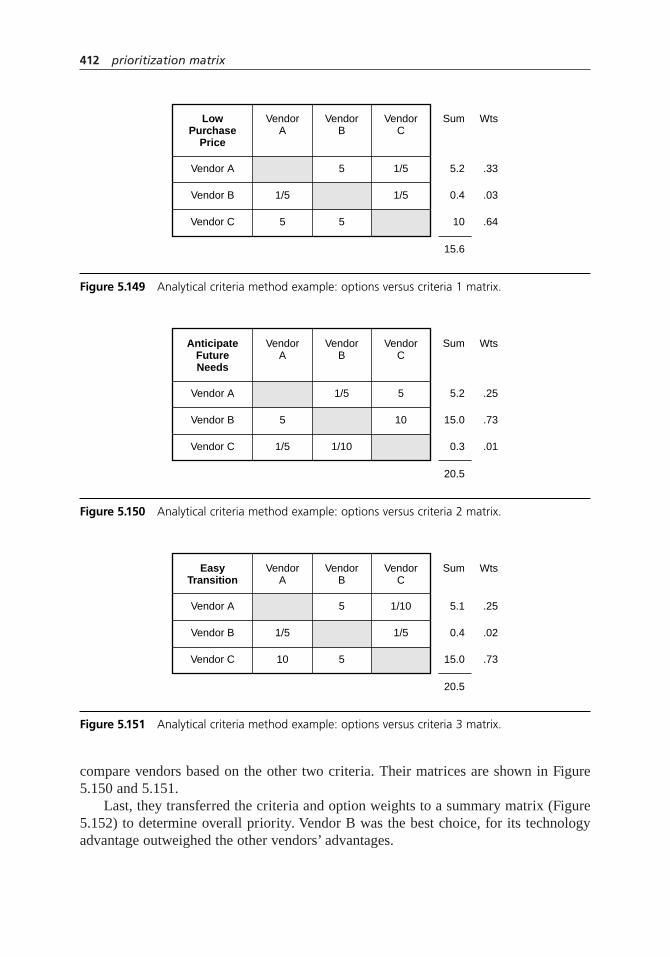
compare vendors based on the other two criteria. Their matrices are shown in Figure5.150 and 5.151.
Last, they transferred the criteria and option weights to a summary matrix (Figure5.152) to determine overall priority. Vendor B was the best choice, for its technologyadvantage outweighed the other vendors’ advantages.
412 prioritization matrix
LowPurchase
Price
VendorA
VendorB
VendorC
Sum Wts
Vendor A 5 1/5 5.2 .33
Vendor B 1/5 1/5 0.4 .03
Vendor C 5 5 10
15.6
.64
Figure 5.149 Analytical criteria method example: options versus criteria 1 matrix.
AnticipateFutureNeeds
VendorA
VendorB
VendorC
Sum Wts
Vendor A 1/5 5 5.2 .25
Vendor B 5 10 15.0 .73
Vendor C 1/5 1/10 0.3
20.5
.01
Figure 5.150 Analytical criteria method example: options versus criteria 2 matrix.
EasyTransition
VendorA
VendorB
VendorC
Sum Wts
Vendor A 5 1/10 5.1 .25
Vendor B 1/5 1/5 0.4 .02
Vendor C 10 5 15.0
20.5
.73
Figure 5.151 Analytical criteria method example: options versus criteria 3 matrix.

consensus criteria method
When to Use
• When the situations listed for “when to use” any prioritization matrix are true, and:
• When differences between options are approximately the same
• When it is not appropriate to devote the time required for the analytical criteriamethod, or . . .
• When a full exchange of views, with the possibility of learning from each other,is not necessary
Procedure
1. Clarify the goal. Use operational definitions where possible. Make sure everyoneunderstands and agrees on what is to be decided.
2. List criteria that the decision must meet.
Criteria Weighting
3. Each person individually prioritizes the criteria by distributing the value of 1.0among them. In other words, give each criterion a weight from 0 to 1.0, where the weights add up to 1.0.
4. Create an L-shaped matrix with criteria as row labels and group members’ namesas column headings. Record everybody’s weights in their columns. Add across therows to get a sum for each criterion.
prioritization matrix 413
Optionsvs. All
Criteria
Lowpurchase
price0.22
Anticipatefutureneeds0.65
Sum
Vendor A .25 × .65.16
.33 × .22.07 .26
Vendor B .03 × .22.01
.73 × .65.47 .48
Vendor C .64 × .22.14
.01 × .65.01 .24
Easytransition
0.12
.25 × .12.03
.02 × .12.00
.73 × .12.09
Figure 5.152 Analytical criteria method example: summary matrix.

5. If individuals’ weights are very different, discuss the reasons for the differences.Repeat steps 3 and 4 if opinions change.
Ranking Options Against Criteria
6. Thinking only about the first criterion, each person individually rank-orders theoptions, from one to the number of options. The option that meets the criterionbest receives the largest number.
7. Create an L-shaped matrix with options as row labels and group members’names as column headings. Title this matrix with the first criterion. Recordeverybody’s rankings in their columns. Add across the rows to get a sum for each option. In the “sum” column, rank the options, from one to the number ofoptions, based on the totals. These are the numbers you will use later.
8. If individuals’ rankings are very different, discuss the reasons for the differences.Repeat steps 6 and 7 if opinions change.
9. Repeat steps 6 through 8 for each of the other criteria. In all, you will make asmany matrices as there are criteria.
Combining All Criteria: Summary Matrix
10. Create an L-shaped matrix with options as row labels and criteria as columnheadings. Write the criteria weights under the criteria names.
11. In the first column, copy the option rankings from the first criterion matrix,step 7. Write “×”and the weight of the first criterion. (The same number isrepeated all down the column). In each cell, multiply the two weights and writethe result.
12. Repeat for each column, copying rankings from the matrix for that criterion.
13. Add the results across each row to get an option score. These scores are relativeweights with respect to all criteria. The largest number is the best choice.
Example
Using the same example of a computer upgrade, Figures 5.153 through 5.156 are thematrices used in this method. To make the example simple, we’ll assume the decision-making team contained four individuals, Karla, Louis, Marie, and Norm. They did notcreate a matrix for the first criterion, “low purchase price,” since the vendor’s bids auto-matically generated a ranking.
414 prioritization matrix

prioritization matrix 415
Criteria K L N Sum Wts
Low purchase price .15.15 .30 .85 .21
Anticipate futureneeds .70 .60.65 2.50 .63
Easy transition .10 .12 .10 .47 .12
After-sale support .05 .08
M
.25
.55
.15
.05 .00 .18 .05
4.00
Figure 5.153 Consensus criteria method example: criteria matrix.
AnticipateFutureNeeds
K L N Sum Rank
Vendor A 11 1 5 0.21 (1)
Vendor B 3 33 12 0.50 (3)
Vendor C 2 2 2 7 0.29 (2)
M
2
3
1
24
Figure 5.154 Consensus criteria method example: criteria versus option 2 matrix.
EasyTransition
K L N Sum Rank
Vendor A 21 2 8 0.33 (2)
Vendor B 2 11 5 0.21 (1)
Vendor C 3 3 3 11 0.46 (3)
M
3
1
2
24
Figure 5.155 Consensus criteria method example: criteria versus option 3 matrix.
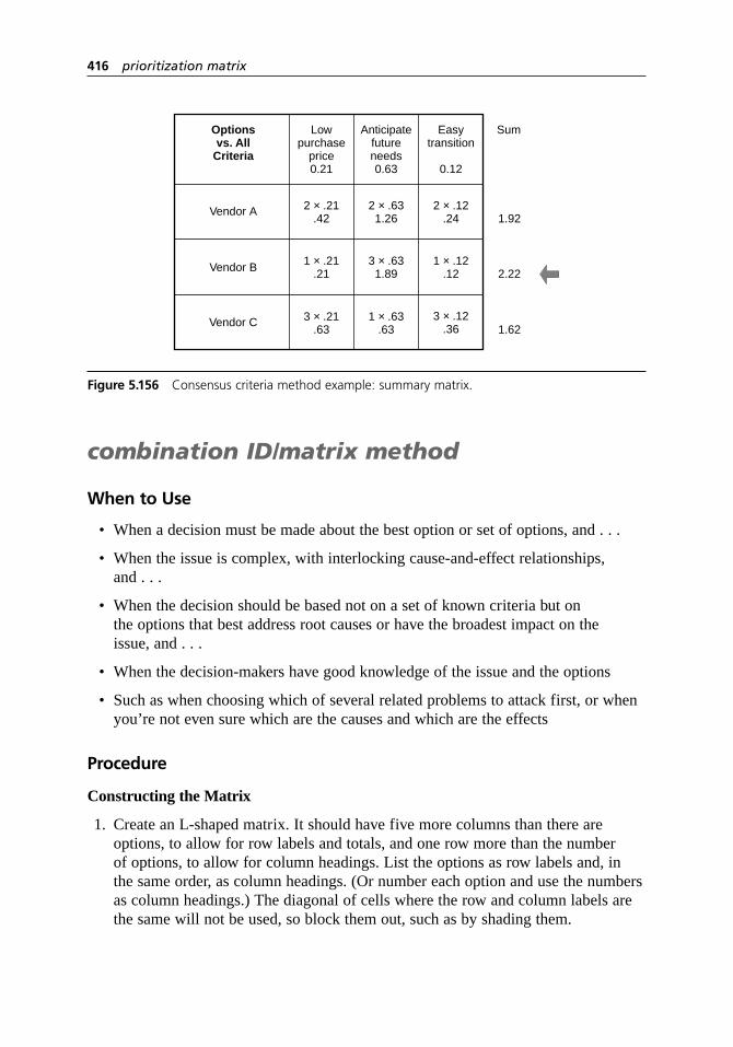
combination ID/matrix method
When to Use
• When a decision must be made about the best option or set of options, and . . .
• When the issue is complex, with interlocking cause-and-effect relationships,and . . .
• When the decision should be based not on a set of known criteria but on the options that best address root causes or have the broadest impact on the issue, and . . .
• When the decision-makers have good knowledge of the issue and the options
• Such as when choosing which of several related problems to attack first, or whenyou’re not even sure which are the causes and which are the effects
Procedure
Constructing the Matrix
1. Create an L-shaped matrix. It should have five more columns than there areoptions, to allow for row labels and totals, and one row more than the number of options, to allow for column headings. List the options as row labels and, in the same order, as column headings. (Or number each option and use the numbersas column headings.) The diagonal of cells where the row and column labels arethe same will not be used, so block them out, such as by shading them.
416 prioritization matrix
Optionsvs. All
Criteria
Lowpurchase
price0.21
Anticipatefutureneeds0.63
Sum
Vendor A 2 × .631.26
2 × .21.42 1.92
Vendor B 1 × .21.21
3 × .631.89 2.22
Vendor C 3 × .21.63
1 × .63.63 1.62
Easytransition
0.12
2 × .12.24
1 × .12.12
3 × .12.36
Figure 5.156 Consensus criteria method example: summary matrix.

2. Consider the first option and the second one. Ask two questions:
“Does the first option cause or influence the second?” If it does, place an upward-pointing arrow in the box where that row and column intersect.
“If there is a relationship, how strong is it?” Draw one of these symbols next tothe arrow to indicate the strength of the relationship:
Strong relationship
Medium relationship
Weak or possible relationship
3. Compare each option to every other option pairwise.
4. Reflect your marks across the diagonal. For every arrow pointing up, draw anarrow pointing left in the other box where those two options intersect. Also drawthe same relationship symbol.
Adding Up the Matrix
5. For each row, count the number of arrows pointing left. Write that number in thefi rst column beyond the options, under “total in.”
6. For each row, count the number of arrows pointing up. Write that number in thesecond column beyond the options, under “total out.”
7. Add “total in” and “total out” and write the sums in the next column, under “totalin and out.”
8. Assign points to the relationship symbols as follows:
9 points 3 points 1 point
For each row, add the relationship symbols’ values. Write that number in the lastcolumn, under “strength.”
Analyzing the Matrix
9. Which options rate highest in the “strength” column? Any option chosen shouldshow strong connections to other options. Eliminate any options that have low“strength” numbers.
10. Which options rate highest in the “total in and out” column? The best optionshave extensive connections to other options. Eliminate options that have a lowtotal in this column.
11. Of the remaining options, which have the highest “total out”? These options affectmany others. They are strongly related to the root causes and are often the bestones to address first.
prioritization matrix 417

12. Which options have the highest “total in”? These options are affected by manyothers, so they may serve as indicators or measures of success.
Example
This tool is usually used to sort out a long list of options. This example has only sevento make the procedure easier to see.
Traffic planners are looking at problems in the downtown area. They use a combi-nation ID/matrix diagram, Figure 5.157, to analyze which problem to address first.
“Backed-up traffic”and “short traffic signal cycle” have the highest strength numbersby far. Next is a cluster of options 2, 3, 5, and 6. “Backed up traffic” is a mix of ins andouts, but it has more ins than outs and only one strong out. In contrast, “short trafficsignal cycle” has three strong outs, one of them to “backed-up traffic.” The first prior-ity should be fixing the short traffic signal.
Considerations
• When you are listing criteria, brainstorming, affinity diagram, and list reductionmay be useful. Operational definitions ensure that everyone knows exactly how toapply the criteria.
• When you are listing criteria, be sure the preferred state is clear. For example,instead of “resources,” write “low use of resources.”
• Do not discuss the relative importance of criteria when first listing them.
• A tree diagram is often used before this tool to generate options.
• Make sure you have calculators or spreadsheet software handy. Check and double-check the math!
418 prioritization matrix
1 2 3 4 5 6 7 Totalin
Totalout
0 1 1 3
3 0 3 11
0 2 2 10
StrengthTotal
in andout
1. Narrow streets
2. Pedestrian access problems
3. Interstate off-ramp location
3 2 5 314. Backed-up traffic on Main St.
1 0 1 95. Business park access problems
1 0 1 96. Hard to turn left mid-block
0 3 3 277. Short traffic signal cycle
Figure 5.157 Combination ID/matrix method example.

• A very long list of options can first be shortened with a tool such as multivotingor list reduction.
• Before accepting the highest score as the decision, study the results, especially if they are surprising. Graph costs versus benefits. Do a sensitivity analysis:does changing the weights or the scoring system affect the results? If the weightsor scoring were controversial, this analysis may help achieve agreement. Look at large differences in scores on important criteria. Compare the most beneficialoption with the least expensive. Do these comparisons suggest an improved option?
• The decision matrix is similar to this tool but less rigorous and time-consuming.The effective–achievable matrix is a tool that separates ease-of-accomplishmentcriteria from effectiveness criteria and visually compares how well variousoptions meet criteria. Paired comparisons can be used for a decision based onindividual preferences rather than criteria.
Analytical Criteria Method
• Encourage full discussion whenever you are making a pairwise comparison of criteria in steps 4 and 6 or of options in step 11. Individuals should voice reasonsfor their opinions. Discuss the comparison until the group reaches consensus on the rating. This is where problems with hidden agendas and pet projects willbe resolved. If consensus is reached on each separate comparison, the group automatically has consensus when the final matrix is calculated.
• This method can take a long time, especially if strong differences of opinion exist.
• Sometimes a great deal of conflict is experienced during this process. However,if the decision is critical, bringing that conflict to the surface during the decision-making process is preferable to having the decision sabotaged later by lack of support.
• For complex decisions, this method cuts through the complexity by handling oneaspect at a time. Without such a structured tool, discussions can be hard to keepon track and key aspects can be missed.
• This tool is based on the analytical hierarchy process (AHP), a process developedby Thomas L. Saaty. He used a comparison scale from 1 to 9 and more complexmathematics than the analytical criteria method. Other methods for multi-criteriadecision analysis also have been developed. Computer software is used for manyof these methods because of their mathematical complexity.
Consensus Criteria Method
• It really doesn’t matter what value is distributed by each person. Distributing avalue of 1.0 is common, but it might be easier to think about distributing 10points across the criteria. You can work with the resulting higher sums or dividethem all by 10.
prioritization matrix 419

• If individuals’ rankings vary greatly and opinions are not changed by discussionand repeating the ranking, this method does not truly generate consensus. Thebest solution will not be reached by averaging strong and contrasting opinions toan in-between ranking.
• This method is unable to reflect significant differences between options. Forexample, suppose that on one criterion, option A is significantly better thanoption B, which is marginally better than option C. The ranking will be the sameas if option A was only marginally better than option B. The final choice will notreflect how outstanding option A is on this criterion. So do not use this method if,for any criterion, differences between options are not approximately consistent.
Combination ID/Matrix Method
• It’s okay to start with a mishmash of causes and effects. The tool will sort them out.
• This tool is most useful with a long list of options, 15 to 50.
• Do not ask, “Is this option caused or influenced by the other?” It’s less confusingto think only about which options cause others. When you reflect your matrixacross the diagonal, the “caused by” question is taken care of.
• Do not draw double-headed arrows. Force yourself to decide which direction thecause or influence works. Similarly, when you reflect your matrix, if you find anarrow already in the second location, you need to rethink that pair of options.
• Do not rely strictly on the math to make your decision. Instead, weigh the indications of the totals with the experience of the group.
• If an option shows approximately equal numbers of in and out arrows, look at the strengths of those arrows. For example, the out arrows may show all weakrelationships, but the in arrows strong relationships. This option is an indicator of success, not a cause.
• This tool is based on the relations diagram, also called the interrelationship diagram—thus the “ID” in the name.
process capability study
Description
A process capability study analyzes the ability of a stable process to generate outputwithin specification limits for a particular quality characteristic. The study calculates an
3948
420 prioritization matrix

index, called a process capability index (PCI) which compares process variation tospecifications. Several dozen indices have been devised, although only a few are com-monly used.
When to Use
• When the process is in statistical control, and . . .
• When the process output forms a normal distribution, and . . .
• When measuring how well a process can meet requirements, such as:
• When monitoring improvement in process performance over time, or . . .
• When comparing two processes to determine which is better able to meet requirements, or . . .
• When communicating with management or a customer about the process’s performance
Cpk and Cp, Ppk and Pp
• When minimizing the amount of off-spec product is a more important goal thanminimizing variation of the process average from target
Cpm and Cpmk
• When minimizing variation around a target is a more important goal thanminimizing off-spec product
Procedure
1. Establish that the process is in statistical control, using a control chart. If not, donot go any further.
2. Establish that the process forms a normal distribution. Use the normal probabilityplot or a goodness-of-fit test. Statistical software and/or the advice of a statistician would be useful here. If the process is not normal, do not proceed. See “Considerations” for several options.
3. Determinem, the estimated process average, the centerline of your control chart:
m =––X if you are using an
–X chart
m =–X if you are using a chart of individuals (X chart)
4. DeterminesX, the estimated process standard deviation, using the overall standarddeviation of sample data.
Preferred method: Use the root mean square deviation.
process capability study 421

where m = the number of measurements used in the calculation
Statistical software and electronic calculators often use this formula to calculatesX. This is sometimes called the overall or long-term deviation.
Alternate method: Use control chart calculations.
From a chart of individuals, usesX from the control chart worksheet (Figure 5.27,page 169).
From an–X and R chart, calculate:
sX =–R ÷ d2
where d2 is read from Table A.2
This is called the within-subgroup or short-term deviation.
Caution: If you use this method, do not use thesX value calculated on the–X and
R control chart worksheet (Figure 5.22, page 162). That is the standard deviationof the subgroup averages, whose spread is narrower than that of the original data.For capability, you must usesX calculated from the original data, which thisformula does.
Note: When s is used forsX, the resulting values are sometimes called Pp and Ppkinstead of Cp and Cpk. For simplicity, this procedure refers only to Cp and Cpk.
5. Determine estimated process spread and process limits:
Estimated process spread = 6sX
Estimated upper process limit =m + 3sX
Estimated lower process limit =m – 3sX
6. Calculate Cp or Cpm. Note: Cp or Cpm cannot be calculated if there is only one specification.
T = Target value for process average
USL = Upper specification limit
LSL = Lower specification limit
CpUSL LSL Specification spread
Estimate= =
–ˆ6σX dd process spread
CpmUSL LSL
6=
+ −( )–
ˆ ˆσ µX T2 2
ˆ
ˆ
σµ
X
ii
m
s
X
m= =
−( )−
=∑ 2
1
1
422 process capability study

7. Calculate Cpk or Cpmk. Determine the distance from the process average to thecloser specification limit. That value goes in the numerator.
8. Larger index values are better. If they are less than the value set by organizationalgoals or the customer, determine how to improve the process:
• Cp < 1: If process spread is greater than specification spread, work to reduce variation.
• Cp ≥ 1 and Cpk < 1: If process spread is less than or equal to specificationspread, but one process limit is beyond a specification limit, work to center the process within the specifications.
• Both Cp and Cpk ≥1: If the process limits are within the specification limits,the process is in a good state. Work to reduce variation or improve centering,if either improvement is beneficial for you or your customer.
• Cpm and Cpmk: Work to bring the process average closer to target or to reducevariation, whichever will provide greater benefit.
Example
Figure 5.158 shows the output from a process with a normal distribution. To make thecalculations and relationships easier to understand, it is set up with s= 2. The processis in control, so capability limits can be calculated.
The upper process limit falls beyond the upper specification limit, so off-spec prod-uct is being made in the range from 16 to 18, as shown by the shaded area.
Specification spread = 16 – 0 = 16
Process spread = 18 – 6 = 12
Cp = specification spread ÷ process spread = 16 ÷ 12 = 1.33
Cpk = (USL –m ) ÷ 3sX = 4 ÷ 6 = 0.67
The Cp of 1.33 reflects how the process could perform if it were centered betweenthe specification limits. Cpk less than 1 indicates that a process limit is outside specifi-cations and the process is currently making significant amounts of off-spec product.Figure 5.159 shows the same process, but centered.
Now suppose that this process drifts over time. Sometimes the mean is centered at8, sometimes it moves as high as 12, or it could be somewhere in between. But suppose
Cpksmaller USL LSL
Cpmksmaller
={ }
=
– ˆ , ˆ –
ˆ
µ µσ3 X
UUSL LSL
3
– ˆ , ˆ –
ˆ ˆ
µ µ
σ µ
{ }+ −( )X T2 2
process capability study 423

also that the variation does not change—a snapshot at any time would show the outputas wide as the normal curve in the figures.
The distribution of all the data would be the sum of all the process curves for the entiretime period. Suppose that as the process drifts, it spends equal amounts of time at everyvalue between 8 and 12. Then its curve would be wider and taller, as in Figure 5.160.
Since the process is drifting, it is not stable—not in statistical control. It would alsonot be normal. Under these conditions, it is inappropriate to calculate any capabilityindex. Let’s look at what would happen if you did calculate Cp and Cpk for this unstableprocess, usingsX =
–R ÷ d2 for the standard deviation. This calculation uses averages of
424 process capability study
181614121086420
Off-specoutput
USLLSL Specification spread = 16
m – LSL = 12
3s = 6
USL – m = 4
Process spread = 12
3s = 6
m
Figure 5.158 Incapable process.
181614121086420
USLLSL Specification spread = 16
m – LSL = 8
3s = 6
USL – m = 8
Process spread = 12
3s = 6
m
Figure 5.159 Capable process.
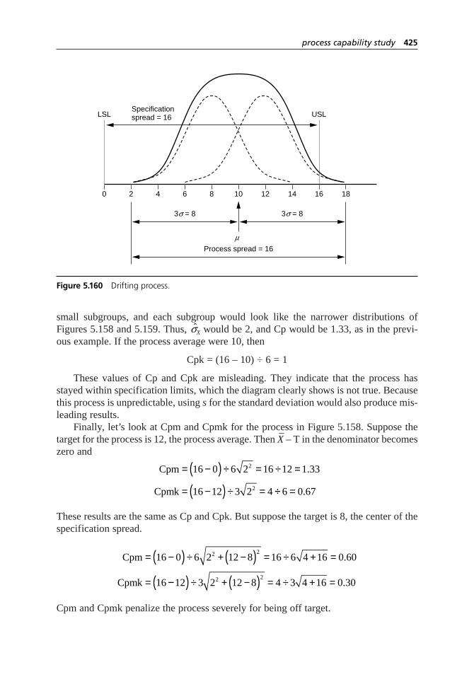
small subgroups, and each subgroup would look like the narrower distributions ofFigures 5.158 and 5.159. Thus,sX would be 2, and Cp would be 1.33, as in the previ-ous example. If the process average were 10, then
Cpk = (16 – 10) ÷ 6 = 1
These values of Cp and Cpk are misleading. They indicate that the process hasstayed within specification limits, which the diagram clearly shows is not true. Becausethis process is unpredictable, using sfor the standard deviation would also produce mis-leading results.
Finally, let’s look at Cpm and Cpmk for the process in Figure 5.158. Suppose thetarget for the process is 12, the process average. Then
–X – T in the denominator becomes
zero and
These results are the same as Cp and Cpk. But suppose the target is 8, the center of thespecification spread.
Cpm and Cpmk penalize the process severely for being off target.
Cpm
Cpmk
= −( ) ÷ + −( ) = ÷ + =
=
16 0 6 2 12 8 16 6 4 16 0 60
16
2 2.
−−( ) ÷ + −( ) = ÷ + =12 3 2 12 8 4 3 4 16 0 302 2.
Cpm
Cpmk
= −( ) ÷ = ÷ =
= −( ) ÷ =
16 0 6 2 16 12 1 33
16 12 3 2 4
2
2
.
÷÷ =6 0 67.
process capability study 425
181614121086420
USLLSLSpecificationspread = 16
3s = 8
Process spread = 16
3s = 8
m
Figure 5.160 Drifting process.

Considerations
Interpreting the Indices
• Cp measures only variability. Cpk also considers how close the process average is to the specification limits.
• To understand the capability of your process, you must consider both the spread(width) of the process and where the average is positioned. The process in Figure5.158 is narrow enough to fit the specifications, but because it is off center, it isproducing out-of-specification product, represented by the shaded area.
• If the process is perfectly centered, Cp will equal Cpk.
• If Cp is greater than or equal to 1.0 (process spread narrower than specificationspread) but Cpk is less than 1 (a process limit outside specifications), the processwould be capable of meeting specifications if it were centered.
• Because a normal distribution has tails extending beyond 3s on either side,even a perfectly centered distribution with a Cpk of 1.0 will have a small amount of product outside the specifications—0.27%, to be exact. (In the normal distribution, 99.73% of the distribution lies within 3s of the average.) In addition, processes often drift slightly. Therefore, many customers require their suppliers to demonstrate that their processes have a higher Cpk than 1. With a Cpk of 1.33, the specification lies 1s beyond the process limit, which provides a comfortable cushion.
• The requirement for six sigma capability has been made famous by Motorola and is the basis for the widely-used Six Sigma process. In this context, “sixsigma” means that process variation has been reduced until the distance fromeither specification limit to the centered process average is at least 6s. The totalspecification spread should be 12s. “Six sigma” also assumes that the processaverage might drift up to 1.5sfrom the centered target. You might want to test your understanding of capability by calculating Cp and Cpk for a “six sigma” process whose specification spread is 12s and whose process average is 1.5s from the midpoint. (Answer below.) See Six Sigmaon page 27 for more information.
• Cpk is highest when the process average is located at the midpoint of the specification spread. If the best target for the process average is not the midpoint,Cpk becomes misleading, and Cpm or Cpmk may be a better index.
• Cpm and Cpmk consider how close the process average is to its target. If theprocess is perfectly on target, Cpm = Cp and Cpmk = Cpk.
• All the indices are statistical estimates, based on sample data, of unknown trueparameters of the process. Therefore, they should be writtenCp, Cpk, and so on.However, common usage omits the “hat,” and that usage is reflected here.
426 process capability study

Problems with Capability Indices
• Use of capability indices is controversial. Too often the number is improperly calculated and is misleading or meaningless. Be sure to follow the rules about statistical control and normal distribution. Reporting process limits and processspread instead of a capability index avoids some of these problems.
• Above all, process capability is a means for communication within and betweenorganizations. Make sure that everyone with whom you are discussing capability—coworkers, managers, customers—agrees on operational definitions of capability,including sampling methods, formulas to be used, and how to handle nonnormaldistributions and unstable situations. If software does calculations for you, be sure you know which index is being calculated and what formulas are used,especially forsX.
• The purpose of measuring and reporting process capability is to predict futureperformance of the process. This is possible only if the process is in statisticalcontrol. If the process is out of control (unstable), all you can measure and reportwith any certainty is past performance of the process.
• Do not drop outlying data from the calculation just because you have identified its cause. Include all bad points unless you truly have eliminated forever andalways the cause of the outlier.
• A problem with usingsX =–R ÷ d2 is that the way the data are subgrouped can
greatly influence the results.
• Many statisticians consider sthe preferable standard deviation to use for calculating capability indices, which are then called Pp and Ppk. Follow therequirements of your organization or your customers (if they require reporting of capability indices) and above all, be sure that reported values are accompaniedby explanations of how they were calculated.
• As with any calculated statistic, capability indices have built-in error. Sample size, sampling error, measurement error, distributions that aren’t quite normal,especially in the tails—all can cause the calculated capability to differ signifi-cantly from the “true” capability. Unfortunately, confidence intervals usually are not reported for capability.
• Neither Cp nor Cpk are directly related to the amount of out-of-spec output produced, although it can be determined from the two together. Two processeswith identical Cpk can have different amounts of off-spec output and may needdifferent actions to improve each process.
• If proportion nonconforming or defects are the measurement of interest, it might be more useful to report and monitor them directly. Even then, however,knowledge of the process is essential to know what actions to take to improve the process.
process capability study 427

Nonnormal Processes
• The output of many processes do not form normal distributions. (See histogramfor more information about different kinds of distributions.) The capability indices described here are only meaningful for the normal distribution. For example, we commonly understand Cp = 1 to mean that 99.73% of a stable,centered distribution lies between specifications, but that is true only for a normaldistribution. For other distributions, such as the common skewed distribution,Cp and Cpk values calculated by the procedures in this book cannot be comparedor interpreted.
• There are other options for calculating a capability index for nonnormal distributions. Whenever you work with a nonnormal distribution,
–R ÷ d2 cannot
be used forsX.
1. Transform the data, including specification limits. For example, a skeweddistribution can be transformed into a normal distribution using naturallogarithms. Then use the formulas presented here.
2. Fit a known distribution to the process. Then calculate from that distributionthe expected proportion nonconforming. Determine the Cpk that would have the same proportion nonconforming for a normal distribution. Reportboth the proportion nonconforming and the “equivalent” Cpk.
3. Do not calculate a capability index. Instead, calculate and report the actualpercentage of the process that is outside specifications.
Consult a statistician for assistance with these methods and for other options.
• Answer to Six Sigma question: Cp = 2.0 and Cpk = 1.5.
process decision programchart
Also called: PDPC
Description
The process decision program chart systematically identifies what might go wrong in aplan under development. Countermeasures are developed to prevent or offset thoseproblems. By using PDPC, you can either revise the plan to avoid the problems or beready with the best response when a problem occurs. This variation of the tree diagramis one of the seven new QC tools.
6
9
7
428 process capability study

When to Use
• Before implementing a plan, especially . . .
• When the plan is large and complex, and . . .
• When the plan must be completed on schedule, or . . .
• When the price of failure is high
Procedure
1. Obtain or develop a tree diagram of the proposed plan. This should be a high-level diagram, showing the objective, a second level of main activities, and a third level of broadly defined tasks to accomplish the main activities.
2. For each task on the third level, brainstorm what could go wrong.
3. Review all the potential problems and eliminate any that are improbable or whoseconsequences would be insignificant. Show the problems as a fourth level linkedto the tasks.
4. For each potential problem, brainstorm possible countermeasures. These might beeither actions or changes to the plan that would prevent the problem or actionsthat would remedy it once it occurred. Show the countermeasures as a fifth level,outlined in clouds or jagged lines.
5. Decide how practical each countermeasure is. Use criteria such as cost, timerequired, ease of implementation, and effectiveness. Mark impractical counter-measures with an X and practical ones with an O.
Example
A medical group is planning to improve the care of patients with chronic illnesses suchas diabetes and asthma through a new chronic illness management program (CIMP). Theyhave defined four main elements and, for each of these elements, key components. Theinformation is laid out in the process decision program chart of Figure 5.161.
Dotted lines represent sections of the chart that have been omitted. Only some ofthe potential problems and countermeasures identified by the planning team are shownon the chart. Thinking about these helped the team create a better program. For example,one of the possible problems with patients’ goal setting is backsliding. The team likedthe idea of each patient having a buddy or sponsor and will add that to the programdesign. Other areas of the chart helped them plan better rollout, such as arranging forall staff to visit a clinic with a CIMP program in place. Still other areas allowed themto plan in advance for problems, such as training the CIMP nurses how to counselpatients who choose inappropriate goals.
This CIMP example is also used for potential problem analysis to allow you to com-pare the two tools.
process decision program chart 429

Considerations
• This is one of several tools that can be used for contingency planning. PDPC ismore systematic than the contingency diagram. Potential problem analysis (PPA)analyzes situations more rigorously. FMEA is most appropriate for new orredesigned processes, products, or services.
• One advantage of this tool is that it starts with a tree diagram of the implemen-tation plan to identify problems. Advantages of PPA are that it specificallyaddresses causes, rates risk, and separates preventive actions from contingencyplans. Consider combining these tools: start with PDPC to identify problems,then use PPA to analyze them.
• Here are some questions that can be used to identify problems:
– What inputs must be present? Are there any undesirable inputs linked to thegood inputs?
– What outputs are we expecting? Might others happen as well?
– What is this supposed to do? Is there something else that it might do instead or in addition?
430 process decision program chart
Checklistof
possiblegoals
Nurseguidance
andapproval
Buddyor
sponsor
Achieve-ment andmainte-nance
rewards
Financialpenalties
Replaceresistant
staff
Involvestaff in
roledefinitions
Visitclinicwith
CIMP inplace
Chronic Illness Management Program
Informationsystem
Delivery systemredesign
At-riskcase
manage-ment
Practiceteams
Plannedvisits
Patientrecordkeeping
Patientclasses
Patientgoal-
setting
Practiceguide-lines
Teamseminars
Inappro-priategoals
Back-sliding
OO
OX
X
O
OO
Staff resis-tance to
rolechanges
Patientswant tosee MD
Chronicdiseaseregistry
Perfor-mancemetrics
Decisionsupport
Patient self-management
support
Figure 5.161 Process description program chart example.
Next Page

– Does this depend on actions, conditions, or events? Are these controllable oruncontrollable?
– What cannot be changed or is inflexible?
– Have we allowed any margin for error?
– What assumptions are we making that could turn out to be wrong?
– What has been our experience in similar situations in the past?
– How is this different from before?
– If we wanted this to fail, how could we accomplish that?
• Potential problems are sometimes called “what-ifs.”
• The tree can be drawn either horizontally or vertically.
project charter
Also called: mission statement
Description
The project charter is a document that authorizes and defines an improvement project.
When to Use
• When a project is started, or . . .
• Whenever someone needs information about the project or clarification of itspurpose, scope, timing, or status, or . . .
• At reviews, to ensure that the project is appropriately focused and on time, and to update the charter with current progress, or . . .
• When information learned in the course of the project indicates a need to changethe charter
Procedure
1. The project’s sponsor (a member of management who initiates and supports theproject) and the project’s team leader collaborate in writing the charter at thebeginning of the project. Many organizations have a standard format. Here areessential elements, with comments or questions that can help fill in the blanks.
1
6
2103948
57
project charter 431
Previous Page

Project title How will this project be named in reports and best-practice databases?
Process name and product What functions and outputs of the organization or service affected will be the project’s focus?
Problem statement What is wrong with the process, product, or service now?
Objective(s) and/or goal(s) What improvement or results are expected? State outcomes in terms of process measure-ments that will be used to measure success.
Scope Which parts of the process are included and which are not? What are the start and endpoints of the process?
Business case What is the importance of the process? What are the current costs of poor quality?What financial impact will the project have:cost savings, increased profit, and costavoidance? What will the impact be onexternal customers?
Project start date This is the date the charter is defined.
Target completion date Estimate based on project complexity,holidays, workloads, travel or customer contact required, and so on.
Anticipated key Gate reviews, presentations, customer visits,milestone dates and so on.
People List names, roles, and contact information:
• Project sponsor
• Project leader
• Team members
• Team facilitator
• Expert technical resource
• Additional process or subject-matter experts
• Additional key stakeholders
Signatures and dates Preparation and approval signatures and dates,revision date.
432 project charter

2. The charter is reviewed and approved by management.
3. As the project becomes better defined during the early steps of defining customerneeds, exploring the problem, and establishing measurements, the charter shouldbe reviewed, revised, and reapproved.
Example
Medrad’s accounting managers wanted to reduce the work required to process freightinvoices in order to free up people to do more value-added work, to eliminate a tempo-rary position, and also to prepare the department to handle future company growth. Withthe help of a performance improvement facilitator from Medrad’s Performance ExcellenceCenter, they defined the project and created a charter, shown in Figure 5.162. In addi-tion to the essential elements listed in the procedure above, the form includes sectionsfor deliverables, support required, and realized financial impact (to be filled in when theproject is completed.)
This charter included a general project objective as well as three more specific pro-ject goals. Because the project was very unfocused at the beginning, goals and objectivescould not be quantified, except for the savings from eliminating the temporary position.
Management and team members realized that major enhancements could be madeto the process, but that was not the intent of this project. The charter states that the scopedoes not include major process improvements.
This revision of the charter was prepared midway through the project, during theimprovement phase. Dates had been entered as each of the first three phases were com-pleted. Metrics—baseline and goal—had been added during the measurement phase.The support required had been quantitatively defined during the analysis phase. For thisrevision, current data was added to the metrics section. (Because of confidentiality,actual numbers for the metrics are not shown, and the names are fictitious.)
See the Medrad freight processing team’s story on page 55 for more informationabout this project.
Considerations
• Use operational definitions to develop statements that are meaningful to everyoneinvolved.
• Three components make up a good improvement objective: direction and magnitudeof change, measure of quality, and name of process. String the three together andyou have a statement of your objective. For example: “Increase from 93 percent to 98 percent the rate of error-free transactions in the call-handling process.” Or,“Reduce by 25 percent the cycle time for packaging parts.”
• Use the SMART acronym to evaluate objectives: Are they simple and specific?Measurable? Agreed-upon and accountable? Realistic? Time-related?
project charter 433

434 project charter
Project Charter
Project Title: Freight Processing Improvement Business Unit: Accounting Operations
Project Leader: John Doe Business Unit Daily processing of accountingTeam Members & Meg O’Toole (Accounting) Description: transactions: mailing invoices,Responsibilities: Deanne Zigler (Supply Chain) paying vendors, processing Facilitator: Steve White invoices, etc.Black Belt: Steve White Unit Manager: John DoeSponsor: Maria MartinezProcess Owner: George Gregory, Red Morris
Problem Statement: A large number of hours are spent processing the payment of inbound and outbound freight.
Project Objective: Improve the efficiency of the freight payables process through better utilization of company resources and improvements in the service provided to the department’s customers.
Business Case/Financial Impact: The improvements will save $xxM annually in labor. These improvements will enable the process to support future growth of the company.
Project SMART Goals: Baseline Current Goal
• Reduce the labor needed to process freight bills. CCID 8–18 10–27
• Make processes more robust to handle more Defects xx% xx% x% capacity. DPM xxx,xxx xx,xxx xx,xxx• Increase awareness of process improvement tools.
Process r x.xx x.xx x.xx
Project Scope Is: The current process of freight payables, including minor improvements to systems that provide inputs to this process.Project Scope Is Not: Major system enhancements; other accounting operations functions.
Deliverables:• Identification of business elements critical in importance to our customers.• Identification of baseline measurements and performance goals.• Process plan and budget required for implementation of the improvements.• Upon approval, successful development, implementation, and control of the improvements.• List of identified opportunities for future projects.
Support Required: IT—Suzanne Smith to adjust ERP (estimate 8 days). Shipping software consultant to incorporate entry screen changes. Planning—Mark Savoy (4 hours).
Schedule: (key milestones and dates) Target Actual Status
Project Start 7-07-03
D—Define: Confirm scope and purpose statements. Document 7-31-03 7-31-03 completefindings from site visits.
M—Measure: Determine appropriate measurements. Calculate 8-15-03 8-20-03 completebaseline and performance goals.
A—Analyze: Perform process analysis and identify drivers of baseline 9-19-03 10-02-03 completeperformance. Document analysis of opportunity areas. Gain approval for I & C.
I—Innovative improvement: Improve and implement new process. 11-10-03 planning
C—Control: Verify that performance goals were met. Standardize the 12-01-03process and list future improvement opportunities.
Realized Financial Impact: Validated by:
Prepared by: Steve White Date: 7-7-03 Revision date: 10-27-03
Approvals Manager: Sponsor:
Figure 5.162 Project charter example.
• Define a scope that can be achieved in less than six months. Many projects failbecause of too ambitious a scope. If a process requires more work than that,attack it in a series of smaller projects.
• See operational definitions, ACORN test, and continuum of team goals to helpdefine the objective or goal.
project charter checklist
Also called: mission statement checklist
Description
The project charter checklist ensures that the entire team understands what it is sup-posed to accomplish and how.
When to Use
• During the first or second meeting of a new team
• When a team is given a new or modified charter
Procedure
Discuss the following questions:
1. Is it clear what management expects of us?
2. Is it clear why this project is important to the organization? Is it clear where thisproject fits into the organization’s overall goals and objectives?
3. Does our project cover only part of a larger process? Where do we fit in? Wheredoes our part of the process start and end?
4. Are the boundaries of the project clear? What will be outside our jurisdiction?
5. Are the goals realistic?
6. Will this project work? Does the charter fit in with our knowledge about theprocess or system?
7. What resources, inside or outside the department, will we need?
8. Do we have the right people on this team to accomplish the mission?
9. What people not on the team will be crucial to our efforts?
1
project charter checklist 435

10. Who will support our efforts? Who will be opposed? Who will be neutral? Howcan we reach all of these people?
11. How will opposition be expressed? How can we be sure that any opposition isbrought out into the open?
12. How will we know that we have been successful? How will others decide whetherwe have been successful?
Example
A team in a technical support department was given this objective: “Improve report prepa-ration through review of the steps in the process.” As the team discussed the items on theproject charter checklist, problems became obvious. Here is some of their discussion.
1. How much improvement do our managers expect? What kind of improvement arethey interested in? Are all aspects of report preparation of equal concern?
2. How does report preparation affect the organization? What aspects are causingproblems to us or to our customers?
3. How much of the process should we address? Are we talking about only thereport-writing process or the entire survey process that culminates in the report?
4. Are we allowed to look at issues within the departments we survey that causeproblems for report writing? What about the management review of the reports?
5. How long does management expect this project to last? Will that be enough time,given our other responsibilities?
6. This project could work, depending on the answers to some of our questions.
7. Has management notified the managers of our customer departments that we’ll be needing some of their people’s time for giving us input? Have they notified our own department, and especially the secretaries?
8. We think we have the right people here.
9. Crucial people: other report writers in our department, the secretaries, and our managers!
10. The report writers aren’t going to want to do things differently. The secretariescould be on our side if we find ways to reduce their work.
11. Let’s be sure to get input about problems from all the report writers and addressthem. We could do a barriers-and-benefits exercise with them when we havechanges to suggest.
12. How will we know we’ve been successful? How will our managers know? Since we don’t know what kind of improvement they’re looking for, how will we measure it?
436 project charter checklist

The team should go back to their management to clarify the objective. Unfortu-nately, this example is fictitious. This was a real objective, as discussed in the finalexample of the continuum of team goals, but the real team did not use a project charterchecklist or the continuum. Months later they thought they were finished; their man-agement said they were not; and the team did not understand why. (See the continuumexample on page 153 for more discussion.)
Considerations
• You may choose to divide into smaller groups, each assigned different questionsto discuss, then reassemble to share results. The first four questions should beconsidered by everyone.
• Also see continuum of team goalsfor a tool that can be used with this one.
radar chart
Also called: web chart, spider chart, star chart
Description
The radar chart is a graph that looks like a spiderweb, with spokes radiating from a cen-tral point and lines connecting them. It shows measurements where several variablescontribute to the overall picture. All variables are considered to be of equal importanceon a radar chart.
When to Use
• When tracking or reporting performance or progress, and . . .
• When several variables are being measured to assess overall performance, and . . .
• When it is not necessary to weight the relative importance of the variables
Procedure
1. Identify the variables that will be measured. These may come from customerrequirements, key performance indicators, or organizational goals. Other qualitytools such as brainstorming or affinity diagrams may be used to develop thevariables, or they may have been developed at another point in the qualityimprovement process.
3948
7
radar chart 437
2. For each variable, determine the measurement scale. It is simplest for each tohave the same scale, such as 1 to 5 or a percentage, but different scales can beused if necessary. Determine which end of the scale represents desirableperformance.
3. To draw the chart, divide 360 degrees by the number of criteria to determine theangle between spokes. Draw spokes of equal lengths radiating from a central pointand spaced evenly around the circle. Label each spoke with its variable. Mark themeasurement scale on the spokes, with undesirable performance at the center.
4. For each variable, mark its measurement on the spoke with a large dot. Connectthe dots.
5. To show performance at a different time or by another subject, repeat step 4,using different line styles. Add a legend or labels to identify line styles. To showperformance of multiple subjects or at multiple times, draw a separate chart foreach one.
6. Assess overall performance and determine needed improvement by observingwhere the “web” lies closest to the center point.
Example
Figure 5.163 is a radar chart of a student’s grades over two report periods. The studenthas improved in four subjects, but seems to be having trouble with art. To avoid confu-sion as additional report periods are added to the chart, separate sets of spokes could beused for each report period, as in the lower pair of diagrams.
Considerations
• Sometimes the center of the circle is designated as the most desirable end of themeasurement scale. In that case, the best performance is on those criteria lyingclosest to the center. The problem with that approach is that as performanceimproves, it becomes harder to see the web.
• Sometimes a circle is drawn around the spokes. If the measurement scale is thesame for each criterion, smaller concentric circles can be drawn to represent the major scale divisions. For example, if the scale is 1 to 10, circles are drawn20, 40, 60, and 80 percent of the distance from the center to the outside circle.However, in many cases the rings of circles clutter the graph and make the linesharder to perceive.
• A ruler, compass, and protractor are helpful for drawing the chart by hand.
• Sometimes criteria and their scales are phrased so that a lower number is better.For example, “number of accidents” as a measure of safety would have zero asmost desirable. If your criteria mix scales, so that high is good for some and bad
438 radar chart

for others, you have two options. Reword your criteria so that all the scales aredirectionally consistent. If that isn’t possible, be careful to draw your chart so thatthe preferable end of each scale is at the circumference. Group together spokeswhose scales run from high at the center to low at the outside.
• When planning the spokes, group together variables that are related. For example, a series of radar charts comparing various computer systems mightshow performance-related variables grouped at the top and cost-related variablesgrouped at the bottom.
• A bar chart or dot chart could be used to show this kind of data. Radar charts are better for showing at a glance which categories need the most improvement or where progress has been made.
• Nominal data are placed on the spokes. The measurement scales along the spokesusually represent ordinal data.
radar chart 439
Languagearts
Math
Art
MusicP.E.
Science
ABC
DF
Socialstudies
Languagearts
Math
Art
MusicP.E.
Science
ABC
DF
Socialstudies
Languagearts
Math
Art
MusicP.E.
Science
ABC
DF
Socialstudies
Period 1Period 2
Figure 5.163 Radar chart example.

regression analysis
Description
Regression analysis is a statistical tool used to find a model for a relationship betweenpairs of numerical data. The model is a line or curve that fits the data best. The resultsof a regression analysis are an equation for that line or curve, a value called r2 that indi-cates how good the fit is, and other statistical measures that tell how well the data matchthe model.
Linear regression identifies the best straight line through a scatter diagram of the data.This type of regression is the most straightforward and is discussed here. Nonlinearregression looks for a curve that best fits the data. Multiple regression is used whenseveral independent variables affect one dependent variable. Nonlinear and multipleregressions are more complicated. Seek help from a statistician if your data requireeither one.
When to Use
• When you have paired numerical data, and . . .
• After drawing a scatter diagram of the data, and . . .
• When you want to know how a change in the independent variable affects thedependent variable, or . . .
• When you want to be able to predict the dependent variable if you know theindependent variable, or . . .
• When you want a statistical measure of how well a line or curve fits the data
Procedure
While linear regression can be done manually, computer software makes the calcula-tions easier. Follow the instructions accompanying your software. The analysis willgenerate a graph of the best-fit regression line placed through the data and a table ofstatistics. These will include:
• Slope of the line. The equation for the line has the formy = mx + b. The slope is the constant m. This tells you that when the independent (x) variable increasesby one, the dependent variable (y ) will increase by m. Positive slope means the line slants upward from left to right; negative slope means the line slantsdownward. (The “hat” on the y reminds us that this is the predicted value of y,not the actual value.)
6
98
5
440 regression analysis
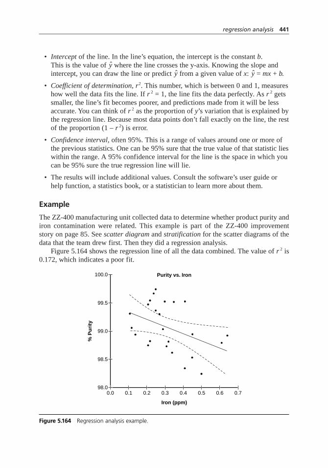
• Intercept of the line. In the line’s equation, the intercept is the constant b. This is the value ofy where the line crosses the y-axis. Knowing the slope andintercept, you can draw the line or predicty from a given value of x:y = mx + b.
• Coefficient of determination, r2. This number, which is between 0 and 1, measureshow well the data fits the line. If r2 = 1, the line fits the data perfectly. As r2 getssmaller, the line’s fit becomes poorer, and predictions made from it will be lessaccurate. You can think of r 2 as the proportion of y’s variation that is explained bythe regression line. Because most data points don’t fall exactly on the line, the restof the proportion (1 – r2) is error.
• Confidence interval, often 95%. This is a range of values around one or more ofthe previous statistics. One can be 95% sure that the true value of that statistic lieswithin the range. A 95% confidence interval for the line is the space in which youcan be 95% sure the true regression line will lie.
• The results will include additional values. Consult the software’s user guide orhelp function, a statistics book, or a statistician to learn more about them.
Example
The ZZ-400 manufacturing unit collected data to determine whether product purity andiron contamination were related. This example is part of the ZZ-400 improvementstory on page 85. See scatter diagram and stratification for the scatter diagrams of thedata that the team drew first. Then they did a regression analysis.
Figure 5.164 shows the regression line of all the data combined. The value of r 2 is0.172, which indicates a poor fit.
regression analysis 441
Purity vs. Iron
Iron (ppm)
% P
uri
ty
99.5
100.0
99.0
98.5
98.00.10.0 0.2 0.3 0.4 0.5 0.6 0.7
Figure 5.164 Regression analysis example.
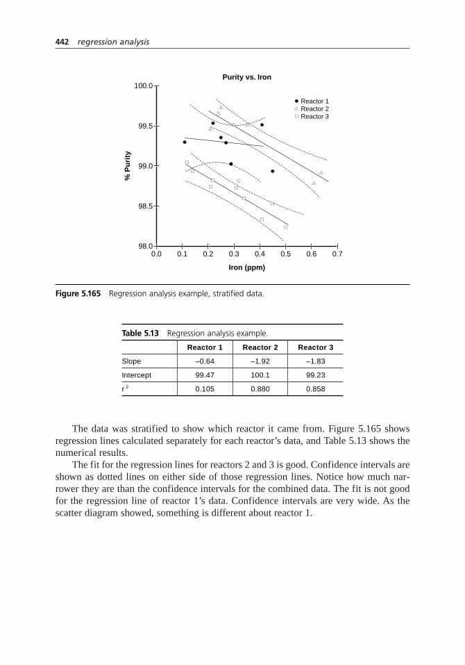
The data was stratified to show which reactor it came from. Figure 5.165 showsregression lines calculated separately for each reactor’s data, and Table 5.13 shows thenumerical results.
The fit for the regression lines for reactors 2 and 3 is good. Confidence intervals areshown as dotted lines on either side of those regression lines. Notice how much nar-rower they are than the confidence intervals for the combined data. The fit is not goodfor the regression line of reactor 1’s data. Confidence intervals are very wide. As thescatter diagram showed, something is different about reactor 1.
442 regression analysis
Purity vs. Iron
Iron (ppm)
% P
uri
ty99.5
100.0
99.0
98.5
98.00.10.0
Reactor 2Reactor 3
0.2 0.3 0.4 0.5 0.6 0.7
Reactor 1
Figure 5.165 Regression analysis example, stratified data.
Table 5.13 Regression analysis example.
Reactor 1 Reactor 2 Reactor 3
Slope –0.64 –1.92 –1.83
Intercept 99.47 100.1 99.23
r 2 0.105 0.880 0.858

Considerations
• Regression analysis models how a dependent variable changes as an independentvariable is controlled. It matters which variable is assigned to the x-axis andwhich to the y-axis, as the result may not be the same when they are reversed.Remember that in regression, the x variable predicts the y variable, and considercarefully how to assign the variables.
• Correlation analysis quantifies the strength of the relationship between two variables, but does not calculate a line to model the data. See correlation analysis for more information.
• For a linear regression, an r2 value of 0 means x and y are not linearly related.The best line is a horizontal line through the data. However, a curve mightdescribe the relationship better. You should always look at a scatter diagram of the data first, then choose a linear or nonlinear regression based on what the data look like.
• Another reason for looking at a scatter diagram first is that very different patternsof data can generate the same statistical results. A visual check of the data canspot outliers and other features of the data that can distort the statistical calcula-tions and might need to be removed.
• Regression analyses usually use a least squares method to find the best fit. The vertical distance of every data point from the line, called the residual,is calculated; each residual is squared; and all are summed. The line with the smallest sum is the best fit.
• To check the regression analysis, make a scatter diagram of the residuals and their line yvalues. Most software will do this for you. If the plot is random,everything’s fine. If it shows a pattern, the assumptions used by the regressionanalysis do not match the data. Consult a statistician.
• As with scatter diagrams, a good correlation does not prove that x causes y. Variabley could cause variable x. Or there may be a third variable that influences both.
• As with scatter diagrams, if the regression plot shows no relationship, considerwhether the independent (x) variable has been varied widely. Sometimes arelationship is not apparent because the data don’t cover a wide enough range.Conversely, be cautious about making predictions outside the range of the dataused for the regression. The data may behave differently beyond that range.
• The boundaries of the confidence interval will be curved. This doesn’t mean theline could be curved. All the possible regression lines are close to one anothernear the center of the data and farther apart at extreme values of x.
regression analysis 443

relations diagram
Also called: interrelationship diagram or digraph, network diagramVariation: matrix relations diagram
Description
The relations diagram shows cause-and-effect relationships. Just as important, theprocess of creating a relations diagram helps a group analyze the natural links betweendifferent aspects of a complex situation.
When to Use
• When trying to understand links between ideas or cause-and-effect relationships,such as:
• When trying to identify an area of greatest impact for improvement, or . . .
• When a complex issue is being analyzed for causes, or . . .
• When a complex solution is being implemented, or . . .
• After generating an affinity diagram, cause-and-effect diagram, or tree diagram,to more completely explore the relations of ideas
Basic Procedure
Materials needed: sticky notes or cards, large paper surface (newsprint or two flipchartpages taped together), marking pens, tape.
1. Write a statement defining the issue that the relations diagram will explore. Writeit on a card or sticky note and place it at the top of the work surface.
2. Brainstorm ideas about the issue and write them on cards or notes. If another toolhas preceded this one, take the ideas from the affinity diagram, the most detailedrow of the tree diagram, or the final branches on the fishbone diagram. You maywant to use these ideas as starting points and brainstorm additional ideas.
1
6
2394
5
6 5
1
6
210394
5
1
6
29
4
444 relations diagram

3. Place one idea at a time on the work surface and ask, “Is this idea related to anyothers?” Place ideas that are related near the first. Leave space between cards toallow for drawing arrows later. Repeat until all cards are on the work surface.
4. For each idea, ask “Does this idea cause or influence any other idea?” Draw arrowsfrom each idea to the ones it causes or influences. Repeat the question for every idea.
5. Analyze the diagram:
• Count the arrows in and out for each idea. Write the counts at the bottom ofeach box. The ones with the most arrows are the key ideas.
• Note which ideas have primarily outgoing (from) arrows. These are basic causes.
• Note which ideas have primarily incoming (to) arrows. These are final effectsthat also may be critical to address.
Be sure to check whether ideas with fewer arrows also are key ideas. The number ofarrows is only an indicator, not an absolute rule. Draw bold lines around the key ideas.
Example
A computer support group is planning a major project: replacing the mainframe com-puter. The group drew a relations diagram (Figure 5.166) to sort out a confusing set ofelements involved in this project. “Computer replacement project” is the card identifying
relations diagram 445
Computerreplacement
project
Higher levelof customer
service
Growth andhigher profit
potential
Newsoftware
Staffincreases
1/1
1/1
2/01/0
1/2
1/4
1/6
In/Out
1/0
2/0
2/0
2/0
1/1
1/1
3/0
3/0
Increasedprocessing
cost
Install newmainframe
Negotiate newmaintenance
contracts
Expandcomputer
room
Upgrade supportequipment
Serviceinterruptions
More utilities(heat, air, electricity)
Telecom-munications
changes
Train users Train operators
Issues around computer replacement project
Figure 5.166 Relations diagram example.
the issue. The ideas that were brainstormed were a mixture of action steps, problems,desired results, and less-desirable effects to be handled. All these ideas went onto the dia-gram together. As the questions were asked about relationships and causes, the mixtureof ideas began to sort themselves out.
After all the arrows were drawn, key issues became clear. They are outlined withbold lines. “New software” has one arrow in and six arrows out. “Install new mainframe”has one arrow in and four out. Both ideas are basic causes. Also, “service interruptions”and “increased processing cost” both have three arrows in, and the group identified themas key effects to avoid.
matrix relations diagramUse a matrix to compare ideas to each other one at a time. This variation is moremethodical and neater. It does not visually emphasize relationships as well.
1. Write a statement defining the issue that the relations diagram will explore.
2. Brainstorm ideas about the issue on a flipchart. If another tool has preceded thisone, take the ideas from the affinity diagram, the most detailed row of the treediagram, or the final branches on the fishbone diagram. You may want to usethese ideas as starting points and brainstorm additional ideas.
3. Draw an L-shaped matrix with one more row than ideas and four more columns.Write the ideas down the first column as row labels and across the top row ascolumn headings. Or number each idea and use the numbers as column headings.The diagonal of cells where the row and column labels are the same will not beused, so block them out, such as by shading them.
4. Go through the matrix methodically, comparing each idea on the left to each ideaacross the top. Ask, “Does the first idea cause or influence the second?” In thebox where the row and column intersect, draw an arrow pointing up to indicatethe idea in the row causing or influencing the idea in the column.
5. Reflect the matrix. Every place there is an arrow pointing up, draw an arrowpointing left in the other box where those two ideas intersect. For example, if row 2, column 3 has an upward arrow, then row 3, column 2 must have a left-pointing arrow.
6. To analyze the matrix, count the “to” arrows (pointing left) and the “from”arrows (pointing up) in each row. Add up the total number of arrows to and fromthat idea. Write the totals in the far right columns of the matrix.
7. Analyze for key ideas as in step 5 of the basic procedure.
Example
The same project, replacement of the mainframe computer, and the same issues areshown in the matrix relations diagram of Figure 5.167. There’s an upward arrow in row 1,
446 relations diagram

column 2. Idea 1 influences or causes idea 2. Similarly, the arrow pointing left in row3, column 2 means idea 2 influences or causes idea 3.
Every upward-pointing arrow is matched with a left-pointing one. For example, row4 (train operators) has a left-pointing arrow at column 6. Row 6 has an upward-pointingarrow at column 4.
The last three columns sum the arrows pointing left (to), the ones pointing up(from), and the total. These are the same sums the team counted in the previous exampleto determine key issues.
Considerations
• Fifteen to 50 ideas is the best range of numbers for a relations diagram. Fewerthan 15 and you do not need it; more than 50 and the diagram is too complex to handle.
• Do not ask, “Is this idea caused or influenced by any others?” Look for ideas that cause others, and do that for every idea. Then the “caused by” question is unnecessary.
• Do not draw double-headed arrows. Force yourself to decide which cause orinfluence is strongest.
• Sometimes bold lines are drawn around key effects and double lines are drawnaround key causes. Or you may find color-coding more useful.
relations diagram 447
1
1. Computer replacement
2 3 4 5 6 7 8 9 10 11 12 13 14 15 To From Total
0 5 52. New software 1 6 73. Train users 1 0 14. Train operators 2 0 25. Staff increases 1 1 26. Install new mainframe 1 4 57. Upgrade support equipment 1 2 3
8. Telecommunications changes 1 1 2
9. Service interruptions 3 0 310. Negotiate new maintenance contracts 2 0 2
11. Expand computer room 1 1 212. Increased processing cost 3 0 3
13. Growth and higher profit potentials 2 0 2
14. More utilities 1 1 215. Higher level of customer service 1 0 1
Figure 5.167 Matrix relations diagram example.
• It can be useful to share the diagram with others and request their ideas andcomments. Do this after step 4 (before the analysis) and when the analysis is completed.
• This tool also has been called the interrelationship digraph. The name relationsdiagram is less intimidating and more easily remembered.
• A related tool, the prioritization matrix, variation combination ID/matrix method,starts with a matrix relations diagram and adds assessments of the strength ofrelationships between ideas. It is used for decision making.
repeatability andreproducibility study
Also called: R&R study, gage R&R, measurement system analysis (MSA)
Description
A repeatability and reproducibility (R&R) study analyzes variation of a measurementsystem that uses an instrument or gage. This variation is compared to the observedtotal variation in the process. The main purpose of an R&R study is to ensure thatmeasurement variation is low enough that process measurements truly reflect theprocess. It is impossible to know whether a product is within specifications or to workon reducing process variation if measurement variation is so great that it masksprocess variation.
R&R studies focus on two types of variation: repeatability, which is variationobtained by the same instrument in repeated readings, and reproducibility, which isvariation that occurs when different people take the measurement.
When to Use
• When a measurement is made using an instrument or device, and . . .
• Before studying process variation or process capability, or . . .
• When selecting a measurement method from several alternatives, or . . .
• When assessing or standardizing measurement methods, procedures, or training, or . . .
• Periodically as an ongoing procedure when maintaining statistical process control of an improved process
3948
57
448 relations diagram

Procedure
Planning
1. Determine the part or product, the measurement, and the instrument to be studied.
2. Determine the number of samples to be used and how they will be obtained. Fiveto ten samples is customary. If each sample may not be consistent throughout,determine procedures to minimize within-sample variation during the study.
3. Determine how many and which operators (people taking measurements) will beused in the study. One to three operators is customary.
4. Determine the number of trials (repeated measurements) each operator willperform. Two or three is customary.
5. Determine calibration procedure, measurement procedure, and analysis procedures.
Testing
6. Calibrate the instrument.
7. Determine a random sequence for the samples. The first operator measures all samples, following the standard operating procedure for the measurement.Record the results.
8. Determine a different random sequence for the samples. The second operatormeasures all samples, as before. Do not allow operators to see others’ results.Repeat until all operators have measured all samples once. This concludes one trial.
9. Repeat steps 7 and 8 until the planned number of trials is completed. Keepoperators from seeing sample numbers, previous results, or any other informationthat might suggest what a measurement “should” be.
Analysis and Improvement
10. Analyze the data. Computer software usually does the math. The most commonanalysis methods are “range and average” and ANOVA (analysis of variance).Summaries of these methods are given below. The primary results of the analysis are:
Repeatability (Equipment Variation or EV). This index reports the variability of the instrument when one person repeatedly measures the same item. It isexpressed as the width of an interval that contains a certain percentage (often99%) of the variation due to the instrument. A standard deviation for repeatabilitymay also be given.
Reproducibility (Appraiser Variation or AV). This index reports the variabilitybetween operators when they each measure the same thing. It is also expressed as the width of an interval that contains a certain percentage (often 99%) of the operator variation. A standard deviation for reproducibility may also be given.
repeatability and reproducibility study 449

Repeatability and Reproducibility (R&R). This index combines the two above to estimate the width of the measurement variation. Again, a standard deviation may also be given. (Note: This index is not a simple sum of therepeatability and reproducibility values, because standard deviations are not additive.)
11. Compare the measurement variation to the total process variation. The simplestway is to calculate the ratio of R&R variation to total process variation. Processvariation should be determined from process control charts and expressed in thesame terms as R&R variation. If R&R variation is expressed as sR&R, use theprocess s for the calculation. If R&R variation is expressed as a 99% interval,use process smultiplied by 5.15. See “Considerations” for discussion ofacceptable measurement variation.
12. If R&R variation is unacceptable, develop action plans for improving it. Furtherstudies or analysis can be done to pinpoint the reason for the variation.
Analysis Methods
Range and Average
This method constructs an–X and R chart of the study’s data. A subgroup is defined as
all trials for one sample by one operator. The standard deviation calculated from theoverall average range
–R is the standard deviation for repeatability. See control chartsfor
more information about–X and R charts and their formulas. This method can be done
without computer software.
1. For each operator, calculate the range Rfor each sample, the average–Ro of all
those ranges, and the average of all that operator’s measurements,–Xo.
2. Calculate the average range–R of all the operators. Calculate the upper control
limit for the ranges.
UCLR = D4 × –R
D4 is the usual R-chart constant from Table A.2, with n= the number of trials.
Plot the ranges and the UCL. If any ranges are higher than the UCL, determineand eliminate the reason for the special cause. Repeat those measurements or, ifthat is impossible, drop them from the calculation.
(Optional) Plot the average of each operator’s repeated measurements on anaverage chart. Look for indications of differences between operators. Compare the width of the control limits, which represents measurement variation, to thewidth of the band of plotted points, which is indicative of process variation.
3. Calculate standard deviations for repeatability, reproducibility, and R&R:
srepeatability=–R ÷ d2
450 repeatability and reproducibility study
d2 is the usual R-chart constant from Table A.2, with n= the number of trials
–Xdiff is the difference between the highest operator’s average and the lowestoperator’s average
d *2 is from Table 5.14.
n = number of samples
r = number of trials or repeats
4. To calculate repeatability, reproducibility, and R&R indices, multiply eachstandard deviation by 5.15 for a 99% interval. For a 95% interval, multiply by 4.For a 99.7% interval, multiply by 6.
ANOVA
ANOVA, or analysis of variance, analyzes the study as a designed experiment. Thefactors are instrument, operators, and samples. This analysis is done with computersoftware. The results will include interactions between instrument and operators.
Example
A critical quality characteristic of a manufacturing process involves a laboratory analy-sis. The characteristic was in statistical control, with a process standard deviation of 13.Customer specifications were much tighter than the process could produce, leading to aCp of 0.8 and a desire to improve the process. Before looking for process improve-ments, the team did an R&R study to estimate how much of the observed process vari-ation was actually measurement error.
The study design was ten samples, three analysts, and two trials. Ten samples weresaved from the previous weeks of production that represented a range of measurementsfrom 13 to 64. A labeling scheme was devised so that the analysts could not see sample
σ σ σR&R repeatability2
reproducibility2= +
σσ
reproducibilitydiff repeatabi=
−
X
d2
2
*
llity2
nr
repeatability and reproducibility study 451
Table 5.14 Reproducibility constant d *2.
Number of Operators d *
2
2 1.41
3 1.91
4 2.24

identification when doing the analysis. Three analysts were selected randomly, and theirschedules were adjusted so that they would all work the same shift the day of the study.Six random sample sequences were determined, one for each analyst within each trial.
The data and calculations are shown in Table 5.15. The bottom half of Figure 5.168shows the R-chart of operator ranges. None of the ranges are out of control. OperatorC’s ranges do show greater variation than the other two operators, which is worth inves-tigating. This means operator C’s measurement variation appears to be different fromthe other operators’. The overall measurement variation is 15% of the total observedprocess variation, which is acceptable. The team can begin studying ways to reduce pro-cess variation, knowing that the process’s responses to changes they make will not beswamped by measurement error.
452 repeatability and reproducibility study
Table 5.15 R&R study example.
Trial Operator A Operator B Operator C
Sample 1 2 Range 1 2 Range 1 2 Range
1 45 48 3 46 46 0 49 48 1
2 13 13 0 13 14 1 13 16 3
3 21 19 2 20 17 3 18 22 4
4 64 62 2 63 64 1 61 65 4
5 23 19 4 23 18 5 23 20 3
6 61 60 1 63 61 2 62 64 2
7 34 35 1 33 35 2 36 38 2
8 41 39 2 41 40 1 38 40 2
9 30 30 0 31 32 1 34 35 1
10 52 57 5 53 50 3 53 56 3–Ro 2.0 1.9 2.5–Xo 38.3 38.2 39.6
R
XR
= + +( ) ÷ == × =
2 0 1 9 2 5 3 2 13
3 27 2 13 7 0
. . . .
. . .UCL
difff
repeatabili
Repeatability:
= =39 6 38 2 1 4. – . .
σ tty
interval
Reproducib
= ÷ =
=
2 13 1 13 1 9
99 9 8
. . .
% .
iility:
reproducibilityσ = ÷( ) −( ) ÷1 4 1 91 1 92 2
. . . 220 0 6
99 3 1
1 9 0 62
=
=
= ( ) +(
.
% .
. .
interval
R&R:
R&Rσ )) =
=
22 0
99 10 3
.
% .
%
interval
process variation == ÷ × =2 0 13 100 15. %

The top half of Figure 5.168 shows the average chart. Although this graph often isnot drawn, it can be informative. This average chart does not suggest any major differ-ences between operators. Does it look as though the process is wildly out of control?Actually, this is exactly how you want an average chart to look for an R&R study. Thosecontrol limits were determined from the measurement process. Because the control limitsare so much narrower than the band swept out by the sample values, it means the mea-surement system can distinguish between samples and recognize real process changes.
Considerations
• This tool is often called gage R&R, where the term gage is expanded to mean anymeasuring device. In this book, the term “instrument” is used to emphasize thatthe approach applies to any equipment used to take a measurement.
• The total variation observed in a process includes both true process variation plus variation caused by the act of observing or measuring the process. Even if aprocess were 100 percent consistent, a control chart of a measured characteristicwould probably show variation from the measurement process. In order for you to work on reducing process variation, measurement variation must be smallenough, relative to process variation, that it doesn’t distort the effects of changesyou make to the process.
• The most important sources of measurement variation, and the ones addressed byR&R studies, are repeatability and reproducibility.
Repeatability. If the same operator uses the same instrument to measure the same sample repeatedly within a short period of time, how much difference will there be in the results?
repeatability and reproducibility study 453
40
60
20
0
2
8
4
6
R
Operator A Operator B Operator C
XUCLX
LCLX
X
UCLR
R
Figure 5.168 R&R study example, average and range charts.
05h.H1224.ch5(403-470).qxd 4/22/05 1:45 PM Page 453

Reproducibility. If several different operators use the same instrument on the same sample, how much difference will there be in the results?
Within-sample variation. This is actually part of process variation, but it oftenaffects R&R studies. If the sample itself is not the same from one part to another, such as a part that is out of round or a liquid that is not well-stirred,then repeated measurements may show variation that might be misinterpreted as measurement variation. R&R studies should attempt to eliminate within-sample variation. If your process is likely to have within-sample variation, youcan run a study first on special standards that have no within-sample variation. If this is not possible, see Resources for ways to minimize within-sample effectsin your study.
• Other sources of measurement error are not included in R&R studies. These are:
Stability. Does the instrument change over a long period of time, days or weeks? Control charts are used to monitor a measurement process’s stability.
Linearity. Does the instrument measure accurately throughout the entire range of expected measurements?
Bias or calibration. Does the instrument consistently measure higher or lowerthan a known true value?
These types of measurement errors should be studied separately to ensure thatyour measurement system is accurate.
• Another common cause of measurement problems is inadequate measurementdiscrimination. This means that the measurement units are too large for theamount of variation in the process. For example, a dimension is measured to the nearest centimeter, but the process standard deviation is only half a centimeter.In these situations, the process control chart may indicate lack of control when the process actually is in control. This problem is easily identified with normalprocess control charts. Count how many values are possible within the limits onthe range chart. For a subgroup size of two, three or fewer possible values signalsinadequate measurement discrimination. If the subgroup size is greater than two,the signal is four or fewer possible values. The solution is equally simple: usesmaller measurement units.
Planning and Running the Study
• If the instrument is automatic or if the same person always operates it, theprocedure should be followed with N, the number of operators, equal to one. If several people regularly take measurements, a random sample of operatorsshould be used for the study: at least two, preferably three or four for betterstatistical results. Using four or more operators makes the study more difficult.Continuing R&R studies should eventually include all operators.
454 repeatability and reproducibility study

• Do not use untrained or inexperienced operators unless you specifically want to assess training. For overall analysis of the measurement method, the study’soperators should have equivalent knowledge of and experience with themeasurement procedure.
• Samples should be selected to represent the range of measurements normallyencountered in the process. However, if you know that the precision ofmeasurement changes across the measurement range, do separate studies atdifferent measurement levels.
• Generally, R&R studies use ten samples. However, the number of samples times the number of operators should be 16 or greater. If not, consult one of the entries in Resources for modifications to the calculations or be sure yourcomputer software can make the adjustments.
• The design can be modified to study other measurement differences. For example, if you want to compare different measurement methods, “method”could replace the “operator” factor or could be added as an additional factor.
• Take careful notes during the tests of any circumstances that might affect the results.
• If your situation does not seem to fit the standard procedures, get help from Resources, the instrument manufacturer, or an expert.
Analyzing the Results
• Data is usually analyzed using computer spreadsheets or statistical software.However, it is important to know what those programs are doing in order to makeappropriate choices when the programs give you options and to interpret andmake decisions from the results. If your results show large measurement variability,study the data carefully, such as by making range control charts, to understandwhat is happening. The entries in Resources describe useful followup studies.
• ANOVA and range methods will usually produce similar although not identical results. The biggest difference is that ANOVA includes interactionsbetween operators and samples. An example of an interaction might be two inexperienced operators obtaining inaccurate measurements at only one end of the measurement range, thus on only three out of ten samples. If ANOVAreveals any significant interactions, they should be investigated and eliminated. A disadvantage of ANOVA methods is that without the range chart, one is lesslikely to identify inconsistent measurements and remove them from the study. If you are using ANOVA, plot the range chart anyway, to ensure that there are no inconsistencies in your study.
• While plotting range control charts is not essential for the analysis, the chart canmake problems and opportunities obvious and also make it easier to communicatethe concepts and results of the study to others.
repeatability and reproducibility study 455

• The average chart can be confusing to those used to process control charts. The plotted points are samples from the process, so they show process variationplus measurement variation. (However, this small selected sample may not be representative of true process variation). The control limits are calculated fromrepeated measurements of the same sample, so they show only measurement variation. The width of the control limits can be thought of as masking an areawhere you can’t tell what variation comes from the process and what comes frommeasurement. The narrower the control limits, the more true process variation youcan see. That’s why you do not want this chart to look as though it is “in control.”If the average chart looks “in control,” the measurement system is totally unableto distinguish real variation in the process.
• The average and range charts can also indicate differences between operators,such as one operator whose averages are consistently off from the others (biased)or whose ranges are much higher (more variation), as in the example. These indications should be investigated and reasons for differences corrected. See theentries in Resources for more information about follow-up studies.
• If one operator shows consistently lower variation than the others, learn what that person is doing differently and standardize that improved procedure throughtraining and documenting.
• The equations for standard deviation are based on the fundamental principle that their squares are additive. If there are two components, A and B, of total variation:
s 2total = s 2
A + s 2B
That is why srepeatabilityand s reproducibility do not add up to sR&R and the repeatabilityand reproducibility indices do not add up to the R&R index.
• Computer software often calculates part variation. This represents the amount ofvariation in the study due to variation from sample to sample. In most cases, thiscalculation is not meaningful. The sample is small and usually not representativeof the entire process. To estimate total process variation, use a standard deviationcalculated from process control charts.
Improvement
• Resources should be devoted to improving the measurement system when itcannot detect process variation well enough to determine acceptable product or to identify response to a process change. The comparison of measurement variation to total process variation helps to make this decision.
• A computer software calculation of measurement variation as a percent of totalvariation should be used with caution. First, the total process variation is usuallycalculated from the study’s samples. As noted above, this is not recommended.Second, the software may have an option to calculate R&R variation as a percent
456 repeatability and reproducibility study

of process tolerance or specifications. In the past, this was the usual practice, butemphasis on continuous improvement has made that calculation less desirable.
• Common guidelines for R&R as a percent of total process variation are: under20%, acceptable; 20% to 30%, marginal; over 30%, unacceptable.
• Other ways of comparing measurement variation to process variation have beendeveloped. For example, Wheeler and Lyday (1989) use a discrimination ratio,which reflects how many distinctly different groups of products within the process output could be discriminated by the measurement system. Their guide-line for devoting resources to improving the measurement system is a ratio of 4, equivalent to 34% of total product variation. The example above has a discrimination ratio of 9.4.
• A process with a good Cp is probably initially low priority for improvement,even if measurement is a large proportion of its variation. Eventually, however,continuous improvement should address the measurement process so that calcula-tions of Cp better reflect the process itself. See process capabilityfor more infor-mation about this index.
• If Cp is low, say 0.6 or less, even large measurement variation does not changeCp much. Fixing the measurement system may be necessary to be able to studythe process, but measurement improvement alone will not improve the process’scapability.
• Periodically repeat R&R studies as you monitor and control the process—that is, forever!
requirements table
Description
The requirements table is a format for identifying customers and their requirements. Itseparates customers into four different categories and requirements into two cate-gories. Thinking about the categories leads to a more complete list of customers andrequirements.
When to Use
• When developing or working with a list of customers
• When developing or working with a list of customers’ requirements
23948
requirements table 457

Procedure
1. Define the product or service. Write it at the top of the form.
2. Brainstorm a list of customers. Ask, “Who cares about the quality of what we do or how we do it?” Use these four categories to help develop a complete list:
External customer. A purchaser or end user of the product or service, or thatperson’s representative, who is outside your company or organization.
Internal customer. A user of the product or service who belongs to your owncompany or organization.
Society. Society has an interest in certain aspects of products, services, and howprocesses are run. Society’s interests usually are represented by agencies such as the EPA, OSHA, certification boards, and so forth. Members of communities in which offices or facilities are located also have interests in aspects of theiroperation.
Supplier. Suppliers may have interests in how materials are used or presented orin when or how information is communicated.
3. For each customer, brainstorm requirements and write them in the appropriatecolumns. Consider the following two types of requirements:
Product. Requirements or needs about the product or service itself.
Process. Requirements or needs about how the product or service is preparedor made.
Table 5.16 shows typical kinds of requirements that concern each type of customer.
458 requirements table
Table 5.16 Categories of customers and their requirements.
Those Who Care What Is Produced How It Is ProducedAbout Quality (Product Requirements) (Process Requirements)
External customer Specifications PriceConsistency Time from request to deliveryPackagingMaintainabilityDurabilitySafety
Internal customer Internal specifications Production safetyCost, including laborSchedule
Society Product liability Employee and community health andProduct safety safety
Suppliers Appearance and functionality of Safe use of suppliesrecognizable supplies or parts When and how information is received

Example
A construction company has contracted to build a home. Figure 5.169 shows the begin-ning of a requirements table.
The product is the new house. The process is how the house is built—the entire flowof activities of the construction company from signing the contract until the house isturned over to the owners.
requirements table 459
Product or service: New house
Customer
External
Homeowner Built to planSpecified materialsDurable and strong construction
•••
Finished by September 30Cost within budgetDo not damage trees on siteRemove construction debris
Product Requirements
Internal
Rough carpentrycrew
HVAC crew
•••
Minimum 30'' crawl space for ductwork
Detailed, accurate plansMaterials delivered 1 day after orderPower available for tools
Schedule before flooring laid2 weeks notice
Society
OSHA Comply with worker safety regulations
Building Comply with building codes Framing inspection before walls closeddepartment Electrical inspection . . .
Plumbing inspection . . .•••
Homeowners’ Meet appearance guidelines Follow noise regulationsassociation
Supplier
Furnace supplier Unit sized appropriately for house volume 8 week lead time to factoryInstall per instructions
Process Requirements
Figure 5.169 Requirements table example.

The homeowners are external customers for the house. If the company were build-ing a spec house for unknown future owners, the requirements would be different. Sincethe homeowners brought a set of plans to the company, their requirements include that thehouse be built to plan, using materials they specify. They want durable and strong con-struction. They probably have many other product requirements. Their process require-ments are fewer. Users of a product often do not care how something is done as long asit is done. The homeowners want the building process to be completed by a certain date,stay within their budget, and not damage the site.
Company members who will be involved in building the house are internal cus-tomers, because earlier aspects of the building process affect their work. For example,the rough carpentry crew needs detailed, accurate plans; materials available quickly;and power available for tools. They have no product requirements: they’ll build any-thing. The heating, ventilating, and air conditioning (HVAC) crew wants to be sched-uled before flooring is laid, and they require two weeks notice to schedule the job andorder supplies. These are process requirements. They also have a product requirementabout the physical dimensions of the house necessary to accommodate their work. Othercrews should be listed too.
Society’s requirements are represented by several groups. OSHA requires the com-pany to comply with worker safety regulations, a process requirement. The local buildingdepartment requires the house to meet building codes (a product requirement) and hasguidelines for when inspections must be done (process). Each of the specific inspectionrequirements should be listed; the first one, framing, is shown. The local homeowners’association also has product requirements, so that the house will fit into the neighborhood,and process requirements, so that construction activities will not disturb neighbors.
The furnace supplier wants the unit ordered to be appropriately sized for the housevolume. If the furnace cannot heat the house, the supplier will receive complaints. Notethat here the product requirement is about a portion of the new house. The supplier alsohas process requirements about order lead time and proper installation of the unit.
This is not a finished example. It shows only a few of the many customers that mustbe considered and the variety of requirements they may have.
The ZZ-400 story on page 80 describes using a requirements table within theimprovement process.
Considerations
• You might not have customers in all four categories. For example, service departments may have no external customers. However, consider each of the four categories to be sure not to omit any customers.
• The reason for categorizing requirements as process or product is to make sure that you think about both types. Not all customers will have both types of requirements.
• Do not waste time and energy debating where to place a customer or requirement.If you’re not sure, just put it somewhere and keep going.
460 requirements table

• When you are listing requirements for a report or form, include not only whatinformation must be there, but also requirements like arrangement for easy read-ing or use, formatting as a graph or table, number of copies, legibility, and so on.
• Be as specific as possible when writing requirements. For example, do not say,“adequate lead time.” Say instead, “two weeks notice.”
• Whenever possible, customers—in all four categories—should be involved inidentifying requirements, either through participation on the improvement team or through interviews or surveys. When they are involved, you can know exactlywhat is important to them and what their specific needs are.
requirements-and-measures tree
Description
The requirements-and-measures tree organizes customers, their requirements, andrelated measurements for a product or service. The relationships between all the cus-tomers, requirements, and measures become visible.
When to Use
• When developing requirements or measures, or . . .
• To organize a complex set of requirements and/or measures, or . . .
• To visually describe a set of requirements and measures and their relationships
Procedure
Materials needed: flipchart paper, sticky notes, marking pens.
1. Identify one process output. Write it on a sticky note and place at the top of aflipchart page.
2. Identify all customers of that output. Write each one on a sticky note and place on the page under the output.
3. For each customer, identify all requirements. Be as specific as possible, usingoperational definitions. For example, don’t say “timely.” Instead say, “received by Friday noon.” Write each requirement on a note and place it under thecustomer’s name.
23948
requirements-and-measures tree 461
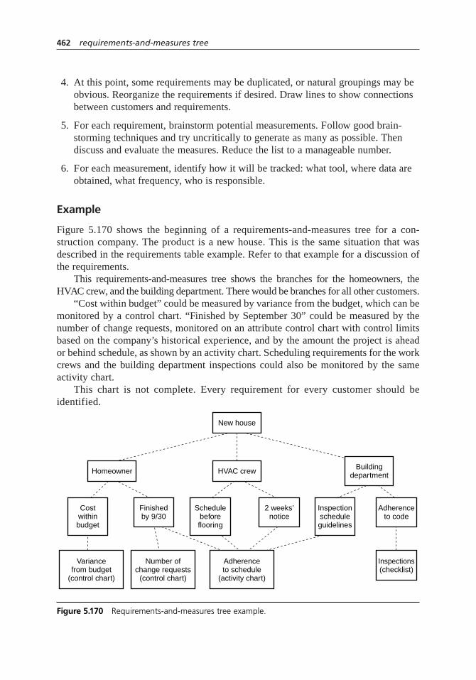
4. At this point, some requirements may be duplicated, or natural groupings may beobvious. Reorganize the requirements if desired. Draw lines to show connectionsbetween customers and requirements.
5. For each requirement, brainstorm potential measurements. Follow good brain-storming techniques and try uncritically to generate as many as possible. Thendiscuss and evaluate the measures. Reduce the list to a manageable number.
6. For each measurement, identify how it will be tracked: what tool, where data areobtained, what frequency, who is responsible.
Example
Figure 5.170 shows the beginning of a requirements-and-measures tree for a con-struction company. The product is a new house. This is the same situation that wasdescribed in the requirements table example. Refer to that example for a discussion ofthe requirements.
This requirements-and-measures tree shows the branches for the homeowners, theHVAC crew, and the building department. There would be branches for all other customers.
“Cost within budget” could be measured by variance from the budget, which can bemonitored by a control chart. “Finished by September 30” could be measured by thenumber of change requests, monitored on an attribute control chart with control limitsbased on the company’s historical experience, and by the amount the project is aheador behind schedule, as shown by an activity chart. Scheduling requirements for the workcrews and the building department inspections could also be monitored by the sameactivity chart.
This chart is not complete. Every requirement for every customer should beidentified.
462 requirements-and-measures tree
New house
HVAC crewHomeowner Buildingdepartment
Number ofchange requests
(control chart)
Adherenceto schedule
(activity chart)
Variancefrom budget
(control chart)
Costwithinbudget
Finishedby 9/30
Schedulebeforeflooring
2 weeks’notice
Inspectionscheduleguidelines
Adherenceto code
Inspections(checklist)
Figure 5.170 Requirements-and-measures tree example.

Considerations
• Do not neglect process requirements—how this output is produced. Be sure toinclude them.
• An affinity diagram can be useful when organizing requirements that have been brainstormed.
• When developing measures, it helps to switch the time frame of your thinking.Think about how to collect measurements of many occurrences over time ratherthan a single occurrence of the output. For example, if the product is a checkrequest, a requirement might be “contains authorized signature.” For one request,that is a yes–no measurement. On a weekly basis, one could record on an attributecontrol chart the percentage of requests lacking an authorized signature.
• An acronym for remembering the elements of a good measure is RAVE:
Relevant—measuring what needs to be measured
Adequate—able to perceive differences
Valid—accurate and consistent
Easy to obtain—inexpensive and simple
• When evaluating and deciding on measures, you can use other tools such as thedecision matrix, multivoting, and list reduction.
• Using the same tool to measure two or more requirements makes it easier to manage the measurement process. In the example, one activity chart can monitorthe scheduling requirements of several customers.
• Think about ways that measurement tools can prevent requirements from beingviolated, instead of only measuring (inspecting) to detect violations after theyhave occurred. For example, an activity chart prompts actions at appropriatetimes, and a control chart chosen for its sensitivity to small changes can alert you when a process begins to drift from historical patterns.
run chart
Description
A run chart is a line graph showing a process measurement on the vertical axis andtime on the horizontal axis. Often, a reference line shows the average of the data. Therun chart reveals patterns in the data over time. Unlike a control chart, it does not showcontrol limits.
3948
57
run chart 463

When to Use
• When monitoring a continuous variable over time, and . . .
• When looking for patterns, such as cycles, trends, or changes in the average,and . . .
• When you want a quick preliminary analysis to find obvious problems, before the effort of constructing control charts, or . . .
• When insufficient points have been collected to draw a control chart yet
Procedure
1. Decide on the vertical scale, based on the range of measurements you expect tosee. Decide on the horizontal time scale, based on the frequency of measurements.Mark and label the scales.
2. If you already have some data, calculate the average:
Draw across the chart a reference line showing the average.
3. Plot each measurement in the time order it occurs. Connect points with straight lines.
4. Look for patterns in the data, using these statistical tests:
Length of Run. Too many consecutive points on one side of the average. A runis 8 points in a row, 10 points on one side out of 11 in a row, 12 points on oneside out of 14 in a row, 16 out of 20.
Number of Runs. The average line is crossed too few or too many times. Use the number of runs table (Table 5.17) for this test. Count the total number of points, skipping any points lying directly on the average line. Determine the number of runs by counting the number of times the line between data points crosses the average line. If the data line touches the average line and then returns to the same side, do not count it as crossing.
Trend. A series of points heading up or down. If the chart has 20 to 100 points, there should be no more than six in a row steadily increasing ordecreasing. For fewer than 20 points, the limit is five. Or use the methoddescribed for the scatter diagram to decide if the number of points indicates a trend.
averagesum of thevalues
number of values=
464 run chart

Example
Figure 5.171 shows a typical run chart. The longest run is six points, which is acceptable.There are eighteen total points, and the centerline is crossed five times, which is alsowithin normal range. A trend test shows no abnormal pattern.
However, if the next two points stay above the centerline, then a suspicious patternwould be signaled by both the length-of-run test (8 in a row) and the number-of-runstest (with 20 points, the centerline should be crossed at least six times).
run chart 465
Table 5.17 Number of runs table.
Total Number OK If Number Total Number OK If Numberof Points of Runs Is: of Points of Runs Is:
< 10 Too small 36–37 12–25to tell
38–39 13–26
10–11 3–8 40–41 14–27
12–13 3–10 42–43 15–28
14–15 4–11 44–45 15–30
16–17 5–12 46–47 16–31
18–19 5–14 48–49 17–32
20–21 6–15 50–59 18–33
22–23 7–16 60–69 22–39
24–25 8–17 70–79 26–45
26–27 8–19 80–89 31–50
28–29 9–20 90–99 35–56
30–31 10–21 100–109 39–62
32–33 11–22 110–119 44–67
34–35 11–24 120–129 48–73
20X
40
115 120 125 130
Figure 5.171 Run chart example.
Considerations
• Run charts are not as powerful as control charts for analyzing process data andidentifying problems. The out-of-control tests used for control charts cannot beused with run charts because there are no control limits and no calculation of s.However, run charts provide a quick preliminary check for obvious problems andalso are useful if you don’t have enough data yet for a control chart.
• As the name “run” indicates, run charts are best for spotting runs of data: pointslying on one side of the centerline or a sequence of points headed in one direction.
• These tests for patterns are based on statistics. They test whether the data are trulystatistically random. If not, an underlying pattern needs to be identified.
• The tests do not judge whether patterns are desirable or undesirable. For example,a trend may be toward better performance or toward worse performance. It is justas important to do something to understand and maintain good performance as itis to eliminate bad performance.
• See graph for more information about graphing techniques. Also see the graphdecision tree (Figure 5.68, page 276) in that entry for guidance on when to use run charts and when other graphs may be more useful for your situation.
sampling
Description
Sampling means selecting a few items out of a larger group in order to question, examine,or test those items and then to draw conclusions about the entire group.
When to Use
• When you need to make conclusions about a large group, and . . .
• When it is expensive, difficult, or would take too long to examine the entire group
For example:
• When monitoring the quality of manufactured items during or after production
• When examining documents during an audit of compliance with procedures
• When gathering employee or customer preferences or feedback
• When testing a new procedure before widespread introduction
23948
57
466 run chart
Procedure
If sampling is new to you, start by reading the definitions of terms on the next page.These definitions explain the concepts of sampling. Then come back and read theprocedure.
1. Determine the population to be studied. Set up a sampling frame.
2. Determine the desired margin of error and confidence level. Those who will usethe data should participate in setting these requirements.
3. Select a sampling method and a sample size n, balancing cost against requiredprecision. Sample-size calculators for simple random samples are available on the Internet. For other sampling methods, consult a statistician to determine theappropriate sample size.
4. Document the sampling plan. Include how and when to do the sampling. Ifsampling will be a continuing process, prepare forms such as check sheets toassist those doing the sampling.
5. Select the sample.
Example
Examples are the best way to describe the various methods of sampling. Suppose a com-pany wished to survey its 10,458 employees located around the world. The employeebase is the population, and a group had already determined appropriate questions. A groupgathered to plan the sampling method.
Simple Random Sample. Gung Ho started the discussion. “I’ve got it figured out. Fora margin of error of 5 and a 95% confidence level, an Internet sample-size calculatorshowed we need a sample of 371. We’ll use a random number generator from theInternet to choose 371 random numbers between 1 and 10,458. Every employeealready has a unique employee number. So the employees with those numbers wouldform our sample.”
Systematic Sample. Ima Thinker said, “That employee list is already randomly orderedby location, department, gender—everything except date of employment. Why don’t wedo this: Randomly pick a starting point, say by throwing a die. If it comes up 4, we startwith the fourth person on the list. 10,458 divided by 371 is 28, so we’ll sample every28th person on the list after that.”
Convenience Sample. Manny Moneybags said, “Why waste time? There are more than371 employees here in this building. We’ll just survey each one and have our answersby this afternoon.” Fortunately, the rest of the group persuaded him that the sample sizeof 371 was only valid if the selection was totally random. Besides, even if everyemployee in the building were surveyed, that sample would not be representative ofall employees. (Manny Moneybags once conducted a customer survey by questioning
sampling 467
the first 100 customers to telephone the call center. In this biased convenience sample,East Coast customers and early risers were overrepresented, and Internet customerswere missed entirely.)
Cluster Sample. Vera Practical said, “You don’t understand. In order to get more andbetter information, this survey must be done with face-to-face interviews using trainedinterviewers. With the methods you’re discussing, the travel cost for interviewers willbe prohibitive. Here’s an idea: Out of our 24 locations, we will randomly select anumber of them. Then we’ll randomly sample from those “cluster” locations. Thesample size will have to be larger, but overall costs will be lower because of reducedtravel. A statistician can determine the sample size required.”
Proportional Stratified Sample. Will Prevail spoke up. “We must ensure representativeresponse from people with different amounts of experience. A simple random or sys-tematic sample is not the most efficient way to do this. A clustered sample won’t do iteither. Let’s divide all employees into four groups: under 5 years experience, 5 to 10years experience, 10 to 20 years experience, over 20 years experience. Within eachgroup, we’ll select random samples proportional to the number of people in the group.The statistician will determine the sample size. It will be less than 371. And Vera Marie,we can use telephone interviews.”
Important Definitions
Population. The entire group of all individuals or items under study. Sometimes called“universe.”
Sampling frame. A list, designed to represent the entire population, from which thesample will be drawn.
Sample. (noun) A smaller group of individuals or items selected from the larger popu-lation. (verb) To select a group of individuals or items from a population to questionor examine.
Random sample. A sample selected by a method in which every possible sample isequally likely.
Representative sample. A sample in which the individuals or items reflect all importantcharacteristics of the population. For example, a customer sample selected from webpage visitors would not be representative, for it would not reflect customers who didn’town computers or shop with them.
Sampling error. The difference between the result estimated from the sample and theresult one would have gotten if one surveyed the entire population. The result estimatedfrom the sample is rarely exactly equal to the unknown, true value. The true samplingerror is also unknown, but the maximum sampling error can be calculated.
Margin of error or confidence interval or tolerance specification. The range of valuesaround the estimate that probably contains the true value. This number is calculatedfrom statistical formulas. For example, suppose a candidate is favored by 38% of pollrespondents, with a margin of error of 4%. This means that in the general population,
468 sampling
05h.H1224.ch5(403-470).qxd 4/7/05 4:48 PM Page 468
the true percentage of supporters has a high probability of being in the range from 34to 42 percent. Without more information, however, you don’t know how high the prob-ability is. For that, you need the confidence level.
Confidence level. The probability that in repeated sampling, the confidence intervalsobtained would contain the true value. In the poll described above, suppose the confi-dence level were 95%. Then if the poll were repeated many times, in 95% of those polls(or 19 times out of 20), the true value would lie within the confidence interval. Anotherway of thinking about the confidence level is the risk one is willing to take of beingwrong, in this case, 5%. When the term “confidence interval” is used to describe therange, the confidence level should be stated with it. In our example: The 4% margin oferror means the 95% confidence interval.
Accuracy. How closely the result estimated from the sample compares to the true value.
Precision. How closely the result estimated from the sample compares to the result onewould have gotten if one surveyed the entire population.
Bias. A difference between the sample and the population, caused by the samplingmethod.
Considerations
• One of the advantages of sampling is that the sample results may actually be moreaccurate than a survey of the entire group. This seems counterintuitive, doesn’t it? One is thinking of sampling error when it seems that a 100 percent surveywould be more precise. However, other types of errors, such as reporting and nonresponse errors, can cause the result of a 100 percent survey to be differentfrom the truevalue. These errors are often greater than the sampling error andcan’t be measured or calculated. With a smaller survey, more care can be takenwith design, training, and execution to reduce these errors.
• Setting up an appropriate sampling frame can be critical to success of the sampling. The sampling frame ideally would include all the intended population,exclude those not in the intended population, avoid duplication, and be up-to-date and accurate. Suppose the intended population is all voters in an upcomingelection. The famous inaccurate poll predicting Dewey beating Truman was dueto an inappropriate sampling frame: the telephone directory. In 1948, many ruralvoters did not have phones. A more appropriate sampling frame might be theofficial list of registered voters. But what about people who will register betweennow and the registration deadline? Registered voters who have no intention ofvoting? Determining an appropriate sampling frame requires the insight of thosefamiliar with the subject of the sampling.
• As sample size is increased, sampling error decreases—at first. Eventually a pointis reached where increasing the sample size does not decrease the error. Also, aspopulation increases, the required sample size increases more slowly, becoming asmaller and smaller fraction of population, until with a large population, sample
sampling 469
size does not depend on population size at all. For example, a sample size of 1000gives a 3.1% margin of error for populations of 50,000 or 200 million. That iswhy polls of only a few thousand respondents can predict the voting preferencesof the entire United States.
• A f inal note about sample size: It is calculated using the proportion p that respond favorably. Usually, of course,p is unknown ahead of time. Thereforemany sample-size calculators assume that p= 50%, which is the worst case andgives the largest sample size. If pcan be predicted, use a sample-size calculatorthat allows you to input p. Alternatively, if after the analysis pturns out to be asmall number, you could input the numbers into a confidence interval calculatorand recalculate the smaller confidence interval for the data you obtained.
• Avoid selecting random numbers out of your head. The human brain wants toform patterns, so numbers chosen that way often do not pass tests of randomness.Instead, use one of the random number generators available in statistics softwareor on the Internet.
• As the example implies, convenience sampling is not recommended. If it isunavoidable—say you’re testing a new training method and you have to use whoever enrolls for the class—at least do some checks to see if bias exists in your sample.
• Stratified sampling works best when each group is as uniform as possible, withdiversity between groups. Cluster sampling is the opposite: it works best when all clusters are as diverse as the total population, so each cluster looks prettymuch like the next. In the real world, clusters are often used to avoid problems of geography, with the result that each one is not diverse and looks different from the next. For the same sample size, stratified sampling gives a more precise answer than random sampling, and cluster sampling gives a less preciseanswer. Therefore, geographic clusters should be avoided. If cost and efficiencydictate using them, a statistician should be consulted to help overcome any nonrandomness. Cluster sampling may be useful when sampling from productionlots, where different lots are expected to be alike.
• With systematic sampling, be careful not to introduce bias. For example, if a sample is taken every hour on the hour, shift changes may affect the samples. A better method might be to take one sample per hour, but to throw a die to determine in which 10-minute interval the sample is taken.
• See hypothesis testing for other issues related to making decisions based on samples.
• This is an overview of sampling. For more specific details, for assistance withcritical projects, or to develop an efficient and effective sampling plan for qualityassurance, consult a statistician.
470 sampling

scatter diagram
Also called: scatter plot, X–Y graph
Description
The scatter diagram graphs pairs of numerical data, one variable on each axis, to lookfor a relationship between them. If the variables are correlated, the points will fall alonga line or curve. The better the correlation, the tighter the points will hug the line.
When to Use
• When you have paired numerical data, and . . .
• When the dependent variable may have multiple values for each value of theindependent variable, and . . .
• When trying to determine whether the two variables are related, such as:
– When trying to identify potential root causes of problems, or . . .
– After brainstorming causes and effects using a fishbone diagram, to determineobjectively whether a particular cause and effect are related, or . . .
– When determining whether two effects that appear to be related both occur withthe same cause, or . . .
– When testing for autocorrelation before constructing a control chart
Procedure
1. Collect pairs of data where a relationship is suspected.
2. Draw a graph with the independent variable on the horizontal axis and the dependent variable on the vertical axis. For each pair of data, put a dot or asymbol where the x-axis value intersects the y-axis value. If two dots fall together, put them side by side, touching, so that you can see both.
3. Look at the pattern of points to see if a relationship is obvious. If the data clearlyform a line or a curve, you may stop. The variables are correlated. You may wish touse regression or correlation analysis now. Otherwise, complete steps 4 through 7.
485
5
scatter diagram 471
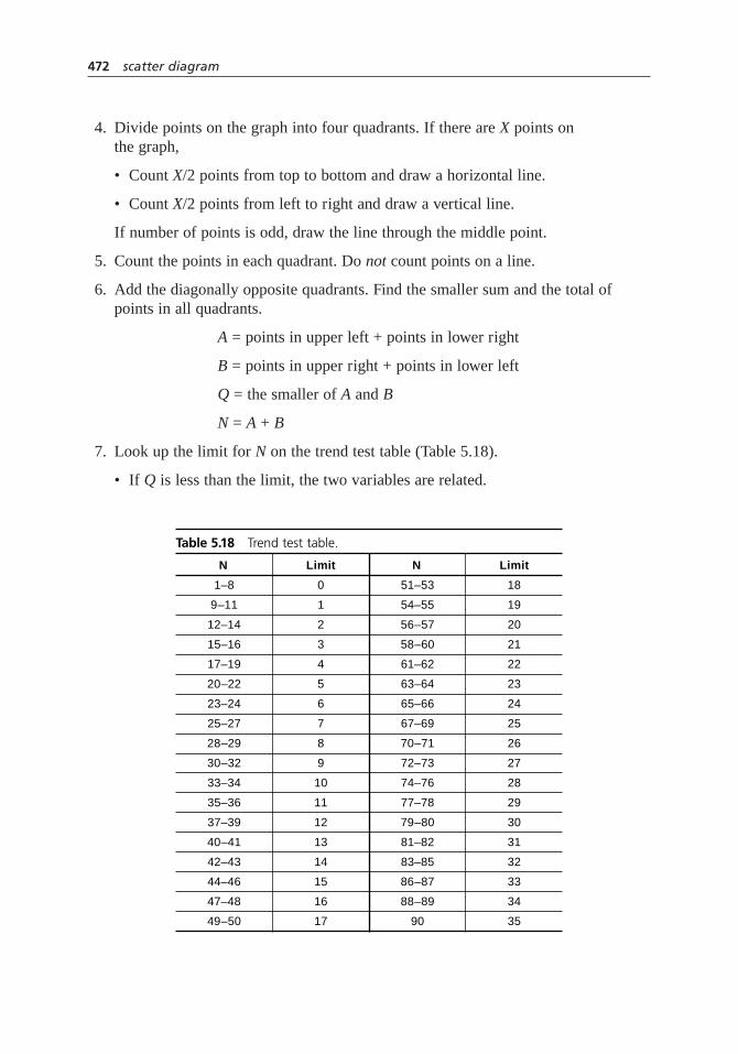
4. Divide points on the graph into four quadrants. If there are X points on the graph,
• Count X/2 points from top to bottom and draw a horizontal line.
• Count X/2 points from left to right and draw a vertical line.
If number of points is odd, draw the line through the middle point.
5. Count the points in each quadrant. Do not count points on a line.
6. Add the diagonally opposite quadrants. Find the smaller sum and the total ofpoints in all quadrants.
A = points in upper left + points in lower right
B = points in upper right + points in lower left
Q = the smaller of A and B
N = A + B
7. Look up the limit for N on the trend test table (Table 5.18).
• If Q is less than the limit, the two variables are related.
472 scatter diagram
Table 5.18 Trend test table.
N Limit N Limit
1–8 0 51–53 18
9–11 1 54–55 19
12–14 2 56–57 20
15–16 3 58–60 21
17–19 4 61–62 22
20–22 5 63–64 23
23–24 6 65–66 24
25–27 7 67–69 25
28–29 8 70–71 26
30–32 9 72–73 27
33–34 10 74–76 28
35–36 11 77–78 29
37–39 12 79–80 30
40–41 13 81–82 31
42–43 14 83–85 32
44–46 15 86–87 33
47–48 16 88–89 34
49–50 17 90 35
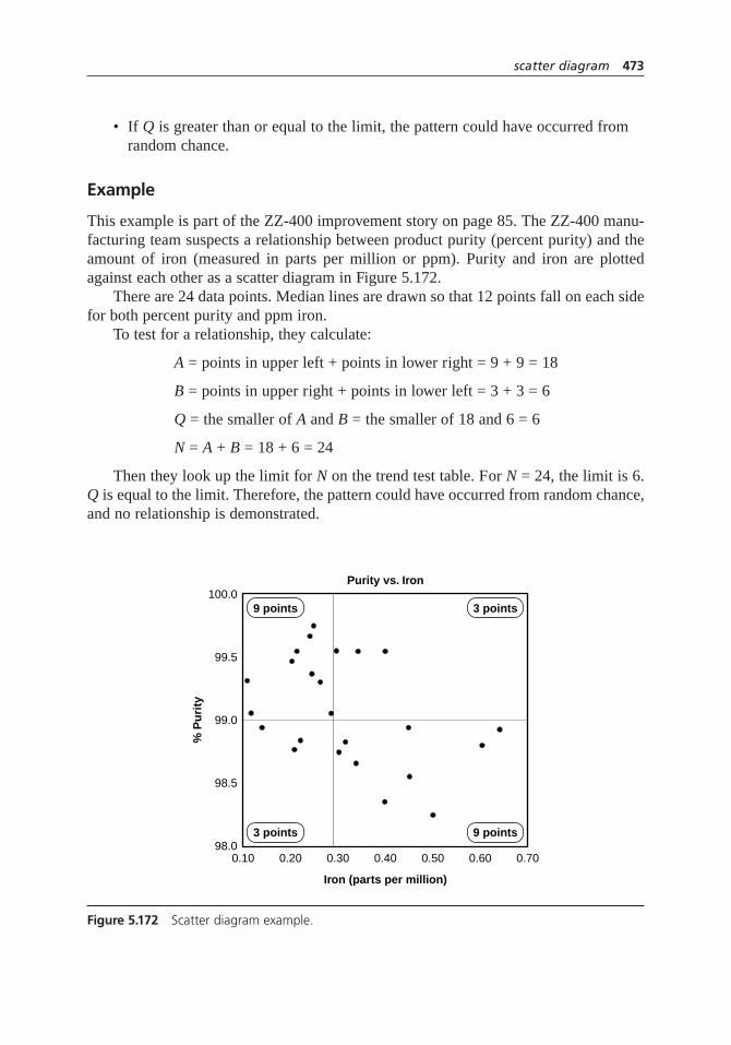
• If Q is greater than or equal to the limit, the pattern could have occurred fromrandom chance.
Example
This example is part of the ZZ-400 improvement story on page 85. The ZZ-400 manu-facturing team suspects a relationship between product purity (percent purity) and theamount of iron (measured in parts per million or ppm). Purity and iron are plottedagainst each other as a scatter diagram in Figure 5.172.
There are 24 data points. Median lines are drawn so that 12 points fall on each sidefor both percent purity and ppm iron.
To test for a relationship, they calculate:
A = points in upper left + points in lower right = 9 + 9 = 18
B = points in upper right + points in lower left = 3 + 3 = 6
Q = the smaller of A and B = the smaller of 18 and 6 = 6
N = A + B = 18 + 6 = 24
Then they look up the limit for N on the trend test table. For N = 24, the limit is 6.Q is equal to the limit. Therefore, the pattern could have occurred from random chance,and no relationship is demonstrated.
scatter diagram 473
Purity vs. Iron
9 points 3 points
3 points 9 points
Iron (parts per million)
% P
uri
ty
100.0
99.5
99.0
98.5
98.00.10 0.20 0.30 0.40 0.50 0.60 0.70
Figure 5.172 Scatter diagram example.

Considerations
• In what kind of situations might you use a scatter diagram? Here are some examples:
– Variable A is the temperature of a reaction after 15 minutes. Variable B measures the color of the product. You suspect higher temperature makes the product darker. Plot temperature and color on a scatter diagram.
– Variable A is the number of employees trained on new software, and variable B is the number of calls to the computer help line. You suspect that more training reduces the number of calls. Plot number of people trained versus number of calls.
– To test for autocorrelation of a measurement being monitored on a controlchart, plot this pair of variables: Variable A is the measurement at a given time. Variable B is the same measurement, but at the previous time. If the scatter diagram shows correlation, do another diagram where variable B is themeasurement two times previously. Keep increasing the separation between the two times until the scatter diagram shows no correlation.
• Even if the scatter diagram shows a relationship, do not assume that one variablecaused the other. Both may be influenced by a third variable.
• When the data are plotted, the more the diagram resembles a straight line,the stronger the relationship. See Figures 5.39 through 5.42, page 198 in the correlation analysis entry, for examples of the types of graphs you might see and their interpretations.
• If a line is not clear, statistics (N and Q) determine whether there is reasonablecertainty that a relationship exists. If the statistics say that no relationship exists,the pattern could have occurred by random chance.
• If the scatter diagram shows no relationship between the variables, considerwhether the data might be stratified. See stratification for more details.
• If the diagram shows no relationship, consider whether the independent (x-axis)variable has been varied widely. Sometimes a relationship is not apparent becausethe data don’t cover a wide enough range.
• Think creatively about how to use scatter diagrams to discover a root cause.
• See graph for more information about graphing techniques. Also see the graph decision tree (Figure 5.68, page 276) in that section for guidance on when to use scatter diagrams and when other graphs may be more useful for your situation.
• Drawing a scatter diagram is the first step in looking for a relationship betweenvariables. See correlation analysis and regression analysis for statistical methodsyou can use.
474 scatter diagram

SIPOC diagram
Description
SIPOC stands for suppliers–inputs–process–outputs–customers. A SIPOC diagram showsa high-level flowchart of a process and lists all suppliers, inputs, outputs, and customers.A SIPOC diagram provides a quick, broad view of key elements of a process.
When to Use
• At the beginning of a project, to help define the important elements of the project, or . . .
• When it is not clear what the process inputs are, who supplies them, what theoutputs are, or who the customers are, or . . .
• When there are many suppliers, inputs, outputs, and/or customers
Procedure
1. Gather a group of people who are knowledgeable about the process. Identify theprocess under study.
2. Create a macro or top-down flowchart of the process. Display it where everyonecan see it throughout the rest of the procedure. Be sure to include starting andending points for the process.
3. Identify the outputs of the process. Record all of them on a flipchart, on stickynotes attached to a wall, or on a transparency. Regardless of where they arerecorded, have a heading reading “Outputs.”
4. Identify the customers who receive the outputs. Record them on a separateflipchart, wall area, or transparency, with the heading “Customers.”
5. Identify the inputs that the process needs. Record them separately as before.
6. Identify the inputs’ suppliers. Once more, record them separately.
7. Review all your work to find omissions, duplications, unclear phrases,inaccuracies, and so on.
8. Draw a complete SIPOC diagram as shown in the example.
Example
A catalog retailer call center created the SIPOC diagram of their telephone customerservice process, shown in Figure 5.173.
23
SIPOC diagram 475

Also see the ZZ-400 story on page 79 and the Medrad story on page 58, whichdescribe using SIPOC diagrams within their improvement processes.
Considerations
• The concepts behind the SIPOC diagram are derived from Juran’s triple roleconcept of customer, processor, and supplier. Juran describes the TRIPROLdiagram, which is similar to the SIPOC, commonly used in Six Sigma.
• Sometimes preliminary requirements and measures for inputs and outputs areidentified and included on the diagram. If you do so, be sure not to consideroutput requirements final until you have discussed them with customers.
• See flowchart for more information about drawing and analyzing flowcharts.
• See critical-to-quality analysis for a tool that examines inputs and outputs in more detail.
stakeholder analysis
Description
Stakeholder analysis identifies individuals or groups with an interest in an issue. Basedon assessments of the interest, influence, and importance of each stakeholder, actions
1
6
29
7
476 SIPOC diagram
Suppliers
• Printer• Merchandising
dept.• Marketing dept.• Phone company• IS dept.• Training dept.
Inputs
• Catalog• Telephone lines• Order system• Customer data-
base• Call statistics
database• Inventory data-
base• Product training• Customer service
training
Process
Customer calls 800number
Rep answers call
Rep and customerexchange information
Rep enters orderinto system
Rep and customerconference with
product specialist(PS) if required
Call concluded
Outputs
• Order entry• Payment info to
accounting• Product request
to warehouse• Inventory data-
base adjustment• Customer data-
base update• Call statistics
database update• Credit card
transaction data
Customers
• Telephonecustomer
• Warehouse dept.• Accounting dept.• Marketing dept.• Credit card
processor
Figure 5.173 SIPOC diagram example.

are planned to change those assessments or to work within them to ensure success of aproject or plan.
When to Use
• When identifying issues that need to be improved based on stakeholder needs,or . . .
• Before beginning problem analysis, if stakeholders’ interests may affect theirinput, or . . .
• When developing a proposed action, to ensure that its effects on all stakeholdersare considered in the design, or . . .
• When planning rollout of a change, to ensure that it will be supported by thosewho can make it succeed or fail
Procedure
1. Define the issue, problem, proposed action, or plan. Brainstorm the stakeholders of that issue. List all the stakeholders in the left-most column of a table. (Optional) Separate stakeholders into primary and secondary.
2. Identify each stakeholder’s interest(s) in the issue. List the interests in the nextcolumn.
3. (Optional) Rate the attitude of each stakeholder on a scale of –2 to +2, where –2 is strongly opposed, 0 is neutral or undecided, and +2 is strongly supportive.Write the rating in the third column.
4. Rate the influence of each stakeholder on a scale of 1 to 5 or low, medium, high.Write the rating in the fourth column.
5. Rate the importance of each stakeholder to the project’s success on a scale of 1 to 5 or low, medium, high. Write the rating in the fifth column.
6. Construct a two-dimensional chart with influence on one edge and importance onthe other. Code each stakeholder with a number or letter. Place each stakeholder’scode in the appropriate place on the influence–importance chart.
7. Analyze the influence–importance chart as follows. (See Figure 5.174.)
• High influence–high importance: Develop good collaboration with thesestakeholders.
• High influence–low importance: These stakeholders could sabotage plans orescalate problems. Work to involve them so their interest increases.
• Low influence–high importance: Work to give these stakeholders voice andinfluence. They often need to be defended or protected.
stakeholder analysis 477
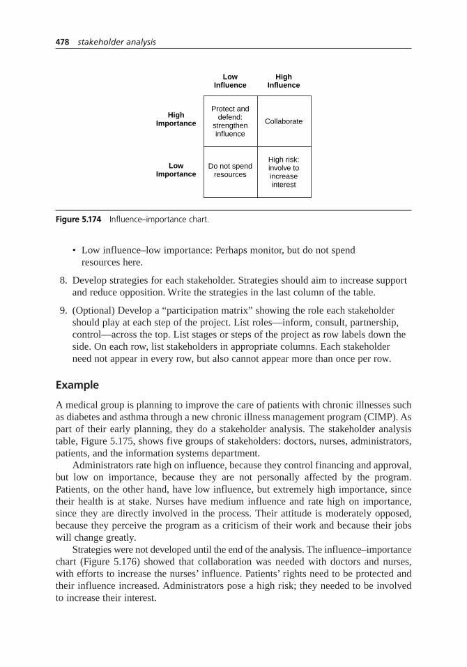
• Low influence–low importance: Perhaps monitor, but do not spend resources here.
8. Develop strategies for each stakeholder. Strategies should aim to increase supportand reduce opposition. Write the strategies in the last column of the table.
9. (Optional) Develop a “participation matrix” showing the role each stakeholdershould play at each step of the project. List roles—inform, consult, partnership,control—across the top. List stages or steps of the project as row labels down theside. On each row, list stakeholders in appropriate columns. Each stakeholderneed not appear in every row, but also cannot appear more than once per row.
Example
A medical group is planning to improve the care of patients with chronic illnesses suchas diabetes and asthma through a new chronic illness management program (CIMP). Aspart of their early planning, they do a stakeholder analysis. The stakeholder analysistable, Figure 5.175, shows five groups of stakeholders: doctors, nurses, administrators,patients, and the information systems department.
Administrators rate high on influence, because they control financing and approval,but low on importance, because they are not personally affected by the program.Patients, on the other hand, have low influence, but extremely high importance, sincetheir health is at stake. Nurses have medium influence and rate high on importance,since they are directly involved in the process. Their attitude is moderately opposed,because they perceive the program as a criticism of their work and because their jobswill change greatly.
Strategies were not developed until the end of the analysis. The influence–importancechart (Figure 5.176) showed that collaboration was needed with doctors and nurses,with efforts to increase the nurses’ influence. Patients’ rights need to be protected andtheir influence increased. Administrators pose a high risk; they needed to be involvedto increase their interest.
478 stakeholder analysis
Protect anddefend:
strengtheninfluence
LowInfluence
HighImportance
Do not spendresources
LowImportance
Collaborate
High risk:involve toincreaseinterest
HighInfluence
Figure 5.174 Influence–importance chart.
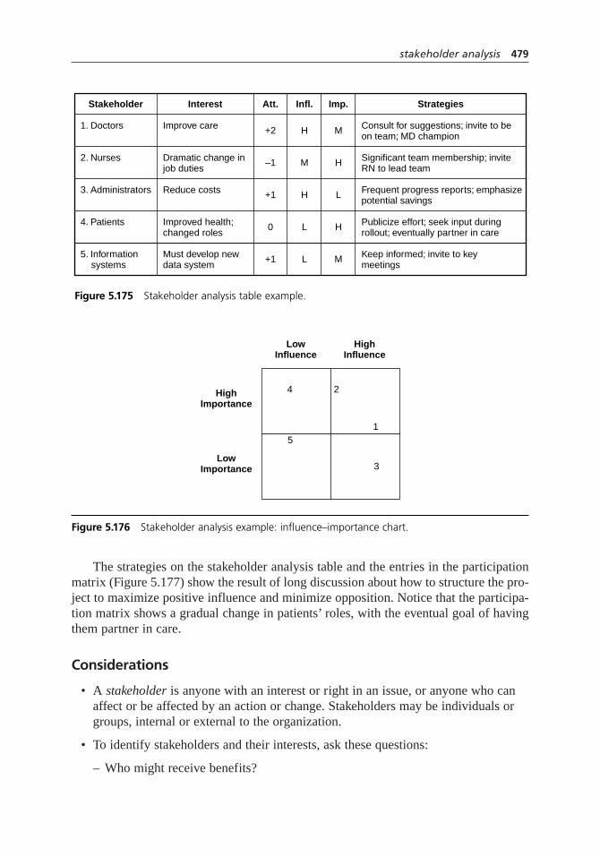
The strategies on the stakeholder analysis table and the entries in the participationmatrix (Figure 5.177) show the result of long discussion about how to structure the pro-ject to maximize positive influence and minimize opposition. Notice that the participa-tion matrix shows a gradual change in patients’ roles, with the eventual goal of havingthem partner in care.
Considerations
• A stakeholder is anyone with an interest or right in an issue, or anyone who canaffect or be affected by an action or change. Stakeholders may be individuals orgroups, internal or external to the organization.
• To identify stakeholders and their interests, ask these questions:
– Who might receive benefits?
stakeholder analysis 479
Stakeholder
1. Doctors Consult for suggestions; invite to beon team; MD champion
Improve care +2 H M
2. Nurses Significant team membership; inviteRN to lead team
Dramatic change injob duties
–1 M H
3. Administrators Frequent progress reports; emphasizepotential savings
Reduce costs +1 H L
4. Patients Publicize effort; seek input duringrollout; eventually partner in care
Improved health;changed roles
0 L H
5. Information systems
Keep informed; invite to keymeetings
Must develop newdata system
+1 L M
Interest Att. Imp.Infl. Strategies
Figure 5.175 Stakeholder analysis table example.
4
LowInfluence
HighImportance
5
LowImportance
2
1
3
HighInfluence
Figure 5.176 Stakeholder analysis example: influence–importance chart.

– Who might experience negative effects?
– Who might be forced to make changes?
– Who might have to change behavior?
– Who has goals that align with these goals?
– Who has goals that conflict with these goals?
– Who has responsibility for action or decision?
– Who has resources or skills that are important to this issue?
– Who has expectations for this issue or action?
• Primary stakeholders are those directly affected. Secondary stakeholders are intermediaries, or those involved in implementing, funding, monitoring,and so on.
• Consider dividing stakeholder groups based on demographics: gender, occupation,and so on.
• Focus groups and interviews can be useful to get accurate information aboutstakeholders and to involve them in the analysis process.
• Influence is the power to make or affect decisions, to control resources, or topersuade or coerce others who can. This influence may be formal or informal.Those with influence can help or hurt the action or plan, or can worsen orimprove a problem.
• Importance is the potential to affect or be affected by the issue, problem, oraction. Information, rights, and dependencies are often involved.
• Some groups add columns beside Attitude, Influence, and Importance to rate thestrength of those assessments. Use ✓ for certain, ? for some uncertainty, ?? forgreat uncertainty and ??? for simply guessing.
480 stakeholder analysis
Identification NursesIS
Doctors
Planning Patients AdministrationIS
DoctorsNurses
CIMP Team
Implementation Administration PatientsIS
DoctorsNurses
CIMP Team
Monitoring AdministrationIS
NursesPatients
Doctors
Inform Consult Partnership Control
Figure 5.177 Stakeholder analysis example: participation matrix.

• Some stakeholder analyses do not assess attitude. Decide whether it is appropriatefor your situation to do so.
• Attitude should be considered only in light of the stakeholder’s influence andimportance. For example, neither opposition nor support matter if the stakeholderhas little influence and importance.
• Stakeholders with high influence must be involved in some way. If this is notpossible with stakeholders who are opposed, their influence must be neutralized.
• On a participation matrix, show plans to increase the involvement of low influence or low importance stakeholders during the course of the project. For example, in the hospital example, the participation matrix shows a desire toactively involve patients and their families as partners in care.
• Other matrices and tables can be used to analyze stakeholders. For example, atable with columns for stakeholder, main objectives, potential positive benefits,potential negative benefits, and overall impact may be useful in complexsituations. See the entries in Resources for more analysis ideas.
• Labeling individuals or groups as powerful or powerless, important or unimportant,can ignite strong emotions. Be ready to deal skillfully with sensitive relationships.
• Be careful to use this tool to learn, to build relationships, to seek common ground,to equalize uneven power, and to increase participation and ownership. Be awarethat it can be used by some stakeholders to concentrate their power.
• Relations diagrams and mind maps may also be useful to depict stakeholder relationships.
storyboard
Also called: displayed thinking
Description
A storyboard is a visual display of thoughts. It makes all facets of a process, organiza-tion, plan, or concept visible at once to anyone. It taps both the creative right brain andthe analytical left brain to yield breakthrough thinking.
1
6
210394
5
6
21039
7
1
6
2103948
57
storyboard 481
When to Use
• When developing new ideas, or . . .
• When planning a project, or . . .
• When developing a process flow diagram, or . . .
• When planning a presentation, or . . .
• When exhibiting proposed plans, or . . .
• When exhibiting or documenting project activities or results
Procedure
Materials needed: cards or sticky notes in three different sizes or colors, large piece ofnewsprint or pinboard, marking pens, images and graphics.
1. Define the topic of the storyboard. Write it on a large card and place it at the topof the work surface (paper or pinboard).
2. Brainstorm important subjects to be considered. Write these on large headercards. The first one should be “Purpose” or “Why work on this topic.” Continueto brainstorm headers until the flow of ideas stops.
3. Critically discuss each heading. Identify duplicates and subjects that are lessimportant and should be dropped. Some headings will be a subcategory underanother heading and should be set aside. Team members can object to anything on the work surface. The team tries to remove the objection by plussing(improving) the idea. Change the card if it is plussed; remove it if the objectioncannot be resolved. Continue the discussion until the group has determined theimportant headers.
4. Choose one header and brainstorm ideas. Write them on small sticky notes andplace under the heading. These are called subbers. Brainstorm until the group has exhausted all ideas.
5. Critically discuss the subbers, as in step 3. Where choices need to be made, theteam may use other tools (such as decision matrix, list reduction, or multivoting)to narrow the list.
6. Continue to generate subbers for each of the headings in turn. Always do acomplete brainstorm first before following with a discussion session.
7. Add details to make the story complete.
• Include copies or thumbnail images of important diagrams or graphs, photos,or sketches.
• Connect ideas and show relationships with arrows or string.
482 storyboard

• Place small sticky notes, called siders, next to any card to make comments oramplify ideas.
8. Once the layout is finished, the final storyboard may be refined and polished withcomputerized word processing or graphics.
Example
This example is part of the ZZ-400 improvement story on page 88. The ZZ-400 purityteam made a storyboard (Figure 5.178) to explain to the rest of the plant how theysolved a quality problem and the broader learnings from the project. The topic cardreads “Iron-Free ZZ-400.” The header cards are “What was the problem?” “How didwe find the root cause?” “How did we fix it?” and “How will we prevent it fromhappening again?” Subbers were needed under only the root cause header, to describethe approach.
Small copies of key diagrams, charts, and documents that led them to their solutionillustrate the steps. A sider provides contact information.
Considerations
• Storyboards and the process of storyboarding were invented by Walt DisneyStudios to develop cartoons and are still used in moviemaking. Keep that in mindas you creatively develop a storyboard that tells the story of your plan or project.What are the main acts, scenes, characters, conflict, and resolution?
• Storyboarding requires a small group. Between 4 and 10 participants is the ideal size.
• Storyboarding alternates between creative brainstorming and critical review. It is essential to keep the two modes separate. Mixing the two is deadly: a groupcannot be creative when some members are being critical. It is the facilitator’srole to keep the team in the right mode. One helpful technique is to pin a card onthe board with “creative” on one side and “critical” on the other, signaling to theteam which type of thinking is in play.
• The decision to switch from creative to critical mode or vice versa can be madeby the facilitator or suggested by a team member.
• The better defined the topic statement is, the better the final result will be and theeasier it will be to get there.
• Common subject headers include purpose, problem or opportunity, future state,who, what, when, how, cost, summary, recommendations, and miscellaneous. The headers you use will depend on your topic.
• To speed the creative process, have participants themselves write their own ideason the cards.
storyboard 483
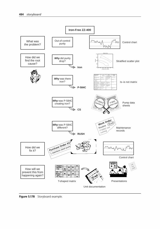
484 storyboard
Iron-Free ZZ-400
How will weprevent this fromhappening again?
Presentations
Unit documentation
T-shaped matrix
How did wefind the root
cause?
Why did puritydrop?
Iron
Stratified scatter plot
Control chartWhat wasthe problem?
Out-of-controlpurity
RUSH
Why was P-584Cdifferent? Maintenance
records
Work Order
Routine
P-584C not
running
Rush
Call
Tom
x783
CS
Why was P-584Ccreating iron? Pump data
sheetsP-584C
carbon steelP-584A,Bstainless st
How did wefix it?
Control chart
Purchase Order #23
1 stainless steel pump
P-584C
Why was thereiron? Is–is not matrix
Purity vs. Iron
Iron (parts per million)
% P
uri
ty
100.0
99.5
99.0
98.5
98.00.10 0.20 0.30 0.40 0.50 0.60 0.70
IsDescribe what
does occur
Problem Statement:Iron contaminationin ZZ-400
What objects are affected?What occurs?
When does the problem occur?When first? When since?How long? What patterns?Before, during, after other events?
Extent of problemHow many problems?How many objects or situations have problems?How serious is the problem?
Who is involved? (Do not use this question to blame.)To whom, by whom, near whom does this occur?
Where does the problem occur? • Geographical • Physical • On an object
Purity dropsIron increases
Lasts about one shiftAbout once a monthOften during same week as pump PMWhen P-584C runs
Purity drops from 99% range to 98% rangePuts us out of specIron up to 0.65 (3 × normal)
Mechanics doing pump PM
Reactors 2 and 3
Only iron increases
Just P-584C
Mechanics usually around
Not reactor 1
Other metal impuritiesIncrease in moistureChange in color
ContinuousAny particular shiftAny other pump than P-584C
Purity below 98.2%Pluggage problemOther specification problems
Reactor 1
Is NotDescribe what
does not occur, though it reasonably might
DistinctionsWhat standsout as odd?
Figure 5.178 Storyboard example.
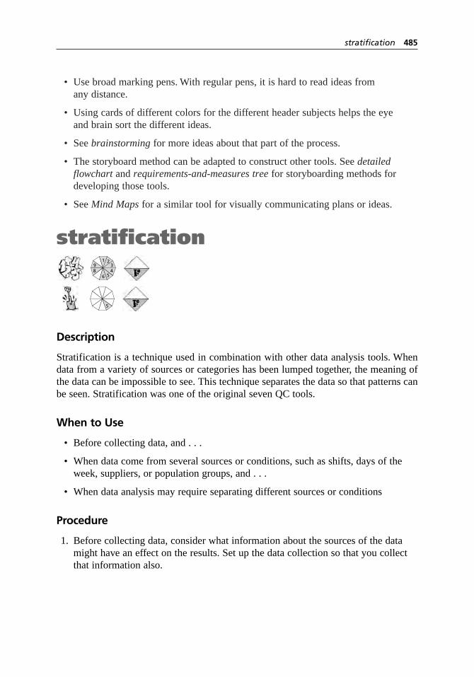
• Use broad marking pens. With regular pens, it is hard to read ideas from any distance.
• Using cards of different colors for the different header subjects helps the eye and brain sort the different ideas.
• See brainstorming for more ideas about that part of the process.
• The storyboard method can be adapted to construct other tools. See detailed flowchart and requirements-and-measures tree for storyboarding methods fordeveloping those tools.
• See Mind Maps for a similar tool for visually communicating plans or ideas.
stratification
Description
Stratification is a technique used in combination with other data analysis tools. Whendata from a variety of sources or categories has been lumped together, the meaning ofthe data can be impossible to see. This technique separates the data so that patterns canbe seen. Stratification was one of the original seven QC tools.
When to Use
• Before collecting data, and . . .
• When data come from several sources or conditions, such as shifts, days of theweek, suppliers, or population groups, and . . .
• When data analysis may require separating different sources or conditions
Procedure
1. Before collecting data, consider what information about the sources of the datamight have an effect on the results. Set up the data collection so that you collectthat information also.
5
1
6
23948
5
stratification 485
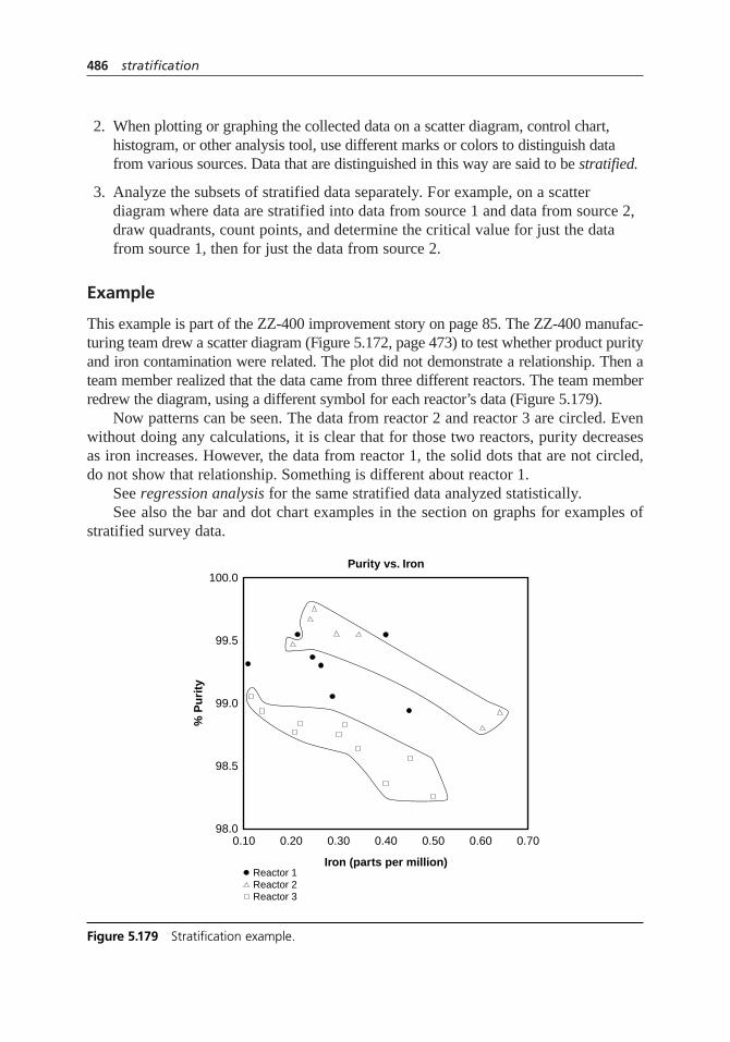
2. When plotting or graphing the collected data on a scatter diagram, control chart,histogram, or other analysis tool, use different marks or colors to distinguish datafrom various sources. Data that are distinguished in this way are said to be stratified.
3. Analyze the subsets of stratified data separately. For example, on a scatterdiagram where data are stratified into data from source 1 and data from source 2,draw quadrants, count points, and determine the critical value for just the datafrom source 1, then for just the data from source 2.
Example
This example is part of the ZZ-400 improvement story on page 85. The ZZ-400 manufac-turing team drew a scatter diagram (Figure 5.172, page 473) to test whether product purityand iron contamination were related. The plot did not demonstrate a relationship. Then ateam member realized that the data came from three different reactors. The team memberredrew the diagram, using a different symbol for each reactor’s data (Figure 5.179).
Now patterns can be seen. The data from reactor 2 and reactor 3 are circled. Evenwithout doing any calculations, it is clear that for those two reactors, purity decreasesas iron increases. However, the data from reactor 1, the solid dots that are not circled,do not show that relationship. Something is different about reactor 1.
See regression analysis for the same stratified data analyzed statistically.See also the bar and dot chart examples in the section on graphs for examples of
stratified survey data.
486 stratification
Purity vs. Iron
Iron (parts per million)
% P
uri
ty
100.0
99.5
99.0
98.5
98.00.10
Reactor 2Reactor 3
0.20 0.30 0.40 0.50 0.60 0.70
Reactor 1
Figure 5.179 Stratification example.

Considerations
• Here are examples of different sources that might require data to be stratified.
Equipment Suppliers
Shifts Day of the week
Departments Time of day
Materials Products
Survey data usually benefit from stratification. See survey for demographic information that may be needed for analysis.
• Always consider before collecting data whether stratification might be neededduring analysis. Plan to collect stratification information. After the data is collected it might be too late.
• If you might photocopy your graph, use different marks rather than different colors to stratify the data.
• On your graph or chart, include a legend that identifies the marks or colors used.In Figure 5.179, the legend tells which symbol refers to which reactor.
survey
Variations: questionnaire, e-survey, telephone interview, face-to-face interview,focus group
Description
Surveys collect data from a targeted group of people about their opinions, behavior, orknowledge. Common types of surveys are written questionnaires, face-to-face or tele-phone interviews, focus groups, and electronic (e-mail or Web site) surveys. Surveys arecommonly used with key stakeholders, especially customers and employees, to discoverneeds or assess satisfaction.
When to Use
• When identifying customer requirements or preferences, or . . .
• When assessing customer or employee satisfaction
Such as:
• When identifying or prioritizing problems to address, or . . .
1
6
23948
5
survey 487

• When evaluating proposed changes, or . . .
• When assessing whether a change was successful, or . . .
• Periodically, to monitor changes in customer or employee satisfaction over time
Basic Procedure
Note: It is often worthwhile to have a survey prepared and administered by a researchorganization. However, you will still need to work with them on the following steps sothat the survey will be most useful.
1. Decide what you want to learn from the survey and how you will use the results.
2. Decide who should be surveyed. Identify population groups, and if they are toolarge to permit surveying everyone, decide how to obtain a sample. (See samplingfor more information.) Decide what demographic information is needed toanalyze and understand the results.
3. Decide on the most appropriate type of survey. See each variation’s “when to use”section for guidance.
4. Decide whether the survey’s answers will be numerical rating, numerical ranking,yes–no, multiple choice, or open-ended—or a mixture.
5. Brainstorm questions and, for multiple choice, the list of possible answers. Keepin mind what you want to learn and how you will use the results. Narrow downthe list of questions to the absolute minimum that you must have to learn whatyou need to learn.
6. Print the questionnaire or interviewers’ question list. (Each variation hasadditional specific instructions at this step.)
7. Test the survey with a small group. Collect feedback.
• Which questions were confusing?
• Were any questions redundant?
• Were answer choices clear? Were they interpreted as you intended?
• Did respondents want to give feedback about topics that were not included?(Open-ended questions can be an indicator of this.)
• On the average, how long did it take for a respondent to complete the survey?
• For a questionnaire, were there any typos or other printing errors?
Also test tabulating and analyzing the results. Is it easy? Do you have all the datayou need?
488 survey

8. Revise the survey based on test results.
9. Administer the survey. See the variations for specific details.
10. Tabulate and analyze the data. Decide how you will follow through. Report resultsand plans to everyone involved. If a sample was involved, also report and explainthe margin of error and confidence level.
questionnaire
When to Use
• When possible responses to questions are known and need only be quantified,such as after an initial set of interviews or focus groups has identified key issues, and . . .
• When collecting data from a large group, and . . .
• When data are not needed immediately, and . . .
• When a low response rate can be tolerated, and . . .
• When resources (money, people) for collecting data are limited
Procedure
Follow the basic procedure. Add the following details at steps 6 and 9.
6. Print the survey in a format that is easy to read and easy to fill out. Leavegenerous space for answers to open-ended questions. Design the form so thattabulating and analyzing data will be easy. At the top, print instructions forcompleting and returning it.
9. There are three options for administering the questionnaire:
• Mail or e-mail the questionnaire with a cover letter. A cover letter shouldinclude the reason for the survey, how recipients were chosen, a deadline and instructions for returning questionnaires, and thanks. If using regular mail,include a stamped and addressed envelope. If using e-mail, design the messageso that the respondent can forward it to the address collecting responses, typinganswers directly into the message.
• Hand-deliver the survey. Ask the recipient for a 10-minute appointment. At theappointment, explain the purpose of the survey and ask for the recipient’s help.This method usually gets a better response rate.
survey 489

• Hold a meeting, if all respondents are at the same location. Send a memoexplaining the purpose of the survey and the time required. At the meeting,repeat the purpose before handing out the survey.
For mailed or hand-delivered questionnaires, follow up with nonrespondents toincrease the response rate. Send another copy of the survey with a new coverletter, or follow up with a telephone interview.
Example
Pearl River School District, recipient of the Malcolm Baldrige National Quality Award,surveys students, parents, and staff annually using a questionnaire developed andadministered by a national research firm. This ensures statistically correct methods,allows them to watch changes over time, and enables comparison with other districts.
The surveys show areas of satisfaction and dissatisfaction, but not reasons. To findcauses, they must dig deeper. Recently, the annual survey showed that the high schoolstudents ranked the cafeteria service low. This was hardly surprising, since the researchfirm’s database showed that almost all high school students rate their cafeterias low.However, Pearl River wanted to improve this rating.
A committee of student leaders and cafeteria staff prepared a second survey to getmore information. Figure 5.180 shows a condensed version of their survey. Demographicinformation was requested at the top. A short paragraph stated the reason for the survey,some additional information respondents needed to know, and who was eligible to com-plete the survey. The survey was designed to be filled out quickly with check marks inappropriate boxes. A few open-ended questions were placed at the end. Data from thesurvey, supplemented with sales data, was analyzed and used to plan menu changes.
Read the Pearl River story on page 65 to learn more about their improvementprocess. For examples of graphs that can be used to analyze survey responses, see thebar chart and dot chart variations in the graph entry.
e-survey
Description
E-surveys are sophisticated Internet-based surveys. They can be structured with inter-active features, such as graphics or programming that triggers alternate questions basedon previous responses. E-surveys can be more convenient and even enjoyable forrespondents, leading to higher response rates. They can also be carried out faster, pro-vide almost instant analysis, cost less than traditional mail or phone surveys, and some-times allow better targeting of respondents. Respondents can be contacted via e-mail,with a hyperlink to the Web site hosting the survey, or the survey can be located at theorganization’s Web site, with an invitation to visitors to complete it. To design and carryout an e-survey, get assistance from a research organization.
490 survey
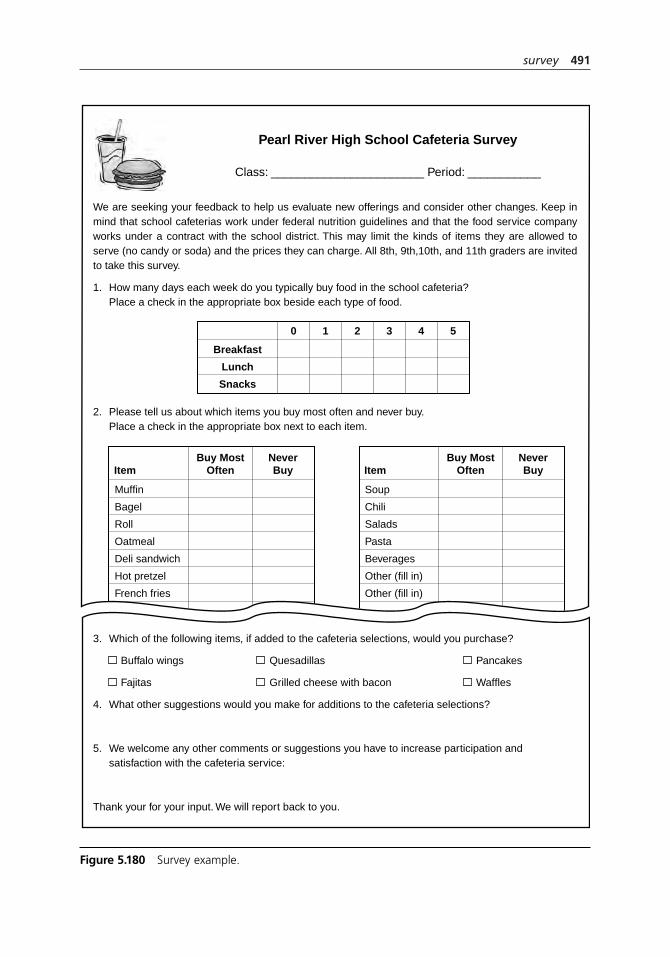
survey 491
0 1 2 3 4 5
Breakfast
Lunch
Snacks
Pearl River High School Cafeteria Survey
Class: _______________________ Period: ___________
We are seeking your feedback to help us evaluate new offerings and consider other changes. Keep in mind that school cafeterias work under federal nutrition guidelines and that the food service company works under a contract with the school district. This may limit the kinds of items they are allowed to serve (no candy or soda) and the prices they can charge. All 8th, 9th,10th, and 11th graders are invited to take this survey.
1. How many days each week do you typically buy food in the school cafeteria?Place a check in the appropriate box beside each type of food.
2. Please tell us about which items you buy most often and never buy.Place a check in the appropriate box next to each item.
3. Which of the following items, if added to the cafeteria selections, would you purchase?
Buffalo wings Quesadillas Pancakes
Fajitas Grilled cheese with bacon Waffles
4. What other suggestions would you make for additions to the cafeteria selections?
5. We welcome any other comments or suggestions you have to increase participation andsatisfaction with the cafeteria service:
Thank your for your input. We will report back to you.
Buy MostOftenItem
NeverBuy
Muffin
Bagel
Roll
Oatmeal
Deli sandwich
Hot pretzel
French fries
Buy MostOftenItem
NeverBuy
Soup
Chili
Salads
Pasta
Beverages
Other (fill in)
Other (fill in)
Figure 5.180 Survey example.

When to Use
• When all members of the target group have Internet access, and . . .
• When possible responses to questions are known and need only be quantified,such as after an initial set of interviews or focus groups has identified key issues, and . . .
• When collecting data from a large group, and . . .
• When resources (money, people) for collecting data are limited, and . . .
• When data are needed quickly, or . . .
• When a higher response rate than with traditional mail or phone surveys is desired
telephone interview
When to Use
• When most possible answers to the questions are known, and . . .
• When data are needed quickly, and . . .
• When a high response rate is needed, and . . .
• When people resources are available for making calls
Procedure
Follow the basic procedure. Add the following details at steps 6 and 9.
6. Print the interviewers’ question list with lots of space to write notes directly underthe question. Make one copy for each interview to be conducted. Also prepare atable with columns for name, phone number, busy signals, message left, call-backappointment, and interview completed. (Figure 5.181 shows an example.)
492 survey
NameLisa Galmon 222-3341Sam Hayes 222-3337Joan McPherson 222-3348
||
||||
| ✓
✓
|||
| Fri 9 amAlbert Stevens 222-3333
Phone # Busy Mess. Appt. Done
Figure 5.181 Table for tracking telephone interviews.
9. Fill out the table as calls are made. At the beginning of the phone interview,introduce yourself and explain the survey and its purpose. State how much timewill be needed and ask if this is a convenient time. If not, make an appointment to call back. See “Considerations” for interviewing tips.
face-to-face interview
When to Use
• When the group to be surveyed is small, and . . .
• When ample resources (time, people, and possibly travel expenses) are available, and . . .
• When possible answers to the questions are not known, such as when you firstbegin studying an issue, or . . .
• When the questions to be asked are sensitive, or . . .
• When the people to be surveyed are high-ranking, important, or otherwise deserving of special attention, or . . .
• When close to 100 percent response rate is needed
Procedure
Follow the basic procedure. Add the following details at steps 3, 6, and 9.
3. Almost all the questions should be open-ended. You might start with a few simpleyes–no questions.
6. Print the interviewers’ question list with lots of space to write notes directly underthe question.
9. Make four contacts with each interviewee.
• Letter. Send a letter or e-mail to each interviewee explaining the survey’spurpose and stating who will call to make interview arrangements.
• Phone. Call to request an interview. The interviewer should introduce him orherself, describe the survey again briefly, and state how much time is needed—no more than thirty minutes. Set an appointment.
• Interview. At the beginning of the interview, restate the purpose of the surveyand the time needed. See “Considerations” for interviewing tips.
• Thank-you. Send a follow-up thank-you letter to the interviewee.
survey 493

Example
The stories from St. Luke’s Hospital (page 72), Medrad (page 59), and ZZ-400 (page 79)all describe using interviews within the improvement process.
focus group
When to Use
• When the subject of the survey is complex or unfocused so that questionnaire orinterview questions cannot be written, or . . .
• Before surveying with a questionnaire or interviews, to identify main issues orthemes, or . . .
• After a questionnaire, to generate in-depth understanding of the responses
Procedure
A focus group brings together up to a dozen people to discuss their attitudes and con-cerns about a subject. Leading, documenting, and analyzing a focus group requires anexperienced facilitator. Ask for help from your human resources or training departmentsor from a consultant or research organization.
Considerations
• Conducting a survey creates expectations for change in those asked to answer it.Do not survey if action will not or cannot be taken as a result.
• Satisfaction surveys should be compared to objective indicators of satisfaction,such as buying patterns for customers or attendance for employees, and to objective measures of performance, such as warranty data in manufacturing orreadmission rates in hospitals. If survey results do not correlate with the othermeasures, work to understand whether the survey is unreliable or whether perceptions are being modified, for better or worse, by the organization’s actions.
• Surveys of customer and employee satisfaction should be ongoing processesrather than one-time events. Plan–do–study–act is an excellent model for satisfaction surveying. Monitor trends over time with run or line charts.
• Get help from a research organization in preparing, administering, and analyzingmajor surveys, especially large ones or those whose results will determine significant decisions or expenditures.
494 survey

• Figure 5.44 on page 204, part of the example for criteria filtering, compares characteristics of different kinds of surveys.
Writing Questions
• Gather input so that the questions will include all topics important to the respondents and to those who will use the data.
• Determine what information is needed before beginning to write questions. Is all this information necessary? Is it sufficient?
• Is some of the information you need available elsewhere? Do not waste surveytime gathering information already available.
• Knowing how the data will be analyzed and used affects how the questions arewritten. For example, will data from students who rarely eat in the cafeteria beanalyzed separately from the regulars? If not, will their food preferences bias the results?
• Questions may be about attitude (satisfaction, agreement), behavior (how often,when, how much), or knowledge (true or false: our service department opens at 9 A.M.). Know which type of information you want and phrase your questionaccordingly.
• Write and rewrite your questions to be short and clear. Try to imagine how therespondent will perceive the question.
• Make your questions as specific as possible. Link questions to particular workprocesses. Ask yourself, “If this question receives poor responses, will we knowwhat to correct?” If your answer is no, rewrite the question.
• Group the questions by topic and start with easy ones. Put the hardest ones in the middle.
• Remember the “one-time, 30-minute rule.”* You have only one time to get information from a respondent and only thirty minutes in which to do it. Thenumber of questions on the survey doesn’t matter, but it should take thirty minutes or less to complete. Questions written with forced-choice answers (see below) can be answered faster than open-ended questions.
• When surveying customers about your performance, ask also about the importance of each item. See importance–performance analysis for a way to ask and analyze those kinds of questions.
• Avoid jargon, duplicate questions, leading questions, questions phrased in the negative, sensitive or emotional questions, questions that ask two things at once.
survey 495
* Glenda Y. Nogami, “Eight Points for More Useful Surveys,” Quality Progress (October 1996): 93–96.
05i.H1224.ch5(471-498).qxd 4/22/05 1:48 PM Page 495

• Carefully think through what demographic information you will need to analyzethe data. Ask those questions as part of the survey. When you are analyzingresults, it will be too late to ask for the information. Demographic informationthat may be important includes:
Age Location (zip code)
Gender Years at location
Marital status Home ownership
Race or ethnicity Income level
Religion Type of job
Education Years of experience
Hobbies Size of company
Often what you ask is a compromise between maintaining the respondents’confidentiality and ensuring necessary analysis later.
• The more time you spend writing the survey, the less time you will spend analyzing it—or repeating it because the information you need isn’t there.
Responses
• Questions with forced-choice answers—numerical ratings, rankings, yes–no,or multiple choice—are simple to answer and score, can be analyzed statistically,and can be repeated on periodic surveys to observe trends. Open-ended questionsare very difficult to analyze, but they can reveal insights and nuances and tell you things you would never think to ask. A good compromise on a questionnaireor telephone interview is mostly forced-choice questions with a few open-endedones at the end.
• Types of responses to avoid: Rankings are harder to answer and analyze than ratings. Do not use yes-no questions if a range of responses is possible. Don’t use fill-in-the-blank questions if multiple choice would work.
• Check that the choices in a multiple choice answer are mutually exclusive. If not,allow people to select as many as apply.
• The Likert scale is the often-used numerical rating of agreement or satisfaction.Use an odd number of choices. Five or seven is best, because the more points onthe scale, the harder it is to distinguish between them. On a scale of 1 to 10,what’s the difference between a 7 and an 8?
• Write specific descriptions of each rating. For example, instead of “from poor (1)to excellent (5)” write:
5 = Always exceeds expectations
496 survey

4 = Sometimes exceeds expectations
3 = Meets expectations
2 = Needs some improvement
1 = Consistently lacking
• Always set up your scale so that a high number means “very satisfied” or “stronglyagree.” People expect that, so with a scale running the opposite direction, somerespondents will answer incorrectly and your data will be unreliable.
Respondents
• See sampling for more information about how to select a statistically valid random sample.
• Remember that an average response rate for a blind, random questionnaire isabout 35 percent. Be sure to send out enough questionnaires that a 35 percentresponse rate will generate enough data.
• For product and service planning, survey not only current customers but alsopotential and past customers.
• Nonresponse, a problem with every questionnaire, can make results unreliable.People who choose to respond often have extremely strong opinions, while nonrespondents have more neutral views. One way of dealing with the issue is to select a random sample of nonrespondents, persistently follow up with thatgroup, and weight their responses. Ask for expert assistance with this.
Interviewing
• If there are several interviewers, they should agree on procedures for recording,summarizing, and analyzing responses. See operational definitions for more information.
• When reading questions, speak distinctly.
• Strive for a tone of voice that does not suggest a particular response. Do not react to answers. You should talk as little as possible.
• On open-ended questions, ask follow-up questions to explore the interviewee’sthinking. Ask for clarification if you do not fully understand an answer.
• Take complete notes on each question. You will not remember later. It is all rightto ask the interviewee to wait a few moments while you write.
• Always ask for permission if you want to make an audio recording of the interview. It is illegal to record a telephone conversation without permission. Take notes to supplement the interview. What if the interviewee’s voice cannot be heard on the recording?
survey 497
• If the interview is not finished within the time promised, ask for permission to continue.
• Always thank the interviewee for his or her time.
• Transcribe your notes as soon as possible after the interview.
Analysis and Reporting
• Methods for analyzing survey data range from simple, such as graphs, to complex,such as correlation or regression analysis and more sophisticated statistics beyondthe scope of this book. If your survey calls for complex analysis, especially multiple factors and criteria, get assistance designing and analyzing the survey.
• Results can be biased for many reasons: respondents were chosen nonrandomly,questions were worded poorly, the questionnaire was confusing or poorly organized. If the survey is critical, get expert help.
• Graphs are better than tables for studying and communicating results. Tools that can be useful include dot, bar, and radar charts for reporting Likert scaleresponses, histograms and other frequency distributions for showing populationpercentages, importance–performance analysis, matrix diagrams, performanceindexing, stratification, and two-dimensional charts.
• For numerical responses, the range of responses is a useful number to calculate,study, and report. Responses that vary from 1 to 5 mean something very differentfrom responses that are all 3s and 4s, although both may average 3.4.
• Response rate must be considered when analyzing data, since nonrespondentsoften have more moderate views than respondents. If data are stratified,calculate and report response rate for each segment. Consider response rate when interpreting the results.
• Whenever you sample from a group, there will be variation in the results. Thedata you get may not exactly represent the data of the entire group. The largeryour sample, the smaller the variation. You can calculate what the variation is;consult your local statistics expert. See sampling for more information.
• To analyze open-ended questions, see thematic analysis on page 99.
• If confidentiality was promised to respondents, maintain confidentiality at all costs.
• A complete report of the results and analysis should have an appendix with all the raw data, including responses to open-ended questions. Mask any responsesthat reveal the respondent’s identity or refer to individuals.
• Send everyone who received a survey a summary of the results and what you planto do. This is not only a courtesy but can improve the response rate the next timeyou conduct a survey.
498 survey

table
Description
A table is a chart with rows and columns used to organize information. The intersectionof a row and column forms a cell. Either words or numbers can be placed in the cells.This is a generic tool that can be adapted for a wide variety of purposes.
When to Use
• When you need to organize data or information, either already collected or thatwill be collected, and . . .
• When the data or information falls into logical groups or categories
Procedure
1. Decide on the categories into which the data will be organized. If there are twosets of categories, one will be the columns and the other will be the rows. If there is only one set of categories, decide whether it will form the columns orrows. The other will represent each piece of data, data source, time, or a similarindicator of data collection.
2. Create a grid with one more column and row than there are items to go in them. Label the rows in the left column and label the columns in the top row. If required, create columns for totals, averages, and other statistical calculations or for check marks or other notations.
3. Write data in each cell.
Example
A visiting nurse wants to organize information about his patient’s medicines. For eachprescription, there are six categories of information: drug name, tablet dosage, dailyamount, time taken, prescribing doctor, and purpose of drug. That information will bein the columns. Each prescription will form a row.
He creates a grid with seven columns, one more than the number of categories.There are five prescriptions, so he creates six rows. After he fills in data, the table lookslike Figure 5.182.
See the St. Luke’s Hospital story on page 71 and the Medrad story on pages 60and 63 for examples of tables used within the improvement process. See also the
1
6
2103948
57
table 499

examples for contingency table, survey tracking, and voice of the customer table.Other examples can be found throughout this book. See the List of Figures and Tableson page xiii.
Considerations
• An L-shaped matrix and a table have the same format. At first glance, they may look identical. However, while an L-shaped matrix is a table, a table is notalways an L-shaped matrix. A table may have only one set of labels, for thecolumns only or the rows only. See the voice of the customer table on page 512for an example. Also, the purpose of a matrix is to show relationships between elements in the rows and elements in the columns. Tables may list data withoutshowing relationships, as in a contingency table.
• While check sheets can take any form, they are usually constructed as tables.
• If the data will be organized into only one set of categories and the other dimension will represent pieces of data, it is usually better to place the categoriesin columns and let the rows represent the data, especially if you have not yet collected the data or more may be added. Adding additional rows is usually easier than adding columns.
• Spreadsheet and word processing software can be used to easily construct and modify tables. Use a spreadsheet if you have mostly numerical data and especially if you will do mathematical calculations with the data. Use word processing if your information is mostly words.
500 table
Drug TabletDosage
Coumadin As directedKlonopin 1 tabletLoratadine 1 tablet
EveningBedtimeMorningMorningMorning
EstradaMaloneChinEstrada Prevent heartburn
Prevent allergiesControl restless leg syndromePrevent stroke
Protonix 1 tabletEstrada Regulate atrial fibrillationVerapamil
5 mg5 mg10 mg40 mg180 mg 1/2 tablet
DailyAmount
Time Doctor Purpose
Figure 5.182 Table example.

tree diagram
Also called: systematic diagram, tree analysis, analytical tree, hierarchy diagram
Description
The tree diagram starts with one item that branches into two or more, each of whichbranch into two or more, and so on. It looks like a tree, with trunk and multiple branches.It is used to break down broad categories into finer and finer levels of detail. Developingthe tree diagram helps you move your thinking step by step from generalities to specifics.This is a generic tool that can be adapted for a wide variety of purposes.
When to Use
• When an issue is known or being addressed in broad generalities and you mustmove to specific details, such as:
• When developing logical steps to achieve an objective, or . . .
• When developing actions to carry out a solution or other plan, or . . .
• When analyzing processes in detail, or . . .
• When probing for the root cause of a problem, or . . .
• When evaluating implementation issues for several potential solutions, or . . .
• After an affinity diagram or relations diagram has uncovered key issues, or . . .
• As a communication tool, to explain details to others
The tree diagram is a generic tool type that can be used in many ways. Table 5.19lists some tree diagram variations that have been named and their uses.
1
6
23948
7
6 5
6
210394
7
1
6
2103948
57
tree diagram 501

Procedure
1. Develop a statement of the goal, project, plan, problem, or whatever is beingstudied. Write it at the top (for a vertical tree) or far left (for a horizontal tree) of your work surface.
2. Ask a question that will lead you to the next level of detail. For example:
• For a goal, action plan, or work breakdown structure: “What tasks must be done to accomplish this?” or “How can this be accomplished?”
• For root-cause analysis: “What causes this?” or “Why does this happen?”
• For gozinto chart: “What are the components?”
Brainstorm all possible answers. If an affinity diagram or relationship diagram has been done previously, ideas may be taken from there. Write each idea in a line below (for a vertical tree) or to the right of (for a horizontal tree) the firststatement. Show links between the tiers with arrows.
3. Do a “necessary and sufficient” check. Are all the items at this level necessaryfor the one on the level above? If all the items at this level were present oraccomplished, would they be sufficient for the one on the level above?
502 tree diagram
Table 5.19 Tree diagram variations.
Name Use
Breakdown tree Show demographic breakdown of a populationsample, as in surveys
CTQ (Critical-to-quality) tree (page 211) Translate customer needs into measurableproduct and process characteristics
Decision tree or logic diagram (page 224) Map the thinking process for making a decision
Dendogram In product design and development, identifyproduct characteristics
Fault tree analysis (page 243) Identify potential causes of failure
Gozinto chart In manufacturing, show parts used to assemblea product
How–how diagram Solve a problem
Job analysis or task analysis Identify tasks and requirements of a job or task
Organization chart Identify levels of management and reportingrelationships
Process decision program chart (page 428) Identify potential problems and countermeasuresin a complex plan
Requirements-and-measures tree (page 461) Identify customers, requirements, and measuresof a product or service
Why–why diagram or five whys (page 513) Identify root causes of a problem
Work breakdown structure (WBS) Identify all aspects of a project, down to workpackage level

4. Each of the new idea statements now becomes the subject: a goal, objective or problem statement. For each one, ask the question again to uncover the nextlevel of detail. Create another tier of statements and show the relationships to the previous tier of ideas with arrows. Do a “necessary and sufficient check” foreach set of items.
5. Continue to turn each new idea into a subject statement and ask the question. Donot stop until you reach fundamental elements: specific actions that can be carriedout, components that are not divisible, root causes.
6. Do a “necessary and sufficient” check of the entire diagram. Are all the itemsnecessary for the objective? If all the items were present or accomplished, wouldthey be sufficient for the objective?
Example
Pearl River School District, 2001 Baldrige Award recipient, uses a tree diagram to com-municate how districtwide goals are translated into subgoals and individual projects.They call this connected approach “The Golden Thread.”
The district has three fundamental goals. The first, improve academic performance,is partly shown in Figure 5.183. District leaders have identified two strategic objectivesthat, when accomplished, will lead to improved academic performance. They are acad-emic achievement and college admissions.
Lag indicators are long-term and results-oriented. The lag indicator for academicachievement is Regents’ diploma rate: the percent of students receiving a state diplomaby passing eight Regents’ exams.
tree diagram 503
Improvedacademicperformance
Academicachievement
Regents’ diploma rate
4th & 8th NYSexam results
Collegeadmissions
Lag indicator
Lag indicator
Lead indicator
Lead indicator
Lead indicator
Lead indicator
Project
Project
Project
Project
Align 5–12 math curriculum
Implement year 2 technology plan
Replace grade 7 assessment
Implement grades 5–8 differentiatedinstruction
Figure 5.183 Tree diagram example.

Lead indicators are short-term and process-oriented. Starting in 2000, the lead indi-cator for the Regents’ diploma rate was performance on new fourth and eighth gradestate tests.
Finally, annual projects are defined, based on cause-and-effect analysis, that willimprove performance. In 2000–2001, four projects were accomplished to improve aca-demic achievement. Thus this tree diagram is an interlocking series of goals and indi-cators, tracing the causes of systemwide academic performance first through highschool diploma rates, then through lower grade performance, and back to specificimprovement projects. Read the Pearl River story on page 65 to learn more abouttheir improvement process.
Considerations
• If a group is developing the tree diagram, use a large writing surface (newsprintor flipchart paper), sticky notes or cards for the ideas, and marking pens.
• Resist the temptation to get too detailed too quickly. At the first level past theobjective statement, the statements should be very broad generalities. The nextlevel can start to break those generalities down to specifics. After that, details will start to emerge. Let the tree structure walk you step by step into succeedinglevels of detail.
• Branches of the tree can be different lengths. It may take more levels to work outthe details for one element than another.
• With each new idea, check its relevance by asking, “Does this really contribute to the original objective, process, or problem?” If not, the idea does not belong on the diagram.
• You may prefer to follow one branch to its end before addressing other branches.
• Ideas in a later tier may be related to several earlier ideas.
• Sometimes the boxes of each tier are numbered, just like the several-leveled flowchart: 1.0; 1.1, 1.2; 1.1.1, 1.1.2; and so on.
• Review the completed diagram with those who will be involved in the actions,or those involved with the process or problem. Ask for their comments and bewilling to make changes based on their suggestions.
• There are two basic types of tree diagrams. The first can be used to break a subject into its basic elements. This component-development type has been calleda constituent–component–analysis diagram. The second type shows the meansand procedures by which a plan will be carried out. This means-development typehas been called a plan-development diagram.
504 tree diagram

two-dimensional chart
Also called: matrix, perceptual mapSee also: effective–achievable chart, importance–performance analysis, plan–results chart
Description
The two-dimensional chart is used to understand the implications of all combinations oftwo factors or dimensions important in an issue. Intersecting x- and y-axes represent thetwo dimensions, points on the chart represent possible combinations of the two dimen-sions, and areas of the chart are assigned interpretations. This tool also can be drawn asa 2 × 2 matrix, where the four boxes of the matrix represent the four quadrants thatintersecting x- and y-axes form. This is a generic tool that can be adapted for a widevariety of purposes.
When to Use
• When two different factors are important in evaluating an issue, and . . .
• When the two factors can be rated or scored on a simple scale such as low–highor yes–no, and . . .
• When each combination of possible values of the two factors creates a differentinterpretation
• Especially when analyzing customer perceptions
Procedure
1. Identify two factors or dimensions that are significant in understanding the issue.Determine a simple scale by which the factors will be valued, such as low–high,yes–no, premium–economy.
2. Draw a graph using two axes intersecting at their midpoints, with one factor onthe x-axis and the other on the y-axis. Label the axes with the factor names andindications of the scale. If you prefer, you may draw a box divided into fourquadrants, with one factor along the left edge and the other along the bottom or top.
3. Identify the areas on the graph that represent each combination of values of thefactors. For each one, decide what interpretation or meaning should be assigned to that area.
1
6
2103948
7
two-dimensional chart 505

4. For each actual situation, determine where on the graph it is placed by itscombination of factors. Decide what that means for interpreting or evaluating the situation.
Example
A restaurant team has gathered from customers their views of the importance of vari-ous services the restaurant provides and of the restaurant’s performance in providingthose services. They created a two-dimensional chart (Figure 5.184) with performanceon the x-axis and importance on the y-axis.
The team studied the chart to decide what each quadrant meant. The upper rightquadrant represents an ideal situation: high-importance services being done well. Theupper left quadrant is the most pressing: important services not being done well.The lower left quadrant represents lower priority for attention: services here are notbeing done well, but they are not important to the customer. Finally, the lower rightquadrant represents services that are not important although they are done well. Perhapstoo much effort is being put into those services.
Data from the customers is placed on the chart. For example, customers ratedbreakfast service 4.2 (on a scale where 5 is best) for importance and 3.9 for perfor-mance. That resulted in a point in the upper right quadrant. The chart shows that privateparties are the highest priority for improvement. Carryout is unimportant and may beusing too many resources.
This example is part of the importance–performance analysis, which uses two-dimensional charts. Compare with Figure 5.105 on page 328. For other examples oftwo-dimensional charts, see effective–achievable chart, plan–results chart, and the
506 two-dimensional chart
5
1 5
1 Importance
Performance Bar
Carryout
Breakfast
Lunch DinnerPrivateparties
Figure 5.184 Two-dimensional chart example.

influence–importance chart under stakeholder analysis. These are variations of the two-dimensional chart. The Kano model on page 18 is also an example.
Considerations
• While it may be possible to measure the factors on a numerical scale, thatprecision is not necessary. Often lines are drawn with simply “low” at one endand “high” at the other. For example, in the Kano model, numerical precision ispossible but not necessary.
• Label the axes consistently and in a way that makes intuitive sense to viewers.Usually, that means low values at the bottom of the y-axis and the left side of the x-axis. If you are using a yes–no scale, place them consistently too.
• The distance between any two points reflects the perceived similarity betweenthem. Points very close together are considered similar.
• Sometimes it is useful to draw arrows (often called vectors) on the chart to indicatemagnitude and direction. For example, an arrow might represent how you wouldlike the ratings to change after planned actions or improvements. Or an arrowmight show that the farther a point lies in that direction, the greater the customer’sperception of a characteristic or the greater the appeal to a market segment.
• Often, variations of this tool have the word “matrix” in their names, such asimportance–influence matrix, although they aren’t really matrices. This tool is a hybrid between a matrix and a graph, but with its own unique and consistentcharacteristics.
value-added analysis
Description
Value-added analysis is a way of studying a process to identify problems. The analysishelps a team look critically at individual steps of a process to differentiate those thattruly add value for the customer from those that do not.
When to Use
• When flowcharting a process, to be sure that non-value-added activities areincluded, or . . .
• When analyzing a flowchart to identify all possible waste in a process
34
5
value-added analysis 507

Procedure
1. Obtain or create a detailed flowchart or deployment flowchart of the process.
2. For each step ask the following questions*:
• Is this activity necessary to produce output?
• Does it contribute to customer satisfaction?
If the answer to both questions is yes, then label or color-code (green) the step as real value-adding (RVA).
3. If the answer was no to either question, ask this:
• Does this activity contribute to the organization’s needs?
If the answer is yes, then label or color-code (yellow) the step as organizationalvalue-adding (OVA).
4. If the answer to all questions is no, then label or color-code (red) the step as non-value-adding (NVA).
5. (Optional) For each step, determine the amount of time required and/or the cost. Determine totals for each category and for the entire process. Determinewhat fraction or percent of the total time and/or cost is spent in real value-added activities.
6. Study the non-value-added activities to reduce or eliminate them.
7. Study organizational value-adding activities to reduce or eliminate them.
Example
Figure 5.185 shows a value-added analysis for the flowchart for filling an order. (Thisis the same process as the detailed flowchart example, Figure 5.63, page 261.) Each stephas been assigned to one of the three categories: real value-adding, organizationalvalue-adding, or non-value-adding.
Note that looking only at the RVA steps shows a simple, fundamental process thatsatisfies the customer: order received, receive materials, make product, confirm deliverydate with customer, ship product. The steps related to product and materials inventory,product and materials inspection, and the wait steps are NVA. All other steps add valueonly for the organization and are opportunities for simplification and waste elimination.One could imagine, for example, a pull system to eliminate ordering of materials.
Compare this analysis to the cost-of-poor-quality example on page 201, which usesthe same order-filling process. The cost-of-poor-quality analysis identified some of thesame steps, but not all. For example, the wait steps were not flagged.
Also see cycle time chart for another use of value-added analysis.
508 value-added analysis
* Adapted from H. James Harrington, Business Process Improvement: The Breakthrough Strategy for Total Quality,Productivity, and Competitiveness (New York: McGraw-Hill, 1991).

value-added analysis 509
Orderreceived
Mail bill
Refuseorder
Filling an Order
Enter orderin system
Check materialsneeded
Scheduleproduction
Inspect product
Ordermaterials
Receivematerials
Inspectmaterials
WaitVendor
WaitScheduleshipment
Confirmdelivery datewith customer
Credit check
Check inventory
Make product
Prepare bill
Ship product
Is creditgood?
No
Yes
Isproduct ininventory?
Arematerials
good?
Isproductgood?
Arematerials ininventory?
No
No
No
No
Yes
Yes
Yes
RVA
OVA
OVA
OVA
NVA
NVA
NVA
NVA
NVA
NVA
NVA
NVA
NVA
NVA
RVA
RVA
RVA
RVA
OVA
OVA
OVA
OVA
Yes
OVA
OVA
Figure 5.185 Value-added analysis example.

Considerations
• Typical NVA activities are: inspection, rework, inventory, waiting, movingmaterials. Cost-of-poor-quality activities are usually non-value-added.
• Typical OVA activities are: scheduling, maintenance, information-handling (on paper or in computer systems), accounting, administration.
• Typical RVA activities are: order receipt, manufacturing, delivering product,providing service, communicating information to customer.
• Calculating the percentage of time or cost spent on RVA versus OVA and NVAactivities can be eye-opening.
• Try using a cycle time chart to graphically illustrate the frequency and cost ofvalue-added and non-value-added activities.
• For other, complementary ways to analyze a flowchart, see cost-of-poor-qualityanalysis and critical-to-quality analysis. While these methods do not identify all the waste that can be found in a value-added analysis, they can be useful starting points if doing a full value-added analysis is overwhelming. They may be more appropriate if the objective is not so broad as identifying all waste.
voice of the customer table
Also called: customer voice table, customer needs table
Description
A voice of the customer (VOC) table captures and organizes information about how thecustomer uses the product or service. Additional columns on the table translate the cus-tomer’s voice into meaningful and measurable items for action by the organization. Thistool is often used with QFD before building a house of quality.
When to Use
• After obtaining information directly from customers, and . . .
• When organizing and analyzing customer needs and wants, to translate them intoorganization criteria and actions
23
510 value-added analysis

Procedure
Part One: Capturing the Customer’s Voice
1. Create a table with rows and columns as shown in the example.
2. For each customer response, fill in a row. Under “customer demographic,”include sex, age, location, occupation, or anything else considered relevant. Under “voice of the customer,” capture as accurately as possible the actual wordscustomers used to describe what they want. Under the remaining “use” columns,answer 5W1H questions to capture details about how customers actually use theproduct or service.
3. Consider the “voice of the customer” data in light of all the data about how theproduct or service is used. Under “reworded data,” write statements that translatethe customer’s needs into criteria meaningful to the organization.
Part Two: Translating the Customer’s Voice
4. Create another table with rows and columns as shown in the example. Usecolumns that reflect features meaningful for your product or service.
5. Sort out the data from part one into categories: benefits to the customer andfeatures that provide those benefits. Place under “demanded quality” each piece of reworded data from part one that expresses a qualitative benefit to the customer. Place under the appropriate column each piece of data thatexpresses a measurable feature.
Example
A catalog clothing retailer has a project to improve their telephone customer service.Customer interviews have provided data about what was important to customers dur-ing their calls. Figure 5.186 shows the first entries to a voice of the customer table.The “feature” columns are categories that are meaningful to the customer servicedepartment.
Considerations
• Some VOC tables divide each “use” category into two columns. One capturesinformation directly from the customer. The other reflects internally generatedideas about who could use it, what it could be used for, and so on.
• Use feature categories that are meaningful for your organization. For products,categories often used are performance, function, and reliability.
• An affinity diagram or its variation, thematic analysis, can be useful to identifythemes from raw VOC data.
voice of the customer table 511

• This is an overview of a tool that looks simple but is hard to put into practice.Drawing a table is easy; listening hard to customers and translating their wordsinto meaningful internal criteria is not. Consult books and papers about QFD tolearn more about this important topic.
• See house of quality for more information about translating customer desires intoproduct or service quality characteristics.
512 voice of the customer table
CustomerDemographic
F, 46, div,urban KY,banker
Should feellike talking toa friendSuggestmatchingaccessories
Self Businessclothes
Weekdayevening
Fromhome
No timeto shop
Discussesnew itemsmatchingpreviouspurchases
Friendly repRep converseswhile enteringorderSmile in rep’svoiceRep usescustomer’sname twiceDatabase listsfinishing touchesProductspecialist canconference
M, 33, mar,rural FL, paramedic
Get the orderrightFast-trackthe orderDon’t wastemy time
Wife(nurse)
Leisureclothing
Weekdaymorning
Fromwork
Birthday;wifementioneditem
KnowsitemnumberShortdeliverytimeDoesn’tknow size
No errorsRep knows howto deducecorrect sizeRep knowsexpress shippingmethodsShort callInstantaneouscomputerresponse
Voice of theCustomer
RewordedData
Use
Who What When Where Why How
DemandedQuality
Friendly rep No errors Rep converses whileentering order
Database listsfinishing touches
Short call Smile in rep’s voice Product specialistcan conference
Instantaneouscomputer response
Rep uses customer’sname twice
Rep knows how todeduce correct size
Rep knows expressshipping methods
OtherFeatures
Performance Presence Knowledge
Figure 5.186 Voice of the customer table example.

why–why diagram
Also called: five whys
Description
The why–why diagram helps to identify the root causes of a problem. In addition, themethod helps the team to recognize the broad network of problem causes and the rela-tionship among these causes. It can indicate the best areas to address for short- andlong-term solutions.
When to Use
• When the team needs to probe for the root cause of a problem, and . . .
• When the team’s analysis of a problem is too superficial, or . . .
• When the many contributing causes to a problem are confusing
• Also, as a graphic communication tool, to explain to others the many causes of a problem
Procedure
Materials needed: cards or sticky notes, newsprint or flipchart paper, marking pens.
1. Develop a statement of the specific problem whose cause you are seeking. Writeit on a note and place it at the far left of the work surface.
2. Ask “Why?” this problem does or could occur. List all these causes on notes andplace them in a column immediately to the right of the problem.
3. Each of the cause statements now becomes a new problem statement. Again ask“Why?” Sometimes the question needs to be phrased, “Why does this situationcause the problem?” Create another column of cause statements. Show therelationships to the first column of causes with arrows.
4. Continue to turn each cause into a problem and ask “Why?” Do not stop until you reach an answer that is fundamental (company policy or procedure, systems,training needs, and so forth).
Variation
Using a diagram is not essential. Simply ask “Why?” and write down the answer(s).Continue to ask “Why?” for each new statement, until “Why?” has been asked fivetimes or more and a root cause is reached.
5
why–why diagram 513

Example
Figure 5.187 is a why–why diagram that tries to uncover the reasons that “making travelarrangements is a time-consuming hassle.” At the second level, there are two answersto the question “Why?” The secretary interrupts with questions about the travel arrange-ments, or the tickets arrive with wrong arrangements and must be sent back.
When the question is asked, “Why does the secretary interrupt?” there are six dif-ferent answers for various types of information the secretary needs. When “Why?” isasked again for each of those, the answers come back to three possibilities: the secre-tary doesn’t know the traveler’s requirements, doesn’t know company policies, ordoesn’t know if the trip is firm. Notice that the end of one chain of causes involving thesecretary is a very broad systemic problem: no training program exists.
Look at the cause, “Traveler’s requirements not known by secretary.” One cause ofthat is “Temporary secretary.” It is not useful to ask, “Why is there a temporary secre-tary?” That question diverts us from our original problem. The appropriate question is,“Why does having a temporary secretary cause this problem?” Then the answer is, “Poorcommunication of requirements to secretary.”
Considerations
• You can construct the diagram directly on flipchart paper or a whiteboard, butusing sticky notes makes construction of the diagram easier.
• The team may prefer to follow one cause statement to its end before thinkingabout other causes.
• Causes in a column on the right may be related to more than one earlier cause.
• If you prefer, place your problem statement at the top of a vertical work surfaceand list causes in rows under it.
• The variation done without a tree diagram works best in simpler situations wheneach “Why?” has only one or two answers.
• Don’t stop when you reach a “who.” Keep asking why. “Whos” are convenientways to point fingers, but they are not root causes.
• The longer the chain of causes to the end point, the more likely it is that the endpoint deals with system issues such as management policies. These deeper causesusually lead to a more complete, fundamental solution to a problem. Addressingcauses that arise early in the chain often amounts to applying a Band-Aid;addressing deeper causes provides long-term solutions to the problem.
• Tackling deeper causes often solves other related problems. See Figure 5.188.Addressing many problems at the early-cause level is like digging an inch deep.Each solution applies to only one problem. Addressing one problem at a deeperlevel is like digging a mile deep. You hit bedrock. The deeper cause is likely toinvolve underlying processes or systems. In digging that deep, you reach a cause
514 why–why diagram

wh
y–wh
y diag
ram515
Making travelarrangements
is a time-consuming
hassle
Wrongarrangements—
sent backDeparture too early/late
Traveler’srequirements
not understoodby agency
Traveler’srequirementsnot told bysecretary
Traveler’srequirementsnot known by
secretary
Poorcommunicationof requirements
to secretary
Secretaryinterrupts
with questions
No/wrong car
No/wrong hotel
Secretary doesn’t knowbest dep/arr times
Secretary doesn’t knowif seats OK
Secretary doesn’t knowif car needed
Secretary doesn’t knowwhich hotel
Secretary doesn’t knowwhich class flight
Secretary doesn’t knowif nonrefundable OK
Secretary doesn’t knowcompany policies
Secretary not trainedon company policies
No trainingprogram exists
Secretary doesn’t knowif trip firm
Inconvenient connections Profile not correct Change not updated
Change notcommunicated
Temporarysecretary
Entry error Complex form
Changeprocess unclear
Wrong seats
Travel Arrangements Hassles
Figure 5.187 Why–why diagram example.

whose solution may influence many other problems. For example, establishing atraining program for secretaries on company policies would probably solve otherproblems in addition to travel arrangement hassles. This principle is sometimesreferred to by the phrase “inch deep, mile wide or inch wide, mile deep.”
• The why–why diagram is a variation of the tree diagram. See tree diagram for more information. Also, see fault tree analysis for a similar, more structured toolthat generates more information about the relationships between causes andeffects at each level.
wordsmithing
Description
Wordsmithing is a method for writing a statement that includes the ideas of everyone inthe group. In a very short period of time, the critical concepts are surfaced and theimpossible happens: composition by committee.
When to Use
• When writing a charter or goal statement, or . . .
• When writing any other brief statement, when it is important that the statementrepresent team consensus
1
6
21039
5
516 why–why diagram
Inch Deep—Mile Wide
P P P P P P P
Why?
P P P P P P
Inch Wide—Mile Deep
P P P P P P P
Why? Defect
P P P P P P
Why?
Influence Process
Why? Systems
Figure 5.188 Inch deep, mile wide—inch wide, mile deep.

Procedure
Materials needed: flipchart paper and marking pen for each person, tape.
1. Brainstorm thoughts and ideas about your team’s issue. Capture the ideas on aflipchart or whiteboard.
2. (Optional) For an objective or goal statement, discuss and decide where on thecontinuum of team goals the still-unknown statement should be.
3. Each member individually and silently drafts a statement. Give each person aflipchart page and marking pen to write his or her statement—in big letters—then tape each page to the wall.
4. When all the statements are on the wall, everyone should walk around andexamine all the statements. All team members underline words or phrases theybelieve should be in the final version of the statement. If someone has alreadyunderlined a phrase you like, underline it again. This is a voting process.Underline words on your own page, too.
5. Identify and discuss the most popular words and phrases. It also can be valuableto discuss minority opinions (single lines). Reach consensus on the key ideas thatshould be in the final version.
6. At this point, there are two options:
• Sometimes it is obvious and easy to write the key words or phrases on a cleansheet of flipchart paper, add connecting words and phrases, and eureka! thestatement is born.
• If it doesn’t seem obvious and easy, one or several volunteers should combinethe popular phrases into a draft before the next meeting. The volunteers shouldtake with them all the flipchart pages from today’s work and keep in mind the discussions from steps 1, 2, and 5. At the next meeting, the volunteersshould present their draft to the entire team for feedback and confirmation orinstructions to try again.
7. Assess the statement. Does this statement capture the understanding of the team?For a goal statement, check where the statement is on the continuum of teamgoals. Is it clear where it is? Is it in the right place?
8. Make the team’s agreed-upon modifications to the draft statement and finalize.
Example
The engineering department of a large corporation designs and builds manufacturingfacilities for the entire corporation. A team was asked to draft a mission statement forthe department. The team brainstormed the following list of ideas:
wordsmithing 517

• Design • Easy to operate
• Build/construct • Flexible
• Plan • Safe
• Within budget • Environmentally responsible
• Low cost • Customers—plant operations
• Within schedule • Easy to maintain
• Better than outsourcing • Customers—maintenance
• Quickly—ASAP • Community
• Best engineering know-how • Manage contractors
• Current technology • Maintain standards
• Business needs
The group agreed that the final statement belonged at the far left of the continuumof goals, as the statement should encompass all services and activities of the department.
Next came the individual statements and the underlining. Here is what was hangingon the walls after 12 minutes:
The Engineering Department’s mission is to design and construct new manu-
facturing plants and plant expansions at best total cost and schedule.
The Engineering Department serves the business units and manufacturing
department by designing and building facilities that serve the needs of those
customers.
To ensure that facilities exist to manufacture products for our customers,
and that those facilities are built and operate as efficiently and effectively
as possible.
The role of the Engineering Department is to build safe, environmentally
responsible, easily maintained and operated facilities according to the best
available practices.
To do the best possible job of building the best possible plants.
Several volunteers took all the flipcharts and over the next week developed the fol-lowing statement, which was adopted by the team and the entire department:
The Engineering Department serves the business units, manufacturing depart-ment, and our customers by being the best at designing and constructing safe,environmentally responsible, easily maintained and operated facilities—better,faster, and at lower total cost than anyone else.
518 wordsmithing
05j.H1224.ch5(499-522).qxd 4/7/05 4:49 PM Page 518

Considerations
• This process usually takes 30 to 45 minutes up to step 6.
• The more discussion you have in steps 1 and 2, the less you will need in step 5.For most groups, it works best to discuss the ideas thoroughly before trying togenerate words.
• However, if there has already been a lot of discussion about the topic, you canminimize or even skip steps 1 and 2. Get your initial ideas out on paper, then discuss more thoroughly in step 5.
work-flow diagram
Also called: spaghetti diagram, work-flow analysis diagram, geographic flowchart,physical layout flowchart
Description
A work-flow diagram is a picture that shows movement through a process. That move-ment might be of people, materials, paper, or information. The diagram consists of amap (such as a floor plan) of the area where the process takes place and lines showingall movements. The diagram graphically shows inefficiency—unnecessary movement.
When to Use
• When the process being studied involves transportation or movement of people,materials, paper, or information, and . . .
• When trying to eliminate waste
Procedure
1. Decide what it is that moves. This may be paper, a file, a person, a piece ofinformation, or materials.
2. Determine the relevant area of movement. Develop or obtain a representation ofthat area.
3. Develop a list of the process steps, in sequence. The best way to do this is todevelop or obtain a detailed flowchart of the process.
4. Draw lines on the layout showing every movement of the item as the processproceeds from step to step. If the movement in a step follows the same path as
6
394
57
work-flow diagram 519

the movement in a previous step, draw another line. Different colors or line typescan be used to distinguish repeated pathways, different phases of the process, ordifferent people or objects moving.
5. (Optional) Identify the time required for each movement.
6. Analyze the diagram. Look for ways to eliminate or shorten movements.
Example
The paper flow of the process for filling an order is tracked on the work-flow diagramof Figure 5.189. This is the same process flowcharted in Figure 5.63, page 261. Thework-flow diagram follows the path of the pieces of paper that are needed to completethe process.
The map of the production office, warehouse, and main offices (located in threeseparate buildings) was drawn first. Then the team drawing the diagram mentallywalked through the process, starting with the first step on the flowchart, “Orderreceived.” Each paper movement was drawn with an arrow. If a movement followed thesame path as a previous movement, another arrow was drawn.
520 work-flow diagram
Productionscheduler
Production office
BillingCredit
Inventoryclerk
Warehouse
Finance department
Orderclerk
Shippingscheduler
Order departmentMailroom
Order
Purchasing
Filling an Order
Figure 5.189 Work-flow diagram example.
The paper does a lot of traveling. Notice that credit and billing are located togetherin the finance department, but they do not interact in this process. Perhaps physicalarrangement according to paper flow would be more efficient than the present arrange-ment by departments.
Considerations
• The relevant area of movement may be an office, a form to be filled out, or fiveoffices located around the world. The representation of that area may be a floorplan, a copy of the form, a map.
• Look for excessive, repetitive, or unnecessary movement.
• To reduce or eliminate movement, you can change either the physical layout orthe process, such as changing the sequence of steps.
• If information is passed electronically rather than on paper, the physical layoutbecomes irrelevant.
work-flow diagram 521
Acknowledgments
The tools of quality improvement have been developed by many people over along time. Some of the toolmakers are well known, but many of the tools havebeen talked and written about so often that their origins are lost. I have been able
to identify originators of many of the tools and have given credit to their inventivenessin the Resources. I am equally grateful to those whose names I do not know. Everyonewho has contributed to the body of quality knowledge has helped us all find the satis-faction of learning, improving, and becoming just a bit more excellent.
Creating this book required the guidance and help of many people. My first teach-ers, mentors, and colleagues in quality improvement were Tom Dominick and MarkRushing, and I am grateful for the experience of working with both of them. Tom intro-duced me to quality improvement as a discipline and shared his enthusiasm for the valueof quality methods in an organization. He taught me to borrow, adapt, and customizefrom many sources. Mark’s depth of understanding, innovativeness, and integrativethinking make him a source for a wealth of ideas and insight. I have learned much fromworking beside him and from our conversations about new ideas and applications.
Too many people to name individually have helped me understand the concepts andmethods of quality improvement, especially my colleagues in quality. My thanks to eachof you who have shared your ideas, successes, and failures with me. I am grateful to allthe people of Ethyl and Albemarle Corporations, whom I have taught and learned from,as we labored together to apply these methods to improve our work and organizations.
I am indebted to my colleague Dave Zimmerman, who created initial drafts of sev-eral tools when this book was first expanded beyond a thin compendium of the mostbasic ones. He first brought brainwriting and list reduction to my attention. The enter-taining example for the importance–performance analysis also was devised by Dave.
For the second edition, many people were generous with their time and knowledge.My thanks to Romesh Juneja of Albemarle for sharing his perspective on Six Sigma andto Sharron Manassa formerly of ASQ for invaluable research assistance. When I searchedfor applications outside my experience, many people generously stepped forward withexperiences and insight that made the examples and case studies come to life. Thanksto Lance Casler, Anne Papinchak, Traci Shaw, and Lyn Tinnemeyer-Daniels of Medrad;
xxv

Patty Gerstenberger and Alan Huxman of St. Luke’s Hospital of Kansas City; SandyCokeley-Pedersen and Susan Grosz of Pearl River School District; Pam Misenheimer,Cheryl Niquette, Marsha Plante, and Lesley Steiner.
I am indebted to Roger Berger and Davis Bothe for their painstaking reviews of themanuscript, their awesome attention to detail, and the depth of their knowledge. Theircomments improved the book greatly.
Deep appreciation goes to Dianne Muscarello, who provided computer expertiseand first manuscript review for both editions, as well as constant support and encour-agement. In addition, she created most of the new graphics for the second edition. Icouldn’t have done this without her help.
Finally, my gratitude to the readers of the first edition, whose use of the book con-firmed that it fills a need and whose comments have helped shape this second edition.
xxvi Acknowledgments

For my parents
who taught me the most important lessons about qualityand who have always believed in me

List of Figures and Tables
Figure 1.1 Expand–focus sequence. . . . . . . . . . . . . . . . . . . . . . . . . 3
Table 1.1 Tool matrix. . . . . . . . . . . . . . . . . . . . . . . . . . . . . . . 8
Figure 2.1 Kano model. . . . . . . . . . . . . . . . . . . . . . . . . . . . . . . 18
Figure 2.2 Baldrige Award categories. . . . . . . . . . . . . . . . . . . . . . . 22
Figure 2.3 Z chart. . . . . . . . . . . . . . . . . . . . . . . . . . . . . . . . . . 26
Figure 2.4 “3s” process. . . . . . . . . . . . . . . . . . . . . . . . . . . . . . . 28
Figure 2.5 “6s” process. . . . . . . . . . . . . . . . . . . . . . . . . . . . . . . 28
Figure 3.1 Ten-step quality improvement process. . . . . . . . . . . . . . . . . 36
Figure 3.2 Ten-step quality improvement process flowchart. . . . . . . . . . . . 37
Figure 4.1 Medrad: balanced scorecard. . . . . . . . . . . . . . . . . . . . . . . 56
Figure 4.2 Medrad: project charter. . . . . . . . . . . . . . . . . . . . . . . . . 57
Figure 4.3 Medrad: project objectives matrix. . . . . . . . . . . . . . . . . . . . 58
Figure 4.4 Medrad: SIPOC diagram. . . . . . . . . . . . . . . . . . . . . . . . 59
Figure 4.5 Medrad: as-is process map. . . . . . . . . . . . . . . . . . . . . . . 59
Figure 4.6 Medrad: project metrics table. . . . . . . . . . . . . . . . . . . . . . 60
Figure 4.7 Medrad: p-chart. . . . . . . . . . . . . . . . . . . . . . . . . . . . . 61
Figure 4.8 Medrad: decision matrix. . . . . . . . . . . . . . . . . . . . . . . . . 61
Figure 4.9 Medrad: as-is and to-be process maps. . . . . . . . . . . . . . . . . 62
Figure 4.10 Medrad: corrective action tracking table. . . . . . . . . . . . . . . . 63
Figure 4.11 Pearl River: tree diagram. . . . . . . . . . . . . . . . . . . . . . . . 65
Figure 4.12 Pearl River: PDSA approach. . . . . . . . . . . . . . . . . . . . . . 66
Figure 4.13 Pearl River: performance evaluation process. . . . . . . . . . . . . . 66
Figure 4.14 Pearl River: analysis process. . . . . . . . . . . . . . . . . . . . . . 67
Figure 4.15 St. Luke’s: balanced scorecard. . . . . . . . . . . . . . . . . . . . . 69
Figure 4.16 St. Luke’s: L-shaped matrix. . . . . . . . . . . . . . . . . . . . . . . 70
Figure 4.17 St. Luke’s: table. . . . . . . . . . . . . . . . . . . . . . . . . . . . . 71
xiii

Figure 4.18 St. Luke’s: detailed flowchart. . . . . . . . . . . . . . . . . . . . . . 72
Figure 4.19 St. Luke’s: fishbone diagram. . . . . . . . . . . . . . . . . . . . . . 73
Figure 4.20 St. Luke’s: to-be detailed flowchart. . . . . . . . . . . . . . . . . . . 73
Figure 4.21 St. Luke’s: Gantt chart. . . . . . . . . . . . . . . . . . . . . . . . . . 75
Figure 4.22 St. Luke’s: policy document. . . . . . . . . . . . . . . . . . . . . . . 75
Figure 4.23 St. Luke’s: roles document. . . . . . . . . . . . . . . . . . . . . . . 76
Figure 4.24 St. Luke’s: checklist. . . . . . . . . . . . . . . . . . . . . . . . . . . 77
Figure 4.25 St. Luke’s: line graph. . . . . . . . . . . . . . . . . . . . . . . . . . 77
Figure 4.26 St. Luke’s: bar graph. . . . . . . . . . . . . . . . . . . . . . . . . . . 78
Figure 4.27 ZZ-400: top-down flowchart. . . . . . . . . . . . . . . . . . . . . . 79
Figure 4.28 ZZ-400: L-shaped matrix. . . . . . . . . . . . . . . . . . . . . . . . 80
Figure 4.29 ZZ-400:–X and R chart. . . . . . . . . . . . . . . . . . . . . . . . . . 81
Figure 4.30 ZZ-400: brainstorming. . . . . . . . . . . . . . . . . . . . . . . . . 81
Figure 4.31 ZZ-400: affinity diagram. . . . . . . . . . . . . . . . . . . . . . . . 82
Figure 4.32 ZZ-400: performance index. . . . . . . . . . . . . . . . . . . . . . . 84
Figure 4.33 ZZ-400: scatter diagram. . . . . . . . . . . . . . . . . . . . . . . . . 85
Figure 4.34 ZZ-400: stratified scatter diagram. . . . . . . . . . . . . . . . . . . . 85
Figure 4.35 ZZ-400: regression analysis. . . . . . . . . . . . . . . . . . . . . . . 86
Figure 4.36 ZZ-400: fishbone diagram. . . . . . . . . . . . . . . . . . . . . . . . 87
Figure 4.37 ZZ-400: is-is not diagram. . . . . . . . . . . . . . . . . . . . . . . . 87
Figure 4.38 ZZ-400: storyboard. . . . . . . . . . . . . . . . . . . . . . . . . . . 89
Figure 5.1 Brainstorming for affinity diagram example. . . . . . . . . . . . . . 97
Figure 5.2 Affinity diagram example. . . . . . . . . . . . . . . . . . . . . . . . 98
Figure 5.3 Dummy separating simultaneous tasks. . . . . . . . . . . . . . . . . 102
Figure 5.4 Dummy keeping sequence correct. . . . . . . . . . . . . . . . . . . 102
Figure 5.5 Using an extra event. . . . . . . . . . . . . . . . . . . . . . . . . . . 103
Figure 5.6 Arrow diagram time box. . . . . . . . . . . . . . . . . . . . . . . . 103
Figure 5.7 Remembering slack calculations. . . . . . . . . . . . . . . . . . . . 104
Figure 5.8 Arrow diagram example. . . . . . . . . . . . . . . . . . . . . . . . . 105
Table 5.1 PERT example. . . . . . . . . . . . . . . . . . . . . . . . . . . . . . 108
Figure 5.9 Balanced scorecard example. . . . . . . . . . . . . . . . . . . . . . 113
Figure 5.10 Project objectives support balanced scorecard goals. . . . . . . . . . 114
Figure 5.11 Data for box plot example. . . . . . . . . . . . . . . . . . . . . . . . 124
Figure 5.12 Box plot example. . . . . . . . . . . . . . . . . . . . . . . . . . . . 125
Figure 5.13 Cause-and-effect matrix example. . . . . . . . . . . . . . . . . . . . 137
Figure 5.14 Check sheet example. . . . . . . . . . . . . . . . . . . . . . . . . . 142
Figure 5.15 Defect concentration diagram example. . . . . . . . . . . . . . . . . 144
Figure 5.16 Contingency diagram example. . . . . . . . . . . . . . . . . . . . . 147
xiv List of Figures and Tables
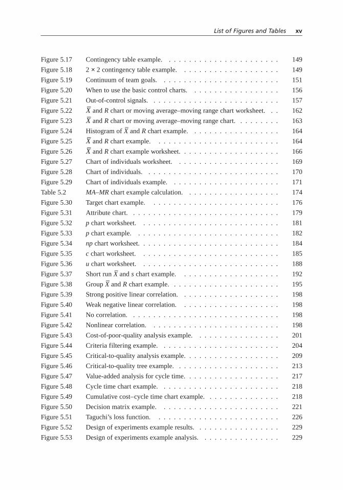
Figure 5.17 Contingency table example. . . . . . . . . . . . . . . . . . . . . . . 149
Figure 5.18 2 × 2 contingency table example. . . . . . . . . . . . . . . . . . . . 149
Figure 5.19 Continuum of team goals. . . . . . . . . . . . . . . . . . . . . . . . 151
Figure 5.20 When to use the basic control charts. . . . . . . . . . . . . . . . . . 156
Figure 5.21 Out-of-control signals. . . . . . . . . . . . . . . . . . . . . . . . . . 157
Figure 5.22–X and R chart or moving average–moving range chart worksheet. . . 162
Figure 5.23–X and R chart or moving average–moving range chart. . . . . . . . . 163
Figure 5.24 Histogram of–X and R chart example. . . . . . . . . . . . . . . . . . 164
Figure 5.25–X and R chart example. . . . . . . . . . . . . . . . . . . . . . . . . 164
Figure 5.26–X and R chart example worksheet. . . . . . . . . . . . . . . . . . . . 166
Figure 5.27 Chart of individuals worksheet. . . . . . . . . . . . . . . . . . . . . 169
Figure 5.28 Chart of individuals. . . . . . . . . . . . . . . . . . . . . . . . . . . 170
Figure 5.29 Chart of individuals example. . . . . . . . . . . . . . . . . . . . . . 171
Table 5.2 MA–MR chart example calculation. . . . . . . . . . . . . . . . . . . 174
Figure 5.30 Target chart example. . . . . . . . . . . . . . . . . . . . . . . . . . 176
Figure 5.31 Attribute chart. . . . . . . . . . . . . . . . . . . . . . . . . . . . . . 179
Figure 5.32 p chart worksheet. . . . . . . . . . . . . . . . . . . . . . . . . . . . 181
Figure 5.33 p chart example. . . . . . . . . . . . . . . . . . . . . . . . . . . . . 182
Figure 5.34 np chart worksheet. . . . . . . . . . . . . . . . . . . . . . . . . . . . 184
Figure 5.35 c chart worksheet. . . . . . . . . . . . . . . . . . . . . . . . . . . . 185
Figure 5.36 u chart worksheet. . . . . . . . . . . . . . . . . . . . . . . . . . . . 188
Figure 5.37 Short run–X and s chart example. . . . . . . . . . . . . . . . . . . . 192
Figure 5.38 Group–X and R chart example. . . . . . . . . . . . . . . . . . . . . . 195
Figure 5.39 Strong positive linear correlation. . . . . . . . . . . . . . . . . . . . 198
Figure 5.40 Weak negative linear correlation. . . . . . . . . . . . . . . . . . . . 198
Figure 5.41 No correlation. . . . . . . . . . . . . . . . . . . . . . . . . . . . . . 198
Figure 5.42 Nonlinear correlation. . . . . . . . . . . . . . . . . . . . . . . . . . 198
Figure 5.43 Cost-of-poor-quality analysis example. . . . . . . . . . . . . . . . . 201
Figure 5.44 Criteria filtering example. . . . . . . . . . . . . . . . . . . . . . . . 204
Figure 5.45 Critical-to-quality analysis example. . . . . . . . . . . . . . . . . . . 209
Figure 5.46 Critical-to-quality tree example. . . . . . . . . . . . . . . . . . . . . 213
Figure 5.47 Value-added analysis for cycle time. . . . . . . . . . . . . . . . . . . 217
Figure 5.48 Cycle time chart example. . . . . . . . . . . . . . . . . . . . . . . . 218
Figure 5.49 Cumulative cost–cycle time chart example. . . . . . . . . . . . . . . 218
Figure 5.50 Decision matrix example. . . . . . . . . . . . . . . . . . . . . . . . 221
Figure 5.51 Taguchi’s loss function. . . . . . . . . . . . . . . . . . . . . . . . . 226
Figure 5.52 Design of experiments example results. . . . . . . . . . . . . . . . . 229
Figure 5.53 Design of experiments example analysis. . . . . . . . . . . . . . . . 229
List of Figures and Tables xv

Figure 5.54 Design of experiments example: main effects. . . . . . . . . . . . . 230
Figure 5.55 Design of experiments example: interaction effects. . . . . . . . . . 230
Figure 5.56 Effective–achievable chart example. . . . . . . . . . . . . . . . . . . 235
Figure 5.57 FMEA example. . . . . . . . . . . . . . . . . . . . . . . . . . . . . 238
Table 5.3 Criteria for severity–occurrence–detection ratings. . . . . . . . . . . 240
Table 5.4 Event symbols. . . . . . . . . . . . . . . . . . . . . . . . . . . . . . 244
Table 5.5 Gate symbols. . . . . . . . . . . . . . . . . . . . . . . . . . . . . . 244
Figure 5.58 Fault tree analysis example. . . . . . . . . . . . . . . . . . . . . . . 245
Figure 5.59 Fishbone diagram example. . . . . . . . . . . . . . . . . . . . . . . 248
Table 5.6 5W2H questions. . . . . . . . . . . . . . . . . . . . . . . . . . . . . 253
Figure 5.60 5W2H example. . . . . . . . . . . . . . . . . . . . . . . . . . . . . 254
Figure 5.61 Macro flowchart example. . . . . . . . . . . . . . . . . . . . . . . . 257
Figure 5.62 Top-down flowchart example. . . . . . . . . . . . . . . . . . . . . . 259
Figure 5.63 Detailed flowchart example. . . . . . . . . . . . . . . . . . . . . . . 261
Figure 5.64 Deployment flowchart example. . . . . . . . . . . . . . . . . . . . . 266
Figure 5.65 Several-leveled flowchart example. . . . . . . . . . . . . . . . . . . 268
Figure 5.66 Force field analysis example. . . . . . . . . . . . . . . . . . . . . . 269
Figure 5.67 Gantt chart example. . . . . . . . . . . . . . . . . . . . . . . . . . . 272
Figure 5.68 Graph decision tree. . . . . . . . . . . . . . . . . . . . . . . . . . . 276
Figure 5.69 Stacked bar graph. . . . . . . . . . . . . . . . . . . . . . . . . . . . 279
Figure 5.70 Scale break. . . . . . . . . . . . . . . . . . . . . . . . . . . . . . . . 279
Figure 5.71 Bar chart example. . . . . . . . . . . . . . . . . . . . . . . . . . . . 281
Figure 5.72 Grouped bar chart example. . . . . . . . . . . . . . . . . . . . . . . 282
Figure 5.73 Dot chart example. . . . . . . . . . . . . . . . . . . . . . . . . . . . 284
Figure 5.74 Two-way dot chart example. . . . . . . . . . . . . . . . . . . . . . . 285
Figure 5.75 Grouped dot chart example. . . . . . . . . . . . . . . . . . . . . . . 286
Figure 5.76 Multi-valued dot chart example. . . . . . . . . . . . . . . . . . . . . 287
Figure 5.77 Poor pie chart. . . . . . . . . . . . . . . . . . . . . . . . . . . . . . 287
Figure 5.78 Acceptable pie chart. . . . . . . . . . . . . . . . . . . . . . . . . . . 288
Figure 5.79 Line graph example. . . . . . . . . . . . . . . . . . . . . . . . . . . 290
Figure 5.80 High-low graph example. . . . . . . . . . . . . . . . . . . . . . . . 292
Figure 5.81 Histogram worksheet. . . . . . . . . . . . . . . . . . . . . . . . . . 294
Figure 5.82 Histogram example. . . . . . . . . . . . . . . . . . . . . . . . . . . 295
Figure 5.83 Normal distribution. . . . . . . . . . . . . . . . . . . . . . . . . . . 296
Figure 5.84 Skewed distribution. . . . . . . . . . . . . . . . . . . . . . . . . . . 296
Figure 5.85 Bimodal (double-peaked) distribution. . . . . . . . . . . . . . . . . . 297
Figure 5.86 Plateau distribution. . . . . . . . . . . . . . . . . . . . . . . . . . . 297
Figure 5.87 Edge peak distribution. . . . . . . . . . . . . . . . . . . . . . . . . . 298
xvi List of Figures and Tables

Figure 5.88 Comb distribution. . . . . . . . . . . . . . . . . . . . . . . . . . . . 298
Figure 5.89 Truncated or heart-cut distribution. . . . . . . . . . . . . . . . . . . 299
Figure 5.90 Dogfood distribution. . . . . . . . . . . . . . . . . . . . . . . . . . . 299
Figure 5.91 Polygon chart example. . . . . . . . . . . . . . . . . . . . . . . . . 300
Figure 5.92 Stem-and-leaf display example. . . . . . . . . . . . . . . . . . . . . 301
Figure 5.93 Point graph example. . . . . . . . . . . . . . . . . . . . . . . . . . . 302
Figure 5.94 Percentile graph example. . . . . . . . . . . . . . . . . . . . . . . . 303
Figure 5.95 CDF graph example. . . . . . . . . . . . . . . . . . . . . . . . . . . 304
Figure 5.96 Cumulative polygon graph example. . . . . . . . . . . . . . . . . . . 305
Figure 5.97 House of quality structure. . . . . . . . . . . . . . . . . . . . . . . . 306
Figure 5.98 House of quality example. . . . . . . . . . . . . . . . . . . . . . . . 308
Table 5.7 Hypothesis tests for means, variances, and proportions. . . . . . . . 315
Table 5.8 Chi-square hypothesis tests for categorical data. . . . . . . . . . . . 317
Figure 5.99 t-test example, first procedure. . . . . . . . . . . . . . . . . . . . . . 319
Figure 5.100 t-test example, alternate procedure. . . . . . . . . . . . . . . . . . . 319
Figure 5.101 Type I and type II errors. . . . . . . . . . . . . . . . . . . . . . . . . 322
Table 5.9 Importance–performance analysis rating table. . . . . . . . . . . . . 325
Figure 5.102 Customers’ importance–performance comparison. . . . . . . . . . . 325
Figure 5.103 Supplier–customer comparison: importance. . . . . . . . . . . . . . 326
Figure 5.104 Supplier–customer comparison: performance. . . . . . . . . . . . . . 327
Table 5.10 Importance–performance analysis example: rating table. . . . . . . . 327
Figure 5.105 Importance–performance analysis example: customers’comparison. . . . . . . . . . . . . . . . . . . . . . . . . . . . . . . . 328
Figure 5.106 Importance–performance analysis example: importance comparison. . . . . . . . . . . . . . . . . . . . . . . . . . . . . . . . 329
Figure 5.107 Importance–performance analysis example: performance comparison. . . . . . . . . . . . . . . . . . . . . . . . . . . . . . . . 329
Figure 5.108 Is–is not matrix. . . . . . . . . . . . . . . . . . . . . . . . . . . . . 331
Figure 5.109 Is–is not matrix example. . . . . . . . . . . . . . . . . . . . . . . . 333
Figure 5.110 List reduction example. . . . . . . . . . . . . . . . . . . . . . . . . 336
Figure 5.111 List reduction example: criteria. . . . . . . . . . . . . . . . . . . . . 336
Figure 5.112 List reduction example: criteria filtering. . . . . . . . . . . . . . . . 337
Table 5.11 When to use differently-shaped matrices. . . . . . . . . . . . . . . . 339
Figure 5.113 L-shaped matrix example. . . . . . . . . . . . . . . . . . . . . . . . 340
Figure 5.114 T-shaped matrix example. . . . . . . . . . . . . . . . . . . . . . . . 341
Figure 5.115 Y-shaped matrix example. . . . . . . . . . . . . . . . . . . . . . . . 342
Figure 5.116 C-shaped matrix example. . . . . . . . . . . . . . . . . . . . . . . . 343
Figure 5.117 X-shaped matrix example. . . . . . . . . . . . . . . . . . . . . . . . 343
Figure 5.118 Roof-shaped matrix example. . . . . . . . . . . . . . . . . . . . . . 344
List of Figures and Tables xvii

Figure 5.119 Meeting evaluation example. . . . . . . . . . . . . . . . . . . . . . . 346
Figure 5.120 When to use a mind map. . . . . . . . . . . . . . . . . . . . . . . . 349
Figure 5.121 Mind map example. . . . . . . . . . . . . . . . . . . . . . . . . . . 351
Figure 5.122 Restaurant’s deployment chart. . . . . . . . . . . . . . . . . . . . . . 353
Figure 5.123 Multi-vari sampling tree example. . . . . . . . . . . . . . . . . . . . 357
Figure 5.124 Multi-vari chart example. . . . . . . . . . . . . . . . . . . . . . . . 358
Figure 5.125 Multivoting example. . . . . . . . . . . . . . . . . . . . . . . . . . . 361
Figure 5.126 Weighted voting example. . . . . . . . . . . . . . . . . . . . . . . . 362
Table 5.12 Normal probability plot example calculations. . . . . . . . . . . . . 367
Figure 5.127 Normal probability plot example. . . . . . . . . . . . . . . . . . . . 368
Figure 5.128 Histogram of normal probability plot data. . . . . . . . . . . . . . . 368
Figure 5.129 Shapes of normal probability plots. . . . . . . . . . . . . . . . . . . 369
Figure 5.130 Paired comparison example. . . . . . . . . . . . . . . . . . . . . . . 373
Figure 5.131 Forced choice example. . . . . . . . . . . . . . . . . . . . . . . . . 374
Figure 5.132 Numerical prioritization example. . . . . . . . . . . . . . . . . . . . 375
Figure 5.133 Pareto chart example. . . . . . . . . . . . . . . . . . . . . . . . . . 378
Figure 5.134 Pareto chart example with cumulative line. . . . . . . . . . . . . . . 378
Figure 5.135 Weighted Pareto chart example. . . . . . . . . . . . . . . . . . . . . 380
Figure 5.136 Comparative Pareto chart example. . . . . . . . . . . . . . . . . . . 381
Figure 5.137 Pareto chart worksheet. . . . . . . . . . . . . . . . . . . . . . . . . . 382
Figure 5.138 Performance index. . . . . . . . . . . . . . . . . . . . . . . . . . . . 384
Figure 5.139 Performance index example. . . . . . . . . . . . . . . . . . . . . . . 386
Figure 5.140 PGCV index example calculations. . . . . . . . . . . . . . . . . . . 389
Figure 5.141 PGCV index example. . . . . . . . . . . . . . . . . . . . . . . . . . 389
Figure 5.142 Plan-do-study-act cycle. . . . . . . . . . . . . . . . . . . . . . . . . 391
Figure 5.143 Plan-do-study-act example. . . . . . . . . . . . . . . . . . . . . . . 392
Figure 5.144 Plan-results chart. . . . . . . . . . . . . . . . . . . . . . . . . . . . 394
Figure 5.145 Plan-results chart example. . . . . . . . . . . . . . . . . . . . . . . . 396
Figure 5.146 PMI example. . . . . . . . . . . . . . . . . . . . . . . . . . . . . . . 398
Figure 5.147 Potential problem analysis example. . . . . . . . . . . . . . . . . . . 400
Figure 5.148 Analytical criteria method example: criteria matrix. . . . . . . . . . 411
Figure 5.149 Analytical criteria method example: options versus criteria 1 matrix. . . . . . . . . . . . . . . . . . . . . . . . . . . . . 412
Figure 5.150 Analytical criteria method example: options versus criteria 2 matrix. . . . . . . . . . . . . . . . . . . . . . . . . . . . . 412
Figure 5.151 Analytical criteria method example: options versus criteria 3 matrix. . . . . . . . . . . . . . . . . . . . . . . . . . . . . 412
Figure 5.152 Analytical criteria method example: summary matrix. . . . . . . . . 413
xviii List of Figures and Tables
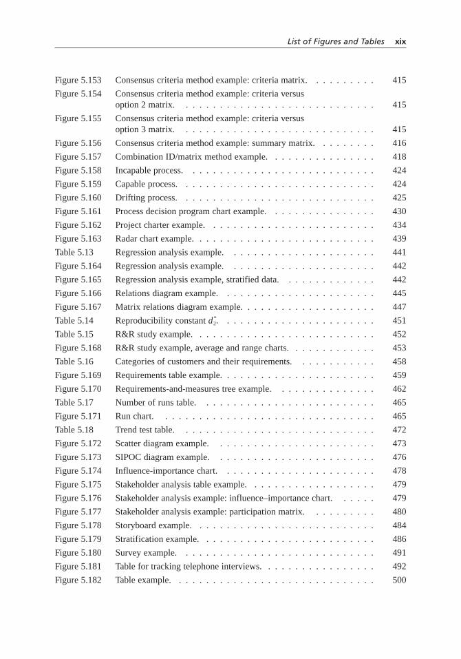
Figure 5.153 Consensus criteria method example: criteria matrix. . . . . . . . . . 415
Figure 5.154 Consensus criteria method example: criteria versus option 2 matrix. . . . . . . . . . . . . . . . . . . . . . . . . . . . . 415
Figure 5.155 Consensus criteria method example: criteria versus option 3 matrix. . . . . . . . . . . . . . . . . . . . . . . . . . . . . 415
Figure 5.156 Consensus criteria method example: summary matrix. . . . . . . . . 416
Figure 5.157 Combination ID/matrix method example. . . . . . . . . . . . . . . . 418
Figure 5.158 Incapable process. . . . . . . . . . . . . . . . . . . . . . . . . . . . 424
Figure 5.159 Capable process. . . . . . . . . . . . . . . . . . . . . . . . . . . . . 424
Figure 5.160 Drifting process. . . . . . . . . . . . . . . . . . . . . . . . . . . . . 425
Figure 5.161 Process decision program chart example. . . . . . . . . . . . . . . . 430
Figure 5.162 Project charter example. . . . . . . . . . . . . . . . . . . . . . . . . 434
Figure 5.163 Radar chart example. . . . . . . . . . . . . . . . . . . . . . . . . . . 439
Table 5.13 Regression analysis example. . . . . . . . . . . . . . . . . . . . . . 441
Figure 5.164 Regression analysis example. . . . . . . . . . . . . . . . . . . . . . 442
Figure 5.165 Regression analysis example, stratified data. . . . . . . . . . . . . . 442
Figure 5.166 Relations diagram example. . . . . . . . . . . . . . . . . . . . . . . 445
Figure 5.167 Matrix relations diagram example. . . . . . . . . . . . . . . . . . . . 447
Table 5.14 Reproducibility constant d *2. . . . . . . . . . . . . . . . . . . . . . . 451
Table 5.15 R&R study example. . . . . . . . . . . . . . . . . . . . . . . . . . . 452
Figure 5.168 R&R study example, average and range charts. . . . . . . . . . . . . 453
Table 5.16 Categories of customers and their requirements. . . . . . . . . . . . 458
Figure 5.169 Requirements table example. . . . . . . . . . . . . . . . . . . . . . . 459
Figure 5.170 Requirements-and-measures tree example. . . . . . . . . . . . . . . 462
Table 5.17 Number of runs table. . . . . . . . . . . . . . . . . . . . . . . . . . 465
Figure 5.171 Run chart. . . . . . . . . . . . . . . . . . . . . . . . . . . . . . . . 465
Table 5.18 Trend test table. . . . . . . . . . . . . . . . . . . . . . . . . . . . . 472
Figure 5.172 Scatter diagram example. . . . . . . . . . . . . . . . . . . . . . . . 473
Figure 5.173 SIPOC diagram example. . . . . . . . . . . . . . . . . . . . . . . . 476
Figure 5.174 Influence-importance chart. . . . . . . . . . . . . . . . . . . . . . . 478
Figure 5.175 Stakeholder analysis table example. . . . . . . . . . . . . . . . . . . 479
Figure 5.176 Stakeholder analysis example: influence–importance chart. . . . . . 479
Figure 5.177 Stakeholder analysis example: participation matrix. . . . . . . . . . 480
Figure 5.178 Storyboard example. . . . . . . . . . . . . . . . . . . . . . . . . . . 484
Figure 5.179 Stratification example. . . . . . . . . . . . . . . . . . . . . . . . . . 486
Figure 5.180 Survey example. . . . . . . . . . . . . . . . . . . . . . . . . . . . . 491
Figure 5.181 Table for tracking telephone interviews. . . . . . . . . . . . . . . . . 492
Figure 5.182 Table example. . . . . . . . . . . . . . . . . . . . . . . . . . . . . . 500
List of Figures and Tables xix

Table 5.19 Tree diagram variations. . . . . . . . . . . . . . . . . . . . . . . . . 502
Figure 5.183 Tree diagram example. . . . . . . . . . . . . . . . . . . . . . . . . . 503
Figure 5.184 Two-dimensional chart example. . . . . . . . . . . . . . . . . . . . 506
Figure 5.185 Value-added analysis example. . . . . . . . . . . . . . . . . . . . . . 509
Figure 5.186 Voice of the customer table example. . . . . . . . . . . . . . . . . . 512
Figure 5.187 Why-why diagram example. . . . . . . . . . . . . . . . . . . . . . . 515
Figure 5.188 Inch deep, mile wide—inch wide, mile deep. . . . . . . . . . . . . . 516
Figure 5.189 Work-flow diagram example. . . . . . . . . . . . . . . . . . . . . . 520
Table A.1 Area under the normal curve. . . . . . . . . . . . . . . . . . . . . . 523
Table A.2 Control chart constants. . . . . . . . . . . . . . . . . . . . . . . . . 525
xx List of Figures and Tables

Resources
This section points you to readily accessible resources where you can learn moreabout individual tools. In some cases, a reference is the original source for thetool. Other sources provide more detail or depth than could be included in this
book. Some of the resources, especially Web sites, have lists of or links to additional ref-erences. Many more references to quality tools exist than can be listed here. For example,textbooks on quality control include many tools. Consider these references suggestionsand starting points for additional information.
A few tools are not listed; in those cases, neither an original source nor any refer-ences that go beyond the information provided in this book could be located. Ironically,some of the most fundamental, widely used tools have the least information available.A half dozen tools were developed by the author or colleagues within the author’s orga-nization. For those tools, a note states that this book is the primary reference.
After the individual tool references are two more lists. One shows Web sites thathouse collections of tools for quality improvement and creativity. The second showsWeb sites that provide information on a wide range of statistical topics.
CHAPTER 2: MEGA-TOOLS: QUALITY MANAGEMENT SYSTEMS
Evolution of Quality Control
Juran Institute. www.juran.com.Skymark Corporation. “Management Thought Leaders.” Skymark.
www.skymark.com/resources/ leaders/biomain.asp.The W. Edwards Deming Institute. www.deming.org.
527

Total Quality Management
Imai, Masaaki. Kaizen: The Key to Japan’s Competitive Success. New York: Random House,1986.
Ishikawa, Kaoru. Guide to Quality Control. Tokyo: Asian Productivity Organization, 1986.Mizuno, Shigeru (ed.). Management for Quality Improvement: The 7 New QC Tools.
Cambridge, MA: Productivity Press, 1995.
Quality Function Deployment
Ermer, Donald S., and Mark K. Iniper. “Delighting the Customer: Quality FunctionDeployment for Quality Service Design.” Total Quality Management 9, no. 4/5 (July1998): 86.
Mazur, Glenn. “QFD Case Studies and White Papers.” QFD and Voice of Customer Analysis.Japan Business Consultants Ltd. www.mazur.net/publishe.htm.
Xie, Min, Kay-Chuan Tan, and Thong Ngee Goh. Advanced QFD Applications. Milwaukee:ASQ Quality Press, 2003.
ISO 9000
Bergenhenegouwen, Louise, Annemarie de Jong, and Henk J. de Vries. 100 Frequently AskedQuestions on the ISO 9000:2000 Series. Milwaukee: ASQ Quality Press, 2002.
Cianfrani, Charles A., Joseph J. Tsiakals, and John E. West. ISO 9001:2000 Explained, SecondEdition. Milwaukee: ASQ Quality Press, 2001.
Seddon, John. “A Brief History of ISO-9000.” Lean Service—Systems Thinking for ServiceOrganisations. www.lean-service.com/home.asp.
Malcolm Baldrige National Quality Award
Blazey, Mark L. Insights to Performance Excellence 2004: An Inside Look at the 2004Baldrige Award Criteria. Milwaukee: ASQ Quality Press, 2004.
National Institute of Standards and Technology. “Baldrige National Quality Program.” U.S.Commerce Department, Technology Administration, National Institute of Standards andTechnology. www.quality.nist.gov.
Benchmarking
American Productivity and Quality Center. www.apqc.org.Camp, Robert. Benchmarking: The Search for Industry Best Practices that Lead to Superior
Performance. Milwaukee: ASQ Quality Press, 1989.Spendolini, Michael J. The Benchmarking Book. 2nd ed. New York: AMACOM, 2003.
528 Resources

Six Sigma
Breyfogle, Forrest W., III. Implementing Six Sigma: Smarter Solutions Using StatisticalMethods. Hoboken, NJ: John Wiley & Sons, 2003.
i-Six Sigma. “New to Six Sigma: A Six Sigma Guide for Both Novice and ExperiencedQuality Practitioners.” i-Six Sigma LLC. www.isixsigma.com/ library/content/six-sigma-newbie.asp.
Pyzdek, Thomas. The Six Sigma Handbook. New York: McGraw-Hill, 2003.Wheeler, Donald J. “The Six-Sigma Zone.” SPC Ink, 2002. SPC Press.
www.spcpress.com/ink_pdfs/The%20Final%206%20Sigma%20Zone.pdf.
Lean Manufacturing
AGI-Goldratt Institute. www.goldratt.com.Goldratt, Eliyahu M., and Jeff Cox. The Goal: A Process of Ongoing Improvement. Croton-on-
Hudson, NY : North River Press, 1992.Lean Manufacturing Enterprise Technical Group, Society of Manufacturing Engineers.
www.sme.org/cgi-bin/communities.pl?/communities/techgroups/ lean_mfg/ l_m_e_o.htmLevinson, William A., and Raymond A. Rerick. Lean Enterprise: A Synergistic Approach to
Minimizing Waste. Milwaukee, WI: Quality Press, 2002.Pyzdek, Thomas. The Six Sigma Handbook. New York: McGraw-Hill, 2003.
TRIZ
Ideation International. www.ideationtriz.com.Rantanen, Kalevi, and Ellen Domb. Simplified TRIZ: New Problem Solving Applications for
Engineers & Manufacturing Professionals. Milwaukee: Quality Press, 2002.The TRIZ Journal. TRIZ Institute. www.triz-journal.com.
CHAPTER 3: THE QUALITY IMPROVEMENT PROCESS
Kayser, Thomas A. Mining Group Gold: How to Cash in on the Collaborative Brain Power ofa Group. New York: McGraw-Hill, 1995.
Scholtes, Peter, Brian L. Joiner, and Barbara J. Streibel. The Team Handbook. Madison, WI:Joiner/Oriel Inc., 2003.
CHAPTER 4: QUALITY IMPROVEMENT STORIES
Medrad, Inc. www.medrad.com.Pearl River School District. www.pearlriver.k12.ny.us.Saint Luke’s Hospital of Kansas City.
https://www.saintlukeshealthsystem.org/slhs/com/system/baldrige/quality_search.htm.
Resources 529

CHAPTER 5: TOOLS
ACORN Test
Gilbert, Thomas F. Human Competence: Engineering Worthy Performance. New York:McGraw-Hill, 1978.
Affinity Diagram
Kabay, M. E. “Computer-Aided Thematic Analysis: Useful Technique for Analyzing Non-Quantitative Data.” Ubiquity 4: issue 24 (August 6, 2003). Association forComputing Machinery. www.acm.org/ubiquity/views/v4i24_kabay.html.
Mizuno, Shigeru (ed.). Management for Quality Improvement: The 7 New QC Tools.Cambridge, MA: Productivity Press, 1995.
Arrow Diagram
Levy, Ferdinand K., Gerald L. Thompson, and Jerome D. West. “The ABCs of the CriticalPath Method.” In Managing Projects and Programs. Harvard Business Review ReprintSeries, no. 10811. Boston: Harvard Business School Press, 1989.
Miller, Robert W. “How to Plan and Control with PERT.” In Managing Projects andPrograms. Harvard Business Review Reprint Series, no. 10811. Boston: Harvard BusinessSchool Press, 1989.
Mizuno, Shigeru (ed.). Management for Quality Improvement: The 7 New QC Tools.Cambridge, MA: Productivity Press, 1995.
Balanced Scorecard
Kaplan, Robert S., and David P. Norton. “The Balanced Scorecard–Measures That DrivePerformance.” Harvard Business Review 70, no. 1 (Jan/Feb92): 71–79.
———. “Using the Balanced Scorecard as a Strategic Management System.” HarvardBusiness Review 74, no.1 (Jan/Feb96): 75–85.
———. The Balanced Scorecard: Translating Strategy into Action. Boston: Harvard BusinessSchool Press, 1996.
Benchmarking
American Productivity and Quality Center. www.apqc.org.Camp, Robert. Benchmarking: The Search for Industry Best Practices that Lead to Superior
Performance. Milwaukee: ASQC Quality Press, 1989.Spendolini, Michael J. The Benchmarking Book. 2nd ed. New York: AMACOM, 2003.
530 Resources

Benefits and Barriers
Pritchard, Blanchard. “Quality Management.” In Encyclopedia of Chemical Processing andDesign, vol. 46, exec. editor John J. McKetta. New York: Marcel Dekker, 1994.
Box Plot
Cleveland, William S. The Elements of Graphing Data. Murray Hill, NJ: AT&T BellLaboratories, 1994.
Heyes, Gerald B. “The Box Plot.” Quality Progress 18, no. 12 (December 1985): 12–17.———. “The GHOST Box Plot.” Statistics Division Newsletter, ASQC (summer 1988).Iglewicz, Boris, and David C. Hoaglin. “Use of Boxplots for Process Evaluation.” Journal of
Quality Technology 19, no. 4 (October 1987): 180–90.Tukey, John W. Exploratory Data Analysis. Reading, MA: Addison-Wesley, 1977.
Brainstorming and Brainwriting
de Bono, Edward. Serious Creativity: Using the Power of Lateral Thinking to Create NewIdeas. New York: HarperCollins, 1992.
Infinite Innovations Ltd. “Brainstorming.co.uk.” www.brainstorming.co.uk.Iowa State University Extension Service. “Group Decision Making Tool Kit.” Iowa State
University Extension to Communities.www.extension.iastate.edu/communities/tools/decisions.
Mycoted, Ltd. “Creativity Techniques.” Creativity & Innovation in Science & Technology.www.mycoted.com/creativity/techniques/index.php.
VanGundy, Arthur B. Techniques of Structured Problem Solving. New York: Van NostrandReinhold, 1988.
Cause-and-Effect Matrix
Breyfogle, Forrest W., III. Implementing Six Sigma: Smarter Solutions Using StatisticalMethods. Hoboken, NJ: John Wiley & Sons, 2003.
Checklist
Ishikawa, Kaoru. Guide to Quality Control. Tokyo: Asian Productivity Organization, 1986.
Checksheet
Ishikawa, Kaoru. Guide to Quality Control. Tokyo: Asian Productivity Organization, 1986.Juran Institute, Inc. “The Tools of Quality: Part V; Check Sheets.” Quality Progress 23, no. 10
(October, 1990): 51–56.
Resources 531

Contingency Table
GraphPad Software, Inc. “Creating Contingency Tables.” The Prism Guide to InterpretingStatistical Results. www.graphpad.com/articles/interpret/contingency/contin_tables.htm.
Ishikawa, Kaoru. Guide to Quality Control. Tokyo: Asian Productivity Organization, 1986.
Continuum of Team Goals
This tool was developed by the author in the early 1990s. This book is the primary reference.
Control Charts
Hoyer, Robert W., and Wayne C. Ellis. “A Graphical Exploration of SPC: Part 2.” QualityProgress 29, no. 6 (June 1996): 57–64.
Ishikawa, Kaoru. Guide to Quality Control. Tokyo: Asian Productivity Organization, 1986.McNees, William H., and Robert A. Klein. Statistical Methods for the Process Industries.
Milwaukee: ASQC Quality Press, 1991.Wheeler, Donald, and David Chambers. Understanding Statistical Process Control. Knoxville,
TN: SPC Press, 1986.
Correlation Analysis
Filliben, James J., and Alan Heckert. “Linear Correlation Plot.” In NIST/SEMATECH e-Handbook of Statistical Methods, ed. Carroll Croarkin and Paul Tobias, 2004. U.S. Commerce Department, Technology Administration, National Institute of Standardsand Technology, Information Technology Laboratory.www.itl.nist.gov/div898/handbook/eda/section3/ linecorr.htm.
Ishikawa, Kaoru. Guide to Quality Control. Tokyo: Asian Productivity Organization, 1986.StatSoft, Inc. “Elementary Concepts in Statistics.” Electronic Statistics Textbook. StatSoft,
2004. www.statsoft.com/textbook/stathome.html.
Cost-of-Poor-Quality Analysis
This tool was developed within Ethyl Corporation in the late 1980s. This book is the primaryreference. For information about the concept of cost of poor quality:
Juran, Joseph M., and Frank M. Gryna, Jr. Quality Planning and Analysis: From ProductDevelopment Through Use. New York: McGraw-Hill, 1980.
Schiffauerova, Andrea, and Vince Thomson. “Cost of Quality: A Survey of Models and BestPractices.” Submitted to International Journal of Quality and Reliability Management.Available online at McGill University, Masters in Manufacturing Management.www.mmm.mcgill.ca/documents-frame.html.
532 Resources

Criteria Filtering
VanGundy, Arthur B. Techniques of Structured Problem Solving. New York: Van NostrandReinhold, 1988.
Critical-to-Quality Analysis and Critical-to-Quality Tree
Berryman, Maurice L. “DFSS and Big Payoffs: Transform Your Organization Into One That’sWorld Class.” Six Sigma Forum Magazine 2, no. 1 (November, 2002). American Societyfor Quality. www.asq.org/pub/sixsigma/past/vol2_issue1/berryman.html.
Brown, Tony. “The Critical List.” Quality World, August, 2002. Institute of Quality Assurance.www.iqa.org/publication/c4-1-71.shtml.
Cycle Time Chart
Harrington, H. James. Business Process Improvement: The Breakthrough Strategy for TotalQuality, Productivity, and Competitiveness. New York: McGraw-Hill, 1991.
Decision Matrix
Dodgson, John, Michael Spackman, Alan Pearman, and Lawrence Phillips. Multi-CriteriaAnalysis Manual, Jun 25, 2004. UK, Office of the Deputy Prime Minister.www.odpm.gov.uk/stellent/groups/odpm_about/documents/page/odpm_about_608524.hcsp.
Decision Tree
American Association for Artificial Intelligence. “Decision Trees.” American Association forArtificial Intelligence. www.aaai.org/AITopics/html/trees.html.
Design of Experiments
Barrentine, Larry. An Introduction to Design of Experiments: A Simplified Approach.Milwaukee: ASQ Quality Press, 1999.
Bhote, Keki R. World Class Quality: Using Design of Experiments to Make It Happen. NewYork: AMACOM, 1991.
Wheeler, Donald J. Understanding Industrial Experimentation. Knoxville, TN: SPC Press,1990.
FMEA
FMECA.COM. Haviland Consulting Group. www.fmeca.com.Stamatis, D. H. Failure Mode and Effect Analysis: FMEA from Theory to Execution.
Milwaukee: ASQ Quality Press, 2003.
Resources 533
Fault Tree Analysis
Long, Allen. Fault-Tree.Net. www.fault-tree.net.Texas Workers’ Compensation Commission. “Fault Tree Analysis.” Texas Workers’
Compensation Commission, Workers’ Health & Safety Division.www.twcc.state.tx.us/information/videoresources/stp_fault_tree.pdf.
U.S. Coast Guard. “Fault Tree Analysis.” In Risk Assessment Tools Reference. Risk-BasedDecision-Making Guidelines, vol. 3. U.S. Department of Homeland Security, U.S. CoastGuard. www.uscg.mil/hq/g-m/risk/E-Guidelines/RBDM/html/vol3/09/v3-09-cont.htm.
Fishbone Diagram
Fukuda, Ryuji. Managerial Engineering: Techniques for Improving Quality and Productivityin the Workplace. Cambridge, MA: Productivity Press, 1997.
Ishikawa, Kaoru. Guide to Quality Control. Tokyo: Asian Productivity Organization, 1986.Sarazen, J. Stephen. “The Tools of Quality: Part II; Cause-and-Effect Diagrams.” Quality
Progress 23, no. 7 (July 1990): 59–62.
5W2H
Japan Human Relations Association. The Service Industry Idea Book : Employee Involvementin Retail and Office Improvement. Translated by Fredrich Czupryna. Cambridge, MA:Productivity Press, 1990.
Flowchart
Burr, John T. “The Tools of Quality: Part I; Going with the Flow(chart).” Quality Progress 23,no. 6 (June 1990): 64–67.
Cram, David M. “Flowcharting Primer.” Training and Development Journal 34, no. 7 (July,1980): 64–68.
Force Field Analysis
Lewin, Kurt. Resolving Social Conflicts and Field Theory in Social Science. Washington, D.C.:American Psychological Association, 1997.
Stratton, A. Donald. “Solving Problems with CEFFA.” Quality Progress 19, no. 4 (April1986): 65–70.
Gantt Chart
Tufte, Edward. “Project Management Graphics (or Gantt Charts).” Online posting, Mar 20,2002. The Work of Edward Tufte and Graphics Press, Ask E.T. Forum.www.edwardtufte.com/bboard/q-and-a-fetch-msg?msg_id=000076&topic_id=1
Wilson, James M. “Gantt Charts: A Centenary Appreciation.” European Journal ofOperational Research 149, no. 2 (September 2003): 430.
534 Resources

Graph
Chambers, John M., William S. Cleveland, Beat Kleiner, and Paul A. Tukey. GraphicalMethods for Data Analysis. Boston: Duxbury Press, 1983.
Cleveland, William S. The Elements of Graphing Data. Murray Hill, NJ: AT&T BellLaboratories, 1994.
Filliben, James J., and Alan Heckert. “Exploratory Data Analysis.” In NIST/SEMATECH e-Handbook of Statistical Methods, ed. Carroll Croarkin and Paul Tobias, 2004. U.S. Commerce Department, Technology Administration, National Institute of Standardsand Technology, Information Technology Laboratory.www.itl.nist.gov/div898/handbook/eda/eda.htm.
Rutchik, Robert H. Guidelines for Statistical Graphs. U.S. Department of Energy, EnergyInformation Administration. www.eia.doe.gov/neic/graphs/preface.htm.
Tufte, Edward R. The Visual Display of Quantitative Information. Cheshire, CT.: GraphicsPress, 2001.
Histogram and other frequency distributions
Chambers, John M., William S. Cleveland, Beat Kleiner, and Paul A. Tukey. GraphicalMethods for Data Analysis. Boston: Duxbury Press, 1983.
Cleveland, William S. The Elements of Graphing Data. Murray Hill, NJ: AT&T BellLaboratories, 1994.
Filliben, James J., and Alan Heckert. “Exploratory Data Analysis: Histogram.” InNIST/SEMATECH e-Handbook of Statistical Methods, ed. Carroll Croarkin and PaulTobias, 2004. U.S. Commerce Department, Technology Administration, National Instituteof Standards and Technology, Information Technology Laboratory.www.itl.nist.gov/div898/handbook/eda/section3/histogra.htm.
Gunter, Berton H., “Subversive Data Analysis, Part I: The Stem and Leaf Display.” QualityProgress 21, no. 9 (September 1988): 88–89.
Ishikawa, Kaoru. Guide to Quality Control. Tokyo: Asian Productivity Organization, 1986.
House of Quality
See also the QFD references listed for Chapter 2.Hauser, John R., and Don Clausing. “The House of Quality.” Harvard Business Review 66,
no. 3 (May–June 1988): 63–73.
Hypothesis Testing
Filliben, James J., and Alan Heckert. “Exploratory Data Analysis: Quantitative Techniques.”In NIST/SEMATECH e-Handbook of Statistical Methods, ed. Carroll Croarkin and PaulTobias, 2004. U.S. Commerce Department, Technology Administration, National Instituteof Standards and Technology, Information Technology Laboratory.www.itl.nist.gov/div898/handbook/eda/section3/eda35.htm.
Lane, David M. “HyperStat Online Textbook.” Rice Virtual Lab in Statistics, Rice University.davidmlane.com/hyperstat/index.html.
Resources 535

Importance–Performance Analysis
Andreasen, Alan. Marketing Social Change: Changing Behavior to Promote Health, SocialDevelopment, and the Environment. San Francisco: Josey-Bass, 1995.
Simply Better! “Voice of the Customer Workbook.” U.S. Department of Labor, Employmentand Training Administration. www.workforce-excellence.net/pdf/vocwkbk.pdf.
Is–Is Not Matrix
Kepner-Tregoe, Inc. Analytic Trouble Shooting. Princeton, NJ: Kepner-Tregoe, 1966.Kepner, Charles H., and Benjamin B. Tregoe. The New Rational Manager. Princeton, NJ:
Princeton Research Press, 1981.
Matrix Diagram
Brassard, Michael. Memory Jogger Plus+: Featuring the Seven Management and PlanningTools. Methuen, MA: Goal/QPC, 1996.
Mizuno, Shigeru (ed.). Management for Quality Improvement: The 7 New QC Tools.Cambridge, Mass: Productivity Press, 1995.
Meeting Evaluation
Scholtes, Peter, Brian L. Joiner, and Barbara J. Streibel. The Team Handbook. Madison, WI:Joiner/Oriel Inc., 2003.
Mind Map
Buzan, Tony. Mind Maps®. Buzan Centres Ltd. www.mind-map.com/EN/mindmaps/definition.html.www.buzan.org
Mistake Proofing
Chase, Richard B., and Douglas M. Stewart. “Make Your Service Fail-Safe.” SloanManagement Review 35, no. 3 (Spring 1994): 35–44.
Grout, John. “John Grout’s Poka-Yoke Page.” Berry College.www.campbell.berry.edu/faculty/jgrout/pokayoke.shtml.
Nikkan Kogyo Shimbun/Factory Magazine, ed. Poka-Yoke: Improving Product Quality byPreventing Defects. Portland, OR: Productivity Press, 1989.
Shingo, Shigeo. Zero Quality Control: Source Inspection and the Poka-Yoke System.Translated by Andrew P. Dillon. Portland, OR: Productivity Press, 1986.
536 Resources

Multi-Vari Chart
Bhote, Keki R. World Class Quality: Using Design of Experiments to Make It Happen. NewYork: AMACOM, 1991.
Perez-Wilson, Mario. Multi-Vari Chart and Analyses. Scottsdale, AZ: Advanced SystemsConsultants, 1993.
Multivoting
Delbecq, Andre L., Andrew H. Van de Ven, and David H. Gustafson. Group Techniques forProgram Planning: A Guide to Nominal Group and Delphi Processes. Middleton, WI:Green Briar Press, 1986.
Huber, George, and A. L. Delbecq. “Guidelines for Combining the Judgments of IndividualGroup Members in Decision Conferences.” Academy of Management Journal 15, no. 2(June, 1972): 161.
Nominal Group Technique
Delbecq, Andre L., Andrew H. Van de Ven, and David H. Gustafson. Group Techniques forProgram Planning: A Guide to Nominal Group and Delphi Processes. Middleton, WI:Green Briar Press, 1986.
Dunham, Randall B. “Nominal Group Technique: A User’s Guide.” Organizational BehaviorWeb Course, University of Wisconsin School of Business.instruction.bus.wisc.edu/obdemo/readings/ngt.html.
Normal Probability Plot
Chambers, John M., William S. Cleveland, Beat Kleiner, and Paul A. Tukey. GraphicalMethods for Data Analysis. Boston: Duxbury Press, 1983.
Filliben, James J., and Alan Heckert. “Exploratory Data Analysis: Normal Probability Plot.”In NIST/SEMATECH e-Handbook of Statistical Methods, ed. Carroll Croarkin and PaulTobias, 2004. U.S. Commerce Department, Technology Administration, National Instituteof Standards and Technology, Information Technology Laboratory.www.itl.nist.gov/div898/handbook/eda/section3/normprpl.htm.
Gunter, Bert. “Q–Q Plots.” Quality Progress 27, no. 2 (February 1994): 81–86.
Operational Definition
Deming, W. Edwards. Out of the Crisis. Cambridge, MA.: Massachusetts Institute ofTechnology, Center for Advanced Engineering Study, 1986.
Scholtes, Peter, Brian L. Joiner, and Barbara J. Streibel. The Team Handbook. Madison, WI:Joiner/Oriel Inc., 2003.
Resources 537

Paired Comparison
Manktelow, James, ed. “Paired Comparison.” Mind Tools.www.mindtools.com/pages/article/newTED_02.htm.
Peterson, George. “Paired Comparison Tool.” U.S. Department of Agriculture, NaturalResources Conservation Service, Social Sciences Institute.www.ssi.nrcs.usda.gov/SSIEnvPsy/nrcs/paircomp.html.
Pareto Chart
Burr, John T. “The Tools of Quality: Part VI; Pareto Charts.” Quality Progress, 23, no. 11(November 1990): 59–61.
Juran, Joseph M., and A. Blanton Godfrey. Juran’s Quality Handbook. New York: McGraw-Hill, 1999.
Ishikawa, Kaoru. Guide to Quality Control. Tokyo: Asian Productivity Organization, 1986.
Performance Index
Riggs, James, and Glenn Felix. Productivity by Objectives. Englewood Cliffs, NJ: PrenticeHall, 1983.
———. “Productivity Measurement by Objectives.” National Productivity Review 2, no. 4(Autumn, 1983): 386–393.
PGCV Index
Hom, Willard C. “Make Customer Service Analyses a Little Easier with the PGCV Index.”Quality Progress 30, no. 3 (March 1997): 89–93.
Plan–Do–Study–Act Cycle
Deming, W. Edwards. The New Economics for Industry, Government, Education. Cambridge,MA: Massachusetts Institute of Technology, Center for Advanced Engineering Study,1993.
Scholtes, Peter, Brian L. Joiner, and Barbara J. Streibel. The Team Handbook. Madison, WI:Joiner/Oriel Inc., 2003.
Plan–Results Chart
This tool was developed within Ethyl Corporation in the late 1980s. This book is the primaryreference.
PMI
de Bono, Edward. Serious Creativity: Using the Power of Lateral Thinking to Create NewIdeas. New York: HarperCollins, 1992.
538 Resources

Potential Problem Analysis
Kepner, Charles H., and Benjamin B. Tregoe. The New Rational Manager. Princeton, NJ:Princeton Research Press, 1981.
VanGundy, Arthur B. Techniques of Structured Problem Solving. New York: Van NostrandReinhold, 1988.
Presentation
Hoff, Ron. “I Can See You Naked.” Kansas City, MO: Andrews and McNeel, 1992.Tufte, Edward. The Cognitive Style of PowerPoint. Cheshire, CT: Graphics Press, 2003.
Prioritization Matrix
Brassard, Michael. Memory Jogger Plus+: Featuring the Seven Management and PlanningTools. Methuen, MA: Goal/QPC, 1996.
Dodgson, John, Michael Spackman, Alan Pearman, and Lawrence Phillips. “The Basic AHP Procedure.” In Multi-Criteria Analysis Manual, 2004. UK, Office of the DeputyPrime Minister. www.odpm.gov.uk/stellent/groups/odpm_about/documents/page/odpm_about_608524-13.hcsp.
Saaty, Thomas L. The Analytical Hierarchy Process: Planning, Priority Setting, ResourceAllocation. New York: McGraw-Hill, 1980.
Process Capability Index
Bothe, Davis R. Measuring Process Capability. Milwaukee: ASQ Quality Press, 2001.Gunter, Berton H. “The Use and Abuse of Cpk.” Quality Progress 22, no. 1 (January 1989):
72–73.———. “The Use and Abuse of Cpk, Part 2.” Quality Progress 22, no. 3 (March 1989):
108–9.———. “The Use and Abuse of Cpk, Part 3.” Quality Progress 22, no. 5 (May 1989): 70–71.———. “The Use and Abuse of Cpk, Part 4.” Quality Progress 22, no. 7 (July 1989): 86–87.Kotz, Samuel, and Norman L. Johnson. “Process Capability Indices—A Review, 1992–2000
(with Subsequent Discussions and Response).” Journal of Quality Technology 34, no. 1(January 2002): 2–53. American Society for Quality.www.asq.org/pub/jqt/past/vol34_issue1/index.html.
Process Decision Program Chart
Mizuno, Shigeru (ed.). Management for Quality Improvement: The 7 New QC Tools.Cambridge, MA: Productivity Press, 1995.
Resources 539

Project Charter
Swinney, Jack. “Project Charter.” i-Six Sigma. www.isixsigma.com/ library/content/c010218a.asp.
Snee, Ronald D., and Roger W. Hoerl. Leading Six Sigma: A Step-by-Step Guide Based onExperience with GE and Other Six Sigma Companies. Upper Saddle River, NJ: FinancialTimes/Prentice Hall, 2003.
Project Charter Checklist
Scholtes, Peter, Brian L. Joiner, and Barbara J. Streibel. The Team Handbook. Madison, WI:Joiner/Oriel Inc., 2003.
Radar Chart
Carangelo, Richard M. “Clearly Illustrate Multiple Measurables with the Web Chart.” QualityProgress 28, no. 1 (January 1995): 36.
Chambers, John M., William S. Cleveland, Beat Kleiner, and Paul A. Tukey. GraphicalMethods for Data Analysis. Boston: Duxbury Press, 1983.
Regression Analysis
Chambers, John M., William S. Cleveland, Beat Kleiner, and Paul A. Tukey. GraphicalMethods for Data Analysis. Boston: Duxbury Press, 1983.
Motulsky, H. J. “Linear Regression.” Curvefit.com. The Complete Guide to NonlinearRegression. GraphPad Software, 1999. curvefit.com/ linear_regression.htm.
Relations Diagram
Brassard, Michael. The Memory Jogger Plus+. Methuen, MA: GOAL/QPC, 1989.Mizuno, Shigeru (ed.). Management for Quality Improvement: The 7 New QC Tools.
Cambridge, MA: Productivity Press, 1995.
Repeatability and Reproducibility Study
Barrentine, Larry B. Concepts for R&R Studies. Milwaukee: ASQ Quality Press, 2003.Croarkin, Carroll. “Gauge R&R Studies.” In NIST/SEMATECH e-Handbook of Statistical
Methods, ed. Carroll Croarkin and Paul Tobias, 2004. U.S. Commerce Department,Technology Administration, National Institute of Standards and Technology, InformationTechnology Laboratory. www.itl.nist.gov/div898/handbook/mpc/section4/mpc4.htm.
Wheeler, Donald J., and Richard W. Lyday. Evaluating the Measurement Process. 2d ed.Knoxville, TN: SPC Press, 1989.
540 Resources

Requirements Table
This tool was developed within Ethyl Corporation in the late 1980s. This book is the primaryreference.
Requirements-and-Measures Tree
This tool was developed within Ethyl Corporation in the late 1980s. This book is the primaryreference.
Run Chart
Pande, Peter S., Roland R. Cavanaugh, and Robert P. Neuman. The Six Sigma Way TeamFieldbook: An Implementation Guide for Process Improvement Teams. New York:McGraw-Hill, 2001.
Sampling
Hembree, Barry. “Define the Sampling Plan.” In NIST/SEMATECH e-Handbook of StatisticalMethods, ed. Carroll Croarkin and Paul Tobias, 2004. U.S. Commerce Department,Technology Administration, National Institute of Standards and Technology, InformationTechnology Laboratory. www.itl.nist.gov/div898/handbook/ppc/section3/ppc33.htm.
Ishikawa, Kaoru. Guide to Quality Control. Tokyo: Asian Productivity Organization, 1986.Prins, Jack. “Test Product for Acceptability.” In NIST/SEMATECH e-Handbook of Statistical
Methods, ed. Carroll Croarkin and Paul Tobias, 2004. U.S. Commerce Department,Technology Administration, National Institute of Standards and Technology, InformationTechnology Laboratory. www.itl.nist.gov/div898/handbook/pmc/section2/pmc2.htm.
Slonim, Morris James. Sampling: A Quick Reliable Guide to Practical Statistics. New York:Simon and Schuster, 1966.
Scatter Diagram
Burr, John T. “The Tools of Quality: Part VII; Scatter Diagrams.” Quality Progress 23, no.12(December 1990): 87–89.
Chambers, John M., William S. Cleveland, Beat Kleiner, and Paul A. Tukey. GraphicalMethods for Data Analysis. Boston: Duxbury Press, 1983.
Ishikawa, Kaoru. Guide to Quality Control. Tokyo: Asian Productivity Organization, 1986.
SIPOC Diagram
Juran, Joseph M. Juran on Leadership for Quality. New York: Free Press, 1989.Pande, Peter S., Roland R. Cavanaugh, and Robert P. Neuman. Six Sigma Way Team
Fieldbook: An Implementation Guide for Process Improvement Teams. New York:McGraw-Hill, 2001.
Resources 541

Stakeholder Analysis
Chevalier, Jacques. “Stakeholder Analysis and Natural Resource Management.” CarletonUniversity. www.carleton.ca/~jchevali/STAKEH2.html.
Mayers, James. “Stakeholder Power Analysis.” Tools for Working on Policies and Institutions.International Institute for Environment and Development, Forestry and Land UseProgramme. www.iied.org/forestry/tools/stakeholder.html.
UK, Overseas Development Administration [now Department for International Development],Social Development Department. “Guidance Note on How to Do Stakeholder Analysis ofAid Projects and Programmes.” Europe’s Forum on International Cooperation.www.euforic.org/gb/stake1.htm.
Storyboard
Forsha, Harry I. Show Me: The Complete Guide to Storyboarding and Problem Solving.Milwaukee: ASQ Quality Press, 1995.
Shepard, Dick. “Storyboard: A Creative, Team-Based Approach to Planning and Problem-Solving.” Continuous Journey 1, no. 2 (December 1992/January 1993): 24–32.
Wallace, Marie. “The Story of Storyboarding—Part 1,” Law Library Resource Xchange. (May 22, 1997). www.llrx.com/columns/guide5.htm.
———. “The Story of Storyboarding—Part 2,” Law Library Resource Xchange. (Jun 24,1997). www.llrx.com/columns/guide6.htm.
Stratification
Ishikawa, Kaoru. Guide to Quality Control. Tokyo: Asian Productivity Organization, 1986.
Survey
Futrell, David, “Ten Reasons Why Surveys Fail,” Quality Progress 27, no. 4 (April, 1994):65–69.
Harrington, H. James. Business Process Improvement: The Breakthrough Strategy for TotalQuality, Productivity, and Competitiveness. New York: McGraw-Hill, 1991.
Harvey, Jen, ed. “Evaluation Cookbook.” Heriot-Watt University, Institute for Computer-BasedLearning, Learning Technology Dissemination Initiative.www.icbl.hw.ac.uk/ ltdi/cookbook/contents.html.
Long, Lori. Surveys from Start to Finish. Alexandria, VA: American Society for Training andDevelopment, 1986.
Nogami, Glenda Y. “Eight Points for More Useful Surveys.” Quality Progress 29, no. 10(October, 1996): 93–96.
Tree Diagram
Mizuno, Shigeru (ed.). Management for Quality Improvement: The 7 New QC Tools.Cambridge, MA: Productivity Press, 1995.
542 Resources

Two-Dimensional Chart
This generic tool has been identified and named by the author.
Value-Added Analysis
Harrington, H. James. Business Process Improvement: The Breakthrough Strategy for TotalQuality, Productivity, and Competitiveness. New York: McGraw-Hill, 1991.
Voice of the Customer Table
Bolt, Andrew, and Glenn H. Mazur. “Jurassic QFD: Integrating Service and Product QualityFunction Deployment,” from The Eleventh Symposium on Quality Function Deployment,Novi, Michigan, June 1999. QFD and Voice of Customer Analysis. Japan BusinessConsultants Ltd. www.mazur.net/works/jurassic_qfd.pdf.
Terninko, John. Step-by-Step QFD: Customer-Driven Product Design. Boca Raton, FL: CRCPress, 1997.
Why–Why Diagram
Bailie, Howard H. “Organize Your Thinking with a Why–Why Diagram.” Quality Progress 18,no. 12 (December, 1985): 22–24.
Wordsmithing
This tool was developed within Ethyl Corporation in the late 1980s. This book is the primaryreference.
Work-Flow Diagram
Harrington, H. James. Business Process Improvement: The Breakthrough Strategy for TotalQuality, Productivity, and Competitiveness. New York: McGraw-Hill, 1991.
TOOL COLLECTIONS ONLINE
Boeing Company. “Advanced Quality System Tools.”www.boeing.com/companyoffices/doingbiz/supplier/d1-9000-1.pdf.
Center for Innovation in Engineering Education. “Review of Japanese and Other QualityTools.” Vanderbilt University, Engineering Science 130: Introduction to Engineering.www.vanderbilt.edu/Engineering/CIS/Sloan/web/es130/quality/qtooltoc.htm.
Manktelow, James. “Mind Tools.” www.mindtools.com.Mycoted, Ltd. “Creativity Techniques.” Creativity & Innovation in Science & Technology.
www.mycoted.com/creativity/techniques/index.php.
Resources 543

SkyMark Corp. “Classic Tools.” SkyMark.www.skymark.com/resources/tools/management_tools.asp.
Sytsma, Sid, and Katherine Manley. “Quality Tools Cookbook.”www.sytsma.com/tqmtools/tqmtoolmenu.html.
Team Creations. “Team Tool Box.” The Team Resource Center. www.team-creations.com/toolbox.htm.
Tidd, Joe, John Bessant, and Keith Pavitt. “Innovation Management Toolbox.” Wiley CollegeTextbooks. www.wiley.co.uk/wileychi/innovate/website/index.htm.
STATISTICS REFERENCES ONLINE
Croarkin, Carroll, and Paul Tobias, ed. “NIST/SEMATECH e-Handbook of StatisticalMethods.” U.S. Commerce Department, Technology Administration, National Institute of Standards and Technology, Information Technology Laboratory.www.itl.nist.gov/div898/handbook/index.htm.
Lane, David M. “HyperStat Online Textbook.” Rice Virtual Lab in Statistics, Rice University.davidmlane.com/hyperstat/index.html.
Pezullo, John C. “Interactive Statistical Calculation Pages.”members.aol.com/johnp71/javastat.html.
StatSoft, Inc. “Electronic Statistics Textbook.” StatSoft.www.statsoft.com/textbook/stathome.html.
University of California at Los Angeles, Department of Statistics. “Statistics Calculators.”calculators.stat.ucla.edu.
Young, Anne, and Bob Gibberd. “SurfStat Australia: An Online Text in IntroductoryStatistics.” www.anu.edu.au/nceph/surfstat/surfstat-home/surfstat.html.
544 Resources
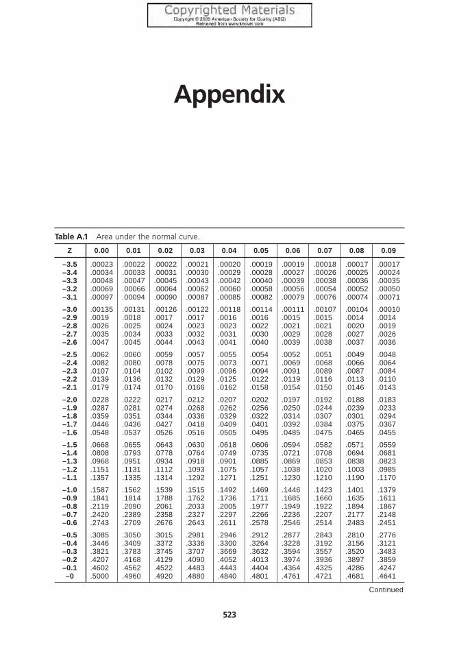
Appendix
Table A.1 Area under the normal curve.
Z 0.00 0.01 0.02 0.03 0.04 0.05 0.06 0.07 0.08 0.09
–3.5 .00023 .00022 .00022 .00021 .00020 .00019 .00019 .00018 .00017 .00017–3.4 .00034 .00033 .00031 .00030 .00029 .00028 .00027 .00026 .00025 .00024–3.3 .00048 .00047 .00045 .00043 .00042 .00040 .00039 .00038 .00036 .00035–3.2 .00069 .00066 .00064 .00062 .00060 .00058 .00056 .00054 .00052 .00050–3.1 .00097 .00094 .00090 .00087 .00085 .00082 .00079 .00076 .00074 .00071
–3.0 .00135 .00131 .00126 .00122 .00118 .00114 .00111 .00107 .00104 .00010–2.9 .0019 .0018 .0017 .0017 .0016 .0016 .0015 .0015 .0014 .0014–2.8 .0026 .0025 .0024 .0023 .0023 .0022 .0021 .0021 .0020 .0019–2.7 .0035 .0034 .0033 .0032 .0031 .0030 .0029 .0028 .0027 .0026–2.6 .0047 .0045 .0044 .0043 .0041 .0040 .0039 .0038 .0037 .0036
–2.5 .0062 .0060 .0059 .0057 .0055 .0054 .0052 .0051 .0049 .0048–2.4 .0082 .0080 .0078 .0075 .0073 .0071 .0069 .0068 .0066 .0064–2.3 .0107 .0104 .0102 .0099 .0096 .0094 .0091 .0089 .0087 .0084–2.2 .0139 .0136 .0132 .0129 .0125 .0122 .0119 .0116 .0113 .0110–2.1 .0179 .0174 .0170 .0166 .0162 .0158 .0154 .0150 .0146 .0143
–2.0 .0228 .0222 .0217 .0212 .0207 .0202 .0197 .0192 .0188 .0183–1.9 .0287 .0281 .0274 .0268 .0262 .0256 .0250 .0244 .0239 .0233–1.8 .0359 .0351 .0344 .0336 .0329 .0322 .0314 .0307 .0301 .0294–1.7 .0446 .0436 .0427 .0418 .0409 .0401 .0392 .0384 .0375 .0367–1.6 .0548 .0537 .0526 .0516 .0505 .0495 .0485 .0475 .0465 .0455
–1.5 .0668 .0655 .0643 .0630 .0618 .0606 .0594 .0582 .0571 .0559–1.4 .0808 .0793 .0778 .0764 .0749 .0735 .0721 .0708 .0694 .0681–1.3 .0968 .0951 .0934 .0918 .0901 .0885 .0869 .0853 .0838 .0823–1.2 .1151 .1131 .1112 .1093 .1075 .1057 .1038 .1020 .1003 .0985–1.1 .1357 .1335 .1314 .1292 .1271 .1251 .1230 .1210 .1190 .1170
–1.0 .1587 .1562 .1539 .1515 .1492 .1469 .1446 .1423 .1401 .1379–0.9 .1841 .1814 .1788 .1762 .1736 .1711 .1685 .1660 .1635 .1611–0.8 .2119 .2090 .2061 .2033 .2005 .1977 .1949 .1922 .1894 .1867–0.7 .2420 .2389 .2358 .2327 .2297 .2266 .2236 .2207 .2177 .2148–0.6 .2743 .2709 .2676 .2643 .2611 .2578 .2546 .2514 .2483 .2451
–0.5 .3085 .3050 .3015 .2981 .2946 .2912 .2877 .2843 .2810 .2776–0.4 .3446 .3409 .3372 .3336 .3300 .3264 .3228 .3192 .3156 .3121–0.3 .3821 .3783 .3745 .3707 .3669 .3632 .3594 .3557 .3520 .3483–0.2 .4207 .4168 .4129 .4090 .4052 .4013 .3974 .3936 .3897 .3859–0.1 .4602 .4562 .4522 .4483 .4443 .4404 .4364 .4325 .4286 .4247–0 .5000 .4960 .4920 .4880 .4840 .4801 .4761 .4721 .4681 .4641
Continued
523

Continued
Z 0.00 0.01 0.02 0.03 0.04 0.05 0.06 0.07 0.08 0.09
0 .5000 .5040 .5080 .5120 .5160 .5199 .5239 .5279 .5319 .53590.1 .5398 .5438 .5437 .5517 .5557 .5596 .5636 .5675 .5714 .57530.2 .5793 .5832 .5871 .5910 .5948 .5987 .6026 .6064 .6103 .61410.3 .6179 .6217 .6255 .6293 .6331 .6368 .6406 .6443 .6480 .65170.4 .6554 .6591 .6628 .6664 .6700 .6736 .6772 .6808 .6844 .68790.5 .6915 .6950 .6985 .7019 .7054 .7088 .7123 .7157 .7190 .7224
0.6 .7257 .7291 .7324 .7357 .7389 .7422 .7454 .7486 .7517 .75490.7 .7580 .7611 .7642 .7673 .7704 .7734 .7764 .7794 .7823 .78520.8 .7881 .7910 .7939 .7967 .7995 .8023 .8051 .8079 .8106 .81330.9 .8159 .8186 .8212 .8238 .8264 .8289 .8315 .8340 .8365 .83891.0 .8413 .8438 .8461 .8485 .8508 .8531 .8554 .8577 .8599 .8621
1.1 .8643 .8665 .8686 .8708 .8729 .8749 .8770 .8790 .8810 .88301.2 .8849 .8869 .8888 .8907 .8925 .8944 .8962 .8980 .8997 .90151.3 .9032 .9049 .9066 .9082 .9099 .9115 .9131 .9147 .9162 .91771.4 .9192 .9207 .9222 .9236 .9251 .9265 .9279 .9292 .9306 .93191.5 .9332 .9345 .9357 .9370 .9382 .9394 .9406 .9418 .9429 .9441
1.6 .9452 .9463 .9474 .9484 .9495 .9505 .9515 .9525 .9535 .95451.7 .9554 .9564 .9573 .9582 .9591 .9599 .9608 .9616 .9625 .96331.8 .9641 .9649 .9658 .9664 .9671 .9678 .9686 .9693 .9699 .97061.9 .9713 .9719 .9726 .9732 .9738 .9744 .9750 .9756 .9761 .97672.0 .9773 .9778 .9783 .9788 .9793 .9798 .9803 .9808 .9812 .9817
2.1 .9821 .9826 .9830 .9834 .9838 .9842 .9846 .9850 .9854 .98572.2 .9861 .9864 .9868 .9871 .9875 .9878 .9881 .9884 .9887 .98902.3 .9893 .9896 .9898 .9901 .9904 .9906 .9909 .9911 .9913 .99162.4 .9918 .9920 .9922 .9925 .9927 .9929 .9931 .9932 .9934 .99362.5 .9938 .9940 .9941 .9943 .9945 .9946 .9948 .9949 .9951 .9952
2.6 .9953 .9955 .9956 .9957 .9959 .9960 .9961 .9962 .9963 .99642.7 .9965 .9966 .9967 .9968 .9969 .9970 .0971 .9972 .9973 .99742.8 .9974 .9975 .9976 .9977 .9977 .9978 .9979 .9979 .9980 .99812.9 .9981 .9982 .9983 .9983 .9983 .9984 .9985 .9985 .9986 .99863.0 .99865 .99869 .99874 .99878 .99882 .99886 .99889 .99893 .99896 .99900
3.1 .99903 .99906 .99910 .99913 .99915 .99918 .99921 .99924 .99926 .999293.2 .99931 .99934 .99936 .99938 .99940 .99942 .99944 .99946 .99948 .999503.3 .99952 .99953 .99955 .99957 .99958 .99960 .99961 .99962 .99964 .999653.4 .99966 .99967 .99969 .99970 .99971 .99972 .99973 .99974 .99975 .999763.5 .99977 .99978 .99978 .99979 .99980 .99981 .99981 .99982 .99983 .99983
524 Appendix
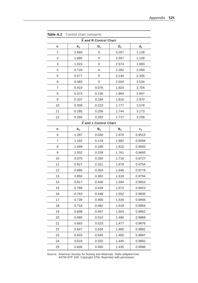
Table A.2 Control chart constants.–X and R Control Chart
n A2 D3 D4 d2
1 2.660 0 3.267 1.128
2 1.880 0 3.267 1.128
3 1.023 0 2.574 1.693
4 0.729 0 2.282 2.059
5 0.577 0 2.144 2.326
6 0.483 0 2.004 2.534
7 0.419 0.076 1.924 2.704
8 0.373 0.136 1.864 2.847
9 0.337 0.184 1.816 2.970
10 0.308 0.223 1.777 3.078
11 0.285 0.256 1.744 3.173
12 0.266 0.283 1.717 3.258–X and s Control Chart
n A3 B3 B4 c4
6 1.287 0.030 1.970 0.9515
7 1.182 0.118 1.882 0.9594
8 1.099 0.185 1.815 0.9650
9 1.032 0.239 1.761 0.9693
10 0.975 0.284 1.716 0.9727
11 0.927 0.321 1.679 0.9754
12 0.886 0.354 1.646 0.9776
13 0.850 0.382 1.618 0.9794
14 0.817 0.406 1.594 0.9810
15 0.789 0.428 1.572 0.9823
16 0.763 0.448 1.552 0.9835
17 0.739 0.466 1.534 0.9845
18 0.718 0.482 1.518 0.9854
19 0.698 0.497 1.503 0.9862
20 0.680 0.510 1.490 0.9869
21 0.663 0.523 1.477 0.9876
22 0.647 0.534 1.466 0.9882
23 0.633 0.545 1.455 0.9887
24 0.619 0.555 1.445 0.9892
25 0.606 0.565 1.435 0.9896
Source: American Society for Testing and Materials. Table adapted from ASTM-STP 15D. Copyright STM. Reprinted with permission.
Appendix 525

This page has been reformatted by Knovel to provide easier navigation
INDEX
Index Terms Links
A
accuracy, definition 469
ACORN test 93
examples 94
action and effect diagram. See reverse fishbone
diagram
action list 51
activity chart 274
See also arrow diagram; Gantt chart
activity network diagram. See arrow diagram
affinity diagram 96 311 463
examples 80 82 97
variation 99
agenda, planning 48
alternate hypothesis, definition 320
analysis of variance (ANOVA) 314 451
See also hypothesis testing
analytical criteria method 409
See also prioritization matrix
criteria weighting 409
example 411
rating options against criteria 410
summary matrix 410
analytical hierarchy process 419
analytical tree. See tree diagram
ANOVA. See analysis of variance
appraiser variation 449
area chart. See cumulative line graph

Index Terms Links
This page has been reformatted by Knovel to provide easier navigation
arrow diagram 100
dummy 101 102
example 104
variations 102
as-is flowcharts 62
See also as-is process maps
as-is process maps 60 262
See also as-is
flowcharts
attribute control charts 177
c chart 184
group chart 194
np chart 182
p chart 177
short run chart 189
u chart 186
attribute data 156
autocorrelation 159 471
average response 228
averages and range chart. See X and R chart
B
backward fishbone. See reverse
fishbone diagram
balanced scorecard 111
examples 55 69 77 112
bar chart 280
examples 281
variations 282
bar graph 78
barriers, identifying 42
Battelle method 205
See also criteria filtering
Index Terms Links
This page has been reformatted by Knovel to provide easier navigation
benchmarking 116
benefits 26
differences 24
examples 23 33 117
history 23
problems 26
process 25
tools 25
benefits and barriers exercise 118
example 120
variation for small group 120
bias, definition 469
bimodal distribution 297
Black Belts 29
blocking 232
box-and-whisker plot.
See box plot
box plot 121 289
example 123
variations 125
box-plot control chart 126
brain web. See Mind Map®
brainstorming 126
See also brainwriting;
contingency diagram; fishbone
diagram; NGT
examples 62 71 74 81
127 128 131
variations 127
ways to work with ideas
generated 132
brainwriting 132
variations 133

Index Terms Links
This page has been reformatted by Knovel to provide easier navigation
C
c chart 184
See also attribute control chart;
control chart
examples 186
CANDO 32
capability indices, problems with 427
See also process capability study
capable process 424
categorical data 275 283 287 299
cause enumeration diagram 249
See also fishbone diagram
cause-and-effect diagram.
See fishbone diagram
cause-and-effect/force field analysis 251
cause-and-effect matrix 135
example 136
cause-and-effect relationships. See relations
diagram
CDF graph. See cumulative distribution function
graph
CEDAC 250
See also fishbone diagram
charette procedure 130
chart. See graph
chart of individuals 60 168
example 171
charter. See project charter
check sheet 141
See also checklist
confirmation check sheet 145
example 142
variation 143
Index Terms Links
This page has been reformatted by Knovel to provide easier navigation
checklist 139
See also check sheet
examples 76 140
chi-square test 314 317 318
cluster sample 468 470
clustered bar chart 282
coefficient of determination 441
comb distribution 298
combination ID/matrix method 416
See also
prioritization matrix
adding up the matrix 417
analyzing the matrix 417
constructing the matrix 416
example 418
comparative Pareto charts 380
See also
Pareto chart
competitive benchmarking 310
concentration diagram. See defect concentration
diagram
confidence interval 441
definition 321 468
confidence level 321 469
confirmation check sheet 145
See also checklist
confounding 232
consensus 44
definition 363
in list reduction 334
in multivoting 363
consensus criteria method 413
See also
prioritization matrix

Index Terms Links
This page has been reformatted by Knovel to provide easier navigation
consensus criteria method (Cont.)
criteria weighting 413
example 414
ranking options against criteria 414
summary matrix 414
constituent–component–analysis diagram 504
constraint management 30 31
contingency diagram 146
example 147
contingency planning 430
contingency table 148
examples 148
continuum of team goals 150
examples 58 151
control chart 155 291
attribute control charts 177
control limits 159
examples 60 64
out-of-control signals 158
variable control charts 160
variations 155 160
when to use 156
control chart decision tree 156
control limits 159
See also control chart
convenience sample 467 470
correlation analysis 197 443
cost of quality 202
cost–cycle time chart 216
See also cycle time chart
cost-of-poor-quality analysis 199
example 200
cost-of-quality analysis. See cost-of-poor-quality
analysis

Index Terms Links
This page has been reformatted by Knovel to provide easier navigation
count chart. See c chart
Cp, Cpk 366 421 457
Crawford slip method 133
See also brainwriting
creative thinking 2 33 131 351
483
criteria filtering 203
See also list reduction
example 204
criteria rating form. See decision matrix
criteria-based matrix. See decision matrix
critical characteristics 239
critical path 100
critical path method 102
See also arrow diagram
critical to flowdown. See critical-to-quality tree
critical value, definition 321
criticality 242
critical-to tree. See critical-to-quality tree
critical-to-quality (CTQ) analysis 207
example 208
critical-to-quality (CTQ) tree 211
example 212
crossed design 359
cross-functional flowchart. See deployment
flowchart; flowchart
C-shaped matrix 339 342
CTQ tree. See critical-to-quality tree
CTX tree. See critical-to-quality tree
cumulative distribution function (CDF) graph 288 304
cumulative line graph 290
cumulative polygon graph 288 292 304
cumulative sum (CUSUM) chart 196
current process controls 239

Index Terms Links
This page has been reformatted by Knovel to provide easier navigation
current state, assessing 40
customer. See customer requirements
customer competitive assessment 310
customer needs. See customer requirements
customer needs table. See voice of the customer
table
customer requirements 17 39 306 457
See also requirements-and-measures tree;
requirements table
customer voice table. See voice of the customer
table
customer window. See importance–performance
analysis
customers, categories of 458
customers, identifying 457
customers’perceptions 323 387
CUSUM chart. See cumulative sum chart
cycle time chart 215
example 217
cyclical variation 358
D
decision grid. See decision matrix
decision limits 228
decision matrix 219
See also cause-and-
effect matrix; L-shaped matrix
examples 60 221
decision process flowchart. See decision tree
decision tree 224
examples 156 276
defect concentration diagram 143
See also check sheet example 144

Index Terms Links
This page has been reformatted by Knovel to provide easier navigation
defect location check sheet. See defect
concentration diagram
defect map. See defect concentration diagram
defects 177 178
See also defect concentration
diagram
delighters 18
demanded quality. See customer requirements
Deming cycle. See plan–do–study–act cycle
Deming,W. Edwards 13
demographic information 496
deployment flowchart 264
See also flowchart example 265
design FMEA 241
See also failure modes and effects analysis
Design for Six Sigma (DFSS) 29
design of experiments (DOE) 225
analysis 228 233
choosing levels 227
example 228
methods 225
phases 227
designed experiment, planning 231
See also design of experiments
desired-result fishbone 250
See also fishbone diagram
detailed flowchart 58 59 71 73
259
See also flowchart
analysis 263
to convert to a deployment chart 263
to convert to a SIPOC diagram 263
to convert to a work-flow diagram 264
example 260

Index Terms Links
This page has been reformatted by Knovel to provide easier navigation
detection rating 239
deviation chart. See target chart
difference chart. See target chart
discrimination ratio 457
displayed thinking. See storyboard
dissatisfiers 17
distributions, kinds of 296
divided bar chart 282
DMAIC 29
dog food distribution 298
dot chart 283
example 283
variations 284
double reversal 128
See also brainstorming
double-peaked distribution 297
down-across. See deployment flowchart;
flowchart
drivers 214
dummy 101 102 104
E
earliest finish 103 106
earliest start 103 106
edge peak distribution 297
effect of a factor 228 232
effective–achievable chart 233
See also two-dimensional chart
example 234
effects analysis. See failure modes and effects
analysis
elimination, mistake-proofing technique 352
equipment variation 449

Index Terms Links
This page has been reformatted by Knovel to provide easier navigation
e-survey 490
events, arrow diagram 104
events, fault tree analysis 243
EWMA. See exponentially weighted moving
average chart
exciters. See delighters
expand–focus sequence 3
expansion 3
exponentially weighted moving average
(EWMA) chart 196
F
face-to-face interview 493
facilitation, mistake-proofing technique 352
facilitator 48
factors 227
fail-safing. See mistake-proofing
failure modes and effects analysis (FMEA) 236
example 239
scope 237
tools often used with 242
types 241
failure, possible causes 246
false positive 159
fault tree analysis 243
causes of failure, possibilities 246
example 245
fishbone, time-delay 86 87 249
fishbone diagram 247
examples 61 72 73 87
248
variations 249
five Ms 241 251

Index Terms Links
This page has been reformatted by Knovel to provide easier navigation
5S 32
5W2H 252
example 253
five whys. See why–why diagram
flipchart 49
flowchart 255
See also arrow diagram;
SIPOC diagram; work-flow diagram; and
names of specific flowcharts
analyzing 263 510
construction 262
examples 257 259 260 265
268
variations 257
focus group 494
focusing 3
force field analysis 268
example 269
with fishbone diagram 251
forced choice 374
See also paired comparison
fractional factorial design 231
confounding 232
frequency distributions 288 292 296
F-test 314
See also hypothesis testing
full factorial design 231
G
gage R&R 453
See also repeatability and reproducibility study
gallery method 134
See also brainwriting

Index Terms Links
This page has been reformatted by Knovel to provide easier navigation
Gantt chart 271
examples 74 272
variation 273
gates, fault tree analysis 244
geographic flowchart. See work-flow diagram
geometrically weighted moving average 196
ghost box plot 126
goodness-of-fit tests 370
graph 274
See also box plot; control chart;
frequency distributions; histogram;
multi-vari chart; Pareto chart; radar chart;
run chart; scatter diagram; and names of
specific graphs
colors and patterns 279
definition 6
graph decision tree 275
principles of good graphs 277
scales and scale lines 278
stratified 65
symbols 278
variations 280
which to use 275
Green Belts 29
group chart 194
See also control chart
example 195
grouped bar chart 282
grouped dot chart 284 285
guidance questions 51
H
Hawthorne effect 396
Index Terms Links
This page has been reformatted by Knovel to provide easier navigation
heart-cut distribution 298
hierarchy diagram. See tree diagram
high-level flowchart. See flowchart; macro
flowchart
high-low graph 291
hinges 122 124
histogram 292 370
examples 164 294
shapes 296
variations 299
hoshin planning 15
Hotelling T2 chart. See multivariate chart
house of quality 305
customer requirements 306 310
example 308
multiple groups of customers with different
requirements 313
objective measurements 312
product or service characteristics 307 311
relationships between customer
requirements and product or service
characteristics 307 311
size 313
targets, setting and analyzing 313
translating customers’verbal ratings 314
H-spread 122 124
hypothesis, definition 320
hypothesis testing 314
chi-square test examples 318
definitions of terms 320
examples 318
t -test example 318

Index Terms Links
This page has been reformatted by Knovel to provide easier navigation
I
importance, definition, in stakeholder
analysis 480
importance comparison chart 326 328
example 328
importance–performance analysis 323
analysis 325
data collection 324
example 327
importance–performance chart 325 327
example 327
improvement objectives 433
improvement opportunities 42 199
improvement process, guidance questions 51
improvement solutions and plans, developing 43
inadequate measurement discrimination 454
incapable process 424
inefficiency 519
influence 480
influence–importance chart 477
initial plans, making 39
inner fences 122 124
input events 244
inspection 202 355
interaction effects 228 232
intercept of the line 441
Internet-based survey. See e-survey
interrelationship diagram. See relations diagram
interview 492
Ishikawa, Kaoru 15
Ishikawa diagram. See fishbone diagram
is–is not matrix 330
examples 87 332

Index Terms Links
This page has been reformatted by Knovel to provide easier navigation
ISO 9000 19 33
history 19
problems and potential 20
quality management principles 21
requirements 20
IX–MR chart. See chart of individuals
J
Juran, Joseph M. 14 381
K
kaizen 15
Kano model 17
key. See decision tree
L
lag indicators 503
lateral thinking 132
latest finish 103 106
latest start 103 106
lead indicators 504
lean enterprise. See lean manufacturing
lean manufacturing 30 33
applications 30
history 30
identifying waste 31
methods and tools 31
lean production. See lean manufacturing
least squares method 443
See also regression
analysis
left-skewed distribution 369
left-tailed, definition 321

Index Terms Links
This page has been reformatted by Knovel to provide easier navigation
Likert scale 496
line graph 77 289
variation 290
linear regression 440
list reduction 334
See also Battelle method;
criteria filtering; multivoting
with criteria filtering 203 206
examples 83 335
location diagram. See defect concentration
diagram
logic diagram. See decision tree
long tails 369
low-hanging fruit 42 58 206
L-shaped matrix 70 80 339 340
See also decision matrix
M
macro flowchart 58 59 257
See also flowchart
to convert to detailed flowchart 263
main effects 228
Malcolm Baldrige National Quality Award 21 33
applying for 23
award categories 22
award criteria 22
history 21
MA–MR chart. See moving average–moving range
chart
margin of error, definition 468
matrix 58
See matrix diagram; two-dimensional
chart

Index Terms Links
This page has been reformatted by Knovel to provide easier navigation
matrix chart. See matrix diagram
matrix data analysis 15
matrix diagram 338
C-shaped 339 342
examples 70 80 340
L-shaped 339 340
roof-shaped 339 344
symbols 344
T-shaped 339 341
uses of matrices 339
when to use differently-shaped matrices 339
X-shaped 339 342
Y-shaped 339 341
matrix relations diagram 446
See also relations diagram
measurement system analysis. See repeatability
and reproducibility study
measurement variation 448 450
sources 453
measures, developing 463
median 122 124
Medrad, Inc. 55
balanced scorecard 56
corrective action tracking table 63
decision matrix 61
p chart 61
process maps 59 62
project metrics table 60
project objectives matrix 58
SIPOC diagram 59
meeting evaluation 345
evaluation form 347
evaluation methods 346
example 346

Index Terms Links
This page has been reformatted by Knovel to provide easier navigation
meeting record 51
meetings, quality improvement team 48
micro map. See detailed flowchart
milestones chart. See Gantt chart
mind flow. See Mind Map®
Mind Map® 349
example 350
minimal cut set 247
mission statement 150
See also project charter
mission statement checklist. See project charter
checklist
mistake-proofing 351
examples 62 70 352
inspection methods 355
regulatory functions 356
setting functions 355
modified box plot 125
modified-width box plot 125
Motorola 27
moving average–moving range chart 172
See also control chart
example 174
moving range chart. See chart of individuals
multimodal distribution 297
multiple characteristic chart. See group chart
multiple picking-out method 362
multiple rating matrix 285
multiple regression 440
multiple-mark choosing 362
multi-valued dot chart 284 285
multi-vari chart 356
crossed design 359
example 357

Index Terms Links
This page has been reformatted by Knovel to provide easier navigation
multi-vari chart (Cont.)
nested design 358
types of variation 358
multivariate chart 196
multivoting 359
example 360
variations 361
N
“necessary and sufficient” check 502
nested design 358
network diagram. See arrow diagram; relations
diagram
NGT voting. See multivoting
node diagram. See arrow diagram
nominal chart. See target chart
nominal data 275
nominal group technique (NGT) 364
in benefits and barriers exercise 119
nominal prioritization. See multivoting
nonconformities 177
See also c chart; np chart; p chart; u chart
nonlinear regression 440
nonnormal distribution 172 296
nonparametric tests 323
non-value-adding activities 30 510
eliminating 30
normal distribution 296
checking data 365 368
distortions 370
histogram 296
in hypothesis testing 314
and process capability 421

Index Terms Links
This page has been reformatted by Knovel to provide easier navigation
normal probability plot 365
example 366
shapes 369
variations 368
note taker 50
np chart 182
See also attribute control chart;
control chart
example 183
null hypothesis, definition 320
numerical data 275 276 299
numerical prioritization 374
See also paired comparison
O
objectives, evaluating 433
objectives matrix. See performance index
occurrence rating 239
ogive graph. See cumulative polygon graph
open-ended questions, analyzing 498
See also thematic analysis
operational definition 370
example 371
opportunity analysis. See decision matrix
optimization study 227 231 232
ordinal data 275
organizational value-adding activities 510
outer fences 123 125
out-of-control signals 157
c chart 186
CUSUM 196
MA–MR chart 173 174
np chart 183

Index Terms Links
This page has been reformatted by Knovel to provide easier navigation
out-of-control signals (Cont.)
p chart 180
R chart 165
short run chart 192 193
u chart 187
X chart 165
output events 244
P
p chart 60 178
See also attribute control
chart; control chart
examples 61 182
P values 228
definition 321
paired comparison, decision-making tool 372
example 373
forced choice 374
numerical prioritization 374
variations 374
paired comparison, statistical tool 323
Pareto analysis 56
Pareto chart 376
See also bar chart; bar graph
example 377
variations 379
parking lot 50
part variation 456
participation matrix 478
PDSA. See plan–do–study–act cycle
Pearl River School District 65
analysis process 67
PDSA approach 66
Index Terms Links
This page has been reformatted by Knovel to provide easier navigation
Pearl River School District (Cont.)
performance evaluation process 66
tree diagram 65
percentile graph 288 292 302
example 303
perceptual map. See two-dimensional chart
performance comparison chart 326 328
example 328
performance index 383
examples 83 84 385
setting up the chart 383
using the chart 385
PERT chart 107
PGCV index 387
example 388
physical layout flowchart. See work-flow
diagram
pie chart 287
pin cards technique 134
See also brainwriting
Plackett-Burman screening design 231
confounding 232
plan-development diagram 504
plan–do–check–act (PDCA) cycle. See
plan–do–study–act cycle
plan–do–study–act (PDSA) cycle 390
examples 65 391
variation 393
plan–results chart 393
See also two-dimensional chart
examples 395
Hawthorne effect 396
plateau distribution 297
plot. See graph

Index Terms Links
This page has been reformatted by Knovel to provide easier navigation
plussing 482
PMI 397
example 397
point chart. See dot chart
point graph 288 292 301
poka-yoke. See mistake-proofing
polygon chart 288 292 299
population, definition 468
positional variation 358
potential gain in customer value index. See PGCV
index
potential opportunity analysis 402
potential problem analysis (PPA) 399
examples 74 88 400
with process decision
program chart 430
PPA. See potential problem analysis
Pp, Ppk 421 422 427
precision, definition 469
preferred state, defining 41
presentation 403
audiovisuals 406
before the presentation 404
during the presentation 407
example 404
handouts 407
prevention, as cost of quality 202
prioritization matrix 408
See also L-shaped matrix
versus criteria filtering 207
examples 411 414 418
variations 409
probability plot 368
See normal probability plot

Index Terms Links
This page has been reformatted by Knovel to provide easier navigation
problem, causes 330 513 514
See also why–why diagram
problem selection matrix. See decision matrix
problem statement 331 333
problems with capability indices 427
Procedure for Potential Consequences 242
process capability index 421
See also process capability study
process capability study 420
example 423
interpreting the indices 426
nonnormal processes 428
problems with capability indices 427
process decision program chart 428
See also tree diagram
example 429
process fishbone 249
See also fishbone
diagram
process flow diagram. See flowchart
process flowchart. See flowchart
process FMEA 241
See also failure modes and
effects analysis
process limits 422
process map. See detailed flowchart
process spread 422
process variation 450
product characteristics 307
production process classification diagram. See
process fishbone
program evaluation and review technique (PERT)
chart 107
project, concluding 47
Index Terms Links
This page has been reformatted by Knovel to provide easier navigation
project bar chart. See Gantt chart
project charter 38 431
examples 56 433 434
identifying 38
project charter checklist 435
See also continuum of team goals
example 436
proportion chart. See p chart
proportional stratified sample 468
Pugh matrix 220
See also decision matrix
Q
QFD matrix. See house of quality
quality, poor 202
quality function deployment (QFD) 16 33 305
benefits and problems 16
customer satisfaction 17
history 16
Kano model 17
tools 17
quality improvement, history 13
quality improvement process 35
benefits 35
guidance questions 51
ten steps 36
quality improvement team 47
agenda, planning 48
facilitator 48
guidance questions checklist 51
meetings 48
other responsibilities 50
quantile graph. See percentile graph

Index Terms Links
This page has been reformatted by Knovel to provide easier navigation
quantile–quantile plot 369
See also normal
probability plot
questionnaire 489
example 490
questions
for developing flowcharts 263
for guidance of quality improvement process 51
for understanding project charter 435
for writing project charter 432
writing, for surveys 493 495
R
radar chart 437
example 438
random sample
definition 468
simple 467
randomization 227 232
RAVE, elements of a good measure 463
real value-adding activities 510
red and green circle exercise. See cost-of-
poor-quality analysis
regression analysis 440
with correlation analysis 199
examples 441
least squares method 443
types of regression 440
rejection region, definition 321
relations diagram 444
example 445
matrix relations diagram 446
variation 446

Index Terms Links
This page has been reformatted by Knovel to provide easier navigation
relationship matrix 31
repeatability and reproducibility study 448
analysis of variance method 451 455
analyzing 449 455
example 451
improvement 456
planning 449 454
range and average method 450 456
testing 449
replacement, mistake-proofing technique 352
replication 227 232
representative sample, definition 468
requirement matrix. See house of quality
requirements table 457
example 459
requirements-and-measures tree 461
example 462
residual 443
response 227
results, monitoring 45
reverse fishbone diagram 250
See also
fishbone diagram
right-skewed distribution 369
right-tailed, definition 321
risk priority number 239 242
robust design 225
roof-shaped matrix 339 344
See also matrix
diagram
root cause 42
guidance questions for identifying 53
identifying in quality improvement process 42
and multivoting 363

Index Terms Links
This page has been reformatted by Knovel to provide easier navigation
root cause (Cont.)
and scatter diagram 474
system issues 43
and why–why diagram 513
root cause analysis 65
root causes, identifying 42
round-robin brainstorming 127
See also brainstorming
run chart 463
See also line graph
example 465
run tests 464
S
St. Luke’s Hospital 69
balanced scorecard 69
bar graph 78
checklist 77
fishbone diagram 73
flowcharts 72
Gantt chart 75
L-shaped matrix 70
line graph 77
policy document 75
roles document 76
table 71
sample, definition 468
sampling 466
definitions 468
example 467
sampling error, definition 468
sampling frame, definition 468
satisfaction, numerical rating of 496

Index Terms Links
This page has been reformatted by Knovel to provide easier navigation
satisfaction surveys 494
satisfiers 17
scale break 278
scatter diagram 471
examples 85 473
scatter plot. See scatter diagram
scheduling
critical path method 102
program evaluation and review technique
(PERT) chart 107
screening experiments 227 231 232
scribe 50
selection matrix. See decision matrix
service characteristics 307
service FMEA 241
See also failure modes and
effects analysis
service map. See detailed flowchart
seven management and planning tools 15
seven quality control tools 15
several-leveled flowchart 267
See also flowchart
severity rating 237
Shewhart,Walter A. 13
Shewhart cycle. See plan–do–study–act cycle
short run chart 189
See also control chart
example, with variable data 192
procedure, with attribute data 193
procedure, with variable data 190
short tails 369
should-be process map 263
siders 483
significance level, definition 321
Index Terms Links
This page has been reformatted by Knovel to provide easier navigation
simple box plot 125
single-mark choosing 363
SIPOC diagram 475
examples 58 79 475
Six Sigma 27 33
history 27
methodology 29
tools 29
what it means 28
Six Sigma capability 426
6–3–5 method 133
See also brainwriting
skewed distribution 296
slack times 104 107
free slack 104
total slack 104
slope of the line 440
SMART criteria for objectives 433
solution, implementing 45
solution impact diagram. See reverse fishbone
diagram
solution matrix. See decision matrix
spaghetti diagram. See work-flow diagram
spider chart. See radar chart
stabilized chart. See short run chart
stacked bar chart 282
stacked line graph. See cumulative line graph
stakeholder 479
identifying 479
stakeholder analysis 476
examples 478
influence–importance chart 477
standardize–do–study–act cycle 393
See also plan–do–study–act cycle

Index Terms Links
This page has been reformatted by Knovel to provide easier navigation
standardizing 46
star chart. See radar chart
starbursting 129
statistic, definition 320
statistical process control. See control chart
stem-and-leaf display 300
stem-and-leaf graph 288 292
sticking dots 361
storyboard 481
See also Mind Map®
examples 88 483 484
stratification 485
example 486
stratified sampling 468 470
stratum chart. See cumulative line graph
subbers 482
suppliers’ratings 330
survey 487
See also names of specific
surveys
analysis and reporting 498
examples 65 490 491 494
interviewing 497
respondents 497
responses 496
variations 489
writing questions 495
symbolic flowchart. See detailed flowchart
synchronous flow
manufacturing 30 31
systematic diagram. See tree diagram
systematic sample 467 470

Index Terms Links
This page has been reformatted by Knovel to provide easier navigation
T
table 499
examples 60 63 71
stratified 65
Taguchi methods 225
Taguchi’s loss function 226
target chart 175
See also control chart
example 176
task time 102 104
tasks 104 109
team efficiency and effectiveness 47 345 347
team leader 48 431
telephone interview 492
temporal variation 358
test, definition 320
test statistic, definition 320
thematic analysis 99
3–2–1 voting 361
time-delay fishbone 86 87 249
See also
fishbone diagram
timekeeper 50
to-be flowcharts 62
tolerance specification, definition 468
tool matrix 2 8
example of using 4
guide to using 2
tools for team effectiveness 47
top event 243
top-down flowchart 79 258
See also Flowchart
to convert to detailed flowchart 263

Index Terms Links
This page has been reformatted by Knovel to provide easier navigation
Total Quality Management (TQM) 14
problems and benefits 15
tools 15
treatments 227
tree analysis. See tree diagram
tree diagram 501
examples 65 503
with house of quality 311
two types 504
trend tests 464
TRIZ 33
truncated distribution 298
T-shaped matrix 339 341
t -test 314 317 318
See also hypothesis testing
two-dimensional chart 505
See also effective–achievable chart;
importance–performance analysis;
plan–results chart
example 506
two-tailed, definition 321
two-way dot chart 284
type I error 322
type II error 322
U
u chart 186
See also attribute control chart;
control chart
examples 189
V
value-added analysis 507

Index Terms Links
This page has been reformatted by Knovel to provide easier navigation
See also cycle time chart
example 508
value/non-value-added cycle time chart 216
See also cycle time chart
variable control charts 160
chart of individuals 168
moving average–moving range chart 172
target chart 175
X and R chart 160
X and s chart 167
variable data 156 275
variation, types of 358
voice of the customer 211 214
See also customer requirements
voice of the customer table 510
example 511
W
waste 203
eliminating 30
identifying 31
waste problems, solving 32
waterfalling 113
web chart. See radar chart
weighted Pareto chart 379
See also Pareto chart
weighted voting 361
example 361
whiteboard 49
why–why diagram 513
See also tree diagram
example 514
variation 513

Index Terms Links
This page has been reformatted by Knovel to provide easier navigation
wildest idea brainstorming 127
See also brainstorming
within-sample variation 454
wordsmithing 516
example 517
work procedure. See checklist
work-flow diagram 519
example 520
X
X chart. See chart of individuals
X and R chart 160
See also control chart
example 164
X and s chart 167
See also control chart
XmR chart. See chart of individuals
Xerox Corporation 23
X–R chart. See chart of individuals
X-shaped matrix 339 342
X–Y graph. See scatter diagram
Y
Y-shaped matrix 339 341
Z
Z chart. See short run chart
z-test 314 317
See also hypothesis testing
ZZ-400 Manufacturing Unit 78
affinity diagram 82
brainstorming 81

Index Terms Links
This page has been reformatted by Knovel to provide easier navigation
ZZ-400 Manufacturing Unit (Cont.)
fishbone diagram 87
histogram 164
is–is not diagram 87
L-shaped matrix 80
performance index 84
regression analysis 86
scatter diagram 85
storyboard 89
top-down flowchart 79
X and R chart 81 164 166