Swiss Graphic Design Histories— Tempting Terms - ARBOR
202
Swiss Graphic Design Histories Tempting Terms advertisement alternative actors Arts and Craſts associations awards canonization clients culture and commerce design promotion design scenes discourse education policy ephemera exhibition design exhibitions France good design historiography identity Italy local and international magazines Modernism museum national identity national label networks origins politics posters practice printing industry private collectors profession publications schools self-promotion standardization training typography source: https://doi.org/10.24451/arbor.16009 | downloaded: 6.3.2022
-
Upload
khangminh22 -
Category
Documents
-
view
0 -
download
0
Transcript of Swiss Graphic Design Histories— Tempting Terms - ARBOR

SwissGraphic DesignHistories
Swiss G
raphic Design H
istories—Tem
pting Terms
Tempting Terms advertisementalternative actorsArts and Craftsassociationsawardscanonizationclientsculture and commercedesign promotiondesign scenesdiscourseeducation policyephemeraexhibition designexhibitionsFrancegood designhistoriographyidentityItalylocal and internationalmagazinesModernismmuseumnational identitynational labelnetworksoriginspoliticsposterspracticeprinting industryprivate collectorsprofessionpublicationsschoolsself-promotionstandardizationtrainingtypography
source: https://doi.org/10.24451/arbor.16009 | downloaded: 6.3.2022

Visual Arguments
advertisementalternative actorsArts and Craftsassociationsawardscanonizationcareerclientsculture and commercecurriculumdesign scenesdiscoursediversityeducation policy exhibition designexhibitionsgenderhandwritinghistoriographyidentityItalymagazinesModernismnational identitynetworksphotographspoliticsposterspracticeprofessionpublicationsregionalismrepresentationschoolsself-promotionskillsstandardizationstereotypesSwissnessSwiss Styleteachingtechnologytemplatestrainingtype designtypography
SwissGraphic DesignHistories
Multiple Voices
advertisementassociationsawardscareerclientsculture and commercecurriculumdesign scenesdiversityFrancegood designItalylocal and internationalnational labelnetworkspoliticspracticeprofessionrepresentationschoolsself-promotionskillsstereotypesSwiss StyleSwissnessteachingtechnologytype designtypography
Tempting Terms
advertisementalternative actorsArts and Craftsassociationsawardscanonizationclientsculture and commercedesign promotiondesign scenesdiscourseeducation policyephemeraexhibition designexhibitionsFrancegood designhistoriographyidentityItalylocal and internationalmagazinesModernismmuseumnational identitynational labelnetworksoriginspoliticsposterspracticeprinting industryprivate collectorsprofessionpublicationsschoolsself-promotionstandardizationtrainingtypography


SwissGraphic DesignHistories
Tempting Terms
Edited by Ueli Kaufmann, Peter J. Schneemann, Sara Zeller
Scheidegger & Spiess

Table of Contents
Reading between the Lines of Swiss Graphic Design HistoryRoland Früh, Ueli Kaufmann, Peter J. Schneemann, Sara Zellerp. 7
Cave Paintings—Continu-ities and Progress in Graphic Designers’ Histo-riesUeli Kaufmannp. 14
Die besten Plakate / Les meilleures affiches— The Early Years of the National Poster Award, between Federal Support and Stylistic AuthoritySara Zellerp. 26
Hotspot Milan—The Perks of Working on the Other Side of the AlpsChiara Barbieri, Davide Fornarip. 38
Iconophile—Debating the Role of the Poster Collector Fred Schneckenburger in the Historiography of Swiss Graphic DesignSara Zellerp. 49
In eigener Sache—Editorial Statements Addressing the Readership Roland Frühp. 63
Kunsthalle Bern—Graphic Design in the Context of an Institution for Contem-porary ArtRoland Früh, Ueli Kaufmann, Peter J. Schneemann, Sara Zellerp. 79
Lehni Frame—Implications of Displaying Graphic DesignSara Zellerp. 92
Netzwerke / Réseaux/ Networks—A Relaunch to Reposition Federal Design PromotionJonas Berthodp. 101
Neue Schweizer Schulschrift—Tracing Exchanges between Modernist Typography and Swiss HandwritingUeli Kaufmannp. 111
Popular Culture—How the Museum für Gestaltung Zürich Promoted the Every-day in Graphic DesignRobert Lzicarp. 126
Schweizer Graphik—Curat-ing Switzerland as a Graphic Design Nation in 1925Roland Früh, Ueli Kaufmann, Robert Lzicar, Sara Zellerp. 140
Sonderstellung—Debating the Status of Graphic Design Education at the Kunstgewerbeschule ZürichRudolf Barmettler, Jonas Niedermannp. 152

Table of Contents
The Basel School—Decon-structing Labels of Swiss Graphic Design EducationSarah Klein, Sandra Bischlerp. 161
Unfamiliar Writing Forms—Instances of Various Scripts in Swiss Graphic Designers’ PublicationsUeli Kaufmannp. 169
Visualiste—Defining a New Job Title within Graphic Design in FranceConstance Delamadeleinep. 181
Weltformat—Setting (Swiss) Display Aesthetics for PostersSara Zellerp. 187

Reading between the Lines of Swiss Graphic Design History
Roland Früh, Ueli Kaufmann, Peter J. Schneemann, Sara Zeller
This publication on the reassessment of Swiss graphic design history has the format of a reference book. It assembles a variety of key-words that are without any systematic order, or normative or comprehensive conception. We consider this approach to be an appropri-ate response to the expectations raised by the title of the research project “Swiss Graphic Design and Typography Revisited.” How might a critical rereading of a national label be achieved—a label that is equally under-stood as a style, as an economic argument in graphic design history, and as an ongoing practice?1
The term “Swiss Graphic Design” has been used for different, changing phenom-ena, and its signification oscillates between styles and professional practices. In the same context, other terms such as Swiss Style, Swiss Typography, (Swiss) Interna-tional (Typographic) Style, Swiss Modernism, or Konstruktive Gebrauchsgrafik have all been used as specifications, either alongside each other, or as synonymous with “Swiss Graphic Design” and with each other.2 Within this ambiguous construct of a national
design label, a canon of designers, works, and publications emerged that forms the basis of practice, theory, and history to this day. This canon was to a large extent created and distributed by the practitioners themselves through publications, lectures, and exhibi-tions. An early example of how Swiss graphic designer Josef Müller-Brockmann spread selected names abroad is to be found at the Sixth International Design Conference in Aspen in 1956. At the end of his lecture about contemporary “visual art” in Switzerland, he presented a list of all the designers “who contribute an essential share to the forma-tion of style in Switzerland.”3 Those he named in his partial list were: Adolf Flückiger, Karl Gerstner, Armin Hofmann, Siegfried Oder-matt, Richard Paul Lohse, Hans Neuburg, Nelly Rudin, Emil Ruder, Gottlieb Soland, Carlo Vivarelli, Alfred Willimann, Max Schmid, Enzo Rösli, Igildo Biesele, and Josef Müller- Brockmann.4 His who’s who of Swiss graphic design thus concludes with his own name.
This leads us to a fundamental specific-ity in graphic design historiography: in self-authored publications, graphic design-ers interwove their own design theories with examples of what they perceived as out-standing works, thus creating the afore-mentioned canon of Swiss graphic design.5 Clearly it is no coincidence, for example, that Karl Gerstner and Markus Kutter com-mented explicitly on their goals in their publication Die neue Graphik / The New Graphic Art / Le nouveau art graphique from 1959:6
7Introduction
DOI: 10.53788/SW
BE0300
8
Our object was […] to take what is more or less familiar and arrange it in such a way that the stylistic relations between the parts become apparent and the for-midable abundance of works of graphic art can be examined in a perspective which allows their chief lines of develop-ment to be discerned and a better under-standing of the whole to be obtained.7
Their text was specifically written with the goal of defining a new field of competence. Claims to a tradition were used to project into the future. However, this reference to a cor-pus of design should not lead to any misun-derstanding that historiography was simply orchestrated by Swiss graphic designers. Both texts and visual showcases have to be understood as being part of the process of international exchange and international reception.8 Nevertheless, as these publi-cations were the only references to Swiss graphic design for a long time, they were not usually understood within their original context of teaching or of design theory, but read rather uncritically as history books. In an essay included in a 2007 revised edition of Karl Gerstner’s Programme entwerfen, Richard Hollis, a major voice in the historiog-raphy of graphic design, reflected in an almost poetic way on the changing status of these “sources” as they shift between the ephemeral and the canonical.
Some important books have only a brief life. They may light up an unexplored
area or catch a rising tide of interest before they disappear onto dusty shelves. A few others last, are referred to and rec-ommended by one generation to another.9
To this day, the contemporary graphic design scene continues to profit from the label, the canon, and prestige; it reactivates, updates, and redefines the master narrative in line with certain aesthetics, terms, and concepts. In classrooms, studios, exhibitions, and publica-tions, Swiss Style or Swiss Graphic Design remains a recurring topic, and prac titioners and established institutions alike make use of the notion of this national label, thus further strengthening it.10 For example, in the publica-tion that accompanied the exhibition 100 Years of Swiss Graphic Design at the Museum für Gestaltung Zürich in 2012, Swiss graphic design was claimed to be “one of the coun-try’s leading products.”11 Awards continue the tradition of singling out contemporary, best-practice examples. Thus instead of critically questioning the label, they further dissemi-nate the idea of specific national design com-petences.12 As with the practitioner-organized exhibition Swiss Style Now, even when com-mentators emphasize contemporary design production and inno vation, they still make ref-erence to a national tradition:
Swiss Style Now shows how the Swiss graphic heritage still serves as a source of inspiration, but how design is much more versatile, emotional and fun today.13
Introduction

9
Rereading and reevaluating these rich sources thus becomes necessary. The prac-titioner-authored publications remain a major source for understanding the history and the development of the Swiss Style. However, at the same time they have to be understood as being representative of certain motivations, functions, and contexts of use.14 In an interview, Manuel Krebs of studio NORM explained their need to author their own books in opposition to academic practice.
The next book is important. […] The point is that graphic designers themselves reflect on the things they do. We want to use our means to talk about design, to formulate our ideas graphically. Unlike cultural theorists, who have no clue about fonts. (Wichtig ist das nächste Buch. […] Es geht darum, dass Grafiker selber über die Dinge, die sie machen, nachdenken. Wir wollen mit unseren Mitteln über Grafik sprechen, unsere Überlegungen grafisch formulieren. Nicht wie Kultur-theoretiker, die von Fonts keine Ahnung haben.)15
With the establishment of an academic field of graphic design history since the 1980s, a more critical reading of these discourse doc-uments has emerged. Increasingly, the prac-titioners’ narratives and their ideological underpinnings have been questioned with regards to their political and economic settings, their social and discursive function,
and their underlying ideological conceptions and biases.16 In this context, it seems worth noting that these innovative approaches to Swiss Graphic Design not only questioned the heroic monograph, but also often provided a much-needed view from abroad.
Evidently, when addressing the topic of Swiss Graphic Design it is inevitable that we should engage with the meaning of a national approach to historiography. As argued by Kjetil Fallan and Grace Lees- Maffei in their paper “Real Imagined Communities: National Narratives and the Global ization of Design History,” the national frame work is by no means fundamentally outdated or even taboo. Instead, national phenom ena and identities in design need to be situated simultaneously within the context of the local, regional, and global, if they are to reflect accurately the pro-cesses by which design is produced, medi-ated, and consumed.17 Calling for a Critical Regionalism, Kenneth Frampton already argued along these lines in the 1970s when he stated that the impact of universal civi - li zation needed to be mediated with elements indirectly derived from the peculiarities of a particular place. He aimed to take the global into account as well as the local, and to include different social, cultural, political, and economic aspects. Most importantly, this approach included discussing the effects of specific local characteristics without cel-ebrating nostalgia, national identities, or ver-nacular traditions.18
Against this background, we believe that a reassessment of Swiss Graphic
Introduction

10
Design’s historiography can neither proceed chronologically nor claim completeness. A single and homogeneous master narrative cannot be maintained. Approaching the renegotiation of this highly complex phenom-enon with a contemporary understanding of historiography, we shall go beyond the linear narrative structures that have dominated the field so far. Instead, we have chosen frag-mentation as a method of investigating rela-tionships, exploring the fringes, and uncover-ing untouched territories. Taking our cue from Carlo Ginzburg’s approach to microhis-tories, we suggest that it is through in-depth analyses and meticulous research of small and well-defined subjects in all their complexi-ties that insights into larger phenomena can be gained, insights that are more aware of plurality and less prone to generalization.19
The present volume gathers together essays that single out terms indicating signif-icant moments within the discourse of Swiss Graphic Design, and question funda-mental issues in relation to the established understanding of it. In order to reassess these canons, we aim to reveal mechanisms behind their formation, fill in gaps with new knowledge and names, and trace stereotypes. Above all, however, these terms indicate symptomatic nodes in the discourse that have served diverse functions in cultural politics. Some of these essays also establish connec-tions to other disciplines and relate specific manifestations, undertakings, or docu ments to historical, political, social, and eco nom - ic events, including what has so far been
considered as being situated at the fringes of the history of Swiss Graphic Design.
We have focused on terms found in exhi-bition catalogs, books, journals, and criticism, but also in administrative documents. Our fragmentary reference book is based on exer-cises of close reading, with the agenda of revising the “critical terms” for the historiog-raphy of graphic design.20 This close reading offers an approach to discourse analysis that is informed by metahistorical interests as introduced by Hayden White.21
Certainly, we do not want to revert to fixed categories. However, we wish to provide transparency about certain overall struc - tures and questions that are the basis of our research. Our first group of terms refers to the historiographical structures and narrative patterns discussed, following the inherent logic of linearity and progress in relation to modernity (“Cave paintings,” “Unfa-miliar writing forms”). The second group of entries targets the issue of how descriptive terms become normative labels and value judgments (“Die besten Plakate /Les meil-leures affiches,” “The Basel School,” “Neue Schweizer Schulschrift,” “Visualiste”). In the third group, specific strategies of dissem-ination are highlighted such as can be found in exhibitions and journals (“In eigener Sache,” “Lehni Frame,” “Schweizer Graphik,” “Weltformat”). And, lastly, there are certain terms that open up a rather loose set of further important paradigms, such as spe-cific sites (“Hotspot Milan,” “Kunsthalle Bern”), and networks of social scenes and
Introduction

11
their protagonists (“Iconophile,” “Netzwerke / Réseaux / Networks,” “Popular Culture,” “Son- derstellung”).
Reading our terms and being confronted with expressions in German or French, there might be a moment of puzzlement. However, in reference to the idea of the untranslat able, we are convinced that the original language invites the reader to a close reading of seem-ingly random phenomena in the discourse.22 The terms in their original lan guage answer a call by Sarah De Bondt and Catherine de Smet that design history in the Anglo-Saxon discourse has to deal with sources in other languages in order to add other cultural speci-ficities to the international discourse.23 Lan-guage is also a prominent topic in designer- authored publications, although it is usually not explicitly addressed. Having interna-tional ambitions for both the validity of their theories and their growing practices, Swiss designers often released their writings in several languages. While some authors decided to release tailored publications for each market, many iconic publications were trilingual.24
These essays are written by researchers who share an enthusiasm for graphic design but come from a variety of backgrounds, from graphic design practice and teaching to art history. The specific structure of this vol-ume intends to bring to the foreground various perspectives on the subject by individuals with their own specific self-understanding as practitioners, teachers, art historians, and designers. It is our intention that the authors’
competencies should complement and chal-lenge each other in a productive way. More-over, this book was produced parallel to the writing of extended case studies as PhD theses with highly individual foci.
Introduction
1 In 2014 “Swiss Graphic Design and Typography” figured in the list proposed by the Fed-eral Office of Culture (FOC) for the UNESCO list of Intangi-ble Cultural Heritage. See www.bak.admin.ch/bak/de/home/kulturerbe/ immaterielles-kulturerbe/umsetzung/vorschlagsliste- des-immateriellen- kulturerbes-in-der-schweiz/ schweizer-grafikdesign-und- typografie.html (accessed Mar. 23, 2020).
2 Beegan 2016: 294–297.3 Müller-Brockmann 1956: 3.4 Ibid.5 Margolin 2012 (1994): 99. “All
the authors were trained as graphic designers and share similar values about the canon of their profession. This canon has neither developed ran-domly nor been institutional-ized in the manner of an aca-demic literary canon. Rather, it resulted from a selection process that has celebrated noteworthy designs in profes-sional magazines such as Novum / Gebrauchsgraphik, Graphis and Print, as well as in numerous picture books and occasional museum exhi-bitions.” Prominent exam - ples of such historiographical works are Gerstner & Kutter 1959; Müller-Brockmann 1961;

12
Gerstner 1963; Hofmann 1965; Müller-Brockmann 1971; Müller- Brockmann & Yoshikawa 1971; Frutiger 1980; Müller-Brock-mann 1981; Lutz 1987; Hochuli & Kinross 1996; Weingart 1999; Bruggisser & Fries 2000; Klanten, Hellige & Mischler 2000. Canonical and arguably canonizing, but not historio-graphical, books, are, for exam-ple, Ruder 1967; Gerstner 1972; NORM 1999; NORM 2002.
6 Gerstner & Kutter 1959.7 Gerstner & Kutter 1959: 4.8 Scotford 2012 (1991): 40–43.9 Hollis 2007: 7.10 For example, the exhibition
Swiss Style Now by the Lucerne-based graphic design-ers Erich Brechbühl and Noël Leu that has been touring internationally since 2016 or the exhibition 100 Years of Swiss Graphic Design at the Museum für Gestaltung Zürich in 2012.
11 Brändle et al. 2014: 9.12 For example, the SFOC still
annually awards prizes to The Most Beautiful Swiss Books. Since 2001, practitioners from Austria, Germany, and Swit-zerland have together orga-nized an annual poster award under the name https://100-beste-plakate.de/ (accessed Mar. 23, 2020).
13 https://weltformat-festival.ch/en/2018/exhibitions/swiss-style-now (accessed Mar. 23, 2020).
14 Hollis’s statement is reminis-cent of Gumbrecht’s accounts of a growing understanding of the varied, shifting reception of texts and a consequential
shift towards a focus on differ-ences in the sense-making of specific communities with and through texts, rather than through their content alone. Gumbrecht 1992: 4.
15 Widmer 2000: 13.16 Dilnot 1984a; 1984b.17 Fallan & Lees-Maffei 2016a: 18.18 Frampton 1983: 147–162.19 Ghobrial 2019. For a discussion
of the relationship between approaches of micro-history and national history, see Berger & Lorenz 2010: 1–25.
20 Nelson & Shiff 2003 (1996).21 White 1980.22 Cassin 2004.23 Cassin 2004; De Bondt & de
Smet 2012a.24 A particularly interesting case
is Jan Tschichold. Even though he did not lack any international ambitions, he never released any multilingual books. Instead, he worked with vari-ous local publishers to pro-duce translations, sometimes even including new visual material by local designers in order to reach his respective audience; see, for example, the Swedish and Dutch edi -tions of his Typographische Gestaltung from 1935. See Tschichold 1935; 1937; 1938.
Introduction


14origins Modernism canonization publicationshistoriography
Cave Paintings
Continuities and Progress in Graphic Designers’ Histories
Ueli Kaufmann
It all started with a cave painting. A shining negative of a hand on a darkened cave wall, painted around 15,000 BC in southern France. This simple, yet iconic prehistoric artifact is shown as the first image of Josef Müller-Brockmann’s A History of Visual Communication /Geschichte der visuellen Kommunikation / Histoire de la communication visuelle.1 Right next to it, on the same page, is a skillful, naturalistic depiction of a bull from 12,000 BC. The opposite, right-hand page shows a hunting scene from 4,000 BC, equally complex and stylized. This spread [Fig. 1] already reveals the essence of the book. At its core, it is an anno-tated stream of 567 numbered images, arranged from left to right and from cover to cover in what appears to be chrono-logical order. This linear sequence can be read as an implied continuous, progres - sive development. And at the pinnacle of it all, Müller-Brockmann positions him-self. His chain of artifacts ends with a
constructivist typographic poster for a festi-val of classical music in Zurich—a contem-porary work by the author. [Fig. 2]
First published in 1971 and adapted and re-issued in 1986, A History of Visual Communication can be considered the earliest attempt at an all-encompassing history of graphic design.2 This assessment is sub-stantiated by the fact that various later historiographies seem to follow its blueprint. Paul Rand’s From Lascaux to Brooklyn of 1996,3 for example, appears to be an adapta-tion of the same narrative for an American readership. But more critical, academic works also show a similar approach. Philip B. Meggs’s highly successful A History ofGraphic Design from 1983,4 Roxane Jubert’sTypography and Graphic Design: From Antiq uityto the Present from 2006,5 and even JohannaDrucker and Emily McVarish’s Graphic DesignHistory: A Critical Guide from 2009 starttheir accounts with cave paintings.6 Thelast of these even goes so far as to begin witha full-page image of a sten ciled hand fromthe same Lascaux cave. Nevertheless, manyhistorians deem Müller-Brockmann’s worka mere footnote to this more recent seri ousfield of research. Instead, they situateA History of Visual Communication within thephenomenon of Swiss Graphic Design.It is seen as part of a wave of manuals thatwere crucial in the worldwide dissemina-tion of the Swiss Modernists’ ideas, theirprinciples of form, and their own practice.7
Authored by Karl Gerstner and his business partner Markus Kutter, and pub-
DOI: 10.53788/SW
BE0301
15origins Modernism canonization publicationshistoriography
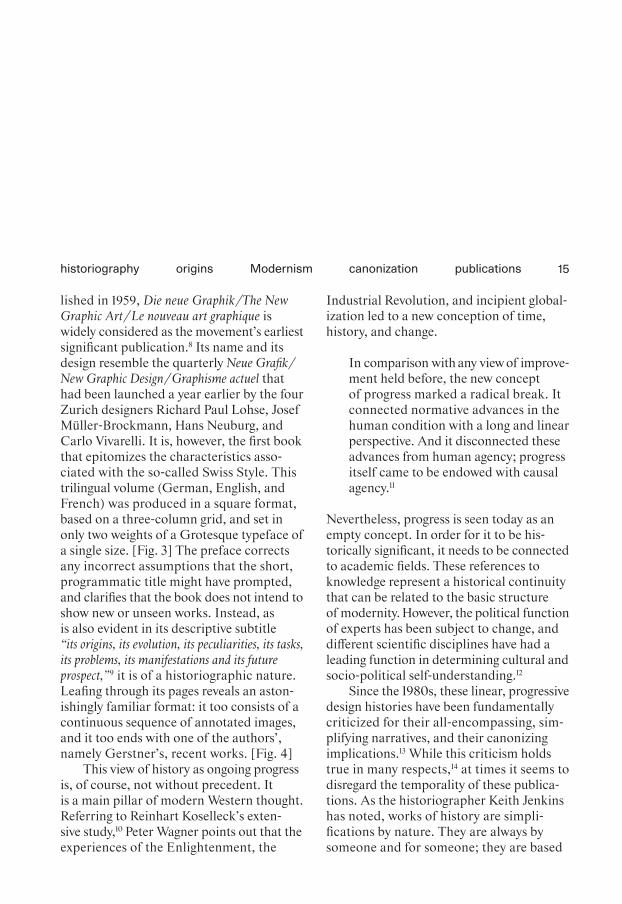
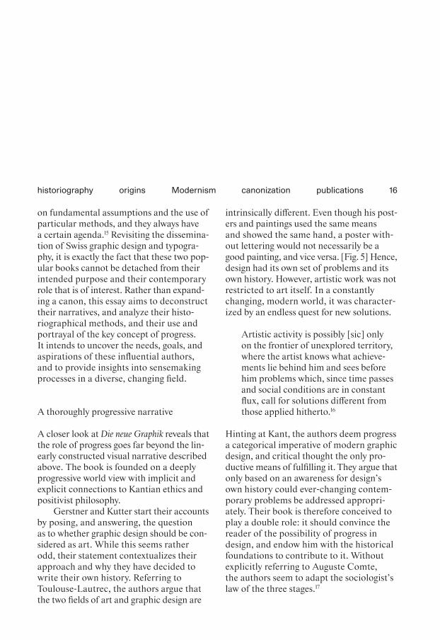
lished in 1959, Die neue Graphik /The New Graphic Art / Le nouveau art graphique is widely considered as the movement’s earliest significant publication.8 Its name and its design resemble the quarterly Neue Grafik / New Graphic Design / Graphisme actuel that had been launched a year earlier by the four Zurich designers Richard Paul Lohse, Josef Müller-Brockmann, Hans Neuburg, and Carlo Vivarelli. It is, however, the first book that epitomizes the characteristics asso-ciated with the so-called Swiss Style. This trilingual volume (German, English, and French) was produced in a square format, based on a three-column grid, and set in only two weights of a Grotesque typeface of a single size. [Fig. 3] The preface corrects any incorrect assumptions that the short, programmatic title might have prompted, and clarifies that the book does not intend to show new or unseen works. Instead, as is also evident in its descriptive subtitle “its origins, its evolution, its peculiarities, its tasks, its problems, its manifestations and its future prospect,”9 it is of a historiographic nature. Leafing through its pages reveals an aston-ishingly familiar format: it too consists of a continuous sequence of annotated images, and it too ends with one of the authors’, namely Gerstner’s, recent works. [Fig. 4]
This view of history as ongoing progress is, of course, not without precedent. It is a main pillar of modern Western thought. Referring to Reinhart Koselleck’s exten - sive study,10 Peter Wagner points out that the experiences of the Enlightenment, the
Industrial Revolution, and incipient global-ization led to a new conception of time, history, and change.
In comparison with any view of im prove-ment held before, the new concept of progress marked a radical break. It connected normative advances in the human condition with a long and linear perspective. And it disconnected these advances from human agency; progress itself came to be endowed with causal agency.11
Nevertheless, progress is seen today as an empty concept. In order for it to be his-torically significant, it needs to be connected to academic fields. These references to knowledge represent a historical continuity that can be related to the basic structure of modernity. However, the political function of experts has been subject to change, and different scientific disciplines have had a leading function in determining cultural and socio-political self-understanding.12
Since the 1980s, these linear, progressive design histories have been fundamentally criticized for their all-encompassing, sim-plifying narratives, and their canonizing implications.13 While this criticism holds true in many respects,14 at times it seems to disregard the temporality of these publica-tions. As the historiographer Keith Jenkins has noted, works of history are simpli-fications by nature. They are always by someone and for someone; they are based
16
on fundamental assumptions and the use of particular methods, and they always have a certain agenda.15 Revisiting the dissemina-tion of Swiss graphic design and typogra-phy, it is exactly the fact that these two pop-ular books cannot be detached from their intended purpose and their contemporary role that is of interest. Rather than expand-ing a canon, this essay aims to decon struct their narratives, and analyze their histo-riographical methods, and their use and portrayal of the key concept of progress. It intends to uncover the needs, goals, and aspirations of these influential authors, and to provide insights into sensemaking processes in a diverse, changing field.
A thoroughly progressive narrative
A closer look at Die neue Graphik reveals that the role of progress goes far beyond the lin-early constructed visual narrative described above. The book is founded on a deeply progressive world view with implicit and explicit connections to Kantian ethics and positivist philosophy.
Gerstner and Kutter start their accounts by posing, and answering, the question as to whether graphic design should be con-sidered as art. While this seems rather odd, their statement contextualizes their approach and why they have decided to write their own history. Referring to Toulouse-Lautrec, the authors argue that the two fields of art and graphic design are
intrinsically different. Even though his post-ers and paintings used the same means and showed the same hand, a poster with-out lettering would not necessarily be a good painting, and vice versa. [Fig. 5] Hence, design had its own set of problems and its own history. However, artistic work was not restricted to art itself. In a constantly changing, modern world, it was character-ized by an endless quest for new solutions.
Artistic activity is possibly [sic] only on the frontier of unexplored territory, where the artist knows what achieve-ments lie behind him and sees before him problems which, since time passes and social conditions are in constant flux, call for solutions different from those applied hitherto.16
Hinting at Kant, the authors deem progress a categorical imperative of modern graphic design, and critical thought the only pro-ductive means of fulfilling it. They argue that only based on an awareness for design’s own history could ever-changing contem-porary problems be addressed appropri-ately. Their book is therefore conceived to play a double role: it should convince the reader of the possibility of progress in design, and endow him with the histori cal foundations to contribute to it. Without explicitly referring to Auguste Comte, the authors seem to adapt the sociologist’s law of the three stages.17
origins canonization publicationshistoriography Modernism

17
The work of laymen always lies outside historical development or in a place fortuitously related to it. Craftsmen cre-ate the essential conditions for such a development to take place: they stand at its beginning. But real evolution begins only with the artist, an evolution that is based at every instant on men tal decision but seen in retrospect to have been necessary and logical.18
While the layout of the book implies a con-tinuous progress, its goal is a break: with the coming of the critical professional, graphic design should leave traditions behind, and finally become fully temporal-ized, truly modern.
These implicit and explicit hints at phil-osophical theories around the concept of progress demonstrate that Gerstner and Kutter deliberately adapted Enlighten ment thinking to formulate their Modernist approach to graphic design. And as Gerst-ner’s widely read classic Programme entwerfen from 1964 was also a direct adaptation of the so-called “Morphological Box” established by the Swiss astrophysicist Fritz Zwicky,19 it becomes evident that the trans-lation and appropriation of models from more prestigious intellectual fields formed the deliberate backbone of their work.
Given the reflective nature of Die neue Graphik, it might not be too surprising that its authors even anticipated some of the more recent criticism. In the very first paragraph, they explain that they were well
aware of certain problematic aspects of their historiography. Explaining the practitioner’s lack of guidance in a wide and undocu-mented field, they claim there was a need for a simple story line that allowed for better navigation. They state that their book was written from a personal, cultural, and geo-graphical perspective, as represented by its structure and the choice of works pre-sented. Explicitly distancing themselves from any claims of neutrality, they further recount that external circumstances—such as the size of the book, the accessibility of sources, the rights to images, and the accu-mulated material itself—influenced how theories were formed that in turn had an impact on the selection of works.20 This statement hardly serves to rebut all criticism, though it does reveal a degree of reflec - tion on the part of the authors that is rarely acknowledged.21
Backed by the theory they put forward, Gerstner and Kutter not only described their view of the past, but also prospected into the future. The works on display were, of course, of the past. But, as the authors pointed out, they showed characteristics which were to become particularly import-ant in the years to come. This, they argued, was possible because in a world increas-ingly permeated by technologies and com-plex systems, certain material and orga-nizational requirements could be identified that went beyond fashion and taste. The selected projects were therefore intended to demonstrate an exemplary exploration of
origins canonization publicationshistoriography Modernism

Fig. 1The prehistoric begin - ning of A History of Visual Communication …
Fig. 2… and its end in Müller- Brockmann’s own work.
Fig. 3The programmatic begin-ning of Neue Graphik …
Fig. 4… and its end in program-matic visions of the authors’ own systematic designs for the future.
Fig. 5Gerstner and Kutter back up their approach by connecting it to art history.
Fig. 1
Fig. 2
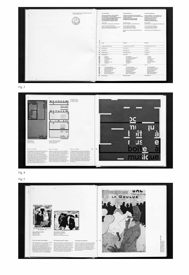
Fig. 3
Fig. 4
Fig. 5

20
these very aspects. Gerstner and Kutter were concerned not only with individual works, but also with the connections between them. They dealt with design issues in a larger context, and showed a systematic approach to advertising and corporate design.22
Placing these statements in context, it is crucial to recognize that the book was written at a time when Gerstner and Kutter were establishing their practices, and that it was exactly this progressive and systematic attitude that suited the needs of expand - ing corporations and institutions.23 The practitioner-historians’ accounts are thus clearly linked to their professional goals and aspirations, and to the roles they were fulfilling or were being requested to fulfill. Gerstner and Kutter’s work appears to have responded exceptionally well to the socio- political and economic demands of their time.24
A troubled adaptation to changing circumstances
As described in the first paragraph of this essay, A History of Visual Communication also suggests an evolution within graphic design. Unlike Gerstner and Kutter’s abstract philosophical arguments, however, Müller- Brockmann’s account was rooted in specific observations. Recent technologi-cal and societal changes had a profound affect on the field of graphic design—from the rise of the new mass media to the
accelerating dematerialization of design processes and products, the growth of indus try and consumerism, and the increas-ing complexity of a globalized and con-nected world.25
[…] for the designer the problems are many times more exacting and wider in scope. His training, based as it is on traditional programmes and methods, hardly enables him to cope with the practical demands of today. The present calls for designers of intelligence who are alive to social problems and can think themselves into their client’s mind and help to make decisions.26
He was certain that adapting to the compli-cated, changing demands of the time would require more than technical training. Seen from a distance, detached from its technological environment, the profession should be understood as being concerned not merely with technical or formal tasks, but also with meeting intellectual and above all social challenges. Restricted only by its visual nature, the graphic designer’s profession was characterized by its two means of communication, namely word and image, and by its intrinsically social func-tion as a mediator of ideas. The profession should therefore better be understood as visual communication.
Calling for a change, however, Müller- Brockmann explained that the fundamental tasks of this emerging field were nothing
origins canonization publicationshistoriography Modernism

21
new. Through the ages, human beings had always tried to make an impact, to capti-vate and to convince. And it was from this point of view that he constructed his nar-rative of a continuity stretching from pre-historic paintings to his own work.27 Explic-itly paraphrasing the British art historian Herbert Read, Müller-Brockmann declared that functionalism was a cultural universal:
The primitive mind made no distinction between art and the utilitarian. These people worked with a specific purpose in view and paid no attention to what we call aesthetic characteristics. Even when the purpose of an object was not recognizable, it was not created for its own sake, or for its beauty of form, or its colour. Every work of these prim-itives originated in an exclusively utilitarian, social, magic or religious intention.28
The fact that even the very oldest artworks could be seen as fulfilling a practical pur-pose not only provided the new field of visual communication with the longest pos-sible origin story, but also supported functionalist ambitions that the Modernist attributed to his own style and practice. At the same time, he appropriated a past that had usually been seen as part of art history—ironically by quoting an art histo-rian—and thereby laid a claim to exper - tise far beyond the traditional borders of his profession.
A comparison of Müller-Brockmann’s text with Read’s original, however, reveals that the designer omitted so much of the art his-torian’s argument that he completely reversed its meaning. In reality, Read wrote that cave paintings showed a concern for beauty and visual characteristics far beyond their practical function, and that it was for this very reason that they should be consid-ered art.29 Müller-Brockmann’s main argu-ment—which is also in the only paragraph supported with a direct reference—is thus at best based on a negligent misunderstand-ing. This book by a practitioner-historian thus seems to have a rather slapdash quality to it, and a further examination of both its structure and its content merely reinforces this impression.
In his preface, Müller-Brockmann states that even though his book is supposed to offer a broad view of visual communication, it should not be seen as complete, but as reflecting his own interests: “factual adver-tising, experiments which influence our thinking and artistic works which set the stylistic trend.”30 Indeed, with the intro-duction of the poster in the second part of the book, his account clearly resembles the then well-established graphic design his-tories focusing on the development of styles and the avant-garde. The first half of his book, however, shows a surprising attention to meaning in everyday life, and to the consumption and societal role of designed artifacts, and barely touches on production processes or form.3 1 A closer
origins canonization publicationshistoriography Modernism

22
look reveals that this, however, is not the only sudden shift in the book. Despite its rhetoric of continuity, there are not only deliberate divisions into chapters and sub-chapters, but also various ruptures based on methodological and theoretical inconsis-tencies that—as the extensive bibliogra - phy suggests—are simply a reflection of the available sources.32
In line with this, it seems worth noting that Müller-Brockmann’s socio-historical approach appears to match a larger trend. Neither the vast scope of his narrative, root-ing his profession at the dawn of mankind, nor his extension of the field into popular mass media, nor even the term “visual com-munication” itself were completely new. Years before this, graphic designers in the USA and in Germany, especially at Hoch-schule für Gestaltung Ulm, demanded that their peers should take control of the new media. They formulated an analytical approach to visual culture based on lin-guistics that was characterized by a search for patterns and systems or universal lan-guages.33 At the same time, a wealth of pop-ular and scientific literature was dedicated to more anthropological approaches in all kinds of fields—many of them touching on the history of graphic design.34 Inter-estingly, at about the same time, Marxist cultural theorists developed art education programs that called for more human- centered, social teaching. Referring to tech-nological changes on the one hand, and to the same universals and continuities on the
other, they too emphasized the importance of popular culture and the mass media.35
It seems that Müller-Brockmann struggled to situate himself within this diffuse spec-trum of positions. He tried to reconcile his seemingly genuine interest in the social and more recent theories that turned their attention to human beings with his codi -fied aesthetics and their established art his-torical explanation. But Müller-Brockmann did not include any fundamentally more varied representations of contemporary everyday visual communication, such as its informal or ephemeral aspects, or street culture. Instead, he tried to reinforce the demarcations of what he thought to be good professional practice, while simultane-ously extending his field of expertise.36 Müller-Brockmann created this univer sal ancestry, leading from cave paintings through various cultures to European avant-garde art, in order to culminate in his own practice. This narrative was eerily remi-niscent of Hegel’s influential model of a “world spirit” moving from East to West that arguably had been significant in European claims to supremacy and, at least in philos-ophy, had long since been discarded.37
Conclusion
The above close reading of Die neue Graphik and A History of Visual Communication has confirmed the importance of the notion of progress that was commonly attributed to
origins canonization publicationshistoriography Modernism

23
both books, to Modernist design, and to Modernism in general. These books are clearly structured so as to depict an evolu-tion of graphic design that seems empiri-cally verifiable. Both should be seen as attempts to demonstrate their authors’ expertise by claiming a truly modern, for-ward-looking position linked to presti-gious fields of knowledge.Both approaches also seem to have attempted to appropri - ate the prestige of art and art history. From this point of view, the fact that these publi-cations are commonly discussed in the same vein appears more than warranted. But as stated in the introduction to this essay, a more in-depth analysis nevertheless reveals remarkable differences between them. Their authors’ strategies, outlooks, and back-grounds, and their references to academic fields and theories all differ strongly—just as do the rigor, conclusiveness, and reflex-ivity of their historiography.
Gerstner and Kutter successfully used concepts from Enlightenment philoso - phy as the backbone of their truly Modern-ist book. It is evident that this deliberate appropriation of models from prestigious intellectual fields was a well-thought-out strategy. By proclaiming their powers of reflection and self-awareness, Gerstner and Kutter showed much foresight, and already addressed much of the criticism that would later be leveled against them. By listing var-ious historiographical shortcomings, from over-simplification to a biased focus and editorial selection, they ask their reader to
take their narrative with a grain of salt. In stark contrast, Müller-Brockmann’s histo-riography reveals difficulties in establishing a concise narrative. He, too, relativizes his account by explaining that it has simply been devised in line with his own interests. The continuity he constructs, however, displays fundamental breaks, and refers to shifting fields of knowledge that are neither reflected nor addressed in his book. It is evident that Müller-Brockmann struggled to reconcile his clear ideas on graphic design and his suc-cessful practice with the newer theoreti - cal framework of the times. His relativizing comments thus come across as preemptive excuses.
From a distance, one might wonder to what extent the distinctions between these two books should be attributed to personal tendencies or to a general paradigm shift. However, it seems that both aspects were intertwined. The fact that these underlying differences seem to have been overlooked might indicate that the historiography of Swiss graphic design and typography, even in its critical instances, has often showed no less of a focus on visual concerns than has the field itself.
origins canonization publicationshistoriography Modernism
24
1 Müller-Brockmann 1971.2 See Scotford 2012 (1991): 38.3 Rand 1996. In Switzerland, a
German translation of the book was published by Niggli under the title Von Lascaux bis Brooklyn.
4 Meggs 1983.5 Jubert 2006.6 Drucker & McVarish 2013
(2009).7 See Dilnot 1984a: 219; Drucker
2009: 56; Hollis 2006: 244–250.8 Gerstner & Kutter 1959.9 Gerstner & Kutter 1959: 1.10 See Koselleck 1975.11 Wagner 2016: 7.12 Speich Chassé 2012: 9–10.13 For criticism regarding: an undis-
cerning adoption of art-historical approaches, see Scotford 2012 (1991): 42; oversimplification, see Meer 2015: 9–23; selection based on mostly visual grounds, see Lzicar & Unger 2016; exclusion of anonymous work, see Scotford 2012 (1991): 44; Mermoz 2012 (1994): 107; exclusion of the pub-lic reception, Aynsley 2012 (1987): 23; their focus on masters or masterpieces and its canon-izing implications, see Scotford 2012 (1991): 42; Baker 2012 (1994): 87; and for hijacking his-tory for the benefit of entre-preneurial design activities, see Dilnot 1984a: 218. Outside the field of design history, of course, criticism of such linear narra tives had been voiced much earlier.
14 For a discussion of the negative aftermath of these linear stories on the perception of other writing systems and cultures, see “Unfamiliar Writing Forms,” in the present volume.
15 See Jenkins 2004 (1991); Munslow 2004: xiii. Design historian Clive
Dilnot argues similarly that early design history has to be seen as a response to a particular problem, and that an analysis of these con-tinuities should cast new light on their view of their present, past, and future. See Dilnot 1984a: 218. Dilnot’s thesis resembles the ideas presented in The Invention of Tradition by the historians Eric Hobsbawm and Terrence Ranger. See Hobsbawm & Ranger 1983.
16 Gerstner & Kutter 1959: 12.17 Enlightenment philosophers
appear to have agreed that art and culture always underwent a devel-opment similar to human beings and thus contained the phases of childhood, adolescence, and maturity (Pfisterer 2007: 24). Comte’s law of the three stages states that humans in the first stage explain phenomena through supernatural agents and in the second through abstract entities. In the third stage, however, they replace absolute notions by rela-tive ones, and look for governing laws (Hamilton 1992: 53).
18 Gerstner & Kutter 1959: 12.19 See Gerstner 2007 (1963): 8–13;
Zwicky 1953. Zwicky suggested addressing problems and tasks by dividing them into individual parameters and recombining them programmatically. Doing so would lead to an overview of all possible solutions, from which a selection could be made, accord-ing to the needs of each case.
20 Gerstner & Kutter 1959: 4.21 Their contemporaries appear not
to have picked up on these relativizing comments either. A review by Czech art historian Josef Paul Hodin published in Art Journal in 1960 went as far as
calling it a “concise history of art used for publicity purposes”—or simply of graphic design. His apprehensions were not concerned with historiographical methods, but with the scope and title of the book (Hodin 1960: 66).
22 Gerstner & Kutter 1959: 214–215.23 See Gerstner & Kröplien 2001:
14–15.24 For example, the historian Anselm
Doering-Manteuffel explains that the 1950s and 1960s in the West were characterized by an under-standing of scientific and rational planning as a prerequisite for overall growth and progress. This vision made the community as a whole the object of governmental influence, and the state used a new elite of professional experts (Doering-Manteuffel 2007: 566). For historiographical positions on the concept and role of experts, see Traverse 2001, and particu-larly Busset & Schumacher 2001: 9–10.
25 Müller-Brockmann 1971: 6. For an in-depth analysis of the dema-terialization of typesetting tech-nology, see Marshall 2003; for a study closer to the time focusing on technological, economic, and social aspects and their effects on people active in the fields of typography and printing, see Marshall 1983. For a recent dis-cussion from the perspective of history of science and with a particular focus on gender, see Dommann 2016.
26 Müller-Brockmann 1971: 281.27 Müller-Brockmann 1971: 6.28 Müller-Brockmann 1971: 7.29 Read 1956 (1937): 8–12.30 Müller-Brockmann 1971: 6.31 Fittingly, his examples are far
origins canonization publicationshistoriography Modernism

25
from canonized pieces of typo-graphic history.
32 His bibliography lists several works on art from various cul-tures, a few books on the origins of art and painting, several pub-lications on visual communica-tion, graphic design handbooks, printing histories, and histories of everyday culture, trades, and the economy. A relatively large portion, however, is devoted to the history of Western art, partic-ularly to the avant-garde.
33 Çelik Alexander 2017: 198.34 See Müller-Brockmann 1971:
330–332.35 Grütter 2019: 44–45. The author,
Georges Bataille, for example, wrote the texts for a book on the Lascaux cave paintings entitled Die vorgeschichtliche Malerei: Lascaux oder die Geburt der Kunst. See Bataille 1955.
36 Victor Margolin noted that the conflation of graphic design and visual communication, of a spe-cific professional practice and a fundamental human activity, was a common problem in design history. He explained that histo-riographers needed to be aware of the fact that while the former was exclusive by definition, the latter was inherently inclusive (regarding practices, place, and time), and therefore needed to be sociological in nature. See Margolin 2012 (1994): 98.
37 Mignolo 2011: 21. For example, the philosopher and political theorist Hermann Lübbe of the University of Zürich pointed out that the concept of Weltgeist had been historically significant, but would now reveal the ridi-culousness of anyone claiming
to be its “owner.” See Lübbe 1973: 232. For a discussion of some Eurocentric biases in designers’ publications with regards to the portrayal of other writing sys-tems and cultures, see “Unfamil-iar Writing Forms,” in the pres-ent volume.
origins canonization publicationshistoriography Modernism

26
Die besten Plakate / Les meilleures affiches
The Early Years of the National Poster Award, between Federal Support and Stylistic Authority
Sara Zeller
In November 1994, the Museum für Gestal-tung Zürich opened Die 99 schlechtesten Plakate – prämiert weil jenseits (The 99 worst posters—awarded because beyond [good and evil]), probably Switzerland’s most con-troversial graphic design exhibition at the time.1 The museum’s then director Martin Heller had selected the 99 worst posters from recent years.2 As Heller puts it bluntly in the exhibition catalog, the selection was made based on his personal tastes. Accord-ing to him a bad poster is:
Everything that tries to fool me: aes-thetically, intellectually, politically, ethically. (Alles was mich […] für dumm verkauft: ästhetisch, intellek-tuell, politisch, ethisch.)3
Unsurprisingly, the exhibition provoked an uproar within the graphic design and advertising community that also reached a wider public. Not only specialist journals but also daily newspapers and the tabloid press reported about the polemic assessment and gave voice to the prominent “Heller- Opfer” (Heller victims).4 Most of them were offended, and harshly criticized Heller. For example, Rosmarie Tissi asked:
Why does a curator of a publicly funded museum think that he has the right to arbitrarily judge Swiss poster design? (Aber wie kommt ein Konservator eines städtischen Museums dazu, im Alleingang willkürlich Tadel auszu-teilen?)5
Heller’s provocative exhibition must be understood as a reaction to the annual national poster award Die besten Schweizer Plakate des Jahres that had been jointly organized by the Allgemeine Plakatge-sellschaft (APG) (General Poster Company) and the Swiss Federal Office of Culture (SFOC) since 1942.6 By turning the award on its head and selecting ninety-nine “bad” posters, Heller intended to criticize the format, which, as he writes, “[…] aus einer Zeit [stammt] in der das gute Schwei-zer Plakat in unbestrittener Allianz gestal-terisch und gesellschaftlich fortschrittlicher Kräfte zum nationalen Identitätsfaktor stilisiert wurde” ([...] dates from a time when the good Swiss poster was stylized to
design promotion politics good design national identityawards
DOI: 10.53788/SW
BE0302
27
become a national identity factor by an unquestioned alliance of creative and socially progressive forces).7 He compares the award with the taste dictates of Die gute Form (Good Form), and suggests abol-ishing it.8 Despite Heller’s open attack, the poster award continued under the aegis of the SFOC (which is situated within the Federal Department of Home Affairs [FDHA]) until 2004.9
Unlike the case of the national book award The Most Beautiful Swiss Books,10 which is still held today by the SFOC, there has not been any scholarly debate about the national poster award up to the present day.11 The present essay, however, takes the criticism voiced by Heller as an oppor-tunity to look back at the establishment and first decade of the annual national poster award. Furthermore, the discourse that accompanied the poster award and its possible impact on Swiss poster produc-tion is examined. By identifying important stakeholders and analyzing the establish-ment of the poster award within the context of the Swiss graphic design community, this essay aims to lay the foundations for further in-depth studies on the subject.
Establishing a national poster award
According to Berchtold von Grünigen, the idea of a national poster award was born at a meeting at the famous Café Odeon in Zurich in the fall of 1940.12 The graphic
designer Pierre Gauchat had invited Edwin Lüthy, the director of the APG, and von Grünigen, in his function as secretary of the Verband Schweizerischer Grafiker (VSG) (Swiss Graphic Design Association), to discuss the “subject of the menacing decline in the quality of the Swiss poster.”13 There, Pierre Gauchat presented the idea of an annual award for the best posters, with the winners having their work published after-wards. The triumvirate then addressed a letter to Philipp Etter, Federal Counselor and head of the FDHA, to request the sup-port of the Swiss government in this mat-ter.14 That same year, the idea was discussed in the Federal Commission for Applied Arts (Eidgenössische Kommission für ange-wandte Kunst, hereinafter EKaK),15 where it met with approval, though it was decided that instead of the prize money originally envisaged, the winners would get a certificate signed by the Federal Counselor.16
At the same time, Gauchat, Lüthy, and von Grünigen organized the first edition of the award on their own accord.17 They chose twenty-four winners from all the posters that had been billboarded in Switzer-land during the whole year, except for advertisements for political parties or refer-endums.18 The winning posters were sub-sequently displayed on two pages of the daily newspaper Neue Zürcher Zeitung (here-inafter NZZ) on December 28, 1941. At the same time, the federal annual national poster award was launched, to take place as of the next year.19
design promotion politics good design national identityawards

28
As the NZZ made evident, the guidelines for the award had already been determined before the federal takeover. The posters were judged according to their “künstlerische Haltung, Werbekraft und Druckqualität” (artistic approach, advertising appeal, and printing quality). The designer, the client, and the printer of the winning posters all received an award. The posters available for selection had to be in the standard Swiss for-mat for posters, Weltformat (90.5 × 128 cm).20 Only a few things changed when the EKaK took over the organization in May 1942. They first published a call for applications inviting designers, printers, and clients to submit their posters themselves from now on, though the jury was still allowed to sug-gest posters for evaluation.21 The assem bled jury comprised important stakeholders from various backgrounds who were affili-ated to relevant associations.22 Hermann Kienzle (president of EKaK and president of the jury), Adolf Guggenbühl (presi dent of the Swiss Advertising Association Schwei-zerischer Reklameverband), Berchtold von Grünigen (secretary of the VSG), Edwin Lüthy (director of the APG), Percival Pernet (member of the EKaK from the French- speaking part of Switzerland), Henri Tanner (president of the Fédération Romande de publicité), and Hans Vollenweider (artistic director at the Orell Füssli printing com-pany) were elected to the jury for a term of three years by the EKaK.23
By February 1943, a total of 159 posters had been evaluated and brought forth
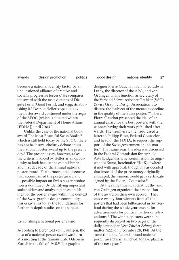
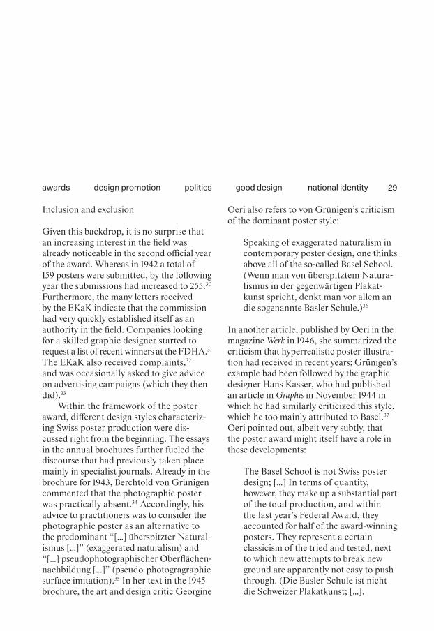
twenty-four Best Posters of the Year 1942. Again, the winners were publicly announced in the NZZ 24 and displayed at well-frequented public places in cities all over Switzer - land, such as Basel, Zurich, Bern, Lucerne, St. Gallen, Lugano, Neuchâtel, Lausanne, and Geneva.25 In addition, a brochure was published every year, list ing the winners with images of their work, and also featur-ing a written commentary or essay on the year’s poster production.26 [Figs. 6, 7]
The Schweizer Filmwochenschau (weekly Swiss film news, shown at every cinema throughout the country) took this first offi-cial year as an opportunity for a lengthy report on Swiss poster design and produc-tion.27 This suggests that the new federal award must have been much discussed, and provided extra visibility for poster produc-tion and the whole graphic industry. Inter-estingly, the report presented a very par-ticular image of the poster designer that would change completely over the next decade.28 Hans Erni and Alois Carigiet are shown painting at their easels either in their studio or on a rooftop terrace, suppos-edly immersed in creative thoughts, while a voice from off camera discusses the fruit-ful cooperation of designer, printer, and client in Switzerland’s poster production industry. The printing process they both use, stone lithography, is explained in great detail, demonstrating how the printer’s contribution is crucial to the outcome of the poster.29
design promotion politics good design national identityawards
29
Inclusion and exclusion
Given this backdrop, it is no surprise that an increasing interest in the field was already noticeable in the second official year of the award. Whereas in 1942 a total of 159 posters were submitted, by the following year the submissions had increased to 255.30 Furthermore, the many letters received by the EKaK indicate that the commission had very quickly established itself as an authority in the field. Companies looking for a skilled graphic designer started to request a list of recent winners at the FDHA.31 The EKaK also received complaints,32 and was occasionally asked to give advice on advertising campaigns (which they then did).33
Within the framework of the poster award, different design styles characteriz -ing Swiss poster production were dis - cussed right from the beginning. The essays in the annual brochures further fueled the discourse that had previously taken place mainly in specialist journals. Already in the brochure for 1943, Berchtold von Grünigen commented that the photographic poster was practically absent.34 Accordingly, his advice to practitioners was to consider the photographic poster as an alternative to the predominant “[…] überspitzter Natural-ismus […]” (exaggerated naturalism) and “[…] pseudophotographischer Oberflächen-nachbildung […]” (pseudo-photogragraphic surface imitation).35 In her text in the 1945 brochure, the art and design critic Georgine
Oeri also refers to von Grünigen’s criticism of the dominant poster style:
Speaking of exaggerated naturalism in contemporary poster design, one thinks above all of the so-called Basel School. (Wenn man von überspitztem Natura-lismus in der gegenwärtigen Plakat-kunst spricht, denkt man vor allem an die sogenannte Basler Schule.)36
In another article, published by Oeri in the magazine Werk in 1946, she summarized the criticism that hyperrealistic poster illustra-tion had received in recent years; Grünigen’s example had been followed by the graphic designer Hans Kasser, who had published an article in Graphis in November 1944 in which he had similarly criticized this style, which he too mainly attributed to Basel.37 Oeri pointed out, albeit very subtly, that the poster award might itself have a role in these developments:
The Basel School is not Swiss poster design; […] In terms of quantity, however, they make up a substantial part of the total production, and within the last year’s Federal Award, they accounted for half of the award-winning posters. They represent a certain classicism of the tried and tested, next to which new attempts to break new ground are apparently not easy to push through. (Die Basler Schule ist nicht die Schweizer Plakatkunst; […].
design promotion politics good design national identityawards
Fig. 6
Fig. 7

Fig. 6Hermann Eidenbenz (design), winner’s certificate for Die besten Plakate des Jahres / Les meilleurs affiches in French, 1942.
Fig. 7Installation shot of the exhibition Die besten Plakate des Jahres 1943 in Basel.
Fig. 8Double spread of Die besten Plakate des Jahres 1946 mit der Ehrenurkunde des eid-genössischen Departe -ments des Inneren, ed. All-gemeine Plakatgesellschaft (1947): n.p.
Fig. 8

32
Gewichtsmässig bilden sie indessen einen wesentlichen Teil der Gesamtpro-duktion, und innerhalb der eidgenös-sischen Prämiierung [sic!] für das ver-gangene Jahr bestreiten sie wieder die Hälfte der prämiierten [sic!] Plakate. Sie repräsentieren eine gewisse Klas-sizität des Bewährten, neben der sich offenbar neue Versuche, neue Wege nicht leicht durchzusetzen vermögen.)38
Although the award was intended to assess the whole of Switzerland’s poster produc-tion, a closer look at the winners reveals that it was de facto a competition between Basel and Zurich. Every year, a few design-ers from French-speaking Switzerland, Ticino, or Central Switzerland were awarded as well. However, while a few new names almost always made the list, most of the win-ners stayed the same.39 Regions such as Bern or St. Gallen were almost completely absent during the first decade of the award. For example, only one Bernese designer won an award during the 1940s.40 How can this imbalance be explained? As the two main economic centers of the German- speaking part of the country, Zurich and Basel undoubtedly had a financially powerful clientele in need of skilled graphic design-ers. This was probably one reason for many professionals to settle there. Most impor-tantly, Switzerland’s most famous schools of applied arts were in Zurich and Basel, which is perhaps the most obvious explana-tion for the dominance of these two cities.41
However, the jury also played a role in the imbalance observed by Oeri. Of the seven members of the first jury who served until 1949, five came from Basel or Zurich. The links to the Allgemeine Gewerbeschule (AGS) Basel were especially close, as Herman Kienzle was a former director of the school, and Berchtold von Grünigen was the head of its design department at the time.42 Further criticism came from one of the award’s founding fathers, who tar-geted the exclusion of posters for political parties and referendums. On behalf of the VSG, Pierre Gauchat requested in 1945 that submitting these posters should be allowed too.43 Because this demand did not meet with approval, the VSG went so far as to leave the jury a few years later.44 In this respect, the question arises as to whether the award simply reflected current produc-tion, or if it also influenced it decisively. This question is not easy to answer, but the aforementioned criticism indicates that the evaluations issued by the annual award jury had an influence on poster production that should not be underestimated. A sentence in the brochure text of the Swiss writer Carl Seelig about the year 1947 points in the same direction, at least con-cerning the jury’s favored design style:
It would be wonderful if abstract avant-gardists also had a chance to draw attention to themselves for once. (Wie schön wäre es, wenn uns einmal […] die abstrakten Avantgardisten eine
design promotion politics good design national identityawards

33
Chance bekämen, die Blicke der Pas-santen auf sich zu ziehen.)45
However, Seelig could also have pointed out that the avant-gardist designers were hardly commissioned for posters during that time.
An article by Hans Neuburg in the specialist journal Typographische Monatsblätter (TM) from 1945 also shows a more diverse pic ture of Swiss graphic design pro-duction, observing several different design styles that he believed coexisted within the country. Illustrative designs were also central to Neuburg’s article, but neverthe-less he also includes a variety of Modernist and abstract designs. However, these were primarily printed on leaflets and in bro-chures, which suggests that poster design was at that time taking a path separate from the rest of graphic design practice.46 [Fig. 8]
Towards a national poster style
Interestingly, Carl Seelig’s brochure text for the year 1947 introduces another aspect. He suggests applying a Swiss national char-acteristic to poster design, thereby linking poster production with the political situa-tion for the first-ever time in the context of these brochures:
The Swiss are a nation of individualists like no other people. In a time of re-dimensioning and adapting, this is
an invaluable advantage that we want to cultivate—also in poster art […]. (Die Schweizer sind, wie kaum ein anderes Volk, ein Volk von Individua-listen. In einer Zeit der Vermas sung und Nivellierung liegt darin ein un schätzbarer Vorteil, den wir pflegen wollen—auch in der Plakatkunst […])47
The essay in the 1949 poster award brochure is by the graphic designer Hans Kasser, who writes about a traveling exhibition called The Swiss Posters that had been organized by the Swiss Arts Council Pro Helvetia and the Swiss Office for the Development of Trade (OSEC). It featured 126 award-winning posters from recent years, most of which were in an illustrative style, with only very few photographic or abstract posters among them.48 The catalog text, also written by Kasser, directly links Swiss poster design with the “Swiss national character”:
Among the arts, the graphic art is per-haps the one which has expressed the Swiss character most clearly over time. (Unter den Künsten ist vielleicht die graphische diejenige, in der sich schwei-zerische Art durch die Zeiten am ein-deutigsten Ausdruck gab.)49
This exhibition was at the time touring European countries, and would travel all around the world during the ensuing decade.50 Kasser’s 1949 essay uses the com-pliments the exhibition received from
design promotion politics good design national identityawards

34
abroad51 to praise Swiss poster production as an important cultural asset:
The mere thought of wanting to say something about the character of Swit-zerland, and to promote the country as a whole with a poster exhibi tion, is an acknowledgement of the intrinsic cultural value of our posters. (Allein im Gedanken, mit einer Revue von Affi-chen etwas über das Wesen der Schweiz aussagen und für das Land als Ganzes werben zu wollen, liegt eine Anerken-nung des kulturellen Eigenwertes unse-rer Plakatpropaganda.)52
More than fifty years later, the curator Mar-tin Heller skillfully deconstructed the mechanics of the award with his selection of the ninety-nine worst posters. From his presentation of the posters in the exhibi-tion space to his accompanying publica-tion, the exhibition is like an act of investi-gative journalism whose aim is to open up the echo chamber of Swiss graphic design. The accusation of arbitrariness that was directed at Heller from various quarters can thus also be directed towards the juries of the national poster award. The difference is that Heller publicly declared that he alone was responsible for selecting the works for his exhibition, whereas the jury of the award, while beginning with a degree of self-criticism, over the years increasingly seemed to believe in their right to decide objectively on the Best Posters of the Year.
The traveling exhibition used a selection of the winners from the 1940s to represent Switzerland abroad, and at the same time showed what was regarded as being typi - cal of “Swiss” poster design by “official” Switzerland—and what was not. Interest-ingly enough, the illustrative poster styles that were so heavily promoted in the 1940s, and which were so closely associated with Swiss graphic design, would soon be largely considered as second rate in an interna-tional context.
design promotion politics good design national identityawards

35
1 For an installation view, see Fig. 48, in the present volume.
2 For an in-depth discussion about Martin Heller’s approach as a curator and director at the Museum für Gestaltung Zürich, see “Popular Culture,” in the present volume.
3 Heller 1995: 49.4 Fischer 1994: 27.5 Ibid.6 The original name of the poster
award was Die besten Plakate des Jahres … / Les Meilleures Affiches parues en … (The Best Posters of the Year …). Later this was changed to Die besten Schweizer Plakate des Jahres … / Les meil-leures affiches Suisses parues en … (The Best Swiss Posters of the Year …).
7 Heller 1995: 47–48.8 The original text reads: “Der
Mechanismus der solche Ideologi-sierung überhaupt ermöglichte, glich jenem der nahezu gleichzei-tigen Auszeichnung.” Heller 1995: 47–48; about Gute Form (Good Form), see Menzi 2014: 192–197.
9 The original poster award under the name Die besten Schweizer Plakate des Jahres (The Best Swiss Posters of the Year) only took place until 2000. From 2003 until 2004 the SFOC created a new poster award named Plakat des Jahres (Poster of the Year); how-ever, in 2004 no posters were awarded prizes because the jury was not satisfied with the entries. After that, the SFOC discon-tinued the award. See Matthieu Musy (SFOC), e-mail to the present writer, January 20, 2020. Since 2001, a new award called 100 beste Plakate (100 Best
Posters) has been organized by an independent group of graphic designers from Switzerland, Austria, and Germany. Up to the present day, the 100 best posters from Austria, Germany, and Switzerland are selected each year. See https://100-beste-plakate.de/ (accessed Mar. 20, 2020). Since 2002 the APG runs its own Swiss Poster Award, see https://www.apgsga.ch/de/unternehmen-markt/events-awards/swiss-poster-award/ (accessed Jun. 8, 2020).
10 In 1943 Jan Tschichold initiated the award The Most Beautiful Swiss Books, which was held the following year for the first time and still exists today. These two awards show many intersections, as, for example, within the com-position of the jury. Also, Pierre Gauchat appears to have played a decisive role in establishing the award in its early years. Unlike the annual poster award, The Most Beautiful Swiss Books has mostly been organized by the Swiss Publishing Association. Only in 1971 did the FDHA (from 1975 SFOC) take over, and it remains in charge of the award today. Nevertheless, a com parison of the two graphic design awards could be an intriguing subject for further studies. See Früh & Neuenschwander 2016: 209–225; Fischer 2004: 13; Früh 2004: 122 (afterwards n.p.).
11 In 1991, Thomas Bolt also looked back on the early years of the poster competition, but with a focus on the dominant stylistic tendencies in Swiss poster design of the 1940s. See Bolt 1991: 360–369. Furthermore, the APG had
published two books about the award that did not ask any criti-cal questions about the endeavor. However, as they provide inter-esting insider information, they have been valuable sources for this essay. See APG 1968; 1991.
12 von Grünigen 1968: T43.13 Ibid. 14 Ibid.15 Swiss Federal Archive SFA,
E3001B#1000/730#375*, AZ. 10.2.06.4, Beste Strassenplakate 1942, 1942–1943, Letter from FDHA office to E. Lüthy (APG) Dec. 6, 1941. (The proceedings of the EKaK meeting from Novem-ber 1941 are missing in the Swiss Federal Archives.)
16 Swiss Federal Archive SFA, E3001B#1000/730#375*, AZ. 10.2.06.4, Beste Strassenplakate 1942, 1942–1943, Letter from FDHA office to E. Lüthy (APG) 06.12.1941.
17 von Grünigen 1968: T43; Welti 1941: n.p.
18 The posters for the selection were provided by the APG; about 300 posters were available for selection. See Welti 1941: n.p.
19 Ibid.20 These guidelines would stay the
same for many years to come. See ibid. Swiss Federal Archive SFA, E3001B#1000/730#375*, AZ. 10.2.06.4, Beste Strassen-plakate 1942, 1942–1943, Regle-ment, Press Release 20.05.1942.
21 Swiss Federal Archive SFA, E3001B#1000/730#375*, AZ. 10.2.06.4, Beste Strassenplakate 1942, 1942–1943, Vie, Art, Cité (Lausanne), Schweizer Reklame, Schweizer. Graphische Mittei-lungen, Typografische Monats-blätter, S.B.B. Revue, Das Werk.
design promotion politics good design national identityawards
36
22 This was a topic of discussion at several meetings, so this task was apparently given particular atten-tion. To ensure the awards’ accep-tance within the community, the commission considered it to be very important to include two members of French-speaking Switzerland and at least one member of every association and lobby organization connected with poster production and adver-tising. Swiss Federal Archive SFA, E3001B#1000/730#375*, AZ. 10.2.06.4, Beste Strassen-plakate 1942, 1942–1943, Letter H. Kienzle to Mr. Du Pasquier, 04.11.1942.
23 Interestingly, there was no official representative of the Schweize-rischer Werkbund (SWB). Swiss Federal Archive SFA, E3001B#1000/730#375*, AZ. 10.2.06.4, Beste Strassenplakate 1942, 1942–1943, Letter H. Kienzle to Mr. Du Pasquier, 04.11.1942.
24 NZZ 1943: n.p.25 The winners of the very first, non-
governmental edition of the award in 1941 were exhibited by the lakeside of Zurich. von Grünigen 1968: T43.
26 The texts often bluntly communi-cated what the jury or the author thought was good or bad design, and sometimes gave direct advice for improvement. For example, designers, printers, and clients are either complimented or harshly criticized for mediocrity, the use of too many or too few colors, or dull images. Lüthy 1943: n.p.; Fustier 1944: n.p.; von Gunten 1947: n.p.; Seelig 1948: n.p.
27 Swiss Federal Archive SFA, J2.143#1996/386#157-1#1*,
Az. 0157-1, Schweizer Plakate, 17.09.1943, (Schweizer Film-wochenschau).
28 Regarding designers and their attire, see “Designer Portraits,” in the volume Visual Arguments.
29 Swiss Federal Archive SFA, J2.143#1996/386#157-1#1*, Az. 0157-1, Schweizer Plakate, 17.09.1943, (Schweizer Film-wochenschau).
30 Swiss Federal Archive SFA, E3001B#1000/730#376, Az. 10.2.06.4, Beste Strassen-plakate 1943, 1943–1944, Pro-ceedings of the jury meeting 22.01.1944.
31 Swiss Federal Archive SFA, E3001B#1000/730#376, Az. 10.2.06.4, Beste Strassenplakate 1943, 1943–1944, Letter from the Schweizerische Zentrale für Verkehrsförderung to FDHA, 22.03.1944.
32 For example, Pro Telephon expressed their extreme disap-pointment that Herbert Leupin’s poster “Kristall” from 1943 was not among the winners and had thus been “downgraded.” (The original reads: “Auch der Schöp-fer des Plakates, Herr Herbert Leupin, der dieses Plakat zu sei-nen besten Arbeiten zählt, ist über die mit der Nichtprämierung verbundene Deklassierung sehr erstaunt.”) See Swiss Federal Archive SFA, E3001B#1000/ 730#376, Az. 10.2.06.4, Beste Strassenplakate 1943, 1943–1944, Letter from Pro Telephon to FDHA, 31.01.1944.
33 A year later, the FDHA received a similar complaint from the Swiss Federal Railways (SBB CFF FFS) asking why their poster “Glückliche Jugend” by
Ernst Morgenthaler was among the winners, but their other poster by the same designer, “Mit der Bahn hinaus ins Freie,” which they considered much more pop-ular, was not. In his reply, the secretary of the FDHA offered advice on the SBB’s advertis - ing strategy on behalf of the jury. Swiss Federal Archive SFA, E3001B#1000/730#376, Az. 10.2.06.4, Beste Strassenplakate 1943, 1943–1944, Letter SBB to FDHA, 24.03.1945.
34 Fustier 1944: n.p35 Ibid.36 Oeri 1946a: n.p. Regarding the
Basel School, see “The Basel School,” in the present volume.
37 Kasser 1945: 42.38 Oeri 1946b: 239.39 For example: Géo Fustier from
Geneva, Pierre Monnerat from Lausanne, Daniela Buzzi from Locarno, and Hans Erni (Lucerne) and Herbert Leupin (originally from Lucerne but living in Basel).
40 In 1943, the Bernese Karl Togg-weiler won an award for a poster for the shoe manufacturer Bata. See Fustier 1944: n.p.
41 See e.g. Hollis 2006: 204–220; This issue is also discussed in “The Basel School,” in the pres-ent volume.
42 Walter 2007: 49 (see especially footnote 78).
43 On behalf of the VSG, Pierre Gauchat requested in 1945 that political posters should be allowed for submission. Swiss Federal Archive SFA, E3001B#1000/730#377*, Az. 10.2.06.4, Beste Strassen-plakate 1944: 1944–1945, Letter of 25 February 1945.
design promotion politics good design national identityawards

37
44 Swiss Federal Archive SFA, E3001B#1978/62#162*, Az. 10.2.06.4, Wettbewerb “Beste Plakate des Jahres”, 1951–1957. We can only speculate as to whether restricting the award to the Swiss standard poster for - mat Weltformat could be regarded as a major intervention. It is possible that clients with a smaller budget could not afford the print-ing and paper costs of Weltformat. Therefore, the award would have only taken larger clients into account.
45 Seelig 1948: n.p.46 Neuburg 1946: 235–262.47 Seelig 1948: n.p.48 Kasser 1950: n.p.49 Pro Helvetia 1950: 7–8.50 Kadelbach 2013: 178–179. This
traveling exhibition is the focus of the PhD thesis of the present author.
51 The skilled craftsmanship, the close cooperation of graphic designers, printers, and clients, the standardization of the for-mat, and the strict regulations on billposting in public spaces were especially well received abroad. Kasser 1950: n.p.
52 Ibid.
design promotion politics good design national identityawards
38design scenes local and international clients networksItaly
Hotspot Milan
The Perks of Working on the Other Side of the Alps
Chiara Barbieri, Davide Fornari
Until recently, histories of Italian graphic design have argued that the so-called “Milanese School” emerged from the rela-tionship between the Italian and the Swiss graphic scenes. As Carlo Vinti put it: “the arrival of Swiss designers in Italy, on the Zurich-Milan axis, has often been seen in terms of a successful marriage between a kind of functional and calcu -lated Swiss prose and an Italian impromptu poetic vein.”1 The intertwining of Swiss rigor and Italian playfulness is a recurring trope in accounts of Swiss graphic design-ers in Italy. This historiographical canon is the result of stereotypical simplifications that put Swiss and Italian graphic tradi-tions at opposite ends of a virtual field of graphic design.2
Most studies on the relationship between Milan and Swiss graphic design have explored their design exchange as something unidirectional, looking at it in terms of what graphic designers born and
trained in Switzerland brought to Milan, and their impact on the local scene. The relationship, though, was mutual in that both parties had something to gain. Adopt-ing a transnational approach to national design canons—here understood as con-structed discourses that cannot be fully explored from within a country—this essay approaches Milan as a hotspot for Swiss graphic design, and investigates the fac - tors and actors that pushed Swiss graphic designers to cross the Alps.3
The city
Graphic design, and design more broadly, found an advantageous ecosystem of cultural organizations and economic, indus-trial, and political structures in Milan, all of which supported the development of the practice, and favored international design exchanges.4 Since the end of the 19th century, Milan had become the heart of the Italian printing industry: the majority of news-papers with the largest national circulations were printed in the city, and the major publishers had established their headquar-ters there.5 Milan was where the practice of graphic design emerged in Italy: here early design education courses were held (the Scuola del Libro), specialist magazines were launched (Risorgimento Grafico, Campo Grafico, L’Ufficio Moderno, and Linea Grafica amongst others), and institutional orga-nizations were founded (ADI—Association
DOI: 10.53788/SW
BE0303

39
for Industrial Design, and Aiap—Italian Association of Advertising Artists).
The city’s great economic and cultural potential made Milan an attractive desti-nation for Swiss graphic designers. From the 1930s onwards, a remarkable number moved to Milan for short or longer periods of time. In the postwar period, the number of Swiss graphic designers active in town grew as the Italian economy boomed.6 As Lora Lamm put it: “in the late 1950s the Milan scene was so fascinating for us graphic designers, it opened a new dimension.”7 Located about 54 kilometers south of the Swiss border, the city was conveniently positioned, and a direct train line made con-nections between Switzerland and Italy easier despite the Alps lying between them. Once in Milan, newcomers could rely on an informal Swiss network of professional and personal relationships, even though, as the Swiss copywriter Silvio Calabresi (Aldo Calabresi’s brother) recalled: “we just wanted to blend in.”8 The extent to which one was an active part of the Swiss commu-nity in Milan varied from person to per -son, but it was almost inevitable that people knew each other.9 Professionally, they tended to seek each other out, so more often than not, Swiss art directors hired Swiss graphic designers as their assistants and collaborators. [Figs. 9, 10]
Graphic design studios
The usual progression of Swiss graphic designers in Milan featured first a stopover at Studio Boggeri.10 Antonio Boggeri, a self-trained photographer and modern graph -ics enthusiast, founded his agency in 1933. It offered an innovative setting to a grow -ing number of industrial clients: a group of professionals able to manage advertising from concept to production.11 From the early days, Boggeri carried out a constant search for designers on the other side of the Alps. The outcome of this recruiting policy was the transit of a succession of Swiss graphic designers who used this work experience as a springboard for their subsequent careers in Italy. Indeed, at Studio Boggeri they came in contact with some of the major companies and design-literate clients that existed at the time.
Imre Reiner, born in Hungary, was the first Swiss designer to work at Studio Boggeri, back in 1933.12 Soon after Reiner, Xanti Schawinsky (formerly of the Bauhaus) joined the team until 1936. Max Huber arrived in Milan in 1940, fresh from his stud-ies at the Kunstgewerbeschule in Zurich, but went straight back to Switzerland to serve in the military.13 Once the war was over, Huber moved back to Milan, picking up where he had left off. In 1946, Carlo Vivarelli was briefly in Milan, where he col-laborated with Boggeri.14 The following year, Walter Ballmer moved to Milan and worked for Studio Boggeri until 1955. In
design scenes local and international clients networksItaly
40
1953, it was the turn of Aldo Calabresi, who became Boggeri’s chief adviser over the following ten years.15 Bruno Monguzzi dis-covered the works of Studio Boggeri while flicking through the second issue of Neue Grafik, and started working with them in 1961.16 Other Swiss graphic design-ers who worked for Boggeri over the years include Lora Lamm, Max Schneider, Warja Honegger-Lavater, René Martinelli, and Hans-Ulrich Osterwalder.17
But Studio Boggeri was not the only Milanese agency to benefit from the arrival of Swiss graphic designers. Its competitor, Studio Grignani, also hired a number of designers who were trained in Switzerland. The founder of the agency, Franco Grignani, was a former assistant of Boggeri, and the director of the printing company Alfieri & Lacroix.18 Gottfried “Godi” Leiser and Ruedi Külling were amongst the Swiss employees of Studio Grignani: the for mer from 1954 until 1955, the latter between 1955 and 1957.19
Some Swiss graphic designers eventually founded their own studios in Milan. Thanks to their previous work experience, they could benefit from a network that proved to be instrumental once they opened a business on their own. Their “Swissness” was also bene-ficial, as the kind of graphics they designed conveyed a set of connotative values upon which Italian clients wanted to capitalize.
Together with Ezio Bonini and Umberto Cappelli, Aldo Calabresi established the agency CBC in 1963, where he was in charge
of editorial design. CBC can be seen as one of the first attempts in Italy to combine the aims and approaches of an advertising agency with those of a graphic design studio. It remained active for almost twenty years, until the advent of commercial television in Italy led to a significant change in custom-ers’ demand.
Walter Ballmer founded the graphic design studio Unidesign in 1971, after having worked at Olivetti since 1955. At Uni design, Ballmer specialized in branding and visual identities, and the studio could count the fashion brands Valentino Garavani and Colmar, and the ski resort Sestriere amongst its clients.20 Some Unidesign clients were interested in associating their public image with an understanding of Swiss graphic design that was shared at the time by the design community and certain sectors of Italian society.21 Having commissioned its visual identity first from Max Huber and later from Ballmer, the Milanese printer NAVA is a case in point: as both were Swiss, they brought added value owing to the celebrated reputation of Swiss graphic design, which appealed to NAVA for mar-keting purposes.
Several Swiss agencies were also active in Italy.22 The Swiss advertising agency GGK—founded in 1962 by Karl Gerstner, Paul Gredinger, and Markus Kutter—exemplifies this trend. In 1964, GGK opened an office in Milan that was active until the late 1980s. The office was success-ful in combining the precepts of Swiss
design scenes local and international clients networksItaly

41
graphic design with the creative revolution in the field of advertising coming from the USA. Some of the designers who moved to Milan to work for GGK even tually founded their own agencies. This was the case with Friedrich “Fritz” Tschirren, who founded the advertising agency STZ (1975–2013) with Hans Rudolf Suter and Valeria Zucchini.23
Unimark International was another key actor that turned Milan into a hotspot for Swiss graphic design in its variant as an “International Style.”24 This international graphic design agency was founded in 1965 by an international group of designers including the Italian Massimo Vignelli, the Dutch, Milan-based Bob Noorda, and the Americans Jay Doblin and Ralph Ecker-strom. Vignelli in particular became one of the advocates of the International Style on both the local and international scenes, and his work “exemplified the Swiss style as the foundation of an international style.”25
Clients
One of the assets of Milan was that it offered an opportunity to work for a num-ber of major companies.26 Potential clients for Swiss graphic designers included Olivetti, la Rina scente, Pirelli, and Fiat. Their role was crucial in attracting graphic designers trained on the other side of the Alps, thereby helping to turn Milan into a hotspot for Swiss graphic designers.
To work for Olivetti in the postwar period was possibly “one of the best jobs worldwide as a graphic designer.”27 Indeed, designers could count on an almost unlimited budget and lack of time pressure, together with an enviable network of collaborators and international exposure. Studio Boggeri acted in most cases as an intermediary between the company and foreign graphic designers. In the 1930s and 1940s, Schawinsky and Huber worked for Olivetti on behalf of Stu-dio Boggeri. Ballmer’s career followed a similar pattern in the postwar years, when Adriano Olivetti hired this former colla-borator of Boggeri as one of his art direc-tors in his Advertisement and Development Office. [Fig. 11] Between 1955 and 1970, Ballmer designed a series of now iconic advertising campaigns based on the sole use of typography in combination with pho-tography and geometric elements. The rede-sign of the Olivetti logo in 1970 brought Ballmer international renown and possibly facilitated his successful candidature to the Alliance Graphique Internationale (AGI) the following year. While Ballmer was with Olivetti, the photographer Serge Libiszewski and a number of assistants—such as Anna Monika Jost and Urs Glaser—also repre-sented Swiss graphic design there.
In the postwar period, the department store la Rinascente became a laboratory for the promotion of design culture. From 1950 to 1954, Huber worked as art direc - tor there, and designed its logo.28 Amneris Liesering Latis relocated to Milan from
design scenes local and international clients networksItaly

Fig. 11
Figs. 9, 10

Figs. 9, 10Sergio Libis (Serge Libi-szew ski), self-portraits taken on his arrival in Milan, Apr. 30 and May 1, 1956.
Fig. 11Walter Ballmer, poster “Olivetti Italia,” from the poster series Olivetti Inter-national, silk-screening on paper, 68.5 × 48.5 cm, 1975.
Fig. 12Lora Lamm, poster “Volentieri a scuola – la Rinascente” (Glad to go to school – la Rinascente), offset print on paper, 70.5 × 100.5 cm, 1956.
Fig. 13Felix Humm, poster for Il mio Giacometti. Fotografie di Giorgio Soavi (My Giaco-metti. Photographs by Giorgio Soavi), inkjet print on paper, 100 × 70 cm, 2000.
Fig. 13
Fig. 12
44
Lugano to follow her Italian husband after World War II. She worked as advertising director at la Rinascente from 1954 to 1964, and then founded a consulting agency for department stores. Lora Lamm moved from Zurich to Milan in 1953, and after a short time at Studio Boggeri as a substitute for Aldo Calabresi, she joined the advertising office of la Rinascente in 1954. For five years, Lamm worked exclusively for the department store. [Fig. 12] Her use of illus-trations, typographic compositions, and photographs contributed to the creation of the “Rinascente Style.”29 This department store also hired the photographer Serge Libiszewski, who described la Rinascente as a “pilgrimage destination” for Swiss design-ers and photographers because it was an avantgarde company ahead of its time in the field of product, graphic, and shop win- dow design, with no equivalent in Switzer-land.30 Libiszewski had formerly been employed in the office of Müller-Brockmann, but moved to Milan in 1956 at Huber’s invitation and opened his own photo-graphic studio there in 1962, working for, amongst others, Olivetti, Pirelli, Alfa Romeo, Citroën, Bosch, Giorgio Armani, and Prenatal.31
The variety of registers featured in the visual communication of Pirelli stemmed from its various collaborations with differ-ent graphic designers that the tire company promoted over the years. Swiss graphic designers who worked at Pirelli included Lora Lamm, Max Huber, Walter Ballmer,
and Jean Robert. Gerhard Forster’s case is particularly interesting in this context. Fresh from his studies, Forster arrived in Italy in 1963 after winning a competition organized by Pirelli. In the following three years, he designed posters and layouts for its in-house magazine.32 One of his works for Pirelli features in the collection of the MoMA in New York, but the museum curi-ously considers Forster as an Italian author.33 This misunderstanding matches Richard Hollis’s observation: “it was difficult to sep-arate what was Italian from what was imported from neighboring Switzerland.”34
The car company Fiat was another attractive client for Swiss graphic designers. Felix Humm moved to Milan in 1966 to oversee the visual communication of Fiat Italy on behalf of the Basel-based adver-tising agency Reiwald, which was responsi-ble for the communication of Fiat Suisse. After moving from Turin to Milan and a period with Studio Boggeri, Humm opened his own office in Milan, working for both Italian and Swiss clients.35 Other designers arrived at Fiat after having worked for some of the abovementioned clients. This was the case with Gerhard Forster, who left Pirelli to work for Fiat,36 and Anna Monika Jost, who briefly worked at Fiat in the early 1970s after having assisted Ballmer at Olivetti between 1965 and 1967. Their mobility is evidence of the demand for Swiss graphic designers in Milan.
design scenes local and international clients networksItaly

45
Institutions
Graphic design studios and clients were possibly the most obvious factors that made Milan a hotspot for Swiss graphic design. But its cultural organizations, professional bodies, and educational institutions also played an active role in the design exchange, though this has been often downplayed in the literature, if not completely forgotten.
The Milan Triennale is a case in point. This cultural institution is an often- neglected actor in the relationship between Swiss graphic design and the city of Milan. Yet it played a key role in the mediation of Swiss graphic design locally and interna-tionally from the 1930s onwards. In 1933, graphic works by Imre Reiner and Xanti Schawinsky were included in the German pavilion curated by Paul Renner.37 Three years later, Max Bill curated the Swiss pavil-ion at the 6th Triennale di Milano in 1936. Their participation aroused interest in the community of Milan-based designers, pri-marily for “the professionalism and level of specialization of the Swiss graphic design-ers,”38 but also because graphic design in Switzerland seemed to be a well-defined job when viewed from abroad, with its own schools, remits, and identity, unlike the sit-uation in Italy. In the postwar period, the Milan Triennale moved from being a plat-form for the mediation of Swiss graphic design to becoming itself a representation of Swiss graphic rules. It was Max Huber who designed the visual image of the first
Milan Triennale after the war, namely the 8th Triennale of 1947, also known as T8. Huber’s design for T8 was based on a visual vocabulary that was rooted in Modernist aesthetics but also aware of their further developments within a Swiss context, and it had a big impact on the history of the Triennale.39
Local organizations provide evidence of the integration of Swiss graphic designers and their desire to collaborate with Italian colleagues. This was the case with ADI. Founded in Milan in 1956, ADI could count on a number of Swiss designers amongst its members, such as Huber, Ballmer, and Calabresi. Their membership of ADI enabled them to be an active part of the Milanese professional scene and to bene fit from the association’s network of designers, intel-lectuals, and industrialists. Local educa-tional institutions provided Swiss designers with further occasions to contribute to articulating a graphic design discourse in Italy. Huber at the Scuola del Libro and Ballmer at the Scuola Politecnica di Design brought Swiss graphic design into the school workshop, and trained a generation of Italian graphic designers according to its methods and rules.
Swiss institutions abroad were also inter-esting institutional venues for Swiss design-ers in Milan. For instance, the association of Swiss citizens active in the Milan area (the Società svizzera di Milano) had been active since 1883.40 Besides facilitating connec-tions between expats and their homeland, it
design scenes local and international clients networksItaly
46
organized social and cultural activities, including a carnival ball for which Ballmer designed the invitation card in the 1950s. In 1997, the Swiss Institute set up a branch in Milan. This was first established in Rome in 1947, in a villa bequeathed to the Swiss Confederation by Carolina Maraini- Sommaruga in order to continue the tra-dition of hospitality for Swiss scholars and artists that she and her husband had begun when they set up their mansion in 1905.41 Since its foundation, the Institute has pro-moted the relationship between Switzer-land and Italy and has at times also com-missioned Swiss graphic designers. This was the case with Felix Humm, for example, who designed the corporate identity for its three Italian venues (Rome, Milan, and Venice). [Fig. 13]
A hotspot for Swiss graphic design
This essay has aimed to reclaim a more active role for Milan within the history of Swiss graphic design. To this end, we have argued that the dissemination of Swiss graphic design in Italy cannot be attributed only to Swiss designers. The city pro vided Swiss graphic designers with multiple oppor-tunities: with graphic design agencies, design-related international events and orga-nizations, an international clientele, and possibilities for founding their own studios in Milan. Moreover, Milan offered an audience that was receptive to the kind of
visual language and methodologies Swiss designers stood for (or were expected to stand for), hence they found a favorable working environment in the city.
On the other side of the Alps, Ital ians were the largest foreign community in Swit-zerland at the time, with massive migration during the 1960s. More than 100,000 Ital-ians arrived every year from 1961 onwards.While a bilateral agreement between Italy and Switzerland defined the status of such workers, popular Swiss culture stigmatized this migration. As Max Frisch wrote:
A tiny master race sees itself in danger: workers have been called, and people are coming. They don’t eat prosperity, on the contrary, they are essential to prosperity. (Ein kleines Herrenvolk sieht sich in Gefahr: man hat Arbeitskräfte gerufen, und es kommen Menschen. Sie fressen den Wohlstand nicht auf, im Gegenteil, sie sind für den Wohlstand unerlässlich.)42
Italian workers were typically employed in heavy-duty industry in Switzerland, and maintained a strong sense of national com-munity.43 So it comes as no surprise that the few Italian nationals involved in graphic design in Switzerland briefly relocated to Zurich to benefit from the excellence of the curriculum imparted at the Kunstgewer - be schule. Oliviero Toscani and Salvatore Gregorietti studied in Switzerland and eventually became key players in an Italian
design scenes local and international clients networksItaly

47
and international context as art directors, photographers, and graphic designers. Nevertheless, by moving to Milan for short or longer periods, Swiss newcomers had a great deal to gain. So instead of thinking of Swiss graphic design in Milan in terms of influence, one should also recognize the perks of working on the other side of the Alps. In doing so, the relationship between the Swiss and the Italian design scenes is rebalanced to reveal a mutually beneficial design exchange.
1 Vinti 2013: 28.2 Richter 2007; 2014b.3 Fallan & Lees-Maffei 2016b;
Meroz & Gimeno Martínez 2016.4 Branzi 1988; Riccini 2001; Vitta
2011.5 Montecchi 2001; Ortoleva 1996.6 Fornari & Profeta 2016.7 Lamm & Ossanna Cavadini
2013: 163.8 Calabresi 2013.9 Libiszewski & Kuhn Libiszewski
2017.10 Barbieri 2017: 124–192.11 Fossati & Sambonet 1974;
Monguzzi 1981; Boggeri & Monguzzi 2005.
12 Besomi 1984; Wild 2006.13 Fioravanti, Passarelli & Sfligiotti
1997: 104–105; Polano & Vetta 2003: 140–151.
14 Monguzzi 1981: 56, 58–59, 61; Waibl 1988: 118–119; Odermatt 1998: 158.
15 Monguzzi 1981: 76, 78, 82–99, 101–109, 111, 114; Waibl 1988: 160–161.
16 Monguzzi & Ossanna Cavadini 2011: 1–2, 6–7; Waibl 1988: 190–191.
17 Fornari 2016.18 Polano & Vetta 2003: 178–187;
Ossanna Cavadini & Piazza 2019.19 Richter 2007: 24; Leiser 2009;
Feusi 2010.20 Ballmer 2003.21 Barbieri & Fornari 2018.22 Galluzzo 2018.23 Morganti 2011: 12.24 Conradi 2010.25 Hollis 2006: 13.26 Vinti 2013: 30.27 Gottschalk 2018.28 Huber 1982.29 Vinti 2013: 36.30 Libiszewski & Kuhn Libiszewski
2017.
design scenes local and international clients networksItaly
48
31 Cataluccio 2015; Bianda & Ossanna Cavadini 2010.
32 Waibl 1988: 178–179; Vinti 2007: 216.
33 See www.moma.org/collection/works/6039?locale=it (accessed Mar. 17, 2020).
34 Hollis 2006: 255.35 Camuffo, De Luca & Girardi
2004; Richter 2007: 80; Georgi & Minnetti 2011: 63.
36 Odermatt 1998: 48.37 Burke 1998.38 Vinti 2013: 30.39 See Piazza & Annicchiarico
2004. More than sixty years after Huber’s design for the T8, the Milan Triennale has yet again entrusted its visual identity to a group of Swiss graphic designers (Marani 2019). Following an international call for projects, a proposal by the Zurich-based agency NORM was chosen for the new logotype of the Trien-nale. This included a rebranding as Triennale Milano instead of La Triennale di Milano and the use of the typeface Riforma, made available in May 2018 by the Lineto type foundry, accom-panied by a specimen thoroughly involved with Italian design history (NORM 2018b).
40 Broggini, Hardegger & Viganò 2014.
41 See www.istitutosvizzero.it (accessed Mar. 17, 2020).
42 Frisch 1967: 100.43 The controversial conditions of
Italian workers in Switzerland are depicted in the acclaimed movie Pane e cioccolata (Bread and chocolate), Italy 1974, color, 110′, directed by Franco Brusati.
design scenes local and international clients networksItaly

Iconophile
Debating the Role of the Poster Collector Fred Schneckenburger in the Historiography of Swiss Graphic Design
Sara Zeller
Ever since the emergence of the modern illustrated poster during the mid-19th cen-tury, it had been a popular item to collect. The passion for this new print medium soon developed into a hype known as affichomanie.1 Poster collectors usually belonged to the middle classes.2 As they were suddenly able to participate in the formerly elitist prac -tice of art collecting, posters allowed them to establish themselves as connoisseurs and professionals. At that time, different desig-nations for the poster collector devel oped inside and outside these newly estab - lished circles. External designations usually emerged as disrespectful descriptions of the phenomenon of poster collecting, while inside it was a matter of distinguishing one-self from collectors in other domains and from the mass of poster collectors around at the time.3 With the term “iconophile,”
Duchesne Aîné, the curator of the Cabinet d’estampes of the Bibliothèque impériale (later Bibliothèque nationale) in Paris, wanted to distance himself from the non- professionals within the field, and stress his professional identity.4 Even though the term thus derives from an institutional con-text of collecting, it rather quickly estab-lished itself as a means of distinction among private collectors as well. As some poster collectors had acquired great expertise within their field, they understood their collecting as a scholarly practice, and wished to distin-guish themselves from people collecting for mere amusement.5 In that respect, the iconophiles’ practice had a decisive influ-ence on the reception of the posters. As they usually bought their objects of desire directly from artists, printers, or clients, it was also they who began to write down the first his-tory of the poster based on their “participa-tory witness accounts.”6 They were also the first to organize large international poster exhibitions in major cities throughout Europe and the USA at the end of the 19th century. This enhanced the status of the poster, boosted its market value, and also made it an item attractive to institutional collections—thereby also paving the way for posters to be displayed in art museums.7
Switzerland, too, was and still is home to renowned institutional and private poster collections. Probably the largest, best- known private collection was compiled by Fred Schneckenburger between 1921 and 1955.8 Schneckenburger was described as a
alternative actors exhibitions historiography canonizationprivate collectors 49
DOI: 10.53788/SW
BE0304

50
dazzling personality by his contempo-raries,9 and he seems to have been indeed a controversial figure. During the day he worked as a businessman, while at night he mingled with Zurich’s avant-garde art scene.10 Besides collecting posters, he estab-lished his own puppet theater, for which he designed the marionettes, wrote, and per-formed socio-critical plays.11 Furthermore, he was an outspoken anti-fascist and a val-ued member of the homosexual association Der Kreis – Le Cercle.12
Like the iconophiles of the first genera-tion, Schneckenburger curated several exhibitions, thus claiming authority in the interpretation of the objects he had accu-mulated. His extensive show Das Plakat als Zeitspiegel (The poster as a mirror of the times), originally put together for the exhi-bition space Helmhaus in Zurich in 1949, also traveled abroad in slightly adapted forms over the following years, and thus dis-seminated the collector’s choices and specific view on the medium.13 In 1955, his internationally renowned collection, comprising approximately 15,000 posters, was sold to the Kunstgewerbemuseum Zürich (Zurich Museum of Arts and Crafts). This acquisition laid the foundation for the museum’s poster collection to become one of the largest of its kind worldwide.14 In this respect, the private collector’s selec-tion has to be considered as having remained relevant to poster history up to the pres - ent day, because his choice of items helped to form a canon of noteworthy posters.15
This essay will locate Schneckenburger’s practice within the poster collector dis-course and will examine his role in the his-toriography of Swiss graphic design. How did he present his collection to the public, and how was it explained? How did those exhibitions present Swiss posters? And how was his network intertwined with his prac-tice as a collector and a curator?
The collector as historiographer
Schneckenburger’s poster collection was often exhibited during the 1940s.16 However, it was arguably Das Plakat als Zeitspiegel in 1949 that attracted the most public atten-tion. Its story started when Adolf Lüchinger, the mayor of Zurich, visited Schnecken-burger’s extensive collection in Frauenfeld and afterwards invited him to curate an exhibition at the Helmhaus in Zurich, a city-owned former court and market hall that served as an exhibition space.17 Schnecken-burger’s selection featured 909 items of international origin. About half of the exhib-its had political content, while the other half consisted of cultural or commercial posters.18 As installation shots show, while many exhibits can be classified as so-called artist posters, the event was not limited to illustrative or painterly works, but included a wide range of design styles of different origins. In his foreword to the accompanying catalog, Schneckenburger elaborates on why he is so fascinated by the poster:
alternative actors exhibitions historiography canonizationprivate collectors

51
Normally, poster collections are cre -ated according to purely artistic criteria. I have always been fascinated by the poster as a vivid mirror of the times, and that’s why I started collecting from this point of view 30 years ago. I think that the results have proved me right, because can you reproduce a certain period of time in a more unvarnished and vivid manner than with a series of posters? (Normalerweise werden Plakatsamm-lungen nach rein künstlerischen Gesichtspunkten angelegt. Mich hat von jeher das Plakat als lebendiger Zeit-spiegel fasziniert, und darum habe ich vor 30 Jahren angefangen, von diesem Gesichtspunkte aus zu sammeln. Ich glaube, dass das Resultat mir recht gege-ben hat, denn kann man eine Zeit unge-schminkter und lebendiger wiederge-ben als mit einer Serie von Plakaten?)19
As this suggests, Schneckenburger seems to have had a specific understanding of the value of posters, and presents this as the basis of his collection: posters as historical documents. Even though this understand-ing of the same poster was not entirely novel, Schneckenburger’s approach received much attention in the press, and almost all reviews concluded by stating something along the same lines as the Basel-based National Zeitung, that the exhibition “[…] einen kultur historischen Querschnitt durch das letzte halbe Jahrhundert [bietet], wie man ihn interessanter sich kaum vorstellen
könnte.” (offers a historico-cultural cross- section through the last half century that one could hardly imagine to be more interesting).20
The question arises as to how we should understand Schneckenburger’s distinctive approach. Poster exhibitions in the 1930s and 1940s in Switzerland either focused pre-dominantly on the development of the medium from its emergence to the present, or offered an overview of contemporary poster production. The former was usually to be found within an institutional con - text, while the latter was more often found at trade shows.21 The exhibitions that drew on Schneckenburger’s collection also tended to take one of these two general approaches.22 So by comparison, the collec-tor’s view offered at the Helmhaus must have come across as fairly novel.23
However, the very first exhibition that had been curated entirely by Schnecken-burger himself can be considered as a fore-runner to the Helmhaus, which suggests that he had been thinking along similar lines since at least that time.24 As early as 1944, he had put together Das politische Plakat im Wandel der Zeiten (The political poster in changing times) that had been shown during the Arbeiterkulturwoche (workers’ cultural week) at the Volkshaus Zürich, which was run by the Arbeiterbewegung (labor move-ment).25 Whereas at the Helmhaus only the choice of exhibits referred to the politi cal views of the collector (such as the many Rus-sian constructivist posters), the Volkshaus
alternative actors exhibitions historiography canonizationprivate collectors

52
exhibition focused more heavily on his left-wing stance. In an introductory text, Schneckenburger elaborates on how politi-cal posters are highly effective, and can even be dangerous. He concludes: “Zu wis-sen, wie diese Waffe gehandhabt wird, ist für den Arbeiter wichtig.” (Knowing how to handle this weapon is important to the labor movement.)26 This suggests that Schneckenburger was keen to place his “archive of historic documents” at the service of the labor movement for educa-tional purposes. [Figs. 14, 15]
Collector’s tradition
However, there is another side to Schneck-enburger’s specific view of his collection of historical documents. He also positions himself within the established discourse of a first generation of international poster collectors, and thus distinguishes himself as being aware of his heritage. As Schnecken-burger recounts in a newspaper article on the sale of his collection to the Kunstgewer-bemuseum Zürich in 1955, he had acquired his first posters through a subscription while working in Frankfurt as a businessman in 1921. This special service had been pro-vided by an association that also ran a jour-nal. After Frankfurt, he had also lived and worked in Milan and Paris, where he continued to buy mostly historical posters through antiquarian bookshops.27 As his account suggests, he was a second-
generation collector who first came into contact with the existing collectors’ dis-course, rather than directly seeking out the medium at artists’ studios or at printers’ workshops. The unnamed association pro-viding the poster subscription must have been the Verein der Plakatfreunde (Associa-tion of Poster Friends), founded in 1905 by the famous German collector Hans Sachs.28 For almost two decades, the Verein der Plakatfreunde comprised a large network of collectors (in 1918 it counted 3,757 mem-bers), and its journal Das Plakat is consid-ered to have been the first professional jour-nal entirely dedicated to the medium.29 Unlike other early collectors such as Hans Sachs, who were primarily interested in contemporary poster production, Schneck-enburger initially focused more on histori-cal posters.
In the abovementioned article, Schneck-enburger further elaborates on the devel-opment of his interests. First, he had ori-ented himself towards aesthetic aspects and subjective contrasts such as “beautiful versus ugly” or “kitsch versus art.” His later change of course towards the content and his burgeoning interest in the poster as a historical document, he recalled, had earned him much criticism, especially from other collectors.30 Nevertheless, if we look at the interests of the first collectors at the end of the 19th century, we can see that they too considered the medium to be valuable as a record for posterity.31 The idea of collect -ing for future historians, who could later
alternative actors exhibitions historiography canonizationprivate collectors

53
work their way through the ephemeral image sources that had been preserved that way, enjoyed great popularity among collectors and critics at the time. In this sense, poster collecting was not seen as a selfish or self- enhancing activity, but rather as a “social responsibility towards the future” in collec-tor circles.32
For both Schneckenburger and the first collectors, they were in no doubt as to the relevance of such a collection. Collecting posters was more than just an accumulation of objects, as one might acquire luxury goods, for it was now the task of an activist. Posters were not merely of aesthetic value, but also of historical and cultural importance as contemporary documents. Seen against this background, Schneckenburger’s under-standing of the medium can also be read as an attempt to continue the tradition of the bespoke first generation of collectors, who were often well-educated members of the middle class with strong links to the avant-garde movement in art and design.
An ambassador for Swiss graphic design
After the exhibition at the Helmhaus Zürich, the Schneckenburger Collection began to receive international attention. Modified versions of the exhibition traveled to the Stedelijk Museum Amsterdam (1950), the Lakeside Press Galeries of R.R. Donneley in Chicago (1951), the Kunstmuseum Düssel-dorf (1951), and lastly to the Musée d’Art
Wallon in Liège (1954). The title of the exhi-bition remained the same everywhere, except for being translated into the local language each time.33 Remarkably, all of these venues were fine art museums and as such were likely to have attracted visitors from high-brow society. There is evidence that the choice of venues for the exhibition was con-nected to Schneckenburger’s personal net-work. Willem Sandberg, the director of the Stedelijk Museum Amsterdam, most likely already knew Schneckenburger because of his puppet theater.34 The thematic structure of the exhibition at the Helmhaus in Zurich was mostly maintained, though the exhibi-tion appears to have been slightly modified for each new venue. One new element was added, however, that is particularly striking: a section dedicated specifically to Swiss graphic design. So how was Swiss graphic design depicted there?
In the exhibition catalog for Het affiche beeld van de tijd at the Stedelijk Museum Amsterdam in 1950, fifty-one posters are listed in the section “Zwitserse Grafici.”35 About two thirds of these explicitly Swiss posters were by either Hans Falk, Alois Carigiet, or Hans Erni, three well-known artists / graphic designers at the time, all of them distinguished by their own poster- design style.36 Most of these exhibits, with a few exceptions, were illustrative posters created during the 1940s, showcasing what is nowadays largely regarded as the dominant stylistic tendency of Swiss poster design at the time.37 As the Swiss newspaper TagesAnzeiger
alternative actors exhibitions historiography canonizationprivate collectors
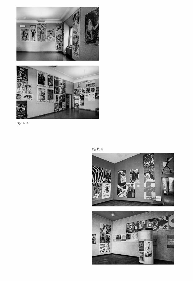
Fig. 14, 15
Fig. 17, 18

Fig. 16
Figs. 14, 15Installation view of the exhibition Das Plakat als Zeit spiegel (The poster as a mirror of the times), Helmhaus Zürich, Jan. 24–Feb. 28, 1949.
Fig. 16Atelier Honegger-Lavater (design), catalog of the exhibition Het affiche beeld van de tijd (The poster as a mirror of the times), Stedelijk Museum Amster-dam, Oct. 13–Nov. 27, 1950.
Figs. 17, 18Installation view of the exhibition Het affiche beeld van de tijd (The poster as a mir ror of the times), Stedelijk Museum Amster-dam, Oct. 13–Nov. 27, 1950.

Fig. 19
Fig. 20
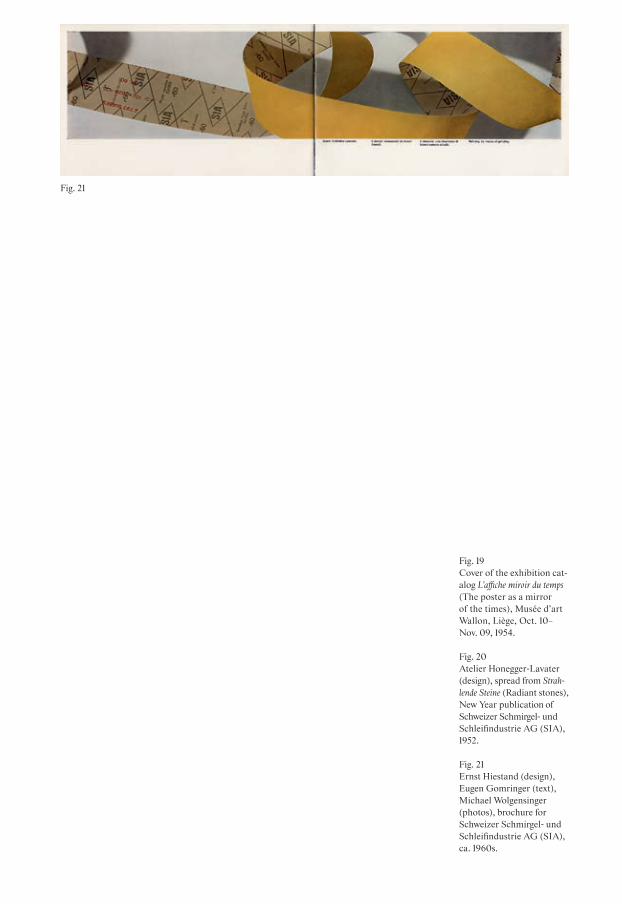
Fig. 19Cover of the exhibition cat-alog L’affiche miroir du temps (The poster as a mirror of the times), Musée d’art Wallon, Liège, Oct. 10– Nov. 09, 1954.
Fig. 20Atelier Honegger-Lavater (design), spread from Strahlende Steine (Radiant stones), New Year publication of Schweizer Schmirgel- und Schleifindustrie AG (SIA), 1952.
Fig. 21Ernst Hiestand (design), Eugen Gomringer (text), Michael Wolgensinger (photos), brochure for Schweizer Schmirgel- und Schleifindustrie AG (SIA), ca. 1960s.
Fig. 21

58
wrote, the section “Zwitserse Grafici” took up a whole room at the Stedelijk Museum:
The Swiss poster art is excellent. It has been given an entire hall, and receives the highest praise. The critics gave the verdict: “Swiss graphic design is unbeat-able.” (Vorzüglich der schweizeri schen Plakatkunst, der ein ganzer Saal ein-geräumt worden ist, wird höchstens Lob gezollt. Die Kritiker finden sich im Urteil: “Die Schweizer Graphik ist unübertrefflich.”)38
In other sections, though, the poster exhibi-tion also showed different design styles by Swiss designers mainly from the 1930s. A photographic poster by Frieda Allenbach from 1935 (“Astra Fett”), Max Bill’s poster “Negerkunst” from 1931, and Hermann Eidenbenz’s poster “Grafa international” from 1936 display Modernist tendencies in Swiss poster design, and most of these are included in every publication about Swiss graphic design history.39 In this respect it is also noteworthy that while Modernist post-ers were generally well represented in the exhibition, those posters by Swiss designers were the exception.
The thematic structure of the exhibition at the Helmhaus in Zurich did, however, feature one exception that can be seen as a kind of forerunner of the later Swiss sec tion that was added abroad. In the Helmhaus catalog, the names of five designers appear as separate categories: Henri de Toulouse-
Lautrec, Théophile Steinlen, Ernst Keller, Hans Falk, and Hans Erni.40 Apart from the ubiquitous French poster artist Toulouse- Lautrec, the others were all of Swiss origin. What is more, those Swiss artists remain to this day a prime feature of the genealogy of Swiss poster designers in the historical literature.41 Can this be viewed as an attempt on Schneckenburger’s part to write the his-tory of the Swiss poster? As it happens, his choice of posters for the Swiss section largely correlates with the overall picture of the annual national poster award during that time.42 Is he therefore acting intention-ally as an ambassador of what the Swiss Federation approved as constituting good Swiss poster design?
The last of Schneckenburger’s exhibition series took place in the Musée d’Art Wallon, the fine art museum in Liège in Belgium, in 1954. It had once more undergone note-worthy changes concerning the represen-tation of Swiss graphic design. For the first time, the Schneckenburger Collection is deliberately labeled as a Swiss collection. On the cover of its catalog, the letters indi-cating the exhibition title, location, and year form a white cross against a red back-ground—the Swiss national flag. This design is rather astonishing, as half of the exhibits were not of Swiss origin—more than in the other exhibitions of the series.43 Remarkably, however, the name of the Swiss section had been changed to “L’Af-fiche Suisse Moderne.”44 Under this new label of “Modern Swiss Poster,” the
alternative actors exhibitions historiography canonizationprivate collectors

59
illustrative posters that had also been shown in Amsterdam were joined by a further three posters by Gottfried Honegger and fifteen exhibits by a younger generation of design-ers such as Josef Müller-Brockmann, Gérard Miedinger, Fred Neukomm, Kurt Kessler, Franco Barberis, Emil Berger, and Lehner & Schwabe. Most of the new posters, how-ever, were still illustrative works (includ - ing the one by Müller-Brockmann), but some by Honegger showed abstract designs or photographs. [Figs. 16, 17, 18, 19]
Schneckenburger as client
Although Schneckenburger’s collection contained many historical posters of inter-national origin, the abovementioned new acquisitions of Swiss contemporary posters were linked to his own personal network in Zurich’s art and design scene. He did not just collect the posters of his friends and acquaintances, but also used his contacts through the company he worked for, namely the Schweizer Schmirgel- und Schleifin-dustrie AG (SIA) in Frauenfeld (today: sia Abrasives).45 From 1948 onwards, he was responsible for the SIA’s advertising.46 This meant that he started commissioning graphic designers, copywriters, and photog-raphers who were part of his network. A lot of the company’s graphic design seems to have been done by Gottfried Honegger, who in that context often used photographs by Michael Wolgensinger.47 As personal
photographs indicate, both Honegger and Wolgensinger must have been close friends of Schneckenburger’s.48 Interestingly, even though as a poster collector Schneck-enburger seemed to have favored artist post ers and illustrative works, the advertis-ing material he commissioned was strictly Modernist. Thus, Schneckenburger must be held accountable for the company’s widely noted Modernist printed matter of that time;49 today, it is proudly referred to as the “sia style”:
In other words, today’s sia style did not develop out of nothing, but is based on a long design tradition, shaped by Swiss artistic personalities such as Gottfried Honegger, Eugen Gomringer, Michael Wolgensinger, and Ernst Hiestand, who, influenced by concrete art and concrete poetry, achieved exemplary results in the field of visual communication. (Das heisst, der heutige sia-Stil entstand nicht aus dem Nichts, sondern beruht auf einer langen gestalterischen Tradition, geprägt von Schweizer Künstler per -sön lich keiten wie Gottfried Honegger, Eugen Gomringer, Michael Wolgen-singer und Ernst Hiestand, die, beein-flusst von der konkreten Malerei und der konkreten Poesie, Vorbildliches im Bereich der visuellen Kommunika-tion geleistet haben.)50
Honegger and Wolgensinger were also involved in the design of the posters, printed
alternative actors exhibitions historiography canonizationprivate collectors
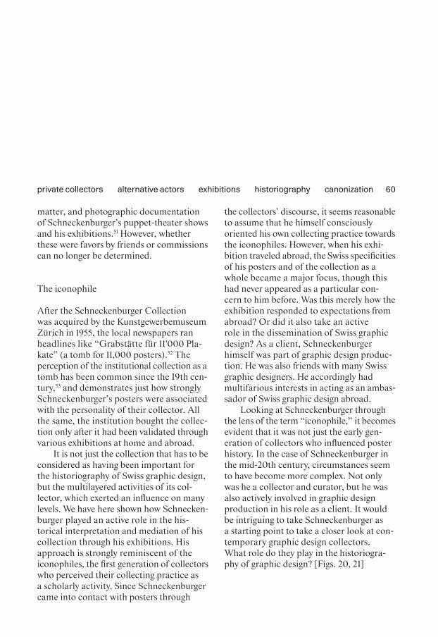
60
matter, and photographic documentation of Schneckenburger’s puppet-theater shows and his exhibitions.51 However, whether these were favors by friends or commissions can no longer be determined.
The iconophile
After the Schneckenburger Collection was acquired by the Kunstgewerbemuseum Zürich in 1955, the local newspapers ran headlines like “Grabstätte für 11’000 Pla-kate” (a tomb for 11,000 posters).52 The perception of the institutional collection as a tomb has been common since the 19th cen-tury,53 and demonstrates just how strongly Schneckenburger’s posters were associated with the personality of their collector. All the same, the institution bought the collec-tion only after it had been validated through various exhibitions at home and abroad.
It is not just the collection that has to be considered as having been important for the historiography of Swiss graphic design, but the multilayered activities of its col -lector, which exerted an influence on many levels. We have here shown how Schnecken-burger played an active role in the his - tori cal interpretation and mediation of his collection through his exhibitions. His approach is strongly reminiscent of the iconophiles, the first generation of collectors who per ceived their collecting practice as a scholarly activity. Since Schneckenburger came into contact with posters through
the collectors’ discourse, it seems reasonable to assume that he himself consciously oriented his own collecting practice towards the iconophiles. However, when his exhi-bition traveled abroad, the Swiss specificities of his posters and of the collection as a whole became a major focus, though this had never appeared as a particular con -cern to him before. Was this merely how the exhi bition responded to expectations from abroad? Or did it also take an active role in the dissemination of Swiss graphic design? As a client, Schneckenburger himself was part of graphic design produc-tion. He was also friends with many Swiss graphic designers. He accordingly had multifarious interests in acting as an ambas-sador of Swiss graphic design abroad.
Looking at Schneckenburger through the lens of the term “iconophile,” it becomes evident that it was not just the early gen-eration of collectors who influenced poster history. In the case of Schneckenburger in the mid-20th century, circumstances seem to have become more complex. Not only was he a collector and curator, but he was also actively involved in graphic design production in his role as a client. It would be intriguing to take Schneckenburger as a starting point to take a closer look at con-temporary graphic design collectors. What role do they play in the historiogra-phy of graphic design? [Figs. 20, 21]
alternative actors exhibitions historiography canonizationprivate collectors

61
1 Iskin 2014: 18.2 Iskin 2014: 22.3 Often, poster collectors were
simply called amateurs, thus locating them within the general practice of art collecting. Iskin 2014: 263–264.
4 Iskin 2014: 263.5 For a detailed discussion of the
different designations for poster collectors and the development of the discourse, see Iskin 2014: 263–269.
6 Iskin 2014: 237 Iskin 2014: 18–22.8 See Richter 2016: 195. 9 Witness account by Trudi
Schoop, as in Ribi 1991: 29.10 Since the early 1930s Schnecken-
burger had often attended perfor-mances of the Schweizer Mario-nettentheater, famous for the puppets made by Sophie Taeuber- Arp, Otto Morach, Paul Bodmer, and Carl Fischer, all of them teachers at the Kunstgewerbe-schule Zürich. See Ribi 1991: 19; Tappy 2016: 12.
11 His marionettes are nowadays part of the Collection of Applied Arts at the Museum für Gestal-tung Zürich. In 1991 the Museum Bellerive in Zurich organized an exhibition called Schneckenburgers Puppencabaret. See Ribi 1991: 9, 27–29.
12 Der Kreis—Le Cercle was a monthly magazine and an associ-ation especially famous for its events organized in Zürich. See https://schwulengeschichte.ch/epochen/4-der-kreis/ besondere-abonnenten/fred- schneckenburger/(accessed Mar. 20, 2020).
13 Ribi 1991: 22. The reasons why Schneckenburger’s exhibition
visited specific venues would be an interesting topic for further study. As Tappy suggests, one plausible explanation of its itin-erary was the collector’s personal contacts. See Tappy 2016: 42–44.
14 The collection was sold for the symbolic price of CHF 50,000. See Richter 2016: 195; Ribi 1991: 23.
15 For more about the subjectivity of private collections, see, for example, Gamboni 2007: 183.
16 A selection of Schneckenburger’s collection was featured in the exhibitions Schweizer Plakatkunst at Kunstmuseum Luzern, 1941 (Swiss poster art); Das Plakat im 19. und 20. Jahrhundert at Museum zu Allerheiligen, Schaffhausen, 1942 (The poster in the 19th and 20th centuries); and Le salon d’affiche at La Quinzaine neuchâ-teloise, 1942 (The poster salon). See Tappy 2016: 24–26.
17 To this day, there exists no com-prehensive history of the Helm-haus as an exhibition space. See https://www.zuerich.com/de/besuchen/kultur/helmhaus- zuerich (accessed Mar. 10, 2020).
18 Verwaltungsabteilung des Stadt-präsidenten von Zürich 1949: 7.
19 Verwaltungsabteilung des Stadt-präsidenten von Zürich 1949: 6.
20 National Zeitung 1949.21 The last exhibition that had been
exclusively dedicated to posters at the Kunstgewerbemuseum Zürich had taken place in 1933 and juxtaposed a selection of the institution’s own collection with international posters. The show Internationale Plakatausstellung focused on providing “[…] an overview of the development of the poster since its emergence
[…].” (The original German reads: “[…] um einmal einen Überblick über die Entwicklung des Plakates seit seinem Aufschwung gegen Ende des vorigen Jahrhunderts zu bieten […].”) See Kunstgewer-bemuseum Zürich 1933: 3.
22 Tappy 2016: 24–26.23 Tappy 2016: 79.24 Ribi 1991: 22.25 See Volkshaus 1944.26 Ibid.27 Weltwoche 1955: 5.28 Between 1896 and 1936, the Ger-
man dentist Hans Sachs assem-bled one of the largest poster collections in the world. During World War II he and his family managed to flee to New York, but his collection passed into Nazi hands. In the postwar period, parts of the collection changed hands several times, but more than a third of it survived. See Grohnert 1992: 16–29.
29 Although Sachs brought the asso-ciation and the magazine through World War I almost entirely unscathed, the board had to resign in 1921. The association was dissolved in 1922 and the journal was discontinued. Grohnert 1992: 17–21.
30 Weltwoche 1955: 5.31 Iskin lists Gustave Fustier,
Beraldi, Ernest Maindron, Roger Marx, Uzanne, Maurice Tal meyr (France); W.S. Rogers, Charles Hiatt, Joseph Thacher Clarke (England); Hans Sachs (Ger-many). See Iskin 2014: 269.
32 Iskin 2014: 271.33 Ribi 1991: 22.34 Tappy 2016: 42–4435 The catalog had an interesting
shape: it was a folded leaflet designed by Gottfried Honegger
alternative actors exhibitions historiography canonizationprivate collectors

62
and printed on the back of abra-sive paper. The choice of material suited Sandberg’s anti- establishment attitude, but also alluded to Schneckenburger’s job at the SIA, which is discussed below.Stedelijk Museum 1950; Tappy 2016: 47.
36 The poster designers represented in the section “Zwitserse Grafici” were: Hans Falk, Alois Carigiet, Hans Erni, Pierre Gauchat, Ernst Keller, Niklaus Stöcklin, Ruodi Barth, Herbert Leupin, Hermann Eidenbenz, Peter Birkhäuser, Donald Brun, Heinrich Steiner, and Gottfried Honegger. See Stedelijk Museum 1950.
37 During the war and immediately thereafter, photographic experi-ments and abstract design were sidelined in favor of illustrative poster designs. Richter 2014a: 38. The specialist journal Graphis also presented its international readership with the same stylistic understanding of Swiss poster design in several articles in 1949. See Bühler 1949: 306–315; Kasser 1949: 316–331.
38 TagesAnzeiger 1950.39 See, for example, Hollis 2006:
204–250.40 See Verwaltungsabteilung des
Stadtpräsidenten von Zürich 1949: 24–25.
41 See, for example, Döring 2014: 41.
42 See “Die besten Plakate /Les meilleures affiches,” in the pres-ent volume.
43 Société royale des beaux-Arts de Liège 1954: cover.
44 Société royale des beaux-Arts de Liège 1954: 27–30.
45 Ribi 1991: 20.46 Isler 1975: 150, 235.
47 Wolgensinger’s photographs had been popular among Modernists. Hollis 2006: 161.
48 Schneckenburger appreciated Honegger as a designer and also as an artist. Photographs show him in his office in the SIA, with a painting by Honegger behind him. See Ribi 1991: 19.
49 Also mentioned in, for example, Hollis 2006: 161.
50 Lüthi 2006: 6.51 Ribi 1991: 20.52 For example, Walser 1961: 8, as
cited in Richter 2016: 195.53 During that time, institutional
collections were often perceived as tombs for the objects. This was mostly because extensive regulations and paperwork often prevented objects from being exhibited, as the museums’ major task was the preservation of the artworks rather than their dis-play. Private collections on the other hand were more easily displayed, depending on the col-lector and their eagerness to present their treasures in public. On that subject see Gamboni 2007: 181.
alternative actors exhibitions historiography canonizationprivate collectors

printing industry professionassociationsmagazinesdiscourse
In eigener Sache
Editorial Statements Addressing the Readership
Roland Früh
“On our own account”1—was the title of a short column that the editorial board of the journal Typographische Monatsblätter (TM) used to address their readership directly. [Fig. 22] These short texts were printed on a colored slip of sugar paper and placed prominently at the beginning of the journal. In this column, the editors informed their readers about changes in the layout,2 explained new strategies regarding their journal’s organization,3 and wrote a short statement to justify why a special issue on typography from Basel had been redesigned using only one cut of a Grotesk typeface4 instead of the usual TM layout. These col-umns were brief and informative—but they also tell us precisely how the editors wished to communicate with their read - ers. Periodicals are in most cases economi-cally dependent both on their readers as subscribers and on the companies who buy advertisement space (and who thus take a keen interest in the subscription figures).
Journals can thus be seen as relational proj-ects in which the editors aim to establish a specific “readership”—which is something distinct from merely the general reading public. A readership can be understood as a close circle of informed, ideally loyal read-ers.5 The present essay will focus on editorial statements and on how they can expose the tools used to convince readers to iden-tify with a publication, and subscribe to it for the long term.
Professional journals and periodicals are a rich source for the history of graphic design and typography in Switzerland.6 This small but interesting range of publica-tions is representative of the diversity of the field, and each of them spoke to a spe-cific group: the workers and apprentices in printing houses, the freelance graphic designers, and the ad-men in agencies. Each periodical had its own strategy of distribu-tion, sales, and sponsorship, and was there-fore dependent on subscriptions in very different ways and to different degrees. The question arises as to whether any exchange between the editors and the readers can be observed across all the journals, and whether each type of publication develops its own strategies.
This essay examines the editorial state-ments in a selection of journals for graphic design and typography in Switzerland and abroad, namely TM, SGM, Graphis, and Neue Grafik. Our focus lies on the years between 1933 and 1965, when these journals were published in parallel, and had a shared
63
DOI: 10.53788/SW
BE0305

64
historical background. The institutional, economic, and historical contexts of the journals are taken into account, as is the role of the editor in the publishing strategy of the journal. The editorial statements, so we posit, can be seen as a form of communi-cation that helps the editors to build a stron-ger connection, a communal “we” and “us,” between the editors, the publication itself, and its readership.7
Graphis—a magazine of graphic design international affairs from Switzerland
The first journal we shall consider is Graphis. In October 1944, Walter Amstutz and Walter Herdeg launched it as a new magazine to cover the latest trends in inter-national visual communication. Amstutz and Herdeg had met when working on the design for the tourism campaigns of St. Moritz.8 In 1938, the tourist board of St. Moritz had canceled their campaign, so Amstutz and Herdeg moved their business to Zurich, where they opened a publishing house and advertising agency under the name Amstutz & Herdeg.9 In 1944 they felt that the time was ripe to edit and publish Graphis, a “magazine pub -lished in Switzerland and concerned with all problems attaching to free and applied art,” as they wrote in their editorial state-ment for its first issue. Their optimism was obvious, and they announced their commitment to their new venture in full
awareness of the extreme circumstances of their time: “The war has entered its deci-sive phase, and the spirit of reconstruction is already abroad. Plans made for an uncertain future can now begin to take on solid form.”10
This editorial by Amstutz and Herdeg is notable for several other reasons. One is how they address the political situation and the timing of their new publication, but another is how they aim to win over a new kind of readership: not the typesetters, not the printers, not the graphic designers nor the graphic artists, but the graphic industry, or what we today would call the “creative industry.” Their magazine wanted to reach an international audience from the start, and included texts in three languages: Ger-man and English in full, with French sum-maries. The articles offered an overview of design work not only from Switzerland, but also from neighboring countries and the USA. Graphis had an institutional partner. From the first issue onwards, it was referred to as “Offizielles Organ des Verbandes Schweizer Graphiker und des Verbandes der Berufs-Schaufenster-Dekorateure der Schweiz” (the official organ of the Swiss Graphic Design Association and the Association of Professional Window Dress-ers). While this link was not discussed in the magazine at all, it might well have been the reason for the magazine’s many articles on shop-window designs.11
Amstutz and Herdeg realized that there was an interest in connecting design with
printing industry professionassociationsmagazinesdiscourse

65
something more than just the profession itself: “The aim which GRAPHIS [sic] sets itself is that of enriching practical life with the seeds of creative inspiration: of helping to bring art into touch with everyday life, and enduing [sic] the forms of that life with artistic significance and value.”12 To an apprentice in a printing company, this might have sounded theoretical and belletristic. But as the diagram at the very end of the first issue of Graphis illustrated, The Eye of Graphis, Herdeg and Amstutz were catering for a broad, diverse audience, spanning all spheres of life.13 [Fig. 23]
Graphis as a magazine did not stand out as being particularly visionary. As Jeremy Aynsley describes it, the content of Graphis actually followed the example of the German journal Gebrauchsgraphik that had already become established back in 1924.14 Its content could be roughly described as “What’s around in the world of advertising, illustration and graphic design.” The concept of an internationally minded pub-lication must be credited to Walter Herdeg, who led the magazine as editor, art direc-tor, and designer until it was sold in 1987. Editorial statements were rare, but Herdeg shaped the publication through his inter-national contacts, which led the design critic Steven Heller to conclude: “In fact, Graphis was never simply the sum of its parts; it was always Walter Herdeg’s statement.”15 Just how important it was to maintain con-tact with the international scene both during and shortly after World War II is
best described by the Swiss graphic designer Pierre Gauchat:
We Swiss graphic designers lived […] in such complete seclusion that doubts had to be raised about the healthy devel-opment of our intellectual and artistic abilities. […] This hunger for spiritual nourishment gave rise three years ago to the idea of an international magazine on the graphic arts […]. Walter Herdeg succeeded in doing what would have been impossible for us: putting out his feelers across almost all fronts in order to satisfy our needs. (Wir Schweizer Graphiker lebten […] in einer so voll-ständigen Abgeschlossenheit, dass Zweifel an der gesunden Weiterent-wicklung unserer geistigen und künst-lerischen Fähigkeiten aufkommen mussten. […] Diesem Hunger nach geis-tiger Nahrung entsprang vor drei Jah-ren der Gedanke einer internationalen graphischen Zeitschrift […]. Walter Herdeg gelang, was uns selbst unmög-lich gewesen wäre: seine Fühler durch fast alle Fronten hindurchzustrecken und so unseren Bedürfnissen Genüge zu tun.)16
Graphis became equally well known in Switzerland and abroad. We have no sub-scription numbers to analyze, but Graphis was often referred to in other publications. In 1955, for example, the British typogra-pher John Ryder put Graphis top of his list
printing industry professionassociationsmagazinesdiscourse

66
of remarkable international typography and design journals.17 This was a leading posi-tion that Jeremy Aynsley confirmed in retro-spect: “[…] in 1944, from Switzerland, the new journal Graphis had been launched, a journal which would dominate coverage of European graphic art and design for the next twenty years at least.”18
The question then arises: What influ-enced the editorial strategies of other typography and design journals of the 1940s when compared with Graphis? Who were their editors, and how did they address their readership?
Editorial voices in the graphic industry in 1940s Switzerland
When Walter Herdeg and Walter Amstutz launched Graphis, there were few typography or graphic design periodicals that would have been available in Switzerland—and international journals, from Germany, England, or the USA, were unlikely to be imported at all during World War II. The remaining journals are found quickly: Schweizer Reklame und Schweizer graphische Mitteilungen (SGM) and Typographische Monatsblätter (TM). SGM was the longest-running journal for the printing industry in Switzer-land. It had started in 1883, then merged in 1936 with the journal of the Schweizer Reklameverband (Swiss Association for Advertisers) and had since lost its indepen-dence and some of its focus on the printing
industry. SGM had always been a rather conservative forum. It was edited for many years by August Müller, the owner of the printing company Zollikofer in St. Gallen who had been printing and funding the journal. His few editorial announcements had mostly said: Don’t get carried away with the latest artistic trends, but learn from experience and the history of the craft.19 A change happened at SGM in September 1943 when the editorial direction was handed over to Hermann Strehler and Rudolf Hostettler, both of whom were still working from their offices at the printing company Zollikofer. Strehler introduced their plans and the new layout of the journal in their first issue, and the editorial announcement also read like a call for a renewed readership.20 Strehler and Hostett-ler were dedicated to editing SGM as an internationally minded, locally rooted pub-lication with a focus on craft, education, and industry. Hostettler in particular kept up a regular correspondence with typog-raphers, printers, and graphic designers in all of Switzerland, and with a wide net -work in Europe and the USA. He did not ignore any specific schools or designers just because of their styles.21 By 1946, SGM arranged to separate from the advertising sector (Schweizer Reklame) and was able to produce a much more focused journal for the industry of printing, graphic design, and typography. According to Strehler, this meant returning to the origins of SGM as its founder August Müller had once defined it.22
printing industry professionassociationsmagazinesdiscourse

67
1946 also marks the year when Hostettler and Strehler published one of the best-known disputes in the history of typography. In issue 5 of 1946, Max Bill was given eight pages for his article “über typographie” (on typography). It was a dogmatic, self- centered article which he designed himself. He insisted on having it printed on coated paper—in contrast to the uncoated paper of the rest of the journal—and he famously used it to attack Jan Tschichold for being a “traitor” to the Modern movement and a reactionary historicist.23 Tschi chold replied in the following issue, 6, addressing Bill directly and correcting him point by point.24 The subject and intensity of the dispute has been written about extensive-ly,25 but the role of Strehler and Hostettler and their editorial work deserves more attention. From the correspondence in the archive, we know that Hostettler had been in touch regularly with Bill and Tschichold. The latter had been a regular contribu - tor to SGM, and he and Hostettler had exchanged letters about both work and per-sonal matters. The fact that Tschichold’s response was published only one issue after Bill’s article suggests that the editors very likely moderated the dispute, and that Tschichold even knew about Bill’s text before it had arrived on his desk in published form. But what is most remarkable is how the editors Strehler and Hostettler intro-duced Tschichold’s reply with a short para-graph, stating that Tschichold has been given the space for his response, but that
the discussion is now closed.26 [Fig. 24] Hostettler obviously did not want to expand on this debate. As he had pointed out in an article of his own, what Bill and Tschi-chold had been disputing had already been made obsolete by other, more progressive ideas.27 But in 1948, he gave Paul Renner a forum to respond to Bill and Tschichold, where Renner precisely and thoughtfully formulated a synthesis of what had been put forward as thesis and antithesis.28 Here, too, Hostettler announced Renner’s piece with a short paragraph of his own:
This article was written by Paul Renner, the creator of Futura and former head of the Meisterschule in Munich, as a contribution to the controversy M. Bill – J. Tschichold in issues 5 and 6of the 1946 volume of this magazine.(Dieser Artikel wurde von Paul Renner,dem Schöpfer der Futura und früherenLeiter der Meisterschule München,geschrieben, als Beitrag zur KontroverseM. Bill – J. Tschichold in den Heften 5und 6 des Jahrgangs 1946 dieserZeitschrift.)29
The editorial voice of Hostettler is that of a reasonable moderator between the occa-sionally dogmatic and stubborn protagonists of typography. We can see this in SGM in his few simple but forceful interventions.
printing industry professionassociationsmagazinesdiscourse

68
Answering to the members of the Swiss Typographers Association
TM was launched in 1933 as the journal of the Schweizerischer Typographenbund (Swiss Typographers’ Association), and it had to cater to the expectations placed on a trade association journal.30 For this reason, the content of each issue of TM always comprised one or two longer articles, followed by a section with detailed, very technical, short articles for apprentices, typesetters, or printers. This technical sec-tion was couched as a service to the read-ers, as the titles of its short articles answered everyday questions such as “Which type size is most readable?”31 While TM had important regular contributors such as Jan Tschichold or Max Caflisch, it had set out without a prominent editorial voice. Initially, it had been edited by Walter Cyliax, a typographer and art director at the Buchdruckerei Fretz in Zurich where TM was printed. He played an active role in regularly introducing the subscribers of TM to modern design work by Anton Stankowski, and to photography by Herbert Matter and Hans Finsler.32 These sections of the journal were very progressive.33 But the editorial board had always included representatives of the Swiss Typographers Association and of the educational insti-tutions in Bern and Zurich. When Cyliax left Switzerland, TM lost its progressive atti tude and continued instead as an informative journal for the members of the association.
The conservative approach of TM is mir-rored in an article saying farewell to Karl Reitz, who had been on the editorial board of TM from 1933 to 1951. Reitz was thanked for his efforts to keep manual type-setting techniques alive despite the cur - rent trend towards automated typesetting machines. This illustrates just how tra-ditional the approach of TM remained, even by the year 1950.34
By the beginning of 1952, SGM merged with TM and the Revue Suisse de l’Imprimerie (RSI) to form a single monthly publication that over time became known by the initials TM. Rudolf Hostettler took on the role of chief editor, and the new TM SGM RSI con-tinued as a journal for the Swiss printing trade, still offering information for associa-tion members and apprentices, but with a more international outreach, and texts in German and French.35 It now included a colored sheet of paper, cut to half the width of the page, which contained the table of contents, a short essay on a contemporary topic, and a note to the reader titled “In eigener Sache” (on our own account). Here, as mentioned at the beginning of this essay, the editors addressed their subscribers with information about the journal or some other, light topics. It became a regular fea-ture, and signaled a desire on the part of the editor and his team to get close to their readership and involve them more. Under Hostettler, the informative section at the back of the journal also became more inter-active. This included short columns with
printing industry professionassociationsmagazinesdiscourse

69
lists of FAQs and the editors’ answers to common questions that are asked in the print shop. There were riddles and quizzes, information for proofreaders, a section entitled “Neue Maschinen und Materialien” (New Machines and Materials) and one with information regarding business admin-istration in the printing trade. With all this content, the new TM SGM RSI maintained its status as a journal for the “Förderung zur Berufsbildung” (support for vocational training), as TM had initially declared back in 1933.
In retrospect, Rudolf Hostettler is largely regarded as the editor who most successfully included opinions and styles from across the spectrum. “Rudolf Hostettler’s editorial ideals were governed not by modernism or traditionalism but rather by the notion of quality; hence Tschichold would always be as valid as Ruder or Weingart”36 was the comment of the designer Paul Barnes, who researched Swiss graphic design and its international outreach, and interviewed practitioners in Switzerland and in the UK. Under Hostettler, TM SGM RSI published statements and work from all over Switzer-land as well as from abroad. It offered equal representation to work done at the schools of Basel, Zurich, St.Gallen, and Lausanne, and showed its readers the post-modern design of Wolfgang Weingart, the traditional work of Jan Tschichold and Max Caflisch, and the work of concrete artists and designers from Zurich. Just as Walter Herdeg is credited for his inter -
national network in his editorial work for Graphis, Hostettler’s role at TM SGM RSI was appreciated by subscribers for his bal-ance of dogmas and styles, so that in large part his journal remained a source of infor-mation for them, namely the members of the association.37
The personal project: Neue Grafik
From 1958 to 1965, a collective of four edi-tors—Josef Müller-Brockmann, Hans Neuburg, Richard Paul Lohse, and Carlo L. Vivarelli—published eighteen issues of a magazine titled Neue Grafik. It had no ties to any association, but had been set up as a committed personal project from the very beginning. As Lars Müller recounts in his tale of the magazine’s history, Neue Grafik ensured this editorial freedom by being published under the umbrella of the pub-lishing house Walter Verlag, who distributed and funded the project. Josef Rast was responsible for Walter Verlag’s publishing program at the time, and while he kept track of sales and subscriptions and urged the editors to follow a strategy that suited both advertisers and subscribers, he never forced them to bend to financial interests.38
The introduction to the first issue of Neue Grafik was signed “LMNV,” the abbre-viation of Lohse, Müller-Brockmann, Neuburg, and Vivarelli, and was a straight-forward manifesto by a group of “[…] drei Grafikern und einem Maler-Grafiker […]”
printing industry professionassociationsmagazinesdiscourse

Fig. 22In eigener Sache: The edi-tors Hostettler and Strehler explain the change of layout for a special issue on work from Basel.
Fig. 23Das Auge der Graphis (The Eye of Graphis).
Fig. 22

Fig. 23

Fig. 24
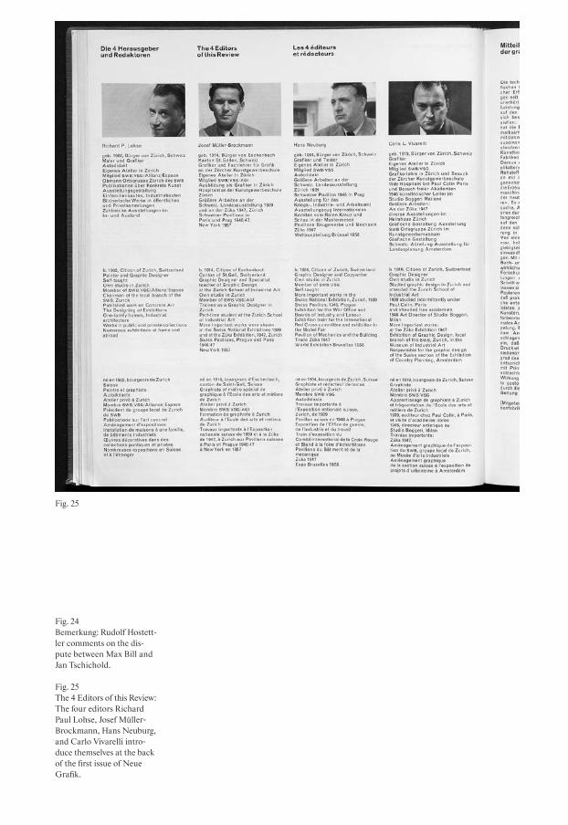
Fig. 25
Fig. 24Bemerkung: Rudolf Hostett-ler comments on the dis-pute between Max Bill and Jan Tschichold.
Fig. 25The 4 Editors of this Review: The four editors Richard Paul Lohse, Josef Müller- Brockmann, Hans Neuburg, and Carlo Vivarelli intro-duce themselves at the back of the first issue of Neue Grafik.

74
(three graphic designers and one painter- graphic designer), as they called themselves, though the English translation in the journal only read “four designers.”39 LMNV announced that the content of their first issue would reflect their overall plan, and that they would formulate a new under-standing of graphic design that was free of being purely a service profession: “The modern designer is no longer the servant of industry, no longer an advertising draughts-man or an original poster artist: he acts entirely independently, planning and creat-ing the whole work […].”40 And they declared that their aim was “to create an interna-tional platform for the discussion of modern graphic and applied art,” an art that they wrote was new on account of its “almost mathematical clarity.” This claim was under-lined by the design of the magazine itself. The layout of Neue Grafik was organized very strictly, being confined in a grid system with four columns. The articles were pub-lished in German, English and French throughout. But its selection of articles, authors, and topics also made Neue Grafik the periodical of its time that was most focused on concrete art and design in Swit-zerland. The editors kept their focus on radical works and ideologies in design and art, and succeeded in refraining from mixing these with more traditional or historical topics in the way SGM, TM, and Graphis did.
After their introductory statement, the editors offered no more editorial com-ments, though they signed off the first issue
with short biographies and a portrait of each of them, similar to those of an author on the back cover of a novel.41 [Fig. 25] In the subsequent issues, they did not offer any editorial notes, and rarely added any intro-ductory comments to an article, though they included some of their own writing in every one of the journal’s eighteen issues42—as a matter of fact, sometimes more than half of an issue’s content was made up by contri-butions from the editors. In addition, they regularly signed themselves as LMNV, especially in situations where they reviewed a work by one of the four of them. “LMNV,” for example, reviewed a catalog designed by Lohse, praising it for the inventiveness and consequence of its design,43 and also pro-moted Josef Müller-Brockmann’s book The Graphic Artist and His Design Problems.44 The contributions that they did not write them-selves either were written by colleagues45 or would support the arguments of the con-crete artists by offering a historical46 or contemporary international47 context. With their constant presence as authors, the editors of Neue Grafik managed to stay in the foreground. So it is safe to say that whoever subscribed to Neue Grafik must have been aware of subscribing to the content and taste of LMNV. As Richard Hollis confirms, this was in fact important to many readers: “[Neue Grafik] was edited and written not by journalists, but by practicing designers. This is what gave the new magazine its authority.”48 So the readership of Neue Grafik could probably be described as a kind of
printing industry professionassociationsmagazinesdiscourse
75
special interest group49 of well-informed followers of the editors’ work, who agreed to invest in the subscription of a maga - zine that stood out from existing, conven-tional journals.
Conclusion
We posit here that the editors of typography journals used their editorial statements both to inform their subscribers and to estab-lish a relationship with them so they would commit to the publication. As we have seen, actual editorial statements are rare in the periodicals we have examined here. Even within Neue Grafik, a magazine that was strongly contingent on the personality of the editors, there is only one real editorial: the introduction statement in the first issue.
What all these journals have in com-mon—Graphis, SGM, TM, and Neue Grafik—is that they all were shaped by their editors over many years. Walter Herdeg was respon-sible for Graphis and its international con-tent in 246 issues from 1944 to 1987. Josef Müller-Brockmann, Hans Neuburg, Richard Paul Lohse, and Carlo L. Vivarelli stayed on the editorial board of Neue Grafik from its first issue in 1958 to its last in 1965. Hermann Strehler and Rudolf Hostettler edited SGM from 1943 to 1951, and in 1952 Hostettler took the editorial lead in the merger of SGM, RSI, and TM—a role to which he dedicated much of his time, right until his death in 1981.50
To conclude here, the editorial statement itself was probably not the principal for mat for addressing the readership. An editor might also use more subtle editorial ele-ments or strategies, and these too are repre-sentative of the readership that a periodical desires to address, be they subscribers who invest in a journal of their own accord (Neue Grafik), members of a union or trade association who desire to stay in touch with professional developments (TM), readers interested in a discursive exchange and reviews of contemporary work (SGM, TM, Graphis, and Neue Grafik in equal degree), or professionals who want to stay informed about the work of their colleagues, nation-ally or internationally (Graphis).
Neue Grafik and its editorial board of Neuburg, Vivarelli, Lohse, and Müller- Brockmann certainly achieved the goals they set out in the introduction to their first issue: to establish a magazine for new, concrete art and design. Their selection of articles, and especially their keenness to write a large number of them, helped to create a consistent, dogmatic publica-tion. This might be considered diamet-rically opposed to the practice of Walter Herdeg. It was his international network and Graphis’s broad, even eclectic content that made his journal compelling. In this regard, perhaps Graphis was not so dif-ferent from Typographica, which was pub-lished in London from 1949 to 1967 by the English typographer Herbert Spencer, whose editorial work has been described
printing industry professionassociationsmagazinesdiscourse
76
by Rick Poynor in words that remind one of Herdeg:
Spencer’s editorial obsessions and intu-itively determined juxtapositions gave rise to possibilities and suggested mean-ings that he himself did not neces - sarily intend or predict. Typographica’s innovation was to presuppose, through these collisions—rather than through any elaborate theoretical statement—threads of aesthetic, intel-lectual and sometimes practical connection between its spectacularly disparate parts.51
Just like Herbert Spencer, Rudolf Hostettler was no supporter of any single school or style.52 While the editorial work of Spencer and perhaps also Herdeg might be described as eclectic, Hostettler’s approach, how - ever broad, was always rooted in the prime purpose of his periodicals, bound as they were to the needs of industry and the Swiss Typographers’ Association. The discussions in TM (and to some degree in SGM too) are proof of this, and it is interesting overall to see how Strehler and Hostettler include many small, informative, technical sections so as not to alienate their subscribers with international, theoretical statements that might have seemed too distant and disconnected from the actual prob lems that occurred in printing companies.53 At the same time, as with the dispute between Max Bill and Jan Tschichold, Hostettler
included articles that represented opposing opinions, moderating between them by adding short comments and by articulating a third, mediating opinion in his own arti-cles or those of others.54 Hostettler’s edito-rial work in this sense is neither dogmatic after the manner of Neue Grafik, nor as eclec-tic as Herdeg’s content for Graphis or Spencer’s for Typographica. But by working as an editor of SGM and TM for almost forty years, Hostettler was able to establish an editorial stance that could offer a platform to opinions and statements by different styles and schools, without being unfaith-ful to his prime concerns, which were the printing industry, and the education of the next generation.55
printing industry professionassociationsmagazinesdiscourse
77
1 Redaktion der TM 1953.2 Ibid.3 Redaktion der TM 1952.4 Redaktion 1952.5 Regarding the role of periodicals
see Beetham 1989: 99; and for design journals: Leslie 2011; Heller & Godfrey 2014; Aynsley 1992.
6 Kinross 1992: 248. Kinross men-tioned TM as a principal source for an analysis of Swiss typogra-phy.
7 Krippendorff 2013; Aynsley 1992. 8 Walter Amstutz was director of
the tourist board of St. Moritz from 1929 to 1938; see Triet 2001. Walter Herdeg had studied design at Kunstgewerbeschule Zürich and the Hochschule für ange-wandte Kunst, Berlin, before moving to Zurich where he worked freelance as a designer and where he met Amstutz. Herdeg worked for about six years for Amstutz and the campaign for St. Moritz, spending off- season time in Paris, London, and New York. See Wittwer 2007; Heller 1986. See also Junod 2014b: 185.
9 Around the same time, Zurich was home to few design agencies. Most of the modern design work came from the Buchdrucke-rei Fretz and the agency of Max Dalang. See Bignens 2000.
10 Herdeg & Amstutz 1943a: 3. World War II was in its fourth year, the Allied forces were advancing into the Netherlands—but to contemplate a quick end to the war needed a healthy dose optimism.
11 Issue 28 of 1949 had been a spe-cial issue with a presentation of the Swiss Graphic Design
Association, covering works by Swiss designers only. As men-tioned in an introduction to the article, the special issue was motivated by a demand from the Swiss Graphic Design Asso -ciation that Herdeg and Amstutz should publish more Swiss content.
12 Herdeg & Amstutz 1943a: 3.13 Herdeg & Amstutz 1943b: back-
cover.14 Aynsley 1992: 67.15 Heller 1986.16 Gauchat 1946: n.p.17 Ryder 1955: 101.18 Aynsley 1992: 67.19 For example, an editorial from
1930 stated: “We don’t want to breed ‘artists’ and foster dilettan-tism, but we need capable crafts-men for our profession.” (Wir wollen keine ‘Künstler’ züchten und dadurch den Dilettantismus fördern, sondern tüchtige Hand-werker für unseren Beruf.) Redaktion und Verlag der Schweizer Graph. Mitteilungen 1930.
20 Strehler 1943: 269.21 The correspondence can be con-
sulted in the archives of the Sammlung Hostettler, Zentrum für das Buch, Kantonsbibliothek Vadiana, St. Gallen.
22 Strehler 1946: n.p.23 Bill 1946.24 Tschichold 1946.25 Bosshard 2012. See also Burke &
Kinross 2000.26 Redaktion und Verlag der
Schweizer Graph. Mitteilungen 1946.27 Hostettler 1946.28 Renner 1948.29 Redaktion und Verlag der Schwei
zer Graph. Mitteilungen 1948: 119.30 The full title of TM read: Typogra
phische Monatsblätter. Zur Förderung
der Berufsbildung. Herausgegeben vom Schweizerischen Typographenbund, Bern. For a history of TM, with a focus on the 1960s to the 1990s, see Paradis 2013.
31 TM 1933 32 See the supplements edited by
Walter Cyliax, TM issues 2 and 5 of 1933, with works by Anton Stankowski, Hans Finsler, Ernst A. Heiniger, Gotthard Schuh, Herbert Matter, and others.
33 Hollis 2006: 98–99.34 Redaktionskommission der TM
1951: 503–504.35 Redaktion der TM 1952.36 Barnes 2000: 15.37 On the role of Hostettler, see
Hochuli 1981: 25.38 Regarding the success of the pub-
lication, an article by Lars Müller is informative: apparently the editors were reporting back to their publisher Josef Rast of Walter Verlag, who was inquiring about the number of subscrib ers and questioned whether the expec-tations had been too high from the beginning. Müller 2014: 8.
39 LMNV 1958a: 2.40 LMNV 1958a: 2.41 LMNV 1958b.42 The eighteen issues included
thirty-four articles by Neuburg, twenty by LMNV, eight by Lohse, two by Vivarelli, and two by Müller-Brockmann.
43 LMNV 1960.44 LMNV 1962.45 Max Bill was a regular contribu-
tor (three articles), as was Margit Staber (eight articles).
46 Schuitema 1961: 16–19.47 Ifert 1959: 24–25.48 Hollis 2014: 18.49 In conversations with designers
of the time, one frequent
printing industry professionassociationsmagazinesdiscourse

78
comment is that everybody looked at Neue Grafik, but nobody actually read it.
50 Unverzagt 2000: 26.51 Poynor 2001: 11.52 Herbert Spencer and Rudolf
Hostettler corresponded regu-larly. Spencer’s daughter was given the name of Hostettler’s wife, Mafalda. See the corre-spondence in Sammlung Hostett-ler, Zentrum für das Buch, Kantonsbibliothek Vadiana, St. Gallen.
53 We must bear in mind that in the years before and during World War II, the printing industry, like every other industry, had to react flexibly to the changing situation, and workers were not always able to keep their jobs. A short history of the Swiss Typographer’s Asso-ciation at the time underlined the critical situation for the printing industry during the war and the effects it had on the workers and their jobs and salaries. Möri 1941.
54 Bill 1946; Tschichold 1946; Hostettler 1946.
55 Hochuli 1981; Unverzagt 2000; Barnes 2000.
printing industry professionassociationsmagazinesdiscourse

Kunsthalle Bern
Graphic Design in the Context of an Institution for Contemporary Art1
Roland Früh, Ueli Kaufmann, Peter J. Schneemann, Sara Zeller
On the international art scene, the label “Kunsthalle Bern” triggers many associa-tions. Its modest building in the Swiss capital, erected in 1918, is one of the iconic exhibition spaces of contemporary art. It has been a place of curatorial innovation, public revolt, and legendary interventions by international artists. The printed matter produced by a cultural institution acts as an interface. Posters, invitation cards, and catalogs serve as communication, com-mentary, and advertisement. The develop-ment, changing status, and style of the Kunsthalle Bern’s ephemera provide key informa tion about how it defines itself as an art space, and an access point to the local art and design scene. As an inter - face, or even a paratext, its printed matter mirrors the diversity of interests of the various actors involved, offering us new
insights into the institution’s networks on a local and global level.2 Ostensibly insignifi-cant details like the advertisements placed by local businesses that help to finance the Kunsthalle, the choice of typeface, or the paper quality (such as glossy or cheap) can be specific demonstrations of the ways in which the Kunsthalle endeavors to frame itself.3
These remarks on the nature of graphic design produced for an art institution are of course not independent of the realm of marketing and advertising. For a high - brow institution, any perception of such a link can be a sensitive matter, since the world of the arts draws a sharp line between itself and the world of commodities. But what kind of status might be defined for the graphic ephemera produced by an art institution? One might describe them as a historical discourse that opens with a tacit agreement on understatement, but this would suggest that such ephemera should not compete with autonomous artworks, and would stress the secondary importance of printed matter. In its capacity to frame the content of an exhibition, printed matter forms a bridge between the public and the institution, but is not the exhibition itself.
At the same time, the history of graphic design, especially in Switzerland, is closely linked to Modernism as a social value system. This is reflected by the common characterization of Swiss Style: a neutral, clean, dogmatic, and geomet ric design with limited use of typefaces,
museum clientspublicationspostersephemera 79
DOI: 10.53788/SW
BE0306

80
materials, and formats. The history of graphic design is interesting in its rela tion to the cultural institutions of the avant-garde, because it demonstrates the link between the cultural world and the language of contemporaneity. Such a language connotes contemporary lifestyle and fash-ion, as well as a general idea of progress and internationalism.4
Looking at the development of global-ized art institutions like Tate Modern, yet another facet of this connection between contemporaneity and graphic identity may be seen. In this case, the graphic design is first and foremost placed at the service of the branding of the institution itself. It plays a crucial role in marketing a site, almost independent of the latter’s content.5
However, the potential for graphic design to communicate a complex value sys-tem, replete with emotions and desires, is not only of interest to cultural managers. Curators and artists increasingly discov-ered the importance of printed matter during the second half of the 20th cen tury, because invitation cards, announcements, and catalogs are media with enormous potential. At the same time, these media liberated themselves from their subsidiary function. Printed matter, one could say, became more and more a representative part of the Kunsthalle Bern itself, serving as a kind of “green screen” for its contem-poraneity, and mirroring the changing lan-guage of art instead.6 Although this applies to all printed matter, the catalogs,
as physical objects, have been especially influential. They clearly demonstrated the radical emancipation of printed matter from its purely discursive function.7
Although the term “ephemerality” is quite often used in the context of printed matter, there is a telling reversion with regard to the temporality of the artistic interventions in the artist’s space. The cata-log, the printed word, may be seen to be physically more stable or permanent than a transitory, conceptual gesture in a space that is otherwise empty, and which denies any stable notions of an object-bound “work.” The mediality of discourse and documentation has to be under stood through its relationship with the exhibi tion itself. When the objecthood of the graphic ephemera overtakes that of the exhibi - tion itself, the two enter into a dialectical play of signification.
Our article investigates the extent to which the printed matter of such an institution of the art world mirrors aspects of the development of graphic design. The Kunsthalle Bern seems ideal for a case study of the changing status of catalogs and ephemera, of the way in which graphic design became a major tool of curators, and of the international network that linked graphic design and contemporary art.
museum clientspublicationspostersephemera

81
Beyond primary functions or liberating the formats
Pages of a mail-order catalog whipped with blood. Spread throughout the exhibition catalog. (Warenhauskatalog-seiten mit Blut gepeitscht. Gleich mässig im Ausstellungskatalog verteilt.)8
This artistic intervention can be found in the publication for a group exhibition of a new generation of Bernese artists at Kunst halle Bern in 1981. In an accompanying state-ment, the artist Gerhard Zandolini questions the role of this genre:
The exhibition catalog as justification for our presence in this exhibition? Advertising for us artists (personality cult)? A pedestal for work completed? A springboard into the art establish-ment? Bait for gallerists? Bearer of a genius cult? (Ausstellungskatalog als Rechtfertigung für die Mitwirkung an dieser Ausstellung? Werbung für uns, die Künstler (Personenkult)? Podest für geleistete Arbeit? Sprungbrett in die etablierte Kunst? Köder für Galeristen? Träger eines Geniekultes?)9
In his editorial, the then director of Kunst-halle Bern, Johannes Gachnang, states that at the request of the exhibiting artists, he himself took on the task of designing the publication. The simple and inexpensive, yet eclectic and expressive brochure could
have hardly been called a catalog. Instead, he writes that it should be seen as hinting at the grassroots mindset of the younger gen-eration, with their collective refusal of public funding, and their rejection of the almost mythical activities of the 1960s.10 Both Zandolini and Gachnang raise ques-tions and materialize ideas, positioning this publication as being an integral part of their work, mediating between the insti-tution and its exhibition on the one side, and the public on the other.
An evaluation of the corpus of almost 100 years of printed matter from the Kunst-halle Bern, however, reveals that its role has not always been as integral. Its earliest publications, starting with its very first exhibition in 1918, were simple and practical booklets. They were produced in local print shops and contained an introduc tion by the current director, an index of artists and their works (often accompanied by prices), and advertisements for small local businesses. A few reproductions of artworks were soon added to the back of the publi-cation, printed on coated paper. The only variables were the design of the cover and the typeface used for the text. Posters for the Kunsthalle were almost exclusively litho-graphs designed by well-known artists—for example, Emil Cardinaux, Otto Baum -berger, Augusto Giacometti, and Cuno Amiet—and they show the typical Art Nou-veau style. Only the graphic design for a single exhibition in 1932 (featuring artworks by Hans Arp, Serge Brignoni, Hans Schiess,
museum clientspublicationspostersephemera

82
Kurt Seligmann, and Sophie Taeuber- Arp) differed radically. Both poster and catalog were designed by Arp himself, and clearly show a Modernist approach: an asymmet-ric layout with little hierarchical difference, employing various photo graphs and a sans-serif typeface all in lowercase letters.11
This only changed during World War II, when the formation of a network of smaller local businesses had a substantial impact on the printed matter of the Kunst halle Bern. A wave of rather experimental typographic posters from 1942 onwards can be traced back to the employment of young graphic designers Kurt Wirth, Hans Hartmann, and Adolf Flückiger. A catalog for an exhi-bition of the Bernese section of the Schwei-zerischer Werkbund later that same year features for the first-ever time an advertise-ment for the painting and plastering com-pany F. Gygi + Co.12
Along with Arnold Rüdlinger’s efforts to internationalize the Kunsthalle Bern’s program in the late 1940s,13 the role of the catalog started changing. Dozens of let ters from all over Germany held in the archives of the Kunsthalle Bern reveal that the publication accompanying the exhibition Moderne deutsche Kunst seit 1933 in 1947 was highly sought after, and also hint at a coming shift away from being a simple guide towards being a documen-tation of the exhibition, or even a surrogate for it that might be used to represent the institution abroad. In line with this development, the above booklet not only
contained more variegated texts and photo-graphs, but also had a more intricate design. Sections of images on coated paper are interspersed with texts set on packag -ing paper so thin that the printing type—a German Grotesque—almost penetrated it. The choice of material could be read as a nod to postwar German graphic design, which was at the time restricted to cheap paper.14 Remarkably, the poster for the same exhibition, designed by Kurt Wirth, shows a very large lowercase “d,” pre-empting the communication design of doc-umenta 1 in 1955.15
Within the context of the fundamental transformations occurring in the art scene of the 1960s, Harald Szeemann discovered printed matter as a curatorial medium into which he could translate his exhibition concepts. From 1966 onwards, several catalogs were published in newspaper for-mat, which allowed for a more intricate layout, parallel narratives, and variation in the structure. This format at the same time played with connotations of both ephem-erality and actuality.16 Some design features remain unchanged, such as the logotype, and the typographical treatment of titles, text, white space, and even advertising, which can perhaps be explained by the fact that the very first “newspaper” program, along with several later issues, were all designed by Adolf Flückiger.
The catalog for Live in Your Head. When Attitudes become Form: Work—Concepts— Processes—Situations—Information, however,
museum clientspostersephemera publications

83
completely abandoned the design and production consistency of the previous two decades. Published in the form of a binder with a thumb index, including templates for artists’ entries, and using a combination of typeset information and handwritten notes, the catalog can be read as a reference to the everyday practice of a curator and his methods of filing and organizing. In line with the skepticism of the artist Peter Friedl, the adoption of an “Erste-Welt-Büro-ästhetik” (First World office aesthetic)17 can also be perceived as an act of subordina-tion to the commodification of a global -ized art world. It is against this background that Gerhard Zandolini’s questioning of the role of exhibition catalogs and Johannes Gachnang’s concern with publishing have to be seen. However, it is more than note-worthy that this act of liberation, which proceeds from a simple, original function, coincided with the increasing demateri-alization of the printing industry. The virtu-osic amalgamation of texts and images of various origins, of typeset and handmade elements, of everyday aesthetics and artist’s sketches, which is so frequent in the 1970s and 1980s, is barely imaginable without the sudden availability of flexible reproduction technologies and their democratic poten-tial. With the dissemination of screen and offset printing, everyday techniques of photocopying, typewriting and handwriting, and drawing and painting that were com-mon to both artist and layman became more viable means of graphic production. The
digitization of the graphic industry in the 1980s and 1990s further liberated design from earlier material preconditions. Thus, one could argue that form and format of printed matter were increasingly subordi-nated to conceptual considerations alone.
Outreach and network
The wide distribution of its catalogs throughout the 1940s reflects the growth of an international network that connected the Kunsthalle Bern with other institutions, curators, artists, publishers, and critics, through which it could share ideals, ideas, names, and curatorial concepts, and par-take in the possibilities offered by traveling exhibitions.18 Its printed matter provides an interesting documentation of its many partners all over the world. Kunsthalle pub-lications were often requested by collab-orating institutions, artists, and art profes-sionals who had not been able to visit an exhibition in Bern. Consequently, these were often shipped internationally, serving as a lasting testament to an ephemeral event.
The Kunsthalle Bern benefitted from generous loans, and in return provided visi-bility to famous collections. In 1960, Wil-lem Sandberg, the director of the Stedelijk Museum in Amsterdam, wrote to Franz Meyer, the Kunsthalle Bern’s director, to ask for a few copies of the catalog for its recent Kazimir Malevich exhibition.19 That exhibition mostly consisted of loans from
museum clientspostersephemera publications

Fig. 26Ausstellung (exhibition), cat-alog cover, 20.5 × 13.5 cm, 1919.
Fig. 27Harald Szeemann and Adolf Flückiger (design), 50 Jahre Kunsthalle Bern/ 12 Environments, newspaper, 50 × 34 cm, 1968.
Fig. 28Peter H. Farni (design), Carlo Huber (photo), 7 aus London (7 from London), catalog cover, 21 × 21 cm, 1973.
Fig. 29Johannes Gachnang, 5. Berner Kunstausstellung, cata-log cover, 27 × 20.5 cm, 1979.
Fig. 307. Berner Kunstausstellung, catalog cover, 27 × 21 cm, 1981. Fig. 26
Fig. 27
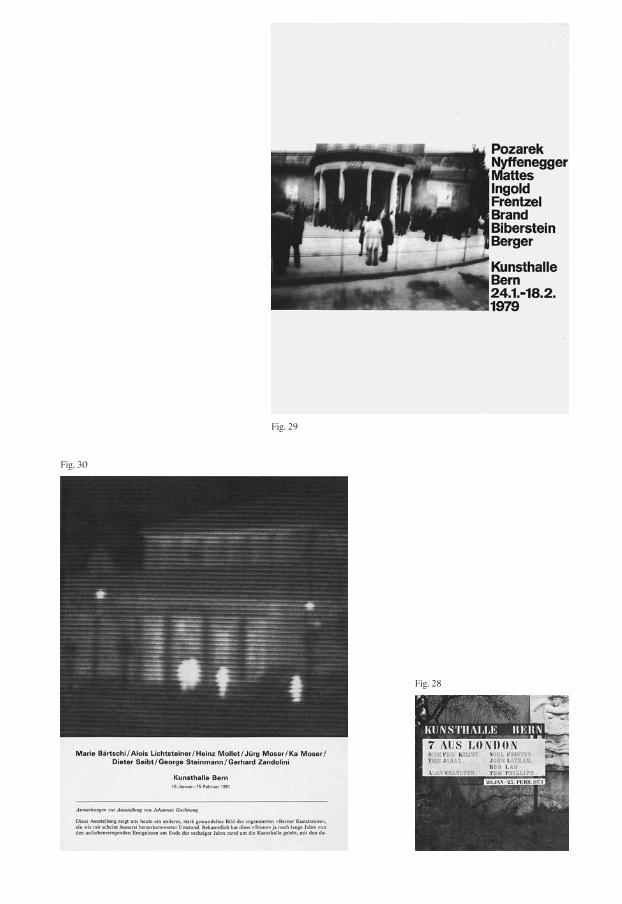
Fig. 28
Fig. 29
Fig. 30

86
the Stedelijk Museum, so the catalog must have been useful for Sandberg for documentation purposes.20
As director of the Stedelijk Museum, Sandberg took the production value of his institution’s publications very seriously. He was ahead of his time in understand - ing printed matter as a tool to shape a muse-um’s public appearance and to create a brand. As a trained typographer and graphic designer, he designed almost every poster and exhibition catalog himself. By regularly using the same typefaces, basic colors, and cheap materials like brown paper, he created a recognizable identity for his museum that visually supported his state-ment of it being a “fierce enemy of the highbrow,”21 and targeted a different audi-ence with his “rebellious” design strat - egy. Sandberg considered both the poster and the catalog as important means of communication, and deliberately used them to advertise upcoming exhibitions, mak - ing the catalogs available by subscription some time before the opening.22
Szeemann’s use of ephemeral materials for his publications also reflects common trends at the time in contemporary art prac-tice. His newspaper series during the 1960s seemed to be the complete opposite of the rather monumental books of pre-ceding years. With his “lowbrow” publish-ing ethos, he, like Sandberg, deliber ately reached out to new audiences, thereby prov-ing the importance of graphic ephemera and the styling of publications.
The Kunsthalle Bern’s local graphic designer and “moderate” Modernist, Adolf Flückiger, also seemed to draw inspiration from Sandberg’s distinctive style, as in his solution for the poster accompanying the 1950 exhibition Les Fauves, for example. However, Sandberg’s playful yet determined, pro-grammatic approach to the catalog was not copied in Bern.
Pontus Hultén, the then director of the Moderna Museet in Stockholm, also reached out to Meyer in 1960 concerning exhibition catalogs. He was busy prepar - ing a Sam Francis exhibition that was com-ing from Bern, and needed Meyer to send the photographic images he had promised to be used in the production of their own publication.23 This later became famous for its cover design by Hultén himself.24 His letter proves that while every host institution was responsible for producing its own catalog, the expensive photographs neces-sary for reproducing images were often exchanged through the international net-work. As director of the Moderna Museet in the 1960s and early 1970s, Hultén orga-nized many landmark exhibitions. Some of them (or at least parts of them) also trav-eled to the Kunsthalle Bern, such as one of the first European Pop Art exhibitions: Vier Amerikaner: Jasper Johns, Alfred Leslie, Robert Rauschenberg, Richard Stankiewicz (1962). The publications issued by the Moderna Museet under the aegis of Pontus Hultén were unique and complex. Often, the artists were themselves involved in the production
museum clientspostersephemera publications

87
process, which meant that these publica-tions became at least as well known as the exhibitions themselves, and are still sought- after collectibles. The typographers and printers Hubert Johansson, John Melin, Anders Österlin, and Gösta Svensson were responsible for the graphic design,25 even though the design ideas and layout are often attributed to Hultén himself. For Hultén, a catalog did not just document the exhibi-tion; he also saw it as a lasting mon ument, after the ephemeral exhibition had already vanished.26 In this sense, he also under-stood the catalog as a souvenir of a visit to the museum—a genuine proof of cultural activity that could afterwards be stored on the bookshelf.27
Szeemann seems to have implemented Hultén’s editorial and design philosophy, at least in part. Although graphic designers will have contributed to his publications, they are usually attributed to Szeemann himself. His catalogs can hardly be called “monuments” in terms of the material they contain, but they became monumental because of their international reception beyond the contemporary art world.
Friendly takeover. The art world as amateur designer
In light of these observations, we might ask just how the catalog design of the Kunst-halle Bern is relevant to the mediation of contemporaneity and the communication
strategies used by art institutions. We have described its immediate influence above, but what were its long-term consequences? Our thesis is that aspects of the seminal Kunsthalle Bern publications by Szeemann and Gachnang are still having an impact on contemporary graphic design, and on the design of exhibition catalogs in particular. This is best exemplified by a set of books from the late 1990s and early 2000s that focused on the role of graphic designers and how they define themselves.
Unlike the exhibitions themselves, the design of printed matter for the Kunst - halle Bern did not create much discussion at the time—not in graphic design jour -nals, and certainly not in the daily press. There are two observations we might make here: First, straightforward design solu -tions such as those by Adolf Flückiger were in themselves unproblematic and hardly seen outside Bern. Second, when the layout of printed matter was overseen by the direc-tors, their office, or a secretary, it would probably have been assessed by design crit-ics as an amateurish or default option. As a consequence, when the Kunsthalle Bern published its catalogs in a do-it-yourself manner (such as those edited and designed by non-designers such as Szeemann or Gachnang), they did not trespass on the graphic design discourse of the time. The question remains as to whether this “amateur” design was simply the work of amateurs, or the result of a consciously implemented concept. One possible
museum clientspostersephemera publications

88
explanation for the lack of interest shown by graphic designers in such seemingly ama-teur work lies in the loosening of the profes-sion’s ties to craft and production. Begin-ning with Jan Tschichold in the 1930s and continuing with the likes of Josef Müller- Brockmann, Max Bill, and Karl Gerstner, graphic design evolved to become cre - ative work that was carried out in studios and agencies, and was no longer a ser - vice provided by a worker at a print shop. As a result, the discourse in graphic design remained isolated, kept alive by graphic designers for graphic designers, and with very little room for a peripheral field of amateur design.
The absence of any discussion around catalogs in the historical discourse may be compared with the contemporary hype among designers for just such raw, “default” publications. The reason for this revived interest might be purely formal, but might also be a result of a younger generation of practitioners who define themselves in ways very far removed from the prototypical conventions of mere service providers. A 2002 statement by the Zurich-based designer Cornel Windlin illustrates this change of position perfectly: “For a start: ‘the’ graphic designer does not exist anymore. This term is misleading and it implies a lot, which hasn’t a lot to do with me or my way of working.”28
Cornel Windlin’s words are taken from an exhibition catalog entitled Public Affairs, curated and edited by Bice Curiger at
the Kunsthaus Zürich in 2002. Curiger had hired Windlin to create the poster that became an independent piece in the exhibi-tion, stacked and available for the visi tors to take home. Windlin was the editor and designer of the catalog, which included an interview with him and presented him as one of the contributing artists to the exhibi-tion. He also designed and edited a web - site that corresponded to the exhibition, and was almost an autonomous piece of web art in itself. Obviously, Windlin here took on a role that was much more influential than that of “just” a designer, and even got the space to explain his own work. His catalog follows a very similar editorial concept to Szeemann’s When Attitudes Become Form. Each artist is given an equal amount of space—one spread, not more and not less—and is represented by a short text and some images.
What is Windlin’s role here? He regards himself as providing not just a service, but a concept, and he contributes to both the form and the project as a whole. This begs the question of whether he is in fact an artist. A few years earlier, he had answered that very question as follows in a publication of the Kunsthaus Zürich:
As far as I am concerned, this is not about trespassing on the artist’s territory, nor is it a discussion about whether this is art or not, or even if I am an artist. Rather, it is about demonstrating how I understand myself,
museum clientspostersephemera publications
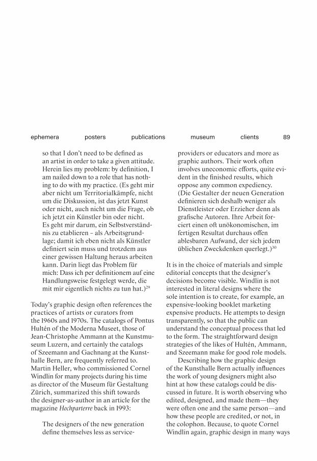
89
so that I don’t need to be defined as an artist in order to take a given attitude. Herein lies my problem: by definition, I am nailed down to a role that has noth-ing to do with my practice. (Es geht mir aber nicht um Territorialkämpfe, nicht um die Diskussion, ist das jetzt Kunst oder nicht, auch nicht um die Frage, ob ich jetzt ein Künstler bin oder nicht. Es geht mir darum, ein Selbstverständ-nis zu etablieren – als Arbeitsgrund-lage; damit ich eben nicht als Künstler definiert sein muss und trotzdem aus einer gewissen Haltung heraus arbeiten kann. Darin liegt das Prob lem für mich: Dass ich per definitionem auf eine Handlungsweise festgelegt werde, die mit mir eigentlich nichts zu tun hat.)29
Today’s graphic design often references the practices of artists or curators from the 1960s and 1970s. The catalogs of Pontus Hultén of the Moderna Museet, those of Jean-Christophe Ammann at the Kunstmu-seum Luzern, and certainly the catalogs of Szeemann and Gachnang at the Kunst-halle Bern, are frequently referred to. Martin Heller, who commissioned Cornel Windlin for many projects during his time as director of the Museum für Gestaltung Zürich, summarized this shift towards the designer-as-author in an article for the magazine Hochparterre back in 1993:
The designers of the new generation define themselves less as service-
providers or educators and more as graphic authors. Their work often involves uneconomic efforts, quite evi-dent in the finished results, which oppose any common expediency. (Die Gestalter der neuen Generation definieren sich deshalb weniger als Dienstleister oder Erzieher denn als grafische Autoren. Ihre Arbeit for - ciert einen oft unökonomischen, im fertigen Resultat durchaus offen ablesbaren Aufwand, der sich jedem üblichen Zweckdenken querlegt.)30
It is in the choice of materials and simple editorial concepts that the designer’s decisions become visible. Windlin is not interested in literal designs where the sole intention is to create, for example, an expensive-looking booklet marketing expensive products. He attempts to design transparently, so that the public can understand the conceptual process that led to the form. The straightforward design strategies of the likes of Hultén, Ammann, and Szeemann make for good role mod els.
Describing how the graphic design of the Kunsthalle Bern actually influences the work of young designers might also hint at how these catalogs could be dis-cussed in future. It is worth observing who edited, designed, and made them—they were often one and the same person—and how these people are credited, or not, in the colophon. Because, to quote Cornel Windlin again, graphic design in many ways
museum clientspostersephemera publications

90
might be a kind of bracketing element in the production of art exhibitions:
Today, graphic design is relatively easy to do. Which is why the important question is: What can I, as an individual, bring to the project? The designer can make a crucial difference, and the fields of design, publishing, and authorship can blend into one another. (Heute ist es relativ einfach, Grafik-design zu machen. Deshalb ist der ent-scheidende Faktor: Was kann ich, als Individuum, in ein Projekt einbringen? Hier kann ein Designer die entschei-dende Differenz ausmachen, und die Bereiche der Gestaltung, Herausge-berschaft und Autorschaft können sogar ineinander übergehen.)31
Such a development in the relationship between printed matter and the exhibition it frames is exemplified by the Kunsthalle Bern’s 2009 exhibition Voids, in which the curator Mathieu Copeland chose to leave spaces empty and prioritize the role of the catalog as documentation. It was designed by Gilles Gavillet and David Rust, both of whom have also collaborated with Windlin. The curator wrote:
While the exhibition dryly renounces documentary fetishism, this publica-tion attempts to cover broader ground. To begin with, there is the catalog of the exhibition, or of the works exhibited,
which historically documents each piece, with the available iconography and commissioned essays.32
Such an example demonstrates how graphic design and editorial decisions may come to be highly influential for the curator through-out the production of an exhibition in its entirety. As such, the consequence will be that catalogs, posters, and flyers will con-stantly attempt to document and immortal-ize the ephemerality of the exhibition.Maybe that is also why printed matter con-tinually references the architecture of the institution, as is the case for the Kunsthalle Bern. The building is repeatedly illus trated as a stamp, a logo, a glowing monument, or as a pixelated fuzzy image. The represen-tation of the institution’s architecture anchors the printed matter to its home base. How this relationship between the institu-tion, the infrastructure, and communication continues to play out in an age in which digital media have come to rival printed matter will be an ongoing challenge for graphic designers, and will be intriguing for everyone else to observe. At any rate, it has been clear for some time that in its rela-tions to the mechanisms of the art world, print still matters.
museum clientspostersephemera publications

91
1 This article is a revised version of a contribution to Schneemann 2018, an investigation into the history of the Kunsthalle Bern. For the original version see Früh et al. 2018: 139–154.
2 Etienne Wismer recently reflected on the functions of Kunsthalle Bern’s catalogs during the 1970s. See Wismer 2017: 284–292.
3 For a study of the specifics of exhibition catalog graphic design, see Jubert 1996.
4 See Heimo Zobernig’s artistic strategies of addressing this dimension of the Modernist dis-course. Zobernig exhibited at the Kunsthalle Bern in 1994, working explicitly with printed matter. See Kunsthalle Bern 1994.
5 See the recent publication on the close collaboration of graphic designer Richard Hollis with the Whitechapel Gallery in London, Wilson 2017; Hofmeister 2011; Ober-Heilig 2015, see subchap-ter 4 “Museen als Marken”.
6 These developments of the eman-cipation of paratexts are not restricted to the context of mini-mal art. See Bracht 2002; Evers, Domesle & Langenberg 1999; Schneemann 2015; Schneemann 2004: 28–43; Schneemann 2003; Jahre 1996.
7 Some of the functions previously fulfilled by printed matter have been moved to the digital realm. An analysis of the current state of visual communication would be warranted, but is not the goal of this research.
8 Zandolini 1981: n.p.9 Ibid.10 Gachnang 1981: n.p.11 The text in the publication is set
in Futura, an iconic typeface
designed by German typographer Paul Renner—with noticeable political allusions. Earlier in the same year Renner had published his book Kulturbolschewismus?, a vigorous defense of Modernism and a critique of Nazi policies. As he could not find a German publisher, he released it through his friend Eugen Rentsch in Zurich. These formal elements can thus be read as political statements, and the role of the publication thereby goes far beyond its usual function. See Burke 1998: 126–143.
12 See “Advertisements,” in the volume Visual Arguments.
13 Ammann & Szeemann 1970: 5.14 Hops & Jäger 2016: 10.15 Hops & Jäger 2016: 105.16 Interestingly, this happened at
the time of a fundamental crisis in the newspaper market, which led to a drastic reduction in the number of newspapers and a process of concentration through the mergers of different pub-lishing houses. See Heinrich & Lobigs 2006: 209.
17 See Friedl 2010: 146–147.18 Nicolas Brulhart’s exhibition
Archiv Netzwerk Kunsthalle (Kunst-halle Bern, Dec. 16, 2016 – Jan. 29, 2017) showed diverse archival material bearing proof of the institution’s extensive interna-tional networks.
19 Willem Sandberg to Franz Meyer, Letter of Jan. 28, 1960; Kunst-halle Bern Archive, file 1960.
20 See Kunsthalle Bern 1959. 21 Leeuw Marcar 2013: 131.22 Spencer 1997: 72.23 Pontus Hultén to Franz Meyer,
Letter of Aug. 11, 1960; Kunst-halle Bern Archive, file 1960.
24 Jahre 1996: 84.25 Jahre 1996: 174.26 “The catalog is also the memorial
of an exhibition, it is the part that can travel around the world, and it is the only part of any impor-tance that will last, once the exhi-bition is over.” Pontus Hultén on the importance of the exhibition catalog, cit. in Jahre 1996: 173 (translation by the authors).
27 “[The catalog] is an authentic document of the cultural act of visiting an exhibition.” Pontus Hultén on the ParisNew York catalog for the exhibition of the same name at Centre Pompidou in 1973, cit. in Jahre 1996: 175 (translation by the authors).
28 “Erstens: ‘den’ Grafiker gibt es nicht mehr. Dieser Begriff ist missverständlich, und er impli-ziert vieles, was mit mir und meiner Arbeitsweise nichts zu tun hat.” Cornel Windlin, cit. in Curiger 2002: 104.
29 Cornel Windlin, cit. in Bovier et al. 1998: 128–133. For a discus-sion of the designer as artist, using the example of Cornel Windlin, see Hollis 2013.
30 Heller 1993: 29.31 Cornel Windlin, cit. in Bovier et
al. 1998: 128–133. 32 Copeland et al. 2009: 30.
museum clientspostersephemera publications
92museumcanonizationpostersexhibitionsexhibition design
Lehni Frame
Implications of Displaying Graphic Design
Sara Zeller
Organizing graphic design exhibitions is always problematic: graphic design does not exist in a vacuum, and the walls of the exhibition space effectively iso late the work of design from the real world. Placing a book, a music album, or a poster in a gallery removes it from the cultural, commercial, and his -torical context without which the work cannot be understood.1
The problem of decontextualization that Peter Bil’ak here observes for graphic design is not unfamiliar to curators from many fields, such as art, design, ethnol ogy, or archeology, and it addresses a specific issue straight-on: How do you ex hibit some-thing that belongs to the mass media, to popular culture, without its context? How do you avoid incorrectly putting something on a pedestal and false interpretations?2 As we can see from the examples we will consider in the present essay, the empty
space created by a temporary loss of func-tion is filled with new meanings by the objects’ new surroundings. Usually, these meanings are not accidental, but are cho -sen and applied consciously.
Since there are no conventions for show-ing graphic design, presentation formats are often renegotiated for each exhibition. While independent venues tend to use casual, low-cost displays using pins and clips to mount exhibits, museums favor large-scale installations.3 As an ephemeral object connected to everyday life, the poster is at odds with the frame traditionally associ-ated with the formal presentation of paintings. Nevertheless, within the institu-tional context, posters nowadays are often framed—and the frames are usually explained as a measure to protect these rare historical items.4
Since the 1990s, institutional display formats have been increasingly subjected to research, analyzing their influence on the perception of exhibits and their power to create visual narratives that inscribe themselves into history.5 The frame has thus to be considered as much more than a protective device. As an inherent part of the display, it has a distinct influence on how exhibits are received. The impact of dis play on historiography is also increasingly being addressed in the field of graphic design.6 In recent research, the display of graphic design exhibitions has been identified as an important element for the “construction of history and meaning.”7 Against this
DOI: 10.53788/SW
BE0307

93
backdrop, the present essay will explore that issue within the context of exhibitions of Swiss graphic design. To do so, the means of display for a non-representative selection of exhibitions at the Museum für Gestal-tung Zürich (hereinafter: MfGZ) and the Museum of Modern Art New York (MoMA) between 1951 and 2012, chosen because of their remarkable display designs, will here be subjected to closer analysis.8
Signifying value
For the MfGZ, the use of frames is not primarily a curatorial decision. For conser-vation reasons, all objects from its collec-tions must be shown behind glass. Never-theless, or possibly because of this, the frame affects how the visitor understands the exhibition—it creates hierarchies and mean-ing. By identifying objects as in need of protection, a certain value is attributed to them. For the large-scale exhibition 100 Years of Swiss Graphic Design, the curators Karin Gimmi and Barbara Junod con-sciously worked with diverse displays, while the exhibition was thematically struc tured and a great many objects were mounted in frames or placed in glass vitrines. A red band overhead displayed 100 posters arranged chronologically—and even though they were out of reach, they were all placed in neat aluminum frames.9 The “frieze,” as it was called by the museum itself, show-cased a history of Swiss poster design from
1912 to 2012: one poster had been selected for every year. Here, it seems to be the combination of the frames, the chronology, the height, and the frieze’s omnipresence throughout the exhibition space that pre-sented the museum’s collection in the light of the master narrative supplied by its own items. Not only was the awestruck, upward-looking visitor informed about the highlights of Swiss poster design, but they also experienced Swiss poster history as a self-contained, linear development. Towards the exit, a contemporary section offered an alternative. Here, posters and objects were attached to wire with metal clips, or lay there for the visitor to browse through, reminiscent of the display modes that can usually be found outside institutions, such as in studio shows or poster festivals.10 The decision to use a casual dis play mode for some of the contemporary posters even served to enhance the special status of the collection’s items.11 [Figs. 31, 32]
The framing policy of the MfGZ concerning the objects of its collection con-formed to standard institutional practice. However, in an international context, most larger institutions only began to use frames to display posters systematically in around the early 1970s. The objects of permanent exhibitions were commonly framed before this practice was later adopted for tempo-rary exhibitions.12 Interestingly, it appears that poster frames from Zurich to New York seem to conform to certain formal criteria, for they comprise a discreet, almost invisible
museumcanonizationpostersexhibitionsexhibition design

94
design, preferably made of light metal. The MfGZ nowadays uses exclusively light aluminum frames by Lehni, a company with connections to the international art and design scene. The so-called “Lehni frame,” designed by Rudolf Lehni in 1976, is itself a celebrated example of Swiss design and is available in every possible size—up to Weltformat, the Swiss standard size for post-ers. The Lehni family established them-selves on the art and design scene early on. Rudolf Lehni senior set up the workshop, and in 1932 he carried out Max Bill’s famous WellRelief (Wave relief ). Together with the designer Andreas Christen, Rudolf Lehni junior produced the aluminum bookshelves for Max Bill’s section at the Expo 1964 in Lausanne. Inspired by this same bookshelf, Donald Judd designed a furniture collec-tion during the 1980s that is still exclusively produced and sold by Lehni.13 It is an interesting act of affirmation that a Swiss design museum should use a Swiss design object to display its posters; exhibit and display thus concur. As a part of the narra-tive itself, the Lehni-frame frames its con tent within the discourse to which the museum contributes.
The frame as institution
In 1988, Stuart Wrede curated the exhibition The Modern Poster at MoMA, which can be considered exemplary in many respects.14 The use of frames in the exhibition is also
particularly noticeable. Except for a scaffold- like architectural intervention in one room, the display design limited itself to the framed mounting of the exhibits and their conscious, picture-gallery-like arrangement on the walls. As the exhibits were pre -sented in chronological order, visitors fol-lowing the proposed circuit experienced a linear history of posters that began in Paris at the end of the 19th century. Recent research has showed how this specific dis-play design supported an understanding of the exhibition as a master narrative con-firming a canon previously established by the museum itself.15 The frames are thus an intrinsic aspect of the whole setting, which was an important agent in framing the exhibits as masterpieces, as artworks, while simultaneously telling the history of poster design. The institution decided to combine contemporary, lesser-known post-ers with established masterpieces, and as such changed the way they were perceived by the audience. The contemporary pop-ular posters enter the essential circle of cul-tural heritage, and the masterpieces step down from their pedestals and rub shoulders with their ephemeral, printed equivalents. The graphic designer Niklaus Troxler was at the time barely known outside Switzer -land, but the inclusion of two posters of his in this exhibition most likely made a large contribution to his international break-through.16 [Fig. 33]
museumcanonizationpostersexhibitionsexhibition design

95
The institution as frame
Another, earlier exhibition at MoMA entirely focusing on poster design from Switzer -land offers a contrasting approach to the display modes discussed above that were mostly related to conservation, protection, and value. In the exhibition Swiss Posters, overseen by Mildred Constantine, the exhib-its were either directly mounted on the walls or in rectangular display elements, without the use of frames. The eye-catching display architecture was discussed in the press release: “The installation will simulate a Swiss street display, with 4 typical free- standing Swiss telephone boxes plastered with posters. Walls will show identical post-ers side by side to make a repeat pattern as it is done in Switzerland where standards in size and display are regulated.”17 Most of the approximately forty exhibits were recent works and had been selected from the The Swiss Poster, a traveling show that had been organized in Switzerland by Pro Helvetia and that toured through Europe, the USA, and South America from 1949 until 1952.18 MoMA’s own poster collection provided a number of exhibits.19 The exhibition design was attempted to re- contextualize the exhibits in their natural habitat. Constantine proba bly got the idea for this original dis-play design from browsing the catalog that accompanied the touring show: it contains photographs of Swiss street scenes with poster hoardings, and presents the telephone booth as a characteristic landmark.20
In fact, mock-up poster columns and walls were at the time (and as a matter of fact still are) nothing unusual in poster exhibi-tions. At that time, it was still very com -mon to show posters—mass-produced printed matter—without any protective glass or frame. Nevertheless, looking at MoMA’s exhibition history, we can see how certain posters were early on displayed in frames and within a white-cube setting. This was the case, for example, in an exhibition about the famous French poster artist A.M. Cassandre in 1936.21 This exhibition looked as if it were imitating an exhibition of paintings. When compared to the Cassandre exhibition, it becomes clear how the display of Swiss Posters did not present its exhibits as unique artworks, nor did it try to establish a canon of poster design. Instead, it showed them as part of the popular culture of a far away, over-seas country. The press reviews also reported about the exhibition as being a kind of contemporary “period room” giving the visi tor “[…] a real feeling of Europe”22—only lacking the bistro chairs and trees of a garden restaurant.
This way of framing (and the corre-sponding absence of frames) shows how the institution understood the exhibition: as a contemporary documentation of Swiss, or at least European, poster design. Interest-ingly (or maybe typically), MoMA’s usual masterpiece approach and personal cult come to the fore in the press release. Characterized not as simple, anonymous designers, the
museumcanonizationpostersexhibitionsexhibition design

Fig. 31Installation view, 100 Jahre Schweizer Grafik / 100 Years of Swiss Graphic Design, Museum für Gestaltung Zürich, Feb. 10–Jun. 3, 2012.
Fig. 32Installation view, 100 Jahre Schweizer Grafik / 100 Years of Swiss Graphic Design, Museum für Gestaltung Zürich, Feb. 10–Jun. 3, 2012.
Fig. 33Installation view, The Mod-ern Poster, Museum of Modern Art (MoMA) New York, Jun. 6–Sep. 6, 1988.
Fig. 34Installation view, Swiss Posters, Museum of Mod-ern Art (MoMA) New York, Jan. 30–Mar. 19, 1951.
Fig. 31
Fig. 32

Fig. 33
Fig. 34

98
artists are referred to as “modern Swiss mas-ters of poster design,” and some of them are listed by name: Donald Brun, Hans Erni, Herbert Leupin, Richard Lohse, and Carlo Vivarelli.23 [Fig. 34]
Issues and potentials
The examples discussed here outline to what extent the use of the frame and the display design can provide information on how orga-nizers classify their exhibits: whether as highlights of design history, as an assessment of a contemporary phenomenon, as art-works, or as insights into the popular culture of a foreign country. However, the dis-cussed examples also raise many questions, and the transfer of graphic design into the exhibition space reveals the spectrum of problems that Bil’ak addresses. If an exhi-bition is regarded as a “strategic system of representations,”24 then its framework seems to function as a visual code for value, whether intentionally or not.25 Of course, the comparison to paintings, a recurring topic in the history of graphic design, becomes obvious. Is the decision to show a poster framed or not a question of whether it is considered to be art (or not)?
Peter Bil’ak’s manifesto-like text points out how graphic design in the exhibi - tion space is detached from its former func-tion. Instead of advertising a product or announcing an event, the posters on display suddenly refer to something else. By tracing
the presence or absence of a supposed detail of presentation, the frame, this sepa-ration becomes even more apparent. In addition, it reveals how these empty spaces are then filled with new meaning. For example, an illustrative poster from the 1940s in the exhibition 100 Years of Swiss Graphic Design not only stands for a specific stylistic tendency and a chapter of Switzer-land’s political history, but also presents the museum’s collection as something valu-able and comprehensive. The interplay of exhibition furniture, display architecture, and structure accordingly results in a complex network of meanings that in turn forms a unique framework for exhibits. In addition, the institution itself frames its exhibits in a certain context. As Ferguson writes: “Exhibitions are publicly sanctioned representations of identity, principally, but not exclusively, of the institutions that represent them. They are narratives which use art objects as elements in institu-tionalized stories that are promoted to an audience.”26 Thus this cascade of framing elements forms its own reference sys - tems, which in turn influence the histo-riography of the exhibited objects. As early as 1976, the artist Brian O’Doherty observed in his famous essay “Inside the White Cube” how art galleries con-structed the history of Modernism.27 In the present essay, I posit that the institu - tional influence on what we understand as the canon of graphic design should not be underestimated either.
museumcanonizationpostersexhibitionsexhibition design
99
Nevertheless, there are also museums that seem to be aware of the authoritarian ges-ture of framing, have actively addressed the problem of exhibiting in the past, and remain conscious today of the implications of framing posters. In a conversation with Clémence Imbert, Ada Stroeve, a curator at the Stedelijk Museum Amsterdam, recounts that she did not want to use frames for posters, but was confronted with the need to protect her exhibits. So in the 1970s, Stroeve conceived a system using Plexiglas for the museum, which allowed her to avoid actual frames and thus prevent any comparison between posters and paintings, while still adhering to her institution’s guidelines on the protection of its objects. To this day, the Stedelijk often uses a light protective system developed by Carolien Glazenburg in 2000 that tries to evoke the notion of a picture frame.28 However, exactly this need for protection seems to communicate the same value system as before. So, is perhaps the only solution we are left with to consciously address the implications of institutional power within exhibitions themselves?
1 Bil’ak 2006: n.p. As Teal Triggs explains, Bil’ak’s text draws on Brian O’Doherty’s writings prob-lematizing the impact of the seemingly neutral gallery space, the White Cube, on historiogra-phy. See Triggs 2016: 18.
2 On this matter, see, for example, Ernst 1996: 111–135.
3 Imbert 2014: 91.4 Imbert 2017: 12.5 See Staniszewski 1998. For a
critical anthology about exhibi-tions, see Greenberg, Ferguson & Nairne 1996. Meanwhile, a whole discourse has developed in various disciplines analyzing how “exhibitions create knowledge about the subjects they seek to represent,” fostering a critical attitude towards display design and other institutional framing devices. See Moser 2010: 22.
6 The latest representative research on the subject has been con-ducted by Clémence Imbert. In her PhD dissertation, she ana-lyzed graphic design exhibitions at the MoMA in New York, the Stedelijk Museum in Amsterdam and the CCI/Centre Pompidou in Paris. See Imbert 2017.
7 Lzicar & Unger 2016: 250. For another case study on that matter, see also Imbert 2015: n.p.
8 However, the present essay is by no means a comprehensive study of the use of frames for poster exhibits and their impact on graphic design history. Rather it wishes to shift the focus on an often neglected and supposed “detail” of the presentation of posters and graphic design in general.
9 Press release, 100 Years of Swiss Graphic Design, Zürcher
museumcanonizationpostersexhibitionsexhibition design

100
Hochschule der Künste, Archiv ZHdk, GBA-2012-D01-004-003.
10 Imbert 2014: 91.11 The frame as a signifier of value
in different contexts is explored, for example, in Duro 1996: 44–62.
12 The MoMA, for example, used frames from 1976 onwards for their permanent poster displays. Imbert 2017: 410.
13 See “History,” in https://lehni.ch/en/company/history/ (accessed Mar. 23, 2020). About the WellRelief’s relation to Bill’s graphic design, see Hollis 2006: 59.
14 As current research shows, MoMA’s understanding of graphic design decisively influ-enced design history, and the exhibition display has been iden-tified as an important element that revealed the museum’s con-cepts and also fostered a specific view on graphic design. Imbert 2015: n.p.
15 Imbert shows how MoMA’s authority regarding the interpre-tation of what is good and valuable should not be underesti-mated. See Imbert 2015: n.p.
16 Zeller 2017: 5–15.17 Press release, Swiss Posters, Cura-
torial Exhibition Files, Exh. #467.2. The Museum of Modern Art Archives, New York.
18 This traveling exhibition is the focus of the PhD thesis of the present author.
19 Press release, Swiss Posters, Cura-torial Exhibition Files, Exh. #467.2. The Museum of Modern Art Archives, New York.
20 Pro Helvetia 1950: n.p.21 See the exhibition Posters by
Cassandre at the Museum of
Modern Art in New York in 1936, as in: www.moma.org/calendar/exhibitions/1805?locale=de (accessed May 23, 2019).
22 Press release, Swiss Posters, Cura-torial Exhibition Files, Exh. #467.2. The Museum of Modern Art Archives, New York.
23 Ibid.24 Ferguson 1996: 178.25 Imbert 2017: 416.26 On that matter, see Ferguson
1996: 175.27 “The history of modernism is
intimately framed by this space [art gallery]; or rather the his -tory of modern art can be cor-related with changes in that space and in the way we see it.” O’Doherty 1986 (1976): 14.
28 Imbert 2017: 407.
museumcanonizationpostersexhibitionsexhibition design
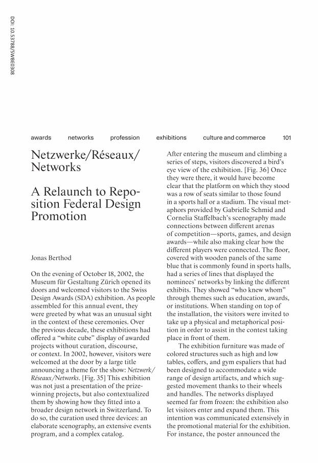
101
Netzwerke/Réseaux/Networks
A Relaunch to Repo-sition Federal Design Promotion
Jonas Berthod
On the evening of October 18, 2002, the Museum für Gestaltung Zürich opened its doors and welcomed visitors to the Swiss Design Awards (SDA) exhibition. As people assembled for this annual event, they were greeted by what was an unusual sight in the context of these ceremonies. Over the previous decade, these exhibitions had offered a “white cube” display of awarded projects without curation, discourse, or context. In 2002, however, visitors were welcomed at the door by a large title announcing a theme for the show: Netzwerk / Réseaux /Networks. [Fig. 35] This exhibition was not just a presentation of the prize- winning projects, but also con textualized them by showing how they fitted into a broader design network in Switzerland. To do so, the curation used three devices: an elaborate scenography, an extensive events program, and a complex catalog.
After entering the museum and climbing a series of steps, visitors discovered a bird’s eye view of the exhibition. [Fig. 36] Once they were there, it would have become clear that the platform on which they stood was a row of seats similar to those found in a sports hall or a stadium. The visual met-aphors provided by Gabrielle Schmid and Cornelia Staffelbach’s scenography made connections between different arenas of competition—sports, games, and design awards—while also making clear how the different players were connected. The floor, covered with wooden panels of the same blue that is commonly found in sports halls, had a series of lines that displayed the nominees’ networks by linking the different exhibits. They showed “who knew whom” through themes such as education, awards, or institutions. When standing on top of the installation, the visitors were invited to take up a physical and metaphorical posi-tion in order to assist in the contest taking place in front of them.
The exhibition furniture was made of colored structures such as high and low tables, coffers, and gym espaliers that had been designed to accommodate a wide range of design artifacts, and which sug-gested movement thanks to their wheels and handles. The networks displayed seemed far from frozen: the exhibition also let visitors enter and expand them. This intention was communicated extensively in the promotional material for the exhibition. For instance, the poster announced the
culture and commerceexhibitionsprofessionnetworksawards
DOI: 10.53788/SW
BE0308

102
intention of the Swiss Federal Office of Culture (SFOC) to turn the exhibition into “a place where networking is practiced.” [Fig. 37]
An exhibition map gave a further point of entry to these networks by providing an extensive list of all the nodes mentioned in the exhibition, along with their contact details. These included schools, design awards, museums, foundations, and profes-sional associations. At the center of the space, a room separated from the rest of the exhibition with floor-to-ceiling curtains offered comfortable seating [Fig. 38] and was used to host a series of events and debates called the Design Salon. Talks were organized around a wide range of topics including gender, marketing, and design as development aid. The extensive program was organized by the curators in collabora-tion with the HGKZ1 and aimed to bring together a wide range of international actors from the scene and beyond. They included designers, representatives of the SFOC, academics, teachers, and museum and gal-lery directors, but also collectors, cura - tors, journalists, and even a psychoanalyst. The cultural mediation program not only contributed to the discourse, but also provided a meeting point to extend the networks.
This exhibition led to a double reveal. The first was obvious: the curators made visible and accessible the networks of Swiss design by using their scenography, events program, and the catalog. But the second
reveal was more implicit. By demystifying the networks, providing a context, and inviting visitors to take part in these con-nections, the SFOC took the position of mediator in the network. This involvement was unprecedented for the SFOC, and introduced a new approach to Federal design promotion, which was met in the main-stream press with unusually overwhelming approval.2
A new era of design promotion
The exhibition was opened by Patrizia Crivelli, who as the secretary of the SFOC’s Design Service was responsible for the SDA. She spoke of it as the beginning of a new era of design promotion.3 This relaunch was an attempt by the Federal Design Com-mission4 to respond to ongoing criticism concerning the awards’ relevance. In 1989, worried that not enough designers were applying, the SDA had already begun exhib-iting the works of winners outside Bern, and had begun publishing a catalog.5 This greater visibility led to increased scrutiny of the awards in the specialist press, which was highly critical of the SDA in the 1990s. Articles argued that the judging process was opaque, and that the winning projects were either safe choices or the work of previous winners and established designers.6 The press also suggested that the SDA did not reflect the whole scene, but instead produced a random selection depending on
culture and commerceexhibitionsprofessionnetworksawards

103
who had happened to present a project that year; this implied that the best design-ers were not being represented.7 More - over, the exhibitions were deemed too sim-ple, for they failed to provide any context to the pieces exhibited.8 In 1996, the spe-cialist press’s opinion of the SDA was at its most critical. It argued that the awards had become so irrelevant that they should be dissolved, or at least wholly rede - fined.9 It is thus not surprising that in 1997, on the occasion of the 80th anniversary of Federal design promotion, the Federal Design Commission began just such a pro-cess of redefinition.10
From early on in this period of transi-tion—whose official purpose was to find new ways of supporting designers, but which was arguably also an attempt at saving the SDA—the SFOC realized it needed to turn itself from a distant, money-giving insti tution into one closer to the practice of designers and at the center of the design scene. One of the ways they identified for repositioning the institution was to give up-and-coming designers an increasing number of commissions to help them launch their careers. After taking over the Most Beautiful Swiss Books competition in 1997, the SFOC shifted its focus to recognizing design, rather than technical aspects,11 and from 1998 onwards the design of its cata - log was outsourced to up-and-coming prac-titioners such as Gilles Gavillet, Cornel Windlin, or NORM, who were all enjoying a moment of critical recognition. The
official criteria for choosing these designers were not fully transparent: Crivelli simply mentioned that the SFOC had “noticed their work.”12 What we do know is that they had all previously won competitions orga-nized by the SFOC.
Promoting “good design” by commis-sioning “good designers” might seem tautological, but this idea was not always so self-evident. Many of the Most Beautiful Swiss Books catalogs before 1998 were small brochures that looked more like admin-istrative documents than pieces of design. Similarly, the SDA catalogs before 2002 were no graphic feats either. They were rather plain, commemorative records listing the procedure, budgets, and winners. By choosing promising designers for these proj-ects, and giving them free rein to develop daring concepts (which were not always wel-comed by the press,13 but certainly were by the designers14), the Design Service gave itself a facelift. It now became more attrac-tive to the scene to which it was trying to appeal: it was young, cool, and on the rise. This demonstrated that the SFOC had understood the necessity of using the lan-guage of design to reposition the institu-tion. By setting an example and becoming an “ideal” client, they enjoyed the bonus of being praised by the critics for their attempt to remain close to the practice of designers.15
Another strategy for repositioning the SDA at the center of things was to provide a critical discourse on the design scene.
culture and commerceexhibitionsprofessionnetworksawards
104
Indeed, no other institution offered anything similar in Switzerland.16 To do so, the theme of “networks” was chosen by the three original curators of the 2002 exhibition: Crivelli; the director of the Museum für Gestaltung, Erika Keil; and designer / jour-nalist / educator Ralf Michel, a member of the Swiss Design Association who was at the time preparing the launch of the Swiss Design Network.17 Soon thereafter, Keil left the museum, and Crivelli asked publisher Lars Müller to step in for the orga-nization of the 2002 SDA.18 The curators hypothesized that there were informal “cre-ative center s” in Switzerland organized as “shared offices, studio buildings, scenes,” and that these nodes—which were pre-sumably interconnected—produced some of the most important Swiss design.19 Assuming that at least some of the winners to be awarded that year would be con-nected to these creative centers, the SFOC aimed to make their connections visible.
Reorganization
Apart from this new curatorial approach, another change included a collaboration with two Swiss design museums, the Musée de design et d’arts appliqués contempo-rains (mudac) in Lausanne and the Museum für Gestaltung Zürich, which were to take turns hosting the yearly exhibition.20 Previously, the ad hoc traveling displays had been hosted by different institutions
every year: museums, but also applied art schools and galleries. The former approach had covered a wide range of cities across all the linguistic regions of Switzerland, but had the disadvantage of producing exhibi-tions that were neither professional nor con-sistent. By contrast, the new strategy enlisted the patronage of two recognized institu-tions and would be supervised by curators who would work thematically. By institu-tionalizing the exhibition, the SFOC secured a place for the SDA on the cultural agenda, and cemented the gravi tas of the event, which now became an actor participating in the creation of a discourse on the Swiss design scene.
One more change also contributed to the creation of a more complex discourse in the selection process. The categories in use so far by applicants—for example, fashion, jewelry, industrial design, and so on—were replaced by two broad groups. Group A comprised objects produced in a single edi-tion or small series, while group B encom-passed industrially or serially produced objects. Although this might seem like a simple administrative reorganization, it had significant consequences for the judging criteria. Instead of assessing objects within a single discipline, the jury was asked to compare objects transversally. This led to tense discussions, but allowed them to take into account new interdisciplinary prac-tices that were increasingly becoming the norm.21 From then on, the judging process would consider “dossiers” as a whole,
culture and commerceexhibitionsprofessionnetworksawards

105
rather than focusing only on the artifact submitted for the award.22 This required a positioning on the part of designers that encouraged them to make submissions that were more professional instead of their hitherto rather more vague approach.23 The holistic selection also helped to sketch out a more detailed picture of the design scene. Previously, assessing projects within the same discipline meant that the emphasis was on “know-how”: technical skills, craft, and constraints within the framework of the discipline. With the new categories, how-ever, this criterion no longer made sense. Different disciplines were mixed, and thus an accent was put on the relevance, qual ity, and originality of concepts and research.24 This can be read as a nod to the ongoing redefinition of the profession as something that belonged to the cultural sector rather than to the service industry—a tendency that had gained momentum in the 1990s.25
The SFOC also wanted to help design-ers broaden their networks. Prize-winning designers were offered three options: the usual money prize (CHF 25,000), a stay in an atelier abroad, or an internship orga-nized by the SFOC at a selection of interna-tional design studios.26 The aim was to give designers more than financial support by championing professional networking.27 The provision of internships was based on Crivelli’s research28 and addressed a real need: demand exceeded the number of places available.29 The SFOC arguably had a dual intention here. Not only did it want to
help build up designers’ networks, but it also needed to reclaim a position at the cen-ter of this network by becoming “an import-ant moderator and initiator.”30 The SFOC aimed to portray itself as a mediator playing an active role in connecting people and promoting designers. No longer a distant institution awarding large sums of money to designers, it now claimed a role “as a node in the so-called ‘design network’” by adopting a proactive position on the scene.31
Echoing the design lifestyle
The exhibition, the related series of events, and the catalog all served to create and mediate a complex, layered discourse sur-rounding the awardees and, by extension, the overall scene itself. They managed to reposition the SDA at the center of the Swiss design scene, and succeeded in creating a renewed sense of excitement that was largely echoed in the national press. This may have been helped by the provision of mat-erial in press releases, discourses, and exhi-bition ephemera, which contrasted with the absence of context in previous years. It also reflected the SFOC’s newfound ability to capture the audience’s imagination through the curation and design of the exhi-bition, which contributed to redefining the face of the institution and led to increased recognition by practitioners.32
The network exhibited in 2002 was not restricted to purely professional nodes, but
culture and commerceexhibitionsprofessionnetworksawards

Fig. 35
Fig. 36

Fig. 35The entrance of the 2002 exhibition with the back of the terraces (in green) and the staircase visible in the background.
Fig. 36The view from the top of the steps.
Fig. 37Poster for the 2002 Swiss Design Awards exhibition, Elektrosmog (graphic design), 2002.
Fig. 38The space in the center of the exhibition. In the fore-ground, a laptop displayed the plan of the space.
Fig. 37
Fig. 38

108
also included affinities, shared interests, collaborations, and informal meetings at picnics, parties, club nights, and open -ings.33 This reflected the new organization of small, recently founded studios, in particular in graphic design. From the late 1990s onwards, these studios expressed a general lack of interest in formal structures such as professional associations,34 prefer-ring informal networks instead.35 Designers’ friends were “all designers and all they [did] was talk about design.”36 They actively wanted to create tightly knit design com-munities; they shared studios, played foos-ball together, and organized exhibitions and parties.37 In books, they chose to be represented as anti-professionals: by mixing business and pleasure, blurring borders between professional and personal lives, they suggested that work and fun went hand in hand.38 The SFOC’s all-encompassing definition gave institutional recognition to a change in the profession: more than a profession, design had become a lifestyle.
These studios concentrated on proj -ects in the cultural field, which were often poorly paid but allowed them to develop more experimental design languages. It is noteworthy in this regard that the only criti-cal review of the 2002 exhibition came in the specialist press in the form of a brief news item that laconically noted an absence of self-awareness in the prevalence of cul-tural projects. It argued that the exhibition did not address why this “niche economy” was given so much weight in the SDA.39
The recognition by the SFOC of the “design lifestyle” in the Most Beautiful Swiss Books and the SDA had led to an increased promotion of small studios with a prac - tice rooted in the cultural field. They saw winning these competitions as an opportu-nity to become recognized and to fund their practice, for winning could help them to finance their studios, or sponsor self- initiated projects.40 From 1998 onwards, the projects commissioned by the SFOC allowed particular designers to develop work under conditions that were the exception rather than the norm—with decent budgets and the leeway to develop strong graphic concepts. All the designers who were com-missioned by the SFOC went on to forge critically recognized careers, which suggests that the SFOC was successful in its role of design promotion. However, it also led to a somewhat predictive role played by networks. Most of the designers then reap-peared in the SFOC’s internal networks; although these were significant for design, they were not discussed in the 2002 exhi-bition. For instance, those designers them-selves sat on the Federal Design Com-mission or on the jury for the Most Beautiful Swiss Books. To be sure, juries can never be entirely impartial. However, an external observer might wonder just how much of an echo chamber these juries became. This predictivity points to the less visible and more passive role played by networks, one to which the reorganization of the SDA actually contributed. Whether wittingly or
culture and commerceexhibitionsprofessionnetworksawards

109
not, the internal networks accessed by designers within the institution allowed them to continue to award practices close to their own that were located pre-dominantly in the cultural sector, and run by designers who were in one way or another part of their existing networks. The side effect of this was a feedback loop of design promotion. It reduced the breadth of practices awarded, and turned the SDA into a partially self-fulfilling prophecy.
culture and commerceexhibitionsprofessionnetworksawards
1 Now called ZHdK. A series of actors were involved in the col-laboration: the Department of Cultural Studies in Art, Media and Design, the Institute for Design and Art Theory, the Design and Art Theory cluster, and the Design Department.
2 Beck 2002; Bergflödt 2002; Cerf 2002a; Cerf 2002b; Eschbach 2002; WOZ 2002; Gasser 2002; Kult 2002; Meier 2002; Schnei-der 2002; Schöner Wohnen 2002; Zürcher 2002; NZZ 2002.
3 Crivelli, Patrizia, “‘Swiss Design 2002: Netzwerke—Réseaux—Networks’. Vernissage vom 18. Okto-ber 2002, 19:30 Uhr,” opening speech at Swiss Design 2002: Netzwerke—Réseaux—Networks, Zurich, Swiss Federal Office of Culture archives, October 18, 2002; Crivelli, Patrizia, and Ralf Michel, [untitled], press confer-ence at Swiss Design 2002: Netzwerke—Réseaux—Networks, Zurich, Swiss Federal Office of Culture archives, 2002.
4 The Federal Design Commission (until 2001: Federal Commission of Applied Arts) is an extra- parliamentary body consisting of five members appointed directly by the Federal Council to advise on design promotion. They take decisions that the secretary of the Design Service executes, though in reality they work in close col-laboration. The Commission also acts as jury for the SDA, along with three invited experts. In 2002, the Commission members were Lorette Coen (cultural journalist and chair of the Com-mission), Ruth Grüninger (fashion designer), Luca Patocchi (gallerist), François Rappo

110
(graphic and type designer), and Annette Schindler (art historian); the experts were Marc Deggeller (set designer, Berlin), Sabine Dreher (curator, Vienna), and Hermann Weizenegger (industrial designer, Berlin).
5 Lippuner & Buxcel 1989.6 Gantenbein 1992; 1994; 1995.7 Gantenbein 1993; 1994; Locher
1996b.8 Jaunin 2001.9 Locher 1996b.10 Crivelli 1999.11 Guggenheimer 2004.12 Crivelli, Patrizia, and Ralf
Michel, [untitled], press con-ference at Swiss Design 2002: Netz werke—Réseaux—Networks, Zurich, Swiss Federal Office of Culture archives, 2002: 3.
13 Tribune de Genève 2001.14 NORM 2017.15 Locher 2002.16 Crivelli, Patrizia, “Briefing
Elektrosmog: Sinn und Zweck der Publikation,” Swiss Federal Office of Culture archives, 2002.
17 Keil, Erika, “Kurze Über sicht,” Zürcher Hochschule der Künste ZHdK archive, AY-GAY-00009.
18 Crivelli, Patrizia, “Vorbereitungs-papier für die Feedbackrunde vom 2. Dezember 2002 in Wet-tingen,” memo, Swiss Federal Office of Culture archives, 2002; Steiner 2001.
19 Müller, Lars, Ralf Michel, and Patrizia Crivelli, “Erste Gedan-ken zu Ausstellung und Buch,” memo, Swiss Federal Office of Culture archives, n.d.
20 Crivelli, Patrizia, “‘Swiss Design 2002: Netzwerke—Réseaux— Networks.’ Vernissage vom
18. Oktober 2002, 19:30 Uhr,” opening speech at Swiss Design 2002: Netzwerke—Réseaux—Networks, Zurich, Swiss Federal Office of Culture archives, Octo-ber 18, 2002; Crivelli, Patrizia, and Ralf Michel, [untitled], press conference at Swiss Design 2002: Netz werke—Réseaux—Networks, Zurich, Swiss Federal Office of Culture archives, 2002.
21 Michel 2001; Crivelli et al. 2002: 209; Kult 2002.
22 Coen & Crivelli 2003: 9.23 Locher 2002: 19.24 Cerf 2002b.25 Berthod 2018a.26 There is no obvious link between
the studios at which the intern-ships were offered in 2002 and members of the Federal Design Commission. One of the experts, Weizenegger, did offer an intern-ship that year. Since the experts were chosen by the Commission because they were recognized in their field, we can only assume that studios were selected using similar criteria.
27 Münch & Staub 2005.28 Crivelli 2017.29 Gasser 2002. This interest lasted
for about a decade before fading; the internships were subse-quently dropped.
30 Müller, Lars, Ralf Michel, and Patrizia Crivelli, “Erste Gedan-ken zu Ausstellung und Buch,” memo, Swiss Federal Office of Culture archives, n.d.
31 Crivelli 2002b.32 Barandun & Zumstein 2017.33 Müller, Lars, Ralf Michel, and
Patrizia Crivelli, “Erste Gedan-ken zu Ausstellung und Buch,” memo, Swiss Federal Office of Culture archives, n.d.
34 NORM 2017.35 Berthod 2019b; Bruggisser
& Fries 2000; Müller, Lars, Ralf Michel, and Patrizia Crivelli, “Erste Gedanken zu Ausstellung und Buch,” memo, Swiss Fed-eral Office of Culture archives, n.d.
36 Truniger 2018.37 Macháček 2004.38 Bruggisser & Fries 2000.39 Hochparterre 2002.40 Gavillet 2017; NORM 2017.
culture and commerceexhibitionsprofessionnetworksawards

111
Neue Schweizer Schulschrift
Tracing Exchanges between Modernist Typography and Swiss Handwriting
Ueli Kaufmann
In November 1934, the Typographische Monatsblätter (TM) published an offprint of its leading article “Europäische Schriften aus Zweitausend Jahren.”1 According to its author, Jan Tschichold, this richly illus-trated account, thirty pages long, provided a canon that allowed the reader to develop an understanding for letterforms and layout—an idea that was to become a topos in publications authored by Swiss typog -raphers. On the last page, Tschichold reca-pitulates his narrative in a genealogical diagram. [Fig. 39] Starting with Roman capitals, his main lineage leads to Caro-lingian handwriting and seems to conclude with the Modernist’s favored printing type, the “Grotesk- Minuskel” from 1830.2 A staggered diagonal line, however, leads to a rather conspicuous detail. It recon-nects the typographic sans serif with a short
side-stream of writing styles, culminat - ing in the “Neue Schweizer Schulschrift (Hulliger)” of 1930.3
The script that Tschichold introduced to his canon under this informative, and seemingly programmatic, name had been developed by the Basel art and writing teacher Paul Hulliger, who had been lobby-ing for an overhaul of handwriting classes since 1919.4 In the early 1920s, not only did he join the commission that was appointed to organize a script reform for his canton,5 but it was the style and the teaching method that he developed that were chosen to be introduced into Basel schools. They were presented to the public in his program -matic publication Die neue Schrift in 1927.6 [Fig. 40] In the years thereafter, Hulliger held countless lectures and workshops all across Switzerland, and published sev eral instructional books and articles in trade journals and daily newspapers. His script, officially called “Neue Schrift,” but com-monly referred to as “Hulligerschrift” or “Baslerschrift,” gained a growing number of active supporters. In October 1927, they came together in an association called Werkgemeinschaft für Schrifterneue rung in der Schweiz (WSS).7 This reform, how-ever, was not accepted nationally, and heated debates about whether to adopt the Basel method continued throughout all of German- speaking Switzerland.8 In 1937, a council of several cantonal education directors decided that an adapted version of the script, now called “Schweizer
discoursetypographynational labelidentityhistoriography
DOI: 10.53788/SW
BE0309
112
Schul schrift,” should be used on a national, or at least intercantonal, level.9 Having never been fully accepted, however, the method was progressively replaced by a new stan-dardized script based on the old English Roundhand.10
While the inclusion of a contemporary style of handwriting for state schools in a canon of European letterforms at first seems rather odd, Tschichold had in fact writ - ten an earlier article in TM in which he vehe -mently refuted the arguments of assorted opponents of Hulliger, and concluded that his method was a clear, good, well-thought-out path to a much-needed renewal of handwriting practices. So the “canoniza-tion” of “Schweizer Schulschrift” through its inclusion in Tschichold’s later “Euro- päische Schriften” article should indeed be read within the context of the dispute surrounding it. Using his authority as a well-known expert typographer, and with the weight of historiography, Tschichold was clearly attempting to convince his peers of the script reform’s validity, and to do his part to sway public opinion.11
Even though handwriting has been a major component of visual culture and the everyday practice of laymen and design- ers throughout the 20th century,12 writing models and practices are almost entirely absent from design history—and particu-larly from accounts of classical Modernism and Swiss graphic design and typography. By following the narrative propagated by its protagonists, Swiss Modernist typography
is usually seen as a direct heir of the ideas and advances of the avant-garde, Bauhaus, and New Typography.13 Its numerous con-nections to contemporary discourses with their own specific ruptures and continuities are often neglected.14 In recent years, cul-tural and literary studies,15 modern art his-tory,16 and even sociolinguistics17 have pro-ductively expanded their fields by analyzing writing practices.
Following Tschichold’s hint, this essay, therefore, explores the relationship between school handwriting and Modernist typog -raphy in Switzerland during the 1920s and 1930s. It traces mutual references and exchanges of ideas, and similarities and dif-ferences in concepts and arguments, thereby unearthing a discourse that addressed far wider circles than a narrow field of progres-sive professionals, that went far beyond superficial aspects of design, and in which both the general public and experts nego-tiated fundamental political and ideological issues. The present essay aims to provide not just another facet of a more varied view of the early history of Swiss graphic design, but also a new impetus for reassessing the shortcomings of past and present historiog-raphies.
Of Tschichold and layouts
There are further indications of a connec-tion between Neue Schweizer Schul- schrift and Modernist graphic design and
discoursetypographynational labelidentityhistoriography

113
typography. Early in 1934, presumably between the abovementioned TM articles by Tschichold, Hulliger published the first volume of his book Die Methode der neuen Handschrift.18 [Fig. 41] This in-depth manual was intended to instruct fellow teachers in the everyday use of his method. The pref-ace, however, also reveals a personal rela-tionship between the script-reformer and his defender.
Finally, I would like to thank my dear friend Jan Tschichold, the outstanding typographer who moved from Munich to Basel, for his valuable advice on the printing of the present work. (End-lich danke ich herzlich meinem lie - ben Freunde Jan Tschichold, dem her-vorragenden, von München nach Basel übersiedelten Fachmann für Typogra-phie, für seine wertvolle Beratung beim Druck der vorliegenden Arbeit.)19
A footnote in Christopher Burke’s book Active Literature: Jan Tschichold and the New Typography from 2007 provides some further information. After fleeing from Munich due to them being prosecuted by the Nazi authorities, Tschichold, his wife Edith, and their son Peter had found refuge with Hulliger and his family in Basel in July 1933.20 As a few letters between the two men reveal, Hulliger appears to have helped Tschichold in finding employment with the Allgemeine Gewerbeschule Basel—which was crucial for getting a residence permit in
Switzerland.21 There is, however, more than a personal angle to the connection.
In the preface to the manual mentioned above, Hulliger further explained that he hoped that the present book and the second volume that was to follow soon after would spark an enthusiasm not only for good hand-writing, but also for the art of good lay - out, and for exemplary graphic design in general.22 By introducing his peers to the intricacies of layout, he wished to heighten the attention given to the appearance of all kinds of documents, from handwritten notes and lettering, to typescripts and every-day printed matter. His goal was to have a positive effect on visual culture as a whole. Consequently, a substantial part of the first volume of Die Methode der neuen Handschrift was not dedicated to writing per se, but to the appearance of handwritten docu-ments—and to a depth that is usually found only in typographic specialist discourse. Hulliger discussed white space, gutters, margins, and line and letter spacing, and pointed out that hierarchies should be set clearly, and that only a few, decidedly different font sizes should be used. He described axial arrangements as both histor-ically outdated and incompatible with the nature of writing, and therefore as inef-ficient; instead, he called for asymmet - ric layouts and for titles to be aligned to the left.23 [Fig. 42]
Hulliger’s definite instructions and their functionalist and economic substantiation, as well as his aim to educate a wider public,
discoursetypographynational labelidentityhistoriography

114
are clearly reminiscent of Tschichold’s many handbooks and their borrowings from engineers and economists such as Porst-mann or Taylor.24 And, not surprisingly, he closes this chapter with a quotation from the designer’s handbook Typographische Entwurfstechnik that called for simplicity and clarity.25
A few years earlier, some of Hulliger’s companions had already drawn on Tschi chold’s works. In the September 1930 issue of Die Schrift, a supplement to the teach ers’ journal Schweizerische Lehrerzeitung, for example, the editor Paul von Moos wrote that the New Typography had estab-lished more efficient layout practices that should now guide students’ exercise books.26 The same issue further contained a very positive review of Die neue Typographie, which was recommended for its enlightening content and also for its appearance. The simple layout, clear hierarchies and struc-ture, confident handling of illustrations, and the use of a plain and clean grotesque would make it a perfect example, it was claimed, for up-to-date book design.27 And indeed, in the 1930s, all of the Swiss script reformers’ books appear to have adhered to a Modernist model.28 [Fig. 43] However, it must be recognized that this was also a general tendency. Many of the teachers’ journals in which we can trace the dis-course on the Swiss script reform changed to a moderately Modernist appearance; and the redesign of the Catholic teachers’ journal Schweizer Schule in 1934 indicates
that this did not necessarily conform to a conservative/progressive dichotomy.29 [Fig. 44]
But while even opponents of the Swiss script reform movement recognized the validity of some of its claims, they did not agree with the reach of these arguments. A combined review of Hulliger’s Die Methode der neuen Handschrift and two of his arti - cles defending himself against his critics was published in Schweizer Schule later in the year, and it offered compliments on the clar-ity of layout and structure, and the refresh-ing inclusion of children’s drawings.30 How-ever, the unnamed reviewer argues that these positive facets of the book itself did not change anything about the method’s fun damental flaws that critics had rightfully been pointing out. He explicitly addressed Hulliger’s references to Tschichold, and seemed to be answering the latter’s claim that psychologists and graphologists were free to deal with the results of writing, but should refrain from claims about its prac-tice and form;31 the reviewer thereby questioned the validity of Tschichold’s expertise.32
Question: Is it typography that has a special authority in the deeply layered pedagogical concerns of the script reform? (Frage: Ist es die Typographie, die über die weitschichtig pädagogi-schen Belange der Schriftreform etwas Besonderes zu sagen hat?)33
discoursetypographynational labelidentityhistoriography

115
Handwriting in school was an educational endeavor, claimed the reviewer, and there-fore had to be subordinated to the develop-ment of the individual child. Hulliger’s method was painstakingly detail-oriented and had an excessive focus on visual aspects. Full of rules and regulations, he or she pointed out, it was a fatherly, typically male approach that lacked sensitivity and moth-erly understanding.34
Hulliger’s supporters, Tschichold among them, denounced this criticism as fanati-cally self-centered. They argued that an obe-dience to certain rules was simply essen -tial to both learning and education, as well as to the functioning of society as a whole. None of the benefits of a modern welfare state could have been established without a certain number of standards and regula-tions, and without giving up some degree of freedom or individuality. And this was the realm, they said, within which the script reform needed to be judged.35 In order to prove that the validity of these aspects was as widely understood as it was true, the WSS in 1934 published a bro-chure that contained a few short, program-matic essays, and around thirty excerpts of statements by experts from various spheres—school authorities, parents, and representatives from trade and industry, as well as some doctors, attorneys, and people from the cultural field. While none of them explicitly referred to the field of graphic design, many highlighted the fact that the new method fostered clarity and
readability, trained students to become more diligent and careful workers, and thereby had a considerable effect on everyday busi-ness life.36
The issues of function and identity, and of the relationship between the state, the economy, and education, as well as ideas about the individual, tradition, and prog-ress, were even more profound in the discus-sion of letterforms. A major point of con-tention was the script itself.
Of letterforms and Renner
Hulliger’s call for an overhaul of writing prac-tices was by no means unusual at the time. In fact, there was a consensus across the entire German-speaking world that writing practices needed to be reformed. Various sides, from teachers to trade unions and intellectuals, lamented about a decline in the quality of handwriting, which in turn was interpreted as Kulturzerfall (cultural decay). Most parties agreed that the issue stemmed from less practice due to a reduction of writing lessons in school, and the introduc-tion of typewriters to offices, and that it was aggravated by the coexistence of Anti-qua and Fraktur forms.37 The style, tools, and methods on which a reform should be based, however, were highly disputed. Authorities from various popular fields, such as pedagogy, medicine, psychology, and especially graphology, along with represen-tatives of business and trade associations,
discoursetypographynational labelidentityhistoriography

Fig. 39

Fig. 40
Fig. 41
Fig. 42
Fig. 39Tschichold’s account of the development of “Euro pean letterforms,” including Hulliger’s new handwriting style.
Fig. 40The cover of Hulliger’s pro-grammatic Die neue Schrift that introduced the Basel script reform to a wider audience.
Fig. 41The cover of Hulliger’s instructive Die Methode der neuen Handschrift.
Fig. 42A spread of Die Methode der neuen Handschrift showing Hulliger’s detailed layout instructions.

Fig. 43The clearly Modernist cover of Die Hulligerschrift.
Fig. 44A spread of the freshly redesigned Catholic teach-ers’ journal Schweizer Schule showing a wider adoption of Modernist principles at the time.
Fig. 45Hulliger’s illustration of the “Urformen der Schrift,” the basic letterforms of the Latin alphabet.
Fig. 44

Fig. 43
Fig. 45
120
voiced their diverse arguments for more per-sonal, national, international, or universal scripts based on either Gothic or Roman forms.38
In an article in the April 1932 edition of the German magazine Schrift und Schreiben, Hulliger recounted the success story of his own approach. Although he explicitly described it as “die Schriftreform der Schweiz” (the script reform of Switzerland), he made it clear that he had no intention of creating a national style. Instead, he aimed for a truly contemporary script deter-mined only by its dual function of enabling both writing and reading. And like all important modern developments in art and culture, he argued that this needed to be an “europäisch-amerikanische Angelegen-heit,” a European-American, or simply international affair. Based on these claims, and referring to Paul Renner and New Typography, Hulliger heavily criticized con-temporaneous proposals from Germany and Austria for their reluctance to let go of their blackletter heritage.39
Paul Renner in Munich, the creator of Futura, this truly European typeface of our time, has quite rightly compared Fraktur with the waning of old folk costumes. By clinging to the German handwriting that corresponds to Fraktur, I believe that both the German and the Austrian script reforms have reached a dead end in their thinking and design, in which this once strong
movement is gradually drying up under the corrosive influences of graphology. The Swiss script reform received a strong impetus from the new typography that came to us from Germany with Futura, which was first adopted at the trade schools of Basel and Zurich (Ex. 2), where these impulses were immediately put into practice. (Paul Renner in München, der Schöpfer der Futura, dieser wahrhaft europäischen Schrift unserer Zeit, hat mit vollem Recht die Fraktur mit den absterbenden alten Kleidertrachten verglichen. Mit dem Festhalten an der der Fraktur entspre-chenden Deutschschrift ist nach meinem Dafürhalten sowohl die deut-sche wie die österreichische Schrift-reform in eine Sackgasse des Denkens und Gestaltens geraten, in der unter den zersetzenden Einflüssen der Gra-phologie die einst starke Bewegung nach und nach versandet. Die Schweizer Schriftreform hat von der mit der Futura aus Deutschland zu uns gekom-menen, an den Gewerbeschulen von Basel und Zürich zuerst aufgenomme-nen neuen Typographie starke Anregun-gen empfangen (Bsp. 2) und hat diese Anregungen sofort in die Praxis umge-setzt.)40
In contrast to his contemporaries, Hulliger claimed that his new writing style was deliberately neither Roman nor blackletter, not cluttered by symbolic relics of the past,
discoursetypographynational labelidentityhistoriography
121
but a truly contemporary style based on the most legible Roman and Carolingian models.41 [Fig. 45] Hulliger’s account of his adoption of German avant-garde ideas through the mediation of Renner’s typeface Futura and the Basel and Zurich trade schools fits perfectly into the established graphic design histories. The above quo-tation, however, also shows that he strategi-cally used this story of origin to substan-tiate his own claims of universality. His way reconciled handwriting with modernity. These ideas were perfectly in line with the contemporaneous program of the Schwei-zer Werkbund and he not only enjoyed the early support of some of its more prom-inent members,42 but also joined the association himself in 1924.43 However, there appear to be barely any references to the association in Hulliger’s work.
In Germany, both the reform and the above narrative found fertile ground. The October 1932 issue of the WSS-edited Die Schrift contained an article in which Hulliger reviewed Renner’s book Mechanisierte Graphik that had appeared two years earlier. After once more introducing the author as the creator of Futura and reiterating the typeface’s importance in the design of his recent publications,44 he praised the book as being deeply penetrat-ing, rich, and captivating. In a seemingly incidental manner, he then remarked on a surprising fact: in the text of the book, the influential Renner called for the adoption of Hulliger’s writing style and methods in
Germany.45 In the chapter “Deutsche Schrift und Rechtschreibung,” Renner indeed praises the excellence of Hulliger’s method, emphasizing their shared concern with function and legibility and their common historical models, and he closes by encouraging his fellow citizens to imple-ment Hulliger’s reform.46
Various articles in Swiss and German journals and newspapers show that only two months later, on November 16, 1932, Hulliger spoke before a Munich audience.47 The Münchner Bund and the Arbeits-gemeinschaft für buchgewerbliche Fort-bildung in München had organized an exhibition on the Swiss script reform, and invited the public to his photo lecture and an ensuing evening of discussions. A couple of the press reviews prove that the issue was not taken lightly. The attend-ees included the Ministerialrat responsible for education in the state of Bavaria with his staff, the Munich Oberstadtschuldirektor, the city’s entire board of education, and the Oberstudiendirektor of the Graphische Berufs-schule, Paul Renner himself.48 Another report on Hulliger’s Munich presentation by the design theorist Hans Eckstein, published in the Swiss journal Das Werk a few months later, made it clear that there was a political sense of urgency to the matter. Right-wing ideologues had success-fully connected letterforms to “romantic- nationalist” ideas, and blackletter was on its way back into everyday life. At the same time, Bavarian schools were about to
discoursetypographynational labelidentityhistoriography

122
introduce the so-called Sütterlin-Schrift, which was of Prussian origin.49 To progres-sive Germans, Hulliger might have appeared as a beacon of light, offering much-desired support from outside. And even though Renner’s earlier reference to Hulliger did not display the same urgency, it seems to have been an indication of similar sentiments.
In Switzerland, however, some perceived Hulliger’s rationalist, universal claims and the detailed method he provided as a threat. Using a terminology commonly ascribed to the radical ends of the political spectrum, they accused his reform of attempting a Gleichschaltung of Switzerland and its peo -ple (this “enforced conformity” was a phrase associated with Nazi politics), of trying to eradicate both personal and regional identities, and denounced Hulliger himself as a “Kulturbolschewist,” a “cul-tural Bolshevist.”50 When faced with simi-lar accusations, Renner wrote a vigorous defense of Modernism and a critique of Nazi cultural policies entitled Kulturbolschewismus? which, owing to the circumstances of the time, had to be published in Switzer-land.51 This link to major movements in design and architecture had major political implications. It is important to note, how-ever, that various articles in teachers’ journals reveal that such accusations were also leveled at other parts of the school reform movement that were not concerned with design at all.
Leaving aside the formal and symbolic aspects of scripts and their political
relevance at the time, it is fitting that a focus on education should reveal further under-lying connections between Hulliger’s reform and Modernist graphic design and typog-raphy. These went beyond the direct refer-ences and interactions of its main prota-gonists in the early 1930s, and beyond the shared ideas of a “new age” and its impli-cations for layouts and letterforms. In an article published in the German maga-zine Die Form in February 1929,52 Renner addressed the question as to why he still saw the need to teach handwriting at art schools. In line with ideas that Hulliger had been disseminating since his first publication in 1919,53 Renner argued that practical work had value which theoretical knowledge could not replicate. The hands-on experi-ence of writing, he argued, provided students with unparalleled opportunities for embodied knowledge and for self- awareness, which he saw as fundamental to the individual’s development and to soci -ety as a whole. In their activities as writing teachers, both men referred not only to the canonized script reformers and design-ers Edward Johnston and Rudolf von Larisch,54 but also on a more fundamen tal level to the theories of the Munich school reformer Georg Kerschensteiner.55 These practical, pedagogical aspects left their mark on education in the German-speaking world, but with its tendency to perceive Modernist design as a merely visual, some-what isolated phenomenon, design history has barely paid any attention to this yet.
discoursetypographynational labelidentityhistoriography

123
Conclusion
This essay has shown how the two discourses of school handwriting and Modernist typog-raphy had fundamental overlaps. Even though Hulliger’s script reform efforts left many traces in newspapers, magazines, books, and particularly in teachers’ journals, they have not received any attention from design history yet. A close reading of these sources, however, shows that protago nists from both fields explicitly referred to each other, and that they shared and adapted each other’s ideas, concepts, and arguments. These overlaps of the Swiss script reform and Modernist typography went far beyond visual aspects of design. A general audi-ence and experts from various fields negoti-ated fundamental political and ideological aspects of what they conceived as a mod-ern society. They fought over personal, pro-fessional, and national identities, and over the relationship between the individual, the state, and the economy. Looking to gain an upper hand in this highly charged discourse, Hulliger and his companions, as well as Renner, Tschichold, and their peers, simultaneously bolstered and exploited each other’s reputation. Design history, however, has thus far ignored this wealth of sources simply because they do not con-form to the established borders of the disci-pline. According to the above analysis, it has ignored the importance of an educa-tional component to which the protagonists at the time themselves explicitly referred.
However, it is imperative that a history of Swiss graphic design, indeed of any design, should now pay due attention to these social aspects.
discoursetypographynational labelidentityhistoriography
1 Tschichold 1934.2 Tschichold 1934: n.p. last page.
The lowercase sans serif letters were originally dated 1820. A corrigendum in the December issue, however, revises it to 1830. TM 1934: 402.
3 This loosely translates to “new Swiss handwriting for public schools (Hulliger).” The new style is portrayed as crowning a devel-opment starting with the “Ita-lique der französ. Antiqua (1780)” or French Old Face Italic, lead-ing to the “Lat. Schreibschrift (Anglaise) (1800)” or English Roundhand.
4 Hulliger 1932a: 97.5 In Switzerland, education is
largely the domain of the individ-ual cantons rather than the fed-eral government, and therefore rather diverse. Handwriting instruction is not unified to this day.
6 Hulliger 1927. Even though Die neue Schrift has generally been attributed to Hulliger, this publi-cation contains several contri-butions by other members of the commission. Two years earlier, a shortened version of the book had been presented to the coun-cil for education. It was descrip-tively titled Die Neugestaltung des Schriftunterrichts an den Basel Städtischen Schulen: Bericht und Anträge vom Erziehungsrat des Kantons BaselStadt gewählten Studienkommission an die Erziehungsbehörden (The reform of the teaching of

124
handwriting at schools in Basel-City: Report and proposals to the educational authorities by the commission elected by the Education Council of the Canton of Basel-City) and already announced the release of the full version for the general public. See Hulliger 1925: 35.
7 The declared goal of the WSS was a reform of handwriting practices at Swiss primary and secondary schools. In order to engage with a wider public, it organized workshops and courses, lectures on writing and its reform, competitions among its members, and exhibitions; it also issued publications, col-lected calligraphic examples, established a library of works on writing, organized propaganda in newspapers, magazines, and other popular media, and lob-bied with authorities and corpo-rations. See von Moos 1927: 369; von Moos 1930: 5. By 1934, the association had over 600 mem-bers organized in eight regional divisions. WSS 1934: n.p.
8 The discussions can be followed best in the journals of teachers’ associations, e.g. Berner Schulblatt, Schweizer Schule, Schweizerische Lehrerinnenzeitung, Schweizer Lehrerzeitung, Archiv für das Schweizerische Unterrichtswesen, Jahresbericht des Bündnerischen Lehrervereins, etc. Mentions in regional and national newspapers, such as the prestigious NZZ, prove that there was wide interest in the dispute. For an account with a slight anti-Hulliger bent, see Greuter 1945.
9 Müller 1937: 44–49. 10 Greuter 1945: 14.
11 Tschichold 1933a: 436. The same article also appeared in the December 1933 issue of Die Schrift, a WSS-edited supplement to the teachers’ journal Schweizerische Lehrerzeitung. See Tschichold 1933b.
12 It was a large part of basic educa-tion, and left traces on all sorts of artifacts, from private and business correspondence to notes, manuscripts, many other doc-uments, designers’ and artists’ sketches, and even finished works.
13 This mono-linear narrative is pervasive in Swiss practitioner- historians’ publications, such as in Josef Müller-Brockmann’s A History of Visual Communication of 1971, Roger Chatelain’s La Typographie Suisse: Du Bauhaus à Paris of 2008, and to a certain extent even in Richard Hollis’s Swiss Graphic Design of 2006. It was established by the new typog-raphers, most prominently Jan Tschichold, and later affirmed by academics. Meer 2015: 9–23. See Hollis 2006; Chatelain 2008; Müller-Brockmann 1971; Tschichold 1987 (1928).
14 Based on an analysis of trade journals, design historian Julia Meer has recently argued that the modernization of advertising and typography had not started with the avant-garde, but several decades earlier, and that the New Typography had an array of sources and parallels. Meer 2015: 273–275.
15 A number of essays by scholars from various fields related to the topic can be found, for example, in two works edited by Hans Ulrich Gumbrecht and K. Lud-wig Pfeiffer, Materialität der
Kommunikation of 1988, and Schrift of 1993. See Gumbrecht & Pfeiffer 1988; 1993.
16 Susanne Strätling’s Die Hand am Werk: Poetik der Poiesis in der russischen Avantgarde from 2017 pro-vides an in-depth discussion of handwriting practices within the Russian avant-garde. See Strätling 2017.
17 While sociolinguistics had long neglected the function of graphic elements of scripts, the past decade appears to show that this is now a growing field. Sebba 2009: 35; Spitzmüller 2012: 255–257.
18 Hulliger 1934. The preface is dated February 1934, and a review of the book was published in June of the same year. See Schweizer Schule 1934.
19 Hulliger 1934: 2.20 Burke 2007: 259.21 Bibliothek für Gestaltung Basel
BGB: PH11.18.22 Hulliger 1934: 2. 23 Hulliger 1934: 19–25.24 See Grütter 2019.25 Hulliger 1934: 24–25. For the
original context, see Tschichold 1932: 11.
26 von Moos 1930: 17–18. 27 Brunner 1930: 20. 28 See Reinhart & Hulliger 1932;
Hulliger 1934; WSS 1934; Hull-iger 1936.
29 The editorial of the newly rede-signed Schweizer Schule explains that it was indeed an adaptation to the expectations of the reader-ship. See Muff 1934: 1.
30 The article is simply signed with the abbreviation “Ib.”. See Schweizer Schule 1934: 550. A likely author appears to be the Bern teacher Jakob Huber, one of the
discoursetypographynational labelidentityhistoriography

125
authors explicitly addressed in Tschichold’s defense of Hulliger’s reform. Interestingly, the December 1933 issue of Die Schrift that contained a reprint of the TM article also featured two open letters in which Huber and WSS member Adolf Rüegg exchanged criticism. Tschichold 1933a: 435; Tschichold 1933b: 63; Huber 1933a; Huber 1933b; Rüegg 1933.
31 See Tschichold 1933a: 435.32 Schweizer Schule 1934: 546–547.33 Schweizer Schule 1934: 547.34 See, for example, Tschichold
1933a: 434–435; Berner Schulblatt 1931: 201–202.
35 See Rüegg 1933b: 49; WSS 1934; and particularly Tschichold 1933a: 434–435; Tschichold 1933b: 61.
36 WSS 1934: 27–42.37 For an analysis of this phenome-
non of German “biglyphism,” see Spitzmüller & Bunčić 2016.
38 The best sources to follow vari-ous positions on different reform methods within Switzerland, once more, appear to be the array of teachers’ journals such as Berner Schulblatt, Schweizer Schule, Schweizerische Lehrerinnenzeitung, Schweizer Lehrerzeitung, and Archiv für das Schweizerische Unterrichtswesen, Jahresbericht des Bündnerischen Lehrervereins.
39 Hulliger 1932a: 97–99. It seems worth noting that, around the turn of the century, blackletter type and related writing styles were commonly called “Deutsche Schrift.” While this völkisch or pan-German connotation made it a favorite among nationalists in Germany, the relationship between script and national iden-tity in Switzerland was more
intricate. As the German-speaking majority of this multilingual country at times showed German sympathies, Antiqua was argu-ably seen as a symbol of national independence and cohesion. See Boser & Brühwiler 2017.
40 Hulliger 1932a: 99.41 Hulliger 1932a: 99. For a brief
illustrated account on the devel-opment of Hulliger’s handwriting style and his teaching method, see “Handwriting Instructions,” in the volume Visual Arguments.
42 Herrmann Kienzle, for example, led the cantonal script reform commission. See Kommission für die Neugestaltung des Schreibun-terrichtes 1925: 5.
43 Bignens 2008: 110.44 He referred to his own Grosser
technischer Lehrgang from 1931, and to the second and third parts of the new Basel primer Z’Basel an mym Rhy that he designed. See Hulliger 1931; Graf 1931. The Basel primer received a fair amount of positive attention for its design, such as in an article in the German journal Die Form and in a report on Hulliger’s Munich lecture by the German design theorist Hans Eckstein in Das Werk. See Die Form 1933: 286; Eckstein 1933: xli.
45 Hulliger 1932b: 26.46 Renner 1930: 64–68.47 Bibliothek für Gestaltung Basel:
PH13.09.h.48 Newspaper clippings, Bibliothek
für Gestaltung Basel: PH13.09.h.1. A short comment in Hulliger’s review of Die neue Typographie published in Die Schrift in October 1933 reveals that it was on this occasion that Hull-iger first met Tschichold. Hulliger 1933: 51.
49 Eckstein 1933: xli. By the time the article was finally published, the Nazi party had already seized power.
50 For an explicit reference to such accusations and a defense of Hulliger and other reformers, see Berner Schulblatt 1931: 201–203.
51 Renner 1932. For an explicit explanation of the relationship between Hulliger’s script reform and school reform, see Hulliger 1930.
52 Renner 1929.53 Hulliger 1919.54 See Burke 1998: 21; Hulliger
1932a: 97.55 See Burke 1998: 56. For Hulli-
ger’s own explanation of the rela-tionship between script reform, school reform, and society, see Hulliger 1925; 1930. For a discus-sion of Kerschensteiner and his theories, see Gonon 2002: 121–155. For insights into the complex nature of the school reform movement in the late 19th and early 20th centuries, see Her-mann & Oelkers 1994: 541–547.
discoursetypographynational labelidentityhistoriography
126
Popular Culture
How the Museum für Gestaltung Zürich Promoted the Everyday in Graphic Design
Robert Lzicar
When I came to the Hochschule für Gestal-tung und Kunst Zürich in 2003 for an exchange semester in the Visual Communi-cation diploma course, I was too late to see with my own eyes one of the exhibitions discussed below. However, perhaps I would not have become interested in Swiss graphic design at all if these exhibitions had not taken place, as they significantly influenced the way graphic design was practiced and reflected upon in Switzerland. The present essay is about how the Kunstgewerbe-museum der Stadt Zürich (later the Museum für Gestaltung Zürich), especially through its curators Margit Weinberg Staber (1976–1984) and Martin Heller (1985–1998), expanded the reference system of graphic design from the professional to the everyday.1 By doing so, they were following the example of those Swiss graphic designers who dealt with popular culture in their
work from the late 1970s onwards, but were also in line with the trend towards recog-nizing everyday experience as a site of dis-cursive production that had begun with the so-called cultural turn, and had there-after become established in the field of cultural studies. There, popular culture is understood as “part of power relations [that] always bears traces of the constant struggle between domination and subor-dination, between power and various forms of resistance to it or evasions of it, between military strategy and guerrilla tactics.”2 Between 1980 and 2000, the Museum für Gestaltung Zürich became recognized as a key place in Switzerland where these rela-tions were renegotiated for the field of design:
No other place presents popular design in such a continuous, coherent way, no other research center documents one of Heller’s favorite topics, thE aesthet-icization of everyday life, in such a vivid and illuminating way. (Kein anderer Ort stellt derart kontinuierlich das Design des Alltags vor und in Zusam-menhänge, keine Forschungsstelle belegt eines von Hellers Lieblings-themen, die Ästhetisierung des Alltags, so eindringlich und einleuchtend.)3
However, as this quotation also implies, the attempts by Weinberg Staber and her suc-cessor Heller were crowned with very differ-ent degrees of success. While Weinberg
networksmuseumcanonizationexhibitionshistoriography
DOI: 10.53788/SW
BE0310
127
Staber’s contributions to the discourse on Swiss graphic design remained rather unnoticed, Heller is regarded today as an important advocate of graphic design as a popular phenomenon in Switzerland. The following questions thus arise: How did the Museum für Gestaltung Zürich present graphic design as an everyday practice to its visitors? What methods did its curators use to establish and disseminate their views on graphic design? How did they shape the discourse and the canon of Swiss graphic design? And what is the significance of their contributions from today’s perspective? The following attempt to answer these questions is based on an understanding that exhibitions “have not just reflected what has been occurring, but have been active in expressing a curatorial point of view,” as the graphic design historian Teal Triggs has put it.4
With different eyes
Long before Weinberg Staber took up her position as curator at the Kunstgewerbe-museum Zürich in 1976, she had obtained her diploma at the Hochschule für Gestal-tung (HfG) Ulm as the first-ever gradu - ate of its Abteilung Information (Informa-tion Department) under the direction of Max Bense in 1958.5 During her studies, she got to know the then director of the HfG Ulm, Max Bill, for whom she worked after graduating as an editorial assistant, man-
aging his archive in Zurich.6 It is therefore not surprising that she had a close rela-tionship with concrete art and the Zurich Concretists (Zürcher Konkreten), which is also evident from her publications.7 Never-theless, Weinberg Staber distinguished herself at the Kunstgewerbemuseum Zürich as a specialist in questions of popular cul-ture.8 In the field of visual communication, she conceived exhibitions on a broad spectrum of topics, such as San Francisco Rock Poster Art: Plakate 1965 bis 1971 (San Francisco Rock Poster Art: Posters 1965 to 1971) (Dec. 26, 1977–Feb. 5, 1978), Push Pin Studios aus New York (Push Pin Studios from New York) (Oct. 24–Dec. 13, 1981), Grapus: ein GrafikerKollektiv aus Frankreich (Grapus: A graphic designer collective from France) (May 8–Jul. 4, 1982), and her most widely acclaimed exhibition, Werbe stil 1930–1940: Die alltägliche Bildersprache eines Jahrzehnts (Advertising style 1930–1940: The everyday imagery of a decade) (Sep. 12– Nov. 15, 1981).
Despite her Modernist background, one cannot accuse Weinberg Staber of having limited herself to this perspective as a cura-tor. This is clear from her introduction to the exhibition Werbestil 1930–1940: Die alltägliche Bildersprache eines Jahrzehnts, where she said she did not want to project the wish-ful thinking of the Modernists into the consciousness of the beholder once again, but instead aimed to present a holistic picture of Gebrauchsgrafik (commercial art) from the elitist to the trivial, and from the
networksmuseumcanonizationexhibitionshistoriography

128
progressive to the conservative, with all intermediate fluctuations in taste.9 How-ever, despite an appreciation of Weinberg Staber’s efforts to bring together popular and fine art, an internal conflict about the museum’s independence from the Kunst-gewerbeschule Zürich (Zurich School of Arts and Crafts) culminated in her resigna-tion in 1984.10
Heller curated his first exhibition at the Kunstgewerbemuseum Zürich before his appointment as its director, working as an external curator in collaboration with Claudia Cattaneo. Mit anderen Augen (With different eyes) (Kunstgewerbemuseum der Stadt Zürich, Nov. 18, 1982–Jan. 23, 1983) presented new approaches in art education and highlighted the influence of chil - dren’s drawings on the visual arts. Before this, Heller had been commissioned by the museum to prepare the Internationale Institut für das Studium der Jugend-zeichnung (International Institute for the Study of Youth Drawing) collection for an exhibition. This collection had been founded in 1932 as a department of the Pestalozzianum in Zurich and documented the reform project “Neues Zeichnen” (New Drawing) in Switzerland. In an inter-view with the present writer, Heller explained that this exhibition overlapped with his licentiate thesis Zur Kunst der gebrannten Kinder: Kindlicher Primitivismus 1940–1960 (On the art of burned children: Childlike primitivism 1940–1960), which he submitted to the University of
Basel in 1985, and it represented the then widespread belief in the free creativity of children.11 Before that, he trained as a draw-ing teacher at the Kunstgewerbeschule Basel (Basel School of Arts and Crafts) and gave lessons in order to finance his second degree in art history, ethnology and Euro-pean folklore. It is therefore not surprising that Heller’s approach to graphic design was different from that of his predecessor.
The Kunstgewerbemuseum belonged to the Kunstgewerbeschule Zürich, and in 1985, the director of the latter, Hansjörg Budliger, offered Heller a position as a permanent curator at the former, on condi -tion that he first complete his university studies.12 One of Heller’s first assignments required him to set up an exhibition enti tled 50 Jahre Schweizerische Winterhilfe (50 years of Swiss Winter Aid) for the poster awards of the charitable organization Schweize-rische Winterhilfe (Museum für Gestaltung Zürich, Oct. 25–Dec. 7, 1986). In con trast to its conventional framework, this exhibi-tion included documentary photographs and poster designs that had been rejected by the juries of the time. In that way, the display shifted the visitor’s focus from the design of the posters to their historical con- text and the principle of competition with which the designers were confronted. Heller’s approach was not to show post - ers as self-contained works of art, but to use them to communicate socio-cultural developments to the Swiss public, and to discuss the selection process of the
networksmuseumcanonizationexhibitionshistoriography
129
competition. This exhibition can serve as an example of Heller’s understanding of exhibiting as an independent cultural technique comparable to writing, for it entailed acquiring new knowledge through research and mediating it in the form of an exhibition.13 On the other hand, however, his exhibition also offered a critical exam-ination of design competitions, a subject that he revisited in one of his later exhibi-tions. [Fig. 46]
After only a few months, Hansjörg Budliger commissioned Heller to design larger exhibition projects, with the free -dom to pursue his own ideas in them. The press release for the exhibition Herzblut: Populäre Gestaltung aus der Schweiz (Life-blood: Popular design from Switzerland) (Museum für Gestaltung Zürich, Sep. 2–Nov. 8, 1987) opens with the question: How does a museum of design come to occupy itself with hobby works by amateurs? It is one of various exhibitions and texts in which Heller explored the phenomena of folk art and popular design.14 It opened the doors of the Museum für Gestaltung Zürich to questions that were also dis-cussed within cultural studies, where popu-lar art is regarded as “part of the every - day, not distanced from it.”15 By presenting the works of amateur designers from Switzerland, the exhibition was explicitly aimed at confronting the visitor with different values, prejudices, cultural hierar-chies, and insights, but also with the arro-gance of those who speak disparagingly of
the “bad” taste of those who are always also the addressees of professional design.16 This statement could easily be applied to several well-known modern Swiss graphic designers who displayed their dogmatic professionalism at the Kunstgewerbemu-seum Zürich in exhibitions such as Konstruktive Grafik (Constructive graphic design) (Mar. 8–Apr. 6, 1958).
Heller deepened his exploration of pop-ular culture in graphic design in the exhi-bition Anschläge: Plakatsprache Zürich 1978–1988 ([Anschläge17]: Poster language [in] Zurich 1978–1988) (Museum für Gestaltung Zürich, Aug. 31–Oct. 23, 1988), which he curated with Alain Marendaz. This exhibi-tion was a continuation of earlier presen-tations of the museum’s collections, but the title itself marks a subversive change of perspective. By deliberately mixing adver-tising and subculture, one of the aims of the exhibition was to review the Zurich youth movement of the 1980s and to show how its visual language was appropri-ated by the mainstream.18 [Fig. 47] In this way, the exhibition documented an essential aspect of urban culture and made visible Zurich’s development during the previous ten years.19 By considering graphic design as part of the urban space and as something that mirrors socio-cultural developments, the exhibition extended the discourse on graphic design into popular culture. In retro-spect, Heller described this approach as visual anthropology in which social patterns manifest themselves.20 It made it possible to
networksmuseumcanonizationexhibitionshistoriography

Fig. 46
Fig. 47

Fig. 46Installation view, 50 Jahre Schweizerische Winterhilfe, Museum für Gestaltung Zürich, Oct. 25–Dec. 7, 1986.
Fig. 47Installation view, Anschläge: Plakatsprache Zürich 1978–1988, Museum für Gestaltung Zürich, Aug. 31–Oct. 23, 1988.
Fig. 48Installation view, Die 99 schlechtesten Plakate –prämiert weil jenseits, Museum für Gestaltung Zürich, Nov. 23, 1994– Jan. 15, 1995.
Fig. 49Cornel Windlin (design), cover of Universal: Für fast alle und alles, 22 × 24 cm, 1996.
Fig. 48
Fig. 49
132
understand graphic design not only as a cre-ative achievement, but also as social expres-sion.21 At the same time, this approach enabled Heller to use design to introduce new subjects into the design discourse.
The boldness of the Museum für Gestal-tung Zürich in questioning traditional values and norms in Swiss graphic design did not escape criticism from the established design scene. Heller’s examination of evalu-ation standards in Swiss graphic design culminated in the exhibition Die 99 schlechtesten Plakate – prämiert weil jenseits (The 99 worst posters—awarded because beyond [good and evil]) (Museum für Gestal- tung Zürich, Nov. 23, 1994–Jan. 15, 1995), which resulted in a public controversy. This exhibition presented ninety-nine post-ers on the floor of the gallery of the museum so that the exhibition visitor looked down on them, as is common practice when judg-ing posters in competitions. [Fig. 48] In addition, the visitors, as the “addressees” of the posters, were invited to contribute their opin ion by selecting the worst one. In the accom panying publication, Heller justified his deliberately subjective choice of each poster and questioned the selec tion criteria of the national poster award Die bes-ten Schweizer Plakate des Jahres (The Best Swiss Posters of the Year), once again putting “good taste” up for discussion.22 Surprisingly, the selection also included award-winning posters by renowned design-ers from other competitions. As expected, some of the designers featured took to the
press to issue a harsh critique of Heller and his exhibition.23 Because Heller claims that the reception of an exhibition interests him more than actually making it,24 we may assume that he deliberately provoked this controversy about the supposedly absent ambition of the poster designs he exhibited. In this way, the exhibition managed to make the discourse on design accessible to a broad public, while at the same time holding up a mirror to the established design scene. It was one of a series of contribu-tions in which Heller criticized the lack of proper discourse, the dominance of capi-talist ways of thinking, and a resultant indif-ference in Swiss graphic design at the time.25
For almost everyone
Even before his appointment as the head curator of the Museum für Gestaltung Zürich in 1990, Heller attached great impor-tance to visual communication for his exhibitions—such as leaflets, publications, posters, and invitation cards. He selected the graphic designers himself, and moni-tored their design processes as their client. Furthermore, to make the museum’s new direction visible to the outside and to appeal to a younger audience, Heller com-missioned aspiring graphic designers to create the printed matter for his various exhibitions. When selecting the designers, it was essential to Heller that they under-stood themselves as authors:26
networksmuseumcanonizationexhibitionshistoriography

133
A whole series of younger Swiss design-ers has succeeded in the last ten or fif-teen years in developing their own forms of expression. In our climate of increas-ing indistinguishability between high art and popular culture, however, this has hardly resulted in any extensive claims to power such as was the case with the “good form” utopias. In any case, graphic design isn’t going to make for better people anymore. The design-ers of the new generation define them-selves less as ser vice-providers or educators and more as graphic authors. Their work often involves uneconomic efforts, quite evident in the finished results, which oppose any common expediency. (Eine ganze Reihe jüngerer Schweizer Gestalterinnen und Gestal-ter hat es in den letzten zehn, fünfzehn Jahren geschafft, eigene Ausdrucks-formen zu entwickeln. Im Klima zu-nehmender Ununterscheidbarkeit von Hoch- und Populärkultur erwachsen daraus allerdings kaum flächendeckende Macht an sprüche, wie sie noch die “Gute Form”-Utopien auszeichneten. Ohnehin macht Grafik längst keine besseren Menschen mehr. Die Gestalter der neuen Generation definieren sich deshalb weniger als Dienstleister oder Erzieher denn als grafische Autoren. Ihre Arbeit forciert einen oft unökono-mischen, im fertigen Resultat durchaus offen ablesbaren Aufwand, der sich jedem üblichen Zweckdenken querlegt.)27
Heller recast visual communication at the Museum für Gestaltung Zürich in line with his interpretation of the graphic designer as author by regularly collaborat-ing with a small group of selected graphic designers, and promoting their careers by doing so. While the posters for Heller’s exhibitions at the beginning of his time at the museum were designed by various graphic designers—including Hans-Rudolf Lutz, Ruedi Wyss, Anne Hoffmann, Roli Fischbacher, Hanna Williamson-Koller, and others—this process is most obvious in the case of Cornel Windlin. What many of these practitioners have in common is that they dealt with popular culture in their work, whether in Lutz’s title pages for the Typographische Monatsblätter (TM) in 1977, or Wyss’s preference for the copying machine as a design tool for his jazz post-ers. However, it was Windlin who had previously attracted attention with his post-ers and flyers for the Rote Fabrik cul tural center in Zurich. Heller issued him with a large number of commissions from the museum, starting with the visual communi-cation for the exhibition Zeit reise: Bilder Maschinen Rätsel (Time travel: Pictures machines riddles) (Mar. 3–May 2, 1993), and ending with the poster for Heller’s last exhibition at the Museum für Gestaltung Zürich, Die Schweizer Autobahn (The Swiss highway) (Mar. 6–May 9, 1999).
As an exemplary product of his col-laboration with Windlin, Heller refers to the publication that accompanied the
networksmuseumcanonizationexhibitionshistoriography
134
exhibition Universal: Für fast alle und alles (Universal: For almost everyone and every-thing) (Museum für Gestaltung Zürich, Oct. 30, 1996–Jan. 5, 1997).28 Windlin was given a great deal of conceptual freedom, and created a picture and textbook that tells the stories behind “Universal” in its own visually attractive way.29 [Fig. 49] This book was awarded a prize as one of the Most Beautiful Swiss Books of 1996, for the rea-son that it managed to bring together the diversity of the extensive exhibition material through its innovative and playful, but also precise design and typographical imple-mentation.30 Windlin is mentioned as co- editor of the book, which in itself highlights the importance that Heller attached to the role of the designer in the creation of publications.
Windlin was also mentioned in several articles by Heller. This is particularly relevant in “Grafik in der Schweiz: Ein zer-streuter Blick aufs Ganze” (Graphic design in Switzerland: a fragmented view of the whole), in which Heller criticizes the status of graphic design in Switzerland at the time. Besides presenting two of Windlin’s works as examples—among them the invitation for the exhibition Zeitreise: Bilder Maschinen Rätsel—Heller mentions him together with thirteen designers and agen-cies who, according to him, have managed to establish themselves as graphic design authors and thus taken over the legacy of the former avant-garde.31 In a later article, Heller even praised Windlin as the dream
partner of clients who are prepared to revise their ideas whenever necessary.32
Heller’s appreciation of Windlin was not without an impact. A considerable num -ber of the graphic designers mentioned here are now part of the canon of Swiss graphic design. Windlin’s later works, especially for the Schauspielhaus Zürich, received sev-eral awards including the Eidgenössischer Preis für Design (Swiss Federal Design Award) in the category “market” in 2011, and the 2007 Swiss Grand Award for Design of the Swiss Federal Office of Culture (SFOC), which is given to renowned designers and design offices that contribute significantly to the reputation of Swiss design on a national and international level. That was the first year that the prize was awarded (under its then name “DESIGNER 2007”).33 Heller’s assessment of Windlin is echoed in the press release for the award, according to which the designer both belonged to the great traditions of his country and had also vigorously renewed the fundamentals of Swiss graphic design.34 It is thus evident that the Museum für Gestaltung Zürich, and above all its curator and later director Heller, had a significant influence on the historiography of Swiss graphic design.
Questions of taste
The museum succeeded in reframing graphic design as a popular phenomenon in contrast to the common view of it as a
networksmuseumcanonizationexhibitionshistoriography

135
professional service. However, how did its exhibitions differ from others of the time that shaped the presentation of graphic design, such as The Graphic Language of Neville Brody, which was held in 1988 at the Twentieth Century Gallery of the Victoria and Albert Museum in London? According to Triggs, that exhibition can be under -stood as “a classic—perhaps the first exam-ple of male, white designer as ‘star,’” and it became a model for further “exhibitions [that] have built upon the status of the individual graphic designer whose work is highly visible within popular culture.” However, despite Heller’s support for indi-vidual designers, he was apparently not interested in any form of monographic reappraisal, nor any resultant “heroization,” as Triggs called it.35
As Heller stated in his interview, he felt that his exhibitions were related to those of Stephen Bayley, the curator of the Boiler-house Project in London. Initiated by the Conran Foundation, which later also founded the Design Museum in London, the Boilerhouse Project was accommodated in former boiler houses of the Victoria and Albert Museum between 1982 and 1986. As such, it “was to be a testing ground for what a permanent design museum might be” by “exploring the relationships between design, industry and commerce.”36 Rather like Heller’s concept for the Museum für Gestaltung Zürich, the Boilerhouse Proj ect was “concerned mainly with ‘designs from the real world’” by presenting exhibitions
such as Taste: An Exhibition about Values in Design in 1983.37 This exhibition was aimed at helping to “understand more clearly why we value certain qualities in design” and thus takes up a topic similar to that of the exhibition Herzblut: Populäre Gestaltung aus der Schweiz at the Museum für Gestaltung Zürich.38 And just like Bayley fought against established structures in the museum sec -tor, and especially at the Victoria and Albert Museum, by addressing “popular culture head-on,”39 Heller’s exhibitions and publica-tions challenged the legitimacy of the dis-tance between high and low culture. Further-more, the approaches of Heller and Bayley seem to be similar in their understanding of exhibition-making as a form of writing. The exhibitions in the Boilerhouse were thus “like three-dimensional magazine arti - cles, and appear to have been written into existence like texts,” as the design historian Alice Twemlow observes.40
The phenomena of writing and author-ship played an increasingly important role in the international discourse on graphic design from the early 1990s onwards. How-ever, while the texts of Michael Rock and Rick Poynor are often regarded as the start-ing point for the transfer of the concept of authorship to graphic design,41 Heller’s con-tributions have so far been largely ignored in this historiography, probably because his texts often appeared in national media and in German. Heller expanded the concept of Grafik (graphic design) in Switzerland by introducing authorship as an alternative
networksmuseumcanonizationexhibitionshistoriography

136
model, and supported it as a postmodern alternative to the then-dominant func - t ional understanding of graphic design. At the same time, new practices emerged that attempted to break away from the Mod-ernist job profile of the graphic designer as a service provider. It was these practi-tioners who, after the success of “konstruk-tive Gebrauchsgrafik,” once again drew the attention of the international design scene to Switzerland and attracted young students like myself to Switzerland.
However, from today’s perspective, Heller was incorrect in believing that graphic authorship only took limited account of stylistic issues and would therefore be more resistant to formalism than functional Modernism. Furthermore, Heller could not have foreseen that the “self-confident graphic designer” he proclaimed, who works mostly for the cultural sector and has to cross-finance her or his uneconomical effort through secondary jobs,42 would first become a desirable status for a succeeding generation of graphic designers, then later a self-exploitative model for the neo-liberal creative industry.43 The conse-quences of this in the education of graphic designers are still evident today, espe - cially in higher education courses, which are either engaged in constantly pro - ducing new “graphic design personalities,” or stuck trying to expand the relevance of graphic design as a reflective practice.
Success stories
With the rise of the designer to become a popular profession and a way of life for a new generation, the Museum für Gestal-tung Zürich positioned itself as a place where current phenomena were negotiated, grievances were addressed, and new forms of mediation were tested. It developed into a central hub of an extensive network of practitioners and theoreticians who did not feel addressed by the discourses produced in traditional media and associations, and did so without exclud ing a wider audience. In retrospect, this successful development of the museum since the crisis described at the beginning of this article can be attributed to Heller’s direction:44
Within the space of a decade, he has taken the Zurich Museum for Design with its collections of posters, graphics, and design, along with its branch in the Museum Bellerive, and with twenty- six exhibitions and just as many books he has turned it into the place in Swit-zerland where people engage and reflect on design and architecture. (Er hat innert eines Jahrzehnts das Museum für Gestaltung Zürich mit seinen Samm-lungen für Plakate, Grafik und Design und seiner Filiale im Museum Belle -rive mit 26 Ausstellungen und ebenso vielen Büchern zu dem Platz der Schweiz gemacht, wo über Design und Architektur nachgedacht wird.)45
networksmuseumcanonizationexhibitionshistoriography
137
Heller’s ability to establish networks, his vision for the Museum für Gestaltung Zürich, and his leadership skills, are con-sidered important factors in this. He not only installed new graphic designers as con-tractors to the museum and promoted their work by featuring it in exhibitions and articles, but also established an entire net-work of regular collaborators. To name but a few: Claude Lichtenstein joined Heller at the museum from the very beginning, as curator for architecture and design. From 1987 onwards, Heller worked almost exclu-sively with Tristan Kobler on exhibition design. He repeatedly published catalogs for the Museum with Walter Keller at Scalo- Verlag or with Lars Müller, who designed the publication for his very first exhibition, Mit anderen Augen. Christina Reble supported Heller in the editing and production of his books, starting in 1988. In matters of intel-lectual dialogue and the develop ment of new theories, Heller was often supported by André Vladimir Heiz as co-author. Further-more, Heller knew how to make use of professional and public media such as daily newspapers, radio, and television, as his list of publications impressively proves.46 Finally, it came as no surprise that the suc-cess story of the Museum für Gestaltung Zürich under the direction of Heller did not remain hidden from outsiders. Accord -ingly, Heller was in 1999 appointed the artis-tic director of the Swiss National Exhibi-tion Expo.01 (later Expo.02), and for that reason resigned from his position as director
of the museum in 1998. Weinberg Staber also made a career in the cultural sector after her time as curator at the Museum für Gestaltung Zürich, but in contrast to Heller, popular culture no longer played a role for her. In 1986, she became involved as a founding member of the Stiftung für kon-krete, konstruktive und konzeptuelle Kunst (Foundation for Concrete, Construc-tive and Conceptual Art), which runs the Museum Haus Konstruktiv in Zurich. She became the first director of this Museum in 1987, and stayed there until 1993. Through her exhibitions and catalogs, Weinberg Staber positioned herself as a leading expert for concrete and constructive art in Swit-zerland, and was appointed an honorary member by the Foundation Board in 2017 in recognition of her contribution to the successful establishment of the Museum Haus Konstruktiv.47
An assessment of Weinberg Staber’s work for the Museum für Gestaltung Zürich not only raises questions from today’s perspective, but also led to controversy in her own day. For example, in an article commenting on her resignation, she was blamed for causing the museum to lose momentum, the argument being that her strength lay in scholarship, not in cre - ative work.48 A letter from the “Präsident des Lehrerkonvents der Kunstgewerbe-schule Zürich” (President of the Teachers’ Convention of the Kunstgewerbeschule Zürich) understandably complained that the article in question exploited Weinberg
networksmuseumcanonizationexhibitionshistoriography
138
Staber’s resignation as an opportunity to construct a problem that lacked any fatual basis.49 Whether the criticism of her work was unjustified or not, what remains is an image of a curator who could not have been more different from Heller. A brief analy sis of the documentation of Weinberg Staber’s exhibitions reveals that, despite her obvi ous efforts to question the then- dominant Modernist interpretations of design, the display and design of her exhi-bitions followed the conventions of the time. Did she truly fail to find an attractive form to convey the popular in graphic design? Or is it because of the male- dominated reception in her field that she has hardly ever figured in histories of Swiss graphic design? Weinberg Staber’s impact on Swiss graphic design has yet to be investigated.
1 The Kunstgewerbemuseum der Stadt Zürich was renamed the Museum für Gestaltung Zürich in 1986.
2 Fiske 1989: 19.3 Julier 1998: 10–15.4 Triggs 2016: 40–41.5 Oswald, Wachsmann & Kellner
2015.6 Jahresbericht 2017: 10.7 See Staber 1960: 19.8 Müller 1984: 39.9 Exhibition text, Werbestil
1930–1940, Zürcher Hochschule der Künste ZHdK Archive, GBA-1981-D08-001.
10 Gasser 1984: 26.11 Heller 1985: n.p.12 Heller 2013. Robert Lzicar and
Amanda Unger interviewed Martin Heller as part of the research project “Mapping Swiss Graphic Design History: Darstel-lungsformen von Grafikdesign-geschichte in der Schweiz” (Pre-sentation forms of graphic design history in Switzerland), which was financed by the Bern Univer-sity of Applied Sciences in 2012–2013.
13 Heller 2013.14 See Heller 1997b.15 Fiske 1992: 154.16 Press review, Herzblut: Populäre
Gestaltung aus der Schweiz, Museum für Gestaltung Zürich 1987, Zürcher Hochschule der Künste ZHdK Archive, GBA-1987-D07-502.
17 Anschläge is an untranslatable wordplay, as in German it can mean both billboards and attacks.
18 Heller 2013.19 Exhibition documentation
Anschläge: Plakatsprache in Zürich: 1978–1988: Eine Ausstellung im Museum für Gestaltung Zürich,
networksmuseumcanonizationexhibitionshistoriography

139
1988, Zürcher Hochschule der Künste ZHdK Archive, GBA-1988-D11-400.
20 Heller 2013.21 See Heller & Heiz 1996: 15–18.22 Heller 1995: 48. For a discussion
of the first decade of the Swiss Poster Award, see “Die besten Plakate / Les meilleures affiches,” in the present volume.
23 Fischer 1994: 26–30.24 Heller 2013.25 See Heller 1991: 50–53.26 Heller 2013.27 Heller 1993: 29. For a summary
of the discourse on “the designer as author” in the English litera-ture, see Barnes 2012: 4–5.
28 Heller & Museum für Gestaltung Zürich 1996.
29 Exhibition documentation, Universal: Für fast alle und alles, Museum für Gestaltung Zürich 1996, Zürcher Hochschule der Künste, ZHdK Archive.
30 Fischer 2004: 119.31 Heller 1993: 28–29.32 Heller 1997a: 50.33 Federal Office of Culture, “Swiss
Design Awards 2015, Swiss Grand Award for Design 2015, 16–21 June 2015, Messezentrum Basel, Hall 4.0,” 2015, https://www.bak.admin.ch/dam/bak/de/dokumente/kulturfoerderung- design/publikationen/swiss_design_awards2015-pressdocu-mentation.pdf.download.pdf/swiss_design_awards2015-press-documentation.pdf (accessed Mar. 27, 2020).
34 Federal Office of Culture, Press release, Preis DESIGNER 2007, https://www.admin.ch/gov/ de/start/dokumentation/medien-mitteilungen.msg-id-15157.html (accessed Mar. 27, 2020).
35 Triggs 2016: 23–24.36 Wilson 2016: 2337 Ibid.38 Bayley & Cliff 1983: 11.39 Twemlow 2017: 168–169.40 Twemlow 2017: 167.41 Barnes 2012: 3.42 Heller 1993: 29–30.43 See Julier 1998.44 See Gantenbein 1999b. A sup-
posed increase in the number of visitors during Heller’s tenure at the Museum für Gestaltung Zürich, as suggested in the arti-cle, cannot be confirmed by the documentation in the ZHdK Archive.
45 Julier 1998: 11–12.46 Document Publikationen Martin
Heller: Stand 25.11.1996, Zürcher Hochschule der Künste ZHdK Archive.
47 Jahresbericht 2017.48 Müller 1984: 39.49 Eberhard 1984: n.p.
networksmuseumcanonizationexhibitionshistoriography

140national label historiographyexhibitionsadvertisementprinting industry
Schweizer Graphik
Curating Switzerland as a Graphic Design Nation in 1925
Roland Früh, Ueli Kaufmann, Robert Lzicar, Sara Zeller
Along the walls and wooden pillars of the large sky-lit exhibition hall, mobile pan - els formed booths onto which posters of slightly varying sizes were directly mounted.1 Each panel accommodated one poster in an orderly sequence, with similar spacing. Part of the hall was completely taken up by a large rug with a table and chairs on it and a flower bouquet placed on top of the former, providing the exhibition space with a salon-like atmosphere. Judging from its title alone, Schweizer Graphik 1730–1925 im Dienste von Reise und Verkehr (Swiss print-ing from 1730–1925 in service of traveling and tourism), one might have expected an exhibition of printed matter for the Swiss tourism industry.2 However, as the installa-tion shots indicate, the exhibition that took place from September 25 to October 10, 1925 at the Haus des Werkbundes in Frankfurt am Main was not just limited to tourism advertisements. In fact, the
photographs show posters for cultural events, such as a typographic poster by Walter Käch for the recent exhibition Die Schrift at the Kunstgewerbemuseum Zürich or an artist’s poster by Ferdinand Hodler advertis-ing an exhibition of his paintings at the Kunsthalle Bern. Schweizer Graphik 1730–1925 im Dienste von Reise und Verkehr was curated by the Kunstgewerbemuseum Zürich, and was accompanied by an illustrated brochure. From this, we learn that the exhibition showed not only posters, but also prints made with various techniques, some of them dating back to the mid-18th century.3 Moreover, the exhibition was part of Die schöne Schweiz (Beautiful Switzerland), which also included another exhi bition entitled Modernes Verkehrswesen (Modern tourism) that was put together by the Schweizerische Verkehrszentrale (Swiss Tourism Office). This section displayed an array of printed matter, photographs, and dioramas of Swit-zerland’s tourist industry.4 The overall exhibition Die schöne Schweiz had been jointly organized by the Schweizerische Zentral-stelle für das Ausstellungs wesen (Swiss Cen-tral Office for Exhibitions) and the Schweiz-erische Verkehrszentrale, two state-financed organizations.5 Since its founding in 1908, the Schweizerische Zentralstelle für das Aus - stellungswesen was subordinate to the Federal Department of Economic Affairs6 and was responsible for organizing Switzer-land’s presence at international trade fairs.7
Thus, Schweizer Graphik 1730–1925 im Dienste von Reise und Verkehr shows an
DOI: 10.53788/SW
BE0311

141
interesting conglomeration of different actors pursuing different interests, which in turn prompts us to question the aims of the exhibition. It also seems striking that an exhibition held abroad in 1925 should so confidently use the national label “Schwei-zer Graphik.” How is this to be under-stood? And how does it relate to today’s understanding of Swiss graphic design and typography? By focusing on these ques-tions, the present essay will subject this largely forgotten exhibition to a close analy-sis. [Figs. 50, 51]
Tourism as a catalyst for poster design
The exhibition in Frankfurt had been dis-cussed in the session of the Federal Council of July 31, 1925, indicating that it was ac- corded a certain importance by the federal authorities. Furthermore, the Federal Coun-cil decided that the Swiss Consul based in Frankfurt had to be present at the opening as an official representative of the Govern-ment.8 The minutes of the meeting record the government’s interest in the exhibition:
The exhibition’s primary purpose is to draw the attention of the very wealthy regions around Frankfurt to Swit - z erland. (Die Ausstellung bezweckt in erster Linie, die Aufmerksamkeit der Frankfurt umgebenden, sehr wohl-habenden Länderstrecken auf die Schweiz zu lenken.)9
As this quotation shows, the interest of the authorities was focused entirely on tour -ism. The exhibition in 1925 took place at a difficult time for tourism in Switzerland. The outbreak of World War I in 1914 was followed by an unstable economic situation in Europe over the following years, and the so-called golden age of tourism had end-ed.10 Economic crises led to state interven-tion. The government supported the tour-ism industry, not least through loans and a reduction in the cost of public transport. An initiative by hoteliers led to the establish-ment of the Nationale Vereinigung zur Förderung des Reiseverkehrs in 1917, which in 1919 was renamed Schweizerische Verkehrszentrale and was intended to give the sector a further economic boost and to bundle individual interests on a national level.11 The tourism sector had been a stimulating factor for Switzerland’s printing and graphic industry, and it now benefitted from governmental support and from the establishment of a national tourism associ-ation. Tourism posters were commissioned regularly, and poster competitions were sponsored.12
The graphic industry in international exhibitions
However, as already noted in the intro-duction, the exhibits in Schweizer Graphik 1730–1925 im Dienste von Reise und Verkehr were not just related to tourism, as there
national label historiographyexhibitionsadvertisementprinting industry

142
was a diverse selection of other posters on display. The content of these exhibits ranged from advertisements for services to cul tural events, and was designed by art ists who were among the most famous in these genres at the time, such as Cuno Amiet, Otto Baum-berger, Augusto Giacometti, Ferdinand Hodler, Otto Morach, Walter Käch, and Ernst Keller.13 The exhibition thus seems to have been intended as a historical over-view of Swiss graphic production up to the present day.
In September 1924, just one year before Frankfurt, a very similar selection of post-ers had been shown at the exhibition Schweizer Kunst und Kunstgewerbe at Liljevalchs Konsthall in Stockholm.14 As part of a Swedish-Swiss exchange the exhibition in Stockholm had been initiated by Alfred Altherr senior in his dual function as a key figure and founder of the Schweizeri - scher Werkbund (SWB) and as director of the Kunstgewerbeschule and its museum in Zurich.15 Moreover, that exhibition had been the first test of the cooperation between the Werkbund and the Schweizeri-sche Zentralstelle für das Ausstellungs-wesen that had been recommended in a decree in 1919 regarding the organization of exhibitions abroad.16
Only a few months before the exhibition in Frankfurt opened, Switzerland also took part in the Exposition internationale des arts décoratifs et industriels in Paris, which lasted from April 28 to October 25, 1925 and was the first large-scale international
industrial exhibition in the tradition of ear-lier world fairs that had been held since the end of the war. Here, the Zentralstelle für das Ausstellungswesen was respon - si ble for the organization of the Swiss pavil-ion, while numerous actors and stakeholders participated in the realization of the exhi-bition, including representatives of the SWB.17 The official catalog for the Swiss pavilion in Paris explicitly lists the “Arts graphiques appliqués,” meaning lithography, letter-press, and intaglio printing, as one of three industrial sectors alongside the textile industry and the watch and jewelry indus-tries. It seems surprising that the graphic industry appears so prominently in this representative exhibition, as the other two outperformed the graphic industry by far in terms of employment numbers and export volume.18 [Figs. 52, 53]
Rooted in Swiss craft tradition
In Schweizer Graphik 1730–1925 im Dienste von Reise und Verkehr, the exhibited prints were understood as intrinsically connected to the tourist industry by the organizers. As the images in the brochure show, they represent typical Swiss motifs such as char-acteristic landscapes or a couple in tradi-tional costume.19 One of the texts attributes the development of these prints to the demand for pictorial souvenirs on the part of tourists:
national label historiographyexhibitionsadvertisementprinting industry

143
[It was] the enthusiasm for Switzerland of that time, which grew out of intel-lectual and cultural preconditions, that made possible the development and flourishing of Swiss craftwork in the second half of the 18th century and around the turn of the [present] century. Little Switzerland would hardly have been able to make such a stately branch of art flourish as it did at that time if there had not been an encompassing European interest in it. ([Es war] die Schweizbegeisterung jener Zeit, die aus geistig-kulturellen Vorbedingun gen erwachse, eine Entwicklung und Blüte der Schweizer Kleinkunst in der zweiten Hälfte des 18. Jahrhunderts und um die Jahrhundertwende überhaupt erst ermöglichte. Die kleine Schweiz hätte nämlich wohl kaum einen so stattlichen Kunstzweig zum Blühen bringen kön-nen, wie ihn jene Zeit präsentiert, wenn nicht ein umfassendes europäisches Interesse dafür vorhanden gewesen wäre.)20
The author Jakob Rudolf Welti describes the production of these prints as a reaction to a Europe-wide interest in which they functioned as travel souvenirs, postcards, and advertising leaflets all at the same time.21
Today’s separate genres of postcards, illustrated hotel brochures and tourism posters were all served in those days by
these black-and-white sheets and hand- colored engravings, the production of which developed from beginnings that often served purely artistic pur-poses, and became a flourishing tourist industry that was cleverly exploited for business as demand increased. (Den heutigen getrennten Dienst der Ansichtskarte, des illustrierten Hotel-prospektes und des Verkehrsplakates verfahren zu jener Zeit alle diese Schwarz-Weissblätter und handkolo-rierten Stiche, deren Herstellung, aus vielfach der reinen Kunst dienen-den Anfängen sich entwickelnd, mit der steigenden Nachfrage zu einem geschäftsmässig klug ausgenützten, blühenden Fremdenindustriezweig wurde.)22
Welti talks about the so-called vedutas, col-ored etchings that appeared in the middle of the 18th century at the time when there was an increase in Alpine tourism. The imagery of the vedutas, geared to customers’ wishes, was produced by the so-called Kleinmeister and their assistants using the division of labor and serial production. Owing to these pre-industrial production methods and their explicitly economic orientation, it does not seem entirely unrea-sonable from today’s perspective to locate them close to graphic design.23 The imagery of these engravings also played an import-ant role in the construction of Swiss iden-tity and its image as an Alpine nation.24
national label historiographyexhibitionsadvertisementprinting industry
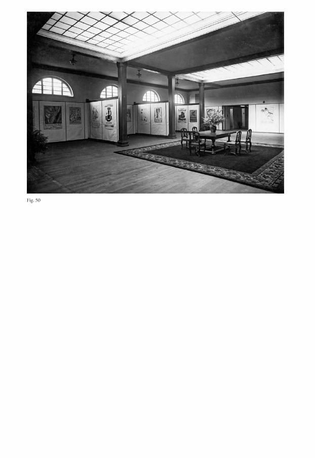
Fig. 50

Fig. 50Installation view, Schweizer Graphik 1730–1925 im Dienste von Reise und Verkehr, Haus des Werkbundes in Frankfurt am Main, Sep. 25–Oct. 10, 1925.
Fig. 51Installation view, Schweizer Graphik 1730–1925 im Dienste von Reise und Verkehr, Haus des Werkbundes in Frankfurt am Main, Sep. 25–Oct. 10, 1925.
Fig. 51

Fig. 52Emile Cardinaux, “Sommer in der Schweiz,” 1921, poster for the Schweizeri-sche Verkehrszentrale, in Schweizer Graphik 1730–1925 im Dienste von Reise und Verkehr, Haus des Werkbunds Frankfurt a. Main, 1925, p. 23.
Fig. 53Installation view, Schweizer Kunst und Kunstgewerbe, Sep. 1924, Liljevalchs Konsthall, in Kunstgewerbemuseum Zürich (ed.), Schweizer Kunst und Kunstgewerbe von der Ausstellung in Stockholm, Kunst-gewerbemuseum Zürich, 1925, p. 5.
Fig. 54Johann Ulrich Schellen-berg, Winterthur 1709–1795, Neftenbach Aussicht auf Töss und Kyburg, colored engrav-ing, in Schweizer Graphik 1730–1925 im Dienste von Reise und Verkehr, Haus des Werk-bunds Frankfurt a. Main, 1925, p. 4.
Fig. 52

Fig. 54
Fig. 53

148
However, by leading modern tourism adver-tising back to the image production of the 18th century, Welti relates the traditional craft to the technical advancements in the printing industry in the spirit of the SWB. Furthermore, he considers Swiss tourism advertising as a specifically Swiss artistic phenomenon that evolved of its own accord without any stimulation from outside.
Another text about lithographed post-ers and the promotion of tourism within the exhibition catalog of Schweizer Graphik by Alfred Altherr senior further develops what this reference to tradition means in stylistic terms:
The successes that led to the develop-ment of artistic, original lithography mainly occurred because they deliber-ately refrained from using photogra -phy. If it had succumbed to this danger, we would have poor artistic results in this field. (Die Erfolge, die der Entwick-lung der künstlerischen Original-lithographie beschieden waren, sind in der Hauptsache dem Umstand zu verdanken, dass sie bewusst darauf ver-zichtet hat, sich der Photographie als Hilfsmittel zu bedienen. Wäre sie dieser Gefahr erlegen, so wären wir arm an künstlerischen Ergebnissen auf diesem Gebiete.)25
In his text, Altherr attributes the interna-tional success of Swiss posters exclusively to the so-called artist poster and degrades the
new technical possibilities of photomontage and photolithography, which were emerg -ing at the same time, to inferior “aids.” Thus, it does not come as a surprise that the exhibition did not include avantgarde exper-iments. [Fig. 54]
The beginning of national representation through graphic design?
A special Swiss issue of the Leipzig journal Archiv für Buchgewerbe und Gebrauchs graphik from 1929 noted that the posters at the exhi-bition in Stockholm had attracted a lot of attention:
I will never forget the blatant amaze-ment with which the Stockholm public looked at the poster section of the Swiss exhibition set up by Alfred Altherr in the summer of 1924. Really, it was the heyday of the Swiss poster, and even though the Scandinavians themselves had very respectable achievements to show for themselves, as became clear in Paris a year later, they gladly recog -nized the primacy of the Swiss poster, which at the time was undoubtedly the best in all of Europe. (Ich werde nie vergessen, mit welchem unverhohle - nen Staunen das Stockholmer Publikum im Sommer 1924 auf der schweizeri-schen Ausstellung, die Alfred Altherr eingerichtet hatte, die Abteilung der Plakate betrachtete. Wirklich, es war
national label historiographyexhibitionsadvertisementprinting industry
149
damals die Zeit der Hochblüte des schweizerischen Plakats, und obschon die Skandinaven, wie sich ein Jahr später in Paris deutlich zeigte, selber sehr respektable Leistungen aufzu-weisen hatten, so anerkannten sie gerne den Vorrang des schweizerischen Plakates, welches damals fraglos das beste in ganz Europa war.)26
We should bear in mind that the author of this article, Josef Gantner, was not an observer from abroad. As a former board member of the SWB and editor of the magazine Das Werk, he had the same inter-ests as one of the parties involved in the organization of the exhibition.27 Neverthe-less, the fact that this German magazine devoted a special issue exclusively to the Swiss graphic industry shows just how much interest it generated outside Switzerland.
The involvement of the SWB in the offi-cial exhibition activities of Switzerland abroad in 1924 led to a paradigm shift in this field, and also to a kind of arranged marriage between culture and economics. Although the various actors involved naturally pur-sued different agendas, they must have seen mutual benefits from each other’s partici-pation.28 As the exhibition in Frankfurt tes-tifies, the graphic industry was situated right in the middle of all this. How can this be explained?
As we have seen, the posters offer a pos-sible explanation. Given the state support for the tourism sector in the interwar period,
tourism advertising and thus the graphic industry must also have experienced a boom. When the Schweizerische Verkehrs-zentrale was founded in 1917, one of its tasks was to promote tourism advertise-ments, and so graphic design came into the focus of a state-funded organization. As Matthieu Gillabert writes, the Schweizeri-sche Verkehrszentrale can be regarded as the first government-funded organization to have decisively spread a certain image of Switzerland abroad. At that time, this visual representation of the nation was based exclusively on economic factors.29 Nevertheless, the exhibitions in Stockholm and Frankfurt show that the selection of the imagery cannot be traced back to the Schweizerische Verkehrszentrale alone, but must rather have been made through the intentions of all the actors involved.
The posters themselves actually seem to have been the common denominator of the economic and cultural actors involved. By depicting the cultural life of the coun -try, they also advertised Switzerland as an attractive tourist destination. They show picturesque tourist destinations, and at the same time advertise the skills of Swiss artists. Whatever the motive, they are also proof of the skill and technical progress of the country’s printing industry.
Already in 1924 and 1925 there seems to have been a certain consensus about what kind of images should be shown under the label “Swiss.” In all three exhibitions mentioned here, the list of poster artists was
national label historiographyexhibitionsadvertisementprinting industry

150
roughly the same, including Cuno Amiet, Otto Baumberger, Emile Cardinaux, Augusto Giacometti, and Ferdinand Hodler. The representatives of the SWB who were probably responsible for the selection of the works thereby also demonstrate a certain understanding of art. As Alfred Altherr senior stated in the Frankfurt exhi-bition brochure, the lithographic poster was better off without “succumbing” to avant-garde art and design tendencies.30 Interestingly, it was the figurative painting of these same artists that in the 1940s would be made into a specifically national, Swiss branch of painting, while the avant-garde was denied the label “Swiss.”31
However, Gantner’s article from 1929 also shows that Altherr’s approach had not met with the approval of everyone on the design scene.
Switzerland does everything it can to attract the foreigner, but for the most part it does so in a completely outdated way, and herein lies the point where Swiss tourism advertising could learn from the advertising of German cities […]. (Die Schweiz tut alles, den Fremden anzulocken, aber sie tut es zum grössten Teil in einer völlig veralteten Weise, und hier liegt der Punkt, wo die schweizerische Verkehrsreklame von der Reklame der deutschen Grossstädte lernen könnte […].)32
He criticizes the genealogy of Swiss tour -ism advertising that was propagated in Frankfurt, which supposedly derived from the vedutas.33 In his opinion, however, it is precisely this “chumming up” to tourism that made Swiss advertising fall behind the developments that took place in the major German cities.
national label historiographyexhibitionsadvertisementprinting industry
151
1 Schweizer Graphik 1925: 26.2 The term “Graphik” or “Grafik”
is highly ambiguous and can designate any output from the printing industry as posters, engravings, books, or smaller printed matter for advertising purposes. By analyzing the exhibition from 1925, the pres ent text also aims to discuss this ambiguity.
3 Schweizer Graphik 1925: 6–8.4 The annual report of the
Schweizerische Verkehrszentrale lists its exhibits as photographs, dioramas, leaflets, and posters. See Nationale Vereinigung zur Förderung des Reiseverkehrs 1925: 12.
5 Zehnder 2016: n.p.6 Today: The Federal Department
of Economic Affairs, Education and Research (EAER).
7 In 1927 it would be merged with other Swiss trade organizations to form the Schweizerische Zentrale für Handelsförderung (OSEC). See Münch 1997: 98; Gillabert 2013: 163 (see especially footnote 522).
8 Swiss Federal Archive SFA, E81#1000/1134#242*, “Schwei-zer Graphik 1730–1925 im Dienste von Reise und Verkehr,” in Frankfurt /Main 1925, 20.07.1925–31.07.1925, Auszug aus dem Protokoll der Sitzung des Schweizerischen Bundesrates 31.07.1925.
9 Swiss Federal Archive SFA, E81#1000/1134#242*, “Schweizer Graphik 1730–1925 im Dienste von Reise und Verkehr,” in Frank- furt/Main 1925, 20.07.1925– 31.07.1925, Auszug aus dem Pro-tokoll der Sitzung des Schweize-rischen Bundesrates 31.07.1925.
10 Tissot 2014: n.p.11 Nowadays Schweiz Tourismus.
See Tissot 2014: n.p.; Richter 2014c: 43.
12 Richter 2014c: 43.13 See, for example, Margadant
1983: 23–27.14 Swiss arts and crafts; it showed
paintings, sculptures, ceramics, stained-glass painting, metal-work, textiles, books, prints, and posters. Kunstgewerbemuseum Zürich 1924: 11–28.
15 In 1922, an exhibition of Swedish applied arts had already been held in Zurich as part of this exchange. See Kunstgewerbe-museum Zürich 1925: 2. The SWB was founded on the initiative of Alfred Altherr senior, who returned to Switzer-land in 1912 as a member of the Deutscher Werkbund (DWB) and with teaching experience from Germany. After his return, he became director of the Kunst-gewerbeschule Zürich. Until the 1930s he was an important member of the SWB board, where he held various offices. See Zumstein 2013b: 419.
16 Münch 1997: 98.17 However, the short-term organi-
zation and large-scale participa-tion led to conflicts of interest. See Münch 1997: 98; Wohlwend Piai 2013b: 119; Debluë 2015: 229–231.
18 Tschudin 2019: n.p.19 Schweizer Graphik 1925: 4, 9, 13, 17.20 Welti 1925: 9. 21 Ibid.22 Ibid.23 Nyffenegger 2016: 139–141.24 See, for example, Marchal 1992:
37–49.25 Altherr 1925: 19.
26 Gantner 1929: 6.27 The art historian Joseph Gantner
had been an editor for Das Werk from 1923 to 1927. See Caviezel- Rüegg 2005: n.p. In 1923 he also became secretary (Schriftführer) and in 1925 director (Geschäftsführer) of the SWB. See Gnägi, Nicolai & Wohlwend Piai 2013: 418.
28 Münch 1997: 98.29 Gillabert 2013: 162–163.30 Altherr 1925: 19.31 Kadelbach 2010: 128–129.32 Gantner 1929: 8.33 Gantner 1929: 8–9.
national label historiographyexhibitionsadvertisementprinting industry

152associations Arts and Craftsschoolseducation policytraining
Sonderstellung
Debating the Status of Graphic Design Education at the Kunstgewerbeschule Zürich
Rudolf Barmettler, Jonas Niedermann
Whoever wished to train as a graphic designer in Switzerland up to the 1980s had two options: to embark on an apprentice-ship as a graphic designer in a commercial enterprise, or to study in the Fachklasse Grafik (Graphic Design Class) at one of the arts and crafts schools.1 This duality of training types goes back to the first half of the 20th century, when the profession was split into two differentiated tracks, and their emergence was not without rivalry. The core of the conflict was an ongoing dispute between the “commercials”—the tradesmen—and the “artists.” These often heated discussions had their origins in the Europe-wide debates on arts and crafts reform, and the associated emergence of training workshops at the arts and crafts schools at the turn of the century.2
Originally, this reform was a counter- movement to industrialization, through which a decline in crafts had become apparent. The most influential of these counter- movements was the Arts & Crafts Movement of the 1890s, which began in England and included social reform plans in addition to a reform of the crafts. Its aim was to counter loveless, industrial, mass production by means of products that expressed uniqueness and inherent beauty. Decades later, the representatives of refined design, based on good craftsman-ship that resisted excessive decoration and automation, organized themselves into various national or regional associa - tions such as Deutscher Werkbund or later Schweizer Werkbund.3 They believed that a better apprenticeship was part and parcel of an appropriate education, and by this they meant that craftsmanship had to be complemented by an artistic school education, with in-school workshops.4 As a result, workshops based on this model were established in various schools in the Netherlands, France, and Germany. Basel and Zurich also followed the example of arts and crafts reform schools such as Düssel dorf, Berlin, Weimar, and Munich.5 Since then, there have been compet ing demands when training as a graphic design- er, with craftsmanship on the one hand and artistic expression on the other. This essay uses the example of Zurich to trace the debates on the establishment and rec ognition of the Fachklasse Grafik in
DOI: 10.53788/SW
BE0312
153
Switzerland in relation to vocational train-ing, as documented in archival material from the Kunstgewerbeschule Zürich and the Gewerbeschule Zürich, the local professional associations,6 and the city and Canton of Zurich.
Negotiating two options for graphic design training in Zurich
When Alfred Altherr took over the manage-ment of the Kunstgewerbeschule and Gewerbemuseum Zürich in 1912, he had come from Berlin and brought with him the ideas of the German Werkbund.7 Shortly after taking up his post, he stated that the workshop, introduced by his predeces-sor Jules de Praetere, had moved too far in an “artistic” direction, even into “kitsch.”8 Consequently, he redefined the tasks and goals of the school: after graduating from the school, graduates should not only become artists but also be able to meet the needs of industry and advertising. Further-more, Altherr promised that the school’s artistic direction would lead master crafts-men, junior craftsmen, and apprentices to develop exemplary craftsmanship.9 There-fore, in 1916, he initiated a reorganization of the Kunstgewerbeschule Zürich.10 But instead of setting up its own design school for the applied arts, a “Hochschule für angewandte Kunst” as was done later in Vienna, Altherr took another step towards craftsmanship with his concept of an Arts
and Crafts School. The school workshop concept, originally conceived for fur ther education, became a Fachschule (Fach-klasse) and was integrated into the Gewer-beschule Zürich. As understandable as this step was at that time, this reorganization devalued the school workshop concept and led to public confusion about the actual function of the school.
As early as 1916, Altherr stated that a certain dualism was noticeable in the expansion of the workshops. Because of the shortage of students (master craftsmen and junior craftsmen), school apprentices in arts and crafts were trained in Zurich between 1912 and 1920.11 However, this con-tradicted the 1916 regulation that stipulated that the school’s task was to further edu-cate pupils only after they had completed an apprenticeship.12 This contradiction soon led to an unwelcome competition between apprenticeships in the Fachklassen and practical apprenticeships. As a result, diffi-culties arose with the trade associations, which did not want to recognize the Fach-klasse as a form of apprenticeship; there were thus arguments in 1916 with the Verein Schweizerischer Lithographiebesitzer (VSLB) (Association of Swiss Lithography Owners) and the Schweizerischer Litho-graphenbund (SLB) (Swiss Lithography Association). Apprentices who had com-pleted their apprenticeships in the Fach-klasse were subsequently no longer allowed to be employed by the companies affili - ated to the VSLB; those who were already
associations Arts and Craftsschoolseducation policytraining
154
thus employed were immediately dis-missed.13 In spite of this decision, the Arts and Crafts Department of the Gewerbe-schule Zürich continued to train graphic design apprentices in the Fachklasse.14 Graduates of the Fachklasse Grafik were called freie (freelance) graphic designers after their training.15 Given these circum-stances and the lack of external recogni-tion, the school tried to revise the profile of its Fachklasse. It established a Sonderstellung (special status) in industrial vocational training, which was also not welcomed by the aforementioned associations.
The main goal of the four-year appren-ticeship training in a private company (master craftsman apprenticeship) is above all the “Besitz der zur Ausübung des Beru-fes nötigen Fähigkeiten und Kenntnisse” (possession of skills and knowl edge neces-sary for the practice of the profession).16 The five-year training in the Fachklassen (includ ing the foundation course and entrance exam), on the other hand, also focuses on independence in creative work, the quality of execution, and the devel-opment of new fields of activity.17 The stu-dent in the Fachklasse is to be fostered in such a way that he is able to solve the versa-tile tasks of practice, and should do so tech nically and artistically as flawlessly as possible.18 Furthermore, the “Stärkung der Urteilskraft und die Pflege des guten Geschmacks” (strengthening of judg- ment and the cultivation of good taste) was of utmost importance.19 For Altherr,
independence from economic constraints was a major concern. He wanted qual- ity work to emerge in the Fachklassen, “to stimulate thinking and feeling in the best possible way.”20 This could not be learned in a restless business, he claimed.21 Entry into the Fachklassen was not open to every-one—there was a tough selection process. Even today (2020), there is a qualifying exam in the foundation course and a subse - quent exam in the Fachklasse that students have to pass.
In 1939, there was a change of directors at the school, due to age restrictions. The new director, Johannes Itten, strove to emphasize “künstlerisch-schöpferischen Entwurfsfähigkeit” (artistic-creative design ability).22 According to Itten, the curricu-lum of the Fachklasse should be worked out systematically and according to pedagogical methodologies, following basic, scientific/artistic principles, which was not possible in vocational apprenticeships.23 He propa-gated the concept of the “allergrösste Indivi-dualisierung des Lehrenden und des Ler-nenden” (greatest individualization of the teacher and the pupil). This would be a pedagogical prerequisite for promising work in creative teaching.24 This insistence on teaching and artistic freedom aroused dis-trust. Did this mean artistic overconfi- dence instead of “usability”—visual self- realization instead of graphic design for commercial use?
associations Arts and Craftsschoolseducation policytraining

155
The debate on “Sonderstellung” and certification
Skepticism about the orientation of the Fachklasse also became noticeable in the debate about the certification of this training path that started in August 1940. For the development of graphic design education in Switzerland, this debate was of momentous significance (with one spe-cific meeting having a crucial impact), and its consequences remain valid today. The description of a meeting between Johannes Itten, the then director of the Gewerbe-schule Zürich, and representatives of the federal and cantonal authorities, illustrates how education was negotiated based on legal, political, and professional motives.25
Itten’s predecessors had established the Fachklasse Grafik as a parallel voca tional training pathway since the 1920s, yet there was no recognized certification for it. Direc-tor Itten hoped to strengthen the “Son-derstellung,” or “special status” of the Fach-klasse as a form of training, but also wanted to anchor its certification in law.26 At a decisive meeting in August 1940, all the authorities involved were present: the Bundesamt für Industrie, Gewerbe und Arbeit (BIGA) (Federal Office for Industry, Trade and Labor), represented by Arnold Schwander; and the Amt für Industrie, Gewerbe und Arbeit des Kantons Zürich (KIGA) (Office for Industry, Trade and Labor of the Canton of Zurich), represented by Georg Gilg and Dr. Ernst Zaugg. Sitting
on the other side were Berchtold von Grünigen as the representative of the Ver-band Schweizerischer Grafiker (VSG) (Swiss Graphic Design Association), the Swiss Werkbund (SWB), and head of the apprentice classes of the Arts and Crafts Department of the Gewerbeschule Zürich, plus Johannes Itten as director of the Gewerbeschule Zürich.27
At its core, the dispute revolved around the question of whether the diploma exams held at the Arts and Crafts Depart-ment of the Gewerbeschule Zürich could legally be equated with the apprenticeship exams held by the canton. Itten overcon-fidently assumed that the Gewerbeschule could determine its own certification and, like his predecessors, he cited the school’s relevance and special status in the voca-tional education system as his justification.
To Itten’s surprise, none of those present questioned the special status of the Fachklassen. The crux of the discussion seemed to be certification. Itten criticized the fact that the diplomas of the Fach-klassen were not recognized by the federal government and the canton. Georg Gilg, the representative of the KIGA, rejected the Sonderstellung certification. But he sug-gested that instead of a separate diploma, the Fachklasse students should receive the regular Swiss Federal Certificate as a qualification. This proposal seemed pragmatic and feasible, but it was clearly not what Itten had hoped for. Gilg, how-ever, seemed to have general doubts about
associations Arts and Craftsschoolseducation policytraining

156
arts and crafts education. As a representative of the Canton of Zurich, he demanded that the existing cantonal teaching program be adhered to. Itten tried to convince those present that the Fachklassen knew best how to define and carry out their final exams themselves. Berchtold von Grünigen, as representative of the VSG and the SWB, shared Itten’s opinion, and when the author-ities demanded that the graduation pro-cesses at the Fachklassen should be overseen by external experts, he complained about such demands that would clearly curtail the independence of the Fachklassen.
As one outcome of this debate, Itten had to come to terms with certification by means of the Swiss Federal Certificate for the Fachklassen, and with having examiners drawn from the ranks of the professional associations.
The compromise
The negotiations with the federal govern-ment and the canton resulted in an order from the Volkswirtschaftsdirektion des Kantons Zürich (Department of Economic Affairs of the Canton of Zurich) that acknowledged the Sonderstellung of the Fachklassen and agreed on a separate, final exam. The latter was now legally equi-valent to the final cantonal apprentice - ship exams.28 It was important for this “spe-cial status” that the curricula and examina-tion plans should meet the minimum
cantonal requirements of the individual professions and be approved by the KIGA and the BIGA.29 In addition, the train - ing relationship had to be regulated by an apprenticeship contract. As a result, the Gewerbeschule Zürich developed a corre-sponding regulation for the Fachklasse Grafik. This regulation was regarded as mandatory until the 1980s, although it already caused discomfort to the VSG and the SWB. The associations were of the opinion that any regulation of training should be rejected. According to them, a graphic designer is an independent artist whose impulses must emerge from the free, spiritual development of his personality.30 And from today’s perspective, this opinion is even more stridently upheld: the teacher, who is himself an artist, can only give his best if he feels free. The two associations made an unequivocal plea for freedom in teaching.31
This phobia of regulations on the part of some associations and designers was also a result of the zeitgeist. In October 1945, the SWB emphasized explicitly that its atti-tude was backed by a “Angst vor Gleich-schaltung” (fear of enforced conformity).32 There were perceptible influences, they claimed, that were inhibiting creative devel-opment. Furthermore, the advantage of having been spared from war, unlike the neighboring countries, was in danger of being lost.33 The demands of the sponsors (the BIGA and the KIGA), however, were understandable from today’s point of view.
associations Arts and Craftsschoolseducation policytraining
157
As late as November 1945, Director Itten tried to regain territory he believed he had lost. He emphasized the link with the SWB and demanded that the experts supervising examinations should be elected by the examination commission on the basis of proposals from the school super-visory commission and the SWB. He insisted that the experts themselves should be members of the SWB and, if possi - ble, of the professional association (VSG) in charge.34
Clearly, this raised certain questions: Would the idealistic support of the arts and crafts schools by the SWB and VSG—the emphasis on artistic and didactic freedom as well as a resistance to any regulations—sooner or later lead to methodical arbitrari-ness, to an interchangeability of learning contents, subjects, and tasks? Was there not a real danger at this point that the Fach-klasse Grafik would drift into the realm of free arts and alienate itself from practice? Was there not the danger of a certain crony-ism if school directors, department heads, faculty members, and external jurors were members of the same professional asso-ciations? On the other hand, were the “com-mercial” trade associations at that time really the “devils”?
In 1947, the cold shower came promptly. The representatives of advertising and the industry—the “commercials”—were enraged. The criticism came from the Zürcher Werbeklub (Zurich Advertising Club). Paul O. Althaus remarked that
many pupils had no idea that any work ought to be based on reproducibility. It should be noted that no businessman had ever spo-ken to students to develop a brief from a sales perspective. He concluded that the link between advertising professionals, prospective businessmen, and the teachers of the Fachklasse Grafik ought to become more active.35 Nine years later, none other than advertising legend Adolf Wirz spoke up, the then president of the Bund Schweize-rischer Reklameberater (BSR) (Swiss Association of Advertising Consultants). His concern was that young graphic designers should engage in practice with the correct mindset. Wirz wrote that he would wel-come it if pupils were made aware of the real task of the Gebrauchsgrafiker (commercial graphic designer).36
Conclusion
In retrospect, Director Itten’s persistent “struggle” for the special status and certifica-tion of the Fachklasse Grafik was under-standable. What he subsequently achieved became the standard throughout Switzer-land—to the present day. These negotiations led to a coexistence of Fachklasse and practical apprenticeship in graphic design training that is unique in Europe. A graphic designer’s training is based on an “artistic,” conceptual orientation (Fach-klasse) on the one hand, and an advertising, service-related, craftsmanship-based
associations Arts and Craftsschoolseducation policytraining

158
orientation (apprenticeship in practice) on the other. The constant rivalry between these two forms of training has long proved to be very productive. Each has had to compete with the other for clients in the marketplace, and the complementarity and overlap involved have contributed to the high quality of Swiss graphic design training.
However, the constant call for freedom of teaching and artistic expression, which has been characterized by a certain ideal-ism, proved to be something of a “boomer-ang.” The problems it brings were also exemplified by the criticism leveled by rep-resentatives of advertising and industry in the postwar years. When too much “art” and too many “concepts” are involved, the labor market tends to get bypassed. In a positive sense, regulation by the authorities also means that teaching concepts and curricula must be developed and disciplines and professional profiles reconsidered. This ensures that teaching can keep pace with the development of technology and with new tasks in practice, while at the same time opening up new fields of activity.
About forty years ago, however, a new, academic training path for graphic designers opened up via the higher education col -leges of the schools of design. Its importance further increased some twenty years ago when this training attained university status (at the Universities of Applied Arts). Pure lectures and self-study, although com-mon at universities abroad, do not really
exist anywhere in Switzerland. On the con-trary, project teaching and workshop teach-ing, with basic and advanced subjects, are still the standard in our curricula. This model has proven to be very successful when compared to tertiary training abroad. It is notable here that the curricula in Bach-elor studies in visual communication and graphic design are still largely based on the Fachklassen model.
associations Arts and Craftsschoolseducation policytraining

159
1 Today there are four different training paths in Switzerland: the academic path at a university of applied sciences and arts; the path via further education after com-pleting an apprenticeship at the Colleges of Higher Education; the Fachklasse Grafik; and that of an apprenticeship within a company.
2 von Grünigen 1943: 261.3 “[Der Werkbund strebte] die
Veredelung der gewerblichen Arbeit im Zusammenwirken von Kunst, Industrie und Handwerk durch Erziehung, Aufklärung und Stellungnahme zu künstler-isch und volkswirtschaftlichen praktischen Fragen” (Zumstein 2013b: 63). The social reform plans on the other hand were dropped. See Kruft 1977: 29.
4 Frauenfelder 1938: 62. The Prussian Ministry of Trade and Commerce had issued a decisive “Lehrwerkstatt-Erlass” (Training Workshop Decree) in 1906, which defined training workshops as common components of education. See Maciuika 2006: 120–131.
5 The director of the Kunstgewer-beschule Zürich and the Gewer-bemuseum Zürich, Jules de Praetere, advocated the school workshop concept. See de Praetere 1908: 19. Later there was a lively exchange among the reform schools. Highly respected designers came to teach in Switzerland in the 1920s (e.g. Fritz Helmuth Ehmcke).
6 The Swiss Werkbund (SWB) and the Verband Schweizerischer Grafiker (VSG).
7 Altherr was a co-founder of the SWB in 1913. See Bignens 2008: 13–18.
8 See “Timetables,” in the volume Visual Arguments.
9 Altherr 1916c: 14.10 Budliger 1978: 97.11 In the winter and summer semes-
ter of 1928–1929, for instance, there were twice as many school apprentices as assistant and mas-ter craftsmen in the Fachklassen. See Altherr 1929: 5.
12 Zentralschulpflege der Stadt Zürich. Verordnung über die Organisation der Gewerbeschule und des Kunstgewerbemuseums Zürich. Zurich: April 27, 1932. Zürcher Hochschule der Künste, Archiv ZHdK, AB-UAE-00002.
13 Budliger 1978: 110.14 Gewerbeschule Zürich. Minutes
of the Supervisory Commission of the Gewerbeschule Zürich. Zurich: December 12, 1917. Stadtarchiv Zürich, V.H.c.121.
15 These trained apprentices—freie Graphiker—could later only work as either a freelancer or an inde-pendent graphic designer, as they had no right to be employed by the contracting companies. It also led to misunderstandings, for the lithography trade and related professions in Switzerland under-stood the term Graphiker (graphic designer) to mean ZeichnerLithograph (draftsman- lithographer). See Keller, Ernst. Letter to the kant. Industrie- und Gewerbeamt (cantonal industry and trade office), “Ausbildung des GRAFIKERS in der grafischen Kunstanstalt,” annex, no. 1. Zurich: June 8, 1938. Zürcher Hochschule der Künste, Archiv ZHdK, AY-VCB-00001.
16 Keller, Ernst. Letter to the kant. Industrie- und Gewerbeamt (cantonal industry and trade
office), “Entwurf eines Regle-ments über die Ausbildung des Graphikers in der graphischen Fachklasse der Gewerbeschule I der Stadt Zürich,” annex, no. 5. Zurich: June 8, 1938. Zürcher Hochschule der Künste, Archiv ZHdK, AY-VCB-00001.
17 Steiner, Heinrich. Letter of the Ortsgruppe Zürich (Zurich local group) of the Verband Schwei-zerischer Grafiker VSG to the Volkswirtschaftsdirektion des Kantons Zürich. Zurich: Septem-ber 12, 1945. Zürcher Hoch -schule der Künste, Archiv ZHdK, AB-UAE-00002.
18 Gewerbeschule Zürich. Memo-randum on the decision of the Teachers’ Conference of the Arts and Crafts Department of the Gewerbeschule Zürich. Zurich: April 28, 1938. Stadtarchiv Zürich, V.H.c.121.:7.1.
19 See Keller, Ernst. Letter to the kant. Industrie- und Gewerbe-amt (cantonal industry and trade office), “Entwurf eines Regle-ments über die Ausbildung des Graphikers in der graphischen Fachklasse der Gewerbeschule I der Stadt Zürich,” annex, no. 5. Zurich: June 8, 1938. Zürcher Hochschule der Künste, Archiv ZHdK, AY-VCB-00001.
20 Kienzle 1929: 22.21 Altherr 1924: 7. 22 Gewerbeschule Zürich. Minutes
of the Supervisory Commission of the Gewerbeschule Zürich. Zurich: June 27, 1941. Stadtarchiv Zürich, V.H.c.121.:2.1.3.1.
23 Ibid. 24 Itten 1939: 14.25 See “Training,” in the volume
Multiple Voices.26 Federal Act on Vocational
associations Arts and Craftsschoolseducation policytraining

160
Training, June 26, 1930, 876. See “Legal Documents,” in the volume Visual Arguments.
27 Gewerbeschule Zürich. Minutes of the Arts and Crafts Depart-ment of the Gewerbeschule Zürich. Zurich: August 21, 1940. Stadtarchiv Zürich, V.H.c.121.:3.1.2.
28 Gewerbeschule Zürich. Minutes of the Supervisory Commission of the Gewerbeschule Zürich. Zurich: April 29, 1944. Stadt-archiv Zürich, V.H.c.121.:2.1.3.1.
29 Volkswirtschaftsdirektion des Kantons. Order of the Volks-wirtschaftsdirektion des Kantons Zürich “Verfügung: Fachklasse gilt als Lehre.” Zurich: 1944. Stadtarchiv Zürich, V.H.c.121.:7.3.
30 Steiner, Heinrich. Letter of the Ortsgruppe Zürich (Zurich local group) of the Verband Schweizeri-scher Grafiker VSG to the Volks-wirtschaftsdirektion des Kantons Zürich. Zurich: September 12, 1945. Zürcher Hochschule der Künste, Archiv ZHdK, ABUAE-00002.
31 Swiss Werkbund. Minutes of the Board of Directors of the Swiss Werkbund SWB. Zurich: Sep-tember 13, 1945. SWB-Archives.
32 Swiss Werkbund (signed by Rich-ard Bühler and Egidius Streiff). Letter to KIGA, Zurich, as well as to the Gewerbeinspektorat Basel- Stadt (Trade Inspectorate of the Canton Basel-City). Zurich: October 5, 1945. Zürcher Hochschule der Künste, Archiv ZHdK, AB-UAE-00002. See “Letter of Correspondence,” in the volume Visual Arguments.
33 Ibid.34 Gewerbeschule Zürich. Minutes
of the Supervisory Section I of
the Gewerbeschule Zürich. Zurich: December 4, 1945. Stadtarchiv Zürich, V.H.c.121.:2.1.3.1.
35 Kunstgewerbeschule Zürich. Minutes of the Supervisory Section I of the Kunstgewerbe-schule Zürich. Zurich: Febru - ary 18, 1947. Stadtarchiv Zürich, V.H.c.121.:2.1.3.1.
36 Wirz, Adolf. President of the Bund Schweizerischer Reklame-berater (BSR) (Swiss Associa -tion of Advertising Consultants) in a letter to Hans Fischli, direc-tor of the Kunstgewerbeschule Zürich. Zurich: February 24, 1956. Zürcher Hochschule der Künste, Archiv ZHdK, AY-VCB-00001.
associations Arts and Craftsschoolseducation policytraining
161canonization historiographyschoolsself-promotionnational label
The Basel School
Deconstructing Labels of Swiss Graphic Design Education
Sarah Klein, Sandra Bischler
The term “school” has been applied ambig-uously in the context of Swiss graphic design history. In addition to being used lit-erally to designate an educational institu-tion, it has also denoted a style affiliation or a common formative mindset in order to sim plify the attribution of certain creative phenomena. In combination with local attributes, such as, for example, “Basel,” “Zurich,” or even “Swiss,” the term has served to describe complex phenomena of graphic design and typography.1 However, the equation of the term “school” with “style” can inevitably only represent a con-traction of institutional reality that con-ceals a multitude of influences and view-points. This becomes evident when taking a closer look at which actors used the term “school” in connection with graphic design and typography during the first half of the 20th century, at the ways in which they used it, and not least at the various motives behind it.
A school model for graphic design
A catalyst for the use of the term “school” in the Swiss graphic design and typogra-phy discourse was the implementation of Fachklassen für Graphik, full-time graphic design classes at public arts and crafts schools in the early 20th century. The Fachklassen were introduced in addition to the prevailing educational model of the appren-ticeship in the printing workshop of a graphic artist or lithographer.2 Alfred Altherr senior, director of the Kunstgewerbe -schule Zürich, ventured as early as 1916 to make the optimistic, but false, predic tion that school education might even replace apprenticeships in the near future.3 However, over the following decades, this new model had to assert itself primarily against skeptical tradespeople. For example, in 1929, and thus more than one decade after the implementation of Fachklassen, a proponent of the school model still noted a lack of recognition, both among cer - tain professionals and among the general population.4
The strategy of the educational institu-tions—above all the Kunstgewerbeschule Zürich and the Allgemeine Gewerbeschule (AGS) Basel—was to equate the term “school” with notions of excellence, quality, and progress, and to anchor it as a catch-word for a specific educational philosophy.
During the 1940s, when Swiss graphic design education was undergoing the decisive steps of its legalization process, the
DOI: 10.53788/SW
BE0313

162canonization historiographyschoolsself-promotionnational label
arts and crafts schools intensified their demarcation efforts. For example, Hermann Kienzle, director of AGS Basel, wrote in 1941:
A student leaving school […] should have at least experienced what can be the highest achievements in his or her profession. This awakening and refinement of a conscience for the qual-ity of his or her work is the best thing that a school can give to its students for their own practice. (Der Schüler, der die Schule verlässt, soll wenigstens […] erlebt haben, was in seinem Beruf höchste Leistung sein kann. Diese Weckung und Verfeinerung des Gewis-sens für die Qualität seiner Arbeit ist das Beste, was die Schule dem Schüler in die Praxis mitgeben kann.)5
However, it was precisely the transferability of this quality into practice that was doubted by the trade itself. In an article in the magazine Das Werk, Berchtold von Grünigen, a teacher at the Kunstgewerbe-schule Zürich, discussed the accusations that the school model was unworldly and lacked practical relevance:
For them [the graphic design practi-tioners], the school, with its consis - tent training to achieve quality, is float-ing in the clouds of an ideal that in their view is proved wrong in practice. (Für sie [die Grafiker, Anm. d. V.]
hängt die Schule mit ihrer konsequen-ten Ausbildung zur Qualität in den Wolken einer Idealvorstellung, die nach ihrer Ansicht in der Praxis Lügen gestraft wird.)6
He responded to these accusations with the argument that the schools would pro - duce “open-minded designers of new solu-tions by which they enrich and fertilize practice” (aufgeschlossene Gestalter neuer Lösungen, mit denen sie die Praxis berei-chern und befruchten).7
The two schools in Zurich and Basel considered themselves as innovators and persistent promoters of “neue schwei-zerische Graphik” (new Swiss graphic design)8—which emphasized their impor-tance not only for the profession itself, but also for the cultural prestige of the nation. According to this narrative, it was primarily the school model that estab -lished Swiss graphic design’s great interna-tional reputation.9
Swiss quality
In the discourse on graphic design and typography, other educational institutions also claimed a leading role in the devel-opment of a national “quality” in the pro-fession. The question as to just what this specific quality was, and where it originated from, was a matter of controversial debate. In the case of “Swiss” typography, this is

163canonization historiographyschoolsself-promotionnational label
reflected in trade journals, such as the fort-nightly Helvetische Typographia or the monthly Typographische Monatsblätter (TM), both published by the Schweizerischer Typo graphenbund (Swiss Typographers’ Association). Apart from the schools in Basel and Zurich, institutions in Aarau, Bern, Biel / Bienne, Lucerne, and St. Gallen also presented themselves or criticized each other. The authors regularly linked regional or national attributions with stereotypes of styles, which took on a polit-ical dimension—especially in the context of World War II and Switzerland’s Geistige Landesverteidigung (Spiritual national defense).10
An example of this is the heated debate about the St. Gallen Fachschule für Buch-drucker (School of Printing) in the 1940s that was started by an article in Helvetische Typographia about supplements in TM, and that led to a discussion in these maga zines about the style or “way” of the St. Gallen school and the origins of “Swiss” typogra-phy. In Helvetische Typographia in 1943, an anonymous author wrote that, in particu-lar, no “fascist supplements and St. Gallen ‘ways’”11 were desired in TM, and thus he wanted to exclude the St. Gallen School of Printing from the typographic discourse. An attempt to defend the St. Gallen typog-raphy was made by the graphic designer Hausammann in an article in TM in 1944. He described it as one of two major direc-tions in Swiss typography. The St. Gal - len School of Printing could take credit, he
wrote, for the application of the tradi tional “healthy, original and down-to-earth forms” (gesunden, ursprünglichen und boden-ständigen Formen”). The second direction, however, he described as sober, functional, lifeless typography that “is misused to create the most impossible aesthetic manip-ulations by means of constructivist specula-tions with blocks, groups, planes and spaces […]” (die durch konstruktivistische Spekulationen mit Blöcken, Gruppen, Flächen und Räumen […] zu den unmög-lichsten ästhetischen Manipulationen missbraucht [wird])12 and had no potential to last. Hausammann declared the St. Gal-len typography as the more sustainable direction, and claimed that it had spread over the country to become “Swiss” typog-raphy. The same argument was made by the author using the pen name “boe” in the Helvetische Typographia, namely that for a long time these approaches hadn’t been “St. Gallen ways” anymore, for this typog-raphy had long since become “Swiss.”13
Both Hausammann and “boe” linked a regional school to specific stylistic quali ties and declared these to have gone national. But this very “Swissness” in typography was controversial. Emil Ruder, a typography teacher at AGS Basel and a sharp critic of St. Gallen typography, asked bluntly “What particularly Swiss traits does this typogra-phy have?” (Was für besonders schweize-rische Züge weist diese Typographie auf?)14 and immediately delivered a statement about what he considered to be genuinely
164
Swiss, namely: “a pronounced sense for honesty of work and material” (ausgespro-chene[r] Sinn für Ehrlichkeit der Arbeit und des Materials).15 The editors of TM also disagreed with Hausammann’s arguments:
The claim that the Fachschule für Buch-drucker embodies the expression of Swiss typography seems very daring to us. What is certain is that something like a home style is cultivated in it, which, like all home styles, has a strong local color and, in addition, seems to consti-tute a minimization of higher values. (Der Anspruch, dass die St. Galler Fach-schule für Buchdrucker den Aus druck der schweizerischen Typographie verkör-pere, erscheint uns sehr gewagt. Sicher ist, dass in ihr so etwas wie “Heimat -stil” gepflegt wird, der, wie aller Heimat-stil, starkes Lokalkolorit aufweist und hier ausserdem noch wie eine Vernied-lichung höherer Werte wirkt.)16
A Swiss synthesis
The editors of TM did not link “Swiss” typog raphy to a certain institution, but described it as a “happy synthesis of the German-speaking and the French-speaking” (glückliche Synthese von Deutsch und Welsch).17 Their emphasis on shared values across language boundaries can be read as a statement in favor of national cohesion
during World War II. It was an idealistic point of view for sure, since in the prac-titioner’s minds the regional characteristics were very prominent, and there was a major disagreement not only about where typographic “Swissness” originated from, but also about what it embodied in the first place, and if it could or could not be attributed to specific educational institu-tions. After the end of the war, the Swiss- German typographer Kurt Huber wrote in TM that the idea of such a synthesis was not yet fulfilled, and he insisted on the existence of regional or, rather, language- specific differences.
As rich in diversity as is the work of the Swiss-German typographers in the French-speaking part of the country, their quests and strivings are still met with fierce resistance. […] This requires that we know the French-speaking Swiss and his typography better. (So reich an Vielfalt auch das Schaffen der Deutsch schweizer Typographen im Welschland ist, ihr Suchen und Stre - ben stösst immer noch auf harten Wider-stand. […] Das verlangt, dass wir den Welschen und seine Typographie näher kennen.)18
Comparable national stereotypes of style and taste in graphic design and typog - ra phy dominated the discussion even when it came to assessing schools and training opportunities in neighboring countries.
canonization historiographyschoolsself-promotionnational label
165canonization historiographyschoolsself-promotionnational label
A supposed understanding of allegedly country-specific biases was employed in advertising particular training opportu-nities abroad, or to warn against them. For example, in 1935, in a summary on train-ing possibilities in Paris, potential Swiss designers were advised to avoid the “offi -cial French taste.”19 As one of the few exceptions, the newly opened school by A.M. Cassandre was recommended,because it was “perhaps closest to us in itstastes” (uns in ihren geschmacklichenAnsichten vielleicht am nächsten).20
These attempts to summarize stylistic phenomena using language-specific or site-specific categories are so evident because it was common to play them off against each other. Educational institu-tions in France, Italy, Germany, and Switzerland used such categories in connec-tion with the term “school” in order to situate themselves more clearly, although this represented an all-too-uniform pic - ture that collapses into its constituent parts on closer inspection.
Filed under: “Basel School, the”
When we return to the regional Swiss dis-course, we find a remarkable example of this ambivalent, sometimes misleading use of the term “school” and the transfor-mation process to which it was subject: the “Basel School” or “Basler Schule.” This designates several approaches in graphic
design that are related on the one hand, but show many differences on the other. Besides being a shortcut for naming the All-gemeine Gewerbeschule Basel, the term “Basel School” as a means of stylistic attri-bution was used early on to describe a formal phenomenon in poster design that came to a head in the early 1940s, mainly in Basel, which was led by graphic design-ers such as Niklaus Stoecklin, Fritz Bühler, Peter Birkhäuser, and Herbert Leupin, who created hyperrealistic representations of products. The “Basler Schule” in poster design was already characterized by contemporaries as an “überspitzter Naturalismus” (exaggerated naturalism).21
The Basel graphic designers have devel-oped their own style of the highest concision and impact, which is rightly highly regarded, both in terms of technical skill and in terms of its unmis-takable effect. […] The Basel poster is a proven brand. (Die Basler Graphiker haben einen eigenen Stil von höchs - ter Prägnanz und Schlagkraft entwickelt, der zu Recht hoch eingeschätzt wird, sowohl was das technische Können, als auch was die unübersehbare Wir- kung betrifft. […] Das Basler Plakat ist eine bewährte Marke.)22
However, the tremendous popularity of this style was also already being criticized, as it implied “the danger of stereotypical sterility, of the routine recipe, the solidified

166
formula” (die Gefahr einer stereotypen Sterilität, des routinierten Rezepts, der erstarrten Formel).23
Several of the designers working in this manner were trained at AGS Basel in the Fachklasse für Graphik, therefore the link between the “Basler Schule” and the AGS Basel seems evident. Indeed, in the 1940s and before that, naturalistic drawing and product representations and the technical skills for hand-drawn lithog-raphy were all part of the Basel curricu - lum. However, they coexisted with other, more abstract, geometric, photographic, typographic, and calligraphic or even theo-retical courses, given by different teachers without any clearly defined formal doc-trine.24 That is to say, even though some of the protagonists of hyperrealistic poster design had been trained at AGS, the emer-gence of the “Basler Schule” as a style phenomenon in the 1930s and 1940s can just as well be connected to the work of Basel-based graphic design studios, to influ-ences from the art world25—and to the great popularity of these posters with cli-ents and the public. There are overlaps between the school as an institution and the school as a style, but they are not congruent.
A term with a new meaning
In a totally different sense, the terms “Basel School (of design),” “Basler Schule,” or the “Basel approach” have also been used to
further differentiate the overall construct of “Swiss Style” graphic design and typog-raphy. According to this narrative, “Zurich” stands for constructive graphic design, closely bound to the concrete art movement and the magazine Neue Grafik.26 “Basel” stands for a more “undogmatic”27 attitude and is usually employed in close connec tion to the educational approach at AGS Basel, especially during the 1950s and 1960s, under teachers such as graphic designer Armin Hofmann and typographer Emil Ruder.28
“Basel school” here has been trans-formed from its initial meaning, a heteroge-nous educational institution—AGS Basel—into yet another, distinctive graphic design approach. This neglects the diversity of the AGS graphic design curriculum, as well as its course structure: the Fachklasse für Graphik, as well as the typography and type-setting courses, the courses for graphic design apprentices, and later the so-called Weiterbildung (Advanced Class for Graphic Design) from 1968 onwards can hardly be generalized as a homogeneous “school” or “approach.”
As a tradition, the AGS Basel itself did not originally propagate a “style,” but combined different design philosophies. Their origins can be traced back as far as the 1930s, during the directorship of Hermann Kienzle (director from 1916 to 1944), who introduced several new approaches to graphic design and typography educa tion, creating the basis for a graphic design class that was not shaped by just one teacher,
canonization historiographyschoolsself-promotionnational label

167canonization historiographyschoolsself-promotionnational label
but by a variety of progressive as well as tra-ditional actors and their courses.29
In the late 1940s, these educational contrasts were even conceptually anchored in the program of the graphic design class.30 Berchtold von Grünigen was appointed in 1932 to be the new director, after having been active in Zurich.31 He apparently adapted his school’s graphic design program according to the graphic design land- scape he found in Basel upon his arrival. He believed that the school, besides its role in actively promoting progressive approaches, should not lose contact with professional practice. In Basel at this time, this meant contact with the world of mainly one- man studios with a commercial orientation, and strong local connections and support.
It was in the late 1950s that the method-ically structured courses by Armin Hof-mann, in cooperation with Emil Ruder’s typography courses, became increasingly recognized on an international stage thanks in part to articles in trade magazines, books, exhibitions, and teaching activities abroad.32 It was also the heyday of the “Swiss Style”—and the intense publica - tion activity of its protagonists in the late 1950s and 1960s indicates that the motto “pub lish or perish” also applied back then to graphic design and education. “Teacher -authors” such as Armin Hofmann, Emil Ruder, and later Wolfgang Weingart, who formulated their methodology and thereby made it accessible to a large audience, naturally came to play a more dominant
role in the promotion of the Basel graphic design education, whereas other teachers play a minor role in the school’s narrative.33
As this essay has argued, the term “school,” supplemented by regional or national attributions, has a long history of transformation and reinterpretation and was strategically used by different actors—institutions, designers, critics, and design historians—according to their specific interests. If we are to achieve a new histo-riography of Swiss graphic design and its education, clarifying and revisiting criti-cal terms such as “Basel school” can pro-vide a starting point for us to question out-dated narratives related to “styles” and “schools” as a major classification system.

168
1 “School” here has to be understood as a stylistic term, influenced by art historiography and its “history of style”—which was intertwined with notions of nationalism. See Locher 1996a: 291.
2 On the foundation of Fachklassen see “Timetables,” in the volume Visual Arguments, and “Sonderstel-lung,” in the present volume. Apprentices also attended the trade schools for supplementary courses one day a week.
3 See Altherr 1916c: 135.4 The art historian Walter
Hugelshofer even remarked that this regrettable lack of recognition and impact would drive the most talented and progressive graduates to emigrate to more “insightful” countries. See Hugelshofer 1929: 58.
5 Allgemeine Gewerbeschule Basel 1941c: 13.
6 von Grünigen 1938: 64.7 von Grünigen 1943: 263.8 Berchtold von Grünigen, Letter to
Dr. P. Tschudi, Sep. 5, 1945, Staats archiv Basel-Stadt, DI-REG 5a 2-7-3 (2) 8.
9 See Allgemeine Gewerbeschule Basel 1941c: 17.
10 See, for example, Reinhardt 2013.11 Helvetische Typographia 1943a: 3.12 Ibid.13 Helvetische Typographia 1943b.14 Ruder 1944.15 Ibid.16 TM 1944: Editorial. Heimatstil was
a term often used to describe a modestly modern, folkloristic architecture which was used for some pavilions at the Swiss National Exhibition 1939. About the development and specific use of the term, see Crettaz-Stürzel 2015, n.p.
17 TM 1944: Editorial. 18 Huber 1947.19 TM 1935: 238.20 TM 1935: 239.21 Oeri 1946a: n.p.22 Ibid.23 Oeri 1946b: 237.24 In 1941, for example, there were
courses in: Zeichen und Marken (Hermann Eidenbenz), Schrift und ihre Anwendung (T[h]eo Ballmer), Graphisches Entwerfen (Paul Kammüller), Modezeichnen (Julia Eble), Typographie (Jan Tschichold and Karl Becker), Lithographie (Werner Koch), Werbelehre (Fritz Bühler). See Allgemeine Gewerbeschule Basel 1941a: 18.
25 As for interactions with art, see, for example, poster designer Niklaus Stoecklin’s work as a painter of “Neue Sachlichkeit,” the “New Objectivity.”
26 See Hollis 2006: 206.27 Richter 2014a: 38.28 See Hollis 2006: 215.29 See “Teaching Material,” in the
volume Visual Arguments.30 See “Student Work,” in the vol-
ume Visual Arguments.31 See Wanner 1965: n.p.32 E.g. Hofmann 1958; 1965; Ruder
1944; Contemporary Arts Center 1957.
33 Lesser known AGS teachers (1930s–1960s) are, for example: Peter von Arx, Theo Ballmer, Karl Becker, Walter Bodmer, Robert Büchler, Fritz Bühler, Julia Eble, Theo Eble, Hermann Eidenbenz, André Gürtler, Andreas His, Paul Kammüller, Ernst Keiser, Lenz Klotz, Manfred Maier, Christian Mengelt, Rolf Rappaz, Numa Rick, Alfred Soder, Gustav Stettler, Max Sulzbachner, Mary Vieira.
canonization historiographyschoolsself-promotionnational label
169typography publicationsModernismcanonizationhistoriography
Unfamiliar Writing Forms
Instances of Various Scripts in Swiss Graphic Designers’ Publications
Ueli Kaufmann
In 1967, the influential Basel designer and educator Emil Ruder published his only book: Typography: A Manual of Design.1 It is a revised, fleshed-out version of the author’s earlier Typographische Monatsblätter (TM) articles and the catalog of an exhibition of the same name, and it proposes a system-atic approach to design practice and teach-ing. Owing to both its form and its con -tent, it has been called the quintessence of Swiss graphic design,2 and is sold and celebrated to this day.3 Even though the pub-lication firmly focuses on Latin script typography, a double-page spread in the second chapter entitled “Function and form” shows seven images of scripts from various cultures, places, and eras. Next to Hebrew, Devanagari, Runic, Sabaean, and two Cuneiform inscriptions on the left, it features a large image of Arabic calligraphy
on the right.4 [Fig. 55] An overview of Swiss designers’ publications reveals that this is not an isolated case. While these books are rarely ever dedicated to the workings of any script other than the Latin, they repeat-edly show images of various writing sys-tems.5 As most Western graphic designers, arguably, have little functional know - ledge of further scripts, this focus on what is known and used in the authors’ every - day work might not be too surprising. With the same thought in mind, however, the fact that examples of different scripts are commonly shown is all the more striking.
If these designers’ publications are seen within the context of Modernism or moder-nity and viewed from a postcolonial perspec-tive, these findings are not negligible. Ideas of Western modernity developed vis-à-vis the conception of a non-Western other, and often in diametrical opposition to it, as has been observed in Edward Said’s highly influ-ential Orientalism from 1978 and in his Culture and Imperialism from 1993, as well as in Stuart Hall’s “The West and the Rest” from 1992, or Henrique Dussel’s “Eurocentrism and Modernity” from 1993.6 And those depictions, as the abovementioned scholars point out, are far from neutral. They gener-ate “knowledge” about an “other” that is often proposed and received as scientific fact.7 Embedded in a cultural, academic, or professional discourse, these assumptions then take on a life of their own, and can therefore hardly be separated from political and socio-economic realities and intentions.
DOI: 10.53788/SW
BE0314

170typography publicationsModernismcanonizationhistoriography
As the approaches that Swiss graphic design-ers presented in their publications have spread alongside corporate culture world-wide,8 and to this day still exert consider-able influence on teaching and practice,9 it seems appropriate to take a closer look at instances of various scripts in those books. By investigating a few selected examples, this article will discuss the portrayal of these “others,” the roles the portrayals play within the respective narratives, relations to common ideas and schools of thought, and problematic aspects such as claims of superiority or the misrepresentation and denigration of various writing systems.
Ruder’s defamiliarization and the dangers of ignorance
In Emil Ruder’s didactic book Typography, the inclusion of images of various writ - ing systems as described above does not stay unaddressed. He notes the time and place of origin of his examples, and offers a brief statement on how they should be inter-preted:
Unfamiliar writing forms hold an appeal for us even if we cannot read them; we enjoy them as formal patterns com-parable to a work of art. If we could read them, we should automatically lose interest in them as form. On seeing Broadway lit up at night, Chesterton said: What an enchanted garden that
would be for anybody lucky enough not to be able to read it!10
By limiting an observer to strictly visual per-ception, he states, an indecipherable writ-ing system would stimulate an appreciation of its inherent formal qualities.11 But rather than explaining this phenomenon any further, Ruder simply leaves things there. Through the juxtaposition of several simi-larly materialized, but structurally and formally diverse scripts, he aims to kindle a comparison of letterforms and patterns, similarities and differences, both in the indi-vidual systems and across them, and in so doing wants to steer the reader towards a purely visual exploration of his own exam-ples. While this invitation to adopt a strictly formal approach to signs takes up just a single spread, it embodies the core of Ruder’s message and method. In the book’s introduction, this staunch Modernist declares his discontent with the status quo of contemporary graphic design. Modern ist typography appears to be omnipresent, he writes, but all too often it is seen as a strict set of rules, rather than an adaptive method for addressing ever-changing prob-lems. As a result, it has grown rigid. To be truly modern, he says, typographers will have to keep finding new visual solutions for the task at hand.12 In order to do so, they will need to wean themselves away from their habitual manner of seeing and doing. It is in this vein, thus Ruder, that the familiar Latin typography should be treated

171typography publicationsModernismcanonizationhistoriography
like the examples of presumably unfamiliar scripts: purely as form.
Although he supported his thesis with a quotation from G.K. Chesterton, Ruder omitted to mention that the same book by Chesterton also explicitly warned about superficially judging cultural artifacts. With-out a functional knowledge of a system, writes Chesterton, signs could easily be mis-interpreted as something known to the observer. He goes on to exemplify this with seemingly similar characters from the Greek and Latin alphabets. While Ruder refrains from claiming anything about the inscriptions that he shows, his method indeed has implications for approaches to other writing systems. After establishing the primacy of the visual, he explains that, in typography, form cannot be sepa-rated from the means and processes of production. In order to fully uncover the craft’s visual potential, designers need to embrace its technological constraints.13
It is the intention of this book to bring home to the typographer that perhaps it is precisely the restriction of the means at his disposal and the practical aims he has to fulfill that make the charm of his craft. It is hoped that the book will elicit those strict and inher-ent laws of the craft of typography which wields such influence in deter-mining the visual aspect of our world today.14
In the course of his book, Ruder offers a set of parameters—largely based on the physical characteristics of wood and metal type—along which visual explorations should be oriented. [Fig. 56] Even though he briefly acknowledges that the dissemina-tion of phototypesetting technology at this time relieved typography of many of its previous restrictions,15 he does not fur -ther explore its use. Despite proclaiming the primacy of the paradigm of “being in time,” he asks his readers instead to submit to the constraints of a moribund technology.
This resistance cannot be explained only by habits acquired through many years of experience as a craftsman in a specific environment; it should also be seen as being in line with a long-standing Western bias. Since the early days of printing with mov-able type, this technology had been lauded as the key to scientific progress, to moder-nity. While this view first developed around the early printing trade, it was soon echoed in literature and historiography.16 When Ruder wrote Typography, the centrality of the letterpress was still very much reflected in influential theories on printing, media, and history, such as in Marshall McLuhan’s highly influential The Gutenberg Galaxy.17 The formally non-restrictive technology of lithography, however, did not properly fit these neat narratives and was long treated as printing history’s stepchild,18 even after it had become the most widely used pro cess with the advent of phototype- setting and offset printing. But whereas the

Fig. 55
Fig. 56

Fig. 55Juxtaposition of vari - ous scripts in Ruder’s Typography.
Fig. 56A perfect illustration of Ruder’s understanding of the innate material restrictions of typography.
Fig. 57Examples of the Chinese script, one of Tschichold’s new favorite topics, used as a “pre-history” for his subsequent history of the Latin script.
Fig. 58Examples of Arabic and Persian writing, used as a “pre-history” for Tschi-chold’s subsequent history of the Latin script.
Fig. 59An example of Arabic writ-ing in Kufic style and corresponding texts from Tschichold’s Geschichte der Schrift in Bildern, used as a basis for a newspaper advertisement for pens; see Fig. 58.
Fig. 60An example of the Mayan writing system and corre-sponding texts from Tschichold’s Geschichte der Schrift in Bildern, used as a basis for a newspaper adver-tisement for pens.
Fig. 58
Fig. 59 Fig. 60
Fig. 57

174
typographer’s outdated “universal rules” in this new environment were still acceptable for the Latin script—which had developed in close relation with the letterpress for five centuries—it was exactly the elimination of these restrictions that were so promising for the representation of other widely used scripts such as Arabic or Devanagari. With photocomposition, mechanical set-ting also now allowed for their more faith-ful rendition.19
While Ruder refrained from any bold claims about the various examples of scripts that he shows, it is the Eurocentric foundations of his approach and its biases, as well as his strictly visual approach to typography and letterforms, that have impli-cations on attitudes towards writing sys-tems other than the Latin.20 Many works by his peers display the traces of similar ideas, though often without his carefulness or reservations.
Tschichold’s temporalization and the persistence of backwardness
In his classic manual Die neue Typographie from 1928,21 the young Jan Tschichold wrote of the dawn of a new era. After the tur moil of World War I, the new era was “supra-national” and marked by a sense of collec-tivity. The ultimate goal now, thus Tschi-chold, was the well-being of humanity as a whole. In this vein, and like many of his contemporaries, he called for the adoption
of a universal script that was stripped of everything “particularistic” or “national”:
The emphatically national, exclusivist character of fraktur—but also of the equivalent national scripts of other peo-ples, for example of the Russians or the Chinese—contradicts present- day transnational bonds between people and will bring about the inevitable elim-ination of those scripts. To keep to this script is a step backwards. Latin script is the international script of the future. (Der betont nationale, partikularisti-sche Charakter der Fraktur, aber auch der entsprechenden Nationalschriften anderer Völker, zum Beispiel des Russi-schen oder Chinesischen, widerspricht den heutigen übernationalen Bindungen der Völker und zwingt zu ihrer unab-wendbaren Beseitigung. An ihr festzu-halten ist Rückschritt. Die lateinische Schrift ist die internationale Schrift der Zukunft.)22
Tschichold’s demands were clearly a reac-tion to the challenges of contemporary politics and to the ethno-nationalist rhetoric surrounding blackletter type and related forms of handwriting in German-speaking areas at the time. He adopted a common position that saw Roman letterforms as anti- nationalist, enlightened, scientific, funda-mentally neutral, and progressive.23
Even though Tschichold’s position was solely based on Central and Western
typography publicationscanonizationhistoriography Modernism
175typography publicationscanonizationhistoriography
European typographic and cultural history and experience, he did not hesitate to extrapolate this position to encompass the world. Based on the idea of linear prog -ress, of a single and inevitable line of devel-opment combining technological, cul tural, and moral aspects, he characterized all other scripts as backward, and called for their abolition. With just a few words, and with a claim that such a stop would be to the benefit of all of humanity, he removed the right to exist from many different writ-ing cultures. Tschi chold’s arguments exem-plify how the conception of progress allows an elite to progressively assign itself edu-cational and leadership tasks. This is gener-ally undertaken by those who conceive themselves as superior to others, who either perceive themselves to be ahead, or feel compelled to catch up with others in order to over take them.24 And it also shows that such a narrative can be effective on several levels—from a local or small-scale profes-sional discourse to the valorization of cul-tures and international claims of supremacy.
As is evident from his many later publi-cations, Tschichold became increasingly conservative and revised his opinions of the value of tradition and various writing sys-tems over the next decades. In 1941, he first published his Geschichte der Schrift in Bildern.25 It is addressed to amateurs and is a short, expressly non-scientific treatise intended to promote a sensibility towards good letterforms by showing an array of historical examples.26 Despite its focus on
the Latin script, his narrative begins with more than twenty images outside it. [Figs. 57, 58] This was no coincidence, and theauthor’s thoroughness did not remainuncommented upon.
The interspersed examples of scripts from foreign cultures are intended to show how meaningful, beautiful forms have developed as a result of techni - cal and optical necessities. (Die einge-streuten Beispiele von Schriften fremder Kulturen sollen darlegen, wie sich aus technischen und optischen Notwendigkeiten sinnvolle und schöne Formen entwickelt haben.)27
Tschichold expresses his appreciation for the visual and artistic quality of Chinese, Japa-nese, and Arabic scripts and assures his readers that all these cultures demon strated a concern for virtuous forms—a shared and seemingly universal value—that was expressed through their specific mate rials and cultural circumstances.28
Despite this change of opinion about the value of scripts and their diversity, how-ever, Tschichold reverts to declaring all but the Latin to be backward. He arranges vari-ous historical and contemporary writing systems into an evolutionary narrative, based on assumed levels of functional abstrac-tion. He thereby leads his readers from cave paintings and unstandardized mnemonic signs to pictograms, ideograms, and finally to phonograms. And the culmination of this
Modernism

176
teleological development is naturally the “Europäische Lautschrift,” the European phonetic alphabet.29 Whether knowingly or not, Tschichold adopts an approach that already had a long and problematic history. Such claims for the superior rationality of an alphabetical writing system were rooted in the European Renaissance discourse on both language and letterforms, were arguably related to proto-nationalism and Christian universalism, and were also perfectly aligned with colonial interests, with a Eurocentric historiography, and with European claims to power. This view of the Latin script as the peak of development in writing was never uncontested—various Enlightenment think-ers, for example, believed that the universal system they propagated needed to be of a pictographic nature, which was an ideal they saw best represented either in the Chinese script or in Egyptian hieroglyphs.30 Nevertheless, it was this connectivity to real-world claims of supremacy, imperialism, and colonialism, that made this notion of the primacy of Latin script so prevalent, long-lived, and consequential.31 While Tschi-chold slightly relativizes his own views by pointing out that certain languages—such as Chinese—would best be written non- phonographically, he reinforces his claims for the functional superiority of the Latin script by connecting them to its visual appearance. Because the Graeco-Latin let-ters are based on elemental opposites—on circle, square, and triangle—they were sim-ply the most readable.32
In yet another one of Tschichold’s books, his popular Erfreuliche Drucksachen durch gute Typographie of 1960, he summarizes these ideas in a short passage of almost frighten-ing clarity.
The occidental letterforms, with which the age of Homer erected an immortal monument to itself, are hardly less inge-nious than the invention of the pho-netic alphabet itself. Compared with the Graeco-Roman, all the other scripts of the world, even those Hebrew and Arabic letters that are related to our own, are unclear and less memora-ble. The spiritual and economic suprem-acy of the Western peoples, nourished by Mediterranean culture, is due in no small part to the formal nobility of the Graeco-Roman script. (Die For -men der abendländischen Buchstaben, mit denen das Zeitalter Homers sich ein unvergängliches Denkmal errichtet hat, sind kaum weniger genial als die Erfindung der Lautzeichenschrift selbst. Mit der griechisch-römischen ver-glichen, sind alle übrigen Schriften der Welt, sogar die mit den unseren ver-wandten hebräischen und arabischen Buchstaben, undeutlich und weniger einprägsam. Die geistige und wirtschaft-liche Vorherrschaft der von der Mit-telmeerkultur genährten westlichen Völ-ker ist nicht zuletzt dem Formen- adel der griechisch-römischen Schrift zu danken.)33
typography publicationscanonizationhistoriography Modernism
177typography publicationscanonizationhistoriography
Evidently, even in the second half of the 20th century, these narratives were still con-nected to claims for the intellectual, polit-ical, and economic supremacy of the West-ern world. The reception of Tschichold’s books suggests that these narratives seam-lessly connected to a discourse that went far beyond the boundaries of the specialized field of graphic design. In the 1950s, for example, fragments from his Geschichte der Schrift appeared in a series of advertise-ments that juxtaposed Western modernity and non-Western “backwardness” in order to sell simple pens.34 [Figs. 59, 60] And the influence of these concepts was not lim-ited to Switzerland and the world of the Latin script, for they had an impact on the perceptions of different scripts in differ - ent cultures that we find in later publications by other Swiss designers.35 Despite reveal-ing insufficient knowledge of other writing systems and script cultures, these narratives have proven to be long-lasting and remain influential to this day.36
Conclusion
The above close reading of books by Emil Ruder and Jan Tschichold reveals that Swiss graphic design also embraced univer-sal aspirations of modernity with a clearly Eurocentric slant. Despite the focus on Latin script typography, other writing systems played a not inconsiderable role in the nar-ratives of both authors, for they were used
to underpin their main arguments. Emil Ruder displayed a degree of respect and care, neither glorifying nor disdaining his exam-ples, but instead merely describing how they might encourage the uninitiated to engage in a comparative exploration of visual qual-ities—which he saw as the essence of truly modern typography. Nevertheless, his insis-tence on embracing the restrictions of letterpress printing revealed a bias that was already outdated at the time, and which was at best overly restrictive when dealing with a wide variety of scripts. In Tschi-chold’s case, these prejudices were exagger-ated to the extreme. In his early work, his experience of German biscriptality led him to demand the abandonment of all writing systems and styles that did not correspond to the Franco-English model of Roman type. His later publications show how he revised his opinion and now attributed artistic value to different writing cultures. Nonetheless, his historiography still revealed real-world claims to superiority for the West that were explicitly connected to functional and visual aspects of the Latin script. In the under-current of Swiss graphic design and typog-raphy, with its narratives of progress, these images of non-Latin, distinctly “other” scripts with their corresponding self-images were seamlessly linked with other disci-plines and discourses. This in turn enabled them to be disseminated, and preserved and prolonged their impact.
Modernism

178
1 Ruder 1967.2 This sentiment is explicitly
expressed, for example, in the foreword to the second edition in English by Charles Bigelow and reiterated by Robin Kinross’s insightful, contemporary cri-tique. See Kinross 1984: 147.
3 Richard Hollis writes that the publication was positively received by design educators worldwide. Hollis 2006: 256. Hilary Kenna emphasized the ongoing impor-tance of Ruder’s Typography and recalled that the book had so far been published in nine languages, was in its seventh edition, and was still being widely used and referenced in education and practice. Kenna 2010: 35.
4 Ruder 1967: 40–41.5 Images and examples displaying
various scripts appear to be par-ticularly common in program-matic books by leading designers. They seem to be mainly used to support the author’s argument by claiming that its validity could also be observed in far-away cul-tures—either because it had been present before, because it would accord to a universal prin-ciple, or simply because the author’s position had already found fertile ground elsewhere. See Müller-Brockmann 1971; Müller-Brockmann & Yoshikawa 1971; Müller-Brockmann 1981; Gerstner 2007 (1963); Lutz 1987; Frutiger 1989 (1978); 2003; 2005; NORM 2002; Tschichold 1941; 1952. The foremost exception, which engages with a non-Latin script on a deeper level, is a spe-cial issue of Typographische Monatsblätter from 1985 in which Hans-Jürg Hunziker recounts teaching
an Arabic typeface design course at the Institute for Studies and Research on Arabization (IERA) in Rabat, Morocco between 1981 and 1983. Even though Hunziker did not belong to the illustrious group of Swiss practitioners who were writing eagerly and were widely received, his essay has recently resurfaced. Being among very few published early sources on Arabic typeface design in a European language, it has been cited by both designers and academics. See Hunziker 1985; Balius 2013; Nemeth 2017.
6 See Said 1979 (1978); Said 1994 (1993); Hall 1992; Dussel 1993.
7 Fabian 1983: 17–18.8 Drucker & McVarish 2013
(2009): 247–254.9 Kenna 2010: 1.10 Ruder 1967: 40. In Chesterton’s
original it reads: “What a glori-ous garden of wonders this would be, to anyone who was lucky enough to be unable to read.” See Chesterton 1922: 33.
11 In recent years, the layered poten-tial of scripts far beyond the rep-resentation of spoken language has received growing attention. Under the term Schriftbildlichkeit, or “notational iconicity,” vari -ous scholars have addressed notational systems with regards to material, functional, discur-sive, performative, and iconic aspects, as well as their changing relations, and have tried to breach the dichotomy between text and image that long guided Western conceptions of writing. Krämer & Totzke 2012: 13–29. For an informative explanation and an overview of different approaches, see Krämer 2014.
For particularly interesting essay collections, see Grube, Kogge & Krämer 2005; Strätling & Witte 2006; Cancik-Kirschbaum, Krämer & Totzke 2012. This change in perspective has also led to reconsiderations of histori-cal European engagement with “unreadable” letterforms, with scripts other than the Latin, such as, for example, Andrea Polaschegg’s work on Goethe’s occupation with Arabic script. See Polaschegg 2005.
12 In a review of Ruder’s Typography, Robin Kinross points out that ref-erences to a “spirit of the time” were rather common among Swiss graphic designers, and he sug-gests that on closer inspection, more problematic aspects could emerge. See Kinross 1984: 150. A particular similarity to Ruder’s position can be detected in the programmatic works of Karl Gerstner. Both Basel designers not only shared a fundamental belief in constant adaptation as modernity’s key principle, but also proposed a methodical approach to solving this issue. For a discussion of Gerstner and Kutter’s historical arguments for the necessity of continuous change as stated in Die neue Grafik in 1959, see “Cave Paintings,” in the present volume.
13 Ruder 1967: 5. Antonio Hernan-dez describes this position as an awareness for feedback pro-cesses between printing or production and design. Robin Kinross describes Ruder’s stance “for craft values as applied to industrial production” as being in line with a more general Swiss tendency towards “near perfect
typography publicationscanonizationhistoriography Modernism

179typography publicationscanonizationhistoriography
technique.” See Hernandez 1971: 10; Kinross 1984: 148.
14 Ruder 1967: 5.15 Ruder 1967: 64.16 See Vervliet 1977: 12–17.17 Further influential instances of
the centrality of letterpress print-ing in historical theories can be found, for example, in Elizabeth Eisenstein’s weighty The Printing Press as an Agent of Change, or Benedict Anderson’s Imagined Communities. See McLuhan 1962; Eisenstein 2005 (1979); Ander-son 2006 (1983).
18 See Twyman 1990: 10, 15–16, 126.19 For a detailed description of the
impact of photocomposition on Bengali type, see Ross 1988: 336–363; and for a similar evalu-ation regarding Arabic type, see Nemeth 2017: 170–283. Both Bengali and Arabic typography benefitted from the flexible posi-tioning of vowels, much improved kerning possibilities, and the extension of character sets. For a more contemporary source on the positive effects of computing and photocomposition on print-ing in the Arabic script with a slight bend towards advertising, see Tracy 1975.
20 According to the linguist and type software manufacturer Thomas Milo, these biases are not only reflected in the design of type-faces, but also have a fundamen-tal effect on the design of machin-ery and software involved in all processes. For a discussion of Milo’s own efforts to create a system rendering the Arabic script independent of these biases, see Nemeth 2017: 410–434.
21 Even though Die neue Typographie was written years before the
author went into exile in Switzer-land, the manual can be consid-ered as one of the key texts for the Swiss discourse around Modern-ist typography. Many later publi-cations explicitly referred to it or were built on a similar narrative.
22 Tschichold 1987 (1928): 77. In pointing to changing demands induced by new media and new reading habits, however, Tschi-chold called for an even more reduced, impersonal appearance that supposedly only sans serif types could provide.
23 For a description of the concepts of rationality and universality in relation to letterforms from the Renaissance to the Enlighten-ment, see de Looze 2016: 67–82, 102–117; Drucker 1995: 159–166. For an in-depth analysis of the long-standing debates on the relationship between the German language and letterforms, the so-called “Schriftstreit” or “Antiqua-Fraktur Debatten,” see Hartmann 1998; Killius 1999. For insights into the rhetoric surrounding “Latin” and “Ger-man” type and handwriting, see Shaw & Bain 1998: 12–13; Will-berg 1998: 42; Mirsky 1998: 6–8.
24 See Koselleck 1975: 400.25 Tschichold 1941. Evidence for a
changing perspective can already be found in Tschichold’s TM article “Europäische Schriften aus Zweitausend Jahren” from 1934, discussed in my essay “Neue Schweizer Schulschrift” in the present volume.
26 Tschichold 1941: 5–6. The Ger-man term Schrift encompasses a multitude of English meanings from “writing system” and “script” to “handwriting” and
“typeface.” In the introduction, Tschichold explains the word in its widest meaning, as consciously fixed signs with a meaning. He adds that real writing was based on conventions and exclusively accessible to insiders. In the con-text of Tschichold’s book, Schrift might best be translated as “let-terform.”
27 Tschichold 1941: 6. 28 Tschichold 1941: 6. This line of
thought is characteristic of most of Tschichold’s work. In his Meisterbuch der Schrift from 1952, for example, he contrasts bad, deficient, or wild letterforms that dominate everyday life with desirable, masterful, genuinely beautiful shapes. Showing a title page of a Chinese book as an example of excellent brush letter-ing, he argues that an “equilib-rium and harmony of all parts” ought to be the aspiration of lettering masters of all cultures. See Tschichold 1952: 15–17.
29 Tschichold 1941: 6–8.30 See Neis 2018; Weststijn 2010; de
Looze 2016: 83–101.31 See Mignolo 1995; Rojinsky
2010; Cortez 2016; Sánchez 2016.
32 Tschichold 1941: 8.33 Tschichold 1960: 28–29. 34 In 1956, the major Swiss news-
paper Neue Zürcher Zeitung (NZZ) contained a series of advertise-ments for the American pen manufacturer Paper Mate. Each iteration showed an example of a script taken from Tschichold’s Geschichte der Schrift in Bildern—depicting the Mayan script, the Chinese script, the Arabic script in its Kufi style, and pictographs of the Native American Crow
Modernism

180
tribe—and a comment loosely based on the same source. With a seemingly shallow understand-ing of the topic, but based on the designer’s Eurocentric proclama-tions, these adverts argued that a formal comparison of the depicted letterings with contem-porary handwriting would reveal an astonishing progress that was directly linked to the tools used. Modern life in all its economic and cultural aspects would not be possible without a pen that allowed for quick, effortless writ-ing. As the most modern of them all, the Paper Mate was the key to progress. Just like Tschichold’s book, the advertisement simply uses scripts of other cultures to substantiate Modernist claims of primacy. See NZZ 1956a; 1956b; 1956c; 1956d.
35 In the two books published by Adrian Frutiger in his later years, for example, he describes his experiences with Indian scripts and his work on a Modernist Devanagari typeface. Even though Frutiger appears to have had a great interest in Indian culture and history, his concept clearly shows traces of arguments simi-lar to those of both Ruder and Tschichold. Based on merely visual characteristics, he com-pared the existing Devanagari type to Latin type from the 15th century. In order to resolve the perceived backwardness of the former, he molded the Indian script after the European. Frutiger 2003: 126–132; 2005: 42–47; see Singh 2016.
36 See Izadpanah 2018: 114–115; Milo 2011: n.p.
typography publicationscanonizationhistoriography Modernism

181
Visualiste
Defining a New Job Title within Graphic Design in France
Constance Delamadeleine
“Visualiste” is a job title coined in the mid-1960s in France. Although Larousse’s Dictionary, one of the most comprehensive, popular repositories of the French lan-guage, did not include this term, it made its way orally within the design community and beyond. By the first half of the 20th cen-tury, graphic design had emerged as a new activity in Western countries.1 Evolving at the intersections of different disciplines such as advertising, fine arts, illustration, print-ing, and typography, the terms used for this activity varied over time and were some-times multiple in nature.2 In France, the names for it oscillated between affichiste (poster maker), artiste graphique (graphic art-ist), maquettiste, and “visualiste.” In the 1950s, a growing professional consciousness emerged among graphic designers who were actively engaged to carve out a profes-sional status for their activity by explor - ing their professional field and defining its boundaries. Finding and defining a new
generic term for it was part of this process, to which the rise of “visualiste” testifies.
The Rencontres internationales de Lure
The Rencontres internationales de Lure (inter-national meetings of Lure) were held annually from 1952 onwards in the village of Lure in southern France. These offered a site where the status and role of the graphic designer were discussed, along with the possible names for the profession. The Rencontres were founded by Jean Garcia, Robert Ranc, and Maximilien Vox, and their main goal was to “[…] élaborer collectivement une doctrine vivante du graphisme Internatio-nal, susceptible de donner une âme aux révo-lutions techniques qui se préparent dans le domaine des procédés. […]” (collectively develop a living doctrine of International graphic design and to give a soul to the forthcoming technical revolutions).3 The Rencontres developed into a professional association in 1957, the Association des com-pagnons de Lure, and its annual meeting still serves as a platform of exchange where ideas and knowledge can be shared between professionals active in the fields of adver-tising, graphic design, printing, and typog-raphy. In addition, its steering committee has regularly invited person alities from artis-tic and scientific disciplines including architecture, psychosociology, semiology, and sociology to discuss topics related to communication. In order to give these
France identityassociationspracticeprofession
DOI: 10.53788/SW
BE0315

Fig. 61

Fig. 61View of the second Studio Hollenstein, ca. 1960.
Fig. 62Studio Hollenstein’s employees at work, ca. 1960.
Fig. 63View of the typesetting department of the Studio Hollenstein, ca. 1960.
Fig. 64Albert Boton, photograph of Albert Hollenstein in dis-cussion with Josef Müller- Brockmann during the Rencontres de Lure, 1965.
Fig. 62 Fig. 63
Fig. 64

184
meetings an international scope, foreign dele-gations were soon introduced, and practi-tioners from Western countries were invited to give lectures, such as the Swiss Josef Müller-Brockmann and the American Aaron Burns. In their formative years, the meet-ings were dominated by discussions around terminology. Although the term graphiste was initially suggested as a generic term, it was not approved by the members of the association.4 The annual report for the year 1954 mentions different terms in several languages, from Grafiker and maquettiste to craftsman, thereby bearing witness to a lengthy battle of ideas about appropriate terminology.5 [Fig. 64] As Marina Emma-nouil writes in her doctoral thesis: “the translation of foreign terms can introduce complexity to the meaning, function and purpose of design in a local context.”6 The international dimension of this meeting could help to explain why there was so much difficulty in defining a French term for graphic design. But this semantic blur is not exclusive to graphic design.7 A similar example can be found in the field of indus-trial design in France during the same period, as the historian Claire Leymonerie explains in her book Le temps des objets: Une histoire du design industriel en France (1945–1980). She identifies the use of differ-ent terms as an indicator of discordance between practitioners who came from dif-ferent backgrounds, and who did not share the same definition of their activity.8
Forging and spreading the term
The concept of “visualism” was formulated by the French graphic designer Roger Excoffon (1910–1983) in 1963 during a meet-ing in Lure, in the same year that he assumed the presidency of the association.9 In his new function, Excoffon developed a cross-disciplinary program that reflected his concept of “visualism” and merged “advertising, photography, and audiovisu-al.”10 “Visualism” emerged first and fore-most as a means of differentiation from the movement Graphie Latine that developed in France from 1950 to 1965. This latter movement was led by one the founders of the Rencontres internationales de Lure, Maximilien Vox (1894–1974), and defended a traditional conception of graphic design that was in opposition to “avantgarde move-ments of modern design.”11 Excoffon had a different vision from that of the members of the Graphie Latine. He defined graphic design as an activity oriented on images and the audiovisual, and less on types and drawings. Finding a new term was an intrin-sic part of this intention to defend a new vision of graphic design. The Swiss typogra-pher Albert Hollenstein, who was based in Paris, shared the same vision as Excoffon. He was the founder of the Studio Hollen-stein (1957–1974) and a member of the asso-ciation of Lure, and he played an active role in promoting the concept of “visualism” both inside the community of graphic design and outside it.
France identityassociationspracticeprofession

185France identityassociationspracticeprofession
In 1966, the Swiss foundation of Paris and the Swiss Helvetic Studies Group organized a Swiss cultural week at the Cité interna-tionale de Paris (Jan. 13–23, 1966), at which Hollenstein was invited to give a lecture related to his professional activity in Paris. In his speech, he described his profession using the term “visualiste,” and provided a clear definition:
Today, between the one who decides a message or defines the axis of a series of messages, and the moment when this message is printed or diffused, there is an entire profession: the visualistes. These are a chain of specialists: in design, drawing and the development of maquettes […] type designers, typog-raphers, photographers. And then there are those who realize the results: the preparers, calibrators, retouchers, illus-trators, editors. These are professions grouped in a global, professional branch: visualization. This is our new profes sion. It is practiced in a team, in a structure. (Aujourd’hui, entre celui qui décide du message ou qui définit l‘axe d’une série de messages et le moment où le message s’imprime ou se diffuse, il y a une pro-fession entière: les visualistes. C’est une chaîne de spécialistes: en conception, dessin et mise au point de maquettes […] créateurs d’alphabets, typographes, pho-tographes. Et ensuite, les réalisateurs: préparateurs, calibreurs, retoucheurs, illustrateurs, monteurs. Ce sont autant
de métiers réunis dans une branche pro-fessionnelle globale: la visualisation. Ceci est notre nouvelle profession. Elle s’exerce en équipe, dans une structure.)12
This definition provided by Hollenstein reflected the organizational structure of his own studio. He built a multidisci plinary team mainly composed of illustrators, “maquettistes,” photographers, type design-ers, and typographers who were surrounded by administrative members (accountants, secretaries) and salesmen: “a chain of spe-cialists grouped in a structure” who were able to provide a “complete work” as out-lined by Hollenstein.13
The working space of his studio was organized as an open-plan structure in order to facilitate communication between the different members of the chain of special-ists. [Figs. 61, 62, 63] Hollenstein employed a rationalized working system that was based on scientific management methods developed in the USA and that had spread to France through different channels.14 It was widely adopted by emerging professions, such as designers,15 who sought to struc-ture their profession along the lines adopted by Hollenstein.16 Through his lecture at the Cité internationale de Paris, Hollenstein aimed to promote the concept of “visual-iste” by describing his own structures. At the same time, he contributed to the dissemi-nation of the new term among a diverse, international audience. This was clearly suc-cessful, because the final report of the
186
1 The term was first used by the American type designer W. Addison Dwiggins in 1922; see Thomson 1997: 35.
2 See Aynsley & Wolfsonian 2000; Emmanouil 2012.
3 Mazerand et al. 1973: n.p.4 Ibid.5 Ranc 1962: n.p.6 Emmanouil 2012: 34.7 This was not a French particular-
ity either. See Martis 1985: 15–21.8 Leymonerie 2016: 17.9 Sesma Prieto 2014a: 231.10 Sesma Prieto 2014b: 3.11 Sesma Prieto 2014b: 2.12 Albert Hollenstein’s notes,
Hugues Hollenstein archives, Tours.
13 Albert Hollenstein’s notes, Hugues Hollenstein archives, Tours.
14 Delamadeleine 2018: 769–770.15 Chessel 1998; Leymonerie 2016;
Martin 1992.16 Albert Hollenstein’s notes,
Hugues Hollenstein archives, Tours.
17 Fondation suisse, report of the Swiss cultural week, 1966, French National Archives, 20090014/260.
18 Quoted in Sesma Prieto 2014a: 299–300.
Swiss Foundation used the word “visualistes” instead of the term graphistes (graphic designers) that had initially featured on the promotional flyer for the event.17 How ever, its meaning was still being debated among practitioners. This was the case in 1967 during the meeting at Lure, where the Bel-gian typographer Fernand Baudin expressed his concern about this new term: “[…] Qu’est-ce que le visualisme? Un mot qui se traduit par design?[…]” (What is visualisme? A word meaning design?).18 The emergence of the term denotes first and foremost a need to provide a new definition for graphic design. Despite this attempt to promote it both in the international design commu-nity and among the general public,“visu-aliste” never became an accepted, generic term.
France identityassociationspracticeprofession
187printing industry exhibitionsclientspostersstandardization
Weltformat
Setting (Swiss) Display Aesthetics for Posters
Sara Zeller
Since November 2009, the poster festival Weltformat (world format) has been organized annually by a graphic designer- led association in Lucerne. According to its organizers, this festival—featuring exhi-bitions, workshops, and presentations—was initiated to provide Switzerland with a poster festival of global scope (i.e. of “world format”) that was appropriate to its long tradition in poster design.1 The title Welt format can thus be understood as an aspiration, but it also refers to the Swiss standard poster format of 128 × 90.5 cm that dominated poster production in the coun-try for almost a century.2 Nowadays, an array of different formats predominate, rather than the former, single standard. However, Weltformat (or F4) is still widely used, especially, but not exclusively, in the cultural sector.3 Despite its name, Weltformat had always been limited to Switzerland and can therefore be considered as specifically Swiss.4 Interestingly, its initial implementa-tion at the beginning of the 20th century seems to have been closely connected to var-
ious exhibitions. To what extent could these have contributed to the establishment of Weltformat as a standard format? Might they even have led to new display aesthetics for poster exhibitions? However, before setting out to explore this issue, the present essay provides a short literature overview on what has already been published on the history of the Weltformat in Switzerland.
Implementing a standard size for posters
The term Weltformat originally referred to a series of standard formats based on the aspect ratio 1:√2 that were developed in around 1912 by Wilhelm Ostwald, a philos-opher and Nobel Laureate for Chemistry.5 However, the establishment of Weltformat as a standard size for posters in Switzer-land can actually be traced back to the Swiss businessman Karl W. Bührer, who was already advocating standardization in advertising at the beginning of the 20th cen-tury. Bührer’s business idea of the mono cards can to a certain extent be considered a fore runner of it. These were elaborately designed, small-scale lithographic advertise-ments for companies, products, and tour-ism. These Monos, as they were colloquially called, were 11.5 × 16.5 cm in size and on their front they showed various motifs that had been designed by famous poster design-ers and artists.6 The aim of the Internationale Mono-Gesellschaft Winterthur, which was founded by Bührer in 1905 and was
DOI: 10.53788/SW
BE0316

188printing industry exhibitionsclientspostersstandardization
basically an early advertising company, was to provide a new, improved advertising sys -tem in answer to contemporary complaints about posters in various sizes cluttering the cities. The mono-cards were printed at the Zurich workshop Lithographische Anstalt J. E. Wolfensberger, which was founded in 1903, and could perhaps today be best compared to flyers.7 Wolfens berger pro-vided the Mono-Company not just with skilled craftsmanship, but also with contacts to notable graphic designers and artists of the time.8 Thus, the mono-cards are often referred to as the forerunner of the artistic poster in literature on Swiss posters.9 How-ever, they must be consid ered as a very local phenomenon. Contrary to Bührer’s expectations, the mono-cards were not eco-nomically successful, and the company went bankrupt in 1911. By then, Bührer had already emigrated to Munich, and in the same year he founded the independent aca-demic institution Die Brücke together with the journalist Adolf Saager.10 Not long afterwards, Wilhelm Ostwald joined their venture and brought with him both his Nobel Prize money and the concept of a series of standard paper formats, Weltformate, based on the proportions 1:√2, as men-tioned above. This standard happened to correspond roughly to the format Bührer had chosen randomly for his mono-cards. Unfortunately, Die Brücke ran out of money and had to be liquidated in 1914.11
In the meantime, Bührer had managed to convince the director and the advertis-
ing committee of the 1914 Swiss National Exhibition to use the Weltformat series as a standard for their entire printed matter, from their logo to their brochures and post-ers.12 Thus, Emil Cardinaux’s infamous poster for the exhibition, colloquially called “the green horse,” was printed in Welt-format XIII (64 × 90.5 cm) and Weltfor-mat XIV (90.5 × 128 cm). The latter would become established as the standard Swiss poster format.13 Interestingly, the other Welt-formate did not succeed in Switzerland.14 Instead, the Deutsche Industrienorm (DIN) was adopted for other printed matter. However, it took several years for the DIN formats to become properly established, as the official fed eral decree for implement-ing DIN was only issued in 1924.15
Outdoor poster displays and the standard format
Concurrently with these developments, billboarding was gradually becoming a monopoly in Switzerland. The APG was founded in Geneva in 1900 and filled a gap that existed between the authorities, the public, and the advertising sector. Municipal authorities had begun regulat -ing billposting within cities in the 1830s, but as poster advertising increased in the late 19th century, so did the number of complaints from citizens about the chaotic flood of images in their streets—the same nuisance that Karl W. Bührer had tried

189printing industry exhibitionsclientspostersstandardization
to combat with his mono-card system as outlined above. In around 1900, the city government of Zurich received the first requests to lease out billboards. All such requests were denied at first, but were then accepted gladly a few years later when the situation intensified and the city govern-ment discovered that the billboards were in fact a valuable source of income. Their new tenant, the APG, apparently offered a convincing service both by taking care of the billboarding itself and by mending or replacing old billboards.16 Soon, the APG had grown enough to establish offices in the major Swiss cities, and was overseeing the licenses for most billboarding across the country.17
Against this backdrop, a standard poster size must have been economically and organizationally very appealing to the APG. According to Bruno Margadant, the APG began to set up advertising col-umns and hoardings tailored to the new Welt-format XIV right after the introduction of the Weltformate at the Landesausstellung (Swiss National Exhibition) in 1914.18 The APG had in fact already been setting up new advertising columns and hoardings since acquiring a license for the city.19 Accounts of this period emphasize the considerable influence exerted by printers such as Wol -f ens berger in establishing the new poster format as a standard.20 As early as 1908, Wolfensberger had bought a new printing press in order to print larger formats. He was already collaborating with Bührer for
the mono-cards, so it seems likely that the two men would also have discussed an associated poster format.21 By 1908, Wolfensberger was printing posters for the men’s outfitter PKZ that measured 124.5 × 93.5 cm, which is close to Weltfor-mat XIV (128 × 90.5 cm).22 The posters for the Landesausstellung in 1914 were also printed at Wolfensberger’s, even though the actual exhibition took place in Bern.23
Unsurprisingly, the APG’s gradual takeover of billposting in the cities went hand-in-hand with the establishment of Weltfor mat as the standard poster size in Switzerland. In every city taken over by the APG, the company eagerly put up more poster stands, columns, and hoardings and replaced older, wooden stands with new metal stands that only took Weltformat.24 They also began providing urban infrastruc-ture such as bus shelters and telephone booths, which were also built to accommo-date standard-sized posters. For example, the first telephone booth financed by adver-tising alone was put up in Zurich in 1930.25
On the occasion of the first edition of the trade fair Mustermesse Basel (MUBA) in 1917, the APG organized its first large-scale, outdoor poster exhibition throughout the city center of Basel.26 The German magazine Das Plakat reported on the exhibi-tion, and counted “940 posters in Welt-format-size” (940 Plakate des Weltformates) advertising fifty-two businesses.27 The author praised the exhibition for its diversity and for the elegant spatial arrangement

Fig. 65
Fig. 66

Fig. 67
Fig. 65Page from Hes, Willy, “Eine schweizerische Kunst-Plakat-Ausstellung im Freien,” in Das Plakat, 4, (1917), p. 209.
Fig. 66Page from Uebe-Münster, Rudolf, “Plakatkleben, Plakatformate, Endlos- Plakate,” in Das Plakat, (June 1920), p. 280.
Fig. 67Installation view, outdoor poster exhibition during Grafiker – ein Berufsbild, Jan. 15–Mar. 20, 1955.

Fig. 68
Fig. 69

Fig. 68Page from “Die Schweiz an der Pressa,” author unknown, in Das Werk, 15, no. 6 (1928), pp. 166–167.
Fig. 69Page from “Die Schweizer Abteilung an der Triennale in Mailand 1936,” author unknown, in Das Werk, 23, no. 8 (1936), pp. 252–253.
Fig. 70Double-spread from Pro Helvetia (ed.), Das Schweizer Plakat / L’Affiche Suisse / Il cartellone Svizzero, Zurich: Pro Helvetia, 1950, n.p.
Fig. 70

194
of its poster stands, most of which had been specifically produced for the occasion.28 Looking at the photographs, it quickly seems apparent that the outdoor display must have attracted a lot of attention, even during the MUBA. Interestingly enough, these photographs were taken without any passers- by, except for one in front of the railway station, where a few people sit or stand next to one of the cars lined up, possibly simu-lating indoor exhibition shots. Contrary to what the article described, the photo-graphs in it indicate that not all the exhib-ited posters were in one standard format, but rather that different formats were still in use, with the exception of the posters in front of the railway station, where the poster stands seem to have been designed to fit solely the Weltformat standard. When we consider these specially designed poster stands, along with the mention of Weltfor-mat in Das Plakat, it would seem that the outdoor exhibition in Basel might also have been intended to promote the new standard format among the wider public.
However, besides this rather casual men-tion in Das Plakat, the Swiss standard for-mat was not further discussed, even though the magazine later often reported on Swiss poster design.29 The APG’s strategy of bringing uniformity to Swiss billboard ing was actually the subject of an article in Das Plakat in 1920, where Switzer land is discussed as the only country with an organized billboarding system and an over-all strategy for installing poster columns
and hoardings in specific areas of its cities. This article is again illustrated with three photographs showing a poster hoarding, a stand, and a column put up by the APG during the MUBA 1919. The images high-light the neat and tidy Swiss billboard - ing system, and only show posters in the same, standard format.30 [Figs. 65, 66]
Towards new display aesthetics
These outdoor exhibitions became a trade-mark of the APG over the years. The introduction of the annual national poster award, jointly organized by the APG and the Federal Department of Home Affairs (FDHA) from 1942 onwards, gave the APG the opportunity to institutionalize these outdoor poster shows.31 Every year, the twenty-four winners were displayed on spe-cially designed stands at well-frequented public spaces in cities all over Switzerland, such as Basel, Zurich, Bern, Lucerne, St. Gallen, Lugano, Neuchâtel, Lausanne, and Geneva.32 The stands included large frames in which the posters were mounted, which distinguished them clearly from the usual advertisements. Below every poster was a little plaque indicating the poster’s printer, designer, and client. Through the specially designed stands, the captions, and the title “Die besten Plakate” (The best posters), these outdoor showcases clearly aimed to present themselves as cultural manifestations and thereby set themselves
printing industry exhibitionsclientspostersstandardization

195printing industry exhibitionsclientspostersstandardization
off from the usual advertising.33 The APG seems never to have missed an opportunity to act as sponsor for outdoor poster exhi-bitions. As with the usual billboarding, the “exhibition furniture” was always care -fully chosen. For example, in 1955 the Ver-band Schweizerischer Grafiker (VSG) opened its exhibition Grafiker – ein Berufsbild (Graphic designer—a job profile) at Kunst-gewerbemuseum Zürich, and it featured a huge outdoor display of Swiss posters that once again set new display standards for outdoor poster shows.34 The Neue Zürcher Zeitung wrote:
The light metal poster stands (architect Bruno Giacometti) provide an excel-lent solution, enabling a large number of posters to be put up quickly and effectively without having to wall up or board up public ground. (Vorzügli che Dienste leisten dabei die leichten metal-lischen Plakatträger (Architekt Bruno Giacometti), die ohne Vermauerung und Verbretterung des öffentlichen Grundes die rasche und wirksame Placierung einer grossen Zahl von Plakaten ermög-lichen.)35 [Fig. 67]
However, it was not only the APG that was setting new standards with its outdoor exhi-bitions over the years. It seems that Welt-format itself—and the resultant tidiness of outside poster displays—also set the tone for new display aesthetics in exhibition spaces. In large exhibitions where Swiss
posters were shown, a new uniformity and structure seem to have arrived with the Weltformat. Or perhaps the uniformity that the standard format brought with it just became very popular with exhibition orga-nizers from the 1920s onwards. Thus, the Swiss section of the Pressa 1928 exhibi-tion in Cologne, designed by architect Hans Hofmann, was structured by having several bands of posters—all in Welt-format—mounted from the ceiling.36 The famous Swiss section at the Triennale di Milano in 1936, designed by Max Bill, also exclusively showed posters in Weltformat.37
Since the actual function of the poster lies in advertising outdoors, the out-door space has often been alluded to in poster exhibitions. In Swiss poster displays abroad, however, the neat billboarding that was closely connected to the standard format seems to have been highlighted as a Swiss specificity from early on. For exam-ple, at the Swiss pavilion of the Triennale di Milano in 1936, a prominent element of the display appears to be a stylized poster column.38 Many years later, this development seems to have culminated at the Museum of Modern Art (MoMA) in New York in 1951, when a Swiss street scene was replicated for the exhibition Swiss Posters. The exhibits either were mounted to create mock-ups of several Swiss telephone booths that per-fectly fit Weltformat, or imitated billboards on the museum walls. In the exhibition texts, the standard size and the normative regulations on billboarding were explained

196
as typical Swiss landmarks and key to the identity of the Swiss posters.39
As we have seen, the establishment of the Weltformat as a standard format for posters in Switzerland did not happen over-night, and can rather be seen as the outcome of a series of events. However, the APG, with its quasi-monopoly in Swiss billboard-ing at the time, must be considered a major contributor to this development. We can only guess the extent to which the APG’s lively exhibition activity in public spaces from 1917 onwards actually fostered the establishment of the Weltformat. But the APG undoubtedly contributed to the increased public awareness of the medium with these exhibitions. A further accom-plishment of the company was the clean billboarding system and the resultant tidy cityscapes that were already perceived abroad as something specifically Swiss in 1920. The cityscape thus characterized by posters repeatedly found its way into the exhibition space, and at the MoMA in 1951 it was even perceived as being an intrinsic feature of the posters themselves. [Figs. 68, 69, 70]
1 See https://weltformat-festival.ch/ 2009 (accessed Mar. 9, 2020). See also Brechbühl et al. 2017.
2 For further reflections on the term “format,” see the recently published book: Nieslony & Schweizer 2020.
3 The formats F200 (116.5 × 170 cm), F12 (268.5 × 128 cm), F24 (268 × 256 cm), or GF (388 × 295 cm) are often used nowadays. More-over, the printed poster is increasingly being replaced by interchangeable or digital screens, allowing alternating advertisements on one spot. On that matter, see Bammatter 2015: 140–142.
4 Bammatter 2015: 142.5 Margadant 1983: 16; Stirnimann
& Thalmann 2001: n.p (first page).
6 Graf 2013: 15–16.7 The printing workshop exists to
the present day under the name Wolfensberger AG.
8 Graf 2013: 102.9 See Margadant 1983: 15.10 Messner 2011: n.p.; Grütter 2019:
117.11 Messner 2011: n.p.12 Margadant 1983: 16.13 Ibid.; Messner 2011: n.p.14 Kühnel 2001: 12.15 For a more detailed discussion
on the establishment of the DIN formats in Switzerland, see Mess-ner 2011: n.p.; Grütter 2019: 114–167.
16 Bammatter 2015: 117–119.17 The APG continued its success-
ful strategy and aimed at nothing less than getting the monopoly in billboarding in the country. In 1938 they already owned conces-sions in ninety cities and commu-nities, ten public transport
printing industry exhibitionsclientspostersstandardization
197printing industry exhibitionsclientspostersstandardization
companies, and forty-eight rural and mountain railways. APG 1975: n.p.; Bammatter 2015: 121.
18 Margadant 1983: 16.19 Bammatter 2015: 119.20 Margadant 1983: 16; Stirnimann
& Thalmann 2001: 70. 21 Wolfensberger had printed a
mono-card by Cardinaux depict-ing the Matterhorn in poster size. However, the poster’s size did not yet correspond to Welt-format XIV (128 × 90.5 cm), but measured 104 × 72.5 cm; see Graf 2013: 64.
22 As for example the poster “Confection Kehl P.K.Z.,” 1908, by Emil Cardinaux.
23 Graf 2013: 64.24 In Zurich, for example, this
development started as early as 1908. Bammatter 2015: 118.
25 Bammatter 2015: 120.26 Stirnimann & Thalmann 2001:
70.27 Hes 1917: 207.28 He closes with the remark that it
had already been decided to repeat the outdoor exhibition the following year. Ibid.
29 This was despite the fact that one of the articles in a 1920s issue was explicitly about poster for-mats. It focused on the advan-tages of certain arrangement techniques and different bill-boarding possibilities offered by various cities. Uebe-Münster 1920: 279–284.
30 Uebe-Münster 1920: 280–284.31 Only posters in the standard size
could enter the competition. See “Die besten Plakate / Les meilleures affiches,” in the pres-ent volume.
32 As the stands only offered space for twelve posters, the exhibits
could be shown in two sets of twelve, one after the other. See Swiss Federal Archive SFA, E3001B#1000/730#376*, Az. 10.2.06.4, “Beste Strassenplakate 1943,” 1943–1944, Proceedings of the jury meeting, Jan. 22, 1944.
33 At least until the late 1960s, the major news formats never tired of reporting on the outdoor poster displays, which were obvi-ously considered a great attrac-tion every year. See “Die besten Plakate/Les meilleures affiches,” in the present volume.
34 Unsurprisingly, this selection focused on the posters having recently won the national poster award. See NZZ 1955.
35 Ibid.36 Das Werk 1928: 161–169.37 Das Werk 1936: 245.38 Ibid.39 In the exhibition catalog, the
transformation from messy poster hoardings to tidy regulated billboarding and the implemen-tation of the standardized poster format are explained in the text with the aid of several photo-graphs. Pro Helvetia 1950: 11–13. On the subject of this exhibition, see also “Lehni Frame,” in the present volume.
Image Credits
© Archives SIA Abrasives Industries AG, Frauenfeld, design Ernst Hiestand: Fig. 21
© Cornel Windlin; courtesy of Zürcher Hochschule der Künste / Archiv ZHdK, GBA-1996-D09-005: Fig. 49
Courtesy of Photobibliothek.ch: Fig. 16
Courtesy of Sergio Libis archive; © 2021, ProLitteris, Zurich: Figs. 9, 10
© Digital image, The Museum of Modern Art, New York / Scala, Florence: Figs. 33, 34
© Elektrosmog and Zürcher Hoch-schule der Künste / Museum für Gestaltung Zürich / Plakat- sammlung, M-0685: Fig. 37
© Estate of Albert Hollenstein and Ville de Paris / Bibliothèque Forney, RES ICO 5515 14; pho-tographer unknown: Figs. 61, 62, 63
© Estate of Gottfried Honegger, Zentralbibliothek Zürich, Alte Drucke AWG 2159 | G: Fig. 20
© Estate of Walter Ballmer and Associazione Archivio Storico Olivetti, Ivrea: Fig. 11
© Felix Humm: Fig. 13© Hugues Hollenstein archive;
ph. Albert Boton: Fig. 64© Kunsthalle Bern Archive: Figs. 26,
27, 28, 29, 30© Lora Lamm and Zürcher Hoch-
schule der Künste / Museum für Gestaltung Zürich / Plakat-sammlung, 71-0546: Fig. 12
© Museum für Gestaltung Zürich, Collections, Zurich University of the Arts / 2021, ProLitteris, Zurich: Figs. 1, 2
Neue Zürcher Zeitung NZZ: Figs. 59, 60
© Swiss Federal Archive SFA, E3001B#1979/121#791*, Az. 10.2.06.4, Anerkennungs-urkunde, ca. 1955–ca. 1970: Fig. 6
© Swiss Federal Archive SFA, E3001B#1000/730#376, Az. 10.2.06.4, Beste Strassen-
plakate, 1943, 1943–1944: Fig. 7
Taken from Das Plakat: Figs. 65, 66Taken from Das Werk: Fisg. 68, 69Taken from Gerstner & Kutter 1959:
Figs. 3, 4, 5Taken from Graphis: Fig. 23Taken from Hulliger 1927: Fig. 40Taken from Hulliger 1927a: Fig. 45Taken from Hulliger 1934: Figs. 41,
42Taken from Kunstgewerbemuseum
Zürich 1925: Fig. 53Taken from Muff 1934:
Fig. 44Taken from Neue Grafik: Fig. 25Taken from Pro Helvetia 1950:
Fig. 70Taken from Ruder 1967: Figs. 55, 56Taken from Schweizer Graphik 1925:
Figs. 52, 54Taken from Schweizerische Gra-
phische Mitteilungen: Fig. 24Taken from Tschichold 1934: Fig. 39Taken from Tschichold 1941b: Figs. 57,
58Taken from Typographische Monats-
blätter: Fig. 22Taken from von Gunten 1947: Fig. 8Taken from WSS 1934:
Fig. 43© Zürcher Hochschule der Künste /
Archiv ZHdK: Figs. 31, 32 (ph. Betty Fleck); Figs. 35, 36, 38 (GBA-2002-D09-400; photog-rapher unknown); Fig. 46 (GBA-1986-D14-400; photographer unknown); Fig. 47 (GBA-1988- D11-200; ph. Francisco Carras-cosa); Fig. 48 (GBA-1994-D12- 500; photographer unknown); Figs. 50, 51 (GBA-1925-D07-300; photographer unknown); Fig. 67 (GBA-1955-D03-300; photogra-pher unknown)
© Zürcher Hochschule der Künste / Museum für Gestaltung Zürich / Plakatsammlung Archiv, Schneckenburger Estate: Figs. 14, 15, 17, 18 (photographer unknown); Fig. 19
198
Imprint
Swiss Graphic Design Histories— Tempting Terms
EditorsUeli Kaufmann, Peter J. Schneemann, and Sara Zeller
Editorial coordinationDavide Fornari, Robert Lzicar
ContributorsChiara Barbieri, Rudolf Barmettler, Jonas Berthod, Sandra Bischler, Constance Delamadeleine, Davide Fornari, Roland Früh, Ueli Kaufmann, Sarah Klein, Robert Lzicar, Jonas Niedermann, Sarah Owens, Michael Renner, Peter J. Schneemann, Arne Scheuer-mann, and Sara Zeller
Translations and copy editingChris Walton
ProofreadingDean Drake, Martine Passelaigue, Lisa Schons
DesignSimone Farner, Naima Schalcher, Zurich
Lithography, printing, and bindingDZA Druckerei zu Altenburg GmbH, Thuringia
This publication has been realized with the kind support of:

© 2021 the authors and Verlag Scheidegger & Spiess AG, Zurich
© for the texts: the authors© for the images: see image credits in each volume© 2021 ProLitteris, Zurich, for all works by Sergio Libis
Verlag Scheidegger & SpiessNiederdorfstrasse 548001 ZurichSwitzerlandwww.scheidegger-spiess.ch
Scheidegger & Spiess is being supported by the Federal Office of Culture with a general subsidy for the years 2021–2024.
All rights reserved; no part of this publication may be reproduced, stored in a retrieval system or transmitted in any form or by any means, electronic, mechanical, photo-copying, recording, or otherwise, without the prior written consent of the publisher.
Swiss Graphic Design Histories is published as a slipcase set of four volumes not avail-able separately.
ISBN 978-3-85881-868-3
Volume 1: Visual Arguments (ISBN 978-3-03942-019-3)Volume 2: Multiple Voices (ISBN 978-3-03942-020-9)Volume 3: Tempting Terms(ISBN 978-3-03942-021-6)
This work is licensed under a Creative Commons Attribution-NonCommercial- NoDerivatives 4.0 International License.
DOI Set: 10.53788/SWBE0000 DOI Volume 1: 10.53788/SWBE0001 DOI Volume 2: 10.53788/SWBE0002 DOI Volume 3: 10.53788/SWBE0003

Swiss G
raphic Design H
istories—Tem
pting Terms
Scheidegger & Spiess ISBN 978-3-03942-021-6