Summer Training internship Project report on Technical Analysis Of State Bank of India SUBMITTED BY
130
I Summer Training internship Project report on Technical Analysis Of State Bank of India Submitted in partial fulfillment of the requirements for Master of Business Administration (MBA) SUBMITTED TO: SUBMITTED BY Dr. B.S SHARMA KAMAL YADAV (08320803912) (Academic year 2012-2014) BHAGWAN PARSHURAM INSTITUE OF TECHNOLOGY (Affiliated to GURU GOBIND SINGH INDRAPRASTHA UNIVERSITY, Delhi)
-
Upload
independent -
Category
Documents
-
view
1 -
download
0
Transcript of Summer Training internship Project report on Technical Analysis Of State Bank of India SUBMITTED BY

I
Summer Training internship Project
report on
Technical Analysis
Of
State Bank of India
Submitted in partial fulfillment of therequirements for Master of BusinessAdministration (MBA)
SUBMITTED TO: SUBMITTED BY
Dr. B.S SHARMA KAMAL YADAV
(08320803912)
(Academic year 2012-2014)
BHAGWAN PARSHURAM INSTITUE OF TECHNOLOGY
(Affiliated to GURU GOBIND SINGH INDRAPRASTHA UNIVERSITY,
Delhi)

II
BHAGWAN PARSHURAM INSTITUTE OF TECHNOLOGYROHINI, SECTOR-17, DELHI
SEPTEMBER, 2013
Declaration
I, Kamal Yadav, Roll No 08320803912, a full time
bonafide student of III Semester of Master of
Business Administration (MBA) Programme of Bhagwan
Parshuram Institute of Technology, Delhi. I hereby
certify that this project work carried out by me at
SMART EQUITY BROKERS PVT. LTD. the report submitted
in partial fulfillment of the requirements of the
programme is an original work of mine under the
guidance of the industry mentor Mr. Amit Jain (Smart
Equity Pvt. Ltd.) and faculty mentor Dr. B.S. Sharma
and is not based or reproduced from any existing work
of any other person or on any earlier work undertaken
at any other time or for any other purpose, and has
not been submitted anywhere else at any time.

III
(Student's Signature)
Date:
(Faculty Mentor's Signature)
Date:

II
AcknowledgmentI have taken efforts in this project.
However, it would not have been possible
without the kind support and help of many
individuals and organizations. I would like
to extend my sincere thanks to all of them.
I am highly indebted to Mr. Amit Jain for
their guidance and constant supervision as
well as for providing necessary information
regarding the project & also for their
support in completing the project.
I would like to express my gratitude
towards the members of Smart Equity
Brokers Pvt. Ltd for their kind co-
operation and encouragement which help me
in completion of this project.
KAMAL YADAV Signature:
Date:

III
Executive SummaryI joined Smart Equity brokers Pvt. Ltd. as
I have my interest towards the share and
securities Market. Smart Equity Brokers
Pvt. Ltd. is a well established institution
in the Indian market. The Objective of my
study was to see how many people are
interested in the share Market. I also
wanted to know the growth potential of this
industry
During my internship I get to know the way
the operations are done in Smart Equity
Brokers Pvt. Ltd... There are number of
clients who are associated with the company

IV
and lot of them follows the markets
carefully and closely. Few of them do the
dealings regularly. Executive officers of
the company are in close touch with the
clients.
I also came across to some problems being
faced by the clients. Sometimes the
Executives are too busy attending
particular clients that they overlook the
other client.
CONTENTSCHAPTER-1...............................................1INTRODUCTION:-..........................................2
WHAT’S THIS EQUITY ANALYSIS?.........................2Assumption’s for the Equity Analysis.............3
Technical analysis:-.................................5DOW THEORY:-.....................................6Criticism of Dow Theory..........................8
Candlestick Charting.................................8History of Technical Analysis:.......................9
CHAPTER-2..............................................13COMPANY PROFILE........................................14

V
Objectives of the Study...............................18CHAPTER-3..............................................19RESEARCH METHODOLOGY...................................19
Tools & Instruments Are Used To Do The Technical Analysis:...........................................19
Price Fields....................................20Price Styles (Charts Types).....................21
The Use of Trends...................................33A More Formal Definition........................35Types of Trend..................................36Trend Lengths...................................37Trend Lines.....................................38
The Importance of Trend.............................40What Is Volume?.....................................41
Volume and Chart Patterns.......................42CHART PATTERNS:-................................43
SUPPORT AND RESISTANCE:-............................51The Importance of Support and Resistance........54
MOVING AVERAGES:-...................................55Types of Moving Averages: -.....................56
Technical Indicators................................63BOLLINGER BANDS.................................63MACD............................................64MOMENTUM........................................66VOLUME..........................................66Relative Strength Index.........................70
CHAPTER-4..............................................74DATA ANALYSIS........................................74
TECHNICAL ANALYSIS OF SBI...........................75CHAPTER-5..............................................85
FINDINGS:...........................................86CONCLUSION:............................................87BIBLIOGRAPHY:..........................................89

1
CHAPTER-1 INTRODUCTION

2
INTRODUCTION:-
WHAT’S THIS EQUITY ANALYSIS? Professional investor will make more money & less
loss than, who let their heart rule. Their head
eliminate all emotions for decision making. Be
ruthless & calculating, you are out to make
money. Decision should be based on actual
movement of share price measured both in money &
percentage term & nothing else. Greed must be
avoided.
Patience may be a virtue, but impatience can
frequently be profitable.
In Equity Analysis anticipated growth,
calculations are based on considered FACTS & not
on HOPE. Equity analysis is basically a
combination of two independent analyses, namely
fundamental analysis & Technical analysis. The

3
subject of Equity analysis, i.e. the attempt to
determine future share price movement & its
reliability by references to historical data is a
vast one, covering many aspect from the
calculating various FINANCIAL RATIOS, plotting of
CHARTS to extremely sophisticated indicators.
A general investor can apply the principles by
using the simplest of tools: pocket calculator,
pencil, ruler, chart paper & your cautious mind,
watchful attention. It should be pointed out
that, this equity analysis does not discuss how
to buy & sell shares, but does discuss a method
which enables the investor to arrive at buying &
selling decision. The financial analysts always
need yardsticks to evaluate the efficiency &
performances of any business unit at the time of
investment. Fundamental analysis is useful in
long term investment decision. In Fundamental
analysis a company’s goodwill, its performances,
liquidity, leverage,

4
turnover, profitability & financial health was
checked & analysis with the help of ratio
analysis for the purpose of long term successful
investment.
Technical analysis refers to the study of market
generated data like prices & volume to determine
the future direction of prices movements.
Technical analysis mainly seeks to predict the
short term price travels. The focus of technical
analysis is mainly on the internal market data,
i.e. prices & volume data. It appeals mainly to
short term traders.
It is the oldest approach to equity
investment dating back to the late 19th century.
Assumption’s for the Equity Analysis.
1. Works only in normal share-market conditions
with great reliability, it also works in abnormal
share-market conditions, but with low
reliability.
2. Equity analysis is purely based on the
INVESTMENT PHILOSOPHY, so the investment object
has vital importance associated to return along

5
with risk.
3. Cash management gets the magnitude role,
because the scenario of equity analysis is
revolving around the term money
4. Portfolio management, risk management was up
to the investor s knowledge.
5. Capital market trend is always a friend,
whether it is short run or long run.
6. You are buying stock & not companies, so don t
are curious or panic to do Post-mortem of
companies’ performances
7. History repeats: investors & speculators react
the same way to the same types of events
homogeneously.
8. Capital market has a typical market psychology
along with other issues like; perceptions, the
crowd Vs the individual, tradition s & trust.
9. An individual perceptions about the investment
return & associated risk may differ from
individual to individual.
10. Although the equity analysis is art as well
as sciences so, it also has some Exceptions.

6
EQUITY ANALYSIS
FUNDAMENTAL
TECHNICAL
ANALYSIS
ANALYSIS

7
Technical analysis:-“Technical analysis refers to the study of market generated
data like prices & volume to determine the future direction of
prices movements.”
Technical analysis mainly seeks to predict
the short term price travels. It is important
criteria for selecting the company to invest. It
also provides the base for decision-making in
investment. The one of the most frequently used
yardstick to check & analyze underlying price
progress. For that matter a verity of tools was
consider.
This Technical analysis is helpful to general
investor in many ways. It provides important &
vital information regarding the current price
position of the company.
Technical analysis involves the use of
various methods for charting, calculating &
interpreting graph & chart to assess the
performances & status of the price. It is the

8
tool of financial analysis, which not only
studies but also reflecting the numerical &
graphical relationship between the important
financial factors.
The focus of technical analysis is mainly on
the internal market data, i.e. prices & volume
data. It appeals mainly to short term traders. It
is the oldest approach to equity investment
dating back to the late 19th century.
It uses charts and computer programs to study
the stock’s trading volume and price movements in
the hope of identifying a trend.
In fact the decision made on the basis of
technical analysis is done only
After inferring a trend and judging the future
movement of the stock on
the basis of the trend. Technical Analysis
assumes that the market is efficient and the
price has already taken into consideration the
other factors related to the company and the
industry. It is because of this assumption that
many think technical analysis is a tool, which is
effective for short-term investing.
9
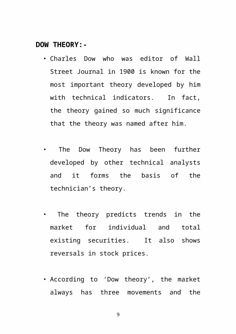
DOW THEORY:-• Charles Dow who was editor of Wall
Street Journal in 1900 is known for the
most important theory developed by him
with technical indicators. In fact,
the theory gained so much significance
that the theory was named after him.
• The Dow Theory has been further
developed by other technical analysts
and it forms the basis of the
technician’s theory.
• The theory predicts trends in the
market for individual and total
existing securities. It also shows
reversals in stock prices.
• According to ‘Dow theory’, the market
always has three movements and the

10
movements are simultaneous in the
nature. These movements may be
described as:-
• The narrow movement which occurs from
day to day.
• The short swing which usually moves for
short time like two weeks and extends
up to a month; this movement can be
called a short term movement, and
The third movement is also the main
movement and it covers for years in its
duration.
• According to the type of movements,
they have been given special names.
• The narrow movement is called
‘fluctuations’ the short swing is
better known as ‘secondary movements’
and the main movement is also called
the ‘primary trends’.
• Narrow movements are called

11
‘fluctuations’. Secondary movements
are those which last only for a short
while and they are also known as
“corrections”. Primary trends are,
therefore, the main movement in the
stock market. It is also called
‘Bears” and ‘Bulls” market.
• According to the Dow Theory, the price
movements in a market can be identified
by means of a line-chart.
• In this chart the technical analyst
should plot the price of the share.
With it, he should also mark the market
average every day.
• This would help in identifying the
primary and secondary movements.
• Dow theorists believe in ‘momentum’,
which, according to them, keeps the
price moving in the same direction.
• They believe in primary trends, which
according to them are momentum or bear

12
and bull markets. The momentum will
carry the prices further but momentum
of primary trend will be halted by the
terminology used by technical analysts
called ‘support areas’ and ‘resistance
areas’.
Criticism of Dow Theory
• The Dow Theory is subject to various
limitations in actual practice.
• Dow has developed this theory to
depict the general trend of the market
but not with the intention of
projecting the future trend or to
diagnose the buy and sell signals in
the market.
• These applications of the Dow Theory
have come in the light of analytical
studies of financial analysts.
• This theory is criticized on the ground

13
that it is too subjective and based on
historical interpretation; it is not
infallible as it depends on the
interpretative ability of the analyst.
• The results of this theory do not also
give meaningful and conclusive evidence
of any action to be taken in terms of
buy and sell operations.
Candlestick Charting
• The candle is comprised of two parts,
the body and the shadows. The body
encompasses the open and closing price
for the period. The candle body is
black if the security closed below the
open, and white if the close was higher
than the open for the period. The
candlestick shadow encompasses the
intra period high and low.
History of Technical Analysis:Technical Analysis as a tool of investment
for the average investor thrived in the late

14
nineteenth century when Charles Dow, then editor
of the Wall Street Journal, proposed the Dow
Theory. He recognized that the movement is caused
by the action/reaction of the people dealing in
stocks rather than the news in itself.
Technical analysis is a method of evaluating
securities by analyzing the Statistics generated
by market activity, such as past prices and
volume. Technical analysts do not attempt to
measure a security's intrinsic value, but instead
use charts and other tools to identify patterns
that can suggest future activity. Just as there
are many investment styles on the fundamental
side.
There are also many different types of technical
traders. Some rely on chart patterns; others use
technical indicators and oscillators, and most
use some combination of the two. In any case,
technical analysts' exclusive use of historical
price and volume data is what separates them from
their fundamental counterparts. Unlike
fundamental analysts, technical analysts don't
care whether a stock is undervalued the only
thing that matters is a security's past trading

15
data and what information this data can provide
about where the Security might move in the
future.
Basic premises of technical analysis:1. Market prices are determined by the
interaction of supply & demand forces.
2. Supply & demand are influenced by variety of
supply & demand affiliated Factors both rational
& irrational.
3. These include fundamental factors as well as
psychological factors.
4. Barring minor deviations stock prices tend to
move in fairly persistent trends.
5. Shifts in demand & supply bring about change
in trends.
6. This shift s can be detected with the help of
charts of manual & computerized action, because
of the persistence of trends & patterns analysis
of past market data can be used to predict future
prices behaviours.
Drawbacks / limitations of technical
analysis:1. Technical analysis does not able to explain

16
the rezones behind the employment or selection of
specific tool of Technical analysis.
2. The technical analysis failed to signal an
uptrend or downtrend in time.
3. The technical analysis must be a self
defeating proposition. As more & more people use,
employ it the value of such analysis trends to
reduce.
Why we use TECHNICAL ANALYSIS?1)Technical analysis provides information on
the best entry and
Exit points for a trade.
2)On a chart, the trader can see where momentum
is rising, a
Trend is forming, a price is dipping or other
events are developing that show the best entry
point and time for the most profitable trade.
With the constant movement of various currencies
against each other in the Forex market, most
Traders will focus on using technical indicators
to find and place their Trades.
IS TECHNICAL ANALYSIS DIFFICULT?

17
1) Technical analysis is not difficult, but it
requires studying
Different types of charts such as the hourly
or daily charts, knowing which
technical indicators to use and how to use
them.
2) Computers and the Internet have made this
process much easier.
Most brokers provide basic charts and technical
indicators for free or at a very low cost.
3) One way to avoid getting frustrated by all the
lines, colours, and
Graphics is to focus on using only a few
indicators that will
Provide you with the information needed. Try
not to clutter your
Chart with too much information.
Fundamental vs. Technical AnalysisTechnical analysis and fundamental analysis
are the two main schools of thought in the
financial markets. As we've mentioned, technical
analysis looks at the price movement of a
security and uses this data to predict its future

18
price movements. Fundamental analysis, on the
other hand, looks at economic factors, known as
fundamentals.
Fundamental analysis takes a relatively
long-term approach to analyzing the market
compared to technical analysis. While
technical analysis can be used on a
timeframe of weeks, days or even minutes,
fundamental analysis often looks at data
over a number of years.
The future can be found in the pastIf prices are based on investor expectations,
then knowing what a security should sell for
(i.e., fundamental analysis) becomes less
important than knowing what other investors
expect it to sell for. That's not to say that
knowing what a security should sell for isn't
important--it is. But there is usually a fairly
strong consensus of a stock's future earnings
that the average investor cannot disprove.
Technical analysis is the process of
analyzing a security's historical prices in an
effort to determine probable future prices. This

19
is done by comparing current price action (i.e.,
current expectations) with comparable historical
price action to predict a reasonable outcome. The
devout technician might define this process as
the fact that history repeats itself while others
would suffice to say that we should learn from
the past.

20
CHAPTER-2 COMPANY PROFILE

21
COMPANY PROFILE
About Smart Equity Broker Pvt Ltd:
Smart Group was incorporated in 2006 and promoted by Mr.
Arun Khera and his family members. The group is primarily
in to retail broking (including HNIs) - Equity, currency
futures and commodity segments. In the retail broking
segment, the Group operates through two companies - Smart
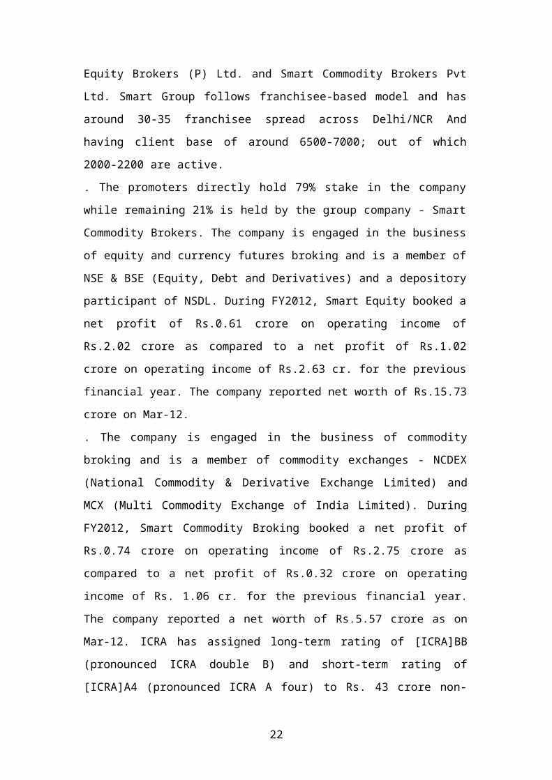
22
Equity Brokers (P) Ltd. and Smart Commodity Brokers Pvt
Ltd. Smart Group follows franchisee-based model and has
around 30-35 franchisee spread across Delhi/NCR And
having client base of around 6500-7000; out of which
2000-2200 are active.
. The promoters directly hold 79% stake in the company
while remaining 21% is held by the group company - Smart
Commodity Brokers. The company is engaged in the business
of equity and currency futures broking and is a member of
NSE & BSE (Equity, Debt and Derivatives) and a depository
participant of NSDL. During FY2012, Smart Equity booked a
net profit of Rs.0.61 crore on operating income of
Rs.2.02 crore as compared to a net profit of Rs.1.02
crore on operating income of Rs.2.63 cr. for the previous
financial year. The company reported net worth of Rs.15.73
crore on Mar-12.
. The company is engaged in the business of commodity
broking and is a member of commodity exchanges - NCDEX
(National Commodity & Derivative Exchange Limited) and
MCX (Multi Commodity Exchange of India Limited). During
FY2012, Smart Commodity Broking booked a net profit of
Rs.0.74 crore on operating income of Rs.2.75 crore as
compared to a net profit of Rs.0.32 crore on operating
income of Rs. 1.06 cr. for the previous financial year.
The company reported a net worth of Rs.5.57 crore as on
Mar-12. ICRA has assigned long-term rating of [ICRA]BB
(pronounced ICRA double B) and short-term rating of
[ICRA]A4 (pronounced ICRA A four) to Rs. 43 crore non-
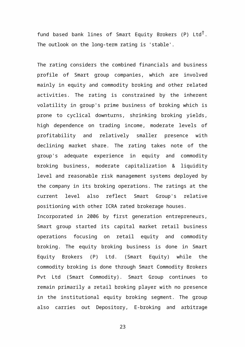
23
fund based bank lines of Smart Equity Brokers (P) Ltd†.
The outlook on the long-term rating is 'stable'.
The rating considers the combined financials and business
profile of Smart group companies, which are involved
mainly in equity and commodity broking and other related
activities. The rating is constrained by the inherent
volatility in group's prime business of broking which is
prone to cyclical downturns, shrinking broking yields,
high dependence on trading income, moderate levels of
profitability and relatively smaller presence with
declining market share. The rating takes note of the
group's adequate experience in equity and commodity
broking business, moderate capitalization & liquidity
level and reasonable risk management systems deployed by
the company in its broking operations. The ratings at the
current level also reflect Smart Group's relative
positioning with other ICRA rated brokerage houses.
Incorporated in 2006 by first generation entrepreneurs,
Smart group started its capital market retail business
operations focusing on retail equity and commodity
broking. The equity broking business is done in Smart
Equity Brokers (P) Ltd. (Smart Equity) while the
commodity broking is done through Smart Commodity Brokers
Pvt Ltd (Smart Commodity). Smart Group continues to
remain primarily a retail broking player with no presence
in the institutional equity broking segment. The group
also carries out Depository, E-broking and arbitrage
24
trading operations.
Smart Equity has a small presence in retail equity
broking segment with a market share of 0.05% in FY-12 as
compared to 0.08% in FY-11. The company is also involved
in currency future broking segment; however the scale of
operations in this segment remains marginal. The income
stream of Smart Equity is concentrated to broking and
trading activities while fee-based income is negligible.
Going forward, Smart Equity's financial performance would
remain highly sensitive to the vagaries of the domestic
capital markets and is subject to risks associated with
capital market operations.
Smart Equity deploys extra cash available into the
arbitrage opportunities that may exist in the equity
capital market. The income from trading activities
(proprietary and arbitrage) constitute 36% of total
income of the company in FY-12 as compared to 47% in the
previous financial year. Smart Group has put in a
reasonable risk management systems with constant
monitoring of dealer's positions to avoid any significant
losses.
Smart Equity has taken adequate steps to mitigate the
credit risks and market risks associated with the retail
broking business for the current scale of its business.
It collects adequate safety deposit from franchisee and
clients to meet any shortfall in the margin requirement.
25
So far, the company has able to protect its asset quality
as reflected in low level of debtors (at Rs.0.19 crore on
March 30, 2012, representing 0.9% of net worth); however,
in the absence of automated/stringent risk management
systems and processes, its asset quality could come under
pressure during the volatile capital market and thus
needs improvement.
Long-term and short-term bank lines are
subject to total utilization of Rs.43 crore
Smart Equity's liquidity profile is adequate; on an
average the utilization levels of bank limits given to
exchanges remain at about 70% which provides some cushion
to manage liquidity in times of volatility. While the
liquidity risk in broking activities is low, going
forward, Smart Equity's ratings would be sensitive to
its ability to improve upon its profitability by growing
its business volume and its ability to maintain superior
asset quality through volatile market conditions.
Company’s values
To be fair, empathetic and responsive in serving our
customers. To respect and reinforce our fellow employees
and the power of teamwork. To strive relentlessly to
improve what we do and how we do it.
Company’s customer base is a mix of institutional, high
net worth, and retail investors. This diversified base
of customers, together with our wide gamut of services,
provides us with the necessary stability and strength
26
to weather the volatility much better than that of the
competitors and also maintain high standards of
customer service levels throughout. Smart meets the
support needs of this investor base through
execution skills driven by an experienced sales
team and research-backed advice generated by a
team of experienced analysts. Smart advisory
services range from investing, trading, research,
financial planning and portfolio management,
which are offered, to a large number of high net
worth individuals and corporate
Business Operations
Smart Equity Brokers Pvt Ltd (Smart Equity) a financial
firm based in Delhi was incorporated in 2006. The
company attained membership in NSE and BSE in 2006. It
operates in both in cash and derivative market segments
of
BSE and NSE. Smart Equity offers comprehensive
financial service such as trading in equities and
derivatives, currency futures, online trading, margin
funding, research reports, advisory service and
distribution of financial products like mutual fund,
IPO and insurance among others. These services are
mainly catered to retail investors, proprietary HNI,
corporate and arbitrage clients. The company through
its associates, smart Commodity Brokers Pvt Ltd offers
commodity trading service which is member of MCX and
NCDEX.As on Mar 31,2011 the Company operated with 130

27
terminal across 40 Offices with 70 employees. During
the same period, the company had nearly 6,500 client
accounts. In FY11, Smart Equity generated 60% revenues
form the derivative market
Objectives of the Study
To give the practical knowledge of technical Analysis.
To Know how technical tools are used to predict the
future behaviour of stocks.
To know how charting techniques are useful to take buy
and sell decision.
To know how an investor can take rational investment
decisions by the study of market trends of movements.
To provide investor with technique with which they can
make a decent profit by trading in stock market.
To find out which equity share is preferable for the
investors i.e., when to buy & when to sell a
particular stock.

28
CHAPTER-3 RESEARCH METHODOLOGY

29
RESEARCH METHODOLOGY
Tools & Instruments Are Used To Do The
Technical Analysis:Price FieldsTechnical analysis is based almost entirely on the
analysis of price and volume. The fields which define a
security's price and volume are explained below.
Open - This is the price of the first trade for the
period (e.g., the first trade of the day). When analyzing
daily data, the Open is especially important as it is the
consensus price after all interested parties were able to
"sleep on it."
High - This is the highest price that the security
traded during the period. It is the point at which there
were more sellers than buyers (i.e., there are always
sellers willing to sell at higher prices, but the High
represents the highest price buyers were willing to pay).
Low - This is the lowest price that the security tradedduring the period. It is the point at which there were
more buyers than sellers (i.e., there are always buyers
willing to buy at lower prices, but the Low represents
the lowest price sellers were willing to accept).
Close - This is the last price that the security traded

30
during the period. Due to its availability, the Close is
the most often used price for analysis. The relationship
between the Open (the first price) and the Close (the
last price) are considered significant by most
technicians. This relationship is emphasized in
candlestick charts.
Volume - This is the number of shares (or contracts)that were traded during the period. The relationship
between prices and volume (e.g., increasing prices
accompanied with increasing volume) is important.
Open Interest - This is the total number of outstandingcontracts (i.e., those that have not been exercised,
closed, or expired) of a future or option. Open interest
is often used as an indicator.
Bid - This is the price a market maker is
willing to pay for a security (i.e., the price
you will receive if you sell).
Ask - This is the price a market maker is
willing to accept (i.e., the price you will pay
to buy the security).
Price Styles (Charts Types)Price in a chart can be displayed in four styles:
1.Bar Chart.

31
2. Line Chart.
3. Candlestick Chart.
4.Point and Figure Charts
1) Bar Charts :The highs and lows of a foreign currency are
plotted in a diagram and the points are joined
with vertical lines (bars). A small horizontal
tick to the left denotes the opening level while
a small horizontal tick to the right represents
the closing price of each interval.
2) Line Chart:

32
It gives the detailed information about every
aspect.
The exchange rates for each time period are
plotted in a diagram and the points are joined.
Prices on the y-axis, time on the x-axis.
The line chart chooses for example the closing
price of consecutive time periods, but can also
work with daily, official fixings.
The relatively easy handling of line charts is a
great advantage. Line charts do not show price
movements within a time period. This can be a
problem because important information for

33
exchange rate analysis can be lost. This Problem
was remedied with the development of bar charts
that represent a more sophisticated form of line
chart.
3) Candlestick Chart:
A candlestick is black if the closing price is
lower than the opening price. A candlestick is
white if the closing price is higher than the
opening price.

34
In the 1600s, the Japanese developed a method of
technical analysis to analyze the price of rice
contracts. This technique is called candlestick
charting. Steven Nison is credited with
popularizing candlestick charting
and has become recognized as the leading expert
on their interpretation.
Candlestick charts display the open, high, low,
and closing prices in a format similar to a
modern-day bar chart, but in a manner that
extenuates the relationship between the opening

35
and closing prices. Candlestick
Charts are simply a new way of looking at prices,
they don't involve any calculations. Because
candlesticks display the relationship between the
open, high, low, and closing prices, they cannot
be displayed on securities that only have closing
prices, nor were they intended to be displayed on
securities that lack opening prices.
The interpretation of candlestick charts is based
primarily on patterns. The most popular patterns
are explained below.
Bullish Patterns1)Long white (empty) line. This is a bullish
line. It occurs when prices open near the
low and close significantly higher near the
period's high.
2)Hammer. This is a bullish line if it occurs
after a significant downtrend. If the line
occurs after a significant up-trend, it is
called a Hanging Man. A Hammer is identified

36
by a small real body (i.e., a small range
between the open and closing prices) and a
long lower shadow (i.e., the low is
significantly lower than the open, high, and
lose). The body can be empty or filled-in.
3)Piercing line. This is a bullish pattern and
the opposite of a dark cloud cover. The
first line is a long black line and the
second line is a long white line. The second
line opens lower than the first line's low,
but it closes more than halfway above the
first line's real body.
4)Bullish engulfing lines. This pattern is
strongly bullish if it occurs after a
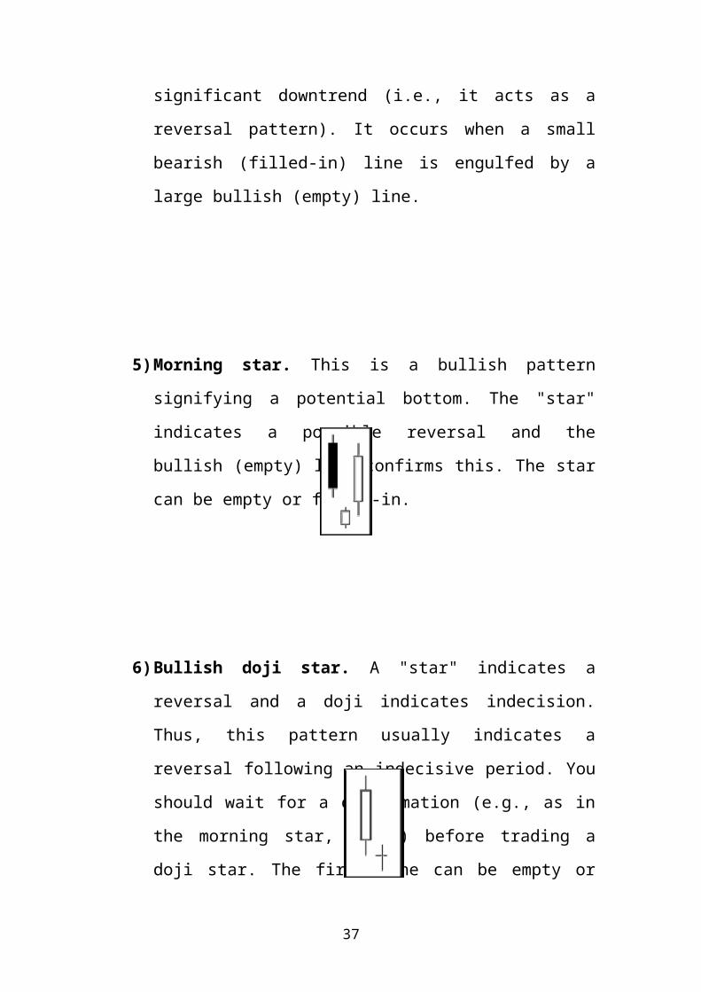
37
significant downtrend (i.e., it acts as a
reversal pattern). It occurs when a small
bearish (filled-in) line is engulfed by a
large bullish (empty) line.
5)Morning star. This is a bullish pattern
signifying a potential bottom. The "star"
indicates a possible reversal and the
bullish (empty) line confirms this. The star
can be empty or filled-in.
6)Bullish doji star. A "star" indicates a
reversal and a doji indicates indecision.
Thus, this pattern usually indicates a
reversal following an indecisive period. You
should wait for a confirmation (e.g., as in
the morning star, above) before trading a
doji star. The first line can be empty or

38
filled in.
Bearish Patterns1)Long black (filled-in) line. This is a
bearish line. It occurs when prices open near
the high and close significantly lower near
the period's low.
2)Hanging Man. These lines are bearish if they
occur after a significant uptrend. If this
pattern occurs after a significant downtrend,
it is called a Hammer. They are identified by
small real bodies (i.e., a small range
between the open and closing prices) and a
long lower shadow (i.e., the low was
significantly lower than the open, high, and
close). The bodies can be empty or filled-in.

39
3)Dark cloud cover. This is a bearish pattern.
The pattern is more significant if the second
line's body is below the centre of the
previous line's body (as illustrated).
4)Bearish engulfing lines. This pattern is
strongly bearish if it occurs after a
significant uptrend (i.e., it acts as a
reversal pattern). It occurs when a small
bullish (empty) line is engulfed by a large
bearish (filled-in) line.
5) Evening star. This is a bearish pattern
signifying a potential top. The "star" indicates
40
a possible reversal and the bearish (filled-in)
line confirms this. The star can be empty or
filled in.
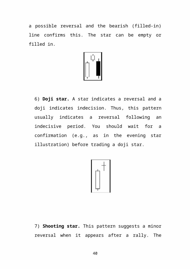
6) Doji star. A star indicates a reversal and a
doji indicates indecision. Thus, this pattern
usually indicates a reversal following an
indecisive period. You should wait for a
confirmation (e.g., as in the evening star
illustration) before trading a doji star.
7) Shooting star. This pattern suggests a minor
reversal when it appears after a rally. The

41
star's body must appear near the low price and
the line should have a long upper shadow.
Reversal Patterns1) Long-legged doji. This line often signifies a
turning point. It occurs when the open and
close are the same, and the range between the
high and low is relatively large.
2) Dragon-fly doji. This line also signifies a
turning point. It occurs when the open and
close are the same, and the low is

42
significantly lower than the open, high, and
closing prices.
3) Gravestone doji. This line also signifies a
turning point. It occurs when the open, close,
and low are the same, and the high is
significantly higher than the open, low, and
closing prices.
4) Star. Stars indicate reversals. A star is a
line with a small real body that occurs after a
line with a much larger real body, where the
real bodies do not overlap. The shadows may
overlap.
43
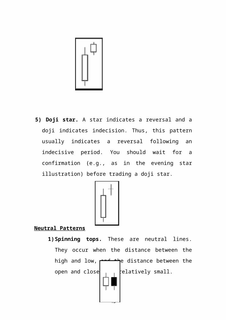
5) Doji star. A star indicates a reversal and a
doji indicates indecision. Thus, this pattern
usually indicates a reversal following an
indecisive period. You should wait for a
confirmation (e.g., as in the evening star
illustration) before trading a doji star.
Neutral Patterns
1)Spinning tops. These are neutral lines.
They occur when the distance between the
high and low, and the distance between the
open and close, are relatively small.

44
2)Doji. This line implies indecision. The
security opened and closed at the same
price. These lines can appear in several
different patterns. Double doji lines (two
adjacent doji lines) imply that a forceful
move will follow a breakout from the
current indecision.

45
3) Point And Figure Charts
The point and figure chart is not well
known or used by the average investor but it has
had a long history of use dating back to the
first technical traders. This type of chart
reflects price movements and is not as concerned
about time and volume in the formulation of the
points. The point and figure chart removes the
noise, or insignificant price movements, in the
stock, which can distort traders' views of the
price trends. These types of charts also try to
neutralize the skewing effect that time has on
chart analysis.
46
When first looking at a point and figure chart,
you will notice a series of Xs and Os. The Xs
represent upward price trends and the Os
represent downward price trends. There are also
numbers and letters in the chart; these represent
months, and give investors an idea of the date.
Each box on the chart represents the price scale,
which adjusts depending on the price of the
stock: the higher the stock's price the more each
box represents. On most charts where the price is
between $20 and $100, a box represents $1, or 1
point for the stock. The other critical point of
a point and figure chart is the reversal
criteria. This is usually set at three but it can
also be set according to the chartist's
discretion. The reversal criteria set how much
the price has to move away from the high or low
in the price trend to create a new trend or, in
other words, how much the price has to move in
order for a column of Xs to become a column of
Os, or vice versa. When the price trend has moved
47
from one trend to another, it shifts to the
right, signalling a trend change.
Summary of charts
TRENDS IN TECHNICAL ANALYSISThe Use of Trends
One of the most important concepts in
technical analysis is that of trend. The
meaning in finance isn't all that
different from the general definition of the
term - a trend is really nothing more than
the general direction in which a security or
market is headed. Take a look at the chart
below:

48
Is not it hard to see that the trend is up?
However, it's not always this easy to see a
trend:

49
There are lots of ups and downs in this
chart, but there isn't a clear indication of
which direction this security is headed.
A More Formal Definition
Unfortunately, trends are not always
easy to see. In other words, defining a
trend goes well beyond the obvious. In any
given chart, you will probably notice that
prices do not tend to move in a straight
line in any direction, but rather in a
series of highs and lows. In technical
analysis, it is the movement of the highs
and lows that constitutes a trend. For

50
example, an uptrend is classified as a
series of higher highs and higher lows,
while a downtrend is one of lower lows and
lower highs.
It is an example of an uptrend. Point 2 in the
chart is the first high, which is determined
after the price falls from this point. Point 3 is
the low that is established as the price falls
from the high. For this to remain an uptrend each
successive low must not fall below the previous
lowest point or the trend is deemed a reversal.
Types of Trend There are three types of trend:
1. Uptrend
2. Downtrend

51
3. Sideways/Horizontal Trends
As the names imply, when each successive
peak and trough is higher, it's referred to as an
upward trend. If the peaks and troughs are
getting lower, it's a downtrend. When there is
little movement up or down in the peaks and
troughs, it's a sideways or horizontal trend. If
you want to get really technical, you might even
say that a sideways trend is actually not a trend
on its own, but a lack of a well-defined trend in
either direction. In any case, the market can
really only trend in these three ways: up, down
or nowhere
Trend Lengths
Along with these three trend directions, there are
three trend classifications. A trend of any
direction can be classified as a long-term trend,
intermediate trend or a short-term trend. In terms
of the stock market, a major trend is generally
categorized as one lasting longer than a year. An
intermediate trend is considered to last between one
and three months and a near-term trend is anything
less than a month. A long-term trend is composed of

52
several intermediate trends, which often move
against the direction of the major trend. If the
major trend is upward and there is a downward
correction in price movement followed by a
continuation of the uptrend, the correction is
considered to be an intermediate trend. The short-
term trends are components of both major and
intermediate trends. Take a look a Figure 4 to get a
sense of how these three trend lengths might look.
When analyzing trends, it is important that
the chart is constructed to best reflect the
type of trend being analyzed. To help
identify long-term trends, weekly charts or
daily charts spanning a five-year period are
used by chartists to get a better idea of
the long-term trend. Daily data charts are

53
best used when analyzing both intermediate
and short-term trends. It is also important
to remember that the longer the trend, the
more important it is; for example, a one-
month trend is not as significant as a five-
year trend.
Trend Lines
A trend line is a simple charting technique
that adds a line to a chart to represent the trend
in the market or a stock. Drawing a trend line is as
simple as drawing a straight line that follows a
general trend. These lines are used to clearly show
the trend and are also used in the identification of
trend reversals.
An upward trend line is drawn at the lows
of an upward trend. This line represents the support
the stock has every time it moves from a high to a
low. Notice how the price is propped up by this
support. This type of trend line helps traders to
anticipate the point at which a stock's price will
begin moving upwards again. Similarly, a downward
trend line is drawn at the highs of the downward
trend. This line represents the resistance level
that a stock faces every time the price moves from a
low to a high.

54
Channels
A channel, or channel lines, is the
addition of two parallel trend lines that
act as strong areas of support and
resistance. The upper trend line connects a
series of highs, while the lower trend line
connects a series of lows. A channel can
slope upward, downward or sideways but,
regardless of the direction, the
interpretation remains the same. Traders
will expect a given security to trade
between the two levels of support and
resistance until it breaks beyond one of the
55
levels, in which case traders can expect a
sharp move in the direction of the break.
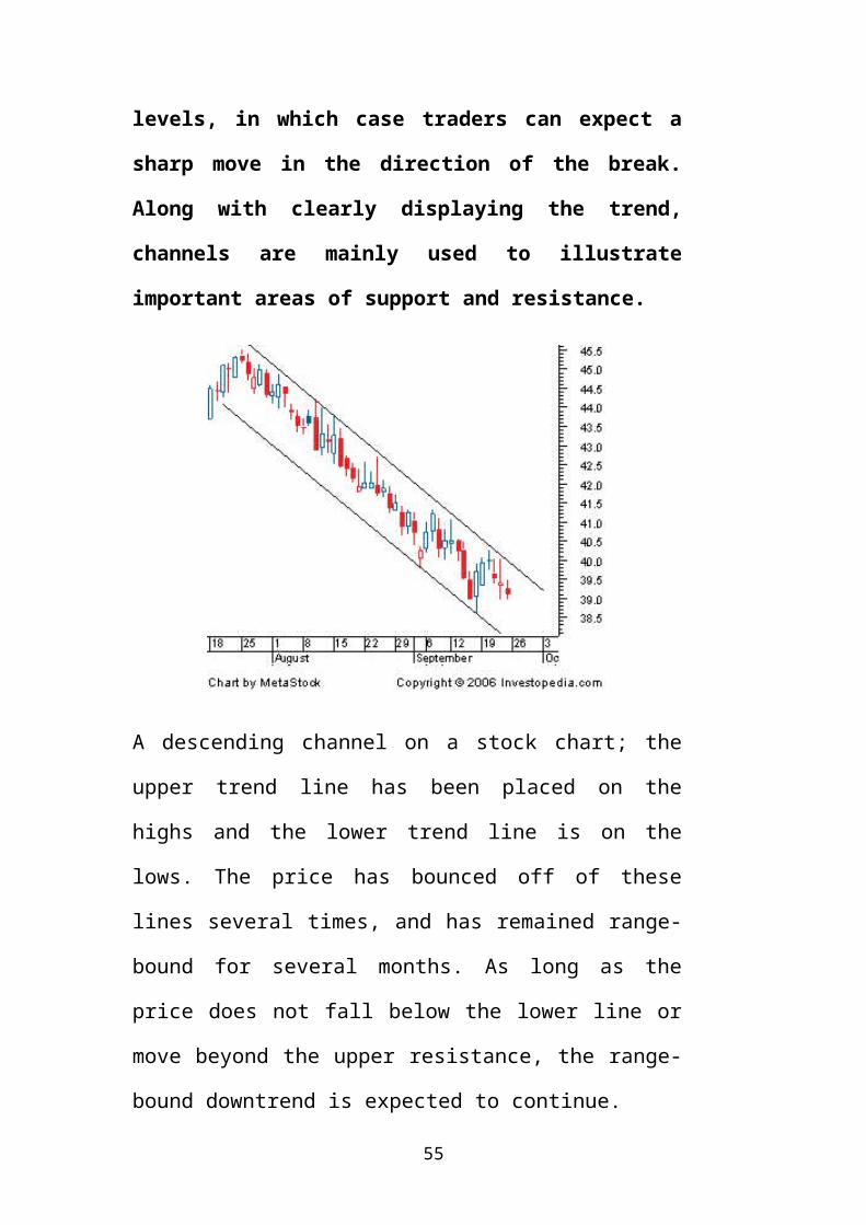
Along with clearly displaying the trend,
channels are mainly used to illustrate
important areas of support and resistance.
A descending channel on a stock chart; the
upper trend line has been placed on the
highs and the lower trend line is on the
lows. The price has bounced off of these
lines several times, and has remained range-
bound for several months. As long as the
price does not fall below the lower line or
move beyond the upper resistance, the range-
bound downtrend is expected to continue.

56
The Importance of Trend
It is important to be able to
understand and identify trends so that you can
trade with rather than against them. Two
important sayings in technical analysis are "the
trend is your friend" and "don't buck the trend,"
illustrating how important trend analysis is for
technical traders
What Is Volume?
Volume is simply the number ofshares or contracts that trade over a given
period of time, usually a day. The higher
the volume the more active the security. To
determine the movement of the volume (up or
down), chartists look at the volume bars
that can usually be found at the bottom of
any chart. Volume bars illustrate how many
shares have traded per period and show

57
trends in the same way that prices do.
Why Volume Is Important?
Volume is an important aspectof technical analysis because it is used to
confirm trends and chart patterns. Any price
movement up or down with relatively high
volume is seen as a stronger, more relevant
move than a similar move with weak volume.
Say, for example, that a stock jumps 5% in

58
one trading day after being in a long
downtrend. Is this a sign of a trend
reversal? This is where volume helps
traders. If volume is high during the day
relative to the average daily volume, it is
a sign that the reversal is probably for
real. On the other hand, if the volume
is below average, there may not be enough
conviction to support a true trend reversal.
Volume should move with the trend. If prices
are moving in an upward trend, volume should
increase (and vice versa). If the previous
relationship between volume and price
movements starts to deteriorate, it is
usually a sign of weakness in the trend. For
example, if the stock is in an uptrend but
the up trading days are marked with lower
volume, it is a sign that the trend is
starting to lose its legs and may soon end.
When volume tells a different story, it is a
case of divergence, which refers to a
contradiction between two different

59
indicators. The simplest example of
divergence is a clear upward trend on
declining volume.
Volume and Chart Patterns
The other use of volume is toconfirm chart patterns. Patterns such as
head and shoulders, triangles, flags and
other price patterns can be confirmed with
volume, a process which we'll describe in
more detail later in this tutorial. In most
chart patterns, there are several pivotal
points that are vital to what the chart is
able to convey to chartists. Basically, if
the volume is not there to confirm the
pivotal moments of a chart pattern, the
quality of the signal formed by the pattern
is weakened.
Volume Precedes Price
Another important idea in technicalanalysis is that price is preceded by volume.
Volume is closely monitored by technicians and

60
chartists to form ideas on upcoming trend
reversals. If volume is starting to decrease in
an uptrend, it is usually a sign that the upward
run is about to end. Now that we have a better
understanding of some of the important factors of
technical analysis, we can move on to charts,
which help to identify trading opportunities in
prices movements.
CHART PATTERNS:-
A chart pattern is a distinct formation on a
stock chart that creates a trading signal, or a
sign of future price movements. Chartists use
these patterns to identify current trends and
trend reversals and to trigger buy and sell
signals.
In the first section of this
tutorial, we talked about the three assumptions
of technical analysis, the third of which was
that in technical analysis, history repeats

61
itself. The theory behind chart patterns is based
on this assumption. The idea is that certain
patterns are seen many times, and that these
patterns signal a certain high probability move
in a stock. Based on the historic trend of a
chart pattern setting up a certain price
movement, chartists look for these Patterns to
identify trading opportunities. While there are
general ideas and components to every chart
pattern, there is no chart pattern that will tell
you with 100% certainty where a security is
headed. This creates some leeway and debate as to
what a good pattern looks like, and is a major
reason why charting is often seen as more of an
art than a science. There are two types of
patterns within this area of technical
analysis, reversal and continuation. A reversal
pattern signals that a prior trend will reverse
upon completion of the pattern. A continuation
pattern, on the other hand, signals that a trend
will continue once the pattern is complete. These
patterns can be found over charts of any

62
timeframe. In this section, we will review some
of the more popular chart patterns.
1. Head and Shoulders:
This is one of the most popular and
reliable chart patterns in technical analysis.
Head and shoulders is a reversal chart pattern
that when formed, signals that the security is
likely to move against the previous trend. As you
can see, there are two versions of the head and
shoulders chart pattern. Head and shoulders top
(shown on the left) is a chart pattern that is
formed at the high of an upward movement and
signals that the upward trend is about to end.
Head and shoulders bottom, also known as inverse
head and shoulders (shown on the right) is the
lesser known of the two, but is used to signal a
reversal in a downtrend.

63
Both of these head and shoulders patterns are
similar in that there are four main parts: two

64
shoulders, a head and a neckline. Also, each
individual head and shoulder is comprised of a
high and a low. For example, in the head and
shoulders top image shown on the left side, the
left shoulder is made up of a high followed by a
low. In this pattern, the neckline is a level of
support or resistance. Remember that an upward
trend is a period of successive rising highs and
rising lows. The head and shoulders chart
pattern, therefore, illustrates a weakening in a
trend by showing the deterioration in the
successive movements of the highs and lows.
2. Cup and Handle: A cup and handle chart is a
bullish continuation pattern in which the upward
trend has paused but will continue in an upward
direction once the pattern is confirmed.

65
The price pattern forms what looks like a cup,
which is preceded by an upward trend. The handle
follows the cup formation and is formed by a
generally downward/sideways movement in the
security's price. Once the price movement pushes
above the resistance lines formed in the handle,
the upward trend can continue.
3. Double Tops and Bottoms:
This chart pattern is another well-known pattern
that signals a trend reversal - it is considered
to be one of the most reliable and is commonly
used. These patterns are formed after a sustained

66
trend and signal to chartists that the trend is
about to reverse. The pattern is created when a
price movement tests support or resistance levels
twice and is unable to break through. This
pattern is often used to signal intermediate and
long-term trend reversals.
A double top pattern is shown on the left, while
a double bottom pattern is shown on the right.
In the case of the double top pattern, the price
movement has twice tried to move above a certain
price level. After two unsuccessful attempts at
pushing the price higher, the trend reverses and
the price heads lower. In the case of a double
bottom (shown on the right), the price movement
has tried to go lower twice, but has found
support each time. After the second bounce off of

67
the support, the security enters a new trend and
heads upward.
4. Triangles
Triangles are some of the most well-known
chart patterns used in technical analysis.
The three types of triangles, which vary in
construct and implication, are the
symmetrical triangle, ascending and
descending triangle. These chart patterns
are considered to last anywhere from a
couple of weeks to several months.
The symmetrical is a pattern in which two trend

68
lines converge toward each other. This pattern is
neutral in that a breakout to the upside or
downside is a confirmation of a trend in that
direction. In an ascending triangle, the upper
trend line is flat, while the bottom trend line
is upward sloping. This is generally thought of
as a bullish pattern in which chartists look for
an upside breakout. In a descending triangle, the
lower trend line is flat and the upper trend line
is descending. This is generally seen as a
bearish pattern where chartists look for a
downside breakout.
5.Flag and Pennants
These two short-term chart patterns are
continuation patterns that are formed when
there is a sharp price movement followed by
a generally sideways price movement. This
pattern is then completed upon another sharp
price movement in the same direction as the
move that started the trend. The patterns are
generally thought to last from one to three

69
weeks.
There
is
little difference between a pennant and a flag.
The main difference between these price movements
can be seen in the middle section of the chart
pattern. In a pennant, the middle section is
characterized by converging trend lines, much
like what is seen in a symmetrical triangle. The
middle section on the flag pattern, on the other
hand, shows a channel pattern, with no
convergence between the trend lines. In both
cases, the trend is expected to continue when the
price moves above the upper trend line
Triple Tops and Bottoms
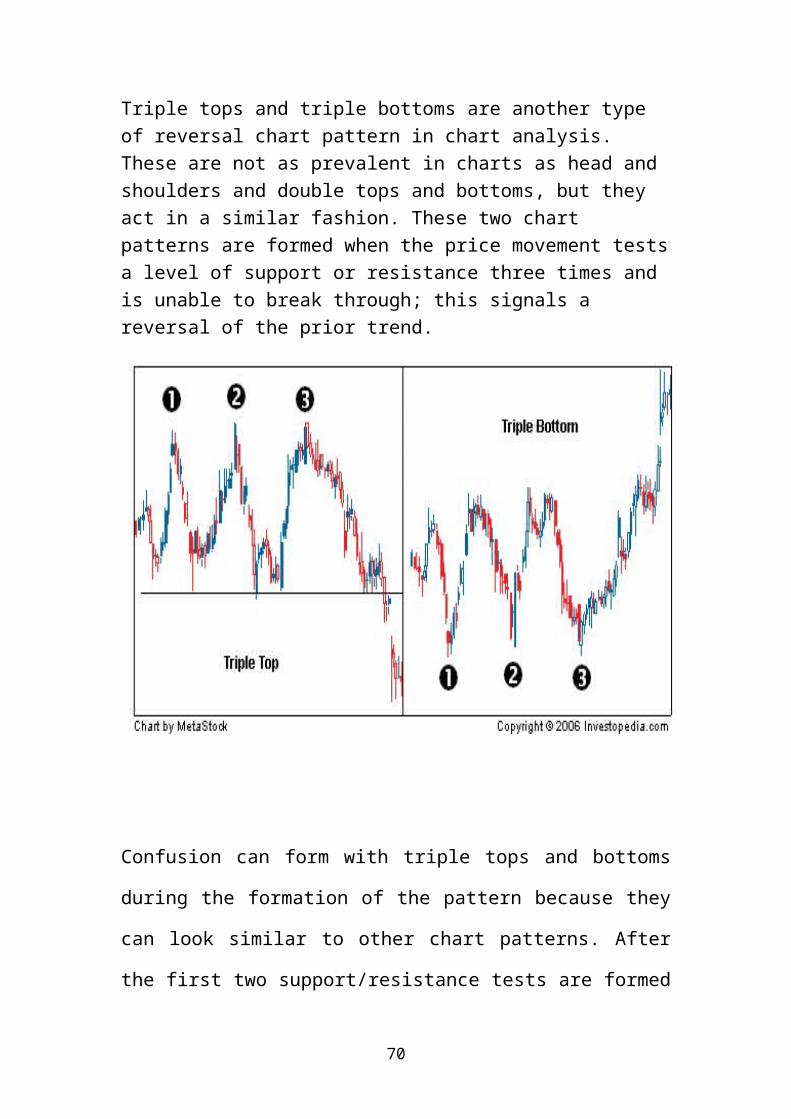
70
Triple tops and triple bottoms are another type of reversal chart pattern in chart analysis. These are not as prevalent in charts as head and shoulders and double tops and bottoms, but they act in a similar fashion. These two chart patterns are formed when the price movement testsa level of support or resistance three times and is unable to break through; this signals a reversal of the prior trend.
Confusion can form with triple tops and bottoms
during the formation of the pattern because they
can look similar to other chart patterns. After
the first two support/resistance tests are formed

71
in the price movement, the pattern will look like
a double top or bottom, which could lead a
chartist to enter a reversal position too soon.
6.Rounding Bottom
A rounding bottom, also referred to as a
saucer bottom, is a long-term reversal pattern
that signals a shift from a downward trend to
an upward trend. This pattern is traditionally
thought to last anywhere from several Months
to several years.
A rounding bottom chart pattern looks similar to
a cup and handle pattern but without the handle.

72
The long-term nature of this pattern and the lack
of a confirmation trigger, such as the handle in
the cup and handle, make it a difficult pattern.
SUPPORT AND RESISTANCE:-
Once you understand the concept of a trend, the
next major concept is that of support and resistance.
You'll often hear technical analysts talk about the
ongoing battle between the bulls and the bears, or the
struggle between buyers (demand) and sellers (supply).
This is revealed by the prices a security seldom moves
above (resistance) or below (support).

73
Support is the price level through which a stock
or market seldom falls (illustrated by the blue
arrows). Resistance, on the other hand, is the
price level that a stock or market seldom
surpasses (illustrated by the Red Arrows).
These support and resistance levels
are seen as important in terms of market
psychology and supply and demand. Support and
resistance levels are the levels at which a lot
of traders are willing to buy the stock (in the
case of a support) or sell it (in the case of
resistance). When these trend lines are broken,
the supply and demand and the psychology behind
the stock's movements is thought to have shifted,
in which case new levels of support and
resistance likely be established.
Role Reversal
Once a resistance or support level is
broken, its role is reversed. If the price falls
below a support level, that level will become
resistance. If the price rises above a resistance
level, it will often become support. As the price

74
moves past a level of support or resistance, it
is thought that supply and demand has shifted,
causing the breached level to reverse its role.
For a true reversal to occur, however, it is
important that the price make a strong move
through either the support or resistance.
For example, as you can see, the dotted line isshown as a level of resistance that has prevented
the price from heading higher on two previous
occasions (Points 1 and 2). However, once the
resistance is broken, it becomes a level of support
(shown by Points 3 and 4) by propping up the price
and preventing it from heading lower again.
Many traders who begin using technical analysis find
this concept hard to believe and don't realize that
this phenomenon occurs rather frequently, even with

75
some of the most well-known companies. For example,
this phenomenon is evident on the Wal-Mart Stores
Inc. (WMT) chart between 2003 and 2006. Notice how
the role of the $51 level changes from a strong
level of support to a level of resistance.
In almost every case, a stock will have both
a level of support and a level of resistance
and will trade in this range as it bounces
between these levels.
The Importance of Support and
Resistance

76
Support and resistance analysis is an
important part of trends because it can be used
to make trading decisions and identify when a
trend is reversing.
Support and resistance levels both
test and confirm trends and need to be monitored
by anyone who uses technical analysis. As long as
the price of the share remains between these
levels of support and resistance, the trend is
likely to continue. It is important to note,
however, that a break beyond a level of support
or resistance does not always have to be a
reversal.
For example, if prices moved above the
resistance levels of an upward trending channel,
the trend have accelerated, not reversed. This
means that the price appreciation is expected to
be faster than it was in the channel.
Being aware of these important support and
resistance points should affect the way that you
trade a stock. Traders should avoid placing
orders at these major points, as the area around

77
them is usually marked by a lot of volatility. If
you feel confident about making a trade near a
support or resistance level, it is important that
you follow this simple rule: do not place orders
directly at the support or resistance level. This
is because in many cases, the price never
actually reaches the whole number, but flirts
with it instead. So if you're bullish on a stock
that is moving toward an important support level,
do not place the trade at the support level.
Instead, place it above the support level, but
within a few points. On the other hand, if you
are placing stops or short selling, set up your
trade price at or below the level of support.
MOVING AVERAGES:-
Most chart patterns show a lot of
variation in price movement. This can make
it difficult for traders to get an idea of a
security's overall trend. One simple method
traders use to combat this is to apply
moving averages. A moving average is the
average price of a security over a set

78
amount of time. By plotting a
security's average price, the price movement
is smoothed out. Once the day-to-day
fluctuations are removed, traders are better
able to identify the true trend and increase
the probability that it will work in their
favor.
Types of Moving Averages: -
There are a number of different types of moving averages that vary in the way they are calculated, but how each average is interpreted remains the same. The calculations only differ inregards to the weighting that they place on the price data, shifting from equal weighting of eachprice point to more weight being placed on recentdata. The three most common types of moving averages are simple, linear and exponential. 1. Simple Moving Average (SMA):
This is the most common method used to calculate
the moving average of prices. It simply takes the
sum of all of the past closing prices over the
time period and divides the result by the number
of prices used in the calculation. For example,
in a 10-day moving average, the last 10 closing

79
prices are added together and then divided by 10.
As you can see in Figure 1, a trader is able to
make the average less responsive to changing
prices by increasing the number of periods used
in the calculation. Increasing the number of time
periods in the calculation is one of the best
ways to gauge the strength of the long-term trend
and the likelihood that it will reverse.
Many individuals argue that the
usefulness of this type of average is

80
limited because each point in the data
series has the same impact on the result
regardless of where it occurs in the
sequence. The critics argue that the
most recent data is more important and,
therefore, it should also have a higher
weighting. This type of criticism has
been one of the main factors leading to
the invention of other forms of moving
averages.
2. Linear Weighted Average
This moving average indicator
is the least common out of the three and is
used to address the problem of the equal
weighting. The linear weighted moving
average is calculated by taking the sum of
all the closing prices over a certain time
period and multiplying them by the position
81
of the data point and then dividing by the
sum of the number of periods. For example,
in a five-day linear weighted average,
today's closing price is multiplied by
five; yesterday's by four and so on until
the first day in the period range is
reached. These numbers are then added
together and divided by the sum of the
multipliers.
3. Exponential Moving Average (EMA) This moving average calculation uses a
smoothing factor to place a higher weight on recent data
points and is regarded as much more efficient than the
linear weighted average. Having an understanding of the
calculation is not generally required for most traders
because most charting packages do the calculation for
you. The most important thing to remember about the
exponential moving average is that it is more responsive
to new information relative to the simple moving average.
This responsiveness is one of the key factors of why this
is the moving average of choice among many technical
traders. A 15-period EMA raises and falls faster than a
15-period SMA. This slight difference doesn’t seem like

82
much, but it is an important factor to be aware of since
it can affect returns.
Major Uses of Moving Averages
Moving averages are used to identify current
trends and trend reversals as well as to set up
support and resistance levels. Moving averages
can be used to quickly identify whether a
security is moving in an uptrend or a downtrend
depending on the direction of the moving average.
When a moving average is heading upward and the

83
price is above it, the security is in an uptrend.
Conversely, a downward sloping moving average
with the price below can be used to signal a
downtrend.
Another method of determining momentum is to look at the
order of a pair of moving averages. When a short-term
average is above a longer-term average, the trend is up.
On the other hand, a long-term average above a shorter-
term average signals a downward movement in the trend.
Moving average trend reversals are formed in two
main ways: when the price moves through a moving average
and when it moves through moving average crossovers. The
first common signal is when the price moves through an
important moving average. For example, when the price of
a security that was in an uptrend falls below a 50-period

84
moving average, it is a sign that the uptrend may be
reversing.
The other signal of a trend reversal is when one
moving average crosses through another. For
example, if the 15-day moving average crosses
above the 50-day moving average, it is a positive
sign that the price will
start to increase.

85
.
If the periods used in the calculation are relatively
short, for example 15 and 35, this could signal a short-
term trend reversal. On the other hand, when two averages
with relatively long time frames cross over (50 and 200,
for example), this is used to suggest a long-term shift
in trend.
Another major way moving averages are used is to identify
support and resistance levels. It is not uncommon to see
a stock that has been falling stop its decline and
reverse direction once it hits the support of a major
moving average. A move through a major moving average is
often used as a signal by technical traders that the
trend is reversing. For example, if the price breaks

86
through the 200-day moving average in a downward
direction, it is a signal that the uptrend is reversing.
Moving averages are a powerful tool for analyzing
the trend in a security. They provide useful
support and resistance points and are very easy
to use. The most common time frames that are used
when creating moving averages are the 200-day,
100-day, 50-day, 20-day and 10-day. The 200-day
average is thought to be a good measure of a

87
trading year, a 100-day average of a half a year,
a 50-day average of a quarter of a year, a 20-day
average of a month And 10 – day average of two
weeks. Moving averages help technical traders
smooth out some of the noise that is found in
day-to-day price movements, giving traders a
clearer view of the price trend. So far we have
been focused on price movement, through charts
and averages. In the next section, we'll look at
some other techniques used to confirm price
movement and patterns.
Technical Indicators
BOLLINGER BANDS
Overview
Bollinger Bands are similar to
moving average envelopes. The difference between
Bollinger Bands and envelopes is envelopes are
plotted at a fixed percentage above and below a
moving average, whereas Bollinger Bands are
plotted at standard deviation levels above and
below a moving average. Since standard deviation

88
is a measure of volatility, the bands are self-
adjusting: widening during volatile markets and
contracting during calmer periods.
Bollinger Bands were created by John Bollinger.
Interpretation Bollinger Bands are usually displayed
on top of security prices, but they can be
displayed on an indicator. These comments refer
to bands displayed on prices. As with moving
average envelopes, the basic interpretation of
Bollinger Bands is that prices tend to stay
within the upper- and lower-band. The distinctive
characteristic of Bollinger Bands is that the
spacing between the bands varies based on the
volatility of the prices. During periods of
extreme price changes (i.e., high volatility),
the bands widen to become more forgiving. During
periods of stagnant pricing (i.e., low
volatility), the bands
Narrow to contain prices.
Following are characteristics of Bollinger

89
Bands.
• Sharp price changes tend to occur after the
bands tighten, as volatility lessens.
• When prices move outside the bands, a
continuation of the current trend is implied
• Bottoms and tops made outside the bands
followed by bottoms and tops made inside the
bands call for reversals in the trend.
• A move that originates at one band tends to go
all the way to the other band. This observation
is useful when projecting price targets.
MACD
OverviewThe MACD ("Moving Average
Convergence/Divergence") is a trend following
momentum indicator that shows the relationship
between two moving averages of prices. The MACD
was developed by Gerald Appel, publisher of
Systems and Forecasts. The MACD is the difference
between a 26-day and 12-day exponential moving
average. A 9-day exponential moving average,
called the "signal" (or "trigger") line is
plotted on top of the MACD to show buy/sell

90
opportunities. (Apple specifies exponential
moving averages as percentages. Thus, he refers
to these three moving averages as 7.5%, 15
and 20% respectively.)
Interpretation: The MACD proves most effectivein wide-swinging trading markets. There are three
popular ways to use the MACD: crossovers,
overbought/oversold conditions, and divergences.
Crossovers
The basic MACD trading rule is to sell when the
MACD falls below its signal line. Similarly, a
buy signal occurs when the MACD rises above its
signal line. It is also popular to buy/sell when
the MACD goes above/below zero.
Overbought/Oversold Conditions
The MACD is also useful as an overbought/oversold
indicator. When the shorter moving average pulls
away dramatically from the longer moving average
(i.e., the MACD rises), it is likely that the
security price is overextending and will soon
return to more realistic levels. MACD overbought
and oversold conditions exist vary from security
to security.

91
Divergences
An indication that an end to the current trend
may be near occurs when the MACD diverges from
the security. A bearish divergence occurs when
the MACD is making new lows while prices fail to
reach new lows. A bullish divergence occurs when
the MACD is making new highs while prices fail to
reach new highs. Both of these divergences are
most significant when they occur at relatively
overbought/oversold levels.
MOMENTUM
OverviewThe Momentum indicator measures the amount that a
security's price has changed over a given time
span.
InterpretationThe interpretation of the Momentum indicator is
identical to the interpretation of the Price ROC.
Both indicators display the rate-of change of a
security's price. However, the Price ROC
indicator displays the rate-of-change as a
percentage whereas the Momentum indicator

92
displays the rate-of-change as a ratio.
VOLUME
Overview Volume is simply the number of shares
(or contracts) traded during a specified time
frame (e.g., hour, day, week, month, etc). The
analysis of volume is a basic yet very important
element of technical analysis. Volume provides
clues as to the intensity of a given price move.
Interpretation Low volume levels are characteristic
of the indecisive expectations that typically
occur during consolidation periods (i.e., periods
where prices move sideways in a trading range).
Low volume also often occurs during the
indecisive period during market bottoms. High
volume levels are characteristic of market tops
when there is a strong consensus that
Prices will move higher. High volume levels are
also very common at the beginning of new trends
(i.e., when prices break out of a trading range).
Just before market bottoms, volume will often

93
increase due to panic-driven selling.
Volume can help determine the health of an
existing trend. A healthy up-trend should have
higher volume on the upward legs of the trend,
and lower volume on the downward (corrective)
legs. A healthy downtrend usually has higher
volume on the downward legs of the trend and
lower volume on the upward (corrective) legs.
RATE OF CHANGE (ROC): Rate of change measures the
rate at which prices rise or fall.
It is based on the principle that prices usually
rise and fall at the fastest pace well ahead of
their peak and before their trough respectively.
10 – Day ROCThe concept of ROC can be explained with the help of a
single example. A ball thrown into the Air generally
shoots up with speed but subsequently shows down
considerably before it turns to come down again. The
loss of upward momentum that occurs before the ball
changes course can be seen in the stock market also.
Before peaking out, share process registers a noticeable
decrease in momentum.
THE CALCULATION OF 10 DAY RATE OF CHANGE
DAY
SHARE
PRICE
SHARE PRICE 10 DAYS
AGO
ROC 10 DAYS
AGO

94
1 2 3 (4) =(2)/(3)1 2079.5 2 2065.05 3 2106.05 4 2165.2 5 2151.1 6 2178.1 7 2189.35 8 2160 9 2125 10 2197 11 2247.95 2079.5 1.08112 2343 2065.05 1.13513 2421.35 2106.05 1.15014 2448 2165.2 1.13115 2252.95 2151.1 1.04716 2270 2178.1 1.04217 2205.15 2189.35 1.00718 2119 2160 0.98119 2229.95 2125 1.04920 2250.5 2197 1.02421 2206 2247.95 0.98122 2242.2 2343 0.95723 2167 2421.35 0.89524 2148.65 2448 0.87825 2151 2252.95 0.95526 2240.05 2270 0.98727 2309.25 2205.15 1.04728 2328.6 2119 1.099

95
29 2357.7 2229.95 1.05730 2292 2250.5 1.018
The concept of ROC can be explained with the help
of a single example. A ball thrown into the air
generally shoots up with speed but subsequently
shows down considerably before it turns to come
down again. The loss of upward momentum that
occurs before the ball changes course can be seen
in the stock market also. Before peaking out,
share process registers a noticeable decrease in
momentum. To measure the rate of change, the
ratio of the most recent closing price to the
price for a certain number of days in the past is
worked out. To calculate a 10 days ROC, the
latest closing price is divided by the closing

96
price of the scrip 10 days ago. If the latest
price is higher than that of the historical price
for the ten previous days, the ROC value will be
above the line 1 and vice versa. In the following
table an example of 10 days ROC is explained.
Under column 2 the share price movement of a
company is provided for 20 days while under
column 3 the prices ruling 10 days ago has been
taken.
In the last column, the ROC values are arrived
at by dividing the current day’s price by the
price 10 days ago.
The ROC values are available from the 11th day
only as for the first 10 trading days. The 10
days back share prices are not available. It is
worth noting that the share prices are available
only on the trading that actually took place in
the market.
Therefore, the ROC is computed for 10 trading
days and not 10 calendar days.
The share price has been increased by Re. 1 on
every day trading day from day 1 to day 15.
However, the ROC declined continuously from the
11th day to 15th day, though the share price in

97
rupees terms increased.
This indicates that though there was a share
price rise in absolute terms, in percentage terms
the rise in share price declined during that
period.
If the ROC line is above 1; the current day
price is higher than that of 10 days ago.
If the ROC line is above 1 and rising; the
difference between the current day price and
10 days back price grows at an increasing
rate (bullish signal).
If ROC line is above 1, but declining; the
price rises at a lower rate than the earlier
growth rate (bearish signal)
If the ROC line is below 1, the current
day’s price is lower than the price 10 days
ago.
If the ROC line is below 1 and falling, the
difference between 10 days price and 10 days
back price grows at a faster rate (bearish
signal).
If the ROC line is below 1, but rising, the
rate of decline slows down (bullish signal).
The ROC line is so constructed that it is

98
always a step ahead of the price movement.
It gives an advance signal before the share
price line takes a reversal direction.
Relative Strength Index
Relative Strength Index (RSI) us is one of the
very few sophisticated Oscillators used in
technical analysis. The others which we have
already discussed in the previous issues are
stochastic and MACD. The rate of change and
momentum are some of the widely used simple
oscillators. There are some flaws like erratic
movement due to sudden drop or rise in the price
movement even in a single trading day in the
usage of simple oscillators. For instance, in a
10 day momentum, a sharp advance or decline ten
days back can cause sudden shifts in momentum
line even if there is a marginal or no change in
current prices. Therefore, it is necessary to
reduce these distortions and smoothen the
oscillator indicator distortions and smoothen the
oscillator indictor distortion and smoothen the
oscillator indicator. The other problem in
simple oscillators is that there is no specified

99
range on vertical scale. Mainly to address these
two major problems of simple oscillators RSI was
developed by J. Welles Wilder, Jr. in 1978. RSI
indicator provides not only the required
smoothing but also 0 and 100 as lower and upper
limits respectively for its vertical scale.
RSI is calculated using the following formula.
RSI=100 – {100 / (1+RS)}
Where RS = Average of n periods price
gains
Average of n periods price
losses
7 day RS value = (8/7) / (4/7) = 1.143 / 0.571=2
RSI= 100 – {100 / (1+RS)}
= 100 – {100 / (1+2)
=100- 33.33 = 66.67.
The RSI value for the seventh day is 66.67. For
calculating the RSI value for the eighth day, we
have to exclude the first day closing price and
include the price on the eighth day. We can
calculate RSI for any time period. The most
widely used period is 14 days. Some technical
analysts also use lesser time periods like 5 -

100
day, 7 – day, 9 – day to get the quicker signals.
Like I any other Oscillators, shorter the time
period, the more sensitive and volatile the RSI
becomes. Therefore, to reduce the misleading
signals Wilder recommended and used a 14 day
period for constructing RSI.
RSI CALCULATIONCHANGE IN PRICE OVER
PREVIOUS DAYDAY CLOSING PRICE GAIN LOSS1 43 0 02 45 2 03 44 0 14 46 2 05 45 0 16 43 0 27 47 4 0
TOTAL 8 4

101
Interpretation:
The RSI values are plotted on chart with a
vertical scale of 0 to 100.
If the RSI moves above the value 70, it is
considered as overbought.
If the RSI moves below the value 30, it is
treated as an oversold zone.
In other words, there may be down trends in the
price after the RSI moving above the 70 level and
prices may recover and look up after the RSI
falls below 30 level. Generally, RSI indicator
crosses the 70 level much before the share price
touches the peak. Similarly, RSI line goes below
the 30 level well ahead of price lifting the
bottom. Hence, RSI gives an advance signal for
reversal share price movements.
Failure swings: we can see the failure in rallies
and also in declines when the RSI is above 70 and
30 respectively. Failure “A” in rally when the
RSI rises above 70 rises again but fails to reach
the level 70 and below the prior lower level.
This is a clear sell signal. Failure at bottom
of when the RSI in a downtrend. Failure “B”
explains the failure in decline when fails to set

102
new low and starts an uptrend to exceed previous
peak.
Divergence:
According to Wilder, divergence is the most
indicative character of the RSI which gives a
warning signal for likely reversal in share
movement. Hence, the divergence is between the
RSI line and the share price. For instance, if
the RSI line is falling below from the level of
80 to 70 and a same time the share price is still
in an uptrend, it gives as indication that the
share price is also likely to reverse its
direction shortly. This divergence gives a sell
signal.
Similarly, we get a buy signal when the RSI line
is moving up below the level 30 and at the same
time the share price is still continuing in a
downtrend.
The RSI indicator simply means
Buy, when the RSI line is crossing up through
the 50 level and
Sell, when the RSI line is crossing down
through the 50 level.
We can also identify the chart patterns like

103
triangles, flags, rectangles in the RSI line and
interpret the same way as in price chart.
Support and Resistance levels also can be drawn
for RSI charts.
These Oscillators are quite useful only for short
terms investors and traders. These are not
useful for long term investors, because they
cannot simply sell their shares for the simple
reason that RSI has moved above the 70 level.
The first entry of RSI into the overbought zone
is only a first warning signal. One has to wait
for further confirmations before really
liquidating his portion

104
CHAPTER-4 DATA ANALYSIS
TECHNICAL ANALYSIS OF SBI

105
Technical Analysis of State Bank of India:
3 Years data taken (1st-Jan-2009 to 27th-Feb-2012)
DATA TABLE
Date Open High Low Close Volume
Adj Close
1 Feb,2012
2,054.00
2,474.80
1,975.05
2,243.40 866,300 2,160.97
2 Jan,2012
1,625.20
2,083.80
1,611.50
2,061.05 583,800 1,985.32
1 Dec,2011
1,812.00
1,951.75
1,576.00
1,619.50 819,400 1,559.99
1 Nov,2011
1,894.00
2,018.25
1,629.10
1,762.85 899,300 1,698.07
3 Oct,2011
1,884.90
1,989.50
1,708.55
1,906.70 827,000 1,836.64
2 Sep,2011
1,990.00
2,049.00
1,812.90
1,911.10 709,500 1,840.88
1 Aug,2011
2,366.90
2,383.85
1,872.00
1,972.00 570,700 1,899.54
1 Jul,2011
2,419.80
2,959.65
1,973.15
2,342.00 338,900 2,255.94
1 Jun,2011
2,308.00
2,430.00
2,123.00
2,405.95 455,000 2,317.54
20-May-2011 30.00 Dividend
2 May,2011
2,811.50
2,819.55
2,165.00
2,297.80 715,700 2,213.37
1 Apr, 2,772. 2,959. 2,707. 2,805. 349,000 2,667.68

106
2011 00 90 00 60
1 Mar,2011
2,651.00
2,888.00
2,523.55
2,767.90 445,000 2,631.83
1 Feb,2011
2,651.90
2,813.40
2,478.60
2,632.00 662,100 2,502.61
3 Jan,2011
2,830.05
2,852.45
2,468.80
2,641.05 780,700 2,511.22
1 Dec,2010
2,998.00
3,172.00
2,655.70
2,811.05 652,800 2,672.86
1 Nov,2010
3,187.00
3,515.00
2,777.00
2,994.10 662,700 2,846.91
1 Oct,2010
3,250.00
3,322.00
3,077.00
3,151.20 280,700 2,996.29
1 Sep,2010
2,772.00
3,268.00
2,738.75
3,233.20 457,200 3,074.26
2 Aug,2010
2,520.00
2,884.00
2,511.00
2,764.85 482,200 2,628.93
1 Jul,2010
2,290.00
2,519.90
2,254.40
2,503.80 343,500 2,380.71
09-Jun-2010 20.00 Dividend
1 Jun,2010
2,260.00
2,402.50
2,201.00
2,302.10 403,300 2,188.93
3 May,2010
2,291.00
2,348.80
2,138.00
2,268.35 505,800 2,137.95
1 Apr,2010
2,085.00
2,318.80
2,015.00
2,297.95 411,100 2,165.85
1 Mar,2010
1,975.85
2,120.05
1,975.85
2,079.00 326,300 1,959.49
05-Feb-2010 10.00 Dividend
1 Feb,2010
2,045.00
2,059.95
1,863.00
1,975.85 522,800 1,862.27
1 Jan,2010
2,269.45
2,315.25
1,957.00
2,058.00 527,900 1,929.74
1 Dec,2009
2,253.05
2,374.75
2,126.20
2,269.45 534,900 2,128.01
2 Nov,2009
2,191.00
2,394.00
2,059.10
2,238.15 691,000 2,098.67
1 Oct,2009
2,180.10
2,500.00
2,048.20
2,191.00 739,200 2,054.45
1 Sep,2009
1,760.00
2,235.00
1,710.10
2,195.70 461,800 2,058.86
3 Aug, 1,825. 1,886. 1,670. 1,743. 428,700 1,634.42

107
2009 00 90 00 05
1 Jul,2009
1,737.90
1,840.00
1,512.00
1,814.00 650,300 1,700.95
10-Jun-2009 29.00 Dividend
1 Jun,2009
1,875.00
1,935.00
1,612.00
1,742.05 651,200 1,633.48
1 May,2009
1,277.70
1,891.00
1,225.00
1,869.10 880,400 1,723.79
1 Apr,2009
1,079.70
1,355.00 980.00 1,277.
70 822,400 1,178.37
2 Mar,2009
1,010.00
1,132.25 894.00 1,066.
551,104,0
00 983.63
2 Feb,2009
1,141.10
1,205.90
1,008.30
1,027.10 773,400 947.25
1 Jan,2009
1,294.45
1,376.40
1,031.05
1,152.20
1,006,200 1,062.62
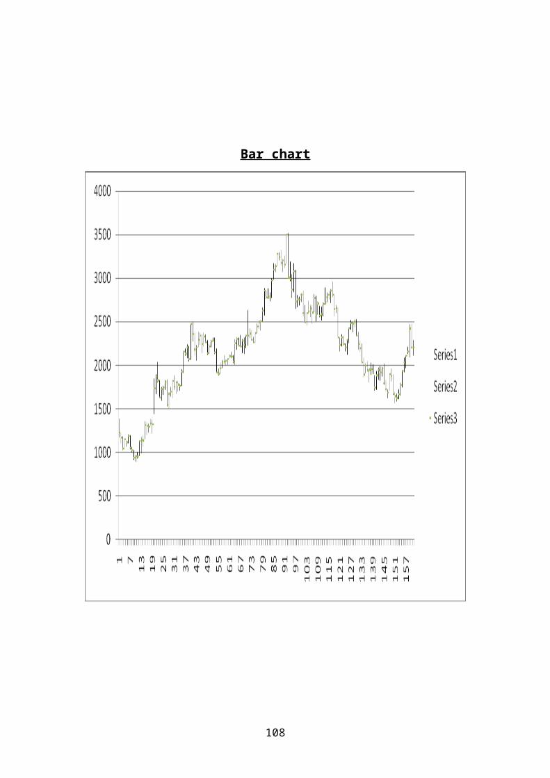
108
Bar chart

109
Candle Stick Chart

110
Line Chart

111
Rate of Change (ROC):SHOWING CHANGE IN
PRICE OF STOCK

112
Relative Strength Index (RSI):

113

114
When 50 DMA crosses 200 DMA in Upside that
time In Technical words it’s called as
GOLDEN CROSS it’s a strong bullish signal

115

116
CHAPTER-5 Findings &Conclusion

117
FINDINGS:
As per Analysis of charts of SBIN :
SBI has strong support @ 2040 & 1880 &
Resistance @ 2190, 2390 & 2450.
RSI is crossing up 50 level which
Indicate Buy Signal.
we see 10 days ROC is above 1 but
declining the price rises at lower rate
than the earlier growth rate which
indicate bearish signal.
But if we take 3 years data and
calculate ROC then we can see “ROC lineis above 1 and rising; the difference
between the current day price and 10 days
back price grows at an increasing rate

118
(bullish signal)”
CONCLUSION : Buying and selling of stock is not an
easy task if you want to make money doing
it. Millions of investors have lost the
money in past trying guessing stock price

119
movements. In order to consistently make
money in the stock market, investors have
to be right over 70% of the time.
In today’s world, if you rely on
fundamental analysis, broker’s advice
newspaper, articles or business channels
for your investing or trading decisions,
you are asking for a painful experience in
the markets. So, this study on technical
analysis will help the investors in
analyzing the scripts based on the
technical tools and oscillators to earn
fruitful investment.
Technical analysis is the art and
science of chart patterns in order to
better analyze and predict prices of a

120
given security.
It is also becoming popular with the
younger generation. But further
research has to be conducted to know
whether the technical analysis alone
will guarantee profits to the
investors.
Knowledge of the stock markets is the
key to the success and emphasis should
be on managing trading risk while
technical analysis can help you to
control them.
There is evidence in support of the
usefulness of moving averages,
momentum, support and resistance and
some patterns; but no convincing
evidence in support of Gann Theory or
Elliott Wave Theory.
Technical analysis works best on

121
currency markets, intermediate on
futures markets, and worst on stock
markets.
Chart patterns work better on stock
markets than currency markets.
Technical analysis doesn't work as
well as it used to.
After detail analysis of charts
showing above using the tools of the
technical analysis,I come to conclusion
to Buy stock of SBIN at current level
i.e. 2100-2130,
Short term Target 2190 & 2390,
Stop Loss @ 2040
Long Term Target above 2390
2540 and above this level 2600 - - 2700
Targets is there, Stop Loss @ 2040

122
BIBLIOGRAPHY: BOOKS REFERRED:
1) Security Analysis and Portfolio
Management by Dr. Punithavathi Pandian
in the year 2008 – Publication: Vikas
Publishing House Pvt Ltd.
2) “NCCFM” module of Technicalanalysis”
WEBSITES:www.investopedia.comwww.onlinetradingconcepts.comwww.nseindia.comwww.bseindia.com http://www.icharts.inhttp://www.moneycontrol.comhttp://www.icharts.comhttp://www.yahoofinance.comhttp://www.stocata.orghttp://www.googlefinance.com
Assisted by my mentor Mr. Amit Jain Technical
Analyst (Smart Equity Brokers Pvt. Ltd) who
expertise in technical analysis in Stock

123
market