statistical-analysis-with-excel-for-dummies.pdf - WordPress.com
502
-
Upload
khangminh22 -
Category
Documents
-
view
0 -
download
0
Transcript of statistical-analysis-with-excel-for-dummies.pdf - WordPress.com


Statistical Analysis with Excel®
FOR
DUMmIES‰
2ND EDITION
01 454060-ffirs.indd i01 454060-ffirs.indd i 4/21/09 7:13:09 PM4/21/09 7:13:09 PM

01 454060-ffirs.indd ii01 454060-ffirs.indd ii 4/21/09 7:13:10 PM4/21/09 7:13:10 PM
Joseph Schmuller, PhD
Statistical Analysis with Excel®
FOR
DUMmIES‰
2ND EDITION
01 454060-ffirs.indd iii01 454060-ffirs.indd iii 4/21/09 7:13:10 PM4/21/09 7:13:10 PM

Statistical Analysis with Excel® For Dummies,® 2nd Edition
Published byWiley Publishing, Inc.111 River StreetHoboken, NJ 07030-5774www.wiley.com
Copyright © 2009 by Wiley Publishing, Inc., Indianapolis, Indiana
Published by Wiley Publishing, Inc., Indianapolis, Indiana
Published simultaneously in Canada
No part of this publication may be reproduced, stored in a retrieval system or transmitted in any form or by any means, electronic, mechanical, photocopying, recording, scanning or otherwise, except as permit-ted under Sections 107 or 108 of the 1976 United States Copyright Act, without either the prior written permission of the Publisher, or authorization through payment of the appropriate per-copy fee to the Copyright Clearance Center, 222 Rosewood Drive, Danvers, MA 01923, (978) 750-8400, fax (978) 646-8600. Requests to the Publisher for permission should be addressed to the Permissions Department, John Wiley & Sons, Inc., 111 River Street, Hoboken, NJ 07030, (201) 748-6011, fax (201) 748-6008, or online at http://www.wiley.com/go/permissions.
Trademarks: Wiley, the Wiley Publishing logo, For Dummies, the Dummies Man logo, A Reference for the Rest of Us!, The Dummies Way, Dummies Daily, The Fun and Easy Way, Dummies.com, Making Everything Easier, and related trade dress are trademarks or registered trademarks of John Wiley & Sons, Inc. and/orits affi liates in the United States and other countries, and may not be used without written permission. Excel is a registered trademark of Microsoft Corporation in the United States and/or other countries All other trademarks are the property of their respective owners. Wiley Publishing, Inc., is not associated with any product or vendor mentioned in this book.
LIMIT OF LIABILITY/DISCLAIMER OF WARRANTY: THE PUBLISHER AND THE AUTHOR MAKE NO REPRESENTATIONS OR WARRANTIES WITH RESPECT TO THE ACCURACY OR COMPLETENESS OF THE CONTENTS OF THIS WORK AND SPECIFICALLY DISCLAIM ALL WARRANTIES, INCLUDING WITH-OUT LIMITATION WARRANTIES OF FITNESS FOR A PARTICULAR PURPOSE. NO WARRANTY MAY BE CREATED OR EXTENDED BY SALES OR PROMOTIONAL MATERIALS. THE ADVICE AND STRATEGIES CONTAINED HEREIN MAY NOT BE SUITABLE FOR EVERY SITUATION. THIS WORK IS SOLD WITH THE UNDERSTANDING THAT THE PUBLISHER IS NOT ENGAGED IN RENDERING LEGAL, ACCOUNTING, OR OTHER PROFESSIONAL SERVICES. IF PROFESSIONAL ASSISTANCE IS REQUIRED, THE SERVICES OF A COMPETENT PROFESSIONAL PERSON SHOULD BE SOUGHT. NEITHER THE PUBLISHER NOR THE AUTHOR SHALL BE LIABLE FOR DAMAGES ARISING HEREFROM. THE FACT THAT AN ORGANIZA-TION OR WEBSITE IS REFERRED TO IN THIS WORK AS A CITATION AND/OR A POTENTIAL SOURCE OF FURTHER INFORMATION DOES NOT MEAN THAT THE AUTHOR OR THE PUBLISHER ENDORSES THE INFORMATION THE ORGANIZATION OR WEBSITE MAY PROVIDE OR RECOMMENDATIONS IT MAY MAKE. FURTHER, READERS SHOULD BE AWARE THAT INTERNET WEBSITES LISTED IN THIS WORK MAY HAVE CHANGED OR DISAPPEARED BETWEEN WHEN THIS WORK WAS WRITTEN AND WHEN IT IS READ.
For general information on our other products and services, please contact our Customer Care Department within the U.S. at 877-762-2974, outside the U.S. at 317-572-3993, or fax 317-572-4002.
For technical support, please visit www.wiley.com/techsupport.
Wiley also publishes its books in a variety of electronic formats. Some content that appears in print may not be available in electronic books.
Library of Congress Control Number: 2009926356
ISBN: 978-0-470-45406-0
Manufactured in the United States of America
10 9 8 7 6 5 4 3 2 1
01 454060-ffirs.indd iv01 454060-ffirs.indd iv 4/21/09 7:13:11 PM4/21/09 7:13:11 PM

About the AuthorJoseph Schmuller is a veteran of over 25 years in Information Technology.
He is the author of several books on computing, including the three editions
of Teach Yourself UML in 24 Hours (SAMS), and the fi rst edition of Statistical Analysis with Excel For Dummies. He has written numerous articles on
advanced technology. From 1991 through 1997, he was Editor-in-Chief of
PC AI magazine.
He is a former member of the American Statistical Association, and he has
taught statistics at the undergraduate and graduate levels. He holds a B.S.
from Brooklyn College, an M.A. from the University of Missouri-Kansas City,
and a Ph.D. from the University of Wisconsin, all in psychology. He and his
family live in Jacksonville, Florida, where he is an Adjunct Professor at the
University of North Florida.
01 454060-ffirs.indd v01 454060-ffirs.indd v 4/21/09 7:13:11 PM4/21/09 7:13:11 PM

01 454060-ffirs.indd vi01 454060-ffirs.indd vi 4/21/09 7:13:11 PM4/21/09 7:13:11 PM

DedicationIn loving memory of Jesse Edward Sprague, my best friend in the whole
world — a man who never met a stranger.
“Friends have all things in common” —Plato
Author’s AcknowledgmentsOne thing I have to tell you about writing a For Dummies book — it’s an
incredible amount of fun. You get to air out your ideas in a friendly, conver-
sational way, and you get a chance to throw in some humor, too. To write a
second edition is almost more fun than one writer should be allowed to have.
I worked again with a terrifi c team. Acquisitions Editor Stephanie McComb
and Project Editor Beth Taylor of Wiley Publishing have been encouraging,
cooperative, and patient. Technical Editor Namir Shammas helped make this
book as technically bulletproof as possible. Any errors that remain are under
the sole proprietorship of the author. My deepest thanks to Stephanie and
Beth. My thanks to Waterside Productions for representing me in this effort.
Again I thank mentors in college and graduate school who helped shape my
statistical knowledge: Mitch Grossberg (Brooklyn College); Mort Goldman,
Al Hillix, Larry Simkins, and Jerry Sheridan (University of Missouri-Kansas
City); and Cliff Gillman and John Theios (University of Wisconsin-Madison).
A long time ago at the University of Missouri-Kansas City, Mort Goldman
exempted me from a graduate statistics fi nal on one condition — that I learn
the last course topic, Analysis of Covariance, on my own. I hope he’s happy
with Appendix B.
I thank my mother and my brother David for their love and support and for
always being there for me, and Kathryn for so much more than I can say.
Finally, a special note of thanks to my friend Brad, who suggested this whole
thing in the fi rst place!
01 454060-ffirs.indd vii01 454060-ffirs.indd vii 4/21/09 7:13:11 PM4/21/09 7:13:11 PM

Publisher’s Acknowledgments
We’re proud of this book; please send us your comments through our online registration form located
at http://dummies.custhelp.com. For other comments, please contact our Customer Care
Department within the U.S. at 877-762-2974, outside the U.S. at 317-572-3993, or fax 317-572-4002.
Some of the people who helped bring this book to market include the following:
Acquisitions, Editorial, and
Media Development
Project Editor: Beth Taylor
(Previous Edition: Sarah Hellert)
Senior Acquisitions Editor: Stephanie McComb
Copy Editor: Beth Taylor
Technical Editor: Namir Shammas
Editorial Manager: Cricket Krengel
Editorial Assistant: Laura Sinise
Cartoons: Rich Tennant (www.the5thwave.com)
Composition Services
Project Coordinator: Kristie Rees
Layout and Graphics: Carrie A. Cesavice,
Shawn Frazier, Melissa K. Jester
Proofreaders: Melissa Cossell,
Bonnie Mikkelson,
Indexer: Steve Rath
Publishing and Editorial for Technology Dummies
Richard Swadley, Vice President and Executive Group Publisher
Barry Pruett, Vice President and Executive Publisher
Andy Cummings, Vice President and Publisher
Mary Bednarek, Executive Acquisitions Director
Robyn Siesky, Editorial Director
Sandy Smith, Senior Marketing Director
Amy Knies, Business Manager
Publishing for Consumer Dummies
Diane Graves Steele, Vice President and Publisher
Composition Services
Debbie Stailey, Director of Composition Services
01 454060-ffirs.indd viii01 454060-ffirs.indd viii 4/21/09 7:13:11 PM4/21/09 7:13:11 PM

Contents at a GlanceIntroduction ................................................................ 1
Part I: Statistics and Excel: A Marriage Made in Heaven ................................................................... 7Chapter 1: Evaluating Data in the Real World ................................................................ 9
Chapter 2: Understanding Excel’s Statistical Capabilities .......................................... 27
Part II: Describing Data ............................................. 53Chapter 3: Show and Tell: Graphing Data ..................................................................... 55
Chapter 4: Finding Your Center ..................................................................................... 79
Chapter 5: Deviating from the Average ......................................................................... 93
Chapter 6: Meeting Standards and Standings ............................................................ 111
Chapter 7: Summarizing It All ....................................................................................... 123
Chapter 8: What’s Normal? ........................................................................................... 141
Part III: Drawing Conclusions from Data ................... 153Chapter 9: The Confi dence Game: Estimation ........................................................... 155
Chapter 10: One-Sample Hypothesis Testing ............................................................. 171
Chapter 11: Two-Sample Hypothesis Testing ............................................................ 187
Chapter 12: Testing More Than Two Samples ........................................................... 217
Chapter 13: Slightly More Complicated Testing ........................................................ 243
Chapter 14: Regression: Linear and Multiple ............................................................. 255
Chapter 15: Correlation: The Rise and Fall of Relationships.................................... 291
Part IV: Working with Probability ............................. 311Chapter 16: Introducing Probability ............................................................................ 313
Chapter 17: More on Probability ................................................................................. 335
Chapter 18: A Career in Modeling ................................................................................ 349
Part V: The Part of Tens ........................................... 367Chapter 19: Ten Statistical and Graphical Tips and Traps ....................................... 369
Chapter 20: Ten Things (Twelve, Actually) That Didn’t Fit in Any
Other Chapter ............................................................................................................. 375
02 454060-ftoc.indd ix02 454060-ftoc.indd ix 4/21/09 7:14:15 PM4/21/09 7:14:15 PM

Appendix A: When Your Worksheet Is a Database....... 405
Appendix B: The Analysis of Covariance .................... 419
Appendix C: Of Stems, Leaves, Boxes, Whiskers, and Smoothies ......................................................... 433
Index ...................................................................... 453
02 454060-ftoc.indd x02 454060-ftoc.indd x 4/21/09 7:14:15 PM4/21/09 7:14:15 PM

Table of ContentsIntroduction ................................................................. 1
About This Book .............................................................................................. 1
What You Can Safely Skip ............................................................................... 2
Foolish Assumptions ....................................................................................... 2
How This Book Is Organized .......................................................................... 3
Part I: Statistics and Excel: A Marriage Made in Heaven .................. 3
Part II: Describing Data ......................................................................... 3
Part III: Drawing Conclusions from Data ............................................. 3
Part IV: Working with Probability ........................................................ 3
Part V: The Part of Tens ........................................................................ 4
Appendix A: When Your Worksheet Is a Database ............................ 4
Appendix B: The Analysis of Covariance ............................................ 4
Appendix C: Of Stems, Leaves, Boxes, Whiskers, and Smoothies ...... 4
Icons Used in This Book ................................................................................. 5
Where to Go from Here ................................................................................... 5
Part I: Statistics and Excel: A Marriage Made in Heaven .................................................................... 7
Chapter 1: Evaluating Data in the Real World. . . . . . . . . . . . . . . . . . . . . .9The Statistical (And Related) Notions You Just Have to Know ................. 9
Samples and populations .................................................................... 10
Variables: Dependent and independent............................................ 11
Types of data ........................................................................................ 12
A little probability ................................................................................ 13
Inferential Statistics: Testing Hypotheses .................................................. 14
Null and alternative hypotheses ........................................................ 15
Two types of error ............................................................................... 16
What’s New in Excel? .................................................................................... 18
Some Things about Excel You Absolutely Have to Know ........................ 20
Autofi lling cells ..................................................................................... 20
Referencing cells .................................................................................. 22
What’s New in This Edition? ........................................................................ 25
Chapter 2: Understanding Excel’s Statistical Capabilities . . . . . . . . .27Getting Started .............................................................................................. 27
Setting Up for Statistics ................................................................................ 30
Worksheet functions in Excel 2007 .................................................... 30
Quickly accessing statistical functions ............................................. 33
02 454060-ftoc.indd xi02 454060-ftoc.indd xi 4/21/09 7:14:15 PM4/21/09 7:14:15 PM

Statistical Analysis with Excel For Dummies, 2nd Edition xiiArray functions .................................................................................... 35
What’s in a name? An array of possibilities ..................................... 38
Creating your own array formulas .................................................... 46
Using data analysis tools .................................................................... 47
Accessing Commonly Used Functions ........................................................ 51
Part II: Describing Data .............................................. 53
Chapter 3: Show and Tell: Graphing Data . . . . . . . . . . . . . . . . . . . . . . . .55Why Use Graphs? ........................................................................................... 55
Some Fundamentals ...................................................................................... 57
Excel’s Graphics Capabilities ....................................................................... 58
Inserting a Chart .................................................................................. 58
Becoming a Columnist .................................................................................. 59
Stacking the columns .......................................................................... 61
One more thing ................................................................................... 63
Slicing the Pie ................................................................................................. 64
Pulling the slices apart ........................................................................ 66
A word from the wise .......................................................................... 68
Drawing the Line ............................................................................................ 68
Passing the Bar ............................................................................................. 71
The Plot Thickens .......................................................................................... 74
Chapter 4: Finding Your Center . . . . . . . . . . . . . . . . . . . . . . . . . . . . . . . . .79Means: The Lore of Averages ....................................................................... 79
Calculating the mean ........................................................................... 80
AVERAGE and AVERAGEA .................................................................. 81
AVERAGEIF and AVERAGEIFS ............................................................. 83
TRIMMEAN ............................................................................................ 86
Other means to an end ........................................................................ 88
Medians: Caught in the Middle .................................................................... 89
Finding the median .............................................................................. 90
MEDIAN ................................................................................................. 90
Statistics À La Mode ...................................................................................... 91
Finding the mode ................................................................................. 91
MODE ..................................................................................................... 92
Chapter 5: Deviating from the Average . . . . . . . . . . . . . . . . . . . . . . . . . .93Measuring Variation ...................................................................................... 94
Averaging squared deviations: Variance and how
to calculate it .................................................................................... 94
VARP and VARPA ................................................................................. 97
Sample variance ................................................................................... 99
VAR and VARA.................................................................................... 100
02 454060-ftoc.indd xii02 454060-ftoc.indd xii 4/21/09 7:14:15 PM4/21/09 7:14:15 PM

xiii Table of Contents
Back to the Roots: Standard Deviation ........................................... 100
Population standard deviation......................................................... 101
STDEVP and STDEVPA ...................................................................... 101
Sample standard deviation ............................................................... 102
STDEV and STDEVA ........................................................................... 102
The missing functions: STDEVIF and STDEVIFS ............................. 103
Related Functions ........................................................................................ 107
DEVSQ ................................................................................................. 107
Average deviation .............................................................................. 108
AVEDEV ............................................................................................... 109
Chapter 6: Meeting Standards and Standings . . . . . . . . . . . . . . . . . . .111Catching Some Zs ........................................................................................ 111
Characteristics of z-scores ............................................................... 112
Bonds versus The Bambino .............................................................. 112
Exam scores ........................................................................................ 113
STANDARDIZE .................................................................................... 114
Where Do You Stand? ................................................................................. 116
RANK ................................................................................................... 117
LARGE and SMALL ............................................................................. 118
PERCENTILE and PERCENTRANK .................................................... 119
Data analysis tool: Rank and Percentile .......................................... 121
Chapter 7: Summarizing It All. . . . . . . . . . . . . . . . . . . . . . . . . . . . . . . . . .123Counting Out ................................................................................................ 123
COUNT, COUNTA, COUNTBLANK, COUNTIF, COUNTIFS ............. 123
The Long and Short of It ............................................................................. 126
MAX, MAXA, MIN, and MINA ........................................................... 126
Getting Esoteric ........................................................................................... 128
SKEW ................................................................................................... 128
KURT ................................................................................................... 130
Tuning In the Frequency ............................................................................. 132
FREQUENCY ........................................................................................ 132
Data analysis tool: Histogram .......................................................... 134
Can You Give Me a Description? ................................................................ 136
Data analysis tool: Descriptive Statistics ........................................ 136
Instant Statistics ......................................................................................... 138
Chapter 8: What’s Normal?. . . . . . . . . . . . . . . . . . . . . . . . . . . . . . . . . . . .141Hitting the Curve ......................................................................................... 141
Digging deeper ................................................................................... 142
Parameters of a normal distribution ............................................... 143
NORMDIST ......................................................................................... 145
NORMINV ............................................................................................ 146
A Distinguished Member of the Family ..................................................... 147
NORMSDIST ....................................................................................... 148
NORMSINV .......................................................................................... 149
02 454060-ftoc.indd xiii02 454060-ftoc.indd xiii 4/21/09 7:14:15 PM4/21/09 7:14:15 PM

Statistical Analysis with Excel For Dummies, 2nd Edition xivPart III: Drawing Conclusions from Data .................... 153
Chapter 9: The Confi dence Game: Estimation . . . . . . . . . . . . . . . . . . . .155What is a Sampling Distribution? .............................................................. 155
An EXTREMELY Important Idea: The Central Limit Theorem .............. 157
Simulating the Central Limit Theorem ............................................ 158
The Limits of Confi dence ........................................................................... 162
Finding confi dence limits for a mean .............................................. 163
CONFIDENCE ...................................................................................... 165
Fit to a t ........................................................................................................ 166
TINV ..................................................................................................... 168
Chapter 10: One-Sample Hypothesis Testing . . . . . . . . . . . . . . . . . . . .171Hypotheses, Tests, and Errors .................................................................. 171
Hypothesis tests and sampling distributions ................................ 172
Catching Some Zs Again ............................................................................ 175
ZTEST ................................................................................................. 177
t for One ........................................................................................................ 179
TDIST .................................................................................................. 180
Testing a Variance ....................................................................................... 181
CHIDIST .............................................................................................. 182
CHIINV ................................................................................................. 183
Chapter 11: Two-Sample Hypothesis Testing . . . . . . . . . . . . . . . . . . . .187Hypotheses Built for Two ........................................................................... 187
Sampling Distributions Revisited .............................................................. 188
Applying the Central Limit Theorem ............................................... 189
Zs once more ...................................................................................... 191
Data analysis tool: z-Test: Two Sample for Means ........................ 192
t for Two ....................................................................................................... 195
Like peas in a pod: Equal variances ................................................ 195
Like p’s and q’s: Unequal variances ................................................ 197
TTEST .................................................................................................. 197
Data Analysis Tools: t-test: Two Sample ........................................ 199
A Matched Set: Hypothesis Testing for Paired Samples ......................... 202
TTEST for matched samples ............................................................ 203
Data analysis tool: t-test: Paired Two Sample for Means ............. 205
Testing Two Variances ............................................................................... 207
Using F in conjunction with t ............................................................ 209
FTEST................................................................................................... 210
FDIST ................................................................................................... 212
FINV ..................................................................................................... 213
Data Analysis Tool: F-test Two Sample for Variances ................... 214
02 454060-ftoc.indd xiv02 454060-ftoc.indd xiv 4/21/09 7:14:15 PM4/21/09 7:14:15 PM

xv Table of Contents
Chapter 12: Testing More Than Two Samples . . . . . . . . . . . . . . . . . . .217Testing More Than Two .............................................................................. 217
A thorny problem .............................................................................. 218
A solution ............................................................................................ 219
Meaningful relationships .................................................................. 223
After the F-test .................................................................................... 224
Data analysis tool: Anova: Single Factor ......................................... 228
Comparing the means ....................................................................... 230
Another Kind of Hypothesis, Another Kind of Test ................................ 232
Working with repeated measures ANOVA ...................................... 232
Getting trendy .................................................................................... 235
Data analysis tool: Anova: Two Factor Without Replication ........ 238
Analyzing trend .................................................................................. 240
Chapter 13: Slightly More Complicated Testing. . . . . . . . . . . . . . . . . .243Cracking the Combinations ........................................................................ 243
Breaking down the variances ........................................................... 244
Data analysis tool: Anova: Two-Factor Without Replication ........ 246
Cracking the Combinations Again ............................................................. 248
Rows and columns ............................................................................. 248
Interactions ......................................................................................... 249
The analysis ........................................................................................ 250
Data analysis tool: Anova: Two-Factor With Replication.............. 252
Chapter 14: Regression: Linear and Multiple . . . . . . . . . . . . . . . . . . . .255The Plot of Scatter ....................................................................................... 255
Graphing Lines ............................................................................................. 257
Regression: What a Line! ............................................................................. 259
Using regression for forecasting ...................................................... 261
Variation around the regression line .............................................. 261
Testing hypotheses about regression ............................................. 263
Worksheet Functions for Regression ........................................................ 269
SLOPE, INTERCEPT, STEYX .............................................................. 269
FORECAST ........................................................................................... 271
Array function: TREND ...................................................................... 272
Array function: LINEST ..................................................................... 275
Data Analysis Tool: Regression ................................................................ 277
Tabled output ..................................................................................... 279
Graphic output ................................................................................... 280
Juggling Many Relationships at Once: Multiple Regression .................. 282
Excel Tools for Multiple Regression ......................................................... 283
TREND revisited ................................................................................. 283
LINEST revisited ................................................................................. 285
Regression data analysis tool revisited .......................................... 287
02 454060-ftoc.indd xv02 454060-ftoc.indd xv 4/21/09 7:14:15 PM4/21/09 7:14:15 PM

Statistical Analysis with Excel For Dummies, 2nd Edition xviChapter 15: Correlation: The Rise and Fall of Relationships . . . . . . .291
Scatterplots Again ....................................................................................... 291
Understanding Correlation ......................................................................... 292
Correlation and Regression ........................................................................ 294
Testing Hypotheses About Correlation .................................................... 297
Is a correlation coeffi cient greater than zero? ............................... 297
Do two correlation coeffi cients differ? ............................................ 298
Worksheet Functions for Correlation ....................................................... 300
CORREL and PEARSON ..................................................................... 300
RSQ ...................................................................................................... 302
COVAR ................................................................................................. 302
Data Analysis Tool: Correlation ................................................................. 303
Tabled output ..................................................................................... 304
Data Analysis Tool: Covariance ................................................................. 307
Testing Hypotheses About Correlation .................................................... 308
Worksheet Functions: FISHER, FISHERINV ..................................... 308
Part IV: Working with Probability ............................. 311
Chapter 16: Introducing Probability . . . . . . . . . . . . . . . . . . . . . . . . . . . .313What is Probability? .................................................................................... 313
Experiments, trials, events, and sample spaces ............................ 314
Sample spaces and probability ........................................................ 314
Compound Events ....................................................................................... 315
Union and intersection ...................................................................... 315
Intersection again .............................................................................. 316
Conditional Probability ............................................................................... 317
Working with the probabilities ........................................................ 318
The foundation of hypothesis testing ............................................. 318
Large Sample Spaces ................................................................................... 318
Permutations ..................................................................................... 319
Combinations ..................................................................................... 320
Worksheet Functions ................................................................................. 321
FACT .................................................................................................... 321
PERMUT .............................................................................................. 321
COMBIN .............................................................................................. 322
Random Variables: Discrete and Continuous .......................................... 322
Probability Distributions and Density Functions .................................... 323
The Binomial Distribution .......................................................................... 325
Worksheet Functions ................................................................................. 326
BINOMDIST ........................................................................................ 327
NEGBINOMDIST .................................................................................. 328
02 454060-ftoc.indd xvi02 454060-ftoc.indd xvi 4/21/09 7:14:15 PM4/21/09 7:14:15 PM

xvii Table of Contents
Hypothesis Testing with the Binomial Distribution ................................ 329
CRITBINOM ......................................................................................... 330
More on hypothesis testing .............................................................. 331
The Hypergeometric Distribution ............................................................. 332
HYPERGEOMDIST .............................................................................. 333
Chapter 17: More on Probability . . . . . . . . . . . . . . . . . . . . . . . . . . . . . . .335Beta ................................................................................................................ 335
BETADIST ............................................................................................ 337
BETAINV .............................................................................................. 338
Poisson .......................................................................................................... 340
POISSON .............................................................................................. 341
Gamma .......................................................................................................... 342
GAMMADIST ....................................................................................... 343
GAMMAINV ......................................................................................... 345
Exponential ................................................................................................... 345
EXPONDIST ......................................................................................... 346
Chapter 18: A Career in Modeling . . . . . . . . . . . . . . . . . . . . . . . . . . . . . .349Modeling a Distribution .............................................................................. 349
Plunging into the Poisson distribution ........................................... 350
Using POISSON .................................................................................. 352
Testing the model’s fi t ....................................................................... 352
A word about CHITEST...................................................................... 355
Playing ball with a model .................................................................. 356
A Simulating Discussion ............................................................................. 359
Taking a chance: The Monte Carlo method.................................... 359
Loading the dice ................................................................................. 359
Simulating the Central Limit Theorem ............................................ 363
Part V: The Part of Tens ............................................ 367
Chapter 19: Ten Statistical and Graphical Tips and Traps . . . . . . . . .369Signifi cant Doesn’t Always Mean Important ............................................ 369
Trying to Not Reject a Null Hypothesis Has a Number
of Implications .......................................................................................... 370
Regression Isn’t Always linear. .................................................................. 370
Extrapolating Beyond a Sample Scatterplot Is a Bad Idea ..................... 371
Examine the Variability Around a Regression Line ................................. 371
A Sample Can Be Too Large ....................................................................... 371
Consumers: Know Your Axes ..................................................................... 372
Graphing a Categorical Variable as Though It’s a Quantitative
Variable Is Just Wrong............................................................................. 372
Whenever Appropriate, Include Variability in Your Graph ................... 373
Be Careful When Relating Statistics-Book Concepts to Excel ................ 374
02 454060-ftoc.indd xvii02 454060-ftoc.indd xvii 4/21/09 7:14:15 PM4/21/09 7:14:15 PM

Statistical Analysis with Excel For Dummies, 2nd Edition xviiiChapter 20: Ten Things (Twelve, Actually) That Didn’t Fit in Any Other Chapter . . . . . . . . . . . . . . . . . . . . . . . . . . . . . . . . . . . . . . . . .375
Some Forecasting ........................................................................................ 375
A moving experience ......................................................................... 375
How to be a smoothie, exponentially .............................................. 377
Graphing the Standard Error of the Mean ................................................ 379
Probabilities and Distributions .................................................................. 383
PROB .................................................................................................... 383
WEIBULL ............................................................................................. 383
Drawing Samples ......................................................................................... 384
Testing Independence: The True Use of CHITEST .................................. 385
Logarithmica Esoterica ............................................................................... 388
What is a logarithm? .......................................................................... 388
What is e? ............................................................................................ 390
LOGNORMDIST ................................................................................... 393
LOGINV ................................................................................................ 394
Array Function: LOGEST ................................................................... 395
Array Function: GROWTH ................................................................. 398
When Your Data Live Elsewhere ............................................................... 401
Appendix A: When Your Worksheet Is a Database ....... 405Introducing Excel Databases ...................................................................... 405
The Satellites database ..................................................................... 405
The criteria range .............................................................................. 407
The format of a database function .................................................. 408
Counting and Retrieving ............................................................................ 409
DCOUNT and DCOUNTA .................................................................. 409
DGET .................................................................................................... 410
Arithmetic ..................................................................................................... 410
DMAX and DMIN................................................................................. 411
DSUM .................................................................................................. 411
DPRODUCT ......................................................................................... 411
Statistics ....................................................................................................... 412
DAVERAGE .......................................................................................... 412
DVAR and DVARP............................................................................... 412
DSTDEV and DSTDEVP ...................................................................... 413
According to Form ............................................................................. 413
Pivot Tables .................................................................................................. 414
02 454060-ftoc.indd xviii02 454060-ftoc.indd xviii 4/21/09 7:14:15 PM4/21/09 7:14:15 PM

xix Table of Contents
Appendix B: The Analysis of Covariance ..................... 419Covariance: A Closer Look ......................................................................... 419
Why You Analyze Covariance .................................................................... 420
How You Analyze Covariance .................................................................... 421
ANCOVA in Excel ......................................................................................... 422
Method 1: ANOVA ............................................................................. 423
Method 2: Regression ....................................................................... 427
After the ANCOVA .............................................................................. 430
And One More Thing ................................................................................... 431
Appendix C: Of Stems, Leaves, Boxes, Whiskers, and Smoothies .......................................................... 433
Stem-and-Leaf ............................................................................................... 433
Boxes and Whiskers .................................................................................... 437
Data Smoothing ............................................................................................ 445
Index ....................................................................... 453
02 454060-ftoc.indd xix02 454060-ftoc.indd xix 4/21/09 7:14:15 PM4/21/09 7:14:15 PM

Statistical Analysis with Excel For Dummies, 2nd Edition xx
02 454060-ftoc.indd xx02 454060-ftoc.indd xx 4/21/09 7:14:15 PM4/21/09 7:14:15 PM

Introduction
What? Yet another statistics book? Well . . . this is a statistics book, all
right, but in my humble (and thoroughly biased) opinion, it’s not just another statistics book.
What? Yet another Excel book? Same thoroughly biased opinion — it’s not
just another Excel book. What? Yet another edition of a book that’s not just
another statistics book and not just another Excel book? Well . . . yes. You got
me there.
So here’s the deal — for the previous edition and for this one. Many statistics
books teach you the concepts but don’t give you a way to apply them. That
often leads to a lack of understanding. With Excel, you have a ready-made
package for applying statistics concepts.
Looking at it from the opposite direction, many Excel books show you Excel’s
capabilities but don’t tell you about the concepts behind them. Before I tell
you about an Excel statistical tool, I give you the statistical foundation it’s
based on. That way, you understand the tool when you use it — and you use
it more effectively.
I didn’t want to write a book that’s just “select this menu” and “click this
button.” Some of that is necessary, of course, in any book that shows you
how to use a software package. My goal was to go way beyond that.
I also didn’t want to write a statistics “cookbook”: When-faced-with-problem-
#310-use-statistical-procedure-#214. My goal was to go way beyond that, too.
Bottom line: This book isn’t just about statistics or just about Excel — it sits
firmly at the intersection of the two. In the course of telling you about statis-
tics, I cover every Excel statistical feature. (Well . . . almost. I left one out. I left
it out of the first edition, too. It’s called “Fourier Analysis.” All the necessary
math to understand it would take a whole book, and you might never use this
tool, anyway.)
About This BookAlthough statistics involves a logical progression of concepts, I organized
this book so you can open it up in any chapter and start reading. The idea is
03 454060-intro.indd 103 454060-intro.indd 1 4/21/09 7:15:21 PM4/21/09 7:15:21 PM

2 Statistical Analysis For Dummies, 2nd Edition
for you to find what you’re looking for in a hurry and use it immediately —
whether it’s a statistical concept or an Excel tool.
On the other hand, cover to cover is okay if you’re so inclined. If you’re a sta-
tistics newbie and you have to use Excel for statistical analysis, I recommend
you begin at the beginning — even if you know Excel pretty well.
What You Can Safely SkipAny reference book throws a lot of information at you, and this one is no
exception. I intended it all to be useful, but I didn’t aim it all at the same level.
So if you’re not deeply into the subject matter, you can avoid paragraphs
marked with the Technical Stuff icon.
Every so often, you’ll run into sidebars. They provide information that elabo-
rates on a topic, but they’re not part of the main path. If you’re in a hurry,
you can breeze past them.
Because I wrote this book so you can open it up anywhere and start using
it, step-by-step instructions appear throughout. Many of the procedures I
describe have steps in common. After you go through some of the procedures,
you can probably skip the first few steps when you come to a procedure you
haven’t been through before.
Foolish AssumptionsThis is not an introductory book on Excel or on Windows, so I’m assuming:
✓ You know how to work with Windows. I don’t go through the details of
pointing, clicking, selecting, and so forth.
✓ You have Excel installed on your computer and you can work along with
the examples. I don’t take you through the steps of Excel installation.
Incidentally, I use Excel 2007 (running in Windows Vista). If you’re using
Excel 97, Excel 2000, or Excel 2003, that’s okay. The statistical functional-
ity is the same. Some of the screen shots in the book will look a little dif-
ferent from what appears on your computer, however.
Also, Excel 2007 has an entirely new user interface, so getting to the sta-
tistical functionality is somewhat different from previous versions.
✓ You’ve worked with Excel before, and you understand the essentials of
worksheets and formulas.
If you don’t know much about Excel, consider looking into Greg Harvey’s excel-
lent Excel books in the For Dummies series. His latest work covers Excel 2007.
03 454060-intro.indd 203 454060-intro.indd 2 4/21/09 7:15:22 PM4/21/09 7:15:22 PM

3 Introduction
How This Book Is OrganizedI organized this book into five parts and three appendixes.
Part I: Statistics and Excel: A Marriage Made in HeavenIn Part I, I provide a general introduction to statistics and to Excel’s statisti-
cal capabilities. I discuss important statistical concepts and describe useful
Excel techniques. If it’s a long time since your last course in statistics or if
you never had a statistics course at all, start here. If you haven’t worked with
Excel’s built-in functions (of any kind) definitely start here.
Part II: Describing DataPart of statistics is to take sets of numbers and summarize them in meaningful
ways. Here’s where you find out how to do that. We all know about averages
and how to compute them. But that’s not the whole story. In this part, I tell you
about additional statistics that fill in the gaps, and I show you how to use Excel
to work with those statistics. I also introduce Excel graphics in this part.
Part III: Drawing Conclusions from DataPart III addresses the fundamental aim of statistical analysis: to go beyond
the data and help decision-makers make decisions. Usually, the data are mea-
surements of a sample taken from a large population. The goal is to use these
data to figure out what’s going on in the population.
This opens a wide range of questions: What does an average mean? What
does the difference between two averages mean? Are two things associated?
These are only a few of the questions I address in Part III, and I discuss the
Excel functions and tools that help you answer them.
Part IV: Working with ProbabilityProbability is the basis for statistical analysis and decision-making. In Part IV,
I tell you all about it. I show you how to apply probability, particularly in the
area of modeling. Excel provides a rich set of built-in capabilities that help
you understand and apply probability. Here’s where you find them.
03 454060-intro.indd 303 454060-intro.indd 3 4/21/09 7:15:22 PM4/21/09 7:15:22 PM

4 Statistical Analysis For Dummies, 2nd Edition
Part V: The Part of TensPart V meets two objectives. First, I get to stand on the soapbox and rant
about statistical peeves and about helpful hints. The peeves and hints total
up to ten. Also, I discuss ten (okay, twelve) Excel things I couldn’t fit in any
other chapter. They come from all over the world of statistics. If it’s Excel
and statistical, and if you can’t find it anywhere else in the book, you’ll find
it here.
As I said in the first edition — pretty handy, this Part of Tens.
Appendix A: When Your Worksheet Is a DatabaseIn addition to performing calculations, Excel serves another purpose: record-
keeping. Although it’s not a dedicated database, Excel does offer some
database functions. Some of them are statistical in nature. I introduce Excel
database functions in Appendix A, along with pivot tables that allow you to
turn your database inside out and look at your data in different ways.
Appendix B: The Analysis of CovarianceThis is new in this edition. The Analysis of Covariance (ANCOVA) is a statisti-
cal technique that combines two other techniques — analysis of variance and
regression analysis. If you know how two variables are related, you can use
that knowledge in some nifty ways, and this is one of the ways. The kicker is
that Excel doesn’t have a built-in tool for ANCOVA — but I show you how to
use what Excel does have so you can get the job done.
Appendix C: Of Stems, Leaves, Boxes, Whiskers, and SmoothiesThis is another addition to this edition. Statisticians often use special tech-
niques to explore and visualize data, and Appendix C covers some of those
techniques. They’re not built into Excel. As is the case with ANCOVA, how-
ever, I show you how to use Excel’s capabilities to implement them.
03 454060-intro.indd 403 454060-intro.indd 4 4/21/09 7:15:22 PM4/21/09 7:15:22 PM

5 Introduction
Icons Used in This BookAs is the case with all For Dummies books, icons appear all over. Each one is
a little picture in the margin that lets you know something special about the
paragraph it’s next to.
This icon points out a hint or a shortcut that helps you in your work and
makes you an all-around better human being.
This one points out timeless wisdom to take with you long after you finish this
book, grasshopper.
Pay attention to this icon. It’s a reminder to avoid something that might gum
up the works for you.
As I mentioned in “What You Can Safely Skip,” this icon indicates material you
can blow past if statistics and Excel aren’t your passion.
Where to Go from HereYou can start the book anywhere, but here are a few hints. Want to learn the
foundations of statistics? Turn the page. Introduce yourself to Excel’s statisti-
cal features? That’s Chapter 2. Want to start with graphics? Hit Chapter 3. For
anything else, find it in the Table of Contents or in the Index and go for it.
Same final admonition as in the first edition: If you have half as much fun
reading and using this book as I had writing it, you’ll have a blast.
03 454060-intro.indd 503 454060-intro.indd 5 4/21/09 7:15:22 PM4/21/09 7:15:22 PM

6 Statistical Analysis For Dummies, 2nd Edition
03 454060-intro.indd 603 454060-intro.indd 6 4/21/09 7:15:22 PM4/21/09 7:15:22 PM

Part IStatistics and
Excel: A Marriage Made in Heaven
04 454060-pp01.indd 704 454060-pp01.indd 7 4/21/09 7:17:17 PM4/21/09 7:17:17 PM

In this part . . .
Part I deals with the foundations of statistics and with
the statistics-related things that Excel can do. On the
statistics side, this part introduces samples and popula-
tions, hypothesis testing, the two types of errors in deci-
sion-making, independent and dependent variables, and
probability. It’s a brief introduction to all the statistical
concepts I explore in the rest of the book. On the Excel
side, I focus on cell referencing and on how to use work-
sheet functions, array functions, and data analysis tools.
My objective is to get you thinking about statistics con-
ceptually and about Excel as a statistical analysis tool.
04 454060-pp01.indd 804 454060-pp01.indd 8 4/21/09 7:17:18 PM4/21/09 7:17:18 PM

Chapter 1
Evaluating Data in the Real WorldIn This Chapter▶ Introducing statistical concepts
▶ Generalizing from samples to populations
▶ Getting into probability
▶ Making decisions
▶ New features in Excel 2007
▶ Understanding important Excel Fundamentals
▶ New features in this edition
The field of statistics is all about decision-making — decision-making
based on groups of numbers. Statisticians constantly ask questions:
What do the numbers tell us? What are the trends? What predictions can we
make? What conclusions can we draw?
To answer these questions, statisticians have developed an impressive array
of analytical tools. These tools help us to make sense of the mountains of
data that are out there waiting for us to delve into, and to understand the
numbers we generate in the course of our own work.
The Statistical (And Related) Notions You Just Have to Know
Because intensive calculation is often part and parcel of the statistician’s
toolset, many people have the misconception that statistics is about number
crunching. Number crunching is just one small part of the path to sound deci-
sions, however.
05 454060-ch01.indd 905 454060-ch01.indd 9 4/21/09 7:17:57 PM4/21/09 7:17:57 PM

10 Part I: Statistics and Excel: A Marriage Made in Heaven
By shouldering the number-crunching load, software increases our speed of
traveling down that path. Some software packages are specialized for statisti-
cal analysis and contain many of the tools that statisticians use. Although
not marketed specifically as a statistical package, Excel provides a number of
these tools, which is why I wrote this book.
I said that number crunching is a small part of the path to sound decisions.
The most important part is the concepts statisticians work with, and that’s
what I talk about for most of the rest of this chapter.
Samples and populationsOn election night, TV commentators routinely predict the outcome of elec-
tions before the polls close. Most of the time they’re right. How do they
do that?
The trick is to interview a sample of voters after they cast their ballots.
Assuming the voters tell the truth about whom they voted for, and assuming
the sample truly represents the population, network analysts use the sample
data to generalize to the population of voters.
This is the job of a statistician — to use the findings from a sample to make a
decision about the population from which the sample comes. But sometimes
those decisions don’t turn out the way the numbers predicted. History buffs
are probably familiar with the memorable picture of President Harry Truman
holding up a copy of the Chicago Daily Tribune with the famous, but wrong,
headline “Dewey Defeats Truman” after the 1948 election. Part of the statisti-
cian’s job is to express how much confidence he or she has in the decision.
Another election-related example speaks to the idea of the confidence in
the decision. Pre-election polls (again, assuming a representative sample of
voters) tell you the percentage of sampled voters who prefer each candidate.
The polling organization adds how accurate they believe the polls are. When
you hear a newscaster say something like “accurate to within three percent,”
you’re hearing a judgment about confidence.
Here’s another example. Suppose you’ve been assigned to find the average
reading speed of all fifth-grade children in the U.S., but you haven’t got the
time or the money to test them all. What would you do?
Your best bet is to take a sample of fifth-graders, measure their reading
speeds (in words per minute), and calculate the average of the reading
speeds in the sample. You can then use the sample average as an estimate of
the population average.
05 454060-ch01.indd 1005 454060-ch01.indd 10 4/21/09 7:17:57 PM4/21/09 7:17:57 PM

11 Chapter 1: Evaluating Data in the Real World
Estimating the population average is one kind of inference that statisticians
make from sample data. I discuss inference in more detail in the upcoming
section “Inferential Statistics.”
Now for some terminology you have to know: Characteristics of a population
(like the population average) are called parameters, and characteristics of a
sample (like the sample average) are called statistics. When you confine your
field of view to samples, your statistics are descriptive. When you broaden
your horizons and concern yourself with populations, your statistics are
inferential.
Now for a notation convention you have to know: Statisticians use Greek let-
ters (μ, σ, ρ) to stand for parameters, and English letters , s, r) to stand for
statistics. Figure 1-1 summarizes the relationship between populations and
samples, and parameters and statistics.
Figure 1-1: The rela-tionship
between populations,
samples, parameters,
and statistics.
Statistics
Parameters
Selectindividuals
Makeinferencesabout
Population
Sample
Variables: Dependent and independentSimply put, a variable is something that can take on more than one value.
(Something that can have only one value is called a constant.) Some variables
you might be familiar with are today’s temperature, the Dow Jones Industrial
Average, your age, and the value of the dollar against the euro.
Statisticians care about two kinds of variables, independent and dependent. Each kind of variable crops up in any study or experiment, and statisticians
assess the relationship between them.
For example, imagine a new way of teaching reading that’s intended to
increase the reading speed of fifth-graders. Before putting this new method
into schools, it would be a good idea to test it. To do that, a researcher would
randomly assign a sample of fifth-grade students to one of two groups: One
05 454060-ch01.indd 1105 454060-ch01.indd 11 4/21/09 7:17:57 PM4/21/09 7:17:57 PM

12 Part I: Statistics and Excel: A Marriage Made in Heaven
group receives instruction via the new method, the other receives instruction
via traditional methods. Before and after both groups receive instruction,
the researcher measures the reading speeds of all the children in this study.
What happens next? I get to that in the upcoming section entitled “Inferential
Statistics: Testing Hypotheses.”
For now, understand that the independent variable here is Method of
Instruction. The two possible values of this variable are New and Traditional.
The dependent variable is reading speed — which we might measure in
words per minute.
In general, the idea is to try and find out if changes in the independent variable
are associated with changes in the dependent variable.
In the examples that appear throughout the book, I show you how to use Excel
to calculate various characteristics of groups of scores. Keep in mind that
each time I show you a group of scores, I’m really talking about the values of a
dependent variable.
Types of dataData come in four kinds. When you work with a variable, the way you work
with it depends on what kind of data it is.
The first variety is called nominal data. If a number is a piece of nominal data,
it’s just a name. Its value doesn’t signify anything. A good example is the
number on an athlete’s jersey. It’s just a way of identifying the athlete and
distinguishing him or her from teammates. The number doesn’t indicate the
athlete’s level of skill.
Next comes ordinal data. Ordinal data are all about order, and numbers begin
to take on meaning over and above just being identifiers. A higher number
indicates the presence of more of a particular attribute than a lower number.
One example is Moh’s Scale. Used since 1822, it’s a scale whose values are 1
through 10. Mineralogists use this scale to rate the hardness of substances.
Diamond, rated at 10, is the hardest. Talc, rated at 1, is the softest. A sub-
stance that has a given rating can scratch any substance that has a lower
rating.
What’s missing from Moh’s Scale (and from all ordinal data) is the idea of
equal intervals and equal differences. The difference between a hardness of
10 and a hardness of 8 is not the same as the difference between a hardness
of 6 and a hardness of 4.
05 454060-ch01.indd 1205 454060-ch01.indd 12 4/21/09 7:17:57 PM4/21/09 7:17:57 PM

13 Chapter 1: Evaluating Data in the Real World
Interval data provides equal differences. Fahrenheit temperatures provide an
example of interval data. The difference between 60 degrees and 70 degrees
is the same as the difference between 80 degrees and 90 degrees.
Here’s something that might surprise you about Fahrenheit temperatures:
A temperature of 100 degrees is not twice as hot as a temperature of 50
degrees. For ratio statements (twice as much as, half as much as) to be valid,
zero has to mean the complete absence of the attribute you’re measuring. A
temperature of 0 degrees F doesn’t mean the absence of heat — it’s just an
arbitrary point on the Fahrenheit scale.
The last data type, ratio data, includes a meaningful zero point. For tempera-
tures, the Kelvin scale gives us ratio data. One hundred degrees Kelvin is
twice as hot as 50 degrees Kelvin. This is because the Kelvin zero point is
absolute zero, where all molecular motion (the basis of heat) stops. Another
example is a ruler. Eight inches is twice as long as four inches. A length of
zero means a complete absence of length.
Any of these types can form the basis for an independent variable or a depen-
dent variable. The analytical tools you use depend on the type of data you’re
dealing with.
A little probabilityWhen statisticians make decisions, they express their confidence about those
decisions in terms of probability. They can never be certain about what they
decide. They can only tell you how probable their conclusions are.
So what is probability? The best way to attack this is with a few examples.
If you toss a coin, what’s the probability that it comes up heads? Intuitively,
you know that if the coin is fair, you have a 50-50 chance of heads and a 50-50
chance of tails. In terms of the kinds of numbers associated with probability,
that’s 1/2.
How about rolling a die? (One member of a pair of dice.) What’s the prob-
ability that you roll a 3? Hmmm . . . a die has six faces and one of them is 3, so
that ought to be 1/6, right? Right.
Here’s one more. You have a standard deck of playing cards. You select one
card at random. What’s the probability that it’s a club? Well . . . a deck of
cards has four suits, so that answer is 1/4.
I think you’’re getting the picture. If you want to know the probability that an
event occurs, figure out how many ways that event can happen and divide by
05 454060-ch01.indd 1305 454060-ch01.indd 13 4/21/09 7:17:57 PM4/21/09 7:17:57 PM

14 Part I: Statistics and Excel: A Marriage Made in Heaven
the total number of events that can happen. In each of the three examples,
the event we were interested in (head, 3, or club) only happens one way.
Things can get a bit more complicated. When you toss a die, what’s the prob-
ability you roll a 3 or a 4? Now you’re talking about two ways the event you’re
interested in can occur, so that’s (1 + 1)/6 = 2/6 = 1/3. What about the probabil-
ity of rolling an even number? That has to be 2, 4, or 6, and the probability is
(1 + 1 + 1)/6 = 3/6 = 1/2.
On to another kind of probability question. Suppose you roll a die and toss a
coin at the same time. What’s the probability you roll a 3 and the coin comes
up heads? Consider all the possible events that could occur when you roll a
die and toss a coin at the same time. Your outcome could be a head and 1-6,
or a tail and 1-6. That’s a total of 12 possibilities. The head-and-3 combination
can only happen one way. So the answer is 1/12.
In general the formula for the probability that a particular event occurs is
I began this section by saying that statisticians express their confidence
about their decisions in terms of probability, which is really why I brought
up this topic in the first place. This line of thinking leads us to conditional probability — the probability that an event occurs given that some other
event occurs. For example, suppose I roll a die, take a look at it (so that you
can’t see it), and I tell you that I’ve rolled an even number. What’s the prob-
ability that I’ve rolled a 2? Ordinarily, the probability of a 2 is 1/6, but I’ve
narrowed the field. I’ve eliminated the three odd numbers (1, 3, and 5) as pos-
sibilities. In this case, only the three even numbers (2, 4, and 6) are possible,
so now the probability of rolling a 2 is 1/3.
Exactly how does conditional probability plays into statistical analysis?
Read on.
Inferential Statistics: Testing HypothesesIn advance of doing a study, a statistician draws up a tentative explanation —
a hypothesis — as to why the data might come out a certain way. After the
study is complete and the sample data are all tabulated, he or she faces the
essential decision a statistician has to make — whether or not to reject the
hypothesis.
05 454060-ch01.indd 1405 454060-ch01.indd 14 4/21/09 7:17:57 PM4/21/09 7:17:57 PM

15 Chapter 1: Evaluating Data in the Real World
That decision is wrapped in a conditional probability question — what’s
the probability of obtaining the data, given that this hypothesis is correct?
Statistical analysis provides tools to calculate the probability. If the probabil-
ity turns out to be low, the statistician rejects the hypothesis.
Here’s an example. Suppose you’re interested in whether or not a particular
coin is fair — whether it has an equal chance of coming up heads or tails.
To study this issue, you’d take the coin and toss it a number of times — say
a hundred. These 100 tosses make up your sample data. Starting from the
hypothesis that the coin is fair, you’d expect that the data in your sample of
100 tosses would show 50 heads and 50 tails.
If it turns out to be 99 heads and 1 tail, you’d undoubtedly reject the fair coin
hypothesis. Why? The conditional probability of getting 99 heads and 1 tail
given a fair coin is very low. Wait a second. The coin could still be fair and
you just happened to get a 99-1 split, right? Absolutely. In fact, you never
really know. You have to gather the sample data (the results from 100 tosses)
and make a decision. Your decision might be right, or it might not.
Juries face this all the time. They have to decide among competing hypoth-
eses that explain the evidence in a trial. (Think of the evidence as data.) One
hypothesis is that the defendant is guilty. The other is that the defendant is
not guilty. Jury-members have to consider the evidence and, in effect, answer
a conditional probability question: What’s the probability of the evidence
given that the defendant is not guilty? The answer to this question deter-
mines the verdict.
Null and alternative hypothesesConsider once again that coin-tossing study I just mentioned. The sample
data are the results from the 100 tosses. Before tossing the coin, you might
start with the hypothesis that the coin is a fair one, so that you expect an
equal number of heads and tails. This starting point is called the null hypoth-esis. The statistical notation for the null hypothesis is H
0. According to this
hypothesis, any heads-tails split in the data is consistent with a fair coin.
Think of it as the idea that nothing in the results of the study is out of the
ordinary.
An alternative hypothesis is possible — that the coin isn’t a fair one, and it’s
loaded to produce an unequal number of heads and tails. This hypothesis
says that any heads-tails split is consistent with an unfair coin. The alterna-
tive hypothesis is called, believe it or not, the alternative hypothesis. The sta-
tistical notation for the alternative hypothesis is H1.
05 454060-ch01.indd 1505 454060-ch01.indd 15 4/21/09 7:17:58 PM4/21/09 7:17:58 PM

16 Part I: Statistics and Excel: A Marriage Made in Heaven
With the hypotheses in place, toss the coin 100 times and note the number
of heads and tails. If the results are something like 90 heads and 10 tails, it’s
a good idea to reject H0. If the results are around 50 heads and 50 tails, don’t
reject H 0.
Similar ideas apply to the reading-speed example I gave earlier. One sample
of children receives reading instruction under a new method designed to
increase reading speed, the other learns via a traditional method. Measure
the children’s reading speeds before and after instruction, and tabulate the
improvement for each child. The null hypothesis, H 0, is that one method
isn’t different from the other. If the improvements are greater with the new
method than with the traditional method — so much greater that it’s unlikely
that the methods aren’t different from one another — reject H 0. If they’re not,
don’t reject H 0.
Notice that I didn’t say “accept H0.” The way the logic works, you never accept
a hypothesis. You either reject H0 or don’t reject H
0.
Notice also that in the coin-tossing example I said around 50 heads and 50
tails. What does “around” mean? Also, I said if it’s 90-10, reject H0. What about
85-15? 80-20? 70-30? Exactly how much different from 50-50 does the split
have to be for you reject H0? In the reading-speed example, how much greater
does the improvement have to be to reject H0?
I won’t answer these questions now. Statisticians have formulated decision
rules for situations like this, and we’ll explore those rules throughout the
book.
Two types of errorWhenever you evaluate the data from a study and decide to reject H
0 or to
not reject H0, you can never be absolutely sure. You never really know what
the true state of the world is. In the context of the coin-tossing example, that
means you never know for certain if the coin is fair or not. All you can do is
make a decision based on the sample data you gather. If you want to be cer-
tain about the coin, you’d have to have the data for the entire population of
tosses — which means you’d have to keep tossing the coin until the end
of time.
Because you’re never certain about your decisions, it’s possible to make an
error regardless of what you decide. As I mentioned before, the coin could be
fair and you just happen to get 99 heads in 100 tosses. That’s not likely, and
that’s why you reject H0. It’s also possible that the coin is biased, and yet you
just happen to toss 50 heads in 100 tosses. Again, that’s not likely and you
don’t reject H0 in that case.
05 454060-ch01.indd 1605 454060-ch01.indd 16 4/21/09 7:17:58 PM4/21/09 7:17:58 PM

17 Chapter 1: Evaluating Data in the Real World
Although not likely, those errors are possible. They lurk in every study that
involves inferential statistics. Statisticians have named them Type I and
Type II.
If you reject H0 and you shouldn’t, that’s a Type I error. In the coin example,
that’s rejecting the hypothesis that the coin is fair, when in reality it is a fair
coin.
If you don’t reject H0 and you should have, that’s a Type II error. That hap-
pens if you don’t reject the hypothesis that the coin is fair, and in reality it’s
biased.
How do you know if you’ve made either type of error? You don’t — at least
not right after you make your decision to reject or not reject H0. (If it’s pos-
sible to know, you wouldn’t make the error in the first place!) All you can do
is gather more data and see if the additional data are consistent with your
decision.
If you think of H0 as a tendency to maintain the status quo and not interpret
anything as being out of the ordinary (no matter how it looks), a Type II error
means you missed out on something big. Looked at in that way, Type II errors
form the basis of many historical ironies.
Here’s what I mean: In the 1950s, a particular TV show gave talented young
entertainers a few minutes to perform on stage and a chance to compete for a
prize. The audience voted to determine the winner. The producers held audi-
tions around the country to find people for the show. Many years after the
show went off the air, the producer was interviewed. The interviewer asked
him if he had ever turned down anyone at an audition that he shouldn’t have.
“Well,” said the producer, “once a young singer auditioned for us and he
seemed really odd.”
“In what way?” asked the interviewer.
“In a couple of ways,” said the producer. “He sang really loud, gyrated his
body and his legs when he played the guitar, and he had these long side-
burns. We figured this kid would never make it in show business, so we
thanked him for showing up, but we sent him on his way.”
“Wait a minute, are you telling me you turned down . . .”
“That’s right. We actually said ‘no’ . . . to Elvis Presley!”
Now that’s a Type II error.
05 454060-ch01.indd 1705 454060-ch01.indd 17 4/21/09 7:17:58 PM4/21/09 7:17:58 PM

18 Part I: Statistics and Excel: A Marriage Made in Heaven
What’s New in Excel?The big news in Excel 2007 — throughout Microsoft Office 2007, in fact — is
the user interface. Where a bar of menus once ruled, you now find a tabbed
band. Appearing near the top of the worksheet window, this band is called
the Ribbon. Figure 1-2 shows the appearance of the Ribbon after I select the
Insert tab.
Figure 1-2: The Insert Tab in the Ribbon in
Excel 2007.
The Ribbon exposes Excel’s capabilities in a way that’s much easier to under-
stand than in previous versions. Each tab presents groups of icon-labeled
command buttons rather than menu choices. Mouseover help adds still
more information when you’re trying to figure out the capability a particular
button activates.
Clicking a button typically opens up a whole category of possibilities. Buttons
that do this are called category buttons.
Microsoft has developed shorthand for describing a mouse-click on a com-
mand button in the Ribbon, and I use that shorthand throughout this book.
The shorthand is
Tab | Command Button
To indicate clicking on the Insert tab’s Other Charts category button, for
example, I write
Insert | Other Charts
By the way, when I click that button, the gallery in Figure 1-3 appears.
I can extend the shorthand. To select the first chart in that gallery (it’s called
High-Low-Close, as mouseover help would tell you), I write
Insert | Other Charts | High-Low-Close
05 454060-ch01.indd 1805 454060-ch01.indd 18 4/21/09 7:17:58 PM4/21/09 7:17:58 PM

19 Chapter 1: Evaluating Data in the Real World
Figure 1-3: Clicking Insert |
Other Charts opens this
gallery.
The downside to all this, of course, is the Ribbon’s newness. If you’ve spent
years with previous versions, you’ve developed an overall sense of where fre-
quently used capabilities reside. Now you have to reorient: The switch from
the menu bar to the Ribbon relocates almost everything.
It’s worth your while to reorient. After you get accustomed to the Ribbon,
you’ll see that everything takes just a few steps now.
Wait a second. Figure 1-3 shows a gallery of charts to insert into a worksheet.
What happened to the Chart Wizard? It’s gone from Excel 2007. In keeping
with everything-takes-just-a-few-steps-now, to create a chart you
1. Select the data to include in the chart.
2. Insert the chart into the worksheet.
3. Use the Design tab and the Layout tab to make modifications.
I’ve oversimplified, but not by much, as Chapter 3 shows. Creating a chart is
more intuitive than it used to be. You’re no longer confined to the order of
steps specified in the Chart Wizard.
Wait another second. Design tab? Layout tab? They’re not in Figure 1-2. After
you insert a chart and select it, they appear. Tabs that appear when needed
are called contextual tabs.
Also in keeping with everything-takes-just-a-few-steps-now, to use a statistical
function you
1. Select a cell for the result of the function.
05 454060-ch01.indd 1905 454060-ch01.indd 19 4/21/09 7:17:58 PM4/21/09 7:17:58 PM

20 Part I: Statistics and Excel: A Marriage Made in Heaven
2. Select a function from the Statistical Functions menu to open a dialog
box for that function.
3. Enter the required information into the dialog box.
4. Close the dialog box.
Again I’ve oversimplified, and again not by much, as you see throughout
the book.
Statistical Functions menu? Yep. This time around, you have a Statistical
Functions menu that wasn’t in the earlier incarnations. It’s buried under
Formulas | More Functions | Statistical
In Chapter 2 I show you how to make that menu more accessible.
Excel 2007’s statistical functionality is by and large the same as in previous
versions. The new version adds three statistical functions: COUNTIFS (counts
the number of cells that meet a set of conditions), AVERAGEIF (finds the aver-
age of cells that meet a condition), AVERAGEIFS (finds the average of cells
that meet a set of conditions).
Some Things about Excel You Absolutely Have to Know
Although I’m assuming you’re not new to Excel, I think it’s wise to take a
little time and space up front to discuss a few Excel fundamentals that figure
prominently in statistical work. Knowing these fundamentals helps you work
efficiently with Excel formulas.
Autofilling cellsThe first is autofill, Excel’s capability for repeating a calculation throughout
a worksheet. Insert a formula into a cell, and you can drag that formula into
adjoining cells.
Figure 1-4 is a worksheet of expenditures for R&D in science and engineer-
ing at colleges and universities for the years shown. The data, taken from a
U.S. National Science Foundation report, are in millions of dollars. Column H
holds the total for each field, and row 11 holds the total for each year. (More
about column I in a moment.)
05 454060-ch01.indd 2005 454060-ch01.indd 20 4/21/09 7:17:58 PM4/21/09 7:17:58 PM

21 Chapter 1: Evaluating Data in the Real World
Figure 1-4: Expenditures
for R&D in science and engineering.
I started with column H blank and with row 11 blank. How did I get the totals
into column H and row 11?
If I want to create a formula to calculate the first row total (for Physical
Sciences), one way (among several) is to enter
= D2 + E2 + F2 + G2
into cell H2. (A formula always begins with “=”.) Press Enter and the total
appears in H2.
Now, to put that formula into cells H3 through H10, the trick is to position the
cursor on the lower right corner of H2 until a “+” appears, hold down the left
mouse button, and drag the mouse through the cells. That “+” is called the
cell’s fill handle.
When you finish dragging, release the mouse button and the row totals
appear. This saves huge amounts of time, because you don’t have to reenter
the formula eight times.
Same thing with the column totals. One way to create the formula that sums
up the numbers in the first column (1990) is to enter
=D2 + D3 + D4 + D5 + D6 + D7 + D8 + D9 + D10
into cell D11. Position the cursor on D11’s fill handle, drag through row 11
and release in column H, and you autofill the totals into E11 through H11.
05 454060-ch01.indd 2105 454060-ch01.indd 21 4/21/09 7:17:58 PM4/21/09 7:17:58 PM

22 Part I: Statistics and Excel: A Marriage Made in Heaven
Dragging isn’t the only way to do it. Another way is to select the array of cells
you want to autofill (including the one that contains the formula), and click
the down arrow next to
Home | Fill
This opens the Fill pop-up menu (see Figure 1-5). Select Down and you
accomplish the same thing as dragging and dropping.
Figure 1-5: The Fill pop-up menu.
Still another way is to select Series from the Fill pop-up menu. Doing this
opens the Series dialog box (see Figure 1-6). In this dialog box, click the
AutoFill radio button, click OK, and you’re all set. This does take one more
step, but the Series dialog box is a bit more compatible with earlier versions
of Excel.
Figure 1-6: The Series dialog box.
I bring this up because statistical analysis often involves repeating a formula
from cell to cell. The formulas are usually more complex than the ones in this
section, and you might have to repeat them many times, so it pays to know
how to autofill.
Referencing cellsThe second important fundamental is the way Excel references worksheet
cells. Consider again the worksheet in Figure 1-4. Each autofilled formula is
slightly different from the original. This, remember, is the formula in cell H2:
05 454060-ch01.indd 2205 454060-ch01.indd 22 4/21/09 7:17:59 PM4/21/09 7:17:59 PM

23 Chapter 1: Evaluating Data in the Real World
= D2 + E2 + F2 + G2
After autofill, the formula in H3 is
= D3 + E3 + F3 + G3
and the formula in H4 is . . . well, you get the picture.
This is perfectly appropriate. I want the total in each row, so Excel adjusts
the formula accordingly as it automatically inserts it into each cell. This is
called relative referencing — the reference (the cell label) gets adjusted rela-
tive to where it is in the worksheet. Here, the formula directs Excel to total up
the numbers in the cells in the four columns immediately to the left.
Now for another possibility. Suppose I want to know each row total’s propor-
tion of the grand total (the number in H11). That should be straightforward,
right? Create a formula for I2, and then autofill cells I3 through I10.
Similar to the earlier example, I’d start by entering this formula into I2:
=H2/H11
Press Enter and the proportion appears in I2. Position the cursor on the fill
handle, drag through column I, release in I10, and . . . D’oh!!! Figure 1-7 shows
the unhappy result — the extremely ugly #/DIV0! in I3 through I10. What’s the
story?
Figure 1-7: Whoops! Incorrect
autofill!
05 454060-ch01.indd 2305 454060-ch01.indd 23 4/21/09 7:17:59 PM4/21/09 7:17:59 PM

24 Part I: Statistics and Excel: A Marriage Made in Heaven
The story is this: unless you tell it not to, Excel uses relative referencing
when you autofill. So the formula inserted into I3 is not
=H3/H11
Instead, it’s
=H3/H12
Why does H11 become H12? Relative referencing assumes that the formula
means divide the number in the cell by whatever number is nine cells south
of here in the same column. Because H12 has nothing in it, the formula is tell-
ing Excel to divide by zero, which is a no-no.
The idea is to tell Excel to divide all the numbers by the number in H11, not
by whatever number is nine cells south of here. To do this, you work with
absolute referencing. You show absolute referencing by adding $-signs to the
cell ID. The correct formula for I2 is
= H2/$H$11
This tells Excel not to adjust the column and not to adjust the row when you
autofill. Figure 1-8 shows the worksheet with the proportions.
Figure 1-8: Autofill
based on absolute
referencing.
To convert a relative reference into absolute reference format, select the
cell address (or addresses) you want to convert, and press the F4 key. F4 is
a toggle that goes between relative reference (H11, for example), absolute
05 454060-ch01.indd 2405 454060-ch01.indd 24 4/21/09 7:17:59 PM4/21/09 7:17:59 PM

25 Chapter 1: Evaluating Data in the Real World
reference for both the row and column in the address ($H$11), absolute refer-
ence for the row-part only (H$11), and absolute reference for the column-part
only ($H11).
What’s New in This Edition?Although Excel’s statistical functions haven’t changed, I’ve restructured the
instructions for every statistical function. The instructions in this edition fit
in with the steps I outlined in the preceding section.
With the disappearance of the Chart Wizard I’ve restructured the instruc-
tions for creating a chart, too. (See Chapter 3.)
One of my points in both editions is that when you report an average, you
should also report variability. For this reason I believe Excel 2007 should also
offer the functions STDEVIF and STDEVIFS in addition to the new functions
AVERAGEIF and AVERAGEIFS. Unfortunately, these functions do not exist in
Excel 2007. To fill the void, I show you how to do what these functions would
do, and in the process take you through some of Excel’s Logical Functions.
(See Chapter 5.)
It’s easier to assign a name to a cell range in Excel 2007 (it takes . . . you
guessed it . . . just-a-few-steps-now). So I rely much more on named cell
ranges in this edition. (See Chapter 2.)
In the Part of Tens, I’ve added a section on importing data from the Web. (See
Chapter 20.)
I pointed out in the Introduction that I’ve added Appendix B and Appendix C.
Each one shows how to do some nifty statistical work that doesn’t come pre-
packaged in Excel.
05 454060-ch01.indd 2505 454060-ch01.indd 25 4/21/09 7:18:00 PM4/21/09 7:18:00 PM

26 Part I: Statistics and Excel: A Marriage Made in Heaven
05 454060-ch01.indd 2605 454060-ch01.indd 26 4/21/09 7:18:00 PM4/21/09 7:18:00 PM

Chapter 2
Understanding Excel’s Statistical Capabilities
In This Chapter� Working with worksheet functions
� Creating a shortcut to statistical functions
� Getting an array of results
� Naming arrays
� Tooling around with analysis
� Using Excel’s Quick Statistics feature
In this chapter, I introduce you to Excel’s statistical functions and data
analysis tools. If you’ve used Excel, and I’m assuming you have, you’re
aware of Excel’s extensive functionality, of which statistical capabilities are a
subset. Into each worksheet cell you can enter a piece of data, instruct Excel
to carry out calculations on data that reside in a set of cells, or use one of
Excel’s worksheet functions to work on data. Each worksheet function is a
built-in formula that saves you the trouble of having to direct Excel to per-
form a sequence of calculations. As newbies and veterans know, formulas are
the business end of Excel. The data analysis tools go beyond the formulas.
Each tool provides a set of informative results.
Getting Started Many of Excel’s statistical features are built into its worksheet functions. In
previous versions, you accessed the worksheet functions by using the Excel
Insert Function button, labeled with the symbol fx. Clicking this button opens
the Insert Function dialog box, which presents a list of Excel’s functions and
a capability for searching for Excel functions. Although Excel 2007 provides
06 454060-ch02.indd 2706 454060-ch02.indd 27 4/21/09 7:18:47 PM4/21/09 7:18:47 PM

28 Part I: Statistics and Excel: A Marriage Made in Heaven
easier ways to access the worksheet functions, this latest version preserves
this button and offers additional ways to open the Insert Function dialog box.
I discuss all of this in more detail in a moment.
Figure 2-1 shows the location of the Insert Function button and the Formula
Bar. They’re on the right of the Name Box. All three are just below the
Ribbon. Inside the Ribbon, in the Formulas tab, is the Function Library.
The Formula Bar is like a clone of a cell you select: Information entered into
the Formula Bar goes into the selected cell, and information entered in the
selected cell appears in the Formula Bar.
Figure 2-1 shows Excel with the Formulas tab open. This shows you another
location for the Insert Function button. Labeled fx, it’s in the extreme left
of the Ribbon, in the Function Library area. As I mention earlier in this sec-
tion, when you click the Insert Function button, you open the Insert Function
dialog box. (See Figure 2-2.)
Figure 2-1: The
Function Library, the Name Box,
the Formula Bar, and
the Insert Function
button.
Formula Bar
Function Library
Insert Function Button
Name Box
Formulas | Insert Function
06 454060-ch02.indd 2806 454060-ch02.indd 28 4/21/09 7:18:47 PM4/21/09 7:18:47 PM

29 Chapter 2: Understanding Excel’s Statistical Capabilities
Figure 2-2: The Insert
Function dialog box.
This dialog box enables you to search for a function that fits your needs, or
to scroll through a list of Excel functions.
So in addition to clicking the Insert Function button next to the Formula bar,
you can open the Insert Function dialog box by selecting
Formulas | Insert Function
To open the Insert Function dialog box, you can also press Shift+F3.
Because of the way earlier versions of Excel were organized, the Insert
Function dialog box was extremely useful. In Excel 2007, however, it’s mostly
helpful if you’re not sure which function to use or where to find it.
The Function Library presents the categories of formulas you can use and
makes it convenient for you to access them. Clicking a category button in this
area opens a menu of the functions in that category.
Most of the time, I work with Statistical Functions that are easily accessible
through the Statistical Functions menu. Sometimes I work with Math functions
in the Math & Trig Functions menu. (You see a couple of these later in the
chapter.) In Chapter 5, I work with a couple of Logic functions.
The final selection of each category menu (like the Statistical Functions menu)
is called Insert Function. Selecting this option is still another way to open the
Insert Function dialog box.
The Name Box is something like a running record of what you do in the work-
sheet. Select a cell, and the cell’s address appears in the Name Box. Click
the Insert Function button and the name of the function you selected most
recently appears in the Name Box.
06 454060-ch02.indd 2906 454060-ch02.indd 29 4/21/09 7:18:47 PM4/21/09 7:18:47 PM

30 Part I: Statistics and Excel: A Marriage Made in Heaven
In addition to the statistical functions, Excel provides a number of data analy-
sis tools you access through the Data tab’s Analysis area.
Setting Up for StatisticsIn this section, I show you how to use the worksheet functions and the analy-
sis tools.
Worksheet functions in Excel 2007Because the Ribbon exposes so many of Excel’s capabilities, it’s not neces-
sary to bury them in menus any more. As I point out in the preceding section,
the Function Library area of the Formulas tab shows all the categories of
worksheet functions.
The steps in using a worksheet function are:
1. Type your data into a data array and select a cell for the result.
2. Select the appropriate formula category and choose your function
from its pop-up menu.
Doing this opens the Function Arguments dialog box.
3. In the Function Arguments dialog box, type the appropriate values for
the function’s arguments.
Argument is a term from mathematics. It has nothing to do with debates,
fights, or confrontations. In mathematics, an argument is a value on
which a function does its work.
4. Click OK to put the result into the selected cell.
Yes, that’s all there is to it.
To give you an example, I explore a function that typifies how Excel’s work-
sheet functions work. This function, SUM, adds up the numbers in cells you
specify and returns the sum in still another cell that you specify. Although
adding numbers together is an integral part of statistical number crunching,
SUM is not in the Statistical category. It is, however, a typical worksheet func-
tion and it shows a familiar operation.
Here, step by step, is how to use SUM.
06 454060-ch02.indd 3006 454060-ch02.indd 30 4/21/09 7:18:47 PM4/21/09 7:18:47 PM

31 Chapter 2: Understanding Excel’s Statistical Capabilities
1. Enter your numbers into an array of cells and select a cell for the
result.
In this example, I’ve entered 45, 33, 18, 37, 32, 46, 39 into cells C2
through C8, and selected C9 to hold the sum.
2. Select the appropriate formula category and choose your function
from its pop-up menu.
This opens the Function Arguments dialog box.
I selected Formulas | Math & Trig
and scrolled down to find and choose SUM.
3. In the Function Arguments dialog box, enter the appropriate values
for the arguments.
Excel guesses that you want to sum the numbers in cells C2 through C8
and identifies that array in the Number1 box. Excel doesn’t keep you in
suspense: The Function Arguments dialog box shows the result of apply-
ing the function. In this example, the sum of the numbers in the array is
250. (See Figure 2-3.)
4. Click OK to put the sum into the selected cell.
Figure 2-3: Using SUM.
06 454060-ch02.indd 3106 454060-ch02.indd 31 4/21/09 7:18:47 PM4/21/09 7:18:47 PM

32 Part I: Statistics and Excel: A Marriage Made in Heaven
Note a couple of points. First, as Figure 2-3 shows, the Formula Bar holds
=SUM(C2:C8)
This formula indicates that the value in the selected cell equals the sum of
the numbers in cells C2 through C8.
After you get familiar with a worksheet function and its arguments, you can
bypass the menu and type the function directly into the cell or into the for-
mula bar, beginning with “=”. When you do, Excel opens a helpful menu as you
type the formula. (See Figure 2-4.) The menu shows possible formulas begin-
ning with the letter(s) you type, and you can select one by double-clicking it.
Figure 2-4: As you type
a formula, Excel opens
a helpful menu.
Another noteworthy point is the set of boxes in the Function Arguments
dialog box in Figure 2-3. In the figure you see just two boxes, Number1 and
Number2. The data array appears in Number1. So what’s Number2 for?
The Number2 box allows you to include an additional argument in the sum.
And it doesn’t end there. Click in the Number2 box and the Number3 box
appears. Click in the Number3 box, and the Number4 box appears . . . and on
and on. The limit is 255 boxes, with each box corresponding to an argument.
A value can be another array of cells anywhere in the worksheet, a number,
an arithmetic expression that evaluates to a number, a cell ID, or a name
that you have attached to a range of cells. (Regarding that last one: Read the
upcoming section “What’s in a name? An array of possibilities.”) As you type
in values, the SUM dialog box shows the updated sum. Clicking OK puts the
updated sum into the selected cell.
You won’t find this multiargument capability on every worksheet function.
Some are designed to work with just one argument. For the ones that do work
with multiple arguments, however, you can incorporate data that resides all
over the worksheet. Figure 2-5 shows a worksheet with a Function Arguments
dialog box that includes data from two arrays of cells, two arithmetic expres-
sions, and one cell. Notice the format of the function in the Formula Bar
(a comma separates successive arguments).
06 454060-ch02.indd 3206 454060-ch02.indd 32 4/21/09 7:18:48 PM4/21/09 7:18:48 PM

33 Chapter 2: Understanding Excel’s Statistical Capabilities
Figure 2-5: Using SUM
with five arguments.
If you select a cell in the same column as your data and just below the last
data cell, Excel correctly guesses the data array that you want to work on.
Excel doesn’t always guess what you want to do, however. Sometimes when
Excel does guess, its guess is incorrect. When either of those things happens,
it’s up to you to enter the appropriate values into the Function Arguments
dialog box.
Quickly accessing statistical functionsIn the preceding example, I show you a function that’s not in the category of
statistical functions. In this section, I show you how to create a shortcut to
Excel’s statistical functions.
You can get to Excel’s statistical functions by selecting
Formulas | More Functions | Statistical
and then choosing from the resulting pop-up menu. (See Figure 2-6.)
06 454060-ch02.indd 3306 454060-ch02.indd 33 4/21/09 7:18:48 PM4/21/09 7:18:48 PM

34 Part I: Statistics and Excel: A Marriage Made in Heaven
Figure 2-6: Accessing
Excel’s Statistical Functions.
Although Excel has buried the statistical functions several layers deep, you
can use a handy Excel 2007 technique to make them as accessible as any of
the other categories: You add them to the Quick Access Toolbar in the upper-
left corner. (Every Office 2007 application has one.)
To do this, select
Formulas | More Functions
and right-click on Statistical. On the pop-up menu, pick the first option; Add
to Quick Access Toolbar. (See Figure 2-7.) Doing this adds a button to the
Quick Access Toolbar. Clicking the new button’s down arrow opens the
pop-up menu of statistical functions. (See Figure 2-8.)
Figure 2-7: Adding the Statistical
functions to the Quick
Access Toolbar.
06 454060-ch02.indd 3406 454060-ch02.indd 34 4/21/09 7:18:48 PM4/21/09 7:18:48 PM

35 Chapter 2: Understanding Excel’s Statistical Capabilities
Figure 2-8: The
Statistical Functions
menu.
From now on, when I deal with a statistical function, I assume that you’ve cre-
ated this shortcut, so you can quickly open the menu of statistical functions.
The next section provides an example.
Array functionsMost of Excel’s built-in functions are formulas that calculate a single value
(like a sum) and put that value into a worksheet cell. Excel has another type
of function. It’s called an array function because it calculates multiple values
and puts those values into an array of cells, rather than into a single cell.
FREQUENCY is a good example of an array function (and it’s an Excel statisti-
cal function, too). Its job is to summarize a group of scores by showing how
the scores fall into a set of intervals that you specify. For example, given
these scores
77, 45, 44, 61, 52, 53, 68, 55
and these intervals
50, 60, 70, 80
06 454060-ch02.indd 3506 454060-ch02.indd 35 4/21/09 7:18:49 PM4/21/09 7:18:49 PM

36 Part I: Statistics and Excel: A Marriage Made in Heaven
FREQUENCY shows how many are less than or equal to 50 (2 in this exam-
ple), how many are greater than 50 and less than or equal to 60 (that would
be 3), and so on. The number of scores in each interval is called a frequency.
A table of the intervals and the frequencies is called a frequency distribution.
Here’s an example of how to use FREQUENCY:
1. Enter the scores into an array of cells.
Figure 2-9 shows a group of scores in cells B2 through B16.
2. Enter the intervals into an array.
I’ve put the intervals in C2 through C9.
3. Select an array for the frequencies.
I’ve put Frequency as the label at the top of column D, so I select D2
through D10 for the resulting frequencies. Why the extra cell? FREQUENCY
returns a vertical array that has one more cell than the frequencies array.
4. From the Statistical Functions menu, select FREQUENCY to open the
Function Arguments dialog box.
I used the shortcut I installed on the Quick Access Toolbar to open this
menu and select FREQUENCY.
Figure 2-9: Working
with FREQUENCY.
06 454060-ch02.indd 3606 454060-ch02.indd 36 4/21/09 7:18:49 PM4/21/09 7:18:49 PM

37 Chapter 2: Understanding Excel’s Statistical Capabilities
5. In the Function Arguments dialog box, enter the appropriate values
for the arguments.
I begin with the Data_array box. In this box I entered the cells that hold
the scores. In this example, that’s B2:B16. I’m assuming you know Excel
well enough to know how to do this in several ways.
Next, I identify the intervals array. FREQUENCY refers to intervals as
“bins,” and holds the intervals in the Bins_array box. For this example,
C2:C9 goes into the Bins_array box. After identifying both arrays, the Insert
Function dialog box shows the frequencies inside a pair of curly brackets.
6. Press Ctrl+Shift+Enter to Close the Function Arguments dialog box
and put the values in the selected array.
This is VERY important. Because the dialog box has an OK button, the
tendency is to click OK, thinking that puts the results into the work-
sheet. That doesn’t get the job done when you work with an array func-
tion, however. Always use the keystroke combination Ctrl+Shift+Enter to
close the Function Arguments dialog box for an array function.
After closing the Function Arguments dialog box, the frequencies go into the
appropriate cells, as Figure 2-10 shows.
Figure 2-10: The finished frequencies.
Note the formula in the Formula Bar:
{= FREQUENCY(B2:B16,C2:C9)}
The curly brackets are Excel’s way of telling you that this is an array function.
I’m not one to repeat myself, but in this case I’ll make an exception. As I said in
Step 6, press Ctrl+Shift+Enter whenever you work with an array function. Keep
this in mind because the Arguments Function dialog box doesn’t provide any
reminders. If you click OK after you enter your arguments into an array func-
tion, you’ll be very frustrated. Trust me.
06 454060-ch02.indd 3706 454060-ch02.indd 37 4/21/09 7:18:49 PM4/21/09 7:18:49 PM
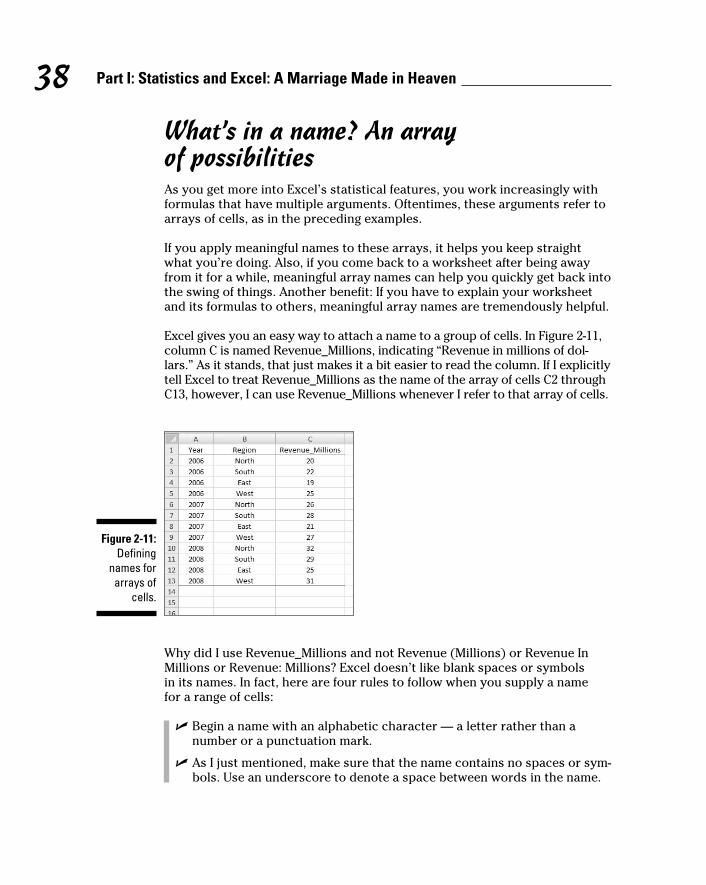
38 Part I: Statistics and Excel: A Marriage Made in Heaven
What’s in a name? An array of possibilitiesAs you get more into Excel’s statistical features, you work increasingly with
formulas that have multiple arguments. Oftentimes, these arguments refer to
arrays of cells, as in the preceding examples.
If you apply meaningful names to these arrays, it helps you keep straight
what you’re doing. Also, if you come back to a worksheet after being away
from it for a while, meaningful array names can help you quickly get back into
the swing of things. Another benefit: If you have to explain your worksheet
and its formulas to others, meaningful array names are tremendously helpful.
Excel gives you an easy way to attach a name to a group of cells. In Figure 2-11,
column C is named Revenue_Millions, indicating “Revenue in millions of dol-
lars.” As it stands, that just makes it a bit easier to read the column. If I explicitly
tell Excel to treat Revenue_Millions as the name of the array of cells C2 through
C13, however, I can use Revenue_Millions whenever I refer to that array of cells.
Figure 2-11: Defining
names for arrays of
cells.
Why did I use Revenue_Millions and not Revenue (Millions) or Revenue In
Millions or Revenue: Millions? Excel doesn’t like blank spaces or symbols
in its names. In fact, here are four rules to follow when you supply a name
for a range of cells:
✓ Begin a name with an alphabetic character — a letter rather than a
number or a punctuation mark.
✓ As I just mentioned, make sure that the name contains no spaces or sym-
bols. Use an underscore to denote a space between words in the name.
06 454060-ch02.indd 3806 454060-ch02.indd 38 4/21/09 7:18:49 PM4/21/09 7:18:49 PM

39 Chapter 2: Understanding Excel’s Statistical Capabilities
✓ Be sure that the name is unique within the worksheet.
✓ Be sure that the name doesn’t duplicate any cell reference in the
worksheet.
Here’s how to define a name:
1. Put a descriptive name at the top of a column (or to the left of a row)
you want to name.
Figure 2-10 shows this.
2. Select the range of cells you want to name.
For this example, that’s cells C2 through C13. Why not include C1? I
explain in a second.
3. Right-click on the selected range.
This opens the menu shown in Figure 2-12.
Figure 2-12: Right-
clicking a selected
cell range opens this
pop-up menu.
4. From the pop-up menu, select Name a Range.
This selection opens the New Name dialog box (see Figure 2-13). As you
can see, Excel knows that Revenue_Millions is the name for the array,
and that Revenue_Millions refers to cells C2 through C13. When pre-
sented with a selected range of cells to name, Excel looks for a nearby
name — just above a column or just to the left of a row. If no name is
present, you get to supply one in the New Name dialog box. (The New
Name dialog box is also accessible by choosing Formula | Define Name.)
06 454060-ch02.indd 3906 454060-ch02.indd 39 4/21/09 7:18:50 PM4/21/09 7:18:50 PM

40 Part I: Statistics and Excel: A Marriage Made in Heaven
Figure 2-13: The New
Name dialog box.
When you select a range of cells like a column with a name at the top,
you can include the cell with the name in it and Excel attaches the
name to the range. I strongly advise against doing this. Why? If I select C1
through C13, the name Revenue_Millions refers to cells C1 through C13,
not C2 through C13. In that case, the first value in the range is text and
the others are numbers.
For a formula like SUM (or SUMIF or SUMIFS, which I discuss next), this
doesn’t make a difference: In those formulas, Excel just ignores values
that aren’t numbers. If you have to use the whole array in a calculation,
however, it makes a huge difference: Excel thinks the name is part of the
array and tries to use it in the calculation. You’ll see this in the next sec-
tion on creating your own array formulas.
5. Click OK.
Excel attaches the name to the range of cells.
Now I have the convenience of using the name in a formula. Here, selecting
a cell (like C14) and entering the SUM formula directly into C14 opens the
boxes in Figure 2-14.
Figure 2-14: Entering
a formula directly into a cell opens
these boxes.
06 454060-ch02.indd 4006 454060-ch02.indd 40 4/21/09 7:18:50 PM4/21/09 7:18:50 PM

41 Chapter 2: Understanding Excel’s Statistical Capabilities
As the figure shows, the boxes open as I type. Pressing the Tab key fills in the
formula in a way that Excel understands. I have to supply the close parenthe-
sis (see Figure 2-15) and type Enter to see the result.
Using the named array, then, the formula is
=SUM(Revenue_Millions)
which is more descriptive than
=SUM(C2:C13)
A couple of Excel 2007’s new formulas show just how convenient this naming
capability is. These formulas, SUMIF and SUMIFS, add a set of numbers if
specific conditions in one cell range (SUMIF) or in more than one cell range
(SUMIFS) are met. SUMIFS is new in Excel 2007.
To take full advantage of naming, I name both column A (Year) and column B
(Region) in the same way I named column C.
Figure 2-15: Completing
the formula.
06 454060-ch02.indd 4106 454060-ch02.indd 41 4/21/09 7:18:50 PM4/21/09 7:18:50 PM

42 Part I: Statistics and Excel: A Marriage Made in Heaven
When you define a name for a cell range like B2:B13 in this example, beware:
Excel can be a bit quirky when the cells hold names. Excel might guess that
the name in the uppermost cell is the name you want to assign to the cell
range. In this case, Excel guesses “North” for the name, rather than “Region.”
If that happens, you make the change in the New Name dialog box.
To keep track of the names in a worksheet, selecting
Formula | Name Manager
opens the Name Manager box shown in Figure 2-16. The nearby buttons in
the Defined Names area are also useful.
Figure 2-16: Managing
the Defined Names in a worksheet.
Next, I sum the data in column C, but only for the North Region. That is, I only
consider a cell in column C if the corresponding cell in column B contains
“North.” To do this, I followed these steps:
1. Select a cell for the formula result.
My selection here is C15.
2. Select the appropriate formula category and choose your function
from its pop-up menu.
This opens the Function Arguments dialog box.
I selected Formulas | Math & Trig
and scrolled down the menu to find and choose SUMIF. This selection
opens the Function Arguments dialog box shown in Figure 2-17.
06 454060-ch02.indd 4206 454060-ch02.indd 42 4/21/09 7:18:50 PM4/21/09 7:18:50 PM

43 Chapter 2: Understanding Excel’s Statistical Capabilities
Figure 2-17: The
Function Arguments dialog box for SUMIF.
SUMIF has three arguments. The first, Range, is the range of cells to eval-
uate for the condition to include in the sum (North, South, East, or West
in this example). The second, Criteria, is the specific value in the Range
(North, for this example). The third, Sum_range, holds the values I sum.
3. In the Function Arguments dialog box, enter the appropriate values
for the arguments.
Here’s where another Defined Names button comes in handy. In that
Ribbon area, click the down arrow next to Use in Formula to open the
drop-down list shown in Figure 2-18.
Figure 2-18: The Use
In Formula drop-down
list.
06 454060-ch02.indd 4306 454060-ch02.indd 43 4/21/09 7:18:51 PM4/21/09 7:18:51 PM

44 Part I: Statistics and Excel: A Marriage Made in Heaven
Selecting from this list fills in the Function Arguments dialog box, as
shown in Figure 2-19. I had to type North into the Criteria box. Excel
adds the double quotes.
4. Click OK.
The result appears in the selected cell. For this example, that’s 78.
Figure 2-19: Completing
the Function Arguments dialog box for SUMIF.
In the formula bar,
=SUMIF(Region,”North”, Revenue_Millions)
appears. I can type it exactly that way into the formula bar, without the
dialog box or the drop-down list.
The formula in the formula bar is easier to understand than
= SUMIF(B2:B13,”North”, C2:C13)
isn’t it?
Incidentally, the same cell range can be both the Range and the Sum_range.
For example, to sum just the cells for which Revenue_Millions is less than 25,
that’s
=SUMIF(Revenue_Millions, “< 25”, Revenue_Millions)
The second argument (Criteria) is always in double-quotes.
What about SUMIFS? That one is useful if I want to find the sum of revenues
for North but only for the years 2006 and 2007. Follow these steps to use
SUMIFS to find this sum:
06 454060-ch02.indd 4406 454060-ch02.indd 44 4/21/09 7:18:51 PM4/21/09 7:18:51 PM

45 Chapter 2: Understanding Excel’s Statistical Capabilities
1. Select a cell for the formula result.
The selected cell is C17.
2. Select the appropriate formula category and choose your function
from its pop-up menu.
This opens the Function Arguments dialog box.
For this example, the selection is SUMIFS from the
Formulas | Math & Trig
menu, opening the Functions Arguments dialog box shown in Figure 2-20.
3. In the Function Arguments dialog box, enter the appropriate values
for the arguments.
Notice that in SUMIFS the Sum_range argument appears first. In SUMIF,
it appears last. The appropriate values for the arguments appear in
Figure 2-20.
4. The formula in the Formula bar is
=SUMIFS(Revenue_Millions,Year,”<2008”,Region,”North”)
5. Click OK.
The answer, 46, appears in the selected cell.
With unnamed arrays, the formula would have been
=SUMIFS(C2:C13,A2:A13,”<2008”,B2:B13,”North”)
which seems much harder to comprehend.
Figure 2-20: The
Completed Function
Arguments dialog box
for SUMIFS.
06 454060-ch02.indd 4506 454060-ch02.indd 45 4/21/09 7:18:51 PM4/21/09 7:18:51 PM

46 Part I: Statistics and Excel: A Marriage Made in Heaven
A defined name involves absolute referencing. (See Chapter 1.) Therefore, if
you try to autofill from a named array, you’ll be in for an unpleasant surprise:
Rather than autofilling a group of cells, you’ll be copying a value over and over
again.
Here’s what I mean. Suppose you assign the name Series_1 to A2:A11 and
Series_2 to B2:B11. In A12, you calculate SUM(Series_1). Being clever, you
figure you’ll just drag the result from A12 to B12 to calculate SUM(Series_2).
What do you find in B12? SUM(Series_1), that’s what.
Creating your own array formulas In addition to Excel’s built-in array formulas, you can create your own. To
help things along, you can incorporate named arrays.
Figure 2-21 shows two named arrays, X and Y in columns C and D. X refers
to C2 through C5 (not C1 through C5!) and Y refers to D2 through D5 (not D1
through D5!) XY is the column header for column F. Each cell in column F will
store the product of the corresponding cell in column C and the correspond-
ing cell in column D.
Figure 2-21: Two named
arrays.
An easy way to enter the products, of course, is to just set F2 equal to C2*E2
and then autofill the remaining applicable cells in column F.
Just to illustrate array formulas, though, I follow these steps to work on the
data in the worksheet in Figure 2-21.
1. Select the array that will hold the answers to the array formula.
That would be F2 through F5, or F2:F5 in Excel-speak. Figure 2-21 shows
the array selected.
2. Into the selected array, type the formula.
The formula here is =X * Y
06 454060-ch02.indd 4606 454060-ch02.indd 46 4/21/09 7:18:51 PM4/21/09 7:18:51 PM

47 Chapter 2: Understanding Excel’s Statistical Capabilities
3. Press Ctrl+Shift+Enter (not Enter).
The answers appear in F2 through F5, as Figure 2-22 shows. Note the for-
mula {=X*Y}
in the formula bar. As I told you earlier, the curly brackets indicate an
array formula.
Figure 2-22: The results of the array
formula {=X * Y}.
Another thing I mention earlier in this chapter: When you name a range of
cells, make sure that the named range does not include the cell with the name
in it. If it does, an array formula like {=X * Y} tries to multiply the letter X by
the letter Y to produce the first value, which is impossible and results in the
exceptionally ugly #VALUE! error.
Using data analysis toolsExcel has a set of sophisticated tools for data analysis. Table 2-1 lists the
tools I cover. (The one I don’t cover, Fourier Analysis, is extremely techni-
cal.) Some of the terms in the table may be unfamiliar to you, but you’ll know
them by the time you finish this book.
Table 2-1 Excel’s Data Analysis ToolsTool What It Does
Anova: Single Factor Analysis of variance for two or more samples
Anova: Two Factor with Replication
Analysis of variance with two independent variables, and multiple observations in each combination of the levels of the variables
Anova: Two Factor without Replication
Analysis of variance with two independent variables, and one observation in each combination of the levels of the variables
(continued)
06 454060-ch02.indd 4706 454060-ch02.indd 47 4/21/09 7:18:52 PM4/21/09 7:18:52 PM

48 Part I: Statistics and Excel: A Marriage Made in Heaven
Table 2-1 (continued)Tool What It Does
Correlation With more than two measurements on a sample of indi-viduals, calculates a matrix of correlation coefficients for all possible pairs of the measurements
Covariance With more than two measurements on a sample of indi-viduals, calculates a matrix of covariances for all pos-sible pairs of the measurements
Descriptive Statistics Generates a report of central tendency, variability, and other characteristics of values in the selected range of cells
Exponential Smoothing
In a sequence of values, calculates a prediction based on a preceding set of values, and on a prior prediction for those values
F-Test Two Sample for Variances
Performs an F-test to compare two variances
Histogram Tabulates individual and cumulative frequencies for values in the selected range of cells
Moving Average In a sequence of values, calculates a prediction which is the average of a specified number of preceding values
Random Number Generation
Provides a specified amount of random numbers gener-ated from one of seven possible distributions
Rank and Percentile Creates a table that shows the ordinal rank and the percentage rank of each value in a set of values
Regression Creates a report of the regression statistics based on linear regression through a set of data containing one dependent variable and one or more independent variables
Sampling Creates a sample from the values in a specified range of cells
t-Test: Two Sample Three t-test tools test the difference between two means. One assumes equal variances in the two samples. Another assumes unequal variances in the two samples. The third assumes matched samples.
z-Test: Two Sample for Means
Performs a two-sample z-test to compare two means when the variances are known
In order to use these tools, you first have to load them into Excel.
06 454060-ch02.indd 4806 454060-ch02.indd 48 4/21/09 7:18:52 PM4/21/09 7:18:52 PM

49 Chapter 2: Understanding Excel’s Statistical Capabilities
To start, click the Office Button and select Excel Options. Doing this opens
the Excel Options dialog box. Then follow these steps:
1. In the Excel Options dialog box, select Add-Ins.
Oddly enough, this opens a list of add-ins.
2. Near the bottom of the list, you see a drop-down list labeled Manage.
From this list, select Excel Add-Ins.
3. Click Go.
This opens the Add-Ins dialog box. (See Figure 2-23.)
4. Click the check box next to Analysis Toolpak and then click OK.
Figure 2-23: The Add-Ins
dialog box.
When Excel finishes loading the Toolpak, you’ll find a Data Analysis button in
the Analysis area of the Data tab. In general, the steps for using a data analy-
sis tool are:
1. Enter your data into an array.
2. Click Data | Data Analysis to open the Data Analysis dialog box.
3. In the Data Analysis dialog box select the data analysis tool you want
to work with.
4. Click OK (or just double-click the selection) to open the dialog box for
the selected tool.
5. In the tool’s dialog box, enter the appropriate information.
I know this sounds like a cop-out, but each tool is different.
6. Click OK to close the dialog box and see the results.
06 454060-ch02.indd 4906 454060-ch02.indd 49 4/21/09 7:18:52 PM4/21/09 7:18:52 PM
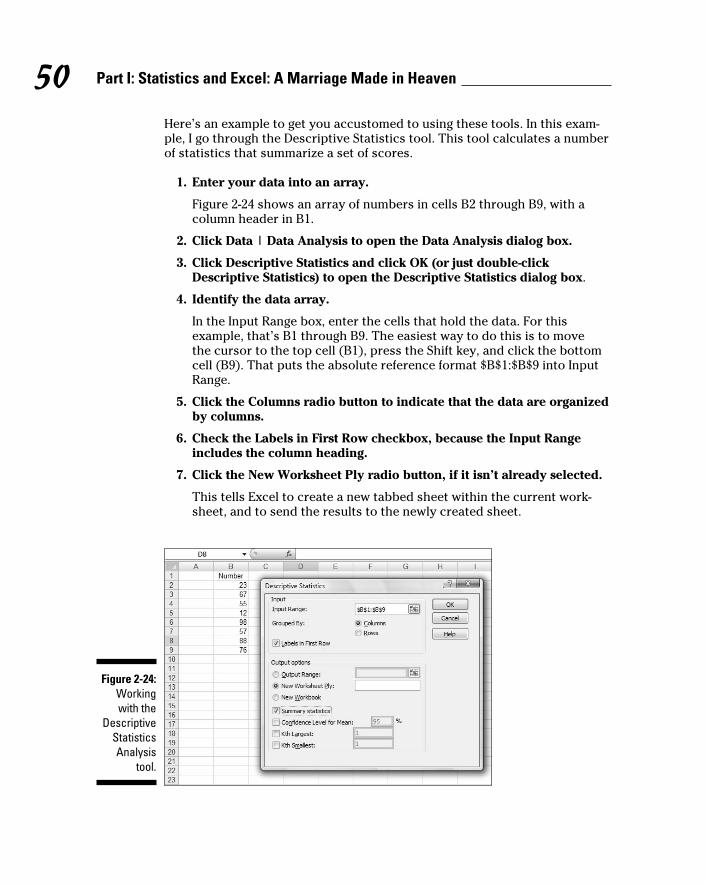
50 Part I: Statistics and Excel: A Marriage Made in Heaven
Here’s an example to get you accustomed to using these tools. In this exam-
ple, I go through the Descriptive Statistics tool. This tool calculates a number
of statistics that summarize a set of scores.
1. Enter your data into an array.
Figure 2-24 shows an array of numbers in cells B2 through B9, with a
column header in B1.
2. Click Data | Data Analysis to open the Data Analysis dialog box.
3. Click Descriptive Statistics and click OK (or just double-click
Descriptive Statistics) to open the Descriptive Statistics dialog box.
4. Identify the data array.
In the Input Range box, enter the cells that hold the data. For this
example, that’s B1 through B9. The easiest way to do this is to move
the cursor to the top cell (B1), press the Shift key, and click the bottom
cell (B9). That puts the absolute reference format $B$1:$B$9 into Input
Range.
5. Click the Columns radio button to indicate that the data are organized
by columns.
6. Check the Labels in First Row checkbox, because the Input Range
includes the column heading.
7. Click the New Worksheet Ply radio button, if it isn’t already selected.
This tells Excel to create a new tabbed sheet within the current work-
sheet, and to send the results to the newly created sheet.
Figure 2-24: Working with the
Descriptive Statistics Analysis
tool.
06 454060-ch02.indd 5006 454060-ch02.indd 50 4/21/09 7:18:52 PM4/21/09 7:18:52 PM
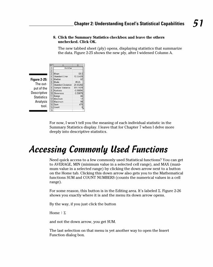
51 Chapter 2: Understanding Excel’s Statistical Capabilities
8. Click the Summary Statistics checkbox and leave the others
unchecked. Click OK.
The new tabbed sheet (ply) opens, displaying statistics that summarize
the data. Figure 2-25 shows the new ply, after I widened Column A.
Figure 2-25: The out-
put of the Descriptive
Statistics Analysis
tool.
For now, I won’t tell you the meaning of each individual statistic in the
Summary Statistics display. I leave that for Chapter 7 when I delve more
deeply into descriptive statistics.
Accessing Commonly Used FunctionsNeed quick access to a few commonly used Statistical functions? You can get
to AVERAGE, MIN (minimum value in a selected cell range), and MAX (maxi-
mum value in a selected range) by clicking the down arrow next to a button
on the Home tab. Clicking this down arrow also gets you to the Mathematical
functions SUM and COUNT NUMBERS (counts the numerical values in a cell
range).
For some reason, this button is in the Editing area. It’s labeled Σ. Figure 2-26
shows you exactly where it is and the menu its down arrow opens.
By the way, if you just click the button
Home | Σ
and not the down arrow, you get SUM.
The last selection on that menu is yet another way to open the Insert
Function dialog box.
06 454060-ch02.indd 5106 454060-ch02.indd 51 4/21/09 7:18:52 PM4/21/09 7:18:52 PM

52 Part I: Statistics and Excel: A Marriage Made in Heaven
Figure 2-26: The Home | Σ button
and the menu its
down arrow opens.
One nice thing about using this menu — it eliminates a step: When you select
a function, you don’t have to select a cell for the result. Just select the cell
range and the function inserts the value in a cell immediately after the range.
06 454060-ch02.indd 5206 454060-ch02.indd 52 4/21/09 7:18:52 PM4/21/09 7:18:52 PM

Part IIDescribing Data
07 454060-pp02.indd 5307 454060-pp02.indd 53 4/21/09 7:19:28 PM4/21/09 7:19:28 PM

In this part . . .
Here’s where you learn how to use statistics to sum-
marize and describe data. I begin by showing you
how to use the Excel graphics capabilities to produce the
kinds of graphs statisticians use. From there, I move on
to descriptive statistics — average, variance, standard
deviation, and some others. I tell you how to combine a
couple of these statistics to standardize scores. Finally,
I describe the normal distribution, a very important topic
in statistics. Along the way, you find out about Excel func-
tions and data analysis tools that cover all the statistical
ideas in this part.
07 454060-pp02.indd 5407 454060-pp02.indd 54 4/21/09 7:19:29 PM4/21/09 7:19:29 PM

Chapter 3
Show and Tell: Graphing DataIn This Chapter▶ Introducing graphs
▶ Working with Excel’s graphics capabilities
▶ Creating graphs for statistical work
The visual presentation of data is extremely important in statistics. Visual
presentation enables you to discern relationships and trends you might
not see if you just look at numbers. Visual presentation helps in another way:
It’s valuable for presenting ideas to groups and making them understand
your point of view.
Graphs come in many varieties. In this chapter, I explore the types of graphs
you use in statistics and when it’s advisable to use them. I also show you how
to use Excel to create those graphs.
Why Use Graphs?Suppose you have to make a pitch to a Congressional committee about com-
mercial space revenues in the early 1990s.
Which would you rather present? The data in Table 3-1, or the graph in
Figure 3-1 that shows the same data? (The data, by the way, are from the U.S.
Department of Commerce, via the Statistical Abstract of the U.S.)
08 454060-ch03.indd 5508 454060-ch03.indd 55 4/21/09 7:19:54 PM4/21/09 7:19:54 PM

56 Part II: Describing Data
Table 3-1 US Commercial Space Revenues from 1990 through 1994 (In Millions of Dollars)Industry 1990 1991 1992 1993 1994
Commercial Satellites Delivered
1,000 1,300 1,300 1,100 1,400
Satellite Services
800 1,200 1,500 1,850 2,330
Satellite Ground Equipment
860 1,300 1,400 1,600 1,970
Commercial Launches
570 380 450 465 580
Remote Sensing Data
155 190 210 250 300
Commercial R&D Infrastructure
0 0 0 30 60
Total 3,385 4,370 4,860 5,295 6,640
Figure 3-1: Graphing
the data in Table 3-1.
08 454060-ch03.indd 5608 454060-ch03.indd 56 4/21/09 7:19:54 PM4/21/09 7:19:54 PM

57 Chapter 3: Show and Tell: Graphing Data
Which one would have a greater and more lasting impact? Although the
table is certainly informative, most would argue that the graph gets the point
across better and more memorably. Eyes that glaze over when looking at
numbers often shine brighter when looking at pictures.
The graph shows you trends you might not see as quickly on the table.
(Satellite services rose fastest. Commercial launches, not so much.) Bottom
line: Tables are good, graphs are better.
Graphs help bring concepts to life that might otherwise be difficult to under-
stand. In fact, I do that throughout the book. I illustrate points by . . . well . . .
illustrating points!
Some FundamentalsLike the graph in Figure 3-1, most graph formats have a horizontal axis and
a vertical axis. The pie graph, a format I show you later in this chapter, does
not. By convention, the horizontal axis is also called the x-axis and the verti-
cal axis is also called the y-axis.
Also, by convention, what goes on the horizontal axis is called the indepen-dent variable and what goes on the vertical axis is called the dependent vari-able. One of Excel’s graph formats reverses that convention, and I bring that
to your attention when I cover it.
Just to give you a heads up, Excel calls that reversed-axis format a bar graph.
You might have seen the graph in Figure 3-1 referred to as a bar graph. So
have I. Excel calls Figure 3-1 a column graph, so I use “columns” from here on.
Getting back to “independent” and “dependent,” those terms imply that
changes in the vertical direction depend (at least partly) on changes in the
horizontal direction.
Another fundamental principle of creating a graph: Don’t wear out the view-
er’s eyes! If you put too much into a graph in the way of information or spe-
cial effects, you defeat the whole purpose of the graph.
For example, in Figure 3-1 I had to make some choices about filling in the
columns. Color-coded columns would have been helpful, but the page you’re
looking at only shows black, white, and shades of gray.
A lot of graph creation comes with experience, and you just have to use
your judgment. In this case, my judgment came into play with the horizontal
gridlines. In most graphs, I prefer not to have them. Here, they seem to add
08 454060-ch03.indd 5708 454060-ch03.indd 57 4/21/09 7:19:56 PM4/21/09 7:19:56 PM

58 Part II: Describing Data
structure and help the viewer figure out the dollar value associated with each
column. But then again, that’s just my opinion.
Excel’s Graphics CapabilitiesAs I mention a couple of paragraphs ago, the graph in Figure 3-1 is a column
graph. It’s one of many types of graphs you can create with Excel. Of all the
graphics possibilities Excel provides, however, only a few are useful for sta-
tistical work. Those are the ones I cover in this chapter.
In addition to the column graph, I show you how to create pie graphs, bar
graphs, line graphs, and scatter plots. Excel refers to each one as a chart rather than a “graph.” In this chapter, I use the two terms interchangeably.
Inserting a chartIn Excel 2007, you insert a chart into a spreadsheet. This immediately clues
you that the chart creation tools are in the Charts area of the Insert tab. (See
Figure 3-2.)
Figure 3-2: The Charts area of the Insert tab.
In Excels past a Chart Wizard guided you step by step through chart creation.
The chart took shape within the wizard as you worked. You didn’t see the full
chart on the worksheet (or on a separate page) until you closed the wizard.
Excel 2007 turns the process inside out and simplifies it. Instead of making
decisions within the wizard (which is no longer available), you immediately
insert a chart into your spreadsheet. Then you use Design and Layout capa-
bilities to modify the chart and make it look just the way you want it.
You follow these steps:
1. Enter your data into a worksheet.
2. Select the data that go into the chart.
08 454060-ch03.indd 5808 454060-ch03.indd 58 4/21/09 7:19:56 PM4/21/09 7:19:56 PM

59 Chapter 3: Show and Tell: Graphing Data
3. In the Charts area of the Insert tab, select the chart type.
When you select a chart type, a box opens that presents a variety of sub-
types. Choose one and Excel creates a chart in your worksheet.
4. Modify the chart.
Click on the chart, and Excel adds a Design tab and a Layout tab to the
Ribbon. These tabs allow you to make all kinds of changes to your chart.
It’s really that simple. The next section shows what I mean.
By the way, here’s one more important concept about Excel graphics. In Excel,
a chart is dynamic. This means that after you create a chart, changing its work-
sheet data results in an immediate change in the chart.
Becoming a ColumnistIn this section, I show you how to create that spiffy graph in Figure 3-1.
Follow these steps:
1. Enter your data into a worksheet.
Figure 3-3 shows the data from Table 3-1 entered into a worksheet.
Figure 3-3: Table 3-1
data entered into a
worksheet.
2. Select the data that go into the chart.
I selected A1:F7. The selection includes the labels for the axes but
doesn’t include row G, which holds the column totals.
3. In the Charts area of the Insert tab, select the chart type.
For this example, the chart type is Column. Selecting Insert | Charts |
Column opens the gallery in Figure 3-4. Here, you select the specific type
of column chart for the data. I selected the first choice in the top row
(Clustered Column).
08 454060-ch03.indd 5908 454060-ch03.indd 59 4/21/09 7:19:56 PM4/21/09 7:19:56 PM

60 Part II: Describing Data
Figure 3-4: The gallery
for a column chart.
4. Modify the chart.
Figure 3-5 shows the resulting chart, as well as the Design tab and the
Layout tab. As you can see, I have to do some heavyweight modifying.
Why? Excel has guessed wrong about how I wanted to design the chart.
It looks okay, but it’s not. Rather than the years on the x-axis, Excel laid
out the industry types. In other words, it interchanged the rows and
columns.
Figure 3-5: The semi-
finished graph —
based on a bad guess
By Excel.
08 454060-ch03.indd 6008 454060-ch03.indd 60 4/21/09 7:19:56 PM4/21/09 7:19:56 PM

61 Chapter 3: Show and Tell: Graphing Data
Fortunately, Excel provides a quick fix. Figure 3-5 shows the Design tab
selected. In the Design | Data area, the choice on the left is Switch Row/
Column. So . . . selecting Design | Data | Switch Row/Column does the
trick.
Some work remains. The axes aren’t labeled yet, and the graph has no
title. Here’s where the Layout tab comes into play. Figure 3-6 shows
Layout | Axis Titles selected, along with the drop-down menu that
allows you to add the title for each axis. Primary Horizontal Axis Title
and Primary Vertical Axis Title provide options for laying out the axis
titles. Layout | Chart Title does the same for the title of the chart.
Adding the titles finishes things off. The result looks like the chart in
Figure 3-1.
Figure 3-6: The Layout
tab enables you to add
titles.
Stacking the columnsIf I had selected Column’s second subtype — Stacked Column — I would have
created a set of columns that presents the same information in a slightly dif-
ferent way. Each column represents the total of all the data series at a point
on the x-axis. Each column is divided into segments. Each segment’s size is
proportional to how much it contributes to the total. Figure 3-7 shows this.
08 454060-ch03.indd 6108 454060-ch03.indd 61 4/21/09 7:19:57 PM4/21/09 7:19:57 PM

62 Part II: Describing Data
Figure 3-7: A stacked
column graph of
the data in Table 3-1.
Notice that the data series are in reverse order from the way they’re set up
in the first column graph. Excel sets them up in this order for the stacked col-
umns, and in the other order for the clustered columns.
I inserted each graph into the worksheet. Excel also allows you to move a
graph to a separate page in the workbook. Select Design | Location | Move
Chart (it’s on the extreme right of the Design tab) to open the Move Chart
dialog box. Click the New Sheet radio button to add a worksheet and move
the chart there. Figure 3-8 shows how the chart looks on its own page.
In Appendix C, by the way, I show you another use for the stacked column
chart.
This is a nice way of showing percentage changes over the course of time. If
you just want to focus on percentages in one year, another type of graph is
more effective. I discuss it in a moment, but first I want to tell you . . .
08 454060-ch03.indd 6208 454060-ch03.indd 62 4/21/09 7:19:57 PM4/21/09 7:19:57 PM

63 Chapter 3: Show and Tell: Graphing Data
Figure 3-8: The stacked
column chart on its
own worksheet.
One more thing Statisticians often use column graphs to show how frequently something occurs.
For example, in a thousand tosses of a pair of dice how many times does a 6 come
up? How many tosses result in a 7? The x-axis shows each possible outcome
of the dice-tosses, and the heights of the columns represent the frequencies.
Whenever the heights represent frequencies, your column graph is a histogram.
It’s easy enough to use Excel’s graphics capabilities to set up a histogram,
but Excel makes it easier still. Excel provides a data analysis tool that does
everything you need to create a histogram. It’s called — believe it or not —
Histogram. You provide an array of cells that hold all the data — like the
outcomes of many dice-tosses, and an array that holds a list of intervals —
like the possible outcomes of the tosses (the numbers 2–12). Histogram goes
through the data array, counts the frequencies within each interval, and then
draws the column graph. I describe this tool in greater detail in Chapter 7.
08 454060-ch03.indd 6308 454060-ch03.indd 63 4/21/09 7:19:58 PM4/21/09 7:19:58 PM

64 Part II: Describing Data
Slicing the PieOn to the next chart type. To show the percentages that make up one total, a
pie graph gets the job done effectively.
Suppose you want to focus on the U.S. commercial space revenues in 1994 —
that is, on the last column of data in Table 3-1. You’ll catch people’s attention
if you present the data in the form of a pie graph, like the one in Figure 3-9.
Figure 3-9: A pie graph
of the last column
of data in Table 3-1.
Here’s how to create this graph:
1. Enter your data into a worksheet.
Pretty easy, as I’ve already done this.
2. Select the data that go into the chart.
I want the names in column A and the data in column F. The trick is to
select column A (cells A2 through A7)in the usual way and then press
and hold the CTRL key. While holding this key, drag the cursor through
F2 through F7. Voilà — two nonadjoining columns are selected
3. In the Charts area of the Insert tab, select the chart type.
I selected Insert | Pie and then chose the first subtype.
08 454060-ch03.indd 6408 454060-ch03.indd 64 4/21/09 7:19:58 PM4/21/09 7:19:58 PM

65 Chapter 3: Show and Tell: Graphing Data
4. Modify the chart.
Figure 3-10 shows the initial pie chart on its own page. To get it to look
like Figure 3-9, I had to do a lot of modifying.
Figure 3-10: The initial pie chart
on its own page.
The little slice filled in black represents 1 percent of the pie (Commercial
R&D Infrastructure) and might be hard to see. I changed the fill color
from black to white and added a border. How? I clicked on that slice
and several slices were selected. Clicking again isolated it. Then I right-
clicked to open the menu in Figure 3-11. Choosing Format Data Point
opens the Format Data Point dialog box (Figure 3-12). I worked with Fill
and Border to change the slice to a white fill with a black border.
Figure 3-11: Right-
clicking an isolated pie chart slice opens this
menu.
08 454060-ch03.indd 6508 454060-ch03.indd 65 4/21/09 7:19:58 PM4/21/09 7:19:58 PM

66 Part II: Describing Data
Figure 3-12: The Format Data Point dialog box.
I selected Layout | Data Labels | Best Fit to add the data to each slice.
With the data labels selected, I right-clicked to open a couple of menus
(Figure 3-13) that enabled me to manipulate the color and size of the
data label font. After I made them all white, the label outside the small
slice became invisible, but right-clicking in its area allowed me to reset
its font to black. Right-clicking on the legend brings up the same menus
for modifying the size of the font in the legend.
Figure 3-13: Menus for manipulat-
ing the color and size of
the data label font.
Pulling the slices apartOne variant of the pie chart is to explode the slices. I’m not particularly fond
of this type of graph, but you might be. In some circumstances, it might come
in handy.
08 454060-ch03.indd 6608 454060-ch03.indd 66 4/21/09 7:19:59 PM4/21/09 7:19:59 PM

67 Chapter 3: Show and Tell: Graphing Data
One of the nice things about Excel’s graphics capabilities is that you can
“what-if” to your heart’s content. So . . . after I finish creating the pie chart,
I can explode it. To do that, I click on the chart and select Design | Change
Chart Type. This opens the Change Chart Type dialog box shown in Figure
3-14. Selecting the pie chart subtype that separates the slices (Exploded Pie)
creates the chart in Figure 3-15.
Figure 3-14: The Change
Chart Type dialog box.
Whenever you set up a pie graph — whether intact or exploded — always
keep in mind . . . .
Figure 3-15: The
exploded version of Figure 3-9.
08 454060-ch03.indd 6708 454060-ch03.indd 67 4/21/09 7:19:59 PM4/21/09 7:19:59 PM

68 Part II: Describing Data
A word from the wiseSocial commentator, raconteur, and former baseball player Yogi Berra once
went to a restaurant and ordered a whole pizza.
“How many slices should I cut,” asked the waitress, “four or eight?”
“Better make it four,” said Yogi, “I’m not hungry enough to eat eight.”
Yogi’s insightful analysis leads to a useful guideline about pie graphs: They’re
more digestible if they have fewer slices. If you cut a pie graph too fine,
you’re likely to leave your audience with information overload.
Drawing the LineIn the preceding example, I focused on one column of data from Table 3-1. In
this one, I focus on one row. The idea is to trace the progress of one space-
related industry across the years 1990–1994. In this example, I graph the
revenues from Satellite Services. The final product, shown on its own page, is
Figure 3-16.
Figure 3-16: A line graph
of the sec-ond Row
of Data in Table 3-1.
A line graph is a good way to show change over time, when you aren’t deal-
ing with too many data series. If you try to graph all six industries on one line
graph, it begins to look like spaghetti.
08 454060-ch03.indd 6808 454060-ch03.indd 68 4/21/09 7:19:59 PM4/21/09 7:19:59 PM

69 Chapter 3: Show and Tell: Graphing Data
How do you create a graph like Figure 3-16? Follow along:
1. Enter your data into a worksheet.
Once again, already done.
2. Select the data that go into the chart.
For this example, that’s cells B3 through F3.
Whoa! Did I forget something? What about that little trick I showed you
before where you hold down the CTRL key and select additional cells?
Couldn’t I do that and select the top row of years for the x-axis?
Nope. Not this time. If I do that, Excel thinks 1990, 1991, 1992, 1993, and
1994 are just another series of data points to plot on the graph. I’ll show
you another way to put those years on the x-axis.
3. In Charts area of the Insert tab, select the chart type.
This time, it’s Insert | Line and then the fourth subtype, Line with
Markers. This creates the chart in Figure 3-17.
Figure 3-17: Insert | Line | Line With
Markers creates the
line chart.
08 454060-ch03.indd 6908 454060-ch03.indd 69 4/21/09 7:20:00 PM4/21/09 7:20:00 PM

70 Part II: Describing Data
4. Modify the chart.
The line on the chart is a little hard to see. Selecting Design | Chart
Styles and the leftmost option makes the line darker.
Next, I added the titles for the chart and for the axes. Clicking the down
arrow of Design | Chart Layouts opens a box with 12 possibilities.
Selecting the tenth one creates text boxes for the titles on the chart.
I still have to put the years on the x-axis. To do this, I right-clicked inside
the chart to open the menu in Figure 3-18.
Figure 3-18: Right-
clicking inside the
chart opens this menu.
Clicking Select Data opens the Select Data Source dialog box. (See Figure
3-19.) In the box labeled Horizontal (Category) Axis Labels, clicking
the Edit button opens the Axis Labels dialog box (Figure 3-20). A blink-
ing cursor in the Axis label range box shows it’s ready for business.
Selecting cells B1 through F1 and clicking OK closes this dialog box.
Clicking OK closes the Select Source dialog box and puts the years on
the x-axis.
Figure 3-19: The Select
Source dia-log box.
One more modification completes the graph. The legend (showing
“Series 1”) isn’t necessary. Right-click on it and choose Delete from the
pop-up menu.
08 454060-ch03.indd 7008 454060-ch03.indd 70 4/21/09 7:20:00 PM4/21/09 7:20:00 PM

71 Chapter 3: Show and Tell: Graphing Data
Figure 3-20: The Axis
Labels dialog box.
Passing the Bar Excel’s bar chart is a column chart laid on its side. This is the one that
reverses the horizontal-vertical convention. Here, the vertical axis holds the
independent variable, and it’s referred to as the x-axis. The horizontal axis is
the y-axis and it tracks the dependent variable.
When would you use the bar graph? This type of graph fits the bill when you
want to make a point about reaching a goal, or about the inequities in attain-
ing one.
Table 3-2 shows the data on (what I feel, anyway) is an important social issue.
The data, from the U.S. Census Bureau (via the U.S. Statistical Abstract), are
for the year 2000. Percent means the percentage of children in each income
group.
Table 3-2 Children’s Use of the Internet at Home (2000)Family Income Percent
Under $15,000 7.7
$15,000-$19,999 12.9
$20,000-$24,999 15.2
$25,000-$34,999 21.0
$35,000-$49,999 31.8
$50,000-$74,999 39.9
Over $75,000 51.7
The numbers in the table are pretty dramatic. Casting them into a bar chart
renders them even more so, as Figure 3-21 shows.
08 454060-ch03.indd 7108 454060-ch03.indd 71 4/21/09 7:20:00 PM4/21/09 7:20:00 PM

72 Part II: Describing Data
Figure 3-21: A bar chart of the data
in Table 3-2.
Children’s Home Use of the Internet (2000)
$75,000 and overFa
mily
Inco
me
$50,000 - $74,999
$35,000 - $49,999
$25,000 - $34,999
$20,000 - $24,999
$15,000 - $19,999
Under $15,000
0 10 20 30Percent
40 50 60
To create this graph, follow these steps:
1. Enter your data into a worksheet.
Figure 3-22 shows the data entered into a worksheet.
Figure 3-22: Table 3-2 data in a
worksheet.
2. Select the data that go into the chart.
For this example, the data are cells A1 through B8.
3. In the Charts area of the Insert tab, select the chart type.
I clicked the down arrow for Insert | Bar and selected the first subtype
(Clustered Bar). The result appears in Figure 3-23. The title is wrong and
the legend is unnecessary, but I deal with that in Step 4.
08 454060-ch03.indd 7208 454060-ch03.indd 72 4/21/09 7:20:00 PM4/21/09 7:20:00 PM

73 Chapter 3: Show and Tell: Graphing Data
Figure 3-23: The Initial Excel bar
chart.
4. Modify the chart.
The first modification is to select a layout. This is a little confusing,
because Design | Chart Layouts holds the desired look, rather than
a ribbon area within the Layout tab. Go figure. The trick is to select a
layout that puts text boxes for the titles onto the graph. The option that
does this (Layout 8) is shown selected in Figure 3-24. (The other way to
do this is with Layout | Labels as I showed you earlier.)
Figure 3-24: The layout for adding axis titles and chart title to the bar chart.
After entering the labels, I deleted the legend. Then I darkened the bars
via Design | Chart Styles. Right-clicking on each label brings up the
menu for increasing the font size.
08 454060-ch03.indd 7308 454060-ch03.indd 73 4/21/09 7:20:00 PM4/21/09 7:20:00 PM

74 Part II: Describing Data
The Plot ThickensYou use an important statistical technique called linear regression to deter-
mine the relationship between one variable, x, and another variable, y. For
more information on linear regression, see Chapter 14.
The basis of the technique is a graph that shows individuals measured on
both x and y. The graph represents each individual as a point. Because the
points seem to scatter around the graph, the graph is called a scatterplot.
Suppose you’re trying to find out how well a test of aptitude for sales pre-
dicts salespeople’s productivity. You administer the test to a sample of sales-
persons and you tabulate how much money they make in commissions over a
two-month period. Each person’s pair of scores (test score and commissions)
locates him or her within the scatterplot.
To create a scatterplot, follow the steps:
1. Enter your data into a worksheet.
Figure 3-25 shows the entered data.
Figure 3-25: Scatterplot
data.
2. Select the data that go into the chart.
Figure 3-25 shows the selected cells — B2 through C21. (Including B1
creates the same chart, but with an incorrect title.) The cells in Column
A are just placeholders that organize the data.
3. In the Charts area of the Insert tab, select the chart type.
I chose the first subtype of Insert | Scatter, resulting in the chart shown
in Figure 3-26.
08 454060-ch03.indd 7408 454060-ch03.indd 74 4/21/09 7:20:01 PM4/21/09 7:20:01 PM
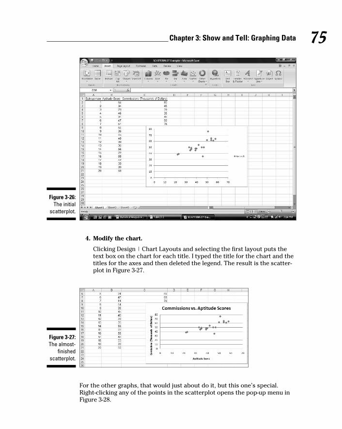
75 Chapter 3: Show and Tell: Graphing Data
Figure 3-26: The initial
scatterplot.
4. Modify the chart.
Clicking Design | Chart Layouts and selecting the first layout puts the
text box on the chart for each title. I typed the title for the chart and the
titles for the axes and then deleted the legend. The result is the scatter-
plot in Figure 3-27.
Figure 3-27: The almost-
finished scatterplot.
For the other graphs, that would just about do it, but this one’s special.
Right-clicking any of the points in the scatterplot opens the pop-up menu in
Figure 3-28.
08 454060-ch03.indd 7508 454060-ch03.indd 75 4/21/09 7:20:01 PM4/21/09 7:20:01 PM

76 Part II: Describing Data
Figure 3-28: Right-
clicking any point on the scatterplot opens this
menu.
Selecting Add Trendline opens the Format Trendline dialog box. I selected
the Linear radio button and clicked the two bottom checkboxes. They’re
labeled Display Equation on Chart and Display R-Squared Value on Chart
(Figure 3-29).
Figure 3-29: The Format
Trendline dialog box.
Clicking OK closes the Format Trendline dialog box. A couple of additional
items are now on the scatterplot, as Figure 3-30 shows. A line passes through
the points. Excel refers to it as a trendline, but it’s really called a regression line. A couple of equations are there, too. (For clarity, I dragged them from
their original locations.) What do they mean? What are those numbers all
about?
08 454060-ch03.indd 7608 454060-ch03.indd 76 4/21/09 7:20:02 PM4/21/09 7:20:02 PM

77 Chapter 3: Show and Tell: Graphing Data
You’ll just have to read Chapter 14 to find out.
Figure 3-30: The scat-
terplot, with additional
information.
08 454060-ch03.indd 7708 454060-ch03.indd 77 4/21/09 7:20:02 PM4/21/09 7:20:02 PM

78 Part II: Describing Data
08 454060-ch03.indd 7808 454060-ch03.indd 78 4/21/09 7:20:02 PM4/21/09 7:20:02 PM

Chapter 4
Finding Your CenterIn This Chapter▶ Working within your means
▶ Meeting conditions
▶ The median is the message
▶ Getting into the mode
Statisticians deal with groups of numbers. They often find it helpful to use
a single number to summarize a group of numbers. Where would a single
summary number come from?
The best bet is to find a number that’s somewhere in the middle, and use
that number to stand for the whole group. If you look at a group of numbers
and try to find one that’s somewhere in the middle, you’re dealing with that
group’s central tendency. Like good ice cream, central tendency comes in sev-
eral flavors.
Means: The Lore of AveragesJust about everyone uses averages. The statistical term for an average is
mean. Sometime in your life, you’ve undoubtedly calculated one. The mean is
a quick way of characterizing your grades, your money, or perhaps your per-
formance in some task or sport over time.
Another reason for calculating means concerns the kind of work that sci-
entists do. Typically, a scientist applies some kind of procedure to a small
sample of people or things and measures the results in some way. He or she
uses the results from the sample to estimate the effects of the procedure
on the population that produced the sample. As it happens, the mean of the
sample is the best estimate of the population mean.
09 454060-ch04.indd 7909 454060-ch04.indd 79 4/21/09 7:20:39 PM4/21/09 7:20:39 PM

80 Part II: Describing Data
Calculating the meanYou probably don’t need me to tell you how to calculate a mean, but I’m
going to do it anyway. Then I’ll show you the statistical formula. My goal is to
help you understand statistical formulas in general, and then set you up for
how Excel calculates means.
A mean is just the sum of a bunch of numbers divided by the amount of num-
bers you added up. Here’s an example. Suppose you measure the reading
speeds of six children in words per minute, and you find that their speeds are
56, 78, 45, 49, 55, 62
The average reading speed of these six children is
That is, the mean of this sample is 57.5 words per minute.
A first try at a formula might be
This is unwieldy as formulas go, so statisticians use abbreviations. A com-
monly used abbreviation for “Number” is x. A typical abbreviation for
“Amount of Numbers You Added Up” is N. With these abbreviations, the for-
mula becomes
Another abbreviation, used throughout statistics, stands for Sum of. It’s the
uppercase Greek letter for S. It’s pronounced “sigma” and it looks like this: Σ.
Here’s the formula with the sigma:
What about “mean”? Statisticians abbreviate that, too. M would be a good
abbreviation, and some statisticians use it, but most use (pronounced “X
bar”) to represent the mean. So here’s the formula:
09 454060-ch04.indd 8009 454060-ch04.indd 80 4/21/09 7:20:39 PM4/21/09 7:20:39 PM

81 Chapter 4: Finding Your Center
Is that it? Well . . . not quite. English letters, like , represent characteristics
of samples. For characteristics of populations, the abbreviations are Greek
letters. For the population mean, the abbreviation is the Greek equivalent of
M, which is μ (pronounced like “you” but with “m” in front of it). The formula
for the population mean, then, is
AVERAGE and AVERAGEAExcel’s AVERAGE worksheet function calculates the mean of a set of numbers.
Figure 4-1 shows the data and Function Arguments dialog box for AVERAGE.
Figure 4-1: Working
with AVERAGE.
Here are the steps:
1. In your worksheet, enter your numbers into an array of cells and
select the cell where you want AVERAGE to place the result.
For this example, I entered 56, 78, 45, 49, 55, 62 into cells B2 through B7,
and I selected B8 for the result.
09 454060-ch04.indd 8109 454060-ch04.indd 81 4/21/09 7:20:40 PM4/21/09 7:20:40 PM

82 Part II: Describing Data
2. From the Statistical Functions menu, choose AVERAGE to open the
AVERAGE Function Arguments dialog box.
3. In the Function Arguments dialog box, enter the values for the
arguments.
If the array of number-containing cells isn’t already in the Number1 box,
I enter it into that box. The mean (57.5 for this example) appears in this
dialog box.
4. Click OK to close the AVERAGE Function Arguments dialog box.
This puts the mean into the cell selected in the worksheet. In this exam-
ple, that’s B8.
As you can see in Figure 4-1, the formula in the Formula bar is
=AVERAGE(B2:B7)
Had I defined Number as the name of B2 through B7 (see Chapter 2), the for-
mula would be
=AVERAGE(Number)
AVERAGEA does the same thing as AVERAGE, but with one important difference.
When AVERAGE calculates a mean, it ignores cells that contain text and it ignores
cells that contain the expressions TRUE or FALSE. AVERAGEA takes text and
expressions into consideration when it calculates a mean. As far as AVERAGEA is
concerned, if a cell has text or FALSE, it has a value of 0. If a cell holds the word
TRUE, it has a value of 1. AVERAGEA includes these values in the mean.
I’m not sure that you’ll use this capability during everyday statistical work
(I never have), but Excel has worksheet functions like AVERAGEA, VARA, and
STDEVA, and I want you to know how they operate. So here are the steps for
AVERAGEA.
1. Type the numbers into the worksheet and select a cell for the result.
For this example, I entered the numbers 56, 78, 45, 49, 55, 62 in cells B2
through B7 and select B9. This leaves B8 blank. I did this because I’m going
to put different values into B8 and show you the effect on AVERAGEA.
2. From the Statistical Functions menu, select AVERAGEA to open the
AVERAGEA Function Arguments dialog box.
3. In the Function Arguments dialog box, enter the values for the
arguments.
This time I entered B2:B8 into the Number1 box. The mean (57.5)
appears in this dialog box. AVERAGEA ignores blank cells, just as
AVERAGE does.
4. Click OK to close the Function Arguments dialog box and the answer
appears in the selected cell.
09 454060-ch04.indd 8209 454060-ch04.indd 82 4/21/09 7:20:40 PM4/21/09 7:20:40 PM

83 Chapter 4: Finding Your Center
Now for some experimentation. In B8, if I type xxx, the mean in B9 changes
from 57.5 to 49.28571. Next, typing TRUE into B8 changes the mean in B9 to
49.42857. Finally, after typing FALSE into B8, the mean changes to 49.28571.
Why the changes? AVERAGEA evaluates a text string like xxx as zero. Thus,
the average in this case is based on seven numbers (not six), one of which
is zero. AVERAGEA evaluates the value TRUE as 1. So the average with TRUE
in B8 is based on seven numbers, one of which is 1.00. AVERAGEA evaluates
FALSE as zero, and calculates the same average as when B8 holds xxx.
AVERAGEIF and AVERAGEIFSThese two functions are new in Excel 2007. They calculate average condition-
ally. AVERAGEIF includes numbers in the average if a particular condition is
met. AVERAGEIFS includes numbers in the average if more than one condi-
tion is met.
To show you how these two new functions work, I set up the worksheet in
Figure 4-2. The entries represent the data from a fictional psychology experi-
ment. In this experiment, a person sits in front of a screen and a color-filled
shape appears. The color is either red or green and the shape is either a
square or a circle. The combination for each trial is random, and all combina-
tions appear an equal number of times. In the lingo of the field, each appear-
ance of a color-filled shape is called a trial. So the worksheet shows the
outcomes of 16 trials.
Figure 4-2: Data from 16 trials of a fictional
psychology experiment.
The person sitting in front of the screen presses a button as soon as he or she
sees the shape. Column D (labeled RT msec) presents one person’s reaction
09 454060-ch04.indd 8309 454060-ch04.indd 83 4/21/09 7:20:40 PM4/21/09 7:20:40 PM

84 Part II: Describing Data
time in milliseconds (thousandths of a second) for each trial. Columns B
and C show the characteristics of the shape presented on that trial. So, for
example, row 2 tells you that on the first trial, a red circle appeared and the
person responded in 410 msec (milliseconds).
For each column, I defined the name in the top cell of the column to refer
to the data in that column. If you don’t remember how to do that, reread
Chapter 2.
I’ve calculated three averages. The first, Average Overall (in cell D19) is just
=AVERAGE(RT_msec)
What about those other two? Cell D20 holds the average of trials that dis-
played a circle. That’s what I mean by a conditional average. It’s the average
of trials that meet the condition Shape = Circle.
Figure 4-3 shows the completed Function Arguments dialog box for
AVERAGEIF. The formula created after clicking OK is
=AVERAGEIF(Shape,”Circle”,RT_msec)
What the dialog box and the formula are telling you is this: Excel includes a
cell in column D (RT_msec) in the average if the corresponding cell in column
B (Shape) holds the value “Circle.” If not, the cell is not included.
Figure 4-3: The
completed dialog
box for AVERAGEIF.
To create this formula, follow these steps:
1. Type the numbers into the worksheet and select a cell for the result.
The cell I selected is D20.
2. From the Statistical Functions menu select AVERAGEIF to open the
AVERAGEIF Function Arguments dialog box.
09 454060-ch04.indd 8409 454060-ch04.indd 84 4/21/09 7:20:40 PM4/21/09 7:20:40 PM

85 Chapter 4: Finding Your Center
3. In the Function Arguments dialog box, enter the values for the
arguments.
For AVERAGEIF in this example the Range is Shape, the Criteria is
“Circle” (Excel types the double-quotes), and the Average_range is
RT_msec.
4. Click OK to close the Function Arguments dialog box and the answer
appears in the selected cell.
Some more on AVERAGEIF: To find the average of the first eight trials, the
formula is
=AVERAGEIF(Trial,”<9”,RT_msec)
To find the average of reaction times faster than 400 msec the formula is
=AVERAGEIF(RT_msec,”<400”,RT_msec)
For each of these last two, the operator “<” precedes the numeric value. If you
try to somehow set it up so that the value precedes the operator, the formula
won’t work.
What about the average for Green Squares in cell D21? Figure 4-4 shows the
completed dialog box for AVERAGEIFS, which can work with more than one
criterion. The formula for calculating the average of trials on which Color =
Green and Shape = Square is
=AVERAGEIFS(RT_msec,Color,”Green”,Shape,”Square”)
Figure 4-4: The
completed dialog
box for AVERAGEIFS.
Notice that RT_msec is the first argument in AVERAGEIFS but the last argu-
ment in AVERAGEIF.
09 454060-ch04.indd 8509 454060-ch04.indd 85 4/21/09 7:20:40 PM4/21/09 7:20:40 PM

86 Part II: Describing Data
To create this formula, follow these steps:
1. Type the numbers into the worksheet and select a cell for the result.
The cell I selected is D21.
2. From the Statistical Functions menu select AVERAGEIFS to open the
AVERAGEIFS Function Arguments dialog box.
3. In the Function Arguments dialog box, enter the values for the
arguments.
For AVERAGEIFS in this example the Average_range is RT_msec.
Criteria_range1 is “Color” and Criteria1 is “Green”. Criteria_range2 is
Shape, the Criteria is “Square”. (Excel types the double-quotes.)
4. Click OK to close the Function Arguments dialog box and the answer
appears in the selected cell.
Given what you just saw, you may be wondering why it’s necessary for Excel
to have both AVERAGEIF and AVERAGEIFS. After all,
=AVERAGEIF(Shape,”Circle”,RT_msec)
gives the same answer as
=AVERAGEIFS(RT_msec, Shape,”Circle”)
So why two functions? Short answer: I don’t know. Long answer: I don’t know.
TRIMMEANIn a retake on a famous quote about statistics, someone said “There are three
kinds of liars: liars, darned liars, and statistical outliers.” An outlier is an
extreme value in a set of scores — so extreme, in fact, that the person who
gathered the scores believes that something is amiss.
One example of outliers involves psychology experiments that measure a
person’s time to make a decision. Measured in thousandths of a second,
these “reaction times” depend on the complexity of the decision. The more
complex the decision, the longer the reaction time.
Typically, a person in this kind of experiment goes through many experimen-
tal trials — one decision per trial. A trial with an overly fast reaction time
(way below the average) might indicate that the person made a quick guess
without really considering what he or she was supposed to do. A trial with a
very slow reaction time (way above the average) might mean that the person
wasn’t paying attention at first and then buckled down to the task at hand.
09 454060-ch04.indd 8609 454060-ch04.indd 86 4/21/09 7:20:41 PM4/21/09 7:20:41 PM

87 Chapter 4: Finding Your Center
Either kind of outlier can get in the way of conclusions based on averaging
the data. For this reason, it’s often a good idea to eliminate them before you
calculate the mean. Statisticians refer to this as “trimming the mean,” and
Excel’s TRIMMEAN function does this.
Here’s how you use TRIMMEAN:
1. Type the scores into a worksheet and select a cell for the result.
For this example, I put these numbers into cells B2 through B11:
500, 280, 550, 540, 525, 595, 620, 1052, 591, 618
These scores might result from a psychology experiment that measures
reaction time in thousandths of a second (milliseconds). I selected B12
for the result.
2. From the Statistical Functions menu, select TRIMMEAN to open the
TRIMMEAN Function Arguments dialog box.
3. In the Function Arguments dialog box, type the values for the
arguments.
The data array goes into the Array box. For this example, that’s B2:B11.
Next, I have to identify the percent of scores I want to trim. In the Percent
box, I enter .2. This tells TRIMMEAN to eliminate the extreme 20 percent
of the scores before calculating the mean. The extreme 20 percent means
the highest 10 percent of scores and the lowest 10 percent of scores.
Figure 4-5 shows the dialog box, the array of scores, and the selected
cell. The dialog box shows the value of the trimmed mean, 567.375.
Figure 4-5: The
TRIMMEAN Function
Arguments dialog box along with
the array of cells and
the selected cell.
4. Click OK to close the dialog box and the answer appears in the
selected cell.
09 454060-ch04.indd 8709 454060-ch04.indd 87 4/21/09 7:20:41 PM4/21/09 7:20:41 PM

88 Part II: Describing Data
The label Percent is a little misleading here. You have to express the percent
as a decimal. So you enter .2 rather than 20 in the Percent box if you want to
trim the extreme 20 percent. (Quick question: If you enter 0 in the Percent
box, what’s the answer equivalent to? Answer: AVERAGE(B2:B11)
What percentage of scores should you trim? That’s up to you. It depends on
what you’re measuring, how extreme your scores can be, and how well you
know the area you’re studying. When you do trim scores and report a mean,
it’s important to let people know that you’ve done this and to let them know
the percentage you’ve trimmed.
In the upcoming section on the median, I show you another way to deal with
extreme scores.
Other means to an endThis section deals with two types of averages that are different from the one
you’re familiar with. I tell you about them because you might run into them
as you go through Excel’s statistical capabilities. (How many different kinds
of averages are possible? Ancient Greek mathematicians came up with 11!)
Geometric meanSuppose you have a two-year investment that yields 25 percent the first year
and 75 percent the second year. (If you do, I want to know about it!) What’s
the average annual rate of return?
To answer that question, you might be tempted to find the mean of 25 and 75
(which averages out to 50). But that misses an important point: At the end of
the first year, you multiply your investment by 1.25 — you don’t add 1.25 to it.
At the end of the second year, you multiply the first-year result by 1.75.
The regular everyday garden-variety mean won’t give you the average rate of
return. Instead, you calculate the mean this way:
The average rate of return is about 65.4 percent, not 50 percent. This kind of
average is called the geometric mean.
In this example, the geometric mean is the square root of the product of two
numbers. For three numbers, the geometric mean is the cube root of the product
of the three. For four numbers, it’s the fourth root of their product, and so on.
In general, the geometric mean of N numbers is the Nth root of their product.
The Excel worksheet function GEOMEAN calculates the geometric mean of
a group of numbers. Follow the same steps as you would for AVERAGE, but
select GEOMEAN from the Statistical Functions menu.
09 454060-ch04.indd 8809 454060-ch04.indd 88 4/21/09 7:20:41 PM4/21/09 7:20:41 PM

89 Chapter 4: Finding Your Center
Harmonic meanStill another mean is something you run into when you have to solve the
kinds of problems that live in algebra textbooks.
Suppose, for example, you’re in no particular hurry to get to work in the morn-
ing, and you drive from your house to your job at the rate of 40 miles per hour.
At the end of the day you’d like to get home quickly, so on the return trip (over
exactly the same distance) you drive from your job to your house at 60 miles
per hour. What is your average speed for the total time you’re on the road?
It’s not 50 miles per hour, because you’re on the road a different amount of
time on each leg of the trip. Without going into this in too much detail, the
formula for figuring this one out is
The average here is 48. This kind of average is called a harmonic mean. I
show it to you for two numbers, but you can calculate it for any amount of
numbers. Just put each number in the denominator of a fraction with 1 as the
numerator. Mathematicians call this the reciprocal of a number. (So 1/40 is
the reciprocal of 40.) Add all the reciprocals together and take their average.
The result is the reciprocal of the harmonic mean.
In the rare event you ever have to figure one of these out in the real world, Excel
saves you from the drudgery of calculation. The worksheet function HARMEAN
calculates the harmonic mean of a group of numbers. Follow the same steps as
you would for AVERAGE, but in the Statistical Functions menu select HARMEAN.
Medians: Caught in the Middle The mean is a useful way to summarize a group of numbers. It’s sensitive to
extreme values, however: If one number is out of whack relative to the others,
the mean quickly gets out of whack, too. When that happens, the mean might
not be a good representative of the group.
For example, with these numbers as reading speeds (in words per minute)
for a group of children
56, 78, 45, 49, 55, 62
the mean is 57.5. Suppose the child who reads at 78 words per minute leaves
the group and an exceptionally fast reader replaces him. Her reading speed is
180 words per minute. Now the group’s reading speeds are
56, 180, 45, 49, 55, 62
09 454060-ch04.indd 8909 454060-ch04.indd 89 4/21/09 7:20:41 PM4/21/09 7:20:41 PM

90 Part II: Describing Data
The new average is 74.5. It’s misleading because except for the new child, no
one else in the group reads nearly that fast. In a case like this, it’s a good idea
to turn to a different measure of central tendency — the median.
Simply put, the median is the middle value in a group of numbers. Arrange
the numbers in order, and the median is the value below which half the
scores fall and above which half the scores fall.
Finding the medianIn our example, the first group of reading speeds (in increasing order) is:
45, 49, 55, 56, 62, 78
The median is right in the middle of 55 and 56 — it’s 55.5
What about the group with the new child? That’s
45, 49, 55, 56, 62, 180
The median is still 55.5. The extreme value doesn’t change the median.
MEDIANThe worksheet function MEDIAN (you guessed it) calculates the median of a
group of numbers. Here are the steps:
1. Type your data into a worksheet and select a cell for the result.
I used 45, 49, 55, 56, 62, 78 for this example, in cells B2 through B7, with
cell B8 selected for the median. I arranged the numbers in increasing
order, but you don’t have to do that to use MEDIAN.
2. From the Statistical Functions menu, select MEDIAN to open the
MEDIAN Function Arguments dialog box.
3. In the Function Arguments dialog box, enter the values for the
arguments.
The Function Arguments dialog box opens with the data array in the
Number1 box. The median appears in that dialog box. (It’s 55.5 for this
example.) Figure 4-6 shows the dialog box along with the array of cells
and the selected cell.
4. Click OK to close the dialog box and the answer appears in the
selected cell.
09 454060-ch04.indd 9009 454060-ch04.indd 90 4/21/09 7:20:41 PM4/21/09 7:20:41 PM

91 Chapter 4: Finding Your Center
Figure 4-6: The MEDIAN
Function Arguments dialog box along with
the array of cells and
the selected cell.
As an exercise, replace 78 with 180 in A6, and you’ll see that the median
doesn’t change.
In Appendix C, I explore an application of the median.
Statistics À La ModeOne more measure of central tendency is important. This one is the score
that occurs most frequently in a group of scores. It’s called the mode.
Finding the modeNothing is complicated about finding the mode. Look at the scores, find the
one that occurs most frequently, and you’ve found the mode. Two scores tie
for that honor? In that case, your set of scores has two modes. (The technical
name is bimodal.)
Can you have more than two modes? Absolutely.
Suppose every score occurs equally often. When that happens, you have no
mode.
Sometimes, the mode is the most representative measure of central tendency.
Imagine a small company that consists of 30 consultants and two high-ranking
officers. Each consultant has an annual salary of $40,000. Each officer has an
annual salary of $250,000. The mean salary in this company is $53,125.
Does the mean give you a clear picture of the company’s salary structure? If
you were looking for a job with that company, would the mean influence your
09 454060-ch04.indd 9109 454060-ch04.indd 91 4/21/09 7:20:41 PM4/21/09 7:20:41 PM

92 Part II: Describing Data
expectations? You’re probably better off if you consider the mode, which in
this case is $40,000.
MODEExcel’s MODE function finds the mode for you.
1. Type your data into a worksheet and select a cell for the result.
I use 56, 23, 77, 75, 57, 75, 91, 59, and 75 in this example. The data are in
cells B2 through B10, with B11 as the selected cell for the mode.
2. From the Statistical Functions menu, select MODE to open the MODE
Function Arguments dialog box. (See Figure 4-7).
3. In the Function Arguments dialog box, type the values for the
arguments.
The Function Arguments dialog box opens with an array highlighted in
the Number1 box. For this example the highlighted array is correct, and
the mode (75 for this example) appears in the dialog box.
Figure 4-7: The MODE
Function Arguments dialog box along with
the array of cells and
the selected cell.
4. Click OK to close the dialog box and the answer appears in the
selected cell.
09 454060-ch04.indd 9209 454060-ch04.indd 92 4/21/09 7:20:41 PM4/21/09 7:20:41 PM

Chapter 5
Deviating from the AverageIn This Chapter▶ What variation is all about
▶ Variance and standard deviation
▶ Excel worksheet functions that calculate variation
▶ Workarounds for missing worksheet functions
▶ Additional worksheet functions for variation
Here are three pieces of wisdom about statisticians:
Piece of Wisdom #1: “A statistician is a person who stands in a bucket of ice
water, sticks their head in an oven and says ‘on average, I feel fine.’”
(K. Dunning)
Piece of Wisdom #2: “A statistician drowned crossing a stream with an aver-
age depth of 6 inches.” (Anonymous)
Piece of Wisdom #3: “Three statisticians go deer hunting with bows and
arrows. They spot a big buck and take aim. One shoots and his arrow flies
off ten feet to the left. The second shoots and his arrow goes ten feet to the
right. The third statistician jumps up and down yelling, ‘We got him! We got
him!’” (Bill Butz, quoted by Diana McLellan in Washingtonian)
What’s the common theme? Calculating the mean is a great way to summa-
rize a group of numbers, but it doesn’t supply all the information you typi-
cally need. If you just rely on the mean, you might miss something important.
To avoid missing important information, another type of statistic is necessary —
a statistic that measures variation. It’s a kind of average of how much each
number in a group differs from the group mean. Several statistics are avail-
able for measuring variation. All of them work the same way: The larger the
value of the statistic, the more the numbers differ from the mean. The smaller
the value, the less they differ.
10 454060-ch05.indd 9310 454060-ch05.indd 93 4/21/09 7:21:13 PM4/21/09 7:21:13 PM

94 Part II: Describing Data
Measuring VariationSuppose you measure the heights of a group of children and you find that
their heights (in inches) are
48, 48, 48, 48, 48
Then you measure another group and find that their heights are
50, 47, 52, 46, 45
If you calculate the mean of each group, you’ll find they’re the same — 48 inches.
Just looking at the numbers tells you the two groups of heights are different:
The heights in the first group are all the same, while the heights in the second
vary quite a bit.
Averaging squared deviations: Variance and how to calculate itOne way to show the dissimilarity between the two groups is to examine the
deviations in each one. Think of a “deviation” as the difference between a
score and the mean of all the scores in a group.
Here’s what I’m talking about. Table 5-1 shows the first group of heights and
their deviations.
Table 5-1 The First Group of Heights and Their DeviationsHeight Height-Mean Deviation
48 48-48 0
48 48-48 0
48 48-48 0
48 48-48 0
48 48-48 0
One way to proceed is to average the deviations. Clearly, the average of the
numbers in the Deviation column is zero.
Table 5-2 shows the second group of heights and their deviations.
10 454060-ch05.indd 9410 454060-ch05.indd 94 4/21/09 7:21:13 PM4/21/09 7:21:13 PM

95 Chapter 5: Deviating from the Average
Table 5-2 The Second Group of Heights and Their DeviationsHeight Height-Mean Deviation
50 50-48 2
47 47-48 –1
52 52-48 4
46 46-48 –2
45 45-48 –3
What about the average of the deviations in Table 5-2? That’s . . . zero!
Hmmm . . . Now what?
Averaging the deviations doesn’t help us see a difference between the two
groups, because the average of deviations from the mean in any group of num-
bers is always zero. In fact, veteran statisticians will tell you that’s a defining
property of the mean.
The joker in the deck here is the negative numbers. How do statisticians deal
with them?
The trick is to use something you might recall from algebra: A minus times a
minus is a plus. Sound familiar?
So . . . does this mean that you multiply each deviation times itself, and then
average the results? Absolutely. Multiplying a deviation times itself is called
squaring a deviation. The average of the squared deviations is so important
that it has a special name: variance.
Table 5-3 shows the group of heights from Table 5-2, along with their devia-
tions and squared deviations.
Table 5-3 The Second Group of Heights and Their Squared DeviationsHeight Height-Mean Deviation Squared
Deviation
50 50-48 2 4
47 47-48 –1 1
52 52-48 4 16
46 46-48 –2 4
45 45-48 –3 9
10 454060-ch05.indd 9510 454060-ch05.indd 95 4/21/09 7:21:13 PM4/21/09 7:21:13 PM

96 Part II: Describing Data
The variance — the average of the squared deviations for this group — is
(4 + 1 + 16 + 4 + 9)/5 = 34/5 = 6.8. This, of course, is very different from the
first group, whose variance is zero.
To develop the variance formula for you and show you how it works, I use
symbols to show all this. represents the Height heading in the first column
of the table and represents the mean. Because a deviation is the result of
subtracting the mean from each number,
represents a deviation. Multiplying a deviation by itself? That’s just
To calculate variance you square each deviation, add them up, and find the
average of the squared deviations. If N represents the amount of squared
deviations you have (in our example, five), then the formula for calculating
the variance is
Σ is the uppercase Greek letter sigma and it stands for the sum of.
What’s the symbol for Variance? As I say in Chapter 1, Greek letters represent
population parameters and English letters represent statistics. Imagine that
our little group of five numbers is an entire population. Does the Greek alpha-
bet have a letter that corresponds to V in the same way that μ (the symbol
for the population mean) corresponds to M?
As a matter of fact, it doesn’t. Instead, we use the lowercase sigma! It looks like
this: σ. Not only that, but because we’re talking about squared quantities, the
symbol is σ2.
So the formula for calculating variance is:
10 454060-ch05.indd 9610 454060-ch05.indd 96 4/21/09 7:21:13 PM4/21/09 7:21:13 PM

97 Chapter 5: Deviating from the Average
Variance is large if the numbers in a group vary greatly from their mean.
Variance is small if the numbers are very similar to their mean.
The variance you just worked through is appropriate if the group of five
measurements is a population. Does this mean that variance for a sample is
different? It does, and you’ll see why in a minute. First, I turn your attention
back to Excel.
VARP and VARPAExcel’s two worksheet functions, VARP and VARPA, calculate the population
variance.
Start with VARP. Figure 5-1 shows the Function Arguments dialog box for
VARP along with data. Here are the steps to follow:
Figure 5-1: Working
with VARP.
1. Put your data into a worksheet and select a cell to display the result.
Figure 5-1 shows that for this example, I’ve put the numbers 50, 47, 52,
46, 45 into cells B2 through B6 and selected B8 for the result.
2. From the Statistical Functions menu, select VARP to open the VARP
Function Arguments dialog box.
3. In the Function Arguments dialog box, enter the appropriate values
for the arguments.
I entered B2:B6 in the Number1 field. The population variance, 6.8,
appears in the Function Arguments dialog box.
4. Click OK to close the dialog box and put the result in the selected cell.
10 454060-ch05.indd 9710 454060-ch05.indd 97 4/21/09 7:21:13 PM4/21/09 7:21:13 PM

98 Part II: Describing Data
Had I defined Score as the name of B2:B6 (see Chapter 2), the formula in the
formula bar would be
=VARP(Score)
When VARP calculates the variance in a range of cells, it only sees numbers.
If text or logical values are in some of the cells, VARP ignores them.
VARPA, on the other hand, does not. VARPA takes text and logical values into
consideration and includes them in its variance calculation. How? If a cell
contains text, VARPA sees that cell as containing a value of zero. If a cell con-
tains the logical value FALSE, that’s also zero as far as VARPA is concerned.
In VARPA’s view of the world, the logical value TRUE is one. Those zeros and
ones get added into the mix and affect the mean and the variance.
To see this in action, I keep the numbers in cells B2 through B6 and again
select cell B8. I follow the same steps as for VARP, but this time open the
VARPA Function Arguments dialog box. In the Value1 field of the VARPA
dialog box I type B2:B7 (that’s B7, not B6) and click OK. Cell B8 shows the
same result as before because VARPA evaluates the blank cell B7 as no entry.
Typing TRUE into Cell B7 changes the result in B8 because VARPA evaluates
B7 as 1. (See Figure 5-2.)
Figure 5-2: VARPA
evaluates TRUE as 1.0,
changing the vari-
ance from the value in Figure 5-1.
Typing FALSE (or any other string of letters except TRUE) into B7 changes
the value in B8 once again. This time, VARPA evaluates B7 as zero.
10 454060-ch05.indd 9810 454060-ch05.indd 98 4/21/09 7:21:14 PM4/21/09 7:21:14 PM

99 Chapter 5: Deviating from the Average
Sample varianceEarlier, I mentioned that you use this formula to calculate population
variance:
I also said that sample variance is a little different. Here’s the difference.
If your set of numbers is a sample drawn from a large population, you’re
probably interested in using the variance of the sample to estimate the vari-
ance of the population.
The formula you used for the variance doesn’t quite work as an estimate of
the population variance. Although the sample mean works just fine as an
estimate of the population mean, this doesn’t hold true with variance, for rea-
sons way beyond the scope of this book.
How do you calculate a good estimate of the population variance? It’s pretty
easy. You just use N-1 in the denominator rather than N. (Again, for reasons
way beyond our scope.)
Also, because we’re working with a characteristic of a sample (rather than
of a population), we use the English equivalent of the Greek letter — s rather
than σ. This means that the formula for the sample variance is
The value of s2, given the squared deviations in our set of five numbers is
(4 + 1 + 16 + 4 + 9)/4 = 34/4 = 8.5
So, if these numbers
50, 47, 52, 46, 45
are an entire population, their variance is 6.4. If they’re a sample drawn from
a larger population, our best estimate of that population’s variance is 8.5.
10 454060-ch05.indd 9910 454060-ch05.indd 99 4/21/09 7:21:14 PM4/21/09 7:21:14 PM

100 Part II: Describing Data
VAR and VARAThe worksheet functions VAR and VARA calculate the sample variance.
Figure 5-3 shows the Function Arguments dialog box for VAR with 50, 47, 52,
46, 45 entered into cells B2 through B6. Cell B7 is part of the cell range, but I
left it empty.
Figure 5-3: Working
with VAR.
The relationship between VAR and VARA is the same as the relationship
between VARP and VARPA: VAR ignores cells that contain logical values
(TRUE and FALSE) and text. VARA includes those cells. Once again, TRUE
evaluates to 1.0 and FALSE evaluates to 0. Text in a cell causes VARA to see
that cell’s value as 0.
This is why I left B7 blank. If you experiment a bit with VARA and logical
values or text in B7, you’ll see exactly what VARA does.
Back to the Roots: Standard DeviationAfter you calculate the variance of a set of numbers, you have a value whose
units are different from your original measurements. For example, if your
original measurements are in inches, their variance is in square inches. This
is because you square the deviations before you average them.
Often, it’s more intuitive if you have a variation statistic that’s in the same
units as the original measurements. It’s easy to turn variance into that kind
of statistic. All you have to do is take the square root of the variance.
10 454060-ch05.indd 10010 454060-ch05.indd 100 4/21/09 7:21:14 PM4/21/09 7:21:14 PM

101 Chapter 5: Deviating from the Average
Like the variance, this square root is so important that we give it a special
name: standard deviation.
Population standard deviationThe standard deviation of a population is the square root of the population
variance. The symbol for the population standard deviation is σ (sigma). Its
formula is
For these measurements (in inches)
50, 47, 52, 46, 45
the population variance is 6.8 square inches, and the population standard
deviation is 2.61 inches (rounded off).
STDEVP and STDEVPAThe Excel worksheet functions STDEVP and STDEVPA calculate the popula-
tion standard deviation. After entering your numbers into your worksheet
and selecting a cell
1. Type your data into an array and select a cell for the result.
2. In the Statistical Functions menu, select STDEVP to open the STDEVP
Function Arguments dialog box.
3. In the Function Arguments dialog box, type the appropriate values for
the arguments.
After you enter the data array, the dialog box shows the value of the pop-
ulation standard deviation for the numbers in the data array. Figure 5-4
shows this.
10 454060-ch05.indd 10110 454060-ch05.indd 101 4/21/09 7:21:14 PM4/21/09 7:21:14 PM

102 Part II: Describing Data
Figure 5-4: The
Function Arguments dialog box
for STDEVP, along with
the data.
4. Click OK to close the dialog box and put the result into the
selected cell.
Like VARPA, STDEVPA uses any logical values and text values it finds when
it calculates the population standard deviation. TRUE evaluates to 1.0 and
FALSE evaluates to 0. Text in a cell gives that cell a value of 0.
Sample standard deviationThe standard deviation of a sample — an estimate of the standard deviation
of a population — is the square root of the sample variance. Its symbol is s and its formula is
For these measurements (in inches)
50, 47, 52, 46, 45
the population variance is 8.4 square inches, and the population standard
deviation is 2.92 inches (rounded off).
STDEV and STDEVAThe Excel worksheet functions STDEV and STDEVA calculate the sample stan-
dard deviation. To work with STDEV
10 454060-ch05.indd 10210 454060-ch05.indd 102 4/21/09 7:21:14 PM4/21/09 7:21:14 PM

103 Chapter 5: Deviating from the Average
1. Type your data into an array and select a cell for the result.
2. In the Statistical Functions menu, select STDEV to open the STDEV
Function Arguments dialog box.
3. In the Function Arguments dialog box, type the appropriate values for
the arguments.
With the data array entered, the dialog box shows the value of the popu-
lation standard deviation for the numbers in the data array. Figure 5-5
shows this.
4. Click OK to close the dialog box and put the result into the
selected cell.
STDEVA uses text and logical values in its calculations. Cells with text have
values of 0, and cells whose values are FALSE also evaluate to 0. Cells that
evaluate to TRUE have values of 1.0.
Figure 5-5: The
Function Arguments dialog box for STDEV.
The missing functions: STDEVIF and STDEVIFSHere’s a rule of thumb: Whenever you present a mean, provide a standard
deviation. Use AVERAGE and STDEV in tandem.
Remember that Excel 2007 offers two new functions, AVERAGEIF and
AVERAGEIFS, for calculating means conditionally. (See Chapter 4.) Two
additional new functions would have been helpful: STDEVIF and STDEVIFS
for calculating standard deviations conditionally when you calculate means
conditionally.
10 454060-ch05.indd 10310 454060-ch05.indd 103 4/21/09 7:21:14 PM4/21/09 7:21:14 PM

104 Part II: Describing Data
Excel 2007, however, doesn’t provide these functions. Instead, I show you
a couple of workarounds that enable you to calculate standard deviations
conditionally.
The workarounds filter out data that meet a set of conditions, and then
calculate the standard deviation of the filtered data. Figure 5-6 shows what
I mean. The data are from the fictional psychology experiment I describe in
Chapter 4.
Here, once again, is the description:
A person sits in front of a screen and a color-filled shape appears. The color
is either red or green and the shape is either a square or a circle. The combi-
nation for each trial is random, and all combinations appear an equal number
of times. In the lingo of the field, each appearance of a color-filled shape is
called a trial. So the worksheet shows the outcomes of 16 trials.
Figure 5-6: Filtering data to
calculate standard deviation
conditionally.
The person sitting in front of the screen presses a button as soon as he or she
sees the shape. Column A presents the trial number. Columns B and C show
the color and shape, respectively, presented on that trial. Column D (labeled
RT_msec) presents one person’s reaction time in milliseconds (thousandths
of a second) for each trial. So, for example, row 2 tells you that on the first trial,
a red circle appeared and the person responded in 410 msec (milliseconds).
For each column, I defined the name in the top cell of the column to refer
to the data in that column. If you don’t remember how to do that, reread
Chapter 2.
Cell D19 displays the overall average of RT_msec. The formula for that aver-
age, of course, is
=AVERAGE(RT_msec)
10 454060-ch05.indd 10410 454060-ch05.indd 104 4/21/09 7:21:15 PM4/21/09 7:21:15 PM

105 Chapter 5: Deviating from the Average
Cell D20 shows the average for all trials on which a circle appeared. The for-
mula that calculates that conditional average is
=AVERAGEIF(Shape,”Circle”,RT_msec)
Cell D21 presents the average for trials on which a green square appeared.
That formula is
=AVERAGEIFS(RT_msec, Color,”Green”, Shape,”Square”)
Columns H and K hold filtered data. Column H shows the data for trials that
displayed a circle. Cell H19 presents the standard deviation for those trials
and is the equivalent of
=STDEVIF(Shape,”Circle”,RT_msec)
if this function existed.
Column K shows the data for trials that displayed a green square. Cell K19
presents the standard deviation for those trials, and is the equivalent of
=STDEVIFS(RT_msec, Color,”Green”,Shape,”Square”)
if that function existed.
How did I filter the data? I’ll let you in on it in a moment, but first I have to tell
you about . . .
A little logicIn order to proceed, you have to know about two of Excel’s logic functions: IF
and AND. You access them by clicking
Formulas | Logical Functions
and selecting them from the Logical Functions menu.
IF takes three arguments:
✓ A logical condition to be satisfied
✓ The action to take if the logical condition is satisfied (that is, if the value
of the logical condition is TRUE)
✓ An optional argument that specifies the action to take if the logical
condition is not satisfied (that is, if the value of the logical condition
is FALSE)
Figure 5-7 shows the Function Arguments dialog box for IF.
10 454060-ch05.indd 10510 454060-ch05.indd 105 4/21/09 7:21:15 PM4/21/09 7:21:15 PM

106 Part II: Describing Data
Figure 5-7: The
Function Arguments dialog box
for IF.
AND can take up to 255 arguments. AND checks to see if all of its arguments
meet each specified condition — that is, if each condition is TRUE. If they all
do, AND returns the value TRUE. If not, AND returns FALSE.
Figure 5-8 shows the Function Arguments dialog box for AND.
Figure 5-8: The
Function Arguments dialog box
for AND.
And now, back to the showIn this example, I use IF to set the value of a cell in column H to the corre-
sponding value in column D if the value in the corresponding cell in column C
is “Circle”. The formula in cell H2 is
=IF(C2=”Circle”,D2,” “)
If this were a phrase it would be, “If the value in C2 is ‘Circle’, then set the
value of this cell to the value in D2. If not, leave this cell blank.” Autofilling the
next 15 cells of column H yields the filtered data in column H in Figure 5-6.
The standard deviation in cell H19 is the value STDEVIF would have provided.
10 454060-ch05.indd 10610 454060-ch05.indd 106 4/21/09 7:21:15 PM4/21/09 7:21:15 PM

107 Chapter 5: Deviating from the Average
I could have omitted the third argument (the two double-quotes) without
affecting the value of the standard deviation. Without the third argument,
Excel fills in FALSE for cells that don’t meet the condition instead of leaving
them blank.
I use AND along with IF for the cells in column K. Each one holds the value
from the corresponding cell in column D if two conditions are true:
✓ The value in the corresponding cell in column B is “Green”
✓ The value in the corresponding cell in column C is “Square”
The formula for cell K2 is
=IF(AND(B2=”Green”,C2=”Square”),D2,” “)
If this was a phrase it would be, “If the value in B2 is ‘Green’ and the value in
C2 is ‘Square’, then set the value of this cell to the value in D2. If not, leave
this cell blank.” Autofilling the next 15 cells in column K results in the filtered
data in column K in Figure 5-6. The standard deviation in cell K19 is the value
STDEVIFS would have provided.
Related FunctionsBefore we move on, take a quick look at a couple of other variation-related
worksheet functions.
DEVSQDEVSQ calculates the sum of the squared deviations from the mean (without
dividing by N or by N-1). For these numbers
50, 47, 52, 46, 45
that’s 34, as Figure 5-9 shows.
10 454060-ch05.indd 10710 454060-ch05.indd 107 4/21/09 7:21:15 PM4/21/09 7:21:15 PM

108 Part II: Describing Data
Figure 5-9: The DEVSQ dialog box.
Average deviationOne more Excel function deals with deviations in a way other than squaring
them.
The variance and standard deviation deal with negative deviations by squar-
ing all the deviations before averaging them. How about if we just ignore the
minus signs? This is called taking the absolute value of each deviation. (That’s
the way mathematicians say “How about if we just ignore the minus signs?”).
If we do that for the heights
50, 47, 52, 46, 45
we can put the absolute values of the deviations into a table like Table 5-4.
Table 5-4 A Group of Numbers and Their Absolute DeviationsHeight Height-Mean |Deviation|
50 50-48 2
47 47-48 1
52 52-48 4
46 46-48 2
45 45-48 3
10 454060-ch05.indd 10810 454060-ch05.indd 108 4/21/09 7:21:15 PM4/21/09 7:21:15 PM

109 Chapter 5: Deviating from the Average
In Table 5-4, notice the vertical lines around Deviation in the heading for the
third column. Vertical lines around a number symbolize its absolute value.
That is, the vertical lines are the mathematical symbol for “How about if we
just ignore the minus signs?”
The average of the numbers in the third column is 2.4. This average is called
the average absolute deviation, and it’s a quick and easy way to characterize
the spread of measurements around their mean. It’s in the same units as the
original measurements. So if the heights are in inches, the absolute average
deviation is in inches, too.
Like variance and standard deviation, a large average absolute deviation
signifies a lot of spread. A small average absolute deviation signifies little
spread.
This statistic is less complicated than variance or standard deviation, but is
rarely used. Why? For reasons that are (once again) beyond our scope, statis-
ticians can’t use it as the foundation for additional statistics you’ll meet later.
Variance and standard deviation serve that purpose.
AVEDEVExcel’s AVEDEV worksheet function calculates the average absolute devia-
tion of a group of numbers. Figure 5-10 shows the AVEDEV dialog box, which
presents the average absolute deviation for the cells in the indicated range.
Figure 5-10: The AVEDEV
Function Arguments dialog box.
10 454060-ch05.indd 10910 454060-ch05.indd 109 4/21/09 7:21:16 PM4/21/09 7:21:16 PM

110 Part II: Describing Data
10 454060-ch05.indd 11010 454060-ch05.indd 110 4/21/09 7:21:16 PM4/21/09 7:21:16 PM

Chapter 6
Meeting Standards and StandingsIn This Chapter▶ How to standardize scores
▶ Making comparisons
▶ Ranks in files
▶ Rolling in the percentiles
In my left hand I hold 15 Argentine pesos. In my right, I hold 100 Chilean
pesos. Which is worth more? Both currencies are called pesos, right? So
shouldn’t the 100 be greater than the 15? Not necessarily. “Peso” is just word
magic — a coincidence of names. Each one comes out of a different country,
and each country has its own economy. To compare the two amounts of
money, you have to convert each currency into a standard unit. The most
intuitive standard for us is our own currency. How much is each amount
worth in dollars and cents? As I write this, 15 Argentine pesos are worth
more than $4. One hundred Chilean pesos are worth about 15 cents.
In this chapter, I show you how to use statistics to create standard units.
Standard units show you where a score stands in relation to other scores in a
group, and I show you additional ways to determine a score’s standing within
a group.
Catching Some ZsAs the previous paragraph shows, a number in isolation doesn’t really tell
a story. In order to fully understand what a number means, you have to
consider the process that produced it. In order to compare one number to
another, they both have to be on the same scale.
In some cases, like currency conversion, it’s easy to figure out a standard. In
others, like temperature conversion or conversion into the metric system, a
formula guides you.
11 454060-ch06.indd 11111 454060-ch06.indd 111 4/21/09 7:21:57 PM4/21/09 7:21:57 PM
112 Part II: Describing Data
When it’s not all laid out for you, you can use the mean and the standard
deviation to standardize scores that come from different processes. The idea
is to take a set of scores and use its mean as a zero-point and its standard
deviation as a unit of measure. Then you compare the deviation of each score
from the mean to the standard deviation. You’re asking “how big is a particu-
lar deviation relative to (something like) an average of all the deviations?”
To do this, you divide the score’s deviation by the standard deviation. In
effect, you transform the score into another kind of score. The transformed
score is called a standard score, or a z-score.
The formula for this is
if you’re dealing with a sample, and
if you’re dealing with a population. In either case, x represents the score
you’re transforming into a z-score.
Characteristics of z-scoresA z-score can be positive, negative, or zero. A negative z-score represents a
score that’s less than the mean and a positive z-score represents a score that’s
greater than the mean. When the score is equal to the mean, its z-score is zero.
When you calculate the z-score for every score in the set, the mean of the
z-scores is 0, and the standard deviation of the z-scores is 1.
After you do this for several sets of scores, you can legitimately compare
a score from one set to a score from another. If the two sets have different
means and different standard deviations, comparing without standardizing is
like comparing apples with kumquats.
In the examples that follow, I show how to use z-scores to make comparisons.
Bonds versus The BambinoHere’s an important question that often comes up in the context of serious
metaphysical discussions: Who is the greatest home run hitter of all time,
11 454060-ch06.indd 11211 454060-ch06.indd 112 4/21/09 7:21:57 PM4/21/09 7:21:57 PM

113 Chapter 6: Meeting Standards and Standings
Barry Bonds or Babe Ruth? Although this is a difficult question to answer,
one way to get your hands around it is to look at each player’s best season
and compare the two. Bonds hit 73 home runs in 2001, and Ruth hit 60 in
1927. On the surface, Bonds appears to be the more productive hitter.
The year 1927 was very different from 2001, however. Baseball (and every-
thing else) went through huge changes in the intervening years, and player
statistics reflect those changes. A home run was harder to hit in the 20s than
in the 00s. Still, 73 versus 60? Hmmm . . .
Standard scores can help us decide whose best season was better. To stan-
dardize, I took the top 50 home run hitters of 1927 and the top 50 from 2001.
I calculated the mean and standard deviation of each group, and then turned
Ruth’s 60 and Bonds’s 73 into z-scores.
The average from 1927 is 12.68 homers with a standard deviation of 10.49.
The average from 2001 is 37.02 homers with a standard deviation of 9.64.
Although the means differ greatly, the standard deviations are pretty close.
And the z-scores? Ruth’s is
Bonds’s is
The clear winner in the z-score best-season home run derby is Babe Ruth.
Period.
Just to show you how times have changed, Lou Gehrig hit 47 home runs in
1927 (finishing second to Ruth) for a z-score of 3.27. In 2001, 47 home runs
amounted to a z-score of 1.04.
Exam scoresGetting away from sports debates, one practical application of z-scores is the
assignment of grades to exam scores. Based on percentage scoring, instruc-
tors traditionally evaluate a score of 90 points or higher (out of 100) as an A,
80–89 points as a B, 70–79 points as a C, 60–69 points as a D, and less than
60 points as an F. Then they average scores from several exams together to
assign a course grade.
11 454060-ch06.indd 11311 454060-ch06.indd 113 4/21/09 7:21:57 PM4/21/09 7:21:57 PM

114 Part II: Describing Data
Is that fair? Just as a peso from Argentina is worth more than a peso from Chile,
and a home run was harder to hit in 1927 than in 2001, is a point on one exam
worth the same as a “point” on another? Like peso, isn’t that just word magic?
Indeed it is. A point on a difficult exam is, by definition, harder to come by
than a point on an easy exam. Because points might not mean the same thing
from one exam to another, the fairest thing to do is convert scores from each
exam into z-scores before averaging them. That way, you’re averaging num-
bers on a level playing field.
In the courses I teach, I do just that. I often find that a lower numerical score
on one exam results in a higher z-score than a higher numerical score from
another exam. For example, on an exam where the mean is 65 and the stan-
dard deviation is 12, a score of 71 results in a z-score of .5. On another exam,
with a mean of 69 and a standard deviation of 14, a score of 75 is equivalent
to a z-score of .429. (Yes, it’s like Ruth’s 60 home runs versus Bonds’s 73.)
Moral of the story: Numbers in isolation tell you very little. You have to
understand the process that produces them.
STANDARDIZEExcel’s STANDARDIZE worksheet function calculates z-scores. Figure 6-1
shows a set of exam scores along with their mean and standard devia-
tion. I used AVERAGE and STDEVP to calculate the statistics. The Function
Arguments dialog box for STANDARDIZE is also in the figure.
Figure 6-1: Exam
scores and the Function
Arguments dialog
box for STANDARD-
IZE.
11 454060-ch06.indd 11411 454060-ch06.indd 114 4/21/09 7:21:57 PM4/21/09 7:21:57 PM

115 Chapter 6: Meeting Standards and Standings
Here are the steps:
1. Enter the data into an array and select a cell.
The data are in C2:C32. I selected D2 to hold the z-score for the score
in C2. Ultimately, I’ll autofill column D and line up all the z-scores next to
the corresponding exam scores.
2. From the Statistical Functions menu, select STANDARDIZE to open the
Function Arguments dialog box for STANDARDIZE.
3. In the Function Arguments dialog box, enter the appropriate values
for the arguments.
First, I entered the cell that holds the first exam score into the X box. In
this example, that’s D2.
In the Mean box, I entered the cell that holds the mean — C33 for this
example. It has to be in absolute reference format, so the entry is $C$33.
Caching some z’sBecause negative z-scores might have con-notations that are, well, negative, educators sometimes change the z-score when they evaluate students. In effect, they’re hiding the z-score, but the concept is the same — stan-dardization with the standard deviation as the unit of measure.
One popular transformation is called the T-score. The T-score eliminates negative scores because a set of T-scores has a mean of 50 and a standard deviation of 10. The idea is to give an exam, grade all the tests, and cal-culate the mean and standard deviation. Next, turn each score into a z-score. Then follow this formula:
People who use the T-score often like to round to the nearest whole number.
SAT scores are another transformation of the z-score. (Some refer to the SAT as a C-score.)
The SAT has a mean of 500 and a standard devi-ation of 100. After the exams are graded, and their mean and standard deviation calculated, each exam score becomes a z-score in the usual way. This formula converts the z-score into a SAT score:
Rounding to the nearest whole number is part of the procedure here, too.
The IQ score is still another transformed z. Its mean is 100 and (in the Stanford-Binet version) its standard deviation is 16. What’s the proce-dure for computing an IQ score? You guessed it. In a group of IQ scores, calculate the mean and standard deviation, and then calculate the z-score. Then it’s
As with the other two, IQ scores are rounded to the nearest whole number.
11 454060-ch06.indd 11511 454060-ch06.indd 115 4/21/09 7:21:58 PM4/21/09 7:21:58 PM

116 Part II: Describing Data
You can type it that way, or you select C33 and then highlight the Mean
box and press the F4 key.
In the Standard_dev box, I entered the cell that holds the standard devi-
ation. The appropriate cell in this example is C34. This also has to be in
absolute reference format, so the entry is $C$34.
4. Click OK to close the Function Arguments dialog box and put the
z-score for the first exam score into the selected cell.
To finish up, I positioned the cursor on the selected cell’s autofill handle,
hold the left mouse button down, and drag the cursor to autofill the remain-
ing z-scores.
Figure 6-2 shows the autofilled array of z-scores.
Figure 6-2: The auto-
filled array of z-scores.
Where Do You Stand?Standard scores are designed to show you how a score stands in relation to
other scores in the same group. To do this, they use the standard deviation
as a unit of measure.
11 454060-ch06.indd 11611 454060-ch06.indd 116 4/21/09 7:21:58 PM4/21/09 7:21:58 PM

117 Chapter 6: Meeting Standards and Standings
If you don’t want to use the standard deviation, you can show a score’s rela-
tive standing in a simpler way. You can determine the score’s rank within the
group: The highest score has a rank of 1, the second highest has a rank of 2,
and so on.
RANKWith Excel’s RANK function you can quickly determine the ranks of all the
scores in a group. Figure 6-3 shows the Function Arguments dialog box for
RANK along with a group of scores. I’ve also set up a column for the ranks.
Figure 6-3: Working
with RANK.
Here are the steps for using RANK:
1. Enter the data into an array and select a cell.
For this example, I entered the scores into cells C2 through C16, and
selected cell D2.
2. From the Statistical Functions menu select RANK to open the Function
Arguments dialog box for RANK.
3. In the Function Arguments dialog box, type the appropriate values for
the arguments.
In the Number box, I entered the cell that holds the score whose rank I
want to insert into the selected cell. For this example, that’s C2.
In the Ref box, I entered the array that contains the scores. I enter
C2:C16 into the Ref box.
This part is important. After I insert RANK into D2 I’m going to drag the
cursor through column D and autofill the ranks of the remaining scores.
To set up for this, I have to let Excel know I want C2 through C16 to be
the array for every score, not just the first one.
11 454060-ch06.indd 11711 454060-ch06.indd 117 4/21/09 7:21:58 PM4/21/09 7:21:58 PM

118 Part II: Describing Data
That means the array in the Ref box has to look like this: $C$2:$C$16. I
can either add the $-signs manually, or highlight the Ref box and then
press the F4 key.
In the Order box, I indicate the order for sorting the scores. To rank the
scores in descending order, I can either leave the Order box alone or
type 0 (zero) into that box. To rank the scores in ascending order, I type
a non-zero value into the Order box. I left this box alone.
4. Click OK to put the rank into the selected cell.
I then position the cursor on the selected cell’s autofill handle, hold the left
mouse button down, and drag the cursor to autofill the ranks of the remain-
ing scores. (See Figure 6-4.)
Figure 6-4: The auto-
filled ranks.
LARGE and SMALLYou can turn the ranking process inside out by supplying a rank and asking
which score has that rank. The worksheet functions LARGE and SMALL
handle this from either end. They tell you the fifth largest score or the third
smallest score, or any other rank you’re interested in.
Figure 6-5 shows the Function Arguments dialog box for LARGE. In the Array
box you enter the array of cells that holds the group of scores. In the K box
you enter the position whose value you want to find. To find the seventh larg-
est score in the array, for example, type 7 into the K box.
SMALL does the same thing, except it finds score positions from the lower
end of the group. The Function Arguments dialog box for SMALL also has an
Array box and a K box. Entering 7 in this K box returns the seventh lowest
score in the array.
11 454060-ch06.indd 11811 454060-ch06.indd 118 4/21/09 7:21:58 PM4/21/09 7:21:58 PM
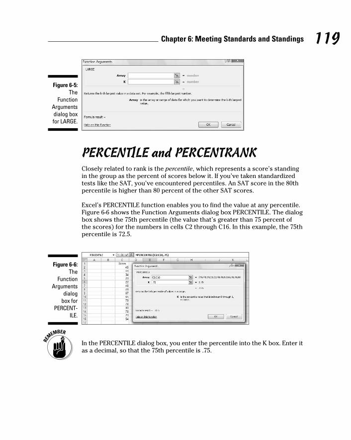
119 Chapter 6: Meeting Standards and Standings
Figure 6-5: The
Function Arguments dialog box for LARGE.
PERCENTILE and PERCENTRANKClosely related to rank is the percentile, which represents a score’s standing
in the group as the percent of scores below it. If you’ve taken standardized
tests like the SAT, you’ve encountered percentiles. An SAT score in the 80th
percentile is higher than 80 percent of the other SAT scores.
Excel’s PERCENTILE function enables you to find the value at any percentile.
Figure 6-6 shows the Function Arguments dialog box PERCENTILE. The dialog
box shows the 75th percentile (the value that’s greater than 75 percent of
the scores) for the numbers in cells C2 through C16. In this example, the 75th
percentile is 72.5.
Figure 6-6: The
Function Arguments
dialog box for
PERCENT-ILE.
In the PERCENTILE dialog box, you enter the percentile into the K box. Enter it
as a decimal, so that the 75th percentile is .75.
11 454060-ch06.indd 11911 454060-ch06.indd 119 4/21/09 7:21:59 PM4/21/09 7:21:59 PM
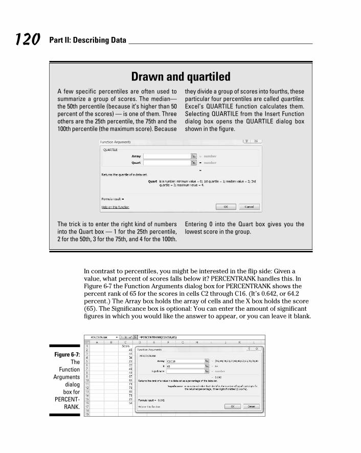
120 Part II: Describing Data
In contrast to percentiles, you might be interested in the flip side: Given a
value, what percent of scores falls below it? PERCENTRANK handles this. In
Figure 6-7 the Function Arguments dialog box for PERCENTRANK shows the
percent rank of 65 for the scores in cells C2 through C16. (It’s 0.642, or 64.2
percent.) The Array box holds the array of cells and the X box holds the score
(65). The Significance box is optional: You can enter the amount of significant
figures in which you would like the answer to appear, or you can leave it blank.
Figure 6-7: The
Function Arguments
dialog box for
PERCENT-RANK.
Drawn and quartiledA few specific percentiles are often used to summarize a group of scores. The median— the 50th percentile (because it’s higher than 50 percent of the scores) — is one of them. Three others are the 25th percentile, the 75th and the 100th percentile (the maximum score). Because
they divide a group of scores into fourths, these particular four percentiles are called quartiles. Excel’s QUARTILE function calculates them. Selecting QUARTILE from the Insert Function dialog box opens the QUARTILE dialog box shown in the figure.
The trick is to enter the right kind of numbers into the Quart box — 1 for the 25th percentile, 2 for the 50th, 3 for the 75th, and 4 for the 100th.
Entering 0 into the Quart box gives you the lowest score in the group.
11 454060-ch06.indd 12011 454060-ch06.indd 120 4/21/09 7:21:59 PM4/21/09 7:21:59 PM

121 Chapter 6: Meeting Standards and Standings
For the X box, you can enter either the value of a score or the label of the
cell in which it appears. In this example, C10 in the X box gives you the same
result as putting 65 in the X box.
Data analysis tool: Rank and PercentileAs the name of this section indicates, Excel provides a data analysis tool
that calculates ranks and percentiles of each score in a group. The Rank and
Percentiles tool calculates both at the same time, so it saves you some steps
versus using the separate worksheet functions. (See Chapter 2 to install
Excel’s data analysis tools.) In Figure 6-8, I take the exam scores from the
z-score example and open the Rank and Percentile dialog box.
Figure 6-8: The Rank
and Percentile
analysis tool.
Here are the steps for using Rank and Percentile:
1. Type your data into an array.
In this example, the data are in cells C2 through C32.
2. In the Tools menu, choose Data Analysis to open the Data Analysis
dialog box.
3. In the Data Analysis dialog box, select Rank and Percentile.
4. Click OK to open the Rank and Percentile dialog box.
11 454060-ch06.indd 12111 454060-ch06.indd 121 4/21/09 7:21:59 PM4/21/09 7:21:59 PM

122 Part II: Describing Data
5. In the Rank and Percentile dialog box, enter the data array into the
Input Range box. Make sure that it’s in absolute reference format.
In this example, a label is in the first row (in cell C1). I want the label
included in the output, so I enter $C$1:$C$32 in the Input Range box,
and I check the Labels in First Row checkbox.
6. Click the Columns radio button to indicate that the data are organized
by columns.
7. Click the New Ply radio button to create a new tabbed page in the
worksheet, and to send the results to the newly created page.
8. Click OK to close the dialog box. Open the newly created page to see
the results.
Figure 6-9 shows the new page with the results. The table orders the scores
from highest to lowest, as the Score column shows along with the Rank
column. The Point column tells you the score’s position in the original group-
ing. For example, the 98 in cell B2 is the 12th score in the original data. The
Percent column gives the percentile for each score.
Figure 6-9: The Output
of the Rank and
Percentile analysis
tool.
11 454060-ch06.indd 12211 454060-ch06.indd 122 4/21/09 7:21:59 PM4/21/09 7:21:59 PM

Chapter 7
Summarizing It AllIn This Chapter▶ Things great and small
▶ Symmetry, peaks, and plateaus
▶ Getting descriptive
▶ Statistics served up on a tray
Measures of central tendency and variability are excellent ways of sum-
marizing a set of scores. They aren’t the only ways. Central tendency
and variability make up a subset of descriptive statistics. Some descriptive
statistics are intuitive — like count, maximum, and minimum. Some are not —
like skewness and kurtosis.
In this chapter, I discuss descriptive statistics, and I show you Excel’s capa-
bilities for calculating them and visualizing them.
Counting OutThe most fundamental descriptive statistic I can imagine is the number of
scores in a set of scores. Excel offers five ways to determine that number.
Yes, five ways. Count them.
COUNT, COUNTA, COUNTBLANK, COUNTIF, COUNTIFSGiven an array of cells, COUNT gives you the amount of those cells that
contain numerical data. Figure 7-1 shows that I’ve entered a group of scores,
selected a cell to hold COUNT’s result, and opened the Function Arguments
dialog box for COUNT. Here are the steps:
12 454060-ch07.indd 12312 454060-ch07.indd 123 4/21/09 7:22:37 PM4/21/09 7:22:37 PM
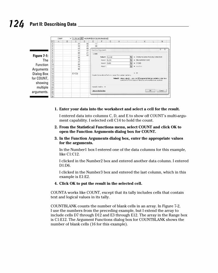
124 Part II: Describing Data
Figure 7-1: The
Function Arguments Dialog Box for COUNT,
showing multiple
arguments.
1. Enter your data into the worksheet and select a cell for the result.
I entered data into columns C, D, and E to show off COUNT’s multi-argu-
ment capability. I selected cell C14 to hold the count.
2. From the Statistical Functions menu, select COUNT and click OK to
open the Function Arguments dialog box for COUNT.
3. In the Function Arguments dialog box, enter the appropriate values
for the arguments.
In the Number1 box I entered one of the data columns for this example,
like C1:C12.
I clicked in the Number2 box and entered another data column. I entered
D1:D6.
I clicked in the Number3 box and entered the last column, which in this
example is E1:E2.
4. Click OK to put the result in the selected cell.
COUNTA works like COUNT, except that its tally includes cells that contain
text and logical values in its tally.
COUNTBLANK counts the number of blank cells in an array. In Figure 7-2,
I use the numbers from the preceding example, but I extend the array to
include cells D7 through D12 and E3 through E12. The array in the Range box
is C1:E12. The Argument Functions dialog box for COUNTBLANK shows the
number of blank cells (16 for this example).
12 454060-ch07.indd 12412 454060-ch07.indd 124 4/21/09 7:22:38 PM4/21/09 7:22:38 PM

125 Chapter 7: Summarizing It All
Figure 7-2: COUNTBLANK
tallies the blank cells in a speci-fied array.
COUNTIF shows the number of cells whose value meets a specified crite-
rion. Figure 7-3 reuses the data once again, showing the Arguments Function
dialog box for COUNTIF. Although the range is C1:E12, COUNTIF doesn’t
include blank cells.
Figure 7-3: COUNTIF tallies the amount of
cells whose data meet
a specified criterion.
The criterion I used, >= 89, tells COUNTIF to count only the cells whose
values are greater than or equal to 89. For this example, that count is 1.
This probably won’t make much difference as you use this function, but a
little quirk of Excel shows up here. If you put double quotes around the cri-
terion, the result appears in the dialog box before you click OK. If you don’t,
it doesn’t. If you click OK without quoting, Excel supplies the quotes and the
result appears in the selected cell, and Excel applies the quotes.
COUNTIFS is new in Excel 2007. This function can use multiple criteria to
determine the count. If the criteria come from two arrays, they must have
the same number of cells. This is because COUNTIFS counts pairs of cells. It
includes a pair of cells in the count if one of the cells meets a criterion and
the other meets a criterion. Take a look at Figure 7-4.
12 454060-ch07.indd 12512 454060-ch07.indd 125 4/21/09 7:22:38 PM4/21/09 7:22:38 PM

126 Part II: Describing Data
Figure 7-4: Working
with COUNTIFS.
In this example, COUNTIFS operates in C1:C6 and D1:D6. The criterion for the
cells in column C is >=40. The criterion for the cells in column D is >50. This
means that COUNTIFS counts cell-pairs whose C cell holds a value greater
than or equal to 40 and whose D cell holds a value greater than 50. Only two
cell-pairs meet these conditions, as the dialog box shows.
You can use a cell range more than once in COUNTIFS. For example
=COUNTIFS(C1:C12,”>30”,C1:C12,”<60”)
gives the number of cells in which the value is between 30 and 60 (not includ-
ing 30 and 60).
The Long and Short of ItTwo more descriptive statistics that probably require no introduction are the
maximum and the minimum. These, of course, are the largest value and the
smallest value in a group of scores.
MAX, MAXA, MIN, and MINA Excel has worksheet functions that determine a group’s largest and smallest
values. I show you what MAX is all about. The others work in a similar fashion.
Figure 7-5 reuses the scores from the preceding examples. I selected a cell to
hold their maximum value, and opened the Function Arguments dialog box
for MAX. Here are the steps:
12 454060-ch07.indd 12612 454060-ch07.indd 126 4/21/09 7:22:38 PM4/21/09 7:22:38 PM

127 Chapter 7: Summarizing It All
Figure 7-5: The
Function Arguments dialog box
for MAX.
1. Type your data into the worksheet and select a cell to hold the result.
I entered data into columns C, D, and E to show off MAX’s multi-argu-
ment capability. For this example, I selected cell C14.
2. From the Statistical Functions menu select MAX to open the Function
Arguments dialog box for MAX.
3. In the Function Arguments dialog box, enter the appropriate values
for the arguments.
In the Number1 box, I entered one of the data columns, C1:C12.
Clicking the Number2 box creates and opens the Number3 box. In the
Number2 box, I entered another array, D1:D6.
I clicked in the Number3 box and entered the last array, E1:E2.
4. Click OK to put the result in the selected cell.
MAX ignores any text or logical values it encounters along the way. MAXA
takes text and logical values into account when it finds the maximum. If
MAXA encounters the logical value TRUE, it converts that value to 1. MAXA
converts FALSE, or any text other than “TRUE”, to 0.
MIN and MINA work the same way as MAX and MAXA, except that they find
the minimum rather than the maximum. Take care when you use MINA,
because the conversions of logical values and text to 0 and 1 influence the
result. With the numbers in the preceding example, the minimum is 22. If you
enter FALSE or other text into a cell in any of the arrays, MINA gives 0 as the
minimum. If you enter TRUE, MINA gives 1 as the minimum.
12 454060-ch07.indd 12712 454060-ch07.indd 127 4/21/09 7:22:38 PM4/21/09 7:22:38 PM

128 Part II: Describing Data
Getting EsotericIn this section, I discuss some little-used statistics that are related to the
mean and the variance. For most people, the mean and the variance are
enough to describe a set of data. These other statistics, skewness and kurto-sis, go just a bit further. You might use them someday if you have a huge set
of data and you want to provide some in-depth description.
Think of the mean as locating a group of scores by showing you where their
center is. This is the starting point for the other statistics. With respect to the
mean
✓ The variance tells you how spread out the scores are.
✓ Skewness indicates how symmetrically the scores are distributed.
✓ Kurtosis shows you whether or not your scores are distributed with a
peak in the neighborhood of the mean.
Skewness and kurtosis are related to the mean and variance in fairly involved
mathematical ways. The variance involves the sum of squared deviations
of scores around the mean. Skewness depends on cubing the deviations
around the mean before you add them all up. Kurtosis takes it all to a higher
power — the fourth power, to be exact. I get more specific in the subsections
that follow.
SKEWFigure 7-6 shows three histograms. The first is symmetric, the other two are
not. The symmetry and the asymmetry are reflected in the skewness statistic.
For the symmetric histogram, the skewness is 0. For the second histogram —
the one that tails off to the right — the value of the skewness statistic is posi-
tive. It’s also said to be skewed to the right. For the third histogram (which
tails off to the left), the value of the skewness statistic is negative. It’s also
said to be skewed to the left.
Where do zero, positive, and negative skew come from? They come from this
formula:
In the formula, is the mean of the scores, N is the number of scores, and s
is the standard deviation.
12 454060-ch07.indd 12812 454060-ch07.indd 128 4/21/09 7:22:39 PM4/21/09 7:22:39 PM

129 Chapter 7: Summarizing It All
Figure 7-6: Three his-
tograms showing
three kinds of skew-
ness.
Symmetric: Skewness = 0
Skewed to the right: Skewness is positive
Skewed to the left: Skewness is negative
I include this formula for completeness. If you’re ever concerned with skew-
ness, you probably won’t use this formula anyway because Excel’s SKEW
function does the work for you.
To use SKEW:
1. Type your numbers into a worksheet and select a cell for the result.
For this example, I’ve entered scores into the first ten rows of columns
C, D, E, and F. (See Figure 7-7.) I selected cell I2 for the result.
2. From the Statistical Functions menu, select SKEW to open the Function
Arguments dialog box for SKEW.
3. In the Function Arguments dialog box, type the appropriate values for
the arguments.
In the Number1 box, enter the array of cells that holds the data. For this
example, the array is C1:F10. With the data array entered, the Function
Arguments dialog box shows the skewness, which for this example is
negative.
4. Click OK to put the result into the selected cell.
12 454060-ch07.indd 12912 454060-ch07.indd 129 4/21/09 7:22:39 PM4/21/09 7:22:39 PM

130 Part II: Describing Data
Figure 7-7: Using the
SKEW function to
calculate skewness.
KURT Figure 7-8 shows two histograms. The first has a peak at its center, the
second is flat. The first is said to be leptokurtic. Its kurtosis is positive. The
second is platykurtic. Its kurtosis is negative.
Figure 7-8: Two his-tograms showing
two kinds of kurtosis.
Leptokurtic: Kurtosis is positive
Platykurtic: Kurtosis is negative
12 454060-ch07.indd 13012 454060-ch07.indd 130 4/21/09 7:22:39 PM4/21/09 7:22:39 PM

131 Chapter 7: Summarizing It All
Negative? Wait a second. How can that be? I mentioned earlier that kurtosis
involves the sum of fourth powers of deviations from the mean. Because four
is an even number, even the fourth power of a negative deviation is positive. If
you’re adding all positive numbers, how can kurtosis ever be negative?
Here’s how. The formula for kurtosis is
where is the mean of the scores, N is the number of scores, and s is the
standard deviation.
Uh . . . why 3? The 3 comes into the picture because that’s the kurtosis of
something special called the standard normal distribution. (I discuss the
normal distribution at length in Chapter 8.) Technically, statisticians refer to
this formula as kurtosis excess — meaning that it shows the kurtosis in a set
of scores that’s in excess of the standard normal distribution’s kurtosis. If
you’re about to ask the question “Why is the kurtosis of the standard normal
distribution equal to 3?” don’t ask.
This is another formula you’ll probably never use because Excel’s KURT func-
tion takes care of business. Figure 7-9 shows the scores from the preceding
example, a selected cell, and the Function Arguments dialog box for KURT.
Figure 7-9: Using KURT to calculate
kurtosis.
12 454060-ch07.indd 13112 454060-ch07.indd 131 4/21/09 7:22:39 PM4/21/09 7:22:39 PM

132 Part II: Describing Data
To use KURT:
1. Enter your numbers into a worksheet and select a cell for the result.
For this example, I entered scores into the first ten rows of columns C,
D, E, and F. I selected cell I2 for the result.
2. From the Statistical Functions menu, select KURT to open the Function
Arguments dialog box for KURT.
3. In the Function Arguments dialog box, enter the appropriate values
for the arguments.
In the Number1 box, I entered the array of cells that holds the data.
Here, the array is C1:F10. With the data array entered, the Function
Arguments dialog box shows the kurtosis, which for this example is
negative.
4. Click OK to put the result into the selected cell.
Tuning In the FrequencyAlthough the calculations for skewness and kurtosis are all well and good,
it’s helpful to see how the scores are distributed. To do this, you create a fre-quency distribution, a table that divides the possible scores into intervals and
shows the number (the frequency) of scores that fall into each interval.
Excel gives you two ways to create a frequency distribution. One is a work-
sheet function, the other is a data analysis tool.
FREQUENCYI show you the FREQUENCY worksheet function in Chapter 2 when I intro-
duce array functions. Here, I give you another look. In the upcoming example,
I reuse the data from the skewness and kurtosis discussions so you can see
what the distribution of those scores looks like.
Figure 7-10 shows the data once again, along with a selected array, labeled
Frequency. I’ve also added the label Intervals to a column, and in that column
I put the interval boundaries. Each number in that column is the upper bound
of an interval. The figure also shows the Function Arguments dialog box for
FREQUENCY.
12 454060-ch07.indd 13212 454060-ch07.indd 132 4/21/09 7:22:40 PM4/21/09 7:22:40 PM

133 Chapter 7: Summarizing It All
Figure 7-10: Finding the
frequencies in an array
of cells.
This is an array function, so the steps are a bit different from the functions I
showed you so far in this chapter.
1. Enter the scores into an array of cells.
The array, as in the preceding examples is C1:F10.
2. Enter the intervals into an array.
I entered 5, 10, 15, 20, 25, and 30 into H2:H7.
3. Select an array for the resulting frequencies.
I put Frequency as the label at the top of column I, so I selected I2
through I7 to hold the resulting frequencies.
4. From the Statistical Functions menu, select FREQUENCY to open the
Function Arguments dialog box for FREQUENCY.
5. In the Function Arguments dialog box, enter the appropriate values
for the arguments.
In the Data_array box I entered the cells that hold the scores. In this
example, that’s C1:F10.
FREQUENCY refers to intervals as “bins,” and holds the intervals in the
Bins_array box. For this example, H2:H7 goes into the Bins_array box.
After I identified both arrays, the Function Arguments dialog box shows
the frequencies inside a pair of curly brackets. Look closely at Figure 7-10
and you see that Excel adds a frequency of zero to the end of the set of
frequencies.
12 454060-ch07.indd 13312 454060-ch07.indd 133 4/21/09 7:22:40 PM4/21/09 7:22:40 PM

134 Part II: Describing Data
6. Press Ctrl+Shift+Enter to close the Function Arguments dialog box.
Use this keystroke combination because FREQUENCY is an array function.
When you close the Function Arguments dialog box, the frequencies go into
the appropriate cells, as Figure 7-11 shows.
Figure 7-11: FREQUENCY’s frequencies.
If I had assigned the name Data to C1:F10 and the name Interval to H2:H7, and
used those names in the Function Arguments dialog box, the resulting formula
would have been
=FREQUENCY(Data,Interval)
which might be easier to understand than
=FREQUENCY(C1:F10,H2:H7)
(Don’t remember how to assign a name to a range of cells? Take another look
at Chapter 2.)
Data analysis tool: HistogramHere’s another way to create a frequency distribution — with the Histogram
data analysis tool. To show you that the two methods are equivalent, I use
the data from the FREQUENCY example. Figure 7-12 shows the data along
with the Histogram dialog box.
The steps are:
1. Enter the scores into an array, and enter intervals into another array.
2. Click on Data | Data Analysis to open the Data Analysis dialog box.
3. From the Data Analysis dialog box, select Histogram to open the
Histogram dialog box.
12 454060-ch07.indd 13412 454060-ch07.indd 134 4/21/09 7:22:40 PM4/21/09 7:22:40 PM

135 Chapter 7: Summarizing It All
Figure 7-12: The
Histogram analysis
tool.
4. In the Histogram dialog box, enter the appropriate values.
The data are in cells C1 through F10, so C1:F10 goes into the Input Range
box. The easiest way to enter this array is to click on C1, press and
hold the Shift key, and then click F10. Excel puts the absolute reference
format ($C$1:$F$10) into the Input Range box.
In the Bin Range box, I enter the array that holds the intervals. In this
example, that’s H2 through H7. I click on H2, press and hold the Shift
key, and then click H7. The absolute reference format ($H$2:$H$7)
appears in the Bin Range box.
5. Click the New Worksheet Ply radio button to create a new tabbed
page and to put the results on the new page.
6. Click the Chart Output checkbox to create a histogram and visualize
the results.
7. Click OK to close the dialog box.
Figure 7-13 shows Histogram’s output. The table matches up with what
FREQUENCY produces. Notice that Histogram adds “More” to the Bin column.
The size of the histogram is somewhat smaller when it first appears. I used
the mouse to stretch the histogram and give it the appearance you see in the
figure. The histogram shows that the distribution does tail off to the left (con-
sistent with the negative skewness statistic) and seems to not have a distinc-
tive peak (consistent with the negative kurtosis statistic).
12 454060-ch07.indd 13512 454060-ch07.indd 135 4/21/09 7:22:40 PM4/21/09 7:22:40 PM

136 Part II: Describing Data
Figure 7-13: The
Histogram tool’s out-put (after I stretched
the chart).
By the way, the other checkbox options on the Histogram dialog box are
Pareto chart and Cumulative percentage. The Pareto chart sorts the inter-
vals in order from highest frequency to lowest before creating the graph.
Cumulative percentage shows the percentage of scores in an interval com-
bined with the percentages in all the preceding intervals. Checking this box
also puts a cumulative percentage line in the histogram.
Can You Give Me a Description?If you’re dealing with individual descriptive statistics, the worksheet func-
tions I’ve discussed get the job done nicely. If you want an overall report that
presents just about all the descriptive statistical information in one place,
use the Data Analysis tool I describe in the next section.
Data analysis tool: Descriptive StatisticsIn Chapter 2, I show you the Descriptive Statistics tool to introduce Excel’s
data analysis tools. Here’s a slightly more complex example. Figure 7-14
shows three columns of scores and the Descriptive Statistics dialog box. I’ve
labeled the columns First, Second, and Third so you can see how this tool
incorporates labels.
Here are the steps for using this tool:
1. Enter the data into an array.
12 454060-ch07.indd 13612 454060-ch07.indd 136 4/21/09 7:22:40 PM4/21/09 7:22:40 PM

137 Chapter 7: Summarizing It All
Figure 7-14: The
Descriptive Statistics
tool at work.
2. Select Data | Data Analysis to open the Data Analysis dialog box.
3. Choose Descriptive Statistics to open the Descriptive Statistics
dialog box.
4. In the Descriptive Statistics dialog box, enter the appropriate values.
In the Input Range box, I enter the data. The easiest way to do this is to
move the cursor to the upper-left cell (B1), press the Shift key, and click
the lower-right cell (D9). That puts $B$1:$D$9 into Input Range.
5. Click the Columns radio button to indicate that the data are organized
by columns.
6. Check the Labels in First Row checkbox, because the Input Range
includes the column headings.
7. Click the New Worksheet Ply radio button to create a new tabbed
sheet within the current worksheet, and to send the results to the
newly created sheet.
8. Click the Summary Statistics checkbox, and leave the others
unchecked.
9. Click OK to close the dialog box.
The new tabbed sheet (ply) opens, displaying statistics that summarize
the data.
As Figure 7-15 shows, the statistics summarize each column separately.
When this page first opens, the columns that show the statistic names
are too narrow, so the figure shows what the page looks like after I wid-
ened the columns.
12 454060-ch07.indd 13712 454060-ch07.indd 137 4/21/09 7:22:40 PM4/21/09 7:22:40 PM

138 Part II: Describing Data
Figure 7-15: The
Descriptive Statistics
tool’s output.
The Descriptive Statistics tool gives values for these statistics: mean, stan-
dard error, median, mode, standard deviation, sample variance, kurtosis,
skewness, range, minimum, maximum, sum, and count. Except for standard
error and range, I’ve discussed all of them.
Range is just the difference between the maximum and the minimum.
Standard error is more involved, and I defer the explanation until Chapter 9.
For now, I’ll just say that standard error is the standard deviation divided by
the square root of the sample size and leave it at that.
By the way, one of the checkboxes left unchecked in the example’s Step 6
provides something called the Confidence Limit of the Mean, which I also
defer until Chapter 9. The remaining two checkboxes, Kth Largest and Kth
Smallest, work like the functions LARGE and SMALL.
Instant Statistics Suppose you’re working with a cell range full of data. You might like to
quickly know the status of the average and perhaps some other descrip-
tive statistics about the data without going to the trouble of using several
Statistical functions.
You can customize the Status bar at the bottom of the worksheet to track
these values for you and display them whenever you select the cell range.
To do this, right-click the status bar to open the Customize Status Bar menu.
(See Figure 7-16.) In the area second from the bottom, checking all the items
displays the values I mention in the preceding section (along with the count
of items in the range — numerical and non-numerical).
12 454060-ch07.indd 13812 454060-ch07.indd 138 4/21/09 7:22:41 PM4/21/09 7:22:41 PM

139 Chapter 7: Summarizing It All
Figure 7-16: The
Customize Status Bar
menu.
Figure 7-17 shows these values displayed on the Status bar for the cells I
selected.
Figure 7-17: Displaying values on the status
bar.
12 454060-ch07.indd 13912 454060-ch07.indd 139 4/21/09 7:22:41 PM4/21/09 7:22:41 PM

140 Part II: Describing Data
12 454060-ch07.indd 14012 454060-ch07.indd 140 4/21/09 7:22:41 PM4/21/09 7:22:41 PM

Chapter 8
What’s Normal?In This Chapter▶ Meet the normal distribution
▶ Standard deviations and the normal distribution
▶ Excel’s normal distribution-related functions
A main job of statisticians is to estimate population characteristics.
The job becomes easier if they can make some assumptions about the
populations they study.
One particular assumption works over and over again: A specific attribute,
trait, or ability is distributed throughout a population so that most people
have an average or near-average amount of the attribute, and progressively
fewer people have increasingly extreme amounts of the attribute. In this
chapter, I discuss this assumption and what it means for statistics. I also
describe Excel functions related to this assumption.
Hitting the CurveWhen you measure something in the physical world like length or weight,
you deal with objects you can see and touch. Statisticians, social scientists,
market researchers, and businesspeople, on the other hand, often have to
measure something they can’t see or put their hands around. Traits like
intelligence, musical ability, or willingness to buy a new product fall into this
category.
These kinds of traits are usually distributed throughout the population so
that most people are around the average — with progressively fewer people
represented toward the extremes. Because this happens so often, it’s become
an assumption about how most traits are distributed.
13 454060-ch08.indd 14113 454060-ch08.indd 141 4/21/09 7:27:32 PM4/21/09 7:27:32 PM

142 Part II: Describing Data
It’s possible to capture the most-people-are-about-average assumption in a
graphic way. Figure 8-1 shows the familiar bell curve that characterizes how a
variety of attributes are distributed. The area under the curve represents the
population. The horizontal axis represents measurements of the ability under
consideration. A vertical line drawn down the center of the curve would cor-
respond to the average of the measurements.
Figure 8-1: The Bell
curve.
f(x)
x
So if we assume that it’s possible to measure a trait like intelligence and if
we assume this curve represents how intelligence is distributed in the popu-
lation, we can say this: The bell curve shows that most people have about
average intelligence, very few have very little intelligence, and very few are
geniuses. That seems to fit nicely with our intuitions about intelligence,
doesn’t it?
Digging deeperOn the horizontal axis of Figure 8-1 you see x, and on the vertical axis f(x).
What do these symbols mean? The horizontal axis, as I just mentioned, repre-
sents measurements, so think of each measurement as an x.
13 454060-ch08.indd 14213 454060-ch08.indd 142 4/21/09 7:27:33 PM4/21/09 7:27:33 PM

143 Chapter 8: What’s Normal?
The explanation of f(x) is a little more involved. A mathematical relationship
between x and f(x) creates the bell curve and enables us to visualize it. The
relationship is rather complex, and I won’t burden you with it. Just under-
stand that f(x) represents the height of the curve for a specified value of x.
You supply a value for x (and for a couple of other things), and that complex
relationship I mentioned returns a value of f(x).
Now for some specifics. The bell curve is formally called the normal distribu-tion. The term f(x) is called probability density, so the normal distribution is
an example of a probability density function. Rather than give you a technical
definition of probability density, I ask you to think of probability density as
something that turns the area under the curve into probability. Probability
of . . . what? I discuss that in the next section.
Parameters of a normal distributionPeople often speak of the normal distribution. That’s a misnomer. It’s really a
family of distributions. The members of the family differ from one another in
terms of two parameters — yes, parameters because I’m talking about popu-
lations. Those two parameters are the mean (μ) and the standard deviation
(σ). The mean tells you where the center of the distribution is, and the stan-
dard deviation tells you how spread out the distribution is around the mean.
The mean is in the middle of the distribution. Every member of the normal
distribution family is symmetric — the left side of the distribution is a mirror
image of the right.
The characteristics of the normal distribution are well known to statisticians.
More important, you can apply those characteristics to your work.
How? This brings me back to probability. You can find some useful probabili-
ties if you can do four things:
✓ If you can lay out a line that represents the scale of the attribute you’re
measuring
✓ If you can indicate on the line where the mean of the measurements is
✓ If you know the standard deviation
✓ If you know (or if you can assume) the attribute is normally distributed
throughout the population
I’ll work with IQ scores to show you what I mean. Scores on the Stanford-
Binet IQ test follow a normal distribution. The mean of the distribution of
these scores is 100 and the standard deviation is 16. Figure 8-2 shows this
distribution.
13 454060-ch08.indd 14313 454060-ch08.indd 143 4/21/09 7:27:33 PM4/21/09 7:27:33 PM

144 Part II: Describing Data
Figure 8-2: The normal
distribu-tion of IQ
divided into standard
deviations.
f(x)
x100 116846852 132 148
.3413.3413
.1359.1359 .0215.0215.0013.0013
As the figure shows, I’ve laid out a line for the IQ scale. Each point on the
line represents an IQ score. With 100 (the mean) as the reference point, I’ve
marked off every 16 points (the standard deviation). I’ve drawn a dotted line
from the mean up to f(100) (the height of the normal distribution where x =
100), and a dotted line from each standard deviation point.
The figure also shows the proportion of area bounded by the curve and the
horizontal axis, and by successive pairs of standard deviations. It also shows
the proportion beyond 3 standard deviations on either side (52 and 148). Note
that the curve never touches the horizontal. It gets closer and closer, but it
never touches. (Mathematicians say the curve is asymptotic to the horizontal.)
So between the mean and one standard deviation — between 100 and 116 —
are .3413 (or 34.13 percent) of the scores in the population. Another way to
say this: The probability that an IQ score is between 100 and 116 is .3413. At
the extremes, in the tails of the distribution, .0013 (.13 percent) of the scores
are on each side.
The proportions in Figure 8-2 hold for every member of the normal distribu-
tion family, not just for Stanford-Binet IQ scores. For example, in a sidebar in
Chapter 6, I mention SAT scores, which have a mean of 500 and a standard
deviation of 100. They’re normally distributed, too. That means 34.13 percent
of SAT scores are between 500 and 600, 34.13 percent between 400 and 500,
and . . . well, you can use Figure 8-2 as a guide for other proportions.
13 454060-ch08.indd 14413 454060-ch08.indd 144 4/21/09 7:27:33 PM4/21/09 7:27:33 PM

145 Chapter 8: What’s Normal?
NORMDIST Figure 8-2 only shows areas partitioned by scores at the standard deviations.
What about the proportion of IQ scores between 100 and 125? Or between
75 and 91? Or greater than 118? If you’ve ever taken a course in statistics,
you might remember homework problems that involve finding proportions
of areas under the normal distribution. You might also remember relying on
tables of the normal distribution to solve them.
Excel’s NORMDIST worksheet function enables you to find normal distribu-
tion areas without relying on tables. NORMDIST finds a cumulative area. You
supply a score, a mean, and a standard deviation for a normal distribution, and
NORMDIST returns the proportion of area to the left of the score (also called
cumulative proportion or cumulative probability). For example, Figure 8-2 shows
that in the IQ distribution .8413 of the area is to the left of 116.
How did I get that proportion? All the proportions to the left of 100 add up to
.5000. (All the proportions to the right of 100 add up to .5000, too.) Add that
.5000 to the .3413 between 100 and 116 and you have .8413.
Restating this another way, the probability of an IQ score less than or equal
to 116 is .8413.
In Figure 8-3, I use NORMDIST to find this proportion. Here are the steps:
1. Select a cell for NORMDIST’s answer.
For this example, I selected C2.
2. From the Statistical Functions menu, select NORMDIST to open the
Function Arguments dialog box for NORMDIST.
3. In the Function Arguments dialog box, enter the appropriate values
for the arguments.
In the X box, I entered the score for which I want to find the cumulative
area. In this example, that’s 116.
In the Mean box, I entered the mean of the distribution, and in the
Standard_dev box, I enter the standard deviation. Here, the mean is 100
and the standard deviation is 116.
In the Cumulative box, I entered TRUE. This tells NORMDIST to find the
cumulative area. The dialog box shows the result.
4. Click OK to see the result in the selected cell.
Figure 8-3 shows that the cumulative area is .84134476 (in the dialog box). If
you enter FALSE in the Cumulative box, NORMDIST returns the height of the
normal distribution at 116.
13 454060-ch08.indd 14513 454060-ch08.indd 145 4/21/09 7:27:33 PM4/21/09 7:27:33 PM

146 Part II: Describing Data
Figure 8-3: Working
With NORMDIST.
To find the proportion of IQ scores greater than 116, subtract the result from
1.0. (Just for the record, that’s .15865524.)
How about the proportion of IQ scores between 116 and 125? Apply NORMDIST
for each score and subtract the results. For this particular example, the for-
mula is
=NORMDIST(125,100,16,TRUE)-NORMDIST(116,100,16,TRUE)
The answer, by the way, is .09957.
NORMINVNORMINV is the flip side of NORMDIST. You supply a cumulative probability,
a mean, and a standard deviation, and NORMINV returns the score that cuts
off the cumulative probability. For example, if you supply .5000 along with a
mean and a standard deviation, NORMINV returns the mean.
This function is useful if you have to calculate the score for a specific per-
centile in a normal distribution. Figure 8-4 shows the Function Arguments
dialog box for NORMINV with .75 as the cumulative probability, 500 as the
mean, and 100 as the standard deviation. Because the SAT follows a normal
distribution with 500 as its mean and 100 as its standard deviation, the result
corresponds to the score at the 75th percentile for the SAT. (For more on
percentiles, see Chapter 6.)
13 454060-ch08.indd 14613 454060-ch08.indd 146 4/21/09 7:27:33 PM4/21/09 7:27:33 PM

147 Chapter 8: What’s Normal?
Figure 8-4: Working
With NORMINV.
A Distinguished Member of the FamilyTo standardize a set of scores so that you can compare them to other sets of
scores, you convert each one to a z-score. (See Chapter 6.) The formula for
converting a score to a z-score (also known as a standard score) is:
The idea is to use the standard deviation as a unit of measure. For example,
the Stanford-Binet version of the IQ test has a mean of 100 and a standard
deviation of 16. The Wechsler version has a mean of 100 and a standard
deviation of 15. How does a Stanford-Binet score of, say, 110, stack up against
a Wechsler score of 110?
An easy way to answer this question is to put the two versions on a level
playing field by standardizing both scores. For the Stanford-Binet
For the Wechsler
So 110 on the Wechsler is a slightly higher score than 110 on the Stanford-Binet.
Now, if you convert all the scores in a normal distribution (such as either ver-
sion of the IQ), you have a normal distribution of z-scores. Any set of z-scores
13 454060-ch08.indd 14713 454060-ch08.indd 147 4/21/09 7:27:33 PM4/21/09 7:27:33 PM

148 Part II: Describing Data
(normally distributed or not) has a mean of 0 and a standard deviation of 1. If
a normal distribution has those parameters it’s a standard normal distribution —
a normal distribution of standard scores.
This is the member of the normal distribution family that most people have
heard of. It’s the one they remember most from statistics courses, and it’s the
one that most people are thinking about when they say the normal distribu-
tion. It’s also what people think of when they hear z-scores. This distribution
leads many to the mistaken idea that converting to z-scores somehow trans-
forms a set of scores into a normal distribution.
Figure 8-5 shows the standard normal distribution. It looks like Figure 8-2,
except that I’ve substituted 0 for the mean and standard deviation units in
the appropriate places.
Figure 8-5: The stan-
dard normal distribution divided up
by standard deviations.
f(x)
x0 10-10-20-30 20 30
.3413.3413
.1359.1359 .0215.0215.0013.0013
In the next two sections, I describe Excel’s functions for working with the
standard normal distribution.
NORMSDIST NORMSDIST is like its counterpart NORMDIST, except that it’s designed for
a normal distribution whose mean is 0 and whose standard deviation is 1.00.
13 454060-ch08.indd 14813 454060-ch08.indd 148 4/21/09 7:27:34 PM4/21/09 7:27:34 PM

149 Chapter 8: What’s Normal?
You supply a z-score and it returns the area to the left of the z-score — the
probability that a z-score is less than or equal to the one you supplied.
Figure 8-6 shows the Function Arguments dialog box with 1 as the z-score.
The dialog box presents .841344746, the probability that a z-score is less
than or equal to 1.00 in a standard normal distribution. Clicking OK puts that
result into a selected cell.
Figure 8-6: Working
with NORMSDIST.
NORMSINVNORSMINV is the flip side of NORMSDIST. You supply a cumulative probabil-
ity and NORMSINV returns the z-score that cuts off the cumulative probabil-
ity. For example, if you supply .5000, NORMSINV returns 0, the mean of the
standard normal distribution.
Figure 8-7 shows the Function Arguments dialog box for NORMSINV, with .75
as the cumulative probability. The dialog box shows the answer, .67448975,
the z-score at the 75th percentile of the standard normal distribution.
Figure 8-7: Working
with NORMSIVV
13 454060-ch08.indd 14913 454060-ch08.indd 149 4/21/09 7:27:34 PM4/21/09 7:27:34 PM

150 Part II: Describing Data
Okay, just because you asked . . . The relationship between x and f(x) for the normal distribution is, as I mention, a pretty complex one. Here’s the equation:
If you supply values for μ (the mean), σ (the stan-dard deviation), and x (a score), the equation gives you back a value for f(x), the height of the normal distribution at x. π and e are important constants in mathematics. π is approximately 3.1416 (the ratio of a circle’s circumference to its diameter). e is approximately 2.71828. It’s related to something called natural logarithms and to a variety of other mathematical concepts. (I tell you more about e in Chapter 20.)
In a standard normal distribution, μ = 0 and σ = 1, so the equation becomes
I changed the x to z because you deal with z-scores in this member of the normal distribu-tion family.
In Excel, you can set up a range of cells that contain standard scores, create a formula that captures the preceding equation, and autofill another range of cells with the formula results. Next, select the range with the formula results. Then you can select
Insert | Line
from the Chart area on the Ribbon and choose the Line with Markers layout. (See Chapter 2.) As the accompanying figure shows, this layout nicely traces out the standard normal distri-bution. The figure also shows the autofilled values.
13 454060-ch08.indd 15013 454060-ch08.indd 150 4/21/09 7:27:34 PM4/21/09 7:27:34 PM

151 Chapter 8: What’s Normal?
The Formula Bar shows the Excel formula that corresponds to the normal distribution equation:
=((1/SQRT(2*PI())))*EXP(-(B2^2)/2)
PI() is an Excel function that gives the value of π. The function EXP() raises e to the power indicated by what’s in the parentheses that follow it.
I show you all of this because I want you to see the equation of the normal distribution as an Excel formula. The NORMDIST worksheet function offers a much easier way to supply the f(z) values. Enter this formula into C2
=NORMDIST(B2,0,1,FALSE)
autofill column C and you have the same values as in the figure.
13 454060-ch08.indd 15113 454060-ch08.indd 151 4/21/09 7:27:34 PM4/21/09 7:27:34 PM

152 Part II: Describing Data
13 454060-ch08.indd 15213 454060-ch08.indd 152 4/21/09 7:27:34 PM4/21/09 7:27:34 PM

Part IIIDrawing
Conclusions from Data
14 454060-pp03.indd 15314 454060-pp03.indd 153 4/21/09 7:28:12 PM4/21/09 7:28:12 PM

In this part . . .
Part III deals with using statistical methods to make
inferences about data. This is all aimed at using the
data from samples to draw conclusions about popula-
tions, and it’s the essence of statistical analysis. I begin
with the extremely important concept of sampling distri-
butions. I move on to estimation and confidence limits
and then to statistical tests geared at one sample, two
samples, and more. Part III ends with discussions of
regression and correlation — the statistics of relationships.
The statistical methods in this part are computationally
intensive. Fortunately, Excel has specialized features
for doing the calculations. The seven chapters in this
part describe Excel functions and tools for inferential
statistics.
14 454060-pp03.indd 15414 454060-pp03.indd 154 4/21/09 7:28:13 PM4/21/09 7:28:13 PM

Chapter 9
The Confidence Game: EstimationIn This Chapter▶ Introducing sampling distributions
▶ Understanding standard error
▶ Simulating the sampling distribution of the mean
▶ Attaching confidence limits to estimates
Populations and samples are pretty straightforward ideas. A popula-
tion is a huge collection of individuals, from which you draw a sample.
Assess the members of the sample on some trait or attribute, calculate statis-
tics that summarize that sample, and you’re in business.
In addition to summarizing the scores in the sample, you can use the sta-
tistics to create estimates of the population parameters. This is no small
accomplishment. On the basis of a small percentage of individuals from the
population, you can draw a picture of the population.
A question emerges, however: How much confidence can you have in the
estimates you create? In order to answer this, you have to have a context in
which to place your estimates. How probable are they? How likely is the true
value of a parameter to be within a particular lower bound and upper bound?
In this chapter, I introduce the context for estimates, show how that plays
into confidence in those estimates, and describe an Excel function that
enables you to calculate your confidence level.
What is a Sampling Distribution?Imagine that you have a population, and you draw a sample from this popula-
tion. You measure the individuals of the sample on a particular attribute and
calculate the sample mean. Return the sample members to the population.
Draw another sample, assess the new sample’s members, and then calcu-
late their mean. Repeat this process again and again, always using the same
number of individuals as you had in the original sample. If you could do this
an infinite amount of times (with the same-size sample each time), you’d have
15 454060-ch09.indd 15515 454060-ch09.indd 155 4/21/09 7:28:41 PM4/21/09 7:28:41 PM

156 Part III: Drawing Conclusions from Data
an infinite amount of sample means. Those sample means form a distribution
of their own. This distribution is called the sampling distribution of the mean.
For a sample mean, this is the context I mention at the beginning of this chap-
ter. Like any other number, a statistic makes no sense by itself. You have to
know where it comes from in order to understand it. Of course, a statistic
comes from a calculation performed on sample data. In another sense, a sta-
tistic is part of a sampling distribution.
In general, a sampling distribution is the distribution of all possible values of a statistic for a given sample size.
I italicize that definition for a reason: It’s extremely important. After many years
of teaching statistics, I can tell you that this concept usually sets the boundary
line between people who understand statistics and people who don’t.
So . . . if you understand what a sampling distribution is, you’ll understand what
the field of statistics is all about. If you don’t, you won’t. It’s almost that simple.
If you don’t know what a sampling distribution is, statistics will be a cook-
book type of subject for you: Whenever you have to apply statistics, you’ll
plug numbers into formulas and hope for the best. On the other hand, if
you’re comfortable with the idea of a sampling distribution, you’ll grasp the
big picture of inferential statistics.
To help clarify the idea of a sampling distribution, take a look at Figure 9-1. It
summarizes the steps in creating a sampling distribution of the mean.
Figure 9-1: The
sampling distribution
of the mean.
Population
Sampling Distribution of the Mean
Sample1
Sample2 Sample
3
Sample4
Sample
. . .
1x 2x 3x 4x x. . .
15 454060-ch09.indd 15615 454060-ch09.indd 156 4/21/09 7:28:41 PM4/21/09 7:28:41 PM

157 Chapter 9: The Confidence Game: Estimation
A sampling distribution — like any other group of scores — has a mean and a
standard deviation. The symbol for the mean of the sampling distribution of
the mean (yes, I know that’s a mouthful) is .
The standard deviation of a sampling distribution is a pretty hot item. It has a
special name — standard error. For the sampling distribution of the mean, the
standard deviation is called the standard error of the mean. Its symbol is .
An EXTREMELY Important Idea: The Central Limit Theorem
The situation I ask you to imagine is one that never happens in the real
world. You never take an infinite amount of samples and calculate their
means, and you never create a sampling distribution of the mean. Typically,
you draw one sample and calculate its statistics.
So if you have only one sample how can you ever know anything about a sam-
pling distribution — a theoretical distribution that encompasses an infinite
number of samples? Is this all just a wild-goose chase?
No, it’s not. You can figure out a lot about a sampling distribution because of
a great gift from mathematicians to the field of statistics. This gift is called the Central Limit Theorem.
According to the Central Limit Theorem
✓ The sampling distribution of the mean is approximately a normal distri-
bution if the sample size is large enough.
Large enough means about 30 or more.
✓ The mean of the sampling distribution of the mean is the same as the
population mean.
In equation form that’s
✓ The standard deviation of the sampling distribution of the mean (also
known as the standard error of the mean) is equal to the population
standard deviation divided by the square root of the sample size.
The equation here is
Notice that the Central Limit theorem says nothing about the population. All
it says is that if the sample size is large enough, the sampling distribution of
15 454060-ch09.indd 15715 454060-ch09.indd 157 4/21/09 7:28:41 PM4/21/09 7:28:41 PM

158 Part III: Drawing Conclusions from Data
the mean is a normal distribution, with the indicated parameters. The popu-
lation that supplies the samples doesn’t have to be a normal distribution for
the Central Limit Theorem to hold.
What if the population is a normal distribution? In that case, the sampling dis-
tribution of the mean is a normal distribution regardless of the sample size.
Figure 9-2 shows a general picture of the sampling distribution of the mean,
partitioned into standard error units.
Figure 9-2: The
sampling distribution
of the mean.
f(x)
xxµ 1x xµ + 2x xµ + 3x xµ +1x xµ2x xµ3x xµ
Simulating the Central Limit TheoremIt almost doesn’t sound right. How can a population that’s not normally dis-
tributed result in a normally distributed sampling distribution?
To give you an idea of how the Central Limit Theorem works, I created a
simulation. This simulation creates something like a sampling distribution of
the mean for a very small sample, based on a population that’s not normally
distributed. As you’ll see, even though the population is not a normal distri-
bution, and even though the sample is small, the sampling distribution of the
mean looks quite a bit like a normal distribution.
15 454060-ch09.indd 15815 454060-ch09.indd 158 4/21/09 7:28:42 PM4/21/09 7:28:42 PM

159 Chapter 9: The Confidence Game: Estimation
Imagine a huge population that consists of just three scores — 1, 2, and 3
and each one is equally likely to appear in a sample. (That kind of population
is definitely not a normal distribution.) Imagine also that you can randomly
select a sample of three scores from this population. Table 1 shows all the
possible samples and their means.
Table 9-1 All Possible Samples of Three Scores (And Their Means) From a Population Consisting of the Scores 1, 2, and 3Sample Mean Sample Mean Sample Mean
1,1,1 1.00 2,1,1 1.33 3,1,1 1.67
1,1,2 1.33 2,1,2 1.67 3,1,2 2.00
1,1,3 1.67 2,1,3 2.00 3,1,3 2.33
1,2,1 1.33 2,2,1 1.67 3,2,1 2.00
1,2,2 1.67 2,2,2 2.00 3,2,2 2.33
1,2,3 2.00 2,2,3 2.33 3,2,3 2.67
1,3,1 1.67 2,3,1 2.00 3,3,1 2.33
1,3,2 2.00 2,3,2 2.33 3,3,2 2.67
1,3,3 2.33 2,3,3 2.67 3,3,3 3.00
If you look closely at the table, you can almost see what’s about to happen in
the simulation. The sample mean that appears most frequently is 2.00. The
sample means that appear least frequently are 1.00 and 3.00. Hmmm . . .
In the simulation, I randomly select a score from the population, and then ran-
domly select two more. That group of three scores is a sample. Then I calculate
the mean of that sample. I repeat this process for a total of 60 samples, result-
ing in 60 sample means. Finally, I graph the distribution of the sample means.
What does the simulated sampling distribution of the mean look like? Figure
9-3 shows a worksheet that answers that question.
In the worksheet, each row is a sample. The columns labeled x1, x2, and x3
show the three scores for each sample. Column G shows the average for the
sample in each row. Column I shows all the possible values for the sample
mean, and column J shows how often each mean appears in the 60 samples.
Columns I and J, and the graph, show that the distribution has its maximum
frequency when the sample mean is 2.00. The frequencies tail off as the
sample means get farther and farther away from 2.00.
15 454060-ch09.indd 15915 454060-ch09.indd 159 4/21/09 7:28:42 PM4/21/09 7:28:42 PM

160 Part III: Drawing Conclusions from Data
Figure 9-3: Simulating
the sampling distribution
of the mean (N=3) from a
population consist-
ing of the scores 1, 2, and 3. The simulation consists of
60 samples.
The point of all this is that the population looks nothing like a normal distri-
bution and the sample size is very small. Even under those constraints, the
sampling distribution of the mean based on 60 samples begins to look very
much like a normal distribution.
What about the parameters the Central Limit Theorem predicts for the sam-
pling distribution? Start with the population. The population mean is 2.00, the
population variance is .67, and the population standard deviation is .82. (This
kind of population requires some slightly fancy mathematics for figuring out
the parameters. The math is a little beyond where we are, so I’ll leave it at
that.)
On to the sampling distribution. The mean of the 60 means is 1.91, and their
standard deviation (an estimate of the standard error of the mean) is .48.
Those numbers closely approximate the Central Limit Theorem–predicted
parameters for the sampling distribution of the mean, 2.00 (equal to the pop-
ulation mean) and .47 (the population standard deviation, .82, divided by the
square root of 3, the sample size).
In case you’re interested in doing this simulation, here are the steps:
1. Select a cell for your first randomly selected number.
I selected cell D2.
2. Use the worksheet function RANDBETWEEN to select 1, 2, or 3.
This simulates drawing a number from a population consisting of the
numbers 1, 2, and 3 where you have an equal chance of selecting each
number. You can either select Formulas | Math & Trig | RANDBETWEEN
and use the Function Arguments dialog box, or just type
=RANDBETWEEN(1,3)
15 454060-ch09.indd 16015 454060-ch09.indd 160 4/21/09 7:28:42 PM4/21/09 7:28:42 PM

161 Chapter 9: The Confidence Game: Estimation
in D2 and press Enter. The first argument is the smallest number
RANDBETWEEN returns, and the second argument is the largest number.
3. Select the cell to the right of the original cell and pick another
random number between one and three. Do this again for a third
random number in the cell to the right of the second one.
The easiest way to do this is to autofill the two cells to the right of the
original cell. In my worksheet those two cells are E2 and F2.
4. Consider these three cells to be a sample and calculate their mean in
the cell to the right of the third cell.
The easiest way to do this is just type
=AVERAGE(D2:F2)
in cell G2 and press Enter.
5. Repeat this process for as many samples as you want to include in the
simulation. Have each row correspond to a sample.
I used 60 samples. The quick and easy way to get this done is to select
the first row of three randomly selected numbers and their mean, and
then autofill the remaining rows. The set of sample means in column G
is the simulated sampling distribution of the mean. Use AVERAGE and
STDEVP to find its mean and standard deviation.
To see what this simulated sampling distribution looks like, use the array
function FREQUENCY on the sample means in column G. Follow these steps:
1. Enter the possible values of the sample mean into an array.
I used column I for this. I expressed the possible values of the sample
mean in fraction form (3/3, 4/3, 5/3, 6/3, 7/3, 8/3, and 9/3) as I entered
them into the cells I3 through I9. Excel converts them to decimal form.
2. Select an array for the frequencies of the possible values of the
sample mean.
I used column J to hold the frequencies, selecting cells J3 through J9.
3. From the Statistical Functions menu, select FREQUENCY to open the
Function Arguments dialog box for FREQUENCY.
4. In the Function Arguments dialog box, enter the appropriate values
for the arguments.
In the Data_array box, I entered the cells that hold the sample means. In
this example, that’s G2:G61.
5. Identify the array that holds the possible values of the sample mean.
FREQUENCY holds this array in the Bins_array box. For my worksheet,
I3:I9 goes into the Bins_array box. After you identify both arrays, the
Function Arguments dialog box shows the frequencies inside a pair of
curly brackets. (See Figure 9-4.)
15 454060-ch09.indd 16115 454060-ch09.indd 161 4/21/09 7:28:42 PM4/21/09 7:28:42 PM

162 Part III: Drawing Conclusions from Data
Figure 9-4: The
Function Arguments
dialog box for
FREQUENCY in the
Simulated Sampling
Distribution Worksheet.
6. Press Ctrl+Shift+Enter to close the Function Arguments dialog box and
show the frequencies.
Use this keystroke combination because FREQUENCY is an array func-
tion. (For more on FREQUENCY, see Chapter 7.)
Finally, with I3:I9 highlighted, select
Insert | Column
and choose the Clustered Column layout to produce the graph of the fre-
quencies. (See Chapter 3.) Your graph will probably look somewhat different
from mine.
By the way, Excel repeats the random selection process whenever you do
something that causes Excel to recalculate the worksheet. The effect is that
the numbers can change as you work through this. For example, if you go
back and autofill one of the rows again, the numbers change and the graph
changes.
The Limits of Confidence I told you about sampling distributions because they help you answer the
question I pose at the beginning of this chapter: How much confidence can
you have in the estimates you create?
The idea is to calculate a statistic, and then use that statistic to establish
upper and lower bounds for the population parameter with, say, 95 percent
15 454060-ch09.indd 16215 454060-ch09.indd 162 4/21/09 7:28:42 PM4/21/09 7:28:42 PM

163 Chapter 9: The Confidence Game: Estimation
confidence. You can only do this if you know the sampling distribution of the
statistic and the standard error. In the next section, I show how to do this for
the mean.
Finding confidence limits for a meanThe FarBlonJet Corporation, a manufacturer of navigation systems, has
developed a new battery to power their portable model. To help market their
system, FarBlonJet wants to know how long, on average, each battery lasts
before it burns out.
They’d like to estimate that average with 95 percent confidence. They test
a sample of 100 batteries, and find that the sample mean is 60 hours, with a
standard deviation of 20 hours. The Central Limit Theorem, remember, says
that with a large enough sample (30 or more), the sampling distribution of
the mean approximates a normal distribution. The standard error of the
mean (the standard deviation of the sampling distribution of the mean) is
The sample size, N, is 100. What about σ? That’s unknown, so you have to
estimate it. If you know σ, that would mean you know μ, and establishing con-
fidence limits would be unnecessary.
The best estimate of σ is the standard deviation of the sample. In this case
that’s 20. This leads to an estimate of the standard error of the mean
The best estimate of the population mean is the sample mean, 60. Armed
with this information, — estimated mean, estimated standard error of the
mean, normal distribution — you can envision the sampling distribution of
the mean, which I’ve done in Figure 9-5. Consistent with Figure 9-2, each stan-
dard deviation is a standard error of the mean.
Now that you have the sampling distribution, you can establish the 95 per-
cent confidence limits for the mean. This means that, starting at the center
of the distribution, how far out to the sides do you have to extend until you
have 95 percent of the area under the curve? (For more on area under the
normal distribution and what it means, see Chapter 8.)
15 454060-ch09.indd 16315 454060-ch09.indd 163 4/21/09 7:28:43 PM4/21/09 7:28:43 PM

164 Part III: Drawing Conclusions from Data
Figure 9-5: The
sampling distribu-
tion of the mean for the
FarBlonJet battery.
f(x)
x60 62585654 64 66
One way to answer this question is to work with the standard normal distri-
bution and find the z-score that cuts off 47.5 percent on the right side and
47.5 percent on the left side (yes, Chapter 8 again). The one on the right is a
positive z-score, the one on the left is a negative z-score. Then multiply each
z-score by the standard error. Add each result to the sample mean to get the
upper confidence limit and the lower confidence limit.
It turns out that the z-score is 1.96 for the boundary on the right side of the
standard normal distribution, and –1.96 for the boundary on the left. You
can calculate those values (difficult), get them from a table of the normal
distribution that you typically find in a statistics textbook (easier), or use the
Excel worksheet function I describe in the next section to do all the calcula-
tions (much easier). The point is that the upper bound in the sampling distri-
bution is 63.92 (60 + 1.96 ), and the lower bound is 56.08 (60 – 1.96 ). Figure
9-6 shows these bounds on the sampling distribution.
This means you can say with 95 percent confidence that the FarBlonJet
battery lasts, on the average, between 56.08 hours and 63.92 hours. Want a
narrower range? You can either reduce your confidence level (to, say, 90 per-
cent) or test a larger sample of batteries.
15 454060-ch09.indd 16415 454060-ch09.indd 164 4/21/09 7:28:43 PM4/21/09 7:28:43 PM

165 Chapter 9: The Confidence Game: Estimation
Figure 9-6: The 95
percent confidence
limits on the FarBlonJet
sampling distribution.
f(x)
x60 62585654
56.08 63.92
64 66
95% Confidence Limits95% Confidence Limits95% Confidence Limits
CONFIDENCEThe CONFIDENCE worksheet function does the lion’s share of the work in
constructing confidence intervals. You supply the confidence level, the
standard deviation, and the sample size. CONFIDENCE returns the result of
multiplying the appropriate z-score by the standard error of the mean. To
determine the upper bound of the confidence limit, you add that result to the
sample mean. To determine the lower bound, you subtract that result from
the sample mean.
To show you how it works, I’ll go through the FarBlonJet batteries example
again. Here are the steps:
1. Select a cell.
2. From the Statistical Functions menu, select CONFIDENCE to open the
Function Arguments dialog box for CONFIDENCE. (See Figure 9-7.)
The Alpha box holds the result of subtracting the desired confidence
level from 1.00.
15 454060-ch09.indd 16515 454060-ch09.indd 165 4/21/09 7:28:43 PM4/21/09 7:28:43 PM

166 Part III: Drawing Conclusions from Data
Figure 9-7: The
Function Arguments
dialog box for
CONFIDENCE.
Yes, that’s a little confusing. Instead of typing .95 for the 95 percent
confidence limit, I have to type .05. Think of it as the percentage of area
beyond the confidence limits rather than the area within the confidence
limits. And why is it labeled “Alpha”? I get into that in Chapter 10.
3. In the Standard_dev box, I typed the standard deviation of the sample.
For this example, the standard deviation is 20.
The Size box holds the number of individuals in the sample. The exam-
ple specifies 100 batteries tested. After I typed that number, the answer
(3.919928) appears in the dialog box.
4. Click OK to put the answer into your selected cell.
To finish things off, I add the answer to the sample mean (60) to determine
the upper confidence limit (63.92) and subtract the answer from the mean to
determine the lower confidence limit (56.08).
Fit to a t The Central Limit Theorem specifies (approximately) a normal distribution
for large samples. Many times, however, you don’t have the luxury of large
sample sizes, and the normal distribution isn’t appropriate. What do you do?
For small samples, the sampling distribution of the mean is a member of a
family of distributions called the t-distribution. The parameter that distin-
guishes members of this family from one another is called degrees of freedom.
Think of degrees of freedom as the denominator of your variance estimate. For
example, if your sample consists of 25 individuals, the sample variance that
estimates population variance is
15 454060-ch09.indd 16615 454060-ch09.indd 166 4/21/09 7:28:43 PM4/21/09 7:28:43 PM

167 Chapter 9: The Confidence Game: Estimation
The number in the denominator is 24, and that’s the value of the degrees of
freedom parameter. In general, degrees of freedom (df) = N– 1 (N is the sample
size) when you use the t-distribution the way I’m about to in this section.
Figure 9-8 shows two members of the t-distribution family (df =3 and df = 10),
along with the normal distribution for comparison. As the Figure shows, the
greater the df, the more closely t approximates a normal distribution.
Figure 9-8: Some mem-
bers of the t-distribu-
tion family.
f(t)
t-4 -3 -2 -1 0 1 2 3 4
So to determine the 95 percent confidence level if you have a small sample,
work with the member of the t-distribution family that has the appropriate
df. Find the value that cuts off 47.5 percent of the area on the right side of the
distribution and 47.5 percent of the area on the left side of the distribution.
The one on the right is a positive value, the one on the left is negative. Then
multiply each value by the standard error. Add each result to the mean to get
the upper confidence limit and the lower confidence limit.
In the FarBlonJet batteries example, suppose the sample consists of 25 bat-
teries, with a mean of 60 and a standard deviation of 20. The estimate for the
standard error of the mean is
The df = N – 1 = 24. The value that cuts off 47.5 percent of the area on the
right of this distribution is 2.064, and on the left it’s –2.064. As I said earlier,
you can calculate these values (difficult), look them up in a table that’s in
statistics textbooks (easier), or use the Excel function I describe in the next
section (much easier).
15 454060-ch09.indd 16715 454060-ch09.indd 167 4/21/09 7:28:44 PM4/21/09 7:28:44 PM

168 Part III: Drawing Conclusions from Data
The point is that the upper confidence limit is 68.256 (60 + 2.064 ) and the
lower confidence limit is 51.744 (60 – 2.064). With a sample of 25 batteries,
you can say with 95 percent confidence that the average life of a FarBlonJet
battery is between 51.744 hours and 68.256 hours. Notice that with a smaller
sample, the range is wider for the same level of confidence that I used in the
previous example.
TINVExcel’s TINV worksheet function finds the value in the t-distribution that cuts
off the desired area. Working with it is short and sweet:
1. Select a cell.
2. From the Statistical Functions menu, select TINV to open the Function
Arguments dialog box for TINV.
3. In the Function Arguments dialog box, enter the appropriate values
for the arguments.
4. In the Probability box, enter the result of subtracting your confidence
level from 1.00.
As I say in the description of the CONFIDENCE function, that’s a bit con-
fusing. Instead of typing .95 for the 95 percent confidence limit, I typed
.05 in the Probability box. Think of it as the percentage of area beyond
the confidence limits rather than the area within the confidence limits.
5. In the Deg_freedom box I type the degrees of freedom.
For this example, df = 24. The answer appears in the dialog box.
6. Click OK to close the dialog box and put the answer in the selected
cell. (See Figure 9-9.)
Figure 9-9: The
Function Arguments dialog box
for TINV.
15 454060-ch09.indd 16815 454060-ch09.indd 168 4/21/09 7:28:44 PM4/21/09 7:28:44 PM

169 Chapter 9: The Confidence Game: Estimation
You still have to multiply TINV’s answer by the standard error of the mean
and do the arithmetic to find the upper and lower limits.
I advise against using the CONFIDENCE worksheet function if your sample size
is less than 30 and if you can’t assume your population is a normal distribu-
tion. Why? CONFIDENCE always assumes a normally distributed sampling
distribution, and that’s not always appropriate. So if your confidence level is
95 percent, for example, CONFIDENCE multiplies the standard error by 1.96
regardless of the sample size. The result is that the confidence interval is too
narrow for a small sample size.
15 454060-ch09.indd 16915 454060-ch09.indd 169 4/21/09 7:28:44 PM4/21/09 7:28:44 PM

170 Part III: Drawing Conclusions from Data
15 454060-ch09.indd 17015 454060-ch09.indd 170 4/21/09 7:28:44 PM4/21/09 7:28:44 PM

Chapter 10
One-Sample Hypothesis TestingIn This Chapter▶ Introducing hypothesis tests
▶ Testing hypotheses about means
▶ Testing hypotheses about variances
Whatever your occupation, you often have to assess whether some-
thing out of the ordinary has happened. Sometimes you start with a
sample from a population about whose parameters you know a great deal.
You have to decide whether that sample is like the rest of the population or
if it’s different.
Measure that sample and calculate its statistics. Finally, compare those sta-
tistics with the population parameters. Are they the same? Are they different?
Does the sample represent something that’s off the beaten path? Proper use of
statistics helps you decide.
Sometimes you don’t know the parameters of the population you’re dealing
with. Then what? In this chapter, I discuss statistical techniques and work-
sheet functions for dealing with both cases.
Hypotheses, Tests, and ErrorsA hypothesis is a guess about the way the world works. It’s a tentative expla-
nation of some process, whether that process is natural or artificial. Before
studying and measuring the individuals in a sample, a researcher formulates
hypotheses that predict what the data should look like.
Generally, one hypothesis predicts that the data won’t show anything new
or interesting. Dubbed the null hypothesis (abbreviated H0), this hypothesis
holds that if the data deviate from the norm in any way, that deviation is due
strictly to chance. Another hypothesis, the alternative hypothesis (abbrevi-
ated H1), explains things differently. According to the alternative hypothesis,
the data show something important.
16 454060-ch10.indd 17116 454060-ch10.indd 171 4/21/09 7:29:22 PM4/21/09 7:29:22 PM

172 Part III: Drawing Conclusions from Data
After gathering the data, it’s up to the researcher to make a decision. The
way the logic works, the decision centers around the null hypothesis. The
researcher must decide to either reject the null hypothesis or to not reject
the null hypothesis. Hypothesis testing is the process of formulating hypoth-
eses, gathering data, and deciding whether to reject or not reject the null
hypothesis.
Nothing in the logic involves accepting either hypothesis. Nor does the logic
entail any decisions about the alternative hypothesis. It’s all about rejecting or
not rejecting H0.
Regardless of the reject-don’t-reject decision, an error is possible. One type
of error occurs when you believe that the data show something important
and you reject H0, and in reality the data are due just to chance. This is called
a Type I error. At the outset of a study, you set the criteria for rejecting H0. In
so doing, you set the probability of a Type I error. This probability is called
alpha (α)
The other type of error occurs when you don’t reject H0 and the data are
really due to something out of the ordinary. For one reason or another, you
happened to miss it. This is called a Type II error. Its probability is called
beta (β). Table 10-1 summarizes the possible decisions and errors.
Table 10-1 Decisions and Errors in Hypothesis Testing “True State” of the World
Ho is True H1 is True
Reject H0 Type I Error Correct Decision
Decision
Do Not Reject H0 Correct Decision Type II Error
Note that you never know the true state of the world. All you can ever do is
measure the individuals in a sample, calculate the statistics, and make a deci-
sion about H0.
Hypothesis tests and sampling distributionsIn Chapter 9, I discuss sampling distributions. A sampling distribution, remem-
ber, is the set of all possible values of a statistic for a given sample size.
16 454060-ch10.indd 17216 454060-ch10.indd 172 4/21/09 7:29:22 PM4/21/09 7:29:22 PM

173 Chapter 10: One-Sample Hypothesis Testing
Also in Chapter 9, I discuss the Central Limit Theorem. This theorem tells
you that the sampling distribution of the mean approximates a normal dis-
tribution if the sample size is large (for practical purposes, at least 30). This
holds whether or not the population is normally distributed. If the population
is a normal distribution, the sampling distribution is normal for any sample
size. Two other points from the Central Limit Theorem:
✓ The mean of the sampling distribution of the mean is equal to the popu-
lation mean.
The equation for this is
✓ The standard error of the mean (the standard deviation of the sampling
distribution) is equal to the population standard deviation divided by
the square root of the sample size.
This equation is
x =N
The sampling distribution of the mean figures prominently into the type of
hypothesis testing I discuss in this chapter. Theoretically, when you test a
null hypothesis versus an alternative hypothesis, each hypothesis corre-
sponds to a separate sampling distribution.
Figure 10-1 shows what I mean. The figure shows two normal distributions.
I placed them arbitrarily. Each normal distribution represents a sampling
distribution of the mean. The one on the left represents the distribution of
possible sample means if the null hypothesis is truly how the world works.
The one on the right represents the distribution of possible sample means if
the alternative hypothesis is truly how the world works.
Of course, when you do a hypothesis test, you never know which distribution
produces the results. You work with a sample mean — a point on the hori-
zontal axis. It’s your job to decide which distribution the sample mean is part
of. You set up a critical value — a decision criterion. If the sample mean is on
one side of the critical value, you reject H0. If not, you don’t.
In this vein, the Figure also shows α and β. These, as I mention earlier, are
the probabilities of decision errors. The area that corresponds to α is in the
H0 distribution. I shaded it in dark gray. It represents the probability that a
sample mean comes from the H0 distribution, but it’s so extreme that you
reject H0.
16 454060-ch10.indd 17316 454060-ch10.indd 173 4/21/09 7:29:22 PM4/21/09 7:29:22 PM

174 Part III: Drawing Conclusions from Data
Figure 10-1: H0 and H1 each cor-
respond to a sampling
distribution.
Sampling DistributionH0
Sampling DistributionCriticalValue
H1
0
0Do Not Reject H 0Reject H
Rejection Regionµ 1µ
Where you set the critical value determines α. In most hypothesis testing, you
set α at .05. This means that you’re willing to tolerate a Type I error (incor-
rectly rejecting H0) 5 percent of the time. Graphically, the critical value cuts off
5 percent of the area of the sampling distribution. By the way, if you’re talking
about the 5 percent of the area that’s in the right tail of the distribution (as in
Figure 10-1), you’re talking about the upper 5 percent. If it’s the 5 percent in
the left tail you’re interested in, that’s the lower 5 percent.
The area that corresponds to β is in the H1 distribution. I shaded it in light
gray. This area represents the probability that a sample mean comes from
the H1 distribution, but it’s close enough to the center of the H
0 distribution
that you don’t reject H0. You don’t get to set β. The size of this area depends
on the separation between the means of the two distributions, and that’s up
to the world we live in — not up to you.
These sampling distributions are appropriate when your work corresponds
to the conditions of the Central Limit Theorem: if you know the population
you’re working with is a normal distribution, or if you have a large sample.
16 454060-ch10.indd 17416 454060-ch10.indd 174 4/21/09 7:29:22 PM4/21/09 7:29:22 PM

175 Chapter 10: One-Sample Hypothesis Testing
Catching Some Zs Again Here’s an example of a hypothesis test that involves a sample from a nor-
mally distributed population. Because the population is normally distributed,
any sample size results in a normally distributed sampling distribution.
Because it’s a normal distribution, you use z-scores in the hypothesis test:
One more “because”: Because you use the z-score in the hypothesis test, the
z-score here is called the test statistic.
Suppose you think that people living in a particular zip code have higher-
than-average IQs. You take a sample of 16 people from that zip code, give
them IQ tests, tabulate the results, and calculate the statistics. For the popu-
lation of IQ scores, μ = 100 and σ = 16 (for the Stanford-Binet version).
The hypotheses are:
H0: μ
ZIP code ≤ 100
H1: μ
ZIP code > 100
Assume α = .05. That’s the shaded area in the tail of the H0 distribution in
Figure 10-1.
Why the ≤ in H0? You use that symbol because you’ll only reject H
0 if the
sample mean is larger than the hypothesized value. Anything else is evidence
in favor of not rejecting H0.
Suppose the sample mean is 107.75. Can you reject H0?
The test involves turning 107.75 into a standard score in the sampling distri-
bution of the mean:
Is the value of the test statistic large enough to enable you to reject H0 with
α = .05? It is. The critical value — the value of z that cuts off 5 percent of the
16 454060-ch10.indd 17516 454060-ch10.indd 175 4/21/09 7:29:23 PM4/21/09 7:29:23 PM

176 Part III: Drawing Conclusions from Data
area in a standard normal distribution — is 1.645. (After years of working
with the standard normal distribution, I happen to know this. Read Chapter 8,
find out about Excel’s NORMSINV function, and you can have information like
that at your fingertips, too.) The calculated value, 1.94, exceeds 1.645, so it’s
in the rejection region. The decision is to reject H0.
This means that if H0 is true, the probability of getting a test statistic value
that’s at least this large is less than .05. That’s strong evidence in favor of
rejecting H0. In statistical parlance, any time you reject H
0 the result is said to
be “statistically significant.”
This type of hypothesis testing is called one-tailed because the rejection
region is in one tail of the sampling distribution.
A hypothesis test can be one-tailed in the other direction. Suppose you had
reason to believe that people in that zip code had lower than average IQ. In
that case, the hypotheses are:
H0: μ
ZIP code ≥ 100
H1: μ
ZIP code < 100
For this hypothesis test, the critical value of the test statistic is –1.645 if
α=.05.
A hypothesis test can be two-tailed, meaning that the rejection region is in
both tails of the H0 sampling distribution. That happens when the hypotheses
look like this:
H0: μ
ZIP code = 100
H1: μ
ZIP code ≠ 100
In this case, the alternate hypothesis just specifies that the mean is differ-
ent from the null-hypothesis value, without saying whether it’s greater or
whether it’s less. Figure 10-2 shows what the two-tailed rejection region looks
like for α = .05. The 5 percent is divided evenly between the left tail (also
called the lower tail) and the right tail (the upper tail).
For a standard normal distribution, incidentally, the z-score that cuts off 2.5
percent in the right tail is 1.96. The z-score that cuts off 2.5 percent in the left
tail is –1.96. (Again, I happen to know these values after years of working with
the standard normal distribution.) The z-score in the preceding example,
1.94, does not exceed 1.96. The decision, in the two-tailed case, is to not reject H
0.
16 454060-ch10.indd 17616 454060-ch10.indd 176 4/21/09 7:29:23 PM4/21/09 7:29:23 PM

177 Chapter 10: One-Sample Hypothesis Testing
Figure 10-2: The two-
tailed rejection
region for α = .05.
Sampling DistributionH0
CriticalValue
CriticalValue
0
0Do Not Reject H 0Reject H0Reject H
Rejection Region
2½% 2½%
Rejection Regionμ
This brings up an important point. A one-tailed hypothesis test can reject H0,
while a two-tailed test on the same data might not. A two-tailed test indicates
that you’re looking for a difference between the sample mean and the null-
hypothesis mean, but you don’t know in which direction. A one-tailed test
shows that you have a pretty good idea of how the difference should come
out. For practical purposes, this means you should try to have enough knowl-
edge to be able to specify a one-tailed test.
ZTEST Excel’s ZTEST worksheet function does the calculations for hypothesis tests
involving z-scores in a standard normal distribution. You provide sample
data, a null hypothesis value, and a population standard deviation. ZTEST
returns the probability in one tail of the H0 sampling distribution.
This is a bit different from the way things work when you apply the formulas
I just showed you. The formula calculates a z-score. Then it’s up to you to
see where that score stands in a standard normal distribution with respect
to probability. ZTEST eliminates the middleman (the need to calculate the
z-score) and goes right to the probability.
16 454060-ch10.indd 17716 454060-ch10.indd 177 4/21/09 7:29:23 PM4/21/09 7:29:23 PM

178 Part III: Drawing Conclusions from Data
Figure 10-3 shows the data and the Function Arguments dialog box for ZTEST.
The data are IQ scores for 16 people in the zip code example in the preceding
section. That example, remember, tests the hypothesis that people in a par-
ticular zip code have a higher than average IQ.
Figure 10-3: Data
and The Function
Arguments dialog box for ZTEST.
Here are the steps:
1. Enter your data into an array of cells and select a cell for the result.
The data in this example are in cells C3 through C18.
2. From the Statistical Functions menu, select ZTEST to open the
Function Arguments dialog box for ZTEST. (See Figure 10-3.)
3. In the Function Arguments dialog box, enter the appropriate values
for the arguments.
In the Array box, I enter the array of cells that hold the data. For this
example, that’s C3:C18.
In the X box, type the H0 mean. For this example, the mean is 100—
the mean of IQ scores in the population.
In the Sigma box, type the population standard deviation. The popu-
lation standard deviation for IQ is 16. After typing that number, the
answer (0.026342) appears in the dialog box.
4. Click OK to put the answer into the selected cell.
With α = .05, and a one-tailed test (H1: μ > 100), the decision is to reject H
0,
because the answer (0.026) is less than .05. Note that with a two-tailed test
(H1: μ ≠ 100), the decision is to not reject H
0. That’s because 2 × 0.026 is
greater than .05 — just barely greater (.052) — but if you draw the line at .05,
you cannot reject H0.
16 454060-ch10.indd 17816 454060-ch10.indd 178 4/21/09 7:29:23 PM4/21/09 7:29:23 PM

179 Chapter 10: One-Sample Hypothesis Testing
t for OneIn the preceding example, I worked with IQ scores. The population of IQ
scores is a normal distribution with a well-known mean and standard devia-
tion. This enabled me to work with the Central Limit Theorem and describe
the sampling distribution of the mean as a normal distribution. I was then
able to use z as the test statistic.
In the real world, however, you typically don’t have the luxury of working
with such well-defined populations. You usually have small samples, and
you’re typically measuring something that isn’t as well known as IQ. The
bottom line is that you often don’t know the population parameters, nor do
you know whether or not the population is normally distributed.
When that’s the case, you use the sample data to estimate the population
standard deviation, and you treat the sampling distribution of the mean as a
member of a family of distributions called the t-distribution. You use t as a test
statistic. In Chapter 9, I introduce this distribution, and mention that you dis-
tinguish members of this family by a parameter called degrees of freedom (df).
The formula for the test statistic is
Think of df as the denominator of the estimate of the population variance.
For the hypothesis tests in this section, that’s N-1, where N is the number of
scores in the sample. The higher the df, the more closely the t-distribution
resembles the normal distribution.
Here’s an example. FarKlempt Robotics, Inc., markets microrobots. They
claim their product averages four defects per unit. A consumer group
believes this average is higher. The consumer group takes a sample of 9
FarKlempt microrobots and finds an average of 7 defects, with a standard
deviation of 3.16. The hypothesis test is:
H0: μ ≤ 4
H1: μ > 4
α = .05
16 454060-ch10.indd 17916 454060-ch10.indd 179 4/21/09 7:29:23 PM4/21/09 7:29:23 PM
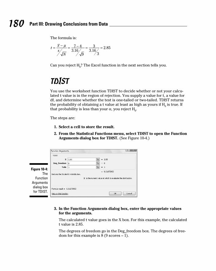
180 Part III: Drawing Conclusions from Data
The formula is:
Can you reject H0? The Excel function in the next section tells you.
TDIST You use the worksheet function TDIST to decide whether or not your calcu-
lated t value is in the region of rejection. You supply a value for t, a value for
df, and determine whether the test is one-tailed or two-tailed. TDIST returns
the probability of obtaining a t value at least as high as yours if H0 is true. If
that probability is less than your α, you reject H0.
The steps are:
1. Select a cell to store the result.
2. From the Statistical Functions menu, select TDIST to open the Function
Arguments dialog box for TDIST. (See Figure 10-4.)
Figure 10-4: The
Function Arguments dialog box for TDIST.
3. In the Function Arguments dialog box, enter the appropriate values
for the arguments.
The calculated t value goes in the X box. For this example, the calculated
t value is 2.85.
The degrees of freedom go in the Deg_freedom box. The degrees of free-
dom for this example is 8 (9 scores – 1).
16 454060-ch10.indd 18016 454060-ch10.indd 180 4/21/09 7:29:23 PM4/21/09 7:29:23 PM

181 Chapter 10: One-Sample Hypothesis Testing
In the Tails box, the idea is to type 1 (for a one-tailed test) or 2 (for a
two-tailed test). In this example, it’s a one-tailed test. After I typed 1, the
dialog box shows the probability in the tail of the t-distribution beyond
the t value.
4. Click OK to close the dialog box and put the answer in the selected cell.
The value in the dialog box in Figure 10-4 is less than .05, so the decision is to
reject H0.
Testing a VarianceSo far, I’ve told you about one-sample hypothesis testing for means. You can
also test hypotheses about variances.
This sometimes comes up in the context of manufacturing. For example, sup-
pose FarKlempt Robotics, Inc, produces a part that has to be a certain length
with a very small variability. You can take a sample of parts, measure them,
find the sample variability and perform a hypothesis test against the desired
variability.
The family of distributions for the test is called chi-square. Its symbol is χ2. I
won’t go into all the mathematics. I’ll just tell you that, once again, df is the
parameter that distinguishes one member of the family from another. Figure
10-5 shows two members of the chi-square family.
The formula for this test statistic is
N is the number of scores in the sample, s2 is the sample variance, and σ2 is
the population variance specified in H0.
With this test, you have to assume that what you’re measuring has a normal
distribution.
Suppose the process for the FarKlempt part has to have at most a standard
deviation of 1.5 inches for its length. (Notice I said standard deviation. This
allows me to speak in terms of inches. If I said variance the units would be
square inches.). After measuring a sample of 26 parts, you find a standard
deviation of 1.8 inches.
16 454060-ch10.indd 18116 454060-ch10.indd 181 4/21/09 7:29:24 PM4/21/09 7:29:24 PM

182 Part III: Drawing Conclusions from Data
Figure 10-5: Two mem-bers of the chi-square
family.
f(x2)
18
16 df=4
df=10
14
12
10
08
06
04
02
0
0 4 8 12 16 20 24
x2
The hypotheses are:
H0: σ2 ≤ 2.25 (remember to square the “at-most” standard deviation of 1.5
inches)
H1: σ2 > 2.25
α = .05
Working with the formula,
Can you reject H0? Read on.
CHIDIST After calculating a value for your chi-square test statistic, you use the
CHIDIST worksheet function to make a judgment about it. You supply the
16 454060-ch10.indd 18216 454060-ch10.indd 182 4/21/09 7:29:24 PM4/21/09 7:29:24 PM

183 Chapter 10: One-Sample Hypothesis Testing
chi-square value and the df, and it tells you the probability of obtaining a
value at least that high if H0 is true. If that probability is less than your α,
reject H0.
To show you how it works, I apply the information from the example in the
preceding section. Follow these steps:
1. Select a cell to store the result.
2. From the Statistical Functions menu, select CHIDIST to open the
Function Arguments dialog box for CHIDIST. (See Figure 10-6.)
Figure 10-6: The
Function Arguments dialog box
for CHIDIST.
3. In the Function Arguments dialog box, type the appropriate values for
the arguments.
In the X box, I typed the calculated chi-square value. For this example,
that value is 36.
In the Deg_freedom box, I typed the degrees of freedom. The degrees
of freedom for this example is 25 (26 – 1). After typing the df, the dialog
box shows the one-tailed probability of obtaining at least this value of
chi-square if H0 is true.
4. Click OK to close the dialog box and put the answer in the selected cell.
The value in the dialog box in Figure 10-6 is greater than .05, so the decision
is to not reject H0. (Can you conclude that the process is within acceptable
limits of variability? See the nearby sidebar “A point to ponder.”)
CHIINVCHIINV is the flip side of CHIDIST. You supply a probability and df, and
CHIINV tells you the corresponding value of chi-square. If you want to know
16 454060-ch10.indd 18316 454060-ch10.indd 183 4/21/09 7:29:24 PM4/21/09 7:29:24 PM

184 Part III: Drawing Conclusions from Data
the value you have to exceed in order to reject H0 in the preceding example,
follow these steps:
1. Select a cell to store the result.
2. From the Statistical Functions menu, select CHIINV and click OK to
open the Function Arguments dialog box for CHIINV. (See Figure 10-7.)
Figure 10-7: The
Function Arguments dialog box
for CHIINV.
3. In the Function Arguments dialog box, enter the appropriate values
for the arguments.
In the Probability box, I typed .05, the probability I’m interested in for
this example.
In the Deg_freedom box, I typed the degrees of freedom. The value for
degrees of freedom in this example is 25 (26 – 1). After I typed the df,
the dialog box shows the value (37.65248) that cuts off the upper 5 per-
cent of the area in this chi-square distribution.
4. Click OK to close the dialog box and put the answer in the selected cell.
As the dialog box in Figure 10-7 shows, the calculated value (36) didn’t miss
the cutoff value by much. A miss is still a miss (to paraphrase “As Time Goes
By”), and you cannot reject H0.
16 454060-ch10.indd 18416 454060-ch10.indd 184 4/21/09 7:29:24 PM4/21/09 7:29:24 PM

185 Chapter 10: One-Sample Hypothesis Testing
A point to ponderRetrace the preceding example. FarKlempt Robotics wants to show that its manufactur-ing process is within acceptable limits of vari-ability. The null hypothesis, in effect, says the process is acceptable. The data do not pres-ent evidence for rejecting Ho. The value of the test statistic just misses the critical value. Does that mean the manufacturing process is within acceptable limits?
Statistics are an aid to common sense, not a substitute. If the data are just barely within acceptability, that should set off alarms.
Usually, you try to reject H0. This is a rare case when not rejecting H0 is more desir-able, because nonrejection implies something
positive — the manufacturing process is work-ing properly. Can you still use hypothesis testing techniques in this situation?
Yes, you can — with a notable change. Rather than a small value of α, like .05, you choose a large value, like .20. This stacks the deck against not rejecting H0 — small values of the test statistic can lead to rejection. If α is .20 in this example, the critical value is 30.6752. (Use CHINV to verify that.) Because the obtained value, 36, is higher than this critical value the decision with this α is to reject H0.
Using a high α is not often done. When the desired outcome is to not reject H0, I strongly advise it.
16 454060-ch10.indd 18516 454060-ch10.indd 185 4/21/09 7:29:24 PM4/21/09 7:29:24 PM

186 Part III: Drawing Conclusions from Data
16 454060-ch10.indd 18616 454060-ch10.indd 186 4/21/09 7:29:24 PM4/21/09 7:29:24 PM

Chapter 11
Two-Sample Hypothesis TestingIn This Chapter▶ Testing differences between means of two samples
▶ Testing means of paired samples
▶ Testing hypotheses about variances
In business, in education, and in scientific research the need often arises
to compare one sample with another. Sometimes the samples are inde-
pendent, sometimes they’re matched in some way. Each sample comes from
a different population. The objective is to decide whether or not the popula-
tions they come from are different from one another.
Usually, this involves tests of hypotheses about population means. You can
also test hypotheses about population variances. In this chapter, I show you
how to carry out these tests. I also discuss useful worksheet functions and
data analysis tools that help you get the job done.
Hypotheses Built for TwoAs in the one-sample case (Chapter 10), hypothesis testing with two samples
starts with a null hypothesis (H0 ) and an alternative hypothesis (H
1). The null
hypothesis specifies that any differences you see between the two samples
are due strictly to chance. The alternative hypothesis says, in effect, that any
differences you see are real and not due to chance.
It’s possible to have a one-tailed test, in which the alternative hypothesis
specifies the direction of the difference between the two means, or a two-tailed test in which the alternative hypothesis does not specify the direction
of the difference.
17 454060-ch11.indd 18717 454060-ch11.indd 187 4/21/09 7:30:20 PM4/21/09 7:30:20 PM

188 Part III: Drawing Conclusions from Data
For a one-tailed test, the hypotheses look like this:
H0: μ
1 - μ
2 = 0
H1: μ
1 - μ
2 > 0
or like this:
H0: μ
1 - μ
2 = 0
H1: μ
1 - μ
2 < 0
For a two-tailed test, the hypotheses are:
H0: μ
1 - μ
2 = 0
H1: μ
1 - μ
2 ≠ 0
The zero in these hypotheses is the typical case. It’s possible, however, to test
for any value — just substitute that value for zero.
To carry out the test, you first set α, the probability of a Type I error that
you’re willing to live with (see Chapter 9). Then you calculate the mean and
standard deviation of each sample, subtract one mean from the other, and
use a formula to convert the result into a test statistic. Compare the test sta-
tistic to a sampling distribution of test statistics. If it’s in the rejection region
that α specifies (see Chapter 10), reject H0. If not, don’t reject H
0.
Sampling Distributions RevisitedIn Chapter 9, I introduce the idea of a sampling distribution — a distribution
of all possible values of a statistic for a particular sample size. In that chap-
ter, I describe the sampling distribution of the mean. In Chapter 10, I show its
connection with one-sample hypothesis testing.
For this type of hypothesis testing, another sampling distribution is neces-
sary. This one is the sampling distribution of the difference between means.
The sampling distribution of the difference between means is the distribution
of all possible values of differences between pairs of sample means with the
sample sizes held constant from pair to pair. (Yes, that’s a mouthful.) Held constant from pair to pair means that the first sample in the pair always has the
same size, and the second sample in the pair always has the same size. The
two sample sizes are not necessarily equal.
17 454060-ch11.indd 18817 454060-ch11.indd 188 4/21/09 7:30:20 PM4/21/09 7:30:20 PM

189 Chapter 11: Two-Sample Hypothesis Testing
Within each pair, each sample comes from a different population. All the
samples are independent of one another, so that picking individuals for one
sample has no effect on picking individuals for another.
Figure 11-1 shows the steps in creating this sampling distribution. This is
something you never do in practice. It’s all theoretical. As the figure shows,
the idea is to take a sample out of one population and a sample out of another,
calculate their means, and subtract one mean from the other. Return the
samples to the populations, and repeat over and over and over. The result
of the process is a set of differences between means. This set of differences
is the sampling distribution.
Figure 11-1: Creating the
sampling distribu-
tion of the difference
between means.
Population 1 Population 2
3
Sampling Distribution of the Difference Between Means
Pair 1
...Pair 2 PairPair 3
... ...
Sample1
Sample1 Sample
1Sample
1
Sample2
Sample2
Sample2
Sample2
Applying the Central Limit TheoremLike any other set of numbers, this sampling distribution has a mean and a
standard deviation. As is the case with the sampling distribution of the mean
(Chapters 9 and 10), the Central Limit Theorem applies here.
According to the Central Limit Theorem, if the samples are large, the sampling
distribution of the difference between means is approximately a normal distri-
bution. If the populations are normally distributed, the sampling distribution is
a normal distribution even if the samples are small.
17 454060-ch11.indd 18917 454060-ch11.indd 189 4/21/09 7:30:20 PM4/21/09 7:30:20 PM

190 Part III: Drawing Conclusions from Data
The Central Limit Theorem also has something to say about the mean and
standard deviation of this sampling distribution. Suppose the parameters for
the first population are μ1 and σ
1, and the parameters for the second popula-
tion are μ2 and σ
2. The mean of the sampling distribution is
The standard deviation of the sampling distribution is
N1 is the number of individuals in the sample from the first population, N
2 is
the number of individuals in the sample from the second.
This standard deviation is called the standard error of the difference between means.
Figure 11-2 shows the sampling distribution along with its parameters, as
specified by the Central Limit Theorem.
Figure 11-2: The
sampling distribu-
tion of the difference
between means
accord-ing to the
Central Limit Theorem.
1 2µ µ( )1 21 2 3 x xµ µ ( )
1 21 2 3 x xµ µ( )1 21 2 2 x xµ µ ( )
1 21 2 2 x xµ µ( )1 21 2 1 x xµ µ ( )
1 21 2 1 x xµ µ
17 454060-ch11.indd 19017 454060-ch11.indd 190 4/21/09 7:30:20 PM4/21/09 7:30:20 PM

191 Chapter 11: Two-Sample Hypothesis Testing
Zs once moreBecause the Central Limit Theorem says that the sampling distribution is
approximately normal for large samples (or for small samples from normally
distributed populations), you use the z-score as your test statistic. Another
way to say “use the z-score as your test statistic” is “perform a z-test.” Here’s
the formula:
The term (μ1–μ
2) represents the difference between the means in H
0.
This formula converts the difference between sample means into a standard
score. Compare the standard score against a standard normal distribution —
a normal distribution with μ = 0 and σ = 1. If the score is in the rejection region
defined by α, reject H0. If it’s not, don’t reject H
0.
You use this formula when you know the value of σ12 and σ
22.
Here’s an example. Imagine a new training technique designed to increase IQ.
Take a sample of 25 people and train them under the new technique. Take
another sample of 25 people and give them no special training. Suppose that
the sample mean for the new technique sample is 107, and for the no-training
sample it’s 101.2. The hypothesis test is:
H0: μ
1 - μ
2 = 0
H1: μ
1 - μ
2 > 0
I’ll set α at .05
The IQ is known to have a standard deviation of 16, and I assume that stan-
dard deviation would be the same in the population of people trained on the
new technique. Of course, that population doesn’t exist. The assumption is
that if it did, it should have the same value for the standard deviation as the
regular population of IQ scores. Does the mean of that (theoretical) popula-
tion have the same value as the regular population? H0 says it does. H
1 says
it’s larger.
The test statistic is
17 454060-ch11.indd 19117 454060-ch11.indd 191 4/21/09 7:30:21 PM4/21/09 7:30:21 PM

192 Part III: Drawing Conclusions from Data
With α = .05, the critical value of z — the value that cuts off the upper 5 per-
cent of the area under the standard normal distribution — is 1.645. (You can
use the worksheet function NORMSINV from Chapter 8 to verify this.) The
calculated value of the test statistic is less than the critical value, so the deci-
sion is to not reject H0. Figure 11-3 summarizes this.
Figure 11-3: The
sampling distribu-
tion of the difference
between means,
along with the critical
value for α = .05 and
the obtained value of the test statistic
in the IQ Example.
1 2µ µ( )1 21 2 3
-3.00 -2.00 -1.00 +1.00 +2.00 +3.000
x xµ µ ( )1 21 2 3 x xµ µ( )
1 21 2 2 x xµ µ ( )1 21 2 2 x xµ µ( )
1 21 2 1 x xµ µ ( )1 21 2 1 x xµ µ
0Do Not Reject H
ObtainedValue
CriticalValue for
a = .05
0Reject H+1.64
Data analysis tool: z-Test: Two Sample for MeansExcel provides a data analysis tool that makes it easy to do tests like the one
in the IQ example. It’s called z-Test: Two Sample for Means. Figure 11-4 shows
the dialog box for this tool along with sample data that correspond to the IQ
example.
17 454060-ch11.indd 19217 454060-ch11.indd 192 4/21/09 7:30:21 PM4/21/09 7:30:21 PM

193 Chapter 11: Two-Sample Hypothesis Testing
Figure 11-4: The z-Test
data analysis tool
and data from two samples.
To use this tool, follow these steps:
1. Type the data for each sample into a separate data array.
For this example, the data in the New Technique sample are in column E
and the data for the No Training sample are in column G.
2. Select Data | Data Analysis to open the Data Analysis dialog box.
3. In the Data Analysis dialog box, scroll down the Analysis Tools list
and select z-Test: Two Sample for Means. Click OK to open the z-Test:
Two Sample for Means dialog box (see Figure 11-4).
4. In the Variable 1 Range box, enter the cell range that holds the data
for one of the samples.
For the example, the New Technique data are in $E$2:$E$27. (Note the
$-signs for absolute referencing.)
5. In the Variable 2 Range box, enter the cell range that holds the data
for the other sample.
The No Training data are in $G$2:$G$27.
6. In the Hypothesized Mean Difference box, type the difference
between μ1 and μ2 that H0 specifies.
In this example, that difference is 0.
7. In the Variable 1 Variance (known) box, type the variance of the first
sample.
The standard deviation of the population of IQ scores is 16, so this vari-
ance is 256.
17 454060-ch11.indd 19317 454060-ch11.indd 193 4/21/09 7:30:21 PM4/21/09 7:30:21 PM

194 Part III: Drawing Conclusions from Data
8. In the Variable 2 Variance (known) box, type the variance of the
second sample.
In this example, this variance is also 256.
9. If the cell ranges include column headings, check the Labels checkbox.
I included the headings in the ranges, so I checked the box.
10. The Alpha box has 0.05 as a default.
I used the default value, consistent with the value of α in this example.
11. In the Output Options, select a radio button to indicate where you
want the results.
I selected New Worksheet Ply to put the results on a new page in the
worksheet.
12. Click OK.
Because I selected New Worksheet Ply, a newly created page opens with
the results.
Figure 11-5 shows the tool’s results, after I expanded the columns. Rows 4, 5,
and 7 hold values you input into the dialog box. Row 6 counts the number of
scores in each sample.
Figure 11-5: Results of the z-Test
data analy-sis tool.
The value of the test statistic is in cell B8. The critical value for a one-tailed
test is in B10, and the critical value for a two-tailed test is in B12.
Cell B9 displays the proportion of area that the test statistic cuts off in one
tail of the standard normal distribution. Cell B11 doubles that value — it’s the
proportion of area cut off by the positive value of the test statistic (in the tail
on the right side of the distribution) plus the proportion cut off by the nega-
tive value of the test statistic (in the tail on the left side of the distribution).
17 454060-ch11.indd 19417 454060-ch11.indd 194 4/21/09 7:30:21 PM4/21/09 7:30:21 PM

195 Chapter 11: Two-Sample Hypothesis Testing
t for TwoThe example in the preceding section involves a situation you rarely
encounter — known population variances. If you know a population’s vari-
ance, you’re likely to know the population mean. If you know the mean, you
probably don’t have to perform hypothesis tests about it.
Not knowing the variances takes the Central Limit Theorem out of play. This
means that you can’t use the normal distribution as an approximation of the
sampling distribution of the difference between means. Instead, you use the
t-distribution, a family of distributions I introduce in Chapter 9 and apply to
one-sample hypothesis testing in Chapter 10. The members of this family of
distributions differ from one another in terms of a parameter called degrees of freedom (df). Think of df as the denominator of the variance estimate you
use when you calculate a value of t as a test statistic. Another way to say
“calculate a value of t as a test statistic”: “Perform a t-test.”
Unknown population variances lead to two possibilities for hypothesis testing.
One possibility is that although the variances are unknown, you have reason to
assume they’re equal. The other possibility is that you cannot assume they’re
equal. In the subsections that follow, I discuss these possibilities.
Like peas in a pod: Equal variancesWhen you don’t know a population variance, you use the sample variance
to estimate it. If you have two samples, you average (sort of) the two sample
variances to arrive at the estimate.
Putting sample variances together to estimate a population variance is called
pooling. With two sample variances, here’s how you do it:
In this formula sp
2 stands for the pooled estimate. Notice that the denomina-
tor of this estimate is (N1-1) + (N
2-1). Is this the df? Absolutely!
The formula for calculating t is
17 454060-ch11.indd 19517 454060-ch11.indd 195 4/21/09 7:30:21 PM4/21/09 7:30:21 PM

196 Part III: Drawing Conclusions from Data
On to an example. FarKlempt Robotics is trying to choose between two
machines to produce a component for its new microrobot. Speed is of the
essence, so they have each machine produce ten copies of the component,
and time each production run. The hypotheses are:
H0: μ
1-μ
2 = 0
H1: μ
1-μ
2 ≠ 0
They set α at .05. This is a two-tailed test, because they don’t know in
advance which machine might be faster.
Table 11-1 presents the data for the production times in minutes.
Table 11-1 Sample Statistics from the FarKlempt Machine Study
Machine 1 Machine 2
Mean Production Time 23.00 20.00
Standard Deviation 2.71 2.79
Sample Size 10 10
The pooled estimate of σ2 is
The estimate of σ is 2.75, the square root of 7.56.
The test statistic is
For this test statistic, df = 18, the denominator of the variance estimate. In a
t-distribution with 18 df, the critical value is 2.10 for the right-side (upper)
tail and –2.10 for the left-side (lower) tail. If you don’t believe me, apply TINV
(Chapter 9). The calculated value of the test statistic is greater than 2.10,
17 454060-ch11.indd 19617 454060-ch11.indd 196 4/21/09 7:30:21 PM4/21/09 7:30:21 PM

197 Chapter 11: Two-Sample Hypothesis Testing
so the decision is to reject H0. The data provide evidence that Machine 2 is
significantly faster than Machine 1. (You can use the word “significant” when-
ever you reject H0.)
Like p’s and q’s: Unequal variancesThe case of unequal variances presents a challenge. As it happens, when vari-
ances are not equal, the t distribution with (N1-1) + (N
2-1) degrees of freedom
is not as close an approximation to the sampling distribution as statisticians
would like.
Statisticians meet this challenge by reducing the degrees of freedom. To
accomplish the reduction they use a fairly involved formula that depends on
the sample standard deviations and the sample sizes.
Because the variances aren’t equal, a pooled estimate is not appropriate. So
you calculate the t-test in a different way:
You evaluate the test statistic against a member of the t-distribution family
that has the reduced degrees of freedom.
TTESTThe worksheet function TTEST eliminates the muss, fuss, and bother of work-
ing through the formulas for the t-test.
Figure 11-6 shows the data for the FarKlempt machines example I showed you
earlier. The Figure also shows the Function Arguments dialog box for TTEST.
Follow these steps:
1. Type the data for each sample into a separate data array and select a
cell for the result.
For this example, the data for the Machine 1 sample are in column B and
the data for the Machine 2 sample are in column D.
2. From the Statistical Functions menu, select TTEST to open the
Function Arguments dialog box for TTEST.
17 454060-ch11.indd 19717 454060-ch11.indd 197 4/21/09 7:30:22 PM4/21/09 7:30:22 PM

198 Part III: Drawing Conclusions from Data
Figure 11-6: Working
with TTEST.
3. In the Function Arguments dialog box, enter the appropriate values
for the arguments.
In the Array1 box, enter the sequence of cells that holds the data for one
of the samples. In this example, the Machine 1 data are in B3:B12.
In the Array2 box, enter the sequence of cells that holds the data for the
other sample. The Machine 2 data are in D3:D12.
The Tails box indicates whether this is a one-tailed test or a two-tailed
test. In this example, it’s a two-tailed test, so I typed 2 in this box.
The Type box holds a number that indicates the type of t-test. The
choices are 1 for a paired test (which you find out about in an upcom-
ing section), 2 for two samples assuming equal variances, and 3 for two
samples assuming unequal variances. I typed 2.
With values supplied for all the arguments, the dialog box shows the
probability associated with the t value for the data. It does not show
the value of t.
4. Click OK to put the answer in the selected cell.
The value in the dialog box in Figure 11-6 is less than .05, so the decision is to
reject H0.
By the way, for this example, typing 3 into the Type box (indicating unequal
variances) results in a very slight adjustment in the probability from the
equal variance test. The adjustment is small because the sample variances
are almost equal and the sample sizes are the same.
17 454060-ch11.indd 19817 454060-ch11.indd 198 4/21/09 7:30:22 PM4/21/09 7:30:22 PM

199 Chapter 11: Two-Sample Hypothesis Testing
Data Analysis Tools: t-test: Two Sample Excel provides data analysis tools that carry out t-tests. One tool works for
the equal variance cases, another for the unequal variances case. As you’ll
see, when you use these tools you end up with more information than TTEST
gives you.
Here’s an example that applies the equal variances t-test tool to the data from
the FarKlempt machines example. Figure 11-7 shows the data along with the
dialog box for t-Test: Two-Sample Assuming Equal Variances.
Figure 11-7: The equal variances
t-Test data analysis tool
and data from two samples.
To use this tool, follow these steps:
1. Type the data for each sample into a separate data array.
For this example, the data in the Machine 1 sample are in column B and
the data for the Machine 2 sample are in column D.
2. Select Data | Data Analysis to open the Data Analysis dialog box.
3. In the Data Analysis dialog box, scroll down the Analysis Tools list
and select t-Test: Two Sample Assuming Equal Variances. Click OK to
open this tool’s dialog box.
This is the dialog box in Figure 11-7.
4. In the Variable 1 Range box, enter the cell range that holds the data
for one of the samples.
For the example, the Machine 1 data are in $B$3:$B$12. (Note the $-signs
for absolute referencing.)
5. In the Variable 2 Range box, enter the cell range that holds the data
for the other sample.
The Machine 2 data are in $D$3:$D$12.
17 454060-ch11.indd 19917 454060-ch11.indd 199 4/21/09 7:30:22 PM4/21/09 7:30:22 PM
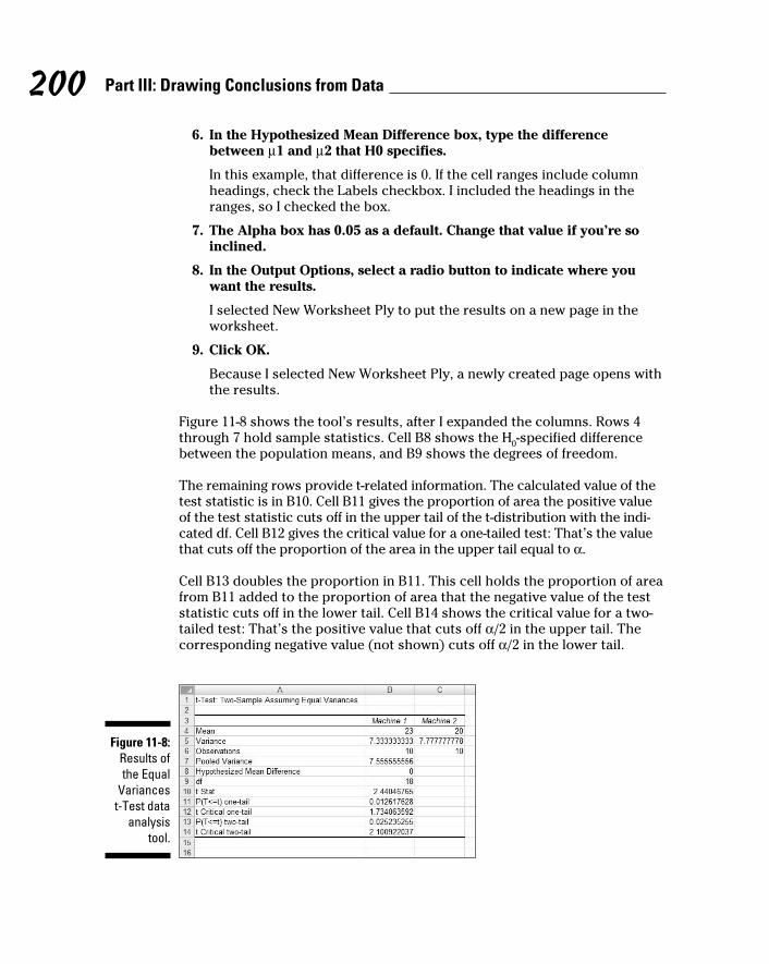
200 Part III: Drawing Conclusions from Data
6. In the Hypothesized Mean Difference box, type the difference
between μ1 and μ2 that H0 specifies.
In this example, that difference is 0. If the cell ranges include column
headings, check the Labels checkbox. I included the headings in the
ranges, so I checked the box.
7. The Alpha box has 0.05 as a default. Change that value if you’re so
inclined.
8. In the Output Options, select a radio button to indicate where you
want the results.
I selected New Worksheet Ply to put the results on a new page in the
worksheet.
9. Click OK.
Because I selected New Worksheet Ply, a newly created page opens with
the results.
Figure 11-8 shows the tool’s results, after I expanded the columns. Rows 4
through 7 hold sample statistics. Cell B8 shows the H0-specified difference
between the population means, and B9 shows the degrees of freedom.
The remaining rows provide t-related information. The calculated value of the
test statistic is in B10. Cell B11 gives the proportion of area the positive value
of the test statistic cuts off in the upper tail of the t-distribution with the indi-
cated df. Cell B12 gives the critical value for a one-tailed test: That’s the value
that cuts off the proportion of the area in the upper tail equal to α.
Cell B13 doubles the proportion in B11. This cell holds the proportion of area
from B11 added to the proportion of area that the negative value of the test
statistic cuts off in the lower tail. Cell B14 shows the critical value for a two-
tailed test: That’s the positive value that cuts off α/2 in the upper tail. The
corresponding negative value (not shown) cuts off α/2 in the lower tail.
Figure 11-8: Results of the Equal
Variances t-Test data
analysis tool.
17 454060-ch11.indd 20017 454060-ch11.indd 200 4/21/09 7:30:22 PM4/21/09 7:30:22 PM

201 Chapter 11: Two-Sample Hypothesis Testing
The samples in the example I used have the same number of scores and
approximately equal variances, so applying the unequal variances version
of the t-Test tool to that data set won’t show much of a difference from the
equal variances case.
Instead I created another example, summarized in Table 11-2. The samples in
this example have different sizes and widely differing variances.
Table 11-2 Sample Statistics for the Unequal Variances t-Test Example
Sample 1 Sample 2
Mean 52.50 41.33
Standard Deviation 499.71 41.87
Sample Size 8 6
To show you the difference between the equal variances tool and the unequal
variances tool, I ran both on the data and put the results side by side.
Figure 11-9 shows the results from both tools. To run the Unequal Variances
tool, you go through the same steps as for the Equal Variances version with
one exception: In the Data Analysis Tools dialog box, you select t-Test: Two
Sample Assuming Unequal Variances.
Figure 11-9: Results of the Equal
Variances t-Test data
analysis tool and the
Unequal Variances
t-Test data analysis tool for the data
summarized in Table 11-2.
Figure 11-9 shows one obvious difference between the two tools: The Unequal
Variances Tool shows no pooled estimate of σ2, because the t-test for that
17 454060-ch11.indd 20117 454060-ch11.indd 201 4/21/09 7:30:22 PM4/21/09 7:30:22 PM
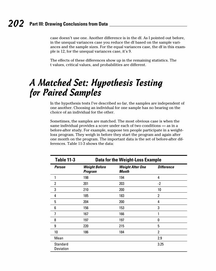
202 Part III: Drawing Conclusions from Data
case doesn’t use one. Another difference is in the df. As I pointed out before,
in the unequal variances case you reduce the df based on the sample vari-
ances and the sample sizes. For the equal variances case, the df in this exam-
ple is 12, for the unequal variances case, it’s 9.
The effects of these differences show up in the remaining statistics. The
t values, critical values, and probabilities are different.
A Matched Set: Hypothesis Testing for Paired Samples
In the hypothesis tests I’ve described so far, the samples are independent of
one another. Choosing an individual for one sample has no bearing on the
choice of an individual for the other.
Sometimes, the samples are matched. The most obvious case is when the
same individual provides a score under each of two conditions — as in a
before-after study. For example, suppose ten people participate in a weight-
loss program. They weigh in before they start the program and again after
one month on the program. The important data is the set of before-after dif-
ferences. Table 11-3 shows the data:
Table 11-3 Data for the Weight-Loss ExamplePerson Weight Before
ProgramWeight After One Month
Difference
1 198 194 4
2 201 203 -2
3 210 200 10
4 185 183 2
5 204 200 4
6 156 153 3
7 167 166 1
8 197 197 0
9 220 215 5
10 186 184 2
Mean 2.9
Standard Deviation
3.25
17 454060-ch11.indd 20217 454060-ch11.indd 202 4/21/09 7:30:22 PM4/21/09 7:30:22 PM

203 Chapter 11: Two-Sample Hypothesis Testing
The idea is to think of these differences as a sample of scores, and treat them
as you would in a one-sample t-test (Chapter 10).
You carry out a test on these hypotheses:
H0: μ
d ≤ 0
H1: μ
d > 0
The d in the subscripts stands for “Difference.” Set α = .05.
The formula for this kind of t-test is:
In this formula, is the mean of the differences. To find , you calculate the
standard deviation of the differences and divide by the square root of the
number of pairs:
The df is N-1.
From Table 11-3,
With df=9 (Number of pairs – 1), the critical value for α=.05 is 2.26. (Use TINV to
verify.) The calculated value exceeds this value, so the decision is to reject H0.
TTEST for matched samplesEarlier, I described the worksheet function TTEST and showed you how to
use it with independent samples. This time, I use it for the matched samples
weight-loss example. Figure 11-10 shows the Function Argument box for
TTEST along with data from the weight-loss example.
17 454060-ch11.indd 20317 454060-ch11.indd 203 4/21/09 7:30:22 PM4/21/09 7:30:22 PM

204 Part III: Drawing Conclusions from Data
Figure 11-10: The
Function Arguments dialog box for TTEST
along with matched
sample data.
Here are the steps to follow:
1. Enter the data for each sample into a separate data array and select
a cell.
For this example, the data for the Before sample are in column B and the
data for the After sample are in column C.
2. From the Statistical Functions menu, select TTEST to open the
Function Arguments dialog box for TTEST.
3. In the Function Arguments dialog box, enter the appropriate values
for the arguments.
In the Array1 box, type the sequence of cells that holds the data for one
of the samples. In this example, the Before data are in B3:B12.
In the Array2 box, type the sequence of cells that holds the data for the
other sample. The After data are in C3:C12.
The Tails box indicates whether this is a one-tailed test or a two-tailed
test. In this example, it’s a one-tailed test so I type 1 in the Tails box.
The Type box holds a number that indicates the type of t-test to per-
form. The choices are 1 for a paired test, 2 for two samples assuming
equal variances, and 3 for two samples assuming unequal variances.
I typed 1.
With values supplied for all the arguments, the dialog box shows the
probability associated with the t value for the data. It does not show the
value of t.
4. Click OK to put the answer in the selected cell.
The value in the dialog box in Figure 11-10 is less than .05, so the decision is
to reject H0.
17 454060-ch11.indd 20417 454060-ch11.indd 204 4/21/09 7:30:23 PM4/21/09 7:30:23 PM

205 Chapter 11: Two-Sample Hypothesis Testing
If I assign the column headers in Figure 11-10 as names for the respective
arrays, the formula in the Formula bar can be
=TTEST(Before,After,1,1)
That format might be easier to explain if you had to show the worksheet to
someone. (If you don’t remember how to define a name for a cell range, see
Chapter 2.)
Data analysis tool: t-test: Paired Two Sample for Means Excel provides a data analysis tool that takes care of just about everything
for matched samples. It’s called t-test: Paired Two Sample for Means. In this
section, I use it on the weight-loss data.
Figure 11-11 shows the data along with the dialog box for t-Test: Paired Two
Sample for Means.
Figure 11-11: The Paired
Two Sample t-Test data
analysis tool and
data from matched samples.
Here are the steps to follow:
1. Enter the data for each sample into a separate data array.
For this example, the data in the Before sample are in column B and the
data for the After sample are in column C.
2. Select Data | Data Analysis to open the Data Analysis dialog box.
3. In the Data Analysis dialog box, scroll down the Analysis Tools list
and select t-Test: Paired Two Sample for Means. Click OK to open this
tool’s dialog box.
This is the dialog box in Figure 11-11.
17 454060-ch11.indd 20517 454060-ch11.indd 205 4/21/09 7:30:23 PM4/21/09 7:30:23 PM

206 Part III: Drawing Conclusions from Data
4. In the Variable 1 Range box, enter the cell range that holds the data
for one of the samples.
For the example, the Before data are in $B$2:$B$12. (Note the $-signs for
absolute referencing.)
5. In the Variable 2 Range box, enter the cell range that holds the data
for the other sample.
The After data are in $C$2:$C$12.
6. In the Hypothesized Mean Difference box, type the difference
between μ1 and μ2 that H0 specifies.
In this example, that difference is 0.
7. If the cell ranges include column headings, check the Labels checkbox.
I included the headings in the ranges, so I checked the box.
8. The Alpha box has 0.05 as a default. Change that value if you want to
use a different α.
9. In the Output Options, select a radio button to indicate where you
want the results.
I selected New Worksheet Ply to put the results on a new page in the
worksheet.
10. Click OK.
Because I selected New Worksheet Ply, a newly created page opens with
the results.
Figure 11-12 shows the tool’s results, after I expanded the columns. Rows 4
through 7 hold sample statistics. The only item that’s new is the number in
cell B7, the Pearson Correlation Coefficient. This is a number between –1 and
+1 that indicates the strength of the relationship between the data in the first
sample and the data in the second.
If this number is close to 1 (as in the example), high scores in one sample are
associated with high scores in the other, and low scores in one are associ-
ated with low scores in the other. If the number is close to –1, high scores in
the first sample are associated with low scores in the second, and low scores
in the first are associated with high scores in the second.
If the number is close to zero, scores in the first sample are unrelated to
scores in the second. Because the two samples consist of scores on the same
people, you expect a high value. (I describe this topic in much greater detail
in Chapter 15.)
Cell B8 shows the H0-specified difference between the population means, and
B9 shows the degrees of freedom.
17 454060-ch11.indd 20617 454060-ch11.indd 206 4/21/09 7:30:23 PM4/21/09 7:30:23 PM

207 Chapter 11: Two-Sample Hypothesis Testing
The remaining rows provide t-related information. The calculated value of the
test statistic is in B10. Cell B11 gives the proportion of area the positive value
of the test statistic cuts off in the upper tail of the t-distribution with the indi-
cated df. Cell B12 gives the critical value for a one-tailed test: That’s the value
that cuts off the proportion of the area in the upper tail equal to α.
Cell B13 doubles the proportion in B11. This cell holds the proportion of area
from B11 added to the proportion of area that the negative value of the test
statistic cuts off in the lower tail. Cell B13 shows the critical value for a two-
tailed test: That’s the positive value that cuts off α/2 in the upper tail. The
corresponding negative value (not shown) cuts off α/2 in the lower tail.
Figure 11-12: Results of
The Paired Two Sample
t-Test data analysis
tool.
Testing Two VariancesThe two-sample hypothesis testing I’ve described thus far pertains to means.
It’s also possible to test hypotheses about variances.
In this section I extend the one-variance manufacturing example I used in
Chapter 10. FarKlempt Robotics, Inc., produces a part that has to be a certain
length with a very small variability. They’re considering two machines to
produce this part, and they want to choose the one that results in the least
variability. They take a sample of parts from each machine, measure them,
find the variance for each sample, and perform a hypothesis test to see if one
machine’s variance is significantly greater than the other’s.
The hypotheses are:
H0: σ
12 = σ
22
H1: σ
12 ≠ σ
22
As always, an α is a must. As usual, I set it to .05.
17 454060-ch11.indd 20717 454060-ch11.indd 207 4/21/09 7:30:23 PM4/21/09 7:30:23 PM

208 Part III: Drawing Conclusions from Data
When you test two variances, you don’t subtract one from the other. Instead,
you divide one by the other to calculate the test statistic. Sir Ronald Fisher is
a famous statistician who worked out the mathematics and the family of dis-
tributions for working with variances in this way. The test statistic is named
in his honor. It’s called an F-ratio and the test is the F test. The family of distri-
butions for the test is called the F-distribution.
Without going into all the mathematics, I’ll just tell you that, once again, df
is the parameter that distinguishes one member of the family from another.
What’s different about this family is that two variance estimates are involved,
so each member of the family is associated with two values of df, rather than
one as in the t-test. Another difference between the F-distribution and the
others you’ve seen is that the F cannot have a negative value. Figure 11-13
shows two members of the F-distribution family.
The test statistic is:
Figure 11-13: Two mem-bers of the
F-distribution family.
f(F)
1.0
0.5
0.0
0F
1 2
df = 10,20
df = 5,15
3 4 5
17 454060-ch11.indd 20817 454060-ch11.indd 208 4/21/09 7:30:23 PM4/21/09 7:30:23 PM

209 Chapter 11: Two-Sample Hypothesis Testing
Suppose FarKlempt Robotics produces 10 parts with Machine 1 and finds a
sample variance of .60 square inches. They produce 15 parts with Machine 2
and find a sample variance of .44 square inches. Can they reject H0?
Calculating the test statistic,
The df’s are 9 and 14: The variance estimate in the numerator of the F ratio is
based on 10 cases, and the variance estimate in the denominator is based on
15 cases.
When the df’s are 9 and 14 and it’s a two-tailed test at α = .05, the critical
value of F is 3.21. (In a moment, I’ll show you an Excel function that finds that
value for you.) The calculated value is less than the critical value, so the deci-
sion is to not reject H0.
It makes a difference which df is in the numerator and which df is in the
denominator. The F-distribution for df=9 and df=14 is different from the
F-distribution for df=14 and df=9. For example, the critical value in the latter
case is 3.98, not 3.21.
Using F in conjunction with tOne use of the F-distribution is in conjunction with the t-test for indepen-
dent samples. Before you do the t-test, you use F to help decide whether to
assume equal variances or unequal variances in the samples.
In the equal variances t-test example I showed you earlier, the standard devi-
ations are 2.71 and 2.79. The variances are 7.34 and 7.78. The F-ratio of these
variances is
Each sample is based on 10 observations, so df=9 for each sample variance.
An F-ratio of 1.06 cuts off the upper 47 percent of the F-distribution whose
df are 9 and 9, so it’s safe to use the equal variances version of the t-test for
these data.
In the sidebar at the end of Chapter 10, I mention that on rare occasions a
high α is a good thing. When H0 is a desirable outcome and you’d rather not
reject it, you stack the deck against rejecting by setting α at a high level so
that small differences cause you to reject H0.
17 454060-ch11.indd 20917 454060-ch11.indd 209 4/21/09 7:30:23 PM4/21/09 7:30:23 PM

210 Part III: Drawing Conclusions from Data
This is one of those rare occasions. It’s more desirable to use the equal vari-
ances t-test, which typically provides more degrees of freedom than the
unequal variances t-test. Setting a high value of α (.20 is a good one) for the
F-test enables you to be confident when you assume equal variances.
FTESTThe worksheet function FTEST calculates an F-ratio on the data from two
samples. It doesn’t return the F-ratio. Instead, it provides the two-tailed prob-
ability of the calculated F-ratio under H0. This means that the answer is the
proportion of area to the right of the F-ratio, and to the left of the reciprocal
of the F-ratio (1 divided by the F-ratio).
Figure 11-14 presents the data for the FarKlempt machines example I just
summarized for you. The Figure also shows the Function Arguments dialog
box for FTEST.
Figure 11-14: Working
With FTEST.
Follow these steps:
1. Enter the data for each sample into a separate data array and select a
cell for the answer.
For this example, the data for the Machine 1 sample are in column B and
the data for the Machine 2 sample are in column D.
2. From the Statistical Functions menu, select FTEST to open the
Function Arguments dialog box for FTEST.
3. In the Function Arguments dialog box, enter the appropriate values
for the arguments.
17 454060-ch11.indd 21017 454060-ch11.indd 210 4/21/09 7:30:24 PM4/21/09 7:30:24 PM

211 Chapter 11: Two-Sample Hypothesis Testing
In the Array1 box, enter the sequence of cells that holds the data for the
sample with the larger variance. In this example, the Machine 1 data are
in B3:B12.
In the Array2 box, enter the sequence of cells that holds the data for the
other sample. The Machine 2 data are in D3:D17.
With values entered for all the arguments, the answer appears in the
dialog box.
4. Click OK to put the answer in the selected cell.
The value in the dialog box in Figure 11-14 is greater than .05, so the decision
is to not reject H0. Figure 11-15 shows the area that the answer represents.
Had I assigned names to those two arrays, the formula in the Formula bar
could have been:
=FTEST(Machine_1,Machine_2)
If you don’t know how to assign names to arrays, see Chapter 2. In that chap-
ter, you also find out why I inserted an underscore into each name.
Figure 11-15: FTEST’s
result.
f(F)
1.0
0.5
0.0
0F
1 2
FTEST returns the sumof these two areas
3 4
17 454060-ch11.indd 21117 454060-ch11.indd 211 4/21/09 7:30:24 PM4/21/09 7:30:24 PM
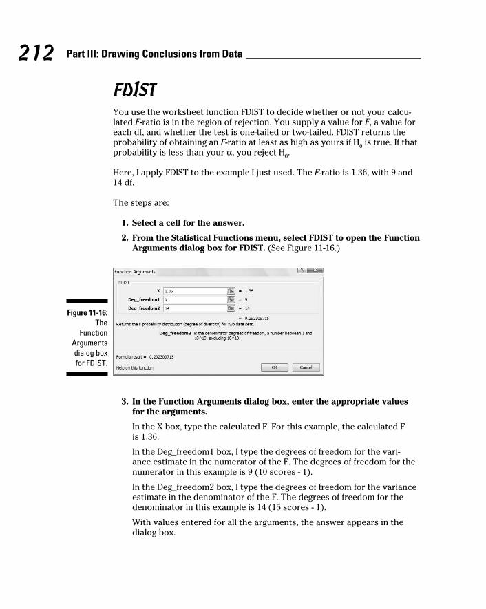
212 Part III: Drawing Conclusions from Data
FDIST You use the worksheet function FDIST to decide whether or not your calcu-
lated F-ratio is in the region of rejection. You supply a value for F, a value for
each df, and whether the test is one-tailed or two-tailed. FDIST returns the
probability of obtaining an F-ratio at least as high as yours if H0 is true. If that
probability is less than your α, you reject H0.
Here, I apply FDIST to the example I just used. The F-ratio is 1.36, with 9 and
14 df.
The steps are:
1. Select a cell for the answer.
2. From the Statistical Functions menu, select FDIST to open the Function
Arguments dialog box for FDIST. (See Figure 11-16.)
Figure 11-16: The
Function Arguments dialog box for FDIST.
3. In the Function Arguments dialog box, enter the appropriate values
for the arguments.
In the X box, type the calculated F. For this example, the calculated F
is 1.36.
In the Deg_freedom1 box, I type the degrees of freedom for the vari-
ance estimate in the numerator of the F. The degrees of freedom for the
numerator in this example is 9 (10 scores - 1).
In the Deg_freedom2 box, I type the degrees of freedom for the variance
estimate in the denominator of the F. The degrees of freedom for the
denominator in this example is 14 (15 scores - 1).
With values entered for all the arguments, the answer appears in the
dialog box.
17 454060-ch11.indd 21217 454060-ch11.indd 212 4/21/09 7:30:24 PM4/21/09 7:30:24 PM

213 Chapter 11: Two-Sample Hypothesis Testing
4. Click OK to close the dialog box and put the answer in the selected cell.
The value in the dialog box in Figure 11-16 is greater than .05, so the decision
is to not reject H0.
FINVExcel’s FINV worksheet function finds the value in the F-distribution that cuts
off a given proportion of the area in the upper (right-side) tail. You can use
it to find the critical value of F. Here, I use it to find the critical value for the
two-tailed test in the FarKlempt machines example.
1. Select a cell for the answer.
2. From the Statistical Functions menu, select FINV to open the Function
Arguments dialog box for FINV.
3. In the Function Arguments dialog box, enter the appropriate values
for the arguments.
In the Probability box, I enter the proportion of area in the upper tail. In
this example, that’s .025 because it’s a two-tailed test with α = .05.
In the Deg_freedom1 box, I type the degrees of freedom for the numera-
tor. For this example, df for the numerator = 9.
In the Deg_freedom2 box, I type the degrees of freedom for the denomi-
nator. For this example, df for the denominator = 9.
With values entered for all the arguments, the answer appears in the
dialog box. (See Figure 11-17.)
4. Click OK to put the answer into the selected cell.
Figure 11-17: The
Function Arguments dialog box
for FINV.
17 454060-ch11.indd 21317 454060-ch11.indd 213 4/21/09 7:30:24 PM4/21/09 7:30:24 PM

214 Part III: Drawing Conclusions from Data
Data Analysis Tool: F-test Two Sample for VariancesExcel provides a data analysis tool for carrying out an F-test on two sample
variances. I apply it here to the sample variances example I’ve been using.
Figure 11-18 shows the data, along with the dialog box for F-Test: Two-Sample
for Variances.
Figure 11-18: The F-Test
data analysis tool
and data from two samples.
To use this tool, follow these steps:
1. Enter the data for each sample into a separate data array.
For this example, the data in the Machine 1 sample are in column B and
the data for the Machine 2 sample are in column D.
2. Select Data | Data Analysis to open the Data Analysis dialog box.
3. In the Data Analysis dialog box, scroll down the Analysis Tools list
and select F-Test Two Sample For Variances. Click OK to open this
tool’s dialog box.
This is the dialog box in Figure 11-18.
4. In the Variable 1 Range box, enter the cell range that holds the data
for the first sample.
For the example, the Machine 1 data are in $B$2:$B$12. (Note the $-signs
for absolute referencing.)
5. In the Variable 2 Range box, enter the cell range that holds the data
for the second sample.
The Machine 2 data are in $D$2:$D$17.
17 454060-ch11.indd 21417 454060-ch11.indd 214 4/21/09 7:30:24 PM4/21/09 7:30:24 PM

215 Chapter 11: Two-Sample Hypothesis Testing
6. If the cell ranges include column headings, check the Labels checkbox.
I included the headings in the ranges, so I checked the box.
7. The Alpha box has 0.05 as a default. Change that value for a different α.
The Alpha box provides a one-tailed alpha. I want a two-tailed test, so I
changed this value to .025
8. In the Output Options, select a radio button to indicate where you
want the results.
I selected New Worksheet Ply to put the results on a new page in the
worksheet.
9. Click OK.
Because I selected New Worksheet Ply, a newly created page opens with
the results.
Figure 11-19 shows the tool’s results, after I expanded the columns. Rows 4
through 6 hold sample statistics. Cell B7 shows the degrees of freedom.
The remaining rows present F-related information. The calculated value of F
is in B8. Cell B9 gives the proportion of area the calculated F cuts off in the
upper tail of the F-distribution. This is the right-side area in Figure 11-15. Cell
B10 gives the critical value for a one-tailed test: That’s the value that cuts off
the proportion of the area in the upper tail equal to the value in the Alpha box.
Figure 11-19: Results of
The F-Test data analy-
sis tool.
17 454060-ch11.indd 21517 454060-ch11.indd 215 4/21/09 7:30:24 PM4/21/09 7:30:24 PM

216 Part III: Drawing Conclusions from Data
17 454060-ch11.indd 21617 454060-ch11.indd 216 4/21/09 7:30:25 PM4/21/09 7:30:25 PM

Chapter 12
Testing More Than Two SamplesIn This Chapter▶ Why multiple t-tests won’t work
▶ Introducing ANOVA
▶ What to do after an ANOVA
▶ Working with repeated measures
▶ Performing a trend analysis
Statistics would be limited if you could only make inferences about one
or two samples. In this chapter, I discuss the procedures for testing
hypotheses about three or more samples. I show what to do when samples
are independent of one another, and what to do when they’re not. In both
cases, I discuss what to do after you test the hypotheses.
I also introduce Excel data analysis tools that do the work for you. Although
these tools aren’t at the level you’d find in a dedicated statistical package,
you can combine them with Excel’s standard features to produce some
sophisticated analyses.
Testing More Than TwoImagine this situation. Your company asks you to evaluate three different
methods for training its employees to do a particular job. You randomly
assign 30 employees to one of the three methods. Your plan is to train them,
test them, tabulate the results, and make some conclusions. Before you can
finish the study, three people leave the company — one from the Method 1
group, and two from the Method 3 group.
Table 12-1 shows the data.
18 454060-ch12.indd 21718 454060-ch12.indd 217 4/21/09 7:31:34 PM4/21/09 7:31:34 PM

218 Part III: Drawing Conclusions from Data
Table 12-1 Data from Three Training MethodsMethod 1 Method 2 Method 3
95 83 68
91 89 75
89 85 79
90 89 74
99 81 75
88 89 81
96 90 73
98 82 77
95 84
80
Mean 93.44 85.20 75.25
Variance 16.28 14.18 15.64
Standard Deviation 4.03 3.77 3.96
Do the three methods provide different results, or are they so similar that
you can’t distinguish among them? To decide, you have to carry out a
hypothesis test:
H0: μ
1 = μ
2 = μ
3
H1: Not H
0
with α = .05.
A thorny problemSounds pretty easy, particularly if you’ve read Chapter 11. Take the mean
of the scores from Method 1, the mean of the scores from Method 2, and do
a t-test to see if they’re different. Follow the same procedure for Method 1
versus Method 3, and for Method 2 versus Method 3. If at least one of those
t-tests shows a significant difference, reject H0. Nothing to it, right?
Wrong. If your α is .05 for each t-test, you’re setting yourself up for a Type I
error with a probability higher than you planned on. The probability that at
least one of the three t-test results in a significant difference is way above .05.
18 454060-ch12.indd 21818 454060-ch12.indd 218 4/21/09 7:31:34 PM4/21/09 7:31:34 PM

219 Chapter 12: Testing More Than Two Samples
In fact, it’s .14, which is way beyond acceptable. (The mathematics behind
calculating that number is a little involved, so I won’t elaborate.)
With more than three samples, the situation gets even worse. Four groups
require six t-tests, and the probability that at least one of them is significant
is .26. Table 12-2 shows what happens with increasing numbers of samples.
Table 12-2 The Incredible Increasing AlphaNumber of Samples t Number of Tests Pr(At Least One Significant t)
3 3 .14
4 6 .26
5 10 .40
6 15 .54
7 21 .66
8 28 .76
9 36 .84
10 45 .90
Carrying out multiple t-tests is clearly not the answer. So what do you do?
A solutionIt’s necessary to take a different approach. The idea is to think in terms of
variances rather than means.
I’d like you to think of variance in a slightly different way. The formula for
estimating population variance, remember, is
Because the variance is almost a mean of squared deviations from the mean,
statisticians also refer to it as Mean Square. In a way, that’s an unfortunate
nickname: It leaves out “deviation from the mean,” but there you have it.
18 454060-ch12.indd 21918 454060-ch12.indd 219 4/21/09 7:31:34 PM4/21/09 7:31:34 PM

220 Part III: Drawing Conclusions from Data
The numerator of the variance, excuse me, Mean Square, is the sum of
squared deviations from the mean. This leads to another nickname, Sum of Squares. The denominator, as I say in Chapter 10, is degrees of freedom (df).
So, the slightly different way to think of variance is
You can abbreviate this as
Now, on to solving the thorny problem. One important step is to find the
Mean Squares hiding in the data. Another is to understand that you use these
Mean Squares to estimate the variances of the populations that produced
these samples. In this case, assume those variances are equal, so you’re
really estimating one variance. The final step is to understand that you use
these estimates to test the hypotheses I show you at the beginning of the
chapter.
Three different Mean Squares are inside the data in Table 12-1. Start with the
whole set of 27 scores, forgetting for the moment that they’re divided into
three groups. Suppose you want to use those 27 scores to calculate an esti-
mate of the population variance. (A dicey idea, but humor me.) The mean of
those 27 scores is 85. I’ll call that mean the grand mean because it’s the aver-
age of everything.
So the Mean Square would be
The denominator has 26 (27–1) degrees of freedom. I refer to that variance
as the Total Variance, or in the new way of thinking about this, the MSTotal
. It’s
often abbreviated as MST.
Here’s another variance to consider. In Chapter 11, I describe the t-test for
two samples with equal variances. For that test, you put the two sample
variances together to create a pooled estimate of the population variance.
The data in Table 12-1 provide three sample variances for a pooled estimate:
16.28, 14.18, 15.64. Assuming these numbers represent equal population vari-
ances, the pooled estimate is:
18 454060-ch12.indd 22018 454060-ch12.indd 220 4/21/09 7:31:35 PM4/21/09 7:31:35 PM

221 Chapter 12: Testing More Than Two Samples
Because this pooled estimate comes from the variance within the groups, it’s
called MSWithin
, or MSW
.
One more Mean Square to go — the variance of the sample means around
the grand mean. In this example, that means the variance in these numbers:
93.44, 85.20, and 75.25 — sort of. I said “sort of” because these are means,
not scores. When you deal with means you have to take into account the
number of scores that produced each mean. To do that you multiply each
squared deviation by the number of scores in that sample.
So this variance is:
The df for this variance is 2 (the number of samples – 1).
Statisticians, not known for their crispness of usage, refer to this as the vari-
ance between sample means. (Among is the correct word when you’re talking
about more than two items.) This variance is known as MSBetween
, or MSB.
So you now have three estimates of population variance: MST, MS
W, and MS
B.
What do you do with them?
Remember that the original objective is to test a hypothesis about three
means. According to H0, any differences you see among the three sample
means are due strictly to chance. The implication is that the variance among
those means is the same as the variance of any three numbers selected at
random from the population.
If you could somehow compare the variance among the means (that’s MSB,
remember) with the population variance, you could see if that holds up. If
only you had an estimate of the population variance that’s independent of
the differences among the groups, you’d be in business.
Ah . . . but you do have that estimate. You have MSW
, an estimate based on
pooling the variances within the samples. Assuming those variances repre-
sent equal population variances, this is a pretty solid estimate. In this exam-
ple, it’s based on 24 degrees of freedom.
18 454060-ch12.indd 22118 454060-ch12.indd 221 4/21/09 7:31:35 PM4/21/09 7:31:35 PM

222 Part III: Drawing Conclusions from Data
The reasoning now becomes: If MSB is about the same as MS
W, you have evi-
dence consistent with H0. If MS
B is significantly larger than MS
W, you have evi-
dence that’s inconsistent with H0. In effect, you transform these hypotheses
H0: μ
1 = μ
2 = μ
3
H1: Not H
0
into these
H0: σ
B2 ≤ σ
W2
H1: σ
B2 > σ
W2
Rather than multiple t-tests among sample means, you perform a test of the
difference between two variances.
What is that test? In Chapter 11 I show you the test for hypotheses about
two variances. It’s called the F-test. To perform this test, you divide one vari-
ance by the other. You evaluate the result against a family of distributions
called the F-distribution. Because two variances are involved, two values for
degrees of freedom define each member of the family.
For this example, F has df = 2 (for the MSB) and df = 24 (for the MS
W).
Figure 12-1 shows what this member of the F family looks like. For our
purposes, it’s the distribution of possible F values if H0 is true.
The test statistic for the example is:
What proportion of area does this value cut off in the upper tail of the
F-distribution? From Figure 12-1, you can see that this proportion is micro-
scopic, as the values on the horizontal axis only go up to 5. (And the propor-
tion of area beyond 5 is tiny.) It’s way less than .05.
This means that it’s highly unlikely that differences among the means are due
to chance. It means that you reject H0.
This whole procedure for testing more than two samples is called the analysis of variance, often abbreviated as ANOVA. In the context of an ANOVA, the
denominator of an F-ratio has the generic name error term. The independent
variable is sometimes called a factor. So this is a single-factor or (one-factor)
ANOVA.
18 454060-ch12.indd 22218 454060-ch12.indd 222 4/21/09 7:31:35 PM4/21/09 7:31:35 PM

223 Chapter 12: Testing More Than Two Samples
Figure 12-1: The
F-distribution with 2 and
24 degrees of freedom.
0 1 2 3 4 5
0.0
0.5
1.0
F
f(F)
In this example, the factor is Training Method. Each instance of the indepen-
dent variable is called a level. The independent variable in this example has
three levels.
More complex studies have more than one factor, and each factor can have
many levels.
Meaningful relationshipsTake another look at the Mean Squares in this example, each with its Sum of
Squares and degrees of freedom. Before, when I calculated each Mean Square
for you, I didn’t explicitly show you each Sum of Squares, but here I include
them:
18 454060-ch12.indd 22318 454060-ch12.indd 223 4/21/09 7:31:35 PM4/21/09 7:31:35 PM

224 Part III: Drawing Conclusions from Data
Start with the degrees of freedom: dfB = 2, df
W = 24, and df
T = 26. Is it a coinci-
dence that they add up? Hardly. It’s always the case that
How about those Sums of Squares?
Again, this is no coincidence. In the analysis of variance, this always happens:
In fact, statisticians who work with the analysis of variance speak of parti-
tioning (read “breaking down into non-overlapping pieces”) the SST into one
portion for the SSB and another for the SS
W, and partitioning the df
T into one
amount for the dfB and another for the df
W.
After the F-testThe F-test enables you to decide whether or not to reject H
0. After you decide
to reject, then what? All you can say is that somewhere within the set of
means, something is different from something else. The F-test doesn’t specify
what those “somethings” are.
Planned comparisonsIn order to get more specific, you have to do some further tests. Not only
that, you have to plan those tests in advance of carrying out the ANOVA.
What are those tests? Given what I said earlier, this might surprise you:
t-tests. While this might sound inconsistent with the increased alpha of mul-
tiple t-tests, it’s not. If an analysis of variance enables you to reject H0, then
it’s OK to use t-tests to turn the magnifying glass on the data and find out
where the differences are. And as I’m about to show you, the t-test you use is
slightly different from the one I discuss in Chapter 11.
These post-ANOVA t-tests are called planned comparisons. Some refer to
them as a priori tests. I illustrate by following through with the example.
Suppose before you gathered the data, you had reason to believe that
Method 1 would result in higher scores than Method 2, and that Method
2 would result in higher scores than Method 3. In that case, you plan in
advance to compare the means of those samples in the event your ANOVA-
based decision is to reject H0.
18 454060-ch12.indd 22418 454060-ch12.indd 224 4/21/09 7:31:35 PM4/21/09 7:31:35 PM

225 Chapter 12: Testing More Than Two Samples
The formula for this kind of t-test is
It’s a test of
H0: μ
1 ≤ μ
2
H1: μ
1 > μ
2
MSW
takes the place of the pooled estimate sp
2 I show you in Chapter 11. In
fact, when I introduced MSW
, I showed how it’s just a pooled estimate that
can incorporate variances from more than two samples. The df for this t-test
is dfW
, rather than (n1 – 1) + (n
2 – 1).
For this example, the Method 1 versus Method 2 comparison is:
With df = 24, this value of t cuts off a miniscule portion of area in the upper
tail of the t-distribution. The decision is to reject H0.
The planned comparison t-test formula I showed you matches up with the
t-test for two samples. You can write the planned comparison t-test formula
in a way that sets up additional possibilities. Start by writing the numerator
a bit differently:
The +1 and –1 are comparison coefficients. I refer to them, in a general way, as
c1 and c
2. In fact, c
3 and can enter the comparison, even if you’re just com-
paring with :
The important thing is that the coefficients add up to zero.
18 454060-ch12.indd 22518 454060-ch12.indd 225 4/21/09 7:31:36 PM4/21/09 7:31:36 PM

226 Part III: Drawing Conclusions from Data
Here’s how the comparison coefficients figure into the planned comparison
t-test formula for a study that involves three samples:
Applying this formula to Method 2 versus Method 3:
The value for t indicates the results from Method 2 are significantly higher
than the results from Method 3.
You can also plan a more complex comparison — say, Method 1 versus the
average of Method 2 and Method 3. Begin with the numerator. That would be
With comparison coefficients, you can write this as
If you’re more comfortable with whole numbers, you can write it as:
Plugging these whole numbers into the formula gives you
Again, strong evidence for rejecting H0.
18 454060-ch12.indd 22618 454060-ch12.indd 226 4/21/09 7:31:36 PM4/21/09 7:31:36 PM

227 Chapter 12: Testing More Than Two Samples
Unplanned comparisonsThings would get boring if your post-ANOVA testing is limited to compari-
sons you have to plan in advance. Sometimes you want to snoop around
your data and see if anything interesting reveals itself. Sometimes something
jumps out at you that you didn’t anticipate.
When this happens, you can make comparisons you didn’t plan on. These
comparisons are called a posteriori tests, post hoc tests, or simply unplanned comparisons. Statisticians have come up with a wide variety of these tests,
many of them with exotic names and many of them dependent on special
sampling distributions.
The idea behind these tests is that you pay a price for not having planned
them in advance. That price has to do with stacking the deck against reject-
ing H0 for the particular comparison.
Of all the unplanned tests available, the one I like best is a creation of famed
statistician Henry Scheffé. As opposed to esoteric formulas and distributions,
you start with the test I already showed you, and then add a couple of easy-
to-do extras.
The first extra is to understand the relationship between t and F. I’ve shown
you the F-test for three samples. You can also carry out an F-test for two
samples. That F-test has df = 1 and df = (n1 – 1) + (n
2 – 1). The df for the t-test,
of course, is (n1 – 1) + (n
2 – 1). Hmmm . . . seems like they should be related
somehow.
They are. The relationship between the two-sample t and the two-sample F is
Now I can tell you the steps for performing Scheffé’s test:
1. Calculate the planned comparison t-test.
2. Square the value to create F.
3. Find the critical value of F for dfB and dfW at α = .05 (or whatever α
you choose).
4. Multiply this critical F by the number of samples – 1.
The result is your critical F for the unplanned comparison. I’ll call this F’.
5. Compare the calculated F to F’. If the calculated F is greater, reject H0
for this test. If it’s not, don’t reject H0 for this test.
18 454060-ch12.indd 22718 454060-ch12.indd 227 4/21/09 7:31:36 PM4/21/09 7:31:36 PM

228 Part III: Drawing Conclusions from Data
Imagine that in the example, you didn’t plan in advance to compare the mean
of Method 1 with the mean of Method 3. (In a study involving only three sam-
ples that’s hard to imagine, I grant you.) The t-test is:
Squaring this result gives
For F with 2 and 24 df and α = .05, the critical value is 3.403. (You can look
that up in a table in a statistics textbook or you can use the worksheet func-
tion FINV.) So
Because the calculated F, 91.61, is greater than F’, the decision is to reject
H0. You have evidence that Method 1’s results are different from Method 3’s
results.
Data analysis tool: Anova: Single FactorThe calculations for the ANOVA can get intense. Excel has a data analysis
tool that does the heavy lifting. It’s called Anova: Single Factor. Figure 12-2
shows this tool along with the data for the preceding example.
Figure 12-2: The Anova:
Single Factor data
analysis tool dialog box.
18 454060-ch12.indd 22818 454060-ch12.indd 228 4/21/09 7:31:37 PM4/21/09 7:31:37 PM

229 Chapter 12: Testing More Than Two Samples
The steps for using this tool are:
1. Enter the data for each sample into a separate data array.
For this example the data in the Method 1 sample are in column B,
the data in the Method 2 sample are in Column C, and the data for the
Method 3 sample are in column D.
2. Select Data | Data Analysis to open the Data Analysis dialog box.
3. In the Data Analysis dialog box, scroll down the Analysis Tools list
and select Anova: Single Factor. Click OK to open the Anova: Single
Factor dialog box.
This is the dialog box in Figure 12-2.
4. In the Input Range box, enter the cell range that holds all the data.
For the example, the data are in $B$2:$D$12. (Note the $-signs for abso-
lute referencing.)
5. If the cell ranges include column headings, check the Labels checkbox.
I included the headings in the ranges, so I checked the box.
6. The Alpha box has 0.05 as a default. Change that value if you’re so
inclined.
7. In the Output Options, select a radio button to indicate where you
want the results.
I selected New Worksheet Ply to put the results on a new page in the
worksheet.
8. Click OK.
Because I selected New Worksheet Ply, a newly created page opens with
the results.
Figure 12-3 shows the tool’s output, after I expanded the columns. The output
features two tables, SUMMARY and ANOVA. The SUMMARY table provides
summary statistics of the samples — the number in each group, the group
sums, averages, and variances. The ANOVA table presents the Sums of
Squares, df, Mean Squares, F, P-value, and critical F for the indicated df. The
P-value is the proportion of area that the F cuts off in the upper tail of the
F-distribution. If this value is less than .05, reject H0.
18 454060-ch12.indd 22918 454060-ch12.indd 229 4/21/09 7:31:37 PM4/21/09 7:31:37 PM

230 Part III: Drawing Conclusions from Data
Figure 12-3: Output from the Anova:
Single Factor anal-
ysis tool.
Comparing the meansExcel’s ANOVA tool does not provide a built-in facility for carrying out
planned (or unplanned) comparisons among the means. With a little ingenu-
ity, however, you can use the Excel worksheet function SUMPRODUCT to do
those comparisons.
The worksheet page with the ANOVA output is the launching pad for the
planned comparisons. In this section, I take you through one planned
comparison — the mean of Method 1 versus the mean of Method 2.
Begin by creating columns that hold important information for the compari-
sons. Figure 12-4 shows what I mean. I put the comparison coefficients in
column J, the squares of those coefficients in column K, and the reciprocal of
each sample size (1/n) in column L.
Figure 12-4: Carrying out
a planned comparison.
18 454060-ch12.indd 23018 454060-ch12.indd 230 4/21/09 7:31:37 PM4/21/09 7:31:37 PM

231 Chapter 12: Testing More Than Two Samples
A few rows below those cells, I put t-test related information — the t-test
numerator, the denominator, and the value of t. I use separate cells for the
numerator and denominator to simplify the formulas. You can put them
together in one big formula and just have a cell for t, but it’s hard to keep
track of everything.
SUMPRODUCT takes arrays of cells, multiplies the numbers in the corre-
sponding cells, and sums the products. (This function is in the Math & Trig
Functions menu, not the Statistical Functions menu.) I used SUMPRODUCT to
multiply each coefficient by each sample mean and then add the products.
I stored that result in K11. That’s the numerator for the planned comparison
t-test. The formula for K11 is
=SUMPRODUCT(J5:J7,D5:D7)
The array J5:J7 holds the comparison coefficients, and D5:D7 holds the
sample means.
K12 holds the denominator. I selected K12 so you could see its formula in the
formula bar:
=SQRT(D13*(SUMPRODUCT(K5:K7,L5:L7)))
D13 has the MSW
. SUMPRODUCT multiplies the squared coefficients in K5:K7
by the reciprocals of the sample sizes in L5:L7 and sums the products. SQRT
takes the square root of the whole thing.
K13 holds the value for t. That’s just K11 divided by K12.
K14 presents the P-value for t — the proportion of area that t cuts off in the
upper tail of the t-distribution with df = 24. The formula for that cell is
=TDIST(K13,C13,1)
The arguments are the calculated t (in K13), the degrees of freedom for MSW
(in C13), and the number of tails.
If you change the coefficients in J5:J7, you instantaneously create and com-
plete another comparison.
In fact, I’ll do that right now, and show you Scheffé’s post hoc comparison.
That one, in this example, compares the mean of Method 1 with the mean
of Method 3. Figure 12-5 shows the extra information for this test, starting a
couple of rows below the t-test.
18 454060-ch12.indd 23118 454060-ch12.indd 231 4/21/09 7:31:37 PM4/21/09 7:31:37 PM

232 Part III: Drawing Conclusions from Data
Figure 12-5: Carrying out
a post hoc comparison.
Cell K16 holds F, the square of the t value in K13. K17 has F’, the product of
C12 (dfB, which is the number of samples – 1) and G12 (the critical value of
F for 2 and 24 degrees of freedom and α = .05). K16 is greater than K17, so
reject H0 for this comparison.
Another Kind of Hypothesis, Another Kind of Test
The ANOVA I just showed you works with independent samples. As you may
remember from Chapter 11, sometimes you work with matched samples. For
example, sometimes a person provides data in a number of different condi-
tions. In this section, I introduce the ANOVA you use when you have more
than two matched samples.
This type of ANOVA is called repeated measures. You’ll see it called other
names, too, like randomized blocks or within subjects.
Working with repeated measures ANOVATo show how this works, I extend the example from Chapter 11. In that exam-
ple, ten people participate in a weight-loss program. Table 12-3 shows their
data over a three-month period.
18 454060-ch12.indd 23218 454060-ch12.indd 232 4/21/09 7:31:37 PM4/21/09 7:31:37 PM

233 Chapter 12: Testing More Than Two Samples
Table 12-3 Data for the Weight-Loss ExamplePerson Before One Month Two
MonthsThree Months
Mean
1 198 194 191 188 192.75
2 201 203 200 196 200.00
3 210 200 192 188 197.50
4 185 183 180 178 181.50
5 204 200 195 191 197.50
6 156 153 150 145 151.00
7 167 166 167 166 166.50
8 197 197 195 192 195.25
9 220 215 209 205 212.25
10 186 184 179 175 181.00
Mean 192.4 189.5 185.8 182.4 187.525
Is the program effective? This question calls for a hypothesis test:
H0: μ
Before = μ
1 = μ
2 = μ
3
H1: Not H
0
Once again, I set α = .05
As in the previous ANOVA, start with the variances in the data. The MST is
the variance in all 40 scores from the grand mean, which is 187.525:
The people participating in the weight-loss program also supply variance.
Each one’s overall mean (his or her average over the four measurements)
varies from the grand mean. Because these data are in the rows, I call this
MSRows
:
18 454060-ch12.indd 23318 454060-ch12.indd 233 4/21/09 7:31:38 PM4/21/09 7:31:38 PM

234 Part III: Drawing Conclusions from Data
The means of the columns also vary from the grand mean:
One more source of variance is in the data. Think of it as the variance left
over after you pull out the variance in the rows and the variance in the col-
umns from the total variance. Actually, it’s more correct to say that it’s the
Sum of Squares left over when you subtract the SSRows
and the SSColumns
from
the SST.
This variance is called MSError
. As I say earlier, in the ANOVA the denomina-
tor of an F is called an “error term.” So the word “error” here gives you a hint
that this MS is a denominator for an F.
To calculate MSError
, you use the relationships among the Sums of Squares
and among the df.
Here’s another way to calculate the dfError
:
To perform the hypothesis test, you calculate the F:
With 3 and 27 degrees of freedom, the critical F for α = .05 is 2.96. (Look it up
or use the Excel worksheet function FINV.) The calculated F is larger than the
critical F, so the decision is to reject H0.
What about an F involving MSRows
? That one doesn’t figure into H0 for this
example. If you find a significant F, all it shows is that people are different
from one another with respect to weight and that doesn’t tell you very much.
As is the case with the ANOVA I showed you before, you plan comparisons to
zero in on the differences. You can use the same formula, except you substi-
tute MSError
for MSW
:
18 454060-ch12.indd 23418 454060-ch12.indd 234 4/21/09 7:31:38 PM4/21/09 7:31:38 PM

235 Chapter 12: Testing More Than Two Samples
The df for this test is dfError
.
For Scheffé’s post hoc test, you also follow the same procedure as before and
substitute MSError
for MSW
. The only other change is to substitute dfColumns
for
dfB and substitute df
Error for df
W when you find F’.
Getting trendyIn situations like the one in the weight-loss example, you have an inde-
pendent variable that’s quantitative — its levels are numbers (0 months,
1 month, 2 months, 3 months). Not only that, but in this case, the intervals
are equal.
With that kind of an independent variable, it’s often a good idea to look for
trends in the data, rather than just plan comparisons among means. If you
graph the means in the weight-loss example, they seem to approximate a line,
as Figure 12-6 shows. Trend analysis is the statistical procedure that exam-
ines that pattern. The objective is to see if the pattern contributes to the sig-
nificant differences among the means.
Figure 12-6: The means
for the weight-loss
example.
178
180
182
184
186
188
190
192
194
Before
Time
1 Month 2 Months 3 Months
Weight (lbs)
A trend can be linear, as it apparently is in this example, or nonlinear (in which
the means fall on a curve). In this example, I only deal with linear trend.
To analyze a trend, you use comparison coefficients — those numbers you
use in planned comparisons. You use them in a slightly different way than
you did before.
18 454060-ch12.indd 23518 454060-ch12.indd 235 4/21/09 7:31:38 PM4/21/09 7:31:38 PM

236 Part III: Drawing Conclusions from Data
Here, you use comparison coefficients to find a Sum of Squares for linear
trend. I abbreviate that as SSLinear
. This is a portion of SSColumns
. In fact,
Also,
After you calculate SSLinear
, you divide it by dfLinear
to produce MSLinear
. This is
extremely easy because dfLinear
= 1. Divide MSLinear
by MSError
and you have an
F. If that F is higher than the critical value of F with df = 1 and dfError
at your α
–level, then weight is decreasing in a linear way over the time period of the
weight-loss program.
The comparison coefficients are different for different numbers of samples.
For four samples, the coefficients are –3, –1, 1, and 3. To form the SSLinear
the
formula is
In this formula, n is the number of people and c represents the coefficients.
Applying the formula to this example,
This is such a large proportion of SSColumns
that SSNonlinear
is really small:
As I pointed out before, df = 1, so MSLinear
is conveniently the same as SSLinear
.
Finally,
The critical value for F with 1 and 27 degrees of freedom and α = .05 is 4.21.
Because the calculated value is larger than the critical value, statisticians
would say the data shows a significant linear component. This, of course, veri-
fies what you see in Figure 12-6.
18 454060-ch12.indd 23618 454060-ch12.indd 236 4/21/09 7:31:38 PM4/21/09 7:31:38 PM

237 Chapter 12: Testing More Than Two Samples
A little more on trendThe coefficients I showed you represent one possible component of what underlies the differences among the four means in the example — the linear component. With four means, it’s also possible to have other com-ponents. I lumped those other components
together into a category I called nonlinear. Now I discuss them explicitly.
One possibility is that four means can differ from one another and form a trend that looks like a curve, as in the next figure.
(continued)
178
180
182
184
186
188
190
192
194
Before
Time
1 Month 2 Months 3 Months
Weight (lbs)
178
180
182
184
186
188
190
192
194
Before 1 Month 2 Months 3 Months
Weight (lbs)
Time
Four means can form still another kind of trend:
18 454060-ch12.indd 23718 454060-ch12.indd 237 4/21/09 7:31:39 PM4/21/09 7:31:39 PM

238 Part III: Drawing Conclusions from Data
Data analysis tool: Anova: Two Factor Without ReplicationHuh? Is that a misprint? Two-Factor??? Without Replication?? What’s that all
about?
Here’s the story: If you’re looking through the data analysis tools for some-
thing like Anova: Single Factor Repeated Measures, you won’t find it. The tool
you’re looking for is there, but it’s hiding out under a different name.
Figure 12-7 shows this tool’s dialog box along with the data for the preceding
weight-loss example.
(continued)
The first kind, where the trend changes direc-tion once is called a quadratic component. In the first figure it increases, and then it decreases. The second, where the trend changes direc-tion twice is called a cubic component. In the second figure it increases, decreases, and then increases again. In Figure 12-6, the trend is linear and doesn’t change direction (it just keeps decreasing).
Quadratic and cubic components have coeffi-cients, too, and here they are:
Quadratic: 1, –1, –1, 1
Cubic: –1, 3, –3, 1
You test for these components the same way you test for the linear component. A trend can be a combination of components: If you have a significant F, one or more of these trend compo-nents might be significant.
Linear, quadratic, and cubic are as far as you can go with four means. With five means, you can look for those three plus a quartic compo-nent (three direction-changes), and with six you
can try and scope out all of the preceding plus a quintic component (four direction-changes). What do the coefficients look like?
For five means, they’re:
Linear: –2, –1, 0 , 1, 2
Quadratic: 2, –1, –2, –1, 2
Cubic: -1, 2, 0, –2, 1
Quartic: 1, –4, 6, –4, 1
And for six means:
Linear: –5, –3, –1 , 1, 3, 5
Quadratic: 5, –1, –4, –4, –1, 5
Cubic: –5, 7, 4, –4, –7, 5
Quartic: 1, –3, 2, 2, –3, 1
Quintic: –1, 5, –10, 10, –5, 1
I could go on with more means, coefficents, and exotic component names (hextic? septic?), but enough already. This should hold you for a while.
18 454060-ch12.indd 23818 454060-ch12.indd 238 4/21/09 7:31:39 PM4/21/09 7:31:39 PM

239 Chapter 12: Testing More Than Two Samples
Figure 12-7: The Anova: Two Factor
Without Replication
data analysis tool
dialog box.
The steps for using this tool are:
1. Type the data for each sample into a separate data array. Put the label
for each person in a data array.
For this example the labels for Person are in column B. The data in the
Before sample are in column C, the data in the 1 Month sample are in
column D, the data for the 2 Month sample are in column E, and the data
for the 3 Month sample are in column F.
2. Select Data | Data Analysis to open the Data Analysis dialog box.
3. In the Data Analysis dialog box, scroll down the Analysis Tools list
and select Anova: Two Factor Without Replication. Click OK to open
the select Anova: Two Factor Without Replication dialog box.
This is the dialog box in Figure 12-7.
4. In the Input Range box, type the cell range that holds all the data.
For the example, the data are in $B$2:$F$12. Note the $-signs for abso-
lute referencing. Note also — and this is important — the Person column
is part of the data.
5. If the cell ranges include column headings, select the Labels option.
I included the headings in the ranges, so I checked the box.
6. The Alpha box has 0.05 as a default. Change that value if you want a
different α.
7. In the Output Options, select a radio button to indicate where you
want the results.
I selected New Worksheet Ply to put the results on a new page in the
worksheet.
8. Click OK.
Because I selected New Worksheet Ply, a newly created page opens with
the results.
18 454060-ch12.indd 23918 454060-ch12.indd 239 4/21/09 7:31:39 PM4/21/09 7:31:39 PM

240 Part III: Drawing Conclusions from Data
Figure 12-8 shows the tool’s output, after I expanded the columns. The output
features two tables, SUMMARY and ANOVA.
The SUMMARY table is in two parts. The first part provides summary sta-
tistics for the rows. The second part provides summary statistics for the
columns. Summary statistics include the number of scores in each row and in
each column along with the sums, means, and variances.
The ANOVA table presents the Sums of Squares, df, Mean Squares, F,
P-values, and critical F-ratios for the indicated df. The table features
two values for F. One F is for the rows, the other for the columns. The
P-value is the proportion of area that the F cuts off in the upper tail of the
F-distribution. If this value is less than .05, reject H0.
Although the ANOVA table includes an F for the rows, this doesn’t concern
you in this case, as H0 is only about the columns in the data. Each row repre-
sents the data for one person. A high F just implies that people are different
from one another, and that’s not news.
Figure 12-8: Output from the Anova:
Two Factor Without
Replication data analy-
sis tool.
Analyzing trendExcel’s Anova: Two Factor Without Replication tool does not provide a way
for performing a trend analysis. As with the planned comparisons, a little
ingenuity takes you a long way. The Excel worksheet functions SUMPRODUCT
and SUMSQ help with the calculations.
18 454060-ch12.indd 24018 454060-ch12.indd 240 4/21/09 7:31:39 PM4/21/09 7:31:39 PM
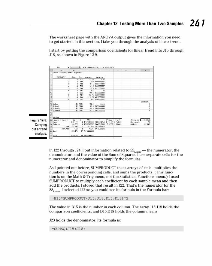
241 Chapter 12: Testing More Than Two Samples
The worksheet page with the ANOVA output gives the information you need
to get started. In this section, I take you through the analysis of linear trend.
I start by putting the comparison coefficients for linear trend into J15 through
J18, as shown in Figure 12-9.
Figure 12-9: Carrying
out a trend analysis.
In J22 through J24, I put information related to SSLinear
— the numerator, the
denominator, and the value of the Sum of Squares. I use separate cells for the
numerator and denominator to simplify the formulas.
As I pointed out before, SUMPRODUCT takes arrays of cells, multiplies the
numbers in the corresponding cells, and sums the products. (This func-
tion is on the Math & Trig menu, not the Statistical Functions menu.) I used
SUMPRODUCT to multiply each coefficient by each sample mean and then
add the products. I stored that result in J22. That’s the numerator for the
SSLinear
. I selected J22 so you could see its formula in the Formula bar:
=B15*SUMPRODUCT(J15:J18,D15:D18)^2
The value in B15 is the number in each column. The array J15:J18 holds the
comparison coefficients, and D15:D18 holds the column means.
J23 holds the denominator. Its formula is:
=SUMSQ(J15:J18)
18 454060-ch12.indd 24118 454060-ch12.indd 241 4/21/09 7:31:39 PM4/21/09 7:31:39 PM

242 Part III: Drawing Conclusions from Data
SUMSQ (another function on the Math & Trig Functions menu) squares the
coefficients in J15:J18 and adds them.
J24 holds the value for SSLinear
. That’s J22 divided by J23.
Figure 12-9 shows that in the ANOVA table I’ve inserted two rows above
the row for Error. One row holds the SS, df, MS, F, P-Value and critical F for
Linear, the other holds these values for Nonlinear. SSNonlinear
in B26 is B24-B25.
The F for Linear is D25 divided by D27. The formula for the P-Value in F25 is
=FDIST(E25,C25,C27)
The first argument, E25, is the F. The second and third arguments are the df.
The formula for the critical F in F25 is
=FINV(0.05,C25,C27)
The first argument is α, and the second and third are the df.
18 454060-ch12.indd 24218 454060-ch12.indd 242 4/21/09 7:31:39 PM4/21/09 7:31:39 PM

Chapter 13
Slightly More Complicated TestingIn This Chapter▶ Working with two variables
▶ Working with replications
▶ Understanding interactions
In Chapter 11, I show you how to test hypotheses with two samples. In
Chapter 12, I show you how to test hypotheses when you have more than
two samples. The common thread through both chapters is that one indepen-
dent variable (also called a factor) is involved.
Many times, you have to test the effects of more than one factor. In this
Chapter, I show how to analyze two factors within the same set of data.
Several types of situations are possible, and I describe Excel data analysis
tools that deal with each one.
Cracking the CombinationsFarKlempt Robotics, Inc., manufactures battery-powered robots. They want
to test three rechargeable batteries for these robots on a set of three tasks —
climbing, walking, and assembling. Which combination of battery and task
results in the longest battery life?
They test a sample of nine robots. They randomly assign each robot one bat-
tery and one type of task. FarKlempt tracks the number of days each robot
works before recharging. The data are in Table 13-1.
19 454060-ch13.indd 24319 454060-ch13.indd 243 4/21/09 7:33:07 PM4/21/09 7:33:07 PM

244 Part III: Drawing Conclusions from Data
Table 13-1 FarKlempt Robots: Number of Days before Recharging in Three Tasks with Three BatteriesTask Battery 1 Battery 2 Battery 3 Average
Climbing 12 15 20 15.67
Walking 14 16 19 16.33
Assembling 11 14 18 14.33
Average 12.33 15.00 19.00 15.44
This calls for two hypothesis tests:
H0: μ
Battery1 = μ
Battery2 = μ
Battery3
H1: Not H
0
and
H0: μ
Climbing = μ
Walking = μ
Assembling
H1: Not H
0
In both tests, set α = .05.
Breaking down the variancesThe appropriate analysis for these tests is an analysis of variance (ANOVA).
Each variable — Batteries and Tasks — is also called a factor. So this analysis
is called a two-factor ANOVA.
To understand this ANOVA, consider the variances inside the data. First,
focus on the variance in the whole set of nine numbers — MST. (“T” in the
subscript stands for “Total.”) The mean of those numbers is 15.44. Because
it’s the mean of all the numbers, it goes by the name grand mean.
This variance is
19 454060-ch13.indd 24419 454060-ch13.indd 244 4/21/09 7:33:07 PM4/21/09 7:33:07 PM

245 Chapter 13: Slightly More Complicated Testing
The means of the three batteries (the column means) also vary from 15.44.
That variance is
Why does the 3 appear as a multiplier of each squared deviation? When you
deal with means, you have to take into account the number of scores that
produced each mean.
Similarly, the means of the tasks (the row means) vary from 15.44:
One variance is left. It’s called MSError
. This is what remains when you sub-
tract the SSBatteries
and the SSTasks
from the SST, and divide that by the df that
remains when you subtract dfBatteries
and dfTasks
from dfT:
To test the hypotheses, you calculate one F for the effects of the batteries and
another for the effects of the tasks. For both, the denominator (the so-called
“error term”) is MSError
:
Each F has 2 and 4 degrees of freedom. With α = .05, the critical F in each
case is 6.94. The decision is to reject H0 for the batteries (they differ from one
another to an extent greater than chance), but not for the tasks.
To zero in on the differences for the batteries, you carry out planned com-
parisons among the column means. (See Chapter 12 for the details.)
19 454060-ch13.indd 24519 454060-ch13.indd 245 4/21/09 7:33:07 PM4/21/09 7:33:07 PM

246 Part III: Drawing Conclusions from Data
Data analysis tool: Anova: Two-Factor Without ReplicationExcel’s Anova: Two-Factor Without Replication tool carries out the analysis
I just outlined. (I used this tool for another type of analysis in Chapter 12.)
Without Replication means that only one robot is assigned to each battery-
task combination. If you assign more than one to each combination, that’s
replication.
Figure 13-1 shows this tool’s dialog box along with the data for the batteries-
tasks example.
Figure 13-1: The Anova: Two Factor
Without Replication
data analysis
tool dialog box along
with the batteries-
tasks data.
The steps for using this tool are:
1. Enter the data into the worksheet, and include labels for the rows and
columns.
For this example, the labels for the tasks are in cells B4, B5, and B6. The
labels for the batteries are in cells C3, D3, and E3. The data are in cells
C4 through E6.
2. Select Data | Data Analysis to open the Data Analysis dialog box.
3. In the Data Analysis dialog box, scroll down the Analysis Tools list
and select Anova: Two Factor Without Replication. Click OK to open
the select Anova: Two Factor Without Replication dialog box.
This is the dialog box in Figure 13-1.
4. In the Input Range box, enter the cell range that holds all the data.
For the example, the data range is $B$3:$E$6. Note the $-signs for abso-
lute referencing. Note also — and this is important — the row labels are
19 454060-ch13.indd 24619 454060-ch13.indd 246 4/21/09 7:33:07 PM4/21/09 7:33:07 PM

247 Chapter 13: Slightly More Complicated Testing
part of the data range. The column labels are, too. The first cell in the
data range, B2, is blank, but that’s OK.
5. If the cell ranges include column headings, select the Labels option.
I included the headings in the ranges, so I checked the box.
6. The Alpha box has 0.05 as a default. Change that value if you want a
different α.
7. In the Output Options, select a radio button to indicate where you
want the results.
I selected New Worksheet Ply to put the results on a new page in the
worksheet.
8. Click OK.
Because I selected New Worksheet Ply, a newly created page opens with
the results.
Figure 13-2 shows the tool’s output, after I expanded the columns. The output
features two tables, SUMMARY and ANOVA.
The SUMMARY table is in two parts. The first part provides summary statistics
for the rows. The second part provides summary statistics for the columns.
Summary statistics include the number of scores in each row and in each
column along with the sums, means, and variances.
The ANOVA table presents the Sums of Squares, df, Mean Squares, F, P-values,
and critical F for the indicated df. The table features two values for F. One F is
for the rows, the other for the columns. The P-value is the proportion of area
that the F cuts off in the upper tail of the F-distribution. If this value is less than
.05, reject H0.
In this example, the decisions are to reject H0 for the batteries (the columns)
and to not reject H0 for the tasks (the rows).
Figure 13-2: Output from the Anova:
Two Factor Without
Replication data analy-
sis tool.
19 454060-ch13.indd 24719 454060-ch13.indd 247 4/21/09 7:33:07 PM4/21/09 7:33:07 PM

248 Part III: Drawing Conclusions from Data
Cracking the Combinations AgainThe analysis I just showed you involves one score for each combination of
the two factors. Assigning one individual to each combination is appropriate
for robots and other manufactured objects, where you can assume that one
object is pretty much the same as another.
When people are involved, it’s a different story. Individual variation among
humans is something you can’t overlook. For this reason, it’s necessary to
assign a sample of people to a combination of factors — not just one person.
Rows and columnsI illustrate with an example. Imagine that a company has two methods of
presenting its training information. One is via a person who presents the
information orally, the other is via a text. Imagine also that the information is
presented in either a humorous way or in a technical way. I refer to the first
factor as Presentation Method and to the second as Presentation Style.
Combining the two levels of Presentation Method with the two levels of
Presentation Style gives four combinations. The company randomly assigns
4 people to each combination, for a total of 16 people. After providing the
training, they test the 16 people on their comprehension of the material.
Figure 13-3 shows the combinations, the four comprehension scores within
each combination, and summary statistics for the combinations, rows, and
columns.
Figure 13-3: Combining
the levels of Presentation Method with the levels of Presentation
Style.
Presentation StyleHumorous
PresentationMethod
Spoken
Mean = 57.25Variance = 12.92
Mean = 24.25Variance = 12.92
Mean = 29.25Variance = 12.25
Mean = 68.50Variance = 12.33
Mean = 40.75
Mean = 48.88
Mean = 46.38 Grand Mean =44.81
Mean = 43.25
Spokenand
Humorous
54556268
Spokenand
Technical
22212925
Textand
Humorous
33252831
Textand
Technical
66657172
Text
Technical
19 454060-ch13.indd 24819 454060-ch13.indd 248 4/21/09 7:33:08 PM4/21/09 7:33:08 PM

249 Chapter 13: Slightly More Complicated Testing
Here are the hypotheses:
H0: μ
Spoken = μ
Text
H1: Not H
0
and
H0: μ
Humorous = μ
Technical
H1: Not H
0
Because the two presentation methods (Spoken and Text) are in the rows,
I refer to Presentation Type as the row factor. The two presentation styles
(Humorous and Technical) are in the columns, so Presentation Style is the
column factor.
InteractionsWhen you have rows and columns of data, and you’re testing hypotheses
about the row factor and the column factor, you have an additional consid-
eration. Namely, you have to be concerned about the row-column combina-
tions. Do the combinations result in peculiar effects?
For the example I presented, it’s possible that combining Spoken and Text
with Humorous and Technical yields something unexpected. In fact, you can
see that in the data in Figure 13-3: For Spoken presentation, the Humorous
style produces a higher average than the Technical style. For Text presenta-
tion, the Humorous style produces a lower average than the Technical style.
A situation like that is called an interaction. In formal terms, an interaction
occurs when the levels of one factor affect the levels of the other factor dif-
ferently. The label for the interaction is row factor × column factor, so for this
example that’s Method × Type.
The hypotheses for this are:
H0: Presentation Method does not interact with Presentation Style
H1: Not H
0
19 454060-ch13.indd 24919 454060-ch13.indd 249 4/21/09 7:33:08 PM4/21/09 7:33:08 PM

250 Part III: Drawing Conclusions from Data
The analysisThe statistical analysis, once again, is an analysis of variance (ANOVA). As is
the case with the other ANOVAs I showed you, it depends on the variances in
the data.
The first variance is the total variance, labeled MST. That’s the variance of all
16 scores around their mean (the “grand mean”), which is 44.81:
The denominator tells you that df = 15 for MST.
The next variance comes from the row factor. That’s MSMethod
, and it’s the
variance of the row means around the grand mean:
The 8 multiplies each squared deviation because you have to take into
account the number of scores that produced each row mean. The df for
MSMethod
is the number of rows – 1, which is 1.
Similarly, the variance for the column factor is
The df for MSStyle
is 1 (the number of columns – 1).
Another variance is the pooled estimate based on the variances within the
four row-column combinations. It’s called the MSWithin
, or MSW
. (For details on
MSw and pooled estimates, see Chapter 12.). For this example,
This one is the error term (the denominator) for each F that you calculate. Its
denominator tells you that df = 12 for this MS.
19 454060-ch13.indd 25019 454060-ch13.indd 250 4/21/09 7:33:08 PM4/21/09 7:33:08 PM

251 Chapter 13: Slightly More Complicated Testing
The last variance comes from the interaction between the row factor and the
column factor. In this example, it’s labeled MSMethod X Type
. You can calculate
this a couple of ways. The easiest way is to take advantage of this general
relationship:
And this one:
Another way to calculate this is
The MS is
For this example,
To test the hypotheses, you calculate three Fs:
For df = 1 and 12, the critical F at α = .05 is 4.75. (You can use the Excel
function FINV to verify.). The decision is to reject H0 for the Presentation
Method and for the Method × Style interaction, and to not reject H0 for the
Presentation Style.
19 454060-ch13.indd 25119 454060-ch13.indd 251 4/21/09 7:33:08 PM4/21/09 7:33:08 PM

252 Part III: Drawing Conclusions from Data
Data analysis tool: Anova: Two-Factor With ReplicationExcel provides a data analysis tool that handles everything. This one is called
Anova: Two-Factor With Replication. “Replication” means you have more
than one score in each row-column combination.
Figure 13-4 shows this tool’s dialog box along with the data for the batteries-
tasks example.
Figure 13-4: The Anova: Two Factor
With Replication
data analysis
tool dialog box along
with the type-method
data.
The steps for using this tool are:
1. Enter the data into the worksheet and include labels for the rows and
columns.
For this example, the labels for the presentation methods are in cells B3
and B7. The presentation types are in cells C2 and D2. The data are in
cells C3 through D10.
2. Select Data | Data Analysis to open the Data Analysis dialog box.
3. In the Data Analysis dialog box, scroll down the Analysis Tools list
and select Anova: Two Factor With Replication. Click OK to open the
select Anova: Two Factor With Replication dialog box.
This is the dialog box in Figure 13-4.
19 454060-ch13.indd 25219 454060-ch13.indd 252 4/21/09 7:33:09 PM4/21/09 7:33:09 PM

253 Chapter 13: Slightly More Complicated Testing
4. In the Input Range box, type the cell range that holds all the data.
For the example, the data are in $B$2:$D$10. Note the $-signs for abso-
lute referencing. Note also — again, this is important — the labels for
the row factor (presentation method) are part of the data range. The
labels for the column factor are part of the range, too. The first cell in
the range, B2, is blank, but that’s OK.
5. If the cell ranges include column headings, select the Labels option.
I included the headings in the ranges, so I checked the box.
6. The Alpha box has 0.05 as a default. Change that value if you want a
different α.
7. In the Output Options, select a radio button to indicate where you
want the results.
I selected New Worksheet Ply to put the results on a new page in the
worksheet.
8. Click OK.
Because I selected New Worksheet Ply, a newly created page opens with
the results.
Figure 13-5 shows the tool’s output, after I expanded the columns. The output
features two tables, SUMMARY and ANOVA.
The SUMMARY table is in two parts. The first part provides summary statis-
tics for the factor combinations and for the row factor. The second part pro-
vides summary statistics for the column factor. Summary statistics include
the number of scores in each row-column combination, in each row, and in
each column along with the counts, sums, means, and variances.
The ANOVA table presents the Sums of Squares, df, Mean Squares, F,
P-values, and critical F for the indicated df. The table features three values
for F. One F is for the row factor, one for the column factor, and one for the
interaction. In the table, the row factor is called Sample. The P-value is the
proportion of area that the F cuts off in the upper tail of the F-distribution.
If this value is less than .05, reject H0.
In this example, the decisions are to reject H0 for the Presentation Method
(the row factor, labeled Sample in the table), to not reject H0 for the
Presentation Style (the column factor), and to reject H0 for the interaction.
19 454060-ch13.indd 25319 454060-ch13.indd 253 4/21/09 7:33:09 PM4/21/09 7:33:09 PM
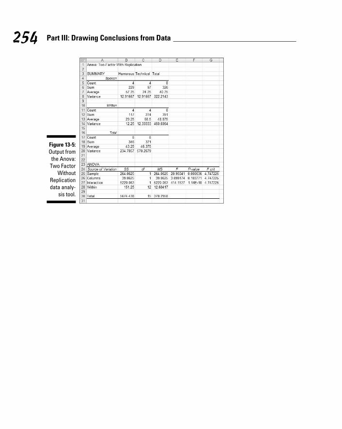
254 Part III: Drawing Conclusions from Data
Figure 13-5: Output from the Anova:
Two Factor Without
Replication data analy-
sis tool.
19 454060-ch13.indd 25419 454060-ch13.indd 254 4/21/09 7:33:09 PM4/21/09 7:33:09 PM

Chapter 14
Regression: Linear and MultipleIn This Chapter▶ Summarizing a relationship
▶ Working with regression
▶ Hypothesis testing and regression
▶ Balancing many relationships
One of the main things you do when you work with statistics is make
predictions. The idea is to take data on one or more variables, and
use these data to predict a value of another variable. To do this, you have
to understand how to summarize relationships among variables, and to test
hypotheses about those relationships.
In this chapter, I introduce regression, a statistical way to do just that.
Regression also enables you to use the details of relationships to make pre-
dictions. First, I show you how to analyze the relationship between one vari-
able and another. Then I show you how to analyze the relationship between a
variable and two others. These analyses involve a good bit of calculation, and
Excel is more than equal to the task.
The Plot of ScatterSahutsket University is an exciting, dynamic institution. Every year, the
school receives thousands of applications. One challenge the Admissions
Office faces is this: Applicants want the Office to predict what their GPAs
(grade-point averages on a 4.0 scale) will be if they attend Sahutsket.
What’s the best prediction? Without knowing anything about an applicant,
and only knowing its own students’ GPAs, the answer is clear: It’s the aver-
age GPA at Sahutsket U. Regardless of who the applicant is, that’s all the
Admissions Office can say if its knowledge is limited.
20 454060-ch14.indd 25520 454060-ch14.indd 255 4/21/09 7:33:50 PM4/21/09 7:33:50 PM

256 Part III: Drawing Conclusions from Data
With more knowledge about the students and about the applicants, a more
accurate prediction becomes possible. For example, if Sahutsket keeps
records on its students’ SAT scores (Verbal and Math combined), the
Admissions Office can match up each student’s GPA with his or her SAT
score and see if the two pieces of data are somehow related. If they are,
an applicant can supply his or her SAT score, and the Admissions Office
can use that score to help make a prediction.
Figure 14-1 shows the GPA-SAT matchup in a graphic way. Because the points
are scattered, it’s called a scatterplot. By convention, the vertical axis (the
y-axis) represents what you’re trying to predict. That’s also called the depen-dent variable or the y-variable. In this case, that’s GPA. Also by convention,
the horizontal axis (the x-axis) represents what you’re using to make your
prediction. That’s also called the independent variable or the x-variable. Here,
that’s SAT.
Figure 14-1: SATs and
GAPs in the Sahutsket University
student body.
SAT
GPA
900 1100 1300 1500
4.0
3.5
3.0
2.5
2.0
1.5
Average GPASAT =1000GPA = 2.5
Each point in the graph represents an individual student’s GPA and SAT. In
a real scatterplot of a university student body, you’d see many more points
than I show here. The general tendency of the set of points seems to be that
high SAT scores are associated with high GPAs and low SAT scores are asso-
ciated with low GPAs.
I singled out one of the points. It shows a Sahutsket student with an SAT
score of 1000 and a GPA of 2.5. I also show the average GPA to give you a
sense that knowing the GPA-SAT relationship provides an advantage over
just knowing the mean.
20 454060-ch14.indd 25620 454060-ch14.indd 256 4/21/09 7:33:51 PM4/21/09 7:33:51 PM

257 Chapter 14: Regression: Linear and Multiple
How do you make that advantage work for you? You start by summarizing
the relationship between SAT and GPA. The summary is a line through the
points. How and where do you draw the line?
I’ll get to that in a minute. First, I have to tell you about lines in general.
Graphing LinesIn the world of mathematics, a line is a way to picture a relationship between
an independent variable (x) and a dependent variable (y). In this relationship
every time I supply a value for x, I can figure out the corresponding value for y.
The equation says to take the x-value, multiply by 2, and then add 3.
If x = 1, for example, y = 6. If x =2, y = 8. Table 14-1 shows a number of x-y pairs
in this relationship, including the pair in which x = 0.
Table 14-1 x-y Pairs in y = 4+ 2xx y
0 4
1 6
2 8
3 10
4 12
5 14
6 16
Figure 14-2 shows these pairs as points on a set of x-y axes, along with a line
through the points. Each time I list an x-y pair in parentheses, the x-value is
first.
As the Figure shows, the points fall neatly onto the line. The line graphs the
equation y = 4 + 2x. In fact, whenever you have an equation like this, where x
isn’t squared or cubed or raised to any power higher than 1, you have what
mathematicians call a linear equation. (If x is raised to a higher power than
one, you connect the points with a curve, not a line.)
20 454060-ch14.indd 25720 454060-ch14.indd 257 4/21/09 7:33:51 PM4/21/09 7:33:51 PM

258 Part III: Drawing Conclusions from Data
Figure 14-2: The graph
for y = 4 + 2x.
0
2
4
6
8
10
12
14
16
18
0 1 2 3 4 5 6
(0,4)
(1,6)
(2,8)
(3,10)
(4,12)
(5,14)(6,16)
x
y
A couple of things to keep in mind about a line: You can describe a line in
terms of how slanted it is, and where it runs into the y-axis.
The how-slanted-it-is part is called the slope. The slope tells you how much y
changes when x changes by 1 unit. In the line in Figure 14-2, when x changes
by 1 (from 4 to 5, for example) y changes by 2 (from 12 to 14).
The where-it-runs-into-the-y-axis part is called the y-intercept (or sometimes
just the intercept). That’s the value of y when x = 0. In Figure 14-2 the y-inter-
cept is 4.
You can see these numbers in the equation. The slope is the number that
multiplies x and the intercept is the number you add to x. In general,
where a represents the intercept and b represents the slope.
The slope can be a positive number, a negative number, or zero. In Figure 14-2,
the slope is positive. If the slope is negative, the line is slanted in a direc-
tion opposite to what you see in Figure 14-2. A negative slope means that
y decreases as x increases. If the slope is zero, the line is parallel to the hori-
zontal axis. If the slope is zero, y doesn’t change as x changes.
The same applies to the intercept — it can be a positive number, a negative
number, or zero. If the intercept is positive, the line cuts off the y-axis above
the x-axis. If the intercept is negative, the line cuts off the y-axis below the
20 454060-ch14.indd 25820 454060-ch14.indd 258 4/21/09 7:33:51 PM4/21/09 7:33:51 PM

259 Chapter 14: Regression: Linear and Multiple
x-axis. If the intercept is zero, it intersects with the y-axis and the x-axis, at
the point called the origin.
And now, back to what I was originally talking about.
Regression: What a Line!Before I began telling you about lines, equations, slopes, and intercepts, I
mentioned that a line is the best way to summarize the relationship in the
scatterplot in Figure 14-1. It’s possible to draw an infinite amount of straight
lines through the scatterplot. Which one best summarizes the relationship?
Intuitively, the “best fitting” line ought to be the one that goes through the
maximum number of points and isn’t too far away from the points it doesn’t
go through. For statisticians, that line has a special property: If you draw that
line through the scatterplot, then draw distances (in the vertical direction)
between the points and the line, and then square those distances and add
them up, the sum of the squared distances is a minimum.
Statisticians call this line the regression line, and indicate it as
Each y’ is a point on the line. It represents the best prediction of y for a given
value of x.
To figure out exactly where this line is, you calculate its slope and its intercept.
For a regression line, the slope and intercept are called regression coefficients.
The formulas for the regression coefficients are pretty straightforward. For
the slope, the formula is
The intercept formula is
I illustrate with an example. To keep the numbers manageable and compre-
hensible, I use a small sample instead of the thousands of students you’d
find in a scatterplot of an entire university student body. Table 14-2 shows a
sample of data from 20 Sahusket University students.
20 454060-ch14.indd 25920 454060-ch14.indd 259 4/21/09 7:33:51 PM4/21/09 7:33:51 PM

260 Part III: Drawing Conclusions from Data
Table 14-2 SAT Scores and GPAs for 20 Sahusket University StudentsStudent SAT GPA
1 990 2.2
2 1150 3.2
3 1080 2.6
4 1100 3.3
5 1280 3.8
6 990 2.2
7 1110 3.2
8 920 2.0
9 1000 2.2
10 1200 3.6
11 1000 2.1
12 1150 2.8
13 1070 2.2
14 1120 2.1
15 1250 2.4
16 1020 2.2
17 1060 2.3
18 1550 3.9
19 1480 3.8
20 1010 2.0
Mean 1126.5 2.705
Variance 26171.32 0.46
Standard Deviation 161.78 0.82
For this set of data, the slope of the regression line is
The intercept is
20 454060-ch14.indd 26020 454060-ch14.indd 260 4/21/09 7:33:51 PM4/21/09 7:33:51 PM

261 Chapter 14: Regression: Linear and Multiple
So the equation of the best fitting line through these 20 points is
or in terms of GPAs and SATs
Using regression for forecastingBased on this sample and this regression line, you can take an applicant’s
SAT score, say 1230, and predict the applicant’s GPA:
Without this rule, the only prediction is the mean GPA, 2.705.
Variation around the regression lineIn Chapter 5, I describe how the mean doesn’t tell the whole story about a
set of data. You have to show how the scores vary around the mean. For that
reason, I introduce the variance and standard deviation.
You have a similar situation here. To get the full picture of the relationship in
a scatterplot, you have to show how the scores vary around the regression
line. Here, I introduce the residual variance and standard error of estimate,
which are analogous to the variance and the standard deviation.
The residual variance is sort of an average of the squared deviations of the
observed y-values around the predicted y-values. Each deviation of a data
point from a predicted point (y - y’) is called a residual, hence the name. The
formula is
I said “sort of” because the denominator is N-2, rather than N. The reason for
the -2 is beyond our scope. As I’ve said before, the denominator of a variance
estimate is degrees of freedom (df), and that concept comes in handy in a
little while.
20 454060-ch14.indd 26120 454060-ch14.indd 261 4/21/09 7:33:51 PM4/21/09 7:33:51 PM

262 Part III: Drawing Conclusions from Data
The standard error of estimate is
To show you how the residual error and the standard error of estimate play
out for the data in the example, here’s Table 14-3. This table extends Table 14-2
by showing the predicted GPA for each SAT:
Table 14-3 SAT Scores, GPAs, and Predicted GPAs for 20 Sahusket University StudentsStudent SAT GPA Predicted GPA
1 990 2.2 2.24
2 1150 3.2 2.79
3 1080 2.6 2.55
4 1100 3.3 2.61
5 1280 3.8 3.23
6 990 2.2 2.24
7 1110 3.2 2.65
8 920 2.0 2.00
9 1000 2.2 2.27
10 1200 3.6 2.96
11 1000 2.1 2.27
12 1150 2.8 2.79
13 1070 2.2 2.51
14 1120 2.1 2.68
15 1250 2.4 3.13
16 1020 2.2 2.34
17 1060 2.3 2.48
18 1550 3.9 4.16
19 1480 3.8 3.92
20 1010 2.0 2.31
Mean 1126.5 2.705
Variance 26171.32 0.46
Standard Deviation
161.78 0.82
20 454060-ch14.indd 26220 454060-ch14.indd 262 4/21/09 7:33:52 PM4/21/09 7:33:52 PM

263 Chapter 14: Regression: Linear and Multiple
As the table shows, sometimes the predicted GPA is pretty close, sometimes
it’s not. One predicted value (4.16) is impossible.
For these data, the residual variance is
The standard error of estimate is
If the residual variance and the standard error of estimate are small, the
regression line is a good fit to the data in the scatterplot. If the residual vari-
ance and the standard error of estimate are large, the regression line is a
poor fit.
What’s “small”? What’s “large”? What’s a “good” fit?
Keep reading.
Testing hypotheses about regressionThe regression equation I’ve been working with
summarizes a relationship in a scatterplot of a sample. The regression coef-
ficients a and b are sample statistics. You can use these statistics to test
hypotheses about population parameters, and that’s what I do in this section.
The regression line through the population that produces the sample (like
the entire Sahutsket University student body, past and present) is the graph
of an equation that consists of parameters, rather than statistics. By conven-
tion, remember, Greek letters stand for parameters, so the regression equa-
tion for the population is
The first two Greek letters on the right are α (alpha) and β (beta), the equiva-
lents of a and b. What about that last one? It looks something like the Greek
equivalent of e. What’s it doing there?
20 454060-ch14.indd 26320 454060-ch14.indd 263 4/21/09 7:33:52 PM4/21/09 7:33:52 PM
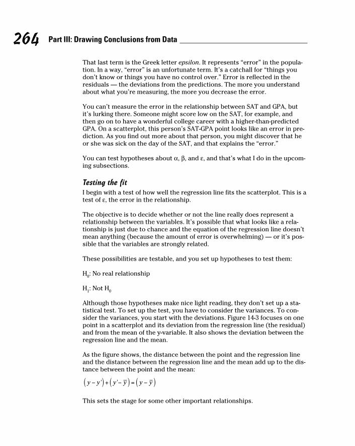
264 Part III: Drawing Conclusions from Data
That last term is the Greek letter epsilon. It represents “error” in the popula-
tion. In a way, “error” is an unfortunate term. It’s a catchall for “things you
don’t know or things you have no control over.” Error is reflected in the
residuals — the deviations from the predictions. The more you understand
about what you’re measuring, the more you decrease the error.
You can’t measure the error in the relationship between SAT and GPA, but
it’s lurking there. Someone might score low on the SAT, for example, and
then go on to have a wonderful college career with a higher-than-predicted
GPA. On a scatterplot, this person’s SAT-GPA point looks like an error in pre-
diction. As you find out more about that person, you might discover that he
or she was sick on the day of the SAT, and that explains the “error.”
You can test hypotheses about α, β, and ε, and that’s what I do in the upcom-
ing subsections.
Testing the fitI begin with a test of how well the regression line fits the scatterplot. This is a
test of ε, the error in the relationship.
The objective is to decide whether or not the line really does represent a
relationship between the variables. It’s possible that what looks like a rela-
tionship is just due to chance and the equation of the regression line doesn’t
mean anything (because the amount of error is overwhelming) — or it’s pos-
sible that the variables are strongly related.
These possibilities are testable, and you set up hypotheses to test them:
H0: No real relationship
H1: Not H
0
Although those hypotheses make nice light reading, they don’t set up a sta-
tistical test. To set up the test, you have to consider the variances. To con-
sider the variances, you start with the deviations. Figure 14-3 focuses on one
point in a scatterplot and its deviation from the regression line (the residual)
and from the mean of the y-variable. It also shows the deviation between the
regression line and the mean.
As the figure shows, the distance between the point and the regression line
and the distance between the regression line and the mean add up to the dis-
tance between the point and the mean:
This sets the stage for some other important relationships.
20 454060-ch14.indd 26420 454060-ch14.indd 264 4/21/09 7:33:52 PM4/21/09 7:33:52 PM

265 Chapter 14: Regression: Linear and Multiple
Figure 14-3: The devia-
tions in a scatterplot.
x
y
( ')y y
( ' )y y
( )y y
( , )x y
( , ')x y
y( , )x y
Start by squaring each deviation. That gives you , , and .
If you add up each of the squared deviations, you have
I just showed you this one. That’s the numerator for the residual variance.
It represents the variability around the regression line— the “error” I spoke
of earlier. In the terminology of Chapter 12, the numerator of a variance is
called a Sum of Squares, or SS. So this is SSResidual
.
This one is new. The deviation represents the gain in prediction due
to using the regression line rather than the mean. The sum reflects this gain,
and is called SSRegression
.
I showed you this one in Chapter 5 — although I used x rather than y. That’s
the numerator of the variance of y. In Chapter 12 terms, it’s the numerator of
total variance. This one is SSTotal
.
This relationship holds among these three sums:
20 454060-ch14.indd 26520 454060-ch14.indd 265 4/21/09 7:33:53 PM4/21/09 7:33:53 PM

266 Part III: Drawing Conclusions from Data
Each one is associated with a value for degrees of freedom — the denomi-
nator of a variance estimate. As I pointed out in the previous section, the
denominator for SSResidual
is N-2. The df for SSTotal
is N-1 (see Chapter 5 and
Chapter 12). As with the SS, the degrees of freedom add up:
This leaves one degree of freedom for Regression.
Where is this all headed, and what does it have to do with hypothesis test-
ing? Well, since you asked, you get variance estimates by dividing SS by
df. Each variance estimate is called a Mean Square, abbreviated MS (again,
Chapter 12):
Now for the hypothesis part. If H0 is true and what looks like a relationship
between x and y is really no big deal, the piece that represents the gain in
prediction because of the regression line (MSRegression
) should be no greater
than the variability around the regression line (MSResidual
). If H0 is not true,
and the gain in prediction is substantial, then MSRegression
should be a lot
bigger than MSResidual
.
So the hypotheses now set up as
H0: σ2
Regression ≤ σ2
Residual
H1: σ2
Regression > σ2
Residual
These are hypotheses you can test. How? To test a hypothesis about two
variances, you use an F test (Chapter 11). The test statistic here is
To show you how it all works, I apply the formulas to the Sahusket example.
The MSResidual
is the same as syx
2 from the preceding section, and that value is
0.16. The MSRegression
is
20 454060-ch14.indd 26620 454060-ch14.indd 266 4/21/09 7:33:53 PM4/21/09 7:33:53 PM

267 Chapter 14: Regression: Linear and Multiple
This sets up the F:
With 1 and 18 df and α = .05, the critical value of F is 4.41. (You can use the
worksheet function FINV to verify.) The calculated F is greater than the criti-
cal F, so the decision is to reject H0. That means the regression line provides
a good fit to the data in the sample.
Testing the slopeAnother question that arises in linear regression is whether or not the slope
of the regression line is significantly different from zero. If it’s not, the mean
is just as good a predictor as the regression line.
The hypotheses for this test are:
H0: β ≤ 0
H1: β > 0
The statistical test is t, which I discuss in Chapters 9, 10, and 11 in connection
with means. The t-test for the slope is
with df = N-2. The denominator estimates the standard error of the slope.
This term sounds more complicated than it is. The formula is:
where sx is the standard deviation of the x-variable. For the data in the example
The actual value is 6.00. Rounding syx
and sb to a manageable number of deci-
mal places before calculating results in 5.96. Either way, this is larger than
the critical value of t for 18 df and α = .05 (2.10), so the decision is to reject
H0. This example, by the way, shows why it’s important to test hypotheses.
20 454060-ch14.indd 26720 454060-ch14.indd 267 4/21/09 7:33:54 PM4/21/09 7:33:54 PM

268 Part III: Drawing Conclusions from Data
The slope, 0.0034 looks like a very small number. (Possibly because it is a
very small number.) Still, it’s big enough to reject H0 in this case.
Testing the intercept For completeness, I include the hypothesis test for the intercept. I doubt you’ll
have much use for it, but it appears in the output of some of Excel’s regression-
related capabilities. I want you to understand all aspects of that output (which
I tell you about in a little while), so here it is.
The hypotheses are
H0: α = 0
H1: α ≠ 0
The test, once again, is a t-test. The formula is
The denominator is the estimate of the standard error of the intercept.
Without going into detail, the formula for sa is
where sx is the standard deviation of the x-variable, s
x2 is the variance of the
x-variable, and is the squared mean of the x-variable. Applying this formula
to the data in the example,
The t-test is
With 18 degrees of freedom, and the probability of a Type I error at .05, the
critical t is 2.45 for a two-tailed test. It’s a two-tailed test because H1 is that
20 454060-ch14.indd 26820 454060-ch14.indd 268 4/21/09 7:33:54 PM4/21/09 7:33:54 PM

269 Chapter 14: Regression: Linear and Multiple
the intercept doesn’t equal zero — it doesn’t specify whether the intercept is
greater than zero or less than zero. Because the calculated value isn’t more
negative than the negative critical value, the decision is to not reject H0.
Worksheet Functions for RegressionExcel is a big help for computation-intensive work like linear regression. An
assortment of functions and data analysis tools makes life a lot easier. In this
section, I concentrate on the worksheet functions and on two array functions.
Figure 14-4 shows the data I use to illustrate each function. The data are GPA
and SAT scores for 20 students in the example I showed you earlier. As the
figure shows, the SAT scores are in C3:C22 and the GPAs are in D3:D22. The
SAT is the x-variable and GPA is the y-variable.
To clarify what the functions do, I defined names for the data arrays. I defined
SAT as the name for C3:C22 and I defined GPA as the name for D3:D22. That
way, I can use those names in the arguments for the functions. If you don’t
remember how to define a name for an array, go back to Chapter 2.
Figure 14-4: Data for the regression-
related worksheet functions.
SLOPE, INTERCEPT, STEYXThese three functions work the same way, so I give a general description and
provide details as necessary for each function.
20 454060-ch14.indd 26920 454060-ch14.indd 269 4/21/09 7:33:54 PM4/21/09 7:33:54 PM

270 Part III: Drawing Conclusions from Data
1. With the data entered, select a cell.
2. From the Statistical Functions menu, select a regression function to
open its Function Arguments dialog box.
• To calculate the slope of a regression line through the data, select
SLOPE.
• To calculate the intercept, select INTERCEPT.
• To calculate the standard error of estimate, select STEYX.
Figures 14-5, 14-6, and 14-7 show the Function Arguments dialog boxes
for these three functions.
3. In the Function Arguments dialog box, enter the appropriate values
for the arguments.
In the Known_y’s box, I entered the name for the cell range that holds
the scores for the y-variable. For this example, that’s GPA (defined as
the name for C3:C22).
In the Known_x’s box, I entered the name for the cell range that holds
the scores for the x-variable. For this example, it’s SAT (defined as the
name for D3:D22). After I enter this name, the answer appears in the
dialog box.
• SLOPE’s answer is .00342556 (Figure 14-5).
• INTERCEPT’s answer is –1.153832541 (Figure 14-6).
• STEYX’s answer is 0.402400043 (Figure 14-7).
4. Click OK to put the answer into the selected cell.
Figure 14-5: The
Function Arguments dialog box for SLOPE.
20 454060-ch14.indd 27020 454060-ch14.indd 270 4/21/09 7:33:54 PM4/21/09 7:33:54 PM

271 Chapter 14: Regression: Linear and Multiple
Figure 14-6: The
Function Arguments
dialog box for
INTERCEPT.
Figure 14-7: The
Function Arguments dialog box for STEYX.
FORECASTThis one is a bit different from the preceding three. In addition to the col-
umns for the x-and-y variables, for FORECAST, you supply a value for x
and the answer is a prediction based on the linear regression relationship
between the x-variable and the y-variable.
Figure 14-8 shows the Function Arguments dialog box for FORECAST. In the
X box, I entered 1290. For this SAT, the figure shows the predicted GPA is
3.265070236.
Figure 14-8: The
Function Arguments
dialog box for
FORECAST.
20 454060-ch14.indd 27120 454060-ch14.indd 271 4/21/09 7:33:55 PM4/21/09 7:33:55 PM

272 Part III: Drawing Conclusions from Data
Array function: TRENDTREND is a versatile function. You can use TREND to generate a set of pre-
dicted y-values for the x-values in the sample.
You can also supply a new set of x-values and generate a set of predicted
y-values, based on the linear relationship in your sample. It’s like applying
FORECAST repeatedly in one fell swoop.
In this section, I go through both uses.
Predicting y’s for the x’s in your sampleFirst, I use TREND to predict GPAs for the 20 students in the sample.
Figure 14-9 shows TREND set up to do this. I include the Formula Bar in this
screen shot so you can see what the formula looks like for this use of TREND.
Figure 14-9: The
Function Arguments dialog box
for TREND, along with
data. TREND is set up
to predict GPAs for
the sample SATs.
1. With the data entered, select a column for TREND’s answers.
I selected E3:E22. That puts the predicted GPAs right next to the sample
GPAs.
2. From the Statistical Functions menu, select TREND to open the
Function Arguments dialog box for TREND.
3. In the Function Arguments dialog box, enter the appropriate values
for the arguments.
In the Known_y’s box, enter the name for the cell range that holds the
scores for the y-variable. For this example, that’s GPA (D3:D22).
20 454060-ch14.indd 27220 454060-ch14.indd 272 4/21/09 7:33:55 PM4/21/09 7:33:55 PM

273 Chapter 14: Regression: Linear and Multiple
In the Known_x’s box, enter the name for the cell range that holds the
scores for the x-variable. For this example, it’s SAT (C3:C22).
I left the New_x’s box blank.
In the Const box, I typed TRUE (or leave it blank) to calculate the y-inter-
cept, or type FALSE to set the y-intercept to zero.
(I really don’t know why you’d enter FALSE.) A note of caution: In the
dialog box, the instruction for the Const box refers to b. That’s the
y-intercept. Earlier in the chapter, I use a to represent the y-intercept,
and b to represent the slope. No particular usage is standard for this.
4. IMPORTANT: Do NOT click OK. Because this is an array function,
press Ctrl+Shift+Enter to put TREND’s answers into the selected array.
Figure 14-10 shows the answers in E3:E22.
Figure 14-10: The results of TREND: Predicted GPAs for
the sample SATs.
Predicting a new set of y’s for a new set of x’sHere, I use TREND to predict GPAs for four new SAT scores. Figure 14-11
shows TREND set up for this, with the name New_SAT defined for the cell
range that holds the new scores. The figure also shows the selected cell
range for the results. Once again, I included the Formula Bar to show you the
formula for this use of the function.
20 454060-ch14.indd 27320 454060-ch14.indd 273 4/21/09 7:33:55 PM4/21/09 7:33:55 PM

274 Part III: Drawing Conclusions from Data
Figure 14-11: The
Function Arguments dialog box
for TREND, along with
data. TREND is set up
to predict GPAs for a new set of
SATs.
1. With the data entered, select a cell range for TREND’s answers.
I selected G8:G11.
2. From the Statistical Functions menu, select TREND to open the
Function Arguments dialog box for TREND.
3. In the Function Arguments dialog box, enter the appropriate values
for the arguments.
In the Known_y’s box, enter the name of the cell range that holds the
scores for the y-variable. For this example, that’s GPA (D3:D22).
In the Known_x’s box, enter the name of the cell range that holds the
scores for the x-variable. For this example, it’s SAT (C3:C22).
In the New_x’s box, enter the name of the cell range that holds the new
scores for the x-variable. Here, that’s New_SAT (F8:F11).
In the Const box, the choices are to enter TRUE (or leave it blank) to cal-
culate the y-intercept, or FALSE to set the y-intercept to zero.I entered
TRUE. (Again, I really don’t know why you’d enter FALSE.)
4. IMPORTANT: Do NOT click OK. Because this is an array function,
press Ctrl+Shift+Enter to put TREND’s answers into the selected
column.
Figure 14-12 shows the answers in G8:G11. This time I included the
Formula Bar to show you that Excel now surrounds the formula with
curly brackets to indicate an array formula.
20 454060-ch14.indd 27420 454060-ch14.indd 274 4/21/09 7:33:55 PM4/21/09 7:33:55 PM

275 Chapter 14: Regression: Linear and Multiple
Figure 14-12: The Results
of TREND: Predicted
GPAs for a new set of
SATs.
Array function: LINEST LINEST combines SLOPE, INTERCEPT, and STEYX, and throws in a few extras.
Figure 14-13 shows the Function Arguments dialog box for LINEST, along with
the data and the selected array for the answers. Notice that it’s a five-row-by-
two-column array. For linear regression, that’s what the selected array has to
be. How would you know the exact row-column dimensions of the array if I
didn’t tell you? Well . . . you wouldn’t.
Figure 14-13: The
Function Arguments dialog box
for LINEST, along with
the data and the selected array for the
results.
20 454060-ch14.indd 27520 454060-ch14.indd 275 4/21/09 7:33:56 PM4/21/09 7:33:56 PM

276 Part III: Drawing Conclusions from Data
Here are the steps for using LINEST:
1. With the data entered, select a five-row-by-two-column array of cells
for LINEST’s results.
I selected G3:H7.
2. From the Statistical Functions menu, select LINEST to open the
Function Arguments dialog box for LINEST.
3. In the Function Arguments dialog box, enter the appropriate values
for the arguments.
In the Known_y’s box, I entered the name of the cell range that holds the
scores for the y-variable. For this example, that’s GPA (D3:D22).
In the Known_x’s box, I entered the name of the cell range that holds the
scores for the x-variable. For this example, it’s SAT (C3:C22).
In the Const box, the choices are to enter TRUE (or leave it blank) to
calculate the y-intercept, or FALSE to set the y-intercept to zero. .I
entered TRUE.
In the Stats box, the choices are to enter TRUE to return regression sta-
tistics in addition to the slope and the intercept, or FALSE (or leave it
blank) to return just the slope and the intercept. I entered TRUE.
In the dialog box, b refers to intercept and m-coefficient refers to slope.
As I said earlier, no set of symbols is standard for this.
4. IMPORTANT: Do NOT click OK. Because this is an array function,
press Ctrl+Shift+Enter to put LINEST’s answers into the selected array.
Figure 14-14 shows LINEST’s results. They’re not labeled in any way, so I
added the labels for you in the worksheet. The left column gives you the
slope, standard error of the slope, something called “R Square,” F, and the
SSregression
. What’s R Square? That’s another measure of the strength of the
relationship between SAT and GPA in the sample. I discuss it in detail in
Chapter 15.
The right column provides the intercept, standard error of the intercept,
standard error of estimate, degrees of freedom, and SSresidual
.
20 454060-ch14.indd 27620 454060-ch14.indd 276 4/21/09 7:33:56 PM4/21/09 7:33:56 PM

277 Chapter 14: Regression: Linear and Multiple
Figure 14-14: LINEST’s results in
the selected array.
Data Analysis Tool: Regression Excel’s Regression data analysis tool does everything LINEST does (and
more) and labels the output for you, too. Figure 14-15 shows the Regression
tool’s dialog box, along with the data for the SAT-GPA example.
Figure 14-15: The
Regression data
analysis tool dialog box, along with
the SAT-GPA data.
The steps for using this tool are:
1. Type the data into the worksheet, and include labels for the columns.
2. Select Data | Data Analysis to open the Data Analysis dialog box.
20 454060-ch14.indd 27720 454060-ch14.indd 277 4/21/09 7:33:56 PM4/21/09 7:33:56 PM

278 Part III: Drawing Conclusions from Data
3. In the Data Analysis dialog box, scroll down the Analysis Tools list
and select Regression. Click OK to open the Regression dialog box.
This is the dialog box in Figure 14-15.
4. In the Input Y Range box, enter the cell range that holds the data for
the y-variable.
For the example, the GPAs (including the label) are in $D$2:$D$22. Note
the $-signs for absolute referencing.
5. In the Input X Range box, enter the cell range that holds the data for
the x-variable.
The SATs (including the label) are in $C$2:$C$22.
6. If the cell ranges include column headings, check the Labels checkbox.
I included the headings in the ranges, so I checked the box.
7. The Alpha box has 0.05 as a default. Change that value if you want a
different alpha.
8. In the Output Options, select a radio button to indicate where you
want the results.
I selected New Worksheet Ply to put the results on a new page in the
worksheet.
9. The Residuals area provides four capabilities for viewing the devia-
tions between the data points and the predicted points. Check as
many as you like.
I selected all four. I’ll explain them when I show you the output.
10. Select the Normal Probability Plots option if you want to produce a
graph of the percentiles of the y-variable.
I checked this one so I could show it to you in the output.
11. Click OK.
Because I selected New Worksheet Ply, a newly created page opens with
the results.
A word about Steps 4 and 5: You’ll notice I didn’t enter the names for the
cell ranges (GPA and SAT). Instead I entered the ranges ($D$2:$D$22 and
$C$2:$C$22). Why? When I define a name for a cell range, I don’t include the
cell that holds the name (for reasons I explain in Chapter 2). Following this
practice, however, creates a small hurdle when you use a data analysis tool:
You can’t check the Labels checkbox if the defined names aren’t in the named
range. Checking that checkbox makes the variable names show up in the
output — which is a good thing. So . . . I just enter the cell range including the
name cell and check the Labels checkbox.
20 454060-ch14.indd 27820 454060-ch14.indd 278 4/21/09 7:33:56 PM4/21/09 7:33:56 PM
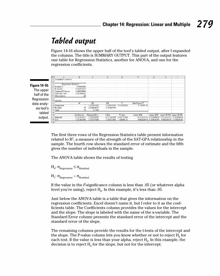
279 Chapter 14: Regression: Linear and Multiple
Tabled outputFigure 14-16 shows the upper half of the tool’s tabled output, after I expanded
the columns. The title is SUMMARY OUTPUT. This part of the output features
one table for Regression Statistics, another for ANOVA, and one for the
regression coefficients.
Figure 14-16: The upper half of the
Regression data analy-
sis tool’s tabled
output.
The first three rows of the Regression Statistics table present information
related to R2, a measure of the strength of the SAT-GPA relationship in the
sample. The fourth row shows the standard error of estimate and the fifth
gives the number of individuals in the sample.
The ANOVA table shows the results of testing
H0: σ
Regression ≤ σ
Residual
H1: σ
Regression > σ
Residual
If the value in the F-significance column is less than .05 (or whatever alpha
level you’re using), reject H0. In this example, it’s less than .05.
Just below the ANOVA table is a table that gives the information on the
regression coefficients. Excel doesn’t name it, but I refer to it as the coef-
ficients table. The Coefficients column provides the values for the intercept
and the slope. The slope is labeled with the name of the x-variable. The
Standard Error column presents the standard error of the intercept and the
standard error of the slope.
The remaining columns provide the results for the t-tests of the intercept and
the slope. The P-value column lets you know whether or not to reject H0 for
each test. If the value is less than your alpha, reject H0. In this example, the
decision is to reject H0 for the slope, but not for the intercept.
20 454060-ch14.indd 27920 454060-ch14.indd 279 4/21/09 7:33:56 PM4/21/09 7:33:56 PM

280 Part III: Drawing Conclusions from Data
Figure 14-17 shows the lower half of the Regression tool’s tabled output.
Figure 14-17: The lower half of the
Regression data analy-
sis tool’s tabled
output.
Here, you find the RESIDUAL OUTPUT and the PROBABILITY OUTPUT. The
RESIDUAL OUTPUT is a table that shows the predicted value and the residual
(y-y’) for each individual in the sample. It also shows the standard residual for
each observation, which is
The tabled data on residuals and standard residuals are useful for analyzing
the variability around the regression line. You can scan these data for outli-
ers, for example, and see if outliers are associated with particular values of
the x-variable. (If they are, it might mean that something weird is going on in
your sample.)
The PROBABILITY OUTPUT is a table of the percentiles in the y-variable data
in the sample. (Yes, PERCENTILE OUTPUT would be a better name.)
Graphic outputFigures 14-18, 14-19, and 14-20 show the Regression tool’s graphic output.
The Normal Probability Plot in Figure 14-18 is a graphic version of the
PROBABILITY OUTPUT table. The SAT Residual Plot in Figure 14-19 shows
the residuals graphed against the x-variable: For each SAT score in the
sample, this plot shows the corresponding residual. Figure 14-20 shows the
SAT Line Fit Plot — a look at the observed and the predicted y-values. Note
that in the Line Fit Plot, the SATs do not appear on the x-axis in numerical
order. Rather, they appear in the same order as in the data.
20 454060-ch14.indd 28020 454060-ch14.indd 280 4/21/09 7:33:57 PM4/21/09 7:33:57 PM

281 Chapter 14: Regression: Linear and Multiple
Figure 14-18: The Normal Probability Plot shows
the percen-tile data
for the y-variable.
Figure 14-19: The SAT Residual
plot graphs the
residuals against the x-variable.
Figure 14-20: The SAT
Line Fit Plot shows the observed y-values and the
predicted y-values.
20 454060-ch14.indd 28120 454060-ch14.indd 281 4/21/09 7:33:57 PM4/21/09 7:33:57 PM

282 Part III: Drawing Conclusions from Data
If you’ve used the Regression Tool in earlier versions of Excel, you’ll notice a
change in the Normal Probability Plot and the Line Fit Plot. These two formerly
appeared as scatterplots. In Excel 2007, they appear as column charts. You can
use Excel’s graphics capabilities to easily reformat them to scatterplots.
Juggling Many Relationships at Once: Multiple Regression
Linear regression is a great tool for making predictions. When you know the
slope and the intercept of the line that relates two variables, you can take
a new x-value and predict a new y-value. In the example I’ve been working
through, you take a SAT score and predict a GPA for a Sahutsket University
student.
What if you knew more than just the SAT score for each student? What if you
had the student’s high-school average (on a 100 scale), and you could use
that information, too? If you could combine SAT with HS average, you might
have a more accurate predictor than just SAT alone.
When you work with more than one independent variable, you’re in the realm
of multiple regression. As in linear regression, you find regression coefficients
for the best-fitting line through a scatterplot. Once again, “best-fitting” means
that the sum of the squared distances from the data points to the line is a
minimum.
With two independent variables, however, you can’t show a scatterplot in
two dimensions. You need three dimensions, and that becomes difficult to
draw. Instead, I’ll just show you the equation of the regression line:
For the SAT-GPA example, that translates to
You can test hypotheses about the overall fit, and about all three of the
regression coefficients.
I won’t go through all the formulas for finding the coefficients, because that
gets really complicated. Instead, I’ll go right to the Excel capabilities.
20 454060-ch14.indd 28220 454060-ch14.indd 282 4/21/09 7:33:58 PM4/21/09 7:33:58 PM

283 Chapter 14: Regression: Linear and Multiple
A couple of things to bear in mind before I proceed:
✓ You can have any number of x-variables. I just use two in the upcoming
example.
✓ Expect the coefficient for SAT to change from linear regression to mul-
tiple regression. Expect the intercept to change, too.
✓ Expect the standard error of estimate to decrease from linear regression
to multiple regression. Because multiple regression uses more informa-
tion than linear regression, it reduces the error.
Excel Tools for Multiple RegressionThe good news about Excel’s multiple regression tools is that they’re the
some of the same ones I just told you about for linear regression: You just
use them in a slightly different way.
The bad news is . . . well . . . uh . . . I can’t think of any bad news!
TREND revisitedI begin with TREND. Before, I showed you how to use this function to predict
values based on one x-variable. Change what you enter into the dialog box,
and it predicts values based on more than one.
Figure 14-21 shows the TREND dialog box and data for 20 students. In the
data, I’ve added a column for each student’s high-school average. I defined
HS_Average as the name for the data in this column. The Figure also shows
the selected column for TREND’s predictions. I include the Formula Bar in
this screen shot so you can see what the formula looks like.
1. With the data entered, select a column for TREND’s answers.
I selected F3:F22. That puts the predicted GPAs right next to the sample
GPAs.
2. From the Statistical Functions menu, select TREND to open the
Function Arguments dialog box for TREND.
20 454060-ch14.indd 28320 454060-ch14.indd 283 4/21/09 7:33:58 PM4/21/09 7:33:58 PM

284 Part III: Drawing Conclusions from Data
Figure 14-21: The Function
Arguments dialog box for TREND along with
data. TREND is set up
to predict GPAs for
the sample SATs and
high-school averages.
3. In the Function Arguments dialog box, enter the appropriate values
for the arguments.
In the Known_y’s box, I entered the name of the cell range that holds the
scores for the y-variable. For this example, that’s GPA (E3:E22).
In the Known_x’s box, I entered the names of the cell ranges that hold
the scores for the x-variables. With the cell ranges named, it’s SAT:HS_
Average. These names cover C3:D22, the cells that hold the SAT scores
and the high-school averages.
I left the New_x’s box blank.
In the Const box, the choices are TRUE (or leave it blank) to calculate
the y-intercept, or FALSE to set the y-intercept to zero. I entered TRUE. (I
really don’t know why you’d enter FALSE.) A note of caution: In the dialog
box, the instruction for the Const box refers to b. That’s the y-intercept.
Earlier in the chapter, I use a to represent the y-intercept, and b to repre-
sent the slope. No particular usage is standard for this. Also, the dialog
box makes it sound like this function just works for linear regression. As
you’re about to see, it works for multiple regression, too.
4. IMPORTANT: Do NOT click OK. Because this is an array function, press
Ctrl+Shift+Enter to put TREND’s answers into the selected column.
Figure 14-22 shows the answers in F3:F22. Note the difference in the Formula
Bar from Figure 14-21 to Figure 14-22. After the function completes its work,
Excel adds curly brackets to indicate an array formula.
So TREND predicts the values, and I haven’t even shown you how to find the
coefficients yet!
20 454060-ch14.indd 28420 454060-ch14.indd 284 4/21/09 7:33:58 PM4/21/09 7:33:58 PM

285 Chapter 14: Regression: Linear and Multiple
Figure 14-22: The results of TREND: Predicted GPAs for
the sample SATs and
high-school averages.
LINEST revisitedTo find the multiple regression coefficients, I turn again to LINEST.
In Figure 14-23, I’ve put the data and the dialog box for LINEST, along with the
data and the selected array for the answers. The selected array is five-rows-
by-three-columns. It’s always five rows. The number of columns is equal to
the number of regression coefficients. For linear regression, it’s two— the
slope and the intercept. For this case of multiple regression, it’s three.
Figure 14-23: The
Function Arguments dialog box
for LINEST, along with
the data and the selected array for the
results of a multiple
regression.
20 454060-ch14.indd 28520 454060-ch14.indd 285 4/21/09 7:33:58 PM4/21/09 7:33:58 PM

286 Part III: Drawing Conclusions from Data
Here are the steps for using LINEST for multiple regression with three
coefficients:
1. With the data entered, select a five-row-by-three-column array of cells
for LINEST’s results.
I selected H3:J7.
2. Click the Insert Function button to open the Insert Function dialog box.
3. In the Insert Function dialog box, select LINEST and click OK to open
the Function Arguments dialog box for LINEST.
In the Known_y’s box, enter the column that holds the scores for the
y-variable. For this example, that’s E3:E22, the GPAs.
In the Known_x’s box, enter the columns that hold the scores for the
x-variables .For this example, it’s C3:D22, the SAT scores and the high-
school averages.
In the Const box, enter TRUE (or leave it blank) to calculate the y-intercept.
Enter FALSE to set the y-intercept to zero. I typed TRUE.
In the Stats box, enter TRUE to return regression statistics in addition
to the slope and the intercept, FALSE (or leave it blank) to return just
the slope and the intercept. I entered TRUE. The dialog box refers to the
intercept as b and to the other coefficients as m-coefficients. I use a to rep-
resent the slope and b to refer to the other coefficients. No set of symbols
is standard.
4. IMPORTANT: Do NOT click OK. Because this is an array function,
press Ctrl+Shift+Enter to put LINEST’s answers into the selected array.
Figure 14-24 shows LINEST’s results. They’re not labeled in any way, so I
added the labels for you in the worksheet. I also drew a box around part of
the results to clarify what goes with what.
The entries that stand out are the ugly #N/A symbols in the last three rows of
the rightmost column. These indicate that LINEST doesn’t put anything into
these cells.
The top two rows of the array provide the values and standard errors for the
coefficients. I drew the box around those rows to separate them from the
three remaining rows, which present information in a different way. Before I
get to those rows, I’ll just tell you that the top row gives you the information
for writing the regression equation:
20 454060-ch14.indd 28620 454060-ch14.indd 286 4/21/09 7:33:59 PM4/21/09 7:33:59 PM

287 Chapter 14: Regression: Linear and Multiple
In terms of SAT, GPA, and high-school average, it’s:
The third row has R Square (a measure of the strength of the relationship
between GPA and the other two variables, which I cover in Chapter 15) and
the standard error of estimate. Compare the standard error of estimate for
the multiple regression with the standard error for the linear regression, and
you’ll see that the multiple one is smaller. (Never mind. I’ll do it for you. It’s
.40 for the linear and 0.35 for the multiple.)
The fourth row shows the F-ratio that tests the hypothesis about whether
or not the line is a good fit to the scatterplot, and the df for the denominator
of the F. The df for the numerator (not shown) is the number of coefficients
minus 1. You can use FINV to verify that this F with df = 2 and 17 is significant.
The last row gives you SSRegression
and SSResidual
.
Figure 14-24: LINEST’s
multiple results in
the selected array.
Regression data analysis tool revisitedIn the same way you use TREND and LINEST for multiple regression, you use
the Regression data analysis tool. Specify the appropriate array for the x-vari-
ables, and you’re off and running.
Here are the steps:
1. Type the data into the worksheet, and include labels for the columns.
2. Select Data | Data Analysis to open the Data Analysis dialog box.
20 454060-ch14.indd 28720 454060-ch14.indd 287 4/21/09 7:33:59 PM4/21/09 7:33:59 PM

288 Part III: Drawing Conclusions from Data
3. In the Data Analysis dialog box, scroll down the Analysis Tools list
and select Regression. Click OK to open the Regression dialog box.
This is the dialog box in Figure 14-15.
4. In the Input Y Range box, enter the cell range that holds the data for
the y-variable.
The GPAs (including the label) are in $E$2:$E$22. Note the $-signs for
absolute referencing.
5. In the Input X Range box, enter the cell range that holds the data for
the x-variable.
The SATs and the high-school averages (including the labels) are in
$C$2:$D$22.
6. If the cell ranges include column headings, select the Labels checkbox.
I included the labels in the ranges, so I selected the box.
7. The Alpha box has 0.05 as a default. Change that value if you want a
different alpha.
In the Output Options, select a radio button to indicate where you want
the results.
8. I selected New Worksheet Ply to put the results on a new page in the
worksheet.
9. The Residuals area provides four capabilities for viewing the devia-
tions between the data points and the predicted points. Select as many
as you like.
I selected all four.
10. The option in the Normal Probability Plot area produces a graph of
the percentiles of the y-variable.
I checked this one.
11. Click OK.
Go back to the section, “Data Analysis Tool: Regression,” for the details of
what’s in the output. It’s the same as before, with a couple of changes and
additions because of the new variable. Figure 14-25 shows the ANOVA table
and the coefficients table.
The ANOVA table shows the new df (2, 17, and 19 for Regression, Residual,
and Total, respectively). The coefficients table adds information for the HS
Average. It shows the values of all the coefficients, as well as standard errors,
and t-test information for hypothesis testing.
20 454060-ch14.indd 28820 454060-ch14.indd 288 4/21/09 7:33:59 PM4/21/09 7:33:59 PM

289 Chapter 14: Regression: Linear and Multiple
Figure 14-25: Part of
the output from the
Regression data analy-
sis tool: The ANOVA
table and the
Coefficients table.
If you go through the example, you’ll see the table of residuals in the output.
Compare the absolute values of the residuals from the linear regression with
the absolute values of the residuals from the multiple regression; you’ll see
the multiple ones are smaller, on average.
The graphic output has some additions, too: A scatterplot of HS Average and
GPA that also shows predicted GPAs, and a plot of residuals and HS Average.
20 454060-ch14.indd 28920 454060-ch14.indd 289 4/21/09 7:33:59 PM4/21/09 7:33:59 PM

290 Part III: Drawing Conclusions from Data
20 454060-ch14.indd 29020 454060-ch14.indd 290 4/21/09 7:33:59 PM4/21/09 7:33:59 PM

Chapter 15
Correlation: The Rise and Fall of Relationships
In This Chapter▶ What correlation is all about
▶ How correlation connects to regression
▶ Conclusions from correlations
▶ Analyzing items
In Chapter 14, I show you the ins and outs of regression, a tool for sum-
marizing relationships between (and among) variables. In this chapter,
I introduce you to the ups and downs of correlation, another tool for looking
at relationships.
I use the example of SAT and GPA from Chapter 14, and show how to think
about the data in a slightly different way. The new concepts connect to what
I showed you in the preceding chapter, and you’ll see how that works. I also
show you how to test hypotheses about relationships and how to use Excel
functions and data analysis tools for correlation.
Scatterplots AgainA scatterplot is a graphic way of showing a relationship between two vari-
ables. Figure 15-1 is a scatterplot that represents the GPAs and SAT scores of
20 students at the fictional Sahusket University. The GPAs are on a 4.0 scale
and the SATs are combined Verbal and Math.
Each point represents one student. A point’s location in the horizontal direc-
tion represents the student’s SAT. That same point’s location in the vertical
direction represents the student’s GPA.
21 454060-ch15.indd 29121 454060-ch15.indd 291 4/21/09 7:34:46 PM4/21/09 7:34:46 PM

292 Part III: Drawing Conclusions from Data
Figure 15-1: A scatter-plot of 20 students’ SAT and
GPA at Sahusket
University.
SAT
GPA
700 900 1100 1300 1500
4.0
3.5
3.0
2.5
2.0
1.5
Understanding CorrelationIn Chapter 14, I refer to the SAT as the independent variable and to the GPA as
the dependent variable. The objective in Chapter 14 was to use SAT to predict
GPA. Here’s a very important point: Although I use scores on one variable to
predict scores on the other, I do not mean that the score on one variable causes
a score on the other. “Relationship” doesn’t necessarily mean “causality.”
Correlation is a statistical way of looking at a relationship. When two things
are correlated, it means that they vary together. Positive correlation means
that high scores on one are associated with high scores on the other, and
that low scores on one are associated with low scores on the other. The scat-
terplot in Figure 15-1 is an example of positive correlation.
Negative correlation, on the other hand, means that high scores on the first
thing are associated with low scores on the second. Negative correlation
also means that low scores on the first are associated with high scores on
the second. An example is the correlation between body weight and the time
spent on a weight-loss program. If the program is effective, the higher the
amount of time spent on the program, the lower the body weight. Also, the
lower the amount of time spent on the program, the higher the body weight.
Table 15-1, a repeat of Table 14-2, shows the data from the scatterplot.
21 454060-ch15.indd 29221 454060-ch15.indd 292 4/21/09 7:34:47 PM4/21/09 7:34:47 PM

293 Chapter 15: Correlation: The Rise and Fall of Relationships
Table 15-1 SAT Scores and GPAs for 20 Sahusket University StudentsStudent SAT GPA
1 990 2.2
2 1150 3.2
3 1080 2.6
4 1100 3.3
5 1280 3.8
6 990 2.2
7 1110 3.2
8 920 2.0
9 1000 2.2
10 1200 3.6
11 1000 2.1
12 1150 2.8
13 1070 2.2
14 1120 2.1
15 1250 2.4
16 1020 2.2
17 1060 2.3
18 1550 3.9
19 1480 3.8
20 1010 2.0
Mean 1126.5 2.705
Variance 26171.32 0.46
Standard Deviation 161.78 0.82
In keeping with the way I used SAT and GPA in Chapter 14, SAT is the x-vari-
able and GPA is the y-variable.
The formula for calculating the correlation between the two is
21 454060-ch15.indd 29321 454060-ch15.indd 293 4/21/09 7:34:47 PM4/21/09 7:34:47 PM

294 Part III: Drawing Conclusions from Data
The term on the left, r, is called the correlation coefficient. It’s also called
Pearson’s product-moment correlation coefficient after its creator Karl Pearson.
The two terms in the denominator on the right are the standard deviation of
the x-variable and the standard deviation of the y-variable. The term in the
numerator is called the covariance. So another way to write this formula is
The covariance represents x and y varying together. Dividing the covariance
by the product of the two standard deviations imposes some limits. The
lower limit of the correlation coefficient is –1.00, and the upper limit is +1.00.
A correlation coefficient of –1.00 represents perfect negative correlation (low
x-scores associated with high y-scores, and high x-scores associated with
low y-scores.) A correlation of +1.00 represents perfect positive correlation
(low x-scores associated with low y-scores and high x-scores associated with
high y-scores.) A correlation of 0.00 means that the two variables are not
related.
Applying the formula to the data in Table 15-1,
What, exactly, does this number mean? I’m about to tell you.
Correlation and RegressionFigure 15.2 shows the scatterplot with the line that “best fits” the points. It’s
possible to draw an infinite number of lines through these points. Which one
is best?
To be “best,” a line has to meet a specific standard: If you draw the distances
in the vertical direction between the points and the line, and you square
those distances, and then you add those squared distances, the best fitting
line is the one that makes the sum of those squared distances as small as
possible. This line is called the regression line.
21 454060-ch15.indd 29421 454060-ch15.indd 294 4/21/09 7:34:47 PM4/21/09 7:34:47 PM

295 Chapter 15: Correlation: The Rise and Fall of Relationships
Figure 15-2: Scatterplot
of the 20 students, including
the regres-sion line.
SAT
GPA
700 900 1100 1300 1500
4.0
3.5
3.0
2.5
2.0
1.5
The regression line’s purpose in life is to enable you to make predictions. As I
mention in Chapter 14, without a regression line your best predicted value of
the y-variable is the mean of the y’s. A regression line takes the x-variable into
account and delivers a more precise prediction. Each point on the regression
line represents a predicted value for y. In the symbology of regression, each
predicted value is a y’.
Why do I tell you all of this? Because correlation is closely related to regres-
sion. Figure 15-3 focuses on one point in the scatterplot, and its distance to
the regression line and to the mean. (This is a repeat of Figure 14-3.)
Figure 15-3: One point in the scatter-plot and its associated distances.
x
y
( ')y y
( ' )y y
( )y y
( , )x y
( , ')x y
y( , )x y
21 454060-ch15.indd 29521 454060-ch15.indd 295 4/21/09 7:34:47 PM4/21/09 7:34:47 PM

296 Part III: Drawing Conclusions from Data
Notice the three distances laid out in the Figure. The distance labeled (y-y’)
is the difference between the point and the regression line’s prediction for
where the point should be. (In Chapter 14, I call that a residual.) The distance
labeled y- is the difference between the point and the mean of the y’s.
The distance labeled y’- is the gain in prediction ability that you get from
using the regression line to predict the point instead of using the mean.
Figure 15-3 shows the three distances are related like this:
As I point out in Chapter 14, you can square all the residuals and add them,
square all the deviations of the predicted points from the mean and add
them, and square all the deviations of the actual points from the mean and
add them, too.
It turns out that these sums of squares are related in the same way as the
deviations I just showed you:
If SSRegression
is large in comparison to SSResidual
, that indicates that the relation-
ship between the x-variable and the y-variable is a strong one. It means that
throughout the scatterplot, the variability around the regression line is small.
On the other hand, if SSRegression
is small in comparison to SSResidual
, that
means that the relationship between the x-variable and the y-variable is weak.
In this case, the variability around the regression line is large throughout the
scatterplot.
One way to test SSRegression
against SSResidual
is to divide each by its degrees
of freedom (1 for SSRegression
and N-2 for SSResidual
) to form variance estimates
(also known as Mean Squares, or MS), and then divide one by the other to
calculate an F. If MSRegression
is significantly larger than MSResidual
, you have evi-
dence that the x-y relationship is strong. (See Chapter 14 for details.)
Here’s the clincher, as far as correlation is concerned: Another way to
assess the size of SSRegression
is to compare it with SSTotal
. Divide the first by
the second. If the ratio is large, this tells you the x-y relationship is strong.
This ratio has a name. It’s called the coefficient of determination. Its symbol is
r2. Take the square root of this coefficient, and you have . . . the correlation
coefficient!
21 454060-ch15.indd 29621 454060-ch15.indd 296 4/21/09 7:34:47 PM4/21/09 7:34:47 PM

297 Chapter 15: Correlation: The Rise and Fall of Relationships
The plus-or-minus sign (±) means that r is either the positive or negative
square root, depending on whether the slope of the regression line is positive
or negative.
So, if you calculate a correlation coefficient and you quickly want to know
what its value signifies, just square it. The answer — the coefficient of deter-
mination — lets you know the proportion of the SSTotal
that’s tied up in the
relationship between the x-variable and the y-variable. If it’s a large propor-
tion, the correlation coefficient signifies a strong relationship. If it’s a small
proportion, the correlation coefficient signifies a weak relationship.
In the GPA-SAT example, the correlation coefficient is .817. The coefficient of
determination is
In this sample of 20 students, the SSRegression
is 66.7 percent of the SSTotal
.
Sounds like a large proportion, but what’s large? What’s small? Those ques-
tions scream out for hypothesis tests.
Testing Hypotheses About CorrelationIn this section, I show you how to answer important questions about cor-
relation. Like any other kind of hypothesis testing, the idea is to use sample
statistics to make inferences about population parameters. Here, the sample
statistic is r, the correlation coefficient. By convention, the population param-
eter is ρ (rho), the Greek equivalent of r. (Yes, it does look like our letter p,
but it really is the Greek equivalent of r.)
Two kinds of questions are important in connection with correlation: (1) Is a
correlation coefficient greater than zero? (2) Are two correlation coefficients
different from one another?
Is a correlation coefficient greater than zero?Returning once again to the Sahusket SAT-GPA example, you can use the
sample r to test hypotheses about the population ρ — the correlation coef-
ficient for all students at Sahusket University.
21 454060-ch15.indd 29721 454060-ch15.indd 297 4/21/09 7:34:48 PM4/21/09 7:34:48 PM

298 Part III: Drawing Conclusions from Data
Assuming we know in advance (before we gather any sample data), that any
correlation between SAT and GPA should be positive, the hypotheses are:
H0: ρ ≤ 0
H1: ρ > 0
I set α = .05.
The appropriate statistical test is a t-test. The formula is:
This test has N-2 df.
For the example, the values in the numerator are set: r is .817 and ρ (in H0) is
zero. What about the denominator? I won’t burden you with the details. I’ll
just tell you that’s
With a little algebra, the formula for the t-test simplifies to
For the example,
With df = 18 and α = .05 (one-tailed), the critical value of t is 2.10 (use the
worksheet function TINV to check). Because the calculated value is greater
than the critical value, the decision is to reject H0.
Do two correlation coefficients differ?In a sample of 24 students at Farshimmelt College, the correlation between
SAT and GPA is .752. Is this different from the correlation (.817) at Sahutsket
University? If I have no way of assuming that one correlation should be
higher than the other, the hypotheses are:
21 454060-ch15.indd 29821 454060-ch15.indd 298 4/21/09 7:34:48 PM4/21/09 7:34:48 PM

299 Chapter 15: Correlation: The Rise and Fall of Relationships
H0: ρ
Sahusket = ρ
Farshimmelt
H1: ρ
Sahusket ≠ ρ
Farshimmelt
Again, α = .05.
For highly technical reasons, you can’t set up a t-test for this one. In fact, you
can’t even work with .817 and .752, the two correlation coefficients.
Instead, what you do is transform each correlation coefficient into something
else and then work with the two something elses in a formula that gives
you — believe it or not — a z-test.
The transformation is called Fisher’s r to z transformation. Fisher is the statisti-
cian who’s remembered as the “F” in the F-test. He transforms the r into a z by
doing this:
If you know what loge means, fine. If not, don’t worry about it. (I explain it in
Chapter 20.) Excel takes care of all of this for you, as you see in a moment.
After you transform r to z, the formula is
The denominator turns out to be easier than you might think. It’s:
For this example,
21 454060-ch15.indd 29921 454060-ch15.indd 299 4/21/09 7:34:48 PM4/21/09 7:34:48 PM

300 Part III: Drawing Conclusions from Data
The whole formula is
The next step is to compare the calculated value to a standard normal dis-
tribution. For a two-tailed test with α = .05 the critical values in a standard
normal distribution are 1.96 in the upper tail and -1.96 in the lower tail. The
calculated value falls in between those two, so the decision is to not reject H0.
Worksheet Functions for CorrelationExcel provides two worksheet functions for calculating correlation — and,
they do exactly the same thing in exactly the same way! Why Excel offers
both CORREL and PEARSON I do not know, but there you have it. Those are
the two main correlation functions.
The others are RSQ and COVAR. RSQ calculates the coefficient of determina-
tion (the square of the correlation coefficient), and COVAR calculates the
covariance, sort of.
CORREL and PEARSONFigure 15-4 shows the data for the Sahusket SAT-GPA example, along with the
Function Arguments dialog box for CORREL.
Figure 15-4: The
Function Arguments dialog box
for CORREL, along with
data.
21 454060-ch15.indd 30021 454060-ch15.indd 300 4/21/09 7:34:48 PM4/21/09 7:34:48 PM

301 Chapter 15: Correlation: The Rise and Fall of Relationships
To use this function, the steps are:
1. Type the data into cell arrays and select a cell for CORREL’s answer.
I’ve entered the SAT data into C3:C22 and the GPA data into D3:D22, and
selected F15. I’ve defined SAT as the name of C3:C22 and GPA as the
name of D3:D22. (Reread Chapter 2 to see how to do this.)
2. From the Statistical Functions menu, select CORREL to open its
Function Arguments dialog box.
3. In the Function Arguments dialog box, enter the appropriate values
for the arguments.
In the Array 1 box, I entered SAT — the name I assigned to the cell range
(C3:C22) that holds the scores for one of the variables.
In the Array 2 box, I entered GPA — the name I assigned the cell range
(D3:D22) that holds the scores for the other variable.
With values entered for each argument, the answer, 0.81662505, appears
in the dialog box.
4. Click OK to put the answer into the selected cell.
Selecting PEARSON instead of CORREL gives you exactly the same
answer, and you use it exactly the same way.
Item analysis: A useful application of correlationInstructors often want to know how perfor-mance on a particular exam question is related to overall performance on the exam. Ideally, someone who knows the material answers the question correctly; someone who doesn’t answers it incorrectly. If everyone answers it correctly — or if no one does — it’s a useless question. This evaluation is called item analysis.
Suppose it’s possible to answer the exam question either correctly or incorrectly, and it’s possible to score from 0 to 100 on the exam. Arbitrarily, you can assign a score of 0 for an incorrect answer to the question, and 1 for a correct answer, and then calculate a correla-tion coefficient where each pair of scores is either 0 or 1 for the question and a number from
0 to 100 for the exam. The score on the exam question is called a dichotomous variable, and this type of correlation is called point biserial correlation.
If the point biserial correlation is high for an exam question, it’s a good idea to retain that question. If the correlation is low, the question probably serves no purpose.
Because one of the variables can only be 0 or 1, the formula for the biserial correlation coef-ficient is a bit different from the formula for the regular correlation coefficient. If you use Excel for the calculations, however, that doesn’t matter. Just use CORREL (or PEARSON) in the way I outline.
21 454060-ch15.indd 30121 454060-ch15.indd 301 4/21/09 7:34:49 PM4/21/09 7:34:49 PM

302 Part III: Drawing Conclusions from Data
RSQIf you have to quickly calculate the coefficient of determination (r2), RSQ is
the function for you. I see no particular need for this function because it’s
easy enough to use CORREL and then square the answer.
Here’s what the EXCEL Formula Bar looks like after you fill in the RSQ
Function Arguments dialog box for this example:
=RSQ(GPA,SAT)
In terms of the dialog box, the only difference between this one and CORREL
(and PEARSON) is that the boxes you fill in are called Known_y’s and
Known_x’s rather than Array 1 and Array 2.
COVARThis is another function for which I see no burning need. A minute ago I said
COVAR calculates covariance “sort of.” I said that because the covariance I
introduced earlier (as the numerator of the correlation coefficient) is
COVAR, however, calculates
You use this function the same way you use CORREL. After you fill in its
Function Arguments dialog box for this example, the formula in the formula
bar is
=COVAR(SAT,GPA)
If you want to use this function to calculate r, you divide the answer by the
product of STDEVP(SAT) and STDEVP(GPA). I don’t know why you’d bother
with all of this when you can just use CORREL.
21 454060-ch15.indd 30221 454060-ch15.indd 302 4/21/09 7:34:49 PM4/21/09 7:34:49 PM

303 Chapter 15: Correlation: The Rise and Fall of Relationships
Data Analysis Tool: CorrelationIf you have to calculate a single correlation coefficient, you’ll find that Excel’s
Correlation data analysis tool does the same thing CORREL does, although
the output is in tabular form. This tool becomes useful when you have to cal-
culate multiple correlations on a set of data.
For example, Figure 15-5 shows SAT, High School Average, and GPA for 20
Sahusket University students, along with the dialog box for the Correlation
data analysis tool.
Figure 15-5: The
Correlation data
analysis tool dialog box, along with data
for SAT, High School
Average, and GPA.
The steps for using this tool are:
1. Type the data into the worksheet and include labels for the columns.
In this example, the data (including labels) are in C2:E22.
2. Select Data | Data Analysis to open the Data Analysis dialog box.
3. In the Data Analysis dialog box, scroll down the Analysis Tools list
and select Correlation. Click OK to open the Correlation dialog box.
This is the dialog box in Figure 15-5.
4. In the Input Range box, enter the cell range that holds all the data.
I entered $C$2:$E$22. Note the $-signs for absolute referencing.
5. To the right of Grouped By, select a radio button to indicate if the data
are organized in columns or rows.
I chose the Columns radio button.
21 454060-ch15.indd 30321 454060-ch15.indd 303 4/21/09 7:34:49 PM4/21/09 7:34:49 PM

304 Part III: Drawing Conclusions from Data
6. If the cell ranges include column headings, check the Labels checkbox.
I included the headings in the ranges, so I checked the box.
7. In the Output Options, select a radio button to indicate where you
want the results.
I selected New Worksheet Ply to put the results on a new page in the
worksheet.
8. Click OK.
Because I selected New Worksheet Ply, a newly created page opens with
the results.
Tabled outputFigure 15-6 shows the tool’s tabled output, after I expanded the columns. The
table is a correlation matrix.
Figure 15-6: The
Correlation data analy-
sis tool’s tabled
output.
Each cell in the matrix represents the correlation of the variable in the row
with the variable in the column. Cell B3 presents the correlation of SAT with
High School Average, for example. Each cell in the main diagonal contains 1.
This is because each main diagonal cell represents the correlation of a vari-
able with itself.
It’s only necessary to fill in half the matrix. The cells above the main diagonal
would contain the same values as the cells below the main diagonal.
What does this table tell you, exactly? Read on. . . .
Multiple correlationThe correlation coefficients in this matrix combine to produce a multiple correlation coefficient. This is a number that summarizes the relationship
21 454060-ch15.indd 30421 454060-ch15.indd 304 4/21/09 7:34:49 PM4/21/09 7:34:49 PM

305 Chapter 15: Correlation: The Rise and Fall of Relationships
between the dependent variable — GPA in this example — and the two inde-
pendent variables (SAT and High School Average).
To show you how these correlation coefficients combine, I abbreviate GPA
as G, SAT as S, and High School Average as H. So rGS is the correlation coef-
ficient for GPA and SAT, rGH is the correlation coefficient for GPA and High
School Average, and rSH is the correlation coefficient for SAT and High
School Average.
Here’s the formula that puts them all together:
The uppercase R on the left indicates that this is a multiple correlation coeffi-
cient, as opposed to the lowercase r that indicates a correlation between two
variables. The subscript G.SH means that the multiple correlation is between
GPA and the combination of SAT and High School Average.
This is the calculation that produces Multiple R in the Regression Statistics
section of the Regression data analysis tool’s results. (See Chapter 14.)
For this example,
Because I use the same data to show you multiple regression in Chapter 14,
this value (with some additional decimal places) is in Figure 14-25, in cell B4.
If you square this number, you get the multiple coefficient of determination. In
Chapter 14, I tell you about R Square, and that’s what this is. It’s another item
in the Regression Statistics that the Regression data analysis tool calculates.
You also find it in LINEST’s results, although it’s not labeled.
For this example, that result is:
You can go back and see this number in Figure 14-24 in cell H5 (the LINEST
results). You can also see it in Figure 14-25, cell B5 (the Regression data anal-
ysis tool report).
21 454060-ch15.indd 30521 454060-ch15.indd 305 4/21/09 7:34:49 PM4/21/09 7:34:49 PM

306 Part III: Drawing Conclusions from Data
Partial correlationGPA and SAT are associated with High School Average (in the example). Each
one’s association with High School Average might somehow hide the true
correlation between them.
What would their correlation be if you could remove that association?
Another way to say this: What would be the GPA-SAT correlation if you could
hold High School Average constant?
One way to hold High School Average constant is to find the GPA-SAT cor-
relation for a sample of students who have one High School Average — 87,
for example. In a sample like that, the correlation of each variable with High
School Average is zero. This usually isn’t feasible in the real world, however.
Another way is to find the partial correlation between GPA and SAT. This is
a statistical way of removing each variable’s association with High School
Average in your sample. You use the correlation coefficients in the correla-
tion matrix to do this:
Adjusting R2
Here’s some more information about R2 as it relates to Excel. In addition to R2 — or as Excel likes to write it, R Square — the Regression data analysis tool calculates Adjusted R Square. In Figure 14-21, it’s in cell B6. Why is it necessary to “adjust” R Square?
In multiple regression, adding independent vari-ables (like High School Average) sometimes makes the regression equation less accurate. The multiple coefficient of determination, R Square, doesn’t reflect this. Its denomina-tor is SSTotal (for the dependent variable) and that never changes. The numerator can only
increase or stay the same. So any decline in accuracy doesn’t result in a lower R Square.
Taking degrees of freedom into account fixes the flaw. Every time you add an independent variable, you change the degrees of freedom and that makes all the difference. Just so you know, here’s the adjustment:
The k in the denominator is the number of inde-pendent variables.
21 454060-ch15.indd 30621 454060-ch15.indd 306 4/21/09 7:34:49 PM4/21/09 7:34:49 PM

307 Chapter 15: Correlation: The Rise and Fall of Relationships
Once again, G stands for GPA, S for SAT, and H for High School Average. The
subscript GS.H means that the correlation is between GPA and SAT with High
School Average “partialled out.”
For this example,
Semipartial correlationIt’s also possible to remove the correlation with High School Average from
just SAT without removing it from GPA. This is called semipartial correlation.
The formula for this one also uses the correlation coefficients from the cor-
relation matrix:
The subscript G(S.H) means the correlation is between GPA and SAT with
High School Average “partialled out” of SAT only.
Applying this formula to the example,
Some statistics textbooks refer to semipartial correlation as part correlation.
Data Analysis Tool: CovarianceYou use the Covariance data analysis tool the same way you use the
Correlation data analysis tool. I won’t go through the steps again. Instead, I’ll
just show you the tabled output in Figure 15-7. The data are from Figure 15-5.
The table is a covariance matrix. Each cell in the matrix shows the covari-
ance of the variable in the row with the variable in the column (again, using
N rather than N-1). Cell C4 shows the covariance of GPA with High School
Average. The main diagonal in this matrix presents the variance of each vari-
able (which is equivalent to the covariance of a variable with itself). In this
case, the variance is what you compute if you use VARP.
21 454060-ch15.indd 30721 454060-ch15.indd 307 4/21/09 7:34:50 PM4/21/09 7:34:50 PM

308 Part III: Drawing Conclusions from Data
Figure 15-7: The
Covariance data analy-
sis tool’s tabled out-
put for SAT, High School
Average, and GPA.
Again, it’s only necessary to fill half the matrix. Cells above the main diagonal
would hold the same values as the cells below the main diagonal.
As is the case with COVAR, I don’t see why you’d use this tool. I just include
it for completeness.
Testing Hypotheses About CorrelationExcel has no worksheet function for testing hypotheses about r. As I pointed
out before, you perform a t-test whose formula is:
With 0.817 stored in cell H12, I used this formula to calculate t:
=H12*SQRT(20-2)/SQRT(1-H12^2)
I then used the answer (6.011 and some additional decimal places) as input
to TDIST (along with 18 df and 1 tail) to find that the one-tailed probability of
the result is way less than .05.
Worksheet Functions: FISHER, FISHERINVExcel handles the rather complex transformations that enable you to test
hypotheses about the difference between two correlation coefficients. FISHER
21 454060-ch15.indd 30821 454060-ch15.indd 308 4/21/09 7:34:50 PM4/21/09 7:34:50 PM

309 Chapter 15: Correlation: The Rise and Fall of Relationships
transforms r to z. FISHERINV does the reverse. Just to refresh your memory,
you use the transformed values in the formula
in which the denominator is
In the example I discussed earlier (Sahusket versus Farshimmelt), the corre-
lation coefficients were .817 and .752, and I did a two-tailed test. The first step
is to transform each correlation. I’ll go through the steps for using FISHER to
transform .817:
1. Select a cell for FISHER’s answer.
I selected B3 for the transformed value.
2. From the Statistical Functions menu, select FISHER to open its
Function Arguments dialog box.
The FISHER Function Arguments dialog box appears in Figure 15-8.
Figure 15-8: The FISHER
Function Arguments dialog box.
3. In the Function Arguments dialog box, type the appropriate value for
the argument.
In the x box, I typed .817, the correlation coefficient. The answer,
1.147728, appears in the dialog box.
4. Click OK to put the answer into the selected cell.
21 454060-ch15.indd 30921 454060-ch15.indd 309 4/21/09 7:34:50 PM4/21/09 7:34:50 PM

310 Part III: Drawing Conclusions from Data
I selected B4 to store the transformation of .752. Next, I used this formula to
calculate Z
=(B3-B4)/SQRT((1/(20-3))+(1/(24-3)))
Finally, I used NORMSINV to find the critical value of z for rejecting H0 with a
two-tailed α of .05. Because the result of the formula (0.521633) is less than
that critical value (1.96), the decision is to not reject H0.
21 454060-ch15.indd 31021 454060-ch15.indd 310 4/21/09 7:34:50 PM4/21/09 7:34:50 PM

Part IVWorking with
Probability
22 454060-pp04.indd 31122 454060-pp04.indd 311 4/21/09 7:35:31 PM4/21/09 7:35:31 PM

In this part . . .
Statistical analysis and decision-making rest on a foun-
dation of probability. Throughout the book, I give
a smattering of probability ideas — just enough to get
you through the statistics. Part IV gives a more in-depth
treatment and covers related Excel features. You find out
about discrete and continuous random variables, count-
ing rules, conditional probability, and probability distribu-
tions. In this part, I also discuss specific probability
distributions that are appropriate for specific purposes.
Part IV ends with an exploration of modeling, tests of how
well a model fits data, and how Excel deals with modeling
and testing.
22 454060-pp04.indd 31222 454060-pp04.indd 312 4/21/09 7:35:32 PM4/21/09 7:35:32 PM

Chapter 16
Introducing ProbabilityIn This Chapter▶ Defining probability
▶ Working with probability
▶ Dealing with random variables and their distributions
▶ Focusing on the binomial distribution
Throughout this book, I toss around the concept of probability, because
it’s the basis of hypothesis testing and inferential statistics. Most of the
time, I represent probability as the proportion of area under part of a distri-
bution. For example, the probability of a Type I error (a/k/a α) is the area in a
tail of the standard normal distribution or the t distribution.
In this chapter, I explore probability in greater detail, including random vari-
ables, permutations, and combinations. I examine probability’s fundamentals
and applications, zero in on a couple of specific probability distributions, and
I discuss probability-related Excel worksheet functions.
What is Probability?Most of us have an intuitive idea about what probability is all about. Toss
a fair coin, and you have a 50-50 chance it comes up “Head.” Toss a fair die
(one of a pair of dice) and you have a one-in-six chance it comes up “2.”
If you wanted to be more formal in your definition, you’d most likely say
something about all the possible things that could happen, and the propor-
tion of those things you care about. Two things can happen when you toss a
coin, and if you only care about one of them (Head), the probability of that
event happening is one out of two. Six things can happen when you toss a
die, and if you only care about one of them (2), the probability of that event
happening is one out of six.
23 454060-ch16.indd 31323 454060-ch16.indd 313 4/21/09 7:35:55 PM4/21/09 7:35:55 PM

314 Part IV: Working with Probability
Experiments, trials, events, and sample spacesStatisticians and others who work with probability refer to a process like
tossing a coin or throwing a die as an experiment. Each time you go through
the process, that’s a trial.
This might not fit your personal definition of an experiment (or of a trial, for
that matter), but for a statistician, an experiment is any process that pro-
duces one of at least two distinct results (like a Head or a Tail).
Another piece of the definition of an experiment: You can’t predict the result
with certainty. Each distinct result is called an elementary outcome. Put a
bunch of elementary outcomes together and you have an event. For example,
with a die the elementary outcomes 2, 4, and 6 make up the event “even
number.”
Put all the possible elementary outcomes together and you’ve got yourself a
sample space. The numbers 1, 2, 3, 4, 5, and 6 make up the sample space for a
die. “Head” and “Tail” make up the sample space for a coin.
Sample spaces and probabilityHow does all this play into probability? If each elementary outcome in a
sample space is equally likely, the probability of an event is
So the probability of tossing a die and getting an even number is
If the elementary outcomes are not equally likely, you find the probability of
an event in a different way. First, you have to have some way of assigning a
probability to each one. Then you add up the probabilities of the elementary
outcomes that make up the event.
A couple of things to bear in mind about outcome probabilities: Each prob-
ability has to be between zero and one. All the probabilities of elementary
outcomes in a sample space have to add up to 1.00.
23 454060-ch16.indd 31423 454060-ch16.indd 314 4/21/09 7:35:56 PM4/21/09 7:35:56 PM

315 Chapter 16: Introducing Probability
How do you assign those probabilities? Sometimes you have advance infor-
mation — such as knowing that a coin is biased toward coming up Head 60
percent of the time. Sometimes you just have to think through the situation
to figure out the probability of an outcome.
Here’s a quick example of “thinking through.” Suppose a die is biased so that
the probability of an outcome is proportional to the numerical label of the out-
come: A 6 comes up six times as often as a 1, a 5 comes up five times as often
as a 1, and so on. What is the probability of each outcome? All the probabilities
have to add up to 1.00, and all the numbers on a die add up to 21 (1+2+3+4+5+
6 = 21), so the probabilities are: pr(1) = 1/21, pr(2) = 2/21, . . ., pr(6) = 6/21.
Compound EventsSome rules for dealing with compound events help you “think through.” A
compound event consists of more than one event. It’s possible to combine
events by either union or intersection (or both).
Union and intersectionOn a toss of a fair die, what’s the probability of getting a 1 or a 4?
Mathematicians have a symbol for “or.” It looks like this , and it’s called
“union.” Using this symbol, the probability of a 1 or a 4 is pr(1 , 4).
In approaching this kind of probability, it’s helpful to keep track of the ele-
mentary outcomes. One elementary outcome is in each event, so the event
“1 or 4” has two elementary outcomes. With a sample space of six outcomes,
the probability is 2/6 or 1/3. Another way to calculate this is
pr(1 , 4) = pr(1) + pr(4) = (1/6) + (1/6) = 2/6 = 1/3
Here’s a slightly more involved one: What’s the probability of getting a
number between 1 and 3 or a number between 2 and 4?
Just adding the elementary outcomes in each event won’t get it done this
time. Three outcomes are in the event “between 1 and 3” and three are in the
event “between 2 and 4.” The probability can’t be 3 + 3 divided by the six out-
comes in the sample space because that’s 1.00, leaving nothing for pr(5) and
pr(6). For the same reason, you can’t just add the probabilities.
23 454060-ch16.indd 31523 454060-ch16.indd 315 4/21/09 7:35:56 PM4/21/09 7:35:56 PM

316 Part IV: Working with Probability
The challenge arises in the overlap of the two events. The elementary out-
comes in “between 1 and 3” are 1, 2, and 3. The elementary outcomes in
“between 2 and 4” are 2, 3, and 4. Two outcomes overlap: 2 and 3. In order to
not count them twice, the trick is to subtract them from the total.
A couple of things will make life easier as I proceed. I abbreviate “between 1
and 3” as A and “between 2 and 4” as B. Also, I use the mathematical symbol
for “overlap.” The symbol is + and it’s called intersection.
Using the symbols, the probability of “between 1 and 3” or “between 2 and 4” is
You can also work with the probabilities:
The general formula is:
Why was it okay to just add the probabilities together in the earlier example?
Because is zero: It’s impossible to get a 1 and a 4 in the same toss of
a die. Whenever , A and B are said to be mutually exclusive.
Intersection againImagine throwing a coin and rolling a die at the same time. These two experi-
ments are independent, because the result of one has no influence on the
result of the other.
What’s the probability of getting a Head and a 4? You use the intersection
symbol and write this as pr(Head 4):
Start with the sample space. Table 16-1 lists all the elementary outcomes.
23 454060-ch16.indd 31623 454060-ch16.indd 316 4/21/09 7:35:56 PM4/21/09 7:35:56 PM

317 Chapter 16: Introducing Probability
Table 16-1 The Elementary Outcomes in the Sample Space for Throwing a Coin and Rolling a DieHead, 1 Tail, 1
Head, 2 Tail, 2
Head, 3 Tail, 3
Head, 4 Tail, 4
Head, 5 Tail, 5
Head, 6 Tail, 6
As the table shows, 12 outcomes are possible. How many outcomes are in the
event “Head and 4”? Just one. So
You can also work with the probabilities:
In general, if A and B are independent,
Conditional ProbabilityIn some circumstances, you narrow the sample space. For example, suppose
I toss a die, and I tell you the result is greater than 2. What’s the probability
that it’s a 5?
Ordinarily, the probability of a 5 would be 1/6. In this case, however, the sample
space isn’t 1, 2, 3, 4, 5, and 6. When you know the result is greater than 2, the
sample space becomes 3, 4, 5, and 6. The probability of a 5 is now 1⁄4.
This is an example of conditional probability. It’s “conditional” because I’ve
given a “condition” — the toss resulted in a number greater than 2. The nota-
tion for this is
23 454060-ch16.indd 31723 454060-ch16.indd 317 4/21/09 7:35:56 PM4/21/09 7:35:56 PM

318 Part IV: Working with Probability
The vertical line is shorthand for the word given, and you read that notation
as “the probability of a 5 given Greater than 2.”
Working with the probabilitiesIn general, if you have two events A and B,
as long as pr(B) isn’t zero.
For the intersection in the numerator on the right, this is not a case where you
just multiply probabilities together. In fact, if you could do that, you wouldn’t
have a conditional probability, because that would mean A and B are inde-
pendent. If they’re independent, one event can’t be conditional on the other.
You have to think through the probability of the intersection. In a die, how
many outcomes are in the event “5 Greater than 2”? Just one, so pr(5
Greater than 2) is 1⁄6, and
The foundation of hypothesis testingAll the hypothesis testing I’ve gone through in previous chapters involves
conditional probability. When you calculate a sample statistic, compute a sta-
tistical test, and then compare the test statistic against a critical value, you’re
looking for a conditional probability. Specifically, you’re trying to find
If that conditional probability is low (less than .05 in all the examples I show
you in hypothesis-testing chapters), you reject H0.
Large Sample SpacesWhen dealing with probability, it’s important to understand the sample
space. In the examples I show you, the sample spaces are small. With a coin
or a die, it’s easy to list all the elementary outcomes.
23 454060-ch16.indd 31823 454060-ch16.indd 318 4/21/09 7:35:57 PM4/21/09 7:35:57 PM

319 Chapter 16: Introducing Probability
The world, of course, isn’t that simple. In fact, probability problems that
live in statistics textbooks aren’t even that simple. Most of the time, sample
spaces are large and it’s not convenient to list every elementary outcome.
Take, for example, rolling a die twice. How many elementary outcomes are in
the sample space consisting of both tosses? You can sit down and list them,
but it’s better to reason it out: Six possibilities for the first toss, and each
of those six can pair up with six possibilities on the second. So the sample
space has 6 × 6 = 36 possible elementary outcomes. (This is similar to the
coin-and-die sample space in Table 16-1, where the sample space consists of
2 × 6 = 12 elementary outcomes. With 12 outcomes, it was easy to list them all
in a table. With 36 outcomes, it starts to get . . . well . . . dicey.)
Events often require some thought, too. What’s the probability of rolling a die
twice and totaling five? You have to count the number of ways the two tosses
can total five, and then divide by the number of elementary outcomes in the
sample space (36). You total a five by getting any of these pairs of tosses: 1
and 4, 2 and 3, 3 and 2, or 4 and 1. That’s four ways and they don’t overlap
(excuse me, intersect), so
Listing all the elementary outcomes for the sample space is often a night-
mare. Fortunately, shortcuts are available, as I show in the upcoming sub-
sections. Because each shortcut quickly helps you count a number of items,
another name for a shortcut is a counting rule.
Believe it or not, I just slipped one counting rule past you. A couple of para-
graphs ago, I say that in two tosses of a die you have a sample space of 6 × 6
= 36 possible outcomes. This is the product rule: If N1 outcomes are possible
on the first trial of an experiment, and N2 outcomes on the second trial, the
number of possible outcomes is N1N
2. Each possible outcome on the first trial
can associate with all possible outcomes on the second. What about three
trials? That’s N1N
2N
3.
Now for a couple more counting rules.
Permutations Suppose you have to arrange five objects into a sequence. How many ways
can you do that? For the first position in the sequence, you have five choices.
After you make that choice, you have four choices for the second position.
Then you have three choices for the third, two for the fourth, and one for the
fifth. The number of ways is (5)(4)(3)(2)(1) = 120.
23 454060-ch16.indd 31923 454060-ch16.indd 319 4/21/09 7:35:57 PM4/21/09 7:35:57 PM

320 Part IV: Working with Probability
In general, the number of sequences of N objects is N(N-1)(N-2)…(2)(1). This
kind of computation occurs fairly frequently in probability-world and it has
its own notation, N! You don’t read this by screaming out “N” in a loud voice.
Instead, it’s “N factorial.” By definition, 1! = 1, and 0! = 1.
Now for the good stuff. If you have to order the 26 letters of the alphabet, the
number of possible sequences is 26!, a huge number. But suppose the task is
to create five-letter sequences so that no letter repeats in the sequence. How
many ways can you do that? You have 26 choices for the first letter, 25 for
the second, 24 for the third, 23 for the fourth, 22 for the fifth, and that’s it. So
that’s (26)(25(24)(23)(22). Here’s how that product is related to 26!:
Each sequence is called a permutation. In general, if you take permutations of
N things r at a time, the notation is NPr (the P stands for “permutation”). The
formula is
CombinationsIn the example I just showed you, these sequences are different from one
another: abcde, adbce, dbcae, and on and on and on. In fact, you could come up
with 5! = 120 of these different sequences just for the letters a, b, c, d, and e.
Suppose I add the restriction that one of these sequences is no different from
another, and all I’m concerned about is having sets of five nonrepeating let-
ters in no particular order. Each set is called a combination. For this example,
the number of combinations is the number of permutations divided by 5!:
In general, the notation for combinations of N things taken r at a time is NCr (the C stands for “combination”). The formula is
23 454060-ch16.indd 32023 454060-ch16.indd 320 4/21/09 7:35:57 PM4/21/09 7:35:57 PM

321 Chapter 16: Introducing Probability
Worksheet Functions Three Excel functions help you with factorials, permutations, and combina-
tions. Excel categorizes one of them as a Statistical function, but, surpris-
ingly, not the other two.
FACTFACT, which computes factorials, is one of the functions not categorized as
Statistical. Instead, you’ll find it in the Math & Trig Functions menu. It’s easy
to use. Supply it with a number, and it returns the factorial. Here are the steps:
1. Select a cell for FACT’s answer.
2. From the Math & Trig functions menu, select FACT to open its
Function Arguments dialog box.
3. In the Function Arguments dialog box, enter the appropriate value for
the argument.
In the Number box, I typed the number whose factorial I want to compute.
The answer appears in the dialog box. If I enter 5, for example, 120 appears.
4. Click OK to put the answer into the selected cell.
PERMUTYou’ll find this one in the Statistical Functions menu. As its name suggests,
PERMUT enables you to calculate NP
r. Here’s how to use it to find
26P
5, the
number of five-letter sequences (no repeating letters) you can create from
the 26 letters of the alphabet. In a permutation, remember, abcde is consid-
ered different from bcdae. Follow these steps:
1. Select a cell for PERMUT’s answer.
2. From the Statistical Functions menu, select PERMUT to open its
Function Arguments dialog box (Figure 16-1).
3. In the Function Arguments dialog box, type the appropriate values for
the arguments.
In the Number box, I entered the N in NP
r. For this example, N is 26.
In the Number_chosen box, I entered the r in NP
r. That would be 5.
With values entered for both arguments, the answer appears in the
dialog box. For this example, the answer is 7893600.
23 454060-ch16.indd 32123 454060-ch16.indd 321 4/21/09 7:35:57 PM4/21/09 7:35:57 PM

322 Part IV: Working with Probability
Figure 16-1: The
Function Arguments
dialog box for
PERMUT.
4. Click OK to put the answer into the selected cell.
COMBIN COMBIN works pretty much the same way as PERMUT. Excel categorizes
COMBIN as a Math & Trig function.
Here’s how you use it to find 26
C5, the number of ways to construct a 5-letter
sequence (no repeating letters) from the 26 letters of the alphabet. In a com-
bination, abcde is considered equivalent to bcdae.
1. Select a cell for COMBIN’s answer.
2. From the Math & Trig Functions menu, select COMBIN to open its
Function Arguments dialog box.
3. In the Function Arguments dialog box, type the appropriate values for
the arguments.
In the Number box, I entered the N in NC
r. Once again, N is 26.
In the Number_chosen box, I entered the r in NC
r. And again, r is 5.
With values entered for both arguments, the answer appears in the
dialog box. For this example, the answer is 65870.
4. Click OK to put the answer into the selected cell.
Random Variables: Discrete and Continuous
Return to tosses of a fair die, where six elementary outcomes are possible. If I
use x to refer to the result of a toss, x can be any whole number from 1 to 6.
23 454060-ch16.indd 32223 454060-ch16.indd 322 4/21/09 7:35:57 PM4/21/09 7:35:57 PM

323 Chapter 16: Introducing Probability
Because x can take on a set of values, it’s a variable. Because x’s possible
values correspond to the elementary outcomes of an experiment (meaning you
can’t predict its values with absolute certainty) x is called a random variable.
Random variables come in two varieties. One variety is discrete, of which die-
tossing is a good example. A discrete random variable can only take on what
mathematicians like to call a countable number of values — like the numbers
1–6. Values between the whole numbers 1–6 (like 1.25 or 3.1416) are impos-
sible for a random variable that corresponds to the outcomes of die-tosses.
The other kind of random variable is continuous. A continuous random vari-
able can take on an infinite number of values. Temperature is an example.
Depending on the precision of a thermometer, it’s possible to have tempera-
tures like 34.516 degrees.
Probability Distributions and Density Functions
Back again to die-tossing. Each value of the random variable x (1–6, remem-
ber) has a probability. If the die is fair, each probability is 1/6. Pair each value
of a discrete random variable like x with its probability, and you have a prob-ability distribution.
Probability distributions are easy enough to represent in graphs. Figure 16-2
shows the probability distribution for x.
Figure 16-2: The
probability distribution for x, a ran-
dom variable based on
the tosses of a fair die.
1 2 3 4 5 6x
pr(x)
1/6
23 454060-ch16.indd 32323 454060-ch16.indd 323 4/21/09 7:35:58 PM4/21/09 7:35:58 PM

324 Part IV: Working with Probability
A random variable has a mean, a variance, and a standard deviation.
Calculating these parameters is pretty straightforward. In random-variable
world, the mean is called the expected value, and the expected value of
random variable x is abbreviated as E(x). Here’s how you calculate it:
For the probability distribution in Figure 16-2, that’s
The variance of a random variable is often abbreviated as V(x), and the for-
mula is
Working with the probability distribution in Figure 16-2 once again,
The standard deviation is the square root of the variance, which in this case
is 1.708.
For continuous random variables, things get a little trickier. You can’t pair a
value with a probability, because you can’t really pin down a value. Instead,
you associate a continuous random variable with a mathematical rule (an
equation) that generates probability density, and the distribution is called a
probability density function. To calculate the mean and variance of a continu-
ous random variable, you need calculus.
In Chapter 8, I show you a probability density function — the standard
normal distribution. I reproduce it here as Figure 16-3.
In the figure, f(x) represents the probability density. Because probability den-
sity can involve some heavyweight mathematical concepts, I won’t go into
it. As I mention in Chapter 8, think of probability density as something that
turns the area under the curve into probability.
While you can’t speak of the probability of a specific value of a continuous
random variable, you can work with the probability of an interval. To find
the probability that the random variable takes on a value within an interval,
you find the proportion of the total area under the curve that’s inside that
interval. Figure 16-3 shows this. The probability that x is between 0 and 1σ
is .3413.
23 454060-ch16.indd 32423 454060-ch16.indd 324 4/21/09 7:35:58 PM4/21/09 7:35:58 PM

325 Chapter 16: Introducing Probability
Figure 16-3: The stan-
dard normal distribution:
A probability density
function.
f(x)
x0 10-10-20-30 20 30
.3413.3413
.1359.1359 .0215.0215.0013.0013
For the rest of this chapter, I deal just with discrete random variables. A spe-
cific one is up next.
The Binomial DistributionImagine an experiment that has these five characteristics:
✓ The experiment consists of N identical trials.
A trial could be a toss of a die, or a toss of a coin.
✓ Each trial results in one of two elementary outcomes.
✓ It’s standard to call one outcome a success and the other a failure. For
die-tossing, a success might be a toss that comes up 3, in which case a
failure is any other outcome.
✓ The probability of a success remains the same from trial to trial.
Again, it’s pretty standard to use p to represent the probability of a suc-
cess, and 1-p (or q) to represent the probability of a failure.
✓ The trials are independent.
✓ The discrete random variable x is the number of successes in the N trials.
23 454060-ch16.indd 32523 454060-ch16.indd 325 4/21/09 7:35:58 PM4/21/09 7:35:58 PM

326 Part IV: Working with Probability
This type of experiment is called a binomial experiment. The probability dis-
tribution for x follows this rule:
On the extreme right, px(1-p)N-x is the probability of one combination of x
successes in N trials. The term to its immediate left is NCx, the number of
possible combinations of x successes in N trials.
This is called the binomial distribution. You use it to find probabilities like the
probability you’ll get four 3s in ten tosses of a die:
The negative binomial distribution is closely related. In this distribution, the
random variable is the number of trials before the xth success. For example,
you use the negative binomial to find the probability of 5 tosses that result in
anything but a 3 before the fourth time you roll a 3.
For this to happen, in the eight tosses before the fourth 3, you have to get
5 non-3s and 3 successes (tosses when a 3 comes up). Then, the next toss
results in a 3. The probability of a combination of 4 successes and 5 failures
is p4(1-p)5. The number of ways you can have a combination of 5 failures and
4-1 successes is 5+4-1
C4-1
. So the probability is
In general, the negative binomial distribution (sometimes called the Pascal distribution) is
Worksheet Functions These distributions are computation intensive, so I get to the worksheet func-
tions right away.
23 454060-ch16.indd 32623 454060-ch16.indd 326 4/21/09 7:35:58 PM4/21/09 7:35:58 PM

327 Chapter 16: Introducing Probability
BINOMDIST BINOMDIST is Excel’s worksheet function for the binomial distribution. As an
example, I use BINOMDIST to calculate the probability of getting four 3s in
ten tosses of a fair die:
1. Select a cell for BINOMDIST’s answer.
2. From the Statistical Functions menu, select BINOMDIST to open its
Function Arguments dialog box (Figure 16-4).
Figure 16-4: The
BINOMDIST Function
Arguments dialog box.
3. In the Function Arguments dialog box, type the appropriate values for
the arguments.
In the Number_s box, I entered the number of successes. For this exam-
ple, the number of successes is 4.
In the Trials box, I entered the number of trials. The number of trials is 10.
In the Probability_s box, I entered the probability of a success. I entered
1/6, the probability of a 3 on a toss of a fair die.
In the Cumulative box, one possibility is FALSE for the probability of
exactly the number of successes entered in the Number_s box. The
other is TRUE for the probability of getting that number of successes or
fewer. I entered FALSE.
With values entered for all the arguments, the answer appears in the
dialog box.
4. Click OK to put the answer into the selected cell.
To give you a better idea of what the binomial distribution looks like, I use
BINOMDIST (with FALSE entered in the Cumulative box) to find pr(0) through
23 454060-ch16.indd 32723 454060-ch16.indd 327 4/21/09 7:35:58 PM4/21/09 7:35:58 PM

328 Part IV: Working with Probability
pr(10), and then I use Excel’s graphics capabilities (see Chapter 3) to graph
the results. Figure 16-5 shows the data and the graph.
Figure 16-5: The
binomial distribution
for x suc-cesses in
ten tosses of a die,
with p = 1/6.
Incidentally, if you type TRUE in the Cumulative box, the result is .984 (and
some more decimal places), which is pr(0) + pr(1) + pr(2) + pr(3) + pr(4).
NEGBINOMDISTAs its name suggests, NEGBINOMDIST handles the negative binomial distribu-
tion. I use it here to work out the example I gave you earlier — the probabil-
ity of getting five failures (tosses that result in anything but a 3) before the
fourth success (the fourth 3).
1. Select a cell for NEGBINOMDIST’s answer.
2. From the Statistical Functions menu, select NEGBINOMDIST to open its
Function Arguments dialog box (Figure 16-6).
Figure 16-6: The
NEGBINOMDIST
Function Arguments dialog box.
23 454060-ch16.indd 32823 454060-ch16.indd 328 4/21/09 7:35:58 PM4/21/09 7:35:58 PM

329 Chapter 16: Introducing Probability
3. In the Function Arguments dialog box, type the appropriate values for
the arguments.
In the Number_f box, I entered the number of failures. The number of
failures is 5 for this example.
In the Number_s box, I entered the number of successes. For this exam-
ple, that’s 4.
In the Probability_s box, I entered 1/6, the probability of a success.
With values entered for all the arguments, the answer appears in the
dialog box. The answer is 0.017 and some additional decimal places.
4. Click OK to put the answer into the selected cell.
Hypothesis Testing with the Binomial Distribution
Hypothesis tests sometimes involve the binomial distribution. Typically, you
have some idea about the probability of a success, and you put that idea into
a null hypothesis. Then you perform N trials and record the number of suc-
cesses. Finally, you compute the probability of getting that many successes
or a more extreme amount if your H0 is true. If the probability is low, reject H
0.
When you test in this way, you’re using sample statistics to make an infer-
ence about a population parameter. Here, that parameter is the probability of
a success in the population of trials. By convention, Greek letters represent
parameters. Statisticians use π (pi), the Greek equivalent of p, to stand for the
probability of a success in the population.
Continuing with the die-tossing example, suppose you have a die and you
want to test whether or not it’s fair. You suspect that if it’s not, it’s biased
toward 3. Define a toss that results in 3 as a success. You toss it 10 times.
Four tosses are successes. Casting all this into hypothesis-testing terms:
H0: π ≤ 1/6
H1: π > 1/6
As I usually do, I set α = .05
To test these hypotheses, you have to find the probability of getting at least 4
successes in 10 tosses with p = 1/6. That probability is pr(4) + pr(5) + pr(6) +
pr(7) + pr(8) + pr(9) + pr(10). If the total is less than .05, reject H0.
23 454060-ch16.indd 32923 454060-ch16.indd 329 4/21/09 7:35:59 PM4/21/09 7:35:59 PM

330 Part IV: Working with Probability
That’s a lot of calculating. You can use BINOMDIST to take care of it all (as
I did when I set up the worksheet in Figure 16-5), or you can take a different
route. You can find a critical value for the number of successes, and if the
number of successes is greater than the critical value, reject H0.
How do you find the critical value? You can use a convenient worksheet func-
tion that I’m about to show you.
CRITBINOMThis function is tailor-made for binomial-based hypothesis testing. Give
CRITBINOM the number of trials, the probability of a success, and a crite-
rion cumulative probability. CRITBINOM returns the smallest value of x (the
number of successes) for which the cumulative probability is greater than or
equal to the criterion.
Here are the steps for the hypothesis testing example I just showed you:
1. Select a cell for CRITBINOM’s answer.
2. From the Statistical Functions menu, select CRITBINOM and click OK
to open its Function Arguments dialog box (Figure 16-7).
Figure 16-7: The
CRITBINOM Function
Arguments dialog box.
3. In the Function Arguments dialog box, enter the appropriate values
for the arguments.
In the Trials box, I entered 10, the number of trials.
In the Probability_s box, I entered the probability of a success. In this
example it’s 1/6, the value of π according to H0.
In the Alpha box, I entered the cumulative probability to exceed. I
entered .95, because I want to find the critical value that cuts off the
upper 5 percent of the binomial distribution.
23 454060-ch16.indd 33023 454060-ch16.indd 330 4/21/09 7:35:59 PM4/21/09 7:35:59 PM

331 Chapter 16: Introducing Probability
With values entered for the arguments, the critical value, 4, appears in
the dialog box.
4. Click OK to put the answer into the selected cell.
As it happens, the critical value is the number of successes in the sample.
The decision is to reject H0.
More on hypothesis testingIn some situations, the binomial distribution approximates the standard
normal distribution. When this happens, you use the statistics of the normal
distribution to answer questions about the binomial distribution.
Those statistics involve z- scores, which means that you have to know the mean
and the standard deviation of the binomial. Fortunately, they’re easy to com-
pute. If N is the number of trials, and π is the probability of a success, the mean is
the variance is
and the standard deviation is
The binomial approximation to the normal is appropriate when N π ≥ 5 and
N(1- π) ≥ 5.
When you test a hypothesis, you’re making an inference about π, and you have
to start with an estimate. You run N trials and get x successes. The estimate is
In order to create a z-score, you need one more piece of information — the
standard error of P. This sounds harder than it is, because this standard
error is just
Now you’re ready for a hypothesis test.
23 454060-ch16.indd 33123 454060-ch16.indd 331 4/21/09 7:35:59 PM4/21/09 7:35:59 PM

332 Part IV: Working with Probability
Here’s an example. The CEO of the FarKlempt Robotics Inc. believes that 50
percent of FarKlempt robots are purchased for home use. A sample of 1,000
FarKlempt customers indicates that 550 of them use their robots at home. Is
this significantly different from what the CEO believes? The hypotheses:
H0: π = .50
H1: π ≠ .50
I set α = .05
N π = 500, and N(1- π) = 500, so the normal approximation is appropriate.
First, calculate P:
Now, create a z-score
With α = .05, is 3.162 a large enough z-score to reject H0? An easy way to find
out is to use the worksheet function NORMSDIST (Chapter 8). If you do, you’ll
find that this z-score cuts off less than .01 of the area in the upper tail of the
standard normal distribution. The decision is to reject H0.
The Hypergeometric DistributionHere’s another distribution that deals with successes and failures.
I start with an example. In a set of 16 light bulbs, 9 are good and 7 are defective.
If you randomly select 6 light bulbs out of these 16, what’s the probability
that 3 of the 6 are good? Consider selecting a good lightbulb as a “success.”
When you finish selecting, your set of selections is a combination of 3 of the
9 good light bulbs together with a combination of 3 of the 7 defective light
bulbs. The probability of getting 3 good bulbs is a . . . well . . . combination of
counting rules:
23 454060-ch16.indd 33223 454060-ch16.indd 332 4/21/09 7:35:59 PM4/21/09 7:35:59 PM

333 Chapter 16: Introducing Probability
Each outcome of the selection of the good light bulbs can associate with all
outcomes of the selection of the defective light bulbs, so the product rule is
appropriate for the numerator. The denominator (the sample space) is the
number of possible combinations of 6 items in a group of 16.
This is an example of the hypergeometric distribution. In general, with a small
population that consists of N1 successes and N
2 failures, the probability of x
successes in a sample of m items is
The random variable x is said to be a hypergeometrically distributed random variable.
HYPERGEOMDISTThis function calculates everything for you when you deal with the hyper-
geometric distribution. Here’s how to use it to go through the example I just
showed you.
1. Select a cell for HYPERGEOMDIST’s answer.
2. From the Statistical Functions menu, select HYPERGEOMDIST to open
its Function Arguments dialog box (Figure 16-8).
Figure 16-8: The
HYPERGEOMDIST
Function Arguments dialog box.
3. In the Function Arguments dialog box, enter the appropriate values
for the arguments.
In the Sample_s box, I entered the number of successes in the sample.
That number is 3 for this example.
23 454060-ch16.indd 33323 454060-ch16.indd 333 4/21/09 7:36:00 PM4/21/09 7:36:00 PM

334 Part IV: Working with Probability
In the Number_sample box, I entered the number of items in the sample.
The sample size for this example is 6.
In the Population_s box, I entered the number of successes in the popu-
lation. In this example that’s 7, the number of good light bulbs.
In the Number_pop box, I entered the number of items in the population.
The total number of light bulbs is 16, and that’s the population size.
With values entered for all the arguments, the answer appears in the
dialog box. The answer is 0.37 and some additional decimal places.
4. Click OK to put the answer into the selected cell.
As I do with the binomial, I use HYPERGEOMDIST to calculate pr(0) through
p(6) for this example. Then I use Excel’s graphics capabilities (see Chapter 3)
to graph the results. Figure 16-9 shows the data and the graph. My objective
is to help you visualize and understand the hypergeometric distribution.
Figure 16-9: The hyper-geometric
distribution for x suc-cesses in
a 6-item sample from
a popula-tion that consists of seven
successes and nine failures.
23 454060-ch16.indd 33423 454060-ch16.indd 334 4/21/09 7:36:00 PM4/21/09 7:36:00 PM

Chapter 17
More on ProbabilityIn This Chapter▶ The beta version
▶ Pursuing Poisson
▶ Grappling with gamma
▶ Exponentially speaking
In the Chapter 16, I delve into probability in a semiformal way, and intro-
duce distributions of random variables. The binomial distribution is the
starting point. In this chapter, I examine additional distributions.
One of the symbols on the pages of this book (and other books in the
Dummies series) lets you know that “Technical Stuff” follows. It might have
been a good idea to hang that symbol above this chapter’s title. So here’s a
small note of caution: Some mathematics follows. I put the math in to help
you understand what you’re doing when you work with the dialog boxes of
the Excel functions I describe.
Are these functions on the esoteric side? Well . . . yes. Will you ever have
occasion to use them? Well . . . you just might.
BetaThis one connects with the binomial distribution, which I discuss in Chapter
16. The beta distribution (not to be confused with “beta,” the probability of a
Type 2 error) is a sort of chameleon in the world of distributions. It takes on
a wide variety of appearances, depending on the circumstances. I won’t give
you all the mathematics behind the beta distribution, because the full treat-
ment involves calculus.
The connection with the binomial is this: In the binomial, the random variable
x is the number of successes in N trials with p as the probability of a success.
N and p are constants. In the beta distribution, the random variable x is the
probability of a success, with N and the number of successes as constants.
24 454060-ch17.indd 33524 454060-ch17.indd 335 4/21/09 7:36:41 PM4/21/09 7:36:41 PM

336 Part IV: Working with Probability
Why is this useful? In the real world, you usually don’t know the value of p,
and you’re trying to find it. Typically, you conduct a study, find the number
of successes in a set of trials, and then you have to estimate p. Beta shows
you the likelihood of possible values of p for the number of trials and suc-
cesses in your study.
Some of the math is complicated, but I can at least show you the rule that
generates the density function for N trials with r successes, when N and r are
whole numbers:
The vertical bar in the parentheses on the left means “given that.” So this
density function is for specific values of N and r. Calculus enters the picture
when N and r aren’t whole numbers. (Density function? “Given that”? See
Chapter 16.)
To give you an idea of what this function looks like, I used Excel to generate
and graph the density function for four successes in ten trials. Figure 17-1
shows the data and the graph. Each value on the x-axis is a possible value for
the probability of a success. The curve shows probability density. As I point
out in the last chapter, probability density is what makes the area under the
curve correspond to probability. The curve’s maximum point is at x = .4,
which is what you would expect for four successes in ten trials.
Figure 17-1: The Beta
Density function for
four suc-cesses in ten trials.
Suppose I toss a die (one of a pair of dice), and I define a success as any toss
that results in a 3. I assume I’m tossing a fair die, so I assume that p = pr(3) =
1/6. Suppose I toss a die ten times and get four 3s. How good does that fair-
die assumption look?
The graph in Figure 17-1 gives you a hint: The area to the left of .16667 (the
decimal equivalent of 1/6) is a pretty small proportion of the total area, mean-
ing that the probability that p is 1/6 or less is pretty low.
24 454060-ch17.indd 33624 454060-ch17.indd 336 4/21/09 7:36:42 PM4/21/09 7:36:42 PM

337 Chapter 17: More on Probability
Now, if you have to go through all the trouble of creating a graph, and then
guesstimate proportions of area to come with an answer like “pretty low,”
you’re doing a whole lot of work for very little return. Fortunately, Excel has a
better way.
BETADISTBETADIST eliminates the need for all the graphing and guesstimating. This
function enables you to work with the cumulative beta distribution to deter-
mine the probability that p is less than or equal to some value. Considering
the complexity of beta, BETADIST is surprisingly easy to work with.
In the BETADIST Function Arguments dialog box, and in the BETADIST help file,
you’ll see “Alpha” and “Beta.” The dialog box tells you each one is a “param-
eter for the distribution” and the help file tells you that each is “a parameter
of the distribution.” Aside from altering the preposition, neither one is much
help — at least, not in any way that helps you apply Alpha and Beta.
So here are the nuts and bolts: For the example I’m working through, Alpha is
the number of successes and Beta is the number of failures.
When you put the density function in terms of Alpha (α) and Beta (β), it’s
Again, this only applies when α and β are both whole numbers. If that’s not
the case, you need calculus to compute f(x).
The steps are:
1. Select a cell for BETADIST’s answer.
2. From the Statistical Functions menu, select BETADIST to open its
Function Arguments dialog box (Figure 17-2).
3. In the Function Arguments dialog box, type the appropriate values for
the arguments.
The X box holds the probability of a success. For this example, the prob-
ability of a success is 1/6.
Excel refers to Alpha and Beta (coming up next) as “parameters to the
distribution.” I treat them as “number of successes” and “number of fail-
ures.” So I entered 4 in the Alpha box and 6 in the Beta box.
The A box and the B box are evaluation limits for the value in the X box.
These aren’t relevant for this type of example. I left them blank, which
by default sets A = 0 and B=1.
24 454060-ch17.indd 33724 454060-ch17.indd 337 4/21/09 7:36:42 PM4/21/09 7:36:42 PM

338 Part IV: Working with Probability
Figure 17-2: The
BETADIST Function
Arguments dialog box.
After all the entries, the answer appears in the dialog box.
The answer for this example is .048021492. “Pretty low” indeed. With
four successes in ten tosses, you’d intuitively expect that p is greater
than 1/6.
4. Click OK to put the answer into the selected cell.
The beta distribution has wider applicability than I show you here.
Consequently, you can put all kinds of numbers (within certain restrictions)
into the various boxes. For example, the value you put into the X box can be
greater than 1.00, and you can enter values that aren’t whole numbers into
the Alpha box and the Beta box.
BETAINVThis one is the inverse of BETADIST. If you enter a probability and values for
successes and failures, it returns a value for p. For example if you supply it
with .048021492, 4 successes, and 6 failures, it returns 0.1666667 — the deci-
mal equivalent of 1/6.
BETAINV has a more helpful application. You can use it to find the confidence
limits for the probability of a success.
Suppose you’ve found r successes in N trials, and you’re interested in the
95 percent confidence limits for the probability of a success. The lower
limit is:
24 454060-ch17.indd 33824 454060-ch17.indd 338 4/21/09 7:36:42 PM4/21/09 7:36:42 PM

339 Chapter 17: More on Probability
The upper limit is:
1. Select a cell for BETAINV’s answer.
2. From the Statistical Functions menu, select BETAINV to open its
Function Arguments dialog box (Figure 17-3).
Figure 17-3: The
BETAINV Function
Arguments dialog box.
3. In the Function Arguments dialog box, enter the appropriate values
for the arguments.
The X box holds a cumulative probability. For the lower bound of the 95
percent confidence limits, the probability is .025.
In the Alpha box, I entered the number of successes. For this example
that’s 4.
In the Beta box, I entered the number of failures (NOT the number of
trials). The number of failures is 6.
The A box and the B box are evaluation limits for the value in the X box.
Again, these aren’t relevant for this type of example. I left them blank,
which by default sets A = 0 and B=1.
With the entries for X, Alpha, and Beta, the answer appears in the dialog
box. The answer for this example is .13699536.
4. Click OK to put the answer into the selected cell.
Entering .975 in the X box gives .700704575 as the result. So the 95 percent
confidence limits for the probability of a success are .137 and .701 (rounded
off) if you have 4 successes in 10 trials.
24 454060-ch17.indd 33924 454060-ch17.indd 339 4/21/09 7:36:42 PM4/21/09 7:36:42 PM

340 Part IV: Working with Probability
With more trials of course, the confidence limit narrows. For 40 successes in
100 trials, the confidence limits are .307 and .497
PoissonIf you have the kind of process that produces a binomial distribution, and
you have an extremely large number of trials and a very small number of suc-
cesses, the Poisson distribution approximates the binomial. The equation of
the Poisson is
In the numerator, μ is the mean number of successes in the trials, and e is
2.71828 (and infinitely more decimal places), a constant near and dear to the
hearts of mathematicians.
Here’s an example. The FarKlempt Robotics Inc. produces a universal joint
for its robots’ elbows. The production process is under strict computer con-
trol, so that the probability a joint is defective is .001. What is the probability
that in a sample of 1000, one joint is defective? What’s the probability that
two are defective? Three?
Named after 19th-century mathematician Siméon-Denis Poisson, this distribu-
tion is computationally easier than the binomial — or at least it was when
mathematicians had no computational aids. With Excel, you can easily use
BINOMDIST to do the binomial calculations.
First, I apply the Poisson distribution to the FarKlempt example. If π = .001
and N = 1000, the mean is
(See Chapter 16 for an explanation of μ = N π .)
Now for the Poisson. The probability that one joint in a sample of 1000 is
defective is:
24 454060-ch17.indd 34024 454060-ch17.indd 340 4/21/09 7:36:43 PM4/21/09 7:36:43 PM

341 Chapter 17: More on Probability
For two defective joints in 1000, it’s
And for three defective joints in 1000:
As you read through this, it may seem odd that I refer to a defective item as a
“success.” Remember, that’s just a way of labeling a specific event.
POISSONHere are the steps for using Excel’s POISSON for the preceding example:
1. Select a cell for POISSON’s answer.
2. From the Statistical Functions menu, select POISSON to open its
Function Arguments dialog box (Figure 17-4).
Figure 17-4: The
POISSON Function
Arguments dialog box.
3. In the Function Arguments dialog box, enter the appropriate values
for the arguments.
In the X box, I entered the number of events for which I’m determining
the probability. I’m looking for pr(1), so I entered 1.
. In the Mean box, I entered the mean of the process. That’s N π, which for
this example is 1.
24 454060-ch17.indd 34124 454060-ch17.indd 341 4/21/09 7:36:43 PM4/21/09 7:36:43 PM

342 Part IV: Working with Probability
In the Cumulative box, it’s either TRUE for the cumulative probability or
FALSE for just the probability of the number of events. I entered FALSE.
. With the entries for X, Mean, and Cumulative, the answer appears in the
dialog box. The answer for this example is .367879441.
4. Click OK to put the answer into the selected cell.
In the example, I showed you the probability for two defective joints in 1,000
and the probability for three. To follow through with the calculations, I’d
type 2 into the X box to calculate pr(2), and 3 to find pr(3).
As I said before, in the 21st century, it’s pretty easy to calculate the binomial
probabilities directly. Figure 17-5 shows you the Poisson and the Binomial
probabilities for the numbers in Column B and the conditions of the example.
I graphed the probabilities so you can see how close the two really are. I
selected Cell D3 so the formula box shows you how I used BINOMDIST to cal-
culate the binomial probabilities.
Figure 17-5: Poisson
prob-abilities and
Binomial probabili-
ties.
Although the Poisson’s usefulness as an approximation is outdated, it has
taken on a life of its own. Phenomena as widely disparate as reaction time
data in psychology experiments, degeneration of radioactive substances, and
scores in professional hockey games seem to fit Poisson distributions. This is
why business analysts and scientific researchers like to base models on this
distribution. (“Base models on?” What does that mean? I tell you all about it
in Chapter 18.)
GammaThe gamma distribution is related to the Poisson distribution in the same way
the negative binomial distribution is related to the binomial. The negative
24 454060-ch17.indd 34224 454060-ch17.indd 342 4/21/09 7:36:43 PM4/21/09 7:36:43 PM

343 Chapter 17: More on Probability
binomial tells you the number of trials until a specified number of successes
in a binomial distribution. The gamma distribution tells you how many sam-
ples you go through to find a specified number of successes in a Poisson dis-
tribution. Each sample can be a set of objects (as in the FarKlempt Robotics
universal joint example), a physical area, or a time interval.
The probability density function for the gamma distribution is:
Again, this works when α is a whole number. If it’s not, you guessed it —
calculus. (By the way, when this function has only whole-number values of
α it’s called the Erlang distribution, just in case anybody ever asks you.) The
letter e, once again, is the constant 2.7818 I told you about earlier.
Don’t worry about the exotic-looking math. As long as you understand what
each symbol means, you’re in business. Excel does the heavy lifting for you.
So here’s what the symbols mean. For the FarKlempt Robotics example, α is
the number of successes and β corresponds to μ the Poisson distribution.
The variable x tracks the number of samples. So if x is 3, α is 2, and β is 1,
you’re talking about the probability density associated with finding the second
success in the third sample, if the average number of successes per sample
(of 1000) is 1. (Where does 1 come from, again? That’s 1000 universal joints
per sample multiplied by .001, the probability of producing a defective one.)
To determine probability, you have to work with area under the density func-
tion. This brings me to the Excel worksheet function designed for gamma.
GAMMADISTGAMMADIST gives you a couple of options. You can use it to calculate the
probability density, and you can use it to calculate probability. Figure 17-6
shows how I used the first option to create a graph of the probability density
so you can see what the function looks like. Working within the context of the
example I just laid out, I set Alpha to 2, Beta to 1, and calculated the density
for the values of x in Column D.
The values in Column E shows the probability densities associated with find-
ing the second defective universal joint in the indicated number of samples
of 1000. For example, Cell E5 holds the probability density for finding the
second defective joint in the third sample.
24 454060-ch17.indd 34324 454060-ch17.indd 343 4/21/09 7:36:43 PM4/21/09 7:36:43 PM

344 Part IV: Working with Probability
Figure 17-6: The density
function for gamma,
with Alpha = 2
and Beta =1.
In real life, you work with probabilities rather than densities. Next, I show
you how to use GAMMADIST to determine the probability of finding the
second defective joint in the third sample. Here it is:
1. Select a cell for GAMMADIST’s answer.
2. From the Statistical Functions menu, select GAMMADIST to open its
Function Arguments dialog box (Figure 17-7).
Figure 17-7: The
GAMMADIST
Function Arguments dialog box.
3. In the Function Arguments dialog box, enter the appropriate values
for the arguments.
The X box holds the number of samples for which I’m determining the
probability. I’m looking for pr(3), so I entered 3.
In the Alpha box, I entered the number of successes. I want to find the
second success in the third sample, so I entered 2.
In the Beta box, I entered the average number of successes that occur
within a sample. For this example, that’s 1.
In the Cumulative box the choices are TRUE for the cumulative distribu-
tion or FALSE to find the probability density. I want to find the probabil-
ity, not the density, so I entered TRUE.
24 454060-ch17.indd 34424 454060-ch17.indd 344 4/21/09 7:36:43 PM4/21/09 7:36:43 PM

345 Chapter 17: More on Probability
With values entered for X, Alpha, Beta, and Cumulative, the answer —
.800851727 — appears in the dialog box.
4. Click OK to put the answer into the selected cell.
GAMMAINVIf you want to know, at a certain level of probability, how many samples it
takes to observe a specified number of successes, this is the function for you.
GAMMAINV is the inverse of GAMMADIST. Enter a probability along with
Alpha and Beta and it returns the number of samples. Its Function Arguments
dialog box has a Probability box, an Alpha box, and a Beta box. Figure
17-8 shows that if you enter the answer for the preceding section into the
Probability box and the same numbers for Alpha and Beta, the answer is 3.
(Well, actually, a tiny bit more than 3.)
Figure 17-8: The
GAMMAINV Function
Arguments dialog box.
ExponentialIf you’re dealing with the gamma distribution and you have Alpha = 1, you
have the exponential distribution. This gives the probability that it takes a
specified number of samples to get to the first success.
What does the density function look like? Excuse me . . . I’m about to go mathemat-
ical on you for a moment. Here, once again, is the density function for gamma:
If α = 1, it looks like this:
24 454060-ch17.indd 34524 454060-ch17.indd 345 4/21/09 7:36:44 PM4/21/09 7:36:44 PM

346 Part IV: Working with Probability
Statisticians like substituting λ (the Greek letter “lambda”) for , so here’s
the final version:
I bring this up because Excel’s EXPONDIST Function Arguments dialog box
has a box for LAMBDA, and I want you to know what it means.
EXPONDISTUse EXPONDIST to determine the probability that it takes a specified number
of samples to get to the first success in a Poisson distribution. Here, I work
once again with the universal joint example. I show you how to find the prob-
ability that you’ll see the first success in the third sample.
1. Select a cell for EXPONDIST’s answer.
2. From the Statistical Functions menu, select EXPONDIST to open its
Function Arguments dialog box (Figure 17-9).
Figure 17-9: The
EXPONDIST Function
Arguments dialog box.
3. In the Function Arguments dialog box, enter the appropriate values
for the arguments.
In the X box, I entered the number of samples for which I’m determining
the probability. I’m looking for pr(3), so I typed 3.
In the Lambda box, I entered the average number of successes per
sample. This goes back to the numbers I gave you in the example — the
probability of a success (.001) times the number of universal joints in
each sample (1000). That product is 1, so I entered 1 in this box.
24 454060-ch17.indd 34624 454060-ch17.indd 346 4/21/09 7:36:44 PM4/21/09 7:36:44 PM

347 Chapter 17: More on Probability
In the Cumulative box, the choices are TRUE for the cumulative distribu-
tion or FALSE to find the probability density. I want to find the probabil-
ity, not the density, so I entered TRUE.
With values entered for X, Lambda, and Cumulative, the answer appears
in the dialog box. The answer for this example is .950212932.
4. Click OK to put the answer into the selected cell.
24 454060-ch17.indd 34724 454060-ch17.indd 347 4/21/09 7:36:44 PM4/21/09 7:36:44 PM

348 Part IV: Working with Probability
24 454060-ch17.indd 34824 454060-ch17.indd 348 4/21/09 7:36:44 PM4/21/09 7:36:44 PM

Chapter 18
A Career in ModelingIn This Chapter▶ What is a model?
▶ Modeling and fitting
▶ Working with the Monte Carlo method
Model is a term that gets thrown around a lot these days. Simply put,
a model is something you know and can work with that helps you
understand something you know little about. A model is supposed to mimic,
in some way, the thing it’s modeling. A globe, for example, is a model of the
earth. A street map is a model of a neighborhood. A blueprint is a model of
a house.
Researchers use models to help them understand natural processes and
phenomena. Business analysts use models to help them understand business
processes. The models these people use might include concepts from math-
ematics and statistics — concepts that are so well known they can shed light
on the unknown. The idea is to create a model that consists of concepts you
understand, put the model through its paces, and see if the results look like
real-world results.
In this chapter, I discuss modeling. My goal is to show how you can harness
Excel’s statistical capabilities to help you understand processes in your world.
Modeling a DistributionIn one approach to modeling, you gather data and group them into a distri-
bution. Next, you try and figure out a process that results in that kind of a
distribution. Restate that process in statistical terms so that it can generate a
distribution, and then see how well the generated distribution matches up to
the real one. This “process you figure out and restate in statistical terms” is
the model.
25 454060-ch18.indd 34925 454060-ch18.indd 349 4/21/09 7:37:14 PM4/21/09 7:37:14 PM

350 Part IV: Working with Probability
If the distribution you generate matches up well with the real data, does this
mean your model is “right”? Does it mean the process you guessed is the pro-
cess that produces the data?
Unfortunately, no. The logic doesn’t work that way. You can show that a
model is wrong, but you can’t prove that it’s right.
Plunging into the Poisson distributionIn this section, I go through an example of modeling with the Poisson distri-
bution. I introduced this distribution in Chapter 17, and I told you it seems to
characterize an array of processes in the real world. By characterize a pro-
cess, I mean that a distribution of real-world data looks a lot like a Poisson
distribution. When this happens, it’s possible that the kind of process that
produces a Poisson distribution is also responsible for producing the data.
What is that process? Start with a random variable x that tracks the number
of occurrences of a specific event in an interval. In Chapter 17, the “interval”
was a sample of 1,000 universal joints, and the specific event was “defective
joint.” Poisson distributions are also appropriate for events occurring in
intervals of time, and the event can be something like “arrival at a toll booth.”
Next, I outline the conditions for a Poisson process, and use both defective
joints and toll booth arrivals to illustrate:
✓ The numbers of occurrences of the event in two nonoverlapping inter-
vals are independent.
The number of defective joints in one sample is independent of the number
of defective joints in another. The number of arrivals at a toll booth during
one hour is independent of the number of arrivals during another.
✓ The probability of an occurrence of the event is proportional to the size
of the interval.
The chance that you’ll find a defective joint is larger in a sample of
10,000 than it is in a sample of 1,000. The chance of an arrival at a toll
booth is greater for one hour than it is for a half hour.
✓ The probability of more than one occurrence of the event in a small
interval is 0 or close to 0.
In a sample of 1,000 universal joints, you have an extremely low prob-
ability of finding two defective ones right next to one another. At any
time, two vehicles don’t arrive at a toll booth simultaneously.
As I show you in Chapter 17, the formula for the Poisson distribution is
25 454060-ch18.indd 35025 454060-ch18.indd 350 4/21/09 7:37:14 PM4/21/09 7:37:14 PM

351 Chapter 18: A Career in Modeling
In this equation, μ represents the average number of occurrences of the
event in the interval you’re looking at, and e is the constant 2.781828 (fol-
lowed by infinitely many more decimal places).
Time to use the Poisson in a model. At the FarBlonJet Corporation, web design-
ers track the number of hits per hour on the intranet home page. They moni-
tor the page for 200 consecutive hours, and group the data as in Table 18-1.
Table 18-1 Hits Per Hour on the FarBlonJet Intranet Home PageHits/Hour Observed Hours Hits/Hour X
Observed Hours
0 10 0
1 30 30
2 44 88
3 44 132
4 36 144
5 18 90
6 10 60
7 8 56
Total 200 600
The first column shows the variable Hits/Hour. The second column, Observed
Hours, shows the number of hours in which each value of Hits/Hour occurred.
In the 200 hours observed, 10 of those hours went by with no hits, 30 hours
had one hit, 44 had two hits, and so on. These data lead the web designers
to use a Poisson distribution to model Hits/Hour. Another way to say this:
They believe a Poisson process produces the number of hits per hour on the
Web page.
Multiplying the first column by the second column results in the third
column. Summing the third column shows that in the 200 observed hours the
intranet page received 600 hits. So the average number of hits/hour is 3.00.
Applying the Poisson distribution to this example,
From here on, I pick it up in Excel.
25 454060-ch18.indd 35125 454060-ch18.indd 351 4/21/09 7:37:14 PM4/21/09 7:37:14 PM

352 Part IV: Working with Probability
Using POISSON Figure 18-1 shows each value of x (hits/hour), the probability of each x if the
average number of hits per hour is 3, the predicted number of hours, and the
observed number of hours (taken from the second column in Table 18-1). I
selected cell B3 so that the formula box shows how I used the POISSON work-
sheet function. I autofilled Column B down to cell B10. (For the details on
using POISSON, see Chapter 17.)
Figure 18-1: Web-page
hits/hour — Poisson-
predicted (μ=3) and observed.
To get the predicted number of hours, I multiplied each probability in
Column B by 200 (the total number of observed hours). I used Excel’s graph-
ics capabilities (see Chapter 3) to show you how close the predicted hours
are to the observed hours. They look pretty close, don’t they?
Testing the model’s fitWell, “looking pretty close” isn’t enough for a statistician. A statistical test is
a necessity. As is the case with all statistical tests, this one starts with a null
hypothesis and an alternative hypothesis. Here they are:
H0: The distribution of observed hits/hour follows a Poisson distribution.
H1: Not H
0
The appropriate statistical test involves an extension of the binomial distri-
bution. It’s called the multinomial distribution — “multi” because it encom-
passes more categories than just “success” and “failure.” It’s difficult to work
with, and Excel has no worksheet function to handle the computations.
Fortunately, pioneering statistician Karl Pearson (inventor of the correla-
tion coefficient) noticed that χ2 (“chi-square”), a distribution I show you in
25 454060-ch18.indd 35225 454060-ch18.indd 352 4/21/09 7:37:14 PM4/21/09 7:37:14 PM

353 Chapter 18: A Career in Modeling
Chapter 11, approximates the multinomial. Originally intended for one-sample
hypothesis tests about variances, χ2 has become much better known for
applications like the one I’m about to show you.
Pearson’s big idea was this. If you want to know how well a hypothesized
distribution (like the Poisson) fits a sample (like the observed hours), use
the distribution to generate a hypothesized sample (our predicted hours, for
instance), and work with this formula:
Usually, this is written with Expected rather than Predicted, and both
Observed and Expected are abbreviated. The usual form of this formula is:
For this example
What does that total up to? Excel figures it out for us. Figure 18-2 shows the
same columns as before, with column F holding the values for (O-E)2/E. I
could have used this formula
=((D3-C3)^2)/C3
to calculate the value in F3 and then autofill up to F10.
I chose a different route. First I assigned the name Predicted_Hrs to C3:C10
and the name Observed_Hrs to D3:D10. Then I used an array formula (see
Chapter 2). I selected F3:F10 and created this formula
=(Observed_Hrs-Predicted_Hrs)^2/Predicted_Hrs
Pressing CTRL+Shift+Enter puts the values into F3:F10. That key combination
also puts the curly brackets into the formula in the Formula Bar.
The sum of the values in column F is in cell F11, and that’s χ2. If you’re trying
to show that the Poisson distribution is a good fit to the data, you’re looking
for a low value of χ2.
25 454060-ch18.indd 35325 454060-ch18.indd 353 4/21/09 7:37:15 PM4/21/09 7:37:15 PM

354 Part IV: Working with Probability
Figure 18-2: Web page
hits/hour — Poisson-
predicted (μ=3) and observed, along with
the cal-culations
needed to compute χ2.
OK. Now what? Is 3.5661 high or is it low?
To find out, you evaluate the calculated value of χ2 against the χ2 distribution.
The goal is to find the probability of getting a value at least as high as the cal-
culated value, 3.5661. The trick is to know how many degrees of freedom (df)
you have. For a goodness-of-fit application like this one
where k = the number of categories and m = the number of parameters esti-
mated from the data. The number of categories is 8 (0 Hits/Hour through 7
Hits/Hour). The number of parameters? I used the observed hours to esti-
mate the parameter μ, so m in this example is 1. That means df = 8-1-1= 6.
Use the worksheet function CHIDIST on the value in F11, with 6 df. CHIDIST
returns .73515, the probability of getting a χ2 of at least 3.5661 if H0 is true.
(See Chapter 10 for more on CHIDIST.) Figure 18-3 shows the χ2 distribution
with 6 df and the area to the right of 3.5661.
If α = .05, the decision is to not reject H0 — meaning you can’t reject the
hypothesis that the observed data come from a Poisson distribution.
This is one of those infrequent times when it’s beneficial to not reject H0 —
if you want to make the case that a Poisson process is producing the data. If
the probability had been just a little greater than .05, not rejecting H0 would
look suspicious. The large probability, however, makes nonrejection of H0 —
and an underlying Poisson process — seem more reasonable. (For more on
this see the sidebar in Chapter 10.)
25 454060-ch18.indd 35425 454060-ch18.indd 354 4/21/09 7:37:15 PM4/21/09 7:37:15 PM

355 Chapter 18: A Career in Modeling
Figure 18-3: The χ2 dis-
tribution, df = 6. The
shaded area is the probability
of getting a χ2 of at least
3.5661 if H0 is true.
f(x2)
x2
3.56610
0
0.05
0.1
0.15
10 20
A word about CHITESTExcel provides CHITEST, a worksheet function that on first look appears
to carry out the test I showed you with about one tenth the work I did on
the worksheet. Its Function Arguments dialog box provides one box for the
observed values and another for the expected values.
The problem is that CHITEST does not return a value for χ2. It skips that step
and returns the probability that you’ll get a χ2 at least as high as the one you
calculate from the observed values and the predicted values.
The problem is that CHITEST’s degrees of freedom are wrong for this case.
CHITEST goes ahead and assumes that df = k-1 (7) rather than k-m-1 (6). You
lose a degree of freedom because you estimate μ from the data. In other
kinds of modeling, you lose more than one degree of freedom. Suppose, for
example, you believe that a normal distribution characterizes the underlying
process. In that case, you estimate μ and σ from the data, and you lose two
degrees of freedom.
By basing its answer on less than the correct df, CHITEST gives you an inap-
propriately large (and misleading) value for the probability.
25 454060-ch18.indd 35525 454060-ch18.indd 355 4/21/09 7:37:15 PM4/21/09 7:37:15 PM

356 Part IV: Working with Probability
CHITEST would be perfect if it had an option for entering df, or if it returned a
value for χ2 (which you could then evaluate via CHIDIST and the correct df).
When you don’t lose any degrees of freedom, CHITEST works as advertised.
Does that ever happen? In the next section, it does.
Playing ball with a modelBaseball is a game that generates huge amounts of statistics — and many
study these statistics closely. SABR, the Society for American Baseball
Research, has sprung from the efforts of a band of dedicated fan-statisticians
(fantasticians?) who delve into the statistical nooks and crannies of the Great
American Pastime. They call their work sabermetrics. (I made up “fantasti-
cians.” They call themselves “sabermetricians.”)
The reason I mention this is that sabermetrics supplies a nice example of
modeling. It’s based on the obvious idea that during a game a baseball team’s
objective is to score runs, and to keep its opponent from scoring runs. The
better a team does at both, the more games it wins. Bill James, who gave
sabermetrics its name and is its leading exponent, discovered a neat relation-
ship between the amount of runs a team scores, the amount of runs the team
allows, and its winning percentage. He calls it the Pythagorean percentage:
Think of it as a model for predicting games won. Calculate this percentage
and multiply it by the number of games a team plays. Then compare the
answer to the team’s wins. How well does the model predict the number of
games each team won during the 2008 season?
To find out, I found all the relevant data for every Major League team for
2008. (Thank you, www.baseball-reference.com.) I put the data into the
worksheet in Figure 18-4.
As Figure 18-4 shows, I used an array formula to calculate the Pythagorean
percentage in Column D. First, I assigned the name Runs_Scored to the data
in Column B, and the name Runs_Allowed to the data in Column C. Then I
selected D2:D31 and created the formula
=Runs_Scored^2/(Runs_Scored^2 + Runs_Allowed^2)
Next, I pressed CTRL+Shift+Enter to put the values into D2:D31 and the curly
brackets into the formula in the Formula Bar.
25 454060-ch18.indd 35625 454060-ch18.indd 356 4/21/09 7:37:15 PM4/21/09 7:37:15 PM

357 Chapter 18: A Career in Modeling
Figure 18-4: Runs
scored, runs allowed,
predicted wins, and
wins for each major
league baseball team in
2008.
Had I wanted to do it another way, I’d have put this formula in Cell D2:
=B2^2/((B2^2)+(C2^2))
Then I would have autofilled the remaining cells in Column D.
Finally, I multiplied each Pythagorean percentage in Column D by the number
of games each team played (24 teams played 162 games, 6 played 161) to get
the predicted wins in Column E. Because the number of wins can only be a
whole number, I used the ROUND function to round off the predicted wins.
For example, the formula that supplies the value in E3 is:
=ROUND(D3*162,0)
The zero in the parentheses indicates that I wanted no decimal places.
Before proceeding, I assigned the name Predicted_Wins to the data in
Column E, and the name Wins to the data in Column F.
25 454060-ch18.indd 35725 454060-ch18.indd 357 4/21/09 7:37:15 PM4/21/09 7:37:15 PM

358 Part IV: Working with Probability
How well does the model fit with reality? This time, CHITEST can supply the
answer. I don’t lose any degrees of freedom here: I didn’t use the Wins data
in Column F to estimate any parameters, like a mean or a variance, and then
apply those parameters to calculate Predicted Wins. Instead, the predictions
came from other data — the Runs Scored and the Runs Allowed. For this
reason, df = k-m-1= 30-0-1 = 29.
Here’s how to use CHITEST (when it’s appropriate!):
1. With the data entered, select a cell for CHITEST’s answer.
2. From the Statistical Functions menu, select CHITEST and click OK to
open the Function Arguments dialog box for CHITEST. (See Figure 18-5.)
Figure 18-5: The
CHITEST Function
Arguments dialog box.
3. In the Function Arguments dialog box, type the appropriate values for
the arguments.
In the Actual_range box, type the cell range that holds the scores for the
observed values. For this example, that’s Wins (the name for F2:F32).
In the Expected_range box, type the cell range that holds the predicted
values. For this example, it’s Predicted_Wins (the name for E2:E32).
With the cursor in the Expected_range box, the dialog box mentions a
product of row totals and column totals. Don’t let that confuse you. That
has to do with a slightly different application of this function (which I
cover in Chapter 20).
With values entered for Actual_range and for Expected_range, the
answer appears in the dialog box. The answer here is .99999518, which
means that with 29 degrees of freedom you have a huge chance of find-
ing a value of χ2 at least as high as the one you’d calculate from these
observed values and these predicted values. Bottom line: The model fits
the data extremely well.
4. Click OK to put the answer into the selected cell.
25 454060-ch18.indd 35825 454060-ch18.indd 358 4/21/09 7:37:16 PM4/21/09 7:37:16 PM

359 Chapter 18: A Career in Modeling
A Simulating DiscussionAnother approach to modeling is to simulate a process. The idea is to define
as much as you can about what a process does and then somehow use num-
bers to represent that process and carry it out. It’s a great way to find out
what a process does in case other methods of analysis are very complex.
Taking a chance: The Monte Carlo methodMany processes contain an element of randomness. You just can’t predict
the outcome with certainty. To simulate this type of process, you have to
have some way of simulating the randomness. Simulation methods that incor-
porate randomness are called Monte Carlo simulations. The name comes
from the city in Monaco whose main attraction is gambling casinos.
In the next sections, I show you a couple of examples. These examples aren’t
so complex that you can’t analyze them. I use them for just that reason: You
can check the results against analysis.
Loading the diceIn Chapter 16, I talked about a die (one member of a pair of dice) that’s
biased to come up according to the numbers on its faces: A 6 is six times as
likely as a 1, a 5 is five times as likely, and so on. On any toss, the probability
of getting a number n is n/21.
Suppose you have a pair of dice loaded this way. What would the outcomes
of 200 tosses of these dice look like? What would be the average of those 200
tosses? What would be the variance and the standard deviation? You can use
Excel to set up Monte Carlo simulations and answer these questions.
To start, I used Excel to calculate the probability of each outcome. Figure
18-6 shows how I did it. Column A holds all the possible outcomes of tossing
a pair of dice (2-12). Columns C through N hold the possible ways of getting
each outcome. Columns C, E, G, I, K, and M show the possible outcomes on
the first die. Columns D, F, H, J, L, and N show the possible outcomes on the
second die. Column B gives the probability of each outcome, based on the
numbers in Columns C-M. I highlighted B7 so the formula box shows I used
this formula to have Excel calculate the probability of a 7:
=((C7*D7)+(E7*F7)+(G7*H7)+(I7*J7)+(K7*L7)+(M7*N7))/21^2
I autofilled the remaining cells in Column B.
25 454060-ch18.indd 35925 454060-ch18.indd 359 4/21/09 7:37:16 PM4/21/09 7:37:16 PM

360 Part IV: Working with Probability
The sum in B14 confirms that I considered every possibility.
Figure 18-6: Outcomes and prob-
abilities for a pair of
loaded dice.
Next, it’s time to simulate the process of tossing the dice. Each toss, in effect,
generates a value of the random variable x according to the probability distri-
bution defined by Column A and Column B. How do you simulate these tosses?
Data analysis tool: Random Number GenerationExcel’s Random Number Generation tool is tailor-made for this kind of simu-
lation. Tell it how many values you want to generate, give it a probability
distribution to work with, and it randomly generates numbers according to
the parameters of the distribution. Each randomly generated number corre-
sponds to a toss of the dice.
Here’s how to use the Random Number Generation Tool:
1. Select Data | Data Analysis to open the Data Analysis dialog box.
2. In the Data Analysis dialog box, scroll down the Analysis Tools list
and select Random Number Generation. Click OK to open the Random
Number Generation dialog box.
Figure 18-7 shows the Random Number Generation dialog box.
Figure 18-7: The Random
Number Generation dialog box.
25 454060-ch18.indd 36025 454060-ch18.indd 360 4/21/09 7:37:16 PM4/21/09 7:37:16 PM

361 Chapter 18: A Career in Modeling
3. In the Number of Variables box, type the number of variables you
want to create random numbers for.
I know, I know. . . Don’t end a sentence with a preposition. As Winston
Churchill once said: “That’s the kind of nonsense up with which I will
not put.” Hey but seriously, I entered 1 for this example. I’m only inter-
ested in the outcomes of tossing a pair of dice.
4. In the Number of Random Numbers box, type the number of numbers
to generate.
I entered 200 to simulate 200 tosses of the loaded dice.
5. In the Distribution box, click the down arrow to select the type of
distribution.
You have seven options here. The choice you make determines what
appears in the Parameters area of the dialog box, because different
types of distributions have different types (and numbers) of parameters.
You’re dealing with a discrete random variable here, so the appropriate
choice is Discrete.
6. Choosing Discrete causes the Value and Probability Input Range box
to appear under Parameters. Enter the array of cells that holds the
values of the variable and the associated probabilities.
The possible outcomes of the tosses of the die are in A2:A12, and the
probabilities are in B2:B12, so the range is A2:B12. Excel fills in the
$-signs for absolute referencing.
7. In the Output Options, select a radio button to indicate where you
want the results.
I selected New Worksheet Ply to put the results on a new page in the
worksheet.
8. Click OK.
Because I selected New Worksheet Ply, a newly created page opens with the
results. Figure 18-8 shows the new page. The randomly generated numbers
are in Column A. The 200 rows of random numbers are too long to show you.
I could have cut and pasted them into 10 columns of 20 cells, but then you’d
just be looking at 200 random numbers.
Instead, I used FREQUENCY to group the numbers into frequencies in
Columns C and D and then used Excel’s graphics capabilities to create a
graph of the results. I selected D2 so the formula box shows how I used
FREQUENCY for that cell. As you can see, I defined Tosses as the name for
A2:A201 and x as the name for C2:C12.
25 454060-ch18.indd 36125 454060-ch18.indd 361 4/21/09 7:37:16 PM4/21/09 7:37:16 PM

362 Part IV: Working with Probability
Figure 18-8: The results of simulat-
ing 200 tosses of a pair of
loaded dice.
What about the statistics for these simulated tosses?
=AVERAGE(Tosses)
tells you the mean is 8.240.
=VAR(Tosses)
returns 4.244 as the estimate of the variance, and SQRT applied to the vari-
ance returns 2.060 as the estimate of the standard deviation.
How do these values match up with the parameters of the random variable?
This is what I meant before by “checking against analysis.” In Chapter 16, I
show how to calculate the expected value (the mean), the variance, and the
standard deviation for a discrete random variable.
The expected value is:
In the worksheet in Figure 18-6, I used the SUMPRODUCT worksheet function
to calculate E(x). The formula is:
=SUMPRODUCT(A2:A12,B2:B12)
The expected value is 8.667.
The variance is:
25 454060-ch18.indd 36225 454060-ch18.indd 362 4/21/09 7:37:16 PM4/21/09 7:37:16 PM

363 Chapter 18: A Career in Modeling
With E(x) stored in B16, I used this formula
=SUMPRODUCT(A2:A12,A2:A12,B2:B12)-B16^2
Note the use of A2:A12 twice in SUMPRODUCT. That gives you the sum of x2.
The formula returns 4.444 as the variance. SQRT applied to that number gives
2.108 as the standard deviation.
Table 18-2 shows how closely the results from the simulation match up with
the parameters of the random variable.
Table 18-2 Statistics from the Loaded Dice-Tossing Simulation and the Parameters of the Discrete Distribution
Simulation Statistic Distribution Parameter
Mean 8.240 8.667
Variance 4.244 4.444
Standard Deviation 2.060 2.108
Simulating the Central Limit TheoremThis might surprise you, but statisticians often use simulations to make
determinations about some of their statistics. They do this when mathemati-
cal analysis becomes very difficult.
For example, some statistical tests depend on normally distributed popula-
tions. If the populations aren’t normal, what happens to those tests? Do they
still do what they’re supposed to? To answer that question, statisticians might
create non-normally distributed populations of numbers, simulate experiments
with them, and apply the statistical tests to the simulated results.
In this section, I use simulation to examine an important statistical item —
the Central Limit Theorem. In Chapter 9, I introduce the Central Limit
Theorem in connection with the sampling distribution of the mean. In fact,
I simulated sampling from a population with only three possible values to
show you that even with a small sample size, the sampling distribution starts
to look normally distributed.
Here, I use the Random Number Generation tool to set up a normally distrib-
uted population and draw 40 samples of 16 scores each. I calculate the mean
25 454060-ch18.indd 36325 454060-ch18.indd 363 4/21/09 7:37:16 PM4/21/09 7:37:16 PM

364 Part IV: Working with Probability
of each sample, and then set up a distribution of those means. The idea is to
see how that distribution matches up with the Central Limit Theorem.
The distribution for this example has the parameters of the population of
scores on the IQ test, a distribution I use for examples in several chapters.
It’s a normal distribution with μ=100 and σ=16. According to the Central Limit
Theorem, the mean of the distribution of means should be 100, and the stan-
dard deviation (the standard error of the mean) should be 4.
For a normal distribution, the Random Number Generation dialog box looks
like Figure 18-9. The first two entries cause Excel to generate 16 random num-
bers for a single variable. Choosing Normal in the Distribution box causes
the Mean box and the Standard Deviation box to appear under Parameters.
As the Figure shows, I entered 100 for the Mean and 16 for the Standard
Deviation. Under Output Options, I selected Output Range and entered a
column of 16 cells. This puts the randomly generated numbers into the indi-
cated column on the current page.
Figure 18-9: The Random
Number Generation dialog box
for a normal distribution.
I used this dialog box 40 times to generate 40 simulated samples of 16 scores
each from a normal population, and put the results in adjoining columns.
Then I used AVERAGE to calculate the mean for each column.
Next, I copied the 40 means to another worksheet so I could show you how
they’re distributed. I calculated their mean and the standard deviation. I used
FREQUENCY to group the means into a frequency distribution, and Excel’s
graphics capabilities to graph the distribution. Figure 18-10 shows the results.
The mean of the means, 99.671, is close to the Central Limit Theorem’s pre-
dicted value of 100. The standard deviation of the means, 3.885, is close to
the Central Limit’s predicted value of 4 for the standard error of the mean.
The graph shows the makings of a normal distribution, although it’s slightly
skewed. In general, the simulation matches up well with the Central Limit
Theorem.
25 454060-ch18.indd 36425 454060-ch18.indd 364 4/21/09 7:37:16 PM4/21/09 7:37:16 PM

365 Chapter 18: A Career in Modeling
Figure 18-10: The results
of the Central Limit
Theorem simulation.
A couple of paragraphs ago, I said “I copied the 40 means to another work-
sheet.” That’s not quite a slam-dunk. When you try to paste a cell into another
worksheet, and that cell holds a formula, Excel usually balks and gives you an
ugly-looking error message when you paste. That happens when the formula
refers to cell locations that don’t hold any values in the new worksheet.
To get around that, you have to do a little trick on the cell you want to copy.
You have to convert its contents from a formula into the value that the for-
mula calculates. The steps are:
1. Select the cell or cell array you want to copy.
2. Right-click and from the pop-up menu, select Copy (or just press
Ctrl+C without right-clicking).
3. Click the cell where you want the copy to go.
4. Right-click and from the pop-up menu again, select Paste Special to
open the Paste Special dialog box. (See Figure 18-11.)
5. In the dialog box, select the Values radio button.
6. Click OK to complete the conversion.
The Paste Special dialog box offers another helpful capability. Every so often
in statistical work, you have to take a row of values and relocate them into a
column or vice versa. Excel calls this transposition. In the steps that follow, I
describe transposing a row into a column, but it works the other way, too:
1. Select a row of data.
2. Right-click and from the pop-up menu, select copy or press Ctrl+ C
without right-clicking.
25 454060-ch18.indd 36525 454060-ch18.indd 365 4/21/09 7:37:17 PM4/21/09 7:37:17 PM

366 Part IV: Working with Probability
Figure 18-11: The Paste
Special dialog box.
3. Select the cell that begins the column where you want to put the
values.
4. Right-click and from the pop-up menu again, select Paste Special to
open the Paste Special dialog box. (Refer to Figure 18-11.)
5. Click the Transpose checkbox. (It’s in the lower-right corner.)
6. Click OK to complete the row-to-column transposition.
25 454060-ch18.indd 36625 454060-ch18.indd 366 4/21/09 7:37:17 PM4/21/09 7:37:17 PM

Part VThe Part of Tens
26 454060-pp05.indd 36726 454060-pp05.indd 367 4/21/09 7:37:51 PM4/21/09 7:37:51 PM

In this part . . .
We come to the famous “Part of Tens.” I put two
chapters into this part. The first one covers statis-
tical traps and helpful tips — from problems with hypoth-
esis testing to advice on graphs, from pitfalls in regression
to advice on graphing variability.
The second chapter goes over a number of Excel features
I just couldn’t fit anywhere else. This part covers forcast-
ing, graphing, testing for independence, and more. I talk
about Excel functions based on logarithms – do you see
what I mean about not fitting anywhere else? – and end by
showing you how to import data from the Web.
26 454060-pp05.indd 36826 454060-pp05.indd 368 4/21/09 7:37:52 PM4/21/09 7:37:52 PM

Chapter 19
Ten Statistical and Graphical Tips and Traps
In This Chapter▶ Beware of significance
▶ Be wary of graphs
▶ Be cautious with regression
▶ Be careful with concepts
The world of statistics is full of pitfalls, but it’s also full of opportunities.
Whether you’re a user of statistics or someone who has to interpret them,
it’s possible to fall into the pitfalls. It’s also possible to walk around them. Here
are ten tips and traps from the areas of hypothesis testing, regression, correla-
tion, and graphs.
Significant Doesn’t Always Mean Important
As I say earlier in the book, “significance” is, in many ways, a poorly chosen
term. When a statistical test yields a significant result, and the decision is to
reject H0, that doesn’t guarantee that the study behind the data is an impor-
tant one. Statistics can only help decision making about numbers and infer-
ences about the processes that produced them. They can’t make those
processes important or earth shattering. Importance is something you have
to judge for yourself — and no statistical test can do that for you.
27 454060-ch19.indd 36927 454060-ch19.indd 369 4/21/09 7:38:14 PM4/21/09 7:38:14 PM

370 Part V: The Part of Tens
Trying to Not Reject a Null Hypothesis Has a Number of Implications
Let me tell you a story: Some years ago, an industrial firm was trying to show
it was finally in compliance with environmental cleanup laws. They took
numerous measurements of the pollution in the body of water surrounding
their factory, compared the measurements with a null hypothesis-generated
set of expectations, and found that they couldn’t reject H0 with α = .05. Their
measurements didn’t differ significantly (there’s that word again) from
“clean” water.
This, the company claimed, was evidence that they had cleaned up their
act. Closer inspection revealed that their data approached significance, but
the pollution wasn’t quite of a high enough magnitude to reject H0. Does this
mean they’re not polluting?
Not at all. In striving to “prove” a null hypothesis, they had stacked the deck
in favor of themselves. They set a high barrier to get over, didn’t clear it, and
then patted themselves on the back.
Every so often, it’s appropriate to try and not reject H0. When you set out on
that path, be sure to set a high value of α (about .20-.30), so that small diver-
gences from H0 cause rejection of H
0. (I discuss this in Chapter 10 and I men-
tion it in other parts of the book. I think it’s important enough to mention
again here.)
Regression Isn’t Always linearWhen trying to fit a regression model to a scatterplot, the temptation is to
immediately use a line. This is the best-understood regression model, and
when you get the hang of it, slopes and intercepts aren’t all that daunting.
But linear regression isn’t the only kind of regression. It’s possible to fit a
curve through a scatterplot. I won’t kid you: The statistical concepts behind
curvilinear regression are more difficult to understand than the concepts
behind linear regression.
It’s worth taking the time to master those concepts, however. Sometimes,
a curve is a much better fit than a line. (This is partly a plug for Chapter 20,
where I take you through curvilinear regression — and some of the concepts
behind it.)
27 454060-ch19.indd 37027 454060-ch19.indd 370 4/21/09 7:38:14 PM4/21/09 7:38:14 PM

371 Chapter 19: Ten Statistical and Graphical Tips and Traps
Extrapolating Beyond a Sample Scatterplot Is a Bad Idea
Whether you’re working with linear regression or curvilinear regression,
keep in mind that it’s inappropriate to generalize beyond the boundaries of
the scatterplot.
Suppose you’ve established a solid predictive relationship between a test of
mathematics aptitude and performance in mathematics courses, and your
scatterplot only covers a narrow range of mathematics aptitude. You have
no way of knowing whether the relationship holds up beyond that range.
Predictions outside that range aren’t valid.
Your best bet is to expand the scatterplot by testing more people. You might
find that the original relationship only tells part of the story.
Examine the Variability Around a Regression Line
Careful analysis of residuals (the differences between observed and pre-
dicted values) can tell you a lot about how well the line fits the data. A foun-
dational assumption is that variability around a regression line is the same
up and down the line. If it isn’t, the model might not be as predictive as you
think. If the variability is systematic (greater variability at one end than at
the other), curvilinear regression might be more appropriate than linear. The
standard error of estimate won’t always be the indicator.
A Sample Can Be Too LargeBelieve it or not. This sometimes happens with correlation coefficients. A
very large sample can make a small correlation coefficient statistically sig-
nificant. For example, with 100 degrees of freedom and α = .05, a correlation
coefficient of .195 is cause for rejecting the null hypothesis that the popula-
tion correlation coefficient is equal to zero.
But what does that correlation coefficient really mean? The coefficient of
determination — r2 — is just .038, meaning that the SSRegression
is less than 4
percent of the SSTotal
(See Chapter 16.) That’s a very small association.
27 454060-ch19.indd 37127 454060-ch19.indd 371 4/21/09 7:38:14 PM4/21/09 7:38:14 PM

372 Part V: The Part of Tens
Bottom line: When looking at a correlation coefficient, be aware of the sample
size. If it’s large enough, it can make a trivial association turn out statistically
significant. (Hmmm . . . “significance” . . . there it is again!)
Consumers: Know Your AxesWhen you look at a graph, make sure that you know what’s on each axis.
Make sure that you understand the units of measure. Do you understand the
independent variable? Do you understand the dependent variable? Can you
describe each one in your own words? If the answer to any of those ques-
tions is “No,” you don’t understand the graph you’re looking at.
When looking at a graph in a TV ad, be very wary if it disappears too quickly,
before you can see what’s on the axes. The advertiser may be trying to create
a lingering false impression about a bogus relationship inside the graph. The
graphed relationship might be as valid as that other staple of TV advertising —
scientific proof via animated cartoon: Tiny animated scrub brushes cleaning
cartoon teeth might not necessarily guarantee whiter teeth for you if you buy
the product. (I know that’s off-topic, but I had to get it in.)
Graphing a Categorical Variable as Though It’s a Quantitative Variable Is Just Wrong
So you’re just about ready to compete in the Rock-Paper-Scissors World
Series. In preparation for this international tournament, you’ve tallied all
your matches from the past ten years, listing the percentage of times you
won when you played each role.
To summarize all the outcomes, you’re about to use Excel’s graphics capa-
bilities to create a graph. One thing’s sure: Whatever your preference rock-
paper-scissors-wise, the graph absolutely, positively had better NOT look like
Figure 19-1.
So many people create these kinds of graphs — people who should know
better. The line in the graph implies continuity from one point to another.
With these data, of course, that’s impossible. What’s between Rock and
Paper? Why are they equal units apart? Why are the three categories in that
order? (Can you tell this is my pet peeve?)
27 454060-ch19.indd 37227 454060-ch19.indd 372 4/21/09 7:38:14 PM4/21/09 7:38:14 PM

373 Chapter 19: Ten Statistical and Graphical Tips and Traps
Figure 19-1: Absolutely the wrong
way to graph cat-
egorical data.
Simply put, a line graph is not the proper graph when at least one of your
variables is a set of categories. Instead, create a column graph. A pie chart
works here, too, because the data are percentages and you have just a few
slices. (See Chapter 3 for Yogi Berra’s pie-slice guidelines.)
When I wrote the first edition of this book, I whimsically came up with the idea
of a Rock Paper Scissors World Series for this example. Between then and now,
I found out . . . there really is one! (The World RPS Society puts it on.)
Whenever Appropriate, Include Variability in Your Graph
When the points in your graph represent means, make sure that the graph
includes the standard error of each mean. This gives the viewer an idea of
the variability in the data — which is an important aspect of the data. Here’s
another plug: In Chapter 20, I show you how to do that in Excel.
Means by themselves don’t always tell you the whole story. Take every
opportunity to examine variances and standard deviations. You may find
some hidden nuggets. Systematic variation — high values of variance associ-
ated with large means, for example — might be a clue about a relationship
you didn’t see before. (Appendix C shows you some additional ways to
explore data.)
27 454060-ch19.indd 37327 454060-ch19.indd 373 4/21/09 7:38:14 PM4/21/09 7:38:14 PM

374 Part V: The Part of Tens
Be Careful When Relating Statistics-Book Concepts to Excel
If you’re serious about doing statistical work, you’ll probably have occasion
to look into a statistics text or two. Bear in mind that the symbols in some
areas of statistics aren’t standard: For example, some texts use M rather
than to represent the sample mean, and some represent a deviation from the
mean with just x.
Connecting textbook concepts to Excel’s statistical functions can be a chal-
lenge, because of the texts and because of Excel. Messages on dialog boxes
and in help files might contain symbols other than the ones you read about,
or they might use the same symbols but in a different way. The discrepancy
might lead you to make an incorrect entry into a parameter in a dialog box,
resulting in an error that’s hard to trace.
27 454060-ch19.indd 37427 454060-ch19.indd 374 4/21/09 7:38:15 PM4/21/09 7:38:15 PM

Chapter 20
Ten Things (Twelve, Actually) That Didn’t Fit in Any Other Chapter
In This Chapter▶ What’s in the forecast?
▶ Visualizing variability
▶ Odds and ends of probability
▶ Looking for independence
▶ Logging out
▶ Importing data
I wrote this book to show you all of Excel’s statistical capabilities. My
intent was to tell you about them in the context of the world of statistics,
and I had a definite path in mind.
Some of the capabilities don’t neatly fit along that path. I still want you to be
aware of them, however, so here they are.
Some ForecastingHere are a couple of useful techniques to help you come up with some fore-
casts. Although they didn’t quite fit into the regression chapter, and they
really didn’t go into the descriptive statistics chapters, so they deserve a sec-
tion of their own.
A moving experienceIn many contexts, it makes sense to gather data over periods of time. When
you do this, you have a time series.
28 454060-ch20.indd 37528 454060-ch20.indd 375 4/21/09 7:38:51 PM4/21/09 7:38:51 PM

376 Part V: The Part of Tens
Investors often have to base their decisions on time series — like stock
prices — and the numbers in a time series typically show numerous ups
and downs. A mean that takes all the peaks and valleys into account might
obscure the big picture of the overall trend.
One way to smooth out the bumps and see the big picture is to calculate a
moving average. This is an average calculated from the most recent scores in
the time series. It moves because you keep calculating it over the time series.
As you add a score to the front end, you delete one from the back end.
Suppose you have daily stock prices of a particular stock for the last 20 days,
and you decide to keep a moving average for the most recent 5 days. Start
with the average from days 1–5 of those 20 days. Then average the prices
from days 2–6. Next, average days 3–7, and so on, until you average the final 5
days of the time series.
Excel’s Moving Average data analysis tool does the work for you. Figure 20-1
shows a fictional company’s stock prices for 20 days, and the dialog box for
the Moving Average tool.
Figure 20-1: Fictional
stock prices and the Moving
Average dialog box.
The figure shows my entries for Moving Average. The Input Range is cells A1
through A21, the Labels in First Row checkbox is checked, and the Interval
is 5. That means that each average consists of the most recent five days.
Cells B2 through B21 are the output range, and I checked the boxes for Chart
Output and for Standard Errors.
The results are in Figure 20-2. Ignore the ugly-looking #N/A symbols. Each
number in Column B is a moving average — a forecast of the price on the
basis of the most recent five days.
28 454060-ch20.indd 37628 454060-ch20.indd 376 4/21/09 7:38:51 PM4/21/09 7:38:51 PM

377 Chapter 20: Ten Things (Twelve, Actually) That Didn’t Fit in Any Other Chapter
Each number in Column C is a standard error. In this context, a standard
error is the square root of the average of the squared difference between the
price and the forecast for the previous five days. So the first standard error
in cell C10 is
Figure 20-2: The results:
moving averages and stan-
dard errors.
The graph (stretched out from its original appearance and with a reformat-
ted vertical axis) shows the moving average in the series labeled Forecast.
Sometimes the forecast matches up with the data, sometimes it doesn’t.
As the figure shows, the moving average smoothes out the peaks and valleys
in the price data.
In general, how many scores do you include? That’s up to you. Include too
many and you risk obsolete data influencing your result. Include too few and
you risk missing something important.
How to be a smoothie, exponentiallyExponential smoothing is similar to a moving average. It’s a technique for
forecasting based on prior data. In contrast with the moving average, which
works just with a sequence of actual values, exponential smoothing takes its
previous prediction into account.
28 454060-ch20.indd 37728 454060-ch20.indd 377 4/21/09 7:38:51 PM4/21/09 7:38:51 PM

378 Part V: The Part of Tens
Exponential smoothing operates according to a damping factor, a number
between zero and one. With α representing the damping factor, the formula is
In terms of stock prices from the preceding example, yt’ represents the pre-
dicted stock price at a time t. If t is today, t-1 is yesterday. So yt-1 is yester-
day’s actual price and y’t-1 is yesterday’s predicted price. The sequence of
predictions begins with the first predicted value as the observed value from
the day before.
A larger damping factor gives more weight to yesterday’s prediction. A
smaller damping factor gives greater weight to yesterday’s actual value. A
damping factor of 0.5 weighs each one equally.
Figure 20-3 shows the dialog box for the Exponential Smoothing data
analysis tool. It’s similar to the Moving Average tool, except for the Damping
Factor box.
Figure 20-3: The
Exponential Smoothing
data analysis tool
dialog box.
I applied Exponential Smoothing to the data from the previous example. I
did this three times with 0.1, 0.5, and 0.9 as the damping factors. Figure 20-4
shows the graphic output for each result.
The highest damping factor, 0.9, results in the flattest sequence of predic-
tions. The lowest, 0.1, predicts the most pronounced set of peaks and valleys.
How should you set the damping factor? Like the interval in the moving aver-
age, that’s up to you. Your experience and the specific area of application are
the determining factors.
In Appendix C, I show you another technique for smoothing. That one is based
on medians.
28 454060-ch20.indd 37828 454060-ch20.indd 378 4/21/09 7:38:52 PM4/21/09 7:38:52 PM

379 Chapter 20: Ten Things (Twelve, Actually) That Didn’t Fit in Any Other Chapter
Figure 20-4: Exponential
smoothing with three
damping factors.
Graphing the Standard Error of the MeanWhen you create a graph and your data are means, it’s a good idea to include
the standard error of each mean in your graph. This gives the viewer an idea
of the spread of scores around each mean.
Figure 20-5 gives an example of a situation where this arises. The data are
(fictional) scores for four groups of people on a test. Each column header
indicates the amount of preparation time for the eight people within the
group. I used Excel’s graphics capabilities (Chapter 3) to draw the graph.
Because the independent variable is quantitative, a line graph is appropriate.
(See Chapter 19 for a rant on my biggest peeve.)
For each group I used AVERAGE to calculate the mean and STDEV to cal-
culate the standard deviation. I also calculated the standard error of each
mean. I selected cell B12, so the formula box shows you that I calculated the
standard error for column B via this formula:
=B11/SQRT(COUNT(B2:B9))
The trick is to get each standard error into the graph. In Excel 2007, it’s a
snap. Begin by selecting the graph. This causes the Design, Layout, and
Format tabs to appear. Select Layout | Error Bars
28 454060-ch20.indd 37928 454060-ch20.indd 379 4/21/09 7:38:52 PM4/21/09 7:38:52 PM

380 Part V: The Part of Tens
Figure 20-5: Four groups, their means,
standard deviations,
and stan-dard errors.
The graph shows
the group means.
This opens a menu. Figure 20-6 shows what I mean.
Figure 20-6: Selecting
Layout | Error Bars.
28 454060-ch20.indd 38028 454060-ch20.indd 380 4/21/09 7:38:52 PM4/21/09 7:38:52 PM

381 Chapter 20: Ten Things (Twelve, Actually) That Didn’t Fit in Any Other Chapter
In this menu, you have to be careful. One selection is Error Bars with Standard
Error. Avoid it. If you think this selection tells Excel to put the standard error
of each mean on the graph, rest assured that Excel has absolutely no idea of
what you’re talking about. For this selection, Excel calculates the standard
error of the set of four means — not the standard error within each group.
Instead, in that menu, pick the final choice, More Error Bar options. This
opens the Format Error Bars dialog box. (See Figure 20-7.)
Figure 20-7: The Format Error Bars dialog box.
In the Display area, click the radio button next to Both (for Direction) and the
radio button next to Cap (for End Style).
Remember the cautionary note I gave you a moment ago? I’ve got a similar
one here. One selection in the Error Amount area is Standard Error. Avoid this
one, too. It does not tell Excel to put the standard error of each mean on the
graph.
In the Error Amount area, click the radio button next to Custom. This acti-
vates the Specify Value button. Click that button to open the Custom Error
Bars dialog box shown in Figure 20-8. With the cursor in the Positive Error
Value box, select the cell range that holds the standard errors ($B$12:$E$12).
Move the cursor to the Negative Error Value box and do the same.
28 454060-ch20.indd 38128 454060-ch20.indd 381 4/21/09 7:38:53 PM4/21/09 7:38:53 PM

382 Part V: The Part of Tens
Figure 20-8: The Custom
Error Bars dialog box.
That Negative Error Value box might give you a little trouble. Make sure that
it’s cleared of any default values before you enter the cell range.
Click OK on the Custom Error Bars dialog box, close the Format Error Bars
dialog box and the graph looks like Figure 20-9.
Figure 20-9: The graph
of the group means
including the standard
error of each mean.
This, by the way, is a good example of how the Ribbon expands the user
experience. In previous Excel versions it was difficult to access the Error Bar
capability, or to even know it was available. Buried under a tab in a dialog
box, Error Bars seldom saw the light of day. The Ribbon, on the other hand,
makes them immediately visible, as Figure 20-6 shows.
28 454060-ch20.indd 38228 454060-ch20.indd 382 4/21/09 7:38:53 PM4/21/09 7:38:53 PM
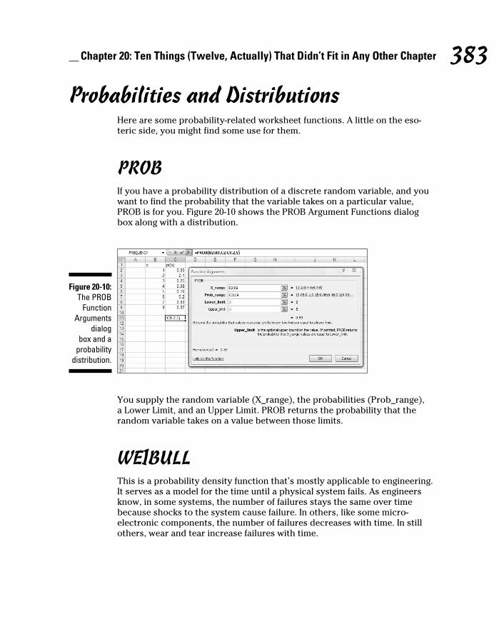
383 Chapter 20: Ten Things (Twelve, Actually) That Didn’t Fit in Any Other Chapter
Probabilities and DistributionsHere are some probability-related worksheet functions. A little on the eso-
teric side, you might find some use for them.
PROBIf you have a probability distribution of a discrete random variable, and you
want to find the probability that the variable takes on a particular value,
PROB is for you. Figure 20-10 shows the PROB Argument Functions dialog
box along with a distribution.
Figure 20-10: The PROB
Function Arguments
dialog box and a
probability distribution.
You supply the random variable (X_range), the probabilities (Prob_range),
a Lower Limit, and an Upper Limit. PROB returns the probability that the
random variable takes on a value between those limits.
WEIBULLThis is a probability density function that’s mostly applicable to engineering.
It serves as a model for the time until a physical system fails. As engineers
know, in some systems, the number of failures stays the same over time
because shocks to the system cause failure. In others, like some micro-
electronic components, the number of failures decreases with time. In still
others, wear and tear increase failures with time.
28 454060-ch20.indd 38328 454060-ch20.indd 383 4/21/09 7:38:53 PM4/21/09 7:38:53 PM

384 Part V: The Part of Tens
The Weibull distribution’s two parameters allow it to reflect all these possi-
bilities. One parameter, Alpha, determines how wide or narrow the distribu-
tion is. The other, Beta, determines where it’s centered on the x-axis.
The Weibull probability density function is a rather complicated equa-
tion. Thanks to Excel, you don’t have to worry about it. Figure 20-11 shows
WEIBULL’s Function Arguments dialog box.
Figure 20-11: The
WEIBULL Function
Arguments dialog box.
The dialog box in the figure answers the kind of question a product engineer
would ask: Assume the time to failure of a bulb in an LCD projector follows
a Weibull distribution with Alpha = .75 and Beta = 2000 hours. What’s the
probability the bulb lasts at most 4000 hours? The dialog box shows that the
answer is .814.
Drawing SamplesExcel’s Sampling data analysis tool is helpful for creating samples. You can
tailor it in a couple of ways. If you’re trying to put a focus group together and
you have to select the participants from a pool of people, you could assign
each one a number, and have the Sampling tool select your group.
One way to select is periodically. You supply n, and Excel samples every nth
number. The other way to select is randomly. You supply the number of indi-
viduals you want randomly selected and Excel does the rest.
Figure 20-12 presents the Sampling dialog box, three groups I had it sample
from, and two columns of output.
The first output column, Column A, shows the results of periodic sampling
with a period of 6. Sampling begins with the sixth score in Group 1. Excel
then counts out scores and delivers the sixth, and goes through that process
28 454060-ch20.indd 38428 454060-ch20.indd 384 4/21/09 7:38:54 PM4/21/09 7:38:54 PM

385 Chapter 20: Ten Things (Twelve, Actually) That Didn’t Fit in Any Other Chapter
again until it finishes in the last group. The periodic sampling process, as you
can see, doesn’t recycle. I supplied an output range up to cell A11, but Excel
stopped after four numbers.
Figure 20-12: The Sam-pling data
analysis tool dialog box,
sampled groups, and
results.
The second output column, Column B, shows the results of random sampling.
I asked for 20 and that’s what I got. If you closely examine the numbers in
Column B, you’ll see that the random sampling process can select a number
more than once.
Beware of a little quirk: The Labels checkbox seems to have no effect. When I
specified an input range that includes C1, D1, and E1, and checked the Labels
checkbox, I received an error message: “Sampling - Input range contains non-
numeric data.” Not a showstopper, but a little annoying.
Testing Independence: The True Use of CHITEST
In Chapter 18, I show you how to use CHITEST to test the goodness of fit of
a model to a set of data. At the time, I warned you about the pitfalls of using
this function in that context, and I mentioned that it’s really intended for
something else.
Here’s the something else. Imagine you’ve surveyed a total of 200 people.
Each person lives in either a rural area, an urban area, or a suburb. Your
survey asked them their favorite type of movie — drama, comedy, or anima-
tion. You want to know if their movie preference is independent of the envi-
ronment in which they live.
28 454060-ch20.indd 38528 454060-ch20.indd 385 4/21/09 7:38:54 PM4/21/09 7:38:54 PM

386 Part V: The Part of Tens
Table 20-1 shows the results.
Table 20-1 Living Environment and Movie PreferenceDrama Comedy Animation Total
Rural 40 30 10 80
Urban 20 30 20 70
Suburban 10 20 20 50
Total 70 80 50 200
The number in each cell represents the number of people in the environment
indicated in the row who prefer the type of movie indicated in the column.
Do the data show that preference is independent of environment? This calls
for a hypothesis test:
H0: Movie preference is independent of environment
H1: Not H
0
α= .05
To get this done, you have to know what to expect if the two are indepen-
dent. Then you can compare the data with the expected numbers and see if
they match. If they do, you can’t reject H0. If they don’t, you reject H
0.
Concepts from probability help determine the expected data. In Chapter 16, I
tell you that if two events are independent, you multiply their probabilities to
find the probability that they occur together. Here, you can treat the tabled
numbers as proportions, and the proportions as probabilities.
For example, in your sample, the probability is 80/200 that a person is from
a rural environment. The probability is 70/200 that a person prefers drama.
What’s the probability that a person is in the category “rural and likes
drama”? If the environment and preference are independent, that’s (80/200)
× (70/200). To turn that probability into an expected number of people,
you multiply it by the total number of people in the sample — 200. So the
expected number of people is (80 × 70)/200, which is 28.
In general,
28 454060-ch20.indd 38628 454060-ch20.indd 386 4/21/09 7:38:54 PM4/21/09 7:38:54 PM

387 Chapter 20: Ten Things (Twelve, Actually) That Didn’t Fit in Any Other Chapter
After you have the expected numbers, you compare them to the observed
numbers (the data) via this formula:
You test the result against a χ2 (chi-square) distribution with df = (Number of
Rows – 1) X (Number of Columns – 1), which in this case comes out to 4.
The CHITEST worksheet function performs the test. You supply the observed
numbers and the expected numbers, and CHITEST returns the probability that a
χ2 at least as high as the result from the preceding formula could have resulted if
the two types of categories are independent. If the probability is small (less than
.05), reject H0. If not, don’t reject. CHITEST doesn’t return a value of χ2, it just
returns the probability (under a χ2 distribution with the correct df).
Figure 20-13 shows a worksheet with both the observed data and the expected
numbers, along with CHITEST’s Function Arguments dialog box. Before I ran
CHITEST I attached the name Observed to D3:F5, and the name Expected to
D10:F12. (If you don’t remember how to do this, reread Chapter 2.)
Figure 20-13: The
CHITEST Function
Arguments dialog
box, with observed data and
expected numbers.
28 454060-ch20.indd 38728 454060-ch20.indd 387 4/21/09 7:38:54 PM4/21/09 7:38:54 PM

388 Part V: The Part of Tens
The figure shows that I’ve entered Observed into the Actual_range box, and
Expected into the Expected_range box. The dialog box shows a very small
probability, .00068, so the decision is to reject H0. The data are consistent
with the idea that movie preference is not independent of environment.
Logarithmica Esoterica The functions in this section are really out there. Unless you’re a tech-head,
you’ll probably never use them. I present them for completeness. You might
run into them while you’re wandering through Excel’s statistical functions,
and wonder what they are.
They’re based on what mathematicians call natural logarithms, which in turn
are based on e, that constant I use at various points throughout the book. I
begin with a brief discussion of logarithms, and then I turn to e.
What is a logarithm?Plain and simple, a logarithm is an exponent — a power to which you raise a
number. In the equation
2 is an exponent. Does that mean that 2 is also a logarithm? Well . . . yes. In
terms of logarithms,
That’s really just another way of saying 102 = 100. Mathematicians read it as
“the logarithm of 100 to the base 10 equals 2.” It means that if you want to
raise 10 to some power to get 100, that power is 2.
How about 1,000? As you know
so
How about 453? Uh . . . Hmmm . . . That’s like trying to solve
28 454060-ch20.indd 38828 454060-ch20.indd 388 4/21/09 7:38:54 PM4/21/09 7:38:54 PM

389 Chapter 20: Ten Things (Twelve, Actually) That Didn’t Fit in Any Other Chapter
What could that answer possibly be? 102 means 10 × 10 and that gives you
100. 103 means 10 × 10 × 10 and that’s 1,000. But 453?
Here’s where you have to think outside the dialog box. You have to imag-
ine exponents that aren’t whole numbers. I know, I know . . . how can you
multiply a number by itself a fraction at a time? If you could, somehow, the
number in that 453 equation would have to be between 2 (which gets you to
100) and 3 (which gets you to 1,000).
In the 16th century, mathematician John Napier showed how to do it and
logarithms were born. Why did Napier bother with this? One reason is that
it was a great help to astronomers. Astronomers have to deal with numbers
that are . . . well . . . astronomical. Logarithms ease computational strain in a
couple of ways. One way is to substitute small numbers for large ones: The
logarithm of 1,000,000 is 6 and the logarithm of 100,000,000 is 8. Also, working
with logarithms opens up a helpful set of computational shortcuts. Before
calculators and computers appeared on the scene, this was a very big deal.
Incidentally,
meaning that
You can use Excel to check that out if you don’t believe me. Select a cell and
type
=LOG(453,10)
press Enter, and watch what happens. Then just to close the loop, reverse
the process. If your selected cell is — let’s say — D3, select another cell
and type
=POWER(10,D3)
or
=10^D3
Either way, the result is 453.
Ten, the number that’s raised to the exponent, is called the base. Because it’s
also the base of our number system and we’re so familiar with it, logarithms
of base 10 are called common logarithms.
28 454060-ch20.indd 38928 454060-ch20.indd 389 4/21/09 7:38:55 PM4/21/09 7:38:55 PM

390 Part V: The Part of Tens
Does that mean you can have other bases? Absolutely. Any number (except 0
or 1 or a negative number) can be a base. For example,
So
If you ever see log without a base, base 10 is understood, so
In terms of bases, one number is special . . .
What is e?Which brings me to e, a constant that’s all about growth. Before I get back to
logarithms, I’ll tell you about e.
Imagine the princely sum of $1 deposited in a bank account. Suppose the
interest rate is 2 percent a year. (Good luck with that.) If it’s simple interest,
the bank adds $.02 every year, and in 50 years you have $2.
If it’s compound interest, at the end of 50 years you have (1 + .02)50 — which
is just a bit more than $2.68, assuming the bank compounds the interest once
a year.
Of course, if they compound it twice a year, each payment is $.01, and after
50 years they’ve compounded it 100 times. That gives you (1 + .01)100, or just
over $2.70. What about compounding it four times a year? After 50 years —
200 compoundings — you have (1 + .005)200 which results in the don’t-spend-
it-all-in-one-place amount of $2.71 and a tiny bit more.
Focusing on “just a bit more” and a “tiny bit more,” and taking it to extremes,
after one hundred thousand compoundings you have $2.718268. After one
hundred million, you have $2.718282.
If you could get the bank to compound many more times in those 50 years,
your sum of money approaches a limit — an amount it gets ever so close to,
but never quite reaches. That limit is e.
The way I set up the example, the rule for calculating the amount is
28 454060-ch20.indd 39028 454060-ch20.indd 390 4/21/09 7:38:55 PM4/21/09 7:38:55 PM

391 Chapter 20: Ten Things (Twelve, Actually) That Didn’t Fit in Any Other Chapter
where n represents the number of payments. Two cents is 1/50th of a dollar
and I specified 50 years — 50 payments. Then I specified two payments a
year (and each year’s payments have to add up to 2 percent), so that in 50
years you have 100 payments of 1/100th of a dollar, and so on.
To see this in action, enter numbers into a column of a spreadsheet as I have
in Figure 20-14. In cells C2 through C20, I have the numbers 1 through 10 and
then selected steps through one hundred million. In D2, I put this formula
=(1+(1/C2))^C2
and then autofilled to D20. The entry in D20 is very close to e.
Figure 20-14: Getting to e.
Mathematicians can tell you another way to get to e:
Those exclamation points signify factorial. 1! = 1, 2! = 2 X 1, 3! = 3 X 2 X 1. (For
more on factorials, see Chapter 16).
Excel helps visualize this one, too. Figure 20-15 lays out a spreadsheet with
selected numbers up to 170 in Column C. In D2, I put this formula:
=1+ 1/FACT(C2)
and, as the Formula Bar in the Figure shows, in D3 I put this one:
=D2 +1/ FACT(C3)
Then I autofilled up to D17. The entry in D17 is very close to e. In fact, from
D11 on, you see no change, even if you increase the amount of decimal places.
28 454060-ch20.indd 39128 454060-ch20.indd 391 4/21/09 7:38:55 PM4/21/09 7:38:55 PM

392 Part V: The Part of Tens
Figure 20-15: Another
path to e.
Why did I stop at 170? Because that takes Excel to the max. At 171, you get an
error message.
So e is associated with growth. Its value is 2.781828 . . . The three dots mean
you never quite get to the exact value (like π, the constant that enables you
to find the area of a circle).
This number pops up in all kinds of places. It’s in the formula for the normal
distribution (see Chapter 8), and it’s in distributions I discuss in Chapter 17.
Many natural phenomena are related to e.
It’s so important that scientists, mathematicians, and business analysts use
it as the base for logarithms. Logarithms to the base e are called natural loga-rithms. A natural logarithm is abbreviated as ln.
Table 20-2 presents some comparisons (rounded to three decimal places)
between common logarithms and natural logarithms:
Table 20-2 Some Common Logarithms (Log) and Natural Logarithms (Ln)Number Log Ln
e 0.434 1.000
10 1.000 2.303
50 1.699 3.912
100 2.000 4.605
453 2.656 6.116
1000 3.000 6.908
28 454060-ch20.indd 39228 454060-ch20.indd 392 4/21/09 7:38:56 PM4/21/09 7:38:56 PM

393 Chapter 20: Ten Things (Twelve, Actually) That Didn’t Fit in Any Other Chapter
One more thing. In many formulas and equations, it’s often necessary to raise
e to a power. Sometimes the power is a fairly complicated mathematical
expression. Because superscripts are usually printed in small font, it can be
a strain to have to constantly read them. To ease the eyestrain, mathemati-
cians have invented a special notation: exp. Whenever you see exp followed
by something in parentheses, it means to raise e to the power of whatever’s
in the parentheses. For example,
Excel’s EXP function does that calculation for you.
Speaking of raising e, when Google, Inc., filed their IPO they said they wanted
to raise $2,718,281,828, which is e times a billion dollars rounded to the near-
est dollar.
On to the Excel functions.
LOGNORMDISTA random variable is said to be lognormally distributed if its natural loga-
rithm is normally distributed. Maybe the name is a little misleading, because I
just said log means “common logarithm” and ln means “natural logarithm.”
Unlike the normal distribution, the lognormal can’t have a negative number
as a possible value for the variable. Also unlike the normal, the lognormal is
not symmetric — it’s skewed to the right.
Like the Weibull distribution I describe earlier, engineers use it to model the
breakdown of physical systems — particularly of the wear-and-tear variety.
Here’s where the large-numbers-to-small numbers property of logarithms
comes into play. When huge numbers of hours figure into a system’s life
cycle, it’s easier to think about the distribution of logarithms than the distri-
bution of the hours.
Excel’s LOGNORMDIST works with the lognormal distribution. You specify
a value, a mean, and a standard deviation for the lognormal. LOGNORMDIST
returns the probability that the variable is, at most, that value.
For example, the FarKlempt Robotics Inc. has gathered extensive hours-to-
failure data on a universal joint component that goes into their robots. They
find that hours-to-failure is lognormally distributed with a mean of 10 and a
standard deviation of 2.5. What is the probability that this component fails in,
at most, 10,000 hours?
28 454060-ch20.indd 39328 454060-ch20.indd 393 4/21/09 7:38:56 PM4/21/09 7:38:56 PM

394 Part V: The Part of Tens
Figure 20-16 shows the LOGNORMDIST Function Arguments dialog box for
this example. In the X box, I entered ln(10000). I entered 10 into the Mean box
and 2.5 into the Standard_dev box. The dialog box shows the answer, .000929
(and some more decimals).
Figure 20-16: The
LOGNORMDIST
Function Arguments dialog box.
LOGINVLOGINV turns LOGNORMDIST around. You supply a probability, a mean,
and a standard deviation for a lognormal distribution. LOGINV gives you the
value of the random variable that cuts off that probability.
To find the value that cuts off .001 in the preceding example’s distribution, I
used the LOGINV dialog box in Figure 20-17. With the indicated entries, the
dialog box shows that the value is 9.722 (and more decimals).
Figure 20-17: The LOGINV
Function Arguments dialog box.
By the way, in terms of hours that’s 16,685 — just for .001.
28 454060-ch20.indd 39428 454060-ch20.indd 394 4/21/09 7:38:56 PM4/21/09 7:38:56 PM

395 Chapter 20: Ten Things (Twelve, Actually) That Didn’t Fit in Any Other Chapter
Array Function: LOGESTIn Chapter 14, I tell you all about linear regression. It’s also possible to have a
relationship between two variables that’s curvilinear rather than linear.
The equation for a line that fits a scatterplot is
One way to fit a curve through a scatterplot is with this equation:
LOGEST estimates a and b for this curvilinear equation. Figure 20-18 shows
the LOGEST function arguments dialog box and the data for this example. It
also shows an array for the results. Before using this function, I attached the
name x to B2:B12 and y to C2:C12.
Figure 20-18: The
Function Arguments dialog box
for LOGEST, along with
the data and the selected array for the
results.
Here are the steps for this function:
1. With the data entered, select a five-row-by-two-column array of cells
for LOGEST’s results.
I selected F4:G8.
2. From the Statistical Functions menu, select LOGEST to open the
Function Arguments dialog box for LOGEST.
28 454060-ch20.indd 39528 454060-ch20.indd 395 4/21/09 7:38:56 PM4/21/09 7:38:56 PM

396 Part V: The Part of Tens
3. In the Function Arguments dialog box, type the appropriate values for
the arguments.
In the Known_y’s box, type the cell range that holds the scores for the
y-variable. For this example, that’s y (the name I gave to C2:C12).
In the Known_x’s box, type the cell range that holds the scores for the
x-variable. For this example, it’s x (the name I gave to B2:B12).
In the Const box, the choices are TRUE (or leave it blank) to calculate
the value of a in the curvilinear equation I showed you or FALSE to set a
to 1. I typed TRUE.
The dialog box uses b where I use a. No set of symbols is standard.
In the Stats box, the choices are TRUE to return the regression statistics
in addition to a and b, FALSE (or leave it blank) to return just a and b. I
typed TRUE.
Again, the dialog box uses b where I use a and m-coefficient where I use b.
4. IMPORTANT: Do NOT click OK. Because this is an array function,
press Ctrl+Shift+Enter to put LOGEST’s answers into the selected
array.
Figure 20-19 shows LOGEST’s results. They’re not labeled in any way, so I added
the labels for you in the worksheet. The left column gives you the exp(b) —
more on that in a moment, standard error of b, R Square, F, and the SSregression
.
The right column provides a, standard error of a, standard error of estimate,
degrees of freedom, and SSresidual
. For more on these statistics, see Chapters
14 and 15.
Figure 20-19: LOGEST’s results in
the selected array.
About exp(b). LOGEST, unfortunately, doesn’t return the value of b — the
exponent for the curvilinear equation. To find the exponent, you have to cal-
culate the natural logarithm of what it does return. Applying Excel’s LN work-
sheet function here gives 0.0256 as the value of the exponent.
28 454060-ch20.indd 39628 454060-ch20.indd 396 4/21/09 7:38:56 PM4/21/09 7:38:56 PM

397 Chapter 20: Ten Things (Twelve, Actually) That Didn’t Fit in Any Other Chapter
So the curvilinear regression equation for the sample data is:
or in that exp notation I told you about,
A good way to help yourself understand all of this is to use Excel’s graphics
capabilities to create a scatterplot. (See Chapter 3.) Then right-click on a data
point in the plot and select Add Trendline from the pop-up menu. That opens
the Format Trendline dialog box (Figure 20-20). Click the radio button next to
Exponential, as I’ve done in the figure. Also, as I’ve done in the figure, toward
the bottom of the dialog box click the checkbox next to Display Equation on
Chart.
Figure 20-20: The Type
tab on the Add
Trendline dialog box.
Click Close, and you have a scatterplot complete with curve and equation. I
reformatted mine in several ways to make it look clearer on the printed page.
Figure 20-21 shows the result.
28 454060-ch20.indd 39728 454060-ch20.indd 397 4/21/09 7:38:57 PM4/21/09 7:38:57 PM

398 Part V: The Part of Tens
Figure 20-21: The scatter-
plot with curve and equation.
Array Function: GROWTHGROWTH is curvilinear regression’s answer to TREND (Chapter 14). You can
use this function two ways — to predict a set of y-values for the x-values in
your sample, or to predict a set of y-values for a new set of x-values.
Predicting y’s for the x’s in your sampleFigure 20-22 shows GROWTH set up to calculate y’s for the x’s I already have.
I included the Formula Bar in this screen shot so you can see what the for-
mula looks like for this use of GROWTH.
Here are the steps:
Figure 20-22: The Function
Arguments dialog box
for GROWTH, along with
the sample data.
GROWTH is set up
to predict x’s for the
sample y’s.
28 454060-ch20.indd 39828 454060-ch20.indd 398 4/21/09 7:38:57 PM4/21/09 7:38:57 PM

399 Chapter 20: Ten Things (Twelve, Actually) That Didn’t Fit in Any Other Chapter
1. With the data entered, select a cell range for GROWTH’s answers.
I selected D2:D12 to put the predicted y’s right next to the sample y’s.
2. From the Statistical Functions menu, select GROWTH to open the
Function Arguments dialog box for GROWTH.
3. In the Function Arguments dialog box, type the appropriate values for
the arguments.
In the Known_y’s box, type the cell range that holds the scores for the
y-variable. For this example, that’s y (the name I gave to C2:C12).
In the Known_x’s box, type the cell range that holds the scores for the
x-variable. For this example, it’s x (the name I gave to B2:B12).
I’m not calculating values for new x’s here, so I leave the New_x’s box
blank.
In the Const box, the choices are TRUE (or leave it blank) to calculate
a, or FALSE to set a to 1. I entered TRUE. (I really don’t know why you’d
enter FALSE.) Once again, the dialog uses b where I use a.
4. IMPORTANT: Do NOT click OK. Because this is an array function,
press Ctrl+Shift+Enter to put GROWTH’s answers into the selected
column.
Figure 20-23 shows the answers in D2:D12.
Figure 20-23: The results
of GROWTH: Predicted y’s for the
sample x’s.
Predicting a new set of y’s for a new set of x’sHere, I use GROWTH to predict y’s for a new set of x’s. Figure 20-24 shows
GROWTH set up for this. In addition to the array named x and the array
named y, I defined New_x as the name for B15:B22, the cell range that holds
the new set of x’s.
Figure 20-24 also shows the selected array of cells for the results. Once
again, I included the Formula Bar to show you the formula for this use of the
function.
28 454060-ch20.indd 39928 454060-ch20.indd 399 4/21/09 7:38:57 PM4/21/09 7:38:57 PM

400 Part V: The Part of Tens
Figure 20-24: The
Function Arguments dialog box
for GROWTH, along
with data. GROWTH
is set up to predict y’s for a new set of x’s.
To do this, follow these steps:
1. With the data entered, select a cell range for GROWTH’s answers.
I selected C15:C22.
2. From the Statistical Functions menu, select GROWTH to open the
Function Arguments dialog box for GROWTH.
3. In the Function Arguments dialog box, type the appropriate values for
the arguments.
In the Known_y’s box, enter the cell range that holds the scores for the
y-variable. For this example, that’s y (the name I gave to C2:C12).
In the Known_x’s box, enter the cell range that holds the scores for the
x-variable. For this example, it’s x (the name I gave to B2:B12).
In the New_x’s box, enter the cell range that holds the new scores for
the x-variable. That’s New_x (the name I gave to B15:B22).
In the Const box, the choices are TRUE (or leave it blank) to calculate a,
or FALSE to set a to one. I typed TRUE. (Again, I really don’t know why
you’d enter FALSE.)
4. IMPORTANT: Do NOT click OK. Because this is an array function,
press Ctrl+Shift+ Enter to put GROWTH’s answers into the selected
column.
Figure 20-25 shows the answers in C15:C22.
28 454060-ch20.indd 40028 454060-ch20.indd 400 4/21/09 7:38:58 PM4/21/09 7:38:58 PM

401 Chapter 20: Ten Things (Twelve, Actually) That Didn’t Fit in Any Other Chapter
Figure 20-25: The Results
of GROWTH: Predicted
y’s for a New Set
of x’s.
When Your Data Live ElsewhereIn a few places throughout the book, I use data from the history of baseball.
Happily, the Web site www.baseball-reference.com provides these data.
How did I get these data from a web page into a worksheet?
It’s way easier than you might think. To take the first giant step, I select
Data| Get External Data
and then choose the type of data source I’m dealing with. Figure 20-26 shows
how to do it.
Figure 20-26: Selecting Data | Get
External Data.
As you can see, you can import from a number of different types of sources.
Here, I just discuss data import from the web. To illustrate, I import data
from the Web site of Wiley Publishing.
28 454060-ch20.indd 40128 454060-ch20.indd 401 4/21/09 7:38:58 PM4/21/09 7:38:58 PM

402 Part V: The Part of Tens
After I choose From Web, the New Web Query window opens within the
spreadsheet. The window displays the home page that appears when I open
my browser. In the Address box, I enter the address of the Web page that
supplies the data. Specifically, I typed Wiley.com into the Address box. When
I clicked Go, the window opened the page with this URL:
www.wiley.com/WileyCDA/
Figure 20-27 shows the appearance of the New Web Query window with
this URL.
Figure 20-27: The New
Web Query window
displaying a Wiley Web
page.
The important items to note here are the right-pointing arrows throughout
the window. You can’t see it on the figure, but those arrows are in yellow.
Each one points to a grouping of data you can import into Excel.
I clicked the arrow next to ABOUT WILEY. Then I clicked Import. The Import
Data dialog box opens and gives the choice of putting the data into the exist-
ing worksheet or a new one. I chose the existing worksheet, and specified cell
A1 as the starting point for the table. (I could have also selected a cell before
I opened the New Web Query window.) Then I clicked OK. Figure 20-28 shows
the result.
28 454060-ch20.indd 40228 454060-ch20.indd 402 4/21/09 7:38:58 PM4/21/09 7:38:58 PM

403 Chapter 20: Ten Things (Twelve, Actually) That Didn’t Fit in Any Other Chapter
Figure 20-28: Data
imported from a Web page into a worksheet.
That’s all there is to it!
28 454060-ch20.indd 40328 454060-ch20.indd 403 4/21/09 7:38:59 PM4/21/09 7:38:59 PM

404 Part V: The Part of Tens
28 454060-ch20.indd 40428 454060-ch20.indd 404 4/21/09 7:38:59 PM4/21/09 7:38:59 PM

Appendix A
When Your Worksheet Is a Database
In This Chapter▶ Databases in Excel
▶ Statistics in databases
▶ Pivot tables
Excel’s main function in life is to perform calculations. As the chapters in
this book show, many of those calculations revolve around built-in sta-
tistical capabilities.
You can also set up a worksheet to store information in something like a
database, although Excel is not as sophisticated as a dedicated database
package. Excel offers database functions that are much like its statistical
functions, so I thought I’d familiarize you with them.
Introducing Excel DatabasesStrictly speaking, Excel provides a data list. This is an array of worksheet
cells into which you enter related data in a uniform format. You organize the
data in columns, and you put a name at the top of each column. In database
terminology, each named column is a field. Each row is a separate record.
This type of structure is useful for keeping inventories, as long as they’re not
overly huge. You wouldn’t use an Excel database for recordkeeping in a ware-
house or a large corporation. For a small business, however, it might fit the bill.
The Satellites databaseFigure A-1 shows an example. This is an inventory of the classic satellites in
our solar system. By “classic,” I mean that astronomers discovered most of
29 454060-bapp01.indd 40529 454060-bapp01.indd 405 4/21/09 7:39:35 PM4/21/09 7:39:35 PM

406 Statistical Analysis with Excel For Dummies, 2nd Edition
them before the 20th century, via conventional telescopes. The three 20th-
century entries are so dim that astronomers discovered them by examin-
ing photographic plates. Today’s super telescopes and space probes have
revealed many more satellites that I didn’t include.
Figure A-1: The
Satellites database.
The database is in cells B10:G35. I defined Satellites as the name of this cell
range. Notice that I included the field names in the range. (Reread Chapter 2
if you don’t remember how to name a cell range.)
The Name field provides the name of the satellite; the Planet field indicates
the planet around which the satellite revolves.
Orbital_Period_Days shows how long it takes for a satellite to make a com-
plete revolution around its planet. Our Moon, for example, takes a little over
27 days. A couple of records have negative values in this field. That means they
revolve around the planet in a direction opposite to the planet’s rotation.
Average Distance_X_1000_km is the average distance from the planet to the
satellite in thousands of kilometers. The last two fields provide the year of
discovery, and the astronomer who discovered the satellite. For our Moon, of
course, those two are unknown.
After you label each field, you attach a name to each cell that holds a field
name. Important point: The range for each name is just the cell that holds the
field name, not the whole column of data. So here, I define Name as the name
of the cell labeled Name.
29 454060-bapp01.indd 40629 454060-bapp01.indd 406 4/21/09 7:39:35 PM4/21/09 7:39:35 PM

407 Appendix A: When Your Worksheet Is a Database
Okay, I worked really hard to set up the premise for the preceding sentence.
Here are two examples that are easier to follow: I define Planet as the name of
cell C10, and Orbital_Period_Days as the name of D10, and so on. Now I can
use these field names in Excel’s database formulas.
The criteria rangeI copied the column headers — excuse me, field names — into the top row. I
also put some information into nearby cells. This area is for the criteria range.
This range enables you to use Excel’s database functions to ask (and answer)
questions about the data. Database honchos call this “querying.” Criteria are
a part and parcel of each database function. (“Criteria” is plural. The singular
form is “criterion.”)
It’s not necessary to have this range at the top of the worksheet. You can des-
ignate any range in the worksheet as the criteria range.
When you use an Excel database function it’s in this format:
=FUNCTION(Database, Field, Criteria)
The function operates on the specified database, in the designated field,
according to the indicated criteria.
For example, if you want to know how many satellites revolve around Saturn,
you select a cell and enter
=DCOUNT(Satellites,Average_Distance_X_1000_km,C1:C2)
Here’s what this formula means: In the database (B1:G35), DCOUNT tallies up
the amount of number-containing cells in the Average_Distance_X_1000_km
field, constrained by the criterion specified in the cell range C1:C2. That cri-
terion is equivalent to Planet = Saturn. Note that a criterion has to include at
least one column header . . . uh . . . field name from the criteria range, and at
least one row. Bear in mind that you can’t use the actual field name in the cri-
teria. You use the cell ID (like C1).
When you include more than one row, you’re saying “or.” For example, if
your criterion happens to be G1:G3, you’re specifying satellites discovered by
Galileo or Cassini.
When you include more than one column in a criterion, you’re saying “and.”
If your criterion is E1:F2, you’re specifying satellites farther than 150,000 km
from their planets and discovered after 1877.
29 454060-bapp01.indd 40729 454060-bapp01.indd 407 4/21/09 7:39:36 PM4/21/09 7:39:36 PM

408 Statistical Analysis with Excel For Dummies, 2nd Edition
The format of a database functionThe formula I just showed you
=DCOUNT(Satellites,Average_Distance__X_1000_km,C1:C2)
is accessible via a Function Arguments dialog box, as is the case for all the
other worksheet functions in Excel. Figure A-2 shows the equivalent dialog
box for the preceding formula, set against the backdrop of the database and
the criteria range.
Figure A-2: The
DCOUNT Function
Arguments dialog box.
How do you open this dialog box? Unlike the Statistical Functions or the
Math & Trig Functions, Database Functions do not reside on their own menu.
Instead you click the Insert Function button to open the Insert Function
dialog box. Then in that dialog box, you scroll down the list of functions until
you find the database function you’re looking for.
Here’s an example:
1. Select a worksheet cell.
As Figure A-2 shows, I selected H6.
2. Click the Insert Function button (it’s labeled fx) to open the Insert
Function dialog box.
29 454060-bapp01.indd 40829 454060-bapp01.indd 408 4/21/09 7:39:36 PM4/21/09 7:39:36 PM

409 Appendix A: When Your Worksheet Is a Database
3. In the Insert Function dialog box, select a function to open its
Function Arguments dialog box.
From the Database category, I selected DCOUNT and that’s the dialog
box in Figure A-2.
4. In the Function Arguments dialog box, enter the appropriate values
for the arguments.
For the Database, I entered Satellites in the Database box. For the Field,
I entered Average_Distance_X_1000_km in the Field box. This isn’t as
keyboard intensive as it sounds. As I type along, a pop-up appears with
the full name of the field name. Double-clicking the name puts it into the
Field box. For the Range, I entered C1:C2 in the Range box.
The answer, 9, appears in the dialog box.
5. Click OK to put the answer into the selected cell.
All the database functions follow the same format, you access them all the
same way, and you fill in the same type of information in their dialog boxes.
So I’m going to skip over that sequence of steps as I describe each function,
and just discuss the equivalent worksheet formula.
Counting and Retrieving One essential database capability is to let you know how many records meet a
particular criterion. Another is to retrieve records. Here are the Excel versions.
DCOUNT and DCOUNTA As I just showed you, DCOUNT counts records. The restriction is that the field
you specify has to contain numbers. If it doesn’t, the answer is zero, as in
=DCOUNT(Satellites,Name,C1:C2)
because no records in the Name field contain numbers.
DCOUNTA counts records in a different way. This one works with any field. It
counts the number of non-blank records in the field that satisfy the criterion.
So this formula returns 9:
=DCOUNTA(Satellites,Name,C1:C2)
29 454060-bapp01.indd 40929 454060-bapp01.indd 409 4/21/09 7:39:36 PM4/21/09 7:39:36 PM

410 Statistical Analysis with Excel For Dummies, 2nd Edition
Getting to “or”Here’s a tally that involves “or”:
=DCOUNTA(Satellites,Name,D1:D3)
The criterion D1:D3 specifies satellites whose orbital period is 1.26 days or
greater than 20 days — as I mention before, multiple rows mean “or.” Five sat-
ellites meet that criterion: Deimos, Hyperion, Iapetus, our Moon, and Nereid.
WildcardsLook closely at Figure A-1 and you see the cryptic entry *io in Cell B2. I did
that so you’d know that Excel database functions can deal with wildcard
characters. The formula
=DCOUNTA(Satellites,Name,B1:B2)
returns 3, the number of satellites with the letter-string “io” anywhere in their
names (Dione, Io, and Hyperion).
DGETDGET retrieves exactly one record. If the criteria you specify result in more
than one record (or in no records), DGET returns an error message.
This formula
=DGET(Satellites,Name,D1:D2)
retrieves “Deimos,” the name of the satellite whose orbital period is 1.26 days.
This one
=DGET(Satellites,Name,E1:E2)
results in an error message because the criterion specifies more than one
record.
ArithmeticExcel wouldn’t be Excel without calculation capabilities. Here are the ones it
offers for its databases.
29 454060-bapp01.indd 41029 454060-bapp01.indd 410 4/21/09 7:39:36 PM4/21/09 7:39:36 PM

411 Appendix A: When Your Worksheet Is a Database
DMAX and DMINAs their names suggest, these provide the maximum value and the minimum
value according to your specifications. The formula
=DMAX(Satellites,Orbital_Period__Days,E1:E2)
returns 360.14. This is the maximum orbital period for any satellite that’s far-
ther than 150,000 km from its planet.
For the minimum value that meets this criterion,
=DMIN(Satellites,Orbital_Period__Days,E1:E2)
gives you –550.48. That’s Phoebe, a satellite that revolves in the opposite
direction to its planet’s rotation.
DSUM This one adds up the values in a field. To add all the orbital periods in the
satellites discovered by Galileo or by Cassini, use this formula:
=DSUM(Satellites,Orbital_Period__Days,G1:G3)
That sum is 117.64.
Want to total up all the orbital periods? (I know, I know . . . =SUM(B11:B35).
Just work with me here.)
This formula gets it done:
=DSUM(Satellites,Orbital_Period__Days,C1:C3)
Why? It’s all in the criterion. C1:C3 means that Planet = Saturn or . . . anything
else, because C3 is empty. The sum, by the way, is 35.457. Bottom line: Be
careful whenever you include an empty cell in your criteria.
DPRODUCTHere’s a function that’s probably here only because Excel’s designers could
create it. You specify the data values, and DPRODUCT multiplies them.
29 454060-bapp01.indd 41129 454060-bapp01.indd 411 4/21/09 7:39:36 PM4/21/09 7:39:36 PM

412 Statistical Analysis with Excel For Dummies, 2nd Edition
The formula
=DPRODUCT(Satellites,Orbital_Period__Days,G1:G2)
returns the product (749.832) of the orbital periods of the satellites Galileo
discovered — a calculation I’m pretty sure Galileo never thought about.
StatisticsWhich brings me to the statistical database functions. These work just like
the similarly named worksheet functions.
DAVERAGEHere’s the formula for the average of the orbital periods of satellites discov-
ered after 1887:
=DAVERAGE(Satellites,Orbital_Period__Days,F1:F2)
The average is negative (-36.4086) because the specification includes those
two satellites with the negative orbital periods.
DVAR and DVARPDVAR is the database counterpart of VAR, which divides the sum of N
squared deviations by N-1. This is called sample variance.
DVARP is the database counterpart of VARP, which divides the sum of N
squared deviations by N. This is the population variance. (For details on VAR
and VARP, sample variance and population variance, and the implications of
N and N-1, see Chapter 5.)
Here’s the sample variance for the orbital period of satellites farther than
150,000 km from their planets and discovered after 1877:
=DVAR(Satellites,Orbital_Period__Days,E1:F2)
That turns out to be 210,358.1.
The population variance for that same subset of satellites is
=DVARP(Satellites,Orbital_Period__Days,E1:F2)
which is 140,238.7.
29 454060-bapp01.indd 41229 454060-bapp01.indd 412 4/21/09 7:39:36 PM4/21/09 7:39:36 PM

413 Appendix A: When Your Worksheet Is a Database
Once again, if you have multiple columns in the criteria, you’re dealing
with “and.”
DSTDEV and DSTDEVPThese two return standard deviations. The standard deviation is the square
root of the variance. (See Chapter 5.) DSTDEV returns the sample standard
deviation, which is the square root of DVAR’s returned value. DSTDEVP
returns the population standard deviation, the square root of DVARP’s
returned value.
For the specifications in the preceding example, the sample standard devia-
tion is
=DSTDEV(Satellites,Orbital_Period__Days,E1:F2)
which is 458.6481.
The population standard deviation is
=DSTDEVP(Satellites,Orbital_Period__Days,E1:F2)
This result is 374.4846.
According to FormExcel provides a Data Form to help you work with databases. Unfortunately,
Excel 2007 didn’t put a button for this form on the Ribbon. To access this
button, you have to put it on the Quick Access toolbar.
Here’s how to do it:
1. Click the down arrow on the right of the Quick Access toolbar to open
the Customize Quick Access Toolbar menu.
2. From this menu, select More Commands to open the Excel Options
dialog box.
3. In the Choose Commands From drop-down menu, select Commands
Not in the Ribbon.
4. In the list box on the left, scroll down and select Form.
5. Click the Add button to put Form into the list box on the right.
6. Click OK to close the Excel Options dialog box.
The Data Form button is now on the Quick Access toolbar.
29 454060-bapp01.indd 41329 454060-bapp01.indd 413 4/21/09 7:39:36 PM4/21/09 7:39:36 PM

414 Statistical Analysis with Excel For Dummies, 2nd Edition
To use the Data Form, highlight the entire cell range of the database, includ-
ing the column headers. Then click the Data Form button.
Figure A-3 shows the appearance of the Data Form when you open it with the
whole database selected. Excel fills in the field names automatically, and the
fields populate with the values from the first record. You can use the form to
navigate through the database, and you can use it to add a record. You can
start with one record and use the New button to enter all the rest, but for me
it’s easier to just type each record.
Figure A-3: The Data Form for working
with Excel databases.
Whenever you add records (and whichever way you add them), be sure to
click Formulas | Manage Names and increase the cell range attached to the
database name.
The title on the Data Form is the same as the name on the bottom tab of the
worksheet. So it’s a good idea to put the name of the database on the tab. It’s
clearer what the Form shows when something like “Satellites” is in its title
rather than “Sheet 1.”
Pivot TablesA pivot table is a cross-tabulation — another way of looking at the data. You
can reorganize the database, and turn it (literally) on its side and inside out.
And you can do it in any number of ways.
For example, you can set up a pivot table that has the satellites in the rows
and a planet in each column, and has the data for orbital period inside the
cells. Figure A-4 shows what I mean.
29 454060-bapp01.indd 41429 454060-bapp01.indd 414 4/21/09 7:39:36 PM4/21/09 7:39:36 PM

415 Appendix A: When Your Worksheet Is a Database
Figure A-4: A pivot table of the satel-
lites data showing
satellites, planets,
and orbital period.
Figure A-5 shows a pivot table that presents another view of the data. This
one takes the spotlight off the individual satellites and puts it on the planets.
Each planet’s row is divided into two rows — one for the Orbital Period and
one for the Average Distance. The numbers are the sums across each planet’s
satellites. Adding up the Orbital Period for all of Jupiter’s satellites gives you
29.66, for instance.
Figure A-5: Another
pivot table of the satel-
lites data, showing planets,
orbital period, and
average distance.
This example focuses on creating the pivot table in Figure A-4. Creating pivot
tables in Excel 2007 is easier than in earlier versions. Before, you
29 454060-bapp01.indd 41529 454060-bapp01.indd 415 4/21/09 7:39:36 PM4/21/09 7:39:36 PM

416 Statistical Analysis with Excel For Dummies, 2nd Edition
went through a number of steps as you worked via a wizard. Now, here’s
what you do:
1. Open the worksheet that holds the database.
In this case, it’s Satellites.
2. Select any cell in the range of the database.
3. Select Insert | Pivot Table to open the Create Pivot Table dialog box
(See Figure A-6).
Figure A-6: The Create Pivot Table dialog box.
4. Make your entries within this dialog box.
Because I selected a cell within the database before I opened this dialog
box, the first radio button is selected and the Range box is filled in.
I selected the radio button next to New Worksheet to put the pivot table
on a new worksheet.
5. Click OK.
The result is the Pivot Table Layout on a new worksheet. (See
Figure A-7.)
6. Populate the Pivot Table Layout.
To populate the PivotTable Layout, you select a field from the
PivotTable Field List, drag it into the appropriate box below, and drop it.
I begin with the rows. To make the names of the satellites appear in the
rows, I selected Name and dropped it into the Row Labels box. Figure
A-8 shows the result. In addition to the satellite names in the rows, the
checkbox next to Name is bold and checked, to indicate it’s in the table.
Unchecking the checkbox removes Name from the table.
29 454060-bapp01.indd 41629 454060-bapp01.indd 416 4/21/09 7:39:37 PM4/21/09 7:39:37 PM

417 Appendix A: When Your Worksheet Is a Database
Figure A-7: A new
worksheet containing
the pivot table layout.
Figure A-8: The
PivotTable Layout after
dropping the Name Field
into the Row Labels box.
29 454060-bapp01.indd 41729 454060-bapp01.indd 417 4/21/09 7:39:37 PM4/21/09 7:39:37 PM

418 Statistical Analysis with Excel For Dummies, 2nd Edition
Next, I dropped Planet into the Column Labels box. (Figure A-9.)
Dragging Orbital Period (Days) from the Field List and dropping it into
the Σ Values box results in the table shown in Figure A-4.
Dropping a field into the Report Filter box creates something like a
multipage version of the table. For example, putting Discoverer in the
Report Filter box creates a drop-down that allows you to see just the
data for each Discoverer.
The down arrow next to a field opens a menu of options for sorting and
filtering that field.
The importance of pivot tables is that they allow you to get your hands dirty
with the data. By dropping fields into and out of the table, you might see rela-
tionships and carry out analyses that might not occur to you if you just look
at the original database.
Figure A-9: The
PivotTable Layout after
dropping the Planet Field into Column Labels Box.
29 454060-bapp01.indd 41829 454060-bapp01.indd 418 4/21/09 7:39:38 PM4/21/09 7:39:38 PM

Appendix B
The Analysis of CovarianceIn This Chapter▶ Another look at covariance
▶ Why and how we analyze covariance
▶ Analysis of Covariance (ANCOVA) in Excel
One of the major points of this book is that Excel comes with a surprising
number of analytical tools and formulas. The toolset isn’t as extensive
as you’d find in a dedicated statistics package, but it’s still impressive.
Some analyses, unfortunately, aren’t part of Excel. And some of those might
turn out to be important for you. In many cases, with a little ingenuity you
can use the existing parts of Excel to perform those analyses anyway. In this
Appendix, I focus on one of those analyses.
Covariance: A Closer LookIn Chapter 15, I mention covariance in connection with correlation. I spoke
about it briefly as the numerator of the correlation coefficient. I also mention
that covariance represents two variables changing together.
What does that mean, exactly?
Imagine a group of people on whom we measure mathematical ability and
sociability. (Let’s just assume we have valid, reliable ways of measuring
both.) If we find that the people with high mathematical ability are the most
sociable, and the people with low mathematical ability are the least sociable,
this thing called covariance is numerically high and positive. This type of
positive relationship is called a direct relationship.
30 454060-bapp02.indd 41930 454060-bapp02.indd 419 4/21/09 7:40:18 PM4/21/09 7:40:18 PM

420 Statistical Analysis with Excel For Dummies, 2nd Edition
A different result is possible: The people with high mathematical ability
might turn out to be the least sociable, and the people with low mathematical
ability the most sociable. If that happens, covariance is numerically high and
negative. This type of negative relationship is called an inverse relationship.
Still another result is possible. We might find no connection whatsoever
between mathematical ability and sociability. In this case, the two variables
are independent, and the numerical value of covariance is close to zero. It
could be slightly positive, it could be slightly negative, but it’s close to zero.
Sounds a lot like correlation? It should. As I said, covariance is the numera-
tor of the correlation coefficient. One way to look at it is that the correlation
coefficient puts an upper and lower bound on covariance. With a little experi-
ence, we can understand what a correlation coefficient of .98 means, or a cor-
relation coefficient of -.62. Without a lot of context, it’s hard to know what a
covariance of 473.5 means.
Why You Analyze CovarianceSo you’ve had a refresher on what covariance is. Why do we want to . . . uh . . .
analyze it?
Let’s begin with a typical study: You randomly assign people to different
conditions and you assess their performance under those conditions. For
example, you might randomly assign 15 children to one of three groups that
differ on how they prepare for a math exam. One group prepares by listen-
ing to a human instructor. Another prepares by going through an interactive
program on a computer. The third prepares by reading a textbook. Then they
take the exam.
The performance on the test is the dependent variable. The three preparation
conditions make up the independent variable. The goal is usually to find out
if the different conditions of the independent variable affect the dependent
variable. Recall from Chapter 12 that this involves a hypothesis test that
looks like this:
H0: μ
Instructor = μ
Computer = μ
Text
H1: Not H
0
In Chapter 12, I also point out that the appropriate statistical technique is the
analysis of variance (ANOVA).
So far, so good. What about covariance?
30 454060-bapp02.indd 42030 454060-bapp02.indd 420 4/21/09 7:40:18 PM4/21/09 7:40:18 PM

421 Appendix B: The Analysis of Covariance
In addition to the dependent variable and the independent variable, a third
kind of variable can come into play. Here’s how. Suppose you have another
relevant measure for each of the 15 children — mathematics aptitude. In
addition to preparation type, this could also affect each child’s exam perfor-
mance. This third variable is called the covariate. The relationship between
the dependent variable and the covariate is covariance.
Big shots in the field of research design and analysis have a name for ran-
domly assigning individuals to different conditions of the independent vari-
able and keeping everything else the same (like the time of day you give the
test, the amount of time each child prepares, the amount of time each child
has to take the test). They call this experimental control.
They also have a name for assessing the effects of a covariate — that is,
its covariance with the dependent variable. They refer to that as statistical control. Both are valuable tools in the analyst’s arsenal.
Bottom-line question: Why do you need statistical control? Suppose you
carry out the study and find no significant differences among preparation
groups. This could mean that experimental control wasn’t powerful enough
to discern an effect of preparation type. That’s when statistical control can
come to the rescue. Suppose mathematics aptitude affected performance in
ways that masked the effects of preparation type. That is, does the possible
correlation of performance with aptitude affect the results?
By combining experimental control with statistical control, analysis of covari-
ance (ANCOVA) answers that question.
How You Analyze CovarianceHow do you combine the two types of control?
In Chapter 12, I point out that ANOVA separates SSTotal
into SSBetween
and SSWithin
.
Divide each SS by its degrees of freedom and you have three MS (variances).
The MSBetween
reflects differences among group means. The MSWithin
estimates
the population variance. It’s based on pooling the variances within the
groups. If the MSBetween
is significantly greater than the MSWithin
, you can reject
the null hypothesis. If not, you can’t. (Reread Chapter 12 if this all sounds
strange to you.)
In ANCOVA, you use the relationship between the dependent variable and
the covariate to adjust SSBetween
and SSWithin
. If the relationship is strong, it’s
likely that the adjustment increases SSBetween
and reduces SSWithin
. Statistics,
30 454060-bapp02.indd 42130 454060-bapp02.indd 421 4/21/09 7:40:18 PM4/21/09 7:40:18 PM

422 Statistical Analysis with Excel For Dummies, 2nd Edition
like most other aspects of our world, feature no free lunches: The adjustment
lowers the dfWithin
by 1. It might help to think of it this way:
ANOVA:
ANCOVA:
A possible outcome of the adjustment (if the relationship is strong) is that
the F ratio is higher for ANCOVA than for ANOVA. In practical terms, this
means that adding statistical control can result in a more powerful study
(that is, greater ability to find an effect) than experimental control alone.
Here’s a way to understand ANOVA vs. ANCOVA: ANOVA helps you find a
needle in a haystack. ANCOVA also does this, but it removes some of the hay
from the haystack — and it makes the needle a little bigger, too.
ANCOVA in ExcelAlthough Excel has no built-in tools for ANCOVA, you can use what Excel
does provide to make ANCOVA way easier than it looks in statistics books.
What does Excel provide? When it comes to covariance, recall that the
COVAR worksheet function does all the calculations for you, as does the
Covariance analysis tool.
It sounds like the Covariance analysis tool is ideal for something called
Analysis of Covariance (ANCOVA). Oddly, it’s not. We also have no use for
COVAR as we proceed.
Instead, I show you two approaches that use other Excel features to carry out
an ANCOVA. One approach uses the Anova: Single Factor analysis tool along
with some worksheet functions. The other uses the Regression analysis tool
along with some worksheet functions.
Both approaches tackle the data in Table B-1. In both methods, I use regres-
sion slopes to express the relationship between the dependent variable and
the covariate.
30 454060-bapp02.indd 42230 454060-bapp02.indd 422 4/21/09 7:40:18 PM4/21/09 7:40:18 PM

423 Appendix B: The Analysis of Covariance
Table B-1 Data for Exam Performance with Three Preparation Methods and for Mathematics Aptitude
Human Computer Text
Math Aptitude
Exam Math Aptitude
Exam Math Aptitude
Exam
10 6 7 9 7 9
9 9 7 5 9 12
8 7 8 14 4 9
6 2 11 10 11 18
9 10 11 15 7 11
These methods are for the kind of research design I discuss in Chapter 12
(single factor ANOVA). You can use ANCOVA for any kind of research design
that involves ANOVA, but these two particular methods won’t work for more
complicated designs (as in Chapter 13, for example).
Method 1: ANOVA When most statistics textbooks cover analysis of covariance, they show you
a lot of arcane-looking computation formulas designed to avoid even more
complex-looking regression-related calculations. The result is that they often
obscure what ANCOVA is supposed to do.
With this method, and the next one, I show you how to harness Excel’s power
to get around all of that. My goal is to make ANCOVA a lot easier than it looks
in stat books.
Figure B-1 shows the ANCOVA worksheet for this method. I’ll take you
through the steps.
The data from Table B-1 are in cells B1:D13, separated into one table for the
dependent variable data and another for the covariate data. I structured
the data this way because I have to use the Anova: Single Factor tool on the
dependent variable and again on the covariate. The input to the Anova tool is
a contiguous range of cells, so the layout in Table B-1 doesn’t work.
The first thing I did was set up to calculate bwithin
, a quantity I use to adjust
the SS and to adjust group means for post-analysis testing.
30 454060-bapp02.indd 42330 454060-bapp02.indd 423 4/21/09 7:40:18 PM4/21/09 7:40:18 PM

424 Statistical Analysis with Excel For Dummies, 2nd Edition
Figure B-1: The
Method 1 ANCOVA
worksheet for the data
in Table B-1.
What is bwithin
? Imagine a scatterplot for each of the three groups, and a
regression line through each scatterplot. Each regression line has a slope.
The value of bwithin
is the average of the group slopes with each slope
weighted by the variance of the covariate within the group.
This might be a rare case where the formula is clearer than the words. Here
it is:
So I used VAR to calculate the variance of each group within the covariate.
Those variances are in row 14, labeled VarianceX. I could have run the Anova
tool to get these variances. I did it this way for clarity. The sum of these vari-
ances, 12.4, is in cell E14.
Then I used SLOPE to calculate the slope within each group. Those are in
row 15, labeled SlopeXY.
Row 16, labeled VarX*SlopeXY, contains the product of each group slope
multiplied by the variance in that group. Cell E16 holds the sum of these
products.
The value of bwithin
is in cell B18. The formula for that cell is
=E16/E14
30 454060-bapp02.indd 42430 454060-bapp02.indd 424 4/21/09 7:40:18 PM4/21/09 7:40:18 PM

425 Appendix B: The Analysis of Covariance
Cell B19 holds another slope I use for SS adjustment. It’s called btotal
and it
represents the slope of the regression line drawn through a scatterplot of all
the scores regardless of the group they’re in. The formula for B19 is
=SLOPE(B2:D6,B9:D13)
Next, I constructed the spiffy-looking ANCOVA table in cells A21:F25. The
objective of this whole process is to fill in this table. I formatted all the labels
and borders to make it look something like the results of an Anova:Single
Factor analysis. Then I filled in the sources of variation in A23:A25, and the df
in C23:C25. The df are the same as for ANOVA, except you lose a df from the
dfWithin
, and that of course is reflected in the dfTotal
.
The next order of business is to run the Anova:Single Factor analysis tool. I
ran it once for the dependent variable and once for the covariate. Why for the
covariate? After all, I’m not testing any hypotheses about Math Aptitude. The
reason for an ANOVA on the covariate is that the ANOVA output provides SS
values I need to complete the ANCOVA.
In Chapter 12, I explain how to use this tool. The only difference is that in this
case I directed the output to this worksheet rather than to separate worksheets.
I removed some rows from the Anova tool’s outputs so that everything would
fit into one screen shot, and I modified them a bit for clarity.
The values in the ANOVA tables enable me to fill in the ANCOVA table. The
Adusted SSTotal
is
This means that
=I13-B19^2*I27
goes into cell B25 in the ANCOVA table. By the way, I rounded off to two deci-
mal places to make everything look nicer on this page. The worksheet has
way more decimal places.
Next up: Adjusted SSWithin
. The formula for the adjustment is
30 454060-bapp02.indd 42530 454060-bapp02.indd 425 4/21/09 7:40:19 PM4/21/09 7:40:19 PM

426 Statistical Analysis with Excel For Dummies, 2nd Edition
Numerically, that’s
So in cell B24 I put this formula
=I11-B18^2*I25
Adjusted SSBetween
? That’s just
=B25-B24
in cell B23.
I complete the ANCOVA table by dividing each Adjusted SS by its df, and then
dividing the Adjusted MSBetween
by the Adjusted MSWithin
to compute F.
That last column in the ANCOVA table, P-value, is a little trick courtesy of
FDIST. The formula in cell F23 is
=FDIST(E23,C23,C24)
Just below the ANCOVA table, I put the adjusted means for the dependent
variable. These enter into post-analysis testing, which I cover in the section
after the next one. For now, I’ll just tell you that each adjusted mean is
where that uppercase X with a bar over it represents the average of all 15
scores in the covariate.
For this example, the adjusted means are
The adjustments increase the spread among the means.
In this worksheet, the group means are in the ANOVA outputs. Specifically,
they’re in K4:K6 for the dependent variable and in K18:K20 for the covariate.
So the formula for the adjusted Human mean (in cell B28) is
=K4-B18*(K18-AVERAGE(B9:D13))
30 454060-bapp02.indd 42630 454060-bapp02.indd 426 4/21/09 7:40:19 PM4/21/09 7:40:19 PM

427 Appendix B: The Analysis of Covariance
For the adjusted Computer mean (cell C28) it’s
=K5-B18*(K19-AVERAGE(B9:D13))
and for the adjusted Textbook mean (cell D28) it’s
=K6-B18*(K20-AVERAGE(B9:D13))
What’s the benefit of ANCOVA? Take a look at Figure B-1. Compare the result
of the dependent-variable ANOVA (F2,12
= 2.57) with the result of the ANCOVA
(F2,11
= 5.84). Although we sacrificed a df, the P-value shows the ANCOVA
result is significant. The ANOVA result is not. The ANCOVA adjusted the
SSBetween
upward, and adjusted the SSWithin
downward.
Bottom line: The relationship between the dependent variable and the covari-
ate enables us to uncover a significant effect we might otherwise miss. In this
example, ANCOVA avoids a Type II error.
Method 2: Regression If the preceding method works, why am I bothering to show you yet another
method? Even more important, why should you take the trouble to master it?
The reason I’d like you to read on is this. The method I’m about to show you
asks you to change your mind-set about the data. If you can do that, you’ll
find yourself open to another way of looking at statistical analysis and to
mastering some new statistical concepts.
Here’s what I mean. The worksheet in Figure B-2 shows the data from Table
B-1 in a different type of layout. The figure also shows the work for the com-
pleted ANCOVA.
Column A has the math exam data, and column B has the math aptitude data,
but they’re not separated into three groups as before. What’s going on here?
My plan is to treat this as a multiple regression. Exam is the dependent vari-
able, and Math Aptitude is an independent variable. But it’s not the only inde-
pendent variable.
The key is to somehow represent the group that each individual is a member
of. Tag1 and Tag2 take care of that. If a child is in the Human Instructor
group, Tag1 = 1 and Tag2 = 0. If a child is in the Computer group, Tag1 = 0 and
Tag2 = 1. If a child is in the Textbook group, Tag1 = 0 and Tag2 = 0. In general,
with k groups, k-1 columns can specify group membership in this way. Just to
let you know, in Statistics World columns B, C, and D are called vectors, but I
won’t go there.
30 454060-bapp02.indd 42730 454060-bapp02.indd 427 4/21/09 7:40:19 PM4/21/09 7:40:19 PM

428 Statistical Analysis with Excel For Dummies, 2nd Edition
Figure B-2: The
Method 2 ANCOVA
worksheet for the data
in Table B-1.
This categorization scheme works when you have the same number of indi-
viduals in each group. If you don’t, things get a little dicey.
I drew lines to separate the three groups but that’s just to clarify.
What I’ve set up is a multiple regression with a dependent variable (Exam)
and three independent variables (Math Aptitude, Tag1, and Tag2). What I’m
saying is that Exam score depends on Math Aptitude, Tag 1, and Tag 2.
Below the data layout, cell B18 holds SSTotalX
. The formula for that cell is
=COUNT(B2:B16)*VARP(B2:B16)
meaning that I multiplied the number of scores in column B (15) by the vari-
ance in column B (treated as a population of 15 scores, hence VARP) to give
SSTotalX
, the numerator of a variance.
I also calculated btotal
in cell B20:
=SLOPE(A2:A16,B2:B16)
What about bwithin
? Patience.
Below those values is a table of means and adjusted means, but I’ll get to that
later.
You might not believe this, but the analysis is almost done.
30 454060-bapp02.indd 42830 454060-bapp02.indd 428 4/21/09 7:40:19 PM4/21/09 7:40:19 PM

429 Appendix B: The Analysis of Covariance
All that remains is to run the Regression analysis tool and use its results to
complete the ANCOVA table.
In Chapter 14 I show you how to use the Regression tool. The difference here
(as with ANOVA in Method 1) is that I directed the output to this worksheet
rather than to a separate worksheet. For this example, the Input Y range in
the Regression tool dialog box is A1:A16. Because this is a multiple regres-
sion, the Input X range is B1:D16.
The ANCOVA table is below the Regression output. As before, I formatted the
whole thing, labels, rows, columns, and all. Then I filled in the df.
I begin, as in Method 1, with the Adjusted SSTotal
. Again, that’s
So this time
=H14-(B20^2*B18)
goes into cell G26.
What next? The values for the Adjusted Within row are in the ANOVA table
for the Regression output. They’re in the row labeled Residual. That’s right —
the Adjusted SSWithin
is the SSResidual
and Adjusted MSWithin
is the MSResidual
.
That means
=H13
goes into cell G25 and
=I13
goes into cell I25.
The Adjusted SSBetween
is
=G26-G25
in cell G24.
30 454060-bapp02.indd 42930 454060-bapp02.indd 429 4/21/09 7:40:19 PM4/21/09 7:40:19 PM

430 Statistical Analysis with Excel For Dummies, 2nd Edition
I divided the Adjusted SSs by the df to produce the Adjusted MSs. Then I
divided the Adjusted MSBetween
by the Adjusted MSWithin
to compute F. The
rightmost entry, Significance F, is based on FDIST as in Method 1.
Did I forget bwithin
? Nope. It’s is in the Regression output in cell G18 under
Coefficients. It’s the regression coefficient for Math_Aptitude. I used this
value to calculate the Adjusted Means in the Means table. After using
AVERAGE to compute the means for the dependent variable and the covari-
ate, I put this formula into cell D24
=B24-$G$18*(C24-AVERAGE($B$2:$B$16))
and autofilled D25 and D26.
When you began reading this subsection, you might have wondered why
I bothered to show you this method. Now that you’ve read it, you might
wonder why I bothered to show you the first one!
After the ANCOVAAs I point out in Chapter 12, a significant F value indicates that an effect is
somewhere within the data. It’s still necessary to zoom in on where.
Post-analysis tests come in two varieties — the kind you plan in advance, and
the kind you don’t. The first, planned comparisons, are motivated by your
ideas about what to expect before you gather the data. The second, post-hoc tests, are motivated by what looks interesting in the data you gathered.
In an ANOVA, you perform those tests on group means. In an ANCOVA, you
adjust the group means (of the dependent variable) just as you adjust the SSs
and the MSs. You also adjust the error term (the denominator) of the tests.
I deal here with planned comparisons. After adjusting the means (which I did
in each Method), the next step is to adjust the MS that goes into the denomi-
nator of the planned comparisons. I refer to the adjusted MS as and the way
to calculate it is
in which k is the number of groups.
30 454060-bapp02.indd 43030 454060-bapp02.indd 430 4/21/09 7:40:19 PM4/21/09 7:40:19 PM

431 Appendix B: The Analysis of Covariance
For our example, that’s
In the Method 1 worksheet, I select a cell and enter
=D24*(1+(I24*2)/I25)
I can now proceed with planned comparisons as I did in Chapter 12.
From all I show you here, it looks like Method 1 has the advantage over
Method 2. Using the ANOVA analysis tool gives you the values you need for
the planned comparisons, and it gives you the dependent-variable ANOVA to
compare against the ANCOVA.
With the data arranged as in Method 2, we can’t get all that information,
can we?
Yes we can. And that sets the stage for looking at a particular statistical anal-
ysis (ANOVA) in a new way, as I mention at the beginning of Method 2.
Read on.
And One More ThingIn several chapters of this book, you see the interplay between ANOVA and
Regression: After every regression analysis, ANOVA tests hypotheses about
regression ideas.
In this section, I turn things around: I take an exercise normally treatable
via ANOVA, turn it into a regression problem, and use regression to do an
analysis of variance. This is called the MRC (multiple regression/correlation)
approach. It’s based on the work of psychologist/statistician Jacob Cohen,
who in the late 1960s formulated the idea of multiple regression as a general
system for data analysis.
Without going into all the details, Cohen’s idea is that many kinds of data are
expressible in the format that regression operates on. Performing a regres-
sion analysis is all that’s necessary. In effect, various statistical techniques
then become special cases of the general system.
30 454060-bapp02.indd 43130 454060-bapp02.indd 431 4/21/09 7:40:20 PM4/21/09 7:40:20 PM

432 Statistical Analysis with Excel For Dummies, 2nd Edition
The dependent variable data in Table B-1 provide an opportunity to illustrate
this approach. With the groups identified under Tag1 and Tag2, and the Tags
as independent variables, ANOVA is exactly the same as multiple regression.
You might already be a step ahead of me. Figure B-3 shows the data laid out
as in Figure B-2, but with different analyses.
Figure B-3: The
Method 2 ANCOVA
worksheet with two different
regression analyses.
I ran the Regression analysis tool twice and directed the output to this work-
sheet both times. I deleted everything but the ANOVA from each output.
The first time I ran the tool, the Input Y Range was A2:A16 (Exam) and the
Input X Range was C2:D16 (Tag1 and Tag2). The result is the first ANOVA
table, just below the heading Dependent Variable.
The second time, the Input Y Range was B2:B16 (Math Aptitude) and the
Input X Range was C2:D16, resulting in the ANOVA table below the heading
Covariate.
Do the numbers look familiar? They should. They’re the same as the two
ANOVAs I ran for Method 1. The only difference, of course, is the names in
the Source of Variance column. Rather than Between and Within, these out-
puts display Regression and Residual.
To complete the post-analysis tests for Method 2 ANCOVA, you only need the
ANOVA for the covariate. I show you both to illustrate the MRC approach.
You can extend the MRC approach to more complex hypothesis tests, like
the ones I discuss in Chapter 13. When you do, it becomes a bit more compli-
cated: You have to know more about multiple regression and how it applies
to things like interaction. In any event, the MRC approach is definitely worth
looking into.
30 454060-bapp02.indd 43230 454060-bapp02.indd 432 4/21/09 7:40:20 PM4/21/09 7:40:20 PM

Appendix C
Of Stems, Leaves, Boxes, Whiskers, and Smoothies
In This Chapter▶ Stem-and-leaf tables
▶ Box-and-whisker charts
▶ Data smoothing
Throughout Part III, I discuss Excel capabilities for testing hypotheses.
The general process is that you formulate a hypothesis, gather data, and
use a statistical technique to test the hypothesis.
Famed statistician John Tukey referred to hypothesis testing as confirmatory data analysis. He stressed, however, the importance of another process —
exploratory data analysis (EDA). As the name suggests, in this process you
explore data to find and illustrate features of interest, and perhaps generate
hypotheses to investigate further.
Tukey catalogued a wide array of techniques for exploring sets of data
and for presenting data sets in ways that make them easy to understand.
In this Appendix, I show you how to use Excel to implement three of those
techniques.
Stem-and-LeafWhenever I return an exam, naturally I tell the class the mean and the stan-
dard deviation, and what a score means in terms of a letter grade. If you read
Chapter 6, you know I do that in terms of z-scores.
31 454060-bapp03.indd 43331 454060-bapp03.indd 433 4/21/09 7:41:01 PM4/21/09 7:41:01 PM

434 Statistical Analysis with Excel For Dummies, 2nd Edition
What’s missing, though, is a sense of how the distribution of exam scores
looks. Even with a frequency distribution (Chapter 2), an individual doesn’t
know exactly where his or her score sits in the overall distribution.
Tukey’s stem-and-leaf display is a way around this. It organizes data so that
an entire distribution of scores is quickly and easily comprehensible.
The display breaks each score into two components: a leaf which is usually
the last digit of the score, and a stem which is everything else. The objective
is to create a layout that looks like Figure C-1.
Figure C-1: A stem-and-
leaf plot.
Stem Leaves
9 0 3 8 8
8
7
6
5
4
0 2 3 3 5 5 7 8 8
0 2 2 2 2 5 7 7 7 8 8
0 5
3 7 7 8
5
In the display (also called a stemplot), the row labeled 9 means that all scores
in that row are between 90 and 99. The leaves — 0, 3, 8, and 8 — in that row
stand for scores of 90, 93, 98, and 98.
Figure C-2 shows an Excel worksheet with scores (in A1:A31), an intermediate
display, and a stem-and-leaf display like Figure C-1. The intermediate display
is the foundation for the stem-and-leaf display.
The first thing I did was arrange the scores in increasing order, which is how
they appear in A1:A31.
Next, I completed the intermediate display. I put numbers representing the
stems in a column. That’s 90, 80, 70, 60, 50, and 40 in C4:C9.
31 454060-bapp03.indd 43431 454060-bapp03.indd 434 4/21/09 7:41:01 PM4/21/09 7:41:01 PM

435 Appendix C: Of Stems, Leaves, Boxes, Whiskers, and Smoothies
Figure C-2: An Excel
worksheet with scores,
an inter-mediate
table, and a stemplot.
After that, I put the scores from column A into the appropriate row in the
intermediate display. Here are the steps for putting the data into the row:
1. For an intermediate display row, select the subset of scores from the
data column.
For the first row, I selected 90–98 from column A.
2. Right-click the selection and choose Copy from the pop-up menu.
3. Select the first cell for the row where the selected scores go.
I selected cell D4 to begin the first row.
4. Right-click the selected cell and choose Paste Special from the pop-up
menu to open the Paste Special dialog box.
5. In the Paste Special dialog box, choose Transpose.
This puts the selected column data into the row, with the scores in
increasing order.
Going through those steps for each row completes the intermediate display.
Then I completed the stem-and-leaf display. I began by putting the stems into
a column: 9, 8, 7, 6, 5, and 4 into C12:C17. Then I used the MOD function to
add the leaves. The MOD function takes two arguments — a number and a
31 454060-bapp03.indd 43531 454060-bapp03.indd 435 4/21/09 7:41:02 PM4/21/09 7:41:02 PM

436 Statistical Analysis with Excel For Dummies, 2nd Edition
divisor — and returns the remainder. Here are the steps for using MOD and
finishing the display.
1. Select the first cell for the leaf row.
I selected D12, the highlighted cell in Figure C-2.
2. From the Math & Trig menu, select MOD to open the Function
Arguments dialog box for MOD. (See Figure C-3.)
Figure C-3: The MOD Function
Arguments dialog box.
3. In the Function Arguments dialog box, enter the values for the
arguments.
For Number, I want the corresponding entry in the intermediate table,
so that’s D4.
For Divisor, I want the intermediate display number that corresponds to
the stem. That’s cell C4. I also want C4 to be the divisor when I autofill
the remaining cells in the row, so I press the F4 key to turn C4 into $C$4.
4. Click OK to close the dialog box and place the calculated value into
the selected cell.
Figure A3-2 shows the Formula bar displaying the formula for D12:
=MOD(D4,$C$4)
5. Autofill the row with the same number of scores as the row in the
intermediate table.
Complete these five steps for each row and you have a stem-and-leaf display.
I added the label Stem and the label Leaves.
To make everything look nicer for pasting to Powerpoint, I merged the cell
holding the Leaves label with a few of the cells to its right.
31 454060-bapp03.indd 43631 454060-bapp03.indd 436 4/21/09 7:41:02 PM4/21/09 7:41:02 PM

437 Appendix C: Of Stems, Leaves, Boxes, Whiskers, and Smoothies
After pasting to PowerPoint, stretching the copy and enlarging the font make
everything clearer.
Consider the stem-and-leaf display next time you have to present a distribu-
tion of scores.
Boxes and WhiskersIn Chapter 20, I describe a way of using Excel to put the standard error of the
mean into a graph. It’s a great way of adding information to a graph that shows
means of a dependent variable versus values of an independent variable.
Figure C-4 shows the Internet connections per district in the fictional eight-
district Farchadat County for the years 2006–2008, along with the standard
error for each mean.
Figure C-4: Internet
connections per district,
Farchadat county,
2006–2008.
InternetConnectionsper District
850
800
750
700
650
600
550
5002006 2007
Year2008
31 454060-bapp03.indd 43731 454060-bapp03.indd 437 4/21/09 7:41:02 PM4/21/09 7:41:02 PM

438 Statistical Analysis with Excel For Dummies, 2nd Edition
Does this chart tell the whole story? Do you really get a sense of the underly-
ing data? Take a look at Table C-1 before you answer.
Table C-1 Number of Internet Connections in Farchadat County, 2006–2008District 2006 2007 2008
1 1,140 957 1,179
2 1,460 960 824
3 489 496 652
4 594 871 651
5 502 732 765
6 508 908 696
7 370 119 390
8 200 220 106
That’s the data summarized in Figure C-4. As you can see, the numbers are
quite a bit different from year to year, even though the means are the same
and the standard errors (particularly for 2007 and 2008) are pretty similar.
If you had to present the information to a Farchadat audience, you couldn’t
just show them all the numbers. That would make everyone’s eyes glaze over
and they’d quickly lose interest. So Figure C-4 doesn’t give enough detail and
Table C-1 gives way too much.
What do you do?
Instead of showing the mean and the standard error, the box-and-whisker plot shows the minimum, first quartile, median, third quartile, and maximum
of a set of data. Statisticians refer to this set of statistics as a five-number summary.
You represent each five-number summary as a box with “whiskers.” The
box is bounded on the top by the third quartile, on the bottom by the first
quartile. The median divides the box. How you lay out the chart determines
the width of the box. The whiskers are error bars: One extends upward from
the third quartile to the maximum, the other extends downward from the
first quartile to the minimum.
Figure C-5 shows this. Notice that the median isn’t necessarily in the middle
of the box and the whiskers aren’t necessarily the same length.
31 454060-bapp03.indd 43831 454060-bapp03.indd 438 4/21/09 7:41:02 PM4/21/09 7:41:02 PM

439 Appendix C: Of Stems, Leaves, Boxes, Whiskers, and Smoothies
Figure C-5: A box with whiskers.
Independent Variable
DependentVariable
First Quartile
Third Quartile
Median
Maximum
Minimum
Surprisingly, Excel doesn’t offer a box-and-whisker chart. Instead, I show you
how to cajole a type of Excel chart into boxes and whiskers. Full disclosure:
The method I show you here isn’t original. It draws heavily (okay, entirely)
from the work of Jon Peltier. Check out Jon’s Web site (peltiertech.com)
for all kinds of great ideas.
The first order of business is to put the data into a worksheet and start com-
puting some statistics. Figure C-6 shows the worksheet and the statistics.
I used the Mean and Standard Error to create the chart in Figure C-4. I use
everything else to create a box-and-whisker plot for the data.
The next group of statistics holds the values for the five-number summary.
I use MIN to find the minimum value for each year and MAX to find the
maximum value. (See Chapter 7.) QUARTILE (Chapter 6) computes the first
quartile and the third quartile. Not surprisingly, MEDIAN (Chapter 4) deter-
mines the median.
The final group of statistics holds the values I put directly into the box-and-
whisker plot. Why is this group necessary?
31 454060-bapp03.indd 43931 454060-bapp03.indd 439 4/21/09 7:41:02 PM4/21/09 7:41:02 PM

440 Statistical Analysis with Excel For Dummies, 2nd Edition
Figure C-6: Worksheet
for a box-And-whiskers
plot.
I’m about to turn a Stacked Column chart (Chapter 3) into a box-and-whisker
plot. In a stacked column, each segment’s size is proportional to how much it
contributes to the size of the column. In a box-and-whisker box, however, the
size of a segment represents a difference between one value and another —
like the difference between the quartile and the median, or between the median
and the first quartile.
So the box is really a stacked column with three segments. The first segment
is the first quartile. The second is the difference between the median and the
first quartile. The third is the difference between the third quartile and the
median.
But wait. Won’t that just look like a column that starts at the x-axis? Not after
I make the first segment disappear!
The other two differences — between the maximum and the third quartile
and between the first quartile and the minimum — become the whiskers.
Follow these steps after you calculate all the statistics you see in Figure C-6.
1. Select the data for the boxes in the box-and-whisker plot.
In this worksheet, that’s B21:D23. Row 20 and Row 24 don’t figure into
this step.
31 454060-bapp03.indd 44031 454060-bapp03.indd 440 4/21/09 7:41:03 PM4/21/09 7:41:03 PM

441 Appendix C: Of Stems, Leaves, Boxes, Whiskers, and Smoothies
2. Select Insert | Column | Stacked Column to add a stacked column
chart to the worksheet.
Figure C-7 shows Steps 1 and 2.
Figure C-8 shows what the stacked column chart looks like after I insert it,
delete the gridlines, and reformat and title the axes.
Figure C-7: Selecting
the Box-And-Whiskers data and
inserting a stacked col-
umn chart.
Figure C-8: The stacked
column chart.
31 454060-bapp03.indd 44131 454060-bapp03.indd 441 4/21/09 7:41:03 PM4/21/09 7:41:03 PM

442 Statistical Analysis with Excel For Dummies, 2nd Edition
3. Add the whiskers.
This is a lot like what I discuss in Chapter 20 when I show how to add
standard errors to a chart.
First, I add the lower whiskers. With Series 1 selected, I click Layout |
Error Bars and pick More Error Bars Options from the menu.
This opens the Format Error Bars dialog box. I select the Minus radio
button, the Cap radio button, and the Custom radio button.
Then I click the Specify Value button to open the Custom Error Bars
dialog box. Leaving the Positive Error Value as is, I specify the cell
range for the Negative Error Value. For this worksheet, that’s B20:D20
(Q1-Minimum). Figure C-9 shows the dialog boxes.
Figure C-9: Using the
Format Error Bars dialog
box and the Custom Error Bars dialog box
to add the lower whiskers.
4. Clicking OK closes this dialog box, and clicking Close closes the
Format Errors dialog box.
I follow similar steps to add the upper whiskers. This time I select
Series 3. Then as before, I click Layout | Error Bars and More Error Bars
Options. This time in the Format Errors dialog box I select the Plus radio
button, the Cap radio button, and the Custom radio button.
31 454060-bapp03.indd 44231 454060-bapp03.indd 442 4/21/09 7:41:03 PM4/21/09 7:41:03 PM

443 Appendix C: Of Stems, Leaves, Boxes, Whiskers, and Smoothies
Again, I click the Specify Value button to open the Custom Error Bars
dialog box. This time, I specify the cell range for the Positive Error
Value. That cell range is B24:D24 (Max-Q3). I click OK and Close.
Figure C-10 shows what the chart looks like after these steps.
Figure C-10: The stacked
column chart with whiskers.
5. Make the bottom segments disappear.
To give the appearance of boxes rather than stacked columns, I select
Series 1 (the bottom segment of each column), right-click and choose
Format Data Series from the pop-up menu to open the Format Data
Series dialog box.
In the Format Data Series dialog box, I select Fill and click the No Fill radio
button. Then I select Border Color and click the No Line radio button.
Clicking Close closes the dialog box. Figure C-11 shows the appearance
of the chart.
6. Reformat the remaining series to complete the box-and-whiskers plot.
I select Series 2, right-click and pick Format Data Series from the pop-up
menu. I select Fill and click the No Fill radio button.
Then I select Border Color and click the Solid Line radio button. I click
the Color Button and select black from the Theme Colors palette.
I click Close, and then go through the same sequence for Series 3.
After that, I delete the legend. Voilà — Figure C-12! I can add another
data series that shows where the means are, and another that would
allow me to connect the medians, but this is enough for now.
31 454060-bapp03.indd 44331 454060-bapp03.indd 443 4/21/09 7:41:04 PM4/21/09 7:41:04 PM

444 Statistical Analysis with Excel For Dummies, 2nd Edition
Figure C-11: The almost-
finished box-and-whiskers
plot.
Figure C-12: The
completed box-and-whiskers
plot.
The box-and-whiskers plot shows important aspects of the data you can’t
see in Figure C-4. One feature it shows is skewness (see Chapter 7): Although
the means are identical and the standard errors pretty similar, the skewness
differs from year to year. You see this in the position of the median within
the box, and in the relative lengths of a box’s whiskers. The data for 2006 are
positively skewed, the data for 2007 are negatively skewed, and the data for
2008 are nearly symmetrical (slightly negative, to be exact).
Another feature the box-and-whiskers plot shows is kurtosis (see Chapter 7) —
how flat or how peaked the data are. Positive kurtosis means a frequency chart
of the data would show a peak. Negative kurtosis means a frequency chart of
the data would show flatness. The height of the box is the clue here. A longer
box suggests negative kurtosis, a shorter box suggests positive kurtosis.
31 454060-bapp03.indd 44431 454060-bapp03.indd 444 4/21/09 7:41:04 PM4/21/09 7:41:04 PM

445 Appendix C: Of Stems, Leaves, Boxes, Whiskers, and Smoothies
For 2008, the data have positive kurtosis, for 2007 the data have negative kur-
tosis. For 2006, the kurtosis is positive, but less so than for 2008. Admittedly,
kurtosis doesn’t mean much with just eight scores. With a larger number,
around 30, this feature takes on greater importance.
What’s the point of all this? The information about skewness, at least, would
probably cause a Farchadat analyst to look at why a particular district might
be an outlier one year and perhaps not the next.
Data SmoothingStatisticians typically have to look at large masses of data and find hard-to-
see patterns. Sometimes an overall trend suggests a particular analytic tool.
And sometimes that tool, while statistically powerful, doesn’t help the statis-
tician arrive at an explanation.
And so it is with Figure C-13, a chart of home runs hit in the American League
from 1901 until 2008. (Yes, I know — yet another baseball example. Bear with
me. Even if you’re not a fan, I think you can appreciate the thought process.)
Figure C-13: Home Runs,
American League,
1901–2008.
Home Runs
Year
1500
1000
500
01900 1910 1920 1930 1940 1950 1960 1970 1980 1990 2000 2010
2000
2500
3000
31 454060-bapp03.indd 44531 454060-bapp03.indd 445 4/21/09 7:41:04 PM4/21/09 7:41:04 PM

446 Statistical Analysis with Excel For Dummies, 2nd Edition
The obvious overall trend is that as the years go by, more home runs are hit.
Fitting a regression line confirms this idea. The equation
Home Runs = 24.325*Year – 465395
is a terrific fit to the data. The equation gives an R-Squared value of 0.91, indi-
cating that a linear model nicely describes the relationship between home
runs and years.
And so . . . what?
Just fitting a regression line glosses over important things within baseball —
things both great and small that make up a baseball season, an era, a history.
And baseball has many of those things. The objective is to get them to reveal
themselves.
The other extreme from the regression line is to connect the dots. That
would just give a bunch of zigzags that likely won’t illuminate a century of
history.
The problem is similar to what I discuss in the preceding section — how
to rise above the details without glossing over everything. In other words,
summarize without eliminating too much: Get rid of the zigzags but keep
the important peaks and valleys. How do we do this without knowing what’s
important in advance?
EDA helps point the way. One of Tukey’s EDA techniques is called three-median smoothing. For each data point in a series, replace that data point
with the median of three numbers: the data point itself, the data point that
precedes it, and the data point that follows. Here’s a formula:
Why the median? Unlike the mean, the median is not sensitive to extreme
values that occur once in awhile — like a zig or a zag. (See Chapter 4 if this
sounds unfamiliar.) The effect is to filter out the noise and leave meaningful
ups and downs.
Why three numbers? Like most everything in EDA, that’s not ironclad. For
some sets of data you might want the median to cover more numbers. It’s up
to the intuitions, experiences, and ideas of the analyst.
31 454060-bapp03.indd 44631 454060-bapp03.indd 446 4/21/09 7:41:04 PM4/21/09 7:41:04 PM

447 Appendix C: Of Stems, Leaves, Boxes, Whiskers, and Smoothies
Another of Tukey’s techniques is called hanning. This is a running weighted
mean. You replace a data point with the sum of one fourth the previous data
point plus half the data point plus one fourth the next data point. The formula:
Still another technique is the skip mean. For this one, I let the formula tell the
story:
Tukey provides a number of others, but I confine the discussion to these
three.
In EDA, you don’t just use one technique on a set of data. Often, you start
with a median smooth, repeat it several times, and then try one or two
others.
For the data in the scatterplot in Figure C-13, I applied the three-median
smooth, repeated it (that is, I applied it to the newly smoothed data), hanned
the smoothed data, and then applied the skip mean. Again, no technique (or
order of techniques) is right or wrong. You apply what you think illuminates
meaningful features of the data.
Figure C-14 shows part of a worksheet for all of this. I obviously couldn’t fit
all 108 years in one screenshot, but this gives you the idea. Column A shows
the year, column B the number of home runs hit that year in the American
League. The remaining columns show successive smooths of the data.
Column C applies the three-median smooth to column B, column D applies
the three-median smooth to column C. A quick look at the numbers shows
that the repetition didn’t make much difference. Column E applies hanning to
column D, and column F applies the skip mean to column E. In columns C–F,
I used the actual number of home runs for the first value (for the year 1901)
and for the final value (for the year 2008).
Just to clue you in on how I arrived at the smoothed values, here are the
worksheet formulas for a typical cell in each column.
31 454060-bapp03.indd 44731 454060-bapp03.indd 447 4/21/09 7:41:04 PM4/21/09 7:41:04 PM

448 Statistical Analysis with Excel For Dummies, 2nd Edition
Figure C-14: A worksheet
for smooth-ing the data
in Figure C-13.
For cell C3, the formula is
=MEDIAN(B2:B4)
For D3, it’s
=MEDIAN(B2:B4)
For E3
=(D2/4)+(D3/2)+(D4/4)
And for F3
=(E2/2)+(E4/2)
I autofilled each column, except for the first value and the final value.
Next, I superimposed the numbers in column F as a series on the scatterplot.
I formatted the series to have a solid line and no markers. Figure C-15 shows
this. I refer to that solid line as “the smoothed line.”
You can easily watch the effect of each successive smoothing technique on
the smoothed line. The key is to right-click on the plot area and choose Select
Data from the pop-up menu. Click on the name of the data series that repre-
sents the smoothed line, edit the cell range of the series to reflect the column
that holds the particular smoothing technique, and click OK to close the edit-
ing dialog boxes.
31 454060-bapp03.indd 44831 454060-bapp03.indd 448 4/21/09 7:41:04 PM4/21/09 7:41:04 PM

449 Appendix C: Of Stems, Leaves, Boxes, Whiskers, and Smoothies
Figure C-15: The
smoothed data for
home runs in the American
League, 1901–2008.
Home Runs
Year
1500
1000
500
01900 1910 1920 1930 1940 1950 1960 1970 1980 1990 2000 2010
2000
2500
3000
And now the story begins to reveal itself. Instead of a regression line that
just tells us that home runs increase as the years go by, the highs and lows
stimulate thinking as to why they’re there. Here’s a highly abridged version
of baseball history consistent with the twists and turns of the smoothed line.
The low flat segment from 1901 until 1920 signifies the “dead-ball era,” a time
when the composition of a baseball inhibited batted balls from going far
enough to become home runs.
As the 1920s began, however, a gentleman named George Herman Ruth (see
Chapter 6) began whacking them out of American League ballparks with
alarming regularity. Noting that this induced many to attend said ballparks,
the powers that be (so the story goes) livened up the baseball to make the
home run a more frequent event. This most likely accounts for the steady
rise in the smoothed line until the 1940s.
Why the sudden decline after 1940? World history played a role: World War II
took many of the best players and home-run production declined. In the late
1940s, they came back. This provided the initial impetus for the ensuing rise
in home runs. After that, the long-overdue diversification of the talent pool
helped home-run output increase steadily until the beginning of the ’60s.
31 454060-bapp03.indd 44931 454060-bapp03.indd 449 4/21/09 7:41:05 PM4/21/09 7:41:05 PM

450 Statistical Analysis with Excel For Dummies, 2nd Edition
From then on, the smoothed line shows a series of peaks and valleys. A
number of influences caused the peaks. The valleys most likely indicate
pitchers adapting, learning, and perfecting their craft.
First peak: 1961 brought expansion, and two new teams joined the American
League. The League stocked the new teams with players from the established
teams. The result was that the pool of pitchers thinned out — the number of
talented pitchers per team declined, and batters took advantage, causing a
sudden rise in home runs after the steady increase through the ’40s and ’50s.
My best guess is that pitching improved, because home-run production
declined in the late ’60s. Then the powers that be intervened again by chang-
ing the rules. The pitcher delivers the ball starting from a standing position
on a raised area called “the mound” 60 feet 6 inches from home plate. In
order to reduce the pitcher’s leverage and thereby increase batting produc-
tion, baseball’s overseers lowered the height of the mound in 1969. Coupled
with another expansion that year (two additional teams), home-run produc-
tion rose again.
In 1973, the American League (but not the National League) changed its rules
yet again to improve batting production. Instead of letting notoriously weak-
hitting pitchers bat, the League invented the role of the designated hitter.
The designated hitter has one job — to bat in place of the pitcher.
With the removal of weak hitters from team batting orders, I expected
an immediate dramatic increase in home runs. It didn’t happen that way.
Instead, the smoothed line dips a bit and then increases steadily, if undramat-
ically, for the1970s. The introduction of the designated hitter likely affected
baseball in a variety of ways that aren’t immediately obvious. I’m sure saber-
metricians (see Chapter 13) have addressed those possibilities.
In 1977, the American League added two more teams, coinciding with another
rise in home runs that continued until the early ’80s. Pitchers apparently
adapted, and home runs declined until the early ’90s.
Then something seems to have fueled home-run production, peaking around
1998 when the League expanded again and added another team. Many have
speculated on what juiced up this increase, but that’s beyond the scope of
this discussion. As the smoothed line shows, home runs are in a period of
decline lately. Hmmm . . .
I had a lot of fun writing this capsule summary of baseball history and show-
ing how events (as I see them) coincided with the peaks and valleys in the
smoothed line. My knowledge is a little stronger on what might have caused
the peaks, less so on the valleys. I assume “pitchers adapting” accounts
31 454060-bapp03.indd 45031 454060-bapp03.indd 450 4/21/09 7:41:05 PM4/21/09 7:41:05 PM

451 Appendix C: Of Stems, Leaves, Boxes, Whiskers, and Smoothies
for the valleys, but I’m not certain. Did they really adapt? If so, how? Did
anything else have an influence? (Strike-shortened seasons, for example?)
Knowing about the valleys causes me to form hypotheses and test them — in
this case, perhaps, by examining other statistics from the appropriate eras.
For completeness, I have to verify my ideas about the peaks, too.
Bottom line: Exploring and visualizing the data stimulates thought about
what’s producing the patterns the exploration uncovers. Speculation leads to
testable hypotheses, which lead to analysis. As Tukey said in the preface to his
book Exploratory Data Analysis (Addison-Wesley, 1977): “The greatest value of
a picture is when it forces us to notice what we never expected to see.”
I don’t think he was just talking about the designated hitter.
A SMOOTH add-in for ExcelEDA should be in the toolset of every statisti-cian. If you want to get more heavily into data smoothing, visit quantdec.com, the Web site of Pennsylvania-based Quantitative Decisions. Founder Bill Huber has developed a free Excel add-in that incorporates all of Tukey’s data smoothing techniques. (More than the ones I
tell you about here.) It’s called SMOOTH. After you download and install it in your spreadsheet, SMOOTH appears in the Statistical Functions menu. Each time you invoke SMOOTH you can apply a number of techniques successively. For example, in one run of SMOOTH, I can apply the four techniques I use for the home-run data.
31 454060-bapp03.indd 45131 454060-bapp03.indd 451 4/21/09 7:41:05 PM4/21/09 7:41:05 PM

452 Statistical Analysis with Excel For Dummies, 2nd Edition
31 454060-bapp03.indd 45231 454060-bapp03.indd 452 4/21/09 7:41:05 PM4/21/09 7:41:05 PM

Index• A •a posteriori tests. See unplanned
comparisons
a priori tests. See planned comparisons
absolute referencing. See also referencing
cells
converting relative references to, 24–25
defi ned, 24
defi ned names and, 46
absolute values, 108
Add-Ins dialog box, 49
alpha
Anova: Single Factor tool, 229
Anova: Two-Factor with Replication tool,
253
Anova: Two-Factor without Replication
tool, 239, 247
defi ned, 172
F-Test Two Sample for Variances tool, 215
increasing, 219
Regression tool, 278, 288
t-test: Paired Two Sample for Means tool,
206
t-Test: Two Sample tool, 200
alternative hypotheses. See also
hypotheses
data importance, 171
decisions, 172
defi ned, 15, 171
statistical notation, 15
testing versus null hypothesis, 173
analysis of covariance (ANCOVA). See also
covariance; covariance analysis
ANOVA method, 423–427
benefi t of, 427
defi ned, 421–422
in Excel, 422–431
F-ratio and, 422
outputs, 426
planned comparisons, 430
post-hoc tests and, 430
regression method, 427–430
table, 425–426
analysis of variance (ANOVA). See also
variances
calculations, 228
defi ned, 222
dependent-variable, 431
F-ratio denominator, 222
multiple regression and, 432
one-factor, 222
post t-tests, 224
repeated measures, 232–235
two-factor, 244–245
AND function, 106
ANOVA. See analysis of variance
ANOVA method (ANCOVA), 423–427
Anova: Single Factor
alpha, 229
ANOVA table, 229
cell ranges, 229
defi ned, 47
dialog box, 228
output, 230
SUMMARY table, 229
use steps, 229
Anova: Two-Factor with Replication
alpha, 253
ANOVA table, 253
cell ranges, 253
defi ned, 47, 252
dialog box, 252
output, 254
output options, 253
SUMMARY table, 253
use steps, 252–253
Anova: Two-Factor without Replication
alpha, 239, 247
ANOVA table, 240, 247
cell ranges, 239, 247
defi ned, 47, 238
dialog box, 239, 246
output, 240, 247
32 454060-bindex.indd 45332 454060-bindex.indd 453 4/21/09 7:41:38 PM4/21/09 7:41:38 PM

454 Statistical Analysis with Excel For Dummies, 2nd Edition
Anova: Two-Factor without Replication
(continued)
output options, 239, 247
SUMMARY table, 240, 247
for two-factor ANOVA, 246–247
use steps, 239, 246–247
arguments
AND function, 106
AVEDEV function, 109
AVERAGE function, 82
AVERAGEA function, 82
AVERAGEIF function, 84
AVERAGEIFS function, 85, 86
BETADIST function, 337–338
BETAINV function, 339
BINOMDIST function, 327
CHIDIST function, 183
CHIINV function, 184
CHITEST function, 358, 387
COMBIN function, 322
CONFIDENCE function, 165–166
CORREL function, 300, 301
COUNT function, 124
COUNTBLANK function, 125
COUNTIF function, 125
COUNTIFS function, 126
CRITBINOM function, 330–331
DCOUNT function, 408, 409
defi ned, 30
DEVSQ function, 108
entering, 31
EXPONDIST function, 346–347
FACT function, 321
FDIST function, 212
FINV function, 213
FISHER function, 309
FORECAST function, 271
FREQUENCY function, 37
FTEST function, 210
GAMMADIST function, 344–345
GAMMAINV function, 345
GROWTH function, 398, 399, 400
HYPERGEOMDIST function, 333–334
IF function, 106
INTERCEPT function, 270, 271
KURT function, 131, 132
LINEST function, 275–276
LOGEST function, 395, 396
LOGINV function, 394
LOGNORMDIST function, 394
MAX function, 127
MEDIAN function, 90, 91
MOD function, 436
MODE function, 92
NEGBINOMDIST function, 328–329
NORMDIST function, 145, 146
NORMINV function, 146, 147
NORMSDIST defi ned, 149
NORMSINV function, 149
PEARSON function, 300–301
PERCENTILE function, 119
PERCENTRANK function, 120
PERMUT function, 321–322
POISSON function, 341–342
PROB function, 383
QUARTILE function, 120
RANK function, 117
SKEW function, 129, 130
SLOPE function, 270
STANDARDIZE function, 114, 115
STDEV function, 103
STDEVP function, 101, 102
STEYX function, 270, 271
SUM function, 33
SUMIF function, 43, 44, 45
TDIST function, 180
TINV function, 168
TREND function, 272–273, 274
TRIMMEAN function, 87
TTEST function, 197–198, 204
VAR function, 100
VARP function, 97
VARPA function, 98
WEIBULL function, 384
ZTEST function, 178
array formulas
creating, 46–47
results, 47
typing, 46
array functions. See also functions; specifi c functions
defi ned, 35
example, 35–37
arrays. See also cells
fi nding frequencies in, 133
FTEST function, 211
intervals, 37
names, defi ning, 38
32 454060-bindex.indd 45432 454060-bindex.indd 454 4/21/09 7:41:38 PM4/21/09 7:41:38 PM

455455 Index
referring to, 38
right-clicking, 39
selecting, 40
unnamed, 45
z-scores, 116
asymptotic curves, 144
autofi lling cells
absolute referencing, 24
benefi ts, 21
defi ned, 20
incorrect, 23
from named arrays, 46
relative referencing, 23
using, 21–22
AVEDEV function, 109
average absolute deviation, 109
average deviation, 108–109
AVERAGE function
accessing, 51
defi ned, 81
formulas, 82, 161
Function Arguments dialog box, 82
with STDEV function, 103
steps, 81–82
using, 364
working with, 81
AVERAGEA function
defi ned, 82
evaluation, 83
Function Arguments dialog box, 82
steps, 82
AVERAGEIF function
defi ned, 20, 83
formula creation, 84–85
formulas, 84
Function Arguments dialog box, 84
AVERAGEIFS function
defi ned, 20, 83
formula creation, 86
Function Arguments dialog box, 85, 86
averages. See also means
deviation, 95
moving, 376
reporting, 25
trial, 85, 105
axes. See also x-axis; y-axis
horizontal, 57, 142
knowing, 372
pie charts and, 57
titles, 61
vertical, 57, 142
Axis Labels dialog box, 70, 71
• B •bar graphs. See also graphs
bars, darkening, 73
creating, 72–73
data selection, 72
defi ned, 57, 71
illustrated, 72
layout, 73
modifying, 73
type selection, 72
uses, 71
bases, 389–390
bell curve
defi ned, 142
illustrated, 142
as normal distribution, 143
best fi tting line, 294
beta distribution
applicability, 338
binomial connection, 335
cumulative, working with, 337–338
defi ned, 335
random variable, 335
BETADIST function
defi ned, 337
Function Arguments dialog box, 337–338
use steps, 337–338
BETAINV function
defi ned, 338
Function Arguments dialog box, 339
lower limit, 338
return, 338
upper limit, 339
use steps, 339
bimodal, 91
BINOMDIST function
defi ned, 327
Function Arguments dialog box, 327
illustrated, 328
use steps, 327
32 454060-bindex.indd 45532 454060-bindex.indd 455 4/21/09 7:41:38 PM4/21/09 7:41:38 PM

456 Statistical Analysis with Excel For Dummies, 2nd Edition
binomial distribution
BINOMDIST function for, 327–328
defi ned, 326
hypothesis testing with, 329–332
illustrated, 328
negative, 326
standard normal distribution
approximation, 331
binomial experiments, 326
bins, 37, 133
box-and-whisker plot
box, 438
data, 440, 444
data selection, 441
defi ned, 438
fi ve-number summary, 438
illustrated, 439, 444
kurtosis display, 444–445
series, reformatting, 443
skewness display, 444
turning stacked column chart into, 440
whiskers, 438
worksheet for, 440
• C •categorical variables, 372–373
category buttons, 18
cell ranges
in COUNTIFS function, 126
database name, increasing, 414
name attachment to, 40
naming, 38–46
right-clicking, 39
selecting, 40
standard scores, 150
cells. See also arrays; cell ranges
autofi lling, 20–22
entering formulas directly into, 40
referencing, 22–25
Central Limit Theorem
defi ned, 157
large samples, 189, 191
mean of sampling distribution, 73, 157
normal distribution for large samples, 166
normally distributed populations, 189
parameters for sampling distribution, 160
population and, 158
sampling distribution as normal
distribution, 157–158
sampling distribution of the difference
between means, 189
simulation, 158–162, 363–366
simulation results, 365
standard deviation of sampling
distribution, 157
standard error of the mean, 173
two-sample hypothesis testing, 189–190
central tendency
defi ned, 79
means, 79–89
medians, 89–91
mode, 91–92
Change Chart Type dialog box, 67
Chart Wizard, 19
charts. See also graphs
creating, 19
defi ned, 58
gallery, 19
High-Low-Close, 18
inserting, 58–59
modifying, 59
Charts area (Insert tab), 58–59
CHIDIST function
defi ned, 182–183
Function Arguments dialog box, 183
use steps, 183
using, 354
CHIINV function
defi ned, 183–184
Function Arguments dialog box, 184
use steps, 184
chi-square distributions
defi ned, 181
degrees of freedom and, 181
members, 182
multinomial approximation, 352–353
test statistic, 181
CHITEST function
defi ned, 355
degrees of freedom and, 355–356
Function Arguments dialog box, 358, 387
32 454060-bindex.indd 45632 454060-bindex.indd 456 4/21/09 7:41:38 PM4/21/09 7:41:38 PM

457457 Index
return, 387
in testing independence, 385–388
use steps, 358
coeffi cient of determination
calculating with RSQ, 302
defi ned, 296
multiple, 305
square root of, 296–297
column factor
defi ned, 249
row factor interaction, 251
variance, 250
column graphs. See also graphs
for categorical variables, 373
data selection, 59
defi ned, 57
gallery, 60
as histograms, 63
illustrated, 56
modifying, 60–61
for occurrence frequency, 63
stacked, 61–63, 440
titles, 61
type selection, 59
COMBIN function, 322
combinations
calculating, 322
defi ned, 320
formula, 320
large sample spaces, 219
notation, 319
common logarithms. See also logarithms
defi ned, 389
natural logarithms comparisons, 392
comparison coeffi cients
changing, 231
defi ned, 225
in fi nding Sum of Squares for linear
trends, 236
multiplying with SUMPRODUCT, 231
in planned comparison t-test formula, 226
squared, 230
in trend analysis, 235
comparisons. See planned comparisons;
unplanned comparisons
compound events. See also events
combining methods, 315
defi ned, 315
formulas, 315, 316
intersection, 316–317
union, 315–316
conditional probability. See also
probabilities
in decision-making process, 15
defi ned, 14, 317
example, 317
hypothesis testing foundation, 318
working with, 318
confi dence, estimates, 155, 162–166
CONFIDENCE function
defi ned, 165
Function Arguments dialog box, 165–166
return, 165
sample size and, 169
sampling distribution assumption, 169
use steps, 165–166
Confi dence Limit of the Mean, 138
confi dence limits
defi ned, 162–163
example, 164–165
fi nding for a mean, 163–165
lower, 168
percentage of area beyond, 166
upper, 168
confi rmatory data analysis, 433
constants, 11
contextual tabs, 19
continuous random variables, 323
CORREL function
cell ranges, 301
defi ned, 300
Function Arguments dialog box, 300, 301
use steps, 301
correlation
calculation formula, 293
defi ned, 291, 292
multiple, 304–305
negative, 292
partial, 306–307
point biserial, 301
positive, 292
regression and, 294–297
semipartial, 307
testing hypotheses about,
297–300, 308–310
worksheet functions for, 300–302
32 454060-bindex.indd 45732 454060-bindex.indd 457 4/21/09 7:41:38 PM4/21/09 7:41:38 PM

458 Statistical Analysis with Excel For Dummies, 2nd Edition
correlation coeffi cient
calculating, 297
defi ned, 294
difference, 298–300
greater than zero, 297–298
large samples and, 371–372
lower limit, 294
multiple, 304–305
Pearson’s product-moment, 294
transforming, 299
upper limit, 294
correlation matrix, 304
Correlation tool
cell ranges, 303, 304
defi ned, 48, 303
dialog box, 303
multiple correlation, 304–305
output options, 304
partial correlation, 306–307
semipartial correlation, 307
tabled output, 304–307
use steps, 303–304
COUNT function
defi ned, 123
Function Arguments dialog box, 124
use steps, 123–124
COUNT NUMBERS function, 51
COUNTA function, 124
COUNTBLANK function
defi ned, 124
Function Arguments dialog box, 125
COUNTIF function, 125
COUNTIFS function
defi ned, 20, 125
example use, 126
Function Arguments dialog box, 126
pairs of cells, 125
counting rule, 319
COVAR function, 302
covariance
calculating, 302
defi ned, 294
formula, 302
matrix, 307
covariance analysis
ANCOVA, 422–431
covariate, 421
dependent variable, 420
experimental control, 421
independent variable, 420
method, 421–422
reason for, 420–421
statistical control, 421
Covariance tool
defi ned, 48, 307
tabled output, 308
covariate
defi ned, 421
dependent variable relationship, 421, 427
variances within, 424
Create Pivot Table dialog box, 416–418
CRITBINOM function
defi ned, 330
Function Arguments dialog box, 330–331
return, 330
use steps, 330–331
criteria range, 407
critical values
defi ned, 173
example, 175–176
for F, 236
one-tailed test, 194
setting, 174
cubic component, 238
cumulative area, 145
cumulative proportion, 145
curly brackets, 37
curvilinear regression. See also regression
equation, 397
extrapolating beyond scatterplot and, 371
GROWTH function, 398–401
Custom Error Bars dialog box, 381–382, 442
Customize Status Bar menu, 138–139
• D •damping factor, 378
data
box-and-whisker plot, 440, 444
graphing, 55–77
imported from Web page, 403
importing, 401–403
interval, 13
median, 446
32 454060-bindex.indd 45832 454060-bindex.indd 458 4/21/09 7:41:38 PM4/21/09 7:41:38 PM

459459 Index
nominal, 12
ordinal, 12
percentile, 281
ratio, 13
scatterplots, 74
sets, 433, 446
smoothed, 449
testing more than two samples, 218
types of, 12–13
data analysis tools, 199–202
Anova: Single Factor, 47, 228–230
Anova: Two-Factor with Replication tool,
47, 252–254
Anova: Two-Factor without Replication,
47, 238–240, 246–247
Correlation, 48, 303–307
Covariance, 48, 307–308
defi ned, 47
Descriptive Statistics, 48, 50, 51, 136–138
Exponential Smoothing, 48, 378
F-Test Two Sample for Variances,
48, 214–215
Histogram, 48, 63, 134–136
list of, 47–48
Moving Average, 48, 376–377
Random Number Generation, 48, 360–363
Rank and Percentile, 48, 121–122
Regression, 48, 277–282, 287–289
Sampling, 48, 384–385
t-test: Paired Two Sample for Means,
205–207
t-Test: Two Sample, 48, 199–202
use example, 50–51
using, 47–51
z-Test: Two Sample for Means,
48, 192–194
Data Form
accessing, 413
defi ned, 413
illustrated, 414
using, 414
data lists, 405
data smoothing
hanning, 447
peaks and valleys, 450, 451
skip mean, 447
SMOOTH, 451
three-median, 446
Data tab (Ribbon)
Analysis area, 30
Data Analysis button, 49, 50, 134, 137
Get External Data button, 401
database functions. See also functions
accessing, 409
arithmetic, 410–412
example, 407
format, 407, 408–409
operation, 407
statistics, 412–414
wildcards and, 410
databases
Data Form, 413–414
fi elds, 405
records, 405, 409–410
satellites, 405–407
uses, 405
worksheets as, 405–418
DAVERAGE function, 412
DCOUNT function
defi ned, 407
formula, 408, 409
Function Arguments dialog box, 408, 409
use steps, 408–409
DCOUNTA function
defi ned, 409
formula, 409, 410
decision-making
in fi eld of statistics, 9
hypotheses, 15
number crunching and, 9
degrees of freedom
CHIDIST function, 183
CHIINV function, 184
in chi-square distributions, 181
CHITEST function, 355–356
defi ned, 166, 179, 195
denominator of variance estimate, 261
equal variances and, 202
FDIST function, 212
F-distribution, 223
FINV function, 213
F-ratio, 209
Mean Squares and, 224
in population variance, 179
reducing, 197
regression, 266
32 454060-bindex.indd 45932 454060-bindex.indd 459 4/21/09 7:41:38 PM4/21/09 7:41:38 PM

460 Statistical Analysis with Excel For Dummies, 2nd Edition
degrees of freedom (continued)
TDIST function, 180
t-distribution and, 167, 179
TINV function, 168
unequal variances and, 202
dependent variables. See also variables
covariance analysis, 420
covariate relationship, 421, 427
defi ned, 12, 256, 292
independent variable relationship, 257
in vertical axis, 57
Descriptive Statistics tool
defi ned, 48, 136
dialog box, 50, 137
opening, 137
options, 137
output, 51, 138
statistics values, 138
use steps, 136–137
working with, 50
Design tab (Ribbon)
Change Chart Type button, 67
Chart Layouts button, 70, 73, 75
Chart Styles button, 70, 73
Data button, 61
Location button, 62
deviations
absolute value of, 108
average, 108–109
averaging, 95
defi ned, 94
in scatterplot, 265
squared, 94–97, 221
standard, 100–107, 148, 178, 190, 379
DEVSQ function
defi ned, 107
Function Arguments dialog box, 108
DGET function, 410
dichotomous variables, 301
direct relationships, 419
discrete random variables, 323
distributions
beta, 335–338
binomial, 326, 327–332
chi-square, 181–182, 352–353
Erlang, 343
exponential, 346–347
F-distribution, 208–210, 213, 223
frequency, 36, 132–136
gamma, 343–345
hypergeometric, 332–334
lognormal, 394–395
multinomial, 352
normal, 131, 143–144, 150–151,
157–158, 392
parameters, 361
Pascal, 326
Poisson, 340–342, 350
probability, 323, 324
sampling, 156–158, 161–162, 172–175,
188–191
t-distribution, 166–168, 179
Weibull, 384
DMAX function, 411
DMIN function, 411
DPRODUCT function, 411–412
drawing samples, 384–385
DSUM function, 411
DVAR function, 412–413
DVARP function, 412–413
• E •e
defi ned, 390
growth association, 392
natural phenomenon related to, 392
paths to, 391–392
raising to power of, 393
elementary outcomes
defi ned, 314
large sample spaces, 319
probabilities of, 314
in sample space, 317
English letters, 11
epsilon, 264
equal variances. See also variances
defi ned, 195
degrees of freedom and, 202
t-test, 210
Erlang distribution, 343
32 454060-bindex.indd 46032 454060-bindex.indd 460 4/21/09 7:41:38 PM4/21/09 7:41:38 PM

461461 Index
error terms
defi ned, 222, 234
for F, 250
errors
epsilon representation, 264
in hypothesis testing, 172
probabilities, 173
Type I, 17, 172
Type II, 17, 172
types of, 16–17
*VALUE!, 47
estimates
confi dence, 155, 162–166
context, 155
pooled, 196, 197, 220–221
population mean, 163
population variance, 195
residual error, 262
standard error, 167, 261, 262, 270
events
combining, 315–316
compound, 315–316
intervals, 350
overlap, 316
exam scores, 113–114
Excel 2007
ANCOVA in, 422–431
graphics capabilities, 58–59
relating statistics-book concepts to, 374
statistical capabilities, 27–52
worksheet functions, 30–33
Excel Options dialog box, 49
EXP function, 151, 393
exp notation, 393
expected numbers, 386–387
expected value, 324
experimental control, 421
experiments
binomial, 326
defi ned, 314
exploratory data analysis (EDA)
defi ned, 433
three-median smoothing, 446
Exploratory Data Analysis (Tukey), 451
EXPONDIST function
Cumulative box, 347
defi ned, 346
Function Arguments dialog box, 346–347
Lambda box, 346
use steps, 346–347
exponential distribution
calculating, 346–347
defi ned, 345
density function, 345
exponential smoothing
damping factor, 378
defi ned, 377
illustrated, 379
Exponential Smoothing tool
application, 378
defi ned, 48
dialog box, 378
exponents
base, 389
curvilinear equation, 396
defi ned, 388
• F •FACT function, 321
factorials
computing, 321
indication, 391
factors, 222, 243
FDIST function
defi ned, 212
degrees of freedom, 212
Function Arguments dialog box, 212
return, 212
use steps, 212–213
F-distribution
cutting off portion of tail, 213
defi ned, 208
degrees of freedom, 223
members, 208
statistic test, 208
with t-test, 209–210
fi elds
defi ned, 405
dropping into/out of pivot tables, 418
Fill pop-up menu, 22
FINV function, 213
FISHER function
defi ned, 308–309
Function Arguments dialog box, 309
FISHERINV function, 309
32 454060-bindex.indd 46132 454060-bindex.indd 461 4/21/09 7:41:39 PM4/21/09 7:41:39 PM

462 Statistical Analysis with Excel For Dummies, 2nd Edition
Fisher’s r to z transformation, 299
fi ve-number summary
defi ned, 438
representation, 438
values, 439
FORECAST function, 271
forecasting, regression for, 261
Format Data Point dialog box, 65–66
Format Data Series dialog box, 443
Format Error Bars dialog box
for adding whiskers, 442
Both button, 381
Cap button, 381, 442
Custom button, 381, 442
illustrated, 381
opening, 381
Plus button, 442
Specify Value button, 381, 443
Format Trendline dialog box, 76, 397
Formula Bar
defi ned, 28
function format, 32
illustrated, 28
formulas, 195, 203
array, 46–47
autofi lled, 22–23
combinations, 320
compound events, 315, 316
converting score to z-score, 147
correlation, 293
covariance, 302
creating, 21
entering directly into cells, 40
event occurrence, 14
inserting in cells, 20, 21
intercept, 259
kurtosis, 131
Mean Square, 220
permutations, 320
Poisson distribution, 340–341, 350
population standard deviation, 101
population variance estimation, 219
regression coeffi cients, 259
repeating, 22
sample standard deviation, 102
sample variance, 99
skewness, 128–129
slope, 259
standard error of estimate, 262
t-test, 195, 203, 225
typing, 32
variance, 96
z-score, 112
z-test, 191
Formulas tab (Ribbon)
Defi ne Name button, 39
Insert Function button, 29
Logical Functions button, 105
Manage Names button, 414
Math & Trig button, 42, 45
More Functions button, 33, 34
F-ratio
ANCOVA and, 422
calculation, 210–211
defi ned, 208
degrees of freedom, 209
error term, 222
region of rejection determination,
212–213
variance estimates in, 209
frequencies
defi ned, 36
fi nding in arrays, 133
fi nished, 37
frequency distribution
creating, 132–136
defi ned, 36, 132
FREQUENCY function
arguments, 37
bins, 37, 133
defi ned, 35, 132
example use, 36–37
formulas, 37, 134
frequencies, 134
Function Arguments dialog box, 37, 133
in simulated sampling distribution,
161–162
use steps, 133–134
using, 361, 364
working with, 36
F-test
after, 224–228
defi ned, 208
rejection decision, 224
FTEST function
arrays, 211
defi ned, 210
formula, 211
32 454060-bindex.indd 46232 454060-bindex.indd 462 4/21/09 7:41:39 PM4/21/09 7:41:39 PM

463463 Index
Function Arguments dialog box, 210
results, 211
use steps, 210–211
working with, 210
F-Test Two Sample for Variances tool
alpha, 215
cell ranges, 214
data, 214
defi ned, 48
dialog box, 214
output options, 215
results, 215
use steps, 214–215
variables, 214
Function Arguments dialog box, 31, 32
AND function, 106
AVEDEV function, 109
AVERAGE function, 82
AVERAGEA function, 82
AVERAGEIF function, 84
AVERAGEIFS function, 85, 86
BETADIST function, 337–338
BETAINV function, 339
BINOMDIST function, 327
CHIDIST function, 183
CHIINV function, 184
CHITEST function, 358, 387
COMBIN function, 322
CONFIDENCE function, 165–166
CORREL function, 300, 301
COUNT function, 124
COUNTBLANK function, 125
COUNTIF function, 125
COUNTIFS function, 126
CRITBINOM function, 330–331
DCOUNT function, 408, 409
DEVSQ function, 108
EXPONDIST function, 346–347
FACT function, 321
FDIST function, 212
FINV function, 213
FISHER function, 309
FORECAST function, 271
FREQUENCY function, 37, 133
FTEST function, 210
GAMMADIST function, 344–345
GAMMAINV function, 345
GROWTH function, 398, 399, 400
HYPERGEOMDIST function, 333–334
IF function, 106
INTERCEPT function, 270, 271
KURT function, 131, 132
LINEST function, 275–276
LOGEST function, 395, 396
LOGINV function, 394
LOGNORMDIST function, 394
MAX function, 127
MEDIAN function, 90, 91
MOD function, 436
MODE function, 92
NEGBINOMDIST function, 328–329
NORMDIST function, 145, 146
NORMINV function, 146, 147
NORMSDIST defi ned, 149
NORMSINV function, 149
opening, 45
PEARSON function, 300–301
PERCENTILE function, 119
PERCENTRANK function, 120
PERMUT function, 321–322
POISSON function, 341–342
PROB function, 383
QUARTILE function, 120
RANK function, 117
SKEW function, 129, 130
SLOPE function, 270
STANDARDIZE function, 114, 115
STDEV function, 103
STDEVP function, 101, 102
STEYX function, 270, 271
SUMIF function, 43, 44, 45
TDIST function, 180
TINV function, 168
TREND function, 272–273, 274
TRIMMEAN function, 87
TTEST function, 197–198, 204
VAR function, 100
VARP function, 97
VARPA function, 98
WEIBULL function, 384
ZTEST function, 178
32 454060-bindex.indd 46332 454060-bindex.indd 463 4/21/09 7:41:39 PM4/21/09 7:41:39 PM

464 Statistical Analysis with Excel For Dummies, 2nd Edition
Function Library
accessing, 28
defi ned, 29
functions
access menus, 29
accessing, 33–35
adding to Quick Access Toolbar, 34
AND, 106
array, 35–37
AVEDEV, 109
AVERAGE, 51, 81–82
AVERAGEA, 82–83
AVERAGEIF, 20, 25, 83–85
AVERAGEIFS, 20, 25, 85–86
BETADIST, 337–338
BETAINV, 338–340
BINOMDIST, 327–328
CHIDIST, 182–183
CHIINV, 183–184
CHITEST, 355–356, 358, 385–388
commonly used, accessing, 51–52
CONFIDENCE, 165–166
CORREL, 300–301
COUNT, 123–124
COUNT NUMBERS, 51
COUNTA, 124
COUNTBLANK, 124–125
COUNTIF, 125
COUNTIFS, 20, 125–126
COVAR, 302
CRITBINOM, 330–331
DAVERAGE, 412
DCOUNT, 407, 408–409, 409
DCOUNTA, 409–410
DEVSQ, 107–108
DGET, 410
dialog box, 20
DMAX, 411
DMIN, 411
DPRODUCT, 411–412
DSTDEV, 413
DSTDEVP, 413
DSUM, 411
DVAR, 412–413
DVARP, 412–413
EXP, 151, 393
EXPONDIST, 346–347
FACT, 321
FDIST, 212–213
FINV, 213
FISHER, 308–309
FISHERINV, 309
FORECAST, 271
Formula Bar format, 32
FREQUENCY, 35–37, 132–134
FTEST, 210–211
GAMMADIST, 343–345
GAMMAINV, 345
GEOMEAN, 88
GROWTH, 398–401
HARMEAN, 89
HYPERGEOMDIST, 333–334
IF, 105–106
INTERCEPT, 269–271
KURT, 131–132
LARGE, 118–119
LINEST, 275–277
LOGEST, 395–398
LOGINV, 394
LOGNORMDIST, 393–394
MAX, 51, 126–127, 439
MAXA, 127
MEDIAN, 90–91, 439
MIN, 51, 127, 439
MINA, 127
MOD, 435–436
MODE, 92
NORMDIST, 145–146
NORMINV, 146–147
NORMSDIST, 148–149
NORMSINV, 149
opening list of, 27
PERCENTILE, 119
PERCENTRANK, 120
PI, 151
POISSON, 341–342
PROB, 383
QUARTILE, 120, 439
RANDBETWEEN, 160–161
RANK, 117–118
RSQ, 302
selecting, 20, 45
32 454060-bindex.indd 46432 454060-bindex.indd 464 4/21/09 7:41:39 PM4/21/09 7:41:39 PM

465465 Index
shortcut to, 33–35
SKEW, 129–130
SLOPE, 269–270, 424
SMALL, 118
STANDARDIZE, 114–116
STDEV, 102–103
STDEVA, 103
STDEVP, 101–102
STDEVPA, 102
STEYX, 269–271
SUM, 30–31, 51
SUMIF, 41, 42–43
SUMIFS, 41
SUMPRODUCT, 230–231, 241
SUMQ, 242
TDIST, 180–181
TINV, 168–169
TREND, 272–275
TRIMMEAN, 86–87
TTEST, 197–198, 203–205
using, 19–20
VAR, 100
VARA, 100
VARP, 97–98
VARPA, 98
WEIBULL, 383–384
worksheet, 30–33
ZTEST, 177–178
fx symbol, 27, 28
• G •gamma distribution
calculating, 343–345
defi ned, 342–343
probability density function, 343
GAMMADIST function
defi ned, 343
Function Arguments dialog box, 344–345
use steps, 344–345
GAMMAINV function, 345
GEOMEAN function, 88
geometric mean, 88
goodness-of-fi t application, 354
grand mean
defi ned, 220, 244
variance from, 233–234
graphs. See also axes; charts
bar, 57, 71–73
benefi ts, 55
categorical variable, 372–373
column, 57, 59–63
creation guidelines, 57–58
fundamentals, 57–58
horizontal axis (x-axis), 57
illustrated example, 56
line, 68–71, 257–259
pie, 57, 64–68
reasons for using, 55–57
scatterplot, 74–77
standard error, 373, 382
variability in, 373
vertical axis (y-axis), 57
“what-if” capabilities, 67
Greek letters, 11
group of means, 382
GROWTH function
cell ranges, 399, 400
defi ned, 398
Function Arguments dialog box,
398, 399, 400
predicting new set of y’s, 399–401
predicting y’s, 398–399
results, 399, 401
use steps, 399, 400
• H •hanning, 447
HARMEAN function, 89
harmonic mean, 89
High-Low-Close chart, 18
Histogram tool
Cumulative percentage option, 136
defi ned, 48, 63
dialog box, 135
FREQUENCY function versus, 134, 135–136
opening, 134
options, 135
32 454060-bindex.indd 46532 454060-bindex.indd 465 4/21/09 7:41:39 PM4/21/09 7:41:39 PM

466 Statistical Analysis with Excel For Dummies, 2nd Edition
Histogram tool (continued)
output, 136
Pareto chart option, 136
use steps, 134–135
histograms
column graphs as, 63
cumulative percentage line, 136
kurtosis, 130
setting up, 63
skewness, 129
Home tab, Σ button, 51, 52
horizontal axis. See also axes
bell curve, 142
defi ned, 57
independent variable, 57
HYPERGEOMDIST function
defi ned, 333
Function Arguments dialog box, 333–334
results, 334
use steps, 333–334
hypergeometric distribution
defi ned, 333
example, 332–333
graphics results, 334
hypergeometrically distributed random
variables, 333
hypotheses
accepting, 172
alternative, 15–16, 171
defi ned, 14, 171
null, 15, 16, 171
rejection decision, 14–15, 172
hypothesis testing
with binomial distribution, 329–332
calculations for, 177–178
conditional probability, 318
as confi rmatory data analysis, 433
correlation, 297–300, 308–310
decisions, 172
defi ned, 171
errors, 172
independence, 385–388
more than two samples, 217–242
multiple regression, 282
one-sample, 171–185
one-tailed, 176
paired samples, 202–207
regression, 263–269
sampling distributions and, 172–174
slope, 267–268
test statistic, 175
two factors, 243–254
two variances, 207–215
two-sample, 187–215
two-tailed, 176
with variances, 181–184
• I •icons, in this book, 5
IF function
arguments, 105
Function Arguments dialog box, 106
Import Data dialog box, 402
importance, 369
importing data, 401–403
independence, testing, 385–388
independent variables. See also variables
covariance analysis, 420
defi ned, 12, 256, 292
dependent variable relationship, 257
factor, 222
in horizontal axis, 57
level, 223
number of, 283
standard deviation, 267
inferential statistics
error types, 16–17
hypotheses, 14–16
populations and, 11
Insert Function button
defi ned, 27
fx label, 27, 28
location, 28
Insert Function dialog box
illustrated, 29
opening, 27–28, 29
Insert tab (Ribbon)
Bar button, 72
Column button, 59, 162
illustrated, 18
Line button, 69, 150
32 454060-bindex.indd 46632 454060-bindex.indd 466 4/21/09 7:41:39 PM4/21/09 7:41:39 PM

467467 Index
Other Charts button, 18
Pie button, 64
Pivot Table button, 416
Scatter button, 74
instant statistics, 138–139
interaction, 249
intercept
calculating, 270
defi ned, 258
formula, 259
linear regression, 283
multiple regression, 283
negative, 258
positive, 258
regression line, 260
testing, 268–269
zero, 259
INTERCEPT function, 270, 271
intersection
in combining events, 316–317
symbol, 316
interval data, 13
intervals
overlapping, 350
size, 350
small, 350
inverse relationships, 420
• K •known population variances, 195
KURT function
defi ned, 131
Function Arguments dialog box, 131, 132
use steps, 132
kurtosis
in box-and-whisker plot, 444–445
defi ned, 128
excess, 131
formula, 131
with KURT function, 131–132
leptokurtic, 130
mean and variance relationship, 128
negative, 444, 445
platykurtic, 130
positive, 444, 445
• L •LARGE function
defi ned, 118
Function Arguments dialog box, 119
large sample spaces. See also probabilities;
sample spaces
combinations, 320
counting rule, 319
elementary outcomes, 319
permutations, 319–320
product rule, 319
Layout tab (Ribbon)
Axis Titles button, 61
Chart Title button, 61
Data Labels button, 66
Error Bars button, 379, 380, 442
Labels button, 73
leaves. See also stem-and-leaf plot
adding, 435
defi ned, 434
labeling, 435
leptokurtic, 130
Line Fit Plot (Regression tool), 282
line graphs. See also graphs
categorical variables and, 373
creating, 69–70
data selection, 69
defi ned, 68
illustrated, 68
modifying, 69
titles, 70
type selection, 69
uses, 68
linear equations, 257
linear regression. See also regression
defi ned, 74
extrapolating beyond scatterplot and, 371
intercept, 283
in predictions, 282
regression coeffi cient, 283
standard error of estimate, 283
linear trends. See also trends
cubic, 238
defi ned, 235
quadratic, 238
Sum of Squares for, 236
32 454060-bindex.indd 46732 454060-bindex.indd 467 4/21/09 7:41:39 PM4/21/09 7:41:39 PM

468 Statistical Analysis with Excel For Dummies, 2nd Edition
lines
graphing, 257–259
intercept, 258–259
regression, 259
slope, 258
smoothed, 448, 449, 450
LINEST function
cell ranges, 276, 286
defi ned, 275
Function Arguments dialog box,
275–276, 285, 286
for multiple regression, 285–287
multiple results, 287
results, 277
use steps, 276, 286
loaded dice
outcomes, 360
probabilities, 360
simulation results, 362
tossing simulation statistics, 363
logarithms
common, 389
defi ned, 388
natural, 388, 392
LOGEST function
defi ned, 395
Function Arguments dialog box, 395, 396
results, 396
use steps, 395–396
LOGINV function, 394
lognormal distribution, 394–395
LOGNORMDIST function
defi ned, 393
Function Arguments dialog box, 394
return, 393
• M •Math & Trig Functions menu, 29
MAX function
accessing, 51
defi ned, 51, 126
in fi ve-number summary, 439
Function Arguments dialog box, 127
use steps, 126–127
MAXA function, 127
mean and variance, 128
Mean Squares
defi ned, 219, 266
degrees of freedom and, 224
example, 220
fi nding, 220
formula, 220
Sum of Squares and, 223
means
abbreviation, 80
calculating, 80–81, 379
comparing, 230–232
confi dence limits for, 163–165
defi ned, 79
example, 80
formula, 80–81
functions, 81–88
geometric, 88
grand, 220
group of, 382
for group of numbers, 89
harmonic, 89
population, 81
random variable, 324
running weighted, 447
sample, 79
of sampling distribution, 157, 190
skip, 447
MEDIAN function
defi ned, 90
in fi ve-number summary, 439
Function Arguments dialog box, 90, 91
steps, 90
medians
defi ned, 90
extreme values and, 446
fi nding, 90
quartile difference, 440
worksheet function, 90–91
MIN function
accessing, 51
defi ned, 51, 127
in fi ve-number summary, 439
MINA function, 127
32 454060-bindex.indd 46832 454060-bindex.indd 468 4/21/09 7:41:39 PM4/21/09 7:41:39 PM
469469 Index
MOD function
arguments, 435–436
defi ned, 435
Function Arguments dialog box, 436
mode
defi ned, 91
fi nding, 91–92
function, 91
as representative of central tendency, 91
MODE function, 92
modeling
distributions, 349–358
simulations, 359–366
models
defi ned, 349
fi t, testing, 352–355
Poisson distribution in, 351
researcher use, 349
Moh’s Scale, 12
Monte Carlo simulations, 359
Move Chart dialog box, 62
moving average
defi ned, 376
results, 377
in series, 377
Moving Average tool
defi ned, 48, 376
dialog box, 376
use results, 377
multinomial distribution, 352
multiple, 219, 222
multiple coeffi cient of determination, 305
multiple correlation coeffi cient. See also
correlation coeffi cient
combination, 305
defi ned, 304
indication, 305
multiple regression. See also regression
as ANCOVA method, 427–430
ANOVA and, 432
defi ned, 282
Excel tools for, 283–289
hypothesis testing, 282
intercept, 283
LINEST function for, 285–287
regression coeffi cient, 283
Regression tool for, 287–289
standard error of estimate, 283
TREND function for, 283–285
x-variables, 283
multiple regression/correlation (MRC),
431, 432
• N •Name box, 29
Name Manager dialog box, 42
named arrays. See also arrays
in array formulas, 46–47
autofi lling from, 46
illustrated, 46
names, array
absolute referencing and, 46
attachment of, 40
beginning character, 38
defi ning, 38–46
managing, 42
spaces/symbols and, 38
tracking, 42
uniqueness, 39
using, 41
natural logarithms. See also logarithms
abbreviation, 392
common logarithms comparisons, 392
defi ned, 150, 388
negative binomial distribution
defi ned, 326
NEGBINOMDIST function for, 328–329
negative correlation, 292
negative kurtosis, 444, 445
NEGBINOMDIST function
defi ned, 328
Function Arguments dialog box, 328–329
use steps, 328–329
New Name dialog box, 39–40
New Web Query window, 402
nominal data, 12
nonlinear trends, 235
normal distribution
defi ned, 143
divided into standard deviations, 144
Excel formula, 151
32 454060-bindex.indd 46932 454060-bindex.indd 469 4/21/09 7:41:39 PM4/21/09 7:41:39 PM

470 Statistical Analysis with Excel For Dummies, 2nd Edition
normal distribution (continued)
formula, 392
member symmetry, 143
parameters, 143–144
probabilities, 143
sampling distribution as, 157–158
standard, 131, 148
x and f(x) relationship, 150–151
Normal Probability Plot (Regression tool),
282
NORMDIST function
cumulative area, 145
defi ned, 145
formula, 146
Function Arguments dialog box, 145, 146
use steps, 145
NORMINV function
defi ned, 146
Function Arguments dialog box, 146, 147
uses, 146
NORMSDIST
defi ned, 148
Function Arguments dialog box, 149
NORMSINV function, 149
null hypotheses. See also hypotheses
defi ned, 15, 171
rejecting/not rejecting, 16, 17
statistical notation, 15
as tendency to maintain status quo, 17
testing versus alternative hypothesis, 173
trying not to reject, 370
number crunching, 9–10
• O •one-factor ANOVA, 222
one-tailed hypothesis testing
critical value, 194
defi ned, 176
rejection, 177
TTEST function, 204
ordinal data, 12
organization, this book, 3–4
origin, 259
outcomes
elementary, 314, 317, 319
loaded dice, 360
summarizing, 372
outliers, 86
• P •paired samples hypothesis testing, 202–207
defi ned, 202
example data, 202
t-test: Paired Two Sample for Means tool,
205–207
TTEST for, 203–205
parameters
distribution, 361
Greek letters for, 11
normal distribution, 143–144
number of, 354
statistics relationship, 11
part correlation, 307
partial correlation, 306–307
Pascal distribution, 326
Paste Special dialog box, 365–366
Pearson Correlation Coeffi cient, 206
PEARSON function
defi ned, 300
use steps, 301
Pearson’s product-moment correlation
coeffi cient, 294
Peltier Web site, 439
percentages, Pythagorean, 356
PERCENTILE function, 119
percentiles
data, 281
defi ned, 119
scores, 119–121
in summarizing score groups, 120
PERCENTRANK function, 120
periodic sampling, 385
PERMUT function
defi ned, 321
Function Arguments dialog box, 321–322
use steps, 321
32 454060-bindex.indd 47032 454060-bindex.indd 470 4/21/09 7:41:39 PM4/21/09 7:41:39 PM

471471 Index
permutations
calculating, 321–322
defi ned, 320
formula, 320
large sample spaces, 319–320
PI function, 151
pie graphs. See also graphs
axes and, 57
borders, 65
changing, 67
creating, 64–65
data selection, 64
exploding, illustrated, 67
fi lls, 65
illustrated, 64
labels, 66
modifying, 65
slices, clicking, 65
slices, number of, 68
slices, pulling apart, 66–67
type selection, 64
pivot tables
creating, 416–418
defi ned, 414
dropping fi elds into/out of, 418
illustrated examples, 415
importance, 418
setting up, 414–415
PivotTable Layout
defi ned, 416
illustrated, 417, 418
populating, 416–418
planned comparisons. See also unplanned
comparisons
ANCOVA and, 430
carrying out, 230
comparison coeffi cients, 225
defi ned, 224
t-test formula, 225–226
platykurtic, 130
point biserial correlation, 301
Poisson distribution
binomial calculations, 340
calculating, 341–342
defi ned, 340
formula, 340–341, 350
illustrated, 342
in model, 351
uses, 350
POISSON function
defi ned, 341
Function Arguments dialog box, 341–342
results, 342
use steps, 341–342
using, 352
Poisson process, 350
pooled estimates
defi ned, 195
example, 196
of population variance, 220–221
unequal variances and, 197
pooling, 195
population standard deviation. See also
standard deviation
defi ned, 101
formula, 101
functions, 101–102
symbol, 101
population variances
calculating, 97–98
defi ned, 412
degrees of freedom in, 179
estimating, 195
estimating formula, 219
known, 195
pooled estimates, 220–221
unknown, 195
populations
bell curve, 142
Central Limit Theorem and, 158
characteristics, 11, 81
inferential statistics and, 11
mean, 81
mean, best estimate, 163
parameters, estimating, 155
regression equation, 263
regression line through, 263
samples relationship, 11
standard deviation, 178
positive correlation, 292
positive kurtosis, 444, 445
post hoc tests. See unplanned comparisons
32 454060-bindex.indd 47132 454060-bindex.indd 471 4/21/09 7:41:39 PM4/21/09 7:41:39 PM

472 Statistical Analysis with Excel For Dummies, 2nd Edition
predictions
gain in, 265
linear regression in, 282
outside range, 371
PROB function, 383
probabilities
assigning, 315
beta, 335–340
binomial distribution, 325–326
conditional, 14, 317–318
decision error, 174
defi ned, 13
of elementary outcomes, 314
exponential distribution, 345–347
formula, 14
gamma distribution, 342–345
hypergeometric distribution, 332–334
hypothesis testing, 329–332
intuitive idea of, 313
large sample spaces, 318–320
loaded dice, 360
multiplying, 386
Poisson distribution, 340–342
probability distributions, 323–325
as proportion of area under part of
distribution, 313
sample mean, 174
sample spaces and, 314–315
successes, 329
working with, 318
worksheet functions, 326–329, 383–384
probability decision errors, 173
probability density
curve, 336
defi ned, 143, 324
graph creation, 343
probability density function
defi ned, 324
gamma distribution, 343
illustrated, 325
normal distribution, 143
Weibull, 384
probability distributions
defi ned, 323
for random variable, 323
working with, 324
product rule, 319
Pythagorean percentage
calculating, 356–357
defi ned, 356
multiplying, 357
• Q •quadratic component, 238
quantitative variables, 372–373
quartic component, 238
QUARTILE function, 120, 439
questions, statistician, 9
Quick Access Toolbar, 34
quintic component, 238
• R •R Square, 306
RANDBETWEEN function, 160–161
Random Number Generation tool
defi ned, 48, 360
dialog box, 361, 364
distribution types, 361
for normal distribution, 364
number of variables, 361
output options, 361
use steps, 360–361
using, 363–364
random sampling, 385
random variables. See also variables
beta distribution, 335–336
continuous, 323
defi ned, 323
discrete, 323
hypergeometrically distributed, 333
lognormally distributed, 393
mean, 324
probability distributions for, 323
standard deviation, 324
variance, 324
randomized blocks. See repeated measures
range, 138
32 454060-bindex.indd 47232 454060-bindex.indd 472 4/21/09 7:41:39 PM4/21/09 7:41:39 PM

473473 Index
Rank and Percentile tool. See also data
analysis tools
defi ned, 48
illustrated, 121
opening, 121
options, 122
output, 122
use steps, 121–122
RANK function
defi ned, 117
Function Arguments dialog box, 117
steps, 117–118
ranks
auto-fi lled, 118
fi nding score for, 118–119
ratio data, 13
reciprocal, 89
records. See also databases
counting, 409–410
defi ned, 405
retrieving one, 410
referencing cells. See also cells
absolute, 24–25
relative, 23–24
regression
correlation and, 294–297
curvilinear, 371
defi ned, 255
degrees of freedom, 266
equation, 263
for forecasting, 261
hypothesis testing about, 263–269
linear, 74, 282, 370
multiple, 282
uses, 255
worksheet functions, 269–277
regression coeffi cients
defi ned, 259
formulas, 259
linear regression, 283
multiple regression, 283
regression line
defi ned, 259, 294
intercept, 260
point prediction, 296
points on, 295
through population, 263
scatterplot fi t, 264–267
slope, 260, 424
variability around, 261–263, 371
x-variable and, 295
regression method (ANCOVA), 427–430
Regression tool
Adjusted R Square, 306
alpha, 278, 288
for ANCOVA table, 429
ANOVA table, 279, 288
cell ranges, 278, 288
defi ned, 48, 277
dialog box, 277
graphic output, 280–282, 289
Line Fit Plot, 282
lower half of tabled output, 280
for multiple regression, 287–289
Normal Probability Plot, 282
output, 279–282, 289
output options, 278, 288
percentile data, 281
PROBABILITY OUTPUT table, 280
RESIDUAL OUTPUT table, 280
residuals, 281
running, 432
tabled output, 279–280, 288
upper half of tabled output, 279
use steps, 277–278
y-values, 281
relationships
correlation and, 291–310
direct, 419
independent variable and dependent
variable, 257
inverse, 420
population and sample, 11
Sum of Squares, 234
variable, 255–289
relative referencing. See also referencing
cells
in autofi lling, 24
converting to absolute references, 24–25
defi ned, 23
formula assumption, 24
using, 23–24
32 454060-bindex.indd 47332 454060-bindex.indd 473 4/21/09 7:41:39 PM4/21/09 7:41:39 PM

474 Statistical Analysis with Excel For Dummies, 2nd Edition
repeated measures. See also analysis of
variance
defi ned, 232
error term, 234
example data, 233
variances, 233
working with, 232–235
residual variance
defi ned, 261
example, 263
residuals
analysis, 371
defi ned, 261, 296
error estimate, 262
graph, 281
Ribbon
Data tab, 30, 49, 50, 134, 401
defi ned, 18
Design tab, 61, 67, 70, 73, 75
Formula tab, 28, 29, 34, 39, 42, 414
Home tab, 51–52
Insert tab, 18, 59, 64, 69, 72, 416
Layout tab, 61, 66, 73, 379, 442
menu bar switch to, 19
row factor
column factor interaction, 251
defi ned, 249
variance, 250
rows. See also databases
multiple, “or” and, 410
stem-and-leaf display, 436
totaling, 23
RSQ function, 302
running weighted mean, 447
• S •sabermetrics, 356
sample mean, 79, 174
sample spaces
defi ned, 314
elementary outcomes in, 317
large, 318–320
probability and, 314–315
sample standard deviation. See also
standard deviation
defi ned, 102
formula, 102
functions, 102–103
return of, 413
symbol, 102
sample variances. See also variances
calculating, 100
defi ned, 412
estimating population variance, 166
formula, 99
samples
all possible, from three scores, 159
characteristics of, 81
drawing, 384–385
examples, 10
paired, 202–207
populations relationship, 11
too large, 371–372
sampling distributions
Central Limit Theorem and, 157
CONFIDENCE function assumption, 169
defi ned, 156, 172
of difference between means,
188, 189, 190
example illustration, 164
FREQUENCY function and, 161–162
hypothesis tests and, 172–175
illustrated, 156
importance of, 156
for large samples, 191
mean of, 157, 190
parameters, 160
partitioned into standard error units, 158
RANDBETWEEN function and, 160–161
set of differences as, 189
simulation, illustrated, 160
simulation steps, 160–162
small samples, 166
standard deviation of, 157, 190
two-sample hypothesis testing, 188–194
Sampling tool
defi ned, 48, 384
dialog box, 385
32 454060-bindex.indd 47432 454060-bindex.indd 474 4/21/09 7:41:39 PM4/21/09 7:41:39 PM

475475 Index
selecting periodically, 384
selecting randomly, 384
satellites database, 405–407
scatterplots. See also graphs
with additional information, 77
creating, 74–75
data, 74
defi ned, 74, 256, 291
deviations in, 265
expanding, 371
extrapolating beyond, 371
fi tting curve through, 370
illustrated, 75
layout, 75
modifying, 75
points, distances, 295
points, right-clicking, 76
regression line fi t, 264–267
trendline, 76
type selection, 74
x-axis, 256
y-axis, 256
Scheffé’s test, 227–228
scores
converting, to z-score, 147
distribution, 132–136
exam, 113–114
number of, 123
percentage of, 136
percentile, 119–121
rank, 17–19
standard. See z-scores
standard units, 111
standardizing, 147
standing, 116–122
in stem-and-leaf display, 434–435
Select Source dialog box, 70
semipartial correlation, 307
Series dialog box, 22
signifi cance, 369
signifi cant linear component, 236
simulations
Central Limit Theorem, 158–162, 363–366
loaded dice, 359–363
Monte Carlo, 359
SKEW function
defi ned, 129
Function Arguments dialog box, 129, 130
use steps, 129
skewness
in box-and-whisker plot, 444
defi ned, 128
formula, 128, 129
histogram illustration, 129
mean and variance relationship, 128
SKEW function for, 129–130
skip mean, 447
slices. See also pie graphs
clicking, 65
number of, 68
pulling apart, 66–67
slope
calculating, 424
defi ned, 258
formula, 259
negative, 258
positive, 258
regression line, 260, 424
standard error, 267
testing, 267–268
t-test for, 267
SLOPE function, 270, 424
SMALL function, 118
SMOOTH, 451
smoothed lines, 448, 449, 450
smoothing
data, 447, 450–451
exponential, 377–379
three-median, 446
squared deviations. See also deviations
averaging, 94–97
defi ned, 95
multiplying by number of scores, 221
stacked column graphs. See also column
graphs; graphs
column order, 62
column size, 61–62
conversion into box-and-whisker plots,
440–444
illustrated, 441
inserting, 62
32 454060-bindex.indd 47532 454060-bindex.indd 475 4/21/09 7:41:39 PM4/21/09 7:41:39 PM

476 Statistical Analysis with Excel For Dummies, 2nd Edition
stacked column graphs (continued)
in own worksheet, 63
segments, 61
with whiskers, 443
standard deviation. See also deviations
calculating, 379
defi ned, 100–101
fi ltering data to calculate, 104
normal distribution divided into, 144, 148
population, 101–102, 178
random variable, 324
return of, 413
sample, 102–103, 413
sampling distribution, 157, 190
trial, 105
as unit of measure, 116
standard error
defi ned, 138, 157
difference between means, 190
graph, 373
maximum/minimum difference, 138
multiplying z-score by, 164
slope, 267
standard error of estimate
calculating, 270
defi ned, 261
formula, 262
linear regression, 282
multiple regression, 282
standard error of mean
in Central Limit Theorem, 173
defi ned, 157
estimate, 167
graph illustration, 382
graphing, 379–382
standard normal distribution
binomial distribution approximation, 331
defi ned, 131, 148
divided by standard deviations, 148
illustrated, 325
standard scores. See z-scores
standard units, 111
STANDARDIZE function
defi ned, 114
Function Arguments dialog box, 114, 115
statistical concepts, 10
statistical control, 421
Statistical Functions menu
illustrated, 35
locating, 20
statistics
as aid to common sense, 185
as decision-making fi eld, 9
English letters for, 11
inferential, 14–17
instant, 138–139
parameters relationship, 11
Status bar
customizing, 138–139
displaying values of, 139
right-clicking, 138
STDEV function
AVERAGE function with, 103
defi ned, 102
Function Arguments dialog box, 103
STDEVA function, 103
STDEVP function
defi ned, 101
Function Arguments dialog box, 101, 102
STDEVPA function, 102
stem-and-leaf plot
defi ned, 434
illustrated, 434
intermediate display, 434–435
leaves, adding, 435
leaves, labeling, 435
rows, 436
stems, placing, 435
stemplot. See stem-and-leaf plot
STEYX function, 270, 271
SUM function
accessing, 51
defi ned, 30
with fi ve arguments, 33
use illustration, 31
using, 30–31
Sum of, abbreviation, 80
Sum of Squares
defi ned, 220, 265
for linear trends, 236
Mean Squares and, 223
relationships of, 234
32 454060-bindex.indd 47632 454060-bindex.indd 476 4/21/09 7:41:39 PM4/21/09 7:41:39 PM

477477 Index
SUMIF function
defi ned, 41
formulas, 44, 45
Function Arguments dialog box, 43, 44, 45
SUMIFS function, 41
SUMPRODUCT function
defi ned, 230, 241
formulas, 362, 363
squared coeffi cients multiplication,
231, 241
SUMQ function, 242
systematic variation, 373
• T •TDIST function
defi ned, 180
Function Arguments dialog box, 180
return, 180
use steps, 180–181
t-distribution
defi ned, 166
degrees of freedom and, 167, 179
members, 167
value, fi nding, 168
test statistic
chi-square, 181
defi ned, 175
evaluation, 197
t as, 179
two-variances hypothesis testing, 208
value size, 175
z-scores as, 175, 191
testing. See hypothesis testing
testing more than two samples. See also
hypothesis testing
data, 218
defi ned, 217
problem, 218–219
relationships, 223–224
solution, 219–223
three-median smoothing, 446
time series, 375
TINV function
answer, multiplying by standard
error, 169
defi ned, 168
Function Arguments dialog box, 168
use steps, 168
Toolpak, 49
Total Variance, 220, 265
traits
distribution, 141–142
measuring, 142
types of, 141
transformation, correlation coeffi cient, 299
transposition, 365
trend analysis
carrying out, 241
comparison coeffi cients in, 235
defi ned, 235
objective, 235
TREND function
defi ned, 272
Function Arguments dialog box,
272–273, 274, 284
for multiple regression, 283–285
predicting new set of y’s, 273–275
predicting y’s, 272–273
results, 273, 275, 285
use steps, 272–273, 274, 283–284
trendlines, 76
trends
analyzing, 235, 240–242
cubic component, 238
four means, 237
linear, 235
nonlinear, 235
quadratic component, 238
quartic component, 238
quintic component, 238
trials, 83
average, 105
defi ned, 104, 314
experimental, 86
slow/fast reaction times, 86
standard deviation, 105
TRIMMEAN function
defi ned, 87
Function Arguments dialog box, 87
percentages trimmed, 88
use guidelines, 87
T-score, 115
32 454060-bindex.indd 47732 454060-bindex.indd 477 4/21/09 7:41:39 PM4/21/09 7:41:39 PM

478 Statistical Analysis with Excel For Dummies, 2nd Edition
t-Test: Paired Two Sample for Means tool
cell ranges, 206
data from matched samples, 205
defi ned, 205
dialog box, 205
difference, 206
output options, 206
results, 207
unequal variances, 210
use steps, 205–206
variables, 206
t-Test: Two Sample tool
cell ranges, 199
defi ned, 48
Equal Variances tool, 201
output options, 200
results, 200
samples, 201
Unequal Variances tool, 201
variables, 199
TTEST function
defi ned, 197
Function Arguments dialog box,
197–198, 204
for matched samples, 203–205
one-tailed test, 204
two-tailed test, 198
use steps, 197–198, 204
working with, 198
t-tests
equal variances, 210
F-distribution, 209–210
formulas, 195, 203, 225
intercept, 268
planned comparison, 225
post-ANOVA, 224
slope, 267
unequal variances, 210
two-factor ANOVA
analysis, 250–251
Anova: Two-factor with Replication tool
for, 252–254
Anova: Two-Factor without Replication
tool for, 246–247
column factor, 249, 250
defi ned, 244
grand mean, 244
hypothesis testing, 245
interactions, 249
presentation methods, 248–249
row factor, 249, 250
rows and columns, 248–249
variances, 244–245, 250
two-factors hypothesis testing
combinations, 243–254
defi ned, 243
variances, 244–245
two-sample hypothesis testing
Central Limit Theorem, 189–190
one-tailed test, 187, 188
paired samples, 202–207
sampling distributions, 188–194
two variances, 207–215
two-tailed test, 187, 188
two-tailed hypothesis testing
defi ned, 176
rejection region, 177
TTEST function, 198
z-score, 176
two-variances hypothesis testing, 207
with FDIST function, 212–213
with FINV function, 213
with F-test data analysis tool, 214–215
with FTEST function, 210–211
test statistic, 208
Type I error
defi ned, 17, 172
example, 17
probability, 268
tolerating, 174
Type II error, 17, 172
• U •unequal variances. See also variances
defi ned, 197
degrees of freedom and, 202
t-test, 210
t-test calculation, 197
union
in combining events, 315–316
symbol, 315
32 454060-bindex.indd 47832 454060-bindex.indd 478 4/21/09 7:41:39 PM4/21/09 7:41:39 PM

479479 Index
unplanned comparisons. See also planned
comparisons
ANCOVA and, 430
carrying out, 232
defi ned, 227
Scheffé’s test, 227–228
• V •#VALUE! error, 47
values
absolute, 108
critical, 173
Descriptive Statistics tool, 138
displaying on Status bar, 139
Excel guessing, 33
expected, 324
fi ve-number summary, 439
smoothed, 447
types of, 32
typing in, 32
VAR function, 100
VARA function, 100
variability
in graphs, 373
regression line, 371
reporting, 25
variables
categorical, 372–373
defi ned, 11
dependent, 11, 12, 57, 256
dichotomous, 301
independent, 11, 12, 57, 222–223, 256
one value, 11
quantitative, 372–373
random, 322–323
relationships, 255
variances
analysis of, 222, 224
between sample means, 221
in covariate, 424
defi ned, 95
equal, 195–197, 202
example, 96
formula, 96, 99
from grand mean, 233–234
large, 97
Mean Square, 219
measuring, 93, 94–100
population, 412
population, calculating, 97–98
random variable, 324
residual, 261, 263
sample, 99, 166, 412
small, 97
square root, 100–101
symbol, 96
testing, 181–184
Total, 220, 265
two-factor ANOVA, 244–245, 250
two-factors hypothesis testing, 244–245
unequal, 197, 202
VARP function
defi ned, 97
formula, 98
Function Arguments dialog box, 97
working with, 97–98
VARPA function, 98
vertical axis. See also axes
bell curve, 142
defi ned, 57
dependent variable, 57
• W •Weibull distribution, 384
WEIBULL function, 383–384
whiskers. See also box-and-whisker plot
adding, 442
defi ned, 438
quartiles becoming, 440
stacked column chart with, 443
wildcard characters, database functions
and, 410
within subjects. See repeated measures
worksheet functions. See also specifi c functions
arguments, 31–32
categories, 30
for correlation, 300–302
in Excel 2007, 30–33
multiargument capabilities, 32
32 454060-bindex.indd 47932 454060-bindex.indd 479 4/21/09 7:41:39 PM4/21/09 7:41:39 PM

480 Statistical Analysis with Excel For Dummies, 2nd Edition
worksheet functions (continued)
probabilities, 326–329, 383–384
regression, 269–277
steps for using, 30–31
worksheets
as databases, 405–418
names, tracking, 42
Status bar, 138–139
• X •x-axis. See also horizontal axis
defi ned, 57
intercept, 258–259
use of, 256
x-variables. See also independent variables
number of, 283
regression line and, 295
specifying, 287
standard deviation, 267
y-variable relationship, 257
x-y pairs, 257
• Y •y-axis. See also vertical axis
defi ned, 57
intercept, 258–259
use of, 256
y-intercept. See intercept
y-variables. See also dependent variables
defi ned, 256
x-variable relationship, 257
• Z •z-scores. See also scores
auto-fi lled array, 116
characteristics of, 112
converting scores to, 147
defi ned, 112
in exam score example, 113–114
formula, 112
hiding, 115
multiplying by standard error, 164
negative, 115, 164
NORMSDIST function and, 149
NORMSINV function and, 149
positive, 164
STANDARDIZE function and, 114–116
as test statistic, 175, 191
in two-tailed hypothesis testing, 176
z-Test: Two Sample for Means tool
cell ranges, 193
defi ned, 48
dialog box, 193
difference, 193
results, 194
use steps, 193–194
variance, 193, 194
z-test formula, 191
ZTEST function
defi ned, 177
Function Arguments dialog box, 178
use steps, 178
z-score calculation elimination, 177
32 454060-bindex.indd 48032 454060-bindex.indd 480 4/21/09 7:41:39 PM4/21/09 7:41:39 PM