Review of bus rapid transit and branded bus service ...
22
INSTITUTE of TRANSPORT and LOGISTICS STUDIES The Australian Key Centre in Transport and Logistics Management The University of Sydney Established under the Australian Research Council’s Key Centre Program. WORKING PAPER ITLS-WP-19-15 Review of bus rapid transit and branded bus service performance in Australia: From workhorse to thoroughbred By David A. Hensher, Yale Z Wong and Loan Ho Institute of Transport and Logistics Studies (ITLS), The University of Sydney Business School, Australia August 2019 ISSN 1832-570X
-
Upload
khangminh22 -
Category
Documents
-
view
2 -
download
0
Transcript of Review of bus rapid transit and branded bus service ...

INSTITUTE of TRANSPORT and LOGISTICS STUDIES The Australian Key Centre in
Transport and Logistics Management
The University of Sydney Established under the Australian Research Council’s Key Centre Program.
WORKING PAPER
ITLS-WP-19-15
Review of bus rapid transit and branded
bus service performance in Australia: From
workhorse to thoroughbred
By David A. Hensher, Yale Z Wong and Loan Ho Institute of Transport and Logistics Studies (ITLS), The University of Sydney Business School, Australia
August 2019
ISSN 1832-570X


NUMBER: Working Paper ITLS-WP-19-15
TITLE: Review of bus rapid transit and branded bus service
performance in Australia: From workhorse to
thoroughbred
ABSTRACT: Bus rapid transit on dedicated right-of-way and branded bus
services with a distinct visual identity have been implemented in
various forms around Australia over the past three decades. A
major public policy debate has surrounded the relative success
of these bus priority and branding measures as compared with
generic route services in attracting patronage. In this paper, we
devise a metric known as a (gross) performance ratio to quantify
the success for each of 7 bus rapid transit systems and 20 branded
bus services as compared with regular route buses across six
Australian capitals. A regression analysis is conducted to
determine the statistical significance of various bus priority and
brand identity initiatives which are used as inputs into a
normalisation procedure to determine the net performance ratio
of each service offering. This allows an informed comparison
between systems and cities, controlling for operating
environment and other service characteristics. The results
reinforce the merits of upgraded bus services both as standalone
initiatives and also as an alternative to expensive, rail-based
infrastructure investment. Measures like network legibility and
brand identity all help upgrade the image of the bus from
workhorse to thoroughbred.
KEY WORDS: bus rapid transit, branded bus services, performance index,
normalisation, benchmarking, Australian urban services
AUTHORS:
Hensher, Wong and Ho
Acknowledgements: We thank Michael Apps and the Bus Industry Confederation
for its support in seeking data from all state and territory
transport authorities and in providing funds for this project.
This paper contributes to the research program of the Volvo
Research and Educational Foundations Bus Rapid Transit
(BRT+) Centre of Excellence. We acknowledge the Foundation
for partial funding support.
CONTACT: INSTITUTE OF TRANSPORT AND LOGISTICS STUDIES
(H73)
The Australian Key Centre in Transport and Logistics
Management
The University of Sydney NSW 2006 Australia
Telephone: +612 9114 1824
E-mail: [email protected]
Internet: http://sydney.edu.au/business/itls
DATE: August 2019


Review of bus rapid transit and branded bus service performance in Australia: From workhorse
to thoroughbred
Hensher, Wong and Ho
Page 1 of 17
1. The BRT debate: What happened?
The humble bus is often criticised. The underappreciated workhorse carries more people
than trains even in cities with extensive rail systems (e.g., London), yet the age-old adage
that buses are boring and trains are sexy holds stronger than ever. This belief resonates in
Australian capitals despite buses accounting for the bulk of the passenger transport task
from their sheer spatial availability, especially for shorter journeys in the inner city and as
first/last mile services to rail in middle and outer suburbs (Wong and Hensher, 2019). As a
result, the importance of bus dominates rail in passenger trip terms, but this is rarely
appreciated by the community nor public policy makers. Without exception, rail is always the
preferred mode, and bus seen as the ‘compromise’ solution—sentiments which have held
true for decades. The well-documented saga that is choice versus blind commitment
(Hensher, 1999, Hensher and Waters, 1994) continues to manifest itself around Australia,
most recently in Canberra (Capital Metro), the Gold Coast (G:Link) and Sydney (CBD and
South East Light Rail, and the proposed Parramatta LRT). It is often the case that politicians
pick their preferred mode as their platform (sometimes even without a corridor in mind!)
which is taken to election, then are left to justify ex-post (LRT as compared with bus-based
alternatives), often using questionable wider economic benefit calculations (Stanley and
Wong, 2016, Hensher et al., 2019b). In many cases LRT has been, in effect, a solution in
search of a problem.
In an ideal world, we as a community ought to consider a transport problem objectively and
then select the most appropriate transport mode to meet that challenge. This is a rational but
unpopular approach given that bus rapid transit (BRT often being most cost effective) simply
does not typically resonate with the community nor carry the same political benefits as rail.
This is often the result of the public’s existing experiences and biases on buses and trains
(Hensher et al., 2019a). Indeed, bus services are conventionally perceived to be slow,
polluting and unreliable as there has been a constant failure to argue that service quality is a
result of right-of-way (i.e., linked to congestion-induced travel time delay) and not traction
technology (rubber versus steel wheels). It is therefore difficult for the public to imagine a
bus-based service offering (BRT) which carries over many of the characteristics intrinsic to
rail (although the recent interest in ‘trackless trams’ is encouraging). As we look around
Australia on the BRT/LRT debate, it is an unfortunate reality that this battle might already be
lost. Brisbane has traditionally been the sole exception, but time will tell if Perth joins this
bandwagon. In the meantime, what are our alternatives?
Over the past two decades, BRT-lite or branded bus services (BBS) have emerged as a
cost-effective reform to improve the bus network. There is growing interest around Australia
in these schemes with a dedicated brand identity (fleet, stops, marketing, etc.), coupled with
some level of bus priority and operating on headway regularity (at least from the customer
perspective) as opposed to traditional timetables and schedules. Often, they are developed
and implemented together with wider network rationalisation, simplifying route structures and
stopping patterns and consolidating services onto high frequency trunk corridors.
Interestingly, BBS is not usually delivered in the context of a bus versus rail debate and a
Review of bus rapid transit and branded bus service performance in Australia: From workhorse
to thoroughbred
Hensher, Wong and Ho
Page 2 of 17
number of systems were ‘last minute’ bids of political desperation (Sydney’s Metrobus and
Canberra’s Rapids expansion being recent examples). Regardless, we believe there to be
much potential for BBS in the present political and economic climate.
In presenting the case for BBS, we are not condoning BRT creep1. Many other studies have
confounded the BRT/BBS distinction which we find problematic—e.g., Currie and Delbosc
(2010) which includes Melbourne’s BBS SmartBus amongst BRT initiatives, itself accounting
for 174% of the 200% quantified increase in Australasian BRT route length (2006-10) to
which the study refers. It is therefore important to note our use of terminology: BBS is not
BRT. Whilst a distinct brand identity is an important element of quality BRT systems (ITDP,
2014), the essential characteristic of BRT remains its dedicated right-of-way and off-vehicle
fare collection which delivers travel time benefits and operational efficiencies. The few BRT
schemes in Australia (Brisbane being the sole system recognised by ITDP2 and ranked
silver—see Li and Hensher (2019)) rate poorly on brand identity, which together with service
simplification constitute two of the most cost effective ways to grow bus patronage (Currie
and Wallis, 2008). BBS (which by contrast usually enjoys more limited bus priority in
Australia) enters the fray as a package of measures to change perceptions and the image of
the bus (Devney, 2011). The rationale for BBS is that its distinct brand identity attracts
patronage by making the bus network more legible and easier to navigate. Further, reforms
usually follow best practices in network design, including a more appropriate mix of
patronage versus coverage-oriented services (Walker, 2008, Nielsen et al., 2005), refined
stop spacing and positioning, and adding cross-town orbitals to create a more ‘gridded’
network (thereby enhancing connectivity) as opposed to the traditional focus on radial routes
in and out of the CBD. Our evaluation of BBS within this BRT/BBS review will encompass
this broad suite of policy initiatives, whilst continuing to treat BBS separately to BRT.
Within the setting of multimodality, the boundaries between modes are getting ever more
blurred. What BRT/BBS and optically-guided bus (or ‘trackless trams’) do is bring rail
characteristics onto bus. In this paper we show that there is a value proposition for hybridity,
in bringing together or ‘integrating’ the very best characteristics of both bus and rail modes.
As technological developments bring new system characteristic possibilities into fray, it is no
longer useful to consider modes as mutually exclusive. BRT/BBS exemplify the very essence
of the ideals of modal integration.
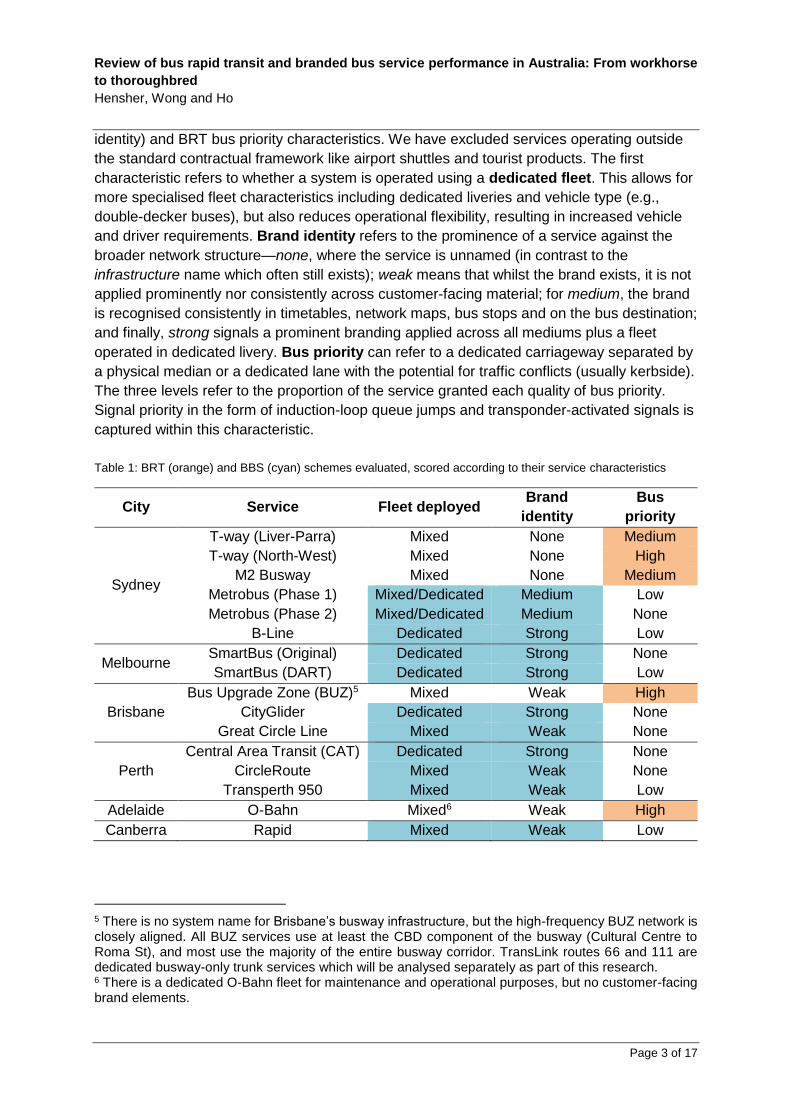
2. An overview of BRT and BBS in Australia3
The aim of this paper is to evaluate the performance of BRT and BBS schemes in Australia,
relative to generic route services in their respective six capital cities. Studied systems are
summarised in Table 14, and scored according to their BBS (fleet deployed and brand
1 See https://en.wikipedia.org/wiki/bus_rapid_transit_creep 2 The Institute for Transportation and Development Policy (ITDP) is a non-profit which has developed The BRT Standard to score systems around the world. 3 For full details on each system, we refer readers to our companion report prepared for the Bus Industry Confederation. 4 Included routes for each service cluster are detailed in an Appendix to this paper.
Review of bus rapid transit and branded bus service performance in Australia: From workhorse
to thoroughbred
Hensher, Wong and Ho
Page 3 of 17
identity) and BRT bus priority characteristics. We have excluded services operating outside
the standard contractual framework like airport shuttles and tourist products. The first
characteristic refers to whether a system is operated using a dedicated fleet. This allows for
more specialised fleet characteristics including dedicated liveries and vehicle type (e.g.,
double-decker buses), but also reduces operational flexibility, resulting in increased vehicle
and driver requirements. Brand identity refers to the prominence of a service against the
broader network structure—none, where the service is unnamed (in contrast to the
infrastructure name which often still exists); weak means that whilst the brand exists, it is not
applied prominently nor consistently across customer-facing material; for medium, the brand
is recognised consistently in timetables, network maps, bus stops and on the bus destination;
and finally, strong signals a prominent branding applied across all mediums plus a fleet
operated in dedicated livery. Bus priority can refer to a dedicated carriageway separated by
a physical median or a dedicated lane with the potential for traffic conflicts (usually kerbside).
The three levels refer to the proportion of the service granted each quality of bus priority.
Signal priority in the form of induction-loop queue jumps and transponder-activated signals is
captured within this characteristic.
Table 1: BRT (orange) and BBS (cyan) schemes evaluated, scored according to their service characteristics
City Service Fleet deployed Brand
identity
Bus
priority
Sydney
T-way (Liver-Parra) Mixed None Medium
T-way (North-West) Mixed None High
M2 Busway Mixed None Medium
Metrobus (Phase 1) Mixed/Dedicated Medium Low
Metrobus (Phase 2) Mixed/Dedicated Medium None
B-Line Dedicated Strong Low
Melbourne SmartBus (Original) Dedicated Strong None
SmartBus (DART) Dedicated Strong Low
Brisbane
Bus Upgrade Zone (BUZ)5 Mixed Weak High
CityGlider Dedicated Strong None
Great Circle Line Mixed Weak None
Perth
Central Area Transit (CAT) Dedicated Strong None
CircleRoute Mixed Weak None
Transperth 950 Mixed Weak Low
Adelaide O-Bahn Mixed6 Weak High
Canberra Rapid Mixed Weak Low
5 There is no system name for Brisbane’s busway infrastructure, but the high-frequency BUZ network is closely aligned. All BUZ services use at least the CBD component of the busway (Cultural Centre to Roma St), and most use the majority of the entire busway corridor. TransLink routes 66 and 111 are dedicated busway-only trunk services which will be analysed separately as part of this research. 6 There is a dedicated O-Bahn fleet for maintenance and operational purposes, but no customer-facing brand elements.
Review of bus rapid transit and branded bus service performance in Australia: From workhorse
to thoroughbred
Hensher, Wong and Ho
Page 4 of 17
As noted, premium bus services in Australia score highly either on brand identity or bus
priority—but never both! This is peculiar and very much unlike implementation in other parts
of the world, and certainly contravenes the BRT best practices espoused by ITDP (2014).
However, we do note the tendency for branding elements not to accompany developed-world
BRT implementation (especially in the US)—an example of BRT creep, but also the different
institutional contexts at play.7 As such, all upgraded bus services in Australia can be
categorised as either BRT or BBS—and can be considered mutually exclusive.
3. Gross performance comparison
The main focus of the paper is on system-specific challenges and constraints, we now
evaluate their relative success according to our devised index of performance (see below).
We have selected the following number of characteristics segmented by individual BRT, BBS
and generic route services as inputs into our criteria for comparing and assessing the
performance of each system:8
• Total vehicle service kilometres
• Average service headway (every x min) in weekday AM and PM peak (directional),
weekday inter-peak, and weekends. The weekday time of day segments are: AM
peak (7:00-9:00AM; 2 hours), inter-peak (9:00AM-4:00PM; 7 hours), and PM peak
(4:00-6:30PM; 2.5 hours)
• Percentage of route distance that is in priority lanes or carriageway in each of the
weekday AM and PM peak (directional), weekday inter-peak, and weekend periods9
• Average speed (km/h) in weekday AM and PM peak (directional), weekday inter-
peak, and weekend periods
• Total passenger boardings per annum
• Average number of passenger boardings per vehicle service kilometre
Whilst more detail has been provided for Sydney, to be able to compare the six cities in
Australia (Sydney, Melbourne, Brisbane, Perth, Adelaide and Canberra) where there exists
varying quantum of BRT and BBS, the data set is limited to the items summarised above. In
addition, it must be recognised that some comparisons make more sense within the one
metropolitan area given differences in the scale of services and the characteristics of the
service delivery areas with respect to population density, road quality and the overall supply
of public transport (including the presence of competing modes). For example, the overall
vehicle service kilometres in Sydney are ten times greater than Canberra and cover a much
greater catchment area and population with much greater traffic congestion in peak periods.
We do, however, define a number of features of the various systems that represent either a
service-specific feature or a context-specific setting potential influence to capture these
effects as summarised in Table .
7 In developing economies (Africa and South America), BRT often results from the formalisation of the informal minibus taxi sector, and hence is almost always set up as an independent company (and brand) from the outset. There are accompanying advantages and disadvantages to this model. 8 We thank state and territory agencies for the provision of data. 9 This accounts for time-limited priority like peak-only bus lanes.
Review of bus rapid transit and branded bus service performance in Australia: From workhorse
to thoroughbred
Hensher, Wong and Ho
Page 5 of 17
We have developed a performance indicator to capture the relationship between patronage,
service kilometres and service frequency. This indicator, which we call the performance
ratio, is defined as the ratio of passenger boardings per service kilometre to the frequency of
provided services. This measure enables us to comment on the success of each service
offering in attracting passengers, consequent on the amount of service kilometres delivered
and its embedded service frequency. This aligns well with two important drivers of patronage
growth—connectivity (correlated with service kilometres) and frequency.
In assessing each BRT and BBS system, it is necessary to define a suitable level or scale of
analysis. Importantly, there exists an inverse relationship between greater aggregation and
the inherent level of variance in each characteristic which is essential for explaining the
causes of variability in performance. For this reason, some of the studied BRT and BBS
systems of interest are considered in totality (as one unit), whilst for others particular routes
(or series of routes) are assessed and compared independently. We explain our rationale
below:
• Sydney’s Metrobus Phase 1 and 2 serve different functions (‘top-up’ versus cross-
town orbital) so are segmented for analysis. Metrobus M61 is also assessed
separately since it is unique in running express (and at high speed) along the M2 Hills
Motorway unlike other frequent stopping trunk services which ply major arterials.
• Melbourne’s SmartBus is segmented into Original (Routes 901, 902 and 903),
Doncaster Area Rapid Transit (DART), and Routes 703/900. These are (respectively)
cross-town orbitals, radial express routes via the M3 Eastern Freeway, and shorter
connections in the middle suburbs.
• Brisbane’s TransLink routes 66 and 111 operate on the busway trunk only and are
assessed separately to Bus Upgrade Zone (BUZ) services which capture all busway
services including through-routes into residential suburbs in mixed traffic. This tests
for differences between closed and open BRT operations and how it might impact on
performance statistics.
• Brisbane’s CityGliders are assessed independently (Blue and Maroon) since they
face different operating environments (and by extension, traffic levels). The Maroon
CityGlider operates on significant parts of the South East busway.
• Perth’s Central Area Transit or CAT (Red, Blue, Yellow and Green routes) are
separated for analysis to capture greater detail in their relative performance.
• Canberra’s four Rapid services (Blue, Red, Black and Green) are analysed
independently given different operating environments and serving different patronage
functions.
What interests us is the relationship between patronage, service kilometres and service
frequency. Figure 110 compares the patronage per service kilometre against the service
frequency over a seven-day period (weekdays and weekend), which we refer to as the gross
performance ratio (GPR) index. It shows the relationship between the number of bus
passengers, the amount of provided service kilometres and service frequency (average
10 Column colours correspond with the (primary) bus livery colour in each city.

Review of bus rapid transit and branded bus service performance in Australia: From workhorse
to thoroughbred
Hensher, Wong and Ho
Page 6 of 17
headway). We would want to see growing patronage when we increase vehicle service
kilometres and introduce more frequent services (shorter headways). A high patronage per
service kilometre (a larger value) and a higher service frequency (a lower value) will increase
the performance ratio. Conversely, a smaller number for the ratio suggests a lower relative
level of performance. As examples, the M2 busway in Sydney (rank 4) has a relatively high
patronage per service kilometre and a relatively high service frequency, resulting in a higher
performance ratio. In contrast, the Liverpool-Parramatta T-way (rank 18) has a relatively
lower service frequency and passengers per service kilometre, resulting in a lower
performance ratio. Another way of viewing this is to consider how effective the provided
service kilometres and associated service frequency are in attracting patronage.
Figure 1: Rank of gross performance ratio defined as raw passenger boardings per service kilometre divided by
average headway. Column outlines represent service type: BRT in solid outline, BBS in perforated outline, and
generic services without outline
It is important to clarify how the assessment of the performance of each of the services being
compared within and between the six capital cities is justified. Specifically, we fully
understand that the locations in which specific services are operating vary greatly between
geographical jurisdictions. Influences such as alternative public transport on offer (notably
rail), levels of traffic congestion on the roads, population density and other land use factors,
can all influence the success of a specific bus-based service.
In this study, we acknowledge all of these potential influences (see Table 2). We propose a
normalisation process (to be introduced) to obtain what we call a net performance ratio
(NPR) (in contrast to a gross or unadjusted performance ratio), enabling us to make
comparative assessments of what is actually provided by focussing on how well bus services
appear to be performing at present, controlling for the role of other effects. At a very broad
Review of bus rapid transit and branded bus service performance in Australia: From workhorse
to thoroughbred
Hensher, Wong and Ho
Page 7 of 17
strategic level, this provides encouraging evidence on the performance of particular services,
and is very useful in messaging the value of BRT and BBS. The focus is on the demand side
and not on the cost of providing the service where additional costs are required when there is
investment in bus priority infrastructure and dedicated branding of vehicles and stops.
4. Rationale for normalisation
Whenever any form of transport service is compared there is always the risk that we end up
making comments that amount to comparing ‘apples and oranges’ and hence relative
performance assessment is questionable and of limited value. When there is an interest in
comparing the performance of bus systems, it is essential that this is undertaken in such a
way that clear and valid statements can be made about how one system performs relative to
one or more other services. It is often the case that individuals make comments on how
efficient one system is compared to another. We are often asked how such individuals can
make such comments! A common concern is that “surely they are not comparing like with
like?”
While one can never be sure what a specific study actually does to form a view (factual or
otherwise) as to how well one system compares with another (or indeed an entire sector),
there are nevertheless some good practical and meaningful principles to adhere to so that
sensible debate can occur. The great majority of commentary appears to be based on a
simple comparison of key performance indicators (KPIs) measured in terms of what we call
the gross level (e.g., passengers per service kilometre as observed). The failure to recognise
sources of influence on such KPIs that are not under the control of the system (such as
location) and which vary by contextual setting is very poor analysis, resulting in nothing more
than a comparison of ‘apples with oranges’.
So what should we do? As a start we need to identify those features of service provision that
incur a disproportionate performance impact across the systems being compared—that the
system has effectively no control over—and are a recognition of the reality of operating in a
specific jurisdiction. To make a valid comparison, these differences must be recognised and
accounted for. We call this ‘normalisation’, although some people often talk of
‘standardisation’.
In the context of metropolitan bus operations in Australia, with a focus on performance
related to passengers accommodated by the provision of service kilometres and service
frequency, the main influences that are outside the control of most systems are likely to be
associated with the location of the services. If there are circumstances that give a particular
service an advantage over another simply because of external contextual influences, then
they must be controlled for. Examples would include location such as city and intra-city
geographical service areas (e.g., the CBD or inner suburbs). Such spatial contextual
influences are proxies for population density, the availability of competing modes and other
considerations.
Review of bus rapid transit and branded bus service performance in Australia: From workhorse
to thoroughbred
Hensher, Wong and Ho
Page 8 of 17
How does normalisation work? The most popular method involves replacing the impact of a
specific influence not under the control of the system (but essentially under the control of the
operating environment), with an average (or median) level (across all sampled systems) of a
factor that may influence performance. The same rule would apply to all selected influences
that need to be ‘normalised’ as a way of removing the influence of these factors on the
comparison of system performance. However, the story does not stop there. Before we can
normalise the KPI of interest, we need to find out what role these normalisation criteria play
in explaining differences in the level of the KPI of interest, so that we can then ensure that
this role is used as a weight to allow for the replacement of the system-specific level of (say)
direct competition with other services of the sample of all operations being compared. These
weights are obtained using a regression model that assures that all influences on differences
in a KPI are accounted for (which includes those influences under the control of the system).
A final comment is a question for all analysts—are you using valid methods to undertake a
comparative assessment of performance? You cannot and never should simply take, for
example, a gross KPI and use it to make statements about whether one operation is more or
less efficient or has a higher level of performance than another operation (in situations that
are potentially so different). Our real fear and concern is that this is exactly what is
happening in many sectors, including the bus transport sector.
5. Net performance comparison
While the gross performance measure presented in Figure 1 is interesting, it is also
potentially misleading and requires appropriate adjustment to obtain a strictly ‘apples with
apples’ comparison. To achieve this, we estimated a series of linear regression models
designed to identify contextual characteristics that, together with system descriptors, can
explain systematic variations in the gross performance ratio index. Table 2 summarises
these service-specific and context-specific effects and identifies those which emerged as
statistically significant used in the normalisation of the performance ratio.
Table 2: Service-specific and context-specific effects tested for how they influence passenger boardings.
Asterisked (*) attributes are statistically significant and form part of the normalisation model
Category Attribute (1/0) Description
Bus priority
Dedicated
carriageway*
Substantial section of route (>30%) on dedicated
bus-only carriageway separated by a physical
median
Dedicated lane* Substantial section of route (>30%) on dedicated
bus-only lane with the potential for traffic conflicts
Signal priority
Substantial amount of grade separation or signal
priority either as induction loop queue jumps or
transponder-activated signals
Premium stations Substantial number of premium stations featuring
better customer amenities
Review of bus rapid transit and branded bus service performance in Australia: From workhorse
to thoroughbred
Hensher, Wong and Ho
Page 9 of 17
Brand identity
Soft branding Distinct service branding in marketing material,
stops and bus destination display
Hard branding Exclusive use of branded fleet reducing operational
flexibility
Service type
Downtown
circulator CBD loop service
Radial inner CBD to inner suburbs route
Radial outer* CBD to inner plus outer suburbs route
Cross-
town/Orbital* Route connecting suburban CBD locations
Feeder/Coverage All other services connecting to the high frequency
network
Other
Direct
competition*
En route competition for a significant section of the
corridor (>60%)
Free service Service is fare-free
System-specific
dummies*
Controls for all other system-specific effects not
otherwise captured
City-specific
dummies*
Controls for all other city-specific effects not
otherwise captured
The final model selected obtained an overall explanation (R-squared) of 72.9%, with 17
identified influences plus a constant. The model included six city-specific dummy (1,0)
variables for Sydney (Syd), Brisbane (Brs), Canberra (Can), Melbourne (Mel), and Perth
(Per) (Adelaide being the base); and seven system-specific dummy (1,0) variables for Perth’s
CAT services (PCat), Brisbane’s busways (BBWay), Brisbane’s CityGlider services (BCGlid),
Canberra’s Rapid services (CRapid), Melbourne’s SmartBus (SMetB), Sydney’s B-Line
(SBLine), and Sydney’s M2 busway (SM2Bw). Three variables represented location effects—
radial/outer (Outer), cross-town/orbital (Orbital) and the presence of competition on the
corridor (Comp). Finally, we found both dedicated carriageway (PricWay) and dedicated lane
(PriLane) to be statistically significant influences on gross performance. Branding attributes
(both hard and soft) did not emerge as statistically significant despite evidence from the
literature to the contrary (Currie and Wallis, 2008), perhaps because of unique ways in which
branding affects travel choice and behaviour. It has been found that ‘hard’ factors like service
span and frequency drive modal shift, but once people become regular users it is the ‘soft’
factors which retain patronage (Hensher et al., 2010). Therefore, the importance of distinct
branding should not be dismissed.
The equation used to undertake the normalisation to obtain the net performance ratio (NPR)
index is given below:
Review of bus rapid transit and branded bus service performance in Australia: From workhorse
to thoroughbred
Hensher, Wong and Ho
Page 10 of 17
𝑁𝑃𝑅 = 0.1068 − 0.772 ∗ 𝑆𝑦𝑑 + 0.0199 ∗ 𝐵𝑟𝑠 − 0.0189 ∗ 𝐶𝑎𝑛 + 0.1396 ∗ 𝑃𝑒𝑟 + 0.0293 ∗ 𝑀𝑒𝑙
+ 0.3065 ∗ 𝑃𝐶𝑎𝑡 + 0.3678 ∗ 𝐵𝐵𝑊𝑎𝑦 + 0.0509 ∗ 𝐵𝐶𝐺𝑙𝑖𝑑 + 0.0763 ∗ 𝐶𝑅𝑎𝑝𝑖𝑑
+ 0.0726 ∗ 𝑆𝑀𝑒𝑡𝐵 + 0.1486 ∗ 𝑆𝐵𝐿𝑖𝑛𝑒 + 0.0244 ∗ 𝑆𝑀2𝐵𝑤 + 0.1252 ∗ 𝑃𝑟𝑖𝑐𝑊𝑎𝑦
+ 0.0977 ∗ 𝑃𝑟𝑖𝐿𝑎𝑛𝑒 − 0.1048 ∗ 𝐴𝑣𝑒𝑟𝑎𝑔𝑒 𝑂𝑢𝑡𝑒𝑟 − 0.0879 ∗ 𝐴𝑣𝑒𝑟𝑎𝑔𝑒 𝑂𝑟𝑏𝑖𝑡𝑎𝑙
+ 0.1038 ∗ 𝐴𝑣𝑒𝑟𝑎𝑔𝑒 𝐶𝑜𝑚𝑝
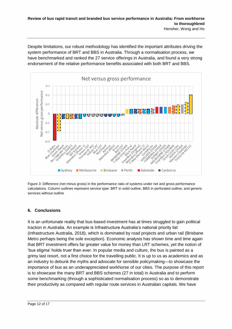
Figure summarises the net performance ratio evidence and Figure compares the gross and
net performance ratios for the 27 BRT and BBS systems relative to generic route services in
the six Australian capitals. As can be seen, there are a number of changes after
normalisation that are important to recognise and comment on. The most notable adjustment
is the elevation of Brisbane’s BRT Routes 66 and 111 (running trunk-only), which exhibited
the greatest absolute difference between net and gross performance (moving up from rank
12 to rank 6). However, it does not perform as well as its BUZ cousin despite the latter
including suburban running in mixed traffic. This may be attributed to a lower level of service
on individual routes relative to a combined service offering. Perth’s four CAT services and
Route 950 show consistently high performance, despite a slight drop in absolute
performance (though its relative rankings remain relatively unchanged) upon normalisation,
accounting for the impact of free fares (in the case of CAT) and high service frequency.
Adelaide’s O-Bahn exhibits the greatest negative adjustment post-normalisation (moving
down from rank 6 to rank 13), which means that much of its performance may be linked to
system-specific characteristics like its high operating speed and right-of-way. It means that
the O-Bahn ought to perform better than it presently does for its given level of infrastructure
and geographic setting. The best normalised performance ratio for Sydney is associated with
the M2 busway (rank 5)—and this is considering the impact that NorthConnex construction
had on service performance during the period of data collection. Melbourne’s SmartBus
(Original) perform similarly to Sydney’s Metrobus (Phase 2), with both being cross-town
orbitals serving the metropolitan fringe. Finally, Canberra’s Blue and Red Rapids perform
well, though they remain mid-range in the context of all Australian systems.
Of special interest is the performance ratio for all services that are not classified as BRT or
BBS. The regular services in each city under the gross performance ratio were ranked 26th
(Sydney), 27th (Brisbane), 29th (Adelaide), 30th (Perth), 32nd (Melbourne) and 33rd (Canberra).
After normalisation, their rankings changed to 21st (Sydney), 23rd (Perth), 25th (Adelaide), 26th
(Brisbane), 27th (Melbourne) and 28th (Canberra). The improvement of Perth and Adelaide is
noticeable. What we find is that the performance ratio for generic routes is (relatively) low
and supports the proposition that the services provided on regular route services have a
worse performance ratio than the majority of BRT and BBS. The exceptions are a number of
BBS with performance close to generic route level being Brisbane’s Great Circle Line, and
Canberra’s Green Rapid, Black Rapid and Xpresso services. Poor performance in Canberra
is consistent with Australia-wide benchmarks of farebox recovery and other performance
indicators (MRCagney, 2015).

Review of bus rapid transit and branded bus service performance in Australia: From workhorse
to thoroughbred
Hensher, Wong and Ho
Page 11 of 17
Figure 2: Rank of net performance ratio defined as normalised passenger boardings per service kilometre divided
by average headway. Column outlines represent service type: BRT in solid outline, BBS in perforated outline, and
generic services without outline
To gain a better appreciation of how normalisation has influenced the ranking of systems,
Figure compares the gross and net performance ratios. Reading from left to right, the larger
negative values indicate that performance has deteriorated after normalisation, in contrast to
the right hand side where performance has improved. Clearly, normalisation has had a
noticeable impact on the relative performance of the 33 systems and services, but a large
majority have changed only slightly (between -0.5 and +0.5). The top three rankings (Perth’s
Yellow and Blue CATs, and Brisbane’s BUZ) have remained unchanged post-normalisation.
What is very noticeable is the presence of high performing services that are not privileged to
have a significant amount of bus priority, and indeed the Perth services stand out as having
virtually no bus priority and compete in mixed traffic. One has to be careful in inferring
anything about the influence or not of bus priority since the traffic streams in many situations
where BBS exists may not justify a dedicated lane given achievable average speeds in
mixed traffic (including consideration of stop distances and traffic type—e.g., circulation
versus through-traffic). Our regression model of the proportion of a route that is afforded bus
priority (either dedicated carriageway or lane) is poorly correlated with average speed, and
the reason is largely due to the high incidence of mixed traffic distances in the overall route
operation where any gains on a dedicated corridor are dissipated by the performance when
off the corridor, resulting in a lower average speed. Sydney’s M2 busway and Brisbane’s
BUZ services (the two top performing BRT) are cases in point where significant sections of
route are in mixed traffic off-corridor (both being open BRT systems).
Review of bus rapid transit and branded bus service performance in Australia: From workhorse
to thoroughbred
Hensher, Wong and Ho
Page 12 of 17
Despite limitations, our robust methodology has identified the important attributes driving the
system performance of BRT and BBS in Australia. Through a normalisation process, we
have benchmarked and ranked the 27 service offerings in Australia, and found a very strong
endorsement of the relative performance benefits associated with both BRT and BBS.
Figure 3: Difference (net minus gross) in the performance ratio of systems under net and gross performance
calculations. Column outlines represent service type: BRT in solid outline, BBS in perforated outline, and generic
services without outline
6. Conclusions
It is an unfortunate reality that bus-based investment has at times struggled to gain political
traction in Australia. An example is Infrastructure Australia’s national priority list
(Infrastructure Australia, 2018), which is dominated by road projects and urban rail (Brisbane
Metro perhaps being the sole exception). Economic analysis has shown time and time again
that BRT investment offers far greater value for money than LRT schemes, yet the notion of
‘bus stigma’ holds truer than ever. In popular media and culture, the bus is painted as a
grimy last resort, not a first choice for the travelling public. It is up to us as academics and as
an industry to debunk the myths and advocate for sensible policymaking—to showcase the
importance of bus as an underappreciated workhorse of our cities. The purpose of this report
is to showcase the many BRT and BBS schemes (27 in total) in Australia and to perform
some benchmarking (through a sophisticated normalisation process) so as to demonstrate
their productivity as compared with regular route services in Australian capitals. We have

Review of bus rapid transit and branded bus service performance in Australia: From workhorse
to thoroughbred
Hensher, Wong and Ho
Page 13 of 17
established an evidence base with which to prosecute the value of investing to upgrade bus-
based services in Australia.
We conclude with a number of critical observations. BRT is not a revolutionary new
technology, but a timeless geometric reality. Indeed, the origins of the BRT concept can be
traced back to 1939 when the world’s first exclusive bus lane was opened in Chicago (Deng
and Nelson, 2011). Not being a ‘technology’, it has struggled to gain the same attention as
emerging concepts like autonomous vehicles, on demand buses and even shared electric
scooters. NSW’s Future Transport 2056 strategy typifies this issue where there is little
recognition of how geometric realities like right-of-way and transport corridors might limit the
potential operation of future technologies (Transport for NSW, 2016). The philosophy of
allocating public transport priority continues to be problematic. The conversation is always
around building additional road space (through land acquisition or otherwise) to
accommodate a bus lane rather than reallocating existing road space for the bus. What is
important is the travel time relativity between private car and public transport that can attract
users onto more sustainable, spatially-efficient modes. Government mentality continues to be
on ‘growing the pie’ (with links to the concept of Pareto efficiency) and improving both roads
and public transport—and so the relativity between modes remains unchanged and thus it is
little wonder governments struggle to improve public transport mode share (which is almost a
universally stated aim). What it does, however, is buy a few more years of accommodation
for growth. Not only must there be a far more optimal allocation of road space (with success
breeding success), but also the need to incorporate a road pricing mechanism with inputs by
time of day, geography and modal efficiency (including passengers per vehicle and
proportion of time on the road network). We believe future developments like mobility as a
service (MaaS) offers immense opportunities to bring the entire transport system into
equilibrium (Wong et al., 2017).
On the topic of relativity, railways with their usually dedicated alignment performs well
because there exists not the same corridor competition. BRT even with dedicated
carriageway often parallels an existing roadway and therefore relies solely on congestion to
increase this relativity. Adelaide O-Bahn, Brisbane’s busway (especially the Eastern busway
to the University of Queensland’s St Lucia campus) and to a lesser extent Sydney’s
Liverpool-Parramatta T-way are unique examples of where this is not the case and so
perform extremely well in terms of attracting modal shift. Another issue with BRT is the
confusion between vehicle capacity and corridor capacity. It is well known that when
implemented well BRT routinely offers throughput above 20,000 (and even up to 45,000)
passengers per hour per direction—as is the case in many Latin American cities like São
Paulo, Porto Alegre, Bogotá and Curitiba (Hensher and Golob, 2008).
In terms of modal ideology, the preference for rail is driven by both cultural and biological
factors. Ride quality is invariably better on a guided system where there is less lateral
movement, although we have also explained how pavement quality and corridor geometry
might also contribute to passenger experience. It remains very much the case that public
perception depends very much on their experience of bus and rail systems (Hensher et al.,
2019a). Our research has shown that people with greater exposure to quality BRT systems
Review of bus rapid transit and branded bus service performance in Australia: From workhorse
to thoroughbred
Hensher, Wong and Ho
Page 14 of 17
(like residents in BRT-extensive cities) are more likely to support bus-based investment as
compared with rail. Their preferences are conditioned based on experiences of vehicle
amenity, network legibility and susceptibility to delays (see previous commentary on bus
priority). It is also the case that rail networks are marketed better (simpler) whilst buses
remain unnecessarily complicated. BBS and initiatives like ‘trackless trams’ are a deliberate
effort to make bus and tram feel as similar as possible, although some commentators argue
that ‘trackless trams’ are not BRT11—something we dispute if delivered at the Gold Standard
(ITDP, 2014). Despite the additional cost and sacrificing operational flexibility (and this is a
trade-off policymakers will have to evaluate), we have shown there to be great benefit to BBS
which in many cases even outperforms BRT. This is despite many being marred in
controversy from the outset and introduced only as a quick political fix.
Whilst our modelling has shown branding factors to rate marginally in terms of affecting travel
choice, we believe there is still value, especially around frequent network branding and
network simplification (Currie and Wallis, 2008). It is usually the case that ‘hard’ factors like
service span and frequency drive modal shift but once people become regular users it is the
‘soft’ factors which add value to retain patronage (Hensher et al., 2010). It remains a curiosity
why BRT systems in Australia lack quality branding or BBS elements. The importance of
branding cannot be understated given the complexity of many bus networks. In the same
way that street directories (and online maps today) show a hierarchy of roads for different
purposes (motorway, arterial, collector and local), frequency mapping can help communicate
where all-day, turn-up-and-go services may be accessed. Especially in Sydney, there is a
severe fragmentation of frequent network brands (and linked to different political persuasions
when implemented) and so we call for a coordinated multimodal (bus and rail) approach for
showing the spatial availability of frequent services across a metropolitan area. There are
also enormous opportunities to extend this frequent network through clever scheduling
(especially on corridors at contract boundaries) to improve effective frequency for zero
additional cost (Wong, 2014)—easily implementable ‘low-hanging fruit’.
Whilst this constitutes a comprehensive review and benchmark of all BRT and BBS systems
in Australian capitals in 2018, there remains a number of opportunities for further empirical
research. Supply-side constraints like the costs of construction and ex-post cost-benefit
analyses have not been considered, but these are difficult to do at scale and as a
comparison. It is more readily conducted at the margin and so we suggest two key areas for
future focus. The first revolves around understanding the secondary benefits of public
transport priority (Currie and Sarvi, 2012). Whilst passenger travel time savings are well
known and usually a key metric for road authorities implementing bus lanes and signal
priority, what is less researched is its impact on operating costs, fleet resources, modal shift
and even changes in land use. A better understanding has practical implications for future
project appraisal. Secondly, it is important to understand the value uplift potential of bus-
based projects. Rail is often hailed as transformative and there has been work done
investigating the impact of BRT (Mulley and Tsai, 2017), but none so far for BBS
incorporating the best branding elements of rail. These are important research gaps
11 See https://theconversation.com/looking-past-the-hype-about-trackless-trams-107092

Review of bus rapid transit and branded bus service performance in Australia: From workhorse
to thoroughbred
Hensher, Wong and Ho
Page 15 of 17
considering the potential of BBS to upgrade the image of the bus from workhorse to
thoroughbred and as an ever more attractive alternative to fully-fledged BRT or rail-based
schemes in an increasingly financially-constrained environment.
References
CURRIE, G. & DELBOSC, A. 2010. Bus rapid transit in Australasia: An update on progress. Built Environment, 36, 328-343.
CURRIE, G. & SARVI, M. 2012. New model for secondary benefits of transit priority. Transportation Research Record: Journal of the Transportation Research Board, 63-71.
CURRIE, G. & WALLIS, I. 2008. Effective ways to grow urban bus markets—A synthesis of evidence. Journal of Transport Geography, 16, 419-429.
DENG, T. & NELSON, J. D. 2011. Recent developments in bus rapid transit: A review of the literature. Transport Reviews, 31, 69-96.
DEVNEY, J. Changing Perceptions of the Bus with Branded Services. 34th Australasian Transport Research Forum (ATRF), 28-30 September 2011 Adelaide, Australia.
HENSHER, D. A. 1999. A bus-based transitway or light rail? Continuing the saga on choice versus blind commitment. Road & Transport Research, 8, 3-21.
HENSHER, D. A., BALBONTIN, C., HO, C. & MULLEY, C. 2019a. Cross-cultural contrasts of preferences for bus rapid transit and light rail transit. Journal of Transport Economics and Policy, 53, 47-73.
HENSHER, D. A., ELLISON, R., HO, C. & WEISBROD, G. 2019b. How well does BRT perform in contrast to LRT? An Australian case study using MetroScan_TI. In: FERBRACHE, F. (ed.) Developing Bus Rapid Transit: The Value of BRT in Urban Spaces. Cheltenham, United Kingdom: Edward Elgar Publishing.
HENSHER, D. A. & GOLOB, T. F. 2008. Bus rapid transit systems: A comparative assessment. Transportation, 35, 501-518.
HENSHER, D. A., MULLEY, C. & YAHYA, N. 2010. Passenger experience with quality-enhanced bus service: the tyne and wear ‘superoute’ services. Transportation, 37, 239-256.
HENSHER, D. A. & WATERS, W. G., II. 1994. Light rail and bus priority systems: Choice or blind commitment? Research in Transportation Economics, 3, 139-162.
INFRASTRUCTURE AUSTRALIA 2018. Infrastructure priority list: Australian infrastructure plan. Canberra, Australia: Australian Government.
ITDP 2014. The BRT Standard. New York, United States: Institute for Transportation and Development Policy.
LI, Z. & HENSHER, D. A. 2019. Performance contributors of bus rapid transit systems within the ITDP BRT standard: An ordered choice approach. 16th International Conference on Competition and Ownership in Land Passenger Transport (Thredbo 16). Singapore.
MRCAGNEY 2015. ACTION expenditure review. ACT Government. MULLEY, C. & TSAI, C.-H. 2017. Impact of bus rapid transit on housing price and accessibility
changes in Sydney: A repeat sales approach. International Journal of Sustainable Transportation, 11, 3-10.
NIELSEN, G., NELSON, J., MULLEY, C., TEGNER, G., LIND, G. & LANGE, T. 2005. Public transport—Planning the networks. Best Practice Guide 2. Stavanger, Norway: HiTrans.
STANLEY, J. & WONG, Y. Z. 2016. Improving public transport service: Hobart—A corridors case study. Moving People > Solutions for Policy Thinkers. Canberra, Australia: Bus Industry Confederation.
Review of bus rapid transit and branded bus service performance in Australia: From workhorse
to thoroughbred
Hensher, Wong and Ho
Page 16 of 17
TRANSPORT FOR NSW 2016. Future transport technology roadmap. Sydney, Australia: NSW Government.
WALKER, J. 2008. Purpose-driven public transport: creating a clear conversation about public transport goals. Journal of Transport Geography, 16, 436-442.
WONG, Y. Z. 2014. ACTION network review: A comparative study of Network 12 and Network 14. Australian National Internships Library. Canberra, Australia: Australian National University.
WONG, Y. Z. & HENSHER, D. A. 2019. State of the industry: Vital statistics · Strategic outlook. Canberra, Australia: Bus Industry Confederation.
WONG, Y. Z., HENSHER, D. A. & MULLEY, C. 2017. Emerging transport technologies and the modal efficiency framework: A case for mobility as a service (MaaS). 15th International Conference on Competition and Ownership in Land Passenger Transport (Thredbo 15). Stockholm, Sweden.
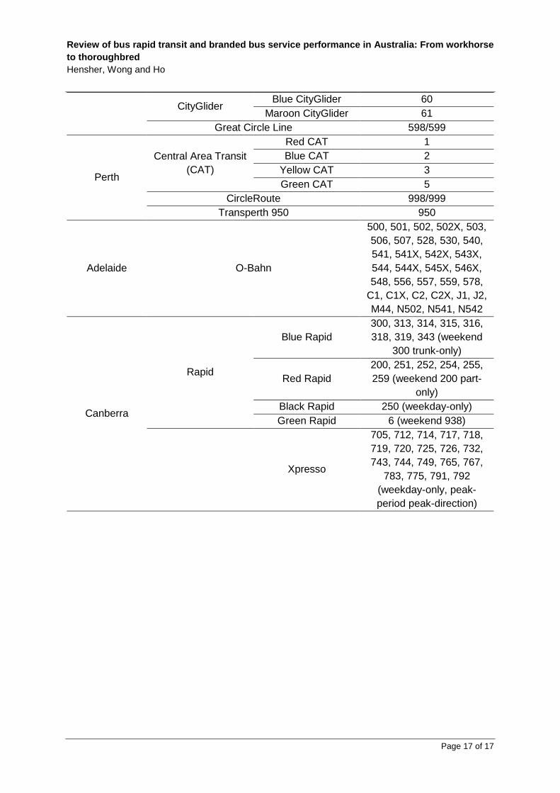
Appendix: Included routes within each service cluster
City Service cluster
(Table 1)
Service cluster
(Figures 1, 2 and 3) Included routes
Sydney
T-way (Liverpool-Parramatta) T80
T-way (North-West)
S8, T60, T61, T62, T63,
T64, T65, T66, T70, T71,
T72, T74, T75, 602X,
607X, 613X, 616X, 617X,
619, 705, 706, 708, 711,
715, 740, 744, 745
M2 Busway
M61, 602X, 607X, 610,
610X, 611, 612X, 613X,
614X, 615X, 616X, 617X,
618X, 619, 620N, 620X,
621, 622, 627, 628, 642,
642X, 650, 650X, 652X,
653, 740
Metrobus (Phase 1) M10, M20, M30, M40,
M50
Metrobus (Phase 2) Metrobus (Phase 2)
M41, M52, M54, M60,
M61, M90, M91, M92
Metrobus (M61) M61
B-Line B1
Melbourne SmartBus (Original)
SmartBus (Original) 901, 902, 903
SmartBus 703/900 703, 900
SmartBus (Doncaster Area Rapid Transit) 905, 906, 907, 908
Brisbane Bus Upgrade Zone
(BUZ)
Bus Upgrade Zone
(BUZ)
66, 100, 111, 120, 130,
140, 150, 180, 196, 199,
200, 222, 330, 333, 340,
345, 385, 412, 444, 555
TransLink 66/111 66, 111
Review of bus rapid transit and branded bus service performance in Australia: From workhorse
to thoroughbred
Hensher, Wong and Ho
Page 17 of 17
CityGlider Blue CityGlider 60
Maroon CityGlider 61
Great Circle Line 598/599
Perth
Central Area Transit
(CAT)
Red CAT 1
Blue CAT 2
Yellow CAT 3
Green CAT 5
CircleRoute 998/999
Transperth 950 950
Adelaide O-Bahn
500, 501, 502, 502X, 503,
506, 507, 528, 530, 540,
541, 541X, 542X, 543X,
544, 544X, 545X, 546X,
548, 556, 557, 559, 578,
C1, C1X, C2, C2X, J1, J2,
M44, N502, N541, N542
Canberra
Rapid
Blue Rapid
300, 313, 314, 315, 316,
318, 319, 343 (weekend
300 trunk-only)
Red Rapid
200, 251, 252, 254, 255,
259 (weekend 200 part-
only)
Black Rapid 250 (weekday-only)
Green Rapid 6 (weekend 938)
Xpresso
705, 712, 714, 717, 718,
719, 720, 725, 726, 732,
743, 744, 749, 765, 767,
783, 775, 791, 792
(weekday-only, peak-
period peak-direction)