Sonangol and the governance of oil revenues in Angola - DBSA
Upload
khangminh22Category
view
1download
0
Regulated Revenues and Hospital Behavior:Evidence from a Medicare Overhaul∗
Tal Gross† Adam Sacarny‡ Maggie Shi§ David Silver¶
June 2021
Abstract
We study a 2008 policy reform in which Medicare revised its hospital payment systemto better reflect patients’ severity of illness. We construct a simulated instrument thatpredicts a hospital’s policy-induced change in reimbursement using pre-reform patientsand post-reform rules. The reform led to large persistent changes in Medicare paymentrates across hospitals. Hospitals that faced larger gains in Medicare reimbursementincreased the volume of Medicare patients they treated. The estimates imply a volumeelasticity of approximately unity. To accommodate greater volume, hospitals increasednurse employment, but also lowered length of stay, with ambiguous effects on quality.
∗We thank Caitlin Carroll, Josh Gottlieb, Peter Hull, workshop participants at the AEA/ASSA ASHE-con session, the ASHEcon virtual conference, Whistler Health Economics Summit, Columbia University,Princeton University, UC Berkeley and UCSB for their helpful feedback.†Questrom School of Business, Boston University and NBER.‡Mailman School of Public Health, Columbia University and NBER.§Department of Economics, Columbia University.¶Department of Economics, Princeton University and NBER.
In most countries, governments contract with private organizations to pay for healthcare, and
it is those private organizations that actually deliver care. In the US, the federal government
pays private hospitals through the Medicare program, the largest single insurer in the country.
For decades, Medicare has paid hospitals a lump-sum fee for each visit, irrespective of the
quality of care provided, an arrangement that is widely recognized as problematic (Institute
of Medicine, 2001; U.S. Department of Health and Human Services, 2015).
Recently, Medicare’s approach has changed. A new generation of “value-based” policies,
many enacted through the Affordable Care Act, seeks to improve hospital quality by linking
payments to quality. The new payment mechanisms leave the fee-for-service system intact
but incentivize quality by reducing per-visit reimbursements for hospitals that do not meet
certain standards. Through a number of programs, Medicare adjusts its reimbursements to
incentivize lower readmission rates, improved survival, more evidence-based care, and fewer
hospital-acquired infections (Appendix A summarizes them).
All of these programs change per-visit payment rates based on indicators of performance.
The approach has two key features. First, the programs increase the incentive for hospitals to
meet the relevant performance goals. That feature that has received much attention (Zuck-
erman et al., 2016; Figueroa et al., 2016; Wadhera et al., 2018; Gupta, 2020).
Second, nearly all value-based payment reforms penalize or reward hospitals by modifying
volume-based payment rates across all Medicare admissions. This design increases the stakes
for meeting program goals. However, it could also activate a supply response. Hospitals
may respond to lower reimbursement rates by treating more or fewer patients. That possible
volume response has, to our knowledge, not been explored. And yet, if lower reimbursements
affect hospital volume, then changes to Medicare payment rates could reallocate patients
across facilities (Chandra et al., 2016). The broad impact of such supply-side responses
highlights the research and policy importance of a plausibly causal estimate of the supply
elasticity.
This paper describes how hospitals respond to such changes in payment rates. In 2008,
Medicare permanently changed prospective reimbursement rates for hospitals, redistribut-
ing roughly $2 billion across hospitals annually in the process. That amounts to roughly
four times the annual penalties imposed by Medicare’s value-based program to reduce read-
missions and seven times the annual penalties imposed by its program to reduce hospital-
acquired conditions. Similar to the payment-rate effects of value-based programs, some
hospitals, by virtue of their patient mix, enjoyed a highly persistent relative increase in
Medicare reimbursements and other hospitals saw a relative decline.
We study how these changes in reimbursement rates affected hospitals’ behavior using a
“simulated-instruments” approach (Currie and Gruber, 1996a,b). The results demonstrate—
1

first and foremost—that hospital care follows a traditional, upward-sloping supply curve.
Increases in Medicare reimbursement rates led hospitals to expand their volume of Medicare
admissions. Our point estimates imply a hospital-level volume elasticity of approximately
unity. To operationalize this result, we note that CMS’s value-based program to reduce hos-
pital readmissions imposes a 3-percent penalty on the lowest-performing hospitals. Our find-
ings imply the program would reduce hospitalizations by approximately 3 percent through
supply responses alone.
We document negative effects of payment rates on length of stay, and positive effects on
other inputs, most notably nurse employment. Such a pattern is consistent with hospitals
responding to higher rates by increasing their overall throughput. It is more difficult for us
to estimate an effect on quality of care, because the composition of patients in the hospital
changed. That said, the results suggest that, if anything, higher payment rates raised quality
of care. Viewed in light of these findings, value-based programs’ rate penalties likely save
money but, in doing so, may impede access.
These effects involve only Medicare patients, but we also find that volume effects “spill
over” to other patients covered by Medicaid. And yet, Medicaid reimbursements were not
intentionally targeted by the reform. There are several channels through which this spillover
might operate, including organizational frictions that prevent hospitals from tailoring their
responses to insurers (Frandsen et al., 2019), mimicking of Medicare’s reforms by other
insurers (Clemens and Gottlieb, 2017), and hospitals using Medicare revenue to finance care
for other patients (Frakt, 2011). Regardless of which mechanism is most relevant, these
results highlight that one payer’s payment is closely linked to the care that other payers’
patients receive.
This paper contributes to a broad literature examining how healthcare providers respond
to reimbursement. One clear finding is that hospitals strategically change how they bill Medi-
care for patients when certain diagnoses become more lucrative, a phenomenon often called
“upcoding” (Silverman and Skinner, 2004; Dafny, 2005; Sacarny, 2018). The remainder of the
literature has largely focused on “real” (as opposed to coding) responses. Studies of physi-
cian behavior have generally found positive volume responses to payment rates (Clemens
and Gottlieb, 2014; Alexander and Schnell, 2019; Baker and Royalty, 2000; Currie et al.,
1994). Clemens and Gottlieb (2014) estimate a price elasticity of supply of outpatient ser-
vices of 1.4, driven by increased intensity of care per visit rather than increased volume.
This mirrors our findings and is consistent with the different incentive systems underlying
Medicare’s payments to physicians (fee for service) versus hospitals (prospective payment):
higher fee-for-service prices encourage more services per visit, while higher prospective pay-
ments encourage hospitals to treat more patients, perhaps by reducing intensity or time per
2
patient.
In the hospital context, there is a growing body of work investigating supply-side re-
sponses to financing changes (e.g. Duggan, 2000; Baicker and Staiger, 2005; Acemoglu and
Finkelstein, 2008; Kaestner and Guardado, 2008; Wu and Shen, 2014; Chang and Jacobson,
2011; Cooper et al., 2017; Azoulay et al., 2020). Acemoglu and Finkelstein (2008) study
the introduction of the hospital prospective payment system in 1983, finding that hospi-
tals reacted by cutting labor inputs and shifting towards capital. More recently, Cooper
et al. (2017) consider the political determinants of hospital payment and find that politi-
cally induced rate increases lead to increased employment and investment, while Azoulay et
al. (2020) find that rate cuts stemming from the 1997 Balanced Budget Act led academic
medical centers to substitute towards research.
This paper contributes to the literature by providing novel estimates of hospital sup-
ply responses to one of Medicare’s primary policy levers: reimbursement rates. Medicare
reimbursements amount to roughly half of hospital revenue, and there exists an ongoing
public debate regarding how Medicare reimbursement to hospitals ought to change. Much
of this debate focuses on scope and intensity of value-based payment reforms, which tend
to manipulate hospital prices to incentivize better patient outcomes. The extent to which
hospitals react to price shocks by admitting more or fewer patients thus plays a crucial role
in understanding the net effects of these pervasive policies.
1 Data, Institutional Background and Empirical Strategy
1.1 Data
This study’s main data source is the MEDPAR file, which contains records of all Medicare
inpatients from 2002 through 2013. We rely on that file to calculate the reimbursement
shock for each hospital as well as for the key outcomes of hospital volume and average length
of stay. We also use that file to observe realized and price-adjusted hospital payments.
The data contain all of the attributes of each hospital stay that determine the Diagnosis-
Related Group (DRG), such as diagnoses and procedures, which we feed into DRG software
to construct which DRG each patient would have counterfactually fallen into in other years.
We also use Medicare data on enrollment, disease histories, and outpatient hospital visits.
To observe hospital scale and labor inputs, we draw on the American Hospital Association
(AHA) annual surveys and Centers for Medicare and Medicaid Services (CMS) Provider of
Services files from 2003 through 2013. Additional information on payment comes from public
CMS rulemaking data published annually in the Federal Register.
3

1.2 Institutional Background
CMS has prospectively reimbursed hospitals for Medicare-insured admissions since the in-
ception of Inpatient Prospective Payment System (IPPS) in 1983 (Cutler and Zeckhauser,
2000). Under this system, each case is categorized into a base DRG, such as heart failure,
based on the diagnosis or procedure that constituted the focus of treatment. The base DRG
is further categorized into DRGs, the unit of payment, by adjusting for patient severity
differences. Hospitals are typically reimbursed a predefined amount for the entirety of that
case’s treatment, with differences in payment stemming in large part from what is known as
the DRG weight, a unitless number that indicates the relative price CMS attaches to that
DRG.
The DRG system that existed prior to the MS-DRG reform recognized severity differences
within base DRGs via a list of complications and comorbidities (CCs) that triggered higher
reimbursement. The pre-reform list of CCs relied heavily on patients’ histories of relevant
chronic diseases. This list had lost its power to discriminate hospital resource-use over the
first 22 years of IPPS. Strategic coding of these CCs, alongside compositional changes in
hospitalizations, led to the overwhelming majority (78 percent) of admissions having a CC
on the eve of the reform (CMS, 2006 pp. 47154).
Recognizing this deficiency, policymakers set out to overhaul the DRG system to “bet-
ter recognize severity of illness” (Centers for Medicare and Medicaid Services, 2007). The
resulting switch to Medicare Severity DRGs (MS-DRGs), which was phased in from 2007
to 2009, marked the most significant overhaul of CMS’s reimbursement system since the
introduction of prospective payment. The new MS-DRG system introduced completely new
lists of qualifying CCs, alongside a third, highest tier of reimbursement within many base
DRGs for patients with “major” CCs (MCCs). In the new system, CMS also re-focused CCs
and MCCs focused on acute exacerbations of illness rather than histories of chronic disease,
since acute illnesses were more predictive of costs of care (CMS, 2019 provides a detailed
description of the development of MS-DRGs).
Hospitalizations for stroke provide a useful illustration of how the MS-DRG system al-
tered reimbursement rates depending on case severity. Appendix Figure A2 plots the weights
for stroke hospitalizations between 2000 and 2013. Prior to the reform, all stroke cases were
reimbursed equally with a DRG weight of 1.2, about $11,000 per case in 2006. The reform
split this base DRG into three tiers: without a CC, with a CC, or with an MCC. By the
time the MS-DRG system was fully phased in, in 2009, stroke hospitalizations with an MCC
were reimbursed at 219 percent of the rate for those without a CC, and at 157 percent of the
rate for those with a CC. The new CC and MCC subcategorizations of base DRGs – stroke
as well as many others – substantially expanded the set of total DRGs from 538 to 745.
4

This led to large shifts in effective reimbursement rates across hospitals because hospitals
differed in the shares of their patients with newly defined CCs and MCCs. Patients with
MCCs comprised just 14 percent of all admissions at the 10th percentile hospital, but 29
percent of all admissions at the 90th percentile hospital (Figure 1a). Those differences form
the basis for our empirical strategy.
1.3 Empirical Strategy
Our study seeks to isolate the predictable mechanical effects of the switch to MS-DRGs on
hospital reimbursements. We then relate these effects to changes in hospital behavior to
understand how hospitals respond to reimbursement rates.
The pre-reform differences in shares of admissions that would have been categorized with
an MCC had they occurred after the reform’s implementation (Figure 1a) provide a natural
starting point for quantifying the differential impacts of the reform across hospitals. As these
differences are calculated using admissions that occurred in 2006, before the phase-in of the
reform, they reflect pre-existing patient-mix differences that were not contemporaneously
factored into reimbursements. As hospitals’ patient mixes tend to be relatively stable over
time, hospitals with higher shares of admissions with MCCs in 2006 stood to see larger
increases in their reimbursement rates once the reform came into effect.
To more formally characterize the predictable mechanical effect of the MS-DRG reform
on hospitals’ reimbursement rates, we generalize the insight above. Our approach is borrowed
from the “simulated instruments” literature (e.g. Currie and Gruber, 1996a,b), adapted to
our setting. We continue to focus exclusively on admissions from 2006.
Our approach requires two key ingredients for each admission (indexed by i) observed
in 2006: (a) its actual DRG weight that was used for payment in 2006, wi, and (b) its
counterfactual MS-DRG weight that would have applied had the admission occurred in
2009, after the reform had fully phased in, w∗i . The first is observed in our data. The second
we simulate by reprocessing admissions under the 2009 MS-DRG rules. This reprocessing
step uses each admission’s listed diagnosis and procedure codes to assign an MS-DRG to
each admission (including CCs and MCCs) and applies the relevant weight from the 2009
payment system. The difference between the counterfactual and actual weights (w∗i − wi)
provides the simulated admission-specific difference in payment rates induced by the reform.
To capture the hospital-level impact of the reform, we average these differences at the
level of the hospital at which the admission occurred. We call this difference hospital h’s
5

“reimbursement shock”:
shockh =1
Nh
∑{i:h(i)=h}
(w∗i − wi) , (1)
where h(i) indicates the hospital at which admission i occurred and Nh is the count of the
admissions at hospital h in 2006. Since both terms in this difference are computed using
the same admissions cohort receiving identical diagnoses and care, this measure captures the
change in reimbursements hospital h would have experienced between 2006 and 2009 had
the hospital changed nothing about its operations, admissions, or coding.
These measured revenue shocks are substantial for many hospitals. Figure 1b presents
a histogram of this reimbursement shock across hospitals. The distribution is centered on
zero: on average, hospitals did not face a fundamental change in their reimbursement rates,
based on pre-reform patient mix. Indeed, the reform was designed to hold this shock to zero
at the national level. But at the hospital level, there exists a great deal of mass beyond
zero. The gap between the 90th and the 10th percentile hospital represents a 10.2-percent
difference in average Medicare reimbursement rates resulting from the policy change. Given
an average Medicare reimbursement in 2006 of $9,590, this translates to an increase in per-
admission reimbursements of $978. Further, given an average caseload of 4,140 discharges,
this translates to a $4 million change in hospital-level Medicare revenue per year. Overall, the
reform redistributed almost 2 percent of inpatient revenue, or $1.95 billion, across hospitals.
Since 49 percent of the revenue went to hospital gains and 51 percent went to hospital losses,
the predicted net effect of the reform on total reimbursements was −0.05 percent, strikingly
close to zero.1
Unsurprisingly, the reimbursement shocks are closely related to hospitals’ pre-reform
MCC shares. The third panel of Figure 1 displays the empirical relationship between shockh
on the vertical axis and a hospital’s share of cases with MCCs on the horizontal axis. The
two are indeed highly correlated (ρ = 0.69), with residual variation in shockh deriving
from differences in shares of patients without any CCs, as well as differences in the types of
diseases that hospitals treat, some of which were more impacted by the reform than others.
The reimbursement shock captures several ways in which the policy change affected the
incentives faced by hospitals. First, it captures a kind of wealth effect. If hospitals were
to change nothing about the patients they admit and the way they code those patients’
conditions, hospitals with high values of the reimbursement shock would enjoy increased
1We calculate the revenue redistributed by taking the absolute value of the predicted shock based on ahospital’s 2006 patients and multiplying it by the hospital’s 2006 patients and its 2006 conversion factorfrom DRG weight to dollars.
6
payments per patient.
Second, the reimbursement shock describes the increased profitability of the patient pool
ex ante. Those patients, in turn, are plausibly representative of the “potential patients” that
the hospital could attract to increase volume because they would draw them from the same
catchment areas. In that sense, the reimbursement shock captures the degree to which the
policy change created an incentive for some hospitals to increase Medicare volume.
Crucially, the reimbursement shock does not measure the actual response of each hospital
to the policy change. Some hospitals may have responded by more aggressively upcoding
their patients, that is, submitting CCs and MCCs to CMS. That impact is not captured by
the reimbursement shock, making the reimbursement shock a plausibly exogenous instrument
by which one can study how the reform affected hospitals.
That said, the reimbursement shock was not randomly assigned to hospitals. A threat
to the validity of this approach would involve a deviation from the standard parallel-trends
assumption. Suppose that hospitals that saw large reimbursement shocks would have in-
creased their Medicare volume even in the absence of the policy change. Were that the
case, then we would erroneously attribute the change in volume to the policy change, when
it would have actually occurred otherwise. To address that threat to validity, we present
event-study regressions. Those regressions demonstrate that the relationship between the
reimbursement shock and patient volume began precisely when the reform was implemented,
not before. That pattern lends credence to the overall empirical strategy.
Table 1 explores how this change in average reimbursement rates was correlated with
hospitals’ characteristics. To do so, the table focuses on hospitals in two groups: those with
a shock above zero that were predicted to experience an increase in reimbursement, and
those with a shock below zero that were predicted to experience a reduction. Hospitals that
saw increases were larger and more likely to be non-profit. Those differences in hospital
characteristics, however, do not invalidate the research design. As we describe below, this
paper’s identification strategy amounts to a difference-in-difference comparison around the
policy change.
To further explore variation in the revenue shock, Appendix Figure A1 plots average DRG
weights over time for the hospitals most affected by the policy change. In particular, the
figure compares hospitals with the top decile of the revenue shock—those set to experience
the greatest gains—versus hospitals with the bottom decile of the revenue shock—those set
to experience the biggest losses. Before the reform, the average DRG weights across those
two groups of hospitals were similar. Importantly, the trend in average DRG weights was
similar before the policy change. But following the implementation of the reform, which
began in 2007, the two time series diverge. Hospitals facing the largest positive revenue
7
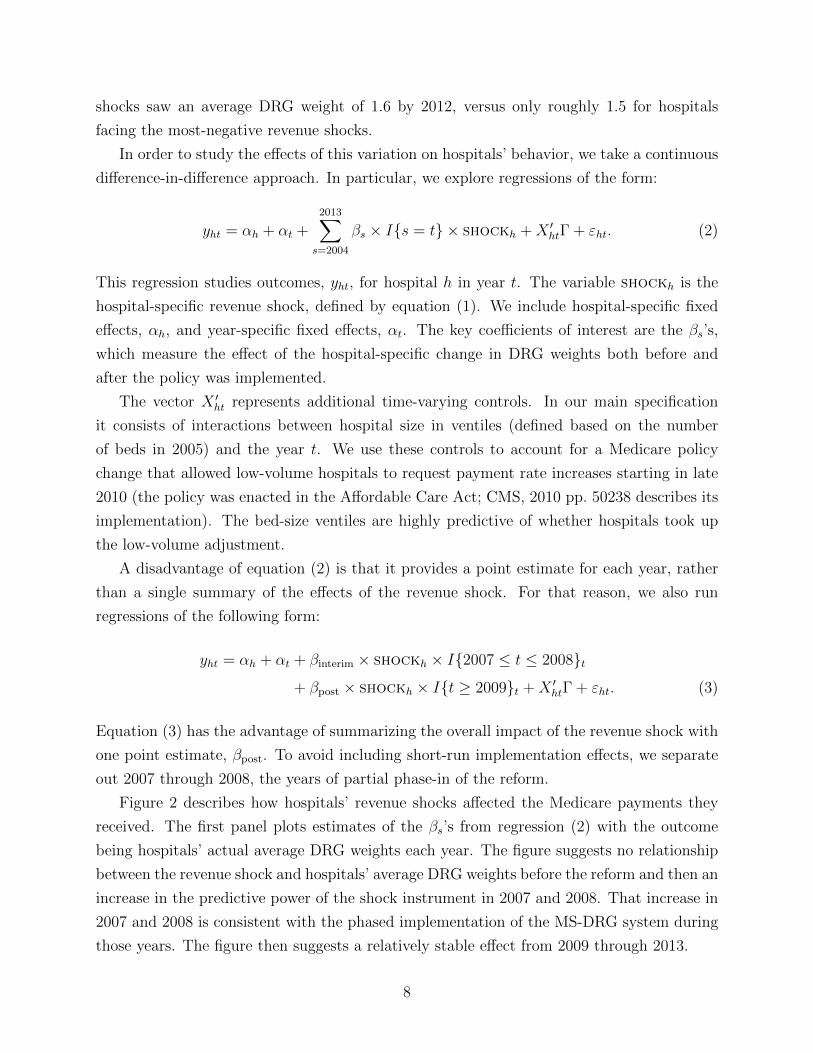
shocks saw an average DRG weight of 1.6 by 2012, versus only roughly 1.5 for hospitals
facing the most-negative revenue shocks.
In order to study the effects of this variation on hospitals’ behavior, we take a continuous
difference-in-difference approach. In particular, we explore regressions of the form:
yht = αh + αt +2013∑
s=2004
βs × I{s = t} × shockh +X ′htΓ + εht. (2)
This regression studies outcomes, yht, for hospital h in year t. The variable shockh is the
hospital-specific revenue shock, defined by equation (1). We include hospital-specific fixed
effects, αh, and year-specific fixed effects, αt. The key coefficients of interest are the βs’s,
which measure the effect of the hospital-specific change in DRG weights both before and
after the policy was implemented.
The vector X ′ht represents additional time-varying controls. In our main specification
it consists of interactions between hospital size in ventiles (defined based on the number
of beds in 2005) and the year t. We use these controls to account for a Medicare policy
change that allowed low-volume hospitals to request payment rate increases starting in late
2010 (the policy was enacted in the Affordable Care Act; CMS, 2010 pp. 50238 describes its
implementation). The bed-size ventiles are highly predictive of whether hospitals took up
the low-volume adjustment.
A disadvantage of equation (2) is that it provides a point estimate for each year, rather
than a single summary of the effects of the revenue shock. For that reason, we also run
regressions of the following form:
yht = αh + αt + βinterim × shockh × I{2007 ≤ t ≤ 2008}t+ βpost × shockh × I{t ≥ 2009}t +X ′htΓ + εht. (3)
Equation (3) has the advantage of summarizing the overall impact of the revenue shock with
one point estimate, βpost. To avoid including short-run implementation effects, we separate
out 2007 through 2008, the years of partial phase-in of the reform.
Figure 2 describes how hospitals’ revenue shocks affected the Medicare payments they
received. The first panel plots estimates of the βs’s from regression (2) with the outcome
being hospitals’ actual average DRG weights each year. The figure suggests no relationship
between the revenue shock and hospitals’ average DRG weights before the reform and then an
increase in the predictive power of the shock instrument in 2007 and 2008. That increase in
2007 and 2008 is consistent with the phased implementation of the MS-DRG system during
those years. The figure then suggests a relatively stable effect from 2009 through 2013.
8

The second panel of Figure 2 presents a non-parametric approach to estimate the same
relationship: a binned scatterplot. That panel compares actual changes in hospitals’ reim-
bursement to their revenue shock. The vertical axis plots changes in average DRG weights
before and after the policy; the horizontal axis plots the instrument. The graph suggests a
roughly linear relationship, suggesting that the linear functional form in (2) is a reasonable
representation of the underlying data.
The third and fourth panels of Figure 2 perform the same analysis when the outcome
of interest is hospitals’ average Medicare payments, in thousands of dollars. Those panels
present what could be called this empirical strategy’s first stage – below we treat this outcome
as the endogenous variable in two-stage least squares regressions. The figures suggest that
hospitals’ revenue shocks increased their average Medicare reimbursement, and that the
underlying functional form of that relationship is approximately linear.
Finally, in order to examine the magnitude of the estimates presented graphically in Fig-
ure 2, the first two panels of Table 2 presents the analogous difference-in-difference estimates
based on equation (3). The first panel shows that hospital revenue shocks passed nearly fully
through to actual DRG weights. Hospitals with a one-unit higher shock see DRG weights
rise by 0.96 units. The second panel shows the translation of this shock to dollars of hospital
reimbursement per patient. A one-unit higher shock leads to a $7,013 increase in average to-
tal payments, which also include reinsurance payments for extraordinarily high-cost patients
and certain payments for medical education and capital costs.
2 Results
We begin by exploring how hospitals responded to their revenue shock by manipulating
their patient throughput. We first estimate equation (2) to test how the reform affected
the volume of Medicare admissions. The first panel of Figure 3 presents estimates of that
event-study regression when the outcome of interest is the logarithm of the number of each
hospital’s Medicare patients each year. The figure suggests no differential trend before the
reform went into effect and then a clear, steadily rising effect after its introduction.
In order to probe the validity of that finding, the second panel of Figure 3 presents
a binned scatterplot that studies the same relationship. For all hospitals, we calculate
the change in total Medicare patient volume between 2006 and 2009, and examine that
change in volume across quantiles of the revenue shock. The figure suggests a positive, linear
relationship: hospitals with larger revenue shocks saw larger increases in Medicare volume.
The linear pattern supports our main specification in which outcomes depend linearly on
the revenue shock.
9

To explore how hospitals achieved this increase in patient volume, we study the average
length of stay of Medicare patients. The third panel of Figure 3 presents event-study esti-
mates where the outcome of interest is the logarithm of the average length of stay in days
of the hospital’s Medicare patients. The figure suggests a clear reversal of trend in 2007,
immediately as the policy change went into effect. The final panel of Figure 3 plots the
corresponding binned scatterplot. That panel supports the assumption of linearity for this
outcome and validates the overall effect estimated via the event-study specification.
The second panel of Table 2 presents reduced-form and 2SLS estimates of the effect of the
revenue shock on outcomes related to volume and throughput. As is consistent with Figure
3, the first two rows of the panel suggest that the revenue shock raises patient volume and
shortens length of stay by economically meaningful and statistically significant magnitudes.
In other words, hospitals increased their throughput, treating more patients but keeping
each for less time in the hospital.
To interpret the point estimates of that reduced-form effect, consider a hospital with
a projected shock of 0.05, putting the hospital at the 90th percentile of the distribution of
revenue shocks. Such a shock represents an expected 4-percent rise in DRG payments for the
average hospital. The point estimates suggest that the hospital’s behavior would change:
its Medicare admissions would rise by 3.8 percent and its average patient would stay at
the hospital for 1.5 percent fewer days. These results demonstrate a large, statistically
significant effect of the revenue shocks induced by the transition to MS-DRGs on hospitals’
Medicare-covered patient throughput.
To further characterize these magnitudes, the table also presents instrumental-variables
estimates. These effects can be interpreted as the effect of raising a hospital’s Medicare
payment by $1,000 per patient; according to the first stage, such a payment change would
result from a predicted revenue shock of 0.14 units. The estimates show that each thousand-
dollar increase in average Medicare payments leads to a 11-percent increase in Medicare
admissions and a 4.3-percent drop in average length of stay for Medicare patients.2 With an
average pre-reform payment rate of $8,618, the implied payment-rate elasticities of volume
and length of stay are 0.97 and −0.037.
Appendix Tables A2 and A3 explore the robustness of the regressions for volume and
length of stay, respectively. The tables address several sources of confounding variation.
For instance, enrollment in Medicare Advantage was expanding during this time period,
2Appendix Table A1 stratifies this analysis by hospital ownership. The table suggests that government-runhospitals have a larger volume response than non-profit and for-profit facilities, though the 2SLS estimatesare not significantly different from each other. In contrast, government-run hospitals have the smallestlength-of-stay response while for-profit facilities have the largest, though again we cannot reject that theyare the same.
10

and expanding differently across counties. That expansion of Medicare Advantage surely
affected hospital revenues. And so it is reassuring that the main coefficients of interest are
not materially changed when we control for county-specific Medicare Advantage penetration.
Similarly, it is unclear which year should be the baseline for the revenue shock instrument—
above, we use 2006 as the pre-period, but these tables present results with 2004 or 2005
as alternative baseline years. The tables suggest relatively similar estimates across these
alternative specifications.
A natural, follow-up question is whether these effects on volume and length of stay
propagate more broadly through hospitals and affect patients outside the Medicare program.
Such “spillovers” can occur when hospitals are not able to treat patients differently based
on their insurer, when other insurers mimic the incentives of Medicare, or when hospitals
use extra revenue to admit other patients. We investigate this possibility with AHA hospital
survey data, which allows us to see patient volume (though not length of stay) by insurer.
The next rows of Panel B in Table 2 present estimates on volume based on the AHA data.
The third row of Panel B studies Medicare volume in the AHA data. We observe a similar—
and, if anything, slightly larger—effect on Medicare admissions when using the AHA data.
The remaining rows of Panel B study other types of admissions: Medicaid admissions
and then admissions not covered by either Medicaid or Medicare.3 The results suggest
that a positive revenue shock leads to a meaningful increase in Medicaid admissions. The
magnitude of that effect on Medicaid is two-thirds of the direct effect on Medicare patients,
as measured in the AHA data. The point estimate on other admissions is positive but
small and statistically insignificant. These findings suggest that the revenue shock induced
by Medicare’s payment reform led to broader changes in how hospitals admitted patients,
particularly Medicaid patients.
The final panel of Table 2 investigates the mechanisms through which hospitals were able
to raise throughput. In particular, we study measures from the AHA survey that relate to
each hospital’s ability to scale its operations. We proxy for the size of the hospital’s physical
plant and capital inputs by its number of beds. We also consider several measures of labor
inputs: full-time equivalent (FTE) employment, nurse employment, and total payroll costs.
The reduced-form estimates suggest that increases in Medicare payments led to statisti-
cally significant increases in the number of beds, FTE employment, and nurse employment,
with the first two estimates statistically significant at the 10-percent level. We find no
statistically significant increase in the number of physicians employed, and note a positive
but statistically insignificant effect on payroll. The 2SLS effects are significant for beds,
3The AHA data does not further dis-aggregate patients. Those not covered by Medicare or Medicare aremostly either privately insured or uninsured.
11

FTE, and nurse employment, showing that a $1,000 rise in payment per patient leads to a
4–7-percent rise in the use of these inputs.
Finally, we ask how hospitals’ revenue shocks may have affected the quality of the care
that they provide. We do so by studying patient outcomes, particularly mortality, given the
focus on mortality in clinical trials (see, e.g., Keeley et al., 2003) and value-based payment.
It is challenging, in this setting, to identify effects on mortality, because revenue shocks may
have induced a change in the selection of patients appearing in each hospital. We attempt to
adjust for such changes by controlling for patient characteristics. Still, selection could occur
if, for example, hospitals increase volume by admitting low-acuity patients at the margin.
We thus view these analyses as secondary.
Appendix Figure A3 describes the effect of the revenue shock on raw and risk-adjusted
mortality for three key patient cohorts: heart failure, pneumonia, and acute myocardial
infarction (AMI, also known as heart attack).4 The figure plots estimates of equation (2)
with patient-level data and mortality within 30 days of hospital admission as the outcome.
Risk-adjusted estimates control for age, sex, race, and prior health conditions.
The figure provides no suggestion that positive revenue shocks led to an increase in mor-
tality.5 Indeed, it suggests a decrease in mortality for patients with heart failure. Evidence
on selection is mixed: for AMI, mortality effects attenuate one-fifth with the addition of
controls, suggesting that revenue shocks induced hospitals to select observably healthier
patients; for the other conditions, we find little sign of selection in either direction.
3 Discussion
A central question in health policy is what and how to reimburse providers. This paper
exploits the 2007–2008 Medicare overhaul to isolate how hospitals respond to per-discharge
reimbursements. Hospitals that saw large increases in their reimbursement rates reacted by
increasing their throughput. The event-study estimates suggest that for each $1,000 increase
in per-discharge Medicare reimbursement, annual inpatient flows increased by 11 percent.
Another way to describe that finding is by contrasting a static analysis with a dynamic
analysis. Label Medicare’s per-visit reimbursement rate as p, and the number of hospital-
4In the same vein, Appendix Figure A4 describes the effect of the revenue shock on readmissions within30 days of hospital discharge. The presence of CMS’s concurrent value-based payment program to reducereadmissions, which led to large changes in this outcome (see e.g. Gupta, 2020), makes these estimates morespeculative. Hospitals were aware that readmissions would be tracked in this program as of early 2010. Theunadjusted effects in Appendix Figure A4 are generally positive, though they attenuate with risk-adjustment.
5Mortality effects for patients with pneumonia are less clear; the fungibility of the pneumonia diagnosishas historically led to spurious changes in pneumonia case volume (Silverman and Skinner, 2004), makingselection into this cohort a particular concern.
12
izations it pays for as q. Policymakers who contemplate a ten-percent increase in Medicare’s
per-visit rates would predict that Medicare’s expenditures would change from pq to 1.1×pq.But such an analysis would be a static calculation. This paper’s results suggest that the
true effect on Medicare expenditures would be closer to 1.12 × pq, because hospitals would
change q in response.
We can also extrapolate from these results to other changes in hospital reimbursement.
CMS’s Hospital-Acquired Condition Reduction Program, for instance, imposes a uniform 1-
percent penalty in hospital reimbursement for the bottom-performing quartile of hospitals.
The estimates above suggest that a persistently penalized hospital would reduce its Medicare
patient volume by roughly 1 percent. To our knowledge, research and debate on the scale of
value-based payment has paid little attention to the potential for these programs to change
patient volume at penalized or rewarded hospitals.
Finally, further afield, we can extrapolate the estimates to changes in private reimburse-
ment. Vogt and Town (2006) suggest that hospital mergers raise commercial prices by 40
percent. This paper’s estimates suggest that that increase in prices, in turn, may increase
admissions by 40 percent and thus roughly double total commercial, hospital-based expen-
ditures. Granted, such an extrapolation assumes that effects in Medicare apply to private
insurance. But the calculation, if nothing else, raises the possibility that volume effects may
matter a great deal whenever the price of a hospitalization changes.
13

References
Acemoglu, Daron and Amy Finkelstein, “Input and technology choices in regulatedindustries: Evidence from the health care sector,” Journal of Political Economy, 2008,116 (5), 837–880.
Alexander, Diane and Molly Schnell, “The Impacts of Physician Payments on Pa-tient Access, Use, and Health,” Technical Report w26095, National Bureau of EconomicResearch, Cambridge, MA July 2019.
Azoulay, Pierre, Misty L Heggeness, and Jennifer L Kao, “Medical Research andHealth Care Finance: Evidence from Academic Medical Centers,” Technical Report, Na-tional Bureau of Economic Research 2020.
Baicker, Katherine and Douglas Staiger, “Fiscal shenanigans, targeted federal healthcare funds, and patient mortality,” The quarterly journal of economics, 2005, 120 (1),345–386.
Baker, Laurence C. and Anne Beeson Royalty, “Medicaid Policy, Physician Behavior,and Health Care for the Low-Income Population,” The Journal of Human Resources, 2000,35 (3), 480.
Centers for Medicare and Medicaid Services, “Changes to the Hospital InpatientProspective Payment Systems and Fiscal Year 2008 Rates.,” Federal Register, August2007, 72 (162), 47129–48175.
, “Changes to the Hospital Inpatient Prospective Payment Systems and Fiscal Year 2011Rates.,” Federal Register, August 2010, 75 (157), 47129–48175.
, “Design and Development of the Diagnosis Related Group (DRG),” PBL-038. Baltimore,MD: Centers for Medicare & Medicaid Services, 2019.
Chandra, Amitabh, Amy Finkelstein, Adam Sacarny, and Chad Syverson, “HealthCare Exceptionalism? Performance and Allocation in the US Health Care Sector,” Amer-ican Economic Review, August 2016, 106 (8), 2110–2144.
Chang, Tom and Mireille Jacobson, “What do nonprofit hospitals maximize? Evidencefrom Californias seismic retrofit mandate,” 2011. Unpublished.
Clemens, Jeffrey and Joshua D. Gottlieb, “Do Physicians’ Financial Incentives AffectMedical Treatment and Patient Health?,” American Economic Review, April 2014, 104(4), 1320–1349.
and , “In the Shadow of a Giant: Medicare’s Influence on Private Physician Payments,”Journal of Political Economy, February 2017, 125 (1), 1–39.
Cooper, Zack, Amanda Kowalski, Eleanor Powell, and Jennifer Wu, “Politics andHealth Care Spending in the United States,” Technical Report w23748, National Bureauof Economic Research, Cambridge, MA August 2017.
14

Currie, Janet and Jonathan Gruber, “Health insurance eligibility, utilization of medicalcare, and child health,” The Quarterly Journal of Economics, 1996, 111 (2), 431–466.
and , “Saving babies: The efficacy and cost of recent changes in the Medicaid eligibilityof pregnant women,” Journal of political Economy, 1996, 104 (6), 1263–1296.
, , and Michael Fischer, “Physician Payments and Infant Mortality: Evidence fromMedicaid Fee Policy,” Technical Report w4930, National Bureau of Economic Research,Cambridge, MA November 1994.
Cutler, David M and Richard J Zeckhauser, “The anatomy of health insurance,” in“Handbook of health economics,” Vol. 1, Elsevier, 2000, pp. 563–643.
Dafny, Leemore S, “How do hospitals respond to price changes?,” American EconomicReview, 2005, 95 (5), 1525–1547.
Duggan, Mark G, “Hospital ownership and public medical spending,” The QuarterlyJournal of Economics, 2000, 115 (4), 1343–1373.
Figueroa, Jose F, Yusuke Tsugawa, Jie Zheng, E John Orav, and Ashish KJha, “Association between the Value-Based Purchasing Pay for Performance Programand Patient Mortality in US Hospitals: Observational Study,” BMJ, May 2016, p. i2214.
Frakt, Austin B, “How much do hospitals cost shift? A review of the evidence,” TheMilbank Quarterly, 2011, 89 (1), 90–130.
Frandsen, Brigham, Michael Powell, and James B Rebitzer, “Sticking points:common-agency problems and contracting in the US healthcare system,” The RAND Jour-nal of Economics, 2019, 50 (2), 251–285.
Gupta, Atul, “Impacts of Performance Pay for Hospitals: The Readmissions ReductionProgram,” 2020. Unpublished.
Institute of Medicine, Crossing the Quality Chasm: A New Health System for the 21stCentury, Washington (DC): National Academies Press (US), 2001.
Kaestner, Robert and Jose Guardado, “Medicare reimbursement, nurse staffing, andpatient outcomes,” Journal of Health Economics, 2008, 27 (2), 339–361.
Keeley, Ellen C, Judith A Boura, and Cindy L Grines, “Primary Angioplasty ver-sus Intravenous Thrombolytic Therapy for Acute Myocardial Infarction: A QuantitativeReview of 23 Randomised Trials,” The Lancet, January 2003, 361 (9351), 13–20.
Sacarny, Adam, “Adoption and learning across hospitals: The case of a revenue-generatingpractice,” Journal of health economics, 2018, 60, 142–164.
Silverman, Elaine M. and Jonathan S. Skinner, “Medicare Upcoding and HospitalOwnership,” J Health Econ, Mar 2004, 23 (2), 369–89.
15
U.S. Department of Health and Human Services, “Better, Smarter, Health-ier: In Historic Announcement, HHS Sets Clear Goals and Timeline for Shift-ing Medicare Reimbursements from Volume to Value,” https://wayback.archive-it.org/3926/20170127185400/https://www.hhs.gov/about/news/2015/01/26/better-smarter-healthier-in-historic-announcement-hhs-sets-clear-goals-and-timeline-for-shifting-medicare-reimbursements-from-volume-to-value.html January 2015.
Vogt, William B and Robert Town, “How has hospital consolidation affected the priceand quality of hospital care?,” 2006.
Wadhera, Rishi K, Karen E Joynt Maddox, Jason H Wasfy, Sebastien Haneuse,Changyu Shen, and Robert W Yeh, “Association of the Hospital Readmissions Reduc-tion Program with mortality among Medicare beneficiaries hospitalized for heart failure,acute myocardial infarction, and pneumonia,” Jama, 2018, 320 (24), 2542–2552.
Wu, Vivian Y and Yu-Chu Shen, “Long-term impact of Medicare payment reductionson patient outcomes,” Health services research, 2014, 49 (5), 1596–1615.
Zuckerman, Rachael B., Steven H. Sheingold, E. John Orav, Joel Ruhter, andArnold M. Epstein, “Readmissions, Observation, and the Hospital Readmissions Re-duction Program,” New England Journal of Medicine, April 2016, 374 (16), 1543–1551.
16

Table 1. Summary Statistics
Revenue shock > 0 Revenue shock < 0
Actual DRG weight 1.437 (0.219) 1.400 (0.284)Avg Medicare payment 9,373 (2,849) 8,012 (2,572)Avg Medicare charges 32,461 (17,658) 23,602 (13789)Avg length of stay, Medicare 5.440 (0.980) 4.783 (0.832)
Beds 273 (194) 215 (189)Total admissions 13,147 (9,689) 10,094 (9,741)Medicare admissions 4,340 (3,226) 3,951 (3,430)Medicaid admissions 2,484 (2,497) 1,636 (1,988)Fraction Medicare 0.424 (0.102) 0.474 (0.095)
Total annual payroll 82 (87) 61 (79)Full time RNs 415 (390) 312 (361)Full time equivalents 1,512 (1,419) 1,187 (1,342)Salary (total payroll/FTEs) 53,154 (12,853) 48,293 (12,378)
Share Non profit 0.69 0.67Share For profit 0.17 0.17Share Government 0.14 0.16
Hospitals 1,112 1,396
This table presents 2006 summary statistics dividing hospitals by the shock instrument.Means are presented with standard deviations in parentheses. Hospitals with a shockbelow zero were set to experience lower reimbursement rates. Hospitals with a shockabove zero were set to experience higher reimbursement rates. Total annual payrollmeasured in millions.
17
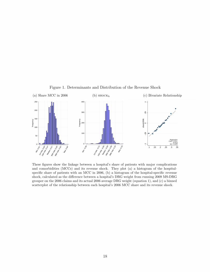
Figure 1. Determinants and Distribution of the Revenue Shock
(a) Share MCC in 2006
0
50
100
150
200
250
Fre
quen
cy
Min
: 0.0
11s
t %ile
: 0.0
910
th %
ile: 0
.14
Med
ian:
0.2
190
th %
ile: 0
.29
99th
%ile
: 0.3
5
Max
: 0.4
6
(b) shockh
0
100
200
300
400
Fre
quen
cy
Min
: -0.
28
1st %
ile: -
0.11
10th
%ile
: -0.
05M
edia
n: -0
.00
90th
%ile
: 0.0
599
th %
ile: 0
.10
Max
: 0.1
9
(c) Bivariate Relationship
-.1
-.05
0.0
5.1
shoc
k200
6
.1 .15 .2 .25 .3 .35share with mcc, v25 (fy 2007) in 2006
Regression:Coef = 0.511
(0.011)R2 = 0.479
These figures show the linkage between a hospital’s share of patients with major complicationsand comorbidities (MCCs) and its revenue shock. They plot (a) a histogram of the hospital-specific share of patients with an MCC in 2006, (b) a histogram of the hospital-specific revenueshock, calculated as the difference between a hospital’s DRG weight from running 2009 MS-DRGgrouper on the 2006 claims and its actual 2006 average DRG weight (equation 1), and (c) a binnedscatterplot of the relationship between each hospital’s 2006 MCC share and its revenue shock.
18

Figure 2. Pass Through and First Stage
(a) Pass Through: DRG Weight, Event Study
-.5
0
.5
1
2003
2004
2005
2006
2007
2008
2009
2010
2011
2012
2013
Year
(b) Pass Through: DRG Weight, Binned Scatterplot
-.05
0
.05
.1
.15
Cha
nge
in a
ctua
l drg
wei
ght (
ME
DP
AR
), 2
006-
2009
-.1 -.05 0 .05 .1Shock: predicted change in drg weight, 2006-2009
(c) First Stage: Payment ($1,000s), Event Study
-2
0
2
4
6
8
2003
2004
2005
2006
2007
2008
2009
2010
2011
2012
2013
Year
(d) First Stage: Payment ($1,000s), Binned Scatterplot
.5
1
1.5
2
Cha
nge
in m
ean
paym
ent (
$1,0
00s)
, 200
6-20
09
-.1 -.05 0 .05 .1Shock: predicted change in drg weight, 2006-2009
These figures describe the relationship between the revenue shock and the actual DRG weight andMedicare payments received by hospitals. The first and third panels present estimates of the βs coef-ficients from equation (2) for each year. Hospital-specific fixed effects, year-specific fixed effects, andhospital-size-times-year-specific fixed effects not shown. The 95-percent confidence intervals are basedon standard errors clustered at the level of the hospital. The omitted year is 2006. The second andfourth panels present binned scatterplots with the actual change in hospital reimbursements plottedalong the vertical axis, and the revenue shock on the horizontal axis. The sample is restricted tohospitals with at least 500 Medicare patients a year in 2004–2013 and excludes critical-access hospitals.
19
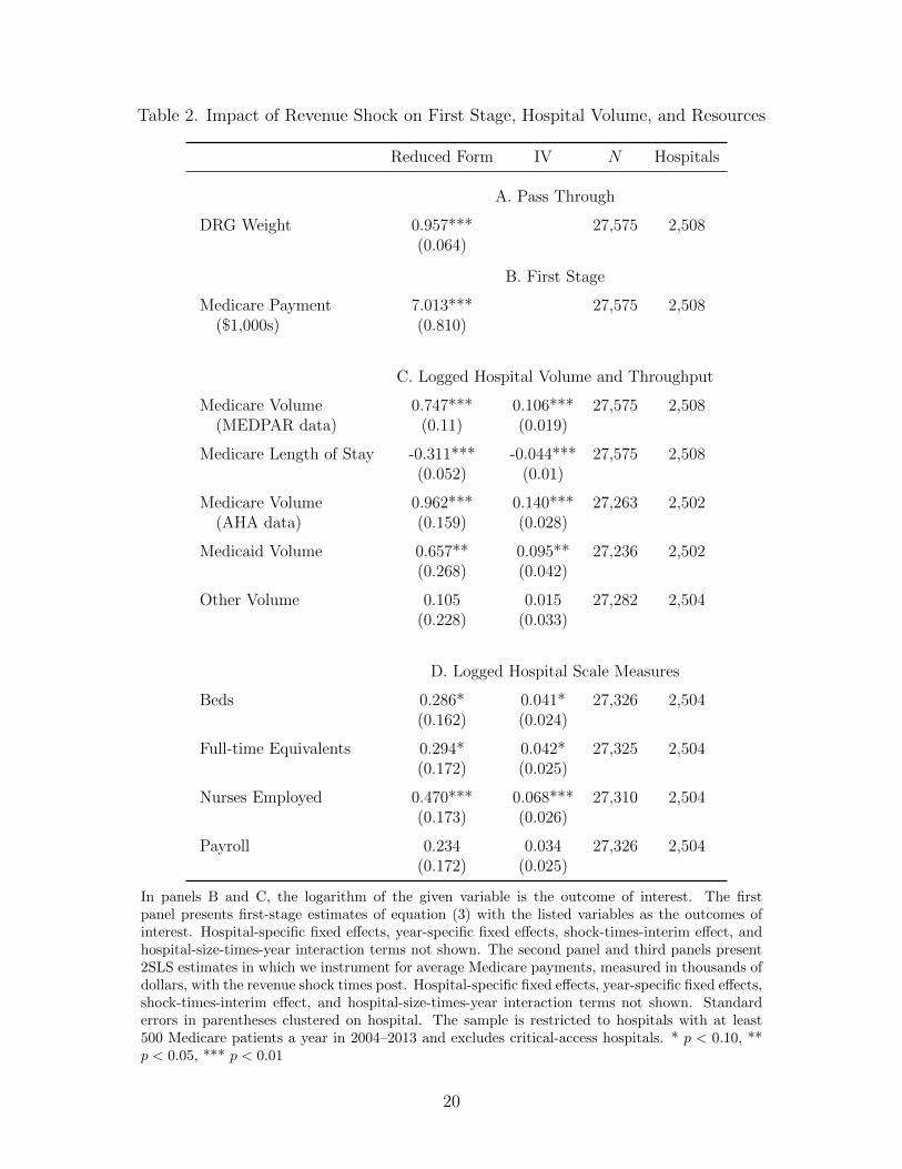
Table 2. Impact of Revenue Shock on First Stage, Hospital Volume, and Resources
Reduced Form IV N Hospitals
A. Pass Through
DRG Weight 0.957*** 27,575 2,508(0.064)
B. First Stage
Medicare Payment 7.013*** 27,575 2,508($1,000s) (0.810)
C. Logged Hospital Volume and Throughput
Medicare Volume 0.747*** 0.106*** 27,575 2,508(MEDPAR data) (0.11) (0.019)
Medicare Length of Stay -0.311*** -0.044*** 27,575 2,508(0.052) (0.01)
Medicare Volume 0.962*** 0.140*** 27,263 2,502(AHA data) (0.159) (0.028)
Medicaid Volume 0.657** 0.095** 27,236 2,502(0.268) (0.042)
Other Volume 0.105 0.015 27,282 2,504(0.228) (0.033)
D. Logged Hospital Scale Measures
Beds 0.286* 0.041* 27,326 2,504(0.162) (0.024)
Full-time Equivalents 0.294* 0.042* 27,325 2,504(0.172) (0.025)
Nurses Employed 0.470*** 0.068*** 27,310 2,504(0.173) (0.026)
Payroll 0.234 0.034 27,326 2,504(0.172) (0.025)
In panels B and C, the logarithm of the given variable is the outcome of interest. The firstpanel presents first-stage estimates of equation (3) with the listed variables as the outcomes ofinterest. Hospital-specific fixed effects, year-specific fixed effects, shock-times-interim effect, andhospital-size-times-year interaction terms not shown. The second panel and third panels present2SLS estimates in which we instrument for average Medicare payments, measured in thousands ofdollars, with the revenue shock times post. Hospital-specific fixed effects, year-specific fixed effects,shock-times-interim effect, and hospital-size-times-year interaction terms not shown. Standarderrors in parentheses clustered on hospital. The sample is restricted to hospitals with at least500 Medicare patients a year in 2004–2013 and excludes critical-access hospitals. * p < 0.10, **p < 0.05, *** p < 0.01
20

Figure 3. Reduced-Form Effects
(a) Log Medicare Volume, Event-Study
-.5
0
.5
1
1.5
2003
2004
2005
2006
2007
2008
2009
2010
2011
2012
2013
Year
(b) Log Medicare Volume, Binned Scatterplot
-.15
-.1
-.05
0
Cha
nge
in lo
g m
edic
are
adm
issi
ons
(ME
DP
AR
), 2
006-
2009
-.1 -.05 0 .05 .1Shock: predicted change in drg weight, 2006-2009
(c) Log Medicare Length of Stay, Event-Study
-.6
-.4
-.2
0
2003
2004
2005
2006
2007
2008
2009
2010
2011
2012
2013
Year
(d) Log Medicare Length of Stay, Binned Scatterplot
-.05
-.04
-.03
-.02
-.01
Cha
nge
in lo
g av
g le
ngth
of s
tay,
200
6-20
09
-.1 -.05 0 .05 .1Shock: predicted change in drg weight, 2006-2009
These figures describe the relationship between the revenue shock and Medicare admissions. The firstand third panels present estimates of the βs coefficients from equation (2) for each year with thevariables listed as the outcomes of interest. Hospital-specific fixed effects, year-specific fixed effects,and hospital-size-times-year interaction terms not shown. The 95-percent confidence intervals are basedon standard errors clustered at the level of the hospital. The omitted year is 2006. The second andfourth panels present a binned scatterplot with the change in log Medicare admissions or log Medicarelength of stay plotted along the vertical axis, and the revenue shock plotted on the horizontal axis. Thesample is restricted to hospitals with at least 500 Medicare patients a year in 2004–2013 and excludescritical-access hospitals.
21

Online Appendix
A Appendix: Review of Hospital Pay-For-Performance Programs
This section provides an overview of recent hospital payment reforms. As mentioned in the
main text, the Patient Protection and Affordable Care Act (ACA) made a handful of key
payment reforms to align hospital payment and quality of care: the Hospital Readmissions
Reduction Program (HRRP), the Hospital Value-Based Purchasing Programs (HVBPP),
and the Hospital-Acquired Conditions Reduction Program (HACRP).
There are a few features of these reforms that are important for understanding their
impacts on hospitals’ payment rates. First, each of these programs administers payment
adjustments as percent modifiers of Medicare reimbursements for a given fiscal year. They
do so through what is known as a hospital’s base operating payment. For instance, under
HRRP in fiscal years 2017 and later, each hospital faces up to a 3-percent cut in total
Medicare reimbursements through an adjustment of its base operating payment, despite the
fact that currently only 6 conditions (3 conditions in FY2013) are considered in determining
annual hospital-specific penalties.
Second, payment adjustments in each program are determined based on rank orderings of
hospitals over a given period. Combined with imperfect risk adjustment that disadvantages
hospitals that treat patients with unmeasured and/or uncoded risks, rank-based penalties
have led to criticisms regarding fairness and the ability of hospitals to improve enough in their
rankings to avoid penalty. CMS has made some adjustments to address this criticism. For
example, in 2019 CMS introduced peer-comparison groups under HRRP, so that hospitals
are compared to peers with similar shares of Medicare-Medicaid dual eligible patients, a
proxy for socioeconomic risk factors. Despite that change, the equity of these programs
across hospitals remains a concern.
Third, CMS uses a multi-year (often 2- or 3-year) lookback period to measure perfor-
mance in each domain. The multi-year lookback period is meant to improve the reliability of
program metrics such as readmission rates for specific, sometimes rare conditions. Thus, pay-
ment adjustments from one year to the next rely on overlapping lookback periods, creating
a mechanical “stickiness” of payment adjustments over time.
As a result of these program features, hospital payment adjustments stemming from the
ACA’s performance-pay programs were predictable and persistent. Hospitals with difficult
patient mixes bore larger penalties both at program inception and today. Totaled across the
three programs, payment adjustments were correlated approximately 0.8 year-to-year, and
22

0.3 between FY2013 and FY2018.
These pay-for-performance reforms had a much smaller impact on hospital reimbursement
rates than the transition to MS-DRGs that we study. First the reforms were smaller in
variability across hospitals. The standard deviation of total adjustments from these programs
was 0.5 percent in FY2013 and reached 1.1 percent in FY2018. By comparison, the 2008
switch to MS-DRGs induced payment rate adjustments with a standard deviation of 5.2
percent across hospitals.
Second, the reforms were smaller in terms of the total amount of money shifted across
hospitals. CMS estimated that the transition to MS-DRGs would re-distribute 2 percent of
inpatient prospective payments, which would amount to about $2 billion in reimbursements
redistributed across hospitals. By contrast, total HRRP penalties were well under half a
billion dollars in 2015.
23

B Appendix Figures
Figure A1. Average DRG Weights for Hospitals That Experienced The Largest Changes inReimbursement
1.45
1.5
1.55
1.6
1.65
2003
2004
2005
2006
2007
2008
2009
2010
2011
2012
2013
Year
Top decile shortfall Top decile windfall
This figure plots the average of actual relative prices received by hospitals from Medicare.We restrict the sample to two groups of hospitals: those in the top decile of the revenueshock and those in the bottom decile.
24

Figure A2. Time Series of Stroke Reimbursement Rate
.5
1
1.5
2
2003
2004
2005
2006
2007
2008
2009
2010
2011
2012
2013
Fiscal year
Relative price (DRG weight)
This figure plots the relative price paid by Medicare to hospitals across years for one particular, commoncondition: stroke (DRG 14 in 2007, labeled intracranial hemorrhage or cerebral infarction). The figureillustrates the policy change, which shifted from one level of severity through FY2007 to three levels ofseverity after 2008.
25

Figure A3. Effect of the Revenue Shock on Patients’ Mortality
(a) Heart Failure
-.15
-.1
-.05
0
.05
2003
2004
2005
2006
2007
2008
2009
2010
2011
2012
2013
Year
not risk-adjusted risk-adjusted
(b) Pneumonia
-.1
-.05
0
.05
.1
.15
2003
2004
2005
2006
2007
2008
2009
2010
2011
2012
2013
Year
not risk-adjusted risk-adjusted
(c) AMI
-.2
-.1
0
.1
.2
2003
2004
2005
2006
2007
2008
2009
2010
2011
2012
2013
Year
not risk-adjusted risk-adjusted
These figures present estimates of the βs coefficients from equation (2) when 30-day mortality of indexadmissions for the given condition is the outcome of interest. Hospital-specific fixed effects and year-specific fixed effects not shown. The risk-adjusted estimates control for age, sex, race, and prior healthconditions. The 95-percent confidence intervals are based on standard errors clustered at the levelof the hospital. The sample is restricted to hospitals with at least 500 Medicare patients a year in2004–2013 and excludes critical-access hospitals. The omitted year is 2006.
26

Figure A4. Effect of the Revenue Shock on Re-admissions
(a) Heart Failure
-.15
-.1
-.05
0
.05
.1
2003
2004
2005
2006
2007
2008
2009
2010
2011
2012
2013
Year
not risk-adjusted risk-adjusted
(b) Pneumonia
-.1
-.05
0
.05
.1
2003
2004
2005
2006
2007
2008
2009
2010
2011
2012
2013
Year
not risk-adjusted risk-adjusted
(c) AMI
-.1
-.05
0
.05
.1
.15
2003
2004
2005
2006
2007
2008
2009
2010
2011
2012
2013
Year
not risk-adjusted risk-adjusted
These figures present estimates of the βs coefficients from equation (2) when 30-day revisits of indexadmissions for the given condition is the outcome of interest. Hospital-specific fixed effects and year-specific fixed effects not shown. The risk-adjusted estimates control for age, sex, race, and prior healthconditions. The 95-percent confidence intervals are based on standard errors clustered at the levelof the hospital. The sample is restricted to hospitals with at least 500 Medicare patients a year in2004–2013 and excludes critical-access hospitals. The omitted year is 2006.
27

C Appendix Tables
Table A1. Effects of the Revenue Shock by Hospital Ownership
(1) (2) (3) (4) (5)Average Total Log Medicare Log Medicare
Payment ($1000s) Volume Length of Stay
For profit × Revenue Shock 9.155∗∗∗ 0.723∗∗∗ -0.555∗∗∗
× Post (1.518) (0.278) (0.119)
Non profit × Revenue Shock 6.492∗∗∗ 0.644∗∗∗ -0.269∗∗∗
× Post (0.997) (0.126) (0.0624)
Government × Revenue shock 8.293∗∗∗ 1.340∗∗∗ -0.317∗∗
× Post (2.677) (0.332) (0.142)
For profit 0.0789∗∗ -0.0606∗∗∗
× Average Total Payment ($1000s) (0.0309) (0.0175)
Non profit 0.0991∗∗∗ -0.0414∗∗∗
× Average Total Payment ($1000s) (0.0231) (0.0128)
Government 0.162∗∗ -0.0382∗
× Average Total Payment ($1000s) (0.0634) (0.0217)
For-profit v. Non-profit 0.14 0.79 0.60 0.03** 0.38For-profit v. Government 0.78 0.15 0.24 0.20 0.42Non-profit v. Government 0.53 0.05** 0.35 0.75 0.90
Hospitals 2,508 2,508 2,508 2,508 2,508N 27,575 27,576 27,575 27,575 27,575
Total payment is measured in thousands of dollars and the outcomes for columns 2 through 5 arethe logarithm of Medicare admissions and the logarithm of the average length of stay. Columns1, 2, and 4 present estimates of equation (3). Columns 3 and 5 present 2SLS estimates, in whichwe instrument for total payment with the revenue-shock instrument interacted with a post-2006indicator function. The table lists p-values that test equality across interaction terms: for-profitversus non-profit; for-profit versus government; and non-profit versus government. Hospital-specific fixed effects, year-specific fixed effects, shock-times-interim effect, and hospital-size-times-year interaction terms not shown. The sample is restricted to hospitals with at least 500 Medicarepatients a year in 2004–2013 and excludes critical-access hospitals. Standard errors in parenthesesclustered on hospital. * p < 0.10, ** p < 0.05, *** p < 0.01
28

Table A2. Robustness, Length of Stay
(1) (2) (3) (4) (5) (6) (7)
A. First-Stage Outcome: Average Total Payment
Revenue Shock 7.013∗∗∗ 6.080∗∗∗ 7.144∗∗∗ 7.706∗∗∗ 4.711∗∗∗ 4.864∗∗∗ 6.607∗∗∗
× Post (0.810) (0.845) (0.870) (0.805) (0.902) (1.009) (0.797)
B. Reduced-Form Outcome: Log Medicare Length of Stay
Revenue Shock -0.311∗∗∗ -0.390∗∗∗ -0.367∗∗∗ -0.302∗∗∗ -0.334∗∗∗ -0.303∗∗∗ -0.309∗∗∗
× Post (0.0519) (0.0560) (0.0551) (0.0515) (0.0644) (0.0707) (0.0523)
C. 2SLS Outcome: Log Medicare Length of Stay
Average Total -0.0443∗∗∗ -0.0658∗∗∗ -0.0526∗∗∗ -0.0392∗∗∗ -0.0708∗∗∗ -0.0624∗∗∗ -0.0468∗∗∗
Payment (0.00989) (0.0151) (0.0118) (0.00865) (0.0216) (0.0222) (0.0108)
Shock year 2006 2005 2004 2006 2006 2006 2006Bed bin × year X X X X X XHRR × year XCZ × year XCounty MA pen. XHospitals 2,508 2,508 2,508 2,508 2,496 2,333 2,504N 27,575 27,575 27,575 27,575 27,443 25,433 27,305
This table presents estimates of equation (3) with the logarithm of average length of stay as the outcomes ofinterest. Hospital-specific fixed effects, year-specific fixed effects, and shock-times-interim terms not shown.Standard errors in parentheses clustered on hospital. The sample is restricted to hospitals with at least 500Medicare patients a year in 2004–2013 and excludes critical-access hospitals. All payments are measuredin thousands of dollars. “CZ” indicates commuting zones, “HRR” indicates hospital referral region; “MA”indicates Medicare Advantage.* p < 0.10, ** p < 0.05, *** p < 0.01
29
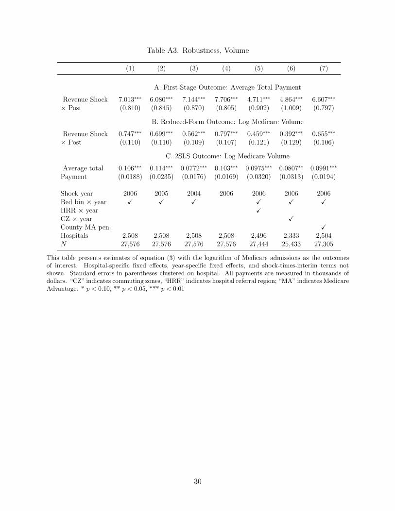
Table A3. Robustness, Volume
(1) (2) (3) (4) (5) (6) (7)
A. First-Stage Outcome: Average Total Payment
Revenue Shock 7.013∗∗∗ 6.080∗∗∗ 7.144∗∗∗ 7.706∗∗∗ 4.711∗∗∗ 4.864∗∗∗ 6.607∗∗∗
× Post (0.810) (0.845) (0.870) (0.805) (0.902) (1.009) (0.797)
B. Reduced-Form Outcome: Log Medicare Volume
Revenue Shock 0.747∗∗∗ 0.699∗∗∗ 0.562∗∗∗ 0.797∗∗∗ 0.459∗∗∗ 0.392∗∗∗ 0.655∗∗∗
× Post (0.110) (0.110) (0.109) (0.107) (0.121) (0.129) (0.106)
C. 2SLS Outcome: Log Medicare Volume
Average total 0.106∗∗∗ 0.114∗∗∗ 0.0772∗∗∗ 0.103∗∗∗ 0.0975∗∗∗ 0.0807∗∗ 0.0991∗∗∗
Payment (0.0188) (0.0235) (0.0176) (0.0169) (0.0320) (0.0313) (0.0194)
Shock year 2006 2005 2004 2006 2006 2006 2006Bed bin × year X X X X X XHRR × year XCZ × year XCounty MA pen. XHospitals 2,508 2,508 2,508 2,508 2,496 2,333 2,504N 27,576 27,576 27,576 27,576 27,444 25,433 27,305
This table presents estimates of equation (3) with the logarithm of Medicare admissions as the outcomesof interest. Hospital-specific fixed effects, year-specific fixed effects, and shock-times-interim terms notshown. Standard errors in parentheses clustered on hospital. All payments are measured in thousands ofdollars. “CZ” indicates commuting zones, “HRR” indicates hospital referral region; “MA” indicates MedicareAdvantage. * p < 0.10, ** p < 0.05, *** p < 0.01
30
Copyright © 2022 FDOKUMEN