Reading and Not-Printing: Obstruction at the Crater Press
23
MATLIT 2.1 (2014): 31-53. ISSN 2182-8830 http://dx.doi.org/10.14195/2182-8830_2-1_2 Reading and Not-Printing: Obstruction at the Crater Press RICHARD PARKER Independent scholar Abstract I will begin this paper with a brief and partial history of American printing, detecting a shared predilection for a noticeably maverick relation to the printed page in the works (printed and otherwise) of Samuel Keimer and Benjamin Franklin during the colonial period, and the works of Walt Whitman, Emily Dickinson and Mark Twain in the nineteenth-century. I term the interrupted, dialectical printing that connects all of these writer/printers ‘not-printing’, and offer some explanation of his term and a description of some of its manifestations. I will then move on to consider how the idea of ‘not-printing’ might be helpful for the consideration of some contemporary British and American poets and printers before concluding with a description of some of the ways that the productive constraints of such a practice have influenced my own work as editor and printer at the Crater Press. Keywords: Printing; American Literature; Contemporary British Poetry; Letterpress; Benjamin Franklin; Walt Whitman; Emily Dickinson. Resumo Começarei este ensaio com uma história breve e parcial da tipografia norte-americana, assinalando uma predileção partilhada por uma relação marcadamente dissidente com a página impressa nas obras (impressas ou não) de Samuel Keimer e Benjamin Franklin durante o período colonial, e nas obras de Walt Whitman, Emily Dickinson e Mark Twain no século XIX. Designo como ‘não-impressão’ a impressão interrompida e dialética que relaciona todos estes escritores/tipógrafos entre si, e ofereço uma explicação deste termo e uma descrição de algumas das suas manifestações. Em seguida refiro de que modo a ideia de ‘não-impressão’ pode ser útil para o entendimento de alguns poetas e tipógrafos contemporâneos ingleses e norte- americanos, antes de concluir com a descrição de alguns dos modos através dos quais os constrangimentos produtivos de tal prática têm influenciado o meu próprio trabalho como editor e tipógrafo na Crater Press. Palavras-chave: Impressão; Literatura Norte-Americana; Poesia Britânica Contemporânea; Tipografia; Benjamin Franklin; Walt Whitman; Emily Dickinson. 1. A History of American Not-Printing will begin this paper with a short history of some different kinds of errant, creative printing in America, before moving to discuss how some of these insights colour my own printing practice. I am not American, nor is my press, the Crater Press—but the piecemeal emergence of American printing (in parallel to the emergence of the Republic herself) I
Transcript of Reading and Not-Printing: Obstruction at the Crater Press
MATLIT 2.1 (2014): 31-53. ISSN 2182-8830 http://dx.doi.org/10.14195/2182-8830_2-1_2
Reading and Not-Printing:
Obstruction at the Crater Press
RICHARD PARKER Independent scholar
Abstract
I will begin this paper with a brief and partial history of American printing, detecting a
shared predilection for a noticeably maverick relation to the printed page in the works
(printed and otherwise) of Samuel Keimer and Benjamin Franklin during the colonial
period, and the works of Walt Whitman, Emily Dickinson and Mark Twain in the
nineteenth-century. I term the interrupted, dialectical printing that connects all of
these writer/printers ‘not-printing’, and offer some explanation of his term and a
description of some of its manifestations. I will then move on to consider how the
idea of ‘not-printing’ might be helpful for the consideration of some contemporary
British and American poets and printers before concluding with a description of some
of the ways that the productive constraints of such a practice have influenced my own
work as editor and printer at the Crater Press. Keywords: Printing; American
Literature; Contemporary British Poetry; Letterpress; Benjamin Franklin; Walt
Whitman; Emily Dickinson.
Resumo
Começarei este ensaio com uma história breve e parcial da tipografia norte-americana,
assinalando uma predileção partilhada por uma relação marcadamente dissidente com
a página impressa nas obras (impressas ou não) de Samuel Keimer e Benjamin
Franklin durante o período colonial, e nas obras de Walt Whitman, Emily Dickinson e
Mark Twain no século XIX. Designo como ‘não-impressão’ a impressão interrompida
e dialética que relaciona todos estes escritores/tipógrafos entre si, e ofereço uma
explicação deste termo e uma descrição de algumas das suas manifestações. Em
seguida refiro de que modo a ideia de ‘não-impressão’ pode ser útil para o
entendimento de alguns poetas e tipógrafos contemporâneos ingleses e norte-
americanos, antes de concluir com a descrição de alguns dos modos através dos quais
os constrangimentos produtivos de tal prática têm influenciado o meu próprio
trabalho como editor e tipógrafo na Crater Press. Palavras-chave: Impressão;
Literatura Norte-Americana; Poesia Britânica Contemporânea; Tipografia; Benjamin
Franklin; Walt Whitman; Emily Dickinson.
1. A History of American Not-Printing
will begin this paper with a short history of some different kinds of
errant, creative printing in America, before moving to discuss how
some of these insights colour my own printing practice. I am not
American, nor is my press, the Crater Press—but the piecemeal emergence of
American printing (in parallel to the emergence of the Republic herself)
I

32 Richard Parker
offers a narrative more redolent of the kind of eccentric practices that I am
interested in than the somewhat more evolutionary (and perhaps stuffy)
development of English printing. In fact, the printing I will discuss here is
not really printing at all, but remains more dialectical than effectual; a process
I have termed not-printing. It is characterised by the failure to print, usually by
mavericks and outsiders, or of such printers’ productive near-failure, a failure
that is amply represented in the great societal and business fluidity of the
USA’s first century. I would also justify the attention I give to America
through the assertion that the particular strand of British avant-gardism that
the Crater Press publishes also has a stronger connection to the American
mavericks of the past 150 years or so than to the contemporaneous
productions of Britain—the more successful, more canonical British literary
world has produced only a few, exceptional, printing-radicals, such as William
Blake, whereas American printing and literature is well-storied in odd printing
and not-printing.
I will begin, then, somewhere near the very beginning of American
printing. At the end of the colonial period the distinctions between the
administrative project of publishing and the creative project of writing had
not yet been defined, and with the coming of the Republic definitions would
need to be made. In his Autobiography Benjamin Franklin recounts his first
employment as a printer after his apprenticeship, with the Philadelphian
printer (perhaps just America’s second) Samuel Keimer:
Keimer’s printing-house, I found, consisted of an old shatter’d Press,
and one small, worn-out Fount of English which he was then using
himself, compising in it an Elegy on Aquila Rose, […] an ingenious
young Man, of excellent Character, much respected in the Town, Clerk
of the Assembly, and a pretty Poet. (21-22)
Keimer, (apparently only on account of his long beard and observance of
the Sabbath) has been called the first Jew in Philadelphia (see Morais, 1894:
10-11), but was not, in fact a Jew at all, but, rather, a some-time adherent of
the Camisard sect, a persecuted branch of French enthusiastic Christianity,
who was born in Southwark in London. After apprenticing in London he had
founded a press there that had failed, had been briefly imprisoned in the
Fleet prison (after getting into trouble for publications critical of the British
monarchy), before emigrating to the New World with the old equipment that
Franklin describes. His compromised position on arrival is representative of
the state of printing in the early 18th-century American colonies; with
machinery as inadequate as the materials to be printed, such activities were
essentially a wayward adjunct to British publishing practices and the British
publishing industry, much like the thirteen colonial states, still divided but
already restive. The poet he eulogises, Aquila Rose—whose name suggests,
perhaps, a blushing imperial eagle—could stand for this stage in the
Reading and Not-Printing 33
development of the colonies. Rose, as well as being a local representative of
the status quo (a figure ‘much respected in the Town, Clerk of the [colonial]
Assembly’) and a printer himself, working at Keimer’s competitor Andrew
Bradford’s press, is, again appropriately, a ‘pretty Poet’. Rose was not the
uncomfortably useful poet Republican America would require; not Whitman,
Williams or Dickinson. Young Franklin, then, finds himself assisting the
supposed-Jew Keimer in the reproduction of tawdry provincial material,
associated with the colonial ruling apparatus. Even the type he uses is
identified as ‘English’; which denotes a size above a ‘pica’, and would
therefore not of use for newspaper or pamphlet printing (the propagandistic
media that would become emblematic of Franklin’s printing practice).
Yet, in the midst of this squalor, almost without Franklin noticing it, the
seeds for a vibrant, living and quintessentially American printing tradition
were being sown. Franklin goes on to describe a unique compositional
technique: “Keimer made Verses too, but very indifferently. He could not be
said to write them, for his Manner was to compose them in the Types
directly out of his Head” (22). Keimer was writing directly onto the
compositing stick; working directly into print without pencil, paper, draft or
revision; a radical suggestion about what the poet might become in the
technological age. This moment presents an instinctive connection between
technology and creation that is typically American and pragmatic; whereas we
now imagine ourselves to have heroically cut out the publishing middleman
(with our unread blogs and POD pamphlets sold at a loss to family and
friends), here Keimer energetically cuts the artist out of the equation,
suggesting a radical printing practice that offers a direct connection between
printer and reader. Such a practice, again in the best American tradition,
would entail isolated activity; Franklin continues: “so there being no Copy,
but one Pair of Cases [of type], and the Elegy likely to require all the Letter,
no one could help him” (22). The apprentice cannot assist his putative
master, for the poem is to be found only in the provisional flux of Keimer’s
imagination, while the small supply of type that the pair have access to (a
constraint that I will return to later) leaves no further typesetting possibilities.
Undaunted, however, the future Commissioner to France character-
istically proceeded to instil some New England order into Keimer’s chaotic
undertaking:
I endeavor’d to put his Press (which he had not yet us’d, and of which he
understood nothing) [this seems somewhat unlikely on both counts] into
Order fit to be work’d with; and, promising to come and print off his
Elegy as soon as he should have got it ready, I return’d to Bradford’s
[where he had been staying] […]. A few Days after, Keimer sent for me
to print off the Elegy. And now he had got another Pair of Cases, and a
Pamphlet to reprint, on which he set me to work. (22)
34 Richard Parker
Franklin’s final judgement on Keimer is damning and dismissive of
Keimer’s potentially revolutionary practice: “Keimer, tho’ something of a
Scholar, was a mere Compositor, knowing nothing of Presswork” (22). The
rigidities of the Yankee sensibility are obvious; poetry and the act of printing
shall not mix, nor yet the obscure habits of the scholar—we cannot even
imagine an organic connection between typesetting (mere Composition) and
the noble act of printing itself (Presswork). Franklin, in his resourcefulness
and, in the years after his time with Keimer, ability to see the great political
use that could be made of printing when the time came for agitation, is
disappointingly dismissive of Keimer’s early experiments. The unappetising
depiction of the proxy-Jew Keimer introduces into American literary history
the concept, in many of its aspects, of the lone, outsider printer—one
repellent and dysfunctional, producing uncomfortable work redolent of a
gross materiality and chaos, or not producing at all. In both of these aspects
he predicts the great literatures and non-literatures of the American
Renaissance and modernism. Keimer, in his chaotic, unproductive glory,
offers the archetype of the American printer: the maverick, not-printing
printer. In fact, we might imagine Keimer not as a printer at all, but as the
personification of an obstruction to printing; a not-printer.
Franklin, on the other hand, would go on to make use of his printing
skills to ferment revolution and independence, as well as cornering the
market in pre-republican self-help with his Poor Richard’s Almanack (1732-58)
and producing an important vehicle for the dissemination of pre-
revolutionary sentiments in his Pennsylvania Gazette (which was founded by
Keimer before being bought-out by Franklin). Washington Irving, looking
back from 1819, would associate the revolution with the printing presses of
Franklin and Thomas Paine in “Rip Van Winkle”, in which the character
most closely associated with the revolution is “a lean, bilious looking fellow
with his pockets full of handbills, […] haranguing vehemently about rights of
citizens—elections—members of Congress—liberty—Bunker’s Hill—heroes
of seventy six—and other words, which were a perfect babylonish jargon to
the bewildered Van Winkle” (779). The propagandistic handbill and its new
democratic vocabulary is the symbol of the American Enlightenment and the
“busy, bustling, disputatious tone” (779) of republican America for Irving.
Franklin’s own example of journalistic/printing practice, with the Pennsylvania
Gazette, would be at the foreground of the printing revolution that facilitated
the American revolution. As Irving intimates, American mob-rule during the
decades following independence would throw up various, often violent,
obstructions to printing. In 1838 a young Abraham Lincoln would charac-
terise Jacksonian America as a lawless place lacking due respect to print:
Whenever the vicious portion of the population shall be permitted to
gather bands of hundreds and thousands, and burn churches, ravage and
rob provision-stores, throw printing-presses into the river, shoot editors,
Reading and Not-Printing 35
and hang and burn obnoxious persons at pleasure and with impunity,
depend on it, this government cannot last. (Howe, 2007: 438)
The destruction of printing machinery marks the sine qua non of
American mobocracy, whether that be through the liberatory actions of the
Founding Fathers or the mob-oppression of Jacksonian bigots. In America,
to revolt is to not-print.
While Franklin’s career insists on a moving-away from Keimer’s not-
printing down more practical, profitable, Yankee avenues, some or his most
famous printed interventions contain, nonetheless, the savour not-printing.
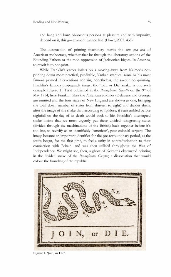
Franklin’s famous propaganda image, the ‘Join, or Die’ snake, is one such
example (Figure 1). First published in the Pennsylvania Gazette on the 9th of
May 1754, here Franklin takes the American colonies (Delaware and Georgia
are omitted and the four states of New England are shown as one, bringing
the total down number of states from thirteen to eight) and divides them,
after the image of the snake that, according to folklore, if reassembled before
nightfall on the day of its death would back to life. Franklin’s interrupted
snake insists that we must urgently put these divided, disagreeing states
(divided through the machinations of the British) back together before it’s
too late, to revivify as an identifiably ‘American’, post-colonial serpent. The
image became an important identifier for the pre-revolutionary period, as the
states began, for the first time, to feel a unity in contradistinction to their
connection with Britain, and was then utilised throughout the War of
Independence. We might see, then, a ghost of Keimer’s obstructed printing
in the divided snake of the Pennsylvania Gazette; a dissociation that would
colour the founding of the republic.
Figure 1. ‘Join, or Die’.

36 Richard Parker
With this snake we are moving towards an idea that is closer to the
fruitful obstruction promised in Keimer’s example. The superstition that
Franklin repeats offers Fraserian rebirth through death; a dialectical image
which enacts the negative, vivifying forces we might want to associate with
the productive constraints of Keimer’s not-printing. The snake represents
disconnection; separation, precursive failure, a negative image of the message
Franklin wishes to communicate. In this sense, though it comes from a
practice that has clearly moved away from the constrictions of the not-
printed, we might use it as an analogue for such methods—a kind of
production that represents, through its exhibition of failure, an unspecified,
utopian creativity to come. It would take the best part of a century for
another, greater, poet to take up Keimer’s suggestion of a synthetic
poetic/printing practice.
In 1855, printer, journalist and loafer, the grossly-material Walt Whitman
would write, set, print, puff and distribute the first and perhaps greatest of
great American poetic sequences, Leaves of Grass. As well as offering the most
detailed poetic depiction of the burgeoning America of Manifest Destiny, this
volume would further develop some of the questions raised in the story of
Franklin and Keimer; Whitman’s work providing, in its vulgarity and grand
inclusivity, a refutation of the ‘pretty’ poetics of Aquila Rose and his colonial,
coterie politics. Whitman’s printing practice would put a grand, though finally
temporary, end to the fraudulent division between writing and printing; his
poems would ring a clangourous close to Yankee-Puritan conceptions of the
greater nobility of practical production over artistic experimentation, while
triumphantly reasserting the Yankee canons of self-reliance, self-promotion
and self-confidence.
A new American materiality—in the sense of the text recognising itself
as a printed text—is central to Leave of Grass. Paper and pages are there in the
title, while Whitman repeatedly points up the physical nature of his text in
“Song of Myself”, writing that “Not words of routine this song of mine, /
But abruptly to question, to leap beyond yet nearer bring; / This printed and
bound book—but the printer and the printing-office boy?” (112) Just as the
gross leaves of the title transform into grass—nature, Romantic
transcendence—so the applied ink, the folded and sewn pages and the
embossed cover will contribute something to Whitman’s depiction of the
soul, and will speak to the reader of his wish to encapsulate the lives of “the
printer and the printing-office boy” and every other kind of American. 1
1 Also, see “Starting from Paumanok” section 13: Not the types set up by the printer return their impression, the meaning, the main [concern, Any more than a man's substance and life or a woman's substance and life return in [the body and the soul, Indifferently before death and after death. (58)
Reading and Not-Printing 37
Printing, then, is a handy metaphor and more in Whitman’s unfolding
poetics. He moves beyond Franklin; for the first time printing is recognised
as being a part of the process of poetry, as being indivisible from the spirit of
inspiration and creation. More importantly for this essay, however, there is
still space in Whitman’s new printing for a depiction of the American not-
printer’s centrally discomforting and repulsive qualities. Thus the not-printer
is vividly evoked in “Song of Myself”, partway through a macabre list of
American misadventures:
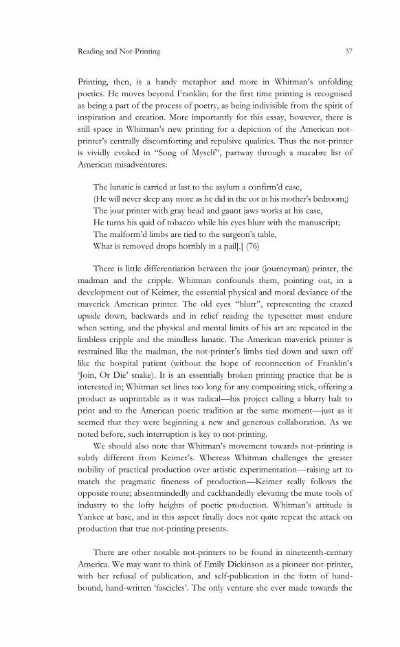
The lunatic is carried at last to the asylum a confirm’d case,
(He will never sleep any more as he did in the cot in his mother’s bedroom;)
The jour printer with gray head and gaunt jaws works at his case,
He turns his quid of tobacco while his eyes blurr with the manuscript;
The malform’d limbs are tied to the surgeon’s table,
What is removed drops horribly in a pail[.] (76)
There is little differentiation between the jour (journeyman) printer, the
madman and the cripple. Whitman confounds them, pointing out, in a
development out of Keimer, the essential physical and moral deviance of the
maverick American printer. The old eyes “blurr”, representing the crazed
upside down, backwards and in relief reading the typesetter must endure
when setting, and the physical and mental limits of his art are repeated in the
limbless cripple and the mindless lunatic. The American maverick printer is
restrained like the madman, the not-printer’s limbs tied down and sawn off
like the hospital patient (without the hope of reconnection of Franklin’s
‘Join, Or Die’ snake). It is an essentially broken printing practice that he is
interested in; Whitman set lines too long for any compositing stick, offering a
product as unprintable as it was radical—his project calling a blurry halt to
print and to the American poetic tradition at the same moment—just as it
seemed that they were beginning a new and generous collaboration. As we
noted before, such interruption is key to not-printing.
We should also note that Whitman’s movement towards not-printing is
subtly different from Keimer’s. Whereas Whitman challenges the greater
nobility of practical production over artistic experimentation—raising art to
match the pragmatic fineness of production—Keimer really follows the
opposite route; absentmindedly and cackhandedly elevating the mute tools of
industry to the lofty heights of poetic production. Whitman’s attitude is
Yankee at base, and in this aspect finally does not quite repeat the attack on
production that true not-printing presents.
There are other notable not-printers to be found in nineteenth-century
America. We may want to think of Emily Dickinson as a pioneer not-printer,
with her refusal of publication, and self-publication in the form of hand-
bound, hand-written ‘fascicles’. The only venture she ever made towards the

38 Richard Parker
literary marketplace was to send some poems to a writer called Thomas
Wentworth Higginson, who offered her lukewarm criticism and advised her
to carry on writing. After Dickinson’s death, when her sister-in-law came to
collect some of her poems for their first publication (contrary to her wishes;
she had asked that they should all be burnt), Higginson would volunteer to
edit her works, making many changes, some to punctuation and layout, some
to wording; much of which was significant.2
If we quickly compare the first two stanzas of ‘“Hope” is that thing with
feathers’ in Thomas H. Johnson’s restorative The Complete Poems of Emily
Dickinson we can readily see the violence that Higginson wrought upon
Dickinson’s poetry:
“Hope” is the thing with feathers—
That perches in the soul—
And sings the tune without the words—
And never stops—at all—
And sweetest—in the Gale—is heard—
And sore must be the storm—
That could abash the little bird
That kept so many warm— (Dickinson, 1976: 116)
In Higginson’s 1891 version—published just as monotype arrives—these
stanzas are amended thusly:
2 Perhaps we might consider editors a sub-set of not-printers. In some sense there obstructive effect on publication is obvious. Today there are fewer obstructions between the writer and putative reader than there have ever been; not-printing is less likely, less of a negative force, than it has ever been. Harry Levin writes (in 1960!) that one of his ‘intermittent nightmares is based on two tons of Thomas Wolfe’s manuscripts now reposing in a vault of the Houghton Library, and the thought that future scholars will gain reputations by putting back what the editors cut out’ (615), and since then things have degraded greatly. Editors, commissioning editors and publishers—not-printers in ties—have made a central contribution to literature – who can doubt that Jack Kerouac’s On the Road was actually improved by the re-writing that many years of short-sighted rejection that he faced from publishers. Today such a volume would have appeared immediately on completion, or even live-blogged during composition, on a website and left there, unread, flabby and imperfect. Not not-printed. But there is also another kind of not-printing editor. In spite of his villainous reputation, perhaps we might think of Higginson as something of a not-printer. His intervention around Dickinson’s poems, rather than irreparably disfiguring them, actually opens up their textuality and their materiality as marginally printed and not-printed documents. His disastrous recasting of Dickinson’s poems offer a new and profoundly negative access point to their ‘truth-content’, the extent of their precariousness and strangeness is underlined, revealed and perhaps amplified by her editor’s clumsiness. In fact we might consider Dickinson and Higginson as two of America’s greatest not-printers, with their negative practices complimenting one another almost miraculously.
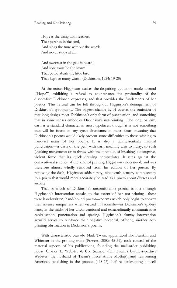
Reading and Not-Printing 39
Hope is the thing with feathers
That perches in the soul,
And sings the tune without the words,
And never stops at all,
And sweetest in the gale is heard;
And sore must be the storm
That could abash the little bird
That kept so many warm. (Dickinson, 1924: 19-20)
At the outset Higginson excises the despairing quotation marks around
‘“Hope”’, exhibiting a refusal to countenance the profundity of the
discomfort Dickinson expresses, and that provides the fundaments of her
poetics. This refusal can be felt throughout Higginson’s derangement of
Dickinson’s typography. The biggest change is, of course, the omission of
that long dash; almost Dickinson’s only form of punctuation, and something
that in some senses embodies Dickinson’s not-printing. The long, or ‘em’,
dash is a standard character in most typefaces, though it is not something
that will be found in any great abundance in most fonts, meaning that
Dickinson’s poems would likely present some difficulties to those wishing to
hand-set many of her poems. It is also a quintessentially manual
punctuation—a dash of the pen, with dash meaning also to hurry, to rush
(evoking movement) or to throw with the intention of breaking; a disruptive,
violent force that its quick drawing encapsulates. It runs against the
conventional sureties of the kind of printing Higginson understood, and was
therefore almost wholly removed from his edition of her poems. By
removing the dash, Higginson adds surety, nineteenth-century complacency
to a poem that would more accurately be read as a poem about distress and
anxiety.
That so much of Dickinson’s uncomfortable poetics is lost through
Higginson’s intervention speaks to the extent of her not-printing—these
were hand-written, hand-bound poems—poems which only begin to convey
their intense uniqueness when viewed in facsimile—in Dickinson’s spidery
hand, in the midst of her unconventional and extraordinarily communicative
capitalisation, punctuation and spacing. Higginson’s clumsy intervention
actually serves to reinforce their negative potential, offering another not-
printing obstruction to Dickinson’s poems.
With characteristic bravado Mark Twain, apprenticed like Franklin and
Whitman in the printing trade (Powers, 2006: 45-51), took control of the
material aspects of his publications, founding the mail-order publishing
house Charles L. Webster & Co. (named after Twain’s business-partner
Webster, the husband of Twain’s niece Annie Moffatt), and reinventing
American publishing in the process (448-63), before bankrupting himself
40 Richard Parker
funding the development of the Paige Compositor, a failed forerunner to
monotype in the 1890s (518-34). Twain’s business model was quite different
from Keimer’s and Whitman’s, with the author utilising the exclusivity
available to fine printing as a way to set up his own publishing empire,
hawking his own novels in luxurious illustrated and printed editions through
mail order—and adding, in the process, a new materiality to particular
editions of particular books that runs contrary to the bluff-reproducibility of
Franklin’s understanding of printing.
Twain’s career was not without the obstructions of not-printing,
however. In 1884, as Twain was readying the first edition of The Adventures of
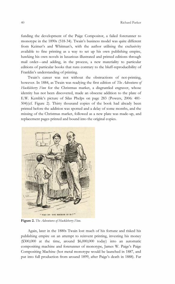
Huckleberry Finn for the Christmas market, a disgruntled engraver, whose
identity has not been discovered, made an obscene addition to the plate of
E.W. Kemble’s picture of Silas Phelps on page 283 (Powers, 2006: 481-
504)(cf. Figure 2). Thirty thousand copies of the book had already been
printed before the addition was spotted and a delay of some months, and the
missing of the Christmas market, followed as a new plate was made-up, and
replacement pages printed and bound into the original copies.
Figure 2. The Adventures of Huckleberry Finn.
Again, later in the 1880s Twain lost much of his fortune and risked his
publishing empire on an attempt to reinvent printing, investing his money
($300,000 at the time, around $6,000,000 today) into an automatic
compositing machine and forerunner of monotype, James W. Paige’s Paige
Compositing Machine (hot metal monotype would be launched in 1887, and
put into full production from around 1899, after Paige’s death in 1888). Far
Reading and Not-Printing 41
more complex than the hot metal system that would eventually achieve
Twain’s goal, the machine never properly worked and came close to losing
Twain all of his material gains. Both events mark the intrusion of not-
printing. We may think of the disgruntled engraver as an iteration of Keimer,
throwing the spanner into Huckleberry’s works, and the Paige machine—a
great, useless mechanism of potentiality, that would not and could not print
and came close to putting the breaks on Twain’s capitalist publishing
project—seems not-printing’s mechanical iteration, a not-robot refusing
production.
If we wished to read a political economy into these developments we
might perceive the shape of bourgeois revolution in the developing
materialities of the period; Keimer’s not-printing was damned by Franklin
who, preferred, instead of the capacities latent in the anarchy of not-printing,
the press’s capacity for immense reproducibility and speedy distribution; the
propaganda machine of the farmers, merchants, lawyers and planters that
were the Founding Fathers. Whitman suggests a kind of bridging of those
positions, calling loudly and lastingly—though not with crystalline clarity—
for a revolution at least partly on Keimer’s model, employing methods and a
delight in the materiality of the text that bring us back to the origin of
American not-printing. That Whitman finally abandoned the press, and came
to call for a unified rather than inverted society, confirms him as a follower
of Franklin in the final estimate, however. Twain continued this revolution,
capitulating to the tastes of the middle-classes, selling them fine-binding and
glorious illustration; and then attempting to cut the journeyman printer out
of the equation with the Paige Compositor. Dickinson’s refusal to publish
had been read as elitism; middle-class Yankee snobbery, her production of
fascicles and their non-distribution amounting to reification of the written
word that refuses printing and not-printing alike.
Perhaps we might imagine that American not-printing simply amounts to
a commodification of anti-commodification. But the example of Keimer, less
canonical than those late not-printers, quasi-Jew and dissenting Protestant,
stalks the history of print’s bloodless bourgeois coup—a critical affront to
the great writer-printers’ restricted practices; offering negative iterations of
the utopian potential that lies embedded within the method and media of
cold-metal printing.
2. Not-Printing at The Crater Press
Bearing in mind my attempt to celebrate particular acts of not-printing in the
American tradition, I would now like to turn to some recent discussions
around letterpress printing in contemporary British and American poetry,
and my own printing practice. I will focus on some of my own, admittedly
extensive, limitations, and the effect they have had, utopian or otherwise, on

42 Richard Parker
the output of my own press, the Crater Press. The divided politics of the
letterpress remain in contemporary practice. Memories of Wapping and
some of the faded glory of the last great pitched-battles of organised labour
in Britain still resonate through the outmoded, physical, material processes of
such hand-printing. Nearly all letterpress printers operating today in the UK
will have at some point been trained by an ex-union man, brought through
that most unionised industry and laid off in Murdoch and Thatcher’s great
purges in the 1980s, only to find, like the poets, precarious employ at the
periphery of the academy. Regarding the Crater Press Orlando Reade writes,
in The White Review, that
These books are crafted with an attention which seems to restore an
experience almost lost to the modern reader. If this sounds like a cliché
about the demise of the book in the era of the electronic reading device,
if these objects sound boutique, their beautiful materiality is counter-
poised by the radical political commitments of the poetry. The fruit of
these labours may seem absurdly distant from the projections of the
professionally paranoid custom-official but in the last two years Crater
Press has published some of the most explosive political poetry made in
Britain. (40)
With blogs free and plentiful, photocopiers piratically accessible to most
students and faculty and a Rymans on every British High Street, the
requirement for time-consuming, difficult, expensive production methods is
hard to justify. The connection between fine printing and luxury and
expensive exclusivity that Twain traded off of inevitably haunts all letterpress
production today. Responding to Reade’s article, Tom Chivers writes—on
his blog—that
if radical poetics aspires to a critique of capitalism, then one can
understand why releasing hand-made pamphlets in small print-runs to a
limited circle of readers is favourable.
But is it not also plausible that this tendency towards the hand-bound
and letterpressed, the limited run, the poorly publicised, and the widely
unavailable, is really just the result of a lack in demand that has become
institutionalised and fetishised as a political position within the small
world of avant-garde poetry? (Chivers, 2012)
We might read Chivers here as suggesting that the residents of the Grand
Hotel Abyss are drawn to not-printing through not-reading. It is true that
such methods have appeared contrary to the requirements of both readers
and technology. Letterpress for poets has become more popular in direct
contradiction to the method’s utility to the printing trade. For Franklin the
potential of a not-printing practice is immediately dismissed, with the
Reading and Not-Printing 43
immense possibilities of the press as a modern tool overshadowing it
dismally. For Whitman, also, the press is a means to an end, and once he was
able to have his books printed professionally he changed his practice. In
Twain’s case the interest in the materiality of particular editions comes right
at the end of hand-setting’s natural life, at the point of the invention of
monotype. Letterpress as a medium for small press printing (which did not
exist in anything approaching its current form when letterpress was a
dominant technology), however, began to catch on in the USA and UK from
the 1960s, just as mimeographing, the Gestetner machine, photocopying,
offset and so on were becoming widely available, and were becoming cheaper
than letterpress. Thus we see the emergence of presses like Andrew Hoyem’s
Arion Press, Jonathan Williams’s Jargon Society (described by Guy
Davenport as “a paradoxical fusion of fine printing and samizdat diffusion”
[iv]) and White Rabbit Press, in the USA and Tom Raworth’s Golliard Press
in the UK immediately after it became possible to produce and disseminate
such works more quickly, more widely and more cheaply through
‘conventional’ methods.
An uncharitable reading of these developments might see Williams,
Raworth and others as continuing Twain’s bourgeois revolution; employing
the difficulty of the production of their products as a kind of Veblenite
surplus value to be savoured and consumed by those possessing enough
cultural capital to appreciate the exclusivity of their purchases, and just
enough capital left after their expensive educations to purchase finely printed
pamphlets. Chivers does not, in fact, go quite this far, suggesting, instead,
that the draw to such limited production is dictated by dropping demand: the
great obstruction upon this not-printing is readers not reading. I can’t quite
see this as a logical reason for moving from the photocopier to the ‘luxury’
edition; Chivers implicitly sees such production as the materialisation of the
‘fetish’ that has grown up around this lack of demand, which has been
‘fetishised as a political position within the small world of avant-garde
poetry’.
Keston Sutherland offers another explanation, one that moves us back
towards production, but of a transformed, wholly un-fetish-like kind:
I was moved by love. What shines in the unpaid labour of generosity of
typesetters […] like Rich Owens […] and Richard Parker, whose Crater
series is unique and beautiful, is, I truly feel, an expression of love. Love
for the deep potential of poetry, for the specific charge of it. What […]
makes it love rather than just solicitude or interest is their extraordinary
dedication to the surface of text. The deep potential is not opposite to
the surface; or rather, it is not opposite to the only surface that is worth
labouring for, the rich surface gripped in graphic intensity and
overflowing with minute detail. (From an email sent to the UKPoetry
List)
44 Richard Parker
Sutherland's love is not sugary, sentimental or conventional. Rather, this
is the ambivalent first-love of surface, something superficial, dangerously
close to lust, and yet deep, running through the whole of the edifice of
community. In its ambivalence and its adherence to the mute, thingful
surface, it is close, in fact, to printing, and in its potentially interruptive
capacity very close to the concept of not-printing. Sutherland is suggesting
more than just the (perhaps hallucinatory) love shared by the community of
poets; rather he is positing that fine printing of fine poetry contains some of
the utopian potentiality that Theodor Adorno sees in successful art—that the
mere existence of such processes and products must go a little part of the
way to refuting the iniquitous social conditions under which we struggle. As
in Adorno, it is finally a utopian image that can be viewed only negatively –
through obstruction, through the concentration upon surface and only
surface.3
Some poets today have advocated a position close to not-printing in
their poetics. In a kind of manifesto revolutionary American poets Jasper
Bernes, Joshua Clover, and Juliana Spahr have advocated that for “The self-
abolition of the poet”, arguing that
Poets really are the unacknowledged legislators of the world because,
from the start, the poem was a tool for the administration of the affairs
of state: written business records and legal codes enabled by the
measurement and patterning of speech provided by the poetic technique.
Dickinson’s attic, Rimbaud’s departure, Oppen’s silence. Though such
dissidence is not unique to the modern poet, the legendary refusals and
decompositions of the modern poets emerge largely as the consequence
of the dawning awareness of this legacy.
I have pointed out Dickinson’s proximity to the not-printing project
above, and Rimbaud’s abdication from poetry and George Oppen’s pointedly
political twenty-year pause from poetic production also repeat some of the
ideas behind this project. We might think of other poets who engaged in
similarly public pauses, partial self-abolitions, such as Robert Duncan, Laura
Riding, Constantine Cavafy and Gerard Manley Hopkins, even T.S. Eliot
after The Four Quartets and Ezra Pound in his late, portentous silence. And we
might also add the great unfinishable books of modernism to such a list;
works that refused the limits and completion of production such as Pound’s
Cantos (1915-62), William Carlos Williams’s Paterson (1946-63), Marcel
3 This is a particularly negative kind of utopianism; one that is not based on any specific programme, or that is even envisionable in any detail. Simon Jarvis writes that “Unlike what is generally called utopianism, it in no way seeks to assure us that the great day must come, nor even that it is likely to. Instead its perennial aim is to resist the liquidation of this possibility by sciences which legislate for the future in the image of the past” (222).
Reading and Not-Printing 45
Proust’s À la recherche du temps perdu (1871-1922) and Robert Musil’s Der Mann
ohne Eigenschaften (1930-43). Keimer and his ghostly reiterations, whom we
have noted interfering about the edges of the successive bourgeois
revolutions of the War of Independence, Manifest Destiny, The Civil War
and the Gilded Age, must be seen to be detaching printing production from
the capitalist functionality of printing just as these poets seek to challenge the
fundamentally compromised nature of poetic language through the
abolishment of themselves as poets.
And at this point, with the argument for an American not-printing
outlined, I will turn to my own experience of printing at the Crater Press.
This project was founded in the summer of 2009 and has to date printed
around thirty pamphlets written by various poets, in various styles (though
with a tendency towards today’s English avant-garde with its triple vortices of
London, Brighton and Cambridge). I print almost only in letterpress, in lots
of different colours and with the intention of producing each pamphlet
differently from those that have gone before.
As, somewhat in the American fashion, editor and printer and sole-
operator in this venture, I consider my primary work to be that of reading. In
the course of my work I engage in different kinds of reading, which manifest
themselves in different ways in the different pamphlets that we have
produced. I would like to think about this reading as something similar to
not-printing; as the fruitful manifestation of obstruction in the artistic
process. I think it will be worth delineating some of these kinds of reading
here; there is that of a kind of prospective background reading, actively and
passively in search of poetries to publish and to establish links with poets that
I might publish. Much of this kind of ‘reading’ is actually a social process,
which takes place at poetry readings, in conversation, sometimes drunkenly—
provisional and unsatisfactory as social interaction as reading ought to be.
Following that process, and once poets and manuscripts have been
procured, the active, selective reading of editing begins. The next stage would
normally be an initial proofreading—checking the author’s submitted
typescript for ambiguities and errors. Proofreading is another kind of active
reading; one in which demands are made upon the writer, and in which the
reader holds the authority of correction over the author. In letterpress an
additional element is added to the proofreading search for errors and
ambiguities: as I proofread a text I will also be on the look out for unusual
typographic elements that will be difficult or impossible to achieve in
traditional movable type. Thus non-standard symbols and effects, like
asterisks, @-signs, bold text, struck-through text, SMALLCAPS, superscripts and
subscripts, even pretty much standard elements such as italics and diacriticals—all
of which we have become used to using with great ease on programmes like
Microsoft Word—are difficult, limited, or impossible for the letterpress
printer. A period of negotiation will follow between the writer and I, with me
46 Richard Parker
attempting to excise such elements from the text, the writer countering with
insistences and justifications, and, finally, circumnavigations and compro-
mises are arrived at through discussion between printer and author.
Following proofreading comes a reading that roughly equates with
‘design’. In this aspect I perhaps feel most the descendent of Keimer,
“something of a scholar, […] a mere compositor, knowing nothing of
presswork.” Here Adorno’s “negative canon” (43) most productively reveals
itself, for in the physical presence of the press and with the limited technical
ability that just a few years of ‘apprenticeship’ can offer you, opportunities
for ‘design’ are severely limited. There is no danger of becoming lost among
the many mysterious functions and potentialities of Adobe Illustrator; simply
to get a text onto the press and then off it again in a reasonably clean manner
is task enough. Miraculously, however, the conjunction of an inflexible
machinery, limited ability and an openness to contingency often leads to
productions of a surprising strangeness and, somehow, originality, if rarely
outright beauty. Much of design, then, becomes subsumed into the
processes of typesetting and imposition.
Printers then enter the brain-twisting stage of typesetting, in which the
movable type is arranged, upside-down but not backwards, upon the
compositing stick into the words required for the text, and ‘imposition’,
whereby the set text is arranged for printing upon the press, backwards but
not upside-down, in the correct layout and order so that the text will fall into
the correct page-order when printed and folded. For me typesetting is the
stage at which I begin to really read the text; every word and letter is
considered physically as it is sought, found and extracted from the case,
repeatedly compared with the setting text, and the growing lines literally
weighed in my left hand as I hold the compositing stick. With this slow,
deliberate reading I often feel like I begin to read with the author for the first
time; by reading with a slowness and exactness that perhaps matches the
speed of composition, I feel more attuned to subtleties and intentions,
echoes and patternings, that I’ve missed during the multiple preceding read-
throughs. I come to read the text with something like the joy and instinctive
understanding of an author contemplating their own work, knowing its
thingness and feeling the reality of its having been created from out of the
void. This is a quintessential capacity of not-printing; something that Franklin
could have had no truck with, and which I imagine the non-not-printer (the
printer) would be keen to move beyond.
More active, negative reading practices follow: print-checking, more
proof-reading, the monitoring of inking consistency and quality during the
printing process, and then the final physical process of folding and binding
and the metaphysical and physical reading of marketing and distribution.
Finally, Crater pamphlets will be the texts by contemporary poets that I have
read with more attention than any other—and by a considerable measure.
The constraints that give the pamphlets their particular feel and look, and the

Reading and Not-Printing 47
rewarding, unproductive reading that the process forces upon me, combine
as not-printing.
3. Examples: Obstructed Reading
I would like, in the final section of this paper, to take this opportunity to see
how some of this reading and not-printing has been manifested in particular
pamphlets published by Crater. Just as I see the pamphlet’s printing as a
reflection of obstruction and an exercise in unusual reading, so the reception
that they receive from readers should be characterised by just such
obstructions, as well as reading experiences perhaps parallel to my reading
and not-printing. When I began the Crater operation I felt, largely through
my own experience of the impossibility of keeping up with my reading of
even the small proportion of interesting published work that I buy, that I
wanted these pamphlets to be read—and I felt, largely instinctively at first,
that a kind of not-reading, associated somehow with the not-printing that I
have been describing, would be key to giving them the best practical chance
to be read, as well as offering a reading experience that contained more of the
utopian, revolutionary potentiality of not-printing.
The first Crater, Crater 0, is unusual in our production in that it is a group
number featuring a number of contemporary poets, each giving one or two
very short (almost haiku-like, but not haiku) poems. The constraints of
production are clear; this was the press’s first project, I was not yet confident
with large-scale printing, and I had very little type at this stage. Thus I felt
bound to a small paper size and to very short poems. The poets writing in
this number produced commissioned poems smaller than they normally
would, and I think the final number proved revelatory about the capacities of
the very short poem in the poetics of today. Later Craters actively explore the
physical limitations of the process; speaking at the Michael Marks Poetry
Pamphlet Awards in June 2011, Robert Hampson said that the Crater Press
was exceptional in ‘its exploration of the opportunities and constraints of
letter-press—and the inventive folding of single or double pages.’ (From
Hampson’s speech) Thus the size of Sara Crangle’s gimme your hands, for
example, was decided by the longest piece of paper we could physically get
through the press (an FAG Swiss Proof 40) in one pull, and many numbers
explore the variations that are possible through folding a single sheet of A3
(or thereabouts) paper (Figure 3).
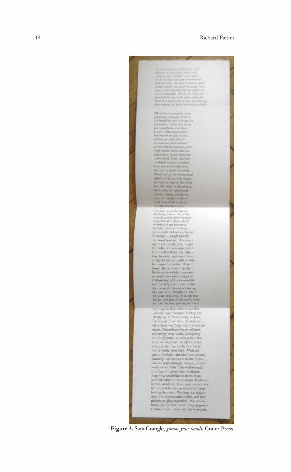
48 Richard Parker
Figure 3. Sara Crangle, gimme your hands, Crater Press.
Reading and Not-Printing 49
As to the barriers to reading in the first number—there is a classificatory
difficulty; there is no title, there is no real number, no clear explanation of
what is going on in the number. More practically the pages were left uncut,
in a move that would be a feature of a number of Craters. Thus a time-saving
necessity of early book production that was adapted into a symbol of surplus
value and the luxury edition is perhaps refurbished into a instrument of
interruption; of something to come between the reader and the text, to
enhance and authenticate their act of reading—before reading, or as a
preliminary meta-reading stage, the reader will need to actively cut the pages;
cut into the product they’ve just expensively ordered and had posted to them.
The smallness of the page size, which was necessitated by the practicalities of
printing, adds to the fiddliness of the reading experience.
The next number, Jonty Tiplady’s Crater 2, Above Shoes by Some Margin,
continued the unspecific numbering, and was again printed in constrained
circumstances. Printed over a few hours illicitly attained in the letterpress
studio Central Saint Martins college of arts in London, it was necessary to
print this five-page pamphlet with just one pull; one run through the press.
It is thus one-sided, with a rather complicated fold. Again, reading such a
fold is a little disorientating—it is unclear whether we are to read left to right
first or top to bottom—while the expanse of the blank page at the centre of
the print should come as something of a shock to the reader.
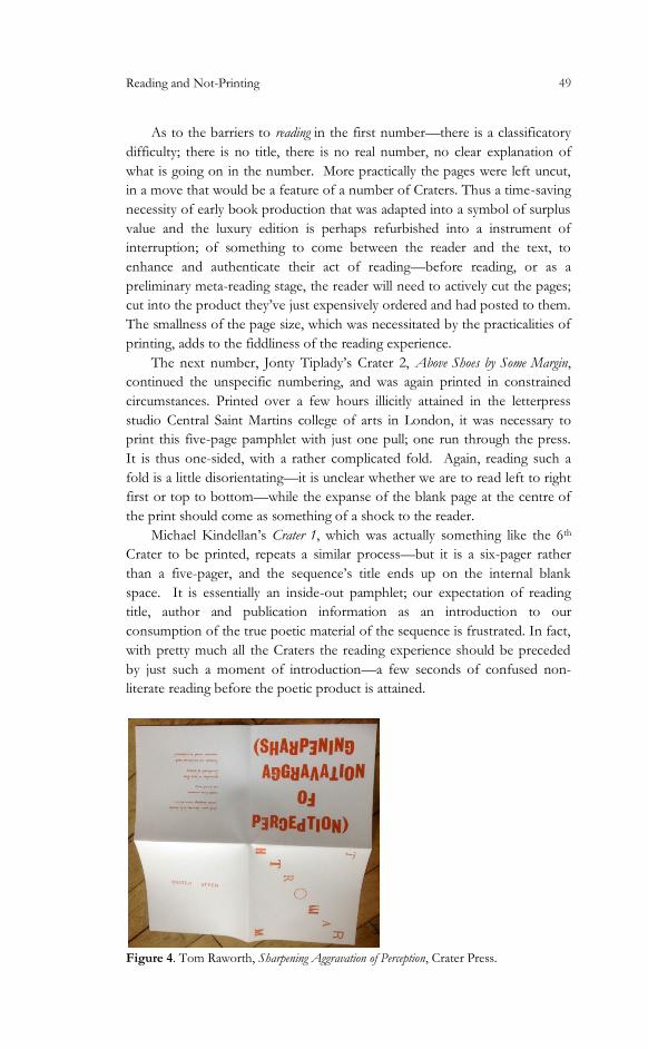
Michael Kindellan’s Crater 1, which was actually something like the 6th
Crater to be printed, repeats a similar process—but it is a six-pager rather
than a five-pager, and the sequence’s title ends up on the internal blank
space. It is essentially an inside-out pamphlet; our expectation of reading
title, author and publication information as an introduction to our
consumption of the true poetic material of the sequence is frustrated. In fact,
with pretty much all the Craters the reading experience should be preceded
by just such a moment of introduction—a few seconds of confused non-
literate reading before the poetic product is attained.
Figure 4. Tom Raworth, Sharpening Aggravation of Perception, Crater Press.

50 Richard Parker
Crater 19, Tom Raworth’s The Sharpening Aggravation of Perception, also
follows this process, which is amplified by other elements of the pamphlet’s
design (Figures 4 and 5). His name is written backwards; the poem is printed
in a cursive typeface (Madonna Ronde), a typeface I used as part of a strategy
suggested by Raworth, who recommended two different French cursives in
combination (alternate-letters Mistral and Metroscript), and which provides,
in its complexity, a barrier on easy reading.
Figure 5. Tom Raworth, Sharpening Aggravation of Perception, Crater Press.
These cursive types are not fashionable among contemporary typesetters;
their gesture towards the handwritten placing a gauze between the medium—
now fetishized for an apparently refurbished authenticity—and the text.
Many of today’s graphic (rather than literary) printers prefer the historic
typefaces of the early days of printing, or blocky Victorian and Edwardian
circus-titling. They celebrate wooden type, and celebrate imperfections and
grain for the manner in which they reveal the type as type. In fact, digital
typographers have created ‘broken’ typefaces to replicate this effect digitally.
Old typefaces (and the font of Madonna I used is probably over 100 years
old) that mask their origin in some sense—as letterpress, movable type—run
completely counter to today's letterpress orthodoxy, and I take some
pleasure, and perhaps demonstrate a little critical not-printing, in
contradicting that orthodoxy. A similar process is also found in the brutal,

Reading and Not-Printing 51
tabloid style sans-serif titling faces like the one I used on Keston Sutherland’s
The Stats on Infinity; typefaces so associated with Fleet Street, Wapping and
hot metal printing that the possibility of their use in the letterpress is nearly
forgotten.
The title of Raworth’s pamphlet, Sharpening Aggravation of Perception, is
printed in alternating right-way- and wrong-way-up letters, again causing the
reader to confusedly turn the pamphlet around in their hands as they seek to
understand, to read, the title. Difficult titles are typical of Crater’s production;
Jeff Hilson’s Organ Music (Figure 6) is one example of this, as is Ken
Edwards’s Millions of Colours. Both titles use a wayward lineation, and the
constraints of speedy printing with limited resources and talent, to partially
camouflage the identity of the poets, and to prolong and enliven the moment
of first encounter with these texts.
Figure 6. Jeff Hilson, Organ Music, Crater Press.
The Raworth Crater, I hope, is an example of my printing with the
pamphlet; of my reading through printing along with Raworth. Sometimes,
however, I read and print in some sense against the writer I’m printing. An
example of this would be the recent Richard Owens Crater, Turncoat, in
which I took Owens’s angry, muscular, politically-charged verse, and printed
it in light pink (actually, at the suggestion of my collaborator Jessica Pujol i
Duran), with the cover hand-stamped with a logo featuring an unashamedly
commercial baseball-like typeface. Owens responded to the printing, writing
that:
52 Richard Parker
the pink i think productively undercuts any of the hyper-aggressive
hyper-masculinist substructure the poem might have—at this stage an
almost ineradicable feature of my writing that troubles me deeply—and
so i was grateful for this, a masterful decision on your part and clear
evidence of how the material production of a poem effectively co-
produces it. (E-mail to the author)
The rubber stamp refuses the reproducibility of Franklinian propaganda-
printing, and, hopefully, does something to the political message Owens wishes
to impart. In fact, I would hope that in an example like this my printing does
enough to provide a kind of a reading of the poem—that it demonstrates a
particular response to the poem and a reading/creation that continues with it.
Finally, the Crater Press is a collaboration between writers and printer;
essentially the not-printing we engage in and the obstructed reading we
provide offer access to a kind of dialectical view of the manner in which art
functions—a view in which restriction and obstruction, the “negative canon”
(Adorno, 1997: 43), contribute materially to revolutionary art. Focusing on,
insisting on, the surface before anything else, for the negative imprint it
might contain of a better world. The amount of printers and publishers who
are, in turn, writers at the Crater Press should be noted: Raworth and Owens
have letterpressed, producing very significant work, while Sutherland, Hilson
and many other Crater contributors operate or have operated small poetry
presses in one form or another. And we are all pretty much unread, unknown
and defective (in one definition or another of these adjectives), as artists and
printers and readers—we are all not-printers.
References
ADORNO, Theodor (1997). Aesthetic Theory. Trans. Robert Hullot-Kentor.
London: Continuum.
BERNES, Jasper; Joshua Clover, and Juliana Spahr (2014). “The Self-
Abolition of the Poet.” Jacket 2, Jan 2014. 9 Sep. 2014.
https://jacket2.org/commentary/self-abolition-poet
CHIVERS, Tom (2012). “The White Review: Make, Write, Argue, Dream.”
This Is Yogic. n. d. 30 Mar. 2014.
http://thisisyogic.wordpress.com/2012/03/21/the-white-review/
CRANGLE, Sara (2012). gimme your hands. Brighton: Crater Press.
DAVENPORT, Guy (1996). “Introduction.” Paul Metcalf, Collected Works:
Volume I: 1956-1976. Minneapolis: Coffee House Press.
DICKINSON, Emily (1976). The Complete Poems of Emily Dickinson. Ed
Thomas H. Johnson. London: Faber.
____________(1924). The Complete Poems of Emily Dickinson. Ed Thomas
Wentworth Higginson. Boston: Little, Brown and Company.
Reading and Not-Printing 53
FRANKLIN, Benjamin (1986). Benjamin Franklin’s Autobiography. Eds J.A.
Leo Lemay and P.M. Zail. New York: Norton.
HAMPSON, Robert (2010). Speech from Michael Marks Poetry Awards.
HILSON, Jeff (2012). from Organ Music: An Anti-Masque Not for Dancing.
Mataró: Crater Press.
HOWE, Daniel Walker (2007). What Hath God Wrought: The Transformation of
America, 1815-1848. Oxford: Oxford University Press.
IRVING, Washington (1978). History, Tales and Sketches. New York: Library
of America.
JARVIS, Simon (1998). Adorno: A Critical Introduction. Cambridge: Polity
Press.
KEROUAC, Jack (2000). On the Road. London: Penguin.
KINDELLAN, Michael (2010). Crater 1. Brighton: Crater Press.
LEVIN, Harry (1960). “What Was Modernism?” The Massachusetts Review, 1.4:
609-630.
MORAIS, Henry Samuel (1894). The Jews of Philadelphia. Philadelphia: The
Levytype Company.
OWENS, Richard (2013). Turncoat. Brighton: Crater Press.
PARKER, Richard, ed. (2009). Crater 0. Brighton: Crater Press.
POWERS, Ron (2006). Mark Twain: A Life. New York: Free Press.
READE, Orlando (2012). “Notes on an Unfamiliar Poetry.” The White Review 4.
SUTHERLAND, Keston (23/03/2012). “UK poetry PLC / Battle of
Wapping.” UKPoetry List. E-mail.
© 2014 Richard Parker.