For the Quarter Ended June 30, 2020 Upto the Quarter Ended ...
Upload
khangminh22Category
view
0download
0
CO_Q4_Mathematics 7 _ Module 3
7
Mathematics Quarter 4 – Module 3
Presentation of Data

Mathematics – Grade 7 Alternative Delivery Mode Quarter 4 – Module 3: Presentation of Data First Edition, 2020 Republic Act 8293, section 176 states that: No copyright shall subsist in any work of the Government of the Philippines. However, prior approval of the government agency or office wherein the work is created shall be necessary for exploitation of such work for profit. Such agency or office may, among other things, impose as a condition the payment of royalties. Borrowed materials (i.e., songs, stories, poems, pictures, photos, brand names, trademarks, etc.) included in this module are owned by their respective copyright holders. Every effort has been exerted to locate and seek permission to use these materials from their respective copyright owners. The publisher and authors do not represent nor claim ownership over them. Published by the Department of Education Secretary: Leonor Magtolis Briones Undersecretary: Diosdado M. San Antonio
Printed in the Philippines by __________________________ Department of Education – SOCCSKSARGEN - Region XII Office Address: Regional Center, Brgy. Carpenter Hill, City of Koronadal
Telefax: (083) 2288825/ (083) 2281893
E-mail Address: [email protected]
Development Team of the Module
Writer: Michelle Ann C. Caras
Editors: Cecile S. Dela Rosa and Grace Joy A. Canseco
Reviewers: Evelyn C. Frusa , Noemi E. Parcon,
Rolex H. Lotilla and Arvin M. Tejada
Illustrator: Michelle Ann C. Caras
Layout Artists: Kent M. Corpuz, Rosel P. Patangan
Management Team: Allan G. Farnazo,
Gilbert B. Barrera
Arturo D. Tingson Jr.
Peter Van C. Ang-ug
Prima A. Roullo
Evelyn C. Frusa
Bernadette M. Villano

7
Mathematics Quarter 4 – Module 3:
Presentation of Data
Introductory Message
This Self-Learning Module (SLM) is prepared so that you, our dear learners,
can continue your studies and learn while at home. Activities, questions,
directions, exercises, and discussions are carefully stated for you to understand
each lesson.
Each SLM is composed of different parts. Each part shall guide you step-by-
step as you discover and understand the lesson prepared for you.
Pre-tests are provided to measure your prior knowledge on lessons in each
SLM. This will tell you if you need to proceed on completing this module or if you
need to ask your facilitator or your teacher’s assistance for better understanding of
the lesson. At the end of each module, you need to answer the post-test to self-
check your learning. Answer keys are provided for each activity and test. We trust
that you will be honest in using these.
In addition to the material in the main text, Notes to the Teacher are also
provided to our facilitators and parents for strategies and reminders on how they
can best help you on your home-based learning.
Please use this module with care. Do not put unnecessary marks on any
part of this SLM. Use a separate sheet of paper in answering the exercises and
tests. And read the instructions carefully before performing each task.
If you have any questions in using this SLM or any difficulty in answering
the tasks in this module, do not hesitate to consult your teacher or facilitator.
Thank you.

1
CO_Q4_Mathematics 7_ Module 3
What I Need to Know
This module was designed and written with you in mind. It is here to help you
master the Real-Life Problems that can be Solved by Statistics. The scope of this
module permits it to be used in many different learning situations. The language
used recognizes the diverse vocabulary level of students. The lessons are arranged
to follow the standard sequence of the course. However, the order in which you
read them can be changed to correspond with the textbook you are now using.
The module contains a single lesson:
Lesson 1 – Pie Chart, Bar Graph, Line Graph, Histogram and Ogive
After going through this module, you are expected to:
1. use appropriate graphs to represent organized ungrouped data: pie chart,
bar graph, line graph; and
2. use appropriate graphs to represent organized grouped data: histogram and
ogive
What I Know
DIRECTIONS: Select the correct answer. Write the letter on a separate sheet of
paper.
1. What is the visual representation of data using rectangles whose widths
represent class boundaries and whose lenghts/heights represent the
frequencies of the intervals?
A. pie chart c. ogive
B. line graph d. histogram
2. What graph use upper class boundaries of the cumulative frequencies.
A. pie chart c. line graph
B. histogram d. Ogive
3. Which of the following illustrations shows the graph of a histogram?
A. B.

2
CO_Q4_Mathematics 7_ Module 3
C D.
4. Last Thursday, Alpheus spent 12 hours of the day sleeping and playing, 2
hours eating and dressing, 6 hours at school, and 4 hours surfing the internet.
What graph is appropriate to show the percentages of time spent on his
activities in the day?
A. bar Graph C. pie Chart
B. line Graph D. histogram
5. What appropriate graph can be used to show the population of Region XII in
the Philippines from 1989 to 2020 ?
A. bar Graph C. pie Chart
B. line Graph D. histogram
*For numbers 6 – 9 refer to the following graph.
6. On what day Mr. James worked the most?
A. Monday C. Wednesday
B. Tuesday D. Thursday
7. On what day did he work for 5 hours?
A. Monday C. Wednesday
B. Tuesday D. Thursday
8. How many hour/s did he work during Monday?
A. 1 C. 3
B. 2 D. 4
9. What is the total number of working hours he spent from Monday to Friday?
A. 10 C. 21
B. 17 D. 28

3
CO_Q4_Mathematics 7_ Module 3
*For numbers 10 – 13 refer your answer to the following graph.
10. How many people like volleyball?
A. 20 B. 25 C. 40 D. 65
11. Which sport got 40 votes?
A. soccer B. volleyball C. basketball D. softball
12. Which sport was liked most?
A. soccer B. volleyball C. basketball D. softball
*For numbers 13 – 15 refer to the following graph.
13. Which food was purchased the most?
A. cheese B. Hotdogs C. chicken D. apples
14. If there were 200 customers in the survey, how many bought pizza?
A. 20 B. 28 C. 48 D. 56
15. What percent of costumers bought either apples or cheese? a. 11% B. 13% C. 24% D. 37%

4
CO_Q4_Mathematics 7_ Module 3
Lesson
1 Pie Chart, Line Graph, Bar Graph, Histogram
and Ogive
In this lesson you will learn how to represent the data using different types of
graphs.
Which frequency distribution table correctly organizes the scores below? 1, 3, 2, 2, 4, 1, 1, 2
What’s In
score tally frequency
1 III 3
2 III 3
3 I 1
4 I 1
score tally
1 III
2 III
3 I
4 I
score tally frequency
1 I 1
2 III 2
3 II 3
score tally frequency
1 III 1
2 II 2
3 II 2
4 I 1
A. B.
C. D.
5
CO_Q4_Mathematics 7_ Module 3
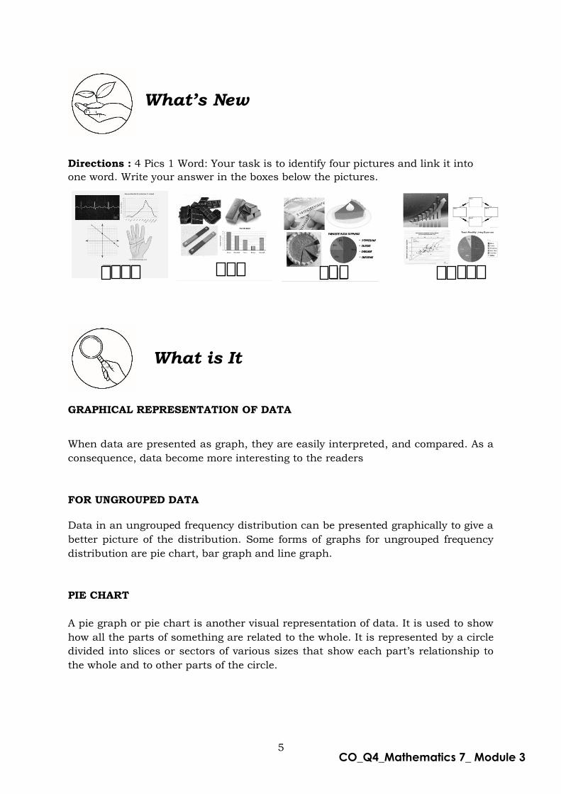
Directions : 4 Pics 1 Word: Your task is to identify four pictures and link it into
one word. Write your answer in the boxes below the pictures.
What is It
GRAPHICAL REPRESENTATION OF DATA
When data are presented as graph, they are easily interpreted, and compared. As a
consequence, data become more interesting to the readers
FOR UNGROUPED DATA
Data in an ungrouped frequency distribution can be presented graphically to give a
better picture of the distribution. Some forms of graphs for ungrouped frequency
distribution are pie chart, bar graph and line graph.
PIE CHART
A pie graph or pie chart is another visual representation of data. It is used to show
how all the parts of something are related to the whole. It is represented by a circle
divided into slices or sectors of various sizes that show each part’s relationship to
the whole and to other parts of the circle.
What’s New

6
CO_Q4_Mathematics 7_ Module 3
Example 1:
Construct a pie chart for the data given below.
Favorite Type of Movie
Type of Movie Number of Votes
Science Fiction 1
Comedy 6
Action 4
Drama 5
Romance 4
Total 20
Solution:
First, divide each value by the total and multiply by 100 to get a percent.
Type of Movie Number of Votes Percent of Each Vote
Science Fiction 1 1
20∙ 100 = 𝟓%
Comedy 6 6
20∙ 100 = 𝟑𝟎%
Action 4 4
20∙ 100 = 𝟐𝟎%
Drama 5 5
20∙ 100 = 2𝟓%
Romance 4 4
20∙ 100 = 𝟐𝟎%
Total 20 100%
Now multiply each part (or percent) by 360° to figure out the degrees each sector in
the pie graph.
Type of Movie Number of Votes
Percent of Each Vote
Degrees of each Sector
Science Fiction 1 𝟓% 1
20∙ 360° = 18°
Comedy 6 𝟑𝟎% 6
20∙ 360° = 108°
Action 4 𝟐𝟎% 4
20∙ 360° = 72°
Drama 5 2𝟓% 5
20∙ 360° = 90°
Romance 4 𝟐𝟎% 4
20∙ 360° = 72°
Total 20 100% 𝟑𝟔𝟎°

7
CO_Q4_Mathematics 7_ Module 3
Science Fiction
5%
Comedy 30%
Action 20%
Drama 25%
Romance 20%
FAVORITE TYPE OF MOVIE
Use compass to draw the circle and a protractor to draw the “pie slices” or sectors.
Label each sector of the circle and give the graph a title.
Example 2:
The amount of electricity used in a typical home is shown below. In a certain
month, a home used 2 000 kwh (kilowatt-hours). Use the graph to find the amount
of electricity used by the following appliances:
A. stove b. water heater B. refrigerator c. air conditioner
Solution:
a. The amount of electricity used by the stove
10% of 2 000 = 10
100∙ 2000 = 200 kwh
8
CO_Q4_Mathematics 7_ Module 3
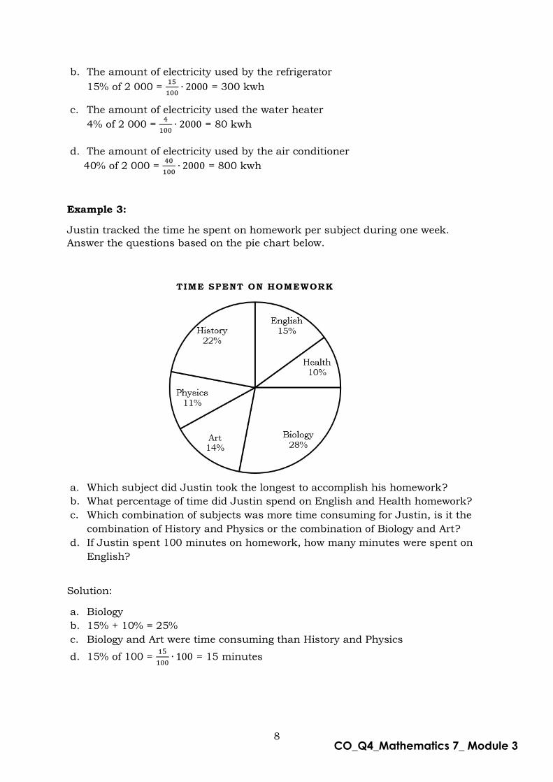
b. The amount of electricity used by the refrigerator
15% of 2 000 = 15
100∙ 2000 = 300 kwh
c. The amount of electricity used the water heater
4% of 2 000 = 4
100∙ 2000 = 80 kwh
d. The amount of electricity used by the air conditioner
40% of 2 000 = 40
100∙ 2000 = 800 kwh
Example 3:
Justin tracked the time he spent on homework per subject during one week.
Answer the questions based on the pie chart below.
a. Which subject did Justin took the longest to accomplish his homework?
b. What percentage of time did Justin spend on English and Health homework?
c. Which combination of subjects was more time consuming for Justin, is it the
combination of History and Physics or the combination of Biology and Art?
d. If Justin spent 100 minutes on homework, how many minutes were spent on
English?
Solution:
a. Biology
b. 15% + 10% = 25%
c. Biology and Art were time consuming than History and Physics
d. 15% of 100 = 15
100∙ 100 = 15 minutes

9
CO_Q4_Mathematics 7_ Module 3
BAR GRAPH
A bar graph uses rectangles (or bars) of uniform width to represent data,
particularly the nominal or categorical type of data. The height of the rectangle
denotes the frequency of the variable. There are two types of bar graph: the vertical
bar graph, which is sometimes called a column chart, and the horizontal bar graph.
A vertical bar graph is used to show the changes on the numerical value of a
variable over a period of time.
*Take Note: A bar graph can be simple or multiple. A simple bar graph represents
only one unit. A multiple bar graph represents different units on the
same diagram for comparison purposes.
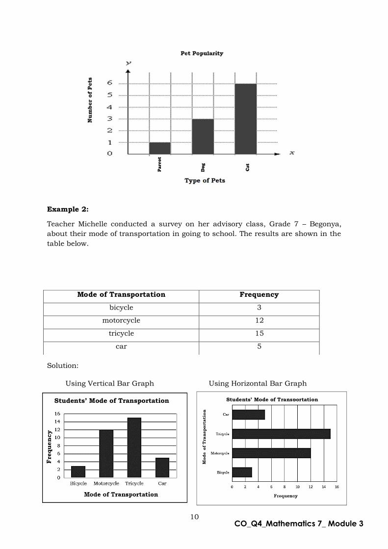
Example 1:
Create a simple bar graph on the data about Pet Popularity shown below
Type of Pets Number of Pets
parrot 1
dog 3
cat 6
Solution:
Step 1: Decide on a title for your graph
Step 2: Draw vertical axis (y – axis) and horizontal axis (x – axis)
Step 3: Label the horizontal axis (Type of Pet)
Step 4: Write the type of pets where the bars will be drawn.
Step 5: Label the vertical axis (Number of Pets).
Step 6: Decide on scale. Consider the least and the greatest number shown on the
data.
Step 7: Draw a bar to show the total for each item.
10
CO_Q4_Mathematics 7_ Module 3
Example 2:
Teacher Michelle conducted a survey on her advisory class, Grade 7 – Begonya,
about their mode of transportation in going to school. The results are shown in the
table below.
Solution:
Using Vertical Bar Graph Using Horizontal Bar Graph
Mode of Transportation Frequency
bicycle 3
motorcycle 12
tricycle 15
car 5
Students’ Mode of Transportation Students’ Mode of Transportation

11
CO_Q4_Mathematics 7_ Module 3
Example 3:
Use the bar graph to answer each question.
a. Which movie receives exactly 5 votes? b. Which movie receives the fewest votes? c. What is the combined number of people who voted for Up and Brave? d. How many more votes did Spy Kids receive than Brave? e. What was the total number of votes of all movie title?
Solution:
a. Ice Age receives exactly 5 votes.
b. Cars receives the fewest votes.
c. The combined number of people who voted for Up and Brave is 16
(10 + 6 = 16).
d. There are 2 more votes (8 – 6 = 2) Spy Kids received than Brave.
e. The total number of votes of all movie title is 30 (5 + 8 + 10 + 6 + 1 = 30).
LINE GRAPH
A line graph is used to represent changes in data over a period of time. Data like
changes in temperature, income, population, and the like can be represented by a
line graph. Data are represented by points and are joined by line segments. A line
graph may be curved, broken, or straight.
Generally, the horizontal axis is used as the time axis and vertical axis is used to
show the changes in other quantity.

12
CO_Q4_Mathematics 7_ Module 3
Example 1:
Amber wanted to join in a 100-meter dash contest in his school. To track her performance whether she is improving or not, her mother recorded her running time from Monday to Sunday as shown in the table below. Create a line graph on
Amber’s training.
Solution:
We use horizontal axis for the days and vertical axis for time in seconds.
On which day is the fastest running time of Amber?
Solution: Sunday is the fastest running time of Amber.
Days of Weeks Time (seconds)
Monday 17
Tuesday 16
Wednesday 17
Thursday 16
Friday 16
Saturday 15
Sunday 14

13
CO_Q4_Mathematics 7_ Module 3
Example 2:
The graph below shows the amount of popcorn sold at a theater.
Use the graph to answer the following questions.
a. Which day had the most popcorn sold?
b. From Thursday to Friday did the amount of popcorn sold increases or
decreases?
c. Were fewer buckets sold on Tuesday or on Thursday?
d. What is the difference in the number of buckets sold on Wednesday and the
number sold on Friday?
e. What is the total number of buckets sold?
Solution:
a. Tuesday f. 450 – 400 = 50 b. Increases g. 300 + 500 + 400 +250 +450 + 150 = 2,050 c. Thursday
FOR GROUPED DATA
Some forms of graphs for grouped frequency distribution are the Histogram and
Ogive.
HISTOGRAM
A Histogram is a bar graph that shows the frequency of data that occur within a
certain interval. In a histogram, the bars are always vertical, the width of each bar
is based upon the size of the interval it represents, and there are no gaps between
adjacent bars. Histograms have no gaps because their bases cover a continuous
range of possible values.

14
CO_Q4_Mathematics 7_ Module 3
Example: Use the graph below to answer the questions below.
a. Which age group has the most number of people?
b. Which age group has the least number of people?
c. How many people are in the age group 11 – 20?
d. How many people are there in the age group 0 – 20?
d. How many people are older than 30?
Solution:
a. 21-30 b. 1-10 c. 25 d. 40 e.25
OGIVE The ogive (also called the cumulative frequency graph or cumulative frequency curve) is a graph plotted from a cumulative frequency table. The following examples show how to draw a cumulative frequency curve for grouped data.
Example:
Draw a cumulative frequency graph for the frequency table below.
Length x (mm) Frequency
11 – 15 2
16 – 20 4
21 – 25 8
26 – 30 14
31 – 35 6
36 – 40 4
41 - 45 2

15
CO_Q4_Mathematics 7_ Module 3
Solution:
We need to add class with 0 frequency before the first class and then find the upper
class boundary for each class interval.
Length x (mm) Frequency Upper Class Boundary
Length x (mm) Cumulative Frequency
6 – 10 0 10.5 x ≤ 10.5 0
11 – 15 2 15.5 x ≤ 15.5 2
16 – 20 4 20.5 x ≤ 20.5 6
21 – 25 8 25.5 x ≤ 25.5 14
26 – 30 14 30.5 x ≤ 30.5 28
31 – 35 6 35.5 x ≤ 35.5 34
36 – 40 4 40.5 x ≤ 40.5 38
41 - 45 2 45.5 x ≤ 45.5 40
And then plot the cumulative frequency against the upper class boundary of each
interval and join the point with the smooth curve.

16
CO_Q4_Mathematics 7_ Module 3
Column A
_______1. Also known as cumulative frequency graph or cumulative
frequency curve.
_______2. A type of graph which uses rectangles or bars of uniform
width to represent data particularly nominal or
categorical type of data.
_______3. A graph which is used to represent changes in data over a
period of time
_______4. A graph used to show how all parts of something are related to the whole.
_______5. A graph whose bars have no gaps because their bases cover a continuous range of possible
values
Each of the following is the title for a graph. On a separate sheet of paper,
indicate whether a bar graph, line graph, or pie chart would best represent the
data.
_____________________1. Project Cost Breakdown Percentage of Han’s Gallery
_____________________2. Population of Region XII from 2000 to 2020
_____________________3. Favorite Drink of a Junior High School Students
_____________________4. Income of ABC Company Over the Years
_____________________5. Percentages of Sources of Chicken in Mindanao
_____________________6. Male Students Who Own Bikes By Grade Level
_____________________7. Family Budget for a Monthly Income of P25,000
_____________________8. Favorite Kpop Group of Teenagers
_____________________9. Temperature in Koronadal City
_____________________10. Average Height of Girls
What’s More
What I Have Learned
Column B
a. line Graph
b. pie Chart
c. bar Graph
d. histogram
e. ogive
Directions: Match the descriptions in column A with word/s being described in
column B. Write the letter of your answer in a separate sheet of paper.
17
CO_Q4_Mathematics 7_ Module 3
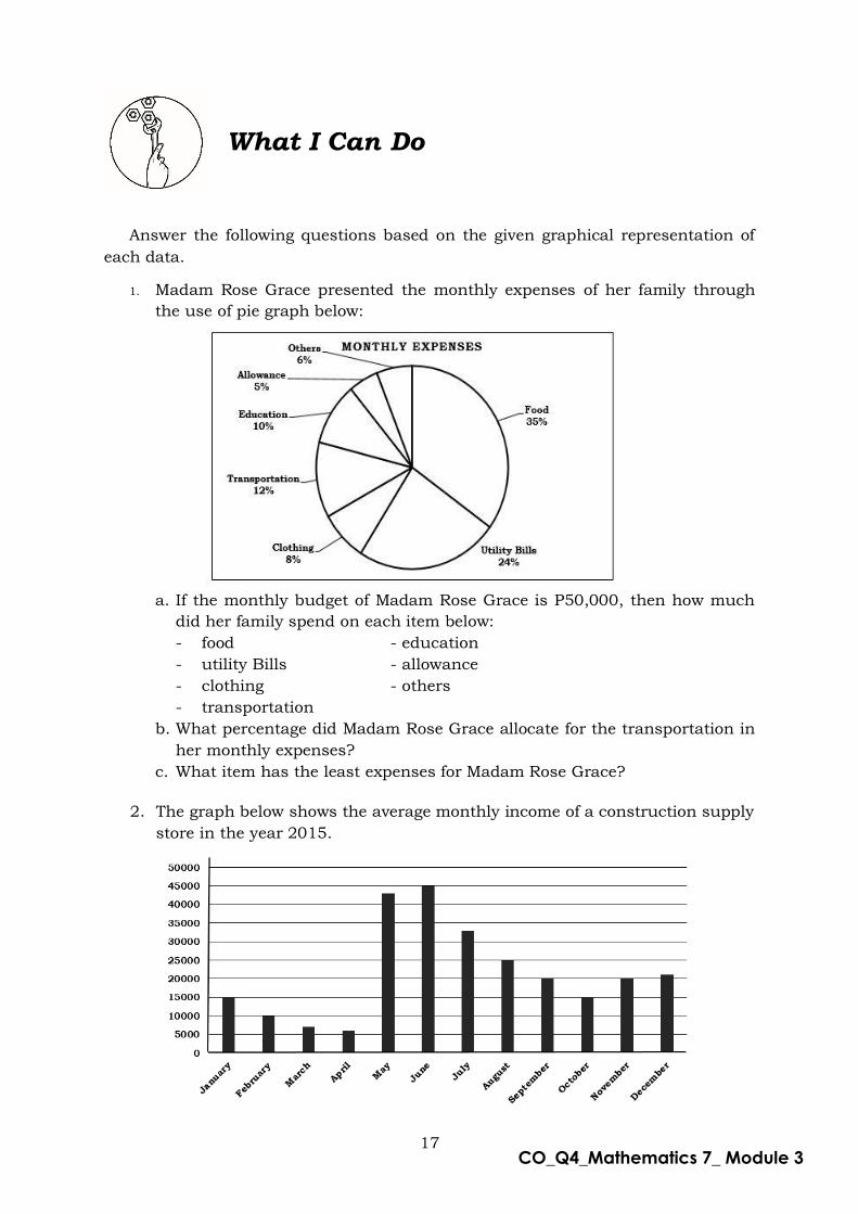
Answer the following questions based on the given graphical representation of
each data.
1. Madam Rose Grace presented the monthly expenses of her family through
the use of pie graph below:
a. If the monthly budget of Madam Rose Grace is P50,000, then how much
did her family spend on each item below:
- food - education
- utility Bills - allowance
- clothing - others
- transportation
b. What percentage did Madam Rose Grace allocate for the transportation in
her monthly expenses?
c. What item has the least expenses for Madam Rose Grace?
2. The graph below shows the average monthly income of a construction supply
store in the year 2015.
What I Can Do

18
CO_Q4_Mathematics 7_ Module 3
a. Which month has the highest income?
b. Which month has the lowest income?
c. What is the income of the store in November and January?
d. What is the difference between the income of the store from August to
September?
e. What is the total income of the store from August to November?
3. The graph below shows the bags of cans recycled.
a. Which day had the fewest bags recycled? b. Which day had the greatest number of bags recycled? c. From Day 2 to Day 3 did the number of bags recycled increases or
decreases? d. How many bags were recycled on Day 5? e. Were more bags recycled on Day 4 or Day 5? f. Were fewer bags recycled on Day 3 or Day 4?
4. Refer your answer to the graph shown below.
a. How many students got marks in 0-25?
b. How many students got more than 50 marks?
c. Which marks range has the least students?
d. How many students got 75 or lesser marks?
e. How many students got marks between 51 and 75?
17
19
CO_Q4_Mathematics 7_ Module 3
Assessment
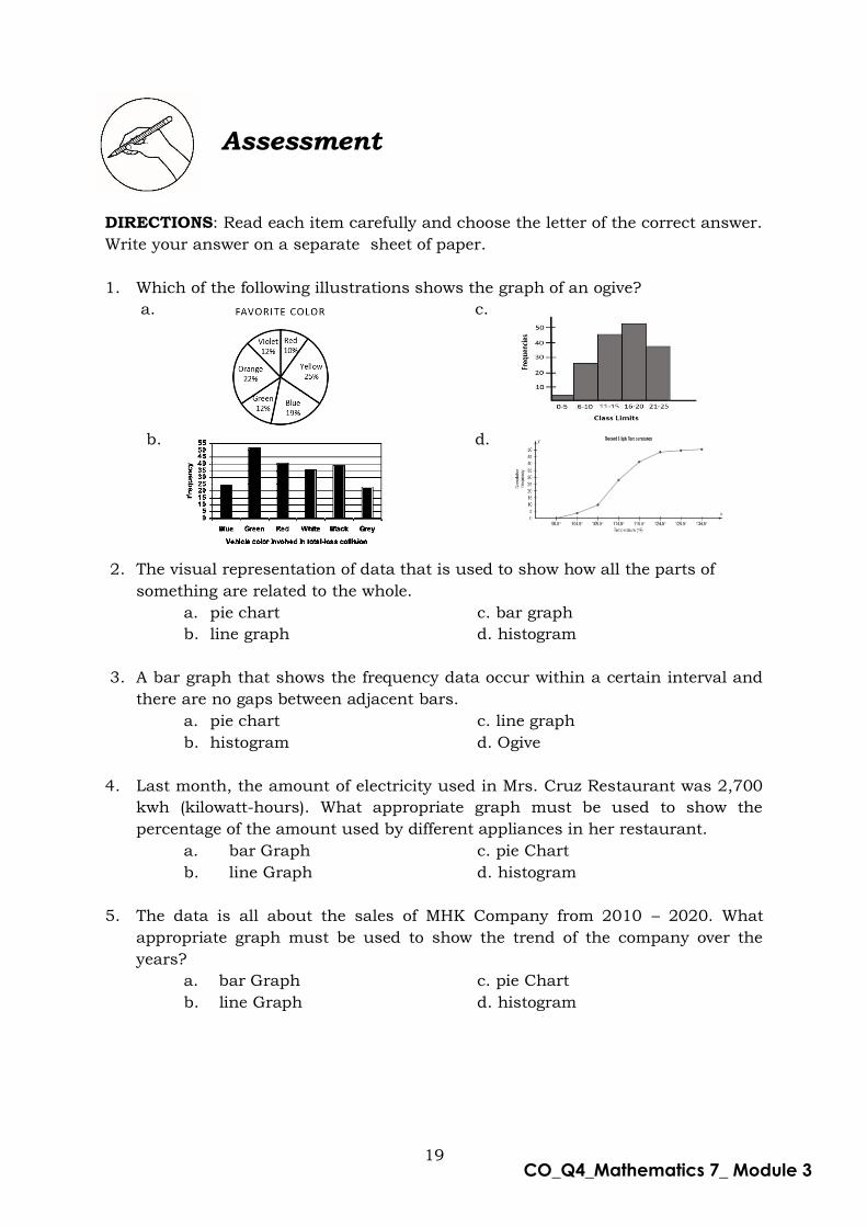
DIRECTIONS: Read each item carefully and choose the letter of the correct answer.
Write your answer on a separate sheet of paper.
1. Which of the following illustrations shows the graph of an ogive?
a. c.
b. d.
2. The visual representation of data that is used to show how all the parts of
something are related to the whole.
a. pie chart c. bar graph
b. line graph d. histogram
3. A bar graph that shows the frequency data occur within a certain interval and
there are no gaps between adjacent bars.
a. pie chart c. line graph
b. histogram d. Ogive
4. Last month, the amount of electricity used in Mrs. Cruz Restaurant was 2,700
kwh (kilowatt-hours). What appropriate graph must be used to show the
percentage of the amount used by different appliances in her restaurant.
a. bar Graph c. pie Chart
b. line Graph d. histogram
5. The data is all about the sales of MHK Company from 2010 – 2020. What
appropriate graph must be used to show the trend of the company over the
years?
a. bar Graph c. pie Chart
b. line Graph d. histogram

20
CO_Q4_Mathematics 7_ Module 3
*For numbers 6 – 8 refer to the following graph.
6. Which day did Johnny spend the most of time playing games?
a. Day 1 b. Day 3 c. Day 5 d. Day 6
7. What is the difference of the time spent playing on Day 5 and Day 2?
a. 10 b. 30 c. 20 d. 60
8. What is the total time he spent playing games?
a. 240 b. 290 c. 320 d. 350
*For Number 9 – 11 refer to the following graph.
21
CO_Q4_Mathematics 7_ Module 3
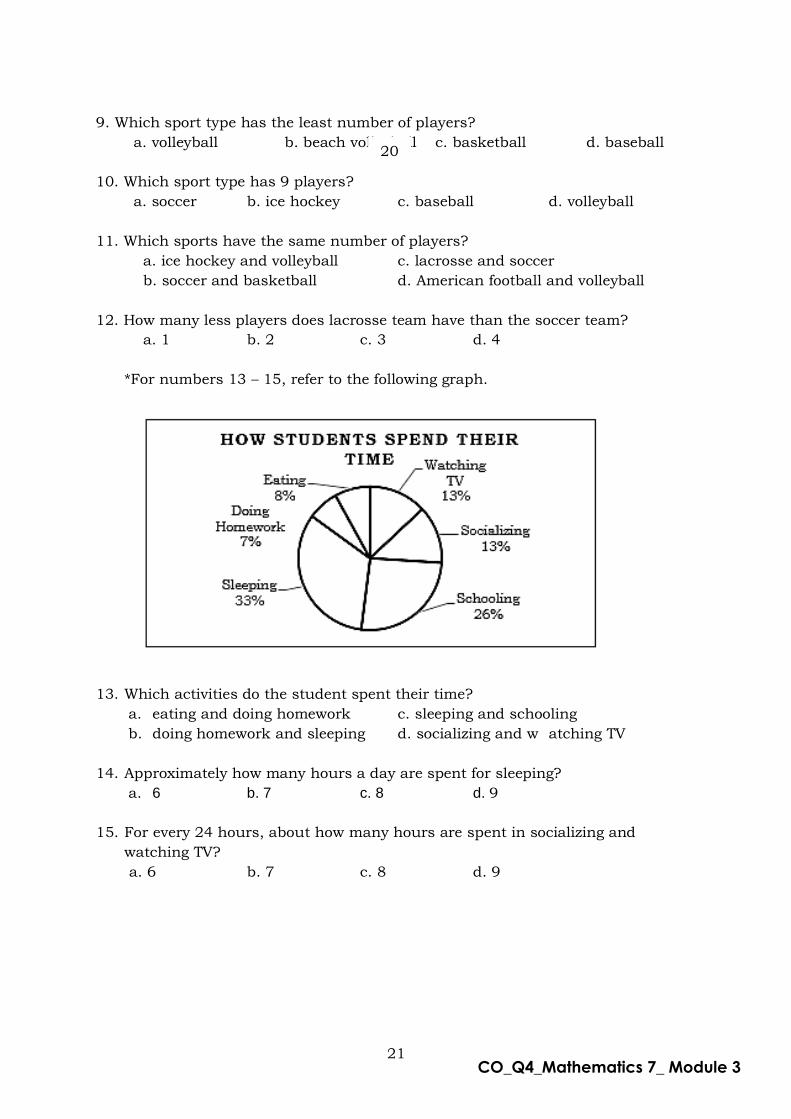
9. Which sport type has the least number of players?
a. volleyball b. beach volleyball c. basketball d. baseball
10. Which sport type has 9 players?
a. soccer b. ice hockey c. baseball d. volleyball
11. Which sports have the same number of players?
a. ice hockey and volleyball c. lacrosse and soccer
b. soccer and basketball d. American football and volleyball
12. How many less players does lacrosse team have than the soccer team?
a. 1 b. 2 c. 3 d. 4
*For numbers 13 – 15, refer to the following graph.
13. Which activities do the student spent their time?
a. eating and doing homework c. sleeping and schooling
b. doing homework and sleeping d. socializing and w atching TV
14. Approximately how many hours a day are spent for sleeping?
a. 6 b. 7 c. 8 d. 9
15. For every 24 hours, about how many hours are spent in socializing and
watching TV?
a. 6 b. 7 c. 8 d. 9
20
22
CO_Q4_Mathematics 7_ Module 3
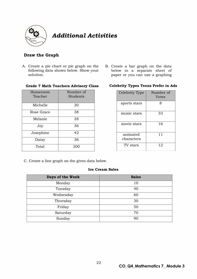
Additional Activities
Draw the Graph
Homeroom Teacher
Number of Students
Michelle 20
Rose Grace 38
Melanie 28
Joy 36
Josephine 42
Daisy 36
Total 200
C. Create a line graph on the given data below. Ice Cream Sales
Days of the Week Sales
Monday 10
Tuesday 40
Wednesday 60
Thursday 30
Friday 50
Saturday 70
Sunday 90
Celebrity Type Number of Votes
sports stars 8
music stars 33
movie stars 16
animated characters
11
TV stars 12
A. Create a pie chart or pie graph on the following data shown below. Show your solution.
B. Create a bar graph on the data below in a separate sheet of paper or you can use a graphing paper.
Celebrity Types Teens Prefer in Ads
Grade 7 Math Teachers Advisory Class

23
CO_Q4_Mathematics 7_ Module 3
Answer Key
What I Know
1.d 2.d 3.a 4.c 5.b 6.d 7.c 8.a 9.c 10.a
11.d 12.c 13.c 14.a 15.d
Lesson 1:
What's New
line bar pie chart
Lesson 1:
What's More
1.pie chart
2.line graph 3.bar graph 4.line graph 5.pie chart 6.bar graph 7.pie chart 8.bar graph 9.line graph 10.line graph
Lesson 1:
What I Have
Learned
1.e 2.c 3.a 4.b 5.d
Lesson 1:
What I Can Do
1.a. food: P17,500 3. a. day 1
utility bills: P12,000 b. day 2
clothing: P4,000 c. decreases
transportation: P6,000 d. 10
education: P5,000 e. day 4
allowance: P2,500 f. day 3
others: P3,000
b. 12%
c. allowance
2. a. June 4. a. 10
b. April b. 120
c. P35,000 c. 0 – 25
d. P5,000 d. 100
e. P80,000 e. 70

24
CO_Q4_Mathematics 7_ Module 3
Assessment
1.d 2.a 3.b 4.c 5.b 6.c 7.a 8.d 9.b 10.c 11.a 12.a 13.d 14.c 15.a
Additional Activities
1.Pie Chart
Additional Activities
2.Bar Graph
3. Line Graph

25
CO_Q4_Mathematics 7_ Module 3
References
O. Oronce, & M. Mendoza, E – math 7: Worktext in Mathematics (Quezon City,
Philippines: Rex Book Store, Inc. 2015), pp. 581–589.
Antonio et al.), Math Connections in the Digital Age the New Grade 7, (Quezon City,
Philippines: Sibs Publishing House, Inc. 2015), pp. 390 –401.
M. Deauna, & F. Lamayo-Deauna, Advanced Algebra, Trigonometry, and Statistics
Textbook (Quezon City, Philippines: Sibs Publishing House, Inc. ,2005) , pp. 454
– 461.
Buzon et al., Advanced Algebra with Trigonometry and Statistics Explorations and
Applications,(Makati City, Philippines: Salesiana Publishers, Inc. 2003), pp. 303 –
307.
Lapinid et al. ,Advanced Algebra, Trigonometry and Statistics: Patterns and
Practicalities,( Makati City, Philippines: Salesiana Publishers, Inc.,2007),
pp. 341 – 343.
https://www.onlinemathlearning.com/cumulative-frequency-graph.html

For inquiries or feedback, please write or call:
Department of Education - Bureau of Learning Resources (DepEd-BLR)
Ground Floor, Bonifacio Bldg., DepEd Complex Meralco Avenue, Pasig City, Philippines 1600
Telefax: (632) 8634-1072; 8634-1054; 8631-4985
Email Address: [email protected] * [email protected]
Copyright © 2022 FDOKUMEN