Quantifying the Dimensions of Color Experience - CORE
92
Quantifying the Dimensions of Color Experience by Uri Feldman B.S., Case Western Reserve University (1984) M.S., University of Illinois (1985) Submitted to the Media Arts and Sciences Section, School of Architecture and Planning, in partial fulfillment of the requirements for the degree of Doctor of Philosophy at the Massachusetts Institute of Technology February 1993 0 Massachusetts Institute of Technology 1993 All rights reserved. Author Media Arts and Sciences Section December 31, 1992 Certified by Walter Bender Principal Research Scientist Media Arts and Sciences Section A Accepted by V- v - Stephen A. Benton Chairperson, Departamental Committee on Graduate Students MASSACHUSETTS INSTITUTE OF T~0 ( 2*' MAR 111993 HO
-
Upload
khangminh22 -
Category
Documents
-
view
0 -
download
0
Transcript of Quantifying the Dimensions of Color Experience - CORE

Quantifying the Dimensions of Color Experience
by
Uri Feldman
B.S., Case Western Reserve University (1984)M.S., University of Illinois (1985)
Submitted to the Media Arts and Sciences Section,School of Architecture and Planning,
in partial fulfillment of the requirements for the degree of
Doctor of Philosophy
at the
Massachusetts Institute of Technology
February 1993
0 Massachusetts Institute of Technology 1993All rights reserved.
AuthorMedia Arts and Sciences Section
December 31, 1992
Certified byWalter Bender
Principal Research ScientistMedia Arts and Sciences Section
A
Accepted by V- v -Stephen A. Benton
Chairperson, Departamental Committee on Graduate StudentsMASSACHUSETTS INSTITUTE
OF T~0 ( 2*'
MAR 111993 HOLIBRARIFE

Quantifying the Dimensions of Color Experienceby
Uri FeldmanSubmitted to the Media Arts and Sciences Section,
School of Architecture and Planningon December 31, 1992, in partial fulfillment of the
requirements for the degree ofDoctor of Philosophy
Abstract
In visual experience, colors appear as interrelated visual sensations, unpredictable fromlooking at colors in isolation. This investigation examines experience of color: theresponse to colors as they relate to each other. It is proposed here that humans can makeconsistent evaluation of the magnitude of any given color experience, based on the type ofinteraction between the colors. The investigation addresses how color experiences areestablished, how experiences are described, and how experiences are quantified.
The investigation is interdisciplinary in nature. A model of color experience wasdeveloped utilizing research methods from fields such as perceptual and cognitivepsychology, linguistics, experimental design, and visual aesthetics. The model describesexperience of color with directly observable features of the colors, such as the chromaticdimensions of hue, value, chroma, and their contrasts, as well as the spatial dimensions ofsize, and proportion.
The interactions between the dimensions were uncovered through a series of experiments.Semantic differential scales were used to evaluate systematic variations in therelationships between the colors. It was found that distinct color experiences can bedescribed with a single scale of magnitude, so that seemingly disparate visual sensationscan be made commensurate with each other.
The results of this investigation directly apply to a wide variety of disciplines. Forinstance, in interface design, color can reinforce information by providing visual"counterpoint." In image reproduction, "color matching" becomes a matter of"preserving" the experience of color. In graphic design, a wide variety visual experiencescan be established and "transposed." In multi-media applications, sensations produced bydifferent modalities can be integrated.
In conclusion, the investigation demonstrates that experiences of color are governed bywell defined objective principles that can be quantified with experimental methods. Themethodology developed here provides the framework for further research in the field.
Thesis Supervisor: Walter BenderTitle: Principal Research Scientist, MIT Media Laboratory
This work has been supported, in part, by International Business Machines Inc.

Thesis Committee
AdviserWalter Bender
Principal Research ScientistMIT Media Arts and Sciences Section
ReaderNathaniel Jacobson
Consultant in ChromatologyBoston, Massachusetts
A-A
//
Arthur L. LoebSenior Lecturer on Visual and Environmental Studies
Harvard University
Margaret A. HagenProfessor of Psychology
Boston University
(-'N
Reader
ReaderIj 4, I
F
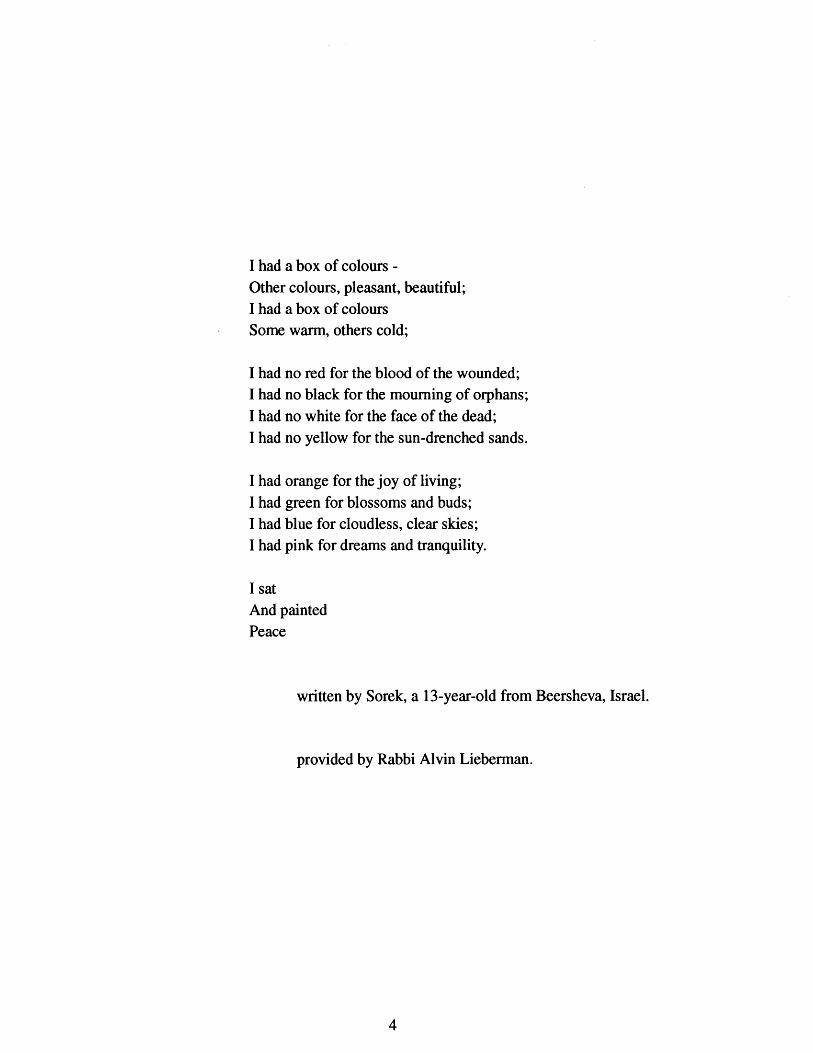
I had a box of colours -Other colours, pleasant, beautiful;I had a box of coloursSome warm, others cold;
I had no red for the blood of the wounded;I had no black for the mourning of orphans;I had no white for the face of the dead;I had no yellow for the sun-drenched sands.
I had orange for the joy of living;I had green for blossoms and buds;I had blue for cloudless, clear skies;I had pink for dreams and tranquility.
I satAnd paintedPeace
written by Sorek, a 13-year-old from Beersheva, Israel.
provided by Rabbi Alvin Lieberman.

Acknowledgments
This work respresents the culmination of a long stay at MIT. During all these years I haveencountered challenging situations, and learned many things. There have been numerouspeople who have contributed to making my stay at MIT a pleasant, educational, andcolorful "experience."
First, I would like to thank the members of my thesis committee as a whole, for theirguidance, inspiration, and patience. Individually, I would like to mention:
Arthur Loeb, for showing me a new way of thinking about ideas-to always look forstructure, pattern, and essence in every endeavor. His insight help put this investigation inglobal perspective.
Margaret Hagen, for having confidence in my investigation. She encouraged me all along,particularly through the tedious experimental stage of the work, and during the writingprocess. Of course, she also provided me with an endless supply of human subjects, andwith a comfortable experimental setup.
Nathaniel Jacobson, for his inspiration, which added a humanistic twist to my technicalapproach to color. Nat's unique ability to bridge the artistic with the technological isadmirable. This work represents a continuation of Nat's pioneering effort in describingcolor experience.
Walter Bender, for his constant and generous support. His unique insight into the issueskept this investigation fresh and challenging all along. It is always a matter of keeping upwith him; he is always two steps ahead of me. His "day-to-day" and "down-to-business"approach made this investigation proceed smoothly all along; from the beginning up to thevery end with the preparation of this document.
I have been privileged to have worked with such talented and stimulating people.
In addition, there are many other people I would like to thank.
Bill Burling, for sharing ideas with me. Our long discussions and marathon work sessionshelped focus, clarify, and develop many of the ideas in this investigation, and beyond...Besides, just for his plain-old friendship, generosity, and words of wisdom.
Nicola Wimpenny, for her work during the experimental stage. Also for her advice,encouragement, and friendship through the final stages of this investigation. Her insightinto the work helped make this a more significant document.

Carlos Rabell, Ben Reis, Harry Papadopoulous, and Mauricio Roman for their
programming assistance through the years. I couldn't have done it without them.
Domina Eberle Spencer, for sharing her knowledge in modeling experience of color; workshe performed over fifty years ago.
Larry Hardin, for writing "Color for Philosophers."
Lino Grau, for his friendship throughout my entire stay at the Media Lab. His presencemade nights at the lab much more pleasant.
Gayle Sherman, for her overall assistance, for her friendly smile, and for her usefuladvice; most notably: "Uri, you've got all night."
Janette Noss, for friendly conversation during her time at the Lab.
Linda Peterson, for ensuring my speedy forward progress through the convolutedacademic program.
Gillian Galloway, for sharing her Grammophone copies with me.
Ben Lowengard, for keeping the "color" gear running.
Pascal Chesnais, for being around and keeping the "garden" running.
John "Wad" Watlington, for being the only fellow Peruvian in the lab.
The staff of the List Visual Arts Center: Toby, Katy, Jill, Jon, Helaine, Ron, Cynthia, and
previously, Dana. They are a very stimulating and fun group of people. They provided me
with a friendly shelter within the building.
Irving Singer and Marty Marks, for introducing me to some of the most fascinating fields
of study: philosophy, music, and film, and most importantly, their inter-relationships.
Jim Paradis and Ed Barrett, for helping me simplify the technical writing process.
Leo Osgood and Dwight Smith, for stressing the "fundamentals" in every endeavor, not
just in basketball.
Christie Moore and Forrest Larson at the Music Library, for providing me with good
music. Their assistance and recommendations were always welcomed.
Bob Randolph, for keeping up with my progress.
My teammates in the Biology department and Hillel intramural basketball and soccer
teams, for turning me into a "jock."
Ina Catlin, for her "smashing" smile.

Natania Remba and Lilian Kravzov, for their friendship this past year.
Cliff Radlauer, for his friendship, and for providing his friends with subsidized lunches,before leaving town. He is missed by many.
Bill Butera, for his friendship through the years. He had just the right attitude towardsworking at the lab, and towards life.
Julia Fink, for her friendship these last few months.
Giovani Hoyos Corrales, (1) for the laughter, and (2) for his friendship this past year.
Stuart Freedman, for his friendship through the years. He provided continuity fromcollege all the way through graduate school. Also for supplying me with jokes.
Susan Scott, for her friendship from week one, and for being a fellow "banana-head."
Ricki Goldman-Segall, for the long walks, talks, shared experiences, and for her friendshipfrom day one. Now I have graduated too, finally.
On a more personal level I have to thank my parents and the rest of my family. They haveprovided continuous support and encouragement from the day I was born. I just wish Icould have spend more time with them these past few years.
This thesis is dedicated to the memory of two people:
my uncle Joss Feldman
and my cousin Balfour Meerovici.
They served as models of scholarship in the arts, and in science from very early on. Theywould have been very proud of me on completing this degree.

Contents
. . . . . . . . . . . . . . . . . . . . . . . . . . 13
1.2 Varieties of Experience . . . . . . . .
1.3 Correspondence . . . . . . . . . . .
1.4 Phenomenology of Color Experience
1.5 "Black box" approach . . . . . . . .
1.6 What Experience of Color is Not . . .
1.7 Purpose and Scope . . . . . . . . . .
2 From Colorimetry to Color Experience2.1 Colorimetry . . . . . . . . . . . . . .
2.1.1 Small-distance Metrics . . . .2.1.2 Limitations of Colorimetry .
2.2 Color Appearance . . . . . . . . . .2.2.1 Retinex Theory . . . . . . .2.2.2 "The colors of things" . . .2.2.3 Chromatic Induction . . . .2.2.4 Global Interactions2.2.5 Limitations of Color Appearance Models .
2.3 Color Harmony . . . . . . . . . . . . . . . . . . . .2.3.1 Early Studies . . . . . . . . . . . . . . . .2.3.2 Color Order Systems . . . . . . . . . . . .2.3.3 Preference Models . . . . . . . . . . . . .2.3.4 Limitations: Boundaries and Indeterminacy
2.4 Expressive Color . . . . . . . . . . . . . . . . . . .2.4.1 Tension and relief with color . . . . . . . .2.4.2 Color Image Scale . . . . . . . . . . . . .2.4.3 Limitations of Color Image Scale . . . . .
2.5 Mathematical Formulation of Color Harmony . . . .
2.5.1 Moon and Spencer. . . . . . . . . . . . . .2.5.2 Aesthetic Measure . . . . . . . . . . . . .2.5.3 Single Metric Approach . . . . . . . . . .2.5.4 Criticism of Moon and Spencer model . . .
2.6 Color Experience . . . . . . . . . . . . . . . . . . .
2.7 Relationships of Color Relationships . . . . . . . .
. . . . . . . . . . . . . . . 14
. . . . . . . . . . . . . . . 14
. . . . . . . . . . . . . . . 14
. . . . . . . . . . . . . . . 17
. . . . . . . . . . . . . . . 17
. . . . . . . . . . . . . . . 17
. . . . . . . 18. . . . . . . 18. . . . . . . 19
. . . . . . . 20
. . . . . . . 20
. . . . . . . 21
. . . . . . . 21
. . . . . . . 21
. . . . . . . 21
. . . . . . . 22
. . . . . . . 22. . . . . . . 22. . . . . . . 23. . . . . . . 23
. . . . . . . 24
. . . . . . . 24
. . . . . . . 24
. . . . . . . 24
. . . . . . . 25. . . . . . . 25. . . . . . . 26. . . . . . . 26. . . . . . . 26
. . .. . . 27
. . . . . . . 27
1 Experience of Color1.1 Introduction. .
. . . . . . . . . . . . .. . . . . . . .

3 The Dimensions of Color Experience3.1 Chromatic Dimensions . . . . . . . . . . . . . . . . . . . . . . . 2 9
3.1.1 Color Specification . . . . . . . . . . . .
3.1.2 Color Order Systems . . . . . . . . . . .3.1.3 Munsell System . . . . . . . . . . . . . .
Dimension 1 => Reference Hue . . . . . . .Dimension 2 => Hue Alignment . . . . . .
3.1.4 Symmetry in Hue Alignment . . . . . . .
3.1.5 Alignment Computation . . . . . . . . .
Dimension 3 => Reference Value . . . . . .
Dimension 4 => Value Contrast . . . . . . .Dimension 5 => Chroma . . . . . . . . . .
3.1.6 Effects of Chroma . . . . . . . . . . . .
3.2 Spatial Dimensions . . . . . . . . . . . . . . . . .
Dimension 6 => Block Size . . . . . . . . .Dimension 7 => Area Ratio . . . . . . . . .
3.2.1 "Balance" in Color Experience . . . . . .
3.3 Proposed Model . . . . . . . . . . . . . . . . . .
3.3.1 Decomposition of Color Experience . . .
4 Quantifying the Dimensions of Color Experience4.1 Design Considerations
4.1.1 Why "boggles?". . . . . . .4.1.2 Dimensions of Meaning . .4.1.3 Hue Invariance. . . . . . . .4.1.4 Rating scales. . . . . . . . .4.1.5 Magnitude-of-Experience . .4.1.6 Task . . . . . . . . . . . . .4.1.7 Task Design . . . . . . . . .4.1.8 Randomization . . . . . . .4.1.9 Adaptation. . . . . . . . . .4.1.10 Boggle Selection . . . . .4.1.11 Boggle Composition . . .
4.2 Implementation . . . . . . . . . . . .4.2.1 Experimental Procedure . .
4.2.2 Setup . . . . . . . . . . . .
4.2.3 Size of Stimuli . . . . . . .
4.2.4 Equipment . . . . . . . . .
4.2.5 Subjects . . . . . . . . . . .
4.2.6 Training . . . . . . . . . . .
4.2.7 Data Processing . . . . . . .
. . . . . . . . 29
. . . . . . . . 29
. . . . . . . . 29
. . . . . . . . 30
. . . . . . . . 30. . . . . . . . 32. . . . . . . . 32. . . . . . . . 32. . . . . . . . 32. . . . . . . . 33. . . . . . . . 34
. . . . . . . . 34
. . . . . . . . 34
. . . . . . . . 34. . . . . . . . 35
. . . . . . . . 35
. . . . . . . . 36
. . . . . . 37
. . . . . . 37
.... .. 38
. ..... 39
...... 39
...... 40- - .. - - 41...... 41...... 41..... . 42.. .... 42...... 43...... 43...... 43...... 43
...... 43
.. - - - - 44
.... - - 44
. - - . - - 44
.. - - - - 44
. . . . . . . .

4.3 Supplementary Experiments . . . . . . . . . . .4.3.1 "Dark" reference value . . . . . . . . .4.3.2 Text as Stimuli . . . . . . . . . . . ...4.3.3 Three-color interactions . . . . . . . . .
. . . . 45
. . . . 45
. . . . 45
. . . . 45
5 A Model of Color Experience5.1 Data format . . . . . . . . . . . . . . . . . . . . . . . . . . . . . 46
5.1.1 Data interpretation . . . . . . . . . . . . . . . . . . . . 46
5.2 Hue Alignment . . . . . . . . . . . . . . . . . . . . . . . . . . . 475.2.1 Hue Alignment as Reference Dimension . . . . . . . . . 48
5.3 Effect of reference hue . . . . . . . . . . . . . . . . . . . . . . . 48
5.4 Effect of Rating Scale. . . . . . . . . . . . . . . . . . . . . . . . 50
5.5 Chroma . . . . . . . . . . . . . . . . . . . . . . . . . . . . . . 51
5.6 Value contrast . . . . . . . . . . . . . . . . . . . . . . . . . . . . 53
5.7 Reference Value . . . . . . . . . . . . . . . . . . . . . . . . . . 55
5.8 Block size . . . . . . . . . . . . . . . . . . . . . . . . . . . . . . 56
5.9 Area ratio . . . . . . . . . . . . . . . . . . . . . . . . . . . . . . 57
5.10 Rating Scale: Dark Reference Value . . . . . . . . . . . . . . . 58
5.11 Screens of Text as Stimuli . . . . . . . . . . . . . . . . . . . . 59
5.12 A Parametric Model of Color Experience . . . . . . . . . . . . 61
5.13 Summary . . . . . . . . . . . . . . . . . . . . . . . . . . . . . 62
6 Experience of Color in Applications6.1 Equivalency in Color Experience . . . . . . . . . . . .
6.1.1 Dimensions of Color Experience . . . . . . .6.1.2 Visualizing the Dimensions of Color Experience6.1.3 Magnitude of experience as "metric" . . . . . ..6.1.4 Equivalent experiences . . . . . . . . . . . . .6.1.5 Equivalency in Hue Alignment . . . . . . . . .6.1.6 Equivalency across Experiential Space . . . . .6.1.7 Establishing Equivalency . . . . . . . . . . . .6.1.8 Transformation of experiences . . . . . . . . .6.1.9 Value contrast versus hue alignment . . . . . .6.1.10 Chroma versus hue alignment . . . . . . . . .
6.2 Space as Framework for Establishing Color Experience .6.2.1 Constraining the Dimensions of Experience . .6.2.2 Selecting an Experience . . . . . . . . . . . .
6.2.3 Constraints in Applications . . . . . . . . . . .
6.2.4 Alternative Constraints . . . . . . . . . . . . .
6.2.5 Accommodating New Dimensions . . . . . . .
. . . . . 63
. . . . . 63. . . . 64
. . . . . 64
. . . . . 65
. . . . . 65
. . . . . 66. . . . . 66. . . . . 67. . . . . 67. . . . . 70. . . . . 70. . . . . 70. . . . . 71. . . . . 71. . . . . 72. . . . . 73

6.3 Establishing Experience of Color in Applications . . . . . . . . . 736.3.1 Prototypical Experiences . . . . . . . . . . . . . . . . . 736.3.2 Response Level . . . . . . . . . . . . . . . . . . . . . . 746.3.3 Transposing the Experience . . . . . . . . . . . . . . . 746.3.4 Adjusting Magnitude of Experience . . . . . . . . . . . 75
6.4 Methodology for Establishing Experience of Color in Applications 75
6.5 Summary . . . . . . . . . . . . . . . . . . . . . . . . . . . . . . 76
7 Beyond Experience of Color7.1 Issues for further investigation . . . . .
7.1.1 Experimental Issues . . . . . .7.1.2 Dimensional Issues . . . . . .
7.2 Areas of further application . . . . . .
7.3 Beyond Experience of Color . . . . . .
Appendix 1Evaluating experience of color: instructions
Appendix 2Boggle Composition . . . . . . . . . . . .
Appendix 3Informed Consent Form . . . . . . . . . . .
Bibliography ......................
. . . . . . . . . . . . . . 77
. . . . . . . . . . . . . . 77
. . . . . . . . . . . . . . 78. . . . . . . . . . . 79
. . . . . . . . . 79
. . . . . . . . . . . . . . 80

List of Figures
1.1
1.2
2.1
3.1
3.2
3.3
4.1
5.1
5.2
5.3
5.4
5.5
5.6
5.7
5.8
5.9
5.1(
5.11
5. 12
5.1
5.1
5.1
5.1
5.1
5.1
6.1
6.2
6.3
6.4
Varieties of color experience . . . . . . . . . . . . . . .
Varieties of color experience: by magnitude of interaction
Identically colored yellow fields with different surrounds
Munsell hue circle divided into ten "basic" hues . . . . .
Two series of alignments with the same reference hue . .
Two Munsell hue "slices" . . . . . . . . . . . . . . . . ..
Sample boggle . . . . . . . . . . . . . . . . . . . . . . .
Response as a function of hue alignment . . . . . . . . .
Boggle series: alignments around single reference hue . .
Response for five reference hues . . . . . . . . . . . . .
Hue invariant boggles . . . . . . . . . . . . . . . . . . .
Response for three rating scales . . . . . . . . . . . . . .
Boggle series: chroma . . . . . . . . . . . . . . . . . . .
Response for four chroma levels . . . . . . . . . . . . .
Boggle series: value contrast . . . . . . . . . . . . . . .
Response for different value contrasts . . . . . . . . . . .
Response as a function of value contrasts for various alignments
Response for three reference values . . . . . . . . . . . . . . .
Boggles with hue alignment of 30 at two reference values . . .
Boggle series: block size . . . . . . . . . . . . . . . . . . . . .
Response for various block sizes . . . . . . . . . . . . . . . . .
Boggle series: area ratio . . . . . . . . . . . . . . . . . . . . .
Response for various area ratios . . . . . . . . . . . . . . . . .
Response for "dark" colors . . . . . . . . . . . . . . . . . . .
Response for text as stimuli . . . . . . . . . . . . . . . . . . .
Bi-lateral symmetry in response . . . . . . . . . . . . . . . . . .
Equivalent boggles . . . . . . . . . . . . . . . . . . . . . . . . .
Transformation between equivalent experiences . . . . . . . . .
Transformation between equivalent experiences . . . . . . . . .
.54
.55
.55
.56
.56
.57
.58
.59
.60
.65
.66
.68
.69
. . . . . 15
. . . . . 16
. . . . . 20
. . . . . 31
. . . . . 31
. . . . . 33
. . . . . 38
. . . . . 47
. . . . . 48
. . . . . 49
. . . . . 50
. . . . . 51
. . . . . 51
. . . . . 52
. . . . . 53
. . . . . 54
5
5
7
8

Chapter 1
Experience of Color
1.1 Introduction
For most, color constitutes a routine aspect of everyday life. Color appears everywhere in
natural objects such as flowers, fish, and rocks, and in fabricated objects such as athletic
shoes, toothpaste, clothing, automobiles, soft-drinks, and bubble-gum. The use of color
has been made even more widespread with the advent of computer driven displays, which
can show images with colors selected from a wide range of possibilities. However, even in
such sophisticated display systems, color selection is usually based on the skill and
memory of trained color specialists and designers, who, in general, treat colors as isolated
visual phenomena.
In reality, though, colors appear as interrelated visual sensations, unpredictable from
looking at the colors in isolation. For instance, certain colors, when placed next to each
other, can look "exciting," as if vibrating at their boundaries. Other colors can look
'subdued" when placed next to each other; still some other colors can look somewhere
along a continuum between "subdued" and "energetic." Thus, color experiences have a
magnitude associated with them, which can range between low magnitude and high
magnitude. Experience of color is the response to color relationships, as determined by the
magnitude of the interaction between colors.
This investigation is about quantifying experiences produced by interactions between two
colors in patterns encompassing a wide-field of view. It is proposed here that humans can
make consistent evaluation as to where in the range of magnitude any given color
experience lies. Thus, the premise of the investigation is a simple one: experience of color
is universal. That is, humans have an ability to make judgements about magnitude of
interaction of colors based on how colors relate to each other. Features of the colors, such
as chromatic composition and spatial configuration determine the magnitude of the
interactions. These features constitute the dimensions of color experience, hence, the title
of the investigation.

1.2 Varieties of Experience
In visual communication, a wide variety of color experiences can be established. For
example, Figure 1.1 shows several patterns made up of two colors arranged in different
configurations. Each pattern constitutes an experience of color; each with its own unique
"character." However, even among such varied experiences, it is possible to identify
features which are common among the experiences: some of the experiences are energetic
and some are weak. Therefore, when viewing colors what is most revealing is to determine
how colors relate to each other. It is the relationship between colors which determines
magnitude of experience. For instance, the experiences in Figure 1.1 can be organized by
magnitude of experience, as shown in Figure 1.2.
1.3 Correspondence
The patterns in Figure 1.2 have been arranged so that the least energetic patterns are on the
left hand side, the most energetic on the right, and all others in between. This arrangement
by magnitude of experience suggests that experience of color transcends chromatic
composition or spatial configuration, in that patterns of very different colors and shapes
can be grouped together and, in effect, can be considered equivalent in terms of magnitude
of experience. It is proposed here that there is correspondence between magnitude of
experience and formal features such as color composition and spatial configuration of the
patterns. Correspondence implies that a specific relationship between colors produces a
given experience; and conversely, given an experience, the specific color relationships
which established the experience can be determined.
1.4 Phenomenology of Color Experience
The focus of this investigation is on the phenomenology of color experience; that is, on
how humans respond to color interactions, independent of how the response is produced.
Unlike color appearance studies, the intent of this investigation is not to describe how a
given color is affected by its surround colors, but rather, the intent is to evaluate the color
and its surround, as a whole. Therefore, when evaluating experience of color, what matters
is the type of interaction, and its magnitude.

Figure 1.1: Varieties of color experience.
. ... ...... .... ... .. ..

Figure 1.2: Varieties of color experience. From left to right, magnitude ofinteraction increases.
16
.... ......... . ..... ... ...... ....:::rn::-r :::::::::: :,: r -- -:-.rr w rrr rrm rrr im :,,im ,:,:::,::::::m m m :,:::m :,:,,:,,:::::,:,::::::::m::,:-er.,:..1..:..:..1.1:.::.::.::.::.:.-:--:--:s zx xx xxx xa z xxx xxx x..x--- ---."" "".

1.5 "Black box" approach
Color vision is the result of highly complex processing, as of yet not fully understood;
therefore, evaluating experience of color with a "Skinnerian" approach is appropriate
because it allows responses to stimuli to be measured, independent of how the responses
are produced (Loeb, 1992). Namely, the human subject is treated as a "black box," which
takes color experiences as input and produces a response as output (Skinner, 1974). The
processes which produce the response are hidden inside the black box. Therefore, the
mechanisms which produce the response are not the focus of this study, so they are not
covered here. For a current and thorough discussion of the mechanisms of color vision
refer to a book such as "Eye, Brain, and Vision," by Hubel (1988).
1.6 What Experience of Color is Not
When evaluating experience of color, agreement between people is large; that is,
judgements of magnitude of experience constitute an invariant aspect of human response
to color. Beyond such invariant response lie more personal and subjective issues of
judgement, such as whether an experience is "pleasing" or not. The problem with
assessing personal preferences is that there is no consensus among people, even less
across people in different cultures, as to which colors are "beautiful" or "ugly" together.
Therefore, subjective evaluation of color is deliberately avoided in this investigation. A
complementary study by Green-Armytage (1992) evaluates the role of personal
preferences on color experience. However, the role of personal preferences in selecting
among equivalent experiences is discussed in Section 6.2.4.
1.7 Purpose and Scope
In summary, the objective of this investigation is to evaluate how color experiences are
established, how experiences are described, and how experiences relate to each other. The
investigation is interdisciplinary in nature. A model of color experience is developed
utilizing research methods from disciplines such as perceptual and cognitive psychology,
linguistics, experimental design, and visual aesthetics. The model has numerous
applications in several disciplines. For instance it can provide answers to questions such
as: "What information are color experiences providing?", "Can color experiences enhance
the information being displayed?", "Can experience of color be preserved?", "How do
experiences relate to each other?", and "Can experiences be transformed?"

Chapter 2
From Colorimetry to Color Experience
In this chapter experience of color is traced back to studies on the phenomenology of
color. These related studies can be classified into five categories. The first category
includes studies on colorimetric specification of colors, in which colors are treated asisolated visual sensations. The second category includes studies on color appearance, inwhich color is treated as it interacts with its surround. The third category includes studieson color harmony, in which patterns and symmetries in color relationships are described.The fourth category includes studies on expressive aspects of color, in which connotationsof color are evaluated. The fifth category includes studies which develop mathematical
models of color relatedness.
The model of color experience developed in this investigation differs from most previous
studies in that color sensations are treated as wholes; that is, experience is evaluated for anensemble of colors, independent of colorimetry and appearance of the individual colors.As the chapter proceeds, singular features of the model developed here are indicated.
2.1 Colorimetry
Colorimetry is the science of measuring color as isolated visual sensations (Billmeyer,
1981) (Wyszecki, 1963). The reason it is important to measure colors as isolated visual
sensations is that there is a need for consistent and systematic specification of color to
answer questions such as: "Do the colors of all parts of the body of a car match?", "Are
paints produced today the same color as paints produced eight years ago?", "Is the color
(and taste?) of the cola soft drink the same in Peru as it is in the United States?"
Colorimetry provides the mechanisms for individual colors to be specified and matched
with precision.
2.1.1 Small-distance Metrics
Metrics, such as AE, or "delta E", have been developed to evaluate the accuracy of a color
match (Billmeyer, 1981). These metrics indicate the difference between colors with a
single number, independent of which dimensions is producing the difference. That is, the

metric does not distinguish between difference in hue, difference in value, or difference insaturation; but rather, the metric consolidates differences into a single number, whichindicates the overall difference between colors.
Such metrics are referred to as small-distance metrics because they are accurate for
computing differences between colors which are very similar to each other; namely, colorswhich differ in chromatic composition by a few just-noticeably-differences. Howeversmall-distance metrics can be misleading when attempting to describe differences betweencolors which are very distant from each other, because changes along different chromaticdimensions produce perceptually distinct changes. For example, for a given AE, a largedifference in hue is experientially very different from a large difference in value, or a largedifference in chroma, because the dimensions of color are not commensurate with eachother. That is, a unit change in hue looks different from a unit change in value and from aunit change in chroma. Therefore, specifying differences between colors with colorimetric
formulations is inaccurate when differences between colors are large.
In this investigation, a metric which makes the dimensions of color commensurate with
each other, is developed. This single metric allows experiences to be related to each other.
2.1.2 Limitations of Colorimetry
One fundamental limitation of colorimetric models is that they do not indicate how a color
appears once it is viewed in its visual context. That is, visual context can produce large
shifts in color appearance which cannot be accounted for by colorimetric specification of
the color; appearance of color is the result of an interaction of colors. For example, Figure
2.1 shows three identical yellow fields on backgrounds of different colors. Because of the
interaction with the surround, the yellow fields look different, even though,
colorimetrically, they are identical. Therefore, colorimetric specification of a color does
not predict its appearance when viewed in its visual context.

Figure 2. 1: Identically colored yellow fields with different surrounds. The yellowfields are equivalent colorimetrically, yet, experientially, they look different fromeach other.
2.2 Color Appearance
There have been many studies on color appearance, in which indicate color shiftsproduced by interactions between color and its surround have been modeled.
2.2.1 Retinex Theory
One of the first theories of color vision to treat colors in visual context is Edwin Land's
Retinex theory (1977). In essence, Retinex theory states that each set of cone cells in the
retina generates an achromatic image of the scene, as if viewed through the filter of its
own photopigment. The color of any single surface is obtained by comparing its lightness
among each of those three differing achromatic images (Rock, 1990). Colors of the scene
are determined based on ratios of luminosity between adjacent regions, regardless of the
type of illumination, or state of adaptation (Labrecque, 1988). Retinex theory is a
manifestation of color constancy (Boynton, 1979).
............... ....... .................. ..........................................

2.2.2 "The colors of things"
Lettvin and colleagues performed a fascinating study on the effects of spatial
configuration on appearance of color (Lettvin, 1986). By evaluating factors such as shared
boundaries, enclosure, and extensibility, they determined how color appearance is affected
by the distribution of reflectance ratios across boundaries and around vertices.
2.2.3 Chromatic Induction
Interestingly, both Retinex theory and Lettvin's study rely on computing spatial
interactions between neighboring colored regions. In fact, spatial interactions between
adjacent color fields can be attributed, in large part, to the phenomenon of chromatic
induction. Buchsbaum (1988) modeled chromatic induction for circular color-surround
configurations with a set of exponential equations. These equations indicate the amount of
perceived chromatic shift for any given circular color-surround configuration.
2.2.4 Global Interactions
In a related study, Arend investigated color interactions for stimuli more complex than the
simple "disk-of-light-in-a-dark-surround" of traditional color research. His research was
motivated by the limitations of traditional color appearance approaches, which cannot
describe the phenomenology of color in images of real scenes. Thus, Arend takes a global
or "wide" field-of-view approach at modeling the interactions between colors (Arend,
1990).
2.2.5 Limitations of Color Appearance Models
Color appearance models, just like colorimetric models, ultimately describe the
phenomenology of a single color. That is, they describe the processes by which the
appearance of a single color is affected by the color of its surround; be it by contrast
effects, or by spatial configuration. In this investigation, the intent is to model the
phenomenology of colors as an ensemble, independent of how the appearance of the
individual colors is established.

2.3 Color Harmony
In color harmony studies, "harmony" refers to combinations of color which are perceivedas "pleasing". Such a definition is based on the notion that there exist certain immutable
relations between objective stimulus properties of color and the perception of harmony.
2.3.1 Early Studies
From early on in the course of color science, models of color harmony have been proposedby artists and scientists alike. For instance, Leonardo considered that difference in hue orcontrast in lightness between two colors produces a particularly harmonious effect(Granger, 1955a). Years later, researchers such as Goethe (1970), and Chevreul (1967)proposed alternate theories of color harmony. For a comprehensive evaluation of colorharmony studies refer to Whitfield and Slatter (1979).
2.3.2 Color Order Systems
Some renowned color scientists, among them Munsell and Ostwald, have developed color
order systems suitable for the specification of color harmony (Munsell, 1954) (Birren,
1969). The systems of Munsell and Ostwald were developed independently in America
and in Germany.
Ostwald's basic idea of color harmony is that any "orderly" geometric arrangement of
colors, in the color order system he developed, should constitute a harmony. Ostwald
considered the simplest harmonies to be made up of colors spaced uniformly along the
neutral axis or of colors spaced uniformly in a radial direction. According to Ostwald's
formulation, combining these simple harmonies, more "complex" harmonies can beestablished.
Munsell developed concepts such as area, balance, and paths to describe color harmony
(Munsell, 1954). For instance, harmonies may be established by following prescribed
paths along color space. To achieve balance between colors in juxtaposition, he developed
the Law of Inverse Ratios of Areas, which states that the area of a color in juxtaposition
with another color should be inversely proportional to the product of the color's value and
chroma. For example, a "small" area of "high" chroma is balanced by a "large" area of
"low" chroma. Validity of this law has been disputed because, as defined by Munsell, it is
based on balance to a neutral color, rather than to any arbitrary color.

As a whole, Munsell's magnificent treatise on color set the foundations for later work oncolor harmony, including aspects of this investigation. When discussing the possibilities ofcolor harmony, Munsell points out that:
"As this constructive imagination gains power, the [color] solid may be laidaside. We can think of color consecutively. Each color suggests its place inthe system, and may be taken as a point of departure for the invention ofgroups to carry out the desired relationship."
2.3.3 Preference Models
One of the first systematic evaluations of interaction of colors was performed by Cohn in1894 (Granger, 1955b). In his study on the "harmony of hue" in two-color configurations,Cohn observed that combinations of colors which approach the complementaryrelationship tended to be seen as more "pleasing." The observations of Cohn agree withresults of more recent studies. For instance, Granger (1955c) found that the degree ofpreference for a particular hue in combination with other hues is positively correlated withthe size of the interval between the hues, so that complementary colors are seen as "mostpleasing;" that is, hues which are farthest apart from each other tend to be described asmost "harmonious" when viewed together.
2.3.4 Limitations: Boundaries and Indeterminacy
A fundamental problem with models of color harmony such as the ones mentioned above,is that they are prescriptive; that is, they designate specific color combinations as
producing either "good" harmonies or "bad" harmonies.
This assumption that all color combinations can be divided into two distinct classes seems
to be taken for granted throughout color harmony studies. There is supposed to be a
perfectly sharp dividing line between harmony and disharmony, and every color
combination must lie in one class or the other. Obviously the sharp division into two
classes is not in accordance with fact, because boundaries between classes are not clearly
defined; the boundaries are indeterminate. As Moon and Spencer wisely observed:
"there are no forbidden combinations, there is no dividing line" (Moon,1944a).
Therefore, color experiences are not bipolar, but rather, they span a continuum. There
aren't just "good" or "bad" experiences, but there are a wide variety of experiences

ranging between good and bad. In practical applications, this continuum of color
experiences sets up a wide variety of expressive possibilities of color (Feldman, 1991).
In fact, this investigation demonstrates that not only a wide variety of experiences can be
established, but also that any given experience of color can be produced in several
different ways by adjusting the dimensions of color experience.
2.4 Expressive Color
2.4.1 Tension and relief with color
There have been many studies on the expressive aspects of color, by researcher such as
Birren (1969), and Hird and Sivik (1989). Kreitler and Kreitler (1972) performed a study
to determine which color combinations are "tension-provoking" and which "tension-
relieving." They found that any two colors which are maximally distant in hue, such as
complements or off-complements are "tension-laden"; whereas colors which are similar in
hue, such as monochrome or analogous colors, are "tension-relieving". With respect to
saturation, they found that highly saturated colors are experienced as more "tension-
laden" than combinations of less saturated colors; that is, there is correspondence between
color relationship and color experience, in that specific relationships between colors
establish specific experiences (Feldman, 1991).
2.4.2 Color Image Scale
Kobayashi developed the Color Image Scale to describe specific color relationships using
common adjectives (Kobayashi, 1990). In this way every color combination can be
described along scales defined by three pairs of attributes: "warm or cool," "soft or hard,"
and "clear or grayish." These three scales correlate with the chromatic qualities of hue,
value, and chroma of the colors, respectively. The color combinations utilized in his study
are presented as a series of wonderful books of color combinations. In these books, color
relationships are organized by their description (Kobayashi, 1984).
2.4.3 Limitations of Color Image Scale
The color image scale is useful in many design applications, however, it is limited because
it is confined to the color samples contained in the books; that is, the color image scale

does not provide a mechanism for establishing an experience with color combinations not
in the books. As is shown in Chapter 6, it is possible to establish the same experience in
many different ways, independent of which colors are utilized. For instance, "energetic"
experiences can be produced around colors which are generally not considered
"energetic," such as pink; when placed against a saturated olive or dark-yellow-green, pink
is seen as "robust" and "energetic" (Jacobson, 199 1a). Therefore, establishing experience
of color becomes a matter of adjusting the relationship between colors and their
dimensions.
2.5 Mathematical Formulation of Color Harmony
A mathematical model of color harmony would try to represent the relationship between
color "specification" and color "harmony" with a set of equations. There have been only a
few investigations attempting to achieve such a goal. Namely, Saunderson and Milner
developed the "Zeta" space to find an analytical transformation between color differences
in a uniform color space, so that harmonies may be determined (Saunderson, 1946).
Glasser and his colleagues developed the cube-root model for a similar purpose (Glasser,
1958).
2.5.1 Moon and Spencer
The most significant study aimed at describing color relationships with a mathematical
model is that of Moon and Spencer, performed in the nineteen-forties (Moon, 1944a).
According to Moon and Spencer:
"the basis of color harmony is that any arrangement of colors that can be
described as an orderly combination, will be sensed as pleasing" (Moon,
1944b).
Their approach is based on mapping colors into a space in which color relationships are
represented by regular geometrical figures such as lines, triangles, and circles. Formulas
which account for area of color fields were developed for computing "balance,"
"identity", "similarity," and "contrast" in color relationship (Moon, 1944c).

2.5.2 Aesthetic Measure
To systematically evaluate color relationships, Moon and Spencer derived a formula for
computing "aesthetic value" of a given color combination (Moon, 1944b). This formula is
based on the concept of aesthetic measure, developed earlier by Birkhoff (Birkhoff, 1933).
The formula states that the aesthetic measure is equal to the number of elements of order
divided by the number of elements of complexity of an image. Harmonies of types such as
"regularity," "similarity," "contrast," and "ambiguity" were evaluated by means of
experiments in which observers organized color samples in order of preference (Moon,
1944b).
Application of the formula to color images requires determining the number of elements
of order and the number of elements of complexity in the image. To this date, however, the
formula hasn't been conclusively validated-and it might never be verified. Aesthetic
measure, by definition, is determined by sampling a large population of people as to which
color relationships are pleasant, and which unpleasant. However, when evaluating
subjective aspects of color, such as personal preference, there is no consensus. Therefore,
aesthetic measure is not a universal metric for evaluating phenomenology of color.
2.5.3 Single Metric Approach
As a whole, though, the work of Moon and Spencer can be considered as visionary in
scope; it represents a significant attempt at describing color relatedness with a systematic
mathematical model. Most importantly, the model introduces the notion of quantifying a
wide variety of visual sensations with a single metric. Quantifying experience of color
with a single metric is useful because it allows seemingly distinct sensations to be related
to each other. That is, the metric becomes a unit for comparing experiences established in
many different ways.
2.5.4 Criticism of Moon and Spencer model
The work of Moon and Spencer has been criticized by many. Pope accused them of
reducing a process as complex as visual perception down to a set of generic mathematical
formulas (Pope, 1944). Others have said that Moon and Spencer had a naive view of color
science-their mathematical construct is "too contrived;" or that "reality does not conform
to simple geometric models" (Whitfield, 1979) (Sivik, 1989).

Such accusation may have some validity, although most of the criticism tends to focus ondetails of the formulation, and not on the fundamental principles. As Moon and Spencerstated:
"a simple formulation, even though imperfect, is better than noformulation" (Moon, 1944d).
In general, thus, their work represents not only a very significant contribution to the fieldof color-harmony, but also serves as a starting point for developing any new model ofcolor relatedness. More specifically, it shares a fundamental feature with thisinvestigation, the use of a single metric to quantify experience of color.
2.6 Color Experience
With the exception of the Moon and Spencer model, none of studies described aboveconsiders the phenomenology of color relationships as ensembles. The studies oncolorimetry describe single colors as isolated sensations; the studies on color appearancedescribe the sensation of a single color as it interacts with its surround. Unlike traditionalcolor harmony prescriptions, color experiences are not confined to harmonies ordisharmonies, but rather, they span a wide range of magnitude. Thus, in essence, color
experience describes the phenomenology of color relationships, as wholes.
2.7 Relationships of Color Relationships
This investigation develops a structure which relates all color experiences. Such a
structure allows experiences to be established with any two colors by adjusting the
relationships between their dimensions. This structure allows, for instance, experiences to
be transposed, so that the same experience is established with two different colors; it is the
relationship between colors that is maintained. In practice, a designer may be able to
navigate within the space of all possible experiences and find experiences which are
equivalent, as well as experiences which are different. Thus, in a general sense, this
investigation is about finding the "relationship of color relationships."

Chapter 3
The Dimensions of Color Experience
"single channel psychophysics is an artifact of laboratory methodology"(Lockhead, 1992).
Experience of color is determined by several factors. Namely, the number of colors, the
brightness of the colors, their intensity, the size and shape of colored regions, etc. Thus,when evaluating color experience, it is not any one factor that is attended to, but rather, itis the interaction between factors that is experienced. Therefore, to describe experience ofcolor, not only must several factors be considered, but also their interactions.
In this investigation, seven factors, or dimensions, were selected to describe experience of
color. The choice of dimensions is based on previous studies by researchers such as
Munsell (1954), Albers (1975), Itten (1970), Moon and Spencer (1944b), and morerecently, Jacobson and Bender (1989). In these studies, chromatic dimensions such as hue,value, chroma, hue contrast, and value contrast, as well as spatial dimensions such asrelative area, and size of color patterns, were identified as being major determinants of
interaction of color.
However, in every study on interaction of color, with the exception of Jacobson and
Bender's, the effect of each of the dimensions on interaction of color was evaluated
individually, without taking into consideration the inter-relationships between thedimensions. For instance, hue contrasts were evaluated independently of value contrasts,when, in fact, there is a strong interaction between these two dimensions (Jacobson,
1991). One of the reasons why these studies evaluated dimensions individually is that it is
difficult to evaluate the interactions between the dimensions because the dimensions are
not commensurate with each other. For instance, a contrast in the hue dimension looks
very different from a contrast in the value dimension, and different from a contrast in the
chroma dimension; therefore, it is difficult to compare them to each other.
This investigation develops a metric which makes the dimensions of color experience
commensurate with each other. This metric is an indicator of the overall experience, and
allows variations along different dimensions to be compared to each other. The metric is

obtained by including not only the contributions of individual dimensions to the overallexperience, but also e contributions of the interactions between the dimensions.
3.1 Chromatic Dimensions
The dimensions of color experience evaluated in this investigation can be grouped into
two categories: chromatic, and spatial. In this section chromatic dimensions of
experience, such as hue, value, and chroma, as well as their contrasts, are described.
3.1.1 Color Specification
Every color sensation can be described by three distinct dimensions defined as hue, value,and chroma.
* Hue is the quality which distinguishes one color family from another, such as"red" from "yellow," or "green" from "blue."
- Value is the dimension which describes the lightness or darkness of a color. Forinstance, a low-value, or "dark" yellow is commonly called "brown." Black, white,and gray are achromatic or neutral colors, and thus, have only one dimension-value, which indicates its lightness or darkness.
* Chroma, or saturation is the purity or intensity of a color. It indicates the degreeof departure of a color from a neutral color such as gray or white. For instance,"pink" is a red of "low-chroma" and "high-value". "Fire engine" red is a color of"high-chroma" and "low-value."
3.1.2 Color Order Systems
Colors, as described by their hue, value, and chroma, can be systematically arranged into acolor order system. Color order systems are useful in specifying individual colors because
every color is described by a unique set of hue, value, and chroma.
Many different color order systems have been developed; namely Munsell (1954),
Ostwald (Birren, 1969), and NCS (Herd, 1981). In this investigation, the Munsell system
of color was adopted.
3.1.3 Munsell System
The Munsell system of color is made up of a collection of samples which are arranged in a
"tree-like" three-dimensional structure. One important feature of the Munsell system is
that it was developed in accordance with visual perception; the samples are spaced in

perceptually uniform steps along each dimension, or equivalently, the samples are an
equal number of "just-noticeable-differences" apart from each other, along each of the
dimensions. Thus, hue steps are equal to each other, value steps are equal to each other,
and chroma steps are equal to each other. However, the dimensions are not commensurate
with each other; that is, hue steps are NOT equal to value steps or to chroma steps.
Another important feature of the Munsell system is that its notation is not linked to, or
limited by existing samples. Any conceivable color can be described by a uniquecombination of hue, value, and chroma, whether it can be produced with current
technology or not (Billmeyer, 1981).
Dimension 1 -> Reference Hue
In the Munsell system, hues are arranged along a continuous circular loop, so that there isa gradual and continuous change from one hue to the next. The Munsell hue "circle,"shown in Figure 3.1, is divided into ten hue categories, one for each of the basic hues.Each basic hue is placed at the center of each category; each of those categories issubsequently partitioned into ten sub-divisions. This results in a circle which is broken up
into 100 hue steps.
When comparing two hues, one of the hues is designated as the reference hue, the other as
the related hue, as shown in Figure 3.2. In this investigation, each of the ten basic hues
was selected as a reference hue. Distance between the hues is indicated by the number of
steps between them. For instance, hues which are near each other are separated by just a
few steps; whereas hues which are farthest apart from each other--diametrically opposite
each other in the hue circle-are 50 hue units apart from each other. Jacobson and Bender
refer to the separation between hues as hue alignment (Jacobson, 1989).
Dimension 2 => Hue Alignment
Hue alignment is defined as the distance in hue between any two colors. Hue alignment
corresponds to the type of relationship between hues; in fact, researchers such as Jacobson
and Bender (1990), and Moon and Spencer (1944a), have defined categories of hue
alignments. For instance, hues such as "yellow" and "orange", are similar-but not
identical-hues, hence they belong to the family of analogous colors. Hues such as
"yellow" and "blue-purple" are called complementary because, in the Munsell system,
they are farthest apart from each other. Thus, from a structural point of view, alignment
corresponds to symmetries and other regularities in the spacing of colors (Feldman, 1990).

Y
GYPB
BG
Figure 3.1: Munsell hue circle divided into ten "basic" hues. Hues aredesignated by either letters (outside), or by numbers rangingbetween 0 and 100 (inside). In this investigation, each of theten basic hues serves as a reference hue.
GY PB
BG
Figure 3.2: Two series of alignments with the same reference hue. Outerring indicates reference hue; inner ring indicates related hue.Circle on the left shows alignments of hues spaced 10 unitsapart from each other. Circle on the right shows alignments ofhues spaced 60 units apart from each other (or 40, if travers-ing hue circle in opposite direction). In terms of hue align-ment, all color pairs in each circle are equivalent to eachother.
GY
..... .... ...... .... ..................... ... .. ................ ..... ..... .. ....... ...

3.1.4 Symmetry in Hue Alignment
Hue alignments appear as symmetric pairs. For any given reference hue, there are two
equivalent alignments; one in each direction of traversal of the hue circuit. For instance,
alignment of 10 is equivalent to alignment of 90, so is 20 with 80, 30 with 70, and so forth.
These alignments are equivalent because the related hues are the same number of steps
away from the reference hue; they are just on opposite sides of the reference hue. Thus,
alignment is a measure which indicates relative distance from a reference hue,
independent of what the reference hue is.
3.1.5 Alignment Computation
When computing hue alignment, as indicated in Figure 3.2, a number of steps greater than
50 measured in one direction, is equivalent to a number of steps less than 50 measured in
the opposite direction. By convention, in this investigation, all alignments are measured by
traversing the Munsell hue circle in the "clock-wise" direction, so that alignments are
indicated by a number between 0 and 100.
Another convention, due to the circular nature of the hue circuit, is that there is "wrap-around," so that hue equal to 0 is identical to hue equal to 100. Similarly, alignment of 0 isthe same as alignment of 100.
Dimension 3 -> Reference Value
The Munsell color system can be visualized as consisting of planes of samples of equal
value, which are stacked perpendicularly to a central achromatic core. When comparing
two colors, as shown in Figure 3.3, the value of one of the colors is designated as the
reference value. With respect to the reference value, the related color may be of either
"equal" value, "higher" value, or "lower" value.
Dimension 4 => Value Contrast
Value contrast indicates the difference in lightness between colors. It is computed by
measuring the distance in value between colors. In Munsell notation, value contrast is a
number ranging between 0 and 10 units.
In an earlier study, Jacobson, Bender, and I evaluated the interaction between hue
alignment and value contrast (Jacobson, 1991). It was observed that value contrast

Figure 3.3: Two Munsell hue "slices;" Yellow on the left, Blue-Purple on theright. Colors increase in value from bottom to top, and in chroma,from the center outward. Note that each hue reaches its maximumchroma at a different value. Value contrast is defined as the differencebetween reference value and related value, as indicated by the arrows.
modulates hue alignment. For instance, hue alignment becomes predominant in
determining experience when value contrast is "low;" whereas when value contrast is
"high" experience becomes independent of hue alignment. The implications of this
interaction between hue alignment and value contrast are significant in applications; for
instance, when displaying text, high value contrast ensures legibility, independent of hue
alignment; whereas, when color is to be used for highlighting, then value contrast should
be low, so that hue alignment can predominate. Thus, value contrast and hue alignment are
important dimensions of color experience.
Dimension 5 => Chroma
Chroma indicates the degree of departure of a color from a neutral of the same value. In
Figure 3.3, chroma corresponds to the distance from the achromatic core. In Munsell
notation, neutrals are defined as having chroma equal to 0. Chroma of a color increases up
to a maximum-a number which varies depending on the Hue and Value of the color. That
is, due to its perceptual nature, the Munsell system does not constrain colors into "tidy"
symmetrical constructs, but rather it "lets colors be" (Feldman, 1992). That is, each hue
reaches its maximum chroma at a different value (Jacobson, 1990). For instance, "yellow"
............ ....................... ..... ......... ..... - -- -_ _ _

is a "light" color, and thus, reaches its maximum saturation at a "high" value; whereas
"blue" is a "dark" color, and reaches its maximum saturation at a "low" value. Therefore,
maximum chroma varies depending on the Hue and Value of the color. In this
investigation, chromas were selected at levels ranging between 2 units and the maximum
attainable chroma for a given Hue-Value position.
3.1.6 Effects of Chroma
Kreitler and Kreitler found that there is correlation between visual "tension" created by
color patterns and chroma of the colors involved (Kreitler, 1972). Morriss and Dunlap
found that increasing chroma of a color increases its "visual prominence," independent of
the hues involved (Morriss, 1988). These findings suggest that chroma contributes to
experience of color, and its effects are, therefore, evaluated here.
3.2 Spatial Dimensions
In this investigation, two spatial dimensions were chosen: size of color element, and
relative area of colors in the overall composition, for simple configurations. These two
dimensions describe features such as "how large" the color patterns are, and "how much"
each color is contributing to the overall experience.
Dimension 6 => Block Size
Colors may be assembled in any size and configuration. For simplicity, in this
investigation colors were confined to square blocks arranged in a matrix configuration.
Size of the blocks is measured in degrees of visual angle. The size of the blocks was
sufficiently large so that they were well beyond the range of optical mixing, which occurs
for sizes less than 0.25 degrees; that is, blocks spanned angles of 0.5 degrees and greater
(Rogowitz, 1983).
Dimension 7 => Area Ratio
When two or more colors are juxtaposed, the area ratio between the colors affects their
visual prominence. The effect of area ratio on color "balance" has been addressed by
researchers such as Munsell, and Moon and Spencer. In essence, it was observed that
"small" areas of "high" chroma balance "large" areas of "low" chroma. Munsell

considered "balance" of relative areas to be the most important factor in establishing
harmony, thus, he developed a quantitative rule for determining relative areas in terms of
value and chroma of respective colors (Munsell 1954). Whereas Munsell derived his rule
from his observations as a painter, Moon and Spencer developed a formula based on
mathematical relationships between colors (Moon, 1944c). In their formula, value
contrast and chroma were used to compute area ratio.
3.2.1 "Balance" in Color Experience
This investigation departs from the notion of balance, and develops the more general
notion of "establishing" an experience. That is, when selecting colors, the intent is not
only to balance colors, but also to "tip" the balance by adjusting the dimensions of
experience such as block size, and area ratio. Therefore, the contributions of the
dimensions to experience of color are significant, and thus, need to be evaluated.
3.3 Proposed Model
To summarize, the dimensions chosen were:
- reference hue
- hue alignment
- reference value
- value contrast
- chroma
- block size
- area ratio
These seven dimensions are sufficient to describe the phenomenology of color experience,
for simple color configurations. However, additional dimensions, such as separation
between colors, or enclosure of colors, and temporal dimensions, may be added. Further
examples of additional dimensions are given in Chapter 7. A methodology which allows
any additional dimensions to be incorporated into the model of color experience is
described in section 6.2.5.

3.3.1 Decomposition of Color Experience
The dimensions of color experience define the structure by which experience of color can
be analyzed. Namely, experience of color can be decomposed into its dimensions, so that
contributions of individual dimensions, as well as their interactions, can be identified.
Variations in the experience become a matter of adjusting the contributions of each of the
dimensions to the overall experience.

Chapter 4
Quantifying the Dimensions of ColorExperience
This chapter describes a series of experiments performed to quantify experience of color.The experiments were designed to measure variations along the dimensions of colorexperience described in the previous chapter. The main consideration in designing theexperiments was to measure color experience without invoking personal-subjectiveconnotations of color, such as color preferences and shape associations. To achieve this,
several design choices had to be made; primarily the choice of stimuli, and the choice ofmetric for evaluating the experience. The design process is the focus of the first part of thechapter. The second part of the chapter describes implementation and experimentalprocedure.
4.1 Design Considerations
4.1.1 Why "boggles?"
The goal of this investigation has been to evaluate experience of color in a way which is
free from subjective connotations. However, in an image, as in nature, colors are usually
bound up with forms, objects, meanings, situations, and memories; all of which may affectthe experience of color (Kreitler, 1972). To dissociate color experience from shapeconnotations, abstract patterns of color, or "boggles," were chosen as stimuli (Jacobson,
1985).
A boggle is made up of colored squares arranged in a matrix pattern, as shown in Figure
4.1. The boggle is a configuration suitable for evaluating experience of color for the
following reasons:
* On the average, every color shares a boundary with all other colors, allowingchromatic interactions to take place.
- There are no figure/ground ambiguities.

Figure 4.1: Sample boggle.
- Patterns inside boggles have indefinite shapes. The greater the number of blocksin the boggle, the more indefinite the shape. In fact, boggles can be described by anentropy measure, which is proportional to the number of blocks in the boggle; thatis, the larger the number of blocks, the higher the entropy (Dorfman, 1966).
* For a given block size and area ratio, boundary length is, on the average, constantfor all boggles.
. When shown in quick succession and in random order, boggles are effective inminimizing adaptation, as discussed in Section 4.1.9.
4.1.2 Dimensions of Meaning
There is no formal language for describing color experience. When talking about color, weresort to descriptions such as colors being cool, passive, exciting, ugly, sour, masculine,tense, and so forth. Cultural, as well as personal biases also play a role as to how colors aredescribed.
Studies in the semantics of meaning have shown that seemingly distinct descriptive wordstend to fall into only a few dimensions of meaning (Sivik, 1986a). Most notably, Osgoodand colleagues (Osgood, 1957a) showed that descriptive words can be of three types:
- Activity type, such as: tame, wild, blatant, muted, still, vibrant.
- Evaluative type, such as: pleasant, unpleasant, ordered, chaotic.
- Potency type, such as: quiet, loud, weak, strong.

These results were confirmed by Hird and Sivik (1989b), who also found a fourth type:
o Warmth: hot, cold.
For this investigation, three pairs of antonyms were chosen to describe color experiences.
Two pairs were from the activity scale: tame-wild, and still-vibrant; and one pair from the
potency scale: quiet-loud. No descriptors were chosen from the evaluative category
because words such as ordered, chaotic, pleasant, and unpleasant tend to be more
judgemental than words from the other scales. The intent here was for the evaluations to
be as non-judgemental as possible.
4.1.3 Hue Invariance
A premise of this investigation is that color experience is hue invariant. Therefore,
descriptors from the warmth category were not chosen because warmth is dependent on
reference hue and not on the relationship between colors (Kobayashi, 1990). However,
warmth descriptors can play a role when selecting among equivalent experiences, as
discussed in section 6.2.4.
4.1.4 Rating scales
Methods developed in psychophysics, such as rating scales, have repeatedly been applied
to estimation of magnitude of individual dimensions of color. Even though there is no
objective external reference against which to compare these subjective rating scales,
relative scaling can be performed dependably to yield estimates of the magnitude of
experiences (Lockhead, 1992). Thus, in the experiments, boggles were evaluated using
rating scales.
A typical rating scale consists of pairs of antonyms placed at the ends of scales:
word 1 2 3 4 5 6 7 antonym
The chosen descriptors served as the ends of the scales: the low magnitude descriptors,
"quiet-tame-still," appeared on the left end of the scales; whereas the high magnitude
descriptors, "loud-wild-vibrant," on the right end of the scales. The scales were divided
into seven levels, a number typically used when performing absolute judgements of
magnitude, as suggested by George Miller (1956) in his classic article titled "The Magical
Number Seven, Plus or Minus Two."

4.1.5 Magnitude-of-Experience
In the analysis, the three scales were considered equivalent because of the assumption that
in color experience it is the magnitude of the experience that matters, not the words used
to describe it. Thus, effectively, the three scales constitute a single scale of magnitude of
the form:
low magnitude 1 2 3 4 5 6 7 high magnitude
This reduction of the three word scales into a single magnitude scale is based on an
implicit sense of magnitude built into the scales. The descriptor words themselves are
relative-"quiet" is possible only because it is "not loud." Hurd and Sivik (1989a) address
this issue of semantic relativity, when describing the paradox inherent in selecting
"bipolar" versus "unipolar" rating scales. They claim that any kind of rating scale is
inherently bipolar because on one extreme there is a descriptor in its full magnitude, and
the descriptor in its lowest magnitude on the opposite end. Effectively, these opposite
magnitudes constitute an antonym pair. Therefore, in the analysis performed in this
investigation, the scales are considered to be equivalent. This assumption was validated
with a pilot experiment, in which a series of boggles were evaluated using the three rating
scales.
7-
6-
5- 6o co
rating-scale 2 4 -o o
c0 00 cx00
1~1 2 3 4 5 6 7
rating-scale 1
Figure 4.2: Scatterplot of response for a set of boggles evaluated using dif-ferent rating scales. Diagonal line represents line of equal response.
40

Figure 4.2 shows a scatterplot of responses obtained with any two of the three rating
scales. Each axis represents response along one of the three rating scales. The scatterplot
shows how all points cluster along the diagonal. Since a point on the diagonal is
equidistant from both axes, it, consequently, has the same value on both axes. This
indicates that the responses were the same along both scales. In fact, a t-test revealed that
there was agreement between the scales with a confidence level of (p<0.001). For the
remainder of this document, agreement among rating scales is assumed; therefore,
experiences are referred to by their magnitude, and not by any descriptor in particular.
4.1.6 Task
The task of the experiment consisted of evaluating boggles with rating scales. For each
boggle, one of the three rating scales was selected, at random. During the experimental
session, the boggles appeared in quick succession, changing in shape and color from trial
to trial. Subjects were instructed to interpret each boggle by the way "the colors interact
with each other." For instance, do the colors "pacify" each other, or do they "vibrate"
together. To indicate the strength of the interaction they utilized the seven point rating
scale. The actual instructions to the experiment are included as Appendix 1.
4.1.7 Task Design
The task described above was designed with two requirements in mind: first, that difficulty
of the task be maintained for the duration of experiment; and second, that boredom and
monotony be minimized. These two requirements were satisfied by randomizing the order
of presentation of the patterns, so that each pattern appeared as a new and unexpected
experience, requiring attention and careful evaluation. The experiment was self-paced, so
each subject was in control of the time for making the evaluations, helping to minimize
monotony.
4.1.8 Randomization
The following are the factors which were randomized throughout the experiments:
- The distribution of the colors in the boggle was random to eliminate patterns in
the boggles.
- The order of presentation of the boggles was random.
- The descriptor words for the rating scale were chosen at random from the set of
three pairs of descriptors.

All these randomizations amounted to increasing the robustness of the data by making the
patterns less predictable. Randomization was also essential in neutralizing the effects of
adaptation.
4.1.9 Adaptation
During the course of the experiments, it was noticed that evaluation of a boggle was
influenced by the appearance of the previous boggles. This effect can be attributed to an
adaptation process taking place in the subject. This adaptation occurred on two levels: achromatic level, and a cognitive level.
On the chromatic level, adaptation produces a shift of the colors towards the afterimagecolors of the previous boggle. However, this shift is in the same chromatic direction for
both colors in the boggle, so that, in effect, the colors of the boggles shift as an ensemble,preserving the relationship between the colors. However, randomizing the order ofpresentation of the boggles across subjects minimized the effects of chromatic adaptation.
From observations made during the experiments, it was noticed that as the experimental
session progressed, subjects responded more quickly. Cognitive adaptation refers to this
progressive learning effect, by which subjects become more proficient at rating boggles as
they are exposed to more of them. Since the order of presentation of boggles was random,
cognitive adaptation was different for each subject. Thus, when averaged across subjects,
the effects of cognitive adaptation canceled out.
4.1.10 Boggle Selection
The boggles utilized in the experiments constitute a systematic sampling of combinationsof the dimensions of experience:
- reference hue: the hue from which hue alignment is computed.
- hue alignment: the distance in hue between colors.
- reference value: the Munsell value of the reference color.
- value contrast: the light-dark contrast between colors.
- chroma: the saturation of colors, in Munsell units.
- block size: the size of the individual blocks within overall pattern.
- area ratio: the relative surface area of each color in the boggle.

The experiments were designed for "hue invariance" because of the assumption that in
color experience it is the relationship between the colors that matters, not what the actual
hues are. Hue invariance was tested by generating boggles with hue alignments around ten
different reference hues-the ten Munsell basic hues.
4.1.11 Boggle Composition
The specific composition of the boggles is presented in Appendix 2.
4.2 Implementation
4.2.1 Experimental Procedure
The procedure was as follows: A boggle was displayed on the screen for a few seconds. Arating was made by entering a number between one and seven along the rating scaleprovided with the boggle. The rating was automatically recorded, together with theinformation on the color composition of the boggle. The screen was cleared and a newpattern and rating scale appeared. This procedure was repeated until all boggles in the testseries were evaluated. Each test series contained somewhere between 300 to 600 boggles.Evaluation of each boggle took a few seconds, so the entire experimental session took
somewhere between 30 to 45 minutes for each subject to complete.
4.2.2 Setup
The experiments were performed at the Computer Graphics Laboratory at BostonUniversity. The laboratory is typical of a modern computational facility, with severalworkstations distributed around the room. The lighting consisted of diffuse indirect light
provided by fluorescent lamps.
4.2.3 Size of Stimuli
Subjects were seated 18 inches away from the screen, a distance at which the boggles
encompassed about 16 degrees of visual angle. Depending on the experiment, the blocks
inside the boggles ranged in size between 0.5 to 8 degrees of visual angle. These sizes are
well beyond the range of optical mixing, which starts to occur for blocks smaller than 0.25
degrees of visual angle (Rogowitz, 1983).

4.2.4 Equipment
The experiments were performed on Sun 3/50 mini-computers with a Hitachi HM4119
color monitor. The monitor and color transformation software were calibrated with CIE
Illuminant D6500 as the reference. The background screen color for all experiments was
Munsell Neutral Gray of Value 5.0.
4.2.5 Subjects
Participants in this study were 170 Boston University Undergraduate Students, most of
them between the ages of 17 to 25 years; all with normal color vision. For their
participation, students received one unit of "participation credit" as part of a course
requirement. Subjects had to sign a consent form in compliance with the regulations set by
the MIT Committee on the Use of Humans as Experimental Subjects. This form is
included as Appendix 3.
4.2.6 Training
Subjects went through a brief training period during which they evaluated a sequence of
boggles representative of the wide variety of experiences contained in the actual
experiment. In this way, subjects became familiar with the procedure and, most
importantly, developed an individualized method for evaluating the boggles that appeared
later in the actual test.
4.2.7 Data Processing
The data were collected automatically by the computer as the experimental session
proceeded. The format of the data consists of a string of numbers, indicating the color
composition of the boggle and its rating. Each response was entered individually and
constituted an independent trial. The data were stored in a custom-made multi-
dimensional database, which permitted direct access to any element of the data. The data
were averaged across subjects, plotted for interpretation, and fitted with a parametric
model. Chapter 5 describes, in detail, the results of the experiments, and the resultant
model.

4.3 Supplementary Experiments
Three additional experiments were performed to evaluate experience of color for specific
conditions. These supplementary experiments were prompted by observations made bysubjects during the trials of the investigation.
4.3.1 "Dark" reference value
During the course of the experiments, it was observed that subjects became "confused"
evaluating boggles with colors of Value 5.0 using the "still-vibrant" scale. It seemedcontradictory to describe a "dark" boggle as "vibrant." To investigate this apparent
contradiction, a series of boggles in which all colors were of Value 5.0 were evaluated.
The composition of the boggles for this experiment are presented in Appendix 2.
4.3.2 Text as Stimuli
Another supplementary experiment was designed to determine the effects of using text,
rather than boggles, as the stimuli. In this experiment, colored text was presented against a
colored background. The task was the same as in the experiments involving boggles: to
evaluate the "interaction between the colors." Characters in the text were randomized, to
make it illegible; after all, the intent of the experiment was not to evaluate legibility of the
text, but rather, to evaluate the interaction between the colors. The color composition of
the test patterns is summarized in Appendix 2.
4.3.3 Three-color interactions
All experiments presented so far were designed to evaluate interactions between two
colors. In general, though, colors appear in configurations which involve more than two
colors. Following an inductive approach, an experiment to evaluate interaction between
three colors was designed. Due to the increased complexity, this was only a preliminary
experiment, in which a limited number of stimuli were used. To perform a comprehensive
evaluation, the number of stimuli would have to be extremely large, due the large number
of combinations of dimensions required to represent the relationships between three
colors.
Task and procedure were the same as in the two-color experiments: to evaluate the
magnitude of experience, in this case, between three colors. Preliminary results are given
in section 7.1.2

Chapter 5
A Model of Color Experience
The experiments performed in this investigation measured experience of color as afunction of the dimensions of experience. In this chapter, the data collected in theexperiments are summarized and analyzed. The chapter concludes with a parametricmodel which allows experiences to be systematically specified and analyzed.
5.1 Data format
The data are presented as "curves" which indicate the response as a function of variationsalong a given dimension of experience. In fact, all the response curves are related to eachother because they represent cross-sections of a response space. This response space isspanned by the dimensions of experience: reference hue, hue alignment, reference value,value contrast, chroma, block size, and area ratio. This response space encompasses allexperiences produced by combinations of variations of all those dimensions. The structureand features of the response space are described in Chapter 6.
5.1.1 Data interpretation
The way to interpret a response curve is to correlate its features with the relationship
between the dimensions of its corresponding boggle. The main features to examine are:
- The mean response of the curve.
- The spread of the responses: what is the swing in responses from minimum tomaximum.
- The shape of the curve: which way does it curve; where does it peak.
- When viewing composite graphs, what is the trend in the response: does theresponse move up, down, or does it stay in the same place.
Each response curve is accompanied by a series of boggles showing sample variations
along the dimension being analyzed. This is to aid in visualizing the features in the data.

5.2 Hue Alignment
The response as a function of hue alignment is shown in Figure 5.1. The horizontal axisindicates hue alignment; the scale "wraps around," so that alignment 100 is equal toalignment 0; also, alignment 50 corresponds to hues which are farthest apart from eachother, or complementary. The vertical axis indicates the magnitude of the response, asmeasured by the seven point scales.
response
0 10 20 30 40 50 60 70 80 90 100alignment (in Munsell hue steps)
Figure 5.1: Response as a function of hue alignment. Vertical line is axisof symmetry around peak.
In figure 5.1, for the fixed conditions of value contrast 0.5, chroma 6.0, and block size of2.0 degrees per block:
- the response ranged between 2.69 and 4.40.
- the mean response was 3.635.
- the spread was 1.71 with a statistical significance of t(398) = 4.556 (p <0.001).
- the curve is concave-down.
-* the curve has bilateral symmetry about the peak, corresponding to symmetricalalignments around reference hue.
- response is lowest at the endpoints, which correspond to hues which are neareach other.
-* response peaks near the midpoint of the curve, which corresponds to hues whichare far apart from each other.
Figure 5.2 shows boggles corresponding to various hue alignments.

80 70
10 20 30 40 50
Figure 5.2: Boggle series. Alignments around single reference color: 5R 6/6.Related colors are: Hue(O-100) 5.5/8.0.
5.2.1 Hue Alignment as Reference Dimension
In this investigation, hue alignment was the dimension along which the most samples weretaken, and consequently, was chosen as the reference dimension. As the chapter proceeds,responses will be compared to this reference-Figure 5.1-to show the effects of each ofthe dimensions on the response as a function of alignment. Departures from the referenceresponse will be indicated, as reference hue, reference value, value contrast, chroma,block size, and area ratio are varied.
5.3 Effect of reference hue
Figure 5.3 shows the response for five different reference hues, for the fixed conditions ofvalue contrast equal to 0.5, chroma of 6.0, and block size of 2.0 degrees per block.
From the curves it can be observed that:
- all curves have the same concave-down shape.
- curves are symmetrical about the peak.
. the curves overlap.
0 90

response
reference hue
0 10 20 30 40 50 60 70 80 90 100
alignment (in Munsell hue steps)
Figure 5.3: Response for five reference hues.
The mean response and spread for five reference hues are:
These measures indicate that mean and spread did not vary significantly across hue. Infact, t-tests along response curve indicates that there is no statistically significant
difference between responses for the five reference hues, with a confidence level of (p<0.001). Therefore the responses are considered hue invariant because, for any given hue
alignment, the responses are comparable, independent of what the reference hue is. Thus,
response is dependent on the relationship between hues; that is, on hue alignment.
Hue invariance is a feature which appeared consistently throughout the investigation.
Therefore, all data presented here assume hue invariance.
Figure 5.4 shows two series of hue invariant boggles; that is, all boggles in each series
were rated the same.
Reference Hue mean spread
Red 3.67 2.00Yellow 3.48 2.02Green 3.71 2.01Blue 3.78 1.78
Purple 3.51 1.56

Figure 5.4: Hue invariant boggles.Top: high magnitude boggles. Bottom:low magnitude boggles.
5.4 Effect of Rating Scale
As mentioned in section 4.1.5, the three rating scales utilized to evaluate boggles wereconsidered equivalent because of an implicit sense of magnitude built into the scales.Figure 5.5 shows the response for the three rating scales, in which it can be observed that:
* all curves have the same concave-down shape.
- the curves are symmetrical about the peak.
- the three curves overlap.
The mean and spread for each rating scale are:
Scale mean spread
still-vibrant 3.69 1.90tame-wild 3.63 1.62quiet-loud 3.54 2.03
... .. .... .. .. ... ..... ......... - ... . -'' .. " .......... I'll - !L--- - --

6 -6--
5-
response 4-
3
2-
0 10 20 30 40 50 60 70 80 90 100
alignment (in Munsell hue steps)
Figure 5.5: Response for three rating scales.
t-tests indicate that there is no statistically significant difference between the curves, witha confidence level of (p <0.001). Therefore, the three rating scales can be considered
equivalent. This justifies discarding the word designators, so that it is accurate to describe
experiences by their magnitude, as a number between one and seven.
5.5 Chroma
Figure 5.6 shows boggles with chroma at levels of 2.0, 4.0, 6.0-the reference-and at
maximum chroma attainable for any given hue-value. Figure 5.7 shows the response at
those four chromas.
Figure 5.6: Boggle series; chroma of related color increasesfrom left to right.

chroma
response -
3-
2-
10 10 20 30 40 50 60 70 80 90 100
alignment (in Munsell hue steps)
Figure 5.7: Response for four chroma levels.
The curves indicate that the shape of the curves is concave-down,
about the peak. The mean response and spread of the data are:and nearly symmetrical
These measures indicate that:
- mean response is directly proportional to chroma; as chroma increases, responseincreases.
* spread is directly proportional to chroma; as chroma increases, spread in responseincreases.
The effects of chroma on response were consistent for all conditions of value contrast,
block size, reference hue, reference value, and area ratio. Relative to the reference, the
mean response and the spread were greater for chroma greater than 6.0; they were less for
chroma less than 6.0.
Chroma mean spread
2.0 1.86 0.874.0 2.85 1.596.0 3.64 1.71
maximum 5.05 2.26

5.6 Value contrast
In this experiment, response as a function of value contrast was measured.value contrastwas set at 0.0, 0.5, 2.0 and 2.5 Munsell Value units. Figure 5.8 shows examples of boggleswith those value contrasts. The response, shown in Figure 5.9, indicates that the shape ofthe curves is concave-down, and symmetrical about the peak.
The mean response and spread of the data are:
The differences in the responses are statistically significant, and thus,indicate that:
these measures
* mean response is directly proportional to value contrast; as value contrastincreases, mean response increases.
* spread is inversely proportional to value contrast; as value contrast increases, thespread in the response decreases.
Therefore, as value contrast varies, mean and spread vary in opposite directions.Graphically, as value contrast increases, the ends of the curves move up, resulting in a"flatter" response. As value contrast increases, the flat response indicates that the effect ofhue alignment is weakened because of diminished spread. This suggests a stronginteraction between value contrast and hue alignment, as was found in a previous study(Jacobson, 1991).
Figure 5.8: Boggle series: from left to right, value contrast of 0.5, 1.0, 2.0, and 2.5.
Value contrast mean spread
0.0 3.60 1.700.5 3.64 1.712.0 3.99 0.952.5 4.09 0.92

value contrast
response
43
2
10 10 20 30 40 50 60 70 80 90 100
alignment (in Munsell hue steps)
Figure 5.9: Response for different value contrasts.
An alternative view of the interaction between hue alignment and value contrast is shownin Figure 5.10, in which, as value contrast increases, the curves for the alignments of 0, 10,20, and 30 slope upward, until, eventually, all the curves get close together, and flatten out.This confirms the observation that, as value contrast increases, response progressivelybecomes independent of hue alignment.
The effects of value contrast on response noted above were consistent for all conditions ofhue alignment, chroma, block size, reference hue, reference value, and area ratio. Relativeto the reference response, as value contrast increased from 0.0 to 2.5, the mean responseincreased, whereas the spread decreased.
7-.
6-
5-
response 4
3-
1 +-0.0
A. I
alignment
6 50
-0 40
-s--- 30A*- 20
-.-.--- 100
0.5 1.0 1.5
value contrast
Figure 5.10: Response as a function of value contrast for various alignments

5.7 Reference Value
Figure 5.11 shows the response for three different reference values, for the fixed
conditions of value contrast equal to 0.0, chroma of 6.0, and block size of 2.0 degrees per
block.
7.
6-
5-
response 4-
3-
1*,
value1-value2------ value 7.5-7.5
-o--.-- value 7.0-7.0---- value 5.0-5.0
0 10 20 30 40 50 60 70 80 90 100
alignment (in Munsell hue steps)
Figure 5.11: Response for three reference values.
The curves indicate that the shape of the curves is concave down. The mean response and
spread of the data are:
These measures indicate that mean responses at reference values 7.0 and 7.5 are similar to
each other; whereas response at value 5.0 is lower. Figure 5.12 shows sample boggles at
the two reference values.
Figure 5.12: Boggles with hue alignment of 30, at reference values of 5.0, and 7.5.
Reference Value mean spread
7.5 3.70 1.137.0 3.75 0.985.0 3.07 1.14
......... ............ ... ..... .I ..... ..................................

5.8 Block size
Boggles containing blocks of various sizes are shown in Figure 5.13. In the experiments
block sizes spanned 0.5, 1.0, 2.0, 4.0, and 8.0 degrees-of-visual-angle per block-well
beyond the range of optical mixing, which occurs for block sizes of 0.25 degrees, or
smaller.
Figure 5.13: Boggle series: block size decreasing from left to right.
The response for different block sizes is shown in Figure 5.14. The curves indicate that the
shape of the curves is concave-down, and symmetrical about the peak.
response
block size
0 10 20 30 40 50 60 70 80 90 100
alignment (in Munsell hue steps)
Figure 5.14: Response for various block sizes.
The mean response and spread of the data are:
Block size mean spread
0.5 4.76 2.671.0 4.50 2.162.0 3.64 1.714.0 3.29 1.578.0 3.05 1.35
............ : ............ 5 ............ :::: -. ............ ..... .... . .............. ........ .. ..... ...

These measures indicate that:
- response is inversely proportional to block size, in degrees-of-visual-angle perblock; that is, as the blocks get smaller, response increases. Equivalently, as thedensity of the blocks in the boggle increases, the response increases.
* spread is inversely proportional to block size, in degrees-of-visual-angle perblock; that is, as the blocks get smaller, the spread in response increases.Equivalently, as the density of the blocks in the boggle increases, the spreadincreases.
The effects of block size on response were consistent for all conditions of value contrast,
chroma, reference hue, reference value, and area ratio. Relative to the reference, the mean
response and the spread were greater for block size smaller than 2.0 degrees of visual
angle; whereas they were less for block size larger than 2.0 degrees of visual angle.
5.9 Area ratio
All results presented so far have been for experiments in which the boggles contained an
equal number of blocks of each of two colors. The "area ratio" experiment measured the
response as the proportion of blocks between the two colors varied. The area ratios tested
were 7:1, 6:2, and 5:3. Boggles with equal amounts of each color, with area ratio of 4:4,
were not tested in this series, since they were tested in other series. Figure 5.15 shows a
series of boggles representing the area ratios tested. In the experiments, the order of
presentation of boggles was random.
Figure 5.15: Boggle series; varying area ratio.
The response for different area ratios, shown in Figure 5.16, indicates that:
- all curves have a concave-down shape.
- the curves are symmetrical about the peak.
e the curves are "stacked" on top of each other; the closer the area ratio to unity, thehigher the response; thus 3/5 is at the top, 1/7 at the bottom.
... .... . .........

area ratio
6- - 2/6S n1/7
5-
response 4-
3-
2-
0 10 20 30 40 50 60 70 80 90 100
alignment (in Munsell hue steps)
Figure 5.16: Response for various area ratios.
The mean response and spread as a function of area ratio are:
Area ratio mean spread
1:7 3.64 2.402:6 3.95 2.213:5 4.16 2.45
t-tests indicate that there is no statistically significant difference between the means, with aconfidence level of (p < 0.001). Thus, apparently, area ratio does not have an effect on
response, at least for the area ratios tested. However, it is likely that the effects of area ratio
on experience are subtle and were not detected by the measurements performed in thisinvestigation. However, for the purposes of this investigation, it is reasonable to assume
that response is invariant with respect to area ratio because the task consisted of evaluating
the interaction of colors independent of how much of each color appeared in the boggle.
This dimension should be tested further.
5.10 Rating Scale: Dark Reference Value
A supplementary experiment to evaluate boggles with colors of Munsell value 5.0 was
performed. This experiment was prompted by the apparent contradiction in evaluating
"dark" colors using the "still-vibrant" rating scale.
For the fixed conditions of Value 5.0, value contrast 0.0, Chroma 6.0, and block size of

7- rating scale
sil-vibrlt6- __ -_ quiet-loud
5-
response 4-
3
0 10 20 30 40 50 60 70 80 90 100
alignment (in Munsell hue steps)
Figure 5.17: Response for "dark colors," evaluated with the three rating scales.
2.0 degrees-per-block, Figure 5.17 indicates that the three curves have concave-downshape. The mean response and spread are:
t-tests indicate that there is no statistically significant difference between the curves, witha confidence level of (p<0.001). Therefore, the three scales can be considered equivalent.
This indicates that choice of rating scale does not affect response, even for "dark" colors.Therefore, it is reasonable to evaluate dark boggles using the "still-vibrant" scale, as wellas with the other two scales.
5.11 Screens of Text as Stimuli
The response for screens of text as stimulus, rather than boggles, is shown in Figure 5.18.
The response was measured at two value contrasts: 0.5 and 2.0. Value contrast of 0.5
corresponding to value contrast between text of value 7.5 and background of value 7.0;
value contrast of 2.0 corresponding to value contrast between text of value 7.0 and
background of value 5.0.
rating scale. mean spread
still-vibrant 3.78 1.44tame-wild 3.61 1.78quiet-loud 3.86 1.57

5-response 4-
3-
)int size/value contrast13z: t V
I I I I I I I I I I . I
0 10 20 30 40 50 60 70 80 90 100
alignment (in Munsell hue steps)
Figure 5.18: Response for text as stimuli
The data show that the response for large value contrast is flat, whereas that for low valuecontrast has concave-down shape. The mean response and spread of the data are:
5.11.1 Discussion
The measures above indicate that as value contrast increases, the ends of the curves move
up, resulting in a "flatter" response. A flat response indicates that text on backgroundlooks the same, independent of hue alignment. These observations agree with results of aprevious study, which found that text becomes "legible" and independent of hue
alignment, when value contrast is 2.0 Munsell units, or greater (Jacobson, 1991).
Therefore, the effects of value contrast on response for text-as-stimuli show trends similar
to those for boggles-as-stimuli; that is, high value contrast flattens response, indicating
that response is independent of alignment. When value contrast is low, alignment becomes
predominant, as indicated by the curved response. One explanation for the flat response is
that, perhaps, the presence of text makes it difficult to dissociate chromatic interactions
from the task of reading the text. This remains as an issue for further investigation.
value contrast mean spread
0.5 4.47 1.582.0 4.54 0.34
D

5.12 A Parametric Model of Color Experience
The data summarized above were fitted with a parametric model using multiple regression(Press, 1988). The parametric model takes the form of a sum of terms, each of whichrepresents a contribution from either an individual dimension or from a cross-interactionbetween dimensions. The terms are presented in decreasing order of magnitude:
response = -36.94 Vr - K
+24.55 K
+22.36 K2
+12.17 Vr2
-10.38 Vr+ 8.01 Al
-5.02
-4.27
+ 2.12
-2.04
-2.03
-1.14
-0.79
-0.55
+ 0.40
+ 0.26
+ 0.10
+ 0.05
Al - Vr
Al2
C
Al-K
K-C
Vr- CS
K.S
Al*.C
r - SAl*S
C-s
The largest five terms indicate that reference value and value contrast are the main
contributors to the response.The next three largest terms indicate the contributions of hue
alignment and of the interaction between alignment and reference value. The remaining
terms indicate the contributions of the other dimensions and of their interactions. In
applications, the parametric model allows responses to be determined by specifying the
values of each of the terms in the equation. Conversely, the model allows contributions

from individual dimensions to be determined by selecting a response and solving theequation in terms of the desired dimension.
5.12.1 Dimensional Coding:
Al = hue alignment; normalized to range 0.0 to 1.0.
Vr = reference value; range 5.0-7.5 Munsell value units.
K = value contrast; range 0.0 to 10.0 Munsell value units.
C = chroma; coded as 0 for chroma less than or equal to 6.0 Munsell units, 1 forchroma greater than 6.0 Munsell units.
S = block size; coded as 0 for block size 2.0 degrees of visual angle, 1 for blocksize of 8.0 degrees of visual angle.
5.13 Summary
This chapter has presented results of a series of experiments which evaluated experienceof color as a function of variations along seven dimensions of experience. Trends in datawere found, by evaluating features of response curves. Data indicated that five of the sevendimensions had an effect on experience: hue alignment, value contrast, reference value,chroma, and block size. The remaining two dimensions: area ratio, and reference hue werefound to have no significant effect. The results are summarized below.
Dimension Effect on To increase To decreaseresponse response response
reference hue No
hue alignment Yes * increase hue separation decrease hue separation
reference value Yes raise reference value lower reference value
value contrast Yes * increase value contrast decrease value contrast
chroma Yes increase chroma decrease chroma
block size Yes decrease block size increase block size
area ratio None detected
* Value contrast has a strong interaction with hue alignment. See Sections 5.6 and 5.11.

Chapter 6
Experience of Color in Applications
The previous chapter presented data which indicate the effects of the dimensions ofexperience on the response to color relationships. The chapter concluded with a
parametric model of color experience, which allows experiences to be specified andanalyzed. In this chapter, a methodology for establishing color experience, based on thedata and model of the previous chapter, is developed. The methodology allowsexperiences to be established by adjusting the contributions of the different dimensions tothe overall response. Examples which illustrate various ways of establishing colorexperience, are given.
The chapter is divided into three parts. The first part introduces the concept of equivalent
experiences. The second part describes theframework for establishing experience of color.The third part develops the methodology for utilizing experience of color in applications.
6.1 Equivalency in Color Experience
6.1.1 Dimensions of Color Experience
Experience of color is the result of an interaction of several dimensions; in this
investigation, seven dimensions were evaluated:
* reference hue. X
- hue alignment. /
- reference value. /
- value contrast. /
- chroma. /
- block size. /
- area ratio. ?
The results presented in the previous chapter indicated that five of those dimensions had

an effect on experience (/): hue alignment, reference value, value contrast, chroma, andblock size. The remaining two dimensions: reference hue (X), and area ratio (?) werefound to have no significant effect. In the case of reference hue, experience was invariant,
although reference hue can play a role when selecting among equivalent experiences, asshown in Section 6.2.3. In the case of area ratio, no effects were noticed, at least for the
range of area ratios evaluated, and for the task of the rating experiment. Therefore, thenumber of significant dimensions of experience was conclusively reduced from seven tofive.
6.1.2 Visualizing the Dimensions of Color Experience
The dimensions of color experience can be visualized as spanning a multi-dimensional
space, in which all experiences are represented. In fact, experiences comprise a response"space," which indicates the magnitude of the response for a given combination ofdimensions. Thus, conceptually, the objective of this investigation is to determine thefeatures of this response space. In particular, how experiences are distributed in the space;
how experiences relate to each other; and which dimensions produce the greatestvariability in response.
6.1.3 Magnitude of experience as "metric"
The experiments performed in the investigation consisted of evaluation of boggles. The
boggles were selected by systematically sampling the space along each dimension, so that
all regions of the space were represented. In this way, correspondence between a boggle
and a region in the space was established.
One unique feature of the approach utilized in this investigation was that all dimensions
were made commensurate with each other because all boggles were rated using the same
metric; that is, a number along a seven-point rating scale. In this way, the metric
establishes the ways in which experiences, corresponding to different regions of the space,
relate to each other. The metric serves as a type of "exchange currency" among
experiences, so that comparisons can take place. For example, an experience produced by
variations in chroma can be compared with an experience produced by variations in block
size; in terms of boggles, a boggle with "small low-chroma" squares can produce an
experience comparable to that produced by a boggle with "large high-chroma" squares.

6.1.4 Equivalent experiences
Data from the experiments indicated that, in fact, a wide variety of boggles were rated the
same; namely, boggles with different composition, in terms of hue alignment, value
contrast, chroma, block size, reference hue, reference-value, and area ratio, produced the
same experience. All such boggles, which were rated the same, are considered equivalent
experientially.
Equivalency has great theoretical as well as practical significance. On a theoretical level,
equivalency provides the way by which responses along distinct dimensions of experience
can be related to each other. On a practical level, equivalency allows experiences to be
analyzed and synthesized for applications. Therefore, equivalency in color experience
constitutes one of the most significant findings of this investigation.
6.1.5 Equivalency in Hue Alignment
Referring to the response as a function of hue alignment, replicated in Figure 6.1, it was
noted that the curve has bi-lateral symmetry. This symmetry indicates that for any given
magnitude of response, there are two equivalent experiences, represented by two points at
symmetrical positions along the curve. These two ways of establishing the same
magnitude of experience are a consequence of the response being hue invariant.
7.
6-
-5
response 4-
31 <
10 10 20 30
alignment
40
(in
50 60 70 80 90 100
Musell hue steps)
Figure 6.1: Bi-lateral symmetry in response. Arrows indicate two equivalentresponses.

6.1.6 Equivalency across Experiential Space
Equivalency is not confined to hue alignment, but rather, a given magnitude of experience
can be extended across the space, as if encompassing a region of equivalent response.
Such a region, encompasses many equivalent experiences, all produced by different
combinations of the dimensions. In terms of the parametric model, equivalent experiences
are obtained by holding the response constant, and adjusting the dimensions accordingly.
Figure 6.2: Equivalent boggles; they were all rated the same.
6.1.7 Establishing Equivalency
Figure 6.2 shows four boggles corresponding to four experiences which produced the
same response. The boggles look very different from each other in terms of their
dimensions, yet, they are equivalent experientially. One way to visualize why these
experiences are equivalent is to establish how the experiences relate to each other; that is,
.. ... ......... .. .... ...... ... ..

how one experience is transformed into another equivalent experience.
6.1.8 Transformation of experiences
Equivalency between the four boggles above can be visualized by observing how the
boggles relate to each other. Figures 6.3, and 6.4 are two examples of progressive
adjustment to the dimensions of experience until an experiential match was established;
that is, the dimensions of experience were adjusted until the boggles became equivalent
experientially.
In both examples, the transformations are performed by decreasing the magnitude of
response by adjustment of one dimension. This decrease is compensated by an increase in
the magnitude of response by adjustment of another dimension.
These two examples show not only the range of possibilities for establishing experience of
color, but also the degree of control provided by the methodology developed here.
6.1.9 Value contrast versus hue alignment
Figure 6.3 shows, along the horizontal dimension, from left to right, the progressive
decrease in the magnitude of response by decreasing value contrast between the colors;
hue alignment and chroma remain constant throughout the transformation. The decrease in
magnitude of response was compensated by adjusting hue alignment until the hues get far
apart from each other, as shown along the vertical direction, from bottom to top; value
contrast and chroma remain constant throughout transformation.

Figure 6.3: Transformation between equivalent experiences. As value contrastdecreases from left to right, magnitude of response decreases. On theright hand side, from bottom to top, hue alignment is adjusted until huesget far apart from each other, so that magnitude of response increases.
68
.......................... . . ... .. ................ ....... ................. .. ..

Figure 6.4: Transformation between equivalent experiences. From left toright, hue alignment is adjusted until hues get close together,and magnitude of response decreases. From bottom to top, onthe right hand side, magnitude of response increases aschroma is increased.
69
............

6.1.10 Chroma versus hue alignment
Figure 6.4 shows the progressive decrease in the magnitude of experience by bringing the
hues close together, until they establish a Monochromatic hue alignment. Magnitude of
experience was increased back to its original level, by increasing chroma of the colors.
The transformations above demonstrate the power of adjustments along the dimensions of
experience for preservation of the experience; that is, preserving the experience amounts
to making compensatory adjustments along different dimensions of experience, so that the
response level is maintained. However, adjustments to dimensions of experience can be
used not only for preserving experience, but for establishing any experience of color, by
selecting a response level accordingly.
6.2 Space as Framework for Establishing Color Experience
The space spanned by the dimensions of experience provides the framework for
establishing any color experience because it indicates how experiences relate to each
other. In fact, establishing color experience amounts to a form of "navigation" in the
space. For instance, traversing the space along a region of constant response results in
experiences which are equivalent to each other. Navigation is performed by adjusting the
contributions of each dimension to the overall experience, and varying the position in the
space.
6.2.1 Constraining the Dimensions of Experience
Establishing experience of color can be viewed as what is known in mathematics as an
underconstrained optimization problem (Strang, 1980); that is, given a magnitude of
experience, there are many equivalent experiences to choose from, and not enough
information as to which to select. In terms of the parametric model, for a given level of
response, there are many combinations of values of the dimensions which produce the
same response. Thus, to select an experience, constraints on the dimensions of experience
must be set, until a unique experience results. In terms of the multi-dimensional space,
setting constraints on the dimensions can be visualized as confining the response to a
single region of the space; a region in which only one of many equivalent experiences
exists. In practice, constraints on the dimensions of experience are set by applications, or
by the designer.

6.2.2 Selecting an Experience
The boggles shown previously in Figure 6.2, represent four out of many possible
equivalent experiences. Suppose that in an application one of the four boggles must bechosen; how is that selection made?
Selection is made by setting constraints on the dimensions of experience, until a uniqueboggle is selected.
6.2.3 Constraints in Applications
The following are all examples of practical situations in which the dimensions of colorexperience are utilized to establish the functionality required by the situation. Theexamples show how certain dimensions are constrained, and how other dimensions are leftunconstrained, so as to establish the visual conditions required by the application. Theseexamples come from many disciplines, and thus, demonstrate the versatility of themethodology developed in this investigation.
- Classification: utilizing Hue Alignment
A typical application in visual design is categorization, in which graphical elements are
grouped into distinct categories. When the number of categories is ten or fewer, hue
alignment is an effective dimension to use (Boynton, 1990) (Derefeldt, 1981). Thus, in
this case, hue alignment should be utilized, while other dimensions are constrained.
If the intent of the application is to highlight, so as to draw attention to a feature in the
display, then a hue alignment which produces a high magnitude of response, such as a
complementary alignment, is suitable. A high magnitude hue alignment serves for
maximum discrimination between background and highlight (Jacobson, 1991).
* Legibility: constraining Value contrast
Legibility of text requires value contrast between text and background of at least 2.0
Munsell units (Jacobson, 1991) (Pastoor, 1990). Therefore, if legibility is a requirement,
then value contrast needs to be constrained to value contrast of 2.0 units, or greater. Low
value contrast is detrimental to legibility.

e Reproduction: limiting Chroma
In natural images, the range of chroma is wide. Thus, when reproducing natural images
with existing technologies, chroma needs to be constrained to accommodate the range of
chromas allowed by the reproduction processes. To adjust experience of color, other
dimensions must be utilized.
e Block size in Typography and Environmental Design
Constraints on size occur frequently in applications; for instance, in certain computerdisplays, the size of the font might be fixed; to make text legible, other dimensions must beadjusted. In large-scale applications, such as architecture, area of surfaces is generally
fixed, so adjustments to experience conveyed by an environment have to be made using
other dimensions, primarily by adjustment of chromatic dimensions (Burling, 1992). Forinstance, if a room needs to be made "quiet," then color relationships which establish alow magnitude of experience must be chosen.
e "Maintaining product image" with reference hue
Industries, such as advertising and textile manufacturing, require that certain hues be used
to maintain "product" image. In such a situation reference hue is constrained. To modify
experiences, other dimensions can be adjusted around reference hue.
6.2.4 Alternative Constraints
* Accommodating personal preference
One alternative way of selecting from among equivalent experiences is to utilize personal
preference; that is, select the boggle which is most "pleasant." This is what is commonlydone when shopping for clothes; one chooses the colors one likes best, or one may alsolook for colors that "go" with other colors.
In graphic design, when establishing an experience, the colors people like best can be
chosen; in which case, it is possible to maintain functionality while accommodating
personal preference.
* Warmth Scale
One additional way of choosing among alternative experiences is to utilize the "cool-
warm" scale. For instance, in interior design, when the intent is to establish the sensation
of "warmth," then wood might be chosen over concrete. That is, wood, besides its thermal

properties, is "redder" than concrete, and, therefore, it is a "warmer" color. Thus,decisions of coolness and warmth are based on reference hue; that is, the cool-warm scalehas direct correspondence with the hue circle: there are "warm" hues-red, yellow; and"cool" hues-blue, green (Kobayashi, 1990). Since experience is hue invariant, cool andwarm hues can be accommodated by model because equivalent experiences can beestablished around any reference hue.
6.2.5 Accommodating New Dimensions
The selection process described here is of great generality because color experience is notconfined to the dimensions chosen in this investigation.; but rather, new dimensions can beintegrated into the model of color experience, as long as the new dimensions arecommensurate with the current dimensions of the model. That is, variations along alldimensions have to be evaluated using the same metric, using a scale, such as the seven-point rating scale.
Therefore, establishing experience of color can be guided not only by the compositional
guidelines developed here, but also by additional dimensions, such as personal preference,
warmth, and others which may arise in future applications. This investigation provides a
mechanism for incorporating new dimensions into model.
6.3 Establishing Experience of Color in Applications
The general approach for establishing color experience is to determine the color intent of
the application (Cowan, 1989). The color intent determines the visual relationships
required by the application. In this discussion, "application" refers to any situation which
utilizes color as a way of conveying a message, such as graphic design, computer graphics,
painting, display design, textile manufacturing, advertising, cinematography, etc.
6.3.1 Prototypical Experiences
Experiences corresponding to specific visual relationships are referred to as prototypical
experiences. For example, in graphic design, if the intent is to highlight or draw attention
to a feature, then a high-magnitude prototypical experience is required. (Jacobson, 1991).

* Finding Cursor
The methodology developed here provides several ways of finding the cursor appearing on
the screen; for instance highlighting can be established by utilizing, for instance, hue
alignment, chroma, or block size. Which of the three dimensions is chosen is determined
by the requirements of the application, by limitations of the display, or by preference of
the designer. However, all three ways of highlighting achieve the same functionality
because they all establish the prototypical experience required by the application.
Therefore, there are several alternative ways of establishing the prototypical experience of
finding the cursor.
Thus, in general, for effective use of color in applications, correspondence between task
and prototypical experience must be established. In this way, the methodology will
indicate alternatives for establishing the desired experience.
6.3.2 Response Level
In terms of the model of color experience, the choice of prototypical experience amounts
to selecting a response level which corresponds to the prototypical experience. Selection
of such a prototypical experience is made by constraining the dimensions of experience
until the required visual conditions are established.
6.3.3 Transposing the Experience
If the intent of the application is to preserve the experience, then magnitude of experience
is maintained. If, on the other hand, the intent is to transpose the experience, then
magnitude of experience is varied. Thus, the model of color experience provides the ways
for not only selecting among equivalent experiences, but also for selecting completely
different experiences.
In an application such as hard-copy reproduction, the intent is to "preserve" the
experience. In terms of the space, the objective is to maintain the response level. In
graphic design, however, the intent might be to produce a variety of experiences, in which
case, the space provides the paths to depart from an experience, by adjusting the
contribution of the individual dimensions to the overall experience.

6.3.4 Adjusting Magnitude of Experience
When establishing experience of color in applications, there are alternatives. For instance,an increase in magnitude of experience can be achieved by either raising chroma, reducing
size of blocks, reducing hue alignment, or reducing value contrast. Further, based on data
from the experiments, changes in magnitude of experience occur at different rates, asindicated by the relative magnitude of the coefficients of the parametric model.
Changes can occur along more than one dimension simultaneously, as well. For instance,if rapid increase in magnitude of experience is required by an application, simultaneouslyincreasing chroma, decreasing block-size, and maximizing distance between hues, willachieve that change most rapidly. On the other hand, if changes in magnitude ofexperience need to be more gradual, then progressive change in fewer dimensions willachieve that. However, the changes must be made along the dimensions which are notconstrained.
6.4 Methodology for Establishing Experience of Color in Applications
The methodology that follows, is typical of a procedure which can be applied to any
situation which utilizes color.
1. Given an application, determine prototypical experience required for the application.
This is the desired experience.
2. Prototypical experience determines response level in space of color experiences.
3. Once response level of equivalent experience is selected, alternatives for establishing
experience are identified from among all equivalent experiences.
4. Based on color composition and graphical configuration of application, current
experience is located in space.
5. Determine how current experience relates to desired experience. If current experience is
not equivalent to desired experience, then determine a path which leads from current
experience to desired experience, by adjusting dimensions of experience.

6. Once path is identified, desired experience is established by setting constraints on
dimensions of experience. Constraints are set either by application or by designer until
desired experience is established.
7. Desired experience is established; it specifies conditions required for conveying color
intent of application.
6.5 Summary
This chapter has developed a methodology for establishing color experience. The
methodology is based on selecting among equivalent experiences by progressively setting
constraints on the dimensions of experience. The methodology allows additional
dimensions, such as personal preference, to be incorporated into the selection process. The
methodology is of great generality, and it can be utilized in any application involving
communication with color.

Chapter 7
Beyond Experience of Color
In this investigation, a methodology for describing experience of color was developed.This methodology is based on describing the phenomenology of color experience withdirectly observable features of the colors, such as the chromatic dimensions of hue, value,chroma, and their contrasts, and the spatial dimensions of area ratio and block size. The
data presented in this document provide empirical support to the approach.
Although the features of the methodology originate in previous studies, this investigationis original in that it describes the interrelationship among the dimensions of color
experience with a single metric. Having a single metric makes the dimensions
commensurate with each other, so that seemingly disparate experiences can be related toeach other. The power of this metric becomes apparent in applications, in which
establishing experience of color becomes a matter of adjusting the metric, so that itmatches a response level. Adjustments to the response are then performed by varying thecontributions of individual dimensions to the overall experience, as dictated by the
guidelines developed in the investigation.
7.1 Issues for further investigation
The methodology developed here describes experience of color in two-color patterns.
Ultimately, however, the methodology should be capable of describing experience of colorin complex multi-color images. Thus, to increase the generality of the approach developed
here, a number of fundamental issues demand further investigation. Two types of issues
come to mind: experimental issues, and dimensional issues. Some examples follow.
7.1.1 Experimental Issues
- Pattern configuration: evaluate patterns of different shapes, such as boggles with
circular elements, polygons, irregular shapes, etc.
- Rating scales: utilize different descriptors for rating scale. Include "like-dislike," and
"warm-cool" scales to evaluate subjective aspects of experience.

-* Envelopment: or the enclosure of colors. Blocks inside boggles are, on the average,
fully enclosed by related color. In natural images, however, colors are not always fully
"enveloped" by just one color. As Lettvin and colleagues demonstrated in their
investigation on appearance of colors, chromatic shifts may be produced by
neighboring colors even when the boundary between colors is small (Lettvin, 1986).
Thus, the effects of envelopment on experience of color should be measured.
- Extensibility: the propagation of color interaction across surfaces has been
investigated by Buchsbaum, who measured the spread of chromatic induction across
surfaces (Buchsbaum, 1988). Lettvin and colleagues also evaluated the separation
between colors and its effects in shifting appearance of colors (Lettvin, 1986). Thus,
the effects of extensibility and of placing buffers between colors should be evaluated.
- Natural images: evaluate experience of color utilizing realistic images, rather than
with abstract patterns. Although, as mentioned in Chapter 4, boggles were deliberately
chosen to dissociate color interaction from shape connotations. Objects in natural
images have subjective connotations associated with them, and hence, they may
confound response. Nevertheless, experience of color should be evaluated with natural
images.
7.1.2 Dimensional Issues
- Chromatic dimensions: increase the number of colors in the pattern. As the
complexity of the image increases, so do the number of interactions, and consequently,
so does the complexity of the model. A supplementary experiment of this investigation
consisted of evaluation of three-color boggles. Preliminary results indicate that
interactions between three colors can be decomposed into interactions between two-
colors. In this way, response to three-color interactions can be predicted from the
responses obtained for the two-color boggles.
- Temporal dimensions: evaluate temporal effects such as sequential presentation of
colors, duration of exposure to image, and adaptation effects (Bender, 1992).

7.2 Areas of further application
This investigation has, by no means, examined all the possibilities of color experience, butrather, a lot of issues remain unresolved. Nevertheless, the model developed in thisinvestigation provides the groundwork for application of color experience in many fields,including:
- Image Understanding: or boggles as primitives. Images may be analyzed by looking
at the interactions between colors. Color interactions in complex multi-color imagesmay be decomposed into all possible pair-wise interactions. Overall experience maybe predicted by weighted combination of responses to individual pairs.
- Color Reproduction: or preserving experience (Feldman, 1991). In applications suchas transfer from screen to "hard-copy," the intent is to perform a "colorimetric" matchof all colors in the image. However, due to technological constraints, such as gamutlimitations, some colors are "impossible" to reproduce. As an alternative, an"experiential" match may be performed, so that the experience is preserved withoutnecessarily reproducing the individual colors. As demonstrated earlier, there are manyoptions for establishing "equivalent" experiences, by adjusting the dimensions of colorexperience, to match a given response level.
- Device independent representations: a map of an image is derived from the
relationships among the chromatic dimensions and among the spatial dimensions ofthe image. Such representations would be device independent, and would makeimages compatible with new technologies, as they develop.
7.3 Beyond Experience of Color
In conclusion, this investigation has demonstrated that experiences of color are governed
by well defined objective principles which can be quantified by experimental methods.
Thus, experience of color constitutes a representation suitable for describingphenomenology of color; worthy of further theoretical and applied research.
Based on the developments of this investigation, the field of color "relatedness," so long
the realm of unverified speculation and intuitiveness, is at a stage where it can coexist
alongside the more scientifically "respectable" fields of colorimetry and color appearance.
The methodology developed in this investigation provides the framework for subsequent
research in the field.

Appendix 1
Evaluating experience of color
In this test you will be presented with patterns of color for evaluation. The patterns, the
shapes, the sizes, and the colors will vary throughout the investigation. At all times during
the experiment you should keep in mind that what we are interested in is the way colors
INTERACT with each other.
By interaction we are referring to what happens between the colors: do they relate to each
other, do they blend together, do they clash, do they vibrate at their boundaries. We are
asking you to give an evaluation of that interaction.
As an analogy, you may think of these color interactions the way you would think about
music: certain types of music are energetic, loud, dynamic; other types of music are quiet,
soft, and peaceful.
In this experiment, certain interactions may look energetic, forceful, or dynamic. Other
color pairs may be seen as slow, peaceful, and quiet. Yet others may appear as in between
quiet and loud. The color combinations you will see, should be interpreted along those
lines.
Therefore, your task is to rate each color interaction based on a pair of verbal descriptions.
For example, upon presentation of a pattern, you may be asked to rate the color
interactions along the following scale:
QUIETI 2 3 4 5 6 7 LOUD
If you think it is QUIET, then enter 1 on the keyboard followed by a return; if, on the other
hand, you think it is LOUD, enter a 7 on the keyboard followed by a return. You may find
that the interaction is neither quiet nor loud so you may want to enter a neutral value, such
as 4. You can indicate intermediate levels of quietness and loudness by entering any of the
other numbers, just as if you were placing weights on opposite ends of a weight scale. Just
remember that in this example, the closer you are to 1 the more quiet the color interaction
is; the closer you are to 7, the louder the interaction is. Thus, the levels on the scale can be
assigned as follows:

1 = very QUIET.
2 = somewhat QUIET.
3 = a little QUIET.
4 = neither QUIET nor LOUD, just in between.
5 = a little LOUD.
6 = somewhat LOUD.
7 = very LOUD.
All levels are permissible and should be used freely, as needed. There is NO right orwrong answer. You are simply providing your evaluation of the color interactions; and asyou go on, you will develop your own method for doing so. Keep in mind, once again, thatwe are interested in the interaction between the colors, and not necessarily in the patternthe colors appear in.
MECHANICS
- You will run through a series of 20 to 30 trial combinations to get you familiarized withthe mechanics of the experiment. During this training series, you will observe typicalcombinations that you may see during the actual experiment. During this stage, it isimportant for you to establish some sort of mental scale for rating the combinations thatyou will see during the actual experiment. This is how you will calibrate your range.Remember, you can use any number in the 1 to 7 range.
This is how the test works:
- A pair of descriptors will appear in white letters on the lower part of the screen.
- You will observe the color pattern in the center of the screen.
- To rate the pattern you are to type a number from 1 to 7 with end-points definedby verbal descriptions. They should be evaluated as described above.
- Hit return key on the right hand side of keyboard.
- Screen will clear momentarily.
- A new pair of descriptors will appear.
- A new pattern will appear.
- And so on.

NOTES
- BE CAREFUL TO READ THE NEW DESCRIPTIONS AND NOTE THEIR ORDER.
- YOU ARE RATING EACH PATTERN ON A DIFFERENT PAIR OF VERBAL
DESCRIPTIONS, and in some cases the same descriptors may appear!
DURATION OF EXPERIMENT
There is a counter which tells you the number of samples left in the experiment. You are
not being timed, so you may establish your own pace, although the pace should be
relatively quick, a couple of seconds per sample. The entire test should take you between
30 to 45 minutes to complete. You may take a break at any time during the experiment.
Thanks for your participation!

Appendix 2
Boggle Composition
Boggles were selected by combining the dimensions outlined below. Two issues had to beconsidered in the computation process:
* Repeats refers to symmetrical pairs of colors. That is, composition of a boggle isobtained by combining two colors, designated as Colori and Color2. Since everycolor is combined with every color, each color combination appears twice in thepermutations; thus boggle with Colori and Color2 is identical to boggle withColor2 and Colori. Such symmetrical pairs were discarded from the sequence.
- Flat color refers to boggles in which Color, and Color2 are identical to eachother; so that boggle becomes, in effect, a flat surface of a single color. Suchboggles were discarded from the sequence.
Dimensional Coding
Hue,, Hue2 = Munsell hue; a number between 0 and 100, obtained by traversingthe hue circle in increments of 10 units. In the outline presented here,hues are indicated by their Munsell "basic" hue designation.
Value,, Value2 = Munsell value; a number between 5.0 and 7.5.
Chroma = Munsell chroma; a number ranging between 2.0 and maximum chromaattainable for a given hue-value position.
Block Size = block size; in degrees of visual angle.
Area Ratio = elements of a boggle are generated in multiples of eight. The ratio ofareas indicates the number of parts assigned to each color. For instance,a ratio of 3/5 indicates a proportion of 3 parts Color, to 5 parts Color2.
Notation
In the following sections, the variations along each dimension of experience is indicated
by a column of elements enclosed by brackets. The "X" symbol indicates that every
element in one of the columns is combined with all the elements in the adjacent column.
The notation used here should not be confused with standard matrix notation.

A2.1 Complete Series
Value 2
7.5X 7.0[5.0
Chroma Block Size
x 8]
1OHue1 x lOHue2 x 3Value, x 3Value2 x 2Chroma x 2BlockSizes-60 = 1740
Area Ratio = 1/1Number of subjects = 80
In this series, the number of boggles was obtained by combining the dimensions indicated
above. The factor of 2 in the denominator accounts for repeated pairs. The number 60
represents the pairs of colors in which both colors are identical to each other, when boggle
becomes a "flat" color pattern.
The 1740 boggles were divided into four groups of 435 boggles each. Each subject
evaluated one of the four groups, so that it took four subjects to evaluate all the boggles in
this series.
Hue1
5R5YR5 Y
5GY5G
5BG5B
5PB5P
5RP
Hue2
5R5 YR5Y
5GY5G
5BG5B
5PB5PL5RP
Value1
[7.5]X 7.0
5.0 -X 6m -.0 ]

A2.1 Chroma SeriesHue] Value,
5R5YR5Y
5GY5G
5BG5B
5PB5P
5RP
10 Hue1V
7.5/7.5/7.5/7.5/7.5/7.5/7.5/7.5/7.5/7.5/
Hue2 Value2
5R5YR5Y
5GY5G
5BG5B
5PB5P
5RP
7.0/7.0/7.0/7.0/7.0/7.0/7.0/7.0/7.0/7.0/
alue, x 10 Hue2Value2 x 3 Chromas= 30Area Ratio = 1/1
Block Size = 2.0 degrees of visual angleNumber of Subjects = 20
Chroma
2.0x 4.0
8.0O
0 boggles
A2.2 Dark Reference Value SeriesHue, Value1
5R5YR5Y
5GY5G
5BG5B5PB5P
5RP
10 Hue1Value,
5.0/5.0/5.0/5.0/5.0/5.0/5.0/5.0/5.0/5.0/
Hue2 Value2
5R5YR5Y
5GY5G
5BG5B
5PB5P
5RP
5.0/5.0/5.0/5.0/5.0/5.0/5.0/5.0/5.0/5.0/
Chroma
x [6.0m ax
x 10 Hue2Value2 x 2 Chromas - 20 repeats = 180 bogglesArea Ratio = 1/1
Block Size = 2.0 degrees of visual angleNumber of Subjects = 31

A2.3 Area Ratio SeriesHue, Value,
5R5YR5Y
5GY5G
5BG5B
5PB5P
5RP
10 Hue1
7.5/7.5/7.5/7.5/7.5/7.5/7.5/7.5/7.5/7.5/
Hue2 Value2
5R5YR5Y
5GY5G
5BG5B
5PB5P
5RP
7.0/7.0/7.0/7.0/7.0/7.0/7.0/7.0/7.0/7.0/
Value1 x 10 Hue2Value2 x 6 Ratios= 600Chroma = 6.0
Block Size = 2.0 degrees of visual angleNumber of Subjects = 29
Area Ratio
1/72/63/55/36/27/1
boggles
A2.4 Block Size SeriesHue, Value,
5R5YR5Y
5GY5G
5BG5B
5PB5P
5RP
7.5/7.5/7.5/7.5/7.5/7.5/7.5/7.5/7.5/7.5/
Hue2 Value2
5R5YR5Y
5GY5G
5BG5B
5PB5P
5RP
7.0/7.0/7.0/7.0/7.0/7.0/7.0/7.0/7.0/7.0/
10 Hue1Value I x 10 Hue2Value2 x 3 Block Sizes = 300 bogglesArea Ratio = 1/1
Chroma = 6.0Number of Subjects = 17
Block Size
0 .5x. 'O

A2.5 Text as Stimuli Series
Background
Hue, Value1
5R5YR5Y
5GY5G
5BG5B
5PB5P
5RP
7.5/7.5/7.5/7.5/7.5/7.5/7.5/7.5/7.5/7.5/
5R5YR5Y
5GY5G
5BG5B5PB5P
5RP
1OHue1 Value, x 1OHue 2 x 2Valu
TextValue2
5.0]
- = 100
Chroma = 6.0Font Size = 17 point Adobe Times
Number of Subjects = 30
Text
Hue2

Appendix 3
Informed Consent Form
An investigation to evaluate the "experience of color" will be performed. Experience ofcolor refers to the interaction between colors and their visual context. A wide variety ofexperiences are possible depending on the types of relationships between colors. It isbelieved that color experiences can be described objectively. We are interested in findingout how consistent these descriptions are.
Procedure
The investigation consists of evaluation of color patterns displayed on a computer screen.The patterns may take the form of checkered configurations, or screens of text. Theexperiences produced by any given color pattern will be evaluated using a rating scale anda list of descriptors provided to you. The data will be recorded automatically by thecomputer. The experiment is self-paced and should take you between 30 and 45 minutes tocomplete. You will be given one hour of credit for your participation. There are noapparent risks in performing these tests.
Guidelines
- Participation is voluntary and you may withdraw from the study at any time withno effects on your grade or credit.
- You may refuse to answer any questions.
- Your responses will be recorded in a file on a computer for later reference.
- Your name will not be used in any reports of the study.
- Your answers will be kept strictly confidential.
- Upon completion of the study you will be given an explanation of the study, atwhich time you will be entitled to ask questions about the study.
Consent
I willingly consent to participate in a study being conducted at Boston University byBoston University and Massachusetts Institute of Technology investigators.
Signature:_ Date:

Bibliography
Albers, Josef (1975) Interaction of Color, Yale University Press, New Haven.
Arend, Larry (February 1990) Apparent surface color is more than color appearance,Proceedings SPIE, vol. 1250.
Bender, Walter (1992) "on temporal dimensions," personal communication.
Billmeyer, Fred W. and Max Saltzman (1981) Principles of Color Technology, John Wiley& Sons, New York.
Birkhoff, G. D. (1933) Aesthetic Measure, Harvard University Press, Cambridge.
Birren, Faber (1969) Principles of Color, Van Nostrand Reinhold, New York.
Birren, Faber (1976) Color Perception in Art, Van Nostrand Reinhold, New York.
Boynton, Robert M. and Harvey S. Small (October 1990) Segregation of basic colors in aninformation display, Journal of the Optical Society of America, vol. 7, no. 10.
Burling, William (1992) "on selecting dimensions," personal communication.
Buchsbaum, Gershon, and K. Tiplitz Blackwell (June 1988) The Effect of Spatial andChromatic Parameters on Chromatic Induction, COLOR research and application,vol. 13, no. 3, pp. 166-173.
Chevreul, Michel Eugene (1967) The Principles of Harmony and Contrast of Colors andtheir Application to the Arts, Reinhold Publishing, New York.
Cowan, William (1989) Colour Selection for User Interfaces, Siggraph Course no.10Notes, ACM Siggraph, Boston.
Derefeldt, Gunilla (1981) Color Coding of Displays, Maps, and Images, FOA rapport,F6rsvarets Forskningsanstalt C 53003-H9 rapport, F6rsvarets Forskningsanstalt C53003-H9.
Dorfman, D. D. and H. McKenna (1966) Pattern preference as a function of patternuncertainty, in Psychology and the Visual Arts, James Hogg, ed., pp. 291-301,Penguin Books, Baltimore.
Feldman, Uri (1990) Color Alignmentfor Display of Information, Media LaboratoryResearch Report.
Feldman, Uri (May 1991) Preserving the Experience of Color, Transcript of Address tothe Inter-Society Color Council Annual Meeting, New York.
Glasser, L. G., A. H. McKinney, C. D. Reilly and P. D. Schnelle (October 1958) Cube-Root Color Coordinate System, Journal of the Optical Society of America, vol. 48,no. 10, pp. 736-740.

Goethe, Johann Wolfgang von (1970) Theory of Colours, MIT Press, Cambridge.
Granger, G. W. (1955a) An Experimental Study of Colour Harmony, The Journal ofGeneral Psychology, vol. 52, pp. 21-35.
Granger, G. W. (1955b) An Experimental Study of Colour Preferences, The Journal ofGeneral Psychology, vol. 52, pp. 3-20.
Granger, G. W. (1955c) The Prediction of Preference for Color Combinations, TheJournal of General Psychology, vol. 52, pp. 213-222.
Green-Armytage, Paul (1992) Poster Paper, Inter Society Color Council Annual Meeting,Princeton.
Hdrd, A. and Lars Sivik (Fall 1981) NCS-Natural Color System: A Sweedish Standard forColor Notation, COLOR research and application, vol. 6, no. 3.
Hubel, David H. (1988) Eye, Brain, and Vision, Scientific American Library, New York.
Itten, Johannes (1970) The Elements of Color, Van Nostrand Reinhold, New York.
Jacobson, Nathaniel (1985) Relative Harmony Quotient, unpublished manuscript.
Jacobson, Nathaniel and Walter Bender (January 1989) Strategiesfor selecting afixed
palette of colors, Proceedings SPIE: Human Vision, Visual Processing and DigitalDisplay, Santa Clara.
Jacobson, Nathaniel and Walter Bender (February 1990) Deterministicformation of visual
color sensation, Proceedings of SPIE, vol. 1250, San Jose.
Jacobson, Nathaniel, Walter Bender, and Uri Feldman (February 1991) Alignment and
Amplification as Determinants of Expressive Color, Proceedings SPIE: Human
Vision, Visual Processing, and Digital Display II, vol. 1453, San Jose.
Jacobson, Nathaniel (1992), "real life is low chroma," personal communication.
Judd, Deane B. and Gunter Wyszecki (1963) Color in Business, Science, and Industry,John Wiley & Sons, New York.
Kobayashi, Shigenobu, with the assistance of Ronald Sternberg (1984) A Book of Colors,Kodansha, New York.
Kobayashi, Shigenobu (1990) Color Image Scale, Kodansha, New York.
Kreitler, Hans and Shulamit Kreitler (1972) Psychology of the Arts, Duke University
Press, Durham, N.C.
Land, Edwin H. (December 1977) The retinex theory of color vision, Scientific American,vol. 237, no. 6, pp 108-128.
LaBrecque, Mort (1988) Retinex: Physics and the theory of color vision, Computers in
Physics, pp. 1-7.

Lettvin, Jerome Y., Philippe Brou, Thomas R. Sciascia and Lynette Linden (August 1986)The Colors of Things, Scientific American, pp. 84-9 1. Lockhead, Gregory R.(1992) Psychophysical scaling: Judgements of attributes or objects?, Behavioraland Brain Sciences, vol. 15, no. 3, pp. 543-601.
Loeb, Arthur (1992) "on Skinner's black box approach," personal communication.
Miller, George A. (1956) The magical number seven, plus or minus two: Some limits onour capacity for processing information, Psychological Review, vol. 63, pp. 81-97.
Moon, Parry and Domina Eberle Spencer (December 1944) Reply to Arthur Pope, Journalof the Optical Society of America, vol. 34, no. 12, p. 765.
Moon, Parry and Domina Eberle Spencer (January 1944a) Geometric Formulation ofClassical Color Harmony, Journal of the Optical Society of America, vol. 34, no.1, pp. 46-59.
Moon, Parry and Domina Eberle Spencer (April 1944b) Aesthetic Measure Applied toColor Harmony, Journal of the Optical Society of America, vol. 34, no. 4, pp. 234-242.
Moon, Parry and Domina Eberle Spencer (February 1944c) Area in Color Harmony,Journal of the Optical Society of America, vol. 34, no. 2, pp 93-103.
Morriss, Robert H. and William P. Dunlap (December 1988) Influence of Chroma and Hueon Spatial Balance of Color Pairs, COLOR research and application, vol. 13, no.6, pp. 385-388.
Munsell, Albert H. (1954) A Color Notation, Munsell Color Company Inc., Baltimore.
Osgood, C. E., G. J. Suci and P. H. Tannenbaum (1957) The Measurement of Meaning,University of Illinois Press, Urbana.
Osgood, C. E., G. J. Suci and P. H. Tannenbaum (1957b) A report on "Experiments inaesthetic communication" by W.T. Tucker, in Psychology and the Visual Arts,James Hogg, ed., pp. 323-330, Penguin Books, Baltimore.
Pastoor, Siegmund (April 1990) Legibility and Subjective Preference for ColorCombinations in Text, Human Factors, vol. 32, no. 2, pp. 157-171.
Pope, Arthur (December 1944) Notes on the Problem of Color Harmony and theGeometry of Color Space, Journal of the Optical Society of America, vol. 34, no.12, pp. 759-765.
Press, W. H., B. P. Flannery, S. A. Teukolsky, and W. T. Vetterling (1988) NumericalRecipes in C, New York, Cambridge University Press.
Rock, Irvin (1990) Introduction to: The Perceptual World; Readings from ScientificAmerican Magazine, pp. vii-xviii, W. H. Freeman, New York.

Rogowitz, B. E. (1983) The Human Visual System: A Guide for the Display Technologist,Proceedings of the Society of Information Display, vol. 24, no. 3, pp. 235-252.
Saunderson, J. L. and B. I. Milner (January 1946) Modified Chromatic Value Color Space,Journal of the Optical Society of America, vol. 36, no. 1, pp. 36-42.
Sivik, Lars and Anders Hurd (1989a) On Studying Color Combinations: Some Reflexionsand Preliminary Experiments, Firgrapport, vol. F22 Scandinavian Colour InstituteAB Stockholm pp. 1-38.
Sivik, Lars and Anders Hdrd (1989b) Semantic Variablesfor Judging Color Combinations-An Analysis of Semantic Dimensions, G6teborg Psychological Reports, no. 5, vol.19, University of Gtteborg, Sweeden.
Skinner, B. F. (1974) About Behaviorism, Knopf, New York.
Stevens, S. S. and E. H. Galanter (1957) Ratio Scales and Category Scales for a DozenPerceptual Continua, Journal of Experimental Psychology, vol. 54, no. 6, pp. 377-411.
Strang, Gilbert (1980) Linear Algebra and its Applications, Academic Press, Orlando.
Whitfield, T. W. A. and P. E. Slatter (1979) Colour Harmony: an Evaluation, BritishJournal of Psychology, vol. 70, pp. 199-207.
Wright, B. and L. Rainwater (1962) "The meanings of coloi" in Psychology and theVisual Arts, James Hogg, ed., pp. 331-244, Penguin Books, Baltimore.