CUDA Speed Up OPTION (Financial) Pricing By Using Binomial Pricing Tree Method
Upload
baruch-cunyCategory
view
1download
0


Price index measurement, traditionally perceived as a relatively narrow and dry topic,
has reached such a level of policy interest as to be mentioned regularly in New York Times
articles and Federal Reserve Board Chairman’s speeches. Indeed, there was a special blue-
ribbon commission devoted just to evaluating the Consumer Price Index (Advisory
Commission on the Consumer Price Index, 1997).
Price index measurement is central to appropriate public and private decision-
making. One common use of price indices, for example, is to update payments for inflation.
By law, Social Security benefits move in line with the overall Consumer Price Index, and
cash wages in the private sector generally do informally. Price indices are also a key item in
setting monetary and fiscal policy. Finally, price indices are used to make productivity
estimates. For many goods, the most accurate measurement of real output is found by
dividing increases in nominal output by increases in inflation.
For all of these reasons, it is important that price indices be measured accurately. A
substantial literature suggests that they frequently are not. This is especially true about price
indices for services, and in particular, price indices for medical care (Armknecht et al 1992,
Griliches 1992, Newhouse 1989, Ford and Sturm 1988). In its recent review of the
Consumer Price Index [CPI], for example, the Advisory Commission to Study the Consumer
Price Index concluded that "The medical care category may be the location of substantial
quality change bias at a rate as rapid or more rapid than in [other goods]." (p. 57) and
suggested that the medical care price index could be overstated by three percentage points
annually. In a response to the Advisory Commission Report, Brent Moulton and Karin
Moses (1997) agreed that there are problems in measuring the medical care CPI: "Without
necessarily endorsing the advisory commission's estimate of bias, we agree that BLS methods
are not likely to capture fully the quality improvements that have occurred in medical

2
services. Adjusting for quality change in this component is the most challenging in the
index." (p. 321).
In this chapter, we estimate price indices for medical care, demonstrating the
techniques that are currently used in medical care price index measurement and some
alternatives that might be used. We begin by describing several conceptual issues related to
medical care price indices. We then treat formally two types of medical care price indices, a
Service Price Index (SPI) and a Cost of Living Index (COL). A key practical problem in
estimating both types of indices is measurement: list prices (“charges”) and harder-to-
measure transaction prices have diverged increasingly, the development of new or modified
medical treatments complicates the comparison of “like” goods over time, and determining
the effects of medical treatment on important health outcomes is confounded by many
intervening factors. We describe methods to address these obstacles.
Our presentation builds on our prior work on heart attacks (Cutler et al., 1998), which
showed that carefully accounting for the development of new medical services substantially
reduces an SPI index, and that a COL index for heart attacks has increased more slowly than
the economy-wide GDP deflator in recent years. However, the only health outcome examined
in that study was mortality, and our study included inpatient expenditure data only through
1991. Mortality is an important outcome for heart attack care, and it is also relatively easy to
measure. But much medical treatment, including that of heart attacks, is directed at the
quality of life, rather than simply life itself. In this paper, we review the results for heart
attack price indices and extend them to include quality of life and more recent time periods.

3
I. Inflation Rates and Benefit Payment Updates
Before presenting estimates of price indices, we remark on an important issue: as we
noted, benefit payments are typically updated at the rate of inflation, but there is no necessary
reason why this need be the case. Indeed, the medical care context provides a particular
example of why this might not be good policy.
Consider a relatively common medical care example: suppose that as a result of
technological advances in medical treatments, medical costs increase but survival increases
even more. What happens to medical care inflation? Economics has a very specific view of
inflation: the inflation rate is the increase in the amount of money consumers need to be just
as well off as they were previously. Since people value living longer more than living less
long, people may be better off than they used to be (assuming the increase in longevity is
great enough), and thus inflation might fall.
But this does not imply that Social Security benefits should fall. After all, the elderly
will live longer; don’t they need more total resources? And aren’t their out-of-pocket
payments for medical care likely to rise? In this situation, one may want to index benefit
programs at a rate separate from the overall inflation rate. If the elderly did not have a
chance to save for the increased lifespan, perhaps society should insure them against
unforeseen reductions in material resources (even if they involve overall increases in utility).
Indeed, politically-sensitive distributional issues become central to this question. For
example, many people think that medical care is a “right”, not a “good”, and therefore the
government should make sure that people can afford the current “technological standard” at
the same out-of-pocket cost over time. In this case, the medical care inflation rate will be
irrelevant for updating Social Security benefits or the government contribution toward
Medicare; rather, the update factor might be the actual rate of increase in private medical care

4
spending adjusted for any age-specific items. Others (e.g., supporters of “voucher”-like
programs for Medicare) think that the government contribution toward Medicare should rise
at a relatively fixed rate. In this case, beneficiaries are not fully insured against increases in
Medicare costs, on the argument that sharing some of the growth in costs as well as benefits
of medical care will improve the efficiency of the health care system.
Thus, while we focus in this chapter on measuring medical care inflation, we are not
answering the broader question about how social programs should be indexed to changes in
medical costs.
II. Medical Care Price Indices: Conceptual Issues
Constructing medical care price indices poses several difficult challenges. The first
problem is measuring the industry’s product. The goods produced by medical providers are a
complex array of personal interactions and diagnostic tests, which lead to insights about the
nature of a patient’s health problem, and are typically followed by a range of treatments
including drugs, procedures, devices, and counseling that may or may not affect the course of
a particular individual’s illness. These goods are not only difficult to measure precisely, they
often differ from case to case. For example, physician time spent chatting with a mildly-ill
patient is different from time spent diagnosing problems in a more severely-ill patient.
Ideally, a price index should find some way to differentiate among these different goods.
The measurement of the industry’s products is complicated by the fact that multiple
bases of payment exist in the market. In traditional fee-for-service billing, prices exist for
over 7,000 particular physician services, such as brief hospital visit or interpretation of an X-
ray. But today transaction prices are frequently based on a more aggregated bundle of

5
services, such as an all-inclusive payment for a bypass surgery operation, or even a single
capitated payment for all treatments for all medical problems during a period of time.
Second, those services are not only difficult to measure, but they change rapidly over
time as new goods appear and old goods change rapidly in quality and nature. For example,
the features of a cardiac catheter, such as size and maneuverability, may change over time, so
that catheter use in the base period and catheter use in the current period are different
procedures.
Third, even when comparable goods can be found, their mix in a typical bundle
changes rapidly. Consequently, price indices are very sensitive to sampling frequency and
reweighting, as in any market in which the goods consumed change rapidly.
Fourth, consumers rarely pay the entire cost of medical care out of pocket. Most of
the payment is typically made by an insurer, public or private. Ultimately, however,
consumers must bear the cost of medical care, through higher individually paid premiums,
lower wages, higher product prices, or increased taxes. Therefore, while the official CPI only
measures out-of-pocket expenses, we choose to allocate all of the costs of medical care to
consumers in forming price indices.1
The most fundamental measurement problem in constructing a medical care price
index, however, is that to a first approximation consumers value the expected effect of
medical care services on their health and not the medical care services themselves. Ideally,
therefore, the output of medical care would be measured in units of expected health
improvement. This is true for the consumption value of any product – consumers do not
value an orange per se, but value the visual, taste, and nutritional consequences of its
consumption. Medical care is a particularly difficult case, however, because the expected
health output is difficult to measure and may change dramatically over time as medical

6
technology advances, whereas the visual, taste, and nutritional aspects of an orange are
reasonably stable.
We illustrate these issues through the development of two price indices for medical
care. The first index is a Service Price Index, which prices the physical output of the medical
sector. The current Consumer Price Index and Producer Price Index for medical care are
conceptually most similar to the Service Price Index, but the similarity is not exact. The
second index is a Cost of Living Index, which prices the health improvement that consumers
receive from medical care. The Cost of Living Index is a more radical departure from current
medical care price indices.
A. Service Price Indices
Frequently, price indices are not derived from a welfare-based concept, but rather
come from calculating the amount of money required to purchase a particular bundle of
goods at different points in time [Getzen 1992]. In the medical care context this kind of
index, which we term a Service Price Index (SPI), is the price of a representative bundle of
medical services (and/or goods) over time. We use the term Service Price Index to reflect the
focus on medical care services rather than patient welfare and use the term Cost of Living
Index to refer to the latter.
To form an SPI, we consider a vector of all possible medical treatments, denoted m.
A typical set of treatments in period t0 is denoted m(t0). The Laspeyres SPI is the relative
cost of this fixed set of treatments over time:
1 Nordhaus [1996] discusses the need to consider indirect costs for non-market goods.
(1) 0 1t ,t
1 0
0 0
1
0
SPI = p( t ) m( t )
p( t ) m( t ) =
p( t )
p( t )
⋅⋅
⋅α

7
where p(t) is the vector of prices for all the medical treatments in period t and α is the vector
of the share of each service in total costs in the base period.
There are many potential SPIs, depending on the bundle of services chosen as the
market basket (i.e., the specific values of m(t0)) and the frequency with which the basket of
goods is resampled (i.e., how frequently α is updated). In particular, the goods and services
in the market basket that is priced may differ, and a given bundle of goods and services may
be priced more or less frequently (e.g., annually, monthly).
A key question in forming a price index for medical care or anything else is the
definition of the market basket being priced — what are the possible elements of m(t0)? In
most cases the unit in which the good is usually priced will dictate the degree of aggregation
that is used in the different elements; for example, one would normally price one man’s
haircut.
As already noted, however, medical care presents numerous examples in which the
same service has multiple bases of price. In the case of heart attack treatment, which we
review extensively below, the pricing may be at a very disaggregated service level, e.g., a
charge for each day in the hospital, time in the operating room, and even each aspirin tablet.
Or the price may be at a more aggregated level, for example, one price for the entire hospital
stay.
Disaggregated Service Price Index. Traditionally the official medical care price
indices were highly disaggregated; they priced, for example, the daily cost of a semi-private
room and the cost of operating room time. Price indices were formed in this way because
this is how payment worked; essentially all payers paid on a fee-for-service (or discounted
fee-for-service) basis. Although this had the appearance, at least, of a constant market

8
basket, if there was a change in the methods of treating a given medical problem – for
example, a substitution of home care for hospital days – the resulting price index could be
misleading as an indicator of the cost of treating the illness.
Aggregated Service Price Index. The aggregated service price index is analogous to
the disaggregated index except that the goods being priced, m(t0), are more aggregated. In
the heart attack example, instead of pricing each day and each tablet of aspirin, the market
basket consists of various treatment regimens, such as a bypass operation. We will describe
these treatments in greater detail below. For now, we remark that the aggregate price index is
more like pricing the automobile rather than the tires, brakes, headlights, engine, windshield,
etc.
B. Cost of Living Index.
Although Service Price Indices are the methods used by the official price indices in
the United States and elsewhere, they do not have an obvious utility interpretation. In
particular, if the quality of a good increases – that is, if the same number of units of the good
produces greater utility – the SPI will not make any adjustment for this.2 We suggest a
second index to account for this, which we term the cost of living index.
To derive the cost of living index, suppose that consumers may have a series of
diseases, indexed by d (one disease can consist of not being sick). Having disease d results in
the receipt of medical care md(t), a vector of constant-quality treatments. If a new procedure
is developed or the ability to perform a given procedure gets better over time, this would be
represented as an addition to the set of md. For the moment, we want to ignore the issue of
2 Although, as we discuss in Section VI.B, the Consumer Price Index and Producer Price Index do attemptto capture changes in quality.

9
how the magnitude of the elements of md are determined; it may be through markets, through
an administrative mechanism, through the beliefs of doctors, or a combination of all of these
factors. We return to this below. The expected welfare of a representative consumer i in any
period t is:
where π d t( ) is the probability that the person has disease d at time t, U is the consumer’s
expected utility, H is the health of the person, which depends on the disease and the expected
effects of medical care received, Yi is income (assumed to be constant over time), pi(t) is the
vector of effective prices to person i of medical care at time t, and Ti(t) is lump-sum payments
(insurance premiums or taxes) for medical services. p m T⋅ + is spending on medical care,
so that the second argument of the utility function is just the consumption of non-health
goods.
We assume that medical services do not have independent consumption value,
beyond their effect on health, and therefore do not include them directly in the utility
function. While this assumption neglects the consumption value of medical care for non-
health reasons, such as hotel-like features of hospitals and the “caring” role of the medical
care process [Newhouse 1977, Fuchs 1993], it captures the predominant value of medical
care.
For simplicity, our specification does not capture some interactions between current
medical services and future utility. For example, elderly people whose life is prolonged but
who are left partially disabled may suffer increased risk of future uninsured nursing home
expense. The utility cost of this risk should be counted as a cost of current medical care
(2) i d=1D
d i i d i i d iU (t) = (t) U ( H (d,m (t)),Y p (t) m (t) - T (t)),∑ ⋅ − ⋅π

10
consumption, just as the longer life is a benefit. However, we do discount future health
benefits and costs to current dollars.
We wish to focus on the effects of changing technology and prices over time and not
on the effects of individuals’ aging. Therefore, we abstract from the medical and economic
effects of aging and implicitly analyze consumers with a constant age and income over time.
Thus, we compare 65 year olds in 1980 with 65 year olds in 1990.
Consumer welfare may also change over time due to changes in disease incidence
(Barzel 1968). Entirely new diseases such as AIDS may be added to the set of possible
illnesses, and other diseases such as smallpox may be eliminated. Changes in lifestyles may
change the incidence of a given set of diseases. For example, better diet, reduced smoking,
and increased exercise have lowered the incidence of heart disease over time. We also
abstract from these effects by estimating price indices for a single disease. It is conceptually
straightforward to apply similar methods to other diseases, and to reconstruct an aggregate
price index from the specific illnesses. With a single disease, welfare is given by:
With these assumptions, welfare changes are only a function of changes in medical
treatments, their expected health effects, and payment over time. The question we pose is:
how do these practice and payment changes affect the price of the medical services industry’s
product?
Following the literature on true cost of living indices [Fisher and Shell 1972], we
define the Cost of Living Index (COL) as the amount consumers would be willing to pay (or
would have to be compensated) to have today’s medical care and today’s prices, when the
alternative is base period medical care and base period prices. The change in the COL
between t0 and t1, denoted C, is the amount of compensation required to equalize utility in
(2’) U(t) = U(H(m(t)),Y p(t) m(t) - T(t)) .− ⋅

11
those two states. It is implicitly defined from:3
Taking a Taylor series expansion around t04, using x to represent consumption, and
rearranging terms, we obtain:
The first term on the right hand side of equation (4) is the health benefit of changes in
medical care, expressed in dollars, exactly the same concept as the benefit in a cost- benefit
analysis. The second term is the change in the cost of medical care, the same concept as the
cost in a cost-benefit analysis. If C is positive, the consumer is better off in period t1 than he
was in period t0 and conversely.
The Laspeyres COL between period t0 and period t1 is just the index of changes in C
scaled by initial income:5
3Fisher and Shell [1972] define the cost of living index in terms of expenditure functions. The incomerequired to reach utility U over time is: COL = e(U,p1)/e(U,p0). This formulation is based on optimizingbehavior. As discussed, medical care may not be chosen at the optimal level ; excessive resources may bedevoted to medical care due insurance and market failures. When the level of medical care is chosenoptimally, COL = 1 - (e(U,p0 )-e(U,p1)) / e(U,p0) = 1-C/Y0, and the two forms are equivalent. When thelevel of medical care is not chosen optimally, equation (3) still represents a valid definition for the COL,although its interpretation is somewhat different. In this case, the COL still represents the change in incomeneeded to keep people equally well off but under the constraint that medical care is allocated in the mannerthat it is actually allocated. Intuitively, we cannot use the machinery of optimization, such as expenditurefunctions. However, we can measure the extent to which people are better or worse off.4 This is a first order expansion which neglects the higher order terms. For major technological innovationsinvolving major changes in health outcomes and medical care expenditures, higher order terms could beimportant. Qualitatively, such higher order terms depend on various curvatures of the utility function andthe health production function. Nonetheless, the first order terms capture the direct important welfareeffects of medical care: the improvement in health and the loss of other goods.
(3) U(H(m( t )),Y p( t ) m( t ) - T( t ) C) = U(H(m( t )),Y p( t ) m( t ) - T( t ))1 1 1 1 0 0 0 0− ⋅ − − ⋅
(4) C = U H
Udm d(p m T)
H m
x
− ⋅ +
(5) 0 1t ,t
0COL = 1
C
Y−

12
It is important to note that the cost portion of the COL is the change in the total cost of care,
not the change in a SPI (i.e. p m T⋅ + , not p). If consumers care only about health output, it
is the total cost of treatment and its expected consequences for health that matter.
Because the COL is a utility-based concept, the key question in implementing a COL
is what to assume about the relation between value and cost. In most markets, a reasonable
assumption is that the marginal consumer’s marginal valuation of the good equals its cost.
Thus, we can link costs and value by observing how much consumers are willing to pay for
the particular components in a bundled product. Indeed, this is the foundation of hedonic
analysis [Griliches 1971]. In medical care markets, however, this is not a tenable
assumption. When medical care decisions are made by patients who are insured at the
margin or by health care providers whose interests may not coincide with those of the patient,
there is no presumption that the marginal value of care equals its social cost. Thus, we
cannot a priori use hedonic analysis to measure changes in the COL.
A second approach is to specify a model for how consumption decisions are made.
Then, using the observed path of consumption and spending, one could infer the change in
the COL. Fisher and Griliches [1995] and Griliches and Cockburn [1994] take this approach
for generic drugs. However, many complex medical treatment decisions may be involved
even in the treatment of a single health problem, and there is no generally accepted model for
how such decisions are made. Therefore, we do not pursue this approach.
A third approach is to use direct evidence on the expected value of medical care in
improving health. Then the COL can be calculated using the measured cost and value
differences directly. This is the approach we pursue here.
5 The Cost of Living Index can be formed using chain weights or other intertemporal aggregation methods.

13
III. Heart Attacks: Brief Medical Background
A heart attack (acute myocardial infarction or AMI) is a sudden death of the heart
muscle, which impairs the heart’s function in pumping blood through the body. The attack
may be caused by lack of blood supply to the heart because of a blockage (occlusion) of the
coronary arteries supplying blood to the heart. The location of the occlusion, as well as of
other narrowings in the coronary arteries that create an elevated risk of further heart damage,
can be determined by a diagnostic imaging procedure, cardiac catheterization. This
procedure shows the degree of impairment of flow in the various coronary arteries supplying
blood to the heart.
If the catheterization shows that the blood supply is sufficiently impaired, and if the
expected clinical benefits are high enough, one of two revascularization procedures may be
performed to improve the blood supply to the heart and prevent further damage (i.e.,
subsequent AMIs): Coronary Artery Bypass Graft (CABG) or Percutaneous Transluminal
Coronary Angioplasty (PTCA). A CABG splices a piece of vein or artery taken from some
other part of the body around the portion of the artery that is blocked. An angioplasty threads
a balloon-like material into the artery and expands it, thereby opening the artery for the flow
of blood.
If revascularization is not performed, the patient will be managed with drugs, counseling,
and further monitoring, which we term medical management. These options are diagrammed
in Figure 1. Although there are many other critical decisions in the treatment of AMI, we
14
focus on the four treatment paths shown in Figure 1: medical management and no
catheterization, catheterization and no revascularization, a bypass operation, and angioplasty.
IV. The Data
Data to analyze medical care prices are particularly difficult to acquire, since one
cannot just ask patients what procedures they had and how much they cost. The prevalence
of insurance means that patients often do not know this information. Thus, medical care
price data must come from providers, insurers, or both, each of which has particular
complications. Added to this is the reticence of many providers (and insurers) to indicate how
much they are receiving (or paying) for particular types of care. Further, the cost-of-living
index requires data on medical outcomes, which are also difficult to obtain.
We use two sources of data in our empirical work. The first is a complete set of
billable services, list prices (charges), demographic information, and discharge abstracts for
all heart attack patients admitted to a major teaching hospital (MTH) between 1983 and 1994.
The hospital that provided the data asked not to be named explicitly. The second data source
is national data on everyone in the Medicare population with a heart attack between 1984 and
1994.6 Since Medicare covers essentially all of the elderly, and since two-thirds of heart
attacks occur in the elderly, Medicare data can provide a relatively comprehensive picture of
the cost and outcomes of heart attacks in the elderly population.
Each of the data sets has advantages and disadvantages. The advantage of the MTH
data is that we have the complete records from the hospital admissions; we know all the
6 In our earlier paper, we were only able to extend the data through 1991. This paper thus offerssubstantially more evidence on the price of heart attack care.

15
particular items that were given to the patient (often numbering in the hundreds). Because
Medicare does not pay on a fee-for-service basis, the details of many services provided are
not recorded by Medicare. All that is known reliably is the major treatments provided
(catheterization, bypass surgery, and angioplasty). The advantages of the Medicare data are
that the samples are larger, and they contain reimbursement information. For confidentiality
reasons, MTH would not give us data on transactions prices for each patient – only list prices.
In addition, the Medicare data can be linked to Social Security death records, which we have
done, allowing us to record this important outcome for the Medicare population. We do not
have information on out-of-hospital outcomes for patients at MTH.
We created the sample of all patients with a new heart attack by identifying all claims
with a primary diagnosis of heart attack (ICD9 code 410), other than rule-out codes.7 Heart
attacks are a severe diagnosis, and essentially everyone with a heart attack who survives the
immediate attack and thus receives any treatment will be admitted to a hospital; it is thus
natural to start with the initial hospitalization. We also exclude readmissions for a previous
heart attack in each data set. In the MTH data, we restrict the sample to those patients for
whom the observed heart attack was their first treated at this hospital. In the Medicare
sample, we choose patients that had not been hospitalized with a heart attack in the year
preceding the admission of interest.
Treatments for a heart attack may extend over several weeks or months. For
example, physicians may delay a cardiac catheterization or revascularization procedure to see
if the patient’s heart muscle improves without these interventions. Indeed, there have been
changes in the timing of these procedures over time in the United States, with more of them
7 Some patients are admitted to a hospital to rule out a heart attack. Generally, these patients do not have adiagnosis of acute myocardial infarction (instead, unstable angina is the typical diagnosis). However, wealso excluded patients admitted with a diagnosis of AMI for less than three days, counting transfers, whowere discharged alive, as such short lengths of stay would be extraordinary for a true elderly AMI patient.

16
being performed sooner after the heart attack occurs. To adjust for this, we define the “heart
attack treatment episode” as all medical care provided in the 90 days beginning with the
initial heart attack admission. We choose a 90 day window because past analyses have
suggested that this time period is adequate to capture essentially all of the initial treatments
without including a large share of treatments for heart attack complications (McClellan,
McNeil, and Newhouse, 1994).
The Medicare data are available for the fee-for-service program only. Managed care
organizations participating in Medicare have generally not submitted reliable utilization
information to the government, and thus we exclude these people. For most of our time
period, managed care enrollment was a small part of Medicare (less than 10 percent), so this
omission is unlikely to have important effects on our results. In future years, however, this
problem could become increasingly important if steps are not taken to improve data reporting
by managed-care plans.8
Table 1 shows the sample sizes for the two data sets. The MTH data has about 300
heart attacks annually.9 The Medicare data has about 225,000 heart attacks annually. This
number is relatively stable, even with the nearly 2 percent growth in Medicare enrollees
annually, implying that heart attack incidence rates are falling.
The next columns of the table show the age and sex mix of people with a heart attack.
The heart attack population is increasingly older over time. In 1984, 49 percent of heart
attacks were in people aged 65-74; by 1994, this was down to 45 percent. The increased age
of heart attack sufferers reflects both the increased age of Medicare enrollees in general and
the fact that younger people are taking better care of themselves over time (better diet and
8 The Balanced Budget Act requires Medicare managed-care plans to submit complete encounter data infuture years. However, it is not yet clear how soon this requirement will be implemented effectively.

17
exercise) so that heart attack rates are falling in the younger elderly. Slightly over half the
heart attack population is male.
Medicare records indicate the amount of money Medicare paid the hospital for the
care. We add up reimbursement in the year after the heart attack to form transactions prices.
We use a one-year period to capture any related heart attack spending not picked up in the 90
day period.
Measuring prices in the MTH data is more difficult. To facilitate exposition, a
discussion of hospital accounting may be helpful. All hospitals have list prices or “charges”
for very disaggregated services, such as minutes of operating room time or specific drugs.
Until recently, the official price indices for medical care, including hospital care, were based
entirely on these charges. At MTH, these are the data we were provided, and we use them to
mimic the historical Bureau of Labor Statistics (BLS) methods.10 But increasingly many
payers do not pay list price. For example, Medicare and Medicaid pay hospitals an
administered price; many Blue Cross plans receive discounts off charges, and managed care
organizations often negotiate prices for broader groups of care, such as an all-inclusive per
diem amount or an amount per admission. To approximate actual transactions prices, we use
more accounting information. Profits for most hospitals -- particularly not-for-profit major
teaching hospitals, of which MTH is one – are close to zero [Prospective Payment
Assessment Commission 1996]. Thus, average accounting costs will roughly equal average
reimbursement. We therefore form a measure of average treatment “costs” for heart attack
patients, which we use as a proxy for average transactions prices. Average treatment costs
are formed by multiplying charges by the hospital- and department- specific “cost-to-charge”
9 We do not know if the patient had an earlier heart attack elsewhere. However, we do know if they weretransferred to MTH from another hospital. We have experimented with restricting the sample to non-transfers, without important effect on the results.

18
ratios. These ratios, provided to Medicare by the hospital, are used for certain Medicare
billing purposes and are believed to be accurate.11
Throughout the paper all medical care inflation figures are the excess over general
inflation. To measure general inflation we chose the GDP deflator, rather than the personal
consumption expenditure deflator, in order to reflect opportunity cost in the overall economy.
Use of another general inflation measure would, however, not substantively affect our results.
All dollar figures are in 1991 dollars.
V. Changes in the Treatment of AMI
We begin with some basic descriptive information on changes in the treatment of
AMI over time. Figure 2 shows the real cost of treating an AMI between 1984 and 1991.
Treatment costs are based on the Medicare data. The cost of a heart attack increased from
$11,500 in 1984 to over $18,000 in 1994, a 4.6 percent annual increase. Cost increases have
been particularly rapid since 1990.
Table 2 shows more detail about the price of particular treatment regimens. We
group all heart attacks patients into four treatment regimens: people whose heart attack was
medically managed; people who received cardiac catheterization but no revascularization
procedure; people who receive bypass surgery; and people who receive angioplasty. The first
rows of the table show the average cost of each treatment regimen in the Medicare data (the
first columns) and the MTH data (the second columns).
10 Transaction prices are not available for private payers for privacy reasons. Partly for this reason the BLShistorically used list prices in the actual CPI.11 For ancillary departments such as laboratory or pharmacy the method multiplies charges that arise fromthat department (such as blood chemistry) by an overall department cost-to-charge ratio. Costs of room andboard services (mainly nurses’ salaries) are computed directly and converted to an average daily rate.Overhead costs are allocated in a prescribed fashion for each department. Our method of deflating chargesis fairly common in the literature [Newhouse, et al., 1989].

19
Price changes within treatment regimens are relatively minor. In the Medicare data,
prices for medical management and bypass surgery rose in real terms, but the annual
increases are small. The price of catheterization and angioplasty fell substantially – by 2 to 6
percent. In each case, the reduction in reimbursement was by design. In 1984, angioplasty
was new and was perceived to be expensive. It was thus placed in a relatively highly-
reimbursed category. As the procedure spread and Medicare officials learned that it was less
expensive than previously thought, angioplasty was moved to a less expensive
reimbursement category. Payments for cardiac catheterization only fell as more
catheterizations were done in the initial hospital visit or on the same admission as more
expensive revascularization procedures. In the MTH data, costs of medical management and
cardiac catheterization fell in real terms, while angioplasty and bypass surgery rose. Only the
bypass surgery increase was large, however, and we suspect that some of this reflects
changing patient demographics into and out of MTH over time. It is clear from both the
Medicare and MTH data, however, that price increases do not explain the growth of heart
attack spending.
The next rows show the change in the utilization of these procedures over time. AMI
treatment changed markedly during the period of our study. In both samples, the use of the
two invasive procedures rose substantially. In the mid-1980s only about ten percent of
elderly heart attack patients received at least one of the three major procedures (35 percent at
MTH, including non-elderly). By the mid-1990s, nearly half of elderly heart attack patients
received one (75 percent at MTH). MTH is more intensive than the average hospital (as
expected), but the trends at MTH are similar to those for the nation as a whole.
As an accounting matter, the increase in treatment intensity is the predominant factor
in explaining the growth of medical spending. We make this formal with an accounting

20
identity. The average cost of treating a heart attack is sum over treatment regimens of the
share of patients receiving each treatment times the average cost of that treatment:
(6) ∑=t
tt pqAC
To a first approximation, then, the change in treatment costs12 is given by:
(7) ∑ ∆+∆=∆t
tt pqpqAC 00)(
Table 3 shows the amount of the increase in treatment costs than can be explained by
price changes and quantity changes. The Table shows that a large share of the increase in
spending is a result of changes in the type of treatments patients are receiving; a much
smaller share is a result of increases in the cost of a given treatment regimen. In the
Medicare data, for example, 78 percent of cost increases result from increasing intensity of
treatments. The price component is relatively large as well (46 percent), but this is somewhat
deceptive; angioplasty, which was essentially non-existent in 1984, fell in price substantially
over this period while bypass surgery, which was much more common, rose in price. If we
use 1991 quantity weights instead of 1984 quantity weights, the component of cost increases
resulting from price increases would be less than half as large.
The MTH data suggest that only 2 percent of spending increases result from cost
increases. Increases in the intensity of treatment, in contrast, explain over half of the
increased cost of heart attack care.
These results presage our later result that if conventional price indices used the
treatment regimen approach they would not find a substantial increase in medical spending
over time. This finding also highlights the importance of quality adjustment. Doctors are
providing these additional high-tech services at least in part because they believe them to be
12 This is an approximation because it ignores the covariance term.

21
valuable – they increase survival or reduce morbidity. To form an accurate price index, we
need to value these changes in quality.
VI. Service Price Indices
A. Disaggregated Service Price Indices.
Prior to 1997, the official CPI for medical care was based on disaggregated service
prices (Cardenas 1996).13 The goods priced and the hospitals in the sample were kept
constant, if possible, for five years, at which time both hospitals and goods were resampled.
Figure 3 shows the real medical care CPI from 1983 to 1994 (when this method was
followed) and Table 4 shows mean growth rates. Over this time period the real medical care
CPI rose 3.4 percent annually. The real hospital component of the CPI increased even more
rapidly, 6.2 percent annually.
Although the CPI resamples goods every five years, it traditionally did not price the
goods used by an average patient. For example, it always priced a one-day stay, independent
of trends in actual length of stay. When actual care changed (for example, shorter stays), no
adjustment was made to the index. An alternative methodology is to choose the average
patient in each year and price the services used by that average patient over time. If we
resample patients frequently enough, changes in the care provided would be incorporated in
the index [Scitovsky 1967].
The difficulty with sampling patient bills over time is that the set of goods provided
changes; some goods disappear and others newly appear. The detailed MTH data permit the
extent of market basket change to be quantified. In consecutive years, we can match services
13 The PPI for medical care used aggregated service prices beginning in 1993.
22
for 98 percent of charges. But over five years, we match only 42 percent of charges, and
over 11 years (the maximum span of our data), we match only 27 percent of charges. Many
of the changes are straightforward (e.g., a different code for an additional intensive care unit);
when we allow for this, our ability to match charges increases substantially. Over the eleven
year period 78 percent rather than 27 percent of expenditures can be matched.14
Truly new goods pose a more difficult problem. For example, intraortic balloon
pumps – small pumps inserted near the heart that can temporarily help the heart pump blood
– did not exist in 1987 but had grown to almost one percent of heart attack spending by 1994.
Like the BLS we link such new goods as we are able, but make no adjustment for potential
quality change [Bureau of Labor Statistics 1992].15
The upper line in Figure 4 and the next row of Table 4 show the disaggregated SPI
calculated using the market basket for the average patient in the initial year. This index
increases 2.8 percent annually in real terms, close to the increase in the cost-based synthetic
CPI, as we would expect. The next rows of the table examine the effects of resampling
patients more frequently. Using a Laspeyres index that resamples patients every five years
the annual increase in real prices is only 2.1 percent, and a chain-weighted Laspeyres index
(annual resampling) increases only 0.7 percent. The bias from fixed weights is thus
substantial. The difference in these indices results almost entirely from the weight placed on
14 Over five years the figure is 85 percent; the one year figure remains 98 percent.15 The BLS treats new and obsolete goods using three possible methods. In some cases, a new good isconsidered to be a direct and fully equivalent replacement for an old good (termed direct comparability). Inother cases, quality adjustments are made for the shift from an old to a new good (termed direct qualityadjustment), although this method is rarely used in practice due to the difficulties in quantifying qualityimprovements. Other new goods are linked into the old index, which is equivalent to assuming that thequality-adjusted price change in the substitution period is exactly equal to the price change of the othergoods in the category. For our longer indices, linking underweights the kinds of goods that appear anddisappear frequently, such as pharmaceuticals, and overweights the kinds of goods that exist over longperiods, such as intensive care unit rooms. The BLS is trying to integrate quality changes into the new PPI,as we discuss in the conclusion.

23
room charges. Between 1983 and 1994, the price of a hospital room rose 60 percent, while
the average length of stay for AMI patients fell 36 percent.
B. Aggregated Service Price Indices.
We next explore changes in the definition of the good being priced. As noted above,
health care providers are frequently paid on the basis of more aggregated bundles of services
than our disaggregated indices price. For example, hospitals receive a fixed amount from
Medicare for the entire admission of every patient in a given Diagnostic Related Group
(DRG) – for example a patient with bypass surgery -- irrespective of the actual services used
by the particular patient.16 Managed care insurers typically pay on a DRG basis or an
inclusive per-diem rate. In such a situation, it is more appropriate to price an aggregated set
of services than the disaggregated services.17
To construct an aggregated SPI, we use the same methodology as for the
disaggregated service price index, but we choose as our goods the four treatment regimens
discussed above. The aggregated SPIs are noisier than the disaggregated SPIs, since the
aggregated SPI is based on actual average treatment costs, which vary substantially with
patient severity. This is particularly true for the MTH data, where the sample sizes are
smaller.18 We thus focus predominantly on the aggregated SPIs for Medicare.
16 This is a bit simplified. More is paid for particularly costly patients than for average patients. But thisdescription is approximately correct.17 Even when payment is based on a more disaggregated level of service than the DRG, an aggregated SPImay be more informative if the aggregated service is a better proxy for a constant quality medical caregood.18 The MTH index is particularly variable because annual fluctuations in the average severity of admissionsaffect the average cost in each category and therefore this index. To eliminate some of these fluctuations,we formed an alternative price index using a three-year moving average of costs for each treatment regimenand the share of patients receiving each treatment regimen. The resulting chain-weighted index fell 0.1percent annually.

24
Using both fixed basket and annual chain-weighted Laspeyres price indices,
aggregated SPIs grow less rapidly than most of the disaggregated SPIs (Figure 5 and Table
4). The fixed basket index increased 2.3 percent per year in the Medicare data, and the annual
chain-weighted index increased 1.7 percent per year. The changes at MTH are smaller. Our
preferred estimate of real price increases using an aggregated SPI is therefore about 1.5
percent annually. This is approximately 1.0 to 2.0 percentage points below a price index
reflecting historical BLS methods.
The increase in the aggregated SPI for Medicare in the 1984-1994 period is greater
than the increase in the 1984-1991 period, reported in our earlier paper (Cutler et al., 1998).
In that paper, we reported a growth of the aggregate SPI using Medicare data of 1.1 percent
(the fixed weighted index) and 0.6 percent (the chain-weighted index). The higher inflation
rates reported here reflect the much more rapid growth of Medicare spending after 1991 than
prior to 1991. Figure 5 shows the growth of the aggregated price index over time. In 1992,
the inflation rate with the Medicare data was nearly 8 percent, followed by 3 percent in 1993
and 2 percent in 1994. As with any series, cumulative inflation rates will be more variable
over shorter time periods than over longer time periods.
VII. Cost of Living Index
Forming a Cost of Living index is more complicated than forming a SPI because one
must price improvements in health rather than just specific medical services. Thus, we have
to measure and price health improvements after a heart attack. Since outcome data are most
readily available for the Medicare sample, we use the Medicare data only to form the cost of
living index.

25
As noted above, the demographics of the heart attack population are changing
somewhat over time. To account for this, we adjust all of our estimates for changes in the
age and sex mix of the population. We group the population into five age groups (65-69, 70-
74, 75-79, 80-84, and 85+), for a total of 10 demographic cells. The data are adjusted to the
average demographic mix of the heart attack population over the 11 year period.19 We would
like to adjust for clinical characteristics of the heart attack as well (the extent of blood flow,
other complications and/or comorbidities), but such data are either not present on the
discharge abstract (for example the extent of blood flow) or are not coded reliably (for
example, complications may be recorded less often for patients who die during the
hospitalization). We thus adjust for demographics only. Other clinical reviews (e.g.,
McGovern et al., 1996) suggest that the severity of heart attack patients has not changed
much since the mid-1980s.
A. Length of Life
We begin with data on the length of life after a heart attack. Figure 6 shows survival
rates over time (adjusted for demographics), based on the year of the heart attack. We show
cumulative mortality rates on the day of the heart attack, by 90 days, 1 year, 2 years, 3 years,
4 years, and 5 years after the heart attack. We show survival for people with heart attacks in
1984, 1987, 1991, and 1994. Since the Social Security data are only available through 1995,
we cannot compute some of the mortality rates; for example 5 year mortality rates for people
with a heart attack in 1994 would require death records through 1999, which do not yet exist.
Still, we can assemble a time series of long-term changes in mortality for many years.
19 In our earlier paper (Cutler et al. 1998), the data were adjusted to the demographic mix between 1984and 1991. Thus, the data are not strictly comparable in the two analyses, although all of the trends areexactly the same.

26
Mortality rates after a heart attack have declined substantially over time. In the first
day after the heart attack, for example, mortality rates were 9.0 percent in 1984, 8.2 percent
in 1987, 6.6 percent in 1991, and 5.7 percent in 1994. Mortality rates at 1 year after the heart
attack have fallen by 9 percentage points. As figure 6 shows, the decline was particularly
pronounced in the mid-1980s, but mortality rates fell in all years.
Determinants of Mortality Improvement
The central question about the improvement in the length of life is whether it results
from improved medical care or other factors. Heidenreich and McClellan (this volume) look
at this issue in some detail. They find considerable evidence that medical innovations are an
important contributor to improved survival, and in particular that they explain the bulk of
survival during the acute treatment period. We summarize their results briefly.
Heidenreich and McClellan first document the reduction in AMI mortality over time.
Between 1975 and 1995, acute heart attack mortality (in the first 30 days after the AMI) fell
from 27.0 percent to 17.4 percent, a decline of nearly 2 percent per year. To analyze why
heart attack mortality fell so rapidly, Heidenreich and McClellan review the (literally)
hundreds of published studies and meta-analyses of heart attack treatments and their
effectiveness.
Table 5 summarizes the evidence on the effect of acute treatments on AMI mortality.
The first column reports the mortality odds ratio of the technologies, using results from
clinical trials and meta-analyses. Many of the technologies have quite substantial health
impacts (values below 1) although some of the technologies are now believed to be harmful,
such as calcium-channel blockers and lidocaine. Heidenreich and McClellan define as
“major technologies” those treatments where the clinical trial evidence is particularly
advanced – beta-blockers, aspirin, ACE inhibitors, thrombolytics, and primary PTCA.

27
The second column shows the change in the share of patients receiving these
treatments over time. Treatment changes have been substantial. Thrombolytics, for example,
were not used in heart attack care in 1980, but were used in almost one-third of heart attacks
by 1995. The use of aspirin, beta blockers, and heparin also increased. Calcium-channel
blocker use increased rapidly in the early 1980s and then fell, following the publication of
studies documenting potentially harmful effects of their use in acute management. Use of
lidocaine and other antiarrhythmic agents also fell over the time period, in conjunction with
new information on their potential harmfulness for typical AMI patients. And as noted
above, both PTCA and bypass surgery increased in use by a substantial amount.
The third column shows the share of the total mortality change between 1975 and
1995 attributable to these treatments. Two summary estimates are presented in the last row of
the table. The first estimate uses evidence on the major treatments only. By this estimate, 62
percent of the reduction in AMI mortality in the past 20 years is attributed to changes in acute
treatments. The second estimate uses all of the technologies; the attributable share is very
similar, 60 percent.
Three drug therapies in particular account for the largest improvements in heart attack
mortality -- aspirin, thrombolytics, and beta blockers. Indeed, beta blocker use alone
accounts for over one-quarter of the mortality decline and use of thrombolytics accounts for
an additional 15 percent. The development and spread of PTCA explains nearly 10 percent
of the mortality decline.20
20 The finding that pharmaceutical use explains a larger share of mortality declines than intensive surgicalprocedures may understate the role of these technologies in contributing to mortality reductions, since itdoes not account for learning-by-doing, which will be more important in surgical procedures than inpharmaceuticals. On the other hand, much of the improvement in learning-by-doing involves reducing therisk of complications from the procedure – so that patients expected to have relatively modest benefitsbecome better candidates as experience improves.

28
Heidenreich and McClellan also review the more limited evidence on other sources of
improvement in acute mortality over time. Though changes in monitoring methods were
important sources of mortality improvements in the 1960s and early 1970s (Goldman, 1984),
they have been less important recently. Coronary care units, for example, had largely
diffused by the mid-1970s, and right-heart (pulmonary artery) catheterization for functional
assessment, which has spread rapidly, does not result in clear survival improvements.
Changes in pre-hospital care may be more important. Emergency 911 systems and
(recently) enhanced 911 systems have become more widely available, and the content of
ACLS procedures has evolved. Several studies have failed to document improvements in
mortality following activation or enhancement of 911 systems, however. Similarly, time
between hospital arrival and the delivery of key AMI treatments (thrombolytics, primary
angioplasty) appears to have declined, although again the evidence on how important this is
in increasing survival is limited. It is likely that improvements in pre-hospital care and
reductions in time to treatment have led to a modest improvement in AMI mortality, perhaps
5 percent to 10 percent, but this conclusion is speculative.
Changes in the type of AMIs admitted to hospitals might also explain about 10 to 20
percent of improved survival over this period, particularly between 1975 and 1985. The
average age of AMI patients in the Minnesota and Worcester registries, and the proportions
of male and female patients were essentially constant. Data on specific measures of heart
attack severity (such as anterior MIs, non-Q-wave infarcts, and high blood pressure at
admission) suggest a modest improvement in severity of heart attacks.
Altogether, changes in acute treatment, pre-hospital care, and patient characteristics
may explain as much as 80 percent of the total improvement in acute mortality for heart
attacks. The remaining 20 percent likely results from other technologies that we have not
studied in detail, improvements in physician acumen in applying technologies, differential

29
diffusion in subgroups of heart attack patients (with differential effects), and miscellaneous
other factors.
Long-term survival rates are also be influenced by post-acute care. As Figure 6
shows, post-acute mortality for heart attack patients is substantial. Many innovations have
occurred in post-acute treatment of heart attack patients, including expanded cardiac
rehabilitation programs as well as drug therapies such as ACE inhibitors and anticoagulation
therapy. However, few studies exist that quantify the effects of long-term therapies for heart
failure patients. The best evidence exists for ACE inhibitors, but limited quantitative data on
the changes in heart failure prevalence after heart attacks makes it difficult to quantify these
important effects. The same is true about secondary prevention of AMI through diagnostic
procedures for risk stratification, risk factor counseling, pharmacologic therapies, and
invasive procedures. Once again, studies show that many of these techniques result in
significant reductions in long-term mortality after heart attacks, but data on changes in
utilization or efficacy of these therapies are lacking.
Taken together, the factors discussed here suggest that innovations in each of primary
prevention, acute and post-acute management, and secondary prevention have led to
substantial reductions in acute and long-term AMI mortality. We cannot quantify each of the
components of improved long-term health, but medical interventions appear to be particularly
important.
In light of this evidence, we assume that the mortality improvements shown in Figure
6 are the outcome of medical treatments. This assumption is essentially correct for mortality
improvements since 1985, and is largely correct over the entire 1975-1995 period. As we
show in other work (Cutler et al., 1998), assuming that only a relatively small share of the
mortality improvement results from medical interventions does not appreciably affect our
results about cost of living indices.

30
Cost of Living Price Indices
To estimate the price index for heart attack care, we need to turn these mortality
improvements into changes in the value of remaining life. We start with some notation.
Denote the share of people who die in period s after a heart attack occurring in year t as ds(t).
The values of s correspond to our intervals above: 1 day after a heart attack, 90 days after a
heart attack, and so on. We assume that people who died in each interval died exactly
halfway through that interval. Thus, people who died within 1 day and 90 days after a heart
attack lived exactly 1½ months, people who died between 90 days and 365 days after a heart
attack died after 7½ months, and so on. Denote the length of life for people who died in each
interval as ls. finally, we denote the value of a year of life as V. for the moment, we assume
that V is constant over time and across people; we discuss this assumption in more detail
below.
The present value of remaining life is given by:
(8) ∑ +=
ss
ss
r
lVdLifePV
)1(][
where r is the real discount rate. In our analysis, we assume a real discount rate of 3 percent;
the results are not particularly sensitive to this assumption.
To estimate equation (8) empirically, we need to determine the share of people dying
in each interval after a heart attack. Our data gives us much of this information. If the
cumulative mortality rate after a heart attack is CMs(t), the share of people dying in interval s
is just CMs(t) – CMs-1(t). But we do not know the cumulative mortality rate for every interval
s in every year – for example, five years after a heart attack that occurred in 1994. To
estimate these cumulative mortality rates, we begin by forming the annual mortality hazard.
For example, the hazard rate between years 2 and 3 is the share of people alive at the end of

31
year 2 who die in year 3. We form the mortality hazard rate for as long a time as we are able.
For example, in 1994, we are able to form the mortality hazard rate between 90 days and 1
year for every calendar year, the mortality hazard rate between 1 year and 2 years for each
calendar year through 1993, the mortality hazard rate between 2 years and 3 years for each
calendar year through 1992, and so on.
Consistent with the reduction in cumulative mortality rates, the mortality hazard rates
are declining over time. For example, the hazard rate between 1 year and 2 years after an
AMI was 13.1 percent in 1984 and 10.7 percent in 1993. We need to forecast this hazard rate
through 1994. To be conservative, we assume that the mortality hazard rate in 1993 (10.7
percent) continued through 1994. Since the mortality hazard rate was falling up through
1993, and mortality hazard rates at durations shorter than 2 years were falling between 1993
and 1994 as well, this assumption almost surely understates the reductions in mortality
hazard rates in 1994. By understating the reduction in the mortality hazard rate, we
understate life expectancy in later years of the sample and thus overstate the change in the
cost of living index. We use the constant mortality hazard rate assumption to forecast all of
the unknown mortality hazard rates through 5 years after a heart attack.
We then need to determine life expectancy for a person surviving 5 years after a heart
attack. Our data provide no evidence on this. We again make a conservative assumption.
We start with national data on survival in 1984, matched by age and sex to the demographic
mix of the heart attack population. For this population, we first find the mortality hazard rate
between 4 and 5 years after the age at which they match the heart attack population. This
mortality rate is 8.6 percent. We then compare this to the mortality hazard rate between 4
and 5 years after the heart attack for people with a heart attack in 1984. This mortality rate is
10.4 percent, or 21.5 percent above the mortality hazard rate for the population as a whole.
We assume that for every subsequent year after a heart attack, people who have had a heart

32
attack have a 21.5 percent greater mortality hazard rate than people who have not had a heart
attack. We can then simulate future survival rates for people who have survived 5 years after
a heart attack. These calculations suggest that people who have lived 5 years after a heart
attack can expect to live another 7 years on average.
We assume that this 7 year additional survival is the same for a person with a heart
attack in every year. This is a conservative assumption, since mortality hazard rates up to 5
years are declining over time, and there is no reason to think that mortality reductions would
cease after 5 years. By making this assumption, we likely understate gains in survival over
time and thus likely overstate the cost of living index.
The first column of table 6 shows life expectancy after a heart attack. Life
expectancy rose from 5 years in 1984 to 6 years in 1994. The increase in life expectancy was
particularly concentrated in the 1987-1990 period. In those 3 years, life expectancy rose by 6
months, compared to 2 months before and 4 months after.
To determine the value of this life extension, we need to know the worth of a year of
life. This is a venerable question in the health economics literature (Viscusi, Tolley et al.).
There are three approaches that have been used to estimate the value of life. The first
approach is contingent valuation – asking people the value they are willing to pay for
increased length of life. This approach suffers from the usual drawbacks of surveys,
however, including the fact that people have frequently not thought about the question in
advance. The second approach is the compensating differentials approach. In many
situations, people have to make job choices where risk of injury or death varies across jobs.
On average, people get paid more to work in riskier jobs than in safer jobs. The risk
premium that people need to be compensated to work in riskier jobs is an estimate of the
value of life. The third approach is to use data on individual purchases of safety devices (for

33
example airbags in cars). By knowing the probability that an airbags saves one’s life,
researchers can back out the implicit value people place on their life.
A rough consensus from this literature (Tolley et al. 1994) is that the life for a prime-
age person is worth about $3 million to $7 million, or about $75,000 to $150,000 per year.
Cutler and Richardson (1997, 1998) suggest a value for the population as a whole of
$100,000 per year of life.
It is not immediately apparent whether we should use this estimate in our research.
We are evaluating lifeyears for the elderly, while most studies look at lifeyears for prime age
people as well as the elderly. One might value a lifeyear more when one has young children,
for example, than when one does not. Indeed, surveys conducted by Murray and Lopez
(1996) show that people value years of life for middle-aged people the most, relative to years
of life for the young or the old. Similarly, the lifeyears that we are evaluating are after a
heart attack, and their quality might be lower than years of life without a heart attack (a topic
we return to below). For these reasons, we make a benchmark assumption that a year of
additional life is worth $25,000. To evaluate the sensitivity of these results, we alternately
assume a year of life is worth $10,000 and $100,000.
The next three columns of Table 6 show the implied change in the value of life.
Under our benchmark assumption, the additional years of life added between 1984 and 1994
are worth over $20,000. This varies between $9,000 when we assume a lifeyear is worth
$10,000 and $86,000 when we assume a lifeyear is worth $100,000.
Cost-Benefit Analysis and the Cost of Living Index
To form the cost of living index, we need to compare this additional value of life with
the cost of producing those additional years. To determine these costs, we use the data on
Medicare spending in the year after a heart attack. The next column of table 6 shows average

34
Medicare costs of treating a heart attack, in 1991 dollars.21 Medicare spending on heart
attacks is substantial – nearly $20,000 by 1994. And as noted above, spending has increased
over time, by $6,682 between 1984 and 1994. The increase in Medicare spending is shown
in the last column of the table.
Comparing the increased in the value of life with the increase in Medicare spending
yields a clear conclusion: the value of increased longevity is greater than the increase in
spending required to produce that additional life. Using our benchmark estimates, the net
value of additional life between 1984 and 1994 is $14,915 ($21,597 - $6,682). Under the low
and high assumptions for the value of a lifeyear, the net gain is $1,957 and $79,706.
The fact that the estimated value of improvements in heart attack mortality is greater
than the total increased expenditures has a direct implication for price index measurement: it
implies that the cost of living for heart attacks is falling. To turn these estimates into a price
index, we need to scale them by the cost of reaching the baseline level of utility in 1984. On
net, the elderly consume roughly $25,000 per person per year (including medical care
expenses). Thus, we assume that baseline resources involved in providing for the elderly is
$25,000 per year, times the 5 years of expected survival for an elderly person with a heart
attack, or $107,000 in present value.
Figure 7 shows the implied cost of living index. Under our benchmark assumption,
the cost of living index falls by 1.5 percent per year. Using the conservative estimate of the
value of a year of life, the decline is 0.2 percent, and using the higher value yields a decline
of 13.7 percent. Thus, in each case the cost of living index is falling. This is in marked
contrast to conventional medical care price indices, which have been rising rapidly in real
terms over this period.
21 Costs should be put in the same dollars as the value of a life. It is not clear what year’s dollars the$25,000 assumption applies to. Since 1991 is about the middle of our data (and is the year we used in our

35
B. Quality of Life
In addition to the length of life, people also care about its quality. Quality of life was
mentioned implicitly in the previous section; in this section, we discuss it explicitly. There
are several dimensions to quality of life. Physical health is one of them – can the individual
ambulate independently? Can they manage tasks of daily living? Do they need specialized
nursing care? Mental health is also important: depression is a commonly-reported
complication after heart attack, and a few recent studies have even found an association
between antidepressant treatment and heart attack survival.
To make sense of these differing components to quality of life, we think of quality of
life on a 0 to 1 scale, where 0 is death and 1 is living in perfect health. If we can estimate
quality of life after a heart attack, we can then form the expected number of quality-adjusted
lifeyears for a person, rather than just the expected number of years remaining.22
To do this, we need to be more precise in our definitions. We denote the quality of
life in any year as Q, which ranges from 0 to 1. For data reasons (discussed below), we
assume Q is the same in each year after a heart attack. We define V as the value of a year in
perfect health. Then, the present value of remaining quality-adjusted lifeyears is:
To measure quality of life for heart attack patients, and quantify how it has changed
over time, we examine a number of different measures. One aspect of quality of life is the
previous research), we assume the $25,000 is the value of a life in 1991 dollars.22 Other approaches also exist for assessing the value of survival years in less than perfect health. Forexample, Murray and Lopez (1996) favor the use of disability-adjusted life years (DALYs), and other cost-effectiveness experts have favored healthy-year equivalents (HYEs). For purposes of the expected utilitycalculations underlying the COLI, however, quality-adjusted life years are the most natural index.
( ) [ ]( )
91
PV Quality adjusted LifeyearsV Qd l
rs s
ss
− =+∑

36
need for additional medical care. Heart attack patients who fare poorly may need to be
readmitted to the hospital for one of several reasons. The person may have a subsequent
AMI or develop serious ischemic heart disease symptoms (including severe chest pains,
palpitations, and other symptoms that resemble those of a heart attack) or they may develop
congestive heart failure (insufficient pumping function by the heart, causing a reduced
exercise tolerance and even severe difficulty breathing if fluid “backs up” into the lungs).
Table 7 and figures 8-11 show trends in readmission for these reasons over time.23
The trends differ by complication. The incidence of subsequent heart attacks (figure 8) has
been declining over time. In 1984, 6.5 percent of people had a subsequent heart attack in the
year after their first heart attack; by 1994 the share was 5.8 percent. But at the same time,
admissions for congestive heart failure (figure 9) have increased. In 1984, 8.4 percent of
heart attack patients were readmitted for congestive heart failure in the year after their heart
attack, and this rose to 9.7 percent in 1994. Readmissions for ischemic heart disease and
other diagnoses were essentially unchanged over the time period.
In addition to the absence of needing future medical care, one can also look at the
direct measures of health status. We examine these measures using data from the National
Health Interview Surveys (NHIS). The NHIS has been conducted annually for many
decades. Micro data are available in public form beginning in 1969. While the NHIS does
not ask if the person has suffered a heart attack, it does ask whether the person has been
hospitalized for ischemic heart disease (ICD9 codes 410-414), which includes heart attacks.
We thus examine the trend over time in the health of people who have had ischemic heart
disease. Consistent with the reduction in AMI mortality, the prevalence of IHD in the
population has been increasing over time; we suspect that some of this is increased survival

37
for people with severe IHD, suggesting that, in the absence of any true quality improvement,
reported quality of life should be falling. In all cases, we adjust the data to the demographic
mix of the population with ischemic heart disease in 1982.
Table 8 shows measures of functional status for people with IHD. The first rows
indicate the share of people reporting activity limitations. Between 1972 and 1981, there was
a marked reduction in the extent of activity limitations. Forty-six percent of people in 1972
could not perform their usual activities or were limited in the kind or amount of usual
activities they could undertake. By 1981, that share fell by 9 percentage points, to 37
percent. Although the question changed in 1982 (to ask about major activities rather than
usual activities), the trend in responses is similar. Twenty-seven percent of people reported
being substantially limited in their major activities in 1982, compared to 16 percent in 1994.
The next rows report questions about work limitations. The share of population that
was unable to work or limited in the kind and amount of work they could undertake fell from
31 percent in 1984 to 18 percent in 1994. And as the last rows show, the frequency with
which people are bothered by IHD fell over the 1970s.
Table 9 shows data on a related, but broader, measure of health status. We tabulate
answers to an NHIS question asking people to self-report their health: excellent, very good,
good, fair, or poor (very good was added in 1982). The upper part of the table shows the
tabulation for people with IHD; the lower part shows the tabulation for the elderly population
as a whole.
Self-reported health for people with IHD has improved over time. In the 1980s, the
share of people with IHD reporting their health to be fair or poor fell from 57 to 53 percent;
in the 1980s the decline was even more dramatic – from 56 to 41 percent. Some of this trend
23 We include only readmissions occurring at least 30 days after the initial heart attack. Earlyreadmissions are probably the result of complications from the heart attack itself, or of further treatment for

38
is mirrored in the elderly population as a whole, but to a lesser extent. In the 1970s, self-
reported health status of the elderly was largely unchanged. Self-reported health status
improved in the 1980s but by a smaller amount.
Self-reported health status can be used to construct an overall quality of life for
people with IHD (see Cutler and Richardson, 1997, 1998, for details). Suppose we assume
that quality of life can be scaled on a 0 to 1 basis. We denote a person’s underlying health
status as h*. We assume that health status is related to the person’s demographics and their
underlying medical conditions as:
where demographics are proxied by age and sex and we include as many medical conditions
as the NHIS asks about. We do not have good information on when the person was admitted
with IHD, however, so we assume that quality of life is the same for everyone alive,
independent of when the heart attack was suffered. Quality of life can change over time,
however.
If people respond to questions about self-reported health with an estimate of h*, we
can estimate the coefficients b by relating self-reported health to people’s demographic
characteristics and the set of diseases they report. In particular, if e is normally distributed,
equation (10) can be estimated as an ordered probit model for self-reported health.
Estimates of the effect of having been in a hospital for IHD on self-reported health
show that IHD has a negative and statistically significant effect on self-reported health status.
The magnitude of this health effect falls over time, however, indicating that it is less bad to
have had IHD now than it was in the past. The implication is that the quality of life for
people with IHD is rising. Indeed, when we evaluate the quality of life disutility for IHD
it. Later readmissions are much more likely to reflect true impairments in quality of life.
( ) *10 h X= +β ε

39
(see Cutler and Richardson, 1997, 1998, for details), the disutility is .36 in 1980 and.29 in
1990, on the scale where 1 is death compared to perfect health.
We can use these quality of life weights to form a more accurate cost of living index
for heart attacks. Table 10 shows the calculations. The first column reports expected
longevity, as above. The second column is the quality of life weight. We assume that in the
absence of IHD, the person would have a quality of life of 1. The values reported subtract
from 1 the imputed disutility from IHD in each year. The product of the length of life and the
quality of life is the number of quality-adjusted lifeyears remaining in expectation.
We now need to know the value of a year in perfect health. This should be greater
than the average value of a year of life people report in surveys, since people answering the
surveys are not in perfect health. Available evidence has not attempted to distinguish
between the value of a year of life and the quality of those years, however. For simplicity,
and for comparison with our earlier results, we assume that $25,000 is actually the value of a
year in perfect health.
The next three columns show the increase in the value of quality-adjusted life over
time. In our benchmark case, we find a greater increase in the value of additional life after
we account for changes in morbidity. Using our benchmark estimate of $25,000 for the value
of a year of life, the increase in the value of life is $21,597 accounting for only mortality, and
$23,431 accounting for morbidity as well.
Relative to the change in costs, the change in the net value of life again suggests
reductions in the cost of living over time. Indeed, the magnitudes are about the same: an 1.7
percent decline in the cost of living in the benchmark case, with a range from 0.3 percent to
16.7 percent using the lower and higher value of an additional year of life in perfect health.
Thus, we find substantial reductions in the cost of living for people with a heart
attack. While the specific calculations relied on one measure of quality of life, a broad range

40
of quality of life indices suggest that quality of life after has heart attack has improved, or at
worse remained the same. We therefore suspect that our qualitative conclusion– that the
quality-adjusted cost of living index has declined – is robust. This finding about cost of
living indices is in marked contrast to service price indices, which increase from 1.5 to 3.5
percent annually, depending on the particular index employed.
VIII. Implications
Our detailed illustrations of medical price indices suggests, at least for the case of
heart attacks, medical prices are not rising very much and may well be declining. These
results have several implications, which we draw out in this section.
A. A “Non-Medical Consumption” Index
At first blush, our results may seem counterintuitive to the general public.
Substantial real increases in the “price” of their medical care have, with only a few recent
exceptions, been an accepted fact of life for the past 40 years. Why is the public so wrong
about this? There are two components to the answer. First, the public is using data about
spending to proxy for data about prices. As we have shown, however, spending increases are
mostly driven by changes in the quantity and type of services provided, not changes in the
price of a given service. Thus, consumers are implicitly drawing implications from the
wrong variable. Our analysis of the consequences of these changes in quality suggests that,
with reasonable valuations of health outcomes, the increase in AMI costs may well have been
worthwhile.
The distinction between our results and “conventional wisdom” relates to our earlier
discussion about what rate should be used to index benefit payments over time. We have

41
presented an inflation rate for AMI treatment; that is different from presenting an optimal rate
by which to increase Social Security payments or Medicare payments.
Indeed, in deciding on the appropriate update factor for public programs,
policymakers may want to answer the question: as medical care changes, how much of an
increase in total income would be required to hold non-medical consumption constant? That
is, the desired update may not be the one that leaves Medicare beneficiaries just as well off in
terms of total utility but one which insures the elderly against the cost of unforseen
technological advances, allowing them to share in medical progress without compromising
their purchasing power of other goods and services.
Of course, if medical expenditures rise more quickly than per-capita income or
people on average will live longer but work the same amount, it is not possible to have such
updates for everyone. This discussion highlights the important redistributional features of
price indices. Given the magnitude of health care spending, especially for the elderly,
choosing the technical method for construction of a medical care price index is a politically
sensitive topic.
B. The Value of Increased Life
Some have made the argument that prolonging life is not of value because people still
have to buy groceries (Tobin 1997). Thus, the calculated inflation rate suggests the elderly
need less income as they live longer, but in reality they might need more.
There are two issues in this argument. The first is the marginal rate of substitution
between health and consumption – V in our analysis. V presumably depends on the ratio of
health to other goods consumption. As people live longer but have less and less income, we
expect V to fall – the marginal value of additional health in terms of consumption goods will
decline. Thus, it would not be appropriate to use our results, nor the results of the economic

42
literature on valuing life more generally, to extrapolate to the value of large changes in the
length of life.
In addition, there is an issue about potential changes in lifetime wealth. One potential
response to people knowing they will live longer is to work longer, so they can have more
consumption and money for medical care when they are elderly. Indeed, the nation is
undergoing a gradual increase in the normal retirement age for Social Security (to 67 years of
age), and there is a notable fall in disability among the elderly (Stallard, Manton, et al.,
1997). With an increased number of healthy years, there is reason to think lifetime income
will not be constant. Just as families appear to adapt to decreased infant mortality by
decreasing fertility, one might suppose that individuals will react to increasing healthy years
of life with increased work over the life cycle. We thus continue to maintain the
commonsense notion that increased life expectancy has a positive value.
C. Unresolved Issues in the Construction of Medical Price Indices
We chose to illustrate our points about the problems with current medical price
indices using heart attacks. We focused on heart attacks because the detailed analysis of
medical treatments and outcomes is much more straightforward at the level of a particular
disease. Heart attacks provide a particularly useful illustration because of the relative ease of
measuring relevant outcomes and the substantial previous research on this condition.
Nonetheless, one can ask where future work on heart attacks should go, and even more
importantly how representative the findings for heart attacks are.
One issue is that one person’s heart attack is different from another’s and thus
treatments of different individuals’ heart attacks are effectively different goods. If we are
only interested in pricing an “average” heart attack and the mix was constant, this would not
be a problem. However, the mix does vary. For example, if people get better at preventing

43
heart attacks, the heart attacks actually suffered may become different in nature—on average
a somewhat different disease. In principle, to account for changes in the mix, one could
construct a “market basket” of different types of heart attacks, apply the methods presented
above, and obtain an overall heart attack price index by using an appropriate set of index
weights for the different types of heart attacks. But this would require even more clinically
detailed analysis, and the evidence that the nature of heart attacks has not changed much in
recent years suggests that such adjustments would not affect our conclusions very much.
A more difficult question is the extent to which our results for heart attacks are
representative of price indices for a broader range of illnesses. The representativeness of the
heart attack example can be asked at two levels. One is whether the conclusion that the price
increase is less than the general price index in recent years holds for other diseases. Work on
the treatment of depression in the 1990s arrived at a similar conclusion (Frank et al., 1997),
but at present such evidence exists for few diseases.
Will it be as easy to make progress with other diseases as it was with heart attacks?
There are several factors that make heart attacks a relatively easy case to study. First, they
are an acute event, so that initiation of care can be dated, and a reasonable approximation to
termination is also possible. Second, the major procedures performed will be documented in
administrative data bases, and finally mortality is a relevant outcome, though of course not
the only relevant outcome.
Indeed, it is with the valuation of outcomes that the most difficult problems probably
lie. For example, Frank, Berndt, and Busch (1997), in estimating a price index for treating
depression, considered those treatments that were therapeutically equivalent in a clinical trial
to be on the same isoquant. But a substantial portion of actual treatment was off the frontier.
The off-the-frontier treatment may have had no value or may have even had negative value.
A full assessment of outcomes would pick up the effects of these treatments, but without

44
studies specifically designed to do that, we are not likely to have reliable answers. Such
studies would have to begin with a sample of patients with the disease and knowledge of
relevant outcomes. The various dimensions of outcomes would have to be valued.
Even if heart attacks are not representative of medical care in general, forming price
indices for heart attacks highlights two issues that will be common to any medical care price
index. First, our results suggest that a price index should price the treatment of a medical
condition, not a particular medical procedure. The medical procedures that are used – the
number of hospital days, tests, etc. -- vary over time quite dramatically. The way to integrate
these changes is to look at them in the context of treating particular conditions.
Second, our results highlight the fundamental role of measuring quality in forming
medical care price indices. Incorporating quality change into the AMI price index has a
dramatic effect on our results. Because medical technology is changing so rapidly in so
many areas, we suspect that measuring quality change in the treatment of other conditions is
equally important.
The Bureau of Labor Statistics has recently been improving its measurement of
quality in medical care prices. Recently-revised BLS methods attempt to include a quality-
adjustment, by asking hospitals to report when major changes occurred in the treatment for
the indicated condition, but we think there is a better method. 24 Both the rapidity of advance
24 Hospitals are asked to report to the BLS when treatment for the patient has materially changed, so thatquality adjustments can be made. In practice, however, few hospitals do so. This may be because treatmentchanges are less obvious when they occur gradually as opposed to all at once. In the case of AMI, forexample, large changes in treatment over a five- or ten-year period are the cumulative effect of manymodest changes in treatment; it is not obvious that hospitals could easily identify these changes as“material” and report them in any given year.

45
in health care and the spread of managed care argue for trying to value outcomes explicitly
and develop COL indices, as we have done here. While many types of uncertainty surround
outcome-based indices, they can still provide useful guidance for policy.

REFERENCES
Advisory Commission to Study the Consumer Price Index, “Toward a More AccurateMeasure of the Cost of Living: Final Report to the Senate Finance Committee,”December 4, 1996, mimeo.
Armknecht, Paul A., and Daniel H. Ginsburg, “Improvements in Measuring Price Changes inConsumer Services: Past, Present, and Future,” in Zvi Griliches, ed., OutputMeasurement in the Service Sector, (Chicago, IL: University of Chicago Press, 1992).
Barzel, Yoram, “Cost of Medical Treatment: Comment,” American Economic Review, 58,September 1968, 937-938.
Bureau of Labor Statistics, “The Consumer Price Index,” Chapter 19 in BLS Handbook ofMethods, Bulletin 2414 (September 1992).
Cardenas, Elaine M., “Revision of the CPI Hospital Services Component,” Monthly LaborReview, CCIX (December 1996), 40-48.
Cutler, David M., Mark McClellan, Joseph P. Newhouse, and Dahlia K. Remler, “Are MedicalPrices Declining? Evidence from Heart Attack Treatments”, Quarterly Journal ofEconomics, November 1998, 991-1024.
Cutler, David M., and Elizabeth Richardson, “Measuring the Health of the United StatesPopulation”, Brookings Papers on Economic Activity, Microeconomics, 1997, 217-270.
Cutler, David M., and Elizabeth Richardson, “The Value of Health: 1970-1990”, AmericanEconomic Review, May 1998.
Fisher, Franklin M., and Zvi Griliches, “Aggregate Price Indices, New Goods, and Generics,Quarterly Journal of Economics, CX (February 1995), 229-244.
Fisher, Franklin M., and Karl Shell, The Economic Theory of Price Indices, (New York, NY:Academic Press, 1972).
Ford, Ina Kay and Philip Sturm, “CPI Revision Provides More Accuracy in the Medical CareServices Component”, Monthly Labor Review, (April 1988).
Frank, Richard G., Susan Busch, and Ernst Berndt, “Measuring Prices and Quantitites ofTreatment for Depression,” American Economic Review, 87 (May 1998).
Fuchs, Victor, The Future of Health Policy, (Cambridge, MA: Harvard University Press,1993).
Getzen, Thomas E., “Medical Care Price Indexes: Theory, Construction, and EmpricialAnalysis of the U.S. Series, 1927-1990," in Advances in Health Economics andHealth Services Research, (JAI Press, Inc., 1992) 83-128.

2
Goldman L, Cook EF. The decline in ischemic heart disease mortality rates. An analysis ofthe comparative effects of medical interventions and changes in lifestyle. Ann InternMed . 1984;101(6):825-36.
Griliches, Zvi, editor, Price Indexes and Quality Change, Cambridge, MA: HarvardUniversity Press, 1971.
Griliches, Zvi, editor, Output Measurement in the Service Sector, Chicago: University ofChicago press, 1992.
Griliches, Zvi, and Iain Cockburn, “Generics and New Goods in Pharmaceutical PriceIndexes”, American Economic Review, LXXXIV (December 1994), 1213-1232.
Heidenreich, Paul, and Mark McClellan, “Trends in Heart Attack Treatments and Outcomes,1975-1995: A Literature Review and Synthesis”, this volume, 1999.
Hunink, Maria G.M., Lee Goldman, Anna N.A. Tosteson, et al., “The Recent Decline inMortality from Coronary Heart Disease”, Journal of the American MedicalAssociation, F277(7), (February 19, 1997), 535-542.
Manton, Kenneth G., Larry Corder and Eric Stallard, “Chronic Disability Trends in theElderly United States Populations: 1982-1994”, Proceedings of the NationalAcademy of Sciences, March 18 1997, 94(6), 2593-2598.
McClellan, Mark, Barbara J. McNeil, and Joseph P. Newhouse, "Does More IntensiveTreatment of Acute Myocardial Infarction Reduce Mortality?," Journal of theAmerican Medical Association, CCLXXII (September 21, 1994), 859-866.
McGovern PG, Pankow JS, Shahar E, Doliszny KM, Folsom AR, Blackburn H, et al. Recenttrends in acute coronary heart disease--mortality, morbidity, medical care, and riskfactors. The Minnesota Heart Survey Investigators. N Engl J Med .1996;334(14):884-90.
Moulton, Brent R., and Karin E. Moses, "Addressing the Quality Change Issue in theConsumer Price Index", Brookings Papers on Economic Activity, 1997:1.
Murray, Christopher J. L., and Alan D. Lopez, eds., The Global Burden of Disease: AComprehensive Assessment of Mortality and Disability from Diseases, Injuries, andRisk Factors in 1990 and Projected to 2020, Cambridge, MA: Harvard UniversityPress, 1996.
Newhouse, Joseph P., “Medical Care Expenditures: A Cross National Survey”, Journal ofHuman Resources, XII (Winter 1977), 115-125.
Newhouse, Joseph P., “Measuring Medical Prices and Understanding Their Effects -- theBaxter Prize Address”, Journal of Health Administration Education, VII (Winter1989), 19-26.
Newhouse, Joseph P., Shan Cretin, and Christina J. Witsberger, “Predicting HospitalAccounting Costs”, Health Care Financing Review, XI (Fall 1989), 25-33.

3
Nordhaus, William, D. “Beyond the CPI: An Augmented Cost of Living Index”, YaleUniversity manuscript, 1996.
Prospective Payment Assessment Commission, Medicare and the American Health CareSystem: Report to the Congress, (Washington DC: The Commission, June 1996).
Scitovsky, Anne A., “Changes in the Costs of Treatment of Selected Illness, 1951-67",American Economic Review LVII (1967), 1182.
Scitovsky, Anne A., Changes in the Costs of Treatment of Selected Illnesses, 1971-1981,”Medical Care, Dec. 1985 vol. 23(12):1345-1357.
Tolley , George, Donald Kenkel, and Robert Fabian, eds., Valuing Health for Policy: AnEconomic Approach, Chicago: University of Chicago Press, 1994.
Tobin, James, “Thoughts on Indexing the Elderly,” Public Interest Report, Federation ofAmerican Scientists, May, 1997.
Triplett, Jack E., “What’s Different About Health? Human Repair and Auto Repair inNational Accounts,” Brookings Institution manuscript, 1997.
Viscusi, W. Kip, “The Value of Risks to Life and Health”, Journal of Economic Literature,XXXI, 1912-1946.


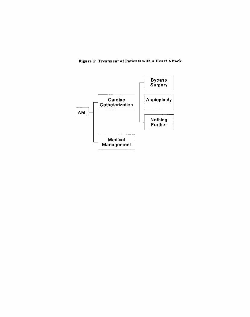


Copyright © 2022 FDOKUMEN