Practical and Project Work - J:\BR (1 Jan 2021)\CBSE Math bo
40
9.1 Practical and Project Work LEARNING OUTCOMES After completion of the unit the students will be able to: Plot the different graphs of functions on Excel. Learn different operations performed on the matrix. Learn how to perform simulation. Comprehend practical applications of demand and supply associated with economics. Understand the meaning of Data Analysis and Data Visualization. Apply Analytical Methods for business decision-making. Analyse different data and develop meaningful inferences for decision-making. Practical and Project Work Assessment Plan 1. Overall Assessment of the course is out of 100 marks. 2. The assessment plan consists of an External Exam and Internal Assessment. 3. External Exam will be of 03 hour duration Pen/Paper Test consisting of 80 marks. 4. The weightage of the Internal Assessment is 20 marks. Internal Assessment can be a combination of activities spread throughout the semester/academic year. Internal Assessment activities include projects and excel based practicals. Teachers can choose activities from the suggested list of practicals or they can plan activities of a similar nature. For data-based practical, teachers are encouraged to use data from local sources to make it more relevant for students. 5. Weightage for each area of internal assessment may be as under: Sl. No. Area and Assessment Area Marks allocated Weightage 1. Project work Project work (10 marks) and record 5 Year-end Presentation/ Viva of the Project 5 2. Practical work Performance of (10 marks) practical and record 5 Year-end test of anyone practical 5 Total 20 U nit 9
-
Upload
khangminh22 -
Category
Documents
-
view
1 -
download
0
Transcript of Practical and Project Work - J:\BR (1 Jan 2021)\CBSE Math bo

9.1Practical and Project Work
LEARNING OUTCOMES After completion of the unit the students will be able to:
Plot the different graphs of functions on Excel.
Learn different operations performed on the matrix.
Learn how to perform simulation.
Comprehend practical applications of demand and supply associated with economics.
Understand the meaning of Data Analysis and Data Visualization.
Apply Analytical Methods for business decision-making.
Analyse different data and develop meaningful inferences for decision-making.
Practical and Project WorkAssessment Plan
1. Overall Assessment of the course is out of 100 marks.
2. The assessment plan consists of an External Exam and Internal Assessment.
3. External Exam will be of 03 hour duration Pen/Paper Test consisting of 80 marks.
4. The weightage of the Internal Assessment is 20 marks. Internal Assessment can be acombination of activities spread throughout the semester/academic year. InternalAssessment activities include projects and excel based practicals. Teachers can chooseactivities from the suggested list of practicals or they can plan activities of a similarnature. For data-based practical, teachers are encouraged to use data from local sourcesto make it more relevant for students.
5. Weightage for each area of internal assessment may be as under:
Sl. No. Area and Assessment Area Marks allocatedWeightage
1. Project work Project work(10 marks) and record 5
Year-end Presentation/Viva of the Project 5
2. Practical work Performance of(10 marks) practical and record 5
Year-end test ofanyone practical 5
Total 20
Un i t
9

9.2 Practical and Project Work
Practical: Use of spreadsheetLearning OutcomesStudents shall be able to:
Draw graph of an exponential function
Comprehend Demand and supply functions on Excel
Study the nature of function at various points
perform Matrix operations using Excel
Suggested practical using the spreadsheet
Plot the graphs of functions on excel and study the graph to find out the point ofmaxima/minima
Probability and dice roll simulation
Matrix multiplication and the inverse of a matrix
Stock Market data sheet on excel
Collect the data on weather, price, inflation or pollution. Analyse the data and makemeaningful inferences
Collect relevant data from newspaper on traffic, sports, stock markets and use excel tostudy future trends
About Project WorkSome suggested project works are given below (according to the syllabus). For more details, you
can refer to the syllabus. The project work would be conducted individually or in a group (3 to 4students). Students select the topic related to the practical implementation of mathematics in differentdomains. Project work includes Data analysis, predicting market trends for better decision making,making inferences based on collected data, do simulations, and find out different best solutions toreal-time problems. You can collect the data sets of various domains from different platforms likeKaggle, https://www.kaggle.com (world’s largest data science community), Google Public Datasets,Amazon Web Services (AWS) datasets, and many more for data analysis and make better decisionmaking. Students may also work on various projects based on the prediction of future sales, stockmarket, air pollution, COVID-19 outbreak etc.
Evaluation of each project should be based on the learning outcomes and practical implementationof its results. The objective of the project should be clear to every student. Different approaches forsolving the problem and get the best and optimized solution to it. Teachers should guide the studentsin making their projects successful.
List of Suggested Projects (Class XII)1. COVID-19 Data Analysis, pre-process and merge datasets to calculate needed measures and
prepare them for an Analysis. In this, you can work with the COVID19 dataset, publishedby John Hopkins University, which consists of the data related to the cumulative number ofconfirmed cases, per day, in each Country.
2. Earthquake prediction using past data.
3. The Project Manager uses cost trend analysis to identify project budget under and overrunsand to solve many budget issues. One of the responsibilities of a project manager is to managethe project budget. This covers, estimating the initial budget (in most cases or at least reviewing),

9.3Practical and Project Work
creating a monthly budget plan, tracking progress (actual)spend , and then re-forecasting thebudget required (known as the estimate to complete – ETC).
The objective of conducting this analysis is to identify where a project will under or overrunthe budget. While a project manager should be completing budget reviews and re-forecastsregularly. So the data needed for this is:
List of projects
Budget for each project
Previous months Year to Date (YTD) Actuals for each project
Current months YTD Actuals for each project
Estimate to Complete (ETC) for each project
This data should be produced by the project monthly so hopefully should not present anissue.
4. Another popular one is to obtain product and pricing data from e-commerce sites for DataAnalysis and decision making. For instance, extract product information about Bluetoothspeakers on Amazon, or collect reviews and prices on various tablets and laptops. This meansyou can start with a product that has a small number of reviews, and then start analysingwith previous feedbacks, reviews on that particular product, and upscale according to theparameters you could choose for better sales.
5. Global Suicide Rates Analysis by taking the dataset from Kaggle (https://www.kaggle.com/russellyates88/suicide-rates-overview-1985-to-2016), it covers suicide rates in various countries,with additional data including year, gender, age, population, GDP, and more. When carryingout your EDA (Exploratory Data Analysis), ask yourself: What patterns can you see? Aresuicide rates climbing or falling in various countries? What variables (such as gender or age)can you find that might correlate to suicide rates?
6. Most Followed on Instagram: Whether you’re interested in social media, or celebrity andbrand culture, this dataset of most-followed people on Instagram
https://data.world/socialmediadata/most-followed-on-instagram has great potential forvisualization. You could create an interactive bar chart that tracks changes in the mostfollowed accounts over time. Or you could explore whether brand or celebrity accounts aremore effective at influencer marketing. Otherwise, why not find another social media datasetto create a visualization?
7. Superstore Sales Forecasting Data: Areas such as product placement, inventory management,and customization of offers, are sought to improve constantly through the application of datascience. Collect the data of various stores and on basis of historical data predict the sales. Thegoal is to predict the department-wise sales of each store using the historical data spanningacross 143 weeks.
8. Forecasting Uber/ Rapido Demands
Demand and Supply functions on Excel
A spreadsheet provides various types of charts to display demand and supply information.Different types of charts are available to use but it depends on what kind of analysis you are goingto perform. If the data requires finding the equilibrium for supply and demand, a line graph providesthe best results as well as visualization but if you want to show the variations between supply anddemand, a column chart is more suitable.

9.4 Practical and Project Work
For creating different charts on supply and demand, the steps are as follows:
1. Open a new spreadsheet, add the data in the different columns as in the image shown belowi.e. price, quantity demanded and quantity supplied.
Fig 1: Supply and Demand Data
2. Select columns of price, quantity demanded, and quantity supplied and click on the InsertTab, choose line chart from chart group.
Fig 2: Line Chart
3. After choosing a line chart, it will appear with the mentioned data values on the x-axis andy-axis with different colors. By default, the price would be at x–axis.

9.5Practical and Project Work
Fig 3: Supply and Demand Line Chart
With the same data, you can also visualize the data by using a scatter plot. The scatter chart isshown below. The supply and demand curve will intersect at a point which is your equilibrium pointand it is visible in both the charts.
Fig 4: Supply and Demand Scatter Chart

9.6 Practical and Project Work
Matrix multiplicationBefore going to matrix multiplication we need to know about the basics of the matrix, what is
the matrix? A matrix is an arrangement of numbers in rows and columns.
For example, Matrix A has two rows and two columns
1. In Microsoft Excel, the MMULT function is used for multiplying any two matrices. So let’stake two matrices 3x3 matrix A and matrix B as shown in the given figure below.
Fig: 5: Two 3x3 Matrices A and B
2. For multiplication of two matrices A and B, the number of columns in the first matrix mustbe equal to the number of rows in the second matrix. After selecting the cells 3x3 and writedown the MMULT () function in the given cell . You can see in the below figure once youwrite the MMULT function it asks for array 1 and array2.
Fig 6: MMULT () function

9.7Practical and Project Work
So Array 1 is the first matrix and Array 2 is the second matrix. After opening the bracket of theMMULT function select the cells of Matrix A (A2:C4), as well as Matrix B (G2:I4) separated withcomma as given the fig 7 and 8.
Fig 7: Array 1(Matrix A)
Fig 8: Array 2(Matrix B)
3. While calculating the result, key Combination Ctrl+Shift+Enter should be used and you willget the desired output. As you can see in fig 9.
Note: Do Not Press Enter Alone, Pressing enter alone will only show one value instead of a matrix.

9.8 Practical and Project Work
Fig 9: Matrix Multiplication using MMULT ( ) Function
Finding the Inverse matrix using MS Excel
1. For calculating the inverse of a given matrix, the MINVERSE function is used. First, createthe matrix A (3x3) given below in fig 10. Enter the values in rows and columns.
Fig 10: 3×3 Matrix
2. Once you create the matrix, then write the MINVERSE in the highlighted cell in which whereyou want to place the resulting matrix . For the array, select the Matrix A cells (B2:D4). Asyou can see in the below-given image fig:11.

9.9Practical and Project Work
Fig 11: MINVERSE Function
3. While calculating the result, key Combination Ctrl+Shift+Enter should be used and you willget the desired output. As you can see in fig 12.
Note: Do Not Press Enter Alone, Pressing enter alone will only show one value instead of a matrix.
Fig 12: Inverse of Matrix

9.10 Practical and Project Work
How to Calculate Probability Using MS Excel?
Probability is the branch of mathematics and it is defined as the likelihood for which an eventis probable, or likely to happen. MS Excel has built-in function PROB for calculating the probability.PROB function is classified under the MS Excel statistical functions. The function of probabilityworked in different domains like in business, sports, in financial analysis for estimating the long termbusiness losses and gain.
Formula :
=PROB (x_range, prob_range, [lower_limit],[upper_limit])
range – the range of numeric values containing our data
prob range – the range of probabilities for each corresponding value in our range
lower_limit –the lower limit of the values for which we want to calculate the probability
upper_limit –the upper limit of the values for which we want to calculate the probability
Let’s take an example to understand the usage of the built-in function PROB for calculating theprobability.
The Below table contains grades and their corresponding probabilities. Here we set the lowerlimit to 50 and the upper limit to 80.
Fig 13: Table for Grades
1. After entering the data in the table we write the PROB function in the formula bar along withthe arguments. Select the cell (A2:A7) for grades and B2:B7 for corresponding probabilitieswith lower limit 50 and upper limit 80.

9.11Practical and Project Work
Fig 14: PROB function
2. After applying the formula you will get the resultant in desired cell i.e.C2 cell 0.95.
Fig 15: Result

9.12 Practical and Project Work
Dice roll simulation
The given example shows you how to simulate the dice roll in MS Excel. Following are the stepsto follow which is given below:
1. The first is to choose the dice, for this go to the INSERT tab and click on the Symbols andselect the Segoe UI symbol as shown in fig 16.
Fig 16: Dice Selection
2. After selecting the Segoe UI Symbol, select the dices from 1 to 6 in column B.
Fig 17: Dices

9.13Practical and Project Work
3. Put each dice on the single-cell by selecting the one dice Ctrl+X and paste it in another cellalong with numbering 1 to 6 as shown in fig 18.
Fig 18: Copying of Dices in individual cell
4. The Next step is to generate the random number between 1 and 6 just similar to the roll ofdice by using built-in function RANDBETWEEN. By applying this function, you have to enterthe bottom and top values.
Fig 19: RANDBETWEEN Function

9.14 Practical and Project Work
5. Put the 1 as the bottom value and 6 top value and enter it. Any random number would begenerated as you can see in Fig 21.
Fig 20: Top and Bottom value of RANDBETWEEN Function
Fig 21: Random Number Generation

9.15Practical and Project Work
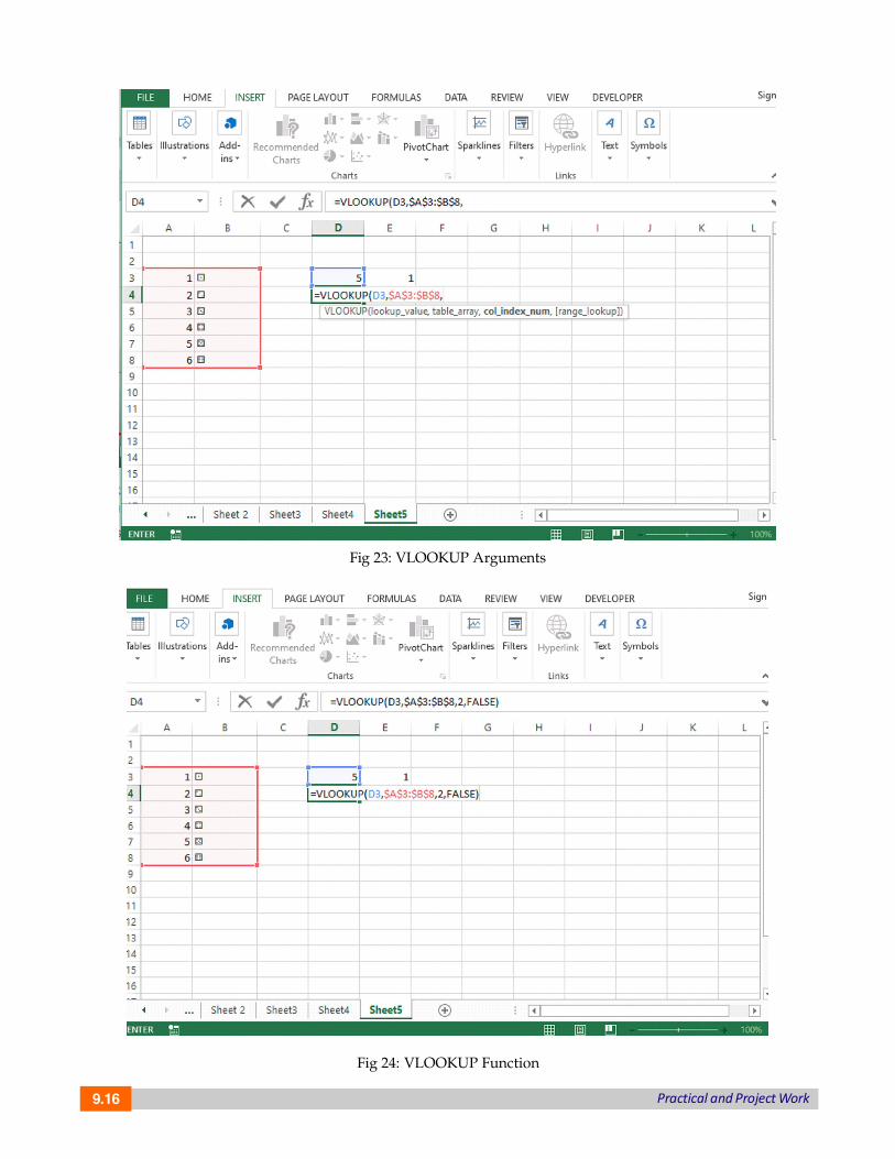
6. Apply the VLOOKUP function to select the outcome for each die. Place the number for thefirst die in column D and the number for the second die in column E as shown in fig 22 .
Fig 22: VLOOKUP Function
7. Add different parameters like lookup value, table array col index and range lookup. Writedown the formula in cell D4, open the bracket and choose D3 value and put a comma. Fortable array, select the column A and B along with the associated values within the cell andpress F4. Add col index value is 2 and for range lookup to choose the argument FALSE. Andpress enter.
Syntax:
=VLOOKUP (value, table, col_index, [range lookup])
Arguments:
Value: The value to look for in the first column.
Table: The table from which to retrieve a value.
Col_index: The column in the table from which to retrieve a value.
Range_lookup: - [optional] TRUE = approximate match (default),FALSE = exact match.
9.16 Practical and Project Work
Fig 23: VLOOKUP Arguments
Fig 24: VLOOKUP Function

9.17Practical and Project Work
8. After press enter, you will get the dice roll in the desired cell which is mentioned below inthe given fig 25 and 26.
Fig 25: Dice Roll
Fig 26: Two Dice Roll

9.18 Practical and Project Work
9. For increasing the Dice size, click on the HOME tab and select the alignment and Increasefont size. Adjust the size of both the dice.
Fig 27: Resizing the Dice
10: Now select one dice, copy it and paste it on another sheet and check the formula bar.
Fig 28: Formula for Dice 1

9.19Practical and Project Work
Fig 29: Two dices
11. Similarly check for dice 2 and add some changes for rolling the dice in the given cell on theformula bar for rolling the dice simulation.
Fig 30: Dice rolling simulation

9.20 Practical and Project Work
Plot the Graphs of functions on ExcelLinear Function: In mathematics, linear functions have the form f(x) = ax + b, where a and b
are constants. The graph of any linear function is a straight line. The Linear function is quite popularin economics. It is very useful in comparing the rates of pay.
Let’s take an example if one company offers to pay you $450 per week and the other offers $10per hour, and both the companies asked you to work 40 hours per week, then which company isgoing to offer the better rate of pay? For this kind of implementation, a linear equation can help youout in a better way. More applications in the daily life of linear equations are: In Budgeting, makingpredictions, variable costs etc.
In excel, plotting of linear function graph, here we take the different values of x and put thevalues in the mentioned formula f(x) = 3x-3 and get the values. You can see in fig 31. Column A:Different values of x i.e. from 0 to 5 and Column B: f(x) =3x-3. For calculating each value apply theformula for value 0, write it down in Column B second cell: 3*A2-3, and then press enter you willget the value i.e. -3 .
Fig 31: Different Values of x
After getting the 1st value, drag the A2 cell till A7, you will get all the values by formula. Seethe values in the given below fig 32. Now select both column A and column B and then for plottingthe graph, go to the INSERT tab and click on charts and choose to scatter plot. Your linear functionwould be plotted for the given values which are shown in Fig 33. The Graph shows the straight line.

9.21Practical and Project Work
Fig 32: Scatter Plot Graph
Fig 33: Graph of Linear Function
Quadratic Function: The quadratic function or polynomial of degree 2 is in the form of
where a, b, and c are real numbers and a‘“0. If a >0, the parabola opensupward. If a<0, the parabola opens downward. The graph of a quadratic function is a curve calleda parabola. It may open upward or downward and can vary in their “width” but they all have thesame basic “U” shape.

9.22 Practical and Project Work
The quadratic functions are used in real-world situations or everyday life like optimizing profitsfor business, calculating areas of certain land, speed of an object like throwing a ball, determininga product’s profit, etc.
In excel, for plotting graph of quadratic function f(x) = , we follow these steps.
1. Take different values of a, b and c for the given function f(x) = ax2+bx+c, Let’s take a=1, b=4and c=2. Put these values in the given function you will get f(x) =x2+4x+2. Put the values ofa, b, and c in different cells of column B as shown in figure 34 below.
2. After assigning the values of a, b, and c, assign different values to x. Now substitute thesevalues in the function f(x) = ax2+bx+c based on each value of x assigned. Apply the formulain the formula bar by selecting the cell and their associated values in the given fig 34.
Fig 34: Formula for implementing Quadratic Function
3. After applying the formula, press enter and you will get the desired value of f(x) for valuex = - 5 i.e 7 in Fig 35.
4. Now if you want to use the auto-completion, we simply lock the cells containing the valuesof a, b, and c as shown in fig 36.

9.23Practical and Project Work
Fig 35: Result
Fig 36: Auto-completion (lock the cells)

9.24 Practical and Project Work
5. After applying the auto-completion select the columns D and E with values and for plottingthe graph click on the INSERT tab and then click on charts and then select the scatter plotand choose the scatter chart you can see the parabolic curve in the given below fig 37. In thisway, you can plot the graph.
Fig 37: Quadratic Function Graph
Exponential Function: An exponential function is a Mathematical function in the formf (x) = , where “x” is a variable and “a” is a constant which is called the base of the
function and it should be greater than 0.
The real-world applications of exponential functions are bacterial growth/decay, populationgrowth/decline, and compound interest, pandemics (exponential growth of disease),smartphone uptake and sale, the exponential growth of cancer cells, etc.
In Excel, there is a built-in exponential function called as EXP function that returns a numericvalue, which is equal to e raised to the power of a given number.
The Syntax for the EXP function
=EXP( ) Note: In between parenthesis you write the number.
EXP function in Excel takes only one input, which is required; it is the exponent value raisedto base e.
The number e is an irrational number, whose value is constant and is approximately equalto 2.7182. This is number is also known as Euler’s Number.
Now let’s see that how to plot an exponential graph in excel. Let’s take different values ofx and apply the EXP function. In the given below fig 38. Apply the function EXP(1) for value1 in Column B.

9.25Practical and Project Work
Fig 38: EXP () Function
After applying function for value 1 and then press enter you will get the value i.e. 2.718282approximately. You can see in fig 39. Similarly, apply for different values and calculate the exponentialvalues for different values of x.
Fig 39: EXP (1) Result

9.26 Practical and Project Work
After calculating the values plot the exponential function graph by clicking on the INSERT tab,select the graph and choose the scatter chart. The graph would be automatically plotted. The graphis shown in fig 40.
Fig 40: Exponential Function Graph
If you want to add Trend lines , right-click on the plotted graph line and select the Add TrendLine option as shown in fig 41.
Fig 41: Add TRENDLINE

9.27Practical and Project Work
After choosing the Trend Line, select the Exponential option in the list of Trend line options andapply it . The final Exponential Function graph would be shown in given fig 42 and 43.
Fig 42: Exponential TRENDLINE
Fig 43: Exponential Function Graph with TRENDLINE

9.28 Practical and Project Work
Stock Market Data Sheet on ExcelIn Microsoft 365 Excel, we get easily the stock and geographic data. We can convert the text into
Stock data type as well as Geography data type which is mentioned in different cells.
In fig A which is given below in column, different cells with company names contain the Stocksdata type. This icon: symbolize the Stock Data Type. The Stocks data type is connected to anonline source that contains more information. Columns B and C are used to extracting that information.Specifically, the values for price and change price are getting extracted from the Stocks data typein column A.
Fig A: Stock Data Type
Let’s take an example to get a better understanding of using Stock data type . How you convertthe text into Stock and Geography Data Type.
In fig 44 which is given below, first, you have to type any text in the cell-like I have writtengoogle text in Column A cell A1.
If you want stock information, type a ticker symbol, company name, or fund name into each cell.If you want geographic data, type a country, province, territory, or city name into each cell.
Fig 44: Stock Information
After selecting the Stock information, as you can see in fig 45 ,the table of stock informationwould be placed on an Excel worksheet.

9.29Practical and Project Work
Fig 45: Stock Information
Now the next step is that you have to convert into Stock Data type . For this you have to selectthe cells to go to the Data Tab and select the Stocks Data Type or Geography Data Type as per yourdata choice. So here I would choose the Stock data type according to my data .You can see in fig46, you’ll know they’re converted if they have this icon for stocks: and this icon for geography:
Fig 46: Stock and Geography Data Type
After selecting the stock data type you will see that the first Company Name Microsoft Corporationconverted into Stock Data Type and you can see the symbol on the left corner of the text. Similarly,one by one you can convert all company names into a stock data type. You can see in both fig 47and 48.

9.30 Practical and Project Work
Fig 47: Stock Data Type
Fig 48: Stock Data Type
Once all done with the stock data type, after that you have to add different metrics or informationrelated to different stocks in your data set. Select one or more cells with the data type and the Insert
Data button will appear as you can see in the above-given fig 48.Click that button and you will
notice a lot of different information or fields associated with that particular stock. Choose one fieldand it will be added to the right of your current data set.
In the given example as shown in fig 49, I choose 52 weeks high, you can choose price also. ForGeography, you might pick Population.

9.31Practical and Project Work
Fig 49: 52-week high field
Once you press enter you will get the value associated with the chosen field. Similarly, apply thesame formula with different data set and choose different fields also.
See the results in fig 50 and 51 which are given below.
Fig 50: Result of the selected field
Fig 51: 52 Week High field result

9.32 Practical and Project Work
Click the Insert Data button again to add more fields. If you’re using a table, here’s a tip: Typea field name in the header row. For example, type Change in the header row for stocks, and thechange in the price column will appear.
Collect Data on weather, price, inflation and pollution: Analyse the Data and make meaningfulInferences
Before going to the inferences we must know about Data Analysis. So Data Analysis is theprocess of cleaning, transforming and modelling the data to discover useful information for businessdecision-making. The main purpose of Data Analysis is to extract useful information from data andsuggesting conclusions, taking the better and right decision based upon the data analysis.
Data Analysis is defined by the statistician John Tukey in 1961 as “Procedures for analysingdata, techniques for interpreting the results of such procedures, ways of planning the gathering ofdata to make its analysis easier, more precise or more accurate, and all the machinery and resultsof (mathematical) statistics which apply to analysing data.”
Data Analysis through Excel
Excel provides different functions, commands, and tools for making data analysis easy. You canalso do data analysis of large data sets by using PivotTables and produce desired reports.
Data Analysis consists of different phases:
Fig 52: Data Analysis Phases

9.33Practical and Project Work
Generating Inference from DataPivot tables are an amazing tool for analysing large data sets. It also helps in summarizing data
and explore data insights.
For creating a Pivot table and analyse the data follow these steps. You can import the data setexternally by clicking on the DATA tab choose the option From Other sources and select the optionas per your requirement. You can import data from other options like From Access, From Web andText. You can see the options in the given fig 53.
Fig 53: Import Dataset in Excel
Let’s take an example like suppose you are working with company data, you have questionslike “How much revenue is contributed by branches of North region?” or “What was the averagenumber of customers for product A or B?” and many others. Then pivot table is the best tool foranalysing this kind of data.
A pivot table provides different operations like count, average, sum, and perform other calculationsaccording to the reference which you have selected i.e. It converts a data table to an inference tableso that we can analyse the data and which helps us to make better decisions.
The table given in fig 54 has sales detail of each customer with the region and product mapping.In the table which is given in fig 55, we have summarized the information at the regional level whichnow helps us to generate an inference that the South region has the highest sales.

9.34 Practical and Project Work
Fig 54: Dataset
Fig 55: Inference Table

9.35Practical and Project Work
How to create a Pivot table, follow the steps given below:1. First click anywhere in the list of the dataset, here I have selected the cell D7 of Column
Premium and then click on the INSERT tab and choose Pivot Table in the left side corner ofTab. Once you choose, Excel automatically selects the chosen area which consists of the datavalues including the heading. If it doesn’t select automatically then you have to do it manuallyto drag over the area to select a particular cell. See the given below fig 56 for selecting thepivot table.
Fig 56: Create Pivot Table from INSERT Tab

9.36 Practical and Project Work
2. After selecting the option new worksheet, place the pivot table on a new sheet and click ok.Now you can see the pivot table in the new worksheet shown in the fig 57.
Fig 57: Pivot Table creation in the new worksheet
3. Now you can see the pivot table panel at the right-hand corner which contains differentfields in the given list. Choose the field as per need for data analysis and making inferencesbased on them. Once you select the fields, here I have selected Product id, Premium andRegion Field.

9.37Practical and Project Work
4. After that your pivot table is created you can see in the fig 58.
Fig 58: Pivot Table
5. If you want to change the rows and columns of the fields which you have selected then right-click the row or column label or the item in a label, point to Move, and then use one of thecommands on the Move menu to move the item to another location. Seein fig 59 .
Fig 59: Pivot Table (Generated Inference)

9.38 Practical and Project Work
6. In Fig 59. given above, we have arranged the Region in row and Product Id in column andsum of premium taken as value. Now the pivot table is created and inferences generated. Youcan also use different functions like sum, average, min, max and other summary fields. Wehave summarized the information at the region level which now helps us to generate aninference that the South region has the highest sales.
Creating Charts: For taking better business decisions and making inferences, data visualizationthrough charts or graphs would be very useful. In excel, for making different charts, click on theINSERT tab select charts and choose any chart .
For the above given data set, visualization of pivot table would be shown like this.
Fig 60: Creating Charts
Similarly, we can analyse the weather also by collecting the weather dataset and make inferencesbased on different parameters or metrics. Get the daily temperature and weather conditions .Youcan take the metrics: Weather Type and for visualization choose different colours for every differentweather, whether its rain, cloud, snow or sun. Make a table with two columns one for weatherdescription and another for type.
Now for analysis, Choose a date, day, temp and weather for making better predictions andmaking decisions.
Collect data from newspapers on traffic, sports activities and on market trends and use excelto study future trends.
Before going to study future trends first we must know about some terminologies which haveworked and going to help you in predicting, analysing the trends.
Forecasting: It is the process of predicting the future by analysing the past and present data.When we talk about Quantitative forecasting so it will work on time series data like we want toknow the number of passengers flying every year on planes by use of time series data.

9.39Practical and Project Work
Some important components of time –series are Trend and Seasonality.
Trend: It is the long term tendency of the variable to increase or decrease over a period of time.For example the number of passengers flying every year on planes by use of time series data.
Examining sales patterns to see if sales are declining because of specific customers or productsor sales regions
Seasonality: In this pattern is repeating at a regular interval of time. For example, retail salestend to peak for the Christmas season and then decline after the holidays. So time series of retailsales will typically show increasing sales from September through December and declining sales inJanuary and February.
Forecasting is the most important technique for predicting future trends and opportunities.Companies use to make good and better business decisions.
Let’s see more examples to get a better understanding of forecasting.
Economists use forecasting techniques to predict future recessions, ups and downs in themarket values and accordingly they recommend good plans.
Government bodies use forecasting for making a plan and build their policies.
Companies Managers use forecasting to predict sales and accordingly they make their budgets,plan things and hire employees.
Profiling customer behaviour, preferences and buying habits.
Finding uncommon developments over the period, which we need to address in our forecasts.
Studying sales patterns to predict future performance.
In Excel, some important functions are available for forecasting like
forecast.linear(): It predicts the values by using past values.
forecast.ets(): It predicts values by existing values.
forecasting.ets.seasonality(): It works on the number of seasonal patterns .
forecasting.ets.confint(): It predicts the value at the specified target date.
Excel TREND function:Let’s take an example to suppose that you are analysing some data for a sequential period of time
and you want to analyse some trend or pattern.
In this example, we have the month numbers (independent x-values) in cell A2:A13 and salesnumbers (dependent y-values) in cell B2:B13. Based on this data, we want to determine the overalltrend in the time series.For this select the cells C2:C13, type the formula which is given below andpress Ctrl + Shift + Enter to complete it:
=TREND (B2:B13, A2:A13)
If you want to draw the trend line, then select the sales and trend values cells (B1:C13) and selectthe line chart (Insert tab > Charts group > Line or Area Chart).
You can see the result, it consists of both the numeric values for the line of best fit and a visualrepresentation of those values in a graph also.

9.40 Practical and Project Work
Fig 61: TREND Function
Fig 62: Visual Representation of Trend Analysis