Interactive Documentaries: Navigation and Design
18
1 Interactive Documentaries: Navigation and Design By Patricia Aufderheide Published in Journal of Film and Video, a publication of the University Film and Video Association, Volume 67, Nos. 3-4, pp. 69-78 Abstract The interactive digital documentary has attracted both enthusiasm and analysis among documentarians, festival programmers and academics, and has been associated with social-action goals of engagement and activism. This article focuses on the claims to interactivity of several interactive documentaries with social-action purposes made between 2008 and 2013, through the lens of navigation. The article considers the implications of simple v. global navigation, the use of metaphor in navigation, and match with interactive objectives. The article concludes that navigation techniques are used that mimic earlier formats, and that user interactivity is currently limited largely to consumer choice, across a range of approaches. The experimental nature of the moment is noted. Introduction The interactive documentary, still barely emergent, has attracted both enthusiasm and analysis. Despite the cautions of Lev Manovich against the inexactitude of the term “interactive” (since all art at some level is interactive), the term “interactive” has come to be generally used to designate multimedia, mostly screen-based storytelling. At film festivals, sessions and even entire conferences on interactive documentary are now standard. At the standard-setting SXSW event in Austin, TX, a strand of interactive documentary that finds overlap audiences between its Interactive and Film conferences has become a place where even standing-room is highly prized.
Transcript of Interactive Documentaries: Navigation and Design

1
Interactive Documentaries: Navigation and Design By Patricia Aufderheide
Published in Journal of Film and Video, a publication of the University Film and Video Association, Volume 67, Nos. 3-4, pp. 69-78
Abstract
The interactive digital documentary has attracted both enthusiasm and analysis among
documentarians, festival programmers and academics, and has been associated with social-action
goals of engagement and activism. This article focuses on the claims to interactivity of several
interactive documentaries with social-action purposes made between 2008 and 2013, through the
lens of navigation. The article considers the implications of simple v. global navigation, the use
of metaphor in navigation, and match with interactive objectives. The article concludes that
navigation techniques are used that mimic earlier formats, and that user interactivity is currently
limited largely to consumer choice, across a range of approaches. The experimental nature of the
moment is noted.
Introduction
The interactive documentary, still barely emergent, has attracted both enthusiasm and analysis.
Despite the cautions of Lev Manovich against the inexactitude of the term “interactive” (since all
art at some level is interactive), the term “interactive” has come to be generally used to designate
multimedia, mostly screen-based storytelling. At film festivals, sessions and even entire
conferences on interactive documentary are now standard. At the standard-setting SXSW event
in Austin, TX, a strand of interactive documentary that finds overlap audiences between its
Interactive and Film conferences has become a place where even standing-room is highly prized.

2
Tribeca, Sheffield and IDFA (International Film Festival at Amsterdam) film festivals have
interactive strands/conferences. Events such as Future of Storytelling, Transvergence and Power
to the Pixel are among the many venues where professionals exchange stories and hints about
making these new works. Entities as diverse as the U.S. Army,i the Museum of Modern Art in
New York, and U.S. public television stationsii are developing interactive projects (Stogner).
Taxonomies
At the same time, early academic work is being done on taxonomies for it (Nash). Indeed,
the Open Documentary Lab at MIT, founded in 2012, features a research forum in which this is
one of the issues. One way to organize the categories is by technical approaches: web
documentary, transmedia and interactive documentary (O'Flynn). In this taxonomy, web
documentaries, such as the series Black Folk Don’t (blackfolkdont.com, since 2012), use the web
as a distribution platform for typically static material, which the viewer can select from.
Transmedia projects are construed across various platforms, as in the Exit Zero Project
(exitzeroproject.org, 2013), which occurs across a book, a film and a web database, and
Reinvention Stories (reinventionstories.org, 2013), featuring short films, a tour with audio and
video stops, and a site for contributed knowledge. (Transmedia projects may also involve
performances and geo-located games such as scavenger hunts.) While some of these applications
may be interactive, some transmedia projects allow only selection of material rather than
contributions. Finally, interactive documentaries have user participation built into their action,
and typically feature databases as integral to their actions. Just a Reflektor (justareflektor.com,
2014) is one example.

3
Other conceptualizations are also being tried out. Sandra Gaudenzi has created
taxonomies rooted in experience, describing interactive documentaries in terms of how viewers
are positioned (e.g., conversational, experiential), and as either semi-closed (user can choose
what material to browse), semi-open (user can add material but not change structure), or open
(system adapts to all inputs). These categories overlap with O’Flynn’s. Maggie Burnette Stogner
argues for three non-exclusive categories, based not on conceptual purity but on perceived areas
of media activity, within a general trend of what she calls “user-centric:” participatory (an
entirely distributed and mostly unstructured experience), collective (an experience that involves
participation within a structure), and mobile (in which participation is often overlaid on the
physical world and experiences within it).
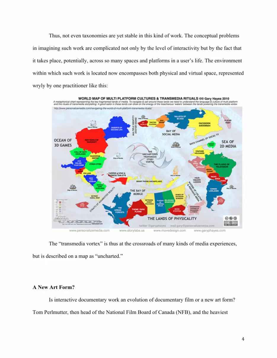
StoryCode designers, professionals who create transmedia works, describe the range with
a graphic (Aiobdun and Knowlton):
Fig. 1
4
Thus, not even taxonomies are yet stable in this kind of work. The conceptual problems
in imagining such work are complicated not only by the level of interactivity but by the fact that
it takes place, potentially, across so many spaces and platforms in a user’s life. The environment
within which such work is located now encompasses both physical and virtual space, represented
wryly by one practitioner like this:
The “transmedia vortex” is thus at the crossroads of many kinds of media experiences,
but is described on a map as “uncharted.”
A New Art Form?
Is interactive documentary work an evolution of documentary film or a new art form?
Tom Perlmutter, then head of the National Film Board of Canada (NFB), and the heaviest

5
institutional investor in interactive documentary (nfb.ca/interactive), was decisive on this, and
influential in his decision. He said at IDFA 2013, “This is a new art form. It is rare to have the
privilege of being at the start of a new art form, and that is why we are investing so much in it.”iii
Perlmutter estimated that 20% of the NFB’s resources currently go to interactive documentary.
Indeed, the NFB has become the world leader in public media production of interactive
documentary, and public media have been the most ambitious investors in the form.
Aston and Gaudenzi also caution against considering the interactive documentary as an
evolution of the form and rather describe it as “a form of nonfiction narrative that uses action and
choice, immersion and enacted perception as ways to construct the real, rather than to represent
it.” While one may well argue that all media constructs the reality it claims to represent (Carey),
there is nonetheless a profound break with the passive experience of media reception built into
this form. In this way, interactive documentary work joins other art work in embracing the
population formerly known as the audience or patron, producing work that is no longer an object
but a shared project with users (Bishop 2).
Academics have returned to earlier film theoretical formulations to discuss the challenges
of developing the basic grammar and syntax of the interactive form. Proctor and Maher for
instance note that in interactive documentary, linear narrative (the syntagmatic axis, in semiotic
analysis, crucial to realist storytelling cinema) and associated thematic elements and associations
(the paradigmatic axis, powerfully in play in experimental cinema and poetry) are equally
important, and that the success of interactivity is in keeping the two in balance. They postulate
that “the interactive narrative stumbles, however, when…..paradigmatic links are sacrificed in
favor of the syntagmatic.” The user, they argue, loses the affective connection and motivation to
keep on clicking; this failure is endemic.

6
This aspiration, however, is challenged by the fact that the art form itself is still
developing its own grammar and syntax, a point made often by developers such as Brian Chirls.
Chirls worked on 18 Days in Egypt (2011), an online platform that showcases and synthesizes
media produced by citizens participating in the demonstrations that overthrew Pres. Hosni
Mubarak. In discussing the problem of finding ways to weave together social media from those
dramatic eighteen days, he noted that interactivity provided a rich set of opportunities both to
explore a variety of media in the same setting and to add to it, but also posed serious challenges
to creators trying to offer both participation and structure to their users. “We are still working out
the grammar here,” he said.iv
The struggle to establish expectation is evident in software design as well. The Korsakaw
system uses the “smallest narrative unit,” in combination with rules governing points of contact
for the user, to constitute media units (Proctor and Maher). Zeega and StoryPlanet have both
developed platforms permitting a range of ways of organizing material so that users can control
flow (Aufderheide), each encoding in software elements of story construction. In any case, the
creative challenge of interactive documentary is raised by the emergent nature of both the form
and the software to present it.
In the wildly experimental early days of this art form, creators lack familiar signals to
channel the expectations of users. In this situation, navigation and graphic design come to take
on outsized significance as clues both to the size and shape of the experience being offered and
also the kinds of interactivity being solicited. Navigation is a key feature of web interaction
(Webster and Ahuja). Viewer disorientation is a primary reason for failure to continue with a
website, and so navigation is continuously under redesign for effectiveness as well as elegance.

7
Interactive Documentaries with a Public Purpose
The interactive documentary would seem to create new ways for people to connect both
with an issue and with others who can change outcomes on it. Certainly the last two decades
have seen a vigorous evolution within social-issue documentary, away from the theatrical or
broadcast experience as an end goal, through an investment in outreach for finished products,
and developing into today’s common scenario for a social issue documentary: strategic design
for multiple outcomes and users; multiple formats for a range of uses; multiple forms of
distribution; and often related projects, products and activities (McLagan).
To examine navigation and design in terms of expectations for interactivity, this article
examines several interactive documentaries that address energy questions. They deal with
complex issues—climate change, energy choices, the terms of work, the terms of development—
through the question of coal production. The topic area is particularly interesting to consider for
interactivity, because of the manifest failure of scientific and factual data to connect directly to
public opinion on climate change and issues of energy, development and economics that relate
directly to it (Sarewitz). Some have argued that sound policies need better communications:
building societal action in response to climate change will require a new communication
infrastructure, in which the public is (1) empowered to learn about both the scientific and
social dimensions of climate change, (2) inspired to take personal responsibility, (3) able
to constructively deliberate and meaningfully participate, and (4) emotionally and
creatively engaged in personal change and collective action. (Nisbet et al.)
Although it would be possible to apply different names to this work depending on the
taxonomy used, in practice all of these are being referred to as interactive documentaries by their
creators and others. Although they vary in their range of interactivity, overall they function

8
interactively at the simplest level, of allowing viewers an option of either content or formats. All
of them are designed with some linear structure, though some have a more highly defined story
arc than others.
Navigation in Five Projects
Navigation is examined here along several axes. One is the question of choice between
simple and global navigation design, taking into consideration studies showing that global design
can be helpful depending on its clarity and ease of access (Webster and Ahuja).
Another is the metaphor and its echoes in other media. In considering the form that
interfaces take, Manovich notes, “the language of cultural interfaces is largely made up from
elements of other, already familiar, cultural forms” (71), and this is as true of navigation as of
other elements. They are deliberately designed to help viewers navigate, in part by using familiar
tropes. This use also resonates well with Bolter and Grusin’s observation that media forms in
general echo and borrow from other media.
A third axis is the match with the interactive functions of the site. Different navigational
needs drive different navigational designs, depending on how the project construes the user’s
relationship with the material.
Coal: A Love Story (2011) was developed as part of a University of North Carolina
ongoing student-journalism project on energy, and is structured with a strong linear through-line,
like a large feature story with sidebars (which in some cases here become the next link in the
story). Ranchers, coal miners, ex-coal miners, Coal Queen pageant contestants, and
environmental activists all have a voice. This is not an advocacy or partisan piece, but a
thoughtful piece of journalism on the pervasive dependence on coal and its costs.

9
User interactivity is mostly in being able to select among informational options. The one
area of the site that allows user input is in a graphic quiz that allows users to estimate how much
coal they use. It effectively demonstrates that daily life is dependent on coal production. Other
elements, interactive in the sense of being able to choose to explore or visit, are video portraits,
stories, interactive graphics, the viewpoints of stakeholders around coal.
Navigation is bold and clear. Its front page is a long infographic with a central ribbon that
serves as the navigation, clearly delineating the argument that America has a difficult love affair
with coal. It is easy to control user choices; the user is always returned to the front-page
infographic, at the place on the “spine” of the story where the user left off. Its navigation is
helped by the clarity of user expectations, since it is built on the model of the newspaper feature
story. Navigation aids—including clear “topic sentences” or curiosity-tweaking blurbs heading
sections, arrows, the discreet global navigation on the left—make understanding where the user
is in the experience easy, and allow revisiting or jumping ahead. It leads to an end point where
the user can explore more opinions and find out about ways to mitigate impacts and obstacles to
implementation.
Coal: A Love Story clearly guides the user through a story with a strong argument—as a
nation and culturally we are dependent on a fuel source that has enormous negative impacts. Its
step-by-step presentation of an argument uses navigation that charts the argument, echoes the
feature story format, and creates a motivation for users to continue.
Journey to the End of Coal (2008), by Samuel Bollendorff and Abel Ségrétin for Paris-
based HonkyTonk Films, is about the human costs of coal mining in China. It was initially
showcased on the website of the leading French newspaper LeMonde in 2008. Its content
10
provides poignant glimpses into dangerous, sometimes lethal working conditions, grimly
polluted environments, and dismal living conditions.
The documentary is interactive only at the level of permitting users to choose from a
short menu of questions, and allowing users to select options to get more information. It offers
users a journey-style adventure, by providing a forking tree of options to a user positioned as an
investigative journalist. It uses convenient, short video clips and stills, which provoke new
questions, which the user can select to continue the quest. It also deliberately frustrates the
explorer in ways that real-life investigations are frustrated by Chinese authorities. No action
points are offered to users.
The user is positioned as a character in a story (“suturing,” in film theory terminology) or an
avatar in a game. However, activity on site does not enrich or elaborate the character, and no
game-style rewards are offered.
The navigation is limited, and strategically withholds information from the users. It
invokes the form of the game, although this is a very limited version of one. It is not clear either
where the user is going or what can happen. It is not clear how to return to a previous screen, for
example, should a user want to try a different answer. There is no global navigation, permitting a
user to understand where they are in an experience. Videos do have a timeline bar, giving users
an idea of their length and permitting sampling.
The site thus falls between the immersive experience of film and the efficiency of
journalistic textual presentation. It provides a vivid experience of journalistic frustration, surely
a feature of research in this area. It focuses as much on the search and what cannot be found out,
as what can be known.

11
Black Gold Boom (2012) takes the viewer with maker Todd Melby in a public media-
funded project, through Association of Independents in Radio’s Localore project, funded by the
Corporation for Public Broadcasting. Created by a regional reporter, the site is structured as a
tour of North Dakota’s oil drilling camps, with photos, vignettes and selfies to enrich the
experience. The viewer can choose to watch an online film or choose video and photographic
segments. It explores the practical terms of existence—what gear should you bring? How should
women protect themselves in a rough male culture? What does the housing look like? It shows
the attractions as well as the downsides of working in the oil boom.
Interactivity is limited to selecting what to visit on the site. The user is treated as an
information-seeker, either motivated as a journalist or as a possible entrant into the oil-boom
scene. The user’s positioning is very similar to that of the journalist Melby. The user is given a
journalist’s well-rounded account of the oil boom, from living conditions to barroom culture to
how to get a job. The site also features related reporting by Melby on issues such as worker
safety.
The navigation is minimalist but functional, primarily depending on expectations from
online video. The core of the site is a video, helpfully labeled as twenty minutes long, with pop-
out videos and songs. There is no timeline bar, but the video is chaptered. The user can pause to
visit pop-out videos, infographics, photographs, and songs. The user can also access short videos
from the first page of the website. The navigation devices are borrowed from online video, and to
some extent from web journalism.
There is no narrative arc in this interactive, but rather a multi-faceted journalistic feature
presented in multimedia. In the core activity—the twenty-minute film—the greatest driver of
12
completion would be curiosity about what else is in the video, since exploring is the only way to
find out.
The Hole Story (2012) done through the National Film Board of Canada by a team led by
Frédéric Dubois, accompanies a feature-length film that argues that Canadian coal policy allows
mining companies to benefit without returning sufficiently to Canada and Canadians, and at a
high environmental and social price. Interactivity is limited to accepting a guided walk-through
of the “mining cycle,” in which entrepreneurs sell out to larger and larger companies that invest
in mines and eventually reap enormous rewards. The user, playing the corporate role, has various
opportunities to listen to interviews from people featured in the film. The user can accept
community input and take action to benefit the community and society; these options cost the
company money, and there is no penalty for ignoring them. The one point at which greater
interactivity is offered is in selection of the mine site, which can be at any Canadian ZIP code;
the mine will be located there, as displayed with Google Earth images.
The role for the user is thus clear but highly limited. Rewards are clear but informationally and
emotionally minimalist; the increasing or decreasing amount of profit is a small number on the
left of the screen.
The Hole Story’s navigation is limited and clear, and matches the function well. Any next
step for the user is boldly marked in red, and the media referent is a game. Global navigation is
functionally absent for the interactive, although it is available for the NFB site as a whole.
Although the list of six sections appears at every juncture of the six steps to mining extraction, it
does not permit the user to navigate anywhere but the next step, and disappears once the user
proceeds with the single option of accepting.

13
Hollow (2013), by Elaine McMillion Sheldon, looks at McDowell County, a coal mining
county and one of the poorest counties in West Virginia, one of the poorest states in the nation. It
is a sprawling love letter to an area, featuring voices and faces of people in the area. Issues
include mining and mining history, development, drugs, crime, history, music, and the land. It
offers a timeline, video vignettes, and information. Elegantly designed interactive graphics
display timelines and demographic information. It counters many stereotypes of West Virginia
by showcasing the complexity in one place, McDowell County. An implicit question pervades
the site: What kind of future can McDowell County make for itself? This, however, is not a
theme that is highlighted in the structure.
User interactivity is mostly in selecting where to stop and what to click on while scrolling
down the six sections of the site. The positioning of the user is not specified; there is no quest or
investigative question pushing action forward, and users are not assumed to be local residents
(who might be assumed to be invested in local self-representation). The question superimposed
on one photograph, “How do you envision a community center?” does not lead to an option to
contribute, but a chance to view a gallery of children’s drawings about their imagined
community center. It is possible to enter a related website, enter an email address and receive
updates from a blog, provide comments, and get community news. Perhaps because it is a
complex, information-rich site (optimized for Chrome), the site can crash in the midst of
viewing.
Navigation is structured around the central structuring activity of scrolling through
photographs and graphics in each section, thus depending upon the familiar navigation of
websites. Users face instructions at the center of the screen, “Scroll Down,” with downward
arrows; however, the arrows do not activate scrolling. Users need to employ the scrollbar at the

14
right of the screen. Global navigation at the bottom is elegant to the point of invisibility; users
may most likely encounter it by accident, since it only appears when a cursor moves over it.
Aside from the global navigation, returning or hopping to another section is difficult; back
buttons kick users out of the site.
Hollow creates a series of portraits around six themes of the history and challenges of
daily life in McDowell County. The scroll, a basic feature of websites, is the central device for
navigation, but within the scroll, there is little guidance on what can or will happen.
User Experience on Site
With all these and other interactive documentaries, extensive analytics are available in
principle, to assess user experience. For this study, only three of the sites were willing to share
such analytics. Two of those show a relatively low degree of commitment to continue, which
appears from anecdotal conference conversation to be typical of today’s interactive documentary
experience; one shows high commitment.
Hollow’s analytics show limited engagement with interactive elements. From June
through December 2013, there were some 77,000 visitors. Of those, more than 75% did not
proceed past the splash page. Overall, viewers stayed for about 5 minutes on the site, with
returning viewers spending a little more than 6 minutes. Top viewing locations were New York
and a variety of West Virginia locations.
Similarly, analytics for Black Coal Boom show limited interactive engagement. During
2013 (from launch Jan. 7, 2013-Dec. 13, 2013), the site attracted more than 25,000 viewers, with
the greatest numbers coming from Minneapolis/St.Paul (close to the story, and also a center of
engaged public media) and New York (a center of media exploration). More than 70% of them,

15
however, quit after the first page, thus never actually experiencing the interactivity of the site.
The return rate was 26%, a figure that nicely correlates with the amount of people who clicked
past the splash page. The average duration was 2.25 minutes. Traffic dramatically fell off after
launch, when 2,000 visitors was the peak.
For Journey to the End of Coal, which debuted on the site of a major international
newspaper (Le Monde), and was an early entry into the genre, viewership from 2008-2013 was
more than 200,000 unique viewers, with 70% of the visits made within ten days of the release.
The bounce rate was extremely low—13%—meaning that most viewers continued past the first
page. The return rate was 20%, with half of those returning more than three times. Users
typically spent 9 minutes on the site, and users who went past the first page spent 10 minutes. v
Conclusion
Users of these five interactive documentaries on energy issues all would likely explore
these sites because of prior interest in the material, whether because of an interest in the content
or an interest in how people are using the form, rather than in pursuit of a media experience in
itself. This is because there is as yet no tradition of or beaten path to these forms. They all exist,
deliberately, as experiments. For all (as Proctor and Maher note), interactivity is first-level (user
chooses where to go); for all of them, by design, the possibilities for user immersion in
experience cross-cut with the opportunities for choice.
In all of them, while users take on a role within the stories that emerge, that role is
extremely limited. Whether the user is construed as a journalist, a consumer, or a stakeholder, the
user’s interaction with the material has little or no effect on the user’s situation within the
experience. The lack of emotional investment created by the sites makes them weak candidates

16
for the kinds of science communication that Nisbet et al. envision—one that invests citizens with
both knowledge and a reason to act on knowledge. Each of them struggles with the challenge of
making dynamic the intersection between syntagmatic and paradigmatic axes of storytelling. The
general lack of action options as a result of interacting with the site also makes these sites more
journalistic and informational than advocacy work or work spurring public engagement on
energy issues.
Each, however, provides a range of information to users on topics otherwise rarely
showcased in media, and posed in ways that permit larger questions to be asked than usually are
asked in daily or weekly journalism. To the extent that navigation permits, users can follow their
own curiosity to visit and revisit that information.
Each of the media metaphors used—the newspaper; the game; the website; the film—is
linked both to origins of the project and to its purpose. Each of them uses navigation that harks
back to other media, and simultaneously solves expressive, logistical and grammatical
challenges.
Navigation choices might or might not be linked to effectiveness and popularity. User
data does not, at the level provided, link usefully to navigation choices. There are too few
examples, and modes of release, organizations showcasing the work, promotional budget and
other factors vary too widely for user data to be linked to one element of design.
In a form that still has yet to attain its distinctive shape and attendant expectations, these
are experiments that demonstrate the potential and challenges of the emergent medium. This is a
stimulating and creative arena for producers, and equally rich for scholars. As the field evolves,
so will expressive capacities distinctive to the form, the body of underlying data that allows

17
analysis of viewer patterns, and the intensity of the relationship between user and maker via the
jointly manipulated object.
NOTES
i Personal correspondence, Claudia Myers, October 12, 2013; also, consult http://www.goarmy.com/downloads/games.html (accessed Jan. 9, 2014) for games that incorporate narrative. ii For one major public broadcasting project, look at Localore, http://localore.net/, accessed Jan. 9, 2014. iii Tom Perlmutter, Personal Communication, Nov. 23, 2013, Amsterdam, NL. iv Brian Chirls, Personal Communication, March 12, 2011, Austin, TX. v This last figure about time on site is an extremely puzzling statistic, since the splash page is minimalist. REFERENCES
Abiodun, Aina, and Mike Knowlton. "Story Hackathon." StoriesLab conference. Washington, DC: Center for Social Media, American University, 2013. Print.
Aston, Judith, and Sandra Gaudenzi. "Interactive Documentary: Setting the Field." Studies in Documentary Film 6.2 (2012): 125-39. Print.
Aufderheide, Patricia. "Transmedia Takeaways from SXSW." Center for Media and Social Impact. March 15, 2013. Web.
Bishop, Claire. Artificial Hells : Participatory Art and the Politics of Spectatorship. 1st ed. London ; New York: Verso Books, 2012. Print.
Bolter, J. David, and Richard A. Grusin. Remediation : Understanding New Media. Cambridge, Mass.: MIT Press, 1999. Print.
Carey, James W. Communication as Culture : Essays on Media and Society. Media and Popular Culture. Boston: Unwin Hyman, 1989. Print.
Gaudenzi, Sandra. "Interactive Documentary: Towards an Aesthetic of the Multiple." Goldsmiths, 2012. Print.
Manovich, Lev. The Language of New Media. Leonardo. 1st MIT Press pbk. ed. Cambridge, Mass.: MIT Press, 2002. Print.
McLagan, Meg. "Imagining Impact: Documentary Film and the Production of Political Effects." Sensible Politics: The Visual Culture of Nongovernmental Activism. Eds. McLagen, Meg and Yates McKee. New York: Zone Books, 2012. 302-20. Print.
Nash, Kate. "Modes of Interactivity: Analysing the Webdoc." Media, Culture & Society 34.2 (2011): 195-210. Print.
Nisbet, Matthew C., et al. "Four Cultures: New Synergies for Engaging Society on Climate Change." Frontiers in Ecology and the Environment 8.6 (2010): 329-31. Print.
18
O'Flynn, Siobhan. "Documentary's Metamorphic Form: Webdoc, Interactive, Transmedia, Participatory and Beyond." Studies in Documentary Film 6.2 (2012): 141-57. Print.
Proctor, Jennifer, and Brigid Maher. "Emotional Multiplicities in Multi-Sourced Work." Database Narrative Archive. Eds. Soar, Matt and Monika Gagnon. 2012 ed: Scalar, 2013. Print.
Sarewitz, Daniel. "How Science Makes Environmental Controversies Worse." Environmental Science & Policy 7.5 (2004): 385-403. Print.
Stogner, Maggie Burnett. "Searching for Aristotle in the Digital Age: Creating Cultural Narrative with 21st Century Media Technologies." The International Journal of New Media, Technology and the Arts (2014). Print.
Webster, Jane, and Jaspreet S. Ahuja. "Enhancing the Design of Web Navigation Systems: The Influence of User Disorientation on Engagement and Performance." MIS Quarterly 30.3 (2006): 661-78. Print.