Human monocytes respond to extracellular cAMP through A2A and A2B adenosine receptors
40
BITS Statistics tutorial January 2014 Janick Mathys VIB-BITS
Transcript of Human monocytes respond to extracellular cAMP through A2A and A2B adenosine receptors

BITS Statistics tutorial
January 2014
Janick Mathys
VIB-BITS
Contents
1. Data types ............................................................................................................................................ 4
2. Outlier detection ................................................................................................................................. 5
3. Descriptive statistics ............................................................................................................................ 6
3.1. Descriptive statistics for the central value ................................................................................... 6
3.1.1. Mode ..................................................................................................................................... 6
3.1.2. Median................................................................................................................................... 6
3.1.3. Mean...................................................................................................................................... 6
3.1.4. When to use mode, median and mean ? .............................................................................. 7
3.1.5. Other measures for the central tendency ............................................................................. 7
3.2. Descriptive statistics for variation ................................................................................................ 7
3.2.1. Variation ratio ........................................................................................................................ 8
3.2.2. Range and interquartile range............................................................................................... 8
3.2.3. Standard deviation ................................................................................................................ 9
3.2.4. When to use variation ratio, IQR and SD? ............................................................................. 9
3.2.5. Other measures for variation ................................................................................................ 9
3.3. Descriptive statistics for the shape of the data distribution ...................................................... 10
3.4. Descriptive statistics for precision of the mean ......................................................................... 11
3.5. Descriptive statistics of bivariate data ....................................................................................... 11
3.5.1. Pearson correlation ............................................................................................................. 12
3.5.2. Spearman correlation .......................................................................................................... 12
4. Graphical description of the data ...................................................................................................... 14
4.1. Pie chart ...................................................................................................................................... 14
4.2. Bar chart ..................................................................................................................................... 15
4.3. Histogram ................................................................................................................................... 15
4.4. Boxplot ....................................................................................................................................... 16
4.5. Scatter plots................................................................................................................................ 16
4.6. Choice of graph type and error bars .......................................................................................... 17
5. Comparing groups ............................................................................................................................. 19
5.1. General outline of statistical tests .............................................................................................. 19
5.2. Comparing the mean to a specified value using the one-sample t-test .................................... 21
5.3. Comparing the means of two groups using the two-sample t-test ........................................... 21
5.4. Comparing the means of three or more groups using one-way ANOVA ................................... 21

5.5. Follow up tests to ANOVA .......................................................................................................... 22
5.6. You need to correct for doing multiple tests on the same data set .......................................... 22
5.6.1. Confidence metrics .............................................................................................................. 22
5.6.2. Multiple testing correction .................................................................................................. 22
5.7. Two-way ANOVA compares groups defined by two grouping variables ................................... 23
5.7.1. What is a factor ? ................................................................................................................. 23
6. Assumptions of parametric statistical tests for comparing means ................................................... 24
Assumption 1: Data are continuous .................................................................................................. 24
6.1.1. What if the data are not continuous ? ................................................................................ 24
6.1.2. Binomial test for comparing a group of nominal data to a hypothetical value .................. 24
Assumption 2: Data are drawn from normal distributions ............................................................... 25
6.2.1. How to check the normality of a distribution?.................................................................... 25
6.2.2. Decision sheet for checking normality ................................................................................ 27
6.2.3. What if the data are not drawn from a normal distribution ? ............................................ 27
Assumption 3: The errors are independent ...................................................................................... 31
7. Additional assumptions for the two-sample t-test and ANOVA ....................................................... 32
Assumption 4: the groups have the same variance .......................................................................... 32
7.1.1. Checking equality of variances ............................................................................................ 32
7.1.2. What if the variances are not equal? .................................................................................. 32
8. Assumption of all tests for comparing groups discussed up to now ................................................. 34
Assumption 5: the data are independent ......................................................................................... 34
8.1.1. Independent versus dependent data .................................................................................. 34
8.1.2. The paired t-test is a parametric test for comparing means of two paired data sets ........ 34
8.1.3. The Wilcoxon matched pairs signed rank test is a non-parametric tests for comparing
medians of two groups of paired data .......................................................................................... 34
8.1.4. Decision sheet for comparing two groups of paired data ................................................... 35
8.1.5. Comparing three or more groups of dependent data ......................................................... 36
9. Making data sets comparable ........................................................................................................... 37
9.1. Standardization .......................................................................................................................... 37
9.2. Normalization ............................................................................................................................. 38
10. One-sided and two-sided p-values .................................................................................................. 39
11. Choice of statistical test .................................................................................................................. 40
1. Data types
It is important to realize that there are different types of data
Nominal data: numbers that reflect a quality/category. There is no rank in the numbers, e.g. gender
(1=male, 2=female), treatment (1=yes, 2=no), location (1=secreted, 2=cytoplasm, 3=membrane,
4=nucleus…). So the numbers do not reflect measurements, they merely represent categories
Ordinal data: numbers that do reflect a ranking or scale e.g. health (1=poor, 2=reasonable, 3=good,
4=excellent), scales to score disease symptoms…
Data consisting of numbers that are measurements of a variable that you are interested in are called
quantitative data whereas nominal and ordinal data are considered qualitative or categorical data.
Quantitative data are continuous data: the data can have an infinite number of possible values, e.g.
a person’s weight, height or blood pressure, time, the length of something... When you plot the data
to a graph, they form a distribution of data along a continuum.
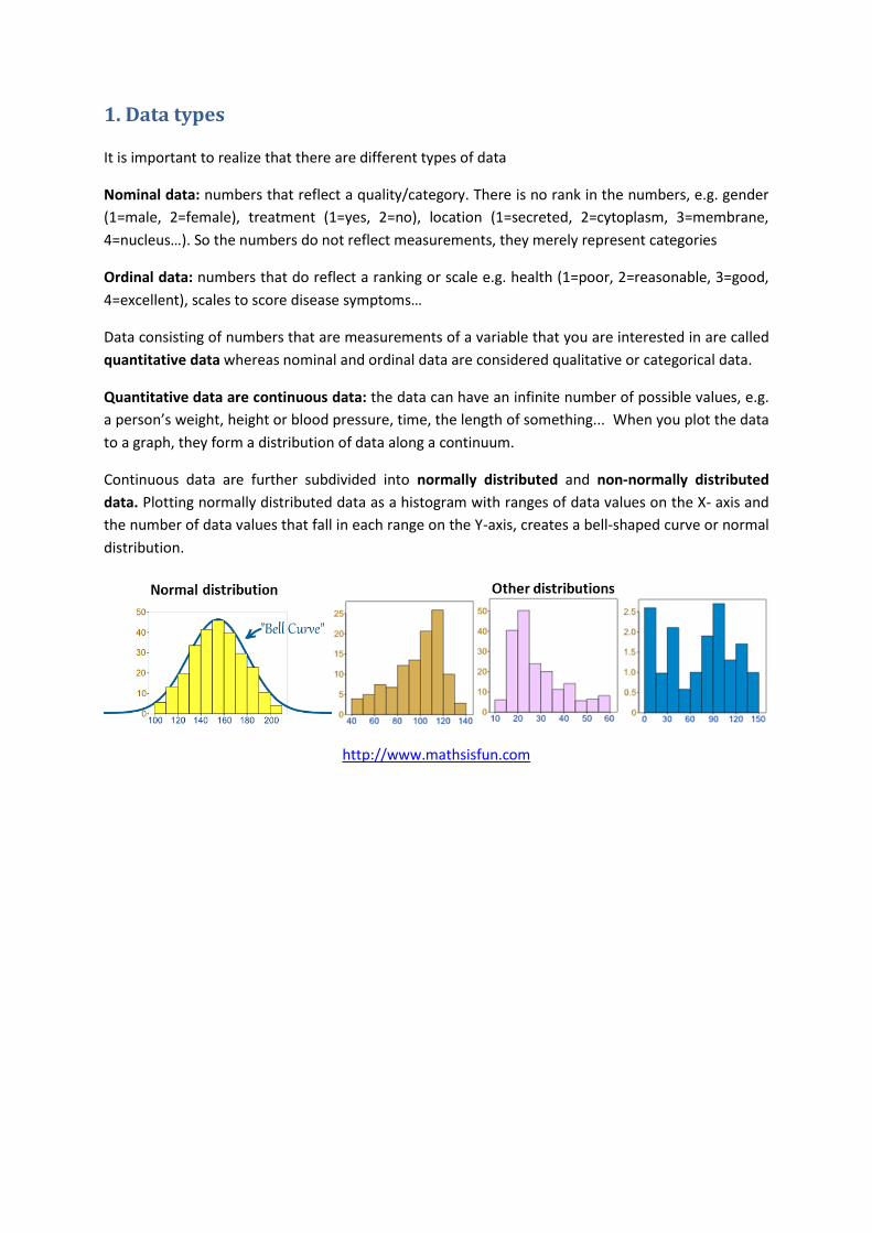
Continuous data are further subdivided into normally distributed and non-normally distributed
data. Plotting normally distributed data as a histogram with ranges of data values on the X- axis and
the number of data values that fall in each range on the Y-axis, creates a bell-shaped curve or normal
distribution.
http://www.mathsisfun.com

2. Outlier detection
An outlier is an observation that is numerically distant from the rest of the data. To identify outliers
you use either statistical procedures or box plots.
In either way, never remove an outlier unless you have a good reason to do so, when you know that
you made a mistake in the measurement e.g. pipetting error… If you remove outliers simply because
they are outliers you are cheating !
3. Descriptive statistics
Descriptive statistics describe the distribution of the data. You use different descriptive statistics for
different types of data.
3.1. Descriptive statistics for the central value
3.1.1. Mode
The mode is the most frequently occurring value in the data set.
The mode is mainly used for describing nominal data.
Pros: no calculations required
Cons: not used for interval or ratio data with several digits of accuracy, as most values are unique
3.1.2. Median
The median is determined by sorting the data set from lowest to highest value and taking the data
point in the middle of the sequence. If there is an even number of data points in the data set, there is
no single value at the middle and the median is calculated as the mean of the two middle values.
The median is used for ordinal and continuous data.
Pros: because the median is not influenced by outliers, it can be used to describe data sets with a
non-normal distribution.
Cons: the median is only based on one or two data values
3.1.3. Mean
The mean is the sum of the values divided by the total number of data points in the data set.
∑
where are all the values in the data set and n is the total number of values in the data set.
It is also called the arithmetic mean. The mean is only valid for continuous data.
Pros: you use all the data to calculate the mean
Cons: the mean is greatly influenced by outliers
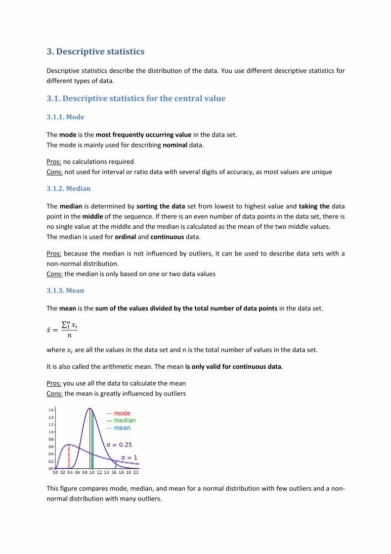
This figure compares mode, median, and mean for a normal distribution with few outliers and a non-
normal distribution with many outliers.
For a normal distribution: mode, median and mean are almost the same.
For the non-normal distribution: the mode is a severe under- and the mean a severe overestimation
of the center of the data set while the median gives a good representation since it is not influenced
by the outliers.
Thus a comparison of the median and the mean can point out the presence of outliers and gives info
on the normality of the data distribution.
3.1.4. When to use mode, median and mean ?
3.1.5. Other measures for the central tendency
The trimmed mean is the mean calculated after removal of a certain percentage of the most extreme
values (outliers), e.g. mean calculated after removing 10% of most extreme values from each end of
the distribution.
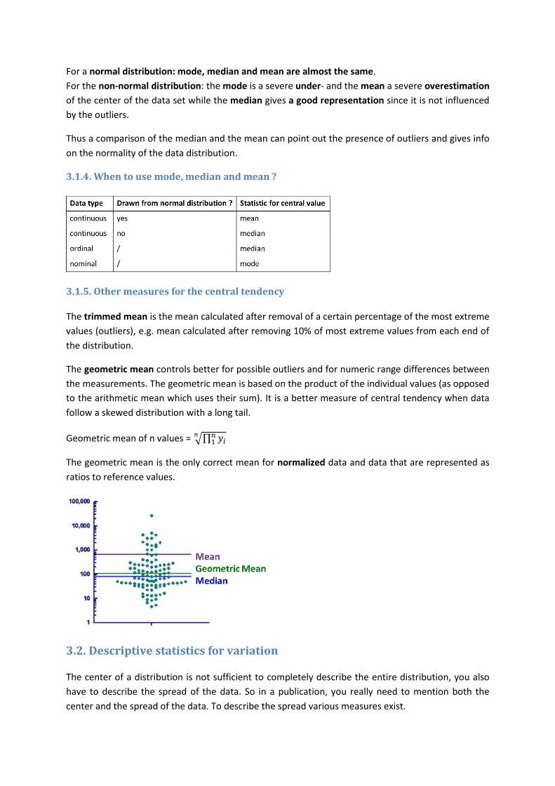
The geometric mean controls better for possible outliers and for numeric range differences between
the measurements. The geometric mean is based on the product of the individual values (as opposed
to the arithmetic mean which uses their sum). It is a better measure of central tendency when data
follow a skewed distribution with a long tail.
Geometric mean of n values = √∏
The geometric mean is the only correct mean for normalized data and data that are represented as
ratios to reference values.
3.2. Descriptive statistics for variation
The center of a distribution is not sufficient to completely describe the entire distribution, you also
have to describe the spread of the data. So in a publication, you really need to mention both the
center and the spread of the data. To describe the spread various measures exist.

3.2.1. Variation ratio
The variation ratio is the proportion of data values which are not the mode.
where is the number of data values that equal the mode
It’s a measure for statistical variation in nominal data. The larger , the more differentiated or
dispersed the data are. The smaller , the more concentrated and similar the data are.
3.2.2. Range and interquartile range
The range is the difference between the largest and the smallest value in the data set.
range = max – min
Pros: easy interpretation and calculation
Cons: only based on the two most extreme values
Quartiles are the three points (Q1, Q2 and Q3) that divide the data set into four equal groups, each
representing a fourth of the data set. This means that:
25% of the values in the data set ≤ Q1
Q2 divides the data set in half and corresponds to the median
75% of the values in the data set ≤ Q3
Quartiles are used to describe the spread of ordinal and continuous data.
Cons: quartiles don’t have equal measurement units: Q2-Q1 can be completely different than Q3-Q2
The interquartile range (IQR) is the difference between the third and the first quartile:
IQR = Q3 – Q1

The IQR can be used for ordinal and continuous data and is especially important for describing the
spread of ordinal data (where you don’t have many alternatives) and non-normal continuous data
(because it’s not influenced by outliers).
Pros: simple interpretation: indicates the width of the range that contains the center half of the data
not influenced by outliers
the IQR has the same measurement unit as the data
Cons: calculated using little information from the data (only Q3 and Q1)
3.2.3. Standard deviation
The variance is the sum of the squared differences between each value and the mean, divided by the
number of values in the data set -1:
∑ ( )
The variance is a measure of the spread of the data relative to the mean. The differences (they will
be positive and negative) are being squared so that they contribute equally to the variance.
Since the variance depends on the mean, it is only relevant to describe the spread of normally
distributed continuous data.
Pros: you use all data values to calculate the variance
Cons: the measurement unit of the variance is the square of the original measurement unit
The standard deviation (SD) is the square root of the variance.
√
Like the variance, the standard deviation is only relevant for normally distributed continuous data.
Pros: you use all data values to calculate the standard deviation
the standard deviation has the same measurement unit as the original data
3.2.4. When to use variation ratio, IQR and SD?
3.2.5. Other measures for variation
The coefficient of variation (CV) is a relative measure of the spread of data.
( )
The CV is only relevant for ratio data.
Pros: the CV can be used to compare the spread of data sets with different measurement units
because the CV is independent of the measuring scale.
Cons: the CV cannot be used when is close to 0
interpretation of the CV is difficult
3.3. Descriptive statistics for the shape of the data distribution
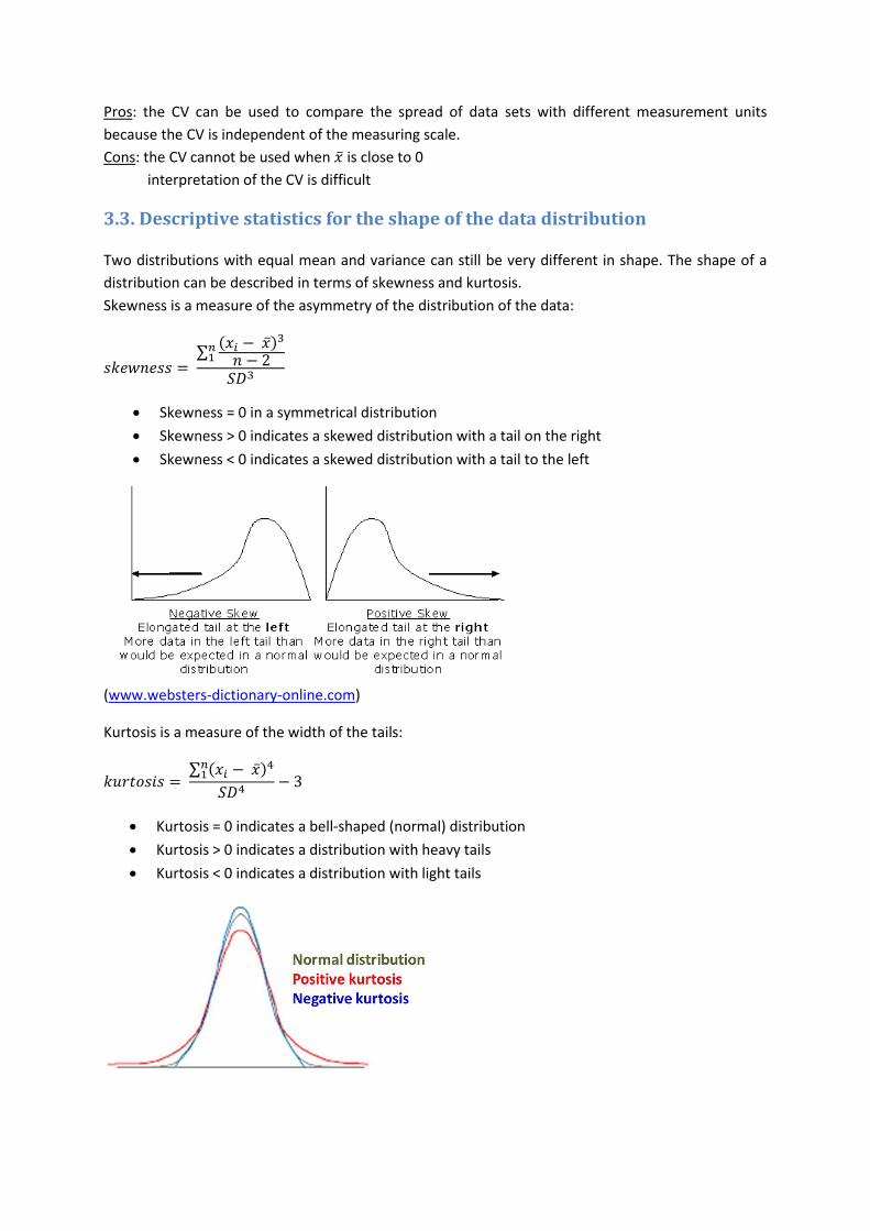
Two distributions with equal mean and variance can still be very different in shape. The shape of a
distribution can be described in terms of skewness and kurtosis.
Skewness is a measure of the asymmetry of the distribution of the data:
∑( )
Skewness = 0 in a symmetrical distribution
Skewness > 0 indicates a skewed distribution with a tail on the right
Skewness < 0 indicates a skewed distribution with a tail to the left
(www.websters-dictionary-online.com)
Kurtosis is a measure of the width of the tails:
∑ ( )
Kurtosis = 0 indicates a bell-shaped (normal) distribution
Kurtosis > 0 indicates a distribution with heavy tails
Kurtosis < 0 indicates a distribution with light tails
3.4. Descriptive statistics for precision of the mean
The mean of a sample represents the mean of a population. However, different samples drawn from
that same population would in general have different values of the sample mean. The standard error
of the mean (SEM) represents the standard error of using the sample mean as an estimation of the
population mean. It represents the variation that is inherent to the process of generating the
samples and expresses how certain you can be that the mean of the sample is representative for the
population mean.
If you were to repeat your experiment over and over again, you would get an infinite number of
samples (each of a certain size, n, which equals the number of subjects– patients, cells, plants…- used
in that experiment). For each sample you could calculate the mean and plot the distribution of all
these means. The distribution of the means would be close to a normal distribution. The higher the
sample size (number of subjects per experiment), the more this distribution would become a normal
distribution with mean equal to the population mean. Also the higher the sample size, the smaller
the standard deviation of this distribution (= the standard error of the mean) would be.
So the SEM is the standard deviation of the distribution of the population divided by the square
root of the sample size. Since you don’t know the standard deviation of the population you take the
standard deviation of the sample as the best guess:
√
If the data are normally distributed, quantiles of the normal distribution and the sample mean and
standard error can be used to calculate confidence intervals for the mean:
The confidence interval is an interval around the sample mean. With 95% certainty the population
mean is expected to fall in this interval.
In publications always describe your data as a mean ± a measure of variation.
3.5. Descriptive statistics of bivariate data
Bivariate data sets contain data values for two variables e.g. length and weight.
You can calculate a statistic that describes the correlation between two variables. The correlation will
tell you if there is a relationship between the two variables e.g. increasing demand leads to higher
prices. So correlation means that the two variables show the same or opposite tendencies.
You may only calculate correlations between variables that you measured (Y columns), not between
a variable that you manipulated (X column) and a variable that you measured. If you have not
manipulated the variable of an X column but just measured it, you do may use for calculating
correlations.
3.5.1. Pearson correlation
The Pearson correlation coefficient indicates whether a linear relation exists between two variables
(x and y) and how strong this relation is:
( )∑ (
) (
)
where n is the total number of values (of x AND y).
You may calculate r for normally distributed continuous data.
By subtracting the mean and dividing by the SD, you standardize each value. As a result both
variables will have the same distribution with mean = 1 and standard deviation = 1, so that r is not
influenced by differences in distribution of the two variables.
As a result, r always lies between -1 and 1.
r = 1: perfect positive linear correlation between x and y
e.g. the larger a person, the more he/she weighs
r = -1: perfect negative linear correlation between x and y
e.g. the larger a person, the less he/she weighs
Pros: r is independent of the scale of the measurement unit
Easy interpretation: r > 0 positive correlation: y increases as x increases
r < 0 negative correlation: y decreases as x increases
!! if there is no relation between x and y, r = 0 but you cannot revert this
Important:
r = 0 does not necessarily imply that there is no relation between x and y !!
there might be a non-linear relation between x and y
a correlation does not imply a causal relation: it does not mean that x causes y
Cons: may only be used for normally distributed data: both x and y have to be normally distributed.
To check whether your data is normally distributed see section 10.2.
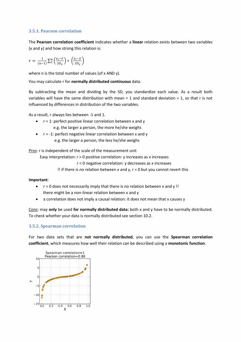
3.5.2. Spearman correlation
For two data sets that are not normally distributed, you can use the Spearman correlation
coefficient, which measures how well their relation can be described using a monotonic function.

To calculate the Spearman correlation you must first rank the two variables x and y from smallest to
largest and use the ranks and instead of the actual data values:
Data values Position in ascending order Rank
0.8 1 1
1.2 2 (2+3)/2 = 2.5
1.2 3 (2+3)/2 = 2.5
3.3 4 4
18 5 5
∑ ( )( )
√∑ ( )
∑ ( )
You may calculate ρ for ordinal and continuous data that is not normally distributed.
Also ρ always lies between -1 and 1.
ρ = 1: perfect positive monotone correlation between x and y
ρ = −1: perfect negative monotone correlation between x and y

4. Graphical description of the data
4.1. Pie chart
Pie charts are mainly used for graphically representing categorical data.
Example of a pie chart in Prism.
Pie charts are clear when there are only 2 categories but not when you have multiple categories as
you can see above. You can represent categorical data as a dot plot which is clearer than a pie chart.
The same data depicted as a dot plot.
Alternatively, you can use a horizontal bar graph, which also gives a clear representation of the data.
The same data depicted as a horizontal bar chart.
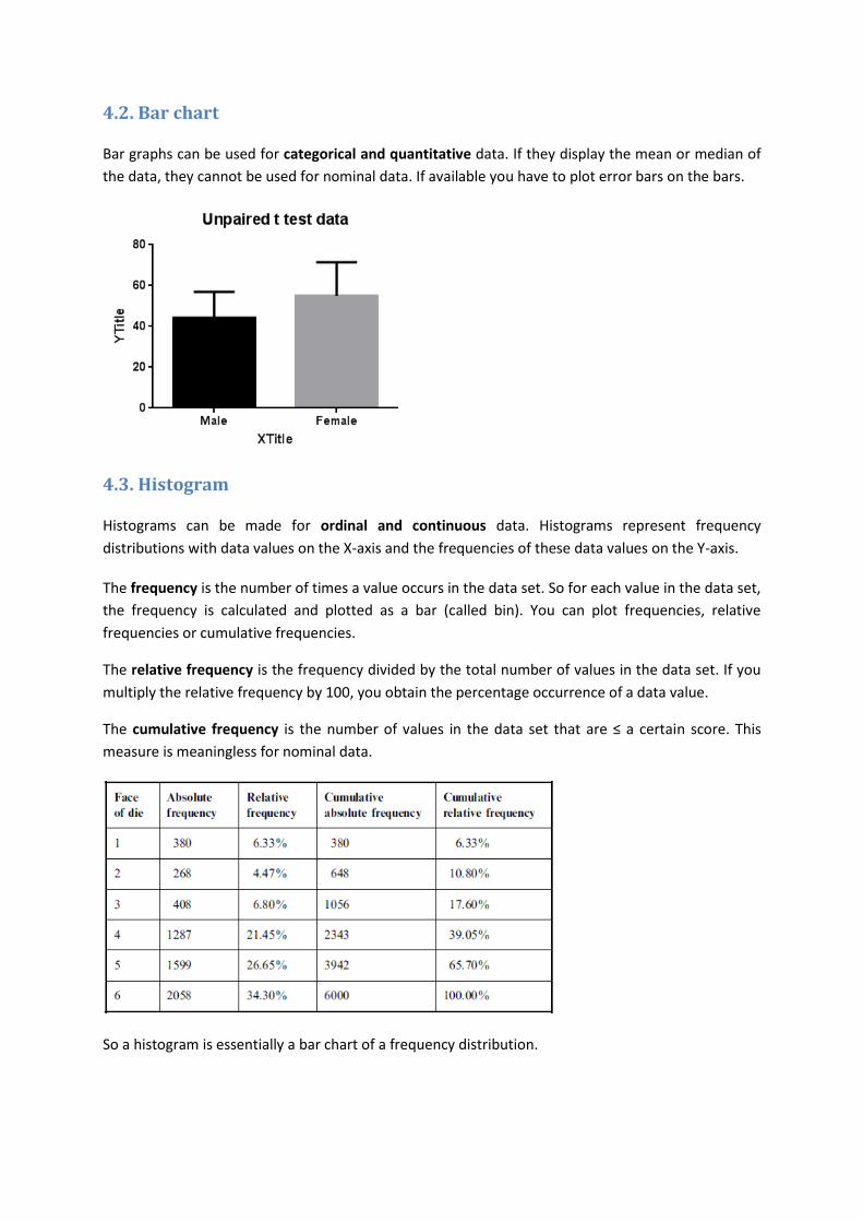
4.2. Bar chart
Bar graphs can be used for categorical and quantitative data. If they display the mean or median of
the data, they cannot be used for nominal data. If available you have to plot error bars on the bars.
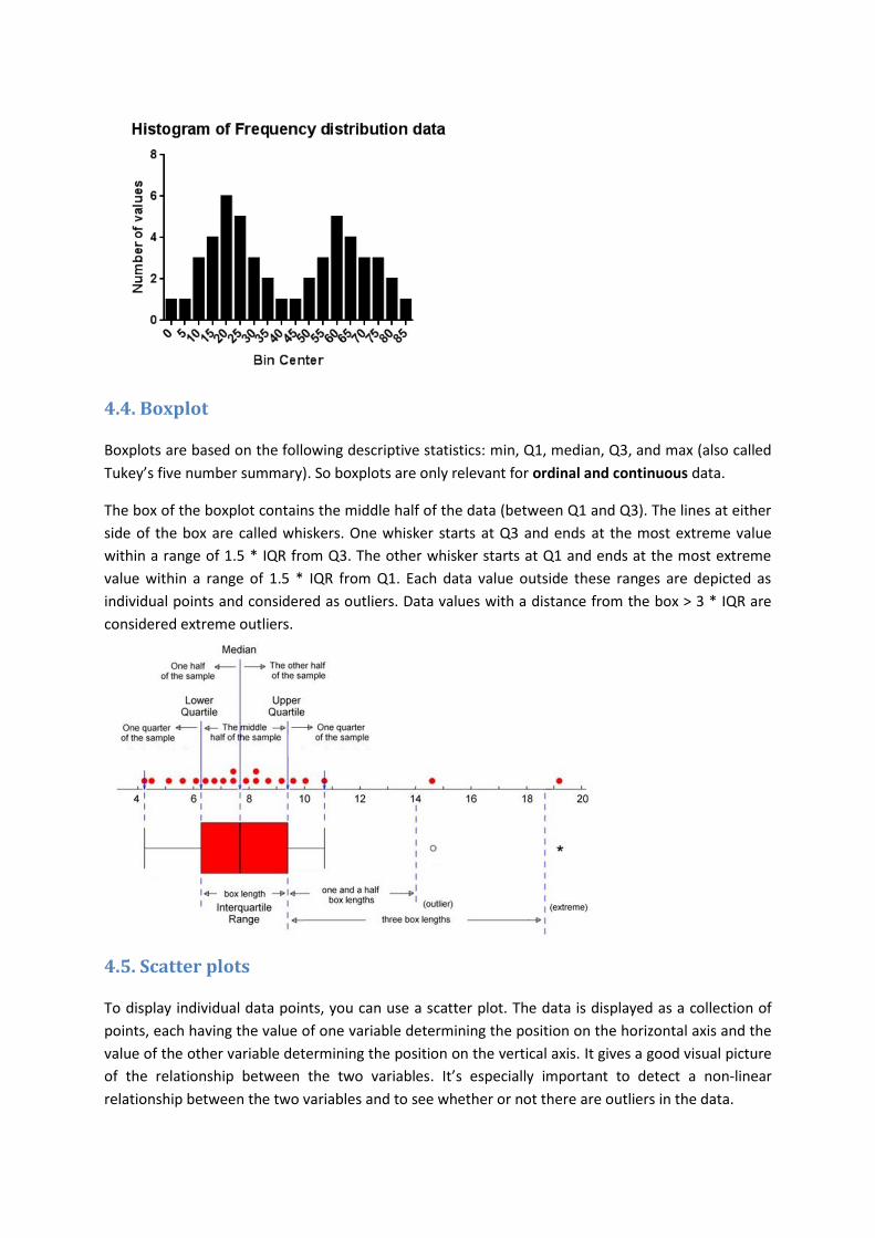
4.3. Histogram
Histograms can be made for ordinal and continuous data. Histograms represent frequency
distributions with data values on the X-axis and the frequencies of these data values on the Y-axis.
The frequency is the number of times a value occurs in the data set. So for each value in the data set,
the frequency is calculated and plotted as a bar (called bin). You can plot frequencies, relative
frequencies or cumulative frequencies.
The relative frequency is the frequency divided by the total number of values in the data set. If you
multiply the relative frequency by 100, you obtain the percentage occurrence of a data value.
The cumulative frequency is the number of values in the data set that are ≤ a certain score. This
measure is meaningless for nominal data.
So a histogram is essentially a bar chart of a frequency distribution.
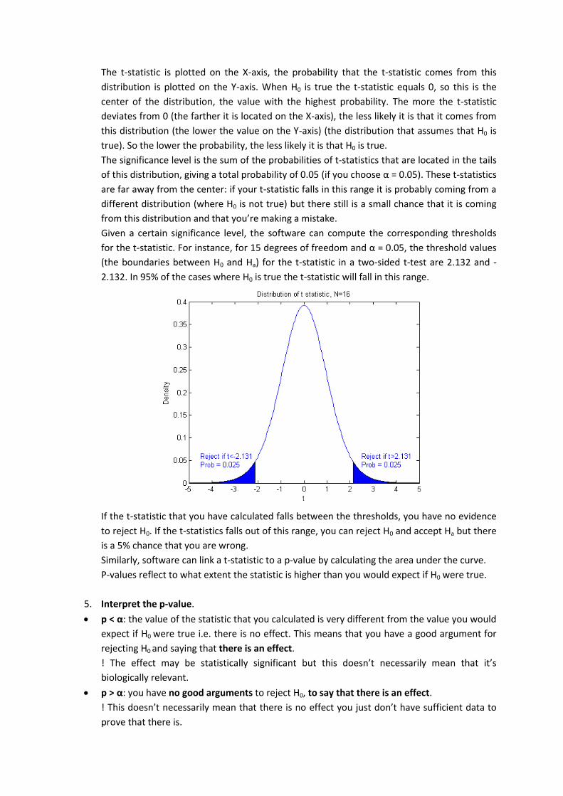
4.4. Boxplot
Boxplots are based on the following descriptive statistics: min, Q1, median, Q3, and max (also called
Tukey’s five number summary). So boxplots are only relevant for ordinal and continuous data.
The box of the boxplot contains the middle half of the data (between Q1 and Q3). The lines at either
side of the box are called whiskers. One whisker starts at Q3 and ends at the most extreme value
within a range of 1.5 * IQR from Q3. The other whisker starts at Q1 and ends at the most extreme
value within a range of 1.5 * IQR from Q1. Each data value outside these ranges are depicted as
individual points and considered as outliers. Data values with a distance from the box > 3 * IQR are
considered extreme outliers.
4.5. Scatter plots
To display individual data points, you can use a scatter plot. The data is displayed as a collection of
points, each having the value of one variable determining the position on the horizontal axis and the
value of the other variable determining the position on the vertical axis. It gives a good visual picture
of the relationship between the two variables. It’s especially important to detect a non-linear
relationship between the two variables and to see whether or not there are outliers in the data.

Scatter plots can be used for displaying ordinal and continuous data.
Example of a scatter plot in Prism
4.6. Choice of graph type and error bars
You can choose between using SD, SEM and 95% confidence intervals for the error bars. Remember
that these three measures have completely different meanings so your choice is determined by what
you want to show on your plot:
If you want to show the spread of the data you have to use the SD.
If you want to show how precise you have measured the mean, you use confidence intervals
or the SEM
Most people plot the SEM because this gives the smallest error bars but the SEM is actually the worst
choice because confidence intervals are much easier to interpret:
If the confidence intervals of two groups do not overlap: you are sure that the means of the
groups are different.
If they do overlap: the means can be different or not, you don’t know.
If you plot SEM instead of confidence intervals the interpretation is as follows:
If the SEM bars of two groups do not overlap: the means can be different or not, you don’t
know.
If they do overlap: you are sure that the means of the groups are equal.
In most cases you are interested in showing a difference between the groups so confidence intervals
will be more informative.
If you are not sure whether you want to show the spread or the precision, here’s a rule of thumb:
You want to show the spread if that’s what you’re interested in, e.g. you want to know the treatment
that gives the least variability, you want to see if a measurement falls within the normal range of
values... With fewer than 50 values, you should create a scatter plot of individual data values to
show the variation among the data. If the data set has more than 50 values, a plot showing
individual data values becomes messy and you have to use a boxplot or a histogram. Alternatively,

you can plot the mean and SD in a bar graph. However, a SD is only one value, so it is a limited way to
show the spread. A bar graph showing mean and SD is therefore less informative than a boxplot or
histogram.
If your goal is to compare means of different groups, or to show how closely your data corresponds
to the predictions of a model, you want to show how precisely the data define the mean instead of
showing the variability. In this case, the best approach is to create a bar graph showing the 95%
confidence interval of the mean.
For small data sets it’s better to plot individual data points. This shows more detail and is easier to
interpret. If you do choose a bar graph, use horizontal bars instead of vertical ones to make it easier
to compare the bars.
Always indicate in the figure legend which statistic you used for the error bars since most people
will think by default that it is a SEM.

5. Comparing groups
Each time you state that there is a difference between groups you have to report the corresponding
statistical test that proves this statement. You have to report:
which test you used: some tests like the t-test have many variants (one-sample versus
two-sample, one-sided versus two-sided, paired versus unpaired, equal variances versus
Welch) so you have to indicate precisely which variant was chosen
the size of the effect (usually the difference or ratio between two groups)
a confidence metric (usually a p-value)
5.1. General outline of statistical tests All statistical tests that are described in this section follow the same pattern:
1. Generate 2 hypotheses:
Null hypothesis H0 which always states that there is no effect / no difference
Alternative hypothesis Ha which always states that there is an effect / difference
2. To check if H0 is true, you calculate a statistic using your data. Depending on the statistical
test that you are doing, the formula for the statistic will differ but in any case the formula will
use your data as input and generate a value as output.
In most tests: the higher the effect -> the more the value of the statistic deviates from 0
3. Choose the significance level (typically α = 0.05) to determine how confident you want to be
about the outcome of the test.
The significance level represents the probability that you reject H0, saying that there is an
effect while in reality there is not. So if you choose α = 0.05, it means that you allow a 5%
chance of incorrectly rejecting H0.
4. Taking into account the significance level and the degrees of freedom (=n-1 in most cases),
you can convert the value of the statistic into a p-value. Each statistic follows a certain
distribution. Software is able to calculate the distribution of a statistic with certain degrees of
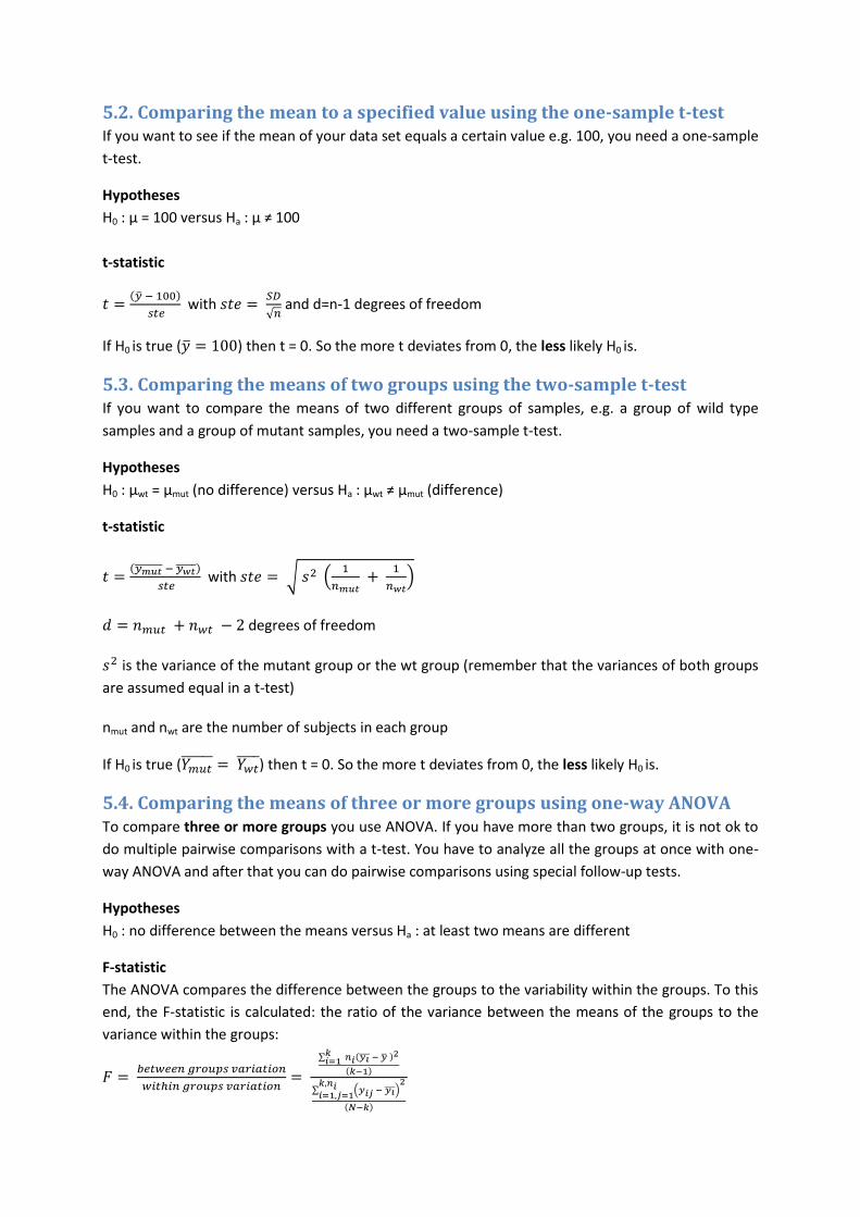
freedom. In the example below you see the distribution of the t-statistic (calculated in a t-
test) given H0 is true, for different degrees of freedom:
You see the degrees of freedom have a substantial impact on the shape of the distribution.
The t-statistic is plotted on the X-axis, the probability that the t-statistic comes from this
distribution is plotted on the Y-axis. When H0 is true the t-statistic equals 0, so this is the
center of the distribution, the value with the highest probability. The more the t-statistic
deviates from 0 (the farther it is located on the X-axis), the less likely it is that it comes from
this distribution (the lower the value on the Y-axis) (the distribution that assumes that H0 is
true). So the lower the probability, the less likely it is that H0 is true.
The significance level is the sum of the probabilities of t-statistics that are located in the tails
of this distribution, giving a total probability of 0.05 (if you choose α = 0.05). These t-statistics
are far away from the center: if your t-statistic falls in this range it is probably coming from a
different distribution (where H0 is not true) but there still is a small chance that it is coming
from this distribution and that you’re making a mistake.
Given a certain significance level, the software can compute the corresponding thresholds
for the t-statistic. For instance, for 15 degrees of freedom and α = 0.05, the threshold values
(the boundaries between H0 and Ha) for the t-statistic in a two-sided t-test are 2.132 and -
2.132. In 95% of the cases where H0 is true the t-statistic will fall in this range.
If the t-statistic that you have calculated falls between the thresholds, you have no evidence
to reject H0. If the t-statistics falls out of this range, you can reject H0 and accept Ha but there
is a 5% chance that you are wrong.
Similarly, software can link a t-statistic to a p-value by calculating the area under the curve.
P-values reflect to what extent the statistic is higher than you would expect if H0 were true.
5. Interpret the p-value.
p < α: the value of the statistic that you calculated is very different from the value you would
expect if H0 were true i.e. there is no effect. This means that you have a good argument for
rejecting H0 and saying that there is an effect.
! The effect may be statistically significant but this doesn’t necessarily mean that it’s
biologically relevant.
p > α: you have no good arguments to reject H0, to say that there is an effect.
! This doesn’t necessarily mean that there is no effect you just don’t have sufficient data to
prove that there is.
5.2. Comparing the mean to a specified value using the one-sample t-test If you want to see if the mean of your data set equals a certain value e.g. 100, you need a one-sample
t-test.
Hypotheses
H0 : µ = 100 versus Ha : µ ≠ 100
t-statistic
( )
with
√ and d=n-1 degrees of freedom
If H0 is true ( ) then t = 0. So the more t deviates from 0, the less likely H0 is.
5.3. Comparing the means of two groups using the two-sample t-test If you want to compare the means of two different groups of samples, e.g. a group of wild type
samples and a group of mutant samples, you need a two-sample t-test.
Hypotheses
H0 : µwt = µmut (no difference) versus Ha : µwt ≠ µmut (difference)
t-statistic
( )
with √ (
)
degrees of freedom
is the variance of the mutant group or the wt group (remember that the variances of both groups
are assumed equal in a t-test)
nmut and nwt are the number of subjects in each group
If H0 is true ( ) then t = 0. So the more t deviates from 0, the less likely H0 is.
5.4. Comparing the means of three or more groups using one-way ANOVA To compare three or more groups you use ANOVA. If you have more than two groups, it is not ok to
do multiple pairwise comparisons with a t-test. You have to analyze all the groups at once with one-
way ANOVA and after that you can do pairwise comparisons using special follow-up tests.
Hypotheses
H0 : no difference between the means versus Ha : at least two means are different
F-statistic
The ANOVA compares the difference between the groups to the variability within the groups. To this
end, the F-statistic is calculated: the ratio of the variance between the means of the groups to the
variance within the groups:
∑ ( )
( )
∑ ( )
( )
where is the sample mean in the ith group
ni is the number of observations in the ith group
is the overall mean of the data (over all groups)
k is the number of groups
N is the total number of data points (over all groups)
If the groups are drawn from populations with the same mean, the variance between the groups
should be lower than or equal to the variance within the groups so F would be close to 1. A high F-
statistic therefore implies that the groups are drawn from populations with different means.
5.5. Follow up tests to ANOVA
Note that the ANOVA will only indicate if there is a difference between the groups but not which
group differs from which, you need to do an additional test, called a post test e.g. the Tukey-Kramer
post-test or Dunett’s test. These tests will find means that are significantly different from each other
by comparing all possible pairs of means. The differences between these post tests and a regular t-
test are the following:
the post tests take into account the scatter in all groups. A t-test only uses the variation of
the two groups it compares. The former gives you a more precise value for the variation,
which is reflected in more degrees of freedom and thus more power to detect differences.
the post tests perform a multiple testing correction, making the significance level apply for
the whole set of comparisons. The t-test uses a significance level that only applies for each
comparison individually, which will lead to a much higher number of false positives (= the
test concludes that two groups are different while in fact they are not; see section 5.6)
5.6. You need to correct for doing multiple tests on the same data set
5.6.1. Confidence metrics
Significance level
The significance level α reflects the probability of rejecting H0 while in fact H0 is true (the number of
tests incorrectly rejecting H0 divided by the total number of tests).
p-values
The p-value is the probability that an incorrectly declared test (where you reject H0 while H0 is true)
gets a statistic higher than or as high as the one that is obtained based on your data.
False discovery rate
The false discovery rate or FDR is the number of tests incorrectly rejecting H0 divided by the total
number of tests rejecting H0. This metric is important when you do many tests on the same data set
(see next section).
5.6.2. Multiple testing correction
You always have to do a correction when you perform multiple tests on the same data set:
You compare more than two groups to each other or to a common control
You have data for multiple genes coming from the same experiment and you want to analyze
each gene individually e.g. checking for differential expression

In these cases you have to correct the calculated p-values to control the false positive rate. As said
before, by choosing α = 0.05 you allow a 5% chance of saying that there is an effect while in reality
there is not. The more tests you do the more likely it will be that you actually will make that mistake.
When you do 3 tests (each with α = 0.05) the chance of incorrectly rejecting H0 increases from 5% to
14%. This is why you have to correct for doing multiple tests.
Failing to adjust for multiple comparisons is the most common mistake in publications! In some
studies there are only a few scientifically sensible comparisons rather than every possible
comparison, then you only have to correct for the comparisons that you make.
There are two main ways to correct for multiple comparisons: Bonferroni correction or FDR-based
methods. Bonferroni correction simply multiplies the p-values by the number of tests, increasing
them and making it less likely that they will be smaller than 0.05. However, when you do a large
number of tests this correction becomes too conservative and you have to use one of the FDR-based
methods. Since FDR is the number of tests incorrectly rejecting H0 divided by the total number of
tests rejecting H0 it is a better metric for multiple comparisons. Suppose you set the FDR to 0.05 and
you do 100 tests. The number of tests that are wrong now depends on the number of tests that
reject H0, which will always be a small fraction of the 100 tests. Even if 20 of the 100 tests reject H0,
still only 1 of them will actually be wrong.
5.7. Two-way ANOVA compares groups defined by two grouping variables
5.7.1. What is a factor ?
There are two types of variables:
What you measure = measure variable
What determines your groups = grouping variable or factor
When you want to compare three or more groups that are defined by a single factor, e.g. treatment,
smoking behavior, disease state… you have to use a one-way ANOVA. Groups that are defined by two
factors e.g. treatment + age or smoking behavior and gender are compared by two-way ANOVA
6. Assumptions of parametric statistical tests for comparing means
Assumption 1: Data are continuous The statistical analyses that are described in chapter 5 only apply to continuous data.
6.1.1. What if the data are not continuous ?
There are statistical tests for nominal data but a full explanation of these tests is beyond the scope of
this training, we will just give the example of the binomial test (see section 6.1.2) since it is
frequently used in biology research.
For ordinal data you can use non-parametric tests. Non-parametric means that the test does not
make any assumptions about the distribution of the data. It’s based on the data alone, not on the
distribution of the data. Common to non-parametric tests is that they calculate a statistic based on a
ranking of the data, meaning that they order the data from smallest to largest or vice versa.
The t-test and the ANOVA do make assumptions about the distribution of the data and are
parametric tests.
6.1.2. Binomial test for comparing a group of nominal data to a hypothetical value
When you want to do a one-sample test on nominal data (comparing the data to a hypothetical
value) and you only have two categories, you use the binomial test. If you have more than two
categories you use a χ2 test.
In the previous one-sample tests, we checked if the mean of our data distribution is equal to a
specified value. On nominal data, the test looks a bit different. You consider each data item as a
separate trial in which you have a binary outcome (since binomial tests only apply when you have 2
categories: yes/no, male/female, A/B…). You test whether the distribution of the data into the two
categories corresponds to the expected distribution. In most cases we expect 50% of the data in the
first category and 50% in the second.
So, in the binomial test you work with frequencies or proportions. This will become clear in an
example. Suppose you want to know if it’s really true that more than 2/3 of the people work more
than 40 hours a week. To check this, you ask a number of people if they do or not. Then you test if
the proportion of people who answered “No” is equal to 0.333 (1/3 of the population). So you test if
the observed proportion equals the expected proportion.
Hypotheses
H0 : pobs = pexp = 0.333 versus Ha : pobs ≠ pexp ≠ 0.333
z-score
The binomial test uses z-scores to determine whether H0 is true or not:
( )
where √ ( )
Assumption 2: Data are drawn from normal distributions Parametric tests assume that the data are normally distributed.
However, “Many variables in biomedical research are not normally distributed and many of them are
positively skewed.” (Olsen, 2003). So, you always need to check if your data are drawn from a normal
distribution. Examples of known positively skewed distributions in biology:
gene expression ratios
distribution of chemicals or organisms in the environment: most compounds occur rarely in
high concentrations e.g. concentrations of hydroxymethylfurfurol in honey samples, species
abundance…
growth measurements: growth in biology is by nature exponential: 1 cell divides into 2, 4, 8…
e.g. bacterial concentrations, fruit size, flower size…
Examples of normal distributions in biology: women’s or men’s height, milk production of cows…
6.2.1. How to check the normality of a distribution?
Method 1: Quick and dirty, based on mean and standard deviation
There’s a quick and dirty trick to check normality: you calculate the mean and SD of the data. When
the SD exceeds half of the mean, you may assume that the data are not drawn from a normal
distribution and you should describe the data as non-normal (using the median and the IQR).
! Please note that this trick only works in data sets without any negative values !
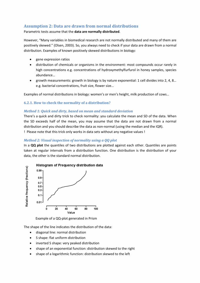
Method 2: Visual inspection of normality using a QQ plot
In a QQ plot the quantiles of two distributions are plotted against each other. Quantiles are points
taken at regular intervals from a distribution function. One distribution is the distribution of your
data, the other is the standard normal distribution.
Example of a QQ-plot generated in Prism
The shape of the line indicates the distribution of the data:
diagonal line: normal distribution
S shape: flat uniform distribution
inverted S shape: very peaked distribution
shape of an exponential function: distribution skewed to the right
shape of a logarithmic function: distribution skewed to the left

You can use the QQ plot to check if your data come from any distribution e.g. an exponential
distribution: instead of the standard normal distribution you use a standard exponential distribution
as the second distribution on the plot.
Method 3: Statistical tests
You can also use statistical tests to determine if your data come from a normal distribution.
Shapiro Wilk test
Hypotheses
H0: data come from a normal distribution versus Ha: data are not drawn from a normal distribution
W-statistic
The test calculates a statistic W, the correlation coefficient between the observed distribution and
the corresponding theoretical values of the normal distribution:
∑ ( ) ( )
√∑ ( ) ∑ ( )
where are the theoretical normal quantiles and are the quantiles derived from the data.
Since W is a correlation coefficient you may reject H0 if W deviates too much from 1.
For this test you need at least 7 data values. You can only use this test if your data set does not
contain duplicate data values.
D'Agostino-Pearson omnibus test
Hypotheses
H0: data come from a normal distribution versus Ha: data are not drawn from a normal distribution
Statistic
The D’Agostino Shapiro omnibus test computes how far from normal the distribution of the data is
in terms of skewness and kurtosis and computes a single p-value from the sum of the discrepancies.
Even when you have duplicate values you can use the D'Agostino-Pearson omnibus test. For this test
you need at least 8 data values.
Method 4: Large data sets are by default normally distributed
For large data sets you can use the central limit theorem. This theorem states that the mean of a
large number of independent samples is always normally distributed. When we explained the SEM,
we said that when you generate an infinite number of samples from a population and you calculate
the means of all these samples, the distribution of these means would become more and more a
normal distribution if the sample size (n = number of subjects in each sample) increases, even if the
original data distribution is not normally distributed at all.
The central limit theorem is true for:
All n when you start from a normally distributed population
n ≥ 10 for samples from an almost normally distributed population (1 peak, ± symmetrical,
short tails)
n ≥ 30 for samples from a random population
n ≥ 45 for samples from a highly skewed population
So for large samples you don’t need to test if the data come from a normal distribution, you may
assume that they do.
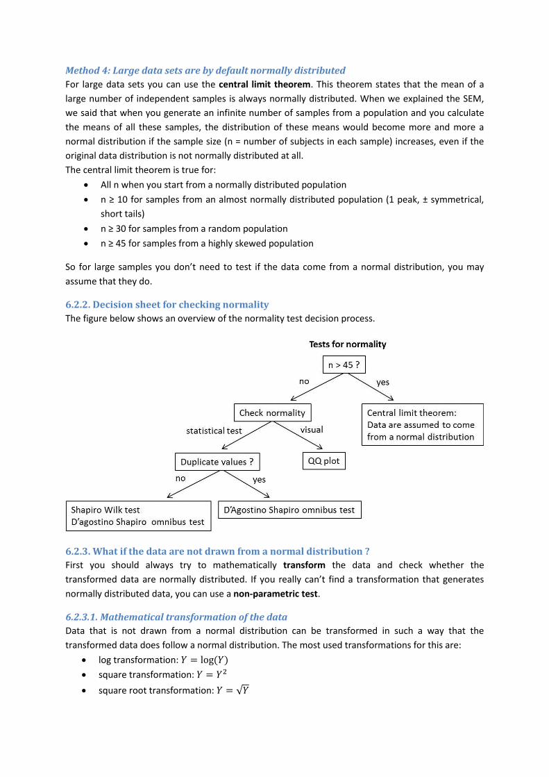
6.2.2. Decision sheet for checking normality
The figure below shows an overview of the normality test decision process.
6.2.3. What if the data are not drawn from a normal distribution ?
First you should always try to mathematically transform the data and check whether the
transformed data are normally distributed. If you really can’t find a transformation that generates
normally distributed data, you can use a non-parametric test.
6.2.3.1. Mathematical transformation of the data
Data that is not drawn from a normal distribution can be transformed in such a way that the
transformed data does follow a normal distribution. The most used transformations for this are:
log transformation: ( )
square transformation:
square root transformation: √

reciprocal transformation:
The antilog of the mean of the log transformed data is not equal to the mean of the untransformed
data but it is equal to the geometric mean of the untransformed data. The antilog of the SD of the
transformed data is mathematically impossible to calculate. You can calculate a confidence interval
on the log transformed data. The antilog of this confidence interval can then be used as a confidence
interval of the geometric mean of the untransformed data and will be asymmetrical.
6.2.3.2. One-sample Wilcoxon signed rank test for comparison of the median to a value
This is a non-parametric one-sample test. Since the data are not drawn from a normal distribution
you cannot use the mean, so you check if the median of your data equals a certain value e.g. 100.
Hypotheses
H0: median = 100 versus Ha: median ≠ 100
W-statistic
The Wilcoxon signed rank test uses the following procedure:
1. differences between the data values and the proposed median are calculated (difference
column)
2. absolute values of these differences are ordered from smallest to highest (absolute value
of difference column)
3. each absolute value gets a rank that reflects the order e.g. the smallest value gets rank 1,
the smallest but one gets rank 2… (rank column)
4. you do keep track of the sign of the difference (sign column)
Suppose we have these data:
data proposed median difference
102 100 2 106 100 6 115 100 15 92 100 -8
Absolute values of differences between data and proposed median are ranked:
rank sign absolute value of difference
1 + 2 2 + 6 3 - 8 4 + 15
The ranks of the values above the proposed median (+ sign) are summed and this sum is called the
test statistic, W, e.g. in our example W = 7.
Given the number of ranks (4 in this case), software can compare W to an expected value and
calculate how likely W is, given H0 is true. If H0is true, you would expect half of the observations to be
above the median. This being the case the expected value of W:
( )
( ) = 5
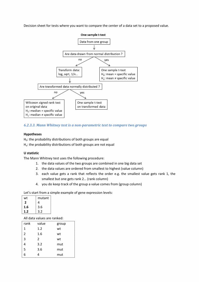
Decision sheet for tests where you want to compare the center of a data set to a proposed value.
6.2.3.3. Mann Whitney test is a non-parametric test to compare two groups
Hypotheses
H0: the probability distributions of both groups are equal
Ha: the probability distributions of both groups are not equal
U statistic
The Mann Whitney test uses the following procedure:
1. the data values of the two groups are combined in one big data set
2. the data values are ordered from smallest to highest (value column)
3. each value gets a rank that reflects the order e.g. the smallest value gets rank 1, the
smallest but one gets rank 2… (rank column)
4. you do keep track of the group a value comes from (group column)
Let’s start from a simple example of gene expression levels:
wt mutant 2 4 1.6 3.6 1.2 3.2
All data values are ranked:
rank value group
1 1.2 wt
2 1.6 wt
3 2 wt
4 3.2 mut
5 3.6 mut
6 4 mut
Next, scores are added. Every wt is given one point for every mut that is above it. Every mut is given
one point for every wt group that is above it.
rank value group score
1 1.2 wt 0
2 1.6 wt 0
3 2 wt 0
4 3.2 mut 3
5 3.6 mut 3
6 4 mut 3
Scores for mut and wt are added and the smallest of those two values is taken. This value is called U.
Uwt = 0 + 0 + 0 = 0
Umut = 3 + 3 + 3 = 9
U = 0
H0 is not true (the distributions are not equal as in the example above) => U is 0
So the more U deviates from 0, the more likely H0 is.
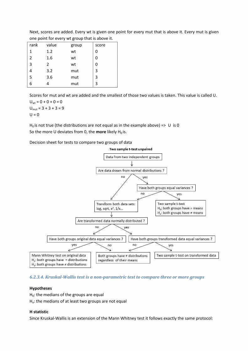
Decision sheet for tests to compare two groups of data
6.2.3.4. Kruskal-Wallis test is a non-parametric test to compare three or more groups
Hypotheses
H0: the medians of the groups are equal
Ha: the medians of at least two groups are not equal
H statistic
Since Kruskal-Wallis is an extension of the Mann Whitney test it follows exactly the same protocol:
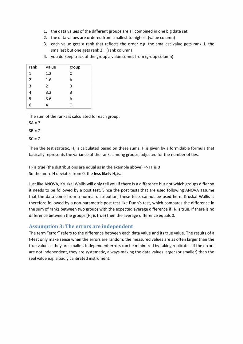
1. the data values of the different groups are all combined in one big data set
2. the data values are ordered from smallest to highest (value column)
3. each value gets a rank that reflects the order e.g. the smallest value gets rank 1, the
smallest but one gets rank 2… (rank column)
4. you do keep track of the group a value comes from (group column)
rank Value group
1 1.2 C
2 1.6 A
3 2 B
4 3.2 B
5 3.6 A
6 4 C
The sum of the ranks is calculated for each group:
SA = 7
SB = 7
SC = 7
Then the test statistic, H, is calculated based on these sums. H is given by a formidable formula that
basically represents the variance of the ranks among groups, adjusted for the number of ties.
H0 is true (the distributions are equal as in the example above) => H is 0
So the more H deviates from 0, the less likely H0 is.
Just like ANOVA, Kruskal Wallis will only tell you if there is a difference but not which groups differ so
it needs to be followed by a post test. Since the post tests that are used following ANOVA assume
that the data come from a normal distribution, these tests cannot be used here. Kruskal Wallis is
therefore followed by a non-parametric post test like Dunn’s test, which compares the difference in
the sum of ranks between two groups with the expected average difference if H0 is true. If there is no
difference between the groups (H0 is true) then the average difference equals 0.
Assumption 3: The errors are independent The term “error” refers to the difference between each data value and its true value. The results of a
t-test only make sense when the errors are random: the measured values are as often larger than the
true value as they are smaller. Independent errors can be minimized by taking replicates. If the errors
are not independent, they are systematic, always making the data values larger (or smaller) than the
real value e.g. a badly calibrated instrument.

7. Additional assumptions for the two-sample t-test and ANOVA Because they are comparing groups instead of a single group to a theoretical value, the two-sample
t-test and the ANOVA are based on additional assumptions.
Assumption 4: the groups have the same variance The two-sample t-test and the ANOVA assume that the groups are sampled from populations that
have identical variances, even if their means are distinct. So, you have to check if this assumption is
true for your data before you apply one of these tests.
7.1.1. Checking equality of variances
7.1.1.1. F-test is a parametric test to compare variances of two groups
Hypotheses
H0: the variances of both groups are equal versus Ha: the variances of both groups are not equal
F-statistic
H0 is true (
) => F is equal to 1
So the more F deviates from 1, the less likely H0 is.
7.1.1.2. Bartlett’s test is a parametric test to compare variances of three or more groups
To use Bartlett’s test, you need at least 5 values in each group.
Hypotheses
H0: the variances of the groups are equal
Ha: the variances of at least two groups are not equal
T-statistic
The T-statistic is calculated using a monstrous formula that in essence compares the arithmetic to
the geometric mean of the group variances. The geometric mean is equal to the arithmetic mean
when all sample variances are equal. The more variation there is among the group variances, the
more these two means differ. The T-statistic is based on the log ratio of the arithmetic to the
geometric mean and as such:
H0 is true (all variances are equal) => T is equal to 0
So the more T deviates from, the less likely H0 is.
7.1.2. What if the variances are not equal?
Conclude that the populations are different. In many experimental contexts, the finding of different
variances is as important as the finding of different means. If the variations are different, then the
populations are different regardless of what the t-test concludes about differences between the
means. What does it mean for two populations to have the same mean but different standard
deviations? Why would you want to test for that? Think about what it tells you about the data. This
may be the most important conclusion from the experiment! Also consider whether the group with
the larger variation is heterogeneous. If a treatment was applied to this group, perhaps it only
worked on part of the subjects. It has been pointed out that this situation simply doesn't often come
up in science.

Transform the data. In many cases, transforming the data can equalize the variances so you can run
the t-test or ANOVA on the transformed values. Log, reciprocal or square root transformations may
be useful.
Perform an alternative test that allows for unequal variance.
7.1.2.1. Welch’s t-test is a parametric test that does not assume two equal variances
Welch's t-test is an adaptation of the t-test for use with two groups having possibly unequal
variances. It is similar to the regular two-sample t-test but calculates the t-statistic differently:
√
If you use the Welsh test to compare variances to decide which test to use, you have increased your
risk of incorrectly rejecting a true H0. So, it is possible to use the Welch t-test routinely but you will
lose some power when the variances are equal but you will gain power in the cases where they are
not. But still you have to ask yourself: What does it mean for two populations to have the same mean
but different standard deviations? Maybe it is better not to ask whether two populations differ, but
to quantify how far apart the two means are. The unequal variance t-test reports a confidence
interval for the difference between two means that is usable even if the standard deviations differ.
There is a similar test for comparing more than two groups with unequal variances but since it is not
implemented in Prism, we are not going to discuss it.
8. Assumption of all tests for comparing groups discussed up to now
Assumption 5: the data are independent Independent means that the measurements from one group do not affect the probabilities of the
other group. You can randomly compare each item from one group to any item of another group.
Note that the non-parametric tests that were discussed up to now like the Mann-Whitney and the
Kruskal-Wallis test make this assumption. Also the F-test and Bartlett’s test make this assumption.
8.1.1. Independent versus dependent data
In an independent experiment, you have two separate sets of samples from different individuals
e.g. samples from 20 patients. At the start of the experiment you randomly pick 10 patients to
receive treatment and 10 patients to receive placebo. You sample all patients two weeks after
treatment.
In a dependent experiment, you use the same individuals for all experimental conditions e.g. samples
from 20 patients. This time you sample all patients before treatment and after two weeks treatment.
This means that the data values in the two groups are paired. You cannot randomly combine a value
from one group with any value from another group but each value in the first group is paired to a
specific value in the other group coming from the same person. Dependent data is also called paired
data. Other examples of paired data:
multiple tissues of the same individual (e.g. right and left eye, slices of an MRI image…)
individuals that belong to the same group (e.g. persons belonging to the same family,
patients going to the same doctor, children from the same class, married couples…)
Dependent data violate the assumption that the groups are independent. All the tests that we have
discussed up to now for comparing groups are based on this assumption. Therefore, to analyze
dependent data you need alternative tests that are not based on this assumption.
8.1.2. The paired t-test is a parametric test for comparing means of two paired data sets
Assumptions of the paired t-test
The test assumes that the differences between pairs follow a normal distribution. The paired t-test
does not assume that the two groups of data are sampled from populations with equal variances!
Hypotheses
H0: the mean difference between the pairs is equal to 0
Ha: the mean difference between the pairs is not equal to 0
t-statistic
Statistics are calculated in the same way as in a one-sample t-test but instead of a mean, the mean
difference between the pairs is used.
8.1.3. The Wilcoxon matched pairs signed rank test is a non-parametric tests for
comparing medians of two groups of paired data
The Wilcoxon matched pairs signed rank test is very similar to the one sample Wilcoxon signed rank
test except that in the former you rank the differences between the pairs and in the latter you rank
the differences between the data values and the proposed median. Also the W-statistic is calculated
slightly differently.

Hypotheses
H0: the median difference between the pairs is equal to 0
Ha: the median difference between the pairs is not equal to 0
W-statistic
Suppose our example comes from a paired experiment:
before After difference
1.2 4 2.8
1.6 3.6 2
2 3.2 1.2
The absolute values of the pairwise differences are ranked:
rank Sign absolute value of the difference
1 + 1.2
2 + 2
3 + 2.8
The ranks of all differences in one direction are summed and the ranks of all differences in the other
direction are summed. The smaller of these two sums is the test statistic, W.
Wup = 6 and Wdown = 0 so W = 0
H0 is not true (median differences between pairs are not equal to 0) => W = 0
So the more W deviates from 0, the more likely H0 is.
8.1.4. Decision sheet for comparing two groups of paired data
8.1.5. Comparing three or more groups of dependent data
Repeated measures ANOVA is a parametric test to compare three or more groups of dependent data
while the Friedman test is its non-parametric alternative. Again, both tests will only tell you if there is
a difference and not which groups differ. So both tests have to be followed by a post test.
Just like the Kruskal-Wallis test, the Friedman test is not able to calculate exact p values when there
are ties your data.
Note that the paired tests analyze the differences between pairs. In some experiments, there’s a
large variability among the differences and the differences become larger when the control value is
larger. When the differences between the pairs are not consistent, the ratio (treated/control) may be
a much more consistent way to quantify the effect of the treatment. Analyzing ratios can lead to
problems because ratios are intrinsically asymmetric: all decreases are expressed as ratios between 0
and 1; all increases are expressed as ratios greater than 1. Instead it makes more sense to look at log
ratios. Then no change is equivalent to 0 (the logarithm of 1), increases are positive and decreases
are negative. A ratio t-test will calculate the mean log ratio of treated/control and will then test H0
that the mean log ratio is equal to 0.

9. Making data sets comparable Sometimes you need to transform the data before you can compare data sets in a meaningful way
because the data sets are very different e.g. they are drawn from very different distributions or
contain values from different ranges.
The two transformations that are discussed below are not meant to transform your data to a normal
distribution. The first one, standardization will equalize two normal distributions so you perform the
transformation on data that is already normally distributed. The second one, normalization, equalizes
the ranges of two data sets but has no effect on the normality of the data.
9.1. Standardization One of the most used transformations is standardization or z-score transformation:
Standardization can be done on normally distributed interval and ratio data. You can do it on non-
normal data but in that case the shape of the distribution of the standardized values will be the same
as the shape of the original distribution (it will not transform your data to a normal distribution).
The z-score indicates how many SDs this value is above or below the mean. It allows you to compare
samples from different distributions (with different means and SDs) in a meaningful way. The mean
of the distribution of z-scores is 0 (since the mean is subtracted from each value), the standard
deviation is 1 (each difference is divided by the SD). Z-scores of values above the mean are positive,
z-scores of values below the mean are negative.
The word standardization is generally used for making two distributions comparable. In most cases,
this means that you set the mean to 0 and the standard deviation to 1, but this is not always so.
Standardization to any mean or SD is possible as long as you use the same mean and SD in all your
data sets, that’s ok. For example, there are many different tests to determine people’s IQ score. The
results of these tests are standardized to a mean of 100 and a standard deviation of 15.
Because it’s standardized, we know that 68% of IQ scores will be between 85 and 115 (1 SD) and if
you have an IQ of 130 (2 SDs) then 97.8% of IQ scores are at or below your IQ (remember 95% of the
values of a normal distribution fall in a range: [mean - 1.96 SD ; mean + 1.96 SD])
9.2. Normalization Normalize converts values from different samples to a common scale. This is useful when you want o
compare the shape or position of two or more curves (e.g. dose-response curves) and you don't
want to be distracted by different maximum and minimum values.
Normalization and standardization are two ways to rescale data but they are not the same!
Normalization rescales your data to a common range with minimum at 0 and maximum at 1 whereas
standardization sets the mean at 0 and the standard deviation at 1.
Both techniques have drawbacks. If there are outliers in the data set (which is often the case),
normalizing your data will scale the other data to a very small interval. When using standardization,
you make an assumption that your data have been drawn from a normal distribution (with a certain
mean and standard deviation) so you are not allowed to use this transformation on data that are not
drawn from a normal distribution.
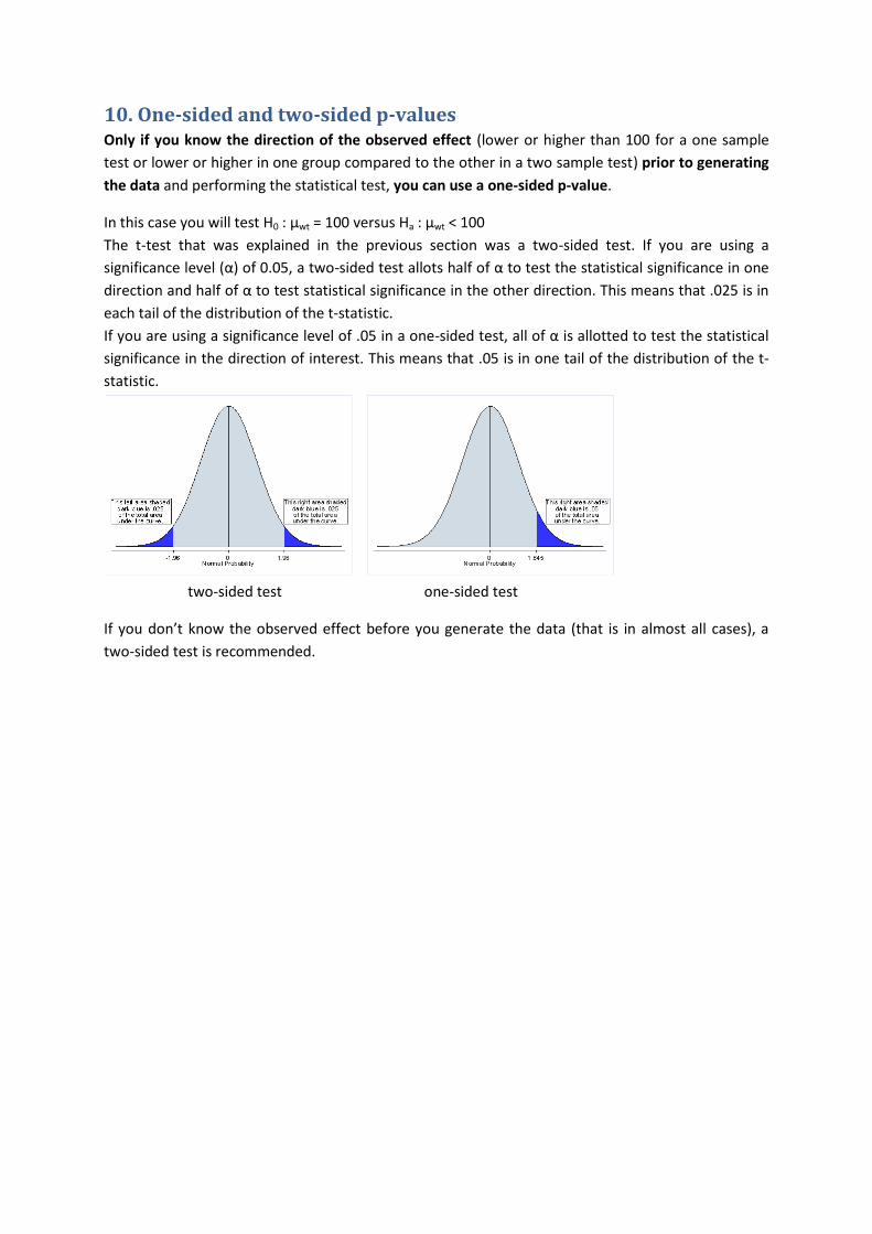
10. One-sided and two-sided p-values Only if you know the direction of the observed effect (lower or higher than 100 for a one sample
test or lower or higher in one group compared to the other in a two sample test) prior to generating
the data and performing the statistical test, you can use a one-sided p-value.
In this case you will test H0 : µwt = 100 versus Ha : µwt < 100
The t-test that was explained in the previous section was a two-sided test. If you are using a
significance level (α) of 0.05, a two-sided test allots half of α to test the statistical significance in one
direction and half of α to test statistical significance in the other direction. This means that .025 is in
each tail of the distribution of the t-statistic.
If you are using a significance level of .05 in a one-sided test, all of α is allotted to test the statistical
significance in the direction of interest. This means that .05 is in one tail of the distribution of the t-
statistic.
two-sided test one-sided test
If you don’t know the observed effect before you generate the data (that is in almost all cases), a
two-sided test is recommended.

11. Choice of statistical test