How Users Perceive and Use Interactive Information Graphics: An Exploratory Study
8
How Users Perceive and Use Interactive Information Graphics: an Exploratory Study Michael Burmester, Marcus Mast, Ralph Tille, Wibke Weber Information Design, Stuttgart Media University {[email protected], [email protected], [email protected], [email protected]} Abstract This paper presents an exploratory empirical study about users’ reception and usage behavior with interactive information graphics. 14 participants took part in the study. We assume users to act interest-driven. Therefore no explicit tasks were assigned to participants. In order not to distract the user, retrospective thinking aloud was employed. Results show that (1) usage durations were heterogeneous between users and between different types of interactive information graphics; (2) users tended to watch introductory animations; (3) initial orientation without interaction on the first content screen (after intro) was rather long with 23 seconds on average; (4) story-based approaches seem to motivate users but might lead to less intensive reception of information; (5) several reception and usage problems have been identified regarding information presentation and interaction. Interactive information graphics tend to overwhelm users with too much information and disregard well-known principles and rules of the old media and web design. Keywords: interactive information graphic, multimedia storytelling, usage behavior 1. Introduction Whether in online journalism, in business management, technical writing or in education: interactive information graphics become more and more important for conveying information. News sites, such as nytimes.com, elmundo.es, or bbc.co.uk use interactive information graphics to explain complex information clearly and intelligible, e.g. the White House health care plan or the earthquake in Chile. Information graphics have the potential to make statistical data truly comprehensible; they can make the data engaging, point out causal relationships, and tell the story behind the story. Interactive information graphics are a relatively new form of visual or multimedia storytelling [2, 3, 14]. They have emerged as a product of the era of media convergence. Several terms describe this kind of storytelling: interactive graphics, animated graphics, multimedia features, interactive narratives, and explanation graphics [cf. 14, p. 14]. In our work, we define interactive information graphics as (1) a hybrid presentation of different modalities: text, photos, audios, videos, charts, maps, graphs, illustrations are combined; the interplay of these is more than the sum of the parts. (2) In addition to multimodality, interactivity and hypertextuality are main characteristics of interactive information graphics. (3) Each information graphic focuses on one story, one topic [14, pp. 20-23]. Information graphics as visual representations belong to several scientific fields: to journalism, information visualization, and information design. While the information graphic in print has been widely studied [cf. 8, 15, 16, 19, 20, 21], the interactive information graphic as a form of visual storytelling remains to be investigated. The difference between a print graphic and an online graphic mainly lies in three aspects: animation, interactivity, and multimodality. These three additional aspects fundamentally change the way in which users perceive, click, and navigate through information graphics on the web. The non-linear nature of the Web offers readers the opportunity to choose their own navigation path through the information graphic. Online graphics allow to control pace and order of the perception of information. Therefore, each user acts like a director who composes his own story. The user himself decides at which point the story begins and ends, whether he clicks first on the video or starts to read the text. George-Palilonis [6, p. 33] assumes that “the most effective online graphics are those presented in a manner that promotes a high degree of interactivity while at the same time observing a clear and logical organization with attention to the variety of ways different online readers may choose to engage with the content.” 2010 14th International Conference Information Visualisation 1550-6037/10 $26.00 © 2010 IEEE DOI 10.1109/IV.2010.57 355 Information Visualisation 1550-6037/10 $26.00 © 2010 IEEE DOI 10.1109/IV.2010.57 361 2010 14th International Conference Information Visualisation 1550-6037/10 $26.00 © 2010 IEEE DOI 10.1109/IV.2010.57 361
-
Upload
hdm-stuttgart -
Category
Documents
-
view
2 -
download
0
Transcript of How Users Perceive and Use Interactive Information Graphics: An Exploratory Study

How Users Perceive and Use Interactive Information Graphics: an Exploratory Study
Michael Burmester, Marcus Mast, Ralph Tille, Wibke Weber Information Design, Stuttgart Media University
{[email protected], [email protected], [email protected], [email protected]}
Abstract This paper presents an exploratory empirical study
about users’ reception and usage behavior with interactive information graphics. 14 participants took part in the study. We assume users to act interest-driven. Therefore no explicit tasks were assigned to participants. In order not to distract the user, retrospective thinking aloud was employed. Results show that (1) usage durations were heterogeneous between users and between different types of interactive information graphics; (2) users tended to watch introductory animations; (3) initial orientation without interaction on the first content screen (after intro) was rather long with 23 seconds on average; (4) story-based approaches seem to motivate users but might lead to less intensive reception of information; (5) several reception and usage problems have been identified regarding information presentation and interaction. Interactive information graphics tend to overwhelm users with too much information and disregard well-known principles and rules of the old media and web design.
Keywords: interactive information graphic, multimedia storytelling, usage behavior
1. Introduction
Whether in online journalism, in business management, technical writing or in education: interactive information graphics become more and more important for conveying information. News sites, such as nytimes.com, elmundo.es, or bbc.co.uk use interactive information graphics to explain complex information clearly and intelligible, e.g. the White House health care plan or the earthquake in Chile. Information graphics have the potential to make statistical data truly comprehensible; they can make the data engaging, point out causal relationships, and tell the story behind the story.
Interactive information graphics are a relatively new form of visual or multimedia storytelling [2, 3, 14]. They have emerged as a product of the era of media convergence. Several terms describe this kind of storytelling: interactive graphics, animated graphics, multimedia features, interactive narratives, and explanation graphics [cf. 14, p. 14]. In our work, we define interactive information graphics as (1) a hybrid presentation of different modalities: text, photos, audios, videos, charts, maps, graphs, illustrations are combined; the interplay of these is more than the sum of the parts. (2) In addition to multimodality, interactivity and hypertextuality are main characteristics of interactive information graphics. (3) Each information graphic focuses on one story, one topic [14, pp. 20-23].
Information graphics as visual representations belong to several scientific fields: to journalism, information visualization, and information design. While the information graphic in print has been widely studied [cf. 8, 15, 16, 19, 20, 21], the interactive information graphic as a form of visual storytelling remains to be investigated. The difference between a print graphic and an online graphic mainly lies in three aspects: animation, interactivity, and multimodality. These three additional aspects fundamentally change the way in which users perceive, click, and navigate through information graphics on the web. The non-linear nature of the Web offers readers the opportunity to choose their own navigation path through the information graphic. Online graphics allow to control pace and order of the perception of information. Therefore, each user acts like a director who composes his own story. The user himself decides at which point the story begins and ends, whether he clicks first on the video or starts to read the text. George-Palilonis [6, p. 33] assumes that “the most effective online graphics are those presented in a manner that promotes a high degree of interactivity while at the same time observing a clear and logical organization with attention to the variety of ways different online readers may choose to engage with the content.”
2010 14th International Conference Information Visualisation
1550-6037/10 $26.00 © 2010 IEEE
DOI 10.1109/IV.2010.57
355
Information Visualisation
1550-6037/10 $26.00 © 2010 IEEE
DOI 10.1109/IV.2010.57
361
2010 14th International Conference Information Visualisation
1550-6037/10 $26.00 © 2010 IEEE
DOI 10.1109/IV.2010.57
361

In order to produce such effective and attractive information graphics the designers, graphic reporters, and journalists should know more about the strengths and the weaknesses of interactive information graphics. They need to know more about the user and his or her perception of interactive information graphics: How do readers interact with online information graphics?
The research about interactive information graphics is at its very beginning. Scientific publications about interactive information graphics are rare. Schumacher [14] provides a good overview of user experiences with interactive multimodal representations. George-Palilonis [6] gives more practical guidelines and describes the professional skills for designers and journalists. Cairo [3] provides support particularly for the process of developing interactive news information graphics.
In our research we focus on four aims: (1) building a typology of interactive information graphics; (2) gaining insights about the basic design principles for interactive information graphics; (3) exploring and investigating interactivity as a key component; (4) understanding user perception and user experience. The study described in the present paper is part of our efforts for reaching the fourth aim.
2. Research Questions
A potential user will use interactive information because he or she is searching for a specific topic or the user is confronted with the information graphic by browsing through electronic information. We think that in many cases using interactive information graphics is driven by the current interest of the user, which means that users are not driven by clear information goals but by interest. If information and interest matches, more concrete information goals can be formed. Due to this assumption and compared to other studies [14] users should be able to use interactive information graphics for as long as they wish and they should be able to select information elements driven by their own interest. With this assured, we expected to observe fairly realistic reception and usage behavior in an experimental setting.
The following research questions were asked: (1) For how long will a user engage with an
interactive information graphic when he or she can interact freely?
(2) Are there candidates of typical usage behavior? In an exploratory study we can find possible usage patterns that would have to be confirmed in follow-up studies.
(3) Which problems can be identified regarding reception and usage behavior?
3. Design of the Study
3.1. Stimuli
The interactive information graphics used as stimuli were chosen according to the following criteria:
(1) All information graphics were to be of interest to a broad audience and to cover a current topic.
(2) The level of interactivity was to be high. The user was to have many interactive options, in particular influence on the narrative of the story. Some of the criteria were navigation elements, links, and control elements.
(3) The information graphics were to be in German language due to the participants of the study.
(4) The graphics were to be accessible on the World Wide Web.
Finally, the information graphics were to cover
aspects from all four main types of interactive information graphics as defined by Nichani and Rajamanickam [9]:
(1) Narratives: “The objective is to explain by giving the reader a vicarious experience of the intent through a story.” Narrative information graphics are characterized by a story “told with a distinct point of view”.
(2) Instructives explain step by step how things work. Here, the objective is to explain, “by enabling the reader to sequentially step through the intent”.
(3) Exploratives offer the reader “an opportunity to explore and discover the intent”.
(4) Simulatives allow the reader “to experience the intent (usually a real world phenomena).”
In pretests participants used information graphics for an unlimited duration. This showed that at a given maximum session duration of 90 min and with the subsequently described experimental procedure, three interactive information graphics could be presented to participants without restricting usage durations. The following information graphics were chosen:
(1) Nuclear power graphic: This is an explorative interactive information
graphic about the issues of nuclear power in the present and future in Europe (Figure 2, Figure 3, Figure 4), published on the website of the business magazine Wirtschaftswoche [10]. The information graphic is based on a print version. The structure, the visual storytelling, and the interaction patterns seem not well optimized for the different requirements and possibilities of online graphics. It mainly employs pop-up windows on a static background image. We supposed that this is a common type of information graphic used by online newspapers. The design uses vector-style elements with a restrained color scheme.
356362362
(2) Space shuttle graphic: This graphic (Figure 7) is a simulative information
graphic about the space shuttle and ten minutes of its takeoff. The graphic also includes elements of instructive information graphics and was produced by a graphic design student [12]. The space shuttle graphic is based on a linear, timeline-oriented story: the first ten minutes after the space shuttle launch. It has redundant interaction patterns and short additional text parts. The style of the design is clear without ornamental elements. One special feature in this graphic is the attempt to involve the user with some clouds in the scene. The layers of these clouds repeatedly come in front of the interaction controls for a few seconds. Like the definitions of the second and third interactivity-levels of Schulmeister [13], this graphic allows to manipulate the content directly: some parts can be moved or rotated and the user has the possibility to view the information from multiple views.
(3) Privacy graphic: This is a narrative information graphic (Figure 5,
Figure 6) published on the website of the news magazine spiegel.de [11]. The information graphic explains the background of privacy intrusions in everyday life of the citizens in Germany. A special feature of this information graphic is that the screen design looks like a criminal thriller illustration; the protagonist of the linear frame story is called Paul. The story is told in five phases representing episodes of Paul’s day (e.g. getting up or at work). The user can watch the scissor-cut, dark-colored scenes from the perspective of an investigator or like in a role-playing game. Therefore, this graphic has a high level of the explorative type of interactivity too.
3.2. Participants
14 participants took part in the study with an average age of 24 years (SD = 9.9). 10 participants were students and 4 were employees (consultants, technicians). All participants held or were in the process of obtaining university-level education (study courses e.g. engineering, computer science, natural sciences, history) and had extensive Internet experience. Gender distribution was 9 male and 5 female participants. All participants had at least some experience with interactive information graphics.
3.3. Methodological approach
Since usage behavior was to be as realistic as possible and interest-driven, we had participants interacting with the information graphics without any disturbance by methods like concurrent think-aloud [4] or other types of co-operative evaluation [22]. Based on an open scenario, participants used the interactive information graphics as they would under daily usage conditions. During the usage phase the interaction was
recorded. After that, a short interview was carried out in order to capture the participant’s first impression of the information graphic. In order to understand the specific interests as well as usage and information reception behavior and problems of the participants, a retrospective think-aloud phase [1] followed the first impression interview. Participants were asked to talk about their thoughts while watching the recording of their usage phase. Retrospective think-aloud is a reliable method when usage videos are used as stimulus [7,17,18]. Retrospective think-aloud was supported by interventions of a session moderator. The moderator reminded participants to keep talking when they stopped for more than about 30 seconds. Also, the moderator occasionally asked questions to clarify ambiguous or vague statements. Participants could pause and resume video playback according to their speed of talking.
To analyze the distribution of visual attention, eye movements were recorded during the usage phase. Eye movement analysis can provide information about elements of interest and sequences of visual attention. Since there were no particular hypotheses, the eye movement data were analyzed in an exploratory manner.
Finally, a questionnaire was used to obtain information on experienced effort, intuitiveness of interaction, joy of use, comprehensibility, knowledge expansion, previous knowledge, and interest in the information graphics’ subject matter. All items were rated on a five-point Likert scale.
3.4. Technical equipment
The study was carried out in the usability research lab at Stuttgart Media University, Germany. A Tobii 1750 remote infrared eye tracker with a frame rate of 50 Hz was used to record the eye movements. Spatial resolution is 0.25° and average accuracy is 0.5°. Tobii Studio software 2.0 recorded the eye movements, the screen, the interaction (all clicks), and a video of the participant’s face. For the retrospective think-aloud session the eye movement indication was switched off and the participant’s video was recorded with the lab’s digital video equipment.
3.5. Procedure
All participants used all stimuli in the usage phase. The presentation order of the stimuli was counterbalanced throughout participants. An open scenario introduced the usage phase: “You used Google to search for <search term>. You found this interactive information graphic. Use it as long as you would under normal conditions.” There was no minimum or maximum usage time introduced.
The procedure of a session was the following: 1. Welcome, presentation of the lab, informed
consent 2. Introduction to the study
357363363

3. Calibration of the eye tracking system 4. Usage phase with each artifact being introduced
by the open scenario, followed by free usage, and closing with a short interview
5. Introduction to retrospective think-aloud 6. Retrospective think-aloud for all stimuli 7. Final questionnaire on demographic data
3.6. Data analysis
The main focus was the qualitative analysis of the observations and retrospective think-aloud protocols. The first step of the analysis was to identify themes in the protocols. After having completed theme descriptions these were related to the research questions.
By applying a method and data triangulation approach of qualitative research [5], data obtained with the different methods were combined and interpreted. The eye movement data were used to identify elements of special interest in combination with the verbal protocols. Statistic analysis was applied for usage duration and questionnaire ratings in order to test differences and correlations.
4. Results and Discussion
4.1. Overview
The result of the triangulation analysis consists of 34 observations. 13 observations deal with candidate usage behavior patterns and 21 observations with reception and usage problems.
4.2. Total usage duration
The usage durations of the three information graphics differed substantially (F(2.26) = 21.81, p = .000, partial eta squared = .627). The mean usage duration of the nuclear power graphic was 5:01 minutes, space shuttle 2:57 minutes, and privacy graphic 8:15 minutes. Correlation analysis of usage duration and items of the questionnaire (effort experienced, intuitiveness of interaction, joy of use, comprehensibility, knowledge expansion, previous knowledge, and interest on information graphic subject) reveal no statically conclusive results. In particular, there are no statistically significant correlations between interest and usage duration. Therefore, the reason for the differences in usage duration between the information graphics might be just due to the differences in the amount of information offered. The nuclear power graphic and the privacy graphic provide more information than the space shuttle graphic. There was a wide range of usage durations (see Table 1), showing large differences between participants.
Table 1: Minimum and maximum usage duration
Graphic Mean Min Max Nuclear power 5:01 1:15 11:43 Space shuttle 2:57 1:07 5:43 Privacy 8:15 2:27 15:18
4.3. Usage duration and reception behavior during initial usage phase
The privacy graphic and the space shuttle graphic start with an intro that can be skipped. Participants tended to wait for the end of the intro. Some were interested in the intro but others just failed to notice the skip option. One participant using the space shuttle graphic said, “I thought that I have to wait till the end of the launch phase which would be annoying”.
After the intro, it seems that users first want to get the “big picture”, before they click on anything. The time from after the intro (if present) to before the first click was rather long with 30.4 sec (SD = 16.6) for the nuclear power graphic, 28.9 sec (SD = 45.6) for the space shuttle graphic and 9.6 sec (SD = 7.2) for the privacy graphic, resulting in an overall average of 22.9 sec. During that time participants (often repeatedly) looked at important information elements and hovered over elements with the mouse pointer. Five participants stated that they wanted to get an overview of all interactive elements in the information graphic at the beginning: “I first wanted to check everything I could click on here.” Figure 1 shows heat maps of the initial usage phase for all three information graphics. Red areas indicate high fixation frequencies and green areas lower frequencies. It can be observed that almost all elements received attention during this phase.
Figure 1: Heat maps of initial usage phase (duration from after intro to before first click)
358364364

On the following pages the participants started to interact after a much shorter delay. For the privacy graphic the difference between the initial usage phase of 9.6 sec and the time to first click on the second page of 3.9 sec is statistically significant (F(1,13) = 8.042, p = .014, partial eta squared = .38).
4.4. Interest and attention
All participants stated that “interest” was the main background of their usage behavior, giving credibility to our initial assumption. Curiosity and interest were responsible for the reception and usage of information elements. Users scanned text elements for interesting words or phrases making them curious, like the word “orbiter” in the space shuttle graphic. The opposite also occurred when users avoided uninteresting material: “’employers’ are not relevant for me, that’s not interesting”. When the interest for an information graphic was low, users tended to skip texts and links: “I just clicked around a little bit in a half-hearted manner.”
If an information graphic provides a story, like the narrative privacy graphic, people tend to be fascinated by the story and are curious how it proceeds and ends. While this is an element of motivation, it also has some shortcomings. Users follow the story and therefore tend to skim and miss important information. About the privacy graphic a user said “It is all about personal information but I would like to continue seeing what Paul will do the rest of his day”. The space shuttle graphic tells a story of the first 10 minutes of the shuttle launch phase. One participant said, “I was interested to see what happens after 9 minutes”. Participants had the impression that when an animation is running from the beginning, like in the space shuttle graphic, or an oral introductory text is spoken, like in the privacy graphic, they would have to wait until the end. For the space shuttle graphic this is particularly suboptimal because the concept of the graphic is that people interact during the animated launch of the space shuttle.
4.5. Information presentation
Several problems concerning information presentation have been identified. Some of them are well-known problems that can be found on web pages, too. One example is the design of text. Textual information was hard to read and was not optimized for screen reading. Text should be short, readable, well structured, simple, and provide a clear message. The privacy graphic provides a lot of text elements. 8 of the 14 participants (57%) said they tend to use text information less than graphical. Apart from the text presentation, participants were bored by redundancy in the texts. In other cases, text would have been necessary to explain a graphical element, but the text was missing.
8 participants (57%) complained about missing text in the space shuttle graphic. Text would have been necessary to comprehend what happens during the launch phase and to understand the components of the spaceship.
For graphical information presentation, the nuclear power graphic in particular received much criticism. 12 participants (86%) mentioned that many graphical elements of the nuclear power graphic were presented in such a way that it was difficult to understand the main point. For this reason, 6 participants (43%) stated to have increasingly skipped graphical information. Figure 2 shows a graphical element that was difficult to understand. The upper line shows the projected energy supply in case all nuclear power plants in Germany would proceed with power production. The line in the middle shows the energy supply in case Germany would stop running nuclear power plants in 20 years. The lower line shows the energy supply in case Germany would stop building nuclear power plants from now on. The difference between the upper line and the two other lines shows how much energy is missing. This was often not understood. One problem was that there are colored areas between the lines leading to misconceptions. In addition to that, it was difficult to read the vertically aligned text.
Figure 2: One of the illustrations causing
massive problems in understanding
Another common point of criticism (9 participants,
64%) was that information density was too high, again particularly for the nuclear power graphic (Figure 3).
359365365
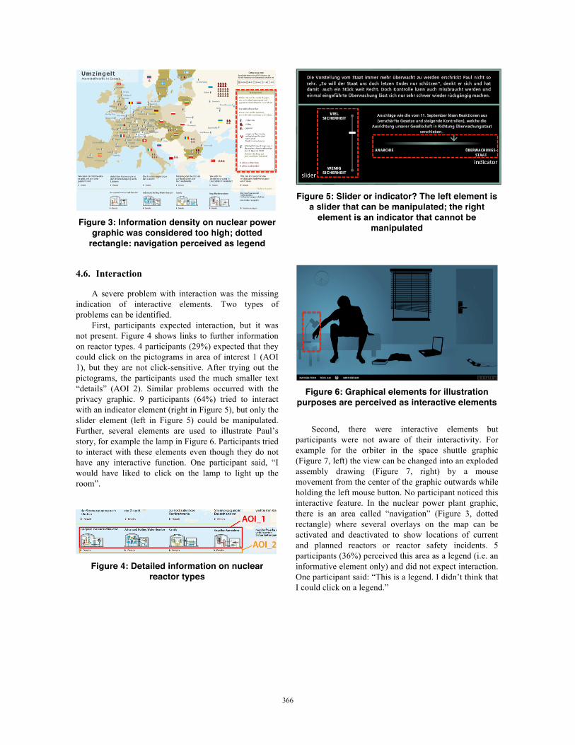
Figure 3: Information density on nuclear power
graphic was considered too high; dotted rectangle: navigation perceived as legend
4.6. Interaction
A severe problem with interaction was the missing indication of interactive elements. Two types of problems can be identified.
First, participants expected interaction, but it was not present. Figure 4 shows links to further information on reactor types. 4 participants (29%) expected that they could click on the pictograms in area of interest 1 (AOI 1), but they are not click-sensitive. After trying out the pictograms, the participants used the much smaller text “details” (AOI 2). Similar problems occurred with the privacy graphic. 9 participants (64%) tried to interact with an indicator element (right in Figure 5), but only the slider element (left in Figure 5) could be manipulated. Further, several elements are used to illustrate Paul’s story, for example the lamp in Figure 6. Participants tried to interact with these elements even though they do not have any interactive function. One participant said, “I would have liked to click on the lamp to light up the room”.
Figure 4: Detailed information on nuclear
reactor types
Figure 5: Slider or indicator? The left element is
a slider that can be manipulated; the right element is an indicator that cannot be
manipulated
Figure 6: Graphical elements for illustration
purposes are perceived as interactive elements
Second, there were interactive elements but participants were not aware of their interactivity. For example for the orbiter in the space shuttle graphic (Figure 7, left) the view can be changed into an exploded assembly drawing (Figure 7, right) by a mouse movement from the center of the graphic outwards while holding the left mouse button. No participant noticed this interactive feature. In the nuclear power plant graphic, there is an area called “navigation” (Figure 3, dotted rectangle) where several overlays on the map can be activated and deactivated to show locations of current and planned reactors or reactor safety incidents. 5 participants (36%) perceived this area as a legend (i.e. an informative element only) and did not expect interaction. One participant said: “This is a legend. I didn’t think that I could click on a legend.”
360366366

Figure 7: The space shuttle can be viewed as an
exploded assembly drawing through mouse interaction which none of the participants
realized
A different type of interaction problem occurred with the privacy graphic. The user is guided through Paul’s day in five phases. 12 participants (86%) stated to have been impatient about the progression of the story. They did not know the total number of phases and were afraid that it might take too long to go through all of them. Therefore, they started to skip and skim information. However, they were very interested in the end of the story, “I didn’t know how long it [the story and its phases] goes, otherwise I would have explored more of it”. There is a link “navigation” in the footer of the information graphic that would have provided users with an overview of all phases of Paul’s day, but this was rarely clicked. Eye tracking analysis showed that 13 participants (93%) looked at the navigation link. However, only 3 used it. From the verbal protocols it became clear that participants were focused on the information on the main screen. They became used to navigating there and did not want to leave the scene.
5. Conclusion and Future Work
Three research questions were addressed in this study. The first question was about the time structure of reception and usage behavior. Interest-driven usage durations were heterogeneous between participants. We suppose that the amount of information provided by the interactive information graphic mainly caused differences in average usage durations.
The second question asked whether there are candidates of typical usage behavior. This question is difficult to answer, but some candidates have been identified: (1) Users tend to watch introductory animations and not skip them. (2) Users show a rather long phase without interaction on the first content screen after the intro (23 seconds on average in this study) where many users scan elements with the eyes and mouse. An often-stated reason was to get an overview of all interactive elements. (3) If an interactive information graphic provides a narrative, users are motivated by this storyline and want to find out how it continues and ends. Doing so, users tend to skip, skim, and overlook
information in order to learn more about the story. This means that a strong story bears the risk of distracting people from essential information.
Most of the observations in this study deal with problematic reception and usage behavior which was the third question addressed. It is noteworthy that many detected problems are typical website usability problems that have been known for a long time. The most prominent example is the design of text. Fonts were too small, text paragraphs too long, sentences difficult to understand. But also the design of graphical elements caused difficulties in understanding. High information density discouraged users to use the information graphic. Regarding interaction, the main problem was for participants to identify, which elements were interactive and which were not.
The new challenge for designers is to combine the “old” media (text, photos, videos, audios, maps, diagrams) with the concept of interactivity in an effective way so users will understand the message easily. However, so far we do not know how much information the users can remember, whether they prefer a linear or non-linear storyline, which topic is particularly suitable for interactive storytelling, whether less media is more, or at what point users struggle with an information overload. To shed light on these questions, more empirical studies are required.
Our next step will be to create various systematically modified versions of one interactive information graphic to test the effect of different design strategies on user perception. Also, we will develop guidelines for designers, journalists, and graphic reporters based on empirical findings.
6. References
[1] R.L. Bowers, H.L. Snyder. Concurrent versus retrospective verbal protocols for comparing window usability. In Proceedings Of Human Factors Society 34th Meeting. 1270-1274. Santa Monica: HFES. 1990.
[2] P. Boczkowski. The Process of Adopting Multimedia and Interactivity in Three Online Newsrooms. In Journal of Communication 54 (2). 197-213. 2004.
[3] A. Cairo. The Future is Now. In Design Journal 97. 16-17. Winter 2005.
[4] K.A. Ericsson, H.A. Simon. A Protocol Analysis: Verbal Protocols as Data. Cambridge, MA: MIT Press. 1993.
[5] U. Flick. Triangulation.Wiesbaden: VS Verlag für Sozialwissenschaften. 2004.
[6] J. George-Palilonis. A Practical Guide to Graphics Reporting. Burlington, MA, Focal Press. 2006.
[7] Z. Guan, S. Lee, E. Cuddihy, J. Ramey: The Validity of the Stimulated Retrospective Think-Aloud Method as Measured by Eye Tracking. CHI Proceedings. 1253-1262. 2006.
[8] A.L. Mendelson, F. Darling-Wolf. Reader’s interpretations of visual and verbal narratives of a National Geographic story on Saudi Arabia. In Journalism 10 (6), 798-818. 2009.
361367367

[9] M. Nichani, V. Rajamanickam. Interactive Visual Explainers – A Simple Classification. 2003. http://www.elearningpost.com/articles/archives/interactive_visual_explainers_a_simple_classification/ (Retrieved Feb 28, 2010)
[10] Nuclear power graphic. Information graphic available at wiwo.circ-it.de/infografiken/atomkraftwerke_in_europa /index.html
[11] Privacy graphic. Information graphic available at www.spiegel.de/flash/0,5532,15385,00.html
[12] Space shuttle graphic. Information graphic available at www.thomasglaeser.de/studium/neuemedien/space_ shuttle/flash.php
[13] R. Schulmeister. Taxonomie der Interaktivität von Multimedia - Ein Beitrag zur aktuellen Metadaten-Diskussion. it+ti, Ausgabe 4, 193-199, 2002.
[14] P. Schumacher. Rezeption als Interaktion. Baden-Baden, Nomos. 2009.
[15] E.R. Tufte. Visual Explanations. Cheshire, CT, Graphics Press. 1997.
[16] E.R. Tufte. Envisioning Information. Cheshire, CT, Graphics Press. 1990.
[17] M.J. Van den Haak, M.D.T. de Jong, P.J. Schellens. Retrospective versus concurrent think-aloud protocols: Testing the usability of an online library catalogue. Behaviour & Information Technology, 22, 339. 2003.
[18] M.J. Van den Haak, M.D.T. de Jong, P.J. Schellens. Employing think-aloud protocols and constructive interaction to test the usability of online library catalogues: a methodological comparison. Interacting with Computers, 16, 1153-1170. 2004.
[19] H. Wainer. Picturing the World. Princeton, New Jersey, Princeton University Press. 2009.
[20] C. Ware. Visual Thinking. Burlington, MA, Morgan Kaufmann. 2008.
[21] B. Weidenmann. Wissenserwerb mit Bildern. Bern Huber. 1994.
[22] P.C. Wright, A.F. Monk. A cost-effective evaluation method for use by designers. In International Journal of Man-Machine Studies. 35, 891-912. 1991.
7. Acknowledgements
We would like to thank the students of the study course information design during the summer semester 2009 for supporting us in carrying out the studies with enthusiasm and much hard work: R. de Buhr, M. De Ita Bautista, N. Grabez, M. Grandl, M. Ramic, J. Röhm, M. Romppel, S. Sawall, B. Schäfer, A. Schäffler, V. Schocker, S. Seidl, F. Spahr, and A. Theile.
The research project “Interactive Information Graphics” is funded by the Federal State of Baden-Württemberg, Germany, Ministry of Science, Research, and the Arts.
362368368