GKReport 26
36
No.26 / 2014.3 26 特 集 かたちのあり方 3
Transcript of GKReport 26

No.26 / 2014.3 26特 集
かたちのあり方3

2 GK Report No.26 3GK Report No.26
No.26 / 2014.3
特 集 3 特 集
かたちのあり方3
4 あらためて道具について考える ─ 「榮久庵憲司とGKの世界──鳳が翔く」展を終えて
栄久庵憲司
6 夢を、かたちにすること山田晃三
8 かたちの応用 ─ GKデザインインターナショナルのかたちNorman Kerechuk
12 異文化の接点 ─ GKデザインヨーロッパのかたち 手塚 功
16 新たな中国デザインの黎明 ─ GK上海のかたち 長田喜晃
20 デザインと技術のその先に 1 (新連載)
月のウサギが見る地球 岩政隆一
22 Special Topic世田谷美術館展「榮久庵憲司とGKの世界 ─ 鳳が翔く」展 開催される
28 Column 道具文化往来 藤本清春
29 Project News・La Cantine/株式会社マルハニチロ・TOCLAS ブランディング計画/トクラス株式会社・MT-07 MT-09/ヤマハ発動機株式会社・VIKING/ヤマハ発動機株式会社・A1200形低床車両/札幌市交通局・あざみ野ガーデンズ(旧東急嶮山スポーツガーデン)/東京急行電鉄株式会社 株式会社東急設計コンサルタント
・森蘭商都サイン計画/上海外高橋保税区開発股份有限公司・YUME iXi/タカラベルモント株式会社
33 Topics・「榮久庵塾」 独自のデザイン世界を解き明かし第3期、第4期修了・GKデザイン機構山田社長 日本デザイン学会で基調講演を行う・GKインダストリアルデザイン田中相談役 JIDAの理事長に就任・「P-Roomセミナー」 GKゆかりの海外ゲストを招いて開催・「2013年度グッドデザイン賞」 GK各社によるデザインが多数受賞・「第47回(2013年)SDA賞」 奨励賞他を受賞・「SKY SUITE」「ベスト・ビジネスクラス・エアラインシート」賞を受賞・GKデザイングループ 「2013 CSCF創意設計大賞」(中国)で最優秀賞他を受賞・GKダイナミックス 「第43回東京モーターショー2013」にショーモデルを出展・GKデザイン総研広島 「第3回鉄道技術展」に出展・「MT-09」 世界的なデザイン賞「iFプロダクトデザインアワード2014」を受賞
35 Column デザイン真善美 栄久庵憲司
3 Feature:
Forms 3
4 Giving a new thought on “dougu” – After the Exhibition of the World of Kenji Ekuan and GK Design GroupKenji Ekuan
6 To Make my Dream into a FormKozo Yamada
8 Applying Form – The Forms of GK Design InternationalNorman Kerechuk
12 Contact Point of Different Cultures – The Forms of GK Design EuropeIsao Tezuka
16 Dawn of Design in China – The Forms of GK Design ShanghaiYoshiaki Osada
20 New Series: Beyond Technology and Design 1
Earth that a rabbit views from the moonRyuichi Iwamasa
22 Special TopicThe World of Kenji Ekuan and GK Design Group: Soaring High in the Sky
28 Column Dougu Culture Crossroad Kiyoharu Fujimoto
29 Project NewsLa Cantine / Maruha Nichiro Food Corporation
TOCLAS Branding Plan / Toclas Corporation
MT-07 MT-09 / Yamaha Motor Co., Ltd.
VIKING / Yamaha Motor Co., Ltd.
A1200 Type Low Floor Streetcar / City of Sapporo Transportation Department
Azamino Gardens (Former Tokyu Kenzan Sports Garden) / Tokyu Corporation
and Tokyu Architects & Engineers Inc.
SUNLAND Shopping Mall Sign System / Shanghai Waigaoqiao Free Trade
Zone Development Co., Ltd.
YUME iXi / Takara Belmont Corp.
33 TopicsThe 3rd and 4th Sessions of “Ekuan Juku” have been completed
Kozo Yamada, president of GK Design Group delivered a keynote speech
Kazuo Tanaka, GK Industrial advisor, assumed the post of president of JIDA
P-Room Seminars
Good Design Award 2013
The 47th SDA Award (2013)
GK won 2013 CSCF Creative Design Competition
Best Business Class Airline Seat Award
The 43rd Tokyo Motor Show
iF Design Award 2014 given to Yamaha MT-09 Motorcycle
The 3rd Mass Transportation Innovation Japan 2013
35 Column Truth, Goodness and Beauty of Design Kenji Ekuan
かたちのあり方 3GKデザイングループは、1952年の創立以来、積極的にさまざまな
国際活動を行ってきた。1956年より発足した日本貿易振興会(現
ジェトロ)によるデザイン留学制度により、欧米のデザイン大学へ
とメンバーを派遣した。また1960年の世界デザイン会議(WoDeCo)
への参加を皮切りに、国際インダストリアルデザイン団体協議会
(ICSID)、世界デザイン機構(DW)活動などへの積極的参加を通じて、
常に海外に向けたデザイン運動を推進してきた。またそれらと平行
して、海外事務所の設立も早い段階から実現してきた。1967年には、
当時のさまざまな困難を乗り越え、ロサンゼルス駐在員事務所を開
設した。1972年には現地法人「GKデザインインターナショナル」と
し、GK初の海外事業拠点とした。そして2002年には、アトランタ
オフィスも開設し、今日に至る。
一方、欧州拠点として、1986年に「グローバルデザイン」をアム
ステルダムに設立し、さらに国際的ネットワークを広げ、2003年
には「GKデザインヨーロッパ」と改名した。アジア拠点としては、
中国の開放経済の草創期である1994年、大手家電メーカー、ハイ
アール・グループ(Haier Group)との合弁により、青島海高設計製
造公司(QHG)を設立し、その後、2005年には、上海芸凱設計有限
公司(GK上海)を、同じく合弁による本格的総合デザインオフィス
として開設した。本号にはこれら海外拠点からのさまざまな報告と
提案を、No.24,25での国内各社に引き続き、掲載している。ます
ます広く世界に発信するGKデザイングループの今後の活動に、大
いに期待して頂きたい。
編集部 松本匡史
Since its establishment in 1952, the GK Design Group has conducted vari-ous kinds of international activities. Under the design study abroad pro-gram sponsored by the Japan External Trade Organization (JETRO), founded in 1956, we sent our members to design schools in Europe and the United States. After participating in the World Design Conference (WoDeCo) in Tokyo in 1960, GK took part actively in the activities of the International Council of Societies of Industrial Design (ICSID) and Design for the World (DW) to promote our design movement toward other countries. In 1967, GK opened its representative office in Los Angeles overcoming various difficulties in those days. The office was registered as an incorporated company “GK Design International” in 1972. This was GK’s first business base overseas. In 2002, a second office in the United States was established in Atlanta.
In 1986, GK opened Global Design in Amsterdam as its base in Europe. After years of expanding its international network, the firm was renamed GK Design Europe in 2003. In Asia, GK and the Haier Group, a major household electronics manufacturer in China jointly founded Qingdao HaiGao Design & Mfg. Co., Ltd. in 1994, when China began its open eco-nomic policy. It was followed by the establishment of another joint gen-eral design firm, GK Design Shanghai Inc., in 2003. In this issue, the activities and proposals from these overseas offices are presented following those by GK member companies in Japan as re-ported in GK Report No. 24 and No. 25. I hope that readers will look for-ward to the worldwide activities of the GK Design Group in the future.
Editor Tadashi Matsumoto

4 GK Report No.26 5GK Report No.26
あらためて道具について考える/栄久庵憲司
あらためて道具について考える─
「榮久庵憲司と GKの世界──鳳が翔く」展を
終えて
世田谷美術館の回廊に展示したバナーBanner that was exhibited in the corridor of the Setagaya Art Museum
栄久庵憲司
2013年7月6日(土)より9月1日(日)まで、東京の世田谷美術館にお
いて開催された「榮久庵憲司とGKの世界 ─ 鳳が翔く」展が終了し
た。主催者である世田谷美術館の熱意ある出展要請に応え、その企
画構想を元にして、昨年創立60周年を迎えた、GKデザイングルー
プの記念事業の一環として、かねてより準備されてきたものである。
1万8千人ほどの来場者があったとのことで、うれしさもひとしおだ。
その評判を受けて、今年の11月には、広島県立美術館で同様の展
覧会が開催される予定である。故郷広島での展覧会であるから、今
から楽しみである。
本展覧会の導入部にあたる回廊に、GKがデザインについて考えて
きた言葉を、バナーで展示した。ここで、この言葉のいくつかを簡
単に解題してみたい。
「モノの民主化、美の民主化」はGK黎明期の言葉である。どこで
でも手に入る、誰の家にでも見られる量産品に、インダストリアル
デザインが美しさを与えることは、まさに美の民主化といえる。こ
の言葉は、GK設立当時の仲間たちが結束するためには大変有効な
キーワードであり、その後も重要な考え方となっている。
「組織創造力を求めて」の組織創造力とは、GKの基層をなす言葉
である。一人ひとりは決して天才ではないのだが、協同しあうこと
でクリエイティブな考え方が生まれるということである。東京藝術
大学の恩師である小池岩太郎先生に言われたものであるが、若かっ
た我々に大いに夢を与えてくれた。
「小さくとも力強く美しく」。この言葉を英語でいうと"Small but
Powerful & Beautiful"となる。欧米においてはそれまで、小さいと
いうのはみすぼらしく豊かさに欠けるというイメージが強かったが、
小さくとも価値のあるものがつくり出せるという日本のものづくり
の方向性を表現したものである。
「人工世界の探求」、「かたちの新風景」。インダストリアルデザイ
ンとは、あらゆる人工の世界を構築していくことであり、そこで創
造された人工物たちが本当の意味で新風景になるか、むしろそれら
をつくっていきたいという覚悟の言葉である。
我々は、2020年にオリンピックを迎える。そこに本当に美しい
風景が生まれるかどうか、まさに新たなデザインの民主化ができる
かどうかが我々の大きな課題である。公共的な建造物を扱って、人
びとにとって喜ばしい状態をつくることができれば、それこそ、も
のの民主化になる。人びとに対してよいサービスであり、よい造形
であれば、豊かな気持ちになることができる。人工物で日本の風土
を美しい風土にできるかどうかは、デザインにかかわる人びとのセ
ンスにかかっているのだ。「お・も・て・な・し」の心が、まさに試され
る時がきた、といってよい。
この展覧会を契機として、あらためて道具について考えている。
道具世界は、微細なものを扱うナノツールから掌に乗るもの、そ
して宇宙衛星まで、まさに膨大な世界である。そもそも道具自身は
人間の鏡、すなわち人間の現れであり、道具世界を考えることが、
人間の世界を極めることになっていく。また一方で、人間を追求す
ることが、道具のあり方を現前させる。
今、道具世界は懊悩している。巷にものがあふれているが、買う
に足らないとか、買うものがないとか、ある意味で豊かさにおぼれ
ている風潮がある。翻って、貧困のためになにも手に入らない世界
もある。このような不整合をあらためるために、道具世界に新たな
定義付けが、今こそ必要なのではないだろうか。
そのためには、まず観察力を育てることが必要である。ものをつ
くる上で、観察するということは、懸命に、誠実になってものを見
るということであるから、美しいものをつくることにつながってい
く。また、観察を続けると、あるときにふっと自分自身が自由奔放
になれ、創造に向けた新たな境地に至ることができる。
最近、日本のものづくりを再考するにあたって、あらためて神道の
世界、神道的な造形に対して興味がある。神道的な造形は、その自
然との深いかかわりゆえに、清楚で、すっきり、さっぱりしている
ように思う。神道の世界、孔孟の教えなどをつなげていき、日本の
かたちのオリジナルを探してみたい。ひとつの造形観をもって思い
を巡らせていくと、広くアジアにも何かその手がかりがあるのでは
ないかと考えている。決して欧米の物まねではない、アジアならで
はの節理を築きあげることができるのではないだろうか。バウハウ
ス以降は、機能主義論が横行しているが、たとえば、日本刀の反り
の美しさは、バウハウスの造形言語では出てこないように思う。バ
ウハウスを乗り越え、東洋的なかたちの根源、そして日本的美しさ
への糸口をさぐっていきたい。
えくあん けんじ GKデザイングループ会長
Giving a new thought on “dougu” – After the Exhibition of the World of Kenji Ekuan and GK Design Group Kenji Ekuan
“The World of Kenji Ekuan and GK Design Group - Soaring High in the Sky” was held at the Setagaya Museum of Art in Tokyo from July 6 to September 1, 2013. In response to the enthusiastic request by the Setagaya Art Museum to host an exhibit, and on the base of its proposed plan, we prepared for it as part of the program marking the 60th year anniversary of the GK Design Group. I am pleased to learn that 18,000 people visited the exhibition. As the exhibition received such a wonder-ful response, a similar exhibition is planned to be held at the Hiroshima Prefectural Art Museum in November this year. I look forward to having the exhibition held in my hometown Hiroshima.
In the corridor leading to the exhibition hall, banners bearing GK design concepts were displayed. I would like to make brief explanations on some of them.
“Democratization of Things, Democratization of Beauty”This is the phrase of GK in its early days. Industrial designers gave beauty to mass produced products that were seen in most households. This is the
democratization of beauty. This phrase was effective in uniting our colleagues right after the foundation of GK, and has remained an impor-tant concept for us.
“Looking for Organizational Creativity”The term “organizational creativity” is a fundamental concept for GK. Individually, no member of GK is a genius but by working together, creative ideas can be brought into being. This phrase was given to us by Prof. Iwataro Koike, my mentor at university, which gave us young designers a big dream.
“Small but Powerful and Beautiful”In the western world, small things had been looked down upon as being poor and lacking a rich feeling. But this phrase indicated the direction for Japanese manufacturing to become able to make small but valuable things.
Exploration into a Man-made World Emerging Landscape of DesignIndustrial design means to build all kinds of man-made worlds. These phases are expressions of our determination to create a new landscape consisting of artifacts we design. We are hosting the Olympics in 2020. Will we have beautiful
landscapes by that time? It is our great challenge to promote a new process of democratizing design. If we could provide people with favorable conditions by dealing with public structures, it would mean the democratization of things: offering good services and good designs to help people feel enriched. It is up to the aesthetic senses of design-related people whether the land of Japan can be comprised of beautiful objects. The time is now here for our sense of hospitality to be tested.
At the occasion of the exhibition, I thought about dougu (tools) afresh. The world of dougu extends from nano tools, palm-sized tools and space satellites. Dougu implies a mirror for humans, so to say, the reflection of humans. Considering the world of dougu will lead to pursuing the world of humans. And at the same time, pursuing humans will help us to envisage how dougu should be.
Today, the world of dougu is in a stalemate. The streets are filled with things, but people say that they are not worthy of possessing or that there isn’t anything they want to buy. In a sense, we are flooded in material affluence. On the other hand, there are places in the world where poverty prevents people from buying the bare necessities. In order to rectify this imbalance, a new definition might be needed in the world of dougu today. For this, observation skills should be trained. The act of observing
means to see things carefully and sincerely. This will lead to the act of making beautiful things. While maintaining their observation, a person suddenly feels as if he is liberated from everything, and can enter a new state of creation.
Recently as I have been reconsidering Japan’s manufacturing, I refreshed my interest in the world of Shinto, and Shinto designs. As it is deeply related with nature, Shinto designs are neat, clean and refreshing. I would like to explore the source of Japanese forms connecting the world of Shinto and teachings of Kongzi and Mencius in ancient China. Look-ing around other parts of the world with a view on design, I wonder if the roots for Japanese forms might be seen widely in Asia. We might be able to build Asian Design, not imitating western designs. After Bauhaus, functionalism has covered the world of design. However, the beauty of a Japanese sword cannot be explained with the design vocabulary of Bauhaus. I would like to continue to explore the sources of oriental forms and Japanese beauty beyond Bauhaus.
Kenji Ekuan, chairperson, GK Design Group
ゆおおとり

6 GK Report No.26 7GK Report No.26
夢を、かたちにすること/山田晃三
夢を、かたちにすること山田晃三
かつて、ある取材で、「デザインってどんなお仕事なんですか?」
とマイクを向けられたことがあった。みじかく答えなければと思い、
「そうですね、夢をかたちにする仕事でしょうか」と回答した。夢
をかたちにすること──これは、いまでも間違った解ではないと
思っている。
ひとはいろいろな夢を見る。野山を駆けめぐる夢。空を飛ぶ夢。
美味しいものを腹一杯食べる夢。たくさんの友人に祝福される夢。
これが現実になったらなんと幸せなことか。これを叶えるのがデザ
インだ。いや待てよ、私たちが見る夢は決してこんな楽しいものば
かりではない。ときにはクルマで衝突する夢や、崩壊するビルディ
ング、奈落の底に落ちてゆく夢からハッと目覚めることもある。夢
は決して素晴らしいものばかりではない。
英語のdreamとドイツ語の traumは、同じ語源をもっており、「だ
ます、あざむく」を意味する印欧基語の語根にさかのぼる。これら
の原義は「幻影、錯覚」であるといい、夢から覚めたときの、当時
の現実社会の厳しさがうかがえる。また漢字の夢、あるいは日本語
のユメは、ぼんやりとした様子をあらわしながら、「寝ているとき
に見るもの」を意味するようだ。語彙において「夢」と「現実」とは明
確に区別され、夢は夢想、あるいは空想(エソラゴト)、さらには幻
想という意味をなし、現実とは一線を画す。長い間、夢とはそうい
うものであったらしい。
ところが近年、はかないはずの夢から、「将来の夢」といういい
方が登場するようになる。願望としての夢、夢は実現可能な「想像
力」と同義になってきたのである。私たちは、現実と夢とが平行し
ていた時代から、夢が現実になる、という時代を迎えた。これが近
代である。近代とは、市民革命による市民社会の成立と、産業革命
によってはじまる資本社会の到来である。このころ、英国ビクトリ
ア朝時代(Victorian Inventions)にはさまざまな未来予想図が描かれ、
科学の進歩に支えられた工業化技術によって、一気に夢が実現され
るようになった。その後、電球も電話も、自動車も飛行機も、現実
のものとなって登場したのである。
産業革命とともに生まれた職能としてのデザインは、こうした工
業化によって誕生するであろうモノたちの「あるべき未来の姿」を
描き出すことを使命とした。こんなものがあったらいいのにという
想像図はもとより、具体的な対象物を、作り手と使い手の立場に
立って、「機能的で美しいもの」にすることを職務としたのである。
こうして新しく誕生する製品や空間が、市民の夢を叶えてくれる時
代が訪れたのであった。
20世紀は「デザインの時代」であったといっても過言ではない。
とりわけインダストリアルデザインはその花形であった。米国を頂
点として、ありとあらゆる工業製品やそれをとりまく情報が大量に
生産され、消費された。新しい製品を手に入れるたびに、夢が叶っ
た。アメリカン・ドリームは、その頂点に自らを置くことすら現実
のものにした。日本の戦後の歩みも同様だ。欧米先進国の物質文明
の豊かさの中に、国民がみな同じ夢、同じ目標を定めた。
インダストリアルデザインが華やかだったころの作り手たちには、
間違いなく「夢」があった。高度成長期、クルマは、彼女を獲得す
るための重要な男の道具。そのデザインは「ドキドキする」感情に
支えられていた。クルマは、そんな男女に強く語りかけていた。洗
濯機や掃除機でさえそうだった。これらを手にしたときは、じつに
嬉しかった。しかしいま、モノから魅力が失われてしまったのは、
生活者ばかりでなくデザインする側にも「ドキドキする」感情が欠
如していったからだろう。ほんとうに欲しいものと、売らねばなら
ぬものとが制作過程において混在してしまった結果だ。そのうちに
デザイナーの資質から「夢」が消え、モノから魅力が消えた。
もはやモノの時代ではなくコトの時代である──というがモノ無
くしてひとは生きられない。起源からして道具(モノ)は、意志の
結実が生んだ、ひとの分身である。ひとの生き方とモノの有り様は
ひとつなのだから、モノを愛するこころは、コトに置き換わるし、
それは精神の充足そのもののはずだ。21世紀のいま問題なのは、
モノの声が聞こえなくなったことである。安全で便利、快適ではあ
るが、語りかける力を持たない、夢をかき立ててくれないモノたち
が、大量に増えた。
モノがひとの分身である以上、モノに「夢」を描きたい。現代デ
ザインは複雑な与件や高度な技術に翻弄されやすい。しかし、デザ
インには「美を持って機能を考える」というほかには譲れない姿勢
があるのだから、モノをしてひとの暮らしや行為に、安全便利を超
えた、「夢」を提示すべきだろうと思う。たかがデザインかもしれ
ないが、ひととモノの関係を再編し、ひとの生き方を示唆する力が、
デザインにはあることを、いま一度思い出したい。
あふれんばかりのモノたちとの付き合いに時間を費やし、ひとり
で考える時間を失ってはいないか。子どもたちが「将来の夢」につ
いて、ドキドキしながら話せるようになるためにも、私たちが真剣
に、私たちの「夢」について考え、議論していたいと思う。
「夢」は、はかないこともあるが、ひとの生きる力そのものだと
思う。さらにいえば、イノベーションの源泉である。
やまだ こうぞう GKデザイン機構 代表取締役社長
To Make my Dream into a FormKozo Yamada
When I was interviewed for a magazine some years ago, the reporter asked me, “What kind of work does a designer do?” I thought I had to give a short reply, and said “It may be something to make a dream into a form.” To make dreams into forms – This is a correct answer even now. People dream various dreams. Some dream to run around in a field, others to fly high in the sky. Some dream to eat their fill of delicious foods, others dream to be celebrated by many friends. How happy one would be if even one of their dreams come true. It is the function of design to realize these dreams. But wait! Dreams that we dream are not always happy and pleasant. We may dream bad dreams of crashing a car, or crumbling buildings. Or we may wake up from a dream of falling in a bottomless abyss. Not all dreams are pleasant. “Dream” in English and “traum” in German originate from the same word root meaning “cheating or deluding” in Proto-Indo European. The original meaning of dream and traum is phantom or illusion. We can guess what difficult realities people in those days found when they awoke from dreams. Chinese 夢 and Japanese yume seem to imply a blurred state of mind and mean“something a person sees while sleeping.” “Dream” is associated with wishful thinking or fantasy, and clearly distinguished from
“reality.” Dream was considered in this way over many centuries. In recent times, however, the expression “dreams of the future” has come into use. “Dream” is used with the connotation of “desire” and the word has come to be used synonymously for “imagination” which can be put into reality. Human society has entered an age when dreams can come true from the age when reality and dreams never crossed. It is the modern age. The advent of the modern age is symbolized by civic society established through people’s revolutions, and a capitalist society formed through industrial revolutions. In the Victorian age, many drawings of the future were illustrated as Victorian Inventions, and along with the development of industrial technologies supported by advanced sciences, dreams of the Victorian age were realized at once. Later, electric bulbs, telephones, automobiles and airplanes came into being. The profession of designing was generated along with the industrial revolution. The mission of the designer was to illustrate “desirable forms” of objects to be produced by industrialization, and to present the image of an object that people might wish to have. The designer was assigned, on the standpoints of both manufacturers and users, to design “functional and beautiful” things. Thus, the time arrived when newly created products and spaces fulfilled people’s dreams. It is not too much to say that the 20th century was an “age of design.” Industrial design was a leader in the age. In industrialized countries led
by the United States, industrial products and information surrounding them were produced and consumed in mass. Each time one obtained a new product, his dream came true. The American dream made it possible for the people to place themselves on top of the world. The progress of post-war Japan gave a similar dream to the Japanese. People dreamed the same dream and set out to achieve the same goal, to enjoy the material affluence of western Europe and America. When industrial design flourished, manufacturers had, no doubt, “dreams.” During the rapid economic growth period, motorcars were important tools for men to attract girlfriends. Motorcar designs were supported by the thrilling sensations they gave people. Motorcar designs were strongly appealing to men and women. The same was true with washing machines and vacuum cleaners. We felt happy when we bought these products. But today, products have lost their appeal, maybe because not only consumers but also designers have lost the sense of thrill when seeing new products. Things that consumers really wanted to have and things that manufacturers thought that they had to sell were mixed in the process of production. As a result, “dreams” disappeared in the minds of designers and consumer appeal was lost from industrial products. People say that it is no longer an age of material things but immate-rial things. But we cannot live without tools (material things). Tools were devised as an extension of human hands. The human way of
living and the way tools exist are deeply associated, and humans can love immaterial things as they love material things, therefore, it is a matter of our mental fulfillment. A problem today is that we cannot hear the voices from products. They are safe and convenient, and give us comfort, but they have no power to appeal to us. Products that do not rouse our dreams have increased. I would like to illustrate “dreams” in tools as the extension of our physical functions. Contemporary designers are at the mercy of increasingly complicated conditions and high technology. But we cannot forget the basic stance of the designer to “seek functionality and beauty,” we should present “dreams” to people through tools beyond safety and convenience. We should be reminded of the power of design which is able to reorganize the relations between humans and tools, and to give suggestions for variations in today’s lifestyles. I wonder if we spend too much time with the flood of tools and other materials leaving little time to think quietly. I would propose that we consider and discuss our “dreams” sincerely so that we may encourage children to speak about their “future dreams” with excitement. “Dreams” sometimes may be vaporous, but they give us power to live on. Furthermore, they are sources of innovation.
Kozo Yamada, president, GK Design Group
“Victorian Inventions” by Leonard De Vries published by American Heritage Press in 1972 より転載。
From “Victorian Inventions” by Leonard De Vries published by American Heritage Press in 1972

GKDIはアメリカのインダストリアル・デ
ザイン会社で、GKデザイングループの一
員である。パワースポーツ・デザインで40
年の経験をもち、これまでにモーターサイ
クル、スノーモビル、全地形対応車、ゴル
フ・カートと水上オートバイを制作してき
た。当社の主要事業は、プロダクト・デザ
イン、グラフィック・デザインと調査研究
である。
2013年11月末、世界中から出展された最
新デザインを見る好機である東京モーター
ショーに出かけた。まる一日、自動車やモー
ターサイクルを見てまわったあと、ひとき
わ目立つデザインがあった。メルセデスの
S-Coupe コンセプトである。
このクルマのどこが特別か。まず、人目
を引くそのかたちに強い印象をうけたのだ
が、ついで細部を見るとどの部分も高品質
であった。優雅さと活動性のバランス、動
きの表現、微妙に抑制のきいた光と影など、
すべてがあいまって実に見事なデザインに
なっていた。
メルセデスのデザイン・ポイントは、い
ともシンプルなもので、動きの表出にある。
それぞれのかたちと細部が全体として前進
する勢いを表現している。
動きとかたち
動きをどのように表現するか、というのが
乗り物のかたちの第一の目標であり、他の
デザイン・ジャンルとの大きな違いがここ
にある。なぜそれが大事なのだろうか。か
たちと線で動きを表現することは、つまり
乗り物の周りの空気の流れを描くことでそ
の乗り物の機能を暗示することである。そ
のかたちは論理性にもとづいていると考え
ている。この論理の原点は初期の船大工に
あるのではないか。かれらは船底を四角に
するよりもV型にした方が水上を楽に切り
進んでいけることを発見した。この単純な
機能的なかたちからかたちと動きの基本的
な関連について教わった。
かたちの真実
かたちは、真実を隠蔽もすれば、語りもする。
これは、積極的な側面と否定的な側面だが、
どちらも顧客のためになる。かたちの真実
とは、われわれの認識が実物の本質とに一
致した時のことをいう。頑丈そうな大きな
岩に見えるハリウッドの映画の小道具が、
実は手の先で動かせるほど軽いものだとい
うのを私たちは見てきた。もちろん、映画
の小道具は観客をごまかす意図があるなど
というつもりはない。ただ、かたちが顧客
の心にどんな期待を生むかの例として使っ
ているにすぎない。
かたちが人の目を欺くのは、デザインで
は有効な手である。ちょうど医者が子ども
の患者に対して本当の機能を知って不安に
ならないように使う、見かけはやさしい医
療器機と同じである。デザインを制作した
り、判断したりする時、その本当の意味を
理解する必要がある。
娯楽性としてのかたち
GKDIの基本的な理念は、製品の特性を強
調することである。パワー、耐久性、また
は高級感などが、かたちをとおして伝達し
たい特性である。かたちをこのように使う
ことで、製品の「娯楽性」が高まる。われ
われの顧客にとって、この「娯楽性」が重
要な価値となる。かたちの娯楽的側面は、
絶えず新しい考えと独自スタイルを追求す
るチャンスをわれわれに与えてくれる。
なんでも誤用されることは、当然のこと
ながらあり、かたちとて例外ではない。し
ばしば、製品の特性や意味を理解していな
い、デザイナーの過剰表現のかたちを目に
する。われわれは、過剰表現のデザインは
玩具のようだと考える。デザインが機能の
一線を越えて娯楽に走ると、「オモチャ」
の領域に落ち込む危険がある。有能なデザ
イナーは、製品にとって適切なレベルのか
たちを維持するのに、機能と純粋さを最も
重要な目標として使う。
かたちと機能
デザイン学校では、かたちと機能を切り離
すことはできないと教わる。どんな製品に
とっても機能は存在理由であり、機能のな
いものは芸術作品の範疇に入る。
GKDIでは、かたちは機能の3段階を経
てつくられる。まず、利用者のニーズを満
たさなくてはならない、機械製造ができな
くてはならない、そしてブランドを売り込
む必要がある。
利用者むけの機能は、製品によって多岐
にわたる。概して、機能に焦点をあてたもの、
あるいは高度に機能的なもののかたちはど
んどん厳密なものになるが、気軽に使う製
品であれば、純粋な機能性にそれほど焦点
をあてなくてすむ。プロダクト・デザイン
の世界では、機能性は通常、利用者と製品
の要件の幅広い領域の中程に位置する。
工場にとっては、大量生産できることが
機能となる。デザインは、製造工程と材料
の要件を満たさなくてはならない。製造工
程をうまく考慮すれば、かたちにも生産工
程にも役立つ。
ブランドの売り込みはかたちの機能であ
り、製品をとおして会社全体を世に問う。
かたちは形状と機能をもって、製品の高品
質と新しい考えを実証できる。
GKDIのかたち
ヤマハ発動機のスノーモビル部門むけの最
近の仕事がSRViperである。このプロジェ
クトにはヤマハ発動機とArctic Catという
アメリカの会社が共同開発に加わった。
Yamahaの商標がついているが、製造は米
国内のArctic Catであり、ヤマハはエンジ
ンだけを提供している。
SRViperの製造コスト節約のため、Arctic
Cat社の既存モデルのベースを共有させる
ことにした。われわれの課題は、差し替え
る部品の数を最小限に止めたうえで、外形
の変更を最大限にすることであった。さら
に、まとまりのある自然な外形をつくるた
めに、既存モデルと新モデルのデザインと
の調和をはかる必要があった。
SRViperには、その用途と市場区分を反
映して、迫力のあるスポーツ特性が与えら
れた。それは正に高性能市場へのヤマハの
復帰の象徴にしたいという意思のあらわれ
でもあった。
かたちのコンセプトは明確で機能と精度
をもった切削工具のような表現とし、ス
ノーモビルのシャープなコーナリングや加
速能力を伝えることであった。
無駄のない躍動的な造型面とエッジをき
かせ、フードの先端からウインドシールド
までを連続的な動きで示すことで、切っ先
鋭い刀のような先端にパワーを宿すデザイ
ンにした。
軽量で高性能に見せるため、また「雪詰
まり」を避けるため、サスペンションは剥
き出しとした。
ヘッドライトはボディ内に埋め込み、重
心を低く感じさせるようにした。そのかた
ちはモダンで迫力があり、ヤマハの独自性
と強いスポーツ志向を強調した。スピード
感を出すため、引き締まった先細りの表面
と強い視覚的な流れをもたせた。
ウインドシールドは、飛翔するかたちを
モチーフにして、風がへり
縁というへり
縁から高速
で流れさるように視覚的な印象をもたせた。
SRViperにヤマハを注入
ヤマハ発動機の製品は、どれもヤマハの
DNAを引き継いでいる。それは、製品の
歴史とヤマハの製品を開発するために働い
た人たちを通して流れる感性と知性から生
まれたものである。このDNAは、各世代
の製品に引き継がれ、生命体の遺伝的連続
のように過去に成功した製品の影響をうけ
ている。SRViperのかたちは、この産物で
ある。「睨みの効いた目」のようなヘッドラ
イトの表情や逆V字形の吸気口などのヤマ
ハの特徴は、SRViperが紛れもなくヤマハ
製品であることを示すことになるが、基本
的なかたちは 、60年にわたる同社の伝統
とGKテザインのかたちに関する理念と切
り離すことはできない。
ノーマン・ケレチャック GKデザインイン
ターナショナル 代表取締役社長
かたちの応用 ─ GKデザインインターナショナルのかたちNorman Kerechuk
Applying Form / Norman Kerechuk
8 GK Report No.26 9GK Report No.26
Applying Form ─ The Forms of GK De-sign InternationalNorman Kerechuk
GKDI is a U.S. based industrial design of-fice and part of the GK Design Group. With over forty years experience in the spe-cialty field of Powersports design, GKDI has created motorcycles, snowmobiles, all-terrain vehicles, golf cars and watercraft. GKDI’ s main services are product design, graphic design, and research.
In late November I had the chance to at-tend the Tokyo Motor Show, it was an ex-cellent opportunity to see the latest design from around the world. After a full day of viewing cars and mo-torcycles, one design in particular stood out, the Mercedes S-Coupe Concept. What made this car special? Its striking form impressed me at first glance, and then
on closer inspection I found high quality in every detail. The balance of elegance and athleticism, its expression of motion and subtle control of light and shadow all com-bine to make this an absolutely stunning design. The Mercedes design point is simple; it is a display of movement. Each shape and de-tail contributes to an overall sweep of for-ward momentum.
Movement and FormExpressing movement is a primary goal of vehicle form, and a major difference be-tween other categories of design. Why is it important? Expressing movement through shape and line implies the mobile function of a vehicle by illustrating how the air will flow around it. We perceive the form to be logical. I can guess the origin of this logic began with a primitive boat builder, who bril-
liantly discovered that a V shape could cut through water easier than a square shape. This simple functional shape has taught us the basic relationship between form and movement.
The Truth of FormForm can disguise or tell the truth, this seems like one positive and one negative quality, but both can benefit the customer. Truth of form is when our perception matches an object’ s actual qualities. We’ ve all seen Hollywood movie props such as large rocks that appear solid until someone reveals that they’ re actually very light and move easily by the touch of a hand. Of course the movie prop has no bad motive to deceive the audience, and I only use it as an example of the expectation form can create in the mind of the customer. Form deception can serve as a useful tool in design; as in the case of a medical tool to
be used on children, a friendly form can hide the serious function of such a device having the benefit of reducing a child’ s anxiety. When we judge or create a design, we should understand its true meaning.
Form as EntertainmentGKDI’ s basic philosophy is to emphasize the nature of a product. Expressing power, ruggedness or luxury are a few examples of attributes we communicate through form. Using form in this manner increases the “entertainment” aspect of the product. Form that provides entertainment is a key value to our customers. The aspect of entertainment in form pro-vides us with constant opportunities for in-novation and style. Of course anything can be misused, and form is no exception. We often see form over-expressed from a designer who does
not understand the nature or meaning of a product. We consider a design with over-expression to be toy-like. When a design crosses the line of entertainment over func-tion it risks falling into the “toy” arena. A skilled designer uses function and purity as an essential aim to keep form on a level ap-propriate to the object.
Form and FunctionAs every student of design learns, form and function go hand in hand. After all, func-tion is the reason for every product, and an object that does not provide function falls into the category of artwork. At GKDI, form is created within three levels of function. A form must meet the users’ needs, it must be able to be manufac-tured, and it should promote the brand. User function can vary widely based on the product. Generally speaking as an ob-ject becomes more focused or highly func-
tional the form becomes increasingly criti-cal, more casually used products may re-quire less focus in terms of pure functional-ity. In the production design world, function-ality usually falls somewhere in the middle to accommodate a wide spectrum of users and product requirements. Manufacturability is function for the fac-tory. Design has to meet production re-quirements, for process and materials. Clever consideration of the manufacturing process can provide benefit for the form as well as production. Brand promotion is a function of form through which the product represents the entire company. The form should demon-strate high quality and innovation through shape and function. Form at GKDIOur recent work for Yamaha’ s snowmobile
division is the 2014 SRViper. This project involved a joint development between Yamaha and the American com-pany Arctic Cat. Although this product is labeled a Yamaha, it will be manufactured by Arctic Cat in the USA, with only the en-gine to be provided by Yamaha. To help conserve cost the SRViper was to share the base of an existing Arctic Cat model; our challenge was to maximize the change of appearance, by changing a mini-mum number of parts. In addition we would have to achieve a design harmony between the new and existing pieces, for a cohesive natural appearance. The SRViper was given an aggressive sports character to reflect its intended use and market segment. This direction was also meant as a metaphor for Yamaha’ s re-turn to the high performance market. The concept of the form is to express a cutting tool with precise and direct func-
tion, thereby conveying the machine’ s abil-ity of sharp cornering and acceleration. We used lean dynamic surfaces and sharp edges to direct the form’ s movement from the tip of the hood through the windshield giving the design a focus and power like that of a pointed sword. The large suspension components were left exposed to reduce the bulk of the ma-chine and to avoid “snow packing.” The headlight is tucked in to give the feeling of a low center of gravity. It’ s shape is modern and aggressive, emphasizing its Yamaha identity and strong sport character. Speed is expressed through the forms over-all lean tapering surfaces and strong visual flow, while the windscreen forms a “flying” shape, giving the impression of high pressure moving over the surface and releasing from its edges, providing a visual burst of speed to the design.
Putting Yamaha in the SRViperYamaha products share a “DNA” that can-not be avoided; it has generated from prod-uct history and the collective taste and in-telligence that flows through the people who have worked to develop Yamaha prod-ucts. This DNA is carried forward by each successive generation of product, and is in-fluenced by what has previously been suc-cessful, like the genetic stream of any or-ganism. The SRViper’ s forms are a product of this. Characteristic Yamaha features such as the “evil eyes” headlight expression and chevron intake shape help to further iden-tify the SRViper as a Yamaha, but the basic form cannot be separated from its 60-year-old heritage, and GK design’ s philosophy of form.
Norman KerechukPresident, GKDI

GKDIはアメリカのインダストリアル・デ
ザイン会社で、GKデザイングループの一
員である。パワースポーツ・デザインで40
年の経験をもち、これまでにモーターサイ
クル、スノーモビル、全地形対応車、ゴル
フ・カートと水上オートバイを制作してき
た。当社の主要事業は、プロダクト・デザ
イン、グラフィック・デザインと調査研究
である。
2013年11月末、世界中から出展された最
新デザインを見る好機である東京モーター
ショーに出かけた。まる一日、自動車やモー
ターサイクルを見てまわったあと、ひとき
わ目立つデザインがあった。メルセデスの
S-Coupe コンセプトである。
このクルマのどこが特別か。まず、人目
を引くそのかたちに強い印象をうけたのだ
が、ついで細部を見るとどの部分も高品質
であった。優雅さと活動性のバランス、動
きの表現、微妙に抑制のきいた光と影など、
すべてがあいまって実に見事なデザインに
なっていた。
メルセデスのデザイン・ポイントは、い
ともシンプルなもので、動きの表出にある。
それぞれのかたちと細部が全体として前進
する勢いを表現している。
動きとかたち
動きをどのように表現するか、というのが
乗り物のかたちの第一の目標であり、他の
デザイン・ジャンルとの大きな違いがここ
にある。なぜそれが大事なのだろうか。か
たちと線で動きを表現することは、つまり
乗り物の周りの空気の流れを描くことでそ
の乗り物の機能を暗示することである。そ
のかたちは論理性にもとづいていると考え
ている。この論理の原点は初期の船大工に
あるのではないか。かれらは船底を四角に
するよりもV型にした方が水上を楽に切り
進んでいけることを発見した。この単純な
機能的なかたちからかたちと動きの基本的
な関連について教わった。
かたちの真実
かたちは、真実を隠蔽もすれば、語りもする。
これは、積極的な側面と否定的な側面だが、
どちらも顧客のためになる。かたちの真実
とは、われわれの認識が実物の本質とに一
致した時のことをいう。頑丈そうな大きな
岩に見えるハリウッドの映画の小道具が、
実は手の先で動かせるほど軽いものだとい
うのを私たちは見てきた。もちろん、映画
の小道具は観客をごまかす意図があるなど
というつもりはない。ただ、かたちが顧客
の心にどんな期待を生むかの例として使っ
ているにすぎない。
かたちが人の目を欺くのは、デザインで
は有効な手である。ちょうど医者が子ども
の患者に対して本当の機能を知って不安に
ならないように使う、見かけはやさしい医
療器機と同じである。デザインを制作した
り、判断したりする時、その本当の意味を
理解する必要がある。
娯楽性としてのかたち
GKDIの基本的な理念は、製品の特性を強
調することである。パワー、耐久性、また
は高級感などが、かたちをとおして伝達し
たい特性である。かたちをこのように使う
ことで、製品の「娯楽性」が高まる。われ
われの顧客にとって、この「娯楽性」が重
要な価値となる。かたちの娯楽的側面は、
絶えず新しい考えと独自スタイルを追求す
るチャンスをわれわれに与えてくれる。
なんでも誤用されることは、当然のこと
ながらあり、かたちとて例外ではない。し
ばしば、製品の特性や意味を理解していな
い、デザイナーの過剰表現のかたちを目に
する。われわれは、過剰表現のデザインは
玩具のようだと考える。デザインが機能の
一線を越えて娯楽に走ると、「オモチャ」
の領域に落ち込む危険がある。有能なデザ
イナーは、製品にとって適切なレベルのか
たちを維持するのに、機能と純粋さを最も
重要な目標として使う。
かたちと機能
デザイン学校では、かたちと機能を切り離
すことはできないと教わる。どんな製品に
とっても機能は存在理由であり、機能のな
いものは芸術作品の範疇に入る。
GKDIでは、かたちは機能の3段階を経
てつくられる。まず、利用者のニーズを満
たさなくてはならない、機械製造ができな
くてはならない、そしてブランドを売り込
む必要がある。
利用者むけの機能は、製品によって多岐
にわたる。概して、機能に焦点をあてたもの、
あるいは高度に機能的なもののかたちはど
んどん厳密なものになるが、気軽に使う製
品であれば、純粋な機能性にそれほど焦点
をあてなくてすむ。プロダクト・デザイン
の世界では、機能性は通常、利用者と製品
の要件の幅広い領域の中程に位置する。
工場にとっては、大量生産できることが
機能となる。デザインは、製造工程と材料
の要件を満たさなくてはならない。製造工
程をうまく考慮すれば、かたちにも生産工
程にも役立つ。
ブランドの売り込みはかたちの機能であ
り、製品をとおして会社全体を世に問う。
かたちは形状と機能をもって、製品の高品
質と新しい考えを実証できる。
GKDIのかたち
ヤマハ発動機のスノーモビル部門むけの最
近の仕事がSRViperである。このプロジェ
クトにはヤマハ発動機とArctic Catという
アメリカの会社が共同開発に加わった。
Yamahaの商標がついているが、製造は米
国内のArctic Catであり、ヤマハはエンジ
ンだけを提供している。
SRViperの製造コスト節約のため、Arctic
Cat社の既存モデルのベースを共有させる
ことにした。われわれの課題は、差し替え
る部品の数を最小限に止めたうえで、外形
の変更を最大限にすることであった。さら
に、まとまりのある自然な外形をつくるた
めに、既存モデルと新モデルのデザインと
の調和をはかる必要があった。
SRViperには、その用途と市場区分を反
映して、迫力のあるスポーツ特性が与えら
れた。それは正に高性能市場へのヤマハの
復帰の象徴にしたいという意思のあらわれ
でもあった。
かたちのコンセプトは明確で機能と精度
をもった切削工具のような表現とし、ス
ノーモビルのシャープなコーナリングや加
速能力を伝えることであった。
無駄のない躍動的な造型面とエッジをき
かせ、フードの先端からウインドシールド
までを連続的な動きで示すことで、切っ先
鋭い刀のような先端にパワーを宿すデザイ
ンにした。
軽量で高性能に見せるため、また「雪詰
まり」を避けるため、サスペンションは剥
き出しとした。
ヘッドライトはボディ内に埋め込み、重
心を低く感じさせるようにした。そのかた
ちはモダンで迫力があり、ヤマハの独自性
と強いスポーツ志向を強調した。スピード
感を出すため、引き締まった先細りの表面
と強い視覚的な流れをもたせた。
ウインドシールドは、飛翔するかたちを
モチーフにして、風がへり
縁というへり
縁から高速
で流れさるように視覚的な印象をもたせた。
SRViperにヤマハを注入
ヤマハ発動機の製品は、どれもヤマハの
DNAを引き継いでいる。それは、製品の
歴史とヤマハの製品を開発するために働い
た人たちを通して流れる感性と知性から生
まれたものである。このDNAは、各世代
の製品に引き継がれ、生命体の遺伝的連続
のように過去に成功した製品の影響をうけ
ている。SRViperのかたちは、この産物で
ある。「睨みの効いた目」のようなヘッドラ
イトの表情や逆V字形の吸気口などのヤマ
ハの特徴は、SRViperが紛れもなくヤマハ
製品であることを示すことになるが、基本
的なかたちは 、60年にわたる同社の伝統
とGKテザインのかたちに関する理念と切
り離すことはできない。
ノーマン・ケレチャック GKデザインイン
ターナショナル 代表取締役社長
Applying Form ─ The Forms of GK De-sign InternationalNorman Kerechuk
GKDI is a U.S. based industrial design of-fice and part of the GK Design Group. With over forty years experience in the spe-cialty field of Powersports design, GKDI has created motorcycles, snowmobiles, all-terrain vehicles, golf cars and watercraft. GKDI’ s main services are product design, graphic design, and research.
In late November I had the chance to at-tend the Tokyo Motor Show, it was an ex-cellent opportunity to see the latest design from around the world. After a full day of viewing cars and mo-torcycles, one design in particular stood out, the Mercedes S-Coupe Concept. What made this car special? Its striking form impressed me at first glance, and then
on closer inspection I found high quality in every detail. The balance of elegance and athleticism, its expression of motion and subtle control of light and shadow all com-bine to make this an absolutely stunning design. The Mercedes design point is simple; it is a display of movement. Each shape and de-tail contributes to an overall sweep of for-ward momentum.
Movement and FormExpressing movement is a primary goal of vehicle form, and a major difference be-tween other categories of design. Why is it important? Expressing movement through shape and line implies the mobile function of a vehicle by illustrating how the air will flow around it. We perceive the form to be logical. I can guess the origin of this logic began with a primitive boat builder, who bril-
liantly discovered that a V shape could cut through water easier than a square shape. This simple functional shape has taught us the basic relationship between form and movement.
The Truth of FormForm can disguise or tell the truth, this seems like one positive and one negative quality, but both can benefit the customer. Truth of form is when our perception matches an object’ s actual qualities. We’ ve all seen Hollywood movie props such as large rocks that appear solid until someone reveals that they’ re actually very light and move easily by the touch of a hand. Of course the movie prop has no bad motive to deceive the audience, and I only use it as an example of the expectation form can create in the mind of the customer. Form deception can serve as a useful tool in design; as in the case of a medical tool to
be used on children, a friendly form can hide the serious function of such a device having the benefit of reducing a child’ s anxiety. When we judge or create a design, we should understand its true meaning.
Form as EntertainmentGKDI’ s basic philosophy is to emphasize the nature of a product. Expressing power, ruggedness or luxury are a few examples of attributes we communicate through form. Using form in this manner increases the “entertainment” aspect of the product. Form that provides entertainment is a key value to our customers. The aspect of entertainment in form pro-vides us with constant opportunities for in-novation and style. Of course anything can be misused, and form is no exception. We often see form over-expressed from a designer who does
not understand the nature or meaning of a product. We consider a design with over-expression to be toy-like. When a design crosses the line of entertainment over func-tion it risks falling into the “toy” arena. A skilled designer uses function and purity as an essential aim to keep form on a level ap-propriate to the object.
Form and FunctionAs every student of design learns, form and function go hand in hand. After all, func-tion is the reason for every product, and an object that does not provide function falls into the category of artwork. At GKDI, form is created within three levels of function. A form must meet the users’ needs, it must be able to be manufac-tured, and it should promote the brand. User function can vary widely based on the product. Generally speaking as an ob-ject becomes more focused or highly func-
tional the form becomes increasingly criti-cal, more casually used products may re-quire less focus in terms of pure functional-ity. In the production design world, function-ality usually falls somewhere in the middle to accommodate a wide spectrum of users and product requirements. Manufacturability is function for the fac-tory. Design has to meet production re-quirements, for process and materials. Clever consideration of the manufacturing process can provide benefit for the form as well as production. Brand promotion is a function of form through which the product represents the entire company. The form should demon-strate high quality and innovation through shape and function. Form at GKDIOur recent work for Yamaha’ s snowmobile
division is the 2014 SRViper. This project involved a joint development between Yamaha and the American com-pany Arctic Cat. Although this product is labeled a Yamaha, it will be manufactured by Arctic Cat in the USA, with only the en-gine to be provided by Yamaha. To help conserve cost the SRViper was to share the base of an existing Arctic Cat model; our challenge was to maximize the change of appearance, by changing a mini-mum number of parts. In addition we would have to achieve a design harmony between the new and existing pieces, for a cohesive natural appearance. The SRViper was given an aggressive sports character to reflect its intended use and market segment. This direction was also meant as a metaphor for Yamaha’ s re-turn to the high performance market. The concept of the form is to express a cutting tool with precise and direct func-
tion, thereby conveying the machine’ s abil-ity of sharp cornering and acceleration. We used lean dynamic surfaces and sharp edges to direct the form’ s movement from the tip of the hood through the windshield giving the design a focus and power like that of a pointed sword. The large suspension components were left exposed to reduce the bulk of the ma-chine and to avoid “snow packing.” The headlight is tucked in to give the feeling of a low center of gravity. It’ s shape is modern and aggressive, emphasizing its Yamaha identity and strong sport character. Speed is expressed through the forms over-all lean tapering surfaces and strong visual flow, while the windscreen forms a “flying” shape, giving the impression of high pressure moving over the surface and releasing from its edges, providing a visual burst of speed to the design.
Putting Yamaha in the SRViperYamaha products share a “DNA” that can-not be avoided; it has generated from prod-uct history and the collective taste and in-telligence that flows through the people who have worked to develop Yamaha prod-ucts. This DNA is carried forward by each successive generation of product, and is in-fluenced by what has previously been suc-cessful, like the genetic stream of any or-ganism. The SRViper’ s forms are a product of this. Characteristic Yamaha features such as the “evil eyes” headlight expression and chevron intake shape help to further iden-tify the SRViper as a Yamaha, but the basic form cannot be separated from its 60-year-old heritage, and GK design’ s philosophy of form.
Norman KerechukPresident, GKDI
Applying Form / Norman Kerechuk
10 GK Report No.26 11GK Report No.26
Applying Form / Norman Kerechuk
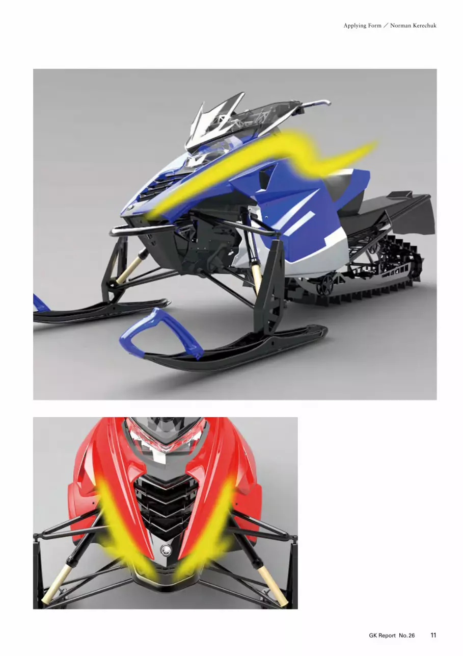
2014 Yamaha SRViper
デザイン:フリオ・フローレス、 麥倉 毅美、明石 将Design: Julio Flores, Takayoshi Mugikura, Masaru Akashi
GKDIはアメリカのインダストリアル・デ
ザイン会社で、GKデザイングループの一
員である。パワースポーツ・デザインで40
年の経験をもち、これまでにモーターサイ
クル、スノーモビル、全地形対応車、ゴル
フ・カートと水上オートバイを制作してき
た。当社の主要事業は、プロダクト・デザ
イン、グラフィック・デザインと調査研究
である。
2013年11月末、世界中から出展された最
新デザインを見る好機である東京モーター
ショーに出かけた。まる一日、自動車やモー
ターサイクルを見てまわったあと、ひとき
わ目立つデザインがあった。メルセデスの
S-Coupe コンセプトである。
このクルマのどこが特別か。まず、人目
を引くそのかたちに強い印象をうけたのだ
が、ついで細部を見るとどの部分も高品質
であった。優雅さと活動性のバランス、動
きの表現、微妙に抑制のきいた光と影など、
すべてがあいまって実に見事なデザインに
なっていた。
メルセデスのデザイン・ポイントは、い
ともシンプルなもので、動きの表出にある。
それぞれのかたちと細部が全体として前進
する勢いを表現している。
動きとかたち
動きをどのように表現するか、というのが
乗り物のかたちの第一の目標であり、他の
デザイン・ジャンルとの大きな違いがここ
にある。なぜそれが大事なのだろうか。か
たちと線で動きを表現することは、つまり
乗り物の周りの空気の流れを描くことでそ
の乗り物の機能を暗示することである。そ
のかたちは論理性にもとづいていると考え
ている。この論理の原点は初期の船大工に
あるのではないか。かれらは船底を四角に
するよりもV型にした方が水上を楽に切り
進んでいけることを発見した。この単純な
機能的なかたちからかたちと動きの基本的
な関連について教わった。
かたちの真実
かたちは、真実を隠蔽もすれば、語りもする。
これは、積極的な側面と否定的な側面だが、
どちらも顧客のためになる。かたちの真実
とは、われわれの認識が実物の本質とに一
致した時のことをいう。頑丈そうな大きな
岩に見えるハリウッドの映画の小道具が、
実は手の先で動かせるほど軽いものだとい
うのを私たちは見てきた。もちろん、映画
の小道具は観客をごまかす意図があるなど
というつもりはない。ただ、かたちが顧客
の心にどんな期待を生むかの例として使っ
ているにすぎない。
かたちが人の目を欺くのは、デザインで
は有効な手である。ちょうど医者が子ども
の患者に対して本当の機能を知って不安に
ならないように使う、見かけはやさしい医
療器機と同じである。デザインを制作した
り、判断したりする時、その本当の意味を
理解する必要がある。
娯楽性としてのかたち
GKDIの基本的な理念は、製品の特性を強
調することである。パワー、耐久性、また
は高級感などが、かたちをとおして伝達し
たい特性である。かたちをこのように使う
ことで、製品の「娯楽性」が高まる。われ
われの顧客にとって、この「娯楽性」が重
要な価値となる。かたちの娯楽的側面は、
絶えず新しい考えと独自スタイルを追求す
るチャンスをわれわれに与えてくれる。
なんでも誤用されることは、当然のこと
ながらあり、かたちとて例外ではない。し
ばしば、製品の特性や意味を理解していな
い、デザイナーの過剰表現のかたちを目に
する。われわれは、過剰表現のデザインは
玩具のようだと考える。デザインが機能の
一線を越えて娯楽に走ると、「オモチャ」
の領域に落ち込む危険がある。有能なデザ
イナーは、製品にとって適切なレベルのか
たちを維持するのに、機能と純粋さを最も
重要な目標として使う。
かたちと機能
デザイン学校では、かたちと機能を切り離
すことはできないと教わる。どんな製品に
とっても機能は存在理由であり、機能のな
いものは芸術作品の範疇に入る。
GKDIでは、かたちは機能の3段階を経
てつくられる。まず、利用者のニーズを満
たさなくてはならない、機械製造ができな
くてはならない、そしてブランドを売り込
む必要がある。
利用者むけの機能は、製品によって多岐
にわたる。概して、機能に焦点をあてたもの、
あるいは高度に機能的なもののかたちはど
んどん厳密なものになるが、気軽に使う製
品であれば、純粋な機能性にそれほど焦点
をあてなくてすむ。プロダクト・デザイン
の世界では、機能性は通常、利用者と製品
の要件の幅広い領域の中程に位置する。
工場にとっては、大量生産できることが
機能となる。デザインは、製造工程と材料
の要件を満たさなくてはならない。製造工
程をうまく考慮すれば、かたちにも生産工
程にも役立つ。
ブランドの売り込みはかたちの機能であ
り、製品をとおして会社全体を世に問う。
かたちは形状と機能をもって、製品の高品
質と新しい考えを実証できる。
GKDIのかたち
ヤマハ発動機のスノーモビル部門むけの最
近の仕事がSRViperである。このプロジェ
クトにはヤマハ発動機とArctic Catという
アメリカの会社が共同開発に加わった。
Yamahaの商標がついているが、製造は米
国内のArctic Catであり、ヤマハはエンジ
ンだけを提供している。
SRViperの製造コスト節約のため、Arctic
Cat社の既存モデルのベースを共有させる
ことにした。われわれの課題は、差し替え
る部品の数を最小限に止めたうえで、外形
の変更を最大限にすることであった。さら
に、まとまりのある自然な外形をつくるた
めに、既存モデルと新モデルのデザインと
の調和をはかる必要があった。
SRViperには、その用途と市場区分を反
映して、迫力のあるスポーツ特性が与えら
れた。それは正に高性能市場へのヤマハの
復帰の象徴にしたいという意思のあらわれ
でもあった。
かたちのコンセプトは明確で機能と精度
をもった切削工具のような表現とし、ス
ノーモビルのシャープなコーナリングや加
速能力を伝えることであった。
無駄のない躍動的な造型面とエッジをき
かせ、フードの先端からウインドシールド
までを連続的な動きで示すことで、切っ先
鋭い刀のような先端にパワーを宿すデザイ
ンにした。
軽量で高性能に見せるため、また「雪詰
まり」を避けるため、サスペンションは剥
き出しとした。
ヘッドライトはボディ内に埋め込み、重
心を低く感じさせるようにした。そのかた
ちはモダンで迫力があり、ヤマハの独自性
と強いスポーツ志向を強調した。スピード
感を出すため、引き締まった先細りの表面
と強い視覚的な流れをもたせた。
ウインドシールドは、飛翔するかたちを
モチーフにして、風がへり
縁というへり
縁から高速
で流れさるように視覚的な印象をもたせた。
SRViperにヤマハを注入
ヤマハ発動機の製品は、どれもヤマハの
DNAを引き継いでいる。それは、製品の
歴史とヤマハの製品を開発するために働い
た人たちを通して流れる感性と知性から生
まれたものである。このDNAは、各世代
の製品に引き継がれ、生命体の遺伝的連続
のように過去に成功した製品の影響をうけ
ている。SRViperのかたちは、この産物で
ある。「睨みの効いた目」のようなヘッドラ
イトの表情や逆V字形の吸気口などのヤマ
ハの特徴は、SRViperが紛れもなくヤマハ
製品であることを示すことになるが、基本
的なかたちは 、60年にわたる同社の伝統
とGKテザインのかたちに関する理念と切
り離すことはできない。
ノーマン・ケレチャック GKデザインイン
ターナショナル 代表取締役社長
Applying Form ─ The Forms of GK De-sign InternationalNorman Kerechuk
GKDI is a U.S. based industrial design of-fice and part of the GK Design Group. With over forty years experience in the spe-cialty field of Powersports design, GKDI has created motorcycles, snowmobiles, all-terrain vehicles, golf cars and watercraft. GKDI’ s main services are product design, graphic design, and research.
In late November I had the chance to at-tend the Tokyo Motor Show, it was an ex-cellent opportunity to see the latest design from around the world. After a full day of viewing cars and mo-torcycles, one design in particular stood out, the Mercedes S-Coupe Concept. What made this car special? Its striking form impressed me at first glance, and then
on closer inspection I found high quality in every detail. The balance of elegance and athleticism, its expression of motion and subtle control of light and shadow all com-bine to make this an absolutely stunning design. The Mercedes design point is simple; it is a display of movement. Each shape and de-tail contributes to an overall sweep of for-ward momentum.
Movement and FormExpressing movement is a primary goal of vehicle form, and a major difference be-tween other categories of design. Why is it important? Expressing movement through shape and line implies the mobile function of a vehicle by illustrating how the air will flow around it. We perceive the form to be logical. I can guess the origin of this logic began with a primitive boat builder, who bril-
liantly discovered that a V shape could cut through water easier than a square shape. This simple functional shape has taught us the basic relationship between form and movement.
The Truth of FormForm can disguise or tell the truth, this seems like one positive and one negative quality, but both can benefit the customer. Truth of form is when our perception matches an object’ s actual qualities. We’ ve all seen Hollywood movie props such as large rocks that appear solid until someone reveals that they’ re actually very light and move easily by the touch of a hand. Of course the movie prop has no bad motive to deceive the audience, and I only use it as an example of the expectation form can create in the mind of the customer. Form deception can serve as a useful tool in design; as in the case of a medical tool to
be used on children, a friendly form can hide the serious function of such a device having the benefit of reducing a child’ s anxiety. When we judge or create a design, we should understand its true meaning.
Form as EntertainmentGKDI’ s basic philosophy is to emphasize the nature of a product. Expressing power, ruggedness or luxury are a few examples of attributes we communicate through form. Using form in this manner increases the “entertainment” aspect of the product. Form that provides entertainment is a key value to our customers. The aspect of entertainment in form pro-vides us with constant opportunities for in-novation and style. Of course anything can be misused, and form is no exception. We often see form over-expressed from a designer who does
not understand the nature or meaning of a product. We consider a design with over-expression to be toy-like. When a design crosses the line of entertainment over func-tion it risks falling into the “toy” arena. A skilled designer uses function and purity as an essential aim to keep form on a level ap-propriate to the object.
Form and FunctionAs every student of design learns, form and function go hand in hand. After all, func-tion is the reason for every product, and an object that does not provide function falls into the category of artwork. At GKDI, form is created within three levels of function. A form must meet the users’ needs, it must be able to be manufac-tured, and it should promote the brand. User function can vary widely based on the product. Generally speaking as an ob-ject becomes more focused or highly func-
tional the form becomes increasingly criti-cal, more casually used products may re-quire less focus in terms of pure functional-ity. In the production design world, function-ality usually falls somewhere in the middle to accommodate a wide spectrum of users and product requirements. Manufacturability is function for the fac-tory. Design has to meet production re-quirements, for process and materials. Clever consideration of the manufacturing process can provide benefit for the form as well as production. Brand promotion is a function of form through which the product represents the entire company. The form should demon-strate high quality and innovation through shape and function. Form at GKDIOur recent work for Yamaha’ s snowmobile
division is the 2014 SRViper. This project involved a joint development between Yamaha and the American com-pany Arctic Cat. Although this product is labeled a Yamaha, it will be manufactured by Arctic Cat in the USA, with only the en-gine to be provided by Yamaha. To help conserve cost the SRViper was to share the base of an existing Arctic Cat model; our challenge was to maximize the change of appearance, by changing a mini-mum number of parts. In addition we would have to achieve a design harmony between the new and existing pieces, for a cohesive natural appearance. The SRViper was given an aggressive sports character to reflect its intended use and market segment. This direction was also meant as a metaphor for Yamaha’ s re-turn to the high performance market. The concept of the form is to express a cutting tool with precise and direct func-
tion, thereby conveying the machine’ s abil-ity of sharp cornering and acceleration. We used lean dynamic surfaces and sharp edges to direct the form’ s movement from the tip of the hood through the windshield giving the design a focus and power like that of a pointed sword. The large suspension components were left exposed to reduce the bulk of the ma-chine and to avoid “snow packing.” The headlight is tucked in to give the feeling of a low center of gravity. It’ s shape is modern and aggressive, emphasizing its Yamaha identity and strong sport character. Speed is expressed through the forms over-all lean tapering surfaces and strong visual flow, while the windscreen forms a “flying” shape, giving the impression of high pressure moving over the surface and releasing from its edges, providing a visual burst of speed to the design.
Putting Yamaha in the SRViperYamaha products share a “DNA” that can-not be avoided; it has generated from prod-uct history and the collective taste and in-telligence that flows through the people who have worked to develop Yamaha prod-ucts. This DNA is carried forward by each successive generation of product, and is in-fluenced by what has previously been suc-cessful, like the genetic stream of any or-ganism. The SRViper’ s forms are a product of this. Characteristic Yamaha features such as the “evil eyes” headlight expression and chevron intake shape help to further iden-tify the SRViper as a Yamaha, but the basic form cannot be separated from its 60-year-old heritage, and GK design’ s philosophy of form.
Norman KerechukPresident, GKDI
Applying Form / Norman Kerechuk
10 GK Report No.26 11GK Report No.26
Applying Form / Norman Kerechuk
2014 Yamaha SRViper
デザイン:フリオ・フローレス、 麥倉 毅美、明石 将Design: Julio Flores, Takayoshi Mugikura, Masaru Akashi
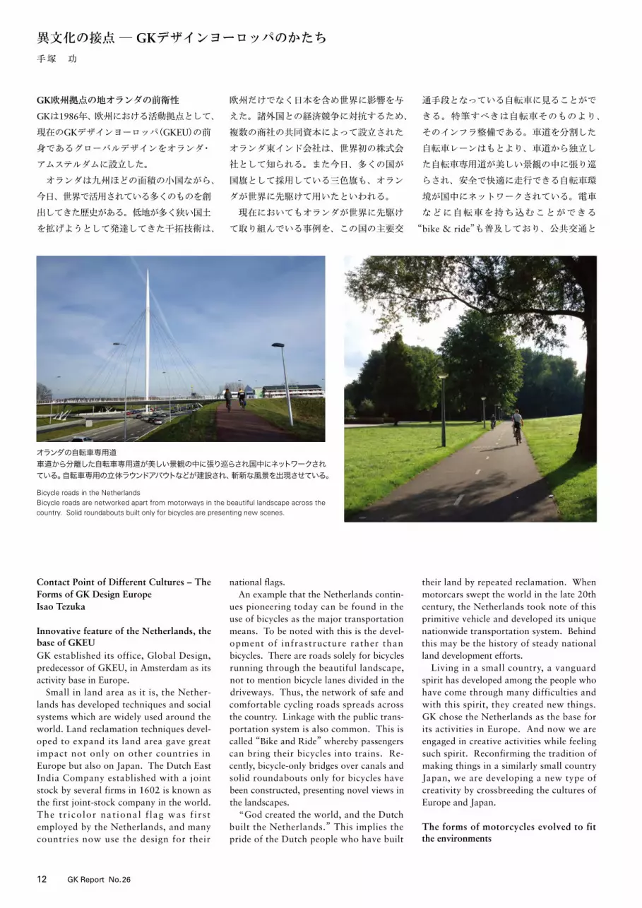
GK欧州拠点の地オランダの前衛性
GKは1986年、欧州における活動拠点として、
現在のGKデザインヨーロッパ(GKEU)の前
身であるグローバルデザインをオランダ・
アムステルダムに設立した。
オランダは九州ほどの面積の小国ながら、
今日、世界で活用されている多くのものを創
出してきた歴史がある。低地が多く狭い国土
を拡げようとして発達してきた干拓技術は、
欧州だけでなく日本を含め世界に影響を与
えた。諸外国との経済競争に対抗するため、
複数の商社の共同資本によって設立された
オランダ東インド会社は、世界初の株式会
社として知られる。また今日、多くの国が
国旗として採用している三色旗も、オラン
ダが世界に先駆けて用いたといわれる。
現在においてもオランダが世界に先駆け
て取り組んでいる事例を、この国の主要交
通手段となっている自転車に見ることがで
きる。特筆すべきは自転車そのものより、
そのインフラ整備である。車道を分割した
自転車レーンはもとより、車道から独立し
た自転車専用道が美しい景観の中に張り巡
らされ、安全で快適に走行できる自転車環
境が国中にネットワークされている。電車
などに自転車を持ち込むことができる
“bike & ride”も普及しており、公共交通と
の連携が新しい移動のスタイルを生んでい
る。昨今では運河にかかる自転車専用橋や、
自転車専用立体ラウンドアバウトなども建
設され、斬新な風景を出現させている。
「世界は神が創ったが、オランダはオラ
ンダ人が創った」──干拓を繰り返し自ら
の土地を築いてきたオランダ人の自負がう
かがわれる言葉である。車が世界を席巻し
た20世紀後半に、オランダが自転車とい
うプリミティブな乗り物にあえて焦点を当
て、独特な移動環境を国中に造り上げてき
たのには、こうした地道な国土づくりの歴
史が背景にあるのかもしれない。
幾多の困難を英知と努力で克服し常に新
しいものを創出してきたオランダには、小
国であるがゆえの前衛的精神が育まれてき
た。そのようなオランダをGKは欧州拠点
の地として選び、その精神を肌で感じなが
ら創造活動を行っている。そして同様に小
国でありながら発展してきた日本のモノづ
くりの原点を再認識し、欧州との異種交配
による新たな創造力を培っている。
環境に合わせてかたちを進化させるモー
ターサイクル
現在、GKEUはモーターサイクル等のパー
ソナルビークルを主な対象としてデザイン
活動を行っている。オランダが自転車を対
象としながら、その外に目を向け環境に新
しいかたちを創出してきたのとは対照的に、
モーターサイクルは様々な環境に適応する
ように、内在する技術を発達させながらそ
のかたちを進化させてきた。モーターサイ
クルの原型ともいえるネイキッドから、ワ
インディングロードの走行に優位なスポー
ツ、長距離の移動に対応したツーリング、
オフロードに適したアドベンチャーなど、
多様な環境や用途から新たなかたちが生ま
れてきた。
さらに欧州では歴史あるレース文化が
モーターサイクルの技術革新とかたちの進
化を牽引してきたともいえる。欧州を中心
に高い人気を集める“Moto GP”は、サー
キットレースの最高峰として最先端のテク
ノロジーがマシンに投入される。1907年
に始まった「マン島TTレース」は 開始以来
現在でも公道を使用して行われ、ロード
レースとしてのバイクを100年以上に渡っ
て育ててきた。元々は欧州・アフリカで行
われて、2009年に開催地を南米に移され
た「ダカール・ラリー」は、 世界一過酷な
レースといわれ、厳しい自然環境がライ
ダーやマシンに試練を与え続けてきた。
レースとは単なるスピード競争ではなく、
至難なコースや厳しい自然に対する人間の
挑戦である。ライダーとマシンとが一体と
なって限界に挑み、さらに高みを求めて進
化する姿に人々は熱狂する。そして新しい
かたちの創造こそが私達デザイナーにとっ
ての挑戦であることを、欧州のレースは再
認識させる。
日欧の接点が生むかたち
モーターサイクルは、19世紀中頃の欧州に
て開発された蒸気機関を搭載した二輪車が
その原型といわれる。鉄道、車、飛行機な
どの乗り物が時代を経ながら大量輸送に向
けて大型化していく中、人間にとって最少
単位の乗り物であり機動力に優位性をもつ
モーターサイクルは、むしろ「小さい」こ
とを大きな価値としながら進化していった。
小型で軽量のエンジンが求められた黎明期
の飛行機には、モーターサイクルの技術が
転用されることが少なくなかったという。
20世紀に入って以降、モーターサイク
ルの開発が世界に拡がり、日本にも多くの
メーカーが誕生した。小型・軽量という基
本的な条件は、元来日本が得意とするとこ
ろでもある。限られた大きさに内在する技
術を発達させながら、戦後、日本メーカー
の台頭は顕著となった。
GKが掲げるモーターサイクル・デザイン
の基本的なコンセプトの一つに「シンプル、
ライト、スリム、コンパクト」がある。さ
まざまなパーツが露出し複雑なメカの塊で
あるモーターサイクルを、一つの目的に
そってシンプルに構成し、人が跨がる乗り
物としてスリムでコンパクトにかたちづく
ることは、日本人が持ち続けてきた省の美
学にも通じる。
現在のGKEUは日本人と欧州人とが、ほ
ぼ同数のメンバーで構成されている。欧州
人メンバーの出身国もさまざまであり社内
では多様な言語が飛び交う。しかし国に
よって文化や歴史が異なる欧州を理解する
うえで、メンバーが多国籍であることは大
きな意義がある。深い歴史と多様な欧州文
化を肌で感じとってきた欧州人デザイナー
と、小さいことを優位に発想し、技術の進
歩とともにかたちを創造してきた日本人デ
ザイナー。前衛的精神に育まれたオランダ
を拠点としながら、日欧のコラボレーショ
ンにより、私達はどちらかだけでは生まれ
得ない新しいかたちづくりに挑んでいる。
五感で地球を移動する道具
今日、高速化した乗り物は世界の距離と時
間を一気に縮めている。しかしその内部空
間は外界から隔離され、あたかも自宅でく
つろぐような快適性が追求される。時速
300km近い高速列車の中で食事を楽しみ
ゲームに興じる乗客にとって、その高速の
移動が外部とどれほどの摩擦を起こしてい
るか知る由もない。
モーターサイクルは人間の身体を露出さ
せながら走る乗り物である。流れる景色や
風圧によってスピードを体感し、エンジン
の音や振動によってマシンと交感し、天候
や気温、周囲の音や臭いまでも含めて自然
を実感する。他の乗り物がそのスピードや
外部から人間の感覚を絶縁してしまった今
日、乗る者の五感をむき出しにして地球を
移動するモーターサイクルは、人間とモノ
と自然との本来の距離を実感させてくれる
道具ともいえよう。
オランダが未来に持続可能な国民の移動
具としての価値を自転車に見いだしたよう
に、私達はモーターサイクルというマシン
の中に、人間本来の感性的価値を見据えて
デザイン活動を続けている。
てづか いさお GKデザインヨーロッパ
代表取締役社長
異文化の接点 ─ GKデザインヨーロッパのかたち手塚 功
異文化の接点 /手塚 功
12 GK Report No.26 13GK Report No.26
Contact Point of Different Cultures – The Forms of GK Design EuropeIsao Tezuka
Innovative feature of the Netherlands, the base of GKEUGK established its office, Global Design, predecessor of GKEU, in Amsterdam as its activity base in Europe. Small in land area as it is, the Nether-lands has developed techniques and social systems which are widely used around the world. Land reclamation techniques devel-oped to expand its land area gave great impact not only on other countries in Europe but also on Japan. The Dutch East India Company established with a joint stock by several firms in 1602 is known as the first joint-stock company in the world. The t r i co lor nat ional f lag was f i r s t employed by the Netherlands, and many countries now use the design for their
national flags. An example that the Netherlands contin-ues pioneering today can be found in the use of bicycles as the major transportation means. To be noted with this is the devel-opment of infrastructure rather than bicycles. There are roads solely for bicycles running through the beautiful landscape, not to mention bicycle lanes divided in the driveways. Thus, the network of safe and comfortable cycling roads spreads across the country. Linkage with the public trans-portation system is also common. This is called “Bike and Ride” whereby passengers can bring their bicycles into trains. Re-cently, bicycle-only bridges over canals and solid roundabouts only for bicycles have been constructed, presenting novel views in the landscapes. “God created the world, and the Dutch built the Netherlands.” This implies the pride of the Dutch people who have built
their land by repeated reclamation. When motorcars swept the world in the late 20th century, the Netherlands took note of this primitive vehicle and developed its unique nationwide transportation system. Behind this may be the history of steady national land development efforts. Living in a small country, a vanguard spirit has developed among the people who have come through many difficulties and with this spirit, they created new things. GK chose the Netherlands as the base for its activities in Europe. And now we are engaged in creative activities while feeling such spirit. Reconfirming the tradition of making things in a similarly small country Japan, we are developing a new type of creativity by crossbreeding the cultures of Europe and Japan.
The forms of motorcycles evolved to fit the environments
Today, GKEU is engaged in designing mo-torcycles and other personal vehicles. The Netherlands focused on bicycles and created new forms in the environments to facilitate bicycle use. In contrast, we have evolved the forms of motorcycles to fit different environments while devising relevant techniques. They include the Naked as the prototype motorcycle, Sports for riding on winding roads, Touring for long-distance tours, and Adventure for off-road riding. Further in Europe, the racing culture has led the technical innovation of motorcycles. The “MotoGP” which is very popular in Europe and others as the highest echelon of circuit motorbike race draws in the latest technology in machines. The Isle of Man Tourist Trophy Race has been carried out on public roads since its beginning in 1907. The race helped the development of motor-bikes for road races over a century. The
Dakar Rally, formerly carried out in Europe and Africa and moved to Latin America in 2009, is said to be the harshest race, and the unforgiving natural environments have given challenging tests to riders and ma-chines. Races do not mean to simply compete against one another for speed. They are for riders and relevant people to demonstrate their abilities to ride on the most difficult courses and in severe natural environments. Riders operate their machines in an inte-grated manner as far as they can and further attempt to go one step higher in riding capability. Audiences become fren-zied by such riders and machines. Races in Europe remind us that, as designers, creat-ing new forms is our task.
Forms created out of interaction between Japanese and European designersIt is said that the original motorcycle is a
two-wheeled vehicle having a steam engine onboard which was developed in Europe in the mid-19th century. The motorcycle with its advantages in the small size and high mobility has evolved while other vehicles, railway trains, motorcars and airplanes have become larger to transport a greater number of passengers. In the early period of developing airplanes when small and light engines were required, techniques to manufacture motorcycles were applied. In the 20th century, motorcycle develop-ment spread to many countries in the world, and several manufacturers were established in Japan as well. Japanese designers are good at making small and light things. Japanese motorcycle manufac-turers devised parts and components and gained remarkable power after WWII. GK’s basic design concept for motor-cycles is that they should be “simple, light, slim and compact.” A motorcycle is an
ensemble of complicated mechanism parts of which many are exposed. It reflects the aesthetics of cutting corners that Japanese have excelled at for many years to build such a machine into a slim and compact vehicle for a rider to straddle. GKEU is composed of about the same numbers of Japanese and European employees. European members are from different countries, and various languages are exchanged in the office. It is meaning-ful, however, to have a multinational staff to understand European countries with different histories and cultures. European designers feel European cultures and long histories in their bones and Japanese designers have conceived smallness as our advantage and created forms along with technological advancement. Through Japanese-European collaboration, we are creating new forms which could not be created by either party alone in the Nether-
lands which has developed with people’s innovative spirit.
A tool to move around on the earth using all five sensesHigh-speed transportation means having shortened distances and time for traveling. But the interiors of these vehicles are insu-lated from the outside, ensuring the com-fort of the passengers and giving them a feeling of being at home. Passengers enjoy meals and games in a rapidly moving train running at nearly 300 km/hour without realizing the great level of friction that the rapid movement is making against the out-side air. In contrast, when riding motorcycles, the human body is exposed. The rider feels the speed by seeing the scenery pass by and feeling the pressure and buffeting of the wind, sympathizes with the machine through the sound and vibration of the
engine, and feels nature by the weather, temperature, sounds and smells of the surrounding environment. Where other vehicles have caused a disengagement of the human senses from speed and environs, the motorcycle which runs on the earth requir-ing that the rider use all five senses, can be said to be a tool that helps riders feel the distances between a human, a machine and nature. Like the Netherlands which has found the value of bicycles as a sustainable means for traveling, we find aesthetic values in a machine called a motorcycle and continue to design motorcycles.
Isao Tezuka, President, GK Design Europe
マン島TT(Tourist Trophy)レース1907年からイギリス王室属国のマン島で行われている歴史あるロードレース。市街地・山間部・海沿いを抜ける一周約60kmの公道を最高速度300km/hで走り抜けるライダーに観客は熱狂する。
The Isle of Man Tourist Trophy (TT) RaceA road race with a long history that started in 1907 conducted on the Isle of Man, a crown dependency. Riders run at a maximum speed of 300 km/hour on a 60km-long route passing through downtowns, moun-tains and along coasts. The crowd gets excited and frenzied.
オランダの自転車専用道車道から分離した自転車専用道が美しい景観の中に張り巡らされ国中にネットワークされている。自転車専用の立体ラウンドアバウトなどが建設され、斬新な風景を出現させている。
Bicycle roads in the NetherlandsBicycle roads are networked apart from motorways in the beautiful landscape across the country. Solid roundabouts built only for bicycles are presenting new scenes.

GK欧州拠点の地オランダの前衛性
GKは1986年、欧州における活動拠点として、
現在のGKデザインヨーロッパ(GKEU)の前
身であるグローバルデザインをオランダ・
アムステルダムに設立した。
オランダは九州ほどの面積の小国ながら、
今日、世界で活用されている多くのものを創
出してきた歴史がある。低地が多く狭い国土
を拡げようとして発達してきた干拓技術は、
欧州だけでなく日本を含め世界に影響を与
えた。諸外国との経済競争に対抗するため、
複数の商社の共同資本によって設立された
オランダ東インド会社は、世界初の株式会
社として知られる。また今日、多くの国が
国旗として採用している三色旗も、オラン
ダが世界に先駆けて用いたといわれる。
現在においてもオランダが世界に先駆け
て取り組んでいる事例を、この国の主要交
通手段となっている自転車に見ることがで
きる。特筆すべきは自転車そのものより、
そのインフラ整備である。車道を分割した
自転車レーンはもとより、車道から独立し
た自転車専用道が美しい景観の中に張り巡
らされ、安全で快適に走行できる自転車環
境が国中にネットワークされている。電車
などに自転車を持ち込むことができる
“bike & ride”も普及しており、公共交通と
の連携が新しい移動のスタイルを生んでい
る。昨今では運河にかかる自転車専用橋や、
自転車専用立体ラウンドアバウトなども建
設され、斬新な風景を出現させている。
「世界は神が創ったが、オランダはオラ
ンダ人が創った」──干拓を繰り返し自ら
の土地を築いてきたオランダ人の自負がう
かがわれる言葉である。車が世界を席巻し
た20世紀後半に、オランダが自転車とい
うプリミティブな乗り物にあえて焦点を当
て、独特な移動環境を国中に造り上げてき
たのには、こうした地道な国土づくりの歴
史が背景にあるのかもしれない。
幾多の困難を英知と努力で克服し常に新
しいものを創出してきたオランダには、小
国であるがゆえの前衛的精神が育まれてき
た。そのようなオランダをGKは欧州拠点
の地として選び、その精神を肌で感じなが
ら創造活動を行っている。そして同様に小
国でありながら発展してきた日本のモノづ
くりの原点を再認識し、欧州との異種交配
による新たな創造力を培っている。
環境に合わせてかたちを進化させるモー
ターサイクル
現在、GKEUはモーターサイクル等のパー
ソナルビークルを主な対象としてデザイン
活動を行っている。オランダが自転車を対
象としながら、その外に目を向け環境に新
しいかたちを創出してきたのとは対照的に、
モーターサイクルは様々な環境に適応する
ように、内在する技術を発達させながらそ
のかたちを進化させてきた。モーターサイ
クルの原型ともいえるネイキッドから、ワ
インディングロードの走行に優位なスポー
ツ、長距離の移動に対応したツーリング、
オフロードに適したアドベンチャーなど、
多様な環境や用途から新たなかたちが生ま
れてきた。
さらに欧州では歴史あるレース文化が
モーターサイクルの技術革新とかたちの進
化を牽引してきたともいえる。欧州を中心
に高い人気を集める“Moto GP”は、サー
キットレースの最高峰として最先端のテク
ノロジーがマシンに投入される。1907年
に始まった「マン島TTレース」は 開始以来
現在でも公道を使用して行われ、ロード
レースとしてのバイクを100年以上に渡っ
て育ててきた。元々は欧州・アフリカで行
われて、2009年に開催地を南米に移され
た「ダカール・ラリー」は、 世界一過酷な
レースといわれ、厳しい自然環境がライ
ダーやマシンに試練を与え続けてきた。
レースとは単なるスピード競争ではなく、
至難なコースや厳しい自然に対する人間の
挑戦である。ライダーとマシンとが一体と
なって限界に挑み、さらに高みを求めて進
化する姿に人々は熱狂する。そして新しい
かたちの創造こそが私達デザイナーにとっ
ての挑戦であることを、欧州のレースは再
認識させる。
日欧の接点が生むかたち
モーターサイクルは、19世紀中頃の欧州に
て開発された蒸気機関を搭載した二輪車が
その原型といわれる。鉄道、車、飛行機な
どの乗り物が時代を経ながら大量輸送に向
けて大型化していく中、人間にとって最少
単位の乗り物であり機動力に優位性をもつ
モーターサイクルは、むしろ「小さい」こ
とを大きな価値としながら進化していった。
小型で軽量のエンジンが求められた黎明期
の飛行機には、モーターサイクルの技術が
転用されることが少なくなかったという。
20世紀に入って以降、モーターサイク
ルの開発が世界に拡がり、日本にも多くの
メーカーが誕生した。小型・軽量という基
本的な条件は、元来日本が得意とするとこ
ろでもある。限られた大きさに内在する技
術を発達させながら、戦後、日本メーカー
の台頭は顕著となった。
GKが掲げるモーターサイクル・デザイン
の基本的なコンセプトの一つに「シンプル、
ライト、スリム、コンパクト」がある。さ
まざまなパーツが露出し複雑なメカの塊で
あるモーターサイクルを、一つの目的に
そってシンプルに構成し、人が跨がる乗り
物としてスリムでコンパクトにかたちづく
ることは、日本人が持ち続けてきた省の美
学にも通じる。
現在のGKEUは日本人と欧州人とが、ほ
ぼ同数のメンバーで構成されている。欧州
人メンバーの出身国もさまざまであり社内
では多様な言語が飛び交う。しかし国に
よって文化や歴史が異なる欧州を理解する
うえで、メンバーが多国籍であることは大
きな意義がある。深い歴史と多様な欧州文
化を肌で感じとってきた欧州人デザイナー
と、小さいことを優位に発想し、技術の進
歩とともにかたちを創造してきた日本人デ
ザイナー。前衛的精神に育まれたオランダ
を拠点としながら、日欧のコラボレーショ
ンにより、私達はどちらかだけでは生まれ
得ない新しいかたちづくりに挑んでいる。
五感で地球を移動する道具
今日、高速化した乗り物は世界の距離と時
間を一気に縮めている。しかしその内部空
間は外界から隔離され、あたかも自宅でく
つろぐような快適性が追求される。時速
300km近い高速列車の中で食事を楽しみ
ゲームに興じる乗客にとって、その高速の
移動が外部とどれほどの摩擦を起こしてい
るか知る由もない。
モーターサイクルは人間の身体を露出さ
せながら走る乗り物である。流れる景色や
風圧によってスピードを体感し、エンジン
の音や振動によってマシンと交感し、天候
や気温、周囲の音や臭いまでも含めて自然
を実感する。他の乗り物がそのスピードや
外部から人間の感覚を絶縁してしまった今
日、乗る者の五感をむき出しにして地球を
移動するモーターサイクルは、人間とモノ
と自然との本来の距離を実感させてくれる
道具ともいえよう。
オランダが未来に持続可能な国民の移動
具としての価値を自転車に見いだしたよう
に、私達はモーターサイクルというマシン
の中に、人間本来の感性的価値を見据えて
デザイン活動を続けている。
てづか いさお GKデザインヨーロッパ
代表取締役社長
Contact Point of Different Cultures – The Forms of GK Design EuropeIsao Tezuka
Innovative feature of the Netherlands, the base of GKEUGK established its office, Global Design, predecessor of GKEU, in Amsterdam as its activity base in Europe. Small in land area as it is, the Nether-lands has developed techniques and social systems which are widely used around the world. Land reclamation techniques devel-oped to expand its land area gave great impact not only on other countries in Europe but also on Japan. The Dutch East India Company established with a joint stock by several firms in 1602 is known as the first joint-stock company in the world. The t r i co lor nat ional f lag was f i r s t employed by the Netherlands, and many countries now use the design for their
national flags. An example that the Netherlands contin-ues pioneering today can be found in the use of bicycles as the major transportation means. To be noted with this is the devel-opment of infrastructure rather than bicycles. There are roads solely for bicycles running through the beautiful landscape, not to mention bicycle lanes divided in the driveways. Thus, the network of safe and comfortable cycling roads spreads across the country. Linkage with the public trans-portation system is also common. This is called “Bike and Ride” whereby passengers can bring their bicycles into trains. Re-cently, bicycle-only bridges over canals and solid roundabouts only for bicycles have been constructed, presenting novel views in the landscapes. “God created the world, and the Dutch built the Netherlands.” This implies the pride of the Dutch people who have built
their land by repeated reclamation. When motorcars swept the world in the late 20th century, the Netherlands took note of this primitive vehicle and developed its unique nationwide transportation system. Behind this may be the history of steady national land development efforts. Living in a small country, a vanguard spirit has developed among the people who have come through many difficulties and with this spirit, they created new things. GK chose the Netherlands as the base for its activities in Europe. And now we are engaged in creative activities while feeling such spirit. Reconfirming the tradition of making things in a similarly small country Japan, we are developing a new type of creativity by crossbreeding the cultures of Europe and Japan.
The forms of motorcycles evolved to fit the environments
Today, GKEU is engaged in designing mo-torcycles and other personal vehicles. The Netherlands focused on bicycles and created new forms in the environments to facilitate bicycle use. In contrast, we have evolved the forms of motorcycles to fit different environments while devising relevant techniques. They include the Naked as the prototype motorcycle, Sports for riding on winding roads, Touring for long-distance tours, and Adventure for off-road riding. Further in Europe, the racing culture has led the technical innovation of motorcycles. The “MotoGP” which is very popular in Europe and others as the highest echelon of circuit motorbike race draws in the latest technology in machines. The Isle of Man Tourist Trophy Race has been carried out on public roads since its beginning in 1907. The race helped the development of motor-bikes for road races over a century. The
Dakar Rally, formerly carried out in Europe and Africa and moved to Latin America in 2009, is said to be the harshest race, and the unforgiving natural environments have given challenging tests to riders and ma-chines. Races do not mean to simply compete against one another for speed. They are for riders and relevant people to demonstrate their abilities to ride on the most difficult courses and in severe natural environments. Riders operate their machines in an inte-grated manner as far as they can and further attempt to go one step higher in riding capability. Audiences become fren-zied by such riders and machines. Races in Europe remind us that, as designers, creat-ing new forms is our task.
Forms created out of interaction between Japanese and European designersIt is said that the original motorcycle is a
two-wheeled vehicle having a steam engine onboard which was developed in Europe in the mid-19th century. The motorcycle with its advantages in the small size and high mobility has evolved while other vehicles, railway trains, motorcars and airplanes have become larger to transport a greater number of passengers. In the early period of developing airplanes when small and light engines were required, techniques to manufacture motorcycles were applied. In the 20th century, motorcycle develop-ment spread to many countries in the world, and several manufacturers were established in Japan as well. Japanese designers are good at making small and light things. Japanese motorcycle manufac-turers devised parts and components and gained remarkable power after WWII. GK’s basic design concept for motor-cycles is that they should be “simple, light, slim and compact.” A motorcycle is an
ensemble of complicated mechanism parts of which many are exposed. It reflects the aesthetics of cutting corners that Japanese have excelled at for many years to build such a machine into a slim and compact vehicle for a rider to straddle. GKEU is composed of about the same numbers of Japanese and European employees. European members are from different countries, and various languages are exchanged in the office. It is meaning-ful, however, to have a multinational staff to understand European countries with different histories and cultures. European designers feel European cultures and long histories in their bones and Japanese designers have conceived smallness as our advantage and created forms along with technological advancement. Through Japanese-European collaboration, we are creating new forms which could not be created by either party alone in the Nether-
lands which has developed with people’s innovative spirit.
A tool to move around on the earth using all five sensesHigh-speed transportation means having shortened distances and time for traveling. But the interiors of these vehicles are insu-lated from the outside, ensuring the com-fort of the passengers and giving them a feeling of being at home. Passengers enjoy meals and games in a rapidly moving train running at nearly 300 km/hour without realizing the great level of friction that the rapid movement is making against the out-side air. In contrast, when riding motorcycles, the human body is exposed. The rider feels the speed by seeing the scenery pass by and feeling the pressure and buffeting of the wind, sympathizes with the machine through the sound and vibration of the
engine, and feels nature by the weather, temperature, sounds and smells of the surrounding environment. Where other vehicles have caused a disengagement of the human senses from speed and environs, the motorcycle which runs on the earth requir-ing that the rider use all five senses, can be said to be a tool that helps riders feel the distances between a human, a machine and nature. Like the Netherlands which has found the value of bicycles as a sustainable means for traveling, we find aesthetic values in a machine called a motorcycle and continue to design motorcycles.
Isao Tezuka, President, GK Design Europe
異文化の接点 /手塚 功
14 GK Report No.26 15GK Report No.26
異文化の接点 /手塚 功
Yamaha Motor Europe N.V.Moto Cage-six concept 2012既存のネイキッドモデルをベースに、様々なプロテクションパーツなどによって、アクロバティックなスタントライディングのイメージを付加したコンセプトモデル。
Yamaha Motor Europe N.V.Moto Cage-Six Concept 2012Using the existing Naked Model for the base, various protection parts were added to give the image of a bike designed for acrobatic stunt riding.
Yamaha Motor Europe N.V. Air Tricker concept 2004フリーライド・プレイバイクとして開発されたTrickerを、エンジンやフレームのさらなる軽量化を図り、360°ステアリングなどBMX(Bicycle Motocross)のような遊びを可能にするコンセプトモデル。
Yamaha Motor Europe N.V.Air Tricker Concept 2004 Tricker was developed as a motorbike for free-ride and sport activities. For this Air Tricker concept 2004, the engine and frame were lightened, and 360-degree steering capability was added. It would enable the rider to feel like riding a Bicycle Motocross (BMX).

消費の喧騒
未だ経済成長を続ける中国では、購買力の
高い都市部中間所得層が爆発的に増加した
ことで消費行動が活性化し、生活のあり方
が大きく変わった。街中を走り回る無数の
高級外車や都心部に数キロおきに立地する
高級商業施設を見れば、その様子は容易に
想像できるし、淘宝(タオバオ)や天猫
(TMALL)のようなECサイトで日常品から
家電まで気軽に購入する消費形態は、日常
生活の中にすっかり根付いている。毎年1
日限定で大々的なセールをすることで知ら
れる11月11日の「光棍節」にて、タオバオは
楽天市場の三ヶ月分もの売上を叩き出した。
新たなデザインの胎動
そんな喧騒の中、海外商品のデザインコ
ピーや海賊版が幅広く流通し「模倣天国」と
称される状況は相変わらずのようにも見え
るが、ここ数年で新しいデザインの潮流が
産まれつつあることもまた事実である。中
国消費経済と蜜月の関係を築き、富や地位
のステータスシンボルとして、そして他者
に対する面子を保つための「かたち」に中国
デザインが加担してきた現況への反動とし
て、新しい中国デザインが各分野で胎動し
て来ている。
2012年、建築界のノーベル賞とも称され
るプリツカー賞を大陸系中国人として初め
て受賞した王澍(Wang Shu)は、ガラスカー
テンウォールと新建材で形作られる中国全
土に蔓延する均質的なグローバリズム建築
とは一線を画した建築デザインを生業とす
る建築家である。王澍は中国古来の文化と
して根付いてきた伝統素材や工法をモダニ
ズムに則した現代建築プログラムにうまく
適合させることで、伝統文化の直接的参照
に留まらない新しい価値を持った中国建築
を創り出している。
また、無印良品は5年振りとなる国際デザ
インコンペを、「未来のくらしに続くデザ
イン」というテーマの元に中国で開催した。
審査員として日欧米の名だたるデザイナー
が名を連ねる中、先述の王澍やアラン・チャ
ンを含む中国・台湾・香港のデザイナーも参
加しているのが大きな特徴である。無印良
品は、日本ブランドとしての知名度を生か
し、高品質、安全性をメッセージに比較的
高級路線で中国展開をしているが、デザイ
ンについては「物足りない」「そっけない」と、
広く受け入れられているとはなかなか言い
難い現状である。ただし、日本らしいデザ
インを中国の消費者に向けて粘り強く発信
している無印良品の動向は今後も注目すべ
きであろう。
一方で、携帯電話は中国デザインを牽引す
る分野になりつつある。大陸全土に有象無
象の携帯電話メーカーが乱立する中、中国
版スティーブ・ジョブズとも呼ばれる雷軍
(Lei Jun)CEOが率いる新興メーカーの小
米科技(Xiaomi)は、洗練された造形デザ
インもさることながら、iPhoneやサムスン
GALAXYと同等のスペックを持ちつつ販
売価格が半額という商品を武器に、創業4
年足らずにも関わらず大きな成功を収めて
いる。2013年の第二四半期の中国市場シェ
アではAppleのiPhoneをとうとう追い抜き、
今後の海外進出も視野に入れている小米は
「安かろう悪かろう」という中国製品へのス
テレオタイプに対し「安くて良いもの」への
挑戦を続けている。
中国における「わかりやすい」デザイン
北方人・南方人の気質の違いや内陸・沿岸部
都市の所得格差、そして80后(1980年代生
まれの中国人の呼称)を中心とした世代間
意識の違いもあり、中国消費市場を一括り
に分析することは不可能である。地域、収入、
世代によって求められる商品の特性が大き
く変わってくる中国では、常に「わかりや
すい」デザインが求められる。この「わかり
やすい」は、先述した無印良品が持ち合わ
せているような簡潔さ、素朴さを表す形容
詞ではなく、「何か」が「わかりやすい」デザ
イン、というような「何か」を形容する意味
合いである。つまり、他者に対して自分が
「お金を持っていること」「良い暮らしをし
ていること」「幸せであること」を他者に対
して「わかりやすく」顕示できるデザインを
中国人は求めるのである。中国人の面子を
満たすべく、消費経済からの多様な要請に
対してデザインが応えていくという構図は、
この「わかりやすさ」への依存に起因してい
る。その結果、中国の「わかりやすい」デザ
インは決して洗練されたものではなく、ど
ちらかといえば装飾過多で成金趣味のテイ
ストに近い。昨年発売されたiPhone 5sの
ゴールドが、土豪金(地方部富裕層の好き
な金色)と揶揄されつつもグレイ、シルバー
に比べ一番売れているのも上記の「わかり
やすさ」を求めた結果によるものであろう。
GK上海の目指す中国デザイン
このような状況の中、2013年にTHERMOS
中国の中国市場向けステンレス魔法瓶のデ
ザインをGK上海は担当した。そこで我々
が目指したものは、現代中国人が求める「わ
かりやすさ」を安直にカタチにするのでは
なく、中国伝統文化で脈々と培われてきた
茶瓶の記憶や使用感覚をカタチに落とし込
んでいくという、どちらかというと「わか
りやすさ」とは距離を置いたデザインで
あった。中国伝統文化を参照せんとする現
代デザインは、中国古来の造形やパターン
を直喩的に目に見えるカタチで引用するこ
とに終始しがちだが、我々は中国伝統文化
の持つ文脈を丁寧に読み解き、現代技術を
以って「翻訳」した上で、新しい「チャイニー
ズモダン」を創り出すことに注力した。そ
れは先述の王澍の中国伝統文化を自身の建
築デザインに取り込もうとするアプローチ
にも相通じるところがある。
デザインの特徴の一つである竹を思わせ
る造形も中国の伝統文化の文脈を読み解い
たものである。竹筒は中国で古来より食べ
物を詰め、飲み物を入れて携帯するための
器としての機能を持っていた。この製品は
現代に甦った竹筒なのである。そして、中
国人は日本人以上にお茶を飲むことが大好
きな人々である。そのため、コップの飲み
口は中国の湯のみ茶碗を思わせる曲線を描
いており、普段から慣れ親しんだ茶碗の使
用体験を身体的に感じることができる。
このように、我々GK上海は中国伝統文
化の文脈を丁寧に読み解き、中国人消費者
の情感に訴えかけるようなデザインを中国
人デザイナーと共に試行錯誤しながら今後
も目指していきたい。
おさだ よしあき GK上海 室長
新たな中国デザインの黎明 ─ GK上海のかたち長田喜晃
新たな中国デザインの黎明 /長田喜晃
16 GK Report No.26 17GK Report No.26
Dawn of Design in China – The Forms of GK GK ShanghaiYoshiaki Osada
Bustling ConsumptionAs the economy is growing in China, people in the middle-income class in urban sectors have increased in number rapidly. They have come to have strong consump-tion power, and their consumption behav-ior and lifestyle have greatly changed. It is easily seen in a number of foreign-brand motorcars running around in the city and high class shopping complexes at every several kilometers in city centers. Purchas-ing daily commodities and household elec-tric appliances through e-commerce sites such as Taobao and Tmall has taken root in people’s daily life. On Quāng Gun Jié (November 11) is known as a day when shops conduct grand sales, and the total sale of Taobao corresponded the amount of
3-month sales of Rakuten.
Stirring of DesignUnder such a bustling atmosphere, the situ-ation commonly called “imitation para-dise” does not seem to have changed observing the market selling copy products and pirated versions of overseas manufac-turers. Even so, it is also true that a new design trend has been emerging in the past several years. New Chinese designs are coming out in various sectors as a retroac-tion to the situation of Chinese designers who have built close relations with the con-sumption economy, and who played a part in designing “forms” as the symbols of wealth and status, or means to save one’s prestige. Wang Shu became the first mainland Chinese architect to receive the Pritzker Architecture Prize, commonly known as a Nobel Prize in architecture, in 2012. His
design draws the line from homogeneous globalist designs using glass curtain walls and new construction materials prevalent across China. He creates Chinese style buildings skillfully applying traditional materials and building methods to modern architectural programs. Thus, he adds a new value to his design beyond direct refer-ence to traditional Chinese culture. Ryohin Keikaku Co., Ltd. sponsored the MUJI Award International Design Compe-tition in China 04 under the theme “De-signs that will continue to life in the future” after five years from the previous one. Among the jury were Wang Shu, Alan Chan and other designers from China, Taiwan and Hong Kong in addition to renowned designers from Japan, Europe and the USA. Taking advantage of public recognition as a Japanese brand, MUJI products are sold as high quality and safe products with the image of relatively high-
class merchandise in China. However, it can be hardly said that the design of MUJI products are widely accepted, because many comment they are “unfriendly” or “too plain.” Even so, we should keep our eye on the developments of MUJI’s persis-tent merchandising of Japanese-style designs to Chinese consumers. Meanwhile, mobile phones are now becoming the driving force for Chinese designers. A number of mobile phone manufacturers are founded. The most notable one is emerging company Xiaomi led by CEO Lei Jun, reputed as “Steve Jobs” in China. It launched phones with sophisticated designs with the identical specifications with iPhone and Samsung’s Galaxy, and sells at half the price of theirs. With this advantage, the company achieved a success just in four years after its founda-tion. In the second quarter of 2013, it outdid Apple’s iPhone in market share in
China. It now intends to export its prod-ucts overseas, challenging the stereotype notoriety “cheap Chinese products but poor in quality” to promote the image of “cheap and good quality products.”
“Easy-to-Understand” Design in ChinaIt is difficult to analyze China’s market as a whole because of differences in character between northern people and southern people, gaps in income between inland rural population and coastal city popula-tion, and a generation gap in consciousness between people born before and after the 1980s. The features of merchandise vary according to regions, and consumers’ income and generations, but one thing common is that they seek “easy to under-stand” designs. This “easy to understand” design does not mean to be simple, or artless, as that of MUJI merchandise, but it means “easy for others to understand what
I am.” In other words, for Chinese people, a design should show that the person having it “is wealthy,” “is living a well-off life,” or “is happy” to other people. This is the background that designers respond to various demands from the consumption economy - to satisfy the desire of the Chi-nese to preserve their face. Eventually, Chi-nese “easy-to-understand” designs are far from being sophisticated. They are often over-decorated, presenting an air of vulgar prosperity. People make a mock of iPhone Gold launched last year as “gold that the wealthy in rural areas are fond of,” but, in fact, the type is better sold than grey and silver coated ones. It may be the result of seeking an “easy-to-understand” design.
Chinese Design that GK Shanghai aims atGK Shanghai was assigned with the design of a stainless steel thermos bottle for Ther-mos China in 2013 for the domestic
market. We aimed to express people’s memory and touch of traditional teapots in China into a form, instead of just visualiz-ing the “ease of understanding” that con-temporary Chinese consumers seek. As the matter of fact, the design came out to be far from being easy to understand. Contempo-rary designs intended to refer to Chinese traditional design tend to similize ancient designs and patterns in visible forms. But we carefully studied Chinese traditional culture, and “translated” it with contempo-rary technology, and focused on creating new Chinese modern des igns . This approach has something in common with aforementioned Wang Shu who takes Chi-nese traditional culture into his architec-tural designs. The design of the thermos bottle sugges-tive of bamboo, an important design element of China, was inspired after read-ing the context of Chinese traditional
culture. A bamboo cylinder has long been used as a vessel to carry food and drinks in China. The thermos is a bamboo cylinder revived in today’s China. Chinese people are fond of drinking tea. The edge of the cup is curved like a tea cup so that people can feel like drinking just as they drink from their teacups. Together with Chinese colleagues, we at GK Shanghai will continue to study Chi-nese culture and create designs that will be appealing to Chinese consumers.
Yoshiaki Osada, Chief Designer,GK Shanghai
中国最大のショッピングサイト「淘宝」。日常品から家電までなんでも揃っている。
Taobao, the largest shopping site in China. It sells daily commodities to household electronics.
王澍設計による寧波博物館(2008年)。廃材レンガを積極的に利用した建築ファサードが特徴。
Ningbo History Museum designed by Wang Shu (2008). It features the façade made of recycled bricks.
去年10月に発売された小米科技の最新スマートフォン「小米手机3」。スペックはiPhone 5sと同等ながら価格は半分以下。
Latest smart phone “Xiaomi hand phone 3” by Xiaomi Inc. Its specifications are the same as iPhone 5s but the price is less than half of it.
Photo : Thomas Stellmach, http://www.flickr.com/photos/dysturb/3439367284/sizes/o/
上海を代表するショッピングストリートである淮海路に昨年オープンした高級商業施設「iapm」。左の特徴的なファサードはPRADA上海旗艦店。iapmには上海4店舗目となるアップルストアや無印良品の上海旗艦店も入っているほか、すぐ近くには世界最大の売り場面積を持つユニクロ旗艦店も同時期にオープン。
High-class commercial complex “iapm” opened in 2013 in Huaihai Lu, a famous shopping street in Shanghai. The characteristic façade on the left is Prada Shanghai. In “iapm,” 4th Apple Store in Shang-hai and Muji’s Shanghai flagship store are housed among others. In close neighborhood there is Uniqlo’s Shanghai store, with the world largest store space which was opened around the same time as “iapm.”
Photo : Dead Simon, http://www.flickr.com/photos/qiaomeng/9500679025/sizes/l/

消費の喧騒
未だ経済成長を続ける中国では、購買力の
高い都市部中間所得層が爆発的に増加した
ことで消費行動が活性化し、生活のあり方
が大きく変わった。街中を走り回る無数の
高級外車や都心部に数キロおきに立地する
高級商業施設を見れば、その様子は容易に
想像できるし、淘宝(タオバオ)や天猫
(TMALL)のようなECサイトで日常品から
家電まで気軽に購入する消費形態は、日常
生活の中にすっかり根付いている。毎年1
日限定で大々的なセールをすることで知ら
れる11月11日の「光棍節」にて、タオバオは
楽天市場の三ヶ月分もの売上を叩き出した。
新たなデザインの胎動
そんな喧騒の中、海外商品のデザインコ
ピーや海賊版が幅広く流通し「模倣天国」と
称される状況は相変わらずのようにも見え
るが、ここ数年で新しいデザインの潮流が
産まれつつあることもまた事実である。中
国消費経済と蜜月の関係を築き、富や地位
のステータスシンボルとして、そして他者
に対する面子を保つための「かたち」に中国
デザインが加担してきた現況への反動とし
て、新しい中国デザインが各分野で胎動し
て来ている。
2012年、建築界のノーベル賞とも称され
るプリツカー賞を大陸系中国人として初め
て受賞した王澍(Wang Shu)は、ガラスカー
テンウォールと新建材で形作られる中国全
土に蔓延する均質的なグローバリズム建築
とは一線を画した建築デザインを生業とす
る建築家である。王澍は中国古来の文化と
して根付いてきた伝統素材や工法をモダニ
ズムに則した現代建築プログラムにうまく
適合させることで、伝統文化の直接的参照
に留まらない新しい価値を持った中国建築
を創り出している。
また、無印良品は5年振りとなる国際デザ
インコンペを、「未来のくらしに続くデザ
イン」というテーマの元に中国で開催した。
審査員として日欧米の名だたるデザイナー
が名を連ねる中、先述の王澍やアラン・チャ
ンを含む中国・台湾・香港のデザイナーも参
加しているのが大きな特徴である。無印良
品は、日本ブランドとしての知名度を生か
し、高品質、安全性をメッセージに比較的
高級路線で中国展開をしているが、デザイ
ンについては「物足りない」「そっけない」と、
広く受け入れられているとはなかなか言い
難い現状である。ただし、日本らしいデザ
インを中国の消費者に向けて粘り強く発信
している無印良品の動向は今後も注目すべ
きであろう。
一方で、携帯電話は中国デザインを牽引す
る分野になりつつある。大陸全土に有象無
象の携帯電話メーカーが乱立する中、中国
版スティーブ・ジョブズとも呼ばれる雷軍
(Lei Jun)CEOが率いる新興メーカーの小
米科技(Xiaomi)は、洗練された造形デザ
インもさることながら、iPhoneやサムスン
GALAXYと同等のスペックを持ちつつ販
売価格が半額という商品を武器に、創業4
年足らずにも関わらず大きな成功を収めて
いる。2013年の第二四半期の中国市場シェ
アではAppleのiPhoneをとうとう追い抜き、
今後の海外進出も視野に入れている小米は
「安かろう悪かろう」という中国製品へのス
テレオタイプに対し「安くて良いもの」への
挑戦を続けている。
中国における「わかりやすい」デザイン
北方人・南方人の気質の違いや内陸・沿岸部
都市の所得格差、そして80后(1980年代生
まれの中国人の呼称)を中心とした世代間
意識の違いもあり、中国消費市場を一括り
に分析することは不可能である。地域、収入、
世代によって求められる商品の特性が大き
く変わってくる中国では、常に「わかりや
すい」デザインが求められる。この「わかり
やすい」は、先述した無印良品が持ち合わ
せているような簡潔さ、素朴さを表す形容
詞ではなく、「何か」が「わかりやすい」デザ
イン、というような「何か」を形容する意味
合いである。つまり、他者に対して自分が
「お金を持っていること」「良い暮らしをし
ていること」「幸せであること」を他者に対
して「わかりやすく」顕示できるデザインを
中国人は求めるのである。中国人の面子を
満たすべく、消費経済からの多様な要請に
対してデザインが応えていくという構図は、
この「わかりやすさ」への依存に起因してい
る。その結果、中国の「わかりやすい」デザ
インは決して洗練されたものではなく、ど
ちらかといえば装飾過多で成金趣味のテイ
ストに近い。昨年発売されたiPhone 5sの
ゴールドが、土豪金(地方部富裕層の好き
な金色)と揶揄されつつもグレイ、シルバー
に比べ一番売れているのも上記の「わかり
やすさ」を求めた結果によるものであろう。
GK上海の目指す中国デザイン
このような状況の中、2013年にTHERMOS
中国の中国市場向けステンレス魔法瓶のデ
ザインをGK上海は担当した。そこで我々
が目指したものは、現代中国人が求める「わ
かりやすさ」を安直にカタチにするのでは
なく、中国伝統文化で脈々と培われてきた
茶瓶の記憶や使用感覚をカタチに落とし込
んでいくという、どちらかというと「わか
りやすさ」とは距離を置いたデザインで
あった。中国伝統文化を参照せんとする現
代デザインは、中国古来の造形やパターン
を直喩的に目に見えるカタチで引用するこ
とに終始しがちだが、我々は中国伝統文化
の持つ文脈を丁寧に読み解き、現代技術を
以って「翻訳」した上で、新しい「チャイニー
ズモダン」を創り出すことに注力した。そ
れは先述の王澍の中国伝統文化を自身の建
築デザインに取り込もうとするアプローチ
にも相通じるところがある。
デザインの特徴の一つである竹を思わせ
る造形も中国の伝統文化の文脈を読み解い
たものである。竹筒は中国で古来より食べ
物を詰め、飲み物を入れて携帯するための
器としての機能を持っていた。この製品は
現代に甦った竹筒なのである。そして、中
国人は日本人以上にお茶を飲むことが大好
きな人々である。そのため、コップの飲み
口は中国の湯のみ茶碗を思わせる曲線を描
いており、普段から慣れ親しんだ茶碗の使
用体験を身体的に感じることができる。
このように、我々GK上海は中国伝統文
化の文脈を丁寧に読み解き、中国人消費者
の情感に訴えかけるようなデザインを中国
人デザイナーと共に試行錯誤しながら今後
も目指していきたい。
おさだ よしあき GK上海 室長
Dawn of Design in China – The Forms of GK GK ShanghaiYoshiaki Osada
Bustling ConsumptionAs the economy is growing in China, people in the middle-income class in urban sectors have increased in number rapidly. They have come to have strong consump-tion power, and their consumption behav-ior and lifestyle have greatly changed. It is easily seen in a number of foreign-brand motorcars running around in the city and high class shopping complexes at every several kilometers in city centers. Purchas-ing daily commodities and household elec-tric appliances through e-commerce sites such as Taobao and Tmall has taken root in people’s daily life. On Quāng Gun Jié (November 11) is known as a day when shops conduct grand sales, and the total sale of Taobao corresponded the amount of
3-month sales of Rakuten.
Stirring of DesignUnder such a bustling atmosphere, the situ-ation commonly called “imitation para-dise” does not seem to have changed observing the market selling copy products and pirated versions of overseas manufac-turers. Even so, it is also true that a new design trend has been emerging in the past several years. New Chinese designs are coming out in various sectors as a retroac-tion to the situation of Chinese designers who have built close relations with the con-sumption economy, and who played a part in designing “forms” as the symbols of wealth and status, or means to save one’s prestige. Wang Shu became the first mainland Chinese architect to receive the Pritzker Architecture Prize, commonly known as a Nobel Prize in architecture, in 2012. His
design draws the line from homogeneous globalist designs using glass curtain walls and new construction materials prevalent across China. He creates Chinese style buildings skillfully applying traditional materials and building methods to modern architectural programs. Thus, he adds a new value to his design beyond direct refer-ence to traditional Chinese culture. Ryohin Keikaku Co., Ltd. sponsored the MUJI Award International Design Compe-tition in China 04 under the theme “De-signs that will continue to life in the future” after five years from the previous one. Among the jury were Wang Shu, Alan Chan and other designers from China, Taiwan and Hong Kong in addition to renowned designers from Japan, Europe and the USA. Taking advantage of public recognition as a Japanese brand, MUJI products are sold as high quality and safe products with the image of relatively high-
class merchandise in China. However, it can be hardly said that the design of MUJI products are widely accepted, because many comment they are “unfriendly” or “too plain.” Even so, we should keep our eye on the developments of MUJI’s persis-tent merchandising of Japanese-style designs to Chinese consumers. Meanwhile, mobile phones are now becoming the driving force for Chinese designers. A number of mobile phone manufacturers are founded. The most notable one is emerging company Xiaomi led by CEO Lei Jun, reputed as “Steve Jobs” in China. It launched phones with sophisticated designs with the identical specifications with iPhone and Samsung’s Galaxy, and sells at half the price of theirs. With this advantage, the company achieved a success just in four years after its founda-tion. In the second quarter of 2013, it outdid Apple’s iPhone in market share in
China. It now intends to export its prod-ucts overseas, challenging the stereotype notoriety “cheap Chinese products but poor in quality” to promote the image of “cheap and good quality products.”
“Easy-to-Understand” Design in ChinaIt is difficult to analyze China’s market as a whole because of differences in character between northern people and southern people, gaps in income between inland rural population and coastal city popula-tion, and a generation gap in consciousness between people born before and after the 1980s. The features of merchandise vary according to regions, and consumers’ income and generations, but one thing common is that they seek “easy to under-stand” designs. This “easy to understand” design does not mean to be simple, or artless, as that of MUJI merchandise, but it means “easy for others to understand what
I am.” In other words, for Chinese people, a design should show that the person having it “is wealthy,” “is living a well-off life,” or “is happy” to other people. This is the background that designers respond to various demands from the consumption economy - to satisfy the desire of the Chi-nese to preserve their face. Eventually, Chi-nese “easy-to-understand” designs are far from being sophisticated. They are often over-decorated, presenting an air of vulgar prosperity. People make a mock of iPhone Gold launched last year as “gold that the wealthy in rural areas are fond of,” but, in fact, the type is better sold than grey and silver coated ones. It may be the result of seeking an “easy-to-understand” design.
Chinese Design that GK Shanghai aims atGK Shanghai was assigned with the design of a stainless steel thermos bottle for Ther-mos China in 2013 for the domestic
market. We aimed to express people’s memory and touch of traditional teapots in China into a form, instead of just visualiz-ing the “ease of understanding” that con-temporary Chinese consumers seek. As the matter of fact, the design came out to be far from being easy to understand. Contempo-rary designs intended to refer to Chinese traditional design tend to similize ancient designs and patterns in visible forms. But we carefully studied Chinese traditional culture, and “translated” it with contempo-rary technology, and focused on creating new Chinese modern des igns . This approach has something in common with aforementioned Wang Shu who takes Chi-nese traditional culture into his architec-tural designs. The design of the thermos bottle sugges-tive of bamboo, an important design element of China, was inspired after read-ing the context of Chinese traditional
culture. A bamboo cylinder has long been used as a vessel to carry food and drinks in China. The thermos is a bamboo cylinder revived in today’s China. Chinese people are fond of drinking tea. The edge of the cup is curved like a tea cup so that people can feel like drinking just as they drink from their teacups. Together with Chinese colleagues, we at GK Shanghai will continue to study Chi-nese culture and create designs that will be appealing to Chinese consumers.
Yoshiaki Osada, Chief Designer,GK Shanghai
新たな中国デザインの黎明/長田喜晃
18 GK Report No.26 19GK Report No.26
新たな中国デザインの黎明/長田喜晃
GK上海のデザインによる中国向けステンレス魔法瓶 Thermos made from stainless steel designed by GK Shanghai for the Chinese market.
Photo : Masaaki UMEDA

地球を客観的に見る視点を人類が手に入れ
たのは、アポロ宇宙船で月に向かったとき
が初めてではないだろうか。1968年Apollo8
が月周回軌道から撮影したカラー写真は
「Earthrise」と呼ばれ「史上最も影響力を
持った写真」と言われる。1972年月に向か
う宇宙船Apollo17からカラーフィルムカ
メラで撮影した地球は45000kmの宇宙か
ら見たFull MoonならぬFull Earthの映像と
して今でも貴重な一枚である。「かけがえ
のない地球」という感覚は宇宙からの視点
を持つことがなければ生まれなかったこと
は確かである。
2000年より手がけている「触れる地球」は
地球の今を体感できるメディアをつくると
いう試みである。もっとも基本となる映像
は、宇宙から見た地球であり、「触れる地
球」には30分毎に更新される気象衛星から
の雲画像をインターネットから取得して
「準リアルタイム」で表示する仕組みを持
たせた。
天気予報のTV放送番組の定番は日本付
近の雲の変化の映像である。狭いフレーム
で切り取られた地形図の上に赤外線で見た
雲を合成した画像は、残念ながら宇宙から
の視点を感じとれない。「触れる地球」は日
本という地域にとどまらず全地球的な自然
現象としての気象を球体上で見られるメ
ディアを提供した。高精細の赤外線雲画像
とNASAの地球観測衛星の膨大な集積から
作成された地球画像(この画像をNASAで
は「The Blue Marble」と呼ぶ)を合わせた
美しい地球像を表示したことは大きな前進
であるとは思う。しかし、あくまでも合成
された映像であることに不満がある。
サイエンスとして読み解く以前に、もっ
ともナチュラルな「今の地球をこの目で宇
宙から見る」というきわめて自然な欲求を
満たすことはできないのだろうか?
合成ではないリアリティのある地球像で
「神々しい」地球で起こっている自然現象
としての気象を実感できるようにすれば茶
の間から「地球観」を変えていく力になる。
地球から月をみる「月見」のように月から
地球をみる「地球見」を仮説してみよう。
だれもが指させる場所から見ているとい
う感覚は最も直感的に理解しやすい。その
わかりやすさは肉眼では見えない静止衛星
に優る。
月の有人「地球見台」は将来の月面宇宙
基地の実現後の最も魅力的な話題になる。
完全に無彩色の月面を背景に、地球から
見る月の4倍の直径のカラフルな地球が浮
かぶ。月面に降り立てば、地球に同じ面を
向けている月であるから、ほぼ同じ位置に
地球が見え続ける。背景の星空は約1ヶ月
のサイクルで巡り、月面の昼夜と同期して
地球の満ち欠けが起こる。月が「新月」の時、
地球は「満地球」。「満月」の時、地球は「新
地球」。1日に1回の周期で地球はゆったり
と自転して見える。月面上で地球はわかり
やすい世界時計になっている。
有人はまだ先のことだとして、無人の「地
球見台」を実現するのは技術的には今でも
可能である。
月から見る地球の姿をリアルタイムで
「触れる地球」に表示できるようになるの
である。窓際に子供を連れて行って、今あ
の月から地球を見ている映像がこの「触れ
る地球」に写っていると話せるとき、宇宙
からの目を手にした実感が湧いてくるに違
いない。
高度で難解になってしまった今の科学技術
の世界をもう一度身近で手にできることか
ら編み直してみよう。日々の暮らしを営む
人の自然な感覚で捉えられることを積み上
げれば確かな共感の輪を広げられるプロ
ジェクトになる。世界中で「私も手にした
い」と思う「人」が集まり資金を集め月に「地
球見台」を送る。国家でも企業でもない
「人」が思いを具現化する。そんな仕組み
が可能な時代である。
アイデアを束ね、具現化にむけてプランを
組み上げ実行する。
そこで核をなすのがデザインという考え
方であるとわたしは思う。
いわまさ りゅういち GKテック
代表取締役社長
技術とデザインのその先 1 (新連載)
月のウサギが見る地球
岩政隆一
20 GK Report No.26 21GK Report No.26
Earth that a rabbit views from the moonRyuichi Iwamasa
I recall that it was when humans headed to the moon on a spacecraft under the Apollo program that an objective view of the earth was first ob-tained. The color photo taken from the orbit round the moon in 1968 by Apollo 8 is called “Earthrise” and is considered to be the “most in-fluential photo in history.” Another one taken by Apollo 17 is still a precious photo of the “Full Earth,” instead of the Full Moon, photographed at a distance of 45,000 km from the earth. It is certain that the sense of the “invaluable earth” could not have been developed without having the perspective to see the earth from outer space. The Tangible Earth project that we have been engaged in since 2000 is an attempt to create a device to show the actual condition of the earth. The basic imagery is the current state of the earth observed from space. The Tangible Earth is equipped with a mechanism to receive
the cloud images transmitted from the climate satellite every 30 minutes via the Internet, and to show them in semi-real time on its surface. The usual TV weather forecasts show the changing images of clouds over Japan and its vi-cinity. These images are made by composing the photos of clouds taken by an infrared camera on the narrow frame of topographic map. Unfortu-nately, we can hardly feel the perspective of outer space from these images. The Tangible Earth is a spherical device showing the weather as natu-ral phenomena not limited to Japan but of the whole world. It is a great advancement that high definition infrared cloud images and the earth images created from the enormous volume of image data from NASA’s earth observation sat-ellite (NASA names the imagery “The Blue Marble”) are composed to exhibit the beautiful images of the earth. Even so, I feel unsatisfied that these images are being composed artificially. I wonder if it is possible to satisfy our natu-ral desire to “see the present earth from outer
space with our eyes” in a more natural man-ner before we obtain scientific information. If we could present a spherical body showing weather as natural phenomena on the “celes-tial” earth with greater reality instead of syn-thetic photos, it would be a strong power to help people change their views on the earth.
Suppose we were to enjoy “earth viewing” from the moon as we have “moon viewing” events on the earth. It is intuitively easy to imagine viewing the earth from a place on the moon that anyone can point their fingers at from the earth. This will provide us with a greater advantage than a stationary satellite which we cannot see with the naked eye. Against the completely achromatic moon surface, the colorful earth floats which is four times as large in diameter as that of the moon seen from the earth. As the moon continually shows the same face to the earth, if one stood on the moon surface, he would continue to see
the earth almost at the same position. The starry sky in the background rotates nearly in the cycle of a month, the earth waxes and wanes synchronizing with the day and night of the moon surface. When the moon is “new,” the earth is “full,” and when the moon is “full,” the earth is “new.” The earth is seen to be slowly rotating once per day. From the moon surface, the earth functions as an easy-to-understand world time clock. A “manned earth viewing platform” on the moon may provide an intriguing topic after the moon surface space station becomes a real-ity sometime in the future, but an “unmanned earth viewing platform” can be brought into existence technologically even today. It would be in the not-so-distant future that the live earth image could be shown on the Tangible Earth. When we bring our children to the window and tell them “the imagery of the earth as seen from the moon in the sky is reflected on this Tangible Earth,” we will for
sure have a realistic sensation that we have ob-tained vision from space.
We attempt to review and explain scientific technologies which are too difficult for people to understand in a friendly manner. If we start doing this in a way that people can understand in a natural way while living their day to day life, I am sure we can raise support among a greater number of people. When people who want to “obtain this one,” gather and collect funds, it is possible to send an “earth viewing platform” to the moon. It is not the govern-ment or business corporations, but individuals who can realize this venture. We are now in an age when such a mechanism can be devised.
Collect ideas, prepare plans for their realiza-tion, and implement them. The act of design-ing plays the core function in the process.
Ryuichi Iwamasa, President, GK Tech
New Series: Beyond Technology and Design 1
Earthrise1968年12月24日 Apollo8号月周回軌道上から撮った地球。宇宙船の動きで地球が昇るように見えた。日本の「かぐや」のハイビジョン映像の原像はここにある。
EarthriseDecember 24, 1968 Apollo 8The earth taken from the orbit round the moon. The appear-ance of the earth rising is affect-ed by the movement of the spacecraft. It is the virgin land-scape for the high-definition image of Japan’s selenological and eng ineer ing exp lo re r KAGUYA.
The Blue Marble1972年12月7日 Apollo17月に向かう宇宙船の窓から撮った満地球。
The Blue Marble December 7, 1972 Apollo 17The “Full Earth” taken from a window of the space-craft going to the moon.
ロシアの気象衛星から見た地球赤道上空36000kmの静止衛星軌道にあるロシアの気象衛星、Erectro-Lから見た地球の映像。
The earth from the Russian climate satellite The image of the earth taken from Erectro-L, Russian Climate Satellite on the geostationary satellite orbit at the height of 36000 km above the equator.
Photo : NASA
Photo : NASA Photo: RFSA
月から見た地球Starry Night / Simulation Curriculum Corpを用いて作成したシミュレーション画像。月面のNewtonクレータの中においた「地球見台」からのビュー。地球は「水平線」近くにほぼ固定されて常時見えている。
The earth viewed from the moonThe image of the earth seen from the moon is made using Starry Night by Simulation Curriculum Corp. View from the “Earth Viewing Platform” placed in the Newton crater on the moon. As the earth is stably placed at the horizontal line, it is always seen.
触れる地球1千万分の1のインタラクティブな地球儀。2000年に開発して以来、進化させながら現在に至る。国内海外合わせ30台弱設置した。昨年にはJVCケンウッドが中型を製品化し普及にはずみがついた。
An interactive globe on a scale of one to 10 million. In the time since the development of the original Tangible Earth in 2000, the Tangible Earth has been upgraded, and at present the Tangible Earth is installed at 30 places both inside and outside Japan. Last year, JVC Kenwood launched the middle-size Tangible Earth, and this has built momentum for popularization of Tangible Earth.
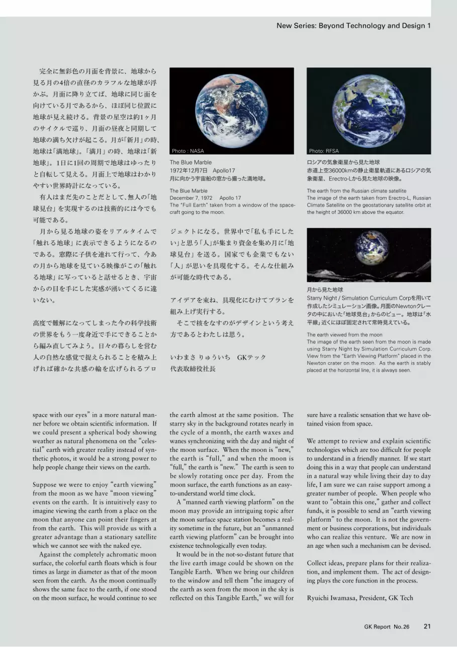

「栄久庵憲司と GKの世界──鳳が翔く」展 開催されるThe World of Kenji Ekuan and GK Design Group: Soaring High in the Sky
22 GK Report No.26 23GK Report No.26
2013年7月6日(土)から9月1日(日)まで、
世田谷美術館(東京)にて「栄久庵憲司とGK
の世界──鳳が翔く」展が開催された。
この展覧会の開催計画は、2011年に世
田谷美術館より栄久庵憲司会長へ企画展の
依頼があったことから始まった。その企画
内容は、「栄久庵憲司による道具と人のか
かわりから生まれるものづくりの思想につ
いて、栄久庵を中心としたGKデザイング
ループの活動を通じて紹介する」ことで
あった。
GKは、これまでにも自主企画による展
示をたびたび開催し、社会に向けて積極的
に提案・提言活動を行ってきた。しかし、
今回のように美術館で独自の調査が行われ
依頼される、という経緯での展覧会は初め
てのことであった。GKは、この申し出を
社会に対してデザインをご理解いただく好
機と捉え、快諾することとなった。また、
2012年に創立60周年を迎えたGKにとって
は、その記念事業の大きな柱となる展覧会
でもあった。
この展覧会で展示した多くのものは、
日々の生活の中で使用される日用品として
デザインされた製品である。それらが公共
の美術館の中に展示され、鑑賞の対象とな
り得るということは、新鮮で感慨深いもの
があった。また、「デザインとは何か」とい
う根本的な問いをあらためて自らに課す意
義深い機会ともなった。そして、そこに込
められた栄久庵会長の道具の思想とGKの
仕事を総合的に、デザインに関心を持つ人
だけでなく、広く一般の人にも紹介できた
ことは大きな喜びであった。
展覧会では、栄久庵会長がデザインを志
すにいたった背景や、GKというデザイン
グループが60年にわたって取り組んでき
た仕事の数々を紐解くように展示した。ま
た、未来に向けた提案をかたちとして発信
することができ、さらにはGKのものづく
りの根本にある、その哲学的な思想も表現
できたことは、フリーランスのデザイング
ループとしてのGKの存在を大いに社会に
アピールできたと考えている。
「鳳が翔く」というこの展覧会のテーマ設定
は栄久庵会長の発案による。中国紀元前4
世紀の哲学者・荘子のとなえた鳳の話から
着想を得たという。大きな流れは、現在か
ら暗闇のトンネルという過程を経て未来を
訪ね、そして未来を悩む心の救いの部分で
終わる。
展示は4つの章で構成された。
第一章「茶碗から都市まで」では、GKが
1952年に創立されて以降、今日にいたる
60年にわたってデザインを担当した製品
の実物やモデル、GKのオリジナルプロダ
クトの数々を展示した。
GKの創立初期、日本が戦後の荒廃の中
から生活の復元と進展を求めていた1950
年代は、デザインとその有用性がまだ社会
に知られていなかった。そうした状況の中、
GKはデザインを運動と捉え、事業化して
かたちとして社会に示すことで、新しい時
代を拓いてきた。茶碗から都市までの幅広
い領域にわたり、人々の生活に欠くことの
できない数々の製品を通して「人間と道
具」とのかかわり等を紹介した。
第二章「創造工房」は、自主研究を中心に
構成し、現在からさらに未来の生活に向け
た提案を具体的に表現した。現在の日本に
は、資源問題等さまざまな課題が山積し混
“The World of Kenji Ekuan and GK Design Group: Soaring High in the Sky” exhibition was held at the Setagaya Art Museum in Tokyo from July 6 to September 1, 2013.
The Setagaya Art Museum approached GK chairperson Kenji Ekuan in 2011 with a plan to hold an exhibition “to introduce the thoughts of Kenji Ekuan on manufacturing industrial prod-
ucts developed from the relations between dougu (tools) and humans by showing the activities of Kenji Ekuan and the GK Design Group.”
The GK Design Group has held exhibitions to demonstrate its activities and to make design proposals to the public in the past. But this was the f irst t ime that a public museum had conducted research and offered a plan to hold an
exhibition on the GK Design Group. We, at GK, happily accepted the offer as it would be a good opportunity to show our design philosophy and works to the general public. For GK having celebrated its 60th anniversary in 2012, the exhi-bition marked a major memorial event.
Many of the exhibits were products designed for daily commodities. It gave us a fresh impression
to see them displayed like artworks in the art museum. The exhibition gave us a chance to ask ourselves the fundamental question “what is design?” It was indeed a great pleasure for us to have a broad overview of our design works and Chairperson Ekuan’s philosophy of dougu, the underlying foundation of our works revealed to not only people interested in design but also to the general public.
In the exhibition, chairperson Ekuan’s back-ground and his reasons for becoming a designer were explained, and the works designed by the GK Design Group over the past 60 years were exhibited. Further, models of our design propos-als for future living were also displayed along with the GK Design Group’s design philosophy underlying our products. We are certain that we could present what the GK Design Group is
as a freelance design firm.
The motif of this exhibition is the Chinese phoe-nix. Chairperson Ekuan was inspired to use this motif having read the episode of a Chinese phoe-nix appearing in the texts by Chinese philoso-pher Zhuang-zi in the 4th century BC. The main flow of the exhibition is to go from the present through a dark tunnel to a future, and to offer
mental relief for people worried about the future.
The exhibition consisted of the following four chapters.Chapter 1: From Tea Bowls to City PlanningActual products and models designed and manu-factured by GK Design Group since its founda-tion in 1952 were arranged.
Design and its utility were little known in Japan in the 1950s as the whole nation was struggling to restore their life out of postwar devastation. Considering design as a movement, GK in its early days explored a new age by dem-onstrating its designs as a business. The design activities covered a wide range from tea cups to cities. The exhibited products were indispens-able in people’s living and showed relations
between humans and dougu.
Chapter 2: The Creative Workshop This section consisted of staff members’ indepen-dent research works suggesting potential concepts for present to future living. Japan today has many problems such as resource and environmental problems. In order to get out of the turmoil and create a comfortable lifestyle, we
前頁:第四章「美の彼岸へ」の天空に羽ばたく本展の主題、「鳳」。人間世界を覆う道具世界の大きさとその可能性を天空に飛翔する鳳になぞらえている。左:第一章の入口に展示した、キッコーマンの「しょうゆ卓上びん」とヤマハ発動機の「VMAX」。国内外でロングセラーとなったGKの代表作が来館者を出迎えた。
Previous page: Chapter 4: To Enlightenment through BeautyChinese Phoenix flying in the sky, the theme of the exhibition. The greatness and potentiality of the world of dougu covering the human world are likened to the flying phoenix.Upper: Kikkoman’s “soy sauce table dispenser” and Yamaha Motors’ “VMAX” motorcycle at the entrance of Chapter 1 exhibition hall. These long selling products which are representative GK design welcomed visitors.Photo : Shinichi Tomita
Special TopicSpecial Topic
中央:第一章「茶碗から都市まで」。GKが創立から60年の間にデザインを担当した製品の実物やモデル、GKオリジナルプロダクト38点がボックス型の展示台に飾られた。下左:「新仏壇」。内部中央の須弥壇(本尊を安置する台座)は、東京藝術大学・宮田亮平学長の制作によるものである。下右:第一章「茶碗から都市まで」と第二章「創造工房」をつなぐトンネル。衰退気味にある今日の闇の中からと明るい未来へと向かう気概を表した。
Middle: The actual products and models that GK designed and produced totaling 38 items were displayed in box-type exhibition cases.Left Blow: New Buddhist Altar. The seat for the principal image at the center was created by Prof. Ryohei Miyata, president of the Tokyo University of the Arts.Right Blow: Tunnel connecting Chapter 1 and Chapter 2 exhibition halls. It expressed GK’s spirit in exploring a bright future out of the present dark and declining mood of Japan. Photo : Shizune Shiigi
迷を呈している。そこから抜け出し未来の
快適な生活を創造するには、生活の根本を
辿り変わることのない生活の原理の発見が
あらためて要るという認識を示した。そこ
には、常に知的探求と自己研鑽を繰り返し
デザインの本質に迫ろうとするGKの強い
意思が込められている。
第三章「道を求めて」では、GKの基本思
想である「道具論」の展開として、デザイン
や、ものづくりを通して築き上げる壮大な
「道具寺道具村構想」の概要が示された。道
具村は、「人間と道具」の正しい関係を築き
上げる場として構想された未来の村づくり
計画である。道具寺はその中心にあり、道
具千手観音像が安置されている。人間の持
つ欲望、その「悪なる欲」と「善なる欲」の矛
盾に悩み迷う人間を、道具千手観音は慈悲
の心を持って善の方向に導くという教えを
かたちとして表現している。
第四章「美の彼岸へ」では、「仏説阿弥陀
経」の一節に記された「池中蓮華」をメタ
ファーとしたインスタレーションを行った。
床一面を覆う蓮の池、蓮の葉の上で羽根を
広げる蝶、木々にとまりさえずる小鳥、昇
り来て沈み行く天体の姿、舞い降りる天女、
天空には「鳳」が飛翔する。その結果が導く
妙なる世界は、ものづくりを通して築き上
げられるデザインの理想郷を描き出そうと
したものである。「自然と人間と道具」が見
事に調和し、未来に訪れるであろう「遥か
なる世界の憧憬」が描かれている。
開催日の前日7月5日(金)には、内覧会
とオープニングセレモニーが開かれ、多く
の方々が来訪された。また会期中には、栄
久庵会長の講演会等も開催され、より多く
の方々に、展示に込めた「栄久庵憲司とGK
の世界」をより深く感じ、理解していただ
く機会につながったのではないかと思う。
入場者数は、当初の予想を大きく上回る、
1万8千人ほどを数えた。2012年をもって
創立60周年を迎えたGKデザイングループ
にとって、この展覧会は、その歴史を飾る
に相応しい記念事業となった。また同時に、
デザインという世界の未来へ向けた新たな
挑戦に勇を鼓すものとなった。ここにあら
ためて、関係各位の多くの方々のご支援と
ご協力に深謝申し上げたい。
realized the need for rediscovering the funda-mental principle of living. This section presented GK’s strong will and stance to search for the essence of design through continuing intellectual pursuits and brainstorming. Chapter 3: The Quest for a“Way”The outline of a magnificent “Master Plan for Dougu Temple and Dougu Vil lage” was
presented in this section as a practical arena of GK’s basic philosophy “Thoughts on Dougu.” The “Dougu Village” is a village in the future conceived as a place to establish correct relations between “humans and dougu.” The “Dougu Temple” is situated at its center and has the Thousand-Armed Dougu Kan-non as its princi-pal image. The teaching that Dougu Kan-non would lead people suffering from human desires,
particularly the contradiction between “wrong desires” and “good desires” into favorable direc-tions with its mercy was expressed in a concrete form.
Chapter 4: To Enlightenment through Beauty In this section, an installation depicting “Lotus flowers in a Pond” described in the Sukhāvatīvyūha (Beautiful scene in a place where happiness
ゆおおとり
exists.) as a metaphor. On the lotus pond on the floor, there were butterflies spreading their wings above lotus leaves, birds singing on branches, the sky changing colors with the rising and set-ting sun, celestial fairies dancing down to the earth, and a phoenix flying in the sky. The in-stallation was intended to illustrate a design utopia created by manufacturing things. “Yearn-ing for a distant world” where “nature, humans
and dougu” would be beautifully harmonized was expressed. An opening ceremony and a preview were held on July 5 with many people concerned in attendance. A lecture meeting was held during the exhibition for the audience to have a deeper understanding about the world of Kenji Ekuan and the world of GK. The number of visitors to the exhibition was
18,000, far beyond the number expected at the beginning. This exhibition was a memorial event for the GK Design Group to honor its 60-year history. At the same time, it gave us strong encouragement to refresh our motivation for the future of design. We would like to express our deep appreciation to people concerned for their support and cooperation extended to this event.
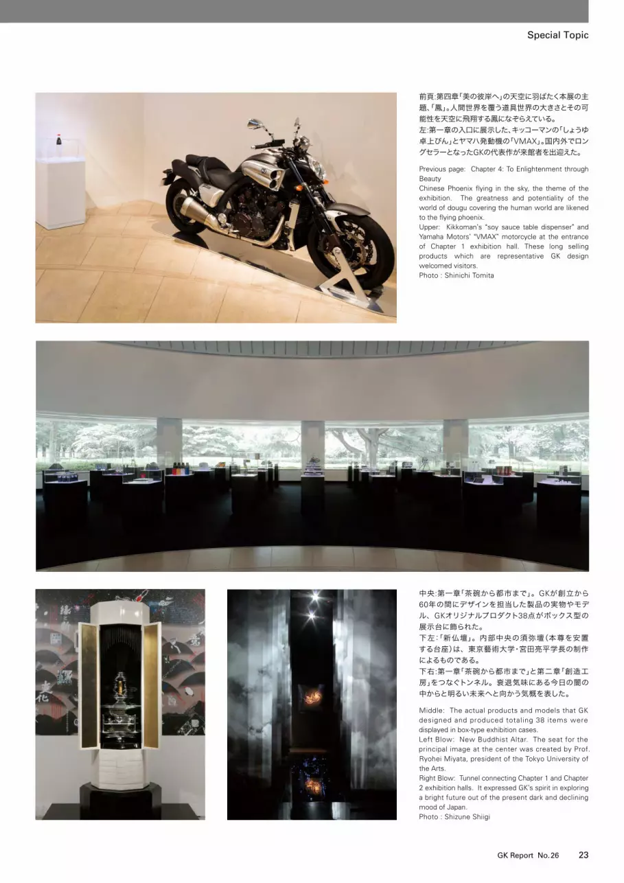

25GK Report No.2624 GK Report No.26
2013年7月6日(土)から9月1日(日)まで、
世田谷美術館(東京)にて「栄久庵憲司とGK
の世界──鳳が翔く」展が開催された。
この展覧会の開催計画は、2011年に世
田谷美術館より栄久庵憲司会長へ企画展の
依頼があったことから始まった。その企画
内容は、「栄久庵憲司による道具と人のか
かわりから生まれるものづくりの思想につ
いて、栄久庵を中心としたGKデザイング
ループの活動を通じて紹介する」ことで
あった。
GKは、これまでにも自主企画による展
示をたびたび開催し、社会に向けて積極的
に提案・提言活動を行ってきた。しかし、
今回のように美術館で独自の調査が行われ
依頼される、という経緯での展覧会は初め
てのことであった。GKは、この申し出を
社会に対してデザインをご理解いただく好
機と捉え、快諾することとなった。また、
2012年に創立60周年を迎えたGKにとって
は、その記念事業の大きな柱となる展覧会
でもあった。
この展覧会で展示した多くのものは、
日々の生活の中で使用される日用品として
デザインされた製品である。それらが公共
の美術館の中に展示され、鑑賞の対象とな
り得るということは、新鮮で感慨深いもの
があった。また、「デザインとは何か」とい
う根本的な問いをあらためて自らに課す意
義深い機会ともなった。そして、そこに込
められた栄久庵会長の道具の思想とGKの
仕事を総合的に、デザインに関心を持つ人
だけでなく、広く一般の人にも紹介できた
ことは大きな喜びであった。
展覧会では、栄久庵会長がデザインを志
すにいたった背景や、GKというデザイン
グループが60年にわたって取り組んでき
た仕事の数々を紐解くように展示した。ま
た、未来に向けた提案をかたちとして発信
することができ、さらにはGKのものづく
りの根本にある、その哲学的な思想も表現
できたことは、フリーランスのデザイング
ループとしてのGKの存在を大いに社会に
アピールできたと考えている。
「鳳が翔く」というこの展覧会のテーマ設定
は栄久庵会長の発案による。中国紀元前4
世紀の哲学者・荘子のとなえた鳳の話から
着想を得たという。大きな流れは、現在か
ら暗闇のトンネルという過程を経て未来を
訪ね、そして未来を悩む心の救いの部分で
終わる。
展示は4つの章で構成された。
第一章「茶碗から都市まで」では、GKが
1952年に創立されて以降、今日にいたる
60年にわたってデザインを担当した製品
の実物やモデル、GKのオリジナルプロダ
クトの数々を展示した。
GKの創立初期、日本が戦後の荒廃の中
から生活の復元と進展を求めていた1950
年代は、デザインとその有用性がまだ社会
に知られていなかった。そうした状況の中、
GKはデザインを運動と捉え、事業化して
かたちとして社会に示すことで、新しい時
代を拓いてきた。茶碗から都市までの幅広
い領域にわたり、人々の生活に欠くことの
できない数々の製品を通して「人間と道
具」とのかかわり等を紹介した。
第二章「創造工房」は、自主研究を中心に
構成し、現在からさらに未来の生活に向け
た提案を具体的に表現した。現在の日本に
は、資源問題等さまざまな課題が山積し混
“The World of Kenji Ekuan and GK Design Group: Soaring High in the Sky” exhibition was held at the Setagaya Art Museum in Tokyo from July 6 to September 1, 2013.
The Setagaya Art Museum approached GK chairperson Kenji Ekuan in 2011 with a plan to hold an exhibition “to introduce the thoughts of Kenji Ekuan on manufacturing industrial prod-
ucts developed from the relations between dougu (tools) and humans by showing the activities of Kenji Ekuan and the GK Design Group.”
The GK Design Group has held exhibitions to demonstrate its activities and to make design proposals to the public in the past. But this was the f irst t ime that a public museum had conducted research and offered a plan to hold an
exhibition on the GK Design Group. We, at GK, happily accepted the offer as it would be a good opportunity to show our design philosophy and works to the general public. For GK having celebrated its 60th anniversary in 2012, the exhi-bition marked a major memorial event.
Many of the exhibits were products designed for daily commodities. It gave us a fresh impression
to see them displayed like artworks in the art museum. The exhibition gave us a chance to ask ourselves the fundamental question “what is design?” It was indeed a great pleasure for us to have a broad overview of our design works and Chairperson Ekuan’s philosophy of dougu, the underlying foundation of our works revealed to not only people interested in design but also to the general public.
In the exhibition, chairperson Ekuan’s back-ground and his reasons for becoming a designer were explained, and the works designed by the GK Design Group over the past 60 years were exhibited. Further, models of our design propos-als for future living were also displayed along with the GK Design Group’s design philosophy underlying our products. We are certain that we could present what the GK Design Group is
as a freelance design firm.
The motif of this exhibition is the Chinese phoe-nix. Chairperson Ekuan was inspired to use this motif having read the episode of a Chinese phoe-nix appearing in the texts by Chinese philoso-pher Zhuang-zi in the 4th century BC. The main flow of the exhibition is to go from the present through a dark tunnel to a future, and to offer
mental relief for people worried about the future.
The exhibition consisted of the following four chapters.Chapter 1: From Tea Bowls to City PlanningActual products and models designed and manu-factured by GK Design Group since its founda-tion in 1952 were arranged.
Design and its utility were little known in Japan in the 1950s as the whole nation was struggling to restore their life out of postwar devastation. Considering design as a movement, GK in its early days explored a new age by dem-onstrating its designs as a business. The design activities covered a wide range from tea cups to cities. The exhibited products were indispens-able in people’s living and showed relations
between humans and dougu.
Chapter 2: The Creative Workshop This section consisted of staff members’ indepen-dent research works suggesting potential concepts for present to future living. Japan today has many problems such as resource and environmental problems. In order to get out of the turmoil and create a comfortable lifestyle, we
第二章「創造工房」。暗闇のトンネルを抜けると一面を白で構成した空間、第二章が現れる。ここでは、未来の生活に向けたさまざまな新しい提案を具体的に示した。
Chapter 2: The Creative Workshop Space consisting of white after passing through the dark tunnel. In this exhibition hall, various design proposals for new future life were shown in concrete forms. Photo : Shinichi Tomita
上:第三章「道を求めて」。道具と道具の世界を司る「道具千手観音像」を中心に展示された。道具千手観音は慈悲の心の象徴である。下:ロボット義手の提案「GK Robo 0」。新仏壇の須弥壇と同様に宮田学長によって制作された。ロボット義手が打つ銅鑼から奏でられる音色は、展示会場全体に響き渡った。
Upper: Chapter 3: The Quest for a“Way”The statue of “Thousand-Armed Dougu Kan-non (Deity of Mercy)” was placed in the center. The Dougu Kan-non governs dougu and the world of dougu and symbolizes mercy.Blow: GK’s proposal for an artificial hand robot “GK Robo 0.” It was created by president Miyata of the Tokyo University of the Arts. The sound of the Chinese gong beaten by the artificial hand reverber-ated through the exhibition halls.Photo : Shinichi Tomita
Special Topic Special Topic
迷を呈している。そこから抜け出し未来の
快適な生活を創造するには、生活の根本を
辿り変わることのない生活の原理の発見が
あらためて要るという認識を示した。そこ
には、常に知的探求と自己研鑽を繰り返し
デザインの本質に迫ろうとするGKの強い
意思が込められている。
第三章「道を求めて」では、GKの基本思
想である「道具論」の展開として、デザイン
や、ものづくりを通して築き上げる壮大な
「道具寺道具村構想」の概要が示された。道
具村は、「人間と道具」の正しい関係を築き
上げる場として構想された未来の村づくり
計画である。道具寺はその中心にあり、道
具千手観音像が安置されている。人間の持
つ欲望、その「悪なる欲」と「善なる欲」の矛
盾に悩み迷う人間を、道具千手観音は慈悲
の心を持って善の方向に導くという教えを
かたちとして表現している。
第四章「美の彼岸へ」では、「仏説阿弥陀
経」の一節に記された「池中蓮華」をメタ
ファーとしたインスタレーションを行った。
床一面を覆う蓮の池、蓮の葉の上で羽根を
広げる蝶、木々にとまりさえずる小鳥、昇
り来て沈み行く天体の姿、舞い降りる天女、
天空には「鳳」が飛翔する。その結果が導く
妙なる世界は、ものづくりを通して築き上
げられるデザインの理想郷を描き出そうと
したものである。「自然と人間と道具」が見
事に調和し、未来に訪れるであろう「遥か
なる世界の憧憬」が描かれている。
開催日の前日7月5日(金)には、内覧会
とオープニングセレモニーが開かれ、多く
の方々が来訪された。また会期中には、栄
久庵会長の講演会等も開催され、より多く
の方々に、展示に込めた「栄久庵憲司とGK
の世界」をより深く感じ、理解していただ
く機会につながったのではないかと思う。
入場者数は、当初の予想を大きく上回る、
1万8千人ほどを数えた。2012年をもって
創立60周年を迎えたGKデザイングループ
にとって、この展覧会は、その歴史を飾る
に相応しい記念事業となった。また同時に、
デザインという世界の未来へ向けた新たな
挑戦に勇を鼓すものとなった。ここにあら
ためて、関係各位の多くの方々のご支援と
ご協力に深謝申し上げたい。
realized the need for rediscovering the funda-mental principle of living. This section presented GK’s strong will and stance to search for the essence of design through continuing intellectual pursuits and brainstorming. Chapter 3: The Quest for a“Way”The outline of a magnificent “Master Plan for Dougu Temple and Dougu Vil lage” was
presented in this section as a practical arena of GK’s basic philosophy “Thoughts on Dougu.” The “Dougu Village” is a village in the future conceived as a place to establish correct relations between “humans and dougu.” The “Dougu Temple” is situated at its center and has the Thousand-Armed Dougu Kan-non as its princi-pal image. The teaching that Dougu Kan-non would lead people suffering from human desires,
particularly the contradiction between “wrong desires” and “good desires” into favorable direc-tions with its mercy was expressed in a concrete form.
Chapter 4: To Enlightenment through Beauty In this section, an installation depicting “Lotus flowers in a Pond” described in the Sukhāvatīvyūha (Beautiful scene in a place where happiness
exists.) as a metaphor. On the lotus pond on the floor, there were butterflies spreading their wings above lotus leaves, birds singing on branches, the sky changing colors with the rising and set-ting sun, celestial fairies dancing down to the earth, and a phoenix flying in the sky. The in-stallation was intended to illustrate a design utopia created by manufacturing things. “Yearn-ing for a distant world” where “nature, humans
and dougu” would be beautifully harmonized was expressed. An opening ceremony and a preview were held on July 5 with many people concerned in attendance. A lecture meeting was held during the exhibition for the audience to have a deeper understanding about the world of Kenji Ekuan and the world of GK. The number of visitors to the exhibition was
18,000, far beyond the number expected at the beginning. This exhibition was a memorial event for the GK Design Group to honor its 60-year history. At the same time, it gave us strong encouragement to refresh our motivation for the future of design. We would like to express our deep appreciation to people concerned for their support and cooperation extended to this event.

2013年7月6日(土)から9月1日(日)まで、
世田谷美術館(東京)にて「栄久庵憲司とGK
の世界──鳳が翔く」展が開催された。
この展覧会の開催計画は、2011年に世
田谷美術館より栄久庵憲司会長へ企画展の
依頼があったことから始まった。その企画
内容は、「栄久庵憲司による道具と人のか
かわりから生まれるものづくりの思想につ
いて、栄久庵を中心としたGKデザイング
ループの活動を通じて紹介する」ことで
あった。
GKは、これまでにも自主企画による展
示をたびたび開催し、社会に向けて積極的
に提案・提言活動を行ってきた。しかし、
今回のように美術館で独自の調査が行われ
依頼される、という経緯での展覧会は初め
てのことであった。GKは、この申し出を
社会に対してデザインをご理解いただく好
機と捉え、快諾することとなった。また、
2012年に創立60周年を迎えたGKにとって
は、その記念事業の大きな柱となる展覧会
でもあった。
この展覧会で展示した多くのものは、
日々の生活の中で使用される日用品として
デザインされた製品である。それらが公共
の美術館の中に展示され、鑑賞の対象とな
り得るということは、新鮮で感慨深いもの
があった。また、「デザインとは何か」とい
う根本的な問いをあらためて自らに課す意
義深い機会ともなった。そして、そこに込
められた栄久庵会長の道具の思想とGKの
仕事を総合的に、デザインに関心を持つ人
だけでなく、広く一般の人にも紹介できた
ことは大きな喜びであった。
展覧会では、栄久庵会長がデザインを志
すにいたった背景や、GKというデザイン
グループが60年にわたって取り組んでき
た仕事の数々を紐解くように展示した。ま
た、未来に向けた提案をかたちとして発信
することができ、さらにはGKのものづく
りの根本にある、その哲学的な思想も表現
できたことは、フリーランスのデザイング
ループとしてのGKの存在を大いに社会に
アピールできたと考えている。
「鳳が翔く」というこの展覧会のテーマ設定
は栄久庵会長の発案による。中国紀元前4
世紀の哲学者・荘子のとなえた鳳の話から
着想を得たという。大きな流れは、現在か
ら暗闇のトンネルという過程を経て未来を
訪ね、そして未来を悩む心の救いの部分で
終わる。
展示は4つの章で構成された。
第一章「茶碗から都市まで」では、GKが
1952年に創立されて以降、今日にいたる
60年にわたってデザインを担当した製品
の実物やモデル、GKのオリジナルプロダ
クトの数々を展示した。
GKの創立初期、日本が戦後の荒廃の中
から生活の復元と進展を求めていた1950
年代は、デザインとその有用性がまだ社会
に知られていなかった。そうした状況の中、
GKはデザインを運動と捉え、事業化して
かたちとして社会に示すことで、新しい時
代を拓いてきた。茶碗から都市までの幅広
い領域にわたり、人々の生活に欠くことの
できない数々の製品を通して「人間と道
具」とのかかわり等を紹介した。
第二章「創造工房」は、自主研究を中心に
構成し、現在からさらに未来の生活に向け
た提案を具体的に表現した。現在の日本に
は、資源問題等さまざまな課題が山積し混
“The World of Kenji Ekuan and GK Design Group: Soaring High in the Sky” exhibition was held at the Setagaya Art Museum in Tokyo from July 6 to September 1, 2013.
The Setagaya Art Museum approached GK chairperson Kenji Ekuan in 2011 with a plan to hold an exhibition “to introduce the thoughts of Kenji Ekuan on manufacturing industrial prod-
ucts developed from the relations between dougu (tools) and humans by showing the activities of Kenji Ekuan and the GK Design Group.”
The GK Design Group has held exhibitions to demonstrate its activities and to make design proposals to the public in the past. But this was the f irst t ime that a public museum had conducted research and offered a plan to hold an
exhibition on the GK Design Group. We, at GK, happily accepted the offer as it would be a good opportunity to show our design philosophy and works to the general public. For GK having celebrated its 60th anniversary in 2012, the exhi-bition marked a major memorial event.
Many of the exhibits were products designed for daily commodities. It gave us a fresh impression
to see them displayed like artworks in the art museum. The exhibition gave us a chance to ask ourselves the fundamental question “what is design?” It was indeed a great pleasure for us to have a broad overview of our design works and Chairperson Ekuan’s philosophy of dougu, the underlying foundation of our works revealed to not only people interested in design but also to the general public.
In the exhibition, chairperson Ekuan’s back-ground and his reasons for becoming a designer were explained, and the works designed by the GK Design Group over the past 60 years were exhibited. Further, models of our design propos-als for future living were also displayed along with the GK Design Group’s design philosophy underlying our products. We are certain that we could present what the GK Design Group is
as a freelance design firm.
The motif of this exhibition is the Chinese phoe-nix. Chairperson Ekuan was inspired to use this motif having read the episode of a Chinese phoe-nix appearing in the texts by Chinese philoso-pher Zhuang-zi in the 4th century BC. The main flow of the exhibition is to go from the present through a dark tunnel to a future, and to offer
mental relief for people worried about the future.
The exhibition consisted of the following four chapters.Chapter 1: From Tea Bowls to City PlanningActual products and models designed and manu-factured by GK Design Group since its founda-tion in 1952 were arranged.
Design and its utility were little known in Japan in the 1950s as the whole nation was struggling to restore their life out of postwar devastation. Considering design as a movement, GK in its early days explored a new age by dem-onstrating its designs as a business. The design activities covered a wide range from tea cups to cities. The exhibited products were indispens-able in people’s living and showed relations
between humans and dougu.
Chapter 2: The Creative Workshop This section consisted of staff members’ indepen-dent research works suggesting potential concepts for present to future living. Japan today has many problems such as resource and environmental problems. In order to get out of the turmoil and create a comfortable lifestyle, we
第4章「美の彼岸へ」で行ったインスタレーション「池中蓮華」。人間世界と道具世界が見事に調和し共生するデザインの理想郷を表現した。
Upper: Chapter 4: To Enlightenment through BeautyInstallation of “Lotus Flowers in a Pond.” A design utopia in which the human world and dougu world exist in harmony was expressed. Blow: Chapter 4: To Enlightenment through BeautyChinese Phoenix flying in the sky, the theme of the exhibition. The greatness and potentiality of the world of dougu covering the human world are likened to the flying phoenix.Photo : Shinichi Tomita
Special Topic
Photo : Shinichi Tomita
Special Topic
27GK Report No.2626 GK Report No.26
迷を呈している。そこから抜け出し未来の
快適な生活を創造するには、生活の根本を
辿り変わることのない生活の原理の発見が
あらためて要るという認識を示した。そこ
には、常に知的探求と自己研鑽を繰り返し
デザインの本質に迫ろうとするGKの強い
意思が込められている。
第三章「道を求めて」では、GKの基本思
想である「道具論」の展開として、デザイン
や、ものづくりを通して築き上げる壮大な
「道具寺道具村構想」の概要が示された。道
具村は、「人間と道具」の正しい関係を築き
上げる場として構想された未来の村づくり
計画である。道具寺はその中心にあり、道
具千手観音像が安置されている。人間の持
つ欲望、その「悪なる欲」と「善なる欲」の矛
盾に悩み迷う人間を、道具千手観音は慈悲
の心を持って善の方向に導くという教えを
かたちとして表現している。
第四章「美の彼岸へ」では、「仏説阿弥陀
経」の一節に記された「池中蓮華」をメタ
ファーとしたインスタレーションを行った。
床一面を覆う蓮の池、蓮の葉の上で羽根を
広げる蝶、木々にとまりさえずる小鳥、昇
り来て沈み行く天体の姿、舞い降りる天女、
天空には「鳳」が飛翔する。その結果が導く
妙なる世界は、ものづくりを通して築き上
げられるデザインの理想郷を描き出そうと
したものである。「自然と人間と道具」が見
事に調和し、未来に訪れるであろう「遥か
なる世界の憧憬」が描かれている。
開催日の前日7月5日(金)には、内覧会
とオープニングセレモニーが開かれ、多く
の方々が来訪された。また会期中には、栄
久庵会長の講演会等も開催され、より多く
の方々に、展示に込めた「栄久庵憲司とGK
の世界」をより深く感じ、理解していただ
く機会につながったのではないかと思う。
入場者数は、当初の予想を大きく上回る、
1万8千人ほどを数えた。2012年をもって
創立60周年を迎えたGKデザイングループ
にとって、この展覧会は、その歴史を飾る
に相応しい記念事業となった。また同時に、
デザインという世界の未来へ向けた新たな
挑戦に勇を鼓すものとなった。ここにあら
ためて、関係各位の多くの方々のご支援と
ご協力に深謝申し上げたい。
realized the need for rediscovering the funda-mental principle of living. This section presented GK’s strong will and stance to search for the essence of design through continuing intellectual pursuits and brainstorming. Chapter 3: The Quest for a“Way”The outline of a magnificent “Master Plan for Dougu Temple and Dougu Vil lage” was
presented in this section as a practical arena of GK’s basic philosophy “Thoughts on Dougu.” The “Dougu Village” is a village in the future conceived as a place to establish correct relations between “humans and dougu.” The “Dougu Temple” is situated at its center and has the Thousand-Armed Dougu Kan-non as its princi-pal image. The teaching that Dougu Kan-non would lead people suffering from human desires,
particularly the contradiction between “wrong desires” and “good desires” into favorable direc-tions with its mercy was expressed in a concrete form.
Chapter 4: To Enlightenment through Beauty In this section, an installation depicting “Lotus flowers in a Pond” described in the Sukhāvatīvyūha (Beautiful scene in a place where happiness
Photo : Shinichi Tomita
Photo : Shinichi Tomita
exists.) as a metaphor. On the lotus pond on the floor, there were butterflies spreading their wings above lotus leaves, birds singing on branches, the sky changing colors with the rising and set-ting sun, celestial fairies dancing down to the earth, and a phoenix flying in the sky. The in-stallation was intended to illustrate a design utopia created by manufacturing things. “Yearn-ing for a distant world” where “nature, humans
and dougu” would be beautifully harmonized was expressed. An opening ceremony and a preview were held on July 5 with many people concerned in attendance. A lecture meeting was held during the exhibition for the audience to have a deeper understanding about the world of Kenji Ekuan and the world of GK. The number of visitors to the exhibition was
18,000, far beyond the number expected at the beginning. This exhibition was a memorial event for the GK Design Group to honor its 60-year history. At the same time, it gave us strong encouragement to refresh our motivation for the future of design. We would like to express our deep appreciation to people concerned for their support and cooperation extended to this event.

28 GK Report No.26
Column
道具文化往来
8.道具原点への旅(その1)──放たれた「一本の矢」
藤本清春
広大無辺の大地に在って、かつて人類は洞窟にその居を構えた。昼は日の照り返す大草原に獣を求め、夜は暗黒の闇に敵の襲来を避け、明日への生命の再生を祈り大地に臥した。その時獣たちは恐ろしい敵である一方で、同時に欠かすことの出来ない友でもあった。それは矢を射って倒す的であるだけではなく、大自然の中に人類が生き長らえるための、飢餓から開放してくれる神でもあったからである。時に未だ食物自給を可能とする、農耕牧畜社会文明を得ることの無かった人類は、只々厳しい日毎夜毎を、そして計り知れない幾星霜を、永遠に続く試練の中に繰り返すしかなかった。しかしその限りない想いの向こう側に、大自然への脅威と畏敬の念を超えて、収穫への希望、豊穣への祈りを、そして遠い道程の果てに到達した今日の世界を、さらにその先に連なる悠久の未来への謳歌が奏でられる様を予感していたに違いない。
そして遂に「一本の矢」は放たれた。その時人類は、逃げる獣の速度を突然「零」にすることに成功する。様々な意味で人類より、「より強く活き」「より早く走り」「より高く飛び」そして「より遠くへ回避する」獣たち。「俊敏に身をこなし」「柔軟に場を移り」「山奥に海中にそして大空へと縦横無尽に動きまわる」動物たち。
それらに追いつき、それらを捉え、それらを「我が獲物」「皆が糧」そして「共有する所産」として手中に捕えた時、人類は、自らの動きを力強くかつ自由に使うことの出来る出発点に立ったのである。そしてその「一本の矢」によって生命を失った雄々しい獣たちはその瞬間、彼らの内にある生命に新たな灯がともり、人類の為に、否、人類と共に輝き始めることとなる。
そもそも地球の誕生と共に顕れた生命の連鎖、今日を経て未来に続く地球環境の永遠なる循環。生物の発生からその成長と進化、食物連鎖の構造変化から全地球的分布への拡がり、そして民族大移動を経て地球上のさまざまな地域に新たな国家や社会が形成するまで、生きとし生けるものと共に始まる永遠なる人類の歴史は、その時、その幕を切ったのであった。ならば今改めて道具発生の原点に旅をしてみよう。かつて、狩猟採集時代の緊張から解き放たれた人類が平原に柵を巡らせ獣を飼いならし、土を耕し大地の実りを得るようになって、人類は厳しい自然から自らを守る「文明の砦」を築き始めた。3万年程前に始まると云われる後期旧石器時代、人類は獲物となる獣たちを洞窟に壁画として描き始める。さてそこに描かれた事実とは真実とは、一体何だったのであろうか。
ふじもと きよはる 道具文化研究所 所長
Dougu-Culture CrossroadKiyoharu Fujimoto, Managing Director, Dougu-Culture Institute
8. Journey to the origin of tools (1) – An arrow shot
In the beginning of human history, people settled in caves in the vast extent of land. They hunted animals in the sun-splashed grasslands in the daytime, and lay on the ground in the darkness of the night to avoid attacks by enemies and praying for the regeneration of energy for tomorrow. Animals were fearful enemies, but at the same time, they were indispensable friends to humans. They were not just targets at which to shoot arrows, but also saviors to keep humans free from famine and to help them survive. Before developing farming and stock raising skills that enabled them to maintain a self-supply of food, humans had to endure endless harsh trials day and night, year after year. Beyond their endless efforts to survive, and apart from their threat to nature and their awe of nature, they might have entertained hopes for harvest and prayers for fertility, and may have even foreseen humans in the future enjoying the world we know today, a world that would be reached after centuries.
At last “an arrow” was shot. At that moment, humans succeeded in reducing the speed of an animal running away to “zero.” Animals lived stronger, ran faster, jumped higher, stayed alert and agile, moved more rapidly and moved here and there in the mountains, in the air and in the sea. When humans caught up with them, caught hold of them, and gained possession of them as “our game,” and “our people’ s food,” humans stood at the starting point to powerfully manipulate their strength at their own will. A new light was lit within animals that lost their life by the shot of an arrow, and they began to
give off brilliance for, or rather, together with humans.
The chain of life that emerged with the birth of the earth and the eternal cycle of its environment will continue farther into the future. The earth has witnessed the genesis of living things and their growth and evolution, changes in the structure of ecologic food chain, and the worldwide spread of living things. Human history opened its curtain and after going through the Great Barbarian Invasion has evolved together with living things to this point when new nations and societies have been founded in various parts of the earth. Therefore, let us travel back to the beginning of the tools. Having been freed from the tension of the hunting-and-gathering age, humans built fences on the grasslands to tame and keep animals, and cultivated the land to get produce out of the soil. Thus, humans began to build the citadels of civilization to protect themselves from the roughness of nature. In the late Paleolithic era said to have begun 30,000 years ago, humans began to draw beasts as their game in cave paintings. What were the facts and the truth which were drawn on the walls?

29GK Report No.26
Project News
La Cantine株式会社マルハニチロGKグラフィックス
若い主婦を中心に定着し始めている新たな食のシーンに合わせて開発された、新ブランド缶詰のパッケージデザイン。カジュアルフレンチの雰囲気を自宅で楽しむという商品コンセプトに合わせて、従来の缶詰のイメージを一掃し、キッチンやテーブルで映えるような洋食器・陶器をイメージした。また、インテリアの飾りやプレゼントとしても楽しめるような印象的な表情を創出した。
La CantineMaruha Nichiro Food CorporationGK Graphics
Package design for new brand canned food products developed to �t new mealtime scenes that have taken a �rm hold among young housewives. To re�ect the product concept of “casual French cuisine at home,” the package was designed in the image of western ceramic dishes to look atractive in a kitchen and on the table, sweeping away the conventional canned food image. Their expressions may well serve as impressive interior decorations and gifts.
TOCLAS ブランディング計画トクラス株式会社GKインダストリアルデザイン GKグラフィックス
トクラス株式会社(旧ヤマハリビングテック株式会社)の社名変更にともなうブランディング計画。ブランド調査から名称の設定、ロゴマークを中心とした視覚要素の整備、一部の商品開発まで総合的に携わった。ロゴマークは、TOCLASブランドの「くらしをつくる品質と意思」を形象化し、企業理念である「お客様の『まいにち』と暮らす」を、言語を越えて伝達できる「チェックマーク」を象徴的に用いて表現した。
TOCLAS Branding PlanToclas Corporation GK Industrial Design + GK Graphics
Yamaha Living Tech Co., Ltd changed its name to Toclas Corporation on October 1, 2013. GK was involved in the rebranding process, from conducting a brand survey, naming, the development of visual elements including the logo mark, and partially in product development. A “check mark” is included in the logo in order to visualize the “quality and intention” of Toclas products to enrich people’s daily life, and to convey the company’s philosophy “to live to support customers’ daily life.”

Project NewsProject News
30 GK Report No.26 31GK Report No.26
MT-07 MT-09ヤマハ発動機株式会社GKダイナミックス
欧州でのスポーツバイク市場では、近年、日常用途の中に楽しさを求める傾向が見られる。これを受け、欧州向けに開発したMT-09、MT-07が、相次いで発表された。MT-09は、意のままに操れる走りの悦びをカタチで表現した。MT-07は、2013年11月にEICMA(ミラノ国際モーターサイクルショー)で発表された。俊敏で自由に駆け抜けるイメージと強い個性を感じさせるデザインを目指した。
MT-07 MT-09Yamaha Motor Co., Ltd. GK Dynamics
In the sport and utility motorcycle market in Europe, there is a tendency to look for elements of pleasure in riding motorbikes for daily use. To respond to this tendency, MT-09 and MT-07 were developed for Europe and launched in succession. The pleasure of riders take in a maneuverable motorbike, is expressed in the form of MT-09. MT-07 was exhibited in EICMA International Motorcycle Exhibition in November 2013. The image of agility running rapidly, and strong individuality were sought.
VIKINGヤマハ発動機株式会社GKダイナミックス
ヤマハ発動機初となる北米向け3人乗り新オフロードビークル(ROV)。近年北米では、ROVの使用が農業などの業務用に加えてツーリングなどのレジャーにも広がっていることを受けて、「Multi Purpose Off Road Vehicle!」をコンセプトに開発された。デザインはコンパクトさの表現を第一とし、優れた悪路走破性を最大限に視覚化。細部に至るまで研ぎ澄まされた機能美を追求した。
VIKINGYamaha Motor Co., Ltd.GK Dynamics
Yamaha’s �rst three-person off-road vehicle (ROV) for North America. Recently in North America, ROVs are widely used not only for farming but for touring and other leisure time activities. The concept of this vehicle is to be a multi-purpose off-road vehicle. Compactness is the primary design element and the body embodies its capabilities in driving on rough roads to the full. Further, functional beauty has been sought as can be seen in the �nely honed details.
A1200形低床車両札幌市交通局GKインダストリアルデザイン
札幌市初となる低床型車両のデザイン開発。札幌市が進める都市活性化のため、車両のほか電停等もトータルに提案し、そのシンボルとなる車両が先行して導入された。外観は、札幌市特有の空気の透明感やシンプルでコントラストの高い風景をシャープなラインと白と黒のカラーリングで表現。内装は、道産の木材を用いて地域性を強調し、曲線を描く天井断面と間接照明で心地の良い空間を演出した。
A1200 Type Low Floor StreetcarCity of Sapporo Transportation Department GK Industrial Design
Design of the �rst low �oor streetcar in Sapporo. The car was introduced as the symbol to spearhead the plan to reactivate the city. The exterior design with sharp lines and black and white colors expresses the transparent air of Sapporo city, and its simple cityscape with strong contrast. For the interior, wood grown in Hokkaido is applied to emphasize the local �avor. The curved ceiling and indirect lighting create a comfortable space.In addition to the car, GK Industrial Design proposed design ideas for stations and other elements
MT-07軽快なフロント回りと切りあがったリア回りを連携的に表現した。
MT-07
The light front part and sharp rear
part are linked in the design.
あざみ野ガーデンズ(旧東急嶮山スポーツガーデン)東京急行電鉄株式会社 株式会社東急設計コンサルタントGK設計
スポーツ施設と商業施設が一体となった郊外型商業施設のリニューアル計画。本計画で新設された商業棟の建築意匠の基本構想をはじめ、入居するテナント向けのデザイン規格、商業施設のVIデザインマニュアルの策定、商業棟周辺のランドスケープやサイン計画等を行った。また、敷地内の施設全体に関わるデザイン項目の総合的なデザインコントロールも行った。
Azamino Gardens (Former Tokyu Kenzan Sports Garden)Tokyu Corporation and Tokyu Architects & Engineers Inc.GK Sekkei
Renewal project of a suburban complex housing sports and commercial facilities. GK Sekkei was engaged in the basic architectural design concept, design frameworks for tenants, and formulating a visual identity (VI) design manual for the newly built commercial wing, landscaping around the wing, and the sign system. Further, it was involved in the total design coordination for all facilities within the site.
MT-09新開発の直列3気筒エンジンを搭載し、その特長を活かすデザインを実現した。
MT-09
The newly developed in-line
three-cylinder engine is on board.
This feature is expressed in its
design.
上:北ゲート。樹木と丘陵地に馴染む素材を選定した。下:商業棟。旧ゴルフショートコースの樹木や池に配慮し低層とした。
Upper: North Gate: Materials were selected to �t trees and the
hilly land
Lower: Commercial Wing: A low-rise building to take advan-
tage of the trees and pond of the former short golf course

Project News
32 GK Report No.26
森蘭商都サイン計画上海外高橋保税区開発股份有限公司GK上海
上海の外高橋保税区に立地する商業施設のサイン計画。外構サインは、建築や景観のデザインコードに合わせた茶系の本体色とし、建築ファサードの特徴である縞模様をサイン本体に取り込んだ。室内サインは、インテリアに溶けこむような白く柔らかい造形を採用した。
SUNLAND Shopping Mall Sign SystemShanghai Waigaoqiao Free Trade Zone Develop-ment Co., Ltd. GK Shanghai
Sign system for a shopping mall located inside the Waigaoqiao Free Trade Zone in Shanghai. For exterior signs, brown is used as the key tone to keep harmony with the design code of the building and surrounding cityscape. The stripe pattern featured in the façade is introduced in the sign. For interior signs, a white and soft design was adopted to have signs �t in with the interior look.
YUME iXiタカラベルモント株式会社GK京都
ゲストの「リラックス感」とスタイリストの「施術のしやすさ」を両立させるシャンプーユニット。同シリーズの快適性を受け継ぎながら、よりコンパクトなフォルムを実現。内蔵されるシート機構の特性上、座る前の座面が前に傾いているため、座面角度からその快適な「寝心地感」が視覚的に伝わりにくかったが、水平に伸びるラインを強調することで、うたた寝を誘うような快適性を表現した。
YUME iXiTakara Belmont Corp.GK Kyoto
A shampooing unit that provides a relaxed feeling to guests and offers ease of shampooing to hair stylists. Succeeding the comfort provided by the same series, a more compact seat was realized with Yume iXi. Because of the mechanism inside the seat, the seating face is inclined forward when no one is in the seat, the feeling of a “comfortable bed” was hardly conveyed at sight. By emphasizing the horizontal line, a comfortable mood to entice a guest to sleep for a short time was expressed.
「2013年度グッドデザイン賞」 GK各社によるデザインが多数受賞
公益財団法人日本デザイン振興会主催の2013年度グッドデザイン賞の審査結果が発表された。本年度のGKデザイングループの受賞は以下の通り。 ・ GKインダストリアルデザイン シャンパングラス「生涯を添い遂げるグラス シャンパングラス」株式会社ワイヤードビーンズ 住宅用定置型蓄電システム「POWER iE 6」エリーパワー株式会社 超低床路面電車「札幌市路面電車 A1200形」札幌市交通局 JAL エコノミークラス座席「SKY WIDER」 JAL ボーイング777-300ER型機「JAL SKY SUITE
777」日本航空株式会社 状態がチェックできるクラウドサービス「FUJITSU In-
telligent Date Service肌メモリ」富士通株式会社 ・ GKダイナミックス モーターサイクル「BOLT」ヤマハ発動機株式会社 歩行分析計「ゲイトジャッジシステム」川村義肢株式会社 ・ GKデザイン総研広島 ナチュラル・サウンド・スピーカー「Egretta TS500 /
TS550」オオアサ電子株式会社
“Good Design Award 2013” GK member com-panies received the Good Design Award for a number of projects.
GK members received the Good Design Award by the Japan Institute of Design Promotion for 2013 as follows:GK Industrial Design - Champagne Glass “Eternal Glass for your life-
time” for Wired Beans Inc.- Electricity storage system for residential use
[POWER iE 6] ELIIY Power Co., Ltd. - Low-�oor tram [Sapporo City TRAM Series A1200]
for the City of Sapporo- JAL Economy Class [JAL SKY WIDER] for Japan
Airlines Co., Ltd.- JAL Boeing 777-300ER [JAL SKY SUITE 777] for
Japan Airlines Co., Ltd- Cloud service to assess skin condition [FUJITSU In-
telligent Data Service - Skin Memory] for Fujitsu Japan.
GK Dynamics- Motorcycle “BOLT” for Yamaha Motor Co., Ltd.- Walking analyzer “Gait Judge System” for
Kawamura Gishi Co., Ltd.GK Design Soken Hiroshima- Natural sound speaker “Egretta TS500/TS550” for
Oasa Electronics Co., Ltd.
“P-Room Seminar” series held inviting foreign guests associated with GK
Lecture meetings were held with three guests invited from among people with whom GK has been associ-ated. - Three-Day Seminar by Prof. Axel Thallemer, Pro-
fessor at University of Art in Linz, July 22-25, 2013 Theme1: Air, Water and Work at Porsche and Festo 2: Design to meet the purpose: Ultimate design 3: Robotic art, design and changing �gures - Dr. Michael Erlhoff, professor at Köln International
School of Design, September 19, 2013. Theme: The way of Future Design should be! He is one of the coauthors of “Design Dictionary“.
A member of GK was engaged in its translation into Japanese.
- Prof. Ivanov Vladimir Michailovich, Design Infor-mation Technology, Saint Petersburg State Poly-technical University, November 26, 2013
Theme: Information Technologies in Museum Envi-ronment
He acts as a coordinator for GK at the Eco Design Conference, a biennial event since 2002. GK has been participating in the conference since its inau-guration.
「P-Roomセミナー」 GKゆかりの海外ゲストを開催
本社1階のP-Roomで開催される「P-Roomセミナー」。今期は、国外よりGKと縁の深い3名を講師にお招きした。芸術産業デザイン・リンツ大学のアクセル・タルマー教授による3日間に渡る連続講義をはじめ、ケルン国際デザイン大学院教授でGKメンバーが翻訳を担当した『Design Dictionary(現代デザイン事典)』(鹿島出版会、2012年)の共編者の一人であるマイケル・アルホフ博士より講演をいただいた。また、サンクトペテルスベルグ工科大学デザイン情報技術学部長のウラジーミル・イワノフ教授は、同大学で2002年から2年に1回開催され、GKメンバーも毎回参加している「エコデザイン会議」で、主催者側としてGKと大学とのコーディネーターを果たされている。各講演のテーマは以下の通り。 ・ アクセル・タルマー教授連続講演会(芸術産業デザイン・リンツ大学インダストリアルデザイン学部長、2013年7月22日、23日、25日) テーマ「Air 」「Water」「Porsche とFesto での仕事」「目的にかなった造形――デザインの究極」「自然から学ぶこと――イノベーションデザイン」「ロボティック・アートとデザインと変化する図形」
・ マイケル・アルホフ博士講演会(ケルン国際デザイン大学院教授、2013年9月19日)
テーマ「The way of Future Design should be!」 ・ ウラジーミル・イワノフ氏講演会(サンクトペテルスベルグ工科大学 デザイン情報技術学科長、2013年11月26日)
テーマ「Information Technologies in Museum Environment」
Topics
33GK Report No.26
「榮久庵塾」 独自のデザイン世界を説き明かし第3期、第4期を修了
2011年の10月より始まった栄久庵会長の講義による「栄久庵塾」。その第3期(2013年7月~9月、テーマ:「デザインの来し方と未来」)と第4期(同年10月~12月、テーマ:「道具文化の深化にむけて」)が山愛ビルのPルームにて開催された。受講者は、栄久庵会長が独自の視点で語るデザイン世界に熱心に耳を傾けるとともに、その創造性豊かな思考に魅了され、その後の懇親会では話された内容をもとに議論を深めるなどの交流を行った。
The 3rd and 4th Sessions of “Ekuan Juku” have been completed
“Ekuan Juku (academy)” began in October 2011 with chairperson Ekuan as a lecturer. The third session (July-September 2013) with the theme, “Past and Fu-ture of Design”, and the fourth session (October-De-cember 2013) with the theme, “Deepening Dougu Culture”, were held at P Room in the GK Of�ce build-ing. Students ardently listened to Ekuan relating his world of design, and were captivated by his creative thought. After his lectures, they exchanged views to deepen their understanding about the themes.
GKデザイン機構山田社長 日本デザイン学会で基調講演を行う
GKデザイン機構山田晃三社長が、2013年6月21日に筑波大学で開催された日本デザイン学会の創立60年を記念する春期研究発表大会で基調講演を行った。「デザインの60年、その基層とすべき精神について」と題する講演の中で山田社長は、1952年に結成されたGKデザイングループが、60年にわたり独立系集団として組織の存続を支えてきたものを概観し「デザインには、人類の誕生にさかのぼる遠い過去と遠い未来をつなぐための『変わることのない原理の探究』が大いなる命題として残されている」と課題提起した。
President Yamada of the GK Design Group de-livers a keynote speech at the conference of the Japan Society for the Science of Design
Kozo Yamada, president of the GK Design Group de-livered a keynote speech at the Spring National Con-ference celebrating the 60th anniversary of the Japan Society for the Science of Design which was held on June 21, 2013 at the University of Tsukuba. Under the theme, “60 years of Design – Necessary Funda-mental Spirits,” he reviewed the 60-year history of GK established in 1952, and discussed what has sup-ported the existence of GK as an independent design �rm for the period. He advised that designers should maintain their search for an unchanging principle to connect the far distant past, dating back to the birth of human beings, to the far distant future.
GKインダストリアルデザイン田中相談役 JIDAの理事長に就任
GKインダストリアルデザイン田中一雄相談役が2013年6月7日、公益社団法人日本インダストリアルデザイナー協会(JIDA)の25-26年度の理事長に就任した。JIDAは1952年に創立された日本で唯一のインダストリアルデザイナーの全国組織。GKからの理事長の就任は、栄久庵会長についで2人目である。
Advisor Tanaka of GK Industrial Design became the president of the Japan Industrial Designers’ Association (JIDA).
Kazuo Tanaka, advisor to GK Industrial assumed the post of president of the Japan Industrial Designers’ Association(JIDA) for 2013-14 on June 7, 2013. Estab-lished in 1952, JIDA is the only nationwide organization of industrial designers. Tanaka is the second president of the organization from GK after chairperson Ekuan.

GKデザイン総研広島 「第3回鉄道技術展」に出展
2013年11月6日から8日まで開催された第3回鉄道技術展(主催:フジサンケイ ビジネスアイ(日本工業新聞社)に、GKデザイン総研広島がブースを出展した。メーカーブースにて実車展示された新型車両7300系「ゆりかもめ」をはじめ、同社がデザインを担当した鉄道関連製品をトータルデザインの視点から紹介。公共鉄道領域におけるトータルデザインの可能性を提示した。期間中に開催されたセミナーに、GKデザイン機構山田社長が講師として参加した。
GK Design Soken Hiroshima presented a booth at the 3rd Mass Transportation Innovation Japan 2013.
GK Design Soken Hiroshima presented a booth at the 3rd Mass Transportation Innovation Japan 2013 sponsored by Fuji Sankei Business I in Tokyo from November 6 to 8, 2013. The actual body of the 7300-system of New Transit Yurikamome in Daiba, Tokyo Bay area and other railway-related products de-signed by the �rm were displayed to show the possi-bility of total design in the public transportation sec-tor. At the seminar held during the exhibition, presi-dent Yamada of the GK Design Group took part as a lecturer. the interview was �lmed in the GK Guest Room.
「MT-09」 世界的なデザイン賞「iFプロダクトデザインアワード2014」を受賞
GKダイナミックスがデザインを担当したヤマハ発動機株式会社のスポーツモデル「MT-09」が、世界的に権威あるデザイン賞「iFデザインアワード」のプロダクトデザイン部門で「iFプロダクトデザインアワード2014」を受賞した。この賞は、ドイツのデザイン振興のための国際的な組織が1953年から主催するデザイン賞で、毎年、全世界の工業製品等を対象に優れたデザインが選定されている。2014年度は世界55ヵ国から多数の応募があり、プロダクトデザイン部門ではさまざまな製品から1,220点が選ばれた。
GKダイナミックス 「第43回東京モーターショー2013」にショーモデルを出展
2013年11月22日から12月1日まで、第43回東京モーターショー2013(主催:一般社団法人日本自動車工業)が開催され、ヤマハ発動機株式会社よりGKダイナミックスがデザインを担当した「PES1」「PED1」「R25」「BOLT Café」「EKIDS」「YPJ-01」の6つのショーモデルが出展された。
GK Dynamics exhibited its show model at the 43rd Tokyo Motor Show 2013.
The 43rd Tokyo Motor Show was organized by the Japan Automobile Manufacturers Association, Inc. from November 22 to December 1, 2013. Yamaha Motors exhibited six show models of motorcycles, PES1, PED1, R25, BOLT Café, EKIDS, and YPJ-01 which were designed by GK Dynamics.
「SKY SUITE」「ベスト・ビジネスクラス・エアラインシート」賞を受賞
GKインダストリアルデザインがデザインを担当したJALのビジネスクラスシート「SKY SUITE」が、SKYTRAX社が運営する2013年「ワールド・エアライン・アワード」において、全世界の航空会社のビジネスクラスシートの中で最も優れていると評価され、「ベスト・ビジネスクラス・エアラインシート」賞を受賞した。SKYTRAX社による「ワールド・エアライン・アワード」のビジネスクラスシート部門を受賞するのは、日本の航空会社で初である。
“SKY Suite” was given the Best Business Class Airline Seat Award.
SKYTRAX, an airline service research �rm based in England annually sponsors the World Airl ine Awards. For the “World Airline Award 2013” The “Sky Suite” seat of Japan Airlines business class which GK Industrial Design was involved in design-ing was awarded the “Best Business Class Airline Seat”. It is the �rst time for a Japanese airline seat to be ranked as the best in the “World Airline Award” business class seat category.
GKデザイングループ「2013 CSCF創意設計大賞」(中国)で最優秀賞他を受賞
中国初のサインをテーマにした文化交流イベント「中国(深圳)サイン文化節(CSCF)」における「2013 CSCF創意設計大賞」のサインシステム設計部門で、GKデザイングループの「JR東日本 標準サイン計画」と「愛知万博サイン、ストリートファニチュア、サービス施設計画」が最優秀賞を、「上海環球金融中心 サイン計画」が優秀賞を受賞した。このサイン文化節は、政府の支持のもと、全国でも権威あるサイン業界組織が連合し、中国社会でのサイン文化に対する認知度向上を目的に開催された。メインイベントとなる「中国国際サイン文化交流会」では、GK上海横田保夫副総経理が、GKの実績をもとに「デザインの役割」と題するスピーチを行った。
GK Design Group won the Best Sign Design Award and other awards at the 2013 CSCF Creative Design Competition held in China.
At China’s �rst cultural exchange event “China (Shenzhen) Sign Cultural Festival, 2013,” the CSCF Creative Design Competition was held. In the Sign System Design Competition, the GK Design Group won The Best Sign Design Awards for the “JR East Japan Standard Sign System” and “Sign, Street Furniture and Service Facility Plan for the 2005 World
「第47回(2013年)SDA賞」 奨励賞他を受賞
公益社団法人日本サインデザイン協会主催の第47回(2013年)SDA賞の審査結果が発表され、GKグラフィックスの「沖縄県与那国町津波避難案内誘導表示」がサインデザイン奨励賞と沖縄地区奨励賞を、GK京都の「京都市観光案内サイン計画」が関西地区デザイン賞を受賞した。その他の入選は次の通り。 ・ GK設計「アークヒルズ仙石山森タワーサイン計画」 ・ GK京都「京都市観光案内サイン計画」「内子町観光案内サイン計画」
The 47th Sign Design Award 2013 GK Design Group received the Encouragement Award and other awards.
The winners of the 47th SDA award competition were published by the Japan Sign Design Association. GK Graphics won the Sign Design Silver Award and Okina-wa Regional Silver Award for the Guidepost of Evacua-tion Routes from Tsunami for Yonakuni Town in Okina-wa. GK Kyoto received the Kansai Regional Design Award for the Kyoto Tourist Guide Sign System. In ad-dition, honorable mentions were given to GK Sekkei for the “Ark Hills Sengokuyama Mori Tower Sign System,” to GK Kyoto for the “Kyoto Tourist Guide Sign Sys-tem,” and “Uchiko Town Tourist Guide Sign System.”
Topics
34 GK Report No.26
PES1
WR450F
掲載写真誤りのお詫び本誌25号に掲載しました「レッドドット・デザインアワード2013受賞」におきまして、受賞したヤマハ発動機株式会社の「WR450F」の写真に誤りがありました。 正しくは下記となります。読者の皆様、ならびに関係各位にご迷惑をおかけいたしましたことを深くお詫び申し上げます。
Apology for an error The photo of the WR450F by Yamaha Motor Co., Ltd. that appeared in the article “Red Dot Design Award 2013” in GK Report No. 25 was mistakenly printed. The correct photo is as below. We apologize for any troubles caused to readers and people concerned.
Exposition, Aichi, Japan” and The Excellent Sign Design Awards for the Shanghai World Financial Center Sign System. This Sign Cultural Festival was organized by the group of sign manufacturers in China under the support of the government in order to enhance people's awareness of signs. At the China International Sign Culture Forum, a main event in the festival, Yasuo Yokota, vice-president of GK Shanghai gave a speech on “the function of design” based on the achievements of the GK Design Group.
“MT-09” won the highly reputed design award in the world “iF Product Design Award 2014” in the world.
A sport model motorcycle, the MT-09 of Yamaha Motor Co., Ltd. which GK Dynamics was involved in designing received “iF Design Award 2014” in the product design category. The competition was insti-tuted in 1953 by the Industry Forum Design Han-nover to promote design in Germany. It is a world renowned design award which gives awards to ex-cellent industrial products around the world every year. In the competition for 2014, held in 2013 appli-cations were submitted from 55 countries, and 1,220 works were selected in the product design category.
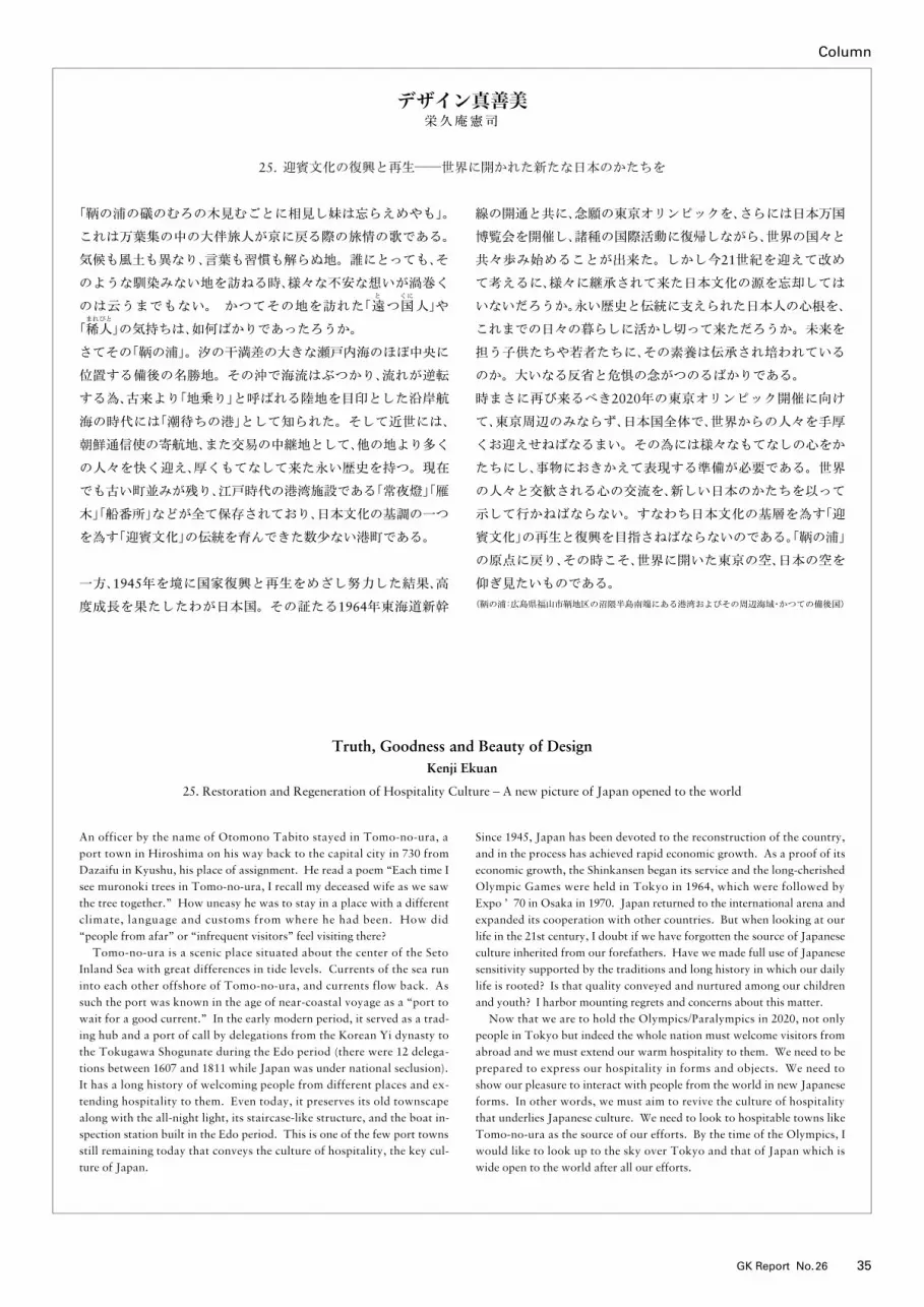
Column
35GK Report No.26
デザイン真善美栄久庵憲司
25. 迎賓文化の復興と再生──世界に開かれた新たな日本のかたちを
Truth, Goodness and Beauty of DesignKenji Ekuan
25. Restoration and Regeneration of Hospitality Culture – A new picture of Japan opened to the world
「鞆の浦の礒のむろの木見むごとに相見し妹は忘らえめやも」。
これは万葉集の中の大伴旅人が京に戻る際の旅情の歌である。
気候も風土も異なり、言葉も習慣も解らぬ地。誰にとっても、そ
のような馴染みない地を訪ねる時、様々な不安な想いが渦巻く
のは云うまでもない。 かつてその地を訪れた「と
遠つくに
国人」や
「まれびと
稀人」の気持ちは、如何ばかりであったろうか。
さてその「鞆の浦」。汐の干満差の大きな瀬戸内海のほぼ中央に
位置する備後の名勝地。その沖で海流はぶつかり、流れが逆転
する為、古来より「地乗り」と呼ばれる陸地を目印とした沿岸航
海の時代には「潮待ちの港」として知られた。そして近世には、
朝鮮通信使の寄航地、また交易の中継地として、他の地より多く
の人々を快く迎え、厚くもてなして来た永い歴史を持つ。現在
でも古い町並みが残り、江戸時代の港湾施設である「常夜燈」「雁
木」「船番所」などが全て保存されており、日本文化の基調の一つ
を為す「迎賓文化」の伝統を育んできた数少ない港町である。
一方、1945年を境に国家復興と再生をめざし努力した結果、高
度成長を果たしたわが日本国。その証たる1964年東海道新幹
線の開通と共に、念願の東京オリンピックを、さらには日本万国
博覧会を開催し、諸種の国際活動に復帰しながら、世界の国々と
共々歩み始めることが出来た。しかし今21世紀を迎えて改め
て考えるに、様々に継承されて来た日本文化の源を忘却しては
いないだろうか。永い歴史と伝統に支えられた日本人の心根を、
これまでの日々の暮らしに活かし切って来ただろうか。未来を
担う子供たちや若者たちに、その素養は伝承され培われている
のか。大いなる反省と危惧の念がつのるばかりである。
時まさに再び来るべき2020年の東京オリンピック開催に向け
て、東京周辺のみならず、日本国全体で、世界からの人々を手厚
くお迎えせねばなるまい。その為には様々なもてなしの心をか
たちにし、事物におきかえて表現する準備が必要である。世界
の人々と交歓される心の交流を、新しい日本のかたちを以って
示して行かねばならない。すなわち日本文化の基層を為す「迎
賓文化」の再生と復興を目指さねばならないのである。「鞆の浦」
の原点に戻り、その時こそ、世界に開いた東京の空、日本の空を
仰ぎ見たいものである。
(鞆の浦:広島県福山市鞆地区の沼隈半島南端にある港湾およびその周辺海域・かつての備後国)
An officer by the name of Otomono Tabito stayed in Tomo-no-ura, a port town in Hiroshima on his way back to the capital city in 730 from Dazaifu in Kyushu, his place of assignment. He read a poem “Each time I see muronoki trees in Tomo-no-ura, I recall my deceased wife as we saw the tree together.” How uneasy he was to stay in a place with a different climate, language and customs from where he had been. How did “people from afar” or “infrequent visitors” feel visiting there? Tomo-no-ura is a scenic place situated about the center of the Seto Inland Sea with great differences in tide levels. Currents of the sea run into each other offshore of Tomo-no-ura, and currents flow back. As such the port was known in the age of near-coastal voyage as a “port to wait for a good current.” In the early modern period, it served as a trad-ing hub and a port of call by delegations from the Korean Yi dynasty to the Tokugawa Shogunate during the Edo period (there were 12 delega-tions between 1607 and 1811 while Japan was under national seclusion). It has a long history of welcoming people from different places and ex-tending hospitality to them. Even today, it preserves its old townscape along with the all-night light, its staircase-like structure, and the boat in-spection station built in the Edo period. This is one of the few port towns still remaining today that conveys the culture of hospitality, the key cul-ture of Japan.
Since 1945, Japan has been devoted to the reconstruction of the country, and in the process has achieved rapid economic growth. As a proof of its economic growth, the Shinkansen began its service and the long-cherished Olympic Games were held in Tokyo in 1964, which were followed by Expo ’ 70 in Osaka in 1970. Japan returned to the international arena and expanded its cooperation with other countries. But when looking at our life in the 21st century, I doubt if we have forgotten the source of Japanese culture inherited from our forefathers. Have we made full use of Japanese sensitivity supported by the traditions and long history in which our daily life is rooted? Is that quality conveyed and nurtured among our children and youth? I harbor mounting regrets and concerns about this matter. Now that we are to hold the Olympics/Paralympics in 2020, not only people in Tokyo but indeed the whole nation must welcome visitors from abroad and we must extend our warm hospitality to them. We need to be prepared to express our hospitality in forms and objects. We need to show our pleasure to interact with people from the world in new Japanese forms. In other words, we must aim to revive the culture of hospitality that underlies Japanese culture. We need to look to hospitable towns like Tomo-no-ura as the source of our efforts. By the time of the Olympics, I would like to look up to the sky over Tokyo and that of Japan which is wide open to the world after all our efforts.
編集後記
今号は、GKデザイングループが活動の拠点を置いているオランダ・
上海・ロサンゼルスという3つの国と地域からの寄稿を掲載しまし
た。同じ時代にありながら、その地域がおかれている社会状況によっ
て求められるかたちのあり方はそれぞれに違っている。そうした各
地域の特性とそれに応じたかたちや取り組み方を現地の視点で見る
ことができ、大変興味深いものでした。昨年夏に開催した世田谷美
術館での展覧会で作成した図録の中で、栄久庵会長は「生活の原理
を発見し、そこから生活の様式を発見しては」と言われています。
その言葉は、時代に沿うデザインが、グローバリゼーションの進展
による地域の均質化、その一方にある地域間競争による差別化など、
起きている事象の価値を見極めて表層的な潮流に流されないように
するための重要な指摘であると感じました。
南條あゆみ
Editor’s NoteReports in this issue have been contributed from the Netherlands, Shang-hai and Los Angeles, locations in which overseas bases of the GK Design Group are located. Forms favored by consumers vary by their respective regions. It is interesting to learn the local characteristics of the respective places and how designers respond to these characteristics. In the catalogue for the exhibition held at the Setagaya Art Museum last year, chairperson Ekuan says, “Why don’t we search for the principle of life and try to discover our own way of living?” I took his words to be important advice for designers who tend to respond to trends to try instead to identify the value of what is happening in the world - Trends such as homogenization due to globalization on one hand, and differentiation due to regional competition on the other - so that they might not be influenced by superficial currents.
Ayumi Nanjo
GKデザイングループ
株式会社GKデザイン機構株式会社GKインダストリアルデザイン株式会社GK設計株式会社GKグラフィックス株式会社GKダイナミックス株式会社GKテック株式会社GK京都株式会社GKデザイン総研広島GK Design International Inc. (Los Angeles / Atlanta)GK Design Europe bv (Amsterdam)青島海高設計製造有限公司(QHG)上海芸凱設計有限公司
GK Design Group
GK Design Group Inc.GK Industrial Design Inc.GK Sekkei Inc.GK Graphics Inc.GK Dynamics Inc.GK Tech Inc.GK Kyoto Inc.GK Design Soken Hiroshima Inc.GK Design International Inc.(Los Angeles / Atlanta)GK Design Europe bv (Amsterdam)Quindao HaiGao Design & Mfg. Co., Ltd (QHG)GK Design Shanghai Inc.
GK Report No.26
2014年3月発行発行人/山田晃三
編集長/松本匡史 編集部/南條あゆみ
翻訳/林 千根
発行所/株式会社GKデザイン機構〒171-0033東京都豊島区高田3-30-14 山愛ビルPhone: 03-3983-4131Fax: 03-3985-7780URL:http://www.gk-design.co.jp/印刷所/株式会社高山
GK Report No.26
Issued: March 2014Publisher: Kozo YamadaChief Editor: Tadashi MatsumotoEditor: Ayumi NanjoTranslator: Chine HayashiPublished by GK Design Group Inc.3-30-14, Takada, Toshima-ku,Tokyo 171-0033 JapanPhone: +81-3-3983-4131Fax: +81-3-3985-7780URL: http://www.gk-design.co.jp/Printed by Takayama Inc.
No.26 / 2014.3