
Fluent Ribbon Control Suite Walkthrough - baixardoc
10
© Degtyarev Daniel, Rikker Serg 2009-2010. All rights reserved http://fluent.codeplex.com Overview Fluent Ribbon Control Suite is a library that implements Microsoft® Office Fluent™ user interface for the Windows Presentation Foundation (WPF). This document covers the main features of this framework and highlights how to use it. It is a good document to make fast inside in ribbon development. To get more practice you can download samples from http://fluent.codeplex.com Any portion of this document can be reprinted without restrictions except the reference to original is required. Fluent Ribbon Control Suite and this document are distributed under Microsoft Permissive License (Ms-PL). This license governs use of the accompanying software. If you use the software, you accept this license. If you do not accept the license, do not use the software. 1. Definitions The terms “reproduce,” “reproduction,” “derivative works,” and “distribution” have the same meaning here as under U.S. copyright law. A “contribution” is the original software, or any additions or changes to the software. A “contributor” is any person that distributes its contribution under this license. “Licensed patents” are a contributor’s patent claims that read directly on its contribution. 2. Grant of Rights (A) Copyright Grant- Subject to the terms of this license, including the license conditions and limitations in section 3, each contributor grants you a non- exclusive, worldwide, royalty-free copyright license to reproduce its contribution, prepare derivative works of its contribution, and distribute its contribution or any derivative works that you create. (B) Patent Grant- Subject to the terms of this license, including the license conditions and limitations in section 3, each contributor grants you a non- exclusive, worldwide, royalty-free license under its licensed patents to make, have made, use, sell, offer for sale, import, and/or otherwise dispose of its contribution in the software or derivative works of the contribution in the software. 3. Conditions and Limitations (A) No Trademark License- This license does not grant you rights to use any contributors’ name, logo, or trademarks. (B) If you bring a patent claim against any contributor over patents that you claim are infringed by the software, your patent license from such contributor to the software ends automatically. (C) If you distribute any portion of the software, you must retain all copyright, patent, trademark, and attribution notices that are present in the software. (D) If you distribute any portion of the software in source code form, you may do so only under this license by including a complete copy of this license with your distribution. If you distribute any portion of the software in compiled or object code form, you may only do so under a license that complies with this license. (E) The software is licensed “as-is.” You bear the risk of using it. The contributors give no express warranties, guarantees or conditions. You may have additional consumer rights under your local laws which this license cannot change. To the extent permitted under your local laws, the contributors exclude the implied warranties of merchantability, fitness for a particular purpose and non-infringement.
-
Upload
khangminh22 -
Category
Documents
-
view
1 -
download
0
Transcript of Fluent Ribbon Control Suite Walkthrough - baixardoc

© Degtyarev Daniel, Rikker Serg
2009-2010. All rights reserved
http://fluent.codeplex.com
Overview
Fluent Ribbon Control Suite is a library that implements Microsoft® Office Fluent™ user interface for the Windows Presentation Foundation (WPF).
This document covers the main features of this framework and highlights how to use it. It is a good
document to make fast inside in ribbon development. To get more practice you can download
samples from http://fluent.codeplex.com
Any portion of this document can be reprinted without restrictions except the reference to original is
required.
Fluent Ribbon Control Suite and this document are distributed under Microsoft Permissive License (Ms-PL).
This license governs use of the accompanying software. If you use the software, you accept this license.
If you do not accept the license, do not use the software.
1. Definitions
The terms “reproduce,” “reproduction,” “derivative works,” and “distribution” have the same meaning here as under U.S. copyright law.
A “contribution” is the original software, or any additions or changes to the software. A “contributor” is any person that distributes its contribution under this license. “Licensed patents” are a contributor’s patent claims that read directly on its contribution. 2. Grant of Rights
(A) Copyright Grant- Subject to the terms of this license, including the license conditions and limitations in section 3, each contributor grants you a non-
exclusive, worldwide, royalty-free copyright license to reproduce its contribution, prepare derivative works of its contribution, and distribute its
contribution or any derivative works that you create.
(B) Patent Grant- Subject to the terms of this license, including the license conditions and limitations in section 3, each contributor grants you a non-
exclusive, worldwide, royalty-free license under its licensed patents to make, have made, use, sell, offer for sale, import, and/or otherwise dispose of its
contribution in the software or derivative works of the contribution in the software.
3. Conditions and Limitations
(A) No Trademark License- This license does not grant you rights to use any contributors’ name, logo, or trademarks. (B) If you bring a patent claim against any contributor over patents that you claim are infringed by the software, your patent license from such contributor
to the software ends automatically.
(C) If you distribute any portion of the software, you must retain all copyright, patent, trademark, and attribution notices that are present in the software.
(D) If you distribute any portion of the software in source code form, you may do so only under this license by including a complete copy of this license
with your distribution. If you distribute any portion of the software in compiled or object code form, you may only do so under a license that complies
with this license.
(E) The software is licensed “as-is.” You bear the risk of using it. The contributors give no express warranties, guarantees or conditions. You may have
additional consumer rights under your local laws which this license cannot change. To the extent permitted under your local laws, the contributors exclude
the implied warranties of merchantability, fitness for a particular purpose and non-infringement.

© Degtyarev Daniel, Rikker Serg
2009-2010. All rights reserved
http://fluent.codeplex.com
Foundation Let‘s learn how to create a simple window with basic elements, such as RibbonTabItem, RibbonGroupBox, Quick Access Toolbar and so on.
As you can see, the window above is not usual WPF window: it has aero style and some elements
located in the title bar area. To achieve this you need use Fluent.RibbonWindow. RibbonWindow is
designed to provide proper office-like glass style. RibbonWindow automatically will use special non-
DWM style in case of Windows XP or basic Windows 7/Vista theme (see below).
One of the way to create RibbonWindow is to create regular WPF window and change
System.Windows.Window to Fluent.RibbonWindow in code and XAML. You can still use regular
System.Windows.Window as you need. Your code and XAML will something like this:

© Degtyarev Daniel, Rikker Serg
2009-2010. All rights reserved
http://fluent.codeplex.com
/// <summary>
/// Represents the main window of the application
/// </summary>
public partial class Window : RibbonWindow
{
/// <summary>
/// Default constructor
/// </summary>
public Window()
{
InitializeComponent();
}
}
<Fluent:RibbonWindow x:Class="Fluent.Sample.Foundation.Window"
xmlns="http://schemas.microsoft.com/winfx/2006/xaml/presentation"
xmlns:x="http://schemas.microsoft.com/winfx/2006/xaml"
xmlns:Fluent="clr-namespace:Fluent;assembly=Fluent"
Title="Fluent.Sample.Foundation" Width="500" Height="250" >
<Grid>
</Grid> </Fluent:RibbonWindow>
BEAWARE: You need also add one of themes in App.xaml, for example:
<Application.Resources>
<!--Attach Default Fluent Control's Theme-->
<ResourceDictionary Source="pack://application:,,,/Fluent;
Component/Themes/Office2010/Silver.xaml" />
</Application.Resources>
Let’s add Ribbon in the Window
<Fluent:Ribbon>
<!--Tabs-->
<Fluent:RibbonTabItem Header="Tab">
<Fluent:RibbonGroupBox Header="Group">
<Fluent:Button Name="buttonGreen" Text="Green"
Icon="Images\Green.png"
LargeIcon="Images\GreenLarge.png" />
<Fluent:Button Name="buttonGray" Text="Grey" Icon="Images\Gray.png"
LargeIcon="Images\GrayLarge.png" />
</Fluent:RibbonGroupBox>
</Fluent:RibbonTabItem>
</Fluent:Ribbon>
The code above produces the ribbon with single tab, group and two buttons. Quick Access Toolbar is a
toolbar with shortcuted controls. You can add any Fluent-based control using context menu (a control
has to implement IQuickAccessToolbarItem interface). You can also pin controls to Quick Access
Toolbar menu.
© Degtyarev Daniel, Rikker Serg
2009-2010. All rights reserved
http://fluent.codeplex.com
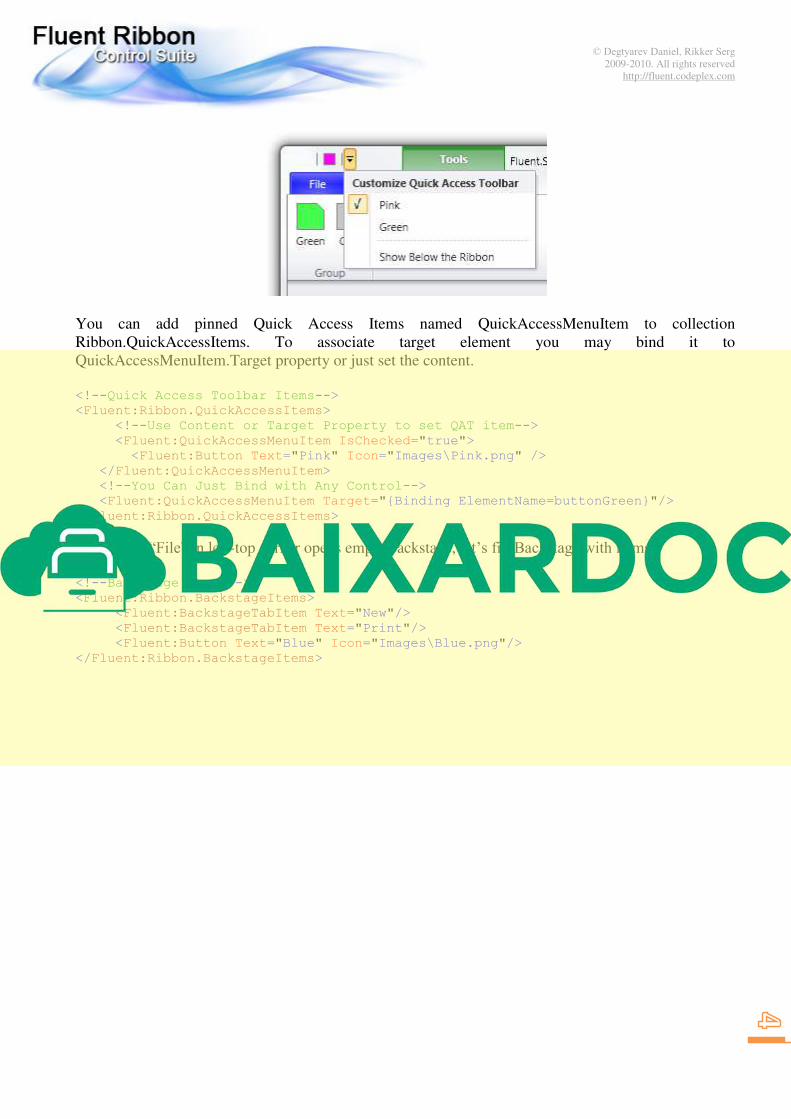
You can add pinned Quick Access Items named QuickAccessMenuItem to collection
Ribbon.QuickAccessItems. To associate target element you may bind it to
QuickAccessMenuItem.Target property or just set the content.
<!--Quick Access Toolbar Items-->
<Fluent:Ribbon.QuickAccessItems>
<!--Use Content or Target Property to set QAT item-->
<Fluent:QuickAccessMenuItem IsChecked="true">
<Fluent:Button Text="Pink" Icon="Images\Pink.png" />
</Fluent:QuickAccessMenuItem>
<!--You Can Just Bind with Any Control-->
<Fluent:QuickAccessMenuItem Target="{Binding ElementName=buttonGreen}"/>
</Fluent:Ribbon.QuickAccessItems>
The button “File” in left-top corner opens empty backstage, let’s fill Backstage with items: <!--Backstage Items-->
<Fluent:Ribbon.BackstageItems>
<Fluent:BackstageTabItem Text="New"/>
<Fluent:BackstageTabItem Text="Print"/>
<Fluent:Button Text="Blue" Icon="Images\Blue.png"/>
</Fluent:Ribbon.BackstageItems>

© Degtyarev Daniel, Rikker Serg
2009-2010. All rights reserved
http://fluent.codeplex.com
The last step is to add contextual tab. Contextual tab is visible when a particular object in an app
selected. Contextual tabs cannot exist out of contextual tab group, so we need to create contextual tab
group (RibbonContextualTabGroup) and bind a tab to this group. RibbonContextualTabGroup need to
be added to Ribbon.ContextualGroups collection:
<!--Contextual Tab Groups-->
<Fluent:Ribbon.ContextualGroups>
<Fluent:RibbonContextualTabGroup Header="Tools" Visibility="Visible"
x:Name="toolsGroup" Background="Green" BorderBrush="Green" />
</Fluent:Ribbon.ContextualGroups>
And associate a tab to this group:
<!--Contextual Tabs-->
<Fluent:RibbonTabItem Header="CT" Group="{Binding ElementName=toolsGroup}"/>
RibbonContextualTabGroup is not visible by default. To show or hide contextual tab you must set
RibbonContextualTabGroup.Visibility property to Visible or Collapsed.
© Degtyarev Daniel, Rikker Serg
2009-2010. All rights reserved
http://fluent.codeplex.com
Resizing
All RibbonGroupBox can be in four states: Large->Middle->Small->Collapsed. By default
RibbonGroupBox’s are in Large state. When a RibbonGroupBox changes its state it changes size of all
its controls.
RibbonTabItem has ReduceOrder property. This property defines order of group to reduce. You can
enumerate group names from the last to first to reduce.
All ribbon contols (Buttons, DropDownButtons, Spinners and so on) have SizeDefinition property.
You can define which size will be used when the group will be in the particular state. For example, if
you set SizeDefinition = "Middle, Middle, Small", that means:
Large State of the group -> Middle size of the control
Middle State of the group -> Middle size of the control
Small State of the group -> Small size of the control
<Fluent:RibbonTabItem ReduceOrder="Default,Default,Default,
Large,Large,Large,
Other,Other,Other" ...>
<!--By default ReduceOrder="Large, Middle, Small"-->
<Fluent:RibbonGroupBox Name="Default" Header="Default Behaviour">
<Fluent:Button ... />
<Fluent:Button ... />
<Fluent:Button ... />
<Fluent:Button ... />
</Fluent:RibbonGroupBox>
<!--You can use short form
(for ex, "Middle" is equal "Middle,Middle,Middle")-->
<Fluent:RibbonGroupBox Name="Large" Header="Large Only">
<Fluent:Button SizeDefinition="Large" .../>
<Fluent:Button SizeDefinition="Large" .../>
<Fluent:Button SizeDefinition="Large" .../>
<Fluent:Button SizeDefinition="Large" .../>
</Fluent:RibbonGroupBox>
<Fluent:RibbonGroupBox Name="Other" Header="Other">
<Fluent:Button SizeDefinition="Large, Large, Large" Icon="Images\Green.png" ../>
<Fluent:Button SizeDefinition="Large, Large, Small" Icon="Images\Gray.png" ../>
<Fluent:Button SizeDefinition="Middle, Small, Small" Icon="Images\Yellow.png" ..
<Fluent:Button SizeDefinition="Middle, Small, Small" Icon="Images\Brown.png" ..
</Fluent:RibbonGroupBox>
</Fluent:RibbonTabItem>
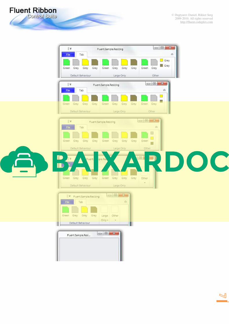
The pseudo code above must produce the following reducing behavior:
© Degtyarev Daniel, Rikker Serg
2009-2010. All rights reserved
http://fluent.codeplex.com

© Degtyarev Daniel, Rikker Serg
2009-2010. All rights reserved
http://fluent.codeplex.com
KeyTips
KeyTips provide for users ability to interact with Ribbon using keyboard. To start process user must
press Alt or F10. KeyTips are shown upon controls.
To make KeyTips work it is enough to set attached property Fluent:KeyTip.Keys to the target control
and the ribbon will arrange and show the keytips automatically. It is possible to set KeyTips to menu
and/or submenu items. Also you need to set KeyTip for groups to open them while they are collapsed.
<Fluent:RibbonGroupBox Fluent:KeyTip.Keys="ZC" ... >
<Fluent:SplitButton Fluent:KeyTip.Keys="R" ... >
<Fluent:MenuItem Fluent:KeyTip.Keys="P" ... />
<Fluent:MenuItem Fluent:KeyTip.Keys="R" ... >
<Fluent:MenuItem Fluent:KeyTip.Keys="O" ... />
</Fluent:MenuItem>
</Fluent:SplitButton>
...

© Degtyarev Daniel, Rikker Serg
2009-2010. All rights reserved
http://fluent.codeplex.com
As you can see items in Quick Access Toolbar are keytipped automatically. Also KeyTips are placed
well automatically. However, there are cases when custom placement is required. In this case you have
to set Fluent:KeyTip.AutoPlacement to false and use additional attached properties:
Property Description
KeyTip.AutoPlacement True by default. You need set false to switch on custom placement
KeyTip.HorizontalAlignment Horizontal alignment relative to keytiped control
KeyTip.VerticalAlignment Vertical alignment relative to keytiped control
KeyTip.Margin Margin to offset KeyTip
<Fluent:RibbonGroupBox Header="Group">
<Fluent:Button Text="Center" LargeIcon="Images\GreenLarge.png"
Fluent:KeyTip.AutoPlacement="False"
Fluent:KeyTip.HorizontalAlignment="Center"
Fluent:KeyTip.VerticalAlignment="Center"
Fluent:KeyTip.Keys="C" />
<Fluent:Button Text="Left" LargeIcon="Images\GrayLarge.png"
Fluent:KeyTip.AutoPlacement="False"
Fluent:KeyTip.HorizontalAlignment="Left"
Fluent:KeyTip.VerticalAlignment="Center"
Fluent:KeyTip.Keys="L" />
<Fluent:Button Text="Top" LargeIcon="Images\YellowLarge.png"
Fluent:KeyTip.AutoPlacement="False"
Fluent:KeyTip.HorizontalAlignment="Center"
Fluent:KeyTip.VerticalAlignment="Top"
Fluent:KeyTip.Keys="T"/>
</Fluent:RibbonGroupBox>

© Degtyarev Daniel, Rikker Serg
2009-2010. All rights reserved
http://fluent.codeplex.com
ScreenTips
To use ScreenTip you have to create Fluent.ScreenTip instance and set to ToolTip property:
<Fluent:Button ... >
<Fluent:Button.ToolTip>
<Fluent:ScreenTip Title="Gray"
HelpTopic="Help for Gray ScreenTip"
Image="Images\GrayLarge.png"
Text="This ScreenTip is ribbon aligned. 

It has the image and handles F1."/>
</Fluent:Button.ToolTip>
</Fluent:Button>
ScreenTip has a unique feature to invoke contextual help when it is in open state. To handle contextual
help you must set ScreenTip.HelpTopic in XAML and subscribe to ScreenTip.HelpPressed event. Be
aware, that the event is static, so you must manually unsubscribe from it when it is appropriate to avoid
memory leaks or subscribe application’s lifetime object as shown below:
public partial class Application : System.Windows.Application
{
void OnStartup(object sender, StartupEventArgs e)
{
ScreenTip.HelpPressed += OnScreenTipHelpPressed;
}
/// <summary>
/// Handles F1 pressed on ScreenTip with help capability
/// </summary>
/// <param name="sender">Sender</param>
/// <param name="e">Arguments</param>
static void OnScreenTipHelpPressed(object sender, ScreenTipHelpEventArgs e)
{
// Show help according the given help topic
// (here just show help topic as string)
MessageBox.Show(e.HelpTopic.ToString());
}
}