thesis remote sensing to quantify in-field soil moisture ...
Upload
goodgravydesignCategory
view
1download
0
Title:
Feel Info: Can Typographic Aesthetics Be QuantifiedDan May, Associate Professor of Art and Art History: University of Nebraska-Kearney, 2014
Bio:Dan May has exhibited across the US in a variety of mediums. His work has appeared in shows in Los Angeles, San Francisco at the AIGA Compost Modern Exhibition, and New York. He has written and published the paper Glitz Glamour and Sustainable Design which is listed in the Library of Congress, USA. His merchandise and poster designs for touring rock icons: Eric Clapton, Cream, Queen, ZZ Top, Stray Cats, Brian Setzer and a host of others, have covered the backs, and the rathskellers of music fans across the planet. He currently teaches at the University of Nebraska-Kearney, and was former Chair of Art and Design at Southern Arkansas University.
Dan May: Digital illustration: Fuel injected type design.

Abstract: The debate over beauty, clarity, purpose, and what the most effective form a type-face should take has been ongoing in the art world, while proof in the scientific community regarding typeface design proves that the structure of a letterform has no material effect on readability or legibility. For this paper an empirical method is offered for quantifying a font’s usefulness and desirability over another in terms of aesthetics.
I have attempted to offer methods to quantify some universal qualities of preference for fonts based on structural aesthetics through investigative, and empirical research. There are two arguments which are currently in vogue in the art community that should be abandoned.1)The modernist ‘crystal goblet’ approach, simply defined is to choose a san serif font for ev-ery graphic design purpose, so that the unimpeded transfer of information is not clouded by a cultural or ornamental context. To many it is preferred method of contemporary typographic design both in terms of beauty and utility. 2) The post-modernist approach would be to find a more unique solution tailored for a partic-ular audience be formulated based on criteria tailored toward the intended audience’s feelings or toward the subject matter that the work was attempting to convey.
I am not a scientist. My study was not able to reach a cross section of humans that could be considered an accurate scientific sampling. My purpose was to shed more light on some traditionally held beliefs in a font’s ability to convey information. I collected an unscientific sampling of 72 people who responded to my survey on aesthetics. My statistical sampling was random. But the respondents were more likely to be college educated, than the rest of the population based on proportion. They were more also likely to be older than the general population, and more likely to be American than any other nationality. But there were people from a broad variety of occupations and educational backgrounds, never-the-less.
I have included in the body of this paper, a sample of the types of questions asked after a brief explanation of font structure was assumed to be read by the uninitiated in typographic terms. It was assumed that participants would read the brief reasoning why this survey was being collected, but there are no guarantees as it was administered electronically.
One of the most interesting results of the test to graphic designers such as myself found that calligraphic fonts were overwhelming preferred when the term beauty was associated with a font, and that san-serif fonts were overwhelmingly considered to be the opposite.
This is a san serif font
notice there are no “lines” below the strokes of the letterform
This is a serif font
notice there ARE “lines” below the strokes of the letterform

Results that were tabulated opened up a broader discussion as to whether the Arts might be open to the idea of formulating a process which can quantify aesthetics. The very idea that an answer to a long debated philosophical question, such as this may seem anathema to those in the Art community. Possibilities that beauty may not necessarily be a subjective matter might be frightening to some relegating it to a formulaic process, aka craft, as opposed to art.
This is a subject that I briefly discuss, but I hope that by beginning to understand what humans consider beautiful we might gain a greater understanding of what motivates us, and override any fear of the perceptions that Art’s importance be reduced.
Paper: Feeling pretty puffed up at my personal genius, I wanted to share a new concept I had for research to a longtime colleague. The concept originated from a student who asked if there was a definitive typeface choice for magazines when it came to legibility, as it was part of a project she was currently working on. I told the student that tradition dictated that serif faces were more legible in print, and san serif faces were relegated to screens, but beyond that I was not sure there were any definitive studies. I spoke quite eloquently (as I usually imagine myself at these time to be the reincarnation of Cicero) that I was sure that this realization had evolved over time, but experiments probably originated during the period of the Bauhaus. I told her that I would check and get back to her by next lecture. To my chagrin, my assumptions were wrong. Aesthetics has been written about by a broad swathe of philosophers, but there is no empirical evidence as to what works better when it comes to communicating, or what qualifies as the most beautiful. A dominant feature in my classroom whenever a concept or visual is produced
Dan May: Feel. food, fool: Mixed media on board: 68 in. x 76 in.

in a composition, whether it may appear aesthetically pleasing to me, or the rest of the class, I invariably ask the student, if they have any research to support whether their choice works better than another choice, so my student’s question logically progressed from that critiquing method that we employed.
If communication rather than beauty is to be the standard by which Graphic Design efficacy is to be judged, one could justifiably argue as David Carson does in one of his books, The End of Print, that one shouldn’t mistake legibility for communication, or beauty1. In the portion of the documentary film Helvetica, where David Carson is being interviewed, he can be seen on screen questioning whether the word ‘caffeinated’ set in the typeface which is the movie’s namesake really says caffeinated visually, or resonates emotionally to the viewer.2
This statement impressed upon me the necessity of finding some outlet to resolve this problem which would put to rest at least some of the issues which confound designers, namely, “ What typeface should I use?” As I began to explain to my colleague, how frustrating it was for me to listen to the somewhat random approach that many designers practiced when attempting to choose the proper font for any project that they may be working on, whether it was a student or seasoned profession-al, such as myself, it appeared that their approach was similar. This long time colleague, who I regularly confided in, stared somewhat vacantly for two heartbeats, as if to measure his re-sponse, and then stated flatly,”Why do you ALWAYS want to take the mystery out of art?”
I do not inherently attempt to be everyone’s buzz-kill, but I approached this from a different point of view than he did. As others who work in the visual arts may believe that working in the visual arts is a ‘gift,’ I believe it is like any other process that you may have a desire to pursue. It requires practicing technique, and utilizing empirical data to synthesize visual solutions. The term gift was beginning to wear thin on me, as I found the term to be increasingly demeaning.
Dan May: Typographic study information published on outhouse door; Mixed Media on outhouse door 60 in. x 18 in.

The ‘gift’ description, which more often than not is bestowed upon the visual, musical, or theat-rical artist, rather than let’s say a carpenter, or a surgeon presents a picture of a person who re-lies upon supernatural qualities bestowed upon them from some outside supernatural source. This outside source appears to grant them ‘special’ abilities and insights that does not require the work and perseverance that comes from ‘legitimate’ professions.
I am not attempting to explain away the child prodigy, who may seem to have been dropped onto the planet with skills beyond their years, nor do I wish to discuss issues of deities. For that, I will wait for a conversation after a few drinks of the intoxicating variety with those who may be interested in discussing these issues when they are sufficiently bereft of their faculties. For this particular essay, I am speaking of the person who appears to have a strength in partic-ular subject, or skill which manifests itself in the subject’s formative years after a significant pe-riod of time has elapsed where the person in questions desire drives them to practice for long periods of time. Studies have been conducted to find that many of ‘talents’ can be explained by a dedication of time to doing something repeatedly rather than an innate supernatural skill. With that definition as a guide describing that a particular person as ‘gifted’ might just as easily be described as having an obsessive compulsive disorder. The only difference between the two being the point of view of the one who is making the evaluation. A ‘gifted’ person has positive connotation while the other may not.
The other thing which bothers me about the word ‘gifted.’ This special ‘gift’ term which per-meates through the art community is a double edged sword. If ‘gifts’ are bestowed upon the few geniuses that transcend the norms of society, then it most assuredly means that the rest of the art community who struggle with the everyday process of making a living are no more than mis-guided hacks who suffer the delusion that their abilities are at most imitative in nature. To these starry eyed dreamers, their rewards are often preceded with the words, “you have to love what your doing to be a designer” (or you may insert artist to replace designer if you wish). These words are often quickly followed by pats on the head and bits of candy in the pittance of compensation they are prepared to offer people with childish dreams of grandeur. You can see that I grow tired of this categorization. Maybe because it strikes too close to home, but what it implies is that your work is not researched, and well considered prior to its completion. Relying on traits such as talent, inspiration, or ‘gifts’ to determine the effectiveness of a person’s visual choices demeans their skills, and intelligence.
I teach a process by which designers make the choices that they do to be similar to the sci-entific method of proof. I am sure that this is not unique. The first step is to do the necessary research on the client’s product or service which might also require some research on the suc-cesses of their competition. Scanning and comparing data that may have been unconsciously, or consciously collected, then comparing that data to historical evidence of the comparative success of one approach over another is then synthesized and transformed into visual compo-sitions by brainstorming or if you prefer doing visual experiments. These are presented to the client to measure their response to it. After the initial presentation, the designer may refine the number of comps (or experiments) they have produced based on client reaction.

The history of the font, its relationship to the visual, and the projected expectation of the re-sponse from your intended audience can be more easily supported by arguments when it is based on sound reasoning. I expect that the student has made their decisions based upon something more than throwing a dart at the metaphorical wall of visual possibilities. More to the point, the proper choice for the correct font should follow the same process as the visual which may accompany it. A well chosen font may even supplant the use of a photo, illustration or some other visual entity all together, because its visual qualities can stand on their own.
Defensible arguments for a designer’s choice should be based on historical evidence, social or economic conventions that were previously experienced, cultural, religious, or political viewpoint, as well as, scientific behavioral studies based on measured responses to things like color, shape, texture, line and composition. These factors are more than a gut feeling, or a ‘gift.’ They are more than inspiration, or a touch by mystical force. A convincing case is made by the process of hard work. As designers present their comps before the client, they should be not relegated to the subjective sword of ridicule because your client feels that their five your old son has a ‘good sense of color.’ They should scan over the visual concepts that have been produced, and know that someone with expertise has more than the hand of a shaman upon them. The process should convince the client that the designer is educated above the level of their ‘gifted’ cousin who paints saw blades as a hobby. Trying earnestly to find a resolution to the question of a font’s desirability by relying on words couched in postmodernist concepts of culturaI relativism seemed to be the answer often relied upon in my experience. I felt that this was no longer a viable answer for me, but rather an ex-cuse to be inconcise. I began to search texts outside the area of art and design where I might find definitive studies on type legibility, readability, and beauty which I had neglected to note throughout my own academic experience. I found a number of models for typographic studies done on legibility in the past eighty years. The study cited by most contemporary researchers which appeared to be the first in a series papers was one done in 1932 by Paterson & Tinker. They conducted a study using a number of fonts for comparison. Simply put, they found very little, if any difference in the ability of the test subjects to read quicker or comprehend more comparing a variety of serif and san-serif typefaces.3
A myriad of other factors have been noticed as more significantfor both readability and legibility, such as: sizes of thetypefaces, line width, tracking, paragraph uniformity andthe relations of the text color–the background (Paterson& Tinker, 1944; Tinker & Paterson, 1946); x-height, strokewidth, counterform (Paterson & Tinker, 1932…4
In 2001 a typographic study conducted by Scott Bondurant Chandler called LEGIBILITY AND COMPREHENSION OF ONSCREEN TYPE 5, Chandler found Helvetica on screen at the twelve point size, when it was anti-aliased was easier to read by test subjects than Palatino. He noted in his study “As early as 1931, Buckingham argued that much research regarding type in print was based on “imagination.” But his study neglected to say if he factored in cultural differenc-

es, sex, or any other factors in his test subjects, and though print may appear to be dying in some cir-cles there is a definite contingent of people who still read from books, and periodicals that are printed upon paper. “A simple calculation shows that Americans are spending approximately 50 million hours each day in front of computer screens at home.”6 An observation regarding the prevalence of reading on a screen device is obviously a growing concern, but at the time of the study multimedia screens and computers dominated. Today smartphones and tablets are legion. Who knows what may be on the horizon and if there will be a significant change in legibility. My guess that the resolution of such devices can only improve rather than degenerate.
Ellen Lupton writing on a variety of scientific studies on legibility and comprehension in her 2003 es-say entitled The Science of Typography
“What we might expect from the science of type is a seamless web of rules. Such is not forthcoming. In its drive to uncover fixed standards, the research has affirmed, instead, human tolerance for typographic variation and the elasticity of the typographic system. Science can help ruffle our dogmas and create a clearer view of how variables interact to create living, breathing—and, yes, readable—typography.”7
So previous scientific analysis proves that when in comes to legibility and comprehension there is no significant difference in typefaces, and even in screen tests there seems to be no deviation. My own survey bears it out, but something in my survey which none of the previous studies test is typographic effects on mood. In my survey 76% of the respondents felt that typographic structure could affect their mood. The varied concepts that column width, number of characters per line, leading, kerning, and many of the other preconceived notions formulated by typographers and designers such as Josef Müller-Brockman (seven words per line) to Ruedi Rüegg (forty to sixty characters) have been proven to have no impact on readability or legibility, but because previous studies, I can only suppose, felt that qualities such as mood or nebulous concepts such as beauty were impossible to quantify, they left those important questions unanswered. This leads us back to the properties associated with beauty and aesthetics. Can typographic shape due to its aesthetics improve mood, and therefore improve comprehension?
Historically speaking many typographic geometric structures were originally defined by grids tied to the golden mean, which translated to some scholars, as justification enough to qualify as being ideal. Since humanists and classicists alike agreed that the mathematical principles contained within this formula had mystical as well as quantifiable qualities, but again we find disagreement among scholars.
“Italian humanists had adopted a type of handwriting called Carolin-gian minuscule that was based on the style of writing used for official documents in the Carolingian Empire during the ninth century. Partly derived from ancient Roman cursive, this hand written script was adopted by Renaissance humanists because of its ties to antiquity.

During the late fifteenth century, this style became known as Humanist minuscule, and it is the basis for roman forms through to the present day. As the printing industry became more respected and commercially viable, there was even greater use of roman letters because it was no longer neces-sary for printed works to imitate the gothic script of handwrit-ten works in order to be deemed valuable.”8
I don’t presume to know better, or to disagree with the entire premise, and especially not the scholarship presented, but I found reliance upon traditional acceptance that ideals of perfec-tion are best defined by ad hominem reasoning, rather than using empirical evidence as justi-fication of a font’s efficacy to be difficult to swallow. One can find many examples of scholars claiming the aesthetic beauty of the serifed typographic designs created by Aldus Manutius, Nicholas Jenson, Geoffroy Tory, Claude Garamond and a host of others, but are their beauty more appreciated by the French and Italians where their designs were revered as much for breaking away from Textura-like illuminated manuscripts, as anything else? The works of Phillipe Grandjean, Roman de Roi, was revered and respected enough that there were restrictions of its use imposed by the French monarchy of Louis XIV, when it was pro-duced, but that may have been based on pride which may have relied more on where they were produced than the scientific process it took to make them. Stephen Eskilson’s Graphic Design: A New History goes on to say,
“the typeface used a 64-square grid,with each unit further split up into 36 smaller squares, so thatthe entire system totaled 2,304 tiny squares. This de-sign process gave typography the imprimatur of a scientific pursuit, whereby letterforms are worked out not by intuition but by rational, logical processes.”9
But the fonts in the early incunabula periods which were often designed to imitate the particu-lar national character where it was first created all appeared to use the same mathematical rig-or in their production. Documentation of national identity for the letterform traditionally known as Textura, or Blackletter when the German Emperor Maximilian commissioned a fresher typeface to be created for the books in his new library, used methodologies and mathematics proposed by craftsmen such as Durer. As Maxmillian directed that the new type be distinctly “German” in character, his motivation was to break from humanist movement typefaces cre-ated in Italy which in turn was based on ancient roman lettering. It was further advanced with Gutenberg where he used it in his 42 line Bible to imitate the beauty of the illuminated manu-script. Though there is some debate about my next claim, significant evidence exists even into the twentieth century, Adolph Hitler felt that type design Textura which Emperor Maximillian preferred helped him to define Germany’s cultural identity.10 Proof of this propaganda ap-proach, is documented by Professor Bytwerk of Calvin College. Blackletter is prominently used in many of the early materials produced by Goebbels. It should also be noted that this was

done at a time when the Bauhaus was promoting the use of sans serif typefaces for its utility and legibility. While Blackletter was used by the nationalist movement to promote pride in Ary-an superiority, once it was rumored that some early Jewish typographers were responsible for initial designs of Textura, Nazi favoritism for the form was quickly extinguished. Furthermore,the progression of illuminated writing which sprang from the region which Germany now oc-cupies identifies the cultural impact it had on the nation’s nascent stages through the 20th century. To say that type structure preference alters a person’s psychological profile may be a stretch, but patriotic fervor related to symbology such as flags and icons which are artistic representations of national identity are nurtured by official decree throughout history.11
In a number of essays compiled in the document Art, Culture, and National Identity in Fin-de-Siecle Europe12 it explains how the ‘nationalist cosmology’ was formulated and enhanced by visuals in the late nineteenth and early twentieth century. The nations studied were Scotland, England, Norway, Romania, Sweden, Germany, Switzerland, and France. Countries who had strong Artistic academies were most represented as having nationalistic pride. The images pre-sented at World’s Fairs and Exhibitions during this period were surely augmented by classical typographic forms which represented their countries of origin.
Similar research into Typeface structure’s influence on an individual’s as well as a nation’s rea-soning skills are found in: Dr. Craig Eliason of The University of St Thomas curated show: “Face The Nation” A visual journey into typeface design 13 compared a variety of typefaces ranging between the beginning of the twentieth century until 1960. In his study, Eliason found letters documenting the reasoning behind constructions of letterforms and their nationalist proclivi-ties from typographers such as Eric Gill of the United Kingdom, Maximillien Vos of France, Jan Tschichold of Weimar Germany, and Adrian Frutiger. Each typographer expressed ideals of pro-portion that they felt were distinctively different and inherently more beautiful simply because of their superior national importance.
But advancing the case for national and cultural identity does not end in Europe, eastern cul-tures from as far back as historical records document in both China and Japan, they have used typography in its calligraphic form to convey emotional as well as informational content. In the culture of Islam calligraphy is held in similar regard as a cultural treasure.
“The Arabic text of the Qu’ran is sacred to Muslims, and its high status gave rise to an associated respect for books in general. However, it is important to remem-ber that while the Qu’ran’s holy status provides an explanation for calligraphy’s importance, by no means all Arabic calligraphy is religious in content.”14
Enough evidence in the centuries long history of typography documents that the structure of typographic forms goes beyond the purely informational purpose that the crystal goblet

crowd would have us subscribe. It evokes feelings of beauty, community with a higher purpose,and nationalism as well. But, once again, the historicist’s approach for typographic beauty and the possibility for a universal paradigm which could rank one typeface’s beauty or preference over another is anecdotal at best, and fraught with esoteric arguments for choosing one typeface over another rather than relying on empirical evidence. For decades since the advent of post modernist thought it was assumed that the complex factors relat-ed to cultural preference would preclude any attempts at measuring universal beauty even while we make attempts to measure a font’s legibility and readability at least until recently.
With advances in MRI, CT scans, and other forms of neuro-imaging, we are beginning to draw a better, more accurate picture of universal aesthetics by mapping out areas of the brain which show signs of increased activity when subjected to external stimulus. Results of a study were published in 2001 in a paper which tracked attraction to facial attributes follow.
Rating Face AttractivenessEight young heterosexual males viewed the stimuli se-quentially, rating each face’s attractiveness on a scaleof 1 (“very unattractive”) to 7 (“very attractive”). Theresults showed a general effect of beauty a general effect of gender and an interaction. Within the male and female sets, the differences between beauti-ful and average faces were significant (p 0.000001) for each comparison. Most importantly, for our purpose, the difference between the beautiful males and beautiful females was not significant.The ratings varied with exposure, such that the differ-ence in ratings between average and beautiful femalefaces increased from 2.96 on the first exposure to 3.39and 3.54 on the second and third exposures; this trend-had a significant linear component. …the ratings for the average faces decreased (2.33, 2.00, and 1.91 across exposures)…15
Evidently in some cases familiarity indeed breeds contempt. What is significant in this study is that it was done on a cross section of people from a variety of backgrounds implying a sense of universality that sends shivers down the foundations of post modernist cultural relativistic thought. Strictly using visual cues in analyzing motor response a Cambridge University study found associations between cognitive skills and motor activity which may relate to why we reach out to touch things that we find appealing, as well as whether the direction that we read increases or decreases cognitive ability.
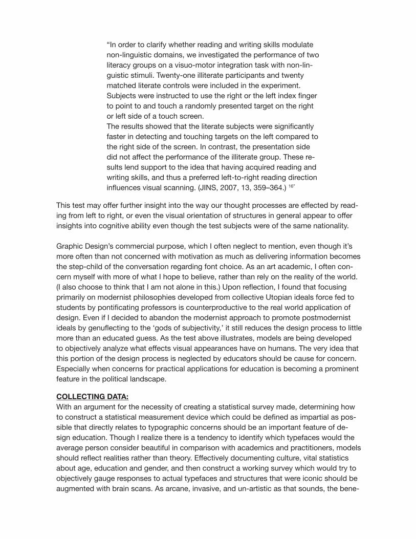
“In order to clarify whether reading and writing skills modulate non-linguistic domains, we investigated the performance of two literacy groups on a visuo-motor integration task with non-lin-guistic stimuli. Twenty-one illiterate participants and twenty matched literate controls were included in the experiment. Subjects were instructed to use the right or the left index finger to point to and touch a randomly presented target on the right or left side of a touch screen.The results showed that the literate subjects were significantly faster in detecting and touching targets on the left compared to the right side of the screen. In contrast, the presentation side did not affect the performance of the illiterate group. These re-sults lend support to the idea that having acquired reading and writing skills, and thus a preferred left-to-right reading direction influences visual scanning. (JINS, 2007, 13, 359–364.) 16”
This test may offer further insight into the way our thought processes are effected by read-ing from left to right, or even the visual orientation of structures in general appear to offer insights into cognitive ability even though the test subjects were of the same nationality. Graphic Design’s commercial purpose, which I often neglect to mention, even though it’s more often than not concerned with motivation as much as delivering information becomes the step-child of the conversation regarding font choice. As an art academic, I often con-cern myself with more of what I hope to believe, rather than rely on the reality of the world. (I also choose to think that I am not alone in this.) Upon reflection, I found that focusing primarily on modernist philosophies developed from collective Utopian ideals force fed to students by pontificating professors is counterproductive to the real world application of design. Even if I decided to abandon the modernist approach to promote postmodernist ideals by genuflecting to the ‘gods of subjectivity,’ it still reduces the design process to little more than an educated guess. As the test above illustrates, models are being developed to objectively analyze what effects visual appearances have on humans. The very idea that this portion of the design process is neglected by educators should be cause for concern. Especially when concerns for practical applications for education is becoming a prominent feature in the political landscape.
COLLECTING DATA:With an argument for the necessity of creating a statistical survey made, determining how to construct a statistical measurement device which could be defined as impartial as pos-sible that directly relates to typographic concerns should be an important feature of de-sign education. Though I realize there is a tendency to identify which typefaces would the average person consider beautiful in comparison with academics and practitioners, models should reflect realities rather than theory. Effectively documenting culture, vital statistics about age, education and gender, and then construct a working survey which would try to objectively gauge responses to actual typefaces and structures that were iconic should be augmented with brain scans. As arcane, invasive, and un-artistic as that sounds, the bene-

fits could be enormous.
Along those lines, in my feeble attempt to develop such a vehicle, I chose fonts from the periods outlined in most design books as being the most iconic in terms of national iden-tity, beauty in structure, and historical period as a base line. I chose fonts of the Old Style, Transitional, and Modern periods, as well as Grotesques, Slab serifs, fat faces, woodcuts, uncials, and calligraphic forms from Islam, Sanscrit, Chinese and Japanese cultures
Below is an example of non representative forms that I placed in my questionnaire. My inten-tion was to create a series of abstract figures which might be able to gauge male or female qualities in terms of texture, line width, contrast and direction of stroke but it may also trans-late to the more ephemeral qualities of beauty. For instance is a more delicate structure as my survey shows more associated with refined beauty or something less than that.
Figure 1

My unscientific findings were as follows.79% of those surveyed felt that typefaces have gender specific qualities.88% of those surveyed felt scriptfaces were more beautiful than any other typeface.The majority of those surveyed felt that san serif type was uglier than serif typeand that they looked more masculine than any other letterform.Blackletter was most closely associated with England and Germany while 72% of the peo-ple believed that woodcut type was distinctively American in style. As I have said before, none of the figures from my survey should be considered a scientific sampling, but it does present some questions.There is scientific evidence which shows that left to right linearly designed reading skills limits our understanding of complex ideas related to space and time, and that some artists
appear to transcend those limitations when it comes to spatial relationships. 15 If this holds true, then it goes without saying that designers should be able to overcome some of those barriers of communication.
Evolutionary psychologists are looking into fundamental issues regarding beauty, and are mapping out the pleasure centers in the brain. It has become more established that aesthetics, beauty, and desirability is not confined to the human experience. It is an in-nate quality which lives in a variety of species.17 In terms of the fine arts where the intent or development of understanding audience behavior is less important this may have less significance. But in the areas of visual design, where understanding is a paramount con-cern, it only follows that with further study and application those same methods can assist artists in developing more targeted approaches for developing visuals which reach a broad-er swath of people creating a truly universal approach to font design which concerns itself with beauty.
info: Dan May 36x24 inches, mixed media on canvas

Bibliography1. “Don’t confuse legibility with communication, just because something is legible doesn’t mean it communicates and more importantly doesn’t mean it communicates the right thing.”–David Carson, Helvetica the Documentary Film2. The End of Print, The Grafik Design of David Carson; 2nd edition, Lewis Blackwell and David Carson, ISBN 9781856698887 Published March 20124. Tinker, M. A., Paterson, D.G. (1932). Studies of typographical factors influencing speed of read-ing: X. Style of typeface. Journal of Applied Psychology, 16(6), 605-613.5. Scott Bondurant Chandler: LEGIBILITY AND COMPREHENSION OF ONSCREEN TYPE2001-10-086. Legibility based on differentiation of characters: A review of empirical findings fundamental for the type design practice; Uroš Nedeljković, Irma Puškarević, Bojan Banjanin,Ivan Pinćjer Faculty of Technical Sciences, Graphic Engineering and Design (Journal of Graphic Engineering and Design, Volume 4 (1), 2013. 17)7. The Science of Typography: Author Ellen Upton, 20098.Stephen J. Eskilson “Graphic Design: A New History” ISBN-10: 0300120117 (pp 9-14)9. Ibid10. Meggs’ History of Graphic Design ISBN-10: 047016873011. “Blackletter: Type and National Identity,” Publisher: Princeton Architectural Press; 1 edition (April 1, 1998), ISBN-10: 1568981252, ISBN-13: 978-15689812539.http://paulshawletterdesign.blogspot.com/2010_09_01_archive.html12. http://www.vam.ac.uk/content/articles/c/calligraphy-in-islamic-art/13. Art Culture and National identity in Fin D’ Sieclé Europe,” Michelle Facos and Sharon Hirsch Cambridge University Press 200314. Neuron, Vol. 32, 537–551, November 8, 2001, Copyright 2001 by Cell PressBeautiful Faces Have Variable Reward Value: fMRI and Behavioral Evidence15: http://www.stthomas.edu/facethenation/redefine_hughschonfield.html16: “Art and Physics” Author :Leonard Shlain Publisher: William Morrow (January 28, 1993) ISBN-10: 068812305816. Journal of the International Neuropsychological Society (2007), 13, 359–364.Copyright © 2007 INS. Published by Cambridge University Press. Printed in the USA.DOI: 10.10170S135561770707044017. The Aesthetic Brain: How We Evolved to Desire Beauty and Enjoy ArtAuthor Anjan Chatterjee Publisher Oxford University Press, 2013ISBN 0199811806, 9780199811809
Copyright © 2022 FDOKUMEN