
Medical Terminology Ophthalm/o = Eye Ophthalm/o = Eye Ophthalm/o ...
Upload
khangminh22Category
view
0download
0
International Journal of
Geo-Information
Article
Eye-tracking Evaluation of Weather Web Maps
Stanislav Popelka , Alena Vondrakova * and Petra Hujnakova
Department of Geoinformatics, Faculty of Science, Palacký University Olomouc, 17. listopadu 50,77146 Olomouc, Czech Republic; [email protected] (S.P.); [email protected] (P.H.)* Correspondence: [email protected]; Tel.: +420585634517
Received: 30 November 2018; Accepted: 28 May 2019; Published: 30 May 2019�����������������
Abstract: Weather is one of the things that interest almost everyone. Weather maps are thereforewidely used and many users use them in everyday life. To identify the potential usability problemsof weather web maps, the presented research was conducted. Five weather maps were selectedfor an eye-tracking experiment based on the results of an online questionnaire: DarkSky, In-Pocasí,Windy, YR.no, and Wundermap. The experiment was conducted with 34 respondents and consistedof introductory, dynamic, and static sections. A qualitative and quantitative analysis of recordeddata was performed together with a think-aloud protocol. The main part of the paper describes theresults of the eye-tracking experiment and the implemented research, which identify the strengthsand weaknesses of the evaluated weather web maps and point out the differences between strategiesin using maps by the respondents. The results include findings such as the following: users workedwith web maps in the simplest form and they did not look for hidden functions in the menu or attemptto find any advanced functionality; if expandable control panels were available, the respondentsonly looked at them after they had examined other elements; map interactivity was not an obstacleunless it contained too much information or options to choose from; searching was quicker in staticmenus that respondents did not have to switch on or off; the graphic design significantly influencedrespondents and their work with the web maps. The results of the work may be useful for furtherscientific research on weather web maps and related user issues.
Keywords: web maps; cartography; user issues; eye-tracking technology; weather; meteorology
1. Introduction
Maps have been popular for centuries, moreover, crafted for several millennia. With thedevelopment of technologies in the twentieth century, digital forms have become popular. At thebeginning of the twenty-first century, a variety of web applications have gradually become moderntrends and a regular part of everyday life. Web maps as another form of cartographic work havebecome popular [1,2].
Many people see the Internet as a revolution for cartography because of new approaches andnew technologies. While previously published maps were tied to a paper medium and expensivelarge-format colour print technology and had limited distribution and use, the Internet has made itpossible not only to distribute maps to a much larger audience but also to incorporate interaction andanimation [3–5]. These maps are becoming progressively more suitable, as some traffic and weathermaps are updated every few minutes [3].
Numerous web map studies have been performed. Research topics have varied from theoreticalfoundations to purely applied studies: how web maps provide users with information [6], how theuse of web-based maps could be made easier for users [7], what problems are associated with webmap design [8], what the usability problems are, and others [9–15]. In the conclusions of those studies,problems related to the map field are often mentioned. One of the most significant conclusions that
ISPRS Int. J. Geo-Inf. 2019, 8, 256; doi:10.3390/ijgi8060256 www.mdpi.com/journal/ijgi

ISPRS Int. J. Geo-Inf. 2019, 8, 256 2 of 27
can be made is that a large number of web maps have a small map field and unnecessarily large webmap controls or legends.
Many modern studies use the eye-tracking technology. Eye-tracking is used for usability tests,evaluation of interactive map interfaces [16], evaluation of animated maps of traffic flows [17], analysesof maps and plans [18], analyses of 3D geovisualizations [19], analyses of dynamic stimuli [20–24],and in general to evaluate the process of map reading and map use [25]. User studies in cartographyprovide enormous opportunities for further development of maps [26].
The research presented below focuses on the question of what problems users have with some ofthe most commonly used thematic maps on the Internet: weather web maps.
1.1. Weather Maps
Maps containing meteorological characteristics and meteorological data, generally known as“weather maps”, were selected for the study from a wide range of available web maps, the main reasonfor this choice being that these maps are considered complex visual displays [23] and are one of themost used thematic web maps.
The term “weather maps” loosely refers to any cartographic depiction of weather or weather-relatedphenomena, including climatic maps. There are four main types of weather web maps [24]. Maps inthe first three categories (weather maps in a narrower sense, satellite image maps, and radar imagemaps) describe recent or current conditions in the atmosphere. The fourth type consists of maps thatpredict future conditions. The development of web maps has been enormous, and most weather webmaps now combine all of these types.
Web maps may be static or dynamic. Each of these categories is further subdivided into view onlyand interactive maps [4]. The current trend is to use animation to show the natural development ofweather. A method called semi-static animation was introduced by Nossum [27] using an example oftemperature forecast for four days. The concept’s core was to make all information visually availableto the user at any given time of the animation. The bottlenecks encountered in animated (web) mapsare no longer because of hardware, software or data, but in the limited visual and cognitive processingskills of the map reader [28].
Semi-static and dynamic animations have been analysed in numerous studies [27,29]. Analysis ofeye-tracking data revealed that the viewing behaviour of respondents for both map types (animationand semi-static animation) are surprisingly similar [30]. Weather maps have also been the subject ofstudies focusing other issues, such as map reading and visual salience [23], communication issuesconcerning climate forecasts [31], and methods of cartographic visualization [32].
1.2. Geovisualization Methods
There is great variability in the range of maps produced, not only because of the potentialavailability of technologies. The differences are in the specifics of the presented phenomena, the chosenmethods of cartographic expression, graphic design, and many other aspects.
The suitability of selected methods of spatial data visualization and particular implementationssignificantly affect a user’s ability to determine the correct information from a map. The quantificationand evaluation of different factors affecting how information in a map is perceived by different usergroups is the main task in many types of research [33–35]. Addressing modern trends in cognitivecartography and cartographic visualization methods can lead to insights in, and improvement to,cartographic production.
Methods of geovisualization represent a set of rules to express the spatial characteristics in amap. Methods of geovisualization are also described as cartographic visualization methods, methodsof representation, means of expression, interpretive methods, graphical representation, mappingexpression, and others. In most cases, they are not universally standardized, and the methods ofgeovisualization used generally depend on the personality and expertise of the author creating thevisualization. Although there are a number of textbooks that describe map creation, approaches vary

ISPRS Int. J. Geo-Inf. 2019, 8, 256 3 of 27
and, thus, the map designs of individual cartographers also vary [36]. However, the approach is uniformin the evaluation of map symbology through visual variables, which describe the graphic dimensionsacross which a map or other visualization is varied to encode information [37]. The methods ofcartographic visualization on weather web maps are analyzed and described in the selected weatherweb map sub-descriptions.
The spatial data visualization process (geovisualization) can result in different levels of processingof the final visualized product, from a simple data view (graphical representation of spatial datalayers) to a map (cartographic visualization with all the features and compositional elements). Whilemaps are produced for different target groups for different purposes and present many differenttopics, the approaches to geovisualization are also changing in many aspects [38]. One possibleaspect is time. The preferred methods of geovisualization may differ in the various age groups ofmap-makers as well as age groups of target users. Differences also exist in national approaches andvarious cartographic schools. Nevertheless, the selection of appropriate geovisualization methods andappropriate parameters of each method is the main task for a person with an education in cartography.
To ensure the correct map communication goals, user testing should be conducted, complex,non-technological aspects, user and usability issues can be addressed and evaluated during the mapproduction analysis.
There are fewer methods of cartographic visualization which express meteorological elements.A basic point method is used to visualize stations, measurement points or other point-located variables.Area symbols are also often used to visualize presented phenomena, because meteorological indicatorshave the characteristic of being continuous data and are mostly presented as continuous surfaces.The most used methods include isolines, graduated symbols (diagrams), points, line symbols, and areas(area patterns) [39].
The composition of weather web maps varies greatly. Some authors see an advantage in the mostuncomplicated map composition with the most basic controls so that the map is not overcrowded withinformation or options and that users can work and control it as simply as possible, other authorsattach more importance to very interactive maps with a complex composition and large number ofcontrols and visualization options [4,5,16,40].
The primary objective of the study presented in this article is to analyse how web-based weathermaps are used and perceived. Only design aspects were evaluated, not the accuracy of the predictivemodel, rate of data update or other aspects. A more detailed analysis of weather web map functionalityand interactivity may be considered for future work. The results of the presented research may beuseful to ordinary users or for further scientific research on web maps and related user issues.
2. Materials and Methods
2.1. Materials – Description of Selected Web Maps
Many web portals contain web maps with meteorological content. These include Windy, In-Pocasí,DarkSky, Wundermap, YR.no, PovodnovyPlan, Meteoearth, Ventusky, Meteoblue, Rainviewer, Weather,and many others. Web maps, portals, and weather apps take different forms. For the most part,they have very similar content; namely the visualization of meteorological phenomena. Some mapscontain a large number of thematic layers and some contain only basic meteorological indicators,such as temperature, precipitation, wind or frontal systems.
For the eye-tracking experiment, five web weather maps were selected. No study was foundwith a complete comparison of weather maps, even though weather web maps are widely usedby the public almost every day. Their use is not limited by previous knowledge or expertise andthey can be used by almost anyone. The evaluated maps were: DarkSky (https://darksky.net/),Windy (https://www.windy.com), In-Pocasí (https://www.in-pocasi.cz), YR.no (https://www.yr.no/kart),and Wundermap (https://www.wunderground.com/wundermap). This number was selected so that

ISPRS Int. J. Geo-Inf. 2019, 8, 256 4 of 27
the time required for the entire experiment did not exceed 30 minutes and to minimize the fatigue anddisorientation experienced by respondents.
The set of the evaluated web maps was designed so that the selected weather web maps includedboth foreign and Czech web-based weather maps and maps both known and unknown to the public.Our laboratory conducted an online survey to gauge the familiarity of a Czech audience to a range ofweb-based weather maps, both of Czech and foreign origin. Of 140 respondents, 34% indicated thatthey commonly use weather maps. The three most frequently indicated weather web maps were YR.no,In-Pocasí, and Windy. Due to their differences in visualization methods, the less commonly used maps,DarkSky and Wundermap, were also selected for testing. These maps are not all representatives of thedifferent types of maps, but as described, they are the three most frequently used maps (according toonline survey) and two maps that the respondents know but do not ordinarily use.
2.1.1. Dark Sky
DarkSky (Figure 1) is a start-up established in 2011 in England and includes web and mobileweather forecast applications for the world. The map is directly loaded, and the composition isorganized into horizontal blocks. A search field and basic information about the location the user islooking for is at the top, with the current meteorological indicator values and a timeline. The nextblock is a map with additional graphs and temperature forecasts for the coming days. Switchingthematic layers is easily accessed in the popup menu. The application contains data about temperature,wind speed and direction, clouds, precipitation, dew point, UV index, ozone, and a layer withemoticons. The application is simple and has no advanced map features compared to the otherevaluated sample weather web maps.
Figure 1. DarkSky map preview. The map has a simple composition, highlighting the basic informationbased on the location that is in the top field. The sample map in the preview is presenting temperatures.
Area patterns combined with the isoline method are implemented in this map. One thematiclayer also offers emoticons in the point method. The map does not contain a legend. Methods are usedcorrectly; nevertheless, a legend is missing. The application’s design is simple and easy to use.
2.1.2. Windy
Windy (Figure 2) is an application developed by the Czech company Seznam.cz and is verydetailed. For example, a user can choose his or her particular altitude. The map contains up-to-dateweather information and forecasts for nine days. The map is loaded directly and has all controls in the

ISPRS Int. J. Geo-Inf. 2019, 8, 256 5 of 27
map field. The composition is divided into four distinct areas: search, timeline, display options menu,and information menu. The layout of controls is logical and intuitive.
Figure 2. Windy map preview. The map has a composition divided into logical elements(search, timeline, display options, information menu). The sample map in the preview ispresenting temperatures.
The map offers many options, for example, a wind conditions view for surfing, kiting andparagliding. The user can also choose layers for different activities (not only sports), such as aeroplanecloud elevation, sea currents for boats and snow elevation for skiers. It allows the user to choose theprediction model to calculate the prediction. Isoline and area pattern methods are used. The legend isin the lower-right corner of the map field.
2.1.3. In-Pocasí
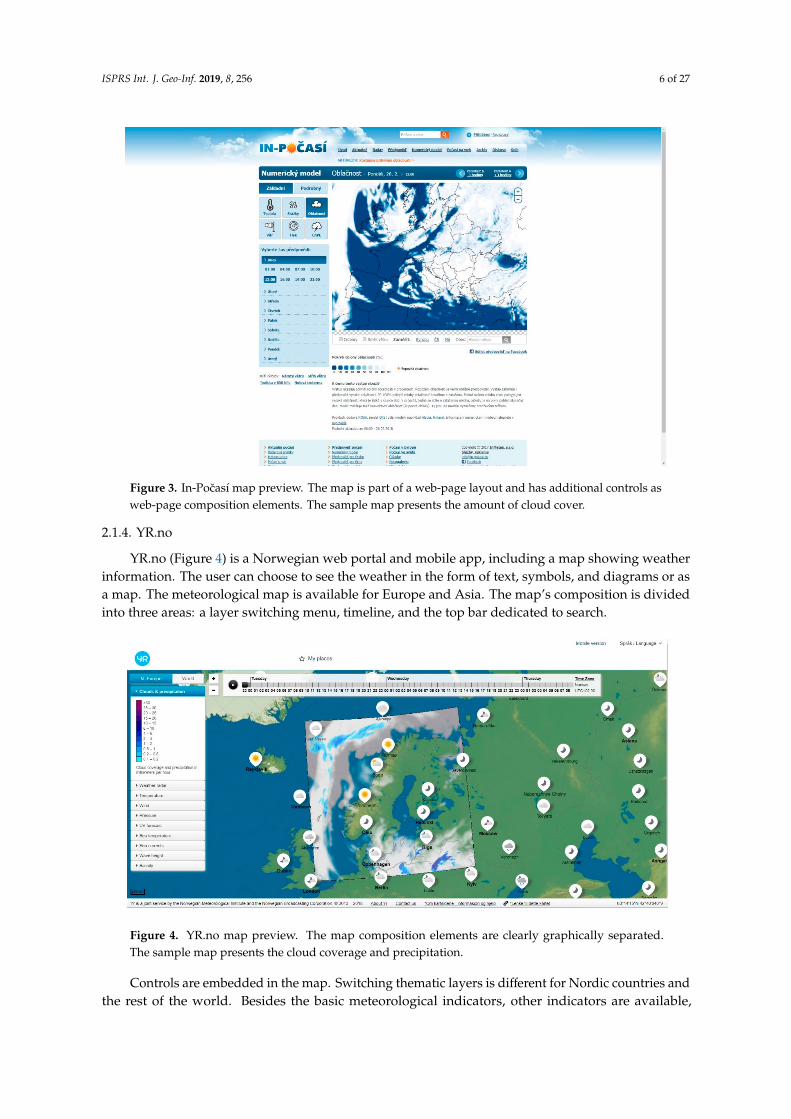
The In-Pocasí web portal (Figure 3) is produced by the Czech Hydrometeorological Instituteand contains a detailed weather forecast for the Czech Republic and a less detailed forecast forEurope. The portal is extensive and contains abundant weather information, including a map showingsix meteorological phenomena in partial thematic layers. The map design is simple and intuitive.The composition of the map is balanced. At the top is a date bar with thematic layer information, whilethe section at the left allows thematic content and time options to be set. Below the map is a legendand supplementary information. Map controls are located outside the map field. The map does notshow any interactive elements.
Only the isolines method is used, and it is used correctly. The only exception is the use of a colourscale, which can sometimes be confusing to users; the presented amount of cloud cover is maximum inwhite and minimal in dark blue colour, which is not usual. The legend is located below the map field.
ISPRS Int. J. Geo-Inf. 2019, 8, 256 6 of 27
Figure 3. In-Pocasí map preview. The map is part of a web-page layout and has additional controls asweb-page composition elements. The sample map presents the amount of cloud cover.
2.1.4. YR.no
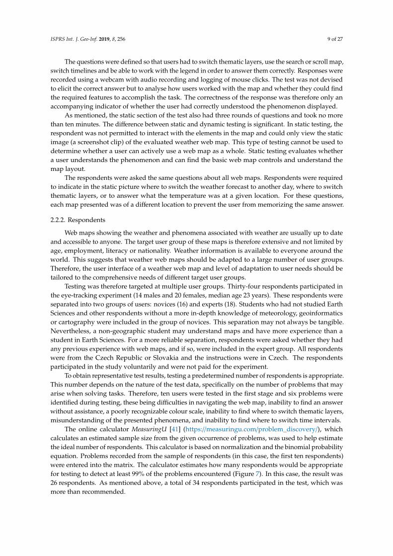
YR.no (Figure 4) is a Norwegian web portal and mobile app, including a map showing weatherinformation. The user can choose to see the weather in the form of text, symbols, and diagrams or asa map. The meteorological map is available for Europe and Asia. The map’s composition is dividedinto three areas: a layer switching menu, timeline, and the top bar dedicated to search.
Figure 4. YR.no map preview. The map composition elements are clearly graphically separated.The sample map presents the cloud coverage and precipitation.
Controls are embedded in the map. Switching thematic layers is different for Nordic countries andthe rest of the world. Besides the basic meteorological indicators, other indicators are available,

ISPRS Int. J. Geo-Inf. 2019, 8, 256 7 of 27
for example, UV radiation, sea currents or wave heights. Advanced and special features arenot provided.
The main method used is the isoline method, which is deployed correctly, and the legend is wellplaced. The overall simple design permits easy searching. A positive feature of this web map is itsinteractivity when searching for interest areas—other charts and forecasts with relatively detailedvalues are displayed in this map. The disadvantage of this map is the difference in detail whendisplaying data for either Nordic countries or the rest of the world.
2.1.5. Wundermap
Wundermap (Figure 5) is produced by German Weather Underground. The map is loaded directlyand the data are provided for the whole world. The page is divided into several blocks that aresomewhat chaotically deployed: at the top is a search box and a button for sharing or switching on/off
the thematic layer menu, in the right corner is a panel to control the thematic layers themselves, at thebottom is the timeline. Controls are standard and located in a menu at the edge of the map.
Figure 5. Wundermap map preview. The map has a simple composition with switching between thetabs (all layers, map settings). The sample map presents the temperature and wind.
The map contains both basic and advanced map features, although the thematic content is notinterpolated, and the point method is used for “weather stations”, which are irregularly scatteredacross the displayed territory. The map legend is hidden in the map settings tab and is incomplete.
2.2. Methods
The five maps described above were tested in an eye-tracking experiment complemented bythink-aloud analysis. The eye-tracking experiment was performed at the Department of Geoinformatics,Palacký University Olomouc, Czech Republic, between 19 February 2018 and 23 March 2018.The eye-tracking laboratory is specifically designed for conducting eye-tracking experiments and isequipped with an SMI RED 250 eye-tracker with an operating frequency of 250 Hz. The eye-trackingdata recordings were supplemented by audio and video recordings of the respondents. These data wereused for further think-aloud analysis. When the eye-tracking experiment was completed, the resultswere analysed, evaluated and interpreted.

ISPRS Int. J. Geo-Inf. 2019, 8, 256 8 of 27
2.2.1. Design of the Experiment
The SMI Experiment Center™ software was used to design the experiment. The eye-tracking testwas divided into introductory, dynamic and static sections (Figure 6).
Figure 6. Map evaluation process.
The introductory section consisted of free viewing of selected web maps, one minute for each map.Users could work with the map and learn about its functionality. This section took five minutes. In thedynamic section, each map always had three questions (three rounds of questions for five evaluatedweather maps). This section of the test was designed to take no more than ten minutes. Questions ineach round were defined differently for each web map so that the respondent was prevented frommemorizing the correct answer and forced to work with the evaluated weather web map. The dynamicsection of the test was presented “live” – so each respondent saw different weather pattern becausethey were looking at different days.
The static section of the test also provided three rounds of questions and was designed to takeno more than ten minutes. In static testing, the respondent was prevented from interacting with theelements in the map and could only view the static image (screenshot) of the evaluated weather webmap. For the last question (what is the temperature in a particular place?), locations were changed so thatrespondents did not memorize the answer.
The first round of questions in the dynamic section addressed wind speed. The respondent wasrequired to answer two questions concerning which area of the Czech Republic currently had thehighest or lowest wind speeds. The second round of questions consisted of five questions concerningcloud cover. Respondents were asked to respond whether clouds were at a specific location and time.Questions in the third round concerned precipitation. The respondents answered whether rain wouldoccur at a particular place and time.
ISPRS Int. J. Geo-Inf. 2019, 8, 256 9 of 27
The questions were defined so that users had to switch thematic layers, use the search or scroll map,switch timelines and be able to work with the legend in order to answer them correctly. Responses wererecorded using a webcam with audio recording and logging of mouse clicks. The test was not devisedto elicit the correct answer but to analyse how users worked with the map and whether they could findthe required features to accomplish the task. The correctness of the response was therefore only anaccompanying indicator of whether the user had correctly understood the phenomenon displayed.
As mentioned, the static section of the test also had three rounds of questions and took no morethan ten minutes. The difference between static and dynamic testing is significant. In static testing, therespondent was not permitted to interact with the elements in the map and could only view the staticimage (a screenshot clip) of the evaluated weather web map. This type of testing cannot be used todetermine whether a user can actively use a web map as a whole. Static testing evaluates whethera user understands the phenomenon and can find the basic web map controls and understand themap layout.
The respondents were asked the same questions about all web maps. Respondents were requiredto indicate in the static picture where to switch the weather forecast to another day, where to switchthematic layers, or to answer what the temperature was at a given location. For these questions,each map presented was of a different location to prevent the user from memorizing the same answer.
2.2.2. Respondents
Web maps showing the weather and phenomena associated with weather are usually up to dateand accessible to anyone. The target user group of these maps is therefore extensive and not limited byage, employment, literacy or nationality. Weather information is available to everyone around theworld. This suggests that weather web maps should be adapted to a large number of user groups.Therefore, the user interface of a weather web map and level of adaptation to user needs should betailored to the comprehensive needs of different target user groups.
Testing was therefore targeted at multiple user groups. Thirty-four respondents participated inthe eye-tracking experiment (14 males and 20 females, median age 23 years). These respondents wereseparated into two groups of users: novices (16) and experts (18). Students who had not studied EarthSciences and other respondents without a more in-depth knowledge of meteorology, geoinformaticsor cartography were included in the group of novices. This separation may not always be tangible.Nevertheless, a non-geographic student may understand maps and have more experience than astudent in Earth Sciences. For a more reliable separation, respondents were asked whether they hadany previous experience with web maps, and if so, were included in the expert group. All respondentswere from the Czech Republic or Slovakia and the instructions were in Czech. The respondentsparticipated in the study voluntarily and were not paid for the experiment.
To obtain representative test results, testing a predetermined number of respondents is appropriate.This number depends on the nature of the test data, specifically on the number of problems that mayarise when solving tasks. Therefore, ten users were tested in the first stage and six problems wereidentified during testing, these being difficulties in navigating the web map, inability to find an answerwithout assistance, a poorly recognizable colour scale, inability to find where to switch thematic layers,misunderstanding of the presented phenomena, and inability to find where to switch time intervals.
The online calculator MeasuringU [41] (https://measuringu.com/problem_discovery/), whichcalculates an estimated sample size from the given occurrence of problems, was used to help estimatethe ideal number of respondents. This calculator is based on normalization and the binomial probabilityequation. Problems recorded from the sample of respondents (in this case, the first ten respondents)were entered into the matrix. The calculator estimates how many respondents would be appropriatefor testing to detect at least 99% of the problems encountered (Figure 7). In this case, the result was26 respondents. As mentioned above, a total of 34 respondents participated in the test, which wasmore than recommended.

ISPRS Int. J. Geo-Inf. 2019, 8, 256 10 of 27
Figure 7. Estimated number of respondents based on the occurrence of problems (MeasuringU).
2.2.3. Analytical Methods
Before the recorded data were statistically evaluated and analysed, data pre-processing wasperformed. This included a data check and quality control and the exclusion of respondents where arecording error appeared during the experiment. DataLoss, or a percentage of incorrectly measuredrecords, was less than 1%, and the rated data, therefore, retained a high reporting value, as only twouser records were removed from the experiment. Fixations and saccades were identified using theI-DT algorithm with dispersion = 80 px and duration = 50 ms. Popelka [42] explains this setting inmore detail.
The first step of data analysis was to evaluate the accuracy of respondents‘ answers. This analysiswas not straightforward. In the first task of the dynamic section of the experiment, answers wererecorded by clicking on the map. The analysis of this kind of data was a lengthy process. Testingwas performed over several weeks and with screen recording (dynamic eye-tracking test). The datadisplayed on the weather map were therefore continually updated, and each respondent saw differentvalues. The accuracy of answers in the dynamic section was done manually based on recorded videosor using notes created during the testing.
The eye-tracking experiment was divided into three parts– the introductory test section, dynamictest section and static test section. The methods of analyses vary due to the different nature of therecorded data in these three parts.
In the Introductory Section of the experiment, the results were gained based on the video recordingsof respondents’ work with the map overlayed by eye-movements. After viewing all recorded videos,a fundamental insight applying to all the web maps used in the experiment was gained.
Processing the results of the Dynamic Section was very time-consuming, as it was necessary toanalyse data using dynamic Areas of Interest. Since each respondent worked with the map individually,dynamic Areas of Interest were created for each web map and each respondent separately. Theseareas of interest (AOIs) were: map fields, timer switching, switching of thematic layers and otherinformation such as legends and supplementary charts. These layers were not active throughouttesting and appeared according to how respondents clicked on them. Creation of dynamic AOIs ishighly time-consuming, so only six respondents were chosen for this type of analysis. Data werevisualized using Sequence Chart method, which displays each respondent’s eye-movement data intime as rows. The colour of these rows corresponds to the visited AOIs.
Analysis of the Static Section was much easier, since all respondents were looking on the samestimuli – screenshots of the web maps. The first method, called Gridded AOI is implemented using theopen-source OGAMA. The image was divided into a regular grid, each grid segment displaying howmany fixations were recorded there.
Another method utilized in eye-movement data visualization is called FlowMap and isimplemented in V-Analytics software. FlowMaps use Thiessen polygons generated based on thefixation distribution. Arrows between these polygons display the number of moves between them.

ISPRS Int. J. Geo-Inf. 2019, 8, 256 11 of 27
ScanGraph was another method used to study the above task. This method was developed toidentify differences in the stimulus reading strategy of different groups of respondents [43]. Beforeanalysing the data, areas of interest over the stimulus must be created and marked, for example, A, B,C, etc. The Scanpath of each respondent can then be replaced by a string of letters expressing the orderof the visited areas of interest. ScanGraph calculates the similarity of these strings by employing threedifferent algorithms: Levenshtein distance, Needleman-Wunsch algorithm and Damerau-Levenshteindistance. Individual respondents are visualized as nodes in the graph, and ScanGraph searches theso-called “cliques” in this graph - a group of respondents who are similar to each other at least toa specified degree. The tool can be used to determine, for example, whether the stimulus was readdifferently by men and women or experts and novices.
Both the Dynamic and Static Sections were also analysed statistically using the Wilcoxon ranksum test, since the data did not have a normal distribution. Statistically significant differences aremarked by an asterisk in the figures below. We chose three eye-tracking metrics to analyse data – TrialDuration, Fixation Count and Scanpath Length. Description of these metrics and their meanings is inTable 1.
Table 1. Description of the eye-tracking metrics used and their meanings.
Trial Duration Longer time needed to solve a task indicates a problem with user interface or highercomplexity of the task.
Fixation Count A higher number of fixations indicates a low level of search efficiency or an inappropriateuser interface of the evaluated application [44].
Scanpath Length A longer scanpath indicates less efficient searching (perhaps due to a sub-optimallayout) [45].
In addition to eye-tracking, the Think-Aloud method was also used to analyse respondents’behaviour during the experiment. Unfortunately, the majority of respondents had problems withverbalizing their actions. They were therefore given the required silence during testing to fullyconcentrate. For this reason, the Think-Aloud method was only employed with some of the moreexperienced respondents.
3. Results
3.1. Accuracy of Answers
The first step in evaluating the eye-tracking experiment was to analyse the accuracy of respondents’answers. All responses recorded during the test are listed in Table 2.
The first task of dynamic testing was to identify areas with the highest or lowest wind intensityby clicking on the map. From the table, it is evident that this task was highly problematic in thecase of Wundermap. The information about wind speed is combined with the information about thetemperature. Temperature was expressed by colour and number (degrees), but the wind speed wasdisplayed using the symbol shape. This was confusing for the respondents. For the rest of the maps,fewer users responded with incorrect answers.
In the second and third task of the dynamic testing, respondents answered whether it would becloudy (task 2) or rainy (task 3) in a particular place. It was found that if respondents knew how tofind the answers, their responses were correct in most cases. In Table 1, red indicates situations when arespondent chose the wrong answer or gave up (chose to answer the question with “No Answer”).The bold in the table refers to situations when a little assistance from the researcher was needed.The most significant problems in tasks 2 and 3 were encountered with the Wundermap map, in whichrespondents were not able to orient themselves.

ISPRS Int. J. Geo-Inf. 2019, 8, 256 12 of 27
Table 2. Responses to questions and tasks given by the respondents in the dynamic and static sectionsof the test. Green indicates correct answers, red is incorrect answers, and bold plus exclamation markindicates answers where a small amount of assistance was required.
In the Static section of the experiment, respondents were required to first indicate where the timeinterval on the map could be switched (task 1). To evaluate the correctness of the responses, areas ofinterest in the stimulus around the correct answers had to be created to detect whether respondents hadclicked on the field. The most significant problems again occurred with Wundermap (Figure 8). In thesecond question, respondents were required to indicate where the thematic layer could be switched.In this situation, almost all of the answers on all maps were correct; only one respondent (P28) on theWundermap answered incorrectly. In the final question of the static section, respondents answeredwhat temperature it would be at certain times in certain cities.
It was immediately apparent that users had the most significant problems finding the correctanswers in the Wundermap weather web map; all the respondents’ answers were incorrect due to theunreadability and misstatement of the presented phenomenon. The authors of the map had chosen aninappropriate cartographic method for visualizing temperature, and respondents were not able to statethe temperature in a given city with any certainty. Figure 8 shows a screen capture of the Wundermapin which test respondents were asked to find the temperature in Olomouc.
Most of the respondents correctly responded to the tasks on YR.no and Windy weather web mapsand could orient themselves to find the correct answer quickly. On the In-Pocasí web map, respondentshad problems finding the interval to which the correct answer belonged. The colour range of the

ISPRS Int. J. Geo-Inf. 2019, 8, 256 13 of 27
displayed values is extensive, and the colour spacing between individual colours is difficult to discern.Respondents found it difficult to assign the colours depicted on the map to the correct interval in thelegend. On the DarkSky web map, respondents had to make a greater effort than on previous maps tofind the temperature, which was not highlighted in the map but only indicated in the information textlocated above the map field.
Figure 8. Image of the Wundermap weather web map from the test.
3.2. Eye-tracking Results
3.2.1. Introductory Test Section Results
As described above, the first part of the eye-tracking test was free viewing of selected weather webmaps. In this section, respondents were required to view the maps they would work with throughoutthe test in five minutes. This section was not evaluated in detail, as it was aimed at orientating primaryusers with the selected web maps. For this task, only the essential characteristics of each evaluatedweb map were summarized and are explained below.
Respondents in the novice group worked differently with the maps. Novices viewed the mapitself, zoomed in on their place of residence, viewed the contents of the map and then focused onswitching thematic layers, etc. Respondents in the group of experts, however, immediately focused onmap functionality after the maps were loaded. They looked for available thematic layers, switchedtimescales and attempted to find out whether it was possible to switch units where the forecast wasdisplayed and whether it was possible to look into the legend. These basic findings confirmed theappropriate separation of respondents into groups of novices and experts. More than 70 percent ofrespondents thus had typical behaviors corresponding to their inclusion in the group of novices/experts,and less than 30 percent of respondents did not demonstrate this typical behavior.
During free viewing of the DarkSky web map, respondents focused mainly on switching thematiclayers, switching the time for displaying the forecast and observing the headline of the web map,where the current temperature was written with large digits (set by default to Fahrenheit). Whilebrowsing, respondents had no problems finding basic controls.
The Windy web map is the most attractive at a glance. Each respondent navigated differentlythrough the map, as it was possible to select and display many different thematic layers and showdifferent units and time intervals. The possibilities are almost countless, and respondents, therefore,moved around the map field with considerable difference. Interestingly, most respondents used themouse wheel to zoom in/out, not the button specified in the map box.

ISPRS Int. J. Geo-Inf. 2019, 8, 256 14 of 27
Respondents did not encounter any problems while viewing the In-Pocasí web map. Control andunderstanding of the map were intuitive, and free viewing therefore did not present any unexpectedconclusions. Test respondents attempted switching thematic layers, zooming in and out, switchingpredictions and looked for primary or detailed viewing.
Free viewing of the Norwegian web map YR.no also demonstrated that respondents had noproblems handling the map. As in other maps, they attempted basic web map control. Somerespondents selected interactive map features, mainly graphs showing additional weather information.The unique feature of this map is the possibility of displaying different thematic layers for Scandinaviancountries than other European countries. No peculiarities in controlling the map were observed.
As the final map in the free viewing section, the Wundermap web map provided the mostsignificant difficulties for respondents. All of the respondents attempted switching thematic layers,but over 50% experienced problems with loading thematic layers (slow loading of content during zoomin/out). Problems were also encountered with switching prediction timing, and some respondentsmentioned that they did not understand the method of data visualization, suggesting that theirinterpretation of the map’s information was problematic.
No unpredictable conclusions were discovered from the free viewing. Respondents alwaysexplored the basic functionality of the web maps, how to control them and the possibility of displayingthematic layers or additional functions. As mentioned above, the main reason for the free viewingsection was to for respondents to gain familiarity with the maps. Respondents who had worked withweb maps previously (experts) focused more on the functionality of the web map and the displayoptions the web map offered. By contrast, users with less experience of web maps (novices) wereprimarily interested in the map’s content (viewing places on the map or attempting to find their placeof residence).
3.2.2. Dynamic Test Section Results
The dynamic section of the eye-tracking experiment immediately followed the introductorysection. The objective of this section was to monitor and identify how respondents worked with themaps, whether they used all the available elements, used the map interactively or otherwise. In thispart of the test, each web map consisted of three tasks.
The first task required: Locate and click to highlight the area with the lowest/highest real-time wind speedin the Czech Republic. This question was evaluated by creating dynamic AOIs and then visualized usingan AOI Sequence Chart. Sequence Charts were created for six respondents—three experts and threenovices. In the following charts (Figure 9), six respondents and their work with the web maps to findan answer to the given question can be seen. One chart was created for each test web map.
Figure 9. Areas of Interest (AOI) Sequence Chart for all evaluated maps for six selected respondents(selection of illustrative examples).
ISPRS Int. J. Geo-Inf. 2019, 8, 256 15 of 27
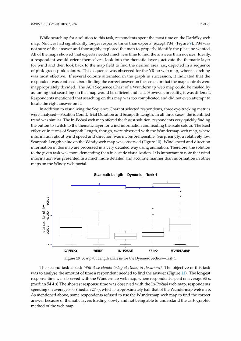
While searching for a solution to this task, respondents spent the most time on the DarkSky webmap. Novices had significantly longer response times than experts (except P34) (Figure 9). P34 wasnot sure of the answer and thoroughly explored the map to properly identify the place he wanted.All of the maps showed that experts needed much less time to find the answers than novices. Ideally,a respondent would orient themselves, look into the thematic layers, activate the thematic layerfor wind and then look back to the map field to find the desired area, i.e., depicted in a sequenceof pink-green-pink colours. This sequence was observed for the YR.no web map, where searchingwas most effective. If several colours alternated in the graph in succession, it indicated that therespondent was confused about finding the correct answer on the screen or that the map controls wereinappropriately divided. The AOI Sequence Chart of a Wundermap web map could be misled byassuming that searching on this map would be efficient and fast. However, in reality, it was different.Respondents mentioned that searching on this map was too complicated and did not even attempt tolocate the right answer on it.
In addition to visualizing the Sequence Chart of selected respondents, three eye-tracking metricswere analysed—Fixation Count, Trial Duration and Scanpath Length. In all three cases, the identifiedtrend was similar. The In-Pocasí web map offered the fastest solution, respondents very quickly findingthe button to switch to the thematic layer for wind information and reading the scale colour. The leasteffective in terms of Scanpath Length, though, were observed with the Wundermap web map, whereinformation about wind speed and direction was incomprehensible. Surprisingly, a relatively lowScanpath Length value on the Windy web map was observed (Figure 10). Wind speed and directioninformation in this map are processed in a very detailed way using animation. Therefore, the solutionto the given task was more demanding than in a static visualization. It is important to note that windinformation was presented in a much more detailed and accurate manner than information in othermaps on the Windy web portal.
Figure 10. Scanpath Length analysis for the Dynamic Section—Task 1.
The second task asked: Will it be cloudy today at [time] in [location]? The objective of this taskwas to analyse the amount of time a respondent needed to find the answer (Figure 11). The longestresponse time was observed with the Wundermap web map, where respondents spent on average 65 s.(median 54.4 s) The shortest response time was observed with the In-Pocasí web map, respondentsspending on average 30 s (median 27 s), which is approximately half that of the Wundermap web map.As mentioned above, some respondents refused to use the Wundermap web map to find the correctanswer because of thematic layers loading slowly and not being able to understand the cartographicmethod of the web map.
ISPRS Int. J. Geo-Inf. 2019, 8, 256 16 of 27
Figure 11. Trial Duration to find the answer in the Dynamic Section—Task 2.
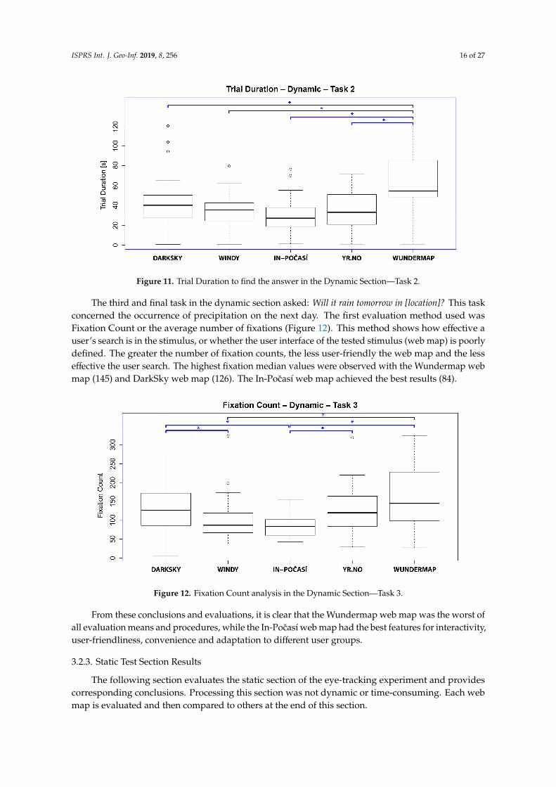
The third and final task in the dynamic section asked: Will it rain tomorrow in [location]? This taskconcerned the occurrence of precipitation on the next day. The first evaluation method used wasFixation Count or the average number of fixations (Figure 12). This method shows how effective auser’s search is in the stimulus, or whether the user interface of the tested stimulus (web map) is poorlydefined. The greater the number of fixation counts, the less user-friendly the web map and the lesseffective the user search. The highest fixation median values were observed with the Wundermap webmap (145) and DarkSky web map (126). The In-Pocasí web map achieved the best results (84).
Figure 12. Fixation Count analysis in the Dynamic Section—Task 3.
From these conclusions and evaluations, it is clear that the Wundermap web map was the worst ofall evaluation means and procedures, while the In-Pocasí web map had the best features for interactivity,user-friendliness, convenience and adaptation to different user groups.
3.2.3. Static Test Section Results
The following section evaluates the static section of the eye-tracking experiment and providescorresponding conclusions. Processing this section was not dynamic or time-consuming. Each webmap is evaluated and then compared to others at the end of this section.

ISPRS Int. J. Geo-Inf. 2019, 8, 256 17 of 27
The first task required: Find and click where the weather forecast can be switched to another day. A visualevaluation of this question was performed using the Gridded AOI method. This method was selectedto facilitate the comparison of stimuli, regardless of their content. The resulting output is shown inFigure 13. Analysis showed that the Windy and In-Pocasí web maps were intuitive to respondents,as they almost immediately found the required location on the map. In contrast, respondents searchedfor the required button on Wundermap. This analysis showed that despite the very colourful andgraphically rich content of this map, the button to switch the weather forecast to another day is notconveniently or intuitively positioned. In the case of the In-Pocasí web map, a simple and clean designwith basic content and no unnecessary features proved to be user-friendly.
Figure 13. Number of fixations recorded in the regular grid overlaying the stimuli in Static – Task 1.The size of the circle and number represent the number of fixations recorded in each cell of the grid.
Another interesting indicator is Trial Duration (Figure 14). From the box plot, it is evident thatrespondents spent the most time finding the correct answer on the Wundermap web map and the leasttime on the Norwegian YR.no. Statistically significant differences were found between the Wundermapand all other maps.
Figure 14. Trial Duration analysis in the Static Section—Task 1.
ISPRS Int. J. Geo-Inf. 2019, 8, 256 18 of 27
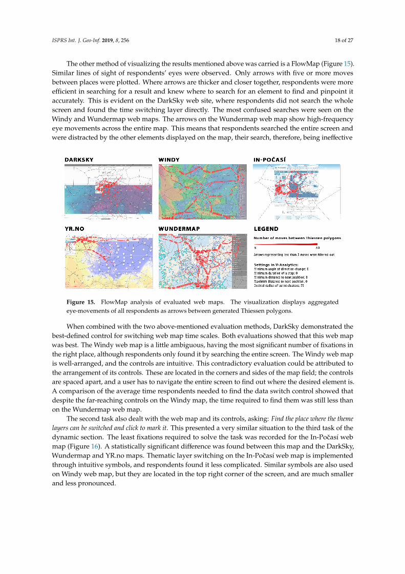
The other method of visualizing the results mentioned above was carried is a FlowMap (Figure 15).Similar lines of sight of respondents’ eyes were observed. Only arrows with five or more movesbetween places were plotted. Where arrows are thicker and closer together, respondents were moreefficient in searching for a result and knew where to search for an element to find and pinpoint itaccurately. This is evident on the DarkSky web site, where respondents did not search the wholescreen and found the time switching layer directly. The most confused searches were seen on theWindy and Wundermap web maps. The arrows on the Wundermap web map show high-frequencyeye movements across the entire map. This means that respondents searched the entire screen andwere distracted by the other elements displayed on the map, their search, therefore, being ineffective
Figure 15. FlowMap analysis of evaluated web maps. The visualization displays aggregatedeye-movements of all respondents as arrows between generated Thiessen polygons.
When combined with the two above-mentioned evaluation methods, DarkSky demonstrated thebest-defined control for switching web map time scales. Both evaluations showed that this web mapwas best. The Windy web map is a little ambiguous, having the most significant number of fixations inthe right place, although respondents only found it by searching the entire screen. The Windy web mapis well-arranged, and the controls are intuitive. This contradictory evaluation could be attributed tothe arrangement of its controls. These are located in the corners and sides of the map field; the controlsare spaced apart, and a user has to navigate the entire screen to find out where the desired element is.A comparison of the average time respondents needed to find the data switch control showed thatdespite the far-reaching controls on the Windy map, the time required to find them was still less thanon the Wundermap web map.
The second task also dealt with the web map and its controls, asking: Find the place where the themelayers can be switched and click to mark it. This presented a very similar situation to the third task of thedynamic section. The least fixations required to solve the task was recorded for the In-Pocasí webmap (Figure 16). A statistically significant difference was found between this map and the DarkSky,Wundermap and YR.no maps. Thematic layer switching on the In-Pocasí web map is implementedthrough intuitive symbols, and respondents found it less complicated. Similar symbols are also usedon Windy web map, but they are located in the top right corner of the screen, and are much smallerand less pronounced.

ISPRS Int. J. Geo-Inf. 2019, 8, 256 19 of 27
Figure 16. Fixation Count analysis in the Static Section—Task 2.
The final task in the static section of the eye-tracking test asked: What is the temperature (in Celsius)in [location]? The Windy web map provided the quickest solution, listing temperature values directly ateach city. Between this map and all others, statistically significant differences were found in the FixationCount and Trial Duration metrics (Figure 17). On the DarkSky web map, however, the temperaturenear Prague was missing, and a large number of incorrect answers were therefore recorded, and thetime required to solve this task was the longest of all evaluated maps.
Figure 17. Trial Duration in the Static Section—Task 3.
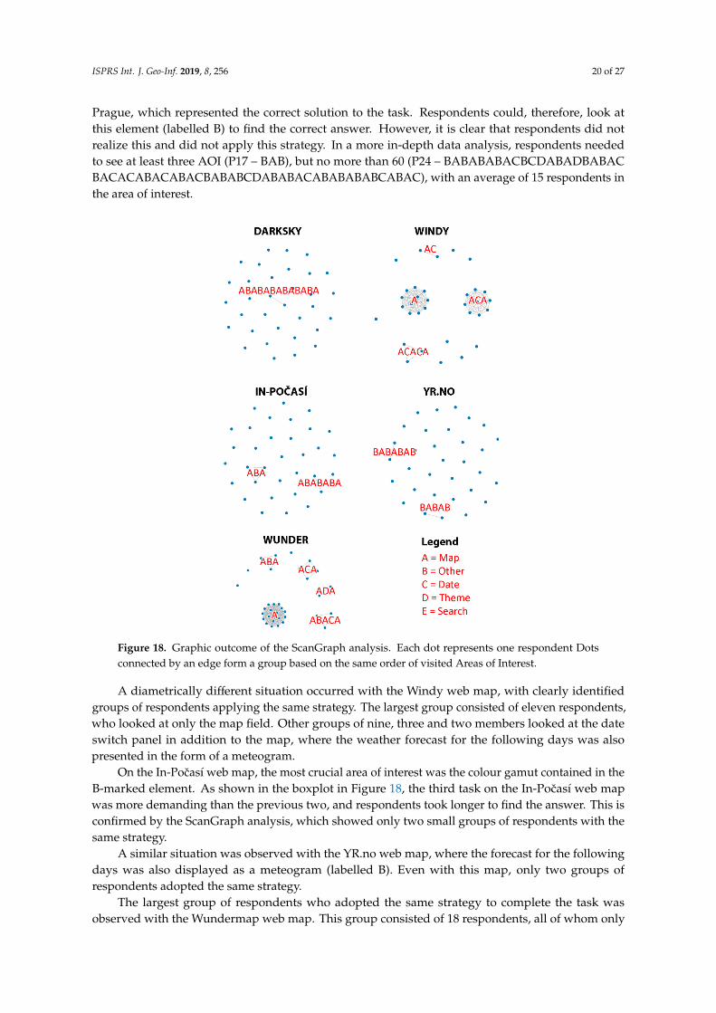
ScanGraph was another method used to study the above task, because it can help to find similaritiesin the strategy of stimulus inspection. In this case, no significant differences were found betweenthe expert and novice groups. ScanGraph was nevertheless used, only in a slightly different manner,in order to tease out similarities and differences in strategy between respondents. Distribution intogroups of experts and novices was not considered, and parameter p indicating the degree of similaritywas set to 100%; therefore, only those respondents whose order of visited areas of interest were thesame became visible. At the same time, “collapsed” was selected so that repeated fixations in onearea of interest were not considered. The resulting graphs for all five maps are shown in Figure 18.Each dot represents one respondent. The order of visited areas of interest is shown in red letters.
This analysis can show how difficult it was to find the right answer on individual maps andwhether respondents chose the same strategy. On the DarkSky web map, only two respondentswere observed utilizing the same strategy. This was at the transition between the areas of interestaround the map field and the information text above the map that indicated the temperature for
ISPRS Int. J. Geo-Inf. 2019, 8, 256 20 of 27
Prague, which represented the correct solution to the task. Respondents could, therefore, look atthis element (labelled B) to find the correct answer. However, it is clear that respondents did notrealize this and did not apply this strategy. In a more in-depth data analysis, respondents neededto see at least three AOI (P17 – BAB), but no more than 60 (P24 – BABABABACBCDABADBABACBACACABACABACBABABCDABABACABABABABCABAC), with an average of 15 respondents inthe area of interest.
Figure 18. Graphic outcome of the ScanGraph analysis. Each dot represents one respondent Dotsconnected by an edge form a group based on the same order of visited Areas of Interest.
A diametrically different situation occurred with the Windy web map, with clearly identifiedgroups of respondents applying the same strategy. The largest group consisted of eleven respondents,who looked at only the map field. Other groups of nine, three and two members looked at the dateswitch panel in addition to the map, where the weather forecast for the following days was alsopresented in the form of a meteogram.
On the In-Pocasí web map, the most crucial area of interest was the colour gamut contained in theB-marked element. As shown in the boxplot in Figure 18, the third task on the In-Pocasí web mapwas more demanding than the previous two, and respondents took longer to find the answer. This isconfirmed by the ScanGraph analysis, which showed only two small groups of respondents with thesame strategy.
A similar situation was observed with the YR.no web map, where the forecast for the followingdays was also displayed as a meteogram (labelled B). Even with this map, only two groups ofrespondents adopted the same strategy.
The largest group of respondents who adopted the same strategy to complete the task wasobserved with the Wundermap web map. This group consisted of 18 respondents, all of whom only

ISPRS Int. J. Geo-Inf. 2019, 8, 256 21 of 27
looked at the map field. Unfortunately, the visualization of temperature on this map is very unclear,and in Olomouc, the temperature data overlapped, and it was difficult for respondents to find thecorrect answer.
3.3. Think-Aloud Results
The Think-Aloud method is one of the oldest research methods [46]. Since the analysis ofeye-tracking data alone does not provide an answer to the question "Why does the user behave ashe/she behaves", the application of the Think-Aloud method can bring new insights and justification ofthe acquired findings.
Although this method was planned to be applied to all respondents, most of the data collectedwere not relevant since, as already mentioned, respondents said it was difficult for them to describewhat they were doing and why, and it interfered with their concentration. Therefore, they were ofteninterviewed after the experiment was completed, so that the information gained could still be used forfurther analysis (but not as Think-Aloud results). In the text below is an example of a respondent whowas able to cooperate 100%. It was an expert who commented on his actions and his reasons withoutany problems.
Because it is not a synthesis of knowledge based on the data from all respondents, but merely anillustrative example of how to use the method, it does not present the majority respondents’ opinionsor approaches. The commentary of one of the respondents was translated and transcribed into textas follows:
Question 1: Locate and click to highlight the area with the highest/lowest real-time wind speed in theCzech Republic.
DarkSky: “I’m trying to zoom in, but it’s not possible using a mouse. Well, here I found someinformation on the map that’s in Hradec Králové, because there are lower numbers than everywhereelse, but I can’t read it from the colours. However, do you want general information or rather pointvalues? As a map user, I would go after that number, so I clicked on Hradec Kralove.”
Windy: “I’ll find the wind. So, the information here is in degrees, and it’s in the cities, and I wouldhave to go here by colour and click somewhere near Olomouc. Also, when I click on it, I’ll get theinformation with the exact number.”
In-Pocasí: “Here, I would go to the border of the three regions, finding it by colour.”
YR: “Here, I have to study this strange colour scale for a long time to find out that it’s the lightestgreen, and I’d like to see it somewhere near Zlín.”
Wundermap: “The wind is hidden somehow strangely here in the layer. So, I want to find the highestnumber, but what does that number show? Well, it’s according to Fahrenheit, but it is the temperature,yet it’s strange. Trying to right-click the legend, but I just can’t see it. Well, look at this, I’m missingthe legend, and it’s been redrawn on another layer. Well, I can’t find the highest one, so let’s say here,because it’s so green and there has to be that temperature. It’s totally stupid to me.”
The quotes clearly show where the user found the answer quickly and where not. For example,the knowledge of the user’s ability to read and understand colours on the maps is very beneficial.
Question 2: Will it be cloudy today at [time] in [location]?
DarkSky: “So, cloud cover can be clicked here. I wrote Prague into the search here, it’s even listedhere. So today at 10 pm, it will be cloudy and partly cloudy. I ignored the map and found it up therein that information.”
Windy: “So I switch to clouds. Here, I switched to clouds, and here found ten o’clock, and now I’mgoing to look at the map. Well, the answer is that it won’t be overcast, but there will be some cloud.”
ISPRS Int. J. Geo-Inf. 2019, 8, 256 22 of 27
In-Pocasí: “Clouds are already there, here, it doesn’t lead me to a location, but when I load it, there isnot much of a base layer here, so I’m looking for a location not very well and estimate it will be coveredby 50% or so, clouds will be there.”
YR: “So precipitation, here, I’m misled and cannot find the clouds, but it is right in the icons, so that Ican find the time and the place. Now I thought it would hit me and the meteogram would start, and at8 o’clock it won’t be cloudy. Clouds only arrive later.”
Wundermap: “Help me. Here there might be a clue, I could find it there. Why does it load so slowlythat I have to wait? We want it for 7 pm, but the map only shows now. How does the timescale changethere, probably not. It may be because it is slow. So, when I click on the map, it will probably not workout anything. It stopped me from looking, so I won’t even look for it.”
The task required work with layers/topics and quotes show that this has appropriately verifieduser credibility within map functionality. Sub-comments lead to knowledge of shortcomings occurringin the evaluated maps and provide the basis for better interpretation of the results.
Question 3: Will it rain tomorrow in [location]?
DarkSky: “I see that I’m not the first to find it through search. So here I am, switching the date totomorrow after I found the place. Well, it will rain there, but I’m not quite sure now if that’s tomorrow.Well, I’m only a little bit confident that the contents of the map will switch to tomorrow, but not atall with the strip above with information. So, I have to look at the map, and it won’t rain tomorrow.However, I’m not quite sure.”
Windy: “So we want tomorrow again. So, it makes me think of the maps as they move, and yes it will rain.”
In-Pocasí: “I’m clicking on Friday and crashing. I know roughly where Paris is, but I would ratherwrite it, and now I see it. Again, the times go through, and I can see that the showers will come,and more rain will come in the evening.”
YR: “I’m starting to move here on that timeline, and I see that tomorrow it should be raining.”
Wundermap: “I have to find it here, but there is a very slow server here. I was trying to select it,but the menu has been stuck. So, disappear. This is a pain. I want to know if it’s going to rain. Well,here I can see only the current, and here’s just a chart for today. I won’t find out about tomorrow.I have a feeling I’m not going to find out about tomorrow.”
Again, the ability to work with web map features, including change of layer/topic and time,was evaluated in this task. Quotes show how the user obtained the information (from map movement,layer switching and time change, etc.) and what was easier for him.
3.4. Summary of Results
Users worked with web maps in the simplest form; they did not look for hidden functions inthe menu or attempt to find any advanced functionality. They primarily looked at the controls onthe main screen of the web map. If expandable control panels were available, the respondents onlylooked at them after they had examined other elements. Therefore, interactive map elements wereonly explored by respondents after they had become acquainted with the map. Map interactivity wasnot an obstacle unless it contained too much information or options to choose from. Searching wasstill quicker in static menus that respondents did not have to switch on or off. Static menus wereavailable on Windy, In-Pocasí and Yr.No; it was necessary to switch the menu on/off in DarkSky andWundermap; Figures 10–13 show the better results for the maps with static menus. For example,the average value of Scanpath Length (Figure 10) for maps with static menus was 14,350px; for thosewith dynamic menus the average Scanpath Length value was 25,355px.
ISPRS Int. J. Geo-Inf. 2019, 8, 256 23 of 27
After evaluating how users worked with weather web maps, novices were identified as beingdisinterested in web map functionality and primarily interested in map content and what they couldsee on the map (for example, whether they could find their place of residence). Experts, though,were interested in exploring web map functionality, such as display capabilities, thematic layers,additional analysis, zooming in/out, switching timescales and other features (based on the comparisonof ScanGraph analyses and qualitative evaluation). Mapmakers (cartographers and GIScience experts)should, therefore, consider the target user group when designing a map. Given that weather informationis accessed by complete cartographic novices with minimal web map experience, weather web mapsshould be as simple as possible. The importance of this statement is paramount if the map is intendedfor the public. If mapmakers expect the map to be mainly for experts and the web map content willcontain not only basic weather indicators but also extensive meteorological indicators and indexes ofmeteorological phenomena, the choice of more sophisticated interactive elements is advisable.
User issues are of relevance to many aspects of mapmaking, such as historical, sociological,psychological, conceptual, and others. One of the most important issues is adapting to the needs ofdifferent user groups. User issues in cartography are determined by map users and represent the mostimportant influence in the process of map creation [47]. It is such an important aspect that map makersshould pay great attention to it.
Much research is involved in discovering user interests and preferences. In some studies,however, user preferences have been shown as not very accurate regarding the quality of assessedgeovisualizations and maps and the suitability of their respective purpose and user target group [48].This finding was confirmed in this study, specifically in the combined evaluation of the Think-Aloudmethod with the results of eye-tracking testing (despite the limitations and problems that accompaniedthe use of the Think-Aloud). For example, one respondent liked a certain map at first glance (mentionedduring map viewing in the Think-Aloud record), but it was difficult for him to complete the task.Conversely, in a map that the respondent did not take any interest in at first and would be rated asaverage in the preference rating, the correct solution was much more accessible. Unfortunately, becausethis respondent needed to concentrate on solving the task and did not attempt to comment on theprocess, it was not possible to substantiate this claim with statistical indicators.
The differences between experts and novices are evident from the evaluation of the experiment.The group of experts worked much more efficiently and could find the correct answers to the requiredtasks. The differences between respondents were also visible in the Sequence Chart evaluation(Figure 9), where it is clear that experts moved their eyes with more concentration on the goal and didnot revise or search. Despite the striking differences in the individual evaluation methods comparedto the similarity of fixation strings, novices and experts did not differ significantly. No significantdifferences in trajectories and movements between AOI areas were found (Figure 18).
Evaluation of the dynamic section of eye-tracking testing clearly showed that respondents had acomplex map composition problem, mainly in that controls were on different sides of the map fieldrather than in one place. This problem arose, though, only during the first use of a web map. As soon asthe respondents learned a map’s functionality, they found this map element easily. Assessing the factorsinfluencing a new user is very different from assessing the factors influencing an experienced user.This was detected while respondents were monitored as they worked with the Windy web map.At first, respondents had great difficulty finding the required controls, as the elements were distributedalong the sides of the map field and set very far apart. In the final task, users no longer demonstratedthe problem of finding map composition elements and used them more efficiently than in the first task.
The user aspect was mainly measured as user-friendliness and showed how a respondent feltwhile using a web map, what worked best for the respondent and what their preferences were.This assessment was subjective and very much depended on the respondent and their habits. This useraspect is closely related to all other user issues mentioned above. During the Think-Aloud assessment,some respondents mentioned the map that was best for them to control and which one they would liketo use. Testing also showed that the concept of user comfort introduces the notion of intuitive map
ISPRS Int. J. Geo-Inf. 2019, 8, 256 24 of 27
control and modern map design. Some respondents did not need a modern design, but they requiredfunctionality, simplicity and high-speed web map loading. For this reason, it was very complicatedto evaluate the user aspect. Testing showed, however, that if a web map did not contain modernvisualization elements, had very complex layouts and was very slow to load, it was very inconvenientto the respondent (for example, the Wundermap web map).
Lastly, graphic design significantly influenced respondents and their work with the web maps.Modern depiction enhances the attractiveness of maps and empowers a user’s vision, even if they donot have flawless control and cartographic visualization methods are sometimes incorrect. Graphicmap design, therefore, adds to the overall impression of a web map, portal or application. Respondentsidentified the Windy web map as attractive, but after the final task, some described this webpageas excessively detailed and cluttered with unnecessary information and suggested the possibility ofchanging thematic content. Most respondents identified the In-Pocasí web map as balanced in mapcontent and graphic design.
4. Discussion
This study assessed selected aspects of weather maps and focused on the degree of interactivity ofthese maps and user perception. Several works have already evaluated web maps, but only in a few casesat the level of user interpretation, perception, and cognition or general analysis of selected web maps.
The evaluated maps were selected based on an online survey, which was used to garner informationon the most frequently used maps and adding a selection of different map types (known but less usedmaps). As most of the respondents had used international web resources in their work and personal life,the selection included the very frequently used weather web map YR.no. Another important aspectconsidered was that the respondents in the present study would be of Czech nationality. Therefore,the frequently used Czech weather web map In-Pocasí, which includes only the territory of the CzechRepublic, was included in the selection. Another Czech weather web map included was Windy map,developed by the owner of the most popular web map application in the Czech Republic Mapy.cz.The final maps selected were the Wundermap map and the DarkSky map, because their interfacesdiffer from the interfaces of the other maps.
The stimuli were presented in a fixed order because the analysis of dynamic stimuli combinedwith random order would be problematic. The analysis of dynamic stimuli will be very problematicwhen they will be randomized. In the static section of the experiment, it is possible to randomize thestimuli, but we did not do so in order to remain consistent within the experimental structure. We hopethat the learning effect did not affect results, since different maps have different control mechanismsand are use different cartographic methods.
The eye-tracking experiment dataset was also analysed with Sequence Charts, using dynamicareas of interest. For the analysis, only six respondents (three experts and three novices) were selected.This was due to the clarity of the resulting visualization and extreme demands on time for creatingdynamic areas of interest. The authors are aware that viewing the order of visited areas of interest forall 34 respondents might be interesting, but it would be necessary to manually create dynamic areas ofinterest for all respondents and all stimuli. However, this question may be a part of future researchthat could address weather web maps and their use.
User issues in map creation are determined by the target users and represent the most significantinfluence in the process of geovisualization. Therefore, considerable attention is addressed toward theuser’s needs, requirements, and preferences. Experiments, as presented in this article, allow inspectingin more detail the specifics that relate to different types of maps. Closely related topics enable detailedanalysis of the experimental data and permit to draw relevant conclusions.
It is necessary to evaluate geovisualizations not only in terms of the correctness of the methodsused and their compliance to cartographic principles, but also in their aesthetics and the user perceptionand interpretation of perceived information. The results above demonstrate that user preferences anduser needs can be different. This conclusion is based on the Think-Aloud data analysis. The research

ISPRS Int. J. Geo-Inf. 2019, 8, 256 25 of 27
outcomes show that it is crucial to implement map user testing into the geovisualization process,including a functional evaluation of interactive maps.
5. Conclusions
Weather maps were evaluated by combining research methods with a core eye-tracking experimentthat focused on analysing the behaviour of respondents as they worked with the selected maps.The experiment was divided into three parts: a free viewing section, a dynamic section, and a staticsection. Five selected web maps with meteorological themes were employed in testing. Thirty-fourrespondents performed the test, separated into two map user groups of experts and novices.
The main aim of the presented research was to find out how users work with selected weatherweb maps. There are many map characteristics and parameters that affect the metrics being evaluated.All weather web maps are complex cartographic works; they differ in map composition, map symbology,map interactivity, map content, etc. Therefore, it is not possible to conclude which weather web mapswere the best and worst overall. It can only be concluded that some maps are easier to understand anduse (Windy, In-Pocasí, YR.no) and some maps are not (Wundermap).
Partial results are presented in the task evaluation (Section 3.2). The acquired knowledge canbe used to further discussion of weather web maps and their implementation. Our results includethe findings that if expandable control panels were available, the respondents only looked at themafter they had examined other elements; map interactivity was not an obstacle unless it contained toomuch information or too many options to choose from; searching was quicker in static menus thatrespondents did not have to switch on or off; and that the Think-Aloud method has significant limitsin the case of dynamic testing due to high user demands.
Each web map is different, and both major and minor differences were identified. Further relatedresearch may focus on the impact of these differences on the user perception and cognition. Analysiscan also be focused on different thematic maps and, thus, differences in attitudes of experts and generalpublic (novices) can be evaluated. To that need, one of the planned future experiments will focus onthe analysis of web maps intended for archaeologists.
Author Contributions: Conceptualization, Alena Vondrakova; Methodology, Stanislav Popelka and PetraHujnakova; Data collection, Petra Hujnakova; Investigation, Petra Hujnakova and Stanislav Popelka;Writing—original draft preparation, Petra Hujnakova, Stanislav Popelka and Alena Vondrakova; Writing—reviewand editing, Stanislav Popelka and Alena Vondrakova.
Funding: The APC was funded by the Czech Science Foundation (Grant No.: 18-05432S).
Acknowledgments: The work on the paper was supported by the Ministry of Culture of the Czech Republic (NAKIII research programme; project No. DG18P02OVV017) and Czech Science Foundation (Grant No.: 18-05432S).Authors would like to thank for all respondents of the experiment.
Conflicts of Interest: The authors declare no conflict of interest.
References
1. Haklay, M.; Singleton, A.; Parker, C. Web mapping 2.0: The neogeography of the GeoWeb. Geogr. Compass2008, 2, 2011–2039. [CrossRef]
2. Roth, R.E.; Donohue, R.G.; Sack, C.M.; Wallace, T.R.; Buckingham, T. A process for keeping pace withevolving web mapping technologies. Cartogr. Perspect. 2015, 25–52. [CrossRef]
3. Peterson, M.P. Maps and the Internet; Elsevier: Amsterdam, The Netherlands, 2003.4. Kraak, M.-J.; Brown, A. Web Cartography: Developments and Prospects; Taylor & Francis: New York, NY,
USA, 2001.5. Nivala, A.-M.; Brewster, S.; Sarjakoski, T.L. Usability evaluation of web mapping sites. Cartogr. J. 2008, 45,
129–138. [CrossRef]6. Harrower, M.; Keller, C.P.; Hocking, D. Cartography on the Internet: Thoughts and a preliminary user survey.
Cartogr. Perspect. 1997, 27–37. [CrossRef]

ISPRS Int. J. Geo-Inf. 2019, 8, 256 26 of 27
7. MacEachren, A.M.; Boscoe, F.P.; Haug, D.; Pickle, L.W. Geographic visualization: Designing manipulablemaps for exploring temporally varying georeferenced statistics. In Proceedings of the IEEE Symposium onInformation Visualization, Triangle Park, NC, USA, 19–20 October 1998; pp. 87–94.
8. Arleth, M. Problems in Screen Map Design. In Proceedings of the 19th International Cartographic Conference,Ottawa, ON, Canada, 14–21 August 1999; pp. 849–857.
9. Schnur, S.; Bektas, K.; Çöltekin, A. Measured and perceived visual complexity: A comparative study amongthree online map providers. Cartogr. Geogr. Inf. Sci. 2018, 45, 238–254. [CrossRef]
10. Wu, H.; Li, Z.; Zhang, H.; Yang, C.; Shen, S. Monitoring and evaluating the quality of Web Map Serviceresources for optimizing map composition over the internet to support decision making. Comput. Geosci.2011, 37, 485–494. [CrossRef]
11. Alacam, Ö.; Dalci, M. A Usability Study of WebMaps with Eye Tracking Tool: The Effects of IconicRepresentation of Information. In New trends in Human-Computer Interaction; Springer: Berling, Germany,2009; pp. 12–21.
12. You, M.; Chen, C.-W.; Liu, H.; Lin, H. A usability evaluation of web map zoom and pan functions. Int. J. Des.2007, 1, 15–25.
13. Buscher, G.; Dumais, S.T.; Cutrell, E. The Good, the bad, and the Random: An Eye-Tracking Study of AdQuality in Web Search. In Proceedings of the 33rd International ACM SIGIR Conference on Research andDevelopment in Information Retrieval, Athens, Greece, 24–28 July 2000; pp. 42–49.
14. Jurík, V.; Herman, L.; Kubícek, P.; Stachon, Z.; Šašinka, C. Cognitive aspects of collaboration in 3d virtualenvironments. Int. Archives Photogram. Remote Sens. Spatial Inf. Sci. 2016, 41, 663. [CrossRef]
15. Šašinka, C.; Morong, K.; Stachon, Z. The Hypothesis Platform: An Online Tool for Experimental Researchinto Work with Maps and Behavior in Electronic Environments. ISPRS Int. J. Geo-Inf. 2017, 6, 1–22.
16. Coltekin, A.; Heil, B.; Garlandini, S.; Fabrikant, S.I. Evaluating the effectiveness of interactive map interfacedesigns: A case study integrating usability metrics with eye-movement analysis. Cartogr. Geogr. Inf. Sci.2009, 36, 5–17. [CrossRef]
17. Dong, W.; Liao, H.; Xu, F.; Liu, Z.; Zhang, S. Using eye tracking to evaluate the usability of animated maps.Sci. China Earth Sci. 2014, 57, 512–522. [CrossRef]
18. Burian, J.; Popelka, S.; Beitlova, M. Evaluation of the Cartographical Quality of Urban Plans by Eye-Tracking.ISPRS Int. J. Geo-Inf. 2018, 7, 192. [CrossRef]
19. Herman, L.; Popelka, S.; Hejlova, V. Eye-tracking Analysis of Interactive 3D Geovisualization. J. EyeMovement Res. 2017, 10, 1–15. [CrossRef]
20. Kurzhals, K.; Weiskopf, D. Space-Time Visual Analytics of Eye-Tracking Data for Dynamic Stimuli. Vis. Comput.Gr. IEEE Trans. 2013, 19, 2129–2138. [CrossRef] [PubMed]
21. Ramloll, R.; Trepagnier, C.; Sebrechts, M.; Beedasy, J. Gaze data visualization tools: Opportunities andchallenges. In Proceedings of the Eight International Conference on Information Visualisation, London, UK,11–14 July 2017; pp. 173–180.
22. Tsang, H.Y.; Tory, M.; Swindells, C. eSeeTrack—Visualizing Sequential Fixation Patterns. Vis. Comput. Gr.IEEE Trans. 2010, 16, 953–962. [CrossRef] [PubMed]
23. Hegarty, M.; Canham, M.S.; Fabrikant, S.I. Thinking about the weather: How display salience and knowledgeaffect performance in a graphic inference task. J. Exp. Psychol. Learn. Memory Cognit. 2010, 36, 37. [CrossRef]
24. Blok, C. Chapter 11: Web maps and weather. Web Cartography; Taylor & Francis: London, UK, 2003; pp. 145–162.25. Opach, T.; Popelka, S.; Dolezalova, J.; Rod, J.K. Star and Polyline Glyphs in a Grid Plot and on a Map Display:
Which Perform Better? Cartogr. Geogr. Inf. Sci. 2017, 1–20. [CrossRef]26. Roth, R.E.; Çöltekin, A.; Delazari, L.; Filho, H.F.; Griffin, A.; Hall, A.; Korpi, J.; Lokka, I.; Mendonça, A.;
Ooms, K. User studies in cartography: Opportunities for empirical research on interactive maps andvisualizations. Int. J. Cartogr. 2017, 3, 61–89. [CrossRef]
27. Nossum, A.S. Semistatic animation–Integrating past, present and future in map animations. Cartogr. J. 2012,49, 43–54. [CrossRef]
28. Harrower, M. The cognitive limits of animated maps. Cartogr. Int. J. Geogr. Inf. Geovis. 2007, 42, 349–357.[CrossRef]
29. Maggi, S.; Fabrikant, S.I.; Imbert, J.-P.; Hurter, C. How do display design and user characteristics matter inanimations? An empirical study with air traffic control displays. Cartogr. Int. J. Geogr. Inf. Geovis. 2016, 51,25–37. [CrossRef]

ISPRS Int. J. Geo-Inf. 2019, 8, 256 27 of 27
30. Opach, T.; Nossum, A. Evaluating the Usability of Cartographic Animations with Eye-Movement Analysis.In Proceedings of the 25th International Cartographic Conference, Paris, France, 3–8 July 2011; pp. 1–11.
31. Ishikawa, T.; Barnston, A.G.; Kastens, K.A.; Louchouarn, P.; Ropelewski, C.F. Climate forecast maps as acommunication and decision-support tool: An empirical test with prospective policy makers. Cartogr. Geogr.Inf. Sci. 2005, 32, 3–16. [CrossRef]
32. Kerpedjiev, S.M. Transformation of weather forecasts from textual to cartographic form. Comput. Phys.Commun. 1990, 61, 246–256. [CrossRef]
33. Herman, L.; Jurík, V.; Stachon, Z.; Vrbík, D.; Russnák, J.; Rezník, T. Evaluation of User Performance inInteractive and Static 3D Maps. ISPRS Int. J. Geo-Inf. 2018, 7, 415. [CrossRef]
34. Fabrikant, S.I.; Lobben, A. Introduction: Cognitive issues in geographic information visualization. Cartogr. Int.J. Geogr. Inf. Geovis. 2009, 44, 139–143. [CrossRef]
35. Stanek, K.; Friedmannová, L.; Kubícek, P.; Konecný, M. Selected issues of cartographic communicationoptimization for emergency centers. Int. J. Digital Earth 2010, 3, 316–339. [CrossRef]
36. Field, K. Cartography; Esri Press: Redlands, CA, USA, 2018; 576p.37. Roth, R.E. Cartographic interaction primitives: Framework and synthesis. Cartogr. J. 2012, 49, 376–395.
[CrossRef]38. Vondrakova, A.; Popelka, S. The use of eye-tracking for the evaluation of various cartographic tasks.
In Proceedings of the Geoconference on Informatics, Geoinformatics and Remote Sensing, Albena, Bulgaria,17–26 June 2014; Volume III, pp. 981–988.
39. Voženílek, V.; Kanok, J. Metody Tematické Kartografie: Vizualizace Prostorových Jevu; Univerzita Palackého vOlomouci pro katedru geoinformatiky: Olomouc, Czech Republic, 2011.
40. Muehlenhaus, I. Web Cartography: Map Design for Interactive and Mobile Devices; CRC Press: Boca Racaton, FL,USA, 2013.
41. Lewis, J.R. Evaluation of procedures for adjusting problem-discovery rates estimated from small samples.Int. J. Human-Comput. Interact. 2001, 13, 445–479. [CrossRef]
42. Popelka, S. Optimal eye fixation detection settings for cartographic purposes. In Proceedings of the 14thSGEM GeoConference on Informatics, Geoinformatics and Remote Sensing, Albena, Bulgaria, 17–26 June2014; pp. 705–712.
43. Dolezalova, J.; Popelka, S. ScanGraph: A Novel Scanpath Comparison Method Using Visualisation of GraphCliques. J. Eye Mov. Res. 2016, 9. [CrossRef]
44. Goldberg, J.H.; Kotval, X.P. Computer interface evaluation using eye movements: Methods and constructs.Int. J. Ind. Ergon. 1999, 24, 631–645. [CrossRef]
45. Goldberg, J.H.; Stimson, M.J.; Lewenstein, M.; Scott, N.; Wichansky, A.M. Eye tracking in web search tasks:Design implications. In Proceedings of the 2002 Symposium on Eye Tracking Research & Applications,New Orleans, LA, USA, 25–27 March 2002; pp. 51–58.
46. Aanstoos, C. The think aloud method in descriptive research. J. Phenomenol. Psychol. 1983, 14, 243. [CrossRef]47. Popelka, S.; Brychtova, A.; Brus, J. Advanced Map Optimalization Based on Eye-Tracking; IntechOpen: London,
UK, 2012; p. 38305.48. Vondráková, A.; Voženílek, V. User preferences in image map using. Int. Arch. Photogramm. Remote Sens.
Spat. Inf. Sci. 2016, XLI-B4, 599–603. [CrossRef]
© 2019 by the authors. Licensee MDPI, Basel, Switzerland. This article is an open accessarticle distributed under the terms and conditions of the Creative Commons Attribution(CC BY) license (http://creativecommons.org/licenses/by/4.0/).
Copyright © 2022 FDOKUMEN