Exploratory Study on Traflc Accident Data - De Gruyter
18
Open Access. © 2018 R. Netek et al., published by De Gruyter. This work is licensed under the Creative Commons Attribution- NonCommercial-NoDerivatives 4.0 License Open Geosci. 2018; 10:367–384 Research Article Rostislav Netek*, Tomas Pour, and Renata Slezakova Implementation of Heat Maps in Geographical Information System – Exploratory Study on Traflc Accident Data https://doi.org/10.1515/geo-2018-0029 Received Dec 14, 2017; accepted May 02, 2018 Abstract: In this study, the authors created an overview of the usage of heat maps as a GIS visualization method. In the first part of the paper, a significant number of stud- ies was evaluated, and the technique was thoroughly de- scribed to set up a base level for further research. At this moment,the most used input data for heat maps are point data. While these data fit the method very well, also stud- ies based on line and polygon data were found. The sec- ond part of the paper is devoted to an exploratory study on traffic accident data of the Olomouc city, Czech Repub- lic. Even spatial distribution of the dataset by geograph- ical information system makes it the perfect example of heat map usage. These data were visualized in multiple ways changing color range, kernel size, radius, and trans- parency. Two groups of users were created in order to eval- uate these heat maps. One group was consisting of those educated or working in cartography. The second one was consisting of the general public. Created heat maps were shown to these volunteers and their task was to decide their preferred solution. Most of the users chose bright col- ors with a negative feeling, such as red, for traffic accident visualization. The best settings for transparency was iden- tified to be around 50%. The final questions were about map readability based on radius. This setting is tied to map scale but follows a common trend throughout the research. The results of this work are a general set of recommenda- tions and specific evaluation of the exploratory study re- garding traffic accidents spatial data. The general recom- mendations include basic principles of the method, imple- mentation by GIS, suitable data and correct usage of heat maps. The evaluation is answering specific questions re- *Corresponding Author: Rostislav Netek: Department of Geoin- formatics, Palacký University Olomouc, Czech Republic; Email: [email protected]; Tel.: +420 585 634 584 Tomas Pour, Renata Slezakova: Department of Geoinformatics, Palacký University Olomouc, Czech Republic garding heat map settings, style and presentation in the specific case. Keywords: heat map, GIS, visualization, traffic 1 Introduction Today, cartography products are mostly connected to large volume datasets. These datasets have to be evaluated and visualized correctly, and in the context of digital cartog- raphy, the heat map method has gained popularity. Heat maps can help us explore big data sets to visually identify single instances or clusters of important data entities [1]. The method became popular with cartographers as well as users. Common usage of the heat maps raises ques- tions about the correct settings and interpretation of the method, etc. This article deals with the usage of the heat map method, its visualization and technical aspects, suit- ability of the method for various datasets, and a descrip- tion of the method itself. The aim of the paper is to create an overview of the heat map method from different per- spectives in its correct use and full understanding. During the one-year IGA 2017 project (Internal Grant Agency project of Palacký University Olomouc, Czech Re- public), a complex analysis of heat-maps on different spa- tial datasets was created. The suitability of heat maps was analyzed via four case studies in diverse subjects: traffic accidents, elections, spatial placement of libraries, and socio-economic themes. This article is focused only on spatial data from traffic accidents in Olomouc, Czech Republic from 2011. Compared to the conventional carto- graphic and geoinformatics methods such as choropleth maps or proportional symbol map, heat-map could pro- vide alternative impression on examined phenomena. Due to even spatial distribution, traffic accident data are best fitting case for heat-map implementation by Geographi- cal Information System. Heat-map as a dynamic visualisa- tion method allows multiple interpretation depending on individual user skills and method settings. Therefore, the exploratory study aims on both cartographical educated
-
Upload
khangminh22 -
Category
Documents
-
view
1 -
download
0
Transcript of Exploratory Study on Traflc Accident Data - De Gruyter

Open Access. © 2018 R. Netek et al., published by De Gruyter. This work is licensed under the Creative Commons Attribution-NonCommercial-NoDerivatives 4.0 License
Open Geosci. 2018; 10:367–384
Research Article
Rostislav Netek*, Tomas Pour, and Renata Slezakova
Implementation of Heat Maps in GeographicalInformation System – Exploratory Study on TraflcAccident Datahttps://doi.org/10.1515/geo-2018-0029Received Dec 14, 2017; accepted May 02, 2018
Abstract: In this study, the authors created an overviewof the usage of heat maps as a GIS visualization method.In the first part of the paper, a significant number of stud-ies was evaluated, and the technique was thoroughly de-scribed to set up a base level for further research. At thismoment,the most used input data for heat maps are pointdata. While these data fit the method very well, also stud-ies based on line and polygon data were found. The sec-ond part of the paper is devoted to an exploratory studyon traffic accident data of the Olomouc city, Czech Repub-lic. Even spatial distribution of the dataset by geograph-ical information system makes it the perfect example ofheat map usage. These data were visualized in multipleways changing color range, kernel size, radius, and trans-parency. Two groups of users were created in order to eval-uate these heat maps. One group was consisting of thoseeducated or working in cartography. The second one wasconsisting of the general public. Created heat maps wereshown to these volunteers and their task was to decidetheir preferred solution. Most of the users chose bright col-ors with a negative feeling, such as red, for traffic accidentvisualization. The best settings for transparency was iden-tified to be around 50%. The final questions were aboutmap readability based on radius. This setting is tied tomapscale but followsa common trend throughout the research.The results of this work are a general set of recommenda-tions and specific evaluation of the exploratory study re-garding traffic accidents spatial data. The general recom-mendations include basic principles of themethod, imple-mentation by GIS, suitable data and correct usage of heatmaps. The evaluation is answering specific questions re-
*Corresponding Author: Rostislav Netek: Department of Geoin-formatics, Palacký University Olomouc, Czech Republic;Email: [email protected]; Tel.: +420 585 634 584Tomas Pour, Renata Slezakova: Department of Geoinformatics,Palacký University Olomouc, Czech Republic
garding heat map settings, style and presentation in thespecific case.
Keywords: heat map, GIS, visualization, traffic
1 IntroductionToday, cartography products aremostly connected to largevolume datasets. These datasets have to be evaluated andvisualized correctly, and in the context of digital cartog-raphy, the heat map method has gained popularity. Heatmaps can help us explore big data sets to visually identifysingle instances or clusters of important data entities [1].The method became popular with cartographers as wellas users. Common usage of the heat maps raises ques-tions about the correct settings and interpretation of themethod, etc. This article deals with the usage of the heatmap method, its visualization and technical aspects, suit-ability of the method for various datasets, and a descrip-tion of the method itself. The aim of the paper is to createan overview of the heat map method from different per-spectives in its correct use and full understanding.
During the one-year IGA 2017 project (Internal GrantAgency project of Palacký University Olomouc, Czech Re-public), a complex analysis of heat-maps on different spa-tial datasets was created. The suitability of heat mapswas analyzed via four case studies in diverse subjects:traffic accidents, elections, spatial placement of libraries,and socio-economic themes. This article is focused onlyon spatial data from traffic accidents in Olomouc, CzechRepublic from 2011. Compared to the conventional carto-graphic and geoinformatics methods such as choroplethmaps or proportional symbol map, heat-map could pro-vide alternative impression on examined phenomena. Dueto even spatial distribution, traffic accident data are bestfitting case for heat-map implementation by Geographi-cal Information System. Heat-map as a dynamic visualisa-tion method allows multiple interpretation depending onindividual user skills and method settings. Therefore, theexploratory study aims on both cartographical educated

368 | R. Netek et al.
and non-educated respondents. Survey findings and theresults of the exploratory study lead to a set of recommen-dations for both cartographically educated and lay users.Based on recommendations we can evaluate the methodfrom a user perspective.
2 Heat map methodSince no exact rules or precise definitions of heat maps ex-ist, widespread use of the method has created different in-terpretations of spatial data. The term heat map has beenusedonly recently in the context of digital cartography andthe rise of map mashups. According to Dempsey [2], theheat map is “a method for showing the geographic clus-tering of a phenomenon”. Yeap and Uy [3] describe heatmaps as “geospatial data on a map using different colorsto represent areas with different concentrations of points— showing overall shape and concentration trends”. Froma technical point of view, it is a visualization of the ar-eas of influence of each point and further summationin places where areas overlap. The color gradient rep-resents the power of influence at a certain point. For anon-cartographer user, the map is attractive, easily read-able and the visualization is more comprehensible. Mete-orological maps use maps in the visible spectrum wherered represents higher temperature and cooler colors lowertemperatures. Different schemes can be used for differentdatasets [4]. Manymethods allow estimation, for example,of traffic accident data to identify hotspots (point density,kernel density, closest neighbor). According to Ivan andHorák [5] or Anderson [6], kernel density estimation is oneof themainmethods for identifying hotspots. This leads tovisualization using the heat map method.
Software designer CormacKinney is considered the pi-oneer of heat maps [7]. He first used the method and theterm heat map in 1991. The use was for real time informa-tion about financial markets. In this case, the values wererepresented by grey to black pixels. The heat map usuallyworkswith a very large datamatrix. It visualizes results us-ing cluster analysis that uses permutation of columns androws to place similar values close to each other based onclustering. A similar system of color coding is used in frac-tal maps and tree maps. The need to create rules of appli-cation and software for effectivemap creation came about,and in 1994, Leland Wilkinson created the first softwarecalled Systat which could create a heat map with largecolor resolution [7].
Currently, heat maps are widely used in different sci-entific disciplines for data presentation and exist in differ-
ent visualization forms (color ranges, basemaps and opac-ity, software implementation). According to Trame andKessler [1], heat maps let us explore large datasets and vi-sualize important cases or clusters. The heatmaphas beenused for many years in visualizations for biological andstatistical analysis. Lopez-Bigaz and Parez-Llamaz [8], forexample, offer the open-source tool Gitools. This tool im-ports data from various biological databases for analysisand visualization with heat maps and compares the ex-perimental data with hundreds of other analyses. Moon etal. [9] used heatmaps to visualize the evaluation of steroidhormones — quantitative indicators can be visualized us-ing heat maps based on hierarchical cluster analysis.
Communicating transportation safety to the generalpublic is an essential and challenging task. When visu-alised and interpreted correctly, these data may help tochange local policies, driver behaviour and specific trafficsigns. Examples of web-based GIS mashups are presentedbyHilton et al. [10]. The article reports that there is a stronginterest in such tools mainly because of the customisationand possibility to explore local data. Another approachbased on GISmodelling is described by Li et al. [11]. In thiswork, authors created a line-basedmodel calculating rela-tive crash riskwhichwas then visualised using 2.5D graph.The topic is expanded in Kušta et al. [12] using traffic in-tensity and animal activity data predicting the possibilityof vehicle collisions. The paper proves that increased loco-motory activity of-of wild animals leads to increased num-ber of animal-vehicle crashes while the intensity of traffichas an only little effect. Plug et al. [13] researched anotherrelated topic of single vehicle crashes. According to the au-thors, these cause over 80% of all fatal car crashes. Thepaper regards both spatial and temporal patterns of thephenomenon. Results are visualised using various meth-ods including circular graph and point-based kernel den-sity estimation. The latter of the two is used to identifylocations of high crash intensity. The same method butusing line-based visualisation on point data is used byBenedek et al. [14]. Authors use a large dataset of trafficcrashes including injuries. Road traffic accident data in-cluding allmentioned beforewere analysed by Soltani andAskari [15]. In their work, authors focus on spatiotemporalanalysis in the city of Shiraz. However, authors concludedthat the trends vary according to incident type. To sum-marise, the topic of traffic safety is essential for society. GISprovides awide range of tools for data analysis and visual-isation in this field. Kernel density estimationwas success-fully used for identification of spatial patterns in many ofthese studies.
In geoscientific fields, heat maps are deployed “tofind the density of houses, crime reports, or roads and

Implementation of Heat Maps in Geographical Information System | 369
utility lines influencing a town or wildlife habitat” [16].Generally, crime statistics, any type of accident or socio-economic aspect (population or price distribution, elec-tion results, emotional maps) are popular subjects thatcan be visualized with a heat map. Its popularity is basedon fast and intuitive interpretation, because the resultingdensity surface is visualized using a gradient that allowsthe areas of highest density to be easily identified [2]. Bycontrast, easy identification is associated with a certainamount of subjectivity. Ivan andHorák [5] characterize thebasic disadvantage of aheatmapas the subjectivity of it re-sults. According to Dempsey’s study [17], “the end visual-ization which affects how data is interpreted by the vieweris a subjective one.”With the boom of internet-based visu-alization platforms, heat map methods are also employedin subjects to do with tourism, sports activity, media, orsocial-networks.
3 Heat maps in GeographicInformation Systems
Geographic Information Systems (GIS) are suited to theanalysis and visualization of map outputs via various car-tographic methods [18]. GIS provide effective tools foridentifying hotspots in order to understand spatial pro-cesses such as traffic accidents. Using suitable data types,data sources, and appropriate software are crucial steps inapplying the heat map method.
3.1 Input data types for visualization byheat map
Generally, data are theprimary foundation for creating anycartography output. According to Longley et al. [18], GIShandles three main data groups — spatial data, attributesdata, and metadata. This paper focuses on the visualiza-tion of map outputs using spatial data only. This chap-ter briefly introduces the basic spatial structures (points,lines, and polygons) related to heat maps.
3.1.1 Point
Points in two-dimensional space (2D) do not have width,height, or depth. They are therefore described as zero-dimensional objects. This geography element is repre-sented only by two coordinates (x, y) in 2D and is too smallto be visualized as a line or polygon. In the real world,
points mainly represent height points, settlements, vege-tation etc. [18]. Approximately 80 - 85% of the sources re-ferred to in this work use point data. Therefore, we can saythat point data are the primary input data for heatmap im-plementation. Possible application fields for point-basedheat maps are crime-rate maps, emotional maps [19] ornatural disasters such as forest fires or earthquakes.
3.1.2 Line
A line is a spatial data type havingwidth, but not height ordepth. It is therefore considered a one-dimensional object.A line can also be described as a series of points (vertexes)belonging to the original line, each of them described bytwo coordinates. In geography, they may represent rivers,road networks, or borders [18]. Visualizing lines as a heatmap is less frequent than when using point data. Heatmaps can be used to visualize traffic volume, public trans-port lines, or data from sport apps such as Endomondo,Strava, or Runkeeper [20], see Figure 1.
Figure 1: Line-based heat map example: running activity in Washing-ton DC from RunKeeper app [20]
3.1.3 Polygon
A polygon has both width and height, but doesn’thave depth. Therefore, they are talked about as two-dimensional objects. It is a closed object with a border

370 | R. Netek et al.
comprising a series of points – lines. It may represent, forexample, water bodies, buildings, or forest areas [18]. Vi-sualizing polygons with heat maps is the least frequentlyused application. Interesting examples are visualizingbuildings by age, risk maps, flood danger, sea water salin-ity, commuting distance, or election results [20].
The main problem with a polygon-based heat map isthat in most cases an uncertain type of choropleth map iscreated. Choropleth maps visualize a phenomenon repre-sented by relative data recalculated to an area (e.g., coun-tries, regions, watersheds, counties, or census blocks).This method works with quantitative data and allows theuser to comparedifferent areasby showing the spatial vari-ability of the phenomenon [21]. Normalization of data inchoropleth maps is usually done for an area. In the caseof socio-economic variables, normalization can be doneby other quantitative characteristics of the area (e.g., 1000infected / 100,000 inhabitants); it is therefore a visual-ization of relative data within existing borders. If a nor-malized choropleth map uses a divergent color range (red-yellow-green is typical for a heat map), it is still a choro-pleth map. By contrast, polygon-based heat maps handleabsolute data. Thismethod, however, usually leads topoorperception of information by the user and is not used fre-quently. If data are not converted to a usual area unit andnew units, areas, and borders subsequently arise inde-pendently, a dasymetric method should be used. In fact,heat maps capture a certain intensity of a phenomenonthrough color transition in areas with no basis for spatialcomparison of individual sub-units. It only shows distri-bution [22, 23].
3.2 Softwares and tools for generating heatmap
In addition to data and visualization aspects, the softwareenvironment can affect the quality of map results. A sub-jective comparative overview of GIS was performed beforethe exploratory study focusing on heatmap parameter set-tings.
3.2.1 Esri products (ArcGIS for Desktop, ArcGIS Pro,ArcGIS Online)
The Esri company, a leading producer of GIS solutions,provides diverse products dependent on the platform. Ar-cGIS for Desktop is currently being replaced by the en-hanced and more powerful ArcGIS Pro. ArcGIS Online is aplatform for creating and sharingGISprojects via the Inter-
net environment. Each of these Esri products allows heatmap visualization.
Three tools are available that can create heat mapsin ArcGIS for Desktop: Kernel Density, Line Density, andPoint Density. The tools can be found in ArcToolbox - Spa-tial Analyst Tools - Density. The Kernel Density tool workswith both point and line data. Based on the input data, itcalculates the size of a territorial unit using a kernel func-tion. The result is a smooth curved surface on each lineor point. Line/Point density can be used only on the re-spective type of data [24]. The difference to the previousmethod is that it calculates the size of a territorial areafrom lines/points in a given diameter around each unit.Output raster is divided into 9 intervals visualized usinga convergent one-color range. This can be changed to aclassified scale, stretched color gradient, or discrete colorrange. Transparency can be also applied to the results.
ArcGIS Pro offers similar possibilities for heatmap cre-ationwith a few improvements. Themain one is that a heatmap visualization can be chosen directly in the layer prop-erties. The basis of the visualization is similar to KernelDensity. ArcGIS Pro allows the weight of an attribute tobe set up, the radius entered, rendering quality selected,and a color scheme applied, customized, and saved. Ar-cGIS Online offers the same tools with limited settings forthe color schemes of point data. For line data, the settingsare much broader and include line styles and much moredetailed color schemes. Unlike previous solutions, ArcGISOnline offers also heat map options for polygon data. Allproducts allow the value of a radius to be set (by default inmap projection units), and predefined color ranges (colorschemes) selected, see Figure 2.
Figure 2: Settings of the color schemes in ArcGIS Pro

Implementation of Heat Maps in Geographical Information System | 371
3.2.2 Quantum GIS
Quantum GIS (QGIS) is a free, open source GIS applica-tion allowing users to visualize, manage, edit, and anal-yse data. In terms of a customized experience and user-friendly interface, Quantum GIS offers an intuitive “heatmap” module. The input layer can be a point layer only.It offers many output formats including GeoTIFF. The di-ameter setting offers map scale units and absolute units– metres. The possibility to set up transparency and colorschemes is similar to ArcGIS Desktop, see Figure 3.
Figure 3: Settings of the color schemes in QGIS
The QGIS application can be enhanced by callingscripts from SAGA GIS and GRASS GIS. The GRASS GISv.kernel function generates a standard raster density mapfrom vector point data using a moving kernel. It can alsogenerate a vector densitymapon a vector network in a spe-cial network mode. The v.kernel function provides sevenkernel density functions: uniform, triangular, Epanech-nikov, quartic, triweight, gaussian, and cosine. SAGA GIShas aKernelDensity Estimationmodule (KDE). KDEallowsthe user to only use quartic and gaussian kernel functions.Both modules can be customized for radius.
3.2.3 Libraries and web tools
One of the other tools which can be used for heat map orkernel density creation is the python library heatmap.pyavailable with Python 2.5+. The tool provides multiple set-tings such as dot size parameter or opacity and the size ofthe resulting image. Results can be visualized using fiveunique color schemes [25].
WebGLayer is another tool for easy web-based heatmapcreation. The tool is built in JavaScript, andapart fromWebGL, also uses the d3.js library for some of itsminor fea-tures. The biggest strength of this library is being able tochange parameters on the fly.WebGLayer also provides onthe fly data filtering based on attribute or spatial param-eters. The heat map settings not only include a standardradius for use as the main heat map creation parameter,but also a custom color scheme that can be adjusted whenusing a web map [26].
A similar tool for web heat maps is the heatmap.js li-brary based on JavaScript. It is easy to use the library withplugins for Google Maps, Leaflet, and OpenLayers. It ispartlymonetized to provide additional support for compa-nies, but the core code is open source and free to use.
HeatmapTool.com is a tool for quick, online visualiza-tion of point data as a heat map. The tool has a great rangeof settings which can be used to customize the given re-sult. It has eight color schemes as well as the option toset up your own, and settings for radius, heat map opac-ity, and feathering. HeatmapTool.com only needs the URLof a CSV file with spatial data and is recommended forusewith GoogleMapsAPI. Google Fusion Tables generatesheat maps from spreadsheets into only two map outputs(feature map vs. heat map) and only has basic functional-ity.
PythonMatplotlib is another common tool used for vi-sualization. It enables certain methods of heat map cre-ation, with multiple approaches to achieve them. Theseinclude the imshow function or histogram2d function. Inlanguage R, a heat map can be generated using the ggplotfunction. Both packages permit extensive customizationlimited only by the range of possibilities in its languages.In contrast to the web tools and special libraries men-tioned above, these functions are not designed for suchspecific visualization techniques and customizing themis much less intuitive and more complex for the casualuser [25].
4 Color visualization aspectsSince a heat map is a subjective cartographical method,some rules should be followed. The choice and setting ofa color range is a priority parameter that reflects overallreadability, a reader’s orientation, and (in)correct inter-pretation of a heat map. Color is one of the most impor-tant aspects for both analog and digital maps [27]. It is afundamental part of all cartographic methods andmap el-ements. Color carries both the information and aesthetic

372 | R. Netek et al.
Figure 4:WebGLayers output example [26]
function of the map. This is why the authors of this studyemphasize color aspects.
4.1 Color ranges in Cartography and GIS
Two data types are distinguished in thematic cartogra-phy and GIS – quantitative data, showing the quantity (re-gardless of whether it is absolute or relative), and qual-itative data, which acquires specific values of the phe-nomenon [21]. Quantitative data are expressed in a quanti-tative range and qualitative data in a qualitative range (seeFigure 5).
Quantitative color ranges are further divided into con-vergent and divergent scales. These ranges show the quan-tity of the effect by means of brightness and color satura-tion. The convergent range shows the increasing intensityof the phenomenon. In most cases, they are monochro-matic (the transition from lightest to the darkest) or mul-ticolored. The divergent range displays the data in a cer-tain interval with a specific (break) value, from where thepositive values are on one side and the negative values onthe other. These color ranges are further divided by the lo-cation of the break value as symmetrical and asymmetricranges [29]. A qualitative color range shows data that gainspecific values for the phenomenon, for example, politicaldivisions of the world. Currently, ColorBrewer 2.0 and Se-quential Color Scheme Generator 1.0 are the only two gen-
Figure 5: Distribution of color ranges [28]
erators available that allow a certain color range accordingto cartographic rules to be created [30, 31].
According to Voženílek and Kaňok [21], two crucialprinciples for the right quantitative range exist: 1) thehigher the intensity of the phenomena, the higher the in-tensity of the color (less desaturation of color as typicalmistake [28, 32] - see Figure 6), and 2) opposing phenom-ena (negative/positive) have different, two-color tones.

Implementation of Heat Maps in Geographical Information System | 373
Figure 6: Correct color range (left); less desaturation of color in range as typical mistake (right) [28]
Table 1: Overview of 140 heat map studies
Color range Overview Number of cases
Quantitative
Convergent Single-color
33
Multi-color
14
Divergent Symetric
50
Asymetric
35
Qualitative
8
Figure 7:Most commonly used divergent symmetric and convergent single-color ranges
4.2 Heat map color ranges
In this study, 140 examples of heat map implementationwere evaluated. Only digital maps from sources acrossthe world were collected. Thematically, most (110+) of thegathered data sources targeted socio-economic themes —especially public services, transport, economic matters,social-networks, and accidents, accumulated many timesover at multiple sources. This was another partial reasonwhy the study examines traffic-accident data. Only few ex-amples displayed natural subjects — typically natural dis-asters.
A variety of color ranges was used in evaluated ex-amples. The choice of color (range) should always corre-spond to the data they visualize according to cartographicsemiology. From a cartographic point of view, color rangewas not suitably chosen for the given data visualizationin many cases. For example, environmental data were dis-
played by a color range typical for socio-economic dataand vice versa. Based on the evaluation of 140 heat maps,the three most-used color ranges were identified – diver-gent symmetrical, divergent asymmetrical, and conver-gent monochromatic. Generally, themost used were diver-gent ranges, 38 examples useddivergent symmetric rangesof green-yellow-red or an extended version of violet-blue-green-yellow-red, see Figure 7.
A commonproblemwas identified – the application ofa symmetric range without a break/average value. This re-sulted in incorrect data interpretationanduser-misleadingvisualization. Inmany cases, a convergentmonochromaticscale should be chosen for accurate interpretation of aphenomenon. From evaluating the examples, the first as-sessment is that heat map authors are putting more em-phasis on user-friendly color ranges instead of cartograph-ically correct visualizations.

374 | R. Netek et al.
5 Exploratory study
5.1 Study description
During the one-year IGA 2017 project (Internal GrantAgency project of Palacký University), a complex analy-sis (based on four different datasets, such as traffic acci-dents, elections, spatial placement of libraries, and socio-economic topics) of heatmapswas created. This article de-scribes an exploratory study focusing only on Traffic Acci-dent data.
5.1.1 Respondents
The survey was completed by 69 respondents (28 womenand41men; agemean26years) including42 cartographers(14 women and 28 men) and 27 non-cartographers (14women and 13 men). The male/female ratio is not similarbecause of the predominance of male students in Geoin-formatic and Cartographic courses. Based on the Dreyufmodel of skill acquisition (expert/novice) [33] respon-dents were divided into two groups. Respondents with atleast a bachelor’s degree in Cartography or Geoinformat-ics (mostly from Palacký University in Olomouc) were con-sidered as Cartographers (“carto”). General users with nohigher cartography skills were considered as the group ofnon-cartographers (“non-carto”) [34]. 56%of non-carto re-spondents was less than 25 years old. User´s time for thequestionnaire was 22-26 minutes, followed by 10-15 min-utes for the think-aloud interview.
The priority of the questionnaire and survey was todetermine the preferences of individual parameter set-tings during the creation and interpretation of heat maps.The evaluation was based on a comparison of the an-swers between cartographic andnon-cartographic respon-dents. The essence of the comparison was the confirma-tion or rebuttal of the assumption of a significant varia-tion in non-cartographic respondents’ answers. The devi-ation was thought to lack the specialist knowledge of car-tographic principles in the creation ofmonitored heatmapparameters.
5.1.2 Stimuli and experiment procedure
The first part of the study looked at color range diversity.Six different color ranges were created. All color rangeshad the same settings: 1 : 90 000 scale, 20 px radius anda layer transparency of 25%. User color range preferences
were verified on three convergent monochromatic ranges(used to illustrate the number of traffic accidents) andthree divergent symmetrical ranges (as a comparison scalewith the maximum, average, and minimum accident val-ues). Three taskswere allocated to an area of interest usingcolor range.
The second part focused on creating four different vi-sualizations based on the layer transparency. The scale(1 : 90 000), color range (divergent symmetrical: green-yellow-red), and radius (20 px) settings were identical,whereas the transparency varied between 0% - 25% - 50%- 75% values. One task was allocated to an area of interestusing transparency.
The third part of exploratory study examined a differ-ent value for the radius. Fourheatmapswithdifferent radii(10 - 20 - 30 – 40, unit of map projection) but with thesame scale (1 : 90 000), the same transparency (25%), andthe same color range (convergent monochrome) were pre-pared. Three tasks were allocated to an area of interest us-ing radius.
Three assumptionswere stated before the research be-gan:
Assumption #1: Cartographic education will affect per-sonal perceptions, especially in color(range) selection
Assumption #2: The transparencywill not affect a respon-dent’s perception
Assumption #3: The radius will significantly affect a re-spondent’s perception
5.1.3 Input data and software
This exploratory study handles point layers of Traffic Ac-cidents, provided by the Olomouc Region Fire Services (6000+ points of accidents in shapefile format; spatial de-limitation: the Olomouc city area; time delimitation: year2011) [35]. The exploratory study is focused and dividedinto three areas of interests: color range, transparency, andradius.
Based on the previous (subject) software comparison,ArcGIS Pro software was used to visualize the heat mapsof all datasets. ArcGIS Pro meets the required general(legend, title, basemap, scale) and specific cartographic(color, transparency, radius) aspects in a fast and user-friendly environment. It is also not necessary to post-process map outputs made by ArcGIS Pro with any othergraphics software.
As a fundamental part of the research, great emphasiswas placed on a primary survey. The entire research took

Implementation of Heat Maps in Geographical Information System | 375
place in the Cognitive-lab at the Dept. of Geoinformatics,Palacký University, Olomouc. A combination of question-naire and think-aloud methods were used. The question-naire was completed digitally by GoogleForms framework,followedby think-aloud interviews for deeper understand-ing of user preferences and cognitive strategies. The ques-tionnaire was divided into five parts. The first section fo-cused on the respondent’s basic information (name, ageetc.), the following four sections were divided accordingto the datasets used (= four case studies).
5.2 Traflc accidents in Olomouc
To access three Areas of Interests (AoI), the following taskswere given to all respondents in the Traffic Accidents ex-ploratory study.
Task #1 (AoI Color range): Choose your preferred colorsfor representing traflc accidents
The importance lies in the rule of cartographic semiologyand semantics,whichprimarilymatches character or colorrelationships to the content of what they designate [18, 21].Typically, red for fires, blue for water etc. The priority wasto find out whether respondents perceive this relationshipor just choose colors they liked. The respondent had achoice of 10 colors, see Figure 8.
Figure 8: Choice of basic colors for exploratory study
The choice of colors is typical for the correct interpre-tation of traffic accidents and the answers were diverse.The color preference from carto respondents is mainly red(35 respondents), then orange (19), purple (12), pink (12),black (11), etc. For complete results see Figure 9. The ob-vious choice of red and orange highlights that the respon-dents chose the color according to the accident’s intensity.As think-aloud confirms, they subconsciously assign redand color to the places with the highest intensity of anyobstacle. Compared to red, green ranked sixth, and wouldbe interpreted as places with the lowest intensity of acci-dents. The reason behind choosing purple and pink wasbased strictly on individual response, not cartographicskill. The color-scheme in the non-carto group is quite dif-
Figure 9: Distribution of color preference according to carto andnon-carto group
ferent, except themost preferred color: red (20), black (19),grey (19), brown (17), orange (8), etc.
Task #2 (AoI Color range): Sort the color range accordingto the best visualization of traflc accident distribution
This task emphasized the chosen color transition and thecolor range type (convergent / divergent). According toresults in Figure 12 it is obvious that the first two rank-ings were the most advanced of the range E (conver-gent monochrome, wine color range). The second mostfrequently chosen range was range A, (also convergentmonochrome, with pink colors). Range B placed third(divergent symmetrical, green-yellow-red/min-avg-max).During the think-aloud interview, most respondents men-tioned a significant relationship between task #1 and #2.The choice of color range strictly corresponded to thechoice of preferred colors in the first task. It followed a gen-eral, publicly adopted semantic rule: (dark) red indicatingplaces with a higher level of danger, and green colors orlighter tints of red indicating safer areas.
Range B, the most used public heat map color range(see Figure 12) was preferred by non-carto respondents.The next ranges were C (divergent symmetric scale, blue-white-red) and F (divergent symmetric scale, violet-yellow-dark red). The selections from non-cartographic respon-dents suggests that the lay public strictly prefer divergentranges with an average value compared to the convergentscales based on hue with only one color. This result cor-roborates a previous thesis that cartographic education af-fects personal perception.

376 | R. Netek et al.
Figure 10: Three most preferred color ranges according to carto group
Figure 11: Three most preferred color ranges according to non-carto group
Figure 12: Distribution of preference of color range according to carto and non-carto group
Task #3 (AoI Color range): Which map representsquantity and which map compares the incidence oftraflc accidents?
The third task deals with identifying color ranges basedon the recognition of the type of scale. Three divergentsymmetrical scales for (comparison) and three convergentmonochrome (for quantity) were used. Whether the re-spondent perceived the difference in concept of interpreta-tion can be deduced from the results. In all cases, both car-tographers and non-cartographers, the individual scaleswere correctly classified.
Task #4 (AoI Transparency): Sort heat maps according totheir readability
Four different layer transparencies (0% - 25% - 50% -75%) on heat maps were shown to respondents. Respon-dents from the carto group preferred layers with 50%transparency (C) and 25% transparency (B); the 0% trans-parency (A) was placed last by most respondents, see Fig-ure 14. Non-cartographic respondent responses were gen-erally similar. However, they confirmed that 0% trans-parency (A) is not a suitable solution for heat maps.Task #4 of our exploratory study refutes Assumption#2. Respondents confirmed that an appropriate level oftransparency (50%) enables easy map readability, while

Implementation of Heat Maps in Geographical Information System | 377
Figure 13: The best transparency settings 50% (left); and the worst transparency settings 0% (right)
Figure 14: Distribution of preference of transparency according to carto and non-carto group
Figure 15: Radius preference at default scale 1: 90 000: the most relevant radius 20 (left); and the worst relevant radius 40 (right)
opaqueness does not allow orientation on the base mapat all. The upper value preference of transparency is quiteindividual: a third of respondents were satisfied with 75%transparency during think-aloud, some preferred 25% in-stead of 75%, regardless of cartographic education.
Task #5 (AoI Radius): Sort heat maps according to theirreadability (relevant to the point layer of traflcaccidents)
Default scale of each map was set to a 1 : 90 000. In thecontext of the radius setting and with the aim of correctly

378 | R. Netek et al.
Figure 16: Distribution of preference of radius according to carto and non-carto group, scale 1 : 90 000
Figure 17: Radius preference at scale 1: 50 000: the most relevant radius 10 for non-carto group (left); the most relevant radius 20 for cartogroup (middle); and the worst relevant radius 40 (right)
Figure 18: Distribution of preference of radius according to carto and non-carto group, scale 1 : 50 000
interpreting traffic accidents, the responses of both carto-graphic and non-cartographic respondents in task #5werethe same in all cases. The most relevant radius settingswere a radius of 20 (B) and a radius of 10 (A). Both groupsselected the highest radius 40 (D) as least favoured, seeFigure 16.
Task #6 (AoI Radius): Sort heat maps according to theirreadability (relevant to the scale of traflc accidentslayer)
Radii values in heat maps change with each scale level!In fact, radii fluctuate during zoom-in or zoom-out move-ments. The reader receives different outputs in different
scale levels from an identical dataset. This is why morethan one task focusing on the radius were given to respon-dents during the exploratory study. Tasks #5, #6, and #7focused on AoI radius among diverse scale levels.
Task #6has a scale of 1 : 50000and radii A– 10, B– 20,C – 30, andD– 40. Radius 30 (C) and 40 (D)were chosen asthe least relevant due to incorrect interpretation. The cartogrouppreferred a radius of 20 (B) and then 10 (A),while thenon-carto group preferred the same, but in reverse order,see Figure 18.

Implementation of Heat Maps in Geographical Information System | 379
Figure 19: Radius preference at scale 1: 130 000: the most relevant radius 10 for non-carto group (left); the most relevant radius 20 for cartogroup (middle); and the worst relevant radius 40 (right)
Figure 20: Distribution of preference of radius according to carto and non-carto group, scale 1 : 130 000
Task #7 (AoI Radius): Sort heat maps according to theirreadability (relevant to the scale of traflc accidentslayer)
Similarly to the previous task, #7 deals with the same radii(A – 10, B – 20, C – 30 a D – 40), but at a scale of 1 : 130 000(zoomed-out). Respondents from the carto group mainlyselected radius 20 (B) as their first choice. A surprisingchoice could be seen in second place (radius C – 30), asthat interpretation was judged to be less appropriate dur-ing think-aloud interviews. The non-carto group selectedradius 10 (A) as the best interpretation and a radius 20 (B)as the second. According to Figure 20, both groups did notprefer the higher radius values 30 (C) and 40 (D).
6 DiscussionIn this chapter, we summarize basic tips for correct heatmaps implementation via GIS. The first part is a list of gen-erally established recommendations, with the purpose ofcartographically correct interpretations of a certain phe-nomenon. The second part is focused on user preferences,confirmed by respondents’ answers in our exploratorystudy. As this paper focuses only on traffic-accident data,
the whole project comprising four studies and diversedata provides a complex analysis of heat map implemen-tation. The results are intended for cartographers andnon-cartographers alike interested in heat map visual-ization with GIS. It allows the strengths and weaknessesof heat maps based on real study to be understood. Itprovides basic and specific recommendations, includingrecommended settings, especially for users not able toprepare comparative studies (non-professional cartogra-phers, state administration employees, students). The au-thors assume the results will be disseminated by profes-sionals and students for the purposes of education.
6.1 General recommendations
Thematically, the choice of visualized topic is not re-stricted, but the choice of appropriate datasets is a prior-ity for successfully visualized heatmaps. Confirmed by theevaluation of 140 heat map examples, around 80% of heatmaps were generated from a point layer. The exploratorystudy confirms that the heatmapmethod is recommendedfor creating heatmaps frompoint datasets. Due to possibleconfusion with choropleth maps, we do not recommendcreating heat maps from polygon datasets. According toEsri [36], “use heat map symbology when many points are
380 | R. Netek et al.
close together and cannot be easily distinguished.” It iscrucial to mention whether data describe the qualitativeor quantitative (regardless on absolute or relative units)attributes of a phenomenon. The overwhelming majority(94.3%) of examined samples have been used for quanti-tative phenomena. It is essential to know whether a heatmap is intended as a fast preview to attract the user’s inter-est only, or further data analysis is expected. From user’spoint of view, a heat map is an attractive kind of spa-tial data visualization. On the other hand, it is not usefulfor detecting accurate values because of its cartographicalprinciples. Based on the results of the exploratory study,certain rules can be suggested:
• Heat maps are recommended for a fast-preview ofspatial data
• Heat maps are recommended as a method for iden-tifying min/max hotspots (not min/max values)
• Heat maps are recommended with maximum cau-tion (according to the user’s target group!) for com-paring diverse phenomena only if the same param-eters are set (radius, color range)
• Heat maps are strictly not recommended as amethod for detecting accurate values
The main cartographical expression of a heat map isthe color range. According to cartographic semiology, col-ors should be related to the data they display [18, 21]. Thisrule is governed by the choice of a green color for a na-ture, grey/black for networks, red/orange for fire or acci-dents, specific colors of political parties, etc. Generally, atypical color for a certain phenomenon allows faster inter-pretation by the reader. The correct radius setting is indi-vidual, mainly related to the scale of the map. The inten-sity of a phenomenon (that extends a certain distance fromit) should not be too unambiguous, but at the same timeshould not merge into one large object without bound-aries. The basic function of transparency is readability ofboth the topographic background and thematic content.
6.2 User preferences in traflc accident data
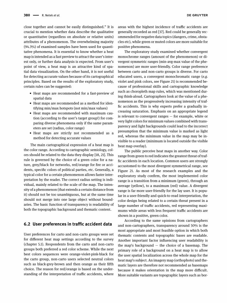
User preferences for carto and non-carto groups were setfor different heat map settings according to the survey(chapter 5.1). Respondents from the carto and non-cartogroups both preferred a red color scheme. While the nextbest colors sequences were orange-violet-pink-black forthe carto group, non-carto users selected neutral colorssuch as black-grey-brown and then orange as their fifthchoice. The reason for red/orange is based on the under-standing of the interpretation of traffic accidents, where
areas with the highest incidence of traffic accidents aregenerally recorded as red [37]. Red could be generally rec-ommended for negative data topics (dangers, crime, obsta-cles etc), while green ormuted colors aremore suitable forpositive phenomena.
The exploratory study examined whether convergentmonochrome ranges (amount of the phenomenon) or di-vergent symmetric ranges (min-avg-max value of the phe-nomenon) are more user-friendly. Color range preferencebetween carto and non-carto groups is diverse. For cartoeducated users, a convergent monochromatic range (e.g.violet and pink colors, see Figure 21) is recommended be-cause of professional skills and cartographic knowledgesuch as choropleth map rules, which was mentioned dur-ing think-aloud. Cartographers look at the value of a phe-nomenon as the progressively increasing intensity of traf-fic accidents. This is why experts prefer a gradually in-creasing saturation. Emphasis on an appropriate legendis relevant to convergent ranges — for example, white orvery light colors forminimumvalues combinedwith trans-parency and light backgrounds could lead to the incorrectpresumption that the minimum value is marked as lightred, whereas the minimum value in the map may be in-visible to a reader (minimum is located outside the visibleheat map overlay).
The public perceive heat maps in another way. Colorrange fromgreen to red indicates the greatest threat of traf-fic accidents in each location. Common users are stronglyaccustomed to the most divergent symmetrical range, seeFigure 21. As most of the research examples and theexploratory study confirm, the most implemented colorrange is a transition from a minimum (green), through anaverage (yellow), to a maximum (red) value. A divergentrange is far more user-friendly for the lay user. It is popu-lar in a user-friendly and quick-to-read interpretation, thecolor design being related to a certain threat present in alarge number of traffic accidents, red representing maxi-mums while areas with less frequent traffic accidents areshown in a positive, green color.
According to the same opinions from cartographersand non-cartographers, transparency around 50% is themost appropriate and most feasible option in which boththematic contents and topographic bases are readable.Another important factor influencing user readability isthe map’s background — the choice of a basemap. Theprimary role of a background on a heat map is to allowthe user spatial localization across the whole map for theheatmap’s subject. An imagerymap (orthophoto) and the-matic layers are therefore not recommended as basemapsbecause it makes orientation in the map more difficult.More suitable variants are topographic layers such as bor-

Implementation of Heat Maps in Geographical Information System | 381
Figure 21: Overall prefered visualisation of heat map by carto (left)and non-carto (right) group
ders, rivers, cities, etc. Map labels make orientation easierbasedon its quantity andmapscale. Currently,GISprovidespecific basemap layers — typically a light or dark graylayer, shaded relief, generalized topographicmap, or layerwith low color saturation. Since all the basemaps gener-ated during the study combined a light gray layer withthe borders of urban areas, we fully recommend a greybasemap or layer with low color saturation. This allowssimple orientation across the whole map without disrupt-ing heat map readability. Because it is a not simple ques-tion, it could be an interesting topic for further studies.
Radius values in heat maps change with scale level!Zoom-in or zoom-out movements cause the radius val-ues to fluctuate. Therefore, radius setting preferences de-pend on individual skills and education due to the pos-sible differences in user interpretation. While non-cartorespondents prefer a smaller radius, a medium radius ismore suitable for the carto group. A smaller radius pro-
vides more separated “islands” and is more similar topoint method visualization. Finally, it is easier to inter-pret. A larger radius provides a more complex represen-tation of a phenomenon, especially where the overlap oc-curs, but it requires conceptual skills for correct interpre-tation. Completely confluent and overlapping areas (onearea over whole map) is not recommended at all.
The disadvantages of these aspects could be partlysolved in a digital environment with interactive function-ality. Web-based GIS such as ArcGIS Online or Google Fu-sion Tables allow interactive editing of cartographic as-pects in real time via web browsers. Radius, transparency,or color could be edited on-screen, immediately and with-out needing to regenerate/resave map outputs. However,this facility could immediately lead to worse results if it isdesigned without knowledge of all the recommendationsand rules. The main limitation of this paper is its focuson heat maps only. Since it is a subjective method, incor-rect use can lead to incorrect perceptions of maps. The au-thors aim to help eliminate these mistakes via this paper.As previouslymentioned, heatmaps are a suitablemethodfor visualizing point datasets, but not frequently used forline or polygon data, which could be limiting factors. Themain aspect of similar studies which profoundly impactsthe study results are participants. Participants should al-ways represent the envisioned user, and it is crucial thatthe sampled participants represent the targeted levels ofexpertise and motivation for controlled experiments [38].That condition is followed by diving participants into twogroups (novice and expert).
The choice of evaluation method is fundamental. Ac-cording to the study of Rohrer [39] “all projects wouldbenefit from multiple research methods and from com-bining insights”. Because of map designers are not com-mon map (especially heat maps could be interpreted dif-ferently) users aware of cognitive processes increased. VanElzakker et al. [40] brings a complex overview of user re-search. While repelling reactions to the quantitative revo-lution in geographywere on the increase, “the think-aloudmethod has become an important tool” [40]. As Hall [41]added “in attitudinal studies, you’re trying to findoutwhatpeople say about a subject, while in behavioural studies,you’re analysing what people are doing. Qualitative meth-ods tend to be stronger for answering ‘why’ types of ques-tions, while quantitative methods do a better job of an-swering questions like ‘how many”’. Quantitative back-ground of the survey “helps prioritise resources, for exam-ple, to focus on issues with the greatest impact” [39]. Thatwas the reason for choosing the combination of question-naire and think-aloud methods for this study. The similarsequence has been used by Janicki et al. [42].
382 | R. Netek et al.
The limit of our study is the aim of the study - setrecommendations based on quantitative research. Thereare some additional quantitative methods such as A/Btesting, scenarios testing or quantitative eye-tracking test-ing which could be implemented into further research.Kubíček et al. [43] examined map-reading tasks on lin-ear feature visualisation. Their study confirms that dif-ferent forms of visualisation may have different impactson performance in map-reading tasks: “colour hue andsize proved more efficient in communicating informationthan shape and colour value. . . . Individual facets of cog-nitive style may affect task performance, depending onthe type of visualisation employed” [43]. Especially sce-narios or A/B tests should lead to the more proper de-sign and measuring the effect of these assignments onuser behaviour [39]. Roth et al. [38] present a complexagenda for user studies in the field of interactive maps.Their study highlights that digital and interactive maps“has fundamentally changed how maps are designed andused”. While heat map parameters could be easily cus-tomised via GIS platform we fully follow the statement“map reader is no longer passive in the creation of the rep-resentation . . . and the map user is empowered to create arepresentation that best supports his or her use context”.Roth et al. [38] recommend qualitative and mixed-methodresearch as a staple for user studies, especially with a fo-cus on human-computer interaction. Methods such as fo-cus group, eye-tracking or another usability lab studiesare suitable for qualitative testing of heat maps – detect-ing how to understand users´ perception on the heat map,answering why the heat map is (non)suitable method orwhy the heat map is (not) popular than another method.To provide a more comprehensive description of carto-graphic methods, three other exploratory studies of heatmaps were performed under the project. Currently, we aredeveloping a system of classification for evaluation andfollowed by the process of user testing with eye trackingevaluation. Some extension with practical tasks (e.g., findmin/max hotspots or compare values at the same place ontwo heat maps) will be definitely included in further re-search.
7 ConclusionsCurrently, the heat map is a highly usedmethod for visual-izing both graphical and tabular phenomena. For the in-terpretation of large-scale datasets, it is crucial for datato be properly classified and visualized. Heat maps areone effective and efficient option to process diverse spa-
tial datasets in GIS via clustering analysis that looks forand unifies similar values. As a relevant cartographicalstandard is absent and many color ranges with an inap-propriately chosen color transition were discovered, theauthors decided to prepare a complex exploratory studyfocusing on evaluation and analysis of heat maps in ge-ographical information systems and digital cartography.The aim of the thesis was to discover preferences for colorranges, transparency, and the radius setting of differentlyoriented data sets, emphasizing the preferences of bothcartographic and non-cartographic respondents, not theindividual needs a user may require. This paper describesan exploratory study examining traffic accident data. Theexperiment’s aim was to set basic recommendations andillustrate the typical strengths and weaknesses of heatmap implementation.
Acknowledgement: This paper was supported by project“Cloud-based Platform for Integration and Visualizationof Different Kind of Geodata” (IGA_PrF_2017_024) of thePalacký University.
Author Contributions: Rostislav Netek conceived the out-line of the article and is the first author of the article.He is responsible for main concept, he conceived and de-signed the experiments. Tomas Pour is the co-author ofSections 2–4. He also helped with the data evaluation. Re-nata Slezakova performed the experiments and analyzedthe data.
References[1] Trame J.; Keßler C. Exploring the Lineage of Volunteered Ge-
ographic Information with Heat Maps. 2011. GeoViz. Avail-able online: http://carsten.io/trame-kessler-geoviz2011.pdf.(accessed on 2018-03-11)
[2] Dempsey C. Heat Maps in GIS. 2012. Available online: https://www.gislounge.com/heat-maps-in-gis/. (accessed on 2018-03-12)
[3] Yeap E.; Uy I. Marker Clustering and Heatmaps: NewFeatures in the Google Maps Android API Utility Li-brary. 2014. Google Geo Developers. Available online:http://googlegeodevelopers.blogspot.com/2014/02/marker-clustering-and-heatmaps-new.html. (accessed on 2018-03-11)
[4] Sainio, J.; Westerholm, J.; Oksanen, J. Generating Heat Maps ofPopular Routes Online fromMassiveMobile Sports Tracking Ap-plication Data in Milliseconds While Respecting Privacy. ISPRSInt. J. Geo-Inf. 2015, 4, 1813-1826.
[5] Ivan I., Horák J. Metodika identifikace anomálních lokalit krimi-nality pomocí jádrových odhadů. 2016. SymposiumGIS Ostrava2016 – Geoinformatika pro společnost. Ostrava.

Implementation of Heat Maps in Geographical Information System | 383
[6] Anderson T.K. Kernel density estimation and K-means cluster-ing to profile road accident hotspots. 2009. Accident Analysis &Prevention, Volume 41, Issue 3, May 2009, Pages 359-364
[7] Kinney C. United States Patent and Trademark Oflce, registra-tion #75263259". 1993.
[8] Perez-Llamas, C. & Lopez-Bigas, N. Gitools: Analysis andVisual-isation of Genomic Data Using Interactive Heat-Maps. PLoSONE6, e19541 (2011)
[9] Moon, J. et al. Heat-map visualization of gas chromatography-mass spectrometry based quantitative signatures on steroidmetabolism. Journal of theAmericanSociety forMassSpectrom-etry, 2009, 20.9: 1626-1637.
[10] Hilton B., Horan N., Thomas A. and SCHOOLEY, BENJAMIN, 2009,Making TraflcSafety Personal: Visualization andCustomizationof National Traflc Fatalities. Visual InformationCommunication.2009. P. 265-282. DOI 10.1007/978-1-4419-0312-9_18. SpringerUS
[11] Li L., Zhu L., Sui D., 2007, A GIS-based Bayesian approach foranalyzing spatial–temporal patterns of intra-city motor vehiclecrashes. Journal of Transport Geography. 2007. Vol. 15, no. 4, p.274-285. DOI 10.1016/j.jtrangeo.2006.08.005. Elsevier BV
[12] Kušta T., Keken Z., Ježek M., Holá M., and Šmíd P., 2017, Theeffect of traflc intensity and animal activity on probability ofungulate-vehicle collisions in the Czech Republic. Safety Sci-ence. 2017. Vol. 91, p. 105-113. DOI 10.1016/j.ssci.2016.08.002.Elsevier BV
[13] Plug Ch., Xia J. C. and Caulfield C., 2011, Spatial and tempo-ral visualisation techniques for crash analysis. Accident Anal-ysis & Prevention. 2011. Vol. 43, no. 6, p. 1937-1946. DOI10.1016/j.aap.2011.05.007. Elsevier BV
[14] BENEDEK J., CIOBANU S. M., MAN T. C., 2016, Hotspots and so-cial background of urban traflc crashes: A case study in Cluj-Napoca (Romania). Accident Analysis & Prevention. 2016. Vol.87, p. 117-126. DOI 10.1016/j.aap.2015.11.026. Elsevier BV
[15] Soltani, A. and Askari, S., 2014, Analysis of Intra-Urban Traf-fic Accidents Using Spatiotemporal Visualization Techniques.Transport and Telecommunication Journal. 2014. Vol. 15, no. 3.DOI 10.2478/ttj-2014-0020. Walter de Gruyter GmbH
[16] DeBoer M. Understanding the Heat Map. 2015. DOI:10.14714/CP80.1314. Available online: http://cartographicperspectives.org/index.php/journal/article/view/cp80-deboer/1420. (accessed on 2018-03-12)
[17] Dempsey C. What is the Difference Between a Heat Map and aHot Spot Map? 2014. Available online: https://www.gislounge.com/difference-heat-map-hot-spot-map/. (accessed on 2018-03-11)
[18] Longley P.A., Goodchild M., Maguire J.M., Rhind D.W. Geoo-graphic Information Systems and Science, 3 edition. 2010, Wi-ley, United Kingdom. 560 p. ISBN: 978-0470721445.
[19] Panek J, Benediktsson K. Emotional mapping and its participa-tory potential: Opinions about cycling conditions in Reykjavik,Iceland. Cities. 2017, 61(1), 65–73.
[20] Eytan, T. A health map rather than a heat map – #CTHNext Bike-share Station’s first two weeks. Available online: https://www.tedeytan.com/2015/12/11/19389 (accessed on 2017-09-16)
[21] Voženílek V, Kaňok J. Metody tematické kartografie: vizualizaceprostorových jevů. Univerzita Palackého vOlomouci, 2011. ISBN978-80-244-2790-4.
[22] Kumar, C.; Heuten,W.; Boll, S. VisualOverlay onOpenStreetMapData to Support Spatial Exploration of Urban Environments. IS-
PRS Int. J. Geo-Inf. 2015, 4, 87-104.[23] Silverman B. W. Density estimation for statistics and data anal-
ysis. New York: Chapman and Hall, 1986.[24] Shi Z. et al.. A web-based interactive 3D visualization tool for
building data. IBPSA Proceeding, 2016.[25] Galili T, O’Callaghan A, Sidi J, Sievert C. heatmaply: an R
package for creating interactive cluster heatmaps for onlinepublishing. 2017. Bionformatics, Oxford University Press. DOI:10.1093/bioinformatics/btx657
[26] WebGLLayer. Available online: http://webglayer.org. (accessedon 2018-03-11)
[27] Vondrakova A. Non-technological aspects of map production.2013. Conference Proceedings SGEM 2013. STEF92 TechnologyLtd. DOI: 10.5593/SGEM2013/BB2.V1/S11.026
[28] Obadalkova, V. Hodnocení vlivu barev na čitelnost digitálníchmap. Olomouc, Czech Republic, 2012. Bachelor thesis. PalackýUniversity Olomou
[29] Dobesova Z., Vavra A., Netek R. Cartographic aspects of cre-ation of plans for botanical garden and conservatories. 2013.Conference Proceedings SGEM 2013. STEF92 Technology Ltd.,653–660. ISSN 1314-2704.
[30] Harrower, M; Brewer, CA.: ColorBrewer.org: An online tool forselecting colour schemes for maps. The Cartographic Journal.2003, Vol. 40, Iss. 1.
[31] Brychtova A., Vondrákova A.: Green versus Red: Eye-trackingevaluation of sequential colour schemes. 2014. SGEM2014 Informatics, Geoinformatics and Remote SensingProceedings Volume III STEF92 Technology Ltd., 8s.DOI10.5593/SGEM2014/B23/S11.082
[32] Živković D. Matrix pixel and Kernel density analysis from the to-pographic maps. 2016. Natural Sciences, Vol. 6, No 1, 2016, pp.39-43. DOI:10.5937
[33] Dreyfus, H L and Dreyfus, S E. Mind over Machine: the power ofhuman intuition and expertise in the age of the computer. 1986,Oxford, Basil Blackwell.
[34] Ullah, R., Mengistu, E.Z., van Elzakker, C.P.J.M., Kraak, M.J.: Us-ability evaluation of centered time cartograms. 2016, Open geo-sciences, Vol. 8, No. 1, p.337-359. ISSN 2391-5447.
[35] Netek R., BalunM.WebGISSolution for CrisisManagement Sup-port – Case Study of Olomouc Municipality. Computational Sci-ence and Its Applications – ICCSA 2014. ICCSA 2014. LectureNotes in Computer Science, vol 8580
[36] Esri. Heat map symbology. Available online: http://pro.arcgis.com/en/pro-app/help/mapping/symbols-and-styles/heat-map.htm (accessed on 2017-09-28)
[37] Netek R., Panek J. Framework See-Think as a Tool for Crowd-sourcing Support-Case Study on Crisis Management. 2016.ISPRS-International Archives of the Photogrammetry, RemoteSensing and Spatial Information Sciences, pp. 13-16.
[38] Roth R.E., Çöltekin A., Delazari L., Filho H.F., Grifln A., HallA., Korpi J., Lokka I., Mendonça A., Ooms K., van Elza-kker C.P.J.M. User studies in cartography: opportunities forempirical research on interactive maps and visualizations.2017. International Journal of Cartography, 3:sup1, 61-89, DOI:10.1080/23729333.2017.1288534
[39] Rohrer Ch. When to Use Which User-Experience ResearchMethods. 2014 Available online: https://www.nngroup.com/articles/which-ux-research-methods/. (accessed on 2018-04-08)

384 | R. Netek et al.
[40] van Elzakker C.P.J.M. The use of maps in the exploration of geo-graphic data. 2004. Utrech, Enschede, Netherlands Geographi-cal Studies 326. Utrech University, 208p. ISBN: 90-6809-357-6
[41] Hall T. How to choose a user research method. 2017 Availableonline: https://uxplanet.org/how-to-choose-a-user-research-method-985112051d84. (accessed on 2018-04-08)
[42] Janicki J., Narula N., Ziegler M., Guenard B., Economo E.P. Vi-sualizing and interacting with large-volume biodiversity datausing client–server web-mapping applications: The design andimplementation of antmaps.org. 2016. Ecological Informatics32 (2016) 185–193. http://dx.doi.org/10.1016/j.ecoinf.2016.02.006
[43] Kubíček P., Šašinka Č., Stachoň Z., Štěrba Z., ApeltauerJ., Urbánek T. Cartographic Design and Usability of Vi-sual Variables for Linear Features. 2017. The CartographicJournal Vol. 54 No. 1 pp. 91–102, February 2017. DOI:10.1080/00087041.2016.1168141