Effect of Web Page Menu Orientation on Retrieving Information by People With Learning Disabilities
12
Optimising web site designs for people with learning disabilities Peter Williams and Christian Hennig University College London Key words: Information technology, web design, learning disabilities, usability, eliciting preferences. Much relevant internet-mediated information is inaccessible to people with learning disabilities because of difficulties in navigating the web. This paper reports on the methods undertaken to deter- mine how information can be optimally presented for this cohort. Qualitative work is outlined where attributes relating to site layout affecting usability were elicited. A study comparing web sites of dif- ferent design layouts exhibiting these attributes is discussed, with the emphasis on methodology. Eight interfaces were compared using various combina- tions of menu position (vertical or horizontal), text size and the absence or presence of images to determine which attributes of a site have the great- est performance impact. Study participants were also asked for their preferences, via a ‘smiley-face’ rating scale and simple interviews. ‘Acquiescence bias’ was minimised by avoiding polar (‘yes/no’) interrogatives, achieved by asking participants to compare layouts (such as horizontal versus vertical menu), with reasons coaxed from those able to articulate them. Preferred designs were for large text and images. This was the reverse of those facilitating fastest retrieval times, a discrepancy due to preferences being judged on aesthetic con- siderations. Design recommendations that recon- cile preference and performance findings are offered. These include using a horizontal menu, juxtaposing images and text, and reducing text from sentences to phrases, thus facilitating pre- ferred large text without increasing task times. Introduction Despite the near ubiquity of the Internet, there has been little research undertaken on its use by people with learning disabilities, and a paucity of empirical evidence regarding how to optimise web pages for information access and retrieval by this constituency. Even that which does exist is conflicting. Nielsen (1996) and Bohman (2010), for example, recommend avoiding the need to scroll. By con- trast, other commentators (e.g., Keates, Adams and Bodine et al., 2007; Sevilla, Herrera and Martinez et al., 2007) urge the use of photos or other pictorial representation and video. Pages containing such content, however, tend to be longer, and therefore do require scrolling. This leads to the question of which attributes of web sites are the most important in designing for accessibility. The aim of the study was, there- fore, to determine optimal web design for people with learning disabilities. This question was addressed first within the context of a wider project: ‘Newham Easy Read’, a web site developed by researchers at the University of East London’s Rix Centre, in conjunction with Newham Borough Council. It was further examined more experimentally using a series of web layouts created specifically to test various design ele- ments. Web site content was based around ‘transition’, the phase in the lives of young people where they make the move from school to life in the community. The information content was developed with this cohort themselves, aided by the research team and their supporters (Minnion, Staples and Singh et al., 2008; Williams, 2008). The first ‘easy read’ site The ‘home page’ of the original web site can be seen in Figure 1. Text content was kept to a minimum and is accompanied by an equivalent audio rendition. Images were also liberally used, as recommended in accessibility litera- ture, such as that by the W3C (World Wide Web Consortium) (1999). Usability studies on this site undertaken by the present writer (Williams, 2013; Williams and Hanson-Baldauf, 2010) involved the development of ‘one-action’ tasks suit- able for people with low literacy skills. Observation of set tasks and free-browsing were undertaken, followed by simple feedback interviews. Of major interest was an examination of the barriers to effective information retrieval, with results feeding into the second part of the study. Factors that related specifically to the usability of the web interface included the use of images, text size and menu position. Each of these is described below. The copyright line was changed on 5 September 2014 after original online publication. Journal of Research in Special Educational Needs · Volume 15 · Number 1 · 2015 25–36 doi: 10.1111/1471-3802.12034 25 © 2013 The Authors. Journal of Research in Special Educational Needs published by John Wiley & Sons Ltd on behalf of NASEN. This is an open access article under the terms of the Creative Commons Attribution License, which permits use, distribution and reproduction in any medium, provided the original work is properly cited.
Transcript of Effect of Web Page Menu Orientation on Retrieving Information by People With Learning Disabilities

Optimising web site designs for people withlearning disabilitiesPeter Williams and Christian HennigUniversity College London
Key words: Information technology, web design, learning disabilities, usability, eliciting preferences.
Much relevant internet-mediated information isinaccessible to people with learning disabilitiesbecause of difficulties in navigating the web. Thispaper reports on the methods undertaken to deter-mine how information can be optimally presentedfor this cohort. Qualitative work is outlined whereattributes relating to site layout affecting usabilitywere elicited. A study comparing web sites of dif-ferent design layouts exhibiting these attributes isdiscussed, with the emphasis on methodology. Eightinterfaces were compared using various combina-tions of menu position (vertical or horizontal), textsize and the absence or presence of images todetermine which attributes of a site have the great-est performance impact. Study participants werealso asked for their preferences, via a ‘smiley-face’rating scale and simple interviews. ‘Acquiescencebias’ was minimised by avoiding polar (‘yes/no’)interrogatives, achieved by asking participants tocompare layouts (such as horizontal versus verticalmenu), with reasons coaxed from those able toarticulate them. Preferred designs were for largetext and images. This was the reverse of thosefacilitating fastest retrieval times, a discrepancydue to preferences being judged on aesthetic con-siderations. Design recommendations that recon-cile preference and performance findings areoffered. These include using a horizontal menu,juxtaposing images and text, and reducing textfrom sentences to phrases, thus facilitating pre-ferred large text without increasing task times.
IntroductionDespite the near ubiquity of the Internet, there has beenlittle research undertaken on its use by people with learningdisabilities, and a paucity of empirical evidence regardinghow to optimise web pages for information access andretrieval by this constituency. Even that which does exist isconflicting. Nielsen (1996) and Bohman (2010), forexample, recommend avoiding the need to scroll. By con-
trast, other commentators (e.g., Keates, Adams and Bodineet al., 2007; Sevilla, Herrera and Martinez et al., 2007) urgethe use of photos or other pictorial representation and video.Pages containing such content, however, tend to be longer,and therefore do require scrolling. This leads to the questionof which attributes of web sites are the most important indesigning for accessibility. The aim of the study was, there-fore, to determine optimal web design for people withlearning disabilities.
This question was addressed first within the context of awider project: ‘Newham Easy Read’, a web site developedby researchers at the University of East London’s RixCentre, in conjunction with Newham Borough Council. Itwas further examined more experimentally using a series ofweb layouts created specifically to test various design ele-ments. Web site content was based around ‘transition’, thephase in the lives of young people where they make themove from school to life in the community. The informationcontent was developed with this cohort themselves, aidedby the research team and their supporters (Minnion, Staplesand Singh et al., 2008; Williams, 2008).
The first ‘easy read’ siteThe ‘home page’ of the original web site can be seen inFigure 1. Text content was kept to a minimum and isaccompanied by an equivalent audio rendition. Images werealso liberally used, as recommended in accessibility litera-ture, such as that by the W3C (World Wide WebConsortium) (1999).
Usability studies on this site undertaken by the presentwriter (Williams, 2013; Williams and Hanson-Baldauf,2010) involved the development of ‘one-action’ tasks suit-able for people with low literacy skills. Observation of settasks and free-browsing were undertaken, followed bysimple feedback interviews. Of major interest was anexamination of the barriers to effective informationretrieval, with results feeding into the second part of thestudy. Factors that related specifically to the usability of theweb interface included the use of images, text size andmenu position. Each of these is described below.The copyright line was changed on 5 September 2014 after original online publication.
bs_bs_banner
Journal of Research in Special Educational Needs · Volume 15 · Number 1 · 2015 25–36doi: 10.1111/1471-3802.12034
25© 2013 The Authors. Journal of Research in Special Educational Needs published by John Wiley & Sons Ltd on behalf of NASEN.This is an open access article under the terms of the Creative Commons Attribution License, which permits use, distribution and reproduction in any medium, provided the original work isproperly cited.

Images: Many participants showed difficulties ininterpreting the meaning of images depicting menuentries, and the more literate participants appeared to relyon the written caption to ascertain the topic depicted.Indeed, some of the images used could be interpreted in anumber of ways even by ‘mainstream’ users. Forexample, that chosen to represent ‘support’ was aclose-up of a handshake, which could have meantfriendship, some kind of agreement or even a ‘goodbye’.Also, image use necessarily results in longer pages, oftenextending below screen level and so requiring scrolling.This was a big issue for some participants, with the leastable appearing not to realise that ‘invisible’ contentexisted, some not being able to scroll effectively, andothers not inclined to do so.Text size: Although study participants tended to preferlarger font, and some guidelines emphasise theimportance of making it possible to increase font size(e.g., British Standards Institution, 2006), the space takenup by even a small body of large text pushes the pagelength down below the visible screen. However, in printform, larger text sizes have been shown to be morereadable than smaller sizes (Mills and Weldon, 1987;Rudnicky and Kolers, 1984; Tinker, 1963), although thedifferences are often not significant until the sizedifferential becomes quite large. However, MichaelBernard and colleagues (Bernard, Lida and Riley et al.2002) noted that no significant research had beenundertaken on text size in an online or technologyenvironment. This still appears to be the case in 2013.Menu position: Clearly, access to content needs to be assimple and accessible as possible (and not just for peoplewith learning disabilities!), and so the presentation ofmenu entries is of great importance. The preliminaryqualitative work suggested that, for these users, thehorizontal option might be the optimal choice. Twopossible reasons are that the entire menu is visible onscreen (discounting horizontal scrolling, heavily frownedupon by accessibility experts, such as Burzagli, Emilianiand Gabbanini, 2009; Colorado and Eberle, 2009), and
the direction in which the information presented iscompatible with the eye movement of someone reading.In other words, it may be easier for someone withlearning disabilities to read menus from left to right ratherthan vertically. Interestingly, prior research (e.g., Bernardand Hamblin, 2003; Tullis, 2005) appears to suggest, bycontrast, that a vertical menu aids information retrievalmore effectively than, for example, ‘drop-downs’ or‘fly-outs’. These studies, however, were with mainstreamparticipants. Whether this is the case for people with lowlevels of literacy has yet to be examined. Also, thenumber of menu entries used in ‘Newham Easy Read’was problematic, not only because negotiating the entriesrequired scrolling, but also because they were very smalland simply too numerous to take in.
The experimental ‘Pete’s Easy Read’ siteThe structure and content of the site. This web siteincluded various design modifications suggested by resultsfrom the original project, and facilitated comparison of theattributes mentioned above. Figure 2 shows the ‘home’page. The grid menu design was present only for this‘portal’ page. Vertical and horizontal arrangements weretested for the information pages themselves.
As with ‘Newham Easy Read’, the site contained threelevels (see Figure 3):
• The home page, as shown in Figure 2, giving access toeach of eight main topic pages;
• A subject menu page itemising information pages oneach topic, and unlike the original site giving a 50-wordtopic introduction; and
• Information pages on each of the subtopics.
Eight interface designs accrue from the attributes underscrutiny, as shown in Table 1.
By testing information retrieval performance on each ofthese interfaces, it was possible to address the question of
Figure 1: ‘Newham Easy Read’ home page
Journal of Research in Special Educational Needs, 15 25–36
26 © 2013 The Authors. Journal of Research in Special Educational Needs published by John Wiley & Sons Ltd on behalf of NASEN

which attributes of web sites are the most important indesigning for accessibility, taking into account the effectthat each variable has on the overall site appearance andfunctionality. Two examples of the different layouts can beseen in Figure 4.
Far fewer entries were included here (five), follow-ing earlier findings regarding scrolling and problems nego-tiating a large number of items. Navigation consisted ofsimply ‘home’ and ‘back’ buttons.
Methodology
ParticipantsThe study was undertaken at various locations, includingthe special needs unit of a college of further education, anadult education class, a self-advocacy group and adult daycentres. Participants had levels ‘entry two’, entry three’ or‘level one’ of literacy, as used in UK Further Educationcolleges (Moser, 1999). As such, they could be expected todo the following:
Figure 2: ‘Pete’s Easy Read’ home page
Figure 3: ‘Pete’s Easy Read’ site structure
Journal of Research in Special Educational Needs, 15 25–36
27© 2013 The Authors. Journal of Research in Special Educational Needs published by John Wiley & Sons Ltd on behalf of NASEN
• Read and understand simple text (those at entry three,up to six sentences in one paragraph);
• Get the main idea from a simple graphical or tabularsource (e.g., safety signs); and
• Understand and use a simple list.
In total, 104 people participated in the study, ranging from17 to 63 years of age, 94 of whom undertook sufficientnumber of tasks to be included in the analysis. It is impor-tant to note also that participants had no physical disabili-ties. Thus, they were all able to manipulate a touch pad ormouse normally, and were not visually impaired.
MethodUnlike with the original exploratory usability work, thisphase of the research used quantitative methods, involving astatistically significant number of participants and recordingtask time. Regarding this measure, it could be argued that thetime taken to access information does not matter. However,there are a number of reasons for adopting this measure:
• The nature of the task: The usability element of thestudy looked at retrieving information rather thancreating or communicating it. As such, speed of accessmay be more important.
• Short attention span: People with learning disabilitiesare known to have short attention spans (LearningDisabilities Association of America, 2010), and timemay be important in terms of willingness to engagewith an information resource.
• Precedent: Time on task is a standard measure inusability testing (see, e.g., Choi and Bakken, 2010),including those addressing issues related to people withlearning disabilities (see, e.g., Karreman, van der Geestand Buursink, 2007).
Participants undertook tasks on the eight interface configu-rations of the new web site, one task per interface, presentedat random. Tasks required participants to do the following:
• Recognise and activate a hyperlink (from a text label,with or without an accompanying image);
• Recognise the need to scroll a page as appropriate andknow how to do so;
• Read simple text; and• Identify a string of text containing the answer to a
simple question.
Four steps were involved in each task, with the goal being toextract two pieces of information from each of the mainsubject sections, as follows:
Step one: Identifying the subject from a main grid menuon the ‘home’ page.Step two: Answering a question from the introductoryparagraph of a particular subject (Figure 5 shows the‘subject home page’ for health in which this page sits).Step three: Identifying the within-subject topic from thesubject menu (Figure 5 again), requiring recognition andactivation of a hyperlink, on occasion below screen level,and thus requiring scrolling.Step four: Answering a question from the text of thetopic accessed. Figure 6 shows the information page for‘going to hospital’, required an answer to one question.
It is worth noting here that these subtasks illustrate themanner in which electronic ‘reading’ entails a morecomplex activity – even for the relatively simple exerciseundertaken here – than negotiating the print medium. DonLeu of the University of Connecticut (e.g., Leu, Kinzer andCoiro et al., 2004; Leu and Zawilinski, 2007; Leu,Zawilinski and Castek et al., 2007) is a leading figure in‘new literacies’ occasioned by electronically presentedinformation, and points out that although, for example,pictures, charts and maps are present in the print environ-ment, the nature of Internet multimedia poses ‘uniqueproblems . . . In an electronic environment, decoding forcomprehension includes decoding the strategic use ofcolor (sic); various clues that indicate hyperlink(s); . . .icons and animations . . . that are not static’ (Leu et al.,2004, p. 1582). In the current case, the major attribute to benegotiated not present in print form are the hyperlinks andtheir navigation.
Issues arising in the set tasks were as follows:Question formulation: Questions were worded in such away as to not require participants to infer answers orbreak text down to elicit information. This is because thestudy sought only to examine the effects of web designon information retrieval, and not comprehension. Thus,questions were used whose answers contained the samewords as those in the question. For example, ‘Where canyou have your meals?’, where the text includes the phrase‘you can have your meals in bed’.Juxtaposition of image and text: One of the researchquestions was that of whether images aid informationretrieval. Figure 7 shows the juxtaposition of text andimage related to the question ‘What do you have to wearto go bowling?’ The images were chosen both to illustrateand make the text easier to follow, and to test whether theimages helped participants arrive at the answers toquestions.
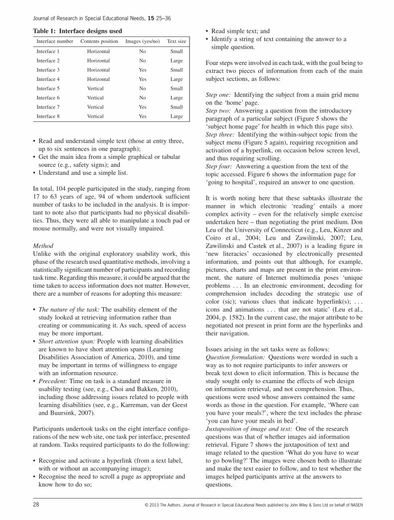
Table 1: Interface designs used
Interface number Contents position Images (yes/no) Text size
Interface 1 Horizontal No Small
Interface 2 Horizontal No Large
Interface 3 Horizontal Yes Small
Interface 4 Horizontal Yes Large
Interface 5 Vertical No Small
Interface 6 Vertical No Large
Interface 7 Vertical Yes Small
Interface 8 Vertical Yes Large
Journal of Research in Special Educational Needs, 15 25–36
28 © 2013 The Authors. Journal of Research in Special Educational Needs published by John Wiley & Sons Ltd on behalf of NASEN

Positioning of sought content: One final feature of thetasks is that of text and image positioning. Clearly, itmight take a longer time to find information if it issituated at the bottom of the screen, and even longerwhere that necessitates scrolling. To concentrate the studymore on the effects of the conditions under considerationrather than on that of scrolling per se, where the requiredmenu entry item (step three) appeared at the bottom ofthe (vertical) list of entries, the information sought in stepfour would be near the top.
Data gathering and analysis. Two types of analysis wereused to compare interface designs:
• A statistical analysis based on measures of task time;and
• A qualitative analysis comprising researcherobservations and interactions with participants, and posthoc informal interviews with participants and carer/tutors, etc.
With regard to the statistical analyses, it is important tonote that in the dataset, several observations come from
the same test person. Strictly speaking, these observationsshould not be treated as statistically independent becausethe individual characteristic of the test persons will affectall their observations. This was addressed statistically byusing a number of ‘mixed-effects models’ (Pinheiro andBates, 2000; R Core Team, 2012). Such models take intoaccount the within-test persons dependence (as outlinedabove) of observations and allow to test the factors ofinterest while taking into account all other factorspresent.
Post-test interviews were undertaken to seek preferencedata regarding the interfaces presented. An issue herewas the documented propensity of an interviewee to agreewith someone in apparent authority. Meisenberg andWilliams (2008) found that ‘less educated and intelligent’people tend to be susceptible to this ‘acquiescence bias’.Space does not permit a full consideration here, but inshort, polar (‘yes/no’) interrogatives (‘Do you like thelayout?’) were eschewed, with one way of doing so beingto ask for comparisons (such as horizontal versus verticalmenu), with reasons coaxed from those able to articulatethem.
Figure 4: Information page on ‘good and bad food’, as presented by two different interfaces
Interface 1: small text, no images and horizontal menu
Interface 8: large text, images and vertical menu
Figure 5: Subject ‘home’ page for health
Journal of Research in Special Educational Needs, 15 25–36
29© 2013 The Authors. Journal of Research in Special Educational Needs published by John Wiley & Sons Ltd on behalf of NASEN

Results
Testing for validityIt was important to test whether there was a significantdifference in task difficulty and in task time with regard totask order. Care was taken to ensure each task was asequal as possible, by site pages each being written at thesame reading level, avoiding inference questions andobtaining feedback from professionals regarding languagelevel and equality of questions. Analyses showed thatneither task topic (P = 0.45) nor task order (P = 0.10) wassignificant, suggesting that the results could be attributedto the factors being investigated and not to other factors inplay.
Individual site attributes and performanceEach attribute (or variable) of the web site was looked atin isolation. In each case, there were two cases for eachattribute. These were the following:
• Presence or absence of images;• Horizontal or vertical menu; and• Large or small text size.
Turning first to the use of images, it is important to statethat the selection used was undertaken after working withpeople with learning disabilities themselves, and with theexpert help of professionals in the field. Thus, they wereas representative as possible. However, comparing thepresence or absence of images suggested no correlationbetween task times for pages displaying images or not.Thus, images appeared to offer little or no help in access-ing information – at least not in terms of speed of access.If this is considered a surprising result, a study byPoncelas and Murphy (2007) came to a similar conclusion– in their case that the addition of symbols to simple textsdoes not necessarily improve people’s understanding of it.
Observational findings suggested one major reason for this.Participants appeared to be focused almost exclusively ontext-based content in order to undertake the tasks, ignoringwhat they may have considered to be extraneous detailbecause they had to concentrate so hard on the text.Summers and Summers (2005) also noted this. In hindsight,an argument could be made for dispensing with text almostaltogether, so that, in the page on bowling, ‘You have to
Figure 6: Information page: ‘Going to hospital’
Figure 7: Information page showing the juxtaposition of text and image
Journal of Research in Special Educational Needs, 15 25–36
30 © 2013 The Authors. Journal of Research in Special Educational Needs published by John Wiley & Sons Ltd on behalf of NASEN

wear shoes they give you!’ might become ‘wear these!’ nextto an appropriate image, as discussed in more detail in theRecommendations section, below.
With regard to menu position, vertical menus significantlyincreased task time (P = 0.001). The difference only corre-sponds to a mean increase of 5.56 seconds per task, butconsidering that there were only five menu entries on eachpage, one can assume that the increase in time would be fargreater with a ‘conventional’ site. Indeed, even sites writtenfor this constituency are prone to having a large number ofmenu entries. Dobson’s Choice,1 for example, had 15 on22.04.13; and ‘Movingonup2’ has eight always-visiblemenu entries, plus the same number on each of the mainsubject pages.
The finding contrasts with other (albeit not equivalent)studies, such as that described earlier by Ojanpää and col-leagues (Ojanpää, Näsänen and Kojo, 2002), although thisis in line with that of Laarni, Simola and Kojo et al. (2004),who studied reading rather than word search. To explain theresults, it is worth noting that some participants, despitebeing asked to look at the menu (and shown its location)tended, instead, to read through the text. Even gentleprobing by the researcher failed in these cases to determinewhether this was because of a poor understanding of thetask or a belief that the link was embedded in the text. Infact, there were cases where it was not obvious whether themenu or the text was being consulted. Importantly, thisbehaviour appeared to affect performance on the verticalmenu pages more than on the horizontal – seeminglybecause when one reads, one does so from the top of thepage, which is where the horizontal menu was placed.
Following on from this, the propensity to absorb informationmethodically from top left to bottom right suggests thatwhere there is distracting material present, the vertical menuentries are accessed more slowly than the horizontal ones. Itappears that the lower entries of the vertical menu were onlyaccessed after horizontal sweeps of the entire page.
The final layout/design variable considered was text size.There was a difference in task time between the two text sizespresented (P = 0.006). This corresponded to an increase of5.06 seconds in time for an average user – with the larger textsize taking longer. Not surprisingly, large text size pushed thecontent to below screen level (as did images), and so in aminority of cases the task answers were not visible on thepage. Not surprisingly, visibility as a variable proved signifi-cant (P = 0.02), controlling for which (e.g., excludinganswers that were not visible) resulted in text size no longerbeing significant (P = 0.21). This means that the effect of textsize can be explained by its effect on visibility. Nevertheless,one cannot discount this – because the very fact that text sizedoes have this effect means that information will take longer
to find from pages where the text is particularly large, andlonger still where more text exists.
This result contradicts traditional guidelines (e.g., Bohman,2004; Hassell, 2005) that state that a larger text size shouldbe used, although, as mentioned earlier, the present partici-pants were not visually impaired. Observations suggestedthat the longer time taken to read large text was a result oftwo factors:
• The increased number of lines generated by large text;and
• The resulting increased length of the page.
The increased number of lines was particularly manifest inthe vertical menu condition, as the width of the area of thepage occupied by the body text was reduced. The ‘with-images’ condition further reduced line length, unlike in thesmall-text condition, as the short sentences generally meantthat one sentence fitted on one line even where the spacewas reduced. In negotiating large text, readers had to focusmore on moving from one line to the next, and those whoread aloud tended to pause between lines. This may havemade it more difficult to read efficiently and with goodunderstanding.
This study limited its scope to ‘computers’, as in desktopsand laptops. Clearly, a new set of issues arise when talkingabout mobile devices, such as smartphones, etc. With thescreen so small, the issue of text size and scrolling becomesmore important. Also, the position of the screen relative tothe user may be different, and the data entry system touchscreen rather than mouse and (physical) keyboard. There isalso the increasing availability of mobile text to speech,raising the issue of the effectiveness of audio as an infor-mation medium, an issue discussed more fully in an earlierpaper by one of the present writers (Williams, 2013). AsClayton Lewis and colleagues (Lewis, Sullivan and Hoehl,2009, p. 387) point out, ‘[a]s smart phones become morepowerful, they offer the possibility to translate complexinformation into simpler, more comprehensible forms thatare appropriate to an individual’s abilities’. Indeed, JosephMintz and colleagues (Mintz, Branch, March et al. 2012)have recently developed mobile phone software to helpdevelop social and life skills in children with autistic spec-trum disorders.
Combined site attributes and performanceTaking first the ‘performances’ of each interface, InterfaceOne (horizontal menu, no images and small- text) is thefastest, and Interfaces Six (vertical, no images and largetext) and Eight (vertical, with images and large text) are theslowest. Box plots of the data are shown in Figure 8. In thebox, there are 50% of the data, 25% each in the part aboveand below the horizontal line, which represents the medianvalue. The end of the dashed ranges is the smallest/largestobservation in the data that are not classified as outlier, thelatter are shown as individual observations above or belowthe dashed range.
1 http://www.dobsonschoice.co.uk/2 http://www.movingonup.info/
Journal of Research in Special Educational Needs, 15 25–36
31© 2013 The Authors. Journal of Research in Special Educational Needs published by John Wiley & Sons Ltd on behalf of NASEN

Interaction between the basic variables (e.g., text size, menuposition and presence of images) was also measured. Thiswas tested by a conditional F-test (Pinheiro and Bates,2000). There was no significant interaction between thevariables (P = 0.832), suggesting, perhaps surprisingly, thatchanging one (e.g., text size) does not affect the contribu-tion of any other variable to task time.
DiscussionOverall, the results accrued do not necessarily support stan-dard guidelines. This is particularly true with regard to thefinding that small text was more effective in informationretrieval and the ineffective use of images. The results canbe explained by reference to observational findings. Themost important of these is that many of the participantselected to read rather than merely skim the text. In manycases, this practice was clear. A minority read aloud, somefollowed the text with the curser, and a smaller group readwith their finger on screen guiding them. This group,clearly, read linearly and made no effort to scan the texteither to search the text or to look for non-verbal clues (inthis case the images) to help. Others also appeared to bereading word for word, simply from their eye and headmovements, although in these cases the indications wereless certain, as such movements, although suggestive, didnot provide proof of reading. Some prior literature has alsonoted this tendency (Summers and Summers, 2005;Theofanos, Mulligan and Redish, 2004), which wouldexplain why participant performance did not improve withpractice. Even when undertaking the last task, they wouldbegin at the top and work slowly downward linearly.
It can be said from this that the participants acquired infor-mation by ‘serial access’. Just as in a computer, serial accessto data is that where the data are read from the storage
medium in the order in which they were recorded until therequired item is reached (Daintith and Wright, 2010).Although not used in the field of education, one might use theexample of multiplication tables, where the product of sixsevens might only be accessible by going through thesequence ‘two sevens are 14; three sevens are 21 . . .’, etc.until the required equation is reached. The lack of significantdifference in task time with regard to task order also suggestssuch ‘serial access’, as participants did not appear to learn toskim-read or use images to find information as their experi-ence of undertaking each task increased.
Although the phenomenon of serial access may sound likea synonym for ‘linear access’, a phrase that is common inweb design and usability (see, e.g., Horton, 2005), it isimportant to note that the terms do not mean the same thing.Linear access (i.e., accessing information from left to right,and top to bottom) includes skimming, the speed reading ofcontent facilitated by omitting trivial words while searchingfor a key fact or phrase or other item of content. This studypresents evidence that people with learning disabilities notonly access content linearly, but that they also indiscrimi-nately imbibe all the information as they proceed. This isthe defining characteristic of ‘serial access’.
This finding is in contrast to previously observed webbehaviour, both by the present writer (Williams andHanson-Baldauf, 2010) and others (Wilkinson and Payne,2006), and also to behaviour observed during the qualitativephase of this work, in sessions where participants weregiven free rein to look at web resources. Behaviour underthese circumstances shows high levels of skimming, scan-ning and browsing. For mainstream Internet users, the prac-tice appears to be prevalent over a wide span of webactivity, including that of specific information seeking(Nicholas, Rowlands and Williams et al., 2011) For thepresent participants, however, although indulging in appar-ent skimming and much rapid jumping from page to pageduring ‘free browsing’, this ceased when the activitychanged to negotiating specific tasks. Clearly, solving infor-mation tasks represented a qualitatively different activitythan that of free browsing, and one that was far more intel-lectually challenging.
In short, serial access helps explain results found regardingeach of the attributes. Thus, images did not help find infor-mation as they were ignored until reached serially; andsmall text proved more effective than large (the participantswere not visually impaired), as it required fewer lines, andtherefore fewer eye movements. The more effective menuposition was horizontal, partly because page contents later-ally juxtaposed with vertical menus proved distracting, butalso as it may have been difficult when reading the text bodyserially to ignore menu entries in the side column.
Preference findingsBefore discussing the findings, a note of explanation isrequired regarding the figures given. A total of 43 people
Figure 8: Box plots of the task times of the eightinterfaces
Journal of Research in Special Educational Needs, 15 25–36
32 © 2013 The Authors. Journal of Research in Special Educational Needs published by John Wiley & Sons Ltd on behalf of NASEN

gave their preferences. Time constraints, fatigue, and in aminority of cases, a straight declining of the invitation togive views prevented all of the participants from undertak-ing this element of the study. The horizontal menu waspreferred by a small margin over the vertical one (18–11,with 14 offering no preference), with comments indicatingit was ‘a bit easier’ and ‘It goes across’ (to which commentthe researcher asked whether this meant it was easier,3
obtaining an affirmative reply). Similarly, the large-textcondition (preferred by 29 people to 6, with 8 ‘no- prefer-ence’) was described as being ‘easier to read’, ‘better’ and‘nice’. The small-text condition was simply ‘too small’,although one person who rated it as ‘like a lot’ said it wasactually easier to read, as it was ‘all in the same place’.Interestingly, being able to see more text in one saccade oreye movement and, complementary to that, not having thetext extend too low on the page were reasons given byprofessionals, when they were shown results suggestingthat the small-text condition interfaces performed better interms of quicker access to information.
The images attribute stimulated more comments than theother two. Only one participant of 43 preferred pageswithout images. Most participants said images made thepage look ‘nice’, ‘gives it colour’, ‘helps you to understand’and ‘makes the writing easier’. The participant who did notlike the images said that he did not like the particular pictureshown. He was not asked whether he would like the picturesillustrating another page, for fear of provoking a positiveresponse merely to please the researcher (i.e., the ‘acquies-cence bias’ mentioned earlier). Two of the (five) partici-pants who rated both image conditions the same maderemarks to the effect that, as one of them declared, ‘itdoesn’t matter whether there are pictures – I can read’.
In comparing these results with those related to perfor-mance, there is only partial agreement between attributepreferences and attribute performances in terms of tasktime. The clearest agreement was in relation to menu posi-tion, where the preference for a horizontal positioningreflected findings that information was accessed quickerfrom sites with that arrangement. Results regarding text sizewere opposed, with participants stating a preference forlarge text even though information from the small-sized textwas accessed quicker. The positive comments and ratingsfor the use of images is not surprising, despite that fact thatthey appeared to play little or no part in informationretrieval.
RecommendationsWhen undertaking a study that includes vulnerable people asparticipants, it is especially incumbent upon the research-er(s) to formulate recommendations that may be of realpractical benefit to and for project participants, and indeed
the population from which they are drawn. Any such recom-mendations from the present study need to address two majorconsiderations. These are reconciling preferences versusperformances, and obviating problems inherent in ‘serialaccess’ behaviour. Of course, the caveat needs to be madethat, as mentioned above, people with learning disabilities,like everyone else, have varied and individual needs andabilities. These recommendations, therefore, should be seenas rough guides only, to be tailored and adapted for anyspecific known user group. Similarly, they are not aimed atone particular group, such as web developers, teachers orinformation providers. The interplay between text andimages, for example, might be decided by a teacher and putinto action by a web developer; the text density and levelmight be decided by an information provider.
The considerations of performances and preferences canbe addressed together by looking at the interplay betweentext and images. The use of pictorial representations,unsurprisingly, was very popular despite their ineffective-ness in terms of information retrieval times, observationallyshown to be due to pages not being examined globally. Evenwith only around 50 words to negotiate, participants had toconcentrate so much on the text, and thus consuming it‘serially’, that they did not engage with the other elementsof the page. This clearly suggests that cutting text even fromthis modest word count may be advisable. An attempt to dothis can be seen in Table 2, which shows two versions of apage on the leisure activity of bowling. The original text ison the left, with an edited version on the right.
The shorter version has been cut such that it still includesvirtually all the information content of the original. The textcould be reduced even further, in fact, although some of theinformation would be lost. However, using supportingimages and juxtaposing these with the text may both aidunderstanding and speed of retrieval, and also address thestrong participant preferences for images. Reducing the textcontent would also resolve the discrepancy between pre-ferred text size (large) and most efficient in terms of infor-mation retrieval (small). With fewer than around 20 words
3 And in doing so being unable to prevent himself from asking the ‘polar interroga-
tive’ he tried so hard to avoid!
Table 2: Full (left) and edited (right) versions of thepage on bowling
Bowling is really fun!
You need at least two people to play.
Before you go bowling you need to
know
• where the bowling rink is
• how to get there
• and how much it costs.
You have to wear shoes they give you!
Remember to give them back at the
end!
Bowling is fun!
Two or more people to play
You need to know. . . .
• Where it is
• How to get there
• Cost
Wear shoes they give you
Give them back after!
Journal of Research in Special Educational Needs, 15 25–36
33© 2013 The Authors. Journal of Research in Special Educational Needs published by John Wiley & Sons Ltd on behalf of NASEN
per page, the length is unlikely to creep below screen level,and the slightly longer time it may take to read large textwould be minimised.
Both performance and preferences matched with regard tomenu layout. Notwithstanding the fact that only two condi-tions were explored, a horizontal menu appears to be easierto use, certainly in pages that also contain a body of text –and preferable with regard to serial access and expressedpreferences. However, the menu list should be clearly dis-tinguishable from the body text, by a border. Of course, onepotential problem with a horizontal arrangement is that,even if the menu spilled onto two rows, the number ofpossible entries would be limited. However, researchundertaken with the ‘Newham Easy Read’ site showed thatmany menu entries could be confusing. If possible, there-fore, small discrete web sites may be the answer wherenecessary.
In sum, possible design recommendations, considering bothperformance and preferences, could consider the following:
• The organisation of text-based information such that themost important content is at the beginning. This is acommon suggestion (see, e.g., Loranger and Nielsen,2006) and is practised religiously in journalism, whereit is known as the ‘inverted pyramid’ (e.g., Pottker,2003), and particularly relevant in the current context,considering the restrictions of ‘serial access’ outlinedearlier.
• Ensuring the juxtaposition of text and images (and, ofcourse, the relevancy of the image to the text).
• Minimising word count and text density to reduce ormaintain short page length.
• Using a fairly large text size, assuming a minimumamount of content (browsers can be configured todisplay the size of one’s choice, but only five exampleswere noted in this research of a browser or desktopadjusted for individual use).
• Designing a menu layout where all of the entries areclearly visible on the page and, considering bothperformance and preference findings, horizontallyarranged.
• Accompanying images will not automatically aidcomprehension. The research showed how difficult itwas to match, in particular, abstract concepts.
• With regard to the ambiguity of images, potential userscould be consulted so as to arrive at some kind ofconsensus about the most appropriate representations.Of course, continued exposure to and consequentfamiliarity with a resource would in time help userslearn what represents ‘health’, ‘support’, etc.
Of course, there are other considerations too, such as thoseof page width, font type, colour combinations, etc.,–moving from web page layout to web site layout, and theattendant issues around structure and navigation. Thesewere, however, beyond the scope of this study.
ConclusionThis study sought to compare different interface designsproduced following qualitative work outlined briefly at thestart of this paper, and in more detail in Williams (2013)and Williams and Hanson-Baldauf (2010). The researchelicited one very important aspect of information retrievalbehaviour that impacted in unexpected ways on perfor-mances with regard to interface design. This was the prac-tice of ‘serial access’ to content when undertaking the settasks, which contrasted strongly with the ‘random access’behaviour of rapid consumption and skimming of contentand general superficial behaviour when not seeking spe-cific information. It also showed a marked contrastbetween page designs that facilitated information retrievaland those that were preferred by the project participants.Recommendations that accounted for serial access andreconciled performance and preference designs wereoffered.
It is appropriate to conclude this paper with a final wordabout the aspirations of self-advocacy, inclusion andequality. As mentioned, the provision of accessible, relevantand timely information is one way that can facilitate theseaspirations [DH/CNO (DH Partnerships for Children,Families and Maternity/CNO Directorate), 2008]. Many ofthe findings outlined in this paper contradict current guide-lines, so hopefully they will inform a debate currentlylacking empirical evidence around how best that informa-tion may be presented. If it has helped the individuals whowere kind enough (and brave enough!) to participate in thisresearch, and the small minority who were too shy or tooengaged in other more compelling activities, to betteraccess and engage with information, then it will have beenworthwhile.
AcknowledgementsA huge thanks to the staff and students at all the fieldworklocations for their participation and interest in the project.The research could not have been done without their totalcooperation and help. Many thanks also to Mr. AndyMinnion, Director of the Rix Centre, and to colleagues atUCL, in particular Ian Rowlands, Vasileios Routsis, OliverDuke-Williams and Vanda Boughton. The Economic andSocial Research Council generously funded the develop-ment and testing of ‘Pete’s Easy Read’ site, further work onwhich was funded by a stipend from UCL. The originalNewham web site was developed at The Rix Centre byequally generous funding by the Social Care Institute ofExcellence, BP, The Jack Petchey Foundation and NewhamBorough Council.
Authors’ notePete Williams developed the research, devised and carriedout the fieldwork. Christian Hennig undertook the statisticalanalysis.
Journal of Research in Special Educational Needs, 15 25–36
34 © 2013 The Authors. Journal of Research in Special Educational Needs published by John Wiley & Sons Ltd on behalf of NASEN

Address for correspondencePeter Williams,Department of Information Studies,University College London,Gower Street,London WC1E 6BT,UK.Email: [email protected].
ReferencesBernard, M. & Hamblin, C. (2003) Cascading versus
indexed menu design. Usability News, 5.1. <http://usabilitynews.org/cascaded-versus-indexed-menu-design/> (accessed 1 October 2012).
Bernard, M., Lida, B., Riley, S., Hackler, T. & Janzen, K.(2002) A comparison of popular online fonts: whichsize and type is best? Usability News, 4(1). <http://usabilitynews.org/a-comparison-of-popular-online-fonts-which-size-and-type-is-best/> (accessed 12June 2009).
Bohman, P. (2004) Cognitive Disabilities Part 1: We StillKnow Too Little, and We Do Even Less. <http://www.webaim.org/techniques/articles/cognitive_too_little/?templatetype=3> (accessed 23 May 2010).
Bohman, U. (2010) ‘The need for easy-to-readinformation on websites.’ In J. Miesenberger Klaus,W. Zagler & A. Karthmer (eds), Computers HelpingPeople with Special Needs, Part I: 12th InternationalConference: ICCHP 2010, Vienna, Austria,pp. 634–40. Berlin, Germany: Springer-Verlag.
British Standards Institution (2006) PAS 78 Guide toGood Practice in Commissioning Accessible Websites.London: British Standards Institution.
Burzagli, L., Emiliani, P. L. & Gabbanini, F. (2009)‘Design for all in action: an example of analysis andimplementation.’ Expert Systems with Applications,36, pp. 985–94.
Choi, J. & Bakken, S. (2010) ‘Web-based education forlow-literate parents in neonatal intensive care unit:development of a website and heuristic evaluation andusability testing.’ International Journal of MedicalInformatics, 79 (8), pp. 565–75.
Colorado, J. T. & Eberle, J. H. (2009) ‘Web accessibilityessentials for online course developers.’ In H. Song(ed.), Handbook of Research on Human Performanceand Instructional Technology, pp. 334–56. Hershey,Pennsylvania: IGI Global.
Daintith, J. & Wright, E. (2010) A Dictionary ofComputing. (6th edn). Oxford: Oxford UniversityPress.
DH/CNO (DH Partnerships for Children, Families andMaternity/CNO Directorate) (2008) Transition:Moving on Well. London: Department of Health.<http://www.bacdis.org.uk/policy/documents/transition_moving-on-well.pdf> (accessed 2December 2012).
Hassell, J. (2005) BBCi Standards and GuidelinesAccessibility Checklist v0.20. http://www.bbc.co.uk/guidelines/newmedia/accessibility/ (accessed 3September 2013).
Horton, S. (2005) Access by Design: A Guide toUniversal Usability for Web Designers. San Francisco,CA: New Riders.
Karreman, J., van der Geest, V. & Buursink, E. (2007)‘Accessible website content guidelines for users withintellectual disabilities.’ Journal of Applied Researchin Intellectual Disabilities, 20 (6), pp. 510–8.
Keates, S., Adams, R., Bodine, C., Czaja, S., Gordon,W., Gregor, P., Hacker, E., Hanson, V., Kemp, J.,Laff, M., Lewis, C., Pieper, M., Richards, J., Rose,D., Savidis, A., Schultz, G., Snayd, P., Trewin, S. &Varker, P. (2007) ‘Cognitive and learning difficultiesand how they affect access to IT systems.’Universal Access in the Information Society,5 (4), pp. 329–39.
Laarni, J., Simola, J., Kojo, I. & Näsänen, R. (2004)‘Reading vertical text from a computer screen.’Behaviour and Information Technology, 23 (2),pp. 75–82.
Learning Disabilities Association of America (2010)Symptoms of Learning Disabilities. <http://www.ldaamerica.org/aboutld/teachers/understanding/symptoms.asp> (accessed 26 September 2010).
Leu, D. J. & Zawilinski, L. (2007) ‘The new literacies ofonline reading comprehension.’ New England ReadingAssociation Journal, 43 (1), pp. 1–7.
Leu, D. J., Zawilinski, L., Castek, J., Banerjee, M.,Housand, B. & Liu, Y. (2007) ‘What is new about thenew literacies of online reading comprehension?’ InL. Rush, J. Eakle & A. Berger (eds), SecondarySchool Literacy: What Research Reveals forClassroom Practices, pp. 37–68. Urbana, IL:National Council of Teachers of English.
Leu, D. J., Jr., Kinzer, C. K., Coiro, J. & Cammack, D.(2004) ‘Toward a theory of new literacies emergingfrom the Internet and other information andcommunication technologies.’ In R. B. Ruddell &N. Unrau (eds), Theoretical Models and Processesof Reading, (5th edn), pp. 1568–611. Newark, DE:International Reading Association.
Lewis, C., Sullivan, J. & Hoehl, J. (2009) MobileTechnology for People with Cognitive Disabilities andTheir Caregivers – HCI Issues. In Stephanidis C (ed.),Universal Access in Human-Computer Interaction:Addressing Diversity 5th International Conference,UAHCI 2009, Held as Part of HCI International2009, San Diego, CA, USA, July 19–24, 2009Proceedings, Part I. Berlin Heidelberg: Springer(Lecture Notes in Computer Science series),pp. 385–94.
Loranger, H. & Nielsen, J. (2006) Prioritizing WebUsability. Berkeley, CA: New Riders.
Meisenberg, G. & Williams, A. (2008) ‘Are acquiescentand extreme response styles related to low intelligence
Journal of Research in Special Educational Needs, 15 25–36
35© 2013 The Authors. Journal of Research in Special Educational Needs published by John Wiley & Sons Ltd on behalf of NASEN

and education?’ Personality and IndividualDifferences, 447, pp. 1539–50.
Mills, C. B. & Weldon, L. J. (1987) ‘Reading test fromcomputer screens.’ ACM Computing Surveys, 19 (4),pp. 329–58.
Minnion, A., Staples, P., Singh, R. & Williams, P. (2008)Beyond the Road Ahead. University of East LondonReport submitted to the Social Care Institute ofExcellence, London.
Mintz, J., Branch, C., March, C. & Lerman, S. (2012)‘Key factors mediating the use of a mobile technologytool designed to develop social and life skills inchildren with autistic spectrum disorders.’ Computersand Education, 58 (1), pp. 53–62.
Moser, C. (chair) (1999) A Fresh Start – ImprovingLiteracy and Numeracy. London: HMSO. <http://www.lifelonglearning.co.uk/mosergroup/> (accessed10 August 2010).
Nicholas, D., Rowlands, I., Williams, P., Brown, D. &Clark, D. (2011) E-Journals, Their Use, Value andImpact. London: RIN.
Nielsen, J. (1996) Top Ten Mistakes in Web Design.<http://www.useit.com/alertbox/9605.html> (accessed21 January 2009).
Ojanpää, H., Näsänen, R. & Kojo, I. (2002) ‘Eyemovements in the visual search of word lists.’ VisionResearch, 42 (12), pp. 1499–512.
Pinheiro, J. C. & Bates, D. M. (2000) Mixed-EffectsModels in S and S-Plus. New York: Springer.
Poncelas, A. & Murphy, G. (2007) ‘Accessibleinformation for people with intellectual disabilities:do symbols really help?’ Journal of AppliedResearch in Intellectual Disabilities, 20 (5),pp. 466–74.
Pottker, H. (2003) ‘News and its communicative quality:the inverted pyramid – when and why did it appear?’Journalism Studies, 4 (4), pp. 501–11.
R Core Team (2012) R: A Language and Environment forStatistical Computing. Vienna, Austria: R Foundationfor Statistical Computing. <http://www.R-project.org>(accessed 3 September 2013).
Rudnicky, A. I. & Kolers, P. A. (1984) ‘Size and case oftype as stimuli in reading.’ Journal of ExperimentalPsychology in Human Perception and Performance,10 (2), pp. 231–49.
Sevilla, J., Herrera, G., Martinez, B. & Alcantud, F.(2007) ‘Web accessibility for individuals with
cognitive deficits: a comparative study between anexisting commercial web and its cognitively accessibleequivalent.’ ACM Transactions on Computer-HumanInteraction, 14 (3), pp. 1–23.
Summers, K. & Summers, M. (2005) Reading andNavigational Strategies of Web Users with LowerLiteracy Skills, ASIS and T Proceedings, October2005 Charlotte, NC. <http://eprints.rclis.org/7038/1/Summers_Reading.pdf> (accessed 30 November2012).
Theofanos, M. F., Mulligan, C. P. & Redish, J. C. (2004)‘Peak performance: redesigning the portal of theDepartment of Health and Human Services.’ UserExperience, 3 (6), pp. 4–7.
Tinker, M. (1963) Legibility of Print. Ames, IA: IowaState University Press.
Tullis, T. (2005) Web-Based Presentation of Information:The Top Ten Mistakes and Why They Are Mistakes,HCI International 2005 Conference ProceedingsLas Vegas, Nevada, USA, July 22–27, 2005.<http://www.eastonmass.net/tullis/presentations/WebInfoPresentation.pdf> (accessed 1 October 2012).
W3C (World Wide Web Consortium) (1999) Web ContentAccessibility Guidelines 1.0. <http://www.w3.org/TR/WAI-WEBCONTENT/> (accessed 3 September2013).
Wilkinson, S. & Payne, S. (2006) Eye Tracking toIdentify Strategies Used by Readers SeekingInformation from On-Line Texts. Proceedingsof the 13th EuropeanConference on Cognitive Ergonomics: Trust andControl in Complex Socio-Technical Systems(ECCE ‘06). ACM, New York, NY, pp. 115–6.
Williams, P. (2008) ‘Transition and people with learningdisabilities: reflections on the quality of content thatemerges from the process of involving service-users ininformation provision.’ Aslib Proceedings, 60 (5),pp. 474–92.
Williams, P. (2013) ‘Web site usability testing involvingpeople with learning disabilities using only imagesand audio to access information.’ Journal ofResearch in Special Educational Needs, 13 (2),pp. 142–51.
Williams, P. & Hanson-Baldauf, D. (2010) ‘Testing aweb information portal for people with learningdisabilities.’ Journal of Research in SpecialEducational Needs, 10 (1), pp. 42–51.
Journal of Research in Special Educational Needs, 15 25–36
36 © 2013 The Authors. Journal of Research in Special Educational Needs published by John Wiley & Sons Ltd on behalf of NASEN