Design Factors Affect User Experience for Different Cultural ...
13
Journal of Educational Issues ISSN 2377-2263 2016, Vol. 2, No. 2 www.macrothink.org/jei 307 Design Factors Affect User Experience for Different Cultural Populations Sauman Chu (Corresponding author) Department of Design, Housing, and Apparel, University of Minnesota 240 McNeal Hall, 1985 Buford Ave. St Paul, MN 55108, USA Tel: 1-612-624-9705 E-mail: [email protected] Received: October 21, 2016 Accepted: November 21, 2016 Published: December 2, 2016 doi:10.5296/jei.v2i2.10217 URL: http://dx.doi.org/10.5296/jei.v2i2.10217 Abstract With increasing changes in our demographic populations and new immigrants settling in the US, there is an increasing need for visual communications that address the diversity of our populations. This paper draws from the results of the researcher’s several past research and teaching projects that worked with different cultural populations. These projects examined the theme of multicultural design with a particular focus on user experience for audiences from different cultural backgrounds. The nature of the projects included printed materials, web design, video production, and interactive design. The researcher examined users’ preferences for precise language presentation, options of visual layout, cultural related design elements such as images, colors, fonts, and interactive interface design. The goal of this paper is to increase design educators and students’ awareness in designing projects for culturally diverse audiences. Keywords: Multicultural design, Design education, User experience, Graphic design, Cultural diversity 1. Introduction With increasing changes in our demographic populations and new immigrants settling in the US, there is an increasing need for visual communications that address the diversity of our populations. Factors include various languages in addition to English, cultures, and religions. This paper draws from the results of the researcher’s several past qualitative research and teaching projects that worked with different cultural populations; differences play an important role in how information should be created and designed. For instance, in a Midwest State in the U.S., information being presented should include Somali, Hmong, and
-
Upload
khangminh22 -
Category
Documents
-
view
3 -
download
0
Transcript of Design Factors Affect User Experience for Different Cultural ...
Journal of Educational Issues ISSN 2377-2263
2016, Vol. 2, No. 2
www.macrothink.org/jei 307
Design Factors Affect User Experience for Different
Cultural Populations
Sauman Chu (Corresponding author)
Department of Design, Housing, and Apparel, University of Minnesota
240 McNeal Hall, 1985 Buford Ave. St Paul, MN 55108, USA
Tel: 1-612-624-9705 E-mail: [email protected]
Received: October 21, 2016 Accepted: November 21, 2016 Published: December 2, 2016
doi:10.5296/jei.v2i2.10217 URL: http://dx.doi.org/10.5296/jei.v2i2.10217
Abstract
With increasing changes in our demographic populations and new immigrants settling in the US, there is an increasing need for visual communications that address the diversity of our populations. This paper draws from the results of the researcher’s several past research and teaching projects that worked with different cultural populations. These projects examined the theme of multicultural design with a particular focus on user experience for audiences from different cultural backgrounds. The nature of the projects included printed materials, web design, video production, and interactive design. The researcher examined users’ preferences for precise language presentation, options of visual layout, cultural related design elements such as images, colors, fonts, and interactive interface design. The goal of this paper is to increase design educators and students’ awareness in designing projects for culturally diverse audiences.
Keywords: Multicultural design, Design education, User experience, Graphic design, Cultural diversity
1. Introduction
With increasing changes in our demographic populations and new immigrants settling in the US, there is an increasing need for visual communications that address the diversity of our populations. Factors include various languages in addition to English, cultures, and religions. This paper draws from the results of the researcher’s several past qualitative research and teaching projects that worked with different cultural populations; differences play an important role in how information should be created and designed. For instance, in a Midwest State in the U.S., information being presented should include Somali, Hmong, and
Journal of Educational Issues ISSN 2377-2263
2016, Vol. 2, No. 2
www.macrothink.org/jei 308
Latino/Hispanic populations.
These projects examined the theme of multicultural design with a particular focus on user experience for audiences from different cultural backgrounds. The nature of the projects included printed materials, web design, video production, and interactive design. The researcher examined users’ preferences for language presentation, visual layout, design elements such as images, colors, fonts, and interactive interface design.
This paper addresses topics of user experience for designers working on projects with target audiences who came from different cultural backgrounds. In addition, the goal of this paper is to increase design educators and students’ awareness in designing projects for culturally diverse audiences. It is important to note that the majority of people from these cultural groups were born or grew up in different countries and now reside permanently in the U.S. I envision that graphic designers, educators, students, and other researchers will find it useful to reference the material presented in this paper when they address design issues related to different cultural groups.
2. Studies in Cross-Cultural Design
All cultures have a frame of reference, including a sign system, that determines how objects or signs are being perceived and interpreted (Geertz, 1983). For instance, an owl represents wisdom in western culture and is usually associated with education. However, an owl represents wickedness in Chinese culture, because of the calling sound produced by this bird. Schudson (1989) suggested that to interpret and understand culture in a given society, one has to study what meanings are available for use in that particular society, and what people choose to use and represent from the available meanings. Culture influences one’s frame of reference, as well as behaviors and attitudes.
Moore (2002) indicated the need for a broader understanding of designing for multicultural and international audiences. Moore suggested that the key component is appropriate communication. The term “appropriate” refers to the best choices of information and design elements for different cultures.
Kress (2004) further explained that the method of delivering information plays a major role, and significantly effects the interpretation of meaning. He pointed out that different media offer different social meanings that are specific to a particular culture. Design elements or signs, such as the selection of color, typeface, and images, are combined to form a message that reflects the designer’s interest, as well as the intended audience’s cultural approach to reading or learning. Jones (2011) emphasized the importance of conducting cultural awareness research for nonverbal cross cultural/international visual design. She suggested that if information is not delivered in culturally appropriate ways, trust and respect may be damaged, and cannot be easily repaired. In her paper, she suggested ways for designers to avoid culturally insensitive design for international audiences. Her suggestions include the examination of cultural values by consulting with local experts; and also creating a localization packet that includes targeted audience’s preferences for colors, symbols, social norms, and bidirectional languages.

Journal of Educational Issues ISSN 2377-2263
2016, Vol. 2, No. 2
www.macrothink.org/jei 309
Anthropologist and cross-cultural researcher Hall (1976) developed a cultural framework categorized different cultures into two categories based on low or high context communication styles. Low context communication defines cultures such as Scandinavians, Germans, and Swiss that communicate information mainly through precise and well-craft textual statements and spoken words. Cultures such as Japanese and Chinese are high context cultures, because the communication of information relies on other communicative cues and nonverbal strategies. The specific environment in which the communication takes place also plays an important part to determine how information should be interpreted. In other words, high context communication carries more of an implied message that could be interpreted differently based on the situation, tone of voice, and behavior as part of the intended message. Therefore, culture is a key factor to determine meaning in high context communication style countries. Differences in communication styles across various cultures can create challenges for designers and content writers when they design printed or online website materials. According to Wurtz (2006), translating text from one language to another language for a targeted cultural group of a website’s content is not a sufficient solution. Communication styles and strategies should also be taken as consideration.
Using the concept of collectivism versus individualism, Hofstede (1980) distinguishes between the two and explains that collectivistic cultures generally select group, rather than individual, welfare and success as a goal. In collectivistic cultures, families often have a major influence on teaching the importance of collective values for a society. Reliance on others is one of the main characteristics of a collectivistic culture; individuals within this culture have developed a network of strong and loyal ties. Collectivistic cultures also tend to use high context communication style.
On the other hand, low context communication style is tied to individualistic cultures. Low context cultures tend to be highly individualistic, wherein the focus of success is placed on goals and accomplishments of the individual, rather than the group. Independence and self-reliance are the main characteristics of individuals in these cultures. Oneself and one’s immediate family are the primary beneficiaries of accomplishing goals. When applying the concept of low context and high context communication styles or collectivism/individualism variables to design materials (printed or online), designers must consider the effectiveness of how design elements, such as images of individuals versus images of groups, would fit into the culture of the target audience. For instance, in featuring a product, consideration would be given to whether the product is being shown with a group of people or just one individual. Showing the product with a group of people will communicate a sense of consensus among individuals, whereas showing it with just one individual will convey a sense of self-satisfaction.
3. Language and Layout
3.1 Content Translation
Language presentation is a significant component in any communication piece. Regardless of the language, presenting and writing information in a clear and concise manner demonstrates the sender’s commitment to the accuracy of the content. Many cultural groups have expressed
Journal of Educational Issues ISSN 2377-2263
2016, Vol. 2, No. 2
www.macrothink.org/jei 310
the concern that when information is presented in two languages, for instance, in both Hmong and English, there is a high possibility that the non-English language will not be translated correctly (Chu, Martinson, McNaughton, & Lawton, 2000). This gives the impression to an audience that the organization doesn’t really care about that population. Therefore, accuracy of translation is an essential factor in determining how presented information is perceived. If there are numerous typos or mistakes, it is very likely that the audience will not read it and the mistakes will be perceived as a sign of disrespect to that culture.
In addition to written materials needing to be concise and translated accurately, follow up with careful review is also necessary. Recently, students in the researcher’s class completed a bilingual video with English translation in the caption. The video was done in partnership with a non-profit program that promotes healthy eating and exercise for the Hispanic/Latino population, and in particular, addresses childhood obesity. The video contained several interview clips with Spanish-speaking parents, and English captions were then placed at the bottom of the screen. Students received the English translation from the program staff; therefore, they were not required to do any translation themselves. However, when a group of students presented the completed project to the client, one interesting mistake occurred in which they put the wrong translation in a different interview clip. They were not aware of any differences, and did not know that the caption did not match the content. This unintentional mistake was completely avoidable, but it did demonstrate that mistakes can happen, and individuals need to be very cautious about the accuracy of content; in particular, seek help if there is uncertainty.
3.2 Bilingual Format
Since immigrants with primary verbal languages not in English make up more than 40% of the U.S. population, many immigrants do not necessarily speak or read English. Rather, they speak their native language at home and communicate to their children using their native language as well. As debatable it might seem, one can live, work, and survive in the U.S. without speaking English fluently. As discussed in the earlier session of the differences between collectivism versus individualism and high context versus low context communication styles, it is important to note that some immigrant groups resided in the U.S. such as Hmong and Somali are high context and collective cultures. Based on the focus group discussions with these groups, both cultures rely heavily in verbal communication as a way for obtaining information. Both immigrant groups have developed a network of strong and loyal ties within each population. Therefore, even though these cultural groups are living in the U.S., it is not necessary that their communication styles have modified or changed to low context.
The Hispanic population is the largest minority group with 17% living in the U.S. (U.S. Census Bureau, 2013). Therefore, it is quite common to find that most of the publications in the U.S. are published in both Spanish and English. Most of these publications are also created in two different documents. In other words, if a person decides to read the publication in Spanish, he/she will pick up the Spanish version of the document (if it is printed) or click on the Spanish version (if it is online).
Journal of Educational Issues ISSN 2377-2263
2016, Vol. 2, No. 2
www.macrothink.org/jei 311
Based on the researcher’s findings (Chu, Martinson, McNaughton, & Lawton, 2000; Chu, Arango, & Yust, 2006; Chu & Mejia, 2013) of three different studies for printed and online publications, the majority of populations prefer bilingual format. This means that the publication is printed or created in both English and a second language, all within a single document. Interestingly, in two of the research projects, groups from both Hmong and Somali populations preferred to read the contents side by side, so that there was a direct learning experience. For instance, if a person is reading in Somali in bullet point 4, and would like to learn and read those words in English, he/she could quickly look to the side and find the translation. This seems to be a preferred and logical way to facilitate learning and to use a bilingual format in communication materials.
3.3 Online Layout Design
The above discussed preference for bilingual materials to be presented and arranged side by side, works particularly well with printed publications. However, for online materials, this preference may be impacted by the size of the device. For end-users using computers, arranging bilingual content side by side is feasible, because screen size is not an issue. However, for mobile devices, such as smart phones and tablets, this could be a challenging approach. The screen size for smartphones is small; so arranging two different languages, side by side, in one screen, is extremely difficult. The result would be two columns so narrow that each line may contain just one or two words. The other option would be to place information in one language below that same information in another language. For instance, in a title, the word for “Breakfast” would be listed first, and the Spanish translation would be listed right below the English word. This approach could be possible if there is limited content. However, if there were paragraphs of content, this approach would be quite overwhelming and take effort to scroll when using mobile devices.
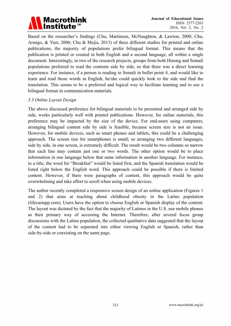
The author recently completed a responsive screen design of an online application (Figures 1 and 2) that aims at teaching about childhood obesity in the Latino population (lifecastapp.com). Users have the option to choose English or Spanish display of the content. The layout was dictated by the fact that the majority of Latinos in the U.S. use mobile phones as their primary way of accessing the Internet. Therefore, after several focus group discussions with the Latino population, the collected qualitative data suggested that the layout of the content had to be separated into either viewing English or Spanish, rather than side-by-side or coexisting on the same page.
Journal of Educational Issues ISSN 2377-2263
2016, Vol. 2, No. 2
www.macrothink.org/jei 312
Figure 1. Content in English Figure 2. Content in Spanish
4. Design Elements
Design elements such as color, images, and graphic elements, play an important part in user experience since they represent the visual preferences of various cultural groups. As mentioned above, in addition to written content, other culturally related design elements were being examined.
4.1 Images and Graphic Elements
Panofsky (1955) identified three levels of meaning in the interpretation of visual images: pre-iconographical, iconographical, and iconological. Pre-iconographical defines the interpretation of meaning through one’s experience with the visual data of an object. This first level places emphasis on the most specific or direct meaning of an object. The second level, iconographical analysis, focuses on an interpretation of meaning that goes beyond the literal and requires the interpreter to consider, during the interpretive process, the experience associated with the object. This interpretation involves the social, cultural and personal experiences of an individual. The third lever, iconological, centers on the interpretation of the core philosophical meaning of an object, and incorporates cultural principles and thoughts into the process.
Barthes (1964) explained that the interpretation of symbols usually lies within the sociocultural contexts in which the meanings are used and accepted by most people. The meaning of a visual symbol is constructed and concurred upon by a specific cultural group, and
Journal of Educational Issues ISSN 2377-2263
2016, Vol. 2, No. 2
www.macrothink.org/jei 313
this kind of meaning usually goes beyond the first level, pre-iconographical, as defined by Panofsky.
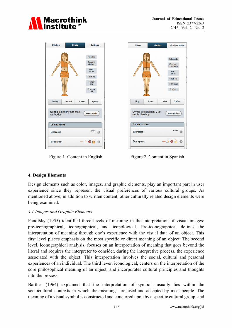
In the Lifecast app, based upon the profile and values of the population, Latinos, we created three modes of use, each with a different style of illustration (Figure 3). We considered the skin tone of the child, and the facial features of Latino children, and we kept the body shape unbiased and neutral. The approach of the different illustration is based on the theory of rhetorical appeals-logos, ethos, and pathos, as a way to improve audience engagement with the application. Logos represents reasoning; ethos represents credibility; and pathos represents emotion. The end user can choose any mode or style of illustration, based on personal preference, for navigating the application. This approach requires iconographical analysis and requires the audience to consider, during the interpretive process, the experience associated with the object.
Figure 3. Three styles of illustration
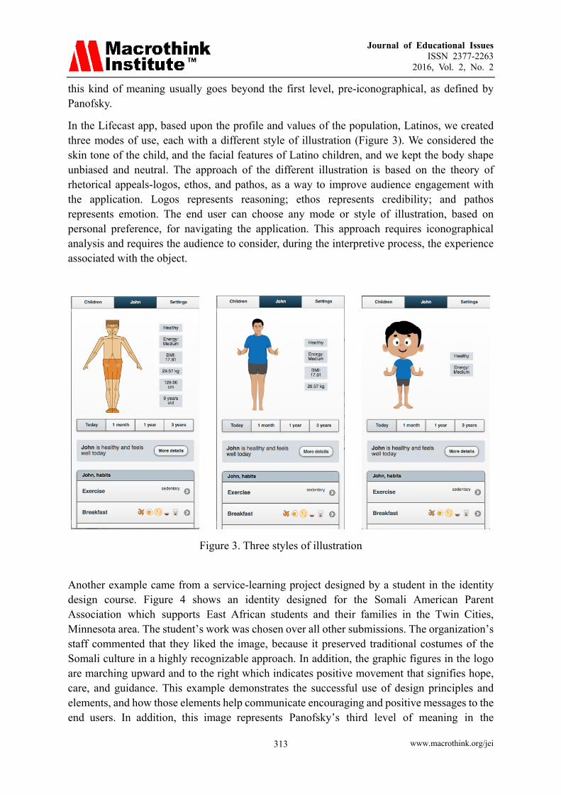
Another example came from a service-learning project designed by a student in the identity design course. Figure 4 shows an identity designed for the Somali American Parent Association which supports East African students and their families in the Twin Cities, Minnesota area. The student’s work was chosen over all other submissions. The organization’s staff commented that they liked the image, because it preserved traditional costumes of the Somali culture in a highly recognizable approach. In addition, the graphic figures in the logo are marching upward and to the right which indicates positive movement that signifies hope, care, and guidance. This example demonstrates the successful use of design principles and elements, and how those elements help communicate encouraging and positive messages to the end users. In addition, this image represents Panofsky’s third level of meaning in the
Journal of Educational Issues ISSN 2377-2263
2016, Vol. 2, No. 2
www.macrothink.org/jei 314
interpretation of visual images. The student successfully incorporates cultural principles and thoughts into the process.
Figure 4. Somali American Parent Association logo, designed by S. Donahue
Bennett, Diodato, and Gaetano (2007) found that emotional response to images or colors was directly related to the cultural experiences of the audience. People also tend to connect emotionally with photos that show people of their same ethnic background. This response is parallel to the iconographical level, because the interpretation requires associating personal and cultural experiences. However, when using images of people in graphics, it is essential not to use an ethnocentric visual approach, because it could be offensive to a particular group or culture.
Similar findings were also indicated by another study in the perception of images, conducted by the researcher with the Hmong participants. Some participants commented that if the publication was for Hmong people, the included images should be representational of Hmong culture. An opportunity arrived when the researcher was contacted by a Hmong school principal. A service-learning project was integrated into one of the researcher’s classes wherein students were asked to design a bilingual brochure for this local K-12 Hmong Charter school. Students met with the school principal and took a field trip to the school in order to learn about and better understand Hmong culture.
Many decorative pieces, such as Hmong story clothes, served as inspiring design elements for the students. Pattern design is also a significant feature in Hmong’s culture and such pattern could be found in clothing, headdresses, tablecloths, and bedding. The researcher guided the students through a design process with emphasis on the research phase in which students had to learn and understand the meaning and application of images and graphic elements in relation to the Hmong culture. In fact, the main goal of the project was to guide design students in the creative process of designing publications for cultures that are different from their own. In addition, we spent significant time discussing bilingual written content and how it should be arranged in a brochure.
Journal of Educational Issues ISSN 2377-2263
2016, Vol. 2, No. 2
www.macrothink.org/jei 315
4.2 Color Perception
Much research has been done which documents how different cultures perceive color differently. The meaning of a color in one culture could be different from the meaning of that same color in another culture. For instance, red signifies danger or warning in Western culture, but it represents celebration and happiness in Chinese culture. From one of the researcher’s studies with the Hmong population, participants indicated that red was the only color they perceived negatively because that color is associated with thoughts of “blood” and “violence.”
Kress and Leeuwen (2002) emphasized that color carries different meanings and connotations for different cultures and individuals. It is essential for visual designers to conduct thoughtful research when selecting colors for a design project.
White (2003) also discussed the impact of misunderstandings about color. White advised that communicators need to understand connotations associated with certain colors with respect to particular contexts or cultures. An international study, involving eight diverse countries, conducted by Madden, Hewett, and Roth (1999), found that blue was rated the most likeable and preferred color (out of ten colors) by participants from five of the eight countries. In addition, green was rated second highest by participants from the remaining three countries. Examination of the meanings of ten colors across different cultures, revealed that red is the one color that is widely interpreted differently among the eight countries. Blue, green, and white are the three colors that many participants interpret similarly and associate strongly with peace, gentleness, and calm.
5. Interface/Web Design
Wurtz (2006) conducted a cross-cultural study that examined web sites from high context and low context cultures – Japan, China, and Korea as high context cultures; and Germany, Denmark, Sweden, Norway, Finland, and the United States as low context cultures. He examined and identified the variables specific to high and low context cultures’ web sites and he stated how those variables were integrated and incorporated into the content. In addition, his study compared the rules and patterns that were applied in two forms of communication: face to face and on the web. The results indicated that high context web sites are more likely to use images/photographs and animation to convey information as compared to low context web sites. Images are also used quite often as navigation elements in high context web sites.
Besides textual content, Wurtz further explains that web sites also include images, multimedia and interactive features, animated graphics, and sounds. Therefore, studying preferences of design elements, as well as cultural values and behaviors of the target group is necessary in order to learn the essential guidelines.
Faiola, Sorin, and Matei (2005) suggest that cognitive styles based on national, cultural orientation play a major role in web design. The researchers conducted a cross-cultural study with Chinese and American users, and found that users performed tasks, and navigated through the site faster, if the website was created by designers who shared their same cultural background.

Journal of Educational Issues ISSN 2377-2263
2016, Vol. 2, No. 2
www.macrothink.org/jei 316
Lin (2002) expresses a similar concern in that some Fortune 500 companies are often creating web site designs on a global and universal scale without tailoring the designs to international or multicultural audiences. This approach contradicts companies’ visions and the disproportionate amount of effort spent on this issue. Gillette (1999) also discusses this issue by explaining how Japanese web site design differs from U.S. design. He explains that Japanese web sites apply a simplistic principle using an appropriate number of pages that are created to load quickly and have fewer links to additional pages. This design allows users to grasp the overall content and scope of the site quickly. On the other hand, American-style web sites tend to contain so much textual information and separated chunks of text that they often make users (in this case, Japanese) feel that there is endless information and they just have to keep clicking to find the right information; but they may feel like they don’t have time to find everything.
A case study on designing a bilingual website was conducted by the researcher (Chu, Arango, & Yust, 2006). The target audience of the website was new Somali immigrants who resided in a Midwest state. A one-stop bilingual (English and Somali) website was created with content focusing on social, educational, and economic information tailored for the new immigrants. For instance, there was information on how to obtain a driver’s license; those requirements and processes were translated into Somali language and arranged, side by side, with the English language (Figure 5).

Journal of Educational Issues ISSN 2377-2263
2016, Vol. 2, No. 2
www.macrothink.org/jei 317
Figure 5. The Somali resource bilingual website
The design process for this website was a participatory research model that utilized users’ input at every step of the data collection, translation, and design. Several focus group discussions were held with the users, and those discussions were conducted and facilitated by a Somali who was fluent in both English and Somali languages. Images and color preferences were selected based upon input from the focus groups.
6. Conclusion
When a communication piece is designed and created by a designer for a different cultural
Journal of Educational Issues ISSN 2377-2263
2016, Vol. 2, No. 2
www.macrothink.org/jei 318
group, it is critical to address user preferences in regards to language, images, graphic elements, and color. Individuals from various cultures perceive and apply all of these elements differently.
Panofsky’s (1955) model provides a framework for how individuals identify and interpret the meaning of visual images. Many online and printed publications with multicultural audiences usually contain more than one language. The discussion then focuses on what is the best and preferable way to present multilingual materials. Color usage is also important since the symbolism of color and connotations about color impacts whether one perceives a piece positively or negatively.
Digital communication of information is significant for the general population, regardless of culture. This trend will continue, and more research could be conducted on cross-cultural differences and preferences in web and interface design, as well as mobile applications.
References
Barthes, R. (1964). Rhetoric of the image. In P. Bouissac (Ed.), Encyclopedia of semiotics. UK: Oxford University Press.
Bennett, A., Diodato, S., & Gaetano, A. (2007). The heuristic evaluation of a culturally-specific graphic for cross-cultural communication. International Association of Societies of Design Research, 1-20.
Chu, S., & Mejia, M. (2013). Application of rhetorical appeals in interactive design for health. In A. Marcus (Ed.), DUXU/HCII 2013, Part II, LNCS 8013 (pp. 371-380). Human Computer Interaction International 2013 Conference. Springer, Heidelberg. https://doi.org/10.1007/ 978-3-642-39241-2_41
Chu, S., Arango, M., & Yust, C. (2006). A case study: Creating and designing a bilingual resource website for Somali immigrants. Advances in Universal Web Design and Evaluation: Research, Trends and Opportunities (pp. 198-218). Pennsylvania: Idea Group Inc.
Chu, S., Martinson, B., McNaughton, M., & Lawton, D. (2000). Designing multilingual communications. Journal of Applied Communications, 84, 7-28.
Faiola, A., Sorin, A., & Matei, B. (2005). Cultural cognitive style and web design: Beyond a behavioral inquiry into computer-mediated communication. Journal of Computer-Mediated Communication, 11, 375-394. https://doi.org/10.1111/j.1083-6101.2006.tb00318.x
Geertz, C. (1983). Local knowledge: Further essays in interpretive anthropology. New York: Basic.
Gillette, D. (1999). Web design for international audiences. Intercom, 46, 15-17.
Hall, E. T. (1976). Beyond culture. New York: Doubleday.
Hofstede, G. (1980). Culture’s consequences: International differences in work-related values. Beverly Hills, CA: Sage.
Journal of Educational Issues ISSN 2377-2263
2016, Vol. 2, No. 2
www.macrothink.org/jei 319
Jones, J. (2011). Visual design in cross-cultural communication. Design Principles and Practices: An International Journal, 5, 361-375. https://doi.org/10.18848/1833-1874/CGP/ v05i04/38079
Kress, G. (2004). Reading images: Multimodality, representation and new media. Information Design Journal + Document Design, 12, 110-119. https://doi.org/10.1075/idjdd.12.2.03kre
Kress, G., & Leeuwen, T. V. (2002). Colour as a semiotic mode: notes for a grammar of colour. Visual Communication, 1, 343-369. https://doi.org/10.1177/147035720200100306
Lin, C. (2002). Organizational size, multiple audiences, and web site design. Technical Communication, 49, 36-44.
Madden, T., Hewett, K., & Roth, M. (1999). Managing images in different cultures: A cross-national study of color meanings and preferences. Journal of International Marketing, 8, 90-107. https://doi.org/10.1509/jimk.8.4.90.19795
Panofsky, E. (1955). Meaning in the visual arts. Garden City, NY: Double day.
United States Census Bureau. (2013). State and county quickfacts. Retrieved from http://quickfacts.census.gov/qfd/states/00000.html
White, J. (2003). Color: The newest tool for technical communicators. Technical Communication, 50, 485-491.
Wurtz, E. (2006). Intercultural communication on web sites: A cross-cultural analysis of web sites from high-context cultures and low-context cultures. Journal of Computer-Mediated Communication, 11, 274-299. https://doi.org/10.1111/j.1083-6101.2006.tb00313.x
Copyright Disclaimer
Copyright for this article is retained by the author(s), with first publication rights granted to the journal.
This is an open-access article distributed under the terms and conditions of the Creative Commons Attribution license (http://creativecommons.org/licenses/by/3.0/).