
Data Analysis with Open Source Tools
533
-
Upload
khangminh22 -
Category
Documents
-
view
0 -
download
0
Transcript of Data Analysis with Open Source Tools


FEBRUARY 1 – 3, 2011SANTA CLARA, CA
strataconf.com
Featured Speakers
Bradford CrossFlightcaster
Amber CaseGeoloqi
Werner VogelsAmazon.com
Toby SegaranGoogle

O’Reilly-5980006 janert5980006˙fm October 28, 2010 22:1
Data Analysis with Open Source Tools

O’Reilly-5980006 janert5980006˙fm October 28, 2010 22:1

O’Reilly-5980006 janert5980006˙fm October 28, 2010 22:1
Data Analysis withOpen Source Tools
Philipp K. Janert
Beijing • Cambridge • Farnham • Köln • Sebastopol • Tokyo

O’Reilly-5980006 janert5980006˙fm October 28, 2010 22:1
Data Analysis with Open Source Tools
by Philipp K. Janert
Copyright c© 2011 Philipp K. Janert. All rights reserved. Printed in the United States of America.
Published by O’Reilly Media, Inc. 1005 Gravenstein Highway North, Sebastopol, CA 95472.
O’Reilly books may be purchased for educational, business, or sales promotional use. Online
editions are also available for most titles (http://my.safaribooksonline.com). For more information,
contact our corporate/institutional sales department: (800) 998-9938 or [email protected].
Editor: Mike Loukides
Production Editor: Sumita Mukherji
Copyeditor: Matt Darnell
Production Services: MPS Limited, a MacmillanCompany, and Newgen North America, Inc.
Indexer: Fred Brown
Cover Designer: Karen Montgomery
Interior Designer: Edie Freedmanand Ron Bilodeau
Illustrator: Philipp K. Janert
Printing History:
November 2010: First Edition.
The O’Reilly logo is a registered trademark of O’Reilly Media, Inc. Data Analysis with Open Source
Tools, the image of a common kite, and related trade dress are trademarks of O’Reilly Media, Inc.
Many of the designations used by manufacturers and sellers to distinguish their products are
claimed as trademarks. Where those designations appear in this book, and O’Reilly Media, Inc.
was aware of a trademark claim, the designations have been printed in caps or initial caps.
While every precaution has been taken in the preparation of this book, the publisher and author
assume no responsibility for errors or omissions, or for damages resulting from the use of the
information contained herein.
ISBN: 978-0-596-80235-6
[M]

O’Reilly-5980006 janert5980006˙fm October 28, 2010 22:1
Furious activity is no substitute for understanding.
—H. H. Williams

O’Reilly-5980006 janert5980006˙fm October 28, 2010 22:1

O’Reilly-5980006 janert5980006˙fm October 28, 2010 22:1
C O N T E N T S
PREFACE xiii
1 INTRODUCTION 1
Data Analysis 1
What’s in This Book 2
What’s with the Workshops? 3
What’s with the Math? 4
What You’ll Need 5
What’s Missing 6
PART I Graphics: Looking at Data
2 A SINGLE VARIABLE: SHAPE AND DISTRIBUTION 11
Dot and Jitter Plots 12
Histograms and Kernel Density Estimates 14
The Cumulative Distribution Function 23
Rank-Order Plots and Lift Charts 30
Only When Appropriate: Summary Statistics and Box Plots 33
Workshop: NumPy 38
Further Reading 45
3 TWO VARIABLES: ESTABLISHING RELATIONSHIPS 47
Scatter Plots 47
Conquering Noise: Smoothing 48
Logarithmic Plots 57
Banking 61
Linear Regression and All That 62
Showing What’s Important 66
Graphical Analysis and Presentation Graphics 68
Workshop: matplotlib 69
Further Reading 78
4 TIME AS A VARIABLE: TIME-SERIES ANALYSIS 79
Examples 79
The Task 83
Smoothing 84
Don’t Overlook the Obvious! 90
The Correlation Function 91
vii

O’Reilly-5980006 janert5980006˙fm October 28, 2010 22:1
Optional: Filters and Convolutions 95
Workshop: scipy.signal 96
Further Reading 98
5 MORE THAN TWO VARIABLES: GRAPHICAL MULTIVARIATE ANALYSIS 99
False-Color Plots 100
A Lot at a Glance: Multiplots 105
Composition Problems 110
Novel Plot Types 116
Interactive Explorations 120
Workshop: Tools for Multivariate Graphics 123
Further Reading 125
6 INTERMEZZO: A DATA ANALYSIS SESSION 127
A Data Analysis Session 127
Workshop: gnuplot 136
Further Reading 138
PART II Analytics: Modeling Data
7 GUESSTIMATION AND THE BACK OF THE ENVELOPE 141
Principles of Guesstimation 142
How Good Are Those Numbers? 151
Optional: A Closer Look at Perturbation Theory and
Error Propagation 155
Workshop: The Gnu Scientific Library (GSL) 158
Further Reading 161
8 MODELS FROM SCALING ARGUMENTS 163
Models 163
Arguments from Scale 165
Mean-Field Approximations 175
Common Time-Evolution Scenarios 178
Case Study: How Many Servers Are Best? 182
Why Modeling? 184
Workshop: Sage 184
Further Reading 188
9 ARGUMENTS FROM PROBABILITY MODELS 191
The Binomial Distribution and Bernoulli Trials 191
The Gaussian Distribution and the Central Limit Theorem 195
Power-Law Distributions and Non-Normal Statistics 201
Other Distributions 206
Optional: Case Study—Unique Visitors over Time 211
Workshop: Power-Law Distributions 215
Further Reading 218
viii C O N T E N T S

O’Reilly-5980006 janert5980006˙fm October 28, 2010 22:1
10 WHAT YOU REALLY NEED TO KNOW ABOUT CLASSICAL STATISTICS 221
Genesis 221
Statistics Defined 223
Statistics Explained 226
Controlled Experiments Versus Observational Studies 230
Optional: Bayesian Statistics—The Other Point of View 235
Workshop: R 243
Further Reading 249
11 INTERMEZZO: MYTHBUSTING—BIGFOOT, LEAST SQUARES,AND ALL THAT 253
How to Average Averages 253
The Standard Deviation 256
Least Squares 260
Further Reading 264
PART III Computation: Mining Data
12 SIMULATIONS 267
A Warm-Up Question 267
Monte Carlo Simulations 270
Resampling Methods 276
Workshop: Discrete Event Simulations with SimPy 280
Further Reading 291
13 FINDING CLUSTERS 293
What Constitutes a Cluster? 293
Distance and Similarity Measures 298
Clustering Methods 304
Pre- and Postprocessing 311
Other Thoughts 314
A Special Case: Market Basket Analysis 316
A Word of Warning 319
Workshop: Pycluster and the C Clustering Library 320
Further Reading 324
14 SEEING THE FOREST FOR THE TREES: FINDINGIMPORTANT ATTRIBUTES 327
Principal Component Analysis 328
Visual Techniques 337
Kohonen Maps 339
Workshop: PCA with R 342
Further Reading 348
15 INTERMEZZO: WHEN MORE IS DIFFERENT 351
A Horror Story 353
C O N T E N T S ix

O’Reilly-5980006 janert5980006˙fm October 28, 2010 22:1
Some Suggestions 354
What About Map/Reduce? 356
Workshop: Generating Permutations 357
Further Reading 358
PART IV Applications: Using Data
16 REPORTING, BUSINESS INTELLIGENCE, AND DASHBOARDS 361
Business Intelligence 362
Corporate Metrics and Dashboards 369
Data Quality Issues 373
Workshop: Berkeley DB and SQLite 376
Further Reading 381
17 FINANCIAL CALCULATIONS AND MODELING 383
The Time Value of Money 384
Uncertainty in Planning and Opportunity Costs 391
Cost Concepts and Depreciation 394
Should You Care? 398
Is This All That Matters? 399
Workshop: The Newsvendor Problem 400
Further Reading 403
18 PREDICTIVE ANALYTICS 405
Introduction 405
Some Classification Terminology 407
Algorithms for Classification 408
The Process 419
The Secret Sauce 423
The Nature of Statistical Learning 424
Workshop: Two Do-It-Yourself Classifiers 426
Further Reading 431
19 EPILOGUE: FACTS ARE NOT REALITY 433
A PROGRAMMING ENVIRONMENTS FOR SCIENTIFIC COMPUTATIONAND DATA ANALYSIS 435
Software Tools 435
A Catalog of Scientific Software 437
Writing Your Own 443
Further Reading 444
B RESULTS FROM CALCULUS 447
Common Functions 448
Calculus 460
Useful Tricks 468
x C O N T E N T S

O’Reilly-5980006 janert5980006˙fm October 28, 2010 22:1
Notation and Basic Math 472
Where to Go from Here 479
Further Reading 481
C WORKING WITH DATA 485
Sources for Data 485
Cleaning and Conditioning 487
Sampling 489
Data File Formats 490
The Care and Feeding of Your Data Zoo 492
Skills 493
Terminology 495
Further Reading 497
INDEX 499
C O N T E N T S xi

O’Reilly-5980006 janert5980006˙fm October 28, 2010 22:1

O’Reilly-5980006 master October 28, 2010 22:0
Preface
THIS BOOK GREW OUT OF MY EXPERIENCE OF WORKING WITH DATA FOR VARIOUS COMPANIES IN THE TECH
industry. It is a collection of those concepts and techniques that I have found to be the
most useful, including many topics that I wish I had known earlier—but didn’t.
My degree is in physics, but I also worked as a software engineer for several years. The
book reflects this dual heritage. On the one hand, it is written for programmers and others
in the software field: I assume that you, like me, have the ability to write your own
programs to manipulate data in any way you want.
On the other hand, the way I think about data has been shaped by my background and
education. As a physicist, I am not content merely to describe data or to make black-box
predictions: the purpose of an analysis is always to develop an understanding for the
processes or mechanisms that give rise to the data that we observe.
The instrument to express such understanding is the model: a description of the system
under study (in other words, not just a description of the data!), simplified as necessary
but nevertheless capturing the relevant information. A model may be crude (“Assume a
spherical cow . . . ”), but if it helps us develop better insight on how the system works, it is
a successful model nevertheless. (Additional precision can often be obtained at a later
time, if it is really necessary.)
This emphasis on models and simplified descriptions is not universal: other authors and
practitioners will make different choices. But it is essential to my approach and point of
view.
This is a rather personal book. Although I have tried to be reasonably comprehensive, I
have selected the topics that I consider relevant and useful in practice—whether they are
part of the “canon” or not. Also included are several topics that you won’t find in any
other book on data analysis. Although neither new nor original, they are usually not used
or discussed in this particular context—but I find them indispensable.
Throughout the book, I freely offer specific, explicit advice, opinions, and assessments.
These remarks are reflections of my personal interest, experience, and understanding. I do
not claim that my point of view is necessarily correct: evaluate what I say for yourself and
feel free to adapt it to your needs. In my view, a specific, well-argued position is of greater
use than a sterile laundry list of possible algorithms—even if you later decide to disagree
with me. The value is not in the opinion but rather in the arguments leading up to it. If
your arguments are better than mine, or even just more agreeable to you, then I will have
achieved my purpose!
xiii

O’Reilly-5980006 master October 28, 2010 22:0
Data analysis, as I understand it, is not a fixed set of techniques. It is a way of life, and it
has a name: curiosity. There is always something else to find out and something more to
learn. This book is not the last word on the matter; it is merely a snapshot in time: things I
knew about and found useful today.
“Works are of value only if they give rise to better ones.”
(Alexander von Humboldt, writing to Charles Darwin, 18 September 1839)
Before We Begin
More data analysis efforts seem to go bad because of an excess of sophistication rather
than a lack of it.
This may come as a surprise, but it has been my experience again and again. As a
consultant, I am often called in when the initial project team has already gotten stuck.
Rarely (if ever) does the problem turn out to be that the team did not have the required
skills. On the contrary, I usually find that they tried to do something unnecessarily
complicated and are now struggling with the consequences of their own invention!
Based on what I have seen, two particular risk areas stand out:
• The use of “statistical” concepts that are only partially understood (and given the
relative obscurity of most of statistics, this includes virtually all statistical concepts)
• Complicated (and expensive) black-box solutions when a simple and transparent
approach would have worked at least as well or better
I strongly recommend that you make it a habit to avoid all statistical language. Keep it
simple and stick to what you know for sure. There is absolutely nothing wrong with
speaking of the “range over which points spread,” because this phrase means exactly what
it says: the range over which points spread, and only that! Once we start talking about
“standard deviations,” this clarity is gone. Are we still talking about the observed width of
the distribution? Or are we talking about one specific measure for this width? (The
standard deviation is only one of several that are available.) Are we already making an
implicit assumption about the nature of the distribution? (The standard deviation is only
suitable under certain conditions, which are often not fulfilled in practice.) Or are we even
confusing the predictions we could make if these assumptions were true with the actual
data? (The moment someone talks about “95 percent anything” we know it’s the latter!)
I’d also like to remind you not to discard simple methods until they have been proven
insufficient. Simple solutions are frequently rather effective: the marginal benefit that
more complicated methods can deliver is often quite small (and may be in no reasonable
relation to the increased cost). More importantly, simple methods have fewer
opportunities to go wrong or to obscure the obvious.
xiv P R E F A C E

O’Reilly-5980006 master October 28, 2010 22:0
True story: a company was tracking the occurrence of defects over time. Of course, the
actual number of defects varied quite a bit from one day to the next, and they were
looking for a way to obtain an estimate for the typical number of expected defects. The
solution proposed by their IT department involved a compute cluster running a neural
network! (I am not making this up.) In fact, a one-line calculation (involving a moving
average or single exponential smoothing) is all that was needed.
I think the primary reason for this tendency to make data analysis projects more
complicated than they are is discomfort: discomfort with an unfamiliar problem space and
uncertainty about how to proceed. This discomfort and uncertainty creates a desire to
bring in the “big guns”: fancy terminology, heavy machinery, large projects. In reality, of
course, the opposite is true: the complexities of the “solution” overwhelm the original
problem, and nothing gets accomplished.
Data analysis does not have to be all that hard. Although there are situations when
elementary methods will no longer be sufficient, they are much less prevalent than you
might expect. In the vast majority of cases, curiosity and a healthy dose of common sense
will serve you well.
The attitude that I am trying to convey can be summarized in a few points:
Simple is better than complex.
Cheap is better than expensive.
Explicit is better than opaque.
Purpose is more important than process.
Insight is more important than precision.
Understanding is more important than technique.
Think more, work less.
Although I do acknowledge that the items on the right are necessary at times, I will give
preference to those on the left whenever possible.
It is in this spirit that I am offering the concepts and techniques that make up the rest of
this book.
Conventions Used in This Book
The following typographical conventions are used in this book:
ItalicIndicates new terms, URLs, and email addresses
Constant width
Used to refer to language and script elements
P R E F A C E xv

O’Reilly-5980006 master October 28, 2010 22:0
Using Code Examples
This book is here to help you get your job done. In general, you may use the code in this
book in your programs and documentation. You do not need to contact us for permission
unless youre reproducing a significant portion of the code. For example, writing a
program that uses several chunks of code from this book does not require permission.
Selling or distributing a CD-ROM of examples from OReilly books does require
permission. Answering a question by citing this book and quoting example code does not
require permission. Incorporating a significant amount of example code from this book
into your products documentation does require permission.
We appreciate, but do not require, attribution. An attribution usually includes the title,
author, publisher, and ISBN. For example: “Data Analysis with Open Source Tools, by Philipp
K. Janert. Copyright 2011 Philipp K. Janert, 978-0-596-80235-6.”
If you feel your use of code examples falls outside fair use or the permission given above,
feel free to contact us at [email protected].
Safari® Books Online.>
SafariBooks online
Safari Books Online is an on-demand digital library that lets you easily search
over 7,500 technology and creative reference books and videos to find the
answers you need quickly.
With a subscription, you can read any page and watch any video from our library online.
Read books on your cell phone and mobile devices. Access new titles before they are
available for print, and get exclusive access to manuscripts in development and post
feedback for the authors. Copy and paste code samples, organize your favorites, download
chapters, bookmark key sections, create notes, print out pages, and benefit from tons of
other time-saving features.
O’Reilly Media has uploaded this book to the Safari Books Online service. To have full
digital access to this book and others on similar topics from OReilly and other publishers,
sign up for free at http://my.safaribooksonline.com.
How to Contact Us
Please address comments and questions concerning this book to the publisher:
O’Reilly Media, Inc.
1005 Gravenstein Highway North
Sebastopol, CA 95472
800-998-9938 (in the United States or Canada)
707-829-0515 (international or local)
707-829-0104 (fax)
xvi P R E F A C E

O’Reilly-5980006 master October 28, 2010 22:0
We have a web page for this book, where we list errata, examples, and any additional
information. You can access this page at:
http://oreilly.com/catalog/9780596802356
To comment or ask technical questions about this book, send email to:
For more information about our books, conferences, Resource Centers, and the O’Reilly
Network, see our website at:
http://oreilly.com
Acknowledgments
It was a pleasure to work with O’Reilly on this project. In particular, O’Reilly has been
most accommodating with regard to the technical challenges raised by my need to include
(for an O’Reilly book) an uncommonly large amount of mathematical material in the
manuscript.
Mike Loukides has accompanied this project as the editor since its beginning. I have
enjoyed our conversations about life, the universe, and everything, and I appreciate his
comments about the manuscript—either way.
I’d like to thank several of my friends for their help in bringing this book about:
• Elizabeth Robson, for making the connection
• Austin King, for pointing out the obvious
• Scott White, for suffering my questions gladly
• Richard Kreckel, for much-needed advice
As always, special thanks go to PAUL Schrader (Bremen).
The manuscript benefited from the feedback I received from various reviewers. Michael E.
Driscoll, Zachary Kessin, and Austin King read all or parts of the manuscript and provided
valuable comments.
I enjoyed personal correspondence with Joseph Adler, Joe Darcy, Hilary Mason, Stephen
Weston, Scott White, and Brian Zimmer. All very generously provided expert advice on
specific topics.
Particular thanks go to Richard Kreckel, who provided uncommonly detailed and
insightful feedback on most of the manuscript.
During the preparation of this book, the excellent collection at the University of
Washington libraries was an especially valuable resource to me.
P R E F A C E xvii

O’Reilly-5980006 master October 28, 2010 22:0
Authors usually thank their spouses for their “patience and support” or words to that
effect. Unless one has lived through the actual experience, one cannot fully comprehend
how true this is. Over the last three years, Angela has endured what must have seemed
like a nearly continuous stream of whining, frustration, and desperation—punctuated by
occasional outbursts of exhilaration and grandiosity—all of which before the background
of the self-centered and self-absorbed attitude of a typical author. Her patience and
support were unfailing. It’s her turn now.
xviii P R E F A C E

O’Reilly-5980006 master October 28, 2010 22:0
C H A P T E R O N E
Introduction
IMAGINE YOUR BOSS COMES TO YOU AND SAYS: “HERE ARE 50 GB OF LOGFILES—FIND A WAY TO IMPROVE OUR
business!”
What would you do? Where would you start? And what would you do next?
It’s this kind of situation that the present book wants to help you with!
Data Analysis
Businesses sit on data, and every second that passes, they generate some more. Surely,
there must be a way to make use of all this stuff. But how, exactly—that’s far from clear.
The task is difficult because it is so vague: there is no specific problem that needs to be
solved. There is no specific question that needs to be answered. All you know is the
overall purpose: improve the business. And all you have is “the data.” Where do you start?
You start with the only thing you have: “the data.” What is it? We don’t know! Although
50 GB sure sounds like a lot, we have no idea what it actually contains. The first thing,
therefore, is to take a look.
And I mean this literally: the first thing to do is to look at the data by plotting it in different
ways and looking at graphs. Looking at data, you will notice things—the way data points
are distributed, or the manner in which one quantity varies with another, or the large
number of outliers, or the total absence of them. . . . I don’t know what you will find, but
there is no doubt: if you look at data, you will observe things!
These observations should lead to some reflection. “Ten percent of our customers drive
ninety percent of our revenue.” “Whenever our sales volume doubles, the number of
1

O’Reilly-5980006 master October 28, 2010 22:0
returns goes up by a factor of four.” “Every seven days we have a production run that has
twice the usual defect rate, and it’s always on a Thursday.” How very interesting!
Now you’ve got something to work with: the amorphous mass of “data” has turned into
ideas! To make these ideas concrete and suitable for further work, it is often useful to
capture them in a mathematical form: a model. A model (the way I use the term) is a
mathematical description of the system under study. A model is more than just a
description of the data—it also incorporates your understanding of the process or the
system that produced the data. A model therefore has predictive power: you can predict
(with some certainty) that next Thursday the defect rate will be high again.
It’s at this point that you may want to go back and alert the boss of your findings: “Next
Thursday, watch out for defects!”
Sometimes, you may already be finished at this point: you found out enough to help
improve the business. At other times, however, you may need to work a little harder.
Some data sets do not yield easily to visual inspection—especially if you are dealing with
data sets consisting of many different quantities, all of which seem equally important. In
such cases, you may need to employ more-sophisticated methods to develop enough
intuition before being able to formulate a relevant model. Or you may have been able to
set up a model, but it is too complicated to understand its implications, so that you want
to implement the model as a computer program and simulate its results. Such
computationally intensive methods are occasionally useful, but they always come later in
the game. You should only move on to them after having tried all the simple things first.
And you will need the insights gained from those earlier investigations as input to the
more elaborate approaches.
And finally, we need to come back to the initial agenda. To “improve the business” it is
necessary to feed our understanding back into the organization—for instance, in the form
of a business plan, or through a “metrics dashboard” or similar program.
What's in This Book
The program just described reflects the outline of this book.
We begin in Part I with a series of chapters on graphical techniques, starting in Chapter 2
with simple data sets consisting of only a single variable (or considering only a single
variable at a time), then moving on in Chapter 3 to data sets of two variables. In Chapter 4
we treat the particularly important special case of a quantity changing over time, a
so-called time series. Finally, in Chapter 5, we discuss data sets comprising more than two
variables and some special techniques suitable for such data sets.
In Part II, we discuss models as a way to not only describe data but also to capture the
understanding that we gained from graphical explorations. We begin in Chapter 7 with a
discussion of order-of-magnitude estimation and uncertainty considerations. This may
2 C H A P T E R O N E

O’Reilly-5980006 master October 28, 2010 22:0
seem odd but is, in fact, crucial: all models are approximate, so we need to develop a sense
for the accuracy of the approximations that we use. In Chapters 8 and 9 we introduce
basic building blocks that are useful when developing models.
Chapter 10 is a detour. For too many people, “data analysis” is synonymous with
“statistics,” and “statistics” is usually equated with a class in college that made no sense at
all. In this chapter, I want to explain what statistics really is, what all the mysterious
concepts mean and how they hang together, and what statistics can (and cannot) do for
us. It is intended as a travel guide should you ever want to read a statistics book in the
future.
Part III discusses several computationally intensive methods, such as simulation and
clustering in Chapters 12 and 13. Chapter 14 is, mathematically, the most challenging
chapter in the book: it deals with methods that can help select the most relevant variables
from a multivariate data set.
In Part IV we consider some ways that data may be used in a business environment. In
Chapter 16 we talk about metrics, reporting, and dashboards—what is sometimes referred
to as “business intelligence.” In Chapter 17 we introduce some of the concepts required to
make financial calculations and to prepare business plans. Finally, in chapter 18, we
conclude with a survey of some methods from classification and predictive analytics.
At the end of each part of the book you will find an “Intermezzo.” These intermezzos are
not really part of the course; I use them to go off on some tangents, or to explain topics
that often remain a bit hazy. You should see them as an opportunity to relax!
The appendices contain some helpful material that you may want to consult at various
times as you go through the text. Appendix A surveys some of the available tools and
programming environments for data manipulation and analysis. In Appendix B I have
collected some basic mathematical results that I expect you to have at least passing
familiarity with. I assume that you have seen this material at least once before, but in this
appendix, I put it together in an application-oriented context, which is more suitable for
our present purposes. Appendix C discusses some of the mundane tasks that—like it or
not—make up a large part of actual data analysis and also introduces some data-related
terminology.
What's with the Workshops?
Every full chapter (after this one) includes a section titled “Workshop” that contains some
programming examples related to the chapter’s material. I use these Workshops for two
purposes. On the one hand, I’d like to introduce a number of open source tools and
libraries that may be useful for the kind of work discussed in this book. On the other
hand, some concepts (such as computational complexity and power-law distributions)
must be seen to be believed: the Workshops are a way to demonstrate these issues and
allow you to experiment with them yourself.
I N T R O D U C T I O N 3

O’Reilly-5980006 master October 28, 2010 22:0
Among the tools and libraries is quite a bit of Python and R. Python has become
somewhat the scripting language of choice for scientific applications, and R is the most
popular open source package for statistical applications. This choice is neither an endorsement
nor a recommendation but primarily a reflection of the current state of available software.
(See Appendix A for a more detailed discussion of software for data analysis and related
purposes.)
My goal with the tool-oriented Workshops is rather specific: I want to enable you to
decide whether a given tool or library is worth spending time on. (I have found that
evaluating open source offerings is a necessary but time-consuming task.) I try to
demonstrate clearly what purpose each particular tool serves. Toward this end, I usually
give one or two short, but not entirely trivial, examples and try to outline enough of the
architecture of the tool or library to allow you to take it from there. (The documentation
for many open source projects has a hard time making the bridge from the trivial,
cut-and-paste “Hello, World” example to the reference documentation.)
What's with the Math?
This book contains a certain amount of mathematics. Depending on your personal
predilection you may find this trivial, intimidating, or exciting.
The reality is that if you want to work analytically, you will need to develop some
familiarity with a few mathematical concepts. There is simply no way around it. (You can
work with data without any math skills—look at what any data modeler or database
administrator does. But if you want to do any sort of analysis, then a little math becomes a
necessity.)
I have tried to make the text accessible to readers with a minimum of previous knowledge.
Some college math classes on calculus and similar topics are helpful, of course, but are by
no means required. Some sections of the book treat material that is either more abstract or
will likely be unreasonably hard to understand without some previous exposure. These
sections are optional (they are not needed in the sequel) and are clearly marked as such.
A somewhat different issue concerns the notation. I use mathematical notation wherever
it is appropriate and it helps the presentation. I have made sure to use only a very small
set of symbols; check Appendix B if something looks unfamiliar.
Couldn’t I have written all the mathematical expressions as computer code, using Python
or some sort of pseudo-code? The answer is no, because quite a few essential mathematical
concepts cannot be expressed in a finite, floating-point oriented machine (anything
having to do with a limit process—or real numbers, in fact). But even if I could write all
math as code, I don’t think I should. Although I wholeheartedly agree that mathematical
notation can get out of hand, simple formulas actually provide the easiest, most succinct
way to express mathematical concepts.
4 C H A P T E R O N E

O’Reilly-5980006 master October 28, 2010 22:0
Just compare. I’d argue that:n∑
k=0
c(k)
(1 + p)k
is clearer and easier to read than:
s = 0
for k in range( len(c) ):
s += c[k]/(1+p)**k
and certainly easier than:
s = ( c / (1+p)**numpy.arange(1, len(c)+1) ).sum(axis=0)
But that’s only part of the story. More importantly, the first version expresses a concept,
whereas the second and third are merely specific prescriptions for how to perform a
certain calculation. They are recipes, not ideas.
Consider this: the formula in the first line is a description of a sum—not a specific sum,
but any sum of this form: it’s the idea of this kind of sum. We can now ask how this
abstract sum will behave under certain conditions—for instance, if we let the upper limit n
go to infinity. What value does the sum have in this case? Is it finite? Can we determine
it? You would not even be able to ask this question given the code versions. (Remember
that I am not talking about an approximation, such as letting n get “very large.” I really do
mean: what happens if n goes all the way to infinity? What can we say about the sum?)
Some programming environments (like Haskell, for instance) are more at ease dealing
with infinite data structures—but if you look closely, you will find that they do so by
being (coarse) approximations to mathematical concepts and notations. And, of course,
they still won’t be able to evaluate such expressions! (All evaluations will only involve a
finite number of steps.) But once you train your mind to think in those terms, you can
evaluate them in your mind at will.
It may come as a surprise, but mathematics is not a method for calculating things.
Mathematics is a theory of ideas, and ideas—not calculational prescriptions—are what I
would like to convey in this text. (See the discussion at the end of Appendix B for more
on this topic and for some suggested reading.)
If you feel uncomfortable or even repelled by the math in this book, I’d like to ask for just
one thing: try! Give it a shot. Don’t immediately give up. Any frustration you may
experience at first is more likely due to lack of familiarity rather than to the difficulty of
the material. I promise that none of the content is out of your reach.
But you have to let go of the conditioned knee-jerk reflex that “math is, like, yuck!”
What You'll Need
This book is written with programmers in mind. Although previous programming
experience is by no means required, I assume that you are able to take an idea and
I N T R O D U C T I O N 5
O’Reilly-5980006 master October 28, 2010 22:0
implement it in the programming language of your choice—in fact, I assume that this is
your prime motivation for reading this book.
I don’t expect you to have any particular mathematical background, although some
previous familiarity with calculus is certainly helpful. You will need to be able to count,
though!
But the most important prerequisite is not programming experience, not math skills, and
certainly not knowledge of anything having to do with “statistics.” The most important
prerequisite is curiosity. If you aren’t curious, then this book is not for you. If you get a
new data set and you are not itching to see what’s in it, I won’t be able to help you.
What's Missing
This is a book about data analysis and modeling with an emphasis on applications in a
business settings. It was written at a beginning-to-intermediate level and for a general
technical audience.
Although I have tried to be reasonably comprehensive, I had to choose which subjects to
include and which to leave out. I have tried to select topics that are useful and relevant in
practice and that can safely be applied by a nonspecialist. A few topics were omitted
because they did not fit within the book’s overall structure, or because I did not feel
sufficiently competent to present them.
Scientific data. This is not a book about scientific data analysis. When you are doing
scientific research (however you wish to define “scientific”), you really need to have a
solid background (and that probably means formal training) in the field that you are
working in. A book such as this one on general data analysis cannot replace this.
Formal statistical analysis. A different form of data analysis exists in some particularly
well-established fields. In these situations, the environment from which the data arises is
fully understood (or at least believed to be understood), and the methods and models to
be used are likewise accepted and well known. Typical examples include clinical trials as
well as credit scoring. The purpose of an “analysis” in these cases is not to find out
anything new, but rather to determine the model parameters with the highest degree of
accuracy and precision for each newly generated set of data points. Since this is the kind
of work where details matter, it should be left to specialists.
Network analysis. This is a topic of current interest about which I know nothing.
(Sorry!) However, it does seem to me that its nature is quite different from most problems
that are usually considered “data analysis”: less statistical, more algorithmic in nature. But
I don’t know for sure.
Natural language processing and text mining. Natural language processing is a big topic
all by itself, which has little overlap (neither in terms of techniques nor applications) with
6 C H A P T E R O N E

O’Reilly-5980006 master October 28, 2010 22:0
the rest of the material presented here. It deserves its own treatment—and several books
on this subject are available.
Big data. Arguably the most painful omission concerns everything having to do with Big
Data. Big Data is a pretty new concept—I tend to think of it as relating to data sets that not
merely don’t fit into main memory, but that no longer fit comfortably on a single disk,
requiring compute clusters and the respective software and algorithms (in practice,
map/reduce running on Hadoop).
The rise of Big Data is a remarkable phenomenon. When this book was conceived (early
2009), Big Data was certainly on the horizon but was not necessarily considered
mainstream yet. As this book goes to print (late 2010), it seems that for many people in
the tech field, “data” has become nearly synonymous with “Big Data.” That kind of
development usually indicates a fad. The reality is that, in practice, many data sets are
“small,” and in particular many relevant data sets are small. (Some of the most important
data sets in a commercial setting are those maintained by the finance department—and
since they are kept in Excel, they must be small.)
Big Data is not necessarily “better.” Applied carelessly, it can be a huge step backward. The
amazing insight of classical statistics is that you don’t need to examine every single
member of a population to make a definitive statement about the whole: instead you can
sample! It is also true that a carefully selected sample may lead to better results than a
large, messy data set. Big Data makes it easy to forget the basics.
It is a little early to say anything definitive about Big Data, but the current trend strikes
me as being something quite different: it is not just classical data analysis on a larger scale.
The approach of classical data analysis and statistics is inductive. Given a part, make
statements about the whole: from a sample, estimate parameters of the population; given
an observation, develop a theory for the underlying system. In contrast, Big Data (at least
as it is currently being used) seems primarily concerned with individual data points. Given
that this specific user liked this specific movie, what other specific movie might he like? This is
a very different question than asking which movies are most liked by what people in
general!
Big Data will not replace general, inductive data analysis. It is not yet clear just where Big
Data will deliver the greatest bang for the buck—but once the dust settles, somebody
should definitely write a book about it!
I N T R O D U C T I O N 7

O’Reilly-5980006 master October 28, 2010 22:0

O’Reilly-5980006 master October 28, 2010 20:25
PART I
Graphics: Looking at Data

O’Reilly-5980006 master October 28, 2010 20:25

O’Reilly-5980006 master October 28, 2010 20:25
C H A P T E R T W O
A Single Variable: Shape andDistribution
WHEN DEALING WITH UNIVARIATE DATA, WE ARE USUALLY MOSTLY CONCERNED WITH THE OVERALL SHAPE OF
the distribution. Some of the initial questions we may ask include:
• Where are the data points located, and how far do they spread? What are typical, as
well as minimal and maximal, values?
• How are the points distributed? Are they spread out evenly or do they cluster in certain
areas?
• How many points are there? Is this a large data set or a relatively small one?
• Is the distribution symmetric or asymmetric? In other words, is the tail of the
distribution much larger on one side than on the other?
• Are the tails of the distribution relatively heavy (i.e., do many data points lie far away
from the central group of points), or are most of the points—with the possible
exception of individual outliers—confined to a restricted region?
• If there are clusters, how many are there? Is there only one, or are there several?
Approximately where are the clusters located, and how large are they—both in terms
of spread and in terms of the number of data points belonging to each cluster?
• Are the clusters possibly superimposed on some form of unstructured background, or
does the entire data set consist only of the clustered data points?
• Does the data set contain any significant outliers—that is, data points that seem to be
different from all the others?
• And lastly, are there any other unusual or significant features in the data set—gaps,
sharp cutoffs, unusual values, anything at all that we can observe?
11

O’Reilly-5980006 master October 28, 2010 20:25
As you can see, even a simple, single-column data set can contain a lot of different
features!
To make this concrete, let’s look at two examples. The first concerns a relatively small data
set: the number of months that the various American presidents have spent in office. The
second data set is much larger and stems from an application domain that may be more
familiar; we will be looking at the response times from a web server.
Dot and Jitter Plots
Suppose you are given the following data set, which shows all past American presidents
and the number of months each spent in office.* Although this data set has three
columns, we can treat it as univariate because we are interested only in the times spent in
office—the names don’t matter to us (at this point). What can we say about the typical
tenure?
1 Washington 94
2 Adams 48
3 Jefferson 96
4 Madison 96
5 Monroe 96
6 Adams 48
7 Jackson 96
8 Van Buren 48
9 Harrison 1
10 Tyler 47
11 Polk 48
12 Taylor 16
13 Filmore 32
14 Pierce 48
15 Buchanan 48
16 Lincoln 49
17 Johnson 47
18 Grant 96
19 Hayes 48
20 Garfield 7
21 Arthur 41
22 Cleveland 48
23 Harrison 48
24 Cleveland 48
25 McKinley 54
26 Roosevelt 90
27 Taft 48
28 Wilson 96
29 Harding 29
*The inspiration for this example comes from a paper by Robert W. Hayden in the Journal of StatisticsEducation. The full text is available at http://www.amstat.org/publications/jse/v13n1/datasets.hayden.html.
12 C H A P T E R T W O

O’Reilly-5980006 master October 28, 2010 20:25
30 Coolidge 67
31 Hoover 48
32 Roosevelt 146
33 Truman 92
34 Eisenhower 96
35 Kennedy 34
36 Johnson 62
37 Nixon 67
38 Ford 29
39 Carter 48
40 Reagan 96
41 Bush 48
42 Clinton 96
43 Bush 96
This is not a large data set (just over 40 records), but it is a little too big to take in as a
whole. A very simple way to gain an initial sense of the data set is to create a dot plot. In a
dot plot, we plot all points on a single (typically horizontal) line, letting the value of each
data point determine the position along the horizontal axis. (See the top part of Figure
2-1.)
A dot plot can be perfectly sufficient for a small data set such as this one. However, in our
case it is slightly misleading because, whenever a certain tenure occurs more than once in
the data set, the corresponding data points fall right on top of each other, which makes it
impossible to distinguish them. This is a frequent problem, especially if the data assumes
only integer values or is otherwise “coarse-grained.” A common remedy is to shift each
point by a small random amount from its original position; this technique is called jittering
and the resulting plot is a jitter plot. A jitter plot of this data set is shown in the bottom part
of Figure 2-1.
What does the jitter plot tell us about the data set? We see two values where data points
seem to cluster, indicating that these values occur more frequently than others. Not
surprisingly, they are located at 48 and 96 months, which correspond to one and two full
four-year terms in office. What may be a little surprising, however, is the relatively large
number of points that occur outside these clusters. Apparently, quite a few presidents left
office at irregular intervals! Even in this simple example, a plot reveals both something
expected (the clusters at 48 and 96 months) and the unexpected (the larger number of
points outside those clusters).
Before moving on to our second example, let me point out a few additional technical
details regarding jitter plots.
• It is important that the amount of “jitter” be small compared to the distance between
points. The only purpose of the random displacements is to ensure that no two points
fall exactly on top of one another. We must make sure that points are not shifted
significantly from their true location.
A S I N G L E V A R I A B L E : S H A P E A N D D I S T R I B U T I O N 13
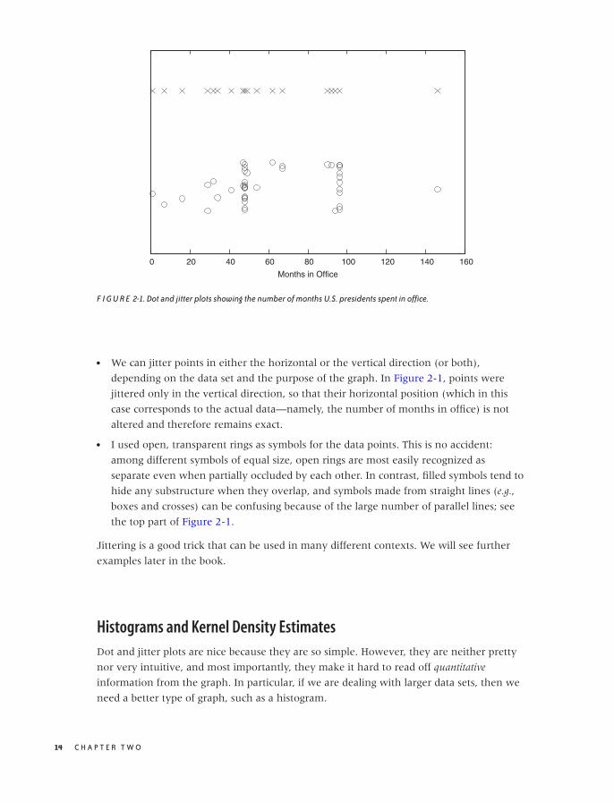
O’Reilly-5980006 master October 28, 2010 20:25
0 20 40 60 80 100 120 140 160
Months in Office
F I G U R E 2-1. Dot and jitter plots showing the number of months U.S. presidents spent in office.
• We can jitter points in either the horizontal or the vertical direction (or both),
depending on the data set and the purpose of the graph. In Figure 2-1, points were
jittered only in the vertical direction, so that their horizontal position (which in this
case corresponds to the actual data—namely, the number of months in office) is not
altered and therefore remains exact.
• I used open, transparent rings as symbols for the data points. This is no accident:
among different symbols of equal size, open rings are most easily recognized as
separate even when partially occluded by each other. In contrast, filled symbols tend to
hide any substructure when they overlap, and symbols made from straight lines (e.g.,
boxes and crosses) can be confusing because of the large number of parallel lines; see
the top part of Figure 2-1.
Jittering is a good trick that can be used in many different contexts. We will see further
examples later in the book.
Histograms and Kernel Density Estimates
Dot and jitter plots are nice because they are so simple. However, they are neither pretty
nor very intuitive, and most importantly, they make it hard to read off quantitative
information from the graph. In particular, if we are dealing with larger data sets, then we
need a better type of graph, such as a histogram.
14 C H A P T E R T W O

O’Reilly-5980006 master October 28, 2010 20:25
0
10
20
30
40
50
60
70
0 500 1000 1500 2000 2500 3000
Num
ber
of O
bser
vatio
ns
Response Time
F I G U R E 2-2. A histogram of a server’s response times.
Histograms
To form a histogram, we divide the range of values into a set of “bins” and then count the
number of points (sometimes called “events”) that fall into each bin. We then plot the
count of events for each bin as a function of the position of the bin.
Once again, let’s look at an example. Here is the beginning of a file containing response
times (in milliseconds) for queries against a web server or database. In contrast to the
previous example, this data set is fairly large, containing 1,000 data points.
452.42
318.58
144.82
129.13
1216.45
991.56
1476.69
662.73
1302.85
1278.55
627.65
1030.78
215.23
44.50
...
Figure 2-2 shows a histogram of this data set. I divided the horizontal axis into 60 bins of
50 milliseconds width and then counted the number of events in each bin.
A S I N G L E V A R I A B L E : S H A P E A N D D I S T R I B U T I O N 15

O’Reilly-5980006 master October 28, 2010 20:25
What does the histogram tell us? We observe a rather sharp cutoff at a nonzero value on
the left, which means that there is a minimum completion time below which no request
can be completed. Then there is a sharp rise to a maximum at the “typical” response time,
and finally there is a relatively large tail on the right, corresponding to the smaller number
of requests that take a long time to process. This kind of shape is rather typical for a
histogram of task completion times. If the data set had contained completion times for
students to finish their homework or for manufacturing workers to finish a work product,
then it would look qualitatively similar except, of course, that the time scale would be
different. Basically, there is some minimum time that nobody can beat, a small group of
very fast champions, a large majority, and finally a longer or shorter tail of “stragglers.”
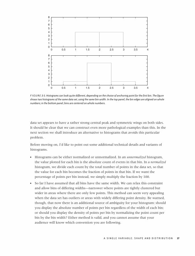
It is important to realize that a data set does not determine a histogram uniquely. Instead,
we have to fix two parameters to form a histogram: the bin width and the alignment of the
bins.
The quality of any histogram hinges on the proper choice of bin width. If you make the
width too large, then you lose too much detailed information about the data set. Make it
too small and you will have few or no events in most of the bins, and the shape of the
distribution does not become apparent. Unfortunately, there is no simple rule of thumb
that can predict a good bin width for a given data set; typically you have to try out several
different values for the bin width until you obtain a satisfactory result. (As a first guess,
you can start with Scott’s rule for the bin width w = 3.5σ/ 3√
n, where σ is the standard
deviation for the entire data set and n is the number of points. This rule assumes that the
data follows a Gaussian distribution; otherwise, it is likely to give a bin width that is too
wide. See the end of this chapter for more information on the standard deviation.)
The other parameter that we need to fix (whether we realize it or not) is the alignment of
the bins on the x axis. Let’s say we fixed the width of the bins at 1. Where do we now
place the first bin? We could put it flush left, so that its left edge is at 0, or we could center
it at 0. In fact, we can move all bins by half a bin width in either direction.
Unfortunately, this seemingly insignificant (and often overlooked) parameter can have a
large influence on the appearance of the histogram. Consider this small data set:
1.4
1.7
1.8
1.9
2.1
2.2
2.3
2.6
Figure 2-3 shows two histograms of this data set. Both use the same bin width (namely, 1)
but have different alignment of the bins. In the top panel, where the bin edges have been
aligned to coincide with the whole numbers (1, 2, 3, . . . ), the data set appears to be flat.
Yet in the bottom panel, where the bins have been centered on the whole numbers, the
16 C H A P T E R T W O
O’Reilly-5980006 master October 28, 2010 20:25
0 1 2 3 4 5 6 7 8
0 0.5 1 1.5 2 2.5 3 3.5 4
0 1 2 3 4 5 6 7 8
0 0.5 1 1.5 2 2.5 3 3.5 4
F I G U R E 2-3. Histograms can look quite different, depending on the choice of anchoring point for the first bin. The figureshows two histograms of the same data set, using the same bin width. In the top panel, the bin edges are aligned on wholenumbers; in the bottom panel, bins are centered on whole numbers.
data set appears to have a rather strong central peak and symmetric wings on both sides.
It should be clear that we can construct even more pathological examples than this. In the
next section we shall introduce an alternative to histograms that avoids this particular
problem.
Before moving on, I’d like to point out some additional technical details and variants of
histograms.
• Histograms can be either normalized or unnormalized. In an unnormalized histogram,
the value plotted for each bin is the absolute count of events in that bin. In a normalized
histogram, we divide each count by the total number of points in the data set, so that
the value for each bin becomes the fraction of points in that bin. If we want the
percentage of points per bin instead, we simply multiply the fraction by 100.
• So far I have assumed that all bins have the same width. We can relax this constraint
and allow bins of differing widths—narrower where points are tightly clustered but
wider in areas where there are only few points. This method can seem very appealing
when the data set has outliers or areas with widely differing point density. Be warned,
though, that now there is an additional source of ambiguity for your histogram: should
you display the absolute number of points per bin regardless of the width of each bin;
or should you display the density of points per bin by normalizing the point count per
bin by the bin width? Either method is valid, and you cannot assume that your
audience will know which convention you are following.
A S I N G L E V A R I A B L E : S H A P E A N D D I S T R I B U T I O N 17

O’Reilly-5980006 master October 28, 2010 20:25
• It is customary to show histograms with rectangular boxes that extend from the
horizontal axis, the way I have drawn Figures 2-2 and 2-3. That is perfectly all right
and has the advantage of explicitly displaying the bin width as well. (Of course, the
boxes should be drawn in such a way that they align in the same way that the actual
bins align; see Figure 2-3.) This works well if you are only displaying a histogram for a
single data set. But if you want to compare two or more data sets, then the boxes start
to get in the way, and you are better off drawing “frequency polygons”: eliminate the
boxes, and instead draw a symbol where the top of the box would have been. (The
horizontal position of the symbol should be at the center of the bin.) Then connect
consecutive symbols with straight lines. Now you can draw multiple data sets in the
same plot without cluttering the graph or unnecessarily occluding points.
• Don’t assume that the defaults of your graphics program will generate the best
representation of a histogram! I have already discussed why I consider frequency
polygons to be almost always a better choice than to construct a histogram from boxes.
If you nevertheless choose to use boxes, it is best to avoid filling them (with a color or
hatch pattern)—your histogram will probably look cleaner and be easier to read if you
stick with just the box outlines. Finally, if you want to compare several data sets in the
same graph, always use a frequency polygon, and stay away from stacked or clustered
bar graphs, since these are particularly hard to read. (We will return to the problem of
displaying composition problems in Chapter 5.)
Histograms are very common and have a nice, intuitive interpretation. They are also easy
to generate: for a moderately sized data set, it can even be done by hand, if necessary.
That being said, histograms have some serious problems. The most important ones are as
follows.
• The binning process required by all histograms loses information (by replacing the
location of individual data points with a bin of finite width). If we only have a few data
points, we can ill afford to lose any information.
• Histograms are not unique. As we saw in Figure 2-3, the appearance of a histogram can
be quite different. (This nonuniqueness is a direct consequence of the information loss
described in the previous item.)
• On a more superficial level, histograms are ragged and not smooth. This matters little if
we just want to draw a picture of them, but if we want to feed them back into a
computer as input for further calculations, then a smooth curve would be easier to
handle.
• Histograms do not handle outliers gracefully. A single outlier, far removed from the
majority of the points, requires many empty cells in between or forces us to use bins
that are too wide for the majority of points. It is the possibility of outliers that makes it
difficult to find an acceptable bin width in an automated fashion.
18 C H A P T E R T W O
O’Reilly-5980006 master October 28, 2010 20:25
0
2
4
6
8
10
12
14
0 20 40 60 80 100 120 140
Months in Office
HistogramKDE, Bandwidth=2.5KDE, Bandwidth=0.8
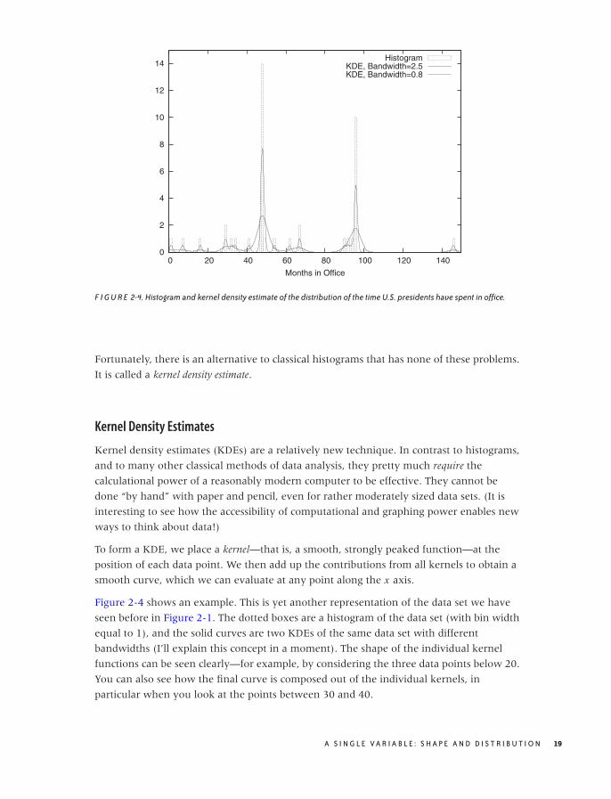
F I G U R E 2-4. Histogram and kernel density estimate of the distribution of the time U.S. presidents have spent in office.
Fortunately, there is an alternative to classical histograms that has none of these problems.
It is called a kernel density estimate.
Kernel Density Estimates
Kernel density estimates (KDEs) are a relatively new technique. In contrast to histograms,
and to many other classical methods of data analysis, they pretty much require the
calculational power of a reasonably modern computer to be effective. They cannot be
done “by hand” with paper and pencil, even for rather moderately sized data sets. (It is
interesting to see how the accessibility of computational and graphing power enables new
ways to think about data!)
To form a KDE, we place a kernel—that is, a smooth, strongly peaked function—at the
position of each data point. We then add up the contributions from all kernels to obtain a
smooth curve, which we can evaluate at any point along the x axis.
Figure 2-4 shows an example. This is yet another representation of the data set we have
seen before in Figure 2-1. The dotted boxes are a histogram of the data set (with bin width
equal to 1), and the solid curves are two KDEs of the same data set with different
bandwidths (I’ll explain this concept in a moment). The shape of the individual kernel
functions can be seen clearly—for example, by considering the three data points below 20.
You can also see how the final curve is composed out of the individual kernels, in
particular when you look at the points between 30 and 40.
A S I N G L E V A R I A B L E : S H A P E A N D D I S T R I B U T I O N 19
O’Reilly-5980006 master October 28, 2010 20:25
0
0.1
0.2
0.3
0.4
0.5
0.6
0.7
0.8
0.9
-10 -5 0 5 10
Box Epanechnikov Gaussian
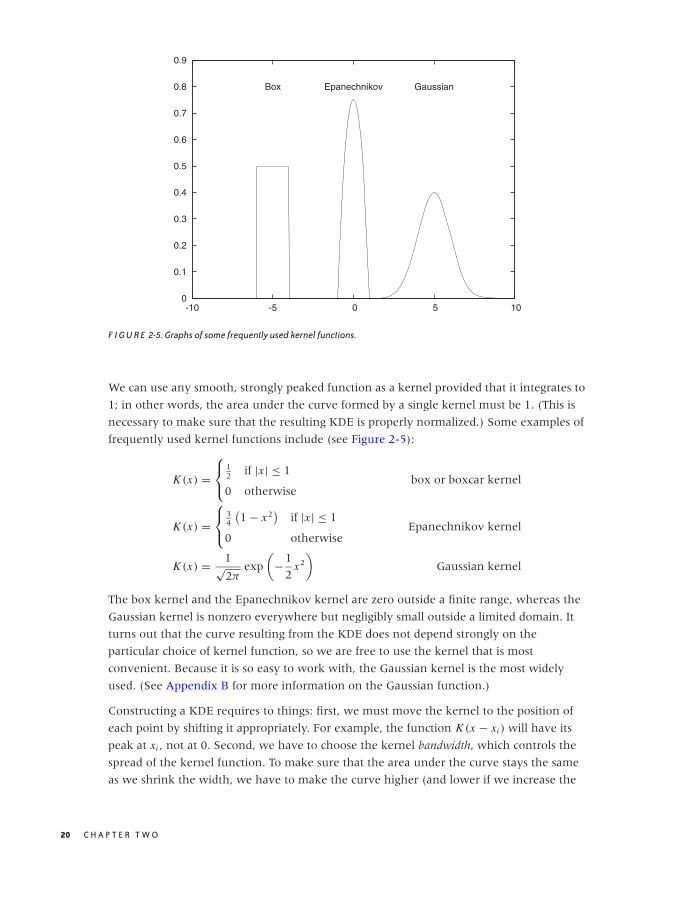
F I G U R E 2-5. Graphs of some frequently used kernel functions.
We can use any smooth, strongly peaked function as a kernel provided that it integrates to
1; in other words, the area under the curve formed by a single kernel must be 1. (This is
necessary to make sure that the resulting KDE is properly normalized.) Some examples of
frequently used kernel functions include (see Figure 2-5):
K (x) =⎧⎨
⎩
12 if |x | ≤ 1
0 otherwisebox or boxcar kernel
K (x) =⎧⎨
⎩
34
(1 − x2
)if |x | ≤ 1
0 otherwiseEpanechnikov kernel
K (x) = 1√2π
exp
(−1
2x2
)Gaussian kernel
The box kernel and the Epanechnikov kernel are zero outside a finite range, whereas the
Gaussian kernel is nonzero everywhere but negligibly small outside a limited domain. It
turns out that the curve resulting from the KDE does not depend strongly on the
particular choice of kernel function, so we are free to use the kernel that is most
convenient. Because it is so easy to work with, the Gaussian kernel is the most widely
used. (See Appendix B for more information on the Gaussian function.)
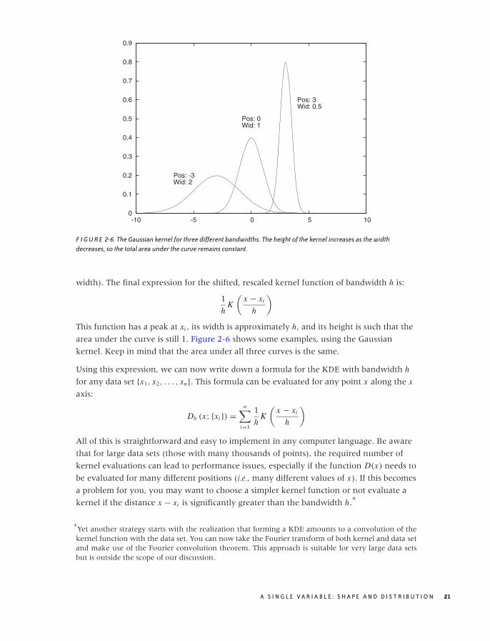
Constructing a KDE requires to things: first, we must move the kernel to the position of
each point by shifting it appropriately. For example, the function K (x − xi ) will have its
peak at xi , not at 0. Second, we have to choose the kernel bandwidth, which controls the
spread of the kernel function. To make sure that the area under the curve stays the same
as we shrink the width, we have to make the curve higher (and lower if we increase the
20 C H A P T E R T W O
O’Reilly-5980006 master October 28, 2010 20:25
0
0.1
0.2
0.3
0.4
0.5
0.6
0.7
0.8
0.9
-10 -5 0 5 10
Pos: -3Wid: 2
Pos: 0Wid: 1
Pos: 3Wid: 0.5
F I G U R E 2-6. The Gaussian kernel for three different bandwidths. The height of the kernel increases as the widthdecreases, so the total area under the curve remains constant.
width). The final expression for the shifted, rescaled kernel function of bandwidth h is:
1
hK
(x − xi
h
)
This function has a peak at xi , its width is approximately h, and its height is such that the
area under the curve is still 1. Figure 2-6 shows some examples, using the Gaussian
kernel. Keep in mind that the area under all three curves is the same.
Using this expression, we can now write down a formula for the KDE with bandwidth h
for any data set {x1, x2, . . . , xn}. This formula can be evaluated for any point x along the x
axis:
Dh (x; {xi }) =n∑
i=1
1
hK
(x − xi
h
)
All of this is straightforward and easy to implement in any computer language. Be aware
that for large data sets (those with many thousands of points), the required number of
kernel evaluations can lead to performance issues, especially if the function D(x) needs to
be evaluated for many different positions (i.e., many different values of x). If this becomes
a problem for you, you may want to choose a simpler kernel function or not evaluate a
kernel if the distance x − xi is significantly greater than the bandwidth h.*
*Yet another strategy starts with the realization that forming a KDE amounts to a convolution of thekernel function with the data set. You can now take the Fourier transform of both kernel and data setand make use of the Fourier convolution theorem. This approach is suitable for very large data setsbut is outside the scope of our discussion.
A S I N G L E V A R I A B L E : S H A P E A N D D I S T R I B U T I O N 21

O’Reilly-5980006 master October 28, 2010 20:25
Now we can explain the wide gray line in Figure 2-4: it is a KDE with a larger bandwidth.
Using such a large bandwidth makes it impossible to resolve the individual data points,
but it does highlight entire periods of greater or smaller frequency. Which choice of
bandwidth is right for you depends on your purpose.
A KDE constructed as just described is similar to a classical histogram, but it avoids two of
the aforementioned problems. Given data set and bandwidth, a KDE is unique; a KDE is
also smooth, provided we have chosen a smooth kernel function, such as the Gaussian.
Optional: Optimal Bandwidth Selection
We still have to fix the bandwidth. This is a different kind of problem than the other two:
it’s not just a technical problem, which could be resolved through a better method;
instead, it’s a fundamental problem that relates to the data set itself. If the data follows a
smooth distribution, then a wider bandwidth is appropriate, but if the data follows a very
wiggly distribution, then we need a smaller bandwidth to retain all relevant detail. In
other words, the optimal bandwidth is a property of the data set and tells us something
about the nature of the data.
So how do we choose an optimal value for the bandwidth? Intuitively, the problem is
clear: we want the bandwidth to be narrow enough to retain all relevant detail but wide
enough so that the resulting curve is not too “wiggly.” This is a problem that arises in
every approximation problem: balancing the faithfulness of representation against the
simplicity of behavior. Statisticians speak of the “bias–variance trade-off.”
To make matters concrete, we have to define a specific expression for the error of our
approximation, one that takes into account both bias and variance. We can then choose a
value for the bandwidth that minimizes this error. For KDEs, the generally accepted
measure is the “expected mean-square error” between the approximation and the true
density. The problem is that we don’t know the true density function that we are trying to
approximate, so it seems impossible to calculate (and minimize) the error in this way. But
clever methods have been developed to make progress. These methods fall broadly into
two categories. First, we could try to find explicit expressions for both bias and variance.
Balancing them leads to an equation that has to be solved numerically or—if we make
additional assumptions (e.g., that the distribution is Gaussian)—can even yield explicit
expressions similar to Scott’s rule (introduced earlier when talking about histograms).
Alternatively, we could realize that the KDE is an approximation for the probability
density from which the original set of points was chosen. We can therefore choose points
from this approximation (i.e., from the probability density represented by the KDE) and
see how well they replicate the KDE that we started with. Now we change the bandwidth
until we find that value for which the KDE is best replicated: the result is the estimate of
the “true” bandwidth of the data. (This latter method is known as cross-validation.)
Although not particularly hard, the details of both methods would lead us too far afield,
and so I will skip them here. If you are interested, you will have no problem picking up
22 C H A P T E R T W O
O’Reilly-5980006 master October 28, 2010 20:25
the details from one of the references at the end of this chapter. Keep in mind, however,
that these methods find the optimal bandwidth with respect to the mean-square error, which
tends to overemphasize bias over variance and therefore these methods lead to rather
narrow bandwidths and KDEs that appear too wiggly. If you are using KDEs to generate
graphs for the purpose of obtaining intuitive visualizations of point distributions, then you
might be better off with a bit of manual trial and error combined with visual inspection. In
the end, there is no “right” answer, only the most suitable one for a given purpose. Also,
the most suitable to develop intuitive understanding might not be the one that minimizes
a particular mathematical quantity.
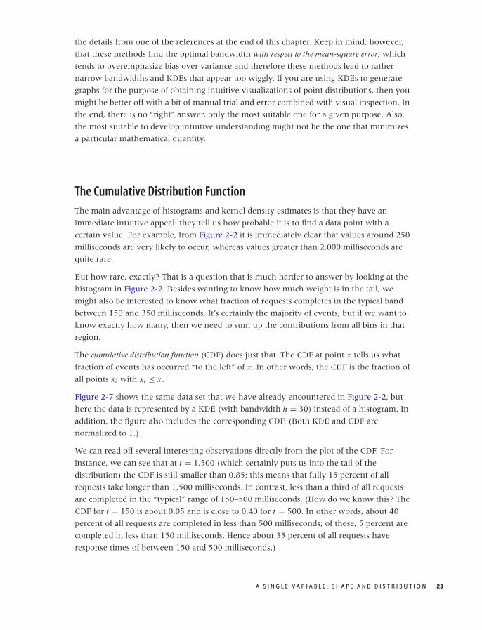
The Cumulative Distribution Function
The main advantage of histograms and kernel density estimates is that they have an
immediate intuitive appeal: they tell us how probable it is to find a data point with a
certain value. For example, from Figure 2-2 it is immediately clear that values around 250
milliseconds are very likely to occur, whereas values greater than 2,000 milliseconds are
quite rare.
But how rare, exactly? That is a question that is much harder to answer by looking at the
histogram in Figure 2-2. Besides wanting to know how much weight is in the tail, we
might also be interested to know what fraction of requests completes in the typical band
between 150 and 350 milliseconds. It’s certainly the majority of events, but if we want to
know exactly how many, then we need to sum up the contributions from all bins in that
region.
The cumulative distribution function (CDF) does just that. The CDF at point x tells us what
fraction of events has occurred “to the left” of x . In other words, the CDF is the fraction of
all points xi with xi ≤ x .
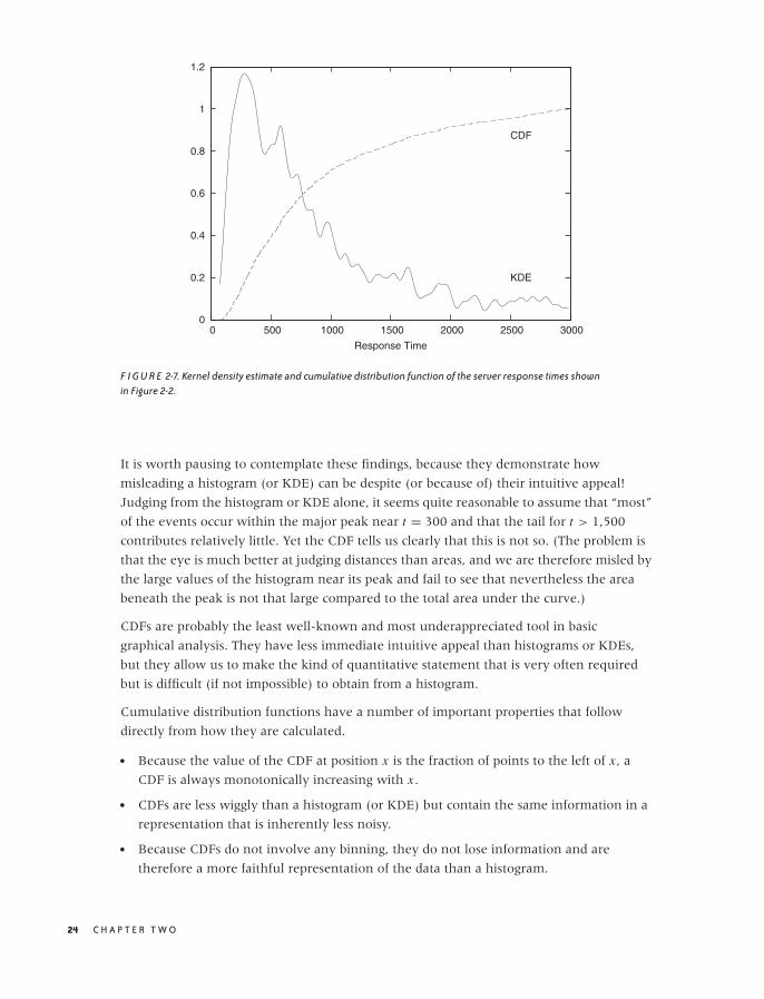
Figure 2-7 shows the same data set that we have already encountered in Figure 2-2, but
here the data is represented by a KDE (with bandwidth h = 30) instead of a histogram. In
addition, the figure also includes the corresponding CDF. (Both KDE and CDF are
normalized to 1.)
We can read off several interesting observations directly from the plot of the CDF. For
instance, we can see that at t = 1,500 (which certainly puts us into the tail of the
distribution) the CDF is still smaller than 0.85; this means that fully 15 percent of all
requests take longer than 1,500 milliseconds. In contrast, less than a third of all requests
are completed in the “typical” range of 150–500 milliseconds. (How do we know this? The
CDF for t = 150 is about 0.05 and is close to 0.40 for t = 500. In other words, about 40
percent of all requests are completed in less than 500 milliseconds; of these, 5 percent are
completed in less than 150 milliseconds. Hence about 35 percent of all requests have
response times of between 150 and 500 milliseconds.)
A S I N G L E V A R I A B L E : S H A P E A N D D I S T R I B U T I O N 23
O’Reilly-5980006 master October 28, 2010 20:25
0
0.2
0.4
0.6
0.8
1
1.2
0 500 1000 1500 2000 2500 3000
Response Time
KDE
CDF
F I G U R E 2-7. Kernel density estimate and cumulative distribution function of the server response times shownin Figure 2-2.
It is worth pausing to contemplate these findings, because they demonstrate how
misleading a histogram (or KDE) can be despite (or because of) their intuitive appeal!
Judging from the histogram or KDE alone, it seems quite reasonable to assume that “most”
of the events occur within the major peak near t = 300 and that the tail for t > 1,500
contributes relatively little. Yet the CDF tells us clearly that this is not so. (The problem is
that the eye is much better at judging distances than areas, and we are therefore misled by
the large values of the histogram near its peak and fail to see that nevertheless the area
beneath the peak is not that large compared to the total area under the curve.)
CDFs are probably the least well-known and most underappreciated tool in basic
graphical analysis. They have less immediate intuitive appeal than histograms or KDEs,
but they allow us to make the kind of quantitative statement that is very often required
but is difficult (if not impossible) to obtain from a histogram.
Cumulative distribution functions have a number of important properties that follow
directly from how they are calculated.
• Because the value of the CDF at position x is the fraction of points to the left of x , a
CDF is always monotonically increasing with x .
• CDFs are less wiggly than a histogram (or KDE) but contain the same information in a
representation that is inherently less noisy.
• Because CDFs do not involve any binning, they do not lose information and are
therefore a more faithful representation of the data than a histogram.
24 C H A P T E R T W O

O’Reilly-5980006 master October 28, 2010 20:25
• All CDFs approach 0 as x goes to negative infinity. CDFs are usually normalized so that
they approach 1 (or 100 percent) as x goes to positive infinity.
• A CDF is unique for a given data set.
If you are mathematically inclined, you have probably already realized that the CDF is (an
approximation to) the antiderivative of the histogram and that the histogram is the
derivative of the CDF:
cdf(x) ≈∫ x
−∞dt histo(t)
histo(x) ≈ d
dxcdf(x)
Cumulative distribution functions have several uses. First, and most importantly, they
enable us to answer questions such as those posed earlier in this section: what fraction of
points falls between any two values? The answer can simply be read off from the graph.
Second, CDFs also help us understand how imbalanced a distribution is—in other words,
what fraction of the overall weight is carried by the tails.
Cumulative distribution functions also prove useful when we want to compare two
distributions. It is notoriously difficult to compare two bell-shaped curves in a histogram
against each other. Comparing the corresponding CDFs is usually much more conclusive.
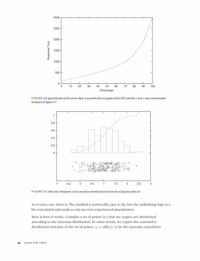
One last remark, before leaving this section: in the literature, you may find the term
quantile plot. A quantile plot is just the plot of a CDF in which the x and y axes have been
switched. Figure 2-8 shows an example using once again the server response time data
set. Plotted this way, we can easily answer questions such as, “What response time
corresponds to the 10th percentile of response times?” But the information contained in
this graph is of course exactly the same as in a graph of the CDF.
Optional: Comparing Distributions with Probability Plots and QQ Plots
Occasionally you might want to confirm that a given set of points is distributed according
to some specific, known distribution. For example, you have a data set and would like to
determine whether it can be described well by a Gaussian (or some other) distribution.
You could compare a histogram or KDE of the data set directly against the theoretical
density function, but it is notoriously difficult to compare distributions that
way—especially out in the tails. A better idea would be to compare the cumulative
distribution functions, which are easier to handle because they are less wiggly and are
always monotonically increasing. But this is still not easy. Also keep in mind that most
probability distributions depend on location and scale parameters (such as mean and
variance), which you would have to estimate before being able to make a meaningful
comparison. Isn’t there a way to compare a set of points directly against a theoretical
distribution and, in the process, read off the estimates for all the parameters required?
A S I N G L E V A R I A B L E : S H A P E A N D D I S T R I B U T I O N 25
O’Reilly-5980006 master October 28, 2010 20:25
0
500
1000
1500
2000
2500
3000
0 10 20 30 40 50 60 70 80 90 100
Res
pons
e T
ime
Percentage
F I G U R E 2-8. Quantile plot of the server data. A quantile plot is a graph of the CDF with the x and y axes interchanged.Compare to Figure 2-7.
0
0.2
0.4
0.6
0.8
1
-1 -0.5 0 0.5 1 1.5 2 2.5 3
F I G U R E 2-9. Jitter plot, histogram, and cumulative distribution function for a Gaussian data set.
As it turns out, there is. The method is technically easy to do, but the underlying logic is a
bit convoluted and tends to trip up even experienced practitioners.
Here is how it works. Consider a set of points {xi } that we suspect are distributed
according to the Gaussian distribution. In other words, we expect the cumulative
distribution function of the set of points, yi = cdf(xi ), to be the Gaussian cumulative
26 C H A P T E R T W O
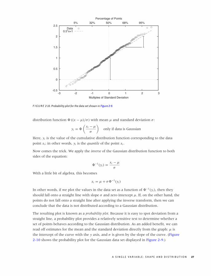
O’Reilly-5980006 master October 28, 2010 20:25
-0.5
0
0.5
1
1.5
2
2.5
-3 -2 -1 0 1 2 3
5% 32% 50% 68% 95%
Multiples of Standard Deviation
Percentage of Points
Data0.5*x+1
F I G U R E 2-10. Probability plot for the data set shown in Figure 2-9.
distribution function � ((x − μ)/σ) with mean μ and standard deviation σ :
yi = �
(xi − μ
σ
)only if data is Gaussian
Here, yi is the value of the cumulative distribution function corresponding to the data
point xi ; in other words, yi is the quantile of the point xi .
Now comes the trick. We apply the inverse of the Gaussian distribution function to both
sides of the equation:
�−1(yi ) = xi − μ
σ
With a little bit of algebra, this becomes
xi = μ + σ�−1(yi )
In other words, if we plot the values in the data set as a function of �−1(yi ), then they
should fall onto a straight line with slope σ and zero intercept μ. If, on the other hand, the
points do not fall onto a straight line after applying the inverse transform, then we can
conclude that the data is not distributed according to a Gaussian distribution.
The resulting plot is known as a probability plot. Because it is easy to spot deviation from a
straight line, a probability plot provides a relatively sensitive test to determine whether a
set of points behaves according to the Gaussian distribution. As an added benefit, we can
read off estimates for the mean and the standard deviation directly from the graph: μ is
the intercept of the curve with the y axis, and σ is given by the slope of the curve. (Figure
2-10 shows the probability plot for the Gaussian data set displayed in Figure 2-9.)
A S I N G L E V A R I A B L E : S H A P E A N D D I S T R I B U T I O N 27

O’Reilly-5980006 master October 28, 2010 20:25
One important question concerns the units that we plot along the axes. For the vertical
axis the case is clear: we use whatever units the original data was measured in. But what
about the horizontal axis? We plot the data as a function of �−1(yi ), which is the inverse
Gaussian distribution function, applied to the percentile yi for each point xi . We can
therefore choose between two different ways to dissect the horizontal axis: either using
the percentiles yi directly (in which case the tick marks will not be distributed uniformly),
or dividing the horizontal axis uniformly. In the latter case we are using the width of the
standard Gaussian distribution as a unit. You can convince yourself that this is really true by
realizing that �−1(y) is the inverse of the Gaussian distribution function �(x). Now ask
yourself: what units is x measured in? We use the same units for the horizontal axis of a
Gaussian probability plot. These units are sometimes called probits. (Figure 2-10 shows
both sets of units.) Beware of confused and confusing explanations of this point elsewhere
in the literature.
There is one more technical detail that we need to discuss: to produce a probability plot,
we need not only the data itself, but for each point xi we also need its quantile yi (we will
discuss quantiles and percentiles in more detail later in this chapter). The simplest way to
obtain the quantiles, given the data, is as follows:
1. Sort the data points in ascending order.
2. Assign to each data point its rank (basically, its line number in the sorted file), starting
at 1 (not at 0).
3. The quantile yi now is the rank divided by n + 1, where n is the number of data points.
This prescription guarantees that each data point is assigned a quantile that is strictly
greater than 0 and strictly less than 1. This is important because �−1(x) is defined only for
0 < x < 1. This prescription is easy to understand and easy to remember, but you may
find other, slightly more complicated prescriptions elsewhere. For all practical purposes,
the differences are going to be small.
Finally, let’s look at an example where the data is clearly not Gaussian. Figure 2-11 shows
the server data from Figure 2-2 plotted in a probability plot. The points don’t fall on a
straight line at all—which is no surprise since we already knew from Figure 2-2 that the
data is not Gaussian. But for cases that are less clear-cut, the probability plot can be a
helpful tool for detecting deviations from Gaussian behavior.
A few additional comments are in order here.
• Nothing in the previous discussion requires that the distribution be Gaussian! You can
use almost any other commonly used distribution function (and its inverse) to generate
the respective probability plots. In particular, many of the commonly used probability
28 C H A P T E R T W O
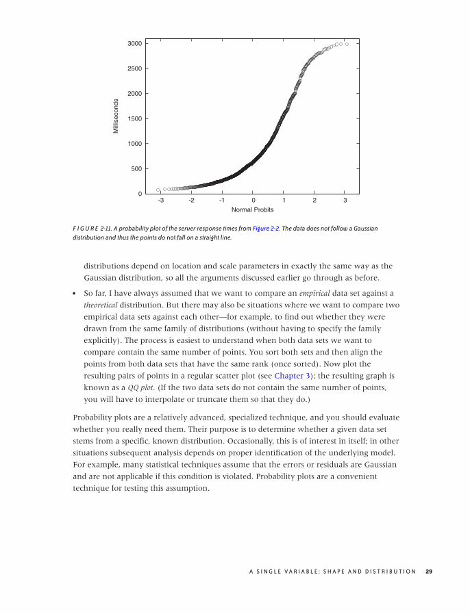
O’Reilly-5980006 master October 28, 2010 20:25
0
500
1000
1500
2000
2500
3000
-3 -2 -1 0 1 2 3
Mill
isec
onds
Normal Probits
F I G U R E 2-11. A probability plot of the server response times from Figure 2-2. The data does not follow a Gaussiandistribution and thus the points do not fall on a straight line.
distributions depend on location and scale parameters in exactly the same way as the
Gaussian distribution, so all the arguments discussed earlier go through as before.
• So far, I have always assumed that we want to compare an empirical data set against a
theoretical distribution. But there may also be situations where we want to compare two
empirical data sets against each other—for example, to find out whether they were
drawn from the same family of distributions (without having to specify the family
explicitly). The process is easiest to understand when both data sets we want to
compare contain the same number of points. You sort both sets and then align the
points from both data sets that have the same rank (once sorted). Now plot the
resulting pairs of points in a regular scatter plot (see Chapter 3); the resulting graph is
known as a QQ plot. (If the two data sets do not contain the same number of points,
you will have to interpolate or truncate them so that they do.)
Probability plots are a relatively advanced, specialized technique, and you should evaluate
whether you really need them. Their purpose is to determine whether a given data set
stems from a specific, known distribution. Occasionally, this is of interest in itself; in other
situations subsequent analysis depends on proper identification of the underlying model.
For example, many statistical techniques assume that the errors or residuals are Gaussian
and are not applicable if this condition is violated. Probability plots are a convenient
technique for testing this assumption.
A S I N G L E V A R I A B L E : S H A P E A N D D I S T R I B U T I O N 29

O’Reilly-5980006 master October 28, 2010 20:25
Rank-Order Plots and Lift Charts
There is a technique related to histograms and CDFs that is worth knowing about.
Consider the following scenario. A company that is selling textbooks and other
curriculum materials is planning an email marketing campaign to reach out to its existing
customers. For this campaign, the company wants to use personalized email messages that
are tailored to the job title of each recipient (so that teachers will receive a different email
than their principals). The problem is the customer database contains about 250,000
individual customer records with over 16,000 different job titles among them! Now what?
The trick is to sort the job titles by the number of individual customer records
corresponding to each job title. The first few records are shown in Table 2-1. The four
columns give the job title, the number of customers for that job title, the fraction of all
customers having that job title, and finally the cumulative fraction of customers. For the
last column, we sum up the number of customers for the current and all previously seen
job titles, then divide by the total number of customer records. This is the equivalent of
the CDF we discussed earlier.
We can see immediately that fully two thirds of all customers account for only 10 different
job titles. Using just the top 30 job titles gives us 75 percent coverage of customer records.
That’s much more manageable than the 16,000 job titles we started with!
Let’s step back for a moment to understand how this example is different from those we
have seen previously. What is important to notice here is that the independent variable has
no intrinsic ordering. What does this mean?
For the web-server example, we counted the number of events for each response time;
hence the count of events per bin was the dependent variable, and it was determined by
the independent variable—namely, the response time. In that case, the independent
variable had an inherent ordering: 100 milliseconds are always less than 400 milliseconds
(and so on). But in the case of counting customer records that match a certain job title,
the independent variable (the job title) has no corresponding ordering relation. It may
appear otherwise since we can sort the job titles alphabetically, but realize that this
ordering is entirely arbitrary! There is nothing “fundamental” about it. If we choose a
different font encoding or locale, the order will change. Contrast this with the ordering
relationship on numbers—there are no two ways about it: 1 is always less than 2.
In cases like this, where the independent variable does not have an intrinsic ordering, it is
often a good idea to sort entries by the dependent variable. That’s what we did in the
example: rather than defining some (arbitrary) sort order on the job titles, we sorted by
the number of records (i.e., by the dependent variable). Once the records have been sorted
in this way, we can form a histogram and a CDF as before.
30 C H A P T E R T W O

O’Reilly-5980006 master October 28, 2010 20:25
T A B L E 2 -1. The first 30 job titles and their relative frequencies.
Number of Fraction of CumulativeTitle customers customers fraction
Teacher 66,470 0.34047 0.340Principal 22,958 0.11759 0.458Superintendent 12,521 0.06413 0.522Director 12,202 0.06250 0.584Secretary 4,427 0.02267 0.607Coordinator 3,201 0.01639 0.623Vice Principal 2,771 0.01419 0.637Program Director 1,926 0.00986 0.647Program Coordinator 1,718 0.00880 0.656Student 1,596 0.00817 0.664Consultant 1,440 0.00737 0.672Administrator 1,169 0.00598 0.678President 1,114 0.00570 0.683Program Manager 1,063 0.00544 0.689Supervisor 1,009 0.00516 0.694Professor 961 0.00492 0.699Librarian 940 0.00481 0.704Project Coordinator 880 0.00450 0.708Project Director 866 0.00443 0.713Office Manager 839 0.00429 0.717Assistant Director 773 0.00395 0.721Administrative Assistant 724 0.00370 0.725Bookkeeper 697 0.00357 0.728Intern 693 0.00354 0.732Program Supervisor 602 0.00308 0.735Lead Teacher 587 0.00300 0.738Instructor 580 0.00297 0.741Head Teacher 572 0.00292 0.744Program Assistant 572 0.00292 0.747Assistant Teacher 546 0.00279 0.749
This trick of sorting by the dependent variable is useful whenever the independent
variable does not have a meaningful ordering relation; it is not limited to situations where
we count events per bin. Figures 2-12 and 2-13 show two typical examples.
Figure 2-12 shows the sales by a certain company to different countries. Not only the sales
to each country but also the cumulative sales are shown, which allows us to assess the
importance of the remaining “tail” of the distribution of sales.
In this example, I chose to plot the independent variable along the vertical axis. This is
often a good idea when the values are strings, since they are easier to read this way. (If
you plot them along the horizontal axis, it is often necessary to rotate the strings by 90
degrees to make them fit, which makes hard to read.)
Figure 2-13 displays what in quality engineering is known as a Pareto chart. In quality
engineering and process improvement, the goal is to reduce the number of defects in a
A S I N G L E V A R I A B L E : S H A P E A N D D I S T R I B U T I O N 31
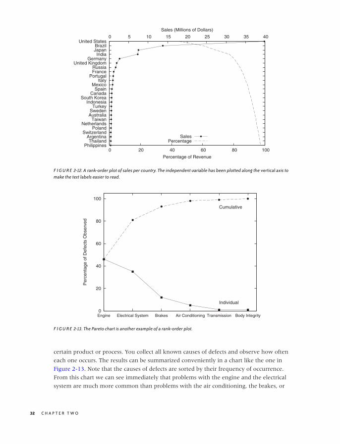
O’Reilly-5980006 master October 28, 2010 20:25
United StatesBrazilJapanIndia
GermanyUnited Kingdom
RussiaFrance
PortugalItaly
MexicoSpain
CanadaSouth Korea
IndonesiaTurkey
SwedenAustralia
TaiwanNetherlands
PolandSwitzerland
ArgentinaThailand
Philippines 0 20 40 60 80 100
0 5 10 15 20 25 30 35 40
Percentage of Revenue
Sales (Millions of Dollars)
SalesPercentage
F I G U R E 2-12. A rank-order plot of sales per country. The independent variable has been plotted along the vertical axis tomake the text labels easier to read.
0
20
40
60
80
100
Engine Electrical System Brakes Air Conditioning Transmission Body Integrity
Per
cent
age
of D
efec
ts O
bser
ved
Cumulative
Individual
F I G U R E 2-13. The Pareto chart is another example of a rank-order plot.
certain product or process. You collect all known causes of defects and observe how often
each one occurs. The results can be summarized conveniently in a chart like the one in
Figure 2-13. Note that the causes of defects are sorted by their frequency of occurrence.
From this chart we can see immediately that problems with the engine and the electrical
system are much more common than problems with the air conditioning, the brakes, or
32 C H A P T E R T W O
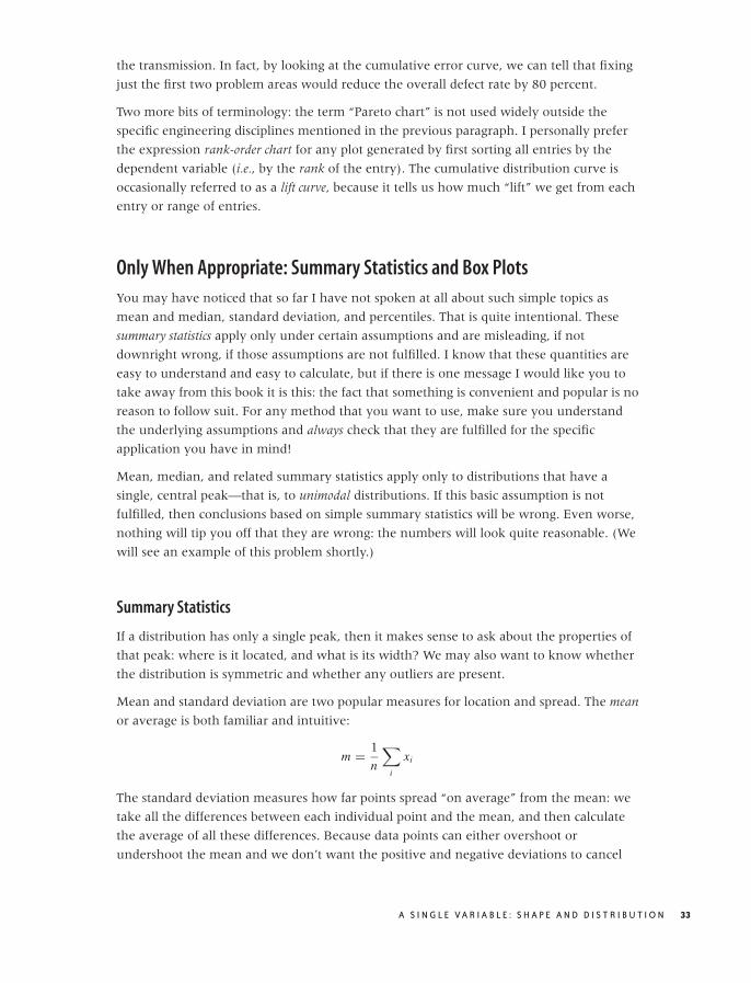
O’Reilly-5980006 master October 28, 2010 20:25
the transmission. In fact, by looking at the cumulative error curve, we can tell that fixing
just the first two problem areas would reduce the overall defect rate by 80 percent.
Two more bits of terminology: the term “Pareto chart” is not used widely outside the
specific engineering disciplines mentioned in the previous paragraph. I personally prefer
the expression rank-order chart for any plot generated by first sorting all entries by the
dependent variable (i.e., by the rank of the entry). The cumulative distribution curve is
occasionally referred to as a lift curve, because it tells us how much “lift” we get from each
entry or range of entries.
Only When Appropriate: Summary Statistics and Box Plots
You may have noticed that so far I have not spoken at all about such simple topics as
mean and median, standard deviation, and percentiles. That is quite intentional. These
summary statistics apply only under certain assumptions and are misleading, if not
downright wrong, if those assumptions are not fulfilled. I know that these quantities are
easy to understand and easy to calculate, but if there is one message I would like you to
take away from this book it is this: the fact that something is convenient and popular is no
reason to follow suit. For any method that you want to use, make sure you understand
the underlying assumptions and always check that they are fulfilled for the specific
application you have in mind!
Mean, median, and related summary statistics apply only to distributions that have a
single, central peak—that is, to unimodal distributions. If this basic assumption is not
fulfilled, then conclusions based on simple summary statistics will be wrong. Even worse,
nothing will tip you off that they are wrong: the numbers will look quite reasonable. (We
will see an example of this problem shortly.)
Summary Statistics
If a distribution has only a single peak, then it makes sense to ask about the properties of
that peak: where is it located, and what is its width? We may also want to know whether
the distribution is symmetric and whether any outliers are present.
Mean and standard deviation are two popular measures for location and spread. The mean
or average is both familiar and intuitive:
m = 1
n
∑
i
xi
The standard deviation measures how far points spread “on average” from the mean: we
take all the differences between each individual point and the mean, and then calculate
the average of all these differences. Because data points can either overshoot or
undershoot the mean and we don’t want the positive and negative deviations to cancel
A S I N G L E V A R I A B L E : S H A P E A N D D I S T R I B U T I O N 33

O’Reilly-5980006 master October 28, 2010 20:25
each other, we sum the square of the individual deviations and then take the mean of the
square deviations. (The second equation is very useful in practice and can be found from
the first after plugging in the definition of the mean.)
s2 = 1
n
∑
i
(xi − m)2
= 1
n
∑
i
x2i − m2
The quantity s2 calculated in this way is known as the variance and is the more important
quantity from a theoretical point of view. But as a measure of the spread of a distribution,
we are better off using its square root, which is known as the standard deviation. Why take
the square root? Because then both measure for the location, and the measure for the
spread will have the same units, which are also the units of the actual data. (If our data set
consists of the prices for a basket of goods, then the variance would be given in “square
dollars,” whereas the standard deviation would be given in dollars.)
For many (but certainly not all!) data sets arising in practice, one can expect about two
thirds of all data points to fall within the interval [m − s, m + s] and 99 percent of all
points to fall within the wider interval [m − 3s, m + 3s].
Mean and standard deviation are easy to calculate, and have certain nice mathematical
properties—provided the data is symmetric and does not contain crazy outliers.
Unfortunately, many data sets violate at least one of these assumptions. Here is an
example for the kind of trouble that one may encounter. Assume we have 10 items
costing $1 each, and one item costing $20. The mean item price comes out to be $2.73,
even though no item has a price anywhere near this value. The standard deviation is
even worse: it comes out to $5.46, implying that most items have a price between
$2.73 − $5.46 and $2.73 + $5.46. The “expected range” now includes negative prices—an
obviously absurd result. Note that the data set itself is not particularly pathological: going
to the grocery store and picking up a handful of candy bars and a bottle of wine will do it
(pretty good wine, to be sure, but nothing outrageous).
A different set of summary statistics that is both more flexible and more robust is based on
the concepts of median and quantiles or percentiles. The median is conventionally defined as
the value from a data set such that half of all points in the data set are smaller and the
other half greater that that value. Percentiles are the generalization of this concept to
other fractions (the 10th percentile is the value such that 10 percent of all points in the
data set are smaller than it, and so on). Quantiles are similar to percentiles, only that they
are taken with respect to the fraction of points, not the percentage of points (in other
words, the 10th percentile equals the 0.1 quantile).
Simple as it is, the percentile concept is nevertheless ambiguous, and so we need to work
a little harder to make it really concrete. As an example of the problems that occur,
consider the data set {1, 2, 3}. What is the median? It is not possible to break this data set
34 C H A P T E R T W O

O’Reilly-5980006 master October 28, 2010 20:25
into two equal parts each containing exactly half the points. The problem becomes even
more uncomfortable when we are dealing with arbitrary percentile values (rather than
the median only).
The Internet standard laid down in RFC 2330 (“Framework for IP Performance Metrics”)
gives a definition of percentiles in terms of the CDF, which is unambiguous and practical,
as follows. The pth percentile is the smallest value x , such that the cumulative distribution
function of x is greater or equal p/100.
pth percentile: smallest x for which cdf(x) ≥ p/100
This definition assumes that the CDF is normalized to 1, not to 100. If it were normalized
to 100, the condition would be cdf(x) ≥ p.
With this definition, the median (i.e., the 50th percentile) of the data set {1, 2, 3} is 2
because the cdf(1) = 0.33 . . . , cdf(2) = 0.66 . . . , and cdf(3) = 1.0. The median of the data
set {1, 2} would be 1 because now cdf(1) = 0.5, and cdf(2) = 1.0.
The median is a measure for the location of the distribution, and we can use percentiles to
construct a measure for the width of the distribution. Probably the most frequently used
quantity for this purpose is the inter-quartile range (IQR), which is the distance between
the 75th percentile and 25th percentile.
When should you favor median and percentile over mean and standard deviation?
Whenever you suspect that your distribution is not symmetric or has important outliers.
If a distribution is symmetric and well behaved, then mean and median will be quite close
together, and there is little difference in using either. Once the distribution becomes
skewed, however, the basic assumption that underlies the mean as a measure for the
location of the distribution is no longer fulfilled, and so you are better off using the
median. (This is why the average wage is usually given in official publications as the
median family income, not the mean; the latter would be significantly distorted by the
few households with extremely high incomes.) Furthermore, the moment you have
outliers, the assumptions behind the standard deviation as a measure of the width of the
distribution are violated; in this case you should favor the IQR (recall our shopping basket
example earlier).
If median and percentiles are so great, then why don’t we always use them? A large part
of the preference for mean and variance is historical. In the days before readily available
computing power, percentiles were simply not practical to calculate. Keep in mind that
finding percentiles requires to sort the data set whereas to find the mean requires only to
add up all elements in any order. The latter is an O(n) process, but the former is an O(n2)
process, since humans—being nonrecursive—cannot be taught Quicksort and therefore
need to resort to much less efficient sorting algorithms. A second reason is that it is much
harder to prove rigorous theorems for percentiles, whereas mean and variance are
mathematically very well behaved and easy to work with.
A S I N G L E V A R I A B L E : S H A P E A N D D I S T R I B U T I O N 35

O’Reilly-5980006 master October 28, 2010 20:25
Box-and-Whisker Plots
There is an interesting graphical way to represent these quantities, together with
information about potential outliers, known as a box-and-whisker plot, or box plot for short.
Figure 2-15 illustrates all components of a box plot. A box plot consists of:
• A marker or symbol for the median as an indicator of the location of the distribution
• A box, spanning the inter-quartile range, as a measure of the width of the distribution
• A set of whiskers, extending from the central box to the upper and lower adjacent
values, as an indicator of the tails of the distribution (where “adjacent value” is defined
in the next paragraph)
• Individual symbols for all values outside the range of adjacent values, as a
representation for outliers
You can see that a box plot combines a lot of information in a single graph. We have
encountered almost all of these concepts before, with the exception of upper and lower
adjacent values. While the inter-quartile range is a measure for the width of the central
“bulk” of the distribution, the adjacent values are one possible way to express how far its
tails reach. The upper adjacent value is the largest value in the data set that is less than
twice the inter-quartile range greater than the median. In other words: extend the
whisker upward from the median to twice the length of the central box. Now trim the
whisker down to the largest value that actually occurs in the data set; this value is the
upper adjacent value. (A similar construction holds for the lower adjacent value.)
You may wonder about the reason for this peculiar construction. Why not simply extend
the whiskers to, say, the 5th and 95th percentile and be done with it? The problem with
this approach is that it does not allow us to recognize true outliers! Outliers are data points
that are, when compared to the width of the distribution, unusually far from the center. Such
values may or may not be present. The top and bottom 5 percent, on the other hand, are
always present even for very compact distributions. To recognize outliers, we therefore
cannot simply look at the most extreme values, instead we must compare their distance from
the center to the overall width of the distribution. That is what box-and-whisker plots, as
described in the previous paragraph, do.
The logic behind the preceding argument is extremely important (not only in this
application but more generally), so I shall reiterate the steps: first we calculated a measure
for the width of the distribution, then we used this width to identify outliers as those
points that are far from the center, where (and this is the crucial step) “far” is measured in
units of the width of the distribution. We neither impose an arbitrary distance from the
outside, nor do we simply label the most extreme x percent of the distribution as
outliers—instead, we determine the width of the distribution (as the range into which
points “typically” fall) and then use it to identify outliers as those points that deviate from
this range. The important insight here is that the distribution itself determines a typical
scale, which provides a natural unit in which to measure other properties of the
36 C H A P T E R T W O

O’Reilly-5980006 master October 28, 2010 20:25
distribution. This idea of using some typical property of the system to describe other parts
of the system will come up again later (see Chapter 8).
Box plots combine many different measures of a distribution into a single, compact graph.
A box plot allows us to see whether the distribution is symmetric or not and how the
weight is distributed between the central peak and the tails. Finally, outliers (if present)
are not dropped but shown explicitly.
Box plots are best when used to compare several distributions against one another—for a
single distribution, the overhead of preparing and managing a graph (compared to just
quoting the numbers) may often not appear justified. Here is an example that compares
different data sets against each other.
Let’s say we have a data set containing the index of refraction of 121 samples of glass.*
The data set is broken down by the type of glass: 70 samples of window glass, 29 from
headlamps, 13 from containers of various kinds, and 9 from tableware. Figures 2-14 and
2-15 are two representations of the same data, the former as a kernel density estimate and
the latter as a box plot.
The box plot emphasizes the overall structure of the data sets and makes it easy to
compare the data sets based on their location and width. At the same time, it also loses
much information. The KDE gives a more detailed view of the data—in particular
showing the occurrence of multiple peaks in the distribution functions—but makes it
more difficult to quickly sort and classify the data sets. Depending on your needs, one or
the other technique may be preferable at any given time.
Here are some additional notes on box plots.
• The specific way of drawing a box plot that I described here is especially useful but is
far from universal. In particular, the specific definition of the adjacent values is often
not properly understood. Whenever you find yourself looking at a box plot, always ask
what exactly is shown, and whenever you prepare one, make sure to include an
explanation.
• The box plot described here can be modified and enhanced. For example, the width
of the central box (i.e., the direction orthogonal to the whiskers) can be used to
indicate the size of the underlying data set: the more points are included, the wider the
box. Another possibility is to abandon the rectangular shape of the box altogether and
to use the local width of the box to display the density of points at each location—
which brings us almost full circle to KDEs.
*The raw data can be found in the “Glass Identification Data Set” on the UCI Machine Learning Repos-itory at http://archive.ics.uci.edu/ml/.
A S I N G L E V A R I A B L E : S H A P E A N D D I S T R I B U T I O N 37
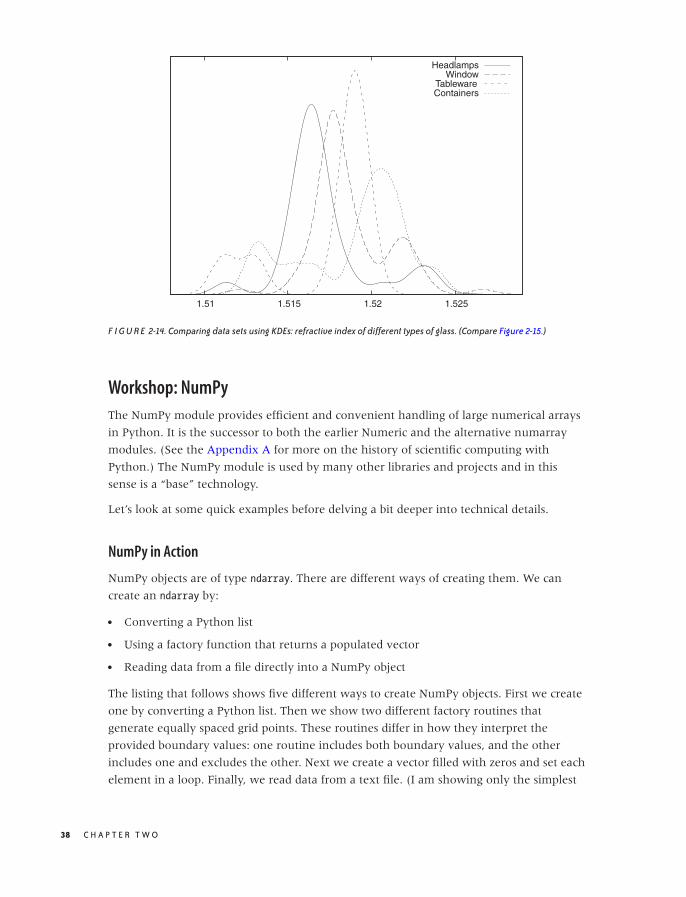
O’Reilly-5980006 master October 28, 2010 20:25
1.51 1.515 1.52 1.525
HeadlampsWindow
TablewareContainers
F I G U R E 2-14. Comparing data sets using KDEs: refractive index of different types of glass. (Compare Figure 2-15.)
Workshop: NumPy
The NumPy module provides efficient and convenient handling of large numerical arrays
in Python. It is the successor to both the earlier Numeric and the alternative numarray
modules. (See the Appendix A for more on the history of scientific computing with
Python.) The NumPy module is used by many other libraries and projects and in this
sense is a “base” technology.
Let’s look at some quick examples before delving a bit deeper into technical details.
NumPy in Action
NumPy objects are of type ndarray. There are different ways of creating them. We can
create an ndarray by:
• Converting a Python list
• Using a factory function that returns a populated vector
• Reading data from a file directly into a NumPy object
The listing that follows shows five different ways to create NumPy objects. First we create
one by converting a Python list. Then we show two different factory routines that
generate equally spaced grid points. These routines differ in how they interpret the
provided boundary values: one routine includes both boundary values, and the other
includes one and excludes the other. Next we create a vector filled with zeros and set each
element in a loop. Finally, we read data from a text file. (I am showing only the simplest
38 C H A P T E R T W O
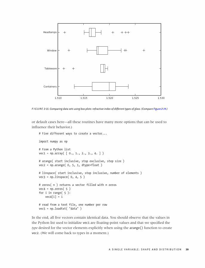
O’Reilly-5980006 master October 28, 2010 20:25
F I G U R E 2-15. Comparing data sets using box plots: refractive index of different types of glass. (Compare Figure 2-14.)
or default cases here—all these routines have many more options that can be used to
influence their behavior.)
# Five different ways to create a vector...
import numpy as np
# From a Python list
vec1 = np.array( [ 0., 1., 2., 3., 4. ] )
# arange( start inclusive, stop exclusive, step size )
vec2 = np.arange( 0, 5, 1, dtype=float )
# linspace( start inclusive, stop inclusive, number of elements )
vec3 = np.linspace( 0, 4, 5 )
# zeros( n ) returns a vector filled with n zeros
vec4 = np.zeros( 5 )
for i in range( 5 ):
vec4[i] = i
# read from a text file, one number per row
vec5 = np.loadtxt( "data" )
In the end, all five vectors contain identical data. You should observe that the values in
the Python list used to initialize vec1 are floating-point values and that we specified the
type desired for the vector elements explicitly when using the arange() function to create
vec2. (We will come back to types in a moment.)
A S I N G L E V A R I A B L E : S H A P E A N D D I S T R I B U T I O N 39
O’Reilly-5980006 master October 28, 2010 20:25
Now that we have created these objects, we can operate with them (see the next listing).
One of the major conveniences provided by NumPy is that we can operate with NumPy
objects as if they were atomic data types: we can add, subtract, and multiply them (and so
forth) without the need for explicit loops. Avoiding explicit loops makes our code clearer. It
also makes it faster (because the entire operation is performed in C without overhead—
see the discussion that follows).
# ... continuation from previous listing
# Add a vector to another
v1 = vec1 + vec2
# Unnecessary: adding two vectors using an explicit loop
v2 = np.zeros( 5 )
for i in range( 5 ):
v2[i] = vec1[i] + vec2[i]
# Adding a vector to another in place
vec1 += vec2
# Broadcasting: combining scalars and vectors
v3 = 2*vec3
v4 = vec4 + 3
# Ufuncs: applying a function to a vector, element by element
v5 = np.sin(vec5)
# Converting to Python list object again
lst = v5.tolist()
All operations are performed element by element: if we add two vectors, then the
corresponding elements from each vector are combined to give the element in the
resulting vector. In other words, the compact expression vec1 + vec2 for v1 in the listing is
equivalent to the explicit loop construction used to calculate v2. This is true even for
multiplication: vec1 * vec2 will result in a vector in which the corresponding elements of
both operands have been multiplied element by element. (If you want a true vector or
“dot” product, you must use the dot() function instead.) Obviously, this requires that all
operands have the same number of elements!
Now we shall demonstrate two further convenience features that in the NumPy
documentation are referred to as broadcasting and ufuncs (short for “universal functions”).
The term “broadcasting” in this context has nothing to do with messaging. Instead, it
means that if you try to combine two arguments of different shapes, then the smaller one
will be extended (“cast broader”) to match the larger one. This is especially useful when
combining scalars with vectors: the scalar is expanded to a vector of appropriate size and
whose elements all have the value given by the scalar; then the operation proceeds,
element by element, as before. The term “ufunc” refers to a scalar function that can be
applied to a NumPy object. The function is applied, element by element, to all entries in
40 C H A P T E R T W O
O’Reilly-5980006 master October 29, 2010 17:40
the NumPy object, and the result is a new NumPy object with the same shape as the
original one.
Using these features skillfully, a function to calculate a kernel density estimate can be
written as a single line of code:
# Calculating kernel density estimates
from numpy import *
# z: position, w: bandwidth, xv: vector of points
def kde( z, w, xv ):
return sum( exp(-0.5*((z-xv)/w)**2)/sqrt(2*pi*w**2) )
d = loadtxt( "presidents", usecols=(2,) )
w = 2.5
for x in linspace( min(d)-w, max(d)+w, 1000 ):
print x, kde( x, w, d )
This program will calculate and print the data needed to generate Figure 2-4 (but it does
not actually draw the graph—that will have to wait until we introduce matplotlib in the
Workshop of Chapter 3).
Most of the listing is boilerplate code, such as reading and writing files. All the actual work
is done in the one-line function kde(z, w, xv). This function makes use of both
“broadcasting” and “ufuncs” and is a good example for the style of programming typical of
NumPy. Let’s dissect it—inside out.
First recall what we need to do when evaluating a KDE: for each location z at which we
want to evaluate the KDE, we must find its distance to all the points in the data set. For
each point, we evaluate the kernel for this distance and sum up the contributions from all
the individual kernels to obtain the value of the KDE at z.
The expression z-xv generates a vector that contains the distance between z and all the
points in xv (that’s broadcasting). We then divide by the required bandwidth, multiply by
1/2, and square each element. Finally, we apply the exponential function exp() to this
vector (that’s a ufunc). The result is a vector that contains the exponential function
evaluated at the distances between the points in the data set and the location z. Now we
only need to sum all the elements in the vector (that’s what sum() does) and we are done,
having calculated the KDE at position z. If we want to plot the KDE as a curve, we have to
repeat this process for each location we wish to plot—that’s what the final loop in the
listing is for.
NumPy in Detail
You may have noticed that none of the warm-up examples in the listings in the previous
section contained any matrices or other data structures of higher dimensionality—just
A S I N G L E V A R I A B L E : S H A P E A N D D I S T R I B U T I O N 41

O’Reilly-5980006 master October 28, 2010 20:25
one-dimensional vectors. To understand how NumPy treats objects with dimensions
greater than one, we need to develop at least a superficial understanding for the way
NumPy is implemented.
It is misleading to think of NumPy as a “matrix package for Python” (although it’s
commonly used as such). I find it more helpful to think of NumPy as a wrapper and access
layer for underlying C buffers. These buffers are contiguous blocks of C memory,
which—by their nature—are one-dimensional data structures. All elements in those data
structures must be of the same size, and we can specify almost any native C type
(including C structs) as the type of the individual elements. The default type corresponds
to a C double and that is what we use in the examples that follow, but keep in mind that
other choices are possible. All operations that apply to the data overall are performed in C
and are therefore very fast.
To interpret the data as a matrix or other multi-dimensional data structure, the shape or
layout is imposed during element access. The same 12-element data structure can
therefore be interpreted as a 12-element vector or a 3 × 4 matrix or a 2 × 2 × 3 tensor—the
shape comes into play only through the way we access the individual elements. (Keep in
mind that although reshaping a data structure is very easy, resizing is not.)
The encapsulation of the underlying C data structures is not perfect: when choosing the
types of the atomic elements, we specify C data types not Python types. Similarly, some
features provided by NumPy allow us to manage memory manually, rather than have the
memory be managed transparently by the Python runtime. This is an intentional design
decision, because NumPy has been designed to accommodate large data structures—large
enough that you might want (or need) to exercise a greater degree of control over the
way memory is managed. For this reason, you have the ability to choose types that take
up less space as elements in a collection (e.g., C float elements rather than the default
double). For the same reason, all ufuncs accept an optional argument pointing to an
(already allocated) location where the results will be placed, thereby avoiding the need to
claim additional memory themselves. Finally, several access and structuring routines
return a view (not a copy!) of the same underlying data. This does pose an aliasing
problem that you need to watch out for.
The next listing quickly demonstrates the concepts of shape and views. Here, I assume
that the commands are entered at an interactive Python prompt (shown as >>> in the
listing). Output generated by Python is shown without a prompt:
>>> import numpy as np
>>> # Generate two vectors with 12 elements each
>>> d1 = np.linspace( 0, 11, 12 )
>>> d2 = np.linspace( 0, 11, 12 )
>>> # Reshape the first vector to a 3x4 (row x col) matrix
>>> d1.shape = ( 3, 4 )
>>> print d1
42 C H A P T E R T W O

O’Reilly-5980006 master October 28, 2010 20:25
[[ 0. 1. 2. 3.]
[ 4. 5. 6. 7.]
[ 8. 9. 10. 11.]]
>>> # Generate a matrix VIEW to the second vector
>>> view = d2.reshape( (3,4) )
>>> # Now: possible to combine the matrix and the view
>>> total = d1 + view
>>> # Element access: [row,col] for matrix
>>> print d1[0,1]
1.0
>>> print view[0,1]
1.0
>>> # ... and [pos] for vector
>>> print d2[1]
1.0
>>> # Shape or layout information
>>> print d1.shape
(3,4)
>>> print d2.shape
(12,)
>>> print view.shape
(3,4)
>>> # Number of elements (both commands equivalent)
>>> print d1.size
12
>>> print len(d2)
12
>>> # Number of dimensions (both commands equivalent)
>>> print d1.ndim
2
>>> print np.rank(d2)
1
Let’s step through this. We create two vectors of 12 elements each. Then we reshape the
first one into a 3 × 4 matrix. Note that the shape property is a data member—not an
accessor function! For the second vector, we create a view in the form of a 3 × 4 matrix.
Now d1 and the newly created view of d2 have the same shape, so we can combine them
(by forming their sum, in this case). Note that even though reshape() is a member
function, it does not change the shape of the instance itself but instead returns a new view
object: d2 is still a one-dimensional vector. (There is also a standalone version of this
function, so we could also have written view = np.reshape( d2, (3,4) ). The presence of
such redundant functionality is due to the desire to maintain backward compatibility with
both of NumPy’s ancestors.)
A S I N G L E V A R I A B L E : S H A P E A N D D I S T R I B U T I O N 43
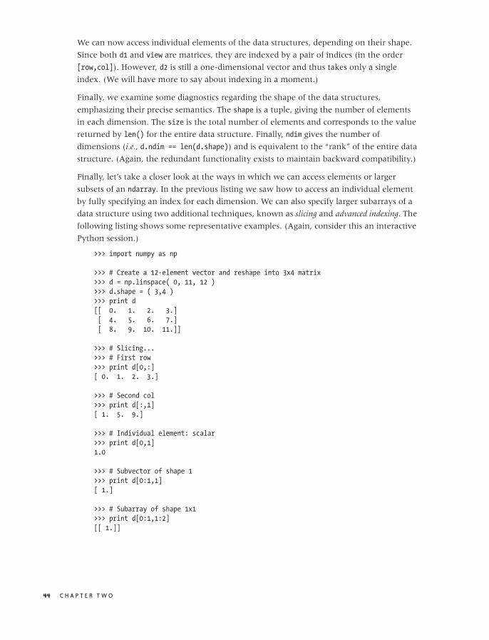
O’Reilly-5980006 master October 28, 2010 20:25
We can now access individual elements of the data structures, depending on their shape.
Since both d1 and view are matrices, they are indexed by a pair of indices (in the order
[row,col]). However, d2 is still a one-dimensional vector and thus takes only a single
index. (We will have more to say about indexing in a moment.)
Finally, we examine some diagnostics regarding the shape of the data structures,
emphasizing their precise semantics. The shape is a tuple, giving the number of elements
in each dimension. The size is the total number of elements and corresponds to the value
returned by len() for the entire data structure. Finally, ndim gives the number of
dimensions (i.e., d.ndim == len(d.shape)) and is equivalent to the “rank” of the entire data
structure. (Again, the redundant functionality exists to maintain backward compatibility.)
Finally, let’s take a closer look at the ways in which we can access elements or larger
subsets of an ndarray. In the previous listing we saw how to access an individual element
by fully specifying an index for each dimension. We can also specify larger subarrays of a
data structure using two additional techniques, known as slicing and advanced indexing. The
following listing shows some representative examples. (Again, consider this an interactive
Python session.)
>>> import numpy as np
>>> # Create a 12-element vector and reshape into 3x4 matrix
>>> d = np.linspace( 0, 11, 12 )
>>> d.shape = ( 3,4 )
>>> print d
[[ 0. 1. 2. 3.]
[ 4. 5. 6. 7.]
[ 8. 9. 10. 11.]]
>>> # Slicing...
>>> # First row
>>> print d[0,:]
[ 0. 1. 2. 3.]
>>> # Second col
>>> print d[:,1]
[ 1. 5. 9.]
>>> # Individual element: scalar
>>> print d[0,1]
1.0
>>> # Subvector of shape 1
>>> print d[0:1,1]
[ 1.]
>>> # Subarray of shape 1x1
>>> print d[0:1,1:2]
[[ 1.]]
44 C H A P T E R T W O

O’Reilly-5980006 master October 28, 2010 20:25
>>> # Indexing...
>>> # Integer indexing: third and first column
>>> print d[ :, [2,0] ]
[[ 2. 0.]
[ 6. 4.]
[ 10. 8.]]
>>> # Boolean indexing: second and third column
>>> k = np.array( [False, True, True] )
>>> print d[ k, : ]
[[ 4. 5. 6. 7.]
[ 8. 9. 10. 11.]]
We first create a 12-element vector and reshape it into a 3 × 4 matrix as before. Slicing
uses the standard Python slicing syntax start:stop:step, where the start position is
inclusive but the stopping position is exclusive. (In the listing, I use only the simplest form
of slicing, selecting all available elements.)
There are two potential “gotchas” with slicing. First of all, specifying an explicit
subscripting index (not a slice!) reduces the corresponding dimension to a scalar. Slicing,
though, does not reduce the dimensionality of the data structure. Consider the two
extreme cases: in the expression d[0,1], indices for both dimensions are fully specified,
and so we are left with a scalar. In contrast, d[0:1,1:2] is sliced in both dimensions.
Neither dimension is removed, and the resulting object is still a (two-dimensional) matrix
but of smaller size: it has shape 1 × 1.
The second issue to watch out for is that slices return views, not copies.
Besides slicing, we can also index an ndarray with a vector of indices, by an operation
called “advanced indexing.” The previous listing showed two simple examples. In the first
we use a Python list object, which contains the integer indices (i.e., the positions) of the
desired columns and in the desired order, to select a subset of columns. In the second
example, we form an ndarray of Boolean entries to select only those rows for which the
Boolean evaluates to True.
In contrast to slicing, advanced indexing returns copies, not views.
This completes our overview of the basic capabilities of the NumPy module. NumPy is
easy and convenient to use for simple use cases but can get very confusing otherwise. (For
example, check out the rules for general broadcasting when both operators are
multi-dimensional, or for advanced indexing).
We will present some more straightforward applications in Chapters 3 and 4.
Further Reading• The Elements of Graphing Data. William S. Cleveland. 2nd ed., Hobart Press. 1994.
A book-length discussion of graphical methods for data analysis such as those described
in this chapter. In particular, you will find more information here on topics such as
A S I N G L E V A R I A B L E : S H A P E A N D D I S T R I B U T I O N 45

O’Reilly-5980006 master October 28, 2010 20:25
box plots and QQ plots. Cleveland’s methods are particularly careful and well
thought-out.
• All of Statistics: A Concise Course in Statistical Inference. Larry Wasserman. Springer. 2004.
A thoroughly modern treatment of mathematical statistics, very advanced and
condensed. You will find some additional material here on the theory of “density
estimation”—that is, on histograms and KDEs.
• Multivariate Density Estimation. David W. Scott. 2nd ed., Wiley. 2006.
A research monograph on density estimation written by the creator of Scott’s rule.
• Kernel Smoothing. M. P. Wand and M. C. Jones. Chapman & Hall. 1995.
An accessible treatment of kernel density estimation.
46 C H A P T E R T W O
O’Reilly-5980006 master October 28, 2010 20:27
C H A P T E R T H R E E
Two Variables: EstablishingRelationships
WHEN WE ARE DEALING WITH A DATA SET THAT CONSISTS OF TWO VARIABLES (THAT IS, A BIVARIATE DATA SET),
we are mostly interested in seeing whether some kind of relationship exists between the
two variables and, if so, what kind of relationship this is.
Plotting one variable against another is pretty straightforward, therefore most of our effort
will be spent on various tools and transformations that can be applied to characterize the
nature of the relationship between the two inputs.
Scatter Plots
Plotting one variable against another is simple—you just do it! In fact, this is precisely
what most people mean when they speak about “plotting” something. Yet there are
differences, as we shall see.
Figures 3-1 and 3-2 show two examples. The data in Figure 3-1 might come from an
experiment that measures the force between two surfaces separated by a short distance.
The force is clearly a complicated function of the distance—on the other hand, the data
points fall on a relatively smooth curve, and we can have confidence that it represents the
data accurately. (To be sure, we should ask for the accuracy of the measurements shown
in this graph: are there significant error bars attached to the data points? But it doesn’t
matter; the data itself shows clearly that the amount of random noise in the data is small.
This does not mean that there aren’t problems with the data but only that any problems
will be systematic ones—for instance, with the apparatus—and statistical methods will not
be helpful.)
47
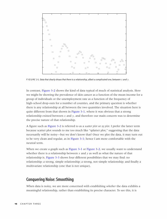
O’Reilly-5980006 master October 28, 2010 20:27
F I G U R E 3-1. Data that clearly shows that there is a relationship, albeit a complicated one, between x and y.
In contrast, Figure 3-2 shows the kind of data typical of much of statistical analysis. Here
we might be showing the prevalence of skin cancer as a function of the mean income for a
group of individuals or the unemployment rate as a function of the frequency of
high-school drop-outs for a number of counties, and the primary question is whether
there is any relationship at all between the two quantities involved. The situation here is
quite different from that shown in Figure 3-1, where it was obvious that a strong
relationship existed between x and y, and therefore our main concern was to determine
the precise nature of that relationship.
A figure such as Figure 3-2 is referred to as a scatter plot or xy plot. I prefer the latter term
because scatter plot sounds to me too much like “splatter plot,” suggesting that the data
necessarily will be noisy—but we don’t know that! Once we plot the data, it may turn out
to be very clean and regular, as in Figure 3-1; hence I am more comfortable with the
neutral term.
When we create a graph such as Figure 3-1 or Figure 3-2, we usually want to understand
whether there is a relationship between x and y as well as what the nature of that
relationship is. Figure 3-3 shows four different possibilities that we may find: no
relationship; a strong, simple relationship; a strong, not-simple relationship; and finally a
multivariate relationship (one that is not unique).
Conquering Noise: Smoothing
When data is noisy, we are more concerned with establishing whether the data exhibits a
meaningful relationship, rather than establishing its precise character. To see this, it is
48 C H A P T E R T H R E E
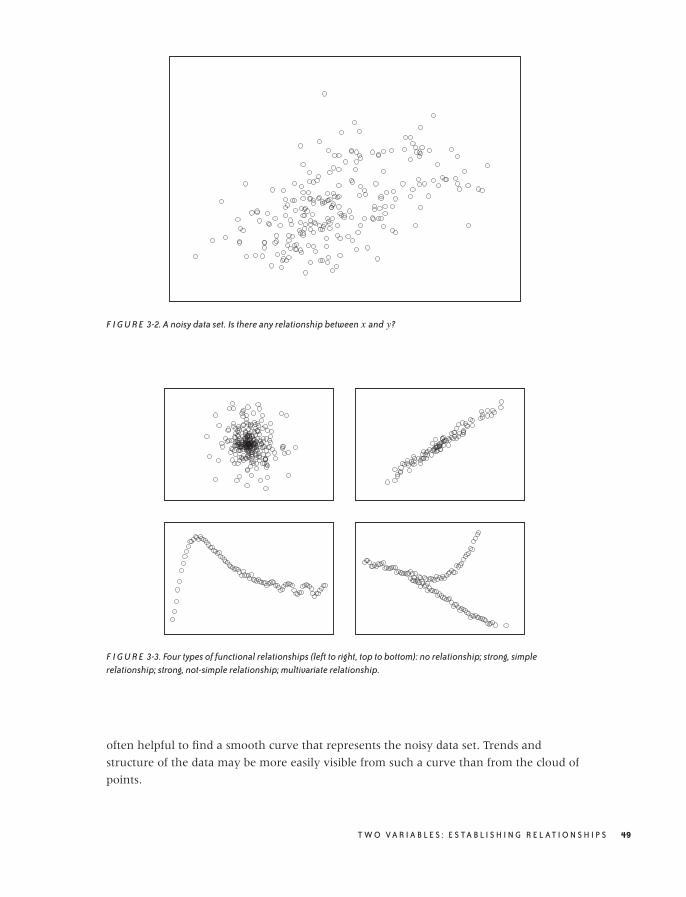
O’Reilly-5980006 master October 28, 2010 20:27
F I G U R E 3-2. A noisy data set. Is there any relationship between x and y?
F I G U R E 3-3. Four types of functional relationships (left to right, top to bottom): no relationship; strong, simplerelationship; strong, not-simple relationship; multivariate relationship.
often helpful to find a smooth curve that represents the noisy data set. Trends and
structure of the data may be more easily visible from such a curve than from the cloud of
points.
T W O V A R I A B L E S : E S TA B L I S H I N G R E L AT I O N S H I P S 49
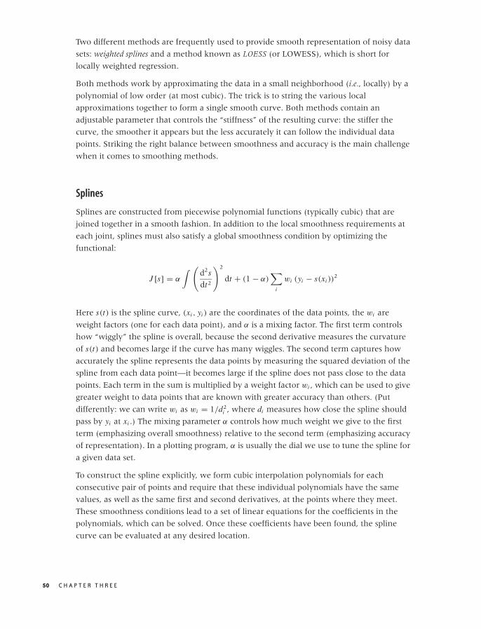
O’Reilly-5980006 master October 28, 2010 20:27
Two different methods are frequently used to provide smooth representation of noisy data
sets: weighted splines and a method known as LOESS (or LOWESS), which is short for
locally weighted regression.
Both methods work by approximating the data in a small neighborhood (i.e., locally) by a
polynomial of low order (at most cubic). The trick is to string the various local
approximations together to form a single smooth curve. Both methods contain an
adjustable parameter that controls the “stiffness” of the resulting curve: the stiffer the
curve, the smoother it appears but the less accurately it can follow the individual data
points. Striking the right balance between smoothness and accuracy is the main challenge
when it comes to smoothing methods.
Splines
Splines are constructed from piecewise polynomial functions (typically cubic) that are
joined together in a smooth fashion. In addition to the local smoothness requirements at
each joint, splines must also satisfy a global smoothness condition by optimizing the
functional:
J [s] = α
∫ (d2s
dt2
)2
dt + (1 − α)∑
i
wi (yi − s(xi ))2
Here s(t) is the spline curve, (xi , yi ) are the coordinates of the data points, the wi are
weight factors (one for each data point), and α is a mixing factor. The first term controls
how “wiggly” the spline is overall, because the second derivative measures the curvature
of s(t) and becomes large if the curve has many wiggles. The second term captures how
accurately the spline represents the data points by measuring the squared deviation of the
spline from each data point—it becomes large if the spline does not pass close to the data
points. Each term in the sum is multiplied by a weight factor wi , which can be used to give
greater weight to data points that are known with greater accuracy than others. (Put
differently: we can write wi as wi = 1/d2i , where di measures how close the spline should
pass by yi at xi .) The mixing parameter α controls how much weight we give to the first
term (emphasizing overall smoothness) relative to the second term (emphasizing accuracy
of representation). In a plotting program, α is usually the dial we use to tune the spline for
a given data set.
To construct the spline explicitly, we form cubic interpolation polynomials for each
consecutive pair of points and require that these individual polynomials have the same
values, as well as the same first and second derivatives, at the points where they meet.
These smoothness conditions lead to a set of linear equations for the coefficients in the
polynomials, which can be solved. Once these coefficients have been found, the spline
curve can be evaluated at any desired location.
50 C H A P T E R T H R E E
O’Reilly-5980006 master October 28, 2010 20:27
LOESS
Splines have an overall smoothness goal, which means that they are less responsive to local
details in the data set. The LOESS smoothing method addresses this concern. It consists of
approximating the data locally through a low-order (typically linear) polynomial
(regression), while weighting all the data points in such a way that points close to the
location of interest contribute more strongly than do data points farther away (local
weighting).
Let’s consider the case of first-order (linear) LOESS, so that the local approximation takes
the particularly simple form a + bx . To find the “best fit” in a least-squares sense, we must
minimize:
χ2 =∑
i
w(x − xi ; h) (a + bxi − yi )2
with respect to the two parameters a and b. Here, w(x) is the weight function. It should be
smooth and strongly peaked—in fact, it is basically a kernel, similar to those we
encountered in Figure 2-5 when we discussed kernel density estimates. The kernel most
often used with LOESS is the “tri-cube” kernel K (x) = (1 − |x |3)3
for |x | < 1, K (x) = 0
otherwise; but any of the other kernels will also work. The weight depends on the distance
between the point x where we want to evaluate the LOESS approximation and the
location of the data points. In addition, the weight function also depends on the parameter
h, which controls the bandwidth of the kernel: this is the primary control parameter for
LOESS approximations. Finally, the value of the LOESS approximation at position x is
given by y(x) = a + bx , where a and b minimize the expression for χ2 stated earlier.
This is the basic idea behind LOESS. You can see that it is easy to generalize—for example,
to two or more dimensions or two higher-order approximation polynomials. (One
problem, though: explicit, closed expressions for the parameters a and b can be found
only if you use first-order polynomials; whereas for quadratic or higher polynomials you
will have to resort to numerical minimization techniques. Unless you have truly
compelling reasons, you want to stick to the linear case!)
LOESS is a computationally intensive method. Keep in mind that the entire calculation
must be performed for every point at which we want to obtain a smoothed value. (In other
words, the parameters a and b that we calculated are themselves functions of x .) This is in
contrast to splines: once the spline coefficients have been calculated, the spline can be
evaluated easily at any point that we wish. In this way, splines provide a summary or
approximation to the data. LOESS, however, does not lend itself easily to semi-analytical
work: what you see is pretty much all you get.
One final observation: if we replace the linear function a + bx in the fitting process with
the constant function a, then LOESS becomes simply a weighted moving average.
T W O V A R I A B L E S : E S TA B L I S H I N G R E L AT I O N S H I P S 51
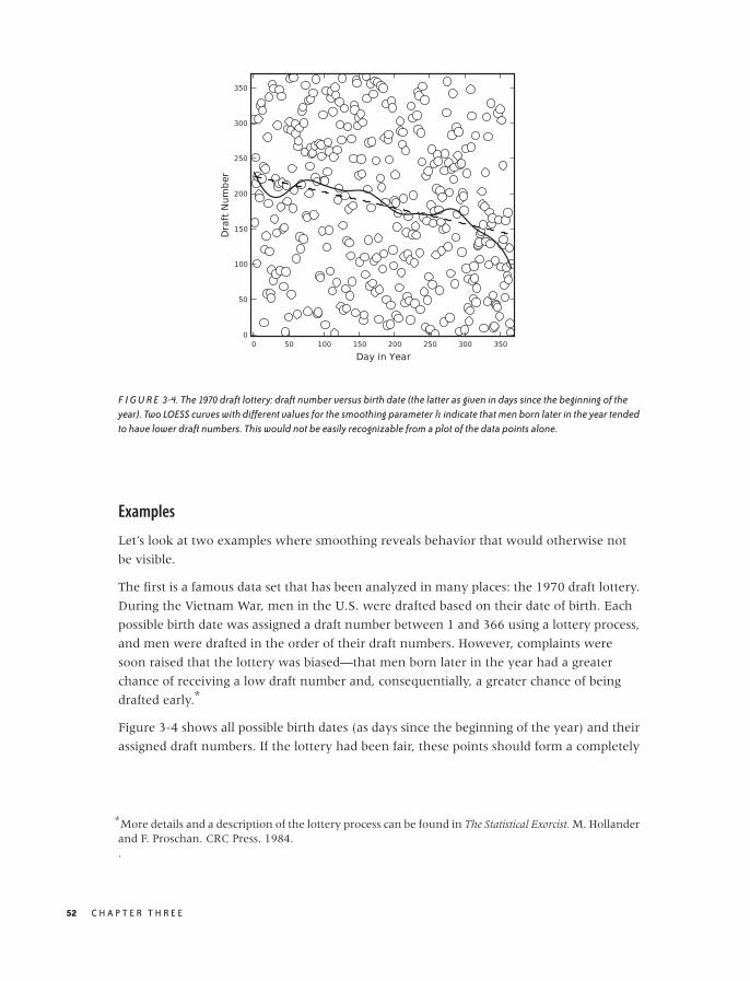
O’Reilly-5980006 master October 28, 2010 20:27
F I G U R E 3-4. The 1970 draft lottery: draft number versus birth date (the latter as given in days since the beginning of theyear). Two LOESS curves with different values for the smoothing parameter h indicate that men born later in the year tendedto have lower draft numbers. This would not be easily recognizable from a plot of the data points alone.
Examples
Let’s look at two examples where smoothing reveals behavior that would otherwise not
be visible.
The first is a famous data set that has been analyzed in many places: the 1970 draft lottery.
During the Vietnam War, men in the U.S. were drafted based on their date of birth. Each
possible birth date was assigned a draft number between 1 and 366 using a lottery process,
and men were drafted in the order of their draft numbers. However, complaints were
soon raised that the lottery was biased—that men born later in the year had a greater
chance of receiving a low draft number and, consequentially, a greater chance of being
drafted early.*
Figure 3-4 shows all possible birth dates (as days since the beginning of the year) and their
assigned draft numbers. If the lottery had been fair, these points should form a completely
*More details and a description of the lottery process can be found in The Statistical Exorcist. M. Hollanderand F. Proschan. CRC Press. 1984..
52 C H A P T E R T H R E E

O’Reilly-5980006 master October 28, 2010 20:27
random pattern. Looking at the data alone, it is virtually impossible to tell whether there
is any structure in the data. However, the smoothed LOESS lines reveal a strong falling
tendency of the draft number over the course of the year: later birth dates are indeed
more likely to have a lower draft number!
The LOESS lines have been calculated using a Gaussian kernel. For the solid line, I used a
kernel bandwidth equal to 5, but for the dashed line, I used a much larger bandwidth of
100. For such a large bandwidth, practically all points in the data set contribute equally to
the smoothed curve, so that the LOESS operation reverts to a linear regression of the
entire data set. (In other words: if we make the bandwidth very large, then LOESS
amounts to a least-squares fit of a straight line to the data.)
In this draft number example, we mostly cared about a global property of the data: the
presence or absence of an overall trend. Because we were looking for a global property, a
stiff curve (such as a straight line) was sufficient to reveal what we were looking for.
However, if we want to extract more detail—in particular if we want to extract local
features—then we need a “softer” curve, which can follow the data on smaller scales.
Figure 3-5 shows an amusing example.* Displayed are the finishing times (separately for
men and women) for the winners in a marathon. Also shown are the “best fit”
straight-line approximations for all events up to 1990. According to this (straight-line)
model, women should start finishing faster than men before the year 2000 and then
continue to become faster at a dramatic rate! This expectation is not borne out by actual
observations: finishing times for women (and men) have largely leveled off.
This example demonstrates the danger of attempting to describe data by using a model of
fixed form (a “formula”)—and a straight line is one of the most rigid models out there! A
model that is not appropriate for the data will lead to incorrect conclusions. Moreover, it
may not be obvious that the model is inappropriate. Look again at Figure 3-5: don’t the
straight lines seem reasonable as a description of the data prior to 1990?
Also shown in Figure 3-5 are smoothed curves calculated using a LOESS process. Because
these curves are “softer” they have a greater ability to capture features contained in the
data. Indeed, the LOESS curve for the women’s results does give an indication that the
trend of dramatic improvements, seen since they first started competing in the mid-1960s,
had already begun to level off before the year 1990. (All curves are based strictly on data
prior to 1990.) This is a good example of how an adaptive smoothing curve can highlight
local behavior that is present in the data but may not be obvious from merely looking at
the individual data points.
*This example was inspired by Graphic Discovery: A Trout in the Milk and Other Visual Adventures. HowardWainer. 2nd ed., Princeton University Press. 2007..
T W O V A R I A B L E S : E S TA B L I S H I N G R E L AT I O N S H I P S 53
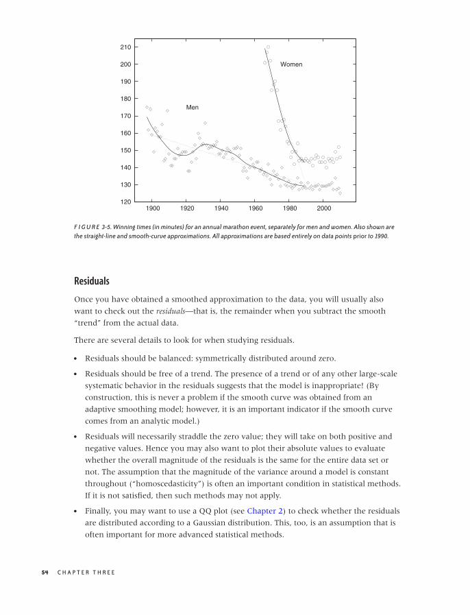
O’Reilly-5980006 master October 28, 2010 20:27
120
130
140
150
160
170
180
190
200
210
1900 1920 1940 1960 1980 2000
Men
Women
F I G U R E 3-5. Winning times (in minutes) for an annual marathon event, separately for men and women. Also shown arethe straight-line and smooth-curve approximations. All approximations are based entirely on data points prior to 1990.
Residuals
Once you have obtained a smoothed approximation to the data, you will usually also
want to check out the residuals—that is, the remainder when you subtract the smooth
“trend” from the actual data.
There are several details to look for when studying residuals.
• Residuals should be balanced: symmetrically distributed around zero.
• Residuals should be free of a trend. The presence of a trend or of any other large-scale
systematic behavior in the residuals suggests that the model is inappropriate! (By
construction, this is never a problem if the smooth curve was obtained from an
adaptive smoothing model; however, it is an important indicator if the smooth curve
comes from an analytic model.)
• Residuals will necessarily straddle the zero value; they will take on both positive and
negative values. Hence you may also want to plot their absolute values to evaluate
whether the overall magnitude of the residuals is the same for the entire data set or
not. The assumption that the magnitude of the variance around a model is constant
throughout (“homoscedasticity”) is often an important condition in statistical methods.
If it is not satisfied, then such methods may not apply.
• Finally, you may want to use a QQ plot (see Chapter 2) to check whether the residuals
are distributed according to a Gaussian distribution. This, too, is an assumption that is
often important for more advanced statistical methods.
54 C H A P T E R T H R E E
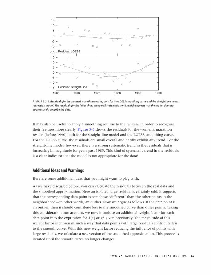
O’Reilly-5980006 master October 28, 2010 20:27
-15
-10
-5
0
5
10
15
Residual: LOESS
-15
-10
-5
0
5
10
15
1965 1970 1975 1980 1985 1990
Residual: Straight Line
F I G U R E 3-6. Residuals for the women’s marathon results, both for the LOESS smoothing curve and the straight-line linearregression model. The residuals for the latter show an overall systematic trend, which suggests that the model does notappropriately describe the data.
It may also be useful to apply a smoothing routine to the residuals in order to recognize
their features more clearly. Figure 3-6 shows the residuals for the women’s marathon
results (before 1990) both for the straight-line model and the LOESS smoothing curve.
For the LOESS curve, the residuals are small overall and hardly exhibit any trend. For the
straight-line model, however, there is a strong systematic trend in the residuals that is
increasing in magnitude for years past 1985. This kind of systematic trend in the residuals
is a clear indicator that the model is not appropriate for the data!
Additional Ideas and Warnings
Here are some additional ideas that you might want to play with.
As we have discussed before, you can calculate the residuals between the real data and
the smoothed approximation. Here an isolated large residual is certainly odd: it suggests
that the corresponding data point is somehow “different” than the other points in the
neighborhood—in other words, an outlier. Now we argue as follows. If the data point is
an outlier, then it should contribute less to the smoothed curve than other points. Taking
this consideration into account, we now introduce an additional weight factor for each
data point into the expression for J [s] or χ2 given previously. The magnitude of this
weight factor is chosen in such a way that data points with large residuals contribute less
to the smooth curve. With this new weight factor reducing the influence of points with
large residuals, we calculate a new version of the smoothed approximation. This process is
iterated until the smooth curve no longer changes.
T W O V A R I A B L E S : E S TA B L I S H I N G R E L AT I O N S H I P S 55
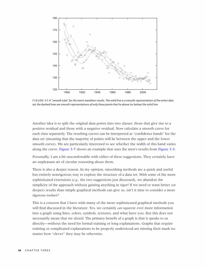
O’Reilly-5980006 master October 28, 2010 20:27
120
130
140
150
160
170
180
1900 1920 1940 1960 1980 2000
F I G U R E 3-7. A “smooth tube” for the men’s marathon results. The solid line is a smooth representation of the entire dataset; the dashed lines are smooth representations of only those points that lie above (or below) the solid line.
Another idea is to split the original data points into two classes: those that give rise to a
positive residual and those with a negative residual. Now calculate a smooth curve for
each class separately. The resulting curves can be interpreted as “confidence bands” for the
data set (meaning that the majority of points will lie between the upper and the lower
smooth curve). We are particularly interested to see whether the width of this band varies
along the curve. Figure 3-7 shows an example that uses the men’s results from Figure 3-5.
Personally, I am a bit uncomfortable with either of these suggestions. They certainly have
an unpleasant air of circular reasoning about them.
There is also a deeper reason. In my opinion, smoothing methods are a quick and useful
but entirely nonrigorous way to explore the structure of a data set. With some of the more
sophisticated extensions (e.g., the two suggestions just discussed), we abandon the
simplicity of the approach without gaining anything in rigor! If we need or want better (or
deeper) results than simple graphical methods can give us, isn’t it time to consider a more
rigorous toolset?
This is a concern that I have with many of the more sophisticated graphical methods you
will find discussed in the literature. Yes, we certainly can squeeze ever more information
into a graph using lines, colors, symbols, textures, and what have you. But this does not
necessarily mean that we should. The primary benefit of a graph is that it speaks to us
directly—without the need for formal training or long explanations. Graphs that require
training or complicated explanations to be properly understood are missing their mark no
matter how “clever” they may be otherwise.
56 C H A P T E R T H R E E
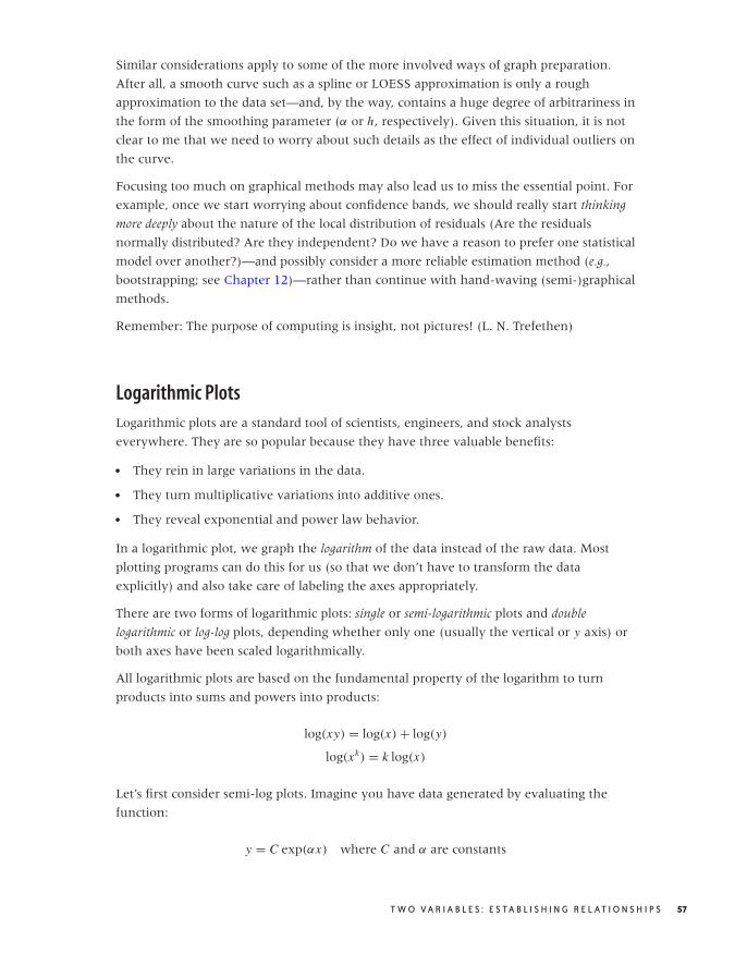
O’Reilly-5980006 master October 28, 2010 20:27
Similar considerations apply to some of the more involved ways of graph preparation.
After all, a smooth curve such as a spline or LOESS approximation is only a rough
approximation to the data set—and, by the way, contains a huge degree of arbitrariness in
the form of the smoothing parameter (α or h, respectively). Given this situation, it is not
clear to me that we need to worry about such details as the effect of individual outliers on
the curve.
Focusing too much on graphical methods may also lead us to miss the essential point. For
example, once we start worrying about confidence bands, we should really start thinking
more deeply about the nature of the local distribution of residuals (Are the residuals
normally distributed? Are they independent? Do we have a reason to prefer one statistical
model over another?)—and possibly consider a more reliable estimation method (e.g.,
bootstrapping; see Chapter 12)—rather than continue with hand-waving (semi-)graphical
methods.
Remember: The purpose of computing is insight, not pictures! (L. N. Trefethen)
Logarithmic Plots
Logarithmic plots are a standard tool of scientists, engineers, and stock analysts
everywhere. They are so popular because they have three valuable benefits:
• They rein in large variations in the data.
• They turn multiplicative variations into additive ones.
• They reveal exponential and power law behavior.
In a logarithmic plot, we graph the logarithm of the data instead of the raw data. Most
plotting programs can do this for us (so that we don’t have to transform the data
explicitly) and also take care of labeling the axes appropriately.
There are two forms of logarithmic plots: single or semi-logarithmic plots and double
logarithmic or log-log plots, depending whether only one (usually the vertical or y axis) or
both axes have been scaled logarithmically.
All logarithmic plots are based on the fundamental property of the logarithm to turn
products into sums and powers into products:
log(xy) = log(x) + log(y)
log(xk) = k log(x)
Let’s first consider semi-log plots. Imagine you have data generated by evaluating the
function:
y = C exp(αx) where C and α are constants
T W O V A R I A B L E S : E S TA B L I S H I N G R E L AT I O N S H I P S 57
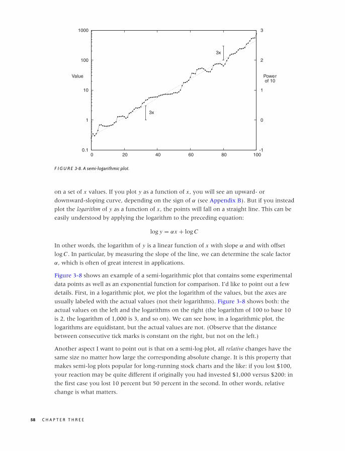
O’Reilly-5980006 master October 28, 2010 20:27
0.1
1
10
100
1000
0 20 40 60 80 100-1
0
1
2
3
Value Powerof 10
3x
3x
F I G U R E 3-8. A semi-logarithmic plot.
on a set of x values. If you plot y as a function of x , you will see an upward- or
downward-sloping curve, depending on the sign of α (see Appendix B). But if you instead
plot the logarithm of y as a function of x , the points will fall on a straight line. This can be
easily understood by applying the logarithm to the preceding equation:
log y = αx + log C
In other words, the logarithm of y is a linear function of x with slope α and with offset
log C . In particular, by measuring the slope of the line, we can determine the scale factor
α, which is often of great interest in applications.
Figure 3-8 shows an example of a semi-logarithmic plot that contains some experimental
data points as well as an exponential function for comparison. I’d like to point out a few
details. First, in a logarithmic plot, we plot the logarithm of the values, but the axes are
usually labeled with the actual values (not their logarithms). Figure 3-8 shows both: the
actual values on the left and the logarithms on the right (the logarithm of 100 to base 10
is 2, the logarithm of 1,000 is 3, and so on). We can see how, in a logarithmic plot, the
logarithms are equidistant, but the actual values are not. (Observe that the distance
between consecutive tick marks is constant on the right, but not on the left.)
Another aspect I want to point out is that on a semi-log plot, all relative changes have the
same size no matter how large the corresponding absolute change. It is this property that
makes semi-log plots popular for long-running stock charts and the like: if you lost $100,
your reaction may be quite different if originally you had invested $1,000 versus $200: in
the first case you lost 10 percent but 50 percent in the second. In other words, relative
change is what matters.
58 C H A P T E R T H R E E
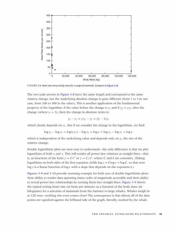
O’Reilly-5980006 master October 28, 2010 20:27
0
50
100
150
200
250
300
350
400
450
0 20,000 40,000 60,000 80,000 100,000 120,000
Hea
rt R
ate
[bea
ts p
er m
inut
e]
Body Mass [kg]
F I G U R E 3-9. Heart rate versus body mass for a range of mammals. Compare to Figure 3-10.
The two scale arrows in Figure 3-8 have the same length and correspond to the same
relative change, but the underlying absolute change is quite different (from 1 to 3 in one
case, from 100 to 300 in the other). This is another application of the fundamental
property of the logarithm: if the value before the change is y1 and if y2 = γ y1 after the
change (where γ = 3), then the change in absolute terms is:
y2 − y1 = γ y1 − y1 = (γ − 1)y1
which clearly depends on y1. But if we consider the change in the logarithms, we find:
log y2 − log y1 = log(γ y1) − log y1 = log γ + log y1 − log y1 = log γ
which is independent of the underlying value and depends only on γ , the size of the
relative change.
Double logarithmic plots are now easy to understand—the only difference is that we plot
logarithms of both x and y. This will render all power-law relations as straight lines—that
is, as functions of the form y = Cxk or y = C/xk , where C and k are constants. (Taking
logarithms on both sides of the first equation yields log y = k log x + log C , so that now
log y is a linear function of log x with a slope that depends on the exponent k.)
Figures 3-9 and 3-10 provide stunning example for both uses of double logarithmic plots:
their ability to render data spanning many order of magnitude accessible and their ability
to reveal power-law relationships by turning them into straight lines. Figure 3-9 shows
the typical resting heart rate (in beats per minute) as a function of the body mass (in
kilograms) for a selection of mammals from the hamster to large whales. Whales weigh in
at 120 tons—nothing else even comes close! The consequence is that almost all of the data
points are squished against the lefthand side of the graph, literally crushed by the whale.
T W O V A R I A B L E S : E S TA B L I S H I N G R E L AT I O N S H I P S 59
O’Reilly-5980006 master October 28, 2010 20:27
10
100
1,000
0.01 0.1 1 10 100 1,000 10,000 100,000 1e+06
Hea
rt R
ate
[bea
ts p
er m
inut
e]
Body Mass [kg]
Human
Cat
Dog
Hamster
Chicken
Monkey
Horse
CowPig
Rabbit
Elephant
Large Whale
F I G U R E 3-10. The same data as in Figure 3-9 but now plotted on a double logarithmic plot. The data points seem to fall ona straight line, which indicates a power-law relationship between resting heart rate and body mass.
On the double logarithmic plot, the distribution of data points becomes much clearer.
Moreover, we find that the data points are not randomly distributed but instead seem to
fall roughly on a straight line with slope −1/4: the signature of power-law behavior. In
other words, a mammal’s typical heart rate is related to its mass: larger animals have
slower heart beats. If we let f denote the heart rate and m the mass, we can summarize
this observation as:
f ∼ m−1/4
This surprising result is known as allometric scaling. It seems to hold more generally and
not just for the specific animals and quantities shown in these figures. (For example, it
turns out that the lifetime of an individual organism also obeys a 1/4 power-law
relationship with the body mass: larger animals live longer. The surprising consequence is
that the total number of heartbeats per life of an individual is approximately constant for
all species!) Allometric scaling has been explained in terms of the geometric constraints of
the vascular network (veins and arteries), which brings nutrients to the cells making up a
biological system. It is sufficient to assume that the network must be a space-filling fractal,
that the capillaries where the actual exchange of nutrients takes place are the same size in
all animals, and that the overall energy required for transport through the network is
minimized, to derive the power-law relationships observed experimentally!* We’ll have
more to say about scaling laws and their uses in Part II.
*The original reference is “A General Model for the Origin of Allometric Scaling Laws in Biology.”G. B. West, J. H. Brown, and B. J. Enquist. Science 276 (1997), p. 122. Additional references can befound on the Web.
60 C H A P T E R T H R E E

O’Reilly-5980006 master October 28, 2010 20:27
Banking
Smoothing methods and logarithmic plots are both tools that help us recognize structure
in a data set. Smoothing methods reduce noise, and logarithmic plots help with data sets
spanning many orders of magnitude.
Banking (or “banking to 45 degrees”) is another graphical method. It is different than the
preceding ones because it does not work on the data but on the plot as a whole by
changing its aspect ratio.
We can recognize change (i.e., the slopes of curves) most easily if they make approximately
a 45 degree angle on the graph. It is much harder to see change if the curves are nearly
horizontal or (even worse) nearly vertical. The idea behind banking is therefore to adjust
the aspect ratio of the entire plot in such a way that most slopes are at an approximate 45
degree angle.
Chances are, you have been doing this already by changing the plot ranges. Often when
we “zoom” in on a graph it’s not so much to see more detail as to adjust the slopes of
curves to make them more easily recognizable. The purpose is even more obvious when
we zoom out. Banking is a more suitable technique to achieve the same effect and opens
up a way to control the appearance of a plot by actively adjusting the aspect ratio.
Figures 3-11 and 3-12 show the classical example for this technique: the annual number
of sunspots measured over the last 300 years.* In Figure 3-11, the oscillation is very
compressed, and so it is difficult to make out much detail about the shape of the curve. In
Figure 3-12, the aspect ratio of the plot has been adjusted so that most line segments are
now at roughly a 45 degree angle, and we can make an interesting observation: the rising
edge of each sunspot cycle is steeper than the falling edge. We would probably not have
recognized this by looking at Figure 3-11.
Personally, I would probably not use a graph such as Figure 3-12: shrinking the vertical
axis down to almost nothing loses too much detail. It also becomes difficult to compare
the behavior on the far left and far right of the graph. Instead, I would break up the time
series and plot it as a cut-and-stack plot, such as the one in Figure 3-13. Note that in this plot
the aspect ratio of each subplot is such that the lines are, in fact, banked to 45 degrees.
As this example demonstrates, banking is a good technique but can be taken too literally.
When the aspect ratio required to achieve proper banking is too skewed, it is usually
better to rethink the entire graph. No amount of banking will make the data set in
Figure 3-9 look right—you need a double logarithmic transform.
There is also another issue to consider. The purpose of banking is to improve human
perception of the graph (it is, after all, exactly the same data that is displayed). But graphs
*The discussion here is adapted from my book Gnuplot in Action. Manning Publications. 2010.
T W O V A R I A B L E S : E S TA B L I S H I N G R E L AT I O N S H I P S 61

O’Reilly-5980006 master October 28, 2010 20:27
0
20
40
60
80
100
120
140
160
180
200
1700 1750 1800 1850 1900 1950 2000
Annual Sunspot Number
F I G U R E 3-11. The annual sunspot numbers for the last 300 years. The aspect ratio of the plot makes it hard to recognizethe details of each cycle.
0 100 200
1700 1750 1800 1850 1900 1950 2000
F I G U R E 3-12. The same data as in Figure 3-11. The aspect ratio has been changed so that rising and falling flanks of thecurve make approximately a 45 degree angle with the horizontal (banking to 45 degrees), but the figure has become so smallthat it is hard to recognize much detail.
with highly skewed aspect ratios violate the great affinity humans seem to have for
proportions of roughly 4 by 3 (or 11 by 8.5 or√
2 by 1). Witness the abundance of display
formats (paper, books, screens) that adhere approximately to these proportions the world
over. Whether we favor this display format because we are so used to it or (more likely, I
think) it is so predominant because it works well for humans is rather irrelevant in this
context. (And keep in mind that squares seem to work particularly badly—notice how
squares, when used for furniture or appliances, are considered a “bold” design. Unless
there is a good reason for them, such as graphing a square matrix, I recommend you avoid
square displays.)
Linear Regression and All That
Linear regression is a method for finding a straight line through a two-dimensional scatter
plot. It is simple to calculate and has considerable intuitive appeal—both of which
together make it easily the single most-often misapplied technique in all of statistics!
There is a fundamental misconception regarding linear regression—namely that it is a
good and particularly rigorous way to summarize the data in a two-dimensional scatter
62 C H A P T E R T H R E E
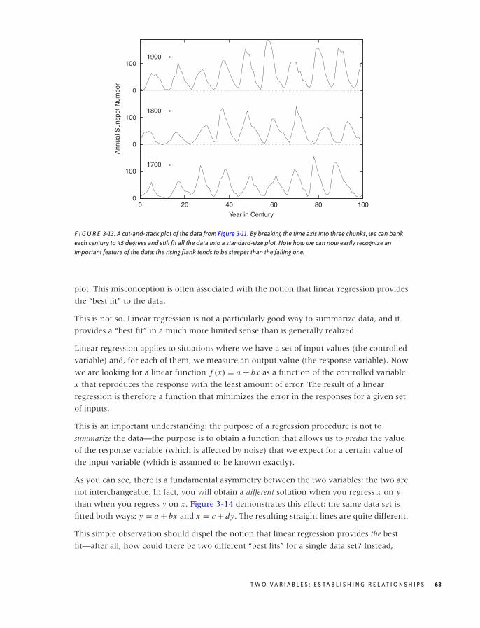
O’Reilly-5980006 master October 28, 2010 20:27
0
100
0
100
0
100
0 20 40 60 80 100
Ann
ual S
unsp
ot N
umbe
r
Year in Century
1700
1800
1900
F I G U R E 3-13. A cut-and-stack plot of the data from Figure 3-11. By breaking the time axis into three chunks, we can bankeach century to 45 degrees and still fit all the data into a standard-size plot. Note how we can now easily recognize animportant feature of the data: the rising flank tends to be steeper than the falling one.
plot. This misconception is often associated with the notion that linear regression provides
the “best fit” to the data.
This is not so. Linear regression is not a particularly good way to summarize data, and it
provides a “best fit” in a much more limited sense than is generally realized.
Linear regression applies to situations where we have a set of input values (the controlled
variable) and, for each of them, we measure an output value (the response variable). Now
we are looking for a linear function f (x) = a + bx as a function of the controlled variable
x that reproduces the response with the least amount of error. The result of a linear
regression is therefore a function that minimizes the error in the responses for a given set
of inputs.
This is an important understanding: the purpose of a regression procedure is not to
summarize the data—the purpose is to obtain a function that allows us to predict the value
of the response variable (which is affected by noise) that we expect for a certain value of
the input variable (which is assumed to be known exactly).
As you can see, there is a fundamental asymmetry between the two variables: the two are
not interchangeable. In fact, you will obtain a different solution when you regress x on y
than when you regress y on x . Figure 3-14 demonstrates this effect: the same data set is
fitted both ways: y = a + bx and x = c + dy. The resulting straight lines are quite different.
This simple observation should dispel the notion that linear regression provides the best
fit—after all, how could there be two different “best fits” for a single data set? Instead,
T W O V A R I A B L E S : E S TA B L I S H I N G R E L AT I O N S H I P S 63
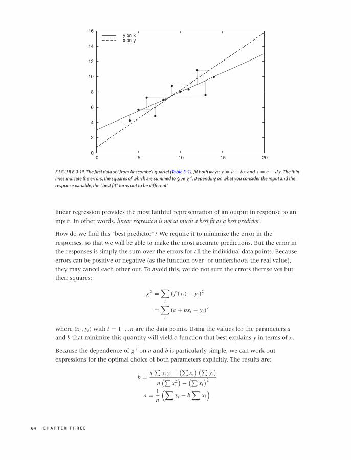
O’Reilly-5980006 master October 28, 2010 20:27
0
2
4
6
8
10
12
14
16
0 5 10 15 20
y on xx on y
F I G U R E 3-14. The first data set from Anscombe’s quartet (Table 3 -1), fit both ways: y = a + bx and x = c + dy. The thinlines indicate the errors, the squares of which are summed to give χ2. Depending on what you consider the input and theresponse variable, the “best fit” turns out to be different!
linear regression provides the most faithful representation of an output in response to an
input. In other words, linear regression is not so much a best fit as a best predictor.
How do we find this “best predictor”? We require it to minimize the error in the
responses, so that we will be able to make the most accurate predictions. But the error in
the responses is simply the sum over the errors for all the individual data points. Because
errors can be positive or negative (as the function over- or undershoots the real value),
they may cancel each other out. To avoid this, we do not sum the errors themselves but
their squares:
χ2 =∑
i
( f (xi ) − yi )2
=∑
i
(a + bxi − yi )2
where (xi , yi ) with i = 1 . . . n are the data points. Using the values for the parameters a
and b that minimize this quantity will yield a function that best explains y in terms of x .
Because the dependence of χ2 on a and b is particularly simple, we can work out
expressions for the optimal choice of both parameters explicitly. The results are:
b = n∑
xi yi − (∑xi
) (∑yi
)
n(∑
x2i
) − (∑xi
)2
a = 1
n
(∑yi − b
∑xi
)
64 C H A P T E R T H R E E
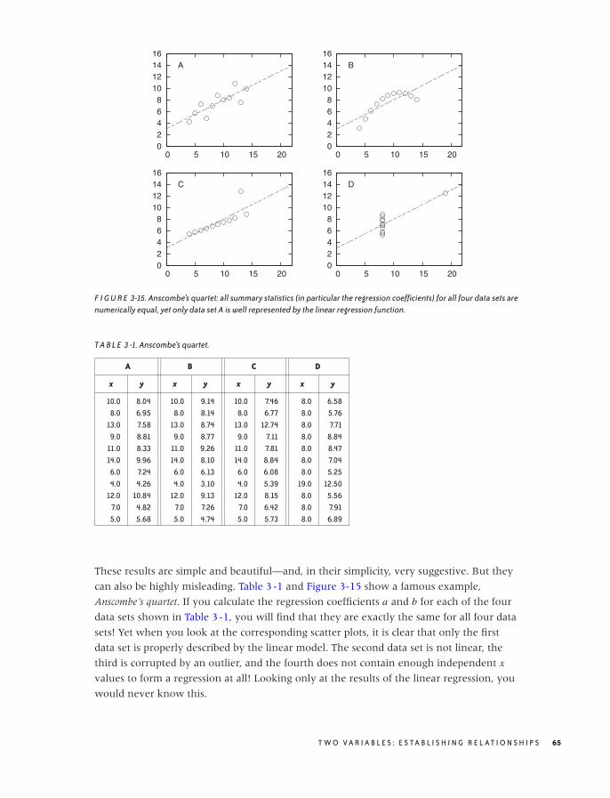
O’Reilly-5980006 master October 28, 2010 20:27
0 2 4 6 8
10 12 14 16
0 5 10 15 20
A
0 2 4 6 8
10 12 14 16
0 5 10 15 20
B
0 2 4 6 8
10 12 14 16
0 5 10 15 20
C
0 2 4 6 8
10 12 14 16
0 5 10 15 20
D
F I G U R E 3-15. Anscombe’s quartet: all summary statistics (in particular the regression coefficients) for all four data sets arenumerically equal, yet only data set A is well represented by the linear regression function.
T A B L E 3 -1. Anscombe’s quartet.
A B C D
x y x y x y x y
10.0 8.04 10.0 9.14 10.0 7.46 8.0 6.588.0 6.95 8.0 8.14 8.0 6.77 8.0 5.76
13.0 7.58 13.0 8.74 13.0 12.74 8.0 7.719.0 8.81 9.0 8.77 9.0 7.11 8.0 8.84
11.0 8.33 11.0 9.26 11.0 7.81 8.0 8.4714.0 9.96 14.0 8.10 14.0 8.84 8.0 7.04
6.0 7.24 6.0 6.13 6.0 6.08 8.0 5.254.0 4.26 4.0 3.10 4.0 5.39 19.0 12.50
12.0 10.84 12.0 9.13 12.0 8.15 8.0 5.567.0 4.82 7.0 7.26 7.0 6.42 8.0 7.915.0 5.68 5.0 4.74 5.0 5.73 8.0 6.89
These results are simple and beautiful—and, in their simplicity, very suggestive. But they
can also be highly misleading. Table 3-1 and Figure 3-15 show a famous example,
Anscombe’s quartet. If you calculate the regression coefficients a and b for each of the four
data sets shown in Table 3-1, you will find that they are exactly the same for all four data
sets! Yet when you look at the corresponding scatter plots, it is clear that only the first
data set is properly described by the linear model. The second data set is not linear, the
third is corrupted by an outlier, and the fourth does not contain enough independent x
values to form a regression at all! Looking only at the results of the linear regression, you
would never know this.
T W O V A R I A B L E S : E S TA B L I S H I N G R E L AT I O N S H I P S 65
O’Reilly-5980006 master October 28, 2010 20:27
I think this example should demonstrate once and for all how dangerous it can be to rely
on linear regression (or on any form of aggregate statistics) to summarize a data set. (In
fact, the situation is even worse than what I have presented: with a little bit more work,
you can calculate confidence intervals on the linear regression results, and even they turn
out to be equal for all four members of Anscombe’s quartet!)
Having seen this, here are some questions to ask before computing linear regressions.
Do you need regression?Remember that regression coefficients are not a particularly good way to summarize
data. Regression only makes sense when you want to use it for prediction. If this is not
the case, then calculating regression coefficients is not useful.
Is the linear assumption appropriate?Linear regression is appropriate only if the data can be described by a straight line. If
this is obviously not the case (as with the second data set in Anscombe’s quartet), then
linear regression does not apply.
Is something else entirely going on?Linear regression, like all summary statistics, can be led astray by outliers or other
“weird” data sets, as is demonstrated by the last two examples in Anscombe’s quartet.
Historically, one of the attractions of linear regression has been that it is easy to calculate:
all you need to do is to calculate the four sums∑
xi ,∑
x2i ,
∑yi , and
∑xi yi , which can be
done in a single pass through the data set. Even with moderately sized data sets (dozens of
points), this is arguably easier than plotting them using paper and pencil! However, that
argument simply does not hold anymore: graphs are easy to produce on a computer and
contain so much more information than a set of regression coefficients that they should
be the preferred way to analyze, understand, and summarize data.
Remember: The purpose of computing is insight, not numbers! (R. W. Hamming)
Showing What's Important
Perhaps this is a good time to express what I believe to be the most important principle in
graphical analysis:
Plot the pertinent quantities!
As obvious as it may appear, this principle is often overlooked in practice.
For example, if you look through one of those books that show and discuss examples of
poor graphics, you will find that most examples fall into one of two classes. First, there are
those graphs that failed visually, with garish fonts, unhelpful symbols, and useless
embellishments. (These are mostly presentation graphics gone wrong, not examples of
bad graphical analysis.)
The second large class of graphical failures consists of those plots that failed conceptually or,
one might better say, analytically. The problem with these is not in the technical aspects of
66 C H A P T E R T H R E E

O’Reilly-5980006 master October 28, 2010 20:27
drawing the graph but in the conceptual understanding of what the graph is trying to
show. These plots displayed something, but they failed to present what was most
important or relevant to the question at hand.
The problem, of course, is that usually it is not at all obvious what we want to see, and it is
certainly not obvious at the beginning. It usually takes several iterations, while a mental
model of the data is forming in your head, to articulate the proper question that a data set
is suggesting and to come up with the best way of answering it. This typically involves
some form of transformation or manipulation of the data: instead of the raw data, maybe
we should show the difference between two data sets. Or the residual after subtracting a
trend or after subtracting the results from a model. Or perhaps we need to normalize data
sets from different sources by subtracting their means and dividing by their spreads. Or
maybe we should not use the original variables to display the data but instead apply some
form of transformation on them (logarithmic scales are only the simplest example of such
transformations). Whatever we choose to do, it will typically involve some form of
transformation of the data—it’s rarely the raw data that is most interesting; but any
deviation from the expected is almost always an interesting discovery.
Very roughly, I think we can identify a three-step (maybe four-step) process. It should be
taken not in the sense of a prescriptive checklist but rather in the sense of a gradual
process of learning and discovery.
First: The basics. Initially, we are mostly concerned with displaying what is there.
• Select proper ranges.
• Subtract a constant offset.
• Decide whether to use symbols (for scattered data), lines (for continuous data), or
perhaps both (connecting individual symbols can help emphasize trends in sparse data
sets).
Second: The appearance. Next, we work with aspects of the plot that influence its overall
appearance.
• Log plots.
• Add a smoothed curve.
• Consider banking.
Third: Build a model. At this point, we start building a mathematical model and
compare it against the raw data. The comparison often involves finding the differences
between the model and the data (typically subtracting the model or forming a ratio).
• Subtract a trend.
• Form the ratio to a base value or baseline.
• Rescale a set of curves to collapse them onto each other.
T W O V A R I A B L E S : E S TA B L I S H I N G R E L AT I O N S H I P S 67

O’Reilly-5980006 master October 28, 2010 20:27
Fourth (for presentation graphics only): Add embellishments. Embellishments and
decorations (labels, arrows, special symbols, explanations, and so on) can make a graph
much more informative and self-explanatory. However, they are intended for an audience
beyond the actual creator of the graph. You will rarely need them during the analysis
phase, when you are trying to find out something new about the data set, but they are an
essential part when presenting your results. This step should only occur if you want to
communicate your results to a wider and more general audience.
Graphical Analysis and Presentation Graphics
I have used the terms graphical analysis and presentation graphics without explaining them
properly. In short:
Graphical analysisGraphical analysis is an investigation of data using graphical methods. The purpose is
the discovery of new information about the underlying data set. In graphical analysis,
the proper question to ask is often not known at the outset but is discovered as part of
the analysis.
Presentation graphicsPresentation graphics are concerned with the communication of information and
results that are already understood. The discovery has been made, and now it needs to be
communicated clearly.
The distinction between these two activities is important, because they do require
different techniques and yield different work products.
During the analysis process, convenience and ease of use are the predominant
concerns—any amount of polishing is too much! Nothing should keep you from redrawing
a graph, changing some aspect of it, zooming in or out, applying transformations, and
changing styles. (When working with a data set I haven’t seen before, I probably create
dozens of graphs within a few minutes—basically, “looking at the data from all angles.”)
At this stage, any form of embellishment (labels, arrows, special symbols) is
inappropriate—you know what you are showing, and creating any form of decoration on
the graph will only make you more reluctant to throw the graph away and start over.
For presentation graphics, the opposite applies. Now you already know the results, but
you would like to communicate them to others. Textual information therefore becomes
very important: how else will people know what they are looking at?
You can find plenty of advice elsewhere on how to prepare “good” presentation
graphics—often strongly worded and with an unfortunate tendency to use emotional
responses (ridicule or derision) in place of factual arguments. In the absence of good
empirical evidence one way or the other, I will not add to the discussion. But I present a
checklist below, mentioning some points that are often overlooked when preparing graphs
for presentation:
68 C H A P T E R T H R E E

O’Reilly-5980006 master October 28, 2010 20:27
• Try to make the text self-explanatory. Don’t rely on a (separate) caption for basic
information—it might be removed during reproduction. Place basic information on the
graph itself.
• Explain what is plotted on the axes. This can be done with explicit labels on the axes or
through explanatory text elsewhere. Don’t forget the units!
• Make labels self-explanatory. Be careful with nonstandard abbreviations. Ask yourself:
If this is all the context provided, are you certain that the reader will be able to figure
out what you mean? (In a recent book on data graphing, I found a histogram labeled
Married, Nvd, Dvd, Spd, and Wdd. I could figure out most of them, because at least
Married was given in long form, but I struggled with Nvd for quite a while!)
• Given how important text is on a graph, make sure to pick a suitable font. Don’t
automatically rely on the default provided by your plotting software. Generally,
sans-serif fonts (such as Helvetica) are preferred for short labels, such as those on a
graph, whereas serif fonts (such as Times) are more suitable for body text. Also pick an
appropriate size—text fonts on graphics are often too large, making them look garish.
(Most text fonts are used at 10-point to 12-point size; there is no need for type on
graphics to be much larger.)
• If there are error bars, be sure to explain their meaning. What are they: standard
deviations, inter-quartile ranges, or the limits of experimental apparatus? Also, choose
an appropriate measure of uncertainty. Don’t use standard deviations for highly
skewed data.
• Don’t forget the basics. Choose appropriate plot ranges. Make sure that data is not
unnecessarily obscured by labels.
• Proofread graphs! Common errors include: typos in textual labels, interchanged data
sets or switched labels, missing units, and incorrect order-of-magnitude qualifiers (e.g.,
milli- versus micro-).
• Finally, choose an appropriate output format for your graph! Don’t use bitmap formats
(GIF, JPG, PNG) for print publication—use a scalable format such as PostScript or PDF.
One last piece of advice: creating good presentation graphics is also a matter of taste, and
taste can be acquired. If you want to work with data, then you should develop an interest
in graphs—not just the ones you create yourself, but all that you see. If you notice one
that seems to work (or not), take a moment to figure out what makes it so. Are the lines
too thick? The labels too small? The choice of colors just right? The combination of curves
helpful? Details matter.
Workshop: matplotlib
The matplotlib module is a Python module for creating two-dimensional xy plots, scatter
plots, and other plots typical of scientific applications. It can be used in an interactive
T W O V A R I A B L E S : E S TA B L I S H I N G R E L AT I O N S H I P S 69

O’Reilly-5980006 master October 28, 2010 20:27
session (with the plots being shown immediately in a GUI window) or from within a
script to create graphics files using common graphics file formats.
Let’s first look at some examples to demonstrate how matplotlib can be used from within
an interactive session. Afterward, we will take a closer look at the structure of the library
and give some pointers for more detailed investigations.
Using matplotlib Interactively
To begin an interactive matplotlib session, start IPython (the enhanced interactive Python
shell) with the -pylab option, entering the following command line like at the shell
prompt:
ipython -pylab
This will start IPython, load matplotlib and NumPy, and import both into the global
namespace. The idea is to give a Matlab-like experience of interactive graphics together
with numerical and matrix operations. (It is important to use IPython here—the flow of
control between the Python command interpreter and the GUI eventloop for the graphics
windows requires it. Other interactive shells can be used, but they may require some
tinkering.)
We can now create plots right away:
In [1]: x = linspace( 0, 10, 100 )
In [2]: plot( x, sin(x) )
Out[2]: [<matplotlib.lines.Line2D object at 0x1cfefd0>]
This will pop up a new window, showing a graph like the one in Figure 3-16 but
decorated with some GUI buttons. (Note that the sin() function is a ufunc from the
NumPy package: it takes a vector and returns a vector of the same size, having applied the
sine function to each element in the input vector. See the Workshop in Chapter 2.)
We can now add additional curves and decorations to the plot. Continuing in the same
session as before, we add another curve and some labels:
In [3]: plot( x, 0.5*cos(2*x) )
Out[3]: [<matplotlib.lines.Line2D object at 0x1cee8d0>]
In [4]: title( "A matplotlib plot" )
Out[4]: <matplotlib.text.Text object at 0x1cf6950>
In [5]: text( 1, -0.8, "A text label" )
Out[5]: <matplotlib.text.Text object at 0x1f59250>
In [6]: ylim( -1.1, 1.1 )
Out[6]: (-1.1000000000000001, 1.1000000000000001)
70 C H A P T E R T H R E E
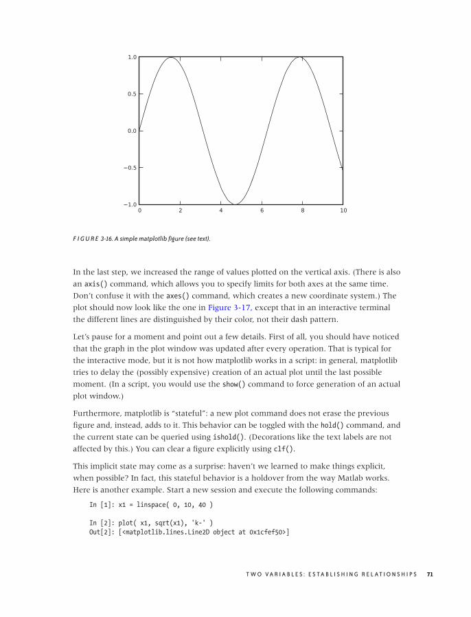
O’Reilly-5980006 master October 28, 2010 20:27
F I G U R E 3-16. A simple matplotlib figure (see text).
In the last step, we increased the range of values plotted on the vertical axis. (There is also
an axis() command, which allows you to specify limits for both axes at the same time.
Don’t confuse it with the axes() command, which creates a new coordinate system.) The
plot should now look like the one in Figure 3-17, except that in an interactive terminal
the different lines are distinguished by their color, not their dash pattern.
Let’s pause for a moment and point out a few details. First of all, you should have noticed
that the graph in the plot window was updated after every operation. That is typical for
the interactive mode, but it is not how matplotlib works in a script: in general, matplotlib
tries to delay the (possibly expensive) creation of an actual plot until the last possible
moment. (In a script, you would use the show() command to force generation of an actual
plot window.)
Furthermore, matplotlib is “stateful”: a new plot command does not erase the previous
figure and, instead, adds to it. This behavior can be toggled with the hold() command, and
the current state can be queried using ishold(). (Decorations like the text labels are not
affected by this.) You can clear a figure explicitly using clf().
This implicit state may come as a surprise: haven’t we learned to make things explicit,
when possible? In fact, this stateful behavior is a holdover from the way Matlab works.
Here is another example. Start a new session and execute the following commands:
In [1]: x1 = linspace( 0, 10, 40 )
In [2]: plot( x1, sqrt(x1), 'k-' )
Out[2]: [<matplotlib.lines.Line2D object at 0x1cfef50>]
T W O V A R I A B L E S : E S TA B L I S H I N G R E L AT I O N S H I P S 71
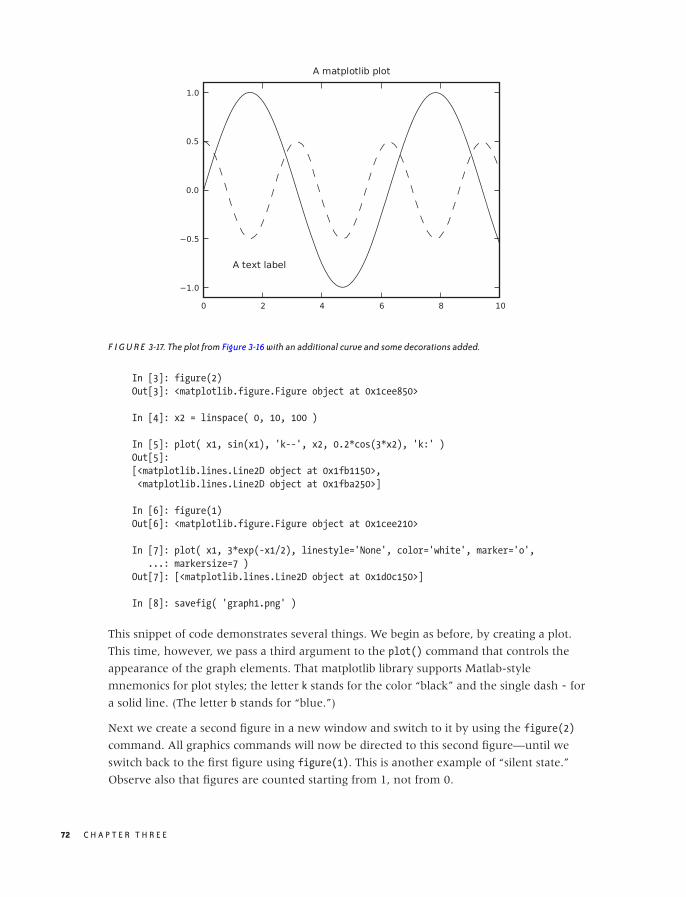
O’Reilly-5980006 master October 28, 2010 20:27
F I G U R E 3-17. The plot from Figure 3-16 with an additional curve and some decorations added.
In [3]: figure(2)
Out[3]: <matplotlib.figure.Figure object at 0x1cee850>
In [4]: x2 = linspace( 0, 10, 100 )
In [5]: plot( x1, sin(x1), 'k--', x2, 0.2*cos(3*x2), 'k:' )
Out[5]:
[<matplotlib.lines.Line2D object at 0x1fb1150>,
<matplotlib.lines.Line2D object at 0x1fba250>]
In [6]: figure(1)
Out[6]: <matplotlib.figure.Figure object at 0x1cee210>
In [7]: plot( x1, 3*exp(-x1/2), linestyle='None', color='white', marker='o',
...: markersize=7 )
Out[7]: [<matplotlib.lines.Line2D object at 0x1d0c150>]
In [8]: savefig( 'graph1.png' )
This snippet of code demonstrates several things. We begin as before, by creating a plot.
This time, however, we pass a third argument to the plot() command that controls the
appearance of the graph elements. That matplotlib library supports Matlab-style
mnemonics for plot styles; the letter k stands for the color “black” and the single dash - for
a solid line. (The letter b stands for “blue.”)
Next we create a second figure in a new window and switch to it by using the figure(2)
command. All graphics commands will now be directed to this second figure—until we
switch back to the first figure using figure(1). This is another example of “silent state.”
Observe also that figures are counted starting from 1, not from 0.
72 C H A P T E R T H R E E

O’Reilly-5980006 master October 28, 2010 20:27
In line 5, we see another way to use the plot command—namely, by specifying two sets of
curves to be plotted together. (The formatting commands request a dashed and a dotted
line, respectively.) Line 7 shows yet a different way to specify plot styles: by using named
(keyword) arguments.
Finally, we save the currently active plot (i.e., figure 1) to a PNG file. The savefig()
function determines the desired output format from the extension of the filename given.
Other formats that are supported out of the box are PostScript, PDF, and SVG. Additional
formats may be available, depending on the libraries installed on your system.
Case Study: LOESS with matplotlib
As a quick example of how to put the different aspects of matplotlib together, let’s discuss
the script used to generate Figure 3-4. This also gives us an opportunity to look at the
LOESS method in a bit more detail.
To recap: LOESS stands for locally weighted linear regression. The difference between
LOESS and regular linear regression is the introduction of a weight factor, which
emphasizes those data points that are close to the location x at which we want to evaluate
the smoothed curve. As explained earlier, the expression for squared error (which we
want to minimize) now becomes:
χ2(x) =∑
i
w(x − xi ; h) (a + bxi − yi )2
Keep in mind that this expression now depends on x , the location at which we want to
evaluate the smoothed curve!
If we minimize this expression with respect to the parameters a and b, we obtain the
following expressions for a and b (remember that we will have to evaluate them from
scratch for every point x):
b =∑
wi∑
wi xi yi − (∑wi xi
) (∑wi yi
)∑
wi
(∑wi x2
i
) − (∑wi xi
)2
a =(∑
wi yi − b∑
wi xi
)∑
wi
This can be quite easily translated into NumPy and plotted with matplotlib. The actual
LOESS calculation is contained entirely in the function loess(). (See the Workshop in
Chapter 2 for a discussion of this type of programming.)
from pylab import *
# x: location; h: bandwidth; xp, yp: data points (vectors)
def loess( x, h, xp, yp ):
w = exp( -0.5*( ((x-xp)/h)**2 )/sqrt(2*pi*h**2) )
b = sum(w*xp)*sum(w*yp) - sum(w)*sum(w*xp*yp)
T W O V A R I A B L E S : E S TA B L I S H I N G R E L AT I O N S H I P S 73
O’Reilly-5980006 master October 28, 2010 20:27
b /= sum(w*xp)**2 - sum(w)*sum(w*xp**2)
a = ( sum(w*yp) - b*sum(w*xp) )/sum(w)
return a + b*x
d = loadtxt( "draftlottery" )
s1, s2 = [], []
for k in d[:,0]:
s1.append( loess( k, 5, d[:,0], d[:,1] ) )
s2.append( loess( k, 100, d[:,0], d[:,1] ) )
xlabel( "Day in Year" )
ylabel( "Draft Number" )
gca().set_aspect( 'equal' )
plot( d[:,0], d[:,1], 'o', color="white", markersize=7, linewidth=3 )
plot( d[:,0], array(s1), 'k-', d[:,0], array(s2), 'k--' )
q = 4
axis( [1-q, 366+q, 1-q, 366+q] )
savefig( "draftlottery.eps" )
We evaluate the smoothed curve at the locations of all data points, using two different
values for the bandwidth, and then proceed to plot the data together with the smoothed
curves. Two details require an additional word of explanation. The function gca() returns
the current “set of axes” (i.e., the current coordinate system on the plot—see below for
more information on this function), and we require the aspect ratio of both x and y axes
to be equal (so that the plot is a square). In the last command before we save the figure to
file, we adjust the plot range by using the axis() command. This function must follow the
plot() commands, because the plot() command automatically adjusts the plot range
depending on the data.
Managing Properties
Until now, we have ignored the values returned by the various plotting commands. If you
look at the output generated by IPython, you can see that all the commands that add
graph elements to the plot return a reference to the object just created. The one exception
is the plot() command itself, which always returns a list of objects (because, as we have
seen, it can add more than one “line” to the plot).
These references are important because it is through them that we can control the
appearance of graph elements once they have been created. In a final example, let’s study
how we can use them:
In [1]: x = linspace( 0, 10, 100 )
In [2]: ps = plot( x, sin(x), x, cos(x) )
74 C H A P T E R T H R E E

O’Reilly-5980006 master October 28, 2010 20:27
In [3]: t1 = text( 1, -0.5, "Hello" )
In [4]: t2 = text( 3, 0.5, "Hello again" )
In [5]: t1.set_position( [7, -0.5] )
In [6]: t2.set( position=[5, 0], text="Goodbye" )
Out[6]: [None, None]
In [7]: draw()
In [8]: setp( [t1, t2], fontsize=10 )
Out[8]: [None, None]
In [9]: t2.remove()
In [10]: Artist.remove( ps[1] )
In [11]: draw()
In the first four lines, we create a graph with two curves and two text labels, as before, but
now we are holding on to the object references. This allows us to make changes to these
graph elements. Lines 5, 6, and 8 demonstrate different ways to do this: for each property
of a graph element, there is an explicit, named accessor function (line 5). Alternatively,
we can use a generic setter with keyword arguments—this allows us to set several
properties (on a single object) in a single call (line 6). Finally, we can use the standalone
setp() function, which takes a list of graph elements and applies the requested property
update to all of them. (It can also take a single graph element instead of a one-member
list.) Notice that setp() generates a redraw event whereas individual property accessors do
not; this is why we must generate an explicit redraw event in line 7. (If you are confused
by the apparent duplication of functionality, read on: we will come back to this point in
the next section.)
Finally, we remove one of the text labels and one of the curves by using the remove()
function. The remove() function is defined for objects that are derived from the Artist
class, so we can invoke it using either member syntax (as a “bound” function, line 9) or
the class syntax (as an “unbound” function, line 10). Keep in mind that plot() returns a
list of objects, so we need to index into the list to access the graph objects themselves.
There are some useful functions that can help us handle object properties. If you issue
setp(r) with only a single argument in an interactive session, then it will print all
properties that are available for object r together with information about the values that
each property is allowed to take on. The getp(r) function on the other hand prints all
properties of r together with their current values.
Suppose we did not save the references to the objects we created, or suppose we want to
change the properties of an object that we did not create explicitly. In such cases we can
use the functions gcf() and gca(), which return a reference to the current figure or axes
T W O V A R I A B L E S : E S TA B L I S H I N G R E L AT I O N S H I P S 75

O’Reilly-5980006 master October 28, 2010 20:27
object, respectively. To make use of them, we need to develop at least a passing familiarity
with matplotlib’s object model.
The matplotlib Object Model and Architecture
The object model for matplotlib is constructed similarly to the object model for a GUI
widget set: a plot is represented by a tree of widgets, and each widget is able to render
itself. Perhaps surprisingly, the object model is not flat. In other words, the plot elements
(such as axes, labels, arrows, and so on) are not properties of a high-level “plot” or
“figure” object. Instead, you must descend down the object tree to find the element that
you want to modify and then, once you have an explicit reference to it, change the
appropriate property on the element.
The top-level element (the root node of the tree) is an object of class Figure. A figure
contains one or more Axes objects: this class represents a “coordinate system” on which
actual graph elements can be placed. (By contrast, the actual axes that are drawn on the
graph are objects of the Axis class!) The gcf() and gca() functions therefore return a
reference to the root node of the entire figure or to the root node of a single plot in a
multiplot figure.
Both Figure and Axes are subclasses of Artist. This is the base class of all “widgets” that
can be drawn onto a graph. Other important subclasses of Artist are Line2D (a polygonal
line connecting multiple points, optionally with a symbol at each point), Text, and Patch
(a geometric shape that can be placed onto the figure). The top-level Figure instance is
owned by an object of type FigureCanvas (in the matplotlib.backend bases module). Most
likely you won’t have to interact with this class yourself directly, but it provides the bridge
between the (logical) object tree that makes up the graph and a backend, which does the
actual rendering. Depending on the backend, matplotlib creates either a file or a graph
window that can be used in an interactive GUI session.
Although it is easy to get started with matplotlib from within an interactive session, it can
be quite challenging to really get one’s arms around the whole library. This can become
painfully clear when you want to change some tiny aspect of a plot—and can’t figure out
how to do that.
As is so often the case, it helps to investigate how things came to be. Originally, matplotlib
was conceived as a plotting library to emulate the behavior found in Matlab. Matlab
traditionally uses a programming model based on functions and, being 30 years old,
employs some conventions that are no longer popular (i.e., implicit state). In contrast,
matplotlib was implemented using object-oriented design principles in Python, with the
result that these two different paradigms clash.
One consequence of having these two different paradigms side by side is redundancy.
Many operations can be performed in several different ways (using standalone functions,
Python-style keyword arguments, object attributes, or a Matlab-compatible alternative
76 C H A P T E R T H R E E

O’Reilly-5980006 master October 28, 2010 20:27
syntax). We saw examples of this redundancy in the third listing when we changed object
properties. This duplication of functionality matters because it drastically increases the size
of the library’s interface (its application programming interface or API), which makes it
that much harder to develop a comprehensive understanding. What is worse, it tends to
spread information around. (Where should I be looking for plot attributes—among
functions, among members, among keyword attributes? Answer: everywhere!)
Another consequence is inconsistency. At least in its favored function-based interface,
matplotlib uses some conventions that are rather unusual for Python programming—for
instance, the way a figure is created implicitly at the beginning of every example, and how
the pointer to the current figure is maintained through an invisible “state variable” that is
opaquely manipulated using the figure() function. (The figure() function actually
returns the figure object just created, so the invisible state variable is not even necessary.)
Similar surprises can be found throughout the library.
A last problem is namespace pollution (this is another Matlab heritage—they didn’t have
namespaces back then). Several operations included in matplotlib’s function-based
interface are not actually graphics related but do generate plots as side effects. For example,
hist() calculates (and plots) a histogram, acorr() calculates (and plots) an autocorrelation
function, and so on. From a user’s perspective, it makes more sense to adhere to a
separation of tasks: perform all calculations in NumPy/SciPy, and then pass the results
explicitly to matplotlib for plotting.
Odds and Ends
There are three different ways to import and use matplotlib. The original method was to
enter:
from pylab import *
This would load all of NumPy as well as matplotlib and import both APIs into the global
namespace! This is no longer the preferred way to use matplotlib. Only for interactive use
with IPython is it still required (using the -pylab command-line option to IPython).
The recommended way to import matplotlib’s function-based interface together with
NumPy is by using:
import matplotlib.pyplot as plt
import numpy as np
The pyplot interface is a function-based interface that uses the same Matlab-like stateful
conventions that we have seen in the examples of this section; however, it does not
include the NumPy functions. Instead, NumPy must be imported separately (and into its
own namespace).
Finally, if all you want is the object-oriented API to matplotlib, then you can import just
the explicit modules from within matplotlib that contain the class definitions you need
T W O V A R I A B L E S : E S TA B L I S H I N G R E L AT I O N S H I P S 77

O’Reilly-5980006 master October 28, 2010 20:27
(although it is customary to import pyplot instead and thereby obtain access to the whole
collection).
Of course, there are many details that we have not discussed. Let me mention just a few:
• Many more options (to configure the axes and tick marks, to add legend or arrows).
• Additional plot types (density or “false-color” plots, vector plots, polar plots).
• Digital image processing—matplotlib can read and manipulate PNG images and can
also call into the Python Image Library (PIL) if it is installed.
• Matplotlib can be embedded in a GUI and can handle GUI events.
The Workshop of Chapter 4 contains another example that involves matplotlib being
called from a script to generate image files.
Further Reading
In addition to the books listed below, you may check the references in Chapter 10 for
additional material on linear regression.
• The Elements of Graphing Data. William S. Cleveland. 2nd ed., Hobart Press. 1994.
This is probably the definitive reference on graphical analysis (as opposed to
presentation graphics). Cleveland is the inventor of both the LOESS and the banking
techniques discussed in this chapter. My own thinking has been influenced strongly by
Cleveland’s careful approach. A companion volume by the same author, entitled
Visualizing Data, is also available.
• Exploratory Data Analysis with MATLAB. Wendy L. Martinez and Angel R. Martinez.
Chapman & Hall/CRC. 2004.
This is an interesting book—it covers almost the same topics as the book you are
reading but in opposite order, starting with dimensionality reduction and clustering
techniques and ending with univariate distributions! Because it demonstrates all
techniques by way of Matlab, it does not develop the conceptual background in great
depth. However, I found the chapter on smoothing to be quite useful.
78 C H A P T E R T H R E E
O’Reilly-5980006 master October 28, 2010 20:29
C H A P T E R F O U R
Time As a Variable: Time-SeriesAnalysis
IF WE FOLLOW THE VARIATION OF SOME QUANTITY OVER TIME, WE ARE DEALING WITH A TIME SERIES. TIME
series are incredibly common: examples range from stock market movements to the tiny
icon that constantly displays the CPU utilization of your desktop computer for the
previous 10 seconds. What makes time series so common and so important is that they
allow us to see not only a single quantity by itself but at the same time give us the typical
“context” for this quantity. Because we have not only a single value but a bit of history as
well, we can recognize any changes from the typical behavior particularly easily.
On the face of it, time-series analysis is a bivariate problem (see Chapter 3). Nevertheless,
we are dedicating a separate chapter to this topic. Time series raise a different set of issues
than many other bivariate problems, and a rather specialized set of methods has been
developed to deal with them.
Examples
To get started, let’s look at a few different time series to develop a sense for the scope of
the task.
Figure 4-1 shows the concentration of carbon dioxide (CO2) in the atmosphere, as
measured by the observatory on Mauna Loa on Hawaii, recorded at monthly intervals
since 1959.
This data set shows two features we often find in a time-series plot: trend and seasonality.
There is clearly a steady, long-term growth in the overall concentration of CO2; this is the
trend. In addition, there is also a regular periodic pattern; this is the seasonality. If we look
closely, we see that the period in this case is exactly 12 months, but we will use the term
79
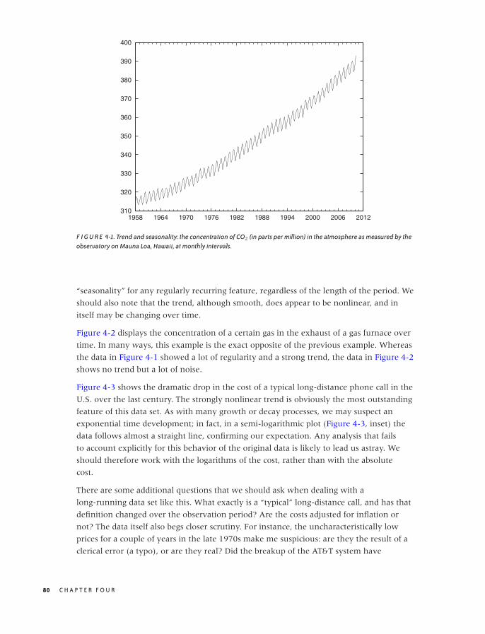
O’Reilly-5980006 master October 28, 2010 20:29
310
320
330
340
350
360
370
380
390
400
1958 1964 1970 1976 1982 1988 1994 2000 2006 2012
F I G U R E 4-1. Trend and seasonality: the concentration of CO2 (in parts per million) in the atmosphere as measured by theobservatory on Mauna Loa, Hawaii, at monthly intervals.
“seasonality” for any regularly recurring feature, regardless of the length of the period. We
should also note that the trend, although smooth, does appear to be nonlinear, and in
itself may be changing over time.
Figure 4-2 displays the concentration of a certain gas in the exhaust of a gas furnace over
time. In many ways, this example is the exact opposite of the previous example. Whereas
the data in Figure 4-1 showed a lot of regularity and a strong trend, the data in Figure 4-2
shows no trend but a lot of noise.
Figure 4-3 shows the dramatic drop in the cost of a typical long-distance phone call in the
U.S. over the last century. The strongly nonlinear trend is obviously the most outstanding
feature of this data set. As with many growth or decay processes, we may suspect an
exponential time development; in fact, in a semi-logarithmic plot (Figure 4-3, inset) the
data follows almost a straight line, confirming our expectation. Any analysis that fails
to account explicitly for this behavior of the original data is likely to lead us astray. We
should therefore work with the logarithms of the cost, rather than with the absolute
cost.
There are some additional questions that we should ask when dealing with a
long-running data set like this. What exactly is a “typical” long-distance call, and has that
definition changed over the observation period? Are the costs adjusted for inflation or
not? The data itself also begs closer scrutiny. For instance, the uncharacteristically low
prices for a couple of years in the late 1970s make me suspicious: are they the result of a
clerical error (a typo), or are they real? Did the breakup of the AT&T system have
80 C H A P T E R F O U R
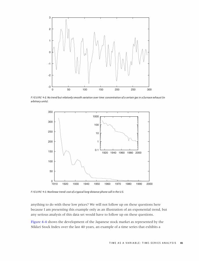
O’Reilly-5980006 master October 28, 2010 20:29
-3
-2
-1
0
1
2
3
0 50 100 150 200 250 300
F I G U R E 4-2. No trend but relatively smooth variation over time: concentration of a certain gas in a furnace exhaust (inarbitrary units).
0
50
100
150
200
250
300
350
1910 1920 1930 1940 1950 1960 1970 1980 1990 2000
0.1
1
10
100
1000
1920 1940 1960 1980 2000
F I G U R E 4-3. Nonlinear trend: cost of a typical long-distance phone call in the U.S.
anything to do with these low prices? We will not follow up on these questions here
because I am presenting this example only as an illustration of an exponential trend, but
any serious analysis of this data set would have to follow up on these questions.
Figure 4-4 shows the development of the Japanese stock market as represented by the
Nikkei Stock Index over the last 40 years, an example of a time series that exhibits a
T I M E A S A V A R I A B L E : T I M E - S E R I E S A N A LY S I S 81

O’Reilly-5980006 master October 28, 2010 20:29
0
5,000
10,000
15,000
20,000
25,000
30,000
35,000
40,000
1970 1975 1980 1985 1990 1995 2000 2005 2010
F I G U R E 4-4. Change in behavior: the Nikkei Stock Index over the last 40 years.
marked change in behavior. Clearly, whatever was true before the New Year’s Day 1990
was no longer true afterward. (In fact, by looking closely, you can make out a second
change in behavior that was more subtle than the bursting of the big Japanese bubble: its
beginning, sometime around 1985–1986.)
This data set should serve as a cautionary example. All time-series analysis is based on the
assumption that the processes generating the data are stationary in time. If the rules of the
game change, then time-series analysis is the wrong tool for the task; instead we need to
investigate what caused the break in behavior. More benign examples than the bursting of
the Japanese bubble can be found: a change in sales or advertising strategy may
significantly alter a company’s sales patterns. In such cases, it is more important to inquire
about any further plans that the sales department might have, rather than to continue
working with data that is no longer representative!
After these examples that have been chosen for their “textbook” properties, let’s look at a
“real-world” data set. Figure 4-5 shows the number of daily calls placed to a call center for
a time period slightly longer than two years. In comparison to the previous examples, this
data set has a lot more structure, which makes it hard to determine even basic properties.
We can see some high-frequency variation, but it is not clear whether this is noise or has
some form of regularity to it. It is also not clear whether there is any sort of regularity on a
longer time scale. The amount of variation makes it hard to recognize any further
structure. For instance, we cannot tell if there is a longer-term trend in the data. We will
come back to this example later in the chapter.
82 C H A P T E R F O U R
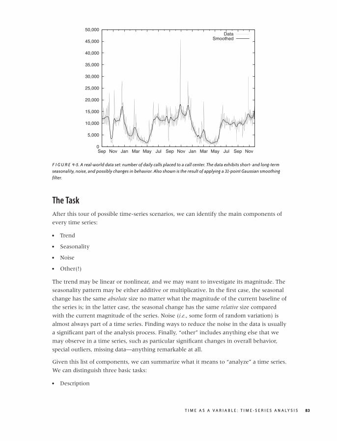
O’Reilly-5980006 master October 28, 2010 20:29
0
5,000
10,000
15,000
20,000
25,000
30,000
35,000
40,000
45,000
50,000
Sep Nov Jan Mar May Jul Sep Nov Jan Mar May Jul Sep Nov
DataSmoothed
F I G U R E 4-5. A real-world data set: number of daily calls placed to a call center. The data exhibits short- and long-termseasonality, noise, and possibly changes in behavior. Also shown is the result of applying a 31-point Gaussian smoothingfilter.
The Task
After this tour of possible time-series scenarios, we can identify the main components of
every time series:
• Trend
• Seasonality
• Noise
• Other(!)
The trend may be linear or nonlinear, and we may want to investigate its magnitude. The
seasonality pattern may be either additive or multiplicative. In the first case, the seasonal
change has the same absolute size no matter what the magnitude of the current baseline of
the series is; in the latter case, the seasonal change has the same relative size compared
with the current magnitude of the series. Noise (i.e., some form of random variation) is
almost always part of a time series. Finding ways to reduce the noise in the data is usually
a significant part of the analysis process. Finally, “other” includes anything else that we
may observe in a time series, such as particular significant changes in overall behavior,
special outliers, missing data—anything remarkable at all.
Given this list of components, we can summarize what it means to “analyze” a time series.
We can distinguish three basic tasks:
• Description
T I M E A S A V A R I A B L E : T I M E - S E R I E S A N A LY S I S 83

O’Reilly-5980006 master October 28, 2010 20:29
• Prediction
• Control
Description attempts to identify components of a time series (such as trend and
seasonality or abrupt changes in behavior). Prediction seeks to forecast future values.
Control in this context means the monitoring of a process over time with the purpose of
keeping it within a predefined band of values—a typical task in many manufacturing or
engineering environments. We can distinguish the three tasks in terms of the time frame
they address: description looks into the past, prediction looks to the future, and control
concentrates on the present.
Requirements and the Real World
Most standard methods of time-series analysis make a number of assumptions about the
underlying data.
• Data points have been taken at equally spaced time steps, with no missing data points.
• The time series is sufficiently long (50 points are often considered as an absolute
minimum).
• The series is stationary: it has no trend, no seasonality, and the character (amplitude and
frequency) of any noise does not change with time.
Unfortunately, most of these assumptions will be more or less violated by any real-world
data set that you are likely to encounter. Hence you may have to perform a certain
amount of data cleaning before you can apply the methods described in this chapter.
If the data has been sampled at irregular time steps or if some of the data points are
missing, then you can try to interpolate the data and resample it at equally spaced
intervals. Time series obtained from electrical systems or scientific experiments can be
almost arbitrarily long, but most series arising in a business context will be quite short and
contain possibly no more than two dozen data points. The exponential smoothing
methods introduced in the next section are relatively robust even for relatively short
series, but somewhere there is a limit. Three or four data points don’t constitute a series!
Finally, most interesting series will not be stationary in the sense of the definition just
given, so we may have to identify and remove trend and seasonal components explicitly
(we’ll discuss how to do that later). Drastic changes in the nature of the series also violate
the stationarity condition. In such cases we must not continue blindly but instead deal
with the break in the data—for example, by treating the data set as two different series
(one before and one after the event).
Smoothing
An important aspect of most time series is, the presence of noise—that is, random (or
apparently random) changes in the quantity of interest. Noise occurs in many real-world
84 C H A P T E R F O U R
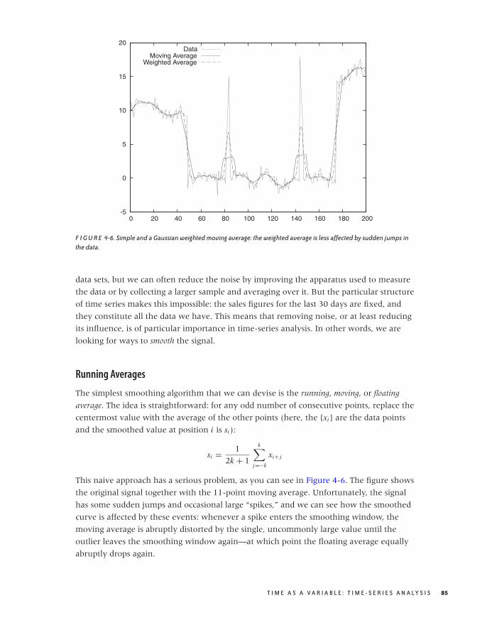
O’Reilly-5980006 master October 28, 2010 20:29
-5
0
5
10
15
20
0 20 40 60 80 100 120 140 160 180 200
DataMoving Average
Weighted Average
F I G U R E 4-6. Simple and a Gaussian weighted moving average: the weighted average is less affected by sudden jumps inthe data.
data sets, but we can often reduce the noise by improving the apparatus used to measure
the data or by collecting a larger sample and averaging over it. But the particular structure
of time series makes this impossible: the sales figures for the last 30 days are fixed, and
they constitute all the data we have. This means that removing noise, or at least reducing
its influence, is of particular importance in time-series analysis. In other words, we are
looking for ways to smooth the signal.
Running Averages
The simplest smoothing algorithm that we can devise is the running, moving, or floating
average. The idea is straightforward: for any odd number of consecutive points, replace the
centermost value with the average of the other points (here, the {xi } are the data points
and the smoothed value at position i is si ):
si = 1
2k + 1
k∑
j=−k
xi+ j
This naive approach has a serious problem, as you can see in Figure 4-6. The figure shows
the original signal together with the 11-point moving average. Unfortunately, the signal
has some sudden jumps and occasional large “spikes,” and we can see how the smoothed
curve is affected by these events: whenever a spike enters the smoothing window, the
moving average is abruptly distorted by the single, uncommonly large value until the
outlier leaves the smoothing window again—at which point the floating average equally
abruptly drops again.
T I M E A S A V A R I A B L E : T I M E - S E R I E S A N A LY S I S 85
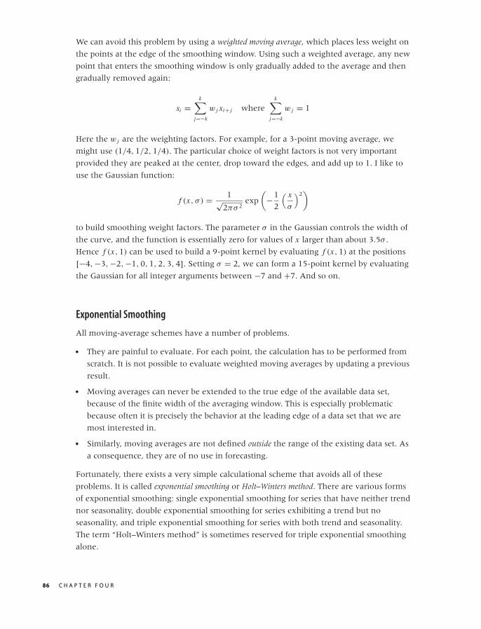
O’Reilly-5980006 master October 28, 2010 20:29
We can avoid this problem by using a weighted moving average, which places less weight on
the points at the edge of the smoothing window. Using such a weighted average, any new
point that enters the smoothing window is only gradually added to the average and then
gradually removed again:
si =k∑
j=−k
w j xi+ j wherek∑
j=−k
w j = 1
Here the w j are the weighting factors. For example, for a 3-point moving average, we
might use (1/4, 1/2, 1/4). The particular choice of weight factors is not very important
provided they are peaked at the center, drop toward the edges, and add up to 1. I like to
use the Gaussian function:
f (x, σ ) = 1√2πσ 2
exp
(−1
2
( x
σ
)2)
to build smoothing weight factors. The parameter σ in the Gaussian controls the width of
the curve, and the function is essentially zero for values of x larger than about 3.5σ .
Hence f (x, 1) can be used to build a 9-point kernel by evaluating f (x, 1) at the positions
[−4, −3, −2, −1, 0, 1, 2, 3, 4]. Setting σ = 2, we can form a 15-point kernel by evaluating
the Gaussian for all integer arguments between −7 and +7. And so on.
Exponential Smoothing
All moving-average schemes have a number of problems.
• They are painful to evaluate. For each point, the calculation has to be performed from
scratch. It is not possible to evaluate weighted moving averages by updating a previous
result.
• Moving averages can never be extended to the true edge of the available data set,
because of the finite width of the averaging window. This is especially problematic
because often it is precisely the behavior at the leading edge of a data set that we are
most interested in.
• Similarly, moving averages are not defined outside the range of the existing data set. As
a consequence, they are of no use in forecasting.
Fortunately, there exists a very simple calculational scheme that avoids all of these
problems. It is called exponential smoothing or Holt–Winters method. There are various forms
of exponential smoothing: single exponential smoothing for series that have neither trend
nor seasonality, double exponential smoothing for series exhibiting a trend but no
seasonality, and triple exponential smoothing for series with both trend and seasonality.
The term “Holt–Winters method” is sometimes reserved for triple exponential smoothing
alone.
86 C H A P T E R F O U R
O’Reilly-5980006 master October 28, 2010 20:29
All exponential smoothing methods work by updating the result from the previous time
step using the new information contained in the data of the current time step. They do so
by “mixing” the new information with the old one, and the relative weight of old and
new information is controlled by an adjustable mixing parameter. The various methods
differ in terms of the number of quantities they track and the corresponding number of
mixing parameters.
The recurrence relation for single exponential smoothing is particularly simple:
si = αxi + (1 − α)si−1 with 0 ≤ α ≤ 1
Here si is the smoothed value at time step i , and xi is the actual (unsmoothed) data at that
time step. You can see how si is a mixture of the raw data and the previous smoothed
value si−1. The mixing parameter α can be chosen anywhere between 0 and 1, and it
controls the balance between new and old information: as α approaches 1, we retain only
the current data point (i.e., the series is not smoothed at all); as α approaches 0, we retain
only the smoothed past (i.e., the curve is totally flat).
Why is this method called “exponential” smoothing? To see this, simply expand the
recurrence relation:
si = αxi + (1 − α)si−1
= αxi + (1 − α) [αxi−1 + (1 − α)si−2]
= αxi + (1 − α)[αxi−1 + (1 − α) [αxi−2 + (1 − α)si−3]
]
= α[xi + (1 − α)xi−1 + (1 − α)2xi−2
] + (1 − α)3si−3
= . . .
= α
i∑
j=0
(1 − α) j xi− j
What this shows is that in exponential smoothing, all previous observations contribute to
the smoothed value, but their contribution is suppressed by increasing powers of the
parameter α. That observations further in the past are suppressed multiplicatively is
characteristic of exponential behavior. In a way, exponential smoothing is like a floating
average with infinite memory but with exponentially falling weights. (Also observe that
the sum of the weights,∑
j α(1 −α) j , equals 1 as required by virtue of the geometric series∑i qi = 1/(1 − q) for q < 1. See Appendix B for information on the geometric series.)
The results of the simple exponential smoothing procedure can be extended beyond the
end of the data set and thereby used to make a forecast. The forecast is extremely simple:
xi+h = si
where si is the last calculated value. In other words, single exponential smoothing yields a
forecast that is absolutely flat for all times.
T I M E A S A V A R I A B L E : T I M E - S E R I E S A N A LY S I S 87
O’Reilly-5980006 master October 28, 2010 20:29
Single exponential smoothing as just described works well for time series without an
overall trend. However, in the presence of an overall trend, the smoothed values tend to
lag behind the raw data unless α is chosen to be close to 1; however, in this case the
resulting curve is not sufficiently smoothed.
Double exponential smoothing corrects for this shortcoming by retaining explicit
information about the trend. In other words, we maintain and update the state of two
quantities: the smoothed signal and the smoothed trend. There are two equations and two
mixing parameters:
si = αxi + (1 − α)(si−1 + ti−1)
ti = β(si − si−1) + (1 − β)ti−1
Let’s look at the second equation first. This equation describes the smoothed trend. The
current unsmoothed “value” of the trend is calculated as the difference between the
current and the previous smoothed signal; in other words, the current trend tells us how
much the smoothed signal changed in the last step. To form the smoothed trend, we
perform a simple exponential smoothing process on the trend, using the mixing
parameter β. To obtain the smoothed signal, we perform a similar mixing as before but
consider not only the previous smoothed signal but take the trend into account as well.
The last term in the first equation is the best guess for the current smoothed
signal—assuming we followed the previous trend for a single time step.
To turn this result into a forecast, we take the last smoothed value and, for each additional
time step, keep adding the last smoothed trend to it:
xi+h = si + h ti
Finally, for triple exponential smoothing we add yet a third quantity, which describes the
seasonality. We have to distinguish between additive and multiplicative seasonality. For
the additive case, the equations are:
si = α(xi − pi−k) + (1 − α)(si−1 + ti−1)
ti = β(si − si−1) + (1 − β)ti−1
pi = γ (xi − si ) + (1 − γ )pi−k
xi+h = si + h ti + pi−k+h
For the multiplicative case, they are:
si = αxi
pi−k+ (1 − α)(si−1 + ti−1)
ti = β(si − si−1) + (1 − β)ti−1
pi = γxi
si+ (1 − γ )pi−k
xi+h = (si + h ti )pi−k+h
Here, pi is the “periodic” component, and k is the length of the period. I have also
included the expressions for forecasts.
88 C H A P T E R F O U R

O’Reilly-5980006 master October 28, 2010 20:29
All exponential smoothing methods are based on recurrence relations. This means that we
need to fix the start-up values in order to use them. Luckily, the specific choice for these
values is not very critical: the exponential damping implies that all exponential smoothing
methods have a short “memory,” so that after only a few steps, any influence of the initial
values is greatly diminished. Some reasonable choices for start-up values are:
s0 = x0 or s0 = 1
n
n∑
i
xi with 1 < n < 5, . . . , 10
and:
t0 = 0 or t0 = x1 − x0
For triple exponential smoothing we must provide one full season of values for start-up,
but we can simply fill them with 1s (for the multiplicative model) or 0s (for the additive
model). Only if the series is short do we need to worry seriously about finding good
starting values.
The last question concerns how to choose the mixing parameters α, β, and γ . My advice is
trial and error. Try a few values between 0.2 and 0.4 (very roughly), and see what results
you get. Alternatively, you can define a measure for the error (between the actual data
and the output of the smoothing algorithm), and then use a numerical optimization
routine to minimize this error with respect to the parameters. In my experience, this is
usually more trouble than it’s worth for at least the following two reasons. The numerical
optimization is an iterative process that is not guaranteed to converge, and you may end
up spending way too much time coaxing the algorithm to convergence. Furthermore, any
such numerical optimization is slave to the expression you have chosen for the “error” to
be minimized. The problem is that the parameter values minimizing that error may not
have some other property you want to see in your solution (e.g., regarding the balance
between the accuracy of the approximation and the smoothness of the resulting curve) so
that, in the end, the manual approach often comes out ahead. However, if you have many
series to forecast, then it may make sense to expend the effort and build a system that can
determine the optimal parameter values automatically, but it probably won’t be easy to
really make this work.
Finally, I want to present an example of the kind of results we can expect from
exponential smoothing. Figure 4-7 is a classical data set that shows the monthly number
of international airline passengers (in thousands of passengers).* The graph shows the
actual data together with a triple exponential approximation. The years 1949 through
1957 were used to “train” the algorithm, and the years 1958 through 1960 are forecasted.
Note how well the forecast agrees with the actual data—especially in light of the strong
seasonal pattern—for a rather long forecasting time frame (three full years!). Not bad for a
method as simple as this.
*This data is available in the “airpass.dat” data set from R. J. Hyndman’s Time Series Data Library athttp://www.robjhyndman.com/TSDL.
T I M E A S A V A R I A B L E : T I M E - S E R I E S A N A LY S I S 89

O’Reilly-5980006 master October 28, 2010 20:29
100
200
300
400
500
600
700
1949 1950 1951 1952 1953 1954 1955 1956 1957 1958 1959 1960 1961
ForecastSmoothing
ActualCalculated
F I G U R E 4-7. Triple exponential smoothing in action: comparison between the raw data (solid line) and the smoothedcurve (dashed). For the years after 1957, the dashed curve shows the forecast calculated with only the data available in 1957.
Don't Overlook the Obvious!
On a recent consulting assignment, I was discussing monthly sales numbers with the
client when he made the following comment: “Oh, yes, sales for February are always
somewhat lower—that’s an after effect of the Christmas peak.” Sales are always lower in
February? How interesting.
Sure enough, if you plotted the monthly sales numbers for the last few years, there was a
rather visible dip from the overall trend every February. But in contrast, there wasn’t
much of a Christmas spike! (The client’s business was not particularly seasonal.) So why
should there be a corresponding dip two months later?
By now I am sure you know the answer already: February is shorter than any of the other
months. And it’s not a small effect, either: with 28 days, February is about three days
shorter than the other months (which have 30–31 days). That’s about 10 percent—close
to the size of the dip in the client’s sales numbers.
When monthly sales numbers were normalized by the number of days in the month, the
February dip all but disappeared, and the adjusted February numbers were perfectly in line
with the rest of the months. (The average number of days per month is 365/12 = 30.4.)
Whenever you are tracking aggregated numbers in a time series (such as weekly, monthly,
or quarterly results), make sure that you have adjusted for possible variation in the
aggregation time frame. Besides the numbers of days in the month, another likely
90 C H A P T E R F O U R
O’Reilly-5980006 master October 28, 2010 20:29
candidate for hiccups is the number of business days in a month (for months with five
weekends, you can expect a 20 percent drop for most business metrics). But the problem
is, of course, much more general and can occur whenever you are reporting aggregate
numbers rather than rates. (If the client had been reporting average sales per day for each
month, then there would never have been an anomaly.)
This specific problem (i.e., nonadjusted variations in aggregation periods) is a particular
concern for all business reports and dashboards. Keep an eye out for it!
The Correlation Function
The autocorrelation function is the primary diagnostic tool for time-series analysis. Whereas
the smoothing methods that we have discussed so far deal with the raw data in a very
direct way, the correlation function provides us with a rather different view of the same
data. I will first explain how the autocorrelation function is calculated and will then
discuss what it means and how it can be used.
The basic algorithm works as follows: start with two copies of the data set and subtract the
overall average from all values. Align the two sets, and multiply the values at
corresponding time steps with each other. Sum up the results for all time steps. The result
is the (unnormalized) correlation coefficient at lag 0. Now shift the two copies against
each other by a single time step. Again multiply and sum: the result is the correlation
coefficient at lag 1. Proceed in this way for the entire length of the time series. The set of
all correlation coefficients for all lags is the autocorrelation function. Finally, divide all
coefficients by the coefficient for lag 0 to normalize the correlation function, so that the
coefficient for lag 0 is now equal to 1.
All this can be written compactly in a single formula for c(k)—that is the correlation
function at lag k:
c(k) =
N−k∑i=1
(xi − μ)(xi+k − μ)
N∑i=1
(xi − μ)2
with μ = 1
N
N∑
i=1
xi
Here, N is the number of points in the data set. The formula follows the mathematical
convention to start indexing sequences at 1, rather than the programming convention to
start indexing at 0. Notice that we have subtracted the overall average μ from all values
and that the denominator is simply the expression of the numerator for lag k = 0.
Figure 4-8 illustrates the process.
The meaning of the correlation function should be clear. Initially, the two signals are
perfectly aligned and the correlation is 1. Then, as we shift the signals against each other,
they slowly move out of phase with each other, and the correlation drops. How quickly it
T I M E A S A V A R I A B L E : T I M E - S E R I E S A N A LY S I S 91

O’Reilly-5980006 master October 28, 2010 20:29
Lag: 0
1 2 3 4 5
1 2 3 4 5
Lag: 1
1 2 3 4 5
1 2 3 4 5
Lag: 2
1 2 3 4 5
1 2 3 4
F I G U R E 4-8. Algorithm to compute the correlation function.
drops tells us how much “memory” there is in the data. If the correlation drops quickly,
we know that, after a few steps, the signal has lost all memory of its recent past. However,
if the correlation drops slowly, then we know that we are dealing with a process that is
relatively steady over longer periods of time. It is also possible that the correlation
function first drops and then rises again to form a second (and possibly a third, or
fourth, . . . ) peak. This tells us that the two signals align again if we shift them far
enough—in other words, that there is periodicity (i.e., seasonality) in the data set. The
position of the secondary peak gives us the number of time steps per season.
Examples
Let’s look at a couple of examples. Figure 4-9 shows the correlation function of the gas
furnace data in Figure 4-2. This is a fairly typical correlation function for a time series that
has only short time correlations: the correlation falls quickly, but not immediately, to zero.
There is no periodicity; after the initial drop, the correlation function does not exhibit any
further significant peaks.
92 C H A P T E R F O U R
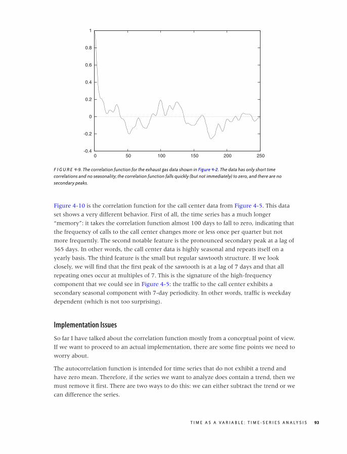
O’Reilly-5980006 master October 28, 2010 20:29
-0.4
-0.2
0
0.2
0.4
0.6
0.8
1
0 50 100 150 200 250
F I G U R E 4-9. The correlation function for the exhaust gas data shown in Figure 4-2. The data has only short timecorrelations and no seasonality; the correlation function falls quickly (but not immediately) to zero, and there are nosecondary peaks.
Figure 4-10 is the correlation function for the call center data from Figure 4-5. This data
set shows a very different behavior. First of all, the time series has a much longer
“memory”: it takes the correlation function almost 100 days to fall to zero, indicating that
the frequency of calls to the call center changes more or less once per quarter but not
more frequently. The second notable feature is the pronounced secondary peak at a lag of
365 days. In other words, the call center data is highly seasonal and repeats itself on a
yearly basis. The third feature is the small but regular sawtooth structure. If we look
closely, we will find that the first peak of the sawtooth is at a lag of 7 days and that all
repeating ones occur at multiples of 7. This is the signature of the high-frequency
component that we could see in Figure 4-5: the traffic to the call center exhibits a
secondary seasonal component with 7-day periodicity. In other words, traffic is weekday
dependent (which is not too surprising).
Implementation Issues
So far I have talked about the correlation function mostly from a conceptual point of view.
If we want to proceed to an actual implementation, there are some fine points we need to
worry about.
The autocorrelation function is intended for time series that do not exhibit a trend and
have zero mean. Therefore, if the series we want to analyze does contain a trend, then we
must remove it first. There are two ways to do this: we can either subtract the trend or we
can difference the series.
T I M E A S A V A R I A B L E : T I M E - S E R I E S A N A LY S I S 93
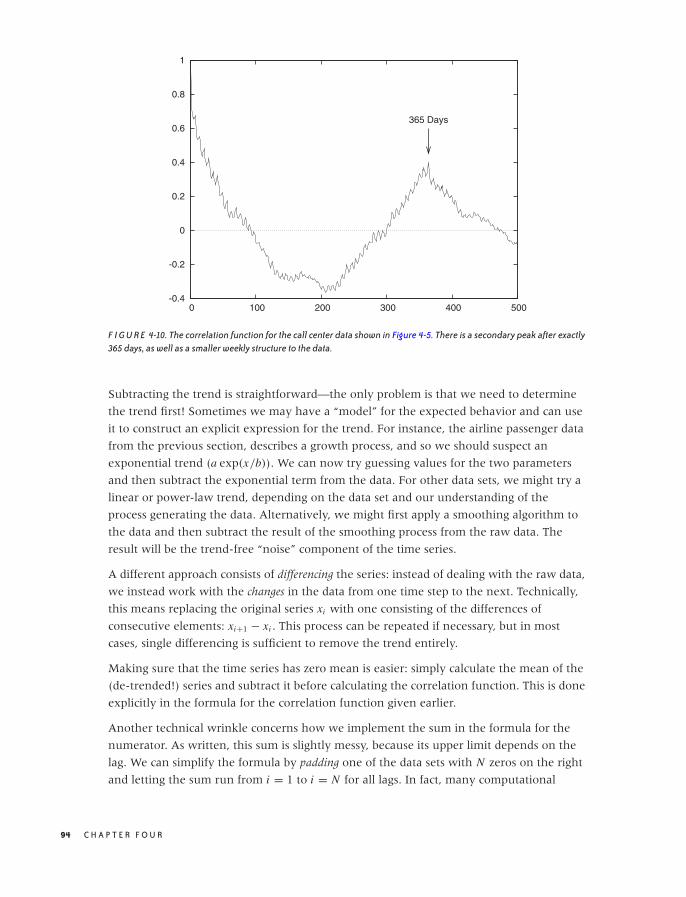
O’Reilly-5980006 master October 28, 2010 20:29
-0.4
-0.2
0
0.2
0.4
0.6
0.8
1
0 100 200 300 400 500
365 Days
F I G U R E 4-10. The correlation function for the call center data shown in Figure 4-5. There is a secondary peak after exactly365 days, as well as a smaller weekly structure to the data.
Subtracting the trend is straightforward—the only problem is that we need to determine
the trend first! Sometimes we may have a “model” for the expected behavior and can use
it to construct an explicit expression for the trend. For instance, the airline passenger data
from the previous section, describes a growth process, and so we should suspect an
exponential trend (a exp(x/b)). We can now try guessing values for the two parameters
and then subtract the exponential term from the data. For other data sets, we might try a
linear or power-law trend, depending on the data set and our understanding of the
process generating the data. Alternatively, we might first apply a smoothing algorithm to
the data and then subtract the result of the smoothing process from the raw data. The
result will be the trend-free “noise” component of the time series.
A different approach consists of differencing the series: instead of dealing with the raw data,
we instead work with the changes in the data from one time step to the next. Technically,
this means replacing the original series xi with one consisting of the differences of
consecutive elements: xi+1 − xi . This process can be repeated if necessary, but in most
cases, single differencing is sufficient to remove the trend entirely.
Making sure that the time series has zero mean is easier: simply calculate the mean of the
(de-trended!) series and subtract it before calculating the correlation function. This is done
explicitly in the formula for the correlation function given earlier.
Another technical wrinkle concerns how we implement the sum in the formula for the
numerator. As written, this sum is slightly messy, because its upper limit depends on the
lag. We can simplify the formula by padding one of the data sets with N zeros on the right
and letting the sum run from i = 1 to i = N for all lags. In fact, many computational
94 C H A P T E R F O U R
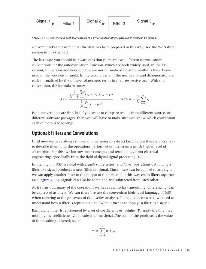
O’Reilly-5980006 master October 28, 2010 20:29
Signal 1Filter 1
Signal 2Filter 2
Signal 3
F I G U R E 4-11. A filter chain: each filter applied to a signal yields another signal, which itself can be filtered.
software packages assume that the data has been prepared in this way (see the Workshop
section in this chapter).
The last issue you should be aware of is that there are two different normalization
conventions for the autocorrelation function, which are both widely used. In the first
variant, numerator and denominator are not normalized separately—this is the scheme
used in the previous formula. In the second variant, the numerator and denominator are
each normalized by the number of nonzero terms in their respective sum. With this
convention, the formula becomes:
c(k) =1
N − k
N−k∑i=1
(xi − μ)(xi+k − μ)
1
N
N∑i=1
(xi − μ)2
with μ = 1
N
N∑
i=1
xi
Both conventions are fine, but if you want to compare results from different sources or
different software packages, then you will have to make sure you know which convention
each of them is following!
Optional: Filters and Convolutions
Until now we have always spoken of time series in a direct fashion, but there is also a way
to describe them (and the operations performed on them) on a much higher level of
abstraction. For this, we borrow some concepts and terminology from electrical
engineering, specifically from the field of digital signal processing (DSP).
In the lingo of DSP, we deal with signals (time series) and filters (operations). Applying a
filter to a signal produces a new (filtered) signal. Since filters can be applied to any signal,
we can apply another filter to the output of the first and in this way chain filters together
(see Figure 4-11). Signals can also be combined and subtracted from each other.
As it turns out, many of the operations we have seen so far (smoothing, differencing) can
be expressed as filters. We can therefore use the convenient high-level language of DSP
when referring to the processes of time-series analysis. To make this concrete, we need to
understand how a filter is represented and what it means to “apply” a filter to a signal.
Each digital filter is represented by a set of coefficients or weights. To apply the filter, we
multiply the coefficients with a subset of the signal. The sum of the products is the value
of the resulting (filtered) signal:
yt =k∑
i=−k
wi xt+i
T I M E A S A V A R I A B L E : T I M E - S E R I E S A N A LY S I S 95
O’Reilly-5980006 master October 28, 2010 20:29
This should look familiar! We used a similar expression when talking about moving
averages earlier in the chapter. A moving average is simply a time series run through an
n-point filter, where every coefficient is equal to 1/n. A weighted moving average filter
similarly consists of the weights used in the expression for the average.
The filter concept is not limited to smoothing operations. The differencing step discussed
in the previous section can be viewed as the application of the filter [1, −1]. We can even
shift an entire time series forward in time by using the filter [0, 1].
The last piece of terminology that we will need concerns the peculiar sum of a product
that we have encountered several times by now. It’s called a convolution. A convolution is a
way to combine two sequences to yield a third sequence, which you can think of as the
“overlap” between the original sequences. The convolution operation is usually defined as
follows:
yt =∞∑
i=−∞wi xt−i
Symbolically, the convolution operation is often expressed through an asterisk: y = w � x ,
where y, w, and x are sequences.
Of course, if one or both of the sequences have only a finite number of elements, then the
sum also contains only a finite number of terms and therefore poses no difficulties. You
should be able to convince yourself that every application of a filter to a time series that
we have done was in fact a convolution of the signal with the filter. This is true in general:
applying a filter to a signal means forming the convolution of the two. You will find that
many numerical software packages provide a convolution operation as a built-in function,
making filter operations particularly convenient to use.
I must warn you, however, that the entire machinery of digital signal processing is geared
toward signals of infinite (or almost infinite) length, which makes good sense for typical
electrical signals (such as the output from a microphone or a radio receiver). But for the
rather short time series that we are likely to deal with, we need to pay close attention to a
variety of edge effects. For example, if we apply a smoothing or differencing filter, then the
resulting series will be shorter, by half the filter length, than the original series. If we now
want to subtract the smoothed from the original signal, the operation will fail because the
two signals are not of equal length. We therefore must either pad the smoothed signal or
truncate the original one. The constant need to worry about padding and proper
alignment detracts significantly from the conceptual beauty of the signal-theoretic
approach when used with time series of relatively short duration.
Workshop: scipy.signal
The scipy.signal package provides functions and operations for digital signal processing
that we can use to good effect to perform calculations for time-series analysis. The
96 C H A P T E R F O U R

O’Reilly-5980006 master October 28, 2010 20:29
scipy.signal package makes use of the signal processing terminology introduced in the
previous section.
The listing that follows shows all the commands used to create graphs like Figures 4-5 and
4-10, including the commands required to write the results to file. The code is heavily
commented and should be easy to understand.
from scipy import *
from scipy.signal import *
from matplotlib.pyplot import *
filename = 'callcenter'
# Read data from a text file, retaining only the third column.
# (Column indexes start at 0.)
# The default delimiter is any whitespace.
data = loadtxt( filename, comments='#', delimiter=None, usecols=(2,) )
# The number of points in the time series. We will need it later.
n = data.shape[0]
# Finding a smoothed version of the time series:
# 1) Construct a 31-point Gaussian filter with standard deviation = 4
filt = gaussian( 31, 4 )
# 2) Normalize the filter through dividing by the sum of its elements
filt /= sum( filt )
# 3) Pad data on both sides with half the filter length of the last value
# (The function ones(k) returns a vector of length k, with all elements 1.)
padded = concatenate( (data[0]*ones(31//2), data, data[n-1]*ones(31//2)) )
# 4) Convolve the data with the filter. See text for the meaning of "mode".
smooth = convolve( padded, filt, mode='valid' )
# Plot the raw data together with the smoothed data:
# 1) Create a figure, sized to 7x5 inches
figure( 1, figsize=( 7, 5 ) )
# 2) Plot the raw data in red
plot( data, 'r' )
# 3) Plot the smoothed data in blue
plot( smooth, 'b' )
# 4) Save the figure to file
savefig( filename + "_smooth.png" )
# 5) Clear the figure
clf()
# Calculate the autocorrelation function:
# 1) Subtract the mean
tmp = data - mean(data)
# 2) Pad one copy of data on the right with zeros, then form correlation fct
# The function zeros_like(v) creates a vector with the same dimensions
# as the input vector v but with all elements zero.
corr = correlate( tmp, concatenate( (tmp, zeros_like(tmp)) ), mode='valid' )
# 3) Retain only some of the elements
corr = corr[:500]
T I M E A S A V A R I A B L E : T I M E - S E R I E S A N A LY S I S 97

O’Reilly-5980006 master October 28, 2010 20:29
# 4) Normalize by dividing by the first element
corr /= corr[0]
# Plot the correlation function:
figure( 2, figsize=( 7, 5 ) )
plot( corr )
savefig( filename + "_corr.png" )
clf()
The package provides the Gaussian filter as well as many others. The filters are not
normalized, but this is easy enough to accomplish.
More attention needs to be paid to the appropriate padding and truncating. For example,
when forming the smoothed version of the data, I pad the data on both sides by half the
filter length to ensure that the smoothed data has the same length as the original set. The
mode argument to the convolve() and correlate functions determines which pieces of the
resulting vector to retain. Several modes are possible. With mode="same", the returned
vector has as many elements as the largest input vector (in our case, as the padded data
vector), but the elements closest to the ends would be corrupted by the padded values. In
the listing, I therefore use mode="valid", which retains only those elements that have full
overlap between the data and the filter—in effect, removing the elements added in the
padding step.
Notice how the signal processing machinery leads in this application to very compact
code. Once you strip out the comments and plotting commands, there are only about 10
lines of code that perform actual operations and calculations. However, we had to pad all
data carefully and ensure that we kept only those pieces of the result that were least
contaminated by the padding.
Further Reading• The Analysis of Time Series. Chris Chatfield. 6th ed., Chapman & Hall. 2003.
This is my preferred text on time-series analysis. It combines a thoroughly practical
approach with mathematical depth and a healthy preference for the simple over the
obscure. Highly recommended.
98 C H A P T E R F O U R

O’Reilly-5980006 master October 28, 2010 20:31
C H A P T E R F I V E
More Than Two Variables: GraphicalMultivariate Analysis
AS SOON AS WE ARE DEALING WITH MORE THAN TWO VARIABLES SIMULTANEOUSLY, THINGS BECOME MUCH MORE
complicated—in particular, graphical methods quickly become impractical. In this chapter,
I’ll introduce a number of graphical methods that can be applied to multivariate problems.
All of them work best if the number of variables is not too large (less than 15–25).
The borderline case of three variables can be handled through false-color plots, which we
will discuss first.
If the number of variables is greater (but not much greater) than three, then we can
construct multiplots from a collection of individual bivariate plots by scanning through the
various parameters in a systematic way. This gives rise to scatter-plot matrices and co-plots.
Depicting how an overall entity is composed out of its constituent parts can be a rather
nasty problem, especially if the composition changes over time. Because this task is so
common, I’ll treat it separately in its own section.
Multi-dimensional visualization continues to be a research topic, and in the last sections
of the chapter, we look at some of the more recent ideas in this field.
One recurring theme in this chapter is the need for adequate tools: most multi-
dimensional visualization techniques are either not practical with paper and pencil, or are
outright impossible without a computer (in particular when it comes to animated
techniques). Moreover, as the number of variables increases, so does the need to look at a
data set from different angles; this leads to the idea of using interactive graphics for
exploration. In the last section, we look at some ideas in this area.
99
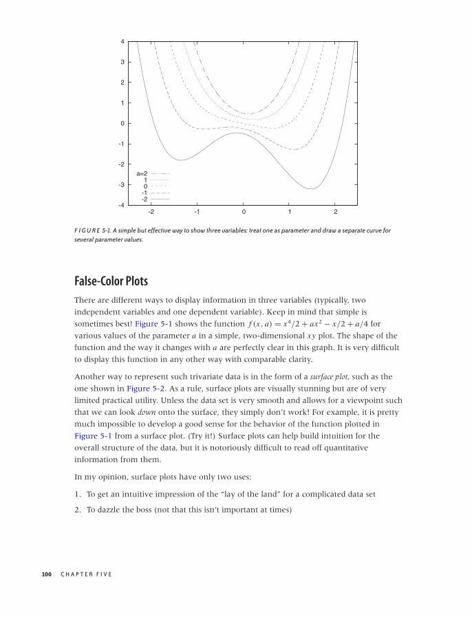
O’Reilly-5980006 master October 28, 2010 20:31
-4
-3
-2
-1
0
1
2
3
4
-2 -1 0 1 2
-2-101
a=2
F I G U R E 5-1. A simple but effective way to show three variables: treat one as parameter and draw a separate curve forseveral parameter values.
False-Color Plots
There are different ways to display information in three variables (typically, two
independent variables and one dependent variable). Keep in mind that simple is
sometimes best! Figure 5-1 shows the function f (x, a) = x4/2 + ax2 − x/2 + a/4 for
various values of the parameter a in a simple, two-dimensional xy plot. The shape of the
function and the way it changes with a are perfectly clear in this graph. It is very difficult
to display this function in any other way with comparable clarity.
Another way to represent such trivariate data is in the form of a surface plot, such as the
one shown in Figure 5-2. As a rule, surface plots are visually stunning but are of very
limited practical utility. Unless the data set is very smooth and allows for a viewpoint such
that we can look down onto the surface, they simply don’t work! For example, it is pretty
much impossible to develop a good sense for the behavior of the function plotted in
Figure 5-1 from a surface plot. (Try it!) Surface plots can help build intuition for the
overall structure of the data, but it is notoriously difficult to read off quantitative
information from them.
In my opinion, surface plots have only two uses:
1. To get an intuitive impression of the “lay of the land” for a complicated data set
2. To dazzle the boss (not that this isn’t important at times)
100 C H A P T E R F I V E
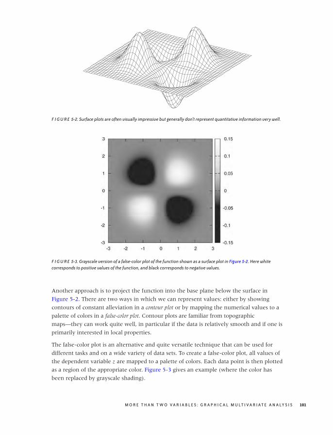
O’Reilly-5980006 master October 28, 2010 20:31
F I G U R E 5-2. Surface plots are often visually impressive but generally don’t represent quantitative information very well.
F I G U R E 5-3. Grayscale version of a false-color plot of the function shown as a surface plot in Figure 5-2. Here whitecorresponds to positive values of the function, and black corresponds to negative values.
Another approach is to project the function into the base plane below the surface in
Figure 5-2. There are two ways in which we can represent values: either by showing
contours of constant alleviation in a contour plot or by mapping the numerical values to a
palette of colors in a false-color plot. Contour plots are familiar from topographic
maps—they can work quite well, in particular if the data is relatively smooth and if one is
primarily interested in local properties.
The false-color plot is an alternative and quite versatile technique that can be used for
different tasks and on a wide variety of data sets. To create a false-color plot, all values of
the dependent variable z are mapped to a palette of colors. Each data point is then plotted
as a region of the appropriate color. Figure 5-3 gives an example (where the color has
been replaced by grayscale shading).
M O R E T H A N T W O V A R I A B L E S : G R A P H I C A L M U LT I V A R I AT E A N A LY S I S 101

O’Reilly-5980006 master October 28, 2010 20:31
I like false-color plots because one can represent a lot of information in a them in a way
that retains quantitative information. However, false-color plots depend crucially on the
quality of the palette—that is, the mapping that has been used to associate colors with
numeric values.
Let’s quickly recap some information on color and computer graphics. Colors for
computer graphics are usually specified by a triple of numbers that specify the intensity of
their red, green, and blue (RGB) components. Although RGB triples make good sense
technically, they are not particularly intuitive. Instead, we tend to think of color in terms
of its hue, saturation, and value (i.e., luminance or lightness). Conventionally, hue runs
through all the colors of the rainbow (from red to yellow, green, blue, and magenta).
Curiously, the spectrum of hues seems to circle back onto itself, since magenta smoothly
transforms back to red. (The reason for this behavior is that the hues in the rainbow
spectrum are arranged in order of their dominant electromagnetic frequency. For
violet/magenta, no frequency dominates; instead, violet is a mixture of low-frequency
reds and high-frequency blues.) Most computer graphics programs will be able to generate
color graphics using a hue–saturation–value (HSV) triple.
It is surprisingly hard to find reliable recommendations on good palette design, which is
even more unfortunate given that convenience and what seems like common sense often
lead to particularly bad palettes. Here are some ideas and suggestions that you may wish
to consider:
Keep it simpleVery simple palettes using red, white, and blue often work surprisingly well. For
continuous color changes you could use a blue-white-red palette, for segmentation
tasks you could use a white-blue-red-white palette with a sharp blue–red transition at
the segmentation threshold.
Distinguish between segmentation tasks and the display of smooth changesSegmentation tasks (e.g., finding all points that exceed a certain threshold, finding the
locations where the data crosses zero) call for palettes with sharp color transitions at
the respective thresholds, whereas representing smooth changes in a data set calls for
continuous color gradients. Of course, both aspects can be combined in a single palette:
gradients for part of the palette and sharp transitions elsewhere.
Try to maintain an intuitive sense of orderingMap low values to “cold” colors and higher values to “hot” colors to provide an
intuitive sense of ordering in your palette. Examples include the simple blue-red
palette and the “heat scale” (black-red-yellow-white—I’ll discuss in a moment why I
don’t recommend the heat scale for use). Other palettes that convey a sense of
ordering (if only by convention) are the “improved rainbow” (blue-cyan-green-
yellow-orange-red-magenta) and the “geo-scale” familiar from topographic maps
(blue-cyan-green-brown-tan-white).
102 C H A P T E R F I V E

O’Reilly-5980006 master October 28, 2010 20:31
Place strong visual gradients in regions with important changesSuppose that you have a data set with values that span the range from −100 to +100
but that all the really interesting or important change occurs in the range −10 to +10.
If you use a standard palette (such as the improved rainbow) for such a data set, then
the actual region of interest will appear to be all of the same color, and the rest of the
spectrum will be “wasted” on parts of the data range that are not that interesting. To
avoid this outcome, you have to compress the rainbow so that it maps only to the
region of interest. You might want to consider mapping the extreme values (from −100
to −10 and from 10 to 100) to some unobtrusive colors (possibly even to a grayscale)
and reserving the majority of hue changes for the most relevant part of the data range.
Favor subtle changesThis is possibly the most surprising recommendation. When creating palettes, there is a
natural tendency to “crank it up full” by using fully saturated colors at maximal
brightness throughout. That’s not necessarily a good idea, because the resulting effect
can be so harsh that details are easily lost. Instead, you might want to consider using
soft, pastel colors or even to experiment with mixed hues in favor of the pure primaries
of the standard rainbow. (Recent versions of Microsoft Excel provide an interesting and
easily accessible demonstration for this idea: all default colors offered for shading the
background of cells are soft, mixed pastels—to good effect.) Furthermore, the eye is
quite good at detecting even subtle variations. In particular, when working with
luminance-based palettes, small changes are often all that is required.
Avoid changes that are hard to detectSome visual changes are especially hard to perceive visually. For example, it is
practically impossible to distinguish between different shades of yellow, and the
transition from yellow to white is even worse! (This is why I don’t recommend the
heat scale, despite its nice ordering property: the bottom third consists of
hard-to-distinguish dark reds, and the entire upper third consists of very
hard-to-distinguish shades of light yellow.)
Use hue- and luminance-based palettes for different purposesIn particular, consider using a luminance-based palette to emphasize fine detail and
using hue- or saturation-based palettes for smooth, large-scale changes. There is some
empirical evidence that luminance-based palettes are better suited for images that
contain a lot of fine detail and that hue-based palettes are better suited for bringing out
smooth, global changes. A pretty striking demonstration of this observation can be
found when looking at medical images (surely an application where details matter!): a
simple grayscale representation, which is pure luminance, often seems much clearer
than a multicolored representation using a hue-based rainbow palette. This rule is
more relevant to image processing of photographs or similar images (such as that in
M O R E T H A N T W O V A R I A B L E S : G R A P H I C A L M U LT I V A R I AT E A N A LY S I S 103

O’Reilly-5980006 master October 28, 2010 20:31
our medical example) than to visualization of the sort of abstract information that we
consider here, but it is worth keeping in mind.
Don’t forget to provide a color boxNo matter how intuitive you think your palette is, nobody will know for sure what you
are showing unless you provide a color box (or color key) that shows the values and
the colors they are mapped to. Always, always, provide one.
One big problem not properly addressed by these recommendations concerns visual
uniformity. For example, consider palettes based on the “improved rainbow,” which is
created by distributing the six primaries in the order blue-cyan-green-yellow-red-magenta
across the palette. If you place these primaries at equal distances across from each other
and interpolate linearly between them in color space, then the fraction of the palette
occupied by green appears to be much larger than the fraction occupied by either yellow
or cyan. Another example is that when placing a fully saturated yellow next to a fully
saturated blue, then the blue region will appear to be more intense (i.e., saturated) than
the yellow. Similarly, the browns that occur in a geo-scale easily appear darker than the
other colors in the palette. This is a problem with our perception of color: simple
interpolations in color space do not necessarily result in visually uniform gradients!
There is a variation of the HSV color space, called the HCL (hue–chroma–luminance)
space that takes visual perception into account to generate visually uniform color maps
and gradients. The HCL color model is more complicated to use than the HSV model,
because not all combinations of hue, chroma, and luminance values exist. For instance, a
fully saturated yellow appears lighter than a fully saturated blue, so a palette at full
chroma and with high luminance will include the fully saturated yellow but not the blue.
As a result, HCL-based palettes that span the entire rainbow of hues tend naturally toward
soft, pastel colors. A disadvantage of palettes in the HCL space is that they often degrade
particularly poorly when reproduced in black and white.*
A special case of false-color plots are geographic maps, and cartographers have significant
experience developing color schemes for various purposes. Their needs are a little
different and not all of their recommendations may work for general data analysis
purposes, but it is worthwhile to become familiar with what they have learned.†
Finally, I’d like to point out two additional problems with all plots that depend on color to
convey critical information.
• Color does not reproduce well. Once photocopied or printed on a black-and-white
laser printer, a false-color plot will become useless!
*An implementation of the transformations between HCL and RGB is available in R and C in the“colorspace” module available from CRAN.†An interesting starting point is Cynthia Brewer’s online ColorBrewer at http://colorbrewer2.org/.
104 C H A P T E R F I V E

O’Reilly-5980006 master October 28, 2010 20:31
• Also keep in mind that about 10 percent of all men are at least partially color blind;
these individuals won’t be able to make much sense of most images that rely heavily or
exclusively on color.
Either one of these problems is potentially serious enough that you might want to
reconsider before relying entirely on color for the display of information.
In my experience, preparing good false-color plots is often a tedious and time-consuming
task. This is one area where better tools would be highly desirable—an interactive tool
that could be used to manipulate palettes directly and in real time would be very nice to
have. The same is true for a publicly available set of well-tested palettes.
A Lot at a Glance: Multiplots
The primary concern in all multivariate visualizations is finding better ways to put more
“stuff” on a graph. In addition to color (see the previous section), there are basically two
ways we can go about this. We can make the graph elements themselves richer, so that
they can convey additional information beyond their position on the graph; or we can put
several similar graphs next to each other and vary the variables that are not explicitly
displayed in a systematic fashion from one subgraph to the next. The first idea leads to
glyphs, which we will introduce later in this chapter, whereas the latter idea leads to
scatter-plot matrices and co-plots.
The Scatter-Plot Matrix
For a scatter-plot matrix (occasionally abbreviated SPLOM), we construct all possible
two-dimensional scatter plots from a multivariate data set and then plot them together in
a matrix format (Figure 5-4). We can now scan all of the graphs for interesting behavior,
such as a marked correlation between any two variables.
The data set shown in Figure 5-4 consists of seven different properties of a sample of 250
wines.* It is not at all clear how these properties should relate to each other, but by
studying the scatter-plot matrix, we can make a few interesting observations. For
example, we can see that sugar content and density are positively correlated: if the sugar
content goes up, so does the density. The opposite is true for alcohol content and density:
as the alcohol content goes up, density goes down. Neither of these observations should
come as a surprise (sugar syrup has a higher density than water and alcohol a lower one).
What may be more interesting is that the wine quality seems to increase with increasing
alcohol content: apparently, more potent wines are considered to be better!
*The data can be found in the “Wine Quality” data set, available at the UCI Machine Learning repositoryat http://archive.ics.uci.edu/ml/.
M O R E T H A N T W O V A R I A B L E S : G R A P H I C A L M U LT I V A R I AT E A N A LY S I S 105
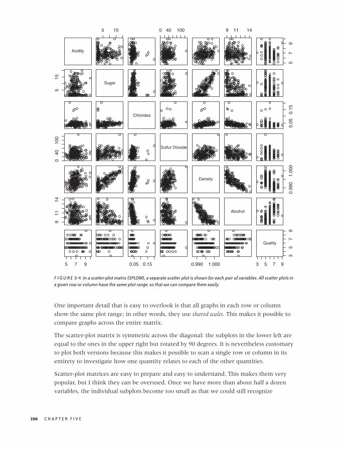
O’Reilly-5980006 master October 28, 2010 20:31
Acidity
5 15 0 40 100 9 11 14
57
9
515
Sugar
Chlorides
0.05
0.15
040
100
Sulfur Dioxide
Density
0.99
01.
000
911
14
Alcohol
5 7 9 0.05 0.15 0.990 1.000 3 5 7 9
35
79
Quality
F I G U R E 5-4. In a scatter-plot matrix (SPLOM), a separate scatter plot is shown for each pair of variables. All scatter plots ina given row or column have the same plot range, so that we can compare them easily.
One important detail that is easy to overlook is that all graphs in each row or column
show the same plot range; in other words, they use shared scales. This makes it possible to
compare graphs across the entire matrix.
The scatter-plot matrix is symmetric across the diagonal: the subplots in the lower left are
equal to the ones in the upper right but rotated by 90 degrees. It is nevertheless customary
to plot both versions because this makes it possible to scan a single row or column in its
entirety to investigate how one quantity relates to each of the other quantities.
Scatter-plot matrices are easy to prepare and easy to understand. This makes them very
popular, but I think they can be overused. Once we have more than about half a dozen
variables, the individual subplots become too small as that we could still recognize
106 C H A P T E R F I V E

O’Reilly-5980006 master October 28, 2010 20:31
anything useful, in particular if the number of points is large (a few hundred points or
more). Nevertheless, scatter-plot matrices are a convenient way to obtain a quick
overview and to find viewpoints (variable pairings) that deserve a closer look.
The Co-Plot
In contrast to scatter-plot matrices, which always show all data points but project them
onto different surfaces of the parameter space, co-plots (short for “conditional plots”) show
various slices through the parameter space such that each slice contains only a subset of
the data points. The slices are taken in a systematic manner, and we can form an image of
the entire parameter space by mentally gluing the slices back together again (the salami
principle). Because of the regular layout of the subplots, this technique is also known as a
trellis plot.
Figure 5-5 shows a trivariate data set projected onto the two-dimensional xy plane.
Although there is clearly structure in the data, no definite pattern emerges. In particular,
the dependence on the third parameter is entirely obscured!
Figure 5-6 shows a co-plot of the same data set that is sliced or conditioned on the third
parameter a. The bottom part of the graph shows six slices through the data
corresponding to different ranges of a. (The slice for the smallest values of a is in the lower
left, and the one for the largest values of a is in the upper righthand corner.) As we look at
the slices, the structure in the data stands out clearly, and we can easily follow the
dependence on the third parameter a.
The top part of Figure 5-6 shows the range of values that a takes on for each of the slices.
If you look closely, you will find that there are some subtle issues hidden in (or rather
revealed by) this panel, because it provides information on the details of the slicing
operation.
Two decisions need to be made with regard to the slicing:
1. By what method should the overall parameter range be cut into slices?
2. Should slices overlap or not?
In many ways, the most “natural” answer to these questions would be to cut the entire
parameter range into a set of adjacent intervals of equal width. It is interesting to observe
(by looking at the top panel in Figure 5-6) that in the example graph, a different decision
was made in regard to both questions! The slices are not of equal width in the range of
parameter values that they span; instead, they have been made in such a way that each
slice contains the same number of points. Furthermore, the slices are not adjacent but
partially overlap each other.
The first decision (to have each slice contain the same number of points, instead of
spanning the same range of values) is particularly interesting because it provides
additional information on how the values of the parameter a are distributed. For instance,
M O R E T H A N T W O V A R I A B L E S : G R A P H I C A L M U LT I V A R I AT E A N A LY S I S 107
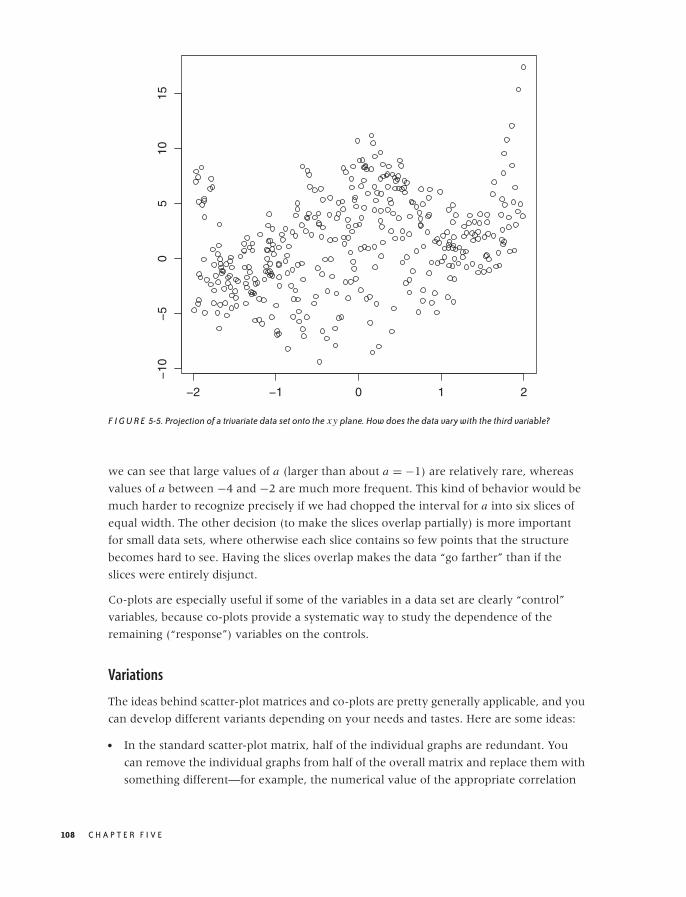
O’Reilly-5980006 master October 28, 2010 20:31
−2 −1 0 1 2
−10
−5
05
1015
F I G U R E 5-5. Projection of a trivariate data set onto the xy plane. How does the data vary with the third variable?
we can see that large values of a (larger than about a = −1) are relatively rare, whereas
values of a between −4 and −2 are much more frequent. This kind of behavior would be
much harder to recognize precisely if we had chopped the interval for a into six slices of
equal width. The other decision (to make the slices overlap partially) is more important
for small data sets, where otherwise each slice contains so few points that the structure
becomes hard to see. Having the slices overlap makes the data “go farther” than if the
slices were entirely disjunct.
Co-plots are especially useful if some of the variables in a data set are clearly “control”
variables, because co-plots provide a systematic way to study the dependence of the
remaining (“response”) variables on the controls.
Variations
The ideas behind scatter-plot matrices and co-plots are pretty generally applicable, and you
can develop different variants depending on your needs and tastes. Here are some ideas:
• In the standard scatter-plot matrix, half of the individual graphs are redundant. You
can remove the individual graphs from half of the overall matrix and replace them with
something different—for example, the numerical value of the appropriate correlation
108 C H A P T E R F I V E
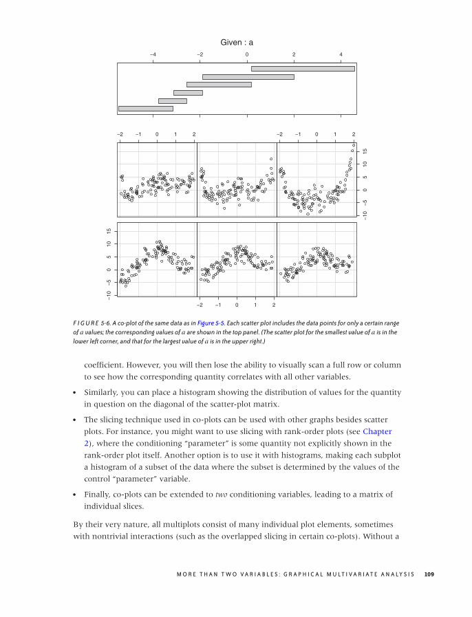
O’Reilly-5980006 master October 28, 2010 20:31
−10
−5
05
1015
−2 −1 0 1 2
−2 −1 0 1 2 −2 −1 0 1 2
−10
−5
05
1015
−4 −2 0 2 4
Given : a
F I G U R E 5-6. A co-plot of the same data as in Figure 5-5. Each scatter plot includes the data points for only a certain rangeof a values; the corresponding values of a are shown in the top panel. (The scatter plot for the smallest value of a is in thelower left corner, and that for the largest value of a is in the upper right.)
coefficient. However, you will then lose the ability to visually scan a full row or column
to see how the corresponding quantity correlates with all other variables.
• Similarly, you can place a histogram showing the distribution of values for the quantity
in question on the diagonal of the scatter-plot matrix.
• The slicing technique used in co-plots can be used with other graphs besides scatter
plots. For instance, you might want to use slicing with rank-order plots (see Chapter
2), where the conditioning “parameter” is some quantity not explicitly shown in the
rank-order plot itself. Another option is to use it with histograms, making each subplot
a histogram of a subset of the data where the subset is determined by the values of the
control “parameter” variable.
• Finally, co-plots can be extended to two conditioning variables, leading to a matrix of
individual slices.
By their very nature, all multiplots consist of many individual plot elements, sometimes
with nontrivial interactions (such as the overlapped slicing in certain co-plots). Without a
M O R E T H A N T W O V A R I A B L E S : G R A P H I C A L M U LT I V A R I AT E A N A LY S I S 109

O’Reilly-5980006 master October 28, 2010 20:31
good tool that handles most of these issues automatically, these plot types lose most of
their appeal. For the plots in this section, I used R (the statistical package), which provides
support for both scatter-plot matrices and co-plots as built-in functionality.
Composition Problems
Many data sets describe a composition problem; in other words, they describe how some
overall quantity is composed out of its parts. Composition problems pose some special
challenges because often we want to visualize two different aspects of the data
simultaneously: on the one hand, we are interested in the relative magnitude of the
different components, and on the other, we also care about their absolute size.
For one-dimensional problems, this is not too difficult (see Chapter 2). We can use a
histogram or a similar graph to display the absolute size for all components; and we can
use a cumulative distribution plot (or even the much-maligned pie chart) to visualize the
relative contribution that each component makes to the total.
But once we add additional variables into the mix, things can get ugly. Two problems
stand out: how to visualize changes to the composition over time and how to depict the
breakdown of an overall quantity along multiple axes at the same time.
Changes in Composition
To understand the difficulties in tracking compositional problems over time, imagine a
company that makes five products labeled A, B, C, D, and E. As we track the daily
production numbers over time, there are two different questions that we are likely to be
interested in: on the one hand, we’d like to know how many items are produced overall;
on the other hand, we would like to understand how the item mix is changing over time.
Figures 5-7, 5-8, and 5-9 show three attempts to plot this kind of data. Figure 5-7 simply
shows the absolute numbers produced per day for each of the five product lines. That’s
not ideal—the graph looks messy because some of the lines obscure each other. Moreover,
it is not possible to understand from this graph how the total number of items changes
over time. Test yourself: does the total number of items go up over time, does it go down,
or does it stay about even?
Figure 5-8 is a stacked plot of the same data. The daily numbers for each product are added
to the numbers for the products that appear lower down in the diagram—in other words,
the line labeled B gives the number of items produced in product lines A and B. The
topmost line in this diagram shows the total number of items produced per day (and
answers the question posed in the previous paragraph: the total number of items does not
change appreciably over the long run—a possibly surprising observation, given the
appearance of Figure 5-7).
Stacked plots can be compelling because they have intuitive appeal and appear to be clear
and uncluttered. In reality, however, they tend to hide the details in the development of
110 C H A P T E R F I V E
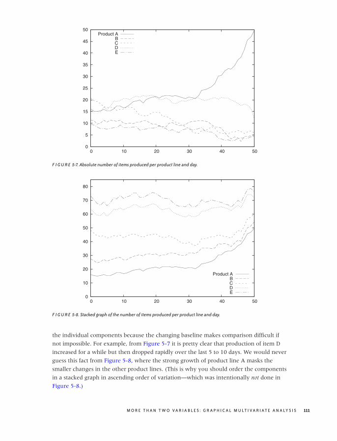
O’Reilly-5980006 master October 28, 2010 20:31
0
5
10
15
20
25
30
35
40
45
50
0 10 20 30 40 50
Product ABCDE
F I G U R E 5-7. Absolute number of items produced per product line and day.
0
10
20
30
40
50
60
70
80
0 10 20 30 40 50
Product ABCDE
F I G U R E 5-8. Stacked graph of the number of items produced per product line and day.
the individual components because the changing baseline makes comparison difficult if
not impossible. For example, from Figure 5-7 it is pretty clear that production of item D
increased for a while but then dropped rapidly over the last 5 to 10 days. We would never
guess this fact from Figure 5-8, where the strong growth of product line A masks the
smaller changes in the other product lines. (This is why you should order the components
in a stacked graph in ascending order of variation—which was intentionally not done in
Figure 5-8.)
M O R E T H A N T W O V A R I A B L E S : G R A P H I C A L M U LT I V A R I AT E A N A LY S I S 111
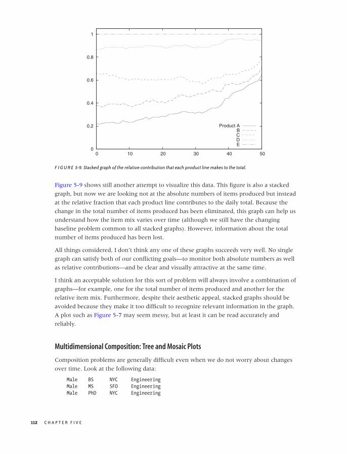
O’Reilly-5980006 master October 28, 2010 20:31
0
0.2
0.4
0.6
0.8
1
0 10 20 30 40 50
Product ABCDE
F I G U R E 5-9. Stacked graph of the relative contribution that each product line makes to the total.
Figure 5-9 shows still another attempt to visualize this data. This figure is also a stacked
graph, but now we are looking not at the absolute numbers of items produced but instead
at the relative fraction that each product line contributes to the daily total. Because the
change in the total number of items produced has been eliminated, this graph can help us
understand how the item mix varies over time (although we still have the changing
baseline problem common to all stacked graphs). However, information about the total
number of items produced has been lost.
All things considered, I don’t think any one of these graphs succeeds very well. No single
graph can satisfy both of our conflicting goals—to monitor both absolute numbers as well
as relative contributions—and be clear and visually attractive at the same time.
I think an acceptable solution for this sort of problem will always involve a combination of
graphs—for example, one for the total number of items produced and another for the
relative item mix. Furthermore, despite their aesthetic appeal, stacked graphs should be
avoided because they make it too difficult to recognize relevant information in the graph.
A plot such as Figure 5-7 may seem messy, but at least it can be read accurately and
reliably.
Multidimensional Composition: Tree and Mosaic Plots
Composition problems are generally difficult even when we do not worry about changes
over time. Look at the following data:
Male BS NYC Engineering
Male MS SFO Engineering
Male PhD NYC Engineering
112 C H A P T E R F I V E

O’Reilly-5980006 master October 28, 2010 20:31
Male BS LAX Engineering
Male MS NYC Finance
Male PhD SFO Finance
Female PhD NYC Engineering
Female MS LAX Finance
Female BS NYC Finance
Female PhD SFO Finance
The data set shows information about ten employees of some company, and for each
employee, we have four pieces of information: gender, highest degree obtained, office
where they are located (given by airport code—NYC: New York, SFO: San Francisco, LAX:
Los Angeles), and their department. Keep in mind that each line corresponds to a single
person.
The usual way to summarize such data is in the form of a contingency table. Table 5-1
summarizes what we know about the relationship between an employee’s gender and his
or her department. Contingency tables are used to determine whether there is a
correlation between categorical variables: in this case, we notice that men tend to work in
engineering and women in finance. (We may want to divide by the total number of
records to get the fraction of employees in each cell of the table.)
The problem is that contingency tables only work for two dimensions at a time. If we also
want to include the breakdown by degree or location, we have no other choice than to
repeat the basic structure from Table 5-1 several times: once for each office or once for
each degree.
A mosaic plot is an attempt to find a graphical representation for this kind of data. The
construction of a mosaic plot is essentially recursive and proceeds as follows (see Figure
5-10):
1. Start with a square.
2. Select a dimension, and then divide the square proportionally according to the counts
for this dimension.
3. Pick a second dimension, and then divide each subarea according to the counts along
the second dimension, separately for each subarea.
4. Repeat for all dimensions, interchanging horizontal and vertical subdivisions for each
new dimension.
T A B L E 5 -1. A contingency table: breakdown of male andfemale employees across two departments
Male Female Total
Engineering 4 1 5Finance 2 3 5
Total 6 4 10
M O R E T H A N T W O V A R I A B L E S : G R A P H I C A L M U LT I V A R I AT E A N A LY S I S 113
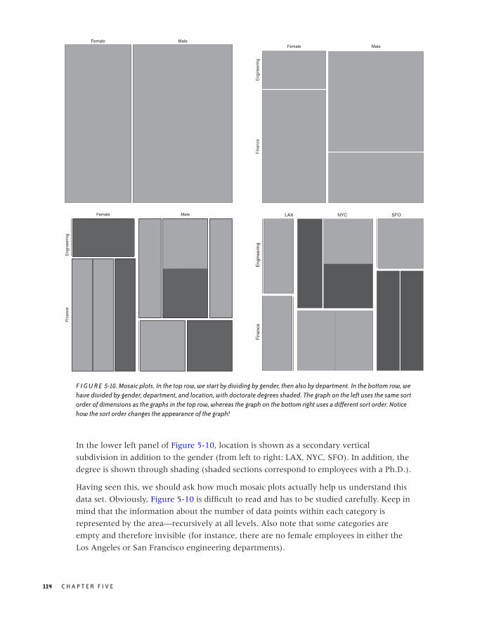
O’Reilly-5980006 master October 28, 2010 20:31
Female MaleFemale
Eng
inee
ring
Fin
ance
Male
Female
Eng
inee
ring
Fin
ance
Male LAX NYC SFO
Eng
inee
ring
Fin
ance
F I G U R E 5-10. Mosaic plots. In the top row, we start by dividing by gender, then also by department. In the bottom row, wehave divided by gender, department, and location, with doctorate degrees shaded. The graph on the left uses the same sortorder of dimensions as the graphs in the top row, whereas the graph on the bottom right uses a different sort order. Noticehow the sort order changes the appearance of the graph!
In the lower left panel of Figure 5-10, location is shown as a secondary vertical
subdivision in addition to the gender (from left to right: LAX, NYC, SFO). In addition, the
degree is shown through shading (shaded sections correspond to employees with a Ph.D.).
Having seen this, we should ask how much mosaic plots actually help us understand this
data set. Obviously, Figure 5-10 is difficult to read and has to be studied carefully. Keep in
mind that the information about the number of data points within each category is
represented by the area—recursively at all levels. Also note that some categories are
empty and therefore invisible (for instance, there are no female employees in either the
Los Angeles or San Francisco engineering departments).
114 C H A P T E R F I V E
O’Reilly-5980006 master October 28, 2010 20:31
4
2Total: 6
2
1
1
0
4 2
2 1 1
Total: 10
Total: 6
F I G U R E 5-11. A tree map (left) and the corresponding tree (right). The numbers give the weight of each node and, ifapplicable, also the weight of the entire subtree.
I appreciate mosaic plots because they represent a new idea for how data can be displayed
graphically, but I have not found them to be useful. In my own experience, it is easier to
understand a data set by poring over a set of contingency tables than by drawing mosaic
plots. Several problems stand out.
• The order in which the dimensions are applied matters greatly for the appearance of
the plot. The lower right panel in Figure 5-10 shows the same data set yet again, but
this time the data was split along the location dimension first and along the gender
dimension last. Shading again indicates employees with a Ph.D. Is it obvious that this is
the same data set? Is one representation more helpful than the other?
• Changing the sort order changes more than just the appearance, it also influences what
we are likely to recognize in the graph. Yet even with an interactive tool, I find it
thoroughly confusing to view a large number of mosaic plots with changing layouts.
• It seems that once we have more than about four or five dimensions, mosaic plots
become too cluttered to be useful. This is not a huge advance over the two dimensions
presented in basic contingency tables!
• Finally, there is a problem common to all visualization methods that rely on area to
indicate magnitude: human perception is not that good at comparing areas, especially
areas of different shape. In the lower right panel in Figure 5-10, for example, it is not
obvious that the sizes of the two shaded areas for engineering in NYC are the same.
(Human perception works by comparing visual objects to each other, and the easiest to
compare are lengths, not areas or angles. This is also why you should favor histograms
over pie charts!)
In passing, let’s quickly consider a different but related concept: tree maps. Tree maps are
area-based representations of hierarchical tree structures. As shown in Figure 5-11, the
area of each parent node in the tree is divided according to the weight of its children.
M O R E T H A N T W O V A R I A B L E S : G R A P H I C A L M U LT I V A R I AT E A N A LY S I S 115

O’Reilly-5980006 master October 28, 2010 20:31
Tree maps are something of a media phenomenon. Originally developed for the purpose
of finding large files in a directory hierarchy, they seem to be more talked about then
used. They share the problems of all area-based visualizations already discussed, and even
their inventors report that people find them hard to read—especially if the number of
levels in the hierarchy increases. Tree maps lend themselves well to interactive
explorations (where you can “zoom in” to deeper levels of the hierarchy).
My greatest concern is that tree maps have abandoned the primary advantage of graphical
methods without gaining sufficiently in power, namely intuition: looking at a tree map
does not conjure up the image of, well, a tree! (I also think that the focus on treelike
hierarchies is driven more by the interests of computer science, rather than by the needs
of data analysis—no wonder if the archetypical application consisted of browsing a file
system!)
Novel Plot Types
Most of the graph types I have described so far (with the exception of mosaic plots) can be
described as “classical”: they have been around for years. In this section, we will discuss a
few techniques that are much more recent—or, at least, that have only recently received
greater attention.
Glyphs
We can include additional information in any simple plot (such as a scatter plot) if we
replace the simple symbols used for individual data points with glyphs: more complicated
symbols that can express additional bits of information by themselves.
An almost trivial application of this idea occurs if we put two data sets on a single scatter
plot and use different symbols (such as squares and crosses) to mark the data points from
each data set. Here the symbols themselves carry meaning but only a simple, categorical
one—namely, whether the point belongs to the first or second data set.
But if we make the symbols more complicated, then they can express more information.
Textual labels (letters and digits) are often surprisingly effective when it comes to
conveying more information—although distinctly low-tech, this is a technique to keep in
mind!
The next step up in sophistication are arrows, which can represent both a direction and a
magnitude (see Figure 5-12), but we need not stop there. Each symbol can be a fully
formed graph (such as a pie chart or a histogram) all by itself. And even that is not the
end—probably the craziest idea in this realm are “Chernoff faces,” where different
quantities are encoded as facial features (e.g., size of the mouth, distance between the eyes),
and the faces are used as symbols on a plot!
116 C H A P T E R F I V E
O’Reilly-5980006 master October 28, 2010 20:31
F I G U R E 5-12. Simple glyphs: using arrows to indicate both direction and magnitude of a field. Notice that the variation inthe data is smooth and that the data itself has been recorded on a regular grid.
As you can see, the problem lies not so much in putting more information on a graph as
in being able to interpret the result in a useful manner. And that seems to depend mostly
on the data, in particular on the presence of large-scale, regular structure in it. If such
structure is missing, then plots using glyphs can be very hard to decode and quite possibly
useless.
Figures 5-12 and 5-13 show two extreme examples. In Figure 5-12, we visualize a
four-dimensional data set using arrows (each point of the two-dimensional plot area has
both a direction and a magnitude, so the total number of dimensions is four). You can
think of the system as flow in a liquid, as electrical or magnetic field lines, or as
deformations in an elastic medium—it does not matter, the overall nature of the data
becomes quite clear. But Figure 5-13 is an entirely different matter! Here we are dealing
with a data set in seven dimensions: the first two are given by the position of the symbol
on the plot, and the remaining five are represented via distortions of a five-edged polygon.
Although we can make out some regularities (e.g., the shapes of the symbols in the lower
lefthand corner are all quite similar and different from the shapes elsewhere), this graph is
hard to read and does not reveal the overall structure of the data very well. Also keep in
mind that the appearance of the graph will change if we map a different pair of variables
to the main axes of the plot, or even if we change the order of variables in the polygons.
Parallel Coordinate Plots
As we have seen, a scatter plot can show two variables. If we use glyphs, we can show
more, but not all variables are treated equally (some are encoded in the glyphs, some are
M O R E T H A N T W O V A R I A B L E S : G R A P H I C A L M U LT I V A R I AT E A N A LY S I S 117
O’Reilly-5980006 master October 28, 2010 20:31
F I G U R E 5-13. Complex glyphs: each polygon encodes five different variables, and its position on the plot adds anothertwo.
encoded by the position of the symbol on the plot). By using parallel coordinate plots, we
can show all the variables of a multivariate data set on equal footing. The price we pay is
that we end up with a graph that is neither pretty nor particularly intuitive, but that can
be useful for exploratory work nonetheless.
In a regular scatter plot in two (or even three) dimensions, the coordinate axes are at right
angles to each other. In a parallel coordinate plot, the coordinate axes instead are parallel
to each other. For every data point, its value for each of the variables is marked on the
corresponding axis, and then all these points are connected with lines. Because the axes
are parallel to each other, we don’t run out of spatial dimensions and therefore can have
as many of them as we need. Figure 5-14 shows what a single record looks like in such a
plot, and Figure 5-15 shows the entire data set. Each record consists of nine different
quantities (labeled A through J).
The main use of parallel coordinate plots is to find clusters in high-dimensional data sets.
For example, in Figure 5-15, we can see that the data forms two clusters for the quantity
labeled B: one around 0.8 and one around 0. Furthermore, we can see that most records
for which B is 0, tend to have higher values of C than those that have a B near 0.8. And
so on.
A few technical points should be noted about parallel coordinate plots:
• You will usually want to rescale the values in each coordinate to the unit interval via
the linear transformation (also see Appendix B):
xscaled = x − xmin
xmax − xmin
118 C H A P T E R F I V E
O’Reilly-5980006 master October 28, 2010 20:31
0
0.2
0.4
0.6
0.8
1
A B C E F G H I J
F I G U R E 5-14. A single record (i.e., a single data point) from a multivariate data set shown in a parallel coordinate plot.
0
0.2
0.4
0.6
0.8
1
A B C E F G H I J
F I G U R E 5-15. All records from the data set shown in a parallel coordinate plot. The record shown in Figure 5-14 ishighlighted.
This is not mandatory, however. There may be situations where you care about the
absolute positions of the points along the coordinate axis or about scaling to a different
interval.
• The appearance of parallel coordinate plots depends strongly on the order in which the
coordinate lines are drawn: rearranging them can hide or reveal structure. Ideally, you
have access to a tool that lets you reshuffle the coordinate axis interactively.
M O R E T H A N T W O V A R I A B L E S : G R A P H I C A L M U LT I V A R I AT E A N A LY S I S 119

O’Reilly-5980006 master October 28, 2010 20:31
• Especially for larger data sets (several hundreds of points or more), overplotting of lines
becomes a problem. One way to deal with this is through “alpha blending”: lines are
shown as semi-transparent, and their visual effects are combined where they overlap
each other.
• Similarly, it is often highly desirable to be able to select a set of lines and highlight them
throughout the entire graph—for example, to see how data points that are clustered in
one dimension are distributed in the other dimensions.
• Instead of combining points on adjacent coordinate axes with straight lines that have
sharp kinks at the coordinate axes, one can use smooth lines that pass the coordinate
axes without kinks.
All of these issues really are tool issues, and in fact parallel coordinates don’t make sense
without a tool that supports them natively and includes good implementations of the
features just described. This implies that parallel coordinate plots serve less as finished,
static graphs than as an interactive tool for exploring a data set.
Parallel coordinate plots still seem pretty novel. The idea itself has been around for about
25 years, but even today, tools that support parallel coordinates plots well are far from
common place.
What is not yet clear is how useful parallel coordinate plots really are. On the one hand,
the concept seems straightforward and easy enough to use. On the other hand, I have
found the experience of actually trying to apply them frustrating and not very fruitful. It is
easy to get bogged down in technicalities of the plot (ordering and scaling of coordinate
axes) with little real, concrete insight resulting in the end. The erratic tool situation of
course does not help. I wonder whether more computationally intensive methods (e.g.,
principal component analysis—see Chapter 14) do not give a better return on investment
overall. But the jury is still out.
Interactive Explorations
All the graphs that we have discussed so far (in this and the preceding chapters) were by
nature static. We prepared graphs, so that we then could study them, but this was the
extent of our interaction. If we wanted to see something different, we had to prepare a
new graph.
In this section, I shall describe some ideas for interactive graphics: graphs that we can
change directly in some way without having to re-create them anew.
Interactive graphics cannot be produced with paper and pencil, not even in principle: they
require a computer. Conversely, what we can do in this area is even more strongly limited
by the tools or programs that are available to us than for other types of graphs. In this
sense, then, this section is more about possibilities than about realities because the tool
support for interactive graphical exploration seems (at the time of this writing) rather
poor.
120 C H A P T E R F I V E

O’Reilly-5980006 master October 28, 2010 20:31
Querying and Zooming
Interaction with a graph does not have to be complicated. A very simple form of
interaction consists of the ability to select a point (or possibly a group of points) and have
the tool display additional information about it. In the simplest case, we hover the mouse
pointer over a data point and see the coordinates (and possibly additional details) in a tool
tip or a separate window. We can refer to this activity as querying.
Another simple form of interaction would allow us to change aspects of the graph directly
using the mouse. Changing the plot range (i.e., zooming) is probably the most common
application, but I could also imagine to adjust the aspect ratio, the color palette, or
smoothing parameters in this way. (Selecting and highlighting a subset of points in a
parallel coordinate plot, as described earlier, would be another application.)
Observe that neither of these activities is inherently “interactive”: they all would also be
possible if we used paper and pencil. The interactive aspect consists of our ability to
invoke them in real time and by using a graphical input device (the mouse).
Linking and Brushing
The ability to interact directly with graphs becomes much more interesting once we are
dealing with multiple graphs at the same time! For example, consider a scatter-plot matrix
like the one in Figure 5-4. Now imagine we use the mouse to select and highlight a group
of points in one of the subplots. If the graphs are linked, then the symbols corresponding
to the data points selected in one of the subplots will also be highlighted in all other
subplots as well.
Usually selecting some points and then highlighting their corresponding symbols in the
linked subgraphs requires two separate steps (or mouseclicks). A real-time version of the
same idea is called brushing: any points currently under the mouse pointer are selected
and highlighted in all of the linked subplots.
Of course, linking and brushing are not limited to scatter-plot matrices, but they are
applicable to any group of graphs that show different aspects of the same data set.
Suppose we are working with a set of histograms of a multivariate data set, each
histogram showing only one of the quantities. Now I could imagine a tool that allows us
to select a bin in one of the histograms and then highlights the contribution from the
points in that bin in all the other histograms.
Grand Tours and Projection Pursuits
Although linking and brushing allow us to interact with the data, they leave the graph
itself static. This changes when we come to Grand Tours and Projection Pursuits. Now we are
talking about truly animated graphics!
Grand Tours and Projection Pursuits are attempts to enhance our understanding of a data
set by presenting many closely related projections in the form of an animated “movie.”
M O R E T H A N T W O V A R I A B L E S : G R A P H I C A L M U LT I V A R I AT E A N A LY S I S 121

O’Reilly-5980006 master October 28, 2010 20:31
The concept is straightforward: we begin with some projection and then continuously
move the viewpoint around the data set. (For a three-dimensional data set, you can
imagine the viewpoint moving on a sphere that encloses the data.)
In Grand Tours, the viewpoint is allowed to perform essentially a random walk around the
data set. In Projection Pursuits, the viewpoint is moved so that it will improve the value of
an index that measures how “interesting” a specific projection will appear. Most indices
currently suggested measure properties such as deviation from Gaussian behavior. At each
step of a Pursuit, the program evaluates several possible projections and then selects the
one that most improves the chosen index. Eventually, a Pursuit will reach a local
maximum for the index, at which time it needs to be restarted from a different starting
point.
Obviously, Tours and Pursuits require specialized tools that can perform the required
projections—and do so in real time. They are also exclusively exploratory techniques and
not suitable for preserving results or presenting them to a general audience.
Although the approach is interesting, I have not found Tours to be especially useful in
practice. It can be confusing to watch a movie of essentially random patterns and
frustrating to interact with projections when attempting to explore the neighborhood of
an interesting viewpoint.
Tools
All interactive visualization techniques require suitable tools and computer programs;
they cannot be done using paper-and-pencil methods. This places considerable weight on
the quality of the available tools. Two issues stand out.
• It seems difficult to develop tools that support interactive features and are sufficiently
general at the same time. For example, if we expect the plotting program to show
additional detail on any data point that we select with the mouse, then the input (data)
file will have to contain this information—possibly as metadata. But now we are
talking about relatively complicated data sets, which require more complicated,
structured file formats that will be specific to each tool. So before we can do anything
with the data, we will have to transform it into the required format. This is a significant
burden, and it may make these methods infeasible in practice. (Several of the more
experimental programs mentioned in the Workshop section in this chapter are nearly
unusable on actual data sets for exactly this reason.)
• A second problem concerns performance. Brushing, for instance, makes sense only if it
truly occurs in real time—without any discernible delay as the mouse pointer moves.
For a large data set and a scatter-plot matrix of a dozen attributes, this means updating
a few thousand points in real time. Although by no means infeasible, such
responsiveness does require that the tool is written with an eye toward performance
and using appropriate technologies. (Several of the tools mentioned in the Workshop
exhibit serious performance issues on real-world data sets.)
122 C H A P T E R F I V E
O’Reilly-5980006 master October 28, 2010 20:31
A final concern involves the overall design of the user interface. It should be easy to learn
and easy to use, and it should support the activities that are actually required. Of course,
this concern is not specific to data visualization tools but common to all programs with a
graphical user interface.
Workshop: Tools for Multivariate Graphics
Multivariate graphs tend to be complicated and therefore require good tool support even
more strongly than do other forms of graphs. In addition, some multivariate graphics are
highly specialized (e.g., mosaic plots) and cannot be easily prepared with a general-
purpose plotting tool.
That being said, the tool situation is questionable at best. Here are three different starting
points for exploration—each with its own set of difficulties.
R
R is not a plotting tool per se; it is a statistical analysis package and a full development
environment as well. However, R has always included pretty extensive graphing
capabilities. R is particularly strong at “scientific” graphs: straightforward but highly
accurate line diagrams.
Because R is not simply a plotting tool, but instead a full data manipulation and
programming environment, its learning curve is rather steep; you need to know a lot of
different things before you can do anything. But once you are up and running, the large
number of advanced functions that are already built in can make working with R very
productive. For example, the scatter-plot matrix in Figure 5-4 was generated using just
these three commands:
d <- read.delim( "wines", header=T )
pairs(d)
dev.copy2eps( file="splom.eps" )
(the R command pairs() generates a plot of all pairs—i.e., a scatter-plot matrix). The
scatter plot in Figure 5-5 and the co-plot in Figure 5-6 were generated using:
d <- read.delim( "data", header=F )
names( d ) <- c( "x", "a", "y" )
plot( y ~ x, data=d )
dev.copy2eps( file='coplot1.eps' )
coplot( y ~ x | a, data=d )
dev.copy2eps( file='coplot2.eps' )
Note that these are the entire command sequences, which include reading the data from
file and writing the graph back to disk! We’ll have more to say about R in the Workshop
sections of Chapters 10 and 14.
M O R E T H A N T W O V A R I A B L E S : G R A P H I C A L M U LT I V A R I AT E A N A LY S I S 123

O’Reilly-5980006 master October 28, 2010 20:31
R has a strong culture of user-contributed add-on packages. For multiplots consisting of
subplots arranged on a regular grid (in particular, for generalized co-plots), you should
consider the lattice package, which extends or even replaces the functionality of the
basic R graphic systems. This package is part of the standard R distribution.
Experimental Tools
If you want to explore some of the more novel graphing ideas, such as parallel coordinate
plots and mosaic plots, or if you want to try out interactive ideas such as brushing and
Grand Tours, then there are several options open to you. All of them are academic
research projects, and all are highly experimental. (In a way, this is a reflection of the state
of the field: I don’t think any of these novel plot types have been refined to a point where
they are clearly useful.)
• The ggobi project (http://www.ggobi.org) allows brushing in scatter-plot matrices and
parallel coordinate plots and includes support for animated tours and pursuits.
• Mondrian (http://www.rosuda.org/mondrian) is a Java application that can produce
mosaic plots (as well as some other multivariate graphs).
Again, both tools are academic research projects—and it shows. They are technology
demonstrators intended to try out and experiment with new graph ideas, but neither is
anywhere near production strength. Both are rather fussy about the required data input
format, their graphical user interfaces are clumsy, and neither includes a proper way to
export graphs to file (if you want to save a plot, you have to take a screenshot). The
interactive brushing features in ggobi are slow, which makes them nearly unusable for
realistically sized data sets. There are some lessons here (besides the intended ones) to be
learned about the design of tools for statistical graphics. (For instance, GUI widget sets do
not seem suitable for interactive visualizations: they are too slow. You have to use a
lower-level graphics library instead.)
Other open source tools you may want to check out are Tulip (http://tulip.labri.fr) and
ManyEyes (http://manyeyes.alphaworks.ibm.com/manyeyes). The latter project is a web-based
tool and community that allows you to upload your data set and generate plots of it
online.
A throwback to a different era is OpenDX (http://www.research.ibm.com/dx). Originally
designed by IBM in 1991, it was donated to the open source community in 1999. It
certainly feels overly complicated and dated, but it does include a selection of features not
found elsewhere.
Python Chaco Library
The Chaco library (http://code.enthought.com/projects/chaco/) is a Python library for
two-dimensional plotting. In addition to the usual line and symbol drawing capabilities, it
124 C H A P T E R F I V E

O’Reilly-5980006 master October 28, 2010 20:31
includes easy support for color and color manipulation as well as—more importantly—for
real-time user interaction.
Chaco is an exciting toolbox if you plan to experiment with writing your own programs to
visualize data and interact with it. However, be prepared to do some research: the best
available documentation seems to be the set of demos that ship with it.
Chaco is part of the Enthought Tool Suite, which is developed by Enthought, Inc., and is
available under a BSD-style license.
Further Reading• Graphics of Large Datasets: Visualizing a Million. Antony Unwin, Martin Theus, and Heike
Hofmann. Springer. 2006.
This is a modern book that in many ways describes the state of the art in statistical data
visualization. Mosaic plots, glyph plots, parallel coordinate plots, Grand Tours—all are
discussed here. Unfortunately, the basics are neglected: standard tools like logarithmic
plots are never even mentioned, and simple things like labels are frequently messed
up. This book is nevertheless interesting as a survey of some of the state of the art.
• The Elements of Graphing Data. William S. Cleveland. 2nd ed., Hobart Press. 1994.
This book provides an interesting counterpoint to the book by Unwin and colleagues.
Cleveland’s graphs often look pedestrian, but he thinks more deeply than almost
anyone else about ways to incorporate more (and more quantitative) information in a
graph. What stands out in his works is that he explicitly takes human perception into
account as a guiding principle when developing new graphs. My discussion of
scatter-plot matrices and co-plots is heavily influenced by his careful treatment.
• Gnuplot in Action: Understanding Data with Graphs. Philipp K. Janert. Manning
Publications. 2010.
Chapter 9 of this book contains additional details on and examples for the use of color
to prepare false-color plots, including explicit recipes to create them using gnuplot. But
the principles are valid more generally, even if you use different tools.
• Why Should Engineers and Scientists Be Worried About Color? B. E. Rogowitz and L. A.
Treinish. http://www.research.ibm.com/people/l/lloydt/color/color.HTM. 1995. This paper
contains important lessons for false-color plots, including the distinction between
segmentation and smooth variation as well as the difference between hue- and
luminance-based palettes. The examples were prepared using IBM’s (now open source)
OpenDX graphical Data Explorer.
• Escaping RGBland: Selecting Colors for Statistical Graphics. A. Zeileis, K. Hornik, and
P. Murrell. http://statmath.wu.ac.at/∼zeileis/papers/Zeileis+Hornik+Murrell-2009.pdf . 2009.
This is a more recent paper on the use of color in graphics. It emphasizes the
importance of perception-based color spaces, such as the HCL model.
M O R E T H A N T W O V A R I A B L E S : G R A P H I C A L M U LT I V A R I AT E A N A LY S I S 125

O’Reilly-5980006 master October 28, 2010 20:31
O’Reilly-5980006 master October 28, 2010 20:53
C H A P T E R S I X
Intermezzo: A Data Analysis Session
OCCASIONALLY I GET THE QUESTION: “HOW DO YOU ACTUALLY WORK?” OR “HOW DO YOU COME UP WITH THIS
stuff?” As an answer, I want to take you on a tour through a new data set. I will use
gnuplot, which is my preferred tool for this kind of interactive data analysis—you will see
why. And I will share my observations and thoughts as we go along.
A Data Analysis Session
The data set is a classic: the CO2 measurements above Mauna Loa on Hawaii. The
inspiration for this section comes from Cleveland’s Elements of Graphical Analysis,* but the
approach is entirely mine.
First question: what’s in the data set? I see that the first column represents the date
(month and year) while the second contains the measured CO2 concentration in parts per
million. Here are the first few lines:
Jan-1959 315.42
Feb-1959 316.32
Mar-1959 316.49
Apr-1959 317.56
...
The measurements are regularly spaced (in fact, monthly), so I don’t need to parse the
date in the first column; I simply plot the second column by itself. (In the figure, I have
*The Elements of Graphing Data. William S. Cleveland. Hobart Press. 1994. The data itself (in a slightlydifferent format) is available from StatLib: http://lib.stat.cmu.edu/datasets/visualizing.data.zip and frommany other places around the Web.
127
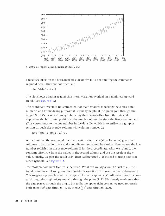
O’Reilly-5980006 master October 28, 2010 20:53
310
315
320
325
330
335
340
345
350
355
360
Jan1958
Jan1961
Jan1964
Jan1967
Jan1970
Jan1973
Jan1976
Jan1979
Jan1982
Jan1985
Jan1988
Jan1991
F I G U R E 6-1. The first look at the data: plot “data” u 1 w l
added tick labels on the horizontal axis for clarity, but I am omitting the commands
required here—they are not essential.)
plot "data" u 1 w l
The plot shows a rather regular short-term variation overlaid on a nonlinear upward
trend. (See Figure 6-1.)
The coordinate system is not convenient for mathematical modeling: the x axis is not
numeric, and for modeling purposes it is usually helpful if the graph goes through the
origin. So, let’s make it do so by subtracting the vertical offset from the data and
expressing the horizontal position as the number of months since the first measurement.
(This corresponds to the line number in the data file, which is accessible in a gnuplot
session through the pseudo-column with column number 0.)
plot "data" u 0:($2-315) w l
A brief note on the command: the specification after the u (short for using) gives the
columns to be used for the x and y coordinates, separated by a colon. Here we use the line
number (which is in the pseudo-column 0) for the x coordinate. Also, we subtract the
constant offset 315 from the values in the second column and use the result as the y
value. Finally, we plot the result with lines (abbreviated w l) instead of using points or
other symbols. See Figure 6-2.
The most predominant feature is the trend. What can we say about it? First of all, the
trend is nonlinear: if we ignore the short-term variation, the curve is convex downward.
This suggests a power law with an as-yet-unknown exponent: xk . All power-law functions
go through the origin (0, 0) and also through the point (1, 1). We already made sure that
the data passes through the origin, but to fix the upper-right corner, we need to rescale
both axes: if xk goes through (1, 1), then b(
xa
)kgoes through (a, b).
128 C H A P T E R S I X
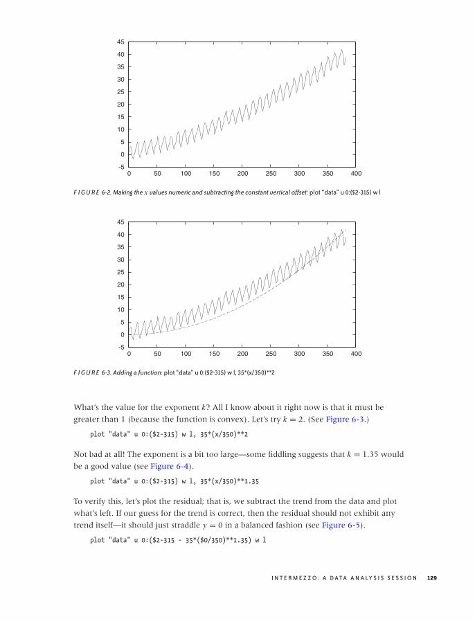
O’Reilly-5980006 master October 28, 2010 20:53
-5
0
5
10
15
20
25
30
35
40
45
0 50 100 150 200 250 300 350 400
F I G U R E 6-2. Making the x values numeric and subtracting the constant vertical offset: plot “data” u 0:($2-315) w l
-5
0
5
10
15
20
25
30
35
40
45
0 50 100 150 200 250 300 350 400
F I G U R E 6-3. Adding a function: plot “data” u 0:($2-315) w l, 35*(x/350)**2
What’s the value for the exponent k? All I know about it right now is that it must be
greater than 1 (because the function is convex). Let’s try k = 2. (See Figure 6-3.)
plot "data" u 0:($2-315) w l, 35*(x/350)**2
Not bad at all! The exponent is a bit too large—some fiddling suggests that k = 1.35 would
be a good value (see Figure 6-4).
plot "data" u 0:($2-315) w l, 35*(x/350)**1.35
To verify this, let’s plot the residual; that is, we subtract the trend from the data and plot
what’s left. If our guess for the trend is correct, then the residual should not exhibit any
trend itself—it should just straddle y = 0 in a balanced fashion (see Figure 6-5).
plot "data" u 0:($2-315 - 35*($0/350)**1.35) w l
I N T E R M E Z Z O : A D ATA A N A LY S I S S E S S I O N 129
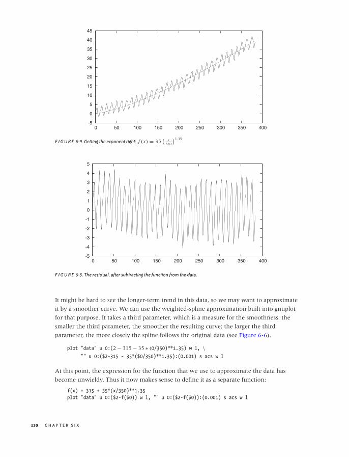
O’Reilly-5980006 master October 28, 2010 20:53
-5
0
5
10
15
20
25
30
35
40
45
0 50 100 150 200 250 300 350 400
F I G U R E 6-4. Getting the exponent right: f (x) = 35(
x350
)1.35
-5
-4
-3
-2
-1
0
1
2
3
4
5
0 50 100 150 200 250 300 350 400
F I G U R E 6-5. The residual, after subtracting the function from the data.
It might be hard to see the longer-term trend in this data, so we may want to approximate
it by a smoother curve. We can use the weighted-spline approximation built into gnuplot
for that purpose. It takes a third parameter, which is a measure for the smoothness: the
smaller the third parameter, the smoother the resulting curve; the larger the third
parameter, the more closely the spline follows the original data (see Figure 6-6).
plot "data" u 0:(2 − 315 − 35 ∗ (0/350)**1.35) w l, \"" u 0:($2-315 - 35*($0/350)**1.35):(0.001) s acs w l
At this point, the expression for the function that we use to approximate the data has
become unwieldy. Thus it now makes sense to define it as a separate function:
f(x) = 315 + 35*(x/350)**1.35
plot "data" u 0:($2-f($0)) w l, "" u 0:($2-f($0)):(0.001) s acs w l
130 C H A P T E R S I X
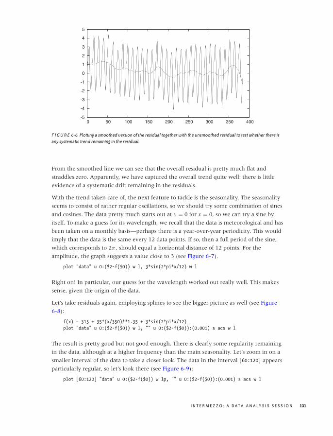
O’Reilly-5980006 master October 28, 2010 20:53
-5
-4
-3
-2
-1
0
1
2
3
4
5
0 50 100 150 200 250 300 350 400
F I G U R E 6-6. Plotting a smoothed version of the residual together with the unsmoothed residual to test whether there isany systematic trend remaining in the residual.
From the smoothed line we can see that the overall residual is pretty much flat and
straddles zero. Apparently, we have captured the overall trend quite well: there is little
evidence of a systematic drift remaining in the residuals.
With the trend taken care of, the next feature to tackle is the seasonality. The seasonality
seems to consist of rather regular oscillations, so we should try some combination of sines
and cosines. The data pretty much starts out at y = 0 for x = 0, so we can try a sine by
itself. To make a guess for its wavelength, we recall that the data is meteorological and has
been taken on a monthly basis—perhaps there is a year-over-year periodicity. This would
imply that the data is the same every 12 data points. If so, then a full period of the sine,
which corresponds to 2π , should equal a horizontal distance of 12 points. For the
amplitude, the graph suggests a value close to 3 (see Figure 6-7).
plot "data" u 0:($2-f($0)) w l, 3*sin(2*pi*x/12) w l
Right on! In particular, our guess for the wavelength worked out really well. This makes
sense, given the origin of the data.
Let’s take residuals again, employing splines to see the bigger picture as well (see Figure
6-8):
f(x) = 315 + 35*(x/350)**1.35 + 3*sin(2*pi*x/12)
plot "data" u 0:($2-f($0)) w l, "" u 0:($2-f($0)):(0.001) s acs w l
The result is pretty good but not good enough. There is clearly some regularity remaining
in the data, although at a higher frequency than the main seasonality. Let’s zoom in on a
smaller interval of the data to take a closer look. The data in the interval [60:120] appears
particularly regular, so let’s look there (see Figure 6-9):
plot [60:120] "data" u 0:($2-f($0)) w lp, "" u 0:($2-f($0)):(0.001) s acs w l
I N T E R M E Z Z O : A D ATA A N A LY S I S S E S S I O N 131
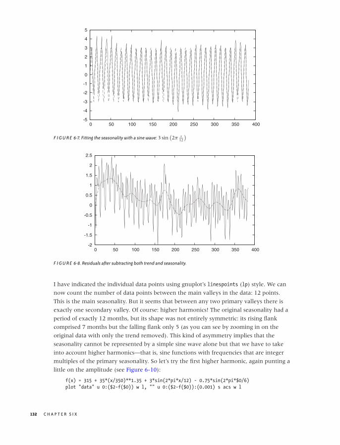
O’Reilly-5980006 master October 28, 2010 20:53
-5
-4
-3
-2
-1
0
1
2
3
4
5
0 50 100 150 200 250 300 350 400
F I G U R E 6-7. Fitting the seasonality with a sine wave: 3 sin(2π x
12
)
-2
-1.5
-1
-0.5
0
0.5
1
1.5
2
2.5
0 50 100 150 200 250 300 350 400
F I G U R E 6-8. Residuals after subtracting both trend and seasonality.
I have indicated the individual data points using gnuplot’s linespoints (lp) style. We can
now count the number of data points between the main valleys in the data: 12 points.
This is the main seasonality. But it seems that between any two primary valleys there is
exactly one secondary valley. Of course: higher harmonics! The original seasonality had a
period of exactly 12 months, but its shape was not entirely symmetric: its rising flank
comprised 7 months but the falling flank only 5 (as you can see by zooming in on the
original data with only the trend removed). This kind of asymmetry implies that the
seasonality cannot be represented by a simple sine wave alone but that we have to take
into account higher harmonics—that is, sine functions with frequencies that are integer
multiples of the primary seasonality. So let’s try the first higher harmonic, again punting a
little on the amplitude (see Figure 6-10):
f(x) = 315 + 35*(x/350)**1.35 + 3*sin(2*pi*x/12) - 0.75*sin(2*pi*$0/6)
plot "data" u 0:($2-f($0)) w l, "" u 0:($2-f($0)):(0.001) s acs w l
132 C H A P T E R S I X
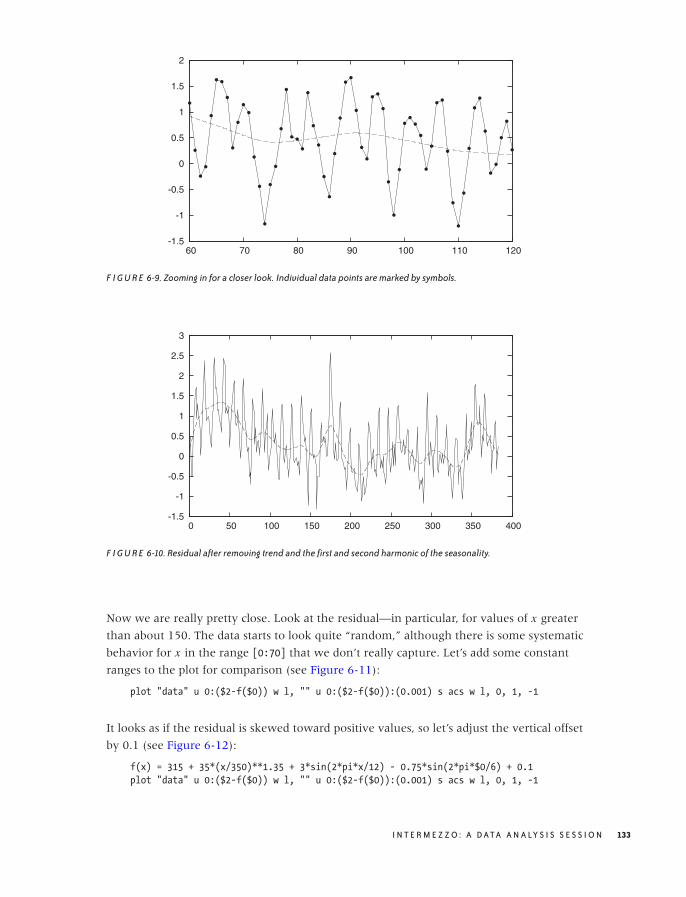
O’Reilly-5980006 master October 28, 2010 20:53
-1.5
-1
-0.5
0
0.5
1
1.5
2
60 70 80 90 100 110 120
F I G U R E 6-9. Zooming in for a closer look. Individual data points are marked by symbols.
-1.5
-1
-0.5
0
0.5
1
1.5
2
2.5
3
0 50 100 150 200 250 300 350 400
F I G U R E 6-10. Residual after removing trend and the first and second harmonic of the seasonality.
Now we are really pretty close. Look at the residual—in particular, for values of x greater
than about 150. The data starts to look quite “random,” although there is some systematic
behavior for x in the range [0:70] that we don’t really capture. Let’s add some constant
ranges to the plot for comparison (see Figure 6-11):
plot "data" u 0:($2-f($0)) w l, "" u 0:($2-f($0)):(0.001) s acs w l, 0, 1, -1
It looks as if the residual is skewed toward positive values, so let’s adjust the vertical offset
by 0.1 (see Figure 6-12):
f(x) = 315 + 35*(x/350)**1.35 + 3*sin(2*pi*x/12) - 0.75*sin(2*pi*$0/6) + 0.1
plot "data" u 0:($2-f($0)) w l, "" u 0:($2-f($0)):(0.001) s acs w l, 0, 1, -1
I N T E R M E Z Z O : A D ATA A N A LY S I S S E S S I O N 133
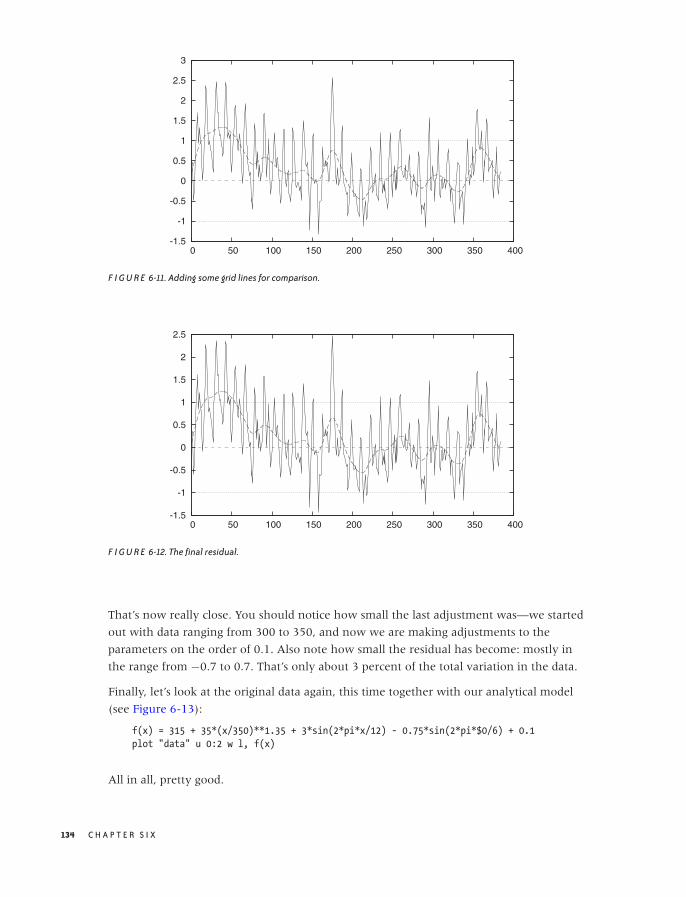
O’Reilly-5980006 master October 28, 2010 20:53
-1.5
-1
-0.5
0
0.5
1
1.5
2
2.5
3
0 50 100 150 200 250 300 350 400
F I G U R E 6-11. Adding some grid lines for comparison.
-1.5
-1
-0.5
0
0.5
1
1.5
2
2.5
0 50 100 150 200 250 300 350 400
F I G U R E 6-12. The final residual.
That’s now really close. You should notice how small the last adjustment was—we started
out with data ranging from 300 to 350, and now we are making adjustments to the
parameters on the order of 0.1. Also note how small the residual has become: mostly in
the range from −0.7 to 0.7. That’s only about 3 percent of the total variation in the data.
Finally, let’s look at the original data again, this time together with our analytical model
(see Figure 6-13):
f(x) = 315 + 35*(x/350)**1.35 + 3*sin(2*pi*x/12) - 0.75*sin(2*pi*$0/6) + 0.1
plot "data" u 0:2 w l, f(x)
All in all, pretty good.
134 C H A P T E R S I X
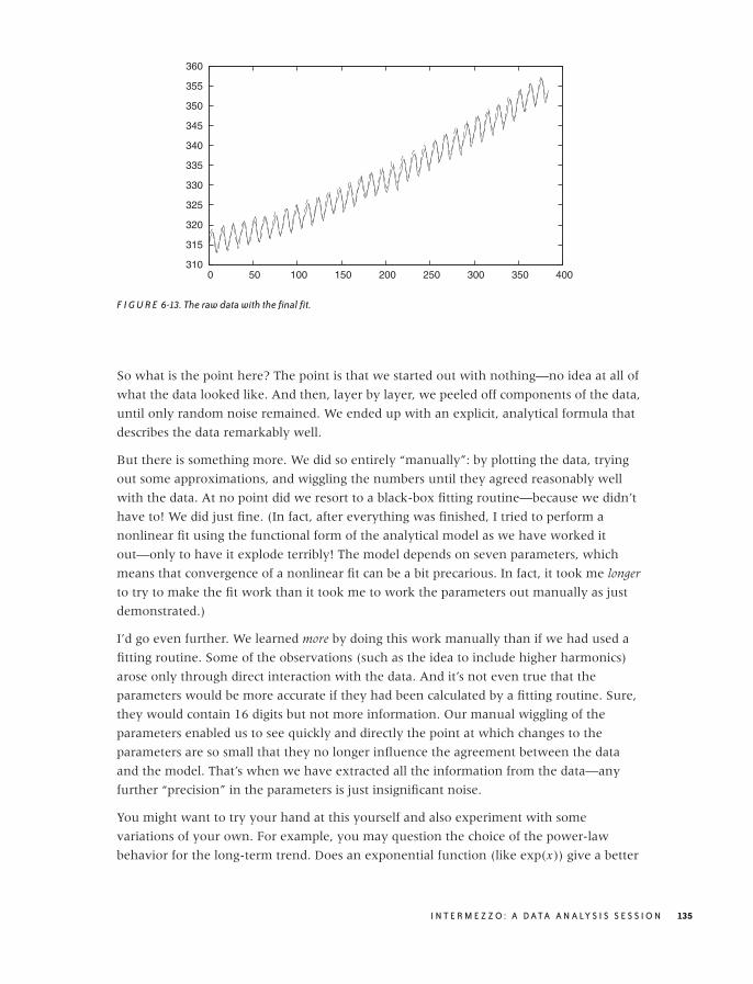
O’Reilly-5980006 master October 28, 2010 20:53
310
315
320
325
330
335
340
345
350
355
360
0 50 100 150 200 250 300 350 400
F I G U R E 6-13. The raw data with the final fit.
So what is the point here? The point is that we started out with nothing—no idea at all of
what the data looked like. And then, layer by layer, we peeled off components of the data,
until only random noise remained. We ended up with an explicit, analytical formula that
describes the data remarkably well.
But there is something more. We did so entirely “manually”: by plotting the data, trying
out some approximations, and wiggling the numbers until they agreed reasonably well
with the data. At no point did we resort to a black-box fitting routine—because we didn’t
have to! We did just fine. (In fact, after everything was finished, I tried to perform a
nonlinear fit using the functional form of the analytical model as we have worked it
out—only to have it explode terribly! The model depends on seven parameters, which
means that convergence of a nonlinear fit can be a bit precarious. In fact, it took me longer
to try to make the fit work than it took me to work the parameters out manually as just
demonstrated.)
I’d go even further. We learned more by doing this work manually than if we had used a
fitting routine. Some of the observations (such as the idea to include higher harmonics)
arose only through direct interaction with the data. And it’s not even true that the
parameters would be more accurate if they had been calculated by a fitting routine. Sure,
they would contain 16 digits but not more information. Our manual wiggling of the
parameters enabled us to see quickly and directly the point at which changes to the
parameters are so small that they no longer influence the agreement between the data
and the model. That’s when we have extracted all the information from the data—any
further “precision” in the parameters is just insignificant noise.
You might want to try your hand at this yourself and also experiment with some
variations of your own. For example, you may question the choice of the power-law
behavior for the long-term trend. Does an exponential function (like exp(x)) give a better
I N T E R M E Z Z O : A D ATA A N A LY S I S S E S S I O N 135

O’Reilly-5980006 master October 28, 2010 20:53
310
320
330
340
350
360
370
380
390
400
Jan1958
Jan1964
Jan1970
Jan1976
Jan1982
Jan1988
Jan1994
Jan2000
Jan2006
Jan2012
Data Model
F I G U R E 6-14. The extended data set up to early 2010 together with the model (up to 1990).
fit? It is not easy to tell from the data, but it makes a huge difference if we want to project
our findings significantly (10 years or more) into the future. You might also take a closer
look at the seasonality. Because it is so regular—and especially since its period is known
exactly—you should be able to isolate just the periodic part of the data in a separate model
by averaging corresponding months for all years. Finally, there is 20 years’ worth of
additional data available beyond the “classic” data set used in my original exploration.*
Figure 6-14 shows all the available data together with the model that we have developed.
Does the fit continue to work well for the years past 1990?
Workshop: gnuplot
The example commands in this chapter should have given you a good idea what working
with gnuplot is like, but let’s take a quick look at some of the basics.
Gnuplot (http://www.gnuplot.info) is command-line oriented: when you start gnuplot, it
presents you with a text prompt at which to enter commands; the resulting graphs are
shown in a separate window. Creating plots is simple—the command:
plot sin(x) with lines, cos(x) with linespoints
will generate a plot of (you guessed it) a sine and a cosine. The sine will be drawn with
plain lines, and the cosine will be drawn with symbols (“points”) connected by lines.
*You can obtain the data from the observatory’s official website at http://www.esrl.noaa.gov/gmd/ccgg/trends/. Also check out the narrative (with photos of the apparatus!) at http://celebrating200years.noaa.gov/datasets/mauna/welcome.html.
136 C H A P T E R S I X

O’Reilly-5980006 master October 28, 2010 20:53
(Many gnuplot keywords can be abbreviated: instead of with lines I usually type: w l, or w
lp instead of with linespoints. These short forms are a major convenience although
rather cryptic in the beginning. In this short introductory section, I will make sure to only
use the full forms of all commands.)
To plot data from a file, you also use the plot command; for instance:
plot "data" using 1:2 with lines
When plotting data from a file, we use the using keyword to specify which columns from
the file we want to plot—in the command just given, we use entries from the first column
as x values and use entries from the second column for y values.
One of the nice features of gnuplot is that you can apply arbitrary transformations to the
data as it is being plotted. To do so, you put parentheses around each entry in the column
specification that you want to apply a transform to. Within these parentheses you can use
any mathematical expression. The data from each column is available by prefixing the
column index by the dollar sign. An example will make this more clear:
plot "data" using (1/$1):($2+$3) with lines
This command plots the sum of the second and third columns (that is: $2+$3) as a function
of one over the value in the first column (1/$1).
It is also possible to mix data and functions in a single plot command (as we have seen in
the examples in this chapter):
plot "data" using 1:2 with lines, cos(x) with lines
This is different from the Matlab-style of plotting, where a function must be explicitly
evaluated for a set of points before the resulting set of values can be plotted.
We can now proceed to add decorations (such as labels and arrows) to the plot. All kinds
of options are available to customize virtually every aspect of the plot’s appearance: tick
marks, the legend, aspect ratio—you name it. When we are done with a plot, we can save
all the commands used to create it (including all decorations) via the save command:
save "plot.gp"
Now we can use load "plot.gp" to re-create the graph.
As you can see, gnuplot is extremely straightforward to use. The one area that is often
regarded as somewhat clumsy is the creation of graphs in common graphics file formats.
The reason for this is historical: the first version of gnuplot was written in 1985, a time
when one could not expect every computer to be connected to a graphics-capable terminal
and when many of our current file formats did not even exist! The gnuplot designers dealt
with this situation by creating the so-called “terminal” abstraction. All hardware-specific
capabilities were encapsulated by this abstraction so that the rest of gnuplot could be as
portable as possible. Over time, this “terminal” came to include different graphics file
formats as well (not just graphics hardware terminals), and this usage continues to this day.
I N T E R M E Z Z O : A D ATA A N A LY S I S S E S S I O N 137

O’Reilly-5980006 master October 29, 2010 17:41
Exporting a graph to a common file format (such as GIF, PNG, PostScript, or PDF) requires
a five-step process:
set terminal png
set output "plot.png"
replot
set terminal wxt
set output
In the first step, we choose the output device or “terminal”: here, a PNG file. In the second
step, we choose the file name. In the third step, we explicitly request that the graph be
regenerated for this newly chosen device. The remaining commands restore the
interactive session by selecting the interactive wxt terminal (built on top of the wxWidgets
widget set) and redirecting output back to the interactive terminal. If you find this process
clumsy and error-prone, then you are not alone, but rest assured: gnuplot allows you to
write macros, which can reduce these five steps to one!
I should mention one further aspect of gnuplot: because it has been around for 25 years, it
is extremely mature and robust when it comes to dealing with typical day-to-day
problems. For example, gnuplot is refreshingly unpicky when it comes to parsing input
files. Many other data analysis or plotting programs that I have seen are pretty rigid in this
regard and will bail when encountering unexpected data in an input file. This is the right
thing to do in theory, but in practice, data files are often not clean—with ad hoc formats
and missing or corrupted data points. Having your plotting program balk over whitespace
instead of tabs is a major nuisance when doing real work. In contrast, gnuplot usually does
an amazingly good job at making sense of almost any input file you might throw at it, and
that is indeed a great help. Similarly, gnuplot recognizes undefined mathematical
expressions (such as 1/0, log(0), and so on) and discards them. This is also very helpful,
because it means that you don’t have to worry about the domains over which functions
are properly defined while you are in the thick of things. Because the output is graphical,
there is usually very little risk that this silent discarding of undefined values will lead you
to miss essential behavior. (Things are different in a computer program, where silently
ignoring error conditions usually only compounds the problem.)
Further Reading• Gnuplot in Action: Understanding Data with Graphs. Philipp K. Janert. Manning
Publications. 2010.
If you want to know more about gnuplot, then you may find this book interesting. It
includes not only explanations of all sorts of advanced options, but also helpful hints
for working with gnuplot.
138 C H A P T E R S I X

O’Reilly-5980006 master October 28, 2010 20:55
PART II
Analytics: Modeling Data

O’Reilly-5980006 master October 28, 2010 20:55

O’Reilly-5980006 master October 28, 2010 20:55
C H A P T E R S E V E N
Guesstimation and the Backof the Envelope
LOOK AROUND THE ROOM YOU ARE SITTING IN AS YOU READ THIS. NOW ANSWER THE FOLLOWING QUESTION:
how many Ping-Pong balls would it take to fill this room?
Yes, I know it’s lame to make the reader do jot’em-dot’em exercises, and the question is
old anyway, but please make the effort to come up with a number. I am trying to make a
point here.
Done? Good—then, tell me, what is the margin of error in your result? How many balls,
plus or minus, do you think the room might accommodate as well? Again, numbers,
please! Look at the margin of error: can you justify it, or did you just pull some numbers
out of thin air to get me off your back? And if you found an argument to base your
estimate on: does the result seem right to you? Too large, too small?
Finally, can you state the assumptions you made when answering the first two questions?
What did or did you not take into account? Did you take the furniture out or not? Did
you look up the size of a Ping-Pong ball, or did you guess it? Did you take into account
different ways to pack spheres? Which of these assumptions has the largest effect on the
result? Continue on a second sheet of paper if you need more space for your answer.
The game we just played is sometimes called guesstimation and is a close relative to the
back-of-the-envelope calculation. The difference is minor: the way I see it, in guesstimation
we worry primarily about finding suitable input values, whereas in a typical
back-of-the-envelope calculation, the inputs are reasonably well known and the
challenge is to simplify the actual calculation to the point that it can be done on the back
of the proverbial envelope. (Some people seem to prefer napkins to envelopes—that’s the
more sociable crowd.)
141

O’Reilly-5980006 master October 28, 2010 20:55
Let me be clear about this: I consider proficiency at guesstimation and similar techniques
the absolute hallmark of the practical data analyst—the person who goes out and solves
real problems in the real world. It is so powerful because it connects a conceptual
understanding (no matter how rough) with the concrete reality of the problem domain; it
leaves no place to hide. Guesstimation also generates numbers (not theories or models)
with their wonderful ability to cut through vague generalities and opinion-based
discussions.
For all these reasons, guesstimation is a crucial skill. It is where the rubber meets the road.
The whole point of guesstimation is to come up with an approximate answer—quickly
and easily. The flip side of this is that it forces us to think about the accuracy of the result:
first how to estimate the accuracy and then how to communicate it. That will be the
program for this chapter.
Principles of Guesstimation
Let’s step through our introductory Ping-Pong ball example together. This will give me an
opportunity to point out a few techniques that are generally useful.
First consider the room. It is basically rectangular in shape. I have bookshelves along
several walls; this helps me estimate the length of each wall, since I know that shelves are
90 cm (3 ft) wide—that’s a pretty universal standard. I also know that I am 1.80 m (6 ft)
tall, which helps me estimate the height of the room. All told, this comes to 5 m by 3.5 m
by 2.5 m or about 50 m3.
Now, the Ping-Pong ball. I haven’t had one in my hands for a long time, but I seem to
remember that they are about 2.5 cm (1 in) in diameter. That means I can line up 40 of
them in a meter, which means I have 403 in a cubic meter. The way I calculate this is:
403 = 43 · 103 = 26 · 1,000 = 64,000. That’s the number of Ping-Pong balls that fit into a
cubic meter.
Taking things together, I can fit 50 · 64,000 or approximately 3,000,000 Ping-Pong balls
into this room. That’s a large number. If each ball costs me a dollar at a sporting goods
store, then the value of all the balls required to fill this room would be many times greater
than the value of the entire house!
Next, the margins of error. The uncertainty in each dimension is at least 10 percent.
Relative errors are added to each other in a multiplication (we will discuss error
propagation later in this chapter), so the total error turns out to be 3 · 10 percent = 30
percent! That’s pretty large—the number of balls required might be as low as two million
or as high as four million. It is uncomfortable to see how the rather harmless-looking 10
percent error in each individual dimension has compounded to lead to a 30 percent
uncertainty.
142 C H A P T E R S E V E N

O’Reilly-5980006 master October 28, 2010 20:55
The same problem applies to the diameter of the Ping-Pong balls. Maybe 2.5 cm is a bit
low—perhaps 3 cm is more like it. Now, that’s a 20 percent increase, which means that
the number of balls fitting into one cubic meter is reduced by 60 percent (3 times the
relative error, again): now we can fit only about 30,000 of them into a cubic meter. The
same goes for the overall estimate: a decrease by half if balls are 5 mm larger than initially
assumed. Now the range is something between one and two million.
Finally, the assumptions. Yes, I took the furniture out. Given the uncertainty in the total
volume of the room, the space taken up by the furniture does not matter much. I also
assumed that balls would stack like cubes, when in reality they pack tighter if we arrange
them in the way oranges (or cannonballs) are stacked. It’s a slightly nontrivial exercise in
geometry to work out the factor, but it comes to about 15 percent more balls in the same
space.
So, what can we now say with certainty? We will need a few million Ping-Pong
balls—probably not less than one million and certainly not more than five million. The
biggest uncertainty is the size of the balls themselves; if we need a more accurate estimate
than the one we’ve obtained so far, then we can look up their exact dimensions and
adjust the result accordingly.
(After I wrote this paragraph, I finally looked up the size of a regulation Ping-Pong ball:
38–40 mm. Oops. This means that only about 15,000 balls fit into a cubic meter, and so I
must adjust all my estimates down by a factor of 4.)
This example demonstrates all important aspects of guesstimation:
• Estimate sizes of things by comparing them to something you know.
• Establish functional relationships by using simplifying assumptions.
• Originally innocuous errors can compound dramatically, so tracking the accuracy of an
estimate is crucial.
• And finally, a few bad guesses on things that are not very familiar can have a
devastating effect (I really haven’t played Ping-Pong in a long time), but they can be
corrected easily when better input is available.
Still, we did find the order of magnitude, one way or the other: a few million.
Estimating Sizes
The best way to estimate the size of an object is to compare it to something you know. The
shelves played this role in the previous example, although sometimes you have to work a
little harder to find a familiar object to use as reference in any given situation.
Obviously, this is easier to do the more you know, and it can be very frustrating to find
yourself in a situation where you don’t know anything you could use as a reference. That
G U E S S T I M AT I O N A N D T H E B A C K O F T H E E N V E L O P E 143

O’Reilly-5980006 master October 28, 2010 20:55
being said, it is usually possible to go quite far with just a few data points to use as
reference values.
(There are stories from the Middle Ages of how soldiers would count how many rows of
stone blocks were used in the walls of a fortress before mounting an attack, the better to
estimate the height of the walls. Obtaining an accurate value was necessary to prepare
scaling ladders of the appropriate length: if the ladders were too short, then the top of the
wall could not be reached; if they were too long, the defenders could grab the
overhanging tops and topple the ladders back over. Bottom line: you’ve got to find your
reference objects where you can.)
Knowing the sizes of things is therefore the first order of business. The more you know,
the easier it is to form an estimate; but also the more you know, the more you develop a
feeling for the correct answer. That is an important step when operating with
guesstimates: to perform an independent “sanity check” at the end to ensure we did not
make some horrible mistake along the way. (In fact, the general advice is that “two
(independent) estimates are better than one”; this is certainly true but not always
possible—at least I can’t think of an independent way to work out the Ping-Pong ball
example we started with.)
Knowing the sizes of things can be learned. All it takes is a healthy interest in the world
around you—please don’t go through the dictionary, memorizing data points in
alphabetical order. This is not about beating your buddies at a game of Trivial Pursuit!
Instead, this is about becoming familiar (I’d almost say intimate) with the world you live
in. Feynman once wrote about Hans A. Bethe that “every number was near something he
knew.” That is the ideal.
The next step is to look things up. In situations where one frequently needs relatively good
approximations to problems coming from a comparably small problem domain,
special-purpose lookup tables can be a great help. I vividly remember a situation in a
senior physics lab where we were working on an experiment (I believe, to measure the
muon lifetime), when the instructor came by and asked us some guesstimation
problem—I forget what it was, but it was nontrivial. None of us had a clue, so he whipped
out from his back pocket a small booklet the size of a playing card that listed the physical
properties of all kinds of subnuclear particles. For almost any situation that could arise in
the lab, he had an approximate answer right there.
Specialized lookup tables exist in all kinds of disciplines, and you might want to make
your own as necessary for whatever it is you are working on. The funniest I have seen
gave typical sizes (and costs) for all elements of a manufacturing plant or warehouse: so
many square feet for the office of the general manager, so many square feet for his
assistant (half the size of the boss’s), down to the number of square feet per toilet stall,
and—not to forget—how many toilets to budget for every 20 workers per 8-hour shift.
Finally, if we don’t know anything close and we can’t look anything up, then we can try
to estimate “from the ground up”: starting just with what we know and then piling up
144 C H A P T E R S E V E N

O’Reilly-5980006 master October 28, 2010 20:55
arguments to arrive at an estimate. The problem with this approach is that the result may
be way off. We have seen earlier how errors compound, and the more steps we have in
our line of arguments the larger the final error is likely to be—possibly becoming so large
that the result will be useless. If that’s the case, we can still try and find a cleverer
argument that makes do with fewer argument steps. But I have to acknowledge that
occasionally we will find ourselves simply stuck: unable to make an adequate estimate
with the information we have.
The trick is to make sure this happens only rarely.
Establishing Relationships
Establishing relationships that get us from what we know to what we want to find is
usually not that hard. This is true in particular under common business scenarios, where
the questions often revolve around rather simple relationships (how something fits into
something else, how many items of a kind there are, and the like). In scientific
applications, this type of argument can be harder. But for most situations that we are
likely to encounter outside the science lab, simple geometric and counting arguments will
suffice.
In the next chapter, we will discuss in more detail the kinds of arguments you can use to
establish relationships. For now, just one recommendation: make it simple! Not: keep it
simple because, more likely than not, initially the problem is not simple; hence you have
to make it so in order to make it tractable.
Simplifying assumptions let you cut through the fog and get to the essentials of a
situation. You may incur an error as you simplify the problem, and you will want to
estimate its effect, but at least you are moving toward a result.
An anecdote illustrates what I mean. When working for Amazon.com, I had a discussion
with a rather sophisticated mathematician about how many packages Amazon can
typically fit onto a tractor-trailer truck, and he started to work out the different ways you
can stack rectangular boxes into the back of the truck! This is entirely missing the point
because, for a rough calculation, we can make the simplifying assumption that the
packages can take any shape at all (i.e., they behave like a liquid) and simply divide the
total volume of the truck by the typical volume of a package. Since the individual package
is tiny compared to the size of the truck, the specific shapes and arrangements of
individual packages are irrelevant: their effect is much smaller than the errors in our
estimates for the size of the truck, for instance. (We’ll discuss this in more detail in
Chapter 8, where we discuss the mean-field approximation.)
The point of back-of-the-envelope estimates is to retain only the core of the problem,
stripping away as much nonessential detail as possible. Be careful that your sophistication
does not get in the way of finding simple answers.
G U E S S T I M AT I O N A N D T H E B A C K O F T H E E N V E L O P E 145

O’Reilly-5980006 master October 28, 2010 20:55
Working with Numbers
When working with numbers, don’t automatically reach for a calculator! I know that I am
now running the risk of sounding ridiculous—praising the virtues of old-fashioned
reading, ’riting, and ’rithmetic. But that’s not my point. My point is that it is all right to
work with numbers. There is no reason to avoid them.
I have seen the following scenario occur countless times: a discussion is under way,
everyone is involved, ideas are flying, concentration is intense—when all of a sudden we
need a few numbers to proceed. Immediately, everything comes to a screeching halt while
several people grope for their calculators and others fire up their computers, followed by
hasty attempts to get the required answer, which invariably (given the haste) leads to
numerous keying errors and false starts, followed by arguments about the best calculator
software to use. In any case, the whole creative process just died. It’s a shame.
Besides forcing you to switch context, calculators remove you one step further from the
nature of the problem. When working out a problem in your head, you get a feeling for
the significant digits in the result: for which digits does the result change as the inputs
take on any value from their permissible range? The surest sign that somebody has no
clue is when they quote the results from a calculation based on order-of-magnitude inputs
to 16 digits!
The whole point here is not to be religious about it—either way. If it actually becomes
more complicated to work out a numerical approximation in your head, then by all
means use a calculator. But the compulsive habit to avoid working with numbers at all
cost should be restrained.
There are a few good techniques that help with the kinds of calculations required for
back-of-the-envelope estimates and that are simple enough that they still (even today)
hold their own against uncritical calculator use. Only the first is a must-have; the other
two are optional.
Powers of ten
The most important technique for deriving order-of-magnitude estimates is to work with
orders of magnitudes directly—that is, with powers of ten.
It quickly gets confusing to multiply 9,000 by 17 and then to divide by 400, and so on.
Instead of trying to work with the numbers directly, split each number into the most
significant digit (or digits) and the respective power of ten. The multiplications now take
place among the digits only while the powers of ten are summed up separately. In the
example I just gave, we split 9,000 = 9 · 1,000, 17 = 1.7 · 10 ≈ 2 · 10, and 400 = 4 · 100.
From the leading digits we have 9 times 2 divided by 4 equals 4.5, and from the powers of
ten we have 3 plus 1 minus 2 equals 2; so then 4.5 · 102 = 450. That wasn’t so hard, was
it? (I have replaced 17 with 2 · 10 in this approximation, so the result is a bit on the high
146 C H A P T E R S E V E N

O’Reilly-5980006 master October 28, 2010 20:55
side, by about 15 percent. I might want to correct for that in the end—a better
approximation would be closer to 390. The exact value is 382.5.)
More systematically, any number can be split into a decimal fraction and a power of ten. It
will be most convenient to require the fraction to have exactly one digit before the
decimal point, like so:
123.45 = 1.2345 · 102
1,000,000 = 1.0 · 106
0.00321 = 3.21 · 10−3
The fraction is commonly known as the mantissa (or the significand in most recent usage),
whereas the power of ten is always referred to as the exponent.
This notation significantly simplifies multiplication and division between numbers of very
different magnitude: the mantissas multiply (involving only single-digit multiplications, if
we restrict ourselves to the most significant digit), and the exponents add. The biggest
challenge is to keep the two different tallies simultaneously in one’s head.
Small perturbations
The techniques in this section are part of a much larger family of methods known as
perturbation theory, methods that play a huge role in applied mathematics and related
fields. The idea is always the same—we split the original problem into two parts: one that
is easy to solve and one that is somehow “small” compared to the first. If we do it right, the
effect of the latter part is only a “small perturbation” to the first, easy part of the problem.
(You may want to review Appendix B if some of this material is unfamiliar to you.)
The easiest application of this idea is in the calculation of simple powers, such as 123. Here
is how we would proceed:
123 = (10 + 2)3 = 103 + 3 · 102 · 2 + 3 · 10 · 22 + 23
= 1,000 + 600 + · · ·= 1,600 + · · ·
In the first step, we split 12 into 10 + 2: here 10 is the easy part (because we know how to
raise 10 to an integer power) and 2 is the perturbation (because 2 � 10). In the next step,
we make use of the binomial formula (see Appendix B), ignoring everything except the
linear term in the “perturbation.” The final result is pretty close to the exact value.
The same principle can be applied to many other situations. In the context of this chapter,
I am interested in this concept because it gives us a way to estimate and correct for the
error introduced by ignoring all but the first digit in powers-of-ten calculations. Let’s look
at another example:
32 · 430
G U E S S T I M AT I O N A N D T H E B A C K O F T H E E N V E L O P E 147

O’Reilly-5980006 master October 28, 2010 20:55
Using only the most significant digits, this is (3 · 101) · (4 · 102) = (3 · 4) · 101+2 = 12,000.
But this is clearly not correct, because we dropped some digits from the factors.
We can consider the nonleading digits as small perturbations to the result and treat them
separately. In other words, the calculation becomes:
(3 + 0.2) · (4 + 0.3) · 103 ≈ 3(1 + 0.1 . . . ) · 4(1 + 0.1 . . . ) · 103
where I have factored out the largest factor in each term. On the righthand side I did not
write out the correction terms in full—for our purposes, it’s enough to know that they are
about 0.1.
Now we can make use of the binomial formula:
(1 + ε)2 = 1 + 2ε + ε2
We drop the last term (since it will be very small compared to the other two), but the
second term gives us the size of the correction: +2ε. In our case, this amounts to about 20
percent, since ε is one tenth.
I will admit that this technique seems somewhat out of place today, although I do use it
for real calculations when I don’t have a calculator on me. But the true value of this
method is that it enables me to estimate and reason about the effect that changes to my
input variables will have on the overall outcome. In other words, this method is a first
step toward sensitivity analysis.
Logarithms
This is the method by which generations before us performed numerical calculations. The
crucial insight is that we can use logarithms for products (and exponentiation) by making
use of the functional equation for logarithms:
log(xy) = log(x) + log(y)
In other words, instead of multiplying two numbers, we can add their logarithms. The slide
rule was a mechanical calculator based on this idea.
Amazingly, using logarithms for multiplication is still relevant—but in a slightly different
context. For many statistical applications (in particular when using Bayesian methods),
we need to multiply the probabilities of individual events in order to arrive at the
probability for the combination of these events. Since probabilities are by construction less
than 1, the product of any two probabilities is always smaller than the individual factors.
It does not take many probability factors to underflow the floating-point precision of
almost any standard computer. Logarithms to the rescue! Instead of multiplying the
probabilities, take logarithms of the individual probabilities and then add the logarithms.
(The logarithm of a number that is less than 1 is negative, so one usually works with
− log(p).) The resulting numbers, although mathematically equivalent, have much better
numerical properties. Finally, since in many applications we mostly care which of a
148 C H A P T E R S E V E N

O’Reilly-5980006 master October 28, 2010 20:55
selection of different events has the maximum probability, we don’t even need to convert
back to probabilities: the event with maximum probability will also be the one with the
maximum (negative) logarithm.
More Examples
We have all seen this scene in many a Hollywood movie: the gangster comes in to pay off
the hitman (or pay for the drug deal, or whatever it is). Invariably, he hands over an
elegant briefcase with the money—cash, obviously. Question: how much is in the case?
Well, a briefcase is usually sized to hold two letter-size papers next to each other; hence it
is about 17 by 11 inches wide, and maybe 3 inches tall (or 40 by 30 by 7 centimeters). A
bank note is about 6 inches wide and 3 inches tall, which means that we can fit about six
per sheet of paper. Finally, a 500-page ream of printer paper is about 2 inches thick. All
told, we end up with 2 · 6 · 750 = 9,000 banknotes. The highest dollar denomination in
general circulation is the $100 bill,* so the maximum value of that payoff was about $1
million, and certainly not more than $5 million.
Conclusion: for the really big jobs, you need to pay by check. Or use direct transfer.
For a completely different example, consider the following question. What’s the typical
takeoff weight of a large, intercontinental jet airplane? It turns out that you can come up
with an approximate answer even if you don’t know anything about planes.
A plane is basically an aluminum tube with wings. Ignore the wings for now; let’s
concentrate on the tube. How big is it? One way to find out is to check your boarding
pass: it will display your row number. Unless you are much classier than your author,
chances are that it shows a row number in the range of 40–50. You can estimate that the
distance between seats is a bit over 50 cm—although it feels closer. (When you stand in
the aisle, facing sideways, you can place both hands comfortably on the tops of two
consecutive seats; your shoulders are about 30 cm apart, so the distance between seats
must be a tad greater than that.) Thus we have the length: 50 · 0.5 m. We double this to
make up for first and business class, and to account for cockpit and tail. Therefore, the
length of the tube is about 50 m. How about its diameter? Back in economy, rows are
about 9 seats abreast, plus two aisles. Each seat being just a bit wider than your shoulders
(hopefully), we end up with a diameter of about 5 m. Hence we are dealing with a tube
that is 50 m long and 5 m in diameter.
As you walked through the door, you might have noticed the strength or thickness of the
tube: it’s about 5 mm. Let’s make that 10 mm (1 cm) to account for “stuff”: wiring, seats,
and all kinds of other hardware that’s in the plane. Imagining now that you unroll the
entire plane (the way you unroll aluminum foil), the result is a sheet that is
*Larger denominations exist but—although legal tender—are not officially in circulation and apparentlyfetch far more than their face value among collectors.
G U E S S T I M AT I O N A N D T H E B A C K O F T H E E N V E L O P E 149

O’Reilly-5980006 master October 28, 2010 20:55
T A B L E 7 -1. Approximate measurements for some common intercontinental jets
Weight WeightLength Width Diameter (empty) (full) Passengers
B767 50 m 50 m 5 m 90 t 150 t 200B747 70 m 60 m 6.5 m 175 t 350 t 400A380 75 m 80 m 7 m 275 t 550 t 500
50 · π · 5 · 0.01m3. The density of aluminum is a little higher than water (if you have ever
been to a country that uses aluminum coins, you know that you can barely make them
float), so let’s say it’s 3 g/cm3.
It is at this point that we need to employ the proverbial back of the envelope (or the
cocktail napkin they gave you with the peanuts) to work out the numbers. It will help to
realize that there are 1003 = 106 cubic centimeters in a cubic meter and that the density
of aluminum can therefore be written as 3 tons per cubic meter. The final mass of the
“tube” comes out to about 25 ton. Let’s double this to take into account the wings (wings
are about as long as the fuselage is wide—if you look at the silhouette of a plane in the
sky, it forms an approximate square); this yields 50 ton just for the “shell” of the airplane.
It does not take into account the engines and most of the other equipment inside the
plane.
Now let’s compare this number with the load. We have 50 rows, half of them with 9
passengers and the other half with 5; this gives us an average of 7 passengers per row or a
total of 350 passengers per plane. Assuming that each passenger contributes 100 kg (body
weight and baggage), the load amounts to 35 ton: comparable to the weight of the plane
itself. (This weight-to-load ratio is actually not that different than for a car, fully occupied
by four people. Of course, if you are driving alone, then the ratio for the car is much
worse.)
How well are we doing? Actually, not bad at all: Table 7-1 lists typical values for three
planes that are common on transatlantic routes: the mid size Boeing 767, the large Boeing
747 (the “Jumbo”), and the extra-large Airbus 380. That’s enough to check our
calculations. We are not far off.
(What we totally missed is that planes don’t fly on air and in-flight peanuts alone: in fact,
the greatest single contribution to the weight of a fully loaded and fuelled airplane is the
weight of the fuel. You can estimate its weight as well, but to do so, you will need one
additional bit of information: the fuel consumption of a modern jet airplane per passenger
and mile traveled is less than that of a typical compact car with only a single passenger.)
That was a long and involved estimation, and I won’t blame you if you skipped some of
the intermediate steps. In case you are just joining us again, I’d like to emphasize one
point: we came up with a reasonable estimate without having to resort to any “seat of the
pants” estimates—even though we had no prior knowledge! Everything that we used, we
150 C H A P T E R S E V E N

O’Reilly-5980006 master October 28, 2010 20:55
could either observe directly (such as the number of rows in the plane or the thickness of
the fuselage walls) or could relate to something that was familiar to us (such as the
distance between seats). That’s an important takeaway!
But not all calculations have to be complicated. Sometimes, all you have to do is “put two
and two together.” A friend told me recently that his company had to cut their budget by
a million dollars. We knew that the overall budget for this company was about five
million dollars annually. I also knew that, since it was mostly a service company, almost
all of its budget went to payroll (there was no inventory or rent to speak of). I could
therefore tell my friend that layoffs were around the corner—even with a salary reduction
program, the company would have to cut at least 15 percent of their staff. The response
was: “Oh, no, our management would never do that.” Two weeks later, the company
eliminated one third of all positions.
Things I Know
Table 7-2 is a collection of things that I know and frequently use to make estimates. Of
course, this list may seem a bit whimsical, but it is actually pretty serious. For instance,
note the range of areas from which these items are drawn! What domains can you reason
about, given the information in this table?
Also notice the absence of systematic “scales.” That is no accident. I don’t need to
memorize the weights of a mouse, a cat, and a horse—because I know (or can guess) that
a mouse is 1,000 times smaller than a human, a cat 10 times smaller, and a horse 10 times
larger. The items in this table are not intended to be comprehensive; in fact, they are the
bare minimum. Knowing how things relate to each other lets me take it from there.
Of course, this table reflects my personal history and interests. Yours will be different.
How Good Are Those Numbers?
Remember the Ping-Pong ball question that started out this chapter? I once posted that
question as a homework problem in a class, and one student’s answer was something like
1,020,408.16327. (Did you catch both mistakes? Not only does the result of this rough
estimate pretend to be accurate to within a single ball; but the answer also includes a
fractional part—which is meaningless, given the context.) This type of confusion is
incredibly common: we focus so much on the calculation (any calculation) that we forget
to interpret the result!
This story serves as a reminder that there are two questions that we should ask before any
calculation as well as one afterward. The two questions to ask before we begin are:
• What level of correctness do I need?
• What level of correctness can I afford?
G U E S S T I M AT I O N A N D T H E B A C K O F T H E E N V E L O P E 151

O’Reilly-5980006 master October 28, 2010 20:55
T A B L E 7 -2. Reference points for guesstimations
Size of an atomic data type 10 bytesA page of text 55 lines of 80 characters, or about 4,500 characters totalA record (of anything) 100–1,000 bytes
A car 4 m long, 1 ton weightA person 2 m tall, 100 kg weightA shelf 1 m wide, 2 m tallSwimming pool (not Olympic) 25 × 12.5 metersA story in a commercial building 4 m high
Passengers on a large airplane 350Speed of a jetliner 1,000 km/hrFlight time from NY 6 hr (to the West Coast or Europe)
Human, walking 1 m/s (5 km/hr)Human, maximum power output 200 W (not sustainable)
Power consumption of a water kettle 2 kWElectricity grid 100 V (U.S.), 220 V (Europe)Household fuse 16 A
3 · 3 10 (minus 10%)π 3
Large city 1 millionPopulation, Germany or Japan 100 millionPopulation, USA 300 millionPopulation, China or India 1 billionPopulation, Earth 7 billion
U.S. median annual income $60,000U.S. federal income tax rate 25% (but also as low as 0% and as high as 40%)Minimum hourly wage $10 per hourBillable hours in a year 2,000 (50 weeks at 40 hours per week)Low annual inflation 2%High annual inflation 8%
Price of a B-2 bomber $2 billion
American Civil War; Franco-Prussian War 1860s; 1870sFrench Revolution 1789Reformation 1517Charlemagne 800Great Pyramids 3000 B.C.E.
Hot day 35 CelsiusVery hot kitchen oven 250 CelsiusSteel melts 1200 Celsius
Density of water 1 g/cm3
Density of aluminum 3 g/cm3
Density of lead 13 g/cm3
Density of gold 20 g/cm3
Ionization energy of hydrogen 13.6 eVAtomic diameter (Bohr radius) 10−10 mEnergy of X-ray radiation keVNuclear binding energy per particle MeVWavelength of the sodium doublet 590 nm
152 C H A P T E R S E V E N

O’Reilly-5980006 master October 28, 2010 20:55
The question to ask afterward is:
• What level of correctness did I achieve?
I use the term “correctness” here a bit loosely to refer to the quality of the result. There
are actually two different concepts involved: accuracy and precision.
AccuracyAccuracy expresses how close the result of a calculation or measurement comes to the
“true” value. Low accuracy is due to systematic error.
PrecisionPrecision refers to the “margin of error” in the calculation or the experiment. In
experimental situations, precision tells us how far the results will stray when the
experiment is repeated several times. Low precision is due to random noise.
Said another way: accuracy is a measure for the correctness of the result, and precision is
a measure of the result’s uncertainty.
Before You Get Started: Feasibility and Cost
The first question (what level of correctness is needed) will define the overall
approach—if I only need an order-of-magnitude approximation, then the proverbial back
of the envelope will do; if I need better results, I might need to work harder. The second
question is the necessary corollary: it asks whether I will be able to achieve my goal given
the available resources. In other words, these two questions pose a classic engineering
trade-off (i.e., they require a regular cost–benefit analysis).
This obviously does not matter much for a throwaway calculation, but it matters a lot for
bigger projects. I once witnessed a huge project (involving a dozen developers for over a
year) to build a computation engine that had failed to come clear on both counts until it
was too late. The project was eventually canceled when it turned out that it would cost
more to achieve the accuracy required than the project was supposed to gain the company
in increased revenue! (Don’t laugh—it could happen to you. Or at least in your company.)
This story points to an important fact: correctness is usually expensive, and high
correctness is often disproportionally more expensive. In other words, a 20 percent
approximation can be done on the back of an envelope, a 5 percent solution can be done
in a couple of months, but the cost for a 1 percent solution may be astronomical. It is also
not uncommon that there is no middle ground (e.g., an affordable 10 percent solution).
I have also seen the opposite problem: projects chasing correctness that is not really
necessary—or not achievable because the required input data is not available or of poor
quality. This is a particular risk if the project involves the opportunity to play with some
attractive new technology.
Finding out the true cost or benefit of higher-quality results can often be tricky. I was
working on a project to forecast the daily number of visitors viewing the company’s
website, when I was told that “we must have absolute forecast accuracy; nothing else
G U E S S T I M AT I O N A N D T H E B A C K O F T H E E N V E L O P E 153

O’Reilly-5980006 master October 28, 2010 20:55
matters.” I suggested that if this were so, then we should take the entire site down, since
doing so would guarantee a perfect forecast (zero page views). Yet because this would also
imply zero revenue from display advertising, my suggestion focused the client’s mind
wonderfully to define more clearly what “else” mattered.
After You Finish: Quoting and Displaying Numbers
It is obviously pointless to report or quote results to more digits than is warranted. In fact,
it is misleading or at the very least unhelpful, because it fails to communicate to the reader
another important aspect of the result—namely its reliability!
A good rule (sometimes known as Ehrenberg’s rule) is to quote all digits up to and
including the first two variable digits. Starting from the left, you keep all digits that do not
change over the entire range of numbers from one data point to the next; then you also
keep the first two digits that vary over the entire range from 0 to 9 as you scan over all data
points. An example will make this clear. Consider the following data set:
121.733
122.129
121.492
119.782
120.890
123.129
Here, the first digit (from the left) is always 1 and the second digit takes on only two
values (1 and 2), so we retain them both. All further digits can take on any value between
0 and 9, and we retain the first two of them—meaning that we retain a total of four digits
from the left. The two right-most digits therefore carry no significance, and we can drop
them when quoting results. The mean (for instance) should be reported as:
121.5
Displaying further digits is of no value.
This rule—to retain the first two digits that vary over the entire range of values and all
digits to the left of them—works well with the methods described in this chapter. If you
are working with numbers as I suggested earlier, then you also develop a sense for the
digits that are largely unaffected by reasonable variations in the input parameters as well
as for the position in the result after which uncertainties in the input parameters corrupt
the outcome.
Finally, a word of warning. The accuracy level of a numerical result should be established
from the outset, since doing so later will trigger resistance. I have encountered a system
that reported projected sales numbers (which were typically in the hundreds of
thousands) to six “significant” digits (e.g., as 324,592 or so). But because these were
forecasts that were at best accurate to within 30 percent, all digits beyond the first were
absolute junk! (Note that 30 percent of 300,000 is 100,000, which means that the
154 C H A P T E R S E V E N
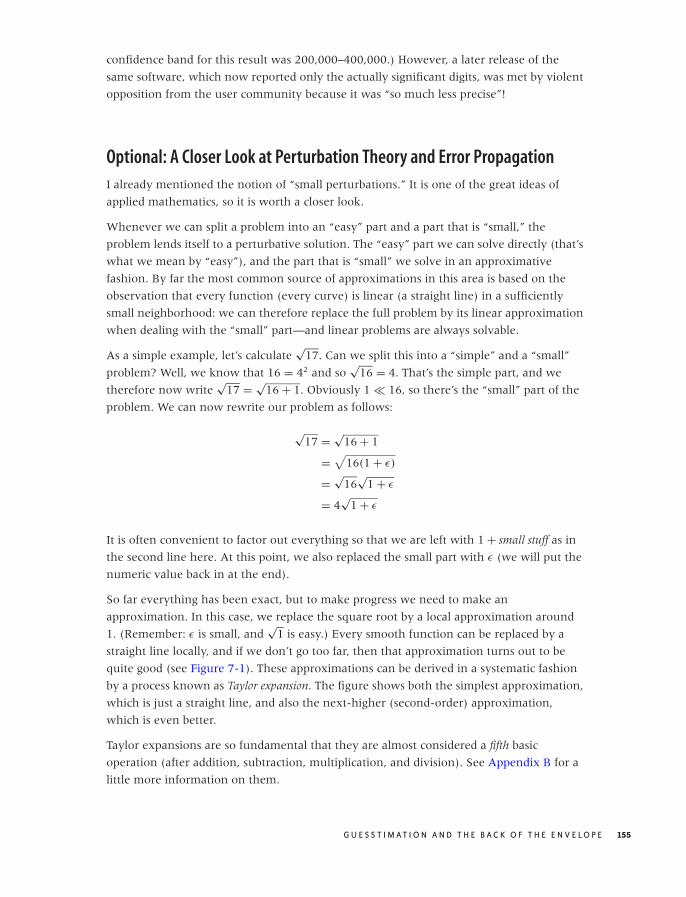
O’Reilly-5980006 master October 28, 2010 20:55
confidence band for this result was 200,000–400,000.) However, a later release of the
same software, which now reported only the actually significant digits, was met by violent
opposition from the user community because it was “so much less precise”!
Optional: A Closer Look at Perturbation Theory and Error Propagation
I already mentioned the notion of “small perturbations.” It is one of the great ideas of
applied mathematics, so it is worth a closer look.
Whenever we can split a problem into an “easy” part and a part that is “small,” the
problem lends itself to a perturbative solution. The “easy” part we can solve directly (that’s
what we mean by “easy”), and the part that is “small” we solve in an approximative
fashion. By far the most common source of approximations in this area is based on the
observation that every function (every curve) is linear (a straight line) in a sufficiently
small neighborhood: we can therefore replace the full problem by its linear approximation
when dealing with the “small” part—and linear problems are always solvable.
As a simple example, let’s calculate√
17. Can we split this into a “simple” and a “small”
problem? Well, we know that 16 = 42 and so√
16 = 4. That’s the simple part, and we
therefore now write√
17 = √16 + 1. Obviously 1 � 16, so there’s the “small” part of the
problem. We can now rewrite our problem as follows:
√17 = √
16 + 1
=√
16(1 + ε)
=√
16√
1 + ε
= 4√
1 + ε
It is often convenient to factor out everything so that we are left with 1 + small stuff as in
the second line here. At this point, we also replaced the small part with ε (we will put the
numeric value back in at the end).
So far everything has been exact, but to make progress we need to make an
approximation. In this case, we replace the square root by a local approximation around
1. (Remember: ε is small, and√
1 is easy.) Every smooth function can be replaced by a
straight line locally, and if we don’t go too far, then that approximation turns out to be
quite good (see Figure 7-1). These approximations can be derived in a systematic fashion
by a process known as Taylor expansion. The figure shows both the simplest approximation,
which is just a straight line, and also the next-higher (second-order) approximation,
which is even better.
Taylor expansions are so fundamental that they are almost considered a fifth basic
operation (after addition, subtraction, multiplication, and division). See Appendix B for a
little more information on them.
G U E S S T I M AT I O N A N D T H E B A C K O F T H E E N V E L O P E 155
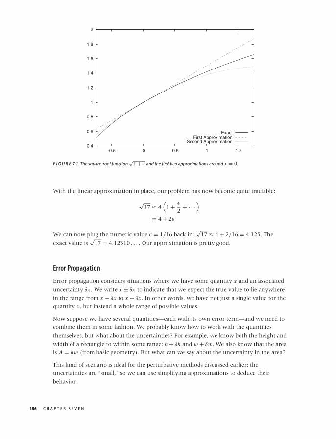
O’Reilly-5980006 master October 28, 2010 20:55
0.4
0.6
0.8
1
1.2
1.4
1.6
1.8
2
-0.5 0 0.5 1 1.5
ExactFirst Approximation
Second Approximation
F I G U R E 7-1. The square-root function√
1 + x and the first two approximations around x = 0.
With the linear approximation in place, our problem has now become quite tractable:
√17 ≈ 4
(1 + ε
2+ · · ·
)
= 4 + 2ε
We can now plug the numeric value ε = 1/16 back in:√
17 ≈ 4 + 2/16 = 4.125. The
exact value is√
17 = 4.12310 . . . . Our approximation is pretty good.
Error Propagation
Error propagation considers situations where we have some quantity x and an associated
uncertainty δx . We write x ± δx to indicate that we expect the true value to lie anywhere
in the range from x − δx to x + δx . In other words, we have not just a single value for the
quantity x , but instead a whole range of possible values.
Now suppose we have several quantities—each with its own error term—and we need to
combine them in some fashion. We probably know how to work with the quantities
themselves, but what about the uncertainties? For example, we know both the height and
width of a rectangle to within some range: h + δh and w + δw. We also know that the area
is A = hw (from basic geometry). But what can we say about the uncertainty in the area?
This kind of scenario is ideal for the perturbative methods discussed earlier: the
uncertainties are “small,” so we can use simplifying approximations to deduce their
behavior.
156 C H A P T E R S E V E N
O’Reilly-5980006 master October 28, 2010 20:55
Let’s work through the area example:
A = (h ± δh)(w ± δw)
= hw
(1 ± δh
h
) (1 ± δw
w
)
= hw
(1 ± δh
h± δw
w+ δh
h
δw
w
)
Here again we have factored the primary terms out, to end up with terms of the form
1 + small stuff, because that makes life easier. This also means that, instead of expressing
the uncertainty through the absolute error δh or δw, we express them through the relative
error δh/h or δw/w. (Observe that if δh � h, then δh/h � 1.)
So far, everything has been exact. Now comes the approximation: the error terms are
small (in fact, smaller than 1); hence their product is extra-small, and we can therefore
drop it. Our final result is thus A = hw(1 ± ( δh
h + δw
w))
or, in words: “When multiplying
two quantities, their relative errors add.” So if I know both the width and the height to
within 10 percent each, then my uncertainty in the area will be 20 percent.
Here are a few more results of this form, which are useful whenever you work with
quantities that have associated uncertainties (you might want to try deriving some of
these yourself):
(x ± δx) + (y ± δy) = x + y ± (δx + δy) Sum
(x ± δx) · (y ± δy) = xy
(1 ±
(δx
x+ δy
y
))Product
x ± δx
y ± δy= x
y
(1 ±
(δx
x+ δy
y
))Fraction
√x + δx = √
x
√1 + δx
x≈ √
x
(1 + 1
2
δx
x
)Square root
log(x + δx) = log
(x
(1 + δx
x
))≈ log x + δx
xLogarithm
The most important ones are the first two: when adding (or subtracting) two quantities,
their absolute errors add; and when multiplying (or dividing) two quantities, their relative
errors add. This implies that, if one of two quantities has a significantly larger error than
the other, then the larger error dominates the final uncertainty.
Finally, you may have seen a different way to calculate errors that gives slightly tighter
bounds, but it is only appropriate if the errors have been determined by calculating the
variances in repeated measurements of the same quantity. Only in that case are the statistical
assumptions valid upon which this alternative calculation is based. For guesstimation, the
simple (albeit more pessimistic) approach described here is more appropriate.
G U E S S T I M AT I O N A N D T H E B A C K O F T H E E N V E L O P E 157

O’Reilly-5980006 master October 28, 2010 20:55
Workshop: The Gnu Scientific Library (GSL)
What do you do when a calculation becomes too involved to do it in your head or even
on the back of an envelope? In particular, what can you do if you need the extra precision
that a simple order-of-magnitude estimation (as practiced in this chapter) will not
provide? Obviously, you reach for a numerical library!
The Gnu Scientific Library, or GSL, (http://www.gnu.org/software/gsl/) is the best currently
available open source library for numerical and scientific calculations that I am aware of.
The list of included features is comprehensive, and the implementations are of high
quality. Thanks to some unifying conventions, the API, though forbidding at first, is
actually quite easy to learn and comfortable to use. Most importantly, the library is
mature, well documented, and reliable.
Let’s use it to solve two rather different problems; this will give us an opportunity to
highlight some of the design choices incorporated into the GSL. The first example involves
matrix and vector handling: we will calculate the singular value decomposition (SVD) of a
matrix. The second example will demonstrate how the GSL handles non-linear, iterative
problems in numerical analysis as we find the minimum of a nonlinear function.
The listing that follows should give you a flavor of what vector and matrix operations look
like when using the GSL. First, we allocate a couple of (two-dimensional) vectors and
assign values to their elements. We then perform some basic vector operations: adding
one vector to another and performing a dot product. (The result of a dot product is a
scalar, not another vector.) Finally, we allocate and initialize a matrix and calculate its
SVD. (See Chapter 14 for more information on vector and matrix operations.)
/* Basic Linear Algebra using the GSL */
#include <stdio.h>
#include <gsl/gsl_vector.h>
#include <gsl/gsl_matrix.h>
#include <gsl/gsl_blas.h>
#include <gsl/gsl_linalg.h>
int main() {double r;
gsl_vector *a, *b, *s, *t;
gsl_matrix *m, *v;
/* --- Vectors --- */
a = gsl_vector_alloc( 2 ); /* two dimensions */
b = gsl_vector_alloc( 2 );
/* a = [ 1.0, 2.0 ] */
gsl_vector_set( a, 0, 1.0 );
gsl_vector_set( a, 1, 2.0 );
158 C H A P T E R S E V E N
O’Reilly-5980006 master October 28, 2010 20:55
/* a = [ 3.0, 6.0 ] */
gsl_vector_set( b, 0, 3.0 );
gsl_vector_set( b, 1, 6.0 );
/* a += b (so that now a = [ 4.0, 8.0 ]) */
gsl_vector_add( a, b );
gsl_vector_fprintf( stdout, a, "%f" );
/* r = a . b (dot product) */
gsl_blas_ddot( a, b, &r );
fprintf( stdout, "%f\n", r );
/* --- Matrices --- */
s = gsl_vector_alloc( 2 );
t = gsl_vector_alloc( 2 );
m = gsl_matrix_alloc( 2, 2 );
v = gsl_matrix_alloc( 2, 2 );
/* m = [ [1, 2],
[0, 3] ] */
gsl_matrix_set( m, 0, 0, 1.0 );
gsl_matrix_set( m, 0, 1, 2.0 );
gsl_matrix_set( m, 1, 0, 0.0 );
gsl_matrix_set( m, 1, 1, 3.0 );
/* m = U s V^T (SVD : singular values are in vector s) */
gsl_linalg_SV_decomp( m, v, s, t );
gsl_vector_fprintf( stdout, s, "%f" );
/* --- Cleanup --- */
gsl_vector_free( a );
gsl_vector_free( b );
gsl_vector_free( s );
gsl_vector_free( t );
gsl_matrix_free( m );
gsl_matrix_free( v );
return 0;
}
It is becoming immediately (and a little painfully) clear that we are dealing with plain C,
not C++ or any other more modern, object-oriented language! There is no operator
overloading; we must use regular functions to access individual vector and matrix
elements. There are no namespaces, so function names tend to be lengthy. And of course
there is no garbage collection!
What is not so obvious is that element access is actually boundary checked: if you try to
access a vector element that does not exist (e.g., gsl vector set( a, 4, 1.0 );), then
the GSL internal error handler will be invoked. By default, it will halt the program and
print a message to the screen. This is quite generally true: if the library detects an
G U E S S T I M AT I O N A N D T H E B A C K O F T H E E N V E L O P E 159

O’Reilly-5980006 master October 28, 2010 20:55
error—including bad inputs, failure to converge numerically, or an out-of-memory
situation—it will invoke its error handler to notify you. You can provide your own error
handler to respond to errors in a more flexible fashion. For a fully tested program, you
can also turn range checking on vector and matrix elements off completely, to achieve the
best possible runtime performance.
Two more implementation details before leaving the linear algebra example: although the
matrix and vector elements are of type double in this example, versions of all routines exist
for integer and complex data types as well. Furthermore, the GSL will use an optimized
implementation of the BLAS (Basic Linear Algebra Subprograms) API if one is available; if
not, the GSL comes with its own, basic implementation.
Now let’s take a look at the second example. Here we use the GSL to find the minimum of
a one-dimensional function. The function to minimize is defined at the top of the listing:
x2 log(x). In general, nonlinear problems such as this must be solved iteratively: we start
with a guess, then calculate a new trial solution based on that guess, and so on until the
result meets whatever stopping criteria we care to define.
At least that’s what the introductory textbooks tell you.
In the main part of the program, we instantiate a “minimizer,” which is an encapsulation
of a specific minimization algorithm (in this case, Golden Section Search—others are
available, too) and initialize it with the function to minimize as well as our initial guess for
the interval containing the minimum.
Now comes the surprising part: an explicit loop! In this loop, the “minimizer” takes a
single step in the iteration (i.e., calculates a new, tighter interval bounding the minimum)
but then essentially hands control back to us. Why so complicated? Why can’t we just
specify the desired accuracy of the interval and let the library handle the entire iteration
for us? The reason is that real problems more often than not don’t converge as obediently
as the textbooks suggest! Instead they can (and do) fail in a variety of ways: they converge
to the wrong solution, they attempt to access values for which the function is not defined,
they attempt to make steps that (for reasons of the larger system of which the routine is
only a small part) are either too large or too small, or they diverge entirely. Based on my
experience, I have come to the conclusion that every nonlinear problem is different (whereas
every linear problem is the same), and therefore generic black-box routines don’t work!
This brings us back to the way this minimization routine is implemented: the required
iteration is not a black box and instead is open and accessible to us. We can simply
monitor its progress (as we do in this example, by printing every iteration step to the
screen), but we could also interfere with it—for instance to enforce some invariant that is
specific to our problem. The “minimizer” does as much as it can by calculating and
proposing a new interval; ultimately, however, we are in control over how the iteration
progresses. (For the textbook example used here, this doesn’t matter, but it makes all the
difference when you are doing serious numerical analysis on real problems!)
160 C H A P T E R S E V E N

O’Reilly-5980006 master October 28, 2010 20:55
/* Minimizing a function with the GSL */
#include <stdio.h>
#include <gsl/gsl_min.h>
double fct( double x, void *params ) {return x*x*log(x);
}
int main() {double a = 0.1, b = 1; /* interval which bounds the minimum */
gsl_function f; /* pointer to the function to minimize */
gsl_min_fminimizer *s; /* pointer to the minimizer instance */
f.function = &fct; /* the function to minimize */
f.params = NULL; /* no additional parameters needed */
/* allocate the minimizer, choosing a particular algorithm */
s = gsl_min_fminimizer_alloc( gsl_min_fminimizer_goldensection );
/* initialize the minimizer with a function an an initial interval */
gsl_min_fminimizer_set( s, &f, (a+b)/2.0, a, b );
while ( b-a > 1.e-6 ) {/* perform one minimization step */
gsl_min_fminimizer_iterate( s );
/* obtain the new bounding interval */
a = gsl_min_fminimizer_x_lower( s );
b = gsl_min_fminimizer_x_upper( s );
printf( "%f\t%f\n", a, b );
}
printf( "Minimum Position: %f\tValue: %f\n",gsl_min_fminimizer_x_minimum(s), gsl_min_fminimizer_f_minimum(s) );
gsl_min_fminimizer_free( s );
return 0;
}
Obviously, we have only touched on the GSL. My primary intention in this section was to
give you a sense for the way the GSL is designed and for what kinds of considerations it
incorporates. The list of features is extensive—consult the documentation for more
information.
Further Reading• Guesstimation: Solving the World’s Problems on the Back of a Cocktail Napkin. Lawrence
Weinstein and John A. Adam. Princeton University Press. 2008.
G U E S S T I M AT I O N A N D T H E B A C K O F T H E E N V E L O P E 161

O’Reilly-5980006 master October 28, 2010 20:55
This little book contains about a hundred guesstimation problems (with solutions!)
from all walks of life. If you are looking for ideas to get you started, look no further.
• Programming Pearls. Jon Bentley. 2nd ed., Addison-Wesley. 1999; also, More
Programming Pearls: Confessions of a Coder. Jon Bentley. Addison-Wesley. 1989.
These two volumes of reprinted magazine columns are delightful to read, although (or
because) they breathe the somewhat dated atmosphere of the old Bell Labs. Both
volumes contain chapters on guesstimation problems in a programming context.
• Back-of-the-Envelope Physics. Clifford E. Swartz. Johns Hopkins University Press. 2003.
Physicists regard themselves as the inventors of back-of-the-envelope calculations. This
book contains a set of examples from introductory physics (with solutions).
• The Flying Circus of Physics. Jearl Walker. 2nd ed., Wiley. 2006.
If you’d like some hints on how to take an interest in the world around you, try this
book. It contains hundreds of everyday observations and challenges you to provide an
explanation for each. Why are dried coffee stains always darker around the rim? Why
are shower curtains pulled inward? Remarkably, many of these observations are still
not fully understood! (You might also want to check out the rather different and more
challenging first edition.)
• Pocket Ref. Thomas J. Glover. 3rd ed., Sequoia Publishing. 2009.
This small book is an extreme example of the “lookup” model. It seems to contain
almost everything: strength of wood beams, electrical wiring charts, properties of
materials, planetary data, first aid, military insignia, and sizing charts for clothing. It
also shows the limitations of an overcomplete collection of trivia: I simply don’t find it
all that useful, but it is interesting for the breadth of topics covered.
162 C H A P T E R S E V E N

O’Reilly-5980006 master October 28, 2010 20:55
C H A P T E R E I G H T
Models from Scaling Arguments
AFTER FAMILIARIZING YOURSELF WITH THE DATA THROUGH PLOTS AND GRAPHS, THE NEXT STEP IS TO START
building a model for the data. The meaning of the word “model” is quite hazy, and I don’t
want to spend much time and effort attempting to define this concept in an abstract way.
For our purposes, a model is a mathematical description of the data that ideally is guided
by our understanding of the system under consideration and that relates the various
variables of the system to each other: a “formula.”
Models
Models like this are incredibly important. It is at this point that we go from the merely
descriptive (plots and graphs) to the prescriptive: having a model allows us to predict what
the system will do under a certain set of conditions. Furthermore, a good or truly useful
model—because it helps us to understand how the system works—allows us to do so
without resorting to the model itself or having to evaluate any particular formula
explicitly. A good model ties the different variables that control the system together in
such a way that we can see how varying any one of them will influence the outcome. It is
this use of models—as an aide to or expression of our understanding—that is the most
important one. (Of course, we must still evaluate the model formulas explicitly in order to
obtain actual numbers for a specific prediction.)
I should point out that this view of models and what they can do is not universal, and you
will find the term used quite differently elsewhere. For instance, statistical models (and
this includes machine-learning models) are much more descriptive: they do not purport
to explain the observed behavior in the way just described. Instead, their purpose is to
predict expected outcomes with the greatest level of accuracy possible (numbers in,
163

O’Reilly-5980006 master October 28, 2010 20:55
numbers out). In contrast, my training is in theoretical physics, where the development of
conceptual understanding of the observed behavior is the ultimate goal. I will use all
available information about the system and how it works (or how I suspect it works!)
wherever I can; I don’t restrict myself to using only the information contained in the data
itself. (This is a practice that statisticians traditionally frown upon, because it constitutes a
form of “pollution” of the data. They may very well be right, but my purpose is different: I
don’t want to understand the data, I want to understand the system!) At the same time, I
don’t consider the absolute accuracy of a model paramount: a model that yields only
order-of-magnitude accuracy but helps me understand the system’s behavior (so that I
can, for instance, make informed trade-off decisions) is much more valuable to me than a
model that yields results with 1 percent accuracy but that is a black box otherwise.
To be clear: there are situations when achieving the best possible accuracy is all that
matters and conceptual understanding is of little interest. (Often these cases involve
repeatable processes in well-understood systems.) If this describes your situation, then
you need to use different methods that are appropriate to your problem scenario.
Modeling
As should be clear from the preceding description, building models is basically a creative
process. As such, it is difficult (if not impossible) to teach: there are no established
techniques or processes for arriving at a useful model in any given scenario. One common
approach to teaching this material is to present a large number of case studies, describing
the problem situations and attempts at modeling them. I have not found this style to be
very effective. First of all, every (nontrivial) problem is different, and tricks and fortuitous
insights that work well for one example rarely carry over to a different problem. Second,
building effective models often requires fairly deep insight into the particulars of the
problem space, so you may end up describing lots of tedious details of the problem when
actually you wanted to talk about the model (or the modeling).
In this chapter, we will take a different approach. Effective modeling is often an exercise
in determining “what to leave out”: good models should be simple (so that they are
workable) yet retain the essential features of the system—certainly those that we are
interested in.
As it turns out, there are a few essential arguments and approximations that prove helpful
again and again to make a complex problem tractable and to identify the dominant
behavior. That’s what I want to talk about.
Using and Misusing Models
Just a reminder: models are not reality. They are descriptions or approximations of
reality—often quite coarse ones! We need to ensure that we only place as much
confidence in a model as is warranted.
164 C H A P T E R E I G H T
O’Reilly-5980006 master October 28, 2010 20:55
How much confidence is warranted? That depends on how well- tested the model is. If a
model is based on a good theory, agrees well with a wide range of data sets, and has
shown it can predict observations correctly, then our confidence may be quite strong.
At the other extreme are what one might call “pie in the sky” models: ad hoc models,
involving half a dozen (or so) parameters—all of which have been estimated
independently and not verified against real data. The reliability of such a model is highly
dubious: each of the parameters introduces a certain degree of uncertainty, which in
combination can make the results of the model meaningless. Recall the discussion in
Chapter 7: three parameters known to within 10 percent produce an uncertainty in the
final result of 30 percent—and that assumes that the parameters are actually known to
within 10 percent! With four to six parameters that possibly are known, only much less
precisely than 10 percent, the situation is correspondingly worse. (Many business models
fall into this category.)
Also keep in mind that virtually all models have only a limited region of validity. If you try
to apply an existing model to a drastically different situation or use input values that are
very different from those that you used to build the model, then you may well find that
the model makes poor predictions. Be sure to check that the assumptions on which the
model is based are actually fulfilled for each application that you have in mind!
Arguments from Scale
Next to the local stadium there is a large, open parking lot. During game days, the parking
lot is filled with cars, and—for obvious reasons—a line of portable toilets is set up all along
one of the edges of the parking lot. This poses an interesting balancing problem: will this
particular arrangement work for all situations, no matter how large the parking lot in
question?
The answer is no. The number of people in the parking lot grows with the area of the
parking lot, which grows with the square of the edge length (i.e., it “scales as” L2); but the
number of toilets is proportional to the edge length itself (so it scales as L). Therefore, as
we make the parking lot bigger and bigger, there comes a point where the number of
people overwhelms the number of available facilities. Guaranteed.
Scaling Arguments
This kind of reasoning is an example of a scaling argument. Scaling arguments try to
capture how some quantity of interest depends on a control parameter. In particular, a
scaling argument describes how the output quantity will change as the control parameter
changes. Scaling arguments are a particularly fruitful way to arrive at symbolic
expressions for phenomena (“formulas”) that can be manipulated analytically.
You should have observed that the expressions I gave in the introductory example were
not “dimensionally consistent.” We had people expressed as the square of a length and
M O D E L S F R O M S C A L I N G A R G U M E N T S 165

O’Reilly-5980006 master October 28, 2010 20:55
toilets expressed as length—what is going on here? Nothing, I merely omitted some detail
that was not relevant for the argument I tried to make. A car takes up some amount of
space on a parking lot; hence given the size of the parking lot (its area), we can figure out
how many cars it can accommodate. Each car seats on average two people (on a game
day), so we can figure out the number of people as well. Each person has a certain
probability of using a bathroom during the duration of the game and will spend a certain
number of minutes there. Given all these parameters, we can figure out the required
“toilet availability minutes.” We can make a similar argument to find the “availability
minutes” provided by the installed facilities. Observe that none of these parameters
depend on the size of the parking lot: they are constants. Therefore, we don’t need to
worry about them if all we want to determine is whether this particular arrangement
(with toilets all along one edge, but nowhere else) will work for parking lots of any size.
(It is a widely followed convention to use the tilde, as in A ∼ B, to express that A “scales
as” B, where A and B do not necessarily have the same dimensions.)
On the other hand, if we actually want to know the exact number of toilets required for a
specific parking lot size, then we do need to worry about these factors and try to obtain
the best possible estimates for them.
Because scaling arguments free us from having to think about pesky numerical factors,
they provide such a convenient and powerful way to begin the modeling process. At the
beginning, when things are most uncertain and our understanding of the system is least
developed, they free us from having to worry about low-level details (e.g., how long does
the average person spend in the bathroom?) and instead help us concentrate on the
system’s overall behavior. Once the big picture has become clearer (and if the model still
seems worth pursuing), we may want to derive some actual numbers from it as well. Only
at this point do we need to concern ourselves with numerical constants, which we must
either estimate or derive from available data.
A recurring challenge with scaling models is to find the correct scales. For example, we
implicitly assumed that the parking lot was square (or at least nearly so) and would
remain that shape as it grew. But if the parking lot were growing in one direction only
(i.e., becoming longer and longer, while staying the same width), then its area would no
longer scale as L2 but instead scale as L, where L is now the “long” side of the lot. This
changes the argument, for if the portable toilets were located along the long side of the lot
then the balance between people and available facilities would be the same no matter
how large the lot became! On the other hand, if the facilities were set up along the short
side, then their number would remain constant while the long side grew, resulting again
in an imbalanced situation.
Finding the correct scales is a bit of an experience issue—the important point here is that
it is not as simple as saying: “It’s an area, therefore it must scale as length squared.” It
depends on the shape of the area and on which of its lengths controls the size.
166 C H A P T E R E I G H T
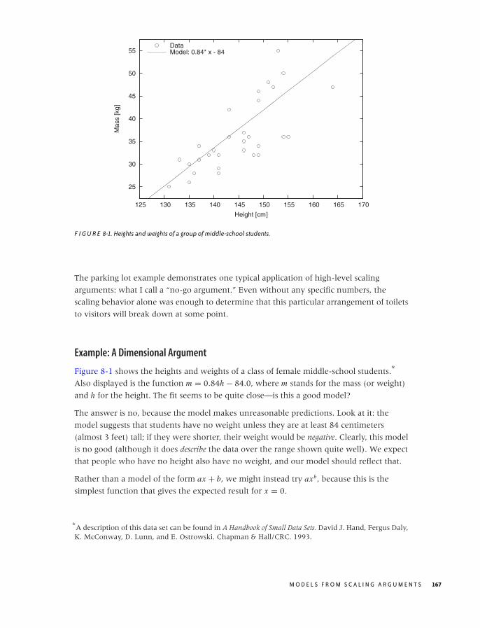
O’Reilly-5980006 master October 28, 2010 20:55
25
30
35
40
45
50
55
125 130 135 140 145 150 155 160 165 170
Mas
s [k
g]
Height [cm]
DataModel: 0.84* x - 84
F I G U R E 8-1. Heights and weights of a group of middle-school students.
The parking lot example demonstrates one typical application of high-level scaling
arguments: what I call a “no-go argument.” Even without any specific numbers, the
scaling behavior alone was enough to determine that this particular arrangement of toilets
to visitors will break down at some point.
Example: A Dimensional Argument
Figure 8-1 shows the heights and weights of a class of female middle-school students.*
Also displayed is the function m = 0.84h − 84.0, where m stands for the mass (or weight)
and h for the height. The fit seems to be quite close—is this a good model?
The answer is no, because the model makes unreasonable predictions. Look at it: the
model suggests that students have no weight unless they are at least 84 centimeters
(almost 3 feet) tall; if they were shorter, their weight would be negative. Clearly, this model
is no good (although it does describe the data over the range shown quite well). We expect
that people who have no height also have no weight, and our model should reflect that.
Rather than a model of the form ax + b, we might instead try axb, because this is the
simplest function that gives the expected result for x = 0.
*A description of this data set can be found in A Handbook of Small Data Sets. David J. Hand, Fergus Daly,K. McConway, D. Lunn, and E. Ostrowski. Chapman & Hall/CRC. 1993.
M O D E L S F R O M S C A L I N G A R G U M E N T S 167
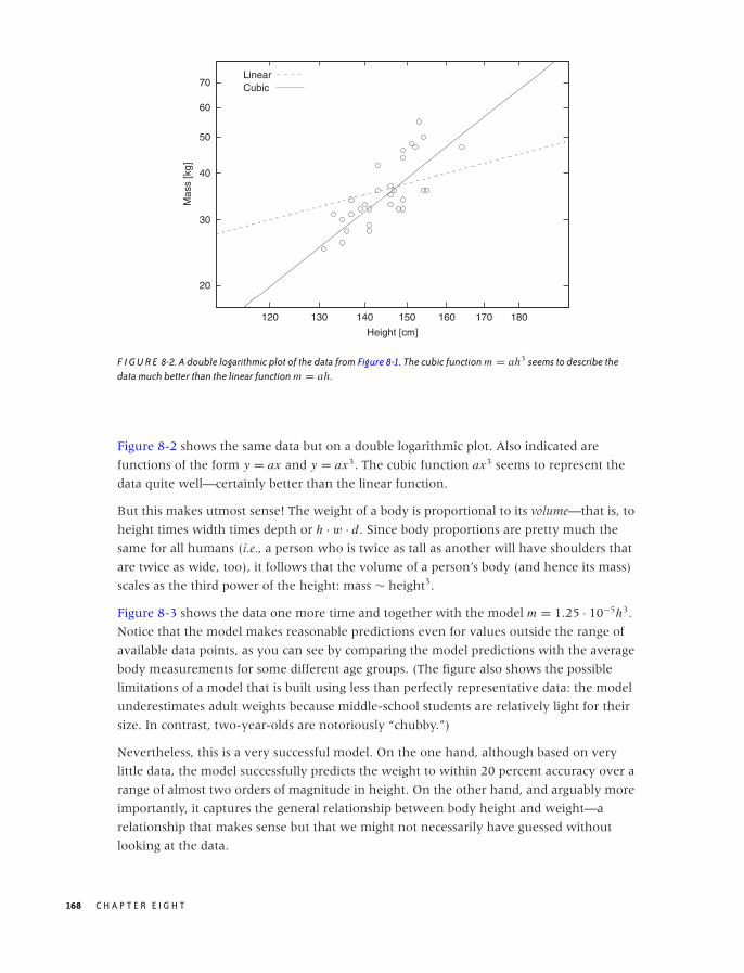
O’Reilly-5980006 master October 28, 2010 20:55
20
30
40
50
60
70
120 130 140 150 160 170 180
Mas
s [k
g]
Height [cm]
LinearCubic
F I G U R E 8-2. A double logarithmic plot of the data from Figure 8-1. The cubic function m = ah3 seems to describe thedata much better than the linear function m = ah.
Figure 8-2 shows the same data but on a double logarithmic plot. Also indicated are
functions of the form y = ax and y = ax3. The cubic function ax3 seems to represent the
data quite well—certainly better than the linear function.
But this makes utmost sense! The weight of a body is proportional to its volume—that is, to
height times width times depth or h · w · d. Since body proportions are pretty much the
same for all humans (i.e., a person who is twice as tall as another will have shoulders that
are twice as wide, too), it follows that the volume of a person’s body (and hence its mass)
scales as the third power of the height: mass ∼ height3.
Figure 8-3 shows the data one more time and together with the model m = 1.25 · 10−5h3.
Notice that the model makes reasonable predictions even for values outside the range of
available data points, as you can see by comparing the model predictions with the average
body measurements for some different age groups. (The figure also shows the possible
limitations of a model that is built using less than perfectly representative data: the model
underestimates adult weights because middle-school students are relatively light for their
size. In contrast, two-year-olds are notoriously “chubby.”)
Nevertheless, this is a very successful model. On the one hand, although based on very
little data, the model successfully predicts the weight to within 20 percent accuracy over a
range of almost two orders of magnitude in height. On the other hand, and arguably more
importantly, it captures the general relationship between body height and weight—a
relationship that makes sense but that we might not necessarily have guessed without
looking at the data.
168 C H A P T E R E I G H T
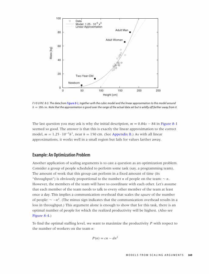
O’Reilly-5980006 master October 28, 2010 20:55
0
20
40
60
80
100
0 50 100 150 200 250
Mas
s [k
g]
Height [cm]
Newborn
Two-Year-Old
Adult Woman
Adult Man
DataModel: 1.25 · 10-5 x3
Linear Approximation
F I G U R E 8-3. The data from Figure 8-1, together with the cubic model and the linear approximation to this model aroundh = 150 cm. Note that the approximation is good over the range of the actual data set but is wildly off farther away from it.
The last question you may ask is why the initial description, m = 0.84x − 84 in Figure 8-1
seemed so good. The answer is that this is exactly the linear approximation to the correct
model, m = 1.25 · 10−5h3, near h = 150 cm. (See Appendix B.) As with all linear
approximations, it works well in a small region but fails for values farther away.
Example: An Optimization Problem
Another application of scaling arguments is to cast a question as an optimization problem.
Consider a group of people scheduled to perform some task (say, a programming team).
The amount of work that this group can perform in a fixed amount of time (its
“throughput”) is obviously proportional to the number n of people on the team: ∼ n.
However, the members of the team will have to coordinate with each other. Let’s assume
that each member of the team needs to talk to every other member of the team at least
once a day. This implies a communication overhead that scales the square of the number
of people: ∼ −n2. (The minus sign indicates that the communication overhead results in a
loss in throughput.) This argument alone is enough to show that for this task, there is an
optimal number of people for which the realized productivity will be highest. (Also see
Figure 8-4.)
To find the optimal staffing level, we want to maximize the productivity P with respect to
the number of workers on the team n:
P(n) = cn − dn2
M O D E L S F R O M S C A L I N G A R G U M E N T S 169
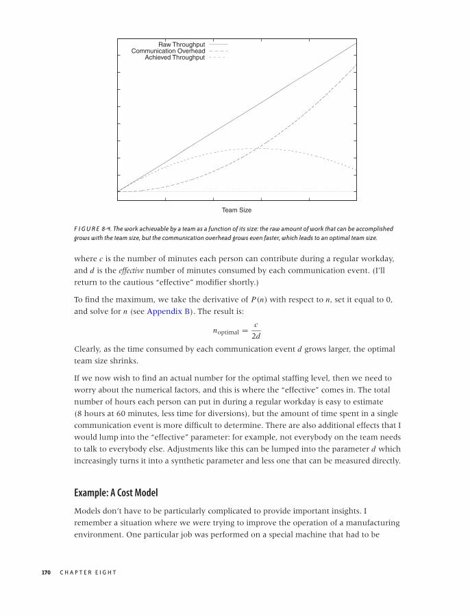
O’Reilly-5980006 master October 28, 2010 20:55
Team Size
Raw ThroughputCommunication Overhead
Achieved Throughput
F I G U R E 8-4. The work achievable by a team as a function of its size: the raw amount of work that can be accomplishedgrows with the team size, but the communication overhead grows even faster, which leads to an optimal team size.
where c is the number of minutes each person can contribute during a regular workday,
and d is the effective number of minutes consumed by each communication event. (I’ll
return to the cautious “effective” modifier shortly.)
To find the maximum, we take the derivative of P(n) with respect to n, set it equal to 0,
and solve for n (see Appendix B). The result is:
noptimal = c
2d
Clearly, as the time consumed by each communication event d grows larger, the optimal
team size shrinks.
If we now wish to find an actual number for the optimal staffing level, then we need to
worry about the numerical factors, and this is where the “effective” comes in. The total
number of hours each person can put in during a regular workday is easy to estimate
(8 hours at 60 minutes, less time for diversions), but the amount of time spent in a single
communication event is more difficult to determine. There are also additional effects that I
would lump into the “effective” parameter: for example, not everybody on the team needs
to talk to everybody else. Adjustments like this can be lumped into the parameter d which
increasingly turns it into a synthetic parameter and less one that can be measured directly.
Example: A Cost Model
Models don’t have to be particularly complicated to provide important insights. I
remember a situation where we were trying to improve the operation of a manufacturing
environment. One particular job was performed on a special machine that had to be
170 C H A P T E R E I G H T
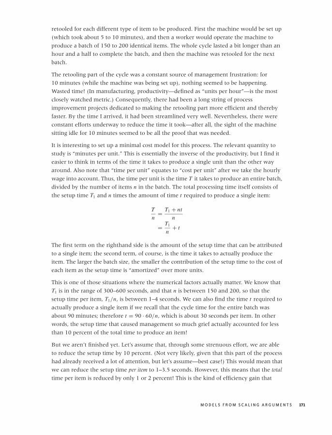
O’Reilly-5980006 master October 28, 2010 20:55
retooled for each different type of item to be produced. First the machine would be set up
(which took about 5 to 10 minutes), and then a worker would operate the machine to
produce a batch of 150 to 200 identical items. The whole cycle lasted a bit longer than an
hour and a half to complete the batch, and then the machine was retooled for the next
batch.
The retooling part of the cycle was a constant source of management frustration: for
10 minutes (while the machine was being set up), nothing seemed to be happening.
Wasted time! (In manufacturing, productivity—defined as “units per hour”—is the most
closely watched metric.) Consequently, there had been a long string of process
improvement projects dedicated to making the retooling part more efficient and thereby
faster. By the time I arrived, it had been streamlined very well. Nevertheless, there were
constant efforts underway to reduce the time it took—after all, the sight of the machine
sitting idle for 10 minutes seemed to be all the proof that was needed.
It is interesting to set up a minimal cost model for this process. The relevant quantity to
study is “minutes per unit.” This is essentially the inverse of the productivity, but I find it
easier to think in terms of the time it takes to produce a single unit than the other way
around. Also note that “time per unit” equates to “cost per unit” after we take the hourly
wage into account. Thus, the time per unit is the time T it takes to produce an entire batch,
divided by the number of items n in the batch. The total processing time itself consists of
the setup time T1 and n times the amount of time t required to produce a single item:
T
n= T1 + nt
n
= T1
n+ t
The first term on the righthand side is the amount of the setup time that can be attributed
to a single item; the second term, of course, is the time it takes to actually produce the
item. The larger the batch size, the smaller the contribution of the setup time to the cost of
each item as the setup time is “amortized” over more units.
This is one of those situations where the numerical factors actually matter. We know that
T1 is in the range of 300–600 seconds, and that n is between 150 and 200, so that the
setup time per item, T1/n, is between 1–4 seconds. We can also find the time t required to
actually produce a single item if we recall that the cycle time for the entire batch was
about 90 minutes; therefore t = 90 · 60/n, which is about 30 seconds per item. In other
words, the setup time that caused management so much grief actually accounted for less
than 10 percent of the total time to produce an item!
But we aren’t finished yet. Let’s assume that, through some strenuous effort, we are able
to reduce the setup time by 10 percent. (Not very likely, given that this part of the process
had already received a lot of attention, but let’s assume—best case!) This would mean that
we can reduce the setup time per item to 1–3.5 seconds. However, this means that the total
time per item is reduced by only 1 or 2 percent! This is the kind of efficiency gain that
M O D E L S F R O M S C A L I N G A R G U M E N T S 171
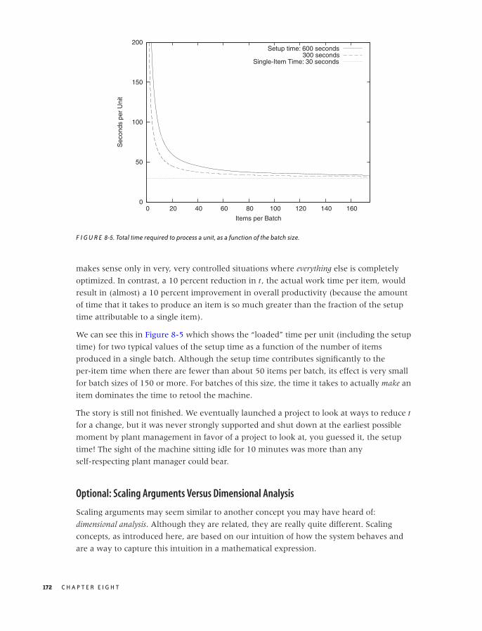
O’Reilly-5980006 master October 28, 2010 20:55
0
50
100
150
200
0 20 40 60 80 100 120 140 160
Sec
onds
per
Uni
t
Items per Batch
Setup time: 600 seconds300 seconds
Single-Item Time: 30 seconds
F I G U R E 8-5. Total time required to process a unit, as a function of the batch size.
makes sense only in very, very controlled situations where everything else is completely
optimized. In contrast, a 10 percent reduction in t , the actual work time per item, would
result in (almost) a 10 percent improvement in overall productivity (because the amount
of time that it takes to produce an item is so much greater than the fraction of the setup
time attributable to a single item).
We can see this in Figure 8-5 which shows the “loaded” time per unit (including the setup
time) for two typical values of the setup time as a function of the number of items
produced in a single batch. Although the setup time contributes significantly to the
per-item time when there are fewer than about 50 items per batch, its effect is very small
for batch sizes of 150 or more. For batches of this size, the time it takes to actually make an
item dominates the time to retool the machine.
The story is still not finished. We eventually launched a project to look at ways to reduce t
for a change, but it was never strongly supported and shut down at the earliest possible
moment by plant management in favor of a project to look at, you guessed it, the setup
time! The sight of the machine sitting idle for 10 minutes was more than any
self-respecting plant manager could bear.
Optional: Scaling Arguments Versus Dimensional Analysis
Scaling arguments may seem similar to another concept you may have heard of:
dimensional analysis. Although they are related, they are really quite different. Scaling
concepts, as introduced here, are based on our intuition of how the system behaves and
are a way to capture this intuition in a mathematical expression.
172 C H A P T E R E I G H T
O’Reilly-5980006 master October 28, 2010 20:55
Dimensional analysis, in contrast, applies to physical systems, which are described by a
number of quantities that have different physical dimensions, such as length, mass, time, or
temperature. Because equations describing a physical system must be dimensionally
consistent, we can try to deduce the form of these equations by forming dimensionally
consistent combinations of the relevant variables.
Let’s look at an example. Everybody is familiar with the phenomenon of air resistance, or
drag: there is a force F that acts to slow a moving body down. It seems reasonable to
assume that this force depends on the cross-sectional area of the body A and the speed (or
velocity) v. But it must also depend on some property of the medium (air, in this case)
through which the body moves. The most basic property is the density ρ, which is the
mass (in grams or kilograms) per volume (in cubic centimeters or meters):
F = f (A, v, ρ)
Here, f (x, y, z) is an as-yet-unknown function.
Force has units of mass · length2/time2, area has units of length2, velocity of length/time,
and density has units of mass/length3. We can now try to combine A, v, and ρ to form a
combination that has the same dimensions as force. A little experimentation leads us to:
F = cρ Av2
where c is a pure (dimensionless) number. This equation expresses the well-known result
that air resistance increases with the square of the speed. Note that we arrived at it using
purely dimensional arguments without any insight into the physical mechanisms at work.
This form of reasoning has a certain kind of magic to it: why did we choose these specific
quantities? Why did we not include the viscosity of air, the ambient air pressure, the
temperature, or the length of the body? The answer is (mostly) physical intuition. The
viscosity of air is small (viscosity measures the resistance to shear stress, which is the force
transmitted by a fluid captured between parallel plates moving parallel to each other but
in opposite directions—clearly, not a large effect for air at macroscopic length scales). The
pressure enters indirectly through the density (at constant temperature, according to the
ideal gas law). And the length of the body is hidden in the numerical factor c, which
depends on the shape of the body and therefore on the ratio of the cross-sectional radius√A to the length. In summary: it is impressive how far we came using only very simple
arguments, but it is hard to overcome a certain level of discomfort entirely.
Methods of dimensional analysis appear less arbitrary when the governing equations are
known. If this is the case, then we can use dimensional arguments to reduce the number
of independently variable quantities. For example: assume that we already know the drag
force is described by F = cρ Av2. Suppose further that we want to perform experiments to
determine c for various bodies by measuring the drag force on them under various
conditions. Naively, it might appear as if we had to map out the full three-dimensional
M O D E L S F R O M S C A L I N G A R G U M E N T S 173

O’Reilly-5980006 master October 28, 2010 20:55
parameter space by making measurements for all combinations of (ρ, A, v). But these
three parameters only occur in the combination γ = ρ Av2, therefore it is sufficient to run
a single series of tests that varies γ over the range of values that we are interested in. This
constitutes a significant simplification!
Dimensional analysis relies on dimensional consistency and therefore works best for
physical and engineering systems, which are described by independently measurable,
dimensional quantities. It is particularly prevalent in areas such as fluid dynamics, where
the number of variables is especially high, and the physical laws are complicated and often
not well understood. It is much less applicable in economic or social settings, where there
are fewer (if any) rigorously established, dimensionally consistent relationships.
Other Arguments
There are other arguments that can be useful when attempting to formulate models. They
come from the physical sciences, and (like dimensional analysis) they may not work as
well in social and economic settings, which are not governed by strict physical laws.
Conservation lawsConservation laws tell us that some quantity does not change over time. The
best-known example is the law of conservation of energy. Conservation laws can be
very powerful (in particular when they are exact, as opposed to only approximate) but
may not be available: after all, the entire idea of economic growth and (up to a point)
manufacturing itself rest on the assumption that more comes out than is being put in!
SymmetriesSymmetries, too, can be helpful in reducing complexity. For example, if an apparently
two-dimensional system exhibits the symmetry of a circle, then I know that I’m
dealing with a one-dimensional problem: any variation can occur only in the radial
direction, since a circle looks the same in all directions. When looking for symmetries,
don’t restrict yourself to geometric considerations—for instance, items entering and
leaving a buffer at the same rate exhibit a form of symmetry. In this case, you might
only need to solve one of the two processes explicitly while treating the other as a
mirror image of the first.
Extreme-value considerationsHow does the system behave at the extremes? If there are no customers, messages,
orders, or items? If there are infinitely many? What if the items are extremely large or
vanishingly small, or if we wait an infinite amount of time? Such considerations can
help to “sanity check” an existing model, but they can also provide inspiration when
first establishing a model. Limiting cases are often easier to treat because only one
effect dominates, which eliminates the complexities arising out of the interplay of
different factors.
174 C H A P T E R E I G H T

O’Reilly-5980006 master October 28, 2010 20:55
Mean-Field Approximations
The term mean-field approximation comes from statistical physics, but I use it only as a
convenient and intuitive expression for a much more general approximation scheme.
Statistical physics deals with large systems of interacting particles, such as gas molecules
in a piston or atoms on a crystal lattice. These systems are extraordinarily complicated
because every particle interacts with every other particle. If you move one of the particles,
then this will affect all the other particles, and so they will move, too; but their movement
will, in turn, influence the first particle that we started with! Finding exact solutions for
such large, coupled systems is often impossible. To make progress, we ignore the
individual interactions between explicit pairs of particles. Instead, we assume that the test
particle experiences a field, the “mean-field,” that captures the “average” effect of all the
other particles.
For example, consider N gas atoms in a bottle of volume V . We may be interested to
understand how often two gas atoms collide with each other. To calculate that number
exactly, we would have to follow every single atom over time to see whether it bumps
into any of the other atoms. This is obviously very difficult, and it certainly seems as if we
would need to keep track of a whole lot of detail that should be unnecessary if we are
only interested in macroscopic properties.
Realizing this, we can consider this gas in a mean-field approximation: the probability that
our test particle collides with another particle should be proportional to the average
density of particles in that bottle ρ = N/V . Since there are N particles in the bottle, we
expect that the number of collisions (over some time frame) will be proportional to Nρ.
This is good enough to start making some predictions—for example, note that this
expression is proportional to N 2. Doubling the number of particles in the bottle therefore
means that the number of collisions will grow by a factor of 4. In contrast, reducing the
volume of the container by half will increase the number of collisions only by a factor
of 2.
You will have noticed that in the previous argument, I omitted lots of detail—for example,
any reference to the time frame over which I intend to count collisions. There is also a
constant of proportionality missing: Nρ is not really the number of collisions but is merely
proportional to it. But if all I care about is understanding how the number of collisions
depends on the two variables I consider explicitly (i.e., on N and V ), then I don’t need to
worry about any of these details. The argument so far is sufficient to work out how the
number of collisions scales with both N and V .
You can see how mean-field approximations and scaling arguments enhance and support
each other. Let’s step back and look at the concept behind mean-field approximations
more closely.
M O D E L S F R O M S C A L I N G A R G U M E N T S 175

O’Reilly-5980006 master October 28, 2010 20:55
T A B L E 8 -1. Mean-field approximations replace an average over functions with functions of averages.
Exact Mean-Field
E[x] = ∑all outcomes x
F(x)p(x) EMF[x] = F
( ∑all outcomes x
x p(x)
)
Background and Further Examples
If mean-field approximations were limited to systems of interacting particles, they would
not be of much interest in this book. However, the concept behind them is much more
general and is very widely applicable.
Whenever we want to calculate with a quantity whose values are distributed according to
some probability distribution, we face the challenge that this quantity does not have a
single, fixed value. Instead, it has a whole spectrum of possible values, each more or less
likely according to the probability distribution. Operating with such a quantity is difficult
because at least in principle we have to perform all calculations for each possible outcome
and then weight the result of our calculation by the appropriate probability. At the very
end of the calculation, we eventually form the average (properly weighted according to
the probability factors) to arrive at a unique numerical value.
Given the combinatorial explosion of possible outcomes, attempting to perform such a
calculation exactly invariably starts to feel like wading in a quagmire—and that assumes
that the calculation can be carried out exactly at all!
The mean-field approach cuts through this difficulty by performing the average before
embarking on the actual calculation. Rather than working with all possible outcomes (and
averaging them at the end), we determine the average outcome first and then only work
with that value alone. Table 8-1 summarizes the differences.
This may sound formidable, but it is actually something we do all the time. Do you ever
try to estimate how high the bill is going to be when you are waiting in line at the
supermarket? You can do this explicitly—by going through all the items individually and
adding up their prices (approximately) in your head—or you can apply a mean-field
approximation by realizing that the items in your cart represent a sample, drawn “at
random,” from the selection of goods available. In the mean-field approximation, you
would estimate the average single-item price for goods from that store (probably about
$5–$7) and then multiply that value by the number of items in your cart. Note that it
should be much easier to count the items in your cart than to add up their individual
prices explicitly.
This example also highlights the potential pitfalls with mean-field arguments: it will only
be reliable if the average item price is a good estimator. If your cart contains two bottles of
champagne and a rib roast for a party of eight, then an estimate based on a typical item
price of $7 is going to be way off.
176 C H A P T E R E I G H T

O’Reilly-5980006 master October 28, 2010 20:55
To get a grip on the expected accuracy of a mean-field approximation, we can try to find a
measure for the width of the original distribution (e.g., its standard deviation or
inter-quartile range) and then repeat our calculations after adding (and subtracting) the
width from the mean value. (We may also treat the width as a small perturbation to the
average value and use the perturbation methods discussed in Chapter 7.)
Another example: how many packages does UPS (or any comparable freight carrier) fit
onto a truck (to be clear: I don’t mean a delivery truck, but one of these 53 feet
tractor-trailer long-hauls)? Well, we can estimate the “typical” size of a package as about a
cubic foot (0.33 m3), but it might also be as small as half that or as large as twice that size.
To find an estimate for the number of packages that will fit, we divide the volume of the
truck (17 m long, 2 m wide, 2.5 m high—we can estimate height and width if we realize
that a person can stand upright in these things) by the typical size of a package:
(17 · 2 · 2.5/0.33) ≈ 3,000 packages. Because the volume (not the length!) of each package
might vary by as much as a factor of 2, we end up with lower and upper bounds of
(respectively) 1,500 to 6,000 packages.
This calculation makes use of the mean-field idea twice. First, we work with the “average”
package size. Second, we don’t worry about the actual spatial packing of boxes inside the
truck; instead, we pretend that we can reshape them like putty. (This also is a form of
“mean-field” approximation.)
I hope you appreciate how the mean-field idea has turned this problem from almost
impossibly difficult to trivial—and I don’t just mean with regard to the actual computation
and the eventual numerical result; but more importantly in the way we thought about it.
Rather than getting stuck in the enormous technical difficulties of working out different
stacking orders for packages of different sizes, the mean-field notion reduced the problem
description to the most fundamental question: into how many small pieces can we divide
a large volume? (And if you think that all of this is rather trivial, I fully agree with
you—but the “trivial” can easily be overlooked when one is presented with a complex
problem in all of its ugly detail. Trying to find mean-field descriptions helps strip away
nonessential detail and helps reveal the fundamental questions at stake.)
One common feature of mean-field solutions is that they frequently violate some of the
system’s properties. For example, at Amazon, we would often consider the typical order to
contain 1.7 items, of which 0.9 were books, 0.3 were CDs, and the remaining 0.5 items
were other stuff (or whatever the numbers were). This is obviously nonsense, but don’t
let this disturb you! Just carry on as if nothing happened, and work out the correct
breakdown of things at the end. This approach doesn’t always work: you’ll still have to
assign a whole person to a job, even it requires only one tenth of a full-time worker.
However, this kind of argument is often sufficient to work out the general behavior of
things.
There is a story involving Richard Feynman working on the Connection Machine, one of
the earliest massively parallel supercomputers. All the other people on the team were
M O D E L S F R O M S C A L I N G A R G U M E N T S 177

O’Reilly-5980006 master October 28, 2010 20:55
computer scientists, and when a certain problem came up, they tried to solve it using
discrete methods and exact enumerations—and got stuck with it. In contrast, Feynman
worked with quantities such as “the average number of 1 bits in a message address”
(clearly a mean-field approach). This allowed him to cast the problem in terms of partial
differential equations, which were easier to solve.*
Common Time-Evolution Scenarios
Sometimes we can propose a model based on the way the system under consideration
evolves. The “proper” way to do this is to write down a differential equation that describes
the system (in fact, this is exactly what the term “modeling” often means) and then
proceed to solve it, but that would take us too far afield. (Differential equations relate the
change in some quantity, expressed through its derivative, to the quantity itself. These
equations can be solved to yield the quantity for all times.)
However, there are a few scenarios so fundamental and so common that we can go ahead
and simply write down the solution in its final form. (I’ll give a few notes on the
derivation as well, but it’s the solutions to these differential equations that should be
committed to memory.)
Unconstrained Growth and Decay Phenomena
The simplest case concerns pure growth (or death) processes. If the rate of change of some
quantity is constant in time, then the quantity will follow an exponential growth (or
decay). Consider a cell culture. At every time step, a certain fraction of all cells in existence
at that time step will split (i.e., generate offspring). Here the fraction of cells that participate
in the population growth at every time step is constant in time; however, because the
population itself grows, the total number of new cells at each time step is larger than at
the previous time step. Many pure growth processes exhibit this behavior—compound
interest on a monetary amount is another example (see Chapter 17).
Pure death processes work similarly, only in this case a constant fraction of the population
dies or disappears at each time step. Radioactive decay is probably the best-known
example; but another one is the attenuation of light in a transparent medium (such as
water). For every unit of length that light penetrates into the medium, its intensity is
reduced by a constant fraction, which gives rise to the same exponential behavior. In this
case, the independent variable is space, not time, but the argument is exactly the same.
Mathematically, we can express the behavior of a cell culture as follows: if N (t) is the
number of cells alive at time t and if a fraction f of these cells split into new cells, then the
*This story is reported in “Richard Feynman and the Connection Machine.” Daniel Hillis. Physics Today42 (February 1989), p. 78. The paper can also be found on the Web.
178 C H A P T E R E I G H T
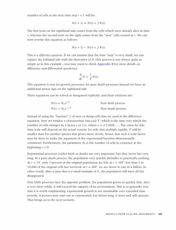
O’Reilly-5980006 master October 28, 2010 20:55
number of cells at the next time step t + 1 will be:
N (t + 1) = N (t) + f N (t)
The first term on the righthand side comes from the cells which were already alive at time
t , whereas the second term on the right comes from the “new” cells created at t . We can
now rewrite this equation as follows:
N (t + 1) − N (t) = f N (t)
This is a difference equation. If we can assume that the time “step” is very small, we can
replace the lefthand side with the derivative of N (this process is not always quite as
simple as in this example—you may want to check Appendix B for more details on
difference and differential quotients):
d
dtN = 1
TN (t)
This equation is true for growth processes; for pure death processes instead we have an
additional minus sign on the righthand side.
These equations can be solved or integrated explicitly, and their solutions are:
N (t) = N0 et/T Pure birth process
N (t) = N0 e−t/T Pure death process
Instead of using the “fraction” f of new or dying cells that we used in the difference
equation, here we employ a characteristic time scale T , which is the time over which the
number of cells changes by a factor e or 1/e, where e = 2.71828 . . . . The value for this
time scale will depend on the actual system: for cells that multiply rapidly, T will be
smaller than for another species that grows more slowly. Notice that such a scale factor
must be there to make the argument of the exponential function dimensionally
consistent! Furthermore, the parameter N0 is the number of cells in existence at the
beginning t = 0.
Exponential processes (either birth or death) are very important, but they never last very
long. In a pure death process, the population very quickly dwindles to practically nothing.
At t = 3T , only 5 percent of the original population are left; at t = 10T , less than 1 in
10,000 of the original cells has survived; at t = 20T , we are down to one in a billion. In
other words, after a time that is a small multiple of T , the population will have all but
disappeared.
Pure birth processes face the opposite problem: the population grows so quickly that, after
a very short while, it will exceed the capacity of its environment. This is so generally true
that it is worth emphasizing: exponential growth is not sustainable over extended time
periods. A process may start out as exponential, but before long, it must and will saturate.
That brings us to the next scenario.
M O D E L S F R O M S C A L I N G A R G U M E N T S 179
O’Reilly-5980006 master October 28, 2010 20:55
Constrained Growth: The Logistic Equation
Pure birth processes never continue for very long: the population quickly grows to a size
that is unsustainable, and then the growth slows. A common model that takes this
behavior into account assumes that the members of the population start to “crowd” each
other, possibly competing for some shared resource such as food or territory.
Mathematically, this can be expressed as follows:
d
dtN = λN (K − N ) λ, K > 0 fixed
The first term on the righthand side (which equals λK N) is the same as in the exponential
growth equation. By itself, it would lead to an exponentially growing population
N (t) = C exp(λK t). But the second term (−λN 2) counteracts this: it is negative, so its
effect is to reduce the population; and it is proportional to N 2, so it grows more strongly as
N becomes large. (You can motivate the form of this term by observing that it measures
the number of collisions between members of the population and therefore expresses the
“crowding” effect.)
This equation is known as the logistic differential equation, and its solution is the logistic
function:
N (t) = K
1 +(
KN0
− 1)
e−λK t
This is a complicated function that depends on three parameters:
λ The characteristic growth rate
K The carrying capacity K = N (t → ∞)
N0 The initial number N0 = N (t = 0) of cells
Compared to a pure (exponential) growth process, the appearance of the parameter K is
new. It stands for the system’s “carrying capacity”—that is the maximum number of cells
that the environment can support. You should convince yourself that the logistic function
indeed tends to K as t becomes large. (You will find different forms of this function
elsewhere and with different parameters, but the form given here is the most useful one.)
Figure 8-6 shows the logistic function for a selection of parameter values.
I should point out that determining values for the three parameters from data can be
extraordinarily difficult especially when the only data points available are those to the left
of the inflection point (the point with maximum slope, about halfway between N0 and
K ). Many different combinations of λ, K , and N0 may seem to fit the data about equally
well. In particular, it is difficult to assess K from early-stage data alone. You may want to
try to obtain an independent estimate (even a very rough one) for the carrying capacity
and use it when determining the remaining parameters from the data.
180 C H A P T E R E I G H T
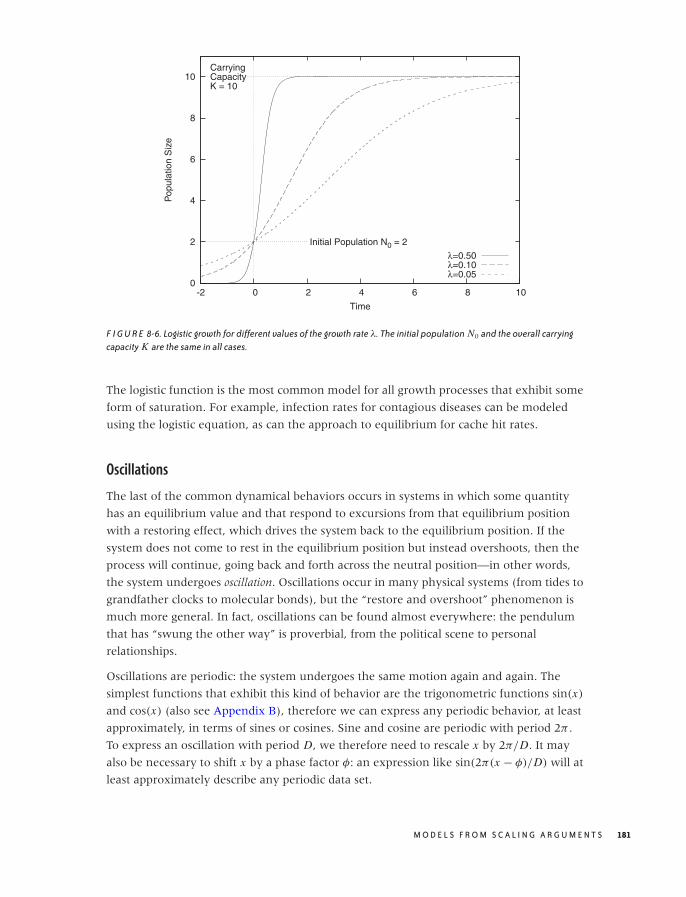
O’Reilly-5980006 master October 28, 2010 20:55
0
2
4
6
8
10
-2 0 2 4 6 8 10
Pop
ulat
ion
Siz
e
Time
Initial Population N0 = 2
CarryingCapacityK = 10
λ=0.50λ=0.10λ=0.05
F I G U R E 8-6. Logistic growth for different values of the growth rate λ. The initial population N0 and the overall carryingcapacity K are the same in all cases.
The logistic function is the most common model for all growth processes that exhibit some
form of saturation. For example, infection rates for contagious diseases can be modeled
using the logistic equation, as can the approach to equilibrium for cache hit rates.
Oscillations
The last of the common dynamical behaviors occurs in systems in which some quantity
has an equilibrium value and that respond to excursions from that equilibrium position
with a restoring effect, which drives the system back to the equilibrium position. If the
system does not come to rest in the equilibrium position but instead overshoots, then the
process will continue, going back and forth across the neutral position—in other words,
the system undergoes oscillation. Oscillations occur in many physical systems (from tides to
grandfather clocks to molecular bonds), but the “restore and overshoot” phenomenon is
much more general. In fact, oscillations can be found almost everywhere: the pendulum
that has “swung the other way” is proverbial, from the political scene to personal
relationships.
Oscillations are periodic: the system undergoes the same motion again and again. The
simplest functions that exhibit this kind of behavior are the trigonometric functions sin(x)
and cos(x) (also see Appendix B), therefore we can express any periodic behavior, at least
approximately, in terms of sines or cosines. Sine and cosine are periodic with period 2π .
To express an oscillation with period D, we therefore need to rescale x by 2π/D. It may
also be necessary to shift x by a phase factor φ: an expression like sin(2π(x − φ)/D) will at
least approximately describe any periodic data set.
M O D E L S F R O M S C A L I N G A R G U M E N T S 181
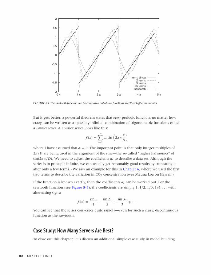
O’Reilly-5980006 master October 28, 2010 20:55
-2
-1.5
-1
-0.5
0
0.5
1
1.5
2
0 π 1 π 2 π 3 π 4 π 5 π
1 term: sin(x)2 terms3 terms
25 termsSawtooth
F I G U R E 8-7. The sawtooth function can be composed out of sine functions and their higher harmonics.
But it gets better: a powerful theorem states that every periodic function, no matter how
crazy, can be written as a (possibly infinite) combination of trigonometric functions called
a Fourier series. A Fourier series looks like this:
f (x) =∞∑
n=1
an sin(
2πnx
D
)
where I have assumed that φ = 0. The important point is that only integer multiples of
2π/D are being used in the argument of the sine—the so-called “higher harmonics” of
sin(2πx/D). We need to adjust the coefficients an to describe a data set. Although the
series is in principle infinite, we can usually get reasonably good results by truncating it
after only a few terms. (We saw an example for this in Chapter 6, where we used the first
two terms to describe the variation in CO2 concentration over Mauna Loa on Hawaii.)
If the function is known exactly, then the coefficients an can be worked out. For the
sawtooth function (see Figure 8-7), the coefficients are simply 1, 1/2, 1/3, 1/4, . . . with
alternating signs:
f (x) = sin x
1− sin 2x
2+ sin 3x
3∓ · · ·
You can see that the series converges quite rapidly—even for such a crazy, discontinuous
function as the sawtooth.
Case Study: How Many Servers Are Best?
To close out this chapter, let’s discuss an additional simple case study in model building.
182 C H A P T E R E I G H T
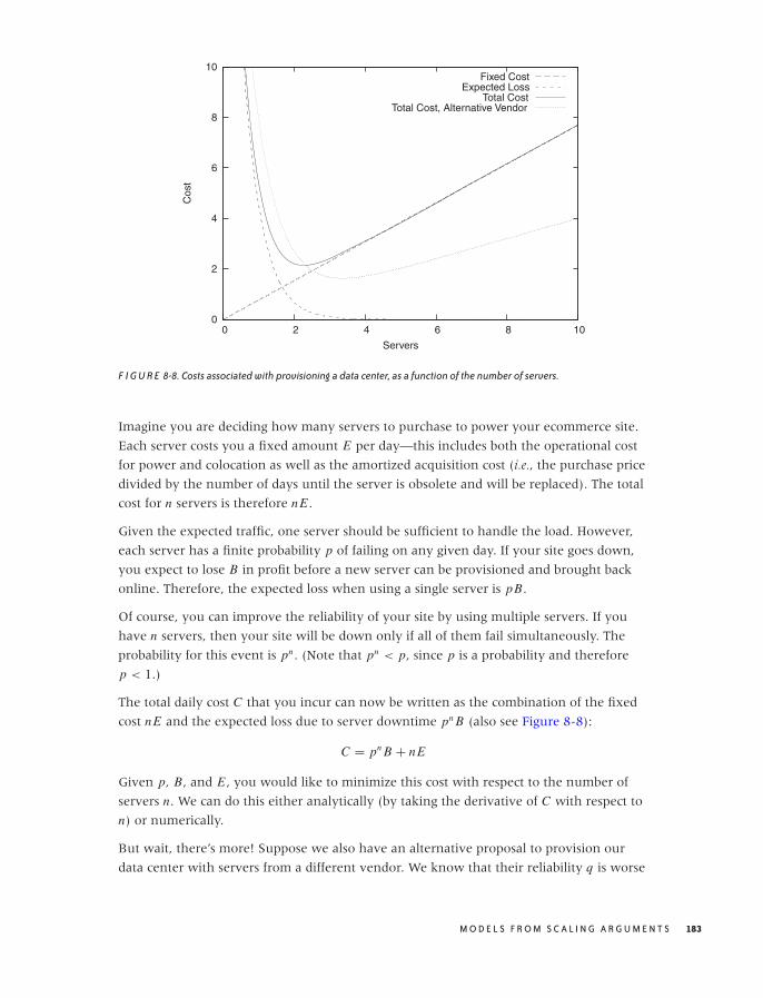
O’Reilly-5980006 master October 28, 2010 20:55
0
2
4
6
8
10
0 2 4 6 8 10
Cos
t
Servers
Fixed CostExpected Loss
Total CostTotal Cost, Alternative Vendor
F I G U R E 8-8. Costs associated with provisioning a data center, as a function of the number of servers.
Imagine you are deciding how many servers to purchase to power your ecommerce site.
Each server costs you a fixed amount E per day—this includes both the operational cost
for power and colocation as well as the amortized acquisition cost (i.e., the purchase price
divided by the number of days until the server is obsolete and will be replaced). The total
cost for n servers is therefore nE .
Given the expected traffic, one server should be sufficient to handle the load. However,
each server has a finite probability p of failing on any given day. If your site goes down,
you expect to lose B in profit before a new server can be provisioned and brought back
online. Therefore, the expected loss when using a single server is pB.
Of course, you can improve the reliability of your site by using multiple servers. If you
have n servers, then your site will be down only if all of them fail simultaneously. The
probability for this event is pn . (Note that pn < p, since p is a probability and therefore
p < 1.)
The total daily cost C that you incur can now be written as the combination of the fixed
cost nE and the expected loss due to server downtime pn B (also see Figure 8-8):
C = pn B + nE
Given p, B, and E , you would like to minimize this cost with respect to the number of
servers n. We can do this either analytically (by taking the derivative of C with respect to
n) or numerically.
But wait, there’s more! Suppose we also have an alternative proposal to provision our
data center with servers from a different vendor. We know that their reliability q is worse
M O D E L S F R O M S C A L I N G A R G U M E N T S 183

O’Reilly-5980006 master October 28, 2010 20:55
(so that q > p), but their price F is significantly lower (F � E). How does this variant
compare to the previous one?
The answer depends on the values for p, B, and E . To make a decision, we must evaluate
not only the location of the minimum in the total cost (i.e., the number of servers required)
but also the actual value of the total cost at the minimum position. Figure 8-8 includes the
total cost for the alternative proposal that uses less reliable but much cheaper servers.
Although we need more servers under this proposal, the total cost is nevertheless lower
than in the first one.
(We can go even further: how about a mix of different servers? This scenario, too, we can
model in a similar fashion and evaluate it against its alternatives.)
Why Modeling?
Why worry about modeling in a book on data analysis? It seems we rarely have touched
any actual data in the examples of this chapter.
It all depends on your goals when working with data. If all you want to do is to describe it,
extract some features, or even decompose it fully into its constituent parts, then the
“analytic” methods of graphical and data analysis will suffice. However, if you intend to
use the data to develop an understanding of the system that produced the data, then
looking at the data itself will be only the first (although important) step.
I consider conceptual modeling to be extremely important, because it is here that we go
from the descriptive to the prescriptive. A conceptual model by itself may well be the most
valuable outcome of an analysis. But even if not, it will at the very least enhance the
purely analytical part of our work, because a conceptual model will lead us to additional
hypothesis and thereby suggest additional ways to look at and study the data in an
iterative process—in other words, even a purely conceptual model will point us back to
the data but with added insight.
The methods described in this chapter and the next are the techniques that I have found
to be the most practically useful when thinking about data and the processes that
generated it. Whenever looking at data, I always try to understand the system behind it,
and I always use some (if not all) of the methods from these two chapters.
Workshop: Sage
Most of the tools introduced in this book work with numbers, which makes sense given
that we are mostly interested in understanding data. However, there is a different kind of
tool that works with formulas instead: computer algebra systems. The big (commercial)
brand names for such systems have been Maple and Mathematica; in the open source
world, the Sage project (http://www.sagemath.org) has become somewhat of a front runner.
184 C H A P T E R E I G H T

O’Reilly-5980006 master October 28, 2010 20:55
Sage is an “umbrella” project that attempts to combine several existing open source
projects (SymPy, Maxima, and others) together with some added functionality into a
single, coherent, Python-like environment. Sage places heavy emphasis on features for
number theory and abstract algebra (not exactly everyone’s cup of tea) and also includes
support for numerical calculations and graphics, but in this section we will limit ourselves
to basic calculus and a little linear algebra. (A word of warning: if you are not really
comfortable with calculus, then you probably want to skip the rest of this section. Don’t
worry—it won’t be needed in the rest of the book.)
Once you start Sage, it drops you into a text-based command interpreter (a REPL, or
read-eval-print loop). Sage makes it easy to perform some simple calculations. For
example, let’s define a function and take its derivative:
sage: a, x = var( 'a x' )
sage: f(x) = cos(a*x)
sage: diff( f, x )
x |--> -a*sin(a*x)
In the first line we declare a and x as symbolic variables—so that we can refer to them
later and Sage knows how to handle them. We then define a function using the
“mathematical” notation f(x) = . . . . Only functions defined in this way can be used in
symbolic calculations. (It is also possible to define Python functions using regular Python
syntax, as in def f(x, a): return cos(a*x), but such functions can only be evaluated
numerically.) Finally, we calculate the first derivative of the function just defined.
All the standard calculus operations are available. We can combine functions to obtain
more complex ones, we can find integrals (both definite and indefinite), and we can even
evaluate limits:
sage: # Indefinite integral:
sage: integrate( f(x,a) + a*x^2, x )
1/3*a*x^3 + sin(a*x)/a
sage:
sage: # Definite integral on [0,1]:
sage: integrate( f(x,a) + a*x^2, x, 0, 1 )
1/3*(a^2 + 3*sin(a))/a
sage:
sage: # Definite integral on [0,pi], assigned to function:
sage: g(x,a) = integrate( f(x,a) + a*x^2, x, 0, pi )
sage:
sage: # Evaluate g(x,a) for different a:
sage: g(x,1)
1/3*pi^3
sage: g(x,1/2)
1/6*pi^3 + 2
sage: g(x,0)
----------------------------------------------------------
RuntimeError
(some output omitted...)
M O D E L S F R O M S C A L I N G A R G U M E N T S 185
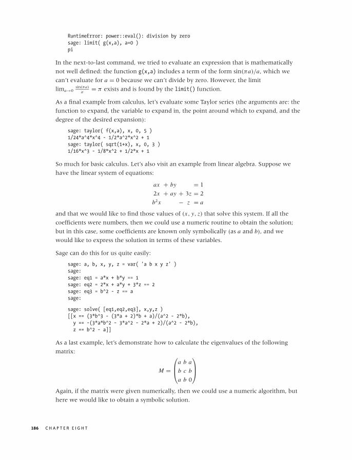
O’Reilly-5980006 master October 28, 2010 20:55
RuntimeError: power::eval(): division by zero
sage: limit( g(x,a), a=0 )
pi
In the next-to-last command, we tried to evaluate an expression that is mathematically
not well defined: the function g(x,a) includes a term of the form sin(πa)/a, which we
can’t evaluate for a = 0 because we can’t divide by zero. However, the limit
lima→0sin(πa)
a = π exists and is found by the limit() function.
As a final example from calculus, let’s evaluate some Taylor series (the arguments are: the
function to expand, the variable to expand in, the point around which to expand, and the
degree of the desired expansion):
sage: taylor( f(x,a), x, 0, 5 )
1/24*a^4*x^4 - 1/2*a^2*x^2 + 1
sage: taylor( sqrt(1+x), x, 0, 3 )
1/16*x^3 - 1/8*x^2 + 1/2*x + 1
So much for basic calculus. Let’s also visit an example from linear algebra. Suppose we
have the linear system of equations:
ax + by = 1
2x + ay + 3z = 2
b2x − z = a
and that we would like to find those values of (x, y, z) that solve this system. If all the
coefficients were numbers, then we could use a numeric routine to obtain the solution;
but in this case, some coefficients are known only symbolically (as a and b), and we
would like to express the solution in terms of these variables.
Sage can do this for us quite easily:
sage: a, b, x, y, z = var( 'a b x y z' )
sage:
sage: eq1 = a*x + b*y == 1
sage: eq2 = 2*x + a*y + 3*z == 2
sage: eq3 = b^2 - z == a
sage:
sage: solve( [eq1,eq2,eq3], x,y,z )
[[x == (3*b^3 - (3*a + 2)*b + a)/(a^2 - 2*b),
y == -(3*a*b^2 - 3*a^2 - 2*a + 2)/(a^2 - 2*b),
z == b^2 - a]]
As a last example, let’s demonstrate how to calculate the eigenvalues of the following
matrix:
M =
⎛
⎜⎝a b a
b c b
a b 0
⎞
⎟⎠
Again, if the matrix were given numerically, then we could use a numeric algorithm, but
here we would like to obtain a symbolic solution.
186 C H A P T E R E I G H T

O’Reilly-5980006 master October 28, 2010 20:55
Again, Sage can do this easily:
sage: m = matrix( [[a,b,a],[b,c,b],[a,b,0]] )
sage: m.eigenvalues()
[-1/18*(-I*sqrt(3) + 1)*(4*a^2 - a*c + 6*b^2 + c^2)/(11/54*a^3 - 7/18*a^2*c + 1/3
*b^2*c + 1/27*c^3 + 1/18*(15*b^2 - c^2)*a + 1/18*sqrt(-5*a^6 - 6*a^4*b^2 + 11*a^2
*b^4 - 5*a^2*c^4 - 32*b^6 + 2*(5*a^3 + 4*a*b^2)*c^3 + (5*a^4 - 62*a^2*b^2 - 4*b^4
)*c^2 - 2*(5*a^5 + 17*a^3*b^2 - 38*a*b^4)*c)*sqrt(3))^(1/3) - 1/2*(I*sqrt(3) + 1)
*(11/54*a^3 - 7/18*a^2*c + 1/3*b^2*c + 1/27*c^3 + 1/18*(15*b^2 - c^2)*a + 1/18*sq
rt(-5*a^6 - 6*a^4*b^2 + 11*a^2*b^4 - 5*a^2*c^4 - 32*b^6 + 2*(5*a^3 + 4*a*b^2)*c^3
+ (5*a^4 - 62*a^2*b^2 - 4*b^4)*c^2 - 2*(5*a^5 + 17*a^3*b^2 - 38*a*b^4)*c)*sqrt(3
))^(1/3) + 1/3*a + 1/3*c, -1/18*(I*sqrt(3) + 1)*(4*a^2 - a*c + 6*b^2 + c^2)/(11/5
4*a^3 - 7/18*a^2*c + 1/3*b^2*c + 1/27*c^3 + 1/18*(15*b^2 - c^2)*a + 1/18*sqrt(-5*
a^6 - 6*a^4*b^2 + 11*a^2*b^4 - 5*a^2*c^4 - 32*b^6 + 2*(5*a^3 + 4*a*b^2)*c^3 + (5*
a^4 - 62*a^2*b^2 - 4*b^4)*c^2 - 2*(5*a^5 + 17*a^3*b^2 - 38*a*b^4)*c)*sqrt(3))^(1/
3) - 1/2*(-I*sqrt(3) + 1)*(11/54*a^3 - 7/18*a^2*c + 1/3*b^2*c + 1/27*c^3 + 1/18*(
15*b^2 - c^2)*a + 1/18*sqrt(-5*a^6 - 6*a^4*b^2 + 11*a^2*b^4 - 5*a^2*c^4 - 32*b^6
+ 2*(5*a^3 + 4*a*b^2)*c^3 + (5*a^4 - 62*a^2*b^2 - 4*b^4)*c^2 - 2*(5*a^5 + 17*a^3*
b^2 - 38*a*b^4)*c)*sqrt(3))^(1/3) + 1/3*a + 1/3*c, 1/3*a + 1/3*c + 1/9*(4*a^2 - a
*c + 6*b^2 + c^2)/(11/54*a^3 - 7/18*a^2*c + 1/3*b^2*c + 1/27*c^3 + 1/18*(15*b^2 -
c^2)*a + 1/18*sqrt(-5*a^6 - 6*a^4*b^2 + 11*a^2*b^4 - 5*a^2*c^4 - 32*b^6 + 2*(5*a
^3 + 4*a*b^2)*c^3 + (5*a^4 - 62*a^2*b^2 - 4*b^4)*c^2 - 2*(5*a^5 + 17*a^3*b^2 - 38
*a*b^4)*c)*sqrt(3))^(1/3) + (11/54*a^3 - 7/18*a^2*c + 1/3*b^2*c + 1/27*c^3 + 1/18
*(15*b^2 - c^2)*a + 1/18*sqrt(-5*a^6 - 6*a^4*b^2 + 11*a^2*b^4 - 5*a^2*c^4 - 32*b^
6 + 2*(5*a^3 + 4*a*b^2)*c^3 + (5*a^4 - 62*a^2*b^2 - 4*b^4)*c^2 - 2*(5*a^5 + 17*a^
3*b^2 - 38*a*b^4)*c)*sqrt(3))^(1/3)]
Whether these results are useful to us is a different question!
This last example demonstrates something I have found to be quite generally true when
working with computer algebra systems: it can be difficult to find the right kind of
problem for them. Initially, computer algebra systems seem like pure magic, so effortlessly
do they perform tasks that took us years to learn (and that we still get wrong). But as we
move from trivial to more realistic problems, it is often difficult to obtain results that are
actually useful. All too often we end up with a result like the one in the eigenvalue
example, which—although “correct”—simply does not shed much light on the problem
we tried to solve! And before we try manually to simplify an expression like the one for
the eigenvalues, we might be better off solving the entire problem with paper and pencil,
because using paper and pencil, we can can introduce new variables for frequently
occurring terms or even make useful approximations as we go along.
I think computer algebra systems are most useful in scenarios that require the generation
of a very large number of terms (e.g., combinatorial problems), which in the end are
evaluated (numerically or otherwise) entirely by the computer to yield the final result
without providing a “symbolic” solution in the classical sense at all. When these
conditions are fulfilled, computer algebra systems enable you to tackle problems that
would simply not be feasible with paper and pencil. At the same time, you can maintain a
greater level of accuracy because numerical (finite-precision) methods, although still
required to obtain a useful result, are employed only in the final stages of the calculation
(rather than from the outset). Neither of these conditions is fulfilled for relatively
M O D E L S F R O M S C A L I N G A R G U M E N T S 187

O’Reilly-5980006 master October 28, 2010 20:55
straightforward ad hoc symbolic manipulations. Despite their immediate “magic” appeal,
computer algebra systems are most useful as specialized tools for specialized tasks!
One final word about the Sage project. As an open source project, it leaves a strange
impression. You first become aware of this when you attempt to download the binary
distribution: it consists of a 500 MB bundle, which unpacks to 2 GB on your disk! When
you investigate what is contained in this huge package, the answer turns out to be
everything. Sage ships with all of its dependencies. It ships with its own copy of all libraries
it requires. It ships with its own copy of R. It ships with its own copy of Python! In short,
it ships with its own copy of everything.
This bundling is partially due to the well-known difficulties with making deeply
numerical software portable, but is also an expression of the fact that Sage is an umbrella
project that tries to combine a wide range of otherwise independent projects. Although I
sincerely appreciate the straightforward pragmatism of this solution, it also feels
heavy-handed and ultimately unsustainable. Personally, it makes me doubt the wisdom of
the entire “all under one roof” approach that is the whole purpose of Sage: if this is what
it takes, then we are probably on the wrong track. In other words, if it is not feasible to
integrate different projects in a more organic way, then perhaps those projects should
remain independent, with the user free to choose which to use.
Further Reading
There are two or three dozen books out there specifically on the topic of modeling, but I
have been disappointed by most of them. Some of the more useful (from the elementary
to the quite advanced) include the following.
• How to Model It: Problem Solving for the Computer Age. A. M. Starfield, K. A. Smith, and
A. L. Bleloch. Interaction Book Company. 1994.
Probably the best elementary introduction to modeling that I am aware of. Ten
(ficticious) case studies are presented and discussed, each demonstrating a different
modeling method. (Out of print, but available used.)
• An Introduction to Mathematical Modeling. Edward A. Bender. Dover Publications. 2000.
Short and idiosyncratic. A bit dated but still insightful.
• Concepts of Mathematical Modeling. Walter J. Meyer. Dover Publications. 2004.
This book is a general introduction to many of the topics required for mathematical
modeling at an advanced beginner level. It feels more dated than it is, and the
presentation is a bit pedestrian; nevertheless, it contains a lot of accessible, and most of
all practical, material.
• Introduction to the Foundations of Applied Mathematics. Mark H. Holmes. Springer. 2009.
This is one of the few books on modeling that places recurring mathematical
techniques, rather than case studies, at the center of its discussion. Much of the
material is advanced, but the first few chapters contain a careful discussion of
188 C H A P T E R E I G H T

O’Reilly-5980006 master October 28, 2010 20:55
dimensional analysis and nice introductions to perturbation expansions and
time-evolution scenarios.
• Modeling Complex Systems. Nino Boccara. 2nd ed., Springer. 2010.
This is a book by a physicist (not a mathematician, applied or otherwise), and it
demonstrates how a physicist thinks about building models. The examples are rich, but
mostly of theoretical interest. Conceptually advanced, mathematically not too difficult.
• Practical Applied Mathematics. Sam Howison. Cambridge University Press. 2005.
This is a very advanced book on applied mathematics with a heavy emphasis on partial
differential equations. However, the introductory chapters, though short, provide one
of the most insightful (and witty) discussions of models, modeling, scaling arguments,
and related topics that I have seen.
The following two books are not about the process of modeling. Instead, they provide
examples of modeling in action (with a particular emphasis on scaling arguments):
• The Simple Science of Flight. Henk Tennekes. 2nd ed., MIT Press. 2009.
This is a short yet fascinating book about the physics and engineering of flying, written
at the “popular science” level. The author makes heavy use of scaling laws throughout.
If you are interested in aviation, then you will be interested in this book.
• Scaling Concepts in Polymer Physics. Pierre-Gilles de Gennes. Cornell University Press.
1979.
This is a research monograph on polymer physics and probably not suitable for a
general audience. But the treatment, which relies almost exclusively on a variety of
scaling arguments, is almost elementary. Written by the master of the scaling models.
M O D E L S F R O M S C A L I N G A R G U M E N T S 189

O’Reilly-5980006 master October 28, 2010 20:55
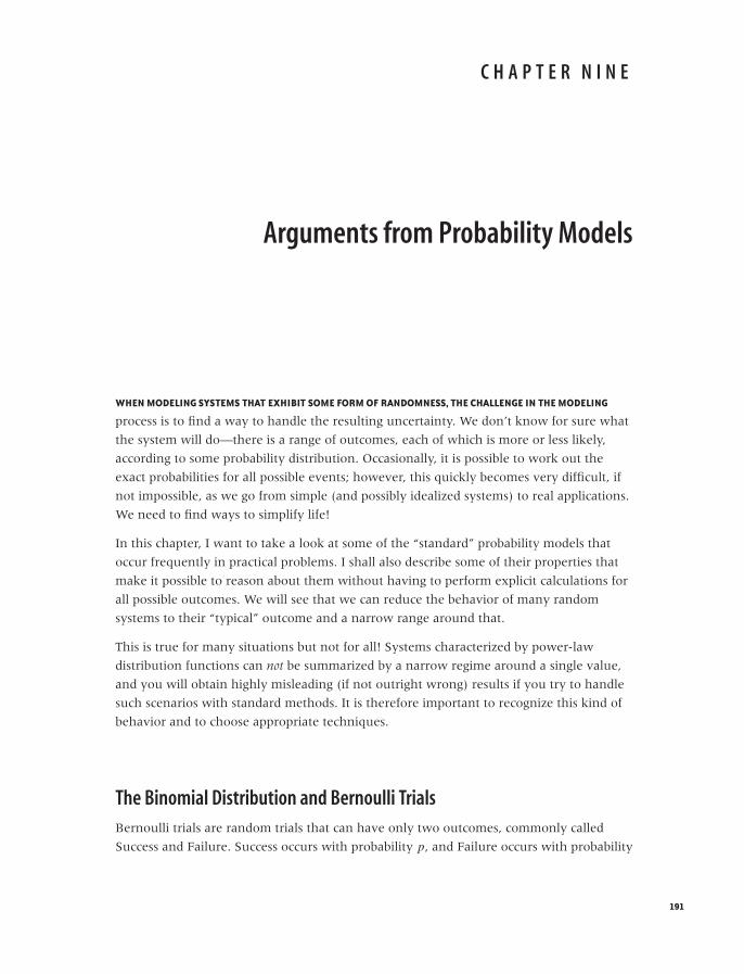
O’Reilly-5980006 master October 28, 2010 20:57
C H A P T E R N I N E
Arguments from Probability Models
WHEN MODELING SYSTEMS THAT EXHIBIT SOME FORM OF RANDOMNESS, THE CHALLENGE IN THE MODELING
process is to find a way to handle the resulting uncertainty. We don’t know for sure what
the system will do—there is a range of outcomes, each of which is more or less likely,
according to some probability distribution. Occasionally, it is possible to work out the
exact probabilities for all possible events; however, this quickly becomes very difficult, if
not impossible, as we go from simple (and possibly idealized systems) to real applications.
We need to find ways to simplify life!
In this chapter, I want to take a look at some of the “standard” probability models that
occur frequently in practical problems. I shall also describe some of their properties that
make it possible to reason about them without having to perform explicit calculations for
all possible outcomes. We will see that we can reduce the behavior of many random
systems to their “typical” outcome and a narrow range around that.
This is true for many situations but not for all! Systems characterized by power-law
distribution functions can not be summarized by a narrow regime around a single value,
and you will obtain highly misleading (if not outright wrong) results if you try to handle
such scenarios with standard methods. It is therefore important to recognize this kind of
behavior and to choose appropriate techniques.
The Binomial Distribution and Bernoulli Trials
Bernoulli trials are random trials that can have only two outcomes, commonly called
Success and Failure. Success occurs with probability p, and Failure occurs with probability
191
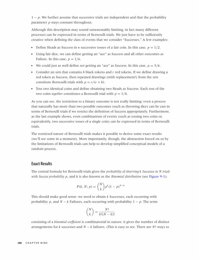
O’Reilly-5980006 master October 28, 2010 20:57
1 − p. We further assume that successive trials are independent and that the probability
parameter p stays constant throughout.
Although this description may sound unreasonably limiting, in fact many different
processes can be expressed in terms of Bernoulli trials. We just have to be sufficiently
creative when defining the class of events that we consider “Successes.” A few examples:
• Define Heads as Success in n successive tosses of a fair coin. In this case, p = 1/2.
• Using fair dice, we can define getting an “ace” as Success and all other outcomes as
Failure. In this case, p = 1/6.
• We could just as well define not getting an “ace” as Success. In this case, p = 5/6.
• Consider an urn that contains b black tokens and r red tokens. If we define drawing a
red token as Success, then repeated drawings (with replacement!) from the urn
constitute Bernoulli trials with p = r/(r + b).
• Toss two identical coins and define obtaining two Heads as Success. Each toss of the
two coins together constitutes a Bernoulli trial with p = 1/4.
As you can see, the restriction to a binary outcome is not really limiting: even a process
that naturally has more than two possible outcomes (such as throwing dice) can be cast in
terms of Bernoulli trials if we restrict the definition of Success appropriately. Furthermore,
as the last example shows, even combinations of events (such as tossing two coins or,
equivalently, two successive tosses of a single coin) can be expressed in terms of Bernoulli
trials.
The restricted nature of Bernoulli trials makes it possible to derive some exact results
(we’ll see some in a moment). More importantly, though, the abstraction forced on us by
the limitations of Bernoulli trials can help to develop simplified conceptual models of a
random process.
Exact Results
The central formula for Bernoulli trials gives the probability of observing k Successes in N trials
with Success probability p, and it is also known as the Binomial distribution (see Figure 9-1):
P(k, N ; p) =(
N
k
)pk(1 − p)N−k
This should make good sense: we need to obtain k Successes, each occurring with
probability p, and N − k Failures, each occurring with probability 1 − p. The term:
(N
k
)= N !
k!(N − k)!
consisting of a binomial coefficient is combinatorial in nature: it gives the number of distinct
arrangements for k successes and N − k failures. (This is easy to see. There are N ! ways to
192 C H A P T E R N I N E
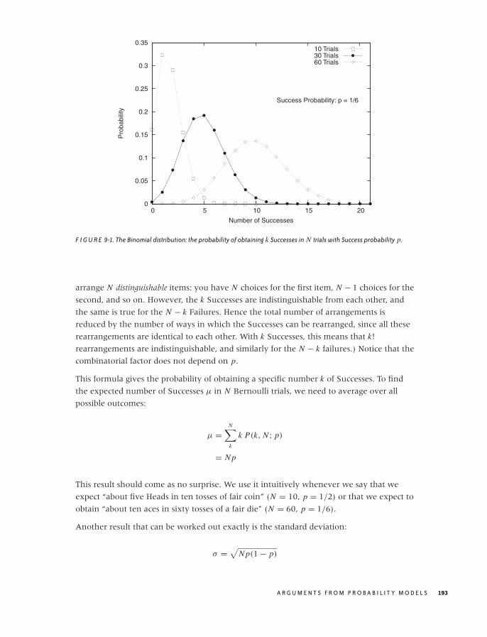
O’Reilly-5980006 master October 28, 2010 20:57
0
0.05
0.1
0.15
0.2
0.25
0.3
0.35
0 5 10 15 20
Pro
babi
lity
Number of Successes
Success Probability: p = 1/6
10 Trials30 Trials60 Trials
F I G U R E 9-1. The Binomial distribution: the probability of obtaining k Successes in N trials with Success probability p.
arrange N distinguishable items: you have N choices for the first item, N − 1 choices for the
second, and so on. However, the k Successes are indistinguishable from each other, and
the same is true for the N − k Failures. Hence the total number of arrangements is
reduced by the number of ways in which the Successes can be rearranged, since all these
rearrangements are identical to each other. With k Successes, this means that k!
rearrangements are indistinguishable, and similarly for the N − k failures.) Notice that the
combinatorial factor does not depend on p.
This formula gives the probability of obtaining a specific number k of Successes. To find
the expected number of Successes μ in N Bernoulli trials, we need to average over all
possible outcomes:
μ =N∑
k
k P(k, N ; p)
= N p
This result should come as no surprise. We use it intuitively whenever we say that we
expect “about five Heads in ten tosses of fair coin” (N = 10, p = 1/2) or that we expect to
obtain “about ten aces in sixty tosses of a fair die” (N = 60, p = 1/6).
Another result that can be worked out exactly is the standard deviation:
σ =√
N p(1 − p)
A R G U M E N T S F R O M P R O B A B I L I T Y M O D E L S 193

O’Reilly-5980006 master October 28, 2010 20:57
The standard deviation gives us the range over which we expect the outcomes to vary.
(For example, assume that we perform m experiments, each consisting of N tosses of a fair
coin. The expected number of Successes in each experiment is N p, but of course we won’t
obtain exactly this number in each experiment. However, over the course of the m
experiments, we expect to find the number of Successes in the majority of them to lie
between N p − √N p(1 − p) and N p + √
N p(1 − p)).
Notice that σ grows more slowly with the number of trials than does μ (σ ∼ √N versus
μ ∼ N). The relative width of the outcome distribution therefore shrinks as we conduct
more trials.
Using Bernoulli Trials to Develop Mean-Field Models
The primary reason why I place so much emphasis on the concept of Bernoulli trials is
that it lends itself naturally to the development of mean-field models (see Chapter 8).
Suppose we try to develop a model to predict the staffing level required for a call center to
deal with customer complaints. We know from experience that about one in every
thousand orders will lead to a complaint (hence p = 1/1000). If we shipped a million
orders a day, we could use the Binomial distribution to work out the probability to receive
1, 2, 3, . . . , 999,999, 1,000,000 complaints a day and then work out the required staffing
levels accordingly—a daunting task! But in the spirit of mean-field theories, we can cut
through the complexity by realizing that we will receive “about N p = 1,000” complaints a
day. So rather than working with each possible outcome (and its associated probability),
we limit our attention to a single expected outcome. (And we can now proceed to
determine how many calls a single person can handle per day to find the required number
of customer service people.) We can even go a step further and incorporate the
uncertainty in the number of complaints by considering the standard deviation, which in
this example comes out to√
N p(1 − p) ≈ √1000 ≈ 30. (Here I made use of the fact that
1 − p is very close to 1 for the current value of p.) The spread is small compared to the
expected number of calls, lending credibility to our initial approximation of replacing the
full distribution with only its expected outcome. (This is a demonstration for the
observation we made earlier that the width of the resulting distribution grows much more
slowly with N than does the expected value itself. As N gets larger, this effect becomes
more drastic, which means that mean-field theory gets better and more reliable the more
urgently we need it! The tough cases can be situations where N is of moderate size—say,
in the range of 10, . . . , 100. This size is too large to work out all outcomes exactly but not
large enough to be safe working only with the expected values.)
Having seen this, we can apply similar reasoning to more general situations. For example,
notice that the number of orders shipped each day will probably not equal exactly one
million—instead, it will be a random quantity itself. So, by using N = 1,000,000 we have
employed the mean-field idea already. It should be easy to generalize to other situations
from here.
194 C H A P T E R N I N E
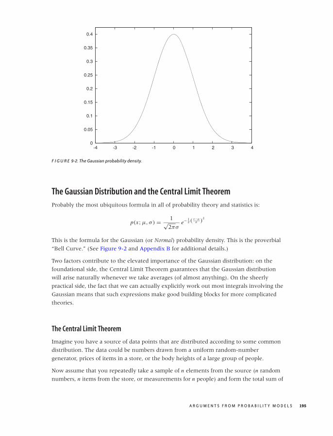
O’Reilly-5980006 master October 28, 2010 20:57
0
0.05
0.1
0.15
0.2
0.25
0.3
0.35
0.4
-4 -3 -2 -1 0 1 2 3 4
F I G U R E 9-2. The Gaussian probability density.
The Gaussian Distribution and the Central Limit Theorem
Probably the most ubiquitous formula in all of probability theory and statistics is:
p(x; μ, σ) = 1√2πσ
e− 12 (
x−μσ )
2
This is the formula for the Gaussian (or Normal) probability density. This is the proverbial
“Bell Curve.” (See Figure 9-2 and Appendix B for additional details.)
Two factors contribute to the elevated importance of the Gaussian distribution: on the
foundational side, the Central Limit Theorem guarantees that the Gaussian distribution
will arise naturally whenever we take averages (of almost anything). On the sheerly
practical side, the fact that we can actually explicitly work out most integrals involving the
Gaussian means that such expressions make good building blocks for more complicated
theories.
The Central Limit Theorem
Imagine you have a source of data points that are distributed according to some common
distribution. The data could be numbers drawn from a uniform random-number
generator, prices of items in a store, or the body heights of a large group of people.
Now assume that you repeatedly take a sample of n elements from the source (n random
numbers, n items from the store, or measurements for n people) and form the total sum of
A R G U M E N T S F R O M P R O B A B I L I T Y M O D E L S 195
O’Reilly-5980006 master October 28, 2010 20:57
the values. You can also divide by n to get the average. Notice that these sums (or
averages) are random quantities themselves: since the points are drawn from a random
distribution, their sums will also be random numbers.
Note that we don’t necessarily know the distributions from which the original points
come, so it may seem it would be impossible to say anything about the distribution of
their sums. Surprisingly, the opposite is true: we can make very precise statements about
the form of the distribution according to which the sums are distributed. This is the
content of the Central Limit Theorem.
The Central Limit Theorem states that the sums of a bunch of random quantities will be
distributed according to a Gaussian distribution. This statement is not strictly true; it is
only an approximation, with the quality of the approximation improving as more points
are included in each sample (as n gets larger, the approximation gets better). In practice,
though, the approximation is excellent even for quite moderate values of n.
This is an amazing statement, given that we made no assumptions whatsoever about the
original distributions (I will qualify this in a moment): it seems as if we got something for
nothing! After a moment’s thought, however, this result should not be so surprising: if we
take a single point from the original distribution, it may be large or it may be small—we
don’t know. But if we take many such points, then the highs and the lows will balance
each other out “on average.” Hence we should not be too surprised that the distribution of
the sums is a smooth distribution with a central peak. It is, however, not obvious that this
distribution should turn out to be the Gaussian specifically.
We can now state the Central Limit Theorem formally. Let {xi } be a sample of size n, having
the following properties:
1. All xn are mutually independent.
2. All xn are drawn from a common distribution.
3. The mean μ and the standard deviation σ for the distribution of the individual data points xi are
finite.
Then the sample average 1n
∑ni xi is distributed according to a Gaussian with mean μ and standard
deviation σ/√
n. The approximation improves as the sample size n increases. In other words, the
probability of finding the value x for the sample mean 1n
∑i xi becomes Gaussian as n gets
large:
P
(1
n
n∑
i
xi = x
)→ 1√
2π
√n
σexp
(−1
2
(x − μ
σ/√
n
)2)
Notice that, as for the binomial distribution, the width of the resulting distribution of the
average is smaller than the width of the original distribution of the individual data points.
This aspect of the Central Limit Theorem is the formal justification for the common
practice to “average out the noise”: no matter how widely the individual data points
scatter, their averages will scatter less.
196 C H A P T E R N I N E

O’Reilly-5980006 master October 28, 2010 20:57
On the other hand, the reduction in width is not as fast as one might want: it is not
reduced linearly with the number n of points in the sample but only by√
n. This means
that if we take 10 times as many points, the scatter is reduced to only 1/√
10 ≈ 30 percent
of its original value. To reduce it to 10 percent, we would need to increase the sample size
by a factor of 100. That’s a lot!
Finally, let’s take a look at the Central Limit Theorem in action. Suppose we draw samples
from a uniform distribution that takes on the values 1, 2, . . . , 6 with equal probability—in
other words, throws of a fair die. This distribution has mean μ = 3.5 (that’s pretty
obvious) and standard deviation σ = √(62 − 1)/12 ≈ 1.71 (not as obvious but not terribly
hard to work it out, or you can look it up).
We now throw the die a certain number of times and evaluate the average of the values
that we observe. According to the Central Limit Theorem, these averages should be
distributed according to a Gaussian distribution that becomes narrower as we increase the
number of throws used to obtain an average. To see the distribution of values, we
generate a histogram (see Chapter 2). I use 1,000 “repeats” to have enough data for a
histogram. (Make sure you understand what is going on here: we throw the die a certain
number of times and calculate an average based on those throws; and this entire process is
repeated 1,000 times.)
The results are shown in Figure 9-3. In the upper-left corner we have thrown the die only
once and thus form the “average” over only a single throw. You can see that all of the
possible values are about equally likely: the distribution is uniform. In the upper-right
corner, we throw the dice twice every time and form the average over both throws.
Already a central tendency in the distribution of the average of values can be observed! We
then continue to make longer and longer averaging runs. (Also shown is the Gaussian
distribution with the appropriately adjusted width: σ/√
n, where n is the number of
throws over which we form the average.)
I’d like to emphasize two observations in particular. First, note how quickly the central
tendency becomes apparent—it only takes averaging over two or three throws for a
central peak to becomes established. Second, note how well the properly scaled Gaussian
distribution fits the observed histograms. This is the Central Limit Theorem in action.
The Central Term and the Tails
The most predominant feature of the Gaussian density function is the speed with which
it falls to zero as |x | (the absolute value of x—see Appendix B) becomes large. It is
worth looking at some numbers to understand just how quickly it does decay. For
x = 2, the standard Gaussian with zero mean and unit variance is approximately
p(2, 0, 1) = 0.05 . . . . For x = 5, it is already on the order of 10−6; for x = 10 it’s about
10−22; and not much further out, at x = 15, we find p(15, 0, 1) ≈ 10−50. One needs to
A R G U M E N T S F R O M P R O B A B I L I T Y M O D E L S 197
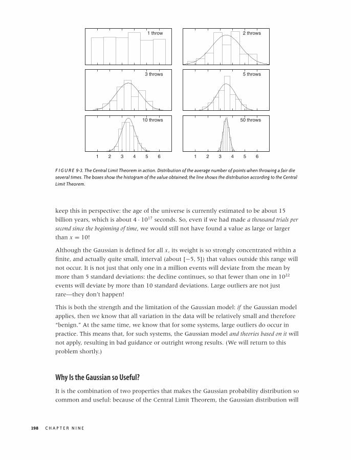
O’Reilly-5980006 master October 28, 2010 20:57
1 throw 2 throws
3 throws 5 throws
1 2 3 4 5 6
10 throws
1 2 3 4 5 6
50 throws
F I G U R E 9-3. The Central Limit Theorem in action. Distribution of the average number of points when throwing a fair dieseveral times. The boxes show the histogram of the value obtained; the line shows the distribution according to the CentralLimit Theorem.
keep this in perspective: the age of the universe is currently estimated to be about 15
billion years, which is about 4 · 1017 seconds. So, even if we had made a thousand trials per
second since the beginning of time, we would still not have found a value as large or larger
than x = 10!
Although the Gaussian is defined for all x , its weight is so strongly concentrated within a
finite, and actually quite small, interval (about [−5, 5]) that values outside this range will
not occur. It is not just that only one in a million events will deviate from the mean by
more than 5 standard deviations: the decline continues, so that fewer than one in 1022
events will deviate by more than 10 standard deviations. Large outliers are not just
rare—they don’t happen!
This is both the strength and the limitation of the Gaussian model: if the Gaussian model
applies, then we know that all variation in the data will be relatively small and therefore
“benign.” At the same time, we know that for some systems, large outliers do occur in
practice. This means that, for such systems, the Gaussian model and theories based on it will
not apply, resulting in bad guidance or outright wrong results. (We will return to this
problem shortly.)
Why Is the Gaussian so Useful?
It is the combination of two properties that makes the Gaussian probability distribution so
common and useful: because of the Central Limit Theorem, the Gaussian distribution will
198 C H A P T E R N I N E
O’Reilly-5980006 master October 28, 2010 20:57
occur whenever we we dealing with averages; and because so much of the Gaussian’s
weight is concentrated in the central region, almost any expression can be approximated
by concentrating only on the central region, while largely disregarding the tails.
As we will discuss in Chapter 10 in more detail, the first of these two arguments has been
put to good use by the creators of classical statistics: although we may not know anything
about the distribution of the actual data points, the Central Limit Theorem enables us to
make statements about their averages. Hence, if we concentrate on estimating the sample
average of any quantity, then we are on much firmer ground, theoretically. And it is
impressive to see how classical statistics is able to make rigorous statements about the
extent of confidence intervals for parameter estimates while using almost no information
beyond the data points themselves! I’d like to emphasize these two points again: through
clever application of the Central Limit Theorem, classical statistics is able to give rigorous
(not just intuitive) bounds on estimates—and it can do so without requiring detailed
knowledge of (or making additional assumptions about) the system under investigation.
This is a remarkable achievement!
The price we pay for this rigor is that we lose much of the richness of the original data set:
the distribution of points has been boiled down to a single number—the average.
The second argument is not so relevant from a conceptual point, but it is, of course, of
primary practical importance: we can actually do many integrals involving Gaussians,
either exactly or in very good approximation. In fact, the Gaussian is so convenient in this
regard that it is often the first choice when an integration kernel is needed (we have
already seen examples of this in Chapter 2, in the context of kernel density estimates, and
in Chapter 4, when we discussed the smoothing of a time series).
Optional: Gaussian Integrals
The basic idea goes like this: we want to evaluate an integral of the form:
∫f (x)e−x2/2 dx
We know that the Gaussian is peaked around x = 0, so that only nearby points will
contribute significantly to the value of the integral. We can therefore expand f (x) in a
power series for small x . Even if this expansion is no good for large x , the result will not
be affected significantly because those points are suppressed by the Gaussian. We end up
with a series of integrals of the form
an
∫xne−x2/2 dx
which can be performed exactly. (Here, an is the expansion coefficient from the expansion
of f (x).)
A R G U M E N T S F R O M P R O B A B I L I T Y M O D E L S 199
O’Reilly-5980006 master October 28, 2010 20:57
We can push this idea even further. Assume that the kernel is not exactly Gaussian but is
still strongly peaked:
∫f (x)e−g(x) dx
where the function g(x) has a minimum at some location (otherwise, the kernel would
not have a peak at all). We can now expand g(x) into a Taylor series around its minimum
(let’s assume it is at x = 0), retaining only the first two terms:
g(x) ≈ g(0) + g′′(0)x2/2 + · · · . The linear term vanishes because the first derivative g′ must
be zero at a minimum. Keeping in mind that the first term in this expansion is a constant
not depending on x , we have transformed the original integral to one of Gaussian type:
e−g(0)
∫f (x)e−g′′(0) x2/2 dx
which we already know how to solve.
This technique goes by the name of Laplace’s method (not to be confused with “Gaussian
integration,” which is something else entirely).
Beware: The World Is Not Normal!
Given that the Central Limit Theorem is a rigorously proven theorem, what could possibly
go wrong? After all, the Gaussian distribution guarantees the absence of outliers, doesn’t
it? Yet we all know that unexpected events do occur.
There are two things that can go wrong with the discussion so far:
• The Central Limit Theorem only applies to sums or averages of random quantities but
not necessarily to the random quantities themselves. The distribution of individual data
points may be quite different from a Gaussian, so if we want to reason about individual
events (rather than about an aggregate such as their average), then we may need
different methods. For example, although the average number of items in a shipment
may be Gaussian distributed around a typical value of three items per shipment, there
is no guarantee that the actual distribution of items per shipment will follow the same
distribution. In fact, the distribution will probably be geometrical, with shipments
containing only a single item being much more common than any other shipment size.
• More importantly, the Central Limit Theorem may not apply. Remember the three
conditions listed as requirements for the Central Limit Theorem to hold? Individual
events must be independent, follow the same distribution, and must have a finite
mean and standard deviation. As it turns out, the first and second of these conditions
can be weakened (meaning that individual events can be somewhat correlated and
drawn from slightly different distributions), but the third condition cannot be
weakened: individual events must be drawn from a distribution of finite width.
200 C H A P T E R N I N E

O’Reilly-5980006 master October 28, 2010 20:57
Now this may seem like a minor matter: surely, all distributions occurring in practice
are of finite width, aren’t they? As it turns out, the answer is no! Apparently
“pathological” distributions of this kind are much more common in real life than one
might expect. Such distributions follow power-law behavior, and they are the topic of
the next section.
Power-Law Distributions and Non-Normal Statistics
Let’s start with an example. Figure 9-4 shows a histogram for the number of visits per
person that a sample of visitors made to a certain website over one month. Two things
stand out: the huge number of people who made a handful of visits (fewer than 5 or 6)
and, at the other extreme, the huge number of visits that a few people made. (The
heaviest user made 41,661 visits: that’s about one per minute over the course of the
month—probably a bot or monitor of some sort.)
This distribution looks nothing like the “benign” case in Figure 9-2. The distribution in
Figure 9-4 is not merely skewed—it would be no exaggeration to say that it consists
entirely of outliers! Ironically, the “average” number of visits per person—calculated
naively, by summing the visits and dividing by the number of unique visitors—equals 26
visits per person. This number is clearly not representative of anything: it describes
neither the huge majority of light users on the lefthand side of the graph (who made one
or two visits), nor the small group of heavy users on the right. (The standard deviation is
±437, which clearly suggests that something is not right, given that the mean is 26 and
the number of visits must be positive.)
This kind of behavior is typical for distributions with so-called fat or heavy tails. In contrast
to systems ruled by a Gaussian distribution or another distribution with short tails, data
values are not effectively limited to a narrow domain. Instead, we can find a nonnegligible
fraction of data points that are very far away from the majority of points.
Mathematically speaking, a distribution is heavy-tailed if it falls to zero much slower than
an exponential function. Power laws (i.e., functions that behave as ∼ 1/xβ for some
exponent β > 0) are usually used to describe such behavior.
In Chapter 3, we discussed how to recognize power laws: data points falling onto a
straight line on a double logarithmic plot. A double logarithmic plot of the data from
Figure 9-4 is shown in Figure 9-5, and we see that eventually (i.e., for more than five
visits per person), the data indeed follows a power law (approximately ∼ x−1.9). On the
lefthand side of Figure 9-5 (i.e., for few visits per person), the behavior is different. (We
will come back to this point later.)
Power-law distributions like the one describing the data set in in Figures 9-4 and 9-5 are
surprisingly common. They have been observed in a number of different (and often
colorful) areas: the frequency with which words are used in texts, the magnitude of
A R G U M E N T S F R O M P R O B A B I L I T Y M O D E L S 201

O’Reilly-5980006 master October 28, 2010 20:57
0
5,000
10,000
15,000
20,000
25,000
30,000
0 5,000 10,000 15,000 20,000 25,000 30,000 35,000 40,000
Num
ber
of U
sers
Number of Visits per User
F I G U R E 9-4. A histogram of the number of visitors who made x number of visits to a certain website. Note the extremeskewness of the distribution: most visitors made one or two visits, but a few made tens of thousands of visits.
earthquakes, the size of files, the copies of books sold, the intensity of wars, the sizes of
sand particles and solar flares, the population of cities, and the distribution of wealth.
Power-law distributions go by different names in different contexts—you will find them
referred to as “Zipf” of “Pareto” distributions, but the mathematical structure is always the
same. The term “power-law distribution” is probably the most widely accepted, general
term for this kind of heavy-tailed distribution.
Whenever they were found, power-law distributions were met with surprise and
(usually) consternation. The reason is that they possess some unexpected and
counterintuitive properties:
• Observations span a wide range of values, often many orders of magnitude.
• There is no typical scale or value that could be used to summarize the distribution of
points.
• The distribution is extremely skewed, with many data points at the low end and few
(but not negligibly few) data points at very high values.
• Expectation values often depend on the sample size. Taking the average over a sample
of n points may yield a significantly smaller value than taking the average over 2n or
10n data points. (This is in marked contrast to most other distributions, where the
quality of the average improves when it is based on more points. Not so for power-law
distributions!)
202 C H A P T E R N I N E
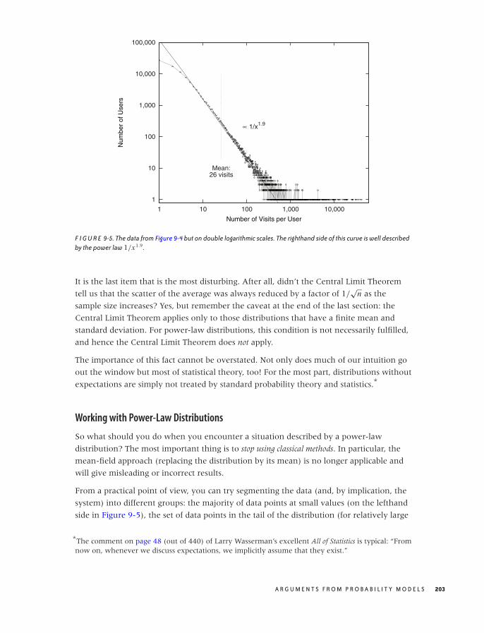
O’Reilly-5980006 master October 28, 2010 20:57
1
10
100
1,000
10,000
100,000
1 10 100 1,000 10,000
Num
ber
of U
sers
Number of Visits per User
Mean:26 visits
∝ 1/x1.9
F I G U R E 9-5. The data from Figure 9-4 but on double logarithmic scales. The righthand side of this curve is well describedby the power law 1/x1.9.
It is the last item that is the most disturbing. After all, didn’t the Central Limit Theorem
tell us that the scatter of the average was always reduced by a factor of 1/√
n as the
sample size increases? Yes, but remember the caveat at the end of the last section: the
Central Limit Theorem applies only to those distributions that have a finite mean and
standard deviation. For power-law distributions, this condition is not necessarily fulfilled,
and hence the Central Limit Theorem does not apply.
The importance of this fact cannot be overstated. Not only does much of our intuition go
out the window but most of statistical theory, too! For the most part, distributions without
expectations are simply not treated by standard probability theory and statistics.*
Working with Power-Law Distributions
So what should you do when you encounter a situation described by a power-law
distribution? The most important thing is to stop using classical methods. In particular, the
mean-field approach (replacing the distribution by its mean) is no longer applicable and
will give misleading or incorrect results.
From a practical point of view, you can try segmenting the data (and, by implication, the
system) into different groups: the majority of data points at small values (on the lefthand
side in Figure 9-5), the set of data points in the tail of the distribution (for relatively large
*The comment on page 48 (out of 440) of Larry Wasserman’s excellent All of Statistics is typical: “Fromnow on, whenever we discuss expectations, we implicitly assume that they exist.”
A R G U M E N T S F R O M P R O B A B I L I T Y M O D E L S 203
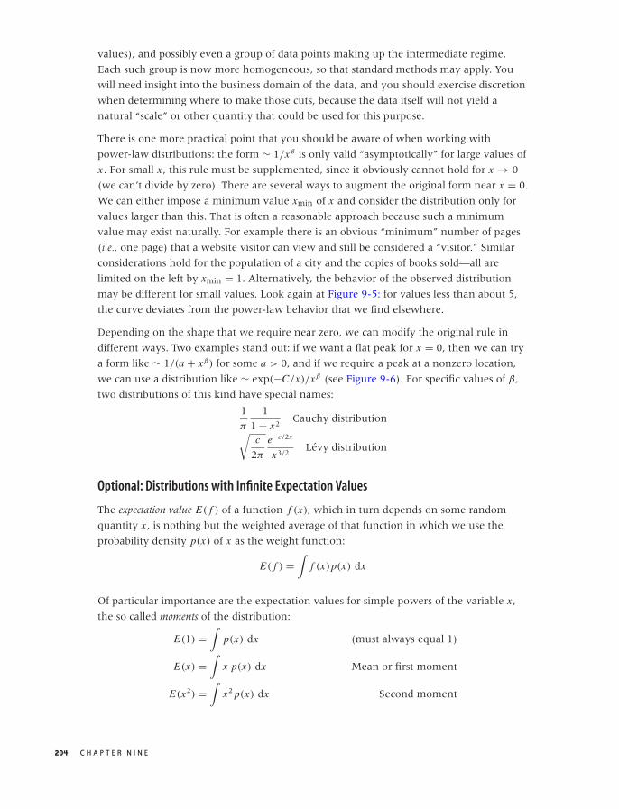
O’Reilly-5980006 master October 28, 2010 20:57
values), and possibly even a group of data points making up the intermediate regime.
Each such group is now more homogeneous, so that standard methods may apply. You
will need insight into the business domain of the data, and you should exercise discretion
when determining where to make those cuts, because the data itself will not yield a
natural “scale” or other quantity that could be used for this purpose.
There is one more practical point that you should be aware of when working with
power-law distributions: the form ∼ 1/xβ is only valid “asymptotically” for large values of
x . For small x , this rule must be supplemented, since it obviously cannot hold for x → 0
(we can’t divide by zero). There are several ways to augment the original form near x = 0.
We can either impose a minimum value xmin of x and consider the distribution only for
values larger than this. That is often a reasonable approach because such a minimum
value may exist naturally. For example there is an obvious “minimum” number of pages
(i.e., one page) that a website visitor can view and still be considered a “visitor.” Similar
considerations hold for the population of a city and the copies of books sold—all are
limited on the left by xmin = 1. Alternatively, the behavior of the observed distribution
may be different for small values. Look again at Figure 9-5: for values less than about 5,
the curve deviates from the power-law behavior that we find elsewhere.
Depending on the shape that we require near zero, we can modify the original rule in
different ways. Two examples stand out: if we want a flat peak for x = 0, then we can try
a form like ∼ 1/(a + xβ) for some a > 0, and if we require a peak at a nonzero location,
we can use a distribution like ∼ exp(−C/x)/xβ (see Figure 9-6). For specific values of β,
two distributions of this kind have special names:
1
π
1
1 + x2Cauchy distribution
√c
2π
e−c/2x
x3/2Levy distribution
Optional: Distributions with Infinite Expectation Values
The expectation value E( f ) of a function f (x), which in turn depends on some random
quantity x , is nothing but the weighted average of that function in which we use the
probability density p(x) of x as the weight function:
E( f ) =∫
f (x)p(x) dx
Of particular importance are the expectation values for simple powers of the variable x ,
the so called moments of the distribution:
E(1) =∫
p(x) dx (must always equal 1)
E(x) =∫
x p(x) dx Mean or first moment
E(x2) =∫
x2 p(x) dx Second moment
204 C H A P T E R N I N E
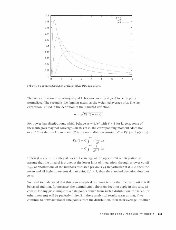
O’Reilly-5980006 master October 28, 2010 20:57
0
0.02
0.04
0.06
0.08
0.1
0.12
0.14
0.16
0.18
0.2
0 1 2 3 4 5 6 7 8
c = 1 = 2 = 5
F I G U R E 9-6. The Levy distribution for several values of the parameter c.
The first expression must always equal 1, because we expect p(x) to be properly
normalized. The second is the familiar mean, as the weighted average of x . The last
expression is used in the definition of the standard deviation:
σ =√
E(x2) − E(x)2
For power-law distributions, which behave as ∼ 1/xβ with β > 1 for large x , some of
these integrals may not converge—in this case, the corresponding moment “does not
exist.” Consider the kth moment (C is the normalization constant C = E(1) = ∫p(x) dx):
E(xk) = C∫ ∞
xk 1
xβdx
= C∫ ∞ 1
xβ−kdx
Unless β − k > 1, this integral does not converge at the upper limit of integration. (I
assume that the integral is proper at the lower limit of integration, through a lower cutoff
xmin or another one of the methods discussed previously.) In particular, if β < 2, then the
mean and all higher moments do not exist; if β < 3, then the standard deviation does not
exist.
We need to understand that this is an analytical result—it tells us that the distribution is ill
behaved and that, for instance, the Central Limit Theorem does not apply in this case. Of
course, for any finite sample of n data points drawn from such a distribution, the mean (or
other moment) will be perfectly finite. But these analytical results warn us that, if we
continue to draw additional data points from the distribution, then their average (or other
A R G U M E N T S F R O M P R O B A B I L I T Y M O D E L S 205

O’Reilly-5980006 master October 28, 2010 20:57
moment) will not settle down: it will grow as the number of data points in the sample
grows. Any summary statistic calculated from a finite sample of points will therefore not
be a good estimator for the true (in this case: infinite) value of that statistic. This poses an
obvious problem because, of course, all practical samples contain only a finite number of
points.
Power-law distributions have no parameters that could (or need be) estimated—except for
the exponent, which we know how to obtain from a double logarithmic plot. There is also
a maximum likelihood estimator for the exponent:
β = 1 + n∑ni=0 log xi
x0
where x0 is the smallest value of x for which the asymptotic power-law behavior holds.
Where to Go from Here
If you want to dig deeper into the theory of heavy-tail phenomena, you will find that it is
a mess. There are two reasons for that: on the one hand, the material is technically hard
(since one must make do without two standard tools: expectation values and the Central
Limit Theorem), so few simple, substantial, powerful results have been obtained—a fact
that is often covered up by excessive formalism. On the other hand, the “colorful” and
multi disciplinary context in which power-law distributions are found has led to much
confusion. Similar results are being discovered and re-discovered in various fields, with
each field imposing its own terminology and methodology, thereby obscuring the
mathematical commonalities.
The unexpected and often almost paradoxical consequences of power-law behavior also
seem to demand an explanation for why such distributions occur in practice and whether
they might all be expressions of some common mechanisms. Quite a few theories have
been proposed toward this end, but none has found widespread acceptance or proved
particularly useful in predicting new phenomena—occasionally grandiose claims to the
contrary notwithstanding.
At this point, I think it is fair to say that we don’t understand heavy-tail phenomena: not
when and why they occur, nor how to handle them if they do.
Other Distributions
There are some other distributions that describe common scenarios you should be aware
of. Some of the most important (or most frequently used) ones are described in this
section.
206 C H A P T E R N I N E
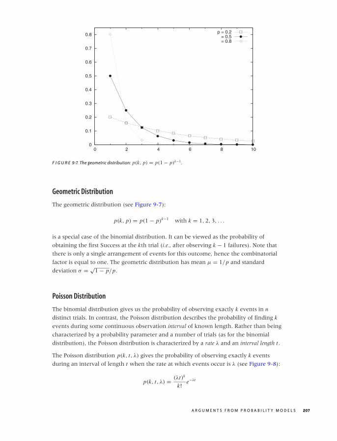
O’Reilly-5980006 master October 28, 2010 20:57
0
0.1
0.2
0.3
0.4
0.5
0.6
0.7
0.8
0 2 4 6 8 10
p = 0.2 = 0.5 = 0.8
F I G U R E 9-7. The geometric distribution: p(k, p) = p(1 − p)k−1.
Geometric Distribution
The geometric distribution (see Figure 9-7):
p(k, p) = p(1 − p)k−1 with k = 1, 2, 3, . . .
is a special case of the binomial distribution. It can be viewed as the probability of
obtaining the first Success at the kth trial (i.e., after observing k − 1 failures). Note that
there is only a single arrangement of events for this outcome, hence the combinatorial
factor is equal to one. The geometric distribution has mean μ = 1/p and standard
deviation σ = √1 − p/p.
Poisson Distribution
The binomial distribution gives us the probability of observing exactly k events in n
distinct trials. In contrast, the Poisson distribution describes the probability of finding k
events during some continuous observation interval of known length. Rather than being
characterized by a probability parameter and a number of trials (as for the binomial
distribution), the Poisson distribution is characterized by a rate λ and an interval length t .
The Poisson distribution p(k, t, λ) gives the probability of observing exactly k events
during an interval of length t when the rate at which events occur is λ (see Figure 9-8):
p(k, t, λ) = (λt)k
k!e−λt
A R G U M E N T S F R O M P R O B A B I L I T Y M O D E L S 207
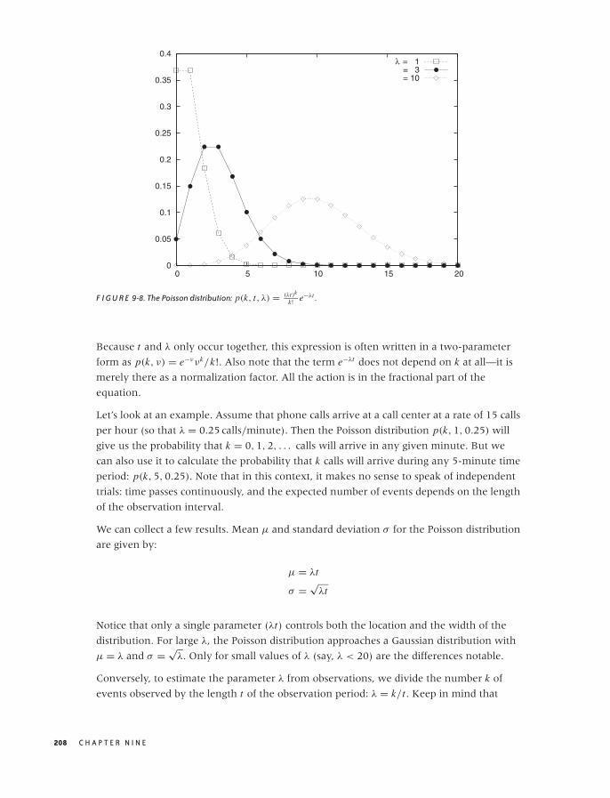
O’Reilly-5980006 master October 28, 2010 20:57
0
0.05
0.1
0.15
0.2
0.25
0.3
0.35
0.4
0 5 10 15 20
λ = 1 = 3 = 10
F I G U R E 9-8. The Poisson distribution: p(k, t, λ) = (λt)k
k! e−λt .
Because t and λ only occur together, this expression is often written in a two-parameter
form as p(k, ν) = e−ννk/k!. Also note that the term e−λt does not depend on k at all—it is
merely there as a normalization factor. All the action is in the fractional part of the
equation.
Let’s look at an example. Assume that phone calls arrive at a call center at a rate of 15 calls
per hour (so that λ = 0.25 calls/minute). Then the Poisson distribution p(k, 1, 0.25) will
give us the probability that k = 0, 1, 2, . . . calls will arrive in any given minute. But we
can also use it to calculate the probability that k calls will arrive during any 5-minute time
period: p(k, 5, 0.25). Note that in this context, it makes no sense to speak of independent
trials: time passes continuously, and the expected number of events depends on the length
of the observation interval.
We can collect a few results. Mean μ and standard deviation σ for the Poisson distribution
are given by:
μ = λt
σ =√
λt
Notice that only a single parameter (λt) controls both the location and the width of the
distribution. For large λ, the Poisson distribution approaches a Gaussian distribution with
μ = λ and σ = √λ. Only for small values of λ (say, λ < 20) are the differences notable.
Conversely, to estimate the parameter λ from observations, we divide the number k of
events observed by the length t of the observation period: λ = k/t . Keep in mind that
208 C H A P T E R N I N E
O’Reilly-5980006 master October 28, 2010 20:57
when evaluating the formula for the Poisson distribution, the rate λ and the length t of
the interval of interest must be of compatible units. To find the probability of k calls over 6
minutes in our call center example above, we can either use t = 6 minutes and
λ = 0.25 calls per minute or t = 0.1 hours and λ = 15 calls per hour, but we cannot mix
them. (Also note that 6 · 0.25 = 0.1 · 15 = 1.5, as it should.)
The Poisson distribution is appropriate for processes in which discrete events occur
independently and at a constant rate: calls to a call center, misprints in a manuscript,
traffic accidents, and so on. However, you have to be careful: it applies only if you can
identify a rate at which events occur and if you are interested specifically in the number of
events that occur during intervals of varying length. (You cannot expect every histogram
to follow a Poisson distribution just because “we are counting events.”)
Log-Normal Distribution
Some quantities are inherently asymmetrical. Consider, for example, the time it takes
people to complete a certain task: because everyone is different, we expect a distribution
of values. However, all values are necessarily positive (since times cannot be negative).
Moreover, we can expect a particular shape of the distribution: there will be some
minimum time that nobody can beat, then a small group of very fast champions, a peak at
the most typical completion time, and finally a long tail of stragglers. Clearly, such a
distribution will not be well described by a Gaussian, which is defined for both positive
and negative values of x , is symmetric, and has short tails!
The log-normal distribution is an example of an asymmetric distribution that is suitable
for such cases. It is related to the Gaussian: a quantity follows the log-normal distribution
if its logarithm is distributed according to a Gaussian.
The probability density for the log-normal distribution looks like this:
p(x; μ, σ) = 1√2πσ x
exp
(−1
2
(log(x/μ)
σ
)2)
(The additional factor of x in the denominator stems from the Jacobian in the change of
variables from x to log x .) You may often find the log-normal distribution written slightly
differently:
p(x; μ, σ ) = 1√2πσ x
exp
(−1
2
(log(x) − μ
σ
)2)
This is the same once you realize that log(x/μ) = log(x) − log(μ) and make the
identification μ = log(μ). The first form is much better because it expresses clearly that μ
is the typical scale of the problem. It also ensures that the argument of the logarithm is
dimensionless (as it must be).
A R G U M E N T S F R O M P R O B A B I L I T Y M O D E L S 209
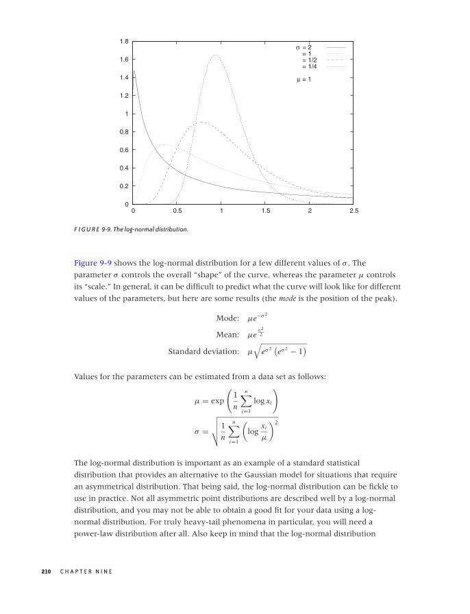
O’Reilly-5980006 master October 28, 2010 20:57
0
0.2
0.4
0.6
0.8
1
1.2
1.4
1.6
1.8
0 0.5 1 1.5 2 2.5
σ = 2 = 1 = 1/2 = 1/4
μ = 1
F I G U R E 9-9. The log-normal distribution.
Figure 9-9 shows the log-normal distribution for a few different values of σ . The
parameter σ controls the overall “shape” of the curve, whereas the parameter μ controls
its “scale.” In general, it can be difficult to predict what the curve will look like for different
values of the parameters, but here are some results (the mode is the position of the peak).
Mode: μe−σ2
Mean: μeσ22
Standard deviation: μ
√eσ2
(eσ2 − 1
)
Values for the parameters can be estimated from a data set as follows:
μ = exp
(1
n
n∑
i=1
log xi
)
σ =√√√√1
n
n∑
i=1
(log
xi
μ
)2
The log-normal distribution is important as an example of a standard statistical
distribution that provides an alternative to the Gaussian model for situations that require
an asymmetrical distribution. That being said, the log-normal distribution can be fickle to
use in practice. Not all asymmetric point distributions are described well by a log-normal
distribution, and you may not be able to obtain a good fit for your data using a log-
normal distribution. For truly heavy-tail phenomena in particular, you will need a
power-law distribution after all. Also keep in mind that the log-normal distribution
210 C H A P T E R N I N E

O’Reilly-5980006 master October 28, 2010 20:57
approaches the Gaussian as σ becomes small compared to μ (i.e., σ/μ � 1), at which
point it becomes easier to work with the familiar Gaussian directly.
Special-Purpose Distributions
Many additional distributions have been defined and studied. Some, such as the gamma
distribution, are mostly of theoretical importance, whereas others—such as the
chi-square, t , and F distributions—are are at the core of classical, frequentist statistics (we
will encounter them again in Chapter 10). Still others have been developed to model
specific scenarios occurring in practical applications—especially in reliability engineering,
where the objective is to make predictions about likely failure rates and survival times.
I just want to mention in passing a few terms that you may encounter. The Weibull
distribution is used to express the probability that a device will fail after a certain time.
Like the log-normal distribution, it depends on both a shape and a scale parameter.
Depending on the value of the shape parameter, the Weibull distribution can be used to
model different failure modes. These include “infant mortality” scenarios, where devices
are more likely to fail early but the failure rate declines over time as defective items
disappear from the population, and “fatigue death” scenarios, where the failure rate rises
over time as items age.
Yet another set of distributions goes by the name of extreme-value or Gumbel distributions.
They can be used to obtain the probability that the smallest (or largest) value of some
random quantity will be of a certain size. In other words, they answer the question: what
is the probability that the largest element in a set of random numbers is precisely x?
Quite intentionally, I don’t give formulas for these distributions here. They are rather
advanced and specialized tools, and if you want to use them, you will need to consult the
appropriate references. However, the important point to take away here is that, for many
typical scenarios involving random quantities, people have developed explicit models and
studied their properties; hence a little research may well turn up a solution to whatever
your current problem is.
Optional: Case Study—Unique Visitors over Time
To put some of the ideas introduced in the last two chapters into practice, let’s look at an
example that is a bit more involved. We begin with a probabilistic argument and use it to
develop a mean-field model, which in turn will lead to a differential equation that we
proceed to solve for our final answer. This example demonstrates how all the different
ideas we have been introducing in the last few chapter can fit together to tackle more
complicated problems.
Imagine you are running a website. Users visit this website every day of the month at a
rate that is roughly constant. We can also assume that we are able to track the identity of
A R G U M E N T S F R O M P R O B A B I L I T Y M O D E L S 211

O’Reilly-5980006 master October 28, 2010 20:57
these users (through a cookie or something like that). By studying those cookies, we can
see that some users visit the site only once in any given month while others visit it several
times. We are interested in the number of unique users for the month and, in particular,
how this number develops over the course of the month. (The number of unique visitors
is a key metric in Internet advertising, for instance.)
The essential difficulty is that some users visit several times during the month, and so the
number of unique visitors is smaller than the total number of visitors. Furthermore, we
will observe a “saturation effect”: on the first day, almost every user is new; but on the last
day of the month, we can expect to have seen many of the visitors earlier in the month
already.
We would like to develop some understanding for the number of unique visitors that can
be expected for each day of the month (e.g., to monitor whether we are on track to meet
some monthly goal for the number of unique visitors). To make progress, we need to
develop a model.
To see more clearly, we use the following idealization, which is equivalent to the original
problem. Consider an urn that contains N identical tokens (total number of potential
visitors). At each turn (every day), we draw k tokens randomly from the urn (average
number of visitors per day). We mark all of the drawn tokens to indicate that we have
“seen” them and then place them back into the urn. This cycle is repeated for every day of
the month.
Because at each turn we mark all unmarked tokens from the random sample drawn at
this turn, the number of marked tokens in the urn will increase over time. Because each
token is marked at most once, the number of marked tokens in the urn at the end of the
month is the number of unique visitors that have visited during that time period.
Phrased this way, the process can be modeled as a sequence of Bernoulli trials. We define
drawing an already marked token as Success. Because the number of marked tokens in
the urn is increasing, the success probability p will change over time. The relevant
variables are:
N Total number of tokens in urn
k Number of tokens drawn at each turn
m(t) Number of already-marked tokens drawn at turn t
n(t) Total number of marked tokens in urn at time t
p(t) = n(t)
NProbability of drawing an already-marked token at turn t
Each day consists of a new Bernoulli trial in which k tokens are drawn from the urn.
However, because the number of marked tokens in the urn increases every day, the
probability p(t) is different every day.
212 C H A P T E R N I N E
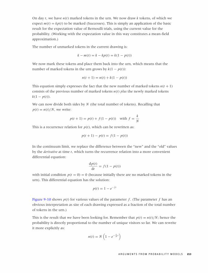
O’Reilly-5980006 master October 28, 2010 20:57
On day t , we have n(t) marked tokens in the urn. We now draw k tokens, of which we
expect m(t) = kp(t) to be marked (Successes). This is simply an application of the basic
result for the expectation value of Bernoulli trials, using the current value for the
probability. (Working with the expectation value in this way constitutes a mean-field
approximation.)
The number of unmarked tokens in the current drawing is:
k − m(t) = k − kp(t) = k(1 − p(t))
We now mark these tokens and place them back into the urn, which means that the
number of marked tokens in the urn grows by k(1 − p(t)):
n(t + 1) = n(t) + k(1 − p(t))
This equation simply expresses the fact that the new number of marked tokens n(t + 1)
consists of the previous number of marked tokens n(t) plus the newly marked tokens
k(1 − p(t)).
We can now divide both sides by N (the total number of tokens). Recalling that
p(t) = n(t)/N , we write:
p(t + 1) = p(t) + f (1 − p(t)) with f = k
N
This is a recurrence relation for p(t), which can be rewritten as:
p(t + 1) − p(t) = f (1 − p(t))
In the continuum limit, we replace the difference between the “new” and the “old” values
by the derivative at time t , which turns the recurrence relation into a more convenient
differential equation:
dp(t)
dt= f (1 − p(t))
with initial condition p(t = 0) = 0 (because initially there are no marked tokens in the
urn). This differential equation has the solution:
p(t) = 1 − e− f t
Figure 9-10 shows p(t) for various values of the parameter f . (The parameter f has an
obvious interpretation as size of each drawing expressed as a fraction of the total number
of tokens in the urn.)
This is the result that we have been looking for. Remember that p(t) = n(t)/N ; hence the
probability is directly proportional to the number of unique visitors so far. We can rewrite
it more explicitly as:
n(t) = N(
1 − e− kN t
)
A R G U M E N T S F R O M P R O B A B I L I T Y M O D E L S 213
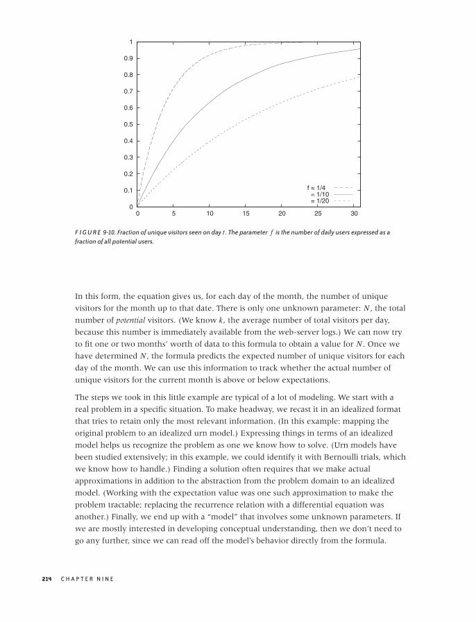
O’Reilly-5980006 master October 28, 2010 20:57
0
0.1
0.2
0.3
0.4
0.5
0.6
0.7
0.8
0.9
1
0 5 10 15 20 25 30
f = 1/4 = 1/10 = 1/20
F I G U R E 9-10. Fraction of unique visitors seen on day t . The parameter f is the number of daily users expressed as afraction of all potential users.
In this form, the equation gives us, for each day of the month, the number of unique
visitors for the month up to that date. There is only one unknown parameter: N , the total
number of potential visitors. (We know k, the average number of total visitors per day,
because this number is immediately available from the web-server logs.) We can now try
to fit one or two months’ worth of data to this formula to obtain a value for N . Once we
have determined N , the formula predicts the expected number of unique visitors for each
day of the month. We can use this information to track whether the actual number of
unique visitors for the current month is above or below expectations.
The steps we took in this little example are typical of a lot of modeling. We start with a
real problem in a specific situation. To make headway, we recast it in an idealized format
that tries to retain only the most relevant information. (In this example: mapping the
original problem to an idealized urn model.) Expressing things in terms of an idealized
model helps us recognize the problem as one we know how to solve. (Urn models have
been studied extensively; in this example, we could identify it with Bernoulli trials, which
we know how to handle.) Finding a solution often requires that we make actual
approximations in addition to the abstraction from the problem domain to an idealized
model. (Working with the expectation value was one such approximation to make the
problem tractable; replacing the recurrence relation with a differential equation was
another.) Finally, we end up with a “model” that involves some unknown parameters. If
we are mostly interested in developing conceptual understanding, then we don’t need to
go any further, since we can read off the model’s behavior directly from the formula.
214 C H A P T E R N I N E
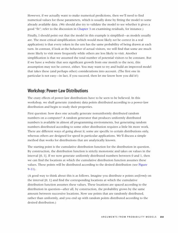
O’Reilly-5980006 master October 28, 2010 20:57
However, if we actually want to make numerical predictions, then we’ll need to find
numerical values for those parameters, which is usually done by fitting the model to some
already available data. (We should also try to validate the model to see whether it gives a
good “fit”; refer to the discussion in Chapter 3 on examining residuals, for instance.)
Finally, I should point out that the model in this example is simplified—as models usually
are. The most critical simplification (which would most likely not be correct in a real
application) is that every token in the urn has the same probability of being drawn at each
turn. In contrast, if look at the behavior of actual visitors, we will find that some are much
more likely to visit more frequently while others are less likely to visit. Another
simplification is that we assumed the total number of potential visitors to be constant. But
if we have a website that sees significant growth from one month to the next, this
assumption may not be correct, either. You may want to try and build an improved model
that takes these (and perhaps other) considerations into account. (The first one in
particular is not easy—in fact, if you succeed, then let me know how you did it!)
Workshop: Power-Law Distributions
The crazy effects of power-law distributions have to be seen to be believed. In this
workshop, we shall generate (random) data points distributed according to a power-law
distribution and begin to study their properties.
First question: how does one actually generate nonuniformly distributed random
numbers on a computer? A random generator that produces uniformly distributed
numbers is available in almost all programming environments, but generating random
numbers distributed according to some other distribution requires a little bit more work.
There are different ways of going about it; some are specific to certain distributions only,
whereas others are designed for speed in particular applications. We’ll discuss a simple
method that works for distributions that are analytically known.
The starting point is the cumulative distribution function for the distribution in question.
By construction, the distribution function is strictly monotonic and takes on values in the
interval [0, 1]. If we now generate uniformly distributed numbers between 0 and 1, then
we can find the locations at which the cumulative distribution function assumes these
values. These points will be distributed according to the desired distribution (see Figure
9-11).
(A good way to think about this is as follows. Imagine you distribute n points uniformly on
the interval [0, 1] and find the corresponding locations at which the cumulative
distribution function assumes these values. These locations are spaced according to the
distribution in question—after all, by construction, the probability grows by the same
amount between successive locations. Now use points that are randomly distributed,
rather than uniformly, and you end up with random points distributed according to the
desired distribution.)
A R G U M E N T S F R O M P R O B A B I L I T Y M O D E L S 215
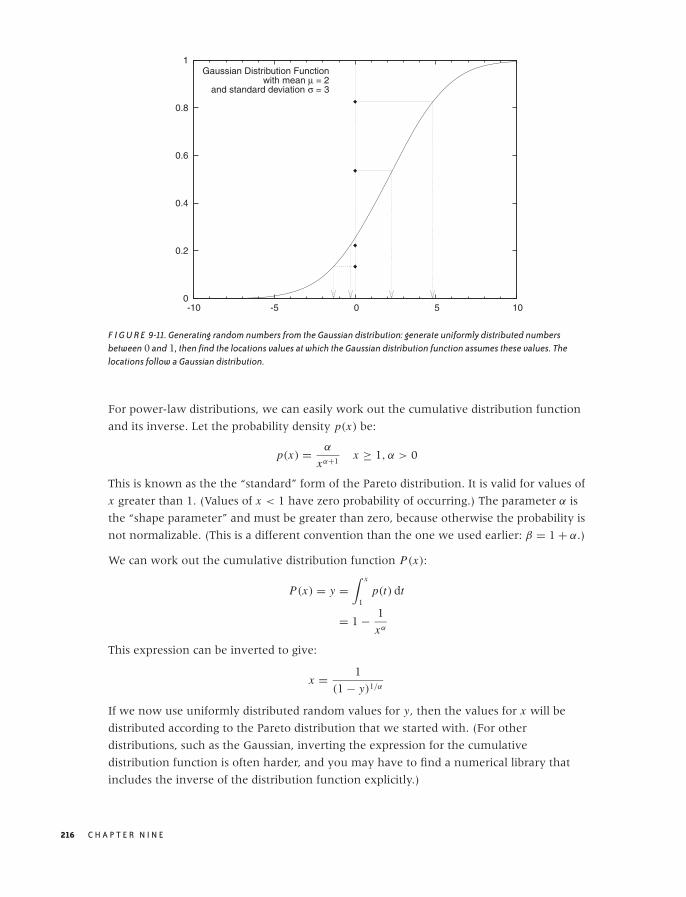
O’Reilly-5980006 master October 28, 2010 20:57
0
0.2
0.4
0.6
0.8
1
-10 -5 0 5 10
Gaussian Distribution Functionwith mean μ = 2
and standard deviation σ = 3
F I G U R E 9-11. Generating random numbers from the Gaussian distribution: generate uniformly distributed numbersbetween 0 and 1, then find the locations values at which the Gaussian distribution function assumes these values. Thelocations follow a Gaussian distribution.
For power-law distributions, we can easily work out the cumulative distribution function
and its inverse. Let the probability density p(x) be:
p(x) = α
xα+1x ≥ 1, α > 0
This is known as the the “standard” form of the Pareto distribution. It is valid for values of
x greater than 1. (Values of x < 1 have zero probability of occurring.) The parameter α is
the “shape parameter” and must be greater than zero, because otherwise the probability is
not normalizable. (This is a different convention than the one we used earlier: β = 1 + α.)
We can work out the cumulative distribution function P(x):
P(x) = y =∫ x
1p(t) dt
= 1 − 1
xα
This expression can be inverted to give:
x = 1
(1 − y)1/α
If we now use uniformly distributed random values for y, then the values for x will be
distributed according to the Pareto distribution that we started with. (For other
distributions, such as the Gaussian, inverting the expression for the cumulative
distribution function is often harder, and you may have to find a numerical library that
includes the inverse of the distribution function explicitly.)
216 C H A P T E R N I N E
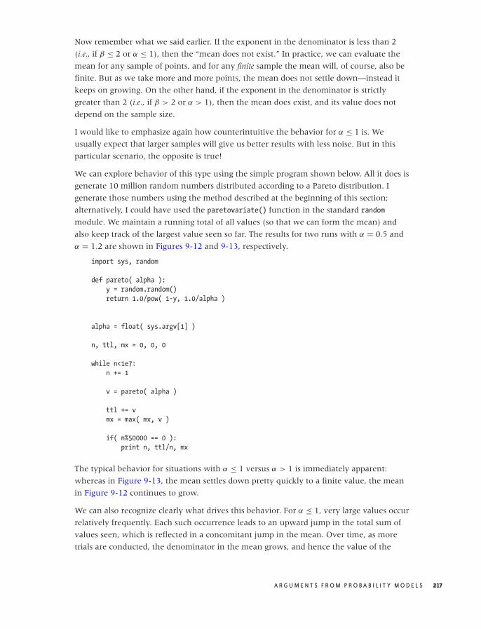
O’Reilly-5980006 master October 28, 2010 20:57
Now remember what we said earlier. If the exponent in the denominator is less than 2
(i.e., if β ≤ 2 or α ≤ 1), then the “mean does not exist.” In practice, we can evaluate the
mean for any sample of points, and for any finite sample the mean will, of course, also be
finite. But as we take more and more points, the mean does not settle down—instead it
keeps on growing. On the other hand, if the exponent in the denominator is strictly
greater than 2 (i.e., if β > 2 or α > 1), then the mean does exist, and its value does not
depend on the sample size.
I would like to emphasize again how counterintuitive the behavior for α ≤ 1 is. We
usually expect that larger samples will give us better results with less noise. But in this
particular scenario, the opposite is true!
We can explore behavior of this type using the simple program shown below. All it does is
generate 10 million random numbers distributed according to a Pareto distribution. I
generate those numbers using the method described at the beginning of this section;
alternatively, I could have used the paretovariate() function in the standard random
module. We maintain a running total of all values (so that we can form the mean) and
also keep track of the largest value seen so far. The results for two runs with α = 0.5 and
α = 1.2 are shown in Figures 9-12 and 9-13, respectively.
import sys, random
def pareto( alpha ):
y = random.random()
return 1.0/pow( 1-y, 1.0/alpha )
alpha = float( sys.argv[1] )
n, ttl, mx = 0, 0, 0
while n<1e7:
n += 1
v = pareto( alpha )
ttl += v
mx = max( mx, v )
if( n%50000 == 0 ):
print n, ttl/n, mx
The typical behavior for situations with α ≤ 1 versus α > 1 is immediately apparent:
whereas in Figure 9-13, the mean settles down pretty quickly to a finite value, the mean
in Figure 9-12 continues to grow.
We can also recognize clearly what drives this behavior. For α ≤ 1, very large values occur
relatively frequently. Each such occurrence leads to an upward jump in the total sum of
values seen, which is reflected in a concomitant jump in the mean. Over time, as more
trials are conducted, the denominator in the mean grows, and hence the value of the
A R G U M E N T S F R O M P R O B A B I L I T Y M O D E L S 217
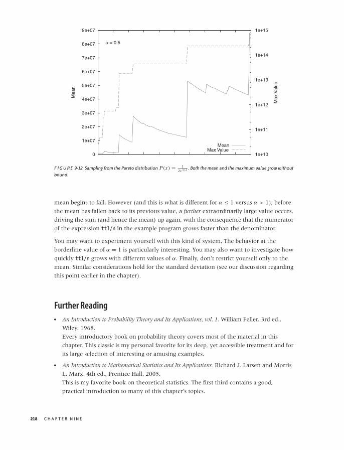
O’Reilly-5980006 master October 28, 2010 20:57
0
1e+07
2e+07
3e+07
4e+07
5e+07
6e+07
7e+07
8e+07
9e+07
1e+10
1e+11
1e+12
1e+13
1e+14
1e+15
Mea
n
Max
Val
ue
α = 0.5
MeanMax Value
F I G U R E 9-12. Sampling from the Pareto distribution P(x) = 12x3/2 . Both the mean and the maximum value grow without
bound.
mean begins to fall. However (and this is what is different for α ≤ 1 versus α > 1), before
the mean has fallen back to its previous value, a further extraordinarily large value occurs,
driving the sum (and hence the mean) up again, with the consequence that the numerator
of the expression ttl/n in the example program grows faster than the denominator.
You may want to experiment yourself with this kind of system. The behavior at the
borderline value of α = 1 is particularly interesting. You may also want to investigate how
quickly ttl/n grows with different values of α. Finally, don’t restrict yourself only to the
mean. Similar considerations hold for the standard deviation (see our discussion regarding
this point earlier in the chapter).
Further Reading• An Introduction to Probability Theory and Its Applications, vol. 1. William Feller. 3rd ed.,
Wiley. 1968.
Every introductory book on probability theory covers most of the material in this
chapter. This classic is my personal favorite for its deep, yet accessible treatment and for
its large selection of interesting or amusing examples.
• An Introduction to Mathematical Statistics and Its Applications. Richard J. Larsen and Morris
L. Marx. 4th ed., Prentice Hall. 2005.
This is my favorite book on theoretical statistics. The first third contains a good,
practical introduction to many of this chapter’s topics.
218 C H A P T E R N I N E

O’Reilly-5980006 master October 28, 2010 20:57
5
5.2
5.4
5.6
5.8
6
0
50,000
100,000
150,000
200,000
250,000
300,000
350,000
400,000
Mea
n
Max
Val
ue
α = 1.2
MeanMax Value
F I G U R E 9-13. Sampling from the Pareto distribution P(x) = 1.2x2.2 . Both the mean and the maximum reach a finite value
and retain it as we continue to make further drawings.
• NIST/SEMATECH e-Handbook of Statistical Methods. NIST.
http://www.itl.nist.gov/div898/handbook/. 2010.
This free ebook is made available by the National Institute for Standards and
Technology (NIST). There is a wealth of reliable, high-quality information here.
• Statistical Distributions. Merran Evans, Nicholas Hastings, and Brian Peacock. 3rd ed.,
Wiley. 2000.
This short and accessible reference includes basic information on 40 of the most useful
or important probability distributions. If you want to know what distributions exist and
what their properties are, this is a good place to start.
• “Power Laws, Pareto Distributions and Zipf’s Law.” M. E. J. Newman. Contemporary
Physics 46 (2005), p. 323.
This review paper provides a knowledgeable yet very readable introduction to the field
of power laws and heavy-tail phenomena. Highly recommended. (Versions of the
document can be found on the Web.)
• Modeling Complex Systems. Nino Boccara. 2nd ed., Springer. 2010.
Chapter 8 of this book provides a succinct and level-headed overview of the current
state of research into power-law phenomena.
A R G U M E N T S F R O M P R O B A B I L I T Y M O D E L S 219

O’Reilly-5980006 master October 28, 2010 20:57
O’Reilly-5980006 master October 28, 2010 20:59
C H A P T E R T E N
What You Really Need to KnowAbout Classical Statistics
BASIC CLASSICAL STATISTICS HAS ALWAYS BEEN SOMEWHAT OF A MYSTERY TO ME: A TOPIC FULL OF OBSCURE
notions, such as t-tests and p-values, and confusing statements like “we fail to reject the
null hypothesis”—which I can read several times and still not know if it is saying yes, no,
or maybe.* To top it all off, all this formidable machinery is then used to draw conclusions
that don’t seem to be all that interesting—it’s usually something about whether the means
of two data sets are the same or different. Why would I care?
Eventually I figured it out, and I also figured out why the field seemed so obscure initially.
In this chapter, I want to explain what classical statistics does, why it is the way it is, and
what it is good for. This chapter does not attempt to teach you how to perform any of the
typical statistical methods: this would require a separate book. (I will make some
recommendations for further reading on this topic at the end of this chapter.) Instead, in
this chapter I will tell you what all these other books omit.
Let me take you on a trip. I hope you know where your towel is.
Genesis
To understand classical statistics, it is necessary to realize how it came about. The basic
statistical methods that we know today were developed in the late 19th and early 20th
centuries, mostly in Great Britain, by a very small group of people. Of those, one worked
*I am not alone—even professional statisticians have the same experience. See, for example, the prefaceof Bayesian Statistics. Peter M. Lee. Hodder & Arnold. 2004.
221

O’Reilly-5980006 master October 28, 2010 20:59
for the Guinness brewing company and another—the most influential one of
them—worked at an agricultural research lab (trying to increase crop yields and the like).
This bit of historical context tells us something about their working conditions and
primary challenges.
No computational capabilitiesAll computations had to be performed with paper and pencil.
No graphing capabilities, eitherAll graphs had to be generated with pencil, paper, and a ruler. (And complicated
graphs—such as those requiring prior transformations or calculations using the
data—were especially cumbersome.)
Very small and very expensive data setsData sets were small (often not more than four to five points) and could be obtained
only with great difficulty. (When it always takes a full growing season to generate a
new data set, you try very hard to make do with the data you already have!)
In other words, their situation was almost entirely the opposite of our situation today:
• Computational power that is essentially free (within reason)
• Interactive graphing and visualization capabilities on every desktop
• Often huge amounts of data
It should therefore come as no surprise that the methods developed by those early
researchers seem so out of place to us: they spent a great amount of effort and ingenuity
solving problems we simply no longer have! This realization goes a long way toward
explaining why classical statistics is the way it is and why it often seems so strange to us
today.
By contrast, modern statistics is very different. It places greater emphasis on nonparametric
methods and Bayesian reasoning, and it leverages current computational capabilities
through simulation and resampling methods. The book by Larry Wasserman (see the
recommended reading at the end of this chapter) provides an overview of a more
contemporary point of view.
However, almost all introductory statistics books—that is, those books one is likely to pick
up as a beginner—continue to limit themselves to the same selection of slightly stale
topics. Why is that? I believe it is a combination of institutional inertia together with the
expectations of the “end-user” community. Statistics has always been a support science for
other fields: originally agriculture but also medicine, psychology, sociology, and others.
And these fields, which merely apply statistics but are not engaged in actively developing
it themselves, continue to operate largely using classical methods. However, the
machine-learning community—with its roots in computer science but great demand for
statistical methods—provides a welcome push for the widespread adoption of more
modern methods.
222 C H A P T E R T E N
O’Reilly-5980006 master October 28, 2010 20:59
Keep this historical perspective in mind as we take a closer look at statistics in the rest of
this chapter.
Statistics Defined
All of statistics deals with the following scenario: we have a population—that is the set of
all possible outcomes. Typically, this set is large: all male U.S. citizens, for example, or all
possible web-server response times. Rather than dealing with the total population (which
might be impossible, infeasible, or merely inconvenient), we instead work with a sample.
A sample is a subset of the total population that is chosen so as to be representative of the
overall population. Now we may ask: what conclusions about the overall population can
we draw given one specific sample? It is this particular question that classical statistics
answers via a process known as statistical inference: properties of the population are
inferred from properties of a sample.
Intuitively, we do this kind of thing all the time. For example, given the heights of five
men (let’s say 178 cm, 180 cm, 179 cm, 178 cm, and 180 cm), we are immediately
comfortable calculating the average (which is 179 cm) and concluding that the “typical”
body size for all men in the population (not just the five in the sample!) is 179 cm, “more
or less.” This is where formal classical statistics comes in: it provides us with a way of
making the vague “more or less” statement precise and quantitative. Given the sample,
statistical reasoning allows us to make specific statements about the population, such as,
“We expect x percent of men to be between y and z cm tall,” or, “We expect fewer than x
percent of all men to be taller than y cm,” and so on.
Classical statistics is mostly concerned with two procedures: parameter estimation (or
“estimation” for short) and hypothesis testing. Parameter estimation works as follows. We
assume that the population is described by some distribution—for example, the Gaussian:
N (x; μ, σ) = 1√2πσ
exp
(−1
2
(x − μ
σ
)2)
and we seek to estimate values for the parameters (μ and σ this case) from a sample. Note
that once we have estimates for the parameters, the distribution describing the population
is fully determined, and we can (at least in principle) calculate any desired property of the
population directly from that distribution. Parameter estimation comes in two flavors:
point estimation and interval estimation. The first just gives us a specific value for the
parameter, whereas the second gives us a range of values that is supposed to contain the
true value.
Compared with parameter estimation, hypothesis testing is the weirder of the two
procedures. It does not attempt to quantify the size of an effect; it merely tries to
determine whether there is any effect at all. Note well that this is a largely theoretical
W H AT Y O U R E A L LY N E E D T O K N O W A B O U T C L A S S I C A L S TAT I S T I C S 223
O’Reilly-5980006 master October 28, 2010 20:59
argument; from a practical point of view, the existence of an effect cannot be separated
entirely from its size. We will come back to this point later, but first let’s understand how
hypothesis testing works.
Suppose we have developed a new fertilizer but don’t know yet whether it actually
works. Now we run an experiment: we divide a plot of land in two and treat the crops on
half of the plot with the new fertilizer. Finally, we compare the yields: are they different?
The specific amounts of the yield will almost surely differ, but is this difference due to the
treatment or is it merely a chance fluctuation? Hypothesis testing helps us decide how
large the difference needs to be in order to be statistically significant.
Formal hypothesis testing now proceeds as follows. First we set up the two hypotheses
between which we want to decide: the null hypothesis (no effect; that is there is no
difference between the two experiments) and the alternate hypothesis (there is an effect so
that the two experiments have significantly different outcomes). If the difference between
the outcomes of the two experiments is statistically significant, then we have sufficient
evidence to “reject the null hypothesis,” otherwise we “fail to reject the null hypothesis.”
In other words: if the outcomes are not sufficiently different, then we retain the null
hypothesis that there is no effect.
This convoluted, indirect line of reasoning is required because, strictly speaking, no
hypothesis can ever be proved correct by empirical means. If we find evidence against
a hypothesis, then we can surely reject it. But if we don’t find evidence against the
hypothesis, then we retain the hypothesis—at least until we do find evidence against it
(which may possibly never happen, in which case we retain the hypothesis indefinitely).
This, then, is the process by which hypothesis testing proceeds: because we can never
prove that a treatment was successful, we instead invent a contradicting statement that
we can prove to be false. The price we pay for this double negative (“it’s not true that there
is no effect”) is that the test results mean exactly the opposite from what they seem to be
saying: “retaining the null hypothesis,” which sounds like a success, means that the
treatment had no effect; whereas “rejecting the null hypothesis” means that the treatment
did work. This is the first problem with hypothesis testing: it involves a convoluted,
indirect line of reasoning and a terminology that seems to be saying the exact opposite
from what it means.
But there is another problem with hypothesis testing: it makes a statement that has
almost no practical meaning! In reducing the outcome of an experiment to the Boolean
choice between “significant” and “not significant,” it creates an artificial dichotomy that is
not an appropriate view of reality. Experimental outcomes are not either strictly
significant or strictly nonsignificant: they form a continuum. In order to judge the results
of an experiment, we need to know where along the continuum the experimental
outcome falls and how robust the estimate is. If we have this information, we can decide
how to interpret the experimental result and what importance to attach to it.
224 C H A P T E R T E N

O’Reilly-5980006 master October 28, 2010 20:59
Classical hypothesis testing exhibits two well-known traps. The first is that an
experimental outcome that is marginally outside the statistical significance level abruptly
changes the interpretation of the experiment from “significant” to “not significant”—a
discontinuity in interpretation that is not borne out by the minimal change in the actual
outcome of the experiment. The other problem is that almost any effect, no matter how
small, can be made “significant” by increasing the sample size. This can lead to
“statistically significant” results that nevertheless are too small to be of any practical
importance. All of this is compounded by the arbitrariness of the chosen “significance
level” (typically 5 percent). Why not 4.99 percent? Or 1 percent, or 0.1 percent? This
seems to render the whole hypothesis testing machinery (at least as generally practiced)
fundamentally inconsistent: on the one hand, we introduce an absolutely sharp cutoff
into our interpretation of reality; and on the other hand, we choose the position of this
cutoff in an arbitrary manner. This does not seem right.
(There is a third trap: at the 5 percent significance level, you can expect 1 out of 20 tests to
give the wrong result. This means that if you run enough tests, you will always find one
that supports whatever conclusion you want to draw. This practice is known as data
dredging and is strongly frowned upon.)
Moreover, in any practical situation, the actual size of the effect is so much more
important than its sheer existence. For this reason, hypothesis testing often simply misses
the point. A project I recently worked on provides an example of this. The question arose
as to whether two events were statistically independent (this is a form of hypothesis
testing). But, for the decision that was ultimately made, it did not matter whether the
events truly were independent (they were not) but that treating them as independent
made no measurable difference to the company’s balance sheet.
Hypothesis testing has its place but typically in rather abstract or theoretical situations
where the mere existence of an effect constitutes an important discovery (“Is this coin
loaded?” “Are people more likely to die a few days after their birthdays than before?”). If
this describes your situation, then you will quite naturally employ hypothesis tests.
However, if the size of an effect is of interest to you, then you should feel free to ignore
tests altogether and instead work out an estimate of the effect—including its confidence
interval. This will give you the information that you need. You are not “doing it wrong”
just because you haven’t performed a significance test somewhere along the way.
Finally, I’d like to point out that the statistics community itself has become uneasy with
the emphasis that is placed on tests in some fields (notably medicine but also social
sciences). Historically, hypothesis testing was invented to deal with sample sizes so small
(possibly containing only four or five events) that drawing any conclusion at all was a
challenge. In such cases, the broad distinction between “effect” and “no effect” was about
the best one could do. If interval estimates are available, there is no reason to use
statistical tests. The Wikipedia entry on p-values (explained below) provides some starting
points to the controversy.
W H AT Y O U R E A L LY N E E D T O K N O W A B O U T C L A S S I C A L S TAT I S T I C S 225
O’Reilly-5980006 master October 28, 2010 20:59
I have devoted quite a bit of space to a topic that may not seem especially relevant.
However, hypothesis tests feature so large in introductory statistics books and courses
and, at the same time, are so obscure and counterintuitive, that I found it important to
provide some background. In the next section, we will take a more detailed look at some
of the concepts and terminology that you are likely to find in introductory (or not-so-
introductory) statistics books and courses.
Statistics Explained
In Chapter 9, we already encountered several well-known probability distributions,
including the binomial (used for trials resulting in Success or Failure), the Poisson
(applicable in situations where events are evenly distributed according to some density),
and the ubiquitous Normal, or Gaussian, distribution. All of these distributions describe
real-world, observable phenomena.
In addition, classical statistics uses several distributions that describe the distribution of
certain quantities that are not observed but calculated. These distributions are not (or not
usually) used to describe events in the real world. Instead, they describe how the
outcomes of specific typical calculations involving random quantities will be distributed.
There are four of these distributions, and they are known as sampling distributions.
The first of these (and the only one having much use outside of theoretical statistics) is the
Gaussian distribution. As a sampling distribution, it is of interest because we already know
that it describes the distribution of a sum of independent, identically distributed random
variables. In other words, if X1, X2, . . . , Xn are random variables, then
Z = X1 + X2 + · · · + Xn will be normally distributed and (because we can divide by a
constant) the average m = (X1 + X2 + · · · + Xn)/n will also follow a Gaussian. It is this last
property that makes the Gaussian important as a sampling distribution: it describes the
distribution of averages. One caveat: to arrive at a closed formula for the Gaussian, we need
to know the variance (i.e., the width) of the distribution from which the individual Xi are
drawn. For most practical situations this is not a realistic requirement, and in a moment
we will discuss what to do if the variance is not known.
The second sampling distribution is the chi-square (χ2) distribution. It describes the
distribution of the sum of squares of independent, identically distributed Gaussian random
variables. Thus, if X1, X2, . . . , Xn are Gaussian random variables with unit variance, then
U = X21 + X2
2 + · · · + X2n will follow a chi-square distribution. Why should we care?
Because we form this kind of sum every time we calculate the variance. (Recall that the
variance is defined as 1n
∑(xi − m)2.) Hence, the chi-square distribution is used to describe
the distribution of variances. The number n of elements in the sum is referred to as the
number of degrees of freedom of the chi-square distribution, and it is an additional parameter
we need to know to evaluate the distribution numerically.
226 C H A P T E R T E N

O’Reilly-5980006 master October 28, 2010 20:59
The third sampling distribution describes the behavior of the ratio T of a normally
(Gaussian) distributed random variable Z and a chi-square-distributed random variable U .
This distribution is the famous Student t distribution. Specifically, let Z be distributed
according to the standard Gaussian distribution and U according to the chi-square
distribution with n degrees of freedom. Then T = Z/√
U/n is distributed according to the t
distribution with n degrees of freedom. As it turns out, this is the correct formula to use
for the distribution of the average if the variance is not known but has to be determined from
the sample together with the average.
The t distribution is a symmetric, bell-shaped curve like the Gaussian but with fatter tails.
How fat the tails are depends on the number of degrees of freedom (i.e., on the number of
data points in the sample). As the number of degrees of freedom increases, the t
distribution becomes more and more like the Gaussian. In fact, for n larger than about 30,
the differences between them are negligible. This is an important point to keep in mind:
the distinction between the t distribution and the Gaussian matters only for small
samples—that is, samples containing less than approximately 30 data points. For larger
samples, it is all right to use the Gaussian instead of the t distribution.
The last of the four sampling distributions is Fisher’s F distribution, which describes the
behavior of the ratio of two chi-square random variables. We care about this when we
want to compare two variances against each other (e.g., to test whether they are equal or
not).
These are the four sampling distributions of classical statistics. I will neither trouble you
with the formulas for these distributions, nor show you their graphs—you can find them
in every statistics book. What is important here is to understand what they are describing
and why they are important. In short, if you have n independent but identically
distributed measurements, then the sampling distributions describe how the average, the
variance, and their ratios will be distributed. The sampling distributions therefore allow us
to reason about averages and variances. That’s why they are important and why statistics
books spend so much time on them.
One way to use the sampling distribution is to construct confidence intervals for an
estimate. Here is how it works. Suppose we have n observations. We can find the average
and variance of these measurements as well as the ratio of the two. Finally, we know that
the ratio is distributed according to the t distribution. Hence we can find the interval
that has a 95 percent probability of containing the true value (see Figure 10-1). The
boundaries of this range are the 95 percent confidence interval; that is, we expect the true
value to fall outside this confidence range in only 1 out 20 cases.
A similar concept can be applied to hypothesis testing, where sampling distributions are
often used to calculate so-called p-values. A p-value is an attempt to express the strength
of the evidence in a hypothesis test and, in so doing, to soften the sharp binary distinction
W H AT Y O U R E A L LY N E E D T O K N O W A B O U T C L A S S I C A L S TAT I S T I C S 227
O’Reilly-5980006 master October 28, 2010 20:59
95% Confidence Interval
95% of Area
F I G U R E 10-1. The shaded area contains 95 percent of the area under the curve; the boundaries of the shaded region arethe bounds on the 95 percent confidence interval.
between significant and not significant outcomes mentioned earlier. A p-value is the
probability of obtaining a value as (or more) extreme than the one actually observed under the
assumption that the null hypothesis is true (see Figure 10-2). In other words, if the null
hypothesis is that there is no effect, and if the observed effect size is x , then the p-value is
the probability of observing an effect at least as large as x . Obviously, a large effect is
improbable (small p-value) if the null hypothesis (zero effect) is true; hence a small
p-value is considered strong evidence against the null hypothesis. However, a p-value is
not “the probability that the null hypothesis is true”—such an interpretation (although
appealing!) is incorrect. The p-value is the probability of obtaining an effect as large or
larger than the observed one if the null hypothesis is true. (Classical statistics does not
make probability statements about the truth of hypotheses. Doing so would put us into
the realm of Bayesian statistics, a topic we will discuss toward the end of this chapter.)
By the way, if you are thinking that this approach to hypothesis testing—with its sliding
p-values—is quite different from the cut-and-dried significant–not significant approach
discussed earlier, then you are right. Historically, two competing theories of significance
tests have been developed and have generated quite a bit of controversy; even today they
sit a little awkwardly next to each other. (The approach based on sliding p-values that
need to be interpreted by the researcher is due to Fisher; the decision-rule approach was
developed by Pearson and Neyman.) But enough, already. You can consult any statistics
book if you want to know more details.
228 C H A P T E R T E N
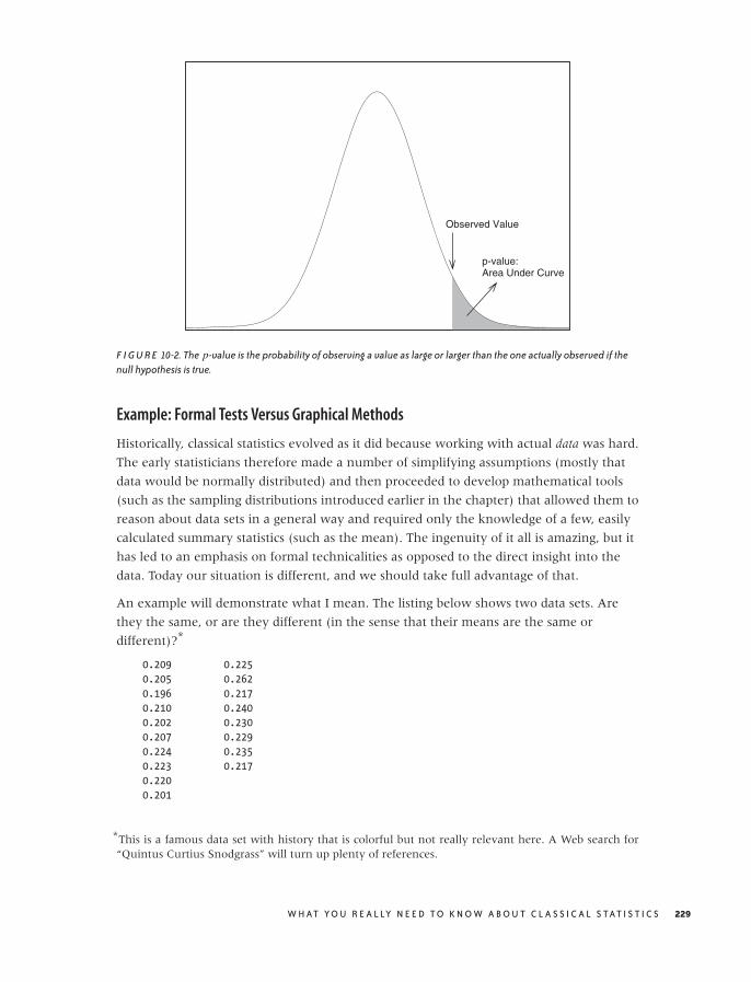
O’Reilly-5980006 master October 28, 2010 20:59
Observed Value
p-value:Area Under Curve
F I G U R E 10-2. The p-value is the probability of observing a value as large or larger than the one actually observed if thenull hypothesis is true.
Example: Formal Tests Versus Graphical Methods
Historically, classical statistics evolved as it did because working with actual data was hard.
The early statisticians therefore made a number of simplifying assumptions (mostly that
data would be normally distributed) and then proceeded to develop mathematical tools
(such as the sampling distributions introduced earlier in the chapter) that allowed them to
reason about data sets in a general way and required only the knowledge of a few, easily
calculated summary statistics (such as the mean). The ingenuity of it all is amazing, but it
has led to an emphasis on formal technicalities as opposed to the direct insight into the
data. Today our situation is different, and we should take full advantage of that.
An example will demonstrate what I mean. The listing below shows two data sets. Are
they the same, or are they different (in the sense that their means are the same or
different)?*
0.209 0.225
0.205 0.262
0.196 0.217
0.210 0.240
0.202 0.230
0.207 0.229
0.224 0.235
0.223 0.217
0.220
0.201
*This is a famous data set with history that is colorful but not really relevant here. A Web search for“Quintus Curtius Snodgrass” will turn up plenty of references.
W H AT Y O U R E A L LY N E E D T O K N O W A B O U T C L A S S I C A L S TAT I S T I C S 229
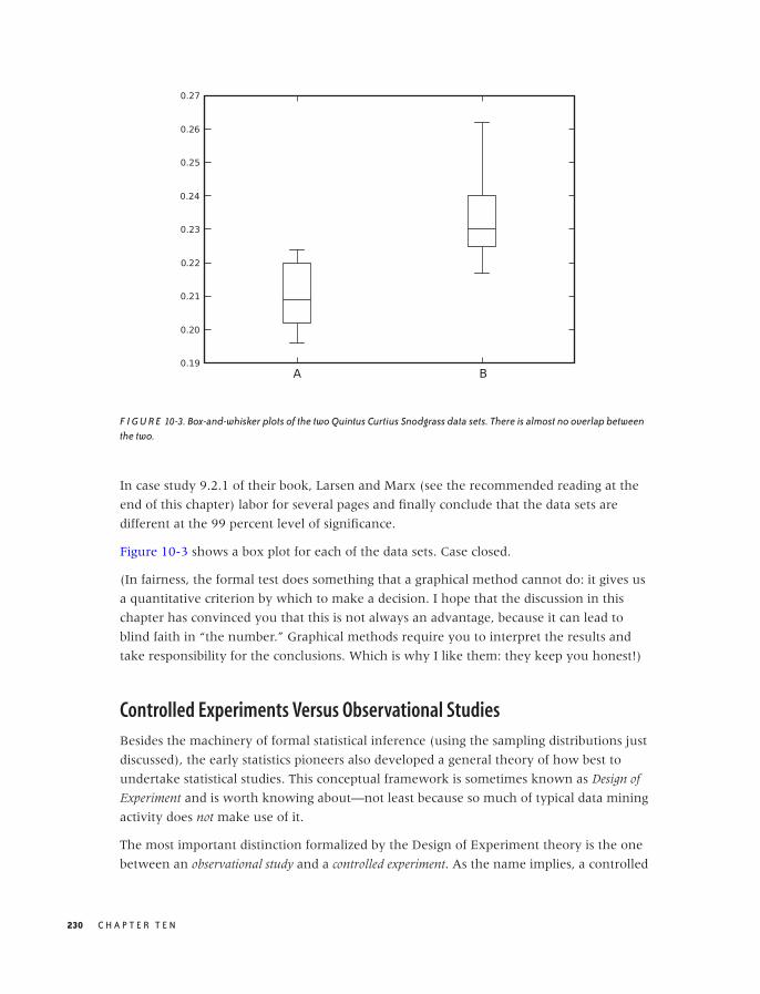
O’Reilly-5980006 master October 28, 2010 20:59
F I G U R E 10-3. Box-and-whisker plots of the two Quintus Curtius Snodgrass data sets. There is almost no overlap betweenthe two.
In case study 9.2.1 of their book, Larsen and Marx (see the recommended reading at the
end of this chapter) labor for several pages and finally conclude that the data sets are
different at the 99 percent level of significance.
Figure 10-3 shows a box plot for each of the data sets. Case closed.
(In fairness, the formal test does something that a graphical method cannot do: it gives us
a quantitative criterion by which to make a decision. I hope that the discussion in this
chapter has convinced you that this is not always an advantage, because it can lead to
blind faith in “the number.” Graphical methods require you to interpret the results and
take responsibility for the conclusions. Which is why I like them: they keep you honest!)
Controlled Experiments Versus Observational Studies
Besides the machinery of formal statistical inference (using the sampling distributions just
discussed), the early statistics pioneers also developed a general theory of how best to
undertake statistical studies. This conceptual framework is sometimes known as Design of
Experiment and is worth knowing about—not least because so much of typical data mining
activity does not make use of it.
The most important distinction formalized by the Design of Experiment theory is the one
between an observational study and a controlled experiment. As the name implies, a controlled
230 C H A P T E R T E N

O’Reilly-5980006 master October 28, 2010 20:59
experiment allows us to control many aspects of the experimental setup and procedure; in
particular, we control which treatment is applied to which experimental unit (we will
define these terms shortly). For example, in an agricultural experiment, we would treat
some (but not all) of the plots with a new fertilizer and then later compare the yields from
the two treatment groups. In contrast, with an observational study, we merely collect data
as it becomes (or already is) available. In particular, retrospective studies are always
observational (not controlled).
In a controlled experiment, we are able to control the “input” of an experiment (namely,
the application of a treatment) and therefore can draw much more powerful conclusions
from the output. In contrast to observational studies, a properly conducted controlled
experiment can provide strong support for cause-and-effect relationships between two
observations and can be used to rule out hidden (or confounding) causes. Observational
studies can merely suggest the existence of a relationship between two observations;
however, they can neither prove that one observation is caused by the other nor rule out
that additional (unobserved) factors have played a role.
The following (intentionally whimsical) example will serve to make the point. Let’s say
we have data that suggests that cities with many lawyers also have many espresso stands
and that cities with few lawyers have few espresso stands. In other words, there is strong
correlation between the two quantities. But what conclusions can we draw about the
causal relationship between the two? Are lawyers particularly high consumers of
expensive coffee? Or does caffeine make people more litigious? In short, there is no way
for us to determine what is cause and what is effect in this example. In contrast, if the
fertilized yields in the controlled agricultural experiment are higher than the yields from
the untreated control plots, we have strong reason to conclude that this effect is due to
the fertilizer treatment.
In addition to the desire to establish that the treatment indeed causes the effect, we also
want to rule out the possibility of additional, unobserved factors that might account for
the observed effect. Such factors, which influence the outcome of a study but are not
themselves part of it, are known as confounding (or “hidden” or “lurking”) variables. In our
agricultural example, differences in soil quality might have a significant influence on the
yield—perhaps a greater influence than the fertilizer. The spurious correlation between
the number of lawyers and espresso stands is almost certainly due to confounding: larger
cities have more of everything! (Even if we account for this effect and consider the per
capita density of lawyers and espresso stands, there is still a plausible confounding factor:
the income generated per head in the city.) In the next section, we will discuss how
randomization can help to remove the effect of confounding variables.
The distinction between controlled experiments and observational studies is most critical.
Many of the most controversial scientific or statistical issues involve observational studies.
In particular, reports in the mass media often concern studies that (inappropriately) draw
causal inferences from observational studies (about topics such as the relationship
W H AT Y O U R E A L LY N E E D T O K N O W A B O U T C L A S S I C A L S TAT I S T I C S 231

O’Reilly-5980006 master October 28, 2010 20:59
between gun laws and homicide rates, for example). Sometimes controlled experiments
are not possible, with the result that it becomes almost impossible to settle certain
questions once and for all. (The controversy around the connection between smoking and
lung cancer is a good example.)
In any case, make sure you understand clearly the difference between controlled and
observational studies, as well as the fundamental limitations of the latter!
Design of Experiments
In a controlled experiment, we divide the experimental units that constitute our sample into
two or more groups and then apply different treatments or treatment levels to the units in
each group. In our agricultural example, the plots correspond to the experimental units,
fertilization is the treatment, and the options “fertilizer” and “no fertilizer” are the
treatment levels.
Experimental design involves several techniques to improve the quality and reliability of
any conclusions drawn from a controlled experiment.
RandomizationRandomization means that treatments (or treatment levels) are assigned to
experimental units in a random fashion. Proper randomization suppresses systematic
errors. (If we assign fertilizer treatment randomly to plots, then we remove the
systematic influence of soil quality, which might otherwise be a confounding factor,
because high-quality and low-quality plots are now equally likely to receive the
fertilizer treatment.) Achieving true randomization is not as easy as it looks—I’ll come
back to this point shortly.
ReplicationReplication means that the same treatment is applied to more than one experimental
unit. Replication serves to reduce the variability of the results by averaging over a
larger sample. Replicates should be independent of each other, since nothing is gained
by repeating the same experiment on the same unit multiple times.
BlockingWe sometimes know (or at least strongly suspect) that not all experimental units are
equal. In this case, it may make sense to group equivalent experimental units into
“blocks” and then to treat each such block as a separate sample. For example, if we
know that plots A and C have poor soil quality and that B and D have better soil, then
we would form two blocks—consisting of (A, C) and (B, D), respectively—before
proceeding to make a randomized assignment of treatments for each block separately.
Similarly, if we know that web traffic is drastically different in the morning and the
afternoon, we should collect and analyze data for both time periods separately. This
also is a form of blocking.
FactorizationThe last of these techniques applies only to experiments involving several treatments
(e.g., irrigation and fertilization, to stay within our agricultural framework). The
232 C H A P T E R T E N

O’Reilly-5980006 master October 28, 2010 20:59
simplest experimental design would make only a single change at any given time, so
that we would observe yields with and without irrigation as well as with and without
fertilizer. But this approach misses the possibility that there are interactions between the
two treatments—for example, the effect of the fertilizer may be significantly higher
when coupled with improved irrigation. Therefore, in a factorial experiment all
possible combinations of treatment levels are tried. Even if a fully factorial experiment
is not possible (the number of combinations goes up quickly as the number of different
treatments grows), there are rules for how best to select combinations of treatment
levels for drawing optimal conclusions from the study.
Another term you may come across in this context is ANOVA (analysis of variance),
which is a standard way of summarizing results from controlled experiments. It
emphasizes the variations within each treatment group for easy comparison with the
variances between the treatments, so that we can determine whether the differences
between different treatments are significant compared to the variation within each
treatment group. ANOVA is a clever bookkeeping technique, but it does not introduce
particularly noteworthy new statistical concepts.
A word of warning: when conducting a controlled experiment, make sure that you apply
the techniques properly; in particular, beware of pseudo-randomization and
pseudo-replication.
Pseudo-randomization occurs if the assignment of treatments to experimental units is not
truly random. This can occur relatively easily, even if the assignment seems to be random.
For example, if you would like to try out two different drugs on lab rats, it is not sufficient
to “pick a rat at random” from the cage to administer the treatment. What does “at
random” mean? It might very well mean picking the most active rat first because it comes
to the cage door. Or maybe the least aggressive-looking one. In either case, there is a
systematic bias!
Here is another example, perhaps closer to home: the web-lab. Two different site designs
are to be presented to viewers, and the objective is to measure conversion rate or
click-throughs or some other metric. There are multiple servers, so we dedicate one of
them (chosen “at random”) to serve the pages with the new design. What’s wrong with
that?
Everything! Do you have any indication that web requests are assigned to servers in a
random fashion? Or might servers have, for example, a strong geographic bias? Let’s
assume the servers are behind some “big-IP” box that routes requests to the servers. How
is the routing conducted—randomly, or round-robin, or based on traffic intensity? Is the
routing smart, so that servers with slower response times get fewer hits? What about
sticky sessions, and what about the relationship between sticky sessions and slower
response times? Is the router reordering the incoming requests in some way? That’s a lot
of questions—questions that randomization is intended to avoid. In fact, you are not
running a controlled experiment at all: you are conducting an observational study!
W H AT Y O U R E A L LY N E E D T O K N O W A B O U T C L A S S I C A L S TAT I S T I C S 233
O’Reilly-5980006 master October 28, 2010 20:59
The only way that I know to run a controlled experiment is by deciding ahead of time
which experimental unit will receive which treatment. In the lab rat example, rats should
have been labeled and then treatments assigned to the labels using a (reliable) random
number generator or random table. In the web-server example it is harder to achieve true
randomization, because the experimental units are not known ahead of time. A simple
rule (e.g., show the new design to every nth request) won’t work, because there may be
significant correlation between subsequent requests. It’s not so easy.
Pseudo-replication occurs when experimental units are not truly independent. Injecting
the same rat five times with the same drug does not reduce variability! Similarly, running
the same query against a database could be misleading because of changing cache
utilization. And so on. In my experience, pseudo-replication is easier to spot and hence
tends to be less of a problem than pseudo-randomization.
Finally, I should mention one other term that often comes up in the context of proper
experimental process: blind and double-blind experiments. In a blind experiment, the
experimental unit should not know which treatment it receives; in a double-blind
experiment, the investigator—at the time of the experiment—does not know either. The
purpose of blind and double-blind experiments is to prevent the knowledge of the
treatment level from becoming a confounding factor. If people know that they have been
given a new drug, then this knowledge itself may contribute to their well-being. An
investigator who knows which field is receiving the fertilizer might weed that particular
field more vigorously and thereby introduce some invisible and unwanted bias. Blind
experiments play a huge role in the medical field but can also be important in other
contexts. However, I would like to emphasize that the question of “blindness” (which
concerns the experimental procedure) is a different issue than the Design of Experiment
prescriptions (which are intended to reduce statistical uncertainty).
Perspective
It is important to maintain an appropriate perspective on these matters.
In practice, many studies are observational, not controlled. Occasionally, this is a painful
loss and only due to the inability to conduct a proper controlled experiment (smoking and
lung cancer, again!). Nevertheless, observational studies can be of great value: one reason
is that they may be exploratory and discover new and previously unknown behavior. In
contrast, controlled experiments are always confirmatory in deciding between the
effectiveness or ineffectiveness of a specific “treatment.”
Observational studies can be used to derive predictive models even while setting aside the
question of causation. The machine-learning community, for instance, attempts to
develop classification algorithms that use descriptive attributes or features of the unit to
predict whether the unit belongs to a given class. They work entirely without controlled
experiments and have developed methods for quantifying the accuracy of their results.
(We will describe some in Chapter 18.)
234 C H A P T E R T E N
O’Reilly-5980006 master October 28, 2010 20:59
That being said, it is important to understand the limitations of observational studies—in
particular, their inability to support strong conclusions regarding cause-and-effect
relationships and their inability to rule out confounding factors. In the end, the power of
controlled experiments can be their limitation, because such experiments require a level
of control that limits their application.
Optional: Bayesian Statistics—The Other Point of View
There is an alternative approach to statistics that is based on a different interpretation of
the concept of probability itself. This may come as a surprise, since probability seems to be
such a basic concept. The problem is that, although we have a very strong intuitive sense
of what we mean by the word “probability,” it is not so easy to give it a rigorous meaning
that can be used to develop a mathematical theory.
The interpretation of probability used by classical statistics (and, to some degree, by
abstract probability theory) treats probability as a limiting frequency: if you toss a fair coin
“a large number of times,” then you will obtain Heads about half of the time; hence the
probability for Heads is 1/2. Arguments and theories starting from this interpretation are
often referred to as “frequentist.”
An alternative interpretation of probability views it as the degree of our ignorance about
an outcome: since we don’t know which side will be on top in the next toss of a fair coin,
we assign each possible outcome the same probability—namely 1/2. We can therefore
make statements about the probabilities associated with individual events without having
to invoke the notion of a large number of repeated trials. Because this approach to
probability and statistics makes use of Bayes’ theorem at a central step in its reasoning, it is
usually called Bayesian statistics and has become increasingly popular in recent years. Let’s
compare the two interpretations in a bit more detail.
The Frequentist Interpretation of Probability
In the frequentist interpretation, probability is viewed as the limiting frequency of each
outcome of an experiment that is repeated a large number of times. This “frequentist”
interpretation is the reason for some of the peculiarities of classical statistics. For example,
in classical statistics it is incorrect to say that a 95 percent confidence interval for some
parameter has a 95 percent chance of containing the true value—after all, the true value
is either contained in the interval or not; period. The only statement that we can make is
that, if we perform an experiment to measure this parameter many times, then in about
95 percent of all cases the experiment will yield a value for this parameter that lies within
the 95 percent confidence interval.
This type of reasoning has a number of drawbacks.
• It is awkward and clumsy, and liable to (possibly even unconscious) misinterpretations.
W H AT Y O U R E A L LY N E E D T O K N O W A B O U T C L A S S I C A L S TAT I S T I C S 235
O’Reilly-5980006 master October 28, 2010 20:59
• The constant appeal to a “large number of trials” is artificial even in situations where
such a sequence of trials would—at least in principle—be possible (such as tossing a
coin). But it becomes wholly ficticious in situations where the trial cannot possibly be
repeated. The weather report may state: “There is an 80 percent chance of rain
tomorrow.” What is that supposed to mean? It is either going to rain tomorrow or not!
Hence we must again invoke the unlimited sequence of trials and say that in 8 out of
10 cases where we observe the current meteorological conditions, we expect rain on
the following day. But even this argument is illusionary, because we will never observe
these precise conditions ever again: that’s what we have been learning from chaos
theory and related fields.
• We would frequently like to make statements such as the one about the chance of rain,
or similar ones—for example, “The patient has a 60 percent survival probability,” and
“I am 25 percent certain that the contract will be approved.” In all such cases the actual
outcome is not of a probabilistic nature: it will rain or it will not; the patient will
survive or not; the contract will be approved or not. Even so, we’d like to express a
degree of certainty about the expected outcome even if appealing to an unlimited
sequence of trials is neither practical nor even meaningful.
From a strictly frequentist point of view, a statement like “There is an 80 percent chance
of rain tomorrow” is nonsensical. Nevertheless, it seems to make so much intuitive sense.
In what way can this intuition be made more rigorous? This question leads us to Bayesian
statistics or Bayesian reasoning.
The Bayesian Interpretation of Probability
To understand the Bayesian point of view, we first need to review the concept of
conditional probability. The conditional probability P(A|B) gives us the probability for the
event A, given (or assuming) that event B has occurred. You can easily convince yourself
that the following is true:
P(A|B) = P(A ∩ B)
P(B)
where P(A ∩ B) is the joint probability of finding both event A and event B. For example, it
is well known that men are much more likely than women to be color-blind: about 10
percent of men are color-blind but fewer than 1 percent of women are color-blind. These
are conditional probabilities—that is, the probability of being color-blind given the gender:
P(color-blind|male) = 0.1
P(color-blind|female) = 0.01
In contrast, if we “randomly” pick a person off the street, then we are dealing with the joint
probability that this person is color-blind and male. The person has a 50 percent chance of
236 C H A P T E R T E N

O’Reilly-5980006 master October 28, 2010 20:59
being male and a 10 percent conditional probability of being color-blind, given that the
person is male. Hence, the joint probability for a random person to be color-blind and male
is 5 percent, in agreement with the definition of conditional probability given previously.
One can now rigorously prove the following equality, which is known as Bayes’ theorem:
P(A|B) = P(B|A)P(A)
P(B)
In words: the probability of finding A given B is equal to the probability of finding B given
A multiplied by the probability of finding A and divided by the probability of finding B.
Now, let’s return to statistics and data analysis. Assume there is some parameter that we
attempt to determine through an experiment (say, the mass of the proton or the survival
rate after surgery). We are now dealing with two “events”: event B is the occurrence of
the specific set of measurements that we have observed, and the parameter taking some
specific value constitutes event A. We can now rewrite Bayes’ theorem as follows:
P(parameter|data) ∝ P(data|parameter)P(parameter)
(I have dropped the denominator, which I can do because the denominator is simply a
constant that does not depend on the parameter we wish to determine. The left- and
righthand sides are now no longer equal, so I have replaced the equality sign with ∝ to
indicate that the two sides of the expression are merely proportional: equal to within a
numerical constant.)
Let’s look at this equation term by term.
On the lefthand side, we have the probability of finding a certain value for the parameter, given
the data. That’s pretty exciting, because this is an expression that makes an explicit
statement about the probability of an event (in this case, that the parameter has a certain
value), given the data. This probability is called the posterior probability, or simply the
posterior, and is defined solely through Bayes’ theorem without reference to any unlimited
sequence of trials. Instead, it is a measure of our “belief” or “certainty” about the outcome
(i.e., the value of the parameter) given the data.
The first term on the righthand side, P(data|parameter), is known as the likelihood function.
This is a mathematical expression that links the parameter to the probability of obtaining
specific data points in an actual experiment. The likelihood function constitutes our
“model” for the system under consideration: it tells us what data we can expect to
observe, given a particular value of the parameter. (The example in the next section will
help to clarify the meaning of this term.)
Finally, the term P(parameter) is known as the prior probability, or simply the prior,
and captures our “prior” (prior to the experiment) belief of finding a certain
outcome—specifically our prior belief that the parameter has a certain value. It is the
W H AT Y O U R E A L LY N E E D T O K N O W A B O U T C L A S S I C A L S TAT I S T I C S 237
O’Reilly-5980006 master October 28, 2010 20:59
existence of this prior that makes the Bayesian approach so controversial, because it
seems to introduce an inappropriately subjective element into the analysis. In reality,
however, the influence of the prior on the final result of the analysis is typically small, in
particular when there is plenty of data. One can also find so-called “noninformative”
priors that express our complete ignorance about the possible outcomes. But the prior is
there, and it forces us to think about our assumptions regarding the experiment and to
state some of these assumptions explicitly (in form of the prior distribution function).
Bayesian Data Analysis: A Worked Example
All of this will become much clearer once we demonstrate these concepts in an actual
example. The example is very simple, so as not to distract from the concepts.
Assume we have a coin that has been tossed 10 times, producing the following set of
outcomes (H for Heads, T for Tails):
T H H H H T T H H H
If you count the outcomes, you will find that we obtained 7 Heads and 3 Tails in 10 tosses
of the coin.
Given this data, we would like to determine whether the coin is fair or not. Specifically,
we would like to determine the probability p that a toss of this coin will turn out Heads.
(This is the “parameter” we would like to estimate.) If the coin is fair, then p should be
close to 1/2.
Let’s write down Bayes’ equation, adapted to this system:
P(p| {T H H H H T T H H H}) ∝ P({T H H H H T T H H H} |p)P(p)
Notice that at this point, the problem has become parametric. All that is left to do is to
determine the value of the parameter p or, more precisely, the posterior probability
distribution for all values of p.
To make progress, we need to supply the likelihood function and the prior. Given this
system, the likelihood function is particularly simple: P(H|p) = p and P(T|p) = 1 − p.
You should convince yourself that this choice of likelihood function gives us exactly what
we want: the probability to obtain Heads or Tails, given p.
We also assume that the tosses are independent, which implies that only the total
number of Heads or Tails matters but not the order in which they occurred. Hence we
don’t need to find the combined likelihood for the specific sequence of 10 tosses; instead,
the likelihood of the set of events is simply the product of the 10 individual tosses. (The
likelihood “factors” for independent events—this argument occurs frequently in Bayesian
analysis.)
238 C H A P T E R T E N
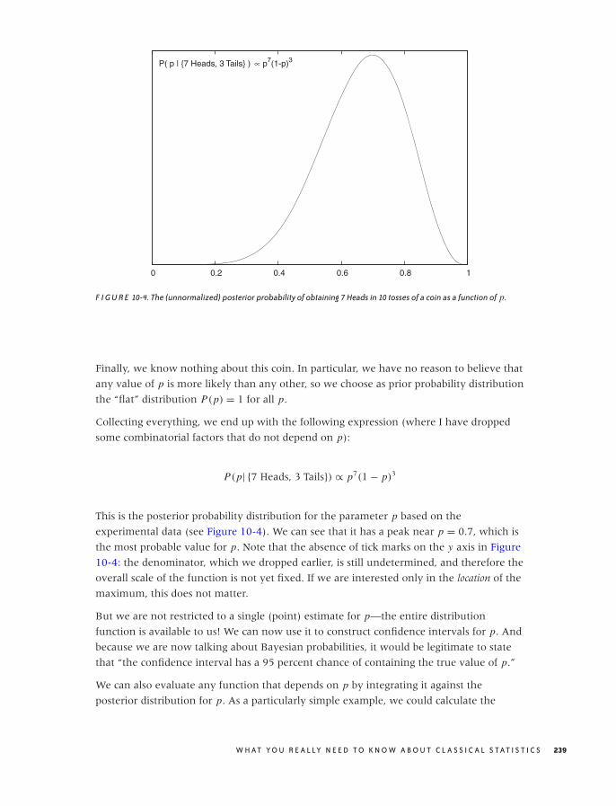
O’Reilly-5980006 master October 28, 2010 20:59
0 0.2 0.4 0.6 0.8 1
P( p | {7 Heads, 3 Tails} ) ∝ p7(1-p)3
F I G U R E 10-4. The (unnormalized) posterior probability of obtaining 7 Heads in 10 tosses of a coin as a function of p.
Finally, we know nothing about this coin. In particular, we have no reason to believe that
any value of p is more likely than any other, so we choose as prior probability distribution
the “flat” distribution P(p) = 1 for all p.
Collecting everything, we end up with the following expression (where I have dropped
some combinatorial factors that do not depend on p):
P(p| {7 Heads, 3 Tails}) ∝ p7(1 − p)3
This is the posterior probability distribution for the parameter p based on the
experimental data (see Figure 10-4). We can see that it has a peak near p = 0.7, which is
the most probable value for p. Note that the absence of tick marks on the y axis in Figure
10-4: the denominator, which we dropped earlier, is still undetermined, and therefore the
overall scale of the function is not yet fixed. If we are interested only in the location of the
maximum, this does not matter.
But we are not restricted to a single (point) estimate for p—the entire distribution
function is available to us! We can now use it to construct confidence intervals for p. And
because we are now talking about Bayesian probabilities, it would be legitimate to state
that “the confidence interval has a 95 percent chance of containing the true value of p.”
We can also evaluate any function that depends on p by integrating it against the
posterior distribution for p. As a particularly simple example, we could calculate the
W H AT Y O U R E A L LY N E E D T O K N O W A B O U T C L A S S I C A L S TAT I S T I C S 239
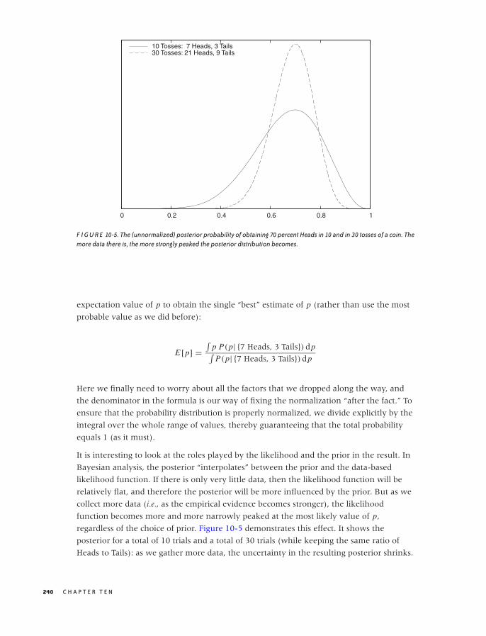
O’Reilly-5980006 master October 28, 2010 20:59
0 0.2 0.4 0.6 0.8 1
10 Tosses: 7 Heads, 3 Tails30 Tosses: 21 Heads, 9 Tails
F I G U R E 10-5. The (unnormalized) posterior probability of obtaining 70 percent Heads in 10 and in 30 tosses of a coin. Themore data there is, the more strongly peaked the posterior distribution becomes.
expectation value of p to obtain the single “best” estimate of p (rather than use the most
probable value as we did before):
E[p] =∫
p P(p| {7 Heads, 3 Tails}) dp∫P(p| {7 Heads, 3 Tails}) dp
Here we finally need to worry about all the factors that we dropped along the way, and
the denominator in the formula is our way of fixing the normalization “after the fact.” To
ensure that the probability distribution is properly normalized, we divide explicitly by the
integral over the whole range of values, thereby guaranteeing that the total probability
equals 1 (as it must).
It is interesting to look at the roles played by the likelihood and the prior in the result. In
Bayesian analysis, the posterior “interpolates” between the prior and the data-based
likelihood function. If there is only very little data, then the likelihood function will be
relatively flat, and therefore the posterior will be more influenced by the prior. But as we
collect more data (i.e., as the empirical evidence becomes stronger), the likelihood
function becomes more and more narrowly peaked at the most likely value of p,
regardless of the choice of prior. Figure 10-5 demonstrates this effect. It shows the
posterior for a total of 10 trials and a total of 30 trials (while keeping the same ratio of
Heads to Tails): as we gather more data, the uncertainty in the resulting posterior shrinks.
240 C H A P T E R T E N
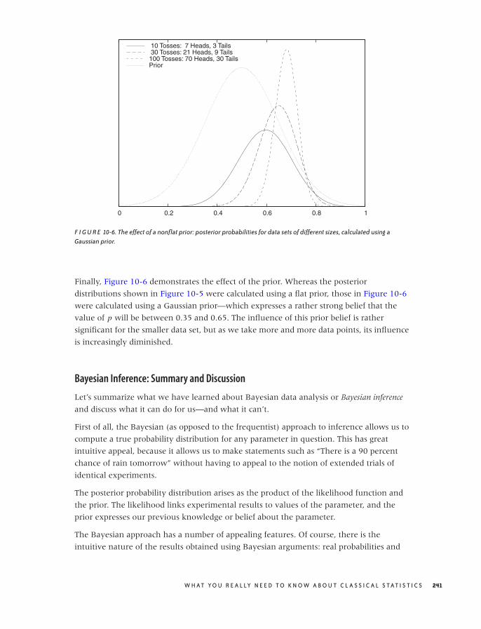
O’Reilly-5980006 master October 28, 2010 20:59
0 0.2 0.4 0.6 0.8 1
10 Tosses: 7 Heads, 3 Tails 30 Tosses: 21 Heads, 9 Tails100 Tosses: 70 Heads, 30 TailsPrior
F I G U R E 10-6. The effect of a nonflat prior: posterior probabilities for data sets of different sizes, calculated using aGaussian prior.
Finally, Figure 10-6 demonstrates the effect of the prior. Whereas the posterior
distributions shown in Figure 10-5 were calculated using a flat prior, those in Figure 10-6
were calculated using a Gaussian prior—which expresses a rather strong belief that the
value of p will be between 0.35 and 0.65. The influence of this prior belief is rather
significant for the smaller data set, but as we take more and more data points, its influence
is increasingly diminished.
Bayesian Inference: Summary and Discussion
Let’s summarize what we have learned about Bayesian data analysis or Bayesian inference
and discuss what it can do for us—and what it can’t.
First of all, the Bayesian (as opposed to the frequentist) approach to inference allows us to
compute a true probability distribution for any parameter in question. This has great
intuitive appeal, because it allows us to make statements such as “There is a 90 percent
chance of rain tomorrow” without having to appeal to the notion of extended trials of
identical experiments.
The posterior probability distribution arises as the product of the likelihood function and
the prior. The likelihood links experimental results to values of the parameter, and the
prior expresses our previous knowledge or belief about the parameter.
The Bayesian approach has a number of appealing features. Of course, there is the
intuitive nature of the results obtained using Bayesian arguments: real probabilities and
W H AT Y O U R E A L LY N E E D T O K N O W A B O U T C L A S S I C A L S TAT I S T I C S 241

O’Reilly-5980006 master October 28, 2010 20:59
95 percent confidence intervals that have exactly the kind of interpretation one would
expect! Moreover, we obtain the posterior probability distribution in full generality and
without having to make limiting assumptions (e.g., having to assume that the data is
normally distributed).
Additionally, the likelihood function enters the calculation in a way that allows for great
flexibility in how we build “models.” Under the Bayesian approach, it is very easy to deal
with missing data, with data that is becoming available over time, or with heterogeneous
data sets (i.e., data sets in which different attributes are known about each data point).
Because the result of Bayesian inference is a probability distribution itself, it can be used
as input for a new model that builds on the previous one (hierarchical models). Moreover,
we can use the prior to incorporate previous (domain) knowledge that we may have
about the problem under consideration.
On the other hand, Bayesian inference has some problems, too—even when we
concentrate on practical applications only, leaving the entire philosophical debate about
priors and subjectivity aside.
First of all, Bayesian inference is always parametric; it is never just exploratory or
descriptive. Because Bayesian methods force us to supply a likelihood function explicitly,
they force us to be specific about our choice of model assumptions: we must already have
a likelihood function in mind, for otherwise we can’t even get started (hence such analysis
can never be exploratory). Furthermore, the result of a Bayesian analysis is always a
posterior distribution—that is, a conditional probability of something, given the data. Here,
that “something” is some form of hypothesis that we have, and the posterior gives us the
probability that this hypothesis is true. To make this prescription operational (and, in
particular, expressible through a likelihood function), we pretty much have to
parameterize the hypothesis. The inference then consists of finding the best value for this
parameter, given the data—which is a parametric problem, given a specific choice for the
model (i.e., the likelihood function). (There are so-called “nonparametric” Bayesian
methods, but in reality they boil down to parametric models with very large numbers of
parameters.)
Additionally, actual Bayesian calculations are often difficult. Recall that Bayesian
inference gives us the full explicit posterior distribution function. If we want to summarize
this function, we either need to find its maximum or integrate it to obtain an expectation
value. Both of these problems are hard, especially when the likelihood function is
complicated and there is more than one parameter that we try to estimate. Instead of
explicitly integrating the posterior, one can sample it—that is, draw random points that are
distributed according to the posterior distribution, in order to evaluate expectation values.
This is clearly an expensive process that requires computer time and specialized software
(and the associated know-how). There can also be additional problems. For example, if
the parameter space is very high-dimensional, then evaluating the likelihood function
(and hence the posterior) may be difficult.
242 C H A P T E R T E N

O’Reilly-5980006 master October 28, 2010 20:59
In contrast, frequentist methods tend to make more assumptions up front and rely more
strongly on general analytic results and approximations. With frequentist methods, the
hard work has typically already been done (analytically), leading to an asymptotic or
approximate formula that you only need to plug in. Bayesian methods give you the full,
nonapproximate result but leave it up to you to evaluate it. The disadvantage of the
plug-in approach, of course, is that you might be plugging into an inappropriate
formula—because some of the assumptions or approximations that were used to derive it
do not apply to your system or data set.
To bring this discussion to a close, I’d like to end with a cautionary note. Bayesian
methods are very appealing and even exciting—something that is rarely said about
classical frequentist statistics. On the other hand, they are probably not very suitable for
casual uses.
• Bayesian methods are parametric and specific; they are never exploratory or
descriptive. If we already know what specific question to ask, then Bayesian methods
may be the best way of obtaining an answer. But if we don’t yet know the proper
questions to ask, then Bayesian methods are not applicable.
• Bayesian methods are difficult and require a fair deal of sophistication, both in setting
up the actual model (likelihood function and prior) and in performing the required
calculations.
As far as results are concerned, there is not much difference between frequentist and
Bayesian analysis. When there is sufficient data (so that the influence of the prior is
small), then the end results are typically very similar, whether they were obtained using
frequentist methods or Bayesian methods.
Finally, you may encounter some other terms and concepts in the literature that also bear
the “Bayesian” moniker: Bayesian classifier, Bayesian network, Bayesian risk, and more.
Often, these have nothing to do with Bayesian (as opposed to frequentist) inference as
explained in this chapter. Typically, these methods involve conditional probabilities and
therefore appeal at some point to Bayes’ theorem. A Bayesian classifier, for instance, is the
conditional probability that an object belongs to a certain class, given what we know
about it. A Bayesian network is a particular way of organizing the causal relationships that
exist among events that depend on many interrelated conditions. And so on.
Workshop: R
R is an environment for data manipulation and numerical calculations, specifically
statistical applications. Although it can be used in a more general fashion for
programming or computation, its real strength is the large number of built-in (or
user-contributed) statistical functions.
W H AT Y O U R E A L LY N E E D T O K N O W A B O U T C L A S S I C A L S TAT I S T I C S 243

O’Reilly-5980006 master October 28, 2010 20:59
R is an open source clone of the S programming language, which was originally developed
at Bell Labs in the 1970s. It was one of the first environments to combine the capabilities
that today we expect from a scripting language (e.g., memory management, proper strings,
dynamic typing, easy file handling) with integrated graphics and intended for an
interactive usage pattern.
I tend to stress the word environment when referring to R, because the way it integrates its
various components is essential to R. It is misleading to think of R as a programming
language that also has an interactive shell (like Python or Groovy). Instead, you might
consider it as a shell but for handling data instead of files. Alternatively, you might want
to view R as a text-based spreadsheet on steroids. The “shell” metaphor in particular is
helpful in motivating some of the design choices made by R.
The essential data structure offered by R is the so-called data frame. A data frame
encapsulates a data set and is the central abstraction that R is built on. Practically all
operations involve the handling and manipulation of frames in one way or the other.
Possibly the best way to think of a data frame is as being comparable to a relational database
table. Each data frame is a rectangular data structure consisting of rows and columns. Each
column has a designated data type, and all entries in that column must be of that type.
Consequently, each row will in general contain entries of different types (as defined by the
types of the columns), but all rows must be of the same form. All this should be familiar
from relational databases. The similarities continue: operations on frames can either
project out a subset of columns, or filter out a subset of rows; either operation results in a
new data frame. There is even a command (merge) that can perform a join of two data
frames on a common column. In addition (and in contrast to databases), we will
frequently add columns to an existing frame—for example, to hold the results of an
intermediate calculation.
We can refer to columns by name. The names are either read from the first line of the
input file, or (if not provided) R will substitute synthetic names of the form V1, V2, . . . . In
contrast, we filter out a set of rows through various forms of “indexing magic.” Let’s look
at some examples.
Consider the following input file:
Name Height Weight Gender
Joe 6.2 192.2 0
Jane 5.5 155.4 1
Mary 5.7 164.3 1
Jill 5.6 166.4 1
Bill 5.8 185.8 0
Pete 6.1 201.7 0
Jack 6.0 195.2 0
Let’s investigate this data set using R, placing particular emphasis on how to handle and
manipulate data with R—the full session transcript is included below. The commands
244 C H A P T E R T E N

O’Reilly-5980006 master October 28, 2010 20:59
entered at the command prompt are prefixed by the prompt >, while R output is shown
without the prompt:
> d <- read.csv( "data", header = TRUE, sep = "\t" )
> str(d)
'data.frame': 7 obs. of 4 variables:
$ Name : Factor w/ 7 levels "Bill","Jack",..: 5 3 6 4 1 7 2
$ Height: num 6.2 5.5 5.7 5.6 5.8 6.1 6
$ Weight: num 192 155 164 166 186 ...
$ Gender: int 0 1 1 1 0 0 0
>
> mean( d$Weight )
[1] 180.1429
> mean( d[,3] )
[1] 180.1429
>
> mean( d$Weight[ d$Gender == 1 ] )
[1] 162.0333
> mean( d$Weight[ 2:4 ] )
[1] 162.0333
>
> d$Diff <- d$Height - mean( d$Height )
> print(d)
Name Height Weight Gender Diff
1 Joe 6.2 192.2 0 0.35714286
2 Jane 5.5 155.4 1 -0.34285714
3 Mary 5.7 164.3 1 -0.14285714
4 Jill 5.6 166.4 1 -0.24285714
5 Bill 5.8 185.8 0 -0.04285714
6 Pete 6.1 201.7 0 0.25714286
7 Jack 6.0 195.2 0 0.15714286
> summary(d)
Name Height Weight Gender Diff
Bill:1 Min. :5.500 Min. :155.4 Min. :0.0000 Min. :-3.429e-01
Jack:1 1st Qu.:5.650 1st Qu.:165.3 1st Qu.:0.0000 1st Qu.:-1.929e-01
Jane:1 Median :5.800 Median :185.8 Median :0.0000 Median :-4.286e-02
Jill:1 Mean :5.843 Mean :180.1 Mean :0.4286 Mean : 2.538e-16
Joe :1 3rd Qu.:6.050 3rd Qu.:193.7 3rd Qu.:1.0000 3rd Qu.: 2.071e-01
Mary:1 Max. :6.200 Max. :201.7 Max. :1.0000 Max. : 3.571e-01
Pete:1
>
> d$Gender <- factor( d$Gender, labels = c("M", "F") )
> summary(d)
Name Height Weight Gender Diff
Bill:1 Min. :5.500 Min. :155.4 M:4 Min. :-3.429e-01
Jack:1 1st Qu.:5.650 1st Qu.:165.3 F:3 1st Qu.:-1.929e-01
Jane:1 Median :5.800 Median :185.8 Median :-4.286e-02
Jill:1 Mean :5.843 Mean :180.1 Mean : 2.538e-16
Joe :1 3rd Qu.:6.050 3rd Qu.:193.7 3rd Qu.: 2.071e-01
Mary:1 Max. :6.200 Max. :201.7 Max. : 3.571e-01
Pete:1
>
> plot( d$Height ~ d$Gender )
> plot( d$Height ~ d$Weight, xlab="Weight", ylab="Height" )
W H AT Y O U R E A L LY N E E D T O K N O W A B O U T C L A S S I C A L S TAT I S T I C S 245
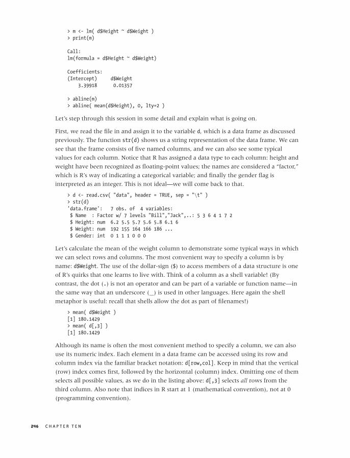
O’Reilly-5980006 master October 28, 2010 20:59
> m <- lm( d$Height ~ d$Weight )
> print(m)
Call:
lm(formula = d$Height ~ d$Weight)
Coefficients:
(Intercept) d$Weight
3.39918 0.01357
> abline(m)
> abline( mean(d$Height), 0, lty=2 )
Let’s step through this session in some detail and explain what is going on.
First, we read the file in and assign it to the variable d, which is a data frame as discussed
previously. The function str(d) shows us a string representation of the data frame. We can
see that the frame consists of five named columns, and we can also see some typical
values for each column. Notice that R has assigned a data type to each column: height and
weight have been recognized as floating-point values; the names are considered a “factor,”
which is R’s way of indicating a categorical variable; and finally the gender flag is
interpreted as an integer. This is not ideal—we will come back to that.
> d <- read.csv( "data", header = TRUE, sep = "\t" )
> str(d)
'data.frame': 7 obs. of 4 variables:
$ Name : Factor w/ 7 levels "Bill","Jack",..: 5 3 6 4 1 7 2
$ Height: num 6.2 5.5 5.7 5.6 5.8 6.1 6
$ Weight: num 192 155 164 166 186 ...
$ Gender: int 0 1 1 1 0 0 0
Let’s calculate the mean of the weight column to demonstrate some typical ways in which
we can select rows and columns. The most convenient way to specify a column is by
name: d$Weight. The use of the dollar-sign ($) to access members of a data structure is one
of R’s quirks that one learns to live with. Think of a column as a shell variable! (By
contrast, the dot (.) is not an operator and can be part of a variable or function name—in
the same way that an underscore ( ) is used in other languages. Here again the shell
metaphor is useful: recall that shells allow the dot as part of filenames!)
> mean( d$Weight )
[1] 180.1429
> mean( d[,3] )
[1] 180.1429
Although its name is often the most convenient method to specify a column, we can also
use its numeric index. Each element in a data frame can be accessed using its row and
column index via the familiar bracket notation: d[row,col]. Keep in mind that the vertical
(row) index comes first, followed by the horizontal (column) index. Omitting one of them
selects all possible values, as we do in the listing above: d[,3] selects all rows from the
third column. Also note that indices in R start at 1 (mathematical convention), not at 0
(programming convention).
246 C H A P T E R T E N
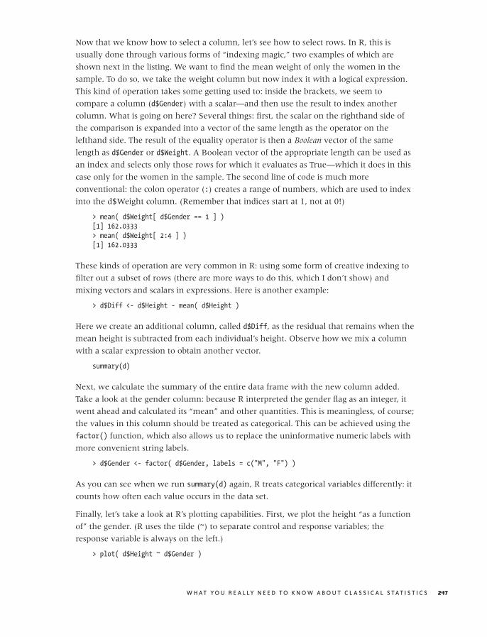
O’Reilly-5980006 master October 28, 2010 20:59
Now that we know how to select a column, let’s see how to select rows. In R, this is
usually done through various forms of “indexing magic,” two examples of which are
shown next in the listing. We want to find the mean weight of only the women in the
sample. To do so, we take the weight column but now index it with a logical expression.
This kind of operation takes some getting used to: inside the brackets, we seem to
compare a column (d$Gender) with a scalar—and then use the result to index another
column. What is going on here? Several things: first, the scalar on the righthand side of
the comparison is expanded into a vector of the same length as the operator on the
lefthand side. The result of the equality operator is then a Boolean vector of the same
length as d$Gender or d$Weight. A Boolean vector of the appropriate length can be used as
an index and selects only those rows for which it evaluates as True—which it does in this
case only for the women in the sample. The second line of code is much more
conventional: the colon operator (:) creates a range of numbers, which are used to index
into the d$Weight column. (Remember that indices start at 1, not at 0!)
> mean( d$Weight[ d$Gender == 1 ] )
[1] 162.0333
> mean( d$Weight[ 2:4 ] )
[1] 162.0333
These kinds of operation are very common in R: using some form of creative indexing to
filter out a subset of rows (there are more ways to do this, which I don’t show) and
mixing vectors and scalars in expressions. Here is another example:
> d$Diff <- d$Height - mean( d$Height )
Here we create an additional column, called d$Diff, as the residual that remains when the
mean height is subtracted from each individual’s height. Observe how we mix a column
with a scalar expression to obtain another vector.
summary(d)
Next, we calculate the summary of the entire data frame with the new column added.
Take a look at the gender column: because R interpreted the gender flag as an integer, it
went ahead and calculated its “mean” and other quantities. This is meaningless, of course;
the values in this column should be treated as categorical. This can be achieved using the
factor() function, which also allows us to replace the uninformative numeric labels with
more convenient string labels.
> d$Gender <- factor( d$Gender, labels = c("M", "F") )
As you can see when we run summary(d) again, R treats categorical variables differently: it
counts how often each value occurs in the data set.
Finally, let’s take a look at R’s plotting capabilities. First, we plot the height “as a function
of” the gender. (R uses the tilde (~) to separate control and response variables; the
response variable is always on the left.)
> plot( d$Height ~ d$Gender )
W H AT Y O U R E A L LY N E E D T O K N O W A B O U T C L A S S I C A L S TAT I S T I C S 247
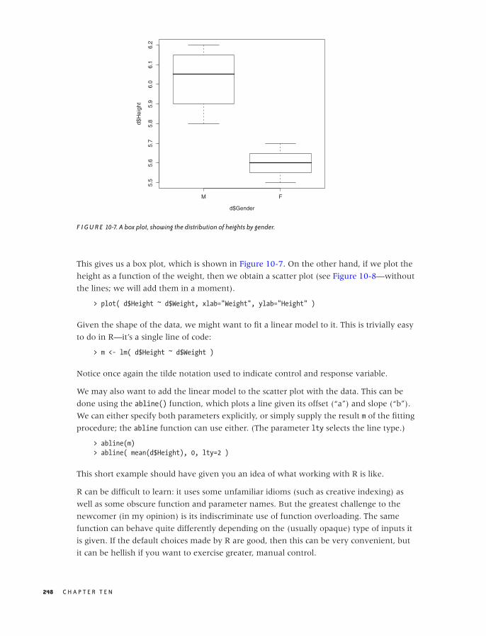
O’Reilly-5980006 master October 28, 2010 20:59
M F
5.5
5.6
5.7
5.8
5.9
6.0
6.1
6.2
d$Gender
d$H
eigh
t
F I G U R E 10-7. A box plot, showing the distribution of heights by gender.
This gives us a box plot, which is shown in Figure 10-7. On the other hand, if we plot the
height as a function of the weight, then we obtain a scatter plot (see Figure 10-8—without
the lines; we will add them in a moment).
> plot( d$Height ~ d$Weight, xlab="Weight", ylab="Height" )
Given the shape of the data, we might want to fit a linear model to it. This is trivially easy
to do in R—it’s a single line of code:
> m <- lm( d$Height ~ d$Weight )
Notice once again the tilde notation used to indicate control and response variable.
We may also want to add the linear model to the scatter plot with the data. This can be
done using the abline() function, which plots a line given its offset (“a”) and slope (“b”).
We can either specify both parameters explicitly, or simply supply the result m of the fitting
procedure; the abline function can use either. (The parameter lty selects the line type.)
> abline(m)
> abline( mean(d$Height), 0, lty=2 )
This short example should have given you an idea of what working with R is like.
R can be difficult to learn: it uses some unfamiliar idioms (such as creative indexing) as
well as some obscure function and parameter names. But the greatest challenge to the
newcomer (in my opinion) is its indiscriminate use of function overloading. The same
function can behave quite differently depending on the (usually opaque) type of inputs it
is given. If the default choices made by R are good, then this can be very convenient, but
it can be hellish if you want to exercise greater, manual control.
248 C H A P T E R T E N
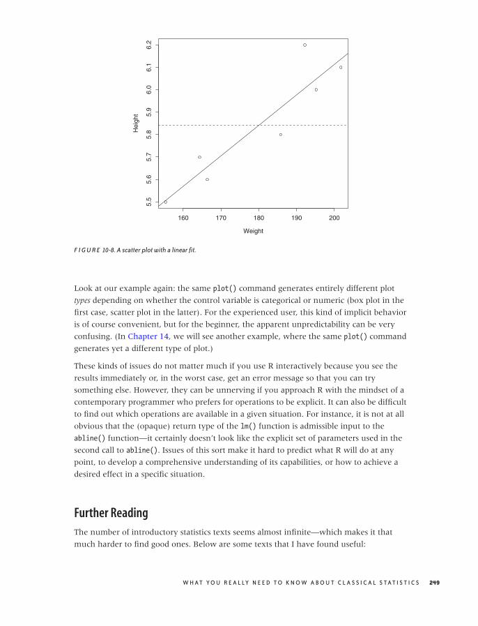
O’Reilly-5980006 master October 28, 2010 20:59
160 170 180 190 200
5.5
5.6
5.7
5.8
5.9
6.0
6.1
6.2
Weight
Hei
ght
F I G U R E 10-8. A scatter plot with a linear fit.
Look at our example again: the same plot() command generates entirely different plot
types depending on whether the control variable is categorical or numeric (box plot in the
first case, scatter plot in the latter). For the experienced user, this kind of implicit behavior
is of course convenient, but for the beginner, the apparent unpredictability can be very
confusing. (In Chapter 14, we will see another example, where the same plot() command
generates yet a different type of plot.)
These kinds of issues do not matter much if you use R interactively because you see the
results immediately or, in the worst case, get an error message so that you can try
something else. However, they can be unnerving if you approach R with the mindset of a
contemporary programmer who prefers for operations to be explicit. It can also be difficult
to find out which operations are available in a given situation. For instance, it is not at all
obvious that the (opaque) return type of the lm() function is admissible input to the
abline() function—it certainly doesn’t look like the explicit set of parameters used in the
second call to abline(). Issues of this sort make it hard to predict what R will do at any
point, to develop a comprehensive understanding of its capabilities, or how to achieve a
desired effect in a specific situation.
Further Reading
The number of introductory statistics texts seems almost infinite—which makes it that
much harder to find good ones. Below are some texts that I have found useful:
W H AT Y O U R E A L LY N E E D T O K N O W A B O U T C L A S S I C A L S TAT I S T I C S 249

O’Reilly-5980006 master October 28, 2010 20:59
• An Introduction to Mathematical Statistics and Its Applications. Richard J. Larsen and Morris
L. Marx. 4th ed., Prentice Hall. 2005.
This is my preferred introductory text for the mathematical background of classical
statistics: how it all works. This is a math book; you won’t learn how to do practical
statistical fieldwork from it. (It contains a large number of uncommonly interesting
examples; however, on close inspection many of them exhibit serious flaws in their
experimental design—at least as described in this book.) But as a mathematical
treatment, it very neatly blends accessibility with sufficient depth.
• Statistics for Technology: A Course in Applied Statistics. Chris Chatfield. 3rd ed., Chapman &
Hall/CRC. 1983.
This book is good companion to the book by Larsen and Marx. It eschews most
mathematical development and instead concentrates on the pragmatics of it, with an
emphasis on engineering applications.
• The Statistical Sleuth: A Course in Methods of Data Analysis. Fred Ramsey and Daniel
Schafer. 2nd ed., Duxbury Press. 2001.
This advanced undergraduate textbook emphasizes the distinction between
observational studies and controlled experiments more strongly than any other book I
am aware of. After working through some of their examples, you will not be able to
look at the description of a statistical study without immediately classifying it as
observational or controlled (and questioning the conclusions if it was merely
observational). Unfortunately, the development of the general theory gets a little lost
in the detailed description of application concerns.
• The Practice of Business Statistics. David S. Moore, George P. McCabe, William M.
Duckworth, and Layth Alwan. 2nd ed., Freeman. 2008.
This is a “for business” version of a popular beginning undergraduate textbook. The
coverage of topics is comprehensive, and the presentation is particularly easy to follow.
This book can serve as a first course, but will probably not provide sufficient depth to
develop proper understanding.
• Problem Solving: A Statistician’s Guide. Chris Chatfield. 2nd ed., Chapman & Hall/CRC.
1995; and Statistical Rules of Thumb. Gerald van Belle. 2nd ed., Wiley. 2008.
Two nice books with lots of practical advice on statistical fieldwork. Chatfield’s book is
more general; van Belle’s contains much material specific to epidemiology and related
applications.
• All of Statistics: A Concise Course in Statistical Inference. Larry Wasserman. Springer. 2004.
A thoroughly modern treatment of mathematical statistics, this book presents all kinds
of fascinating and powerful topics that are sorely missing from the standard
introductory curriculum. The treatment is advanced and very condensed, requiring
general previous knowledge in basic statistics and a solid grounding in mathematical
methods.
250 C H A P T E R T E N

O’Reilly-5980006 master October 28, 2010 20:59
• Bayesian Methods for Data Analysis. Bradley P. Carlin, and Thomas A. Louis. 3rd ed.,
Chapman & Hall. 2008.
This is a book on Bayesian methods applied to data analysis problems (as opposed to
Bayesian theory only). It is a thick book, and some of the topics are fairly advanced.
However, the early chapters provide the best introduction to Bayesian methods that I
am aware of.
• “Sifting the Evidence—What’s Wrong with Significance Tests?” Jonathan A. C. Sterne
and George Davey Smith. British Medical Journal 322 (2001), p. 226.
This paper provides a penetrating and nonpartisan overview of the problems associated
with classical hypothesis tests, with an emphasis on applications in medicine (although
the conclusions are much more generally valid). The full text is freely available on the
Web; a search will turn up multiple locations.
W H AT Y O U R E A L LY N E E D T O K N O W A B O U T C L A S S I C A L S TAT I S T I C S 251

O’Reilly-5980006 master October 28, 2010 20:59

O’Reilly-5980006 master October 29, 2010 17:43
C H A P T E R E L E V E N
Intermezzo: Mythbusting—Bigfoot,Least Squares, and All That
EVERYBODY HAS HEARD OF BIGFOOT, THE MYSTICAL FIGURE THAT LIVES IN THE WOODS, BUT NOBODY HAS EVER
actually seen him. Similarly, there are some concepts from basic statistics that everybody
has heard of but that—like Bigfoot—always remain a little shrouded in mystery. Here, we
take a look at three of them: the average of averages, the mystical standard deviation, and
the ever-popular least squares.
How to Average Averages
Recently, someone approached me with the following question: given the numbers in
Table 11-1, what number should be entered in the lower-right corner? Just adding up the
individual defect rates per item and dividing by 3 (in effect, averaging them) did not seem
right—if only because it would come out to about 0.75, which is pretty high when one
considers that most of the units produced (100 out of 103) are not actually defective. The
specific question asked was: “Should I weight the individual rates somehow?”
This situation comes up frequently but is not always recognized: we have a set of rates (or
averages) and would like to summarize them into an overall rate (or overall average). The
T A B L E 11 -1. Defect rates: what value should go into the lower-right corner?
Item type Units produced Defective units Defect rate
A 2 1 0.5B 1 1 1.0C 100 1 0.01
Total defect rate ???
253
O’Reilly-5980006 master October 28, 2010 21:12
problem is that the naive way of doing so (namely, to add up the individual rates and then
to divide by the number of rates) will give an incorrect result. However, this is rarely
noticed unless the numbers involved are as extreme as in the present example.
The correct way to approach this task is to start from scratch. What is the “defect rate,”
anyway? It is the number of defective items divided by the number of items produced.
Hence, the total defect rate is the total number of defective items divided by the total
number of items produced: 3/103 ≈ 0.03. There should be no question about that.
Can we arrive at this result in a different way by starting with the individual defect rates?
Absolutely—provided we weight them appropriately. Each individual defect rate should
contribute to the overall defect rate in the same way that the corresponding item type
contributes to the total item count. In other words, the weight for item type A is 2/103,
for B is 1/103, and for C it is 100/103. Pulling all this together, we have:
0.5 · 2/103 + 1.0 · 1/103 + 0.01 · 100/103 = (1 + 1 + 1)/103 = 3/103 as before.
To show that this agreement is not accidental, let’s write things out in greater generality:
nk Number of items of type k
dk Number of defective items of type k
εk = dk
nkDefect rate for type k
fk = nk∑i ni
Contribution of type k to total production
Now look at what it means to weight each individual defect rate:
fkεk = nk∑i ni
dk
nk
= dk∑i ni
In other words, weighting the individual defect rate εk by the appropriate weight factor fk
has the effect of turning the defect rate back to the the defect count dk (normalized by total
number of items).
In this example, each item could get only one of two “grades,” namely 1 (for defective) or
0 (for not defective), and so the “defect rate” was a measure of the “average defectiveness”
of a single item. The same logic as just demonstrated applies if you have a greater (or
different) range of values. (You can make up your own example: give items grades from 1
to 5, and then calculate the overall “average grade” to see how it works.)
Simpson's Paradox
Since we are talking about mystical figures that can sometimes be found in tables, we
should also mention Simpson’s paradox. Look at Table 11-2 which shows applications and
admissions to a fictional college in terms the applicants’ gender and department.
254 C H A P T E R E L E V E N

O’Reilly-5980006 master October 28, 2010 21:12
T A B L E 11 -2. Simpson’s paradox: applications and admissions by gender of applicant.
Male Female Overall
Department A 80/100 = 0.8 9/10 = 0.9 89/110 = 0.81Department B 5/10 = 0.5 60/100 = 0.6 65/110 = 0.59
Total 85/110 = 0.77 69/110 = 0.63
If you look only at the bottom line with the totals, then it might appear that the college is
discriminating against women, since the acceptance rate for male applicants is higher than
that for female applicants (0.77 versus 0.63).* But when you look at the rates for each
individual department within the college, it turns out that women have higher acceptance
rates than men for every department. How can that be?
The short and intuitive answer is that many more women apply to department B, which
has a lower overall admission rate than department A (0.59 versus 0.81), and this drags
down their (gender-specific) acceptance rate.
The more general explanation speaks of a “reversal of association due to a confounding
factor.” When considering only the totals, it may seem as if there is an association
between gender and admission rates, with male applicants being accepted more
frequently. However, this view ignores the presence of a hidden but important factor: the
choice of department. In fact, the choice of department has a greater influence on the
acceptance rate than the original explanatory variable (the gender). By lumping the
observations for the different departments into a single number, we have in fact masked
the influence of this factor—with the consequence that the association between
acceptance rate (which favors women for each department) and gender was reversed.
The important insight here is that such “reversal of association” due to a confounding
factor is always possible. However, both conditions must occur: the confounding factor
must be sufficiently strong (in our case, the acceptance rates for departments A and B
were sufficiently different), and the assignment of experimental units to the levels of this
factor must be sufficiently imbalanced (in our case, many more women applied to
department B than to department A).
As opposed to Bigfoot, Simpson’s paradox is known to occur in the real world. The
example in this section, for instance, was based on a well-publicized case involving the
University of California (Berkeley) in the early 1970s. A quick Internet search will turn up
additional examples.
*You should check that the entries in the bottom row have been calculated properly, per the discussionin the previous section!
I N T E R M E Z Z O : M Y T H B U S T I N G — B I G F O O T , L E A S T S Q U A R E S , A N D A L L T H AT 255

O’Reilly-5980006 master October 28, 2010 21:12
The Standard Deviation
The fabled standard deviation is another close relative of Bigfoot. Everybody (it seems)
has heard of it, everybody knows how to calculate it, and—most importantly—everybody
knows that 68 percent of all data points fall within 1 standard deviation, 95 percent
within 2, and virtually all (that is: 99.7 percent) within 3.
Problem is: this is utter nonsense.
It is true that the standard deviation is a measure for the spread (or width) of a
distribution. It is also true that, for a given set of points, the standard deviation can always
be calculated. But that does not mean that the standard deviation is always a good or
appropriate measure for the width of a distribution; in fact, it can be quite misleading if
applied indiscriminately to an unsuitable data set. Furthermore, we must be careful how
to interpret it: the whole 68 percent business applies only if the data set satisfies some
very specific requirements.
In my experience, the standard deviation is probably the most misunderstood and
misapplied quantity in all of statistics.
Let me tell you a true story (some identifying details have been changed to protect the
guilty). The story is a bit involved, but this is no accident: in the same way that Bigfoot
sightings never occur in a suburban front yard on a sunny Sunday morning, severe
misunderstandings in mathematical or statistical methods usually don’t reveal themselves
as long as the applications are as clean and simple as the homework problems in a
textbook. But once people try to apply these same methods in situations that are a bit less
standard, anything can happen. This is what happened in this particular company.
I was looking over a bit of code used to identify outliers in the response times from a
certain database server. The purpose of this program was to detect and report on
uncommonly slow responses. The piece of code in question processed log files containing
the response times and reported a threshold value: responses that took longer than this
threshold were considered “outliers.”
An existing service-level agreement defined an outlier as any value “outside of 3 standard
deviations.” So what did this piece of code do? It sorted the response times to identify the
top 0.3 percent of data points and used those to determine the threshold. (In other words,
if there were 1,000 data points in the log file, it reported the response time of the third
slowest as threshold.) After all, 99.7 percent of data points fall within 3 standard
deviations. Right?
After reading Chapter 2, I hope you can immediately tell where the original programmer
went wrong: the threshold that the program reported had nothing at all to do with
standard deviations—instead, it reported the top 0.3 percentile. In other words, the
program completely failed to do what it was supposed to do. Also, keep in mind that it is
256 C H A P T E R E L E V E N

O’Reilly-5980006 master October 28, 2010 21:12
incorrect to blindly consider the top x percent of any distribution as outliers (review the
discussion of box plots in Chapter 2 if you need a reminder).
But the story continues. This was a database server whose typical response time was less
than a few seconds. It was clear that anything that took longer than one or two minutes
had to be considered “slow”—that is, an outlier. But when the program was run, the
threshold value it reported (the 0.3 percentile) was on the order of hours. Clearly, this
threshold value made no sense.
In what must have been a growing sense of desperation, the original programmer now
made a number of changes: from selecting the top 0.3 percent, to the top 1 percent, then
the top 5 percent and finally the top 10 percent. (I could tell, because each such change
had dutifully been checked into source control!) Finally, the programmer had simply
hard-coded some seemingly “reasonable” value (such as 47 seconds or something) into the
program, and that’s what was reported as “3 standard deviations” regardless of the input.
It was the only case of outright technical fraud that I have ever witnessed: a technical
work product that—with the original author’s full knowledge—in no way did what it
claimed to do.
What went wrong here? Several things. First, there was a fundamental misunderstanding
about the definition of the standard deviation, how it is calculated, and some of the
properties that in practice it often (but not always) has. The second mistake was applying
the standard deviation to a situation where it is not a suitable measure.
Let’s recap some basics: we often want to characterize a point distribution by a typical
value (its location) and its spread around this location. A convenient measure for the
location is the mean: μ = 1n
∑ni xi . Why is the mean so convenient? Because it is easy to
calculate: just sum all the values and divide by n.
To find the width of the distribution, we would like see how far points “typically” stray
from the mean. In other words, we would like to find the mean of the deviations xi − μ.
But since the deviations can be positive and negative, they would simply cancel, so
instead we calculate the mean of the squared deviations: σ 2 = 1n
∑ni (xi − μ)2. This
quantity is called the variance, and its square root is the standard deviation. Why do we
bother with the square root? Because it has the same units as the mean, whereas in the
variance the units are raised to the second power.
Now, if and only if the point distribution is well behaved (which in practice means: it is
Gaussian), then it is true that about 68 percent of points will fall within the interval
[μ − σ, μ + σ ] and that 95 percent fall within the interval [μ − 2σ, μ + 2σ ] and so on. The
inverse is not true: you cannot conclude that 68 percent of points define a “standard
deviation” (this is where the programmer in our story made the first mistake). If the point
distribution is not Gaussian, then there are no particular patterns by which fractions of
points will fall within 1, 2, or any number of standard deviations from the mean.
However, keep in mind that the definitions of the mean and the standard deviation (as
I N T E R M E Z Z O : M Y T H B U S T I N G — B I G F O O T , L E A S T S Q U A R E S , A N D A L L T H AT 257
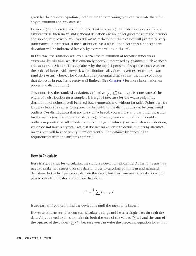
O’Reilly-5980006 master October 28, 2010 21:12
given by the previous equations) both retain their meaning: you can calculate them for
any distribution and any data set.
However (and this is the second mistake that was made), if the distribution is strongly
asymmetrical, then mean and standard deviation are no longer good measures of location
and spread, respectively. You can still calculate them, but their values will just not be very
informative. In particular, if the distribution has a fat tail then both mean and standard
deviation will be influenced heavily by extreme values in the tail.
In this case, the situation was even worse: the distribution of response times was a
power-law distribution, which is extremely poorly summarized by quantities such as mean
and standard deviation. This explains why the top 0.3 percent of response times were on
the order of hours: with power-law distributions, all values—even extreme ones—can
(and do!) occur; whereas for Gaussian or exponential distributions, the range of values
that do occur in practice is pretty well limited. (See Chapter 9 for more information on
power-law distributions.)
To summarize, the standard deviation, defined as√
1n
∑ni (xi − μ)2, is a measure of the
width of a distribution (or a sample). It is a good measure for the width only if the
distribution of points is well behaved (i.e., symmetric and without fat tails). Points that are
far away from the center (compared to the width of the distribution) can be considered
outliers. For distributions that are less well behaved, you will have to use other measures
for the width (e.g., the inter-quartile range); however, you can usually still identify
outliers as points that fall outside the typical range of values. (For power-law distributions,
which do not have a “typical” scale, it doesn’t make sense to define outliers by statistical
means; you will have to justify them differently—for instance by appealing to
requirements from the business domain.)
How to Calculate
Here is a good trick for calculating the standard deviation efficiently. At first, it seems you
need to make two passes over the data in order to calculate both mean and standard
deviation. In the first pass you calculate the mean, but then you need to make a second
pass to calculate the deviations from that mean:
σ 2 = 1
n
∑(xi − μ)2
It appears as if you can’t find the deviations until the mean μ is known.
However, it turns out that you can calculate both quantities in a single pass through the
data. All you need to do is to maintain both the sum of the values (∑
xi ) and the sum of
the squares of the values (∑
x2i ), because you can write the preceding equation for σ 2 in a
258 C H A P T E R E L E V E N
O’Reilly-5980006 master October 28, 2010 21:12
form that depends only on those two sums:
σ 2 = 1
n
∑(xi − μ)2
= 1
n
∑ (x2
i − 2xiμ + μ2)
= 1
n
(∑x2
i − 2μ∑
xi + μ2∑
1)
= 1
n
∑x2
i − 2μ1
n
∑xi + μ2 1
nn
= 1
n
∑x2
i − 2μ · μ + μ2
= 1
n
∑x2
i − μ2
= 1
n
∑x2
i −(
1
n
∑xi
)2
This is a good trick that is apparently too little known. Keep it in mind; similar situations
crop up in different contexts from time to time. (To be sure, the floating-point properties
of both methods are different, but if you care enough to worry about the difference, then
you should be using a library anyway.)
Optional: One over What?
You may occasionally see the standard deviation defined with an n in the denominator
and sometimes with a factor of n − 1 instead.√√√√1
n
n∑
i
(xi − μ)2 or
√√√√ 1
n − 1
n∑
i
(xi − μ)2
What really is the difference, and which expression should you use?
The factor 1/n applies only if you know the exact value of the mean μ ahead of time. This
is usually not the case; instead, you will usually have to calculate the mean from the data.
This adds a bit of uncertainty, which leads to the widening of the proper estimate for the
standard deviation. A theoretical argument then leads to the use of the factor 1/(n − 1)
instead of 1/n.
In short, if you calculated the mean from the data (as is usually the case), then you should
really be using the 1/(n − 1) factor. The difference is going to be small, unless you are
dealing with very small data sets.
Optional: The Standard Error
While we are on the topic of obscure sources of confusion, let’s talk about the standard
error.
I N T E R M E Z Z O : M Y T H B U S T I N G — B I G F O O T , L E A S T S Q U A R E S , A N D A L L T H AT 259
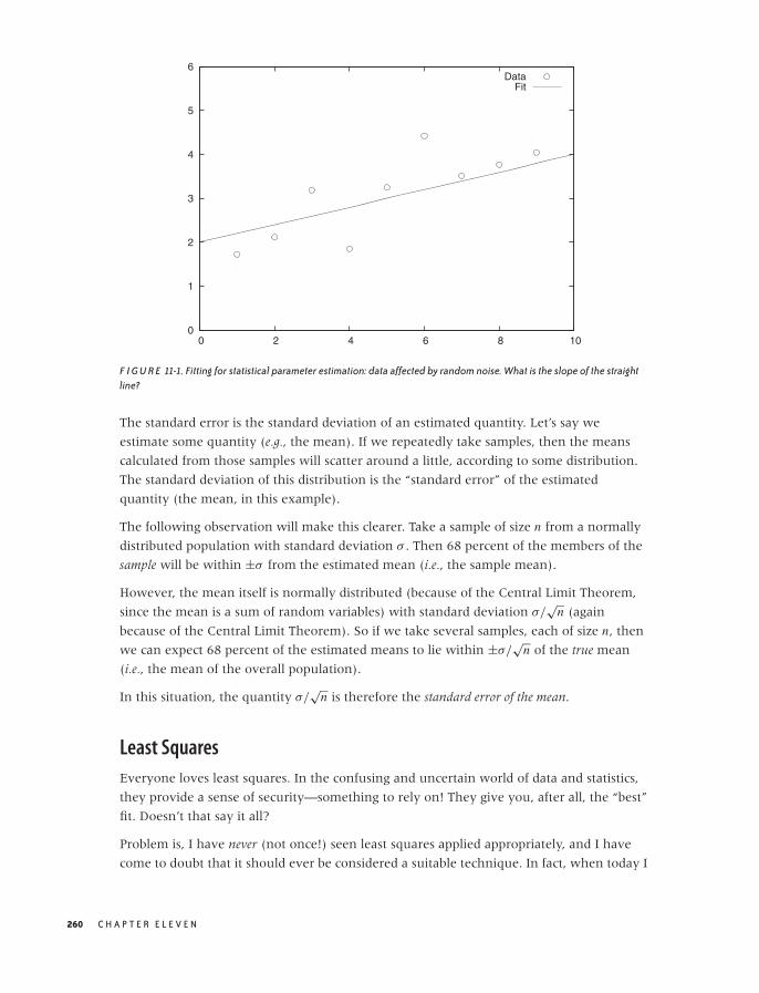
O’Reilly-5980006 master October 28, 2010 21:12
0
1
2
3
4
5
6
0 2 4 6 8 10
DataFit
F I G U R E 11-1. Fitting for statistical parameter estimation: data affected by random noise. What is the slope of the straightline?
The standard error is the standard deviation of an estimated quantity. Let’s say we
estimate some quantity (e.g., the mean). If we repeatedly take samples, then the means
calculated from those samples will scatter around a little, according to some distribution.
The standard deviation of this distribution is the “standard error” of the estimated
quantity (the mean, in this example).
The following observation will make this clearer. Take a sample of size n from a normally
distributed population with standard deviation σ . Then 68 percent of the members of the
sample will be within ±σ from the estimated mean (i.e., the sample mean).
However, the mean itself is normally distributed (because of the Central Limit Theorem,
since the mean is a sum of random variables) with standard deviation σ/√
n (again
because of the Central Limit Theorem). So if we take several samples, each of size n, then
we can expect 68 percent of the estimated means to lie within ±σ/√
n of the true mean
(i.e., the mean of the overall population).
In this situation, the quantity σ/√
n is therefore the standard error of the mean.
Least Squares
Everyone loves least squares. In the confusing and uncertain world of data and statistics,
they provide a sense of security—something to rely on! They give you, after all, the “best”
fit. Doesn’t that say it all?
Problem is, I have never (not once!) seen least squares applied appropriately, and I have
come to doubt that it should ever be considered a suitable technique. In fact, when today I
260 C H A P T E R E L E V E N
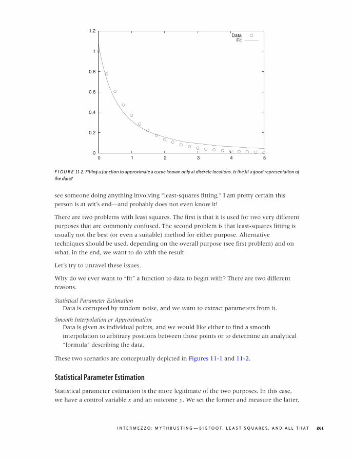
O’Reilly-5980006 master October 28, 2010 21:12
0
0.2
0.4
0.6
0.8
1
1.2
0 1 2 3 4 5
DataFit
F I G U R E 11-2. Fitting a function to approximate a curve known only at discrete locations. Is the fit a good representation ofthe data?
see someone doing anything involving “least-squares fitting,” I am pretty certain this
person is at wit’s end—and probably does not even know it!
There are two problems with least squares. The first is that it is used for two very different
purposes that are commonly confused. The second problem is that least-squares fitting is
usually not the best (or even a suitable) method for either purpose. Alternative
techniques should be used, depending on the overall purpose (see first problem) and on
what, in the end, we want to do with the result.
Let’s try to unravel these issues.
Why do we ever want to “fit” a function to data to begin with? There are two different
reasons.
Statistical Parameter EstimationData is corrupted by random noise, and we want to extract parameters from it.
Smooth Interpolation or ApproximationData is given as individual points, and we would like either to find a smooth
interpolation to arbitrary positions between those points or to determine an analytical
“formula” describing the data.
These two scenarios are conceptually depicted in Figures 11-1 and 11-2.
Statistical Parameter Estimation
Statistical parameter estimation is the more legitimate of the two purposes. In this case,
we have a control variable x and an outcome y. We set the former and measure the latter,
I N T E R M E Z Z O : M Y T H B U S T I N G — B I G F O O T , L E A S T S Q U A R E S , A N D A L L T H AT 261
O’Reilly-5980006 master October 28, 2010 21:12
resulting in a data set of pairs: {(x1, y1), (x2, y2), . . .}. Furthermore, we assume that the
outcome is related to the control variable through some function f (x; {a, b, c, . . .}) of
known form that depends on the control variable x and also on a set of (initially
unknown) parameters {a, b, c, . . .}. However, in practice, the actual measurements are
affected by some random noise ε, so that the measured values yi are a combination of the
“true” value and the noise term:
yi = f (xi , {a, b, c, . . .}) + εi
We now ask: how should we choose values for the parameters {a, b, c, . . .}, such that the
function f (x, {a, b, c, . . .}) reproduces the measured values of y most faithfully? The usual
answer is that we want to choose the parameters such that the total mean-square error E2
(sometimes called the residual sum of squares):
E2 =∑
i
( f (xi , {a, b, c, . . .}) − yi )2
is minimized. As long as the distribution of errors is reasonably well behaved (not too
asymmetric and without heavy tails), the results are adequate. If, in addition, the noise is
Gaussian, then we can even invoke other parts of statistics and show that the estimates for
the parameters obtained by the least-squares procedure agree with the “maximum
likelihood estimate.” Thus the least-squares results are consistent with alternative ways of
calculation.
But there is another important aspect to least-squares estimation that is frequently lost:
we can obtain not only point estimates for the parameters {a, b, c, . . .} but also confidence
intervals, through a self-consistent argument that links the distribution of the parameters
to the distribution of the measured values.
I cannot stress this enough: a point estimate by itself is of limited use. After all, what
good is knowing that the point estimate for a is 5.17 if I have no idea whether this
means a = 5.17 ± 0.01 or a = 5.17 ± 250? We must have some way of judging the range
over which we expect our estimate to vary, which is the same as finding a confidence
interval for it. Least squares works, when applied in a probabilistic context like this,
because it gives us not only an estimate for the parameters but also for their confidence
intervals.
One last point: in statistical applications, it is rarely necessary to perform the minimization
of E2 by numerical means. For most of the functions f (x, {a, b, c, . . .}) that are commonly
used in statistics, the conditions that will minimize E2 can be worked out explicitly. (See
Chapter 3 for the results when the function is linear.) In general, you should be reluctant
to resort to numerical minimization procedures—there might be better ways of obtaining
the result.
262 C H A P T E R E L E V E N

O’Reilly-5980006 master October 28, 2010 21:12
Function Approximation
In practice, however, least-squares fitting is often used for a different purpose. Consider
the situation in Figure 11-2, where we have a set of individual data points. These points
clearly seem to fall on a smooth curve. It would be convenient to have an explicit formula
to summarize these data points rather than having to work with the collection of points
directly. So, can we “fit” a formula to them?
Observe that, in this second application of least-squares fitting, there is no random noise. In
fact, there is no random component at all! This is an important insight, because it implies
that statistical methods and arguments don’t apply.
This becomes relevant when we want to determine the degree of confidence in the results
of a fit. Let’s say we have performed a least-squares routine and obtained some values for
the parameters. What confidence intervals should we associate with the parameters, and
how good is the overall fit? Whatever errors we may incur in the fitting process, they will
not be of a random nature, and we therefore cannot make probabilistic arguments about
them.
The scenario in Figure 11-2 is typical: the plot shows the data together with the best fit for
a function of the form f (x; a, b) = a/(1 + x)b, with a = 1.08 and b = 1.77. Is this a good
fit? And what uncertainty do we have in the parameters? The answer depends on what
you want to do with the results—but be aware that the deviations between the fit and the
data are not at all “random” and hence that statistical “goodness of fit” measures are
inappropriate. We have to find other ways to answer our questions. (For instance, we
may find the largest of the residuals between the data points and our fitted function and
report that the fit “represents the data with a maximum deviation of . . . .”)
This situation is typical in yet another way: given how smooth the curve is that the data
points seem to fall on, our “best fit” seems really bad. In particular, the fit exhibits a
systematic error: for 0 < x < 1.5, the curve is always smaller than the data, and for
x > 1.5, it is always greater. Is this really the best we can do? The answer is yes, for
functions of the form a/(1 + x)b. However, a different choice of function might give much
better results. The problem here is that the least-squares approach forces us to specify the
functional form of the function we are attempting to fit, and if we get it wrong, then the
results won’t be any good. For this reason, we should use less constraining approaches
(such as nonparametric or local approximations) unless we have good reasons to favor a
particular functional form.
In other words, what we really have here is a problem of function interpolation or
approximation: we know the function on a discrete set of points, and we would like to
extend it smoothly to all values. How we should do this depends on what we want to do
with the results. Here is some advice for common scenarios:
• To find a “smooth curve” for plotting purposes, you should use one of the smoothing
routines discussed in Chapter 3, such as splines or LOESS. These nonparametric
I N T E R M E Z Z O : M Y T H B U S T I N G — B I G F O O T , L E A S T S Q U A R E S , A N D A L L T H AT 263

O’Reilly-5980006 master October 28, 2010 21:12
methods have the advantage that they do not impose a particular functional form on
the data (in contrast to the situation in Figure 11-2).
• If you want to be able to evaluate the function easily at an arbitrary location, then you
should use a local interpolation method. Such methods build a local approximation by
using the three or four data points closest to the desired location. It is not necessary to
find a global expression in this case: the local approximation will suffice.
• Sometimes you may want to summarize the behavior of the data set in just a few
“representative” values (e.g., so you can more easily compare one data set against
another). This is tricky—it is probably a better idea to compare data sets directly against
each other using similarity metrics such as those discussed in Chapter 13. If you still
need to do this, consider a basis function expansion using Fourier, Hermite, or wavelet
functions. (These are special sets of functions that enable you to extract greater and
greater amounts of detail from a data set. Expansion in basis functions also allows you
to evaluate and improve the quality of the approximation in a systematic fashion.)
• At times you might be interested in some particular feature of the data: for example,
you suspect that the data follows a power law xb and you would like to extract the
exponent; or the data is periodic and you need to know the length of one period. In
such cases, it is usually a better idea to transform the data in such a way that you can
obtain that particular feature directly, rather than fitting a global function. (To extract
exponents, you should consider a logarithmic transform. To obtain the length of an
oscillatory period, measure the peak-to-peak (or, better still, the zero-to-zero)
distance.)
• Use specialized methods if available and applicable. Time series, for instance, should be
treated with the techniques discussed in Chapter 4.
You may have noticed that none of these suggestions involve least squares!
Further Reading
Every introductory statistics book covers the standard deviation and least squares (see the
book recommendations in Chapter 10). For the alternatives to least squares, consult a
book on numerical analysis, such as the one listed here.
• Numerical Methods That (Usually) Work. Forman S. Acton. 2nd ed., Mathematical
Association of America. 1997.
Although originally published in 1970, this book does not feel the least bit dated—it is
still one of the best introductions to the art of numerical analysis. Neither a cookbook
nor a theoretical treatise, it stresses practicality and understanding first and foremost. It
includes an inimitable chapter on “What Not to Compute.”
264 C H A P T E R E L E V E N

O’Reilly-5980006 master October 28, 2010 21:15
PART III
Computation: Mining Data

O’Reilly-5980006 master October 28, 2010 21:15

O’Reilly-5980006 master October 28, 2010 21:15
C H A P T E R T W E L V E
Simulations
IN THIS CHAPTER, WE LOOK AT SIMULATIONS AS A WAY TO UNDERSTAND DATA. IT MAY SEEM STRANGE TO FIND
simulations included in a book on data analysis: don’t simulations just generate even more
data that needs to be analyzed? Not necessarily—as we will see, simulations in the form of
resampling methods provide a family of techniques for extracting information from data. In
addition, simulations can be useful when developing and validating models, and in this
way, they facilitate our understanding of data. Finally, in the context of this chapter we
can take a brief look at a few other relevant topics, such as discrete event simulations and
queueing theory.
A technical comment: I assume that your programming environment includes a
random-number generator—not only for uniformly distributed random numbers but also
for other distributions (this is a pretty safe bet). I also assume that this random-number
generator produces random numbers of sufficiently high quality. This is probably a
reasonable assumption, but there’s no guarantee: although the theory of random-number
generators is well understood, broken implementations apparently continue to ship. Most
books on simulation methods will contain information on random-number
generators—look there if you feel that you need more detail.
A Warm-Up Question
As a warm-up to demonstrate how simulations can help us analyze data, consider the
following example. We are given a data set with the results of eight tosses of a coin: six
Heads and two Tails. Given this data, would we say the coin is biased?
267
O’Reilly-5980006 master October 28, 2010 21:15
0 0.2 0.4 0.6 0.8 1
F I G U R E 12-1. The likelihood function p6(1 − p)2 of observing six Heads and two Tails in eight tosses of a coin, as afunction of the coin’s “balance parameter” p.
The problem is that the data set is small—if there had been 80,000 tosses of which 60,000
came out Heads, then we would have no doubt that the coin was biased. But with just
eight tosses, it seems plausible that the imbalance in the results might be due to chance
alone—even with a fair coin.
It was for precisely this kind of question that formal statistical methods were developed.
We could now either invoke a classical frequentist point of view and calculate the
probability of obtaining six or more Heads in eight tosses of a fair coin (i.e., six or more
successes in eight Bernoulli trials with p = 0.5). The probability comes out to
37/256 ≈ 0.14, which is not enough to “reject the null hypothesis (that the coin is fair) at
the 5 percent level.” Alternatively, we could adopt a Bayesian viewpoint and evaluate the
appropriate likelihood function for the given data set with a noninformative prior (see
Figure 12-1). The graph suggests that the coin is not balanced.
But what if we have forgotten how to evaluate either quantity, or (more likely!) if we are
dealing with a problem more intricate than the one in this example, so that we neither
know the appropriate model to choose nor the form of the likelihood function? Can we
find a quick way to make progress on the question we started with?
Given the topic of this chapter, the answer is easy. We can simulate tosses of a coin, for
various degrees of imbalance, and then compare the simulation results to our data set.
import random
repeats, tosses = 60, 8
268 C H A P T E R T W E L V E
O’Reilly-5980006 master October 28, 2010 21:15
0
1
2
3
4
5
6
7
8
0 0.2 0.4 0.6 0.8 1
Num
ber
of H
eads
Obs
erve
d
Balance Parameter p
F I G U R E 12-2. Results of 60 simulation runs, each consisting of eight tosses of a coin, for different values of the coin’s“balance parameter” p. Shown are the number of Heads observed in each run. Although a slight balance toward Heads( p ≈ 0.7) seems most probable, note that as many as six Heads can occasionally be observed even with a coin that isbalanced toward Tails.
def heads( tosses, p ):
h = 0
for x in range( 0, tosses ):
if random.random() < p: h += 1
return h
p = 0
while p < 1.01:
for t in range( 0, repeats ):
print p, "\t", heads( tosses, p )
p += 0.05
The program is trivial to write, and the results, in the form of a jitter plot, are shown in
Figure 12-2. (For each value of the parameter p, which controls the imbalance of the coin,
we have performed 60 repeats of 8 tosses each and counted the number of Heads in each
repeat.)
The figure is quite clear: for p = 0.5 (i.e., a balanced coin), it is pretty unlikely to obtain six
or more Heads, although not at all impossible. On the other hand, given that we have
observed six Heads, we would expect the parameter to fall into the range p = 0.6, . . . , 0.7.
We have thus not only answered the question we started with but also given it some
context. The simulation therefore not only helped us understand the actual data set but
also allowed us to explore the system that produced it. Not bad for 15 lines of code.
S I M U L AT I O N S 269

O’Reilly-5980006 master October 28, 2010 21:15
Monte Carlo Simulations
The term Monte Carlo simulation is frequently used to describe any method that involves
the generation of random points as input for subsequent operations.
Monte Carlo techniques are a major topic all by themselves. Here, I only want to sketch
two applications that are particularly relevant in the context of data analysis and
modeling. First, simulations allow us to verify analytical work and to experiment with it
further; second, simulations are a way of obtaining results from models for which
analytical solutions are not available.
Combinatorial Problems
Many basic combinatorial problems can be solved exactly—but obtaining a solution is
often difficult. Even when one is able to find a solution, it is surprisingly easy to arrive at
incorrect conclusions, missing factors like 1/2 or 1/n! and so on. And lastly, it takes only
innocuous looking changes to a problem formulation to render the problem intractable.
In contrast, simulations for typical combinatorial problems are often trivially easy to write.
Hence they are a great way to validate theoretical results, and they can be extended to
explore problems that are not tractable otherwise.
Here are some examples of questions that can be answered easily in this way:
• If we place n balls into n boxes, what is the probability that no more than two boxes
contain two or more balls? What if I told you that exactly m boxes are empty? What if at
most m boxes are empty?
• If we try keys from a key chain containing n different keys, how many keys will we
have to try before finding the one that fits the lock? How is the answer different if we
try keys randomly (with replacement) as opposed to in order (without replacement)?
• Suppose an urn contains 2n tokens consisting of n pairs of items. (Each item is marked
in such a way that we can tell to which pair it belongs.) Repeatedly select a single
token from the urn and put it aside. Whenever the most recently selected token is the
second item from a pair, take both items (i.e., the entire pair) and return them to the
urn. How many “broken pairs” will you have set aside on average? How does the
answer change if we care about triples instead of pairs? What fluctuations can we
expect around the average value?
The last problem is a good example of the kind of problem for which the simple case
(average number of broken pairs) is fairly easy to solve but that becomes rapidly more
complicated as we make seemingly small modifications to the original problem (e.g., going
from pairs to triples). However, in a simulation such changes do not pose any special
difficulties.
270 C H A P T E R T W E L V E

O’Reilly-5980006 master October 28, 2010 21:15
Another way that simulations can be helpful concerns situations that appear unfamiliar or
even paradoxical. Simulations allow us to see how the system behaves and thereby to
develop intuition for it. We already encountered an example in the Workshop section of
Chapter 9, where we studied probability distributions without expectation values. Let’s
look at another example.
Suppose, we are presented with a choice of three closed envelopes. One envelope
contains a prize, the other two are empty. After we have selected an envelope, it is
revealed that one of the envelopes that we had not selected is empty. We are now
permitted to choose again. What should we do? Stick with our initial selection? Randomly
choose between the two remaining envelopes? Or pick the remaining envelope—that is,
not the one that we selected initially and not the one that has been opened?
This is a famous problem, which is sometimes known as the “Monty Hall Problem” (after
the host of a game show that featured a similar game).
As it turns out, the last strategy (always switch to the remaining envelope) is the most
beneficial. The problem appears to be paradoxical because the additional information that
is revealed (that an envelope we did not select is empty) does not seem to be useful in any
way. How can this information affect the probability that our initial guess was correct?
The argument goes as follows. Our initial selection is correct with probability p = 1/3
(because one envelope among the original three contains the prize). If we stick with our
original choice, then we should therefore have a 33 percent chance of winning. On the
other hand, if in our second choice, we choose randomly from the remaining options
(meaning that we are as likely to pick the initially chosen envelope or the remaining one),
then we will select the correct envelope with probability p = 1/2 (because now one out of
two envelopes contains the prize). A random choice is therefore better than staying put!
But this is still not the best strategy. Remember that our initial choice only had a p = 1/3
probability of being correct—in other words, it has probability q = 2/3 of being wrong. The
additional information (the opening of an empty envelope) does not change this
probability, but it removes all alternatives. Since our original choice is wrong with probability
q = 2/3 and since now there is only one other envelope remaining, switching to this
remaining envelope should lead to a win with 66 percent probability!
I don’t know about you, but this is one of those cases where I had to “see it to believe it.”
Although the argument above seems compelling, I still find it hard to accept. The program
in the following listing helped me do exactly that.
import sys
import random as rnd
strategy = sys.argv[1] # must be 'stick', 'choose', or 'switch'
wins = 0
for trial in range( 1000 ):
S I M U L AT I O N S 271
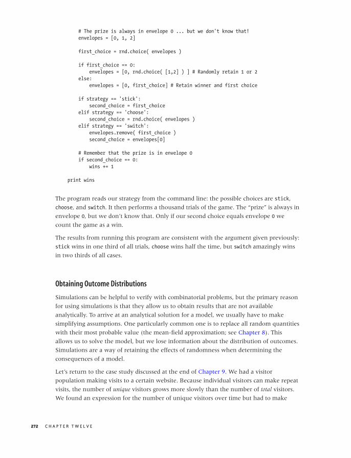
O’Reilly-5980006 master October 28, 2010 21:15
# The prize is always in envelope 0 ... but we don't know that!
envelopes = [0, 1, 2]
first_choice = rnd.choice( envelopes )
if first_choice == 0:
envelopes = [0, rnd.choice( [1,2] ) ] # Randomly retain 1 or 2
else:
envelopes = [0, first_choice] # Retain winner and first choice
if strategy == 'stick':
second_choice = first_choice
elif strategy == 'choose':
second_choice = rnd.choice( envelopes )
elif strategy == 'switch':
envelopes.remove( first_choice )
second_choice = envelopes[0]
# Remember that the prize is in envelope 0
if second_choice == 0:
wins += 1
print wins
The program reads our strategy from the command line: the possible choices are stick,
choose, and switch. It then performs a thousand trials of the game. The “prize” is always in
envelope 0, but we don’t know that. Only if our second choice equals envelope 0 we
count the game as a win.
The results from running this program are consistent with the argument given previously:
stick wins in one third of all trials, choose wins half the time, but switch amazingly wins
in two thirds of all cases.
Obtaining Outcome Distributions
Simulations can be helpful to verify with combinatorial problems, but the primary reason
for using simulations is that they allow us to obtain results that are not available
analytically. To arrive at an analytical solution for a model, we usually have to make
simplifying assumptions. One particularly common one is to replace all random quantities
with their most probable value (the mean-field approximation; see Chapter 8). This
allows us to solve the model, but we lose information about the distribution of outcomes.
Simulations are a way of retaining the effects of randomness when determining the
consequences of a model.
Let’s return to the case study discussed at the end of Chapter 9. We had a visitor
population making visits to a certain website. Because individual visitors can make repeat
visits, the number of unique visitors grows more slowly than the number of total visitors.
We found an expression for the number of unique visitors over time but had to make
272 C H A P T E R T W E L V E
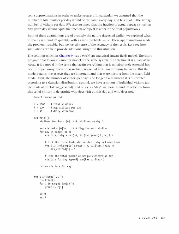
O’Reilly-5980006 master October 28, 2010 21:15
some approximations in order to make progress. In particular, we assumed that the
number of total visitors per day would be the same every day, and be equal to the average
number of visitors per day. (We also assumed that the fraction of actual repeat visitors on
any given day would equal the fraction of repeat visitors in the total population.)
Both of these assumptions are of precisely the nature discussed earlier: we replaced what
in reality is a random quantity with its most probable value. These approximations made
the problem tractable, but we lost all sense of the accuracy of the result. Let’s see how
simulations can help provide additional insight to this situation.
The solution which in Chapter 9 was a model: an analytical (mean-field) model. The short
program that follows is another model of the same system, but this time it is a simulation
model. It is a model in the sense that again everything that is not absolutely essential has
been stripped away: there is no website, no actual visits, no browsing behavior. But the
model retains two aspects that are important and that were missing from the mean-field
model. First, the number of visitors per day is no longer fixed, instead it is distributed
according to a Gaussian distribution. Second, we have a notion of individual visitors (as
elements of the list has visited), and on every “day” we make a random selection from
this set of visitors to determine who does visit on this day and who does not.
import random as rnd
n = 1000 # total visitors
k = 100 # avg visitors per day
s = 50 # daily variation
def trial():
visitors_for_day = [0] # No visitors on day 0
has_visited = [0]*n # A flag for each visitor
for day in range( 31 ):
visitors_today = max( 0, int(rnd.gauss( k, s )) )
# Pick the individuals who visited today and mark them
for i in rnd.sample( range( n ), visitors_today ):
has_visited[i] = 1
# Find the total number of unique visitors so far
visitors_for_day.append( sum(has_visited) )
return visitors_for_day
for t in range( 25 ):
r = trial()
for i in range( len(r) ):
print i, r[i]
S I M U L AT I O N S 273
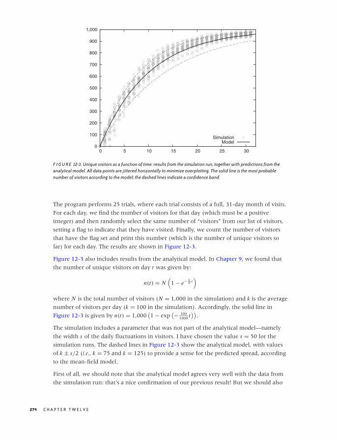
O’Reilly-5980006 master October 28, 2010 21:15
0
100
200
300
400
500
600
700
800
900
1,000
0 5 10 15 20 25 30
SimulationModel
F I G U R E 12-3. Unique visitors as a function of time: results from the simulation run, together with predictions from theanalytical model. All data points are jittered horizontally to minimize overplotting. The solid line is the most probablenumber of visitors according to the model; the dashed lines indicate a confidence band.
The program performs 25 trials, where each trial consists of a full, 31-day month of visits.
For each day, we find the number of visitors for that day (which must be a positive
integer) and then randomly select the same number of “visitors” from our list of visitors,
setting a flag to indicate that they have visited. Finally, we count the number of visitors
that have the flag set and print this number (which is the number of unique visitors so
far) for each day. The results are shown in Figure 12-3.
Figure 12-3 also includes results from the analytical model. In Chapter 9, we found that
the number of unique visitors on day t was given by:
n(t) = N(
1 − e− kN t
)
where N is the total number of visitors (N = 1,000 in the simulation) and k is the average
number of visitors per day (k = 100 in the simulation). Accordingly, the solid line in
Figure 12-3 is given by n(t) = 1,000(1 − exp
(− 1001000 t
)).
The simulation includes a parameter that was not part of the analytical model—namely
the width s of the daily fluctuations in visitors. I have chosen the value s = 50 for the
simulation runs. The dashed lines in Figure 12-3 show the analytical model, with values
of k ± s/2 (i.e., k = 75 and k = 125) to provide a sense for the predicted spread, according
to the mean-field model.
First of all, we should note that the analytical model agrees very well with the data from
the simulation run: that’s a nice confirmation of our previous result! But we should also
274 C H A P T E R T W E L V E

O’Reilly-5980006 master October 28, 2010 21:15
note the differences; in particular, the simulation results are consistently higher than the
theoretical predictions. If we think about this for a moment, this makes sense. If on any
day there are unusually many visitors, then this irrevocably bumps the number of unique
visitors up: the number of unique visitors can never shrink, so any outlier above the
average can never be neutralized (in contrast to an outlier below the average, which can
be compensated by any subsequent high-traffic day).
We can further analyze the data from the simulation run, depending on our needs. For
instance, we can calculate the most probable value for each day, and we can estimate
proper confidence intervals around it. (We will need more than 25 trials to obtain a good
estimate of the latter.)
What is more interesting about the simulation model developed here is that we can use it
to obtain additional information that would be difficult or impossible to calculate from the
analytical formula. For example, we may ask for the distribution of visits per user (i.e., how
many users have visited once, twice, three times, and so on). The answer to this question
is just a snap of the fingers away! We can also extend the model and ask for the number of
unique visitors who have paid two or more visits (not just one). (For two visits per person,
this question can be answered within the framework of the original analytical model, but
the calculations rapidly become more tedious as we are asking for higher visit counts per
person.)
Finally, we can extend the simulation to include features not included in the analytical
model at all. For instance, for a real website, not all possible visitors are equally likely to
visit: some individuals will have a higher probability of visiting the website than do others.
It would be very difficult to incorporate this kind of generalization into the approach
taken in Chapter 9, because it contradicts the basic assumption that the fraction of actual
repeat visitors equals the fraction of repeat visitors in the total population. But it is not at
all difficult to model this behavior in a simulation model!
Pro and Con
Basic simulations of the kind discussed in this section are often easy to program—certainly
as compared with the effort required to develop nontrivial combinatorial arguments!
Moreover, when we start writing a simulation project, we can be fairly certain of being
successful in the end; whereas there is no guarantee that an attempt to find an exact
answer to a combinatorial problem will lead anywhere.
On the other hand, we should not forget that a simulation produces numbers, not insight!
A simulation is always only one step in a larger process, which must include a proper
analysis of the results from the simulation run and, ideally, also involves an attempt to
incorporate the simulation data into a larger conceptual model. I always get a little
uncomfortable when presented with a bunch of simulation results that have not been fit
into a larger context. Simulations cannot replace analytical modeling.
S I M U L AT I O N S 275
O’Reilly-5980006 master October 28, 2010 21:15
In particular, simulations do not yield the kind of insight into the mechanisms driving
certain developments that a good analytical model affords. For instance, recall the case
study near the end of Chapter 8, in which we tried to determine the optimal number of
servers. One important insight from that model was that the probability pn for a total
failure dropped extremely rapidly as the number n of servers increased: the exponential
decay (with n) is much more important than the reliability p of each individual server. (In
other words, redundant commodity hardware beats expensive supercomputers—at least
for situations in which this simplified cost model holds!) This is the kind of insight that
would be difficult to gain simply by looking at results from simulation runs.
Simulations can be valuable for verifying analytical work and for extending it by
incorporating details that would be difficult or impossible to treat in an analytical model.
At the same time, the benefit that we can derive from simulations is enhanced by the
insight gained from the analytical, conceptual modeling of the the mechanisms driving a
system.
The two methods are complementary—although I will give primacy to analytical work.
Analytical models without simulation may be crude but will still yield insight, whereas
simulations without analysis produce only numbers, not insight.
Resampling Methods
Imagine you have taken a sample of n points from some population. It is now a trivial
exercise to calculate the mean from this sample. But how reliable is this mean? If we
repeatedly took new samples (of the same size) from the population and calculated their
means, how much would the various values for the mean jump around?
This question is important. A point estimate (such as the mean by itself) is not very
powerful: what we really want is an interval estimate which also gives us a sense of the
reliability of the answer.
If we could go back and draw additional samples, then we could obtain the distribution of
the mean directly as a histogram of the observed means. But that is not an option: all we
have are the n data points of the original sample.
Much of classical statistics deals with precisely this question: how can we make statements
about the reliability of an estimate based only on a set of observations? To make progress,
we need to make some assumptions about the way values are distributed. This is where
the sampling distributions of classical statistics come in: all those Normal, t , and chi-square
distributions (see Chapter 10). Once we have a theoretical model for the way points are
distributed, we can use this model to establish confidence intervals.
Being able to make such statements is one of the outstanding achievements of classical
statistics, but at the same time, the difficulties in getting there are a major factor in making
classical statistics seem so obscure. Two problems stand out:
276 C H A P T E R T W E L V E
O’Reilly-5980006 master October 28, 2010 21:15
• Our assumptions about the shape of those distributions may not be correct, or we may
not be able to formulate those distributions at all—in particular, if we are interested in
more complicated quantities than just the sample mean or if we are dealing with
populations that are ill behaved (i.e., not even remotely Gaussian).
• Even if we know the sampling distribution, determining confidence limits from it may
be tedious, opaque, and error-prone.
The Bootstrap
The bootstrap is an alternative approach for finding confidence intervals and similar
quantities directly from the data. Instead of making assumptions about the distribution of
values and then employing theoretical arguments, the bootstrap goes back to the original
idea: what if we could draw additional samples from the population?
We can’t go back to the original population, but the sample that we already have should
be a fairly good approximation to the overall population. We can therefore create
additional samples (also of size n) by sampling with replacement from the original sample.
For each of these “synthetic” samples, we can calculate the mean (or any other quantity,
of course) and then use this set of values for the mean to determine a measure of the
spread of its distribution via any standard method (e.g., we might calculate its
inter-quartile range; see Chapter 2).
Let’s look at an example—one that is simple enough that we can work out the analytical
answer and compare it directly to the bootstrap results. We draw n = 25 points from a
standard Gaussian distribution (with mean μ = 0 and standard deviation σ = 1). We then
ask about the (observed) sample mean and more importantly, about its standard error. In
this case, the answer is simple: we know that the error of the mean is σ/√
n (see Chapter
11), which amounts to 1/5 here. This is the analytical result.
To find the bootstrap estimate for the standard error, we draw 100 samples, each
containing n = 25 points, from our original sample of 25 points. Points are drawn
randomly with replacement (so that each point can be selected multiple times). For each
of these bootstrap samples, we calculate the mean. Now we ask: what is the spread of the
distribution of these 100 bootstrap means?
The data is plotted in Figure 12-4. At the bottom, we see the 25 points of the original data
sample; above that, we see the means calculated from the 100 bootstrap samples. (All
points are jittered vertically to minimize overplotting.) In addition, the figure shows
kernel density estimates (see Chapter 2) of the original sample and also of the bootstrap
means. The latter is the answer to our original question: if we repeatedly took samples
from the original distribution, the sample means would be distributed similarly to the
bootstrap means.
(Because in this case we happen to know the original distribution, we can also plot both it
and the theoretical distribution of the mean, which happens to be Gaussian as well but
S I M U L AT I O N S 277
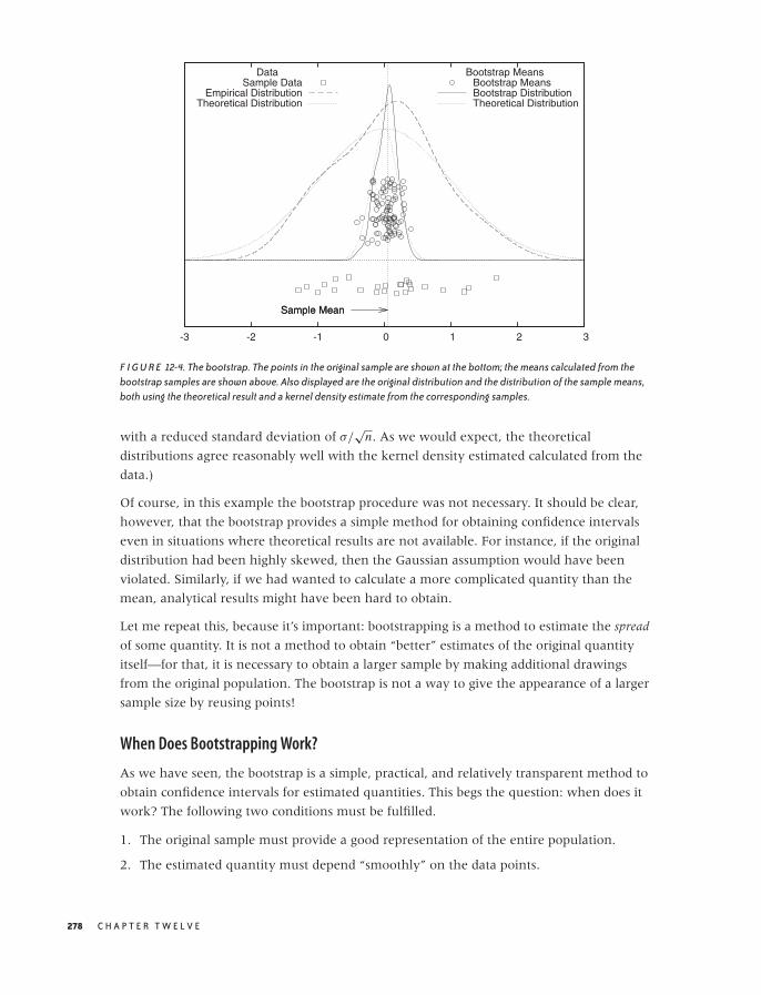
O’Reilly-5980006 master October 28, 2010 21:15
-3 -2 -1 0 1 2 3
Sample Mean
DataSample Data
Empirical DistributionTheoretical Distribution
Sample Mean
Bootstrap MeansBootstrap MeansBootstrap DistributionTheoretical Distribution
F I G U R E 12-4. The bootstrap. The points in the original sample are shown at the bottom; the means calculated from thebootstrap samples are shown above. Also displayed are the original distribution and the distribution of the sample means,both using the theoretical result and a kernel density estimate from the corresponding samples.
with a reduced standard deviation of σ/√
n. As we would expect, the theoretical
distributions agree reasonably well with the kernel density estimated calculated from the
data.)
Of course, in this example the bootstrap procedure was not necessary. It should be clear,
however, that the bootstrap provides a simple method for obtaining confidence intervals
even in situations where theoretical results are not available. For instance, if the original
distribution had been highly skewed, then the Gaussian assumption would have been
violated. Similarly, if we had wanted to calculate a more complicated quantity than the
mean, analytical results might have been hard to obtain.
Let me repeat this, because it’s important: bootstrapping is a method to estimate the spread
of some quantity. It is not a method to obtain “better” estimates of the original quantity
itself—for that, it is necessary to obtain a larger sample by making additional drawings
from the original population. The bootstrap is not a way to give the appearance of a larger
sample size by reusing points!
When Does Bootstrapping Work?
As we have seen, the bootstrap is a simple, practical, and relatively transparent method to
obtain confidence intervals for estimated quantities. This begs the question: when does it
work? The following two conditions must be fulfilled.
1. The original sample must provide a good representation of the entire population.
2. The estimated quantity must depend “smoothly” on the data points.
278 C H A P T E R T W E L V E
O’Reilly-5980006 master October 28, 2010 21:15
The first condition requires the original sample to be sufficiently large and relatively clean.
If the sample size is too small, then the original estimate for the actual quantity in question
(the mean, in our example) won’t be very good. (Bootstrapping in a way exacerbates this
problem because data points have a greater chance of being reused repeatedly in the
bootstrap samples.) In other words, the original sample has to be large enough to allow
meaningful estimation of the primary quantity. Use common sense and insight into your
specific application area to establish the required sample size for your situation.
Additionally, the sample has to be relatively clean: crazy outliers, for instance, can be a
problem. Unless the sample size is very large, outliers have a significant chance of being
reused in a bootstrap sample, distorting the results.
Another problem exists in situations involving power-law distributions. As we saw in
Chapter 9, estimated values for such distributions may not be unique but depend on the
sample size. Of course, the same considerations apply to bootstrap samples drawn from
such distributions.
The second condition suggests that bootstrapping does not work well for quantities that
depend critically on only a few data points. For example, we may want to estimate the
maximum value of some distribution. Such an estimate depends critically on the largest
observed value—that is, on a single data point. For such applications, the bootstrap is not
suitable. (In contrast, the mean depends on all data points and with equal weight.)
Another questions concerns the number of bootstrap samples to take. The short answer is:
as many as you need to obtain a sufficiently good estimate for the spread you are
calculating. If the number of points in the original sample is very small, then creating too
many bootstrap samples is counterproductive because you will be regenerating the same
bootstrap samples over and over again. However, for reasonably sized samples, this is not
much of a problem, since the number of possible bootstrap samples grows very quickly
with the number of data points n in the original sample. Therefore, it is highly unlikely
that the same bootstrap example is generated more than once—even if we generate
thousands of bootstrap samples.
The following argument will help to develop a sense for the order of magnitudes involved.
The problem of choosing n data points with replacement from the original n-point sample
is equivalent to assigning n elements to n cells. It is a classical problem in occupancy
theory to show that there are:
(2n − 1
n
)= (2n − 1)!
n!(n − 1)!
ways of doing this. This number grows extremely quickly: for n = 5 it is 126, for n = 10
we have 92,378, but for n = 20 it already exceeds 1010.
(The usual proof proceeds by observing that assigning r indistinguishable objects to n bins
is equivalent to aligning r objects and n − 1 bin dividers. There are r + n − 1 spots in total,
S I M U L AT I O N S 279
O’Reilly-5980006 master October 28, 2010 21:15
which can be occupied by either an object or a divider, and the assignment amounts to
choosing r of these spots for the r objects. The number of ways one can choose r elements
out of n + r − 1 is given by the binomial coefficient(r+n−1
r
). Since in our case r = n, we
find that the number of different bootstrap samples is given by the expression above.)
Bootstrap Variants
There are a few variants of the basic bootstrap idea. The method so far—in which points
are drawn directly from the original sample—is known as the nonparametric bootstrap. An
alternative is the parametric bootstrap: in this case, we assume that the original population
follows some particular probability distribution (such as the Gaussian), and we estimate its
parameters (mean and standard deviation, in this case) from the original sample. The
bootstrap samples are then drawn from this distribution rather than from the original
sample. The advantage of the parametric bootstrap is that the bootstrap values do not
have to coincide exactly with the known data points. In a similar spirit, we may use the
original sample to compute a kernel density estimate (as an approximation to the
population distribution) and then draw bootstrap samples from it. This method combines
aspects of both parametric and nonparametric approaches: it is nonparametric (because it
make no assumption about the form of the underlying population distribution), yet the
bootstrap samples are not restricted to the values occurring in the original sample. In
practice, neither of these variants seems to provide much of an advantage over the
original idea (in part because the number of possible bootstrap samples grows so quickly
with the number of points in the sample that choosing the bootstrap samples from only
those points is not much of a restriction).
Another idea (which historically predates the bootstrap) is the so-called jackknife. In the
jackknife, we don’t draw random samples. Instead, given an original sample consisting of
n data points, we calculate the n estimates of the quantity of interest by successively
omitting one of the data points from the sample. We can now use these n values in a
similar way that we used values calculated from bootstrap samples. Since the jackknife
does not contain any random element, it is an entirely deterministic procedure.
Workshop: Discrete Event Simulations with SimPy
All the simulation examples that we considered so far were either static (coin tosses,
Monty Hall problem) or extremely stripped down and conceptual (unique visitors). But if
we are dealing with the behavior and time development of more complex systems—
consisting of many different particles or actors that interact with each other in
complicated ways—then we want a simulation that expresses all these entities in a
manner that closely resembles the problem domain. In fact, this is probably exactly what
most of us think of when we hear the term “simulation.”
There are basically two different ways that we can set up such a simulation. In a continuous
time simulation, time progresses in “infinitesimally” small increments. At each time step, all
280 C H A P T E R T W E L V E

O’Reilly-5980006 master October 28, 2010 21:15
simulation objects are advanced while taking possible interactions or status changes into
account. We would typically choose such an approach to simulate the behavior of
particles moving in a fluid or a similar system.
But in other cases, this model seems wasteful. For instance, consider customers arriving at
a bank: in such a situation, we only care about the events that change the state of the
system (e.g., customer arrives, customer leaves)—we don’t actually care what the
customers do while waiting in line! For such system we can use a different simulation
method, known as discrete event simulation. In this type of simulation, time does not pass
continuously; instead, we determine when the next event is scheduled to occur and then
jump ahead to exactly that moment in time.
Discrete event simulations are applicable to a wide variety of problems involving multiple
users competing for access to a shared server. It will often be convenient to phrase the
description in terms of the proverbial “customers arriving at a bank,” but exactly the same
considerations apply, for instance, to messages on a computer network.
Introducing SimPy
The SimPy package (http://simpy.sourceforge.net/) is a Python project to build discrete event
simulation models. The framework handles all the event scheduling and messaging
“under the covers” so that the programmer can concentrate on describing the behavior
of the actors in the simulation.
All actors in a SimPy simulation must be subclasses of the class Process. Congestion points
where queues form are modeled by instances of the Resource class or its subclasses. Here is
a short example, which describes a customer visiting a bank:
from SimPy.Simulation import *
class Customer( Process ):
def doit( self ):
print "Arriving"
yield request, self, bank
print "Being served"
yield hold, self, 100.0
print "Leaving"
yield release, self, bank
# Beginning of main simulation program
initialize()
bank = Resource()
cust = Customer()
cust.start( cust.doit() )
simulate( until=1000 )
S I M U L AT I O N S 281

O’Reilly-5980006 master October 28, 2010 21:15
Let’s skip the class definition of the Customer object for now and concentrate on the rest of
the program. The first function to call in any SimPy program is the initialize() method,
which sets up the simulation run and sets the “simulation clock” to zero. We then proceed
to create a Resource object (which models the bank) and a single Customer object. After
creating the Customer, we need to activate it via the start() member function. The start()
function takes as argument the function that will be called to advance the Customer
through its life cycle (we’ll come back to that). Finally, we kick off the actual simulation,
requiring it to stop after 1,000 time steps on the simulation clock have passed.
The Customer subclasses Process, therefore its instances are active agents, which will be
scheduled by the framework to receive events. Each agent must define a process execution
method (PEM), which defines its behavior and which will be invoked by the framework
whenever an event occurs.
For the Customer class, the PEM is the doit() function. (There are no restrictions on its
name—it can be called anything.) The PEM describes the customer’s behavior: after the
customer arrives, the customer requests a resource instance (the bank in this case). If the
resource is not available (because it is busy, serving other customers), then the framework
will add the customer to the waiting list (the queue) for the requested resource. Once the
resource becomes available, the customer is being serviced. In this simple example, the
service time is a fixed value of 100 time units, during which the customer instance is
holding—just waiting until the time has passed. When service is complete, the customer
releases the resource instance. Since no additional actions are listed in the PEM, the
customer is not scheduled for future events and will disappear from the simulation.
Notice that the Customer interacts with the simulation environment through Python yield
statements, using special yield expressions of the form shown in the example. Yielding
control back to the framework in this way ensures that the Customer retains its state and
its current spot in the life cycle between invocations. Although there are no restrictions on
the name and argument list permissible for a PEM, each PEM must contain at least one of
these special yield statements. (But of course not necessarily all three, as in this case; we
are free to define the behavior of the agents in our simulations at will.)
The Simplest Queueing Process
Of course the previous example which involved only a single customer entering and
leaving the bank, is not very exciting—we hardly needed a simulation for that! Things
change when we have more than one customer in the system at the same time.
The listing that follows is very similar to the previous example, except that now there is
an infinite stream of customers arriving at the bank and requesting service. To generate
this infinite sequence of customers, the listing makes use of an idiom that’s often used in
SimPy programs: a “source” (the CustomerGenerator instance).
282 C H A P T E R T W E L V E

O’Reilly-5980006 master October 28, 2010 21:15
from SimPy.Simulation import *
import random as rnd
interarrival_time = 10.0
service_time = 8.0
class CustomerGenerator( Process ):
def produce( self, b ):
while True:
c = Customer( b )
c.start( c.doit() )
yield hold, self, rnd.expovariate(1.0/interarrival_time)
class Customer( Process ):
def __init__( self, resource ):
Process.__init__( self )
self.bank = resource
def doit( self ):
yield request, self, self.bank
yield hold, self, self.bank.servicetime()
yield release, self, self.bank
class Bank( Resource ):
def servicetime( self ):
return rnd.expovariate(1.0/service_time)
initialize()
bank = Bank( capacity=1, monitored=True, monitorType=Monitor )
src = CustomerGenerator()
activate( src, src.produce( bank ) )
simulate( until=500 )
print bank.waitMon.mean()
for evt in bank.waitMon:
print evt[0], evt[1]
The CustomerGenerator is itself a subclass of Process and defines a PEM (produce()).
Whenever it is triggered, it generates a new Customer and then goes back to sleep for a
random amount of time. (The time is distributed according to an exponential
distribution—we will discuss this particular choice in a moment.) Notice that we don’t
need to keep track of the Customer instances explicitly: once they have been activated
using the start() member function, the framework ensures that they will receive
scheduled events.
S I M U L AT I O N S 283

O’Reilly-5980006 master October 28, 2010 21:15
There are two changes to the Customer class. First of all, we explicitly inject the resource to
request (the bank) as an additional argument to the constructor. By contrast, the Customer
in the previous example found the bank reference via lookup in the global namespace.
That’s fine for small programs but becomes problematic for larger ones—especially if there
is more than one resource that may be requested. The second change is that the Customer
now asks the bank for the service time. This is in the spirit of problem domain
modeling—it’s usually the server (in this case, the bank) that controls the time it takes to
complete a transaction. Accordingly, we have introduced Bank as subclass of Resource in
order to accommodate this additional functionality. (The service time is also exponentially
distributed but with a different wait time than that used for the CustomerGenerator.)
Subtypes of the Process class are used to model actors in a SimPy simulation. Besides
these active simulation objects, the next most important abstraction describes congestion
points, modeled by the Resource class and its subclasses. Each Resource instance models a
shared resource that actors may request, but its more important function is to manage the
queue of actors currently waiting for access.
Each Resource instance consists of a single queue and one or more actual “server units”
that can fulfill client requests. Think of the typical queueing discipline followed in banks
and post offices (in the U.S.—other countries have different conventions!): a single line
but multiple teller windows, with the person at the head of the line moving to the next
available window. That is the model represented by each Resource instance. The number
of server units is controlled through the keyword argument capacity to the Resource
constructor. Note that all server units in a single Resource instance are identical. Server
units are also “passive”: they have no behavior themselves. They only exist so that a
Process object can acquire them, hold them for a period of time, and then release them
(like a mutex).
Although a Resource instance may have multiple server units, it can contain only a single
queue. If you want to model a supermarket checkout situation, where each server unit
has its own queue, you therefore need to set up multiple Resource instances, each with
capacity=1: one for each checkout stand and each managing its own queue of customers.
For each Resource instance, we can monitor the length of the queue and the events that
change it (arrivals and departures) by registering an observer object with the Resource.
There are two types of such observers in SimPy: a Monitor records the time stamp and new
queue length for every event that affects the queue, whereas a Tally only keeps enough
information to calculate summary information (such as the average queue length). Here
we have registered a Monitor object with the Bank. (We’ll later see an example of a Tally.)
As before, we run the simulation until the internal simulation clock reaches 1,000. The
CustomerGenerator produces an infinite stream of Customer objects, each requesting service
from the Bank, while the Monitor records all changes to the queue.
284 C H A P T E R T W E L V E
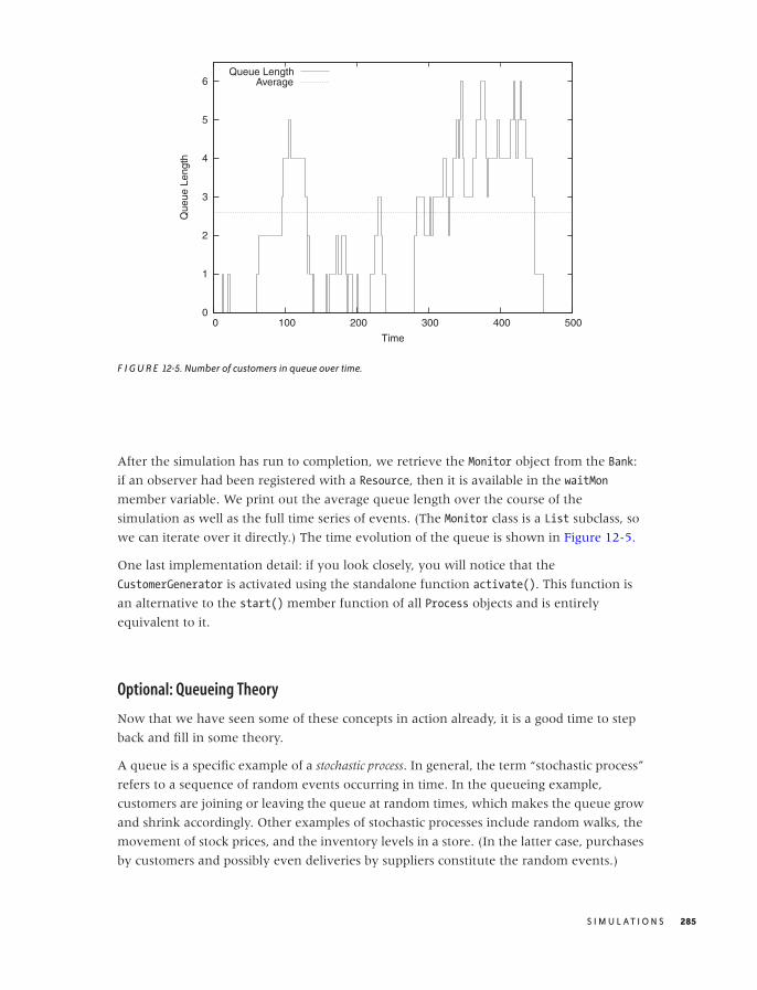
O’Reilly-5980006 master October 28, 2010 21:15
0
1
2
3
4
5
6
0 100 200 300 400 500
Que
ue L
engt
h
Time
Queue LengthAverage
F I G U R E 12-5. Number of customers in queue over time.
After the simulation has run to completion, we retrieve the Monitor object from the Bank:
if an observer had been registered with a Resource, then it is available in the waitMon
member variable. We print out the average queue length over the course of the
simulation as well as the full time series of events. (The Monitor class is a List subclass, so
we can iterate over it directly.) The time evolution of the queue is shown in Figure 12-5.
One last implementation detail: if you look closely, you will notice that the
CustomerGenerator is activated using the standalone function activate(). This function is
an alternative to the start() member function of all Process objects and is entirely
equivalent to it.
Optional: Queueing Theory
Now that we have seen some of these concepts in action already, it is a good time to step
back and fill in some theory.
A queue is a specific example of a stochastic process. In general, the term “stochastic process”
refers to a sequence of random events occurring in time. In the queueing example,
customers are joining or leaving the queue at random times, which makes the queue grow
and shrink accordingly. Other examples of stochastic processes include random walks, the
movement of stock prices, and the inventory levels in a store. (In the latter case, purchases
by customers and possibly even deliveries by suppliers constitute the random events.)
S I M U L AT I O N S 285
O’Reilly-5980006 master October 28, 2010 21:15
In a queueing problem, we are concerned only about arrivals and departures. A
particularly important special case assumes that the rate at which customers arrive is
constant over time and that arrivals at different times are independent of each other.
(Notice that these are reasonable assumptions in many cases.) These two conditions imply
that the number of arrivals during a certain time period t follows a Poisson distribution,
since the Poisson distribution:
p(k, t, λ) = (λt)k
k!e−λt
gives the probability of observing k Successes (arrivals, in our case) during an interval of
length t if the “rate” of Successes is λ (see Chapter 9).
Another consequence is that the times between arrivals are distributed according to an
exponential distribution:
p(t, λ) = λe−λt
The mean of the exponential distribution can be calculated without difficulty and equals
1/λ. It will often be useful to work with its inverse ta = 1/λ, the average interarrival time.
(It’s not hard to show that interarrival times are distributed according to the exponential
distribution when the number of arrivals per time interval follows a Poisson distribution.
Assume that an arrival occurred at t = 0. Now we ask for the probability that no arrival
has occurred by t = T ; in other words, p(0, T, λ) = e−λT because x0 = 1 and 0! = 1.
Conversely, the probability that the next arrival will have occurred sometime between
t = 0 and t = T is 1 − p(0, T, λ). This is the cumulative distribution function for the
interarrival time, and from it, we find the probability density for an arrival to occur at t asddt (1 − p(0, t, λ)) = λe−λt .)
The appearance of the exponential distribution as the distribution of interarrival times
deserves some comment. At first glance, it may seem surprising because this distribution is
greatest for small interarrival times, seemingly favoring very short intervals. However, this
observation has to be balanced against the infinity of possible interarrival times, all of
which may occur! What is more important is that the exponential distribution is in a sense
the most “random” way that interarrival times can be distributed: no matter how long we
have waited since the last arrival, the probability that the next visitor will arrive after t
more minutes is always the same: p(t, λ) = λe−λt . This property is often referred to as the
lack of memory of the exponential distribution. Contrast this with a distribution of
interarrival times that has a peak for some nonzero time: such a distribution describes a
situation of scheduled arrivals, as we would expect to occur at a bus stop. In this scenario,
the probability for an arrival to occur within the next t minutes will change with time.
Because the exponential distribution arises naturally from the assumption of a constant
arrival rate (and from the independence of different arrivals), we have used it as the
distribution of interarrival times in the CustomerGenerator in the previous example. It is
less of a natural choice for the distribution of service times (but it makes some theoretical
arguments simpler).
286 C H A P T E R T W E L V E
O’Reilly-5980006 master October 28, 2010 21:15
The central question in all queueing problems concerns the expected length of the
queue—not only how large it is but also whether it will settle down to a finite value at all,
or whether it will “explode,” growing beyond all bounds.
In the simple memoryless, single-server–single-queue scenario that we have been
investigating, the only two control parameters are the arrival rate λa and the service or
exit rate λe; or rather their ratio:
u = λa
λe
which is the fraction of time the server is busy. The quantity u is the server’s utilization. It
is intuitively clear that if the arrival rate is greater than the exit rate (i.e., if customers are
arriving at a faster rate then the server can process them), then the queue length will
explode. However, it turns out that even if the arrival rate equals the service rate (so that
u = 1), the queue length still grows beyond all bounds. Only if the arrival rate is strictly
lower than the service rate will we end up with a finite queue.
Let’s see how this surprising result can be derived. Let pn be the probability of finding
exactly n customers waiting in the queue. The rate at which the queue grows is λa , but the
rate at which the queue grows from exactly n to exactly n + 1 is λa pn , since we must take
into account the probability of the queue having exactly n members. Similarly, the
probability of the queue shrinking from n + 1 to n members is λe pn+1.
In the steady state (which is the requirement for a finite queue length), these two rates
must be equal:
λa pn = λe pn+1
which we can rewrite as:
pn+1 = λa
λepn = upn
This relationship must hold for all n, and therefore we can repeat this argument and write
pn = upn−1 and so on. This leads to an expression for pn in terms of p0:
pn = un p0
The probability p0 is the probability of finding no customer in the queue—in other words,
it is the probability that the server is idle. Since the utilization is the probability for the
server to be busy, the probability p0 for the server to be idle must be p0 = 1 − u.
We can now ask about the expected length L of the queue. We already know that the
queue has length n with probability pn = un p0. Finding the expected queue length L
S I M U L AT I O N S 287
O’Reilly-5980006 master October 28, 2010 21:15
requires that we sum over all possible queue lengths, each one weighted by the
appropriate probability:
L =∞∑
n=0
npn
= p0
∞∑
n=0
nun
Now we employ a trick that is often useful for sums of this form: observe thatddu un = nun−1 and hence that nun = u d
du un . Using this expression in the sum for L leads to:
L = p0
∞∑
n=0
ud
duun
= p0ud
du
∞∑
n=0
un
= p0ud
du
1
1 − u(geometric series)
= p0u
(1 − u)2
= u
1 − u
where we have used the sum of the geometric series (see Appendix B) and the expression
for p0 = 1 − u. We can rewrite this expression directly in terms of the arrival and exit rates
as:
L = u
1 − u= λa
λe − λa
This is a central result. It gives us the expected length of the queue in terms of the
utilization (or in terms of the arrival and exit rates). For low utilization (i.e., an arrival rate
that is much lower than the service rate or, equivalently, an interarrival time that is much
larger than the service time), the queue is very short on average. (In fact, whenever the
server is idle, then the queue length equals 0, which drags down the average queue
length.) But as the arrival rate approaches the service rate, the queue grows in length and
becomes infinite when the arrival rate equals the service rate. (An intuitive argument for
why the queue length will explode when the arrival rate equals the service time is that, in
this case, the server never has the opportunity to “catch up.” If the queue becomes longer
due to a chance fluctuation in arrivals, then this backlog will persist forever, since overall
the server is only capable of keeping up with arrivals. The cumulative effect of such
chance fluctuations will eventually make the queue length diverge.)
Running SimPy Simulations
In this section, we will try to confirm the previous result regarding the expected queue
length by simulation. In the process, we will discuss a few practical points of using SimPy
to understand queueing systems.
288 C H A P T E R T W E L V E

O’Reilly-5980006 master October 28, 2010 21:15
First of all, we must realize that each simulation run is only a particular realization of the
sequence of events. To draw conclusions about the system in general, we therefore always
need to perform several simulation runs and average their results.
In the previous listing, the simulation framework maintained its state in the global
environment. Hence, in order to rerun the simulation, you had to restart the entire
program! The program in the next listing uses an alternative interface that encapsulates
the entire environment for each simulation run in an instance of class Simulation. The
global functions initialize(), activate(), and simulate() are now member functions of
this Simulation object. Each instance of the Simulation class provides a separate, isolated
simulation environment. A completely new simulation run now requires only that we
create a new instance of this class.
The Simulation class is provided by SimPy. Using it does not require any changes to the
previous program, except that the current instance of the Simulation class must be passed
explicitly to all simulation objects (i.e., instances of Process and Resource and their
subclasses):
from SimPy.Simulation import *
import random as rnd
interarrival_time = 10.0
class CustomerGenerator( Process ):
def produce( self, bank ):
while True:
c = Customer( bank, sim=self.sim )
c.start( c.doit() )
yield hold, self, rnd.expovariate(1.0/interarrival_time)
class Customer( Process ):
def __init__( self, resource, sim=None ):
Process.__init__( self, sim=sim )
self.bank = resource
def doit( self ):
yield request, self, self.bank
yield hold, self, self.bank.servicetime()
yield release, self, self.bank
class Bank( Resource ):
def setServicetime( self, s ):
self.service_time = s
def servicetime( self ):
return rnd.expovariate(1.0/self.service_time )
def run_simulation( t, steps, runs ):
for r in range( runs ):
S I M U L AT I O N S 289
O’Reilly-5980006 master October 29, 2010 17:45
sim = Simulation()
sim.initialize()
bank = Bank( monitored=True, monitorType=Tally, sim=sim )
bank.setServicetime( t )
src = CustomerGenerator( sim=sim )
sim.activate( src, src.produce( bank ) )
sim.startCollection( when=steps//2 )
sim.simulate( until=steps )
print t, bank.waitMon.mean()
t = 0
while t <= 11.0:
t += 0.5
run_simulation( t, 100000, 10 )
Another important change is that we don’t start recording until half of the simulation
time steps have passed (that’s what the startCollection() method is for). Remember that
we are interested in the queue length in the steady state—for that reason, we don’t want to
start recording until the system has settled down and any transient behavior has
disappeared.
To record the queue length, we now use a Tally object instead of a Monitor. The Tally will
not allow us to replay the entire sequence of events, but since we are only interested in
the average queue length, it is sufficient for our current purposes.
Finally, remember that as the utilization approaches u = 1 (i.e., as the service time
approaches the interarrival time), we expect the queue length to become infinite. Of
course, in any finite simulation it is impossible for the queue to grow to infinite length:
the length of the queue is limited by the finite duration of the simulation run. The
consequence of this observation is that, for utilizations near or above 1, the queue length
that we will observe depends on the number of steps that we allow in the simulation. If
we terminate the simulation too quickly, then the system will not have had time to truly
reach its fully developed steady state and so our results will be misleading.
Figure 12-6 shows the results obtained when running the example program with 1,000
and 100,000 simulation steps. For low utilization (i.e., short queue lengths), the results
from both data sets agree with each other (and with the theoretical prediction). However,
as the service time approaches the interarrival time, the short simulation run does not last
long enough for the steady state to form, and so the observed queue lengths are too short.
Summary
This concludes our tour of discrete event simulation with SimPy. Of course, there is more
to SimPy than mentioned here—in particular, there are two additional forms of resources:
290 C H A P T E R T W E L V E
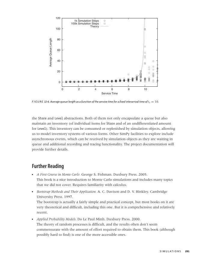
O’Reilly-5980006 master October 29, 2010 17:45
0
20
40
60
80
100
120
0 2 4 6 8 10
Ave
rage
Que
ue L
engt
h
Service Time
1k Simulation Steps100k Simulation Steps
Theory
F I G U R E 12-6. Average queue length as a function of the service time for a fixed interarrival time of ta = 10.
the Store and Level abstractions. Both of them not only encapsulate a queue but also
maintain an inventory (of individual items for Store and of an undifferentiated amount
for Level). This inventory can be consumed or replenished by simulation objects, allowing
us to model inventory systems of various forms. Other SimPy facilities to explore include
asynchronous events, which can be received by simulation objects as they are waiting in
queue and additional recording and tracing functionality. The project documentation will
provide further details.
Further Reading• A First Course in Monte Carlo. George S. Fishman. Duxbury Press. 2005.
This book is a nice introduction to Monte Carlo simulations and includes many topics
that we did not cover. Requires familiarity with calculus.
• Bootstrap Methods and Their Application. A. C. Davison and D. V. Hinkley. Cambridge
University Press. 1997.
The bootstrap is actually a fairly simple and practical concept, but most books on it are
very theoretical and difficult, including this one. But it is comprehensive and relatively
recent.
• Applied Probability Models. Do Le Paul Minh. Duxbury Press. 2000.
The theory of random processes is difficult, and the results often don’t seem
commensurate with the amount of effort required to obtain them. This book (although
possibly hard to find) is one of the more accessible ones.
S I M U L AT I O N S 291

O’Reilly-5980006 master October 28, 2010 21:15
• Introduction to Stochastic Processes. Gregory F. Lawler. Chapman & Hall/CRC. 2006.
This short book is much more advanced and theoretical than the previous one. The
treatment is concise and to the point.
• Introduction to Operations Research. Frederick S. Hillier and Gerald J. Lieberman. 9th ed.,
McGraw-Hill. 2009.
The field of operations research encompasses a set of mathematical methods that are
relevant for many problems arising in a business or industrial setting, including
queueing theory. This text is a standard introduction.
• Fundamentals of Queueing Theory. Donald Gross, John F. Shortle, James M. Thompson,
and Carl M. Harris. 4th ed., Wiley. 2008.
The standard textbook on queueing theory. Not for the faint of heart.
292 C H A P T E R T W E L V E
O’Reilly-5980006 master October 28, 2010 21:20
C H A P T E R T H I R T E E N
Finding Clusters
THE TERM CLUSTERING REFERS TO THE PROCESS OF FINDING GROUPS OF POINTS WITHIN A DATA SET THAT ARE IN
some way “lumped together.” It is also called unsupervised learning—unsupervised because
we don’t know ahead of time where the clusters are located or what they look like. (This
is in contrast to supervised learning or classification, where we attempt to assign data points
to preexisting classes; see Chapter 18.)
I regard clustering as an exploratory method: a computer-assisted (or even computationally
driven) approach to discovering structure in a data set. As an exploratory technique, it
usually needs to be followed by a confirmatory analysis that validates the findings and
makes them more precise.
Clustering is a lot of fun. It is a rich topic with a wide variety of different problems, as we
will see in the next section, where we discuss the different kinds of cluster one may
encounter. The topic also has a lot of intuitive appeal, and most clustering methods are
rather straightforward. This allows for all sorts of ad hoc modifications and enhancements
to accommodate the specific problem one is working on.
What Constitutes a Cluster?
Clustering is not a very rigorous field: there are precious few established results, rigorous
theorems, or algorithmic guarantees. In fact, the whole notion of a “cluster” is not
particularly well defined. Descriptions such as “groups of points that are similar” or “close
to each other” are insufficient, because clusters must also be well separated from each
other. Look at Figure 13-1: some points are certainly closer to each other than to other
points, yet there are no discernible clusters. (In fact, it is an interesting exercise to define
293
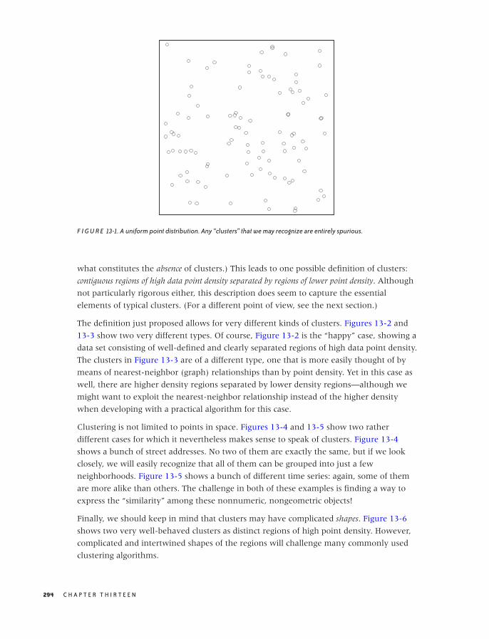
O’Reilly-5980006 master October 28, 2010 21:20
F I G U R E 13-1. A uniform point distribution. Any “clusters” that we may recognize are entirely spurious.
what constitutes the absence of clusters.) This leads to one possible definition of clusters:
contiguous regions of high data point density separated by regions of lower point density. Although
not particularly rigorous either, this description does seem to capture the essential
elements of typical clusters. (For a different point of view, see the next section.)
The definition just proposed allows for very different kinds of clusters. Figures 13-2 and
13-3 show two very different types. Of course, Figure 13-2 is the “happy” case, showing a
data set consisting of well-defined and clearly separated regions of high data point density.
The clusters in Figure 13-3 are of a different type, one that is more easily thought of by
means of nearest-neighbor (graph) relationships than by point density. Yet in this case as
well, there are higher density regions separated by lower density regions—although we
might want to exploit the nearest-neighbor relationship instead of the higher density
when developing with a practical algorithm for this case.
Clustering is not limited to points in space. Figures 13-4 and 13-5 show two rather
different cases for which it nevertheless makes sense to speak of clusters. Figure 13-4
shows a bunch of street addresses. No two of them are exactly the same, but if we look
closely, we will easily recognize that all of them can be grouped into just a few
neighborhoods. Figure 13-5 shows a bunch of different time series: again, some of them
are more alike than others. The challenge in both of these examples is finding a way to
express the “similarity” among these nonnumeric, nongeometric objects!
Finally, we should keep in mind that clusters may have complicated shapes. Figure 13-6
shows two very well-behaved clusters as distinct regions of high point density. However,
complicated and intertwined shapes of the regions will challenge many commonly used
clustering algorithms.
294 C H A P T E R T H I R T E E N
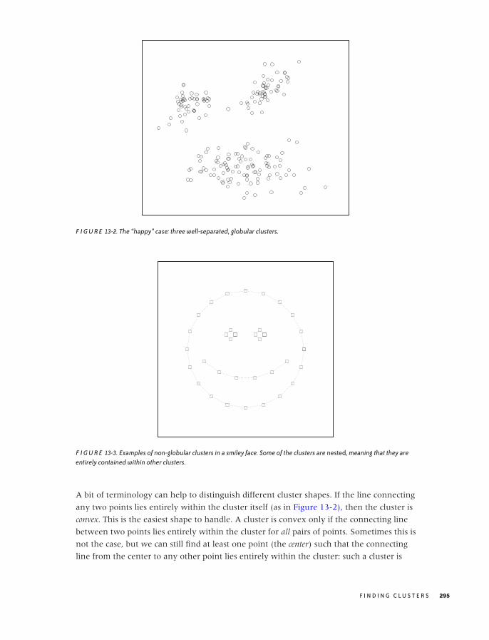
O’Reilly-5980006 master October 28, 2010 21:20
F I G U R E 13-2. The “happy” case: three well-separated, globular clusters.
F I G U R E 13-3. Examples of non-globular clusters in a smiley face. Some of the clusters are nested, meaning that they areentirely contained within other clusters.
A bit of terminology can help to distinguish different cluster shapes. If the line connecting
any two points lies entirely within the cluster itself (as in Figure 13-2), then the cluster is
convex. This is the easiest shape to handle. A cluster is convex only if the connecting line
between two points lies entirely within the cluster for all pairs of points. Sometimes this is
not the case, but we can still find at least one point (the center) such that the connecting
line from the center to any other point lies entirely within the cluster: such a cluster is
F I N D I N G C L U S T E R S 295
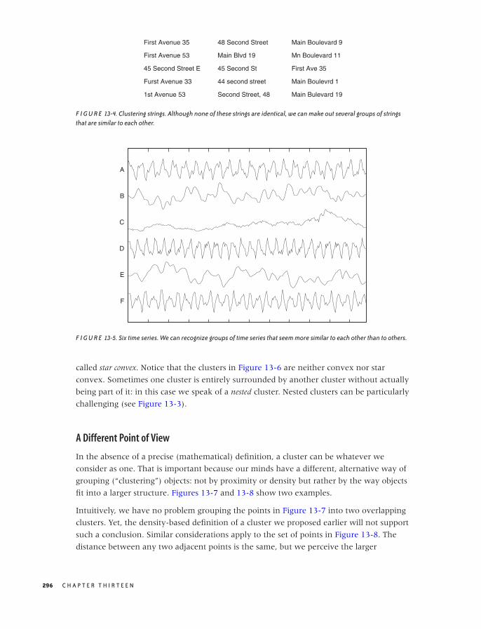
O’Reilly-5980006 master October 28, 2010 21:20
First Avenue 35
First Avenue 53
45 Second Street E
Furst Avenue 33
1st Avenue 53
48 Second Street
Main Blvd 19
45 Second St
44 second street
Second Street, 48
Main Boulevard 9
Mn Boulevard 11
First Ave 35
Main Boulevrd 1
Main Bulevard 19
F I G U R E 13-4. Clustering strings. Although none of these strings are identical, we can make out several groups of stringsthat are similar to each other.
F
E
D
C
B
A
F I G U R E 13-5. Six time series. We can recognize groups of time series that seem more similar to each other than to others.
called star convex. Notice that the clusters in Figure 13-6 are neither convex nor star
convex. Sometimes one cluster is entirely surrounded by another cluster without actually
being part of it: in this case we speak of a nested cluster. Nested clusters can be particularly
challenging (see Figure 13-3).
A Different Point of View
In the absence of a precise (mathematical) definition, a cluster can be whatever we
consider as one. That is important because our minds have a different, alternative way of
grouping (“clustering”) objects: not by proximity or density but rather by the way objects
fit into a larger structure. Figures 13-7 and 13-8 show two examples.
Intuitively, we have no problem grouping the points in Figure 13-7 into two overlapping
clusters. Yet, the density-based definition of a cluster we proposed earlier will not support
such a conclusion. Similar considerations apply to the set of points in Figure 13-8. The
distance between any two adjacent points is the same, but we perceive the larger
296 C H A P T E R T H I R T E E N

O’Reilly-5980006 master October 28, 2010 21:20
F I G U R E 13-6. Two clusters that are well separated but not globular. Some algorithms (e.g., the k-means algorithm) will notbe able to handle such clusters.
F I G U R E 13-7. An impossible situation for most clustering algorithms: although we believe to recognize two crossedclusters, no strictly local algorithm will be able to separate them.
structures of the vertical and horizontal arrangements and assign points to clusters based
on them.
This notion of a cluster does not hinge on the similarity or proximity of any pair of points
to each other but instead on the similarity between a point and a property of the entire
cluster. For any algorithm that considers a single point (or a single pair of points) at a time,
this leads to a problem: to determine cluster membership, we need the property of the
whole cluster; but to determine the properties of the cluster, we must first assign points to
clusters.
F I N D I N G C L U S T E R S 297

O’Reilly-5980006 master October 28, 2010 21:20
F I G U R E 13-8. The two clusters are distinguished not by a local property between pairs of points but rather by a globalproperty of the entire cluster.
To handle such situations, we would need to perform some kind of global structure
analysis—a task our minds are incredibly good at (which is why we tend to think of
clusters this way) but that we have a hard time teaching computers to do. For problems in
two dimensions, digital image processing has developed methods to recognize and extract
certain features (such as edge detection). But general clustering methods, such as those
described in the rest of this chapter, deal only with local properties and therefore can’t
handle problems such as those in Figures 13-7 and 13-8.
Distance and Similarity Measures
Given how strongly our intuition about clustering is shaped by geometric problems such
as those in Figures 13-2 and 13-3, it is an interesting and perhaps surprising observation
that clustering does not actually require data points to be embedded into a geometric
space: all that is required is a distance or (equivalently) a similarity measure for any pair of
points. This makes it possible to perform clustering on a set of strings, such as those in
Figure 13-4 that do not map to points in space. However, if the data points have
properties of a vector space (see Appendix C), then we can develop more efficient
algorithms that exploit these properties.
A distance is any function d(x, y) that takes two points and returns a scalar value that is a
measure for how different these points are: the more different, the larger the distance.
Depending on the problem domain, it may make more sense to express the same
information in terms of a similarity function s(x, y), which returns a scalar that tells us
how similar two points are: the more different they are, the smaller the similarity. Any
298 C H A P T E R T H I R T E E N
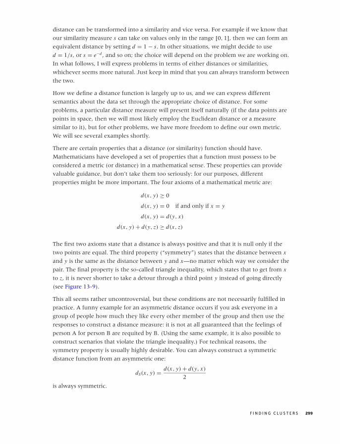
O’Reilly-5980006 master October 28, 2010 21:20
distance can be transformed into a similarity and vice versa. For example if we know that
our similarity measure s can take on values only in the range [0, 1], then we can form an
equivalent distance by setting d = 1 − s. In other situations, we might decide to use
d = 1/s, or s = e−d , and so on; the choice will depend on the problem we are working on.
In what follows, I will express problems in terms of either distances or similarities,
whichever seems more natural. Just keep in mind that you can always transform between
the two.
How we define a distance function is largely up to us, and we can express different
semantics about the data set through the appropriate choice of distance. For some
problems, a particular distance measure will present itself naturally (if the data points are
points in space, then we will most likely employ the Euclidean distance or a measure
similar to it), but for other problems, we have more freedom to define our own metric.
We will see several examples shortly.
There are certain properties that a distance (or similarity) function should have.
Mathematicians have developed a set of properties that a function must possess to be
considered a metric (or distance) in a mathematical sense. These properties can provide
valuable guidance, but don’t take them too seriously: for our purposes, different
properties might be more important. The four axioms of a mathematical metric are:
d(x, y) ≥ 0
d(x, y) = 0 if and only if x = y
d(x, y) = d(y, x)
d(x, y) + d(y, z) ≥ d(x, z)
The first two axioms state that a distance is always positive and that it is null only if the
two points are equal. The third property (“symmetry”) states that the distance between x
and y is the same as the distance between y and x—no matter which way we consider the
pair. The final property is the so-called triangle inequality, which states that to get from x
to z, it is never shorter to take a detour through a third point y instead of going directly
(see Figure 13-9).
This all seems rather uncontroversial, but these conditions are not necessarily fulfilled in
practice. A funny example for an asymmetric distance occurs if you ask everyone in a
group of people how much they like every other member of the group and then use the
responses to construct a distance measure: it is not at all guaranteed that the feelings of
person A for person B are requited by B. (Using the same example, it is also possible to
construct scenarios that violate the triangle inequality.) For technical reasons, the
symmetry property is usually highly desirable. You can always construct a symmetric
distance function from an asymmetric one:
dS(x, y) = d(x, y) + d(y, x)
2
is always symmetric.
F I N D I N G C L U S T E R S 299
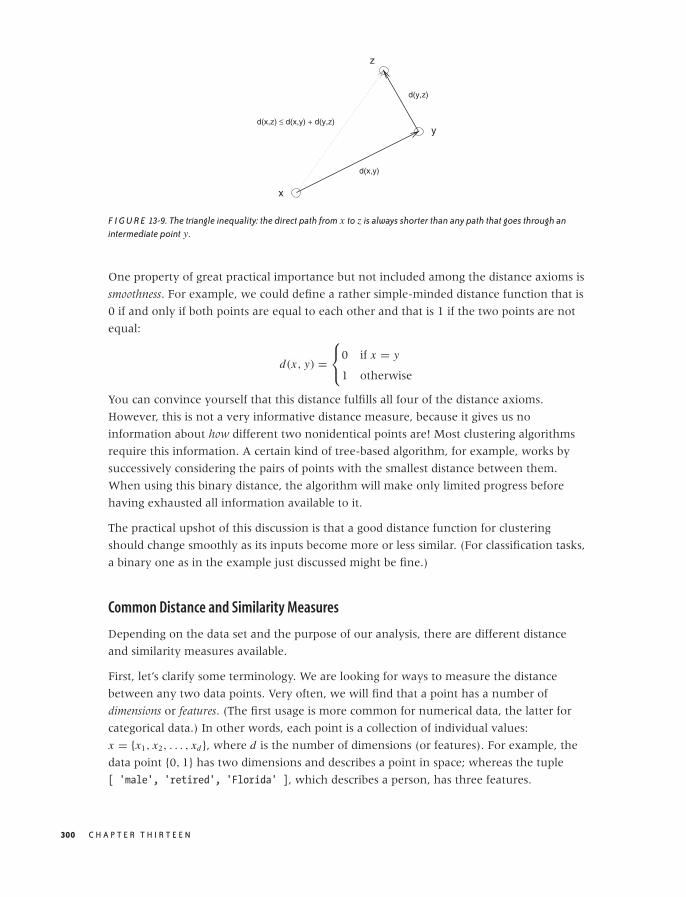
O’Reilly-5980006 master October 28, 2010 21:20
x
y
z
d(x,y)
d(y,z)
d(x,z) ≤ d(x,y) + d(y,z)
F I G U R E 13-9. The triangle inequality: the direct path from x to z is always shorter than any path that goes through anintermediate point y.
One property of great practical importance but not included among the distance axioms is
smoothness. For example, we could define a rather simple-minded distance function that is
0 if and only if both points are equal to each other and that is 1 if the two points are not
equal:
d(x, y) =⎧⎨
⎩0 if x = y
1 otherwise
You can convince yourself that this distance fulfills all four of the distance axioms.
However, this is not a very informative distance measure, because it gives us no
information about how different two nonidentical points are! Most clustering algorithms
require this information. A certain kind of tree-based algorithm, for example, works by
successively considering the pairs of points with the smallest distance between them.
When using this binary distance, the algorithm will make only limited progress before
having exhausted all information available to it.
The practical upshot of this discussion is that a good distance function for clustering
should change smoothly as its inputs become more or less similar. (For classification tasks,
a binary one as in the example just discussed might be fine.)
Common Distance and Similarity Measures
Depending on the data set and the purpose of our analysis, there are different distance
and similarity measures available.
First, let’s clarify some terminology. We are looking for ways to measure the distance
between any two data points. Very often, we will find that a point has a number of
dimensions or features. (The first usage is more common for numerical data, the latter for
categorical data.) In other words, each point is a collection of individual values:
x = {x1, x2, . . . , xd}, where d is the number of dimensions (or features). For example, the
data point {0, 1} has two dimensions and describes a point in space; whereas the tuple
[ 'male', 'retired', 'Florida' ], which describes a person, has three features.
300 C H A P T E R T H I R T E E N

O’Reilly-5980006 master October 28, 2010 21:20
T A B L E 13 -1. Commonly used distance and similarity measures fornumeric data
Name Definition
Manhattan d(x, y) = ∑di |xi − yi |
Euclidean d(x, y) =√∑d
i (xi − yi )2
Maximum d(x, y) = maxi |xi − yi |Minkowski d(x, y) =
(∑di |xi − yi |p
)1/p
Dot product x · y =∑d
i xi yi√∑di x2
i
√∑di y2
i
Correlationcoefficient
corr(x, y) =∑d
i (xi −x)(yi −y)√∑d
i (xi −x)2√∑d
i (yi −y)2
x = 1d
∑di xi y = 1
d
∑di yi
For any given data set containing n elements, we can form n2 pairs of points. The set of all
distances for all possible pairs of points can be arranged in a quadratic table known as the
distance matrix. The distance matrix embodies all information about the mutual
relationships between all points in the data set. If the distance function is symmetric, as is
usually the case, then the matrix is also symmetric. Furthermore, the entries along the
main diagonal typically are all 0, since d(x, x) = 0 for most well-behaved distance
functions.
Numerical data
If the data is numerical and also“mixable” or vector-like (in the sense of Appendix C),
then the data points bear a strong resemblance to points in space; hence we can use a
metric such as the familiar Euclidean distance. The Euclidean distance is the most
commonly used from a large family of related distance measures, which also contains the
so-called Manhattan (or taxicab) distance and the maximum (or supremum) distance. All of
these are in fact special cases of a more general Minkowski or p-distance.* Table 13-1 shows
some examples. (The Manhattan distance is so named because it measures distances the
way a New York taxicab moves: at right angles, along the city blocks. The Euclidean
distance measures distances “as the crow flies.” Finally, it is an amusing exercise to show
that the maximum distance corresponds to the Minkowski p-distance as p → ∞.)
All these distance measures have very similar properties, and the differences between
them usually do not matter much. The Euclidean distance is by far the most commonly
used. I list the others here mostly to give you a sense of the kind of leeway that exists in
defining a suitable distance measure—without significantly affecting the results!
*The Minkowski distance defined here should not be confused with the Minkowski metric, which definesthe metric of the four-dimensional space-time in special relativity.
F I N D I N G C L U S T E R S 301

O’Reilly-5980006 master October 28, 2010 21:20
If the data is numeric but not mixable (so that it does not make sense to add a random
fraction of one data set to a random fraction of a different data set), then these distance
measures are not appropriate. Instead, you may want to consider a metric based on the
correlation between two data points.
Correlation-based measures are measures of similarity: they are large when objects are
similar and small when the objects are dissimilar. There are two related measures: the dot
product and the correlation coefficient, which are also defined in Table 13-1. The only
difference is that when calculating the correlation coefficient, we first center both data
points by subtracting their respective means.
In both measures, we multiply entries for the same “dimension” and sum the results; then
we divide by the correlation of each data point with itself. Doing so provides a
normalization and ensures that the correlation of any point with itself is always 1. This
normalization step makes correlation-based distance measures suitable for data sets
containing data points with widely different numeric values.
By construction, the value of a dot product always falls in the interval [0, 1], and the
correlation coefficient always falls in the interval [−1, 1]. You can therefore transform
either one into a distance measure if need be (e.g., if d is the dot product, then 1 − d is a
proper distance).
I should point out that the dot product has a geometric meaning. If we regard the data
points as vectors in some suitable space, then the dot product of two points is the cosine of
the angle that the two vectors make with each other. If they are perfectly aligned (i.e.,
they fall onto each other), then the angle is 0 and the cosine (and the correlation) is 1. If
they are at right angles to each other, the cosine is 0.
Correlation-based distance measures are suitable whenever numeric data is not readily
mixable—for instance, when evaluating the similarity of the time series in Figure 13-5.
Categorical data
If the data is categorical, then we can count the number of features that do not agree in
both data points (i.e., the number of mismatched features); this is the Hamming distance.
(We might want to divide by the total number of features to obtain a number between 0
and 1, which is the fraction of mismatched features.)
In certain data mining problems, the number of features is large, but only relatively few of
them will be present for each data point. Moreover, the features may be binary: we care
only whether or not they are present, but their values don’t matter. (As an example,
imagine a patient’s health record: each possible medical condition constitutes a feature,
and we want to know whether the patient has ever suffered from it.) In such situations,
where features are not merely categorical but binary and sparse (meaning that just a few
of the features are On), we may be more interested in matches between features that are
On than in matches between features that are Off. This leads us to the Jaccard coefficient sJ ,
which is the number of matches between features that are On for both points, divided by
302 C H A P T E R T H I R T E E N
O’Reilly-5980006 master October 28, 2010 21:20
the number of features that are On in at least one of the data points. The Jaccard
coefficient is a similarity measure; the corresponding distance function is the Jaccard
distance dJ = 1 − sJ .
n00 features that are Off in both points
n10 features that are On in the first point, and Off in the second point
n01 features that are Off in the first point, and On in the second point
n11 features that are On in both points
sJ = n11
n10 + n01 + n11
dJ = n10 + n01
n10 + n01 + n11
There are many other measures of similarity or dissimilarity for categorical data, but
the principles are always the same. You calculate some fraction of matches, possibly
emphasizing one aspect (e.g., the presence or absence of certain values) more than others.
Feel free to invent your own—as far as I can see, none of these measures has achieved
universal acceptance or is fundamentally better than any other.
String data
If the data consists of strings, then we can use a form of Hamming distance and count the
number of mismatches. If the strings in the data set are not all of equal length, we can pad
the shorter string and count the number of characters added as mismatches.
If we are dealing with many strings that are rather similar to each other (distorted
through typos, for instance), then we can use a more detailed measure of the difference
between them—namely the edit or Levenshtein distance. The Levenshtein distance is the
minimum number of single-character operations (insertions, deletions, and substitutions)
required to transform one string into the other. (A quick Internet search will give many
references to the actual algorithm and available implementations.)
Another approach is to find the length of the longest common subsequence. This metric is
often used for gene sequence analysis in computational biology.
This may be a good place to make a more general point: the best distance measure to use
does not follow automatically from data type; rather, it depends on the semantics of the
data—or, more precisely, on the semantics that you care about for your current analysis!
In some cases, a simple metric that only calculates the difference in string length may be
perfectly sufficient. In another case, you might want to use the Hamming distance. If you
really care about the details of otherwise similar strings, the Levenshtein distance is most
appropriate. You might even want to calculate how often each letter appears in a string
and then base your comparison on that. It all depends on what the data means and on
what aspect of it you are interested at the moment (which may also change as the analysis
progresses). Similar considerations apply everywhere—there are no “cookbook” rules.
F I N D I N G C L U S T E R S 303

O’Reilly-5980006 master October 28, 2010 21:20
Special-purpose metrics
A more abstract measure for the similarity of two points is based on the number of
neighbors that the two points have in common; this metric is known as the shared nearest
neighbor (SNN) similarity. To calculate the SNN for two points x and y, you find the k
nearest neighbors (using any suitable distance function) for both x and y. The number of
neighbors shared by both points is their mutual SNN.
The same concept can be extended to cases in which there is some property that the two
points may have in common. For example, in a social network we could define the
“closeness” of two people by the number of friends they share, by the number of movies
they have both seen, and so on. (This application is equivalent to the Hamming distance.)
Nearest-neighbor-based metrics are particularly suitable for high-dimensional data, where
other distance measures can give spuriously small results.
Finally, let me remind you that sometimes the solution does not consist of inventing a
new metric. Instead, the trick is to map the problem to a different space that already has a
predefined, suitable metric.
As an example, consider the problem of measuring the degree of similarity between
different text documents (we here assume that these documents are long—hundreds or
thousands of words). The standard approach to this problem is to count how often each
word appears in each document. The resulting data structure is referred to as the document
vector. You can now form a dot product between two document vectors as a measure of
their correspondence.
Technically speaking, we have mapped each document to a point in a (high-dimensional)
vector space. Each distinct word that occurs in any of the documents spans a new
dimension, and the frequency with which each word appears in a document provides the
position of that document along this axis. This is very interesting, because we have
transformed highly structured data (text) into numerical, even vector-like data and can
therefore now manipulate it much more easily. (Of course, the benefit comes at a price: in
doing so we have lost all information about the sequence in which words appeared in the
text. It is a separate consideration whether this is relevant for our purpose.)
One last comment: one can overdo it when defining distance and similarity measures.
Complicated or sophisticated definitions are usually not necessary as long as you capture
the fundamental semantics. The Hamming distance and the document vector correlation
are two good examples of simplified metrics that intentionally discard a lot of information
yet still turn out to be highly successful in practice.
Clustering Methods
In this section, we will discuss several very different clustering algorithms. As you will see,
the basic ideas behind all three algorithms are rather simple, and it is straightforward to
304 C H A P T E R T H I R T E E N
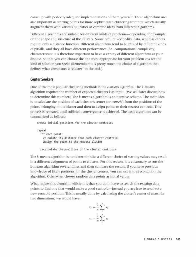
O’Reilly-5980006 master October 28, 2010 21:20
come up with perfectly adequate implementations of them yourself. These algorithms are
also important as starting points for more sophisticated clustering routines, which usually
augment them with various heuristics or combine ideas from different algorithms.
Different algorithms are suitable for different kinds of problems—depending, for example,
on the shape and structure of the clusters. Some require vector-like data, whereas others
require only a distance function. Different algorithms tend to be misled by different kinds
of pitfalls, and they all have different performance (i.e., computational complexity)
characteristics. It is therefore important to have a variety of different algorithms at your
disposal so that you can choose the one most appropriate for your problem and for the
kind of solution you seek! (Remember: it is pretty much the choice of algorithm that
defines what constitutes a “cluster” in the end.)
Center Seekers
One of the most popular clustering methods is the k-means algorithm. The k-means
algorithm requires the number of expected clusters k as input. (We will later discuss how
to determine this number.) The k-means algorithm is an iterative scheme. The main idea
is to calculate the position of each cluster’s center (or centroid) from the positions of the
points belonging to the cluster and then to assign points to their nearest centroid. This
process is repeated until sufficient convergence is achieved. The basic algorithm can be
summarized as follows:
choose initial positions for the cluster centroids
repeat:
for each point:
calculate its distance from each cluster centroid
assign the point to the nearest cluster
recalculate the positions of the cluster centroids
The k-means algorithm is nondeterministic: a different choice of starting values may result
in a different assignment of points to clusters. For this reason, it is customary to run the
k-means algorithm several times and then compare the results. If you have previous
knowledge of likely positions for the cluster centers, you can use it to precondition the
algorithm. Otherwise, choose random data points as initial values.
What makes this algorithm efficient is that you don’t have to search the existing data
points to find one that would make a good centroid—instead you are free to construct a
new centroid position. This is usually done by calculating the cluster’s center of mass. In
two dimensions, we would have:
xc = 1
n
n∑
i
xi
yc = 1
n
n∑
i
yi
F I N D I N G C L U S T E R S 305

O’Reilly-5980006 master October 28, 2010 21:20
where each sum is over all points in the cluster. (Generalizations to higher dimensions are
straightforward.) You can only do this for vector-like data, however, because only such
data allows us to form arbitrary “mixtures” in this way.
For strictly categorical data (such as the strings in Figure 13-4), the k-means algorithm
cannot be used (because it is not possible to “mix” different points to construct a new
centroid). Instead, we have to use the k-medoids algorithm. The k-medoids algorithm
works in the same way as the k-means algorithm except that, instead of calculating the
new centroid, we search through all points in the cluster to find the data point (the
medoid) that has the smallest average distance to all other points in the cluster.
The k-means algorithm is surprisingly modest in its resource consumption. On each
iteration, the algorithm evaluates the distance function once for each cluster and each
point; hence the computational complexity per iteration is O(k · n), where k is the number
of clusters and n is the number of points in the data set. This is remarkable because it
means that the algorithm is linear in the number of points. The number of iterations is
usually pretty small: 10–50 iterations are typical. The k-medoids algorithm is more costly
because the search to find the medoid of each cluster is an O(n2) process. For very large
data sets this might be prohibitive, but you can try running the k-medoids algorithm on
random samples of all data points. The results from these runs can then be used as starting
points for a run using the full data set.
Despite its cheap-and-cheerful appearance, the k-means algorithm works surprisingly
well. It is pretty fast and relatively robust. Convergence is usually quick. Because the
algorithm is simple and highly intuitive, it is easy to augment or extend it—for example,
to incorporate points with different weights. You might also want to experiment with
different ways to calculate the centroid, possibly using the median position rather than
the mean, and so on.
That being said, the k-means algorithm can fail—annoyingly in situations that exhibit
especially strong clustering! Because of its iterative nature, the algorithm works best in
situations that involve gradual density changes. If your data sets consists of very dense
and widely separated clusters, then the k-means algorithm can get “stuck” if initially two
centroids are assigned to the same cluster: moving one centroid to a different cluster
would require a large move, which is not likely to be found by the mostly local steps
taken by the k-means algorithm.
Among variants, a particularly important one is fuzzy clustering. In fuzzy clustering, we
don’t assign each point to a single cluster; instead, for each point and each cluster, we
determine the probability that the point belongs to that cluster. Each point therefore
acquires a set of k probabilities or weights (one for each cluster; the probabilities must sum
to 1 for each point). We then use these probabilities as weights when calculating the
centroid positions. The probabilities also make it possible to declare certain points as
“noise” (having low probability of belonging to any cluster) and thus can help with data
306 C H A P T E R T H I R T E E N
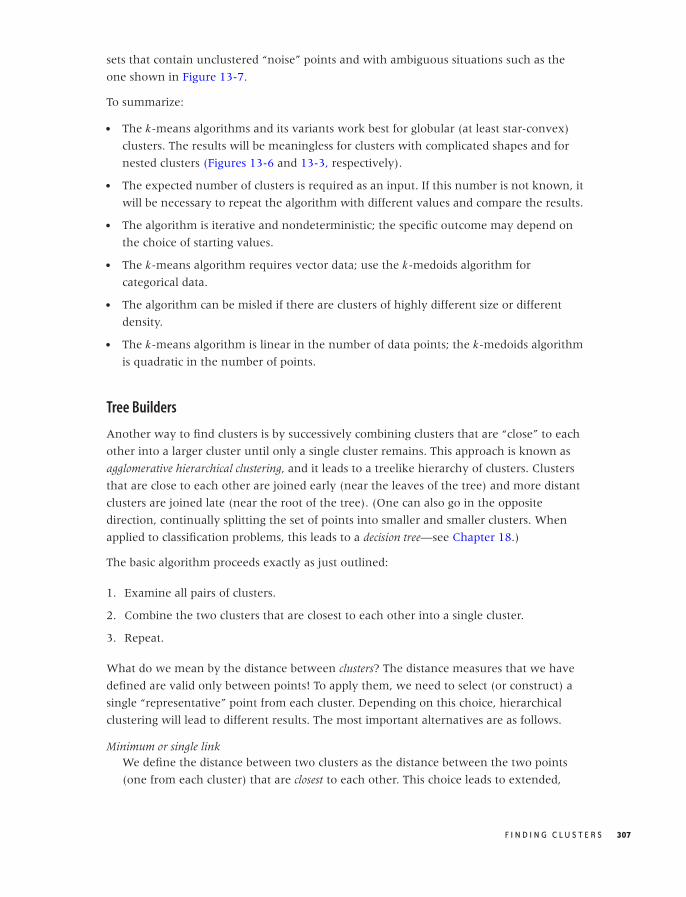
O’Reilly-5980006 master October 28, 2010 21:20
sets that contain unclustered “noise” points and with ambiguous situations such as the
one shown in Figure 13-7.
To summarize:
• The k-means algorithms and its variants work best for globular (at least star-convex)
clusters. The results will be meaningless for clusters with complicated shapes and for
nested clusters (Figures 13-6 and 13-3, respectively).
• The expected number of clusters is required as an input. If this number is not known, it
will be necessary to repeat the algorithm with different values and compare the results.
• The algorithm is iterative and nondeterministic; the specific outcome may depend on
the choice of starting values.
• The k-means algorithm requires vector data; use the k-medoids algorithm for
categorical data.
• The algorithm can be misled if there are clusters of highly different size or different
density.
• The k-means algorithm is linear in the number of data points; the k-medoids algorithm
is quadratic in the number of points.
Tree Builders
Another way to find clusters is by successively combining clusters that are “close” to each
other into a larger cluster until only a single cluster remains. This approach is known as
agglomerative hierarchical clustering, and it leads to a treelike hierarchy of clusters. Clusters
that are close to each other are joined early (near the leaves of the tree) and more distant
clusters are joined late (near the root of the tree). (One can also go in the opposite
direction, continually splitting the set of points into smaller and smaller clusters. When
applied to classification problems, this leads to a decision tree—see Chapter 18.)
The basic algorithm proceeds exactly as just outlined:
1. Examine all pairs of clusters.
2. Combine the two clusters that are closest to each other into a single cluster.
3. Repeat.
What do we mean by the distance between clusters? The distance measures that we have
defined are valid only between points! To apply them, we need to select (or construct) a
single “representative” point from each cluster. Depending on this choice, hierarchical
clustering will lead to different results. The most important alternatives are as follows.
Minimum or single linkWe define the distance between two clusters as the distance between the two points
(one from each cluster) that are closest to each other. This choice leads to extended,
F I N D I N G C L U S T E R S 307

O’Reilly-5980006 master October 28, 2010 21:20
thinly connected clusters. Because of this, this approach can handle clusters of
complicated shapes, such as those in Figure 13-6, but it can be sensitive to noise points.
Maximum or complete linkThe distance between two clusters is defined as the distance between the two points
(one from each cluster) that are farthest away from each other. With this choice, two
clusters are not joined until all points within each cluster are connected to each
other—favoring compact, globular clusters.
AverageIn this case, we form the average over the distances between all pairs of points (one
from each cluster). This choice has characteristics of both the single- and complete-link
approaches.
CentroidFor each cluster, we calculate the position of a centroid (as in k-means clustering) and
define the distance between clusters as the distance between centroids.
Ward’s methodWard’s method measures the distance between two clusters in terms of the decrease in
coherence that occurs when the two clusters are combined: if we combine clusters that
are closer together, the resulting cluster should be more coherent than if we combine
clusters that are farther apart. We can measure coherence as the average distance of all
points in the cluster from a centroid, or as their average distance from each other.
(We’ll come back to cohesion and other cluster properties later.)
The result of hierarchical clustering is not actually a set of clusters. Instead, we obtain a
treelike structure that contains the individual data points at the leaf nodes. This structure
can be represented graphically in a dendrogram (see Figure 13-10). To extract actual
clusters from it, we need to walk the tree, evaluate the cluster properties for each subtree,
and then cut the tree to obtain clusters.
Tree builders are expensive: we need at least the full distance matrix for all pairs of points
(requiring O(n2) operations to evaluate). Building the complete tree takes O(n) iterations:
there are n clusters (initially, points) to start with, and at each iteration, the number of
clusters is reduced by one because two clusters are combined. For each iteration, we need
to search the distance matrix for the closest pair of clusters—naively implemented, this is
an O(n2) operation that leads to a total complexity of O(n3) operations. However, this can
be reduced to O(n2 log n) by using indexed lookup.
One outstanding feature of hierarchical clustering is that it does more than produce a flat
list of clusters; it also shows their relationships in an explicit way. You need to decide
whether this information is relevant for your needs, but keep in mind that the choice of
measure for the cluster distance (single- or complete-link, and so on) can have a
significant influence on the appearance of the resulting tree structure.
308 C H A P T E R T H I R T E E N
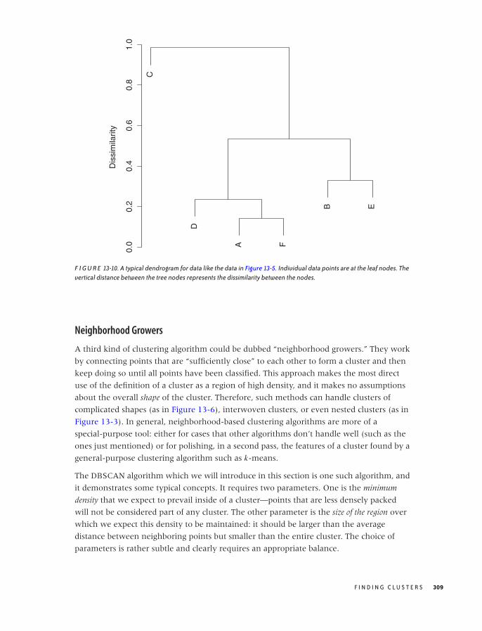
O’Reilly-5980006 master October 28, 2010 21:20
C
D
A F
B E
0.0
0.2
0.4
0.6
0.8
1.0
Dis
sim
ilarit
y
F I G U R E 13-10. A typical dendrogram for data like the data in Figure 13-5. Individual data points are at the leaf nodes. Thevertical distance between the tree nodes represents the dissimilarity between the nodes.
Neighborhood Growers
A third kind of clustering algorithm could be dubbed “neighborhood growers.” They work
by connecting points that are “sufficiently close” to each other to form a cluster and then
keep doing so until all points have been classified. This approach makes the most direct
use of the definition of a cluster as a region of high density, and it makes no assumptions
about the overall shape of the cluster. Therefore, such methods can handle clusters of
complicated shapes (as in Figure 13-6), interwoven clusters, or even nested clusters (as in
Figure 13-3). In general, neighborhood-based clustering algorithms are more of a
special-purpose tool: either for cases that other algorithms don’t handle well (such as the
ones just mentioned) or for polishing, in a second pass, the features of a cluster found by a
general-purpose clustering algorithm such as k-means.
The DBSCAN algorithm which we will introduce in this section is one such algorithm, and
it demonstrates some typical concepts. It requires two parameters. One is the minimum
density that we expect to prevail inside of a cluster—points that are less densely packed
will not be considered part of any cluster. The other parameter is the size of the region over
which we expect this density to be maintained: it should be larger than the average
distance between neighboring points but smaller than the entire cluster. The choice of
parameters is rather subtle and clearly requires an appropriate balance.
F I N D I N G C L U S T E R S 309

O’Reilly-5980006 master October 28, 2010 21:20
In a practical implementation, it is easier to work with two slightly different parameters:
the neighborhood radius r and the minimum number of points n that we expect to find
within the neighborhood of each point in a cluster. The DBSCAN algorithm distinguishes
between three types of points: noise, edge, and core points. A noise point is a point which
has fewer than n points in its neighborhood of radius r , such a point does not belong to
any cluster. A core point of a cluster has more than n neighbors. An edge point is a point that
has fewer neighbors than required for a core point but that is itself the neighbor of a core
point. The algorithm discards noise points and concentrates on core points. Whenever it
finds a core point, the algorithm assigns a cluster label to that point and then continues to
add all its neighbors, and their neighbors recursively to the cluster, until all points have
been classified.
This description is simple enough, but actually deriving a concrete implementation that is
both correct and efficient is less than straightforward. The pseudo-code in the original
paper* appears needlessly clumsy; on the other hand, I am not convinced that the
streamlined version that can be found (for example) on Wikipedia is necessarily correct.
Finally, the basic algorithm lends itself to elegant recursive implementations, but keep in
mind that the recursion will not unwind until the current cluster is complete. This means
that, in the worst case (of a single connected cluster), you will end up putting the entire
data set onto the stack!
As pointed out earlier, the main advantage of the DBSCAN algorithm is that it handles
clusters of complicated shapes and nested clusters gracefully. However, it does depend
sensitively on the appropriate choice of values for its two control parameters, and it
provides little help in finding them. If a data set contains several clusters with widely
varying densities, then a single set of parameters may not be sufficient to classify all of the
clusters. These problems can be ameliorated by coupling the DBSCAN algorithm with the
k-means algorithm: in a first pass, the k-means algorithm is used to identify candidates for
clusters. Moreover, statistics on these subsets of points (such as range and density) can be
used as input to the DBSCAN algorithm.
The DBSCAN algorithm is dominated by the calculations required to find the neighboring
points. For each point in the data set, all other points have to be checked; this leads to a
complexity of O(n2). In principle, algorithms and data structures exist to find candidates
for neighboring points more efficiently (e.g., kd-trees and global grids), but their
implementations are subtle and carry their own costs (grids can be very memory
intensive). Coupling the DBSCAN algorithm with a more efficient first-pass algorithm
(such as k-means) may therefore be a better strategy.
*“A Density-Based Algorithm for Discovering Clusters in Large Spatial Databases with Noise.” MartinEster, Hans-Peter Kriegel, Jorg Sander, and Xiaowei Xu. Proceedings of 2nd International Conferenceon Knowledge Discovery and Data Mining (KDD-96). 1996.
310 C H A P T E R T H I R T E E N

O’Reilly-5980006 master October 28, 2010 21:20
Pre- and Postprocessing
The core algorithm for grouping data points into clusters is usually only part (though the
most important one) of the whole strategy. Some data sets may require some cleanup or
normalization before they are suitable for clustering: that’s the first topic in this section.
Furthermore, we need to inspect the results of every clustering algorithm in order to
validate and characterize the clusters that have been found. We will discuss some concepts
and quantities used to describe clusters and to measure the clustering quality.
Finally, several cluster algorithms require certain input parameters (such as the number of
clusters to find), and we need to confirm that the values we provided are consistent with
the outcome of the clustering process. That will be our last topic in this section.
Scale Normalization
Look at Figures 13-11 and 13-12. Wouldn’t you agree that the data set in Figure 13-11
exhibits two reasonably clearly defined and well-separated clusters while the data set in
Figure 13-12 does not? Yet both figures show the same data set—only drawn to different
scales! In Figure 13-12, I used identical units for both the x axis and the y axis; whereas
Figure 13-11 was drawn to maintain a suitable aspect ratio for this data set.
This example demonstrates that clustering is not independent of the units in which the
data is measured. In fact, for the data set shown in Figures 13-11 and 13-12, points in two
different clusters may be closer to each other than to other points in the same cluster! This
is clearly a problem.
If, as in this example, your data spans very different ranges along different dimensions,
you need to normalize the data before starting a clustering algorithm. An easy way to
achieve this is to divide the data, dimension for dimension, by the range of the data along
that dimension. Alternatively, you might want to divide by the standard deviation along
that dimension. This process is sometimes called whitening or prewhitening, particularly in
signal-theoretic literature.
You only need to worry about this problem if you are working with vector-like data and
are using a distance measure like the Euclidean distance. It does not affect
correlation-based similarity measures. In fact, there is a special variant of the Euclidean
distance that performs the appropriate rescaling for each dimension on the fly: the
Mahalanobis distance.
Cluster Properties and Evaluation
It is easiest to think about cluster properties in the context of vector-like data and a
straightforward clustering algorithm such as k-means. The algorithm already gives us the
F I N D I N G C L U S T E R S 311
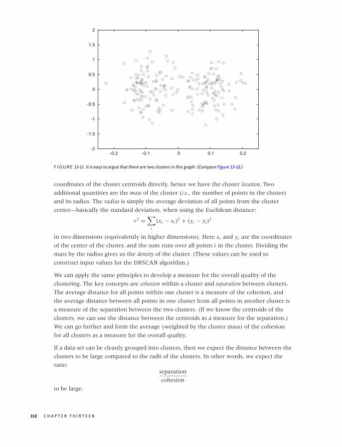
O’Reilly-5980006 master October 28, 2010 21:20
-2
-1.5
-1
-0.5
0
0.5
1
1.5
2
-0.2 -0.1 0 0.1 0.2
F I G U R E 13-11. It is easy to argue that there are two clusters in this graph. (Compare Figure 13-12.)
coordinates of the cluster centroids directly, hence we have the cluster location. Two
additional quantities are the mass of the cluster (i.e., the number of points in the cluster)
and its radius. The radius is simply the average deviation of all points from the cluster
center—basically the standard deviation, when using the Euclidean distance:
r2 =∑
i
(xc − xi )2 + (yc − yi )
2
in two dimensions (equivalently in higher dimensions). Here xc and yc are the coordinates
of the center of the cluster, and the sum runs over all points i in the cluster. Dividing the
mass by the radius gives us the density of the cluster. (These values can be used to
construct input values for the DBSCAN algorithm.)
We can apply the same principles to develop a measure for the overall quality of the
clustering. The key concepts are cohesion within a cluster and separation between clusters.
The average distance for all points within one cluster is a measure of the cohesion, and
the average distance between all points in one cluster from all points in another cluster is
a measure of the separation between the two clusters. (If we know the centroids of the
clusters, we can use the distance between the centroids as a measure for the separation.)
We can go further and form the average (weighted by the cluster mass) of the cohesion
for all clusters as a measure for the overall quality.
If a data set can be cleanly grouped into clusters, then we expect the distance between the
clusters to be large compared to the radii of the clusters. In other words, we expect the
ratio:separation
cohesion
to be large.
312 C H A P T E R T H I R T E E N
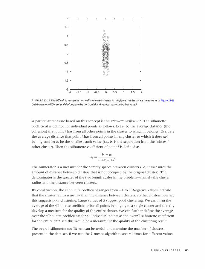
O’Reilly-5980006 master October 28, 2010 21:20
-2
-1.5
-1
-0.5
0
0.5
1
1.5
2
-2 -1.5 -1 -0.5 0 0.5 1 1.5 2
F I G U R E 13-12. It is difficult to recognize two well-separated clusters in this figure. Yet the data is the same as in Figure 13-11but drawn to a different scale! (Compare the horizontal and vertical scales in both graphs.)
A particular measure based on this concept is the silhouette coefficient S. The silhouette
coefficient is defined for individual points as follows. Let ai be the average distance (the
cohesion) that point i has from all other points in the cluster to which it belongs. Evaluate
the average distance that point i has from all points in any cluster to which it does not
belong, and let bi be the smallest such value (i.e., bi is the separation from the “closest”
other cluster). Then the silhouette coefficient of point i is defined as:
Si = bi − ai
max(ai , bi )
The numerator is a measure for the “empty space” between clusters (i.e., it measures the
amount of distance between clusters that is not occupied by the original cluster). The
denominator is the greater of the two length scales in the problem—namely the cluster
radius and the distance between clusters.
By construction, the silhouette coefficient ranges from −1 to 1. Negative values indicate
that the cluster radius is greater than the distance between clusters, so that clusters overlap;
this suggests poor clustering. Large values of S suggest good clustering. We can form the
average of the silhouette coefficients for all points belonging to a single cluster and thereby
develop a measure for the quality of the entire cluster. We can further define the average
over the silhouette coefficients for all individual points as the overall silhouette coefficient
for the entire data set; this would be a measure for the quality of the clustering result.
The overall silhouette coefficient can be useful to determine the number of clusters
present in the data set. If we run the k-means algorithm several times for different values
F I N D I N G C L U S T E R S 313
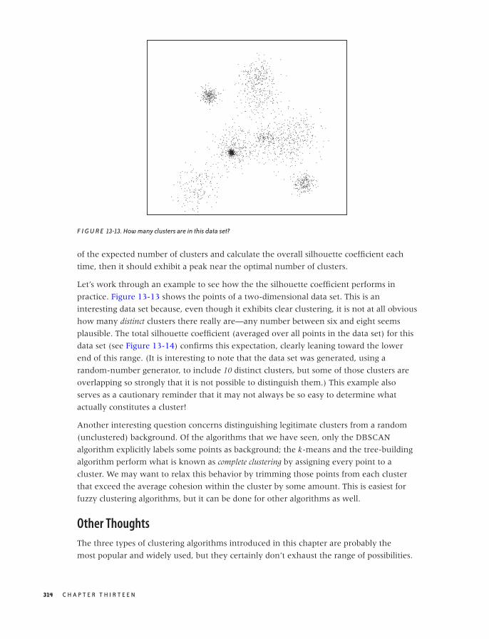
O’Reilly-5980006 master October 28, 2010 21:20
F I G U R E 13-13. How many clusters are in this data set?
of the expected number of clusters and calculate the overall silhouette coefficient each
time, then it should exhibit a peak near the optimal number of clusters.
Let’s work through an example to see how the the silhouette coefficient performs in
practice. Figure 13-13 shows the points of a two-dimensional data set. This is an
interesting data set because, even though it exhibits clear clustering, it is not at all obvious
how many distinct clusters there really are—any number between six and eight seems
plausible. The total silhouette coefficient (averaged over all points in the data set) for this
data set (see Figure 13-14) confirms this expectation, clearly leaning toward the lower
end of this range. (It is interesting to note that the data set was generated, using a
random-number generator, to include 10 distinct clusters, but some of those clusters are
overlapping so strongly that it is not possible to distinguish them.) This example also
serves as a cautionary reminder that it may not always be so easy to determine what
actually constitutes a cluster!
Another interesting question concerns distinguishing legitimate clusters from a random
(unclustered) background. Of the algorithms that we have seen, only the DBSCAN
algorithm explicitly labels some points as background; the k-means and the tree-building
algorithm perform what is known as complete clustering by assigning every point to a
cluster. We may want to relax this behavior by trimming those points from each cluster
that exceed the average cohesion within the cluster by some amount. This is easiest for
fuzzy clustering algorithms, but it can be done for other algorithms as well.
Other Thoughts
The three types of clustering algorithms introduced in this chapter are probably the
most popular and widely used, but they certainly don’t exhaust the range of possibilities.
314 C H A P T E R T H I R T E E N
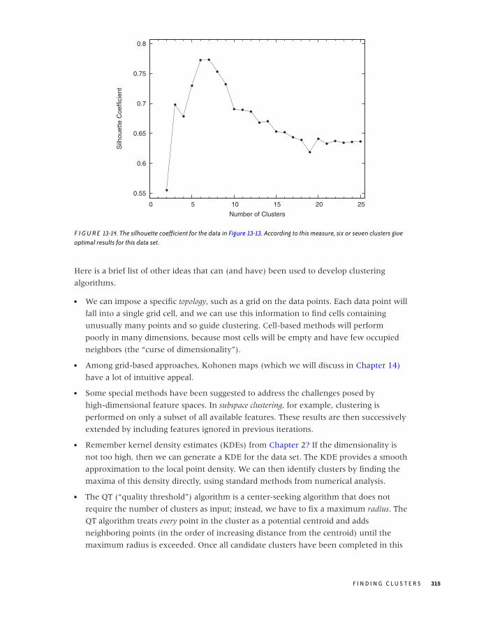
O’Reilly-5980006 master October 28, 2010 21:20
0.55
0.6
0.65
0.7
0.75
0.8
0 5 10 15 20 25
Silh
ouet
te C
oeffi
cien
t
Number of Clusters
F I G U R E 13-14. The silhouette coefficient for the data in Figure 13-13. According to this measure, six or seven clusters giveoptimal results for this data set.
Here is a brief list of other ideas that can (and have) been used to develop clustering
algorithms.
• We can impose a specific topology, such as a grid on the data points. Each data point will
fall into a single grid cell, and we can use this information to find cells containing
unusually many points and so guide clustering. Cell-based methods will perform
poorly in many dimensions, because most cells will be empty and have few occupied
neighbors (the “curse of dimensionality”).
• Among grid-based approaches, Kohonen maps (which we will discuss in Chapter 14)
have a lot of intuitive appeal.
• Some special methods have been suggested to address the challenges posed by
high-dimensional feature spaces. In subspace clustering, for example, clustering is
performed on only a subset of all available features. These results are then successively
extended by including features ignored in previous iterations.
• Remember kernel density estimates (KDEs) from Chapter 2? If the dimensionality is
not too high, then we can generate a KDE for the data set. The KDE provides a smooth
approximation to the local point density. We can then identify clusters by finding the
maxima of this density directly, using standard methods from numerical analysis.
• The QT (“quality threshold”) algorithm is a center-seeking algorithm that does not
require the number of clusters as input; instead, we have to fix a maximum radius. The
QT algorithm treats every point in the cluster as a potential centroid and adds
neighboring points (in the order of increasing distance from the centroid) until the
maximum radius is exceeded. Once all candidate clusters have been completed in this
F I N D I N G C L U S T E R S 315

O’Reilly-5980006 master October 28, 2010 21:20
way, the cluster with the greatest number of points is removed from the data set, and
then the process starts again with the remaining points.
• There is a well-known correspondence between graphs and distance matrices. Given a
set of points, a graph tells us which points are directly connected to each other—but so
does a distance matrix! We can exploit this equivalence by treating a distance matrix as
the adjacency matrix of a graph. The distance matrix is pruned (by removing
connections that are too long) to obtain a sparse graph, which can be interpreted as the
backbone of a cluster.
• Finally, spectral clustering uses powerful but abstract methods from linear algebra
(similar to those used for principal component analysis; see Chapter 14) to structure
and simplify the distance matrix.
Obviously, much depends on our prior knowledge about the data set: if we expect clusters
to be simple and convex, then the k-means algorithm suggests itself. On the other hand, if
we have a sense for the typical radius of the clusters that we expect to find, then QT
clustering would be a more natural approach. If we expect clusters of complicated shapes
or nested clusters, then an algorithm like DBSCAN will be required. Of course, it might be
difficult to develop this kind of intuition—especially for problems that have significantly
more than two or three dimensions!
Besides thinking of different ways to combine points into clusters, we can also think of
different ways to define clusters to begin with. All methods discussed so far have relied
(directly or indirectly) on the information contained in the distance between any two
points. We can extend this concept and begin to think about three-point (or higher) distance
functions. For example, it is possible to determine the angle between any three consecutive
points and use this information as the measure of the similarity between points. Such an
approach might help with cases like the one shown in Figure 13-8. Yet another idea is to
measure not the similarity between points but instead the similarity between a point and a
property of the cluster. For example, there is a straightforward generalization of the k-means
algorithm in which the centroids are no longer pointlike but are straight lines,
representing the “axis” of an elongated cluster. Rather than measuring the distance for
each point from the centroid, this algorithm calculates the distance from this axis when
assigning points to clusters. This algorithm would be suitable for cases like that shown in
Figure 13-7. I don’t think any of these ideas that try to generalize beyond pairwise
distances have been explored in detail yet.
A Special Case: Market Basket Analysis
Which items are frequently bought together? This and similar questions arise in market
basket analysis or—more generally—in association analysis. Because association analysis is
looking for items that occur together, it is in some ways related to clustering. However,
the specific nature of the problem is different enough to require a separate toolset.
316 C H A P T E R T H I R T E E N

O’Reilly-5980006 master October 28, 2010 21:20
The starting point for association analysis is usually a data set consisting of transactions—
that is, items that have been purchased together (we will often stay with the market
basket metaphor when illustrating these concepts). Each transaction corresponds to a
single “data point” in regular clustering.
For each transaction, we keep track of all items that have occurred together but typically
ignore whether or not any particular item was purchased multiple times: all attributes are
Boolean and indicate only the presence or absence of a certain item. Each item spans a
new dimension: if the store sells N different items, then each transaction can have up to
N different (Boolean) attributes, although each transaction typically contains only a tiny
subset of the entire selection. (Note that we do not necessarily need to know the
dimensionality N ahead of time: if we don’t know it, we can infer an approximation from
the number of different items that actually occur in the data set.)
From this description, you can already see how association analysis differs from regular
clustering: data points in association analysis are typically very high-dimensional but also
very sparse. It also differs from clustering (as we have discussed it so far) in that we are
not necessarily interested in grouping entire “points” (i.e., transactions) but would like to
identify those dimensions that frequently occur together.
A group of zero or more items occurring together is known as an item set (or itemset). Each
transaction consists of an item set, but every one of its subsets is also an item set. We can
construct arbitrary item sets from the selection of available items. For each such item set,
its support count is the number of actual transactions that contain the candidate item set as
a subset.
Besides simply identifying frequent item sets, we can also try to derive association
rules—that is, rules of the form “if items A and B are bought, then item C is also likely to
be bought.” Two measures are important when evaluating the strength of an association
rule: its support s and its confidence c. The support of a rule is the fraction of transactions
in the entire data set that contain the combined item set (i.e., the fraction of transactions
that contain all three items A, B, and C). A rule with low support is not very useful
because it is rarely applicable.
The confidence is a measure for the reliability of an association rule. It is defined as the
number of transactions in which the rule is correct, divided by the number of transactions
in which it is applicable. In our example, it would be the number of times A, B, and C
occur together divided by the number of times A and B occur together.
How do we go about finding frequent item sets (and association rules)? Rather than
performing an open-ended search for the “best” association rule, it is customary to set
thresholds for the minimum support (such as 10 percent) and confidence (such as 80
percent) required of a rule and then to generate all rules that meet these conditions.
F I N D I N G C L U S T E R S 317
O’Reilly-5980006 master October 28, 2010 21:20
To identify rules, we generate candidate item sets and then evaluate them against the set
of transactions to determine whether they exceed the required thresholds. However, the
naive approach—to create and evaluate all possible item sets of k elements—is not feasible
because of the huge number (2k) of candidate item sets that could be generated, most of
which will not be frequent! We must find a way to generate candidate item sets more
efficiently.
The crucial observation is that an item set can occur frequently only if all of its subsets occur
frequently. This insight is the basis for the so-called apriori algorithm, which is the most
fundamental algorithm for association analysis.
The apriori algorithm is a two-step algorithm: in the first step, we identify frequent item
sets; in the second step, we extract association rules. The first part of the algorithm is the
more computationally expensive one. It can be summarized as follows.
Find all 1-item item sets that meet the minimum support threshold.
repeat:
from the current list of k-item item sets, construct (k+1)-item item sets
eliminate those item sets that do not meet the minimum support threshold
stop when no (k+1)-item item set meets the minimum support threshold
The list of frequent item sets may be all that we require, or we may postprocess the list to
extract explicit association rules. To find association rules, we split each frequent item set
into two sets, and evaluate the confidence associated with this pair. From a practical point
of view, rules that have a 1-item item set on the “righthand side” are the easiest to
generate and the most important. (In other words, rules of the form “people who bought
A and B also bought C,” rather than rules of the form “people who bought A and B also
bought C and D.”)
This basic description leaves out many technical details, which are important in actual
implementations. For example: how exactly do we create a (k + 1)-item item set from the
list of k-item item sets? We might take every single item that occurs among the k-item
item sets and add it, in turn, to every one of the k-item item sets; however, this would
generate a large number of duplicate item sets that need to be pruned again. Alternatively,
we might combine two k-item item sets only if they agree on all but one of their
items. Clearly, appropriate data structures are essential for obtaining an efficient
implementation. (Similar considerations apply when determining the support count of a
candidate item set, and so on.)*
Although the apriori algorithm is probably the most popular algorithm for association
analysis, there are also very different approaches. For example, the FP-Growth Algorithm
(where FP stands for “Frequent Pattern”) identifies frequent item sets using something
*An open source implementation of the apriori algorithm (and many other algorithms for frequent pat-tern identification), together with notes on efficient implementation, can be found athttp://borgelt.net/apriori.html. The arules package for R is an alternative. It can be found on CRAN.
318 C H A P T E R T H I R T E E N

O’Reilly-5980006 master October 28, 2010 21:20
like a string-matching algorithm. Items in transactions are sorted by their support count,
and a treelike data structure is built up by exploiting data sets that agree in the first k
items. This tree structure is then searched for frequently occurring item sets.
Association analysis is a relatively complicated problem that involves many technical (as
opposed to conceptual) challenges as well. The discussion in this section could only
introduce the topic and attempt to give a sense of the kinds of approaches that are
available. We will see some additional problems of a similar nature in Chapter 18.
A Word of Warning
Clustering can lead you astray, and when done carelessly it can become a huge waste of
time. There are at least two reasons for this: although the algorithms are deceptively
simple, it can be surprisingly difficult to obtain useful results from them. Many of them
depend quite sensitively on several heuristic parameters, and you can spend hours
fiddling with the various knobs. Moreover, because the algorithms are simple and the field
has so much intuitive appeal, it can be a lot of fun to play with implementations and to
develop all kinds of modifications and variations.
And that assumes there actually are any clusters present! (This is the second reason.) In
the absence of rigorous, independent results, you will actually spend more time on data
sets that are totally worthless—perpetually hunting for those clusters that “the stupid
algorithm just won’t find.” Perversely, additional domain knowledge does not necessarily
make the task any easier: knowing that there should be exactly 10 clusters present in
Figure 13-13 is of no help in finding the clusters that actually can be identified!
Another important question concerns the value that you ultimately derive from clustering
(assuming now that at least one of the algorithms has returned something apparently
meaningful). It can be difficult to distinguish spurious results from real ones: like
clustering algorithms, cluster evaluation methods are not particularly rigorous or
unequivocal either (Figure 13-14 does not exactly inspire confidence). And we still have
not answered the question of what you will actually do with the results—assuming that
they turn out to be significant.
I have found that understanding the actual question that needs to be answered,
developing some pertinent hypotheses and models around it, and then verifying them on
the data through specific, focused analysis is usually a far better use of time than to go off
on a wild-goose clustering search.
Finally, I should emphasize that, in keeping with the spirit of this book, the algorithms in
this chapter are suitable for moderately sized data sets (a few thousand data points and a
dozen dimensions, or so) and for problems that are not too pathological. Highly developed
algorithms (e.g., CURE and BIRCH) exist for very large or very high-dimensional
problems; these algorithms usually combine several different cluster-finding approaches
F I N D I N G C L U S T E R S 319

O’Reilly-5980006 master October 28, 2010 21:20
together with a set of heuristics. You need to evaluate whether such specialized
algorithms make sense for your situation.
Workshop: Pycluster and the C Clustering Library
The C Clustering Library (http://bonsai.hgc.jp/∼mdehoon/software/cluster/software.htm) is a
mature and relatively efficient clustering library originally developed to find clusters
among gene expressions in microarray experiments. It contains implementations of the
k-means and k-medoids algorithms, tree clustering, and even self-organized (Kohonen)
maps. It comes with its own GUI frontend as well as excellent Perl and Python bindings.
It is easy to use and very well documented. In this Workshop, we use Python to
demonstrate the library’s center-seeker algorithms.
import Pycluster as pc
import numpy as np
import sys
# Read data filename and desired number of clusters from command line
filename, n = sys.argv[1], int( sys.argv[2] )
# x and y coordinates, whitespace-separated
data = np.loadtxt( filename, usecols=(0,1) )
# Perform clustering and find centroids
clustermap = pc.kcluster( data, nclusters=n, npass=50 )[0]
centroids = pc.clustercentroids( data, clusterid=clustermap )[0]
# Obtain distance matrix
m = pc.distancematrix( data )
# Find the masses of all clusters
mass = np.zeros( n )
for c in clustermap:
mass[c] += 1
# Create a matrix for individual silhouette coefficients
sil = np.zeros( n*len(data) )
sil.shape = ( len(data), n )
# Evaluate the distance for all pairs of points
for i in range( 0, len(data) ):
for j in range( i+1, len(data) ):
d = m[j][i]
sil[i, clustermap[j] ] += d
sil[j, clustermap[i] ] += d
# Normalize by cluster size (that is: form average over cluster)
for i in range( 0, len(data) ):
sil[i,:] /= mass
320 C H A P T E R T H I R T E E N

O’Reilly-5980006 master October 28, 2010 21:20
# Evaluate the silhouette coefficient
s = 0
for i in range( 0, len(data) ):
c = clustermap[i]
a = sil[i,c]
b = min( sil[i, range(0,c)+range(c+1,n) ] )
si = (b-a)/max(b,a) # This is the silhouette coeff of point i
s += si
# Print overall silhouette coefficient
print n, s/len(data)
The listing shows the code used to generate Figure 13-14, showing how the silhouette
coefficient depends on the number of clusters. Let’s step through it.
We import both the Pycluster library itself as well as the NumPy package. We will use
some of the vector manipulation abilities of the latter. The point coordinates are read from
the file specified on the command line. (The file is assumed to contain the x and y
coordinates of each point, separated by whitespace; one point per line.) The point
coordinates are then passed to the kcluster() function, which performs the actual
k-means algorithm. This function takes a number of optional arguments: nclusters is the
desired number of clusters, and npass holds the number of trials that should be performed
with different starting values. (Remember that k-means clustering is nondeterministic with
regard to the initial guesses for the positions of the cluster centroids.) The kcluster()
function will make npass different trials and report on the best one.
The function returns three values. The first return value is an array that, for each point in
the original data set, holds the index of the cluster to which it has been assigned. The
second and third return values provide information about the quality of the clustering
(which we ignore in this example). This function signature is a reflection of the
underlying C API, where you pass in an array of the same length as the data array and
then the cluster assignments of each point are communicated via this additional array.
This frees the kcluster() function from having to do its own resource management,
which makes sense in C (and possibly also for extremely large data sets).
All information about the result of the clustering procedure are contained in the
clustermap data structure. The Pycluster library provides several functions to extract this
information; here we demonstrate just one: we can pass the clustermap to the
clustercentroids() function to obtain the coordinates of the cluster centroids. (However,
we won’t actually use these coordinates in the rest of the program.)
You may have noticed that we did not specify the distance function to use in the listing.
The C Clustering Library does not give us the option of a user-defined distance function
with k-means. It does include several standard distance measures (Euclidean, Manhattan,
correlation, and several others), which can be selected through a keyword argument to
kcluster() (the default is to use the Euclidean distance). Distance calculations can be a
rather expensive part of the algorithm, and having them implemented in C makes the
F I N D I N G C L U S T E R S 321

O’Reilly-5980006 master October 28, 2010 21:20
k = 6
F I G U R E 13-15. The result of running the k-means algorithm on the data from Figure 13-13, finding six clusters. Differentclusters are shown in black and gray, and the cluster centroids are indicated by filled dots.
overall program faster. (If we want to define our own distance function, then we have to
use the kmedoids() function, which we will discuss in a moment.)
To evaluate the silhouette coefficient we need the point-to-point distances, and so we
obtain the distance matrix from the Pycluster library. We will also need the number of
points in each cluster (the cluster’s “mass”) later.
Next, we calculate the individual silhouette coefficients for all data points. Recall that the
silhouette coefficient involves both the average distance to the all points in the same cluster
as well as the average distance to all points in the nearest cluster. Since we don’t know
ahead of time which one will be the nearest cluster to each point, we simply go ahead and
calculate the average distance to all clusters. The results are stored in the matrix sil.
(In the implementation, we make use of some of the vector manipulation features of
NumPy: in the expression sil[i,:] /= mass, each entry in row i is divided componentwise
by the corresponding entry in mass. Further down, we make use of “advanced indexing”
when looking for the minimum distance between the point i and a cluster to which it
does not belong: in the expression b = min( sil[i, range(0,c)+range(c+1,n) ] ), we
construct an indexing vector that includes indices for all clusters except the one that the
point i belongs to. See the Workshop in Chapter 2 for more details.)
Finally, we form the average over all single-point silhouette coefficients and print the
results. Figure 13-14 shows them as a graph.
Figures 13-15 and 13-16 show how the program assigned points to clusters in two runs,
finding 6 and 10 clusters, respectively. These results agree with Figure 13-14: k = 6 is
322 C H A P T E R T H I R T E E N
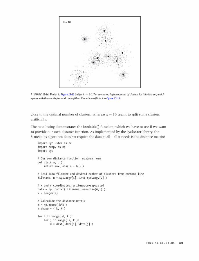
O’Reilly-5980006 master October 28, 2010 21:20
k = 10
F I G U R E 13-16. Similar to Figure 13-15 but for k = 10. Ten seems too high a number of clusters for this data set, whichagrees with the results from calculating the silhouette coefficient in Figure 13-14.
close to the optimal number of clusters, whereas k = 10 seems to split some clusters
artificially.
The next listing demonstrates the kmedoids() function, which we have to use if we want
to provide our own distance function. As implemented by the Pycluster library, the
k-medoids algorithm does not require the data at all—all it needs is the distance matrix!
import Pycluster as pc
import numpy as np
import sys
# Our own distance function: maximum norm
def dist( a, b ):
return max( abs( a - b ) )
# Read data filename and desired number of clusters from command line
filename, n = sys.argv[1], int( sys.argv[2] )
# x and y coordinates, whitespace-separated
data = np.loadtxt( filename, usecols=(0,1) )
k = len(data)
# Calculate the distance matrix
m = np.zeros( k*k )
m.shape = ( k, k )
for i in range( 0, k ):
for j in range( i, k ):
d = dist( data[i], data[j] )
F I N D I N G C L U S T E R S 323
O’Reilly-5980006 master October 28, 2010 21:20
m[i][j] = d
m[j][i] = d
# Perform the actual clustering
clustermap = pc.kmedoids( m, n, npass=20 )[0]
# Find the indices of the points used as medoids, and the cluster masses
medoids = {}for i in clustermap:
medoids[i] = medoids.get(i,0) + 1
# Print points, grouped by cluster
for i in medoids.keys():
print "Cluster=", i, " Mass=", medoids[i], " Centroid: ", data[i]
for j in range( 0, len(data) ):
if clustermap[j] == i:
print "\t", data[j]
In the listing, we calculate the distance matrix using the maximum norm (which is not
supplied by Pycluster) as distance function. Obviously, we could use any other function
here—such as the Levenshtein distance if we wanted to cluster the strings in Figure 13-4.
We then call the kmedoids() function, which returns a clustermap data structure similar to
the one returned by kcluster(). For the kmedoids() function, the data structure
contains—for each data point—the index of the data point that is the centroid of the
assigned cluster.
Finally, we calculate the masses of the clusters and print the coordinates of the cluster
medoids as well as the coordinates of all points assigned to that cluster.
The C Clustering Library is small and relatively easy to use. You might also want to
explore its tree-clustering implementation. The library also includes routines for Kohonen
maps and principal component analysis, which we will discuss in Chapter 14.
Further Reading• Introduction to Data Mining. Pang-Ning Tan, Michael Steinbach, and Vipin Kumar.
Addison-Wesley. 2005.
This is my favorite book on data mining. The presentation is compact and more
technical than in most other books on this topic. The section on clustering is
particularly strong.
• Data Clustering: Theory, Algorithms, and Applications. Guojun Gan, Chaoqun Ma, and
Jianhong Wu. SIAM. 2007.
This book is a recent survey of results from clustering research. The presentation is too
terse to be useful, but it provides a good source of concepts and keywords for further
investigation.
324 C H A P T E R T H I R T E E N

O’Reilly-5980006 master October 28, 2010 21:20
• Algorithms for Clustering Data. Anil K. Jain and Richard C. Dubes. Prentice Hall. 1988.
An older book on clustering as freely available at
http://www.cse.msu.edu/∼jain/Clustering Jain Dubes.pdf .
• Metric Spaces: Iteration and Application. Victor Bryant. Cambridge University Press. 1985.
If you are interested in thinking about distance measures in arbitrary spaces in a more
abstract way, then this short (100-page) book is a wonderful introduction. It requires
no more than some passing familiarity with real analysis, but it does a remarkable job
of demonstrating the power of purely abstract reasoning—both from a conceptual
point of view but also with an eye to real applications.
F I N D I N G C L U S T E R S 325

O’Reilly-5980006 master October 28, 2010 21:20

O’Reilly-5980006 master October 28, 2010 21:25
C H A P T E R F O U R T E E N
Seeing the Forest for the Trees:Finding Important Attributes
WHAT DO YOU DO WHEN YOU DON’T KNOW WHERE TO START? WHEN YOU ARE DEALING WITH A DATA SET THAT
offers no structure that would suggest an angle of attack?
For example, I remember looking through a company’s contracts with its suppliers for a
certain consumable. These contracts all differed in regards to the supplier, the number of
units ordered, the duration of the contract and the lead time, the destination location that
the items were supposed to be shipped to, the actual shipping date, and the procurement
agent that had authorized the contract—and, of course, the unit price. What I tried to
figure out was which of these quantities had the greatest influence on the unit price.
This kind of problem can be very difficult: there are so many different variables, none of
which seems, at first glance, to be predominant. Furthermore, I have no assurance that
the variables are all independent; many of them may be expressing related information.
(In this case, the supplier and the shipping destination may be related, since suppliers are
chosen to be near the place where the items are required.)
Because all variables arise on more or less equal footing, we can’t identify a few as the
obvious “control” or independent variables and then track the behavior of all the other
variables in response to these independent variables. We can try to look at all possible
pairings—for example, using graphical techniques such as scatter-plot matrices (Chapter
5)—but that may not really reveal much either, particularly if the number of variables is
truly large. We need some form of computational guidance.
In this chapter, we will introduce a number of different techniques for exactly this
purpose. All of them help us select the most important variables or features from a
multivariate data set in which all variables appear to arise on equal footing. In doing so,
327
O’Reilly-5980006 master October 28, 2010 21:25
we reduce the dimension of the data set from the original number of variables (or
features) to a smaller set, which (hopefully) captures most of the “interesting” behavior of
the data. These methods are therefore also known as feature selection or dimensionality
reduction techniques.
A word of warning: the material in this chapter is probably the most advanced and least
obvious in the whole book, both conceptually and also with respect to actual
implementations. In particular, the following section (on principal component analysis) is
very abstract, and it may not make much sense if you haven’t had some previous exposure
to matrices and linear algebra (including eigentheory). Other sections are more accessible.
I include these techniques here nevertheless, because they are of considerable practical
importance but also to give you a sense of the kinds of (more advanced) techniques that
are available, and also as a possible pointer for further study.
Principal Component Analysis
Principal component analysis (PCA) is the primary tool for dimensionality reduction in
multivariate problems. It is a foundational technique that finds applications as part of
many other, more advanced procedures.
Motivation
To understand what PCA can do for us, let’s consider a simple example. Let’s go back to
the contract example given earlier and now assume that there are only two variables for
each contract: its lead time and the number of units to be delivered. What can we say
about them? Well, we can draw histograms for each to understand the distribution of
values and to see whether there are “typical” values for either of these quantities. The
histograms (in the form of kernel density estimates—see Chapter 2) are shown in Figure
14-1 and don’t reveal anything of interest.
Because there are only two variables in this case, we can also plot one variable against the
other in a scatter plot. The resulting graph is shown in Figure 14-2 and is very revealing:
the lead time of the contract grows with its size. So far, so good.
But we can also look at Figure 14-2 in a different way. Recall that the contract data
depends on two variables (lead time and number of items), so that we would expect the
points to fill the two-dimensional space spanned by the two axes (lead time and number
of items). But in reality, all the points fall very close to a straight line. A straight line,
however, is only one-dimensional, and this means that we need only a single variable to
describe the position of each point: the distance along the straight line. In other words,
although it appears to depend on two variables, the contract data mostly depends on a
single variable that lies halfway between the original ones. In this sense, the data is of
lower dimensionality than it originally appeared.
328 C H A P T E R F O U R T E E N
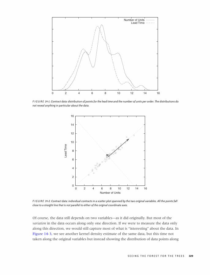
O’Reilly-5980006 master October 28, 2010 21:25
0 2 4 6 8 10 12 14 16
Number of UnitsLead Time
F I G U R E 14-1. Contract data: distribution of points for the lead time and the number of units per order. The distributions donot reveal anything in particular about the data.
0
2
4
6
8
10
12
14
16
0 2 4 6 8 10 12 14 16
Lead
Tim
e
Number of Units
F I G U R E 14-2. Contract data: individual contracts in a scatter plot spanned by the two original variables. All the points fallclose to a straight line that is not parallel to either of the original coordinate axes.
Of course, the data still depends on two variables—as it did originally. But most of the
variation in the data occurs along only one direction. If we were to measure the data only
along this direction, we would still capture most of what is “interesting” about the data. In
Figure 14-3, we see another kernel density estimate of the same data, but this time not
taken along the original variables but instead showing the distribution of data points along
S E E I N G T H E F O R E S T F O R T H E T R E E S 329
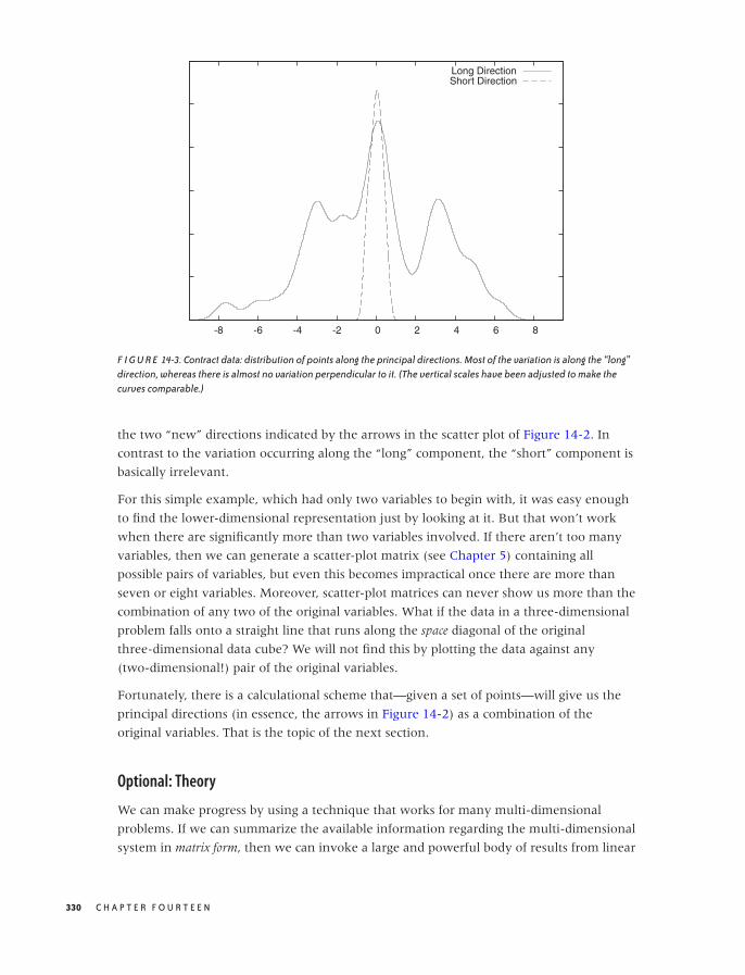
O’Reilly-5980006 master October 28, 2010 21:25
-8 -6 -4 -2 0 2 4 6 8
Long DirectionShort Direction
F I G U R E 14-3. Contract data: distribution of points along the principal directions. Most of the variation is along the “long”direction, whereas there is almost no variation perpendicular to it. (The vertical scales have been adjusted to make thecurves comparable.)
the two “new” directions indicated by the arrows in the scatter plot of Figure 14-2. In
contrast to the variation occurring along the “long” component, the “short” component is
basically irrelevant.
For this simple example, which had only two variables to begin with, it was easy enough
to find the lower-dimensional representation just by looking at it. But that won’t work
when there are significantly more than two variables involved. If there aren’t too many
variables, then we can generate a scatter-plot matrix (see Chapter 5) containing all
possible pairs of variables, but even this becomes impractical once there are more than
seven or eight variables. Moreover, scatter-plot matrices can never show us more than the
combination of any two of the original variables. What if the data in a three-dimensional
problem falls onto a straight line that runs along the space diagonal of the original
three-dimensional data cube? We will not find this by plotting the data against any
(two-dimensional!) pair of the original variables.
Fortunately, there is a calculational scheme that—given a set of points—will give us the
principal directions (in essence, the arrows in Figure 14-2) as a combination of the
original variables. That is the topic of the next section.
Optional: Theory
We can make progress by using a technique that works for many multi-dimensional
problems. If we can summarize the available information regarding the multi-dimensional
system in matrix form, then we can invoke a large and powerful body of results from linear
330 C H A P T E R F O U R T E E N
O’Reilly-5980006 master October 28, 2010 21:25
algebra to transform this matrix into a form that reveals any underlying structure (such as
the structure visible in Figure 14-2).
In what follows, I will often appeal to the two-dimensional example of Figure 14-2, but
the real purpose here is to develop a procedure that will be applicable to any number of
dimensions. These techniques become necessary when the number of dimensions exceeds
two or three so that simple visualizations like the ones discussed so far will no longer
work.
To express what we know about the system, we first need to ask ourselves how best to
summarize the way any two variables relate to each other. Looking at Figure 14-2, the
correlation coefficient suggests itself. In Chapter 13, we introduced the correlation coefficient
as a measure for the similarity between two multi-dimensional data points x and y. Here,
we use the same concept to express the similarity between two dimensions in a
multivariate data set. Let x and y be two different dimensions (“variables”) in such a data
set, then the correlation coefficient is defined by:
corr(x, y) = 1
N
∑i (xi − x)(yi − y)
σ (x)σ (y)
where the sum is over all data points, x and y are the means of the xi and the yi ,
respectively, and σ(x) =√
1N
∑i (xi − x)2 is the standard deviation of x (and equivalently
for y). The denominator in the expression of the correlation coefficient amounts to a
rescaling of the values of both variables to a standard interval. If that is not what we want,
then we can instead use the covariance between the xi and the yi :
cov(x, y) = 1
N
N∑
i
(xi − x)(yi − y)
All of these quantities can be defined for any two variables (just supply values for, say xi
and zi ). For a p-dimensional problem, we can find all the p(p − 1)/2 different
combinations (remember that these coefficients are symmetric: cov(x, y) = cov(y, x)).
It is now convenient to group the values in a matrix, which is typically called � (not to be
confused with the summation sign!)
� =
⎛
⎜⎜⎝
cov(x, x) cov(x, y) . . .
cov(y, x) cov(y, y)
.... . .
⎞
⎟⎟⎠
and similarly for the correlation matrix. Because the covariance (or correlation) itself is
symmetric under an interchange of its arguments, the matrix � is also symmetric (so that
it equals its transpose).
S E E I N G T H E F O R E S T F O R T H E T R E E S 331
O’Reilly-5980006 master October 28, 2010 21:25
We can now invoke an extremely important result from linear algebra, known as the
spectral decomposition theorem, as follows. For any real, symmetric N × N matrix A, there exists
an orthogonal matrix U such that:
B =
⎛
⎜⎜⎜⎜⎝
λ1
λ2
. . .
λN
⎞
⎟⎟⎟⎟⎠= U−1 AU
is a diagonal matrix.
Let’s explain some of the terminology. A matrix is diagonal if its only nonzero entries are
along the main diagonal from the top left to the bottom right. A matrix is orthogonal if its
transpose equals its inverse: U T = U−1 or U T U = UU T = 1.
The entries λi in the diagonal matrix are called the eigenvalues of matrix A, and the column
vectors of U are the eigenvectors. The spectral theorem also implies that all eigenvectors are
mutually orthogonal. Finally, the ith column vector in U is the eigenvector “associated”
with the eigenvalue λi ; each eigenvalue has an associated eigenvector.
What does all of this mean? In a nutshell, it means that we can perform a change of
variables that turns any symmetric matrix A into a diagonal matrix B. Although it may
not be obvious, the matrix B contains the same information as A—it’s just packaged
differently.
The change of variables required for this transformation consists of a rotation of the
original coordinate system into a new coordinate system in which the correlation matrix
has a particularly convenient (diagonal) shape. (Notice how in Figure 14-2, the new
directions are rotated with respect to the original horizontal and vertical axes.)
When expressed in the original coordinate system (i.e., the original variables that the
problem was initially expressed in), the matrix � is a complicated object with off-diagonal
entries that are nonzero. However, the eigenvectors span a new coordinate system that is
rotated with respect to the old one. In this new coordinate system, the matrix takes on a
simple, diagonal form in which all entries that are not on the diagonal vanish. The arrows
in Figure 14-2 show the directions of the new coordinate axes, and the histogram in
Figure 14-3 measures the distribution of points along these new directions.
The purpose of performing a matrix diagonalization is to find the directions of this new
coordinate system, which is more suitable for describing the data than was the original
coordinate system.
Because the new coordinate system is merely rotated relative to the original one, we can
express its coordinate axes as linear combinations of the original ones. In Figure 14-2, for
instance, to make a step in the new direction (along the diagonal), you take a step along
the (old) x axis, followed by a step along the (old) y axis. We can therefore express the
332 C H A P T E R F O U R T E E N
O’Reilly-5980006 master October 28, 2010 21:25
new direction (call it x) in terms of the old ones: x = (x + y)/√
2 (the factor√
2 is just a
normalization factor).
Interpretation
The spectral decomposition theorem applies to any symmetric matrix. For any such
matrix, we can find a new coordinate system, in which the matrix is diagonal. But the
interpretation of the results (what do the eigenvalues and eigenvectors mean?) depends on
the specific application. In our case, we apply the spectral theorem to the covariance or
correlation matrix of a set of points, and the results of the decomposition will give us the
principal axes of the distribution of points (hence the name of the technique).
Look again at Figure 14-2. Points are distributed in a region shaped like an extremely
stretched ellipse. If we calculate the eigenvalues and eigenvectors of the correlation
matrix of this point distribution, we find that the eigenvectors lie in the directions of the
principal axes of the ellipse while the eigenvalues give the relative length of the
corresponding principal axes.
Put another way, the eigenvalues point along the directions of greatest variance: the data
is most stretched out if we measure it along the principal directions. Moreover, the
eigenvalue corresponding to each eigenvector is a measure of the width of the distribution
along this direction.
(In fact, the eigenvalue is the square of the standard deviation along that direction;
remember that the diagonal entries of the covariance matrix � are σ 2(x) = ∑i (xi − x)2.
Once we diagonalize �, the entries along the diagonal—that is, the eigenvalues—are the
variances along the “new” directions.)
You should also observe that the variables measured along the principal directions are
uncorrelated with each other. (By construction, their correlation matrix is diagonal,
which means that the correlation between any two different variables is zero.)
This, then, is what the principal component analysis does for us: if the data points are
distributed as a globular cloud in the space spanned by all the original variables (which
may be more than two!), then the eigenvectors will give us the directions of the principal
axes of the ellipsoidal cloud of data points and the eigenvalues will give us the length of
the cloud along each of these directions. The eigenvectors and eigenvalues therefore
describe the shape of the point distribution. This becomes especially useful if the data set
has more than just two dimensions, so that a simple plot (as in Figure 14-2) is no longer
feasible. (There are special varieties of PCA, such as “Kernel PCA” or “ISOMAP,” that work
even with point distributions that do not form globular ellipsoids but have more
complicated, contorted shapes.)
The description of the shape of the point distribution provided by the PCA is already
helpful. But it gets even better, because we may suspect that not all of the original
S E E I N G T H E F O R E S T F O R T H E T R E E S 333

O’Reilly-5980006 master October 28, 2010 21:25
variables are really needed. Some of them may be redundant (expressing more or less the
same thing), and others may be irrelevant (carrying little information).
An indication that variables may be redundant (i.e., express the “same thing”) is that they
are correlated. (That’s pretty much the definition of correlation: knowing that if we
change one variable, then there will be a corresponding change in the other.) The PCA
uses the information contained in the mutual correlations between variables to identify
those that are redundant. By construction, the principal coordinates are uncorrelated (i.e.,
not redundant), which means that the information contained in the original (redundant)
set of variables has been concentrated in only a few of the new variables while the
remaining variables have become irrelevant. The irrelevant variables are those
corresponding to small eigenvalues: the point distribution will have only little spread in
the corresponding directions (which means that these variables are almost constants and
can therefore be ignored).
The price we have to pay for the reduction in dimensions is that the new directions will
not, in general, map neatly to the original variables. Instead, the new directions will
correspond to combinations of the original variables.
There is an important consequence of the preceding discussion: the principal component
analysis works with the correlation between variables. If the original variables are
uncorrelated, then there is no point in carrying out a PCA! For instance, if the data points
in Figure 14-2 had shown no structure but had filled the entire two-dimensional
parameter space randomly, then we would not have been able to simplify the problem by
reducing it to a one-dimensional one consisting of the new direction along the main
diagonal.
Computation
The theory just described would be of only limited interest if there weren’t practical
algorithms for calculating both eigenvalues and eigenvectors. These calculations are
always numerical. You may have encountered algebraic methods matrix diagonalization
methods in school, but they are impractical for matrices larger than 2 × 2 and infeasible
for matrices larger than about 4 × 4.
However, there are several elegant numerical algorithms to invert and diagonalize
matrices, and they tend to form the foundational part of any numerical library. They are
not trivial to understand, and developing high-quality implementations (that avoid, say
round-off error) is a specialized skill. There are no good reasons to write your own, so you
should always use an established library. (Every numerical library or package will include
the required functionality.)
Matrix operations are relatively expensive, and run time performance can be a serious
concern for large matrices. Matrix operations tend to be of O(N 3) complexity, which
means that doubling the size of the matrix will increase the time to perform an operation
334 C H A P T E R F O U R T E E N

O’Reilly-5980006 master October 28, 2010 21:25
by a factor of 23 = 8. In other words, doubling the problem size will result in nearly a
tenfold increase in runtime! This is not an issue for small matrices (up to 100 × 100 or so),
but you will hit a brick wall at a certain size (somewhere between 5,000 × 5,000 and
50,000 × 50,000). Such large matrices do occur in practice but usually not in the context
of the topic of this chapter. For even larger matrices there are alternative algorithms—
which, however, calculate only the most important of the eigenvalues and eigenvectors.
I will not go into details about different algorithms, but I want to mention one explicitly
because it is of particular importance in this context. If you read about principal
component analysis (PCA), then you will likely encounter the term singular value
decomposition (SVD); in fact, many books treat PCA and SVD as equivalent expressions for
the same thing. That is not correct; they are really quite different. PCA is the application of
spectral methods to covariance or correlation matrices; it is a conceptual technique, not an
algorithm. In contrast, the SVD is a specific algorithm that can be applied to many
different problems one of which is the PCA.
The reason that the SVD features so prominently in discussions of the PCA is that the SVD
combines two required steps into one. In our discussion of the PCA, we assumed that you
first calculate the covariance or correlation matrix explicitly from the set of data points
and then diagonalize it. The SVD performs these two steps in one fell swoop: you pass the
set of data points directly to the SVD, and it calculates the eigenvalues and eigenvectors of
the correlation matrix directly from those data points.
The SVD is a very interesting and versatile algorithm, which is unfortunately rarely
included in introductory classes on linear algebra.
Practical Points
As you can see, principal component analysis is an involved technique—although with
the appropriate tools it becomes almost ridiculously easy to perform (see the Workshop in
this chapter). But convenient implementations don’t make the conceptual difficulties go
away or ensure that the method is applied appropriately.
First, I’d like to emphasize that the mathematical operations underlying principal
component analysis (namely, the diagonalization of a matrix) are very general: they
consist of a set of formal transformations that apply to any symmetric matrix.
(Transformations of this sort are used for many different purposes in literally all fields of
science and engineering.)
In particular, there is nothing specific to data analysis about these techniques. The PCA
thus does not involve any of the concepts that we usually deal with in statistics or
analysis: there is no mention of populations, samples, distributions, or models. Instead,
principal component analysis is a set of formal transformations, which are applied to the
covariance matrix of a data set. As such, it can be either exploratory or preparatory.
S E E I N G T H E F O R E S T F O R T H E T R E E S 335

O’Reilly-5980006 master October 28, 2010 21:25
As an exploratory technique, we may inspect its results (the eigenvalues and
eigenvectors) for anything that helps us develop an understanding of the data set. For
example, we may look at the contributions to the first few principal components to see
whether we can find an intuitive interpretation of them (we will see an example of this in
the Workshop section). Biplots (discussed in the following section) are a graphical
technique that can be useful in this context.
But we should keep in mind that this kind of investigation is exploratory in nature: there
is no guarantee that the results of a principal component analysis will turn up anything
useful. In particular, we should not expect the principal components to have an intuitive
interpretation in general.
On the other hand, PCA may also be used as a preparatory technique. Keep in mind that,
by construction, the principal components are uncorrelated. We can therefore transform
any multivariate data set into an equivalent form, in which all variables are mutually
independent, before performing any subsequent analysis. Identifying a subset of principal
components that captures most of the variability in the data set—for the purpose of
reducing the dimensionality of the problem, as we discussed earlier—is another
preparatory use of principal component analysis.
As a preparatory technique, principal component analysis is always applicable but may
not always be useful. For instance, if the original variables are already uncorrelated, then
the PCA cannot do anything for us. Similarly, if none of the eigenvalues are significantly
smaller (so that their corresponding principal components can be dropped), then again we
gain nothing from the PCA.
Finally, let me reiterate that PCA is just a mathematical transformation that can be applied
to any symmetric matrix. This means that its results are not uniquely determined by the
data set but instead are sensitive to the way the inputs are prepared. In particular, the
results of a PCA depend on the actual numerical values of the data points and therefore on
the units in which the measurements have been recorded. If the numerical values for one
of the original variables are consistently larger than the values of the other variables, then
the variable with the large values will unduly dominate the spectrum of eigenvalues. (We
will see an example of this problem in the Workshop.) To avoid this kind of problem, all
variables should be of comparable scale. A systematic way to achieve this is to work with
the correlation matrix (in which all entries are normalized by their autocorrelation)
instead of the covariance matrix.
Biplots
Biplots are an interesting way to visualize the results of a principal component analysis. In
a biplot, we plot the data points in a coordinate system spanned by the first two principal
components (i.e., those two of the new variables corresponding to the largest eigenvalues).
In addition, we also plot a representation of the original variables but now projected into
336 C H A P T E R F O U R T E E N

O’Reilly-5980006 master October 28, 2010 21:25
the space of the new variables. The data points are represented by symbols, whereas the
directions of the original variables are represented by arrows. (See Figure 14-5 in the
Workshop section.)
In a biplot, we can immediately see the distribution of points when represented through
the new variables (and can also look for clusters, outliers, or other interesting features).
Moreover, we can see how the original variables relate to the first two principal
components and to each other: if any of the original variables are approximately aligned
with the horizontal (or vertical) axis, then they are approximately aligned with the first
(or second) principal component (because in a biplot, the horizonal and vertical axes
coincide with the first and second principal components). We can thus see which of the
original variables contribute strongly to the first principal components, which might help
us develop an intuitive interpretation for those components. Furthermore, any of the
original variables that are roughly redundant will show up as more or less parallel to each
other in a biplot—which can likewise help us identify such combinations of variables in
the original problem.
Biplots may or may not be helpful. There is a whole complicated set of techniques for
interpreting biplots and reading off various quantities from them, but these techniques
seem rarely used, and I have not found them to be very practical. If I do a PCA, I will
routinely also draw a biplot: if it tells me something worthwhile, that’s great; but if not,
then I’m not going to spend much time on it.
Visual Techniques
Principal component analysis is a rigorous prescription, and example of a “data-centric”
technique: it transforms the original data in a precisely prescribed way, without ambiguity
and without making further assumptions. The results are an expression of properties of
the data set. It is up to us to interpret them, but the results are true regardless of whether
we find them useful or not.
In contrast, the methods described in this section are convenience methods that attempt
to make multi-dimensional data sets more “palatable” for human consumption. These
methods do not calculate any rigorous properties inherent in the data set; instead, they try
to transform the data in such a way that it can be plotted while at the same time trying to
be as faithful to the data as possible.
We will not discuss any of these methods in depth, since personally, I do not find them
worth the effort: on the one hand, they are (merely) exploratory in nature; on the other
hand, they require rather heavy numerical computations and some nontrivial theory.
Their primary results are projections (i.e., graphs) of data sets, which can be difficult to
interpret if the number of data points or their dimensionality becomes large—which is
exactly when I expect a computationally intensive method to be helpful! Nevertheless,
S E E I N G T H E F O R E S T F O R T H E T R E E S 337
O’Reilly-5980006 master October 28, 2010 21:25
there are situations where you might find these methods useful, and they do provide
some interesting concepts for how to think about data. This last reason is the most
important to me, which is why this section emphasizes concepts while skipping most of
the technical details.
The methods described in this section try to calculate specific “views” or projections of the
data into a lower number of dimensions. Instead of selecting a specific projection, we can
also try to display many of them in sequence, leaving it to the human observer to choose
those that are “interesting.” That is the method we introduced in Chapter 5, when we
discussed Grand Tours and Projection Pursuits—they provide yet another approach to the
problem of dimensionality reduction for multivariate data sets.
Multidimensional Scaling
Given a set of data points (i.e., the coordinates of each data point), we can easily find the
distance between any pair of points (see Chapter 13 for a discussion of distance
measures). Multidimensional scaling (MDS) attempts to answer the opposite question:
given a distance matrix, can we recover the explicit coordinates of the points?
This question has a certain intellectual appeal in its own right, but of course, it is relevant
in situations where our information about a certain system is limited to the differences
between data points. For example, in usability studies or surveys we may ask respondents
to list which of a set of cars (or whiskeys, or pop singers) they find the most or the least
alike; in fact, the entire method was first developed for use in psychological studies. The
question is: given such a matrix of relative preferences or distances, can we come up with
a set of absolute positions for each entry?
First, we must choose the desired number of dimensions of our points. The dimension
D = 2 is used often, so that the results can be plotted easily, but other values for D are
also possible.
If the distance measure is Euclidean—that is, if the distance between two points is given
by:
d(x, y) =√√√√
D∑
i
(xi − yi )2
where the sum is running over all dimensions—then it turns out that we can invert this
relationship explicitly and find expressions for the coordinates in terms of the distances.
(The only additional assumption we need to make is that the center of mass of the entire
data set lies at the origin, but this amounts to no more than an arbitrary translation of all
points.) This technique is known as classical or metric scaling.
The situation is more complicated if we cannot assume that the distance measure is
Euclidean. Now we can no longer invert the relationship exactly and must resort instead
to iterative approximation schemes. Because the resulting coordinates may not replicate
338 C H A P T E R F O U R T E E N

O’Reilly-5980006 master October 28, 2010 21:25
the original distances exactly, we include an additional constraint: the distance matrix
calculated from the new positions must obey the same rank order as the original distance
matrix: if the original distances between any three points obeyed the relationship
d(x, y) < d(x, z), then the calculated coordinates of the three points must satisfy this also.
For this reason, this version of multidimensional scaling is known as ordinal scaling.
The basic algorithm makes an initial guess for the coordinates and calculates a distance
matrix based on the guessed coordinates. The coordinates are then changed iteratively to
minimize the discrepancy (known as the “stress”) between the new distance matrix and
the original one.
Both versions of multidimensional scaling lead to a set of coordinates in the desired
number of dimensions (usually two), which we can use to plot the data points in a form
of scatter plot. We can then inspect this plot for clusters, outliers, or other features.
Network Graphs
In passing, I’d like to mention force-based algorithms for drawing network graphs because
they are similar in spirit to multidimensional scaling.
Imagine we have a network consisting of nodes, some of which are connected by vertices
(or edges), and we would like to find a way to plot this network in a way that is
“attractive” or “pleasing.” One approach is to treat the edges as springs, in such a way that
each spring has a preferred extension and exerts an opposing force—in the direction of
the spring—if compressed or extended beyond its preferred length. We can now try to
find a configuration (i.e., a set of coordinates for all nodes) that will minimize the overall
tension of the springs.
There are basically two ways we can go about this. We can write down the the total
energy due to the distorted springs and then minimize it with respect to the node
coordinates using a numerical minimization algorithm. Alternatively, we can “simulate”
the system by initializing all nodes with random coordinates and then iteratively moving
each node in response to the spring forces acting on it. For smaller networks, we can
update all nodes at the same time; for very large networks, we may randomly choose a
single node at each iteration step for update and continue until the configuration no
longer changes. It is easy to see how this basic algorithm can be extended to include richer
situations—for instance, edges carrying different weights.
Note that this algorithm makes no guarantees regarding the distances that are maintained
between the nodes in the final configuration. It is purely a visualization technique.
Kohonen Maps
Self-organizing maps (SOMs), often called Kohonen maps after their inventor, are
different from the techniques discussed so far. In both principal component analysis and
multidimensional scaling, we attempted to find a new, more favorable arrangement of
S E E I N G T H E F O R E S T F O R T H E T R E E S 339

O’Reilly-5980006 master October 28, 2010 21:25
points by moving them about in a continuous fashion. When constructing a Kohonen
map, however, we map the original data points to cells in a lattice. The presence of a lattice
forces a fixed topology on the system; in particular, each point in a lattice has a fixed set of
neighbors. (This property is typically and confusingly called “ordering” in most of the
literature on Kohonen maps.)
The basic process of constructing a Kohonen map works as follows. We start with a set of
k data points in p dimensions, so that each data point consists of a tuple of p numeric
values. (I intentionally avoid the word “vector” here because there is no requirement that
the data points must satisfy the “mixable” property characteristic of vectors—see
Appendix C and Chapter 13.)
Next we prepare a lattice. For simplicity, we consider a two-dimensional square lattice
consisting of n × m cells. Each cell contains a p-dimensional tuple, similar to a data point,
which is called the reference tuple. We initialize this tuple with random values. In other
words, our lattice consists of a collection of random data points, arranged on a regular grid.
Now we perform the following iteration. For each data point, we find that cell in the
lattice with the smallest distance between its contained p-tuple and the data point; then
we assign the data point to this cell. Note that multiple data points can be assigned to the
same cell if necessary.
Once all the data points have been assigned to cells in the lattice, we update the p-tuples
of all cells based on the values of the data points assigned to the cell itself and to its
neighboring cells. In other words, we use the data points assigned to each cell, as well as
those assigned to the cell’s neighbors, to compute a new tuple for the cell.
When all lattice points have been updated, we restart the iteration and begin assigning
data points to cells again (after erasing the previous assignments). We stop the iteration if
the assignments no longer change or if the differences between the original cell values
and their updates are sufficiently small.
This is the basic algorithm for the construction of a Kohonen map. It has certain
similarities with the k-means algorithm discussed in Chapter 13. Both are iterative
procedures in which data points are assigned to cells or clusters, and the cell or cluster is
updated based on the points assigned to it. However, two features are specific to Kohonen
maps:
• Each data point is mapped to a cell in the lattice, and this implies that each data point is
placed in a specific neighborhood of other data points (which have been mapped to
neighboring cells).
• Because the updating step for each cell relies not only on the current cell but also on
neighboring cells, the resulting map will show a “smooth” change of values: changes
are averaged or “smeared out” over all cells in the neighborhood. Viewed the other
way around, this implies that points that are similar to each other will map to lattice
cells that are in close proximity to each other.
340 C H A P T E R F O U R T E E N
O’Reilly-5980006 master October 28, 2010 21:25
Although the basic algorithm seems fairly simple, we still need to decide on a number of
technical details if we want to develop a concrete implementation. Most importantly, we
still need to give a specific prescription for how the reference tuples will be updated by the
data points assigned to the current cell and its neighborhood.
In principle, it would be possible to recalculate the values for the reference tuple from
scratch every time by forming a componentwise average of all data points assigned to the
cell. In practice, this may lead to instability during iteration, and therefore it is usually
recommended to perform an incremental update of the reference value instead, based on
the difference between the current value of the reference tuple and the assigned data
points. If yi (t) is the value of the reference tuple at position i and at iteration t , then we
can write its value at the next iteration step t + 1 as:
yi (t + 1) = yi (t) +∑
k
h(i, j; t) (xk( j; t) − yi (t))
where xk( j; t) is the data point k which has been assigned to lattice point j at iteration
step t and where the sum runs over all data points. The weight function h(i, j; t) is now
chosen to be a decreasing function of the distance between the lattice cells i and j , and it
is also made to shrink in value as the iteration progresses. A typical choice is a Gaussian:
h(i, j; t) = α(t) exp
(− di j
2σ(t)
)2
where di j is the Euclidean distance between lattice points i and j and where α(t) and σ(t)
are decreasing functions of t . Choices other than the Gaussian are also possible—for
instance, we may choose a step function to delimit the effective neighborhood.
Even with these definitions, we still need to decide on further details:
• What is the topology of the lattice? Square lattices (like quad-ruled paper) are
convenient but strongly single out two specific directions. Hexagonal lattices (like a
honeycomb) are more isotropic. We also need to fix the boundary conditions. Do cells
at the edge of the lattice have fewer neighbors than cells in the middle of the lattice, or
do we wrap the lattice around and connect the opposite edges to form periodic
boundary conditions?
• What is the size of the lattice? Obviously, the number of cells in the lattice should be
smaller than the number of data points (otherwise, we end up with unoccupied cells).
But how much smaller? Is there a preferred ratio between data points and lattice cells?
Also, should the overall lattice be square (n × n) or rectangular (n × m)? In principle,
we can even consider lattices of different shape—triangular, for example, or circular.
However, if we choose a lattice of higher symmetry (square or circular), then the
orientation of the final result within the lattice is not fixed; for this reason, it has been
suggested that the lattice should always be oblongated (e.g., rectangular rather than
square).
• We need to choose a distance or similarity measure for measuring the distance
between data points and reference tuples.
S E E I N G T H E F O R E S T F O R T H E T R E E S 341

O’Reilly-5980006 master October 28, 2010 21:25
• We still need to fix the numerical range of α(t) and σ(t) and define their behavior as
functions of t .
In addition, there are many opportunities for low-level tuning, in particular with regard to
performance and convergence. For example, we may find it beneficial to initialize the
lattice points with values other than random numbers.
Finally, we may ask what we can actually do with the resulting lattice of converged
reference tuples. Here are some ideas.
• We can use the lattice to form a smooth, “heat map” visualization of the original data
set. Because cells in the lattice are closely packed, a Kohonen map interpolates
smoothly between different points. This is in contrast to the result from either PCA or
MDS, which yield only individual, scattered points.
• One problem when plotting a Kohonen map is deciding which feature to show. If the
original data set was p-dimensional, you may have to plot p different graphs to see the
distribution of all features.
• The situation is more favorable if one of the features of interest is categorical and has
only a few possible values. In this case, you can plot the labels on the graph and study
their relationships (which labels are close to each other, and so on). In this situation, it
is also possible to use a “trained” Kohonen map to classify new data points or data
points with missing data.
• If the number of cells in the lattice was chosen much smaller than the number of
original data points, then you can try mapping the reference tuples back into the
original data space—for example, to use them as prototypes for clustering purposes.
Kohonen maps are an interesting technique that occupy a space between clustering and
dimensionality reduction. Kohonen maps group similar points together like a clustering
algorithm, but they also generate a low-dimensional representation of all data points by
mapping all points to a low-dimensional lattice. The entire concept is very ad hoc and
heuristic; there is little rigorous theory, and thus there is little guidance on the choice of
specific details. Nonetheless, the hands-on, intuitive nature of Kohonen maps lends itself
to exploration and experimentation in a way that a more rigorous (but also more abstract)
technique like PCA does not.
Workshop: PCA with R
Principal component analysis is a complicated technique, so it makes sense to use
specialized tools that hide most of the complexity. Here we shall use R, which is the
best-known open source package for statistical calculations. (We covered some of the
basics of R in the Workshop section of Chapter 10; here I want to demonstrate some of the
advanced functionality built into R.)
342 C H A P T E R F O U R T E E N

O’Reilly-5980006 master October 28, 2010 21:25
Let’s consider a nontrivial example. For a collection of nearly 5,000 wines, almost a dozen
physico-chemical properties were measured, and the results of a subjective “quality” or
taste test were recorded as well.* The properties are:
1 - fixed acidity
2 - volatile acidity
3 - citric acid
4 - residual sugar
5 - chlorides
6 - free sulfur dioxide
7 - total sulfur dioxide
8 - density
9 - pH
10 - sulphates
11 - alcohol
12 - quality (score between 0 and 10)
This is a complicated data set, and having to handle 11 input variables is not comfortable.
Can we find a way to make sense of them and possibly even find out which are most
important in determining the overall quality of the wine?
This is a problem that is perfect for an application of the PCA. And as we will see, R makes
this really easy for us.
For this example, I’ll take you on a slightly roundabout route. Be prepared that our initial
attempt will lead to an incorrect conclusion! I am including this detour here for a number
of reasons. I want to remind you that real data analysis, with real and interesting data sets,
usually does not progress linearly. Instead, it is very important that, as we work with a
data set, we constantly keep checking and questioning our results as we go along. Do they
make sense? Might we be missing something? I also want to demonstrate how R’s
interactive programming model facilitates the required exploratory work style: try
something and look at the results; if they look wrong, go back and make sure you are on
the right track, and so on.
Although it can be scripted for batch operations, R is primarily intended for interactive
use, and that is how we will use it here. We first load the data set into a heterogeneous
“data frame” and then invoke the desired functions on it. Functions in turn may return
data structures themselves that can be used as input to other functions, that can be
printed in a human readable format to the screen, or that can be plotted.
R includes many statistical functions as built-in functions. In our specific case, we can
perform an entire principal component analysis in a single command:
wine <- read.csv( "winequality-white.csv", sep=';', header=TRUE )
pc <- prcomp( wine )
plot( pc )
*This example is taken from the “Wine Quality” data set, available at the UCI Machine Learning repos-itory at http://archive.ics.uci.edu/ml/.
S E E I N G T H E F O R E S T F O R T H E T R E E S 343
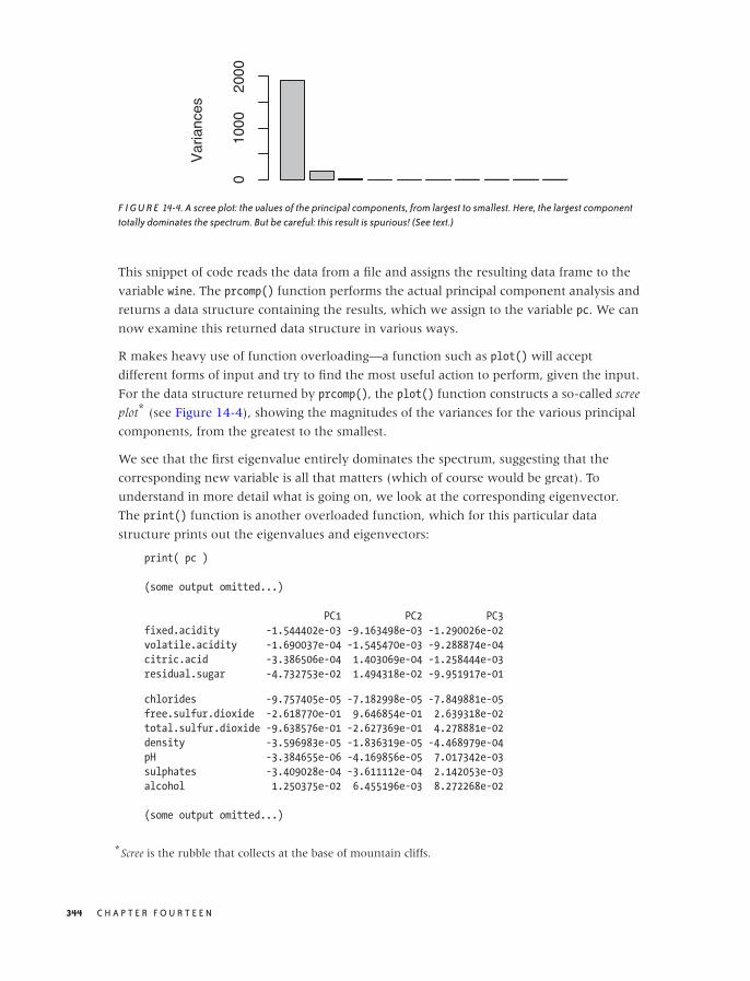
O’Reilly-5980006 master October 28, 2010 21:25
Var
ianc
es
010
0020
00
F I G U R E 14-4. A scree plot: the values of the principal components, from largest to smallest. Here, the largest componenttotally dominates the spectrum. But be careful: this result is spurious! (See text.)
This snippet of code reads the data from a file and assigns the resulting data frame to the
variable wine. The prcomp() function performs the actual principal component analysis and
returns a data structure containing the results, which we assign to the variable pc. We can
now examine this returned data structure in various ways.
R makes heavy use of function overloading—a function such as plot() will accept
different forms of input and try to find the most useful action to perform, given the input.
For the data structure returned by prcomp(), the plot() function constructs a so-called scree
plot* (see Figure 14-4), showing the magnitudes of the variances for the various principal
components, from the greatest to the smallest.
We see that the first eigenvalue entirely dominates the spectrum, suggesting that the
corresponding new variable is all that matters (which of course would be great). To
understand in more detail what is going on, we look at the corresponding eigenvector.
The print() function is another overloaded function, which for this particular data
structure prints out the eigenvalues and eigenvectors:
print( pc )
(some output omitted...)
PC1 PC2 PC3
fixed.acidity -1.544402e-03 -9.163498e-03 -1.290026e-02
volatile.acidity -1.690037e-04 -1.545470e-03 -9.288874e-04
citric.acid -3.386506e-04 1.403069e-04 -1.258444e-03
residual.sugar -4.732753e-02 1.494318e-02 -9.951917e-01
chlorides -9.757405e-05 -7.182998e-05 -7.849881e-05
free.sulfur.dioxide -2.618770e-01 9.646854e-01 2.639318e-02
total.sulfur.dioxide -9.638576e-01 -2.627369e-01 4.278881e-02
density -3.596983e-05 -1.836319e-05 -4.468979e-04
pH -3.384655e-06 -4.169856e-05 7.017342e-03
sulphates -3.409028e-04 -3.611112e-04 2.142053e-03
alcohol 1.250375e-02 6.455196e-03 8.272268e-02
(some output omitted...)
*Scree is the rubble that collects at the base of mountain cliffs.
344 C H A P T E R F O U R T E E N

O’Reilly-5980006 master October 28, 2010 21:25
This is disturbing: if you look closely, you will notice that both the first and the second
eigenvector are dominated by the sulfur dioxide concentration—and by a wide margin!
That does not seem right. I don’t understand much about wine, but I would not think that
the sulfur dioxide content is all that matters in the end.
Perhaps we were moving a little too fast. What do we actually know about the data in the
data set? Right: absolutely nothing! Time to find out. One quick way to do so is to use the
summary() function on the original data:
summary(wine)
fixed.acidity volatile.acidity citric.acid residual.sugar
Min. : 3.800 Min. :0.0800 Min. :0.0000 Min. : 0.600
1st Qu.: 6.300 1st Qu.:0.2100 1st Qu.:0.2700 1st Qu.: 1.700
Median : 6.800 Median :0.2600 Median :0.3200 Median : 5.200
Mean : 6.855 Mean :0.2782 Mean :0.3342 Mean : 6.391
3rd Qu.: 7.300 3rd Qu.:0.3200 3rd Qu.:0.3900 3rd Qu.: 9.900
Max. :14.200 Max. :1.1000 Max. :1.6600 Max. :65.800
chlorides free.sulfur.dioxide total.sulfur.dioxide density
Min. :0.00900 Min. : 2.00 Min. : 9.0 Min. :0.9871
1st Qu.:0.03600 1st Qu.: 23.00 1st Qu.:108.0 1st Qu.:0.9917
Median :0.04300 Median : 34.00 Median :134.0 Median :0.9937
Mean :0.04577 Mean : 35.31 Mean :138.4 Mean :0.9940
3rd Qu.:0.05000 3rd Qu.: 46.00 3rd Qu.:167.0 3rd Qu.:0.9961
Max. :0.34600 Max. :289.00 Max. :440.0 Max. :1.0390
pH sulphates alcohol quality
Min. :2.720 Min. :0.2200 Min. : 8.00 Min. :3.000
1st Qu.:3.090 1st Qu.:0.4100 1st Qu.: 9.50 1st Qu.:5.000
Median :3.180 Median :0.4700 Median :10.40 Median :6.000
Mean :3.188 Mean :0.4898 Mean :10.51 Mean :5.878
3rd Qu.:3.280 3rd Qu.:0.5500 3rd Qu.:11.40 3rd Qu.:6.000
Max. :3.820 Max. :1.0800 Max. :14.20 Max. :9.000
I am showing the output in its entire length to give you a sense of the kind of output
generated by R. If you look through this carefully, you will notice that the two sulfur
dioxide columns have values in the tens to hundreds, whereas all other columns have
values between 0.01 and about 10.0. This explains a lot: the two sulfur dioxide columns
dominate the eigenvalue spectrum simply because they were measured in units that make
the numerical values much larger than the other quantities. As explained before, if this is
the case, then we need to scale the input variables before performing the PCA. We can
achieve this by passing the scale option to the prcomp() command, like so:
pcx <- prcomp( wine, scale=TRUE )
Before we examine the result of this operation, I’d like to point out something else. If you
look really closely, you will notice that the quality column is not what it claims to be. The
description of the original data set stated that quality was graded on a scale from 1 to 10.
But as we can see from the data summary, only grades between 3 and 9 have actually
been assigned. Worse, the first quartile is 5 and the third quartile is 6, which means that at
S E E I N G T H E F O R E S T F O R T H E T R E E S 345

O’Reilly-5980006 master October 28, 2010 21:25
least half of all entries in the data set have a quality ranking of either 5 or 6. In other
words, the actual range of qualities is much narrower than we might have expected
(given the original description of the data) and is strongly dominated by the center. This
makes sense (there are more mediocre wines than outstanding or terrible ones), but it
also makes this data set much less interesting because whether a wine will be ranked 5
versus 6 during the sensory testing is likely a toss-up.
We can use the table() function to see how often each quality ranking occurs in the data
set (remember that the dollar sign is used to select a single column from the data frame):
table( wine$quality )
3 4 5 6 7 8 9
20 163 1457 2198 880 175 5
As we suspected, the middling ranks totally dominate the distribution. We might therefore
want to change our goal and instead try to predict the outliers, either good or bad, rather
than spending too much effort on the undifferentiated middle.
Returning to the results of the scaled PCA, we can look at the spectrum of eigenvalues for
the scaled version by using the summary() function (again, overloaded!) on the return
value of prcomp():
summary( pcx )
Importance of components:
PC1 PC2 PC3 PC4 PC5 PC6
Standard deviation 1.829 1.259 1.171 1.0416 0.9876 0.9689
Proportion of Variance 0.279 0.132 0.114 0.0904 0.0813 0.0782
Cumulative Proportion 0.279 0.411 0.525 0.6157 0.6970 0.7752
PC7 PC8 PC9 PC10 PC11 PC12
Standard deviation 0.8771 0.8508 0.7460 0.5856 0.5330 0.14307
Proportion of Variance 0.0641 0.0603 0.0464 0.0286 0.0237 0.00171
Cumulative Proportion 0.8393 0.8997 0.9460 0.9746 0.9983 1.00000
No single eigenvalue dominates now, and the first 5 (out of 12) eigenvalues account for
only 70 percent of the total variance. That’s not encouraging—it doesn’t seem that we can
significantly reduce the number of variables this way.
As a last attempt, we can create a biplot. This, too, is very simple; all we need to do is
execute (see Figure 14-5)
biplot( pcx )
This is actually a fascinating graph! We see that three of the original variables—alcohol
content, sugar content, and density— are parallel to the first principal component (the
horizontal axis). Moreover, alcohol content is aligned in the direction opposite to the
other two quantities.
But this makes utmost sense. If you recall from chemistry class, alcohol has a lower
density than water, and sugar syrup has a higher density. So the result of the PCA reminds
us that density, sugar concentration, and alcohol content are not independent: if you
346 C H A P T E R F O U R T E E N
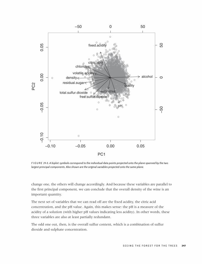
O’Reilly-5980006 master October 28, 2010 21:25
−0.10 −0.05 0.00 0.05
−0.
10−
0.05
0.00
0.05
PC1
PC
2
oo
o
oo
o
o
oo
o
o
oo
o
o
oo
o
o
oo
o
o
o
o
ooo
o
o
o oo
oo
o
o
ooo oo o
ooo
oo
oo o
o
oo
o
oo
o
oo
o
o
ooo
oo
oo
o
o
o
o
o
o
o
oo
o
o
oo
o
o
ooo
o
ooo
o
ooo
o
o
o
o
oo
oo
oo o
ooo o
o
oo
oo
o
o
o
oo
o
oo
oo
o
o
o
oo
o
o
oo oo
o
oo
o
oo o
o o
o
o
oo
oo
o
oo
ooo
o
oo
o
o
o
o
oo
oo
o
o
o
oo
o
oo
o
o
o
oo
o
o
o
oo o oo
oo
oo
oooo
oo
oooo oo
oo
o
o
o
oo
o
o oo
o
oo
oo
o
ooo
o
oo
o
o
o
oooooo
o
o
o
o
oo
o
o
o
o oo
o
o
oo
oo
o
ooo
o
o
oo
o
o
o
o
ooo
o
o
o
oo
oo
o
o
oo
oo
oo
o
o
oooo
o
o
o
o
o
o
o
o
o
o
o
oo
oooooo
o
o
o
oo
o
oo
ooo
o oo
o
o
o
oo
o
o
o oo
o oo
o
o
o
o
o
o
oo
o
oo
oo
o
o
o
o
o
oo
o
o
o
o
o
o
o
o
oo
oo
o
oo
o
o
oo
o
o
o o
o
o
o o
o
oo
o
ooo
o
o
o
o
o
o
o
o
o
o
ooo o
o o
o
o
o
o
o
ooo
o
o
o
o
oo
ooo ooo
o
o
oo o
o
o
oo
o
o
oo
o
o
o
o
o
o
ooo
o
o
o
o
ooo
o
o
o
o
o
o
o
oo
o
o
ooo
o
o
o
o o
o
o
oo
o
oo
o
o
ooo
o
o
o
oo
o
oo
o
o
oo
oo o
oo
oo
o
o
o
o
o
o
o
oo
o
oo
o
ooo
o
ooo
o
o
ooo
oooooo
oo
o
o
o
o
o
o
oo
o
o
o o
o
o
o
o
oo
oo
oo
o
o oo
oo
oo
o
o
o
ooo
ooo
o
o
o
o
o
o
o
o
o
o
o
o
o
oo
oo
o
oo
o
o
o
o
oooo
oo
o
oo
ooooo
o
oo
o
o
o
o
o
oo
o
oo
o
ooo
o ooo
o
oo
oo
o
ooo
o
o
o
oooo
o
o
o
o
o
o
o
o
oo
o
o
o
oo
oo
o o
ooo
oo
oooo
o
o
o
o
o
o
o
o oo
ooo
o
o
oooo
o
o
oo
o
o
o
o
oo
o
oo
oo
o
oo
o
oo
o
o o
o
o
o
o
o
o
o
o
o
o
o
oo
o
oo
o
o
o
o
o
o
o
o
o
oo
oo o
oo
oo
oo
ooo
o
o
o
o
o
oo o
oo
o
o
o
o
o
o
o oo
o
oo
ooo
o
oo
o
o
o
ooo
oo
o
o
oo
o
o
o
oo
ooo ooo
oo
o
oo
o
o
ooo
o
ooo
o o
o
o
o
o
o
o
ooo
oooo
ooo
o
o
o
o
o
o
o
o
oo
oo
oo
o
o
o
o
o
o
o
o
o
o
oo
o
o
o
o
o
oo
o
o
o
oo
o o
o
o
o
o
o
oo
o
o
o
o
o o
oo
o
oo
o
oo
o
o
oooo o
o
oo
o
o
o
o
oo
oo
o
o
o
o
o
o
o
o o
o o
o
o
o
o
oo
o
o
o
o
o o
o
ooo
o
o
ooo
oo
ooo
o
oo
o
ooo
oo
o
oo
o
o
oo
o
oo
o
o
oo o
oo
o
oo o
o
oo
o
o
o
oo
o
oo
o
o
o
ooo
o
o
o
o
o
o
o
o
oo
o
oo
o
o
ooo
o
oo o
ooo
o
o
o
o
o
oo
o
oo o
o
o
oo
o
o
oo
oo
o
oo
o
o
o
ooo
o
o
o
o
o
o
oo
oo
ooo
o
oo
ooo
o
o
o
o
oo o
oo
o
o
o
o
o oo
o
o
o
o
o
o
o o
oo
o
o
o
o
o oo
oo oo
o
o o
o
o
o o
oo
o
oo
o
o
o
o
oo
o
o
ooo
oo
o
o
o
o
ooo
o
o
oo
oo
o
o
o
o
o
o
o
o
oo
o
o
o
o
o
o
o
o
o o
o
o
o
o
oo
o
o
o
o
o
o
o
o
o
o
o
o
oo
oo
ooo
oo
o
oo
o
o
o
o o
o
o
o
oo
o
o
o
o
oo
oo
o
o
oo
o
oo
o
o
o oo o
o
o o
o
o
o
o
o oo
o
o
oo o
o
o
o
o
ooo
oo
o
o
o
o
o
oo
o
o
o
o
o
oo
o
o
o
ooo
o oo
o
o
oo
o
o
o
oo
o oo
o
o
o
oo
oo oo
o oo
o
o
o
o
o
oo
o
o
o
oo
o
o
o
oo
oo
oo
oo
o
o
o
o
oo
o
o
oo
o
o oo
o
o
o
o
o
o
o
o
o
o
o oo
o
o
o
o
o
o
oo
o
ooo
oo
o
o
oo
o
o
o
o
o
o
o
o o
ooo
o
oo
o
o
oooo oo
o
oo
o
o
o
o
o
o
oo
o
o
ooo
o
oo
o
o
o
o
o
o
oo
o
o
o
oo
o
oo
oo
oo
o o
o
o
o
o
o
ooo
o
o
ooo o
o
o
oo
o
o
o
o
o
oo
oo
o
oo
o
o
o
oo
ooo
o
o
o
oo
o
o
oo
o
o
o
o ooo oo
o
o
oo
o
o
o
o
oo
o
oo
o
oo
o
o
oo
o
oo
ooo
o
o
o
o o
o
o o
oo
o
o
o
o
oo
o
ooo
o
ooo
o
o
o
o
o
o
o
o
oo
o
o
o
o
oo
o
oo
o
o
oo
o o
o
o
o
oo
o
o
oo
o
o
o
o
o
o
o
oo
o
o
o
o
oo
o
o oo
o
o ooo
o
o
oo
o
o o
o
o
oo o
o o
oo
oo
o
o
o
ooo
o
o
o
oo
ooo
o
o
o
oo
o
ooo
o
o
o
o
o
o
oo
o
oooo
oo
o
o o
o
ooo
o
o ooo
oo
o
o
o
oo
o
oooo
o
o
o
o
o
ooo
oo
o
oooo
o ooo
o
oo
o
o
o
oo
o
o
o
oo
o
ooo
o
o
oo
o
o
o
o
o
o o
o
o
oo
o
o
o
oo
o
oo
o
oo
o
oo
oo o
oooo
o
o o
o
o
o
ooo oo
oo
o
ooo
o
o ooo
o
o
o
o
o
o o
o
o
o
o
o
o
oo
o o
oo
o
o
o
o
o
o
o o
o
o
o o
o
o
o
o
o
o
o
o
oo
oo
o
o
o
o
oo
ooooo
o
oo
o
o
o
o oo
ooo
o
o
o
ooo
o
o
oo
o
oo
o
o
o oo o
o
o
o o
o
oo
oo
o
o
o
o
o
o
o
o
ooo
o
ooo
o
oooo
oo
oo
o
o
o
ooo
o
o
oo
oo
o
o
oo
oo
o
o
oo
oo
o
o
ooo
o
o
oo
o
o
o
o
oo
o
oo
o
o
o
oo
o
o
oo
oo
o
o
o
oo
ooo
ooo
o
oo
o
o
o
o
o
o
o
ooo
oo
oo
o
ooooo
o oo
o
oo
o oo
oo
ooo
o
ooo
o
ooo o
o
oo
oo
o
o
o
o
o
o
o
oo
o
o
o
oo
o
o
o
o
o
oo
o
o
o
o
o
o
o oo
o
o
o
ooo
o
o
oo
oo
o
o
o
o o
o
oo
o
o
ooo
o
oo
oo
oo
oo
o
o
o
o
oo
o
oo
o
o
o
ooo
o
oo
oo
o
o
o
o
o
oo
o
ooo
o
oooo
o
oo
oo
o
o
o o
o
o o
oo
o
o
oo
oo
o
o
o
o
o
o
o
ooo
o
o
o
oo
o
ooo
oo
o
o
oo
o
o
o
o
o
oo
oo
ooooo
oo
oo
o
o
oooo
o o o
o
o
o
o
oo
o
oo
o
ooo
o
o
oo
o
oo
o
o
o
oo
o
o
o
o
oo
o
o
oo
oo o
o
ooooo
oo
o
o
o
oo
oo
o
ooo
o
o
o
o
o
o
o
o
o
o
o
ooo
oo
o
o
oo
o
o
o
o
o
o
o
o
ooo
o
o
o
o
o
o
o
oo
oooooo
o
o
o
o
o
o
oo
oo oo
o
oo
o
o
oo
oo
oo
o
o
ooo
ooo
o
o
o
oo
o
o
o
o
o
o
o
o
o oo
o
o
oo
o
oo
o
o
oo
o ooo
o
oo
oo
o
o
o
o
ooo
oo
o
o
oo
o
oo
o o
o
ooo
o
o
ooo
ooo
o
oo
o
oo
ooo
oo
oo
o
o
oo
o
o
o
o
o
oo o
o
o
o
o
o
o
o
oo
o
o
o
o
o
o
oooo
o
oooo
oo
o
o
o
o
o
o
o
o
o
oo
oo
o
oo o
oo
ooo
ooo
oo
o
o
oo
o
o
o
o
o
o
o ooo
o
oo
oo
ooo
o
o
oo
o
o
oo
oo
o
o
ooo
o o
oo
o
o
o
o
o
o
oo
o
o
o
o
oo
o
o
o
o
o
o
o o
o
o
oo
o
oo
o
o
o
o
ooo
ooo
o ooo o
o
o
o
o
o
ooo
o
oo
oo
o
oo o
o
o
oo oo
oo
o
oo
oo
o
o
ooooooo
o
o o
o
o
o
o
o
o
o
o
o
o
o
o
ooo
o
o
o
o
o
oo o
o
o
ooo
o
oo
o
o
o
o
o
oo
o
o
o oo
o
oo
o
o
o
o
o
o
oo
oo
o
ooo
o o
o
o
o
oo oo
oo
o
o
o
o
o
o
o
o
o
oo
o
o
oo o
o
oo
o
o
oo
o
oo
o
oo
ooo
o
o
o
oo
oo o
ooooo oo ooo
o
ooo
o
oo o
oo
o
o
o
o
o
o
o
o
oo
oo
oo
o
ooo
o
o
o
o
oo
o
oo
o
o
o
o
o
o
o
o
o
oo
oo
o
o
o
o o
oo
o
o
o
o
o
oooo o
oo
oo
oooo
o
o
oo
ooo o
o
oo
o
oo
oo oo
oo
oo
o
o
o
o
o
o
ooooo
o
o
o
o
o
ooo
oo
o
o
o oo
ooo
o
o
o
o
ooo
o
oo
oo
o
o
o o
o
o
o
o
oooo
o
o
o
o
oo
oo
o o
o
o
o
o
o
o
o
o
o
o
o
o oo
oo
o
o
o
o
o
o
o
o
o
oo
o
oo
oo
oo
o
oo
oo
ooo
ooo
o
ooo
o
o
oooo
o
oo
o
o
oo
oo
o
oo ooo
o
o oo
o
oo
o
o oooo
o
o
o
oo
o
oo
o
o
oo
oo
o
o
o
o
oo
oo o
ooo
o
o
o o
o
oooo
o
o
o
o ooo
oo
oooo
o
oo
o
o
oo
o oo
oo
o o
o
o
o
o
o
o
oo
o
o
o
o ooo
o
o
oo
o
oo
o
o
o
oo
o
o o
o
o
oo
o
o
o
o
oo
o
o
o
o
oo
o
o
o
o
o o
o
o
oo
o oo
oo
o
o
o
o
o
oo
o
o
oo
o
o
oo
o
o
oo
oo
o
ooo
o o
ooooo
o
o
o
oo
oo oo
o
o
o
o
oo
oo
o
o
o
oo
o
oo
o
oo
o
o
o
o
o
o
o
oooo
oo o
o
o
oo
o
o
o
o
o
oo
o
ooo
oo
o
o
o
o
ooo
o
o
o
o
o
o
o
o
ooo
o
ooo
o
o
o
oo
oo
o
o
o
o
o
o
o
o
ooo
o
o o
o
oo
o
o
o
o
o
o
o
o
o
o
o
o
o
oo
o
oo
o
oo
o
o
o
o
oo o
o
oo
o
o
o
ooo
o
o
o
ooooooo
oo
o
oo
o
o
o
o
o
o
o
oo
ooo
o
oo
oo
o
o
oooo
o
o
oo
o
oooo
o
o
o
o
o
o
o
o
o
o
o o
o
o
o
o
o
oo
oo
o
o
o
o
ooo
oo
o
o
oo o
o
o
ooo
oo
o
o
o
oooo
o
o
o
oo
oo
oo
o o
oo
o
o
oo
o
o
oo
o
o oo
o
o
o
ooo
o
oo
oo
oo
o
o
o
o
oo
oo
o
oo
o
o
o
o
o
o
o
o
ooo
o
oo
o
ooo
o
o
o
o
o
o
o
oo
o ooo
o
oooo
o
o
o
ooo
o
o oo o
oo
o
o oo
o
ooo
oo
o
o
o o
o o
o
oo
o ooo
oo
o
o
oo
oo
oo
o ooo o
o oo
o
o
oo
o
o
ooo
o
o
o
o ooo
oo
oo
ooo
o
oo
o
oo
o
o
oo
o
oo
o
o oo
o
o
o
ooo
o
ooo
oo
o
oo
o
o
oo
oo
oo
o
o
ooo
o
o
o
o
o
o
o
oo
o
o
oo
oo
o
o
o
oo
o
oo o
o
oo
o oo
o
o
o
ooo
oo
oo
o oo
o
o
o
o
oo
o
o
o
o o
ooo
oo
o
o
o
oo
oo
o
o
o
ooo
o
ooo
ooo
oo
o
o
o
o
oo
oo
oo
o
o
o
o
o
o
o
o
o
o
o
oo
o oo
ooo
o o
oo
o
oo
oo
oo
oo
oo o
o
o
o
o
o
o
o
o
o
o
o
oo
o
o
oo
o
o
oo
ooooo
oo
o
o o
o
oo
o
o
ooo
o
o
oo
o o
o
oo
o
o
o
o
o
oo
oo
o
o
oooooooo
o
oo
o
ooo
o
o
ooo
oo
o
o
o
o
ooo oo
o
oo
oo
oo
o
o
o
o
oo
oo
o
o
ooooo o
o
oo
o
oo
o
o ooo
o o
o
ooo
o
o
o
oo oo
o
oo
oo
oo
oo
o
oo
o
o
oo
o
oo
oo
oo
oo
o
oo
o
o
o
o
o
o
ooo
o
o oo
o
oo
o oo
oo
o
o
oooo
o
o
o oo
o
o
o
oo
oo
o
o
o
o
o o
oo
o
o
o
o
oo
o
o
o
o
o
o
o
oo
o
oo
o
o
o
o
o
o
o
o
o
oo
o
o
ooo
oo
ooo
o
o
o
o
o
o
o
o
o
o
o
o
o
oooo
o
o
oo
o
o
o
o
o
o
ooo
o
o
o
oo
o
o oo
oo
o
o o
o
o
o
ooo
o o
oooo
o o
o
o
oo
oo
o
oo
ooo
o
o
o ooo
o
o
o
o
o
o
oo
oo
oo
o
oo
oo
o
ooo
oo
oo
o oo
o
oo
o
o
oo
ooooo
ooo
o o
o
oo
o
o
ooo
oo
o
o
oo
oo ooo
o
o
oo
o
o
oo
oo
ooo
o
oo
oo
oo
oo
o
o
o
o
oooo
oo o
oo
o
oo
o
o
ooo
oo
oo
oo
o
oo
oo
oo
oo
oo
ooo
o
o
o
o
o
ooo
oo
ooo ooo
o
oooo oo
oooooo oo
o
o ooo
o
oo
o
o
o
ooo
o
oo
o
oo
o
o
o
o
ooo
o
o
o
o
oo
ooo
o
oo
oo
oo
ooo
oo
o
ooo
oo
o oo
o
oo
oo o
o
oo
oo
o ooo
o
o
o
o
o
o
o
oo
o
o
oo
o oo
o
ooo oo
o
o o
o
ooo oo
oooo
oooo
o
oo
oooo
oooo
oo
o
oo
o
o
o
o
oo
o
oo
oo o
ooo
o
oo
o
oo
oo
o
o
ooo
o
o o
o
oo
o
o ooo
oooooooo
o
oo
o
o
o
o
o
o
oo
o
o
oo
o
o
o
o
oo
o
o
oo oo
o
ooo
o oo
o
oo
o
o
o
o
o
oo
ooo
o
ooo
o
o
oo
ooooo oo o o
ooo
o
o
o
ooo
o
o
oo o ooooo ooo oo
oo
o
o
oo
oo
oo
o o
oo
oo
o
oo
o
o
o
o
o
o o
oo
oooo
o
o
o oooo
oo o
o
o
o
oo
o o
o
ooo
o
oooo
oo
o
oo
ooo
o
o
o
o
o
o
o
o
o
o
o
o
o o
oo
o
o oo
o
o
oo
o
o
ooo
o
o o
oo
ooooo
o
o
ooo
o
o
o
oo
oo
o
ooo
o
ooo
oo
o
o
oo o
o
o
o
oo
o
o
o
o
ooooo
o
o
o
oo
o
oo
o
o
o o
o
o
o
o oo
o
oo
o
o
oo
o o
o
o
o
o
oo
o
o
oooo
oo
o
o
o
o
oo
oo
oo
o
o
ooo
o
o
oo
oooo
o
oo
oo
oo
o
o
oo
ooo
oo
o
oooo
o
o
o
o
o
oo
o
o
ooo
o
oo
o
oo
o oo
o
o o
o
o
o
oo
oooo
o
o
o
oo
oo
o
oooo oo
o
o
o
o
oo
oo
o
oo
o
oo
oo
oo
o o
o
o
o
oo
o
oo
o
o
oo
o
o
oo ooo
o
o
o
o
ooo
o
o
o
o
o
oo
o
ooo
o
o
o
o
ooooooo
o
o
o
o oo o
oo
oo
o
o
oo
oo
oo
o
oo oo ooo
oo o
o
o
oo
o
o
oo
o
o
o o
o
o
oo
oo
oo
o
o
oo
o
o
oo
oo
oo
o
o
o
oo
o
o
o
oo
o
o
o
oo ooo
o
o
oo o
ooo
oooo
o
o
o
o
o
o
oo
oo
o
o
oo
oo oo
o
oo
o
oo
o
o
o
o oo
o
o
o
−50 0 50
−50
050fixed.acidity
volatile.acidity
citric.acid
residual.sugar
chlorides
free.sulfur.dioxidetotal.sulfur.dioxide
density
pH
sulphates
alcohol
quality
F I G U R E 14-5. A biplot: symbols correspond to the individual data points projected onto the plane spanned by the twolargest principal components. Also shown are the original variables projected onto the same plane.
change one, the others will change accordingly. And because these variables are parallel to
the first principal component, we can conclude that the overall density of the wine is an
important quantity.
The next set of variables that we can read off are the fixed acidity, the citric acid
concentration, and the pH value. Again, this makes sense: the pH is a measure of the
acidity of a solution (with higher pH values indicating less acidity). In other words, these
three variables are also at least partially redundant.
The odd one out, then, is the overall sulfur content, which is a combination of sulfur
dioxide and sulphate concentration.
S E E I N G T H E F O R E S T F O R T H E T R E E S 347

O’Reilly-5980006 master October 28, 2010 21:25
And finally, it is interesting to see that the quality seems to be determined primarily by the
alcohol content and the acidity. This suggests that the more alcoholic and the less sour the
wine, the more highly it is ranked—quite a reasonable conclusion!
We could have inferred all of this from the original description of the data set, but I must
say that I, for one, failed to see these connections when initially scanning the list of
columns. In this sense, the PCA has been a tremendous help in interpreting and
understanding the content of the data set.
Finally, I’d like to reflect one more time on our use of R in this example. This little
application demonstrates both the power and the shortcomings of R. On the one hand, R
comes with many high-level, powerful functions built in, often for quite advanced
statistical techniques (even an unusual and specialized graph like a biplot can be created
with a single command). On the other hand, the heavy reliance on high-level functions
with implicit behavior leads to opaque programs that make it hard to understand exactly
what is going on. For example, such a critical question as deciding whether or not to
rescale the input data is handled as a rather obscure option to the prcomp() command. In
particular, the frequent use of overloaded functions—which can exhibit widely differing
functionality depending on their input—makes it hard to predict the precise outcome of an
operation and makes discovering ways to perform a specific action uncommonly difficult.
Further Reading• Introduction to Multivariate Analysis. Chris Chatfield and Alexander Collins. Chapman &
Hall/CRC. 1981.
A bit dated but still one of the most practical, hands-on introductions to the
mathematical theory of multivariate analysis. The section on PCA is particularly clear
and practical but entirely skips computational issues and makes no mention of the SVD.
• Principal Component Analysis. I. T. Jolliffe. 2nd ed., Springer. 2002.
The definitive reference on principal component analysis. Not an easy read.
• Multidimensional Scaling. Trevor F. Cox and Michael A. A. Cox. Chapman & Hall/CRC.
2001.
The description of multidimensional scaling given in this chapter is merely a
sketch—mostly, because I find it hard to imagine scenarios where this technique is
truly useful. However, it has a lot of appeal and is fun to tinker with. Much more
information, including some extensions, can be found in this book.
• Introduction to Data Mining. Pang-Ning Tan, Michael Steinbach, and Vipin Kumar.
Addison-Wesley. 2005.
This is my favorite reference on data mining. The presentation is compact and more
technical than in most other books on this topic.
348 C H A P T E R F O U R T E E N

O’Reilly-5980006 master October 28, 2010 21:25
Linear Algebra
Linear algebra is a foundational topic. It is here that one encounters for the first time
abstract concepts such as spaces and mappings treated as objects of interest in their own
right. It takes time and some real mental effort to get used to these notions, but one gains
a whole different perspective on things.
The material is also of immense practical value—particularly its central result, which is the
spectral decomposition theorem. The importance of this result cannot be overstated: it is
used in every multi-dimensional problem in mathematics, science, and engineering.
However, the material is abstract and unfamiliar, which makes it hard for the beginner.
Most introductory books on linear algebra try to make the topic more palatable by
emphasizing applications, but that only serves to confuse matters even more, because it
never becomes clear why all that abstract machinery is needed when looking at
elementary examples. The abstract notions at the heart of linear algebra are best
appreciated, and most easily understood, when treated in their own right.
The resources listed here are those I have found most helpful in this regard.
• Linear Algebra Done Right. Sheldon Axler. 2nd ed., Springer. 2004.
The book lives up to its grandiose title. It treats linear algebra as an abstract theory of
mappings but on a very accessible, advanced undergraduate level. Highly
recommended but probably not as the first book on the topic.
• Matrix Methods in Data Mining and Pattern Recognition. Lars Elden. SIAM. 2007.
This short book is an introduction to linear algebra with a particular eye to applications
in data mining. The pace is fast and probably requires at least some previous familiarity
with the subject.
• Understanding Complex Datasets: Data Mining with Matrix Decompositions. David Skillicorn.
Chapman & Hall/CRC. 2007.
An advanced book, concentrating mostly on applications of the SVD and its variants.
• “A Singularly Valuable Decomposition: The SVD of a Matrix.” Dan Kalman. The College
Mathematics Journal 27 (1996), p. 2. This article, which can be found on the Web, is a
nice introduction to the SVD. It’s not for beginners, however.
S E E I N G T H E F O R E S T F O R T H E T R E E S 349

O’Reilly-5980006 master October 28, 2010 21:25

O’Reilly-5980006 master October 28, 2010 21:32
C H A P T E R F I F T E E N
Intermezzo: When More Is Different
WHEN DEALING WITH SOME OF THE MORE COMPUTATIONALLY INTENSIVE DATA ANALYSIS OR MINING
algorithms, you may encounter an unexpected obstacle: the brick wall. Programs or
algorithms that seemed to work just fine turn out not to work once in production. And I
don’t mean that they work slower than expected. I mean they do not work at all!
Of course, performance and scalability problems are familiar to most enterprise
developers. However, the kinds of problems that arise in data-centric or computationally
intensive applications are different, and most enterprise programmers (and, in fact, most
computer science graduates) are badly prepared for them.
Let’s try an example: Table 15-1 shows the time required to perform 10 matrix
multiplications for square matrices of various size. (The details of matrix multiplication
don’t concern us here; suffice it to say that it’s the basic operation in almost all problems
involving matrices and is at the heart of operator decomposition problems, including the
principal component analysis introduced in Chapter 14.)
T A B L E 15 -1. Time required toperform 10 matrix multiplications forsquare matrices of different sizes
Size n Time [seconds]
100 0.00200 0.06500 2.12
1,000 22.442,000 176.22
351

O’Reilly-5980006 master October 29, 2010 17:46
Would you agree that the data in Table 15-1 does not look too threatening? For a
2,000 × 2,000 matrix, the time required is a shade under three minutes. How long might
it take to perform the same operation for a 10,000 × 10,000 matrix? Five, maybe ten
minutes? Yeah, right. It takes five hours! And if you need to go a little bit bigger still—say,
30,000 × 30,000, the computation will take five days.
What we observe here is typical of many computationally intensive algorithms: they
consume disproportionately more time as the problem size becomes larger. Of course, we
have all heard about this in school, but our intuition for the reality of this phenomenon is
usually not very good. Even if we run a few tests on small data sets, we fail to spot the
trouble: sure, the program takes longer as the data sets get larger, but it all seems quite
reasonable. Nevertheless, we tend to be unprepared for what appears to be a huge jump in
the required time as we increase the data set by a seemingly not very large factor.
(Remember: what took us from three minutes to five hours was an increase in the
problem size by a factor of 5—not even an order of magnitude!)
The problem is that, unless you have explicitly worked on either a numerical or a
combinatorial problem in the past, you probably have never encountered the kind of
scaling behavior exhibited by computational or combinatorial problems. This skews our
perception.
Where are you most likely to encounter perceptible performance problems in an
enterprise environment? Answer: slow database queries! We all have encountered the
frustration resulting from queries that perform a full table scan instead of using an
indexed lookup (regardless whether no index is available or the query optimizer fails to
use it). Yet a query that performs a full table scan rather than using an index exhibits one
of the most benign forms of scaling: from O(log n) (meaning that the response time is
largely insensitive to the size of the table) to O(n) (meaning that doubling the table size
will double the response time).
In contrast, matrix operations—such as the matrix multiplication encountered in the
earlier example—scale as O(n3); this means that if the problem doubles in size, then the
time required grows by a factor of 8 (because 23 = 8). In other words, as you go from a
2,000 × 2,000 matrix to a 4,000 × 4,000 matrix, the problem will take almost 10 times as
long; and if you go to a 10,000 × 10,000 matrix, it will take 53 = 125 times as long. Oops.
And this is the good news. Many combinatorial problems (such as the Traveling Salesman
problem and similar problems) don’t scale according to a power law (such as O(n3)) but
instead scale exponentially (O(en)). In these cases, you will hit the brick wall much faster
and much more brutally. For such problems, an incremental increase in the size of the
problem (i.e., from n to n + 1) will typically at least double the runtime. In other words, the
last element to calculate takes as much time as all the previous elements taken together.
System sizes of around n = 50 are frequently the end of the line. With extreme effort you
might be able to push it to n = 55, but n = 100 will be entirely out of reach.
352 C H A P T E R F I F T E E N

O’Reilly-5980006 master October 28, 2010 21:32
The reason I stress this kind of problem so much is that in my experience, not only are
most enterprise developers unprepared for the reality of it but also that the standard set of
software engineering practices and attitudes is entirely inadequate to deal with them. I
once heard a programmer say, “It’s all just engineering” in response to challenges about
the likely performance problems of a computational system he was working on. Nothing
could be further from the truth: no amount of low-level performance tuning will save a
program of this nature that is algorithmically hosed—and no amount of faster hardware,
either. Moreover, “standard software engineering practices” are either of no help or are
even entirely inapplicable (we’ll see an example in a moment).
Most disturbing to me was his casual, almost blissful ignorance—this coming from a guy
who definitely should have known better.
A Horror Story
I was once called into a project in its thirteenth hour—they had far exceeded both their
budget and their schedule and were about to be shut down for good because they could
not make their system work. They had been trying to build an internal tool that was
intended to solve what was, essentially, a combinatorial problem. The tool was supposed
to be used interactively: the user supplies some inputs and receives an answer within, at
most, a few minutes. By the time I got involved, the team had labored for over a year, but
the minimum response time achieved by their system exceeded 12 hours—even though it
ran on a very expensive (and very expensive to operate) supercomputer.
After a couple of weeks, I came up with an improved algorithm that calculated answers in
real time and could run on a laptop.
No amount of “engineering” will be able to deliver that kind of speed-up.
How was this possible? By attacking the problem on many different levels. First of all, we
made sure we fully understood the problem domain. The original project team had always
been a little vague about what exactly the program was trying to calculate, as a result
their “domain model” was not truly logically consistent. Hence the first thing to do was to
put the whole problem on sound mathematical footing. Second, we redefined the problem:
the original program had attempted to calculate a certain quantity by explicit
enumeration of all possible combinations, whereas the new solution calculated an
approximation instead. This was warranted because the input data was not known very
precisely, anyway, and because we were able to show that the uncertainty introduced by
the approximation was less than the uncertainty already present in the data. Third, we
treated hot spots differently than the happy case: the new algorithm could calculate the result to
higher accuracy, but it did so only when the added accuracy was needed. Fourth, we used
efficient data structures and implemented some core pieces ourselves instead of relying on
general-purpose libraries; we also judiciously precalculated and cached some frequently
used intermediate results.
I N T E R M E Z Z O : W H E N M O R E I S D I F F E R E N T 353

O’Reilly-5980006 master October 28, 2010 21:32
After putting the whole effort on a conceptually consistent footing, the most important
contribution was changing the problem definition: dropping the exact approach, which
was unnecessary and infeasible, and adopting an approximate solution that was cheap
and all that was required.
Some Suggestions
Computational and combinatorial programming is really different. It runs into different
limits and requires different techniques. Most important is the appropriate choice of
algorithm at the outset, since no amount of low-level tuning or “engineering” will save a
program that is algorithmically flawed.
Here is a list of recommendations in case you find yourself setting out on a project that
involves heavy computation or deals with combinatorial complexity issues:
Do your homework. Understand computational complexity, know the complexity of the
algorithm you intend to use, and research the different algorithms (and their trade-offs)
available for your kind of problem. Read broadly—although the exact problem as
specified may turn out to be intractable, you may find that a small change in the
requirements may lead to a much simpler problem. It is definitely worth it to renegotiate
the problem with the customer or end users than setting out on a project that is infeasible
from the outset. (Skiena’s Algorithm Design Manual is a particularly good resource for
algorithms grouped by problems.)
Run a few numbers. Do a few tests with small programs and evaluate their scaling
performance. Don’t just look at the actual numbers themselves—also consider the scaling
behavior as you vary the problem size. If the program does not exhibit the scaling
behavior you expect theoretically, it has a bug. If so, fix the bug before proceeding! (In
general, algorithms follow the theoretical scaling prediction quite closely for all but the
smallest of problem sizes.) Extrapolate to real-sized problems: can you live with the
expected runtime predictions?
Forget standard software engineering practices. It is a standard assumption in current
software engineering that developer time is the scarcest resource and that programs
should be designed and implemented accordingly. Computationally intensive programs
are one case where this is not true: if you are likely to max out the machine, then it’s
worth having the developer—rather than the computer—go the extra mile. Additional
developer time may very well make the difference between an “infeasible” problem and a
solved one.
For instance, in situations where you are pressed for space, it might very well make sense
to write your own container implementations instead of relying on the system-provided
hash map. Beware of the trap of conditioned thinking, though: in one project I worked
on, we knew that we would have a memory size problem and that we therefore had to
354 C H A P T E R F I F T E E N

O’Reilly-5980006 master October 28, 2010 21:32
keep the size of individual elements small. On the other hand, it was not clear at first
whether the 4-byte Java int data type would be sufficient to represent all required values
or whether we would have to use the 8-bye Java long type. In response, someone
suggested that we wrap the atomic data type in an object so we could swap out the
implementation, in case the 4-byte int turned out to be insufficient. That’s a fine
approach in a standard software engineering scenario (“encapsulation” and all that), but
in this situation—where space was at a premium—it missed the point entirely: the space
that the Java wrapper would have consumed (in addition to its data members) would
have been larger than the payload!
Remember: standard software engineering practices are typically intended to trade
machine resources for developer resources. However, for computationally intensive
problems, machine resources (not developer time) are the limiting factor.
Don’t assume that parallelization will be possible. Don’t assume that you’ll be able to
partition the problem in such a way that simultaneous execution on multiple machines
(i.e., parallelization) will be possible, until you have developed an actual, concrete,
implementable algorithm—many computational problems don’t parallelize well. Even if
you can come up with a parallel algorithm, performance may be disappointing: hidden
costs (such as communication overhead) often lead to performance that is much poorer
than predicted; a cluster consisting of twice as many nodes often exhibits a behavior much
less than double the original one! Running realistic tests (on realistically sized data sets
and on realistically sized clusters) is harder for parallel programs than for single processor
implementations—but even more important.
Leave yourself some margin. Assume that the problem size will be larger by a factor of 3
and that hardware will deliver only 50 percent of theoretically predicted performance.
If the results are not wholly reassuring, explore alternatives. Take the results for the
expected runtime and memory requirements that you obtained from theoretical
predictions and the tests that you have performed seriously. Unless you seem able to meet
your required benchmarks comfortably, explore alternatives. Consider better algorithms,
research whether the problem can be simplified or whether the problem can be
approached in an entirely different manner, and look into approximate or heuristic
solutions. If you feel yourself stuck, get help!
If you can’t make it work on paper, STOP. It won’t work in practice, either. It is a
surprisingly common anti-pattern to see the warning signs early but to press on regardless
with the hopeful optimism that “things will work themselves out during
implementation.” This is entirely misguided: nothing will work out better as you proceed
with an implementation; everything is always a bit worse than expected.
I N T E R M E Z Z O : W H E N M O R E I S D I F F E R E N T 355

O’Reilly-5980006 master October 28, 2010 21:32
Unless you can make it work on paper and make it work comfortably, there is no point in
proceeding!
The recurring recommendation here is that nobody is helped by a project that ultimately
fails, because it was impossible (or at least infeasible) from the get-go. Unless you can
demonstrate at least the feasibility of a solution (at an acceptable price point!), there is no
use to proceed. And everybody is much better off knowing this ahead of time.
What About Map/Reduce?
Won’t the map/reduce family of techniques make most of these considerations obsolete?
The answer, in general, is no.
It is important to understand that map/reduce is not actually a clever algorithm or even
an algorithm at all. It is a piece of infrastructure that makes naive algorithms convenient.
That’s a whole different ball game. The map/reduce approach does not speed up any
particular algorithm at all. Instead, it makes the parallel execution of many subproblems
convenient. For map/reduce to be applicable, therefore, it must be possible to partition the
problem in such a way that individual partitions don’t need to talk to each other. Search is
such an application that is trivially parallelizable, and many (if not all) successful current
applications of map/reduce that I am aware of seem to be related to generalized forms of
search.
This is not to say that map/reduce is not a very important advance. (Any device that
makes an existing technique orders of magnitudes more convenient is an important
innovation!) At the moment, however, we are still in the process of figuring how which
problems are most amenable to the map/reduce approach and how best to adapt them. I
suspect that the algorithms that will work best on map/reduce will not be straightforward
generalizations of serial algorithms but instead will be algorithms that would be entirely
unattractive on a serial computer.
It is also worth remembering that parallel computation is not new. What has killed it in
the past was the need for different partitions of the problem to communicate with each
other: very quickly, the associated communication overhead annihilated the benefit from
parallelization. This problem has not gone away, it is merely masked by the current
emphasis on search and searchlike problems, which allow trivial parallelization without
any need for communication among partitions. I worry that more strictly computational
applications (such as the matrix multiplication problem discussed earlier or the simulation
of large physical systems) will require so much sharing of information among nodes that
the map/reduce approach will appear unattractive.
Finally, amid the excitement currently generated by map/reduce, it should not be
forgotten that its total cost of ownership (including the long-term operational cost of
maintaining the required clusters as well as the associated network and storage
infrastructure) is not yet known. Although map/reduce installations make distributed
356 C H A P T E R F I F T E E N
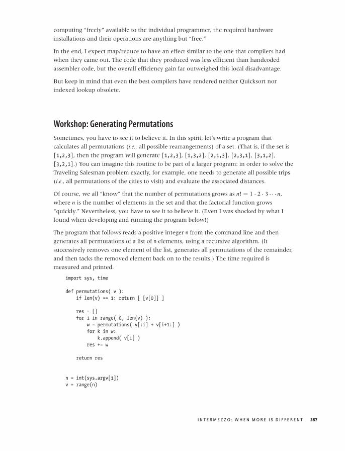
O’Reilly-5980006 master October 28, 2010 21:32
computing “freely” available to the individual programmer, the required hardware
installations and their operations are anything but “free.”
In the end, I expect map/reduce to have an effect similar to the one that compilers had
when they came out. The code that they produced was less efficient than handcoded
assembler code, but the overall efficiency gain far outweighed this local disadvantage.
But keep in mind that even the best compilers have rendered neither Quicksort nor
indexed lookup obsolete.
Workshop: Generating Permutations
Sometimes, you have to see it to believe it. In this spirit, let’s write a program that
calculates all permutations (i.e., all possible rearrangements) of a set. (That is, if the set is
[1,2,3], then the program will generate [1,2,3], [1,3,2], [2,1,3], [2,3,1], [3,1,2],
[3,2,1].) You can imagine this routine to be part of a larger program: in order to solve the
Traveling Salesman problem exactly, for example, one needs to generate all possible trips
(i.e., all permutations of the cities to visit) and evaluate the associated distances.
Of course, we all “know” that the number of permutations grows as n! = 1 · 2 · 3 · · · n,
where n is the number of elements in the set and that the factorial function grows
“quickly.” Nevertheless, you have to see it to believe it. (Even I was shocked by what I
found when developing and running the program below!)
The program that follows reads a positive integer n from the command line and then
generates all permutations of a list of n elements, using a recursive algorithm. (It
successively removes one element of the list, generates all permutations of the remainder,
and then tacks the removed element back on to the results.) The time required is
measured and printed.
import sys, time
def permutations( v ):
if len(v) == 1: return [ [v[0]] ]
res = []
for i in range( 0, len(v) ):
w = permutations( v[:i] + v[i+1:] )
for k in w:
k.append( v[i] )
res += w
return res
n = int(sys.argv[1])
v = range(n)
I N T E R M E Z Z O : W H E N M O R E I S D I F F E R E N T 357

O’Reilly-5980006 master October 28, 2010 21:32
t0 = time.clock()
z = permutations( v )
t1 = time.clock();
print n, t1-t0
(You may object to the use of recursion here, pointing out that Python does not allow
infinite depth of recursion. This is true but is not a factor: we will run into trouble long
before that constraint comes into play.)
I highly recommend that you try it. Because we know (or suspect) that this program
might take a while to run when the number of elements is large, we probably want to
start out with three elements. Or with four. Then maybe we try five, six, or seven. In all
cases, the program finishes almost instantaneously. Then go ahead and run it with n=10.
Just 10 elements. Go ahead, do it. (But I suggest you save all files and clean up your login
session first, so you can reboot without losing too much work if you have to.)
Go ahead. You have to see it to believe it!*
Further Reading• The Algorithm Design Manual. Steven S. Skiena. 2nd ed., Springer. 2008.
This is an amazing book, because it presents algorithms not as abstract entities to be
studied for their own beauty but as potential solutions to real problems. Its second half
consists of a “hitchhiker’s guide to algorithms”: a catalog of different algorithms for
common problems. It helps you find an appropriate algorithm by asking detailed
questions about your specific problem and provides pointers to existing
implementations. In addition, the author’s “war stories” of past successes and failures
in the real world provide a vivid reminder that algorithms are real.
*Anybody who scoffs that this example is silly, because “you should not store all the intermediateresults; use a generator” or because “everyone knows you can’t find all permutations exhaustively;use heuristics” is absolutely correct—and entirely missing the point. I know that this implementationis naive, but—cross your heart—would you really have assumed that the naive implementation wouldbe in trouble for n = 10? Especially, when it didn’t even blink for n = 7?
358 C H A P T E R F I F T E E N

O’Reilly-5980006 master October 28, 2010 21:35
PART IV
Applications: Using Data

O’Reilly-5980006 master October 28, 2010 21:35

O’Reilly-5980006 master October 28, 2010 21:35
C H A P T E R S I X T E E N
Reporting, Business Intelligence,and Dashboards
DATA ANALYSIS DOES NOT JUST CONSIST OF CRUNCHING NUMBERS. IT ALSO INCLUDES NAVIGATING THE CONTEXT
and environment in which the need for data analysis arises. In this chapter and the next,
we will look at two areas that often have a demand for data analysis and analytical
modeling but that tend to be unfamiliar if you come from a technical background: in this
chapter, we discuss business intelligence and corporate metrics; in the next chapter,
financial calculations and business plans.
This material may seem a little out of place because it is largely not technical. But that is
precisely why it is important to include this topic here: to a person with a technical
background, this material is often totally new. Yet it is precisely in these areas that sound
technical and analytical advice is often required: the primary consumers of these services
are “business people,” who may not have the necessary background and skills to make
appropriate decisions without help. This places additional responsibility on the person
working with the data to understand the problem domain thoroughly, in order to make
suitable recommendations.
This is no joke. I have seen otherwise very smart people at high-quality companies
completely botch business metrics programs simply because they lacked basic software
engineering and math skills. As the person who (supposedly!) “understands data,” I see it
as part of my responsibility to understand what my clients actually want to do with the
data—and advise them accordingly on the things they should be doing. But to do so
effectively, it is not enough to understand the data—I also need to understand my clients.
That’s the spirit in which these chapters are intended. The aim is to describe some of the
ways that demand for data arises in a business environment, to highlight some of the traps
for the unwary, and to give some advice on using data more successfully.
361

O’Reilly-5980006 master October 28, 2010 21:35
Business Intelligence
Businesses have been trying to make use of the data that they collect for years and, in the
process, have accumulated a fair share of disappointments. I think we need to accept that
the problem is hard: you need to find a way to represent, store, and make accessible a
comprehensive view of all available data in such a way that is useful to anybody and for
any purpose. That’s just hard. In addition, to be comprehensive, such an initiative has to
span the entire company (or at least a very large part of it), which brings with it a whole
set of administrative and political problems.
This frustrating state of affairs has brought forth a number of attempts to solve what is
essentially a conceptual and political problem using technical means. In particular, the
large enterprise tool vendors saw (and see) this problem space as an opportunity!
The most recent iteration on this theme was data warehouses—that is, long-term,
comprehensive data stores in which data is represented in a denormalized schema that is
intended to be more general than the schema of the transactional databases and also
easier to use for nontechnical users. Data is imported into the data warehouse from the
transactional databases using so-called ETL (extraction, transformation, and load)
processes.
Overall, there seems to be a feeling that data warehouses fell short of expectations for
three reasons. First of all, since data warehouses are enterprise-wide, they respond slowly
to changes in any one business unit. In particular, changes to the transactional data
schema tend to propagate into the data warehouse at a glacial pace, if at all. The second
reason is that accessing the data in the data warehouse never seems to be as convenient as
it should be. The third and final reason is that doing something useful with the data (once
obtained) turns out to be difficult—in part because the typical query interface is often
clumsy and not designed for analytic work.
While data warehouses were the most recent iteration in the quest for making company
data available and useful, the current trend goes by the name of business intelligence, or BI.
The term is not new (Wikipedia tells me that it was first used in the 1950s), but only in
the last one or two years have I seen the term used regularly.
The way I see it, business intelligence is an accessibility layer sitting on top of a data
warehouse or similar data store, trying to make the underlying data more useful through
better reporting, improved support for ad hoc data analysis, and even some attempts at
canned predictive analytics.
Because it sits atop a database, all business intelligence stays squarely within the database
camp; and what it aspires to do is constrained by what a database (or a database
developer!) can do. The “analytics” capabilities consist mostly of various aggregate
operations (sums, averages, and so on) that are typically supported by OLAP (Online
362 C H A P T E R S I X T E E N

O’Reilly-5980006 master October 28, 2010 21:35
Analytical Processing) cubes. OLAP cubes are multi-dimensional contingency tables (i.e.,
with more than two dimensions) that are precomputed and stored in the database and
that allow for (relatively) quick summaries or projections along any of the axes. These
“cubes” behave much like spreadsheets on steroids, which makes them familiar and
accessible to the large number of people comfortable with spreadsheets and pivot tables.
In my experience, the database heritage (in contrast to a software engineering heritage) of
BI has another consequence: the way people involved with business intelligence relate to
it. While almost all software development has an element of product development to it,
business intelligence often feels like infrastructure maintenance. And while the purpose of
the former typically involves innovation and the development of new ways to please the
customer, the latter tends to be more reactive and largely concerned with “keeping the
trains on time.” This is not necessarily a bad thing, as long as one pays attention to the
difference in cultures.
What is the take away here? First of all, I think it is important to have realistic
expectations: when it comes right down to it, business intelligence initiatives are mostly
about better reporting. That is fine as far as it goes, but it does not require (or provide)
much data analysis per se. The business users who are the typical customers of such
projects usually don’t need much help in defining the numbers they would like to see.
There may be a need for help with visualization and overall user interface design, but the
possibilities here tend to be mostly defined (and that means limited) by the set of tools
being used.
More care needs to be taken when any of the “canned” analysis routines are being used
that come bundled with many BI packages. Most (if not all) of these tools are freebies,
thrown in by the vendor to pad the list of supported features, but they are likely to lack
production strength and instead emphasize “ease of use.” These tools will produce results,
all right—but it will be our job to decide how significant and how relevant these results are.
We should first ask what these routines are actually doing “under the hood.” For example,
a clustering package may employ any one of a whole range of clustering algorithms (as we
saw in Chapter 13) or even use a combination of algorithms together with various
heuristics. Once we understand what the package does, we can then begin asking
questions about the quality and, in particular, the significance of the results. Given that
the routine is largely a black box to us, we will not have an intuitive sense regarding the
extent of the region of validity of its results, for example. And because it is intended as an
easy-to-use give away, it is not likely to have support for (or report at length about) nasty
details such as confidence limits on the results. Finally, we should ask how relevant and
useful these results are. Was there an original question that is being addressed—or was
the answer mostly motivated by the ease with which it could be obtained?
R E P O R T I N G , B U S I N E S S I N T E L L I G E N C E , A N D D A S H B O A R D S 363

O’Reilly-5980006 master October 28, 2010 21:35
One final observation: when there are no commercial tool vendors around, there is not
much momentum for developing business intelligence implementations. Neither of the
two major open source databases (MySQL and Postgres) has developed BI functionality or
the kinds of ad hoc analytics interfaces that are typical of BI tools. (There are, however, a
few open source projects that provide reporting and OLAP functionality.)
Reporting
The primary means by which data is used for “analysis” purposes in an enterprise
environment is via reports. Whether we like it or not, much of “business intelligence”
revolves around reporting, and “reporting” is usually a big part of what companies do
with their data.
It is also one of the greatest sources of frustration. Given the ubiquity of reporting and the
resources spent on it, one would think that the whole area would be pretty well figured
out by now. But this is not so: in my experience, nobody seems to like what the reporting
team is putting out—including the reporting team itself.
I have come to the conclusion that reporting, as currently understood and practiced, has it
all wrong. Reporting is the one region of the software universe that has so far been barely
touched by the notions of “agility” and “agile development.” Reporting solutions are
invariably big, bulky, and bureaucratic, slow to change, and awkward to use. Moreover, I
think with regards to two specific issues they get it exactly wrong:
1. In an attempt to conserve resources, reporting solutions are often built generically: a
single reporting system that supports all the needs of all the users. The reality, of
course, is that the system does not serve the needs of any user (certainly not well), even
as the overhead of the general-purpose architecture drives the cost through the roof.
2. Most reporting that I have seen confuses “up to date” with “real time.” Data for reports
is typically pulled in immediate response to a user’s query, which ensures that the data
is up to date but also (for many reports) that it will take a while before the report is
available—often quite a while! I believe that this delay is the single greatest source of
frustration with all reports, anywhere. For a user, it typically matters much more to get
the data right this minute than to get it up to this minute!
Can we conceive of an alternative to the current style of reporting, one that actually
delivers on its promise and is easy and fun to use? I think so (in fact, I have seen it in
action), but first we need to slaughter a sacred cow: namely, that one reporting system
should be able to handle all kinds of different requirements. In particular, I think it will be
helpful to distinguish very clearly between operational and representative reports.
Representative reports are those intended for external users. Quarterly filings certainly fall
into this category, as do reports the company may provide to its customers on various
metrics. In short, anything that gets published.
364 C H A P T E R S I X T E E N

O’Reilly-5980006 master October 28, 2010 21:35
Operational reports, in contrast, are those used by managers within the company to
actually run the business. Such reports include information on the the number of orders
shipped today, the size of the backlog, or the CPU loads of various servers.
These two report types have almost nothing in common! Operational reports need to be
fast and convenient—little else matters. Representative reports need to be definitive and
optically impressive. It is not realistic to expect a single reporting system to support both
requirements simultaneously! I’d go further and say that the preparation of representative
reports is always somewhat of a special operation and should be treated as such: “making
it look good.” If you have to do this a lot (e.g., because you regularly send invoices to a
large number of customers), then by all means automate the process—but don’t kid
yourself into thinking that this is still merely “reporting.” (Billing is a core business activity
for all service businesses!)
When it comes to operational reports, there are several ideas to consider:
Think “simple, fast, convenient.” Reports should be simple to understand, quick
(instantaneous) to run, and convenient to use. Convenience dictates that the users must
not be required to fill in an input mask with various parameters. The most the user can be
expected to do is to select one specific report from a fixed list of available ones.
Don’t waste real estate. The whole point of having a report is the data. Don’t waste space
on other things, especially if they never change. I have seen reports in which fully one
third of the screen was taken up by a header showing the company logo! In another case,
a similar amount of space was taken up by an input mask. Column headers and
explanations are another common culprit: once people have seen the report twice, they
will know what the columns are. (You will still need headers, but they can be short.)
Move explanatory material to a different location and provide a link to it. Remember: the
reason people ran the report is to see the data.
Make reports easy to read. In particular, this means putting lots of data onto a single page
that can be read by scrolling (instead of dividing the data across several pages that require
reloading those pages). Use a large enough font and consider (gently!) highlighting every
second line. Less is more.
Consider expert help for the visual design. Reports don’t have to be ugly. It may be worth
enlisting an expert to design and implement a report that looks pleasant and is easy to use.
Good design will emphasize the content and avoid distracting embellishments. Developing
good graphic designs is a specialized skill, and some people are simply better at this task
than others. Remember: a report’s ease of use is not an unnecessary detail but an essential
quality!
R E P O R T I N G , B U S I N E S S I N T E L L I G E N C E , A N D D A S H B O A R D S 365

O’Reilly-5980006 master October 28, 2010 21:35
Provide raw data, and let the user handle filtering and aggregation. This is a potentially
radical idea: instead of providing a complicated input mask whereby the user has to
specify a bunch of selection criteria and the columns to return, a report can simply return
everything (within reason, of course) and leave it to the user to perform any desired
filtering and aggregation. This idea is based on the realization that most people who use
reports are going to be comfortable working with Excel (or an equivalent spreadsheet
program). Hence, we can regard a report not as an end product but rather as a data feed
for spreadsheets.
This approach has a number of advantages: it is simple, cheap, and flexible (because users
are free to design their own reports). It also implies that the report needs to include
additional columns, which are required for user-level filtering and aggregation.
Consider cached reports instead of real-time queries. Once the input mask has been
removed, the content of a report is basically fixed. But once it is fixed, it can be run ahead
of time and cached—which means that we can return the data to the user instantaneously.
It also means that the database is hit only once no matter how often the report is viewed.
Find out what your users are doing with reports—and then try to provide it for them. I
cannot tell how often I’ve witnessed the following scenario. The reporting team spends
significant time and effort worrying about the details and layout of its reports. But a few
doors down the hall, the first thing that the report’s actual users do is cut-and-paste the
results from the reporting system and import them into, yes, Excel. And then they often
spend a lot of time manually editing and formatting the results so that they reflect the
information that the users actually need. This occurs every day (or every week, or every
hour—each time the report is accessed).
These edits are often painfully simple: the users need the report sorted on some numerical
column, but this is impossible because the entry in that column is text: “Quantity 17.” Or
they need the difference between two columns rather than the raw values. In any case,
it’s usually something that could be implemented in half an hour, solving the problem
once and for all. (These informal needs tend not to be recognized in formal
“requirements” meetings, but they become immediately apparent if you spend a couple of
hours tracking the the users’ daily routines.)
Reports are for consumers, not producers. A common response to the previous item is
that every user seems to have his own unique set of needs, and trying to meet all of them
would lead to a proliferation of different reports.
There is of course some truth to that. But in my experience, certain reports are used by
work groups in a fairly standard fashion. It is in these situations that the time spent on
repetitive, routine editing tasks (such as those just described) is especially painful—and
366 C H A P T E R S I X T E E N

O’Reilly-5980006 master October 29, 2010 17:49
avoidable. In such cases it might also be worthwhile to work with the group (or its
management) to standardize their processes, so that in the end, a single report can meet
everybody’s needs.
But there is a bigger question here, too. Whose convenience is more important—the
producers’ or the users’? More broadly: for whom are the reports intended—for the
reporting team or for the people looking at them?
Think about the proper metrics to show. For reports that show some form of summary
statistics (as opposed to raw counts), think about which quantities to show. Will a mean
(e.g., “average time spent in queue”) be sufficient, or is the distribution of values skewed,
so that the median would be more appropriate? Do you need to include a measure for the
width of the distribution (standard deviation or inter-quartile range)? (Answer: probably!)
Also, don’t neglect cumulative information (see Chapter 2).
Don’t mix drill-down functionality with standard reporting. This may be a controversial
item. In my opinion, reports are exactly that: standard overviews of the status of the
system. Every time I run a report, I expect to find the same picture. (The numbers will
change, of course, but not the overall view.) Drill-downs, on the other hand, are always
different. After all, they are usually conducted in response to something out of the
ordinary. Hence I don’t think it makes sense devising a general-purpose framework for
them; ad hoc work is best done using ad hoc tools.
Consider this: general-purpose frameworks are always clumsy and expensive yet they
rarely deliver the functionality required. Would it be more cost-effective to forget about
maintaining drill-down functionality in the reporting system itself and instead deploy the
resources (i.e., the developers) liberated thereby to address drill-down tasks on an ad hoc
basis?
Don’t let your toolset strangle you. Don’t let your toolset limit the amount of value you
can deliver. Many reporting solutions that I have seen can be awfully limiting in terms of
the kind of information you can display and the formatting options that are available. As
with any tool: if it gets in the way, evaluate again whether it is a net gain!
This is the list. I think the picture I’m trying to paint is pretty clear: fast, simple, and
convenient reports that show lots of data but little else. Minimal overhead and a
preference for cheap one-offs as opposed to expensive, general-purpose solutions. It’s not
all roses—in particular, the objection that a large number of cheap one-off reports might
incur a significant total cost of ownership in the long run is well taken. On the other
hand, every general-purpose reporting solution that I have seen incurred a similar cost of
ownership—but did not deliver the same level of flexibility and convenience.
I think it is time to rethink reporting. The agile movement (whether right or wrong in all
detail) has brought fresh life to software development processes. We should start applying
its lessons to reporting.
R E P O R T I N G , B U S I N E S S I N T E L L I G E N C E , A N D D A S H B O A R D S 367

O’Reilly-5980006 master October 28, 2010 21:35
Finally, a word about reporting tools. The promise of the reporting tools that I have seen is
to consume data from “many sources” and to deliver reports to “many formats” (such as
HTML, PDF, and Excel).
I have already suggested why I consider this largely an imaginary problem: I cannot
conceive of a situation where you really need to deliver the same report in both HTML
and PDF versions. If there is a requirement to support both formats, on close examination
we will probably find that the HTML report is an operational report, whereas the PDF
report is to be representational. There are probably additional differences between the two
versions (besides the output format), in terms of layout, content, life cycle, and
audience—just about everything.
Similar considerations apply regarding the need to pull data from many sources. Although
this does occur, does it occur often enough that it should form the basis for the entire
reporting architecture? Or does, in reality, most of the data come from relational databases
and the odd case where some information comes from a different source (e.g., an XML
document, an LDAP server, or a proprietary data store) is best handled as a special case?
(If you do in fact need to pull data from very different sources, then you should consider
implementing a proper intermediate layer, one that extracts and stores data from all
sources in a robust, common format. Reporting requires a solid and reliable data model. In
other words, you want to isolate your reporting solution from the vagaries of the data
sources—especially if these sources are “weird.”)
The kinds of problems that reporting tools promise to solve strike me as classic examples
of cases where a framework seems like a much better idea than it actually is. Sure, a lot of
the tasks involved in reporting are lame and repetitive. However, designing a framework
that truly has the flexibility required to function as a general-purpose tool is difficult,
which leads to frameworks that are hard to use for everyone—and you still have to work
around their limitations. The alternative is to write some boring but straightforward and
most of all simple boilerplate code that solves your specific problems simply and well. I tend
to think that some simple, problem-specific boilerplate code is in every way preferable to a
big, complicated, all-purpose framework.
As for the actual delivery technology, I am all for simple tables and static, precomputed
graphics—provided they are useful and well thought-out (which is not always as easy as it
may seem). Specifically, I don’t think that animated or interactive graphics—for example,
using Adobe Flash, Microsoft Silverlight, or some other “Thick Client” technology—work
well for reporting. Test yourself: how often do you want to wait for 5–10 seconds while
some bar chart is slowly rendering itself (with all the animated bars growing individually
from the base line)? Once you have seen this a few times, the “cute” effect has worn off,
and the waiting becomes a drag. Remember that reports should be convenient, and that
mostly means quick.
368 C H A P T E R S I X T E E N

O’Reilly-5980006 master October 28, 2010 21:35
Thick clients do make sense as technologies for building “control consoles”: complex user
interfaces designed to operate a complex system that needs to be controlled in real time.
But that’s a very different job than reporting and should be (and usually is) treated as a
core product with a dedicated software team.
Corporate Metrics and Dashboards
It is always surprising when a company doesn’t have good, real-time, and consistent
visibility into some of its own fundamental processes. It can be amazingly difficult to
obtain insight into data such as: orders fulfilled today, orders still pending, revenue by
item type, and so on.
But this lack of visibility should not come as surprise because up close, the problem is
harder than it appears. Any business of sufficient size will have complex business rules,
which furthermore may be inconsistent across divisions or include special exceptions for
major customers. The IT infrastructure that provides the data will have undergone several
iterations over the years and be a mixture of “legacy” and more current systems—none of
which were primarily designed for our current purposes! The difficulties in presenting the
desired data are nothing more than a reflection of the complexity of the business.
You may encounter two concepts that try to address the visibility problem just described:
special dashboards and more general metrics programs. The goals of a metrics program are to
define those quantities that are most relevant and should be tracked and to design and
develop the infrastructure required to collect the appropriate data and make it accessible.
A dashboard might be the visible outcome of a metrics program. The purpose of a
dashboard is to provide a high-level view of all relevant metrics in a single report (rather
than a collection of individual, more detailed reports). Dashboards often include
information on whether any given metric is within its desired range.
Dashboard implementations can be arbitrarily fancy, with various forms of graphical
displays for individual quantities. An unfortunate misunderstanding results from taking
the word “dashboard” too seriously and populating the report with graphical images of
dials, as one might find in a car. Of course, this is beside the point and actually detracts
from a legitimate, useful idea: to have a comprehensive, unified view of the whole set of
relevant metrics.
I think it is important to keep dashboards simple. Stick to the original idea of all the
relevant data on a single page—together with clear indications of whether each value is
within the desired range or not.
As already explained when discussing reports, I do not believe that drill-down
functionality should be part of the overall infrastructure. The purpose of the dashboard is
R E P O R T I N G , B U S I N E S S I N T E L L I G E N C E , A N D D A S H B O A R D S 369

O’Reilly-5980006 master October 28, 2010 21:35
to highlight areas that need further attention, but the actual work on these areas is better
done using individual, detailed research.
Recommendations for a Metrics Program
In case you find yourself on a project team to implement a metrics program, tasked to
define the metrics to track and to design the required infrastructure, here are some
concrete recommendations that you might want to consider.
Understand the cost of metrics programs. Metrics aren’t free. They require development
effort and deployment infrastructure of production-level strength, both of which have
costs and overhead. Once in production, these systems will also require regular
maintenance. None of this is free.
I think the single biggest mistake is to assume that a successful metrics program can be
run as an add-on project without additional resources. It can’t.
Have realistic expectations for the achievable benefit. The short-term effect of any sort of
metrics program is likely to be small and possibly nondetectable. Metrics provide visibility
and only visibility, but they don’t improve performance. Only the decisions based on these
metrics will (perhaps!) improve performance. But here the marginal gain can be quite
small, since many of the same decisions might have been made anyway, based on routine
and gut feeling.
The more important effect of a metrics program stems from the long-term effect it has on
the organizational culture. A greater sense of accountability, or even the realization that
there are different levels of performance, can change the way the business runs. But these
effects take time to materialize.
Start with the actions that the metrics should drive. When setting out to define a set of
metrics to collect, make sure to ask yourself: what decision would I make differently in
response to the value of this metric? If none comes to mind, you don’t need to collect it!
Don’t define what you can’t measure. This is a good one. I remember a metrics program
where the set of metrics to track had been decided at the executive management level,
based on what would be “useful” to see. Problem was, for a significant fraction of those
quantities, no data was being collected and none could be collected because of limitations
in the physical processes.
Build appropriate infrastructure. For a metrics program to be successful, it must be
technically reliable, and the data must be credible. In other words, the systems that
support it must be of production-level quality in regard to robustness, uptime, and reliability.
For a company of any size, this requires databases, network infrastructure,
monitoring—the whole nine yards. Plan on them! It will be difficult to be successful with
only flat files and a CGI script (or with Excel sheets on a SharePoint, for that matter).
370 C H A P T E R S I X T E E N

O’Reilly-5980006 master October 28, 2010 21:35
There is an important difference here between a more comprehensive program that
purports to be normative and widely available, and an ad hoc report. Ad hoc reports can
be extremely effective precisely because they do not require any infrastructure beyond a
CGI script (or an Excel sheet), but they do not scale. They won’t scale to more metrics,
larger groups of users, more facilities, longer historical time frames, or whatever it is.
That being said, if all you need is an ad hoc report, by all means go for it.
Steer clear of manually collected metrics. First of all, manually collected metrics are
neither reliable nor credible (people will forget to enter numbers and, if pressed, will
make them up). Second, most people will resist having to enter numbers (especially in
detail—think timesheets!), which will destroy the acceptance and credibility of the
program. Avoid manually collected metrics at all cost.
Beware of aggregates. It can be very appealing to aggregate values as much as possible:
“Just give me one number so that I see how my business is doing.” The problem is that
every aggregation step loses information that is impossible to regain: you can’t unscramble
an egg. And actionable information is typically detailed information. Knowing that my
aggregated performance score has tanked is not actionable but knowing which specific
system has failed is!
This leads us to questions about user interface design, roll-ups, and drill-downs. I think
most of this is unnecessary. All that’s required is a simple, high-level report. If details are
required, one can always dig deeper in an ad hoc fashion.
Think about the math involved. The math required for corporate metrics is rarely
advanced, but it still offers opportunities for mistakes. A common example occurs
whenever we are forming a ratio—for example, to calculate the defect rate as the number
of defects divided by the number of items produced. The problem is that the denominator
can become zero (no items produced during the observation time frame), which makes it
impossible to calculate a defect rate. There are different ways you can handle this (report
as “not available,” treat zero items produced as a special case, especially slick: add a small
number to the denominator in your definition of the defect rate, so that it can never
become zero), but you need to handle this possibility somehow (also see Appendix B).
There are other problems for which careful thinking about the best mathematical
representation can be helpful. For example, to compare metrics they need to be
normalized through rescaling by an appropriate scaling factor. For quantities that vary
over many orders of magnitude, it might be more useful to track the logarithm instead of
the raw quantity. Consider getting expert help: a specialist with sufficient analytical
background can recognize trouble spots and make recommendations for how best to deal
with them that may not be obvious.
R E P O R T I N G , B U S I N E S S I N T E L L I G E N C E , A N D D A S H B O A R D S 371

O’Reilly-5980006 master October 28, 2010 21:35
Be careful with statistical methods that might not apply. Mean and standard deviation
are good representations for the typical value and the typical spread only if the
distribution of data points is roughly symmetrical. In many practical situations, this is not
the case—waiting times, for instance, can never be negative and, although the “typical”
waiting time may be quite short, there is likely to be a tail of events that take a very long
time to complete. This tail will corrupt both mean and standard deviation. In such cases,
median-based statistics are a better bet (see Chapter 2 and Chapter 9).
In general, it is necessary to study the nature of the data before settling on an appropriate
way to summarize it. Again, consider expert help if you don’t have the competency
in-house.
Don’t buy what you don’t need. It is tempting to ask for a lot of detail that is not really
required. Generally, it is not necessary to track sales numbers on a millisecond basis
because we cannot respond to changes at that speed—and even if we could, the numbers
would not be very meaningful because sales normally fluctuate over the course of a day.
Establish a meaningful time scale or the frequency with which to track changes. This time
scale should be similar to the time scale in which we can make decisions and also similar
to the time scale after which we see the results of those decisions. Note that this time scale
might vary drastically: daily is probably good enough for sales, but for, say, the reactor
temperature, a much shorter time scale is certainly appropriate!
Don’t oversteer. This recommendation is the logical consequence of the previous one.
Every “system” has a certain response time within which it reacts to changes. Applying
changes more frequently than this response time is useless and possibly harmful (because
it prevents the system from reaching a steady state).
Learn to distinguish trend and variation. Most metrics will be tracked over time, so what
we have learned about time-series analysis (see Chapter 4) applies. The most important
skill is to develop an understanding for the duration and magnitude of typical “noise”
fluctuations and to distinguish them from significant changes (trends) in the data.
Suppose sales dipped today by 20 percent: this is no cause for alarm if we know that sales
fluctuate by ±25 percent from day to day. But if sales fall by 5 percent for five days in a
row, that could possibly be a warning sign.
Don’t forget the power of perverted incentives. When metrics are used to manage staff
performance, this often means changing from a vague yet broad sense of “performance”
to a much narrower focus on specifically those quantities that are being measured. This
development can result in creating perverted incentives.
372 C H A P T E R S I X T E E N

O’Reilly-5980006 master October 28, 2010 21:35
Take, for instance, the primary performance metric in a customer service call center: the
number of calls a worker handles per hour, or “calls per hour.” The best way for a call
center worker who is evaluated solely in terms of calls per hour to improve her standing is
by picking up the phone when it rings and hanging up immediately! By making calls per
hour the dominant metric, we have implicitly deemphasized other important aspects,
such as customer satisfaction (i.e., quality).
Beware of availability bias. Some quantities are easier to measure than others and
therefore tend to receive greater attention. In my experience, productivity is generally
easier to measure than quality, with all the unfortunate consequences this entails.
Just because it can’t be measured does not mean it does not exist. Some quantities cannot
be measured. This includes “soft” factors such as culture, commitment, and fun; but also
some very “hard” factors like customer satisfaction. You can’t measure that—all you can
measure directly are proxies (e.g., the return rate). An alternative are surveys, but because
participants decide themselves whether they reply, the results may be misleading. (This is
known as self-selection bias.)
Above all, don’t forget that a metrics program is intended to help the business by
providing visibility—it should never become an end in itself. Also keep in mind that it is
an effort to support others, not the other way around.
Data Quality Issues
All reporting and metrics efforts depend on the availability and quality of the underlying
data. If the required data is improperly captured (or not captured at all), there is nothing
to work with!
The truth of the matter is that if a company wants to have a successful business
intelligence or metrics program, then its data model and storage solution must be designed
with reporting needs in mind. By the time the demand for data analysis services rolls around,
it is too late to worry about data modeling!
Two problems in particular occur frequently when one is trying to prepare reports or
metrics: data may not be available or it may not be consistent.
Data Availability
Data may not be collected at all, often with the innocent argument that “nobody wanted
to use it.” That’s silly: data that’s directly related to a company’s business is always
relevant—whether or not anybody is looking at it right now.
If data is not available, this does not necessarily mean that it is not being collected. Data
may be collected but not at the required level of granularity. Or it is collected but
immediately aggregated in a way that loses the details required for later analysis. (For
R E P O R T I N G , B U S I N E S S I N T E L L I G E N C E , A N D D A S H B O A R D S 373

O’Reilly-5980006 master October 28, 2010 21:35
instance, if server logs are aggregated daily into hits per page, then we lose the ability to
associate a specific user to a page, and we also lose information about the order in which
pages were visited.)
Obviously, there is a trade-off between the amount of data that can be stored and the level
of detail that we can achieve in an analysis. My recommendation: try to keep as much
detail as you can, even if you have to spool it out to tape (or whatever offline storage
mechanism is available). Keep in mind that operational data, once lost, can never be
restored. Furthermore, gathering new data takes time and cannot be accelerated. If you
know that data will be needed for some planned analysis project, start collecting it today.
Don’t wait for the “proper” extraction and storage solution to be in place—that could
easily take weeks or even months. If necessary, I do not hesitate to pull daily snapshots of
relevant data to my local desktop, to preserve it temporarily, while a long-term storage
solution is being worked out. Remember: every day that data is not collected is another
day by which your results will be delayed.
Even when data is in principle collected at the appropriate level of detail, it may still not
be available in a practical sense, if the storage schema was not designed with reporting
needs in mind. (I assume here that the data in question comes from a corporate
database—certainly the most likely case by far.) Three problems stand out to me in this
context: lack of revision history, business logic commingled with data, and awkward
encodings.
Some entities have a nontrivial life cycle: orders will go through several status updates,
contracts have revisions, and so on. In such cases, it is usually important to preserve the
full revision history—that is, all life-cycle events. The best way to do this is to model the
time-varying state as a separate entity. For instance, you might have the Order entity
(which contains, for example, the order ID and the customer ID) and the OrderStatus,
which represents the actual status of the order (placed, accepted, shipped, paid,
completed, . . . ), as well as a timestamp for the time that the status change took place. The
current status is the one with the most recent status change. (A good way to handle this is
with two timestamps: ValidFrom and ValidTo, where the latter is NULL for the current
status.) Such a model preserves all the information necessary to study quantities like the
typical time that orders remain in any one state. (In contrast, the presence of history
tables with OldValue and NewValue columns suggests improper relational modeling.)
The important principle is that data is never updated—we only append to the revision
history. Keep in mind that every time a database field is updated, the previous value is
destroyed. Try to avoid this whenever you can! (I’d go so far as to say that CRUD—create,
read, update, delete—is indeed a four-letter word. The only two operations that should
ever be used are create and read. There may be valid operational reasons to move very old
data to offline storage, but the data model should be designed in such a way that we never
clobber existing data. In my experience, this point is far too little understood and even less
heeded.)
374 C H A P T E R S I X T E E N
O’Reilly-5980006 master October 28, 2010 21:35
The second common problem is business logic that is commingled with data in such a way
that the data alone does not present an accurate picture of the business. A sure sign of this
situation is a statement like the following: “Don’t try to read from the database
directly—you have to go through the access layer API to get all the business rules.” What
this is saying is that the DB schema was not designed so that the data can stand by itself:
the business rules in the access layer are required to interpret the data correctly. (Another
indicator is the presence of long, complicated stored procedures. This is worse, in fact,
because it suggests that the situation developed inadvertently, whereas the presence of an
access layer is proof of at least some degree of foreplanning.)
From a reporting point of view, the difficulty with a mandatory access layer like this is
that a reporting system typically has to consume the data in bulk, whereas application-
oriented access layers tend to access individual records or small collections of items. The
problem is not the access layer as such—in fact, an abstraction layer between the database
and the application (or applications) often makes sense. But it should be exactly that: an
abstraction and access layer without embedded business logic, so that it can be bypassed if
necessary.
Finally, the third problem that sometimes arises is the use of weird data representations,
which (although complete) make bulk reporting excessively difficult. As an example,
think of a database that stores only updates (to inventory levels, for example) but not the
grand total. To get a view of the current state, it is now necessary to replay the entire
transaction history since the beginning of time. (This is why your bank statement lists
both a transaction history and an account balance!) In such situations it may actually
make sense to invest in the required infrastructure to pull out the data and store it in a
more manageable fashion. Chances are good that plenty of uses for the sanitized data will
appear over time (build it, and they will come).
Data Consistency
Problems of data consistency (as opposed to data availability) occur in every company of
sufficient size, and they are simply an expression of the complexity of the underlying
business. Here are some typical examples that I have encountered.
• Different parts of the company use different definitions for the same metric.
Operations, for example, may consider an order to be completed when it has left the
warehouse, whereas the finance department does consider an order to be complete
once the payment for it has been received.
• Reporting time frames may not be aligned with operational process flows. A seemingly
simple question such as, “How many orders did we complete yesterday?” can quickly
become complicated, depending on whose definition of “yesterday” we use. For
example, in a warehouse, we may only be able to obtain a total for the number of
orders completed per shift—but then how do we account for the shift that stretches
from 10 at night to 6 the next morning? How do we deal with time zones? Simply
R E P O R T I N G , B U S I N E S S I N T E L L I G E N C E , A N D D A S H B O A R D S 375

O’Reilly-5980006 master October 28, 2010 21:35
stating that “yesterday” refers to the local time at the corporate headquarters sounds
simple but is probably not practical, since all the facilities will naturally do their
bookkeeping and reporting according to their local time.
• Time flows backward. How does one account for an order that was later returned? If
we want to recognize revenue in the quarter in which the order was completed but an
item is later returned, then we have a problem. We can still report on the revenue
accurately—but not in a timely manner. (In other words, final quarterly revenue
reports cannot be produced until the time allowed to return an item has elapsed. Keep
in mind that this may be a long time in the case of extended warranties or similar
arrangements.)
Additional difficulties will arise if information has been lost—for instance, because the
revision history of a contract has not been kept (recall our earlier discussion). You can
probably think of still other scenarios in which problems of data or metric inconsistency
occur.
The answer to this set of problems is not technical but administrative or political. Basically
it comes down to agreeing on a common definition of all metrics. An even more drastic
recommendation to deal with conflicting metrics is to declare one data source as the
“normative” one; this does not make the data any more accurate, but it can help to stop
fruitless efforts to reconcile different sources at any cost. At least that’s the theory.
Unfortunately, if the manager of an off-site facility can expect to have his feet held to the
fire by the CEO over why the facility missed its daily goal of two million produced units by
a handful of units last Friday, he will look for ways to pass the blame. And pointing to
inconsistencies in the reports is an easy way out. (In my experience, one major drawback
of all metrics programs is the amount of work generated to reconcile minute
inconsistencies between different versions of the same data. The costs—in terms of
frustration and wasted developer time—can be stunning.)
As practical advice I recommend striving as much as possible for clear definitions of all
metrics, so that at least we know what we’re talking about. Furthermore, wherever
possible, try to make those metrics normative that are practical to gather, rather than those
“correct” from a theoretical point of view (e.g., report metrics in local instead of global
time coordinates). Apply conversion factors behind the scenes, if necessary, but try to
make sure that humans only need to deal with quantities that are meaningful and familiar
to them.
Workshop: Berkeley DB and SQLite
For analysis purposes, the most suitable data format is usually the flat file. Most of the
time, we will want all (or almost all) of the records in a data set for our analysis. It
therefore makes more sense to read the whole file, possibly filter out the unneeded
records, and process the rest, rather than to do an indexed lookup of only the records that
we want.
376 C H A P T E R S I X T E E N

O’Reilly-5980006 master October 28, 2010 21:35
Common as this scenario is, it does not always apply. Especially when it comes to
reporting, it can be highly desirable to have access to a data storage solution that supports
structured data, indexed lookup, and even the ability to merge and aggregate data. In
other words, we want a database.
The problem is that most databases are expensive—and I don’t (just) mean in terms of
money. They require their own process (or processes), they require care and feeding, they
require network access (so that people and processes can actually get to them). They must
be designed, installed, and provisioned; very often, they require architectural approval
before anything else. (The latter point can become such an ordeal that it makes anything
requiring changes to the database environment virtually impossible; one simply has to
invent solutions that do without them.) In short, most databases are expensive: both
technically and politically.
Fortunately, other people have recognized this and developed database solutions that are
cheap: so-called embedded databases. Their distinguishing feature is that they do not run in
a separate process. Instead, embedded databases store their data in a regular file, which is
accessed through a library linked into the application. This eliminates most of the
overhead for provisioning and administration, and we can replicate the entire database
simply by copying the data file! (This is occasionally very useful to “deploy” databases.)
Let’s take a look at the two most outstanding examples of (open source) embedded
databases: the Berkeley DB, which is a key/value hash map stored on disk, and SQLite,
which is a complete relational database “in a box.” Both have bindings to almost any
programming language—here, we demonstrate them from Python. (Both are included
in the Python Standard Library and therefore should already be available wherever
Python is.)
Berkeley DB
The Berkeley DB is a key/value hash map (a “dictionary”) persisted to disk. The notion of
a persistent key/value database originated on Unix; the first implementation being the
Unix dbm facility. Various reimplementations (ndbm, gdbm, and so on) exist. The original
“Berkeley DB” was just one specific implementation that added some additional
capabilities—mostly multiuser concurrency support. It was developed and distributed by a
commercial company (Sleepycat) that was acquired by Oracle in 2008. However, the
name “Berkeley DB” is often used generically for any key/value database.
Through the magic of operator overloading, a Berkeley DB also looks like a dictionary to
the programmer* (with the requirement that keys and values must be strings):
import dbm
db = dbm.open( "data.db", 'c' )
*In Perl, you use a “tied hash” to the same effect.
R E P O R T I N G , B U S I N E S S I N T E L L I G E N C E , A N D D A S H B O A R D S 377
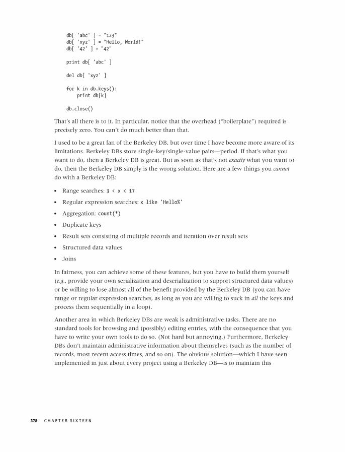
O’Reilly-5980006 master October 28, 2010 21:35
db[ 'abc' ] = "123"
db[ 'xyz' ] = "Hello, World!"
db[ '42' ] = "42"
print db[ 'abc' ]
del db[ 'xyz' ]
for k in db.keys():
print db[k]
db.close()
That’s all there is to it. In particular, notice that the overhead (“boilerplate”) required is
precisely zero. You can’t do much better than that.
I used to be a great fan of the Berkeley DB, but over time I have become more aware of its
limitations. Berkeley DBs store single-key/single-value pairs—period. If that’s what you
want to do, then a Berkeley DB is great. But as soon as that’s not exactly what you want to
do, then the Berkeley DB simply is the wrong solution. Here are a few things you cannot
do with a Berkeley DB:
• Range searches: 3 < x < 17
• Regular expression searches: x like 'Hello%'
• Aggregation: count(*)
• Duplicate keys
• Result sets consisting of multiple records and iteration over result sets
• Structured data values
• Joins
In fairness, you can achieve some of these features, but you have to build them yourself
(e.g., provide your own serialization and deserialization to support structured data values)
or be willing to lose almost all of the benefit provided by the Berkeley DB (you can have
range or regular expression searches, as long as you are willing to suck in all the keys and
process them sequentially in a loop).
Another area in which Berkeley DBs are weak is administrative tasks. There are no
standard tools for browsing and (possibly) editing entries, with the consequence that you
have to write your own tools to do so. (Not hard but annoying.) Furthermore, Berkeley
DBs don’t maintain administrative information about themselves (such as the number of
records, most recent access times, and so on). The obvious solution—which I have seen
implemented in just about every project using a Berkeley DB—is to maintain this
378 C H A P T E R S I X T E E N

O’Reilly-5980006 master October 28, 2010 21:35
information explicitly and to store it in the DB under a special, synthetic key. All of this is
easy enough, but it does bring back some of the “boilerplate” code that we hoped to avoid
by using a Berkeley DB in the first place.
SQLite
In contrast to the Berkeley DB, SQLite (http://www.sqlite.org/) is a full-fledged relational
database, including tables, keys, joins, and WHERE clauses. You talk to it in the familiar
fashion through SQL. (In Python, you can use the DB-API 2.0 or one of the higher-level
frameworks built on top of it.)
SQLite supports almost all features found in standard SQL with very few exceptions. The
price you pay is that you have to design and define a schema. Hence SQLite has a bit more
overhead than a Berkeley DB: it requires some up-front design as well as a certain
amount of boilerplate code.
A simple example exercising many features of SQLite is shown in the following listing. It
should pose few (if any) surprises, but it does demonstrate some interesting features of
SQLite:
import sqlite3
# Connect and obtain a cursor
conn = sqlite3.connect( 'data.dbl' )
conn.isolation_level = None # use autocommit!
c = conn.cursor()
# Create tables
c.execute( """CREATE TABLE orders
( id INTEGER PRIMARY KEY AUTOINCREMENT,
customer )""" )
c.execute( """CREATE TABLE lineitems
( id INTEGER PRIMARY KEY AUTOINCREMENT,
orderid, description, quantity )""" )
# Insert values
c.execute( "INSERT INTO orders ( customer ) VALUES ( 'Joe Blo' )" )
id = str( c.lastrowid )
c.execute( """INSERT INTO lineitems ( orderid, description, quantity )
VALUES ( ?, 'Widget 1', '2' )""", ( id, ) )
c.execute( """INSERT INTO lineitems ( orderid, description, quantity )
VALUES ( ?, 'Fidget 2', '1' )""", ( id, ) )
c.execute( """INSERT INTO lineitems ( orderid, description, quantity )
VALUES ( ?, 'Part 17', '5' )""", ( id, ) )
c.execute( "INSERT INTO orders ( customer ) VALUES ( 'Jane Doe' )" )
id = str( c.lastrowid )
R E P O R T I N G , B U S I N E S S I N T E L L I G E N C E , A N D D A S H B O A R D S 379

O’Reilly-5980006 master October 28, 2010 21:35
c.execute( """INSERT INTO lineitems ( orderid, description, quantity )
VALUES ( ?, 'Fidget 2', '3' )""", ( id, ) )
c.execute( """INSERT INTO lineitems ( orderid, description, quantity )
VALUES ( ?, 'Part 9', '2' )""", ( id, ) )
# Query
c.execute( """SELECT li.description FROM orders o, lineitems li
WHERE o.id = li.orderid AND o.customer LIKE '%Blo'""" )
for r in c.fetchall():
print r[0]
c.execute( """SELECT orderid, sum(quantity) FROM lineitems
GROUP BY orderid ORDER BY orderid desc""" )
for r in c.fetchall():
print "OrderID: ", r[0], "\t Items: ", r[1]
# Disconnect
conn.close()
Initially, we “connect” to the database—if it doesn’t exist yet, it will be created. We specify
autocommit mode so that each statement is executed immediately. (SQLite also supports
concurrency control through explicit transaction.)
Next we create two tables. The first column is specified as a primary key (which implies
that it will be indexed automatically) with an autoincrement feature. All other columns
do not have a data type associated with them, because basically all values are stored in
SQLite as strings. (It is also possible to declare certain type conversions that should be
applied to the values, either in the database or in the Python interface.)
We then insert two orders and some associated line items. In doing so, we make use of a
convenience feature provided by the sqlite3 module: the last value of an
autoincremented primary key is available through the lastrowid attribute (data member)
of the current cursor object.
Finally, we run two queries. The first one demonstrates a join as well as the use of SQL
wildcards; the second uses an aggregate function and also sorts the result set. As you can
see, basically everything you know about relational databases carries over directly to
SQLite!
SQLite supports some additional features that I have not mentioned. For example, there is
an “in-memory” mode, whereby the entire database is kept entirely in memory: this can
be very helpful if you want to use SQLite as a part of a performance-critical application.
Also part of SQLite is the command-line utility sqlite3, which allows you to examine a
database file and run ad hoc queries against it.
I have found SQLite to be extremely useful—basically everything you expect from a
relational database but without most of the pain. I recommend it highly.
380 C H A P T E R S I X T E E N

O’Reilly-5980006 master October 28, 2010 21:35
Further Reading• Information Dashboard Design: The Effective Visual Communication of Data. Stephen Few.
O’Reilly. 2006.
This book addresses good graphical design of dashboards and reports. Many of the
author’s points are similar in spirit to the recommendations in this chapter. After
reading his book, you might consider hiring a graphic or web designer to design your
reports for you!
R E P O R T I N G , B U S I N E S S I N T E L L I G E N C E , A N D D A S H B O A R D S 381

O’Reilly-5980006 master October 28, 2010 21:35
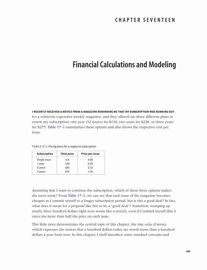
O’Reilly-5980006 master October 28, 2010 21:42
C H A P T E R S E V E N T E E N
Financial Calculations and Modeling
I RECENTLY RECEIVED A NOTICE FROM A MAGAZINE REMINDING ME THAT MY SUBSCRIPTION WAS RUNNING OUT.
It’s a relatively expensive weekly magazine, and they offered me three different plans to
renew my subscription: one year (52 issues) for $130, two years for $220, or three years
for $275. Table 17-1 summarizes these options and also shows the respective cost per
issue.
T A B L E 17 -1. Pricing plans for a magazine subscription
Subscription Total price Price per issue
Single issue n/a 6.001 year 130 2.502 years 220 2.123 years 275 1.76
Assuming that I want to continue the subscription, which of these three options makes
the most sense? From Table 17-1, we can see that each issue of the magazine becomes
cheaper as I commit myself to a longer subscription period, but is this a good deal? In fact,
what does it mean for a proposal like this to be a “good deal”? Somehow, stomping up
nearly three hundred dollars right now seems like a stretch, even if I remind myself that it
saves me more than half the price on each issue.
This little story demonstrates the central topic of this chapter: the time value of money,
which expresses the notion that a hundred dollars today are worth more than a hundred
dollars a year from now. In this chapter, I shall introduce some standard concepts and
383

O’Reilly-5980006 master October 28, 2010 21:42
calculational tools that are required whenever we need to make a choice between
different investment decisions—whether they involve our own personal finances or the
evaluation of business cases for different corporate projects.
I find the material in this chapter fascinating—not because it is rocket science (it isn’t) but
because it is so fundamental to how the economy works. Yet very few people, in
particular, very few tech people, have any understanding of it. (I certainly didn’t.) This is a
shame, not just because the topic is obviously important but also because it is not really all
that mystical. A little familiarity with the basic concepts goes a long way toward removing
most of the confusion (and, let’s face it, the intimidation) that many of us experience
when reading the Wall Street pages.
More important in the context of this book is that a lot of data analysis is done specifically
to evaluate different business proposals and to support decisions among them. To be able
to give effective, appropriate advice, you want to understand the concepts and
terminology of this particular problem domain.
The Time Value of Money
Let’s return to the subscription problem. The essential insight is that—instead of paying
for the second and third year of the subscription now—I could invest that money, reap the
investment benefit, and pay for the subsequent years of the subscription later. In other
words, the discount offered by the magazine must be greater than the investment income I
can expect if I were instead to invest the sum.
It is this ability to gain an investment benefit that makes having money now more
valuable than having the same amount of money later. Note well that this has nothing to
do with the concept of inflation, which is the process by which a certain amount of money
tends to buy a lesser amount of goods as time passes. For our purposes, inflation is an
external influence over which we have no control. In contrast, investment and
purchasing decisions (such as the earlier magazine subscription problem) are under our
control, and time value of money calculations can help us make the best possible decisions
in this regard.
A Single Payment: Future and Present Value
Things are easiest when there is only a single payment involved. Imagine we are given the
following choice: receive $1,000 today, or receive $1,050 a year from now. Which one
should we choose?
Well, that depends on what we could do with $1,000 right now. For this kind of analysis,
it is customary to assume that we would put the money in a “totally safe form of
384 C H A P T E R S E V E N T E E N
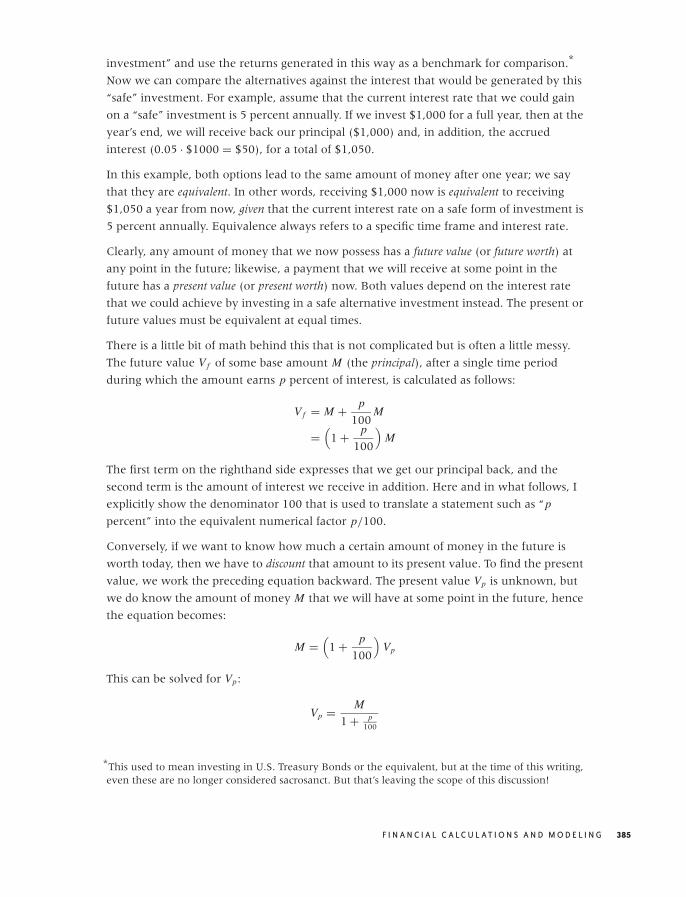
O’Reilly-5980006 master October 28, 2010 21:42
investment” and use the returns generated in this way as a benchmark for comparison.*
Now we can compare the alternatives against the interest that would be generated by this
“safe” investment. For example, assume that the current interest rate that we could gain
on a “safe” investment is 5 percent annually. If we invest $1,000 for a full year, then at the
year’s end, we will receive back our principal ($1,000) and, in addition, the accrued
interest (0.05 · $1000 = $50), for a total of $1,050.
In this example, both options lead to the same amount of money after one year; we say
that they are equivalent. In other words, receiving $1,000 now is equivalent to receiving
$1,050 a year from now, given that the current interest rate on a safe form of investment is
5 percent annually. Equivalence always refers to a specific time frame and interest rate.
Clearly, any amount of money that we now possess has a future value (or future worth) at
any point in the future; likewise, a payment that we will receive at some point in the
future has a present value (or present worth) now. Both values depend on the interest rate
that we could achieve by investing in a safe alternative investment instead. The present or
future values must be equivalent at equal times.
There is a little bit of math behind this that is not complicated but is often a little messy.
The future value V f of some base amount M (the principal), after a single time period
during which the amount earns p percent of interest, is calculated as follows:
V f = M + p
100M
=(
1 + p
100
)M
The first term on the righthand side expresses that we get our principal back, and the
second term is the amount of interest we receive in addition. Here and in what follows, I
explicitly show the denominator 100 that is used to translate a statement such as “p
percent” into the equivalent numerical factor p/100.
Conversely, if we want to know how much a certain amount of money in the future is
worth today, then we have to discount that amount to its present value. To find the present
value, we work the preceding equation backward. The present value Vp is unknown, but
we do know the amount of money M that we will have at some point in the future, hence
the equation becomes:
M =(
1 + p
100
)Vp
This can be solved for Vp:
Vp = M
1 + p100
*This used to mean investing in U.S. Treasury Bonds or the equivalent, but at the time of this writing,even these are no longer considered sacrosanct. But that’s leaving the scope of this discussion!
F I N A N C I A L C A L C U L AT I O N S A N D M O D E L I N G 385

O’Reilly-5980006 master October 28, 2010 21:42
Note how we find the future or present value by multiplying the base amount by an
appropriate equivalencing factor—namely, the future-worth factor 1 + p/100 and the
present-worth factor 1/(1 + p/100). Because most such calculations involve discounting a
future payment to the present value, the percentage rate p used in these formulas is
usually referred to as the discount rate.
This example was the simplest possible because there was only a single payment
involved—either at the beginning or at the end of the period under consideration. Next,
we look at scenarios where there are multiple payments occurring over time.
Multiple Payments: Compounding
Matters become a bit more complicated when there is not just a single payment involved
as in the example above but a series of payments over time. Each of these payments must
be discounted by the appropriate time-dependent factor, which leads us to cash-flow
analysis. In addition, payments made or received may alter the base amount on which we
operate, this leads to the concept of compounding.
Let’s consider compounding first, since it is so fundamental. Again, the idea is simple: if
we put a sum of money into an interest-bearing investment and then reinvest the
generated interest, we will start to receive interest on the interest itself. In other words,
we will start receiving compound interest.
Here is how it works: we start with principal M and invest it at interest rate p. After one
year, we have:
V (1) =(
1 + p
100
)M
In the second year, we receive interest on the combined sum of the principal and the
interest from the first year:
V (2) =(
1 + p
100
)V (1)
=(
1 + p
100
)2M
and so on. After n years, we will have:
V (n) =(
1 + p
100
)nM
These equations tell us the future worth of our investment at any point in time. It works
the other way around, too: we can determine the present value of a payment that we
expect to receive n years from now by working the equations backward (much as we did
previously for a single payment) and find:
V (present) = M(1 + p
100
)n
386 C H A P T E R S E V E N T E E N
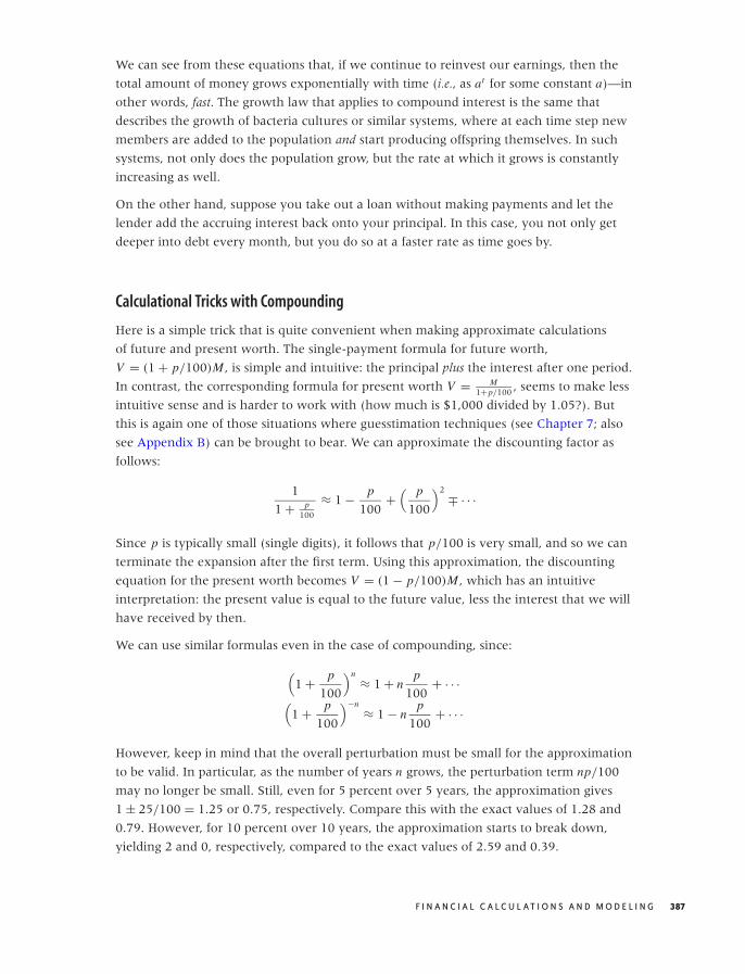
O’Reilly-5980006 master October 28, 2010 21:42
We can see from these equations that, if we continue to reinvest our earnings, then the
total amount of money grows exponentially with time (i.e., as at for some constant a)—in
other words, fast. The growth law that applies to compound interest is the same that
describes the growth of bacteria cultures or similar systems, where at each time step new
members are added to the population and start producing offspring themselves. In such
systems, not only does the population grow, but the rate at which it grows is constantly
increasing as well.
On the other hand, suppose you take out a loan without making payments and let the
lender add the accruing interest back onto your principal. In this case, you not only get
deeper into debt every month, but you do so at a faster rate as time goes by.
Calculational Tricks with Compounding
Here is a simple trick that is quite convenient when making approximate calculations
of future and present worth. The single-payment formula for future worth,
V = (1 + p/100)M , is simple and intuitive: the principal plus the interest after one period.
In contrast, the corresponding formula for present worth V = M1+p/100 , seems to make less
intuitive sense and is harder to work with (how much is $1,000 divided by 1.05?). But
this is again one of those situations where guesstimation techniques (see Chapter 7; also
see Appendix B) can be brought to bear. We can approximate the discounting factor as
follows:
1
1 + p100
≈ 1 − p
100+
( p
100
)2∓ · · ·
Since p is typically small (single digits), it follows that p/100 is very small, and so we can
terminate the expansion after the first term. Using this approximation, the discounting
equation for the present worth becomes V = (1 − p/100)M , which has an intuitive
interpretation: the present value is equal to the future value, less the interest that we will
have received by then.
We can use similar formulas even in the case of compounding, since:
(1 + p
100
)n≈ 1 + n
p
100+ · · ·
(1 + p
100
)−n≈ 1 − n
p
100+ · · ·
However, keep in mind that the overall perturbation must be small for the approximation
to be valid. In particular, as the number of years n grows, the perturbation term np/100
may no longer be small. Still, even for 5 percent over 5 years, the approximation gives
1 ± 25/100 = 1.25 or 0.75, respectively. Compare this with the exact values of 1.28 and
0.79. However, for 10 percent over 10 years, the approximation starts to break down,
yielding 2 and 0, respectively, compared to the exact values of 2.59 and 0.39.
F I N A N C I A L C A L C U L AT I O N S A N D M O D E L I N G 387
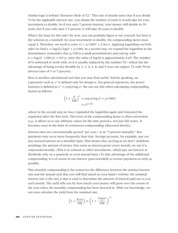
O’Reilly-5980006 master October 28, 2010 21:42
Similar logic is behind “Einstein’s Rule of 72.” This rule of thumb states that if you divide
72 by the applicable interest rate, you obtain the number of years it would take for your
investment to double. So if you earn 7 percent interest, your money will double in 10
years, but if you only earn 3.5 percent, it will take 20 years to double.
What’s the basis for this rule? By now, you can probably figure it out yourself, but here is
the solution in a nutshell: for your investment to double, the compounding factor must
equal 2. Therefore, we need to solve (1 + p/100)n = 2 for n. Applying logarithms on both
sides we find n = log(2)/ log(1 + p/100). In a second step, we expand the logarithm in the
denominator (remember that p/100 is a small perturbation!) and end up with
n = log(2) · (100/p) = 69/p, since the value of log(2) is approximately 0.69. The number
69 is awkward to work with, so it is usually replaced by the number 72—which has the
advantage of being evenly divisible by 2, 3, 4, 6, 8, and 9 (you can replace 72 with 70 for
interest rates of 5 or 7 percent).
Here is another calculational tool that you may find useful. Strictly speaking, an
expression such as xn is defined only for integer n. For general exponents, the power
function is defined as xn = exp(n log x). We can use this when calculating compounding
factors as follows:(
1 + p
100
)n= exp (n log (1 + p/100))
≈ enp/100
where in the second step we have expanded the logarithm again and truncated the
expansion after the first term. This form of the compounding factor is often convenient
(e.g., it allows us to use arbitrary values for the time period n, not just full years). It
becomes exact in the limit of continuous compounding (discussed shortly).
Interest rates are conventionally quoted “per year,” as in “5 percent annually.” But
payments may occur more frequently than that. Savings accounts, for example, pay out
any accrued interest on a monthly basis. That means that (as long as we don’t withdraw
anything) the amount of money that earns us interest grows every month; we say it is
compounded monthly. (This is in contrast to other investments, which pay out interest or
dividends only on a quarterly or even annual basis.) To take advantage of the additional
compounding, it is of course in our interest (pun intended) to receive payments as early as
possible.
This monthly compounding is the reason for the difference between the nominal interest
rate and the annual yield that you will find stated on your bank’s website: the nominal
interest rate is the rate p that is used to determine the amount of interest paid out to you
each month. The yield tells you by how much your money will grow over the course of
the year when the monthly compounding has been factored in. With our knowledge, we
can now calculate the yield from the nominal rate:
(1 + pyield
100
)=
(1 +
pnominal12
100
)12
388 C H A P T E R S E V E N T E E N

O’Reilly-5980006 master October 28, 2010 21:42
One more bit of terminology: the interest rate p/12 that is used to determine the value of
the monthly payout is known as the effective interest rate.
Of course, other payment periods are possible. Many mutual funds pay out quarterly. In
contrast, many credit cards compound daily. In theory, we can imagine payments being
made constantly (but at an appropriately reduced effective interest rate); this is the case of
continuous compounding mentioned earlier. In this case, the compounding factor is given by
the exponential function. (Mathematically, you replace the 12 in the last formula by n and
then let n go to infinity, using the identity limn→∞(1 + x/n)n = exp(x).)
The Whole Picture: Cash-Flow Analysis and Net Present Value
We now have all the tools at our disposal to evaluate the financial implications of any
investment decision, no matter how complicated. Imagine we are running a
manufacturing plant (or perhaps an operation like Amazon’s, where books and other
goods are put into boxes and mailed to customers—that’s how I learned about all these
things). We may consider buying some piece of automated equipment for some part of the
process (e.g., a sorting machine that sorts boxes onto different trucks according to their
destination). Alternatively, we can have people do the same job manually. Which of these
two alternatives is better from an economic point of view?
The manual solution has a simple structure: we just have to pay out the required wages
every year. If we decide to buy the machine, then we have to pay the purchase price now
(this is also known as the first cost) and also pay a small maintenance fee each year. For the
sake of the argument, assume also that we expect to use the machine for ten years and
then sell it on for scrap value.
In economics texts, you will often find the sequence of payments visualized using
cash-flow diagrams (see Figure 17-1). Time progresses from left to right; inflows are
indicated by upward-pointing arrows and outflows by downward-pointing arrows.
To decide between different alternatives, we now proceed as follows:
1. Determine all individual net cash flows (net cash flows, because we offset annual costs
against revenues).
2. Discount each cash flow to its present value.
3. Add up all contributions.
The quantity obtained in the last step is known either as the net present value (NPV) or the
discounted net cash flow: it is the total value of all cash flows, each properly discounted to its
present value. In other words, our financial situation will be the same, whether we
execute the entire series of cash flows or receive the net present value today. Because the
net present value contains all inflows and outflows (properly discounted to the present
value), it is a comprehensive single measure that can be used to compare the financial
outcomes of different investment strategies.
F I N A N C I A L C A L C U L AT I O N S A N D M O D E L I N G 389
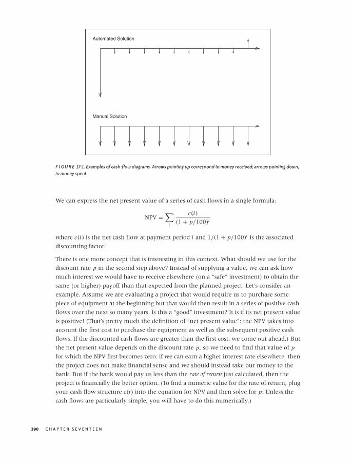
O’Reilly-5980006 master October 28, 2010 21:42
Automated Solution
Manual Solution
F I G U R E 17-1. Examples of cash-flow diagrams. Arrows pointing up correspond to money received; arrows pointing down,to money spent.
We can express the net present value of a series of cash flows in a single formula:
NPV =∑
i
c(i)
(1 + p/100)i
where c(i) is the net cash flow at payment period i and 1/(1 + p/100)i is the associated
discounting factor.
There is one more concept that is interesting in this context. What should we use for the
discount rate p in the second step above? Instead of supplying a value, we can ask how
much interest we would have to receive elsewhere (on a “safe” investment) to obtain the
same (or higher) payoff than that expected from the planned project. Let’s consider an
example. Assume we are evaluating a project that would require us to purchase some
piece of equipment at the beginning but that would then result in a series of positive cash
flows over the next so many years. Is this a “good” investment? It is if its net present value
is positive! (That’s pretty much the definition of “net present value”: the NPV takes into
account the first cost to purchase the equipment as well as the subsequent positive cash
flows. If the discounted cash flows are greater than the first cost, we come out ahead.) But
the net present value depends on the discount rate p, so we need to find that value of p
for which the NPV first becomes zero: if we can earn a higher interest rate elsewhere, then
the project does not make financial sense and we should instead take our money to the
bank. But if the bank would pay us less than the rate of return just calculated, then the
project is financially the better option. (To find a numeric value for the rate of return, plug
your cash flow structure c(i) into the equation for NPV and then solve for p. Unless the
cash flows are particularly simple, you will have to do this numerically.)
390 C H A P T E R S E V E N T E E N
O’Reilly-5980006 master October 28, 2010 21:42
The net present value is such an important criterion when making investment decisions
because it provides us with a single number that summarizes the financial results of any
planned project. It gives us an objective (financial) quantity to decide among different
investment alternatives.
Up to a point, that is. The process described here is only as good as its inputs. In particular,
we have assumed that we know all inputs perfectly—possibly for many years into the
future. Of course we don’t have perfect knowledge, and so we better accommodate for
that uncertainty somehow. That will be the topic of the next section.
There is another, more subtle problem when evaluating different options solely based on
net present value: different investment alternatives may have nonfinancial benefits or
drawbacks that are not captured by the net present value. For example, using manual
labor may lead to greater flexibility: if business grows more strongly than expected, then
the company can hire additional workers, and if business slows down, then it can reduce
the number of workers. In contrast, any piece of equipment has a maximum capacity,
which may be a limiting factor if business grows more strongly than expected. The
distinction arising here is that between fixed and variable cost, and we will come back to it
toward the end of the chapter.
Uncertainty in Planning and Opportunity Costs
Now we are ready to revisit the magazine subscription problem from the beginning of this
chapter. Let’s consider only two alternatives: paying the entire amount for a two-year
subscription up front or making two single-year payments. The NPV for the second option
is (1 + 1/(1 + p/100)) C1yr, where we have left the discount rate p undetermined for the
moment. We can now ask: what interest rate would we have to earn elsewhere to make
the second option worthwhile? In other words, we want to know the discount rate we’d
have to apply to make the NPV of the multiple-payment option equal to the cost of the
single-payment plan:(
1 + 1
1 + p100
)C1yr = C2yr
This equation can be solved for p. The result is p = 30 percent! In other words, the
two-year subscription is so much cheaper that we would have to find an investment
yielding 30 percent annually before it would be worthwhile to pay for the subscription
year by year and invest the saved money elsewhere. No investment (and certainly no
“safe” investment) yields anywhere near that much. Clearly, something is amiss. (Exercise
for the reader: find the net present value for the three-year subscription and verify that it
leads to the same value for p.)
Using Expectation Values to Account for Uncertainty
The two- and three-year plans carry a hidden cost for us: once we have signed up, we can
no longer freely decide over our money—we’re committed ourselves for the long haul. In
F I N A N C I A L C A L C U L AT I O N S A N D M O D E L I N G 391
O’Reilly-5980006 master October 28, 2010 21:42
contrast, if we pay on a yearly basis, then we can reevaluate every year whether we want
to continue the subscription. The price for this freedom is a higher subscription fee.
However, we will probably not find it easy to determine the exact dollar value that this
freedom is worth to us.
From the magazine’s perspective, the situation is simpler. They can simply ask how much
money they expect to make from an individual subscriber under either option. If I sign up
for the two-year subscription, they make C2yr with certainty; if I sign up for the one-year
subscription, they make C1yr with certainty now and another C1yr later—provided I renew
my subscription! In this case, then, the amount of money the magazine expects to make
on me is C1yr + γ C1yr, where γ is the probability that I will renew the subscription. From
the magazine’s perspective, both options must be equally favorable (otherwise they would
adjust the price of the two-year subscription to make them equal), so we can equate the
expected revenues and solve for γ . The result comes out to about γ = 0.7—in other
words, the magazine expects (based on past experience, and so on) that about 70 percent
of its current subscribers will renew their subscription. For three years, the equation
becomes (1 + γ + γ 2)C1yr = C3yr because, to sign up for three years, a subscriber must
decide twice to renew the subscription. If you work through the algebra, you will find that
γ again comes out to about γ = 0.7, providing a nice consistency check.
There are two takeaways in this example that are worth emphasizing: the first concerns
making economic decisions that are subject to uncertainty. The second is the concept of
opportunity cost, which is the topic of the following section.
When making economic decisions that are subject to uncertainty, you may want to take
this uncertainty into account by replacing the absolute cash flows with their expected
values. A simple probability model for the likely payout is often sufficient. In the
magazine example there were just two outcomes: the subscriber renews with probability
γ = 0.7 and value C1yr, or the subscriber does not renew with probability γ = 0.3 and
value 0, hence the expected value is 0.3 · 0 + 0.7 · C1yr. If your situation warrants it and if
you can specify the probability distribution for various payout alternatives in more detail,
then you can calculate the expected value accordingly. (See Chapter 8 and Chapter 9 for
more information on how to build models to support this kind of conclusion.)
Working with expectation values is convenient, because once you have determined the
expected value of the payout, you no longer need to worry about the probabilities for the
various outcomes: they have been entirely absorbed into the expectation values. What
you lose is insight into the probable spread of outcomes. For a quick order-of-magnitude
check, that’s acceptable, but for a more serious study, an estimate of the spread should be
included. There are two ways to do this: repeat your calculation multiple times using
different values (low, medium, high) for the expected payouts at every step to develop a
sense for the range of possible outcomes. (If there are many different options, you may
want to do this through simulation; see Chapter 12.) Alternatively, you can evaluate both
392 C H A P T E R S E V E N T E E N

O’Reilly-5980006 master October 28, 2010 21:42
the expectation value and the spread directly from the probability distribution to obtain a
range for each estimated value: μ ± σ . Now you can use this sum in your calculations,
treating σ as a small perturbation and evaluate the effect of this perturbation on your
model (see Chapter 7).
Opportunity Costs
The second point that I would like to emphasize is the concept of opportunity cost.
Opportunity costs arise when we miss out on some income (the “opportunity”) because
we were not in a position to take advantage of it. Opportunity costs formalize the notion
that resources are finite and that, if we apply them to one purpose, then those resources
are not available for other uses. In particular, if we commit resources to a project, then we
want that project to generate a benefit greater than the opportunity costs that arise,
because those resources are no longer available for other uses.
I find it easiest to think about opportunity cost in the context of certain business
situations. For instance, suppose a company takes on a project that pays $15,000. While
this contract is under way, someone else offers the company a project that would pay
$20,000. Assuming that the company cannot break its initial engagement, it is now
incurring an opportunity cost of $5,000.
I find the concept of opportunity cost useful as a way to put a price on alternatives,
particularly when no money changes hands. In textbooks, this is often demonstrated by
the example of the student who takes a trip around the world instead of working at a
summer job. Not only does the student have to pay the actual expenses for the trip but
also incurs an opportunity cost equal to the amount of forgone wages. The concept of
opportunity cost allows us to account for these forgone wages, which would otherwise be
difficult because they do not show up on any account statement (since they were never
actually paid).
On the other hand, I often find opportunity cost a somewhat shadowy concept because it
totally hinges on a competing opportunity actually arising. Imagine you try to decide
between two opportunities: an offer for a project that would pay $15,000 and the prospect
of a project paying $20,000. If you take the first job and then the second opportunity
comes through as well, you are incurring an opportunity cost of $5,000. But if the second
project falls through, your opportunity cost just dropped to zero! (The rational way to
make this decision would be to calculate the total revenue expected from each prospect
but weighted by the probability that the contract will actually be signed. This brings us back
to calculations involving expected payouts, as discussed in the preceding section.)
To be clear: the concept of opportunity cost has nothing to do with uncertainty in
planning. It is merely a way to evaluate the relative costs of competing opportunities.
However, when evaluating competing deals, we must often decide between plans that
have a different likelihood of coming to fruition, and therefore opportunity cost and
planning for uncertainty often arise together.
F I N A N C I A L C A L C U L AT I O N S A N D M O D E L I N G 393

O’Reilly-5980006 master October 28, 2010 21:42
Cost Concepts and Depreciation
The methods described in the previous sections might suggest that the net present value is
all there is to financial considerations. This is not so—other factors may influence our
decision. Some factors are entirely outside the financial realm (e.g., ethical or strategic
considerations); others might have direct business implications but are not sufficiently
captured by the quantities we have discussed so far.
For example, let’s go back to the situation discussed earlier where we considered the
choice between two alternatives: buying a sorting machine or having the same task
performed manually. Once we identify all arising costs and discount them properly to
their present value, it would seem we have accounted for all financial implications. But
that would be wrong: the solution employing manual labor is more flexible, for instance.
If the pace of the business varies over the course of the year, then we need to buy a
sorting machine that is large enough to handle the busiest season—which means it will be
underutilized during the rest of the year. If we rely on manual labor, then we can more
flexibly scale capacity up through temporary labor or overtime—and we can likewise
respond to unexpectedly strong (or weak) growth of the overall business more flexibly,
again by adjusting the number of workers. (This practice may have further
consequences—for example, regarding labor relations.) In short, we need to look at the
costs, and how they arise, in more detail.
To understand the cost structure of a business or an operation better, it is often useful to
discuss it in terms of three pairs of complementary concepts:
1. Direct versus indirect cost
2. Fixed versus variable cost
3. Capital expenditure versus operating cost
For good measure, I’ll also throw in the concept of depreciation, although it is not a cost in
the strict sense of the word.
Direct and Indirect Costs
Labor and materials that are applied in creating the product (i.e., in the creation of
something the company will sell) are considered direct labor or direct materials cost.
Indirect costs, on the other hand, arise from activities that the company undertakes to
maintain itself : management, maintenance, and administrative tasks (payroll and
accounting) but also training, for example. Another term for such indirect costs is overhead.
I should point out that this is a slightly different definition of direct and indirect costs than
the one you will find in the literature. Most textbooks define direct cost as the cost that is
“easily attributable” to the production process, whereas indirect cost is “not easily
attributable.” This definition makes it seem as if the distinction between direct and
394 C H A P T E R S E V E N T E E N

O’Reilly-5980006 master October 28, 2010 21:42
indirect costs is mostly one of convenience. Furthermore, the textbook definition provides
no reason why, for example, maintenance and repair activities are usually considered
indirect costs. Surely, we can keep track of which machine needed how much repair and
therefore assign the associated cost to the product made on that specific machine. On the
other hand, by my definition, it is clear that maintenance should be considered an indirect
cost because it is an activity the company undertakes to keep itself in good order—not to
generate value for the customer.
I have used the term “product” for whatever the company is selling. For manufacturing or
retail industries this is a straightforward concept, but for a service industry the “product”
may be intangible. Nevertheless, in probably all businesses we can introduce the concept
of a single produced unit or unit of production. In manufacturing and retail there are actual
“units,” but in other industries the notion of a produced unit is a bit more artificial: in
service industries, for instance, one often uses “billable hours” as a measure of production.
Other industries have specialized conventions: the airline industry uses “passenger miles,”
for example.
The unit is an important concept because it is the basis for the most common measure of
productivity—namely the unit cost or cost per unit (CPU). The cost per unit is obtained by
dividing the total (dollar) amount spent during a time period (per month, for instance) by
the total number of units produced during that time. If we include not only the direct cost
but also the indirect cost in this calculation, we obtain what is called the loaded or burdened
cost per unit.
We can go further and break out the various contributions to the unit cost. For example, if
there are multiple production steps, then we can determine how much each step
contributes to the total cost. We can also study how much indirect costs contribute to the
overall cost as well as how material costs relate to labor. Understanding the different
contributions to the total cost per unit is often a worthwhile exercise because it points
directly to where the money is spent. And appearances can be deceiving. I have seen
situations where literally hundreds of people were required for a certain processing step
whereas, next door, a single person was sufficient to oversee a comparable but highly
automated process. Yet once you calculated the cost per unit, it all looked very different:
because the number of units going through the automated process was low, its total cost
per unit was actually higher than for the manual process. And because so many units
where processed manually, their labor cost per unit turned out to be very low.
In general, it is desirable to have low overhead relative to the direct cost: a business
should spend relatively less time and money on managing itself than on generating value
for the customer. In this way, the ratio of direct to indirect cost can be a telling indicator
for “top-heavy” organizations that seem mostly occupied with managing themselves. On
the other hand, overeager attempts to improve the direct/indirect cost ratio can lead to
pretty unsanitary manipulations. For example, imagine a company that considers
software engineers direct labor, while any form of management (team leads and project
F I N A N C I A L C A L C U L AT I O N S A N D M O D E L I N G 395

O’Reilly-5980006 master October 28, 2010 21:42
managers) is considered indirect. The natural consequence is that management
responsibilities are pushed onto developers to avoid “indirect” labor. Of course, this does
not make these tasks go away; they just become invisible. (It also leads to the inefficient
use of a scarce resource: developers are always in short supply—and they are expensive.)
In short, beware the danger of perverted incentives!
Fixed and Variable Costs
Compared to the previous distinction (between direct and indirect costs), the distinction
between fixed and variable costs is clearer. The variable costs are those that change in
response to changing demand, while fixed costs don’t. For a car manufacturer, the cost of
steel is a variable cost: if fewer cars are being built, less steel is consumed. Whether labor
costs are fixed or variable depends on the type of labor and the employment contracts.
But the capital cost for the machines in the production line is a fixed cost, because it has
to be paid regardless of whether the machines are busy or idle.
It is important not to confuse direct and variable costs. Although direct costs are more
likely to be variable (and overhead, in general, is fixed), these are unrelated concepts; one
can easily find examples of fixed, yet direct costs. For example, consider a consultancy
with salaried employees: their staff of consultants is a direct cost, yet it is also a fixed cost
because the consultants expect their wages regardless of whether the consultancy has
projects for them or not. (We’ll see another example in a moment.)
In general, having high fixed costs relative to variable ones makes a business or industry
less flexible and more susceptible to downturns. An extreme example is the airline
industry: its cost structure is almost exclusively fixed (pretty much the only variable cost is
the price of the in-flight meal), but its demand pattern is subject to extreme cyclical
swings.
The numbers are interesting. Let’s do a calculation in the spirit of Chapter 7. A modern jet
airplane costs about $100M new and has a useful service life of about 10 years. The cost
attributable to a single 10-hour transatlantic flight (the depreciation—see below) comes to
about $30k (i.e., $100M/(10 · 365)—half that, if the plane is turned around immediately,
completing a full round-trip within 24 hours). Fuel consumption is about 6 gallons per
mile; if we assume a fuel price of $2 per gallon, then the 4,000-mile flight between New
York and Frankfurt (Germany) will cost $50k for fuel. Let’s say there are 10 members of
the cabin crew at $50k yearly salary and two people in the cockpit at $150k each. Double
these numbers for miscellaneous benefits, and we end up with about $2M in yearly labor
costs, or $10k attributable to this one flight. In contrast, the cost of an in-flight meal
(wholesale) is probably less than $10 per person. For a flight with 200 passengers, this
amounts to $1,000–2,000 dollars total. It is interesting to see that—all things
considered—the influence of the in-flight meal on the overall cost structure of the flight is
as high as it is: about 2 percent of the total. In a business with thin margins, improving
profitability by 2 percent is usually seen as worthwhile. In other words, we should be
396 C H A P T E R S E V E N T E E N

O’Reilly-5980006 master October 28, 2010 21:42
grateful that we get anything at all! A final cross-check: the cost per passenger for the
entire flight from the airline’s point of view is $375—and at the time of this writing, the
cheapest fare I could find was $600 round-trip, equivalent to $300 for a single leg. As is
well known, airlines break even on economy class passengers but don’t make any profits.
Capital Expenditure and Operating Cost
Our final distinction is the one between capital expenditure (CapEx) and operating expense
(OpEx—the abbreviation is rarely used). Capital expenses are money spent to purchase
long-lived and typically tangible assets: equipment, installations, real estate. Operating
expenses are everything else: payments for rents, raw materials, fees, salaries. In most
companies, separate budgets exist for both types of expense, and the availability of funds
may be quite different for each. For example, in a company that is financially strapped but
does have a revenue stream, it might be quite acceptable to hire and “throw people” at a
problem (even at great cost), but it might very well be impossible to buy a piece of
equipment that would take care of the problem for good. Conversely, in companies that
do have money in the bank, it is often easier to get a lump sum approved for a specific
purchase than to hire more people or to perform maintenance. Decision makers often are
more inclined to approve funding for an identifiable and visible purchase than for
spending money on “business as usual.” Political and vanity considerations may play a
role as well.
The distinction between CapEx and operating costs is important because, depending on
the availability of funds from either source, different solutions will be seen as feasible. (I
refer to such considerations as “color of money” issues—although all dollars are green,
some are greener than others!)
In the context of capital expenditure, there is one more concept that I’d like to introduce
because it provides an interesting and often useful way of thinking about money: the
notion of depreciation.* The idea is this: any piece of equipment that we purchase will have
a useful service life. We can now distribute the total cost of that purchase across the entire
life of the asset. For example, if I purchase a car for $24,000 and expect to drive it for 10
years, then I can say that this car costs me $200 per month “in depreciation” alone and
before taking into account any operating costs (such as gas and insurance). I may want to
compare this number with monthly lease payment options on the same kind of vehicle.
In other words, depreciation is a formalized way of capturing how an asset loses value
over time. There are different standard ways to calculate it: “straight-line” distributes the
purchase cost (less any salvage value that we might expect to obtain for the asset at the end
*Do not confuse to depreciate, which is the process by which an asset loses value over time, with todeprecate, which is an expression of disapproval. The latter word is used most often to mark certainparts of a software program or library as deprecated, meaning that they should no longer be used infuture work.
F I N A N C I A L C A L C U L AT I O N S A N D M O D E L I N G 397

O’Reilly-5980006 master October 29, 2010 17:50
of its life) evenly over the service life. The “declining balance” method assumes that the
asset loses a certain constant fraction of its value every year. And so on. (Interestingly,
land is never depreciated—because it does not wear out in the way a machine does and
therefore does not have a finite service life.)
I find depreciation a useful concept, because it provides a good way to think about large
capital expenses: as an ongoing cost rather than as an occasional lump sum. But
depreciation is just that: a way of thinking. It is important to understand that depreciation
is not a cash flow and therefore does not show up in any sort of financial accounting.
What’s in the books is the money actually spent, when it is spent.
The only occasion where depreciation is treated as a cash flow is when it comes to taxes.
The IRS (the U.S. tax authority) requires that certain long-lived assets purchased for
business purposes be depreciated over a number of years, with the annual depreciation
counted as a business expense for that year. For this reason, depreciation is usually
introduced in conjunction with tax considerations. But I find the concept more generally
useful as a way to think about and account for the cost of assets and their declining value
over time.
Should You Care?
What does all this talk about money, business plans, and investment decisions have to do
with data analysis? Why should you even care?
That depends. If you take a purely technical stance, then all of these questions are outside
your area of competence and responsibility. That’s a valid position to take, and many
practitioners will make exactly that decision.
Personally, I disagree. I don’t see it as my job to provide answers to questions. I see it as my
responsibility to provide solutions to problems, and to do this effectively, I need to
understand the context in which questions arise, and I need to understand how answers
will be evaluated and used. Furthermore, when it comes to questions having to do with
abstract topics like data and mathematical modeling, I have found that few clients are in a
good position to ask meaningful questions. Coaching the client on what makes a good
question (one that is both operational for me and actionable for the client) is therefore a
large part of what I do—and to do that, I must understand and speak the client’s language.
There are two more reasons why I find it important to understand issues such as those
discussed in this (and the previous) chapter: to establish my own credibility and to provide
advice and counsel on the mathematical details involved.
The decision makers—that is, the people who request and use the results of a data analysis
study—are “business people.” They tend to see decisions as investment decisions and thus
will evaluate them using the methods and terminology introduced in this chapter. Unless I
understand how they will look at my results and unless I can defend my results in those
398 C H A P T E R S E V E N T E E N

O’Reilly-5980006 master October 28, 2010 21:42
terms, I will be on weak ground—especially since I am supposed to be “the expert.” I
learned this the hard way: once, while presenting the results of a rather sophisticated and
involved analysis, some MBA bully fresh out of business school challenged me with: “OK,
now which of these options has the best discounted net cash flow?” I had no idea what he
was talking about. I looked like an idiot. That did not help my credibility! (No matter how
right I was in everything else I was presenting.)
Another reason why I think it is important to understand the concepts in this chapter is
that the math can get a little tricky. This is why the standard textbooks resort to large
collections of precooked scenarios—which is not only confusing but can become
downright misleading if none of them fit exactly and people start combining several of the
standard solutions in ad hoc (and probably incorrect) ways. Often the most important skill
I bring to the table is basic calculus. In one place I worked for, which was actually staffed
by some of the smartest people in the industry, I discovered a problem because people did
not fully understand the difference between 1/x and −x . Of course, if you put it like this,
everybody understands the difference. But if you muddy the waters a little bit and present
the problem in the business domain setting in which it arose, it’s no longer so easy to see
the difference. (And I virtually guarantee you that nobody will understand why 1/(1 − x)
is actually close to 1 − x for small x , when 1/x is not equal −x .)
In my experience, the correct and meaningful application of basic math outside a purely
mathematical environment poses a nearly insurmountable challenge even for otherwise
very bright people. Understanding exactly what people are trying to do (e.g., in calculating
a total rate of return) allows me to help them avoid serious mistakes.
But in the end, I think the most important reason for mastering this material is to be able
to understand the context in which questions arise and to be able to answer those
questions appropriately with a sense for the purpose driving the original request.
Is This All That Matters?
In this chapter, we discussed several financial concepts and how to use them when
deciding between different business or investment options.
This begs the question: are these the only issues that matter? Should you automatically
opt for the choice with the highest net present value and be done with it?
Of course, the short answer is no. Other aspects matter and may even be more important
(strategic vision, sustainability, human factors, personal interest, commitment). What
makes these factors different is that they are intangible. You have to decide on them
yourself.
The methods and concepts discussed in this chapter deal specifically and exclusively with
the financial implications of certain decisions. Those concerns are important—otherwise,
you would not even be in business. But this focus should not be taken to imply that
financial considerations are the only ones that matter.
F I N A N C I A L C A L C U L AT I O N S A N D M O D E L I N G 399

O’Reilly-5980006 master October 28, 2010 21:42
0
50
100
150
200
250
300
350
400
450
50 75 100 125 150
Rev
enue
Initial Inventory
c1 = 1.50
c1 = 2.00
c1 = 2.50
c1 = 3.00
c1 = 3.50
c1 = 4.00
c1 = 4.50
c1 = 5.00
c1 = 5.50
F I G U R E 17-2. Simulation results for the newsvendor problem: total revenue as a function of the initial inventory, forseveral values of the sales price c1. Also shown is the (theoretical) locus of the initial inventory size that leads to maximumrevenue.
However, I am in no better position than you to give advice on ethical questions. It’s up to
each of us individually—what kind of life do we want to live?
Workshop: The Newsvendor Problem
In this workshop, I’d like to introduce one more idea that is often relevant when dealing
with business plans and calculations on how to find the optimal price or, alternatively, the
optimal inventory level for some item. The basic problem is often presented in the
following terms.
Imagine you run a newsstand. In the morning, you buy a certain number n of newspapers
at price c0. Over the course of the day, you try to sell this inventory at price c1; anything
that isn’t sold in the evening is discarded (no salvage value). If you knew how many
papers you would actually sell during the course of the day (the demand m), then it would
be easy: you would buy exactly m papers in the morning. However, the demand is not
known exactly, although we know the probability p(k) of selling exactly k copies. The
question is: how many papers should you buy in the morning in order to maximize your
net earnings (the revenue)?
A first guess might be to use the average number of papers that we expect to sell—that is,
the mean of p(k). However, this approach may not be good enough: suppose that c1 is
much larger than c0 (so that your markup is high). In that case, it makes sense to
purchase more papers in the hope of selling them, because the gain from selling an
400 C H A P T E R S E V E N T E E N
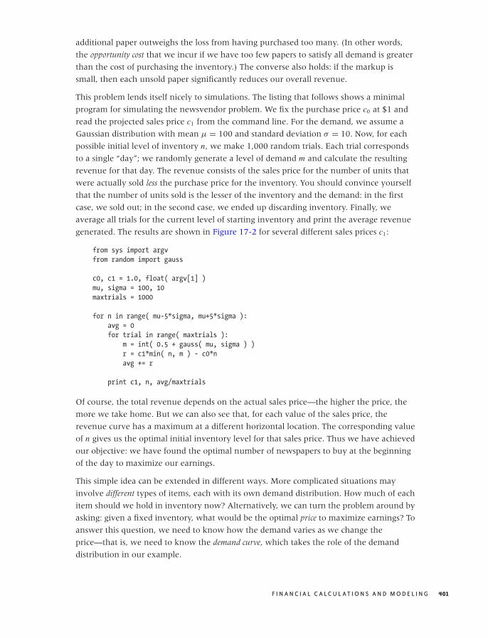
O’Reilly-5980006 master October 28, 2010 21:42
additional paper outweighs the loss from having purchased too many. (In other words,
the opportunity cost that we incur if we have too few papers to satisfy all demand is greater
than the cost of purchasing the inventory.) The converse also holds: if the markup is
small, then each unsold paper significantly reduces our overall revenue.
This problem lends itself nicely to simulations. The listing that follows shows a minimal
program for simulating the newsvendor problem. We fix the purchase price c0 at $1 and
read the projected sales price c1 from the command line. For the demand, we assume a
Gaussian distribution with mean μ = 100 and standard deviation σ = 10. Now, for each
possible initial level of inventory n, we make 1,000 random trials. Each trial corresponds
to a single “day”; we randomly generate a level of demand m and calculate the resulting
revenue for that day. The revenue consists of the sales price for the number of units that
were actually sold less the purchase price for the inventory. You should convince yourself
that the number of units sold is the lesser of the inventory and the demand: in the first
case, we sold out; in the second case, we ended up discarding inventory. Finally, we
average all trials for the current level of starting inventory and print the average revenue
generated. The results are shown in Figure 17-2 for several different sales prices c1:
from sys import argv
from random import gauss
c0, c1 = 1.0, float( argv[1] )
mu, sigma = 100, 10
maxtrials = 1000
for n in range( mu-5*sigma, mu+5*sigma ):
avg = 0
for trial in range( maxtrials ):
m = int( 0.5 + gauss( mu, sigma ) )
r = c1*min( n, m ) - c0*n
avg += r
print c1, n, avg/maxtrials
Of course, the total revenue depends on the actual sales price—the higher the price, the
more we take home. But we can also see that, for each value of the sales price, the
revenue curve has a maximum at a different horizontal location. The corresponding value
of n gives us the optimal initial inventory level for that sales price. Thus we have achieved
our objective: we have found the optimal number of newspapers to buy at the beginning
of the day to maximize our earnings.
This simple idea can be extended in different ways. More complicated situations may
involve different types of items, each with its own demand distribution. How much of each
item should we hold in inventory now? Alternatively, we can turn the problem around by
asking: given a fixed inventory, what would be the optimal price to maximize earnings? To
answer this question, we need to know how the demand varies as we change the
price—that is, we need to know the demand curve, which takes the role of the demand
distribution in our example.
F I N A N C I A L C A L C U L AT I O N S A N D M O D E L I N G 401
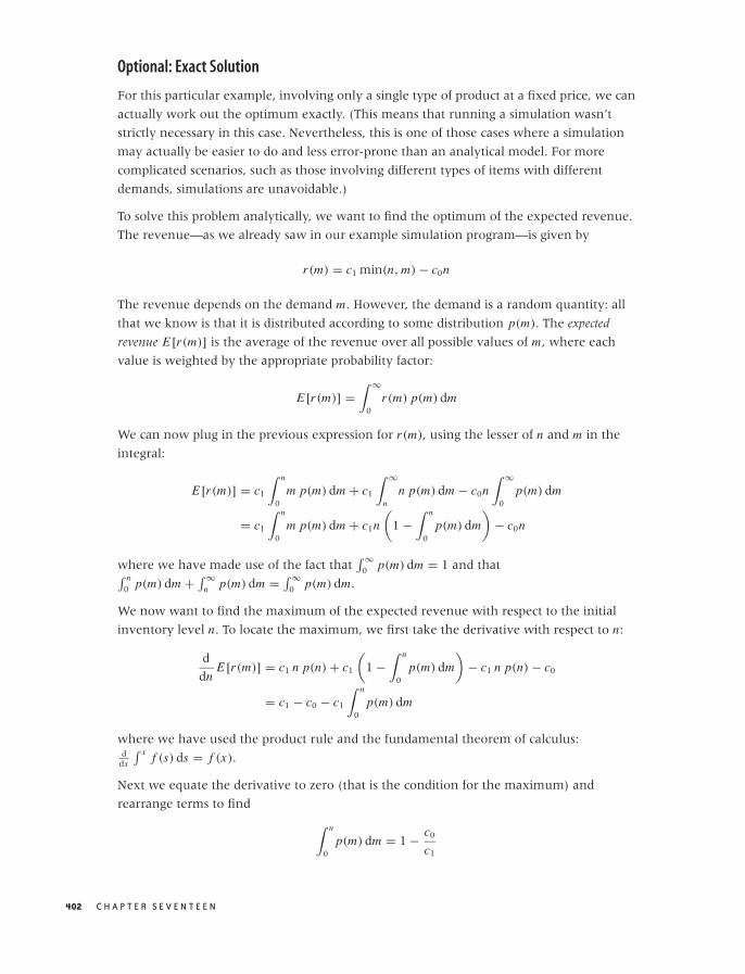
O’Reilly-5980006 master October 28, 2010 21:42
Optional: Exact Solution
For this particular example, involving only a single type of product at a fixed price, we can
actually work out the optimum exactly. (This means that running a simulation wasn’t
strictly necessary in this case. Nevertheless, this is one of those cases where a simulation
may actually be easier to do and less error-prone than an analytical model. For more
complicated scenarios, such as those involving different types of items with different
demands, simulations are unavoidable.)
To solve this problem analytically, we want to find the optimum of the expected revenue.
The revenue—as we already saw in our example simulation program—is given by
r(m) = c1 min(n, m) − c0n
The revenue depends on the demand m. However, the demand is a random quantity: all
that we know is that it is distributed according to some distribution p(m). The expected
revenue E[r(m)] is the average of the revenue over all possible values of m, where each
value is weighted by the appropriate probability factor:
E[r(m)] =∫ ∞
0r(m) p(m) dm
We can now plug in the previous expression for r(m), using the lesser of n and m in the
integral:
E[r(m)] = c1
∫ n
0m p(m) dm + c1
∫ ∞
nn p(m) dm − c0n
∫ ∞
0p(m) dm
= c1
∫ n
0m p(m) dm + c1n
(1 −
∫ n
0p(m) dm
)− c0n
where we have made use of the fact that∫ ∞
0 p(m) dm = 1 and that∫ n0 p(m) dm + ∫ ∞
n p(m) dm = ∫ ∞0 p(m) dm.
We now want to find the maximum of the expected revenue with respect to the initial
inventory level n. To locate the maximum, we first take the derivative with respect to n:
d
dnE[r(m)] = c1 n p(n) + c1
(1 −
∫ n
0p(m) dm
)− c1 n p(n) − c0
= c1 − c0 − c1
∫ n
0p(m) dm
where we have used the product rule and the fundamental theorem of calculus:d
dx
∫ x f (s) ds = f (x).
Next we equate the derivative to zero (that is the condition for the maximum) and
rearrange terms to find
∫ n
0p(m) dm = 1 − c0
c1
402 C H A P T E R S E V E N T E E N

O’Reilly-5980006 master October 28, 2010 21:42
This is the final result. The lefthand side is the cumulative distribution function of the
demand, and the righthand side is a simple expression involving the ratio of the purchase
price and the sales price. Given the cumulative distribution function for the demand, we
can now find the value of n for which the cumulative distribution function equals
1 − c0/c1—that value of n is the optimal initial inventory level.
The lighter dotted line in Figure 17-2 shows the location of the optimum revenue
obtained by plugging the optimal inventory calculated in this way back into the
expression for the revenue. As we would expect, this line goes right through the peaks in
all the revenue curves. Notice that the maximum in the revenue curve occurs for n < 100
for c1 < 2.00: in other words, our markup has to be at least 100 percent, before it makes
sense to hold more inventory than the expected average demand. (Remember that we
expect to sell 100 papers on average.) If our markup is less than that, then we are
better-off selling our inventory out entirely, rather than having to discard some items. (Of
course, details such as these depend on the specific choice of the probability distribution
p(m) that is used to model the demand.)
Further Reading
If you want to read up on some of the details that I have (quite intentionally) skipped,
you should look for material on “engineering economics” or “engineering economic
analysis.” Some books that I have found useful include the following.
• Industrial Mathematics: Modeling in Industry, Science and Government. Charles R. MacCluer.
Prentice Hall. 1999.
In his preface, MacCluer points out that most engineers leaving school “will have no
experience with problems incorporating the unit $.” This observation was part of the
inspiration for this chapter. MacCluer’s book contains an overview over many more
advanced mathematical techniques that are relevant in practical applications. His
choice of topics is excellent, but the presentation often seems a bit aloof and too terse
for the uninitiated. (For instance, the material covered in this chapter is compressed
into only three pages.)
• Schaum’s Outline of Engineering Economics. Jose Sepulveda, William Souder, and Byron
Gottfried. McGraw-Hill. 1984.
If you want a quick introduction to the details left out of my presentation, then this
inexpensive book is a good choice. Includes many worked examples.
• Engineering Economy. William G. Sullivan, Elin M. Wicks, and C. Patrick Koelling.
14th ed., Prentice Hall. 2008.
Engineering Economic Analysis. Donald Newnan, Jerome Lavelle, and Ted Eschenbach.
10th ed., Oxford University Press. 2009.
F I N A N C I A L C A L C U L AT I O N S A N D M O D E L I N G 403

O’Reilly-5980006 master October 28, 2010 21:42
Principles of Engineering Economic Analysis. John A. White, Kenneth E. Case, and David
B. Pratt. 5th ed., Wiley. 2000.
Three standard, college-level textbooks that treat largely the same material on many
more pages.
The Newsvendor Problem
• Pricing and Revenue Optimization. Robert Phillips. Stanford Business Books. 2005.
Finding the optimal price for a given demand is the primary question in the field of
“revenue optimization.” This book provides an accessible introduction.
• Introduction to Operations Research. Frederick S. Hillier and Gerald J. Lieberman. 9th ed.,
McGraw-Hill. 2009.
The field of operations research encompasses a set of mathematical methods that are
useful for many problems that arise in a business setting, including inventory
management. This text is a standard introduction.
404 C H A P T E R S E V E N T E E N

O’Reilly-5980006 master October 28, 2010 21:44
C H A P T E R E I G H T E E N
Predictive Analytics
DATA ANALYSIS CAN TAKE MANY DIFFERENT FORMS—NOT ONLY IN THE TECHNIQUES THAT WE APPLY BUT ALSO
in the kind of results that we ultimately achieve. Looking back over the material that we
have covered so far, we see that the results obtained in Part I were mostly descriptive: we
tried to figure out what the data was telling us and to describe it. In contrast, the results in
Part II were primarily prescriptive: data was used as a guide for building models which
could then be used to infer or prescribe phenomena, including effects that had not
actually been observed yet. In this form of analysis, data is not used directly; instead it is
used only indirectly to guide (and verify) our intuition when building models.
Additionally, as I tried to stress in those chapters, we don’t just follow data blindly, but
instead we try to develop an understanding of the processes that generate the data and to
capture this understanding in the models we develop. The predictive power of such
models derives from this understanding we develop by studying data and the circumstances
in which it is generated.*
In this chapter, we consider yet another way to use data—we can call it predictive, since the
purpose will be to make predictions about future events. What is different is that now we
try to make predictions directly from the data without necessarily forming the kind of
conceptual model (and the associated deeper understanding of the problem domain) as
discussed in Part II. This difference is obviously both a strength and a weakness. It’s a
strength in that it enables us to deal with problems for which we have no hope of
developing a conceptual model, given the complexity of the situation. It is also a weakness
because we may end up with only a black-box solution and no deeper understanding.
*The techniques discussed in Part III are different: for the most part they were strictly computationaland can be applied to any purpose, depending on the context.
405
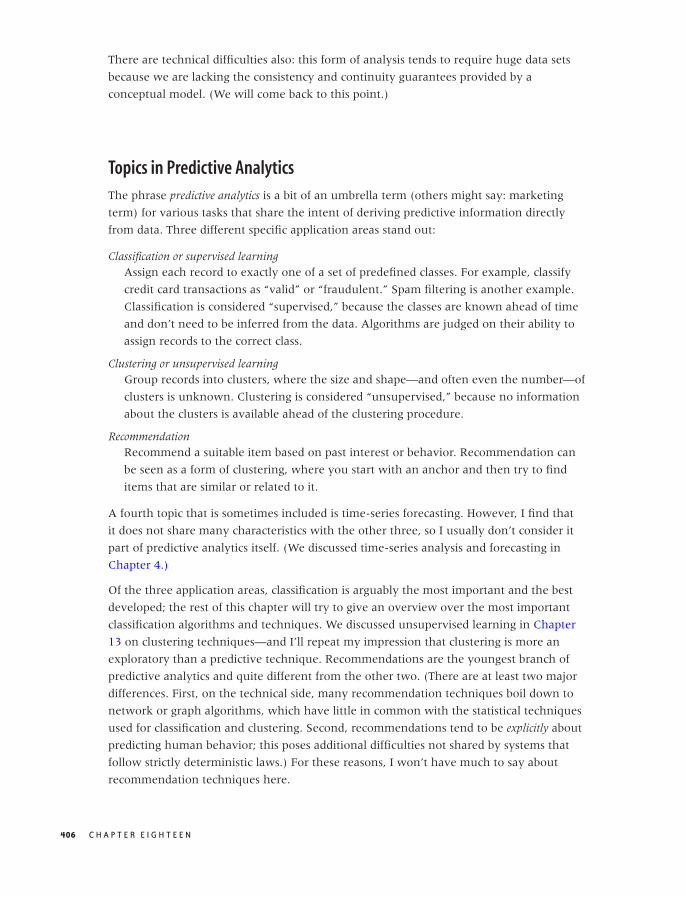
O’Reilly-5980006 master October 28, 2010 21:44
There are technical difficulties also: this form of analysis tends to require huge data sets
because we are lacking the consistency and continuity guarantees provided by a
conceptual model. (We will come back to this point.)
Topics in Predictive Analytics
The phrase predictive analytics is a bit of an umbrella term (others might say: marketing
term) for various tasks that share the intent of deriving predictive information directly
from data. Three different specific application areas stand out:
Classification or supervised learningAssign each record to exactly one of a set of predefined classes. For example, classify
credit card transactions as “valid” or “fraudulent.” Spam filtering is another example.
Classification is considered “supervised,” because the classes are known ahead of time
and don’t need to be inferred from the data. Algorithms are judged on their ability to
assign records to the correct class.
Clustering or unsupervised learningGroup records into clusters, where the size and shape—and often even the number—of
clusters is unknown. Clustering is considered “unsupervised,” because no information
about the clusters is available ahead of the clustering procedure.
RecommendationRecommend a suitable item based on past interest or behavior. Recommendation can
be seen as a form of clustering, where you start with an anchor and then try to find
items that are similar or related to it.
A fourth topic that is sometimes included is time-series forecasting. However, I find that
it does not share many characteristics with the other three, so I usually don’t consider it
part of predictive analytics itself. (We discussed time-series analysis and forecasting in
Chapter 4.)
Of the three application areas, classification is arguably the most important and the best
developed; the rest of this chapter will try to give an overview over the most important
classification algorithms and techniques. We discussed unsupervised learning in Chapter
13 on clustering techniques—and I’ll repeat my impression that clustering is more an
exploratory than a predictive technique. Recommendations are the youngest branch of
predictive analytics and quite different from the other two. (There are at least two major
differences. First, on the technical side, many recommendation techniques boil down to
network or graph algorithms, which have little in common with the statistical techniques
used for classification and clustering. Second, recommendations tend to be explicitly about
predicting human behavior; this poses additional difficulties not shared by systems that
follow strictly deterministic laws.) For these reasons, I won’t have much to say about
recommendation techniques here.
406 C H A P T E R E I G H T E E N

O’Reilly-5980006 master October 28, 2010 21:44
T A B L E 18 -1. The confusion matrix for a binary classification problem
Predicted: A Predicted: B
Actual: A Correct Incorrect
Actual: B Incorrect Correct
Let me emphasize that this chapter can serve only as an overview of classification. Entire
books could (and have!) been written about it. But we can outline the problem, introduce
some terminology, and give the flavor of different solution approaches.
Some Classification Terminology
We begin with a data set containing multiple elements, records, or instances. Each instance
consists of several attributes or features. One of the features is special: it denotes the record’s
class and is known as the class label. Each record belongs to exactly one class.
A large number of classification problems are binary, consisting only of two classes (valid
or fraudulent, spam or not spam); however, multiclass scenarios do also occur. Many
classification algorithms can deal only with binary problems, but this is not a real
limitation because any multiclass problem can be treated as a set of binary problems
(belongs to the target class or does belong to any other class).
A classifier takes a record (i.e., a set of attribute values) and produces a class label for this
record. Building and using a classifier generally follows a three-step process of training,
testing, and actual application.
We first split the existing data set into a training set and a test set. In the training phase, we
present each record from the training set to the classification algorithm. Next we compare
the class label produced by the algorithm to the true class label of the record in question;
then we adjust the algorithm’s “parameters” to achieve the greatest possible accuracy or,
equivalently, the lowest possible error rate. (Of course, the details of this “fitting” process
vary greatly from one algorithm to the next; we will look at different ways of how this is
done in the next section.)
The results can be summarized in a so-called confusion matrix whose entries are the number
of records in each category. (Table 18-1 shows the layout of a generic confusion matrix.)
Unfortunately, the error rate derived from the training set (the training error) is typically
way too optimistic as an indicator of the error rate the classifier would achieve on new
data—that is, on data that was not used during the learning phase. This is the purpose of
the test set: after we have optimized the algorithm using only the training data, we let the
classifier operate on the elements of the test set to see how well it classifies them. The
error rate obtained in this way is the generalization error and is a much more reliable
indicator of the accuracy of the classifier.
P R E D I C T I V E A N A LY T I C S 407
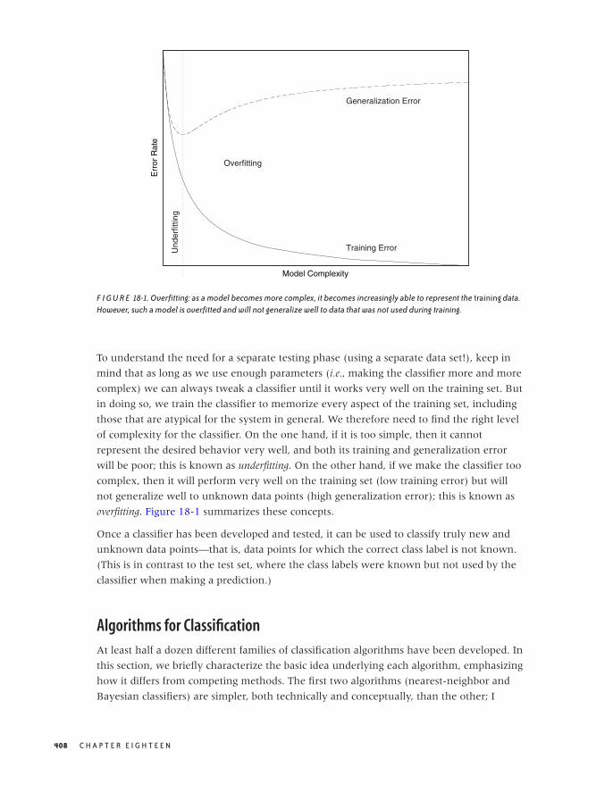
O’Reilly-5980006 master October 28, 2010 21:44
Err
or R
ate
Model Complexity
Training Error
Generalization Error
OverfittingU
nder
fittin
g
F I G U R E 18-1. Overfitting: as a model becomes more complex, it becomes increasingly able to represent the training data.However, such a model is overfitted and will not generalize well to data that was not used during training.
To understand the need for a separate testing phase (using a separate data set!), keep in
mind that as long as we use enough parameters (i.e., making the classifier more and more
complex) we can always tweak a classifier until it works very well on the training set. But
in doing so, we train the classifier to memorize every aspect of the training set, including
those that are atypical for the system in general. We therefore need to find the right level
of complexity for the classifier. On the one hand, if it is too simple, then it cannot
represent the desired behavior very well, and both its training and generalization error
will be poor; this is known as underfitting. On the other hand, if we make the classifier too
complex, then it will perform very well on the training set (low training error) but will
not generalize well to unknown data points (high generalization error); this is known as
overfitting. Figure 18-1 summarizes these concepts.
Once a classifier has been developed and tested, it can be used to classify truly new and
unknown data points—that is, data points for which the correct class label is not known.
(This is in contrast to the test set, where the class labels were known but not used by the
classifier when making a prediction.)
Algorithms for Classification
At least half a dozen different families of classification algorithms have been developed. In
this section, we briefly characterize the basic idea underlying each algorithm, emphasizing
how it differs from competing methods. The first two algorithms (nearest-neighbor and
Bayesian classifiers) are simpler, both technically and conceptually, than the other; I
408 C H A P T E R E I G H T E E N

O’Reilly-5980006 master October 28, 2010 21:44
discuss them in more detail since you may want to implement them yourself. For the
other algorithms, you probably want to use existing libraries instead!
Instance-Based Classifiers and Nearest-Neighbor Methods
The idea behind instance-based classifiers is dead simple: to classify an unknown instance,
find an existing instance that is “most similar” to the new instance and assign the class
label of the known instance to the new one!
This basic idea can be generalized in a variety of ways. First of all, the notion of “most
similar” brings us back to the notion of distance and similarity measures introduced in
Chapter 13; obviously we have considerable flexibility in the choice of which distance
measure to use. Furthermore, we don’t have to stop at a single “most similar” existing
instance. We might instead take the nearest k neighbors and use them to classify the new
instance, typically by using a majority rule (i.e., we assign the new instance to the class that
occurs most often among the k neighbors). We could even employ a weighted-majority
rule whereby “more similar” neighbors contribute more strongly than those farther away.
Instance-based classifiers are atypical in that they don’t have a separate “training” phase;
for this reason, they are also known as “lazy learners.” (The only adjustable parameter is
the extent k of the neighborhood used for classification.) However, a (possibly large) set of
known instances must be kept available during the final application phase. For the same
reason, classification can be relatively expensive because the set of existing instances must
be searched for appropriate neighbors.
Instance-based classifiers are local: they do not take the overall distribution of points into
account. Additionally, they impose no particular shape or geometry on the decision
boundaries that they generate. In this sense they are especially flexible. On the other
hand, the are also susceptible to noise.
Finally, instance-based classifiers depend on the proper choice of distance measure, much
as clustering algorithms do. We encountered this situation before, when we discussed the
need for scale normalization in Chapters 13 and 14; the same considerations apply here as
well.
Bayesian Classifiers
A Bayesian classifier takes a probabilistic (i.e., nondeterministic) view of classification.
Given a set of attributes, it calculates the probability of the instance to belong to this or that
class. An instance is then assigned the class label with the highest probability.
A Bayesian classifier calculates a conditional probability. This is the probability of the
instance to belong to a specific class C , given the set of attribute values:
P(class C | {x1, x2, x3, . . . , xn})
P R E D I C T I V E A N A LY T I C S 409

O’Reilly-5980006 master October 28, 2010 21:44
Here C is the class label, and the set of attribute values is {x1, x2, x3, . . . , xn}. Note that we
don’t yet know the value of the probability—if we did, we’d be finished.
To make progress, we invoke Bayes’ theorem (hence the name of the classifier—see also
Chapter 10 for a discussion of Bayes’ theorem) to invert this probability expression as
follows:
P(class C | {xi }) = P({xi } | class C) · P(class C)
P({xi })
where I have collapsed the set of n features into {xi } for brevity.
The first term in the numerator (the likelihood) is the probability of observing a set of
features {xi } if the instance belongs to class C (in the language of conditional probability:
given the class label C). We can find an empirical value for this probability from the set of
training instances: it is simply the frequency with which we observe the set of specific
attribute values {xi } among instances belonging to class C . Empirically, we can
approximate this distribution by a set of histograms of the {xi }, one for each class label. The
second term in the numerator, P(class C), is the prior probability of any instance
belonging to class C . We can estimate this probability from the fraction of instances in the
training set that belong to class C . The denominator does not depend on the class label
and—as usual with Bayesian computations—is ignored until the end, when the
probabilities are normalized.
Through the use of Bayes’ theorem, we have been able to express the probability for an
instance to belong to class C , given a set of features, entirely through expressions that can
be determined from the training set.
At least in theory. In practice, it will be almost impossible to evaluate this probability
directly. Look closely at the expression (now written again in its long form),
P({x1, x2, x3, . . . , xn} | class C). For each possible combination of attribute values, we must
have enough examples in our training set to be able to evaluate their frequency with
some degree of reliability. This is a combinatorial nightmare! Assume that each feature is
binary (i.e., it can take on one of only two values). The number of possible combinations is
then 2n , so for n = 5 we already have 32 different combinations. Let’s say we need about
20 example instances for each possible combination in order to evaluate the frequency,
then we’ll need a training set of at least 600 instances. In practice, the problem tends to be
worse because features frequently can take more than two values, the number of features
can easily be larger than five, and—most importantly—some combinations of features
occur much less frequently than others. We therefore need a training set large enough to
guarantee that even the least-frequent attribute combination occurs sufficiently often.
In short, the “brute force” approach of evaluating the likelihood function for all possible
feature combinations is not feasible for problems of realistic size. Instead, one uses one of
two simplifications.
410 C H A P T E R E I G H T E E N

O’Reilly-5980006 master October 28, 2010 21:44
The naive Bayesian classifier assumes that all features are independent of each other, so that
we can write:
P({x1, x2, x3, . . . , xn} |C) = P(x1|C)P(x2|C)P(x3|C) · · · P(xn|C)
This simplifies the problem greatly, because now we need only determine the frequencies
for each attribute value for a single attribute at a time. In other words, each probability
distribution P(xi |C) is given as the histogram of a single feature xi , separately for each
class label. Despite their simplicity, naive Bayesian classifiers are often surprisingly
effective. (Many spam filters work this way.)
Another idea is to use a Bayesian network. Here we prune the set of all possible feature
combinations by retaining only those that have a causal relationship with each other.
Bayesian networks are best discussed through an example. Suppose we want to build a
classifier that predicts whether we will be late to work in the morning, based on three
binary features:
• Alarm clock went off: Yes or No
• Left the house on time: Yes or No
• Traffic was bad: Yes or No
Although we don’t assume that all features are independent (as we did for the naive
Bayesian classifier), we do observe that the traffic situation is independent of the other
two features. Furthermore, whether we leave the house on time does depend on the
proper working of the alarm clock. In other words, we can split the full probability:
P(Arrive on time | Alarm clock, Leave on time, Traffic)
into the following combination of events:
P(Arrive on time | Leave on time)
P(Leave on time | Alarm clock)
P(Arrive on time | Traffic)
Notice that only two of the terms give the probability for the class label (“Arrive on time”)
and that one gives the probability of an intermediate event (see Figure 18-2).
For such a small example (containing only three features), the savings compared with
maintaining all feature combinations are not impressive. But since the number of
combinations grows exponentially with the number of features, restricting our attention
to only those factors that have a causal relationship with each other can significantly
reduce the number of combinations we need to retain for larger problems.
The structure (or topology) of a Bayesian network is usually not inferred from the data;
instead, we use domain knowledge to determine which pathways to keep. This is exactly
P R E D I C T I V E A N A LY T I C S 411
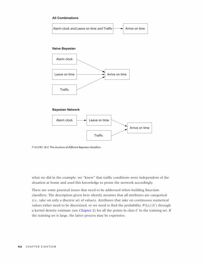
O’Reilly-5980006 master October 28, 2010 21:44
All Combinations
Alarm clock and Leave on time and Traffic Arrive on time
Naive Bayesian
Alarm clock
Leave on time
Traffic
Arrive on time
Bayesian Network
Alarm clock Leave on time
Traffic
Arrive on time
F I G U R E 18-2. The structure of different Bayesian classifiers.
what we did in the example: we “knew” that traffic conditions were independent of the
situation at home and used this knowledge to prune the network accordingly.
There are some practical issues that need to be addressed when building Bayesian
classifiers. The description given here silently assumes that all attributes are categorical
(i.e., take on only a discrete set of values). Attributes that take on continuous numerical
values either need to be discretized, or we need to find the probability P({xi } |C) through
a kernel density estimate (see Chapter 2) for all the points in class C in the training set. If
the training set is large, the latter process may be expensive.
412 C H A P T E R E I G H T E E N
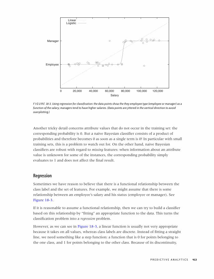
O’Reilly-5980006 master October 28, 2010 21:44
Employee
Manager
0 20,000 40,000 60,000 80,000 100,000 120,000
Salary
LinearLogistic
F I G U R E 18-3. Using regression for classification: the data points show the they employee type (employee or manager) as afunction of the salary; managers tend to have higher salaries. (Data points are jittered in the vertical direction to avoidoverplotting.)
Another tricky detail concerns attribute values that do not occur in the training set: the
corresponding probability is 0. But a naive Bayesian classifier consists of a product of
probabilities and therefore becomes 0 as soon as a single term is 0! In particular with small
training sets, this is a problem to watch out for. On the other hand, naive Bayesian
classifiers are robust with regard to missing features: when information about an attribute
value is unknown for some of the instances, the corresponding probability simply
evaluates to 1 and does not affect the final result.
Regression
Sometimes we have reason to believe that there is a functional relationship between the
class label and the set of features. For example, we might assume that there is some
relationship between an employee’s salary and his status (employee or manager). See
Figure 18-3.
If it is reasonable to assume a functional relationship, then we can try to build a classifier
based on this relationship by “fitting” an appropriate function to the data. This turns the
classification problem into a regression problem.
However, as we can see in Figure 18-3, a linear function is usually not very appropriate
because it takes on all values, whereas class labels are discrete. Instead of fitting a straight
line, we need something like a step function: a function that is 0 for points belonging to
the one class, and 1 for points belonging to the other class. Because of its discontinuity,
P R E D I C T I V E A N A LY T I C S 413

O’Reilly-5980006 master October 28, 2010 21:44
the step function is hard to work with; hence one typically uses the logistic function (see
Appendix B) as a smooth approximation to the step function. The logistic function gives
this technique its name: logistic regression. Like all regression methods, it is a global
technique that tries to optimize a fit over all points and not just over a particularly
relevant subset.
Logistic regression is not only important in practical applications but has deep roots in
theoretical statistics as well. Until the arrival of support vector machines, it was the
method of choice for many classification problems.
Support Vector Machines
Support vector machines are a relative newcomer among classification methods. The
name is a bit unfortunate: there is nothing particularly “machine-y” about them. They
are, in fact, based on a simple geometrical construction.
Consider training instances in a two-dimensional feature space like the one in Figure
18-4. Now we are looking for the “best” dividing line (or decision boundary) that separates
instances belonging to one class from instances belonging to the other.
We need to decide what we mean by “best.” The answer given by support vector
machines is that the “best” dividing line is one that has the largest margin. The margin is
the space, parallel to the decision boundary, that is free of any training instances. Figure
18-4 shows two possible decision boundaries and their respective margins. Although this
example is only two-dimensional, the reasoning generalizes directly to higher dimensions.
In such cases, the decision boundary becomes a hyperplane, and support vector machines
therefore find the maximum margin hyperplanes (a term you might find in the literature).
I will not go through the geometry and algebra required to construct a decision boundary
from a data set, since you probably don’t want to implement it yourself, anyway. (The
construction is not difficult, and if you have some background in analytic geometry, you
will be able to do it yourself or look it up elsewhere.) The important insight is that support
vector machines turn the task of finding a decision boundary first into the geometric task
of constructing a line (or hyperplane) from a set of points (this is an elementary task in
analytic geometry). The next step—find the decision boundary with the largest margin—is
then just a multi-dimensional optimization problem, with a particularly simple and
well-behaved objective function (namely, the square of the distance of each point from
the decision boundary), for which good numerical algorithms exist.
One important property of support vector machines is that they perform a strict global
optimization without having to rely on heuristics. Because of the nature of the objective
function, the algorithm is guaranteed to find the global optimum, not merely a local one.
On the other hand, the final solution does not depend on all points; instead it depends
only on those closest to the decision boundary, points that lie right on the edge of the
margin. (These are the support vectors, see Figure 18-4.) This means that the decision
414 C H A P T E R E I G H T E E N
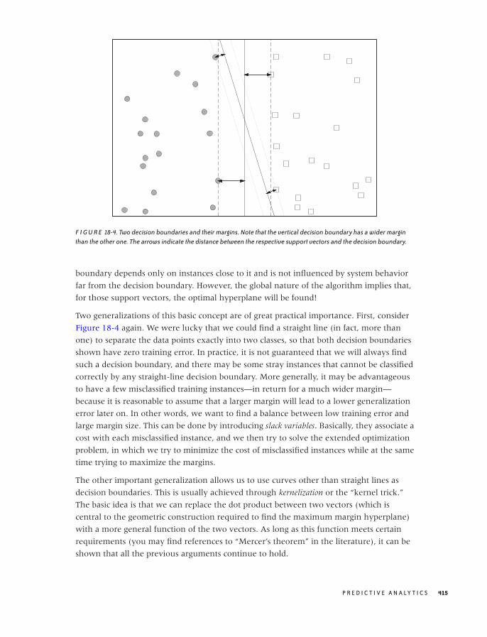
O’Reilly-5980006 master October 28, 2010 21:44
F I G U R E 18-4. Two decision boundaries and their margins. Note that the vertical decision boundary has a wider marginthan the other one. The arrows indicate the distance between the respective support vectors and the decision boundary.
boundary depends only on instances close to it and is not influenced by system behavior
far from the decision boundary. However, the global nature of the algorithm implies that,
for those support vectors, the optimal hyperplane will be found!
Two generalizations of this basic concept are of great practical importance. First, consider
Figure 18-4 again. We were lucky that we could find a straight line (in fact, more than
one) to separate the data points exactly into two classes, so that both decision boundaries
shown have zero training error. In practice, it is not guaranteed that we will always find
such a decision boundary, and there may be some stray instances that cannot be classified
correctly by any straight-line decision boundary. More generally, it may be advantageous
to have a few misclassified training instances—in return for a much wider margin—
because it is reasonable to assume that a larger margin will lead to a lower generalization
error later on. In other words, we want to find a balance between low training error and
large margin size. This can be done by introducing slack variables. Basically, they associate a
cost with each misclassified instance, and we then try to solve the extended optimization
problem, in which we try to minimize the cost of misclassified instances while at the same
time trying to maximize the margins.
The other important generalization allows us to use curves other than straight lines as
decision boundaries. This is usually achieved through kernelization or the “kernel trick.”
The basic idea is that we can replace the dot product between two vectors (which is
central to the geometric construction required to find the maximum margin hyperplane)
with a more general function of the two vectors. As long as this function meets certain
requirements (you may find references to “Mercer’s theorem” in the literature), it can be
shown that all the previous arguments continue to hold.
P R E D I C T I V E A N A LY T I C S 415

O’Reilly-5980006 master October 28, 2010 21:44
One disadvantage of support vector machines is that they lead to especially opaque
results: they truly are black boxes. The final classifier may work well in practice, but it
does not shed much light on the nature of the problem. This is in contrast to techniques
such as regression or decision trees (see the next section), which often lead to results that
can be interpreted in some form. (In regression problems, for instance, one can often see
which attributes are the most influential ones, and which are less relevant.)
Decision Trees and Rule-Based Classifiers
Decision trees and rule-based classifiers are different from the classifiers discussed so far in
that they do not require a distance measure. For this reason, they are sometimes referred
to as nonmetric classifiers.
Decision trees consist of a hierarchy of decision points (the nodes of the tree). When using
a decision tree to classify an unknown instance, a single feature is examined at each node
of the tree. Based on the value of that feature, the next node is selected. Leaf nodes on the
tree correspond to classes; once we have reached a leaf node, the instance in question is
assigned the corresponding class label. Figure 18-5 shows an example of a simple decision
tree.
The primary algorithm (Hunt’s algorithm) for deriving a decision tree from a training set
employs a greedy approach. The algorithm is easiest to describe when all features are
categorical and can take only one of two values (binary attributes). If this is the case, then
the algorithm proceeds as follows:
1. For each instance in the training set, examine each feature in turn.
2. Split the training instances into two subsets based on the value of the current feature.
3. Select the feature that results in the “purest” subsets; the value of this attribute will be
the decision condition employed by the current node.
4. Repeat this algorithm recursively on the two subsets until the resulting subsets are
sufficiently pure.
To make this concrete, we must be able to measure the purity of a set. Let fC be the
fraction of instances in the set belonging to class C . Obviously, if fC = 1 for any class label
C , then the set is totally pure because all of its elements belong to the same class. We can
therefore define the a purity of a set as the frequency of its most common constituent.
(For example, if a set consists of 60 percent of items from class A, 30 percent from class B,
and 10 percent from class C, then its purity is 60 percent.) This is not the only way to
define purity. Other ways of measuring it are acceptable provided they reach a maximum
when all elements of a set belong to the same class and reach a minimum when the
elements of the set are distributed uniformly across classes.
416 C H A P T E R E I G H T E E N
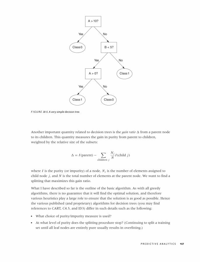
O’Reilly-5980006 master October 28, 2010 21:44
A > 10?
Class 0 B < 5?
A > 0? Class 1
Class 1 Class 0
Yes No
Yes No
Yes No
F I G U R E 18-5. A very simple decision tree.
Another important quantity related to decision trees is the gain ratio � from a parent node
to its children. This quantity measures the gain in purity from parent to children,
weighted by the relative size of the subsets:
� = I (parent) −∑
children j
N j
NI (child j)
where I is the purity (or impurity) of a node, N j is the number of elements assigned to
child node j , and N is the total number of elements at the parent node. We want to find a
splitting that maximizes this gain ratio.
What I have described so far is the outline of the basic algorithm. As with all greedy
algorithms, there is no guarantee that it will find the optimal solution, and therefore
various heuristics play a large role to ensure that the solution is as good as possible. Hence
the various published (and proprietary) algorithms for decision trees (you may find
references to CART, C4.5, and ID3) differ in such details such as the following:
• What choice of purity/impurity measure is used?
• At what level of purity does the splitting procedure stop? (Continuing to split a training
set until all leaf nodes are entirely pure usually results in overfitting.)
P R E D I C T I V E A N A LY T I C S 417

O’Reilly-5980006 master October 28, 2010 21:44
• Is the tree binary, or can a node have more than two children?
• How should noncategorical attributes be treated? (For attributes that take on a
continuum of values, we need to define the optimal splitting point.)
• Is the tree postprocessed? (To reduce overfitting, some algorithms employ a pruning
step that attempts to eliminate leaf nodes having too few elements.)
Decision trees are popular and combine several attractive features: with good algorithms,
decision trees are relatively cheap to build and are always very fast to evaluate. They are
also rather robust in the presence of noise. It can even be instructive to examine the
decision points of a decision tree, because they frequently reveal interesting information
about the distribution of class labels (such as when 80 percent of the class information is
contained in the topmost node). However, algorithms for building decision trees are
almost entirely black-box and do not lend themselves to ad hoc modifications or
extensions.
There is an equivalence between decision trees and rule-based classifiers. The latter consist
of a set of rules (i.e., logical conditions on attribute values) that, when taken in aggregate,
determine the class label of a test instance. There are two ways to build a rule-based
classifier. We can build a decision tree first and then transform each complete path
through the decision tree into a single rule. Alternatively, we can build rule-based
classifiers directly from a training set by finding a subset of instances that can be described
by a simple rule. These instances are then removed from the training set, and the process
is repeated. (This amounts to a bottom-up approach, whereas using a variant of Hunt’s
algorithm to build a decision-tree follows a top-down approach.)
Other Classifiers
In addition to the classifiers discussed so far, you will find others mentioned in the
literature. I’ll name just two—mostly because of their historical importance.
Fisher’s linear discriminant analysis (LDA) was one of the first classifiers developed. It is
similar to principal component analysis (see Chapter 14). Whereas in PCA, we introduce a
new coordinate system to maximize the spread along the new coordinates axes, in LDA
we introduce new coordinates to maximize the separation between two classes that we
try to distinguish. The position of the means, calculated separately for each class, are taken
as the location of each class.
Artificial neural networks were conceived as extremely simplified models for biological
brains. The idea was to have a network of nodes; each node receives input from several
other nodes, forms a weighted average of its input, and then sends it out to the next layer
of nodes. During the learning stage, the weights used in the weighted average are adjusted
to minimize training error. Neural networks were very popular for a while but have
recently fallen out of favor somewhat. One reason is that the calculations required are
418 C H A P T E R E I G H T E E N

O’Reilly-5980006 master October 28, 2010 21:44
more complicated than for other classifiers; another is that the whole concept is very ad
hoc and lacks a solid theoretical grounding.
The Process
In addition to the primary algorithms for classification, various techniques are important
for dealing with practical problems. In this section, we look at some standard methods
commonly used to enhance accuracy—especially for the important case when the most
“interesting” type of class occurs much less frequently than the other types.
Ensemble Methods: Bagging and Boosting
The term ensemble methods refers to a set of techniques for improving accuracy by
combining the results of individual or “base” classifiers. The rationale is the same as when
performing some experiment or measurement multiple times and then averaging the
results: as long as the experimental runs are independent, we can expect that errors will
cancel and that the average will be more accurate than any individual trial. The same logic
applies to classification techniques: as long as the individual base classifiers are
independent, combining their results will lead to cancellation of errors and the end result
will have greater accuracy than the individual contributions.
To generate a set of independent classifiers, we have to introduce some randomness into
the process by which they are built. We can manipulate virtually any aspect of the overall
system: we can play with the selection of training instances (as in bagging and boosting),
with the selection of features (often in conjunction with random forests), or with
parameters that are specific to the type of classifier used.
Bagging is an application of the bootstrap idea (see Chapter 12) to classification. We
generate additional training sets by sampling with replacement from the original training
set. Each of these training sets is then used to train a separate classifier instance. During
production, we let each of these instances provide a separate assessment for each item we
want to classify. The final class label is then assigned based on a majority vote or similar
technique.
Boosting is another technique to generate additional training sets using a bootstrap
approach. In contrast to bagging, boosting is an iterative process that assigns higher
weights to instances misclassified in previous rounds. As the iteration progresses, higher
emphasis is placed on training instances that have proven hard to classify correctly. The
final result consists of the aggregate result of all base classifiers generated during the
iteration. A popular variant of this technique is known as “AdaBoost.”
Random forests apply specifically to decision trees. In this technique, randomness is
introduced not by sampling from the training set but by randomly choosing what features
P R E D I C T I V E A N A LY T I C S 419
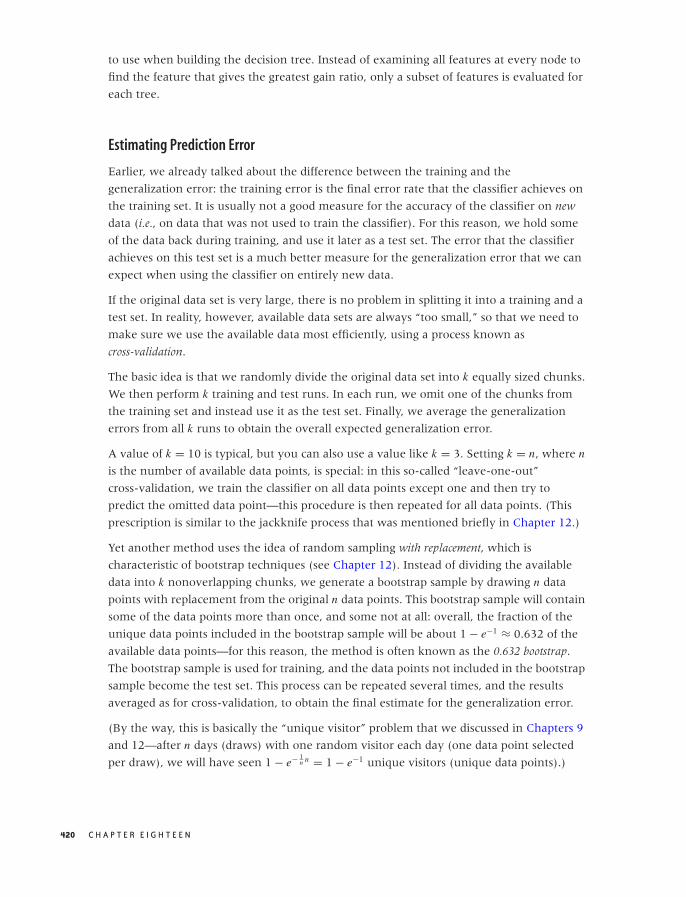
O’Reilly-5980006 master October 28, 2010 21:44
to use when building the decision tree. Instead of examining all features at every node to
find the feature that gives the greatest gain ratio, only a subset of features is evaluated for
each tree.
Estimating Prediction Error
Earlier, we already talked about the difference between the training and the
generalization error: the training error is the final error rate that the classifier achieves on
the training set. It is usually not a good measure for the accuracy of the classifier on new
data (i.e., on data that was not used to train the classifier). For this reason, we hold some
of the data back during training, and use it later as a test set. The error that the classifier
achieves on this test set is a much better measure for the generalization error that we can
expect when using the classifier on entirely new data.
If the original data set is very large, there is no problem in splitting it into a training and a
test set. In reality, however, available data sets are always “too small,” so that we need to
make sure we use the available data most efficiently, using a process known as
cross-validation.
The basic idea is that we randomly divide the original data set into k equally sized chunks.
We then perform k training and test runs. In each run, we omit one of the chunks from
the training set and instead use it as the test set. Finally, we average the generalization
errors from all k runs to obtain the overall expected generalization error.
A value of k = 10 is typical, but you can also use a value like k = 3. Setting k = n, where n
is the number of available data points, is special: in this so-called “leave-one-out”
cross-validation, we train the classifier on all data points except one and then try to
predict the omitted data point—this procedure is then repeated for all data points. (This
prescription is similar to the jackknife process that was mentioned briefly in Chapter 12.)
Yet another method uses the idea of random sampling with replacement, which is
characteristic of bootstrap techniques (see Chapter 12). Instead of dividing the available
data into k nonoverlapping chunks, we generate a bootstrap sample by drawing n data
points with replacement from the original n data points. This bootstrap sample will contain
some of the data points more than once, and some not at all: overall, the fraction of the
unique data points included in the bootstrap sample will be about 1 − e−1 ≈ 0.632 of the
available data points—for this reason, the method is often known as the 0.632 bootstrap.
The bootstrap sample is used for training, and the data points not included in the bootstrap
sample become the test set. This process can be repeated several times, and the results
averaged as for cross-validation, to obtain the final estimate for the generalization error.
(By the way, this is basically the “unique visitor” problem that we discussed in Chapters 9
and 12—after n days (draws) with one random visitor each day (one data point selected
per draw), we will have seen 1 − e− 1n n = 1 − e−1 unique visitors (unique data points).)
420 C H A P T E R E I G H T E E N

O’Reilly-5980006 master October 28, 2010 21:44
T A B L E 18 -2. Terminology for the confusion matrix in the case of class imbalance (i.e.“bad”outcomes are much less frequent than “good” outcomes)
Predicted: Bad Predicted: Good
Actually: Bad True positive: “Hit” False negative: “Miss”
Actually: Good False positive: “False alarm” True negative: “Correct rejection”
Class Imbalance Problems
A special case of particular importance concerns situations where one of the classes occurs
much less frequently than any of the other classes in the data set—and, as luck would
have it, that’s usually the class we are interested in! Consider credit card fraud detection,
for instance: only one of every hundred credit card transactions may be fraudulent, but
those are exactly the ones we are interested in. Screening lab results for patients with
elevated heart attack risk or inspecting manufactured items for defects falls into the same
camp: the “interesting” cases are rare, perhaps extremely rare, but those are precisely the
cases that we want to identify.
For cases like this, there is some additional terminology as well as some special techniques
for overcoming the technical difficulties. Because there is one particular class that is of
greater interest, we refer to an instance belonging to this class as a positive event and the
class itself as the positive class. With this terminology, entries in the confusion matrix (see
Table 18-1) are often referred to as true (or false) positives (or negatives).
I have always found this terminology very confusing, in part because what is called
“positive” is usually something bad: a fraudulent transaction, a defective item, a bad
heart. Table 18-2 shows a confusion matrix employing the special terminology for
problems with a class imbalance—and also an alternative terminology that may be more
intuitive.
The two different types of errors may have very different costs associated with them.
From the point of view of a merchant accepting credit cards as payment, a false negative
(i.e., a fraudulent transaction incorrectly classified as “not fraudulent”—a “miss”) results
in the total loss of the item purchased, whereas a false positive (a valid transaction
incorrectly classified as “not valid”—a “false alarm”) results only in the loss of the profit
margin on that item.
The usual metrics by which we evaluate a classifier (such as accuracy and error rate), may
not be very meaningful in situations with pronounced class imbalances: keep in mind that
the trivial classifier that labels every credit card transaction as “valid” is 99 percent
accurate—and entirely useless! Two metrics that provide better insight into the ability of a
classifier to detect instances belonging to the positive class are recall and precision. The
precision is the fraction of correct classifications among all instances labeled positive; the
P R E D I C T I V E A N A LY T I C S 421
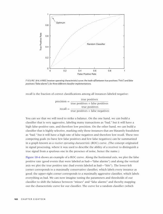
O’Reilly-5980006 master October 28, 2010 21:44
0
0.2
0.4
0.6
0.8
1
0 0.2 0.4 0.6 0.8 1
True
Pos
itive
Rat
e
False Positive Rate
Optimum
Random Classifier
F I G U R E 18-6. A ROC (receiver operating characteristic) curve: the trade-off between true positives (“hits”) and falsepositives (“false alarms”), for three different classifier implementations.
recall is the fraction of correct classifications among all instances labeled negative:
precision = true positives
true positives + false positives
recall = true positives
true positives + false negatives
You can see that we will need to strike a balance. On the one hand, we can build a
classifier that is very aggressive, labeling many transactions as “bad,” but it will have a
high false-positive rate, and therefore low precision. On the other hand, we can build a
classifier that is highly selective, marking only those instances that are blatantly fraudulent
as “bad,” but it will have a high rate of false negatives and therefore low recall. These two
competing goals (to have few false positives and few false negatives) can be summarized
in a graph known as a receiver operating characteristic (ROC) curve. (The concept originated
in signal processing, where it was used to describe the ability of a receiver to distinguish a
true signal from a spurious one in the presence of noise, hence the name.)
Figure 18-6 shows an example of a ROC curve. Along the horizontal axis, we plot the false
positive rate (good events that were labeled as bad—“false alarms”) and along the vertical
axis we plot the true positive rate (bad events labeled as bad—“hits”). The lower-left
corner corresponds to a maximally conservative classifier, which labels every instance as
good; the upper-right corner corresponds to a maximally aggressive classifier, which labels
everything as bad. We can now imagine tuning the parameters and thresholds of our
classifier to shift the balance between “misses” and “false alarms” and thereby mapping
out the characteristic curve for our classifier. The curve for a random classifier (which
422 C H A P T E R E I G H T E E N
O’Reilly-5980006 master October 28, 2010 21:44
assigns a positive class label with fixed probability p, irrespective of attribute values) will
be close to the diagonal: it is equally likely to classify a good instance as good as it is to
classify a bad one as good, hence its false positive rate equals its true positive rate. In
contrast, the ideal classifier would have a true positive rate equal to 1 throughout. We
want to tune our classifier so that it approximates the ideal classifier as nearly as possible.
Class imbalances pose some technical issues during the training phase: if positive instances
are extremely rare, then we want to make sure to retain as much of their information as
possible in the training set. One way to achieve this is by oversampling (i.e., resampling)
from the positive class instances—and undersampling from the negative class
instances—when generating a training set.
The Secret Sauce
All this detail about different algorithms and processes can easily leave the impression that
that’s all there is to classification. That would be unfortunate, because it leaves out what
can be the most important but also the most difficult part of the puzzle: finding the right
attributes!
The choice of attributes matters for successful classification—arguably more so than the
choice of classification algorithm. Here is an interesting case story. Paul Graham has
written two essays on using Bayesian classifiers for spam filtering.* In the second one, he
describes how using the information contained in the email headers is critical to obtaining
good classification results, whereas using only information in the body is not enough. The
punch line here is clear: in practice, it matters a lot which features or attributes you
choose to include.
Unfortunately, when compared with the extremely detailed information available on
different classifier algorithms and their theoretical properties, it is much more difficult to
find good guidance regarding how best to choose, prepare, and encode features for
classification. (None of the current books on classification discuss this topic at all.)
I think there are several reasons for this relative lack of easily available information—
despite the importance of the topic. One of them is lack of rigor: whereas one can prove
rigorous theorems on classification algorithms, most recommendations for feature
preparation and encoding would necessarily be empirical and heuristic. Furthermore,
every problem domain is different, which makes it difficult to come up with
recommendations that would be applicable more generally. The implication is that factors
such as experience, familiarity with the problem domain, and lots of time-consuming trial
and error are essential when choosing attributes for classification. (A last reason for the
*“A Plan for Spam” (http://www.paulgraham.com/spam.html) and “Better Bayesian Filtering”(http://www.paulgraham.com/better.html).
P R E D I C T I V E A N A LY T I C S 423
O’Reilly-5980006 master October 28, 2010 21:44
relative lack of available information on this topic may be that some prefer to keep their
cards a little closer to their chest: they may tell you how it works “in theory,” but they
won’t reveal all the tricks of the trade necessary to fully replicate the results.)
The difficulty of developing some recommendations that work in general and for a broad
range of application domains may also explain one particular observation regarding
classification: the apparent scarcity of spectacular, well-publicized successes. Spam
filtering seems to be about the only application that clearly works and affects many people
directly. Credit card fraud detection and credit scoring are two other widely used (if less
directly visible) applications. But beyond those two, I see only a host of smaller,
specialized applications. This suggests again that every successful classifier implementation
depends strongly on the details of the particular problem—probably more so than on the
choice of algorithm.
The Nature of Statistical Learning
Now that we have seen some of the most commonly used algorithms for classification as
well as some of the related practical techniques, it’s easy to feel a bit overwhelmed—there
seem to be so many different approaches (each nontrivial in its own way) that it can be
hard to see the commonalities among them: the “big picture” is easily lost. So let’s step
back for a moment and reflect on the specific challenges posed by classification problems
and on the overall strategy by which the various algorithms overcome these challenges.
The crucial problem is that from the outset, we don’t have good insight into which
features are the most relevant in predicting the class—in fact, we may have no idea at all
about the processes (if any!) that link observable features to the resulting class. Because
we don’t know ahead of time which features are likely to be most important, we need to
retain them all and perhaps even expand the feature set in an attempt to include any
possible clue we can get. In this way, the problem quickly becomes very
multi-dimensional. That’s the first challenge.
But now we run into a problem: multi-dimensional data sets are invariably sparse data
sets. Think of a histogram with (say) 5 bins per dimension. In one dimension, we have 5
bins total. If we want on average at least 5 items per bin, we can make do with 25 items
total. Now consider the same data set in two dimensions. If we still require 5 bins per
dimension, we have a total of 25 bins, so that each bin contains on average only a single
element. But it is in three dimensions that the situation becomes truly dramatic: now
there are 125 bins, so we can be sure that the majority of bins will contain no element at
all! It gets even worse in higher dimensions. (Mathematically speaking, the problem is
that the number of bins grows exponentially with the number of dimensions: N d , where d
is the number of dimensions and N is the number of bins per dimension. No matter what
you do, the number of cells is going to grow faster than you can obtain data. This problem
is known as the curse of dimensionality.) That’s the second challenge.
424 C H A P T E R E I G H T E E N

O’Reilly-5980006 master October 28, 2010 21:44
It is this combinatorial explosion that drives the need for larger and larger data sets. We
have just seen that the the number of possible attribute value combinations grows
exponentially; therefore, if we want to have a reasonable chance of finding at least one
instance of each possible combination in our training data, we need to have very large
data sets indeed. Yet despite our best efforts, we will frequently end up with a sparse data
set (as discussed above). Nevertheless, we will often deal with inconveniently large data
sets. That’s the third challenge.
Basically all classification algorithms deal with these challenges by using some form of
interpolation between points in the sparse data set. In other words, they attempt to
smoothly fill the gaps left in the high-dimensional feature space, supported only by a
(necessarily sparse) set of points (i.e., the training instances).
Different algorithms do this in different ways: nearest-neighbor methods and naive
Bayesian classifiers explicitly “smear out” the training instances to fill the gaps locally,
whereas regression and support vector classifiers construct global structures to form a
smooth decision boundary from the sparse set of supporting points. Decision trees are
similar to nearest-neighbor methods in this regard but provide a particularly fast and
efficient lookup of the most relevant neighbors. Their differences aside, all algorithms
aim to fill the gaps between the existing data points in some smooth, consistent way.
This brings us to the question of what can actually be predicted in this fashion. Obviously,
class labels must depend on attribute values, and they should do so in some smooth,
predictable fashion. If the relationship between attribute values and class labels is too
crazy, no classifier will be very useful.
Furthermore, the distribution of attribute values for different classes must differ, for
otherwise no classifier will be able to distinguish classes by examining the attribute
values.
Unfortunately, there is—to my knowledge—no independent, rigorous way of determining
whether the information contained in a data set is sufficient to allow the data to be
classified. To find out, we must build an actual classifier. If it works, then obviously there
is enough information in the data set for classification. But if it does not work, we have
learned nothing, because it is always possible that a different or more sophisticated
classifier would work. But without an independent test, we can spend an infinite amount
of time building and refining classifiers on data sets that contain no useful information.
We encountered this kind of difficulty already in Chapter 13 in the context of clustering
algorithms, but it strikes me as even more of a problem here. The reason is that
classification is by nature predictive (or at least should be), whereas uncertainty of this
sort seems more acceptable in an exploratory technique such as clustering.
To make this more clear, suppose we have a large, rich data set: many records with many
features. We then arbitrarily assign class labels A and B to the records in the data set. Now,
by construction, it is clear that there is no way to predict the labels from the “data”—they
P R E D I C T I V E A N A LY T I C S 425

O’Reilly-5980006 master October 28, 2010 21:44
are, after all, purely random! However, there is no unambiguous test that will clearly say
so. We can calculate the correlation coefficients between each feature (or combination of
features) and the class label, we can look at the distribution of feature values and see
whether they differ from class to class, and so eventually convince ourselves that we
won’t be able to build a good classifier given this data set. But there is no clear test or
diagnostic that would give us, for instance, an upper bound on the quality of any classifier
that could be built based on this data set. If we are not careful, we may spend a lot of time
vainly attempting to build a classifier capable of extracting useful information from this
data set. This kind of problem is a trap to be aware of!
Workshop: Two Do-It-Yourself Classifiers
With classification especially, it is really easy to end up with a black-box solution: a tool
or library that provides an implementation of a classification algorithm—but one that
we would not be able to write ourselves if we had to. This kind of situation always
makes me a bit uncomfortable, especially if the algorithms require any parameter tuning
to work properly. In order to adjust such parameters intelligently, I need to understand
the algorithm well enough that I could at least provide a rough-cut version myself (much
as I am happy to rely on the library designer for the high-performance version).
In this spirit, instead of discussing an existing classification library, I want to show you
how to write straightforward (you might say “toy version”) implementations for two
simple classifiers: a nearest-neighbor lazy learner and a naive Bayesian classifier. (I’ll give
some pointers to other libraries near end of the section.)
We will test our implementations on the classic data set in all of classification: Fisher’s Iris
data set.* The data set contains measurements of four different parts of an iris flower
(sepal length and width, petal length and width). There are 150 records in the data set,
distributed equally among three species of Iris (Iris setosa, versicolor, and virginica). The task
is to predict the species based on a given a set of measurements.
First of all, let’s take a quick look at the distributions of the four quantities, to see whether
it seems feasible to distinguish the three classes this way. Figure 18-7 shows histograms
(actually, kernel density estimates) for all four quantities, separately for the three classes.
One of the features (sepal width) does not seem very promising, but the distributions of
the other three features seem sufficiently separated that it should be possible to obtain
good classification results.
*First published in 1936. The data set is available from many sources, for example in the “Iris” data seton the UCI Machine Learning repository at http://archive.ics.uci.edu/ml/.
426 C H A P T E R E I G H T E E N
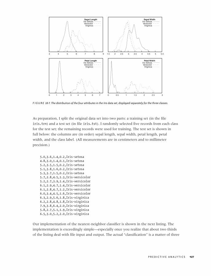
O’Reilly-5980006 master October 28, 2010 21:44
3 4 5 6 7 8 9
Sepal LengthIris SetosaVersicolor
Virginica
1.5 2 2.5 3 3.5 4 4.5 5 5.5
Sepal WidthIris SetosaVersicolor
Virginica
0 1 2 3 4 5 6 7
Petal LengthIris SetosaVersicolor
Virginica
0 0.5 1 1.5 2 2.5 3
Petal WidthIris SetosaVersicolor
Virginica
F I G U R E 18-7. The distribution of the four attributes in the Iris data set, displayed separately for the three classes.
As preparation, I split the original data set into two parts: a training set (in the file
iris.trn) and a test set (in file iris.tst). I randomly selected five records from each class
for the test set; the remaining records were used for training. The test set is shown in
full below: the columns are (in order) sepal length, sepal width, petal length, petal
width, and the class label. (All measurements are in centimeters and to millimeter
precision.)
5.0,3.6,1.4,0.2,Iris-setosa
4.8,3.0,1.4,0.1,Iris-setosa
5.2,3.5,1.5,0.2,Iris-setosa
5.1,3.8,1.6,0.2,Iris-setosa
5.3,3.7,1.5,0.2,Iris-setosa
5.7,2.8,4.5,1.3,Iris-versicolor
5.2,2.7,3.9,1.4,Iris-versicolor
6.1,2.9,4.7,1.4,Iris-versicolor
6.1,2.8,4.7,1.2,Iris-versicolor
6.0,3.4,4.5,1.6,Iris-versicolor
6.3,2.9,5.6,1.8,Iris-virginica
6.2,2.8,4.8,1.8,Iris-virginica
7.9,3.8,6.4,2.0,Iris-virginica
5.8,2.7,5.1,1.9,Iris-virginica
6.5,3.0,5.2,2.0,Iris-virginica
Our implementation of the nearest-neighbor classifier is shown in the next listing. The
implementation is exceedingly simple—especially once you realize that about two thirds
of the listing deal with file input and output. The actual “classification” is a matter of three
P R E D I C T I V E A N A LY T I C S 427

O’Reilly-5980006 master October 28, 2010 21:44
lines in the middle:
# A Nearest-Neighbor Classifier
from numpy import *
train = loadtxt( "iris.trn", delimiter=',', usecols=(0,1,2,3) )
trainlabel = loadtxt( "iris.trn", delimiter=',', usecols=(4,), dtype=str )
test = loadtxt( "iris.tst", delimiter=',', usecols=(0,1,2,3) )
testlabel = loadtxt( "iris.tst", delimiter=',', usecols=(4,), dtype=str )
hit, miss = 0, 0
for i in range( test.shape[0] ):
dist = sqrt( sum( (test[i] - train)**2, axis=1 ) )
k = argmin( dist )
if trainlabel[k] == testlabel[i]:
flag = '+'
hit += 1
else:
flag = '-'
miss += 1
print flag, "\t Predicted: ", trainlabel[k], "\t True: ", testlabel[i]
print hit, "out of", hit+miss, "correct - Accuracy: ", hit/(hit+miss+0.0)
The algorithm loads both the training and the test data set into two-dimensional NumPy
arrays. Because all elements in a NumPy array must be of the same type, we store the
class labels (which are strings, not numbers) in separate vectors.
Now follows the actual classification step: for each element of the test set, we calculate the
Euclidean distance to each element in the training set. We make use of NumPy
“broadcasting” (see the Workshop in Chapter 2) to calculate the distance of the test
instance test[i] from all training instances in one fell swoop. (The argument axis=1 is
necessary to tell NumPy that the sum in the Euclidean distance should be taken over the
inner (horizontal) dimension of the two-dimensional array.) Next, we use the argmin()
function to obtain the index of the training record that has the smallest distance to the
current test record: this is our predicted class label. (Notice that we base our result only on
a single record—namely the closest training instance.)
Simple as it is, the classifier works very well (on this data set). For the test set shown, all
records in the test set are classified correctly!
The naive Bayesian classifier implementation is next. A naive Bayesian classifier needs an
estimate of the probability distribution P(class C | feature x), which we find from a
histogram of attribute values, separately for each class. In this case, we need a total of 12
histograms (3 classes × 4 features). I maintain this data in a triply nested data structure:
histo[label][feature][value]. The first index is the class label, the second index specifies
428 C H A P T E R E I G H T E E N

O’Reilly-5980006 master October 28, 2010 21:44
the feature, and the third contains the values of the feature that occur in the histogram.
The value stored in the histogram is the number of times that each value has been
observed:
# A Naive Bayesian Classifier
total = {} # Training instances per class label
histo = {} # Histogram
# Read the training set and build up a histogram
train = open( "iris.trn" )
for line in train:
# seplen, sepwid, petlen, petwid, label
f = line.rstrip().split( ',' )
label = f.pop()
if not total.has_key( label ):
total[ label ] = 0
histo[ label ] = [ {}, {}, {}, {} ]
# Count training instances for the current label
total[label] += 1
# Iterate over features
for i in range( 4 ):
histo[label][i][f[i]] = 1 + histo[label][i].get( f[i], 0.0 )
train.close()
# Read the test set and evaluate the probabilities
hit, miss = 0, 0
test = open( "iris.tst" )
for line in test:
f = line.rstrip().split( ',' )
true = f.pop()
p = {} # Probability for class label, given the test features
for label in total.keys():
p[label] = 1
for i in range( 4 ):
p[label] *= histo[label][i].get(f[i],0.0)/total[label]
# Find the label with the largest probability
mx, predicted = 0, -1
for k in p.keys():
if p[k] >= mx:
mx, predicted = p[k], k
if true == predicted:
flag = '+'
hit += 1
else:
flag = '-'
miss += 1
P R E D I C T I V E A N A LY T I C S 429

O’Reilly-5980006 master October 29, 2010 17:52
print flag, "\t", true, "\t", predicted, "\t",for label in p.keys():
print label, ":", p[label], "\t",print
print hit, "out of", hit+miss, "correct - Accuracy: ", hit/(hit+miss+0.0)
test.close()
I’d like to point out two implementation details. The first is that the second index is an
integer, which I use instead of the feature names; this simplifies some of the loops in the
program. The second detail is more important: I know that the feature values are given in
centimeters, with exactly one digit after the decimal point. In other words, the values are
already discretized, and so I don’t need to “bin” them any further—in effect, each bin in the
histogram is one millimeter wide. Because I never need to operate on the feature values,
I don’t even convert them to numbers: I read them as strings from file and use them (as
strings) as keys in the histogram. Of course, if we wanted to use a different bin width, then
we would have to convert them into numerical values so that we can operate on them.
In the evaluation part, the program reads data points from the test set and then evaluates
the probability that the record belongs to a certain class for all three class labels. We then
pick the class label that has the highest probability. (Notice that we don’t need an explicit
factor for the prior probability, since we know that each class is equally likely.)
On the test set shown earlier, the Bayesian classifier does a little worse than the nearest
neighbor classifier: it correctly classifies 12 of 15 instances for a total accuracy of 80 percent.
If you look at the results of the classifier more closely, you will immediately notice a
couple of problems that are common with Bayesian classifiers. First of all, the posterior
probabilities are small. This should come as no surprise: each Bayes factor is smaller than 1
(because it’s a probability), so their product becomes very small very quickly. To avoid
underflows, it’s usually a good idea to add the logarithms of the probabilities instead of
multiplying the probabilities directly. In fact, if you have a greater number of features, this
becomes a necessity. The second problem is that many of the posterior probabilities come
out as exactly zero: this occurs whenever no entry in the histogram can be found for at
least one of the feature values in the test record; in this case the histogram evaluates to
zero, which means the entire product of probabilities is also identical to zero. There are
different ways of dealing with this problem—in our case, you might want to experiment
with replacing the histogram of discrete feature values with a kernel density estimate
(similar to those in Figure 18-7), which, by construction, is nonzero everywhere. Keep in
mind that you will need to determine a suitable bandwidth for each histogram!
Let me be clear: the implementations of both classifiers are extremely simpleminded. My
intention here is to demonstrate the basic ideas behind these algorithms in as few lines of
code as possible—and also to show that there is nothing mystical about writing a simple
classifier. Because the implementations are so simple, it is easy to continue experimenting
430 C H A P T E R E I G H T E E N

O’Reilly-5980006 master October 28, 2010 21:44
with them: can we do better if we use a larger number of neighbors in our nearest-
neighbor classifier? How about a different distance function? In the naive Bayesian
classifier, we can experiment with different bin widths in the histogram or, better yet,
replace the histogram of discrete bins with a kernel density estimate. In either case, we
need to start thinking about runtime efficiency: for a data set of only 150 elements this
does not matter much, but evaluating a kernel density estimate of a few thousand points
can be quite expensive!
If you want to use an established tool or library, there are several choices in the open
source world. Three projects have put together entire data analysis and mining
“toolboxes,” complete with graphical user interface, plotting capabilities, and various
plug-ins: RapidMiner (http://rapid-i.com/) and WEKA (http://www.cs.waikato.ac.nz/ml/
weka/), which are both in Java as well as Orange (http://www.ailab.si/orange/), which is in
Python. WEKA has been around for a long time and is very well established; RapidMiner
is part of a more comprehensive tool suite (and includes WEKA as a plug-in). Orange is an
alternative using Python.
All three of these projects use a “pipeline” metaphor: you select different processing steps
(discretizers, smoothers, principal component analysis, regression, classifiers) from a
toolbox and string them together to build up the whole analysis workflow entirely within
the tool. Give it a shot—the idea has a lot of appeal, but I must confess that I have never
succeeded in doing anything nontrivial with any of them!
There are some additional libraries worth checking out that have Python interfaces:
libSVM (http://www.csie.ntu.edu.tw/˜cjlin/libsvm/) and Shogun (http://www.shogun-toolbox
.org/) provide implementations of support vector machines, while the Modular toolkit for
Data Processing (http://mdp-toolkit.sourceforge.net/) is more general. (The latter also adheres
to the “pipeline” metaphor.)
Finally, all classification algorithms are also available as R packages. I’ll mention just three:
the class package for nearest-neighbor classifiers and the rpart package for decision trees
(both part of the R standard distribution) as well as the e1071 package (which can be
found on CRAN) for support vector machines and naive Bayesian classifiers.
Further Reading• Introduction to Data Mining. Pang-Ning Tan, Michael Steinbach, and Vipin Kumar.
Addison-Wesley. 2005.
This is my favorite book on data mining. It contains two accessible chapters on
classification.
• The Elements of Statistical Learning. Trevor Hastie, Robert Tibshirani, and Jerome
Friedman. 2nd ed., Springer. 2009.
This book exemplifies some of the problems with current machine-learning theory: an
entire book of highly nontrivial mathematics—and what feels like not a single
real-world example or discussion of “what to use when.”
P R E D I C T I V E A N A LY T I C S 431

O’Reilly-5980006 master October 28, 2010 21:44

O’Reilly-5980006 master October 28, 2010 21:46
C H A P T E R N I N E T E E N
Epilogue: Facts Are Not Reality
THE LAST (NOT LEAST) IMPORTANT SKILL WHEN WORKING WITH DATA IS TO KEEP IN MIND THAT DATA IS ONLY
part of the picture. In particular, when one is working intensely with data oneself, it is all
too easy to forget that just about everyone else will have a different perspective.
When the data contradicts appearances, appearances will win. Almost always, at least.
Abstract “data” will have little or no credibility when compared with direct, immediate
observation. This has been one of my most common experiences. A manager observes a
pile of defective items—and no amount of “data” will convince him that avoiding those
defects will cost more than the defects themselves. A group of workers spends an
enormous amount of effort on some task—and no amount of “data” will convince them
that their efforts make no measurable difference to the quality of the product.
If something strongly appears to be one way, then it will be very, very difficult to challenge
that appearance based on some abstract analysis—no matter how “hard” your facts may
be.
And it can get ugly. If your case is watertight, so that your analysis cannot be refuted, then
you may next find that your personal credibility or integrity is being challenged.
Never underestimate the persuasive power of appearance.
Data-driven decision making is a contradiction in terms. Making a decision means that
someone must stick his or her neck out and decide. If we wait until the situation is clear or
let “the data” dictate what we do, then there is no longer any decision involved. This also
means that if things don’t turn out well, then nobody will accept the blame (or the
responsibility) for the outcome: after all, we did what “the data” told us to do.
433

O’Reilly-5980006 master October 28, 2010 21:46
It is a fine line. Gut-level decisions can be annoyingly random (this way today, that way
tomorrow). They can also lead to a lack of accountability: “It was my decision to do X that
led to Y!”—without a confirming look at some data, who can say?
Studying data can help us understand the situation in more detail and therefore make
better-informed decisions. On the other hand, data can be misleading in subtle ways. For
instance, by focusing on “data” it is easy to overlook aspects that are important but for
which no data is available (including but not limited to “soft factors”). Also, keep in mind
that data is always backward looking: there is no data available to evaluate any truly novel
idea!
Looking at data can help illuminate the situation and thereby help us make better
decisions. But it should not be used to absolve everyone from taking individual
responsibility.
Sometimes the only reason you need is that it is the right thing to do. Some organizations
feel as if you would not put out a fire in the mail room, unless you first ran a controlled
experiment and developed a business case for the various alternatives. Such an
environment can become frustrating and stifling; if the same approach is being applied to
human factors such as creature comforts (better chairs, larger monitors) or customer
service (“sales don’t dip proportionally if we lower the quality of our product”), then it
can start to feel toxic pretty quickly.
Don’t let “data” get in the way of ethical decisions.
The most important things in life can’t be measured. It is a fallacy to believe that, just
because something can’t be measured, it doesn’t matter or doesn’t even exist. And a pretty
tragic fallacy at that.
434 C H A P T E R N I N T E E N
O’Reilly-5980006 master October 28, 2010 21:48
A P P E N D I X A
Programming Environments forScientific Computation and
Data Analysis
MOST DATA ANALYSIS INVOLVES A GOOD DEAL OF DATA MANIPULATION AND NUMERICAL COMPUTATION. OF
course, we use computers for these tasks, hence we also need appropriate software.
This appendix is intended to give a brief survey of several popular software systems
suitable for the kind of data analysis discussed in the rest of the book. I am mostly
interested in open source software, although I also mention some of the most important
commercial players.
The emphasis here is on programming environments for scientific applications (i.e., libraries
or packages intended for general data manipulation and computation) because being able
to operate with data easily and conveniently is a fundamental capability for all data
analysis efforts. On the other hand, I do not include programs intended exclusively for
graphing data: not because visualization is not important (it is), but because the choice of
plotting or visualization software is less fundamental.
Software Tools
In many ways, our choice of a data manipulation environment determines what problems
we can solve; it certainly determines which problems we consider to be “easy” problems.
For data analysis, the hard problem that we should be grappling with is always the data
and what it is trying to tell us—the mechanics of handling it should be sufficiently
convenient that we don’t even think about them.
Properties I look for in a tool or programming environment include:
• Low overhead or ceremony; it must be easy to get started on a new investigation.
• Facilitates iterative, interactive use.
435

O’Reilly-5980006 master October 28, 2010 21:48
• No arbitrary limitations (within reasonable limits).
• Scriptable—not strictly required but often nice to have.
• Stable, correct, mature; free of random defects and other annoying distractions.
Most of these items are probably not controversial. Given the investigative nature of most
data analysis, the ability to support iterative, interactive use is a requirement. Scriptability
and the absence of arbitrary limitations are both huge enablers. I have been in situations
where the ability to generate and compare hundreds of graphs revealed obvious
similarities and differences that had never been noticed before—not least because
everyone else was using tools (mostly Excel) that allowed graphs to be created only one at
a time. (Excel is notorious for unnecessarily limiting what can be done, and so is SQL.
Putting even minimal programming abilities on top of SQL greatly expands the range of
problems that can be tackled.)
In addition to these rather obvious requirements, I want to emphasize two properties that
may appear less important, but are, in fact, essential for successful data analysis. First, it is
very important that the tool or environment itself does not impose much overhead or
“ceremony”: we will be hesitant to investigate an ad hoc idea if our programming
environment is awkward to use or time-consuming to start. Second, the tool must be
stable and correct. Random defects that we could “work around” if we used it as a
component in a larger software project are unacceptable when we use the tool by itself.
In short: whatever we use for data manipulation must not get in our way! (I consider this
more important than how “sophisticated” the tool or environment might be: a dumb tool
that works is better than a cutting-edge solution that does not deliver—a point that is
occasionally a little bit forgotten.)
Before leaving this section, let me remind you that it is not only the size of the toolbox
that matters but also our mastery of the various elements within it. Only tools we know
well enough that using them feels effortless truly leverage our abilities. Balancing these
opposing trends (breadth of tool selection and depth of mastery) is a constant challenge.
When in doubt, I recommend you opt for depth—superficiality does not pay.
Scientific Software Is Different
It is important to realize that scientific software (for a sufficiently wide definition of
“scientific”) faces some unusual challenges. First of all, scientific software is hard. Writing
high-quality scientific programs is difficult and requires rather rare and specialized skills.
(We’ll come back to this later.) Second, the market for scientific software is small, which
makes it correspondingly harder for any one program or vendor to gain critical mass.
Both of these issues affect all players equally, but a third problem poses a particular
challenge for open source offerings: many users of scientific software are transients.
Graduate students graduate, moving on from their projects and often leaving the research
436 A P P E N D I X A

O’Reilly-5980006 master October 28, 2010 21:48
environment entirely. As a result, “abandonware” is common among open source
scientific software projects. (And not just there—the long-term viability of commercial
offerings is also far from assured.)
Before investing significant time and effort into mastering any one tool, it is therefore
necessary to evaluate it with regard to two questions:
• Is the project of sufficiently high quality?
• Does the project have strong enough momentum and support?
A Catalog of Scientific Software
There are currently three main contenders for interactive, numeric programming
available: Matlab (and its open source clone, Octave), R (and its commercial predecessor,
S/S-Plus), and the NumPy/SciPy set of libraries for Python. Fundamentally, all three are
vector and matrix packages: they treat vectors and matrices as atomic data types and allow
mathematical functions to operate on them directly (addition, multiplication, application
of a function to all elements in a vector or matrix). Besides this basic functionality, all
three offer various other mathematical operations, such as special functions, support for
function minimization, or numerical integration and nonlinear equation solving. It is
important to keep in mind that all three are packages for numerical computations that
operate with floating-point numbers. None of these three packages handles symbolic
computations, such as the expansion of a function into its Taylor series. For this you need
a symbolic math package, such as Mathematica or Maple (both commercial) or Maxima,
Sage, or Axiom (all three open source). (Matlab has recently acquired the ability to
perform symbolic operations as well.)
Matlab
Matlab has been around since the mid-1980s; it has a very large user base, mostly in the
engineering professions but also in pure mathematics and in the machine-learning
community. Rather than do all the heavy lifting itself, Matlab was conceived as a
user-friendly frontend to existing high-performance numerical linear algebra libraries
(LINPACK and EISPACK, which have been replaced by LAPACK). Matlab was one of the
first widely used languages to treat complex data structures (such as vectors and matrices)
as atomic data types, allowing the programmer to work with them as if they were scalar
variables and without the need for explicit looping. (In this day and age, when
object-oriented programming and operator overloading are commonly used and entirely
mainstream, it is hard to imagine how revolutionary this concept seemed when it was first
developed.*) In 2008, The MathWorks (the company that develops Matlab) acquired the
*I remember how blown away I personally was when I first read about such features in the programminglanguage APL in the mid-1980s!
P R O G R A M M I N G E N V I R O N M E N T S F O R S C I E N T I F I C C O M P U TAT I O N A N D D ATA A N A LY S I S 437

O’Reilly-5980006 master October 28, 2010 21:48
rights to the symbolic math package MuPAD and incorporated it into subsequent Matlab
releases.
Matlab was mainly designed to be used interactively, and its programming model has
serious deficiencies for larger programming projects. (There are problems with abstraction
and encapsulation as well as memory management issues.) It is a commercial product but
quite reasonably priced.
Matlab places particular emphasis on the quality of its numerical and floating-point
algorithms and implementations.
There is an open source clone of Matlab called Octave. Octave (http://www.gnu.org/
software/octave/) strives to be fully compatible; however, there are reports of difficulties
when porting programs back and forth.
R
R is the open source clone of the S/S-Plus statistical package originally developed at Bell
Labs. R (http://www.r-project.org) has a very large user base, mostly in the academic statistics
community and a healthy tradition of user-contributed packages. The Comprehensive R
Archive Network (CRAN) is a large central repository of user-contributed modules.
When first conceived, S was revolutionary in providing an integrated system for data
analysis, including capabilities that we today associate with scripting languages (built-in
support for strings, hash maps, easy file manipulations, and so on), together with
extensive graphics functionality—and all that in an interactive environment! On the other
hand, S was not conceived as a general-purpose programming language but is strongly
geared toward statistical applications. Its programming model is quite different from
current mainstream languages, which can make it surprisingly difficult for someone with
a strong programming background to switch to S (or R). Finally, its primarily academic
outlook makes for a sometimes awkward fit within a commercial enterprise
environment.
The strongest feature of R is the large number of built-in (or user-contributed) functions
for primarily statistical calculations. In contrast to Matlab, R is not intended as a general
numerical workbench (although it can, with some limitations, be used for that purpose).
Moreover—and perhaps contrary to expectations—it is not intended as a general-purpose
data manipulation language, although it can serve as scripting language for text and file
manipulations and similar tasks.
A serious problem when working with R is its dated programming model. It relies strongly
on implicit behavior and “reasonable defaults,” which leads to particularly opaque
programs. Neither the language nor the libraries provide strong support for organizing
information into larger structures, making it uncommonly difficult to locate pertinent
information. Although it is easy to pick up isolated “tricks,” it is notoriously difficult to
develop a comprehensive understanding of the whole environment.
438 A P P E N D I X A

O’Reilly-5980006 master October 28, 2010 21:48
Like Matlab, R is here to stay. It has proven its worth (for 30 years!); it is mature; and it
has a strong, high-caliber, and vocal user base. Unlike Matlab, it is free and open source,
making it easy to get started.
Python
Python has become the scripting language of choice for scientists and scientific
applications, especially in the machine-learning field and in the biological and social
sciences. (Hard-core, large-scale numerical applications in physics and related fields
continue to be done in C/C++ or even—horresco referens—in Fortran.)
The barrier to programming in Python is low, which makes it easy to start new projects.
This is somewhat of a mixed blessing: on the one hand, there is an abundance of exciting
Python projects out there; on the other hand, they seem to be particularly prone to the
“abandonware” problem mentioned before. Also, scientists are not programmers, and it
often shows (especially with regard to long-term, architectural vision and the cultivation
of a strong and committed community).
In addition to a large number of smaller and more specialized projects, there have been
five major attempts to provide a comprehensive Python library for scientific applications. It
can be confusing to understand how they relate to each other, so they are summarized
here:*
NumericThis is the original Python module for the manipulation of numeric arrays, initiated in
1995 at MIT. Superceded by NumPy.
NumarrayAn alternative implementation from the Space Telescope Science Institute (2001).
Considered obsolete, replaced by NumPy.
NumPyThe NumPy project was begun in 2005 to provide a unified framework for numerical
matrix calculations. NumPy builds on (and supercedes) Numeric, and it includes the
additional functionality developed by numarray.
SciPyStarted in 2001, the SciPy project evolved out of an effort to combine several
previously separate libraries for scientific computing. Builds on and includes NumPy.
ScientificPythonAn earlier (started in 1997) general-purpose library for scientific applications. In
contrast to SciPy, this library tries to stay with “pure Python” implementations for
better portability.
*For more information on the history and interrelations of these libraries, check out the first chapterin Travis B. Oliphant’s “Guide to NumPy,” which can be found on the Web.
P R O G R A M M I N G E N V I R O N M E N T S F O R S C I E N T I F I C C O M P U TAT I O N A N D D ATA A N A LY S I S 439

O’Reilly-5980006 master October 28, 2010 21:48
Today, the NumPy/SciPy project has established itself as the clear winner among
general-purpose libraries for scientific applications in Python, and we will take a closer
look at it shortly.
A strong point in favor of Python is the convenient support it has for relatively fancy and
animated graphics. The matplotlib library is the most commonly used Python library for
generating standard plots, and it has a particularly close relationship with NumPy/SciPy.
Besides matplotlib there are Chaco and Mayavi (for two- and three-dimensional graphics,
respectively) and libraries such as PyGame and Pyglet (for animated and interactive
graphics)—and, of course, many more.
Uncertainties associated with the future and adoption of Python3 affect all Python
projects, but they are particularly critical for many of the scientific and graphics libraries
just mentioned: to achieve higher performance, these libraries usually rely heavily on C
bindings, which do not port easily to Python3. Coupled with the issue of “abandonware”
discussed earlier, this poses a particular challenge for all scientific libraries based on
Python at this time.
NumPy/SciPy
The NumPy/SciPy project (http://www.scipy.org) has become the dominant player in
scientific programming for Python. NumPy provides efficient vector and matrix
operations; SciPy consists of a set of higher-level functions built on top of NumPy.
Together with the matplotlib graphing library and the IPython interactive shell,
NumPy/SciPy provides functionality resembling Matlab. NumPy/SciPy is open source
(BSD-style license) and has a large user community; it is supported and distributed by a
commercial company (Enthought).
NumPy is intended to contain low-level routines for handling vectors and matrices, and
SciPy is meant to contain all higher-level functionality. However, some additional
functions are included in NumPy for backward compatibility, and all NumPy functions are
aliased into the SciPy namespace for convenience. As a result, the distinction between
NumPy and SciPy is not very clear in practice.
NumPy/SciPy can be a lot of fun. It contains a wide selection of features and is very easy
to get started with. Creating graphical output is simple. Since NumPy/SciPy is built on
Python, it is trivial to integrate it into other software projects. Moreover, it does not
require you to learn (yet another) restricted, special-purpose language: everything is
accessible from a modern, widely used scripting language.
On the other hand, NumPy/SciPy has its own share of problems. The project has a
tendency to emphasize quantity over quality: the number of features is very large, but the
design appears overly complicated and is often awkward to use. Edge and error cases are
not always handled properly. On the scientific level, NumPy/SciPy feels amateurish. The
choice of algorithms appears to reflect some well-known textbooks more than deep,
practical knowledge arising from real experience.
440 A P P E N D I X A

O’Reilly-5980006 master October 28, 2010 21:48
What worries me most is that the project does not seem to be managed very well:
although it has been around for nearly 10 years and has a large and active user base, it has
apparently not been able to achieve and maintain a consistent level of reliability and
maturity throughout. Features seem to be added haphazardly, without any long-term
vision or discernible direction. Despite occasional efforts in this regard, the documentation
remains patchy.
NumPy/SciPy is interesting because, among scientific and numeric projects, it probably
has the lowest barrier to entry and is flexible and versatile. That makes it a convenient
environment for getting started and for casual use. However, because of the overall
quality issues, I would not want to rely on it for “serious” production work at this
point.
What About Java?
Java is not a strong player when it comes to heavily numerical computations—so much so
that a Java Numerics Working Group ceased operations years ago (around the year 2002)
for lack of interest.
Nevertheless, a lot of production-quality machine-learning programming is done in Java,
where its relatively convenient string handling (compared to C) and its widespread use for
enterprise programming come into play. One will have to see whether these applications
will over time lead to the development of high-quality numerical libraries as well.
If you want a comfortable programming environment for large (possibly distributed)
systems that’s relatively fast, then Java is a reasonable choice. However, Java
programming has become very heavy-weight (with tools to manage your frameworks,
and so on), which does not encourage ad hoc, exploratory programming. Groovy carries
less programming overhead but is slow. A last issue concerns Java’s traditionally weak
capabilities for interactive graphics and user interfaces, especially on Linux.
Java is very strong in regard to Big Data; in particular, Hadoop—the most popular open
source map/reduce implementation—is written in Java. Java is also popular for text
processing and searching.
A relatively new project is Incanter (http://incanter.org/), which uses Clojure (a Lisp dialect
running on top of the Java virtual machine) to develop an “R-like statistical computing
and graphics environment.” Incanter is an interesting project, but I don’t feel that it has
stood the test of time yet, and one will have to see how it will position itself with respect
to R.
Other Players
The preceding list of programs and packages is, of course, far from complete. Among the
other players, I shall briefly mention three.
P R O G R A M M I N G E N V I R O N M E N T S F O R S C I E N T I F I C C O M P U TAT I O N A N D D ATA A N A LY S I S 441

O’Reilly-5980006 master October 28, 2010 21:48
SAS SAS is a classical statistics packages with strongly established uses in credit scoring
and medical trials. SAS was originally developed for OS/360 mainframes, and it shows. Its
command language has a distinct 1960s feel, and the whole development cycle is strongly
batch oriented (neither interactive nor exploratory). SAS works best when well-defined
procedures need to be repeated often and on large data sets. A unique feature of SAS is
that it works well with data sets that are too large to fit into memory and therefore need
to be processed on disk.
SAS, like the mainframes it used to run on, is very expensive and requires specially trained
operators—it is not for the casual user. (It is not exactly fun, either. The experience has
been described as comparable to “scraping down the wallpaper with your fingernails.”)
SciLab SciLab is an open source project similar to Matlab. It was created by the French
research institute INRIA.
GSL The GSL (Gnu Scientific Library) is a C library for classical numerical analysis:
special functions, linear algebra, nonlinear equations, differential equations, the lot. The
GSL was designed and implemented by a relatively small team of developers, who clearly
knew what they were doing—beyond the standard textbook treatment. (This is evident
from some design choices that specifically address ugly but important real-world needs.)
The API is wonderfully clear and consistent, the implementations are of high quality, and
even the documentation is complete and finished. I find the GSL thoroughly enjoyable to
use. (If you learned numerical analysis from Numerical Recipes,* this is the software that
should have shipped with the book—but didn’t.)
The only problem with the GSL is that it is written in C. You need to be comfortable with
C programming, including memory management and function pointers, if you want to
use it. Bindings to scripting languages exist, but they are not part of the core project and
may not be as complete or mature as the GSL itself.
Recommendations
So, which to pick? No clear winner emerges, and every single program or environment
has significant (not just superficial) drawbacks. However, here are some qualified
recommendations:
• Matlab is the 800-pound gorilla of scientific software. As a commercially developed
product, it also has a certain amount of “polish” that many open source alternatives
*Numerical Recipes 3rd Edition: The Art of Scientific Computing. William H. Press, Saul A. Teukolsky, WilliamT. Vetterling, and Brian P. Flannery. Cambridge University Press. 2007.
442 A P P E N D I X A

O’Reilly-5980006 master October 28, 2010 21:48
lack. If you don’t have a preferred programming environment yet, and if you can afford
it (or can make your employer pay for it), then Matlab is probably the most
comprehensive, most mature, and best supported all-purpose tool. Octave is a cheap
way to get started and “try before you buy.”
• If you work with statisticians or have otherwise a need for formal statistical methods
(tests, models), then R is a serious contender. It can also stand in as a scripting
language for data manipulation if you don’t already have a favorite one yet. Since it is
open source software, its financial cost to you is zero, but be prepared for a significant
investment of time and effort before you start feeling comfortable and proficient.
• NumPy/SciPy is particularly easy to get started with and can be a lot of fun for casual
use. However, you may want to evaluate carefully whether it will meet your needs in
the long run if you are planning to use it for a larger or more demanding project.
• NumPy/SciPy, together with some of its associated graphics packages, is also of interest
if you have a need for fancier, possibly interactive, graphics.
• If you have a need for serious numerical analysis and you know C well, then the GSL is
a mature, high-quality library.
I am well aware that this list of options does not cover all possibilities that may occur in
practice!
Writing Your Own
Given the fragmented tool situation, it may be tempting to write your own. There is
nothing wrong with that: it can be very effective to write a piece of software specifically
for your particular problem and application domain. It is much harder to write
general-purpose scientific software.
Just how much harder is generally underappreciated. When P. J. Plauger worked on his
reference implementation of the standard C library,* he found that he “spent about as
much time writing and debugging the functions declared in <math.h> as [he] did all the
rest of this library combined”! Plauger then went on to state his design goals for his
implementation of those functions.
This should startle you: design goals? Why should a reference implementation need any
design goals beyond faithfully and correctly representing the standard?
The reason is that scientific and numerical routines can fail in more ways than most people
expect. For such routines, correctness is not so much a binary property, as a floating-point
value itself. Numerical routines have more complicated contracts than strlen(char *).
*The Standard C Library. P. J. Plauger. Prentice Hall. 1992.
P R O G R A M M I N G E N V I R O N M E N T S F O R S C I E N T I F I C C O M P U TAT I O N A N D D ATA A N A LY S I S 443

O’Reilly-5980006 master October 28, 2010 21:48
My prime example for this kind of problem is the sine function. What could possibly go
wrong with it? It is analytic everywhere, strictly bounded by [−1, 1], perfectly smooth,
and with no weird behavior anywhere. Nonetheless, it is impossible to evaluate the sine
accurately for sufficiently large values of x . The reason is that the sine sweeps out its
entire range of values when x changes by as little as 2π . Today’s floating-point values
carry about 16 digits of precision. Once x has become so large that all of these digits are
required to represent the value of x to the left of the decimal point, we are no longer able
to resolve the location of x within the interval of length 2π with sufficient precision to be
meaningful—hence the “value” returned by sin(x) is basically random. In practice, the
quality of the results starts to degrade long before we reach this extreme regime. (More
accurately the problem lies not so much in the implementation of the sine but in the
inability to express its input values with the precision required for obtaining a meaningful
result. This makes no difference for the present argument.)
There are two points to take away here. First, note how “correctness” is a relative quality
that can degrade smoothly depending on circumstances (i.e., the inputs). Second, you
should register the sense of surprise that a function, which in mathematical theory is
perfectly harmless, can turn nasty in the harsh reality of a computer program!
Similar examples can be found all over and are not limited to function evaluations. In
particular for iterative algorithms (and almost all numerical algorithms are iterative), one
needs to monitor and confirm that all intermediate values are uncorrupted—even in cases
where the final result is perfectly reasonable. (This warning applies to many matrix
operations, for instance.)
The punch line here is that although it is often not hard to produce an implementation
that works well for a limited set of input values and in a narrow application domain, it is
much more difficult to write routines that work equally well for all possible arguments. It
takes a lot of experience to anticipate all possible applications and provide built-in
diagnostics for likely failure modes. If at all possible, leave this work to specialists!
Further Reading
Matlab
• Numerical Computing with MATLAB. Cleve B. Moler. Revised reprint, SIAM. 2008.
The literature on Matlab is vast. I mention this title because its author is Cleve Moler,
the guy who started it all.
R
• A Beginner’s Guide to R. Alain F. Zuur, Elena N. Ieno, and Erik H. W. G. Meesters.
Springer. 2009.
Probably the most elementary introduction into the mechanics of R. A useful book to
get started, but it won’t carry you very far. Obviously very hastily produced.
444 A P P E N D I X A

O’Reilly-5980006 master October 28, 2010 21:48
• R in a Nutshell. Joseph Adler. O’Reilly. 2009.
This is the first book on R that is organized by the task that you want to perform. This
makes it an invaluable resource in those situations where you know exactly what you
want to do but can’t find the appropriate commands that will tell R how to do it. The
first two thirds of the book address data manipulation, programming, and graphics in
general; the remainder is about statistical methods.
• Using R for Introductory Statistics. John Verzani. Chapman & Hall/CRC. 2004.
This is probably my favorite introductory text on how to perform basic statistical
analysis using R.
NumPy/SciPy
There is no comprehensive introduction to NumPy/SciPy currently available that takes a
user’s perspective. (The “Guide to NumPy” by Travis Oliphant, which can be found on the
NumPy website, is too concerned with implementation issues.) Some useful bits, together
with an introduction to Python and some other libraries, can be found in either of the
following two books.
• Python Scripting for Computational Science. Hans Petter Langtangen. 3rd ed., Springer.
2009.
• Beginning Python Visualization: Crafting Visual Transformation Scripts. Shai Vaingast. Apress.
2009.
P R O G R A M M I N G E N V I R O N M E N T S F O R S C I E N T I F I C C O M P U TAT I O N A N D D ATA A N A LY S I S 445

O’Reilly-5980006 master October 28, 2010 21:48

O’Reilly-5980006 master October 28, 2010 21:54
A P P E N D I X B
Results from Calculus
IN THIS APPENDIX, WE REVIEW SOME OF THE RESULTS FROM CALCULUS THAT ARE EITHER NEEDED EXPLICITLY IN
the main part of the book or are conceptually sufficiently important when doing data
analysis and mathematical modeling that you should at least be aware that they exist.
Obviously, this appendix cannot replace a class (or two) in beginning and intermediate
calculus, and this is also not the intent. Instead, this appendix should serve as a reminder
of things that you probably know already. More importantly, the results are presented
here in a slightly different context than usual. Calculus is generally taught with an eye
toward the theoretical development—it has to be, because the intent is to teach the entire
body of knowledge of calculus and therefore the theoretical development is most
important. However, for applications you need a different sort of tricks (based on the same
fundamental techniques, of course), and it generally takes years of experience to make out
the tricks from the theory. This appendix assumes that you have seen the theory at least
once, so I am just reminding you of it, but I want to emphasize those elementary
techniques that are most useful in applications of the kind explained in this book.
This appendix is also intended as somewhat of a teaser: I have included some results that
are particularly interesting, noteworthy, or fascinating as an invitation for further study.
The structure of this appendix is as follows:
1. To get a head start, we first look at some common functions and their graphs.
2. Then we discuss the core concepts of calculus proper: derivative, integral, limit.
3. Next I mention a few practical tricks and techniques that are frequently useful.
447
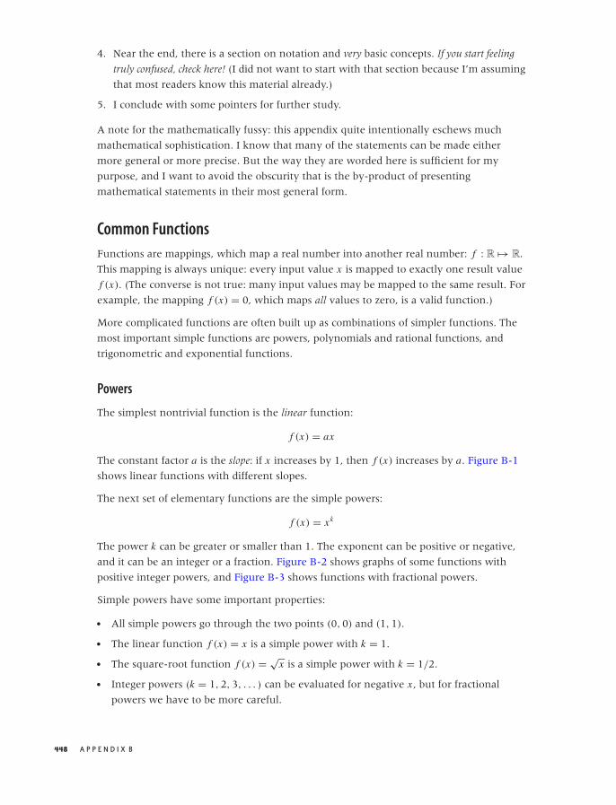
O’Reilly-5980006 master October 28, 2010 21:54
4. Near the end, there is a section on notation and very basic concepts. If you start feeling
truly confused, check here! (I did not want to start with that section because I’m assuming
that most readers know this material already.)
5. I conclude with some pointers for further study.
A note for the mathematically fussy: this appendix quite intentionally eschews much
mathematical sophistication. I know that many of the statements can be made either
more general or more precise. But the way they are worded here is sufficient for my
purpose, and I want to avoid the obscurity that is the by-product of presenting
mathematical statements in their most general form.
Common Functions
Functions are mappings, which map a real number into another real number: f : R �→ R.
This mapping is always unique: every input value x is mapped to exactly one result value
f (x). (The converse is not true: many input values may be mapped to the same result. For
example, the mapping f (x) = 0, which maps all values to zero, is a valid function.)
More complicated functions are often built up as combinations of simpler functions. The
most important simple functions are powers, polynomials and rational functions, and
trigonometric and exponential functions.
Powers
The simplest nontrivial function is the linear function:
f (x) = ax
The constant factor a is the slope: if x increases by 1, then f (x) increases by a. Figure B-1
shows linear functions with different slopes.
The next set of elementary functions are the simple powers:
f (x) = xk
The power k can be greater or smaller than 1. The exponent can be positive or negative,
and it can be an integer or a fraction. Figure B-2 shows graphs of some functions with
positive integer powers, and Figure B-3 shows functions with fractional powers.
Simple powers have some important properties:
• All simple powers go through the two points (0, 0) and (1, 1).
• The linear function f (x) = x is a simple power with k = 1.
• The square-root function f (x) = √x is a simple power with k = 1/2.
• Integer powers (k = 1, 2, 3, . . . ) can be evaluated for negative x , but for fractional
powers we have to be more careful.
448 A P P E N D I X B
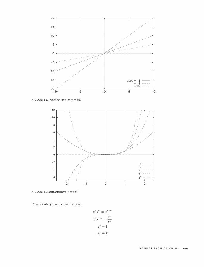
O’Reilly-5980006 master October 28, 2010 21:54
-20
-15
-10
-5
0
5
10
15
20
-10 -5 0 5 10
slope = 1 = 2 = 1/2
F I G U R E B-1. The linear function y = ax .
-6
-4
-2
0
2
4
6
8
10
12
-2 -1 0 1 2
x2
x3
x4
x5
F I G U R E B-2. Simple powers: y = axk .
Powers obey the following laws:
xn xm = xn+m
xn x−m = xn
xm
x0 = 1
x1 = x
R E S U LT S F R O M C A L C U L U S 449
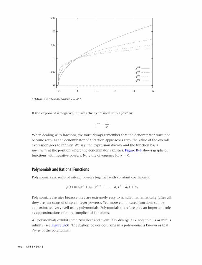
O’Reilly-5980006 master October 28, 2010 21:54
0
0.5
1
1.5
2
2.5
0 1 2 3 4 5
x1/2
x1/3
x1/4
x1/5
F I G U R E B-3. Fractional powers: y = a p/q .
If the exponent is negative, it turns the expression into a fraction:
x−n = 1
xn
When dealing with fractions, we must always remember that the denominator must not
become zero. As the denominator of a fraction approaches zero, the value of the overall
expression goes to infinity. We say: the expression diverges and the function has a
singularity at the position where the denominator vanishes. Figure B-4 shows graphs of
functions with negative powers. Note the divergence for x = 0.
Polynomials and Rational Functions
Polynomials are sums of integer powers together with constant coefficients:
p(x) = an xn + an−1xn−1 + · · · + a2x2 + a1x + a0
Polynomials are nice because they are extremely easy to handle mathematically (after all,
they are just sums of simple integer powers). Yet, more complicated functions can be
approximated very well using polynomials. Polynomials therefore play an important role
as approximations of more complicated functions.
All polynomials exhibit some “wiggles” and eventually diverge as x goes to plus or minus
infinity (see Figure B-5). The highest power occurring in a polynomial is known as that
degree of the polynomial.
450 A P P E N D I X B
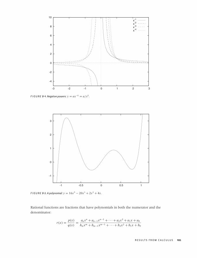
O’Reilly-5980006 master October 28, 2010 21:54
-4
-2
0
2
4
6
8
10
-3 -2 -1 0 1 2 3
x-1
x-2
x-3
x-4
F I G U R E B-4. Negative powers: y = ax−k = a/xk .
-1
0
1
2
3
-1 -0.5 0 0.5 1
F I G U R E B-5. A polynomial: y = 16x5 − 20x3 + 2x2 + 4x .
Rational functions are fractions that have polynomials in both the numerator and the
denominator:
r(x) = p(x)
q(x)= an xn + an−1xn−1 + · · · + a2x2 + a1x + a0
bm xm + bm−1xm−1 + · · · + b2x2 + b1x + b0
R E S U LT S F R O M C A L C U L U S 451
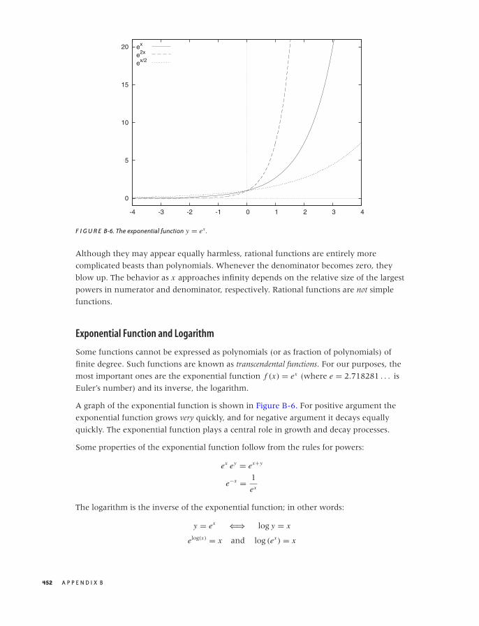
O’Reilly-5980006 master October 28, 2010 21:54
0
5
10
15
20
-4 -3 -2 -1 0 1 2 3 4
ex
e2x
ex/2
F I G U R E B-6. The exponential function y = ex .
Although they may appear equally harmless, rational functions are entirely more
complicated beasts than polynomials. Whenever the denominator becomes zero, they
blow up. The behavior as x approaches infinity depends on the relative size of the largest
powers in numerator and denominator, respectively. Rational functions are not simple
functions.
Exponential Function and Logarithm
Some functions cannot be expressed as polynomials (or as fraction of polynomials) of
finite degree. Such functions are known as transcendental functions. For our purposes, the
most important ones are the exponential function f (x) = ex (where e = 2.718281 . . . is
Euler’s number) and its inverse, the logarithm.
A graph of the exponential function is shown in Figure B-6. For positive argument the
exponential function grows very quickly, and for negative argument it decays equally
quickly. The exponential function plays a central role in growth and decay processes.
Some properties of the exponential function follow from the rules for powers:
ex ey = ex+y
e−x = 1
ex
The logarithm is the inverse of the exponential function; in other words:
y = ex ⇐⇒ log y = x
elog(x) = x and log (ex ) = x
452 A P P E N D I X B
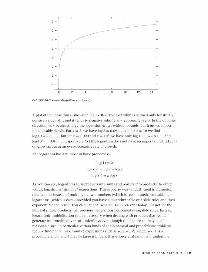
O’Reilly-5980006 master October 28, 2010 21:54
-4
-3
-2
-1
0
1
2
3
0 2 4 6 8 10 12 14
F I G U R E B-7. The natural logarithm: y = log(x).
A plot of the logarithm is shown in Figure B-7. The logarithm is defined only for strictly
positive values of x , and it tends to negative infinity as x approaches zero. In the opposite
direction, as x becomes large the logarithm grows without bounds, but it grows almost
unbelievably slowly. For x = 2, we have log 2 = 0.69 . . . and for x = 10 we find
log 10 = 2.30 . . . , but for x = 1,000 and x = 106 we have only log 1000 = 6.91 . . . and
log 106 = 13.81 . . . , respectively. Yet the logarithm does not have an upper bound: it keeps
on growing but at an ever-decreasing rate of growth.
The logarithm has a number of basic properties:
log(1) = 0
log(x y) = log x + log y
log(xk) = k log x
As you can see, logarithms turn products into sums and powers into products. In other
words, logarithms “simplify” expressions. This property was (and is!) used in numerical
calculations: instead of multiplying two numbers (which is complicated), you add their
logarithms (which is easy—provided you have a logarithm table or a slide rule) and then
exponentiate the result. This calculational scheme is still relevant today, but not for the
kinds of simple products that previous generations performed using slide rules. Instead,
logarithmic multiplication can be necessary when dealing with products that would
generate intermediate over- or underflows even though the final result may be of
reasonable size. In particular, certain kinds of combinatorial and probabilistic problems
require finding the maximum of expressions such as pn(1 − p)k , where p < 1 is a
probability and n and k may be large numbers. Brute-force evaluation will underflow
R E S U LT S F R O M C A L C U L U S 453
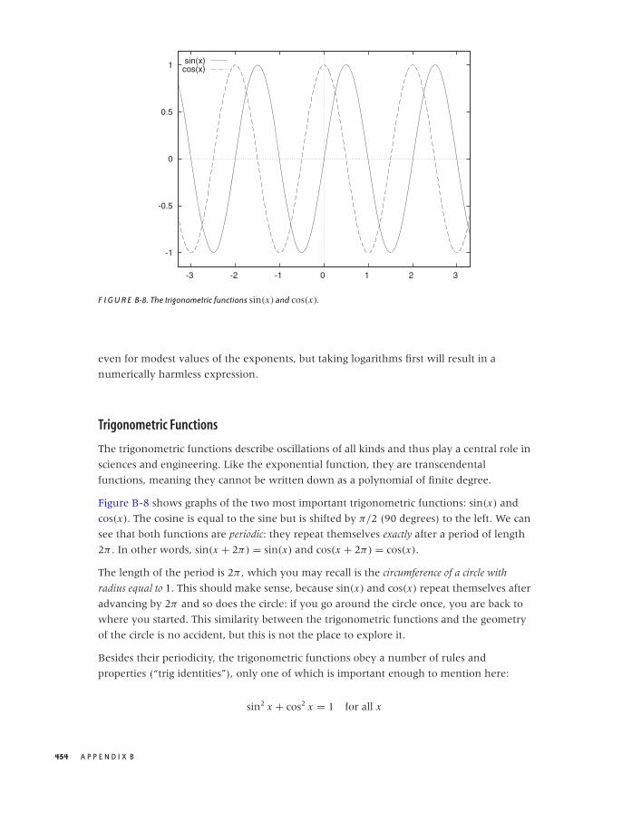
O’Reilly-5980006 master October 28, 2010 21:54
-1
-0.5
0
0.5
1
-3 -2 -1 0 1 2 3
sin(x)cos(x)
F I G U R E B-8. The trigonometric functions sin(x) and cos(x).
even for modest values of the exponents, but taking logarithms first will result in a
numerically harmless expression.
Trigonometric Functions
The trigonometric functions describe oscillations of all kinds and thus play a central role in
sciences and engineering. Like the exponential function, they are transcendental
functions, meaning they cannot be written down as a polynomial of finite degree.
Figure B-8 shows graphs of the two most important trigonometric functions: sin(x) and
cos(x). The cosine is equal to the sine but is shifted by π/2 (90 degrees) to the left. We can
see that both functions are periodic: they repeat themselves exactly after a period of length
2π . In other words, sin(x + 2π) = sin(x) and cos(x + 2π) = cos(x).
The length of the period is 2π , which you may recall is the circumference of a circle with
radius equal to 1. This should make sense, because sin(x) and cos(x) repeat themselves after
advancing by 2π and so does the circle: if you go around the circle once, you are back to
where you started. This similarity between the trigonometric functions and the geometry
of the circle is no accident, but this is not the place to explore it.
Besides their periodicity, the trigonometric functions obey a number of rules and
properties (“trig identities”), only one of which is important enough to mention here:
sin2 x + cos2 x = 1 for all x
454 A P P E N D I X B
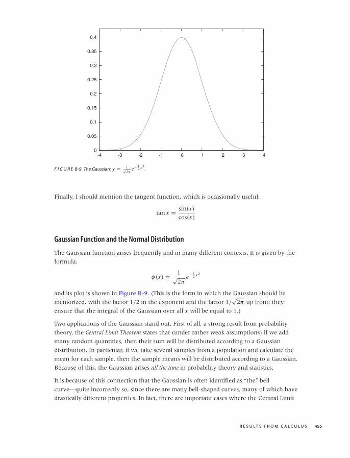
O’Reilly-5980006 master October 28, 2010 21:54
0
0.05
0.1
0.15
0.2
0.25
0.3
0.35
0.4
-4 -3 -2 -1 0 1 2 3 4
F I G U R E B-9. The Gaussian: y = 1√2π
e− 12 x2
.
Finally, I should mention the tangent function, which is occasionally useful:
tan x = sin(x)
cos(x)
Gaussian Function and the Normal Distribution
The Gaussian function arises frequently and in many different contexts. It is given by the
formula:
φ(x) = 1√2π
e− 12 x2
and its plot is shown in Figure B-9. (This is the form in which the Gaussian should be
memorized, with the factor 1/2 in the exponent and the factor 1/√
2π up front: they
ensure that the integral of the Gaussian over all x will be equal to 1.)
Two applications of the Gaussian stand out. First of all, a strong result from probability
theory, the Central Limit Theorem states that (under rather weak assumptions) if we add
many random quantities, then their sum will be distributed according to a Gaussian
distribution. In particular, if we take several samples from a population and calculate the
mean for each sample, then the sample means will be distributed according to a Gaussian.
Because of this, the Gaussian arises all the time in probability theory and statistics.
It is because of this connection that the Gaussian is often identified as “the” bell
curve—quite incorrectly so, since there are many bell-shaped curves, many of which have
drastically different properties. In fact, there are important cases where the Central Limit
R E S U LT S F R O M C A L C U L U S 455
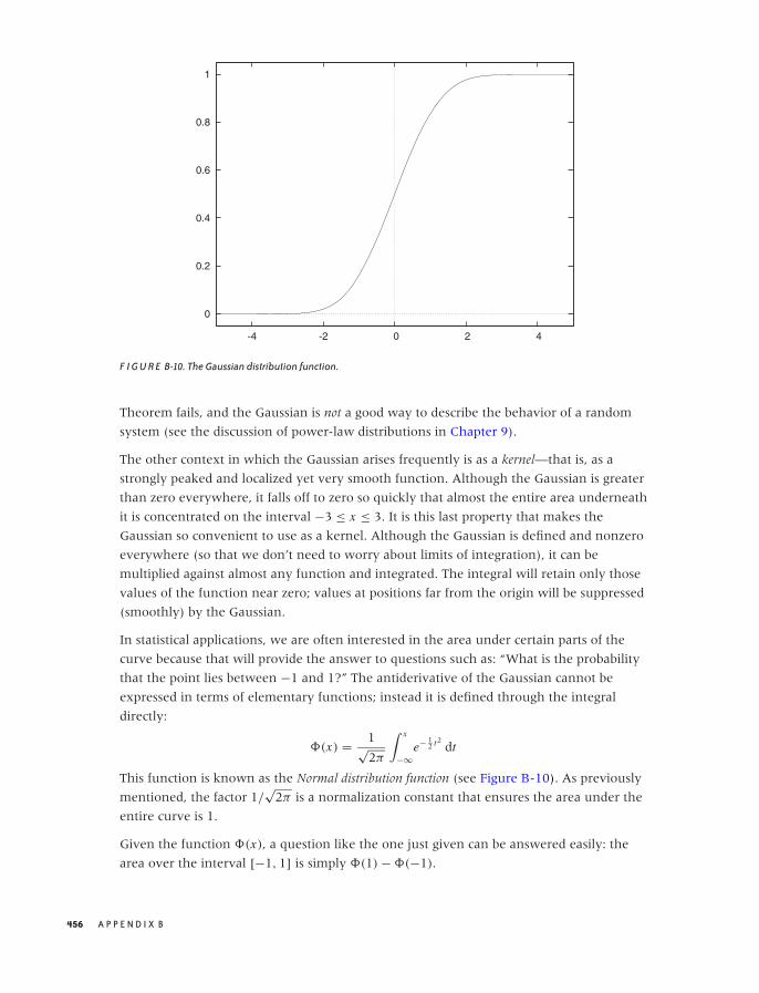
O’Reilly-5980006 master October 28, 2010 21:54
0
0.2
0.4
0.6
0.8
1
-4 -2 0 2 4
F I G U R E B-10. The Gaussian distribution function.
Theorem fails, and the Gaussian is not a good way to describe the behavior of a random
system (see the discussion of power-law distributions in Chapter 9).
The other context in which the Gaussian arises frequently is as a kernel—that is, as a
strongly peaked and localized yet very smooth function. Although the Gaussian is greater
than zero everywhere, it falls off to zero so quickly that almost the entire area underneath
it is concentrated on the interval −3 ≤ x ≤ 3. It is this last property that makes the
Gaussian so convenient to use as a kernel. Although the Gaussian is defined and nonzero
everywhere (so that we don’t need to worry about limits of integration), it can be
multiplied against almost any function and integrated. The integral will retain only those
values of the function near zero; values at positions far from the origin will be suppressed
(smoothly) by the Gaussian.
In statistical applications, we are often interested in the area under certain parts of the
curve because that will provide the answer to questions such as: “What is the probability
that the point lies between −1 and 1?” The antiderivative of the Gaussian cannot be
expressed in terms of elementary functions; instead it is defined through the integral
directly:
�(x) = 1√2π
∫ x
−∞e− 1
2 t2dt
This function is known as the Normal distribution function (see Figure B-10). As previously
mentioned, the factor 1/√
2π is a normalization constant that ensures the area under the
entire curve is 1.
Given the function �(x), a question like the one just given can be answered easily: the
area over the interval [−1, 1] is simply �(1) − �(−1).
456 A P P E N D I X B
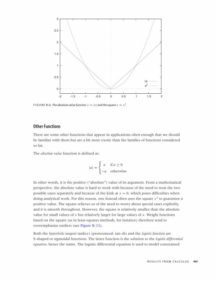
O’Reilly-5980006 master October 28, 2010 21:54
0
0.5
1
1.5
2
2.5
3
-2 -1.5 -1 -0.5 0 0.5 1 1.5 2
|x|
x2
F I G U R E B-11. The absolute value function y = |x | and the square y = x2.
Other Functions
There are some other functions that appear in applications often enough that we should
be familiar with them but are a bit more exotic than the families of functions considered
so far.
The absolute value function is defined as:
|a| =⎧⎨
⎩a if a ≥ 0
−a otherwise
In other words, it is the positive (“absolute”) value of its argument. From a mathematical
perspective, the absolute value is hard to work with because of the need to treat the two
possible cases separately and because of the kink at x = 0, which poses difficulties when
doing analytical work. For this reason, one instead often uses the square x2 to guarantee a
positive value. The square relieves us of the need to worry about special cases explicitly,
and it is smooth throughout. However, the square is relatively smaller than the absolute
value for small values of x but relatively larger for large values of x . Weight functions
based on the square (as in least-squares methods, for instance) therefore tend to
overemphasize outliers (see Figure B-11).
Both the hyperbolic tangent tanh(x) (pronounced: tan-sh) and the logistic function are
S-shaped or sigmoidal functions. The latter function is the solution to the logistic differential
equation, hence the name. The logistic differential equation is used to model constrained
R E S U LT S F R O M C A L C U L U S 457
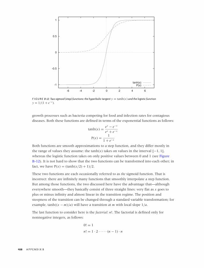
O’Reilly-5980006 master October 28, 2010 21:54
-1
-0.5
0
0.5
1
-6 -4 -2 0 2 4 6
tanh(x)P(x)
F I G U R E B-12. Two sigmoid (step) functions: the hyperbolic tangent y = tanh(x) and the logistic functiony = 1/(1 + e−x ).
growth processes such as bacteria competing for food and infection rates for contagious
diseases. Both these functions are defined in terms of the exponential functions as follows:
tanh(x) = ex − e−x
ex + e−x
P(x) = 1
1 + e−x
Both functions are smooth approximations to a step function, and they differ mostly in
the range of values they assume: the tanh(x) takes on values in the interval [−1, 1],
whereas the logistic function takes on only positive values between 0 and 1 (see Figure
B-12). It is not hard to show that the two functions can be transformed into each other; in
fact, we have P(x) = (tanh(x/2) + 1)/2.
These two functions are each occasionally referred to as the sigmoid function. That is
incorrect: there are infinitely many functions that smoothly interpolate a step function.
But among those functions, the two discussed here have the advantage that—although
everywhere smooth—they basically consist of three straight lines: very flat as x goes to
plus or minus infinity and almost linear in the transition regime. The position and
steepness of the transition can be changed through a standard variable transformation; for
example, tanh((x − m)/a) will have a transition at m with local slope 1/a.
The last function to consider here is the factorial: n!. The factorial is defined only for
nonnegative integers, as follows:
0! = 1
n! = 1 · 2 · · · · · (n − 1) · n
458 A P P E N D I X B
O’Reilly-5980006 master October 28, 2010 21:54
The factorial plays an important role in combinatorial problems, since it is the number of
ways that n distinguishable objects can be arranged. (To see this, imagine that you have to
fill n boxes with n items. To fill the first box, you have n choices. To fill the second box,
you have n − 1 choices. And so on. The total number of arrangements or permutations is
therefore n · (n − 1) · · · 1 = n!.)
The factorial grows very quickly; it grows faster even than the exponential. Because the
factorial grows so quickly, it is often convenient to work with its logarithm. An important
and widely used approximation for the logarithm of the factorial is Stirling’s approximation:
log n! ≈ n log(n) − n for large n
For the curious: it is possible to define a function that smoothly interpolates the factorial
for all positive numbers (not just integers). It is known as the Gamma function, and it is
another example (besides the Gaussian distribution function) for a function defined
through an integral:
�(x) =∫ ∞
0t x−1e−t dt
The variable t in this expression is just a “dummy” variable of integration—it does not
appear in the final result. You can see that the first term in the integral grows as a power
while the second falls exponentially, with the effect that the value of the integral is finite.
Note that the limits of integration are fixed. The independent variable x enters the
expression only as a parameter. Finally, it is easy to show that the Gamma function obeys
the rule n �(n) = �(n + 1), which is the defining property of the factorial function.
We do not need the Gamma function in this book, but it is interesting as an example of
how integrals can be used to define and construct new functions.
The Inverse of a Function
A function maps its argument to a result: given a value for x , we can find the
corresponding value of f (x). Occasionally, we want to turn this relation around and ask:
given a value of f (x), what is the corresponding value of x?
That’s what the inverse function does: if f (x) is some function, then its inverse f −1(x) is
defined as the function that, when applied to f (x), returns the original argument:
f −1 ( f (x)) = x
Sometimes we can invert a function explicitly. For example, if f (x) = x2, then the inverse
function is the square root, because√
x2 = x (which is the definition of the inverse
function). In a similar way, the logarithm is the inverse function of the exponential:
log(ex ) = x .
R E S U LT S F R O M C A L C U L U S 459
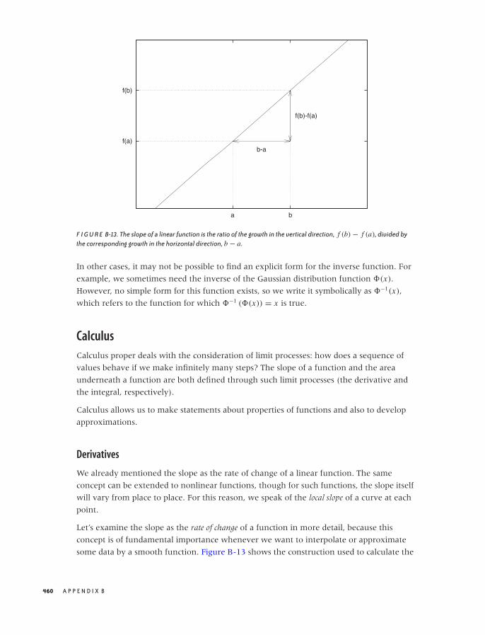
O’Reilly-5980006 master October 28, 2010 21:54
f(a)
f(b)
a b
b-a
f(b)-f(a)
F I G U R E B-13. The slope of a linear function is the ratio of the growth in the vertical direction, f (b) − f (a), divided bythe corresponding growth in the horizontal direction, b − a.
In other cases, it may not be possible to find an explicit form for the inverse function. For
example, we sometimes need the inverse of the Gaussian distribution function �(x).
However, no simple form for this function exists, so we write it symbolically as �−1(x),
which refers to the function for which �−1 (�(x)) = x is true.
Calculus
Calculus proper deals with the consideration of limit processes: how does a sequence of
values behave if we make infinitely many steps? The slope of a function and the area
underneath a function are both defined through such limit processes (the derivative and
the integral, respectively).
Calculus allows us to make statements about properties of functions and also to develop
approximations.
Derivatives
We already mentioned the slope as the rate of change of a linear function. The same
concept can be extended to nonlinear functions, though for such functions, the slope itself
will vary from place to place. For this reason, we speak of the local slope of a curve at each
point.
Let’s examine the slope as the rate of change of a function in more detail, because this
concept is of fundamental importance whenever we want to interpolate or approximate
some data by a smooth function. Figure B-13 shows the construction used to calculate the
460 A P P E N D I X B
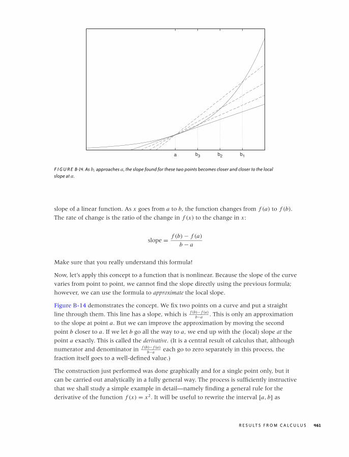
O’Reilly-5980006 master October 28, 2010 21:54
a b3 b2 b1
F I G U R E B-14. As bi approaches a, the slope found for these two points becomes closer and closer to the localslope at a.
slope of a linear function. As x goes from a to b, the function changes from f (a) to f (b).
The rate of change is the ratio of the change in f (x) to the change in x :
slope = f (b) − f (a)
b − a
Make sure that you really understand this formula!
Now, let’s apply this concept to a function that is nonlinear. Because the slope of the curve
varies from point to point, we cannot find the slope directly using the previous formula;
however, we can use the formula to approximate the local slope.
Figure B-14 demonstrates the concept. We fix two points on a curve and put a straight
line through them. This line has a slope, which is f (b)− f (a)
b−a . This is only an approximation
to the slope at point a. But we can improve the approximation by moving the second
point b closer to a. If we let b go all the way to a, we end up with the (local) slope at the
point a exactly. This is called the derivative. (It is a central result of calculus that, although
numerator and denominator in f (b)− f (a)
b−a each go to zero separately in this process, the
fraction itself goes to a well-defined value.)
The construction just performed was done graphically and for a single point only, but it
can be carried out analytically in a fully general way. The process is sufficiently instructive
that we shall study a simple example in detail—namely finding a general rule for the
derivative of the function f (x) = x2. It will be useful to rewrite the interval [a, b] as
R E S U LT S F R O M C A L C U L U S 461

O’Reilly-5980006 master October 28, 2010 21:54
T A B L E B-1. Derivatives and antiderivatives(integrals) for a few elementary functions.
Function Derivative Integral
xn nxn−1 1n+1 xn+1
ex ex ex
log x 1/x x log x − xsin x cos x − cos xcos x − sin x sin x
[x, x + ε]. We can now go ahead and form the familiar ratio:
f (b) − f (a)
b − a= f (x + ε) − f (x)
(x + ε) − x
= (x + ε)2 − x2
x + ε − x
= x2 + 2xε + ε2 − x2
ε
= 2xε + ε2
ε
= 2x + ε
→ 2x as ε goes to zero
In the second step, the terms not depending on ε cancel each other; in the third step, we
cancel an ε between the numerator and the denominator, which leaves an expression that
is perfectly harmless as ε goes to zero! The (harmless) result is the sought-for derivative of
the function. Notice that the result is true for any x , so we have obtained an expression for
the derivative of x2 that holds for all x : the derivative of x2 is 2x . Always. Similar rules can
be set up for other functions (you may try your hand at finding the rule for x3 or even xk
for general k). Table B-1 lists a few of the most important ones.
There are two ways to indicate the derivative. A short form uses the prime, like this: f ′(x)
is the derivative of f (x). Another form uses the differential operator ddx , which acts on the
expression to its right. Using the latter, we can write:
d
dxx2 = 2x
Finding Minima and Maxima
When a smooth function reaches a local minimum or maximum, its slope at that point is
zero. This is easy to see: as you approach a peak, you go uphill (positive slope); once over
the top, you go downhill (negative slope). Hence, you must have passed a point where
you were going neither uphill nor downhill—in other words, where the slope was zero.
(From a mathematically rigorous point of view, this is not quite as obvious as it may seem;
you may want to check for “Rolle’s theorem” in a calculus text.)
462 A P P E N D I X B
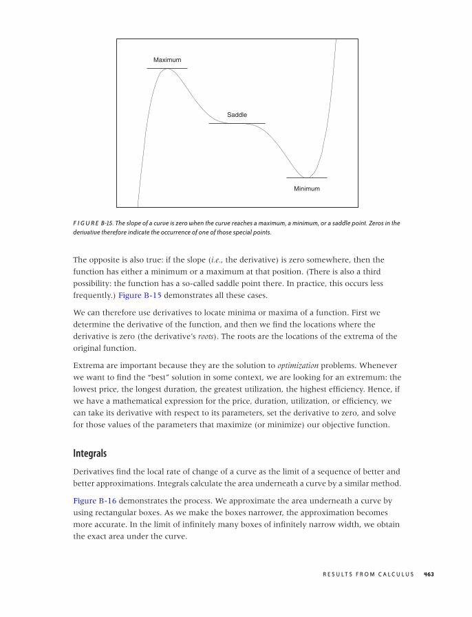
O’Reilly-5980006 master October 28, 2010 21:54
Maximum
Minimum
Saddle
F I G U R E B-15. The slope of a curve is zero when the curve reaches a maximum, a minimum, or a saddle point. Zeros in thederivative therefore indicate the occurrence of one of those special points.
The opposite is also true: if the slope (i.e., the derivative) is zero somewhere, then the
function has either a minimum or a maximum at that position. (There is also a third
possibility: the function has a so-called saddle point there. In practice, this occurs less
frequently.) Figure B-15 demonstrates all these cases.
We can therefore use derivatives to locate minima or maxima of a function. First we
determine the derivative of the function, and then we find the locations where the
derivative is zero (the derivative’s roots). The roots are the locations of the extrema of the
original function.
Extrema are important because they are the solution to optimization problems. Whenever
we want to find the “best” solution in some context, we are looking for an extremum: the
lowest price, the longest duration, the greatest utilization, the highest efficiency. Hence, if
we have a mathematical expression for the price, duration, utilization, or efficiency, we
can take its derivative with respect to its parameters, set the derivative to zero, and solve
for those values of the parameters that maximize (or minimize) our objective function.
Integrals
Derivatives find the local rate of change of a curve as the limit of a sequence of better and
better approximations. Integrals calculate the area underneath a curve by a similar method.
Figure B-16 demonstrates the process. We approximate the area underneath a curve by
using rectangular boxes. As we make the boxes narrower, the approximation becomes
more accurate. In the limit of infinitely many boxes of infinitely narrow width, we obtain
the exact area under the curve.
R E S U LT S F R O M C A L C U L U S 463
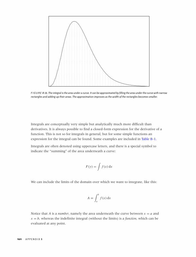
O’Reilly-5980006 master October 28, 2010 21:54
F I G U R E B-16. The integral is the area under a curve. It can be approximated by filling the area under the curve with narrowrectangles and adding up their areas. The approximation improves as the width of the rectangles becomes smaller.
Integrals are conceptually very simple but analytically much more difficult than
derivatives. It is always possible to find a closed-form expression for the derivative of a
function. This is not so for integrals in general, but for some simple functions an
expression for the integral can be found. Some examples are included in Table B-1.
Integrals are often denoted using uppercase letters, and there is a special symbol to
indicate the “summing” of the area underneath a curve:
F(y) =∫
f (x) dx
We can include the limits of the domain over which we want to integrate, like this:
A =∫ b
af (x) dx
Notice that A is a number, namely the area underneath the curve between x = a and
x = b, whereas the indefinite integral (without the limits) is a function, which can be
evaluated at any point.
464 A P P E N D I X B
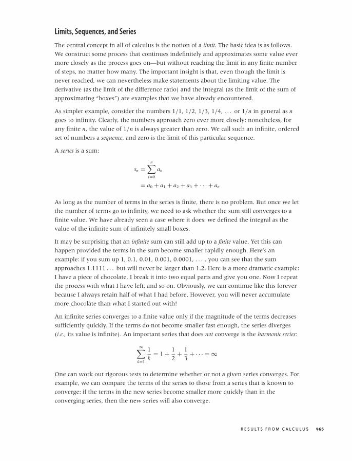
O’Reilly-5980006 master October 28, 2010 21:54
Limits, Sequences, and Series
The central concept in all of calculus is the notion of a limit. The basic idea is as follows.
We construct some process that continues indefinitely and approximates some value ever
more closely as the process goes on—but without reaching the limit in any finite number
of steps, no matter how many. The important insight is that, even though the limit is
never reached, we can nevertheless make statements about the limiting value. The
derivative (as the limit of the difference ratio) and the integral (as the limit of the sum of
approximating “boxes”) are examples that we have already encountered.
As simpler example, consider the numbers 1/1, 1/2, 1/3, 1/4, . . . or 1/n in general as n
goes to infinity. Clearly, the numbers approach zero ever more closely; nonetheless, for
any finite n, the value of 1/n is always greater than zero. We call such an infinite, ordered
set of numbers a sequence, and zero is the limit of this particular sequence.
A series is a sum:
sn =n∑
i=0
an
= a0 + a1 + a2 + a3 + · · · + an
As long as the number of terms in the series is finite, there is no problem. But once we let
the number of terms go to infinity, we need to ask whether the sum still converges to a
finite value. We have already seen a case where it does: we defined the integral as the
value of the infinite sum of infinitely small boxes.
It may be surprising that an infinite sum can still add up to a finite value. Yet this can
happen provided the terms in the sum become smaller rapidly enough. Here’s an
example: if you sum up 1, 0.1, 0.01, 0.001, 0.0001, . . . , you can see that the sum
approaches 1.1111 . . . but will never be larger than 1.2. Here is a more dramatic example:
I have a piece of chocolate. I break it into two equal parts and give you one. Now I repeat
the process with what I have left, and so on. Obviously, we can continue like this forever
because I always retain half of what I had before. However, you will never accumulate
more chocolate than what I started out with!
An infinite series converges to a finite value only if the magnitude of the terms decreases
sufficiently quickly. If the terms do not become smaller fast enough, the series diverges
(i.e., its value is infinite). An important series that does not converge is the harmonic series:
∞∑
k=1
1
k= 1 + 1
2+ 1
3+ · · · = ∞
One can work out rigorous tests to determine whether or not a given series converges. For
example, we can compare the terms of the series to those from a series that is known to
converge: if the terms in the new series become smaller more quickly than in the
converging series, then the new series will also converge.
R E S U LT S F R O M C A L C U L U S 465
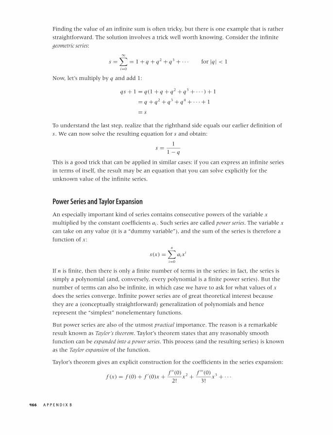
O’Reilly-5980006 master October 28, 2010 21:54
Finding the value of an infinite sum is often tricky, but there is one example that is rather
straightforward. The solution involves a trick well worth knowing. Consider the infinite
geometric series:
s =∞∑
i=0
= 1 + q + q2 + q3 + · · · for |q| < 1
Now, let’s multiply by q and add 1:
qs + 1 = q(1 + q + q2 + q3 + · · · ) + 1
= q + q2 + q3 + q4 + · · · + 1
= s
To understand the last step, realize that the righthand side equals our earlier definition of
s. We can now solve the resulting equation for s and obtain:
s = 1
1 − q
This is a good trick that can be applied in similar cases: if you can express an infinite series
in terms of itself, the result may be an equation that you can solve explicitly for the
unknown value of the infinite series.
Power Series and Taylor Expansion
An especially important kind of series contains consecutive powers of the variable x
multiplied by the constant coefficients ai . Such series are called power series. The variable x
can take on any value (it is a “dummy variable”), and the sum of the series is therefore a
function of x :
s(x) =n∑
i=0
ai xi
If n is finite, then there is only a finite number of terms in the series: in fact, the series is
simply a polynomial (and, conversely, every polynomial is a finite power series). But the
number of terms can also be infinite, in which case we have to ask for what values of x
does the series converge. Infinite power series are of great theoretical interest because
they are a (conceptually straightforward) generalization of polynomials and hence
represent the “simplest” nonelementary functions.
But power series are also of the utmost practical importance. The reason is a remarkable
result known as Taylor’s theorem. Taylor’s theorem states that any reasonably smooth
function can be expanded into a power series. This process (and the resulting series) is known
as the Taylor expansion of the function.
Taylor’s theorem gives an explicit construction for the coefficients in the series expansion:
f (x) = f (0) + f ′(0)x + f ′′(0)
2!x2 + f ′′′(0)
3!x3 + · · ·
466 A P P E N D I X B
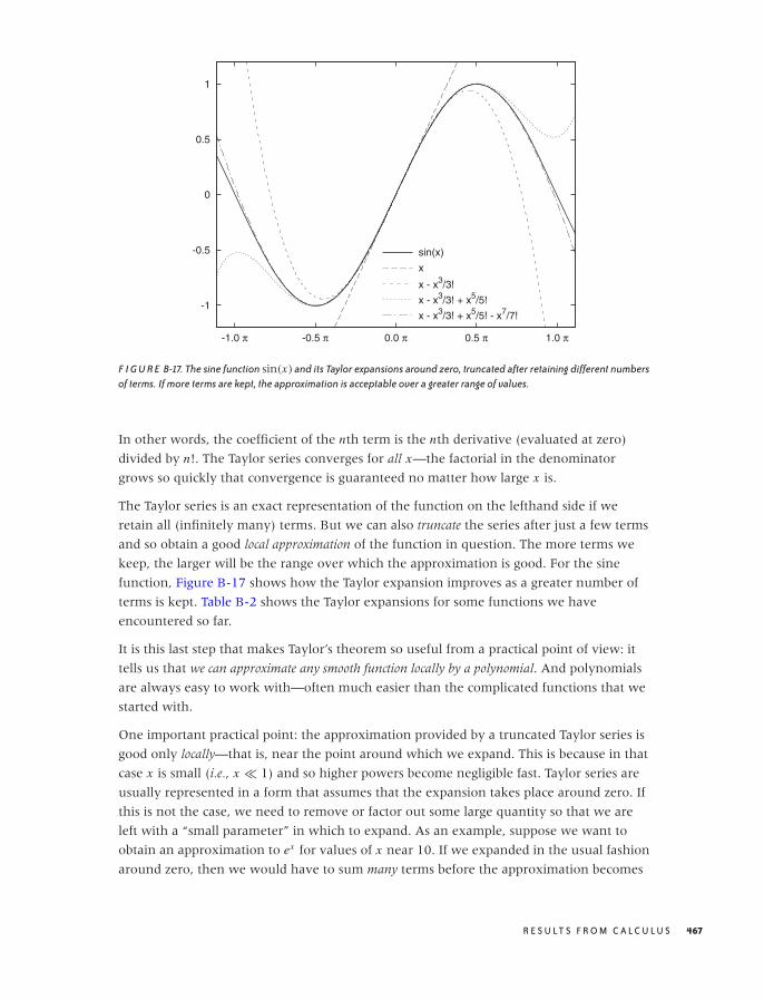
O’Reilly-5980006 master October 28, 2010 21:54
-1
-0.5
0
0.5
1
-1.0 π -0.5 π 0.0 π 0.5 π 1.0 π
sin(x)
x
x - x3/3!
x - x3/3! + x5/5!
x - x3/3! + x5/5! - x7/7!
F I G U R E B-17. The sine function sin(x) and its Taylor expansions around zero, truncated after retaining different numbersof terms. If more terms are kept, the approximation is acceptable over a greater range of values.
In other words, the coefficient of the nth term is the nth derivative (evaluated at zero)
divided by n!. The Taylor series converges for all x—the factorial in the denominator
grows so quickly that convergence is guaranteed no matter how large x is.
The Taylor series is an exact representation of the function on the lefthand side if we
retain all (infinitely many) terms. But we can also truncate the series after just a few terms
and so obtain a good local approximation of the function in question. The more terms we
keep, the larger will be the range over which the approximation is good. For the sine
function, Figure B-17 shows how the Taylor expansion improves as a greater number of
terms is kept. Table B-2 shows the Taylor expansions for some functions we have
encountered so far.
It is this last step that makes Taylor’s theorem so useful from a practical point of view: it
tells us that we can approximate any smooth function locally by a polynomial. And polynomials
are always easy to work with—often much easier than the complicated functions that we
started with.
One important practical point: the approximation provided by a truncated Taylor series is
good only locally—that is, near the point around which we expand. This is because in that
case x is small (i.e., x � 1) and so higher powers become negligible fast. Taylor series are
usually represented in a form that assumes that the expansion takes place around zero. If
this is not the case, we need to remove or factor out some large quantity so that we are
left with a “small parameter” in which to expand. As an example, suppose we want to
obtain an approximation to ex for values of x near 10. If we expanded in the usual fashion
around zero, then we would have to sum many terms before the approximation becomes
R E S U LT S F R O M C A L C U L U S 467
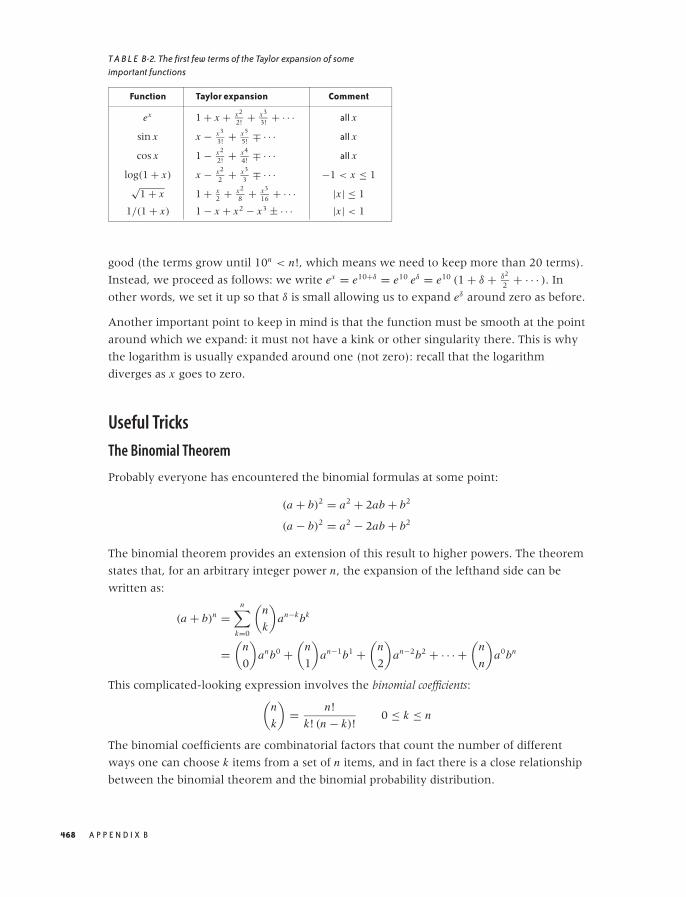
O’Reilly-5980006 master October 28, 2010 21:54
T A B L E B-2. The first few terms of the Taylor expansion of someimportant functions
Function Taylor expansion Comment
ex 1 + x + x2
2! + x3
3! + · · · all x
sin x x − x3
3! + x5
5! ∓ · · · all x
cos x 1 − x2
2! + x4
4! ∓ · · · all x
log(1 + x) x − x2
2 + x3
3 ∓ · · · −1 < x ≤ 1√
1 + x 1 + x2 + x2
8 + x3
16 + · · · |x | ≤ 1
1/(1 + x) 1 − x + x2 − x3 ± · · · |x | < 1
good (the terms grow until 10n < n!, which means we need to keep more than 20 terms).
Instead, we proceed as follows: we write ex = e10+δ = e10 eδ = e10 (1 + δ + δ2
2 + · · · ). In
other words, we set it up so that δ is small allowing us to expand eδ around zero as before.
Another important point to keep in mind is that the function must be smooth at the point
around which we expand: it must not have a kink or other singularity there. This is why
the logarithm is usually expanded around one (not zero): recall that the logarithm
diverges as x goes to zero.
Useful Tricks
The Binomial Theorem
Probably everyone has encountered the binomial formulas at some point:
(a + b)2 = a2 + 2ab + b2
(a − b)2 = a2 − 2ab + b2
The binomial theorem provides an extension of this result to higher powers. The theorem
states that, for an arbitrary integer power n, the expansion of the lefthand side can be
written as:
(a + b)n =n∑
k=0
(n
k
)an−kbk
=(
n
0
)anb0 +
(n
1
)an−1b1 +
(n
2
)an−2b2 + · · · +
(n
n
)a0bn
This complicated-looking expression involves the binomial coefficients:(
n
k
)= n!
k! (n − k)!0 ≤ k ≤ n
The binomial coefficients are combinatorial factors that count the number of different
ways one can choose k items from a set of n items, and in fact there is a close relationship
between the binomial theorem and the binomial probability distribution.
468 A P P E N D I X B
O’Reilly-5980006 master October 28, 2010 21:54
As is the case for many exact results, the greatest practical use of the binomial theorem
comes from an approximate expression. Assume that b < a, so that b/a < 1. Now we can
write:
(a + b)n = an
(1 + b
a
)n
≈ an
(1 + n
b
a+ n(n − 1)
2
(b
a
)2
+ · · ·)
Here we have neglected terms involving higher powers of b/a, which are small compared
to the retained terms, since b/a < 1 by construction (so that higher powers of b/a, which
involve multiplying a small number repeatedly by itself, quickly become negligible).
In this form, the binomial theorem is frequently useful as a way to generate approximate
expansions. In particular, the first-order approximation:
(1 + x)n ≈ 1 + nx for |x | < 1
should be memorized.
The Linear Transformation
Here is a quick, almost trivial, trick that is useful enough to be committed to memory. Any
variable can be transformed to a similar variable that takes on only values from the
interval [0, 1], via the following linear transformation, where xmin and xmax are the
minimum and maximum values that x can take on:
y = x − xmin
xmax − xmin
This transformation is frequently useful—for instance, if we have two quantities and
would like to compare how they develop over time. If the two quantities have very
different magnitudes, then we need to reduce both of them to a common range of values.
The transformation just given does exactly that.
If we want the transformed quantity to fall whenever the original quantity goes up, we
can do this by writing:
y = 1 − y = 1 − x − xmin
xmax − xmin
We don’t have to shift by xmin and rescale by the original range xmax − xmin. Instead, we
can subtract any “typical” value and divide by any “typical” measure of the range. In
statistical applications, for example, it is frequently useful to subtract the mean μ and to
divide by the standard deviation σ . The resulting quantity is referred to as the z-score:
z = x − μ
σ
R E S U LT S F R O M C A L C U L U S 469
O’Reilly-5980006 master October 28, 2010 21:54
Alternatively, you might also subtract the median and divide by the inter-quartile range.
The exact choice of parameters is not crucial and will depend on the specific application
context. The important takeaway here is that we can normalize any variable by:
• Subtracting a typical value (shifting) and
• Dividing by the typical range (rescaling)
Dividing by Zero
Please remember that you cannot divide by zero! I am sure you know this—but it’s
surprisingly easy to forget (until the computer reminds us with a fatal “divide by zero”
error).
It is instructive to understand what happens if you try to divide by zero. Take some fixed
number (say, 1), and divide it by a sequence of numbers that approach zero:
1
10= 0.1
1
5= 0.2
1
1= 1.0
1
1/5= 5
1
1/10= 10
1
0= ?
In other words, as you divide a constant by numbers that approach zero, the result
becomes larger and larger. Finally, if you let the divisor go to zero, the result grows
beyond all bounds: it diverges. Figure B-18 shows this graphically.
What you should take away from this exercise and Figure B-18 is that you cannot replace
1/0 by something else—for instance, it is not a smart move to replace 1/0 by 0 “because
both don’t really mean anything, anyway.” If you need to find a numeric value for 1/0,
then it should be something like “infinity,” but this is not a useful value to operate with in
practical applications.
Therefore, whenever you encounter a fraction ab of any kind, you must check whether the
denominator can become zero and exclude these points from consideration.
Failing to do so is one of the most common sources of error. What is worse, these errors
are difficult to recover from—not just in implementations but also conceptually. A typical
470 A P P E N D I X B
O’Reilly-5980006 master October 28, 2010 21:54
0
2
4
6
8
10
0 2 4 6 8 10
F I G U R E B-18. As you divide a constant value by smaller and smaller numbers, the result is getting larger and larger. If youdivide by zero, it blows up!
example involves “relative errors,” where we divide the difference between the observed
and the expected value by the expected value:
relative error = observed − expected
expected
What happens if for one day the expected value drops to zero? You are toast. There is no
way to assign a meaningful value to the error in this case. (If the observed value is also
zero, then you can treat this as a special case and define the relative error to be zero in this
case, but if the observed value is not zero, then this definition is obviously inappropriate.)
These kinds of problems have an unpleasant ability to sneak up on you. A quantity such
as the relative error or the defect rate (which is also a ratio: the number of defects found
divided by the number of units produced) is a quantity commonly found in reports and
dashboards. You don’t want your entire report to crash because no units were produced
for some product on this day rendering the denominator zero in one of your formulas!
There are a couple of workarounds, neither of which is perfect. In the case of the defect
rate, where you can be sure that the numerator will be zero if the denominator is
(because no defects can be found if no items were produced), you can add a small positive
number to the denominator and thereby prevent it from ever becoming exactly zero. As
long as this number is small compared to the number of items typically produced in a day,
it will not significantly affect the reported defect rate, but will relieve you from having to
check for the 00 special case explicitly. In the case of calculating a relative error, you might
want to replace the numerator with the average of the expected and the observed values.
The advantage is that now the denominator can be zero only if the numerator is zero,
R E S U LT S F R O M C A L C U L U S 471

O’Reilly-5980006 master October 28, 2010 21:54
which brings us back to the suggestion for dealing with defect rates just discussed. The
problem with this method is that when no events are observed but some number was
expected, the relative error is reported as −2 (negative 200 percent instead of negative
100 percent); this is due to the factor 1/2 in the denominator, which comes from
calculating the average there.
So, let me say it again: whenever you are dealing with fractions, you must consider the
case of denominators becoming zero. Either rule them out or handle them explicitly.
Notation and Basic Math
This section is not intended as a comprehensive overview of mathematical notation or as
your first introduction to mathematical formulas. Rather, it should serve as a general
reminder of some basic facts and to clarify some conventions used in this book. (All my
conventions are pretty standard—I have been careful not to use any symbols or
conventions that are not generally used and understood.)
On Reading Formulas
A mathematical formula combines different components, called terms, by use of operators.
The most basic operators are plus and minus (+ and −) and multiplied by and divided by
(· and /). Plus and minus are always written explicitly, but the multiplication operator is
usually silent—in other words, if you see two terms next to each other, with nothing
between them, they should be multiplied. The division operator can be written in two
forms: 1/n or 1n , which mean exactly the same thing. The former is more convenient in
text such as this; the latter is more clear for long, “display” equations. An expression such
as 1/n + 1 is ambiguous and should not be used, but if you encounter it, you should
assume that it means 1n + 1 and not 1/(n + 1) (which is equivalent to 1
n+1 ).
Multiplication and division have higher precedence than addition and subtraction,
therefore ab + c means that first you multiply a and b and then add c to the result. To
change the priority, you need to use parentheses: a(b + c) means that first you add b and c
and then multiply the result by a. Parentheses can either be round (. . . ) or square [. . . ],
but their meaning is the same.
Functions take one (or several) arguments and return a result. A function always has a
name followed by the arguments. Usually the arguments are enclosed in parentheses: f (x).
Strictly speaking, this notation is ambiguous because an expression such as f (a + b) could
mean either “add a and b and then multiply by f ” or “add a and b and then pass the
result to the function f .” However, the meaning is usually clear from the context.
(There is a slightly more advanced way to look at this. You can think of f as an operator,
similar to a differential operator like ddx or an integral operator like
∫dt . This operator is
now applied to the expression to the right of it. If f is a function, this means applying the
472 A P P E N D I X B
O’Reilly-5980006 master October 28, 2010 21:54
function to the argument; if the operator is a differential operator, this means taking the
derivative; and if f is merely a number, then applying it simply means multiplying the
term on its right by it.)
A function may take more than one argument; for example, the function f (x, y, z) takes
three arguments. Sometimes you may want to emphasize that not all of these arguments
are equivalent: some are actual variables, whereas others are “parameters,” which are
kept constant while the variables change. Consider f (x) = ax + b. In this function, x is the
variable (the quantity usually plotted along the horizontal axis) while a and b would be
considered parameters. If we want to express that the function f does depend on the
parameters as well as on the actual variable, we can do this by including the parameters in
the list of arguments: f (x, a, b). To visually separate the parameters from the actual
variable (or variables), a semicolon is sometimes used: f (x; a, b). There are no
hard-and-fast rules for when to use a semicolon instead of a comma—it’s simply a
convenience that is sometimes used and other times not.
One more word on functions: several functions are regarded as “well known” in
mathematics (such as sine and cosine, the exponential function, and the logarithm). The
names of such well-known functions are always written in upright letters, whereas
functions in general are denoted by an italic letter. (Variables are always written in italics.)
For well-known functions, the parentheses around the arguments can be omitted if the
argument is sufficiently simple. (This is another example of the “operator” point of view
mentioned earlier.) Thus we may write sin(x + 1) + log x − f (x) (note the upright letters
for sine and logarithm, and the parentheses around the argument for the logarithm have
been omitted, because it consists of only a single term). This has a different meaning than:
sin(x + 1) + log(x − f (x)).
Elementary Algebra
For numbers, the following is generally true:
a(b + c) = ab + ac
This is often applied in situations like the following, where we factor out the a:
a + b = a(1 + b/a)
If a is much greater than b, then we have now converted the original expression a + b into
another expression of the form:
something large · (1 + something small)
which makes it easy to see which terms matter and which can be neglected in an
approximation scheme. (The small term in the parentheses is “small” compared to the 1 in
the parentheses and can therefore be treated as a perturbation.)
R E S U LT S F R O M C A L C U L U S 473
O’Reilly-5980006 master October 28, 2010 21:54
Quantities can be multiplied together, which gives rise to powers:
a · a = a2
a · a · a = a3
. . .
The raised quantity (the superscript) is also referred to as the exponent. In this book,
superscripts always denote powers.
The three binomial formulas should be committed to memory:
(a + b)2 = a2 + 2ab + b2
(a − b)2 = a2 − 2ab + b2
(a + b)(a − b) = a2 − b2
Because the easiest things are often the most readily forgotten, let me just work out the
first of these identities explicitly:
(a + b)2 = (a + b)(a + b)
= a(a + b) + b(a + b)
= a2 + ab + ba + b2
= a2 + 2ab + b2
where I have made use of the fact that ab = ba.
Working with Fractions
Let’s review the basic rules for working with fractions. The expression on top is called the
numerator, the one at the bottom is the denominator:
numerator
denominator
If you can factor out a common factor in both numerator and denominator, then this
common factor can be canceled:
2 + 4x
2 + 2 sin(y)= 2(1 + 2x)
2(1 + sin(y)= 1 + 2x
1 + sin y
To add two fractions, you have to bring them onto a common denominator in an
operation that is the opposite of canceling a common factor:
1
a+ 1
b= a
ab+ b
ab= a + b
ab
Here is a numeric example:
1
2+ 1
3= 3
6+ 2
6= 5
6
474 A P P E N D I X B
O’Reilly-5980006 master October 28, 2010 21:54
Sets, Sequences, and Series
A set is a grouping of elements in no particular order. In a sequence, the elements occur in a
fixed order, one after the other.
The individual elements of sets and sequences are usually shown with subscripts that
denote the index of the element in the set or its position in the sequence (similar to
indexing into an array). In this book, subscripts are used only for the purpose of indexing
elements of sets or sequences in this way.
Sets are usually indicated by curly braces. The following expressions are equivalent:
{x1, x2, x3, . . . , xn}{xi | i = 1, . . . , n}
For brevity, it is customary to suppress the range of the index if it can be understood from
context. For example, if it is clear that there are n elements in the set, I might simply write
{xi }.One often wants to sum a finite or infinite sequence of numbers; the result is known as a
series:
x1 + x2 + x3 + · · · + xn
Instead of writing out the terms explicitly, it is often useful to use the sum notation:
n∑
i=1
xi = x1 + x2 + x3 + · · · + xn
The meaning of the summation symbol should be clear from this example. The variable
used as index (here, i) is written underneath the summation sign followed by the lower
limit (here, 1). The upper limit (here, n) is written above the summation sign. As a
shorthand, any one of these specifications can be omitted. For instance, if it is clear from
the context that the lower limit is 1 and the upper limit is n, then I might simply write∑i xi or even
∑xi . In the latter form, it is understood that the sum runs over the index of
the summands.
It is often convenient to describe the terms to be summed over in words, rather than
giving specific limits:∑
all data points
xi
Some standard transformations involving the summation notation are used fairly often.
For example, one frequently needs to shift indices. The following three expressions are
equal, as you can easily see by writing out explicitly the terms of the sum in each case:
n∑
i=0
xi =n+1∑
i=1
xi−1 = x0 +n∑
i=1
xi
R E S U LT S F R O M C A L C U L U S 475
O’Reilly-5980006 master October 28, 2010 21:54
Keep in mind that the summation notation is just a shorthand for the explicit form given
at the start of this section. If you become confused, you can always write out the terms
explicitly to understand what is going on.
Finally, we may take the upper limit of the sum to be infinity, in which case the sum runs
over infinitely many terms. Infinite series play a fundamental role in the theoretical
development of mathematics, but all series that you will encounter in applications are, of
course, finite.
Special Symbols
A few mathematical symbols are either indispensable or so useful that I wouldn’t do
without them.
Binary relationships
There are several special symbols to describe the relationship between two expressions.
Some of the most useful ones are listed in Table B-3.
T A B L E B-3. Commonly used relational operators
Operator Meaning
= �= equal to, not equal to< > less than, greater than≤ ≥ less than or equal to, greater than or equal to
� � much less than, much greater than∝ proportional to≈ approximately equal to∼ scales as
The last three might require a word of explanation. We say two quantities are
approximately equal when they are equal up to a “small” error. Put differently, the
difference between the two quantities must be small compared to the quantities
themselves: x and 1.1x are approximately equal, x ≈ 1.1x , because the difference (which
is 0.1x) is small compared to x .
One quantity is proportional to another if they are equal up to a constant factor that has
been omitted from the expression. Often, this factor will have units associated with it. For
example, when we say “time is money,” what we really mean is:
money ∝ time
Here the omitted constant of proportionality is the hourly rate (which is also required to
fix the units: hours on the left, dollars on the right; hence hourly rate must have units of
“dollars per hour” to make the equation dimensionally consistent).
476 A P P E N D I X B
O’Reilly-5980006 master October 28, 2010 21:54
We say that a quantity scales as some other quantity if we want to express how one
quantity depends on another one in a very general way. For example, recall that the area
of a circle is πr2 (where r is the length of the radius) but that the area of a square is a2
(where a is the length of the side of the square). We can now say that “the area scales as
the square of the length.” This is a more general statement than saying that the area is
proportional to the square of the length: the latter implies that they are equal up to a
constant factor, whereas the scaling behavior allows for more complicated dependencies.
(In this example, the constant of proportionality depends on the shape of the figure, but
the scaling behavior area ∼ length2 is true for all symmetrical figures.)
In particular when evaluating the complexity of algorithms, there is another notation to
express a very similar notion: the so-called big O notation. For example, the expression
O(n2) states that the complexity of an algorithm grows (“scales”) with the square of the
number of elements in the input.
Parentheses and other delimiters
Round parentheses (. . .) are used for two purposes: to group terms together (establishing
precedence) and to indicate the arguments to a function:
ab + c �= a(b + c) Parentheses to establish precedence
f (x, y) = x + y Parentheses to indicate function arguments
Square brackets [. . .] are mostly used to indicate an interval:
[a, b] all x such that a ≤ x ≤ b
For the purpose of this book, we don’t need to worry about the distinction between closed
and open intervals (i.e., intervals that do or don’t contain their endpoints, respectively).
Very rarely I use brackets for other purposes—for example as an alternative to round
parentheses to establish precedence, or indicate that a function takes another function as
its argument, as in the expectation value: E[ f (x)].
Curly braces {. . .} always denote a set.
Miscellaneous symbols
Two particular constants are indispensable. Everybody has heard of π = 3.141592 . . . ,
which is the ratio of the circumference of a circle to its diameter:
π = circumference
diameter= 3.141592 . . .
R E S U LT S F R O M C A L C U L U S 477
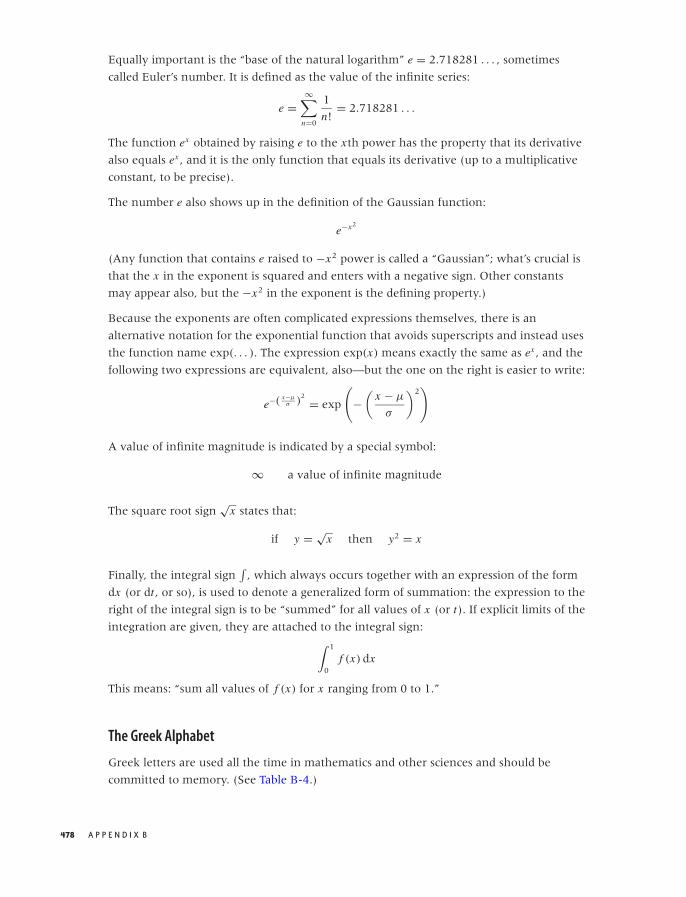
O’Reilly-5980006 master October 28, 2010 21:54
Equally important is the “base of the natural logarithm” e = 2.718281 . . . , sometimes
called Euler’s number. It is defined as the value of the infinite series:
e =∞∑
n=0
1
n!= 2.718281 . . .
The function ex obtained by raising e to the xth power has the property that its derivative
also equals ex , and it is the only function that equals its derivative (up to a multiplicative
constant, to be precise).
The number e also shows up in the definition of the Gaussian function:
e−x2
(Any function that contains e raised to −x2 power is called a “Gaussian”; what’s crucial is
that the x in the exponent is squared and enters with a negative sign. Other constants
may appear also, but the −x2 in the exponent is the defining property.)
Because the exponents are often complicated expressions themselves, there is an
alternative notation for the exponential function that avoids superscripts and instead uses
the function name exp(. . . ). The expression exp(x) means exactly the same as ex , and the
following two expressions are equivalent, also—but the one on the right is easier to write:
e−( x−μσ )
2 = exp
(−
(x − μ
σ
)2)
A value of infinite magnitude is indicated by a special symbol:
∞ a value of infinite magnitude
The square root sign√
x states that:
if y = √x then y2 = x
Finally, the integral sign∫
, which always occurs together with an expression of the form
dx (or dt , or so), is used to denote a generalized form of summation: the expression to the
right of the integral sign is to be “summed” for all values of x (or t). If explicit limits of the
integration are given, they are attached to the integral sign:∫ 1
0f (x) dx
This means: “sum all values of f (x) for x ranging from 0 to 1.”
The Greek Alphabet
Greek letters are used all the time in mathematics and other sciences and should be
committed to memory. (See Table B-4.)
478 A P P E N D I X B

O’Reilly-5980006 master October 29, 2010 17:53
T A B L E B-4. The Greek alphabet
Lowercase Uppercase Name
α A Alphaβ B Betaγ � Gammaδ � Deltaε E Epsilonζ Z Zetaη H Etaθ � Thetaι I Iotaκ K Kappaλ � Lambdaμ M Muν N Nuξ � Xio O Omicronπ � Piρ R Rhoσ � Sigmaτ T Tauυ ϒ Upsilonφ � Phiχ X Chiψ ! Psiω # Omega
Where to Go from Here
This appendix can of course only give a cartoon version of the topics mentioned, or—if
you have seen this material before—at best serve as a reminder. But most of all, I hope it
serves as a teaser: mathematics is a wonderfully rich and stimulating topic, and I would
hope that in this appendix (and in the rest of this book) I have been able to convey some
of its fascination—and perhaps even convinced you to dig a little deeper.
If you want to learn more, here are a couple of hints.
The first topic to explore is calculus (or real analysis). All modern mathematics starts here,
and it is here that some of the most frequently used concepts (derivative, integral, Taylor
expansion) are properly introduced. It is a must-have.
But if you limit your attention to calculus, you will never get over the idea that
mathematics is about “calculating something.” To get a sense of what math is really all
about, you have to go beyond analysis. The next topic in a typical college syllabus is linear
algebra. In linear algebra, we go beyond relatively tangible things like curves and numbers
and for the first time start to consider concepts in a fully abstract way: spaces,
transformations, mappings. What can we say about them in general without having to
R E S U LT S F R O M C A L C U L U S 479

O’Reilly-5980006 master October 28, 2010 21:54
appeal to any particular realization? Understanding this material requires real mental
effort—you have to change the way you think. (Similarly to how you have to change the
way you think if you try to learn Lisp or Haskell.) Linear algebra also provides the
theoretical underpinnings of all matrix operations and hence for most frequently used
numerical routines. (You can’t do paper-and-pencil mathematics without calculus, and
you can’t do numerical mathematics without linear algebra.)
With these two subjects under your belt, you will be able to pick up pretty much any
mathematical topic and make sense of it. You might then want to explore complex
calculus for the elegance and beauty of its theorems, or functional analysis and Fourier
theory (which blend analysis and linear algebra) because of their importance in all
application-oriented areas, or take a deeper look at probability theory, with its obvious
importance for anything having to do with random data.
On Math
I have observed that there are two misconceptions about mathematics that are
particularly prevalent among people coming from a software or computing background.
The first misconception holds that mathematics is primarily a prescriptive, calculational
(not necessarily numerical) scheme and similar to an Algol-derived programming
language: a pseudo-code for expressing algorithms. The other misconception views
mathematics as mostly an abstract method for formal reasoning, not dissimilar to certain
logic programming environments: a way to manipulate logic statements.
What both of them miss is that mathematics is not a method but first and foremost a body
of content in its own right. You will never understand what mathematics is if you see it
only as something you use to obtain certain results. Mathematics is, first and foremost, a
rich and exciting story in itself.
There is an unfortunate perception among nonmathematicians (and even partially
reinforced by this book) that mathematics is about “calculating things.” This is not so, and
it is probably the most unhelpful misconception about mathematics of all.
In fairness, this point of view is promulgated by many introductory college textbooks. In a
thoroughly misguided attempt to make their subject “interesting,” they try to motivate
mathematical concepts with phony applications to the design of bridges and airplanes, or
to calculating the probability of winning at poker. This not only obscures the beauty of the
subject but also creates the incorrect impression of mathematics as a utilitarian fingering
exercise and almost as a necessary evil.
Finally, I strongly recommend that you stay away from books on popular or recreational
math, for two reasons. First, they tend to focus on a small set of topics that can be treated
using “elementary” methods (mostly geometry and some basic number theory), and tend
to omit most of the conceptually important topics. Furthermore, in their attempt to
480 A P P E N D I X B

O’Reilly-5980006 master October 28, 2010 21:54
present amusing or entertaining snippets of information, they fail to display the rich,
interconnected structure of mathematical theory: all you end up with is a book of (stale)
jokes.
Further Reading
Calculus
• The Hitchhiker’s Guide to Calculus. Michael Spivak. Mathematical Association of America.
1995.
If the material in this appendix is really new to you, then this short (120-page) booklet
provides a surprisingly complete, approachable, yet mathematically respectable
introduction. Highly recommended for the curious and the confused.
• Precalculus: A Prelude to Calculus. Sheldon Axler. Wiley. 2008.
Axler’s book covers the basics: numbers, basic algebra, inequalities, coordinate systems,
and functions—including exponential, logarithmic, and trigonometric functions—but it
stops short of derivatives and integrals. If you want to brush up on foundational
material, this is an excellent text.
• Calculus. Michael Spivak. 4th ed., Publish or Perish. 2008.
This is a comprehensive book on calculus. It concentrates exclusively on the clear
development of the mathematical theory and thereby avoids the confusion that often
results from an oversupply of (more or less) artificial examples. The presentation is
written for the reader who is relatively new to formal mathematical reasoning, and the
author does a good job motivating the peculiar arguments required by formal
mathematical manipulations. Rightly popular.
• Yet Another Introduction to Analysis. Victor Bryant. Cambridge University Press. 1990.
This short book is intended as a quick introduction for those readers who already
possess passing familiarity with the topic and are comfortable with abstract operations.
Linear Algebra
• Linear Algebra Done Right. Sheldon Axler. 2nd ed., Springer. 2004.
This is the best introduction to linear algebra that I am aware of, and it fully lives up to
its grandiose title. This book treats linear algebra as abstract theory of mappings, but on
a very accessible, advanced undergraduate level. Highly recommended.
• Linear Algebra. Klaus Janich. Springer. 1994.
This book employs a greater amount of abstract mathematical formalism than the
previous entry, but the author tries very hard to explain and motivate all concepts. This
book might therefore give a better sense of the nature of abstract algebraic arguments
than Axler’s streamlined presentation. The book is written for a first-year course at
German universities; the style of the presentation may appear exotic to the American
reader.
R E S U LT S F R O M C A L C U L U S 481

O’Reilly-5980006 master October 28, 2010 21:54
Complex Analysis
• Complex Analysis. Joseph Bak and Donald J. Newman. 2nd ed., Springer. 1996.
This is a straightforward, and relatively short, introduction to all the standard topics of
classical complex analysis.
• Complex Variables. Mark J. Ablowitz and Athanassios S. Fokas. 2nd ed., Cambridge
University Press. 2003.
This is a much more comprehensive and advanced book. It is split into two parts: the
first part developing the theory, the second part discussing several nontrivial
applications (mostly to the theory of differential equations).
• Fourier Analysis and Its Applications. Gerald B. Folland. American Mathematical Society.
2009.
This is a terrific introduction to Fourier theory. The book places a strong emphasis on
the solution of partial differential equations but in the course of it also develops the
basics of function spaces, orthogonal polynomials, and eigenfunction expansions. The
later chapters give an introduction to distributions and Green’s functions. This is a very
accessible book, but you will need a strong grounding in real and complex analysis, as
well as some linear algebra.
Mindbenders
If you really want to know what math is like, pick up any one of these. You don’t have to
understand everything—just get the flavor of it all. None of them are “useful,” all are
fascinating.
• A Primer of Analytic Number Theory. Jeffrey Stopple. Cambridge University Press. 2003.
This is an amazing book in every respect. The author takes one of the most advanced,
obscure, and “useless” topics—namely analytic number theory—and makes it
completely accessible to anyone having even minimal familiarity with calculus
concepts (and even those are not strictly required). In the course of the book, the
author introduces series expansions, complex numbers, and many results from
calculus, finally arriving at one of the great unsolved problems in mathematics: the
Riemann hypothesis. If you want to know what math really is, read this book!
• The Computer As Crucible: An Introduction to Experimental Mathematics. Jonathan Borwein
and Keith Devlin. AK Peters. 2008.
If you are coming from a programming background, you might be comfortable with
this book. The idea behind “experimental mathematics” is to see whether we can use a
computer to provide us with intuition about mathematical results that can later be
verified through rigorous proofs. Some of the observations one encounters in the
process are astounding. This book tries to maintain an elementary level of treatment.
• Mathematics by Experiment. Jonathan M. Borwein and David H. Bailey. 2nd ed., AK
Peters. 2008.
482 A P P E N D I X B

O’Reilly-5980006 master October 28, 2010 21:54
This is a more advanced book coauthored by one of the authors of the previous entry
on much the same topic.
• A Mathematician’s Lament: How School Cheats Us Out of Our Most Fascinating and Imaginative
Art Form. Paul Lockhart. Bellevue Literary Press. 2009.
This is not a math book at all: instead it is a short essay by a mathematician (or math
teacher) on what mathematics is and why and how it should be taught. The author’s
philosophy is similar to the one I’ve tried to present in the observations toward the end
of this appendix. Read it and weep. (Then go change the world.) Versions are also
available on the Web (for example, check http://www.maa.org/devlin/devlin 03 08.
html).
R E S U LT S F R O M C A L C U L U S 483

O’Reilly-5980006 master October 28, 2010 21:54
O’Reilly-5980006 master October 28, 2010 21:58
A P P E N D I X C
Working with Data
ONE OF THE UNCOMFORTABLE (AND EASILY OVERLOOKED) TRUTHS OF WORKING WITH DATA IS THAT USUALLY
only a small fraction of the time is spent on the actual “analysis.” Often a far greater
amount of time and effort is expended on a variety of tasks that may appear “menial” by
comparison but that are absolutely critical nevertheless: obtaining the data; verifying,
cleaning and possibly reformatting it; and dealing with updates, storage, and archiving.
For someone new to working with data (and even, periodically, for someone not so new),
it typically comes as a surprise that these preparatory tasks are not only necessary but also
take up as much time as they do.
By their nature, these housekeeping and auxiliary tasks tend to be very specific: specific to
the data, specific to the environment, and specific to the particular question being
investigated. This implies that there is little that can be said about them in generality—it
pretty much all comes down to ad hoc hackery. Of course, this absence of recognizable
nontrivial techniques is one of the main reasons these activities receive as little attention
as they do.
That being said, we can try to increase our awareness of such issues typically arising in
practical situations.
Sources for Data
The two most common sources for data in an enterprise environment are databases and
logfiles. As data sources, the two sources tend to address different needs. Databases will
contain data related to the “business,” whereas logfiles are a source for “operational” data:
databases answer the question “what did we sell to whom?” whereas logfiles answer the
question “what did we do, and when?”
485

O’Reilly-5980006 master October 28, 2010 21:58
Databases can be either “online transaction processing” (OLTP) or “production” databases,
or “data warehouses” for long-term storage. Production databases tend to be normalized,
fast, and busy. You may or may not be able to get read access to them for ad hoc queries,
depending on company policy. Data warehouses tend to be denormalized, slow, and often
accessed through a batch processing facility (submit your query tonight and find out
tomorrow that you omitted a field you needed). Production databases tend to be owned
(at least in spirit) by the application development teams. Data warehouses are invariably
owned by the IT department, which implies a different culture (see also the discussion in
Chapter 17). In either form, databases tend to provide a stable foundation for data
needs—provided you are interested in something the company already considers part of
its “business.”
In contrast, logfiles are often an important source of data for new initiatives. If you want
to evaluate a new business idea, chances are that the data required for your analysis will
not be available in the database—not yet, since there has never been a reason to store it
before. In such situations you may still be able to find the information you need in logfiles
that are regularly produced.
One very important distinction is that databases and logfiles have different life cycles:
making changes to the design of a database is always a slow (often, excruciatingly slow)
process, but the data itself lives in the database forever (if the database is properly
designed). In contrast, logfiles often contain much more information than the database,
but they are usually deleted very quickly. If your organization keeps logfiles for two
weeks, consider yourself lucky!
Therefore, if you want to begin a project using data contained in logfiles then you need to
move fast: start saving all files to your desktop or another safe location immediately, then
figure out what you want to do with them! Frequently, you will need several weeks’ (or
months’) worth of data for a conclusive analysis, and every day that you wait can never
be made up. Also keep in mind that logfiles are usually generated on production servers to
which access may be heavily restricted. It is not uncommon to spend weeks in negotiations
with network administrators if you need to move significant amounts of data off of
production systems.
The same consideration applies if information is not available in the logfiles, so that
existing code needs to be instrumented to support collection of the required data. In this
situation, you will likely find yourself captive to preexisting release schedules and other
constraints. Again: start to think about collecting data early.
Because databases and logfiles are so common and so directly useful sources of data in an
enterprise environment, it’s easy to forget that they’re not the only available sources.
A separate data source that sometimes can be extremely useful is the company’s finance
department. Companies are required to report on various financial metrics, which means
that such information must be available, although possibly only in a highly aggregated
form (e.g., quarterly) and possibly quite late. On other hand, this information is normative
486 A P P E N D I X C

O’Reilly-5980006 master October 28, 2010 21:58
and therefore reliable: after all, it’s what the company is paying taxes on! (I am ignoring
the possibility that the data provided by the finance department might be wrong, but don’t
get me wrong: forensic data analysis is also an interesting field of study.)
What works internally may also work with competitors. The quarterly filings that publicly
listed companies are required to make can make interesting reading!
So far we have assumed that you had to find and extract the data you need from
whatever sources are available; in my experience, this is by far the most common
scenario. However, your data may also be handed to you—for example, if it is
experimental data or if it comes from an external source. In this case, it may come in a
domain-specific file format (we’ll return to data formats shortly). The problem with this
situation is, of course, that now you have no control over what is in the data!
Cleaning and Conditioning
Raw data, whether it was obtained from a database query or by parsing a logfile, typically
needs to be cleaned or conditioned. Here are some areas that often need attention.
Missing valuesIf individual attributes or entire data points are missing, we need to decide how to
handle them. Should we discard the whole record, mark the information in question as
missing, or backfill it in some way? Your choice will depend strongly on your specific
situation and goals.
OutliersIn general, you should be extremely careful when removing outliers—you may be
removing the effect that you are looking for. Never should data points be removed
silently. (There is a (partly apocryphal) story* that the discovery of the hole in the
ozone layer over Antarctica was delayed by several years because the automated data
gathering system discarded readings that it considered to be “impossibly low.”)
JunkData that comes over a network may contain nonprintable characters or similar junk.
Such data is not only useless but can also seriously confuse downstream applications
that are attempting to process the data (e.g., when nonprintable characters are
interpreted as control characters—many programming environments will not issue
helpful diagnostics if this happens). This kind of problem frequently goes unnoticed,
because such junk is typically rare and not easily noticed simply by scanning the
beginning of a data set.
Formatting and normalizingIndividual values may not be formatted in the most useful way for subsequent analysis.
Examples of frequently used transformations for this purpose include: forcing upper- or
*http://www.nas.nasa.gov/About/Education/Ozone/history.html.
W O R K I N G W I T H D ATA 487

O’Reilly-5980006 master October 28, 2010 21:58
lowercase; removing blanks within strings, or replacing them with dashes; replacing
timestamps with Unix Epoch seconds, the Julian day number, or a similar numerical
value; replacing numeric codes with string labels, or vice versa; and so on.
Duplicate recordsData sets often contain duplicate records that need to be recognized and removed
(“de-duped”). Depending on what you consider “duplicate,” this may require a
nontrivial effort. (I once worked on a project that tried to recognize misspelled postal
addresses and assign them to the correctly spelled one. This also is a form of
de-duping.)
Merging data setsThe need to merge data sets from different sources is arises pretty often—for instance,
when the data comes from different database instances. Make sure the data is truly
compatible, especially if the database instances are geographically dispersed. Differing
time zones are a common trouble spot, but don’t overlook things like monetary units.
In addition, you may need to be aware of localization issues, such as font encodings
and date formatting.*
Reading this list, you should realize that the process of cleaning data cannot be separated
from analyzing it. For instance: outlier detection and evaluation require some pretty deep
analysis to be reliable. On the other hand, you may need to remove outliers before you
can calculate meaningful values for certain summary statistics. This is an important
insight, which we will make time and again: data analysis is an iterative process, in which
each operation is at the same time the result of a previous step and the preparation for a
subsequent step.
Data files may also be defective in ways that only become apparent when subsequent
analysis fails or produces nonsensical results. Some common problems are:
Clerical errorsThese are basically data entry errors: 0.01 instead of 0.001, values entered in the wrong
column, all that. Because most data these days is computer generated, the classic
occasional typo seems to be mostly a thing of the past. But watch out for its industrial
counterpart: entire data sets that are systematically corrupted. (Once, we didn’t realize
that a certain string field in the database was of fixed width. As we went from entries
of the form ID1, ID2, and so on to entries like ID10, the last character was silently
truncated by the database. It took a long time before we noticed—after all, the results
we got back looked all right.)
*Regarding time zones, I used to be a strong proponent of keeping all date/time information in Coordi-nated Universal Time (UTC, “Greenwich Time”), always. However, I have since learned that this is notalways appropriate: for some information, such as customer behavior, it is the local time that matters,not the absolute time. Nevertheless, I would prefer to store such information in two parts: timestampin UTC and in addition, the local time zone of the user. (Whether we can actually determine the user’stime zone accurately is a different matter.)
488 A P P E N D I X C
O’Reilly-5980006 master October 28, 2010 21:58
Numerical “special” valuesMissing values in a data set may be encoded using special numerical values (such as −1
or 9999). Unless these values are filtered out, they will obviously corrupt any statistical
analysis. There is less of a need for special values like this when data is kept in text files
(because you can indicate missing values with a marker such as ???), but be aware that
it’s still an issue when you are dealing with binary files.
Crazy business rules and overloaded database fieldsBad schema design can thoroughly wreck your analysis. A pernicious problem is
overloaded database fields: fields that change their meaning depending on the values
of other fields in the database. I remember a case where the Quantity field in a table
contained the number of items shipped—unless it was zero—in which case it signaled a
discount, a promotion, or an out-of-stock situation depending on whether an entry
with the same order ID existed in the Discounts, Promotions, or BackOrders tables—or it
contained not the number of items shipped but rather the number of multi-item
packages that had been shipped (if the IsMulti flag was set), or it contained the ID (!)
of the return order associated with this line item (if some other flag was set). What
made the situation so treacherous was that running a query such as select
avg(Quantity) from . . . would produce a number that seemed sensible even though it
was, of course, complete nonsense. What’s worse, most people were unaware of this
situation because the data was usually accessed only through (massive) stored
procedures that took all these crazy business rules into account.
Sampling
When dealing with very large data sets, we can often simplify our lives significantly by
working with a sample instead of the full data set—provided the sample is representative of
the whole. And therein lies the problem.
In practice, sampling often means partitioning the data on some property of the data:
picking all customers whose names begin with the letter “t,” for instance, or whose
customer ID ends with “0”; or using the logfile from one server only (out of 10); or all
transactions that occurred today. The problem is that it can be very difficult to establish a
priori whether these subpopulations are at all representative of the entire population.
Determining this would require an in-depth study on the whole population—precisely
what we wanted to avoid!
Statistical lore is full of (often quite amusing) stories about the subtle biases introduced
through improper sampling. Choosing all customers whose first names end in “a” will
probably introduce a bias toward female customers. Surveying children for the number of
siblings will overestimate the number of children per household because it excludes
households without children. A long-term study of mutual funds may report overly
optimistic average returns on investment because it ignores funds that have been shut
W O R K I N G W I T H D ATA 489

O’Reilly-5980006 master October 28, 2010 21:58
down because of poor performance (“survivorship bias”). A trailing zero may indicate a
customer record that was created long ago by the previous version of the software. The
server you selected for your logfile may be the “overflow” server that comes online during
peak hours only. And we haven’t even mentioned the problems involved with collecting
data in the first place! (A phone survey is inherently biased against those who don’t have
a phone or don’t answer it.) Furthermore, strange biases may exist that nobody is aware
of. (It is not guaranteed that the network administrators will know or understand the
algorithm that the load balancer uses to assign transactions to servers, particularly if the
load balancer itself is “smart” and changes its logic based on traffic patterns.)
A relatively safe way to create a sample is to take the whole data set (or as large a chunk
of it as possible) and randomly pick some of the records. The keyword is randomly: don’t
take every tenth record; instead, evaluate each record and retain it with a probability of
1/10. Also make sure that the data set does not contain duplicates. (For instance, to
sample customers given their purchases, you must first extract the customer IDs and
de-dupe them, then sample from the de-duped IDs. Sampling from the transactions alone
will introduce a bias toward repeat customers.)
Sampling in this way pretty much requires that the data be available as a file. In contrast,
sampling from a database is more difficult because, in general, we don’t have control (or
even full understanding) over how records are sorted internally. We can dump all records
to file and then sample from there, but this is rather awkward and may not even be
feasible for very large tables.
A good trick to enable random sampling from databases is to include an additional
column, which at the time the record is created is filled with a random integer between (say)
0 and 99. By selecting on this column, we can extract a sample consisting of 1 percent of
all records. This column can even be indexed (although the database engine may ignore
the index if the result set is too large). Even when it is not possible to add such a column
to the actual table, the same technique can still be used by adding a cross-reference table
that contains only the primary key of the table we want to sample from and the random
integer. It is critical that the the random number is assigned at the time the record is
created and is never changed or updated thereafter.
Whichever approach you take, you should verify that your sampling process does lead to
representative samples. (Take two independent samples and compare their properties.)
Sampling can be truly useful—even necessary. Just be very careful.
Data File Formats
When it comes to file formats for data, my recommendation is to keep it simple, even
dead-simple. The simpler the file format, the greater flexibility you have in terms of the
tools you can use on the data. Avoid formats that require a nontrivial parser!
490 A P P E N D I X C

O’Reilly-5980006 master October 28, 2010 21:58
My personal favorite is that old standby, the delimiter-separated text file, with one record
per line and a single data set per file. (Despite the infamous difficulties with the Unix make
utility, I nevertheless like tab-delimited files: since numbers don’t contain tabs, I never
need to quote or escape anything; and the tabs make it easy to visually inspect a
file—easier than do commas.) In fairness, delimiter-separated text files do not work well
for one-to-many relationships or other situations where each record can have a varying
number of attributes. On the other hand, such situations are rare and tend to require
special treatment, anyway.
One disadvantage of this format is that it does not allow you to keep information about
the data (“metadata”) within the file itself, except possibly the column names as first row.
One solution is to use two files—one for the data and one for the metadata—and to adopt
a convenient naming convention (e.g., using the same basename for both files while
distinguishing them by the extensions .data and .names).*
In general, I strongly recommend that you stay with text files and avoid binary files. Text
files are portable (despite the annoying newline issue), robust, and self-explanatory. They
also compress nicely. If you nevertheless decide to use binary files, I suggest that you use
an established format (for which mature libraries exist!) instead of devising an ad hoc
format of your own.
I also don’t find XML very suitable as a file format for data: the ratio of markup to payload
is poor which leads to unnecessarily bloated files. XML is also notoriously expensive to
parse, in particular for large files. Finally, the flexibility provided by XML is rarely
necessary for data sets, which typically have a very regular structure. (It may seem as if
XML might be useful for metadata, but even here I disagree: the value of XML is to make
data machine-readable, whereas the primary consumers of metadata are humans!)
Everything I have said so far assumes that the data files are primarily for yourself (you
don’t want to distribute them) and that you are willing to read in the entire file
sequentially (so that you don’t need to perform seeks within the file). There are file
formats that allow you to bundle multiple data sets into a single file and efficiently extract
parts of them (for example, check out the Hierarchical Data Format (HDF) and its
variants, such as netCDF), but I have never encountered them in real life. It should not be
lost on you that the statistics and machine-learning communities use delimiter-separated
text almost exclusively as format for data sets on their public data repositories. (And if you
need indexed lookup, you may be better off setting up a minimal standalone database for
yourself: see the Workshop in Chapter 16.)
Finally, I should point out that some (scientific) disciplines have their own specialized file
formats as well as the tools designed to handle them. Use them when appropriate.
*This convention is used by many data sets available from the UCI Machine Learning Repository.
W O R K I N G W I T H D ATA 491

O’Reilly-5980006 master October 28, 2010 21:58
The Care and Feeding of Your Data Zoo
If you work in the same environment for a while, you are likely to develop a veritable
collection of different data sets. Not infrequently, it is this ready access to relevant data
sets that makes you valuable to the organization (quite aside from your more celebrated
skills). On the downside, maintaining that collection in good order requires a certain
amount of effort.
My primary advice is make sure that all data sets are self-explanatory and reproducible.
To ensure that a data set is self-explanatory, you should not only include the minimal
metadata with or in the file itself, but include all the information necessary to make sense
of it. For instance, to represent a time series (i.e., a data set of measurements taken over
time at regular intervals), it is strictly necessary to store only the values, the starting time,
and the length of the interval between data points. However, it is safer to store the
corresponding timestamp with each measured value—this way, the data set still makes
sense even if the metadata has been lost or garbled. Similar considerations apply more
generally: I tend to be fairly generous when it comes to including information that might
seem “redundant.”
To keep data reproducible, you should keep track of its source and the cleaning and
conditioning transformations. This can be tedious because so much of the latter consists of
ad hoc, manual operations. I usually keep logs with my data sets to record the URLs (if the
data came from the Web) or the database queries. I also capture the commands and
pipelines issued at the shell prompt and keep copies of all transformation scripts. Finally, if
I combine data from multiple sources into a single data set, I always retain the original
data sets.
This kind of housekeeping is very important: not only to produce an audit trail (should it
ever be needed) but also because data sets tend to be reused again and again and for
different purposes. Being able to determine exactly what is in the data is crucial.
I have not found many opportunities to automate these processes; the tasks just vary too
much. The one exception is the automated scheduled collection and archiving of volatile
data (e.g., copying logfiles to a safe location). Your needs may be different.
Finally, here are three pieces of advice on the physical handling of data files. They should
be obvious but aren’t necessarily.
Keep data files readily availableBeing able to run a minimal script on a file residing on a local drive to come up with an
answer in seconds (compared to the 12–24 hour turnaround typical of may data
warehouse installations) is a huge enabler.
Compress your data filesI remember a group of statisticians who constantly complained about the lack of disk
space and kept requesting more storage. None of them used compression or had even
492 A P P E N D I X C

O’Reilly-5980006 master October 28, 2010 21:58
heard of it. And all their data sets were kept in a textlike format that could be
compressed by 90 percent! (Also keep in mind that gzip can read from and write to a
pipe, so that the uncompressed file never needs to exist on disk.)
Have a backup strategyThis is important especially if all of your data resides only on your local workstation. At
the very least, get a second drive and mirror files to it. Of course, a remote (and,
ideally, managed) storage location is much better. Keep in mind that data sets can
easily become large, so you might want to sit down with your network administrators
early in the process so that your storage needs can be budgeted appropriately.
Skills
I hope that I’ve convinced you that obtaining, preparing, and transforming data makes
up a large part of day-to-day activities when working with data. To be effective in this
role, I recommend you acquire and develop some skills that facilitate these aspects of
your role.
For the most part, these skills come down to easy, ad hoc programming. If you come from
software development, you will hardly find anything new here. But if you come from a
scientific (or academic) background, you might want to broaden your expertise a little.
A special consideration is due to those who come to “data analysis” from a
database-centric, SQL programming point of view. If this describes your situation, I strongly
encourage you to pick up a language besides SQL. SQL is simply too restricted in what it
can do and therefore limits the kinds of problems you will choose to tackle—whether you
realize it or not! It’s also a good idea to do the majority of your work “offline” so that there
is less of a toll on the database (which is, after all, usually a shared resource).
Learn a scripting languageA scripting language such as Perl, Python, or Ruby is required for easy manipulation of
data files. Knowledge of a “large-scale” programming language like C/C++/Java/C# is
not sufficient. Scripting languages eliminate the overhead (“boilerplate code”) typically
associated with common tasks such as input/output and file or string handling. This is
important because most data transformation tasks are tiny and therefore the typical
cost of overhead, relative to the overall programming task, is simply not acceptable.
Note that R (the statistics package) can do double duty as a scripting language for these
purposes.
Master regular expressionsIf you are dealing with strings (or stringlike objects, such as timestamps), then regular
expressions are the solution (and an amazingly powerful solution) to problems you
didn’t even realize you had! You don’t need to develop intimate familiarity with the
whole regular expression bestiary, but working knowledge of the basics is required.
W O R K I N G W I T H D ATA 493

O’Reilly-5980006 master October 28, 2010 21:58
Be comfortable browsing a databasePick a graphical database frontend* and become proficient with it. You should be able
to figure out the schema of a database and the semantics of the data simply by
browsing the tables and their values, requiring only minimal help.
Develop a good relationship with your system administrator and DBASystem administrators and DBAs are in the position to make your life significantly
easier (by granting you access, creating accounts, saving files, providing storage,
running jobs for you, . . . ). However, they were not hired to do that—to the contrary,
they are paid to “keep the trains on time.” A rogue (and possibly clueless or oblivious)
data analyst, running huge batch jobs during the busiest time of the day, does not help
with that task!
I would like to encourage you to take an interest in the situation of your system
administrators: try to understand their position and the constraints they have to work
under. System administrators tend to be paranoid—that’s what they’re paid for! Their
biggest fear is that something will upset the system. If you can convince them that you
do not pose a great risk, you will probably find them to be incredibly helpful.
(Finally, I tend to adopt the attitude that any production job by default has higher
priority than the research and analysis I am working on, and therefore I better be
patient.)
Work on UnixI mean it. Unix was developed for precisely this kind of ad hoc programming with files
and data, and it continues to provide the most liberating environment for such work.
Unix (and its variants, including Linux and Mac OS X) has some obvious technical
advantages, but its most important property in the present context is that it encourages
you to devise solutions. It does not try (or pretend) to do the job for you, but it goes out of
its way to give you tools that you might find handy—without prescribing how or for
what you use them. In contrast, other operating systems tend to encourage you to stay
within the boundaries of certain familiar activity patterns—which does not encourage
the development of your problem-solving abilities (or, more importantly, your
problem-solving attitudes).
True story: I needed to send a file containing several millions of keys to a coworker.
(The company did not work on Unix.) Since the file was too large to fit safely into an
email message, I posted it to a web server on my desktop and sent my coworker the
link. (I dutifully had provided the file with the extension .txt, so that he would be able
to open it.) Five minutes later, he calls me back: “I can’t open that”—“What do you
mean?”—“Well, I click the link, but ScrapPaper [the default text editor for small text
*The SQuirreL project (http://squirrel-sql.sourceforge.net) is a good choice. Free, open source, and mature,it is also written in Java—which means that it can run anywhere and connect to any database forwhich JDBC drivers exist.
494 A P P E N D I X C

O’Reilly-5980006 master October 28, 2010 21:58
files on this particular system] dies because the file is too big.” This coworker was not
inept (in fact, he was quite good at his primary job), but he displayed the particular
non-problem-solving attitude that develops in predefined work environments: “link,
click.” It did not even occur to him to think of something else to try. That’s a problem!
If you want to be successful working with data, you want to work in an environment
that encourages you to devise your own solutions.
You want to work on Unix.
Terminology
When working with data, there is some terminology that is frequently used.
Types of Data
We can distinguish different types of data. The most important distinction is the one
between numerical and nonnumerical or categorical data.
Numerical data is the most convenient to handle because it allows us to perform arbitrary
calculations. (In other words, we can calculate quantities like the mean.) Numerical data
can be continuous (taking on all values) or discrete (taking on only a discrete set of values).
It is often necessary to discretize or bin continuous data.
You will sometimes find numerical data subdivided further into interval and ratio data.
Interval data is data that does not have a proper origin, whereas ratio data does. Examples
of interval data (without proper origin) are calendar dates and temperatures in units of
Fahrenheit or Celsius. You can subtract such data to form intervals (there are 7 days
between 01 April 09 and 07 April 09) but you cannot form ratios: it does not make sense
to say that 60 Celsius is “twice as hot” as 30 Celsius. In contrast, quantities like length or
weight measurements are ratio data: 0 kilograms truly means “no mass,” and 0
centimeters truly means “no length.” For ratio data, it makes sense to say that a mass of 2
kilograms is “twice as heavy” as a mass of 1 kilogram.
The distinction between ratio and interval data is not very important in practice, because
interval data occurs rarely (I can think of no examples other than the two just mentioned)
and can always be avoided through better encoding. The data is numeric by construction,
so a zero must exist; hence an encoding can be found that measures magnitudes from this
origin (the Kelvin scale for temperatures does exactly that).
All nonnumerical data is categorical—in practice, you will usually find categorical data
encoded as strings. Categorical data is less powerful than numerical data because there are
fewer things we can do with it. Pretty much the only available operation is counting how
often each value occurs.
Categorical data can be subdivided into nominal and ordinal data. The difference is that for
ordinal data, a natural sort order between values exists, whereas for nominal data no such
W O R K I N G W I T H D ATA 495

O’Reilly-5980006 master October 28, 2010 21:58
sort order exists. An example for ordinal (sortable) data is a data set consisting of values
like Like, Dislike, Don't Care, which have a clear sort order (namely, Like > Don't Care >
Dislike). In contrast, the colors Red, Blue, Green when used to describe (say) a sweater are
nominal, because there is no natural order in which to arrange these values.
Sortability is an important property because it implies that the data is “almost” numerical.
If categorical data is sortable then it can be mapped to a set of numbers, which are more
convenient to handle. For example, we can map Like, Dislike, Don't Care to the numbers
1, −1, and 0, which allows us to calculate an average value after all! However, there is no
such thing as the “average color” of all sweaters that were sold.
Another property I look for determines whether data is “mixable.” Can I combine
arbitrary multiples of data points to construct a new data point? For data to be mixable in
this way, it is not enough to be able to combine data points (e.g., concatenating two strings)
I must also be able to combine arbitrary multiples of all data points. If I can do this, then I
can construct a new data point that lies, for example, “halfway” between the original ones,
like so: x/2 + y/2. Being able to construct new data points in this way can speed up
certain algorithms (see Chapter 13 for some applications).
When data is mixable it is similar to points in space, and a lot of geometric intuition can be
brought to bear. (Technically, the data forms a vector space over the real numbers.)
The Data Type Depends on the Semantics
It is extremely important to realize that the type of the data is determined by the semantics of the
data. The data type is not inherent in the data—it only arises from its context.
Postal codes are a good example: although a postal code like 98101 may look like a number,
it does not behave like a number. It just does not make sense to add two postal codes
together or to form the average of a bunch of postal codes! Similarly, the colors Red, Yellow,
Green may be either nominal (if they refer to the colors of a sweater) or ordinal (if they are
status indicators, in which case they obey a sort order akin to that of a traffic light).
Whether data is numerical or categorical, sortable or not, depends on its meaning. You
can’t just look at a data set in isolation to determine its type. You need to know what the
data means.
Data by itself does not provide information. It is only when we take the data together with
its context that defines its semantics that data becomes meaningful. (This point is
occasionally overlooked by people with an overly formalistic disposition.)
Types of Data Sets
Data sets can be classified by the number of variables or columns they contain. Depending
on the type of data set, we tend to be interested in different questions.
496 A P P E N D I X C

O’Reilly-5980006 master October 28, 2010 21:58
UnivariateA data set containing values only for a single variable. The weights of all students in a
class, for example, form a univariate data set. For univariate data sets, we usually want
to know how the individual points are distributed: the shape of the distribution,
whether it is symmetric, does it have outliers, and so on.
BivariateA data set containing two variables. For such data sets, we are mostly interested in
determining whether there is a relationship between the two quantities. If we had the
heights in addition to the weights, for instance, we would ask whether there is any
discernible relationship between heights and weights (e.g., are taller students heavier?).
MultivariateIf a data set contains more than two variables, then it is considered multivariate. When
dealing with multivariate problems, we typically want to find a smaller group of
variables that still contains most of the information about the data set.
Of course, any bivariate or multivariate data set can be treated as a univariate one if we
consider a single variable at a time. Again, the nature of the data set is not inherent in the
data but depends on how we look at it.
Further Reading• Problem Solving: A Statistician’s Guide. Chris Chatfield. 2nd ed., Chapman & Hall/CRC.
1995.
This is a highly informative book about all the messy realities that are usually not
mentioned in class: from botched experimental setups to effective communication with
the public. The book is geared toward professional statisticians, and some of the
technical discussion may be too advanced, but it is worthwhile for the practicality of its
general advice nonetheless.
• Unix Power Tools. Shelley Powers, Jerry Peek, Tim O’Reilly, and Mike Loukides. 3rd ed.,
O’Reilly. 2002.
The classic book on getting stuff done with Unix.
• The Art of UNIX Programming. Eric S. Raymond. Addison-Wesley. 2003.
The Unix philosophy has been expounded many times before but rarely more
eloquently. This is a partisan book, and one need not agree with every argument the
author makes, but some of his observations on good design and desirable features in a
programming environment are well worth contemplating.
Data Set Repositories
Although I assume that you have your own data sets that you would like to analyze, it’s
nice to have access to a wider selection of data sets—for instance, when you want to try
out and learn a new method.
W O R K I N G W I T H D ATA 497

O’Reilly-5980006 master October 28, 2010 21:58
Several data set repositories exist on the Web. These are the ones that I have found
particularly helpful.
• The Data and Story Library at statlib. A smaller collection of data sets, together with their
motivating “stories,” intended for courses in introductory statistics.
(http://lib.stat.cmu.edu/DASL)
• Data Archive at the Journal of Statistics Education. A large collection of often uncommonly
interesting data sets. In addition to the data sets, the site provides links to the full text
of the articles in which these data sets were analyzed and discussed.
(http://www.amstat.org/publications/jse—then select “Data Archive” in the navigation bar)
• UCI Machine Learning Repository. A large collection of data sets, mostly suitable for
classification tasks. (http://archive.ics.uci.edu/ml/)
• Time Series Data Library. An extensive collection of times series data. Unfortunately,
many of the data sets are poorly documented. (http://robjhyndman.com/TSDL/)
• Frequent Itemset Mining Dataset Repository. A specialized repository with data sets for
methods to find frequent item sets. (http://fimi.cs.helsinki.fi/data/)
• UCINET IV Datasets. Another specialized collection: this one includes data sets with
information about social networks.
(http://vlado.fmf.uni-lj.si/pub/networks/data/Ucinet/UciData.htm)
• A Handbook of Small Data Sets. David J. Hand, Fergus Daly, K. McConway, D. Lunn, and
E. Ostrowski. Chapman & Hall/CRC. 1993.
This is a rather curious resource: a book containing over 500 individual data sets (with
descriptions) from all walks of life. Most of the data sets are “small,” containing from a
handful to a few hundred points. The data sets themselves can be found all over the
Web, but only the book gives you the descriptions as well.
498 A P P E N D I X C

O’Reilly-5980006 janert5980006˙ind October 28, 2010 22:22
INDEX
Aabsolute value function, 457accuracy
defined, 153displaying, 154
advanced indexing (NumPy) 44agglomerative hierarchical
clustering, 307algebra
about, 473linear algebra, 349, 481
algorithms, 354–356for classification, 408–419
allometric scaling, 60alternate hypotheses, 224ANOVA (analysis of variance), 233Anscombe’s Quartet, 65approximations, function
approximation with leastsquares, 261, 263
Taylor expansions 461apriori algorithm, 318arguments, scaling, 165–174artificial neural networks, 418aspect ratios, banking, 61association analysis, 316autocorrelation function,
91, 93averaging averages, 253–255
Bback-of-the-envelope calculations,
141, 150backups, data files, 493bagging, 419bandwidth selection, KDEs, 19, 22banking, 61–63base of the natural logarithm, 478Bayesian classifiers, 409–413
Bayesian networks, 411Bayesian statistics, 235–243
Bayesian interpretation ofprobability, 236
data analysis example,238–241
frequentist interpretation ofprobability, 235
inference, 241Berkeley DB, 376–380Bernoulli trials, 194binary relationships, notation
for, 476Binomial distribution and Bernoulli
trials, 191–194binomial theorem, 468biplots, PCA, 336, 346birth processes, 179bivariate analysis, See also time-series
analysis, 47–78banking, 61–63linear regression, 62–66logarithmic plots, 57–60noise and smoothing, 48–57scatter plots, 47
bivariate data sets, 497blind experiments, 234blocking, 232boosting, 419bootstrap, 277–280box-and-whisker plots
about, 36–38Quintus Curtius Snodgrass
example, 230broadcasting (NumPy) 40brushing and linking, multivariate
analysis, 121business intelligence, See also financial
calculations, 362–369
499

O’Reilly-5980006 janert5980006˙ind October 29, 2010 17:56
CC Library: See GSLC Clustering Library, 320–324calculus, 447–483
absolute value function, 457binomial theorem, 468derivatives, 460–462dividing by zero, 470exponential functions, 452–454factorial function, 458Gaussian function and the Normal
distribution, 455hyperbolic tangent function, 457integrals, 463inverse of a function, 459limits, sequences and series, 465linear transformation, 469logarithms, 452–454mathematical notation, 472–478minima and maxima, 462on math, 480polynomials, 450power series and Taylor
expansion, 466powers, 448rational functions, 450trigonometric functions, 454
capital expenditures (CapEx), 397carrying capacity (logistic
equation), 180cash-flow analysis, 386, 389–391categorical data
about, 495clustering, 302
CDF (cumulative distributionfunction), 23–29
Central Limit TheoremGaussian distribution, 195–201, 455power-law distributions, 203
centroids, clusters, 305, 308Chaco library (Python), 124chi-square (χ2) distribution, 226class imbalance problems, 421classical statistics, See statisticsclassification, See also predictive analytics
about, 406
terminology, 407cleaning and conditioning data, 487clustering, 293–325
about, 293–298, 406distance and similarity measures,
298–304market basket analysis, 316methods, 304–310pre- and postprocessing, 311–314Pycluster and the C Clustering
Library, 320–324CO2 measurements above Mauna Loa
on Hawaii, 80, 127–136cohesion, clusters, 312color, false-color plots, 100–105combinatorial problems, 270complete clustering, 314composition, multivariate analysis,
110–116compounding, 386–389compression, data files, 492conditional probability, 236confidence intervals
bootstrap, 277example, 227least squares, 262
confidence, association rules, 317confounding variables, 231confusion matrix, 407conservation laws, 174consistency, data consistency, 375–376contingency tables, 113continuous time simulations, 280contour plots, 101convex clusters, 295convolution, 95coplots, 107–109correlation coefficient
clustering, 302PCA, 331
correlation function, 91–95correlations, clustering, 302costs
cost concepts and depreciation,394–398
cost model example, 170
500 INDEX

O’Reilly-5980006 janert5980006˙ind October 28, 2010 22:22
direct and indirect costs 394–396fixed and variable costs 396–397opportunity costs, 393
CPU (cost per unit), 395cross-validation, 420cumulative distribution function
(CDF), 23–29curse of dimensionality, 424
Ddashboards, 369–373data, 485–498
cleaning and conditioning, 487file formats, 490maintenance, 492quality issues, 373–376sampling, 489skills, 493sources and availability, 373, 485terminology and data types, 495
data analysisbivariate analysis, 47–78calculus, 447–483clustering, 293–325data, 485–498dimensionality reduction, 327–349financial calculations, 383–404guesstimation, 141multivariate analysis, 99–125predictive analytics, 405–431probability models, 191–219reporting, business intelligence and
dashboards, 361–381scaling, 163–189session example, 127–138simulations, 267–292software, 435–445statistics, 221–251time-series analysis, 79–98univariate analysis, 11–46
data frames (R), 244data warehouses, 362data-driven decision making, 433databases
about, 485browsing, 494
DBSCAN algorithm, 309, 314death processes, 178decision boundaries, 414decision trees, 416–419delimiter-separated text files, 491delimiters, 477dendrograms, 308density, clusters, 312depreciation, 397derivatives, 460–462differencing, time-series, 94digital signal processing (DSP), 95dimensional analysis versus scaling
arguments, 172dimensional argument example, 167dimensionality reduction, 327–349
Kohonen maps, 339–342principal component analysis (PCA),
328–337, 342–348R statistical analysis package,
342–348visual techniques, 337
dimensionality, curse of, 424direct costs, 394discrete event simulations, 281distance matrices, 301, 316distance measures, clustering,
298–304, 307distributions, See also Gaussian
distribution, 191–219Binomial distribution and Bernoulli
trials, 191–194chi-square (χ2) distribution, 226Fisher’s F distribution, 227geometric distribution, 207log-normal distribution, 209Monte Carlo simulation for outcome
distributions, 272–275Poisson distribution, 207posterior probability distribution,
239, 241power-law distributions,
201–206, 215sampling distributions, 226special-purpose distributions, 211statistics, 226–230
INDEX 501

O’Reilly-5980006 janert5980006˙ind October 29, 2010 17:56
distributions (Continued )Student t distribution, 227
dividing by zero, 470document vectors, 304dot plots, 12dot product, 302double exponential smoothing, 88double logarithmic plots, 57, 59double-blind experiments, 234draft lottery, LOESS, 52DSP (digital signal processing), 95duplicate records, 488
Ee (base of the natural logarithm), 478edit distance, 303Ehrenberg’s rule, 154eigenvectors, 332, 333, 344embedded databases, 377ensemble methods, 419error propagation, 155estimation, parameter estimation, 223ethics, 434Euclidean distance, 301Euler’s number, 478expectation values
accounting for uncertainty, 391distributions with infinite
expectation values, 204experiments, versus observational
studies, 230–235exponential distribution, 286exponential function, 452–454exponential growth or decay, 178exponential smoothing, 86–89exporting files from gnuplot, 138extrema, 463extreme-value considerations, 174
Ffactorial function, 458factorization, 232false-color plots, 100–105feasibility, numerical correctness, 153feature selection, See dimensionality
reductionFeynman, R. P., 144, 177
filesformats, 138, 490maintenance, 492
filters, time-series analysis, 95financial calculations, 383–404
cost concepts and depreciation,394–398
newsvendor problem,400–403
time value of money, 384–391uncertainty and opportunity costs,
391–393Fisher’s F distribution, 227Fisher’s Iris data set, 426Fisher’s LDA (linear discriminant
analysis), 418fixed costs, 396floating averages, 85force-based algorithms, 339format
data, 487file formats, 490
Fourier series, 182FP-Growth Algorithm, 318fractions
about, 474division by zero, 470
frequentist interpretation ofprobability, 235
function approximation, 263functions, See calculus; Gaussian
distributionfuture value, 384fuzzy clustering, 306
Ggain ratio, 417Gaussian distribution (Gaussian
function)about, 226, 455Central Limit Theorem, 195–201histograms, 16KDEs, 20moving averages, 86
Gaussian distribution function, 456Gaussian kernel, LOESS, 53
502 INDEX

O’Reilly-5980006 janert5980006˙ind October 28, 2010 22:22
generalization errors, 407geometric distribution, 207ggobi 124glyphs, 116Gnu Scientific Library (GSL),
158–161, 442gnuplot, 136grand tours and projection
pursuits, multivariateanalysis, 121
graphical analysisdefined, 68interpretation, 56process, 66versus statistical tests, 229
Greek alphabet, 478growth and decay phenomena,
unconstrained, 178growth, the logistic equation, 180GSL (Gnu Scientific Library),
158–161, 442guesstimation, 141
numerical correctness,151–155
perturbation theory and errorpropagation, 155
principles, 142–151
HHamming distance, 302HCL (hue–chroma–luminance)
space, 104hidden variables, 231histograms
about, 15–19bandwidth selection, 22scatter-plot matrices, 109
homoscedasticity, LOESS, 54Hunt’s algorithm, 416hyperbolic tangent function, 457hypothesis testing, 223
Iindirect costs, 394infinite expectation values,
distributions, 204
instance-based classifiers, 409integrals
about, 463Gaussian integrals, 199
interpolation, least squares, 261inverse of a function, 459item sets, 317
JJaccard coefficient and distance, 302jackknife, 280Java, 441jitter plots, 12joint probability, 236
Kk-means algorithm, 305k-medoids algorithm, 306kernel density estimate (KDE),
19–23, 315kernelization, 415Kohonen maps, 339–342
LLDA (linear discriminant analysis), 418least squares, 260–264
function approximation, 263statistical parameter estimation, 261
Levenshtein distance, 303lift charts, 30–33, See also ROClikelihood function, 237, 241limits, calculus, 465linear algebra, 349linear discriminant analysis (LDA), 418linear functions, 448linear regression
about, 63–66LOESS, 51, 73
linear transformation, calculus, 469linking and brushing, multivariate
analysis, 121Linux, 494location, clusters, 312LOESS
about, 51–53matplotlib case study, 73
INDEX 503

O’Reilly-5980006 janert5980006˙ind October 29, 2010 17:56
log-log plots, 57log-normal distribution, 209logarithmic plots, 57–60logarithms
about, 148calculus, 452–454
logfiles, 485logistic equation, constrained
growth, 180longest common subsequence, 303lurking variables, 231
MManhattan distance, 301map/reduce techniques, 356margin of error, 153market basket analysis, 316mass, clusters, 312math 4–5, 447–483
absolute value function, 457binomial theorem, 468derivatives, 460–462dividing by zero, 470exponential functions, 452–454factorial function, 458Gaussian function and the Normal
distribution, 455hyperbolic tangent function, 457integrals, 463inverse of a function, 459limits, sequences and series, 465linear transformation, 469logarithms, 452–454mathematical notation, 472–478minima and maxima, 462on math, 4, 480polynomials, 450power series and Taylor
expansion, 466powers, 448rational functions, 450trigonometric functions, 454
mathematics, See also calculus;distributions; financial calculations;Gaussian distribution
about, 4, 480
notation, 472–478Matlab, 437, 442matplotlib, 69–78
LOESS case study, 73object model and architecture, 76properties, 74–76using interactively, 70–73
matrix operations, 334, 351maximum distance, 301maximum margin hyperplanes, 414MDS (multidimensional scaling), 338mean
about, 33exponential distribution, 286
mean-field approximations,175–178
mean-field models, 194mean-square error, KDE
bandwidth, 22median, 33, 34merging data sets, 488metrics programs, 369–373minima and maxima, functions, 462Minkowski distance, 301missing values, 487, 489Mondrian 124modeling, See also financial calculations;
probability models; scaling;simulations
about, iand data analysis, 184principles, 163–164
money, See time value of money 7Monte Carlo simulations, 270–276
combinatorial problems,270–272
outcome distributions, 272–275mosaic plots, multidimensional
composition, 112–116moving averages, 85multidimensional scaling (MDS), 338multiplots, 105–110
coplots, 107–109scatter-plot matrices, 105–107
multivariate analysis, See alsodimensionality reduction, 99–125
504 INDEX

O’Reilly-5980006 janert5980006˙ind October 28, 2010 22:22
composition problems, 110–116false-color plots, 100–105glyphs, 116interactive explorations, 120–123multiplots, 105–110parallel coordinate plots, 117–120tools, 122–125
multivariate data sets, 497
Nnaive Bayesian classifier, 411nearest-neighbor methods, 409neighborhood growers clustering
algorithms, 309nested clusters, 296net present value (NPV),
389–391network graphs, 339neural networks, artificial, 418noise, 48–57
examples, 52–53ideas and warnings, 55LOESS, 51residuals, 54splines, 50time-series, 83
nominal data, 495non-normal statistics and power-law
distributions, 201–206nonmetric classifiers, 416nonnumerical data, 495nonparametric bootstrap, 280Normal distribution function, 456normalization
about, 487scale normalization: clustering, 311
normalized histograms, 17NPV (net present value), 389–391null hypotheses, 224numarray (Python) 439Numeric (Python) 439numerical data
about, 495clustering, 301
NumPy (Python) 38–45, 77, 439,440, 443
Oobject model, matplotlib, 76OLAP (Online Analytical Processing)
cubes, 363operating costs, 397opportunity costs, 393optimization problems
extrema, 463scaling, 169
order-of-magnitude estimates, 146ordinal data, 495outliers, 487overfitting, 408
Pp-distance, 301p-values, 227parallel coordinate plots, 117–120parallelization, 355parameter estimation, 223parametric bootstrap, 280parenthesis and other delimiters, 477Pareto charts, 31Pareto distribution, standard form, 216PCA (principal component analysis),
328–337about, 328–330biplots, 336computation, 334interpretation, 333issues, 335R statistical analysis package,
342–348theory, 330–333
percentiles, 33, 34performance
matrix operations and othercomputational applications, 334,351–356
permutations, 357perturbation theory, 147, 155plot command (matplotlib), 74plot function (gnuplot), 127plot function (R), 344point estimates, 223
least squares, 262
INDEX 505

O’Reilly-5980006 janert5980006˙ind October 28, 2010 22:22
Poisson distribution, 207polynomials
about, 450, 467LOESS, 51splines, 50
posterior probability (posteriorprobability distribution), 237,239, 241
power series and Taylor expansion, 466power-law distributions
example, 215non-normal statistics, 201–206
powers of ten, 146powers, calculus, 448precision
defined, 153metrics, 421
predictive analytics, 405–431about, 405–407algorithms for classification,
408–419class imbalance problems, 421classification terminology, 407ensemble methods, 419prediction error, 420statistical learning, 424–426do-it-yourself classifiers, 426–431
present value, 384presentation graphics, defined, 68prewhitening, 311principal components analysis,
See PCAprior probability, 237probability
Bayesian interpretation, 236frequentist interpretation, 235
probability models, 191–219Binomial distribution and Bernoulli
trials, 191–194Gaussian Distribution and the
Central Limit Theorem, 195–201geometric distribution, 207log-normal distribution, 209Poisson distribution, 207power-law distributions,
201–206, 215
special-purpose distributions, 211unique visitors over time case study,
211–215probability plots, comparing with
distributions, 25–29projection pursuits and grand tours,
multivariate analysis, 121pseudo-randomization, 233pseudo-replication, 233Pycluster and the C Clustering Library,
320–324pyplot, 77Python
about, 439NumPy 37–44matplotlib, 77SciPy, 439scipy.signal, 96–98SimPy 280–291
QQQ plots
comparing with distributions, 25–29LOESS, 54
QT algorithm, 315quality, data quality issues, 373–376quantile plots, 25quantiles, 34querying and zooming, multivariate
analysis, 121queueing problems 280–291
RR statistical analysis package, 123,
243–249, 342–348, 438, 443radius, clusters, 312random forests, 419randomization, 232rank-order plots, 30–33rational functions, 450recall, 421recommendations, 406recurrence relations, exponential
smoothing, 89regression, See also linear regression
using for classification, 413
506 INDEX

O’Reilly-5980006 janert5980006˙ind October 28, 2010 22:22
regular expressions, 493relationships, establishing, 145replication, 232reports, 364–369resampling methods, simulations,
276–280residuals, smoothing, 54reversal of association, 255ROC (receiver operating characteristic)
curve, 422rule-based classifiers, 416–418running averages, 85
SSage, 184–188sampling distributions, 226sampling, data, 489SAS, 442scale normalization, clustering, 311scaling, 163–189
arguments, 165–174mean-field approximations,
175–178modeling principles,
163–164time-evolution scenarios, 178–182
scatter plots, 47scatter-plot matrices, 105–107ScientificPython, 439SciLab, 442SciPy, 439, 440, 443scipy.signal, 96–98scree plots, 344scripting languages, 493seasonality
CO2 measurements above MaunaLoa on Hawaii, 131
time-series, 79, 83self-organizing maps (SOMs), 339semi-logarithmic plots, 57sensitivity analysis, perturbation
theory, 148separation, clusters, 312sequences, calculus, 465series, calculus, 465servers case study, 182
sets, sequences and series, 475sigmoid function, 458signals, DSP, 95significance, statistical
significance, 224silhouette coefficient, 313similarity measures, clustering,
298–304Simpson’s paradox, 254SimPy, 280–291
about, 281–282queueing, 282–288running simulations, 288–290
simulations, 267–292about, 267discrete event simulations with
SimPy, 280–291Monte Carlo simulations, 270–276resampling methods, 276–280
single logarithmic plots, 57singular value decomposition
(SVD), 335size, estimating, 143slicing (NumPy), 44smoothing, 48–57
examples, 52–53ideas and warnings, 55least squares, 261LOESS, 51residuals, 54splines, 50time-series analysis, 84–89
smoothness, clustering, 300SNN (shared nearest neighbor)
similarity, 304software, 435–445
about, 430Berkeley DB 376–380Chaco 124ggobi 124GSL, 158–161, 442Java, 441libSVM, 431Matlab, 437, 442manyeyes 124Mondrian 124
INDEX 507

O’Reilly-5980006 janert5980006˙ind October 28, 2010 22:22
software (Continued )NumPy, 38–45, 77, 439, 440, 443Python, 77, 124, 185, 320, 439RapidMiner, 431R statistical analysis package, 123,
243–249, 342–348, 438, 443Sage 184–188SAS, 442ScientificPython, 439SciLab, 442SciPy, 439, 440, 443Shogun, 431SimPy 280–291skills, 493SQLite 379–380Tulip 124WEKA, 431
SOMs (self-organizing maps), 339special symbols, 476–478spectral clustering, 316spectral decomposition theorem, 332splines
about, 50weighted splines, 50
SQLite, 379–380stacked plots, 110standard deviation, 33, 193, 256–260standard error
about, 259bootstrap estimate, 277
star convex clusters, 296statistical parameter estimation, 261statistical significance, 224statistics, 221–251
about, 223–226Bayesian statistics, 235–243controlled experiments versus
observational studies, 230–235distributions, 226–230historical development, 221R statistical analysis package,
243–249stochastic processes, 285string data, clustering, 303Student t distribution, 227subspace clustering, 315
summary statistics, 33–35supervised learning, 406support count, 317support vector machines
(SVM), 414supremum distance, 301surface plots, 100SVD (singular value
decomposition), 335symbols, 476–478symmetry
clustering, 299models, 174
Tt distribution, 227taxicab distance, 301Taylor expansion, 466test sets, 407tests
hypothesis testing, 223versus graphical methods, 229
text files, 491time value of money, 384–391
cash-flow analysis and net presentvalue, 389–391
compounding, 386–389future and present value, 384
time-evolution scenarios, 178–182constrained growth: the Logistic
equation, 180oscillations, 181unconstrained growth and decay
phenomena, 178time-series analysis, 79–98
components of, 83–84correlation function, 91–95examples, 79–82filters and convolutions, 95scipy.signal, 96–98smoothing, 84–89
tools, See softwaretopology, Bayesian networks, 411training errors, 420training sets, 407transcendental functions, 452
508 INDEX

O’Reilly-5980006 janert5980006˙ind October 28, 2010 22:22
tree plots, multidimensionalcomposition, 112–116
trendsCO2 measurements above Mauna
Loa on Hawaii, 128time-series, 79, 83, 93versus variations, 372
trigonometric functions, 454triple exponential smoothing, 88
Uufuncs (NumPy), 40uncertainty in planning, 391–393underfitting, 408unique visitors over time case study,
211–215univariate analysis, 11–46
cumulative distribution function,23–29
dot and jitter plots, 12histograms and kernel density
estimates, 14–23rank-order plots and lift charts,
30–33summary statistics and box plots,
33–38
univariate data sets, 497Unix, 494unnormalized histograms, 17unsupervised learning, 293, 406
Vvariable costs, 396vectors
document vectors, 304eigenvectors, 332, 333, 344
visual uniformity, 104
WWard’s method, 308weight functions, 457weighted moving averages, 86weighted splines, 50whitening, 311
XXML data file format, 491
Yzero, dividing by, 470zooming and querying, multivariate
analysis, 121
INDEX 509

O’Reilly-5980006 janert5980006˙ind October 28, 2010 22:22

O’Reilly-5980006 Colophon October 28, 2010 22:27
About the Author
After previous careers in physics and software development, Philipp K. Janert currently
provides consulting services for data analysis, algorithm development, and mathematical
modeling. He has worked for small start-ups and in large corporate environments, both in
the U.S. and overseas. He prefers simple solutions that work to complicated ones that
don’t, and thinks that purpose is more important than process. Philipp is the author of
“Gnuplot in Action: Understanding Data with Graphs” (Manning Publications), and has
written for the O’Reilly Network, IBM developerWorks, and IEEE Software. He is named
inventor on a handful of patents, and is an occasional contributor to CPAN. He holds a
Ph.D. in theoretical physics from the University of Washington. Visit his company website
at www.principal-value.com.
Colophon
The animal on the cover of Data Analysis with Open Source Tools is a common kite, most
likely a member of the genus Milvus. Kites are medium-size raptors with long wings and
forked tails. They are noted for their elegant, soaring flight. They are also called “gledes”
(for their gliding motion) and, like the flying toys, they appear to ride effortlessly on air
currents.
The genus Milvus is a group of Old World kites, including three or four species and
numerous subspecies. These kites are opportunistic feeders that hunt small animals, such
as birds, fish, rodents, and earthworms, and also eat carrion, including sheep and cow
carcasses. They have been observed to steal prey from other birds. They may live 25 to
30 years in the wild.
The genus dates to prehistoric times; an Israeli Milvus pygmaeus specimen is thought to be
between 1.8 million and 780,000 years old. Biblical references to kites probably refer to
birds of this genus. In Coriolanus, Shakespeare calls Rome “the city of kites and crows,”
commenting on the birds’ prevalence in urban areas.
The most widespread member of the genus is the black kite (Milvus migrans), found in
Europe, Asia, Africa, and Australia. These kites are very common in many parts of their
habitat and are well adapted to city life. Attracted by smoke, they sometimes hunt by
capturing small animals fleeing from fires.
The other notable member of Milvus is the red kite (Milvus milvus), which is slightly larger
than the black kite and is distinguished by a rufous body and tail. Red kites are found only
in Europe. They were very common in Britain until 1800, but the population was

O’Reilly-5980006 Colophon October 28, 2010 22:27
devastated by poisoning and habitat loss, and by 1930, fewer than 20 birds remained.
Since then, kites have made a comeback in Wales and have been reintroduced elsewhere
in Britain.
The cover image is from Cassell’s Natural History, Volume III. The cover font is Adobe ITC
Garamond; the text font is Adobe’s Meridien-Roman; the heading font is Adobe Myriad
Condensed; and the code font is LucasFont’s TheSansMonoCondensed.