CP Probability and Statistics: Unit 2 – Tables and Graphs
26
CP Probability and Statistics: Unit 2 – Tables and Graphs Circle Graphs Two General Types of Graphs: Qualitative Graphs – graphs used to summarize qualitative, or categorical, or attribute data. Examples: circle graphs, bar graphs, pareto charts Quantitative Graphs - graphs used to summarize numerical data and to show its distribution. (Shows the frequency of each value of a variable.) Examples: dot plots, stem-and-leaf plots, histograms, time series graphs Circle Graphs: show each category as a proportional part of a circle. They are divided into sections according to the percentage of frequencies in each category. Steps used to create circle graphs: o Convert the frequencies into proportional parts of the circle. To do this find the percentage and degree. Percentage = × 100 Degree = × 360 o Use a protractor to measure each angle. o Write the category name and percentage in each section.
-
Upload
khangminh22 -
Category
Documents
-
view
0 -
download
0
Transcript of CP Probability and Statistics: Unit 2 – Tables and Graphs

CP Probability and Statistics: Unit 2 – Tables and Graphs
Circle Graphs
Two General Types of Graphs:
Qualitative Graphs – graphs used to summarize qualitative, or categorical, or attribute data.
Examples: circle graphs, bar graphs, pareto charts
Quantitative Graphs - graphs used to summarize numerical data and to show its distribution.
(Shows the frequency of each value of a variable.)
Examples: dot plots, stem-and-leaf plots, histograms, time series graphs
Circle Graphs: show each category as a proportional part of a circle.
They are divided into sections according to the percentage of frequencies in each
category.
Steps used to create circle graphs:
o Convert the frequencies into proportional parts of the circle. To do this find the
percentage and degree.
Percentage = 𝑓
𝑛× 100
Degree = 𝑓
𝑛× 360
o Use a protractor to measure each angle.
o Write the category name and percentage in each section.

Example: A survey of 500 families were asked where they were going on vacation. The results
are shown.
Area Great Lakes New England East Coast South West Coast
# Vacationing 37 104 206 96 57
Example: A statistics class containing 35 students was given a final exam. The breakdown of
grades achieved is shown.
Letter Grade A B C D F
# Achieved 8 15 7 4 1
Bar Graphs and Pareto Charts
Bar Graphs: show each category as a proportionally sized rectangular area. The bars do NOT
touch.
Pareto Chart: a bar graph with the bars arranged from greatest to least.

Bar Graph Example: Tom surveyed a sample of people at a football game to find out their
favorite soft drink. The results are shown.
Soft Drink Sprite Coke Root Beer Dr. Pepper Orange
Number 18 25 10 12 7
Pareto Chart Example: Using the data from above, create a pareto chart.
Bar Graph Example: 45 students voted on their favorite ice cream flavor. Vanilla was the most
popular choice. The results of voting can be seen below.
Flavor Chocolate Vanilla Strawberry Butterscotch
Number 8 15 10 12

Pareto Chart Example: Draw a pareto chart for the number of crimes investigated in one week
in New York City.
Crime Homicide Rape Robbery Assault
Number 13 34 29 60
Dot Plots and Pictographs
Dot Plot: a graphical way of showing frequencies of data.
Displays the data with a dot positioned along a scale (vertical or horizontal).
Helps you see clustering.
Example: 16 students were asked how long it took to get home from school every day. The
results are listed in the chart.
# of
Minutes
2 4 6 8 10 12 16
# of
Children
2 2 2 4 2 3 1

Example: This data set gives pulse rates, in beats per minute, for a group of 30 students.
68 60 76 68 64 80 72 76 92 68 56 72 68 60 84
72 56 88 76 80 68 80 84 64 80 72 64 68 76 72
Pictograph: Uses picture symbols to convey the meaning of statistical information. Pictographs
should be used carefully because the graphs may either accidentally or deliberately
misrepresent the data.
Example: Mrs. French and Mr. Miskey are planning a party for their classes. The students are
asked to vote for their favorite ice cream flavor. The list below are the results.
Use the information from the list to complete the pictograph below and answer the questions.

What two flavors did the students like the least?
How many students voted for either cookie dough or strawberry?
How many more students voted for chocolate chip than vanilla?
How many votes were there in all?
Example: Four Girl Scouts sold cookies for one month. The list below shows how many boxes
were sold by each Girl Scout.
Use the information from the list to complete the pictograph below and answer the questions.
How many boxes of cookies did the girls sell in all?
How many more boxes of cookies did Isabella sell than Emma?
Which two girls sold a total of 75 boxes of cookies?
Half of the cookies sold by Grace were Thin Mints. How many boxes of Thin Mints did Grace
sell?

Stem-and-Leaf Plots
Stem-and-Leaf Plots: use part of a data value as the stem and part of the data value as the leaf
to form groups or classes.
All stem-and-leaf plots must have a key.
The stems are the numbers in the greatest common place value.
The leaves are the numbers in the next greatest place value.
Example: Construct a stem-and-leaf plot.
25 31 20 32 13 14 43 2 57 23 36 32 33 32 44
32 52 44 51 45
A) Arrange the numbers to be in order. You can do this by hand or let the calculator do it for
you.
B) Make a list of the stems.
C) Add the leaves.
Example: Make a stem and leaf plot of the following numbers.
1340, 1690, 1870, 1920, 1380, 1700, 1960, 1800
Example: Construct stem and leaf plots for the following set of data. A math test is marked out
of 50. The marks for the class are shown below.
7, 36, 41, 39, 27, 21, 24, 17, 24, 31, 17, 13, 31, 19, 8, 10, 14, 45, 49, 50, 45, 32, 25, 17, 46, 36,
23, 18, 12, 6
Example: Construct stem and leaf plots for the following set of data.
100, 110, 120, 130, 130, 150, 160, 170, 170, 190, 210, 230, 240, 260, 270, 270, 280, 290, 290

Back-to-Back Stem-and-Leaf Plots: used to compare two sets of data on the same graph.
They share the same stem and have the leaves branch off from the right and left sides.
Example: Oak vs. Maple Tree Heights
Oak: 28, 28, 30, 35, 35, 35, 36, 38, 38, 38, 42, 42, 42, 47, 48, 51
Maple: 22, 22, 27, 27, 27, 28, 28, 29, 31, 32, 32, 35, 35, 38, 41
Example: The data listed below shows the points scored by two high school basketball teams in
their last 10 games.
Team A - 70, 72, 74, 76, 81, 83, 85, 90, 95, 95
Team B - 72, 75, 76, 77, 83, 85, 86, 90, 94, 94

Data with Decimals:
NEVER include decimals in the actual stem-and-leaf plot.
Two Options:
1. Include the decimal in the key.
2. Truncate past the decimal
Example: Include in the Key.
GPA: 4.0 3.7 1.8 3.9 2.5 1.4 3.7 2.8 0.7 3.6 2.4 3.6
Example: Truncate
Drop Out Rates: 21.9 = 17.5 = 15.5 = 20.4 = 24.0 =
15.5 = 20.4 = 29.2 = 30.0 = 31.5 =
26.8 = 18.7 = 26.4 =

Example: Include the decimal in the key.
Subjects in a psychological study were timed while completing a certain task. Complete a stem-
and-leaf plot for the following list of times:
7.6, 8.1, 9.2, 6.8, 5.9, 6.2, 6.1, 5.8, 7.3, 8.1, 8.8, 7.4, 7.7, 8.2
Example: truncate the decimal.
The weights (to the nearest tenth of a kilogram) of 30 students were measured and recorded
as follows:
59.2, 61.5, 62.3, 61.4, 60.9, 59.8, 60.5, 59.0, 61.1, 60.7, 61.6, 56.3, 61.9, 65.7, 60.4, 58.9, 59.0,
61.2, 62.1, 61.4, 58.4, 60.8, 60.2, 62.7, 60.0, 59.3, 61.9, 61.7, 58.4, 62.2

Frequency Distributions, Frequency Polygons, and Ogives
Frequency Distribution: A listing (or chart) of the frequency of each variable.
Its goal is to condense the data and make it more manageable.
Frequency – the number of values in a specific class of the distribution.
Two forms of a frequency distribution:
1. Ungrouped – each value stands alone; single numbers in the class. This is used when
the range of data is small.
2. Grouped – a set or group of values in the class.
Example: Put the numbers of the array in a frequency distribution chart and find the relative
frequency (frequency divided by the number of data entries).
3, 2, 2, 3, 2, 4, 4, 1, 2, 2, 4, 3, 2, 0, 2, 2, 1, 3, 3, 1

Example: The data below represent the number of miles per gallon that 30 selected four-wheel-
drive sports utility vehicles obtained in city driving. Construct a frequency distribution.
12 17 12 14 16 18 16 18 12 16 17 15
15 16 12 15 16 16 12 14 15 12 15 15
19 13 16 18 16 14
Grouped Data Frequency Distributions:
Is used when the range of data is large.
These are distributions where the class limits are a set or group of values instead of
single digits.
There should be between 5 and 20 classes.
To find the class width, subtract the lower class limit of one class from the lower class
limit of the next class.
Rules for the classes:
o Mutually exclusive (non-overlapping class limits)
o Continuous (no numbers skipped)
o Exhaustive (include all data)
o Equal in width
o

How to start:
o Find the range (high minus low)
o Find the class width: 𝑟𝑎𝑛𝑔𝑒
𝑛𝑢𝑚𝑏𝑒𝑟 𝑜𝑓 𝑐𝑙𝑎𝑠𝑠𝑒𝑠 ALWAYS round up if this is not a whole
number.
o Pick a starting number (always pick the lowest value).
o Set up your chart.
Example: Grouped Data using 5 classes
60 47 82 95 88 72 90 77 86 58 64 95 77 38 90
63 68 97 58 79 89 44 70 70 72 86 50 94 55 82

Example: Make a frequency distribution table with 5 classes.
Minutes Spent on the Phone
102 124 108 86 103 82 71 104 112 118 87 95 103 116 85
122 87 100 105 97 107 67 78 125 109 99 105 99 101 92
Example – Construct a grouped frequency distribution for the following data using 7 classes.
Record High Temperatures (each of the 50 states)
112 100 127 120 134 118 105 110 109 112 110 118 117 116 118
122 114 114 105 109 107 112 114 115 118 117 118 122 106 110
116 108 110 121 113 120 119 111 104 111 120 113 120 117 105
110 118 112 114 114
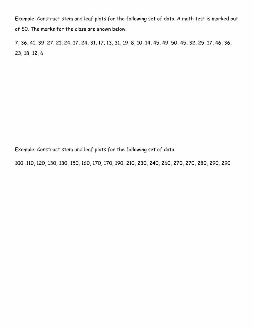
Example: The number of hours taken by transmission mechanics to remove, repair, and replace
transmissions in one of the Transmission Fix-It stores one day last week are recorded as
follows:
2.9 3.4 5.4 3.6 2.7 4.4 5.4 3.2 4.6 3.3 2.3 3.3 6.7 2.2 4.4
5.5 3.3 6.7 8.7 4.1
Construct a frequency distribution with 5 classes (intervals).
Example: Here are the ages of 50 members of a county social service program:
81 53 67 60 80 64 56 54 91 61 66 88 67 65 52
72 74 65 73 69 43 54 76 70 97 68 82 75 79 60
39 87 76 97 86 45 60 43 65 76 92 72 82 80 70
65 50 58 70 56
Create a frequency distribution with 7 intervals (classes).

Frequency Polygon: a graphical device for understanding the shapes of the distributions.
It is a good choice for displaying cumulative frequency distributions.
To create a frequency polygon:
1. “choose” a class interval
2. Draw an x-axis representing the values of the scores in your data
3. Mark the middle of each class interval with a tick mark and label it with the middle
value represented by the class (midpoint)
4. Draw the y-axis to indicate the frequency of each class
5. Place a point in the middle of each class interval at the height corresponding to its
frequency
6. Connect the points
You should include one class interval below the lowest value in your data and one above
the highest value.
Example: The table shows some information about the heights (h cm) of 60 plants. Draw a
frequency polygon to show this information.

Example: The table shows some information about the weights, in kg, of 100 boxes. Draw a
frequency polygon to show this information.
Example: 30 students ran a cross-country race. Each student’s time was recorded. The table
shows information about these times.

Cumulative Frequency Polygon: the same as a frequency polygon, except that the y-value for
each point is the number of items in the corresponding class interval PLUS all of the numbers in
the lower intervals.
Example: The frequency table gives information about the times it took some office workers to
get to the office one day. Draw a cumulative frequency polygon for this information.
Example: The table shows some information about the weights (w grams) of 60 apples. Draw a
cumulative frequency polygon to show this information.

Ogive: sometimes called a cumulative frequency polygon.
A type of frequency polygon that shows cumulative frequencies.
The cumulative percents are added on the graph from left to right.
An ogive graph plots cumulative frequency on the y-axis and class boundaries along the x-
axis. (This is very similar to a histogram, only instead of rectangles, an ogive has a single
point marking where the top right of the rectangle would be.)
It is usually easier to create this kind of graph from a frequency table.
Example: For the data given below, construct an ogive.
Example: For the data given below, construct an ogive.

Histograms
Histogram: a vertical bar graph that displays classes and frequencies from a frequency
distribution. (the bars DO touch.)
Bar graphs contain:
o A title
o A frequency on the vertical scale (y – axis)
o Classes on the horizontal scale (x – axis)
Histograms may ungrouped or grouped.
Example: Create a histogram for the following data.
x 3 4 5 6 7
f 2 5 10 1 8
Example: Create a histogram for the following data.
Annual Salary Number of Managers
15-25 12
25-35 37
35-45 26
45-55 19
55-65 6

Example: Construct a histogram to represent the following data. The number of hours of
television watched in a week:
2 2 2 3 3.5 3.5 4 4 5.5 5.5 5.5 6 8 8.5 8.5
8.5 8.5 8.5 8.5 9 9 9 9.5 12.5
Example: The scores on a mathematics test were 70, 55, 61, 80, 85, 72, 65, 40, 74, 68, and 84.
Complete the accompanying table, and use the table to construct a frequency histogram for
these scores.

Shapes of Histograms:
1. Normal or Symmetrical
2. Uniform or Rectangular
3. Left Skew (Negative)

4. Right Skew (Positive)
5. Bimodal

Time Series Graphs
Time Series Graphs represent data that occur over a specific period of time.
Example: Draw a time series graph of the daily amount of rainfall (in millimeters) based on the
following recorded data.
Example: The number of homicides that occurred in the workplace for the years 2003 to 2008
is shown. Construct a Time Series Graph.

Example: Create a time series graph using the end of the month stock prices in dollars for
General Motors for 2014 listed below.
Example: Create a time series graph using the US population data for 2000 to 2009 shown in
the table below. The data was accessed on January 19, 2015 from the US Census Bureau
website. These values are U.S. population estimates on July 1st of each year, rounded down to
the nearest million.