Communicating and visualising climate projections – user preferences and abilities amongst...
32
School of Earth and Environment Communicating and visualising climate projections – user preferences and abilities amongst adaptation practitioners in local authorities in Germany Susanne Lorenz, Suraje Dessai, Piers Forster, Jouni Paavola Third Nordic International Conference on Climate Change Adaptation, Copenhagen, 25-27 August 2014 Adapting to change: from research to decision-making Theme 2 – Mainstreaming 25 th August 2014 1
Transcript of Communicating and visualising climate projections – user preferences and abilities amongst...
School of Earth and Environment
Communicating and visualising climate
projections – user preferences and
abilities amongst adaptation practitioners
in local authorities in Germany
Susanne Lorenz, Suraje Dessai, Piers Forster, Jouni Paavola
Third Nordic International Conference on Climate Change Adaptation, Copenhagen,
25-27 August 2014 Adapting to change: from research to decision-making
Theme 2 – Mainstreaming
25th August 2014 1

• Climate visualisations and the ‘departure from rationality’
• Research questions and how we seek to answer them
• Results
– Objective comprehension
– Likelihood
– Confidence
– Trust
• Discussion
• Reality check
Overview
2
‘Although there are many guidelines for climate
communication, there is little empirical evidence of
their efficacy, whether or not dispassionately
explaining the science or for persuading people to
act in more sustainable ways.’ (Pidgeon & Fischhoff
2011: 35)
Research context
3
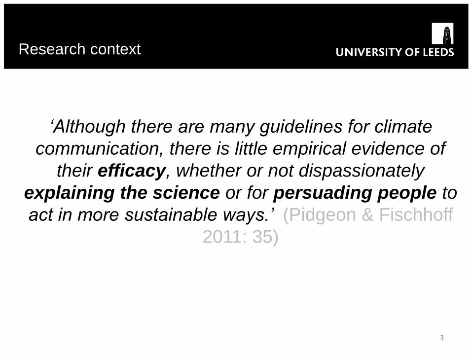
Why climate visualisations?
1. Help explore possible futures (Schneider 2012)
2. Make complexity easier to comprehend (Stengel et al.
2008)
3. Crucial tools for communicating and can function as
decision-making tools (Schneider 2012)
Research context
4
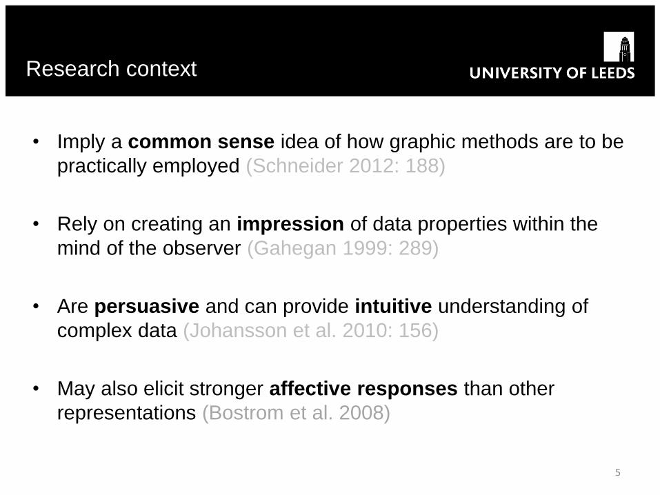
• Imply a common sense idea of how graphic methods are to be
practically employed (Schneider 2012: 188)
• Rely on creating an impression of data properties within the
mind of the observer (Gahegan 1999: 289)
• Are persuasive and can provide intuitive understanding of
complex data (Johansson et al. 2010: 156)
• May also elicit stronger affective responses than other
representations (Bostrom et al. 2008)
Research context
5
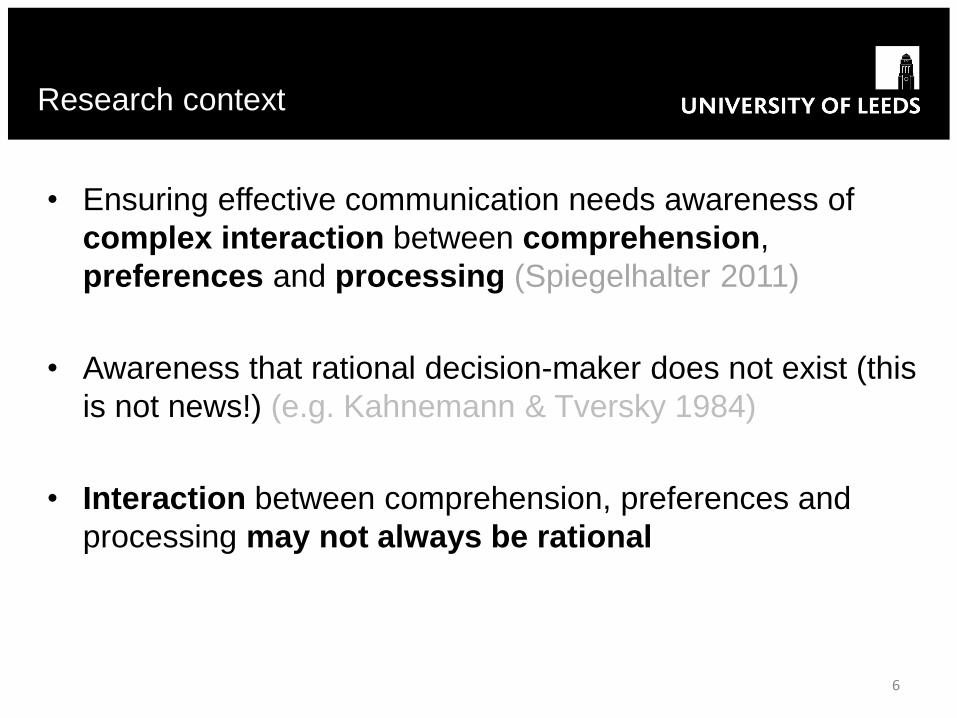
• Ensuring effective communication needs awareness of
complex interaction between comprehension,
preferences and processing (Spiegelhalter 2011)
• Awareness that rational decision-maker does not exist (this
is not news!) (e.g. Kahnemann & Tversky 1984)
• Interaction between comprehension, preferences and
processing may not always be rational
Research context
6
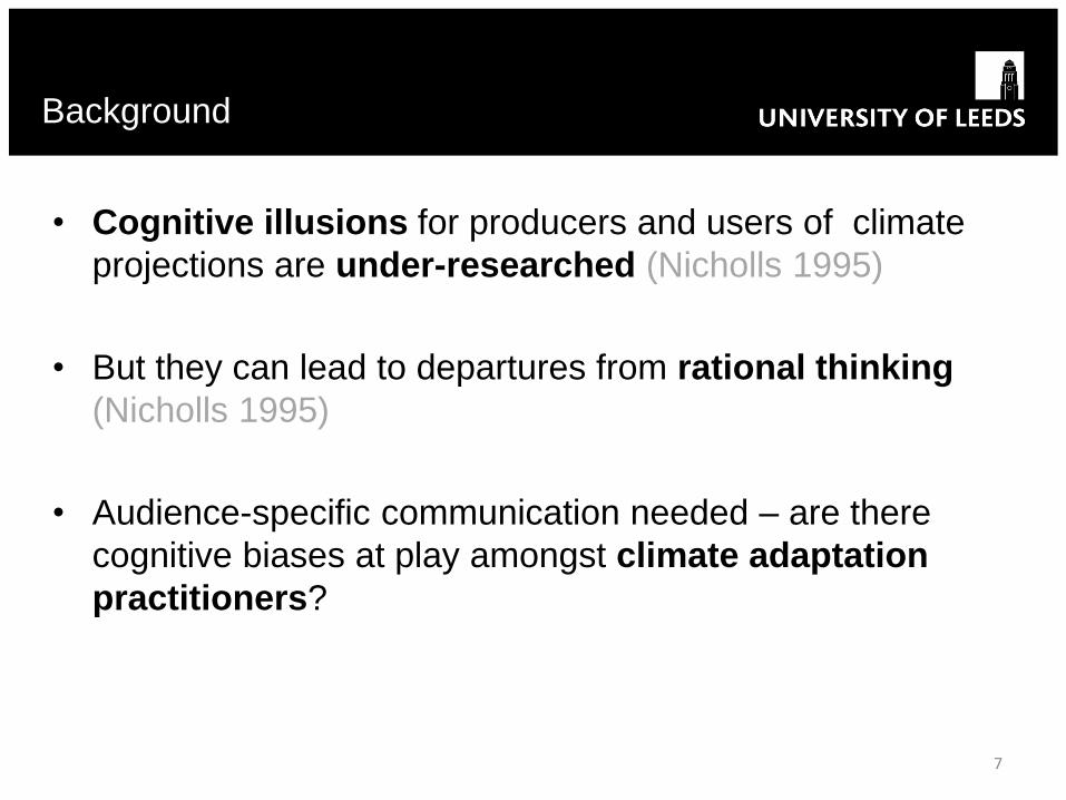
• Cognitive illusions for producers and users of climate
projections are under-researched (Nicholls 1995)
• But they can lead to departures from rational thinking
(Nicholls 1995)
• Audience-specific communication needed – are there
cognitive biases at play amongst climate adaptation
practitioners?
Background
7
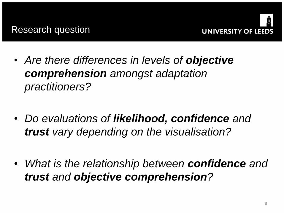
• Are there differences in levels of objective
comprehension amongst adaptation
practitioners?
• Do evaluations of likelihood, confidence and
trust vary depending on the visualisation?
• What is the relationship between confidence and
trust and objective comprehension?
Research question
8
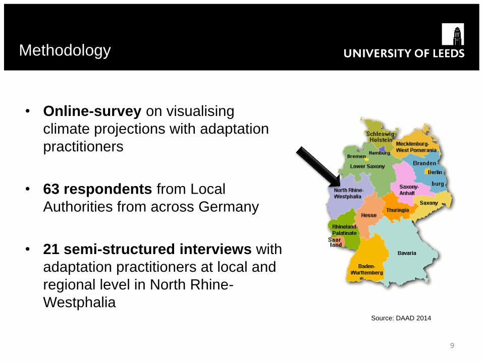
• Online-survey on visualising
climate projections with adaptation
practitioners
• 63 respondents from Local
Authorities from across Germany
• 21 semi-structured interviews with
adaptation practitioners at local and
regional level in North Rhine-
Westphalia
Methodology
9
Source: DAAD 2014
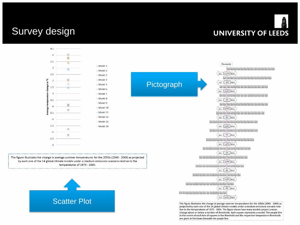
Survey design
10
Scatter Plot
Pictograph
Survey design
11
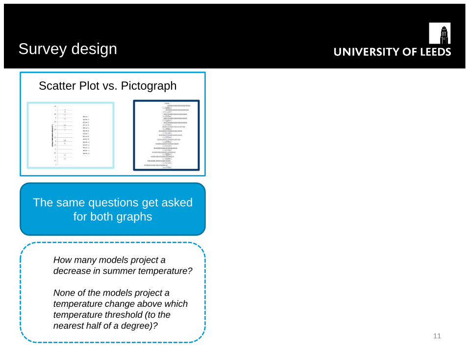
Scatter Plot vs. Pictograph
The same questions get asked
for both graphs
How many models project a
decrease in summer temperature?
None of the models project a
temperature change above which
temperature threshold (to the
nearest half of a degree)?

Survey design
12
Bubble Plot
Histogram
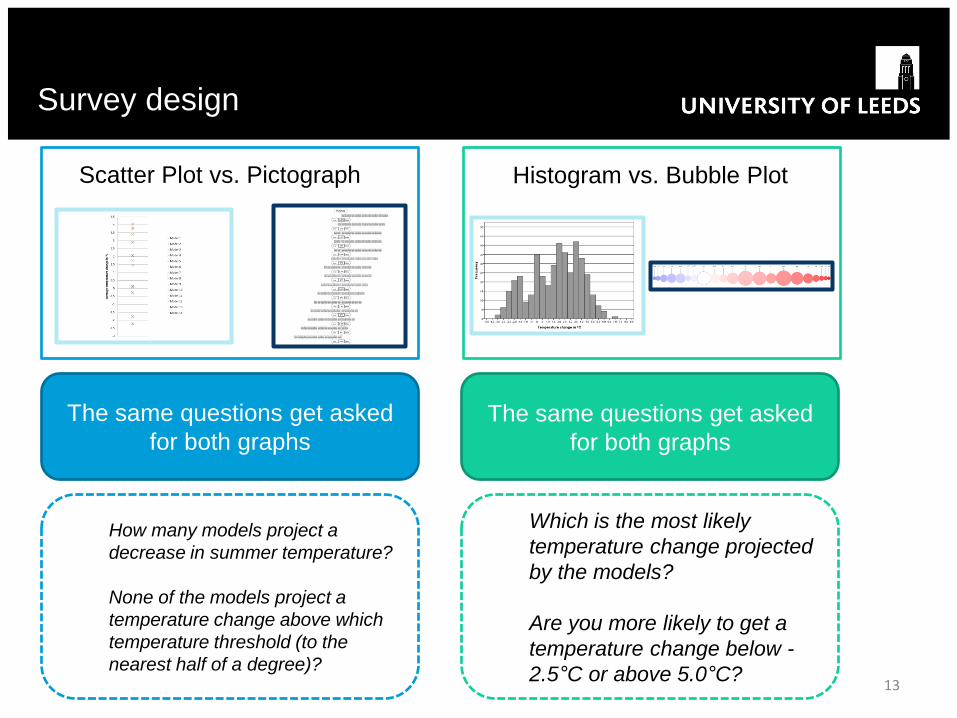
Survey design
13
Scatter Plot vs. Pictograph Histogram vs. Bubble Plot
The same questions get asked
for both graphs
The same questions get asked
for both graphs
How many models project a
decrease in summer temperature?
None of the models project a
temperature change above which
temperature threshold (to the
nearest half of a degree)?
Which is the most likely
temperature change projected
by the models?
Are you more likely to get a
temperature change below -
2.5°C or above 5.0°C?
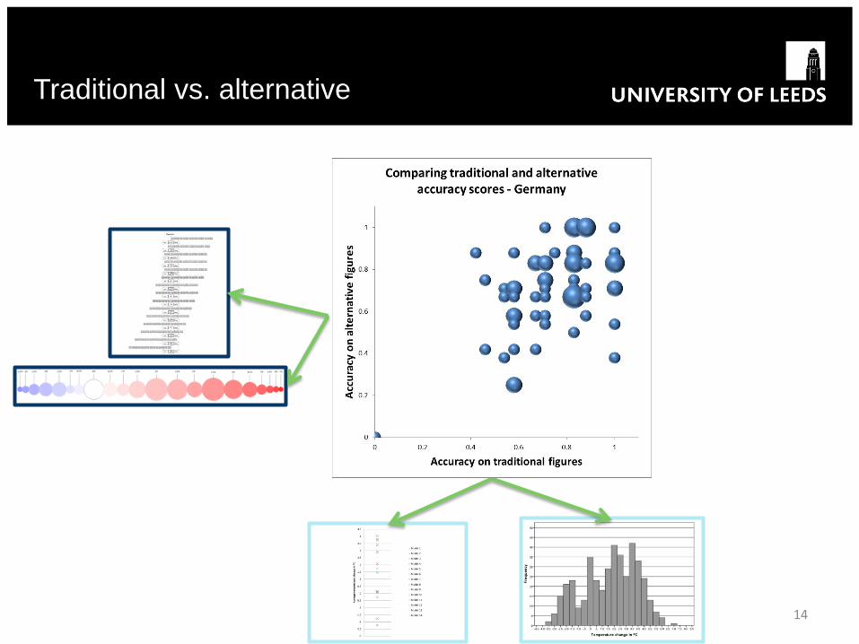
Traditional vs. alternative
14
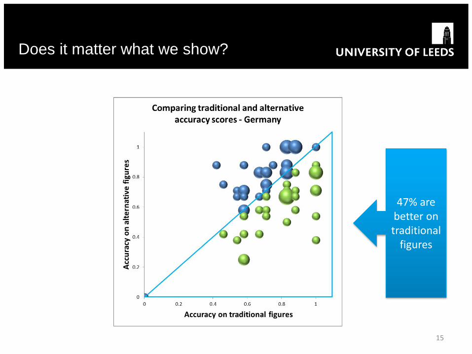
Does it matter what we show?
15
47% are better on traditional
figures
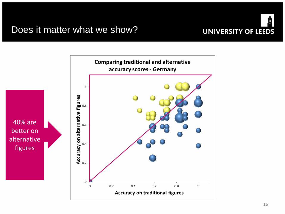
Does it matter what we show?
16
40% are better on
alternative figures
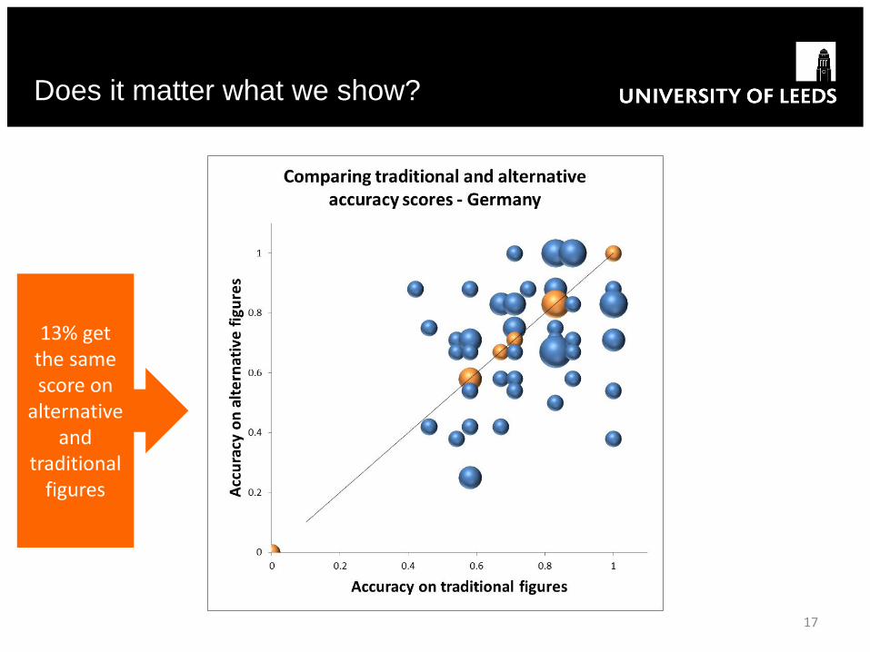
Does it matter what we show?
17
13% get the same score on
alternative and
traditional figures
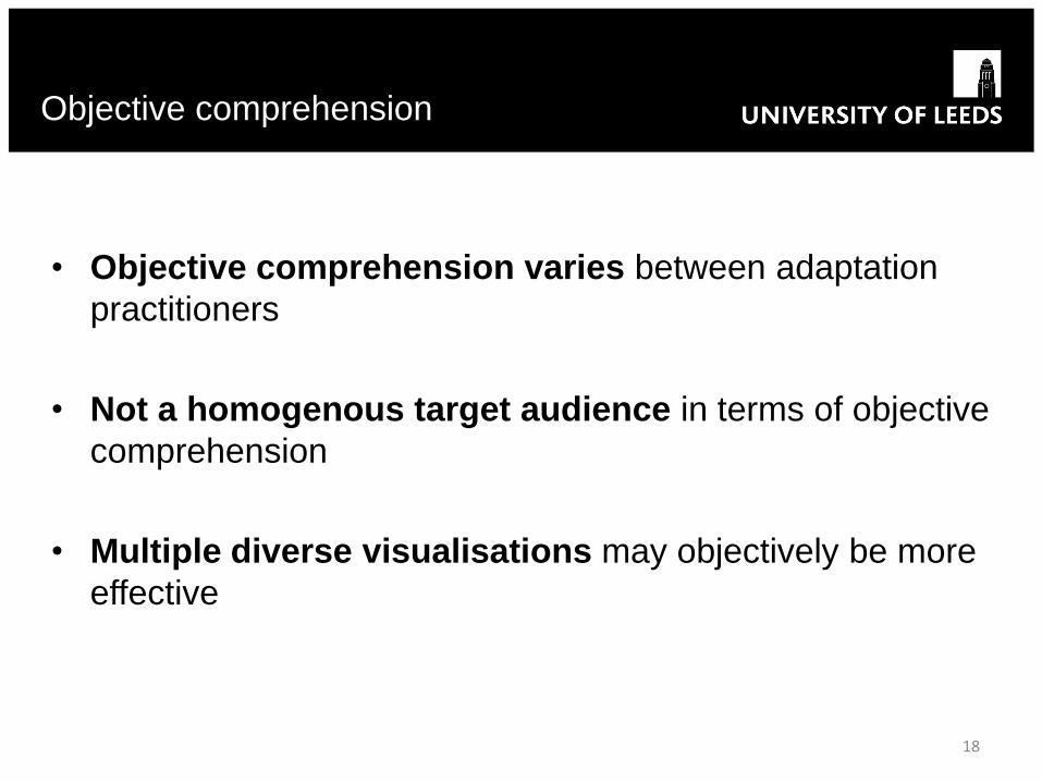
• Objective comprehension varies between adaptation
practitioners
• Not a homogenous target audience in terms of objective
comprehension
• Multiple diverse visualisations may objectively be more
effective
Objective comprehension
18
Likelihood
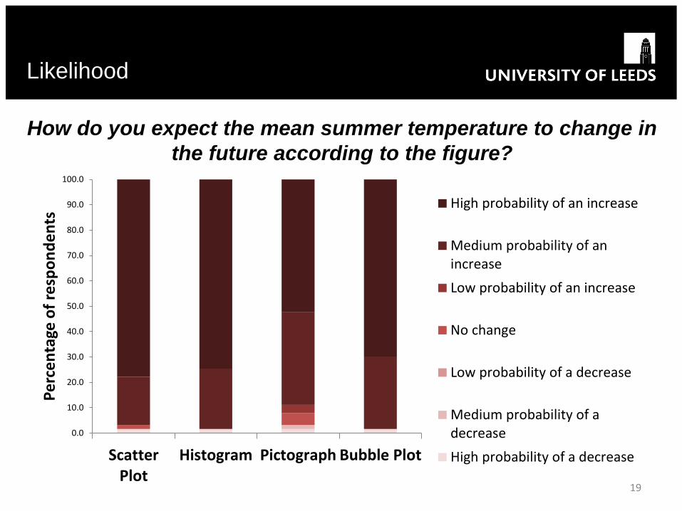
19
How do you expect the mean summer temperature to change in
the future according to the figure?
0.0
10.0
20.0
30.0
40.0
50.0
60.0
70.0
80.0
90.0
100.0
ScatterPlot
Histogram Pictograph Bubble Plot
Pe
rce
nta
ge o
f re
spo
nd
en
ts High probability of an increase
Medium probability of anincrease
Low probability of an increase
No change
Low probability of a decrease
Medium probability of adecrease
High probability of a decrease
• Likelihood estimation of temperature change does not vary
significantly between any of the four figures
• Likelihood estimation = independent of the figure?
• Prior biases/ expectations/ beliefs at play with this audience?
• Confirmation bias
– when users hold strong pre-existing beliefs regarding future
climate
– Attend more to information that confirms pre-existing
beliefs
Likelihood
20
Confidence
21
0.0
10.0
20.0
30.0
40.0
50.0
60.0
70.0
80.0
90.0
100.0
Scatter Plot Histogram Pictograph Bubble Plot
Pe
rce
nta
ge o
f re
spo
nd
en
ts
Confidence Level 6
Confidence Level 5
Confidence Level 4
Confidence Level 3
Confidence Level 2
Confidence Level 1
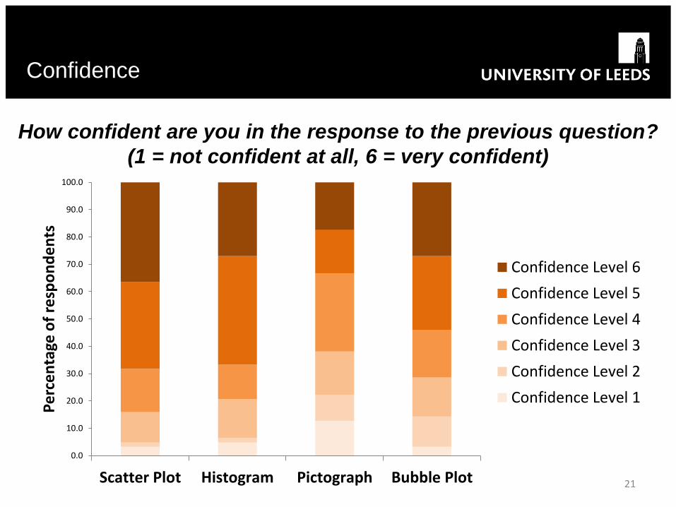
How confident are you in the response to the previous question?
(1 = not confident at all, 6 = very confident)

• Whereas likelihood does not vary, there are significant
differences in confidence between most figures
• Exception: Histogram vs. Bubble Plot
• Only just not significant with a p value of 0.051 (Wilcoxon signed
rank test)
Confidence
22
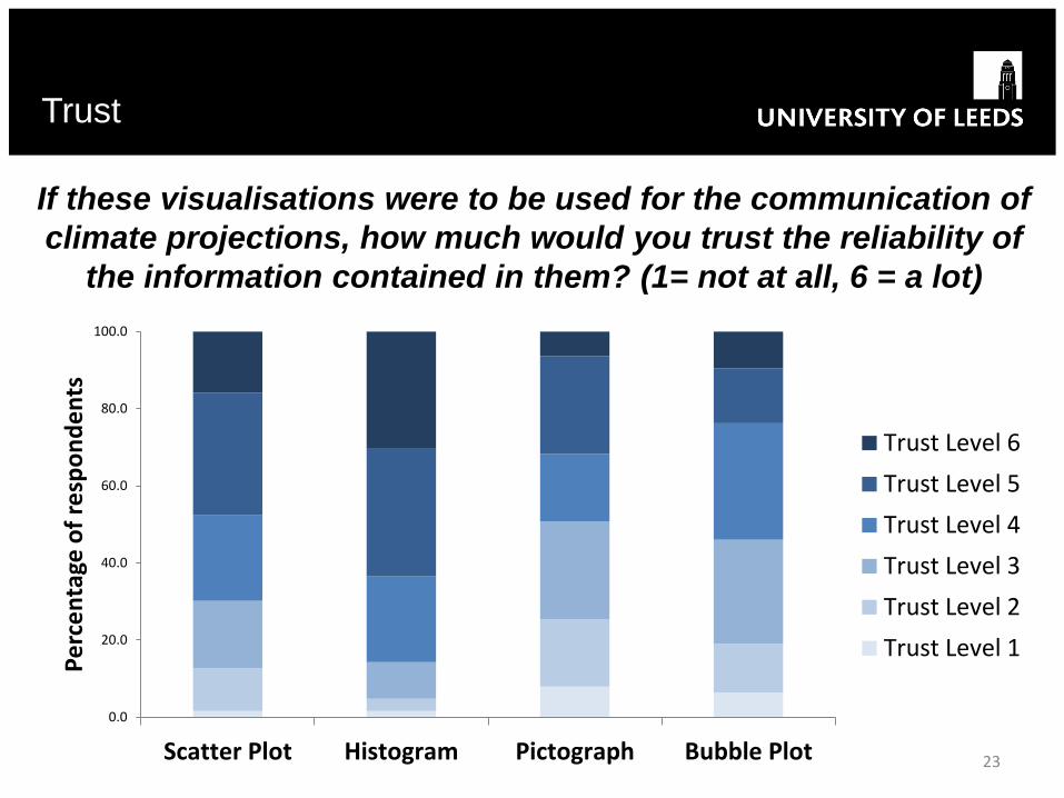
Trust
23
If these visualisations were to be used for the communication of
climate projections, how much would you trust the reliability of
the information contained in them? (1= not at all, 6 = a lot)
0.0
20.0
40.0
60.0
80.0
100.0
Scatter Plot Histogram Pictograph Bubble Plot
Pe
rce
nta
ge o
f re
spo
nd
en
ts
Trust Level 6
Trust Level 5
Trust Level 4
Trust Level 3
Trust Level 2
Trust Level 1

• As with confidence, there are also significant differences in
trust between most figures (Wilcoxon Signed Rank test)
• Exception: Pictograph vs. Bubble Plot
Trust
24
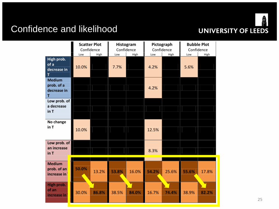
Confidence and likelihood
25
Scatter Plot Confidence
Histogram Confidence
Pictograph Confidence
Bubble Plot Confidence
Low High Low High Low High Low High
High prob. of a decrease in T
10.0% 0% 7.7% 0% 4.2% 0% 5.6% 0%
Medium prob. of a decrease in T
0% 0% 0% 0% 4.2% 0% 0% 0%
Low prob. of a decrease in T
0% 0% 0% 0% 0% 0% 0% 0%
No change in T
10.0% 0% 0.0% 0% 12.5% 0% 0% 0%
Low prob. of an increase in T
0% 0% 0% 0% 8.3% 0% 0% 0%
Medium prob. of an increase in T
50.0%
13.2% 53.8% 16.0% 54.2% 25.6% 55.6% 17.8%
High prob. of an increase in T
30.0% 86.8% 38.5% 84.0% 16.7% 74.4% 38.9% 82.2%

• Strong association between estimated likelihood and
confidence
• Content familiarity - window onto a familiar world (Roth
2002, Sha & Freedman 2011
• Content familiarity - attempt to confirm or disconfirm
relationships based on prior expectations or beliefs (Sha &
Freedman 2011)
• Confirmation bias – mean summer temperature change
expected in Germany – not a surprise?
Confidence and likelihood
26
• For Histogram, Scatter Plot, Bubble Plot confidence seems to
be high regardless of level of trust
• Confidence more internal (self-assessed) – trust more
external
• Trusting your abilities vs. believing what you see
• Relationship for pictograph seems more logical – in that low trust
links to low confidence and high trust links to high confidence
• More ‘logical’ judgements when confronted with something new/
unfamiliar?
Confidence and trust
27

• Only significant association between confidence and objective
comprehension for the pictograph (only small effect size,
Kruskall-Wallis test)
– Respondents with higher objective comprehension are also more
confident in their assessment, lower objective comprehension are
less confidence
• Lack of an association for the other -> objective comprehension
is not linked to subjective confidence?
• Maybe link does exist for the unfamiliar visualisations only?
Confidence and objective
comprehension
28

• Awareness of variability within the target audience - objective
comprehension, confidence and trust are all variable
• The only ‘constant’ seems to be likelihood – due to a cognitive
bias?
• Evaluating effectiveness of visualisations does not just depend
on objective comprehension and preferences but also on the
cognitive biases that might be at play
• Balance showing familiar visualisations (risk stronger biases)
with unfamiliar visualisations (possibly more logical processing)
but less willingness to engage?
Conclusion
29
• No mandatory legislative targets for adaptation at local
government scale in Germany (though this would be welcomed
by practitioners)
• Most activity focuses on awareness raising in majority of councils
- adaptation is in the starting blocks
• Climate projections are rarely needed/ used – only for specific
projects in the bigger cities
• But, if climate communication is mainly used for awareness
raising, do we need greater recognition of cognitive biases that
can help/ hinder both the explanation of the science and potential
persuasion/ buy in for action?
Practical ‘reality check’
30

Thank you!
Susanne Lorenz
School of Earth and Environment
University of Leeds, UK
http://www.see.leeds.ac.uk/people/s.lorenz
https://twitter.com/Susanne_Lorenz
31
• Bostrom, Ann, Luc Anselin, and Jeremy Farris. 2008. Visualizing seismic risk and uncertainty. Annals
of the New York Academy of Sciences. 1128(1), pp.29-40.
• DAAD. 2014. [Online] . [Accessed 18th August 2014] . Available from: https://www.daad.org/links
• Gahegan, Mark. 2000. The case for inductive and visual techniques in the analysis of spatial
data. Journal of Geographical Systems. 2(1), pp.77-83.
• Johansson J, T-S. Neset, B-O. Linner. 2010. Evaluating climate visualization: an information
visualization approach. in Information Visualisation (IV), 14th International Conference, IEEE, pp. 156-
161.
• Kahneman D., A. Tversky. 1984. Coices, Values, and Frames. American Psychologist. 39, pp.341-350.
• Pidgeon, Nick, Baruch Fischhoff. 2011. The role of social and decision sciences in communicating
uncertain climate risks. Nature Climate Change . 1(1), pp.35-41.
• Roth, Wolff-Michael. "Reading graphs: Contributions to an integrative concept of literacy." Journal of
Curriculum Studies 34.1 (2002): 1-24.
• Schneider, Birgit. 2012. Climate model simulation visualization from a visual studies perspective. Wiley
Interdisciplinary Reviews: Climate Change. 3(2), pp.185-193.
• Shah P., E.G. Freedman. 2011. Bar and Line Graph Comprehension: An Interaction of Top-Down and
Bottom-Up Processes. Topics in Cognitive Science. 3, pp.560-578.
• Spiegelhalter, David, Mike Pearson, and Ian Short. 2011. Visualizing uncertainty about the
future. Science . 333(6048), pp.1393-1400.
• Stengel, Dirk, Georgio M. Calori, and Peter V. Giannoudis. 2008. Graphical data
presentation. Injury. 39(6), pp.659-665.
References
32