Experiential Brand Activation on Customer Brand Trust in ...
Upload
khangminh22Category
view
0download
0
B R A N D G U I D E L I N E S

This document serves as a resource for understanding and applying the Colorado Community
College System brand, identity and creative expression. It provides standards for the use of logos,
artwork, color palette, typography and other key visual elements.
These guidelines are based on a discovery process that took place throughout 2017-18. Thorough
and highly inclusive, this effort drew from a wide cross-section of Colorado Community College
System constituents.
A living reference, this guide is intended to serve as a resource and a starting point for
communications and creative professionals charged with articulating and representing the
institution's brand. It is intended to be a developing body of work that will evolve moving forward.
For information or questions about these guidelines and usage permissions, please contact
The Office of Public Affairs
WELCOME TO COLORADO COMMUNITY COLLEGE SYSTEM BRAND GUIDELINES
BRAND GUIDELINES

DESIGN ASSETS
BRAND GUIDELINES

4C O L O R A D O C O M M U N I T Y C O L L E G E S Y S T E M
B R A N D G U I D E L I N E SBrand Mark
PRIMARY HORIZONTAL LOGO
This is the Colorado Community College System primary logo. To establish brand consistency, it should be used whenever possible to represent the system as a whole.
Its construction allows for maximum versatility and usage, either on its own or as a part of a larger system.
——————
Preferred Full-Color LogoThe Pantone, CMYK or RGB full-color logos are preferred. Use Pantone or CMYK for any print use such as collateral or business materials. Use RGB for electronic use such as PowerPoint presentations, digital or video.
Reverse (Knockout) LogosUse the reverse logos for applications on color or photographic backgrounds. Always ensure that the background you choose provides sufficient contrast for the logo.
FULL-COLOR LOGO
REVERSE LOGOS

5C O L O R A D O C O M M U N I T Y C O L L E G E S Y S T E M
B R A N D G U I D E L I N E SBrand Mark
SECONDARY LOGO
This is the Colorado Community College System's secondary abbreviated logo. It should be used whenever using the primary logo is not possible due to spacing restrictions, etc.
——————
Preferred Full-Color LogoThe Pantone, CMYK or RGB full-color logos are preferred. Use Pantone or CMYK for any print use such as collateral or business materials. Use RGB for electronic use such as PowerPoint presentations, digital or video.
Reverse (Knockout) LogosUse the reverse logos for applications on color or photographic backgrounds. Always ensure that the background you choose provides sufficient contrast for the logo.
FULL-COLOR LOGO
REVERSE LOGOS

6C O L O R A D O C O M M U N I T Y C O L L E G E S Y S T E M
B R A N D G U I D E L I N E SBrand Mark
TERTIARY LOGO
This is the Colorado Community College System's tertiary stacked logo. Its compact construction allows for maximum versatility and usage, either on its own or as a part of a larger system. Best use of this logo is when used along with centered layouts and text.
——————
Preferred Full-Color LogoThe Pantone, CMYK or RGB full-color logos are preferred. Use Pantone or CMYK for any print use such as collateral or business materials. Use RGB for electronic use such as PowerPoint presentations, digital or video.
Reverse (Knockout) LogosUse the reverse logos for applications on color or photographic backgrounds. Always ensure that the background you choose provides sufficient contrast for the logo.
FULL-COLOR LOGO
REVERSE LOGOS

7C O L O R A D O C O M M U N I T Y C O L L E G E S Y S T E M
B R A N D G U I D E L I N E SBrand Mark
MINIMUM SPACE — PRIMARY LOGO
To ensure visibility and legibility, logos should never
be presented in sizes smaller than the requirements
shown on this page.
To maintain visual integrity, applications using
alternative reproduction techniques such as
embroidery and silkscreen may require presenting
the logos at larger sizes than indicated here.
These are only minimum sizes. Logos should be
sized appropriately for the piece being designed.
Consult your print vendor for specifics on minimum
sizes based on the piece you are creating.
PRIMARY HORIZONTAL LOGO
Print 2 in Digital 250px

8C O L O R A D O C O M M U N I T Y C O L L E G E S Y S T E M
B R A N D G U I D E L I N E SBrand Mark
MINIMUM SPACE — SECONDARY & TERTIARY LOGOS
To ensure visibility and legibility, logos should never
be presented in sizes smaller than the requirements
shown on this page.
To maintain visual integrity, applications using
alternative reproduction techniques such as
embroidery and silkscreen may require presenting
the logos at larger sizes than indicated here.
These are only minimum sizes. Logos should be
sized appropriately for the piece being designed.
Consult your print vendor for specifics on minimum
sizes based on the piece you are creating.
SECONDARY LOGO
Digital 100pxPrint 1 in
TERTIARY STACKED LOGO
Print 1.25 in Digital 150px

9C O L O R A D O C O M M U N I T Y C O L L E G E S Y S T E M
B R A N D G U I D E L I N E SBrand Mark
CLEAR SPACE
Whenever you use the logo, it should be surrounded
with clear space to ensure its visibility and impact.
No graphic elements of any kind should appear
inside this zone.
Clear space in primary and tertiary stacked logos
equals the height of “C" in "Colorado” (X).
Clear space in secondary logo equals the height of
the flame in the middle C (in gray flame).
The clear space rule applies to all Colorado
Community College System logos.
X
X X
X
X
X
X X
X
X

1 0C O L O R A D O C O M M U N I T Y C O L L E G E S Y S T E M
B R A N D G U I D E L I N E SBrand Mark
HORIZONTAL LOGO PLACEMENT
The justified appearance of the horizontal logo allows it to be aligned to any edge of the paper or be placed at the center.
On printed materials the minimum distance from the edges of the logo to the edges of the piece should be equal to the height of the C in the word Colorado.
Placement of the logo on promotional pieces is more flexible based on the relationship to artwork
and photos.

1 1C O L O R A D O C O M M U N I T Y C O L L E G E S Y S T E M
B R A N D G U I D E L I N E SBrand Mark
SECONDARY LOGO PLACEMENT
The secondary logo should be mainly used whenever the primary logo is not possible due to spacing restrictions, or when using the full name becomes redundant. Its placement is versatile as it can be placed in the center, right or left justified.
On printed materials the minimum distance from the edges of the logo to the edges of the piece should be equal to the height of the flame.
Placement of the logo on promotional pieces is more flexible based on the relationship to artwork and photos.

1 2C O L O R A D O C O M M U N I T Y C O L L E G E S Y S T E M
B R A N D G U I D E L I N E SBrand Mark
TERTIARY LOGO PLACEMENT
To maintain a consistency in appearance, the logo should be mainly used centered on the page.
On printed materials the minimum distance from the edges of the logo to the edges of the piece should be equal to the height of the C in the word Colorado.
Placement of the logo on promotional pieces is more flexible based on the relationship to artwork and photos.

1 3C O L O R A D O C O M M U N I T Y C O L L E G E S Y S T E M
B R A N D G U I D E L I N E SBrand Mark
COLORADO COMMUNITY COLLEGE SYSTEM SEAL
This is the Colorado Community College System's seal logo and it's approved color variations.
——————
Preferred Full-Color LogoThe Pantone, CMYK or RGB full-color logos are preferred. Use Pantone or CMYK for any print use such as collateral or business materials. Use RGB for electronic use such as PowerPoint presentations, digital or video.
——————
CLEAR SPACEWhenever you use the logo, it should be
surrounded with clear space to ensure its visibility
and impact. No graphic elements of any kind
should appear inside this zone.
Clear space in seal logo equals the height of the flame in the middle C (in gray flame).
APPROVED COLOR VARIATIONS
Pantone® PMS 302
CMYK 100/43/12/56
RGB 0/65/101
HEX #004165
Pantone® PMS 7534
CMYK 4/4/13/8
RGB 215/211/199
HEX #d7d3c7
Pantone® PMS 1225
CMYK 0/17/68/0
RGB 255/203/79
HEX #ffcb4f
1 4C O L O R A D O C O M M U N I T Y C O L L E G E S Y S T E M
B R A N D G U I D E L I N E SBrand Mark
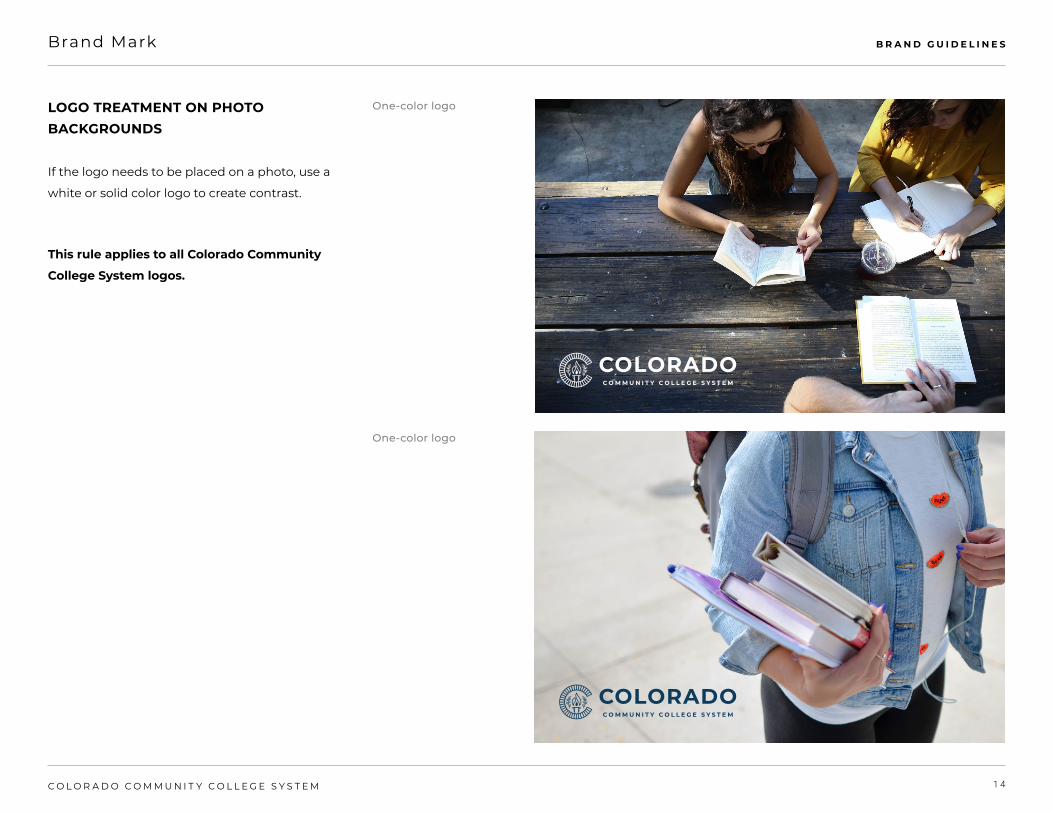
LOGO TREATMENT ON PHOTO BACKGROUNDS
If the logo needs to be placed on a photo, use a
white or solid color logo to create contrast.
This rule applies to all Colorado Community
College System logos.
One-color logo
One-color logo

1 5C O L O R A D O C O M M U N I T Y C O L L E G E S Y S T E M
B R A N D G U I D E L I N E SBrand Mark
INCORRECT LOGO USE
Correct and consistent use of the primary logo
is an essential part of building brand equity.
While a great deal of flexibility has been built
into the visual identity system, the correct use
of each element has been carefully defined.
The examples shown here represent some–but
not all–of the ways the Colorado Community
College System logos might be used incorrectly.
If you have questions about the correct or
incorrect use of the school’s logos, contact The
Office of Marketing and Public Relations.
Incorrect logo rules apply to all Colorado
Community College System logos.
DO NOT add a drop shadow or any other effects to the logo.
DO NOT place the primary logo in a container shape of any type.
DO NOT add additional information to the primary logo.
DO NOT place the logo on a color that does not provide sufficient contrast.
DO NOT place the logo on visually distracting backgrounds.
DO NOT change the typeface of any part of the logo.
DO NOT use unapproved color configurations of the logo.DO NOT use unapproved colors for the logo.
FUNDRAISING EVENT

1 6C O L O R A D O C O M M U N I T Y C O L L E G E S Y S T E M
B R A N D G U I D E L I N E S
x
Brand Mark
CO-BRANDING
Co-branding helps show unification between
Colorado Community College System and our
partners. When co-branding communications,
it is critical to follow all the guidance in this
manual.
The Colorado Community College System logo
should be placed on the left with a divider line
separating partner logo(s) to the right.
The divider line should be a stroke of 1 point
and gray (30% black).
It is important to ensure all partner logos are
of visually equal weight and nothing has more
prominence than the Colorado Community
College System logo.
Colorado Community College System clear
space for logos must be observed with
increased space of 2x the width of two C's in
Colorado (in gray).
Co-branding rules apply to all Colorado
Community College System logos.2
x
1 7C O L O R A D O C O M M U N I T Y C O L L E G E S Y S T E M
B R A N D G U I D E L I N E SColor Palette
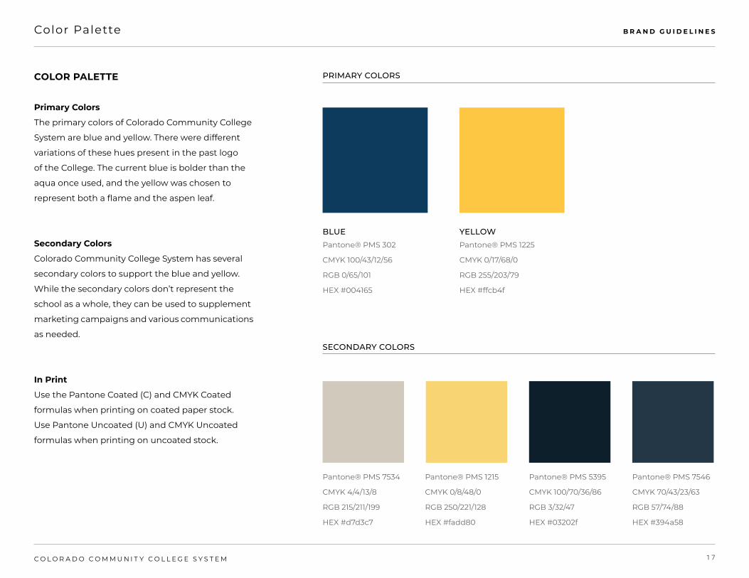
COLOR PALETTE
Primary Colors
The primary colors of Colorado Community College
System are blue and yellow. There were different
variations of these hues present in the past logo
of the College. The current blue is bolder than the
aqua once used, and the yellow was chosen to
represent both a flame and the aspen leaf.
Secondary Colors
Colorado Community College System has several
secondary colors to support the blue and yellow.
While the secondary colors don’t represent the
school as a whole, they can be used to supplement
marketing campaigns and various communications
as needed.
In Print
Use the Pantone Coated (C) and CMYK Coated
formulas when printing on coated paper stock.
Use Pantone Uncoated (U) and CMYK Uncoated
formulas when printing on uncoated stock.
Pantone® PMS 302
CMYK 100/43/12/56
RGB 0/65/101
HEX #004165
Pantone® PMS 7534
CMYK 4/4/13/8
RGB 215/211/199
HEX #d7d3c7
Pantone® PMS 1215
CMYK 0/8/48/0
RGB 250/221/128
HEX #fadd80
Pantone® PMS 5395
CMYK 100/70/36/86
RGB 3/32/47
HEX #03202f
Pantone® PMS 7546
CMYK 70/43/23/63
RGB 57/74/88
HEX #394a58
Pantone® PMS 1225
CMYK 0/17/68/0
RGB 255/203/79
HEX #ffcb4f
BLUE YELLOW
PRIMARY COLORS
SECONDARY COLORS

1 8C O L O R A D O C O M M U N I T Y C O L L E G E S Y S T E M
B R A N D G U I D E L I N E STypography
TYPEFACES
Montserrat
Montserrat is a simple and versatile sans serif
font with a modern feel. This family of fonts
is the most flexible system available for use
in the Colorado Community College System
brand. All weights and faces are available
for use, but should be used with discretion
where appropriate. Montserrat is the primary
typeface for both headlines and body in
marketing materials in print and on web.
Playfair Display
Playfair Display is a secondary font in the
Colorado Community College System brand.
It is a sophisticated serif font and is used as
a supporting typeface, although it can be a
nice switch up from the primary typeface. It
can also be used for headlines and unique
call outs such as displaying quotations and
numbers in both print and web.
MONTSERRAT PLAYFAIR DISPLAY
RegularItalicBoldBold ItalicBlackBlack Italic
ThinThin ItalicExtraLightExtraLight ItalicLightLight ItalicRegularItalicMediumMedium ItalicSemiBoldSemiBold ItalicBoldBold ItalicExtraBoldExtraBold ItalicBlackBlack Italic

1 9C O L O R A D O C O M M U N I T Y C O L L E G E S Y S T E M
B R A N D G U I D E L I N E SBranding Graphics
Graphics
Aspen Leaf
These 3 vector illustrations of the aspen leaf are
graphics that can be used to enhance branding
in print and digital applications. Different uses for
these graphics includes being a placeholder for
text or the Colorado Community College System
logos, placing it on top of photos in a subtle, clean
manner, etc.
Pattern
This diagonal line pattern is set at a 45 degree
angle with a stroke size of 1 point. The diagonal
lines can be placed on top of photos, behind text,
and overlapping with other blocks of color and
images.
Icons
These icons contain elements of the Colorado
Community College System brand and can be
used as a graphic to give ordinary content
greater substance.
All graphics must be used in a clean and
sophisticated manner, making sure text is
readable at all times.

2 0C O L O R A D O C O M M U N I T Y C O L L E G E S Y S T E M
B R A N D G U I D E L I N E SPhotography
AUTHENTIC, DIVERSE, PASSIONATE AND CONFIDENT
Utilizing the following photography principles is
essential in consistently presenting the Colorado
Community College System brand. All photo
choices should aim to make an emotional
connection with the viewer, while still feeling
genuine and authentic. Shots of individuals should
show them working to achieve a goal or in the
immediate moment after, or celebrating their
accomplishment. Group photos should show
individuals interaction with one another in a fun
and relevant setting.
Have a Natural Light Source:
Both indoor and outdoor shots should use a natural
light source with an easily identifiable direction.
Use a Slightly Indirect Camera Angle:
Unusual or unexpected indirect camera angles that
imply aspiration or accomplishment add a uniquely
energetic quality to the composition.
Use Shallow Depth of Field:
Whenever possible, photographs should show
dimension, a sense of space and environment
using a shallow depth of field.
All photography here is for positioning only.

2 1C O L O R A D O C O M M U N I T Y C O L L E G E S Y S T E M
B R A N D G U I D E L I N E SGraphic/Photography Usage
Acceptable Usage of Graphics and Photography
These are all acceptable ways of applying the
graphics, colors, photography, and typography to
the Colorado Community College System brand.
*NOTE* alternate color variations are OK to use
as long as they are approved by The Office of
Marketing and Public Relations.

For information or questions about these guidelines and usage permissions, please contact
The Office of Public Affairs
QUESTIONS?
BRAND GUIDELINES
Copyright © 2022 FDOKUMEN