Brand guidelines - eDreams
24
Brand guidelines
-
Upload
khangminh22 -
Category
Documents
-
view
5 -
download
0
Transcript of Brand guidelines - eDreams

Brand guidelines

Dream the sky.Make it yours.

Visual identity
LogoVisual elementsImagery
IndexPlease note this is an interactive (so clickable) guideline.

Brand guidelines
Visual identity
Logo Visual elementsImagery

Brand guidelines
Visual identity > Logo
Visual identity
Logo The logo is the core of a brand’s identity.
Find out about the logo’s elements, variations and how to apply it in a consistent way.

Brand guidelines
3
Symbol Logotype
Logo
ArchitectureThe logo is a graphic comprised of the wordmark (logotype) and figurative mark (symbol).
The lettering is created using the Netto typeface, and the three dreaming bubbles are inseperable. The logo should be always produced from the master artwork.
Use the complete logo. The only time you should use the symbol alone is on the eDreams website or social media channels where there are other elements to help the user recognise the brand.
The logo can also be accompanied by a slogan.
Visual identity > Logo > Architecture

Brand guidelines
4
Vertical versionThe horizontal version of the logo is the official version, and should be used in all media.
However, in exceptional cases where there is not enough space for the usual logo, you can use the vertical version of the eDreams logo.
You should avoid using this version unless it is strictly necessary.
Visual identity > Logo > Vertical version

Brand guidelines
5
LegibilityAn exclusion zone around the logo has been created to protect its integrity and make sure the logo is easy to read.
The height of the “e” of the logo is taken as a guide to define the exclusion zone.
Exclusion zone
Minimum size online
60px
Minimum size offline
20 mm
Visual identity > Logo > Legibility
Brand guidelines
6
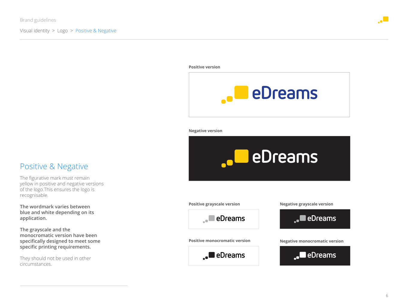
Positive & NegativeThe figurative mark must remain yellow in positive and negative versions of the logo.This ensures the logo is recognisable.
The wordmark varies between blue and white depending on its application.
The grayscale and the monocromatic version have been specifically designed to meet some specific printing requirements.
They should not be used in other circumstances.
Positive version
Negative version
Positive grayscale version
Positive monocromatic version
Negative grayscale version
Negative monocromatic version
Visual identity > Logo > Positive & Negative

Brand guidelines
7
Don’tsIt is not allowed to alter the structure, colour, proportions, elements or the direction of the logo.
Move elements Remove elements
Stretch or transform
OutlineChange colors
Change the font
Add elements
Adding shadows
Visual identity > Logo > Don'ts

Brand guidelines
8
Background coloursYou should always try to use the positive (main) version of the logo. However, when the background is the same colour as an element of the logo you can use the negative version.
Avoid using the logo on a plain yellow background. If this cannot be avoided, use the black monocromatic version to ensure legibility.
Application over plain colour
White background
Blue background
Yellow backgrounds
Visual identity > Logo > Background colours

Brand guidelines
9
Background imagesUse the main (positive) version on light backgrounds.
Use the negative version on dark backgrounds which do not contrast with the blue part of the logo.
If the background picture is too complex, and it is difficult to read the logo, we strongly recommended using a different image.
Use a solid corporate colour label behind the logo if there is no other option.
Light background
Dark background
Complex background
Application over image backgrounds
Visual identity > Logo > Background imagery

Brand guidelines
49
Communication > Video > Opening and closing
Opening and closing eDreams animation
Frame 1 Frame 2 Frame 3
Frame 4 Frame 5 Frame 6
Opening and closing A smooth animation of the eDreams logo (the bubbles and name appear at the beginning and disappear at the end).

Brand guidelines
50
Video mark on a video with starting and closing
Key element on an independent video (without starting and closing)
Communication > Video > Video mark
Video markThe eDreams symbol or logo is applied to the top right-hand corner of all videos. It can be applied in colour or in negative, depending on the video requirements.
Videos with opening and closing animations should have the eDreams symbol in the top left-hand corner.
Independent videos or video cuts without the opening and closing sequences need the complete eDreams logo. These rules are flexible in order to adapt the video to the different platforms.

Brand guidelines
10
Favicon and app iconThe eDreams favicon graphic is linked with the eDreams website. It is a smaller representation of the brand for the browser and for the mobile interfaces.
Take into account that the favicon is not the brand logo and should never replace the logo.
It can be used as 32x32px.
Visual identity > Logo > Favicon app icon

Brand guidelines
Visual identity > Visual elements
Visual identity
Visual elements Elements such as the colour palette, typography and iconography help to build a consistent brand environment.
These elements help customers recognise our brand even if the logo is not present.

Brand guidelines
12
Visual identity > Visual elements > Colour palette
Colour palettePrimary colourseDreams Blue (Pantone 286) is the main colour of the eDreams identity so it has the strongest presence on our brand.
eDreams Yellow (Pantone 109)complements the eDreams Blue colour, creating balance and making the palette more distinctive and sophisticated.
eDreams White balances the other colours and gives space to the elements.
Secondary coloursThese colours provide flexibility when you need to present a large variety of elements. They should be used to accent the primary palette, never dominate the piece.
eDreams Cyan contrasts the eDreams Blue.
eDreams Grey contrasts the cool corporate colours, adding warmth.
eDreams Light blue provides dynamism and a contemporary look.
Pantone 109
CMYK C0 M12 Y100 K0RGB R255 G204 B0Hex FFCC00
Pantone 286
CMYK C100 M75 Y0 K0RGB R0 G51 B153Hex 003399
White
CMYK C0 M0 Y0 K0RGB R255 G255 B255Hex FFFFFF
Pantone 9100 C CMYK C3 M2 Y4 K0RGB R45 G44 B40Hex F5F4F0
PantoneCMYK C88 M76 Y0 K0RGB R30 G67 B213Hex 1E43D5
Pantone 2727 U CMYK C73 M43 Y0 K0RGB R25 G140 B251Hex 198CFB

Brand guidelines
13
Visual identity > Visual elements > Typography
TypographyThe Open Sans family can be used in all weights. It solves hierarchy issues in a easy and clean way.
Use Open Sans Light for generic content and Open Sans Semibold to highlight specific content.
The Heiti SC family can also be used in all weights.
abcdefghijklmanñopqrstuvwxyzABCDEFGHIJKLMANÑOPQRSTUVWXYZ 0123456789 ‘ ? ! ” ( % ) # @ / & < - + ÷ × = > $ € : ; , . *
Open Sans Light
abcdefghijklmanñopqrstuvwxyzABCDEFGHIJKLMANÑOPQRSTUVWXYZ 0123456789 ‘ ? ! ” ( % ) # @ / & < - + ÷ × = > $ € : ; , . *
Open Sans Semibold
Heiti SC Light
あいうえおかきくけこがぎぐげごさしすせそざじずぜぞたちつてとだぢづでどなにぬねのはひふへほばびぶべぼぱぴぷぺぽまみむめもやゆよらりるれろわをん

Brand guidelines
14
IconsIcons are essential graphic elements and are one of the most recognised elements of the brand.
Icons can help improve usability issues or give a message in a strong and consistent way.
There are two types of icons:1. Product, ancilliary or travel icons All our products are identified with the icons which are used across all platforms and markets.
2. Functionality or interaction icons:Functionality icons help improve navigation, interaction or user experience.
All functionality icons should be derived from the Pictos.cc family which has been purchased for this use.
Visual identity > Visual elements > Icons
Product icons
Flight Hotel Dynpack Cars
Brand guidelines
Visual identity > Imagery
Visual identity
Imagery Our images inspire the audience, but also add value and further develop our brand.
Used correctly they are an important tool and help set a proper style, create brand recognition and engage the customer.

Brand guidelines
16
LandscapesNatural landscapes are a great way to persuade travellers. Use pictures of nature spectacular beaches, highmountains or beautiful horizons where possible.
When you use images of cities, choose recognisable places such as capitals or famous monuments.
Visual identity > Imagery > Landscapes

Brand guidelines
17
Visual identity > Imagery > Experiences
ExperiencesYou can also inspire travellers by demonstrating the experience through people or objects.
People must look natural or be in action, never looking at the camera. The people in the picture should also seem to have the similar inquisitiveness as the target audience.
Objects in images should be related to the specific content or message they appear alongside.

Brand guidelines
18
Selection criteriaChoose neutral and natural images, with no retouching, effects, added objects or strident colours.
The images should be inspiring and clean, with few visual elements. Try to choose a picture which features the corporate colours where possible.
Choose the best image:1. Does it feel natural?2. Is it inspiring?3. Do the actions of the people seem natural/casual?4. Does it show less than 6 people?5. Does it feel unique? (not a stock photo)
If you answered “yes” to all these questions, then you can use the picture.
Visual identity > Imagery > Selection criteria
Choosing the best image
It does not feel natural it also seems a stock photo
More than six people. Not very inspiring.

Do you have any doubts?Let’s talk :)