CELEBRATING THE WORLD'S BEST BRANDING
48
CELEBRATING THE WORLD’S BEST BRANDING FEATURING 39 WORLD-CLASS PROJECTS FROM 26 TOP AGENCIES showcase winners
-
Upload
khangminh22 -
Category
Documents
-
view
3 -
download
0
Transcript of CELEBRATING THE WORLD'S BEST BRANDING

BR AND IMPACT AWARDS 2021
1
CELEBRATING THE WORLD’S BEST BRANDING
FEATURING 39 WORLD-CLASS PROJECTS FROM 26 TOP AGENCIES
showcasewinners
2
INTRODUCT ION & CONTENTS
Introduction
W elcome to the Brand Impact Awards 2021 winners showcase. This is the second edition of the BIAs to take place during the Covid-19 pandemic. The climate has evolved since we hosted our first-ever virtual winners presentation in September 2020, with
most restrictions now lifted in the UK – but while case numbers remain high, for the safety of all those involved we have once again opted to announce the trophies through our digital channels.
While the shift to remote judging in 2020 came after our mostly UK-based panel was already on board to review the work face-to-face, this year we took the opportunity to broaden the range and depth of expertise – with a truly global line-up spanning San Francisco to Sydney, taking in New York, London, Paris and Cape Town along the way.
After more than 30 hours of video debate in total, a record 230 entries were honed down to a shortlist of 39 projects, from 26 different agencies. Thanks again to all our judges for your time, insight and flexibility with juggling competing timezones to ensure the best work rose to the surface.
It’s been a tough year for us all, and every agency on this list has had to adapt in its own way to get through this. It’s become clear that there’s no one way to do things in the hybrid-working future. Many of the award-winning jobs featured in these pages have been completed under tougher-than-usual constraints – but in a record-breaking year for entries, the calibre remains inspiringly high.
Besides demonstrating your world-class approach to prospective clients, design awards are an opportunity to recognise the efforts of your people. With this in mind, we will be inviting all trophy-winning agencies to a special celebratory event in London on 13th October to toast your success with your team, and catch up with industry peers over a drink or two. I hope to see many of you there.
Thank you to everyone who submitted entries despite the ongoing pressures of the pandemic, and congratulations again to all the worthy winners.Nick CarsonChair of judges, Brand Impact Awards
ContentsJudging panel 3
Best of Show 2020 5
Gold Award winners 14
Silver Award winners 20
Bronze Award winners 32
Social Impact Award 42
3
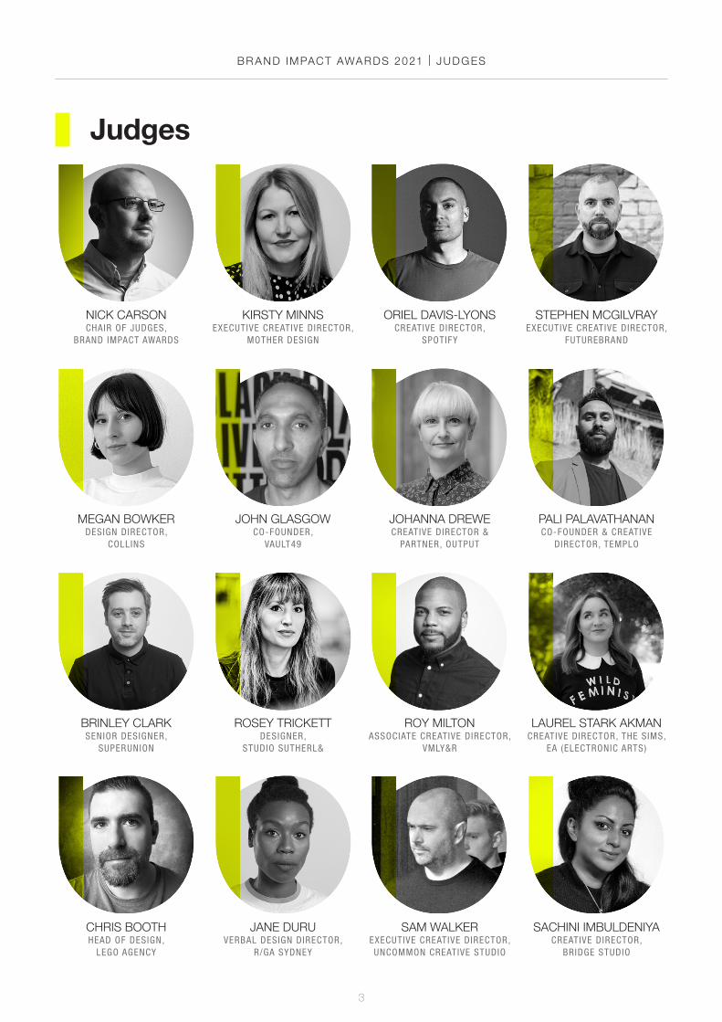
BR AND IMPACT AWARDS 2021 | JUDGES
ORIEL DAVIS-LYONSCREATIVE DIRECTOR,
SPOTIFY
NICK CARSONCHAIR OF JUDGES,
BRAND IMPACT AWARDS
STEPHEN MCGILVRAYEXECUTIVE CREATIVE DIRECTOR,
FUTUREBRAND
KIRSTY MINNSEXECUTIVE CREATIVE DIRECTOR,
MOTHER DESIGN
JOHANNA DREWECREATIVE DIRECTOR &
PARTNER, OUTPUT
PALI PALAVATHANANCO-FOUNDER & CREATIVE
DIRECTOR, TEMPLO
BRINLEY CLARKSENIOR DESIGNER,
SUPERUNION
MEGAN BOWKERDESIGN DIRECTOR,
COLLINS
JOHN GLASGOWCO-FOUNDER,
VAULT49
ROSEY TRICKETTDESIGNER,
STUDIO SUTHERL&
ROY MILTONASSOCIATE CREATIVE DIRECTOR,
VMLY&R
LAUREL STARK AKMANCREATIVE DIRECTOR, THE SIMS,
EA (ELECTRONIC ARTS)
Judges
CHRIS BOOTHHEAD OF DESIGN,
LEGO AGENCY
JANE DURUVERBAL DESIGN DIRECTOR,
R/GA SYDNEY
SAM WALKEREXECUTIVE CREATIVE DIRECTOR,UNCOMMON CREATIVE STUDIO
SACHINI IMBULDENIYACREATIVE DIRECTOR,
BRIDGE STUDIO
4
BECCA MAGNUSWRITER AND STRATEGIST,
FREELANCE
BINOY ZUZARTESENIOR COPYWRITER,
WUNDERMAN THOMPSON
CATHARINE BRANDYDESIGN MANAGER, STAMPS & COLLECTIBLES, ROYAL MAIL
FRIDA EKCREATIVE DIRECTOR,
ANIMADE
ROSIE HILDERACTING EDITOR,CREATIVE BLOQ
SARAH DOUGLASEDITOR IN CHIEF,
WALLPAPER*
NKANYEZI MASANGOEXECUTIVE CREATIVE DIRECTOR,
KING JAMES GROUP
ADAM JENNSFOUNDER AND PARTNER,
MAINFRAME
JB HARTFORDCREATIVE DIRECTOR,
JONES KNOWLES RITCHIE
JEAN-BAPTISTE LEVÉEFOUNDER AND PRESIDENT,
PRODUCTION TYPE
KATE MAGOCASSOCIATE DIRECTOR OF VERBAL DESIGN, PROTO
MIKE ALDERSONCO-FOUNDER AND CCO,
MANVSMACHINE
ROB CLARKETYPE AND LETTERING
DESIGNER, FREELANCE
MIKE MOLONEYFOUNDER AND ECD,
ART&GRAFT
ANNIE MASCIAVÈLEAD OF CREATIVE
PRODUCTION, INFARM
BR AND IMPACT AWARDS 2021 | JUDGES
ASTRID D’HONDTDESIGN DIRECTOR,
DIXONBAXI

BR AND IMPACT AWARDS 2021
5
best of showshortlist

6
BR AND IMPACT AWARDS 2021 | BEST OF SHOW SHORTL IST
W ith a clean sweep across the board, COLLINS’ stunningly elegant type-led branding scheme for San Francisco Symphony drew nothing but admiration
from the judges who reviewed it. It took home Gold in both Culture and Typography, and despite fierce debate amongst the final panel as the other contenders were weighed up, it was ultimately unanimous to celebrate the job as Best of Show for the Brand Impact Awards 2021.
A 108-year old international cultural touchstone, the San Francisco Symphony has a deep legacy of rewriting the rules to advance the orchestral arts. As part of a wholesale transformation of its previous approach to programming, the organisation has blazed a trail in the industry by putting diversity, equity and inclusion first in a hierarchy-subverting restructure. In a move that stunned the global music community, the baton as music director passed to visionary conductor and composer Esa–Pekka Salonen.
SF Symphony’s experimental blueprint revolves around a groundbreaking artistic leadership model, based on eight partners from diverse disciplines.
These include Bryce Dressner of The National; AI entrepreneur Carol Reiley; bassist Esperanza Spalding; classical vocalist Julia Bullock; experimental flutist Claire
San Francisco Symphonyby COLLINS
www.wearecollins.com
BEST OF SHOW: WINNER | CULTURE: GOLD | TYPOGRAPHY: GOLD

7
Chase; violinist Pekka Kuusisto; and composer and pianist Nicholas Britell.
COLLINS was invited to clarify, define, and express this new vision, and help SF Symphony to re-assert classical music as a crucial, global contemporary art form – all while staying rooted in community, strengthening the bonds that have made the organisation so successful for over a century.
The result is an experimental, ever-responsive visual system that brings to life the dynamic qualities of classical music using classic, elegant typography. Responsive, variable font technologies adds unexpected contemporary behaviour – each character morphs in reaction to the sound of music.
COLLINS also crafted a more expressive voice, juxtaposing the timeless formality of black and white with a contemporary palette inspired by the San Francisco Bay Area. All of these elements combine to evoke the rich emotional range of symphonic music across an ever-changing media and digital landscape.
BR AND IMPACT AWARDS 2021 | BEST OF SHOW SHORTL IST
“This work is a perfect example of making something brilliantly smart look so easy,” says Best of Show panellist Roy Milton, creative director at VMLY&R. “It was refreshing to see the tone and jubilance perfectly done in every way, and joyful and fun to see work that was both spaceless and limitless. It could be expressed practically in any medium, and in any space.”
“This is such a simple idea, beautifully executed,” agrees Rosey Trickett, designer at Studio Sutherl& and fellow Best of Show judge. “It manages to feel contemporary as well as timeless – it takes a lot of work to look this effortless. It’s so full of joy: you can tell they had fun making this. I love this project, and wish I had done it.”
8
BR AND IMPACT AWARDS 2021 | BEST OF SHOW SHORTL IST
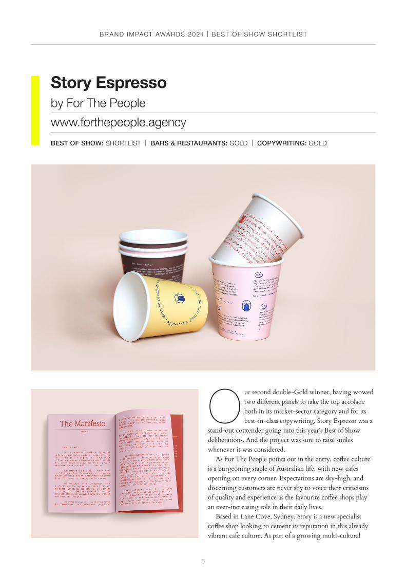
O ur second double-Gold winner, having wowed two different panels to take the top accolade both in its market-sector category and for its best-in-class copywriting, Story Espresso was a
stand-out contender going into this year’s Best of Show deliberations. And the project was sure to raise smiles whenever it was considered.
As For The People points out in the entry, coffee culture is a burgeoning staple of Australian life, with new cafes opening on every corner. Expectations are sky-high, and discerning customers are never shy to voice their criticisms of quality and experience as the favourite coffee shops play an ever-increasing role in their daily lives.
Based in Lane Cove, Sydney, Story is a new specialist coffee shop looking to cement its reputation in this already vibrant cafe culture. As part of a growing multi-cultural
Story Espresso by For The People
www.forthepeople.agency
BEST OF SHOW: SHORTLIST | BARS & RESTAURANTS: GOLD | COPYWRITING: GOLD
9
community, its customers are as attuned to great design as they are to top-quality coffee – and voracious social media users. Story needed to establish an engaging, definable and premium identity that could break through the competitive and dense marketplace, and be embraced by a growing legion of loyal customers.
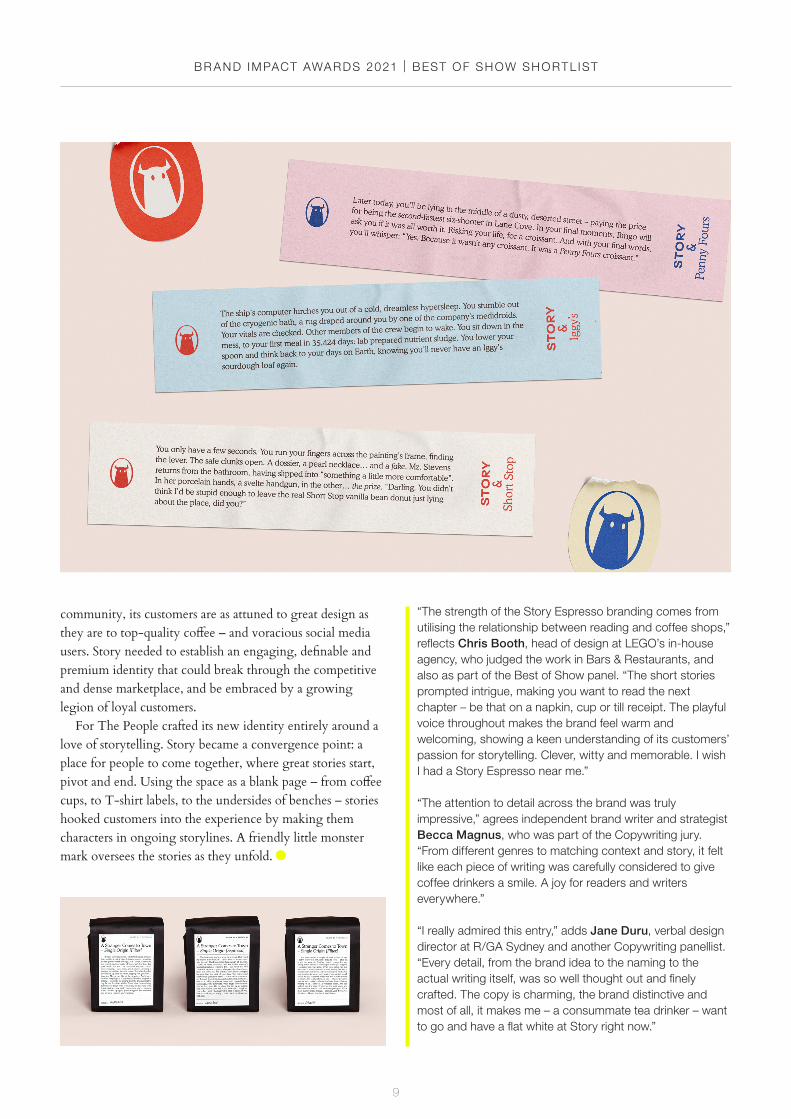
For The People crafted its new identity entirely around a love of storytelling. Story became a convergence point: a place for people to come together, where great stories start, pivot and end. Using the space as a blank page – from coffee cups, to T-shirt labels, to the undersides of benches – stories hooked customers into the experience by making them characters in ongoing storylines. A friendly little monster mark oversees the stories as they unfold.
BR AND IMPACT AWARDS 2021 | BEST OF SHOW SHORTL IST
“The strength of the Story Espresso branding comes from utilising the relationship between reading and coffee shops,” reflects Chris Booth, head of design at LEGO’s in-house agency, who judged the work in Bars & Restaurants, and also as part of the Best of Show panel. “The short stories prompted intrigue, making you want to read the next chapter – be that on a napkin, cup or till receipt. The playful voice throughout makes the brand feel warm and welcoming, showing a keen understanding of its customers’ passion for storytelling. Clever, witty and memorable. I wish I had a Story Espresso near me.”
“The attention to detail across the brand was truly impressive,” agrees independent brand writer and strategist Becca Magnus, who was part of the Copywriting jury. “From different genres to matching context and story, it felt like each piece of writing was carefully considered to give coffee drinkers a smile. A joy for readers and writers everywhere.”
“I really admired this entry,” adds Jane Duru, verbal design director at R/GA Sydney and another Copywriting panellist. “Every detail, from the brand idea to the naming to the actual writing itself, was so well thought out and finely crafted. The copy is charming, the brand distinctive and most of all, it makes me – a consummate tea drinker – want to go and have a flat white at Story right now.”
10
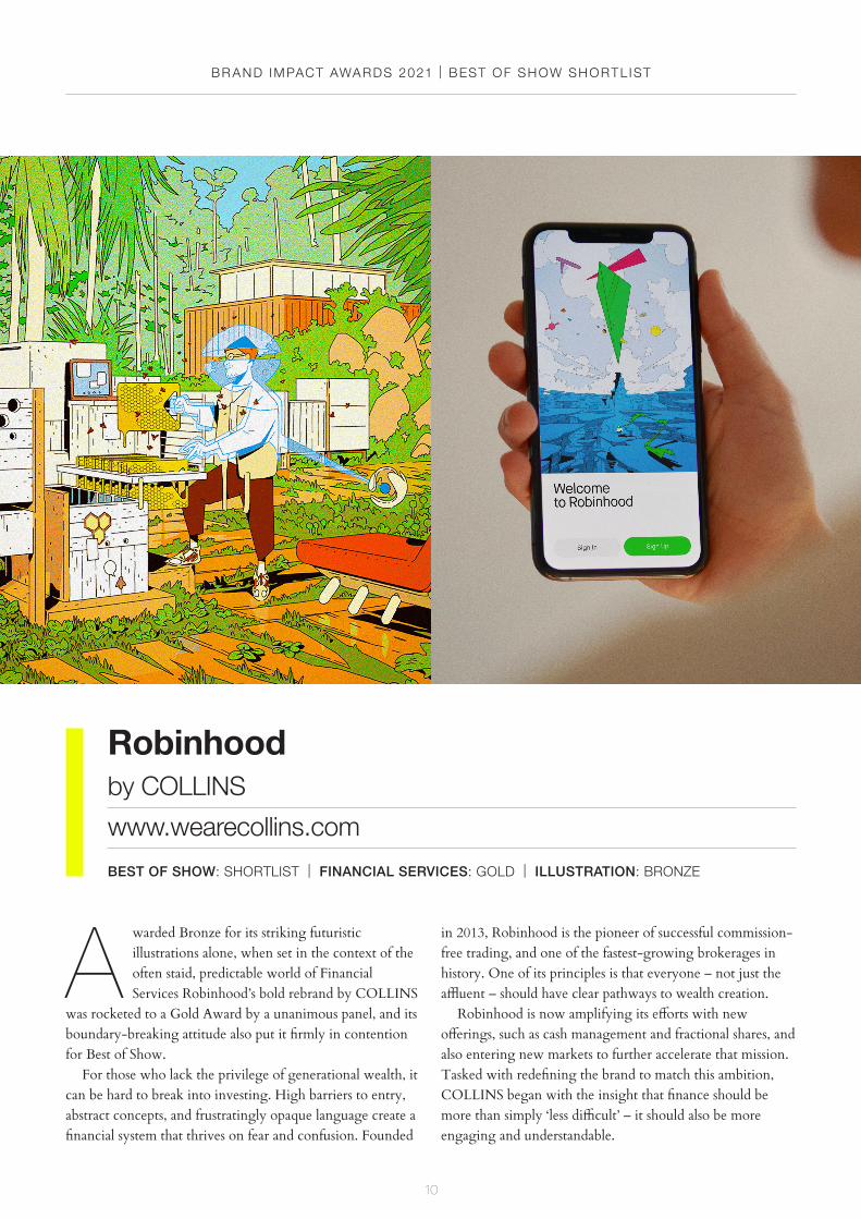
in 2013, Robinhood is the pioneer of successful commission-free trading, and one of the fastest-growing brokerages in history. One of its principles is that everyone – not just the affluent – should have clear pathways to wealth creation.
Robinhood is now amplifying its efforts with new offerings, such as cash management and fractional shares, and also entering new markets to further accelerate that mission. Tasked with redefining the brand to match this ambition, COLLINS began with the insight that finance should be more than simply ‘less difficult’ – it should also be more engaging and understandable.
A warded Bronze for its striking futuristic illustrations alone, when set in the context of the often staid, predictable world of Financial Services Robinhood’s bold rebrand by COLLINS
was rocketed to a Gold Award by a unanimous panel, and its boundary-breaking attitude also put it firmly in contention for Best of Show.
For those who lack the privilege of generational wealth, it can be hard to break into investing. High barriers to entry, abstract concepts, and frustratingly opaque language create a financial system that thrives on fear and confusion. Founded
Robinhood by COLLINS
www.wearecollins.com
BEST OF SHOW: SHORTLIST | FINANCIAL SERVICES: GOLD | ILLUSTRATION: BRONZE
BR AND IMPACT AWARDS 2021 | BEST OF SHOW SHORTL IST

11
The process began with series of client workshops in COLLINS’ San Francisco office, with an inspiring purpose: to imagine what the world could look like fifty years into the future, if society were to embrace Robinhood’s belief that collective participation is a source of power. This led to a close collaboration with the team at Robinhood to hone their vision, strategy, language, design, and voice.
At the heart of the new brand is the idea that Robinhood encourages its customers to imagine better futures, and helps to build them. Imaginative illustrations and information graphics aim both to evoke and instruct, with visual metaphors translating obtuse topics like ‘ETFs’ and ‘Fractional Shares’ into relatable concepts.
“This is a game-changer for the finance category and a best-in-class execution of a brand brought to life through digital products,” says Johanna Drewe, partner and creative director at Studio Output, who judged the project in Illustration and was also part of the Best of Show panel. “The simplification of bamboozling topics through guides and clever illustrations are a personal favourite, but the overall brand experience just seems so well-thought-through and a joy to interact with.”
“The world of finance is often difficult to understand and uninspiring in design. This work turns tradition on its head,” agrees Drewe’s fellow panellist John Glasgow, executive creative director at Vault49. “Robinhood uses illustration to decode the complex world of finance, while making it understandable and engaging for the everyday person.”
“The design successfully mashes together the theme of ‘finance 50 years in the future’ with the whimsical world of legendary outlaw and ‘hero of the people’ Robin Hood,” Glasgow continues. “Completely ignoring all category norms, it brings a fresh and disruptive attitude to an often bland, serious category.”
BR AND IMPACT AWARDS 2021 | BEST OF SHOW SHORTL IST
12
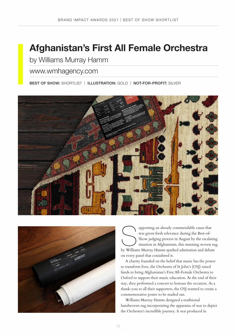
S upporting an already commendable cause that was given fresh relevance during the Best-of-Show judging process in August by the escalating situation in Afghanistan, this stunning woven rug
by Williams Murray Hamm sparked admiration and debate on every panel that considered it.
A charity founded on the belief that music has the power to transform lives, the Orchestra of St John’s (OSJ) raised funds to bring Afghanistan’s First All-Female Orchestra to Oxford to support their music education. At the end of their stay, they performed a concert to honour the occasion. As a thank-you to all their supporters, the OSJ wanted to create a commemorative poster to be mailed out.
Williams Murray Hamm designed a traditional handwoven rug incorporating the apparatus of war to depict the Orchestra’s incredible journey. It was produced in
Afghanistan’s First All Female Orchestra by Williams Murray Hamm
www.wmhagency.com
BEST OF SHOW: SHORTLIST | ILLUSTRATION: GOLD | NOT-FOR-PROFIT: SILVER
BR AND IMPACT AWARDS 2021 | BEST OF SHOW SHORTL IST

13
collaboration with a Kabul-based women’s charity, then photographed to create a poster. For an extra touch of authenticity, these were then sent out in the same rubble sacks that Afghan rugs are traditionally dispatched in.
A handwoven wool rug is an iconic symbol of Afghan culture, often used as a stage. Traditionally, weavers would conceal themselves and messages within their designs. During times of conflict, so-called ‘war rugs’ relayed compelling, often heart-wrenching narratives from the heart of the conflict – and they are still considered one of the world’s richest traditions of war art.
This is best summed up by the following saying from Williams Murray Hamm’s entry: “When you look at an Afghan rug, you can see its soul.”
“This project is hard to ignore, as a genuine, heartfelt story that is so clearly connected to the origins and context of its content,” reflects Megan Bowker, design director at COLLINS, who judged the project in Not-for-Profit and was also part of the Best of Show panel. “By reimagining a poster’s medium and form, this woven rug exhibits thoughtful and masterful craft that is simultaneously filled with life and narrative.”
“They picked exactly the right way to tell the story they needed to tell,” agrees Rosey Trickett, designer at Studio Sutherl&, who was part of both the Illustration and Not-for-Profit panels, and also joined Bowker on the Best of Show jury. “It’s a beautifully crafted piece of work that feels original and appropriate.”
BR AND IMPACT AWARDS 2021 | BEST OF SHOW SHORTL IST
BR AND IMPACT AWARDS 2021
14
gold awardwinners
BR AND IMPACT AWARDS 2021 | GOLD AWARD WINNERS
15
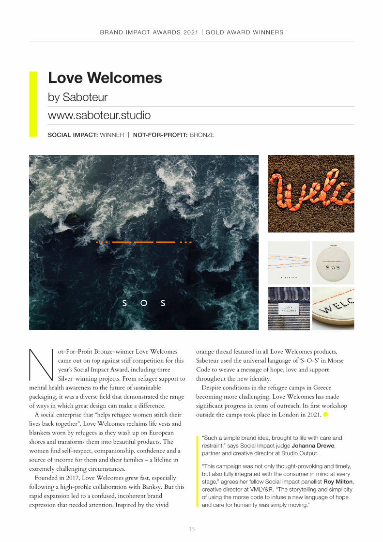
N ot-For-Profit Bronze-winner Love Welcomes came out on top against stiff competition for this year’s Social Impact Award, including three Silver-winning projects. From refugee support to
mental health awareness to the future of sustainable packaging, it was a diverse field that demonstrated the range of ways in which great design can make a difference.
A social enterprise that “helps refugee women stitch their lives back together”, Love Welcomes reclaims life vests and blankets worn by refugees as they wash up on European shores and transforms them into beautiful products. The women find self-respect, companionship, confidence and a source of income for them and their families – a lifeline in extremely challenging circumstances.
Founded in 2017, Love Welcomes grew fast, especially following a high-profile collaboration with Banksy. But this rapid expansion led to a confused, incoherent brand expression that needed attention. Inspired by the vivid
Love Welcomesby Saboteur
www.saboteur.studio
SOCIAL IMPACT: WINNER | NOT-FOR-PROFIT: BRONZE
“Such a simple brand idea, brought to life with care and restraint,” says Social Impact judge Johanna Drewe, partner and creative director at Studio Output.
“This campaign was not only thought-provoking and timely, but also fully integrated with the consumer in mind at every stage,” agrees her fellow Social Impact panellist Roy Milton, creative director at VMLY&R. “The storytelling and simplicity of using the morse code to infuse a new language of hope and care for humanity was simply moving.”
orange thread featured in all Love Welcomes products, Saboteur used the universal language of ‘S-O-S’ in Morse Code to weave a message of hope, love and support throughout the new identity.
Despite conditions in the refugee camps in Greece becoming more challenging, Love Welcomes has made significant progress in terms of outreach. Its first workshop outside the camps took place in London in 2021.
BR AND IMPACT AWARDS 2021 | GOLD AWARD WINNERS
16
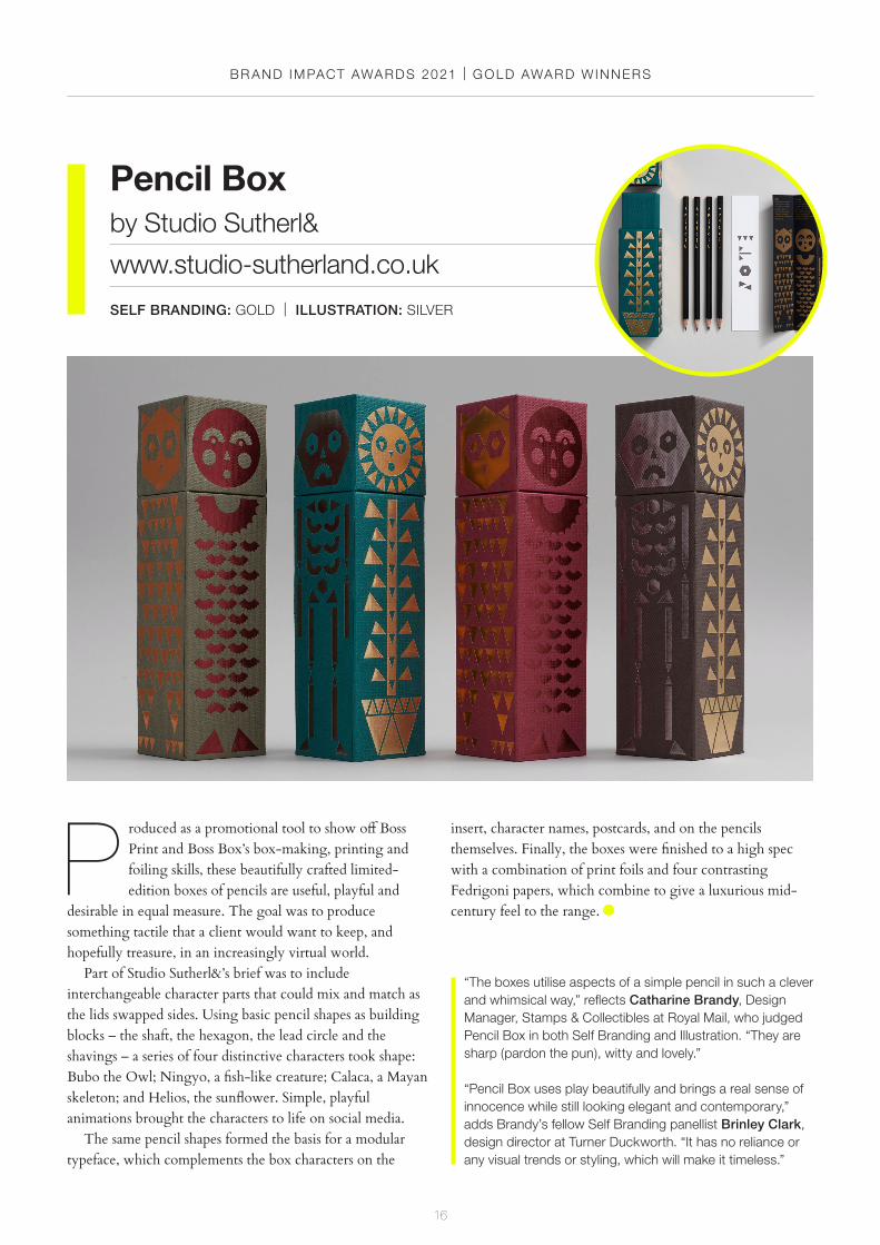
P roduced as a promotional tool to show off Boss Print and Boss Box’s box-making, printing and foiling skills, these beautifully crafted limited-edition boxes of pencils are useful, playful and
desirable in equal measure. The goal was to produce something tactile that a client would want to keep, and hopefully treasure, in an increasingly virtual world.
Part of Studio Sutherl&’s brief was to include interchangeable character parts that could mix and match as the lids swapped sides. Using basic pencil shapes as building blocks – the shaft, the hexagon, the lead circle and the shavings – a series of four distinctive characters took shape: Bubo the Owl; Ningyo, a fish-like creature; Calaca, a Mayan skeleton; and Helios, the sunflower. Simple, playful animations brought the characters to life on social media.
The same pencil shapes formed the basis for a modular typeface, which complements the box characters on the
insert, character names, postcards, and on the pencils themselves. Finally, the boxes were finished to a high spec with a combination of print foils and four contrasting Fedrigoni papers, which combine to give a luxurious mid-century feel to the range.
Pencil Boxby Studio Sutherl&
www.studio-sutherland.co.uk
SELF BRANDING: GOLD | ILLUSTRATION: SILVER
“The boxes utilise aspects of a simple pencil in such a clever and whimsical way,” reflects Catharine Brandy, Design Manager, Stamps & Collectibles at Royal Mail, who judged Pencil Box in both Self Branding and Illustration. “They are sharp (pardon the pun), witty and lovely.”
“Pencil Box uses play beautifully and brings a real sense of innocence while still looking elegant and contemporary,” adds Brandy’s fellow Self Branding panellist Brinley Clark, design director at Turner Duckworth. “It has no reliance or any visual trends or styling, which will make it timeless.”

BR AND IMPACT AWARDS 2021 | GOLD AWARD WINNERS
17
T urner Duckworth was tasked with breathing new life into the packaging and visual identity for Tres Generaciones tequila, with a view to sparking reconsideration for the long-established brand –
which, as its name implies, can boast three generations of tequila-making expertise – against a raft of challengers in the increasingly competitive modern market.
Balancing the need for modernity with a 150-year family heritage, at the heart of the redesign is the three-stripes icon and its transition from rough to smooth. Holding a dual meaning, it represents not only the journey of the three generations of Sauza leaders as they perfected their tequila over time, but also the distinctive third distillation step in the
production of the tequila, which is intended to produce a more refined finish.
Tres Generaciones’ prominent position creates drama, intrigue and standout. The glass structure and premium colour palette were inspired by the original green decanters used to launch the brand, resulting in a bottle that disrupts the traditional tequila shelf with effortless confidence.
Tres Generacionesby Turner Duckworth: London, San Francisco & New York
www.turnerduckworth.com
WINE, BEER & SPIRITS: GOLD
“The Tres Generaciones redesign does what all great rebrands do,” says Sam Walker, executive creative director at Uncommon Creative Studio and part of this year’s Wine, Beer & Spirits panel. “It makes you feel like it’s existed forever, and forget what came before.”

BR AND IMPACT AWARDS 2021 | GOLD AWARD WINNERS
18
T he Kraken Rum briefed NB Studio to develop a premium limited-edition bottle for use in 2020 and beyond. Rising to the challenge with aplomb, the team crafted a bespoke design that pays
homage to the deep-sea beast that gives the brand its name, and stretches the boundaries of what it’s possible to achieve with glass in the process.
Adorned with embossed tentacle detailing and ‘stained’ by the Kraken’s jet-black ink, the new bottle is the centre-piece of the brand’s Unknown Deep campaign, also created by NB. Every year, consumers are lured deeper into the story as they unearth fresh clues about the elusive Kraken.
To ensure the longevity of the format, the body of the bottle is reserved as a canvas for customisation as part of future iterations of the campaign. This first plunge into Unknown Deep unearths bottles that have been bravely
commandeered from within the Kraken’s lair – encrusted in precious gold and ancient currency which depict the mysterious Beast. As NB says in the awards entry: “How and why the Kraken happened upon this inestimable cache, only the Beast knows.”
The Kraken Rumby NB Studio
www.nbstudio.co.uk
WINE, BEER & SPIRITS: GOLD
“The imaginative narrative is well-articulated and crafted across every touchpoint,” Kirsty Minns, executive creative director at Mother Design. “From the two-handled Victorian rum bottle to the lovingly executed type and perfectly chosen colour palette, it’s a great piece of design.”
“This project is distinction in the highest order,” agrees agrees Minns’ fellow panellist Brinley Clark, design director at Turner Duckworth. “It has defied category conventions and created not just a unique piece of packaging, but a stand-out brand that has been incredibly crafted.”

BR AND IMPACT AWARDS 2021 | GOLD AWARD WINNERS
19
G lobal guitar masters Fender approached ManvsMachine with the task of introducing a new game-changing guitar: The American Acoustasonic Jazzmaster, billed as Fender’s best-
sounding, most playable and versatile guitar yet. MvsM’s task was to create a film that educated and excited
audiences in equal measure about its boundless versatility and endless sonic possibilities. The studio set out to echo Fender’s legendary status amongst guitar players, while looking to the future and using this convention-breaking new instrument to cast the brand in a fresh light.
Inspired by the tagline – ‘The Sonic Shapeshifter’ – MvsM began researching the concept of shapeshifting, and enlisted the help of multi-award-winning music and sound design studio, Resonate, who began developing an immersive aural journey using only the product itself.
One of the key features of the Acoustasonic Jazzmaster is its innovative new Blend Knob, which enables the guitar to shift seamlessly between iconic acoustic voicings and big electric tones, bridging the gap between two worlds that had
previously been opposed. The ‘cause and effect’ relationship between the rotation of the knob and its physical and aural transformations became a central conceit of the film.
A mind-bending journey of sound and vision, the final film showcases the incredible versatility of the instrument – a musical mutant that’s unafraid to twist and morph between acoustic and electric tones, unlikely body shapes and cool tonewoods to create sonic colours that defy definition.
Fender - Acoustasonic Jazzmasterby ManvsMachine
www.mvsm.com
MOTION: GOLD
“This is ManvsMachine doing what they do best – leading from the front with innovative, flawless, mind-bending 3D,” says Adam Jenns, founder and director of Mainframe and Motion category judge. “This is another cracker in a long line of standout projects.”
“A slick, smooth display of shape-shifting motion design with a great sense of pace and rhythm,” agrees Jenns’ fellow Motion judge Mike Moloney, founder and executive creative director at Art&Graft. “It’s perfect for an instrument product piece dissecting the various guitar components – and wonderful sound design too. Classic ManvsMachine.”

BR AND IMPACT AWARDS 2021
20
silver awardwinners
BR AND IMPACT AWARDS 2021 | S ILVER AWARD WINNERS
21
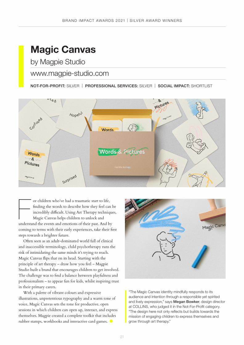
F or children who’ve had a traumatic start to life, finding the words to describe how they feel can be incredibly difficult. Using Art Therapy techniques, Magic Canvas helps children to unlock and
understand the events and emotions of their past. And by coming to terms with their early experiences, take their first steps towards a brighter future.
Often seen as an adult-dominated world full of clinical and inaccessible terminology, child psychotherapy runs the risk of intimidating the same minds it’s trying to reach. Magic Canvas flips that on its head. Starting with the principle of art therapy – draw how you feel – Magpie Studio built a brand that encourages children to get involved. The challenge was to find a balance between playfulness and professionalism – to appear fun for kids, whilst inspiring trust in their primary carers.
With a palette of vibrant colours and expressive illustrations, unpretentious typography and a warm tone of voice, Magic Canvas sets the tone for productive, open sessions in which children can open up, interact, and express themselves. Magpie created a complete toolkit that includes rubber stamps, workbooks and interactive card games.
Magic Canvasby Magpie Studio
www.magpie-studio.com
NOT-FOR-PROFIT: SILVER | PROFESSIONAL SERVICES: SILVER | SOCIAL IMPACT: SHORTLIST
“The Magic Canvas identity mindfully responds to its audience and intention through a responsible yet spirited and lively expression,” says Megan Bowker, design director at COLLINS, who judged it in the Not-For-Profit category. “The design here not only reflects but builds towards the mission of engaging children to express themselves and grow through art therapy.”
BR AND IMPACT AWARDS 2021 | S ILVER AWARD WINNERS
22
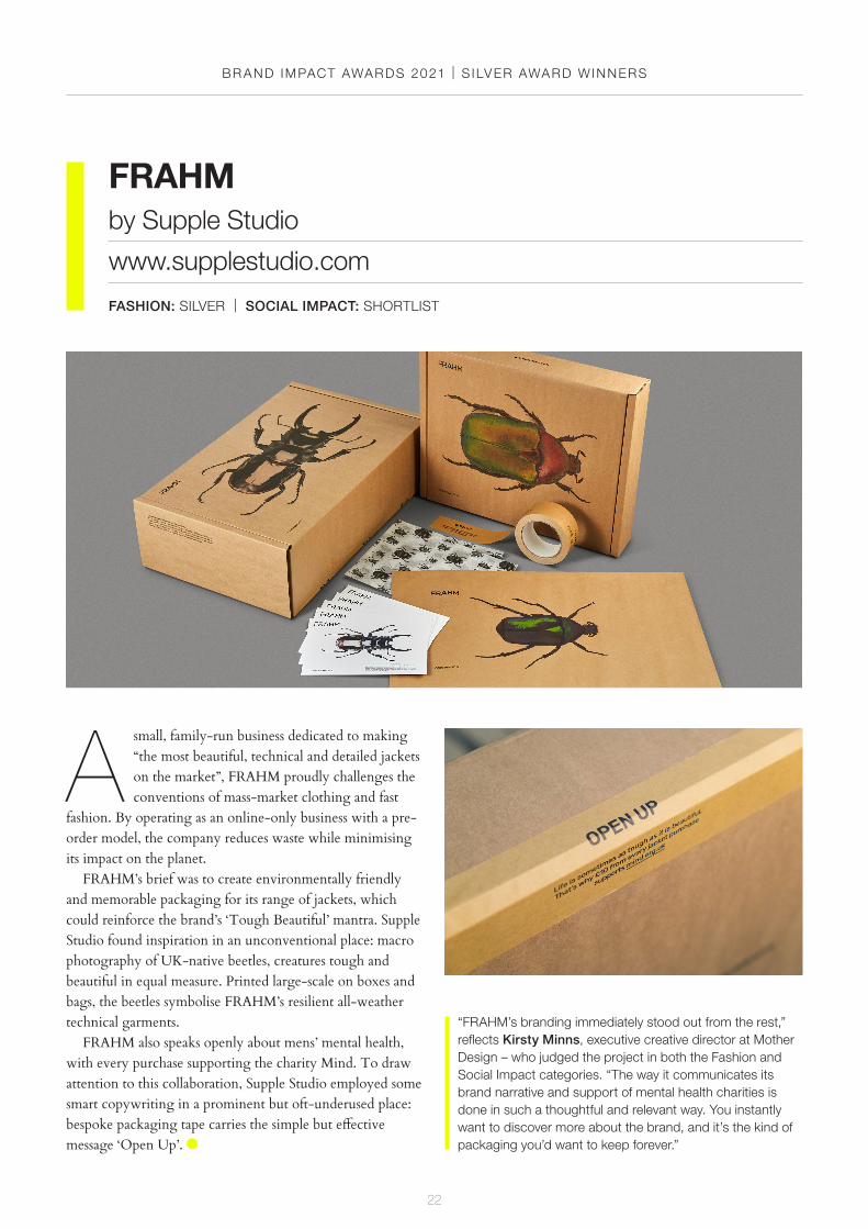
A small, family-run business dedicated to making “the most beautiful, technical and detailed jackets on the market”, FRAHM proudly challenges the conventions of mass-market clothing and fast
fashion. By operating as an online-only business with a pre-order model, the company reduces waste while minimising its impact on the planet.
FRAHM’s brief was to create environmentally friendly and memorable packaging for its range of jackets, which could reinforce the brand’s ‘Tough Beautiful’ mantra. Supple Studio found inspiration in an unconventional place: macro photography of UK-native beetles, creatures tough and beautiful in equal measure. Printed large-scale on boxes and bags, the beetles symbolise FRAHM’s resilient all-weather technical garments.
FRAHM also speaks openly about mens’ mental health, with every purchase supporting the charity Mind. To draw attention to this collaboration, Supple Studio employed some smart copywriting in a prominent but oft-underused place: bespoke packaging tape carries the simple but effective message ‘Open Up’.
FRAHMby Supple Studio
www.supplestudio.com
FASHION: SILVER | SOCIAL IMPACT: SHORTLIST
“FRAHM’s branding immediately stood out from the rest,” reflects Kirsty Minns, executive creative director at Mother Design – who judged the project in both the Fashion and Social Impact categories. “The way it communicates its brand narrative and support of mental health charities is done in such a thoughtful and relevant way. You instantly want to discover more about the brand, and it’s the kind of packaging you’d want to keep forever.”
BR AND IMPACT AWARDS 2021 | S ILVER AWARD WINNERS
23
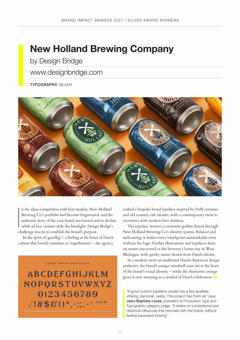
I n the ultra-competitive craft beer market, New Holland Brewing Co’s portfolio had become fragmented, and the authentic story of the core brand was buried and in decline while ad hoc variants stole the limelight. Design Bridge’s
challenge was to re-establish the brand’s purpose.In the spirit of ‘gezellig’ – a feeling at the heart of Dutch
culture that loosely translates as ‘togetherness’ – the agency
New Holland Brewing Companyby Design Bridge
www.designbridge.com
TYPOGRAPHY: SILVER
crafted a bespoke brand typeface inspired by Delft ceramics and old country cafe facades, with a contemporary twist to reconnect with modern beer drinkers.
The typeface weaves a consistent golden thread through New Holland Brewing Co’s identity system. Relaxed and welcoming, it makes every touchpoint unmistakable even without the logo. Further illustrations and typefaces draw on stories uncovered in the brewery’s home city in West Michigan, with quirky names drawn from Dutch idioms.
In a modern twist on traditional Dutch-American design aesthetics, the brand’s unique windmill asset sits at the heart of the brand’s visual identity – while the distinctive orange gives it new meaning as a symbol of Dutch celebration.
“A good custom typeface usually has a few qualities: striking, personal, useful. This project has them all,” says Jean-Baptiste Levee, president at Production Type and Typography category judge. “It draws on conventional and historical influences that resonate with the brand, without feeling backward-looking.”

BR AND IMPACT AWARDS 2021 | S ILVER AWARD WINNERS
24
F ounded in 1963, the 2nd Air Division USAAF Memorial Library commemorates the 6,900 American airmen who lost their lives in action during the Second World War while stationed in
Norfolk and Suffolk. The name failed to capture the institution’s broader proposition, however: a collection of books about the United States, its history and its culture.
American Libraryby The Click
www.theclickdesign.com
EDUCATION: SILVER
“One hallmark of great branding if it feels both fresh and timeless all at once,” reflects Oriel Davis-Lyons, creative director at Spotify, who judged the project in the Education category. “It’s hard to achieve, but the American Library hit that sweet spot. It felt like an instant classic.”
The Click was brought on board to craft a new brand identity, which started with a bold new name – the American Library – to encapsulate the institution’s forward-thinking approach, while remaining true to its offering. This includes a comprehensive range of books, photographs, letters and memoirs, as well as films, magazines and historic artefacts documenting American life and culture.
In a satisfyingly simple, beautifully executed twist of logo craft, The Click blended the Stars and Stripes with an open book to communicate the library’s unique heritage and present-day purpose. This icon is then deconstructed to create further useful assets and graphic devices across a range of different touchpoints, from brochures to bookmarks.

BR AND IMPACT AWARDS 2021 | S ILVER AWARD WINNERS
25
Just 40 minutes from the Tasmanian capital Hobart, the Derwent Valley is billed as one of the last great secrets of the Australian island state – home to some of the most spectacular, historically-significant sites in
the country. The region needed an authentic identity to capture its true nature, resonate with locals, distinguish itself from the rest of Tasmania, and attract more visitors.
Derwent Valleyby For The People
www.forthepeople.agency
PUBLIC SECTOR: SILVER
“This project stood out from the other entries,” says Pali Palavathanan, founder and creative director of TEMPLO. “For its beautifully crafted type and illustrations, but also for its sensitivity to reflect the delicate matter of nature.”
Inspired by the area’s fable-like nature, For The People approached the identity as if Derwent Valley were a publishing house. The graphic system leans on literary references, telling nine different stories through a mix of iconography and book-cover-style illustrations.
Besides stimulating tourism, the rebrand needed to drive investment, economic development, population growth, and secure a sustainable future for residents. With a relatively modest central marketing budget, the organisation is largely reliant on community ownership and implementation across different businesses, community groups, local initiatives, and events. For The People provided the versatile toolkit required for thousands of unique voices to help amplify that narrative so the region can punch above its weight.

BR AND IMPACT AWARDS 2021 | S ILVER AWARD WINNERS
26
C rane has been making paper for 250 years, and its story is interweaved with American history. Stephen Crane established the business in 1770 after purchasing the Liberty Paper Mill in
Dalton, Massachusetts, and Boston revolutionary Paul Revere went on to choose Crane paper for the first currency used by the newly established American colonies.
In the 1840s, Crane pioneered embellished engravings to prevent counterfeiting. By 1879, it was paper supplier for all US dollars for the Federal Reserve Bank. At the turn of the century, a push against the mechanisation of humanity was taking place: The Art Nouveau movement was influencing Crane’s paper products. Since then, algorithms, social media, and AI have exchanged thoughtfulness for speed and efficiency – but the timeless physicality of paper has an enduring appeal.
Tasked with updating and refreshing the Crane brand, COLLINS tapped into that rich seam of history to find visual inspiration. Far from just a functional aid, the stationery box becomes a desirable, collectable object to be displayed on a desk, shelf, or coffee table. By showcasing Crane’s printing and engraving capabilities, weight and detail are given to written notes that are designed to be savoured and cherished for many years to come.
Crane Paperby COLLINS
www.wearecollins.com
RETAIL: SILVER
“Crane’s new branding is quietly stylish and elegant, and appropriately tactile,” says Catharine Brandy, Design Manager, Stamps & Collectibles at Royal Mail, who judged the Retail category. “It’s a skilful interweaving of the company’s past with a contemporary new look.”
BR AND IMPACT AWARDS 2021 | S ILVER AWARD WINNERS
27
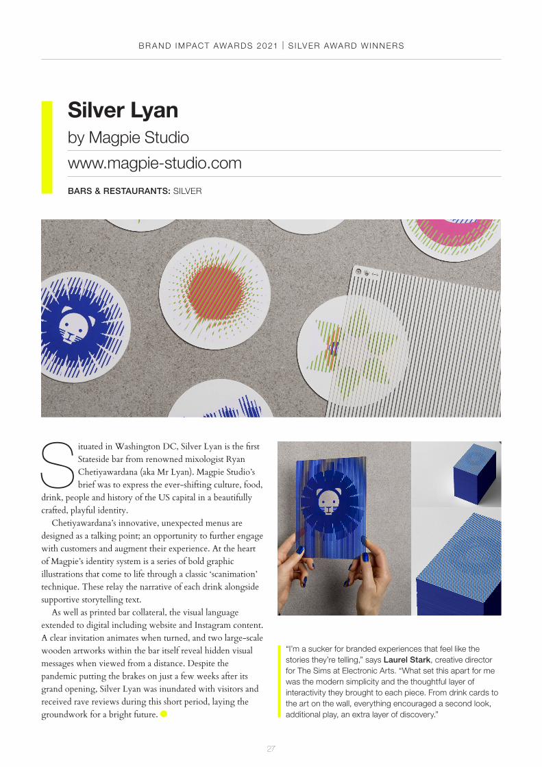
S ituated in Washington DC, Silver Lyan is the first Stateside bar from renowned mixologist Ryan Chetiyawardana (aka Mr Lyan). Magpie Studio’s brief was to express the ever-shifting culture, food,
drink, people and history of the US capital in a beautifully crafted, playful identity.
Chetiyawardana’s innovative, unexpected menus are designed as a talking point; an opportunity to further engage with customers and augment their experience. At the heart of Magpie’s identity system is a series of bold graphic illustrations that come to life through a classic ‘scanimation’ technique. These relay the narrative of each drink alongside supportive storytelling text.
As well as printed bar collateral, the visual language extended to digital including website and Instagram content. A clear invitation animates when turned, and two large-scale wooden artworks within the bar itself reveal hidden visual messages when viewed from a distance. Despite the pandemic putting the brakes on just a few weeks after its grand opening, Silver Lyan was inundated with visitors and received rave reviews during this short period, laying the groundwork for a bright future.
Silver Lyanby Magpie Studio
www.magpie-studio.com
BARS & RESTAURANTS: SILVER
“I’m a sucker for branded experiences that feel like the stories they’re telling,” says Laurel Stark, creative director for The Sims at Electronic Arts. “What set this apart for me was the modern simplicity and the thoughtful layer of interactivity they brought to each piece. From drink cards to the art on the wall, everything encouraged a second look, additional play, an extra layer of discovery.”
BR AND IMPACT AWARDS 2021 | S ILVER AWARD WINNERS
28
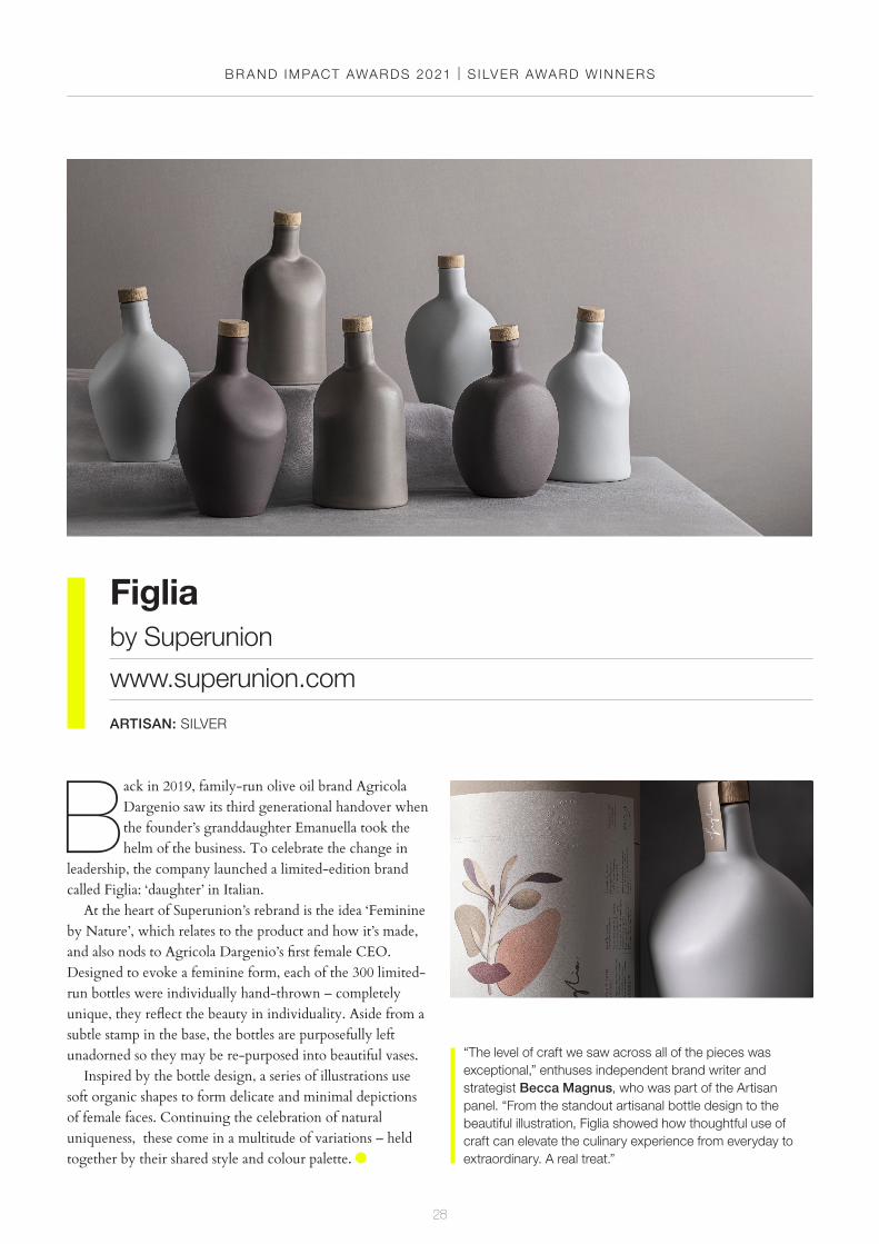
Back in 2019, family-run olive oil brand Agricola Dargenio saw its third generational handover when the founder’s granddaughter Emanuella took the helm of the business. To celebrate the change in
leadership, the company launched a limited-edition brand called Figlia: ‘daughter’ in Italian.
At the heart of Superunion’s rebrand is the idea ‘Feminine by Nature’, which relates to the product and how it’s made, and also nods to Agricola Dargenio’s first female CEO. Designed to evoke a feminine form, each of the 300 limited-run bottles were individually hand-thrown – completely unique, they reflect the beauty in individuality. Aside from a subtle stamp in the base, the bottles are purposefully left unadorned so they may be re-purposed into beautiful vases.
Inspired by the bottle design, a series of illustrations use soft organic shapes to form delicate and minimal depictions of female faces. Continuing the celebration of natural uniqueness, these come in a multitude of variations – held together by their shared style and colour palette.
“The level of craft we saw across all of the pieces was exceptional,” enthuses independent brand writer and strategist Becca Magnus, who was part of the Artisan panel. “From the standout artisanal bottle design to the beautiful illustration, Figlia showed how thoughtful use of craft can elevate the culinary experience from everyday to extraordinary. A real treat.”
Figliaby Superunion
www.superunion.com
ARTISAN: SILVER

BR AND IMPACT AWARDS 2021 | S ILVER AWARD WINNERS
29
Goodfindby Reed Words
www.reedwords.com
COPYWRITING: SILVER
G oodfind is a directory that helps people discover ethical brands and use their purchasing power for good. As part of its shift from its former name ‘The DoGooders’, the organisation
needed inspiring and distinctive copy to convince people that shopping ethically doesn’t have to be difficult.
Reed Words developed a ‘Good Rebel’ tone of voice, combining directness and deadpan humour to sound like a real person, not another faceless corporation. It has a unique brand of positivity: warm, but not overly-earnest; rebellious without the fury. A breath of fresh air in a sector often plagued by ‘worthy’ brand language.
In place of phrases like ‘save the planet’ or ‘protect the environment’ – which can make the problem feel
overwhelming – Goodfind turns eco-clichés on their head. By taking a direct, clear and positive approach, it inspires people to make small changes for good.
“The outlaw, or rebel archetype, is challenging for any brand to get right,” points out Kate Magoc, Associate Director, Verbal Design at Proto. “Push too hard, and it can be off-putting. Not hard enough, and it can feel cartoonish.” “Goodfind centres its rebellious voice on a strong core truth: ‘Doing good shouldn’t be a rebellious act, but until that changes here we are’,” adds Magoc. “Brash honesty enabled them to pull off an activating rebel-with-a-cause persona, creating a voice for ethical shopping that feels genuine and never preachy.”
BR AND IMPACT AWARDS 2021 | S ILVER AWARD WINNERS
30
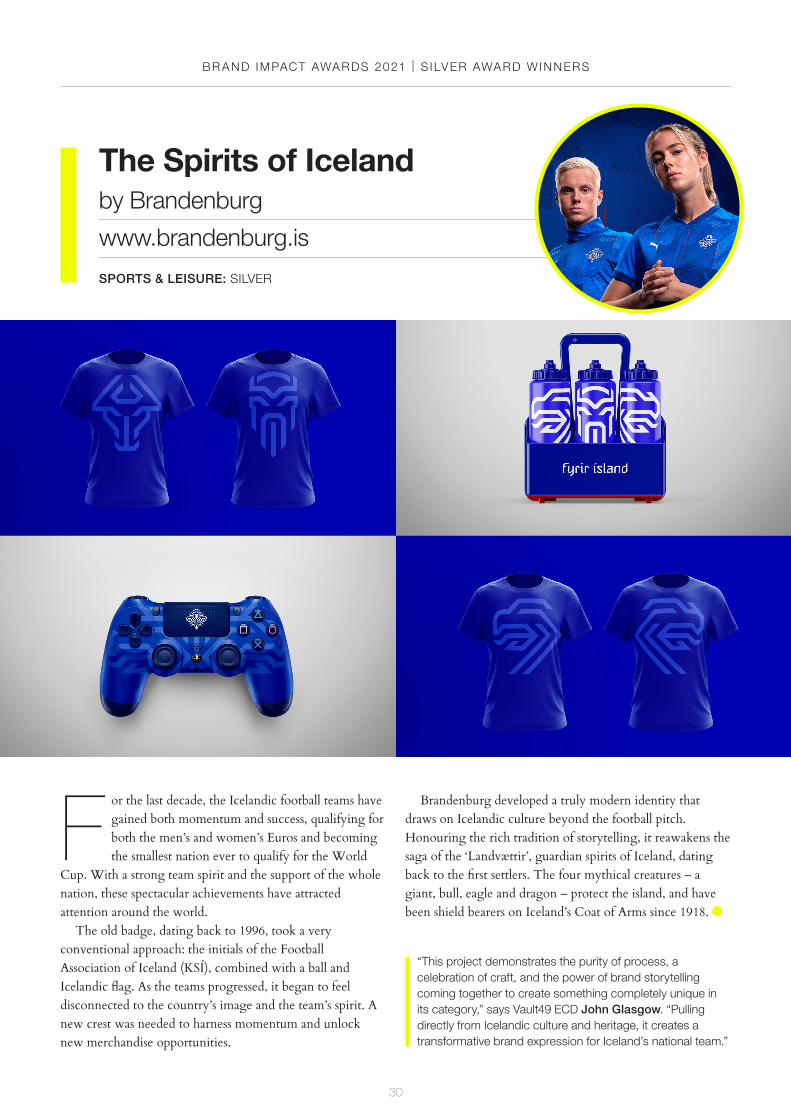
F or the last decade, the Icelandic football teams have gained both momentum and success, qualifying for both the men’s and women’s Euros and becoming the smallest nation ever to qualify for the World
Cup. With a strong team spirit and the support of the whole nation, these spectacular achievements have attracted attention around the world.
The old badge, dating back to 1996, took a very conventional approach: the initials of the Football Association of Iceland (KSÍ), combined with a ball and Icelandic flag. As the teams progressed, it began to feel disconnected to the country’s image and the team’s spirit. A new crest was needed to harness momentum and unlock new merchandise opportunities.
Brandenburg developed a truly modern identity that draws on Icelandic culture beyond the football pitch. Honouring the rich tradition of storytelling, it reawakens the saga of the ‘Landvættir’, guardian spirits of Iceland, dating back to the first settlers. The four mythical creatures – a giant, bull, eagle and dragon – protect the island, and have been shield bearers on Iceland’s Coat of Arms since 1918.
The Spirits of Icelandby Brandenburg
www.brandenburg.is
SPORTS & LEISURE: SILVER
“This project demonstrates the purity of process, a celebration of craft, and the power of brand storytelling coming together to create something completely unique in its category,” says Vault49 ECD John Glasgow. “Pulling directly from Icelandic culture and heritage, it creates a transformative brand expression for Iceland’s national team.”
BR AND IMPACT AWARDS 2021 | S ILVER AWARD WINNERS
31
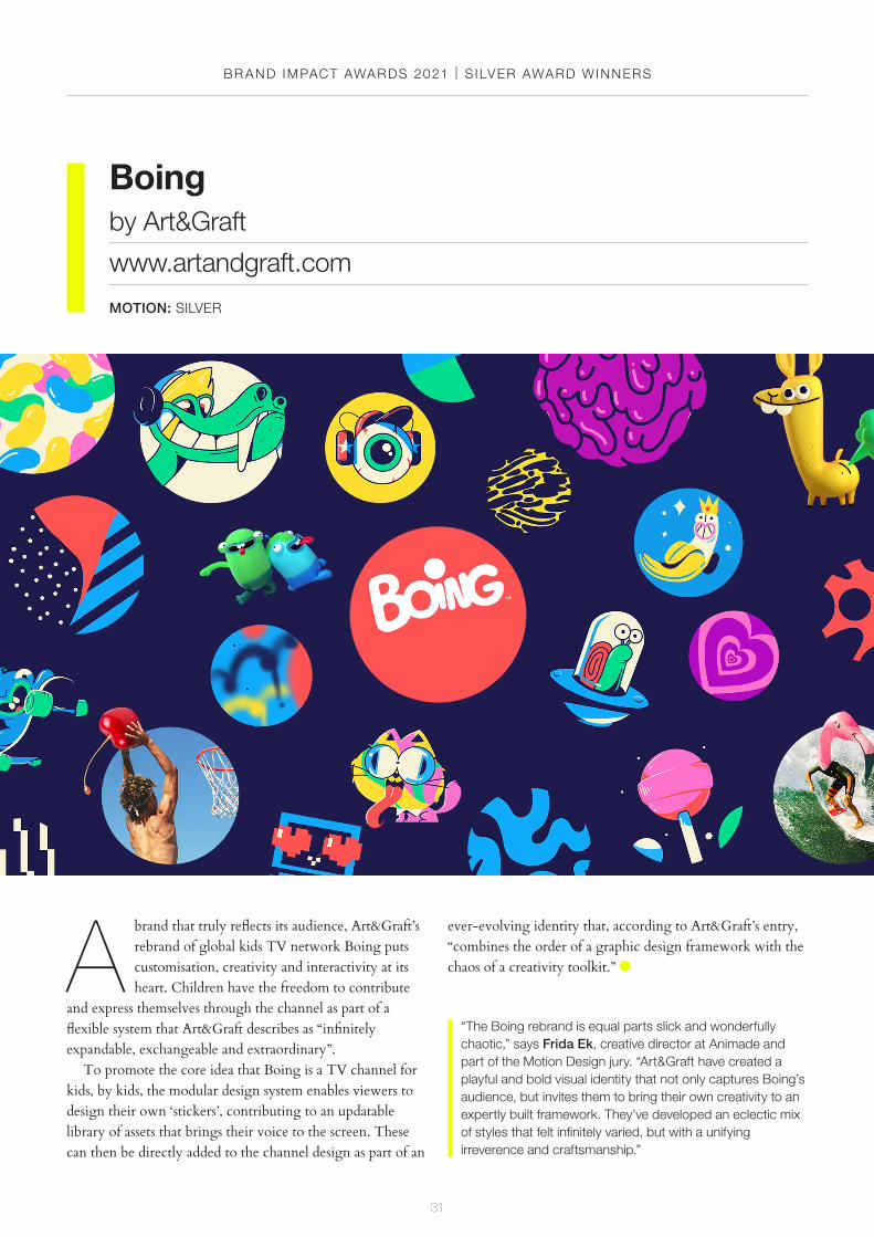
A brand that truly reflects its audience, Art&Graft’s rebrand of global kids TV network Boing puts customisation, creativity and interactivity at its heart. Children have the freedom to contribute
and express themselves through the channel as part of a flexible system that Art&Graft describes as “infinitely expandable, exchangeable and extraordinary”.
To promote the core idea that Boing is a TV channel for kids, by kids, the modular design system enables viewers to design their own ‘stickers’, contributing to an updatable library of assets that brings their voice to the screen. These can then be directly added to the channel design as part of an
ever-evolving identity that, according to Art&Graft’s entry, “combines the order of a graphic design framework with the chaos of a creativity toolkit.”
Boingby Art&Graft
www.artandgraft.com
MOTION: SILVER
“The Boing rebrand is equal parts slick and wonderfully chaotic,” says Frida Ek, creative director at Animade and part of the Motion Design jury. “Art&Graft have created a playful and bold visual identity that not only captures Boing’s audience, but invites them to bring their own creativity to an expertly built framework. They’ve developed an eclectic mix of styles that felt infinitely varied, but with a unifying irreverence and craftsmanship.”
BR AND IMPACT AWARDS 2021
32
bronze awardwinners
BR AND IMPACT AWARDS 2021 | BRONZE AWARD WINNERS
33
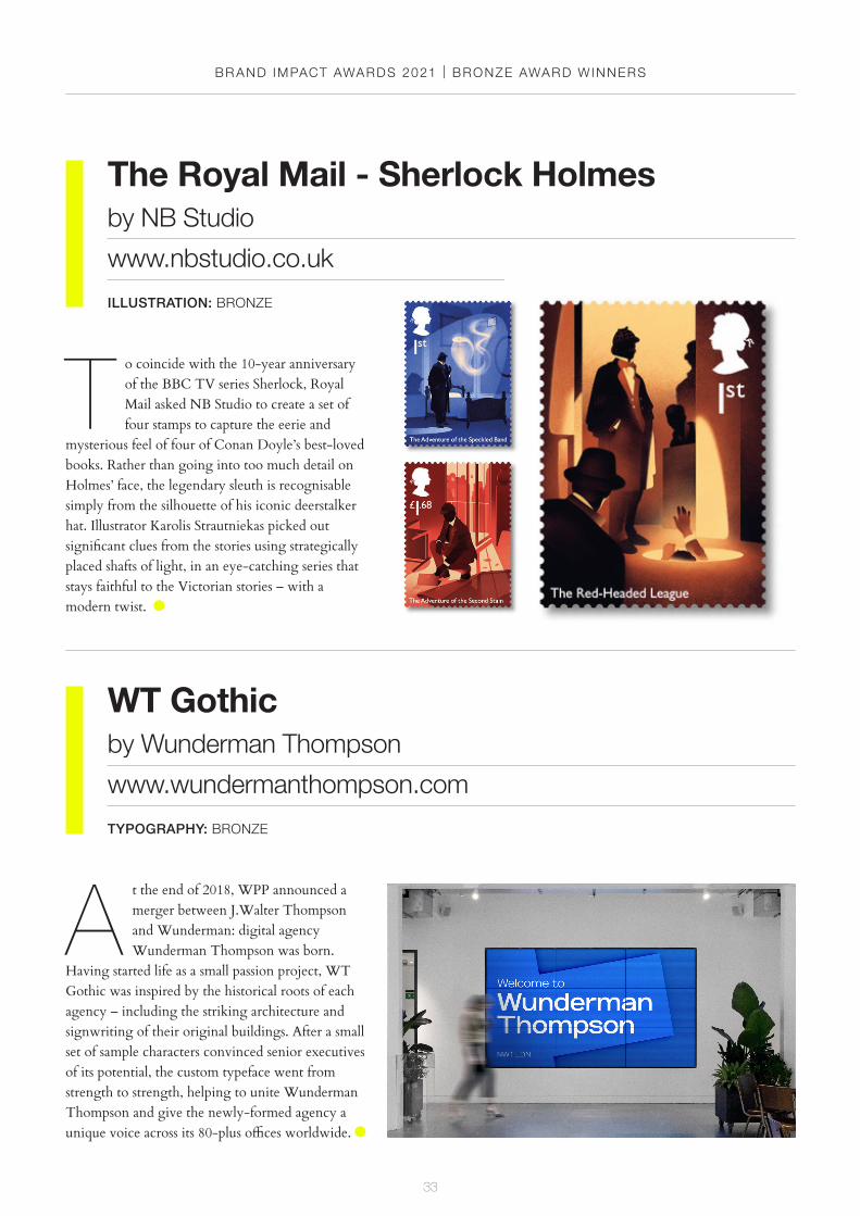
The Royal Mail - Sherlock Holmesby NB Studio
www.nbstudio.co.uk
ILLUSTRATION: BRONZE
WT Gothicby Wunderman Thompson
www.wundermanthompson.com
TYPOGRAPHY: BRONZE
A t the end of 2018, WPP announced a merger between J.Walter Thompson and Wunderman: digital agency Wunderman Thompson was born.
Having started life as a small passion project, WT Gothic was inspired by the historical roots of each agency – including the striking architecture and signwriting of their original buildings. After a small set of sample characters convinced senior executives of its potential, the custom typeface went from strength to strength, helping to unite Wunderman Thompson and give the newly-formed agency a unique voice across its 80-plus offices worldwide.
T o coincide with the 10-year anniversary of the BBC TV series Sherlock, Royal Mail asked NB Studio to create a set of four stamps to capture the eerie and
mysterious feel of four of Conan Doyle’s best-loved books. Rather than going into too much detail on Holmes’ face, the legendary sleuth is recognisable simply from the silhouette of his iconic deerstalker hat. Illustrator Karolis Strautniekas picked out significant clues from the stories using strategically placed shafts of light, in an eye-catching series that stays faithful to the Victorian stories – with a modern twist.

BR AND IMPACT AWARDS 2021 | BRONZE AWARD WINNERS
34
WPP Wavemakerby NB Studio
www.nbstudio.co.uk
MOTION: BRONZE
Riversideby Superunion
www.superunion.com
CULTURE: BRONZE
Situated in Hammersmith, on London’s River Thames, Riverside Studios has been home to British TV classics such as Top of the Pops, Blue Peter and Doctor Who.
After a seven-year closure for redevelopment, Riverside reopened in 2020 to host television productions, cinema and visual arts. Reflecting the studios’ innovative heritage, Superunion set out to position it as a place that brings culture and communities together. The new branding features a striking series of moiré patterns, inspired by the visual effect of television screens and the flowing movement of the river.
I nspired by Wavemaker’s updated brand strategy ‘Positive Provocation’, NB Studio’s new visual identity system for the global media agency network continually affects, reacts and responds
to the world around it. Designed in a bespoke font, the logo is constructed from blocks that rearrange into graphic illustrations and simple digital animations to signify disruption, transformation and dynamic change. The orange dot from the logo becomes a playful ‘agitator’ in each animation, representing Wavemaker’s often complex role as a transformative influence on businesses in a simple but effective visual way.
BR AND IMPACT AWARDS 2021 | BRONZE AWARD WINNERS
35
M.AD School of Ideasby COLLINS
www.wearecollins.com
EDUCATION: BRONZE
Chigwell Schoolby Nalla Design
www.nalla.co.uk
EDUCATION: BRONZE
F ounded in 1629, Chigwell School is a co-educational independent school based in Essex, UK. To help modernise the school and attract a wider range of admissions,
Nalla developed a new brand strategy to find contemporary relevance in its founding motto: ‘Find a way or make a way.’ Inspired by the Chapel that sits at the heart of school life at Chigwell, the new branding system make extensive use of graphic line art to represent the leading from the building’s stained-glass windows. The result is a highly distinctive look and feel that weaves through every print and digital touchpoint.
F ormerly known as Miami Ad School, M.AD School of Ideas is home to passionate misfits, rookie visionaries, and some of the most-awarded alumni on the
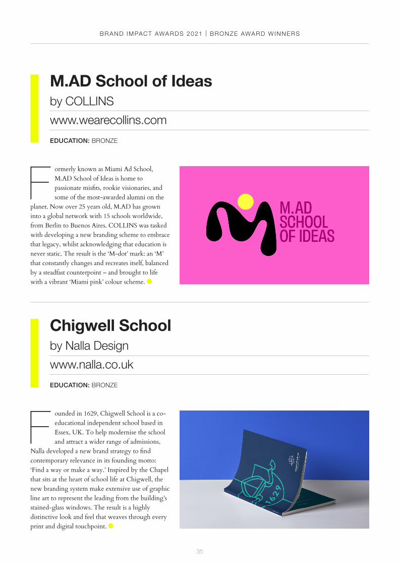
planet. Now over 25 years old, M.AD has grown into a global network with 15 schools worldwide, from Berlin to Buenos Aires. COLLINS was tasked with developing a new branding scheme to embrace that legacy, whilst acknowledging that education is never static. The result is the ‘M-dot’ mark: an ‘M’ that constantly changes and recreates itself, balanced by a steadfast counterpoint – and brought to life with a vibrant ‘Miami pink’ colour scheme.
BR AND IMPACT AWARDS 2021 | BRONZE AWARD WINNERS
36
Lou Kymeby B&W Studio
www.bandwstudio.co.uk
ENTERTAINMENT: BRONZE
Sidetracks Radioby Studio Sutherl&
www.studio-sutherland.co.uk
ENTERTAINMENT: BRONZE
A small internet-based radio station, Sidetracks broadcasts from a range of places and spaces in London and beyond. Each show has a specific theme
and is presented by enthusiasts and friends to share their love of music with the world. Studio Sutherl&’s simple but dynamic identity is based on the literal ‘tracks’ on an LP, with two semi-circles offset to create an ‘S’. The black-and-white line pattern translates into a range of abstract Op-Art covers for each show, as well as a range of merchandise, which combine to create a mesmerising optical effect.
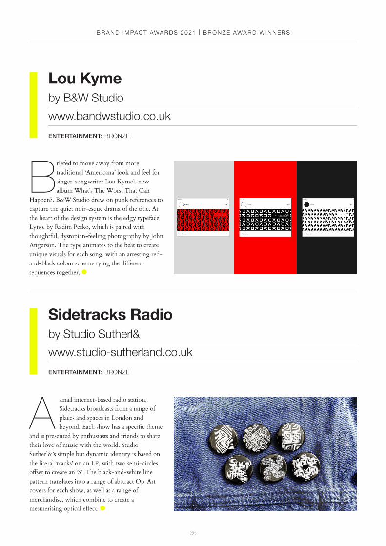
Briefed to move away from more traditional ‘Americana’ look and feel for singer-songwriter Lou Kyme’s new album What’s The Worst That Can
Happen?, B&W Studio drew on punk references to capture the quiet noir-esque drama of the title. At the heart of the design system is the edgy typeface Lyno, by Radim Pesko, which is paired with thoughtful, dystopian-feeling photography by John Angerson. The type animates to the beat to create unique visuals for each song, with an arresting red-and-black colour scheme tying the different sequences together.
BR AND IMPACT AWARDS 2021 | BRONZE AWARD WINNERS
37
First Directby BrandOpus
www.brandopus.com
FINANCIAL SERVICES: BRONZE
BlackRockby Turner Duckworth: London, San Francisco & New York
www.turnerduckworth.com
FINANCIAL SERVICES: BRONZE
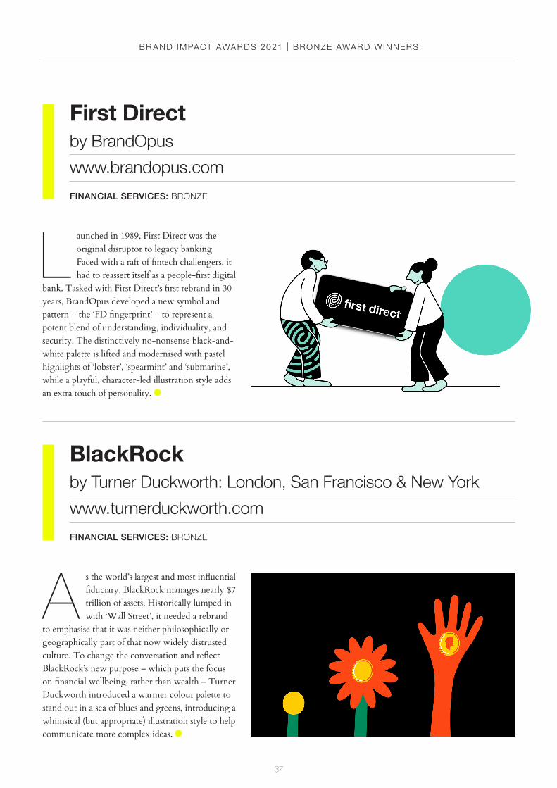
A s the world’s largest and most influential fiduciary, BlackRock manages nearly $7 trillion of assets. Historically lumped in with ‘Wall Street’, it needed a rebrand
to emphasise that it was neither philosophically or geographically part of that now widely distrusted culture. To change the conversation and reflect BlackRock’s new purpose – which puts the focus on financial wellbeing, rather than wealth – Turner Duckworth introduced a warmer colour palette to stand out in a sea of blues and greens, introducing a whimsical (but appropriate) illustration style to help communicate more complex ideas.
L aunched in 1989, First Direct was the original disruptor to legacy banking. Faced with a raft of fintech challengers, it had to reassert itself as a people-first digital
bank. Tasked with First Direct’s first rebrand in 30 years, BrandOpus developed a new symbol and pattern – the ‘FD fingerprint’ – to represent a potent blend of understanding, individuality, and security. The distinctively no-nonsense black-and-white palette is lifted and modernised with pastel highlights of ‘lobster’, ‘spearmint’ and ‘submarine’, while a playful, character-led illustration style adds an extra touch of personality.
BR AND IMPACT AWARDS 2021 | BRONZE AWARD WINNERS
38
Casey’sby Interbrand
www.interbrand.com
FMCG: BRONZE
Botanical Loftsby Range Left
www.rangeleft.co.uk
PROPERTY & CONSTRUCTION: BRONZE
B uilt on the site of historic Georgian botanical gardens in the heart of London E1, Botanical Lofts is a new boutique development of apartments. Inspired by
the original gardens, which housed an extensive collection of coveted specimen plants that most Georgian Londoners had never seen at the time, Range Left paired delicately organic, floral-inspired typography with botanical Dutch Master paintings. Beyond the website, brochures and social media assets, the branding comes to life at scale on hoardings and a large artwork mounted in the building’s reception.
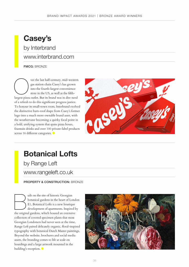
O ver the last half-century, mid-western gas station chain Casey’s has grown into the fourth-largest convenience store in the US, as well as the fifth-
largest pizza outlet. But its brand was in dire need of a refresh to do this significant progress justice. To honour its small-town roots, Interbrand evolved the distinctive barn-roof shape from Casey’s former logo into a much more ownable brand asset, with the weathervane becoming a quirky focal point in a bold, unifying system that spans pizza boxes, fountain drinks and over 100 private-label products across 16 different categories.
BR AND IMPACT AWARDS 2021 | BRONZE AWARD WINNERS
39
i.Detroitby Studio Sutherl&
www.studio-sutherland.co.uk
PUBLISHING: BRONZE
A Baxter & Bailey Zoommasby Baxter & Bailey
www.baxterandbailey.co.uk
SELF-BRANDING: BRONZE
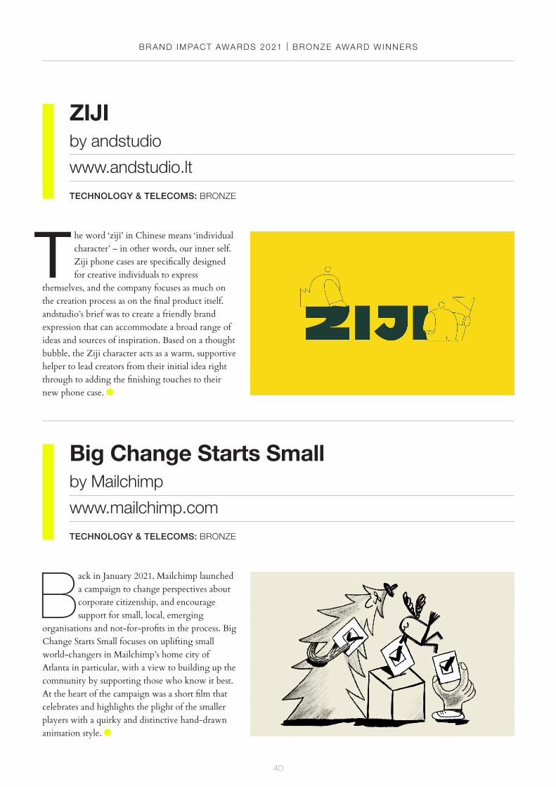
B reaking from their usual festive tradition, for Christmas 2020 the team at Brighton-based studio Baxter & Bailey decided to step away from sending a physical card to
clients and collaborators in favour of building something more playful – and potentially useful too. Marking the end of a long year in which virtual meetings had quickly become the norm for businesses around the world, the result was a set of 12 animated virtual backgrounds for anyone to download for free, providing some weird and wonderful conversation starters for their next on-screen encounter.
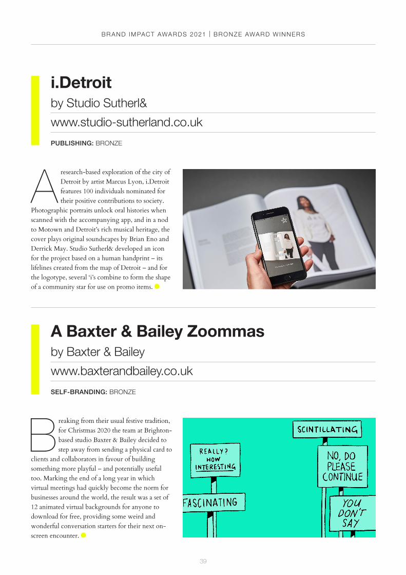
A research-based exploration of the city of Detroit by artist Marcus Lyon, i.Detroit features 100 individuals nominated for their positive contributions to society.
Photographic portraits unlock oral histories when scanned with the accompanying app, and in a nod to Motown and Detroit’s rich musical heritage, the cover plays original soundscapes by Brian Eno and Derrick May. Studio Sutherl& developed an icon for the project based on a human handprint – its lifelines created from the map of Detroit – and for the logotype, several ‘i’s combine to form the shape of a community star for use on promo items.
BR AND IMPACT AWARDS 2021 | BRONZE AWARD WINNERS
40
ZIJIby andstudio
www.andstudio.lt
TECHNOLOGY & TELECOMS: BRONZE
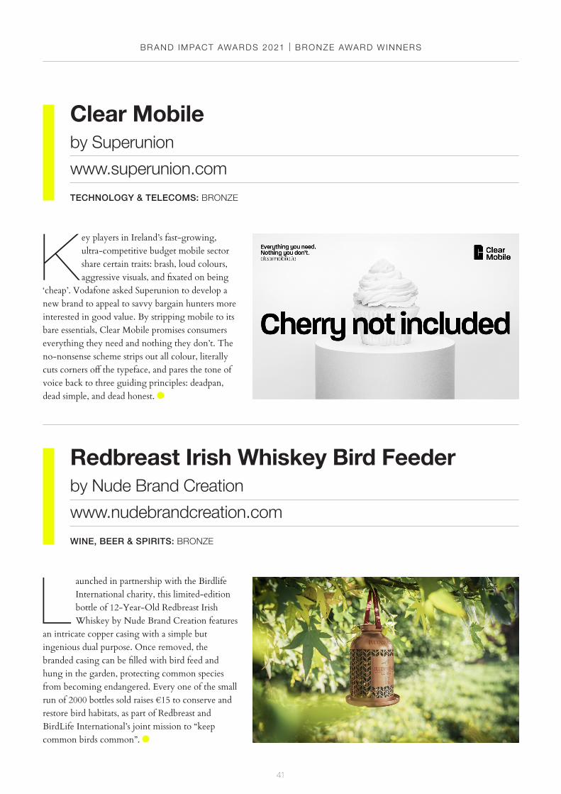
T he word ‘zìjĭ’ in Chinese means ‘individual character’ – in other words, our inner self. Ziji phone cases are specifically designed for creative individuals to express
themselves, and the company focuses as much on the creation process as on the final product itself. andstudio’s brief was to create a friendly brand expression that can accommodate a broad range of ideas and sources of inspiration. Based on a thought bubble, the Ziji character acts as a warm, supportive helper to lead creators from their initial idea right through to adding the finishing touches to their new phone case.
Big Change Starts Smallby Mailchimp
www.mailchimp.com
TECHNOLOGY & TELECOMS: BRONZE
Back in January 2021, Mailchimp launched a campaign to change perspectives about corporate citizenship, and encourage support for small, local, emerging
organisations and not-for-profits in the process. Big Change Starts Small focuses on uplifting small world-changers in Mailchimp’s home city of Atlanta in particular, with a view to building up the community by supporting those who know it best. At the heart of the campaign was a short film that celebrates and highlights the plight of the smaller players with a quirky and distinctive hand-drawn animation style.
BR AND IMPACT AWARDS 2021 | BRONZE AWARD WINNERS
41
Clear Mobileby Superunion
www.superunion.com
TECHNOLOGY & TELECOMS: BRONZE
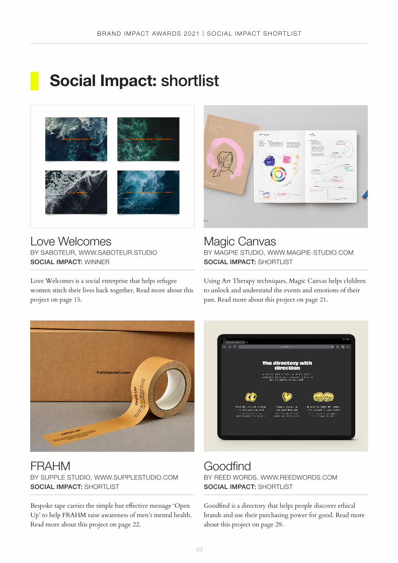
K ey players in Ireland’s fast-growing, ultra-competitive budget mobile sector share certain traits: brash, loud colours, aggressive visuals, and fixated on being
‘cheap’. Vodafone asked Superunion to develop a new brand to appeal to savvy bargain hunters more interested in good value. By stripping mobile to its bare essentials, Clear Mobile promises consumers everything they need and nothing they don’t. The no-nonsense scheme strips out all colour, literally cuts corners off the typeface, and pares the tone of voice back to three guiding principles: deadpan, dead simple, and dead honest.
Redbreast Irish Whiskey Bird Feederby Nude Brand Creation
www.nudebrandcreation.com
WINE, BEER & SPIRITS: BRONZE
L aunched in partnership with the Birdlife International charity, this limited-edition bottle of 12-Year-Old Redbreast Irish Whiskey by Nude Brand Creation features
an intricate copper casing with a simple but ingenious dual purpose. Once removed, the branded casing can be filled with bird feed and hung in the garden, protecting common species from becoming endangered. Every one of the small run of 2000 bottles sold raises €15 to conserve and restore bird habitats, as part of Redbreast and BirdLife International’s joint mission to “keep common birds common”.

BR AND IMPACT AWARDS 2021
42
social impactshortlist
43
Love WelcomesBY SABOTEUR, WWW.SABOTEUR.STUDIOSOCIAL IMPACT: WINNER
Love Welcomes is a social enterprise that helps refugee women stitch their lives back together. Read more about this project on page 15.
FRAHM BY SUPPLE STUDIO, WWW.SUPPLESTUDIO.COMSOCIAL IMPACT: SHORTLIST
Bespoke tape carries the simple but effective message ‘Open Up’ to help FRAHM raise awareness of men’s mental health. Read more about this project on page 22.
Magic CanvasBY MAGPIE STUDIO, WWW.MAGPIE-STUDIO.COMSOCIAL IMPACT: SHORTLIST
Using Art Therapy techniques, Magic Canvas helps children to unlock and understand the events and emotions of their past. Read more about this project on page 21.
Goodfind BY REED WORDS, WWW.REEDWORDS.COMSOCIAL IMPACT: SHORTLIST
Goodfind is a directory that helps people discover ethical brands and use their purchasing power for good. Read more about this project on page 29.
Social Impact: shortlist
BR AND IMPACT AWARDS 2021 | SOC IAL IMPACT SHORTL IST
44
BR AND IMPACT AWARDS 2021 | SOC IAL IMPACT SHORTL IST
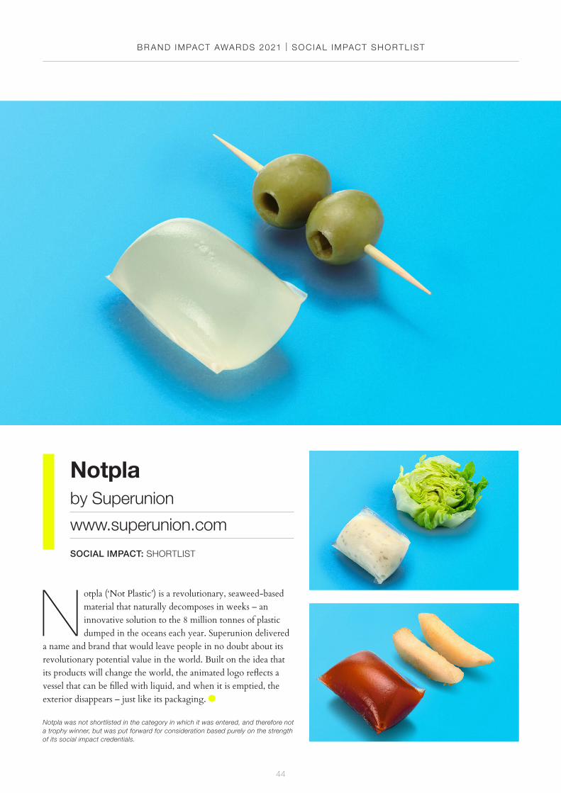
Notplaby Superunion
www.superunion.com
SOCIAL IMPACT: SHORTLIST
N otpla (‘Not Plastic’) is a revolutionary, seaweed-based material that naturally decomposes in weeks – an innovative solution to the 8 million tonnes of plastic dumped in the oceans each year. Superunion delivered
a name and brand that would leave people in no doubt about its revolutionary potential value in the world. Built on the idea that its products will change the world, the animated logo reflects a vessel that can be filled with liquid, and when it is emptied, the exterior disappears – just like its packaging.
Notpla was not shortlisted in the category in which it was entered, and therefore not a trophy winner, but was put forward for consideration based purely on the strength of its social impact credentials.
45
BR AND IMPACT AWARDS 2021 | CRED ITS
San Francisco Symphony
Louis Mikolay, Erik Berger Vaage, Sidney Lim, Karin Fyhrie, Christine Takaichi, Ben Crick, Tomas Markevicius, Michael Taylor, Yeun Kim, Mackenzie Pringle, Eric Park, Neil Jackson, Ivan Cruz; DINAMO; SF Symphony
Story Espresso
Executive Creative Director: Jason Little; Design Director: Olivia King; Writers: Mat Groom, Daniel St. Vincent; Designers: Pete Conforto, Chris Van Niekerk, Kinal Ladha; Illustrator: Ilana Bodenstein
Robinhood
Ben Crick, Karin Fyhrie, Erik Berger Vaage, Taamrat Amaize, Anjelica Triola, Mackenzie Pringle, Yeun Kim, Victoria Thomas, LA Hall; Robinhood Internal – Robert Thompson, Victor Bivol, Drew Nelson, Elaine Lin, Daniel Haire, Zane Bevan, Baiju Bhatt; Illustration: Matias Basla, Liam Cobb, Jaedoo Lee, Ilya Milstein
Afghanistan’s First All Female Orchestra
Creative Director: Garrick Hamm; Business Director: Emmanuelle Hilson; Designer: Holly Mattacott-Darrah; Illustration: Holly Mattacott-Darrah; Artwork: Jason Budgen; Retouching: Jason Budgen, Trevor Wills; Copywriter: Antonia Green; Producer: Imogen Turner; Production Director: Mark Tosey; Rug woven by Turquoise Mountain Printers; VGL Client: Orchestra of St John’s
Pencil Box
Design: Studio Sutherl&; Client: Boss Box; Creative director: Jim Sutherland; Illustration: Rebecca Sutherland Love Welcomes
Nick Eagleton, The Playful Saboteur; Paul Cardwell, The Laughing Saboteur; James Osborn, The Hungry Saboteur
Tres Generaciones
Creative Director: Jared Britton; Executive Creative Director: Jamie McCathie; Account Director: D’Arcy Danaher; Production Director: Craig Snelgrove
The Kraken Rum
Creative Directors: Alan Dye and Nick Finney; Designer: Sam Pittman; Client Manager: Jack Layer; Consultant: Neil Hirst; 3D modelling: Simon Miller; Photography: Paul Zak
Fender - Acoustasonic Jazzmaster
Client: Fender; In-House Direction, Design & Animation: ManvsMachine; Sound Design & Music: Resonate
Magic Canvas
Magpie Studio – Creative Partners: David Azurdia, Ben Christie; Account Director: Alice Thompson; Designer: Cassie Brock; Illustrator & Designer: Lucas Garcia; Magic Canvas – Therapeutic Life Story Practitioner: Viola Phillips
FRAHM
Design: Supple Studio; Copywriting: Supple Studio
New Holland Brewing Company
Typography: Rob Clarke; Illustration: Bailey Sullivan; Creative Director: Mike Perry; Strategy: Lisa Franck; VP Strategy: Christina Tazza; Senior Designer: Gregor Johnstone; Junior Designer: Jacklyn Munck; Designer: Katie Hasler; Senior Designer: Marlee Bruning; Senior Designer: Cody Hoerauf; Business Operations Director: Laura Bird; Senior Client Manager: Tayler Spellis
American Library
The Click – Creative Director: Bobby Burrage; Design: Bobby Burrage, Jordan Blyth, Scott Keightley
Credits
BR AND IMPACT AWARDS 2021 | CRED ITS
46
Derwent Valley
Designers: Ilana Bodenstein, Peter Conforto; Design Director: Olivia King; Creative Director: Johanna Roca; Executive Creative Director: Jason Little; Typographer: Olivia King; Writers: Mat Groom, Daniel St. Vincent; Illustrator: Ilana Bodenstein; Strategists: Sammy Page, Oscar Langley
Crane Paper
Nick Ace, Jump Jirakaweekul, Camille M. Sauvé, Tomas Markevicius, Jacob Wise, Tom Elia, Ian Aronson, Alexandra Wallace, Paul Jun; The Nucleus Group – Elizabeth Talerman, Shazeeda Bhola, Gena Cuba; Crane – Jill Armstrong, Dean Daigle, Chris Harrold, Bart Robinson, Laura Seele, Katelyn Stetler, Paul Thorogood; Photography: Mari Juliano, Theo Livaudais
Silver Lyan
Creative Partners: Ben Christie, David Azurdia; Account Director: Natasha Sutton; Designer: Cassie Brock
Figlia
Executive Creative Director: Andy Reynolds; Design Director: Gianluca Crudele; Designer: Louisa Luk; Ceramics: Salvatore Caraglia; Photography: Scott Kimble; Filming: Gabriele Scarcelli; Film Editting: Connor Reddy; Printing: Inkchacha; Project Management: Eugenia Chui
Goodfind
Copy – Writer: Jamie Thorp; Creative Lead: Orlaith Wood; Design – Designer and Creative Director: Matt Morgan
The Spirits of Iceland
Creative Director: Hrafn Gunnarsson; Associate Creative Director: Dóri Andrésson; Graphic Designer: Thorgeir Blöndal; Art Director: Davíð Arnar Baldursson; Graphic
Designer: Guðmundur Pétursson; Creative Director: Jón Ari Helgason; Associate Creative Director: Arnar Halldórsson; Copywriters: Bragi Valdimar Skúlason, Jón Oddur Guðmundsson, Elín Þórsdóttir; Account Manager: Raquel Diaz; Animation: Thorvaldur Sævar Gunnarsson, Eyrun Steffers; CEO: Ragnar Gunnarsson; Photographer: Sveinn Speight; Composer: Pétur Jónsson; Director: Hannes Thor Halldórsson; Illustrator: Asgeir Jon Asgeirsson
Boing
Designed, Directed & Produced by Art&Graft
The Royal Mail - Sherlock Holmes
Creative Directors: Alan Dye, Nick Finney; Designers: Laura Bowman, Harriet Payler; Illustrator: Karolis Strautniekas
WPP Wavemaker
Creative Directors: Alan Dye, Nick Finney; Designers: Jamie Breach, Harriet Payler; Digital Agency: The Web Kitchen
Riverside
Executive Creative Director: Stuart Radford; Design Director: Jonathan Brodie; Senior Designer: Fraser Donaldson; Senior Account Manager: Nicola Bennett-Cook
M.AD School of Ideas
Zuzanna Rogatty, Niamh Walsh, Tomas Markevicius, Aran Quinn, Eric Park, Christine Takaichi, Dashiell Alison, Madeleine Carrucan, TJ Dumser; M.AD School of Ideas - Pippa Seichrist, Hank Richardson; Photography: Mari Juliano, Theo Livaudais, Kristine Lim
Chigwell School
Strategy: Vicki Young; Design Team: Alice Saunders, Kirsty Tavendale; Client Partnership Director: Bethan Thomas; Web Development: Pepper Digital
Credits
47
BR AND IMPACT AWARDS 2021 | CRED ITS
Lou Kyme
Creative Director: Lee Bradley; Designer: Scott Cockerham; Photographer: John Angerson Sidetracks Radio
Design: Marc Spicer, Jim Sutherland
First Direct
Chief Creative Officer: Paul Taylor; Design Director: Claire Marshall; Designers: Meg Vaughan, Sophie Taylor; Motion Designer: Jack Rogers; Producer: Seona Bell; Creative Finisher: Ashley Vanstone; Illustrator: Harry Neville-Towle
BlackRock
Head of Design: Sarah Moffat; Executive Creative Director: Andy Baron; Creative Director: Chris Partelow; Implementation Director: Jeff Jones; Account Directors: Bailey James, Kate Wierman, Katie Monahan
Casey’s
Client: Megan Elfers; Agency: Interbrand New York; Executive Creative Director: Oliver Maltby; Creative Director: Izgi Yapici; Senior Designer: Spencer Seligman; Design Fellow: Eddy Lee; Implementation: Jean Campbell; Account Manager: Anna Young; Typography: Jesse Ragan; 3D and Animation: Fakery
Botanical Lofts
Designers: Matthew Gowar, Liam Parker, Jack Shaw, Jo Phillimore
i.Detroit
Artist: Marcus Lyon; Photographer: Joe Briggs-Price; Design: Studio Sutherl&; Creative Director: Jim Sutherland;
Designer: Rosey Trickett; Producer: Camila Pastorelli; DNA: Family Tree DNA; Sound: Rethink Audio; App: Calvium; Museum: Charles H. Wright; Funding: The Kresge Foundation
A Baxter & Bailey Zoommas
Animator: Nick Murray Willis
ZIJI
Design Lead: Domas Miksys; Designer: Ignas Vezelis; Creative Director: Augustinas Paukste; Project Manager: Diana Abramaviciute; Strategist: Gaile Andriuskeviciute; Copywriter: Ieva Dobilaite; Strategist: Rene Fischer; Photographer: Martyna Jovaisaite
Big Change Starts Small
Senior Director, Corporate Citizenship, Mailchimp: Lain Shakespeare; Senior Director, Head of Brand & Content Marketing, Mailchimp: Michael Mitchell; The Kin Agency
Clear Mobile
Executive Creative Director: Stuart Radford; Design Director: Ryan Ras; Designer: Sam Ratcliffe; Copywriter: Tom Tytherleigh; Strategist: Laura Stepney; Account Director: Mairi Murdoch; Client Director: James Saunders
Redbreast Irish Whiskey Bird Feeder
Creative Director: Mike Parsonson; Structural Director: Stewart Hobbs; Account Director: Bernard Gormley Notpla
Superunion – Senior Creative Director: Mark Wood; Designer: Ilaria Celata; Client Services: Nicola Bennett-Cook; Notpla – Co-Founders: Pierre Paslier, Rodrigo Garcia Gonzalez, Lise Honsiner
Credits

BR AND IMPACT AWARDS 2021
48
CELEBRATING THE WORLD’S BEST BRANDING
# B R A N D I M P A C T A W A R D S