Cartographic Perspectives
76
Cartographic Perspectives Journal of the North American Cartographic Information Society Number 65, Winter 2010 OPINION PIECE Outside the Bubble: Real-world Mapmaking Advice for Students 7 FEATURED ARTICLES Considerations in Design of Transition Behaviors for Dynamic 16 Thematic Maps Sarah E. Battersby and Kirk P. Goldsberry Non-Connective Linear Cartograms for Mapping Traffic Conditions 33 Yi-Hwa Wu and Ming-Chih Hung REVIEWS Cartography Design Annual # 1 51 Reviewed by Mary L. Johnson Cartographic Relief Presentation 53 Reviewed by Dawn Youngblood GIS Tutorial for Marketing 54 Reviewed by Eva Dodsworth The State of the Middle East: An Atlas of Conflict and Resolution 56 Reviewed by Daniel G. Cole CARTOGRAPHIC COLLECTIONS More than Just a Pretty Picture: The Map Collection at the Library 59 of Virginia Cassandra Britt Farrell THE PRACTICAL CARTOGRAPHER’S CORNER How to Create a Text Halo Mask in Illustrator CS3/CS4 63 Alex Tait VISUAL FIELDS 3D Birds-eye-view Raster Maps 65 Derek Tonn and Michael Karpovage COLOR FIGURES 67 (continued on page 3) From the Editor In this Issue Dear NACIS Members: The winter of 2010 was quite an ordeal to get through here on the eastern side of Big Savage Moun- tain. A nearby weather recording station located on Keysers Ridge (about 10 miles to the west of Frostburg) recorded 262.5 inches of snow for the winter of 2010. For the first time in my eleven- year tenure at Frostburg State University, the university was shut down for an entire week. The crews that normally plow the sidewalks and parking lots were snowed in and could not get out of their homes. As storm after storm swept through the area, plow- ing became more difficult. There wasn’t enough room to pile up the snow. Even today, snow drifts remain dotted amidst the green- ing fields. However, it appears as though spring will pass us by as summer apparently is already here with several days that have broken existing record high temperatures. Once again, this issue of CP con- tains a mixture of cartographic of- ferings which I hope you will find intriguing. I hope you took time to read through the letter from President Margaret Pearce. As you can tell, there is quite a lot happen- ing in the NACIS and CP world. I will detail a bit more on changes that you will see to CP later. For now, this issue of CP begins with an opinion piece from Tom Patter- son entitled “Outside the Bubble:
-
Upload
khangminh22 -
Category
Documents
-
view
3 -
download
0
Transcript of Cartographic Perspectives
1 cartographic perspectives Number 65, Winter 2010
Cartographic PerspectivesJournal of the
North American CartographicInformation Society
Number 65, Winter 2010
OPINION PIECEOutside the Bubble: Real-world Mapmaking Advice for Students 7
FEATURED ARTICLESConsiderations in Design of Transition Behaviors for Dynamic 16Thematic MapsSarah E. Battersby and Kirk P. Goldsberry
Non-Connective Linear Cartograms for Mapping Traffic Conditions 33Yi-Hwa Wu and Ming-Chih Hung
REVIEWSCartography Design Annual # 1 51Reviewed by Mary L. Johnson
Cartographic Relief Presentation 53Reviewed by Dawn Youngblood
GIS Tutorial for Marketing 54Reviewed by Eva Dodsworth
The State of the Middle East: An Atlas of Conflict and Resolution 56Reviewed by Daniel G. Cole
CARTOGRAPHIC COLLECTIONSMore than Just a Pretty Picture: The Map Collection at the Library 59of VirginiaCassandra Britt Farrell
THE PRACTICAL CARTOGRAPHER’S CORNERHow to Create a Text Halo Mask in Illustrator CS3/CS4 63Alex Tait
VISUAL FIELDS3D Birds-eye-view Raster Maps 65Derek Tonn and Michael Karpovage COLOR FIGURES 67
(continued on page 3)
From the Editor In this Issue
Dear NACIS Members:
The winter of 2010 was quite an ordeal to get through here on the eastern side of Big Savage Moun-tain. A nearby weather recording station located on Keysers Ridge (about 10 miles to the west of Frostburg) recorded 262.5 inches of snow for the winter of 2010. For the first time in my eleven-year tenure at Frostburg State University, the university was shut down for an entire week. The crews that normally plow the sidewalks and parking lots were snowed in and could not get out of their homes. As storm after storm swept through the area, plow-ing became more difficult. There wasn’t enough room to pile up the snow. Even today, snow drifts remain dotted amidst the green-ing fields. However, it appears as though spring will pass us by as summer apparently is already here with several days that have broken existing record high temperatures.
Once again, this issue of CP con-tains a mixture of cartographic of-ferings which I hope you will find intriguing. I hope you took time to read through the letter from President Margaret Pearce. As you can tell, there is quite a lot happen-ing in the NACIS and CP world. I will detail a bit more on changes that you will see to CP later. For now, this issue of CP begins with an opinion piece from Tom Patter-son entitled “Outside the Bubble:
2 Number 65, Winter 2010 cartographic perspectives Cartographic PerspectivesJournal of the
North American CartographicInformation Society©2010 NACIS ISSN 1048-9085www.nacis.org
Sarah BattersbyUniversity of South Carolina
Barbara ButtenfieldUniversity of Colorado-Boulder
Matthew EdneyUniversity of Southern MaineUniversity of Wisconsin
Dennis FitzsimonsHumboldt State University
Amy GriffinUniversity ofNew South Wales – ADFA
Patrick KennellyLong Island UniversityCW Post Campus
Mike LeitnerLouisiana State University
Amy LobbenUniversity of Oregon
Margaret PearceOhio University
Keith RiceUniversity of Wisconsin atStevens Point
Anthony RobinsonPenn State University
Julia SeimerUniversity of Regina
Editorial Board Section Editors
The Practical Cartographer’sCornerAlex TaitInternational [email protected]
ReviewsMark DenilCartographer at [email protected]
Visual FieldsMike HermannUniversity of [email protected]
Fritz Kessler,EditorDepartment of GeographyFrostburg State University230 Gunter Hall101 Braddock BlvdFrostburg, MD 21532(301) 687-4266fax: (301) [email protected]
Assistant EditorJim AndersonFlorida State [email protected]
Copy EditorMary SpaldingPotomac State College ofWest Virginia Univerisity
Cartographic CollectionsAngie CopeAGS [email protected]
3 cartographic perspectives Number 65, Winter 2010
NACIS holds the copyrights to all items published in each issue. The opinions expressed are those of the author(s), and not necessarily the opinion of NACIS.
The CoverCasting Lots1992, 60 ” x 84”, oil and acrylic/canvasSusanne SlavickAndrew W. Mellon Professor of ArtCarnegie Mellon University
In Casting Lots, the directional winds (originally designated by Aris-totle and usually personified as cherubic faces exhaling with inflated cheeks) become gloved hands in anonymous acts of inadequate altruism — toward any imagined need, a need that is infinite. They surround an emptied world, measured only by ghostly traces of longi-tudes and latitudes. The resulting black hole is not one of nihilism, but a space for re-imagining, reawakening — much like the pregnant absences of the Buddhist plenum void, the empty space full of poten-tial. It is a realm from which anything can spring forth.http://artscool.cfa.cmu.edu/~slavick/
(letter from the editor continued)
(continued on page 4)
Real-world Mapmaking Advice for Students” that should be a must read for every cartography student (and their professors, too!). Tom relates his decades of map-making experience, offering guidance in simple terms on how to make bet-ter maps. The two featured articles both highlight experimentation. The first article titled “Consid-erations in Design of Transition Behaviors for Dynamic Thematic Maps” by Sarah Battersby and Kirk Goldsberry reports research findings that investigate how static principles of thematic map design do not always effectively commu-nicate in a dynamic environment. The second article titled “Non-Connective Linear Cartograms for Mapping Traffic Conditions” by Yi-Hwa Wu and Ming-Chih Hung discusses novel ways to represent traffic flows through cartogram symbolization.
The individual sections fol-low. First up is the Book Reviews where you will find reviews from a sampling of four mapping-related texts. Next is the Cartographic Col-lections section. Before the main piece in this section, you will find
a correction to Martin Wood’s piece titled “The Maps Collec-tion of the National Library of Australia” that appeared in issue #63 and contained several errors. A corrected version of the open-ing paragraph is reprinted. The main piece titled “More than Just a Pretty Picture: The Map Col-lection at the Library of Virginia” is penned by Cassandra Farrell of the Library of Virginia. Here, she gives an overview of the map collection housed at the Library of Virginia. The next section, “The Practical Cartographer’s Corner,” replaces the Mapping Methods and Tips section. Alex Tait, of International Mapping, is the editor for this new sec-tion. Here, Alex gives practical advice (hence the name) targeted toward the novice map maker on a broad range of topics. We welcome Alex’s wealth of knowl-edge in the mapping field and look forward to his continued practical map making advice in issues to come. The Visual Fields piece presents “3D Birds-Eye-View Raster Maps” by Derek Tonn and Michael Karpovage, both of whom are associated with mapformation, LLC. Their
piece describes how they utilized Adobe Photoshop to create realis-tic landscapes for Hudson Valley Community College’s new 3D birds-eye-view campus map.
And now, I will report on some important updates to CP’s status. I recently met with the NACIS Board in Madison, Wisconsin, as part of the annual spring NACIS Board meeting where I reported on the rather gloomy status of the journal. To date, I have not re-ceived any submissions for peer-reviewed publication consider-ation in 2010. This number comes on the heels of only a handful of submissions for 2009. If the journal maintains this submission status quo, it will cease to exist out of attrition. This fact is non-refutable, and thus some kind of new think-ing has to emerge or CP will fade. Thus, the first order of business was to discuss the future of CP. Strong consideration was given to the results of the CP reader-ship survey that was conducted in January of 2009 and the CP panel session held at the last NACIS conference in Sacramento, Califor-nia, which collectively indicated that changes are not only afoot but they are necessary. As many of you know, CP experimented with a digital version (CP issue #64) in 2009. This issue was met with considerable success and reflected what many commented on in the CP readership survey and panel session: allow CP to go digital. At the board meeting this sentiment was in the forefront as the decision to move CP completely digital was made. In light of this move, this issue will be the last printed ver-sion of the journal that you will, by default, receive in the mail. Fu-
4 Number 65, Winter 2010 cartographic perspectives
(letter from the editor continued)
ture issues of CP will be digitally served through NACIS’ Web site. In addition, CP will become com-pletely open source allowing free access to the journal. The decision to go in this new direction was made after serious consideration of the NACIS budget. The cost in-volved in printing a paper version of CP typically runs around $7,500 while the electronic version of CP cost $1,800. Obviously, three issues of print CP greatly consume a considerable amount of the annual NACIS budget. Three (or more) issues of digital CP per year offers a considerable cost savings.
What does this new direc-tion mean to you? I feel there are several advantages to this new approach.
Digital publication means that new types of articles and inter-action with the articles are now possible. Links to mapping appli-cations, interactive opportunities, imbedded videos/animations, and color figures in-line with text are just a few of the possibilities that a digital publication offers over the print environment. For a field such as mapping that is so tied to tech-nology, the decision to go digital seemed like a logical leap to make.
Digital open source means that authors wishing to publish have faster turn-around times from sub-mission to “print.”
Open source also means that a greater number of individuals will have instant access to your schol-arly work.
Open source also satisfies the longstanding problem of CP read-ers not being able to get a copy of the journal from their local univer-sity or public library.
CP will still be available in print form through a “print on demand’ service. NACIS members desiring a printed copy can still order one and have it shipped to your door for around $15.00.
No other cartography journal
offers completely digital and open source which should help draw contributors and thus increase exposure of CP and NACIS to a broader community.
CP will still offer the same peer-reviewed content as in issues past.
Obviously, this decision will cause concern among some of the readership. A CP Transition Committee has been established to detail the foreseeable issues that are involved with the move from print to digital format. But, I want to assure each of you that this new move was done to help ensure that CP continues to be healthy, cutting edge, and responds to its reader-ship. More information on the move to all digital will be revealed in future CP issues and at the fall NACIS conference as the transition becomes more evident and we are able to work through some of the issues that will undoubtedly reveal themselves. In the meantime, I encourage you to send me your thoughts and concerns regard-ing the transition and how it may impact you.
On a personal note, I am enter-ing into my final year as CP Editor. It has been a rewarding experience being at the helm of CP. In spite of the new experiences and chal-lenges the position has offered, I formally announced my decision at the spring board meeting to not seek another three-year term as editor. Although I have enjoyed my time in the editorship, I believe that someone else should step up and carry CP into the future. After a brief search, Patrick Kennelly will begin his three-year term as CP Editor in January 2011. Patrick is an Associate Professor in the Department of Earth and Envi-ronmental Science at CW Post Campus / Long Island University. Patrick has accumulated many publications mostly focusing on terrain mapping and has a long-standing service record to the NACIS community. I have great confidence that Patrick will con-
tinue forging a solid future for CP. I hope you will help in welcoming him into the editorship.
I also wish to thank the follow-ing individuals who served as external reviewers during 2009 for their time and thoughtful com-ments.
James AkermanNat CaseMathew DooleyRob EdsallIan MuehlenhausMichael Petersondaan StrebeLynn Usery
I encourage each of you to con-sider CP as the publication outlet for your peer-reviewed papers, opinion pieces, information on map libraries, mapping methods and techniques, and visual fields. I know there is much that is hap-pening in the mapping world out there. CP and its readership would like to hear about it.
I offer this issue to you for your contemplation and reading plea-sure. I welcome your questions, comments, and discrepancies.
Until next time,Fritz
From the President
(continued on page 5)
Greetings, NACIS!
Whew, what a year of change this has been. Some years, it seems we talk about the changes we want to make and the projects we want to pursue, but leave it at that. It’s the bantering-about-projects phase that innocently transpires during the conference coffee breaks and in the din of the hospitality suite. In fact, if it was a polygon, I’d give it a gradient fill, with 15 percent
5 cartographic perspectives Number 65, Winter 2010
(letter from the president continued)
cyan in the left doodad (I prefer the technical term, rather than the more informal “slider”), and 20 percent yellow in the right doo-dad: shallow waters illuminated by possibility.
Sometimes we begin to take one of these ideas more seriously and begin a little reconnaissance. Does it make sense to actually pursue this? How will it affect our budget? What do the members think? Who is going to do the work? And why would we put so much effort into this; for what purpose? This crucial phase is supposed to be transitory: either the project seems useful and goes forward, or there is a real-ization that it’s not such a good idea after all. I’d change that right doodad to 40 percent cyan: we’re headed into deeper waters, and we’re serious. The hazard is that brilliant ideas enter this stage and never leave, and a kind of stasis of “questioning why” sets in. It’s the safe, inert space of indefinite ques-tioning and non-implementation. It’s easy to let things languish here because board members come and go, and we can be recreationally forgetful. Lose the gradient: I’m giving it a flat 50 percent black, neither here nor there, and saving it as a lossy, low resolution 8-bit 72dpi jpeg. Brilliance flattened, downsampled, and shelved.
Whether a spark of action squeezes out of this space and into the world depends on the per-son, the committee, or the board. A willingness to do the work, a memory of what was dreamed, and a vision for what could be. A 64-bit FABTONE Zipachrome C vision. It’s a rare board that can access this swatch, but this is one of those boards, and this has been one of those years.
Changes at CP
One of the major accomplishments of the Board is a transition and
new future for the journal you hold in your hands. I will leave it to CP Editor Fritz Kessler to tell you of this exciting work (see his letter in this issue). As Fritz’s term as Editor is coming to a close in 2010, on behalf of the NACIS Board, I would like to thank him for his excellent work. Fritz left no stone unturned looking for inno-vative scholarship and technique of potential interest to the diverse population that is you, the mem-bership, during a time when sub-missions to cartographic journals in general were at an all-time low. This he accomplished while coor-dinating peer reviews, copyedits, page proofs, and final layouts on-schedule for every issue. In his spare time, he led thoughtful discussions at the annual confer-ence about the health and future of CP, engaging the feedback of his editorial board and the members. These same discussions readied us for a major transformation in 2010. Thanks, Fritz, for shepherding us through, and all the best in your next project.
Also on behalf of the board, I would like to welcome Dr. Patrick J. Kennelly, who will officially take the reins as our new Editor on January 1. Many of you already know him as the coordinator of the annual Student Poster Competi-tion and map gallery, a role best served by someone with both a gentle soul and a firm grasp of the rules. We’ve also seen Patrick in action from his involvement in the conference sessions over the years, and we are both confident of his capabilities and accustomed to his smile.
CartoTalk
Another major accomplishment was that our organization was pleased to take over site manage-ment of CartoTalk, the Public Forum for Cartography and De-sign at cartotalk.com. As many of you know, this critical resource is
the brainchild of NACIS member Nick Springer, of Springer Carto-graphics. Last year, mulling over CartoTalk’s growing web pres-ence and popularity, Nick and the Board thought it would be exciting if NACIS began hosting the site. In this new role, NACIS is now responsible for running all aspects of the forum, including approving new members, managing the soft-ware, recruiting and working with advertisers, and generally contrib-uting a welcoming and inclusive voice to the forum. This work is being shepherded by Anthony Robinson, Mark Harrower, and Matthew Hampton, with Nick’s counsel, of course.
Also, as part of this transition, NACIS takes over publication of the Cartography Design Annual, an international selection of the year’s “Best Of” in map design. You can read more about the CDA, as well as purchase a copy or submit your own work for consideration, at car-tographyannual.com. CDA 3.0 will be released in fall of 2010, and the call for submissions is now open.
Branding and nacis.org
As this edition of CP goes to press, the other major project under way is a major overhaul of the NACISWeb site, in both content and design. Guided by our Branding Committee members Lou Cross, Erik Steiner, Jeremy White, Rob Roth, and Tanya Buckingham, with help from Gordon Kennedy and Brandon Plewe, you can expect to see changes at nacis.org during 2010 and 2011, as we work toward a more centralized access point for the annual conference, Cartographic Perspectives, CartoTalk, and the Cartography Design Annual.
Board members have also con-tinued to expand NACIS connec-tions and networking at other geo-graphic and neogeographic events. In March, Veep Tanya Buckingham
(continued on page 6)
6 Number 65, Winter 2010 cartographic perspectives
traveled to the 2010 O’Reilly Where 2.0 Conference in San Jose to share information about NACIS and forge connections with other mapheads. In April, Executive Di-rector Lou Cross again represented NACIS at the annual meeting of the Association of American Geog-raphers conference in Washington, D.C., presiding over our snappy new booth display in the Ex-hibit Hall and deploying his easy charisma to promote the confer-ence and journal to unsuspecting geographers.
Awards
We have been equally busy mak-ing organizational changes for the Society this year. Amy Griffin, Jen-nifer Milyko, David Barnes, David Lambert, and Max Baber reorga-nized the way that we promote, collect, and rank applications for travel awards, to better serve the needs of both students and professionals as they make plans to attend the annual conference. The committee brought the same attention to how we promote and collect submissions to the student map and poster competitions, to bring these deadlines into align-ment with the academic calendar.
St. Petersburg 2010
Meanwhile, there is much excite-ment about the October conference in St. Petersburg, Florida. Veep Tanya Buckingham is assembling a great new program including keynote speaker Eric Sanderson of the Mannahatta Project; Practical Map Librarians Day returns due to popular demand, this year with the leadership of Terri Robar; and Neil Allen and Sam Pepple are tak-ing charge of Practical Cartogra-phy Day. (If you haven’t seen the Call for Participation at nacis.org, check your mailbox. Yes, you will need your swimsuit to participate.)
To implement so many changes, the Executive Board works over-time, year-round; it is the entity that keeps activities on schedule and manageable. Veep Tanya Buckingham seems to serve on ev-ery committee when not organiz-ing and hosting our spring board meeting in Madison this year. Trea-surer Gordon Kennedy carefully ensures we are spending within reason. Secretary Ginny Mason tracks and prioritizes every action, discussion, and commitment. Web-master Erik Steiner keeps nacis.org active and flexible to the changing needs and requests of the soci-ety. Above and beyond, Business Operations manager Susan Peschel handles all membership transac-tions, conference registrations and correspondence, and Executive Director Lou Cross oversees all operations and committee work with longterm memory. Together, Lou and Susan are the WD-40 of the annual conference; this is the reason you don’t see them attend-ing conference sessions—they don’t have the time!
So, here’s to the Board, whose creative energy, goodwill, and opti-mism have moved us into the thick of things. To be president during this time is pretty exciting. Though I’ll admit there are days when I open my email with apprehension. Now what? I think. But then I see the beauty of that Zipachrome C, and think, there are some very fun and talented people giving this organization beauty, and I want to be a part of it.
If there are wishes you have for NACIS, be they practical or dreamy, please feel free to contact me or any of our board members to talk about them.
Margaret
(letter from the president continued)
7 cartographic perspectives Number 65, Winter 2010
Outside the Bubble: Real-worldMapmaking Advice for Students
Tom PattersonU.S. National Park Service1
The student maps that I see are generally impressive. Compared to my student maps made back in the dark (room) ages, your maps are techni-cally competent, more ambitious in scope, and innovative. Clearly the technology has improved to a level that student mapping is now less of a production slog and more about design and experimentation, as it should be. However, because you are still a student, your maps are not without problems, often the same mistakes I once made. What follows can help you address these problems.
Some of my advice is specific—nuts and bolts stuff, such as map gen-eralization and text legibility. Other advice is general. Maps made from inside the bubble of a university class differ markedly from those made by careerists in terms of purpose and design. I will discuss what these differences are, why they exist, and the changes students can expect when transitioning to the professional ranks. Map design also gets a lot of ink because it is my passion. As the digital mapmaking craft matures with many of us employing the same software and data, it is design that will most differentiate the maps we create.
In a field as broad and subjective as cartography, we tend to view the world through the lens of our personal experiences. My main focus has been terrain presentation, tourist maps, and print production. I now work for a government agency. Filter what I say accordingly.
To map is to err
I will begin with a delicate topic—misspellings, poor grammar, and typo-graphical errors. These are all too common on maps, but student maps are among the worst offenders. The consequences of these mistakes are not trivial. One misspelled word casts doubt on all of the map’s information despite your careful research. In a map design competition, disqualifica-tion will result. Worse, a prospective employer reviewing your portfolio may not hire you. Then there is the embarrassment factor. We all delight in discovering text blunders by othres—as you just noticed. The more au-thoritative the document, the more smug we become about its errors. Your map, which many people instinctively regard as an authoritative docu-ment, is not immune.
Maps are probably more prone to textual errors than other types of publications. Books, magazines, and newspapers—highly text-centric me-dia—more likely receive proof reading as a matter of course. In contrast, a map’s mostly graphical elements may not get close editorial scrutiny. Mapmaking is largely a visual undertaking, and mapmakers may or may not have a bent for the written word. While engrossed in mapmaking, we tend to treat labels as graphical elements, relying on pattern recognition for identification—for example, Vienna and Vlenna have similar forms. Compounding this problem, technical and design issues demand our at-tention for the greater part of a project. Only at the project’s end do labels appear on the map—just when time is running short.
“As the digital mapmaking craft matures with many of us employing the same software and data, it is design that will most differentiate the maps we create.”
8 Number 65, Winter 2010 cartographic perspectives
To minimize text errors, get in the habit of always proofreading your map. Remember: mistakes on a draft map, if caught, you soon forget. If published, they will haunt you forever. On a student map I once mis-spelled Everett, Washington, as Everet, a transgression that my professor, Dr. Everett Wingert, still reminds me of. And always use spell checkers. If your mapping software has no spell checking, copy and paste the text into software that does. Then ask an erudite, detail-oriented person to read your map. Spell checking alone will not catch the wrong word if prop-erly spelled—for example, on a map of the Wasatch Range, Utah, I once labeled a peak as a peek.
Focus your map proofreading in the most obvious of places. Titles, legends, large labels, and familiar place names are especially vulnerable to errors. Be on the lookout for labels that you duplicated, dragged aside, and forgot to re-name while placing type on your map. Errors of omission are the trickiest of all to catch. Discovering an inadvertently deleted label is like finding a needle in a haystack—a needle that you can’t see. Other checklist items: make sure that metric/imperial number conversions are accurate, bar scales display the correct length, and legend text matches the symbol it identifies.
Brief encounters
Perhaps you have experienced something similar to this: You are visiting home from university and proudly unveil the map project you worked on for a gazillion hours, only to have your family give it perfunctory atten-tion. Smarting from the “That’s a very nice map, dear” brush-off, you first might think that you come from a family of incurious dullards. What you in fact experienced is the 500-to-1 rule of mapmaking: for every five hun-dred units of time you spend making a map, readers will spend one unit looking at it, maybe two if they are loved ones.
In our busy, media-saturated lives, attention spans have decreased. At Zion National Park, a study of hikers about to set off on a two-hour hike found that slightly less than 50 percent bothered to read the large trail-head map. Those that did look at it did so for an average of 44 seconds (Schobesberger and Patterson, 2008). Attracting reader “eyeballs” chal-lenges all visual media, not just maps: we surf the web, peruse newspa-pers, flip through magazines, scan TV channels, and “do” the Smithsonian Air and Space Museum in an afternoon. On the positive side, research suggests that maps attract more attention than other media. A study at Yosemite National Park (Hall et. al., 2001), for example, found that a sig-nificant factor in whether a pedestrian read an outdoor sign was the pres-ence of a map. (Signs warning of big, dangerous animals were the most popular.) Maps are included in news magazines as visual speed bumps, hoping we will pause long enough to read the accompanying article.
So what should a cartographer do? The trick in such a competitive envi-ronment is to give readers reason to slow down and read your map—catch their eye, pique their curiosity, and then draw them in—without resort-ing to dumbed-down content and cheesy graphics. Even maps on highly specialized topics targeted at small audiences should cater to educated lay audiences, the so-called public television demographic. Human interest is a powerful attractor that you should harness judiciously. For example, knowing what I do today, I would re-title my undergraduate student map “Household income by census tracts in Oneonta, NY, 1978” as “Oneonta 1978—Where we live, what we earn.” Peruse the Economist magazine for excellent examples of punchy titling; its editors masterfully hook general audiences to read serious news stories.
“Remember: mistakes on a draft map, if caught, you soon forget.
If published, they will haunt you forever.”
“The trick in such a competitive environment is to give readers reason to slow down and read
your map . . .”
9 cartographic perspectives Number 65, Winter 2010
Presenting map information with visual hierarchies is a hallmark of good map design, as you have no doubt heard in class. Give the most em-phasis to the information that you want someone to remember long after they put down your map. A reader should be able to tell what your map is about instantly and understand its major point within seconds. The finer details will follow if you designed your map properly. These principles also apply to other visual communications. In this article I use subtitles, short paragraphs, and a preference for plain English to entice you to read on—if you got this far, perhaps the technique has merit. Readers should also have the option to cherry-pick information: reading your map should not be an all-or-nothing exercise.
A pleasing color palette is crucial to attract and retain readers. The colors on your map are highly personal, more so than any other design element, providing you with a way to connect with the reader. People re-spond to colors at an emotional level. If you select the right palette—there is an element of luck involved—they say they “love” your map colors. It’s like a first date: Colors are the pheromones of map design.
A problem we all face when selecting colors is the almost infinite vari-ety in the spectrum. As you experiment with map colors, note the ten-dency to make each new version of your map more colorful than the last, eventually leading to gaudiness. Avoid using primary colors in their pure form (even the venerable 20 percent cyan water tint benefits from having a little magenta or yellow added to it). If your color sense in not finely honed, find maps with colors that people like and mimic them—sampling colors on raster maps with the eyedropper tool in Photoshop is easy. To obtain good color schemes for choropleth maps, visit the ColorBrewer2.org Web site.
If the above advice seems unseemly or manipulative to you, consider the alternative: no readers at all.
Stand-up cartography
I see student maps mostly when I am on my feet, either at cartographic conference poster sessions or as a judge of the Cartography and Geo-graphic Information Science Society (CaGIS) Map Design Competition. There is nothing wrong with reading maps while standing up. The problem is that people are sitting down when they design these maps and presume that the readers will be, too.
Cases in point are the National Geographic magazine insert maps that feature a collage of text, photographs, and illustrations—a widely admired style now de rigueur for student final projects. You see these beautiful maps tacked to walls everywhere—but rarely read. Why? Because the complex information and small type sizes are intended for close-up reading, not for reading by people standing several feet away. When designing your map for a design contest or poster session, consider the possibility that your audience will be upright.
A Darwinian aspect applies to map design contests. You can do things to help judging audiences take notice of your map—and perhaps have it voted best student map2. Large size is advantageous—up to a point, because very small maps are easy to overlook amidst the goliaths. People subconsciously expect a winning map to show evidence of considerable work, so the judges look to size as a crude gauge of your sweat-equity labor. For similar reasons maps with sparse information fare less well than maps with dense information—so long as your map isn’t impen-etrably complex, cluttered, and illegible. A common pitfall with National Geographic-style maps made by students is too little map and too much
“It’s like a first date: Colors are the pheromones of map design.”
“A Darwinian aspect applies to map design contests.”
10 Number 65, Winter 2010 cartographic perspectives
non-map content. This emphasis makes judges look askance. In the color department, brighter, richer hues stand out better in the often poorly lit venues where your map is displayed. Eye-catching colors also help if your map is on exhibit in a public place where people socialize. Conference go-ers, a group prone to information overload, too little sleep, and too much alcohol, are an especially challenging audience to engage.
Legible labels and text are critical to the success of any map on public display. To make sure your map is readable, print out a draft and view it from some distance away. Limit text on your map to essential information. Lengthy discourses on common data types and software used to create the map fall under the category of “too much information.” Do you really care what word processor I used on this article? Let your map speak for itself.
Avoid “text brick,” long uninterrupted columns of text as impenetrable to readers as brick walls are to pedestrians. Break up your prose into bite-sized chunks. Ridiculously wide lines of text are my pet peeve. Tip: if, when you read a text, your head moves horizontally, you know there’s a problem. Other text advice: Eschew exotic fonts (use sparingly, and only then in titles), use ample leading between lines (a bit more than what you see here), and, most important, set the text in a point size large enough to be read from a comfortable distance.
Maps for everyone
The above harangue about text legibility has probably led you to con-clude, correctly, that I am middle-aged wearer of eyeglasses. With a significant part of the population in industrialized countries getting on in years, you must make maps that cater to our special needs—and yours, too, eventually.
Are you seeking a job and new avenues for mapping research? Acces-sibility is a hot topic. The idea of universal design is central to accessibil-ity. At the National Park Service, where the average age of park visitors is older than the national average, the labels on our maps are now a point size or two larger than in decades past. Tactile interaction with maps is en-couraged. Solid terrain models of the parks are now touchable by millions of visitors—who I hope regularly wash their hands.
When appropriate and economically feasible, your maps should reach out to the widest possible audience. For example, designing maps with a palette distinguishable by the many people with red-green colorblindness is usually achievable without detracting significantly from the majority experience. And when it is not, the inclusion of symbols, patterns, and other visual cues besides color can help this viewing population (Jenny and Kelso, 2007). Contrary to what my generation was told in map design class, redundancy has its benefits. We all interact with maps differently.
Universal design is not universally applicable to all maps, however. For instance, creating a mountaineering map of K2 with contour lines removed because they are too technical and hard to see would jeopardize the safety of the climbers who rely on them. If you are asked to create spe-cialized maps fundamentally at odds with goals of universal design, the best approach is dual product lines.
Technology in the form of interactive mapping is key to this effort. First, the relatively small size and low resolution of digital displays forces the cartographer to design cleaner and simpler maps. This solution benefits everyone. (Those seeking in-depth information can get it simply by click-ing deeper.) Zooming to larger scales solves the problem of legibility. And audio content and text readers improve the map-using experience for people with severely limited vision. It is not too far-fetched to imagine
“With a significant part of the population in industrialized
countries getting on in years, you must make maps that
cater to our special needs—and yours, too, eventually.”
11 cartographic perspectives Number 65, Winter 2010
that location-aware mobile devices soon will direct the sight-impaired and give warnings for site navigation.
Getting organized
Transitioning from university to a career comes with benefits—most nota-bly getting paid—and the trade-off of having your identity subsumed by an organization. This is not necessarily a bad thing. I am inspired working for the National Park Service, an outfit associated with the likes of John Muir, Theodore Roosevelt, and Stephen Mather3. The longer you work for an organization, the more you are identified with it. One personal decision that many of you will face is whether to remain a cartographer or to pursue opportunities within the organization in an unrelated area, often in management. If you cross this Rubicon, you never go back. With fast-paced technology changes, your mapmaking skills soon become rusty. Three people come immediately to mind who used to attend NACIS meet-ings and who have now moved on to other pursuits in their organizations and are doing well, thank you very much.
As a cartographer in an organization, you will be making maps using new procedures, and the end result will have a stylistic imprimatur not of your own devising. This can be trying if your new employer is using antiquated technology to create maps that are less sophisticated than your student projects. As the cub cartographer, you can often do little to change this situation in the short term: employees with more seniority have staked out their turf, map standards are in place, and production pro-cesses have been set. Because most cartographic institutions are inherently conservative, direct challenges to the status quo are almost always counter-productive. Change happens one retirement at a time.
A long-term strategy is, first, to gain acceptance as a loyal team player. Depending on where you work, this can take months or even years. Then suggest small changes of a non-threatening nature in collaboration with your boss and colleagues, building on these successes in a gradually more significant way over time. Concurrent to this “sleeper cell” approach, be prepared to spring to action if organizational chaos ensues. Disruptive technologies, reorganizations, and business downturns open the door for overdue change that you can contribute to in meaningful ways.
Compared to your university studies, largely based on the “every per-son for him/herself” model, working as a cartographer in an organization is highly collaborative. Think Vladimir Ilyich Lenin instead of Ayn Rand. You work with colleagues on teams and have clients to please, consultants to query, and bosses to answer to. Working collaboratively makes it harder to pour your heart and soul into a project. On the other hand, you benefit from the expertise of others. As cartography becomes increasingly interac-tive and technologically complex, making maps becomes dependent on the specialized talents of more than one person. Outsourcing will become a part of your cartographic life.
Cartographic triage
Not all maps can receive the full benefit of your flowering cartographic talent. The reasons are many. Too little time and too little money obviously impede cartographic excellence. Poor or unavailable data diminish quality. Without a herculean effort on your part, a map of the Ruwenzori Moun-tains, where data is scarce, for example, can never have the same polish as a map of Mt. Rainier, where data is plentiful. Geographic reality versus graphic reality is another limiting factor, as any Chilean cartographer who
“Concurrent to this “sleeper cell” approach, be preparedto spring to action iforganizational chaos ensues.”
“Working collaboratively makes it harder to pour your heart and soul into a project. On the other hand, you benefit from the expertise of others.”
12 Number 65, Winter 2010 cartographic perspectives
has struggled with a landscape-format page can tell you. And sometimes unreasonable client demands come into play.
Accept these mapping limitations and do the best job possible, within reason. A heretical thought: suggest to your clients that they not make a map in favor of text, a chart, photograph, or some other means to convey the information. Some overly ambitious assignments given to cartography students would never fly in the professional world—editors wouldn’t al-low it. As a cartographic pro you occasionally just need to say no.
An exception to the above: it is not acceptable to make a deliberately inferior map for an obnoxious client. Swallow your pride, do your best work, vent your frustrations privately, and raise your rates if they come back.
Be smooth
Those of us with one foot planted in the manual era and the other in the digital era have noticed that today’s maps are not as generalized as they once were. In a complete change of emphasis, automated cartographers have replaced the preternaturally smooth lines of manual cartography with those laden with detail (Wingert 2007). Creating small-scale maps from large-scale data is at the root of this problem. An extreme example would be to have microscopic Manhattan Island appear on a page-size world map. The explanation for the past and present generalization deficiencies hinges on two words: extra work. Adding detail to a manual map (not counting hand jitters) requires painstaking tracing at close visual range, hence the overly generalized maps of yesteryear. Removing infor-mation from map databases is not quite as onerous but does take extra effort—thus explaining the busy maps that we see today. Both professional and student maps suffer from an excess of detail, as do some of mine.
Another rationalization for not generalizing maps, I suspect, is hesi-tancy to alter data made by others—who are we to mess with what the sci-entists at USGS have created? “Best leave things alone,” we tell ourselves. Poor geographic knowledge of the area you are mapping can exacerbate this “hands off” tendency.
Generalizing raster data is relatively easy. For example, shaded relief that when rendered from a Digital Elevation Model (DEM) with too high of a resolution looks like a dense texture instead of recognizable moun-tains. On small-scale maps, rendering shaded relief from a downsampled DEM fixes this problem. The rule of thumb is for the DEM to be 40- to 50-percent as wide (measured in pixels) as the rendered shaded relief at final size. Generalizing vectors—coastlines, drainages, roads, etc.—is not as easy. The workhorse Douglas-Peucker algorithm developed in 1973 produces spiky, angular lines that are arguably worse than the original de-tailed data. Line simplification in Adobe Illustrator works well only when applied very lightly. The Web site Mapshaper.org is a better option for vector generalization because it offers the more advanced Visvalingam-Whyatt algorithm (Bloch and Harrower 2006). To get good results usually involves experimenting and using more than one of these tools.
No matter which method or combination of methods you use for generalization, the likelihood of needing manual touchups exists. The broader message here is that you must do what it takes to create a good map by whatever means. If working manually gives you pause, consider this: surgeons using high-tech equipment operate on thousands of patients every day. They are highly trained, consummate professionals. They have no compunction about working with their hands. They improve people’s
“Some overly ambitiousassignments given to
cartography students would never fly in the professional
world—editors wouldn’tallow it.”
“The explanation for the past and present generalizationdeficiencies hinges on two
words: extra work.”
13 cartographic perspectives Number 65, Winter 2010
lives. Couldn’t your automated map with its blemishes benefit from a little cosmetic surgery?
In pursuit of elegance
An item to put on the list of life’s changes you will experience in the next few years is the prospect of becoming a cartographic creature of habit. Like following the same route to work every day or ordering the same item from the menu of your favorite restaurant, all of your maps will carry a distinctive mark. At my office, for example, where there are four cartog-raphers making maps according to general standards—the same fonts, recreational symbols, north arrows, scale bars, etc.—each of us can tell at a glance who made which map. Sometimes the identifying trait is as subtle as a type positioning preference. Outside of an institutional setting, and left to your own inclinations, your maps will become highly personalized, more so as the years go by. Established freelance cartographers known for their unique style of mapping are a prime example. I mention all of this to you because in the next few years the habits you develop will become more or less set. Now is the time to decide the mapping style you wish to exhibit.
I recommend elegance as an ideal to guide your map design. According to Wikipedia:
Elegance is the attribute of being unusually effective and simple. It is frequently used as a standard of tastefulness, particularly in the areas of visual design and decoration. Elegant things exhibit refined grace and dignified propriety.
Elegance is a portable ideal. It can change as your ideas about maps change. Also, it applies to paper maps as much as to map interface de-sign and to map software development. Even those few iconoclasts in the geospatial community who profess disdain for attractive maps (you can identify them by their use of “pretty” and “picture” as pejorative terms) can hardly take issue with the goal of map elegance. Or so I would hope.
Mapping software is both the friend and enemy of elegant map de-sign. GIS software—as we all know—is still a bit rough in its graphics capabilities but improving. And graphical software has its own issues, most notably gimmicks to tempt you. Drop shadows, reflections, glows, transparency, fades, and the like are wonderful when used with restraint. They are abominable when they are not. I would change the former Adobe advertising slogan from “If you can dream it, you can do it” to “If you can dream it, should you do it?”
As you discover new design features in your favorite software, think twice about using them on your next mapping project. In our enthusi-asm for a new technique, misapplication is all too easy. One of my least successful maps (the list is long) was a panorama of Dinosaur National Monument created with new 3D software for a landscape best viewed conventionally from directly above. Be patient and file a new technique away in your bag of tricks for use when just the right situation arises4.
Part of my job involves art-directing illustrators. Their mockups often show a simplistic elegance not evident in the highly rendered final piece. Knowing how far to push a map’s aesthetic bounds is a judgment call—with additional work, your map should become more refined, not less. But graphically overwrought maps are all too common now. Most extreme are those lavishly rendered maps lacking useful information or a message,
“Knowing how far to push a map’s aesthetic bounds is a judgment call—with additional work, your map should become more refined, not less.”
14 Number 65, Winter 2010 cartographic perspectives
whose sole purpose is to provide viewing pleasure. I call this carto-porn. Although precisely defining this genre is difficult, most of us “know it when we see it.”
While you strive for elegance, you should also work toward creating fault-tolerant map designs. With repurposing of maps now the norm, try to select colors that can withstand shifts in color mode (CMYK, RGB, etc.) and that will display satisfactorily on a range of different media, from paper to iPhones. Think about how legible your map will be when viewed at different scales and display resolutions. Some maps have a superior fault-tolerant design, for reasons I can’t explain. Nonetheless, it is a factor for you to consider.
Continuing education
Having sermonized at you, I will end by telling you where you can hear other viewpoints on mapping. Attend cartography conferences. The NACIS annual meeting will expose you to a wide range of map topics and map people in a friendly setting. On the other side of the Atlantic in the U.K., the Society of Cartographers conference attracts like-minded par-ticipants. For an on-line map community with members from around the world, the Cartotalk.com discussion forum is the place to go, as are excel-lent mapping blogs too numerous (and sometimes ephemeral) to mention. The ESRI Mapping Center (mappingcenter.esri.com) offers a wealth of map design and production advice aimed primarily at ArcGIS users.
Professional journals generally are not a good source of practical map-ping information—present publication excepted, of course—for want of relevant articles. Those who make maps don’t much write about them. And those who write, mostly academics, have tenure review committees to think about that do not look kindly on right-brained pursuits, such as map design. A related concern is the many articles containing poorly designed maps and illustrations. This lack of “cartographic cred” sends practical mapmakers the mixed message: do as you read, not as you see. (How to interpret map articles with no maps, such as this one, is for you to decide.) An encouraging sign is the focus that Cartographic Perspectives now gives to map techniques and to delivering issues in a more timely fashion, including a free online issue. I encourage you to share your ideas by writing articles, which need not have earth-shattering significance. Short, direct, and helpful will do just fine.
In an on-line survey, mapmakers ranked work experience as the most influential factor in learning map design (Patterson et. al 2007). To capi-talize on this, consider taking part in one or more mapping internships to broaden your exposure to new mapping methods. To avoid the trap of working in a self-imposed cartographic ghetto, interact with those in related fields. At the National Park Service, working with GIS specialists, writers, and graphic designers especially has brought tangible benefits to the maps that I make. So, too, has working with outside software develop-ers to improve mapping tools.
In the nature versus nurture debate over what it takes to be a good mapmaker, I am convinced that our craft is learnable. My student maps were lackluster. Although natural talent is obviously advantageous, a motivated person with persistence can excel at making maps—and have lots of fun.
“This lack of “cartographic cred” sends practical
mapmakers the mixed message: do as you read, not as you see.”

15 cartographic perspectives Number 65, Winter 2010
References
Bloch, Matthew, and Mark Harrower. 2006. MapShaper.org: A map gener-alization Web service. Proceedings of AutoCarto 2006, Vancouver, Wa.http://www.mapshaper.org.
Hall, Troy E., Tonya L. Smith-Jackson,, and K. Hockett. 2001. Evaluation of the national park system sign format and design, part 2: Prototype test protocols and results in Yosemite National Park. (Technical Report.) Departments of Forestry and Human Factors Engineering, Virginia Tech Institute, Blacks-burg, Virginia..
Jenny, Bernhard, and Nathaniel Vaughn Kelso. 2007. Color design for the color vision impaired. Cartographic Perspectives 58:61–67.http://jenny.cartography.ch/pdf/2007_JennyKelso_ColorDesign_lores.pdf
Patterson, T., Gamache, M., Hermann, M. and Tait, A. 2007. Map Design Survey—Looking at the Results. Cartographic Perspectives. Spring 2007. No. 57. 73–83.URL: www.nacis.org/map%5Fdesign/
Schobesberger, D. and Patterson, T. 2008. Evaluating the Effectiveness of 2D vs. 3D Trailhead Maps, A Map User Study Conducted at Zion National Park, United States. Proceedings of 6th ICA Mountain Cartography Workshop, Lenk, Switzerland, 201-205.URL: www.shadedrelief.com/Zion/index.html
Wingert, E. 2007. Personal communication with author.
Endnotes
1The opinions in this article are my own and not those of the U.S. National Park Service, nor do examples necessarily relate to the National Park Ser-vice. I borrow examples and tips liberally from the mapping community—my thanks to all of you. Attempts at humor are mine alone.2My advice pertains to traditional paper maps. The CaGIS Map Design Competition has seen an uptick in interactive entries in recent years, some of which have won. This trend will only continue.3 Stephen Tyng Mather (1867–1930) was the founding director of the Na-tional Park Service, shaping the agency’s modern form.4In counterpoint, risk-averse mapmaking is not good either. Breakthrough map designs will happen only if you stretch your abilities and try new techniques, accepting a few inevitable failures.
16 Number 65, Winter 2010cartographic perspectives
Considerations in Design of Transition Behaviors for Dynamic Thematic Maps
Sarah E. BattersbyDepartment of Geography
Univ. of South [email protected]
Kirk P. GoldsberryDepartment of Geography
Michigan State [email protected]
Initial submission, September 11, 2009; final acceptance December 4, 2009
Maps provide a means for visual communication of spatial informa-tion. The success of this communication process largely rests on the design and symbolization choices made by the cartographer. For static mapmaking we have seen substantial research in how our design deci-sions can influence the legibility of the map’s message, however, we have limited knowledge about how dynamic maps communicate most effectively. Commonly, dynamic maps communicate spatiotemporal information by 1) displaying known data at discrete points in time and 2) employing cartographic transitions that depict changes that occur between these points. Since these transitions are a part of the commu-nication process, we investigate how three common principles of static map design (visual variables, level of measurement, and classed vs. unclassed data representations) relate to cartographic transitions and their abilities to congruently and coherently represent temporal change in dynamic phenomena. In this review we find that many principles for static map design are less than reliable in a dynamic environment; the principles of static map symbolization and design do not always ap-pear to be effective or congruent graphical representations of change. Through the review it becomes apparent that we are in need of addi-tional research in the communication effectiveness of dynamic thematic maps. We conclude by identifying several research areas that we believe are key to developing research-based best practices for communicating about dynamic geographic processes.
Key words: dynamic maps, animated maps, map design principles, tweening, temporal smoothing, cartographic transitions
INTRODUCTION
everal models describing the process of cartographic communication have been suggested in the last fifty years (for reviews of these models
see MacEachren 1995; Montello 2002). While each of the various models may differ in their level of complexity, they all seem to rely on the same basic parts: 1) the real world phenomenon, 2) the cartographer’s concep-tion of the phenomenon, 3) the design and symbolization of a map based on the cartographer’s conception, and 4) the reader’s perception and interpretation of the resulting map. For static map design, we have seen substantial research in many aspects of these four steps – and through this work many, but by no means all, basic principles of mapmaking have been refined into sets of guidelines and suggestions to simplify the process of creating simple yet appropriate static maps. For instance, cartographers identify an acceptable thematic map type by considering how the mapped
“. . . we find that manyprinciples for static map design
are less than reliable in adynamic environment; the
principles of static mapsymbolization and design do
not always appear to be effective or congruent graphical
representations of change.”
cartographic perspectives 17Number 65, Winter 2010 cartographic perspectives
phenomenon occurs and changes in space (MacEachren 1992), or select a visual variable using charts that detail which one is most effective for our level of measurement (MacEachren 1994). These helpful guidelines and suggestions for symbolization in static maps have been detailed extensively in introductory cartography texts (e.g., Dent, Torgusen, and Hodler 2009; Slocum et al. 2008). However, they are not always sufficient for guiding successful design of dynamic thematic maps; the addition of a dynamic temporal dimension adds additional complexity to the entire mapping process, specifically with respect to how we conceptualize and communicate change in real world phenomena.
Dynamic thematic maps confront readers with the equivalent of mul-tiple static maps shown in sequence with transitions between each set of maps. These transitions emphasize change in the state / existence, loca-tion, shape / size / extent, or attribute of the phenomenon being mapped (Harrower 2002). In order to depict these changes, a dynamic map must employ a transition effect such as a tween, morph, fade, wipe, or abrupt change. We believe that the appearance of the transition used to indicate change in or between attributes graphically implies information to the reader that depicts the nature of the change in time and mapped attribute. The nature of how we design these transitions is an interesting factor that needs special consideration with respect to the cartographer’s conceptual-ization of the map and in how the reader is able to perceive and interpret the resulting map. Existing discussions of the cartographic communication model do not address issues of dynamic symbolization of change, or what we might simply call “change behaviors.” Since the transition’s appear-ance is symbolic and meaningful, and since there has been an increase in interest in using dynamic mapping methods, we feel that it is important to examine how static map design principles behave in a dynamic map en-vironment and what they may imply to the map-reader about the change process.
In the recent ICA research agenda on cartography and GIScience (Virrantaus, Fairbairn, and Kraak 2009), the challenges of depicting the temporal nature of geospatial processes was a recurring theme in need of focused research. It has also been suggested that dynamic maps are chal-lenging to read and that there is a general need improve our understand-ing of cognitive aspects of dynamic maps, and to assess whether dynamic displays actually enhance our ability to communicate dynamic processes (Slocum et al. 2008; Goldsberry and Battersby 2009). Inspired by these challenges, our aim is to evaluate behaviors of static map principles as they occur in a dynamic map environment, and to assess the conceptual applicability of specific static map design principles as they may be used in a dynamic environment depicting temporal change. As a guide for our assessment we use Tversky et al.’s (2002) Congruence Principle for effective dynamic graphics as we evaluate how transitions (with specific emphasis on smooth transitions) may influence our communication of change in an effective and cartographically appropriate manner.
Background
To start, it seems appropriate to define what we mean by “dynamic thematic map.” In the discussion of non-static cartographic products that show change many different terms have been used, for instance: animat-ed-, dynamic-, or spatio-temporal thematic maps. We feel that this can be confusing, as the terms are often used somewhat interchangeably, and the maps to which they refer can differ substantially. To maintain clarity here we will use what we feel is the most inclusive term – dynamic thematic
“The addition of a dynamic temporal dimension addsadditional comlexity to theentire mapping process . . . “
“. . . we believe that dynamic maps are challenging to read and that there is a general need to improve our understanding of cognitive aspects of dynamic maps . . .”
18 Number 65, Winter 2010cartographic perspectives
maps. Dynamic thematic maps include any thematic map that shows the process of change, regardless of the type of change or number of maps between which change is visible (e.g., to show dynamic change processes between two distinct maps or a one-hundred map series). The depiction of the process of change requires that the readers must personally identify and extract the implicit changes between two or more maps in map read-ing, the change depicted is not displayed in a single map (e.g., a single map showing the percent change in population between 1900 and 1910). Animated thematic maps are often defined as being a subset of dynamic thematic maps, with multiple snapshots of the same mapped extent shown in succession over time. Some definitions suggest that the series of maps in an animation is necessarily temporal (e.g., Weber and Buttenfield 1993), and some imply that any series showing change in time, space, or attribute is included (e.g., DiBiase et al. 1992; Lobben 2003; Peterson 1993). Regardless of which definition is used, both fall under the broader defini-tion of dynamic thematic map.
Since dynamic maps are more complex than their static counterparts, we will also review a few fundamental terms that can be used to define their components. Dynamic thematic maps operate using a timeline that describes the sequence in which mapped data will be displayed and the duration that each individual map in the sequence will be visible. Note that the use of a timeline does not mean that the change reflected in the dynamic map is required to be temporal, only that the transition occurs over time. In these temporal sequences, the primary display element is typically a single static map (or “frame”). Given that most contemporary computer animations run at a display rate of 12 to 24 frames per second, duplicate frames (or maps) are commonly inserted into the sequence to ensure that readers have sufficient time to perceive individual snapshots. These sets of duplicate frames combine to form a scene, which, in anima-tion terms, is defined as the representation of static situation (DiBiase et al. 1992). The duration of individual scenes depends on the number of duplicate frames inserted by the designer. Between scenes, other types of additional frames may be added to help generate a specific kind of transi-tion.
Transitions
Transitions within a dynamic thematic map are commonly modifica-tions to a visual variable that occur over time in a dynamic display. These transitions can show either temporal change, such as in a time series animation, or non-temporal change, such as a transition between different classification methods or attributes. Transition methods include all tech-niques for graphical representation of change, whether it is a graphical in-terpolation or “tween,” morph, fade, wipe, instantaneous change between scenes, or any other method for changing representation. In dynamic maps produced in recent years, we often see tweens (i.e. temporal smooth-ing), fades, and/or abrupt transitions, likely this is because these types of transition are default options in software commonly used for dynamic map design (e.g., Adobe Flash), and can be relatively easy to implement when working with vector data.
Changes to geographic phenomenon can be broadly grouped into two categories, smooth and abrupt (Graf and Gober 1992); different transition methods are useful for showing smoothly and abruptly changing phe-nomenon. Smooth transitions describe the process of gradual and continu-ous change to the visual properties of a graphical entity or the process of shifting one graphical entity into another entity (e.g., morphing shapes or
“. . . different transitionmethods are useful for showing
smoothly and abruptlychanging phenomenon.”
“Between scenes, other types of additional frames may be added
to generate a specific kind of transition.”
cartographic perspectives 19Number 65, Winter 2010 cartographic perspectives
tweening the tint of a map feature). This type of transition can involve at-tribute change, or change to the existence of a single object resulting in the appearance or disappearance of the object. Conversely, abrupt transitions (or non-tweened changes) describe the process of immediate change to visual properties or existence of an object. While it is possible to incorpo-rate smooth transitions in any dynamic map, the overall appearance and implications of how a transition may be interpreted by a reader depend on the behavior of the visual variables in the static map key frames that bookend the transition.
Congruence and transitions
For representing dynamic processes, dynamic maps are believed to be superior to static maps since they permit the representation of change pro-cesses in a way that is more consistent with the temporal nature of real-world change (e.g., Thrower 1959; Moellering 1973). This alignment of the format of the map with the nature of the change adheres to the Congru-ence Principle of graphics proposed by Tversky et al. (Tversky, Morrison, and Betrancourt 2002). The congruence principle of graphics states that the content and format of a graphic should correspond to the content and format of the concepts to be conveyed. Cartographic transitions facili-tate the congruent representation of many geographic change concepts. However, this facilitation depends on a crucial correspondence linking the content and the format of phenomenon – in this case geographic change, to the content and format of the change’s graphic appearance – the transi-tional behavior of the map symbology. In other words, animations should be more congruent representations if the graphical depictions of change correspond to the nature and tendencies of mapped phenomenon’s real-world change behavior. We operate on the assumption that congruence is beneficial to aid readers’ interpretation of the graphic, however, we also recognize that congruence may not equal effectiveness in all cases.
There are many challenges to obtaining true congruence between geographic phenomenon and the resulting mapped data (Blok 2000). Of specific concern to dynamic mapping is the fact that although many geographic phenomena are continuous in nature, they are only measured at specific instances in time. These sampling instances are usually, but not always, distributed at regular temporal intervals even though geographic phenomena seldom change at regular intervals. This means that the discrete temporal snapshots that are the basis for many time-series anima-tions are limited in their ability to accurately convey change processes on their own; transitions are required to create the impression of continu-ously occurring and gradually changing phenomena. Furthermore, loyal depictions of data sets – especially snapshot-based time-series GIS data sets – are often incongruent representations of the underlying geographic phenomena the data are intended to capture; the general process of trans-lating from phenomena to data necessarily requires simplification, gener-alization, and reduction of dimensionality which will always place limits on our ability to maintain congruence
Congruent depictions of temporally continuous processes should mim-ic the nature of the change exhibited by the mapped phenomenon. By in-serting transitions in-between scenes of dynamic maps cartographers can provide visual smoothing that offers a more congruent representation of the changes that take place in temporally continuous geographic phenom-ena – even though they happen to be sampled at snapshots. The result in-cludes a smoother, more fluid depiction of change. While these depictions may still not be sufficient to show the true variability of temporal change
“Cartographic transitionsfacilitate the congruentrepresentation of manygeographic concepts.”
“There are many challenges to obtaining true congruencebetween geographicphenomenon and the resulting mapped data.”
20 Number 65, Winter 2010cartographic perspectives
(especially in instances with particularly lengthy sampling intervals), in many cases they are more representative of the nature of the change than are abruptly changing dynamic maps. They may also, however, be made ineffective (or inappropriate) based on other cartographic design decisions made for the static maps that act as key frames in the animation.
Principles for dynamic map symbolization
While we have many accepted cartographic guidelines for symbolization of the static map key frames, for dynamic maps we have fewer guide-lines, such as DiBiase et al.’s (1992) dynamic visual variables (extended by MacEachren (1995)) and Harrower’s (2003) animated map guidelines. Dynamic visual variables describe the process of change in dynamic maps based on duration, rate of change, and order of frames in the map. In the context of examining transition properties, duration and rate of change are the most critical; duration describes the length of time that a static scene is displayed before a transition, and rate of change describes the ratio of magnitude of change and duration. Though DiBiase discusses the concept of magnitude of change with respect to duration of frames or scenes, it can also be examined in terms of transition duration. An abrupt transition would have duration of 0 (or in few enough milliseconds to be considered 0), while a smooth transition would require a lengthier duration to be no-ticeable. Harrower (2003) provided more concrete design principles to ad-dress the four challenges to watching and learning from dynamic graph-ics: disappearance, attention, confidence, and complexity. His suggestions largely focus on static map symbolization and map elements, such as inclusion of tools to control the map playback, and generalizing, filtering, or smoothing data so that only necessary information is included. For the most part, these dynamic map symbolization principles do not provide guidance in evaluating how static map symbolization behaves during the transitions that communicate change or how these transitions may influ-ence the congruence of the map.
Transition behaviors for map symbolization
For discussion of transition behaviors, we start with general design is-sues of level of measurement and classification method – two important decisions that underlie the structure of thematic maps. Following this, we move to discussion of the behaviors of the visual variables that specifically define the attributes undergoing transition. Through this discussion we aim to highlight problems that may arise in representation of change in dynamic maps.
Level of measurement
According to the Congruence Principle an effective graphic will conform to the content and format of the concept to be conveyed. From a dynamic map standpoint, we must ask whether the concept being conveyed is the change to the geographic phenomenon being mapped, or the concept of change as represented by our sampled data – with concern for somewhat realistic estimation of what happened between sampled points. These two concepts are different in that a focus on change in the data depends largely on how we have sampled and classified or categorized the data – and thus more on the level of measurement for the data that we have chosen to rep-resent the geographic phenomenon; the focus on change to the geographic phenomenon artificially removes concern with the level of measurement
“. . . while we have manyaccepted cartographic guidelines
for symbolization of the static map key frames, for dynamic
maps we have fewerguidelines.”
cartographic perspectives 21Number 65, Winter 2010 cartographic perspectives
of the representation. Because of this, we feel that we cannot disconnect the issue of congruence and the nature of the data representation. In map-ping as we are always forced to simplify and use data representative of snapshots of our phenomena of interest, however, in dynamic situations we strive for data representation that is congruent with how we believe the phenomena changes.
Since geographic phenomena can exhibit temporally abrupt or smooth change patterns, and the level of measurement is dependent on the data collected for the phenomenon, it is logical that we may encounter all of the combinations of level of measurement and type of change at some point. The question is whether the behavior of data represented at each of these levels of measurement is equally congruent (or effective) at represent-ing the change. Essentially, we need to ask what exactly does the state between two distinct classes of values mean for each level of measure-ment? In this section we examine the four commonly recognized levels of measurement – nominal, ordinal, interval, and ratio and how data at these levels of measurement may behave when used to represent change in a dynamic environment.
Nominal
Nominal data is categorical – depending on the nature of the categories and the drivers of the change the transition state between categories could properly imply a fuzzy categorization (or “graded membership”) of transitional areas (e.g., as discussed by Chrisman 1998). Of course, sim-ply showing change between the beginning and end categories seems to imply that the change is entirely dependent on these two categories and that there was no possible interplay of other nominal categories. With influence from more than two categories, a transition only reflecting the influence of the origin and destination categories is not congruent with the drivers of the change. For example, consider a map showing categories of largest church membership for each county. Over time, we may see switches to the category representing the religious congregation with the largest membership. With this type of change, it is likely that the ratio of all religious groups identified in the area is going to change; it isn’t simply a change in the relationship between two categories with one becoming more populous than the other. In that case, the change isn’t really just be-tween two categories, so while the transition between categories has still been a smooth progression, the fact that it involves more than the origin and destination state makes the transition itself less of a clear, smooth change.
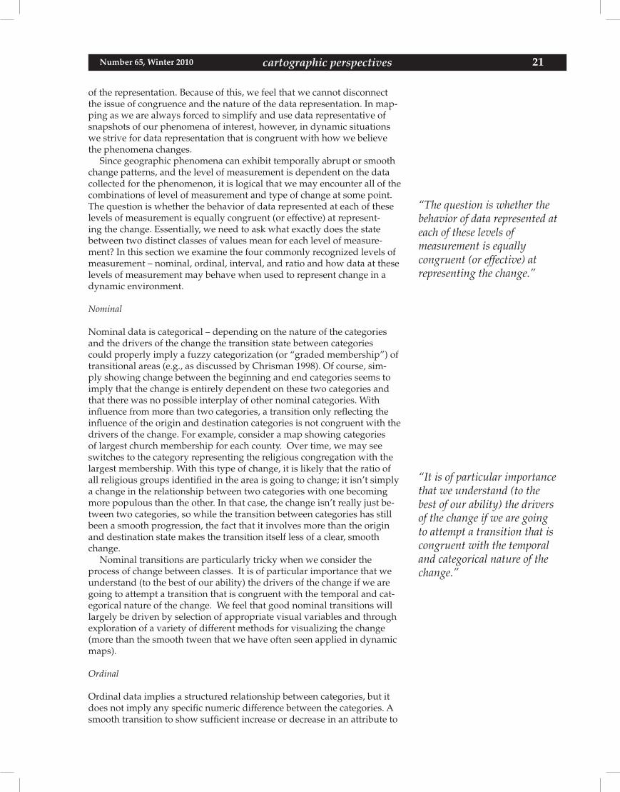
Nominal transitions are particularly tricky when we consider the process of change between classes. It is of particular importance that we understand (to the best of our ability) the drivers of the change if we are going to attempt a transition that is congruent with the temporal and cat-egorical nature of the change. We feel that good nominal transitions will largely be driven by selection of appropriate visual variables and through exploration of a variety of different methods for visualizing the change (more than the smooth tween that we have often seen applied in dynamic maps).
Ordinal
Ordinal data implies a structured relationship between categories, but it does not imply any specific numeric difference between the categories. A smooth transition to show sufficient increase or decrease in an attribute to
“The question is whether the behavior of data represented at each of these levels ofmeasurement is equallycongruent (or effective) atrepresenting the change.”
“It is of particular importance that we understand (to the best of our ability) the drivers of the change if we are going to attempt a transition that is congruent with the temporal and categorical nature of the change.”
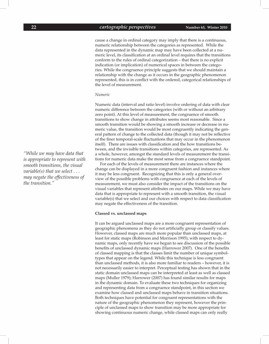
22 Number 65, Winter 2010cartographic perspectives
cause a change in ordinal category may imply that there is a continuous, numeric relationship between the categories as represented. While the data represented in the dynamic map may have been collected at a nu-meric level, its classification at an ordinal level requires that the transitions conform to the rules of ordinal categorization – that there is no explicit indication (or implication) of numerical spaces in between the catego-ries. While the congruence principle suggests that we should maintain a relationship with the change as it occurs in the geographic phenomenon represented, this is in conflict with the ordered, categorical relationships of the level of measurement.
Numeric
Numeric data (interval and ratio level) involve ordering of data with clear numeric difference between the categories (with or without an arbitrary zero point). At this level of measurement, the congruence of smooth transitions to show change in attributes seems most reasonable. Since a smooth transition would be showing a smooth increase or decrease in nu-meric value, the transition would be most congruently indicating the gen-eral pattern of change to the collected data (though it may not be reflective of the finer temporal-scale fluctuations that may occur in the phenomenon itself). There are issues with classification and the how transitions be-tween, and the invisible transitions within categories, are represented. As a whole, however, amongst the standard levels of measurement the transi-tions for numeric data make the most sense from a congruence standpoint.
For each of the levels of measurement there are instances where the change can be displayed in a more congruent fashion and instances where it may be less congruent. Recognizing that this is only a general over-view of the possible problems with congruence at each of the levels of measurement, we must also consider the impact of the transitions on the visual variables that represent attributes on our maps. While we may have data that is appropriate to represent with a smooth transition, the visual variable(s) that we select and our choices with respect to data classification may negate the effectiveness of the transition.
Classed vs. unclassed maps
It can be argued unclassed maps are a more congruent representation of geographic phenomena as they do not artificially group or classify values. However, classed maps are much more popular than unclassed maps, at least for static maps (Robinson and Morrison 1995); with respect to dy-namic maps, only recently have we begun to see discussion of the possible benefits of unclassed dynamic maps (Harrower 2007). One of the benefits of classed mapping is that the classes limit the number of unique symbol-types that appear on the legend. While this technique is less congruent than unclassed methods, it is also more familiar to readers – however, it is not necessarily easier to interpret. Perceptual testing has shown that in the static domain unclassed maps can be interpreted at least as well as classed maps (Muller 1979); Harrower (2007) has found similar results for maps in the dynamic domain. To evaluate these two techniques for organizing and representing data from a congruence standpoint, in this section we examine how classed and unclassed maps behave in transition situations. Both techniques have potential for congruent representations with the nature of the geographic phenomenon they represent, however the prin-ciple of unclassed maps to show transition may be more appropriate for showing continuous numeric change, while classed maps can only really
“While we may have data that is appropriate to represent with smooth transitions, the visual variable(s) that we select . . . may negate the effectiveness of the transition.”
cartographic perspectives 23Number 65, Winter 2010 cartographic perspectives
show change between levels of class membership and may falsely imply a strictly numeric relationship.
Since most classed maps contain between four and seven classes, map-readers only have to discern between a small number of symbols. Dynamic thematic maps depict differences in attributes over both space and time. As an individual geographic entity such as a single enumeration unit in a choropleth map changes over time its representation on the map shifts as well. To show continuous change to the geographic phenomenon in a classed map, our symbols must smoothly change between classes. Software packages that enable gradual transitions commonly interpolate or blend to generate intermediate frames that – in sequence – combine to create a smoothing effect in which the symbol gradually transitions between an origin state and a destination state. However, this often leaves us with a contradiction between map symbolization and the legend defin-ing our values (Figure 1). For example, in Figure 1 as the enumeration units gradually fade between the discrete hues on the legend the inter-mediate fills are undefined according to the legend. While the transition may be “congruent” by definition, it is cartographically questionable as it provides un-defined information to the reader. Abrupt changes in classed maps do not exhibit this same problem; all values on the map throughout the transition are defined in the legend.
Figure 1. Transitions between key frames may lead to undefined symbology. (see page 67 for color version)
Although the data classification process can be helpful in static map-making, it might be harder to justify in dynamic maps that rely on smooth transitions to achieve congruence with temporally continuous geographic phenomena. Unclassed maps, by virtue of the steadfast links connecting attribute values to precisely proportional symbology, may perform more consistently during smooth cartographic transitions. In an unclassed ap-proach, the frames in smooth transitions remain loyal to the continuous legend since all values are defined individually (Figure 2). With respect to representation of abrupt changes to geographic phenomena, unclassed choropleth maps provide an interesting problem for congruent represen-tation – abrupt changes in unclassed choropleth maps may be viewed as being “smooth” due to relatively subtle shifts of color between individual time steps (Harrower 2007). In other words, regardless of the cartogra-phers attempt to maintain congruence with the phenomenon being repre-sented, the transition may be misinterpreted as a smooth change – even if the phenomenon changes abruptly.
Visual variables
In this section we review the possible implications of transitions between the different static visual variables, and what they may mean when used in a dynamic map. According to the Congruence Principle, the represen-tation of change in the dynamic map should correspond with the nature of change to the geographic phenomenon, however for the map to be effec-
“Although the dataclassification process can be helpful in static map-making, it might be harder to justify indynamic maps that rely on smooth transitions . . .”
24 Number 65, Winter 2010cartographic perspectives
Figure 2. Differences between transitions in classed and unclassed maps. (see page 67 for colorversion)
tive the represented change must also be intuitive for the reader. While in some cases a cartographer can congruently depict the nature of tem-poral changes with a smooth transition, the visual implications of these transitions still derive from the static visual variables (Bertin 1983), which means that the dynamical representation of change may still be inap-propriate due to lack of meaning in the visual variable’s transition states. We feel that some visual variables transition in more intuitive ways than others. In other words, the intuitiveness of the symbols within transitional frames is directly dependent upon the selected visual variables.
Quantitative visual variables
For quantitative data that changes smoothly over time we can consider six of the visual variables that would commonly be used in static maps: spacing, size, perspective height, hue, lightness, and saturation (Slocum et al. 2008). Transition of these visual variables would be intended to show continuous progression of values in their transition states. For instance, with perspective height, the intermediate frames between a “short” symbol and a “tall” symbol will be medium height symbols that grow over time in sequence. Similarly, during a transition involving size (e.g., on a dynamic proportional symbol map), the intermediary symbols will gradually shrink or grow over time. However, not all of these quantita-tive visual variables will be equally as effective at clearly representing the intermediate values. Figure 3 demonstrates how these six variables behave during smooth transitions and demonstrate that not all of the quantitative visual variables have intuitive transitional states. Of these visual variables, the ones appearing to have the most intuitive transitions imply sequential change of an ordinal or quantitative nature. Of course, the visual vari-able transition cannot be considered in isolation – as we discussed earlier, it is important to also consider the level of measurement for the attribute change – for instance, is the smooth transition of size incorrectly implying numeric change for ordinal data?
Qualitative visual variables
The sequential nature of the transitions of the visual variables recom-mended for qualitative data, orientation, shape, arrangement, and hue are less clear than those commonly used for quantitative data. During smooth transitions the qualitative visual variables are less capable of signifying many, but not all, sequential transformations (e.g., cyclical changes be-tween categories such as indicating transition of leaf color through green, yellow, and brown). Transitional symbols between known states are less predictable for qualitative maps; for instance, when transitioning between orange and blue what will the intermediate symbols look like and what do they mean? Similarly, what symbols occur to show the transition between
“. . . however, for the map to be effective, the represented change must also be intuitive for the reader.”
“Transitional symbols between known states are less predictable for qualitative maps . . .”
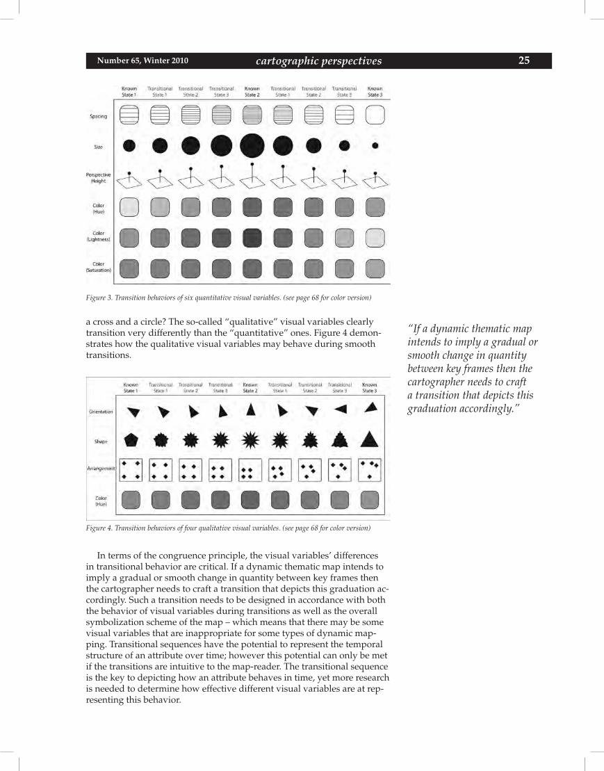
cartographic perspectives 25Number 65, Winter 2010 cartographic perspectives
Figure 3. Transition behaviors of six quantitative visual variables. (see page 68 for color version)
a cross and a circle? The so-called “qualitative” visual variables clearly transition very differently than the “quantitative” ones. Figure 4 demon-strates how the qualitative visual variables may behave during smooth transitions.
Figure 4. Transition behaviors of four qualitative visual variables. (see page 68 for color version)
In terms of the congruence principle, the visual variables’ differences in transitional behavior are critical. If a dynamic thematic map intends to imply a gradual or smooth change in quantity between key frames then the cartographer needs to craft a transition that depicts this graduation ac-cordingly. Such a transition needs to be designed in accordance with both the behavior of visual variables during transitions as well as the overall symbolization scheme of the map – which means that there may be some visual variables that are inappropriate for some types of dynamic map-ping. Transitional sequences have the potential to represent the temporal structure of an attribute over time; however this potential can only be met if the transitions are intuitive to the map-reader. The transitional sequence is the key to depicting how an attribute behaves in time, yet more research is needed to determine how effective different visual variables are at rep-resenting this behavior.
“If a dynamic thematic map intends to imply a gradual or smooth change in quantity between key frames then the cartographer needs to craft a transition that depicts this graduation accordingly.”
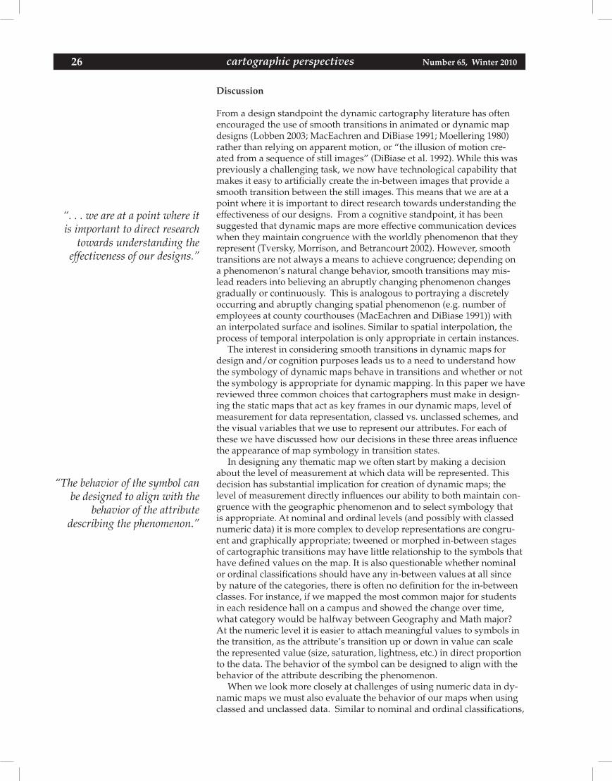
26 Number 65, Winter 2010cartographic perspectives
Discussion From a design standpoint the dynamic cartography literature has often encouraged the use of smooth transitions in animated or dynamic map designs (Lobben 2003; MacEachren and DiBiase 1991; Moellering 1980) rather than relying on apparent motion, or “the illusion of motion cre-ated from a sequence of still images” (DiBiase et al. 1992). While this was previously a challenging task, we now have technological capability that makes it easy to artificially create the in-between images that provide a smooth transition between the still images. This means that we are at a point where it is important to direct research towards understanding the effectiveness of our designs. From a cognitive standpoint, it has been suggested that dynamic maps are more effective communication devices when they maintain congruence with the worldly phenomenon that they represent (Tversky, Morrison, and Betrancourt 2002). However, smooth transitions are not always a means to achieve congruence; depending on a phenomenon’s natural change behavior, smooth transitions may mis-lead readers into believing an abruptly changing phenomenon changes gradually or continuously. This is analogous to portraying a discretely occurring and abruptly changing spatial phenomenon (e.g. number of employees at county courthouses (MacEachren and DiBiase 1991)) with an interpolated surface and isolines. Similar to spatial interpolation, the process of temporal interpolation is only appropriate in certain instances.
The interest in considering smooth transitions in dynamic maps for design and/or cognition purposes leads us to a need to understand how the symbology of dynamic maps behave in transitions and whether or not the symbology is appropriate for dynamic mapping. In this paper we have reviewed three common choices that cartographers must make in design-ing the static maps that act as key frames in our dynamic maps, level of measurement for data representation, classed vs. unclassed schemes, and the visual variables that we use to represent our attributes. For each of these we have discussed how our decisions in these three areas influence the appearance of map symbology in transition states.
In designing any thematic map we often start by making a decision about the level of measurement at which data will be represented. This decision has substantial implication for creation of dynamic maps; the level of measurement directly influences our ability to both maintain con-gruence with the geographic phenomenon and to select symbology that is appropriate. At nominal and ordinal levels (and possibly with classed numeric data) it is more complex to develop representations are congru-ent and graphically appropriate; tweened or morphed in-between stages of cartographic transitions may have little relationship to the symbols that have defined values on the map. It is also questionable whether nominal or ordinal classifications should have any in-between values at all since by nature of the categories, there is often no definition for the in-between classes. For instance, if we mapped the most common major for students in each residence hall on a campus and showed the change over time, what category would be halfway between Geography and Math major? At the numeric level it is easier to attach meaningful values to symbols in the transition, as the attribute’s transition up or down in value can scale the represented value (size, saturation, lightness, etc.) in direct proportion to the data. The behavior of the symbol can be designed to align with the behavior of the attribute describing the phenomenon.
When we look more closely at challenges of using numeric data in dy-namic maps we must also evaluate the behavior of our maps when using classed and unclassed data. Similar to nominal and ordinal classifications,
“. . . we are at a point where it is important to direct research
towards understanding theeffectiveness of our designs.”
“The behavior of the symbol can be designed to align with the
behavior of the attributedescribing the phenomenon.”
cartographic perspectives 27Number 65, Winter 2010 cartographic perspectives
it can be difficult to interpret a smooth transition between classed numeri-cal ranges of quantitative data, which, by definition, have no numerically defined space between ranges – yet smooth transitions can mislead read-ers by graphically implying that such a space does exist. Smooth transi-tions are likely more compatible with unclassed maps (e.g. proportional symbol maps or unclassed choropleth maps) since designers can ensure that transitional symbols between key frames correspond with a numeri-cal definition within the symbology scheme. However, smooth transitions on unclassed maps may reduce the perceptual salience of changes and make the map harder to interpret (Fabrikant and Goldsberry 2005).
In considering the behavior of individual visual variables used in transitions we find that there are some that lend themselves to smooth transitions more than others. Many of the so-called quantitative visual variables – size, perspective height, lightness, and saturation perform well in showing in-between stages; these variables each produce intuitive progressions between discrete states. For example, as a symbol smoothly changes in size it will appear to gradually grow or shrink. The qualitative visual variables, orientation, shape, arrangement, and hue are much more challenging to work with to show clear patterns of change.
Conclusions
With respect to following the Congruence Principle for effective dynamic graphics, we find that smooth transitions are questionable in many situa-tions; the principles of static map symbolization are not always amenable to congruent graphical representation in a dynamic domain, nor do some common design decisions appear appropriate for clearly depicting change. This is not entirely unexpected, however, as it seems unwise to expect map design principles that perform well in the static domain to serve equally well in the dynamic domain (Bertin 1983).
In the recent ICA research agenda on cartography and GIScience (Virrantaus, Fairbairn, and Kraak 2009), the challenges of depicting the temporal nature of geospatial processes was a recurring theme in need of focused research. In light of this, and considering the need to improve our understanding of cognitive aspects of dynamic maps and how the maps can enhance our ability to communicate dynamic processes, we feel that there are still a number of important issues to tackle. Awareness of transi-tion behaviors in our maps is one thing, but it does not guarantee that the message being communicated will be clear to the reader (or will be more effective than using symbology that seem incongruent or inappropriate). It was beyond the scope of this work to evaluate these issues of visual perception; however, this perception issue is critical in the quest to design dynamic maps that are more effective as communication devices. To that end, some of the important unanswered questions that we have identified are:
• Doesachievingcongruencebetweencartographictransitionsandthe natural change behavior for a mapped phenomenon influence the way readers interpret the nature of the change(s)? Map-readers infer ideas about geographic phenomena based upon their graphi-cal structure within an external representation; cartographers need to understand how the appearance of the graphical model influences map-readers’ perception of the mapped phenomenon. For instance, Harrower (2007) has found that abrupt transitions in unclassed dynamic choropleth maps were incorrectly seen as being “smooth,” falsely implying to the reader that the change occurs continuously.
“Awareness of transitionbehaviors in our maps is one thing, but it does not guarantee that the message beingcommunicated will be clear to the reader.”
28 Number 65, Winter 2010cartographic perspectives
It has also been suggested that, regardless of congruence, smooth transitions may be more effective at cueing readers to notice change (Fabrikant et al. 2008), which is key to successful communication of dynamic processes. If empirical research indicates that this is the case, it raises the question of whether or not smooth transitions should only be used as a mechanism to achieve congruence with continuous change processes, or if they can also be used as a means to increase the perceptual salience of transitions in dynamic maps.
• Howdodynamicmapsworkeffectivelywithrespecttoreaders’internal representations of change? This paper examined analogies between the form and/or appearance of a real-world phenomenon and external (graphical) representations designed to mimic the phenomenon’s space-time behavior. The correspondence linking the natural structure of a geographic phenomenon and its graphical rep-resentation is a central component of the principles of cartographic symbolization (Slocum et al. 2008); cartographers typically employ certain mapping techniques depending on the spatial arrangement and attribute characteristics of the mapped phenomenon. However, even if an external representation achieves statistical correspondence with the mapped phenomenon it does not guarantee intuitiveness. Previous research has demonstrated that observers fail to apprehend information encoded in some complex displays even though they realistically mimic a complex natural phenomenon’s space-time behavior apprehension and there is evidence that merely viewing a congruent animation does not necessarily lead to an accurate inter-nal representation of mapped phenomenon (Hegarty, Kriz, and Cate 2003). This evidence suggests that more cartographic research is needed to help us understand how observers internalize space-time events. If the goal of a map animation is to foster strong understand-ing of spatiotemporal geographic phenomena, than it is imperative that future investigations measure the effectiveness of animations based upon their ability to facilitate intuitive internal representations.
• Howcantheuncertaintyassociatedwithtransitionalvaluesbeevalu-ated and (if necessary) communicated to readers? In our attempts to achieve congruence we create new interpolated values to transition between the known values at discrete time steps. It is yet unclear how a reader interprets these transitional values and whether or not they are assumed to be “real” data values, or are simply recognized as a graphical transition. If the assumption is that they are accurate data values then it is imperative that we investigate techniques that provide congruent representations of change while communicating the uncertainty of the transitional data to the reader. The issue of uncertainty in the transition also raises the question of how readers of dynamic maps utilize the legend in their interpretation of displayed data. For instance, does the inclusion of transition states on the legend encourage the reader to identify the transition as a real data value and/or does the lack of a corresponding legend value imply more accurately that a transition is simply a transition, not an accu-rate representation of value?
• Howdowedesignsmoothtransitionsforqualitativedatathatmakesense? With most quantitative data we can design our maps so that the change to the map symbols scales in proportion to the quantity of change to the phenomenon. However, as we have demonstrated in
“How do dynamic maps work effectively with respect to
readers’ internal representations of change?”
cartographic perspectives 29Number 65, Winter 2010 cartographic perspectives
this article, the so-called “qualitative visual variables” transition in a less intuitive fashion. As a consequence, gradual changes in qualita-tive attributes present a difficult challenge to cartographers. More research is needed to help cartographers create intuitive transitions between key states of qualitative attributes.
• Whatisthejustnoticeabledifference(JND)betweensymbolsina dynamic map? We have seen research in this area for static map symbology (e.g., examining differences in proportional symbol size (Flannery 1956, 1971), hue, or lightness (Brewer et al. 1997)) but these differences have not been tested in a dynamic environment – what may be sufficient difference for a static map may be insufficient in a dynamic environment. Of particular interest to the authors are the JNDissueswithproportionalsymbolsandcolor(hue,lightness,andsaturation). Since these are some of the most common visual variables that we rely on in our static maps it is critical to understand more about how they change, how the changes are interpreted (or not), and how we can make them more effective for communicating dynamic processes. Change signals within dynamic thematic maps depend upon, or are derivatives of the graphical structure of the static key frames. The functionality of dynamic thematic maps depends upon the legibility and intuitiveness of change signals, which in turn are dependent on the graphical structure of static key frames. We also feel that it is important to ask if there such a thing is a “just noticeable transition,” or a minimum requirement for producing a perceptually salient change, and can this help mitigate problems of change blind-ness in dynamic thematic maps?
• Howshouldmagnitudeofchangebetweenscenesinfluencethedesign of transitions? Can certain transitional designs enable readers to notice, perceive, and understand more changes than others? For instance, with a classed choropleth map (which may or may not be a good choice to begin with), it seems like we should be particularly cautious with smooth transitions for changes that are greater than one class. In any scheme that involves variation in both hue and lightness or saturation the in-between states are less clear when the magnitude of class change is large. Unless we artificially force our transition to go through intermediate classes the symbol representation in the transition is challenging to interpret due to the creation of an unlim-ited number of new “transition” classes that have no corresponding symbol in the legend except for at the key frames bookending the transition (Figure 5).
The figure shows the original Color Brewer colors assigned to classes (top), potential transition states for an enumeration unit changing from Class 1 to Class 5 (middle), and a proposed scheme that requires the enumeration unit to pass through the color assigned to each intermediate class during the transition (bottom).
Perception and interpretation are fundamental issues in evaluating the quality of a map – if the map does not communicate clearly enough that the reader can understand the message it is not a successful design. As Tufte has written, “graphical excellence begins with telling the truth about the data” (Tufte 2001, 53), however, as MacEachren and DiBiase (1991, 224) have pointed out, this “inhibits creativity by denying the role of rhetoric.” In a dynamic environment we will always struggle with the spatial and temporal limitations of our data and it is necessary to find creative ways
“In a dynamic environment we will always struggle with the spatial and temporal limitations of our data . . .”
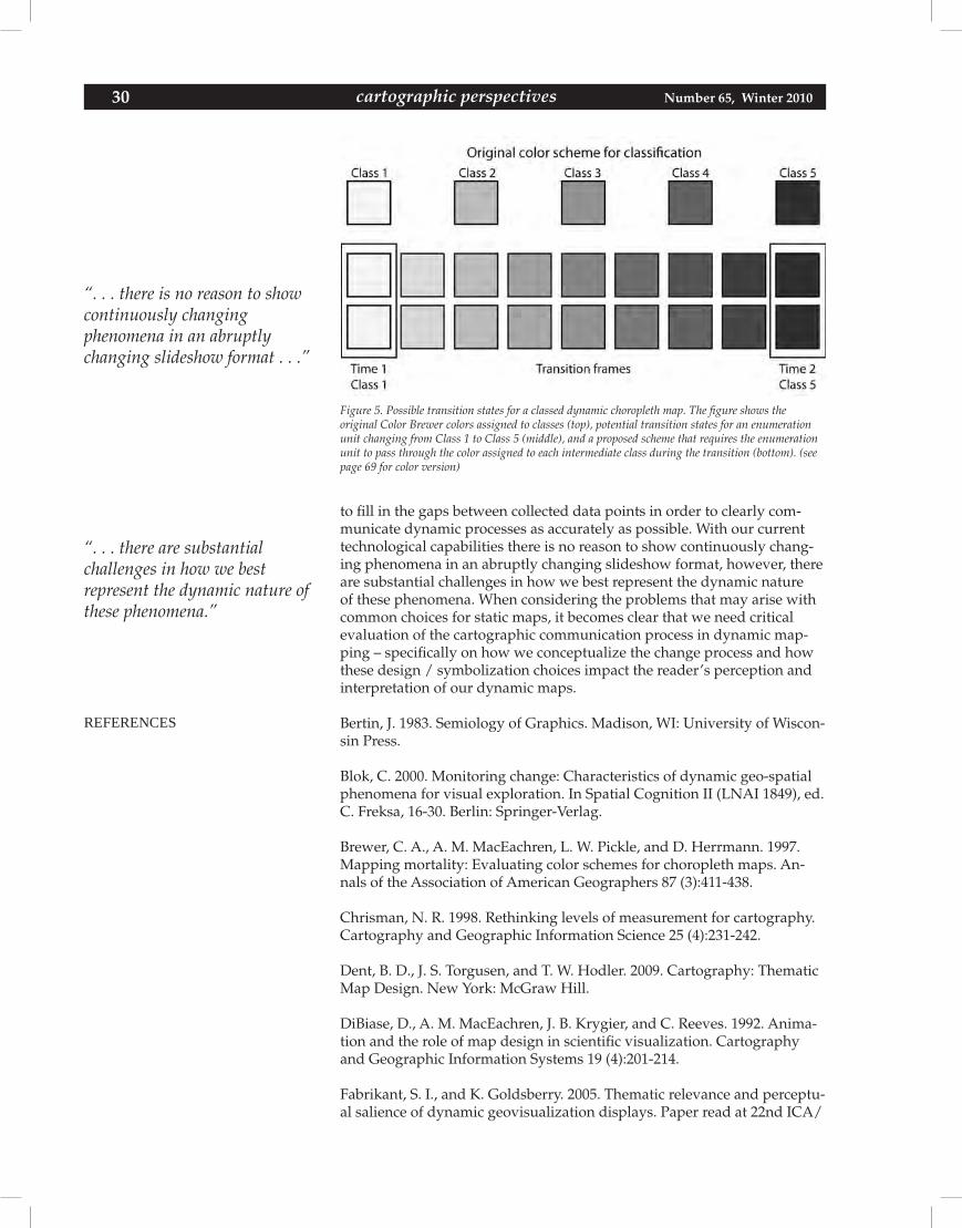
30 Number 65, Winter 2010cartographic perspectives
Figure 5. Possible transition states for a classed dynamic choropleth map. The figure shows theoriginal Color Brewer colors assigned to classes (top), potential transition states for an enumeration unit changing from Class 1 to Class 5 (middle), and a proposed scheme that requires the enumeration unit to pass through the color assigned to each intermediate class during the transition (bottom). (see page 69 for color version)
to fill in the gaps between collected data points in order to clearly com-municate dynamic processes as accurately as possible. With our current technological capabilities there is no reason to show continuously chang-ing phenomena in an abruptly changing slideshow format, however, there are substantial challenges in how we best represent the dynamic nature of these phenomena. When considering the problems that may arise with common choices for static maps, it becomes clear that we need critical evaluation of the cartographic communication process in dynamic map-ping – specifically on how we conceptualize the change process and how these design / symbolization choices impact the reader’s perception and interpretation of our dynamic maps.
Bertin,J.1983.SemiologyofGraphics.Madison,WI:UniversityofWiscon-sin Press.
Blok, C. 2000. Monitoring change: Characteristics of dynamic geo-spatial phenomena for visual exploration. In Spatial Cognition II (LNAI 1849), ed. C. Freksa, 16-30. Berlin: Springer-Verlag.
Brewer, C. A., A. M. MacEachren, L. W. Pickle, and D. Herrmann. 1997. Mapping mortality: Evaluating color schemes for choropleth maps. An-nals of the Association of American Geographers 87 (3):411-438.
Chrisman, N. R. 1998. Rethinking levels of measurement for cartography. Cartography and Geographic Information Science 25 (4):231-242.
Dent,B.D.,J.S.Torgusen,andT.W.Hodler.2009.Cartography:ThematicMap Design. New York: McGraw Hill.
DiBiase,D.,A.M.MacEachren,J.B.Krygier,andC.Reeves.1992.Anima-tion and the role of map design in scientific visualization. Cartography and Geographic Information Systems 19 (4):201-214.
Fabrikant, S. I., and K. Goldsberry. 2005. Thematic relevance and perceptu-al salience of dynamic geovisualization displays. Paper read at 22nd ICA/
REFERENCES
“. . . there is no reason to show continuously changingphenomena in an abruptly changing slideshow format . . .”
“. . . there are substantialchallenges in how we bestrepresent the dynamic nature of these phenomena.”
cartographic perspectives 31Number 65, Winter 2010 cartographic perspectives
ACIInternationalCartographicConference,July9-16,2005,atACoruna,Spain.
Fabrikant, S. I., S. Rebich-Hispanha, N. Andrienko, G. Andrienko, and D. R. Montello. 2008. Novel method to measure inference affordance in static small-multiple map displays representing dynamic processes. The Carto-graphicJournal45(3).
Flannery,J.J.1956.Thegraduatedcircle:Adescription,analysis,andeval-uation of a quantitative map symbol. Unpublished dissertation, University of Wisconsin, Madison.
—. 1971. The effectiveness of some common graduated point symbols in the presentation of quantitative data. Canadian Cartographer 8 (2):96-109.
Goldsberry, K., and S. E. Battersby. 2009. Issues of change detection in animated choropleth maps. Cartographica 44 (3):201-215.
Graf, W. L., and P. Gober. 1992. Movements, cycles, and systems. In Ge-ography’sInnerWorlds,eds.R.F.Abler,M.G.MarcusandJ.M.Olson,234-254.Brunswick,NJ:RutgersUniversityPress.
Harrower, M. 2002. Visualizing change: Using cartographic animation to explore remotely-sensed data. Cartographic Perspectives 39:30-42.
—. 2003. Tips for designing effective animated maps. Cartographic Per-spectives 44:63-65.
—.2007.Unclassedanimatedchoroplethmaps.TheCartographicJournal44 (4):313-320.
Hegarty, M., S. Kriz, and C. Cate. 2003. The roles of mental animations and external animations in understanding mechanical systems. Cognition and Instruction 21 (4):325-360.
Lobben, A. 2003. Classification and application of cartographic animation. The Professional Geographer 55 (3):318-328.
MacEachren, A. M. 1992. Visualizing uncertain information. Cartographic Perspectives 23:10-19.
—. 1994. Some Truth With Maps: A Primer on Symbolization and Design. Washington DC: Association of American Geographers.
—. 1995. How Maps Work: Representation, Visualization, and Design. New York: The Guilford Press.
MacEachren, A. M., and D. DiBiase. 1991. Animated maps of aggregate data: Conceptual and practical problems. Cartography and Geographic Information Systems 18 (4):221-229.
Moellering, H. 1973. The computer animated film: A dynamic cartography. In Proceedings of the ACM Annual Conference, 64-69. Atlanta, GA: ACM.
—. 1980. The real-time animation of three-dimensional maps. The Ameri-can Cartographer 7 (1):67-75.
32 Number 65, Winter 2010cartographic perspectives
Montello, D. R. 2002. Cognitive map-design research in the twentieth cen-tury: Theoretical and empirical approaches. Cartography and Geographic Information Science 29 (3):283-304.
Muller,J.-C.1979.Perceptionofcontinuouslyshadedmaps.AnnalsoftheAssociation of American Geographers 69 (2):240-249.
Peterson, M. P. 1993. Interactive cartographic animation. Cartography and Geographic Information Systems 20 (1):40-44.
Robinson,A.H.,andJ.L.Morrison.1995.ElementsofCartography,SixthEdition.NewYork:JohnWiley&Sons,Inc.
Slocum, T. A., R. B. McMaster, F. C. Kessler, and H. H. Howard. 2008. The-matic Cartography and Geographic Visualization. 3rd ed. Upper Saddle River,NJ:PrenticeHall.
Thrower,N.J.1959.Animatedcartography.TheProfessionalGeographer11 (6):9-12.
Tufte, E. R. 2001. The Visual Display of Quantitative Information. Cheshire, CT: Graphics Press.
Tversky,B.,J.B.Morrison,andM.Betrancourt.2002.Animation:Canitfacilitate?InternationalJournalofHuman-ComputerStudies57:247-262.Virrantaus,K.,D.Fairbairn,andM.-J.Kraak.2009.ICAresearchagendaon cartography and GIScience. Cartography and Geographic Information Science 36 (2):209-222.
Weber, C. R., and B. P. Buttenfield. 1993. A cartographic animation of aver-age yearly surface temperatures for the 40 contiguous United States: 1897-1986. Cartography and Geographic Information Systems 20 (3):141-150.
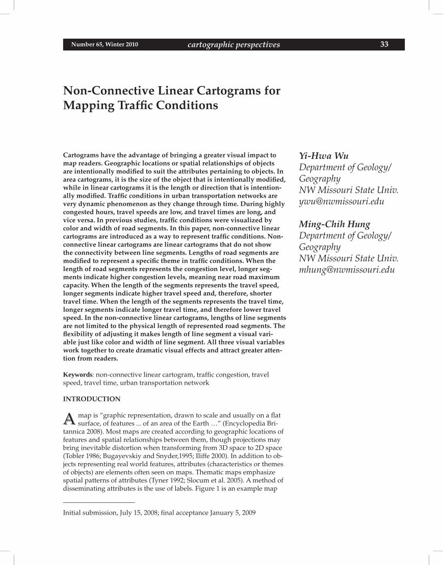
cartographic perspectives 33Number 65, Winter 2010 cartographic perspectives
Non-Connective Linear Cartograms for Mapping Traffic Conditions
Yi-Hwa WuDepartment of Geology/GeographyNW Missouri State [email protected]
Ming-Chih HungDepartment of Geology/GeographyNW Missouri State [email protected]
Initial submission, July 15, 2008; final acceptance January 5, 2009
Cartograms have the advantage of bringing a greater visual impact to map readers. Geographic locations or spatial relationships of objects are intentionally modified to suit the attributes pertaining to objects. In area cartograms, it is the size of the object that is intentionally modified, while in linear cartograms it is the length or direction that is intention-ally modified. Traffic conditions in urban transportation networks are very dynamic phenomenon as they change through time. During highly congested hours, travel speeds are low, and travel times are long, and vice versa. In previous studies, traffic conditions were visualized by color and width of road segments. In this paper, non-connective linear cartograms are introduced as a way to represent traffic conditions. Non-connective linear cartograms are linear cartograms that do not show the connectivity between line segments. Lengths of road segments are modified to represent a specific theme in traffic conditions. When the length of road segments represents the congestion level, longer seg-ments indicate higher congestion levels, meaning near road maximum capacity. When the length of the segments represents the travel speed, longer segments indicate higher travel speed and, therefore, shorter travel time. When the length of the segments represents the travel time, longer segments indicate longer travel time, and therefore lower travel speed. In the non-connective linear cartograms, lengths of line segments are not limited to the physical length of represented road segments. The flexibility of adjusting it makes length of line segment a visual vari-able just like color and width of line segment. All three visual variables work together to create dramatic visual effects and attract greater atten-tion from readers.
Keywords: non-connective linear cartogram, traffic congestion, travel speed, travel time, urban transportation network
INTRODUCTION
map is “graphic representation, drawn to scale and usually on a flat surface, of features ... of an area of the Earth …” (Encyclopedia Bri-
tannica 2008). Most maps are created according to geographic locations of features and spatial relationships between them, though projections may bring inevitable distortion when transforming from 3D space to 2D space (Tobler 1986; Bugayevskiy and Snyder,1995; Iliffe 2000). In addition to ob-jects representing real world features, attributes (characteristics or themes of objects) are elements often seen on maps. Thematic maps emphasize spatial patterns of attributes (Tyner 1992; Slocum et al. 2005). A method of disseminating attributes is the use of labels. Figure 1 is an example map
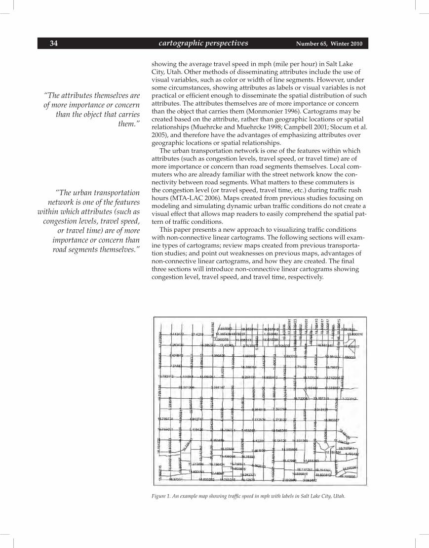
34 Number 65, Winter 2010cartographic perspectives
Figure 1. An example map showing traffic speed in mph with labels in Salt Lake City, Utah.
showing the average travel speed in mph (mile per hour) in Salt Lake City, Utah. Other methods of disseminating attributes include the use of visual variables, such as color or width of line segments. However, under some circumstances, showing attributes as labels or visual variables is not practical or efficient enough to disseminate the spatial distribution of such attributes. The attributes themselves are of more importance or concern than the object that carries them (Monmonier 1996). Cartograms may be created based on the attribute, rather than geographic locations or spatial relationships (Muehrcke and Muehrcke 1998; Campbell 2001; Slocum et al. 2005), and therefore have the advantages of emphasizing attributes over geographic locations or spatial relationships.
The urban transportation network is one of the features within which attributes (such as congestion levels, travel speed, or travel time) are of more importance or concern than road segments themselves. Local com-muters who are already familiar with the street network know the con-nectivity between road segments. What matters to these commuters is the congestion level (or travel speed, travel time, etc.) during traffic rush hours (MTA-LAC 2006). Maps created from previous studies focusing on modeling and simulating dynamic urban traffic conditions do not create a visual effect that allows map readers to easily comprehend the spatial pat-tern of traffic conditions.
This paper presents a new approach to visualizing traffic conditions with non-connective linear cartograms. The following sections will exam-ine types of cartograms; review maps created from previous transporta-tion studies; and point out weaknesses on previous maps, advantages of non-connective linear cartograms, and how they are created. The final three sections will introduce non-connective linear cartograms showing congestion level, travel speed, and travel time, respectively.
“The attributes themselves are of more importance or concern
than the object that carries them.”
“The urban transportation network is one of the features
within which attributes (such as congestion levels, travel speed,
or travel time) are of moreimportance or concern than road segments themselves.”
cartographic perspectives 35Number 65, Winter 2010 cartographic perspectives
Cartogram
A cartogram “purposely distorts geographic space based on values of a theme (e.g., making the size of countries proportional to population” (Slocum et al. 2005). In its common use, a cartogram “does not depict geographic space, but rather changes the size of objects depending on a certain attribute” (Cartogram Central 2002a). Distortion, in turn, creates unexpectedly strong visual impacts (Tyner 1992; Clarke 1995; Dorling and Fairbairn 1997; Tobler 2004). There are area cartograms focusing on areal features and associated attributes and linear cartograms focusing on linear features and associated attributes. Most cartogram research is focused on area cartograms. Depending on the types of distortions, area cartograms can be grouped as contiguous cartograms, non-contiguous cartograms, pseudo-cartograms, or Dorling cartograms (Tobler 1986; Dorling 1993; Muehrcke and Muehrcke 1998; Campbell 2001; Cartogram Central 2002a; Slocum et al. 2005). For contiguous cartograms, continuity is preserved while shape is distorted. For non-contiguous cartograms, shape is pre-served while continuity is distorted (Slocum et al. 2005). For Dorling cartograms, neither shape nor continuity is preserved; instead, non-over-lapping symbols like circles are used. The sizes of these symbols are pro-portional to the mapped variable (Dorling 1993). Pseudo-cartograms are sometimes called pseudo-continuous cartograms. Though they may look like contiguous cartograms, neither shape nor continuity is preserved. Polygon sides are often straightened and aligned with gridlines in order to accurately represent relative directions (Tobler 1986).
The majority of area cartogram research has focused on contiguous cartograms, especially developing algorithms on automatically creating them, because of the complexity of maintaining the continuity (Dougenik et al. 1985; Edelsbrunner and Waupotitsch 1997; House and Kocmoud1998; Kocmoud and House 1998; Keim et al. 2002; Gastner and Newman 2004; Keim et al. 2004; Keim et al. 2005; Inoue and Shimizu 2006). In addi-tion, creating area cartograms using commercial geographic information system (GIS) software has attracted interest from cartogram researchers in recent years (Jackel 1997; Du and Liu 1999; Wolf 2005). Area cartograms are often used to present election results (Haro 1968; Kocmoud and House 1998; Fabrikant 2000, 2004; Gastner et al. 2005) or social-economic data, such as population (Haro 1968; Kocmoud and House 1998; Cartogram Central 2002b; Newman 2006; ODT Inc. 2007).
Little attention was given to the creation and application of linear carto-grams, sometimes called distance cartograms (Campbell 2001) or distance-by-time cartograms (Tyner 1992). Compared to the classification of area cartograms based on continuity of polygons (contiguous area cartogram or non-contiguous area cartogram), linear cartograms could be identified as connective linear cartogram or non-connective linear cartogram based on connectivity of line segments. Connective linear cartograms preserve connectivity but distort line shapes. In such linear cartograms, route con-nectivity is preserved (lines connecting to other lines are still connecting to them), but direction and length of route segments are intentionally distorted. Furthermore, the lengths of route segments are not proportional to any attribute associated with these transportation routes. Simplicity and appearance are the main concerns of these linear cartograms. They are mainly used to conceptually present unique transportation routes (e.g., MTA-LAC 2008; Transport for London 2008; Washington Metropolitan Area Transit Authority 2008a), driving distance and driving time maps (e.g., AAA 2004), or airline route maps (e.g., Delta Airlines 2008). On the other hand, non-connective linear cartograms preserve line shapes but dis-
“Distortion, in turn, creates unexpectedly strong visual impacts.”
“. . . non-connective linear cartograms preserve line shapes but distort connectivity.”
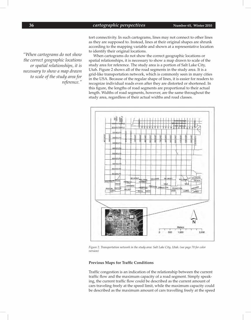
36 Number 65, Winter 2010cartographic perspectives
tort connectivity. In such cartograms, lines may not connect to other lines as they are supposed to. Instead, lines at their original shapes are shrunk according to the mapping variable and shown at a representative location to identify their original locations.
When cartograms do not show the correct geographic locations or spatial relationships, it is necessary to show a map drawn to scale of the study area for reference. The study area is a portion of Salt Lake City, Utah. Figure 2 shows all of the road segments in the study area. It is a grid-like transportation network, which is commonly seen in many cities in the USA. Because of the regular shape of lines, it is easier for readers to recognize individual roads even after they are distorted or shortened. In this figure, the lengths of road segments are proportional to their actual length. Widths of road segments, however, are the same throughout the study area, regardless of their actual widths and road classes.
Figure 2. Transportation network in the study area: Salt Lake City, Utah. (see page 70 for colorversion)
Previous Maps for Traffic Conditions
Traffic congestion is an indication of the relationship between the current traffic flow and the maximum capacity of a road segment. Simply speak-ing, the current traffic flow could be described as the current amount of cars traveling freely at the speed limit, while the maximum capacity could be described as the maximum amount of cars travelling freely at the speed
“When cartograms do not show the correct geographic locations
or spatial relationships, it is necessary to show a map drawn
to scale of the study area for reference.”
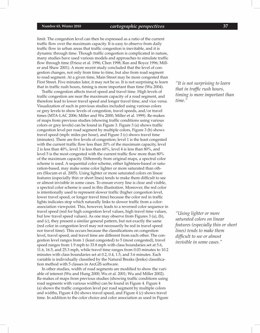
cartographic perspectives 37Number 65, Winter 2010 cartographic perspectives
limit. The congestion level can then be expressed as a ratio of the current traffic flow over the maximum capacity. It is easy to observe from daily traffic flow in urban areas that traffic congestion is inevitable, and it is dynamic through time. Though traffic congestion is complicated in nature, many studies have used various models and approaches to simulate traffic flow through time (Friesz et al. 1996; Chen 1998; Ran and Boyce 1996; Mill-er and Shaw 2001). A more recent study concluded that the level of con-gestion changes, not only from time to time, but also from road segment to road segment. At a given time, Main Street may be more congested than First Street. Five minutes later, it may not be so. It is not surprising to learn that in traffic rush hours, timing is more important than time (Wu 2004).
Traffic congestion affects travel speed and travel time. High levels of traffic congestion are near the maximum capacity of a road segment, and therefore lead to lower travel speed and longer travel time, and vice versa. Visualization of such in previous studies included using various colors or grey levels to show levels of congestion, travel speeds, and/or travel times (MTA-LAC 2006; Miller and Wu 2000; Miller et al. 1999). Re-makes of maps from previous studies (showing traffic conditions using various colors or grey levels) can be found in Figure 3. Figure 3 (a) shows traffic congestion level per road segment by multiple colors, Figure 3 (b) shows travel speed (mph: miles per hour), and Figure 3 (c) shows travel time (minutes). There are five levels of congestion; level 1 is the least congested with the current traffic flow less than 20% of the maximum capacity, level 2 is less than 40%, level 3 is less than 60%, level 4 is less than 80%, and level 5 is the most congested with the current traffic flow more than 80% of the maximum capacity. Differently from original maps, a spectral color scheme is used. A sequential color scheme, either lightness-based or satu-ration-based, may make some color lighter or more saturated than oth-ers (Slocum et al. 2005). Using lighter or more saturated colors on linear features (especially thin or short lines) tends to make them difficult to see or almost invisible in some cases. To ensure every line is clear and visible, a spectral color scheme is used in this illustration. Moreover, the red color is intentionally used to represent slower traffic (higher congestion level, lower travel speed, or longer travel time) because the color red in traffic lights indicates stop which naturally links to slower traffic from a color-association viewpoint. This, however, leads to a reversed color sequence in travel speed (red for high congestion level values, high travel time values, but low travel speed values). As one may observe from Figures 3 (a), (b), and (c), they present a similar general pattern, but not exactly the same (red color in congestion level may not necessarily be red in travel speed nor travel time). This occurs because the classifications on congestion level, travel speed, and travel time are different from each other. The con-gestion level ranges from 1 (least congested) to 5 (most congested), travel speed ranges from 1.9 mph to 33.8 mph with class boundaries set at 5.6, 11.6, 16.5, and 25.3 mph, while travel time ranges from 0.03 minutes to 10.2 minutes with class boundaries set at 0.2, 0.4, 1.5, and 3.6 minutes. Each variable is individually classified by the Natural Breaks (Jenks) classifica-tion method with 5 classes in ArcGIS software.
In other studies, width of road segments are modified to show the vari-able of interest (Wu and Hung 2000; Wu et al. 2001; Wu and Miller 2002). Re-makes of maps from previous studies (showing traffic conditions using road segments with various widths) can be found in Figure 4. Figure 4 (a) shows the traffic congestion level per road segment by multiple colors and widths, Figure 4 (b) shows travel speed, and Figure 4 (c) shows travel time. In addition to the color choice and color association as used in Figure
“It is not surprising to learn that in traffic rush hours,timing is more important than time.”
“Using lighter or moresaturated colors on linearfeatures (especially thin or short lines) tends to make themdifficult to see or almostinvisible in some cases.”
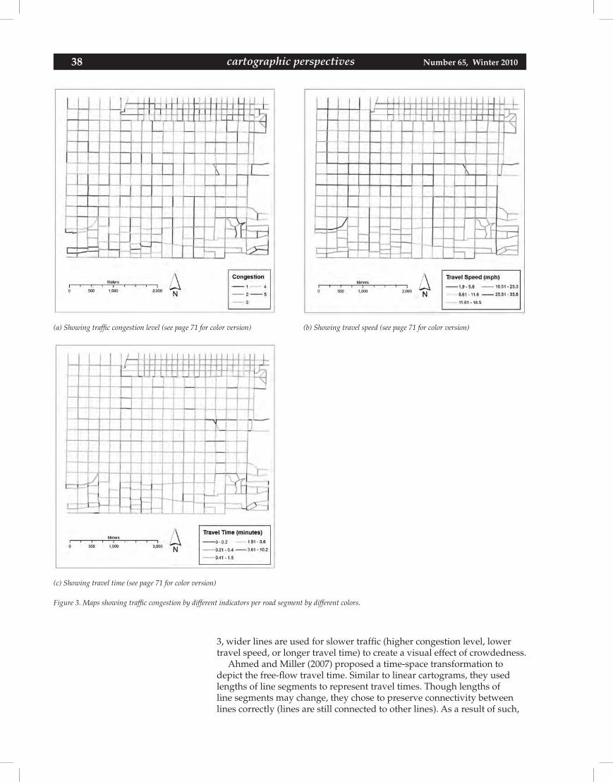
38 Number 65, Winter 2010cartographic perspectives
Figure 3. Maps showing traffic congestion by different indicators per road segment by different colors.
(a) Showing traffic congestion level (see page 71 for color version) (b) Showing travel speed (see page 71 for color version)
(c) Showing travel time (see page 71 for color version)
3, wider lines are used for slower traffic (higher congestion level, lower travel speed, or longer travel time) to create a visual effect of crowdedness.
Ahmed and Miller (2007) proposed a time-space transformation to depict the free-flow travel time. Similar to linear cartograms, they used lengths of line segments to represent travel times. Though lengths of line segments may change, they chose to preserve connectivity between lines correctly (lines are still connected to other lines). As a result of such,

cartographic perspectives 39Number 65, Winter 2010 cartographic perspectives
(b) Showing travel speed (see page 72 for color version)(a) Showing traffic congestion level (see page 72 for color version)
(c) Showing travel time (see page 72 for color version)
Figure 4. Maps showing traffic congestion by different indicators per road segment by multiple colors and multiple widths.
features were moved away from their geographic locations and formed time-space locations. These time-space locations were superimposed on geographic locations, and vectors were drawn from geographic locations to time-space locations to show the displacement pattern. In such visual-ization, road segments were not drawn to scale. Furthermore, road inter-sections were not drawn to their geographic locations. For readers who want to identify road intersections, it is very confusing and challenging.
40 Number 65, Winter 2010cartographic perspectives
Traffic Conditions by Non-Connective Linear Cartogram
Advantages of Non-Connective Linear CartogramThough traffic conditions were visualized in previous studies, there is room to improve. In Figure 1, traffic conditions (average travel speed) are shown as labels which are then attached to each line segment. Readers have to examine the numbers in order to get information out of the map. Though this is an effective method to show quantitative traffic condi-tions for individual road segments, it is not suitable to represent a com-prehensive view of the entire transportation network. In addition, labels themselves take up space in the map. This method may inevitably make the map crowded because of a large amount of labels. In Figure 3, traffic conditions (congestion level, travel speed, and travel time) are shown with various colors. Unfortunately, colors themselves do not show any numeric associations. It is the order of these colors in the legend that relates the numeric meanings to the reader. Thus, legends have to be studied in order for readers to understand meanings of various colors. In Figure 4, in addi-tion to colors, widths of line segments are used to show traffic conditions. Comparing to Figure 3, this approach improves numerical association, but not much. In addition to problems with use of colors, there are drawbacks or limitations on use of widths. Lines cannot be drawn too wide. Other-wise, the whole map will look crowded and, in turn, difficult to be read. The resultant map from the time-space transformation approach proposed by Ahmed and Miller (2007) is quite similar to linear cartogram, connec-tive linear cartogram to be exact. Their transformation created severe distortions as seen from their map. More specifically, their transformation modified lengths of road segments and moved road intersections away from their geographic locations on their map. Because of these distortions, the map is quite confusing even for readers who are familiar with the study area.
To better visualize traffic conditions on maps, this paper presents a new approach using non-connective cartograms. The transportation network in the study area will be shown symbolically. Road segments are represented by line segments. Lengths of line segments are not proportional to their actual lengths. Instead, they are proportional to the mapping variable; in this paper it is congestion level, travel speed, or travel time. Lengths of line segments may be drawn independently from their physical lengths of the represented road segments. Therefore, length itself is a visual variable for line segment, just like color or width of line segment. To create a better visual effect, all three visual variables of line segment (length, width, and color) are utilized. Also because lengths are adjusted, line segments may not connect to other line segments. In other words, connectivity between road segments is not preserved. To some degrees, non-connective linear cartograms work like non-contiguous area cartograms in that lengths (or sizes) of mapping units (lines versus polygons) are independent from their physical lengths (or sizes) and could be used as a means to show the vari-able of interest.
Non-connective cartograms have the potential to better visualize traffic conditions, based on problems observed from previous studies. The map-ping variable is represented by one or more of the visual variables of the line segments; there is no need for labels. Therefore, this eliminates labels and free up space to avoid crowdedness caused by labeling. By choosing a saturation-based color scheme, the degree of saturation may also be used to represent the value of the mapping variable. Therefore, colors do have a quantitative association, or at least an ordinal meaning. Not every line segment is connecting to other line segments. Some lines are short. These
“Unfortunately, colorsthemselves do not show any
numeric associations. It is the order of these colors in the
legend that relates the numeric meanings to the reader.”
“Lengths of line segments are not proportional to their actual
lengths. Instead, they areproportional to the mapping
variable . . .”
cartographic perspectives 41Number 65, Winter 2010 cartographic perspectives
short lines free up space for other map elements. Even though other lines are drawn at a relatively large width, there is space for such wide lines. Therefore, wide lines will not cause unpleasant crowdedness. Road seg-ment connectivity is not presented in non-connective linear cartograms; adjustments on lengths will not affect the locations of road intersections. Road intersections are shown at their geographic locations (though in cartograms presented by this study, road intersections are not mapped). Therefore, there is less confusion for readers.
Calculation and Classification of Traffic Conditions
The congestion level was calculated following previous work by Miller et al. (1999), Miller and Wu (2000), Wu et al. (2001), and Wu and Miller (2002). Their work produced five congestion levels, level 1 being the most congested with more than 80% of the maximum capacity of travel volume on the road, level 2 with more than 60%, level 3 with more than 40%, level 4 with more than 20%, and level 5 being the least congested with less than 20% of the maximum capacity. From a cartographic viewpoint (Slocum et al. 2005); however, it is preferable for high levels to represent high data values. Therefore, their work was modified to produce a reversed order (level 5 being the most congested while level 1 is the least congested), so that higher congestion levels are associated with higher percents of maximum capacity. Lengths of line segments are proportional to their data value and are calculated by the following equation:
L = r * (f / 5) (equation 1)where L is the length of a line segment in a non-connective linearcartogram,r is the original length of a line segment, andf is the traffic condition value (congestion level, travel speed, or travel time) with ranges between 1 and 5.
The following sections and linear cartograms depict the traffic condi-tions (congestion level, travel speed, and travel time) in the time interval 1, the beginning of the analysis time period (4 pm). They are created by Visual Basic (VB) scripts in ArcGIS software. The VB scripts read in the polyline shapefile and break down the connectivity between lines by con-verting the entire shapefile to a collection of graphics. Each graphic then represents an individual line segment in the transportation network, and equation 1 is applied to each graphic to adjust the length according to the variable of interest. The graphic is then assigned a pair of coordinates that illustrates the center of the represented line segment. ArcMap software draws it on the map area according to these assigned coordinates. At the time when the manuscript is written, the VB scripts only perform the con-version, length-adjusting, and coordinates-assigning tasks. Before running the VB scripts, the traffic conditions have to be manually classified, and widths and colors manually chosen.
Non-Connective Linear Cartogram for Congestion Level
Figure 5 shows non-connective linear cartograms, indicating the levels of traffic congestion. The lengths of road segments are modified according to their congestion levels. Higher congestion levels (higher data value, slower traffic) are represented by longer segments. As in non-contiguous area cartograms, a drawn-to-scale map (Figure 2) should be used for reference. In addition, colors and widths are used here as well to enhance
“. . . however, it is preferable for high levels to represent high data values.”
“Higher congestion levels (higher data value, slowertraffic) are represented bylonger segments.”
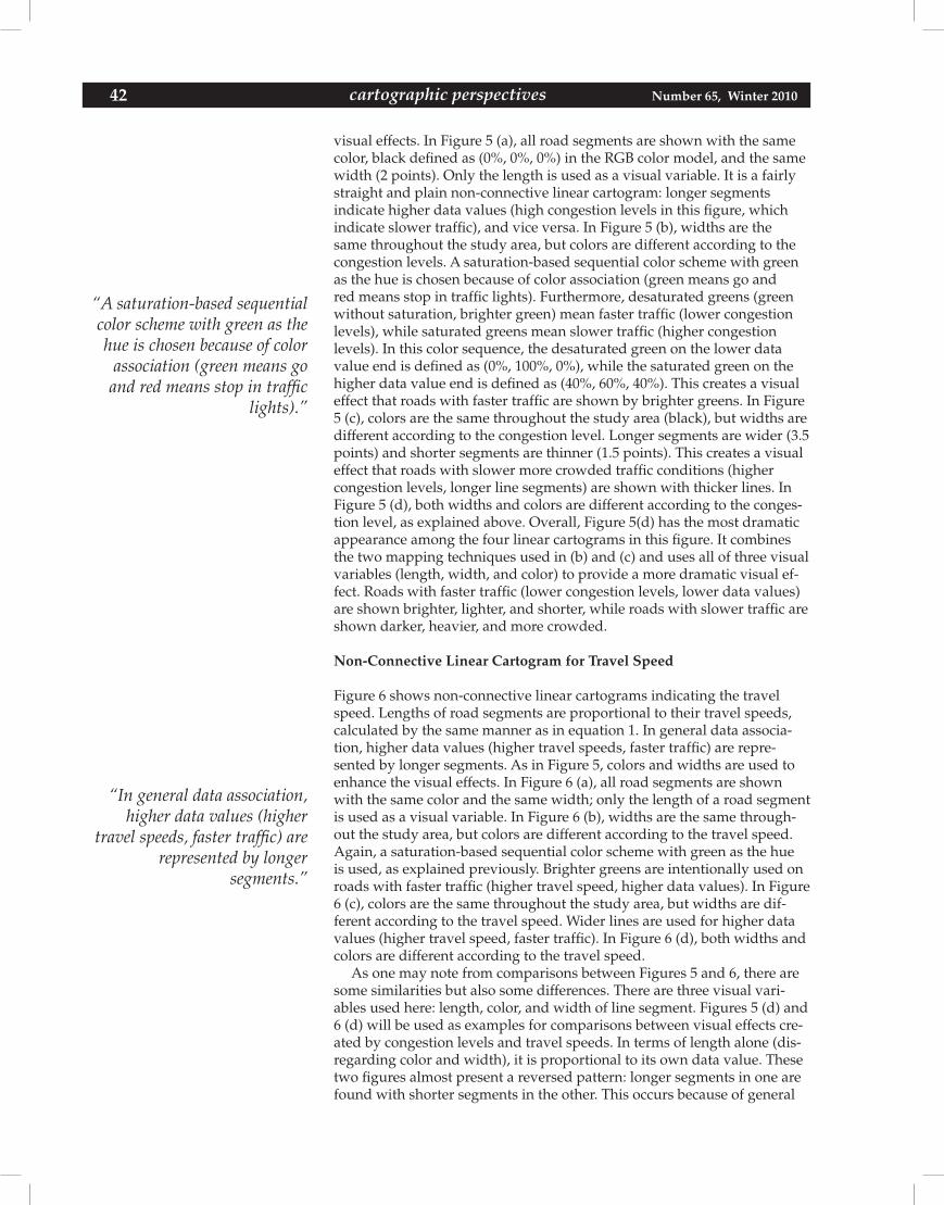
42 Number 65, Winter 2010cartographic perspectives
visual effects. In Figure 5 (a), all road segments are shown with the same color, black defined as (0%, 0%, 0%) in the RGB color model, and the same width (2 points). Only the length is used as a visual variable. It is a fairly straight and plain non-connective linear cartogram: longer segments indicate higher data values (high congestion levels in this figure, which indicate slower traffic), and vice versa. In Figure 5 (b), widths are the same throughout the study area, but colors are different according to the congestion levels. A saturation-based sequential color scheme with green as the hue is chosen because of color association (green means go and red means stop in traffic lights). Furthermore, desaturated greens (green without saturation, brighter green) mean faster traffic (lower congestion levels), while saturated greens mean slower traffic (higher congestion levels). In this color sequence, the desaturated green on the lower data value end is defined as (0%, 100%, 0%), while the saturated green on the higher data value end is defined as (40%, 60%, 40%). This creates a visual effect that roads with faster traffic are shown by brighter greens. In Figure 5 (c), colors are the same throughout the study area (black), but widths are different according to the congestion level. Longer segments are wider (3.5 points) and shorter segments are thinner (1.5 points). This creates a visual effect that roads with slower more crowded traffic conditions (higher congestion levels, longer line segments) are shown with thicker lines. In Figure 5 (d), both widths and colors are different according to the conges-tion level, as explained above. Overall, Figure 5(d) has the most dramatic appearance among the four linear cartograms in this figure. It combines the two mapping techniques used in (b) and (c) and uses all of three visual variables (length, width, and color) to provide a more dramatic visual ef-fect. Roads with faster traffic (lower congestion levels, lower data values) are shown brighter, lighter, and shorter, while roads with slower traffic are shown darker, heavier, and more crowded.
Non-Connective Linear Cartogram for Travel Speed
Figure 6 shows non-connective linear cartograms indicating the travel speed. Lengths of road segments are proportional to their travel speeds, calculated by the same manner as in equation 1. In general data associa-tion, higher data values (higher travel speeds, faster traffic) are repre-sented by longer segments. As in Figure 5, colors and widths are used to enhance the visual effects. In Figure 6 (a), all road segments are shown with the same color and the same width; only the length of a road segment is used as a visual variable. In Figure 6 (b), widths are the same through-out the study area, but colors are different according to the travel speed. Again, a saturation-based sequential color scheme with green as the hue is used, as explained previously. Brighter greens are intentionally used on roads with faster traffic (higher travel speed, higher data values). In Figure 6 (c), colors are the same throughout the study area, but widths are dif-ferent according to the travel speed. Wider lines are used for higher data values (higher travel speed, faster traffic). In Figure 6 (d), both widths and colors are different according to the travel speed.
As one may note from comparisons between Figures 5 and 6, there are some similarities but also some differences. There are three visual vari-ables used here: length, color, and width of line segment. Figures 5 (d) and 6 (d) will be used as examples for comparisons between visual effects cre-ated by congestion levels and travel speeds. In terms of length alone (dis-regarding color and width), it is proportional to its own data value. These two figures almost present a reversed pattern: longer segments in one are found with shorter segments in the other. This occurs because of general
“A saturation-based sequential color scheme with green as the hue is chosen because of color
association (green means go and red means stop in traffic
lights).”
“In general data association, higher data values (higher
travel speeds, faster traffic) are represented by longer
segments.”
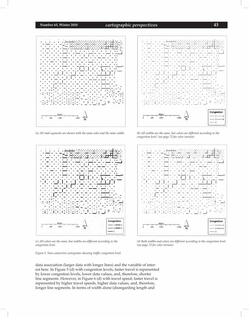
cartographic perspectives 43Number 65, Winter 2010 cartographic perspectives
Figure 5. Non-connective cartograms showing traffic congestion level.
(a) All road segments are shown with the same color and the same width. (b) All widths are the same, but colors are different according to the congestion level. (see page 73 for color version)
(c) All colors are the same, but widths are different according to the congestion level.
(d) Both widths and colors are different according to the congestion level. (see page 73 for color version)
data association (larger data with longer lines) and the variable of inter-est here. In Figure 5 (d) with congestion levels, faster travel is represented by lower congestion levels, lower data values, and, therefore, shorter line segments. However, in Figure 6 (d) with travel speed, faster travel is represented by higher travel speeds, higher data values, and, therefore, longer line segments. In terms of width alone (disregarding length and
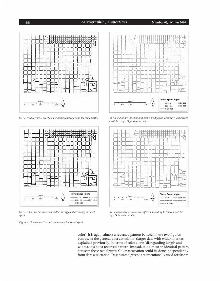
44 Number 65, Winter 2010cartographic perspectives
(a) All road segments are shown with the same color and the same width. (b) All widths are the same, but colors are different according to the travel speed. (see page 74 for color version)
(c) All colors are the same, but widths are different according to travel speed.
(d) Both widths and colors are different according to travel speed. (see page 74 for color version)
Figure 6. Non-connective cartograms showing travel speed.
color), it is again almost a reversed pattern between these two figures because of the general data association (larger data with wider lines) as explained previously. In terms of color alone (disregarding length and width), it is not a reversed pattern. Instead, it is almost an identical pattern between these two figures. Color association could be done independently from data association. Desaturated greens are intentionally used for faster
cartographic perspectives 45Number 65, Winter 2010 cartographic perspectives
travel. As one may notice from the figure legends, desaturated greens are for lower data values (faster travel) in Figure 5 (d), but higher data values (also faster travel) in Figure 6 (d). Therefore, they both have a visual effect that brighter greens mean faster travel.
Non-Connective Linear Cartogram for Travel Time
Figure 7 shows non-connective linear cartograms indicating the travel time. Lengths of road segments are proportional to their travel times. Higher data values (longer travel times, slower travel) lead to longer segments. As was done in Figures 5 and 6, colors and widths were used here as well to enhance visual effects. In Figure 7 (a), all road segments are shown with the same color and the same width. In Figure 7 (b), widths are the same throughout the study area, but colors are different according to the travel time. Again, a saturation-based sequential color scheme with green as the hue is used, as explained previously. Brighter greens are in-tentionally used on roads with faster traffic (lower travel time, lower data values). In Figure 7 (c), colors are the same throughout the study area, but widths are different according to the travel time. Wider lines are used for higher data values (higher travel time, slower traffic). In Figure 7 (d), both widths and colors are different according to the travel time.
Figure 7 shows a similar general pattern as the one observed in Figure 5, but not a perfect match. Normally, higher congestion levels indicate lower travel speed and longer travel time. However, travel time depends on not only the congestion level, but also the distance (the actual length of the road segment). Not every road segment in the study area has the same actual length. The same congestion level may not necessarily lead to the same travel time. In addition, data classification may also play an impor-tant role in the overall pattern. These three variables (congestion level, travel speed, and travel time) are classified independently from each other by the Natural Breaks (Jenks) method in ArcGIS software.
Discussion and Summary
Three variables of traffic conditions are presented by non-connective linear cartograms: congestion level, travel speed, and travel time. For each variable, four cartograms are created. Contributions of these cartograms are the ability to use length of line segment as a visual variable (just like color or width) to create dramatic visual effects. Lengths of line segments on the map are not limited to the physical length of the represented real-world road segments; they could be modified according to the mapping variable. Among the four cartograms for each variable of interest, one is a plain linear cartogram with uniform width and uniform color (for example, Figure 5 (a)), one is with uniform width but various colors (for example, Figure 5 (b)), one is with various widths but uniform color (for example, Figure 5 (c)), and the last one is with various widths and various colors (for example, Figure 5 (d)). It is the one with various widths and various colors that brings the most visual impact because all three visual variables are utilized. In Figure 5 (d), it is easy to see desaturated green roads. In traffic signals, green means go. The color is so designed that desaturated green lines indicate faster traffic, while saturated green lines indicate slower traffic.
Color choice is a difficult task in map-making. A saturation-based color scheme is chosen in this study because of color association in traffic lights. It is natural to choose green as the hue for maps depicting traffic condi-tions. Unfortunately, there are not many choices on levels of saturated
“Contributions of thesecartograms are the ability to use length of line segment as a visual variable (just like coloror width) to create dramatic visual effects.”
“Color choice is a difficult task in map-making.”
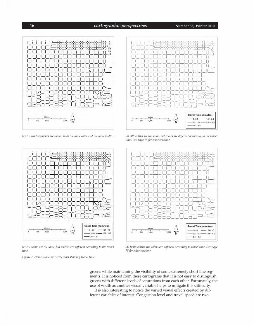
46 Number 65, Winter 2010cartographic perspectives
(a) All road segments are shown with the same color and the same width. (b) All widths are the same, but colors are different according to the travel time. (see page 75 for color version)
(c) All colors are the same, but widths are different according to the travel time.
(d) Both widths and colors are different according to travel time. (see page 75 for color version)
Figure 7. Non-connective cartograms showing travel time.
greens while maintaining the visibility of some extremely short line seg-ments. It is noticed from these cartograms that it is not easy to distinguish greens with different levels of saturations from each other. Fortunately, the use of width as another visual variable helps to mitigate this difficulty.
It is also interesting to notice the varied visual effects created by dif-ferent variables of interest. Congestion level and travel speed are two
cartographic perspectives 47Number 65, Winter 2010 cartographic perspectives
commonly used variables in describing traffic flows. They may, however, create two almost reversed patterns as explained in previous sections. Readers are encouraged to examine the legend carefully before attempting to interpret these cartograms.
Cartograms should be used with caution. Non-connective linear cartograms do not suit street networks with long streets far away from each other or with irregular patterns. They are better suited to networks in which segments and interconnections are dense and plenty because road intersections may be used as reference points in most readers’ mental image of a given area. The street network in Salt Lake City, Utah, is a grid-like network where most road segments are short and straight and are well aligned in an east-west or north-south direction. Though line segments are not connected to others and road intersections are not shown as points, they are still recognizable and easily linked to their represented road segments in the real world.
Though non-connective linear cartograms are created, the whole pro-cess has room for improvement. First of all, manual tasks are involved in several steps, such as data classification of travel speed and travel time, line width choices, line color choices, etc. These could be automated by VB scripts with or without some graphic user interface. Secondly, travel speed and travel time are quantitative data at the ratio level of measure-ment (Slocum et al. 2005). They are classified to five classes, to be con-sistent with five congestion levels. It would be interesting to explore the possibility of using non-connective linear cartograms to represent raw (not classified) travel speed or travel time. Thirdly, a computer anima-tion to show dynamics of traffic conditions as lengths of line segments gradually changes as time progresses into traffic rush hours. Fourthly, different colors may be used on these cartograms. Currently, it is not easy to distinguish greens with different levels of saturation. Fifthly, these non-connective linear cartograms have not been verified on their practical values yet. It would be helpful to have a user survey on commuters who are familiar with the study area. However, the practical value of these car-tograms should be separated from the accuracy of the model to simulate traffic conditions.
American Automobile Association (AAA). 2004. Driving distances and driving times [map]. In United States [map]. In North American regional series. Heathrow, FL: AAA.
Ahmed, Nobbir, and Harvey J. Miller. 2007. Time-space transformations of geographic space for exploring, analyzing, and visualizing transportation systems. Journal of Transport Geography 15:2-17.
Bugayevskiy, Lev M., and John Parr Snyder. 1995. Map projections: A ref-erence manual. London: Taylor and Francis.
Campbell, John. 2001. Map use and analysis. 4th Ed. New York: McGraw-Hill.
Cartogram Central. 2002a. Cartogram types. Available online from http://www.ncgia.ucsb.edu/projects/Cartogram_Central/types.html, last vis-ited January 2, 2009.
—. 2002b. Cartogram gallery Available online from http://www.ncgia.ucsb.edu/projects/Cartogram_Central/gallery.html, last visited July 13, 2008.
REFERENCES
“Cartograms should be used with caution. Non-connective linear cartograms do not suit street networks with long streets far away from each other or with irregular patterns.”
48 Number 65, Winter 2010cartographic perspectives
Chen, Huey-Kuo. 1998. Dynamic travel choice models: A variational in-equality approach. New York: Springer.
Clarke, Keith C. 1995. Analytical and computer cartography. Englewood Cliffs, NJ: Prentice-Hall.
Delta Airlines. 2008. Sky: Delta Airline in-flight magazine. Aug.: 131-132. Also available online from http://www.delta-sky.com/2008_08/fullmaga-zine/, last visited Aug. 22, 2008.
Dorling, Daniel. 1993. Map design for census mapping. Cartographic Jour-nal 30.2:167-183.
Dorling, Daniel, and David Fairbairn. 1997. Mapping: Ways of represent-ing the world. Essex: Pearson Education.
Dougenik, James A., Nicholas R. Chrisman, and Duane R. Niemeyer. 1985. An algorithm to construct continuous area cartograms. Professional Geog-rapher 37.1:75–81.
Du, Changming, and Lin Liu. 1999. Constructing contiguous area car-togram using ArcView Avenue. In Proceedings of Geoinformatics ‘99 Conference, 1-7.
Edelsbrunner, Herbert, and Roman Waupotitsch. 1997. A combinatorial approach to cartograms. Computational Geometry: Theory and Applica-tions 7.5:343-360.
Encyclopedia Britannica. 2008. Map: Cartography. Available online at http://www.britannica.com/EBchecked/topic/363506/map, last visited January 1, 2009.
Fabrikant, Sara I. 2000. Cartographic variations on the presidential election 2000 theme, available online at http://www.geog.ucsb.edu/%7Esara/html/mapping/election/map.html, last visited July 13, 2008.
—. 2004. 2004 Blue and red America. Available online at http://www.geog.ucsb.edu/%7Esara/html/mapping/election/election04/election.html, last visited July 13, 2008.
Friesz, Terry L., David Bernstein, and Roger Stough. 1996. Dynamic sys-tems, variational inequalities and control theoretic models for predicting time-varying urban network flows. Transportation Science 30:14-31.
Gastner, Michael T., and Mark E.J. Newman. 2004. Diffusion-based meth-od for producing density-equalizing maps. In Proceedings of the National Academy of Sciences of the United States of America 101.20:7499-7504.
Gastner, Michael T., Cosma R. Shalizi, and Mark E. J. Newman. 2005. Maps and cartograms of the 2004 U.S. presidential election results. Ad-vances in Complex Systems 8.1:117-123.
Haro, A.S. 1968. Area cartogram of the SMSA population of the United States. Annals of the Association of American Geographers 58.3:452–460.
House, D., and C. J. Kocmoud. 1998. Constructing continuous cartograms.

cartographic perspectives 49Number 65, Winter 2010 cartographic perspectives
In Proceedings of IEEE Visualization 1998.
Iliffe, Jonathan C. 2000. Datums and map projections: For remote sensing, GIS, and surveying. London: CRC Press.
Inoue, Ryo, and Eihan Shimizu. 2006. A new algorithm for continuous area cartogram construction with triangulation of regions and restriction on bearing changes of edges. Cartography and Geographic Information Science 33.2:115-125.
Jackel, Charles B. 1997. Using ArcView to create contiguous and noncon-tiguous area cartograms. Cartography and Geographic Information Sci-ence 24.2:101-109.
Keim, Daniel A., Stephen C. North, and Christian Panse. 2004. Cartodraw: A fast algorithm for generating contiguous cartograms. IEEE Transactions on Visualization and Computer Graphics 10.1:95-110.
Keim, Daniel A., Stephen C. North, Christian Panse, and Jörn Schneide-wind. 2002. Efficient cartogram generation: A comparison. In Proceedings of the IEEE Symposium on Information Visualization 2002 (InfoVis’02): 33-36.
Keim, Daniel A., Christian Panse, and Stephen C. North. 2005. Medial-axis-based cartograms. IEEE Computer Graphics and Applications 25.3: 60-68.
Kocmoud, Christopher J., and Donald H. House. 1998. A constraint-based approach to constructing continuous cartograms. Proceedings of 8th Inter-national Symposium on Spatial Data Handling.
Metropolitan Transportation Authority, Los Angeles County (MTA-LAC). 2006. Real time traffic. Available online from http://rtmap.metro.net/html/index.html, accessed on July 13, 2008.
—. 2008. Go Metro. Available online from http://www.metro.net/rid-ing_metro/maps/rail_map.pdf, accessed on July 13, 2008.
Miller, Harvey J., and Shih-Lung Shaw. 2001. Geographic information systems for transportation: Principles and applications. New York: Oxford University Press.
Miller, Harvey J., and Yi-Hwa Wu. 2000. GIS software for measuring space-time accessibility in transportation planning and analysis. GeoInfor-matica 4:141-159.
Miller, Harvey J., Yi-Hwa Wu, and Ming-Chih Hung. 1999, GIS-based dynamic traffic congestion modeling to support time-critical logistics. In Proceedings of the Hawai’i International Conference on Systems Science.
Muehrcke, Phillip H., and Juliana O. Muehrcke. 1998. Map use: Reading, analysis and interpretation. 4th ed. Madison: JP Publications.
Newman, Mark E. J. 2006. Images of the social and economic world. Avail-able online from http://www-personal.umich.edu/~mejn/cartograms, last visited July 13, 2008.
50 Number 65, Winter 2010cartographic perspectives
ODT, Inc. 2007. The world’s most populous countries. Available online from http://www.odt.org/Pictures/poplcart.jpg, last visited July 13, 2008.
Ran, Bin, and David Boyce. 1996. Modeling dynamic transportation net-works: An intelligent transportation system oriented approach. New York: Springer.
Slocum, Terry A., Robert B. McMaster, Fritz C. Kessler, and Hugh H. How-ard. 2005. Thematic cartography and geographic visualization. 2nd Ed. Upper Saddle River, NJ: Prentice Hall.
Tobler, Waldo R. 1986. Pseudo-cartograms. The American Cartographer 13.1:43-50.
—. 2004. Thirty-five years of computer cartograms. Annals of the Associa-tion of American Geographers 94.1:58-73.
Transport for London. 2008. A visitor’s guide to travelling around London: Your bus, Tube and rail map, available online from http://www.tfl.gov.uk/assets/downloads/travelling-around-london-leaflet-0108.pdf, last visited July 13, 2008.
Tyner, Judith A. 1992. Introduction to thematic cartography. Englewood Cliffs, NJ: Prentice-Hall.
Washington Metropolitan Area Transit Authority. 2008a. Metrorail system map. Available online from http://www.wmata.com/metrorail/system-map.cfm, last visited July 13, 2008.
—. 2008b. Metrorail street map. Available online from http://www.wmata.com/maps/metrorail_street_map.cfm, last visited July 13, 2008.
Wolf, Eric B. 2005. Creating contiguous cartograms in ArcGIS 9. In Pro-ceedings of 2005 ESRI International User Conference.
Wu, Yi-Hwa. 2004. Dynamic accessibility: Timing is more important than time. Paper presented at the Association of American Geographers (AAG) 100th Annual Meeting.
Wu, Yi-Hwa, and Ming-Chih Hung. 2000. Visualization of transportation network dynamics. Paper presented at the Association of American Geog-raphers (AAG) 96th Annual Meeting, Apr. 4-8, 2000, Pittsburgh, PA, USA.
Wu, Yi-Hwa, and Harvey J. Miller. 2002. Computational tools for measur-ing space-time accessibility within transportation networks with dynamic flow. Journal of Transportation and Statistics 4.2/3 (special issue on acces-sibility): 1-14.
Wu, Yi-Hwa, Harvey J. Miller, and Ming-Chih Hung. 2001. A GIS-based decision support system for analysis of route choice in congested urban road networks. Journal of Geographical Systems 3:3-24.
51 cartographic perspectives Number 65, Winter 2010
Reviews
Cartography Design Annual # 1 Compiled and edited by Nick Springer Produced and published in 2008 by SpringerCartographics, LLC 77 pages, with full color reproductions of maps throughout $39.95 softcover ISBN 13-978-0-6152-2116-8
Reviewed by Mary L. JohnsonRemington & Vernick EngineersHaddonfield, New Jersey
Nick Springer, the editor of Cartography Design Annual #1, might best be described as a cartophile. In the fore-word to his book, he reveals that he earned a degree in Geography but most enjoyed the hands-on design work in the cartography lab. He began his career in graphic design only because he was unable to obtain a job designing maps. He ultimately went out on his own and established a freelance cartographic design business.
Although he greatly enjoyed his work, Springer felt increasingly isolated as a cartographer and be-gan to think he was one of the only ones out there. He searched the Internet for any online community for cartographers that might fill the void, but he was unable to make any connections at the time. In 2004, Springer created Cartotalk.com as a place for cartog-raphers to share ideas, get peer feedback, ask for and receive advice, and generally communicate about the interests they shared. He has since discovered that there are many cartographers out there, and they have often expressed to him a similar longing for commu-nity.
As Cartotalk grew in popularity, cartographers began to post their maps on the site. Springer believed that the best of these maps should be compiled and shared in book format. His goal was not to create a competition, per se, but simply to select what he felt were the best designed maps of a particular year and showcase them for the world to see. He did not limit his choices to any specific design process, so hand-drawn maps appear side by side with GIS or graphi-cally designed maps.
Cartography Design Annual #1 represents maps pub-lished in 2007. Springer admits that the thirty-six maps showcased in his book should not be considered a comprehensive collection by any means, since submis-sions were solicited mostly through the Cartotalk Web
site. Many worthy cartographers may have been un-aware of this first book and were, therefore, unable to contribute. Springer hopes that word of mouth and the book itself will encourage even more submissions for the next edition, which will showcase maps published in 2008.
Springer chose the maps for Cartography Design Annual #1 based on their overall aesthetic value, the clarity of their data, and any unique design elements that made them stand out from the others. All deci-sions were purely his own, and he admits to including some of his own work in the collection. His real goal, he indicates, was simply to showcase beautiful maps.
So, what constitutes a “beautiful” map? I chose to review this book from among others offered to me in an effort to find that out. My company creates maps for a variety of municipal applications. The best of these are both functional and beautiful; others tend more to the former than the latter. Our maps have won a number of local awards for excellence, which seems to indicate they are pleasing in some manner, but I notice that in the civil engineering field the mapping awards tend to go to the purely functional, rather than to the purely beautiful, map. In other mapping com-petitions, however, I notice that only the graphically enhanced or similarly eye-pleasing maps seem to win. Even those that I consider to be less than functional or very rudimentary for the purposes intended will often take the prize if they include some particular types of graphic element. This is fine to a degree; but, like fab-ric or wallpaper, I think a map can sometimes be too “busy” or even too plain to be really effective.
Cartography Design Annual #1 features a variety of maps that appear eminently functional for their re-spective purposes, as well as aesthetically pleasing. To me, this represents the epitome of mapping excellence. Most of the maps deal with North America and other northern hemisphere nations, though a few maps represent the southern hemisphere or even the entire world. Contributors range from recognized names, such as National Geographic, McGraw-Hill and the U.S. National Park Service, to independent cartogra-phers and cartographic design firms.
Each map in Cartography Design Annual #1 is presented on two facing pages. One page shows the overall map in its entirety, while the other page shows an enlarged detail from the map to provide a closer look. Each cartographer’s name and employing com-pany or organization is included, as well as a Web ad-dress where more information about each map can be
52 Number 65, Winter 2010cartographic perspectives
found. Data sources are listed for most maps, as well as the software applications used to create them. No other text is provided. The maps are allowed to speak entirely for themselves.
Support for this book was provided by Avenza Sys-tems, Inc., producers of MAPublisher and Geographic Imager. Many of the maps showcased were created, in part, with Avenza software applications. Other frequently used applications include ESRI, Adobe, Quark, Manifold System, and Corel products.
A wide cross-section of mapping is represented in Cartography Design Annual #1. Road maps, relief maps, trail maps, route maps, tourist maps, pictorial maps, atlas maps, and street maps are featured. Also includ-ed are a map of golf courses, a map showing fire his-tory, a map documenting plant life, and even part of a world map that was made into a global beanbag chair. Gives a whole new meaning to the phrase “sitting on top of the world,” doesn’t it?
These are some of the specific maps that caught my attention:
• TheShipsAtlas – Plate 7 – Piracy Incidents Map by Shipping Guides Limited provides an overview of piracy incidents throughout the world dur-ing 2005 and 2006. Piracy locations are marked with the image of a skull and crossed swords–the larger the image, the more piracy incidents have occurred there. The map also features detailed graphs and charts at the bottom to provide addi-tional information. If this map is any indication, piracy is occurring even more frequently and in more widespread locations than the nightly newscasts would allow.
• ExpressiveMap: Bangkok by Olason Cartographic Artistry is a road map that has been visually enhanced with superimposed images of local architecture, folklore, and tourist attractions. Because many of the images on the map are placed on their geographic locations as well as in a collage around the map’s perimeter, I could imagine its being used equally well as a tourist guide or educational tool. This map provides the overall ambience of Bangkok even for those who aren’t visiting there. Although not shown, anno-tation indicates that detailed maps of the central business district, old city, and riverfront areas are included on the reverse side as additional refer-ence. It seems to be a comprehensive mapping product.
• SierraCounty, produced by Chicago CartoGraph-ics for the Directory Plus phone book of Truth or Consequences, New Mexico, is a spare, clean, matter-of-fact road map that is as appealing as it is simple. Pastel colors, major roadways, and a hint of topography all surround the western city that was originally called Hot Springs and then
renamed in 1950 in honor of the iconic television show, TruthorConsequences. Television was so popular at the time that this seemed like a great publicity gimmick for the city, and residents have voted to keep the name ever since. It’s a name that would stand out on any map, but looks particularly chic on this one.
• Brossard(North America) Geopictorial Map by GEOgrafix shows a portion of the boundary between the United States and Canada from a unique vantage point. Both countries have been rotated clockwise, so the eastern boundary of the State of Maine appears at the bottom of the over-all map, and the City of Chicago appears near the top. Brossard, in Canada, and other, more well-known cities in both Canada and the United States are each represented on the map with a group of their most recognizable buildings ren-dered in ink and watercolor. The buildings even have shadows to add to their three-dimensional appeal. The purpose of the map is to show that Brossard has “room for growth,” which seems to be indicated by its small collection of representa-tional buildings surrounded by many apparently larger cities and the vast open spaces in between. The more I look at this map, the more detail I see, including a tiny skier on a snow-covered moun-tain in Vermont, boats and barges in the rivers, an airplane in flight (complete with shadow), a lighthouse, and even a miniature representation of Niagara Falls. Absolutely amazing.
• GVAWilliamsManhattan by Halcrow, Incorpo-rated, depicts Lower Manhattan in great detail. Color-coded building footprints and recreation areas enhance the well-labeled streets, land-marks, and mass transit routes. A lot of thought must have gone into designing a map that is not overwhelmed by the intensity of population and architecture it depicts, but works to present them in a crisp and consistently readable format. Even the orderly way in which the annotation was ap-plied is impressive. Each font is distinct, yet they all work together quite well. It is a very neat and well-organized map that would accommodate the needs of any visitor to Manhattan.
I would definitely recommend Cartography Design Annual #1 to anyone with even a passing interest in cartography or geography. The quality and color satu-ration of the map reproductions is impressive through-out, which really enhanced my overall enjoyment of the book. The maps seem to jump right off the page. Although it is a slim volume, it is one that readers will find themselves perusing again and again, like a favor-ite art book or photo album. There is always another detail or nuance to discover.
53 cartographic perspectives Number 65, Winter 2010
I admit that I liked some of the maps in Cartogra-phy Design Annual #1 much more than others, and a few just didn’t seem worthy of their place in the book in comparison with the rest of those chosen. Even with maps, it would seem, beauty is in the eye of the beholder. But for the true cartophile, there is plenty to behold in this book.
Cartographic Relief Presentation By Eduard Imhof ESRI Press, Redlands, California, 2007 436 p., 14 color plates, bibliography, index. ISBN: 9781589480261 soft-cover $59.95
Reviewed by Dawn Youngblood, PhDSouthernMethodistUniversity,Dallas
Swiss geographer Eduard Imhof’s classic text is once again available in English. Within the discipline of cartography, few works are considered classics and few of those remain relevant beyond the transition to GIS mapping. Imhof’s text on relief representation, however, can still be viewed as a masterpiece. Imhof combined intellect and graphics in the solution of map design problems; his mission was clearly to improve the precision and readability of maps. He writes on page 359 of this volume that “Only simplicity provides a lasting impression,” and what makes Imhof a master cartographer is his ability to take a large amount of complex topographic data and transform it into some-thing not only simple in its ability to be interpreted but beautiful as well.
Eduard Imhof (1895-1986) was a professor of cartog-raphy at the Swiss Federal Institute of Technology in Zürich from 1925 to 1965 and devoted his career to raising the standards of map design. He is best known for his relief shading work and mountain cartography. Considered the founder of modern academic cartog-raphy, Imhof was one of the people responsible for the inspirational and accurate Swiss national maps. In 1965, his breakthrough book, published in Ger-man, Kartographische Gelande Darstellung, filled a need in cartographic instruction by offering guidelines for properly rendering terrain in maps of all types and scales. The book was translated into English in 1982 for Walter de Gruyter publishers of Berlin as Carto-graphic Relief Presentation, and the translation served to expand its influence globally. Cartographic Relief Pre-sentation was an expensive book with a limited press run that made it a rare find until this new ESRI Press edition was issued. The reissue should benefit map-ping professionals, scholars, scientists, and students alike, whether their maps are drawn by traditional
means or with the aid of a computer. This new edition of Cartographic Relief Presentation preserves Imhof’s insightful commentary and analytical style through the application of sparse editing. All the color maps, aerial photographs, and instructive illustrations are faithfully reproduced. It should come as no surprise that gorgeous full-color cartographic plates used as examples for the text feature the geographer’s Swiss homeland, particularly the Alps. In the 1982 English edition published by de Gruyter, the plates were loose and were included in a sleeve in the back of the vol-ume. In the ESRI Press edition, they are bound into the back. Cartographic Relief Presentation was among the essential mapping and graphical design books of the twentieth century. Many such volumes suffer the “out of sight, out of mind” syndrome when they fall out of print, but the recognition by the new publishers of the continuing relevance of Cartographic Relief Presentation for the twenty-first century has saved Imhof’s work from a similar fate.
The sixteen chapters guide the reader from the “Topographic Foundations” of Chapter 2 through to the “Interplay of Elements” in Chapter 14, with addi-tional observations and future developments in Chap-ters 15 and 16, respectively. Chapter 1 is a fifteen-page history of cartographic relief presentation beginning with the earliest known map–an earthenware plate from Mesopotamia some 4,400 years old. While brief, the history is thorough and does not stray from the specific topic of relief presentation. Whether the reader is interested in history or not, the demonstration of knowledge gives him or her a sense of the deep and thorough scholarship Imhof devoted to his task. The author, for instance, credits Leonardo da Vinci for first showing relief forms individually and continuously related, as if seen in an oblique bird’s-eye view.
Chapter 2 lays the topographic foundations of relief presentation from classic survey methods, through issues regarding accuracy, to the use of general or de-rived maps at smaller scales as working bases. Chap-ter 3 goes deeply into general principles on the study of topography including landscape drawing, aerial photography and its interpretation, field reconnais-sance and identification, rectification, and an excellent explanation of the differences between aerial photo-graphs and maps. The chapter also explores binocular viewing in stereo pairs before ending with a brief but clear statement of the importance of the cartographer in advancing scientific knowledge as part of a recipro-cal relationship with geomorphologists.
Chapter 4 is devoted to the theory of colors. One look at the beautiful reproductions of Imhof’s own work found among the color plates will encourage the cartographic student at any level to read this chapter. His use of hypsometric tints and colors demonstrates his mastery of composition and harmony using strict
54 Number 65, Winter 2010cartographic perspectives
standardization. After quickly reviewing the chemical and physiological theories of color, Imhof reviews the psychological theory of color. Following a classifica-tion of colors, Imhof offers specific advice on effective color combinations, demonstrating the practicality behind understanding the theory.
In Chapter 5, Imhof explores the general problem of relief presentation, which basically stems from at-tempting to represent a three-dimensional surface on a two-dimensional plane. He further explains the differ-ences between a map and a picture, and discusses the goals of the cartographer challenged to present relief. Spot heights and soundings and their significance are covered in Chapter 6. As in other chapters, but par-ticularly in this one, exacting tables inform the reader of precise measures, such as minimum type sizes (for spot height values) for sheet maps by scale.
Chapter 7 is devoted to a short study of skeletal lines, which can serve either as a constructional aid or as an independent form of terrain representation. The significantly lengthier Chapter 8 offers a detailed study of contour lines in just under forty pages. Again, precise tables and illustrations guide the learner in selecting every detail while the text addresses the reso-lution of various problems, such as what to do when data is absent.
It should come as no surprise that the longest chapter in Imhof’s book is devoted to shading and shadows. Chapter 9 progresses from general aspects and graphic procedure through to oblique hillshad-ing with a computer some fifty pages later. Examples of shading and shadows are prolifically and expertly illustrated using multiple angles and degrees. Chapter 10 covers hachures and other related techniques while Chapter 11 devotes nearly fifty pages to rock drawing, including a critical examination of the different meth-ods and prescriptions for which is best for various scales.
Among the initial decisions any cartographer must make is selecting symbolization. Imhof’s Chapter 12 refers strictly to topographic symbolization, in keep-ing with his overall theme. Chapter 13 explores the purpose and possibilities of area color tinting in maps, applying the lessons learned in the earlier chapter on color theory. Chapter 14 explores the nature and effect of the interplay of elements for varying scales of map. In it, Imhof lays out his now classic techniques for allowing clarity of interpretation among layered elements, such as contour lines and text. Chapters 15 and 16 are devoted to map reproduction techniques and to future developments, respectively. Since this is a classic work, these last chapters, while enjoyable and brief, may be the ones of least practical use to the cartographer.
The ESRI Press edition of Cartographic Relief Presen-tation was edited by H.J. Steward for clarity and con-
sistency and is intended to be an affordable volume for the modern student of cartographic method and theory. The result is a study of cartographic relief pre-sentation that is both approachable and at moments profound. The careful balance of words and images conveys the principles of cartographic expression under consideration as clearly as the relief on an Imhof map of the Alps.
GIS Tutorial for Marketing by Fred L. Miller 2007 ESRI Press; Redlands, California 432 pages, with graphics on every page Includes 180-day trial copy of ArcGIS Desktop 9.2Software on DVD Includes a data CD $79.95 US, Softcover, spiral bound ISBN 978-1-58948-079-7
ReviewedbyEvaDodsworth,GeospatialDataServicesLibrarian,UniversityofWaterloo
Written specifically for the undergraduate marketing curriculum, GISTutorialforMarketing is a nine-chapter, hands-on GIS exercise book that guides the user step by step through course-related business scenarios. With each chapter representing content taught in marketing courses, students gain complementary GIS knowledge through theory and practical exercises us-ing ArcGIS 9.2 software. No previous GIS knowledge is necessary, as the book provides an introduction and guided overview of the software program. Although targeted for marketing students, this tutorial makes an excellent resource for professionals in the market-ing and business industries. The sample data included with the book provide professionals with a taste of some of the detailed demographic and consumer-based data collected and made available commercially. The book also acts as a comprehensive GIS reference manual and an overall how-to GIS tutorial for those new to ArcGIS. GISTutorialforMarketing provides readers a broad-based, hands-on resource for learn-ing how to use GIS tools in making marketing related decisions.
The author, Dr. Fred L. Miller, is Professor of Mar-keting and Telecommunications Systems Management at Murray State University. He has authored many articles on marketing GIS and is the recipient of the 2001 Marketing Education Review Best Article Award. His technical knowledge in GIS and professional expe-rience in teaching marketing courses have produced a resource unavailable until the release of this book. Dr. Miller clearly illustrates the value of GIS technology in
55 cartographic perspectives Number 65, Winter 2010
the marketing sector, from site selection to customer profiling to service call routing, and he eliminates a barrier many companies face: technical GIS software training. Coursework assigned to students at Murray State and Bellarmine University forms the book’s con-tents, with student feedback considered when revising and refining the exercises.
The software exercises in the book were designed for ArcGIS 9.2 software. A 180-day trial copy of ArcGIS 9.2 is included at the back of the book. A data disc is also included and is required to complete the exer-cises. The CD consists of sample data from a variety of sources, but all packaged under ESRI’s name. Exam-ples include street data from ArcGIS Business Ana-lyst 8.3 (courtesy of Tele Atlas North America, Inc.), population census data from ESRI Business Informa-tion Systems (courtesy of U.S. Census), Community Tapestry data from ESRI Business Information Solu-tions (courtesy of Mediamark data), and much more.
Seven of the nine chapters cover specific topics that are taught in undergraduate marketing courses, while the first two chapters are dedicated to introducing the readers to ArcMap 9.2 and to geospatial data. Specifi-cally, the data covered in greatest depth is ESRI’s Com-munity Tapestry Data lifestyle segmentation system. This product classifies households in the United States into sixty-five distinct lifestyle segments. It combines demographic data with housing, lifestyle, and pur-chasing behavior information to produce profiles for each segment. Also available is the combination of this data with Market Potential Indexes which provide identification of prospective customers based on their attitudes, lifestyle activities, media habits, and pur-chasing patterns. This sample data is used in many of the exercises in each chapter.
Every chapter defines a marketing concept, a sce-nario, an explanation of how GIS software can be used to solve the problem, and step-by step instructions in doing so using ArcGIS. The scenarios cover a range of organizations, geographic areas, and marketing problems, all consisting of real-world situations. The themes covered include Principles of Marketing, Con-sumer Behavior, Promotional Management/ Advertis-ing/Integrated Communication, Marketing Research/eCommerce/Internet Marketing, International/Global Marketing Management, Retailing/Retail Manage-ment, and Personal Selling/Sales Management. Examples of the related scenarios include developing a targeted promotional campaign, matching merchan-dizing strategy of stores to the lifestyle characteristics of consumers, profiling and locating prospective cus-tomers, identifying a location for a store, determining optimal routes for salespeople, and more. Within each chapter, the step-by-step ArcGIS exercises are accom-panied by full-color graphics, which average two per page. The reader begins with an introduction to the
software program and learns the basics such as chang-ing symbols, classifying thematic data, measuring, and identifying features. With new scenarios, new skills are learned such as buffering, selecting by location/by attribute, as well as calculating statistics. Users will also spend some time learning how to add graphs, create map layouts, join boundary zip codes files to feature class tables, and perform network analysis. After working through the book, the reader will have a fairly good handle on the most commonly used fea-tures and tools in ArcGIS.
The purpose of this tutorial is to provide market-ing students with a guide that coaches them through solving real-world marketing problems with the aid of a GIS. The author provides common, easy-to-under-stand marketing-themed scenarios and demonstrates how GIS tools can be used to calculate, filter, analyze data, and display results. The author’s objectives have undoubtedly been met, as he provides a thor-ough demonstration of how one can find solutions to problems and answers to questions. Students without a GIS background will not only gain an appreciation for GIS technology, but will be able to use the concepts learned in their professional careers. Additionally, the easy-to-read-and-follow style of the manual will also attract individuals with no marketing background but with an interest in marketing and business. Students from all disciplines who read GISTutorialforMarketingwill get a crash course in some of the key concepts of marketing. Additionally, this manual is ideal for any-body interested in learning ArcMap. By working with the common tools and features covered, the user will gain the knowledge and practice necessary to utilize, manipulate, and display geospatial data.
The first chapter provides an orientation to ArcMap, covering all the fundamental features of the software. On its own, it provides an excellent overview of all the tools that are necessary to successfully complete exer-cises in subsequent chapters. What the chapter doesn’t cover, however, is GIS theory. It doesn’t explain the concept of a GIS, nor does it explain any cartographic fundamentals which may be crucial to those who haven’t worked with maps before. Because the manual includes exercises that use demographic data, some best-practices guidelines would be useful for topics in choropleth mapping, projections, explanations of census boundaries, and even proper map-making techniques. The manual teaches users how to complete specific marketing-related exercises using GIS soft-ware, but it doesn’t provide them with the information literacy skills required for them to answer real-world questions independently in the future. Readers of this manual will complete all the exercises, but will still not know, for example, which classification method to use for quantitative data, how to properly create a map in layout mode, how to access geospatial data, or how
56 Number 65, Winter 2010cartographic perspectives
to work with data from multiple sources and possibly different projections and datums. This book assumes that undergraduate business students have funda-mental geography knowledge, but that is certainly not always the case; and, in the real world, datasets are not provided clipped to geographical boundaries of inter-est with symbols and legends pre-set, as is the case in most of the exercises in the book. I think the manual could at least offer links to online resources that cover the theoretical concepts.
There are seven chapters that introduce different business scenarios, and with each scenario GIS is used to calculate, analyze, visualize, or interpret informa-tion. The steps required to perform the functions in the program are clearly explained, and the instructions are very easy to follow, with just the right amount of graphic illustration to keep the reader on track. Many times, though, the technical procedures covered in the first chapter are re-taught in subsequent chapters; for instance, a basic step such as adding new data into the frame is taught step-by-step in every chapter. For users who are completing the exercises in order, this becomes redundant and unnecessary. Although the chapters can be completed in any order, it is advised that the first chapter gets completed before all the oth-ers. With this being the case, I feel it isn’t necessary to re-teach many of the fundamentals that are covered in Chapter One.
The exercises in the manual use geospatial data provided by ESRI and are samples of a collection that ESRI makes available commercially. The data are described at great length, and a lot of effort has gone into demonstrating the benefits of this data for busi-ness professionals. It appears as though the exercises have been created to highlight the apparent effective-ness of detailed demographic data for the business sector. Considering the amount of dataset plugging, especially at the end of the chapters when the data are described even further, I often wondered whether the purpose of the book was to teach users GIS software, or whether it was to promote ESRI’s data. It’s most likely a combination of the two, but if the tutorial con-centrated more on educating and preparing the reader to be an independent GIS user, it would have been that much more effective.
Overall, GISTutorialforMarketing does an excel-lent job covering the fundamentals of both the field of Marketing and ArcGIS. Although written for the marketing sector, I would highly recommend this book to any individual interested in learning how to use ArcGIS software. All readers can understand and relate to the scenarios described, and the step-by-step ArcGIS instructions are easy enough to be followed by individuals with a variety of technical backgrounds.
The State of the Middle East: An Atlas of Conflict and Resolution by Dan Smith Berkeley, California: University of California Press, 2006.144 pp., 70 maps, 36 pie charts and bar graphs,bibliography and web sources, index$19.95. PaperISBN-10: 0-520-24868-6; ISBN-13: 978-0-520-24868-7
Reviewed by: Daniel G. ColeSmithsonianInstitution,Washington,DC
This slim volume gives a succinct and analytical presentation of the history and current state of affairs (up to early 2006) for the Middle East as defined by the author. Dan Smith is known for producing other atlases of this type, such as TheStateofWarandPeaceAtlas (3rd ed., 1997), ThePenguinAtlasofWarandPeace(4th ed., 2003), and ThePenguinStateoftheWorldAtlas(7th ed., 2003). His cartographer on this atlas is Isabelle Lewis, known for her recent work on the Inheriting the World:TheAtlasofChildren’sHealthandtheEnvironment (2004), and TheTobaccoAtlas (2nd ed., 2006).
In the Introduction, the author states that the “intention of this book is to open a door for people who are not experts on the Middle East, but who are interested and concerned by the region’s conflicts and its prospects for peace” (7). Smith struggles with the geographic definition of the Middle East, finally set-tling on those countries stretching from Morocco, in the west, to Iran, in the east. He excludes any African countries south of those bordering the Mediterranean Sea, and defends his decision not to include Cyprus and Turkey, especially noting that the latter country is in essence the “meeting point of Europe and the Middle East, not fully a part of either” (11). Smith out-lines the organization of the book into three parts: The Shaping of the Middle East (the region’s history), Are-nas of Conflict (contemporary issues), and The State of the Nations (with thematic and reference maps). A glossary is, surprisingly, placed at the end of this intro-ductory section, along with a short discussion con-cerning the problem of transliteration between Arabic and Latin script. Illustrating this, Smith provides the example of the BBC Web site listing of twenty-one dif-ferent ways to spell the Libyan President’s last name!
Part I, The Shaping of the Middle East, covers eight topics: Ottoman Empire, European Colonialism, New Middle East after World War I, Decolonization, Arab Nationalism, Formation of the State of Israel, Oil, and the U.S. Presence. Each topic is two to six pages in length, with twenty-five maps and six graphs overall. Smith frequently uses sidebars, here and in Part II, to summarize chronological sequences. The maps and pie charts are designed with a liberal dose of color, and
57 cartographic perspectives Number 65, Winter 2010
while this reviewer might have chosen different color schemes, these colors often work well without being too garish. The bar graphs are for the most part de-signed innovatively, and all tend to communicate quite well. Some typographical placement problems occur, such as black type in dark-colored areas or occasional type/linework intersections. But for the most part, all of the graphics and artwork are readable. Regard-less of whether standard (e.g., migration and refugee flows) or non-standard symbols (e.g., graduated oil barrels and U.S. flags) are used, the quantitative maps always display numerical data as well so that the reader can choose between a quick overview or a more detailed summary.
Part II, Arenas of Conflict, deals with fifteen topics: Arab-Israeli Warfare, Israel and Palestine, Jerusalem, Lebanon, Syria, Libya, Egypt, Algeria, Iran, Iran-Iraq War, Iraq, Kurds, Gulf Wars, Saudi Arabia, and Danger and Opportunity. One comparative bar graph that gets the message across in a unique way is a two-ended water pipeline illustrating the amount of average daily water consumption per person for Palestinians and Israelis. The current situation in the West Bank and Gaza, in terms of settlements, the Israeli Wall, Israeli checkpoints, and areas of Palestinian and Israeli control, is provided on a map that should be studied extensively. In the section on Libya, a map highlights and names each of the countries where either a revolu-tionary group has received material support or some violent incident due to Libya has occurred. Strangely, Switzerland is named and highlighted even though no connection is made to Libya. One glaring typographi-cal error is on page 98, where the author places the September 11 attack on the U.S. in the year 2000.
In other sections of Part II, the maps concerned with the ethnic makeup of the Middle East are especially instructive, providing information on Berber ethnic groups across North Africa, the diversity of ethnic and religious groups in Iran and Iraq, as well as the dispersal and diversity of the Kurdish population. Unfortunately, the map on page 91 of Kurdish Home-lands does not correspond with the maps on page 93 of the Kurdish Diaspora and Kurdish Dialects. Nota-bly, the former map excludes any portion of Syria from the Kurdish homeland. One ethnic group missing from any of the maps are the Bedouins; an attempt should be made to add these people to future editions of the atlas.
Part III, The State of the Nations, with sixteen maps and thirteen graphs, has fourteen sections. All of the maps in this part have additional inset maps of the Israel-Palestine area. The first map effectively displays each entity’s dominant language with voice balloons indicating significant minority language groups along with pie charts illustrating the ethnic breakdown. Again, a Syrian-Kurdish problem pops up on page 114,
where Smith notes the “significant numbers of Kurds in Iran, Iraq and Syria,” although the accompanying map shows none in Syria. The Religion section has a graph on non-Muslim religions (Jewish, Christian, and Other), with up to 15 percent for Other, but no men-tion is made of what Other includes.
The Life Expectancy and Health section begins a trend that carries on through the rest of the atlas where bar graphs compare the region’s statistical data with that of the rest of the world, at times comparing world regions while at others comparing selected countries. The Population and Urbanization map shows percent-ages of urbanization over a four-class choropleth dis-tribution of population. A map of population density would have been a helpful addition here. Oddly, the Water and Sanitation and Water Resources sections are ten pages apart. Regardless, one learns that significant percentages of people throughout the region do not have access to clean water or sanitation, or both. No-tably, although the infrastructure in Iraq is currently problematic, that country has the most potential cubic meters of water per person available.
Education and Literacy is portrayed using propor-tional pencils to show gender differences in primary education over a four-class map of literacy as a per-centage of population age 15 and above. One editing problem exists between the small-scale map and the inset where Jordan is shown in the 90 percent and over class on the former, but in the 70-89 percent class on the inset. Government and Economy pictures colored stacks of coins (GDP per person) over a qualitatively classed map of six different types of government. Mili-tary Spending shows which countries are parties to the Nuclear Non-Proliferation treaty over a four-class map of military expenditures as a percentage of GDP. Sur-prisingly, Oman appears as the most militaristic, being the only country with 12 percent or more.
Energy and Transportation depict proportional cars for the number of cars per 1000 people over a four-class map of tons of oil expenditure per person. Here, one can see that Qatar and United Arab Emir-ates (U.A.E.) are even bigger per capita oil users than the U.S. With Labor and Migration, pie charts indicate which of the countries are signatories to four different international labor agreements over a five-class map of percentages of cross-border migration, excluding refugees. A startling statistic of globalization is given here with over 50 percent of the people in U.A.E, Qatar, and Kuwait listed as foreign born. The Refugees section has proportional pie charts for the numbers of refugees over a five-class map of the number of cross-border refugees in 2004. Unfortunately, the numbers given here for the Palestinians are not compatible the map on page 56 which deals solely with the Palestin-ian Diaspora in 2005.
Gender Equality displays stacks of coins as female-

58 Number 65, Winter 2010cartographic perspectives
to-male earned income ratios over a five-class map of percentage female to male literacy. The last section in the book concerns Human Rights. Pie charts indicating which countries are party to four different interna-tional human rights agreements overlay a four-class qualitative map indicating the major type of human rights abuse that occurs in each country.
Overall, in spite of the criticisms listed above, the maps are usually clear and uncluttered, including those that have a multi-variable focus. Much can be learned from this atlas, and most libraries should have a copy. This reviewer hopes that the discrepancies and omissions criticized will be dealt with in subsequent editions. Atlases of this type become dated rather quickly, and, given the dynamic nature of the Middle East, we might well expect to see an updated edition of this atlas soon.
59 cartographic perspectives Number 65, Winter 2010
Cartographic Collections
More than Just a Pretty Picture: The Map Collection at the Library of Virginia
Cassandra Britt FarrellMap Specialist and Senior Research ArchivistArchives Research ServicesLibrary of Virginia
The Library of Virginia’s map collection has grown significantly since the Library opened in 1823. Seven maps and four atlases are listed in the 1828 catalog and today approximately 65,000 maps are housed at the Library of Virginia. Rare manuscript collections, valuable “mother” maps of the state, and thousands of maps produced for commercial and federal pub-lications are available for patron use. They are more than just pretty pictures, as this article attempts to show. In fact, this article is based on a presentation I gave in August 2008 at the Library of Virginia during the exhibition “From Williamsburg to Wills’s Creek: the Fry-Jefferson Map of Virginia.”
On August 19, 2008 I had the opportunity to discuss the Library of Virginia’s map collection as part of the noontime lecture series “Mining the Treasure House.” My presentation, “More than Just a Pretty Picture: The Map Collection at the Library of Virginia,” was given in conjunction with the gallery opening of the exhibi-tion “From Williamsburg to Wills’s Creek: the Fry-Jef-ferson Map of Virginia.” The Library’s map collection has grown significantly since the Library opened in 1823, and researchers exploring Virginia’s and the na-tion’s history from the cartographic perspective should consider researching our holdings.
Through the years librarians and archivists have added to the collection, and today it includes im-portant published maps of the state and nation, rare manuscript collections, and little known county plats and surveys. Seven maps and four atlases are listed in the Virginia State Library’s first catalog (1828), and of those only John Melish’s map of the United States, 1816, is still extant (31). Despite the ravages of the Civil War, the collection stands today as one of the best on Virginia cartographic history and continues to serve its varied users: scholars, treasure hunters, state workers, land and title researchers, map apprais-ers and map researchers. Recently, controversy arose over the location of a slave burial ground in Richmond City, Virginia. Researchers from all sides consulted the
Library’s 1809 Young map of the city of Richmond and other area maps. Virginians have been consulting the colony’s and state’s map collection for centuries.
Prior to Virginia becoming a royal colony in 1624, the Virginia Company of London purchased reference materials for colonial councilors to use, and Virginians’ desire for official reference material is reflected a 1666 Act of the Assembly requiring “the auditors” to obtain a complete collection of the laws of England as well as manuals on the “practice of law” (Henings 246). The Library’s collections were added to during the eigh-teenth century. Since charts, maps and other reference works accompanied voyagers on the earliest English ships sailing to Virginia and were an essential part of the first histories of the Chesapeake Bay and the Atlantic Coast, it is likely that Virginia’s first library included maps (Treadway and Campbell 3-4, 69).
Virginia’s General Assembly passed “An Act Concerning the Public Library” in 1827, requiring the governor and council to set aside a room in the capitol to house books and authorized payment of an addi-tional salary to the clerk of the council who would act as public librarian. Proceeds from the sale of the Her-man Boye’s 1826 Map of the State of Virginia supported the Library. William Harvie Richardson, clerk of the Council, quickly compiled and published a list of the Library’s holdings that included eleven maps. The state librarian continued to acquire maps and by 1856 thirty maps were included in the Library’s collections (Virginia State Library 1856, 270-271). This number does not reflect the number of atlases in the Library’s collections.
The Civil War had a devastating effect on the Library, and many maps were taken from the state’s collection. One well-known case involved Union soldier Frederick Lindal, who was on sentry duty April 4, 1865, when he “acquired” at least two maps and sent them to his friend who lived in Chautauqua, New York, for safe keeping. Ironically, two of the maps taken by Lindal were drawings of manuscript maps housed in the London State Paper Office. The docu-ments had been copied for Colonel Angus W. McDon-ald who had traveled to London in 1860 to note and copy any documents and maps of Virginia and the Virginia-Maryland boundary line. Of the thirty-two maps he studied, five were copied. In 1942 the Library purchased William Mayo’s Map of Virginia and Peter Jefferson’s Map of the Northern Neck and the letter sent to Frederick Lindal’s friend in 1865 from Mrs. Charles Lindal of Buffalo, New York (Stephenson and McKee
60 Number 65, Winter 2010cartographic perspectives
xvi). Soldiers were not the only ones absconding with Virginia’s treasures; other curious visitors carried off books and valuable papers during those hectic days.
Following Reconstruction, the Library once more acquired materials for the general collection. In 1873 the General Assembly authorized the librarian and joint committee to purchase not only standard refer-ence materials but also copies of any book, pamphlet or manuscript, work of art, and relic relating to the history of Virginia (Treadway and Campbell 16). Not much had been done with the collection since the war. The next year, William P. Palmer, the state librarian, asked all county clerks to report on public documents, seals, maps, and other valuable items in their offices. In 1911 the Library began to assess and organize its map collection. According to the1911-1912 Report of the State Librarian:
Maps in the library have, up to the past year, been in a confused and almost inaccessible condi-tion. Many were collected in bundles and stored and others were placed in a map case, but without order. The assistant librarian spent considerable time in examining the maps, in repairing them, and in pressing them so that they might be readily filed. Some of the maps from having been rolled for fifty or sixty years were in a deplorable condi-tion. In fact, little could be done with them. Most of the maps in our collection have by this time been arranged in the map case. (Virginia State Library 1911-1912, 14)
Earl Gregg Swem published the first comprehensive list of printed maps of the colony and commonwealth in 1914. Swem’s Index listed in detail maps published about Virginia from the fifteenth to the early twentieth century, including Board of Public Works maps, Revo-lutionary and Civil War maps, and county and city maps. He indicated in which institution the maps were located. Fortunately, librarians and archivists have an-notated the Library’s copy of Swem’s publication, and staff members consult this to determine if a particular map is in our collection. Maps acquired by the Library have been recorded in the Library of Virginia reports since 1907 and in map accession notebooks since 1911; however, this has not always been done consistently, and staff stumble upon unrecorded maps housed on the Library’s fourth floor. Today, accessioned maps are featured in quarterly reports and are available online for patrons to research.
The state library acquired its most impressive collection of rare manuscript plats, surveys, field notes, and maps when it obtained the Board of Public Works (BPW) Archives in the mid 1920s. The bulk of the agency’s records pre-date the Civil War. Virginia was one of the first states to establish a state agency
to oversee the development of its internal improve-ments movement. In 1816 Virginia’s Board of Public Works was established and oversaw the development of Virginia’s transportation system up to and through the Civil War. Most of the agency’s cartographic works consists of manuscript maps and field notes documenting the surveying, planning, and inspecting of individual transportation projects. Four-hundred and eighty-five separately filed maps document 191 companies, and 145 separately filed field note volumes pertain to fifty-two surveying projects. These records relate to river improvements, canals, roads, turnpikes and railroads supervised by the Board. Forty-five maps dated between 1817 and 1839 pertain to twenty-seven river surveying and navigation companies. Within the surviving papers of the BPW are eighty-nine maps related to canal construction. Maps exist for seventeen canal companies and projects and thirty-one railroad companies. Most were created prior to the Civil War. More than half of the Board of Public Works maps pertain to turnpike companies, and many others are related to road projects (Stephenson and McKee 128).
The Board of Public Works collection includes several early nineteenth century manuscript county maps created under the direction of John Wood, two state maps published in 1826 and 1859 and several that mark the work completed by the internal im-provements movement within the state. The Library is extremely fortunate to possess the original cop-perplates for the 1827 and 1859 state maps of Virginia and the reduced sized plates. Recently, re-strikes were completed from these and are for sale from the Library of Virginia Foundation.
One of the largest collections in the Library of Virginia’s cartographic collection is its topographical map collection. As a federal depository, The Library received these maps from the U.S. Government Print-ing Office. Today, each Virginia quadrangle in the map collection has been catalogued, and researchers can de-termine if we have a quadrangle map for their area of interest. Most libraries catalog their topographic map collections as a series and do not include an individual record for each. This concentrated effort to catalog our topographic maps has increased access to the map collection, and staff members can provide quality answers to map reference questions, especially those generated by genealogists who search for information by locality--specifically, by Virginia counties and cities.
Earlier in the decade the Library of Virginia, in part-nership with the Library of Congress and the Virginia Historical Society, catalogued and made available on-line through American Memory their Civil War maps. Virginia’s Civil War map collection includes maps ac-companying governor’s reports, Confederate imprints, manuscript maps, and a small group of field maps of
61 cartographic perspectives Number 65, Winter 2010
southwestern Virginia that belonged to Major General William W. Loring, C.S.A. The Library catalogued 298 maps and was the Library’s first digital map collection made available for patron research online. Patrons can not only access our map collection through American Memory but also through the Library of Virginia’s Web site by using the Virginia Memory portal.
Through gifts and purchase, the Library has ac-quired original manuscript plats and surveys for eighteenth-century towns and nineteenth-century county surveys for private and public lands and road projects that were completed by county and city sur-veyors. The historical map collection includes inkjet printouts and photostats of county plats and surveys from original items housed in the Library’s Local Records Collection. The map collection includes the original Byrd Plan of Richmond surveyed and drawn by William Mayo and James Wood and the 1729 plan for the town of Fredericksburg completed by John Royster and Robert Buckner. In 1955 the Library purchased for thirty –five dollars the nineteenth-century survey of G.A. White’s estate, Harts Bottom, in Rockbridge County, Virginia, drawn by C.W. Oltman. An index to dwellings identifying the overseer’s house and other buildings on White’s estate accompanies the map. Thirteen early nineteenth-century manuscript maps completed by surveyors for the Board of Public Works, most notably Hugh Taylor and Andrew Alexander, were located and catalogued. Taylor and Alexander mapped portions of Northern Virginia, the Blue Ridge, and the Central Piedmont, identifying county bound-aries, roads, homes, taverns, and ferry stops within the region.
Librarians and archivists working with the Library’s cartographic collections have compiled an impressive collection of published commercial, state and county sanctioned, and manuscript maps of the New World, North America, the United States, Southeast Virginia and Virginia’s counties. Today, the Library owns three states of John Smith’s map Virginia, the 1819 American reprint of Smith’s map, and the copperplate used in printing the 1819 facsimile. Two states of Joshua Fry and Peter Jefferson’s Map of the Most Inhabited Parts of Virginia . . . North Carolina were acquired by the Library in the 1960s: the fourth state and two copies of the sixth state. The rare third state of Fry and Jeffer-son’s map was donated to the Library of Virginia in late 2006. Other acquisitions include the second state of Bishop Madison’s map. Beginning in the late 1990s Alan M. Voorhees donated sixty-seven maps from his private collection to the Library; other institutions that benefited from his generosity include the Virginia Historical Society and the Library of Congress. The Voorhees Collection includes John Ogilby’s The Road from London to Harwich in Essex, John Mitchell’s A Map of the British and French Dominions in North America,
John Henry’s A New and Accurate Map of Virginia, Lewis Evan’s A General Map of the Middle British Colonies in America, Hartmann Schedel’s Secunda Etas Mundi, and Lorenz Fries’ Orbis Typus Universalis. This collection is in the Virginia Memory portal.
Within the last two years, the Library has received a collection of tactile maps by University of Maryland professor Joseph W. Wiedel and several sea charts published by Matthew Fontaine Maury. The donated Maury charts complement the donation made by Mau-ry’s daughter in 1912. In 2006 the Library hired a full-time map cataloguer, Leah Thomas, and we have been able to identify accession and catalog maps stored on the Library’s fourth floor. As we have worked to iden-tify these maps, we have found maps published by Dezauche and French maps the Library received from Alexandre Vattemare’s Système d’echange interna-tional. Hidden in a box that staff labeled “the mystery box” were Jasper Nantiat’s beautifully engraved map of Spain folded in its original cover, a composite atlas of maps from a children’s atlas, several maps of the western United States published by the federal gov-ernment before the Civil War, a bicycle map of France and Germany and several mid-eighteenth-century maps published by Thomas Jefferys. These have added to the breadth and depth of our collections and are excellent examples of the different cartographic genres.
Today, Leah Thomas and Deanna Chavez are working to classify our map collection by the Library of Congress classification system, and the Library of Virginia’s map collection is increasingly more read-ily available to a worldwide audience. Shortly, maps exhibited by the Library of Virginia in “From Wil-liamsburg to Wills’s Creek: The Fry-Jefferson Map of Virginia” will be available for patron research in Virginia Memory, and we are working with the Library of Virginia Foundation to determine which map collection should be scanned, catalogued, and uploaded into Virginia Memory for patron access. One being considered is the Chesapeake and Ohio Railroad Company maps and plans collection. The maps relate to a variety of subjects and most show railroad rights of way along the old James River and Kanawha Canal. Others contain surveys of routes through towns, plats of railroad depots and private property condemned for railroad use, and surveys of branch line routes. The plans relate to dams, sections through canals and water sheet pits, profiles of riverbeds, canal lock gates and their machinery, and a bridge over the Manchester Canal. The Library of Virginia’s collection of maps and plans are more than just pretty pictures; they docu-ment Virginia’s rich history.
62 Number 65, Winter 2010cartographic perspectives
Notes
According to the 1828 catalog the following maps were transferred to the Library from the executive depart-ment: 1) Map of U.S. by Bradley, 2) Map of the U.S. by Melish 3) Map of Virginia by Madison 4) Map of South Carolina 5) Map of Missouri, Illinois and Arkansas 6) Map of Connecticut 7) Map of New Hampshire 8) Map of the U.S. by Tanner. A total of eleven maps are listed.
Richardson divided the holdings into several classes: law, political economy, history and biography, agri-culture and horticulture, miscellaneous subjects and maps. Of the 659 titles listed, 555 were works printed after 1776. Virtually all of the pre-1776 imprints appear to have come from the colonial Council’s library.
Lindal’s letter is filed in the Library of Virginia’s archives, Personal Papers, Accession 21947, and cor-respondence relating to the gift is in the accession file under its assigned number, 438. Additional informa-tion is listed on page 13 of The Annual Report of the Virginia State Library, 1941-1942.
For more information on Virginia’s internal improve-ment movement and the Board of Public Works, please consult Chapter Three, “Building Virginia: The Ante-bellum Years” by Ronald E. Grim in Stephenson and McKee’s Virginia in Maps: Four Centuries of Settlement, Growth and Development.
For a complete listing of maps in the Library of Virginia’s Civil War Map Collection, Voorhees Map Collection, and Board of Public Works Map Collection, please use the Library’s online Books and Journals Catalog or the Virginia Memory portal, www.lva.virginia.gov.
Library of Virginia staff created an in-house finding aid to the Chesapeake and Ohio Railroad Company Records of maps and plans which were donated by the Chessie System to the Virginia State Library and Archives in 1977-1978. There are 196 maps, sixty-seven plans and twenty-five charts and graphs.
References
Hening, William Waller. 1916. An act for law bookes.” In The statutes at large: Being a collection of all the laws of Virginia from the first session of the legislature in the year 1619. Facsimile of the first edition. Charlottesville: University Press of Virginia for Jamestown Foundation of the Commonwealth of Virginia, 1969.
Library of Virginia. 1856. A Catalogue of the Library of the State Library of Virginia. Richmond: John Nowlan.
McKee, Marianne. 2001. Using the Map Collection in the Archives at the Library of Virginia. Richmond: Library of Virginia, Archival and Information Services Division, Archives Research Services.
Stephenson, Richard, and Marianne McKee, eds. 2000. Virginia in Maps: Four Centuries of Settlement, Growth, and Development Richmond: Library of Virginia.
Swem, Earl G. 1914. Maps relating to Virginia in the Virginia State Library and other departments of the Commonwealth with the 17th and 18th century atlas-maps in the Library of Congress.” Virginia State Library Bulletin 7.2 and 3. Richmond: Davis Bottom, Superin-tendent of Public Printing.
Treadway, Sandra Gioia, and Edward D.C. Campbell, Jr., eds. 1997. The commonwealth: Treasures from the col-lections of the Library of Virginia. Richmond: Library of Virginia.
Virginia State Library. 1828. A catalogue of the Library of the State of Virginia. Richmond, Virginia: Printed by S. Shepherd.
—. 1831. A catalogue of the Library of the State of Virginia. Richmond: S. Shepherd and Company.
—. 1832. Supplement, containing addition of 1831. A catalogue of the State Library of Virginia. Richmond: S. Shepherd.
—. 1839. A catalogue of the State Library of Virginia. Rich-mond: Shepherd and Colin.
—. 1849. A catalogue of the Library of the State of Virginia. Richmond: Cowlan, Baptist and Nowlan.
—. 1877. Catalogue of the Virginia State Library. Rich-mond: Geo. W. Gary’s Steam Print House.
—. 1907. Jamestown exhibit. Annual report of the Library Board of the Virginia State Library.
—. 1913. Ninth annual report of the Library Board of the Virginia State Library 1911-1912. Richmond: Davis Bot-tom, Superintendent of Public Printing.

63 cartographic perspectives Number 65, Winter 2010
The Practical Cartographer's Corner
How to Create a Text Halo Mask inIllustrator CS3/CS4
Alex TaitInternational [email protected]
Introduction
When you create a map with a dense background of lines, it is often desirable to “cut” the lines around your text. This creates what is often called a halo effect. The labels for contour lines present a classic case for this.
The technique described below is more effective than actually cutting the vector lines or using a text stroke halo or drop shadow. It keeps the integrity of the background and eliminates the visual clutter stroke or shadow can introduce.
Steps
1. Duplicate the text objects you want haloed and move them to a new layer, rename it “mask” or some such.
2. Hide the original live text objects layer to keep it out of the way and unmodified.
3. Select and outline duplicated text objects (menu: Type/Create Outlines or command-shift-O).
4. Offset the newly created text paths the desired amount of the halo (e.g. 2 pts, Rounded) using the menu command: Object/Path/Offset Path. [Note: in CS4 this command leaves only the offsets selected, not the offsets and the original outlines, you must Deselect All and then reselect all on this layer.]
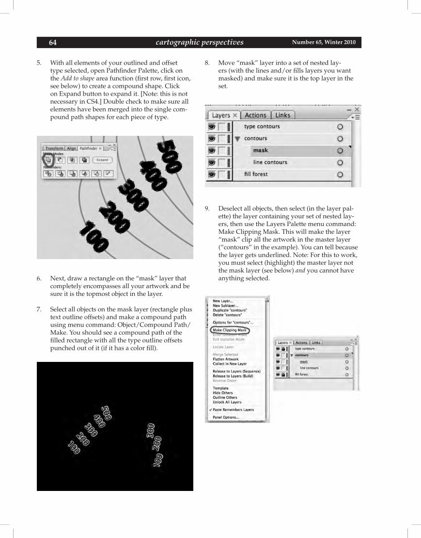
64 Number 65, Winter 2010cartographic perspectives
5. With all elements of your outlined and offset type selected, open Pathfinder Palette, click on the Add to shape area function (first row, first icon, see below) to create a compound shape. Click on Expand button to expand it. [Note: this is not necessary in CS4.] Double check to make sure all elements have been merged into the single com-pound path shapes for each piece of type.
6. Next, draw a rectangle on the “mask” layer that completely encompasses all your artwork and be sure it is the topmost object in the layer.
7. Select all objects on the mask layer (rectangle plus text outline offsets) and make a compound path using menu command: Object/Compound Path/Make. You should see a compound path of the filled rectangle with all the type outline offsets punched out of it (if it has a color fill).
8. Move “mask” layer into a set of nested lay-ers (with the lines and/or fills layers you want masked) and make sure it is the top layer in the set.
9. Deselect all objects, then select (in the layer pal-ette) the layer containing your set of nested lay-ers, then use the Layers Palette menu command: Make Clipping Mask. This will make the layer “mask” clip all the artwork in the master layer (“contours” in the example). You can tell because the layer gets underlined. Note: For this to work, you must select (highlight) the master layer not the mask layer (see below) and you cannot have anything selected.
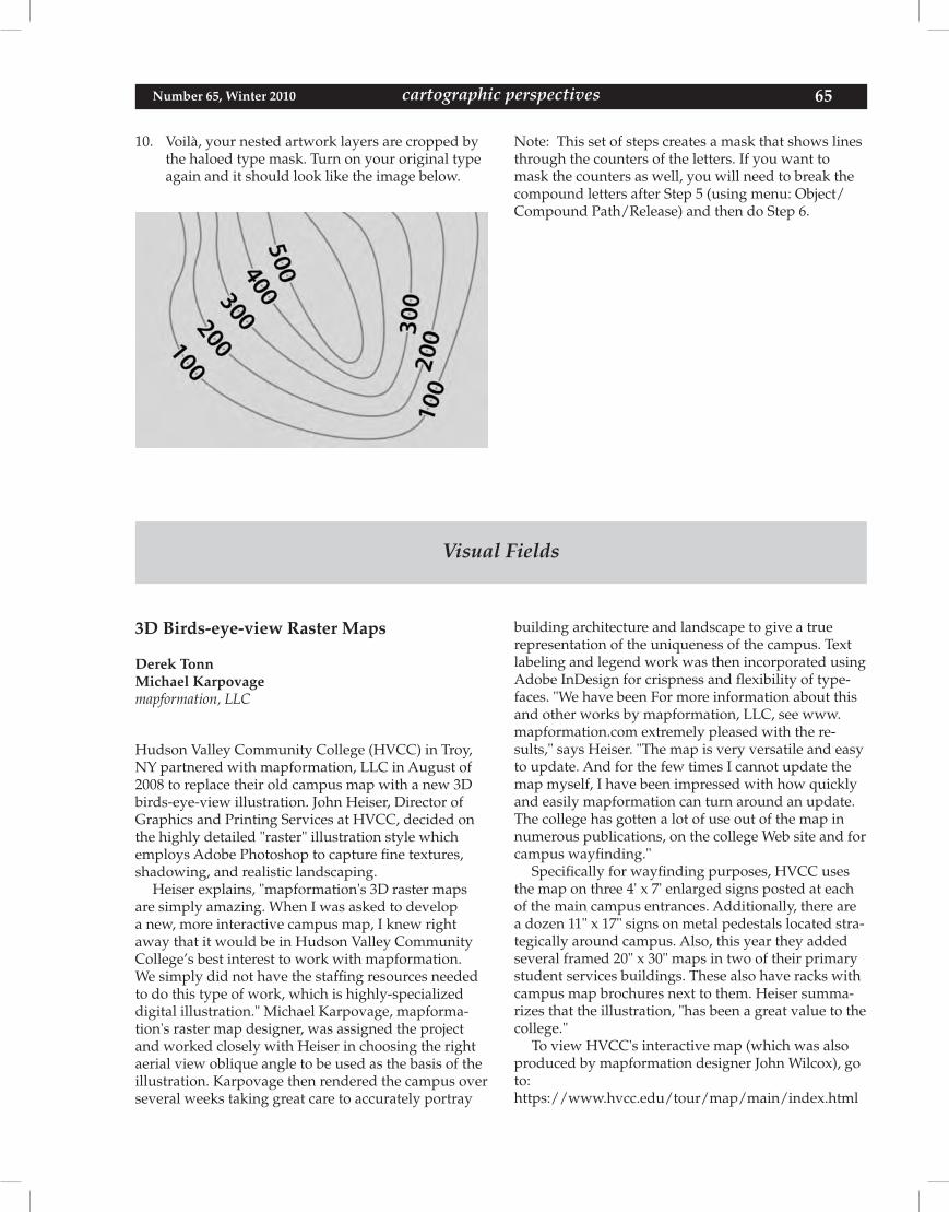
65 cartographic perspectives Number 65, Winter 2010
Visual Fields
10. Voilà, your nested artwork layers are cropped by the haloed type mask. Turn on your original type again and it should look like the image below.
Note: This set of steps creates a mask that shows lines through the counters of the letters. If you want to mask the counters as well, you will need to break the compound letters after Step 5 (using menu: Object/Compound Path/Release) and then do Step 6.
3D Birds-eye-view Raster Maps
Derek TonnMichael Karpovagemapformation, LLC
Hudson Valley Community College (HVCC) in Troy, NY partnered with mapformation, LLC in August of 2008 to replace their old campus map with a new 3D birds-eye-view illustration. John Heiser, Director of Graphics and Printing Services at HVCC, decided on the highly detailed "raster" illustration style which employs Adobe Photoshop to capture fine textures, shadowing, and realistic landscaping.
Heiser explains, "mapformation's 3D raster maps are simply amazing. When I was asked to develop a new, more interactive campus map, I knew right away that it would be in Hudson Valley Community College’s best interest to work with mapformation. We simply did not have the staffing resources needed to do this type of work, which is highly-specialized digital illustration." Michael Karpovage, mapforma-tion's raster map designer, was assigned the project and worked closely with Heiser in choosing the right aerial view oblique angle to be used as the basis of the illustration. Karpovage then rendered the campus over several weeks taking great care to accurately portray
building architecture and landscape to give a true representation of the uniqueness of the campus. Text labeling and legend work was then incorporated using Adobe InDesign for crispness and flexibility of type-faces. "We have been For more information about this and other works by mapformation, LLC, see www.mapformation.com extremely pleased with the re-sults," says Heiser. "The map is very versatile and easy to update. And for the few times I cannot update the map myself, I have been impressed with how quickly and easily mapformation can turn around an update. The college has gotten a lot of use out of the map in numerous publications, on the college Web site and for campus wayfinding."
Specifically for wayfinding purposes, HVCC uses the map on three 4' x 7' enlarged signs posted at each of the main campus entrances. Additionally, there are a dozen 11" x 17" signs on metal pedestals located stra-tegically around campus. Also, this year they added several framed 20" x 30" maps in two of their primary student services buildings. These also have racks with campus map brochures next to them. Heiser summa-rizes that the illustration, "has been a great value to the college."
To view HVCC's interactive map (which was also produced by mapformation designer John Wilcox), go to:https://www.hvcc.edu/tour/map/main/index.html
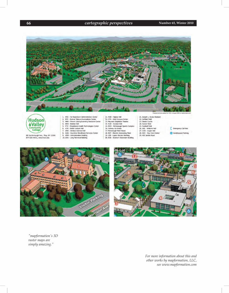
66 Number 65, Winter 2010cartographic perspectives
For more information about this andother works by mapformation, LLC,
see www.mapformation.com
"mapformation's 3Draster maps aresimply amazing.”
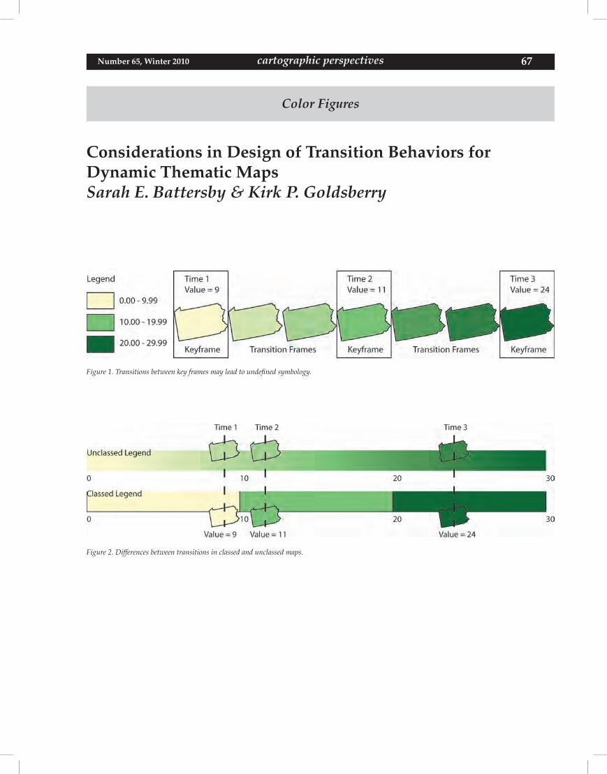
67 cartographic perspectives Number 65, Winter 2010
Color Figures
Considerations in Design of Transition Behaviors forDynamic Thematic MapsSarah E. Battersby & Kirk P. Goldsberry
Figure 1. Transitions between key frames may lead to undefined symbology.
Figure 2. Differences between transitions in classed and unclassed maps.
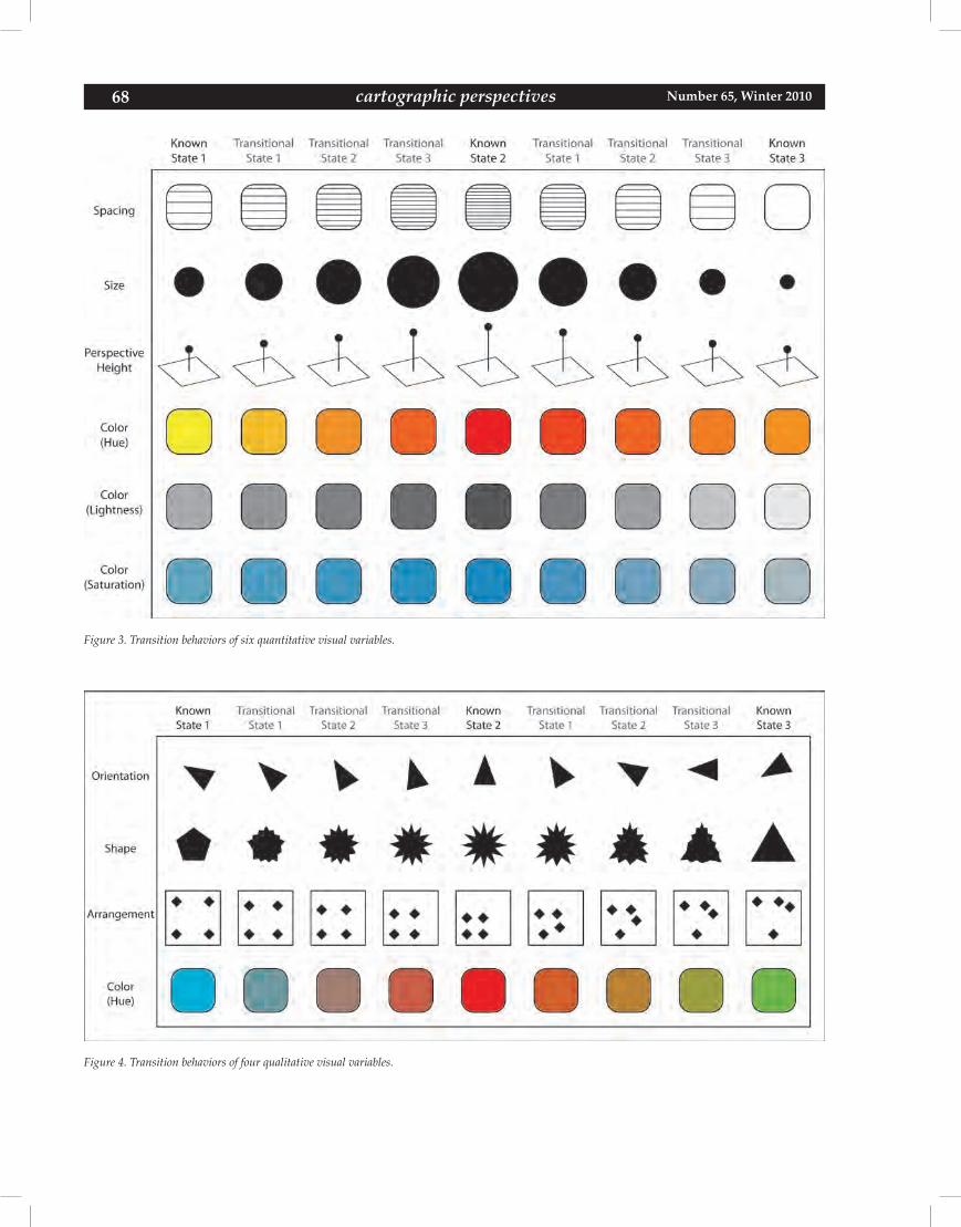
68 Number 65, Winter 2010cartographic perspectives
Figure 3. Transition behaviors of six quantitative visual variables.
Figure 4. Transition behaviors of four qualitative visual variables.
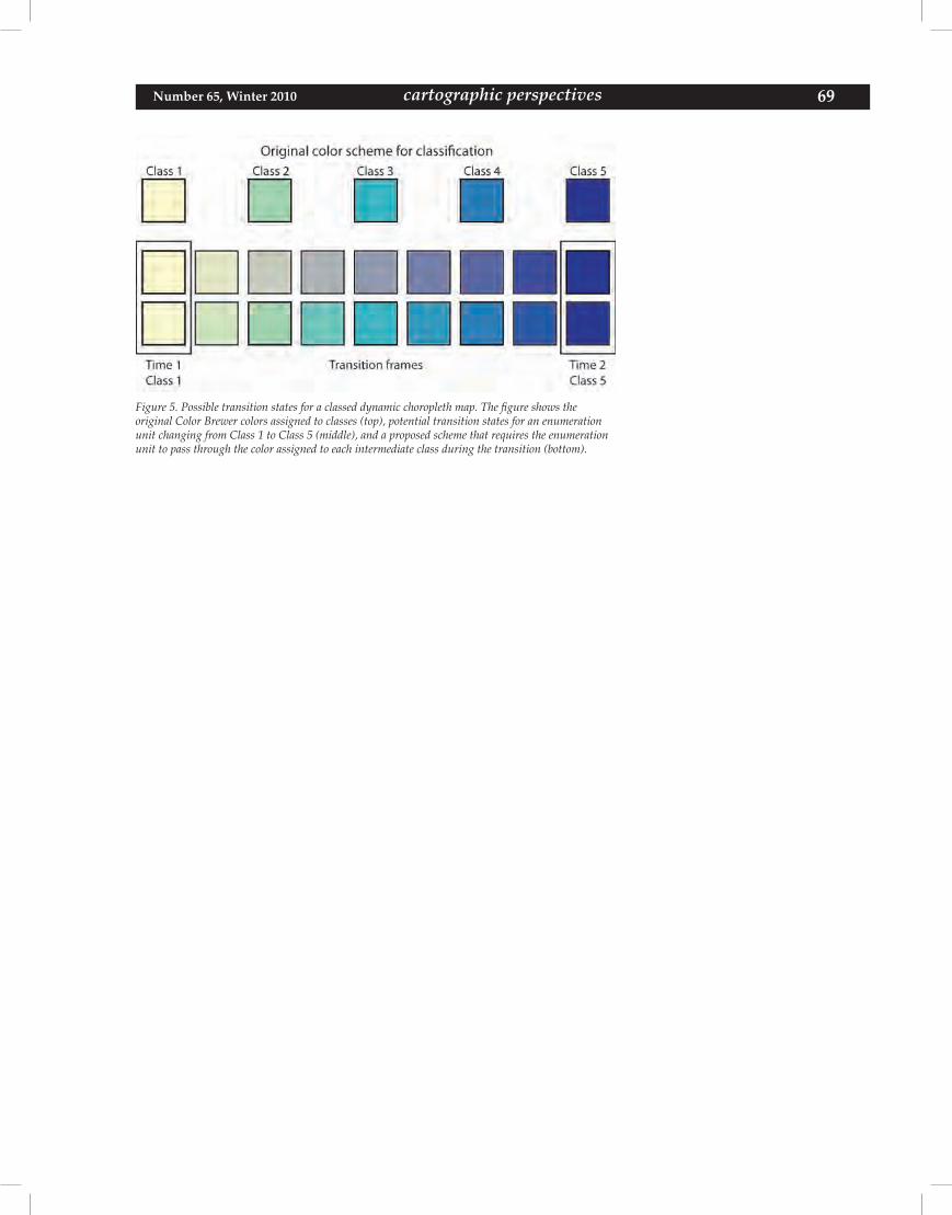
69 cartographic perspectives Number 65, Winter 2010
Figure 5. Possible transition states for a classed dynamic choropleth map. The figure shows theoriginal Color Brewer colors assigned to classes (top), potential transition states for an enumeration unit changing from Class 1 to Class 5 (middle), and a proposed scheme that requires the enumeration unit to pass through the color assigned to each intermediate class during the transition (bottom).
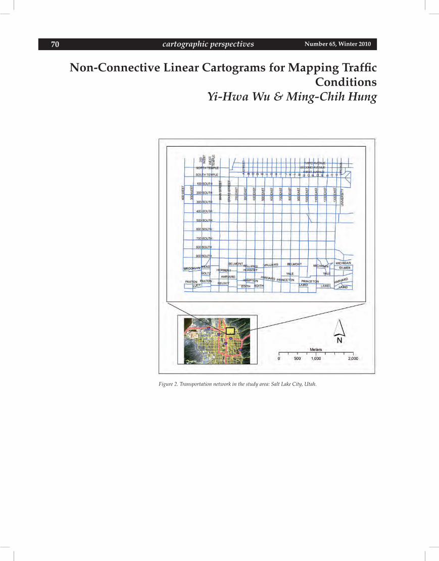
70 Number 65, Winter 2010cartographic perspectives
Non-Connective Linear Cartograms for Mapping TrafficConditions
Yi-Hwa Wu & Ming-Chih Hung
Figure 2. Transportation network in the study area: Salt Lake City, Utah.
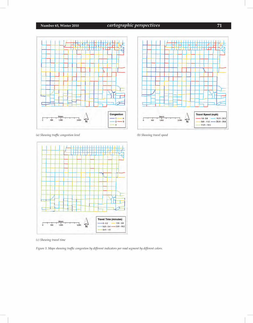
71 cartographic perspectives Number 65, Winter 2010
(a) Showing traffic congestion level (b) Showing travel speed
(c) Showing travel time
Figure 3. Maps showing traffic congestion by different indicators per road segment by different colors.
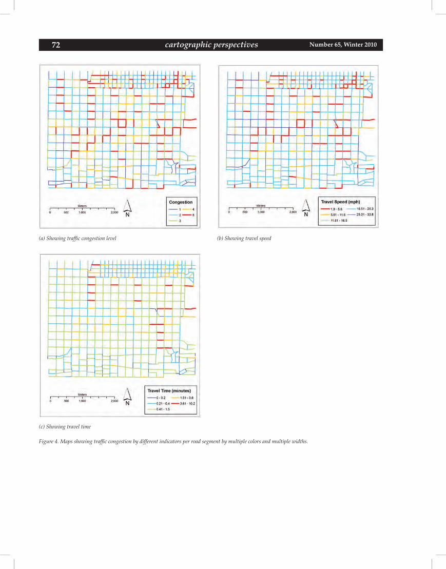
72 Number 65, Winter 2010cartographic perspectives
(a) Showing traffic congestion level (b) Showing travel speed
(c) Showing travel time
Figure 4. Maps showing traffic congestion by different indicators per road segment by multiple colors and multiple widths.
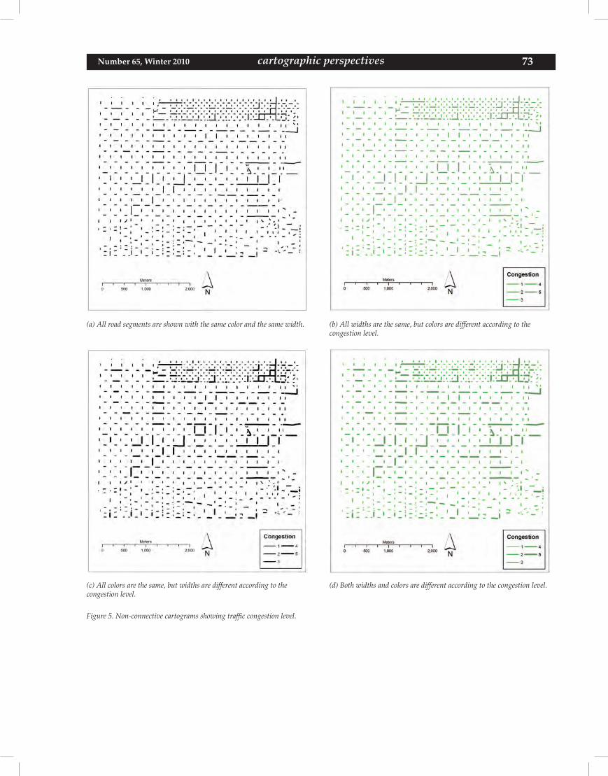
73 cartographic perspectives Number 65, Winter 2010
(a) All road segments are shown with the same color and the same width. (b) All widths are the same, but colors are different according to thecongestion level.
(c) All colors are the same, but widths are different according to the congestion level.
(d) Both widths and colors are different according to the congestion level.
Figure 5. Non-connective cartograms showing traffic congestion level.
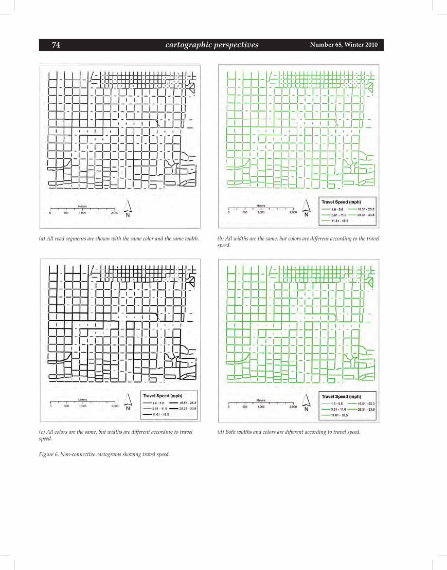
74 Number 65, Winter 2010cartographic perspectives
(a) All road segments are shown with the same color and the same width. (b) All widths are the same, but colors are different according to the travel speed.
(c) All colors are the same, but widths are different according to travel speed.
(d) Both widths and colors are different according to travel speed.
Figure 6. Non-connective cartograms showing travel speed.
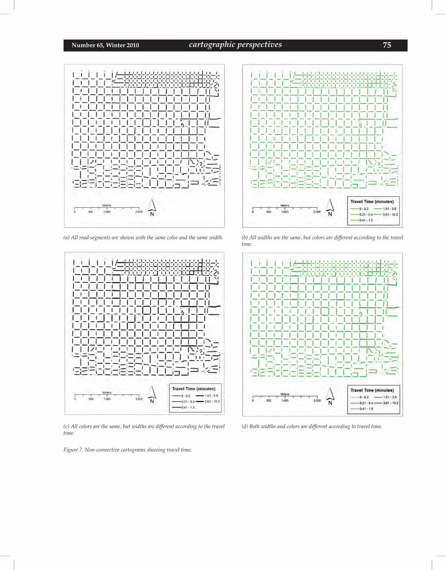
75 cartographic perspectives Number 65, Winter 2010
(a) All road segments are shown with the same color and the same width. (b) All widths are the same, but colors are different according to the travel time.
(c) All colors are the same, but widths are different according to the travel time.
(d) Both widths and colors are different according to travel time.
Figure 7. Non-connective cartograms showing travel time.

76 Number 65, Winter 2010cartographic perspectives