BUSINESS STATISTICS - ACE College
232
B.Com.(C.A.) Third Year Core Paper No.13 BUSINESS STATISTICS BHARATHIAR UNIVERSITY SCHOOL OF DISTANCE EDUCATION COIMBATORE – 641 046
-
Upload
khangminh22 -
Category
Documents
-
view
1 -
download
0
Transcript of BUSINESS STATISTICS - ACE College

B.Com.(C.A.)
Third Year Core Paper No.13
BUSINESS STATISTICS
BHARATHIAR UNIVERSITY
SCHOOL OF DISTANCE EDUCATION
COIMBATORE – 641 046

2
(Syllabus) PAPER – VIII BUSINESS STATISTICS
Objectives : To promote the skill of applying statistical techniques in business.
UNIT-I Meaning and Scope of Statistics – Characteristics and Limitations – Presentation of Data by Diagrammatic and Graphical Methods – Measures of Central Tendency – Mean, Median, Mode Geometric Mean, Harmonic Men.
UNIT-II Measure of Dispersion and Skewness – Range, Quartile Deviation and Standard Deviation – Pearson’s and Bowley’s Measures of Skewness.
UNIT-III Simple Correlation – Pearson’s coefficient of Correlation – Interpretation of Co-efficient of Correlation – Concept of Regression Analysis – Coefficient of Concurrent Deviation.
UNIT-IV Index Numbers (Price Index Only) – Method of Construction – Wholesale and Cost of Living Indices, Weighted Index Numbers – LASPEYRES’ Method, PAASCHE’S Method, FISHER’S Ideal Index. (Excluding Test of Adequacy of Index Number Formulae)
UNIT-V Analysis of Time Series and Business Forecasting – Methods of Measuring Trend and Seasonal Changes (Including Problems) Methods of Sampling – Sampling and Non-Sampling Errors (Theoretical Aspects Only)
Note – Distribution of Mark : Theory : 20 % Problems – 80 %
Book for Reference
1. Navanitham, P.A., “Business Mathematics and Statistics”, Jai Publishers, Trichy, 2004.
2. S.P.Gupta, “Statistical Methods”, 3. M.Sivathanu Pillai, “Economic and Business Statistics”.
3
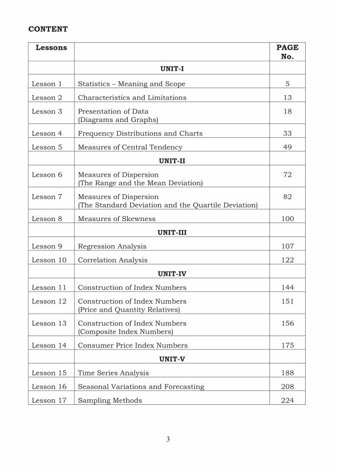
CONTENT
Lessons PAGE No.
UNIT-I
Lesson 1 Statistics – Meaning and Scope 5
Lesson 2 Characteristics and Limitations 13
Lesson 3 Presentation of Data (Diagrams and Graphs)
18
Lesson 4 Frequency Distributions and Charts 33
Lesson 5 Measures of Central Tendency 49
UNIT-II
Lesson 6 Measures of Dispersion (The Range and the Mean Deviation)
72
Lesson 7 Measures of Dispersion (The Standard Deviation and the Quartile Deviation)
82
Lesson 8 Measures of Skewness 100
UNIT-III
Lesson 9 Regression Analysis 107
Lesson 10 Correlation Analysis 122
UNIT-IV
Lesson 11 Construction of Index Numbers 144
Lesson 12 Construction of Index Numbers (Price and Quantity Relatives)
151
Lesson 13 Construction of Index Numbers (Composite Index Numbers)
156
Lesson 14 Consumer Price Index Numbers 175
UNIT-V
Lesson 15 Time Series Analysis 188
Lesson 16 Seasonal Variations and Forecasting 208
Lesson 17 Sampling Methods 224

4
UNIT – I

5
LESSON-1
STATISTICS – MEANING AND SCOPE
CONTENTS
1.0. Aims and Objectives
1.1. Meaning of Statistics
1.2. Statistical Investigation
1.3. Scope of Statistics
1.4. Summary
1.5. Lesson End Activity
1.6. Points for Discussion
1.7. Suggested Reading/Reference/Sources
1.0 AIMS AND OBJECTIVES
This lesson aims to provide in general the meaning and definition of statistics, and their role in various disciplines and different phases of human endeavour. The significance of statistical theory is highlighted. The need of statistical investigation in making vital decisions about the universe or the population under study is also presented.
1.1 MEANING OF STATISTICS
Statistics is a term which has several meanings in practice. The word ‘statistics’ can be used in two senses, namely, (a) to describe values which summarize data, such as percentages or averages and (b) to describe the topic of statistical method.
The term ‘data’ would mean facts or things certainly known from which conclusions may be drawn. Statistics is regarded commonly as data which is defined as a collection of information on certain variables or characteristics such as the prices of commodities during a particular period, the number of business enterprises in a city, the number of financial institutions in a state, illiteracy level of population in a district, health conditions of people, geographical locations, weather conditions during a period of time etc.
Statistical method can be described as (a) the selection, classification and organisation of basic facts into meaningful data, and as (b) summarizing, presenting and analysing the data into useful information.

6
Statistics, in general, is defined in many ways; few of them are presented below: It is the aggregate of facts and figures.
� It stands for record of numerical facts and figures.
� It is termed as statistical methods that are described for the principles and techniques applied in the collection, analysis and interpretation of data on the statements of facts.
� It is a field concerned with scientific methods for collecting, organizing, summarizing, presenting and analyzing data, as well as drawing valid conclusions and making reasonable decisions on the basis of such analysis.
� It is a body of concepts and methods used to collect and interpret data concerning a particular area of investigation and to draw conclusions in situations where uncertainty and variations are present.
� It is a field which refers to the science and art of obtaining and analyzing quantitative data with a view to make sound inference in the face of uncertainty.
1.2 STATISTICAL INVESTIGATION
The statistical information obtained from many different sources is being used by business establishments to make vital decisions about various business and managerial problems based on one or more techniques, described as statistical methods. The decisions that would be taken are the outcomes of an activity, called statistical investigation. In general, a statistical investigation is defined as a process or a set of processes of studying the population under study with reference to one or more characteristics using statistical data. A few examples of statistical investigation are listed below:
1. Assessing people’s opinion on the choice of various schemes proposed by business firms to market their products.
2. Assessing people’s preference on the choice of candidates contesting in elections.
3. Studying the impact of economic policies adopted by the government on labour force.
4. Forecasting the production of items during a particular future period.
5. Studying the mental depression and stress of managers of business firms. Statistical investigations are usually undertaken to make decisions on population with reference to one or more characteristics of interest which may be inadequate or unobtainable. In situations involving costly or destructive nature of items or time consuming activities or problems, investigations will be based on sample information that would be drawn by specific procedures from the population.
7
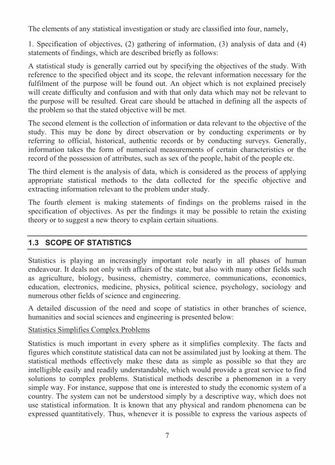
The elements of any statistical investigation or study are classified into four, namely,
1. Specification of objectives, (2) gathering of information, (3) analysis of data and (4) statements of findings, which are described briefly as follows:
A statistical study is generally carried out by specifying the objectives of the study. With reference to the specified object and its scope, the relevant information necessary for the fulfilment of the purpose will be found out. An object which is not explained precisely will create difficulty and confusion and with that only data which may not be relevant to the purpose will be resulted. Great care should be attached in defining all the aspects of the problem so that the stated objective will be met.
The second element is the collection of information or data relevant to the objective of the study. This may be done by direct observation or by conducting experiments or by referring to official, historical, authentic records or by conducting surveys. Generally, information takes the form of numerical measurements of certain characteristics or the record of the possession of attributes, such as sex of the people, habit of the people etc.
The third element is the analysis of data, which is considered as the process of applying appropriate statistical methods to the data collected for the specific objective and extracting information relevant to the problem under study.
The fourth element is making statements of findings on the problems raised in the specification of objectives. As per the findings it may be possible to retain the existing theory or to suggest a new theory to explain certain situations.
1.3 SCOPE OF STATISTICS
Statistics is playing an increasingly important role nearly in all phases of human endeavour. It deals not only with affairs of the state, but also with many other fields such as agriculture, biology, business, chemistry, commerce, communications, economics, education, electronics, medicine, physics, political science, psychology, sociology and numerous other fields of science and engineering.
A detailed discussion of the need and scope of statistics in other branches of science, humanities and social sciences and engineering is presented below:
Statistics Simplifies Complex Problems
Statistics is much important in every sphere as it simplifies complexity. The facts and figures which constitute statistical data can not be assimilated just by looking at them. The statistical methods effectively make these data as simple as possible so that they are intelligible easily and readily understandable, which would provide a great service to find solutions to complex problems. Statistical methods describe a phenomenon in a very simple way. For instance, suppose that one is interested to study the economic system of a country. The system can not be understood simply by a descriptive way, which does not use statistical information. It is known that any physical and random phenomena can be expressed quantitatively. Thus, whenever it is possible to express the various aspects of

8
the economic system as numeric measures, the system could be understood without any difficulty and ambiguity.
Statistics Measures and Highlights Results
Statistical methods provide the ways and means of measuring the results of various policies on economics, trading, banking etc. For instance, the effect of a rise in the bank rate against loan to be given to the industries can be studied in a proper manner by means of a statistical study of the phenomenon. Though it is a complex exercise, the statistical methods help to render service to a great extent to ease out the difficulty. The statistical ideas will further help to measure whether a rise in the bank rate has affected the industries adversely or favourably by taking into consideration a comparative study of the present situation with the past. The statistical thinking further helps to make a decision whether the change has been beneficial or otherwise from the point of view of industries. All such measures and decisions could be made possible only with the use of adequate statistical data.
Statistics Studies Relationships Among Phenomena
Statistical methods render a service in studying the relationship that exists between two or more phenomena. In all types of economic and business studies the importance of observing relationship between different phenomena is very great. For instance, the relationship between, say, price and supply or demand and price of a commodity is a phenomenon which requires a very careful and close study before any generalization can be made. In the absence of statistical methods it would be very difficult to arrive at a precise and correct conclusion in this respect.
Statistics Deals with Human Experience
The experience and knowledge gained by human can be enhanced and assimilated by the science of statistics so as to easily understand, describe and measure the effects of the actions taken by him or by others. The science has provided vital methods, which can be used anywhere and study any problems which deal with deterministic and random phenomena in correct perspectives and on the right directions.
The following discussions indicate how statistics is indispensable in different branches of human activities:
Statistics and their Relationships with the Common Man
The science of statistics is important to common man in every walk of his life. It has the universal applicability in all the fields where the human steps in. Millions of people all over the world use statistics in their day-to-day actions though they might not have heard the term ‘statistics’. While making decisions on various problems in different situations, a human makes use of information which he gets from the universe or population. For instance, suppose that a person wishes to invest his earnings in stocks. Before taking a decision on the choice of companies, number of shares to purchase, amount of investment etc., he gets detailed statistical information such as the market fluctuations of shares, the performance of the company in the past. A thorough analysis of data in such cases will
9
help the person to make effective decisions. As another example, consider a farmer who wishes to have a particular quantity of rain in a particular season so that he may have a good crop. Here, based on his past experience in crop cultivation and seasonal changes he would have an idea of the correlation that exists between rainfall and crop yields.
Importance of Statistics in Theory of Economics
Economics and statistics are in fact inseparable. Most of the concepts in economics can be treated using statistical relationships through statistical models. Almost all economics problems are studied and compared with the help of statistical data. The purchasing power of people, consumption behaviour, income and expenditure on certain goods are analyzed using statistical data. Economic policies, reforms and their impacts on the society are being studied based on statistical information. Statistics of production, exchange and distribution describe the wealth of the nation, development of the nation and distribution of national dividend. All such statistics are needed to study about the progress and growth of the economy of the country. Thus, in all types of economic problems statistical approach is essential and statistical analysis is much useful. Mathematics, statistics and accounting are the powerful instruments which help the modern economist to increase and improve economic growth.
Statistics and their Significance in Planning
For the development of any country or state, planning is essential. The schemes of the government are based on planning. Planning cannot be imagined without statistics. For instance, growing population and growing demand of commodities are a major concern for many under developed and developing countries. In order to control population and to meet the demand, a state or a government needs proper planning, which obviously use statistical information. In order that any planning is to be successful, statistical data, more complex in nature, should be analyzed carefully and correctly. Various countries implement the economic plans only by conducting statistical studies of the economic resources of the respective countries and by finding the possible ways and means of utilizing these resources in the best possible manner. Various plans that have been prepared for the economic development of India have also made use of the statistical material available about various economic problems.
Statistics and Commerce
Statistics is an important aid to business and commerce. In any business establishment, forecasts are made based on the past performance of the firm. Success or failure in business is realized according as the forecasts made prove to be accurate or otherwise. A business man, who uses the forecasting tool to plan for the future, succeeds in business when the result of forecasting is precise and accurate. A business man fails in his business due to wrong expectations and calculations, which arise due to faulty reasoning and inaccurate analysis of various causes affecting a particular phenomenon. Modern devices, called economic barometers, considered to be the statistical methods, being applied by the business people have made business forecasting more definite and precise. Analysis of demand of goods, supply of commodities, the prices, effect of trade cycles and seasonal
10
fluctuations help a businessman to take final decision about the productivity and demand. All these aspects are carried out using the statistical principles. The effects of booms and depressions are to be considered seriously by a businessman to succeed in business. Such effects are being analysed only by statistical concepts using information. A study of all these things is in reality a study of statistics and hence we say that all types of businessmen have to make use of statistics in one form or the other if they want any success in their profession.
Statistical data are used extensively by promoters of new business so as to arrive at decisions about starting a new firm.
The methods of statistical analysis are particularly appropriate in finding the solution of problems connected with the internal organization and administration of business units and with the processes of buying and selling that bring the businessman into contact with the price system. Various branches of commerce, such as cost accounting utilise the services of statistics in different forms. For instance, the technique with the help of statistical methods helps producers to decide about the prices of various commodities. Similarly, promoters of new business make extensive use of statistical data to arrive at conclusions which are vital from the point of view while starting a new concern.
Application of Statistics in Business Management
Managers in business firms always need to make decisions in the face of uncertainty. The statistical tools such as collection, classification, tabulation, analysis and interpretation of data deal with the problem of uncertainty and are found to be useful in making wise decisions at various levels of managerial function.
The production programming, quality and inventory control are the statistical tools which are applied to the problems concerned with business management. The production programming techniques depend on quality of sales forecasts and projections. The sales forecasts are made using statistical data, which provide sales estimates. Effective control on sales is done based on a statistical study of trend. Market research, consumer preference studies, trade channel studies and readership surveys are other methods of sales control which make an extensive use of statistical tools.
Statistical methods also come to the aid of quality control. Here, random sampling method is adopted to decide whether a lot of items supplied by a manufacture is of standard quality or not.
Inventory control is essential for economical functioning of business enterprises. It relates both to quantitative and qualitative aspects. The stocking of inventories at the optimum level depends on the accuracy of sales forecasts and correlation between the final product and size and quantity of each raw material, tools, equipment, fuel, etc., needed for it.
Quality Control on inventory is not only facilitated but also made more accurate with the aid of statistics. Here again the method of random sampling is adopted in choosing the items from a lot of items for inspection. The whole lot is accepted if the sampled items are conforming to specifications. The procedure may be a complicated one when it is required to inspect each and every item of inventory purchases.
11
Significance of Statistics to the States or Countries
Economic planning and development for the welfare of the people of a state are usually done with statistical data. States use extensively the data in their administration. States propose new schemes for the people. Most often they need to examine or foresee the kind of impact of the scheme on the people if the schemes are implemented. This exercise can be done only with the help of numerical data. Statistical investigation is being carried out by the governments to find the solution or remedies to the social problems which erupt in the states. The states often get data from their departments and various other sources and use them for various purposes. For instance, based on the data it collects, a state can have an idea of the literacy level, the need of the facility, the requirements of funds for various department proposals etc. For every scheme to be implemented in the states, the governments want to have estimates of fund requirements. This is done using statistical facts and figures. In the economic area, for finding out the prosperity of the country the central government wishes to estimate the figures of national income. Though a state is an administrative body, it carries on businesses of various kinds and has monopoly in many cases. For instance, public transport system and co-operative stores are being supported by the governments. In order to carry on business houses which the state holds in its control, it needs statistics.
Application of Statistical Methods in Research
Most of the modern statistical methods and statistical information play a vital role in research in different fields of science, engineering, medicine and social sciences. In the field of agriculture, experimental designs are proposed and analyzed using statistical methods to study about crop yields with different types of fertilizers and different types of diets and environments. In the field of medicine and public health, the statistical methods such as clinical trials and survival analysis are used for testing the efficacy of new medicines and methods of treatment. In the field of industry, the concepts of quality control and design of industrial experiments are applied as part of research and development activity, which helps in improving quality and productivity. In the fields of economics and commerce, financial data are being processed through statistical methods, which help to suggest new economic theories. Market researches are carried on by making extensive use of statistical methods. Irrespective of any field, any researcher will always present his findings with statistical evidence and significance as the results are mostly based on statistical information and numerical facts and figures.
Acceptability of Statistical Methods
Statistical methods have the prestige of its universal acceptability. All governments in the world countries need statistical data for planning and implementing various schemes for the welfare of the people. Statistical concepts assist in planning the initial observations, in organizing them and formulating hypotheses from them, and in judging whether the new observations agree sufficiently well with the predictions from the hypotheses. Statistical knowledge and information of both deterministic and random nature are being used by scientists of all disciplines to propose and develop new theories. Persons from all walks of life, astrologers, astronomers, biologists, meteorologists, botanists, and zoologists make use of statistics and statistical methods extensively in their research. Statistics, when used

12
properly and effectively, would result in a reasonable standard of accuracy of results for the problems of nondeterministic nature. Thus, the importance, utility and indispensability of statistics as a branch of mathematical science to the modern world have been indicated by its universal applicability.
1.4 SUMMARY
Statistics is concerned with data pertaining to population and deals with methods with which certain studies related to population are done. In this lesson, the meaning and definition of statistics are presented. The notion of statistical investigation, which is a framework for making a study about the population based on statistical data, and its need are described with illustrations. The importance of statistics as data and as a set of tools in human activities and in various other disciplines is elaborated in a separate section.
1.5 LESSON END ACTIVITY
1. Get information about the weekly sales (in Rs.) of commodities in a departmental store near your home during the first six months in the year 2008.
2. Collect data relating to monthly income of families living in your street and their weekly expenditure.
1.6 POINTS FOR DISCUSSION
1. Define the term ‘statistics’. 2. Explain the meaning of statistics. 3. What is meant by statistical investigation? Give illustrations. 4. Describe the importance of statistics in commerce. 5. Explain the scope of statistics in business management. 6. Discuss the need of statistics in economics and in research. 7. Explain the significance of statistics in studying problems related to various
branches of sciences and humanities. 8. Elaborate the meaning and scope of statistics. 9. State the purposes which statistics serve.
1.7 SUGGESTED READING/REFERENCE/SOURCES
1. Pal, N., and S. Sarkar (2005), Statistics – Concepts and Applications, Prentice – Hall, Englewood Cliffs, NJ, US.

13
LESSON-2
CHARACTERISTICS AND LIMITATIONS
CONTENTS
2.0. Aims and Objectives
2.1. Characteristics of Statistics
2.2. Limitations of Statistics
2.3. Summary
2.4. Lesson End Activity
2.5. Points for Discussion
2.6. Suggested Reading/Reference/Sources
2.0 AIMS AND OBJECTIVES
The material presented in this lesson enables one to understand the intended purpose of statistics and related features they should possess. By learning the contents given in this lesson, one will be able to give a proper attention to the limitations of statistics while applying the theoretical concepts of statistics.
2.1 CHARACTERISTICS OF STATISTICS
Statistics, in general, must possess the following chief characteristics. 1. Statistics must be numerical statements of facts
The qualitative characteristics of a population under study do not form part of statistical studies and hence should be expressed or reduced in terms of numerical quantities. The characteristics such as good, average, poor are the qualitative expressions, which may be expressed as numbers like 2, 1 and 0 respectively. For example, a good student in a class may be assigned with the number 2, where as a poor student with 0. Similarly, the standard of a student may be specified according to the marks he secures in a test. For instance, when a student secures 60 per cent marks and above, he may be classified as good. The annual productions of cereals per acre in the previous period and in the current period respectively reported as 40 and 55 quintals constitute statistical statements. Similarly, ages of persons A and B are specified as 20 years and 60 years make statistical statements.

14
2. Statistics are aggregate of facts
Statistics do not take into account individual cases. For instance, an individual working in a firm whose average monthly income is Rs. 20,000 does not constitute statistics unless the income details of the total number of individuals is given out. Similarly, a single age of 25 years or 40 years is not statistics but a series relating to the ages of a group of persons would be called statistics. Likewise, aggregates of figures relating to birth, death, purchase, sale, etc., would be called statistics because they can be studied in relation to each other and are capable of comparison, where as the single figure relating to birth, death, purchase, sale, etc., does not form statistics. Studies pertaining to individuals are not significant from statistical point of view, for conclusions cannot be drawn by means of comparison and also the figure cannot be treated otherwise. In order to advance the study it is necessary that other observations must be made available. 3. Statistics should be capable of being related to each other
In order to understand clearly the percentage of students who have passed in an examination it is important to know that how many students has appeared the examination and to make comparisons it is also required to know about the figures of other sections of the class. For example, suppose that the number of students in a class and the number of menial staff in the school are specified. These figures are all numerical statements of facts. Even then, they cannot be called as statistics as there is no apparent relationship among them, 4. Statistics must have certain object behind them
They must be collected for a pre-determined purpose. Only figures that are relevant and relate to the objective of enquiry should be provided. Sets of figures without any object behind them are not capable of being placed in relation to each other. Suppose that in a study related to finding the teacher-student ratio, it is required to have information about the number of students and number of teachers in a school. Obviously, these figures may constitute statistics, as they are presented with an objective. It is also much important that the aggregates of facts must pertain to the objective of enquiry in order that they may be designated as statistics. 5. Statistics are affected to a marked extent by a large number of causes Usually, statistical facts are not traceable to a single cause. It is known that the demand of a commodity depends on the supply of the commodity. As the supply of the commodity decreases, the demand increases. But, in reality the change in the demand is not only caused by the supply, but also other factors such as the price of the commodity, people’s choice, prices of related commodities etc. Similarly, statistics of prices are affected by conditions of supply, demand, exports, imports, currency circulation and a large number of other factors. Thus, there are many factors which influence changes in a variable under study and there should not be only a single factor responsible for bringing about a change in the variable. When there is only one factor operating at a time, the study ceases to be significant from statistical point of view.

15
6. Statistics should exhibit a reasonable standard of accuracy While collecting statistical information one should be cautious so as to get or maintain a reasonable standard of accuracy. As statistics, sometimes, deal with large numbers, it becomes impossible to observe each one of the items individually. Therefore, it becomes necessary to observe and analyze a sample of items and to apply the result to the entire group, called population. Usually, in such cases population characteristics can only be estimated from sample information. Obviously, the estimated figures cannot be absolutely accurate and precise and the degree of accuracy expected in such figures depends to a large extent on the purpose for which statistics are collected. Whenever the results of the smaller group are almost identical to those of the larger group, it is ascertained that a reasonable standard of accuracy is attained. The term reasonable standard is relative, depending upon the object of the enquiry and the resources available. 7. Statistics should be collected in a systematic manner It is essential that statistics must be collected in a systematic manner so that they may conform to reasonable standards of accuracy. 8. Statistics should be placed in relation to each other and for the purpose of comparison The data that have been collected for analysis should reflect homogeneous character and be capable of being compared with each other. When the data is of heterogeneous type, it is not possible to compare the values, thus cannot be placed in relationship to the other. For example, the height of a person and the success in his business can not be placed together because it does not make any sense and thus can not be compared to each other.
2.2 LIMITATIONS OF STATISTICS
Application of Statistics has several limitations. A description of a few limitations is given below:
1. Statistics does not study qualitative phenomenon
Statistics can be applied only to those problems which are capable of quantitative expressions. The situations involving characteristics which cannot be expressed in figures have very little use of statistical methods. For example, the qualitative characteristics such as Good, Bad, Beauty, Honesty, Pleasure, Joy, Satisfaction etc., are not measurable and hence can not be expressed in figures. In such cases, statistical methods cannot be of much help. Therefore, whenever it is possible to relate such qualitative information with other factors which are measurable in nature, they may be indirectly expressed as numeric quantities. For instance, pleasure itself may not be capable of quantitative analysis but many factors which are related to this phenomenon are capable of being expressed in figures and as such can throw some light on the study of this problem. A study of the number of tax evaders can indirectly tell us something of the problem under study. Again, the service rendered by a business firm to its customers can be measured in terms of the kind of service and the number of customers who get utmost satisfaction and if the number of customers who have received proper service is decreasing, it would be possible to modify the procedure of rendering service.

16
2. Statistics does not reveal all the facts Statistics cannot reveal all the facts about the population. It is known that many problems are affected by some factors which are not capable of statistical analysis. Hence, it would not be possible always to examine a problem in all its dimensions by a statistical approach alone. For instance, in a study relating to the culture or religion of a country, many problems have to be examined and addressed based on the relevant information about the background of the country. All these things do not come under the orbit of statistics. 3. Statistical laws are true only on average Statistics as a science is not accurate as many other sciences are, and statistical methods are not very precise and correct. Laws of statistics are not true universally and are true only on an average. Statistics deal with certain phenomena which are affected by a multiplicity of causes and it is not possible to study the effects of each of these factors separately as is done under experimental methods. Due to this limitation in the statistical methods, the conclusions arrived at are not perfectly accurate and consequently the same conclusions cannot be arrived at under similar conditions at all times. 4. Statistics does not study individuals For purposes of analysis of statistical data, the aggregates arrived are most often reduced to single figures. However, statistics deal with aggregates. For instance, an individual item of a time series data is specifically unimportant; but the series is usually condensed into an average for purposes of comparison. Moreover, individual values observed separately do not constitute statistical data. This is a limitation. It is important to have the group of individual values, which together have to be analysed to draw conclusions. For instance, it is important to have the marks scored by all the students in a class in an examination, based on which the decisions are to be made rather than to have the marks of an individual. In a similar way, the average income of a group of persons might have remained the same over two periods and yet many persons in the group might have become poorer than what they were before. Statistical methods ignore such individual cases. Thus, statistical methods have no place for an individual item of a series. 5. It is liable to be misused: Statistics are liable to be misused easily. Statistics is a delicate science and consequently should be used with caution. There is very great possibility of the misuse of this science as any type of meaningless conclusion can be drawn from the results arrived from the data. In practice, statistical methods can be properly used only by trained or experienced people. Lack of experience or training in handling data leads one to make inaccurate results. Misuses, unfortunately, are probably as common as valid uses of statistics. Hence, it is more important to discriminate between a valid and an invalid use of statistics and then know how to make effective use of statistics. 6. Statistics often leads to false conclusions
It happens, generally, in cases where statistics are quoted without context or details. Suppose that in a certain competitive examination, the students belonging to one centre have done better than those of another centre. It does not mean that the first centre has a
17
better standard than the other. This is so because there is a possibility that the candidates in the first centre may have been coached effectively while those of the other centre may not have trained in that way. Similarly, average expenditure in one hostel may be very much more than in the other, and on enquiry it may be found that students are generally spending similar amounts, but in the former hostel the average has been pushed up by a student or two who may be very rich and spending much more than others. 7. The statistical data must be uniform and its main characteristics must be stable throughout the study. For example, the wages of labourers in two factories are not comparable, if the average wage in the first factory is based on wages of adult males and the average wage in the second factory is based on adult males and adult females. Hence, it is required that the data must be highly uniform and homogeneous. 8. It is always important to see that statistics must always be handled by experts. Others are likely to apply wrong methods in statistical analysis.
2.3 SUMMARY
Any concept or theory should possess certain salient features. Statistics, of course, is no exception. In this lesson, the chief characteristics of statistics are described in detail. The limitations of statistics such as possibility of misuse, of making wrong decisions etc., are also presented.
2.4 LESSON END ACTIVITY
1. Consider the score obtained by a student who had taken up a short course in a city college. What can you say about this course? With this score, can you make any conclusion?
2. A figure related to sales realized by a firm in a particular month is available. What kind of conclusion would you draw from this figure?
2.5 POINTS FOR DISCUSSION
1. What are the chief characteristics of Statistics?
2. Discuss in detail the serious limitations of statistics with illustrations.
2.6 SUGGESTED READING/REFERENCE/SOURCES
1. Pal, N., and S. Sarkar (2005), Statistics – Concepts and Applications, Prentice – Hall, Englewood Cliffs, NJ, US.

18
LESSON-3
PRESENTATION OF DATA
(DIAGRAMS AND GRAPHS)
CONTENTS
3.0. Aims and Objectives
3.1. Statistical Diagrams
3.2. Types of Charts and Graphs
3.3. Summary
3.4. Lesson End Activity
3.5. Points for Discussion
3.6. Suggested Reading/Reference/Sources
3.0 AIMS AND OBJECTIVES
The aim of this lesson is to emphasize the ways and means of presenting statistical information through diagrams and graphs. The methods described will help the learner to construct the statistical diagrams with ease.
3.1 STATISTICAL DIAGRAMS
The numerical data which are collected for analysis are represented in the form of diagrams, called statistical diagrams or charts.
Statistical diagrams are generally drawn in order to present data in an attractive and colourful way and to enable a general perspective of the data to be shown without excessive detail. Diagrams can be used as a replacement for tabulation of data and often used for layman to understand somehow the statistical data. They make comparison of data much easier and help in establishing trends of the past performance. A complex data could be made simple and more easily understandable by representing the statistical data in the form of diagrams.
Besides some advantages as given above, diagrammatic representation of data do have certain limitations, a few of them are listed below: � Diagrams may not reveal many facts of data. � They provide an approximate idea about the characteristics of data. � Diagrams may not exhibit the minor differences.

19
� Sometimes it is more difficult to draw the facts contained in the data from three or multidimensional diagrams.
� Great care must be given in representing data by means of diagrams as they may often give misleading impressions.
3.2 TYPES OF DIAGRAMS OR CHARTS AND GRAPHS
There are various types of diagrams to represent statistical data. The diagrams can be classified under the following three categories:
(a) Diagrams to display non-numeric frequency distributions. [Note: Non-numeric frequency distributions describe qualitative characteristics of the data]
(b) Diagrams to display time series.
(c) Miscellaneous diagrams
The first category consists of three types of diagrams, namely, (i) Pictograms, (ii) Simple bar charts and (iii) Pie charts. In the second category, there are two types of diagrams, namely, (i) Line diagrams and (ii) Simple bar charts. The diagrams which come under the third category are: (i) Component, percentage and multiple bar charts and (ii) Multiple pie charts. Generally diagrams are of one-dimensional, two-dimensional or three dimensional. One-dimensional diagram is a diagram which is constructed on the basis of only one dimension, namely length. Such type of diagrams is in the form of bars. Simple, component, percentage and multiple bar charts are examples for one-dimensional diagrams. Two-dimensional diagram is a diagram which is constructed on the basis of two dimensions, namely, length and width. Rectangles, squares, circles and Pie diagrams are a few examples for two-dimensional diagrams. A detailed discussion of each of the diagrams listed in the three categories (a), (b) and (c) is now presented.
Pictograms
A pictogram is a chart which represents the magnitude of numeric values by using only simple descriptive pictures or icons. A picture or a symbol or an icon is selected that easily identifies the data pictorially. It is then duplicated in proportion to the class frequency, for each class represented. Pictograms are normally used for displaying a small number of classes, generally with non-numeric frequency distributions. However, they can be used for representing time series.
The advantage of a pictogram is that it is easy to understand even for laymen; however, there are certain disadvantages, such as, (i) not accurate enough for statistical presentation

20
and (ii) symbol magnification, sometimes, may be confusing when the data are not clearly shown.
Simple Bar Charts
A simple bar chart is a chart consisting of a set of non-joining bars and represents the magnitude of a variable. A separate bar for each time point or class is erected to a height proportional to the data value or class frequency. The widths of the bars drawn for each time or class are always the same. For an attractive and elegant display, each bar may be shaded or coloured differently.
Simple bar charts can be used to represent non-numeric frequency distributions and time series equally well.
Simple bar charts are easy to construct and to understand the values being represented by bars. Besides these advantages, simple bar charts have the following special features:
(i) The charts can be drawn with vertical or horizontal bars, but must show a scaled frequency axis.
(ii) The charts are easily adapted to take into account of both positive and negative values.
(iii) Two bar charts can be placed back-to-back for comparison purposes.
A procedure for the construction of simple bar chart is given below:
1. Decide whether bars should be vertical or horizontal.
2. In the case of vertical bars, take the data values on y – axis and the time point on the x – axis.
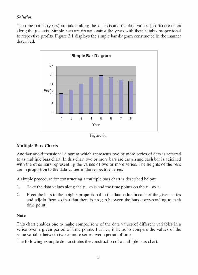
3. Erect the bars to the heights proportional to the data value. In order to demonstrate this procedure the following illustration is presented: Example 3.1 Draw a simple bar diagram for the following data relating to profit achieved by a business firm during 2000 - 2007.
Year Profit
(in Rs. Lakhs)2000 10.5 2001 12.3 2002 15.6 2003 19.2 2004 20.1 2005 19.1 2006 17.7 2007 16.9
21
Solution
The time points (years) are taken along the x – axis and the data values (profit) are taken along the y – axis. Simple bars are drawn against the years with their heights proportional to respective profits. Figure 3.1 displays the simple bar diagram constructed in the manner described.
Figure 3.1
Multiple Bars Charts
Another one-dimensional diagram which represents two or more series of data is referred to as multiple bars chart. In this chart two or more bars are drawn and each bar is adjoined with the other bars representing the values of two or more series. The heights of the bars are in proportion to the data values in the respective series. A simple procedure for constructing a multiple bars chart is described below:
1. Take the data values along the y – axis and the time points on the x – axis.
2. Erect the bars to the heights proportional to the data value in each of the given series and adjoin them so that that there is no gap between the bars corresponding to each time point.
Note
This chart enables one to make comparisons of the data values of different variables in a series over a given period of time points. Further, it helps to compare the values of the same variable between two or more series over a period of time.
The following example demonstrates the construction of a multiple bars chart.
Simple Bar Diagram
0
5
10
15
20
25
1 2 3 4 5 6 7 8
Year
Profit
22
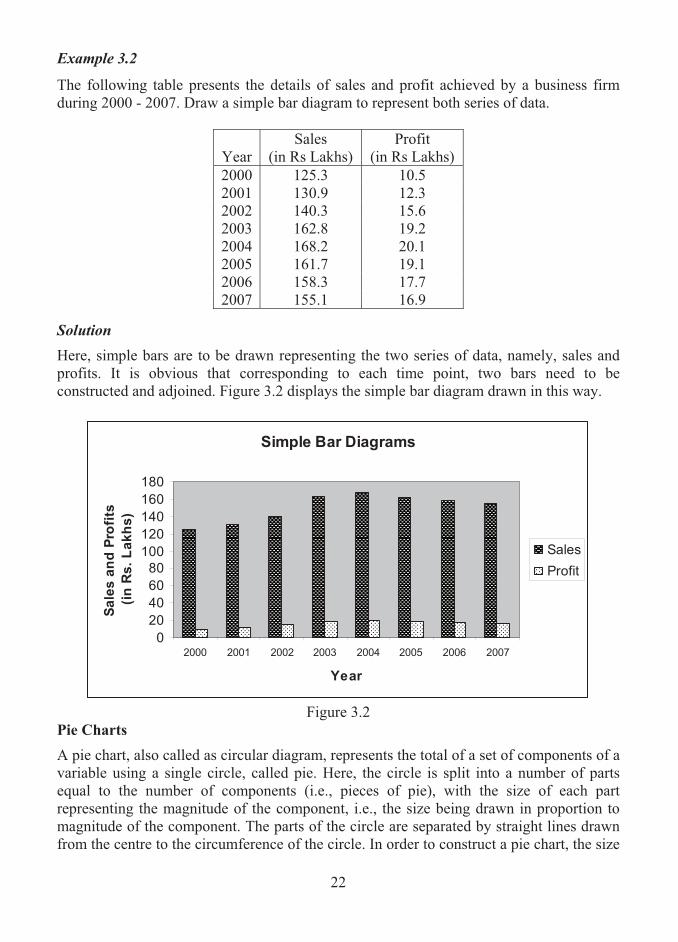
Example 3.2
The following table presents the details of sales and profit achieved by a business firm during 2000 - 2007. Draw a simple bar diagram to represent both series of data.
Year Sales
(in Rs Lakhs) Profit
(in Rs Lakhs) 2000 125.3 10.5 2001 130.9 12.3 2002 140.3 15.6 2003 162.8 19.2 2004 168.2 20.1 2005 161.7 19.1 2006 158.3 17.7 2007 155.1 16.9
Solution
Here, simple bars are to be drawn representing the two series of data, namely, sales and profits. It is obvious that corresponding to each time point, two bars need to be constructed and adjoined. Figure 3.2 displays the simple bar diagram drawn in this way.
Simple Bar Diagrams
0
20
40
60
80
100
120
140
160
180
2000 2001 2002 2003 2004 2005 2006 2007
Year
Sa
les
an
d P
rofi
ts
(in
Rs
. L
ak
hs
)
Sales
Profit
Figure 3.2
Pie Charts
A pie chart, also called as circular diagram, represents the total of a set of components of a variable using a single circle, called pie. Here, the circle is split into a number of parts equal to the number of components (i.e., pieces of pie), with the size of each part representing the magnitude of the component, i.e., the size being drawn in proportion to magnitude of the component. The parts of the circle are separated by straight lines drawn from the centre to the circumference of the circle. In order to construct a pie chart, the size

23
of each part in degrees needs to be calculated. For an elegant display of parts, they can be shaded or coloured differently.
The procedure for constructing a pie chart consists of the following steps: (i) Calculate the proportion of the total that each component represents by using the
formula given below:
componentstheallofvalueTotalcomponentkththeofValuePk � .
(ii) Multiply each proportion by 360o, giving the sizes of the relevant components (in degrees) which need to be drawn. That is, obtain the degree to each component by using the following formula:
Degree = Pk × 360o.
(iii) Compute cumulative degrees. (iii) Draw a circle with a convenient radius and split the circle into as many parts as equal
to the number of component based on the cumulative degrees.
A pie chart has the merits that it is a more appealing way of presenting data and that the comparison of classes in relative terms is made easy.
The major demerits of the chart are: (i) the sectors in a circle must be defined carefully and (ii) compilation of data to each sector is more complex.
Example 3.3 Annual budget allocation for a business firm under various heads of expenditure for the financial year 2008-09 is given below:
Heads of Expenditure Budget Allocation (in Rs. Lakhs)
Salary 100 Purchase 30 Board Meetings 5 Travel 7 Reports 2 Overhead 5 Miscellaneous 10
Total 159 Draw a pie chart.
SolutionA pie chart or circular diagram is constructed by expressing the values of the sectors or components in terms of degrees taking the whole as 360 degrees. The following table which presents the component values in terms of degrees and percentages is constructed based on the procedure described earlier:

24
Category Rs. in Lakhs Degree Percentage
Salary 100 �� 360159100 226o 100
360226
� =64
Purchase 30 �� 36015930 68o 100
36068
� =19
Meetings 5 �� 360159
5 11o 10036011
� = 3
Travel 7 �� 360159
7 16o 10036016
� = 4
Reports 2 �� 360159
2 5o 100360
5� = 1
Overhead 5 �� 360159
5 11o 10036011
� = 3
Miscellaneous 10 �� 36015910 23o 100
36023
� = 6
Total 159 360o 100 Figure 3.3 is the pie chart which portrays various components in proportion to the degrees tabulated above.
Pie Diagram
64%
19%
3%
4%
1%
3%
6%
Salary
Purchase
Meetings
Travel
Reports
Ovehead
Miscellaneous
Figure 3.3
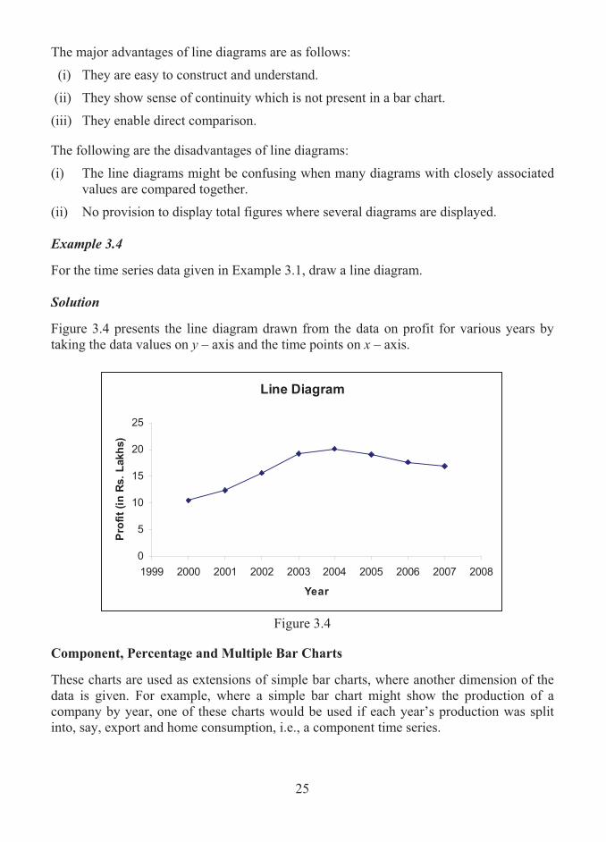
Line Diagrams
A line diagram, also known as historigram, plots the values of a time series as a sequence of points joined by straight lines. The time points are always represented along the horizontal axis and the values of the variable along the vertical axis.
25
The major advantages of line diagrams are as follows:
(i) They are easy to construct and understand.
(ii) They show sense of continuity which is not present in a bar chart.
(iii) They enable direct comparison.
The following are the disadvantages of line diagrams:
(i) The line diagrams might be confusing when many diagrams with closely associated values are compared together.
(ii) No provision to display total figures where several diagrams are displayed. Example 3.4 For the time series data given in Example 3.1, draw a line diagram.
Solution Figure 3.4 presents the line diagram drawn from the data on profit for various years by taking the data values on y – axis and the time points on x – axis.
Line Diagram
0
5
10
15
20
25
1999 2000 2001 2002 2003 2004 2005 2006 2007 2008
Year
Pro
fit
(in
Rs.
Lakh
s)
Figure 3.4
Component, Percentage and Multiple Bar Charts These charts are used as extensions of simple bar charts, where another dimension of the data is given. For example, where a simple bar chart might show the production of a company by year, one of these charts would be used if each year’s production was split into, say, export and home consumption, i.e., a component time series.

26
In component bar charts, each bar represents a class and splits up into different component parts. Comparison among different components and comparison between the total and a component are made simple by these charts. Components bar charts are also termed as sub-divided bar charts. In percentage bar charts, each bar represents a class and all bars are drawn to the same height, representing 100% (of the total). The component parts of each class are then calculated as percentages of the total and shown within the bar accordingly. One may observe that there is a difference between a component bar chart and a percentage bar chart. In a component bar chart, the bars are of different heights as the totals usually different, whereas in a percentage bar chart, all the bars are of same height as the value of individual bar is expressed in terms of percentage. Multiple bar charts have a set of bars for each class with each bar representing a single component part of the total. Within each set, the bars are physically joined and always arranged in the same sequence, and sets of bars should be separated. For all three charts, the components are normally shaded and a legend (key) would be shown at the side of the chart.
Example 3.5 For the time series data given in Example 3.2, construct a component bar chart. Solution
A component bar chart is constructed based on the following procedure: 1. Compute the cumulative value of the components of a variable for the given time
points. 2. Corresponding to each time point, draw a simple bar with its height proportional to
the cumulative value of the variable. 3. Sub – divide the bars according to the values of the components.
Using this procedure, the following table is constructed:
Year Sales (in Rs Lakhs)
Profit (in Rs Lakhs)
Cumulative Values
2000 125.3 10.5 135.8 2001 130.9 12.3 143.2 2002 140.3 15.6 155.9 2003 162.8 19.2 182.0 2004 168.2 20.1 188.3 2005 161.7 19.1 180.8 2006 158.3 17.7 176.0 2007 155.1 16.9 172.0

27
Simple bars are drawn with their heights in proportion to the cumulative values presented in the last column of the above table plotted against the time points in a graph by taking time points on the x – axis and cumulative values on the y - axis. According to the values of the two components (sales and profits), each bar is sub-divided into two. Figure 3.5 displays the component bar chart prepared in this manner.
Component Bar Chart
0
50
100
150
200
2000 2001 2002 2003 2004 2005 2006 2007
Year
Sale
s a
nd
Pro
fits
(in
Rs.L
akh
s)
Profit
Sales
Figure 3.5
Example 3.6 Various details of two commodities A and B are given below:
Category Commodity A Commodity B Price per unit Rs. 10 Rs. 15 Number of units sold 100 100 Production Cost Rs. 300 Rs. 500 Cost of components Rs. 500 Rs. 800 Profit Rs. 200 Rs. 200
Construct a component bar chart based on the given data. Solution
Here, the selling cost of commodity A and commodity B are found as Rs. 1000 and Rs. 1500 respectively. While constructing the component bar chart, it should be ensured that the bar for each commodity is to account for the corresponding selling cost, which is based on the production cost, components cost and the profit. Thus, for the given data, the component bar chart is constructed (Figure 3.6), where series 1 represents the cost of the components, series 2 represents production cost and series 3 represents profit, as shown below:

28
Multiple Bar Diagram
Series1
Series1
Series2
Series2
Series3
Series3
0
200
400
600
800
1000
1200
1400
1600
Commodity A Commodity B
Co
sts
(in
Ru
pees)
Series3
Series2
Series1
Figure 3.6
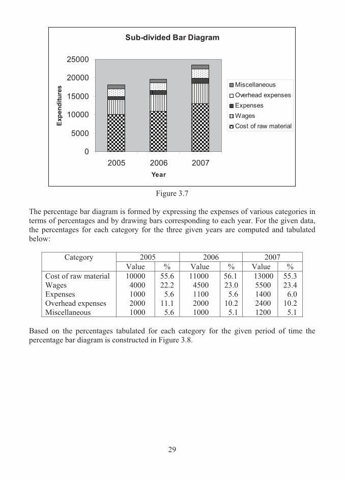
Example 3.7 The data relating to expenditure in the production of a certain electronic component during different periods of time are given below:
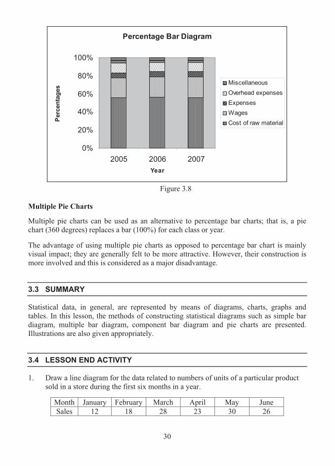
Category 2005 2006 2007 Cost of raw material 10000 11000 13000 Wages 4000 4500 5500 Expenses 1000 1100 1400 Overhead expenses 2000 2000 2400 Miscellaneous 1000 1000 1200
Construct a sub-divided bar chart for the given data. Also, compute percentage of all expenses in each of the year and draw a percentage bar diagram.
Solution Here, first the total cost of the component should be arrived for each year. While constructing the sub-divided bar diagram, the vertical bar is erected for each of the given years and it should account for the associated total cost. Here, the cost of raw material, wages, expenses, overhead expenses and miscellaneous are assumed as series 1, series 2, series 3, series 4 and series 5 respectively. Thus, for the given data, the sub-divided bar chart is constructed and displayed as Figure 3.7.
29
Sub-divided Bar Diagram
0
5000
10000
15000
20000
25000
2005 2006 2007
Year
Exp
en
dit
ure
s Miscellaneous
Overhead expenses
Expenses
Wages
Cost of raw material
Figure 3.7
The percentage bar diagram is formed by expressing the expenses of various categories in terms of percentages and by drawing bars corresponding to each year. For the given data, the percentages for each category for the three given years are computed and tabulated below:
2005 2006 2007 Category Value % Value % Value %
Cost of raw material 10000 55.6 11000 56.1 13000 55.3 Wages 4000 22.2 4500 23.0 5500 23.4 Expenses 1000 5.6 1100 5.6 1400 6.0 Overhead expenses 2000 11.1 2000 10.2 2400 10.2 Miscellaneous 1000 5.6 1000 5.1 1200 5.1
Based on the percentages tabulated for each category for the given period of time the percentage bar diagram is constructed in Figure 3.8.
30
Percentage Bar Diagram
0%
20%
40%
60%
80%
100%
2005 2006 2007
Year
Perc
en
tag
es
Miscellaneous
Overhead expenses
Expenses
Wages
Cost of raw material
Figure 3.8
Multiple Pie Charts Multiple pie charts can be used as an alternative to percentage bar charts; that is, a pie chart (360 degrees) replaces a bar (100%) for each class or year. The advantage of using multiple pie charts as opposed to percentage bar chart is mainly visual impact; they are generally felt to be more attractive. However, their construction is more involved and this is considered as a major disadvantage.
3.3 SUMMARY
Statistical data, in general, are represented by means of diagrams, charts, graphs and tables. In this lesson, the methods of constructing statistical diagrams such as simple bar diagram, multiple bar diagram, component bar diagram and pie charts are presented. Illustrations are also given appropriately.
3.4 LESSON END ACTIVITY
1. Draw a line diagram for the data related to numbers of units of a particular product sold in a store during the first six months in a year.
Month January February March April May June Sales 12 18 28 23 30 26
31
2. The data given below show the amount of cereals (in tons) produced in a particular region during 2003 – 2007. Draw component bar chart to represent the data.
Amount of Cereals (in tons) during Cereals
2003 2004 2005 2006 2007 Wheat 336 482 500 347 450 Barley 866 856 901 727 866 Oats 131 136 108 122 97
Others 25 23 22 23 18 3. The costs associated with two business projects are given below:
Costs (in Rs. Lakhs.) Project Set-up Running Overhead Labour A 265 420 82 150 B 210 289 65 115
Display the data using a component bar chart. Also draw a pie chart for each of the projects. 4. The following data represents the number of employees in each of five categories of
employees in a business enterprise. Display the given data by (a) a pie chart and (b) a simple bar chart.
Category A Category B Category C Category D Category E
Number of Employees 35 48 17 22 8
5. The data given below show the production (in tones) of two varieties of a particular
crop during 2000 – 2005. Display the information in a bar chart.
Production of Crops (in tons) Year Variety A Variety B 2000 42 30 2001 48 35 2002 29 38 2003 25 31 2004 30 34 2005 34 30

32
6. Investments made by a business executive of a company during 2005 – 2007 are given below:
Year Types of Investments 2005 2006 2007
Bank Deposits Rs. 30,000 Rs. 45,000 Rs. 58,000 Provident Fund Rs. 50,000 Rs. 54,000 Rs. 60,000
Insurance Premiums Rs. 20,000 Rs. 25,000 Rs. 28,000 Gold Rs. 60,000 Rs. 80,000 Rs. 90,000
Display the information given above using (a) a percentage components chart and (b) a multiple bar chart.
3.5 POINTS FOR DISCUSSION
1. What is a statistical diagram? What purpose a statistical diagram serve? 2. List out various types of charts. 3. What is pictogram? 4. What is line diagram? How do you construct a line diagram? 5. Write down the procedure of constructing a pie chart. 6. What is component bar diagram? How do you construct such a diagram?
3.6 SUGGESTED READING/REFERENCE/SOURCES
1. Pal, N., and S. Sarkar (2005), Statistics – Concepts and Applications, Prentice – Hall, Englewood Cliffs, NJ, US.
2. Levin, R.I., and D.S. Rubin (1997), Statistics for Management, 7/e, Prentice – Hall, Englewood Cliffs, NJ, US.

33
LESSON-4
FREQUENCY DISTRIBUTIONS AND CHARTS
CONTENTS 4.0. Aims and Objectives 4.1. Raw Data 4.2. Data Arrays 4.3. A Simple Frequency Distribution 4.4. A Grouped Frequency Distribution 4.5. Pictorial Representation of a Frequency Distribution 4.6. Cumulative Frequency Distributions 4.7. Relative-Frequency Frequency Distributions 4.8. Relative-Cumulative Frequency Distributions 4.9. Summary 4.10. Lesson End Activity 4.11. Points for Discussion 4.12. Suggested Reading/Reference/Sources
4.0 AIMS AND OBJECTIVES
This lesson presents the meaning and construction of frequency distribution. The rules for forming the distribution of data and the corresponding graphical charts are discussed. The lucid way of presentation of the contents in this lesson will enable one to draw the frequency polygons, frequency curves, cumulative frequency curves etc., with much ease.
4.1 RAW DATA
Data or information that has not been arranged in any way is called raw data.
Examples
1. The set of ages of 1000 workers in a large industry constitutes raw data. 2. The set of scores of candidates in an entrance examination for admission into a
business school forms raw data.

34
Specifically, the raw data related to the number of students who have got admission into an International Business School from each of the 50 colleges in a city are displayed below:
1 3 2 1 0 2 5 1 2 3 4 0 5 6 1 2 1 2 6 2 0 1 6 1 6 2 0 4 5 1 5 3 4 1 4 6 7 2 3 5 1 2 4 2 1 3 5 1 6 2
4.2 DATA ARRAYS
An arrangement of raw data in an order of magnitude or in a sequence is called data array. An array, usually called as data array, enables one to extract some information from the data. The raw data given above are arrayed and shown below:
0 0 0 0 1 1 1 1 1 1 1 1 1 1 1 1 2 2 2 2 2 2 2 2 2 2 2 3 3 3 3 3 4 4 4 4 4 5 5 5 5 5 5 6 6 6 6 6 6 7
This array enables one to identify certain information contained within the data set. The lowest and the highest number are respectively identified as 0 and 7. The number 0 occurs 4 times and the number 7 occurs only once. From these, it is inferred that from 4 colleges no student has got admission and from only one college, a maximum number of students has been selected.
4.3 SIMPLE FREQUENCY DISTRIBUTION
Raw data sets some times may contain a limited number of values, with each value may occur many numbers of times. In such a case, the raw data may be organized in a form termed as a simple frequency distribution. A simple frequency distribution, also called as frequency table, is a tabular arrangement of data values together with the number of occurrences, called frequency, of such values. The structure of a frequency table is normally applicable to discrete raw data, since data values are quite likely to be repeated many times and is not normally suitable for continuous data.
Formation of a Simple Frequency Distribution A simple frequency distribution is formed using a tool called as ‘tally chart’. A tally chart is constructed using the following method:

35
(a) Examine each data value. (b) Record the occurrence of the value with the symbol (|), called as tally mark. (c) Find the frequency of the data value as the total of tally marks corresponding to that
value. (d) Arrange the data values along with frequencies in a tabular form. Such a tabular
arrangement is said to be a simple frequency distribution. Example 4.1
Consider the data related to number of students admitted into a Business School given in earlier example. It is identified that the lowest number is 0 and the highest number is 7. As the data values are discrete in nature, a simple frequency distribution using tally marks is obtained as follows:
Data Value Tally Marks Total0 |||| 4 1 ||||| ||||| || 12 2 ||||| ||||| | 11 3 ||||| 5 4 ||||| 5 5 ||||| | 6 6 ||||| | 6 7 | 1 Total 50
4.4 GROUPED FREQUENCY DISTRIBUTION
It is necessary to summarize and present large mass of data in useful ways so that important facts from the data could be extracted and effective decisions could be drawn. A large mass of data is summarized in such a way that the data values are distributed into groups, or classes, or categories. This enables one to determine class frequencies, defined as the number of values lying in each class. . A standard form into which the large mass of data is organised into classes or groups along with the frequencies is known as a grouped frequency distribution. A grouped frequency distribution is defined as a tabular arrangement of data values by various classes or groups together with the corresponding class or group frequencies.
Example 4.2 The following table displays the number of orders received by a business firm each week over a period of one year.
The table is a grouped frequency distribution in which the numbers of orders are given as class intervals and number of weeks as frequencies.

36
Number of orders
received Number of weeks
0 – 4 2 5 – 9 8
10 – 14 11 15 – 19 14 20 – 24 6 25 – 29 4 30 – 34 3 35 – 39 2 40 – 44 1 45 – 49 1
Terms under Frequency Distributions
In a grouped frequency distribution, the class or group of data values is said to be the class interval. For example, the ages of workers may be given in a group such as 20 – 30. Here, 20 – 30 is said to be the class interval. The lower and upper values of each class interval are called the class limits.
The lower and upper values of a class that has common points between classes are called class boundaries. The class boundaries are specified in such a way that the upper boundary of one class coincides with the lower boundary of the next class. In a frequency distribution, when there is a difference between the upper value of one class and the lower value of the next class, the class boundaries are fixed by adding 0.5 with the upper limits and subtracting 0.5 with the lower limit. Alternatively, the class boundaries are found by adding the upper limit of one class to the lower limit of the next class and dividing it by 2.
The width or length of a class is defined as the numerical difference between lower and upper class boundaries (and not class limits). It is also called as the size of the class.
Class mid-points are situated in the centre of the classes and are called class marks. They can be identified as being mid way between the upper and lower boundaries (or limits).
A particular use of class mid points is to estimate the totals of all the items lying in the class. This can be done by multiplying the class mid-points with the class frequency. Thus, if a class is described as 10 to 20 (mid-point 15) with a frequency of 6, an estimate of the total of all the items in the class is 15 x 6 = 90.
Certain Remarks on Compilation of Grouped Frequency Distributions (a) The values given in the data set must be contained within one (and only one) class.
Thus overlapping classes must not occur. Also, the combined set of classes must contain all items. For instance, the set of classes 10-14, 15-19, 20-24 etc., would be suitable for data measured as whole numbers, but would not be suitable for data measured to one decimal place, since, for example, there is no provision for accommodating the value 14.6 in the above structure.

37
(b) The classes must be arranged in the order of their magnitude.
(c) Normally, in total, 8 to 10 class intervals in a frequency distribution may be defined. It is not desirable to have less than 5 or more than 15 class intervals. It is to be noted when there are very few classes, one may have a good overall summary of the nature of the data and when there are many classes, more information is generated to comprehend quickly the overall nature of the data.
(d) Class intervals should be defined in such a way as to assimilate easily with ranges that naturally describe the data being presented.
(e) Frequency distributions having equal class widths throughout are preferable. When this is not possible, classes with smaller or larger widths can be used. Open ended classes are acceptable but only at the two ends of a distribution.
Formation of a Grouped Frequency Distribution To summarize raw data in a logical way, a frequency distribution is formed. The following procedure is adopted to form a grouped frequency distribution. Step 1: Determine the range of values covered by the data as the difference between the largest and the smallest values. (Any extreme values present at either end of the data are sometimes ignored). Step 2: Divide the range by the number of class intervals to obtain a standard class width. (If, for instance, 10 classes are required, the range should be divided by 10). Step 3: Determine the frequencies of each class interval by using a tally chart. Step 4: Tabulate the class intervals together with the corresponding frequencies. The resulting table is called the frequency distribution. Note 1. It should be noted that in a frequency distribution, the first class should contain the
lowest value and the last class should contain the highest value. 2. The number of class intervals may be determined by using the following
mathematical formula, (called Sturges formula): k = 1 + 3.322log10N,
where N is the total frequency and k is the number of class intervals.

38
Example 4.3 The data related to the number of orders received by a business firm each week over a period of one year are given below: 20 38 43 16 19 7 10 13 5 29 17 13 2 10 21 37 25 19 23 32 17 17 22 27 10 4 11 16 16 24 22 31 46 18 14 9 15 5 6 8 12 12 8 6 18 31 13 14 16 17 18 28 For the given data, construct a grouped frequency distribution. Solution
1. The lowest and the largest values are observed as 2 and 46 respectively. Hence, the range is obtained as 46 – 2 = 44.
2. Dividing 44 by 10, the class width is obtained as 4.4, which is adjusted to 5.
3. The frequency distribution is now formed with 10 class intervals each of size 5. The frequencies are computed using tally marks. Thus, the grouped frequency distribution for the given data is displayed in Table 4.1.
Table 4.1
Frequency Distribution of Number of Orders
Class Intervals Tally Marks Frequencies
0 – 4 || 2 5 – 9 ||||| ||| 8
10 – 14 ||||| ||||| | 11 15 – 19 ||||| ||||| |||| 14 20 – 24 ||||| | 6 25 – 29 |||| 4 30 – 34 ||| 3 35 – 39 || 2 40 – 44 | 1 45 – 49 | 1
Total 52

39
4.5 PICTORIAL REPRESENTATION OF A FREQUENCY DISTRIBUTION
A frequency distribution can be represented pictorially using (i) a histogram, (ii) a frequency polygon and (iii) a frequency curve. The meaning and the method of construction of such charts are described below: Histograms A frequency distribution can be represented pictorially by means of a histogram. A histogram is a chart consisting of a set of vertical bars having their base on a horizontal axis, and is constructed using the procedure given below:
1. On a two-dimensional graph, represent frequency on the vertical axis and data values on the horizontal axis.
2. Draw a vertical bar to represent each class interval, with the centre at the class mark, the bar width corresponds to the class width and the height corresponds to the class frequency.
3. Join the bars together.
4. Give the appropriate title. Histograms are helpful to make comparison of two frequency distributions having the same class structure, when the bars corresponding to each class of the two distributions are properly drawn and shaded. Example 4.4 Draw a histogram for a grouped frequency distribution given in Example 4.3. Solution
A histogram for the given frequency distribution is constructed (i) by taking the class frequency on y – axis and the variable value on the x – axis, and (ii) by drawing adjacent vertical bar (rectangle) for each class interval as displayed in Figure 4.1.

40
Histogram
0
2
4
6
8
10
12
14
16
0 – 4 5 – 9 10 – 14 15 – 19 20 – 24 25 – 29 30 – 34 35 – 39 40 – 44 45 – 49
Class Intervals
Fre
qu
en
cie
s
Figure 4.1
Note
The above procedure is followed when the frequency distribution has equal class intervals. In the case of a frequency distribution with unequal class intervals, if histogram is constructed the area of rectangles may not be proportional to the class frequency. Hence, for drawing a histogram adjusted frequency for each class will be calculated and then the procedure will be adopted. The formula for adjusted frequency is given below:
ervalclassunequalgiventheofFreqeuncyervalclassunequalgiventheofWidth
ervalclasslowesttheofWidthFrequencyAdjusted
intint
int��
Frequency Polygons and Curves: A frequency distribution can be represented pictorially using a frequency polygon. A frequency polygon is a line graph of the class frequency plotted against the class mark and it is constructed as given below:
(1) Represent each class by a single point with the height of the point showing the class frequency; the position of the point must be directly above the corresponding class mid-point.
(2) Join the points by straight lines.
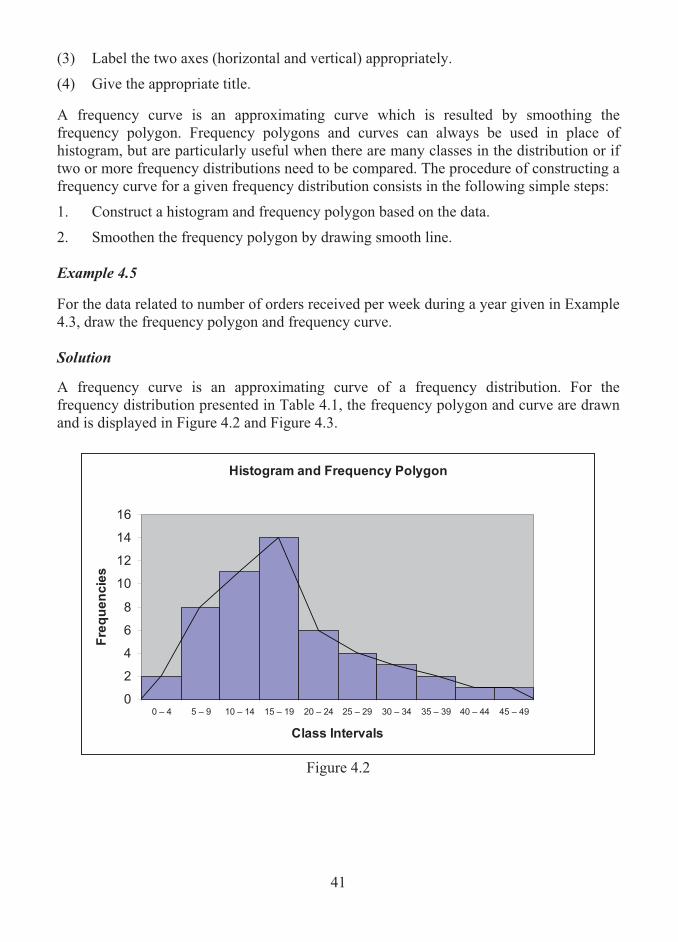
41
(3) Label the two axes (horizontal and vertical) appropriately.
(4) Give the appropriate title.
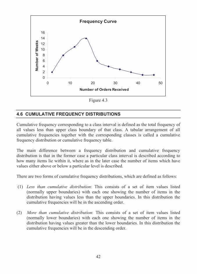
A frequency curve is an approximating curve which is resulted by smoothing the frequency polygon. Frequency polygons and curves can always be used in place of histogram, but are particularly useful when there are many classes in the distribution or if two or more frequency distributions need to be compared. The procedure of constructing a frequency curve for a given frequency distribution consists in the following simple steps:
1. Construct a histogram and frequency polygon based on the data.
2. Smoothen the frequency polygon by drawing smooth line. Example 4.5
For the data related to number of orders received per week during a year given in Example 4.3, draw the frequency polygon and frequency curve. Solution
A frequency curve is an approximating curve of a frequency distribution. For the frequency distribution presented in Table 4.1, the frequency polygon and curve are drawn and is displayed in Figure 4.2 and Figure 4.3.
Histogram and Frequency Polygon
0
2
4
6
8
10
12
14
16
0 – 4 5 – 9 10 – 14 15 – 19 20 – 24 25 – 29 30 – 34 35 – 39 40 – 44 45 – 49
Class Intervals
Fre
qu
en
cie
s
Figure 4.2
42
Frequency Curve
0
2
4
6
8
10
12
14
16
0 10 20 30 40 50
Number of Orders Received
Nu
mb
er
of
Weeks
Figure 4.3
4.6 CUMULATIVE FREQUENCY DISTRIBUTIONS
Cumulative frequency corresponding to a class interval is defined as the total frequency of all values less than upper class boundary of that class. A tabular arrangement of all cumulative frequencies together with the corresponding classes is called a cumulative frequency distribution or cumulative frequency table.
The main difference between a frequency distribution and cumulative frequency distribution is that in the former case a particular class interval is described according to how many items lie within it, where as in the later case the number of items which have values either above or below a particular level is described. There are two forms of cumulative frequency distributions, which are defined as follows: (1) Less than cumulative distribution: This consists of a set of item values listed
(normally upper boundaries) with each one showing the number of items in the distribution having values less than the upper boundaries. In this distribution the cumulative frequencies will be in the ascending order.
(2) More than cumulative distribution: This consists of a set of item values listed
(normally lower boundaries) with each one showing the number of items in the distribution having values greater than the lower boundaries. In this distribution the cumulative frequencies will be in the descending order.

43
Example 4.6
Compute the cumulative frequencies based on the data given in Example 4.3.
Solution
For the data related to the number of orders received per week by a business firm during a period of one year given in Example 4.3, the less than and more than cumulative frequencies are computed and displayed in Table 4.2.
Table 4.2
Less than and More than Cumulative Frequency Distributions
Number of orders received
Number of weeks
Less than Cumulative Frequencies
More Than Cumulative Frequencies
0 – 4 2 2 52 5 – 9 8 10 50
10 – 14 11 21 42 15 – 19 14 35 31 20 – 24 6 41 17 25 – 29 4 45 11 30 – 34 3 48 7 35 – 39 2 50 4 40 – 44 1 51 2 45 – 49 1 52 1
Cumulative Frequency Polygons and Ogives A graph obtained by plotting the cumulative frequencies against the class boundaries (may be upper or lower) and joining the points with small straight lines is called a cumulative frequency polygon. A cumulative frequency curve or ogive curve is an approximating curve, which is resulted on a two-dimensional graph by smoothing the cumulative frequency polygon. The curve of a less than cumulative distribution, called less than ogive curve, is an increasing curve and has an upward slope from left to right. The curve of a more than cumulative distribution, termed as more than ogive curve is a decreasing curve and has a downward slope from left to right.
The construction and the properties of less than ogive and more than ogive curves are demonstrated in the following illustration: Example 4.7
For the data given in Example 4.3, draw the ogive curves.

44
Solution The cumulative frequencies are computed using the frequency distribution given in Example 4.3 and are tabulated against the class intervals in Example 4.6. These cumulative frequencies are plotted on a two dimensional graph. The class intervals are taken along the horizontal axis and the cumulative frequencies are fixed on the vertical axis. The less than and more than ogive curves are depicted in Figure 4.4 and Figure 4.5 respectively.
Less than Ogive curve
0
10
20
30
40
50
60
0 10 20 30 40 50 60
Number of Order Received
Nu
mb
er
of
Weeks
Figure 4.4
More than Ogive Curve
0
10
20
30
40
50
60
0 10 20 30 40 50
Number of Orders Received
Nu
mb
er
of
Weeks
Figure 4.5
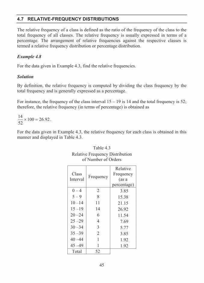
45
4.7 RELATIVE-FREQUENCY DISTRIBUTIONS
The relative frequency of a class is defined as the ratio of the frequency of the class to the total frequency of all classes. The relative frequency is usually expressed in terms of a percentage. The arrangement of relative frequencies against the respective classes is termed a relative frequency distribution or percentage distribution. Example 4.8 For the data given in Example 4.3, find the relative frequencies. Solution By definition, the relative frequency is computed by dividing the class frequency by the total frequency and is generally expressed as a percentage. For instance, the frequency of the class interval 15 – 19 is 14 and the total frequency is 52; therefore, the relative frequency (in terms of percentage) is obtained as
92.261005214
�� . For the data given in Example 4.3, the relative frequency for each class is obtained in this manner and displayed in Table 4.3.
Table 4.3
Relative Frequency Distribution of Number of Orders
Class Interval Frequency
Relative Frequency
(as a percentage)
0 – 4 2 3.85 5 – 9 8 15.38
10 –14 11 21.15 15 –19 14 26.92 20 –24 6 11.54 25 –29 4 7.69 30 –34 3 5.77 35 –39 2 3.85 40 –44 1 1.92 45 –49 1 1.92 Total 52
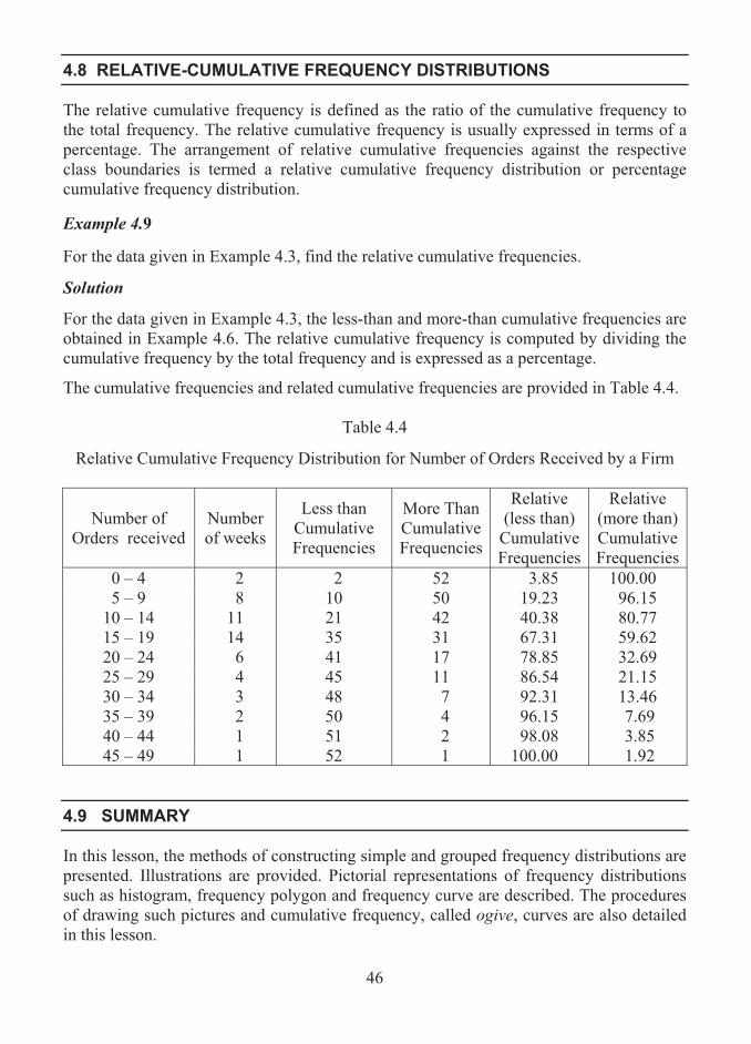
46
4.8 RELATIVE-CUMULATIVE FREQUENCY DISTRIBUTIONS
The relative cumulative frequency is defined as the ratio of the cumulative frequency to the total frequency. The relative cumulative frequency is usually expressed in terms of a percentage. The arrangement of relative cumulative frequencies against the respective class boundaries is termed a relative cumulative frequency distribution or percentage cumulative frequency distribution. Example 4.9 For the data given in Example 4.3, find the relative cumulative frequencies.
Solution
For the data given in Example 4.3, the less-than and more-than cumulative frequencies are obtained in Example 4.6. The relative cumulative frequency is computed by dividing the cumulative frequency by the total frequency and is expressed as a percentage.
The cumulative frequencies and related cumulative frequencies are provided in Table 4.4.
Table 4.4
Relative Cumulative Frequency Distribution for Number of Orders Received by a Firm
Number of Orders received
Number of weeks
Less than Cumulative Frequencies
More Than Cumulative Frequencies
Relative (less than)
Cumulative Frequencies
Relative (more than) Cumulative Frequencies
0 – 4 2 2 52 3.85 100.00 5 – 9 8 10 50 19.23 96.15
10 – 14 11 21 42 40.38 80.77 15 – 19 14 35 31 67.31 59.62 20 – 24 6 41 17 78.85 32.69 25 – 29 4 45 11 86.54 21.15 30 – 34 3 48 7 92.31 13.46 35 – 39 2 50 4 96.15 7.69 40 – 44 1 51 2 98.08 3.85 45 – 49 1 52 1 100.00 1.92
4.9 SUMMARY
In this lesson, the methods of constructing simple and grouped frequency distributions are presented. Illustrations are provided. Pictorial representations of frequency distributions such as histogram, frequency polygon and frequency curve are described. The procedures of drawing such pictures and cumulative frequency, called ogive, curves are also detailed in this lesson.

47
4.10 LESSON END ACTIVITY
1. The data given below relate to the number of orders supplied by a business firm each week over a period of 40 weeks:
24 13 28 15 25 29 15 46 9 10 17 22 23 17 16 22 11 12 18 20 13 27 18 22 20 14 26 14 19 40 17 21 23 26 18 24 21 27 40 31
Construct a grouped frequency distribution. 2. The frequency distribution of number of items that were found to be defective over a
number of production runs is given below:
Number of Defectives 0 – 4 5 – 9 10 –14 15 - 19 20 - 24 25 - 29 30 - 34 35 –39
Number of Production Runs 12 28 34 46 38 22 14 7
Draw a histogram for the frequency distribution. 3. Draw a histogram for the following grouped frequency distribution of number of
items manufactured by a firm over a period of ninety days.
Number of Components 100 - 120 120 –140 140 -160 160 - 180 180 - 200 Number of Days 16 22 30 14 8
4. For the data given in Problem 2, draw (a) a frequency polygon, (b) a frequency curve and (c) ‘less than’ and ‘more than’ cumulative frequency curves.
4.11 POINTS FOR DISCUSSION
1. Define raw data. 2. Define data array. 3. What is a frequency distribution? 4. Name the two types of frequency distribution. 5. What is a simple frequency distribution? How do you construct a simple frequency
distribution? 6. State the rules for forming a grouped frequency distribution. 7. What is a relative frequency distribution?

48
8. What are the ways of representing a frequency distribution? 9. What is a histogram? 10. What is a frequency polygon? How does a frequency polygon differ from a
frequency curve? 11. Define cumulative frequency distribution. 12. What are ogive curves?
4.12 SUGGESTED READING/REFERENCE/SOURCES
1. McClave, J.T., and T. Sincich (2008), First Course in Statistics, 10/e, Prentice Hall, Englewood Cliffs, NJ, US.
2. Freund, J.E., Williams, F.J., and B.M. Perles (1992), Elementary Business Statistics, 6/e, Prentice – Hall, Englewood Cliffs, NJ, US.
3. Levin, R.I., and D.S. Rubin (1997), Statistics for Management, 7/e, Prentice – Hall, Englewood Cliffs, NJ, US.

49
LESSON-5
MEASURES OF CENTRAL TENDENCY
CONTENTS
5.0. Aims and Objectives
5.1. Descriptive Statistics
5.2. Measures of Central Tendency
5.3. The Arithmetic Mean
5.4. The Median
5.5. The Mode
5.6. The Empirical Relation between the Mean, Median and Mode
5.7. The Geometric Mean
5.8. The Harmonic Mean
5.9. The Root Mean Square
5.10. Summary
5.11. Lesson End Activity
5.12. Points for Discussion
5.13. Suggested Reading/Reference/Sources
5.0 AIMS AND OBJECTIVES
The aim of this lesson is to discuss the various measures of location of individual data values and frequency distributions, and their computations. The simple formulae are provided for easy handling of data and calculations. The user can aptly adopt the concepts by learning the contents presented in this lesson.
5.1 DESCRIPTIVE STATISTICS
Descriptive statistics normally deal with the basic analysis of univariate data, which are obtained from measuring just one attribute. Statistical measures are the measures which describe this type of analysis and are categorized into three groups, namely, measures of central tendency, measures of dispersion and measures of skewness. This chapter is concerned with description of various measures of central tendency and their applications.
50
5.2 MEASURES OF CENTRAL TENDENCY
The measures of central tendency are the most well known measures of numeric data and are called in general as averages. An average is defined as a value that is typical, or representative, of a set of data. These values tend to lie centrally within a set of data arranged according to magnitude. Thus, averages are termed as measures of central tendency. The term ‘average’ is being used by everyone in every walk of life. For instance, business people talk in terms of average monthly sales or profit, students use in terms average marks, employee’s trade unions in terms of average income or salary, insurance company would use the average age of policy holders and so on. There are different types of averages which are suitable to various situations and requirements. Of them, the most common measures are the following: (1) the arithmetic mean or simply mean, (2) the median, (3) the mode, (4) the geometric mean and (5) the harmonic mean.
5.3 THE ARITHMETIC MEAN
The most commonly used average among all is the arithmetic mean or simply mean. It is a measure of a set of values defined as the sum of the values divided by the number of values. In terms of mathematical notations, it is defined as follows: For a given set of numbers nxxx ,,, 21 � , the arithmetic mean is defined and denoted by
�����
�n
ii
n xnn
xxxx
1:
21 1�.
The method of computing the mean has a simple procedure, which is given below:
1. Find the sum of the numbers as n
n
ii xxxx ����� �21
1:.
2. Divide the sum by n, the result of which is the mean.
Example 5.1 Compute the arithmetic mean of the numbers 8, 3, 5, 12, and 10.
Solution Here, the number of data values is n = 5 and the given values are represented by 521 ,,, xxx � .
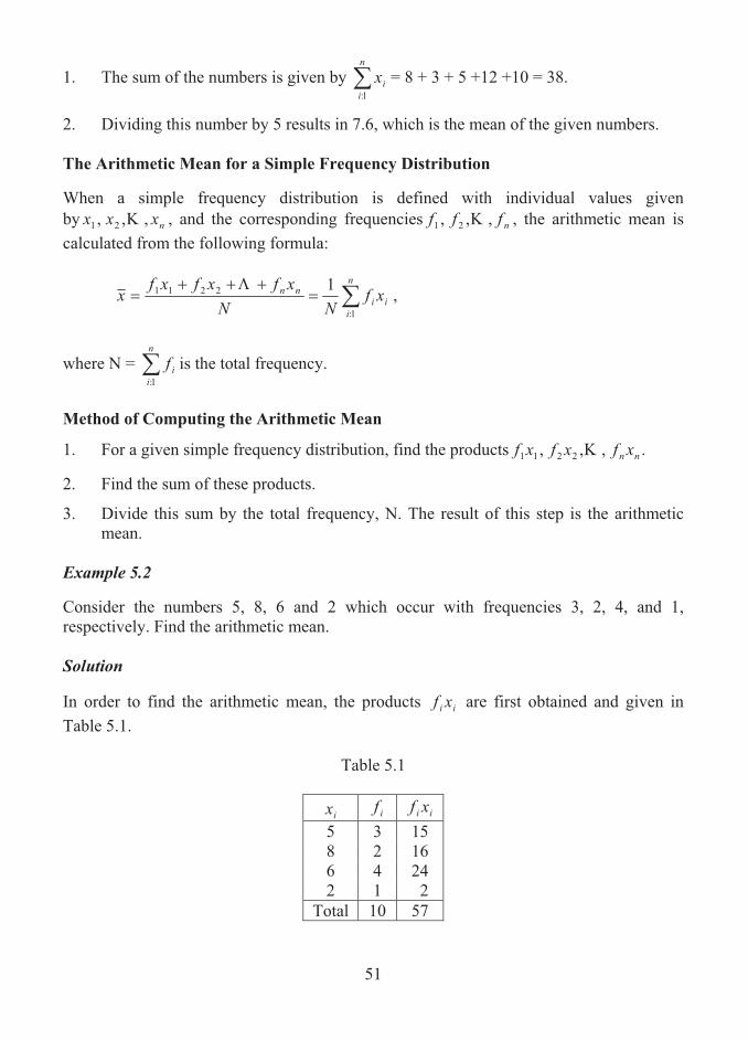
51
1. The sum of the numbers is given by �n
iix
1:= 8 + 3 + 5 +12 +10 = 38.
2. Dividing this number by 5 results in 7.6, which is the mean of the given numbers.
The Arithmetic Mean for a Simple Frequency Distribution When a simple frequency distribution is defined with individual values given by nxxx ,,, 21 � , and the corresponding frequencies nfff ,,, 21 � , the arithmetic mean is calculated from the following formula:
�����
�n
iii
nn xfNN
xfxfxfx
1:
2211 1�,
where N = �n
iif
1:is the total frequency.
Method of Computing the Arithmetic Mean
1. For a given simple frequency distribution, find the products .,,, 2211 nn xfxfxf �
2. Find the sum of these products.
3. Divide this sum by the total frequency, N. The result of this step is the arithmetic mean.
Example 5.2 Consider the numbers 5, 8, 6 and 2 which occur with frequencies 3, 2, 4, and 1, respectively. Find the arithmetic mean. Solution In order to find the arithmetic mean, the products ii xf are first obtained and given in Table 5.1.
Table 5.1
ix if ii xf5 3 15 8 2 16 6 4 24 2 1 2
Total 10 57

52
From this table, it is observed that N = 10 and �n
iii xf
1:= 57.
Then, the arithmetic mean is calculated as follows:
.7.510/57 ��x The Arithmetic Mean of a Grouped Frequency Distribution It is known that a grouped frequency distribution summarises data into groups of intervals of values, each showing the number of items having values in the group and in this type of structure individual data values can not be identified. When such a grouped frequency distribution is given, the formula for finding the arithmetic mean is the same as that specified for a simple frequency distribution. As intervals are given, individual data values are identified as the middle values (called mid-points) as representative of the class intervals. The procedure for computing the arithmetic mean is then as follows:
Step 1. Find the middle value (mid-point) of each group or interval. Step 2. Label the mid-point of the ith class interval or group as .,,2,1:, nixi �
Step 3. Find the products .,,, 2211 nn xfxfxf �
Step 4. Find the sum of these products. Step 5. Divide this sum by the total frequency, N. The result of this step is the arithmetic Mean. Example 5.3 A frequency distribution of number of sales of a particular product made by 80 salesmen of a business firm is given below:
Number of Sales 0 - 4 5 – 9 10 – 14 15 – 19 20 – 24 25 – 29
Number of Salesmen 1 14 23 21 15 6
Calculate the arithmetic mean of the sales based on the given information. Solution In order to calculate the arithmetic mean, the product of the mid-point and the corresponding frequency for each class interval is obtained and provided in Table 5.2

53
Table 5.2
Class Interval Mid-points, ix
Frequency, if
ii xf
0 – 4 2 1 2 5 – 9 7 14 98
10 – 14 12 23 276 15 – 19 17 21 357 20 – 24 22 15 330 25 – 29 27 6 162
Total 80 1225
Here, it is observed that N = �n
iif
1:= 80 and �
n
iii xf
1:=1225.
Hence, the arithmetic mean is obtained as
3.1580
122511:
��� �n
iii xf
Nx .
Thus the average number of sales is given by 15.3.
The Group Arithmetic Mean Sometimes, the means of a number of groups need to be combined to form a grand mean. Let there be k groups with knnn ,,, 21 � items respectively. Let the means of such groups be given by nxxx ,,, 21 � respectively. Then, the grand mean from these group information is defined and denoted by
�
��
�����
� n
ii
n
iii
k
kk
n
xn
nnnxnxnxn
x
1:
:1::
21
2211
��
.
Example 5.4Suppose that there are three regions for a company to promote its sales. Three sales executive A, B and C were appointed. Average sales shown by them over a particular period are given in Table 5.3.
Table 5.3
Sales Executive Average Sales (in Rs.) Number of Sales A 86420 24 B 112910 37 C 104220 25
Find the average value per sale from the given data

54
Solution
Here, average sales are denoted by 104220112910,86420 321 ��� xandxx and the number of sales made by A, B and C are given by n1 = 24, n2 = 37 and n3 = 25. Then, the average value per sale is calculated as follows:
ix in ii xn 86420 24 2074080112910 37 4177670104220 25 2605500Total 86 8857250
It is observed from the table that �3
1:iin = 86 and i
ii xn�
3
1: = 8857250.
Hence, the average value per sale is obtained as
102991.3.86
88572503
1:
3
:1:: ���
�
�
ii
iii
n
xnx
The Weighted Arithmetic Mean
Sometimes nxxx ,,, 21 � are associated with certain weighting factors nwww ,,, 21 � , depending on the significance or importance attached to the numbers. In this case,
��n
iii xw
Wx
1:
1
is the weighted arithmetic mean, where ��n
iiwW
1:
is the total weight.
Example 5.5 The distribution of wages for various categories of workers in a sales counter is given below:
Category of Workers
Number of Workers
Wages per Day (in rupees)
Unskilled Workers 10 150 Semi-skilled Workers 8 200 Skilled Workers 5 300 Supervisors 2 450 Managers 1 600
Calculate the weighted average of wages.

55
Solution
Here, the number of workers is taken as weights and the wages as data values. In order to compute the weighted average, the product of the wage per day and number of workers in each category of workers is computed and displayed in Table 5.4.
Table 5.4
iw ix ii xw 10 150 1500 8 200 1600 5 300 1500 2 450 900 1 600 600
Total 26 6100
It is observed from the above computations that 261:
�� �n
iiwW and � �
n
iii xw
1:.6100
Hence, the weighted average is obtained as
234.6154.26
610011:
��� �n
iii xw
Wx
Characteristics of Arithmetic Mean The arithmetic mean has the following important characteristics: 1. Arithmetic mean is simple, easy to understand and compute. Technically, it is
considered as the mathematical average, since its basic definition is given in arithmetical terms
2. It is based on all values. Hence, it is considered as a more representative of the data. 3. It will be affected much by the extreme values. Hence it is not suitable for data sets
that have extreme values at one end. 4. It cannot be determined by inspection of observations.
5.4 THE MEDIAN
A measure of location which is considered to be an alternative to the arithmetic mean is the median. The median of a set of items or values which are arranged in the order of their magnitude is either the middle value or the arithmetic mean of the two middle values. It is the value which divides the data set into two equal halves. In other words, median is a particular value which lies exactly halfway along the set.
56
For a given a set of items, the median is determined from the procedure given below:
1. Arrange the given items in the ascending or descending order of their magnitude.
2. If the number of items in the set is odd, choose the middle most one in the arranged order as the median of the set; if the number of items is even, find the median as the arithmetic mean of the middle two items.
Example 5.6 Consider the set of numbers 3, 4, 4, 5, 5, 6, 8, 8, 8, 9 and 10. Here, the numbers are in the ascending order of magnitude and the middle number 6 is taken as the median. It is seen that this number divides the entire set into two parts, with each part containing equal number of values.
Example 5.7 Consider the set of numbers 5, 5, 7, 9, 11, 12, 15, and 18. Here, the items are in the ascending order and number of items is even. Hence, the median is obtained as 10, which is the arithmetic mean of the middle two numbers 9 and 11. Calculation of Median for a Set of Numbers
Suppose a set of n numbers is given. It is required to find the median for the data. The procedure for identifying the median is given below: 1. Arrange the given numbers in an ascending of their magnitude.
2. Identify the 2
1�n th item in the arranged set of values.
3. If the item identified is a whole number, then median is the size of that item; if the item identified is not a whole number, then median is the size of full item plus 50% of the difference between the sizes of full and succeeding items.
It is observed in example 5.6 that there are n = 11 numbers. Since 62
1�
�n is a whole
number, median is 6, which is the size of the 6th item.
In example 5.7 it is noted that n = 8. Here, 2
1�n = 4.5 is not a whole number. Thus, the
size of 4th item plus 50% of the difference between the 4th and 5th items is obtained as 9 + (11-9)/2 = 10, which is the median.
The Median for a Simple Frequency Distribution
For a simple frequency distribution defined with the individual values, nxxx ,,, 21 � and the corresponding frequencies, nfff ,,, 21 � , the median is computed using the following procedure:

57
1. Compute the total frequency as �����n
iin ffffN
1:21 � .
2. Determine the cumulative frequencies.
3. Find the cumulative frequency which just exceeds N/2.
4. The value of x corresponding to this cumulative frequency is the median.
Example 5.8Find the median for the following frequency distribution:
Values of x 0 1 2 3 4 5 6 Frequency 15 24 18 12 8 2 1
SolutionIn order to find the median, first the cumulative frequencies (c.f.) are computed and are presented in Table 5.5.
Table 5.5
Values
of x Frequency Cumulative
Frequency 0 15 15 1 24 39 2 18 57 3 12 69 4 8 77 5 2 79 6 1 80
Total 80 Here, the total frequency is N = 80 and N/2 = 40. The cumulative frequency exceeding 40 is 57, which corresponds to x = 2. Hence, median is 2. Median for a Grouped Frequency Distribution
For a grouped frequency distribution, the median is obtained from the following formula:
cf
fcLM
N
d0
2 .�� ,
where c.f.= the cumulative frequency just less than that corresponding to median class, f0 = frequency of the median class,
L = lower limit of the median class, and c = the size of the median class,
58
Procedure for Computing Median The median for a grouped frequency distribution can be computed using the following procedure: Step 1: Compute the cumulative frequencies (c.f) from the frequency distribution.
Step 2: Find the total frequency as N =�n
iif
1:
.
Step 3: Find the cumulative frequency that exceeds N/2. Step 4: Identify the median class corresponding to this cumulative frequency. Step 5: With reference to the median class, observe the quantities L, f0, c and c.f. Step 6: Substituting these quantities in the formula for median, compute the value of it.
Example 5.9 The age distribution of 130 sales executives employed in a business enterprise is given below:
Age (years) 20-25 25-30 30-35 35-40 40-45 45-50
Number of Executives 2 14 29 43 33 9
Calculate the median age from the given distribution. Solution The cumulative frequencies are obtained and are presented in Table 5.6 to facilitate the computation of the median age.
Table 5.6
Cumulative Frequency Distribution of Ages
Age Group Frequency Cumulative Frequency
20-25 2 2 25-30 14 16 30-35 29 45 35-40 43 88 40-45 33 121 45-50 9 130 Total 130
Here, N = 130 and N/2 = 65. The cumulative frequency that exceeds 65 is 88, which corresponds to the group 35-40. This group is the median class.

59
With reference to this median class, the following quantities are observed: L = 35, c.f. = 45, f0 = 43 and c = 5. Thus, the median is obtained as
cf
fcLM
N
d0
2 .��
= 543
456535 �
�
= 43
10035 �
= 37.33. Hence, the median is 37.33 years. Characteristics of the Median
The median of a set of numbers or a frequency distribution has the following properties or characteristics:
1. It is an appropriate alternative to the arithmetic mean when extreme values are present at one or both ends of a set or distribution.
2. It can be used when certain end values of a set or distribution are difficult, expensive or impossible to obtain, particularly appropriate to life data. In extreme cases the only numeric values that need to be determined are the middle one or two.
3. It will often assume a value equal to one of the original items, which is considered as an advantage over the mean.
5.5 THE MODE
The mode of a set of numbers is that value, which occurs most often or with the greatest frequency. It would also be treated as the most common value. Example 5.10 The set 2, 2, 5, 7, 9, 9, 9, 10, 10, 11, 12, and 18 has mode 9. Example 5.11
The set 3, 5, 8, 10, 12, 15, and 16 has no mode.

60
Example 5.12 The set 2, 3, 4, 4, 4, 5, 5, 7, 7, 7, and 9 has two modes, 4 and 7. NoteFrom these examples the following observations could be made: a. A set of numbers with one mode is said to have a uni-modal distribution. b. Mode may not exist. Refer example 5.11. c. Mode may not be unique. Example 5.12 shows that there are two modes and hence
the given set of numbers is said to have a bimodal distribution. Significance of Mode Mode is a measure which has some practical utility, particularly when popularity of something has to be measured. In other words, the mode is considered as a representative value in terms of popularity.
Example 5.13 A retail shop deals with selling different brands of a particular home appliance product. The price of the product which is sold most by the shop will be considered as a representative value of the prices and the corresponding product is said to be the most popular one among all. This value (price) is called as mode. The Mode of a Simple Frequency Distribution
For a simple frequency distribution defined with the individual values, nxxx ,,, 21 � and the corresponding frequencies, nfff ,,, 21 � the mode is observed as a particular value corresponding to the largest value of the frequency.
Example 5.14 The frequency distribution of delivery times of orders sent out from an industrial firm is given below:
Number of Days 0 1 2 3 4 5 6 7 8 9 10 11
Number of Orders 4 8 11 12 15 21 10 4 2 2 1 1
Find the mode for the frequency distribution.

61
Solution It is observed from the frequency distribution that the largest frequency is 21, which is corresponding to the value 5. Hence, the mode is 5 days. The Mode of a Grouped Frequency Distribution In the case of grouped data, the mode can be obtained from the following formula:
cfff
ffLM
201
010 2
��
where f0 = frequency of the class preceding the modal class, f1 = frequency of the modal
class, f2 = frequency of the class succeeding the modal class, L = lower limit of the modal class, and c = size of the modal class.
The mode for the frequency distribution can be computed using the following procedure:
Step 1: Observe the largest frequency from the frequency distribution. Step 2: Identify the modal class corresponding to the largest frequency. Step 3: With reference to the modal class, observe the quantities L, f0, f1, f2 and c. Step 4: Substituting these quantities in the formula for mode, compute the value of it. Example 5.15
The age distribution of employees working in a financial institution dealing with share investments is given below:
Age (years) 20-25 25-30 30-35 35-40 40-45 45-50
Number of Employees 2 14 29 43 33 9
Determine the mode of the distribution of ages. Solution The mode of the given distribution is determined as given below:
1. The largest frequency in the distribution is 43, which corresponds to the group 35-40.
2. The modal class is identified as 35-40.
3. With reference the modal class, the following quantities are observed:

62
Lower limit of the modal class, L = 35; size of the modal class, c = 5; frequency of the modal class, f1 = 43; frequency of the class preceding the modal class, f0 = 29; and frequency of the modal class succeeding the modal class, f2 = 33. 4. Thus, the mode is computed as
cfff
ffLM �
��201
010 2
= 53329432
294335 ��
�
= 5241435 ��
= 37.92. Thus, for the given distribution of ages the mode is 37.92 years. Characteristics of the Mode
The mode of a set of numbers or a frequency distribution has the following important properties:
1. It is an alternative to other measures such mean and median, particularly in situations requiring the most frequently occurring value or the most popular value to represent data.
2. It is easy to understand and involves simple calculation
3. It can be used when a distribution has open ended classes.
4. It ignores extreme values. However, it is affected by the most popular class when a distribution is significantly skewed.
5. It is not unique. Sometimes mode may not exist; sometimes there exists a single mode or two or more modes. In the case of a single model, the distribution is said to be unimodal and in the case of two modes, the distribution is called bimodal.
5.6 THE EMPIRICAL RELATION BETWEEN ARITHMETIC MEAN, MEDIAN AND MODE
For a symmetric distribution, the mean, the median and the mode coincide; for an asymmetric, particularly, for a moderately skewed distribution, the median will always lie between the mean and the mode. Based on this property, these measures satisfy the following empirical relationships: 1. Mean - Mode = 3 (Mean - Median). 2. Mode = 3Median – 2Mean 3. Median = (2Mean + Mode)/3.
63
5.7 THE GEOMETRIC MEAN
The geometric mean, G, of a set of n positive numbers nxxx ,,, 21 � is the nth root of the product of the numbers and is denoted as
nn
ii
nn xxxxG
/1
1:
/121 )(
�
� �
������ ��
The geometric measure is a specialized measure, used to average proportional increases in wages or goods such as percentages.
Procedure to Compute the Geometric Mean of a Set of Numbers
For a set of numbers nxxx ,,, 21 � , the geometric mean is computed as given below:
1. Find the product of all the numbers.
2. Find the nth root of the product, which results in the geometric mean. . Example 5.16 Find the geometric mean of the numbers 2, 4, and 8. Solution 1. The product of the three numbers is 2 × 4 × 8 = 64. 2. The cube root of 64 is 3 64 = 4, which is the geometric mean. Example 5.17 It is known that the price of a commodity has risen by 6%, 13%, 11% and 15% in each of four consecutive years. Calculate the geometric mean. Solution
1. The product of the four percentage values is 6 × 13 × 11 × 15 = 12870.
2. The 4th root of 12870 is computed as %65.10128704 � , which is the geometric mean. This value would be considered as the constant increase necessary each year to produce the final year price given the starting year price. Example 5.18 In a business firm, the average number of employees that has risen in four successive years is given as 84, 97, 116 and 129. Compute the percentage increase from one year to the next. Also, find the average percentage increase in employees from year to year.
64
Solution 1. The percentage increase from a year to the next is calculated as follows: The percentage increase from the first year to the second year is computed as
%5.1510084
8497��
.
In a similar way, the percentage increase from the second year to the third, from the third to the fourth are found respectively as follows:
%6.1910097
97116��
;
%2.11100116
116129��
.
2. The product of these percentages is calculated as 11.5 × 19.6 × 11.2 = 2524.48 3. The cube root of this product is 3 2524.48 = 13.616%, which is the geometric mean. The value 13.616% is the average percentage increase in employees from year to year for the firm. An Alternate Formula for Computing Geometric Mean The geometric mean, G can also be computed by taking logarithms. In such a case,
�
� �
�� �
n
iix
nantiG
1:)log(1log .
This formula can be used with the following procedure:
1. For given ),,2,1:(, nixi � , compute logarithmic values as )(log10 ix .
2. Find the sum of these logarithmic values as�n
iix
1:10 )(log .
3. Divide the sum by n so as to get the arithmetic mean of logarithmic values.
4. Take antilog of the quantity derived in step 3. The value of the antilog is the geometric mean.
65
The Geometric Mean for the Grouped Data For grouped data given with frequencies, the geometric mean is obtained from the following formula:
Nn
i
fi
Nfn
ff in xxxxG/1
1:
/121 )( 21
�
� �
������ �� ,
where N is the total frequency.
This formula can also be written as �
� �
�� �
n
iii xf
NAntiG
1:10 )(log1log .
The procedure to compute the geometric mean for grouped data is as follows: 1. From the given frequency distribution, find the quantities nf
nff xxx ,,, 21
21 � .
2. Find the product of these quantities as �n
i
fi
ix1:
= nfn
ff xxx ��� �2121 .
3. Find the Nth root of�n
i
fi
ix1:
as Nn
i
fi
ix�1:
, which is the geometric mean of the frequency
distribution.
5.8 THE HARMONIC MEAN
The harmonic mean is another specialized measure of location used only in particular circumstances, namely when the data consists of a set of rates, such as prices (Rs. Per gram or kilograms or tons), speed (miles per hour or kilometres per hour) or productivity (man-hour or output). The harmonic mean is defined as the reciprocal of the mean of the reciprocals of the numbers. For a set of n positive numbers nxxx ,,, 21 � , the harmonic mean, H, is given by
���� n
i i
n
i i x
n
xn
H
1:1:
1111 .
In practice, it may also be expressed as ��n
i ixnH 1:
111 .

66
Steps for Computing the Harmonic Mean of a Set of Numbers
1. Find the reciprocals of the given numbers asnxxx
1,,1,1
21
� .
2. Find the sum of the reciprocals, i.e.,�n
i ix1:
1 .
3. Divide the sum by n, i.e., find the mean of the reciprocals as �n
i ixn 1:
11 .
4. Find the reciprocal of the mean of the reciprocals, which gives the harmonic mean. Example 5.19 Find the harmonic mean of a set of prime numbers 2, 3, 5, 7 and 11. Solution 1. The reciprocals of the given numbers are:
5.0211
1
��x
; 33.0311
2
��x
; 2.0511
3
��x
; 142.0711
4
��x
; 0909.01111
5
��x
.
2. The sum of the reciprocals is �n
i ix1:
1 = 0.5 + 0.33 + 0.2 + 0.142 + 0.0909 = 1.2629.
3. The mean of the reciprocals is .25258.05
2629.1111:
���n
i ixn
4. The reciprocal of the mean of the reciprocal is ���
� 25258.01
111
1:
n
i ixn
H 3.959.
Example 5.20 A business man travels 25 miles at 25 mph, 25 miles at 50 mph, and 25 miles at 75 mph. Find the harmonic mean of these three velocities. [Note: mph = miles per hour] Solution
1. The reciprocals of x1 = 25 mph, x2 = 50 mph and x3 = 75 are 0.04, 0.02 and 0.0133 respectively.
2. The sum of the reciprocals is found to be ���751
501
251 0.04 + 0.02 +0.0133 =
0.0733.
3. Hence, the harmonic mean is mphH 9.400733.0
31
1�
�� .

67
The Harmonic Mean for Grouped Data For grouped data given with frequencies, the harmonic mean is obtained from the following formula:
�� n
i i
i
xf
N
H
1:
11 .
Steps for Computing the Harmonic Mean for Grouped Data When data are grouped with frequencies, i.e., when a frequency distribution is given, the harmonic mean is calculated as follows:
1. Find the quantities n
n
xf
xf
xf ,,,
2
2
1
1 � from the given frequency distribution.
2. Find the sum of the above quantities as�n
i i
i
xf
1:.
3. Divide the sum by the total frequency, N, i.e., find �n
i i
i
xf
N 1:
1 .
4. Determine the harmonic mean as�
� n
i i
i
xf
N
H
1:
11 .
Characteristics of the Geometric and Harmonic Mean
The geometric and the harmonic means have the following important properties or characteristics: a. For all sets of data, the geometric and the harmonic means have the following
relationship in relation to the arithmetic mean:
Arithmetic Mean � Geometric Mean � Harmonic Mean. The equality signs hold only if all the numbers nxxx ,,, 21 � are identical. b. Both of these means are considered as measures which are to be used in particular
situations. Hence, they are not to be compared or contrasted with the other three standard averages.
c. It is known that the arithmetic mean is affected by extremes values. But, the
geometric and the harmonic means have the advantage of taking little account of extreme values.
68
Example 5.21 Find the arithmetic mean, geometric mean and harmonic mean of a set of 3 numbers given by 2, 4, and 9 and compare them. Solution
The set of given numbers has AM = 5, GM = 4.16 and HM = 3.43. It is clear that AM > GM > HM.
5.9 THE ROOT MEAN SQUARE
The root mean square or quadratic mean of a set of numbers nxxx ,,, 21 � is defined and denoted by
�
� �
�� �
n
iix
nRMS
1:
21 .
5.10 SUMMARY
Averages are the representative values of a set of data and are said as measures of central tendency due to the reason that they tend to lie at the centre when the data values in a set are arranged in an order of their magnitude. In this lesson, the definition and characteristics of averages such as the arithmetic mean, the median, the mode, the geometric mean and the harmonic mean are provided. The methods of calculating the averages for given sets of data values, and for given simple and grouped frequency distributions are presented with illustrations.
5.11 LESSON END ACTIVITY
1. The data relating to the number of orders supplied by a business firm each week over a period of 40 weeks are given below:
24 13 28 15 25 29 15 46 9 10 17 22 23 17 16 22 11 12 18 20 13 27 18 22 20 14 26 14 19 40 17 21 23 26 18 24 21 27 40 31
Construct a frequency distribution and compute the arithmetic mean of number of orders. Also, find the median and the mode of the distribution.
69
2. The frequency distribution of number of items that were found to be defective over a number of production runs is given below:
Number of Defectives 0 – 4 5 – 9 10 - 14 15 - 19 20 - 24 25 - 29 30 - 34 35 –39
Number of Production
Runs 12 28 34 46 38 22 14 7
Based on the data given, calculate (i) the arithmetic mean, (ii) the median and (iii) the mode. 3. The details of sales orders received by a business enterprise from various retailers
during the past 10 years are given below:
Year 1 2 3 4 5 6 7 8 9 10 Orders
Worth (in Rs. Lakhs).
1.52 1.63 1.72 1.78 2.11 2.53 2.35 2.18 1.92 1.86
Compute (i) the arithmetic mean, (ii) the median and (iii) the mode based on the data. 4. Find the median of the following set of numbers:
0.53 0.46 0.50 0.49 0.52 0.53 0.44 0.55 0.54 5. Calculate (i) the mean, (ii) the median and (iii) the mode of the following frequency
distribution: Data Value 1 2 3 4 5 6
Frequency 2 8 24 52 31 11 6. The number of days taken by a business concern to respond to the orders it received
are given below:
Number of Days 1 2 3 4 5 6 7 8 9 10 Number of
Orders 4 8 11 12 21 15 10 4 2 1 Calculate the mean, the median and the mode of the distribution.
7. The price of a commodity has risen by 8%, 11% and 13% in each of the three consecutive years. Calculate the geometric mean using this information.
8. A group of employees have received 5%, 8% and 4% salary increases over the last three years. What percentage do they need this year in order to average 6% over the whole period?

70
9. Calculate the harmonic mean of a set of first five prime numbers.
10. The distribution of number of employees in a firm with reference to their IQ (intelligent quotient) is as follows:
IQ Level Number of Employees
98 – 106 3 107 – 115 5 116 – 124 9 125 – 133 12 134 – 142 5 143 – 151 4 152 – 160 2
Determine (i) the arithmetic mean, (ii) the median and (iii) the mode of the given frequency distribution.
11. Employees of a business firm have received 6%, 8%, 5% and 7% salary increases over the last 4 years. Find the average percentage increase in salary of employees from year to year.
12. The price of a commodity was Rs. 1000, Rs. 1150, Rs. 1200, Rs. 1225 and Rs. 1300 over five successive years. Calculate the average yearly percentage increase in price.
5.12 POINTS FOR DISCUSSION
1. What are averages?2. List out various measures of central tendency. 3. Define: (a) the arithmetic mean, (b) the median, (c) the mode, (d) the harmonic mean
and (e) the geometric mean. 4. State the situations in which geometric mean is likely to be applied. 5. State the situations in which harmonic mean is likely to be applied. 6. Write the empirical relationship that exists among the mean, the median and the
mode.
5.13 SUGGESTED READING/REFERENCE/SOURCES
1. McClave, J.T., and T. Sincich (2008), First Course in Statistics, 10/e, Prentice Hall, Englewood Cliffs, NJ, US.
2. Freund, J.E., Williams, F.J., and B.M. Perles (1992), Elementary Business Statistics, 6/e, Prentice – Hall, Englewood Cliffs, NJ, US.

71
UNIT – II
72
LESSON-6
MEASURES OF DISPERSION
(THE RANGE AND THE MEAN DEVIATION)
CONTENTS 6.0. Aims and Objectives 6.1. Measures of Dispersion 6.2. Various Measures of Dispersion 6.3. The Range 6.4. The Mean Deviation 6.5. Summary 6.6. Lesson End Activity 6.7. Points for Discussion 6.8. Suggested Reading/Reference/Sources
6.0 AIMS AND OBJECTIVES
A detailed discussion on the need of measures of variation with an illustration is made in this lesson. This enables one to understand the significance of these measures and the method of computing the basic measures such as the range and the mean deviation of a set of individual data values or of a frequency distribution.
6.1 MEASURES OF DISPERSION
Measures of location or central tendency have a very great utility in statistical analysis. However, the measures such as the mean, the median and the mode provide a single numeric quantity as the representative of a set of data and reveal only part of the things one needs to know about the characteristics of the data. That is, these measures are not generally enough to characterize the data in a meaningful way. Hence, in order to be able to form a fair idea of the data, it becomes necessary to study the characteristics like the spread or dispersion of the individual values of the data set from the averages through some other measures called measures of dispersion.
Properties of an Ideal Measure of Dispersion In order that the measures of dispersion are to be treated as ideal measures, they should possess a few characteristics as given below:

73
1. They should be simple and easy to understand and calculate.
2. They should be based on all data values.
3. They should not be affected much by extreme data values, as extreme items some times may not represent the situation on which studies are made.
4. They should be amenable to facilitate further mathematical treatments. Definition of Dispersion or Variation
Dispersion or variation of the data is defined as the degree to which numerical data tend to spread about an average value.
Example Suppose there are three data sets, each containing 10 items. The values of the items are given below:
Set A Set B Set C 40 36 1 40 40 9 40 37 20 40 38 25 40 39 35 40 40 45 40 41 55 40 42 60 40 43 70 40 44 80 Total 400 400 400 Mean 40 40 40
It is observed from the above table that the means of the three different data sets are identical. In set A, the items do not exhibit any variation at all, as the values of all the items are equal. Hence, in this case the mean fully represents the data to describe the characteristics involved. In set B, it is noticed that all the items have different values with the minimum and maximum values given by 36 and 44. In this case the individual items are not very much scattered from the mean and exhibit little amount of variation. Hence, the mean may be considered as a good representative of the set. In set C, the mean is 40, yet the values of the items are different with the minimum and the maximum value given by 1 and 80. It is seen that the values are very widely scattered

74
from mean, which means that the data exhibit more variation. Hence, the mean in this case could not be a satisfactory representative of the data.
It is quite evident from the above example that if data are widely dispersed, a measure of location is lesser representative of the data as a whole than it would be for data closely centered around the mean. Thus, in order to study the characteristics involved in similar data sets, where the averages are identical, it is essential that other measures along with the averages should also be considered. As the data are concerned with variations among values of the items, measures of variation, termed as measures of dispersion are significant.
Significance of Measures of Dispersion 1. Measures of dispersion describe the extent of spread of the values of the individual
items of a distribution from its central value. 2. They help us to understand the pattern of data. 3. They provide additional information, based on which the reliability of the measures
of central tendency is judged. 4. They, with the support of measures of central tendency, are used to make
comparisons of several groups of data.
6.2 VARIOUS MEASURES OF DISPERSION
There are various measures of dispersion or variation. They are: 1. The Range. 2. The Mean Deviation. 3. The Quartile Deviation. 4. The Standard Deviation.
6.3 THE RANGE
The range of a set of values of items is the simplest measure of dispersion. It is defined as the numerical difference between the largest and the smallest values of the items in the set. The advantage of this method is its simplicity. Measures of range may be classified as (i) absolute and (ii) relative. An absolute measure of range for individual observations is defined and denoted by
R = L – S,
where L is the largest observation and S is the smallest observation.
A relative measure of range for individual observations is defined and denoted by
SLSLR
�
� .

75
NoteRelative measure of range is also called as coefficient of range.
In case of continuous series of data, the absolute and relative measures of range are calculated by using the respective formula given above, where S and L are the lower limit of the lowest class and the upper limit of the highest class respectively. However, frequencies are not considered while computing absolute and relative range.
Illustrations The illustrations which provide relevant information on the dispersion of a set of values are as follows: 1. The range of prices of different models of the same car. 2. The range of times of delivery of different items ordered. 3. The range of manpower available on a production line at different times. 4. The range of prices of different varieties of a commodity. 5. The range of quantity of exports of items over a period of 10 successive years. Example 6.1
Find the range and coefficient of range for the set of numbers 12, 6, 7, 3, 15, 10, 18, and 5. Solution Since the smallest value is 3 and the largest value is 18, the range is obtained as 18-3 = 15 and the coefficient of range is computed as
71.02115
318318
���
��
�SLSLR .
Example 6.2
The following table presents the number of ceramic tiles damaged during shipment through two vehicles in 8 days:
Vehicle 1 4 7 1 2 2 6 2 3 Vehicle 2 3 2 2 3 2 4 1 1
Find the range for both the vehicles and give the comment on the result. Solution 1. The range of values for vehicle 1 is 7-1 = 6. 2. The range of values for vehicle 2 is 4-1 = 3.
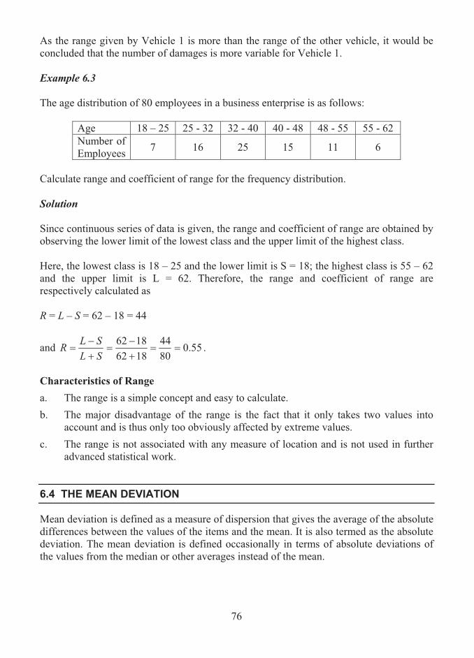
76
As the range given by Vehicle 1 is more than the range of the other vehicle, it would be concluded that the number of damages is more variable for Vehicle 1. Example 6.3 The age distribution of 80 employees in a business enterprise is as follows:
Age 18 – 25 25 - 32 32 - 40 40 - 48 48 - 55 55 - 62 Number of Employees 7 16 25 15 11 6
Calculate range and coefficient of range for the frequency distribution. Solution
Since continuous series of data is given, the range and coefficient of range are obtained by observing the lower limit of the lowest class and the upper limit of the highest class.
Here, the lowest class is 18 – 25 and the lower limit is S = 18; the highest class is 55 – 62 and the upper limit is L = 62. Therefore, the range and coefficient of range are respectively calculated as R = L – S = 62 – 18 = 44
and 55.08044
18621862
���
��
�SLSLR .
Characteristics of Range a. The range is a simple concept and easy to calculate. b. The major disadvantage of the range is the fact that it only takes two values into
account and is thus only too obviously affected by extreme values. c. The range is not associated with any measure of location and is not used in further
advanced statistical work.
6.4 THE MEAN DEVIATION
Mean deviation is defined as a measure of dispersion that gives the average of the absolute differences between the values of the items and the mean. It is also termed as the absolute deviation. The mean deviation is defined occasionally in terms of absolute deviations of the values from the median or other averages instead of the mean.

77
It is a much more important measure than the range since all the values of the items in the set are taken into account in its calculation.
Depending on whether the data consists of a set of items or a complete distribution, different formulae need to be used in the calculation of this measure.
The Mean Deviation for a Set of Numbers
The mean deviation for a set of n numbers nxxx ,,, 21 � is defined and denoted by
� �n
ii xx
nMD
1:
1 ,
where MD stands for the mean deviation, x is the arithmetic mean of the given numbers, and xxi is the absolute value of the deviation of the ith value from the mean. Steps for Computing the Mean Deviation 1. Find the arithmetic mean of the numbers nxxx ,,, 21 � using the following formula:
��n
iix
nx
1:
1
2. Determine the absolute differences of the numbers from the arithmetic mean as x,,x,x n21 xxx � .
3. Find the sum of these absolute differences as� n
ii xx
1:
.
4. Divide this sum by n. The resulting quantity is the mean deviation. Example 6.4 1. Compute the mean deviation for the following set of numbers:
43, 75, 48, 39, 51, 47, 50, 47 Solution
Table 6.1 is constructed to facilitate easy computation of mean deviation from the mean.

78
Table 6.1
Value of x xx | xx |
43 -7 7 75 25 25 48 -2 2 39 -11 11 51 1 1 47 -3 3 50 0 0 47 -3 3
Total 400 52 Mean 50 6.5
From the above table the following are observed:
1. The total of all given numbers is 0401:� �
n
iix .
2. The arithmetic mean is computed as ��n
iix
nx
1:
1 = 50
3. The sum of the absolute differences from the arithmetic mean is determined
as� n
ii xx
1:
= 52
Hence, the mean deviation of the given set of numbers is found as
8521
1:
�� �n
ii xx
nMD = 6.5.
The Mean Deviation for a Simple Frequency Distribution
When a simple frequency distribution is given with the values nxxx ,,, 21 � of the n items occurring with frequencies nfff ,,, 21 � , the mean deviation is calculated using the following formula:
� �n
iii xxf
NMD
1:
1 ,
where N = �n
iif
1:
is the total frequency.
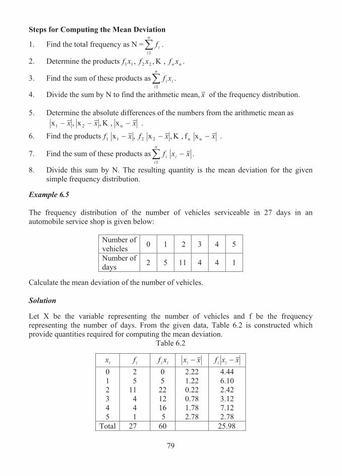
79
Steps for Computing the Mean Deviation
1. Find the total frequency as N =�n
iif
1:
.
2. Determine the products nn xfxfxf ,,, 2211 � .
3. Find the sum of these products as i
n
ii xf�
1:
.
4. Divide the sum by N to find the arithmetic mean, x of the frequency distribution. 5. Determine the absolute differences of the numbers from the arithmetic mean as
x,,x,x n21 xxx � .
6. Find the products xf ,,x,x nn2211 xxfxf � .
7. Find the sum of these products as� n
iii xxf
1:
.
8. Divide this sum by N. The resulting quantity is the mean deviation for the given simple frequency distribution.
Example 6.5 The frequency distribution of the number of vehicles serviceable in 27 days in an automobile service shop is given below:
Number of vehicles 0 1 2 3 4 5
Number of days 2 5 11 4 4 1
Calculate the mean deviation of the number of vehicles.
Solution Let X be the variable representing the number of vehicles and f be the frequency representing the number of days. From the given data, Table 6.2 is constructed which provide quantities required for computing the mean deviation.
Table 6.2
ix if ii xf xxi xxf ii
0 2 0 2.22 4.44 1 5 5 1.22 6.10 2 11 22 0.22 2.42 3 4 12 0.78 3.12 4 4 16 1.78 7.12 5 1 5 2.78 2.78
Total 27 60 25.98

80
From the table, the following are observed:
1. The total frequency, N =�n
iif
1:= 27.
2. The sum of the products, i
n
ii xf�
1:
= 60.
3. Thus, the mean is .22.2602711
1:���� � i
n
ii xf
Nx
4. The sum,� n
iii xxf
1: = 25.98.
5. Hence, the mean deviation is � �n
iii xxf
NMD
1:
1
98.25271��
.9622.0� Characteristics of Mean Deviation a. The mean deviation can be regarded as a good representative measure of dispersion.
b. It is easy to understand.
c. It is useful for comparing the variability between distributions of like nature.
d. It has an important property that the mean deviation defined about the median is a minimum.
e. Its practical disadvantage is that it can be complicated to calculate if the mean is anything other than a whole number.
f. Because of the modulus sign, the mean deviation is virtually impossible to handle theoretically and this is not used in more advanced analysis.
6.5 SUMMARY
Variation is the degree to which data values tend to spread about an average value and is also termed as dispersion. There are four measures of dispersion, namely, the range, the mean deviation, the quartile deviation and the standard deviation. In this lesson, the definition and characteristics of the range and mean deviation are provided. The methods of computing these measures are presented with illustrations.
6.6 LESSON END ACTIVITY
1. Find the range of a set consisting of numbers 4, 5, 8, 15, 12, 9, and 3.

81
2. The numbers of errors committed by two employees while typing the business reports over eight hours on a working day are as follows:
Employee 1 : 2 6 5 2 0 5 3 7 Employee 2 : 1 3 5 2 6 4 1 1
Identify the employee whose errors are more variable.
3. Compute the mean deviation about mean of a set consisting of numbers 1, 3, 5, 7, 9. 4. For the following frequency distribution find (i) the mean, and (ii) the mean
deviation about mean:
Data Value 1 2 3 4 5 6 7 8 Frequency 3 9 17 25 36 28 15 8
5. The age distribution of 80 employees in a business enterprise is as follows:
Age 18 - 25 25 - 32 32 - 40 40 - 48 48 - 55 55 - 62 Number of Employees 7 16 25 15 11 6
Calculate (i) the arithmetic mean and (ii) the mean deviation about mean for the distribution.
6.7 POINTS FOR DISCUSSION
1. What is meant by dispersion?
2. List out various measures of dispersion.
3. Define range of a set of data values.
4. Define mean deviation.
5. Write down the procedure of determining the mean deviation of a frequency distribution.
6.8 SUGGESTED READING/REFERENCE/SOURCES
1. McClave, J.T., and T. Sincich (2008), First Course in Statistics, 10/e, Prentice Hall, Englewood Cliffs, NJ, US.
2. Freund, J.E., Williams, F.J., and B.M. Perles (1992), Elementary Business Statistics, 6/e, Prentice – Hall, Englewood Cliffs, NJ, US.

82
LESSON-7
MEASURES OF DISPERSION
(THE STANDARD DEVIATION AND THE QUARTILE DEVIATION)
CONTENTS
7.0. Aims and Objectives
7.1. The Standard Deviation
7.2. The Quantiles
7.3. The Quartile Deviation
7.4. Relative Dispersion
7.5. The Quartile Coefficient of Dispersion
7.6. Summary
7.7. Lesson End Activity
7.8. Points for Discussion
7.9. Suggested Reading/Reference/Sources
7.0 AIMS AND OBJECTIVES
This lesson presents the concepts of standard and quartile deviations. The method of computing these measures using simplified formulae is discussed. The illustrations presented in this lesson will give an insight to the learner on how to adopt the formulae in given situations.
7.1 THE STANDARD DEVIATION
The most commonly used measure of dispersion is the standard deviation, which is similar to the mean deviation. It tells about the average distance of any value of the item in the data set from the average of the distribution. It is defined as the positive square root of mean of the squared deviations of the values of the items taken from the arithmetic mean. For a set of numbers nxxx ,,, 21 � , the standard deviation is defined and denoted by
� �n
ii xx
nSD
1:
2)(1 ,
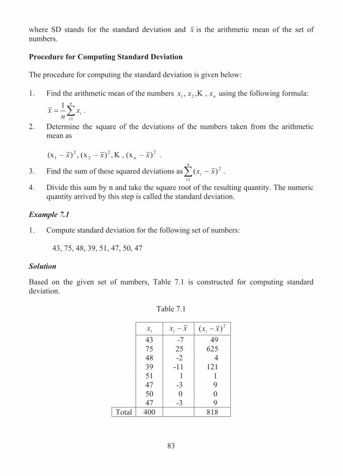
83
where SD stands for the standard deviation and x is the arithmetic mean of the set of numbers.
Procedure for Computing Standard Deviation
The procedure for computing the standard deviation is given below: 1. Find the arithmetic mean of the numbers nxxx ,,, 21 � using the following formula:
��n
iix
nx
1:
1 .
2. Determine the square of the deviations of the numbers taken from the arithmetic mean as
)x(,,)x(,)(x 2
n2
22
1 xxx � .
3. Find the sum of these squared deviations as� n
ii xx
1:
2)( .
4. Divide this sum by n and take the square root of the resulting quantity. The numeric quantity arrived by this step is called the standard deviation.
Example 7.1 1. Compute standard deviation for the following set of numbers:
43, 75, 48, 39, 51, 47, 50, 47
Solution Based on the given set of numbers, Table 7.1 is constructed for computing standard deviation.
Table 7.1
ix xxi 2)( xxi
43 -7 49 75 25 625 48 -2 4 39 -11 121 51 1 1 47 -3 9 50 0 0 47 -3 9
Total 400 818
84
From Table 7.1, the following are observed:
1. The sum of the values, 4001:
��n
iix
2. Hence, the mean is .50400811
1:
���� �n
iix
nx
3. The sum of squares of deviations, � n
ii xx
1:
2)( = 818.
4. Thus, the standard deviation is � �n
ii xx
nSD
1:
2)(1
81881��
25.102� .11187.10� A Simplified Formula for the Standard Deviation of a Set of Values A simplified formula for computing the standard deviation of a set of values is given below:
� �n
ii xx
nSD
1:
221
The following procedure is adopted for finding the measure with the use of this formula: Step 1: Find the sum of the squares of all values. Step 2: Divide this sum by the number of values. Step 3: Subtract the square of the mean from the quantity arrived in step 2. Step 4: Find the square root for the resulting number, which gives the standard deviation. Example 7.2 1. Compute standard deviation for the following set of numbers:
43, 75, 48, 39, 51, 47, 50, 47

85
Solution
Table 7.2 is constructed to provide the squares of the given numbers. Table 7.2
ix 2
ix 43 1849 75 5625 48 2304 39 1521 51 2601 47 2209 50 2500 47 2209
Total 400 20818 From the above table, we observe the following:
1. The sum of the values, 4001:
��n
iix
2. Hence, the mean is .50400811
1:���� �
n
iix
nx
3. The sum of squares of the values,� �n
iix
1:
2 20818 .
4. Thus, the standard deviation is
� �n
ii xx
nSD
1:
221
2502081881
��
250025.2602 � 25.102� .11187.10�
Standard Deviation for a Simple Frequency Distribution For large sets of data, a frequency distribution is normally constructed. When a simple frequency distribution is formed, with the values nxxx ,,, 21 � of the n items occurring
nfff ,,, 21 � times respectively, a computational formula for the standard deviation is as given below:

86
� �n
iii xxf
NSD
1:
2)(1 .
where N = �n
iif
N 1:
1 is the total frequency.
Steps for Computing the Standard Deviation
1. Find the total frequency as N =�n
iif
1:.
2. Determine the products nn xfxfxf ,,, 2211 � .
3. Find the sum of these products as i
n
ii xf�
1:
.
4. Divide the sum by N to find the arithmetic mean of the frequency distribution.
5. Determine the deviations of the numbers from the arithmetic mean as
)x(, ,)x(,)x( n21 xxx � .
6. Find the squares of the deviations as
)x(,,)x(,)x( 2n
22
21 xxx � .
7. Find the products . )( ,,)(,)( 2222
211 xxfxxfxxf nn �
8. Find the sum of these products as� n
iii xxf
1:
2)( .
9. Divide this sum by N. The resulting quantity is the standard deviation for the given simple frequency distribution.
Example 7.3 A business firm has recorded the number of orders received for each of 58 successive weeks. The details are given in the following frequency table:
Number of orders received 10 -14 15-19 20-24 25-29 30-34 35-39
Number of weeks 3 7 15 20 9 4 Calculate the standard deviation. Solution Let us consider the number of weeks as the frequency corresponding to the class intervals.
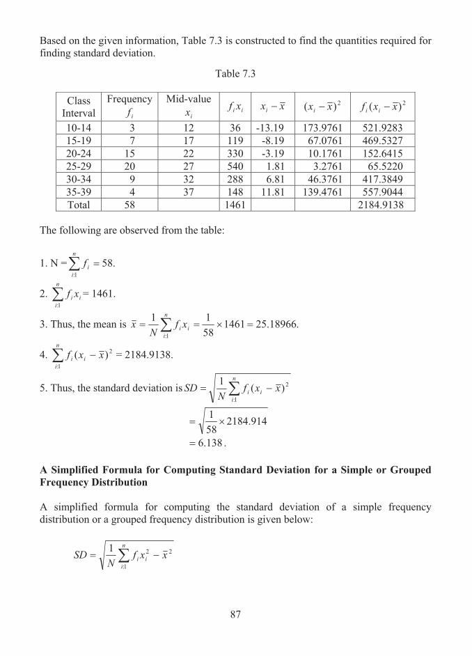
87
Based on the given information, Table 7.3 is constructed to find the quantities required for finding standard deviation.
Table 7.3
Class Interval
Frequency if
Mid-value ix ii xf xxi 2)( xxi 2)( xxf ii
10-14 3 12 36 -13.19 173.9761 521.9283 15-19 7 17 119 -8.19 67.0761 469.5327 20-24 15 22 330 -3.19 10.1761 152.6415 25-29 20 27 540 1.81 3.2761 65.5220 30-34 9 32 288 6.81 46.3761 417.3849 35-39 4 37 148 11.81 139.4761 557.9044 Total 58 1461 2184.9138
The following are observed from the table:
1. N = .581:
��n
iif
2. i
n
ii xf�
1:
= 1461.
3. Thus, the mean is .25.1896614615811
1:
���� � i
n
ii xf
Nx
4. � n
iii xxf
1:
2)( = 2184.9138.
5. Thus, the standard deviation is � �n
iii xxf
NSD
1:
2)(1
914.2184581��
138.6� .
A Simplified Formula for Computing Standard Deviation for a Simple or Grouped Frequency Distribution A simplified formula for computing the standard deviation of a simple frequency distribution or a grouped frequency distribution is given below:
� �n
iii xxf
NSD
1:
221
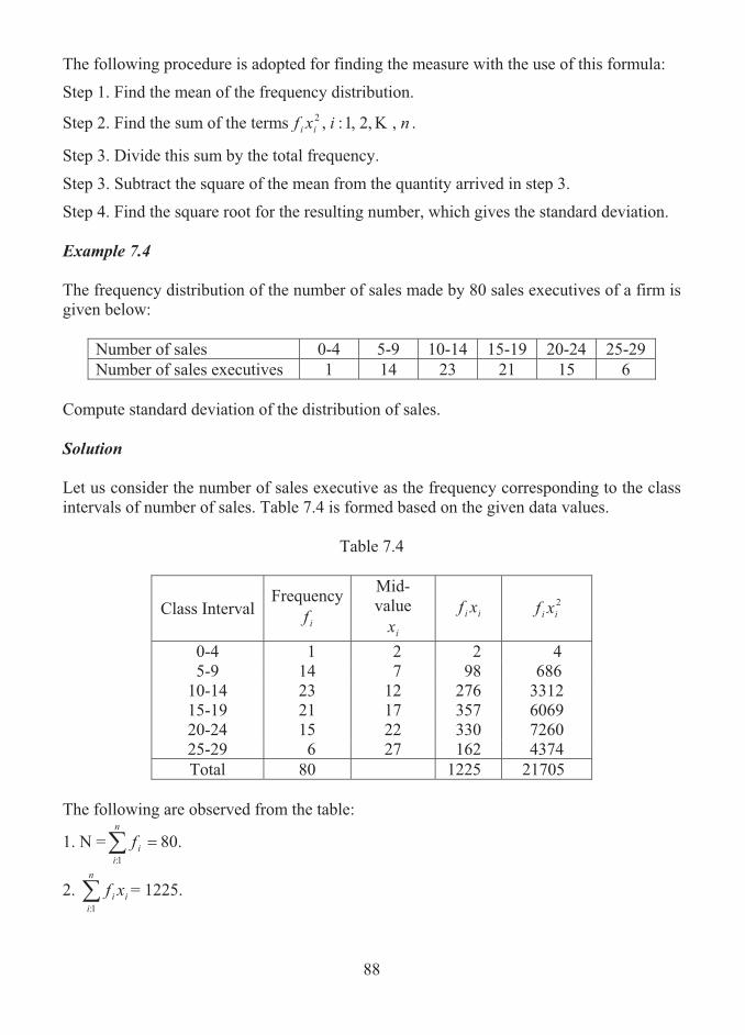
88
The following procedure is adopted for finding the measure with the use of this formula:
Step 1. Find the mean of the frequency distribution.
Step 2. Find the sum of the terms nixf ii ,,2,1:,2 � .
Step 3. Divide this sum by the total frequency.
Step 3. Subtract the square of the mean from the quantity arrived in step 3.
Step 4. Find the square root for the resulting number, which gives the standard deviation. Example 7.4 The frequency distribution of the number of sales made by 80 sales executives of a firm is given below:
Number of sales 0-4 5-9 10-14 15-19 20-24 25-29 Number of sales executives 1 14 23 21 15 6
Compute standard deviation of the distribution of sales. Solution Let us consider the number of sales executive as the frequency corresponding to the class intervals of number of sales. Table 7.4 is formed based on the given data values.
Table 7.4
Class Interval Frequency
if
Mid-value
ix ii xf 2
ii xf
0-4 1 2 2 4 5-9 14 7 98 686
10-14 23 12 276 3312 15-19 21 17 357 6069 20-24 15 22 330 7260 25-29 6 27 162 4374 Total 80 1225 21705
The following are observed from the table:
1. N = .801:
��n
iif
2. i
n
ii xf�
1:
= 1225.

89
3. Thus, the mean is .3125.1512258011
1:
���� � i
n
ii xf
Nx
4. 217051:
2� �n
iii xf .
5. Thus, the standard deviation is
.11:
22� �n
iii xxf
NSD
2)3125.15(21705
801
��
.
)3125.15(3125.271. 2�
= 84.36 . = 6.07.
Characteristics of the Standard Deviation
As an important measure of variation, standard deviation has the following significant characteristics:
a. The standard deviation is defined in terms of the arithmetic mean.
b. As all data values are involved in the calculation, it can be regarded as a true representative of the data.
c. More often, in practice, statistical analysis is based on a theoretical symmetric distribution, called normal distribution, which is specified in terms of both the mean and standard deviation.
d. For distributions, that are symmetric, virtually all of the items should lie within three standard deviation of the mean.
Variance of a Set of Numbers or a Frequency DistributionMathematically, variance of a set of numbers or a frequency distribution is defined as the square of the standard deviation. In other words, it is the arithmetic mean of the squares of deviations of individual observations of the distribution from the arithmetic mean.
It is usually denoted by the symbol �2. The extent of variability in the frequency distribution or population is measured by the variance. Whenever the value of the variance is smaller, it is interpreted that there is lesser variability in the distribution or population; whenever the value of the variance is larger, it is interpreted that there is more variability in the distribution.

90
7.2 THE QUANTILES
A quantile is a particular type of measure which splits a set of values or a distribution of items into equal portions. In a frequency distribution, a given fraction or proportion of items lies at or below a quantile. A quantile is termed as a fractile.
A simple example for a fractile is the median, which is 0.5 fractile. This means that there are 50% of the values below the median and the remaining 50% values are above the median. Thus, the median divides the data set into two equal portions.
In a similar way, when three values divide the data set into four equal parts, they are said to be quartiles. The position below which 25% of the values of distribution lie is said to be 0.25 fractile, also called the first quartile; the position below which 75% values fall is called 0.75 fractile or the third quartile.
Deciles and percentiles are also defined in this fashion with the data split up into 10 and 100 equal portions.
The quartiles, deciles and percentiles are collectively called as quantiles.
Based on the idea of splitting the data into equal portions by arranging the data in the order of magnitude, measures of dispersion and skewness could be found. One such important measure of dispersion is called quartile deviation.
7.3 THE QUARTILE DEVIATION
Quartile deviation is another important measure of dispersion which is defined as follows: Quartile deviation of a set of values is defined and denoted by
213 QQ
Q
� ,
where Q1 is the first quartile and Q3 is the third quartile. Identifying the Quartiles for a Set of Numbers Suppose a set of n numbers is given. It is required to find the first and third quartiles for the data. The procedure for identifying the quartiles is given below:
The first quartile, Q1, is identified as the 4
1�n th item in the arranged set of values.
The third quartile, Q3, is identified as the 4
)1(3 �n th item in the arranged set of values.
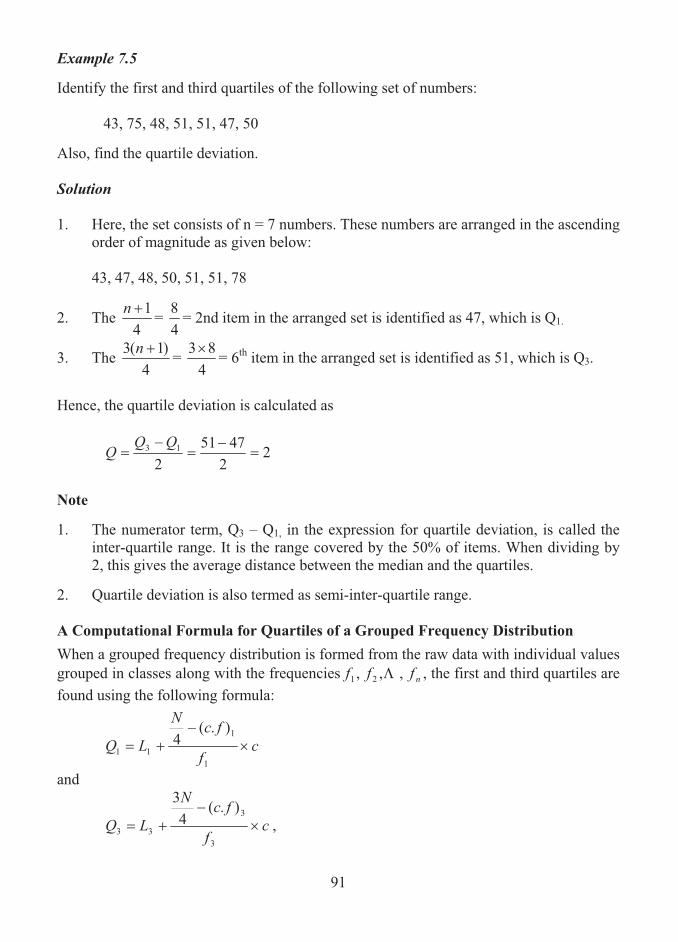
91
Example 7.5 Identify the first and third quartiles of the following set of numbers:
43, 75, 48, 51, 51, 47, 50 Also, find the quartile deviation.
Solution 1. Here, the set consists of n = 7 numbers. These numbers are arranged in the ascending
order of magnitude as given below:
43, 47, 48, 50, 51, 51, 78
2. The 4
1�n = 48 = 2nd item in the arranged set is identified as 47, which is Q1.
3. The 4
)1(3 �n = 4
83� = 6th item in the arranged set is identified as 51, which is Q3.
Hence, the quartile deviation is calculated as
22
47512
13 �
�
Q
Note 1. The numerator term, Q3 – Q1, in the expression for quartile deviation, is called the
inter-quartile range. It is the range covered by the 50% of items. When dividing by 2, this gives the average distance between the median and the quartiles.
2. Quartile deviation is also termed as semi-inter-quartile range.
A Computational Formula for Quartiles of a Grouped Frequency Distribution
When a grouped frequency distribution is formed from the raw data with individual values grouped in classes along with the frequencies nfff ,,, 21 � , the first and third quartiles are found using the following formula:
cf
fcN
LQ �
��1
1
11
).(4
and
cf
fcN
LQ �
��3
3
33
).(4
3
,

92
where L1 = lower bound of the first quartile class; L3 = lower bound of the third quartile class; f1 = frequency of the first quartile class; f3 = frequency of the third quartile class;(c.f)1 = cumulative frequency of class immediately preceding the first quartile class; (c.f)3 = cumulative frequency of class immediately preceding the third quartile class; and c = the class width.
Procedure for Finding the First and Third Quartiles
1. Find the total frequency, N.
2. Find N/4 and 3N/4.
3. Compute the cumulative frequencies from the given frequency distribution.
4. Identify the first quartile class as a class corresponding to the cumulative frequency just greater than N/4. In a similar way, identify the third quartile class as a class corresponding to the cumulative frequency just greater than 3N/4.
5. For finding the first quartile, Q1, observe the quantities L1, f1, (c.f.)1 and c; for finding the third quartile, Q3, observe the quantities L3, f3, (c.f.)3 and c.
6. Compute Q1 and Q3 using the appropriate formulae.
Example 7.6 The following data relates to the ages of library card holders in a particular library scheme.
Age 10-20 20-30 30-40 40-50 50-60 60-70 70-80 80-90 Number of Card Holders
12 17 28 36 40 32 19 6
Find the quartile deviation of ages.
Solution Here, let f be the frequency representing the number of card holders in a group. To find the quartile deviation, the first and third quartiles are required. For identifying the quartiles, the cumulative frequencies are found and tabulated in Table 7.5.

93
Table 7.5
Age Frequency Cumulative Frequency
10-20 12 12 20-30 17 29 30-40 28 57 40-50 36 93 50-60 40 133 60-70 32 165 70-80 19 184 80-90 6 190
The following quantities are observed from the table:
1. The total frequency is N = 190.
2. To identify the first quartile, find N/4 as 190/4 = 47.5.
3. The cumulative frequency just greater than 47.5 is 57, which corresponds to the age group 30-40, called first quartile class.
4. Here, L1 = 30, f1 = 28, (c.f.)1 = 29, and c = 10.
5. Hence, the first quartile is obtained as
cf
fcN
LQ �
��1
1
11
).(4
1028
295.4730 �
��
= 36.6071. 4. To identify the third quartile, find 3N/4 as 3 × 190/4 = 142.5 5. The cumulative frequency jus greater than 142.5 is 165, which corresponds to the
age group 60-70, called the third quartile. 6. Here, L3 = 60, f3 = 32, (c.f.)3 = 133, and c = 10.

94
7. Hence, the third quartile is obtained as
cf
fcN
LQ �
��3
3
33
).(4
3
1032
1335.14260 �
��
= 62.96875. 8. As Q1 = 36.6071 and Q3 = 62.96875, the quartile deviation is computed as
213 QQ
Q
�
2
6071.3696875.62 �
= 13.1808. Example 7.7 Find the quartile deviation for the following frequency distribution:
ix 0 1 2 3 4 5 6 7 8 9 10 11
if 4 8 11 12 21 15 10 4 2 2 1 1 Solution
In order to compute the quartile deviation, we first find out the values of Q1 and Q3. Let us calculate the cumulative frequencies (c.f.) from the given frequency distribution. Table 7.6 presents such cumulative frequencies.
Table 7.6
ix if c.f. 0 4 4 1 8 12 2 11 23 3 12 35 4 21 56 5 15 71 6 10 81 7 4 85 8 2 87 9 2 89 10 1 90 11 1 91 Total 91

95
1. The total frequency is N = 91.
2. To identify the first quartile, find N/4 as 91/4 = 22.75.
3. The cumulative frequency just greater than 22.75 in Table 7.6 is 23, which corresponds to the number 2. Hence, Q1 = 2.
4. To identify the third quartile, find 3N/4 as 3 × 91/4 = 68.25.
5. The cumulative frequency just greater than 68.25 in Table 7.6 is 71, which corresponds to the number 5. Hence, Q3 = 5.
6. Thus, the quartile deviation is computed as Q = (5-2)/2 = 3/2 = 1.5. An Alternate Procedure to Identify the Quartiles Let N be the total frequency. Then, the first and third quartiles are found as follows:
1. The first quartile is obtained corresponding to the thN4
1� item.
2. In the above example, N = 91. Thus, the thN4
1� item is obtained as
.234
924
191 itemrditemthitemth ���
3. The first cumulative frequency equals or exceeds 23 is 23, which corresponds to x =
2. Hence, Q1 = 2.
4. The third quartile is obtained corresponding to the thN4
)1(3 � item.
5. The thN4
)1(3 � item is found as
.694
2764
)191(3 itemthitemthitemth ���
6. The first cumulative frequency equals or exceeds 69 is 71, which corresponds to x = 5. Hence, Q3 = 5.
7.4 RELATIVE DISPERSION
The dispersion, as measured from the range or the mean deviation or the quartile deviation or the standard deviation is termed as actual variation. It is also known as the absolute dispersion. One of the important applications of measures of dispersion, as a measure of variability, which expresses variation in the same units as the original data is explained below:

96
It is sometimes necessary to compare two different distributions with regard to variability. For instance, consider the following example: A firm makes loan payments to two banks, Bank A and Bank B. The payments to Bank A have a standard deviation Rs. 1, 00, 000/- and the payments to Bank B have a standard deviation Rs. 45,000/-. Here, it is not possible to make comparison of these standard deviations, because the standard deviations alone cannot be considered as the basis for comparing two sets of values or two distributions and hence, they must be supported by some other measures particularly the arithmetic mean. Consider another example. Suppose that a set of values have the standard deviation of 10 and the mean of 5. Suppose, further, that another set of values have a standard deviation of 10 and a mean of 100. It is observed that in the first set the variation varies by an amount twice as large as the mean itself and in the second set, the variation relative to the mean is insignificant. In this particular case the dispersion of a set of data can not be seen until the standard deviation, the mean, and how the standard deviation compares with the mean are known. Thus, a more concise measure for comparison of the variability of two sets of values relative to the average is needed. Such a measure is called as relative dispersion, which is defined by
averagedispersionabsolutedispersionlative �Re .
When the absolute dispersion is the standard deviation and the average is the mean, the relative dispersion is called as the coefficient of variation. Thus, the coefficient of variation relates the standard deviation and the mean by expressing the standard deviation as a percentage of the mean. The formula for the coefficient of variation, also called coefficient of dispersion, is given by
100tan��
meandeviationdardsCV = 100�
x� .
Example 7.8 Suppose an accountant, A in a business firm prepares on an average 40 pre-audit reports with a standard deviation 5 per annum. Another accountant, B in the same firm prepares on an average 160 pre-audit reports with a standard deviation of 15 per annum. Identify the accountant who shows less variability?
97
Solution
By observing the given information, it appears that B has three times more variation in the output rate than A. But B completes the work at a rate four times faster than A. Thus, in order to identify the accountant who shows less variability, the coefficients of variation for both A and B are computed as given below:. For accountant A,
100tan��
meandeviationdardsCVA .
= 100405� = 12.5%.
For accountant B,
100tan��
meandeviationdardsCVB .
= 10016015
�
= 9.4%. Here, CVB is less than CVA. Thus, the accountant B, who has more absolute variation in output than A, has less relative variation because the mean output for B is much greater than for A.
7.5 THE QUARTILE COEFFICIENT OF DISPERSION
The quartile coefficient of dispersion measures the quartile deviation as a percentage of the median and it is defined as a relative measure of variation as given below:
%100��median
deviationquartileQCD
This measure is used to make comparison of median and quartiles.
7.6 SUMMARY
In this lesson, the discussion is related to two other measures of dispersion, namely, the quartile deviation and the standard deviation. The procedures for computing these measures are described with illustrations. The concepts of quantiles and relative dispersion are presented. The significance of coefficient of variation is illustrated through an example. The simplified procedure of identifying the quartiles of a set of data values is provided.

98
7.7 LESSON END ACTIVITY
1. The following data relates to monthly personal income (in Rupees Thousands) of 140 employees working in a business firm.
Income 1 - 5 5 - 10 10 - 15 15 -20 20 – 25 25 - 25
Number of Employees 12 24 38 42 16 8
Compute (i) the arithmetic mean and (ii) the standard deviation for the distribution. 2. Calculate the mean and standard deviation of a set consisting of following numbers:
38 69 42 48 56 72 46 56 63 3. The data relating to the number of marketing targets reached by 72 medical
representatives of a pharmaceutical company in a specified territory are given below:
Number of Targets 0 - 7 7 - 14 14 - 21 21 - 28 28 - 35 35 - 42
Number of Representatives 3 9 21 19 13 7
Determine the average number of targets from the given distribution. Also find (i) the mean deviation about mean and (ii) the standard deviation. Compare them and interpret appropriately. 4. The following data relates to the weekly sales orders (in Rs.Thousands) received by
a business firm from 9 marketing regions.
Region 1 2 3 4 5 6 7 8 9 Sales 20 23 35 27 45 29 36 33 30
Calculate the following: (i) the average sales order (arithmetic mean), (ii) the median, (iii) the mode, (iv) the mean deviation about mean, and (v) the standard deviation. 5. Arrange the following numbers either in the ascending order or descending of their
magnitude and compute the following: (i) the median, (ii) the first quartile, (iii) the third quartile and (iv) the quartile deviation:
32, 30, 24, 24, 36, 33, 29, 29, 30, 28, 30, 32, 32, 34, 28
6. The age distribution of number of subscribers for broadband connectivity of a
private telecommunication service provider in a business region is given below:

99
Age 10 - 20 20 – 30 30 - 40 40 - 50 50 - 60 60 - 70
Number of Subscribers 15 36 58 62 24 12
Find the median and quartile deviation of ages. 7. The following table presents the mean sales targets per month and the corresponding
standard deviations achieved by two business executives of a company.
Mean Target
Standard Deviation
Executive A 76.3 14.9 Executive B 84.7 18.6
Find the coefficient of variation for both the executives. Compare and interpret the results.
7.8 POINTS FOR DISCUSSION
1. Define quartile deviation. 2. What are quantiles? 3. What is relative dispersion? 4. State the need of coefficient of variation. 5. What is standard deviation? 6. Define variance.
7.9 SUGGESTED READING/REFERENCE/SOURCES
1. McClave, J.T., and T. Sincich (2008), First Course in Statistics, 10/e, Prentice Hall, Englewood Cliffs, NJ, US.
2. Freund, J.E., Williams, F.J., and B.M. Perles (1992), Elementary Business Statistics, 6/e, Prentice – Hall, Englewood Cliffs, NJ, US.
100
LESSON-8
MEASURES OF SKEWNESS
CONTENTS 8.0. Aims and Objectives 8.1. Skewness 8.2. Characteristics of Skewness 8.3. Method of Calculating Bowley’s Coefficient of Skewness 8.4. Summary 8.5. Lesson End Activity 8.6. Points for Discussion 8.7. Suggested Reading/Reference/Sources
8.0 AIMS AND OBJECTIVES
This lesson aims to provide the concept of skewness and its measure. Based on the methodology given, a learner will be able to identify whether a given set of data values or a frequency distribution is symmetric or skewed to the left or right just by finding the measure of skewness.
8.1 SKEWNESS
Skewness is the measure or degree of asymmetry, or departure from symmetry, of a distribution. A frequency distribution is said to be symmetric if the frequencies are equally distributed on both sides of the central value (particularly mean), otherwise it is called as asymmetric. Asymmetric frequency distributions are referred to as skewed distributions. A frequency distribution is said to be skewed to the right or to the left according as its frequency curve has a longer tail to the right or left of the central maximum than to the left or right. The frequency distribution which is skewed to the right is also termed as positively skewed distribution. Similarly, the distribution which is skewed to the left is called as negatively skewed distribution.
8.2 CHARACTERISTICS OF SKEWNESS
1. For skewed distributions, the mean tends to lie on the same side of the mode as the longer tail. Hence, a measure of symmetry is made by the difference between the mean and the mode.
101
2. For a moderately skewed distribution with single mode, there exists the following empirical relationship:
Mean – Mode = 3(Mean – Median)
3. For a positively skewed distribution, the relative position of the mean, median and
mode satisfy the following relationship:
Mode < Median < Mean 4. For a negatively skewed distribution, the relative position of the mean, median and
mode satisfy the following relationship:
Mode > Median > Mean. Following are the various measures of skewness: 1. A measure of skewness could be defined in terms of the difference Mean-Mode as
Sk = deviationdardsModeMean
tan ,
which is said to be Pearson’s first measure or coefficient of skewness. This measure is referred to as the relative measure of skewness based on mean and mode. The difference Mean – Mode is called as the absolute measure of skewness based on mean and mode. 2. A measure of skewness could be defined in terms of the difference, Mean – Median, as
Sk = deviationdardsMedianMean
tan)(3 ,
which is said to be Pearson’s second measure or coefficient of skewness. 3. It is known that for a symmetric distribution the median lies exactly halfway between the other two quartiles. For a right (positively) skewed type distribution, the median is pulled closer to Q1 (or pulled closed to Q3 for negative data). Based on this relationship, for measuring the skewness, following coefficient is used:
13
231 2QQ
QQQQSk
�� ,
which is said to be Bowley’s coefficient of skewness. The numerator quantity 231 2QQQ � is referred to as the absolute measure of skewness based on quartiles.

102
Note 1. If the measure of skewness, Sk, is zero, it signifies no skewness in the distribution
and hence the distribution is symmetric.
2. If Sk < 0, the distribution is skewed to the left.
3. If Sk > 0, the distribution is skewed to the right.
4. The greater the value of Sk (positive or negative), the more the distribution is skewed.
Example 8.1 1. Find Pearson’s first and second measures of Skewness of the following simple
frequency distribution.
Values of items 2 4 6 8 10 Frequency 1 6 18 10 5
Solution 1. Pearson’s first measure of skewness is obtained by using the formula given below:
Sk = deviationdardsModeMean
tan .
The quantities mean, mode and standard deviation are now required for computing Sk. 1. The mode is 6 as the maximum frequency is 18. 2. The mean and standard deviation are obtained from the procedures described earlier
as
6.6�x and 907878.1�� . Substituting these quantities in the Pearson’s formula, the measure of skewness is obtained as
Sk = 907878.1
66.6 = 0.314486.
Since Sk > 0, the given distribution is positively skewed. Pearson’s second measure of skewness is obtained by using the following formula:
Sk = deviationdardsMedianMean
tan)(3 .

103
Now, it is required to find the median. For this purpose, first find the cumulative frequencies and tabulate as given below:
x f c.f. 2 1 1 4 6 7 6 18 25 8 10 35 10 5 40 Total 40
Here, the total frequency is N = 40 and N/2 = 20. The cumulative frequency just greater than 20 is 25, which corresponds to x = 6. Hence the median of the given distribution is 6. As mean = 6.6, median = 6 and standard deviation = 1.907878, the Pearson’s second measure is obtained as
Sk = 907878.1
)66.6(3 �
= 0.94346. As Sk > 0, it is shown that the distribution is positively skewed Also, as Mode = Median < Mean, the distribution is positively skewed.
8.3 METHOD OF CALCULATING BOWLEY’S COEFFICIENT OF SKEWNESS
The Bowley’s coefficient of skewness is calculated by using the method given below: 1. For a given set of numbers or a frequency distribution, calculate the first, second and
third quartiles as Q1, Q2 and Q3. 2. Compute the coefficient of skewness by using the following formula:
13
231 2QQ
QQQQSk
�� ,
which is the Bowley’s coefficient of skewness.
8.4 SUMMARY
The degree of departure from symmetry is said to be skewness. The measure of skewness is termed as coefficient of skewness. In this lesson, the concept of skewness is discussed along with its characteristics. The computation of the coefficient of skewness with

104
reference to the mean, the median and the mode is illustrated. The relationship among the mean, the median and the mode for identifying the symmetry of a frequency distribution is also presented.
8.5 LESSON END ACTIVITY
1. The data relating to the number of marketing targets reached by 72 medical representatives of a pharmaceutical company in a specified territory are given below:
Number of
Targets 0 - 7 7 - 14 14 - 21 21 - 28 28 - 35 35 - 42
Number of Representatives 3 9 21 19 13 7
Calculate (i) the mean, (ii) the mode, (iii) the standard deviation and (iv) the Pearson’s measure of skewness. 2. The age distribution of number of subscribers for broadband connectivity of a
private telecommunication service provider in a business region is given below:
Age 10 - 20 20 - 30 30 - 40 40 - 50 50 - 60 60 - 70 Number of Subscribers 15 36 58 62 24 12
Calculate (i) the mean, (ii) the mode, (iii) the standard deviation and (iv) the Pearson’s measure of skewness. 3. Calculate (i) the mean, (ii) the median, (iii) the mode, (iv) the standard deviation and
(v) quartile deviation for the following simple frequency distribution:
Data Value 0 1 2 3 4 5 6 7 8 9 10 11
Frequency 5 7 12 11 19 14 10 6 5 4 2 2 Find the first, the second and the third quartile. Also, determine the quartile measure of skewness. Interpret the result. 4. The age distribution of female employees of a Business Process Outsourcing centre
is as follows:
Age 19 - 21 21 - 23 23 - 25 25 - 27 27 - 29 29 - 31 31 - 33 33 - 35 Number of Employees 22 28 35 40 52 50 34 18

105
Compute the mean, the median and the modal age from the given data. Also, identify whether the distribution is symmetric by finding a measure of skewness,
8.6 POINTS FOR DISCUSSION
1. Explain the concept of skewness.
2. Define Pearson’s coefficient of skewness.
3. What are the characteristics of skewness?
4. Write down the Pearson’s first and second measures of skewness.
8.7 SUGGESTED READING/REFERENCE/SOURCES
1. McClave, J.T., and T. Sincich (2008), First Course in Statistics, 10/e, Prentice Hall, Englewood Cliffs, NJ, US.
2. Freund, J.E., Williams, F.J., and B.M. Perles (1992), Elementary Business Statistics, 6/e, Prentice – Hall, Englewood Cliffs, NJ, US.

106
UNIT – III
107
LESSON-9
REGRESSION ANALYSIS
CONTENTS
9.0. Aims and Objectives
9.1. Concept of Regression and Regression Analysis
9.2. Methods of Fitting a Regression Line
9.3. Standard Error of Estimate of the Regression Equation
9.4. Summary
9.5. Lesson End Activity
9.6. Points for Discussion
9.7. Suggested Reading/Reference/Sources
9.0 AIMS AND OBJECTIVES
The aim of this lesson is to discuss elaborately the concept of a statistical measure, called regression and its significance in studying the relationship between two variables. The learner can employ with ease the techniques presented in this lesson for finding the regression lines.
9.1 CONCEPT OF REGRESSION AND REGRESSION ANALYSIS
Regression is the concept of studying a relationship that, in practice, is found to exist between two or more variables. The following are few examples of the variables exhibiting the relationships. 1. Annual turnover of a firm depends on its annual expenditure on advertisement. 2. The total cost of production depends on the number of items produced. 3. The cost per item is normally dependent on the level of production. 4. The price of an engine depends on engine capacity.
Regression analysis is a powerful statistical methodology which consists in developing a mathematical equation that relates the known variables to the unknown variables. The known variables are called the independent variables and the variables which are to be predicted are the dependent variables. The independent variables are chosen freely or occurs naturally where as the dependent variables occur as consequences of the values of independent variables. In the above examples, it may be observed that annual turnover,
108
total cost of items, cost per item and the price are the dependent variables whereas expenditure, number of items produced, level of production and engine capacity are referred as independent variables.
In order to express the relationship between two variables in a mathematical form that connects the variables the following procedure is adopted:
1. Collect the data that show corresponding values of the variables under consideration. For example, suppose that Y and X denote, respectively, the annual turnover of the firm and the annual expenditure. Then, a sample of n values would reveal the turnover nyyy ,,, 21 � and the corresponding expenditures nxxx ,,, 21 � .
2. Plot the points ),(,),,(),,( 2211 nn yxyxyx � on a rectangular coordinating system. The resulting set of points is sometimes called a scatter diagram.
3. From the scatter diagram, visualize a smooth curve, called an approximating curve that approximates the data.
4. Determine an appropriate equation of approximating curves that fit the given data. When the plotted data on the variables appear to be a straight line, the relationship between variables is said to be linear and correspondingly an equation of straight line is fitted for the data. Sometimes the data may exhibit a nonlinear relationship, which may be approximated by a quadratic curve or a cubic curve or a polynomial of higher degree. The simplest type of approximating curve connecting a dependent variable with an independent variable is a straight line, which is also called as linear regression line. A straight line or a linear regression line is represented mathematically by a linear function of X or of Y. A linear function, Y, of X is given by
bXaY �� , where a and b are termed as Y – intercept and slope of the equation respectively. In a similar way, a linear function, X, of Y is given by
dYcX �� , where c and d are termed as X – intercept and slope of the equation respectively. An important use of regression line is for estimating the value of one variable given a value of the other on the basis of sample data. For any set of two-variable data (called bivariate data), there are two regression lines:
109
1. The Y on X regression line is the name given to that regression line which is used for estimating Y given a value of X.
2. The X on Y regression line is the name given to that regression line which is used for
estimating X given a value of Y. Example 9.1 1. Suppose that annual turnover, represented by Y of a firm is recorded against its
advertisement expenditure, represented by X. A regression line of Y on X, then, would be used to estimate the value of annual turnover corresponding to a given value of expenditure.
2. When it is required to estimate the expenditure for given information about annual
turnover, the regression line of X on Y would be used. It is observed from the definition and examples that the regression equation of Y on X is not same as the regression equation of X on Y. In other words, the two regression lines are quite distinct.
9.2 METHODS OF FITTING A REGRESSION LINE
The process of obtaining a linear regression relationship for a given set of bivariate data is often referred to as fitting a straight line. There are three methods, namely, (1) Inspection, (2) Method of Semi-averages and (3) Method of Least Squares, which are commonly used to determine a regression equation or line to a given set of bivariate data. The description of these methods is given below: Inspection
This is the simplest method which consists in the following two steps: a. Plot a scatter diagram for the relevant data. b. Draw a line that most suitably fit the data. In this method, normally, the averages (means) of the data on X and Y are plotted and the regression line is expected to pass through these points. Though simple, the method has a disadvantage that different lines would be drawn, not necessarily passing through the mean, using the data.
110
Method of Semi-averages This method is adopted using the following steps:
a. First arrange the values of X in the ascending or descending order of their magnitude and rearrange the given bivariate data.
b. Divide the data into two equal groups.
c. Compute the arithmetic means for each group.
d. Plot the means and join them with a straight line. The resulting line is the required regression line of Y on X.
Method of Least Squares A standard method of determining a regression equation that best fits the given data and uses the principle that sum of squares of the deviations of the observed values from the estimated values is a minimum. It has strong mathematical base. Formula for Obtaining the Y on X Least Squares Regression Line Let ),(,),,(),,( 2211 nn yxyxyx � be n pairs of sample data on two variables X and Y. Let x and y be the mean of X and Y respectively defined by
��n
iix
nx
1:
1
and
��n
iiy
ny
1:
1 .
When a regression equation of Y on X is modelled as bXaY �� , the values of b and a can be obtained using the following formulae:
� �
� ��
��
���
�
��
���
���
���
�
�n
i
n
iii
n
i
n
ii
n
iiii
xxn
yxyxnb
1:
2
1:
2
1: 1:1:
and
xbya � .

111
Note 1. The slope, b, of the equation can also be expressed as follows:
(i) �
�
� n
ii
n
iii
xxn
yxyxnb
1:
22
1:
1
1
;
(ii) �
�
� n
ii
n
iii
xnx
yxnyxb
1:
22
1: .
2. The expression in the numerator is the covariance between X and Y, and in the
denominator is the variance of X. Thus, the slope, b, of the regression equation of Y on X is also denoted by
22
),(
X
XY
X
YXCovb��
��� ,
where � �n
iiX xx
n 1:
22 )(1� is the variance of X and � �n
iiiXY yyxx
n 1:))((1� .
3. The constant b is also called as the regression coefficient of Y on X. Formula for Obtaining the X on Y Least Squares Regression Line If the variable X is taken to be the dependent instead of the independent variable, the straight line equation is written as
dYcX �� , and therefore c and d are determined from the following formulae:
ydxc � and 2
),(
Y
YXCovd�
� ,
where � �n
iinY yy
1:
212 )(� is the variance of Y. The constant d is called the regression
coefficient of X on Y.
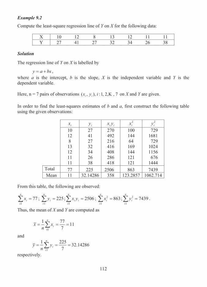
112
Example 9.2
Compute the least-square regression line of Y on X for the following data:
X 10 12 8 13 12 11 11 Y 27 41 27 32 34 26 38
Solution The regression line of Y on X is labelled by
bxay �� , where a is the intercept, b is the slope, X is the independent variable and Y is the dependent variable. Here, n = 7 pairs of observations 7,,2,1:),,( �iyx ii on X and Y are given. In order to find the least-squares estimates of b and a, first construct the following table using the given observations:
ix iy ii yx 2
ix 2iy
10 27 270 100 729 12 41 492 144 1681 8 27 216 64 729 13 32 416 169 1024 12 34 408 144 1156 11 26 286 121 676 11 38 418 121 1444
Total 77 225 2506 863 7439 Mean 11 32.14286 358 123.2857 1062.714
From this table, the following are observed:
771:
��n
iix ; 225
1:��
n
iiy ; 2506
1:��
n
iii yx ; 863
1:
2 ��n
iix ; 7439
1:
2 ��n
iiy .
Thus, the mean of X and Y are computed as
117771
1:��� �
n
iix
nx
and
14286.327
22511:
��� �n
iiy
ny
respectively.

113
The regression coefficient Y on X (or slope of Y) is given by
� �
� ��
��
���
�
��
���
���
���
�
�n
i
n
iii
n
i
n
ii
n
iiii
xxn
yxyxnb
1:
2
1:
2
1: 1:1:
= 27786372257725067
���
= 112217
= 1.9375.
The intercept is calculated as
xbya � . = 32.14286 – 1.9375 × 11 = 10.83036.
Thus, the least-squares regression equation is given by
Y = 10.83036 + 1.9375X. Example 9.3
Data for nine regions on the number of stores and turnover (in Rs. thousands per month) of a trading company are given below:
Number of Stores 952 253 360 484 593 639 498 371 416
Turnover 3657 819 1250 1302 1861 1625 1452 717 1179 Assume that X represents the number of stores and Y represents the turnover.
(a) Find the least-squares regression equation of Y on X. (b) From the regression equation, obtain an estimate of the turnover for given X = 1000
stores.
SolutionAs discussed in the previous example, we proceed to find the regression equation of Y on X. Here, n = 9 pairs of observations 9,,2,1:),,( �iyx ii on X and Y are given. Using these observations, the following table is constructed:

114
ix iy ii yx 2ix 2
iy 952 3657 3481464 906304 13373649 253 819 207207 64009 670761 360 1250 450000 129600 1562500 484 1302 630168 234256 1695204 593 1861 1103573 351649 3463321 639 1625 1038375 408321 2640625 498 1452 723096 248004 2108304 371 717 266007 137641 514089 416 1179 490464 173056 1390041
Total 4566 13862 8390354 2652840 27418494 Mean 507.3333 1540.222 932261.6 294760 3046499
From the above table, the following quantities are observed:
45661:
��n
iix ; 13862
1:��
n
iiy ; 8390354
1:��
n
iii yx ; 2652840
1:
2 ��n
iix ; 27418494
1:
2 ��n
iiy .
Thus, the mean of X and Y are computed as
507.33339
456611:
��� �n
iix
nx
and
1540.2229
1386211:
��� �n
iiy
ny
respectively. The regression coefficient Y on X (or slope of Y) is computed from the formula
� �
� ��
��
���
�
��
���
���
���
�
�n
i
n
iii
n
i
n
ii
n
iiii
xxn
yxyxnb
1:
2
1:
2
1: 1:1:
as
b = 245662652840913862456683903549
���
=3027204
12219294
= 4.036495
115
The intercept is calculated as xbya �
= 1540.222 - 4.036495 ×507.3333 = -507.626.
Thus, the least-squares regression equation is given by
Y = -507.626 + 4.036495X. From this equation, for X = 1000, the estimate of Y is obtained as follows:
Y = -507.626 + 4.036495 × 1000 = 3528.869.
Thus, the estimated turnover of the trading company is Rs. 3528.869 thousands per month when the number of stores is 1000.
9.3 STANDARD ERROR OF ESTIMATE OF THE REGRESSION EQUATION
Let esty be the estimate of Y for given values of X. The estimate of Y is obtained from the equation bXaY �� by substituting the values of a,b and X. Then, a measure of the scatter about the regression line of Y on X is supplied by the quantity
2
1:| )(1
est
n
iiXY yy
ns � � ,
which is called the standard error of estimate of Y on X. Here, the difference, )( esti yy , between the observed and estimated values of Y is called the error or residual. In a similar way, the standard error of estimate of X on Y is given by
2
1:| )(1
est
n
iiYX xx
ns � � .
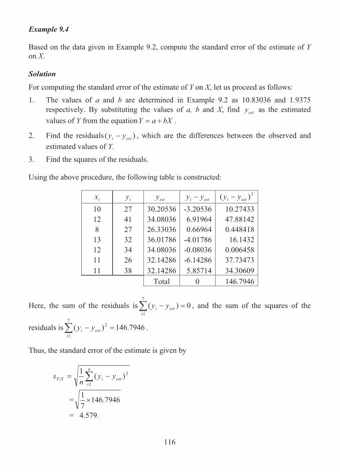
116
Example 9.4 Based on the data given in Example 9.2, compute the standard error of the estimate of Y on X. Solution
For computing the standard error of the estimate of Y on X, let us proceed as follows:
1. The values of a and b are determined in Example 9.2 as 10.83036 and 1.9375 respectively. By substituting the values of a, b and X, find esty as the estimated values of Y from the equation bXaY �� .
2. Find the residuals )( esti yy , which are the differences between the observed and estimated values of Y.
3. Find the squares of the residuals. Using the above procedure, the following table is constructed:
ix iy esty esti yy 2)( esti yy
10 27 30.20536 -3.20536 10.27433 12 41 34.08036 6.91964 47.88142 8 27 26.33036 0.66964 0.448418 13 32 36.01786 -4.01786 16.1432 12 34 34.08036 -0.08036 0.006458 11 26 32.14286 -6.14286 37.73473 11 38 32.14286 5.85714 34.30609
Total 0 146.7946
Here, the sum of the residuals is� �7
1:0)(
iesti yy , and the sum of the squares of the
residuals is� �7
1:
2 7946.146)(i
esti yy .
Thus, the standard error of the estimate is given by
2
1:| )(1
est
n
iiXY yy
ns � �
= 7946.14671�
= 4.579.

117
Example 9.5 Based on the data given in Example 9.3, (a) find the regression equation of X on Y, (b) find the standard error of estimates of Y on X and X on Y. Solution The regression equation of X on Y is given by the form
dYcX �� , where c is the intercept and d is the slope of the regression line. The least squares estimates of d and c are respectively given by
2
),(
Y
YXCovd�
� and ydxc � ,
where yxyxn
YXCovn
iii � �
1:
1),(
and 2
:
22 1 yyn
n
iiY � �� .
By referring Example 9.3, the following quantities can be observed:
45661:
��n
iix ; 13862
1:��
n
iiy ; 8390354
1:��
n
iii yx ; 2652840
1:
2 ��n
iix ; 27418494
1:
2 ��n
iiy .
Therefore,
1540.222507.3333839035491),( ���YXCov
= 150855.65;
22 222.15402741849491
��Y� .
= 674215.524.
The regression coefficient, d, is obtained as
524.674215625.150855
�d
= 0.22375
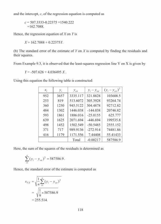
118
and the intercept, c, of the regression equation is computed as
c = 507.3333-0.22375 ×1540.222 =162.7088.
Hence, the regression equation of X on Y is
X = 162.7088 + 0.22375Y. (b) The standard error of the estimate of Y on X is computed by finding the residuals and their squares. From Example 9.3, it is observed that the least-squares regression line Y on X is given by
Y = -507.626 + 4.036495 X .
Using this equation the following table is constructed:
ix iy esty esti yy 2)( esti yy
952 3657 3335.117 321.8828 103608.5 253 819 513.6072 305.3928 93264.74 360 1250 945.5122 304.4878 92712.82 484 1302 1446.038 -144.038 20746.82 593 1861 1886.016 -25.0155 625.777 639 1625 2071.694 -446.694 199535.8 498 1452 1502.549 -50.5485 2555.152 371 717 989.9136 -272.914 74481.86 416 1179 1171.556 7.44408 55.41433
Total -0.00217 587586.9 Here, the sum of the squares of the residuals is determined as
9.587586)( 2
1:�� est
n
ii yy .
Hence, the standard error of the estimate is computed as
2
1:| )(1
est
n
iiXY yy
ns � �
= 9.58758691�
= 255.514.
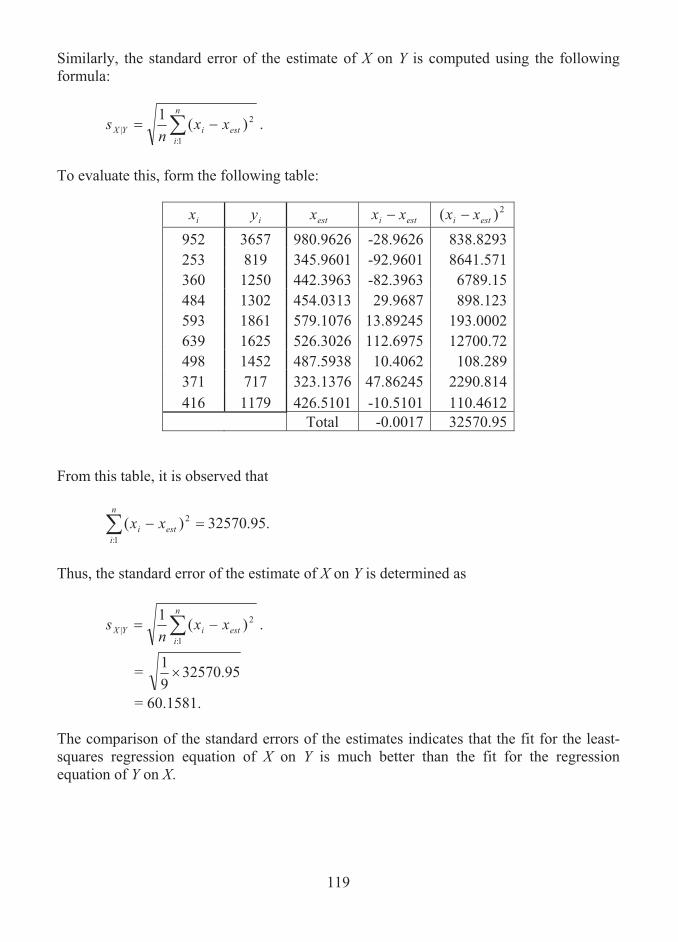
119
Similarly, the standard error of the estimate of X on Y is computed using the following formula:
2
1:| )(1
est
n
iiYX xx
ns � � .
To evaluate this, form the following table:
ix iy estx esti xx 2)( esti xx
952 3657 980.9626 -28.9626 838.8293 253 819 345.9601 -92.9601 8641.571 360 1250 442.3963 -82.3963 6789.15 484 1302 454.0313 29.9687 898.123 593 1861 579.1076 13.89245 193.0002 639 1625 526.3026 112.6975 12700.72 498 1452 487.5938 10.4062 108.289 371 717 323.1376 47.86245 2290.814 416 1179 426.5101 -10.5101 110.4612
Total -0.0017 32570.95 From this table, it is observed that
.95.32570)( 2
1:�� est
n
ii xx
Thus, the standard error of the estimate of X on Y is determined as
2
1:| )(1
est
n
iiYX xx
ns � � .
= 32570.9591�
= 60.1581. The comparison of the standard errors of the estimates indicates that the fit for the least-squares regression equation of X on Y is much better than the fit for the regression equation of Y on X.

120
Note When the standard error of the estimate is smaller, the regression fit for the data is much better.
9.4 SUMMARY
The technique that is used to describe the relationship between a dependent variable and one or more independent variables in mathematical form is termed as regression. The concept of regression is applied for estimating the value of the dependent variable for a given set of independent variables. In this lesson, the concept of regression and the importance of regression analysis are described. The methods of fitting a simple regression line of a dependent variable on an independent variable are presented with appropriate examples.
9.5 LESSON END ACTIVITY
1. Fit a least-squares regression line of a variable Y on another variable X based on the following data:
X 4 6 7 9 10 12 13 15 Y 2 4 5 7 8 10 11 13
2. For the data given in problem 1, compute the standard error of the estimate of Y on
X. 3. The following data relates to the output (in tons) of a certain commodity during 6
consecutive years and the profit (in Rs. Thousands) per ton:
Output 1000 1500 1800 2000 2400 2600 Profit 110 115 123 130 146 158
Fit a least-squares regression line, by taking profit as a dependent variable and output as an independent variable. Also, estimate the profit when the output in a particular year is (i) 2200 tonnes and (ii) 3000 tons. 4. The annual production (in tones) of a certain product and the corresponding
expenditure (in rupees lakhs) are shown in the following table:
Production 18 21 23 19 21 25 27 23 21 17 Expenditure 15 17 18 15 16 20 24 22 19 18

121
Draw a scatter diagram to the given data. Also, determine the following: (i) The regression equation of Y on X, where Y represents the expenditure and X
represents the production. (ii) The estimate of expenditure, for the amount of production is (a) 15 tons and (b) 30
tons. 5. The monthly production (in tons) of an industrial product and the corresponding
sales orders (in Rs. Thousands) are given below;
Production 10 12 10 14 15 11 Sales Order 105 110 98 130 128 130
Find the sales estimate if the production is (i) 20 tons and (ii) 9 tons. 6. For the data given in Problem 4, compute the standard error of estimate of Y on X.
9.6 POINTS FOR DISCUSSION
1. Explain the concept of regression with illustrations.
2. What is meant by regression analysis? State its importance.
3. What are two regression lines?
4. List out the methods of fitting a least-squares regression line of a dependent variable on an independent variable.
5. Define the standard error of the estimate of a regression equation.
9.7 SUGGESTED READING/REFERENCE/SOURCES
1. Spiegel, M.R., and L.J. Stephens (2000), Statistics, Schaum’s Outline Series, Tata McGraw-Hill, Inc.,
2. Levin, R.I., and Rubin, D.S., (1997), Statistics for Management, 7/e, Prentice – Hall, Englewood Cliffs, NJ, US.
122
LESSON-10
CORRELATION ANALYSIS
CONTENTS 10.0. Aims and Objectives 10.1. Concept of Correlation 10.2. Positive and Negative Correlation 10.3. Measure of Correlation 10.4. Product Moment Correlation Coefficient 10.5. Pearson’s Product-Moment Formula for the Linear Correlation Coefficient 10.6. Regression Lines and Linear Correlation Coefficient 10.7. Explained and Unexplained Variations 10.8. Coefficient of Determination 10.9. Properties of Correlation and Regression Coefficients 10.10. Causal Relationships 10.11. Measure of Concurrent Deviation 10.12. Summary 10.13. Lesson End Activity 10.14. Points for Discussion 10.15. Suggested Reading/Reference/Sources
10.0 AIMS AND OBJECTIVES
The purpose of this lesson is to provide an elaborate discussion on the concept of correlation and its measure. The illustrations given here enable the learner to understand the importance of correlation analysis and principle of relating the variables. The discussions made in this lesson will also enable one to learn how to interpret the values of correlation coefficient appropriately.
10.1 CONCEPT OF CORRELATION
More often, in studies involving two variables, a change in the value of one variable will bring a corresponding and related change in the other variable. This would mean that in practice the variables under study are related. The concept of regression and its

123
importance are discussed in the earlier lesson. The purpose of regression analysis is to identify a relationship that exists between the two variables from a given set of bivariate data. A least-squares regression line is found to be a good fit for the data, when the variables exhibit a linear relationship. Correlation analysis aims to provide a measure of how well a least-squares regression line fits the given set of data and helps to measure how well the line explains the variation of the dependent variable. Correlation is a technique used to measure the strength of the relationship between two variables. It describes the degree to which one variable is linearly related to another. When the correlation between the variables under study is better, the data points will be much closer to the regression line and hence one would have the more confidence in using the regression line for estimation. Correlation is defined as follows: Correlation is a concept concerned with describing the strength of the relationship between two variables by measuring the degree of scatter of the bivariate data values. Suppose that X and Y denote the two variables under consideration. Let
),(,),,(),,( 2211 nn yxyxyx � be n pairs of sample observations or values on X and Y. A scatter diagram can be drawn by plotting these pairs of values on a rectangular coordinate system. This diagram shows the location of points of (X, Y). When all points in the scatter diagram appear to lie near a straight line, the relationship between the variables is termed as linear and for studying such a linear relationship the concept of linear correlation is used. The plot of points lying near some curve, other than a straight line, exhibits a nonlinear relationship. A measure of the linear relationship between the two variables is called as coefficient of linear correlation.
10.2 POSITIVE AND NEGATIVE CORRELATION
Linear correlation between two variables may be classified into three types, namely, (1) positive correlation, (2) negative correlation and (3) no correlation. Correlation can exist in such a way that increases or decreases in the value of one variable tend to be associated with increases or decreases in the value of the other. This is known as positive or direct correlation. Thus, correlation is said to be positive or direct, if an increase or decrease in a variable results in a corresponding and proportionate increase or decrease in the other variable. That is, if Y tends to increase (or decrease) as X increases (or decreases), the correlation is called positive or direct correlation.
Example 10.1Number of calls made by salesman and number of sales realized have a relationship. The more calls a salesman makes, the more sales would be likely.

124
Example 10.2 Age of insured person and amount of premium are related. It is known that older a person is, the greater is the amount of premium. Example 10.3 Maintenance cost and age of the machine are two related variables. It is clear that as the machine gets older, the cost of maintenance will be higher. Example 10.4 There is a relationship between the experience of an employee and his salary. It can be realized that an employee who has more experience gets higher salary. Correlation also exists when increases or decreases in the value of one variable tend to be associated with decreases or increases in the value of the other and vice versa. In this case the correlation is said to be negative or inverse. Thus, correlation is said to be negative or indirect, if an increase or decrease in a variable results in a decrease or increase in the other variable. That is, if Y tends to increase (or decrease) as X decreases (or increases), the correlation is called negative or indirect correlation. Example 10.5 Number of weeks of experience and number of error made are related. As one becomes more experienced in performing a particular task, so less errors would be made. Example 10.6 Demand for the commodity and its price have a relationship. When the price of the commodity increases, the demand for the commodity decreases. If there is no relationship indicated between the variables, we say that there is no correlation between them, that is, they are uncorrelated.
10.3 MEASURE OF CORRELATION
A measure of correlation between two variables can be determined qualitatively and quantitatively. A qualitative measure of correlation is defined by direct inspection of the scatter diagram which is resulted from the plot of bivariate sample data. Just by observing the type of approximating curve in the scatter diagram it would be possible to make a decision whether there exists positive or negative or no correlation between the variables.
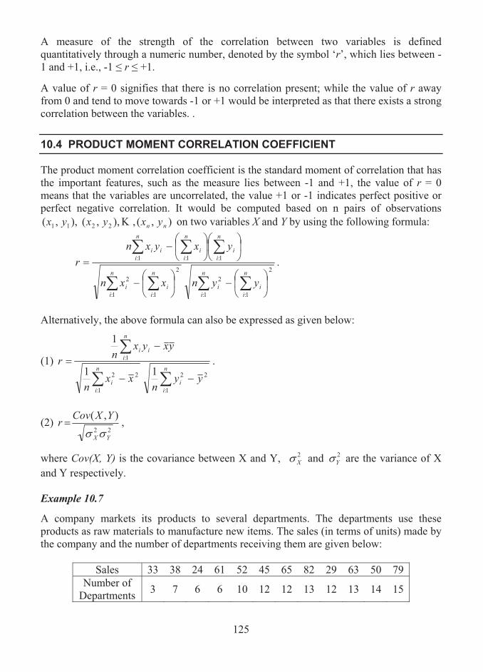
125
A measure of the strength of the correlation between two variables is defined quantitatively through a numeric number, denoted by the symbol ‘r’, which lies between -1 and +1, i.e., -1 � r � +1. A value of r = 0 signifies that there is no correlation present; while the value of r away from 0 and tend to move towards -1 or +1 would be interpreted as that there exists a strong correlation between the variables. .
10.4 PRODUCT MOMENT CORRELATION COEFFICIENT
The product moment correlation coefficient is the standard moment of correlation that has the important features, such as the measure lies between -1 and +1, the value of r = 0 means that the variables are uncorrelated, the value +1 or -1 indicates perfect positive or perfect negative correlation. It would be computed based on n pairs of observations
),(,),,(),,( 2211 nn yxyxyx � on two variables X and Y by using the following formula:
� �� �
� ��
��
���
��
�
���
�
��
���
���
���
�
�n
i
n
iii
n
i
n
iii
n
i
n
ii
n
iiii
yynxxn
yxyxnr
1:
2
1:
2
1:
2
1:
2
1: 1:1: .
Alternatively, the above formula can also be expressed as given below:
(1)
��
�
�
n
ii
n
ii
n
iii
yyn
xxn
yxyxnr
1:
22
1:
22
1:
11
1
.
(2) 22
),(
YX
YXCovr��
� ,
where Cov(X, Y) is the covariance between X and Y, 2X� and 2
Y� are the variance of X and Y respectively. Example 10.7
A company markets its products to several departments. The departments use these products as raw materials to manufacture new items. The sales (in terms of units) made by the company and the number of departments receiving them are given below:
Sales 33 38 24 61 52 45 65 82 29 63 50 79 Number of
Departments 3 7 6 6 10 12 12 13 12 13 14 15
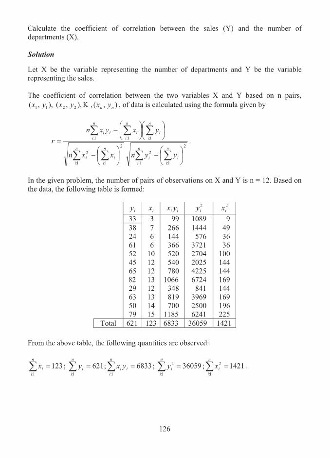
126
Calculate the coefficient of correlation between the sales (Y) and the number of departments (X). Solution Let X be the variable representing the number of departments and Y be the variable representing the sales. The coefficient of correlation between the two variables X and Y based on n pairs,
),(,),,(),,( 2211 nn yxyxyx � , of data is calculated using the formula given by
� �� �
� ��
��
���
��
�
���
�
��
���
���
���
�
�n
i
n
iii
n
i
n
iii
n
i
n
ii
n
iiii
yynxxn
yxyxnr
1:
2
1:
2
1:
2
1:
2
1: 1:1: .
In the given problem, the number of pairs of observations on X and Y is n = 12. Based on the data, the following table is formed:
iy ix ii yx 2
iy 2ix
33 3 99 1089 9 38 7 266 1444 49 24 6 144 576 36 61 6 366 3721 36 52 10 520 2704 100 45 12 540 2025 144 65 12 780 4225 144 82 13 1066 6724 169 29 12 348 841 144 63 13 819 3969 169 50 14 700 2500 196 79 15 1185 6241 225
Total 621 123 6833 36059 1421
From the above table, the following quantities are observed:
1231:
��n
iix ; 621
1:��
n
iiy ; 6833
1:��
n
iii yx ; 36059
1:
2 ��n
iiy ; 1421
1:
2 ��n
iix .

127
Thus, using the formula for the coefficient of correlation, we get
22 6213605912123142112621123683312
��
���r
= 9513.666
5613
= 0.589993,
which shows a moderate positive correlation between the sales and number of departments.
Example 10.8 The data on the number, X, of bank staff in a local bank and the waiting time, Y (in minutes) of 13 customers are given below:
X 2 3 5 4 2 6 1 3 4 3 3 2 4 Y 12.8 11.3 3.2 6.4 11.6 3.2 8.7 10.5 8.2 11.3 9.4 12.8 8.2
Calculate the coefficient of correlation between the number of staff on duty and the waiting time. Solution The coefficient of correlation between two variables X and Y is computed using the following alternative formula:
��
�
�
n
ii
n
ii
n
iii
yyn
xxn
yxyxnr
1:
22
1:
22
1:
11
1
,
where x and y are the arithmetic mean of X and Y given respectively by
��n
iix
nx
1:
1
and
��n
iiy
ny
1:
1 .
In the given problem, the number of pairs of observations on X and Y is n = 13. Based on the data, the following table is formed:
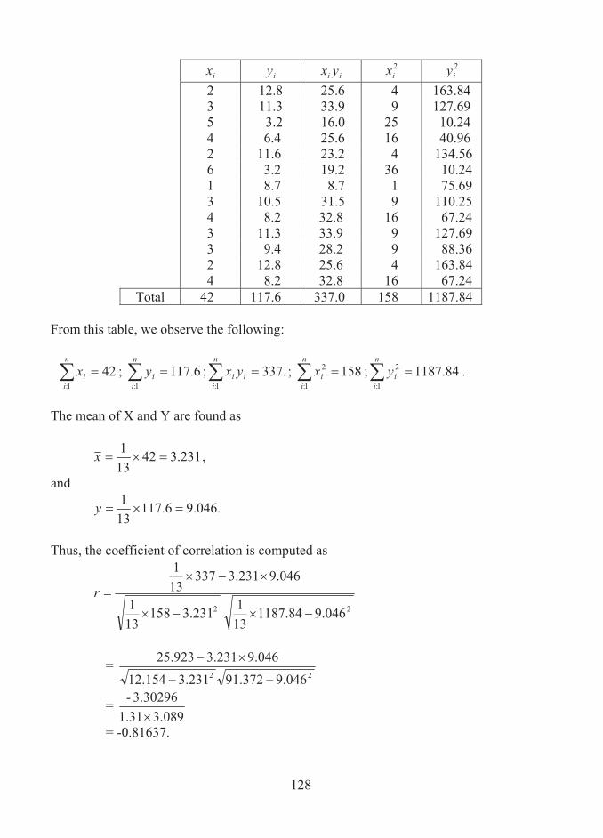
128
ix iy ii yx 2ix 2
iy 2 12.8 25.6 4 163.84 3 11.3 33.9 9 127.69 5 3.2 16.0 25 10.24 4 6.4 25.6 16 40.96 2 11.6 23.2 4 134.56 6 3.2 19.2 36 10.24 1 8.7 8.7 1 75.69 3 10.5 31.5 9 110.25 4 8.2 32.8 16 67.24 3 11.3 33.9 9 127.69 3 9.4 28.2 9 88.36 2 12.8 25.6 4 163.84 4 8.2 32.8 16 67.24
Total 42 117.6 337.0 158 1187.84 From this table, we observe the following:
421:
��n
iix ; 6.117
1:��
n
iiy ; .337
1:��
n
iii yx ; 158
1:
2 ��n
iix ; 84.1187
1:
2 ��n
iiy .
The mean of X and Y are found as
231.342131
���x ,
and
.046.96.117131
���y
Thus, the coefficient of correlation is computed as
22 046.984.1187131231.3158
131
046.9231.3337131
��
���r
= 22 046.9372.91231.3154.12
046.9231.3923.25
�
= 3.0891.31
3.30296-�
= -0.81637.

129
10.5 PEARSON’S PRODUCT-MOMENT FORMULA FOR THE LINEAR CORRELATION COEFFICIENT
If a linear relationship between two variables is assumed, the coefficient of correlation is defined and denoted by
YX
YXCovr��
),(� ,
where ),( YXCov is the covariance between X and Y, X� is the standard deviation of X and
Y� is the standard deviation of Y. Let ),(,),,(),,( 2211 nn yxyxyx � be n pairs of observations on the variables X and Y. Then, the expressions for computing ),( YXCov , X� and Y� are given below:
� �n
iii yyxx
nYXCov
:))((1),( ,
� �n
iiX xx
n :
2)(1� ;
� �n
iiY yy
n :
2)(1� .
Example 10.9 Refer the data presented in the previous example and calculate the product moment correlation. Solution
From the given data, we form the following table.
ix iy xxi yyi ))(( yyxx ii ( xxi )2 ( yyi )2
2 12.8 -1.231 3.754 -4.621 1.515 14.093 3 11.3 -0.231 2.254 -0.521 0.053 5.081 5 3.2 1.769 -5.846 -10.342 3.129 34.176 4 6.4 0.769 -2.646 -2.035 0.591 7.001 2 11.6 -1.231 2.554 -3.144 1.515 6.523 6 3.2 2.769 -5.846 -16.188 7.667 34.176 1 8.7 -2.231 -0.346 0.772 4.977 0.120 3 10.5 -0.231 1.454 -0.336 0.053 2.114 4 8.2 0.769 -0.846 -0.651 0.591 0.716 3 11.3 -0.231 2.254 -0.521 0.053 5.081 3 9.4 -0.231 0.354 -0.082 0.053 0.125 2 12.8 -1.231 3.754 -4.621 1.515 14.093 4 8.2 0.769 -0.846 -0.651 0.591 0.716
Total 42 117.6 -0.003 0.002 -42.939 22.308 124.012
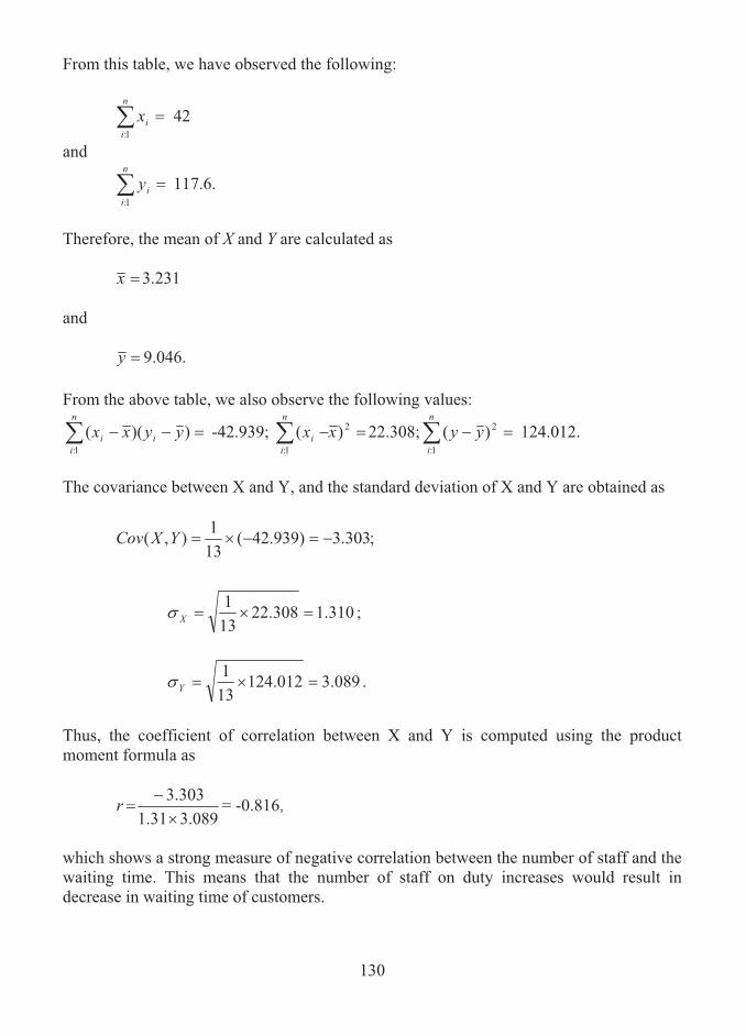
130
From this table, we have observed the following:
��n
iix
1:42
and
��n
iiy
1:
117.6.
Therefore, the mean of X and Y are calculated as
�x 3.231 and
�y 9.046. From the above table, we also observe the following values:
�� ))((1:
yyxxn
iii -42.939; �� 2
1:)( xx
n
ii 22.308; �� 2
1:)( yy
n
i124.012.
The covariance between X and Y, and the standard deviation of X and Y are obtained as
;303.3)939.42(131),( ���YXCov
310.1308.22131
���X� ;
089.3012.124131
���Y� .
Thus, the coefficient of correlation between X and Y is computed using the product moment formula as
089.331.1303.3
�
�r = -0.816,
which shows a strong measure of negative correlation between the number of staff and the waiting time. This means that the number of staff on duty increases would result in decrease in waiting time of customers.

131
Remarks on the Value of Coefficient of Correlation
When there is no correlation, i.e., r = 0, the scatter diagram will exhibit scattering of points in a haphazard fashion with elliptical boundary; When the correlation increases in strength (in both directions, positive and negative), the scatter diagram will display the points with a narrowed elliptical boundary, which means there is much less scatter. When correlation coefficient is perfect i.e., r = 1 or r = -1, the points will form a straight line, i.e., the plotted points will lie on a straight line. This straight line is the least squares regression line of Y on X.
10.6 REGRESSION LINES AND LINEAR CORRELATION COEFFICIENT
The equation of the least squares regression line of Y on X, given by bXaY �� , can be written as
)( XXbYY � ,
where
.),(2
X
Y
X
rYXCovb��
���
Similarly, the equation of the regression line of X on Y, given by dYcX �� , can be written as
)()( YYdXX � ,
where
.),(2
Y
X
Y
rYXCovd��
���
The slopes, b and d of the two regression lines in the above equations are equal if and only if r = ±1. In such a case the two lines are identical and there is perfect linear correlation between the variables X and Y. If r = 0, the lines are at right angles and there is no linear correlation between X and Y. Thus the linear correlation coefficient measures the departures of the two regression lines. Example 10.10 The grades of 10 students on two tests in Business Statistics are given below:
Test 1 6 5 8 8 7 6 10 4 9 7Test 2 8 7 7 10 5 8 10 6 8 6
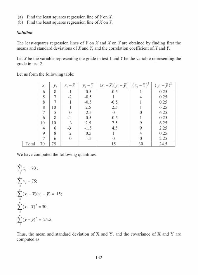
132
(a) Find the least squares regression line of Y on X. (b) Find the least squares regression line of X on Y. Solution The least-squares regression lines of Y on X and X on Y are obtained by finding first the means and standard deviations of X and Y, and the correlation coefficient of X and Y. Let X be the variable representing the grade in test 1 and Y be the variable representing the grade in test 2. Let us form the following table:
ix iy xxi yyi ))(( yyxx ii ( xxi )2 ( yyi )2 6 8 -1 0.5 -0.5 1 0.25 5 7 -2 -0.5 1 4 0.25 8 7 1 -0.5 -0.5 1 0.25 8 10 1 2.5 2.5 1 6.25 7 5 0 -2.5 0 0 6.25 6 8 -1 0.5 -0.5 1 0.25 10 10 3 2.5 7.5 9 6.25 4 6 -3 -1.5 4.5 9 2.25 9 8 2 0.5 1 4 0.25 7 6 0 -1.5 0 0 2.25
Total 70 75 15 30 24.5 We have computed the following quantities.
701:
��n
iix ;
;751:
��n
iiy
�� ))((1:
yyxxn
iii 15;
�� 2
1:
)( xxn
ii 30;
�� 2
1:)( yy
n
i24.5.
Thus, the mean and standard deviation of X and Y, and the covariance of X and Y are computed as

133
;71070
��x
;5.71075
��y
;732.130101
���X�
��� 5.24101
Y� 1.565;
.5.115101),( ���YXCov
Therefore, the coefficient of correlation is found as
565.1732.15.1�
�r
= 0.5534. On substituting the values of the means, the standard deviations and the coefficient of correlation in the equations for least square regression lines on Y on x and of X on Y, we get the following: Regression Line of Y on X
)( XXrYYX
Y ���
)7(732.1
1.5655534.05.7 �� XY
)7(5.05.7 �� XY .5.04 XY ��
Regression Line of X on Y
)( YYrXXY
X ���
)5.7(1.5651.7325534.07 �� YX
)5.7(612.07 �� YX
0.612Y.2.41 ��X

134
Note
In the previous example, the regression coefficients of Y on X and X on Y are obtained as
b = bY|X = 0.5 and
d = bX|Y = 0.612. Hence, the coefficient of correlation between X and Y is obtained as
YXXY bbr || ��
612.05.0 �� = 0.553.
10.7 EXPLAINED AND UNEXPLAINED VARIATIONS
The variation between observed values of the variable Y and their mean y is known as the total variation. This variation is split into two types of variations, namely, explained and unexplained variations. An explained variation is defined as the variation between the estimated value of Y given X and the mean of Y. An unexplained variation is defined as the numerical difference between total and explained variation and is the variation between the observed and estimated values of Y. In mathematical notations, the total variation, which is the sum of squares of the deviations of the values of Y from the mean y , is denoted by
V =� n
ii yy
1:
2)( ,
which can be written as
V = �� �n
iest
n
iesti yyyy
1:
2
1:
2 )()( ,
where the first expression on right hand side is the unexplained variation and the second expression is the explained variation. Suppose that particulars about turnover (Y) and expenditure on advertising (X) are available for a company over a number of months. It is clear that the turnover values obviously will vary from month to month and the best estimate of a typical value of turnover is the mean value of turnover over the period.

135
However, a better estimate of Y given a specific value of X can be obtained from the regression equation of Y on X. Then, the difference between the value of Y given by the Y on X regression equation (that is the estimated value of Y given X) and the mean of the Y values is known as the explained variation.
The unexplained variation is caused by factors not taken into account by the regression model.
10.8 COEFFICIENT OF DETERMINATION
The coefficient of determination is the ratio of explained variation to total variation and is expressed by
iationtotaliationlainedr
varvarexp2 �
�
�
� n
ii
n
iest
yy
yy
1:
2
1:
2
)(
)(.
This measure gives the proportion of all the variation in the values on dependent variable, Y, that is explained by the variation in the values on the independent variable, X. When there is no explained variation, i.e., the total variation is all unexplained, this ratio would be 0. If there is zero unexplained variation, i.e., the total variation is all explained, the ratio is 1. In other cases, the ratio lies between 0 and 1. Since the ratio is always nonnegative, it is denoted by r2. The quantity r, which is the square root of r2, is the product moment correlation coefficient. Obviously, r will lie between -1 and +1. Example 10.11 Assuming that X is an independent variable and Y is a dependent variable on X, compute (a) the total variation, (b) the explained variation, (c) the unexplained variation and (d) the coefficient of correlation between X and Y using the data given below:.
X 10 12 8 13 12 11 11 Y 27 41 27 32 34 26 38

136
Solution For finding the total, explained and unexplained variations, proceed as follows: 1. Find the regression equation of Y on X. 2. From this equation find the estimates of Y for given X.
3. From the observed values of Y, determine the total variation as V =� n
ii yy
1:
2)( .
4. By using the observed and estimated values of Y, determine the unexplained variation as
� n
iesti yy
1:
2 .)(
5. Determine the explained variation as � n
iest yy
1:
2)( = V - .)(1:
2� n
iesti yy
6. Compute the coefficient of correlation as
.)(
)(
1:
2
1:
2
�
�
�� n
ii
n
iest
yy
yyr
The regression equation of Y on X is found based on the given data as
Y = 10.83036 + 1.9375X. Using this equation, the estimates of Y for given X = ix are found which are tabulated below as esty along with the values required for finding the total, explained and unexplained variations.
ix iy esty esti yy 2)( esti yy 2)( yyi
10 27 30.20536 -3.20536 10.27433 26.44901 12 41 34.08036 6.91964 47.88142 78.44893 8 27 26.33036 0.66964 0.448418 26.44901 13 32 36.01786 -4.01786 16.1432 0.020409 12 34 34.08036 -0.08036 0.006458 3.448969 11 26 32.14286 -6.14286 37.73473 37.73473 11 38 32.14286 5.85714 34.30609 34.30609
Total 0 146.7946 206.8571
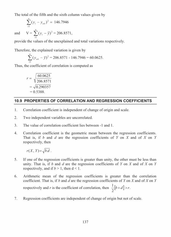
137
The total of the fifth and the sixth column values given by
� �n
iesti yy
1:
2)( 146.7946
and V = � n
ii yy
1:
2)( = 206.8571,
provide the values of the unexplained and total variations respectively. Therefore, the explained variation is given by
� n
iest yy
1:
2)( = 206.8571 - 146.7946 = 60.0625.
Thus, the coefficient of correlation is computed as
8571.2060625.60
�r
= 0.290357 = 0.5388.
10.9 PROPERTIES OF CORRELATION AND REGRESSION COEFFICIENTS
1. Correlation coefficient is independent of change of origin and scale.
2. Two independent variables are uncorrelated.
3. The value of correlation coefficient lies between -1 and 1.
4. Correlation coefficient is the geometric mean between the regression coefficients. That is, if b and d are the regression coefficients of Y on X and of X on Y respectively, then
dbYXr �),( .
5. If one of the regression coefficients is greater than unity, the other must be less than unity. That is, if b and d are the regression coefficients of Y on X and of X on Y respectively, and if b > 1, then d < 1.
6. Arithmetic mean of the regression coefficients is greater than the correlation coefficient. That is, if b and d are the regression coefficients of Y on X and of X on Y
respectively and r is the coefficient of correlation, then � � .21 rdb ��
7. Regression coefficients are independent of change of origin but not of scale.
138
10.10 CAUSAL RELATIONSHIPS
With respect to bivariate data, an independent variable is one that occurs naturally or is specially chosen in order to investigate another (dependent) variable. Relationships involving the dependence of one variable on the other are sometimes called as causal relationships. A causal relationship is said to exist between two variables when the values of one is directly attributable to the other. Another way of thinking this concept is that there is a distinct ‘cause and effect’ relationship between the two variables. Example 10.12
Age of machine and cost of maintenance are related variables. Here, age is the cause variable and cost is the effect variable.
Example 10.13
Age of insured person and amount of premium are related. Here, age is the cause variable and cost is the effect variable. In cases such as these it is usual to expect some degree of correlation, but it need not necessarily be strong.
Correlation might exist between the variables (but it could be strong), yet no causal relationship exist. This is sometimes known as spurious correlation.
Example 10.14 When we consider yearly profit of company and rateable value of premiums, both of these variables are likely to increase if the sizes of the first increases, but the two variables are not directly associated. That is, there is no causal relationship present. The conclusions which can be drawn from the above examples are as follows:
1. Correlation does not necessarily imply causality.
2. Causality normally implies correlation.
10.11 MEASURE OF CONCURRENT DEVIATION
The coefficient of concurrent deviation is a measure of correlation between two series calculated in the direction of change ignoring the amount of change.

139
The procedure of computing the coefficient of concurrent deviation consists in finding the direction in which the values in the series change. The direction of change of any value from the preceding is marked by + signs or by – signs according as the value moves up or moves below. Let there be n number of pairs of deviations. Let c be the number of concurrent deviations. Then, the measure of concurrent deviations is defined and denoted by
���
���
���n
ncr 2 .
The following points are important while applying the above formula:
1. If ���
���
nnc2 is positive, the sign should be positive before and after the square root.
2. If ���
���
nnc2 is negative, the sign should be negative before and after the square root.
Example 10.15 Calculate the coefficient of concurrent deviations based on the following data on price and imports on a certain commodity.
Price (in Lakhs) 368 384 385 361 347 384 395 403 400 385
Imports (in tonnes) 22 21 24 20 22 26 25 29 28 27
Solution Let X be the variable representing the price of the commodity and Y be the variable representing the imports. Construct the following table by assigning + or – sign to the values of each series based on the direction of change from the previous value and find the concurrent deviations. Corresponding to the first value of each series, signs could not be assigned.

140
X Direction of change
Y Direction of change
Concurrent Deviations
368 22 384 + 21 - - 385 + 24 + + 361 - 20 - + 347 - 22 + - 384 + 26 + + 395 + 25 - - 403 + 29 + + 400 - 28 - + 385 - 27 - +
Here, the number of pairs of concurrent deviations is n = 9 and the number of concurrent deviations is c = 6, which is the number of + signs. Hence, the coefficient of concurrent deviation is obtained as
���
���
���n
ncr 2
���
���
���n
nc2
���
��� �
���9
962
���
���
�9
912
= 0.57735,
which shows that there is a moderate degree of relationship between the prices and imports of the commodity.
10.12 SUMMARY
A study of measuring the association or relationship between two or more variables is termed as correlation analysis. The degree of relationship between the variables is expressed as a numeric constant, called as coefficient of correlation. In this lesson, the concept of correlation and the method of computing correlation coefficient between two

141
variables are described with examples. The relationship between the coefficient of correlation and the lines of regression equations are explored. The meaning of coefficient of determination, and the concepts of causal relationship and concurrent deviations are presented.
10.13 LESSON END ACTIVITY
1. Based on the data given below, compute the coefficient of correlation between X and Y.
X 4 6 7 9 10 12 13 15 Y 2 4 5 7 8 10 11 13
2. The following data relates to the output (in tons) of a certain commodity during 6
consecutive years and the profit (in Rs. Thousands) per tonne:
Output 1000 1500 1800 2000 2400 2600 Profit 110 115 123 130 146 158
Determine the coefficient of correlation between the output and the profit. 3. The monthly production (in tones) of an industrial product and the corresponding
sales orders (in Rs. Thousands) are given below;
Production 10 12 10 14 15 11 Sales Order 105 110 98 130 128 130
Calculate the coefficient of correlation. 4. The annual production (in tones) of a certain product and the corresponding
expenditure (in rupees lakhs) are shown in the following table:
Production 18 21 23 19 21 25 27 23 21 17 Expenditure 15 17 18 15 16 20 24 22 19 18
Draw a scatter diagram to the given data. Also, determine the following:
(i) The regression equation of Y on X, where Y represents the expenditure and X represents the production;
(ii) The estimate of expenditure when the production is (a) 15 tonnes and (b) 30 tonnes;
and (iii) the coefficient of correlation between X and Y.

142
5. The production (in tons) of a commodity and its cost (in Rs. Lakhs) over a period of 10 years in the past are given as follows:
Production 20 12 14 23 18 12 8 10 15 12
Cost 48 30 34 52 35 28 24 25 34 27 Calculate the product moment correlation between the production and the cost. 6. The annual turnover (in Rs. Lakhs) of a business firm and the profit (in Rs. Lakhs)
realized by the firm are given in the following table:
Turnover 110 122 130 138 152 159 170 182 Profit 12 13 15 18 20 22 25 28
By assuming profit as a dependent variable and turnover as an independent variable, determine (i) the least-square regression line of profit on turnover, (ii) the estimate of profit if the turnover is Rs. 200 lakhs, and (iii) the Pearson’s coefficient of correlation between the turnover and profit. Also, find the coefficient of determination. 7. For the data given in problem 6, compute (i) the total variation, (ii) the unexplained
variation and the explained variation.
10.14 POINTS FOR DISCUSSION
1. Explain the concept of correlation with illustrations. 2. Distinguish between correlation analysis and regression analysis. 3. Define coefficient of determination. 4. What do you understand by causal relationships? 5. Describe the method of computing the measure of concurrent deviations. 6. State the properties of coefficient of correlation. 7. Define (i) total variation, (ii) explained variation, (iii) unexplained variation.
10.15 SUGGESTED READING/REFERENCE/SOURCES
1. Spiegel, M.R., and L.J. Stephens (2000), Statistics, Schaum’s Outline Series, Tata McGraw-Hill, Inc.,
2. Levin, R.I., and Rubin, D.S., (1997), Statistics for Management, 7/e, Prentice – Hall, Englewood Cliffs, NJ, US.

143
UNIT – IV

144
LESSON-11
CONCEPT OF INDEX NUMBERS
CONTENTS
11.0. Aims and Objectives
11.1. Meaning and Definition of Index numbers
11.2. Problems Involved in the Construction of Index Numbers
11.3. Types of Index Numbers
11.4. Uses of Index Numbers
11.5. Limitations of Index Numbers
11.6. Summary
11.7. Lesson End Activity
11.8. Points for Discussion
11.9. Suggested Reading/Reference/Sources
11.0 AIMS AND OBJECTIVES
Index numbers provide a standardized way of comparing the values, over time, of commodities such as prices, volume of output and wages. They are used extensively in business, commerce and government establishments in various forms. A learner can easily grasp the purpose of such index numbers by referring the contents given in this lesson.
11.1 MEANING AND DEFINITION OF INDEX NUMBERS
An index number is a numeric quantity that is used to measure the level of a certain phenomenon such as prices or quantities or values of goods and services as compared to the level of the same at some specified period, location and other characteristics like income, profession etc. The index numbers are much important for managerial enterprises, business establishments and government organisations in making vital economic decisions. Definition of Index Number:
The definition of index numbers takes several forms and a few among them are listed below:

145
Wheldon defines an index number as a device which shows by its variation the changes in a magnitude which is not capable of accurate measurement in itself or of direct valuation in practice.
Edgeworth defines it as an index that shows by its variations the changes in a magnitude which is not acceptable either of accurate measurements in itself or of direct variation in practice. A simple index number is defined as a measure of percentage change in the value of some economic commodity over a period of time. It is always expressed in terms of a base of 100. Here, the term ‘economic commodity’ would be used to describe anything measurable such as price, quantity, productivity, expenditure, and so on, which has some economic relevance. An index number measures how much a variable changes over time. It is calculated by finding the ratio of the current value to a base value and by multiplying the resulting number by 100 to express the index as a percentage. This final value is the percentage relative. It is to be noted that the index number for the base point in time is always 100. Example 11.1 Suppose that the price of a standard box of 10 pencils was Rs. 20 in January and rose to Rs. 22 in June. The percentage increase can be worked out as:
1010020
2022��
.
In other words, the price of pencils rose by 10% from January to June. To put this into index number form, the 10% increase is added to the base of 100, giving 110. This is then described as follows: The price index of pencils in June was 110 (January = 100). Here, (January = 100) implies the starting point as January over which the increase in price is being measured and the base value as 100 of the index number. Example 11.2 Suppose that the productivity of a firm decreased by 5% over the period from 2004 to 2007. Then, the productivity index for the firm in 2007 is calculated as
95100100
5100��
.

146
Example 11.3 The following data relate to the production of computer systems by a firm during eight months from March to October.
Month March April May June July August September OctoberProduction 142 126 128 104 108 146 158 137 Compute the productivity index numbers with (i) March = 100, (ii) May = 100 as base. Solution The productivity index numbers are obtained as follows: a. Find the percentage increase or decrease of production with reference to the base
period. b. If the productivity increases, the index numbers are obtained by adding the
percentage increase with 100; if the productivity decreases, they are computed by subtracting the percentage decrease from 100.
Based on the procedure, the productivity relatives are obtained and tabulated below:
Base March = 100 Base May = 100 Month Production Percentage
Change Productivity
Index Percentage
Change Productivity
Index March 142 0 100 10.9 110.9 April 126 -11.3 88.7 -1.6 98.4 May 128 -9.9 90.1 0 100 June 104 -26.8 73.2 -18.8 81.2 July 108 -23.9 76.1 -15.6 84.4 August 146 2.8 102.8 14.1 114.1 September 158 11.3 111.3 23.4 123.4 October 137 -3.5 96.5 7 107
11.2 PROBLEMS INVOLVED IN THE CONSTRUCTION OF INDEX NUMBERS
The important problems which are to be encountered in practice while constructing index numbers are the following:
1. The purpose of index number: It is absolutely essential to set the purpose of finding an index number. The precisely stated purpose will enable one to plan for selecting the required items from the appropriate source.
147
(2) Selection of component commodities: The required commodities are selected appropriately to include in a composite index depending on the purpose. For instance, when the purpose of an index is to measure the cost of living of people living in slums, the commodities or items which are used by those alone should be selected.
(3) Selection of Weights: While computing index numbers it is important to consider the
weights of individual component commodities selected. A weighting factor is considered as an indicator of the significance of each component. Usually, prices are weighted by quantities, quantities by prices and productivity by number of workers involved. The weights are normally determined by conducting certain investigations. For instance, the weights used for the items covered by the consumer price index are determined by a family budget survey. The two types of indices which are normally used are: (i) unweighted indices, in which no specific weights are attached to various commodities, and (ii) weighted indices, in which appropriate weights are assigned to various items.
(4) Collection of the Data: The information relating to the prices, volumes, productivity, etc., for each component or item, together with the measures of the magnitude of the weights of the component should be collected from reliable sources keeping in mind the principles of data collection such as accuracy, adequacy, validity, proper representation, etc. It is to be noted that, normally, quantities are much more difficult to determine than prices. Also, the more complex the structure of the index, the more cost will be involved in collecting the data.
(5) Selection of a base time period: A base period is a period with which the comparison
of relative changes in the level of a phenomenon is made. For practical purposes, a normal base period, preferably a recent period might be chosen and might correspond with new working practices, a new company organisation or even a new method of collecting data. Also, it should be important that the period should not be far from the given period. For the comparison of two series of index numbers the base dates for both should be identical.
(6) Type of average to be used: As index numbers are specialized averages, a proper
choice of average should be made while constructing the index. The arithmetic mean, the geometric mean and the median are the averages used for the purpose.
11.3 TYPES OF INDEX NUMBERS
Index numbers are generally classified into three principal types, namely (1) the price index, (2) the quantity index and (3) the value index A price index is the most frequently used index, which compares levels of prices from one period to another. The consumer price index, also called as cost of living index or retail price index, measures overall price changes of a variety of consumer goods and services
148
and is intended to study the effect of changes in the price level on the cost of living of different classes of people. A quantity index measures how much the number or quantity of a variable changes over time. The value index measures changes in total monetary worth. That is, it measures changes in the money value of a variable. In effect, the value index combines price and quantity changes to present a more informative index.
11.4 USES OF INDEX NUMBERS
Index numbers can be used in several ways. Different indices serve different purposes. 1. A specific commodity index is designed to serve as a measure of changes in the
phenomenon of that commodity only. 2. There are many general purpose index numbers which help to measure changes in
general, either in production or in prices or in something else. 3. The index numbers may measure cost of living index of different classes of people. 4. Index numbers are used to measure the level of economic phenomena in order to
enable a comparison. 5. Index numbers such as the consumer price index are used as general indicators of the
nation’s economic conditions. 6. Index numbers, usually, reflect general economic conditions over a period of time.
For example, the consumer price index measures changes in the cost of living; the index of industrial production reflects changes in industrial output; the financial share index reflects the general state of the stock market.
7. Index numbers are used as part of an intermediate computation to understand other
information better. 8. Governments use index numbers extensively to decide upon tax changes, subsidies
to industries or regions etc. 9. Trade unions refer national cost of living and production indices in wage
negotiations or to compare the cost of living across national boundaries, regions or professions.
10. Financial institutions use various cost indices to index-link house policies.
149
11.5 LIMITATIONS OF INDEX NUMBERS
1. All index numbers are not good for all purposes.
2. A general purpose index may give a fair deal of change in price levels in general, but may fail to give any satisfactory picture of changes in the cost of living.
3. The index numbers are only approximate measurements. They just give a fair idea of changes and not an accurate idea.
4. There are chances of making errors besides mistakes, thus the quality of index number is likely to suffer; for example, in the selection of the commodities, the selection may not be proper or base year may not be satisfactorily chosen, an unsatisfactory average may be used, or the weights may be assigned wrongly.
5. Indices, by their nature, give only general indications of changes often over wide geographical areas. Thus, they generally will not cater for minority groups of professions or measure regional variations. For example, expenses of a family in a particular month might have been raised significantly, yet the price index for that month do not show any increase.
6. Weighting factors may become out of date, thus the index may not be useful to make comparisons.
7. If samples have been used to obtain data for either values or weights, the information obtained might be biased, incomplete or false.
8. Index numbers can be misunderstood or misinterpreted by the uninformed layman. For example, suppose that a production index increases from 400 to 410, this might be wrongly interpreted as a 10% increase in production, but there has been only a 10 points increase, which is 10 out of 400 or 2.5% increase.
11.6 SUMMARY
A measure of the percentage change in the value of some economic commodity over a period of time is called an index number. In this lesson, the meaning and definition of index numbers are given with illustrations. The important problems which are to be encountered in the construction of index numbers are described in detail. The uses and limitations of index numbers are highlighted.
11.7 LESSON END ACTIVITY
1. Identify the reason why index numbers are treated as specialized averages. 2. Geometric mean is best average in the construction of index numbers. Is this
statement true? 3. Construct your own example for price index number.4. State an illustration to find productivity index.
150
11.8 POINTS FOR DISCUSSION
1. What is an index number?
2. Explain in detail the problems that are to be given attention while constructing index numbers.
3. List out the various types of index numbers.
4. Bring out the uses of index numbers.
5. What are the limitations of index numbers?
11.9 SUGGESTED READING/REFERENCE/SOURCES
1. Levin, T.I., and D.S. Rubin (1997), Statistics for Management, 7/e, Prentice – Hall, Englewood Cliff, NJ, US.
2. McClave, J.T., Benson, P.G., and T. Sincich (2008), Statistics for Business and Economics, 10/e, Prentice – Hall, Englewood Cliff, NJ, US.
151
LESSON-12
CONSTRUCTION OF INDEX NUMBERS
(PRICE AND QUANTITY RELATIVES)
CONTENTS
12.0. Aims and Objectives
12.1. Symbols and Notations
12.2. Index Relatives
12.3. Fixed Base and Chain Base Relatives
12.4. Summary
12.5. Lesson End Activity
12.6. Points for Discussion
12.7. Suggested Reading/Reference/Sources
12.0 AIMS AND OBJECTIVES
The primary aim of this lesson is to properly propose the methods of finding the price and quantity relatives. Further, it aims to define the fixed and chain base relatives.
12.1 SYMBOLS AND NOTATIONS
Computation of various index numbers is done based on several formulae, which involve special letters, namely, p and q, representing prices and quantities. When stating such formulae it is more convenient to be able to refer to an economic commodity at some general time point. With respect to the time point, the following symbols and notation are used in the construction of index numbers:
0p = price at base time point
np = price at some other time point
0q = quantity at base time point
nq = quantity at some other time point
Index number can also be labelled in a compact way. For example, the statement ‘the index for 2007 based on 2005 (as 100) is 95’ may be labelled as I2007(2005 = 100) = 95 or I2007|2005 = 95.
152
12.2 INDEX RELATIVES
An index number measures the change in a single distinct commodity and may be called as a relative. The formulae for calculating a price relative and a quantity relative are as follows:
Price Relative = 1000
��pp
I nP
Quantity Relative = 1000
I nQ
Example 12.1 The price and quantities sold of two particular items in an electronic home appliances showroom over a period of two years are given below:
2006 2007 Item Price
0p
Quantities 0q
Price np
Quantities nq
Washing Machine Rs. 15,000 50 Rs. 16,000 38 Refrigerator Rs. 11,000 64 Rs. 12,500 40
Find price and quantity relatives for 2007 (2006 = 100) for both items. Solution
By letting the base period as 2006 and the current period as 2007, the price and quantity relatives (index numbers) for washing machine are computed as follows:
Price Relative = I2007|2006 = ����� 1001500016000100
0pp
I nP 106.67.
Quantity Relative = I2007|2006 = 761005038100
0
I nQ .
In a similar way, for refrigerator, the price and quantity relatives are obtained as follows:
Price Relative = I2007|2006 = ����� 1001100012500100
0pp
I nP 113.64.
Quantity Relative = I2007|2006 = ����� 1006440100
0qq
I nQ 62.5.
NoteIt can be seen that an index number is a compact way of describing percentage changes over time.

153
12.3 FIXED BASE AND CHAIN BASE RELATIVES
In order to measure the changes in values of an index relative over time, two different time series relatives are defined, namely, (i) fixed base relative and (ii) chain base relative. A period which is fixed as the base and adhered throughout while constructing the index relative is called as fixed base period. Thus, a fixed base relative is computed on the same time period. This method can be used when the basic nature of the commodity is unchanged over the whole period.
Illustrations 1. The price of edible oil in an oil market over a period of 3 months.
2. The money spent for weekly magazines. The method of chain base consists in assuming the immediately preceding time period as the base and then computing the relatives on that basis. Thus, in this method, each index relative is calculated with respect to the immediately preceding time point and can be used with any set of commodity values. In contrast to the fixed base relatives, the method of fixed base requires the condition that the basic nature of the commodity should change over the whole time period.
Illustration
An industrial management is interested to construct a monthly index of total maintenance costs for the power generator which it uses in the industry. However, this kind of unit is likely to change yearly with other kinds of sophisticated components being fitted as standard. This in turn would affect the maintenance cost index. Therefore, in this case, a chain base relative should be used. Example 12.2 The particulars relating to the monthly production (in units) of garments by a hosiery unit in a city for the first six months of a year are given below:
Year January February March April May June Production 1,400 1550 1450 1425 1375 1450
Calculate a set of fixed base relatives (with base March = 100) and a set of chain base relatives.
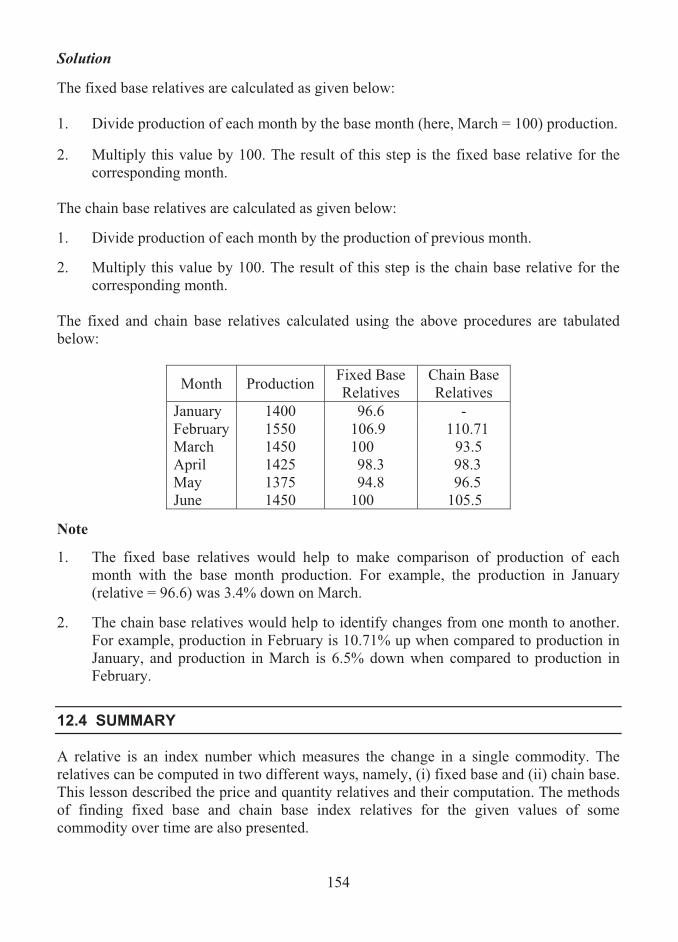
154
Solution The fixed base relatives are calculated as given below: 1. Divide production of each month by the base month (here, March = 100) production. 2. Multiply this value by 100. The result of this step is the fixed base relative for the
corresponding month. The chain base relatives are calculated as given below: 1. Divide production of each month by the production of previous month. 2. Multiply this value by 100. The result of this step is the chain base relative for the
corresponding month. The fixed and chain base relatives calculated using the above procedures are tabulated below:
Month Production Fixed Base Relatives
Chain Base Relatives
January 1400 96.6 - February 1550 106.9 110.71 March 1450 100 93.5 April 1425 98.3 98.3 May 1375 94.8 96.5 June 1450 100 105.5
Note
1. The fixed base relatives would help to make comparison of production of each month with the base month production. For example, the production in January (relative = 96.6) was 3.4% down on March.
2. The chain base relatives would help to identify changes from one month to another.
For example, production in February is 10.71% up when compared to production in January, and production in March is 6.5% down when compared to production in February.
12.4 SUMMARY
A relative is an index number which measures the change in a single commodity. The relatives can be computed in two different ways, namely, (i) fixed base and (ii) chain base. This lesson described the price and quantity relatives and their computation. The methods of finding fixed base and chain base index relatives for the given values of some commodity over time are also presented.
155
12.5 LESSON END ACTIVITY
1. The data relating to production (in thousands of hectoliters) of beverages in a region during January – June in a year are given below:
Year January February March April May June
Production 1250 1190 1495 1622 1987 2308 Calculate a set of (i) fixed base and (ii) chain base relatives with (a) January, (b) March and (c) May as the base period. 2. The price and quantities sold of 4 particular commodities in a shop over a period of
two years are given below:
Base Year Current Year Commodity Price
(in Rs.) Quantities (in Kg.)
Price (in Rs.)
Quantities (in Kg.)
A 150 5 170 6 B 160 6 175 4 C 170 7 175 5 D 180 8 160 8
Find price and quantity relatives for the current year (base year = 100) for all commodities.
12.6 POINTS FOR DISCUSSION
1. What is meant by index relative? 2. Distinguish between the fixed base and chain base relatives. 3. Define: (i) the price relative, (ii) the quantity relative. 4. Explain how you would compute (i) the price relative and (ii) the quantity relative. 5. Describe the methods of computing (i) the fixed base relatives and (ii) the chain base
relatives.
12.7 SUGGESTED READING/REFERENCE/SOURCES
1. Levin, T.I., and D.S. Rubin (1997), Statistics for Management, 7/e, Prentice – Hall, Englewood Cliff, NJ, US.
2. McClave, J.T., Benson, P.G., and T. Sincich (2008), Statistics for Business and Economics, 10/e, Prentice – Hall, Englewood Cliff, NJ, US.
156
LESSON-13
CONSTRUCTION OF INDEX NUMBERS
(COMPOSITE INDEX NUMBERS)
CONTENTS 13.0. Aims and Objectives 13.1. Composite Index Numbers 13.2. Types of Composite Index Numbers 13.3. Methods of Calculating Composite Weighted Index Numbers 13.4. Comparison of the Two Composite Indices 13.5. Special Cases of Weighted Aggregate Index Numbers 13.6. Summary 13.7. Lesson End Activity 13.8. Points for Discussion 13.9. Suggested Reading/Reference/Sources
13.0 AIMS AND OBJECTIVES
The purpose of this lesson is to provide various methods of constructing composite index numbers. The illustrations given here will be much helpful to understand the idea of such index numbers and their construction.
13.1 COMPOSITE INDEX NUMBERS
A composite index number is an index number which is defined by combining the information from a set of economic commodities of similar kind.
Examples
1. Index number of housing costs based on components such as mortgage payments or rent, rates, repairs, insurance and so on.
2. National price index based on components such as food, beverages, fuel and light, transport and vehicles and so on.
3. Industrial production index based on components such as metal, coal, food, clothes, oil and tobacco and so on.
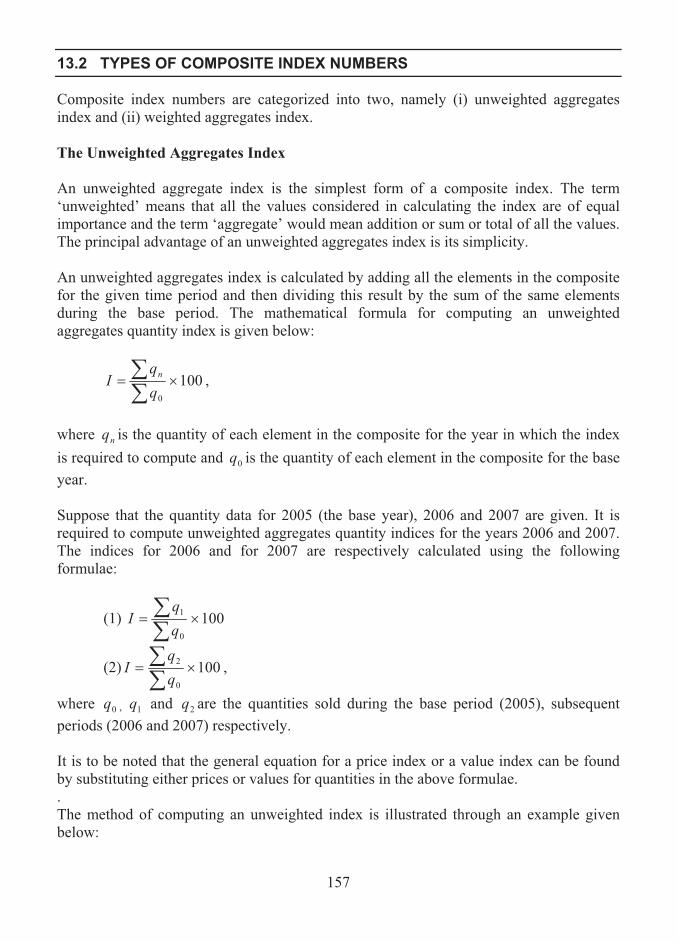
157
13.2 TYPES OF COMPOSITE INDEX NUMBERS
Composite index numbers are categorized into two, namely (i) unweighted aggregates index and (ii) weighted aggregates index. The Unweighted Aggregates Index An unweighted aggregate index is the simplest form of a composite index. The term ‘unweighted’ means that all the values considered in calculating the index are of equal importance and the term ‘aggregate’ would mean addition or sum or total of all the values. The principal advantage of an unweighted aggregates index is its simplicity. An unweighted aggregates index is calculated by adding all the elements in the composite for the given time period and then dividing this result by the sum of the same elements during the base period. The mathematical formula for computing an unweighted aggregates quantity index is given below:
1000
����
I n ,
where nq is the quantity of each element in the composite for the year in which the index is required to compute and 0q is the quantity of each element in the composite for the base year. Suppose that the quantity data for 2005 (the base year), 2006 and 2007 are given. It is required to compute unweighted aggregates quantity indices for the years 2006 and 2007. The indices for 2006 and for 2007 are respectively calculated using the following formulae:
(1) 1000
1 ����
I
(2) 1000
2 ����
I ,
where 0q , 1q and 2q are the quantities sold during the base period (2005), subsequent periods (2006 and 2007) respectively. It is to be noted that the general equation for a price index or a value index can be found by substituting either prices or values for quantities in the above formulae. . The method of computing an unweighted index is illustrated through an example given below:
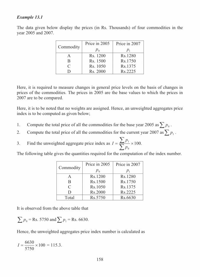
158
Example 13.1 The data given below display the prices (in Rs. Thousands) of four commodities in the year 2005 and 2007.
CommodityPrice in 2005
0p Price in 2007
1p A Rs. 1200 Rs.1280 B Rs. 1500 Rs.1750 C Rs. 1050 Rs.1375 D Rs. 2000 Rs.2225
Here, it is required to measure changes in general price levels on the basis of changes in prices of the commodities. The prices in 2005 are the base values to which the prices in 2007 are to be compared. Here, it is to be noted that no weights are assigned. Hence, an unweighted aggregates price index is to be computed as given below; 1. Compute the total price of all the commodities for the base year 2005 as� 0p .
2. Compute the total price of all the commodities for the current year 2007 as� 1p .
3. Find the unweighted aggregate price index as .1000
1 ����
pp
I
The following table gives the quantities required for the computation of the index number.
CommodityPrice in 2005
0p Price in 2007
1p A Rs.1200 Rs.1280 B Rs.1500 Rs.1750 C Rs.1050 Rs.1375 D Rs.2000 Rs.2225
Total Rs.5750 Rs.6630 It is observed from the above table that � 0p = Rs. 5750 and� 1p = Rs. 6630. Hence, the unweighted aggregates price index number is calculated as
10057506630
��I = 115.3.

159
The price index describing the change in the commodities from 2005 to 2007 is determined as 115.3. Suppose that the elements in this composite are representative of the general price level. Then, it could be concluded that prices are 15.3 percent up from 2005 to 2007. Note It is to be observed that only four commodities are considered, which would not reflect accurate price changes for all goods and services. Thus, this calculation provides us with only a very rough estimate. Limitations of Unweighted Index Numbers 1. An unweighted index can be distorted, and loses its value from changes in a few
items in the index that do not fairly represent the situation being studied.
2. The major disadvantage of an unweighted index is that it does not attach greater importance to price changes in a high-use item than it does to use a low-use item.
The Weighted Aggregates Index Numbers A composite index number is normally calculated after each component involved is weighted. A weighting factor is considered as an indicator of the importance of the component with respect to the type of index being calculated. Examples of weighting factors used in practice:
1. While calculating a price index the components are weighted either by quantity or expenditure or cost.
2. While computing a quantity index the components are weighted either by price or expenditure or cost.
3. A productivity index can be calculated by weighting the components by the number of men involved in the manufacture or production.
Usually, greater importance or weight is assigned to changes in some variables than do others while computing index. This weighting allows one to include more information than just the change in price over time and improves the accuracy of the general price level estimate based on the sample selected. However, the problem is to decide how much weight is to be attached to each of the variables in the sample. In the computation of a weighted aggregates index, the quantity of an item consumed will be used as the measure of its importance. The general formula for computing a weighted aggregates price index is
1000
����
qpqp
I n ,

160
where np is the price of each element in the composite in the current year, 0p is the price of each element in the composite in the base year and q is the quantity weighting factor chosen.
13.3 METHODS OF CALCULATING COMPOSITE WEIGHTED INDEX NUMBERS
For a given set of economic commodities with their values specified for two separate time points and a set of weights for the commodities, a composite index number can be calculated using two alternative methods, namely, (i) weighted average of relatives and (ii) weighted aggregates.
Method of Weighted Average of Relatives This method consists in calculating index relatives for each of the given components and then using the given weights to obtain a weighted average of the relatives. The steps involved in calculating a weighted average of relatives are given below: 1. Calculate an index relative for each component. The formula for index relative for a
component, k, say, is given by
1000
��ppI n
k .
2. Calculate a weighted average of relatives using the formula given below:
���
k
kkAR w
IwI ,
where kw is the weighting factor and Ik is the index relative for component k.
Note: The above formula may be simply written as .���
wwI
I AR
Example 13.2 The data given below display the prices of four components along with respective weights during two years, Year 1 and Year 2.
Price (in Rs. ) Component Weight Year 1 Year 2 A 3 2000 2300 B 7 1850 2100 C 4 1925 2175 D 8 3150 3425
Compute a weighted average of price relatives for the components.

161
Solution
Let w be the weight of the component. Let np and 0p be the price of the component in the current and base year respectively. Assume that year 1 is the base year and year 2 is the current year. A weighted average of price relatives for the components is computed based on index relatives of all components. The following table presents the index relatives.
Component wk 0p np 1000
��ppI n
k kk Iw
A 3 2000 2300 115 345 B 7 1850 2100 113.5 794.5 C 4 1925 2175 113 452 D 8 3150 3425 108.7 869.6
Total 22 2461.1 From the above table, we observe the total weight as � kw = 22 and � kk Iw = 2461.1. Hence, the weighted average of relatives is computed as
���
k
kkAR w
IwI
=22
1.2461
= 111.9. Method of Weighted Aggregates This method consists in multiplying each component value by its corresponding weight and adding these products to form an aggregate. The aggregates are obtained for both specified time points and are used to calculate the index. The steps involved in calculating a weighted aggregate index number are given below: 1. Calculate the products of weights and base values and add these to form a
(base) aggregate total. The formula for the base year aggregate is given below:
Aggregate total (base) =� kk pw 0 , where kp0 is the base year price of component k.
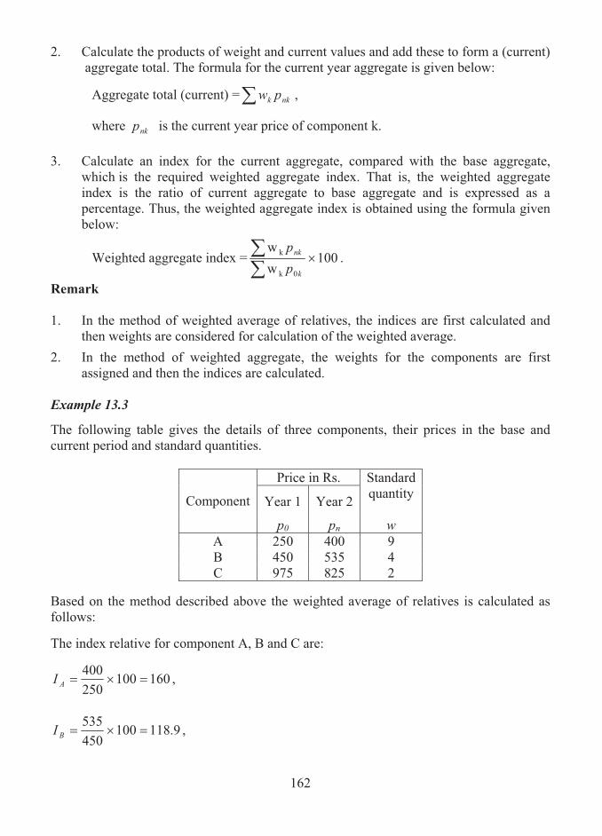
162
2. Calculate the products of weight and current values and add these to form a (current) aggregate total. The formula for the current year aggregate is given below:
Aggregate total (current) =� nkk pw ,
where nkp is the current year price of component k.
3. Calculate an index for the current aggregate, compared with the base aggregate, which is the required weighted aggregate index. That is, the weighted aggregate index is the ratio of current aggregate to base aggregate and is expressed as a percentage. Thus, the weighted aggregate index is obtained using the formula given below:
Weighted aggregate index = 100ww
0k
k ���
k
nk
pp
.
Remark 1. In the method of weighted average of relatives, the indices are first calculated and
then weights are considered for calculation of the weighted average.
2. In the method of weighted aggregate, the weights for the components are first assigned and then the indices are calculated.
Example 13.3
The following table gives the details of three components, their prices in the base and current period and standard quantities.
Price in Rs.
Year 1 Year 2
Standard quantity
Component
p0 pn w A 250 400 9 B 450 535 4 C 975 825 2
Based on the method described above the weighted average of relatives is calculated as follows: The index relative for component A, B and C are:
160100250400
���AI ,
9.118100450535
���BI ,

163
6.84100975825
���CI .
The weighted average of relatives is computed as follows:
.13915
8.2084249
6.8429.11841609
�
�
�������
�
���
k
kkAR w
IwI
This is the required overall index number. A simple layout for calculation of the above index number is given below:
Price in Rs. Year 1 Year 2
Standard quantity
Price relativeComponent
0p np w I wI
A 250 400 9 160 1440 B 450 535 4 118.9 475.6 C 975 825 2 84.6 169.2
Total 15 2084.8
From the above table, the weighted average of relatives, IAR, is calculated as
987.13815
8.2084���
��
k
kkAR w
IwI .
Example 13.4 The data relating to the prices and weights of industrial components are given below.
Price in Rs. Year 1 Year 2
Standard quantity Component
0p np wA 150 300 8 B 340 425 3 C 1040 884 1
Total 12 Calculate the weighted aggregate index using the data.

164
Solution Let wk be the weight of the kth component. Let nkp and kp0 be the price of the kth component in the current and base year respectively. Assume that year 1 is the base year and year 2 is the current year. The weighted aggregate index is calculated by finding the sums of products of weights and base prices of components and products of weights and current prices of components. A layout for computing the index number is constructed as given below:
Component 0p np w 0wp nwp A 150 300 8 1200 2400B 340 425 3 1020 1275C 1040 884 1 1040 884
Total 12 3260 4559 From this table, the aggregate (base) total and aggregate (current) total are observed as � kk pw 0 = 3260 and � nkk pw = 4559 respectively. Thus, the weighted aggregate price index is given by
IAG = 100ww
0k
k ���
k
nk
pp
= 10032604559
�
= 139.8.
13.4 COMPARISON OF THE TWO COMPOSITE INDICES
1. Both the methods are alternative ways of combining the information for a set of commodities into an index number.
2. For the given set of data, the two separate methods given for calculating a
composite index number will generally yield two different values for the index. Obviously, index numbers will be misused or misinterpreted. In order to tackle this problem (i) the technique used in calculating the index number should be quoted or published, and (ii) if indices are being calculated over a set of time periods, the same method should be used for each time period.
3. The characteristics of the two methods which cause different values of the final
index to occur are as follows:
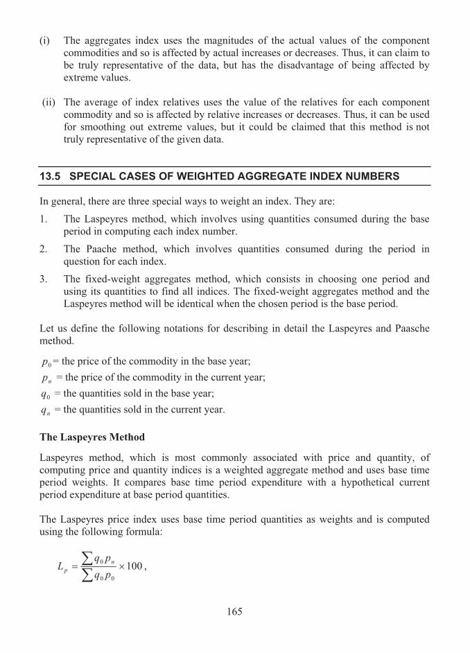
165
(i) The aggregates index uses the magnitudes of the actual values of the component commodities and so is affected by actual increases or decreases. Thus, it can claim to be truly representative of the data, but has the disadvantage of being affected by extreme values.
(ii) The average of index relatives uses the value of the relatives for each component
commodity and so is affected by relative increases or decreases. Thus, it can be used for smoothing out extreme values, but it could be claimed that this method is not truly representative of the given data.
13.5 SPECIAL CASES OF WEIGHTED AGGREGATE INDEX NUMBERS
In general, there are three special ways to weight an index. They are:
1. The Laspeyres method, which involves using quantities consumed during the base period in computing each index number.
2. The Paache method, which involves quantities consumed during the period in question for each index.
3. The fixed-weight aggregates method, which consists in choosing one period and using its quantities to find all indices. The fixed-weight aggregates method and the Laspeyres method will be identical when the chosen period is the base period.
Let us define the following notations for describing in detail the Laspeyres and Paasche method.
0p = the price of the commodity in the base year;
np = the price of the commodity in the current year;
0q = the quantities sold in the base year;
nq = the quantities sold in the current year. The Laspeyres Method Laspeyres method, which is most commonly associated with price and quantity, of computing price and quantity indices is a weighted aggregate method and uses base time period weights. It compares base time period expenditure with a hypothetical current period expenditure at base period quantities. The Laspeyres price index uses base time period quantities as weights and is computed using the following formula:
10000
0 ����
pqpq
L np ,

166
The Laspeyres quantity index uses base time period prices as weights and is computed using the following formula:
10000
0 ����
qpqp
L nq ,
Advantages and Disadvantages of Laspeyres Indices A Laspeyres index has certain advantages and disadvantages. The major advantages are given below:
1. The Laspeyres index needs only the base period quantities, no matter for how many
periods the index is being calculated. Hence, this method allows us to make a direct comparison of one index with another.
2. As this method uses only one quantity measure, the quantity measures are not
required to be tabulated every year.
The following are the disadvantages of the Laspeyres index.
1. The primary disadvantage of this method is that it tends to over-estimate price increases in a period of rising prices.
2. The base period quantities as weights may become out of date. In such cases, the Laspeyres index can not be properly defined.
The Paasche Method
This is another method of computing a weighted average index. The weights to be used in the Paasche method are the quantity measures for the current period rather for the base period. The Paasche index compares current period expenditure with a hypothetical base period expenditure at current period quantities. Paasche’s price index is computed using the following formula:
1000
����
pqpq
Pn
nnp ,
which uses current time period quantities as weights. The formula for finding Paasche’s quantity index is as follows:
1000
����
qpqp
Pn
nnq ,
which uses current time period prices as weights.

167
Similar to the Laspeyres index, the Paasche index has the following advantages:
1. The principal advantage of this method is that it considers current period weights, which are always up to date.
2. When compared to the Laspeyres index, the Paasche index is considered as a better indicator of general changes in the economy as it takes into account of the effect of changes in price and consumption patterns.
The disadvantages of Paasche index are as follows: 1. The Paasche method tends to under-estimate price increases in a period of rising
prices. 2. It is often difficult to get information about current period quantities as it would be
expensive or hard to identify sources of data.
Note It is difficult to compare indices derived by the Paasche method from different periods. This is due to the following reasons: 1. A particular Paasche price index is the result of both price and quantity changes from
the base period. 2. The quantity measures used for one index period are usually different from the
quantity measures for another index period. Hence, it is impossible to attribute the difference between the two indices to price changes only.
Example 13.5
The following data relate to a set of commodities used in a particular process:
Base Period Current Period Commodity Unit of
purchase Price in Rs.
Quantity in units
Price in Rs.
Quantity in units
A 1 tonne 36 100 4000 95 B 15 kgs. 8000 12 9000 10 C 10 litres 4500 16 4100 18 D 100 metres 500 1100 600 1200
Calculate Laspeyres and Paasche price indices for the current period.

168
Solution Construct the following table: Commodity 0p 0q np nq npq0 00 pq nn pq 0pqn
A 36 100 4000 95 400000 3600 380000 3420B 8000 12 9000 10 108000 96000 90000 80000C 4500 16 4100 18 65600 72000 73800 81000D 500 1100 600 1200 660000 550000 720000 600000
Total 1233600 721600 1263800 764420 From this table the following quantities are observed which are used for computing Laspeyres and Paasche index numbers:
� npq0 = 1233600
� 00 pq = 721600
� nnqp = 1263800
� nqp0 = 764420 Thus, Laspeyres price index and Paasche price index are obtained as
10000
0 ����
pqpq
L np
= 100721600
1233600�
= 170.95 and
1000
����
n
nnq qp
qpP
= 100764420
1263800�
= 165.33 respectively. Fixed-Weight Aggregates Method
This method is used to assign weights to elements in a composite. It is similar to both the Laspeyres and Paasche methods. It consists in defining weights from a representative period rather than using base-period or current-period weights (quantities). The

169
representative weights are referred to as fixed weights. The fixed weights and the base prices do not have to come from the same period. A fixed-weight aggregates price index is computed using the procedure given below:
1. Multiply the current-period prices by the fixed weights and find the sum of the results.
2. Multiply the base-period prices by the fixed weights and find the sum of the results.
3. Find the ratio of first sum to the second sum and express the result as a percentage. The resulting numeric quantity is called a fixed aggregates price index.
Let 0p , np and W represent base-period prices, current-period prices and fixed weights respectively. Then, the formula for computing the fixed aggregates price index is given by
.1000
����
WpWp
I n
The major advantage of this method is that it is more flexible in selecting the base period and the fixed weight (quantity). Irving Fisher’s Ideal Index Number The Fisher’s ideal index number is derived from Laspeyres and Paasche indices through the following formula:
ppp PLF ��
= ��
�� ��
on
nn
o
n
pqpq
pqpq
0
0100 ,
which is the geometric mean of Laspeyres and Paasche indices.
Remark The Fishers index number is not very popular in practice due to the complexity involved in using new quantity weights while computing it for each period. Example 13.6 The prices and quantities of four commodities produced by a manufacturing firm during the period 2005 and 2006 are given below:

170
Quantity (in kgs.) during Price (in Rs.) during Commodity 2005 2006 2005 2006
A 175 201 1540 1830 B 32 46 1270 1490 C 48 43 2760 2490 D 65 66 2190 2070
Calculate (a) Laspeyres index number, (b) Paasche index number and (c) Fisher’s index number for 2006 assuming year 2005 as the base year. Solution Let 0p and 1p be the base year and the current year prices of commodities. Let 0q and
1q be the base year and current year commodities. To determine the Laspeyres, Paasche and Fisher’s index numbers, let us form the following layout from the given data:
0q 1q 0p 1p 00 pq 10 pq 01 pq 11 pq175 201 1540 1830 269500 320250 309540 367830 32 46 1270 1490 40640 47680 58420 68540 48 43 2760 2490 132480 119520 118680 107070 65 66 2190 2070 142350 134550 144540 136620 Total 584970 622000 631180 680060
From the above table, we observe the following: � 00 pq = 584970
� 10 pq = 622000
� 01 pq = 631180
� 11 pq = 680060 Thus, the Laspeyres, Paasche and Fisher ideal index numbers are computed as follows:
10000
10 ����
pqpq
Lp
= 100584970622000
�
= 106.3;

171
10010
11 ����
qpqp
Pq
= 100631180680060
�
= 107.7; and
ppp PLF ��
= ��
�� ��
01
11
00
10100pqpq
pqpq
= 631180680060
584970622000100 ��
= 107.
13.6 SUMMARY
A composite index number is defined as an index number determined by combining the information from a set of commodities or components of similar kind. In this lesson, two types of composite index numbers such as (i) unweighted index numbers and (ii) weighted index numbers are described with illustrations. The methods of calculating a composite index number, namely, weighted average of relatives and (ii) weighted aggregates are presented. The Laspeyres and Paasche index numbers which are treated as special cases of a weighted aggregate index are defined and discussed with their merits and demerits.
13.7 LESSON END ACTIVITY
1. Find Laspeyres, Paasche and Fishers index numbers for the year 2007 when the base year is fixed as 2005 based on the following information:
2005 2007
Product Price (in Rs./kgs.)
Quantity (in kgs.)
Price (in Rs./kgs.)
Quantity (in kgs.)
A 25 100 33 140 B 28 175 42 170 C 15 125 22 130 D 12 200 20 220

172
2. A survey of household expenditure shows some changes as given below over the same week in each of the three years for an average family:
Price (in Rs.) Product Units of
Purchase Quantity Purchased
in 2005 2005 2006 2007 Bread Loaf 4 10 12 24 Butter 500 grams 1500 grams 50 55 72 Jam 500 grams 1000 grams 85 90 120 Tea 250 grams 500 grams 35 42 62 Milk 1 Litre 15 litres 13 15 20
Use (i) the Lapeyres method and (ii) the Paasche method for finding the index numbers for the years 2006 and 2007 by fixing 2005 as the base year.
3. The data relating to price (in Rs. Thousands) and quantity (in tones) of 4 different commodities in 2002 and 2007 are given below:
Commodities Year A B C D
2002 10 12 15 18 Quantiy 2007 15 13 19 22 2002 20 24 30 38 Price 2007 25 30 33 35
Compute (i) Laspeyres, (ii) Paasche and (iii) Fisher’s price index numbers for the year 2007 by assuming 2005 as the base year. 4. The particulars of 4 different commodities in the base and the current period are
given below:
Base Period Current Period Commodity Units Price
(in rupees) Quantity (units)
Price (in rupees)
Quantity (units)
A 100 Metres 3200 150 3800 200 B 1 Tonne 600 20 700 15 C 50 Litres 2500 25 2800 30 D 2 Kilograms 150 200 200 220
Calculate Laspeyres and Paasche index numbers for the current period.

173
5. The quantities and costs of materials for 4 departments of a business firm for two years are given as follows:
Cost
(in Rupees Lakhs) Quantity (in tones) Department
Base Year Current Year Base Year Current Year A 12 16 120 145 B 10 13 85 98 C 14 12 52 50 D 17 19 72 70
Calculate Laspeyres, Paasche and Fisher’s price index numbers for the current year with reference to the base year. 6. Calculate the price index number from the information given in problem 1 by the
method of weighted aggregates.
7. Calculate a weighted average of price relatives for the following commodities:
Price (in Rupees) Commodity Weight Year 1 Year 2 A 3 300 309 B 6 280 300 C 2 425 470 D 7 560 600
8. The weights of five different products and their prices (in rupees) during three
consecutive years are given below:
Weight Price (in Rupees) Product Year 1 Year 2 Year 3 A 12 4000 4100 4250 B 6 2500 2660 2900 C 8 3550 4000 3850 D 9 6075 5925 6190
Calculate a weighted aggregate price index for each year taking year 1 as the base year.

174
13.8 POINTS FOR DISCUSSION
1. Define a composite index number.
2. What are the two types of composite index numbers? How would they be computed?
3. Distinguish between the weighted average of relatives and the weighted aggregate indices.
4. Define the Laspeyres index number.
5. State the merits and demerits of the Laspeyres index numbers.
6. Define the Paasche index number.
7. State the merits and demerits of the Paasche index numbers.
8. Define Irving Fisher’s index number.
9. Explain the procedure of computing (i) the Laspeyres and (ii) the Paasche index numbers.
13.9 SUGGESTED READING/REFERENCE/SOURCES
1. Levin, T.I., and D.S. Rubin (1997), Statistics for Management, 7/e, Prentice – Hall, Englewood Cliff, NJ, US.
2. McClave, J.T., Benson, P.G., and T. Sincich (2008), Statistics for Business and Economics, 10/e, Prentice – Hall, Englewood Cliff, NJ, US.

175
LESSON-14
CONSUMER PRICE INDEX NUMBER
(COST OF LIVING INDEX NUMBERS)
CONTENTS 14.0. Aims and Objectives 14.1. Meaning of Consumer Price Index Number 14.2. Construction of Consumer Price Index Numbers 14.3. Uses of Cost of Living Index Number 14.4. Summary 14.5. Lesson End Activity 14.6. Points for Discussion 14.7. Suggested Reading/Reference/Sources
14.0 AIMS AND OBJECTIVES
The aim of this lesson is to provide the meaning of consumer price index number and its computation. The learner can easily adopt the formulae given in this lesson for constructing such index numbers.
14.1 MEANING OF CONSUMER PRICE INDEX NUMBER
Most often it would be necessary to study and measure the effect of changes in prices of commodities and services on the consumption power of various classes of people during a given time point with respect to some other time point. The numeric measures of such effects are called consumer price index numbers, which is also known as the cost of living index numbers. These index numbers should not be taken as indices of changes in the standard of living of people. Since changes in the cost of living of people are effected by changes in retail prices, sometimes these indices are also regarded as measuring changes in retail prices of commodities which are consumed by people. When there is a change in the cost of living of an individual between two time points, it would be interpreted as there is a change in his income with which he has to maintain his standard of living in both the time points. Hence, a consumer price index number is necessary to measure the average change in the cost of maintaining the standard of living in a specified time as in the base time.

176
It is necessary to point out here that no single consumer price index number is suitable for measuring changes in the cost of living of all classes of people because various classes of people differ widely from each other so far as their consumption habits are concerned. Thus, the cost of living index number relates to a specified class of people in specified region.
14.2 CONSTRUCTION OF CONSUMER PRICE INDEX NUMBERS
Cost of living index number is constructed in two distinct methods, namely, (i) the aggregate expenditure method and (ii) the family budget method. (i) Aggregate Expenditure Method
In this method, the weights provided by the quantities consumed in the base year are assigned to various commodities. Here, the cost of living index number is defined by the ratio of the total expenditure in current year to the total expenditure in base year and is expressed as a percentage. That is,
Cost of living index = 100exp
exp�
yearbaseinenditureTotalyearcurrentinenditureTotal ,
which is written in a mathematical form as given below:
Cost of living index = 10000
0 ���
pqpq n .
It can be observed that this formula is same as the Laspeyres index. The aggregate expenditure method is also known as the weighted aggregate method and is considered as the most popular method of constructing cost of living index numbers. Example 14.1
The price and quantities sold of 4 particular commodities in a shop over a period of two years are given below:
Base Year Current Year Commodity Price
(in Rs.) Quantities (in Kg.)
Price (in Rs.)
Quantities (in Kg.)
A 150 5 170 6 B 160 6 175 4 C 170 7 175 5 D 180 8 160 8
Determine consumer price index number.

177
Solution
In order to determine consumer price index number by aggregate expenditure method, first construct the following table:
0p 0q np nq 00qp 0qpn
150 5 170 6 750 850 160 6 175 4 960 1050 170 7 175 5 1190 1225 180 8 160 8 1440 1280
4340 4405 From the above table, the following quantities are observed: � npq0 = 4405 and � 00 pq = 4340. Thus, consumer price index number is calculated as
Consumer price index = 10000
0 ���
pqpq n
= 10043404405
�
= 101.5. (ii) Family Budget Method: In this method, the weights are defined by the values of quantities consumed in the base year and the cost of living index is computed on taking the weighted average of price relatives. Let I and w be the price relatives and the weights respectively. Then, the cost of living index is defined by
Cost of living index =��
wwI
,
which is the weighted average of price relatives. This method of finding cost of living is also known as the method of weighted relatives.

178
14.3 USES OF COST OF LIVING INDEX NUMBER
1. Cost of living index numbers are used for (i) calculating real wages and (ii) measuring the change in the purchasing power of the money. Thus, these index numbers indicate whether the real wages are rising or falling when money wages remain unchanged.
The real wages and purchasing power of money would be calculated using the following formulae:
Real wages = 100numberindex living ofcost
�wagesmoney
Purchasing power of money = numberindex living ofcost
1
2. The rate of dearness allowance for government employees and industrial workers based on changes in prices of commodities are calculated by using cost of living indices so as to meet the increased cost of living.
3. These indices are also used for deflation of income and value series in national accounts.
4. They are used widely in wage negotiations and wage contracts that would be signed between the governments or establishments and the trade unions. .
5. It serves as an economic indicator for the analysis of price situation. Example 14.2 In the construction of a certain cost of living index number the following group index numbers were found:
Group Index Number Weights Food 352 48 Fuel and lighting 200 10 Clothing 230 8 House rent 160 12 Miscellaneous 190 15
Calculate the cost of living index by the method of weighted relatives. Solution The method of weighted relatives for finding the cost of living index consists of the following steps:

179
Step 1: Find the products of the weight and index for each group as wI. Step 2: Find the sum of all the product values as�wI .
Step 3: Find the total weight as�w .
Step 4: Find the cost of living index as��
wwI
.
A simple layout for the computation of cost of living index based on the above steps is given below:
Group Index Number
IWeights
w wI
Food 352 48 16896 Fuel and lighting
200 10 2000
Clo thing 230 8 1840 House rent 160 12 1920 Miscellaneous 190 15 2850
Total 93 25506 From the above table it is observed that�wI = 25506 and�w = 93. Hence, the required cost of living index (CLI) is obtained as
CLI = 258.27493
25506� .
Example 14.3 In the construction of a certain cost of living index number the following group index numbers were found:
Group Average percentage increase
Weights
Food 32 15 Fuel and lighting 54 3 Clothing 47 4 House rent 78 2 Miscellaneous 58 1
Calculate the cost of living index by the method of weighted relatives. SolutionThe method of weighted relatives for finding the cost of living index consists of the following steps:

180
Step 1: For each component, find the index, I, from the average percentage increase by adding the average with 100.
Step 2: Find the products of the weight and index for each group as wI. Step 3: Find the sum of all the product values as�wI .
Step 4: Find the total weight as�w .
Step 5: Find the cost of living index as the ratio��
wwI
.
A simple layout for the computation of cost of living index based on the above steps is given below:
Group Average percentage
increase Index
IWeights
WwI
Food 32 132 15 1980 Fuel and lighting 54 154 3 462 Clothing 47 147 4 588 House rent 78 178 2 356 Miscellaneous 58 158 1 158 Total 25 3544
From the above table, it is observed that�wI = 3544 and�w = 25. Hence, the required cost of living index is obtained as
CLI = 76.14125
3544� .
Example 14.4 Construct the cost of living index for the year 2006 (Base 2000 = 100) based on the data given below:
Price Commodity Units 2005 2007 Weight
A Litres 0.50 0.75 10% S Kilograms 0.60 0.75 25% C Metres 2.00 2.40 20% D Litres 0.80 1.00 40% E Grams 8.00 10.00 5%
Here, the cost of living index is obtained by the method of weighted relatives as given below:
Step 1: Find price relatives (Base 2000) as 1000
��pp
I n , where pn and p0 are the prices
of commodities in the current and past period respectively.

181
Step 2: Find the products of the weight and index for each group as wI. Step 3: Find the sum of all the product values as�wI .
Step 4: Find the total weight as�w .
Step 5: Find the cost of living index as the ratio��
wwI
.
A layout for the computation of cost of living index based on the above steps is given below:
Commodity p0 pn I w wI
A 0.50 0.75 150 10% 1500 S 0.60 0.75 125 25% 3125 C 2.00 2.40 120 20% 2400 D 0.80 1.00 125 40% 5000 E 8.00 10.00 125 5% 625
Total 100% 12650 From the above table, it is observed that�wI = 12650 and �w = 100. Hence, the required cost of living index is obtained as
CLI = 5.126100
12650� .
Example 14.5
Compute price index number by using simple aggregate method for the year 2007 assuming 2006 as the base year based on the following data:
Price (in Rs.) during Commodity Units of Purchase 2006 2007
A Litres 300 325 B Metres 240 300 C Kilograms 560 530 D Quintals 850 790
Solution Assuming p0 and p1 as the base and current prices of the commodity, the price index number can be calculated using the following formula:
.1000
1 ����
pp
I

182
From the given data, the total price of commodities for the base and current periods are obtained as
� 0p = 1950
and � 1p = 1945,
respectively. Hence, the price index is 10019501945
��I = 99.7.
Example 14.6 The prices of various components during 2005 and 2007 are given along with the respective quantities in the following table.
Component Quantity Price in 2005
Price in 2007
A 5 1000 1260 B 4 840 1110 C 3 1200 1500 D 9 500 610 E 12 1500 1600
Find the price index number by the method of weighted aggregates. SolutionHere, the quantities given are considered as weights assigned to the components. Let w be the weight, p0 be the price at the base period and p1 be the price at the current period. Then, the weighted aggregate price index number is computed using the following formula:
.1000
1 ����
kk
kk
pwpw
I
The layout for computing this index number is as follows:
Component w 0p 1p 0wp 1wp
A 5 1000 1260 5000 6300 B 4 840 1110 3360 4440 C 3 1200 1500 3600 4500 D 9 500 610 4500 5490 E 12 1500 1600 18000 19200 Total 34460 39930
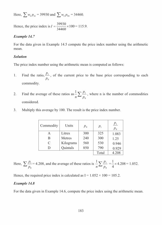
183
Here, � kk pw 1 = 39930 and � kk pw 0 = 34460.
Hence, the price index is 1003446039930
��I = 115.9.
Example 14.7
For the data given in Example 14.5 compute the price index number using the arithmetic mean.
Solution
The price index number using the arithmetic mean is computed as follows:
1. Find the ratio,0
1
pp , of the current price to the base price corresponding to each
commodity.
2. Find the average of these ratios as �0
11pp
n, where n is the number of commodities
considered.
3. Multiply this average by 100. The result is the price index number.
Commodity Units 0p 1p 0
1
pp
A Litres 300 325 1.083 B Metres 240 300 1.25 C Kilograms 560 530 0.946 D Quintals 850 790 0.929 Total 4.208
Here, �0
1
pp = 4.208, and the average of these ratios is �
0
11pp
n = 208.4
41� = 1.052.
Hence, the required price index is calculated as I = 1.052 × 100 = 105.2.
Example 14.8
For the data given in Example 14.6, compute the price index using the arithmetic mean.

184
Solution
The procedure is similar to the one illustrated in Example 14.4. It consists in finding the
sum of the products of the ratio,0
1
pp and the weight corresponding to the component and
then dividing it by the total weight.
Construct the following table:
Component w 0p 1p wpp�
0
1
A 5 1000 1260 6.3 B 4 840 1110 5.286 C 3 1200 1500 3.75 D 9 500 610 10.98 E 12 1500 1600 12.8
33 39.116
Here, we have 116.390
1 ��� wpp and� � 33w .
Hence, the required index number is computed as
.5.118
10033116.39
1000
1
�
��
����
w
wpp
I
14.4 SUMMARY
Cost of living index numbers is a measure of the percentage changes in the average level of the goods and services which the people of a country buy. In this lesson, the concept of cost of living index numbers and its need are presented. The aggregate expenditure and family budget methods of constructing the cost of living index numbers are described with illustrations.

185
14.5 LESSON END ACTIVITY
1. The costs of living index numbers for different group of items and the associated weights for the year 2007 with 2005 as the base year are given below:
Group of
Items Cost of Living
Index Weight
A 600 38 B 425 20 C 520 12 D 250 18 E 290 12
Calculate the cost of living index number for 2007 in total. Also, determine the earnings of a person in 2007 so as to maintain the same standard of living when his earnings in 2005 were Rs. 10,000. 2. Determine cost of living index by family budget method based on the following
data:
Year 1 Year 2 Year 3 Commodity Price (in Rs.) Quantity (in Kg.) Price (in Rs.) A 100 10 150 B 200 12 240 C 250 14 320 D 300 16 390
3. The data relating to price (in Rs. Thousands) and quantity (in tones) of 4 different
commodities in 2002 and 2007 are given below:
Commodities Year A B C D 2002 10 12 15 18 Quantiy 2007 15 13 19 22 2002 20 24 30 38 Price 2007 25 30 33 35
Compute consumer price index based on the given information by the method of aggregate expenditure.

186
14.6 POINTS FOR DISCUSSION
1. What is meant by cost of living index number? 2. What are the two methods of constructing the cost of living index numbers? 3. Describe the aggregate expenditure method of computing the price index number. 4. State the uses of cost of living index numbers.
14.7 SUGGESTED READING/REFERENCE/SOURCES
1. Levin, T.I., and D.S. Rubin (1997), Statistics for Management, 7/e, Prentice – Hall, Englewood Cliff, NJ, US.
2. McClave, J.T., Benson, P.G., and T. Sincich (2008), Statistics for Business and Economics, 10/e, Prentice – Hall, Englewood Cliff, NJ, US.

187
UNIT – V
188
LESSON-15
TIME SERIES ANALYSIS
CONTENTS
15.0. Aims and Objectives
15.1. Definition of a Time Series
15.2. Graph of a Time Series
15.3. Characteristic Movements of Time Series
15.4. Time Series Models
15.5. Time Series Analysis
15.6. Significance of Trend Values
15.7. Techniques for Extracting the Trend
15.8. Characteristics of the Methods of Measuring Trend
15.9. Summary
15.10. Lesson End Activity
15.11. Points for Discussion
15.12. Suggested Reading/Reference/Sources
15.0 AIMS AND OBJECTIVES
The contents in this lesson provide the basic notion of time series analysis and its importance. The methods for measuring trend component are provided in a simple manner, which the learner could adopt with ease for a given time series data.
15.1 DEFINITION OF TIME SERIES
A time series is defined as numerical data or the values of some statistical variable measured or described over a uniform set of time points. In other words, a time series is a set of observations taken at specific times, usually at equal intervals. It is also defined as the statistical data that are described over time. Based on such data it is required to understand the structure within which the data originates and the nature of the variation in both the short and long term.
189
A government of a state or a country or any large or small business firm will need to keep records of information such as production, sales, purchases, and value of stock held, etc., which could be recorded daily, weekly, quarterly or yearly, and such data constitute a time series.
Time series occurs naturally in all spheres of business activity as demonstrated in the following examples: Examples
1. Total annual production of wheat in India over a number of years. 2. The daily closing price of a share on the stock exchange 3. The total monthly sales receipts in a departmental store. 4. Annual turnover (in Rs. Crores) of a firm for ten successive years. 5. Numbers unemployed (in thousands) for each quarter of four successive years. 6. Total monthly sales for a small business for three successive years. 7. Daily takings for a super-market over a two month period. 8. Total annual profits of a company for five years. 9. Annual import and export of certain commodities for a period of 5 years Time Series Cycle Time series data, normally, exhibits a general pattern which broadly repeats and such a pattern is called as a cycle. Examples
1. Consumption of domestic electricity will have a distinct bi-monthly cycle. 2. Monthly sales for a business will exhibit some natural 12-monthly cycle. 3. Daily purchase for a supermarket will display a definite 6-day cycle. 4. Daily consumption of milk from a dairy will show a definite 7-day cycle.
15.2 GRAPH OF A TIME SERIES
Mathematically, a time series is defined by the values ,,, 21 �YY of a variable Y at time points �,, 21 tt . Thus, Y is a function of time, t. A time series involving a variable Y is often represented graphically by constructing a graph of Y against t. The standard graph for a time series is a line diagram. It is obtained by plotting the values of Y on the vertical axis against t on the horizontal axis as single points and by joining these points with straight line segments.
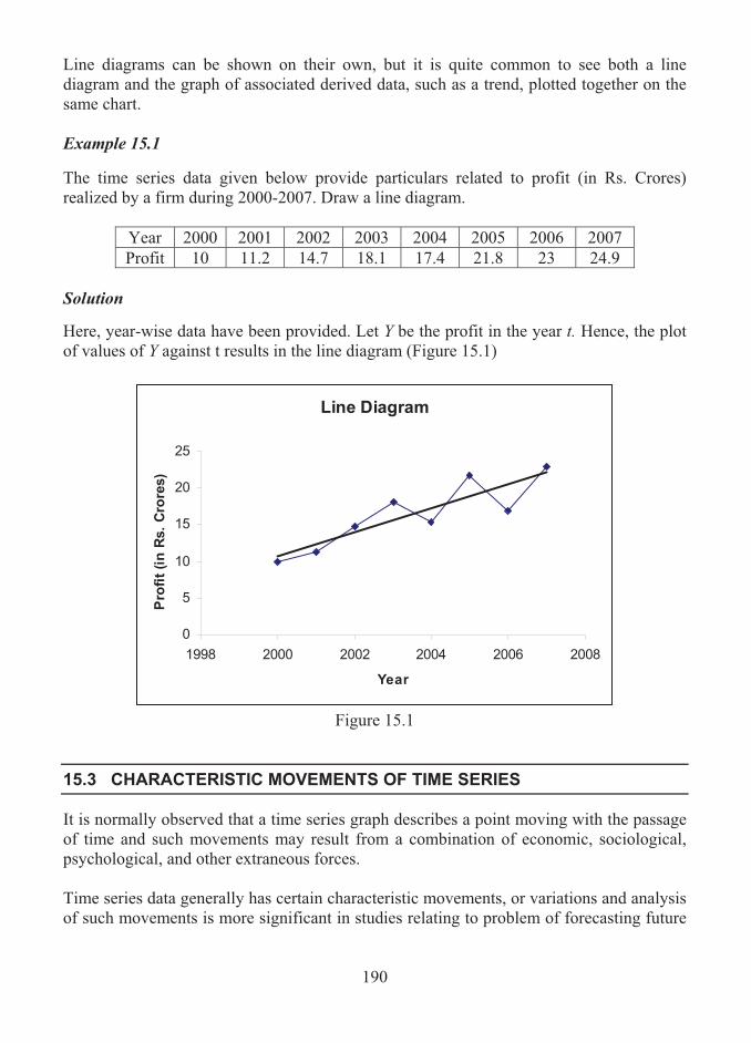
190
Line diagrams can be shown on their own, but it is quite common to see both a line diagram and the graph of associated derived data, such as a trend, plotted together on the same chart. Example 15.1
The time series data given below provide particulars related to profit (in Rs. Crores) realized by a firm during 2000-2007. Draw a line diagram.
Year 2000 2001 2002 2003 2004 2005 2006 2007 Profit 10 11.2 14.7 18.1 17.4 21.8 23 24.9
Solution Here, year-wise data have been provided. Let Y be the profit in the year t. Hence, the plot of values of Y against t results in the line diagram (Figure 15.1)
Line Diagram
0
5
10
15
20
25
1998 2000 2002 2004 2006 2008
Year
Pro
fit
(in
Rs.
Cro
res)
Figure 15.1
15.3 CHARACTERISTIC MOVEMENTS OF TIME SERIES
It is normally observed that a time series graph describes a point moving with the passage of time and such movements may result from a combination of economic, sociological, psychological, and other extraneous forces. Time series data generally has certain characteristic movements, or variations and analysis of such movements is more significant in studies relating to problem of forecasting future

191
movements and making projections. The movements, some times called as changes or components, of time series data are of four kinds, namely, (a) Long-term trend or secular trend or movements; (b) Cyclical fluctuations; (c) Seasonal variation; and (d) Irregular variation. Secular Trend or Movements The secular trend or movement represents the direction of the time series over a long period of time. In other words, the movement is the underlying long-term tendency of the data. The secular movements are measured by a trend line or curve, which is resulted in a time series graph and in turn enable one to identify whether the value of the variable tends to increase or decrease.
Examples1. A steady increase in the cost of living or consumer price index will exhibit a trend. 2. Annual production of dairy products will show a trend pattern. 3. An increase or decrease in export or import will display a trend. There are various techniques for extracting a trend from a given time series. They are: 1. Graphical method; 2. Method of semi-averages; 3. Method of least-squares; and 4. Method of moving averages.
Seasonal Variations
Seasonal variations or movements are short-term cyclic fluctuations in the data about the trend which occur periodically in a year. Such variations are due to recurring events occurring annually and involve patterns of change within a year that tends to be repeated from year to year. The time intervals are usually measured in terms of days, weeks, months or quarters in detecting seasonal movements. Examples1. Daily seasons over a weekly cycle for sales in a supermarket.
2. Monthly seasons over a yearly cycle for purchase of a company.
3. Quarterly seasons over a yearly cycle for consumption of electricity in the domestic sector.
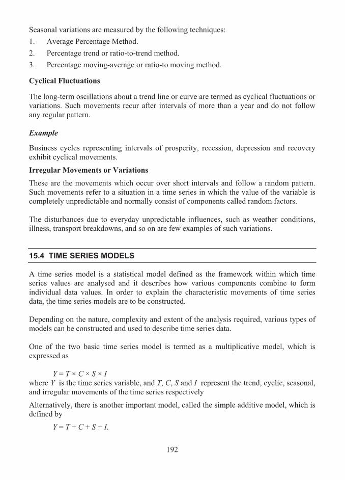
192
Seasonal variations are measured by the following techniques: 1. Average Percentage Method. 2. Percentage trend or ratio-to-trend method. 3. Percentage moving-average or ratio-to moving method. Cyclical Fluctuations The long-term oscillations about a trend line or curve are termed as cyclical fluctuations or variations. Such movements recur after intervals of more than a year and do not follow any regular pattern. Example Business cycles representing intervals of prosperity, recession, depression and recovery exhibit cyclical movements.
Irregular Movements or Variations These are the movements which occur over short intervals and follow a random pattern. Such movements refer to a situation in a time series in which the value of the variable is completely unpredictable and normally consist of components called random factors. The disturbances due to everyday unpredictable influences, such as weather conditions, illness, transport breakdowns, and so on are few examples of such variations.
15.4 TIME SERIES MODELS
A time series model is a statistical model defined as the framework within which time series values are analysed and it describes how various components combine to form individual data values. In order to explain the characteristic movements of time series data, the time series models are to be constructed. Depending on the nature, complexity and extent of the analysis required, various types of models can be constructed and used to describe time series data. One of the two basic time series model is termed as a multiplicative model, which is expressed as
Y = T × C × S × I where Y is the time series variable, and T, C, S and I represent the trend, cyclic, seasonal, and irregular movements of the time series respectively
Alternatively, there is another important model, called the simple additive model, which is defined by
Y = T + C + S + I.
193
15. 5 TIME SERIES ANALYSIS
Time series analysis is the process of understanding, describing, evaluating and extracting the components of a time series model that splits a particular series into understandable and explainable portions and that enables one to identify trends, to eliminate extraneous factors and make forecasts or projections appropriately. In other words, time series analysis enables the structure of the data to be understood, trends to be identified and forecasts to be made. For a given set of time series data, every single given value of Y can be either expressed as the sum or as the product of the four components such as T, C, S and I. The main objective of the overall time series analysis amounts to investigating and interpreting these components. Such a process in time series analysis is termed as a decomposition of a time series into its basic components movements.
15.6 SIGNIFICANCE OF TREND VALUES
The trend can be considered as the major component of the additive time series model about which the other components, seasonal (S), cyclical (C) and irregular (R) variations, move. This component is found by identifying separate trend (T) values, each corresponding to each time point. The objective of finding the trend values based on the time series is to enable one to highlight the underlying tendency or the patterns exhibited by the data. For example, in a study about sales pattern, a business sales trend will normally show whether sales are moving up or down in the long run. The trend analysis also enables to project past patterns into the future.
15.7 TECHNIQUES FOR EXTRACTING THE TREND
There are three important techniques that can be used to extract a trend from a set of time series values: 1. Method of Semi-averages is the simplest technique involving the calculation of two
averages which, when plotted on a chart and joined up, form a straight line.
2. Method of Least-squares regression line is a technique which results in a straight line.
3. Method of Moving averages is the most commonly used method for identifying a trend and involves the calculation of a set of averages.

194
Method of Semi-averages The method of semi-averages for obtaining a trend for a time series is described below: Step 1. Split the data into a lower and upper group, i.e., split the data into two equal halves. Step 2. Find the mean value for each group. Step 3. Plot each mean against an appropriate time point on a two-dimensional graph. (This time point can be taken as the median time point of the respective group) Step 4. The line joining the two plotted points is the required trend. It is important that the two groups in question have an equal number of data values. If the given data, however, contains an odd number of data values, the middle value can be ignored for the purpose of drawing the trend line. Once a trend line has been obtained, the trend values corresponding to each time point can be read off from the graph.
Example 15.2 Calculate the trend values using the method of semi-averages for the following time series data:
16, 12, 15, 14, 18, 12, 14, 13, 18, 13 Solution For finding the trend values, a trend line is to be drawn. In order to draw a trend line, proceed as follows: 1. Divide the given data into two equal groups, each containing equal number of
values. Thus, the values of the two groups are as given below:
Group 1: 16, 12, 15, 14, 18 Group 2: 12, 14, 13, 18, 13
2. The average (mean) of group1 and 2 are computed as
��n
iix
nx
1:11
1 = 15
and 1411:
21 �� �n
iix
nx
respectively.

195
3. Plot these averages against the respective median time point in each group on a two-dimensional graph. Figure 15.2 displays the plotted points.
4. Draw the trend line joining the two points. The trend line is shown in the Figure 15.2.
5. From the trend line, the trend values corresponding to each time point are found.
It can be observed that the line passing through the averages of two sub-groups is linear.
Trend Line using
Method of Semi-averages
8
10
12
14
16
18
20
1 2 3 4 5 6 7 8 9 10Time, t
Data
Valu
es a
t t
Time series values Semi-averages Linear (Semi-averages)
Figure 15.2
Example 15.3 Data given below represent sales (in Rs.000) that were recorded for a firm every day over a period of 2 weeks. Obtain a trend line by the method of semi-averages.
Week 1 Week 2 Mon Tue Wed Thu Fri Mon Tue Wed Thu Fri
Sales 250 320 340 520 410 260 380 410 670 420 Solution It is to be noted that the data values are time-ordered, which is normal and natural feature for a time series. Based on the method of semi-averages, a trend line is obtained as given below: 1. The sales data given for week 1 and 2 are considered as the two groups.
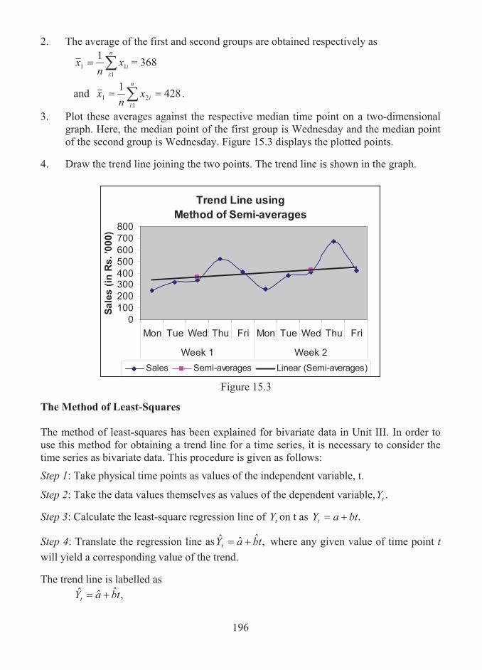
196
2. The average of the first and second groups are obtained respectively as
��n
iix
nx
1:11
1 = 368
and 42811:
21 �� �n
iix
nx .
3. Plot these averages against the respective median time point on a two-dimensional graph. Here, the median point of the first group is Wednesday and the median point of the second group is Wednesday. Figure 15.3 displays the plotted points.
4. Draw the trend line joining the two points. The trend line is shown in the graph.
Trend Line using
Method of Semi-averages
0
100
200
300400
500
600
700
800
Mon Tue Wed Thu Fri Mon Tue Wed Thu Fri
Week 1 Week 2
Sa
les
(in
Rs
. '0
00
)
Sales Semi-averages Linear (Semi-averages)
Figure 15.3
The Method of Least-Squares The method of least-squares has been explained for bivariate data in Unit III. In order to use this method for obtaining a trend line for a time series, it is necessary to consider the time series as bivariate data. This procedure is given as follows:
Step 1: Take physical time points as values of the independent variable, t.
Step 2: Take the data values themselves as values of the dependent variable, .tY
Step 3: Calculate the least-square regression line of tY on t as .btaYt ��
Step 4: Translate the regression line as ,ˆˆˆ tbaYt �� where any given value of time point t will yield a corresponding value of the trend. The trend line is labelled as
,ˆˆˆ tbaYt ��

197
where tY is the time series value at time point t, a is the intercept and b is the slope of the trend line.
The values of b and a can be obtained using the following formulae:
� �
� ��
��
���
�
��
���
���
���
�
�n
i
n
iii
n
i
n
ii
n
iiii
ttn
ytytnb
:1:
2
:
2
1: ::ˆ ;
tbya ˆˆ � ,
where ��n
iitn
t:
1
and
��n
iiy
ny
:
1 .
Example 15.4 For the following time series data, find the trend line using the method of least squares:
Time, t 1 2 3 4 5 6 7 8 9 10 11 12 Values of tY
2.2 5.0 7.9 3.2 2.9 5.2 8.2 3.8 3.2 5.8 9.1 4.1
SolutionThe trend line is labelled by the equation
tbaytˆˆˆ �� .
In order to find this equation, we proceed as follows:
1. Find the sums �� ��n
ii
n
i
n
iiii
n
ii tytyt
1::
2
1:: 1:1::
,,, .
2. Find the means yandt as
��n
iitn
t:
1
and
��n
iiy
ny
:
1 .

198
3. Using the above quantities, find the values of a and b .
Construct the following table to observe the quantities given in step 1 above.
it iy ii yt 2it
1 2.2 2.2 1 2 5.0 10 4 3 7.9 23.7 9 4 3.2 12.8 16 5 2.9 14.5 25 6 5.2 31.2 36 7 8.2 57.4 49 8 3.8 30.4 64 9 3.2 28.8 81 10 5.8 58 100 11 9.1 100.1 121 12 4.1 49.2 144
Total 78 60.6 418.3 650 From the above table, the following are observed:
781::
��n
iit ;�
n
iiy
1::= 60.6;�
n
iii yt
1:= 418.3; and �
n
iit
1::
2 = 650.
Thus, the means are obtained as
5.61278
��t
and
05.512
6.60��y .
The value of b is calculated as
2)78(65012)6.60()78(3.41812ˆ
���
�b
= 1716
8.292
= 0.170629. The value of a is computed as
5.6170628.005.5ˆ ��a
= 3.940909.
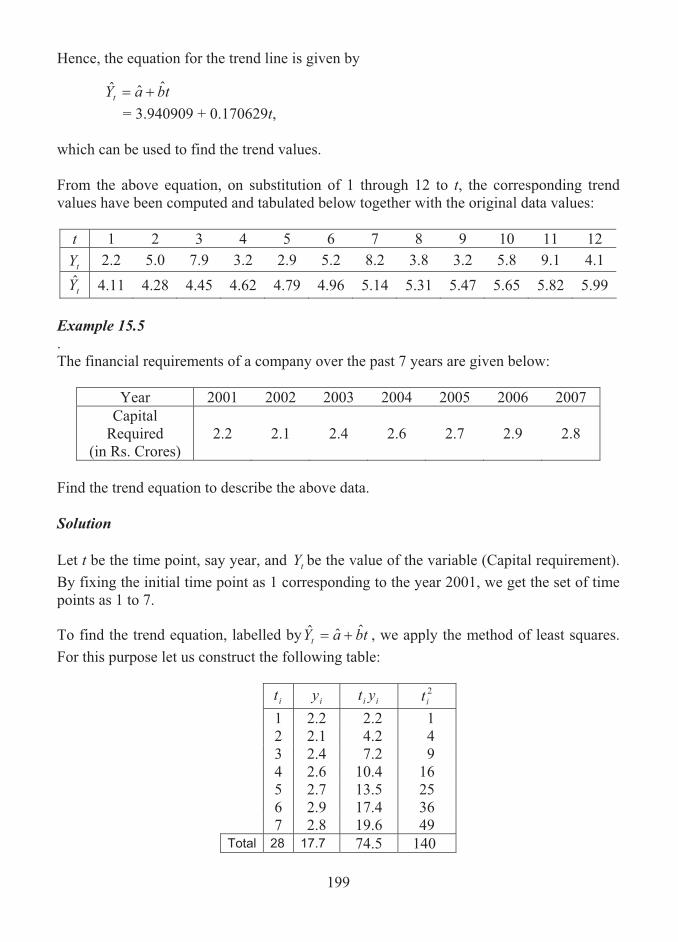
199
Hence, the equation for the trend line is given by
tbaYtˆˆˆ ��
= 3.940909 + 0.170629t, which can be used to find the trend values. From the above equation, on substitution of 1 through 12 to t, the corresponding trend values have been computed and tabulated below together with the original data values:
t 1 2 3 4 5 6 7 8 9 10 11 12
tY 2.2 5.0 7.9 3.2 2.9 5.2 8.2 3.8 3.2 5.8 9.1 4.1
tY 4.11 4.28 4.45 4.62 4.79 4.96 5.14 5.31 5.47 5.65 5.82 5.99 Example 15.5. The financial requirements of a company over the past 7 years are given below:
Year 2001 2002 2003 2004 2005 2006 2007 Capital
Required (in Rs. Crores)
2.2 2.1 2.4 2.6 2.7 2.9 2.8
Find the trend equation to describe the above data. Solution Let t be the time point, say year, and tY be the value of the variable (Capital requirement). By fixing the initial time point as 1 corresponding to the year 2001, we get the set of time points as 1 to 7. To find the trend equation, labelled by tbaYt
ˆˆˆ �� , we apply the method of least squares. For this purpose let us construct the following table:
it iy ii yt 2it
1 2.2 2.2 1 2 2.1 4.2 4 3 2.4 7.2 9 4 2.6 10.4 16 5 2.7 13.5 25 6 2.9 17.4 36 7 2.8 19.6 49
Total 28 17.7 74.5 140
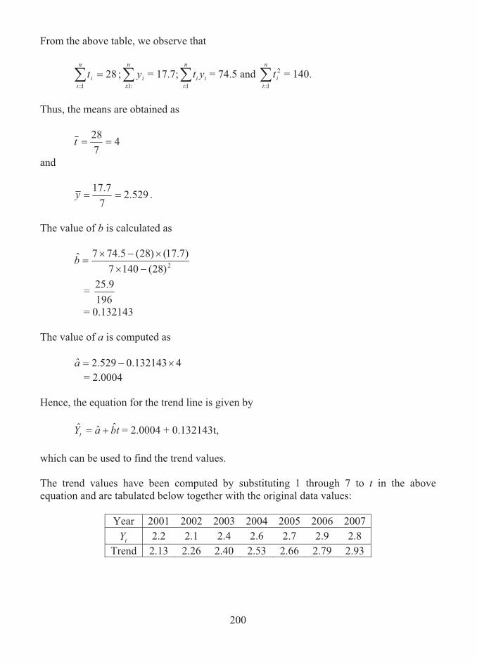
200
From the above table, we observe that
281::
��n
iit ;�
n
iiy
:1:= 17.7;�
n
iii yt
1:= 74.5 and �
n
iit
1::
2 = 140.
Thus, the means are obtained as
4728
��t
and
529.27
7.17��y .
The value of b is calculated as
2)28(1407)7.17()28(5.747ˆ
���
�b
= 196
9.25
= 0.132143 The value of a is computed as
4132143.0529.2ˆ ��a
= 2.0004 Hence, the equation for the trend line is given by
tbaYt
ˆˆˆ �� = 2.0004 + 0.132143t, which can be used to find the trend values. The trend values have been computed by substituting 1 through 7 to t in the above equation and are tabulated below together with the original data values:
Year 2001 2002 2003 2004 2005 2006 2007
tY 2.2 2.1 2.4 2.6 2.7 2.9 2.8 Trend 2.13 2.26 2.40 2.53 2.66 2.79 2.93

201
The Method of Moving Averages
This method of obtaining a time series trend consists in calculating a set of averages, each one corresponding to a trend value for a time point of the series. These are known as moving averages, since each average is calculated by moving from one overlapping set of values to the next. The number of values in each set is always the same and is known as the period of the moving average. Suppose that a set of numbers, �,, 21 YY , is given. Then, moving average of order n is defined to be the sequence of arithmetic means as given below:
nYYY
M n����
�211 ,
nYYY
M n 1322
�����
�,
nYYY
M n 2433
�����
�,
and so on. The sums in the numerators of the above expressions are called moving totals of order n. It is to be noted that when time series data are considered, the moving totals and averages are calculated by specifying the period, which is nothing but the number of values in a set.
Example 15.6 Consider a set of 10 numbers as given below:
12 10 11 11 9 11 10 10 11 10 Calculate a set of moving total and moving averages of period 5 for the series. Solution1. As the period is specified as five, find the total of first five numbers and find the
average.
2. Remove the first number and consider the 6th number. Find the total of numbers positioned at 2nd to 6th places.
3. Proceed in this manner until all the numbers in the series have been taken care of. The total and the averages arrived are respectively called as the moving totals and moving averages.
The moving totals and the moving averages are placed corresponding to the middle position of the respective series of five numbers as given below:

202
Data Value
Moving Total
Moving Average
12 10 11 53 10.6 11 52 10.4 9 52 10.4 11 51 10.2 10 51 10.2 10 52 10.4 11 10
Thus, the moving averages arrived are the trend values for the given series of numbers. Remarks on the Moving Average Technique 1. Moving averages of period n for the values of a time series are arithmetic means of
successive and overlapping values, taken n at a time.
2. The moving average values calculated form the required trend components for the given series.
3. The following points should be noted when considering a moving average trend: (i) The period of the moving averages must coincide with the length of the natural cycle
of the series. Some examples follow:
(a) Moving averages for the trend of numbers unemployed for the quarters of the year must have a period of 4.
(b) Total monthly sales of a business for a number of years would be described by a moving average trend of period 12.
(c) A moving average trend of period 6 would be appropriate to describe the daily takings for a supermarket (open 6 days per week) over a number of months.
(ii) Each moving average trend value calculated must correspond with an appropriate
time point. This can always be determined as the median of the time points, for the values being averages. For moving averages with an odd-numbered period, 3, 5, 7, etc., the relevant time point is that corresponding to the 2nd, 3rd, 4th, etc., value.
However, when the moving averages have an even-numbered period (2, 4, 6, 8, etc.,), there is no obvious and natural time point corresponding to each calculated average.
Centering Moving Averages When calculating moving averages with an even period, the resulting moving average would seem to have to be placed in between two corresponding time points.

203
In this case, the placing of these averages would not be satisfactory when the averages are being used to represent a trend, since the trend values need to coincide with particular time points. A method known as centering is used in this type of situation, where the calculated averages are themselves averaged in successive overlapping pairs. This ensures that each calculated (trend) value ‘lines up’ with a time point.
Example 15.7
Calculate the 4-period moving average and find the centered two-point moving averages based on the following data:
Time Point 1 2 3 4 5 6 7 8 9 10 Data Value 9 14 17 12 10 14 19 15 10 16
SolutionHere, the time period is even numbered. Hence, the four-year moving totals and moving averages are placed between the time points 2nd and 3rd, 3rd and 4th, and so on. The centred two-point moving averages are then placed corresponding to the time points 3rd, 4th, and so on. The following table displays the moving totals, moving averages and centered moving averages:
Time Point
Data Value
Four-year Moving
Total
Four-year Moving Average
Centered two-point Moving
Average 1 9 2 14 52 13 3 17 13.125 53 13.25 4 12 13.25 53 13.25 5 10 13.5 55 13.75 6 14 14.125 58 14.5 7 19 14.5 58 14.5 8 15 14.75 60 15 9 10
10 16 The centered moving averages are the trend values for the given time series. It is to be seen that the two starting and ending time points do not have a trend value. The omission of these trend values occurs always while adopting the moving average method.

204
Example 15.8 Calculate trend values for the following data using the method of moving averages with an appropriate period.
The following figures relate to loan receipts (in Rs. Crores) for a local bank.
Year 1 Year 2 Year 3 Quarter 1 2.8 3.0 3.0 Quarter 2 4.2 4.2 4.7 Quarter 3 3.0 3.5 3.6 Quarter 4 4.6 5.1 5.3
SolutionHere, 4-quarterly data for three years are given. Thus, the 4-quarterly moving averages are to be calculated. As the period is even numbered, the centered moving average values are required.
The 4-period moving totals and moving averages, and centered moving averages are computed and tabulated below:
Quarter Data value
Four-year Moving
Total
Four-year
Moving Average
Centered two-point
Moving Average
1 2.8 2 4.2
Year 1 14.6 3.65 3 3.0 3.675 14.8 3.7 4 4.6 3.7
14.8 3.7 1 3.0 3.7625 15.3 3.825 2 4.2 3.8875 Year 2 15.8 3.95 3 3.5 3.95 15.8 3.95 4 5.1 4.0125 16.3 4.075 1 3.0 4.0875 16.4 4.1 2 4.7 4.125 Year 3 16.6 4.15 3 3.6 4 5.3
205
15.8 CHARACTERISTICS OF THE METHODS OF MEASURING TREND
Each method of measuring trend of time series data possesses certain salient features or characteristics. The most significant characteristics are listed below:
1. The method of semi-averages use only two plotted points, namely averages. These averages are used in the construction of a trend line which leads to the general feeling that it is unrepresentative. The method also assumes that a strictly linear trend is appropriate to the data.
2. The method of least-squares assumes that a linear trend is appropriate and gives the trend line which is considered as mathematically more representative of the data. However, it is generally unsuitable for highly seasonal data.
3. The method of moving average is the most widely used technique for obtaining a trend. A serious limitation of the method is that the period of the averages should be chosen appropriately. If the period is properly fixed, then the method will show the true nature of the trend, whether linear or non-linear. It has a disadvantage in the sense that no trend values are obtained for the beginning and end time point of a series.
15.9 SUMMARY
A set of observations drawn at specific time points is said to be a time series. In this lesson, the concept of time series is described with illustrations. The four characteristic movements of time series data such as (i) trend, (ii) seasonal variation, (iii) cyclical variation and (iv) irregular variation are explained. The need for time series analysis is highlighted. A detailed discussion on the methods of measuring trend in the time series data is made. The method of semi-averages, the method of least-squares regression lines and the method of moving averages for estimating the trend are illustrated through examples. The concept of centered moving averages is presented with its importance.
15.10 LESSON END ACTIVITY
1. The data shown below relate to the number of salesmen (in thousand) travelled across the country for promotion of sales of their products in each of the four quarters during three consecutive years. Calculate a time series trend by the method of semi-averages.
Year 1 Year 2 Year 3 Quarter 1 2 3 4 1 2 3 4 1 2 3 4
Number of Salesmen 25 45 74 36 30 48 88 40 32 52 94 44

206
2. Calculate a set of trend values using the method of semi-averages for the following data set:
20, 22, 19, 21, 23, 19, 18, 20, 22, 21
3. Calculate a set of moving totals and moving averages of period 3 for the following
data set:
12, 15, 11, 16, 13, 17, 19, 21, 24, 14, 12, 16, 13 4. Compute the trend values by using the method of semi-averages for the following
time series data relating to the sales orders (in Rs Lakhs) received by a business firm over a period of 10 successive years:
Year 1998 1999 2000 2001 2002 2003 2004 2005 2006 2007 Sales 92 105 110 98 130 128 130 124 115 119
5. Apply the method of least squares and calculate the time series trend values for the
following data on production of a certain commodity over a period of 12 months in a year:
Month 1 2 3 4 5 6 7 8 9 10 11 12
Production 20 12 14 23 18 12 8 10 15 12 16 21 6. For the following time series data, calculate the trend values by the method of
moving averages of period 5.
Time Points 1 2 3 4 5 6 7 8 9 10 Data Value 12 10 11 11 9 11 10 10 11 10
7. For the data given in problem 1, find the least squares trend line and compute the
trend values. 8. For the time series data given below, calculate the moving averages of period 4 and
the centered moving averages:
Time Points 1 2 3 4 5 6 7 8 9 10 Data Value 9 14 17 12 10 14 19 15 10 16
9. The sales (in Rs. Lakhs) of a company in 4 quarters of each of the five consecutive
years in the past are given below:

207
Quarter Year 1 2 3 4 2003 19 31 62 9 2004 20 32 65 17 2005 24 36 78 14 2006 24 39 83 20 2007 25 42 85 24
Calculate the trend values by (i) the method of least squares and (ii) the method of centered moving averages of period 4.
15.11 POINTS FOR DISCUSSION
1. Define time series.
2. What are the major characteristic movements of a time series data?
3. What is meant by a trend?
4. What is meant by seasonal variation?
5. List out various methods of measuring trend in a time series data.
6. Describe the method of least-squares in measuring trend.
7. Define: (i) moving total, (ii) moving average.
8. How would the moving averages be used in finding a trend equation?
9. What is meant by centered moving average? When would it be applied?
15.12 SUGGESTED READING/REFERENCE/SOURCES
1. Spiegel, M. R., and L.J. Stephens (2000). Statistics, Schaum’s Outlines Series, 3/e, Tata McGraw-Hill, New York, US.
2. McClave, J.T., Benson, P.G., and T. Sincich (2008). Statistics for Business and Economics, 10/e, Prentice- Hall, New Jersey, US.
208
LESSON-16
SEASONAL VARIATIONS AND FORECASTING
CONTENTS
16.0. Aims and Objectives
16.1. Nature of Seasonal Variation
16.2. A Simple Technique for Calculating Seasonal Variation
16.3. Seasonally Adjusted Time Series
16.4. Estimation of Seasonal Variations or Seasonal Indices
16.5. Methods of Measuring Seasonal Variations or Seasonal Indices
16.6. Forecasting
16.7. Technique for Forecasting
16.8. Projecting the Trend
16.9. Summary
16.10. Lesson End Activity
16.11. Points for Discussion
16.12. Suggested Reading/Reference/Sources
16.0 AIMS AND OBJECTIVES
The purpose of this lesson is to present the meaning of seasonal variations and the methods of measuring the seasonal factors. The contents given here provide a comprehensive idea of seasonal variations and the need of seasonal indices. This lesson also aims at providing a basic concept of forecasting for the learner.
16.1 NATURE OF SEASONAL VARIATION
Seasonal variations refer to patterns that a time series appears to follow in specific periods (may be months or quarters) in successive years. Such patterns, often identical or near identical, are termed as seasonal movements. In a broad sense, seasonal variation is defined as repetitive and predictable movement around the trend line in less than one year period.

209
Sales in a departmental store will normally be high during first week of a month or during week ends; winter clothes will sell well in autumn and winter, and badly in spring and summer, sale of uniform dresses of school children will go up during May-June of every year are few examples for time series data which exhibit seasonal changes.
The seasonal variations in a time series are detected for the purpose of establishing the pattern of past behaviours and projecting pattern into the future.
Seasonal changes or variations in a time series are measured by the seasonal factors. They are expressed as the deviations from the underlying trend and show, on an average, by how much a particular season will tend to increase or decrease the underlying trend.
16.2 A SIMPLE TECHNIQUE FOR CALCULATING SEASONAL VARIATION
Let Y be the given time series data and T be the trend value derived from the time series. The procedure for calculating the seasonal variation has the following steps: Step 1: For each time point, find the difference between the original data value and the trend value as Y – T. Step 2: For each season, find the average of all Y – T values. Step 3: The averages obtained for all seasons are the seasonal variation values, provided the total of the averages works out to be zero. If the total differs from zero, adjust one or more of them so that their total is zero; the adjusted values are then taken as seasonal variation values. Example 16.1 The Sales of a small firm during four quarters in two years are given (in Rs. Lakhs) along with the trend values as follows:
Year 1 Year 2 Quarter 1 2 3 4 1 2 3 4 Sales, Y 20 15 60 30 35 25 100 50 Trend, T 23 29 34 39 45 50 55 61
Calculate seasonal variation for the given time series data. Solution The seasonal variations are calculated according to the procedure described earlier. The results are given below: Step 1: Find the difference between the actual and trend values for each quarter of the years as follows:

210
Year 1 Year 2
Quarter 1 2 3 4 1 2 3 4 Sales, Y 20 15 60 30 35 25 100 50 Trend, T 23 29 34 39 45 50 55 61
Y – T -3 -14 26 -9 -10 -25 45 -11 Step 2: For each quarter of the two years find the averages of the Y - T values as given below:
Quarters 1 2 3 4
Year 1 -3 -14 26 -9 Year 2 -10 -25 45 -11 Totals -13 -39 71 -20
Averages -6.5 -19.5 35.5 -10 Step 3: The sum of the averages is calculated as -0.5. As it is required that the sum of the averages as zero, one or more averages are adjusted to get the sum as zero. For instance, the third quarter average may be adjusted just by adding the 0.5 with 35.5. Hence, the adjusted values, called as seasonal variations are obtained as:
Quarter 1 2 3 4 Seasonal Variation
(adjusted) -6.5 -19.5 36 -10
16.3 SEASONALLY ADJUSTED TIME SERIES
The process of adjusting the time series data using seasonal factors or values is called deseasonalization of data. The seasonal adjustment is required to smooth out any seasonal fluctuations present in the time series data Deaseasonalized data would be calculated either by subtracting the appropriate seasonal figure from each of the original time series values (represented algebraically by Y – S) or by dividing the actual monthly data by the corresponding seasonal index number (represented by Y/S). Example 16.2 The following figures relate to the observed (Y) and 4-period moving average trend values (T) of loan receipts (in Rs. Crores) of a local bank.

211
Year 1 Year 2 Year 3 Y T Y T Y T Quarter 1 2.8 3.0 3.7625 3.0 4.0625 Quarter 2 4.2 4.2 3.875 4.7 4.1125 Quarter 3 3.0 3.625 3.5 3.925 3.6 Quarter 4 4.6 3 5.0 3.9875 5.3
Calculate the seasonal variations and seasonally adjusted values for the given time series data. Solution The seasonal variations are calculated according to the procedure described earlier. The results are given below: 1. Find the difference between the actual and trend values for each quarter of the years
as follows:
Year 1 Year 2 Year 3 Y T Y-T Y T Y-T Y T Y-T
Q1 2.8 3.0 3.7625 -0.7625 3.0 4.0625 -1.0625 Q2 4.2 4.2 3.875 0.325 4.7 4.1125 0.5875 Q3 3.0 3.625 -0.625 3.5 3.925 -0.425 3.6 Q4 4.6 3 1.6 5.0 3.9875 1.0125 5.3
2. For each quarter of the two years find the averages of the Y-T values as given below:
Quarters 1 2 3 4
Year 1 -0.625 1.6 Year 2 -0.7625 0.325 -0.425 1.0125 Year 3 -1.0625 0.5875 Totals -1.825 0.9125 -1.05 2.6125
Averages -0.9125 0.45625 -0.525 1.30625 3. The sum of the averages is calculated as 0.325. As it is required that the sum of the
averages as zero, one or more averages are adjusted to get the sum as zero. Here, the second and fourth quarter averages may be adjusted by subtracting 0.1 and 0.225 with them. Hence, the adjusted values, called as seasonal variations are obtained as:
Quarter 1 2 3 4
Seasonal Variation (adjusted) -.9125 0.35625 -0.525 1.08125

212
16.4 ESTIMATION OF SEASONAL VARIATIONS OR SEASONAL INDICES
Seasonal index is a numeric measure that describes the degree of seasonal variation. It is based on a mean of 100, with the degree of seasonality measured by variations away from the base. It is also defined as a set of numbers showing the relative values of a variable during the months of the year changes. Example 16.3 Suppose that details of sales realized during first three months in a particular year are given as 70, 110, and 65 percent of the average monthly sales for the whole year. Then, the numbers 70, 110, and 65 provide the seasonal index for the year. They are, sometimes, called seasonal index numbers. The average (mean) seasonal index for the whole year should be 100%; that is, the sum of the index numbers of 12 months in that year should be 1200%.
16.5 METHODS OF MEASURING SEASONAL VARIATIONS OR SEASONAL INDICES
Seasonal indices are measured based on various methods. A brief description of such methods is given below: Average Percentage Method This method is the simplest method of measuring seasonal variations and consists in the following steps: 1. Find the monthly averages for each year from the time series data. 2. Divide the monthly data by the corresponding monthly averages for each year and
express the results as percentages. 3. Average out the percentages arrived in step 2 using either a mean or a median; if the
mean is used, avoid any extreme values present. 4. Thus, the resulting 12 percentages constitute the seasonal index; if the mean of these
percentages is not 100% or the sum is not 1200%, adjust them by multiplying by a suitable factor.
Example 16.4 The monthly values of export of cotton (in Rs. Lakhs) by a textile unit for the years 2001-2006 are given below:
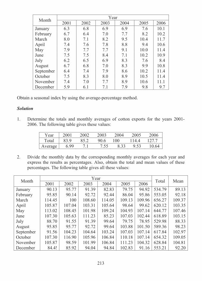
213
Year Month 2001 2002 2003 2004 2005 2006 January 6.3 6.8 6.9 6.9 7.6 10.1 February 6.7 6.4 7.0 7.7 8.2 10.2 March 8.0 7.1 8.2 9.5 10.4 11.7 April 7.4 7.6 7.8 8.8 9.4 10.6 May 7.9 7.7 7.7 9.1 10.0 11.4 June 7.5 7.5 8.4 7.1 10.2 10.9 July 6.2 6.5 6.9 8.3 7.6 8.4 August 6.7 6.8 7.0 8.3 9.9 10.8 September 6.4 7.4 7.9 8.6 10.2 11.4 October 7.5 8.3 8.0 8.9 10.5 11.4 November 7.4 7.0 7.7 8.9 10.6 11.1 December 5.9 6.1 7.1 7.9 9.8 9.7
Obtain a seasonal index by using the average-percentage method. Solution 1. Determine the totals and monthly averages of cotton exports for the years 2001-
2006. The following table gives these values:
Year 2001 2002 2003 2004 2005 2006 Total 83.9 85.2 90.6 100 114.4 127.7
Average 6.99 7.1 7.55 8.33 9.53 10.64 2. Divide the monthly data by the corresponding monthly averages for each year and
express the results as percentages. Also, obtain the total and mean values of these percentages. The following table gives all these values:
Year Month 2001 2002 2003 2004 2005 2006 Total Mean
January 90.13 95.77 91.39 82.83 79.75 94.92 534.79 89.13February 95.85 90.14 92.72 92.44 86.04 95.86 553.05 92.18March 114.45 100 108.60 114.05 109.13 109.96 656.27 109.37April 105.87 107.04 103.31 105.64 98.64 99.62 620.12 103.35May 113.02 108.45 101.98 109.24 104.93 107.14 644.77 107.46June 107.30 105.63 111.23 85.23 107.03 102.44 618.89 103.15July 88.70 91.55 91.39 99.64 79.75 78.95 529.98 88.33August 95.85 95.77 92.72 99.64 103.88 101.50 589.36 98.23September 91.56 104.23 104.64 103.24 107.03 107.14 617.84 102.97October 107.30 116.90 105.96 106.84 110.18 107.14 654.32 109.05November 105.87 98.59 101.99 106.84 111.23 104.32 628.84 104.81December 84.4! 85.92 94.04 94.84 102.83 91.16 553.21 92.20
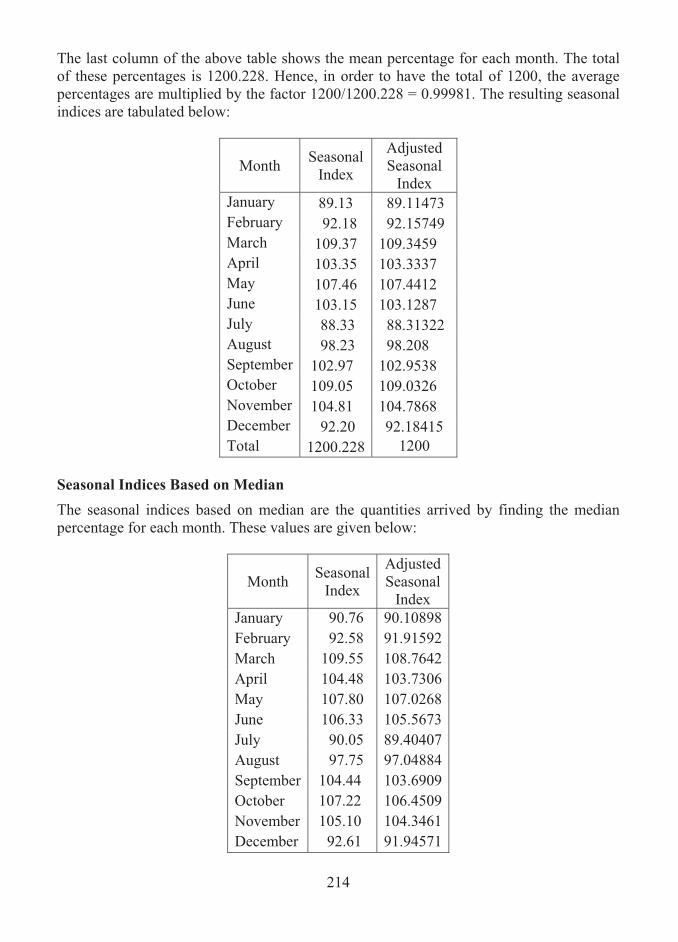
214
The last column of the above table shows the mean percentage for each month. The total of these percentages is 1200.228. Hence, in order to have the total of 1200, the average percentages are multiplied by the factor 1200/1200.228 = 0.99981. The resulting seasonal indices are tabulated below:
Month Seasonal Index
Adjusted Seasonal
Index January 89.13 89.11473 February 92.18 92.15749 March 109.37 109.3459 April 103.35 103.3337 May 107.46 107.4412 June 103.15 103.1287 July 88.33 88.31322 August 98.23 98.208 September 102.97 102.9538 October 109.05 109.0326 November 104.81 104.7868 December 92.20 92.18415 Total 1200.228 1200
Seasonal Indices Based on Median
The seasonal indices based on median are the quantities arrived by finding the median percentage for each month. These values are given below:
Month Seasonal Index
Adjusted Seasonal
Index January 90.76 90.10898February 92.58 91.91592March 109.55 108.7642April 104.48 103.7306May 107.80 107.0268June 106.33 105.5673July 90.05 89.40407August 97.75 97.04884September 104.44 103.6909October 107.22 106.4509November 105.10 104.3461December 92.61 91.94571
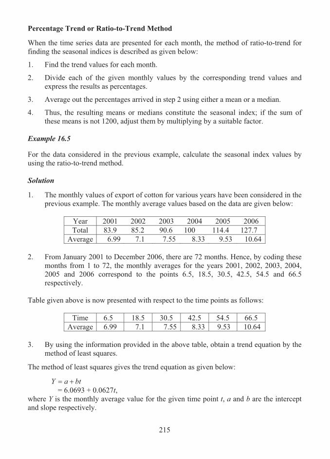
215
Percentage Trend or Ratio-to-Trend Method When the time series data are presented for each month, the method of ratio-to-trend for finding the seasonal indices is described as given below:
1. Find the trend values for each month.
2. Divide each of the given monthly values by the corresponding trend values and express the results as percentages.
3. Average out the percentages arrived in step 2 using either a mean or a median.
4. Thus, the resulting means or medians constitute the seasonal index; if the sum of these means is not 1200, adjust them by multiplying by a suitable factor.
Example 16.5 For the data considered in the previous example, calculate the seasonal index values by using the ratio-to-trend method. Solution 1. The monthly values of export of cotton for various years have been considered in the
previous example. The monthly average values based on the data are given below:
Year 2001 2002 2003 2004 2005 2006 Total 83.9 85.2 90.6 100 114.4 127.7
Average 6.99 7.1 7.55 8.33 9.53 10.64 2. From January 2001 to December 2006, there are 72 months. Hence, by coding these
months from 1 to 72, the monthly averages for the years 2001, 2002, 2003, 2004, 2005 and 2006 correspond to the points 6.5, 18.5, 30.5, 42.5, 54.5 and 66.5 respectively.
Table given above is now presented with respect to the time points as follows:
Time 6.5 18.5 30.5 42.5 54.5 66.5 Average 6.99 7.1 7.55 8.33 9.53 10.64
3. By using the information provided in the above table, obtain a trend equation by the
method of least squares.
The method of least squares gives the trend equation as given below:
btaY �� = 6.0693 + 0.0627t,
where Y is the monthly average value for the given time point t, a and b are the intercept and slope respectively.
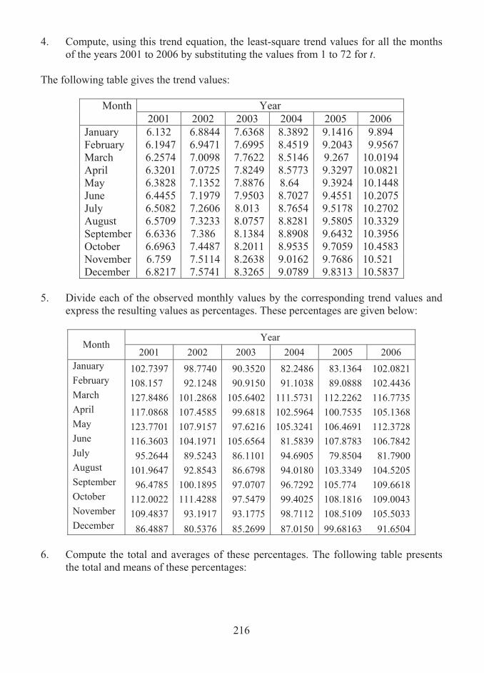
216
4. Compute, using this trend equation, the least-square trend values for all the months of the years 2001 to 2006 by substituting the values from 1 to 72 for t.
The following table gives the trend values:
Year Month 2001 2002 2003 2004 2005 2006
January 6.132 6.8844 7.6368 8.3892 9.1416 9.894 February 6.1947 6.9471 7.6995 8.4519 9.2043 9.9567 March 6.2574 7.0098 7.7622 8.5146 9.267 10.0194 April 6.3201 7.0725 7.8249 8.5773 9.3297 10.0821 May 6.3828 7.1352 7.8876 8.64 9.3924 10.1448 June 6.4455 7.1979 7.9503 8.7027 9.4551 10.2075 July 6.5082 7.2606 8.013 8.7654 9.5178 10.2702 August 6.5709 7.3233 8.0757 8.8281 9.5805 10.3329 September 6.6336 7.386 8.1384 8.8908 9.6432 10.3956 October 6.6963 7.4487 8.2011 8.9535 9.7059 10.4583 November 6.759 7.5114 8.2638 9.0162 9.7686 10.521 December 6.8217 7.5741 8.3265 9.0789 9.8313 10.5837
5. Divide each of the observed monthly values by the corresponding trend values and
express the resulting values as percentages. These percentages are given below:
Year Month
2001 2002 2003 2004 2005 2006 January 102.7397 98.7740 90.3520 82.2486 83.1364 102.0821 February 108.157 92.1248 90.9150 91.1038 89.0888 102.4436 March 127.8486 101.2868 105.6402 111.5731 112.2262 116.7735 April 117.0868 107.4585 99.6818 102.5964 100.7535 105.1368 May 123.7701 107.9157 97.6216 105.3241 106.4691 112.3728 June 116.3603 104.1971 105.6564 81.5839 107.8783 106.7842 July 95.2644 89.5243 86.1101 94.6905 79.8504 81.7900 August 101.9647 92.8543 86.6798 94.0180 103.3349 104.5205 September 96.4785 100.1895 97.0707 96.7292 105.774 109.6618 October 112.0022 111.4288 97.5479 99.4025 108.1816 109.0043 November 109.4837 93.1917 93.1775 98.7112 108.5109 105.5033 December 86.4887 80.5376 85.2699 87.0150 99.68163 91.6504
6. Compute the total and averages of these percentages. The following table presents
the total and means of these percentages:

217
Month Total Means Adjusted Means
January 559.3329 93.2221 93.0870February 573.8329 95.6388 95.5001March 675.3483 112.558 112.3948April 632.7137 105.4523 105.2994May 653.4734 108.9122 108.7543June 622.4601 103.7433 103.5929July 527.2297 87.87162 87.7442August 583.3722 97.2287 97.0877September 605.9038 100.984 100.8375October 637.5673 106.2612 106.1071November 608.5782 101.4297 101.2826December 530.6432 88.44053 88.3123 Total 1201.743 1200
The last column of the above table gives the adjusted means which are the seasonal indices arrived by the ratio-to-trend method.
Note 1. When the time series data are presented for each quarter, the above procedure is still
applied by using the trend values for each quarter instead of the trend values for each month.
2. Dividing each monthly value Y by the corresponding trend value T yields Y/T = CSI
[from the multiplicative model], and that the subsequent averaging of Y/T produces the seasonal indices. Insofar as these indices include cyclic and irregular variations, this may be an important disadvantage of the method, especially if the variations are large.
Percentage Moving Average, or Ratio-to-Moving Average Method Suppose that monthly time series data are provided. Then, the ratio- to-moving average method consists in the following steps:
1. Compute a 12-month moving average from the given data.
2. Determine a 12-month centered moving average by computing a 2-point moving average of the moving average obtained in step 1
3. Divide each of the actual monthly values by the corresponding 12-month centered moving average and express each result as a percentage.
4. Average out the percentages arrived in step 2 using either a mean or a median.

218
5. Thus, the resulting means or medians constitute the required seasonal index; if the sum of these means or medians is not 1200, adjust them by multiplying by a suitable factor.
In the case of quarterly data, the procedure is as follows:
1. Compute a 4-period moving averages.
2. Determine a 4-period centered moving average by computing a 2-point moving average of the moving average obtained in step 1
3. Divide each of the actual quarterly values by the corresponding 4-quareter centered moving average and express each result as a percentage.
4. Average out the percentages arrived in step 2 using either a mean or a median.
5. Thus, the resulting means or medians constitute the required seasonal index; if the sum of these means or medians is not 400, adjust them by multiplying by a suitable factor.
Example 16.6 The following figures relate to loan receipts (in Rs. Crores) of a local bank.
Year 1 Year 2 Year 3 Quarter 1 2.8 3.0 3.0 Quarter 2 4.2 4.2 4.7 Quarter 3 3.0 3.5 3.6 Quarter 4 4.6 5.1 5.3
Calculate seasonal indices for the following data, using the method of ratio-to-moving averages with an appropriate period. Solution Here, 4-quarterly data for various years are given. Thus, the 4-quarterly moving averages are to be calculated. As the period is even numbered, the centered moving average values are required. The 4-period moving totals and moving averages, and centered moving averages are computed. Then, the ratio-to-moving average values are obtained by dividing each of the observed quarterly times series values by the moving average (centered) values and by expressing the result as percentages. The seasonal indices along with the moving averages are tabulated below:

219
Quarter Data Value
Four-year Moving
Total
Four-year
Moving Average
Centered two-point
Moving Average
Ratio-to-moving Average
1 2.8 2 4.2
Year 1 14.6 3.65 3 3.0 3.675 81.6327 14.8 3.7 4 4.6 3.7 124.3243 14.8 3.7 1 3.0 3.7625 79.7342 15.3 3.825 2 4.2 3.8875 108.0386
Year 2 15.8 3.95 3 3.5 3.95 88.6076 15.8 3.95 4 5.1 4.0125 127.1028 16.3 4.075 1 3.0 4.0875 73.3945 16.4 4.1 2 4.7 4.125 113.9394
Year 3 16.6 4.15 3 3.6 4 5.3
The seasonal indices are now calculated by finding the average of the ratio-to-moving average values and are given in the following table:
Quarters 1 2 3 4 Year 1 81.6327 124.3243 Year 2 79.7342 108.0386 88.6076 127.1028 Year 3 73.3945 113.9394 Totals 153.1287 221.978 170.240 251.4271 Averages 76.5644 110.989 85.120 125.7136 Adjusted Averages 76.87 111.43 85.46 126.22

220
As the quarterly averages are found, the total should be 400. But, here, it is noticed that the total average is 398.387. Therefore, the averages are adjusted by multiplying each average by multiplying the factor given by 400/398.387, so that the total of adjusted averages is found as 400. These adjusted values are also tabulated in the above table.
16.6 FORECASTING
An important application of time series analysis is forecasting. Forecasting is a statistical tool which is adopted in any decision making process. For instance, if monthly demand of commodities for the next year is known well in advance, then it would be easier to plan for meeting the demand. In a similar way, when monthly sales for the next year are known, then clearly, business life would be much conducive. By the process of forecasting, planning for the future is much feasible depending on the requirements. However, in many practical instances, future can not predicted accurately; but, it would be possible to best examine the most likely future values, given the analysis of data related to past time points. Normally, forecasting can be performed at different levels, depending on the use to which it will be put. It is possible, occasionally, to make a simple guess about the future based on past patterns of the information. Many times, a well structured forecasting is essential rather than simple guessing and is particularly required when there is a large investment at stake. As the forecasts are made based on the analysis of past data and as the future period may be affected by the presence of unknown factors, they should be adapted with caution and care. An implicit assumption that is made in forecasting is that the patterns that will be exhibited in the analysis of past data will be broadly continued, at least in the short-term future.
16.7 TECHNIQUE FOR FORECASTING
Forecasting a value for a future time point involves the following steps:
Step 1: Estimate a trend value for the time point by employing an appropriate method.
Step 2: Identify the seasonal variation value appropriate to the time series.
Step 3: Add these two values together, giving the required forecast.
Time series forecasting can be made using the simple additive model of the form given by
STY estest �� , where estY is the estimated data value, estT is the estimated (or projected) trend value and S is appropriate seasonal variation value.
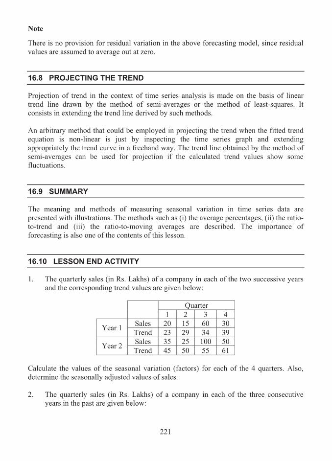
221
Note There is no provision for residual variation in the above forecasting model, since residual values are assumed to average out at zero.
16.8 PROJECTING THE TREND
Projection of trend in the context of time series analysis is made on the basis of linear trend line drawn by the method of semi-averages or the method of least-squares. It consists in extending the trend line derived by such methods. An arbitrary method that could be employed in projecting the trend when the fitted trend equation is non-linear is just by inspecting the time series graph and extending appropriately the trend curve in a freehand way. The trend line obtained by the method of semi-averages can be used for projection if the calculated trend values show some fluctuations.
16.9 SUMMARY
The meaning and methods of measuring seasonal variation in time series data are presented with illustrations. The methods such as (i) the average percentages, (ii) the ratio-to-trend and (iii) the ratio-to-moving averages are described. The importance of forecasting is also one of the contents of this lesson.
16.10 LESSON END ACTIVITY
1. The quarterly sales (in Rs. Lakhs) of a company in each of the two successive years and the corresponding trend values are given below:
Quarter 1 2 3 4
Sales 20 15 60 30 Year 1 Trend 23 29 34 39 Sales 35 25 100 50 Year 2 Trend 45 50 55 61
Calculate the values of the seasonal variation (factors) for each of the 4 quarters. Also, determine the seasonally adjusted values of sales. 2. The quarterly sales (in Rs. Lakhs) of a company in each of the three consecutive
years in the past are given below:
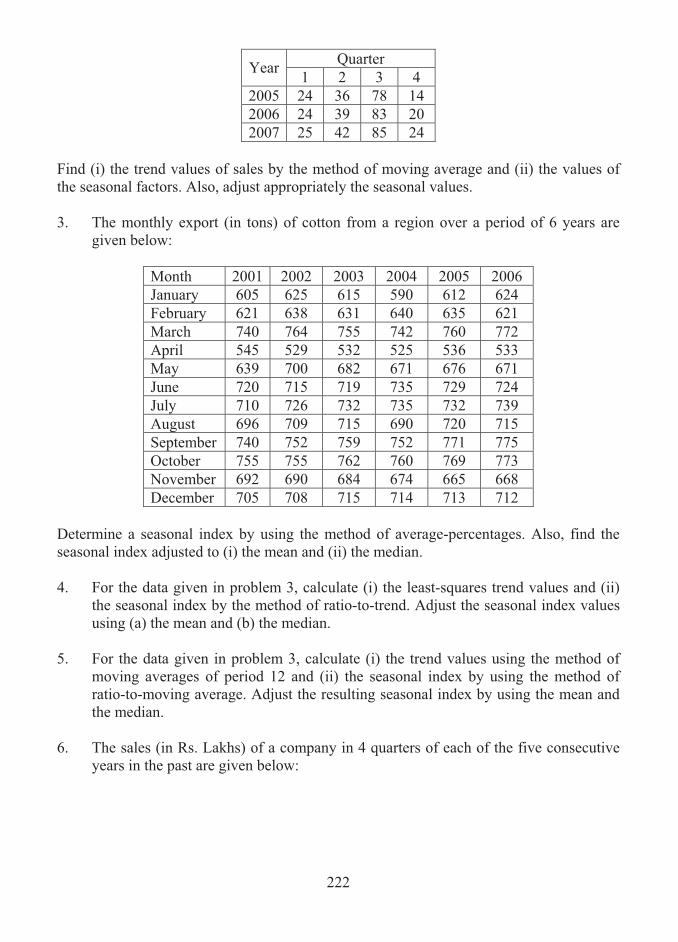
222
Quarter Year 1 2 3 4 2005 24 36 78 14 2006 24 39 83 20 2007 25 42 85 24
Find (i) the trend values of sales by the method of moving average and (ii) the values of the seasonal factors. Also, adjust appropriately the seasonal values. 3. The monthly export (in tons) of cotton from a region over a period of 6 years are
given below:
Month 2001 2002 2003 2004 2005 2006 January 605 625 615 590 612 624 February 621 638 631 640 635 621 March 740 764 755 742 760 772 April 545 529 532 525 536 533 May 639 700 682 671 676 671 June 720 715 719 735 729 724 July 710 726 732 735 732 739 August 696 709 715 690 720 715 September 740 752 759 752 771 775 October 755 755 762 760 769 773 November 692 690 684 674 665 668 December 705 708 715 714 713 712
Determine a seasonal index by using the method of average-percentages. Also, find the seasonal index adjusted to (i) the mean and (ii) the median. 4. For the data given in problem 3, calculate (i) the least-squares trend values and (ii)
the seasonal index by the method of ratio-to-trend. Adjust the seasonal index values using (a) the mean and (b) the median.
5. For the data given in problem 3, calculate (i) the trend values using the method of
moving averages of period 12 and (ii) the seasonal index by using the method of ratio-to-moving average. Adjust the resulting seasonal index by using the mean and the median.
6. The sales (in Rs. Lakhs) of a company in 4 quarters of each of the five consecutive
years in the past are given below:

223
Quarter Year 1 2 3 4 2003 19 31 62 9 2004 20 32 65 17 2005 24 36 78 14 2006 24 39 83 20 2007 25 42 85 24
Compute the seasonal index values by (i) the method of ratio-to-moving average, (ii) the method of ratio-to-trend and (ii) the method of average percentages.
16.11 POINTS FOR DISCUSSION
1. Define seasonal variation.
2. What is meant by seasonal index?
3. List out various methods of measuring seasonal variation.
4. Explain the method of average percentages in measuring seasonal variation.
5. Describe the procedure of ratio-to-trend method of computing seasonal indices.
6. Write down the procedure of ratio-to-moving average method of computing seasonal indices.
7. What is meant by forecasting?
16.12 SUGGESTED READING/REFERENCE/SOURCES
1. Spiegel, M. R., and L.J. Stephens (2000). Statistics, Schaum’s Outlines Series, 3/e, Tata McGraw-Hill, New York, US.
2. McClave, J.T., Benson, P.G., and T. Sincich (2008). Statistics for Business and
Economics, 10/e, Prentice- Hall, New Jersey, US.

224
LESSON-17
SAMPLING METHODS
CONTENTS 17.0. Aims and Objectives 17.1. Introduction to Sampling 17.2. Basic Methods of Sampling 17.3. Sampling and Non-sampling Errors 17.4. Summary 17.5. Lesson End Activity 17.6. Points for Discussion 17.7. Suggested Reading/Reference/Sources
17.0 AIMS AND OBJECTIVES
The aim of this lesson is to present the purpose of sampling in studying a population and the methods of drawing samples from a given population. The contents, here, would help the learner to appropriately distinguish the methods of sampling, the errors that erupt in and adopt a suitable method of sampling for a given type of population.
17.1 INTRODUCTION TO SAMPLING
Statistical theory is generally concerned with studying problems related to populations consisting of individual units with reference to one or more characteristics, which may be qualitative or quantitative. Here, a population is defined as a group of individual items or people called elementary units having one or many characteristics. Very often, in practice, decisions about populations are called upon on the basis of information gathered from them on the characteristics under study. The decisions about the population are considered as the result of a process, called as statistical investigation or survey, which is carried on the population. Statistical surveys or investigations are conducted sometimes by collecting data for each and every unit belonging to the population taking all the units in the population. Such a process of conducting surveys is termed as complete enumeration or complete census method. More often, in practice, the statistical surveys are based on only representative parts of the population. These representative parts are called samples and hence the process is called as sample survey.
225
The complete enumeration surveys are helpful particularly when the number of elements in the population is small or when the information is required for each and every element. For instance, a business establishment might be interested to find out the opinions of its employees on a policy decision to be taken. In this case, complete census is required. But, the survey, which is to be carried on a large population will generally require extremely more cost, more time, more labour and more resources. Hence, in order to avoid these shortcomings substantially, that is, to reduce the cost, time and manpower required for the survey, the sample survey would be suggested as an alternative method to complete enumeration. Sample surveys will be much helpful in situations where only summary figures are required for the characteristics under study as a whole or for groups of units; in such situations, collection of data for every unit is seldom in practice. For instance, broadcasting media conduct public opinion survey during elections among a part of population belonging to several regions and pollsters analyse the summary of results of the survey. The concepts which would help to study the relationships existing between a population and samples drawn from it are said to constitute sampling theory. Sampling theory provides various methods of collecting information from the population under consideration, and helps to estimate unknown population characteristics, called parameters, from the information provided by the sample characteristics, called statistics.
Suppose that the average monthly turnover of all small grocery shops in a city is Rs. 1.5 lakhs. In this case, Rs. 1.5 lakhs is a characteristic of the population of all small grocery shops. On other hand, if the average monthly turnover of grocery shops situated in a particular region of the city is Rs. 1.5 lakhs, then this figure could be used to describe a characteristic of the sample. In sampling theory, the samples that are required for studying the population characteristics are the representative parts or groups of elements of the population under consideration and are selected according to some specified procedure. Generally, a sample is classified into two categories, namely, (i) non-random sample and (ii) random sample. Non-random sample is a sample selected by a non-random process. It is drawn using certain amount of judgement with a view to getting a representative sample, and hence it is termed as judgement or purposive sample. In purposive sampling, units are selected by considering the available auxillary information more or less subjectively with a view to ensuring a reflection of the population in the sample. In this type of sampling, personal knowledge and opinion are used to identify the items from the population that are to be included in the sample. A sample selected by judgement sampling is based on the expertise one has about the population. For example, stock market member effectively analyses the stock prices of shares of various companies based on his expertise in the field and make forecasts on the

226
fluctuations and the prices of shares in the future period. This type of sampling is seldom used in large-scale surveys mainly because it is not generally possible to get strictly valid estimates of the parameters under consideration. Random sample is a sample containing elements, the selection of which is governed by ascertainable laws of chance. This implies that a random sample is a sample drawn in such a way that each unit in the population has a predetermined probability of selection. This sample is also called as probability sample and the method of drawing such a sample is termed as probability or random sampling. For instance, consider a population consisting of N units. Then, a random sampling consists in ensuring each and every element of the population has an equal chance of being selected as part of the sample. Based on such a sample, it is always possible to assess the estimates of the population characteristics that result from the sample.
17.2 BASIC METHODS OF SAMPLING
There are three important methods of random sampling. They are: (i) simple random sampling, (ii) stratified random sampling and (iii) systematic sampling. The procedures of these methods are explained below: Simple Random Sampling Simple random sampling is the simplest form of random sampling and consists in selecting a sample, unit by unit, ensuring equal probability of selection for every unit at each draw. This method requires a properly constructed sampling frame, which is a list of all the elements of the population under consideration. The main limitation for using this method of sampling is that the population must be as homogenous as possible. The term ‘homogenous’ means a single characteristic of the elements of the population about which the sample survey is to be undertaken. There are two simple procedures of drawing a simple random sample from a homogenous population. They are: lottery method and random numbers method. Lottery Method
Suppose that a population consists of N elements and it is required to draw a simple random sample of n elements from the population. The lottery method of drawing the sample consists in the following steps:
Step 1. List all the elements of the population under study.
Step 2. Assign unique numeric numbers to each element of the population. Step 3. Write the numbers on the small-sized cards or chits of identical shapes.
227
Step 4. Place all the numbered cards or chits in an urn or a box and thoroughly shuffle them.
Step 5. Draw the cards or chits from the urn or box one by one until the required number of cards or chits are chosen. At each draw of the card or chit, shuffle the box.
Step 6. The elements in the population corresponding to the numbers chosen constitute the required sample.
Random Number Method The random number method of drawing a simple random sample of n elements from a population of N elements is described below: Step 1. List out all the elements of the population under study. Step 2. Assign unique numeric numbers to each element of the population. If the
population size, N, is a two digit number, the numbers from 01 through to N are assigned to the elements.
Step 3. Refer a random number table and select any row or column. Step 4. Sequentially select the numbers (with required number of digits) until the required
number of elements are chosen. Step 5. The elements in the population corresponding to the numbers chosen constitute the
required sample. The method has the following merits:
� It is a simple method.
� Unbiased selection of sample elements is made. The method has the following disadvantages:
� A well-constructed sampling frame is required.
� Chosen individual is to be located and interviewed for the survey.
� Sometimes the population characteristics are under-represented or over represented. Stratified Random Sampling Stratified random sampling is an extension of the procedure of simple random sampling. This type of sampling is adopted when the population under study is heterogeneous. The term ‘heterogeneous’ means that there are more than a single characteristic of the population about which investigation is to be carried out. The method involves in

228
stratifying the population under study. By stratification we mean a process of identifying characteristics that are significant to the investigators and dividing the population into various groups according to the characteristics such that the resulting groups are as homogeneous as possible. Such groups are called as sub-population or strata. An individual group is said to be a stratum. Examples 1. In an area survey, the whole areas of a region will be divided into coastal, plains and
hilly areas etc. 2. In a trade survey, the retail stores in a city are classified on the basis of the products
sold or their total volume of sales. The method of stratified sampling consists in the following steps:
Step 1. Divide the heterogeneous population into a number of homogeneous sub-groups. These sub-groups are called sub-populations or strata.
Step 2. Select a simple random sample of a specified number of elements from each stratum.
Step 3. The combination of all the samples resulted constitutes the required stratified sample.
It is important, here, to calculate the proportion of the elements of the population to each sub-population or stratum and to split the total number of sample elements in proportion to the number of elements in the sub-population. Suppose that the population consists of N elements and a random sample of n elements is required to be selected by stratified sampling. The procedure is as follows: Step 1. Divide the population into k strata, with N1 elements in the first stratum, N2 elements in the second stratum, and Nk elements in the kth stratum, so that N = N1 + N2 +…+Nk. Step 2. Select a simple random sample of n1 elements from the first stratum, of n2 elements from the second stratum and of nk elements from the kth stratum. Step 3. Thus, the stratified sample of n elements is selected, where n = n1 + n2 +…+ nk. A striking advantage of this method of sampling is that the sample drawn is free from bias. This is because of the stratification which takes into account strata levels considered to be more important to the investigators. A few drawbacks of this method are given below:

229
1. It has a more complex procedure, and has administrative inconvenience in selecting the sample.
2. It requires a large sampling frame.
3. It is required to fix the strata levels appropriately.
4. It involves more cost and labour due to stratification.
Systematic Sampling Systematic sampling is operationally more convenient than simple random sampling and at the same time ensures for each unit equal probability of inclusion in the sample. Suppose that a population consists of N units and a sample of n units is to be drawn. Assume that N is written as a multiple of n, i.e., N = nk. Then, the procedure of systematic sampling consists in selecting every kth unit starting with the unit corresponding to a number r chosen at random from 1 to k, where k is taken as an integer nearest to N/n. The random number r chosen from 1 to k is known as the random start and the constant k is termed as the sampling interval. A sample selected by this procedure is termed as a systematic sample with a random start, r. It may be seen that the value of r determines the whole sample. By this procedure there will exist k systematic samples, each having n elements. In other words, this procedure amounts to selecting with equal probability one of the k possible groups of units into which the population can be divided in a systematic manner. Illustration Suppose a population consists of N = 15 units and a sample of n = 3 units is to be drawn. Here, the procedure consists in the following steps: Step 1. Find the value of k as k = N/n = 15/3 = 5. Step 2. As k =5, list out the population elements as given below:
1 6 11
2 7 12 3 8 13 4 9 14 5 10 15 Step 3. From the first k = 5 units, select randomly a unit. Suppose the selected number is 3. Subsequently, other elements of the sample are fixed as 3 + k = 3 + 5 = 8 and 3 +2k = 3 + 2 × 5 = 13.
Step 4. Thus, the systematic sample is selected as (3, 8, 13).

230
Here, it is to be noted that the first number selected randomly is called the random start and k = 5 is the sampling interval. The other possible systematic samples are as follows: (1, 6, 11), (2, 7, 12), (4, 9, 14) and (5, 10, 15). This method of sampling is particularly useful for homogeneous populations that are of the same kind or uniform. The advantages of this method are as follows:
� It is simple and easy to use.
� It can be used where no sampling frame is available.
17.3 SAMPLING AND NON-SAMPLING ERRORS
The main purpose of sampling is to draw inferences about a population under study with reference to one or more characteristics based on sample observations taken from the population. An implicit assumption that is made in the theory of sampling is that the true value of each element in the population can be obtained and tabulated without any error. However, in practice, in the process of collection and analysis of statistical data, there arise some kinds of errors, which are termed as sampling and non-sampling errors. Sampling error is the error that arises due to making decisions about the population on the basis of only sample observations. It exists only when sample data are considered. In a complete enumeration survey, the information is collected from each and every member of the population, and hence, obviously in this case the sampling errors do not exist and one would expect that the data should be free from other types of errors. But this is seldom realized in practice. The other types of errors due to ascertainment or observations do exist in practice while carrying out both complete enumeration survey and sample survey. Sometimes errors are committed while tabulating the data, which ultimately affects the results. Such errors are called as non-sampling errors. As such, the non-sampling errors are occurring not due to making inferences based on samples, but due to other factors. While conducting large-scale census surveys, the occurrence of non-sampling errors are quite noticeable and also unavoidable. In some situations the non-sampling errors may be large, and deserve greater attention than the sampling error. The sampling and non-sampling errors which exist in practice are required to be controlled and reduced to a level so as to get effective results of the survey, irrespective of whether it is complete enumeration or sample survey.
Sources of Non-sampling Errors Non-sampling errors can occur at every stage of planning and execution of the census or sample survey. Particularly, in a sample survey, non-sampling errors may arise due to inadequate sampling frames and inappropriate method of selection of sampling units.

231
There are many factors which influence the occurrence of non-sampling errors; a few of them are listed below: 1. Inadequate and inconsistent specification of data, the domain of study, and scope of
the investigation; 2. Ill-defined population or sample; 3. Irrelevant choice of methods of data collection; 4. Failure to follow tabulation rules; 5. Omission or duplication of units due to imprecise definition of the boundaries of
area units.; 6. Incomplete or wrong identification particulars of units; 7. Irrelevant methods of enumeration; 8. Inappropriate methods of interview, observation or ascertainment with inadequate or
ambiguous schedules, definitions or instructions; 9. Lack of trained and experienced investigators; 10. Lack of adequate inspection and supervision of primary staff; 11. Inadequate scrutiny of basic data; 12. Errors in data processing operations such as coding, verification and tabulation, etc; 13. Errors committed during presentation, printing of tabulated results, graphs etc., and 14. Improper interpretation of results.
17.4 SUMMARY
In this lesson, the need for sampling theory in studying about the population with respect to its characteristics is emphasized. A clear distinction between complete enumeration method and sampling survey is made conceptually. Three methods of drawing samples from a population under study, namely, simple random sampling, stratified random sampling and systematic sampling are explained. The important concepts of sampling and non-sampling errors are also presented. Various sources of non-sampling errors are listed.
17.5 LESSON END ACTIVITY
1. Draw a simple random sample of size 2 from a population, which consists of 5 numbers, say, 2, 3, 5, 7 and 11.
2. A population consists of numbers 1, 3, 5, 7, 9. List out all possible samples of size 2
drawn by the method of simple random sampling.
3. A population consists of 30 units. How many systematic samples of size 5 could be drawn from this population? Write down all the possible systematic samples.

232
17.6 POINTS FOR DISCUSSION
1. Explain the need of sampling theory.
2. Bring out the advantages of sampling theory over complete enumeration.
3. Describe the method of using random numbers in selecting a simple random sample from a population of N units.
4. Explain the procedure of drawing a stratified random sample from a heterogeneous population.
5. What is a systematic sample? Explain how you would draw a systematic sample of size n from a population of size N, which is expressed as nk, where k = N/n?
6. What is meant by sampling error?
7. What is meant by non-sampling error? How does it differ from sampling error?
17.7 SUGGESTED READING/REFERENCE/SOURCES
1. Cochran, W.G., Sampling Techniques, John Wiley & Sons Inc.,
2. McClave, J.T., Benson, P.G., and T. Sincich (2008). Statistics for Business and Economics, 10/e, Prentice- Hall, New Jersey, US.