Atlas of W orld Architecture - Internet Archive
257
Atlas of World Architecture of Design Media Publishing Limited Design Media Publishing Limited World
-
Upload
khangminh22 -
Category
Documents
-
view
3 -
download
0
Transcript of Atlas of W orld Architecture - Internet Archive

Atlas of W
orld Architecture
of
Design Media Publishing Limited
Design Media Publishing Limited
World

Preface
Atlas Of New Century Architecture
Buildings are now on the drawing board and they are nothing like the places we may
recall from our childhood. New materials and new technologies are reshaping the way
we build. And at the same time, many architects and designers are also drawing upon
ancient materials and building techniques but interpret them in modern ways. With
the advanced development of economy and diversity of social life as well as increased
sensitivity to the environment, architecture design is far from the primitive forms and
styles; it is on the way to be comfortable, economical and rustically beautiful.
The book, Atlas Of New Century Architecture , with 250 projects selected, is a
detailed and comprehensive portrayal of the best and newest architecture projects
from 6 continents of more than 50 countries. Designers can be inspired a lot to
search a balance between the overwhelmingly globalised trend and the increasingly
personalised feature.
It offers readers a visual feast with the collection of world's most classic architecture
projects and is categorised into 10 parts, including Cultural, Commercial, Hospital,
Educational, Corporate, Residential, Hotel, Transportation, Recreational and Complex
architecture. Each project is illustrated with real photos, plans and text. In addition,
each geographic region is distinguished by a different colour–code. We firmly believe
and hope it will serve as a source of pleasure and inspiration to all its readers.
Featured with its timeliness, globalisation, regionalisation, and professionalisation
it will help readers from all over the world to find inspiration and approach new
materials and the cultural heritage.

Location of the selected projects of Atlas Of New Century Architecture
1. Canada
2. USA
3. Mexico
4. Colombia
5. Chile
6. Brazil
7. Iceland
8. Norway
9. Sweden
10. Finland
11. UK
12. Denmark
13. Germany
14. Poland
15. Portugal
16. Spain
17. France
18. The Netherlands
19. Luxembourg
20. Switzerland
21. Italy
22. Austria
23. Slovenia
24. Hungary
25. Greece
26. Angola
27. Libya
28. Turkey
29. Georgia
30. Cyprus
31. Lebanon
32. Israel
33. UAE
34. India
35. China
36. South Korea
37. Japan
38. Malaysia
39. Singapore
40. Indonesia
41. Australia

Contents
North America
Canada
USA
Mexico
South America
Colombia
Chile
Brazil
Asia
China
Hongkong
Taiwan
Korea
Japan
Malaysia
Singapore
India
Indonesia
Kazakhstan
Georgia
UAE
Bahrain
Lebanon
Israel
Cyprus
Turkey
Europe
Finland
Norway
Denmark
Iceland
UK
Spain
Portugal
France
8
10
62
68
70
76
82
122
128
132
146
180
184
188
Luxembourg
Poland
Hungary
Italy
Germany
Austria
Switzerland
The Netherland
Greece
Slovenia
Africa
Angola
Libya
Oceania
Australia
Index of Projects
Index of Architects 198
202
204
206
210
212
214
216
218
230
234
238
244
246
286
312
318
330
332
344
348
368
388
406
420
456
462
482
484
386
508
510

Nor
th A
mer
ica
8 9
Educ
atio
nal
Com
plet
ion
Dat
e: 2
006
Phot
o: To
m A
rban
Arc
hite
ct: Z
eidl
er P
artn
ersh
ip A
rchi
tect
s
Ont
ario
Cana
da
The Belleville Public Library and John M Parrott Art Gallery
The new Belleville Public Library not only provides resources for research and recreation, it is also a cultural and community destination. At 38,000 sf, the building includes a library, art galleries, meeting rooms, and a café as well as a significant outdoor public space. A large plaza frames the rotunda building, welcoming people from Campbell and Pinnacle Streets.
Interpretative and flexible spaces are at the heart of the architectural design of the building’s programmatic elements. A rectangular element houses the galleries, library stacks, lounges and study spaces while the circular element – the rotunda – is the public hub of the library and plaza that includes the entrance, gift shop and street café. The third floor gallery entered from the rotunda connects the building activities vertically and increases the diversity of the building programme. The library provides both quiet spaces for contemplation and study as well as dynamic light–filled open spaces for other social activities.
Daytime view
Axonometric
Entrance Reading room
1. entrance2. WC3. reading room
1
2
3

Nor
th A
mer
ica
10 11
Arc
hite
ct: R
TKL
Ass
ocia
tes
Inc.
/Mck
issa
ck &
Mck
issa
ck; I
nter
iors
: D
aroff
Des
ign;
La
ndsc
ape
Arc
hite
cts:
M
ahan
Ryk
iel A
ssoc
iate
s In
c.
Ligh
ting
Des
ign:
Bra
ndst
on P
artn
ersh
ip In
c.
Hot
el
Phot
o: R
TKL/
Dav
id W
hitc
omb
Com
plet
ion
Dat
e: 2
008
Balti
mor
eU
SA
Hilton Baltimore Convention Centre Hotel
The hotel is poised to play a key role in the continued success of the Pratt Street and Inner Harbour Entertainment and Convention Centre District. To take advantage of this unique position, the design team aimed to create and enhance the pedestrian experience that flows from the convention centre and to Camden Yards. Civic spaces and defined urban edges are critical components to defining the area, which long lacked cohesive commercial activity and animation.
The hotel’s exterior skin was designed to embody Baltimore’s complex personality, hinting both backward and forward. Red brick façades wrap the building’s lower floors and establish visual connection with the historic brick warehouse across the street that serves as a backdrop to the Ballpark at Camden Yards and with the traditional row houses that line the residential neighborhoods to the west. If brick serves as a nod to the past, the metal cladding makes a more overt nod to the future—calling to mind Baltimore’s industrial bulwark while offering a modern edge that relates to the sleek high–rises bordering the site.
The interior continues the sense of openness and visibility that drives the public spaces. Arranged to limit barriers between interior and exterior, the lobby and public areas provide constant but unobtrusive visual interest and activity.
1. eutaw street2. paca street3. howard street
1
2
3
General view
Details
Lobby EntranceInterior
Landscape Passageway

Nor
th A
mer
ica
12 13
Cultu
ral
Com
plet
ion
Dat
e: 2
008
Phot
o: A
aron
Est
o an
d Pa
ul R
iver
aA
rchi
tect
: Grim
shaw
Arc
hite
cts
USA
New
Yor
k
Experimental Media and Performing Arts CentreThe building incorporates a wide variety of venues designed to the highest professional standards, which accommodate both the traditional performing arts and new, experimental media. Also provided are artist–in–residence studios, audiovisual production and postproduction suites, audience amenities and student and support facilities.
By taking advantage of the slope of the hillside site, the design solves one of the persistent challenges of performing arts projects: concealing the windowless mass of a very large hall and fly tower. This use of the topography also creates vistas over Troy toward the Hudson River, as seen from the campus approach and from major visitor spaces within the building.
The entire north façade of the building is a glass curtain wall, providing transparency between the EMPAC interior and the city of Troy. The glass wall allows daylight to flood the atrium, augmented by a halo skylight around the top of the concert hall that washes the cedar hull with the changing light of the day. By night, the wood hull is lit up from within the building and creates an iconic external identity that can be seen from distance.
Nor
th A
mer
ica
14 15
Resi
dent
ial
Com
plet
ion
Dat
e: 2
009
Phot
o: B
itton
i des
ign
stud
ioA
rchi
tect
: Bitt
oni d
esig
n st
udio
USA
Los
Ang
eles
Evans House
Here is a residential building designed by Bittoni design studio (Mark Bittoni architects, Ross Jeffries and Salomé Reeves). This project is actually a redesign of a private residence located in the Crestwood Hills, near Los Angeles. This house has a special site, located on the hill with a panoramic view all around. Inside the house there is also a luxurious interior, spacious rooms, large windows, polished floors, comfortable beds, swimming pool and kitchen and adequate dining room. It is correct to say that this house is a real dream.
1 entrance2 kitchen3 living room4 toilet5 staircase
Bird's – eye view
Exterior Outdoor view and kitchen
living room
1 entrance2 kitchen3 living room4 toilet5 staircase
1 2
3
4
5
Kitchen
Living room

Nor
th A
mer
ica
16 17
20th Street Offices
Environmental sensitivity went into all aspects of the design and construction of the 20th Street Offices. The initial concept began with an open linear tube–like form sitting atop a series of moment frames. This concept allowed the occupiable space to be lifted above the at–grade parking, maximising opportunities for open green space, natural ventilation and daylight. With the open ends oriented to the east and west, the natural flow of air coming off the Pacific Ocean circulates through the tube, maximising fresh air and minimising the need for mechanical systems. The building envelope of the tube element consists of custom– designed diamond–patterned cladding, fabricated out of sheet metal. This cladding combined with recycled content insulation of high R–values, minimises heat gain and puts less stress on the mechanical systems as well.
Broken up into different multifunctional spaces the building allows occupants, visitors and clients to congregate for discussions and events, hold visual presentations, share a meal, watch a film or even hold a yoga class on the green roof. The 20th Street Offices strives to create a lifestyle, an office culture and a connection to the community synonymous with its environmentally conscious informed design. The building functions as a laboratory and gallery to explore ideas, test products, promote green initiatives and market "building responsibly" to its clients and the surrounding community.
Corp
orat
eCo
mpl
etio
n D
ate:
200
9
Phot
o: B
elzb
erg
Arc
hite
cts
Arc
hite
ct: B
elzb
erg
Arc
hite
cts
USA
San
ta M
onic
a
1. entrance below2. reception3. office manager4. kitchen5. work studio6. conference room7. balcony8. restroom
1 2
3
4
56 7
8
Nor
th A
mer
ica
18 19
Educ
atio
nal
Com
plet
ion
Dat
e: 2
008
Phot
o: B
ill T
imm
erm
anA
rchi
tect
: Ehr
lich
Arc
hite
cts
(ww
w.e
hrlic
harc
hite
cts.c
om)
Ariz
ona
USA
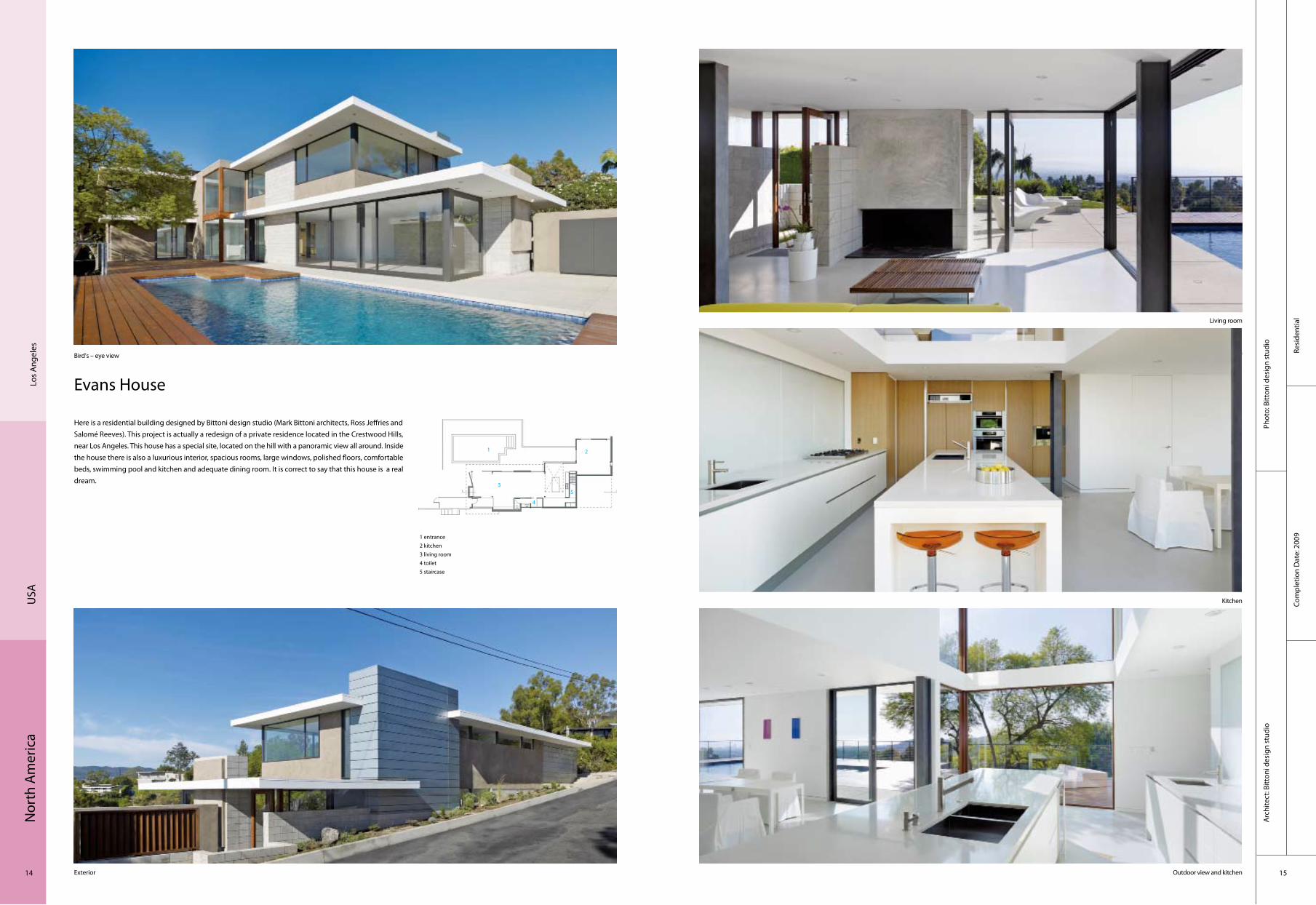
Arizona State University Walter Cronkite School of Journalism & Mass Communication
Located in downtown Phoenix, the new six–storey, 22,500–square–metre building has become an integral part of the fabric of ASU’s energising downtown campus and a harbinger of Phoenix’s redevelopment.As truth and honesty are guiding principles to journalism, so are they to the design of the building. The architecture is specifically expressive of function and materiality. The design is based on an economical 30–foot–square exposed structural concrete column grid with post–tensioned concrete floor slabs. The exterior is clad with glass, masonry and multi–coloured metal panels – the pattern of the panels is inspired by U.S. broadcast frequency spectrum allocations (the Radio Spectrum). The composition is kinetic and dynamic – symbolic of journalism and media’s role in our society. The building’s massing incorporates appropriate sun screens on each of the four façades; their specific architectural treatment reduces the heat loads and is one of many of the LEED Silver building’s sustainable strategies. Burnished concrete block walls, ground and polished concrete floors and warm wood ceilings further express the forthright and direct nature of news delivery.
The Cronkite School occupies all of the second and third floors and a portion of the fourth and sixth floors. The airy, multi–tiered First Amendment Forum is the heart of the school. By day, students gather spontaneously between classes, and in the evenings, the grand hall transforms into a public forum where students and industry leaders discuss the most critical issues facing today’s news media.
1. lobby2. service centre3. presentation hall4. classroom
Façade
Front view Service centre
Night view Presentation hall
1
2
3
4

Nor
th A
mer
ica
20 21
Educ
atio
nal
Com
plet
ion
Dat
e: 2
008
Phot
o: T
imot
hey
Hur
sley
Arc
hite
ct: H
opki
ns A
rchi
tect
s w
ith B
urns
Wal
d an
d Ex
ecut
ive
Arc
hite
cts
Ariz
ona
USA
Northern Arizona University
The building forms a long arc oriented to the south to capture the winter sun in a glass–enclosed three–storey gallery that serves as a thermal buffer space for the offices behind. Louvres and blinds shade the gallery from the hot summer sun, yet allow sun penetration to warm the building in the winter. The south façade of the building is expressed in brick, wood, glass and aluminum. Sustainable strategies integrated into the building include:a long and thin shape to maximise daylight and minimize electric lighting needs;concrete structural frame stores heat in the winter and cool in the summer to reduce energy required for heating and air–conditioning;low–pressure under–floor air distribution reduces fan sizes and energy requirements;nearby field of photovoltaic panels (donated by APS) produces 160 kilowatts and produces more than 20 % of the building’s electricity;triple–glazed windows on the building’s north side minimise unwanted energy loss and gain;automated shade controls regulate solar gain to maintain a comfortable gallery environment.
The combined impact of all these strategies is to reduce the energy consumption by 89% compared to a typical building. Ninety percent of construction waste materials were recycled, and 30 percent of the materials used in construction were made from recycled materials, including insulation made from recycled denim jeans. Water conservation measures include the use of indigenous landscaping, low–pressure faucets, waterless urinals and dual–flush toilets.
Exterior view
Exterior view
Exterior view 03 Passageway
1. entrance2. atrium3. conference pod4. plant5. offices6. terrace7. café8. detention basin9. entrance plaza
1
2
3
4
5
6
7
8
1
9

Nor
th A
mer
ica
22 23
Cultu
ral
Com
plet
ion
Dat
e: 2
007
Phot
o: T
imot
hy H
ursl
eyA
rchi
tect
: Ran
dall
Stou
t Arc
hite
cts,
Inc.
Roan
oke
USA
Taubman Museum of Art
Located at one of Roanoke’s most visible and historic downtown intersections, the new Museum is the first major purpose–built museum ever constructed in the city. The building, with forms and materials chosen to pay homage to the famed Blue Ridge and Appalachian Mountain surroundings, quadrupled the size of the Art Museum’s previous facilities at Centre in the Square. The building features flexible exhibition galleries for the Art Museum’s important permanent collection of 19th and early 20th century American art, contemporary art and regional crafts; education facilities with a library, studio and study Centre; a multi–purpose auditorium; a café; a book and gift shop; a black–box theatre; and outdoor terraces providing unique vistas of the city.
The finish on undulating, stainless steel roof forms reflects the rich variety of colour found in the sky and the seasonal landscape. Inspired by mountain streams, translucent glass surfaces emerge from the building’s mass to create canopies of softly–diffused light over the public spaces and gallery level. As it rises to support the stainless steel roof, a layered pattern of angular exterior walls is surfaced in shingled patinated zinc to give an earthen and aged quality to the façade.
1. Salem Avenue entrance2. museum lobby3. museum shop4. auditorium5. theatre foyer6. theatre7. mechanical8. museum services9. art handling10. loading dock11. protective services12. catering kitchen13. e & o studio14. art venture gallery15. museum café16. electrical equipment
Exterior View of North Façade Exterior view from Salem Avenue
Exterior view from Norfolk AvenueAtrium view from gallery level
1
2
3
4
5
6
7 8
9
10
11
12
13
14
15
16

Nor
th A
mer
ica
24 25
Educ
atio
nal
Com
plet
ion
Dat
e: 2
009
Phot
o: Iw
an B
aan
Arc
hite
ct: M
orph
osis
Arc
hite
cts
New
Yor
kU
SA
41 Cooper Square-the new academic building for The Cooper Union
41 Cooper Square, the new academic building for The Cooper Union, aspires to manifest the character, culture and vibrancy of both the 150–year–old institution and of the city in which it was founded. 41 Cooper Square aspires to reflect the institution’s stated goal to create an iconic building – one that reflects its values and aspirations as a Centre for advanced and innovative education in Art, Architecture and Engineering. In the spirit of the institution’s dedication to free, open and accessible education, the building itself is symbolically open to the city. Visual transparencies and accessible public spaces connect the institution to the physical, social and cultural fabric of its urban context. At street level, the transparent façade invites the neighborhood to observe and to take part in the intensity of activity contained within. Many of the public functions – an exhibition gallery, board room and a two–hundred–seat auditorium – are easily accessible on one level below grade.
The building reverberates with light, shadow and transparency via a high performance exterior double skin whose semi–transparent layer of perforated stainless steel wraps the building’s glazed envelope to provide critical interior environmental control, while also allowing for transparencies to reveal the creative activity occurring within. Responding to its urban context, the sculpted façade establishes a distinctive identity for Cooper Square. The building’s corner entrance lifts up to draw people into the lobby in a deferential gesture towards the institution’s historic Foundation Building. The façade registers the iconic, curving profile of the central atrium as a glazed figure that appears to be carved out of the Third Avenue façade, connecting the creative and social heart of the building to the street.
Built to LEED Gold standards and likely to achieve a Platinum rating, 41 Cooper Square will be the first LEED–certified academic laboratory building in New York City.
Night view
Street view View from distance Staircase
Stairwell and roof
1. entrance2. loading bay3. retail4. storge5. office6. classroom7. main lobby
12
3
45
6
7
Nor
th A
mer
ica
26 27
Corp
orat
eCo
mpl
etio
n D
ate:
200
5
Phot
o: W
oodr
uff/B
row
n A
rchi
tect
ural
Pho
togr
aphy
Arc
hite
ct: K
lingS
tubb
ins
Wilm
ingt
onU
SA
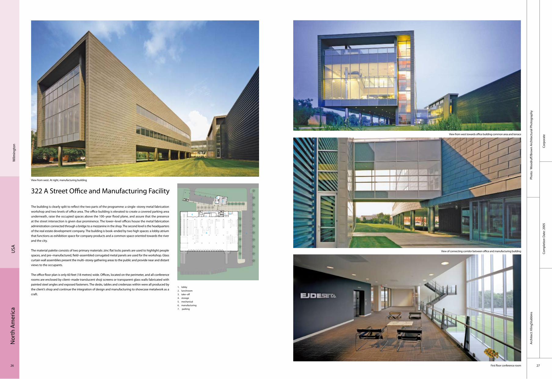
322 A Street Office and Manufacturing Facility
The building is clearly split to reflect the two parts of the programme: a single–storey metal fabrication workshop and two levels of office area. The office building is elevated to create a covered parking area underneath, raise the occupied spaces above the 100–year flood plane, and assure that the presence at the street intersection is given due prominence. The lower–level offices house the metal fabrication administration connected through a bridge to a mezzanine in the shop. The second level is the headquarters of the real estate development company. The building is book–ended by two high spaces: a lobby atrium that functions as exhibition space for company products and a common space oriented towards the river and the city.
The material palette consists of two primary materials: zinc flat locks panels are used to highlight people spaces, and pre–manufactured, field–assembled corrugated metal panels are used for the workshop. Glass curtain wall assemblies present the multi–storey gathering areas to the public and provide near and distant views to the occupants.
The office floor plan is only 60 feet (18 metres) wide. Offices, located on the perimeter, and all conference rooms are enclosed by client–made translucent shoji screens or transparent glass walls fabricated with painted steel angles and exposed fasteners. The desks, tables and credenzas within were all produced by the client’s shop and continue the integration of design and manufacturing to showcase metalwork as a craft.
View from west. At right, manufacturing building
View from west towards office building common area and terrace
View of connecting corridor between office and manufacturing building
First floor conference room
1. lobby2. lunchroom3. take–off4. storage5. mechanical6. manufacturing7. parking
2
34
5
6 7
75
5 5
1

Nor
th A
mer
ica
28 29
Educ
atio
nal
Com
plet
ion
Dat
e: 2
007
Phot
o: To
m B
onne
rA
rchi
tect
: Ehr
lich
Arc
hite
cts(
ww
w.e
hrlic
harc
hite
cts.c
om)
Lausd William J. Clinton Middle School
Located just south of downtown Los Angeles in an isolated pocket of light manufacturing and vacant buildings with minimal community life, this middle school links two city blocks and provides a safe learning haven for more than 1,500 students. Within a tight budget, a clear and simple design was employed to allow for quality materials including corrugated steel and concrete masonry.
The 150,000–square–foot campus (plus 65,000 square feet of structured parking, canopies and bridges) includes a 3–acre academic quad and, across the street, a 6–acre athletic quad. The two–storey academic building houses administration, library, lecture space and shared classrooms on the first floor, with individual classrooms on the upper level. Each side of the U–shaped plan, colour–coded in blue, green or yellow, forms a community of about 500 students; each individual classroom within its cluster is painted a different shade of the principal colour.
The two quads are joined by a pedestrian bridge over a wide, busy street that links classrooms with a gymnasium, playing fields, a track, and faculty parking for 142 cars. All shade canopies are tilted at an optimal angle to the sun, to enhance the performance of photovoltaics.
A generously–sized, colourful interior urban oasis
Durable, low–maintenance materials were used throughout the design
Large open–air canopiesColoured corrugated steel and concrete masonry
The site design treats the school in an urban way
Los
Ang
eles
USA
1. main administration2. library3. multi-purpose4. general classroom5. art room6. kitchen7. gym8. parking
2
3
4
5
6
71
55
444
4
4
4
8
Nor
th A
mer
ica
30 31
Cultu
ral
Com
plet
ion
Dat
e: 2
009
Phot
o: Iw
an B
aan,
Tim
Hur
sley
Arc
hite
ct: F
oste
r + P
artn
ers
Texa
sU
SA
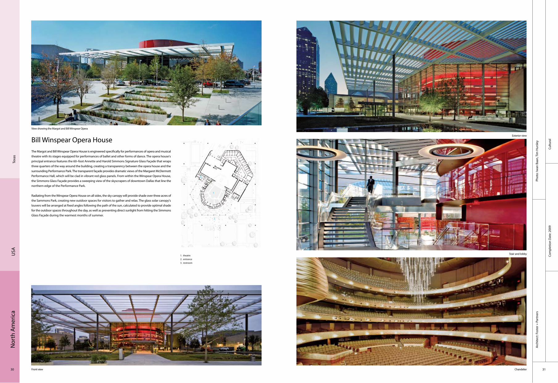
Bill Winspear Opera HouseThe Margot and Bill Winspear Opera House is engineered specifically for performances of opera and musical theatre with its stages equipped for performances of ballet and other forms of dance. The opera house's principal entrance features the 60–foot Annette and Harold Simmons Signature Glass Façade that wraps three quarters of the way around the building, creating a transparency between the opera house and the surrounding Performance Park. The transparent façade provides dramatic views of the Margaret McDermott Performance Hall, which will be clad in vibrant red glass panels. From within the Winspear Opera House, the Simmons Glass Façade provides a sweeping view of the skyscrapers of downtown Dallas that line the northern edge of the Performance Park.
Radiating from the Winspear Opera House on all sides, the sky canopy will provide shade over three acres of the Sammons Park, creating new outdoor spaces for visitors to gather and relax. The glass solar canopy's louvers will be arranged at fixed angles following the path of the sun, calculated to provide optimal shade for the outdoor spaces throughout the day, as well as preventing direct sunlight from hitting the Simmons Glass Façade during the warmest months of summer.
View showing the Margot and Bill Winspear Opera
Exterior view
Stair and lobby
Chandelier
1. theatre 2. entrance 3. restroom
Front view
1
2
3

Nor
th A
mer
ica
32 33
Educ
atio
nal
Com
plet
ion
Dat
e: 2
007
Phot
o: F
arsh
id A
ssas
si, A
nton
Gra
ssl/E
sto.
Arc
hite
ct: M
acha
do a
nd S
ilvet
ti A
ssoc
iate
s+ G
ould
Eva
ns, L
LC.
Tem
pe, A
rizon
aU
SA
Hassayampa Academic Village, Arizona State University
Located at the southeast corner of Arizona State University’s Tempe campus, The Hassayampa Academic Village interlaces 1,900 beds with classroom, computing, dining and retail components. The buildings are organised as a series of 4–storey courtyard buildings sharing a public gallery space with a 7–storey tower. The towers flank the primary east–west and north–south connections to campus and serve as thresholds to the gallery spaces with their entrance to the residential buildings. Each of these buildings is comprosed of 4 floors of 40 student communities sharing a social lounge with the adjoining floor. Together, the 4 floors of student suites gain a shared identity through the colour of their respective courtyard elevations, thereby promoting an individual identity for each building within the life of the academic village.
The project is designed to respect the demands of the climate and environment through its orientation, building envelope, mechanical systems and harnessing of breezes. Devices such as canopies will shade outdoor public spaces, which in turn temper the environment around the buildings. Coupled with material selection and efficiencies of the building, these strategies to reduce heat gain have achieved a LEED Silver rating for the complex.
Public gallery flanked by social lounges and student entrance
Arroyo courtyard looking toward social lounge
Public gallery flanked by social lounges and student entranceView of Sky Lounge outdoor terrace and the Hassayampa Academic Village
1. Chuparosa Court2. Arroyo Court3. Jojoba Court4. Verbana Court1. Acourtia Court
1
2
3
4 5

Nor
th A
mer
ica
34 35
Resi
dent
ial
Com
plet
ion
Dat
e: 2
007
Phot
o: C
hris
tian
Rich
ters
Arc
hite
ct: U
NSt
udio
USA
Ups
tate
, New
Yor
k
VilLA NM
VilLA NM is not a regular house; it is not meant for everyday living. It is a house for summers, for weekends, for stolen time. This is a house that you share with your immediate family, with your most intimate friends. The house is compact as vacation homes often are: like the dacha and lake–side cabin of Russia and Scandinavia, the house offers a simple, private, family–and–nature orientated retreat from urban life.
The conceptual model for Villa NM is a box with a blob–like moment in the middle; a twist in both plan and section that causes a simple shoebox to bifurcate into two separate, split–level volumes. One side clings to the Northern slope of the hill; the other detaches itself from the ground, leaving room underneath for a covered parking space.
All the internal spaces maximise the potential for wraparound views. The kitchen and dining area on the ground floor are connected by a ramp to the living space above, the 1.5–metre (5 feet)–height change allowing for a sweeping outlook over the surrounding woodland and meadows. A similar ramp connects the living area to the master and the children’s bedrooms on the first floor. Facilities such as the bathroom, kitchen and fireplace are clustered in the vertical axis of the house, leaving the outer walls free. Large glazed windows feature in all but the most private rooms.
1. living 2. kitchen 3. bedroom 4. bathroom 5. stairs
Front with pool (West)
Distance view
Entrance
Interior with furniture
Ground floor plan
4
3
2
1
5

Nor
th A
mer
ica
36 37
Com
mer
cial
Com
plet
ion
Dat
e: 2
008
Phot
o: B
ob L
inde
r and
Mik
e Si
ncla
irA
rchi
tect
: Huff
t Pro
ject
s, LL
C/ M
atth
ew H
ufft
Green Circle Shopping Centre
Sprin
gfiel
dU
SA
Aerial perspective © Bob Linder
Aerial perspective–roof Details© Bob Linder Exterior corner Details© Bob Linder
Exteiror stairs © Sinclair Interior1 © Bob Linder
The Green Circle Shopping Centre located in Springfield, Missouri, is one of the most sustainably developed retail spaces in the United States. Slated to achieve a LEED Platinum rating, the highest rating possible, the 23,000–square foot centre incorporates recycled materials, utilises sources of renewable energy, and maximises energy efficiency.
Site location was treated with great sensitivity. The conventional shopping centre would clear the site of trees and maximise parking and retail space. As a sustainable alternative, Green Circle preserved over 40 existing trees on site and in doing so provided building tenants and customers with green space for recreation and visual relief.
A geothermal system with 40 wells located under the parking lot utilises the earth’s heat energy for heating and cooling 100% of the spaces. Paired with both an ERV (Energy and Heat Recovery Ventilators) and heavily insulated walls and floors, the geothermal system provides a 50% improvement in efficiency and decreased utility demands when compared with the baseline case of a typical shopping centre. Increased efficiency translates to lower electrical bills for the tenants and less air pollution for the environment. Lighting controls, efficient light fixtures, photovoltaic panels and extensive daylighting by the strategic placement of windows play a large part as well. The roof and the south façade have photovoltaic panels producing several kilowatts of electrical energy for building use. Interior spaces are capable of having almost no artificial lighting during daylight hours. Furthermore, all of the glass used for daylighting is high performance which minimises solar heat gain where necessary and transmits a high percentage of visible light.
Nor
th A
mer
ica
38 39
Cultu
ral
Com
plet
ion
Dat
e: 2
010
Phot
o: T
ravi
s Fu
llert
on, T
ippy
Tip
pens
Arc
hite
ct: R
ick
Mat
her A
rchi
tect
s
Rich
mon
dU
SA
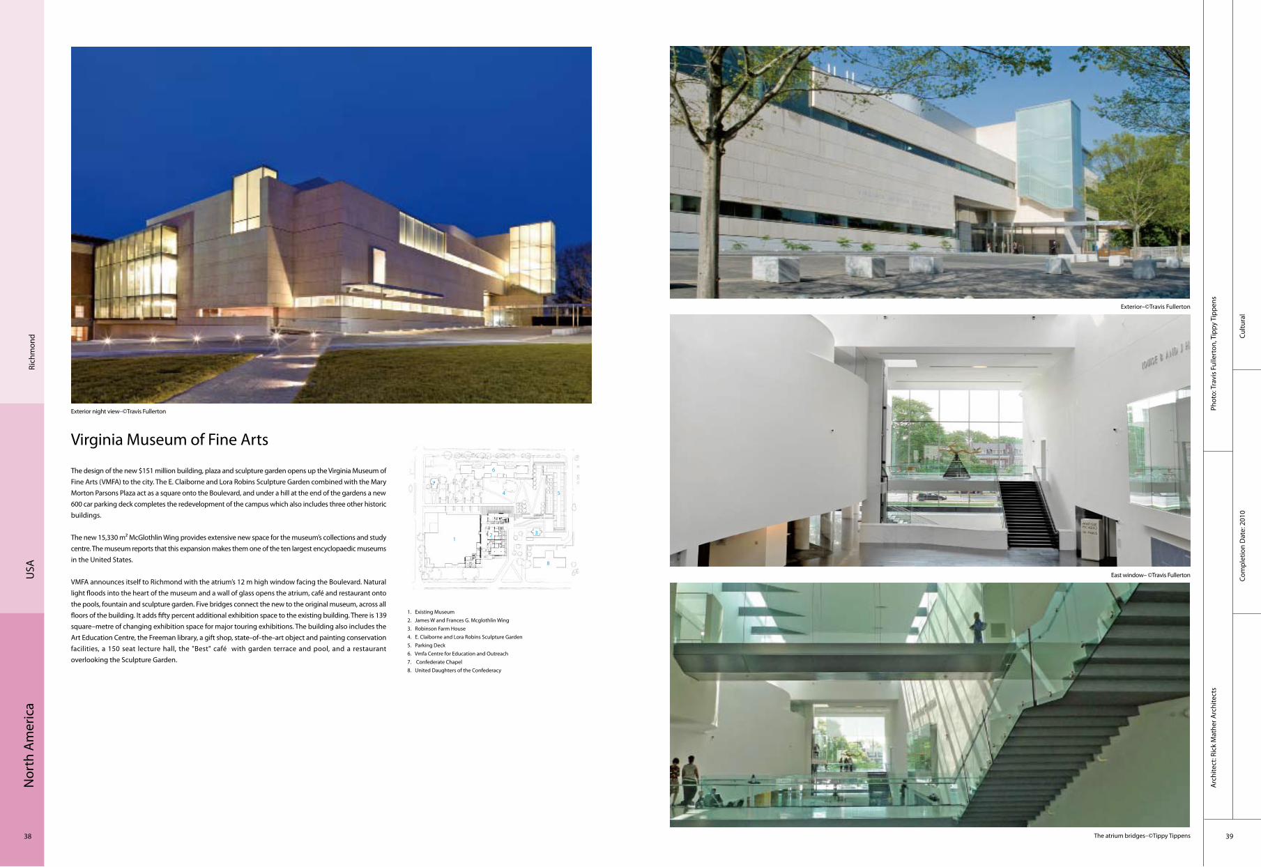
Virginia Museum of Fine Arts
Exterior night view–©Travis Fullerton
Exterior–©Travis Fullerton
East window– ©Travis Fullerton
The atrium bridges–©Tippy Tippens
1. Existing Museum2. James W and Frances G. Mcglothlin Wing3. Robinson Farm House4. E. Claiborne and Lora Robins Sculpture Garden5. Parking Deck6. Vmfa Centre for Education and Outreach7. Confederate Chapel8. United Daughters of the Confederacy
The design of the new $151 million building, plaza and sculpture garden opens up the Virginia Museum of Fine Arts (VMFA) to the city. The E. Claiborne and Lora Robins Sculpture Garden combined with the Mary Morton Parsons Plaza act as a square onto the Boulevard, and under a hill at the end of the gardens a new 600 car parking deck completes the redevelopment of the campus which also includes three other historic buildings.
The new 15,330 m² McGlothlin Wing provides extensive new space for the museum’s collections and study centre. The museum reports that this expansion makes them one of the ten largest encyclopaedic museums in the United States.
VMFA announces itself to Richmond with the atrium’s 12 m high window facing the Boulevard. Natural light floods into the heart of the museum and a wall of glass opens the atrium, café and restaurant onto the pools, fountain and sculpture garden. Five bridges connect the new to the original museum, across all floors of the building. It adds fifty percent additional exhibition space to the existing building. There is 139 square–metre of changing exhibition space for major touring exhibitions. The building also includes the Art Education Centre, the Freeman library, a gift shop, state–of–the–art object and painting conservation facilities, a 150 seat lecture hall, the "Best" café with garden terrace and pool, and a restaurant overlooking the Sculpture Garden.
4
321
5
8
6
7

Nor
th A
mer
ica
40 41
Recr
eatio
nal
Com
plet
ion
Dat
e: 2
007
Phot
o: B
ill T
imm
erm
an, T
imm
erm
an P
hoto
grap
hy, I
ncor
pora
ted
Phoe
nix,
Ariz
ona
USA
Arc
hite
ct: b
lank
stu
dio,
arc
hite
ct
Ariz
ona
USA Social Condenser for Superior
The Social Condenser project is located at the base of the Superstition Mountain Range in the Town of Superior, Arizona which was founded in 1882 and has strong ties to mining of copper, silver and gold.
The project is uniquely positioned between historic Main Street and Queen Creek. The site consists of two parcels, the project parcel to the north and an open landscaped parcel to be developed into future outdoor dining and music pavilion, and is bisected by an access path from the upper street level and a lower wooden footbridge that spans across the creek.
The project is a renovation and expansion of an existing two–storey block building and addition of an exterior dining terrace. The lower level is developed into kitchen, mechanical and storage spaces and the upper level is designed as an open gathering space. The south–facing wall of the upper level of the existing building is removed to expose the volume within. The remaining form is rendered to closely match the shadow tones of the surrounding hills and acts as both backdrop and anchor for the new addition.
The project was informed by the concept of the "public house". Classically an obscured, introverted diagram, the Social Condenser conversely aims to balance concealment with exuberant exposure of the internal activities to the streetscape, the pedestrian walking path and the adjacent landscaped parcel.
The project is envisioned to be the living room of the community; a place to congregate, socialise, view work of provincial artists and enjoy the breathtaking landscape vistas that envelop the region.

Nor
th A
mer
ica
42 43
Resi
dent
ial
Com
plet
ion
Dat
e: 2
009
Phot
o: C
ourt
esy
of S
tudi
o 80
4, In
c.A
rchi
tect
: Stu
dio
804,
Inc.
Kans
asU
SA
Sustainable Residence – 3716 Springfield
The residence at 3716 Springfield in Kansas City is an environmentally conscious, modern home performing completely "off–the–grid". Being the first LEED platinum home in the Kansas City Metropolitan area, the building serves as an example of sustainable practice and living for buyers considering a life in the city. The combination of the passive glazing with the louvres for shading and active systems integrated with the roof plane flush to the siding calls out visually the environmental building standards. Also, the residence is dedicated to teaching the community and provides tours for all interested parties in order to effectively encourage the neighbourhood to become knowledgeable in sustainable architecture.
A broad south exposure was purposely sought after to support the passive solar effort. Additionally, operable windows along the lower south glazing and roof–top skylight allow for stack ventilation throughout the interior. The entire site was planted with drought–resistant landscaping and the south was intentionally left open to encourage the homeowner to plant a native garden. The hardscape surrounding the exterior of the home use pervious concrete which permits rainwater to seep through and into the water table.
1. garage2. bath3. kitchen4. living room5. flex space6. bath7. master bath8. master bedroom
Building
East view
Kitchen across island
Bath on the ground door
4
3
2 1
5 86 7
Nor
th A
mer
ica
44 45
Resi
dent
ial
Com
plet
ion
Dat
e: 2
010
Phot
o: P
aul W
arch
ol P
hoto
grap
hyA
rchi
tect
: Dav
id Ja
mes
on A
rchi
tect
Mar
ylan
dU
SA
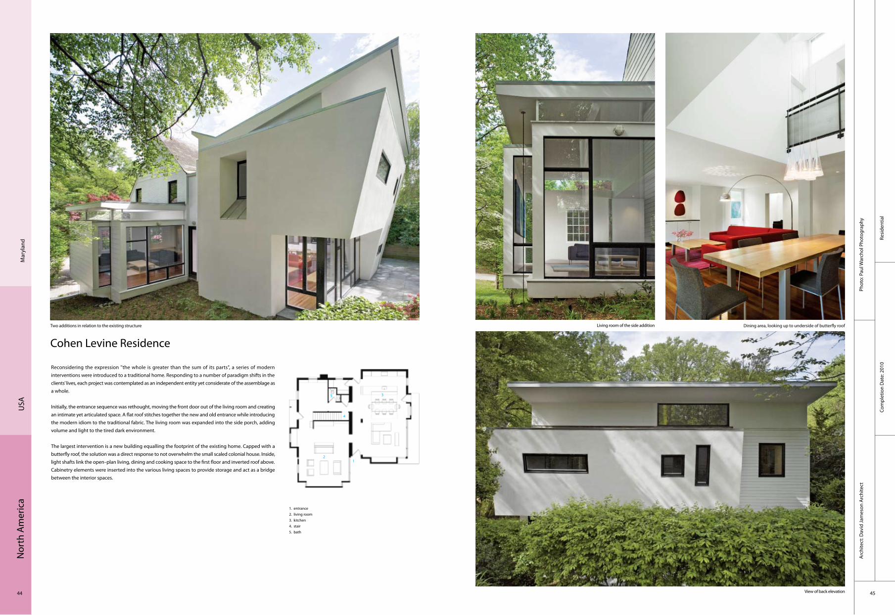
Cohen Levine Residence
Reconsidering the expression "the whole is greater than the sum of its parts", a series of modern interventions were introduced to a traditional home. Responding to a number of paradigm shifts in the clients’ lives, each project was contemplated as an independent entity yet considerate of the assemblage as a whole.
Initially, the entrance sequence was rethought, moving the front door out of the living room and creating an intimate yet articulated space. A flat roof stitches together the new and old entrance while introducing the modern idiom to the traditional fabric. The living room was expanded into the side porch, adding volume and light to the tired dark environment.
The largest intervention is a new building equalling the footprint of the existing home. Capped with a butterfly roof, the solution was a direct response to not overwhelm the small scaled colonial house. Inside, light shafts link the open–plan living, dining and cooking space to the first floor and inverted roof above. Cabinetry elements were inserted into the various living spaces to provide storage and act as a bridge between the interior spaces.
Two additions in relation to the existing structure
View of back elevation
Living room of the side addition Dining area, looking up to underside of butterfly roof
1. entrance2. living room3. kitchen4. stair5. bath
4
3
21
5

Nor
th A
mer
ica
46 47
Educ
atio
nal
Com
plet
ion
Dat
e: 2
008
Phot
o: W
illia
m Z
bare
nA
rchi
tect
: KRU
ECK+
SEXT
ON
Chic
ago,
USA
Spertus Institute Of Jewish Studies
Acclaimed as the finest cultural addition to Chicago after Millennium Park, the Spertus Institute of Jewish Studies is one of the city’s most celebrated and discussed new projects.
The façade is an innovative, 21st–century approach to the use of glass and the expression of identity. Folding glass planes on the façade give drama and presence to this ten–storey building located in a city of skyscrapers. The folds also scale and modulate the Spertus façade and relate it to the mostly brick and stone neighbouring buildings in the Michigan Boulevard Historic District.
The project includes an asymmetrical, fan–shaped auditorium with seating for 400 people, and full projection, lighting and sound mixing capabilities. The balcony is uniquely multi–tiered so that smaller groups can attain a level of intimacy with the onstage performance even when the auditorium is partially filled. The back of the auditorium has a faceted form, revealed within the main lobby of the building, that gives a dynamic expression to the activities inside.
Moving up into the building, visitors follow a sequence of light–filled spaces which connect and overlap Spertus’s mixed–use programme of exhibition galleries, library, auditorium, college classrooms and administrative offices. A great hall at the top floor looks back across Grant Park to the skyline and the lake, connecting both the institution and visitors back to city and nature.
Nor
th A
mer
ica
48 49
Resi
dent
ial
Com
plet
ion
Dat
e: 2
008
Phot
o: P
b El
emen
tal A
rchi
tect
ure
Arc
hite
ct: P
b El
emen
tal A
rchi
tect
ure,
Dav
e Bi
ddle
, Chr
is P
ardo
Seat
tleU
SA
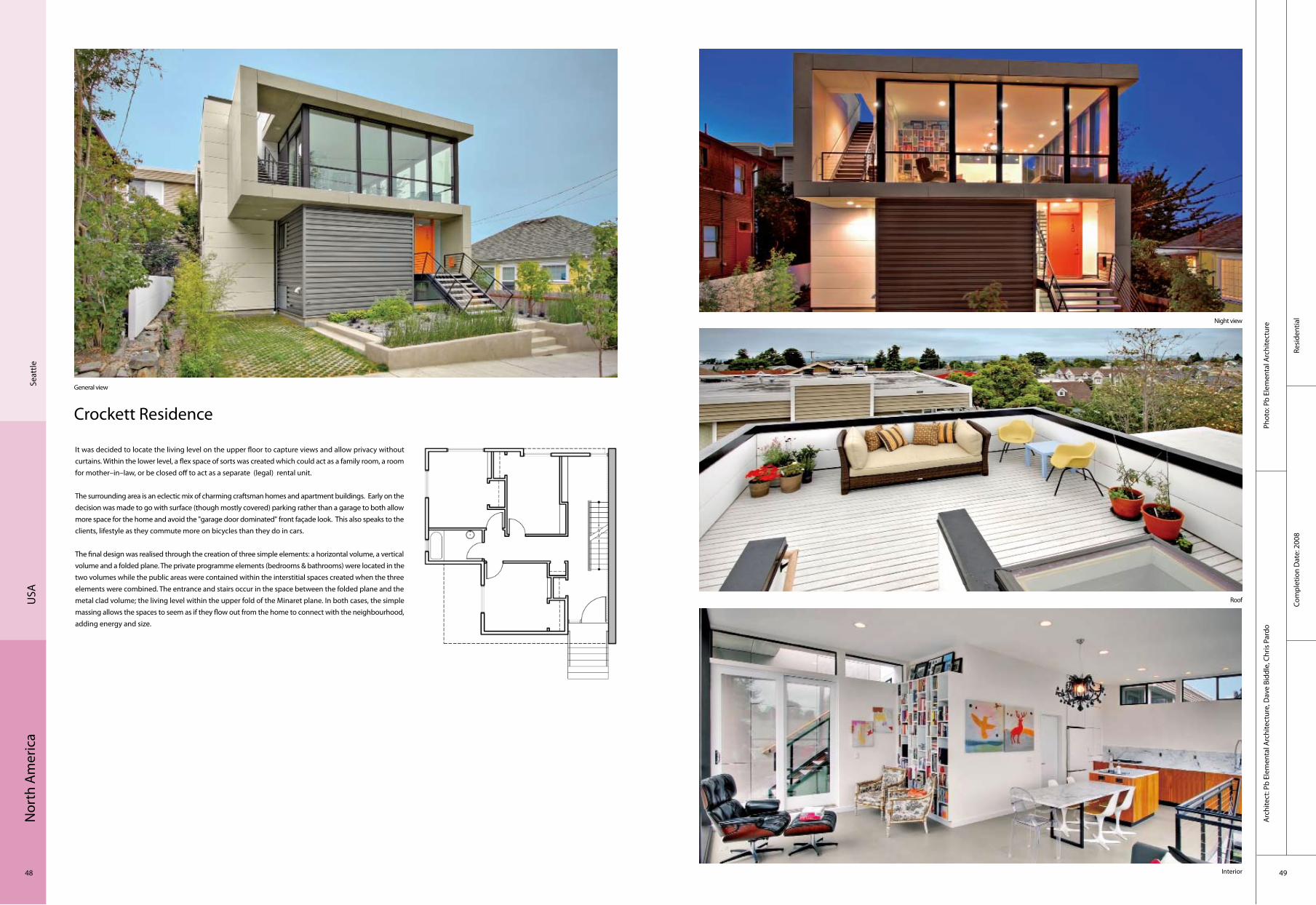
Crockett Residence
It was decided to locate the living level on the upper floor to capture views and allow privacy without curtains. Within the lower level, a flex space of sorts was created which could act as a family room, a room for mother–in–law, or be closed off to act as a separate (legal) rental unit.
The surrounding area is an eclectic mix of charming craftsman homes and apartment buildings. Early on the decision was made to go with surface (though mostly covered) parking rather than a garage to both allow more space for the home and avoid the "garage door dominated" front façade look. This also speaks to the clients, lifestyle as they commute more on bicycles than they do in cars.
The final design was realised through the creation of three simple elements: a horizontal volume, a vertical volume and a folded plane. The private programme elements (bedrooms & bathrooms) were located in the two volumes while the public areas were contained within the interstitial spaces created when the three elements were combined. The entrance and stairs occur in the space between the folded plane and the metal clad volume; the living level within the upper fold of the Minaret plane. In both cases, the simple massing allows the spaces to seem as if they flow out from the home to connect with the neighbourhood, adding energy and size.
General view
Night view
Roof
Interior

Nor
th A
mer
ica
50 51
Resi
dent
ial
Com
plet
ion
Dat
e: 2
008
Phot
o: P
eter
Jahn
keA
rchi
tect
: PIQ
UE
llc.
Ore
gon
USA
Strauchaus
This home rests on the edge of a wooded area. The diagramming process analysed the programme and needs of the two owners in effort to resolve a cohesive experiential sequencing of spaces, suggest massing arrangements and uncover elevation compositions. The abstraction of the programme is made in effort to make the two paths: the movement, and the connections become an extension of the landscape.
As the building takes form, the graphic maps and modeled paths begin to prescribe how the structure relates to the surrounding context. A patterning of thin floor–to–ceiling windows connects the structure to the neighbouring forestry by continuing the event of a body passing through the forest.
Building in the evening
Front side in the evening
Patioin the evening Hallway
4
3
2
1
5
1. entrance2. living room3. kitchen4. stair5. bath

Nor
th A
mer
ica
52 53
Resi
dent
ial
Com
plet
ion
Dat
e: 2
008
Phot
o: T
he s
tudi
o of
Rob
ert O
shat
zA
rchi
tect
: Rob
ert O
shat
z, A
rchi
tect
Colo
urad
oU
SA
Mt. Crested Butte Residence
This is a special house built in a ski resort community by two brother carpenters who happen to own a truckload of redwood siding. The house was designed to be attractive to two families who might want to be in a resort at 3,100–metre elevation. From the front door one could ski down to the ski lift, take the lift and ski back down to the house. A central shaft that runs vertically through the house supports the house. In the interior the central shaft is a fireplace for each of the house’s three floors. The house is designed with two garages on each side of the entrance. One enters the house on a split–level. A half level up has two master bedroom suites separated by the central shaft with a fireplace and whirlpool in it. A half level down from the entrance is the community family areas, living, kitchen, etc. The lowest level is a children's playroom/dormitory. The undulating roof reflects the mountaintop behind the house. Local people refer to the house as the "snow clam".
4
3 2 15
1. outer entrance2. inner entrance3. great room4. kitchen5. deck6. garage
6
6
Nor
th A
mer
ica
54 55
Resi
dent
ial
Com
plet
ion
Dat
e: 2
009
Phot
o: P
eter
Jahn
keD
esig
n: P
IQU
E llc
.
Ore
gon
USA
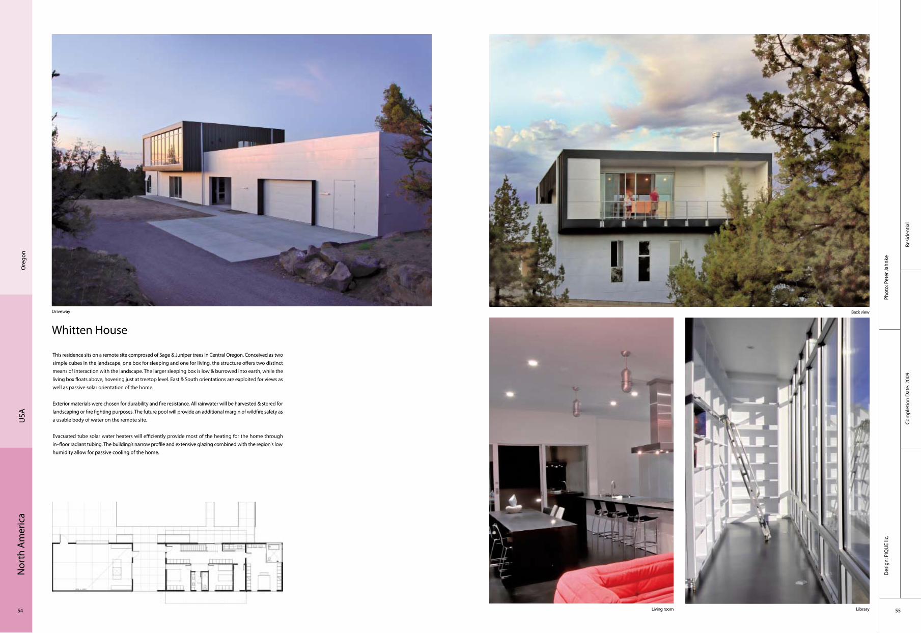
Whitten House
This residence sits on a remote site comprosed of Sage & Juniper trees in Central Oregon. Conceived as two simple cubes in the landscape, one box for sleeping and one for living, the structure offers two distinct means of interaction with the landscape. The larger sleeping box is low & burrowed into earth, while the living box floats above, hovering just at treetop level. East & South orientations are exploited for views as well as passive solar orientation of the home.
Exterior materials were chosen for durability and fire resistance. All rainwater will be harvested & stored for landscaping or fire fighting purposes. The future pool will provide an additional margin of wildfire safety as a usable body of water on the remote site.
Evacuated tube solar water heaters will efficiently provide most of the heating for the home through in–floor radiant tubing. The building’s narrow profile and extensive glazing combined with the region's low humidity allow for passive cooling of the home.
Driveway Back view
Living room Library
Nor
th A
mer
ica
56 57
Resi
dent
ial
Com
plet
ion
Dat
e: 2
007
Phot
o: M
ered
ith B
row
erA
rchi
tect
: Rob
ert H
arve
y O
shat
z
Ore
gon
USA
Weiss Residence
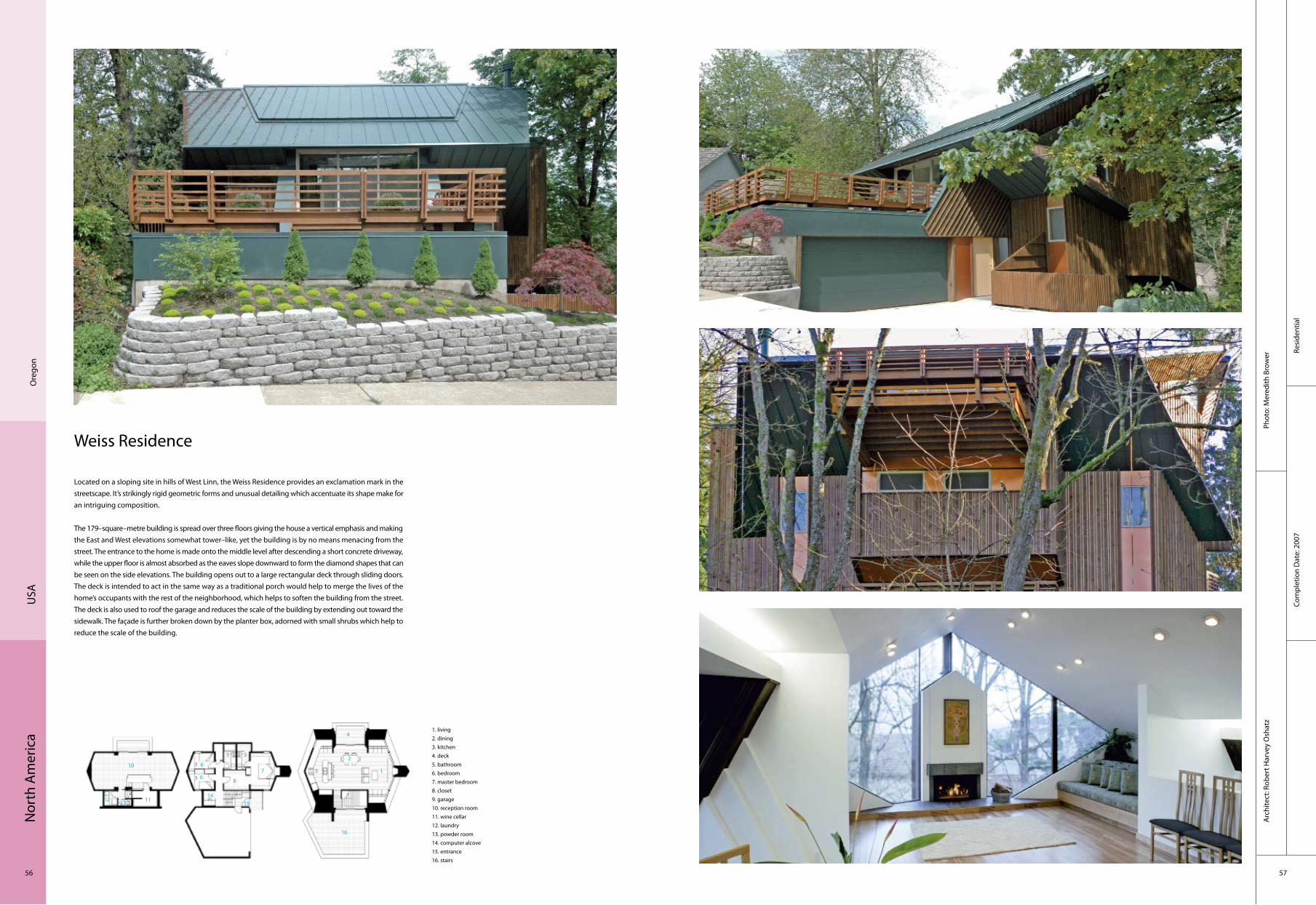
Located on a sloping site in hills of West Linn, the Weiss Residence provides an exclamation mark in the streetscape. It’s strikingly rigid geometric forms and unusual detailing which accentuate its shape make for an intriguing composition.
The 179–square–metre building is spread over three floors giving the house a vertical emphasis and making the East and West elevations somewhat tower–like, yet the building is by no means menacing from the street. The entrance to the home is made onto the middle level after descending a short concrete driveway, while the upper floor is almost absorbed as the eaves slope downward to form the diamond shapes that can be seen on the side elevations. The building opens out to a large rectangular deck through sliding doors. The deck is intended to act in the same way as a traditional porch would help to merge the lives of the home’s occupants with the rest of the neighborhood, which helps to soften the building from the street. The deck is also used to roof the garage and reduces the scale of the building by extending out toward the sidewalk. The façade is further broken down by the planter box, adorned with small shrubs which help to reduce the scale of the building.
16
3
2
1
5
1. living2. dining3. kitchen4. deck5. bathroom6. bedroom7. master bedroom8. closet9. garage10. reception room11. wine cellar12. laundry13. powder room14. computer alcove15. entrance16. stairs
6
6
4
5
7
8
1415
10
1112 13
Nor
th A
mer
ica
58 59
Com
plex
Mar
cy W
ong
Don
n Lo
gan
Arc
hite
cts
Phot
o: L
eft S
ide
Imag
e of
the
Spr
ead
by S
teve
Pro
ehl;
Oth
ers
by B
illy
Hus
tace
Com
plet
ion
Dat
e: 2
009
Rich
mon
dU
SA
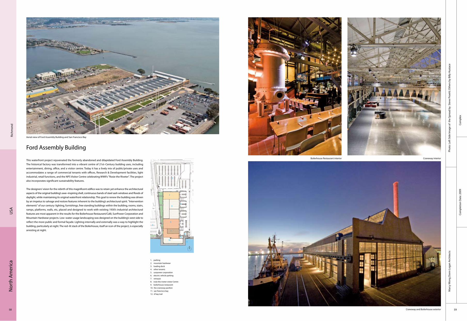
Ford Assembly Building
This waterfront project rejuvenated the formerly abandoned and dilapidated Ford Assembly Building. The historical factory was transformed into a vibrant centre of 21st–Century building uses, including entertainment, dining, office, and a visitor centre. Today it has a lively mix of public/private uses and accommodates a range of commercial tenants with offices, Research & Development facilities, light industrial, retail functions, and the NPS Visitor Centre celebrating WWII’s "Rosie the Riveter". The project also incorporates significant sustainability features.
The designers’ vision for the rebirth of this magnificent edifice was to retain yet enhance the architectural aspects of the original building’s awe–inspiring shell, continuous bands of steel sash windows and floods of daylight, while maintaining its original waterfront relationship. This goal to renew the building was driven by an impetus to salvage and restore features inherent to the building’s architectural spirit. "Intervention elements" of our century: lighting, furnishings, free standing buildings within the building, rooms, stairs, ramps, platforms, walls, etc, placed and designed to work with existing 1930’s industrial architectural features are most apparent in the results for the Boilerhouse Restaurant/Café, SunPower Corporation and Mountain Hardwear projects. Low–water usage landscaping was designed on the building’s west side to reflect the more public and formal façade. Lighting internally and externally was a way to highlight the building, particularly at night. The red–lit stack of the Boilerhouse, itself an icon of the project, is especially arresting at night.
Aerial view of Ford Assembly Building and San Francisco Bay
Boilerhouse Restaurant interior Craneway interior
Craneway and Boilerhouse exterior
1. parking2. mountain hardwear3. loading dock4. other tenants5. sunpower corporation6. electric vehicle parking7. vetrazzo8. rosie the riveter visitor Centre9. boilerhouse restaurant10. the craneway pavilion11. san francisco bay12. sf bay trail
43
2
1
56
78
9
1011
12

Nor
th A
mer
ica
60 61
Recr
eatio
nal
Arc
hite
ct: M
arcy
Won
g D
onn
Loga
n A
rchi
tect
sPh
oto:
Sha
ron
Rise
dorp
h
Com
plet
ion
Dat
e: 2
008
San
Fra
ncis
coU
SA
Orange Memorial Park Recreation Centre
Orange Memorial Park is the most important public recreation venue for the citizens of South San Francisco and is the context for the new recreation building which is encircled by soccer, picnic, basketball and other outdoor amenities. The building’s most significant element is an airy, light–filled Activity Pavilion for cultural, recreational, celebratory, and educational activities. The architects chose wood flooring and an exposed wood truss roof to add warmth and grace to this important room.
The recreation building is conceived as a focal point of the park and an icon for the community. Towards that goal, a juxtaposition of two distinct rectangular masses was created – one large, light and largely transparent, housing the Activity Pavilion, with large areas of glass in concert with red and yellow cedar, and another mass that is by contrast a smaller, nearly solid box of basalt stone. The interior use of cedar specifically in the Activity Pavilion creates a dynamic and inviting environment for a central meeting place for the community. Moreover, the horizontality of the building is accentuated by the roof of the Pavilion whose paired glu–lam wood trusses span the room; these trusses cantilever beyond the enclosed footprint to provide covered outdoor patio areas.
West Façade Elevation – Entrance Approach to Recreation Building East façade elevation – view from fields at dusk
Interior of multi–purpose pavilionDetailed exterior cedar and glass façade of multi–purpose pavilion on west, south and east sides
1. main entrance2. entrance from fields3. reception counter4. foyer5. office6. office7. utility room8. men's restroom9. women's restroom10. storage11. kitchen12. pantry13. multi–purpose activity pavilion14. east patio15. south patio16. west patio
4
321
5 67
89
101112
13 14
15
16
Nor
th A
mer
ica
62 63
Educ
atio
nal
Com
plet
ion
Dat
e: 2
007
Phot
o: M
r. H
erib
erto
Her
nand
ez O
choa
B. A
rch.
Arc
hite
ct: L
abor
ator
io e
n A
rqui
tect
ura
Prog
resi
va S
. C.
Oco
tlan
Mex
ico
Library and Media Centre of the University of Guadalajara
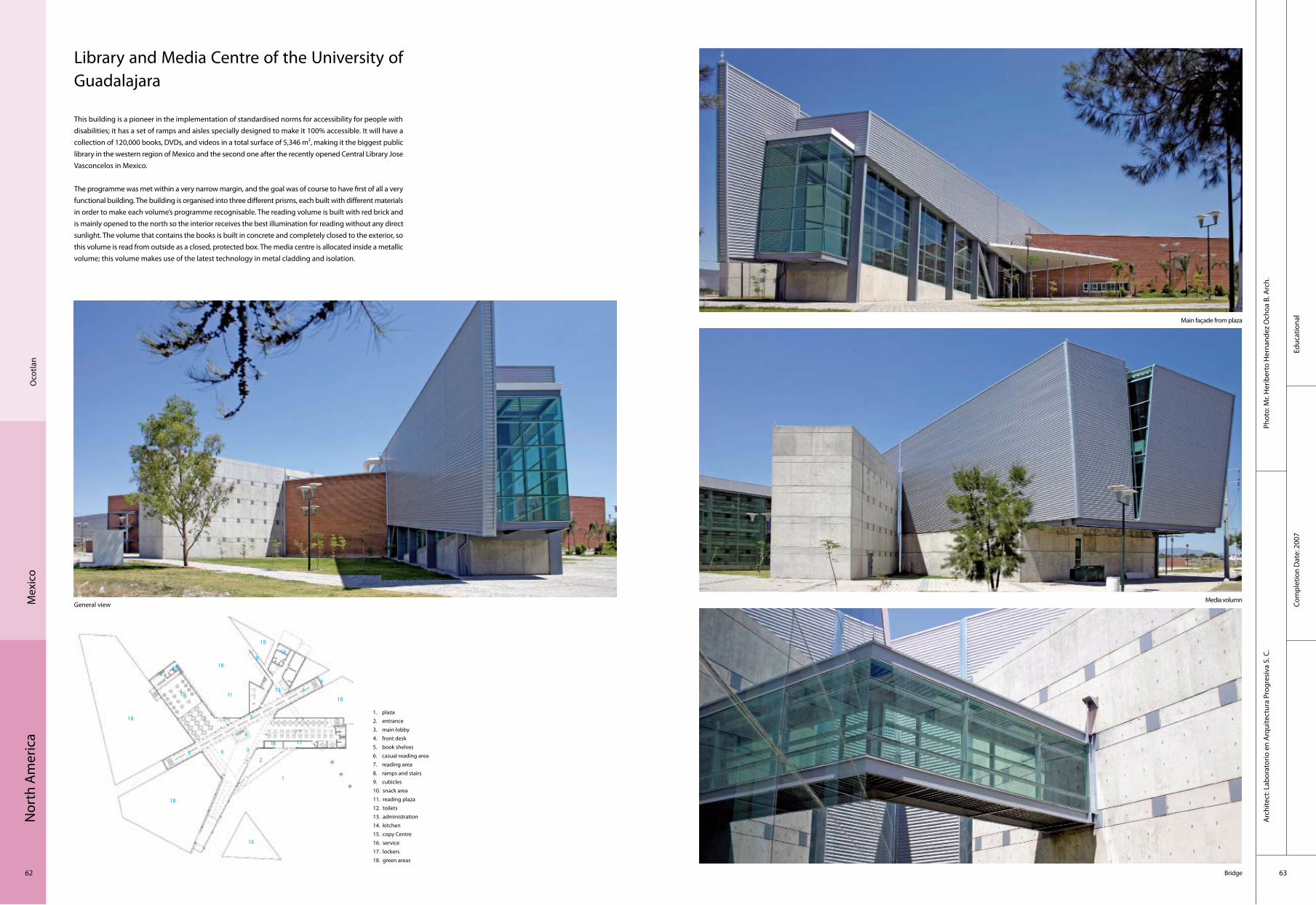
This building is a pioneer in the implementation of standardised norms for accessibility for people with disabilities; it has a set of ramps and aisles specially designed to make it 100% accessible. It will have a collection of 120,000 books, DVDs, and videos in a total surface of 5,346 m2, making it the biggest public library in the western region of Mexico and the second one after the recently opened Central Library Jose Vasconcelos in Mexico.
The programme was met within a very narrow margin, and the goal was of course to have first of all a very functional building. The building is organised into three different prisms, each built with different materials in order to make each volume’s programme recognisable. The reading volume is built with red brick and is mainly opened to the north so the interior receives the best illumination for reading without any direct sunlight. The volume that contains the books is built in concrete and completely closed to the exterior, so this volume is read from outside as a closed, protected box. The media centre is allocated inside a metallic volume; this volume makes use of the latest technology in metal cladding and isolation.
General viewMedia volumn
Bridge
Main façade from plaza
1. plaza2. entrance3. main lobby4. front desk 5. book shelves 6. casual reading area 7. reading area 8. ramps and stairs 9. cubicles 10. snack area 11. reading plaza 12. toilets 13. administration 14. kitchen 15. copy Centre 16. service 17. lockers 18. green areas
4
3
2
1
5 6
7
8
9
10 11
12
13
14
15
16
7
8
5
5
17
18
18
18
18
18
18

Nor
th A
mer
ica
64 65
Corp
orat
eCo
mpl
etio
n D
ate:
200
8
Phot
o: M
ito C
ovar
rubi
asA
rchi
tect
: Ric
ardo
Agr
az
Gua
naju
ato
Mex
ico
A.M. Celaya
The A.M. newspaper in the state of Guanajuato, Mexico, is subsidiary to one of the main national journals of Grupo Reforma. Its local contents are produced in Leon where it is printed, and from where it is distributed throughout the state, once it has received the news generated in Celaya. Therefore, printed without any industrial facilities, the A.M. Celaya had been operating in a rented unit with no urban presence whatsoever. So, in order to create an appropriate projection according to the social importance and financial viability of the newspaper, the owners destined an outstandingly located terrain. This was a long and slim land, facing one of the main avenues in the city, to be used for three purposes: the newspaper headquarters, shopping units and an additional rental business block in the upper level.
This is how the architectural programme comes out, bringing a triple–height cube as main volume for the newspaper brand image. The central stairway is set here, communicating the main entrance to the public attention areas as well as meeting rooms, whereas on the first floor comes the editors and directors office, as well as the newspaper offices. On the other end of the building is the main entrance for the rental business units, having underneath the shop units, all of them with direct access from the street.
It is an almost 100–meter–long building, with a series of vertical strips used for ventilation by tip–up windows The long and slim terrain, facing one of the main avenues in the city, dictated the programme
The volumetric statement is the triple–height lobby hall with a big granite plate that holds the newspaper’s logo
The stairs lead to the First floor where the editors and directors office, as well as the newspaper offices come
The programme comes out of a triple–height cube as main volume for the newspaper brand image
1. security2. lifts3. classified section4. lobby5. sala de juntas6. files7. local commercial8. services
4
32
15
6 78 77 7 7 7 7 7 7 7 7 7 7
2
4

Nor
th A
mer
ica
66 67
Resi
dent
ial
Com
plet
ion
Dat
e: 2
008
Phot
o: A
rq. G
usta
vo S
lovi
kA
rchi
tect
: SLV
K: A
rq. G
usta
vo S
lovi
k, A
rq D
anie
l Dic
kter
, Arq
Em
anue
l Teo
hua.
Mex
ico
City
Mex
ico
Manantiales de Espejo Apartment Building
The building is located in a regeneration zone of Mexico City that is growing in popularity, housing 47 apartments, 55 m2 each. The building has a green rooftop that stands in contrast with the grey surroundings of the area. The structure is "U" shaped, with all the apartments having views both on the inside and outside façades. The windows on the outside are designed as a reference to barcodes used to tag commercial products. The inside windows bring light and movement together. The architecture of the building reflects the site, located next to a speedy avenue that connects the northern side of the city and surrounded by small streets with low circulation and speed, with a very dynamic expression in façades which contrasts the regular form of the plan. In the lower level there is the parking. The next 6 levels are apartments and the upper level is the roof garden. The materials used are mostly concrete for the main core of the building and steel for the circulations, making the building look both strong and modern in contrast to the building and houses in the immediate surroundings that are much older.
1. main bedroom2. bedroom3. living room4. dining room5. kitchen6. utility7. toilet8. WC9. study10. balcony11. lift12. corridor
4
3
21
5 6
7
8
1
2
9
10
11
12
1
1
2
2
21
21
21
1
10

Sout
h A
mer
ica
68 69
Cultu
ral
Com
plet
ion
Dat
e: 2
009
Phot
o: R
odrig
o D
avila
Arc
hite
ct: D
anie
l Bon
illa
Omegablock, Colegio Anglo Colombiano (Omega Block, Anglo Colombiano College)
The Omega Block Building is located in the Anglo Colombiano School in the Bogota, capital of Colombia. This building is the summary of three buildings in progression, which are adapted to the morphology of the triangular area disposed for its development.
The three volumes are combined with low to high mass or vice versa. Greater Volume houses general classrooms, specialised classrooms medium volume music and art rooms and smaller volume of media. The master volume is structured through the subtraction of the mass, the average volume level through the envelope, and the smaller volume is a sieve or perforated in the mass sequence. The dominant materiality of the project, large format brick and slender pre–stressed concrete elements (beige in colour), binds the outside spaces with that of the large internal atrium space. Further tonal and material compliment is found in the vibrant green special divisions (doors and divisions), with smooth Formica finish.
A grand staircase, or tiered seating, ensures a fluid connection between the base plane (ground floor) with level above, while offering a congregational space. With this element, the scale of the building changes, and the use of the atrium space is re–interpreted.
General view
Bogo
ta
Co
lom
bia
Main hall
Exterior Details
Sout
h A
mer
ica
70 71
Cultu
ral
Com
plet
ion
Dat
e: 2
009
Phot
o: C
risto
bal P
alm
aA
rchi
tect
: Est
udio
Am
eric
a
Sant
iago
Chile
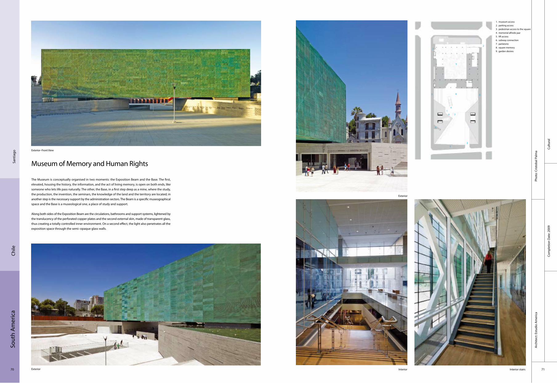
Museum of Memory and Human Rights
The Museum is conceptually organised in two moments: the Exposition Beam and the Base. The first, elevated, housing the history, the information, and the act of living memory, is open on both ends, like someone who lets life pass naturally. The other, the Base, in a first step deep as a mine, where the study, the production, the invention, the seminars, the knowledge of the land and the territory are located; in another step is the necessary support by the administration sectors. The Beam is a specific museographical space and the Base is a museological one, a place of study and support.
Along both sides of the Exposition Beam are the circulations, bathrooms and support systems, lightened by the translucency of the perforated copper plates and the second external skin, made of transparent glass, thus creating a totally controlled inner environment. On a second effect, the light also penetrates all the exposition space through the semi–opaque glass walls.
Exterior
Exterior–Front View
Exterior
Interior stairsInterior
1. museum access2. parking access3. pedestrian access to the square4. memorial alfredo jaar5. lift access6. subway connection7. parlatorio8. square memory9. garden desires
4
3
2
1
5
6 7
8
3
3
9
32

Sout
h A
mer
ica
72 73
Com
mer
cial
Com
plet
ion
Dat
e: 2
009
Phot
o: G
uille
rmo
Hev
ia
Arc
hite
ct: G
H+A
Arq
uite
ctos
Nes
tlé G
rane
ros
Fact
ory
VI R
egió
nCh
ile
Benavides Drugstore and Warehouse
An architecture of simple lines, contrast of transparencies and closed walls answers to two complementary functions: the buildings (distribution centre and offices) and the usability (services in the pharmaceutical area, incorporated with technologies of the last generation in the production and passive ventilation systems for the buildings).
The lot is located in a new expansion of an industrial park, made by the firm Kalos in the north of Monterrey (international airport highway). The new pharmaceutical complex is the gateway to the urbanisation, on one side the great park, on the other the central axis with green spaces.
The architecture of the complex is simple and outright. A vertical and diagonal texture of relief lines on a big closed white volume produces a game of light and shadows while giving movement to the façades. It contrasts with the administrative building, which is designed like a cube of blue glossy glass, subdivided by aluminium blades, giving the building a decisive character of transparency, both during day and night. The second skin is suspended from and offset to the volume of the administrative building, above a multiuse water pond. The water pond permits the thermal control of the building through evaporation produced during the hot months and the effect of transparencies, reflex, light and shadows.
Façade
Factory hall
Warehouse
Main façade
1 access2 hall3 water4 cantina5 kitchen6 bathroom
4
3
2 15
6
3
9

Sout
h A
mer
ica
74 75
Corp
orat
eCo
mpl
etio
n D
ate:
200
8
Phot
o: C
ristiá
n Ba
raho
na, G
uille
rmo
Hev
ia H
. & G
uille
rmo
Hev
ia G
arcí
aA
rchi
tect
: GH
+A A
rqui
tect
os
Enea
– P
udah
uel
Chile
ALSACIA
The volumes level the architecture to the lines of the perimeter, while fitting itself to the urban context and the counterfort of the cordillera, using a roundly colour scheme of red and black. The project defines itself by the use of simple lines, extreme colours and pure volumetry.
The use of the buildings (distribution and classification of auto parts) and its complexities define the architecture to a big, closed volume which terraces itself to follow the urban boundaries. The contrast between the red and black, draws attention to accent the simplicity of the volumes, transforming the architectural ensemble to a unique icon of the access to the ENEA business site. The main building contrasts with its black metal to the administrative building and the service areas due to its morphology and materiality. The second volume is made out of insight concrete, glass and steel. The suspended roof crosses the volume, bearing itself on both sides on metal columns of double height, generating covered and protected areas. An access atrium, preceded by a water pond (obey the function of chilling the main façade by evaporation) and the square in the subsequent façade assigned for social activities, contains the big stairs which cross the diagonal, dynamising the space and giving access to the educational– and staffrooms.
Far view
Sunset view
BridgeCorridor
Stairs
1 access2 parking3 offices and services4 cafeteria5 distribution centre6 storage dangerous elements7 truck operation patio
4
3
1
5
6
7
2

Sout
h A
mer
ica
76 77
Educ
atio
nal
Com
plet
ion
Dat
e: 2
008
Phot
o: P
edro
Kok
Arc
hite
ct: F
GM
F
Braz
ilRi
o de
Jane
iro, R
J
SESC
The library evidently has a great influence of the modern architecture from São Paulo. It is possible to perceive the influences from Vilanova Artigas and Paulo Mendes da Rocha. The influence of Artigas’ building, the FAU–USP building, is also visible, almost as a tribute from the alumni to the building in which they studied architecture.
This construction is composed by a great entrance atrium surrounded by a concrete beam one storey high. This beam, which has the role of structure and sealing to the superior portion, organises a long footbridge which gives access to the library’s general collection. Therefore, this structure not only serves as sealing, but it also shelters the collection and creates the footbridge for visitors. Under the concrete beam, the glass sealing produces a contrast between the weight of the concrete on the superior portion versus the transparency and lightness of the inferior sealing. It is at this tension point that the visitor is invited to enter the library.
Part of the library is suspended over SESC’s great central water mirror, and the access is made through a footbridge which symbolises the passage to a study place. When over the water mirror, it is possible to have very interesting views that may change during the day as daylight itself changes.
1. interior2. exterior
Entrance
General view
Interior
Interior
Details1 2
Sout
h A
mer
ica
78 79
Resi
dent
ial
Com
plet
ion
Dat
e: 2
008
Phot
o: N
elso
n Ko
nA
rchi
tect
: Stu
dio
MK2
7
Rio
de Ja
neiro
Braz
il
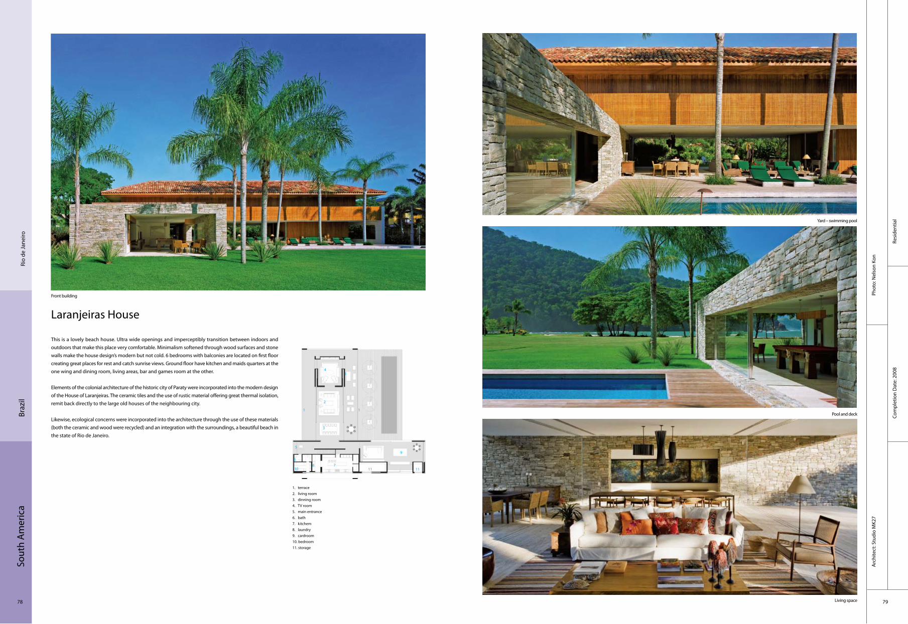
Laranjeiras House
This is a lovely beach house. Ultra wide openings and imperceptibly transition between indoors and outdoors that make this place very comfortable. Minimalism softened through wood surfaces and stone walls make the house design’s modern but not cold. 6 bedrooms with balconies are located on first floor creating great places for rest and catch sunrise views. Ground floor have kitchen and maids quarters at the one wing and dining room, living areas, bar and games room at the other.
Elements of the colonial architecture of the historic city of Paraty were incorporated into the modern design of the House of Laranjeiras. The ceramic tiles and the use of rustic material offering great thermal isolation, remit back directly to the large old houses of the neighbouring city.
Likewise, ecological concerns were incorporated into the architecture through the use of these materials (both the ceramic and wood were recycled) and an integration with the surroundings, a beautiful beach in the state of Rio de Janeiro.
1. terrace2. living room3. dinning room4. TV room5. main entrance6. bath7. kitchem8. laundry9. cardroom10. bedroom11. storage
Front building
Yard – swimming pool
Pool and deck
Living space
1
1
2
1
3
4
5
678
9
10 11 11

Sout
h A
mer
ica
80 81
House 53
The House 53 volumetry was defined following São Paulo city building laws and the site’s peculiar shape, which is just over 10 metres in front and approximately 30 metres in length. According to the legislation one can build in the neighbourhood up to a two–floor building, settled upon the site’s lateral limits. A third floor is allowed as long as the lateral setbacks are respected.
The house was conceived as a wood–and–mortar monolithic block with another concrete and glass volume upon it. Due to the ground’s small front and volumetry, the box’s two edges had to make the most of light’s entrance, which explains the large windows. It was also desirable that these windows would make it possible to darken the internal environment whenever needed.
The house’s inferior volume, which comprises the living room on the ground floor and the bedrooms on the first floor, is a glass box with wooden brises that open as folding doors. The rooms’ front and back façades were designed to be completely closed or opened.
Front façade Deck at night
Front Dining room
1 living room2 bedroom 3 lounge room
São
Paul
oBr
azil
Resi
dent
ial
Com
plet
ion
Dat
e: 2
009
Phot
o: R
ômul
o Fi
aldi
niA
rchi
tect
: Stu
dio
MK2
7
1
2
3
Asi
a
82 83
Com
mer
cial
Phot
o: C
hris
tian
Rich
ters
Com
plet
ion
Dat
e: 2
009
Arc
hite
ct: U
n St
udio
Chin
aTa
iwan
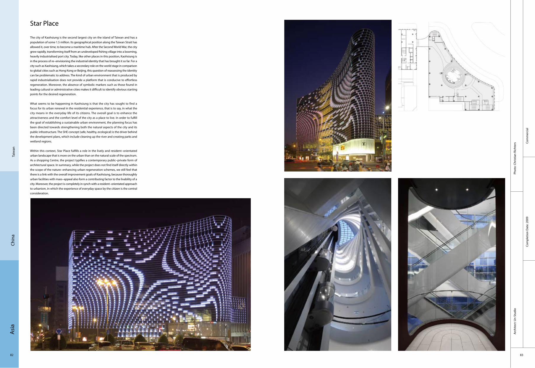
Star Place
The city of Kaohsiung is the second largest city on the island of Taiwan and has a population of some 1.5 million. Its geographical position along the Taiwan Strait has allowed it, over time, to become a maritime hub. After the Second World War, the city grew rapidly, transforming itself from an undeveloped fishing village into a booming, heavily industrialised port city. Today, like other places in this position, Kaohsiung is in the process of re–envisioning the industrial identity that has brought it so far. For a city such as Kaohsiung, which takes a secondary role on the world stage in comparison to global cities such as Hong Kong or Beijing, this question of reassessing the identity can be problematic to address. The kind of urban environment that is produced by rapid industrialisation does not provide a platform that is conducive to effortless regeneration. Moreover, the absence of symbolic markers such as those found in leading cultural or administrative cities makes it difficult to identify obvious starting points for the desired regeneration.
What seems to be happening in Kaohsiung is that the city has sought to find a focus for its urban renewal in the residential experience, that is to say, in what the city means in the everyday life of its citizens. The overall goal is to enhance the attractiveness and the comfort level of the city as a place to live. In order to fulfill the goal of establishing a sustainable urban environment, the planning focus has been directed towards strengthening both the natural aspects of the city and its public infrastructure. The SHE concept (safe, healthy, ecological) is the driver behind the development plans, which include cleaning up the river and creating parks and wetland regions.
Within this context, Star Place fulfills a role in the lively and resident–orientated urban landscape that is more on the urban than on the natural scale of the spectrum. As a shopping Centre, the project typifies a contemporary public–private form of architectural space. In summary, while the project does not find itself directly within the scope of the nature–enhancing urban regeneration schemes, we still feel that there is a link with the overall improvement goals of Kaohsiung, because thoroughly urban facilities with mass–appeal also form a contributing factor to the livability of a city. Moreover, the project is completely in synch with a resident–orientated approach to urbanism, in which the experience of everyday space by the citizen is the central consideration.

Asi
a
84 85
Com
plex
Com
plet
ion
Dat
e: 2
007
Phot
o: D
anie
l Won
g (iM
AGE
28)
Arc
hite
ct: W
ong
& T
ung
Inte
rnat
iona
l Ltd
.
Shen
zhen
Chin
a
1. office areas2. office areas3. central passage way4. activity space
Exterior view 01
Exterior view 02 Exterior view 03
Entrance way
Kerry Plaza, Futian, Shenzhen
Located on the southern part of the Futian CBD between the Exhibition Centre and Civic Centre, this comprehensive development houses a 6–star flagship Shangri–la Hotel complex and the Futian Kerry Plaza.
The Futian Kerry Plaza calls for a pair of connected towers. The two 23–storey office towers soar up to 99.8 meter high. Symmetry is forgone for a more tectonic interplay between two rectangles. The two towers are connected on grade with a podium containing the hotel lobby and retail facilities. The entrance is framed with an iconic portal and matching canopy in the form of sweeping curves.
4
1
3
2

Asi
a
86 87
Corp
orat
eCo
mpl
etio
n D
ate:
200
7
Phot
o: Je
rry
Lee,
_M
Mos
er_B
en M
cMill
an c
opy
Arc
hite
ct: A
RUP
Beiji
ngCh
ina
Nokia China Campus
Nokia China Campus in Beijing is China’s first LEED – NC (Leadership in Energy and Environmental Design–New Construction) Gold certified building. The facility includes a research and development laboratory, office space, canteen, auditorium, formal and informal meeting areas, gymnasium and bike shed.
From concept to detailed design, ARUP was aware of the sustainability issues and the building boasts energy–efficient features such as a temperature–controlled cavity between the panes of the glass façade which balances the sun’s natural heat and the building air–conditioning so the intense summer and winter climates of Beijing do not affect the internal climate. The building also incorporates water conservation techniques, methods to reduce air pollution and improved air ventilation. 30 design techniques altogether result in 37% of water saving and up to 20% energy saving. 97% of the interior is afforded views from the glass façades, and skylights and a large communal atrium provide natural light and ventilation throughout the building.
This six–storey facility is the realisation of an integrated multidisciplinary design services. The building is the product of cutting–edge engineering design services – ARUP employed Computational Fluid Dynamics, thermal and energy modelling, structural optimisation and building sustainability tool kit to design the energy efficient building.
Exterior façade
Structure details
Interior hall
Full view
1. hall2. reception3. stairs4. WC5. dining
12
5
3
4

Asi
a
88 89
Cultu
ral
Com
plet
ion
Dat
e: 2
007
Phot
o: B
ildna
chw
eis
Arc
hite
ct: G
mp
Arc
hite
kten
Beiji
ngCh
ina
Zhongguancun Christian Church
With its free curved shape, the building forms a solitaire in the park–like open space between Zhongguancun Cultural Tower and the "City of Books". On the upper floors it houses China’s largest Christian church, while on the ground floor commercial spaces are situated. The shape of the church body does not only allow for a sightline to the south media façade of the Cultural Tower but also emphasises its special function in contrast to the surrounding commercially used buildings. The rod system of the façade forms a homogeneous skin, which however lets in sufficient daylight.
The entrance to the main church hall faces northeast and opens up to the street as well as to Zhongguancun Cultural Tower. A cross, clearly identifying the building as a Christian church, develops from the façade rod system. Through a large portal, worshippers mount a stairway to enter the main church hall on the first floor. With its alternation of open and massive wall sections, the façade rod system creates a special lighting atmosphere inside the church hall, matching the ecclesiastical function of the space. The entrance for clergy and church employees is placed on the northwest side and gives access to a side chapel as well as to stairways and a lift to all the floors of the church building. The parish offices and community spaces are on the second and third floors of the south and west wings. Some of the upper–floor spaces open onto a roof terrace – a substitute for a churchyard – that offers parishioners an attractive outdoor space.
Exterior view Bird's–eye view
Interior view Interior view
Night view
1. entrance2. stairs
1
2

Asi
a
90 91
Cultu
ral
Com
plet
ion
Dat
e: 2
005
Phot
o: C
hris
tian
Gah
l, Be
rlin
Arc
hite
ct: G
mp
– Vo
n G
erka
n, M
arg
And
Par
tner
s A
rchi
tect
s
Shan
ghai
Chin
a
Museum Shanghai–Pudong, China
Opposite the historically grown city Centre of Shanghai a new "Manhattan" comes into being on the other side of the river: the district Shanghai–Pudong with the highest office – and hotel building at present in China. The Shanghai–Pudong Museum is one of the most important urban projects in this new district. It is supposed to document and archive the district’s history and development comprehensively. At the same time modern multifunctional and open exhibition spaces are created to inform the public with a permanent exhibition and special exhibitions about selected topics.
Three elements form the building complex: the square–shaped horizontally orientated glass body with exhibition halls, a much broader, 4–meter–high base with surrounding stairs, which accommodates the archives, and a bar–shaped building on the eastern side for the administration. The base as one of the main architectural features of the museum lifts the main building with the exhibition halls above the level of the surrounding streets and emphasises the central importance of the complex. Simplicity and reduction of the materials dominate the clear cube. The façade of the upper, closed part of the main building not only serves as weather protection but also as a communication surface. It is made of two parallel façade–layers. The outer layer consists of glass and the inner one of room–high closed wall panels. These elements can be rotated along their longitudinal axis and can be opened or closed, according to the particular requirements of the exhibition concept, so that views from the inside to the outside and vice versa are generated.
General view
Front view
Night view
Interior view

Asi
a
92 93
Com
plex
Com
plet
ion
Dat
e: 2
007
Phot
o: L
ab A
rchi
tect
ure
Arc
hite
ct:
Lab
Arc
hite
ctur
e
Beiji
ngCh
ina
SOHO Shangdu
The faceted façades of the two 32–level towers and smaller landmark building onto Dongqiaolu are clad in a random pattern of grey glass and aluminum panels. The dynamic qualities of the pattern readily allowed the proportion of glass orientating to the south and west to be reduced, thus lowering the heat gain to units in those directions. Inscribed within the faced facets are a large–scale geometrical parametric network of lines which at night create continuous light–lines and the project’s distinctive nocturnal image. The façade pattern was directly generated on the same principles and visual image of the traditional Chinese ice–ray pattern, a decorative motif used primarily for joinery and paving, which is parametric in its geometric properties.
The organisation of the retail was designed on the principle of a vertical hutong with a series of internal streets and passages which vary in their position, width, height from floor to floor, thus generating differentiated circulation patterns which in turn, create the potential for localised and specialist retail zones.
Two large internal courtyards, which spiral vertically and link all the floors provide a navigational and activity focus to the retail area’s "east" and "west–ends", facilitating a range of events from fashion parades, commercial launches to concerts and talks activities.
Night view Outside view Outside view
Hall Interior view
1. office area2. WC
11
1 1
2

Asi
a
94 95
Jish
ouCh
ina
Bird‘s-eye view
Entrance plaza
Part of elevation, academic building
Entrance hall of gallery
Educ
atio
nal
Com
plet
ion
Dat
e: 2
006
Phot
o: S
hu H
eA
rchi
tect
: A
telie
r Fei
chan
g Ji
anzh
u
Jishou University Research and Education Building and Huang Yongyu Museum
The project is concerned mainly with two important issues relating to site: the first is the relationship between the architecture and surrounding environment, and the second is how to establish a relationship between local architectural tradition and local culture.
The building sits on development–ready levelled land that once was part of the hillside on the university campus. The Research Education Building and the Museum form a wedge–shaped composite section that juts into the land. The building mass, multiple roofs and integrated windows blur the vertical and horizontal forms of the walls and roofs, which in turn, contribute to rebuilding and reestablishing the physical presence of the site.
Respect for cultural tradition of architecture evolves into two types in Jishou: protection of the typical traditional architecture in old town; copy of the traditional residence regardless of the difference in structure, material, function, and size." Conceiving maintaining a modern, new architectural logic as precondition, they try to introduce the style of traditional residential building into the building, so as to build relationship between new structure and local building visually. Therefore, in concept, this building is a "mountain" as well as a "village."
Asi
a
96 97
Resi
dent
ial
Com
plet
ion
Dat
e: 2
008
Phot
o: C
hris
tian
Rich
ters
, Shu
He
Arc
hite
ct: D
avid
Chi
pper
field
Arc
hite
cts
Han
gzho
uCh
ina
Ninetree Village
A small valley, bordered by a dense bamboo forest, forms the site for this luxury housing development, situated near the Qian Tang River in Hangzhou, southeastern China. The particular charm and beauty of the place are the determining factors. Twelve individual volumes are arranged in a chessboard pattern to create the maximum amount of open space for each building. Through planting new vegetation, each apartment building is set in its own clearing in the forest. The buildings adapt to the topography, creating a flowing landscape through a slight turning of the blocks.
The grounds will be accessed from the southern entrance via a network of lanes. All buildings are linked to an underground car park, enabling the site to be free from vehicles above ground. Within the development there are six types of building differing in size and floor plan depending on the location, view and light conditions.
The individual apartment buildings contain five generously proportioned apartments, each accommodating a full floor of approximately 450 m². The floor plan concept creates a flowing interior space defined by solid elements which accommodate auxiliary functions.
1. stairs2. dining3. living room4. bedroom
2
1
3
4

Asi
a
98 99
Educ
atio
nal
Com
plet
ion
Dat
e: 2
004
Phot
o: D
esha
us S
tudi
oA
rchi
tect
: Des
haus
Stu
dio
Don
ggua
nCh
ina
Liberal Art Department, Dongguan Institute of Technology
The ground floor of the Liberal Art Department building is plugged in the hill, thus the building is melted in the terrain. The ground floor’s two sides are opened to the outside and own the nice scenery, while the other part of the building get the daylight from "L" shape courtyard. The roof of the ground floor become an open platform in rolling hills, while the elevated square building stands above the platform. The platform, courtyard and corridors together create a centralism of outdoor public square. In the main direction of walking, strong feeling of block building have clearly been faded away, which reduced the building’s pressure to the environment. When eyesight crosses the elevated building and falls on the behind hills, people may recall the original image of this area.
General view
2nd view
Inner court of the 2nd floor
EntranceSoutheast
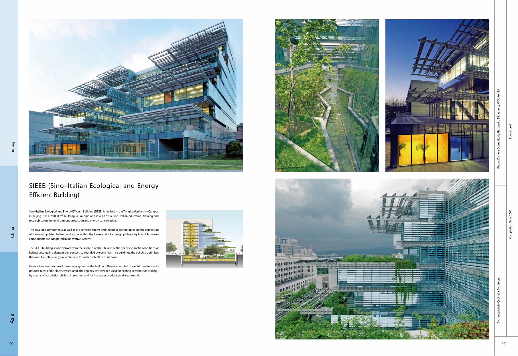
Asi
a
100 101
Beiji
ngCh
ina
SIEEB (Sino–Italian Ecological and Energy Efficient Building)
Sino–Italian Ecological and Energy Efficient Building (SIEEB) is realised in the Tsinghua University Campus in Beijing. It is a 20,000 m2 building, 40 m high and it will host a Sino–Italian education, training and research centre for environment protection and energy conservation.
The envelope components as well as the control systems and the other technologies are the expression of the most updated Italian production, within the framework of a design philosophy in which proven components are integrated in innovative systems.
The SIEEB building shape derives from the analysis of the site and of the specific climatic conditions of Beijing. Located in a dense urban context, surrounded by some high–rise buildings, the building optimises the need for solar energy in winter and for solar protection in summer.
Gas engines are the core of the energy system of the building. They are coupled to electric generators to produce most of the electricity required. The engines’ waste heat is used for heating in winter, for cooling – by means of absorbtion chillers in summer and for hot water production all year round.
Educ
atio
nal
Com
plet
ion
Dat
e: 2
006
Phot
o: D
anie
le D
omen
ical
i; A
less
andr
o D
igae
tano
; MCA
Arc
hivi
Arc
hite
ct: M
ario
Cuc
inel
la A
rchi
tect
s

Asi
a
102 103
Cultu
ral
Com
plet
ion
Dat
e: 2
009
Phot
o: B
eijin
g Su
nlay
Arc
hite
ctur
al D
esig
n Co
.Ltd
.A
rchi
tect
: Bei
jing
Sunl
ay A
rchi
tect
ural
Des
ign
Co.L
td.
Ord
osCh
ina
Ordos Protestant Church
Located on top of a hill of Ordos, planned as a green open space for the city, the project takes its inspiration from the topography of the land. The surrounding landscape offers a strong contrast of colours and depth, creating a rich changing background from day time to night time for the church’s settlement. It sets framed views of the church in a characterized landscape of excavated rocks proper to a city like Ordos, in Inner Mongolia.
The scheme, named "Dove of Peace", gives its metaphor and poetry to the church by re–interpreting a contemporary and abstract silhouette of the bird caring a branch of Olive in its beak. The Church has a concrete structure and uses white crepi finish for its façades. Its dynamic shape follows the adjacent curved road that crosses the site. The dialogue between the outside and the inside space is emphasised by the play of shadows and light that creates complexity and depth in the reading of the space. Its elements are thought to reflect harmony and tranquility in this place for prays and celebration.
Birdeyeview
South façade
North façade
Interior
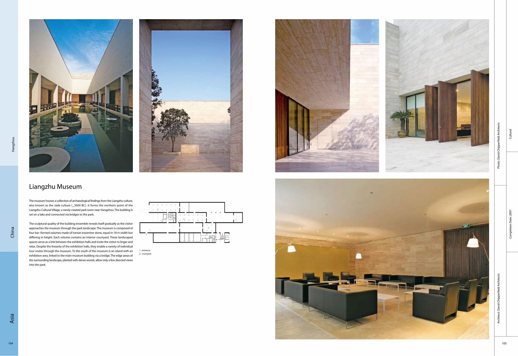
Asi
a
104 105
Cultu
ral
Com
plet
ion
Dat
e: 2
007
Phot
o: D
avid
Chi
pper
field
Arc
hite
cts
Arc
hite
ct: D
avid
Chi
pper
field
Arc
hite
cts
Han
gzho
uCh
ina
Liangzhu Museum
The museum houses a collection of archaeological findings from the Liangzhu culture, also known as the Jade culture (~3000 BC). It forms the northern point of the Liangzhu Cultural Village, a newly created park town near Hangzhou. The building is set on a lake and connected via bridges to the park.
The sculptural quality of the building ensemble reveals itself gradually as the visitor approaches the museum through the park landscape. The museum is composed of four bar–formed volumes made of Iranian travertine stone, equal in 18 m width but differing in height. Each volume contains an interior courtyard. These landscaped spaces serve as a link between the exhibition halls and invite the visitor to linger and relax. Despite the linearity of the exhibition halls, they enable a variety of individual tour routes through the museum. To the south of the museum is an island with an exhibition area, linked to the main museum building via a bridge. The edge areas of the surrounding landscape, planted with dense woods, allow only a few directed views into the park.
1. entrance2. courtyard
2
12
2
2

Asi
a
106 107
Cultu
ral
Com
plet
ion
Dat
e: 2
007
Phot
o: S
hu H
eA
rchi
tect
: Sun
lay
Arc
hite
ctur
e D
esig
n Co
., Lt
d.
Zhan
g H
ua, F
an L
i
Tian
jinCh
ina
Tianjing Bridge Culture Museum
The Bridge Culture Museum is located at the centre of the QiaoYuan Park, Tianjin. Because of it special location, on the central axis facing to the main entrance, and because it is supposed to be the landmark of the Bridge Park, this area is designed as a leisure and exhibition space in order to meet people's needs of "pleasurable show space".
The origin of the design concept is "operable bridge". Steel bridge, folded surface, variable structural columns, U–shape enclosed space and extended platform, all create a "Building for Strolling". This building is "accessible and passable". It brings people exciting and surprised experiences because of the conversion between interior and exterior spaces. The steel bridge between the buildings leads people to the exhibition space, which is all green; the bottom of the building is multidimensional surface, which is accessible for people to go though; the sixteen structural columns have been treated in different ways to distract people's sight; the Z–shaped building, U–shaped enclosed space, the coffee break deck and the combination of the interior and exterior spaces, merged the building together with the site. One can find attraction of the building though their own experience to it. The "accessible and passable" Bridge Culture Museum is interactive for people, both interior and exterior.
21 3
4
56
7
1. performance plaza2. rooftop viewing terrace3. green roof4. water terrace5. "Bridge Culture" steel plate6. iron gate and fence7. main entrance plaza

Asi
a
108 109
Cultu
reCo
mpl
etio
n D
ate:
200
8
Phot
o: D
oug
Snow
er, D
oug
Snow
er P
hoto
grap
hyA
rchi
tect
: Goe
ttsc
h Pa
rtne
rs
Beiji
ngCh
ina
Beijing Nexus Centre
The Nexus Centre is a structure of sophisticated form and superb function. Its column–free and unusually large 2,200m2 floor plate allows ultimate freedom for tenants to fully customise their space and maximise efficiency according to individual needs.Located on a long, linear site, the dual–tower complex slopes from south to north from its 551–foot apex in order to limit shadow casting on its northern residential neighbours. The eastern façade fronts the heavily–trafficked ring road and gives retailers prominence along the base. The western façade, by contrast, overlooks the serene setting of an urban park. On the south, the building curves in relation to its corner site, opening up to a large landscaped plaza that segregates vehicular and pedestrian traffic while creating an inviting amenity for tenants.
The design of the complex uses a combination of stainless steel and granite to define distinct fenestration that visually breaks down the overall mass into more slender elements. Expansive floor–to–ceiling glass is applied throughout in order to bring natural light deep into the office floors. Extensive vertical shading devices on the east and west façades control heat gain, and operable windows on all floors promote the introduction of fresh air throughout the work environments.
East Elevation

Asi
a
110 111
Corp
orat
eCo
mpl
etio
n D
ate:
200
7
Phot
o: S
hu H
eA
rchi
tect
: Jia
Lia
nna,
Che
n Lo
ng ,
Liu
Yang
Beiji
ngCh
ina
UF Soft R&D Centre, Beijing, China
For the UF Soft R&D Centre, the architecture began the architectural design by studying the way computer programmers work and live. In order to create a healthier working environment, they borrowed the basic fabric of the old Beijing – the courtyard houses, which offer their residents the proximity of the nature – to mix indoor and outdoor spaces. To further reinforce the integration of the architecture and the landscape, the complex was limited to only three storeys and shallow depth that allows better natural ventilation and daylight. The end result is a mat building that could extend horizontally or a fine–grained fabric urban design that is the antithesis of treating buildings as objects. In the plan, the complex consists of three inter–connected buildings. Two major courtyards are situated in between the buildings with various smaller courts and terraces on different levels.
Besides the concern of health, making team working more spontaneous is another important aim of the design. The diverse public spaces indoor and outdoor have been proven to encourage people to interact, to communicate, and to socialise. While there are a number of materials and construction methods employed in the project, glass blocks embedded in the concrete masonry units is the main technological innovation, which gives the building a solid and transparent appearance at the same time.
View of courtyard from bridge
Night view of courtyard
View of courtyard
Inside of wall
4
3
2
1
1. R & D Centre I2. R & D Centre I, Phase 23. Entrance & Exit4. Entrance & Exit

Asi
a
112 113
Com
plex
Com
plet
ion
Dat
e: 2
008
Phot
o: S
unla
y D
esig
nA
rchi
tect
: Sun
lay
Des
ign
Beiji
ngCh
ina
Raffles City Beijing
Raffles City Beijing is located at Dongzhimen with convenient access to the Subway, west to the East 2nd Ring Road and Southwest to the Airport Express Way. This building complex includes retails, offices, clubhouse, studio apartments, parking space and supporting facilities. The design concept is to create a unique impressive architecture in city centre with multiple function choices, clear and flexible functional spaces and smooth internal traffic.
Different buildings have been illustrated by different surface texture, for example, the surface of the podium is pixel–like glass pattern; the curtain wall of the office building is composed of aluminum frame and 1.4 metre–wide and full–height double glazing; the façade of the studio apartment is illustrated by panel curtain wall and French window system; the roof of the club employs coloured aluminum, to show the connecting of the pieces.
Around the buildings, the gardens are linearly distributed, with the plants and flowers connected to the open spaces with the buildings. The two gardening entrance can not only guides costumers but also emphasise the retail atmosphere. There is a courtyard on the roof of the podium, and the landscape of the courtyard creates a screen which separats the office building away. The central of the courtyard is also the glass roof of the atrium, whose diamond surface forms a special view of the yard.
View from far away Full view Entrance with light
EscalatorDetails
1. entrance2. body part of the building3. green plants and landscape
3
1
2

Asi
a
114 115
Cultu
ral
Com
plet
ion
Dat
e: 2
010
Phot
o: S
hu H
eA
rchi
tect
: Ate
lier F
eich
ang
jianz
hu
Shan
ghai
Chin
a
2010 Shanghai EXPO – Shanghai Corporate PavilionIn 2010, we have gone through a long period of rapid technological advancement and the amount of infrastructure in a building has dramatically increased to the point that technologies are today’s basic building blocks. For Shanghai Corporate Pavilion at the World Expo, the architect would like to manifest this observation in their design: the interior spaces of the Shanghai Corporate Pavilion, which are shaped as a series of free, flowing forms, will be enclosed not only by walls of the static kind but also a dense, cubic volume of infrastructural network, including LED lights and mist–making system, which are capable of changing the appearance of the building from one moment to another as programmed through computer.
However, the design is not embracing technology for the technology’s sake. Rather, they like to convey visually the spirit of the Shanghai Corporate Pavilion, the dream of a brighter future, through sophisticated technologies. Technology is about the enrichment of imagination and symbolic of the industry and industrialism of Shanghai. Also through technology, they like to address the pressing issue of energy and sustainability. A part of the architectural infrastructure is designated for the solar energy harvesting and rain water collecting, and the external façade will be made of recycled polycarbonate(PC) plastic.
View from southwest
West elevation
View from northwest
Queuing area
1. power distribution room2. air condition room3. office4. WC
2
4
3
1

Asi
a
116 117
Recr
eatio
nal
Com
plet
ion
Dat
e: 2
008
Phot
o: S
hu H
eA
rchi
tect
: Sun
lay
Arc
hite
ctur
e D
esig
n Co
., Lt
d.
Beiji
ngCh
ina
Qingcuiyuan Club House
Qingcuiyuan Club House is located on the west bank of Wenyu River, Chaoyang District, which has excellent condition of graceful natural landscape. The design concept is not only to create a unique building, but also to integrate it into this attractive landscape environment.
Qingcuiyuan Club House shows two topics, Collision and Blend, the collision of different cultures and styles, the blend of time and space. It is telling a story which is ancient and modern. It is describing an aesthetics encounter between east and west.
The architectural design scheme considers "axis and symmetry" which are emphasised by classical architectural language, and "fluxion and consistency" which are sought by modern architectural language. Red brick walls and transparent glazing are employed to create coagulated building mass and flowing spaces. Inside courtyard with comfortable scale is the continuation of greening, water scene and original natural landscape.
Façade and entrance
CorridorInterior landscape
Night view

Asi
a
118 119
Educ
atio
nal
Com
plet
ion
Dat
e: 2
009
Arc
hite
ct: L
i Xia
odon
g
Zhan
gzho
uCh
ina
Bridge School
located at a remote village, Fujian Province in China, the project not only provides a physical function– a school + a bridge, but also presents a spiritual centre. The main concept of the design is to enliven an old community (the village) and to sustain a traditional culture (the castles and lifestyle) through a contemporary language which does not compete with the traditional, but presents and communicates with the traditional with respect. It is done by combining few different functions into one space – a bridge which connects two old castles across the creek, a school which also symbolically connects past, current with future, a playground (for the kids) and the stage (for the villagers).
A light–weight structure traverses a small creek in a single, supple bound, essentially, it is an intelligent contemporary take on the archetype of the inhabited bridge. Supported on concrete piers (which also have the function of a small shop), the simple steel structure acts like a giant box girder that’s been slightly dislocated, so the building subtly twists, rises and falls as it spans the creek. Inside are a pair of almost identical wedge–shaped classrooms, each tapering towards the mid point of the structure (which holds a small public library). Although it’s possible to use the building as a bridge, a narrow crossing suspended underneath the steel structure and anchored by tensile wires offers an alternative and more direct route.
1
2
3
1. Classroom
2. Library
3. Classroom
General view
Details
Entrance
Classroom
Phot
o: P
rovi
ded
by A
rchi
tect

Asi
a
120 121
Com
plex
Com
plet
ion
Dat
e: 2
007
Phot
o: 5
Plu
s D
esig
n A
rchi
tect
: 5 P
lus
Des
ign
Chen
gdu
Chin
a
Luxehills Chengdu, China
Located in the beautiful foothills of Shuangliu County just south of Chengdu is the new 500–acre Luxehills international community. The project is designed as a world–class international destination for shopping, entertainment and sports, as well as a safe and desirable place to live, work, and raise a family. The entire development is inspired by a European lifestyle, complete with the usage of natural materials and rich landscaping. The 2,500 residents of Luxehills will enjoy an array of retail, restaurant, entertainment, and leisure amenities.
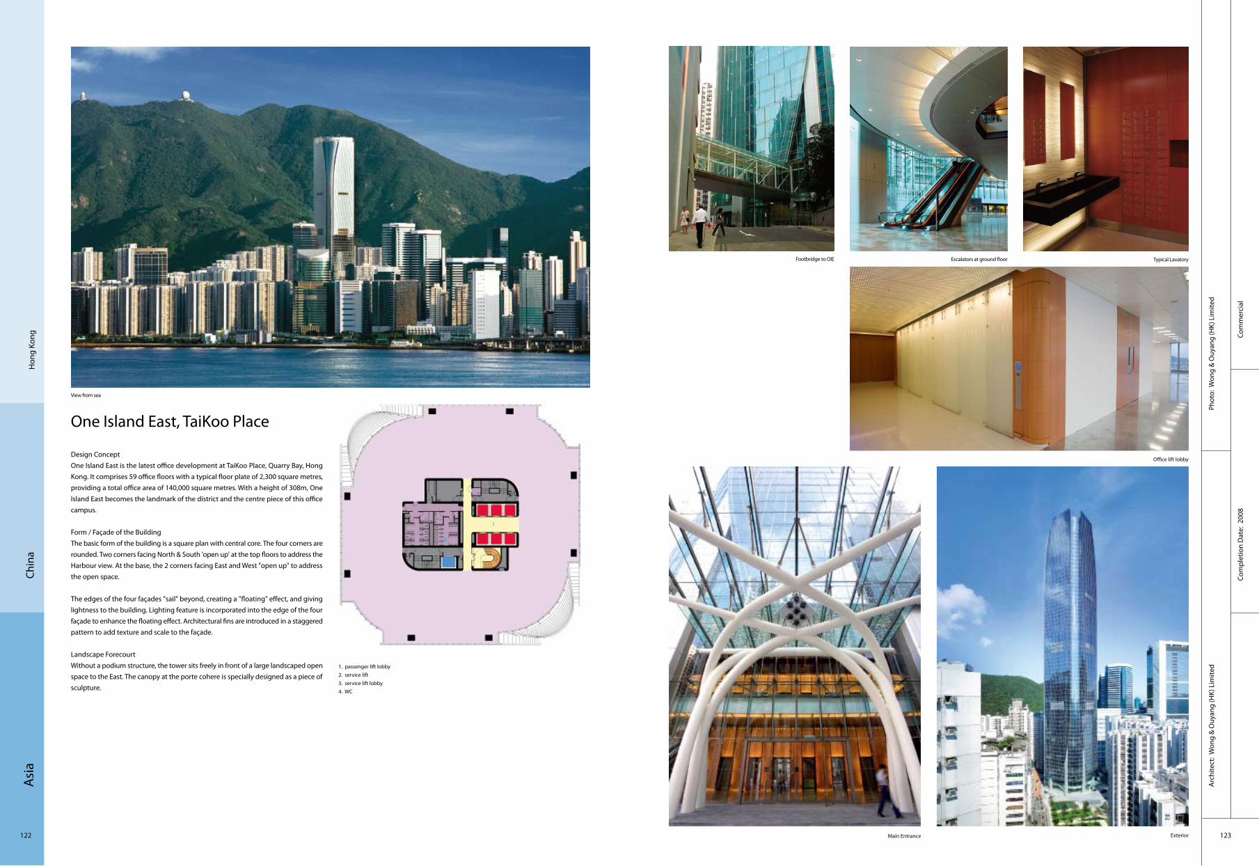
Asi
a
122 123
Com
mer
cial
Com
plet
ion
Dat
e: 2
008
Phot
o: W
ong
& O
uyan
g (H
K) L
imite
dA
rchi
tect
: Won
g &
Ouy
ang
(HK)
Lim
ited
Chin
aH
ong
Kong
One Island East, TaiKoo Place
Design ConceptOne Island East is the latest office development at TaiKoo Place, Quarry Bay, Hong Kong. It comprises 59 office floors with a typical floor plate of 2,300 square metres, providing a total office area of 140,000 square metres. With a height of 308m, One Island East becomes the landmark of the district and the centre piece of this office campus.
Form / Façade of the BuildingThe basic form of the building is a square plan with central core. The four corners are rounded. Two corners facing North & South 'open up' at the top floors to address the Harbour view. At the base, the 2 corners facing East and West "open up" to address the open space.
The edges of the four façades "sail" beyond, creating a "floating" effect, and giving lightness to the building. Lighting feature is incorporated into the edge of the four façade to enhance the floating effect. Architectural fins are introduced in a staggered pattern to add texture and scale to the façade.
Landscape ForecourtWithout a podium structure, the tower sits freely in front of a large landscaped open space to the East. The canopy at the porte cohere is specially designed as a piece of sculpture.
1. passenger lift lobby2. service lift3. service lift lobby 4. WC
3
4
1
2
View from sea
Footbridge to OIE Escalators at ground floor Typical Lavatory
Office lift lobby
Main Entrance Exterior
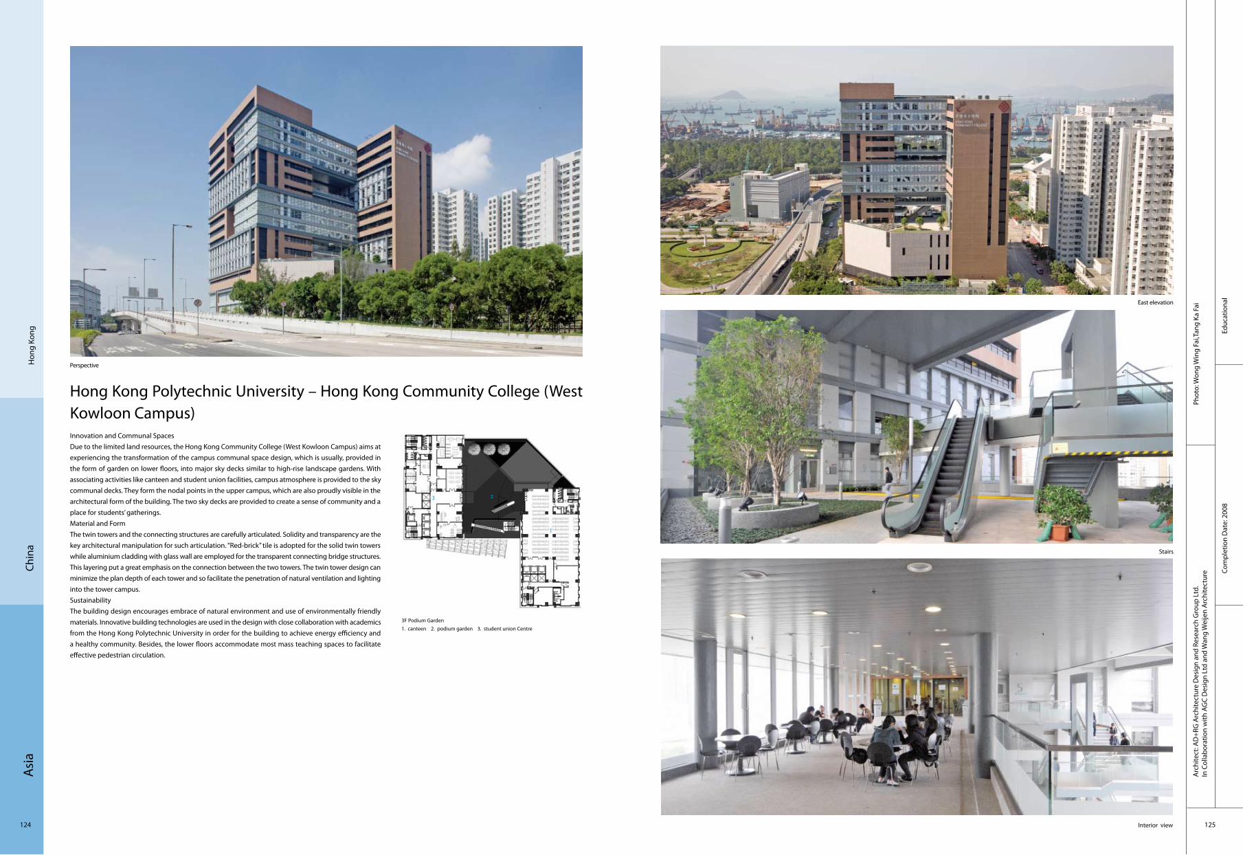
Asi
a
124 125
Educ
atio
nal
Com
plet
ion
Dat
e: 2
008
Phot
o: W
ong
Win
g Fa
i,Tan
g Ka
Fai
Arc
hite
ct: A
D+R
G A
rchi
tect
ure
Des
ign
and
Rese
arch
Gro
up L
td.
In C
olla
bora
tion
with
AG
C D
esig
n Lt
d an
d W
ang
Wei
jen
Arc
hite
ctur
e
Hon
g Ko
ngCh
ina
Hong Kong Polytechnic University – Hong Kong Community College (West Kowloon Campus)Innovation and Communal SpacesDue to the limited land resources, the Hong Kong Community College (West Kowloon Campus) aims at experiencing the transformation of the campus communal space design, which is usually, provided in the form of garden on lower floors, into major sky decks similar to high-rise landscape gardens. With associating activities like canteen and student union facilities, campus atmosphere is provided to the sky communal decks. They form the nodal points in the upper campus, which are also proudly visible in the architectural form of the building. The two sky decks are provided to create a sense of community and a place for students’ gatherings. Material and FormThe twin towers and the connecting structures are carefully articulated. Solidity and transparency are the key architectural manipulation for such articulation. “Red-brick” tile is adopted for the solid twin towers while aluminium cladding with glass wall are employed for the transparent connecting bridge structures. This layering put a great emphasis on the connection between the two towers. The twin tower design can minimize the plan depth of each tower and so facilitate the penetration of natural ventilation and lighting into the tower campus. SustainabilityThe building design encourages embrace of natural environment and use of environmentally friendly materials. Innovative building technologies are used in the design with close collaboration with academics from the Hong Kong Polytechnic University in order for the building to achieve energy efficiency and a healthy community. Besides, the lower floors accommodate most mass teaching spaces to facilitate effective pedestrian circulation.
3F Podium Garden 1. canteen 2. podium garden 3. student union Centre
Perspective
East elevation
Stairs
Interior view
3
1
2
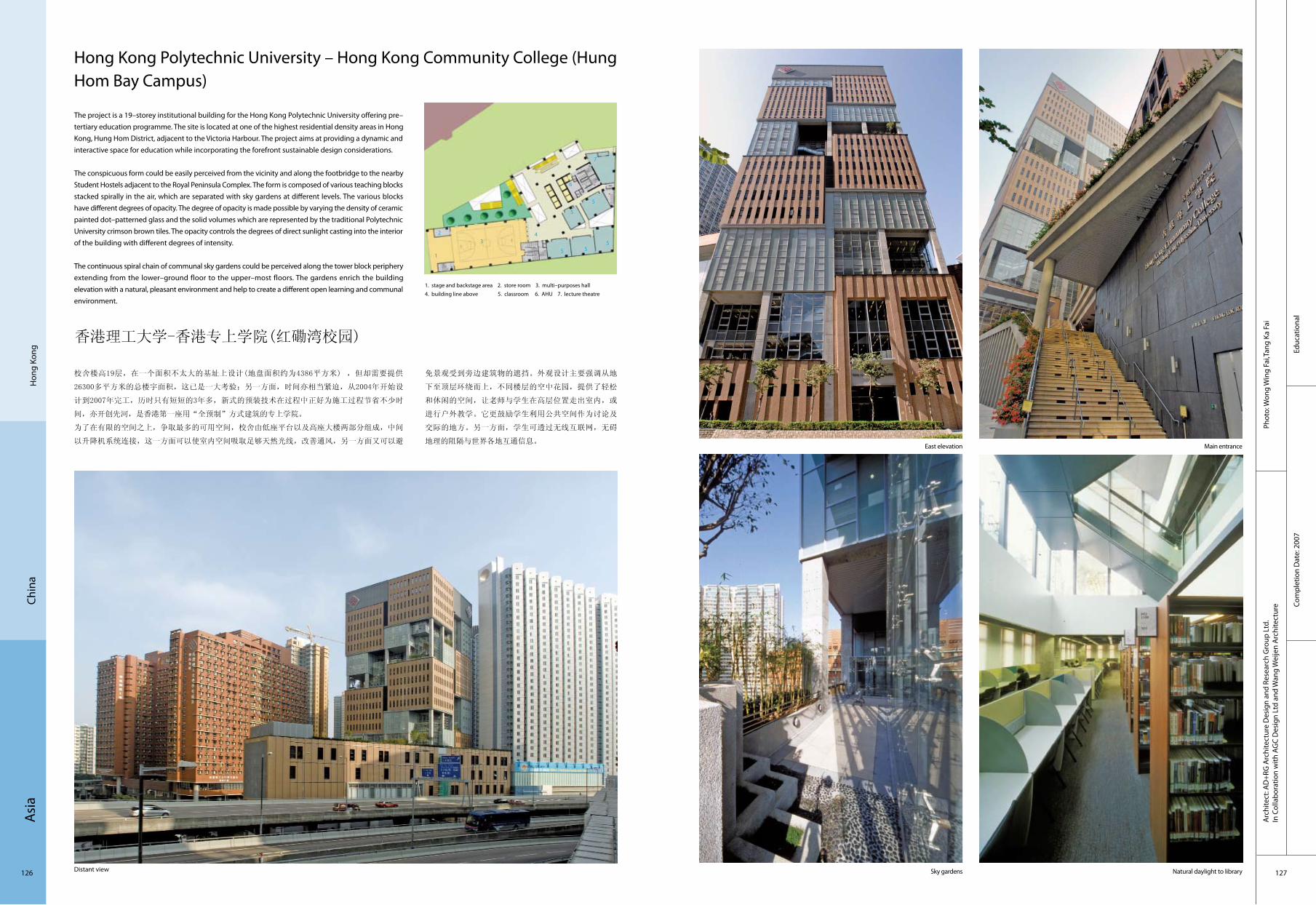
Asi
a
126 127
Educ
atio
nal
Com
plet
ion
Dat
e: 2
007
Phot
o: W
ong
Win
g Fa
i,Tan
g Ka
Fai
Hon
g Ko
ngCh
ina
Hong Kong Polytechnic University – Hong Kong Community College (Hung Hom Bay Campus)
The project is a 19–storey institutional building for the Hong Kong Polytechnic University offering pre–tertiary education programme. The site is located at one of the highest residential density areas in Hong Kong, Hung Hom District, adjacent to the Victoria Harbour. The project aims at providing a dynamic and interactive space for education while incorporating the forefront sustainable design considerations.
The conspicuous form could be easily perceived from the vicinity and along the footbridge to the nearby Student Hostels adjacent to the Royal Peninsula Complex. The form is composed of various teaching blocks stacked spirally in the air, which are separated with sky gardens at different levels. The various blocks have different degrees of opacity. The degree of opacity is made possible by varying the density of ceramic painted dot–patterned glass and the solid volumes which are represented by the traditional Polytechnic University crimson brown tiles. The opacity controls the degrees of direct sunlight casting into the interior of the building with different degrees of intensity.
The continuous spiral chain of communal sky gardens could be perceived along the tower block periphery extending from the lower–ground floor to the upper–most floors. The gardens enrich the building elevation with a natural, pleasant environment and help to create a different open learning and communal environment.
香港理工大学-香港专上学院(红磡湾校园)
校舍楼高19层,在一个面积不太大的基址上设计(地盘面积约为4386平方米) ,但却需要提供
26300多平方米的总楼宇面积,这已是一大考验;另一方面,时间亦相当紧迫,从2004年开始设
计到2007年完工,历时只有短短的3年多,新式的预装技术在过程中正好为施工过程节省不少时
间,亦开创先河,是香港第一座用“全预制”方式建筑的专上学院。
为了在有限的空间之上,争取最多的可用空间,校舍由低座平台以及高座大楼两部分组成,中间
以升降机系统连接,这一方面可以使室内空间吸取足够天然光线,改善通风,另一方面又可以避
1. stage and backstage area 2. store room 3. multi–purposes hall 4. building line above 5. classroom 6. AHU 7. lecture theatre
免景观受到旁边建筑物的遮挡。外观设计主要强调从地
下至顶层环绕而上,不同楼层的空中花园,提供了轻松
和休闲的空间,让老师与学生在高层位置走出室内,或
进行户外教学。它更鼓励学生利用公共空间作为讨论及
交际的地方。另一方面,学生可透过无线互联网,无碍
地理的阻隔与世界各地互通信息。
Distant view
East elevation Main entrance
Sky gardens Natural daylight to library
Arc
hite
ct: A
D+R
G A
rchi
tect
ure
Des
ign
and
Rese
arch
Gro
up L
td.
In C
olla
bora
tion
with
AG
C D
esig
n Lt
d an
d W
ang
Wei
jen
Arc
hite
ctur
e
34
1
2
7
5
6
55
5
5

Asi
a
128 129
Tran
spor
tatio
nCo
mpl
etio
n D
ate:
200
8
Phot
o: n
ocre
dit
Arc
hite
ct: S
hin
Taka
mat
su +
Shin
Tak
amat
su A
rchi
tect
and
Ass
ocia
tes
Co.,L
td.
Chin
aKa
ohsi
ung
Kaohsiung Metro Station
Kaohsiung city decided a construction of the subway, and designated Shin Takamatsu to design a new subway station. The design range was the concourse (total floor area: 10,000 m2) and the entrance. The station is located under an intersection in the central Kaohsiung city. Concretely, four main entrances on four corners and eight sub–entrances along the road are architecture on the ground. Therefore, through urban point of view, these designs influence the landscape of the city. As the result of researching the characteristics of the site with basic recognition, Shin Takamatsu found a historical fact that this intersection was the place where the Taiwan democracy movement began. The confusing design task because of the simplicity of functional request was rapidly solved by the symbolic information. An idea, which settles the four entrances located on four corners as an architectural synthesis and gives each entrance the form of joining hands while unifying them was generated in one sitting. At the presentation for the concept, these forms were named "Form of Prayer". Kaohsiung city gladly accepted it. An idea that the emitted laser beams from the top of the four entrances meet above the central intersection was proposed at the presentation.
Panoramic view
Exit
Station exit Interior

Asi
a
130 131
Com
mer
cial
Com
plet
ion
Dat
e: 2
006
Phot
o: M
r. D
aich
i Ano
Arc
hite
ct: K
umik
o In
ui
Chin
aTa
ipei
LV Taipei
Since Taipei is in the subtropical zone, the city is filled with lots of trees. The designers tried to use the landscape of trees for the motif of the façade. Tree does never relate to the brand image of Louis Vuitton, however they thought it was important. The main material of the façade is perforated stone. The designers used half–artificial stone, and made square holes with water jet machine. Then they filled up holes with synthetic resins. The pattern of the hole was based on Louis Vuitton’s checker flag pattern called DAMIER pattern. Even though DAMIER pattern usually is homogeneous, the designers made each square in different sizes. There are more than 30 sizes. The smallest is 7 mm, and the biggest is 35 mm. Using such difference of sizes, they made another pattern in bigger scale which is also the checker flag pattern. And the bigger pattern is not homogeneous. The size of each square is different. Using such difference of sizes, they made one more pattern which is the silhouette of trees. What the designers really wanted to do is to weaken the symbolised image of the brand. Usually symbol does not relate to the context, which the designers really do not like. They want to make something linked to the surroundings delicately. If the designers can refine the commercial façade architecturally, this is one way to do it.
1. retail space2. entrance3. arcade
Panoramic view Exterior façadeEntrance
Lobby
1
2
3

Asi
a
132 133
Cultu
ral
Com
plet
ion
Dat
e: 2
007
Phot
o: Y
ong–
Kwan
Kim
Arc
hite
ct: M
ass
Stud
ies
Pusa
nKo
rea
Xi Gallery
Located in Yeonsan–dong, Pusan, this building was constructed for the purpose of promoting "Xi", a brand of apartments. In addition to the standard type of an apartment unit exhibition space, a even larger share of the floor area is allocated as a variable cultural space for the locals, which as a result creates a brand–new building typology: a Housing Cultural Centre. As economic forces and cultural activities seem to form complex interrelationships causing our private and public spheres to merge and invade each other, this building comes as a product of these current phenomena. The focus of the designers’ investigation is to create a fluid space that can respond to the "continuously new" situations arising from the dynamic flux of economy and culture, and in the organisation of the movement system to correspond to such a space. This new movement organisation is necessary to maintain the existing individuality of the spaces, but at the same time be able to expand/unify them in diverse manners to suit future possible needs.
Night view
Building front
Hall
Interior

Asi
a
134 135
Resi
dent
ial
Com
plet
ion
Dat
e: 2
009
Phot
o: C
hris
tian
Rich
ters
Arc
hite
ct: U
NSt
udio
Suw
onKo
rea
Model House
The Model House for I’Park City is a showroom to exhibit the residential urban and façade design for an 88–building development in Suwon. The principal design intention was to curate the visitor experience by elaborating on an implicit circulation strategy. The route of the visitor, from the approach to the building and throughout the tour within, is treated as an ongoing exhibition.
The building is therefore configured as a clear illustration of this strategy, which becomes the central feature both within the interior space and as a generator of the façade design. The resultant crossing of the circulation ribbon produces various viewpoints of the exhibited content, in this case, the façades of the show–units. In parallel, the same path oscillates between a focus on the interior exhibited content and the adjacent larger site and landscape, which is the location of the future development. The circulation route underscores the importance of the "coming home experience" which is the organisational driver of the entire I’Park City Urban development, and the core of the overall site branding strategy.
Building front
Façade details Interior
Building in normal environment
1. skin2. volume3. exhibition ribbon4. entrance level5. level 16. level 27. roof terrace observatory
1 2
3
5
6
4
7

Asi
a
136 137
Seou
lKo
rea
Myeongdong Theater
Due to the soaring land price in Myeongdong and increasing propensity to consume, the former Myeongdong National Theatre building was under threat of being torn down and replaced by a high–rise commercial building. However, the exterior wall was preserved thanks to the campaign for preserving the building and the purchase by Ministry of Culture, Sports and Tourism. The new cultural interface of the newborn Myeongdong Theatre holds the memories of the past and the vital energy of the district and has become an artistic beacon. The exterior wall, which keeps the memory of Myeongdong, was preserved and a vessel of regeneration (auditorium mass) was created for the culture of Myeongdong streets in the past, present and the future. The energy of the streets was brought inside the building and filled between the wall of the past and the auditorium mass.
For an urban space open to people, the auditorium mass was lifted above a floor to create a large lobby. The natural lighting pouring down through the skylight, which has been installed between the hall and the auditorium mass, runs along down the mass and reaches the lobby, making the narrow space into one enriched by light. As for the auditorium, the balconies of two floors are surrounded in a three–dimensional way and compose a friendly performance hall in the shape of a horseshoe.
Daytime view from the street
1. disaster preventing room2. guard room3. lobby4. space for loading and unloading 5. under stage 6. orchestra pit 7. make–up room 8. office
Cultu
ral
Com
plet
ion
Dat
e: 2
009
Phot
o: P
ark
Youn
g–ch
aeA
rchi
tect
: Myu
ng–G
i Soh
n, Jo
ng–R
. Hah
n
Roof
2F Hall with showcase for preserved past wall
Auditorium
1 2
35 6
4
7
3
8
7

Asi
a
138 139
Educ
atio
nal
Com
plet
ion
Dat
e: 2
009
Phot
o: Y
um S
eung
Hoo
nA
rchi
tect
: Sam
oo A
rchi
tect
s &
Eng
inee
rs
Sungkyunkwan University’s Samsung Library
A resource centre where people can retrieve information systematically is an essential goal that the designers bear in mind for this information centre. The theme named the "Digital Library" has been the most basic concept to apply in this design. The Sungkyunkwan University's Samsung Library has an image of a ginkgo leaf, which is the symbol of Sungkyunkwan University as well as an image of an opened book. The Digital Library which has been embodied with transparent and metallic materials is set to reorganise the context of the campus as a hub of information exchange in the heart of the campus.
The centre is a multi–functional facility providing conventions and resting areas. The inner round–shaped void creates a hall, allowing sunlight to flow inside. Group study rooms are freely dispersed near the hall, creating dynamic rhythms. Besides, free community zones are a new type of multi–functional place, and are far different from the quiet and closed typical studying rooms. The Sungkyunkwan University Samsung Library represents a new type of library that is appropriate for the digital era where students can study while socialising with friends, surfing the internet, listening to music and drinking coffee.
Daytime view
1. search room 2. exhibition hall 3. lobby 4. hall5. upper open 6. free reading room 7. data keeping room
Rear entrance
Lobby Meeting room
Seou
lKo
rea
1
2
56
4
7
3
7

Asi
a
140 141
Corp
orat
eCo
mpl
etio
n D
ate:
200
7
Phot
o: K
im Y
ong
Kwan
Arc
hite
ct: Z
eidl
er P
artn
ersh
ip A
rchi
tect
s
Seou
lKo
rea
Canadian Diplomatic Complex
The design of the Canadian Embassy in Seoul creates a dialogue between Korean and Canadian cultures, expressing common links and in particular a shared reverence for nature. This unique site shares a "place" with a 520–year–old tree, a living symbol of nature, called Hakjasu or “scholar” tree in the historic Jeong–dong district near Deoksoo Palace.
The composition pulls back and suspends the two main building masses creating an entrance plaza and gathering place with this tree at its focal point. The building base ties together these two main blocks. This undulating mass is wrapped with a continuous wooden screen composed of western red cedar. Its soft curves frame the public space around the tree adding to the rich composition of textures and materials at the entrance to the building. The wood will age to resemble the undulating walls surrounding Deoksoo Palace.
The historic Jeong–dong context plays an important part in the building materials and organisation of the embassy. Jeong–dong is built of stone, brick and wood in varying hues ranging from grey to red. Embassy materials have been chosen carefully to harmonise with these colours and textures and to extend the pedestrian walk that meanders along the undulating Deoksoog Palace wall.
A protection plan for the 520–year–old tree was critical. The massing was designed for minimum impact on the tree rootball. Using an existing urban site, directing drainage into landscaped areas, coordinating with local materials, minimising parking through a high–density automated system, providing open space, reducing light pollution by screening and curtain wall design, maximising energy efficiency, commissioning – these were all measures taken to promote sustainability.
1. reflective pool2. garden3. main public entrance4. 520 year old tree
4
1
3
2

Asi
a
142 143
Com
mer
cial
Phot
o: Y
oung
–Kw
an K
im
Com
plet
ion
Dat
e: 2
009
Arc
hite
ct: D
eSte
fano
and
Par
tner
s, Lt
d.
Seou
l Ko
rea
Post Tower
The Post Tower, situated in one of the most critical and highly visible sites in the historic central business district of Seoul, is the south gate of Myeongdong. Three major roads and their intersections form a triangle within the city that defines the district.
The 72,000–square– metre building presents a symmetrical face and dramatic silhouette to the primarily axial approach from Namdaemun. The building is developed with a primarily stone wall to convey solidity and permanence to the place and accented with a detailed stainless steel window system to provide shadow, richness and sparkle. A super scaled gentle arch that provides a generous and welcoming entrance for the project defines the lobby and main postal hall. The building is sited to the east of the site to maximise the public space in front of the project and create a memorable urban place that accepts the many pedestrian movements through and across the site. ,Programmatically the first three floors contain the public postal spaces and the office lobbies. The next six floors contain postal sorting operations on large floor plates to minimise vertical movements. As the tower breaks into two individual towers, the central postal authorities occupy the south tower and the north tower is speculative office space to generate income for the owner. The tenth floor becomes the community centre for the project and contains dining, meeting and lounge spaces for the users all Centreed on a large exterior terrace.
General view
Night view
Entrance
Hall
Elevations

Asi
a
144 145
Arc
hite
ct: U
nsan
gdon
g A
rchi
tect
sPh
oto:
Uns
angd
ong
Arc
hite
cts
Coop
erat
ion
Com
plet
ion
Dat
e: 2
008
Seou
lKo
rea
Kumho Culture Complex – Kring
The designers' intention is to construct an architectural building to create codes for companies and consumers to facilitate communication, then embed an identity in that architecture. "Urban Sculpture for Branding" is the concept applied in Kring compound culture space to realise brand identity for the client. The way to create this building was different from the conventional method. It was about creating an urban sculpture, and then composing a compound space in it.
Uh–Ul–Lim, phonetic pronunciation of Korean word means "harmony", and the brand image of Kumho E&C was transformed as brand identity through the architectural shaping process. Through the architectural interpretation process, the phenomenon of harmony was connected and emphasised to the city and society with undulation, and the notion of undulation was deepened. The designers wanted to gather various elements of nature, life, and city harmoniously and the essence of harmony to rush out to the city creating echo and undulations, and that became the brand scenario of the project. Projecting images to the city and sucking up the energy of the city at the same time, gigantic container for echo was born, which leads to the concept of "Dream" as well. The designers wanted this to be the monument of the city day and night, specifically, a lighting sculpture when it is dark. Moreover, it becomes a pure white space when entered into, and contains all and any types of cultural programme. The pure white space which achieves spatial surrealism is acting as a stage for performance. Just like a stage changes itself to conform to the types and story of a play, this becomes a compound space to fit itself to diverse needs.
Com
mer
cial
1 atrium2 exhibition3 cinema4 meeting room5 office6 toilet7 storage8 machinery
36
7
1
24
45 8
General view
Front view Entrance
Hall Reception

Asi
a
146 147
Com
mer
cial
Com
plet
ion
Dat
e: 2
007
Phot
o: K
en’ic
hi S
uzuk
iA
rchi
tect
: Hop
kins
Arc
hite
cts
Toky
oJa
pan
Shin–Marunouchi Towers
Hopkins Architects have designed and built a landmark office, retail and restaurant development in Tokyo’s most prestigious location for Mitsubishi Estate Group.
Hopkins Architects worked alongside architects, Mitsubishi Jisho Sekkei, to create a structure divided into three sections – 2 towers on a podium base. The 6–storey podium incorporates retail and restaurants. The building’s West façade looks onto one of Tokyo’s most exclusive shopping streets. Conran, Prada and Hermes all have shops in the area. The offices are aimed at leading international businesses.
The commission required a mixed–use complex with large shop, luxury boutiques, restaurants, and offices for international business tenants; linked below ground level to the Tokyo Plaza metro station. The urban and intrinsic value of the project is revealed by the lightness of the volumetric relationships, the meticulous care taken over the details, the Miesian classicism of the structure that uses relationships on both the urban and human scales. The steel and glass structure resolves the relationship between architecture and its context.
View from the street Façade cornerGeneral view
EntranceCorridor
1. Tokyo station2. Marunouchi Building3. Tokyo Central Post Office4. Tokyo Marine Nichido Building5. the Industry Club of Japan/ Mitsubishi Ufj Trust and Banking Building
1
2
4
3
5

Asi
a
148 149
Aom
ori P
refe
ctur
eJa
pan
Hos
pita
lCo
mpl
etio
n D
ate:
200
7
Phot
o: M
itsuh
iro W
ada
Arc
hite
ct: M
ikio
Chi
kusa
, Nor
ihiro
Saw
a, M
orik
i Mat
sugu
ma/
Show
a–Se
kkei
,Inc
Towada City Hospital
Towada City is at the foot of the mountain Hakkoda–san in the Tohoku snowy district. It is distinguished by its fertile nature and the streets which are orderly marked off as the origin of the modern urban planning.In view of designing this hospital, the outward walls are coloured with the earth–colour and the balconies are with the colour of trunk of cherry blossoms to reflect the cherry blossoms at the government office quarter. The outward walls are designed with grid to match with the latticed streets in Towada City. The façade facing the streets uses of many glasses and extends back a long way with reflecting the trees lined in the streets and the streaming through the leaves of trees.
It aimed at making of the building long–standing by adopting the PC structure and the quake–absorbing structure in the building frame, discontinuing the building frame burial of piping as much as possible, and adopting the simple partition.
Regarding the hospital rooms, the water–based facilities and water supply are placed along the outside wall. This design ensures that any future structural changes can be flexibly accommodated, that nurses can visually care for patients with greater ease, and that the window–side bed temperature during the winter season can be maintained at an adequate level.
Externals at night that shine on town
Externals considered in accordance with the streets at the government office quarter
Entrance hall that images
Entrance at night
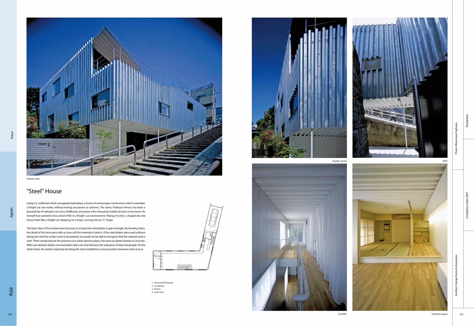
Asi
a
150 151
Resi
dent
ial
Com
plet
ion
Dat
e: 2
007
Phot
o: M
itsum
asa
Fujit
suka
Arc
hite
ct: K
engo
Kum
a &
Ass
ocia
tes
Toky
oJa
pan
"Steel" House
Using 3.2–millimetre thick corrugated steel plates, a house of monocoque construction which resembles a freight car was made, without having any beams or columns. The client, Professor Hirose, has been a devoted fan of railroads cars since childhood, and stores a few thousand models of trains in his home. He himself had wanted to live a kind of life in a freight–car environment. Fitting in to the L–shaped site, the house looks like a freight car stopping on a slope, curving into an "L" shape.
The basic idea of the architectural structure is to bend the steel plates to gain strength. By bending them, the detail of the bent parts tells us how soft the material of steel is. If the steel plates were used without being bent and the surface were to be painted, we would not be able to recognise that the material used is steel. There would only be the presence of a white abstract plane, the same as plaster boards or concrete. With such abstract detail, communication does not exist between the substance of steel and people. On the other hand, the detail created by bending the steel establishes communication between steel and us.
Exterior view
StiltsFaçade corner
Common spaceCorridor
1. living and dining area2. car parking3. kitchen4. wash room
1
2
3
4

Asi
a
152 153
Corp
orat
eCo
mpl
etio
n D
ate:
200
7
Phot
o: Y
oshi
haru
Mat
sum
ura,
Yos
hihi
sa A
raki
, Fu
jitec
A
rchi
tect
: Yos
hihi
ro M
atsu
da, H
idea
ki T
akag
i/Sho
wa
Sekk
ei, I
nc
Shig
a pr
efec
ture
Japa
n
FUJITEC"Big Wing" Headquarters/Product Development CentreThis building was planned for the headquarters to take the hub of the enterprise and for the R&D to make use of the most advanced technology for the products development, in the site along the superhigh speed railway of Tokaido–shinkansen where a rural landscape is stretched around.
In order to strengthen and promote company's growth, the designers aimed to build a space that only showed the company’s appeal, but also tried to create an atmosphere in which the employees could work together
The interior of the building is comprosed of the entrance hall with a working area to the north and a VIP area to the South. The two floors are open and connected, allowing for the working atmosphere to have a sense of continuity and togetherness. The atrium to the east serves multiple purposes besides being a way to move throughout the building, including as a meeting area and a space to take breaks. The atrium’s two floors are open, further fostering a sense of workplace cohesion. Additionally, from the bridge that crosses to the lifts of the research tower, one can observe the latest research and development while seeing through the glass the green landscape that the Shinkansen tracks run through.
General view from west
Conference room
Façade, night view
Atrium
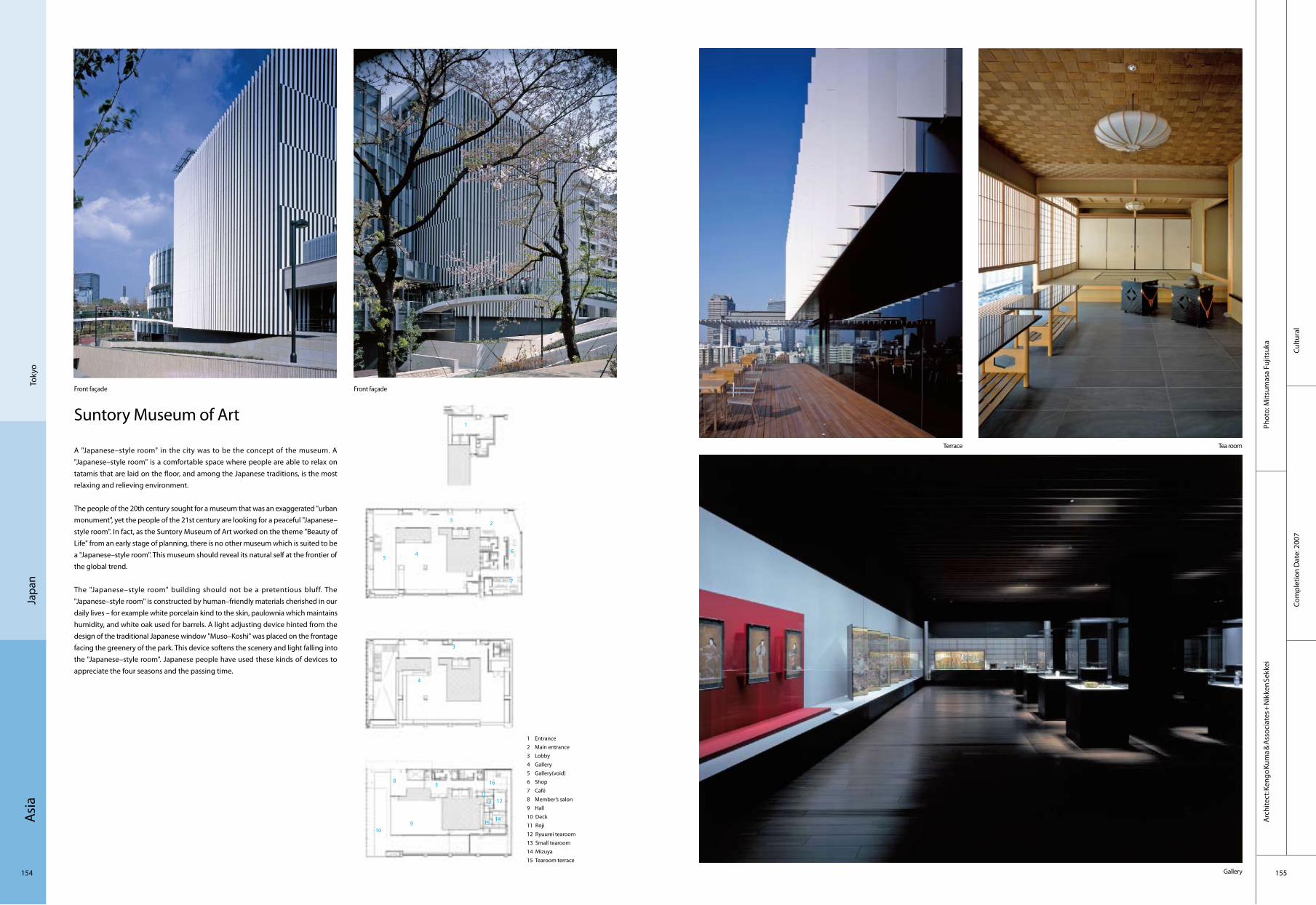
Asi
a
154 155
Cultu
ral
Com
plet
ion
Dat
e: 2
007
Phot
o: M
itsum
asa
Fujit
suka
Arc
hite
ct: K
engo
Kum
a & A
ssoc
iate
s + N
ikke
n Se
kkei
Japa
nTo
kyo
Suntory Museum of Art
A "Japanese–style room" in the city was to be the concept of the museum. A "Japanese–style room" is a comfortable space where people are able to relax on tatamis that are laid on the floor, and among the Japanese traditions, is the most relaxing and relieving environment.
The people of the 20th century sought for a museum that was an exaggerated "urban monument", yet the people of the 21st century are looking for a peaceful "Japanese–style room". In fact, as the Suntory Museum of Art worked on the theme "Beauty of Life" from an early stage of planning, there is no other museum which is suited to be a "Japanese–style room". This museum should reveal its natural self at the frontier of the global trend.
The "Japanese–style room" building should not be a pretentious bluff. The "Japanese–style room" is constructed by human–friendly materials cherished in our daily lives – for example white porcelain kind to the skin, paulownia which maintains humidity, and white oak used for barrels. A light adjusting device hinted from the design of the traditional Japanese window "Muso–Koshi" was placed on the frontage facing the greenery of the park. This device softens the scenery and light falling into the "Japanese–style room". Japanese people have used these kinds of devices to appreciate the four seasons and the passing time.
1 Entrance2 Main entrance3 Lobby4 Gallery5 Gallery(void)6 Shop7 Café8 Member’s salon9 Hall 10 Deck11 Roji12 Ryuurei tearoom13 Small tearoom14 Mizuya15 Tearoom terrace
Front façade Front façade
Terrace Tea room
Gallery
1
23
45
6
7
8
3
4
109
3 16
12
1514
1311

Asi
a
156 157
Copo
rate
Com
plet
ion
Dat
e: 2
008
Phot
o: T
akas
hi Y
amag
uchi
& A
ssoc
iate
sA
rchi
tect
: Tak
ashi
Yam
aguc
hi &
Ass
ocia
tes
Japa
nTo
kyo
Silent Office
The site is located at the side of an elevated highway near Haneda Airport, at the corner defined by the crossing of two roads. The neighbourhood townscape doesn't show any continuity. The architecture is composed of the closed space to catch silence. In a rectangular box is divided by two slits. The interval between those parts leads the air, the wind and the light into the office itself. To ensure an effective internal space, while respecting the legislative outline of the allowed building volume, the ceiling's height of the top floor is higher on the west side than the east one.
Not only to be functional, but aslo to give to the place some complexity, the inside and the outside spaces have been carefully thought out. The parking and the delivery areas are on the west side. The road side provides tree plantations, adding to the surroundings some green space.The ground floor is divided between the warehouse and working space for the personnel. The first floor is devoted to an other part of the warehouse function. The tenant office is on the last and second floor.
1. entrance 2. hall 3. lobby 4. office 5. storehouse6. reception 7. storage 8. parking 9. space 10. utility11. balcony 12. terrace
Façade
Terrace
Void
Office room
2
3
4 5
67
5
4
4
4
4
7 7
7 7
4
4
4
999
10
1112
11

Asi
a
158 159
Hos
pita
lCo
mpl
etio
n D
ate:
200
9
Phot
o: S
S–O
SAKA
Arc
hite
ct: M
ikio
Chi
kusa
Uw
ajim
aJa
pan
Uwajima City Hospital
The Uwajima Municipal Hospital had opened in 1910 which has played the core of hospital in the outskirts of the district. It was reconstructed toward the new era of 100 years from now on. The total area of this project is 19,604.79 square metres, with a 11,233.09–square–metre building area. The roof slab occupies 50.38m. The highest height is 50.98m. The ground floor is in the underground, the tenth floor on the ground. The materials are PcaPC, steel structure and quake–absorbing structure. There are 435 beds in total.
The outward appearance is designed for representing the blue sky in Uwajima with lightening the size of the structure with a basic tone of a vertical stripe. And the interior appearance is designed rather for the well–ordered and calm hospitals. The colouring of the hospital is composed of being approachable to the regional people.
1. lecture hall 2. reception 3. office 4. dialysis 5. physiological examination 6. specimen lab 7. medical examination 8. central treatment 9. medical examination 10. medical examination
External
Night view of the front
Front view Side view of the night Rehabilitation garden
Special private room
2
3
5
6
7
4
1
9
10
8

Asi
a
160 161
Corp
orat
eCo
mpl
etio
n D
ate:
200
8
Phot
o: K
oich
i Sat
ake
Arc
hite
ct: R
iken
Yam
amam
oto
& F
ield
Sho
p
Nig
ata
Japa
n
Namics Techno Core
Namics is a company that manufactures special paste for semiconductor boards. In the year of its 60th anniversary of founding, this innovative company has decided to rebuild its research centre. Riken Yamamamoto & Field Shop were invited to a design competition, and proposed an iconic, mushroom–shaped structure which appears to float in midair. Namics is a vigorous company which tries to constantly re–establish its corporate image by endeavouring in new projects. As Namics grew rapidly into a multinational corporation, its management sought a building which appropriately symbolises the company’s momentum. Another design requirement was to "open up" the building to numerous visiting clients, and the interpretation of this requirement was that the building had to be legible and recognisable as possible.
They proposed an articulated three–layer structure with the ground floor and first floor pulled apart. The ground floor accommodates the research facilities, the middle first floor a floating garden, and the first floor a cafeteria and hoteling office. The research facilities on the first floor are arranged on a grid plan as requested by the client. The middle second floor, or the ground floor roof, is landscaped with a space for exhaust outlets coming from the research rooms and laboratories, which provide a relaxation area for the staff. On top of that there is the second floor mushroom structure. This building is sure to establish Namics’ new image.
1. Utilities room2. Waste and recycling area3. Laboratory4. Multi function plaza5. reception area6. visitors room7. general affairs office
Bird‘s eye view
External view
External view
General affairs office
2
3
56
7
4
1
3 3
3 3
3
3
1

Asi
a
162 163
Com
mer
cial
Com
plet
ion
Dat
e: 2
005
Phot
o: M
r. D
aich
i Ano
Arc
hite
ct: K
umik
o In
ui
Toky
oJa
pan
Flower Shop H
The designers tried to make small rooms without the presence of ceiling, which may make people feel as if they were in exterior space even though they are in interior space. Since it has a limit of height of the building, the designers divided a building into several small volumes. The smaller the footprint of each building is, the higher the impression of the ceiling is.
The context of the site consists of both the city and the park. Since the city and the park are completely different in various points, the designers were in two minds about choosing which context they take. If they design a pavilion, that does not fit in with the city. If they design just a building, that does not fit to the park. They did not want either of them. Thus, the designers decided to accept both of them. The division of the building made the proportion of each building vertical, which made the project resemble to the building around it. The designers love such way of respecting existing landscape. The project does not only copy the man–made context, but also respect the spaces like trees.
1 terrace2 retail space3 retail space4 cashier5 backyard
Front view
Entrance
Lobby Entrance
23
54
1

Asi
a
164 165
Resi
dent
ial
Com
plet
ion
Dat
e: 2
006
Phot
o: H
irosh
i Ued
aA
rchi
tect
: Kaz
uhik
o Ki
shim
oto
/ aca
a
Kana
gaw
aJa
pan
House in Yugawara
The south part of the slope, where used to be a tangerine farm, is the site. Flexible soil was found after the research and the pile work was necessary. The wooden bungalow was very light and the architects were able to have smaller number of stakes by making the groundwork positioning consolidate and distributed by blocks. With the post on the balanced groundwork, they made the box–shaped walls and the floor and roof.
The box, created as one of the groundwork, presents the softness in the continuous one–room spacing. Besides, the slope presents the multilevel floor, which gives the area some separation by the level. People who would live there can choose their own "space" as they like.
At the TEPCO comfortable Housing Contest, the prize was given especially for the understanding of the construction and consistency of the flatness plan. The project is particularly designed to fit the strange site of the area. The low cost of the construction of the project is also part of the consideration for the winning in this contest.
Daytime view
Side view
Terrace
Stairs
1. base 2. in–between column structure 3. roof
2
3
1

Asi
a
166 167
Recr
eatio
nal
Com
plet
ion
Dat
e: 2
007
Phot
o: N
ocre
dit
Arc
hite
ct: S
hin
Taka
mat
su +
Shin
Tak
amat
su A
rchi
tect
and
Ass
ocia
tes
Co.,L
td.
Osa
kaJa
pan
Namba Hips
A client who has developed amusement businesses obtained a plot of a prime location fronting Midosuji, a main road in Osaka. The client planned to build a complex mainly containing amusement facilities and restaurants, and required many architects to submit their ideas in a long term. As the result of the comparison, he finally designated Shin Takamatsu. The idea which made the client decide was so clear. The lucid idea led a consistent architecture from the beginning to the completion. It is a separation from meanings. Takamatsu says without fearing the misunderstanding, this form of the architecture was developed as the theme which thoroughly hates the meaning. The architecture was designed by pursuing the form which ignores architectural urban scale and refered to nothing. The architect was sure that the only existence of unregistered glory can be the symbolic architecture in the city where there is super saturation with registered glory.
West Elevation
Front façade Night view Interior Interior
Interior
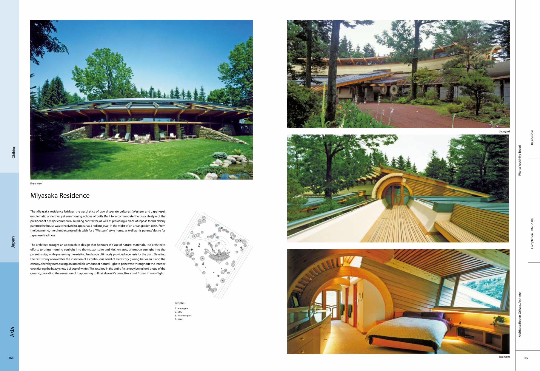
Asi
a
168 169
Resi
dent
ial
Com
plet
ion
Dat
e: 2
008
Phot
o: Y
oshi
hiko
Toba
riA
rchi
tect
: Rob
ert O
shat
z, A
rchi
tect
Obi
hiro
Japa
n
Miyasaka Residence
The Miyasaka residence bridges the aesthetics of two disparate cultures (Western and Japanese), emblematic of neither, yet summoning echoes of both. Built to accommodate the busy lifestyle of the president of a major commercial building contractor, as well as providing a place of repose for his elderly parents; the house was conceived to appear as a radiant jewel in the midst of an urban garden oasis. From the beginning, the client expressed his wish for a "Western" style home, as well as his parents’ desire for Japanese tradition.
The architect brought an approach to design that honours the use of natural materials. The architect's efforts to bring morning sunlight into the master suite and kitchen area, afternoon sunlight into the parent's suite, while preserving the existing landscape ultimately provided a genesis for the plan. Elevating the first storey allowed for the insertion of a continuous band of clerestory glazing between it and the canopy, thereby introducing an incredible amount of natural light to penetrate throughout the interior even during the heavy snow buildup of winter. This resulted in the entire first storey being held proud of the ground, providing the sensation of it appearing to float above it's base, like a bird frozen in mid–flight.
site plan
Front view
Courtyard
Bed room
1. entre gate 2. alley3. future carport4. street
2
3
4
1
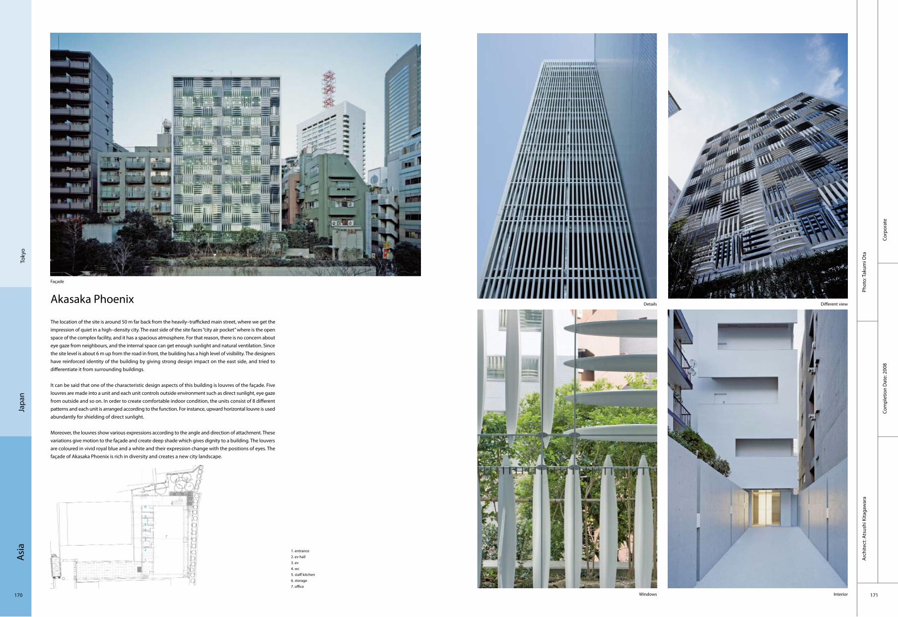
Asi
a
170 171
Corp
orat
eCo
mpl
etio
n D
ate:
200
8
Phot
o: T
akum
i Ota
Arc
hite
ct: A
tsus
hi K
itaga
war
a
Toky
oJa
pan
Akasaka Phoenix
The location of the site is around 50 m far back from the heavily–trafficked main street, where we get the impression of quiet in a high–density city. The east side of the site faces “city air pocket” where is the open space of the complex facility, and it has a spacious atmosphere. For that reason, there is no concern about eye gaze from neighbours, and the internal space can get enough sunlight and natural ventilation. Since the site level is about 6 m up from the road in front, the building has a high level of visibility. The designers have reinforced identity of the building by giving strong design impact on the east side, and tried to differentiate it from surrounding buildings.
It can be said that one of the characteristic design aspects of this building is louvres of the façade. Five louvres are made into a unit and each unit controls outside environment such as direct sunlight, eye gaze from outside and so on. In order to create comfortable indoor condition, the units consist of 8 different patterns and each unit is arranged according to the function. For instance, upward horizontal louvre is used abundantly for shielding of direct sunlight.
Moreover, the louvres show various expressions according to the angle and direction of attachment. These variations give motion to the façade and create deep shade which gives dignity to a building. The louvers are coloured in vivid royal blue and a white and their expression change with the positions of eyes. The façade of Akasaka Phoenix is rich in diversity and creates a new city landscape.
Façade
Details Different view
InteriorWindows
1. entrance2. ev hall3. ev4. wc5. staff kitchen6. storage7. office
2
3
4
1
4
5
6
7

Asi
a
172 173
Com
mer
cial
Phot
o: S
huhe
i End
o
Com
plet
ion
Dat
e: 2
006
Arc
hite
ct: S
huhe
i End
o
Kyot
oJa
pan
Rooftecture O–K
The Rooftecture projects, eight buildings designed by Osaka–based architect Shuhei Endo for the Japan–based used car dealership, O–RUSH, are whimsical structures with sweeping cantilevered roofs and continuous suspended steel sheets that minimise interior walls, leaving room to show off the glimmering cars inside.
In a similar use of suspended steel, Endo utilised a one–storey structural steel frame from an existing building and covered it with a new roof for the Kyoto O–RUSH building, Rooftecture O–K. Contact points within the building’s frame stabilise the continuous suspended steel sheet roof that begins at ground level on one end, and waves upward to cover the two–storey showroom. The thickness of the steel sheets provides self–weighted stress, opposing gravity. The glazed façade opens the 2,000–plus–square–foot interior to natural daylighting.
The one–storey difference in elevation from the maintenance space to the two–storey showroom of the building is united with a continuous visual context under the sinuous metallic roof.
General view
Reception
Workshop
1. exhibition space2. office3. meeting space4. workshop
Façade
2
3 41 4
1

Asi
a
174 175
EX
The site of EX faces the front of a four–way crosswalk with heavy pedestrian traffic. The goal of the project was to design a core facility that could change the scenery of the Chiba station area that is suffering from economic decay. The solution to this problem was to design a building with a 5–storey glass atrium in the front so the various activities inside would be seen from the outside. Then by having an atrium full of movement, the architects aimed to let the context and the atrium have a stronger connection to each other.
The main circulation for the building is gathered at the front atrium facing the existing shopping district. The atrium then is made with a transparent curtain wall so it visually opens up to the surrounding district. Besides, the escalator facing the atrium is cantilevered to make the space become open. The building’s exterior is then clad with metal panels that vary in width to give the building a rhythm and avoids the monotonous surface.
The name of the building is "EX" which is a prefix meaning "out of". This is to emphasise on the designer’s design concept: wide range of information and activities are sent out from this building, making the whole community a more attractive place.
Looking towards the elevation facing the scramble junction Extra detail The organic print on the building surface adds playfulness to the architecture
View from the main ground level entrance looking at the cantilevered floors
The atrium becomes increasingly transparent at night as it is lit up
1. lift 2. tenant 3. WC4. central monitor room 5. garbage place 6. escape staircase
Com
mer
cial
Com
plet
ion
Dat
e: 2
008
Phot
o: K
ohic
hi To
rimur
a A
rchi
tect
: SAT
OH
Hiro
taka
Arc
hite
cts
Chib
aJa
pan
3
2
56
4
1
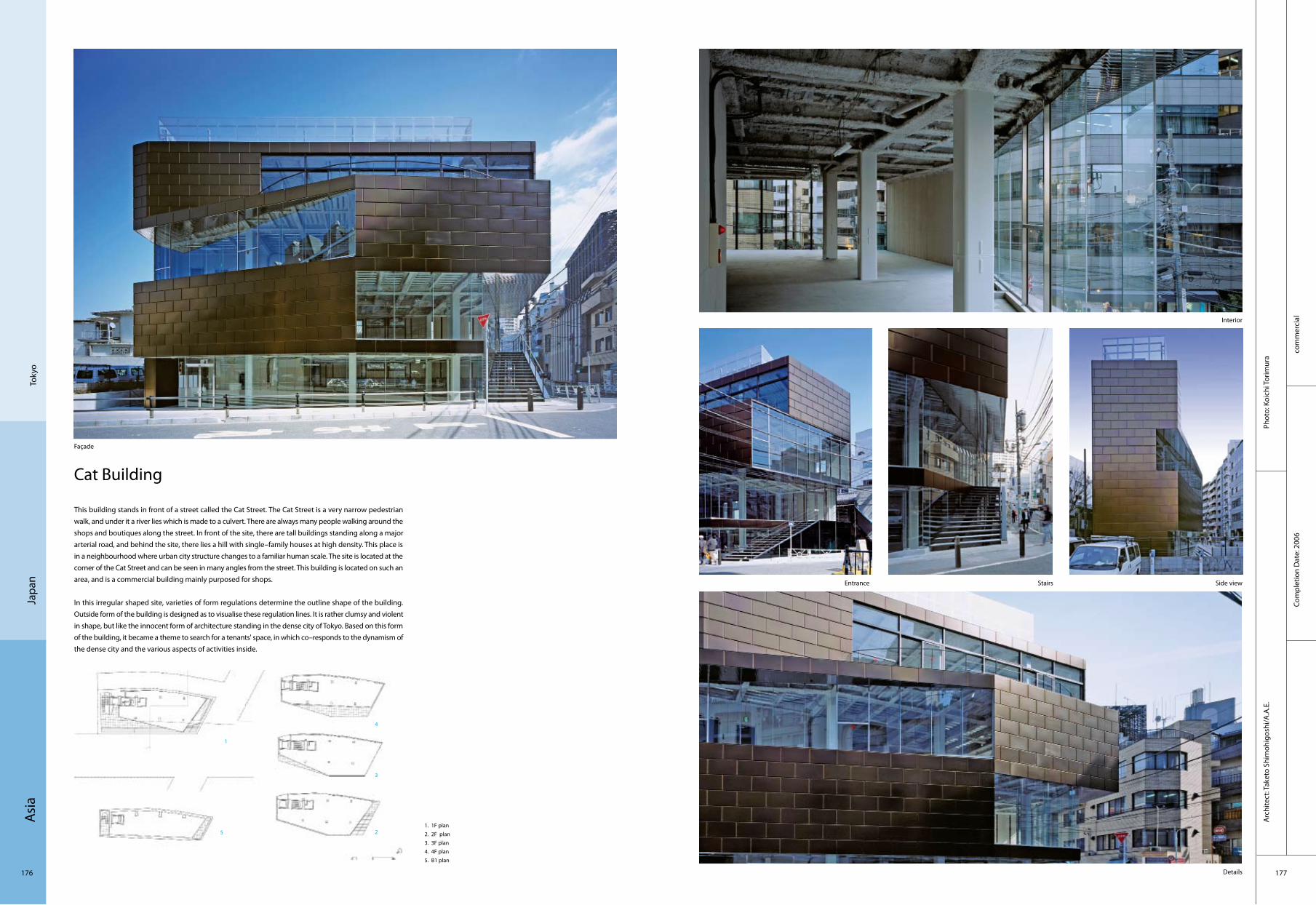
Asi
a
176 177
com
mer
cial
Co
mpl
etio
n D
ate:
200
6
Phot
o: K
oich
i Tor
imur
aA
rchi
tect
: Tak
eto
Shim
ohig
oshi
/A.A
.E.
Toky
oJa
pan
Cat Building
This building stands in front of a street called the Cat Street. The Cat Street is a very narrow pedestrian walk, and under it a river lies which is made to a culvert. There are always many people walking around the shops and boutiques along the street. In front of the site, there are tall buildings standing along a major arterial road, and behind the site, there lies a hill with single–family houses at high density. This place is in a neighbourhood where urban city structure changes to a familiar human scale. The site is located at the corner of the Cat Street and can be seen in many angles from the street. This building is located on such an area, and is a commercial building mainly purposed for shops.
In this irregular shaped site, varieties of form regulations determine the outline shape of the building. Outside form of the building is designed as to visualise these regulation lines. It is rather clumsy and violent in shape, but like the innocent form of architecture standing in the dense city of Tokyo. Based on this form of the building, it became a theme to search for a tenants' space, in which co–responds to the dynamism of the dense city and the various aspects of activities inside.
Façade
Interior
Entrance Stairs Side view
Details
3
25
4
1
1. 1F plan2. 2F plan3. 3F plan4. 4F plan5. B1 plan
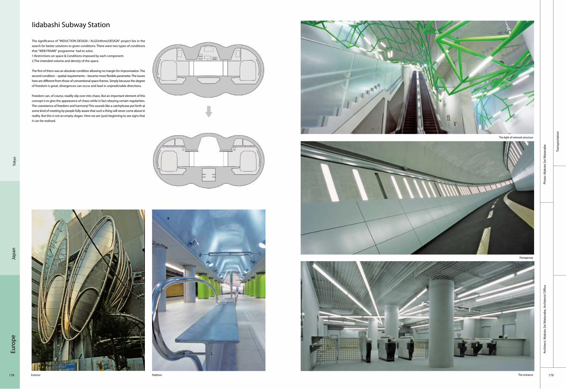
Euro
pe
178 179
Tran
spor
tatio
n
Phot
o: M
akot
o Se
i Wat
anab
eA
rchi
tect
: Mak
oto
Sei W
atan
abe,
Arc
hite
cts’
Offi
ce
Toky
oJa
pan
Iidabashi Subway Station
The significance of "INDUCTION DESIGN / ALGOrithmicDESIGN" project lies in the search for better solutions to given conditions. There were two types of conditions that "WEB FRAME" programme had to solve. 1.Restrictions on space & Conditions imposed by each component. 2.The intended volume and density of the space.
The first of them was an absolute condition allowing no margin for improvisation. The second condition – spatial requirements – became more flexible parameter. The issues here are different from those of conventional space frames. Simply because the degree of freedom is great, divergences can occur and lead in unpredictable directions.
Freedom can, of course, readily slip over into chaos. But an important element of this concept is to give the appearance of chaos while in fact obeying certain regularities. The coexistence of freedom and harmony! This sounds like a catchphrase put forth at some kind of meeting by people fully aware that such a thing will never come about in reality. But this is not an empty slogan. Here we are (just) beginning to see signs that it can be realised.
Exterior Platform
The light of network structure
Passageway
The entrance

Asi
a
180 181
Recr
eatio
nal
Com
plet
ion
Dat
e: 2
009
Phot
o: D
esig
n N
etw
ork
Arc
hite
cts
Sdn
Bhd.
Arc
hite
ct: D
esig
n N
etw
ork
Arc
hite
cts
Sdn
Bhd.
Kuch
ing
Mal
aysi
a
Unimas Golf Resort Club
The Unimas Golf Resort Club house is part of the unimas master plan in Kota Samarahan, Kuching. The club house and golf course is the centre piece and communal heartland of a university township planned on the successful development of Universiti Malaysia Sarawak.
The facilities of the club house are located on three floors – with the guest arrival and main entrance at upper ground level. The second entrance point is for buggies located at the lower ground level. The upper ground floor houses the banquet hall with a capacity of 50 tables i.E. 500 persons. Ancillary spaces to the banquet hall are provided in the form of VIP rooms and pre function spaces. The lobby and terrace that wrap around the building serves as both a viewing gallery and dining terrace. The kitchen and its supporting facilities are also located in this floor for easier operation and efficiency of use. The "open–plan" nature of the design means that all the facilities are visually linked with the exception of the services and amenities. In order to liberate the upper floor plane for the members’ viewing and f & b needs, the water courtyard and the amenities are located in the lower ground floor – the changing rooms and toilets are located here for proximity to the swimming pool level and the buggy parks. The second entrance is located at this level, with 60 buggy parks under cover nearby and other 28 buggy parks outdoors. In keeping with the effort to maintain an open plan and maximum view advantage on the main floor, the roomed facilities such as offices, library and conference facilities are located in a mezzanine floor partially housed within the building’s roof space.
1. tennis court (future extension)2. future extension3. swimming pool4. interior
View of the clubhouse from the golf course
The new clubhouse speaks of lightness and shade
Resor t–swimming
Modern tropical style in a sombre palette and tidier lines
3
2 4
1

Asi
a
182 183
Resi
dent
ial
Com
plet
ion
Dat
e: 2
009
Phot
o: D
esig
n N
etw
ork
Arc
hite
cts
Sdn
Bhd
Arc
hite
ct: D
esig
n N
etw
ork
Arc
hite
cts
Sdn
Bhd
Sant
ubon
g, K
uchi
ngM
alay
sia
Yeoman's Bungalow
The house is entered from main staircase – an open structure where the timber–lined cantilevered flights of stairs double as a sculptural lookout. At the top of the stairs, one crosses the threshold into the first pavilion that is the conversation area, the kitchen and a dining room that overlooks at lap pool. From here, one crosses a water–court into the second pavilion further up the slope; which is the main living room with a large viewing deck. The spaces in these two pavilions are visually linked as one looks towards the lap pool.
Nestled uppermost in the hillside is the bedroom pavilion which contains the master bedroom suite, guest bedrooms and study. This longish block is flanked by a veranda, which can be turned into an informal living space when the guests slide open the glazed doors to the bedrooms. From this veranda and down a flight of stairs, one comes full–circle and arrives back at the first pavilion.
Ultimately, this is a house to be experienced – by standing in her rooms, by walking through her corridors and looking through her windows, because the architectural language is deliberately uncomplicated and its form is simple, acting merely as a foil to the more commanding presence of Mount Santubong.
Façade
Night viewSavour the vistas
Stairs and countyard Interior
1. landscape2. swimming pool3. building
3
2
1

Asi
a
184 185
Resi
dent
ial
Com
plet
ion
Dat
e: 2
009
Phot
o: A
lber
t Lim
Arc
hite
ct: W
allfl
ower
Arc
hite
ctur
e +
Des
ign
East
Coa
st a
rea
Sing
apor
e
Enclosed Open House
The owners wanted a spacious, contemporary house that would be as open as possible but without compromising security and privacy at the same time. Surrounded by neighbours on four sides, the solution was a fully fenced compound with a spatial programme that internalised spaces such as pools and gardens, which are normally regarded as external to the envelope of the house. By zoning spaces such as the bedrooms and servants’ quarters on alternative levels, i.e. upper storey and basement levels, the ground plane was freed from walls that would have been required if public and private programmes were interlaced on the same plane. The see–through volumes allow a continuous, uninterrupted 40–metre view, from the entrance foyer and pool, through the formal living area to the internal garden courtyard and formal dining area in the second volume. All these spaces are perceived to be within the built enclosure of the house.
The environmental transparencies at ground level and between courtyards are important in passively cooling the house. All the courtyards have different material finishes and therefore different heat gain and latency (water, grass, granite). As long as there are temperature differences between courtyards, the living, dining and pool house become conduits for breezes that move in between the courtyards, very much like how land and sea breezes are generated.
Front view with pool
General view
Entrance
Living room
1. driveway2. charporch3. changing room4. store5. foyer6. swimming pool7. living8. powder room9. TV area10.linkway11.counrtyard12.dining13.kitchen14.outdoor terrace15.void to basement16.study room
2
3
4
1
9
56
7
10
1112
1314
15
16
8

Asi
a
186 187
Hot
elCo
mpl
etio
n D
ate:
201
0
Phot
o: D
erek
Sw
alw
ell
Arc
hite
ct: O
NG
&O
NG
Pte
Ltd
.
Sing
apor
e Ci
tySi
ngap
ore
Studio M Hotel
Profile
Front Profile
Detail Bedroom
1. entrance2. reception area3. lobby4. corridor5. courtyard6. lounge
Studio M Hotel was designed by ONG&ONG, and is located at Mohamed Sultan Road, Singapore. A mere stone’s throw away from the Singapore River, Studio M Hotel is in the heart of entertainment districts like Clarke Quay, Boat Quay and Robertson Quay.
Given its high visibility and the accompanying social vibrance of the site, the key idea was to design a trendy and memorable landmark worthy of gracing the historical river next to which it resides. The result is a building façade shaped like a boat sail, with the elevated deck being likened to a cruise deck. These features collectively paint an image of a ship moored by the riverside.
Rooms were designed as live–work–play spaces that cater to the needs of urban travellers. Conceptualised as a "box within a box", each 15m2 room is compact yet luxurious, with double volume space for added depth and fully functional bathroom"pods" that can be easily reconfigured to create a diversity of room types. A staircase leads up to the furniture deck that either houses a bed or workstation, giving business travellers the added convenience of computer facilities during their stay.
2
3
4
1
5
6

Asi
a
188 189
Com
plex
Com
plet
ion
Dat
e: 2
006
Phot
o: P
ino
Mar
ches
eA
rchi
tect
: Sh
erilc
aste
lino,
C&
M A
rchi
tect
s
Auro
ville
Indi
a
Multipurpose Building For Auroville PapersThis building houses a multipurpose hall and services for 60 workers (kitchen, laundry, lockers, bathrooms etc.) of the existing factory. The services are contained within closed rooms and the hall is left completely open on two sides for maximum cross ventilation and feeling of space at congregations. The hall is also marked by a curvilinear wall on one side and the linear block of services on the other. The roof is lifted from the building to provide a natural draft of air circulation in the room. A small bas–relief design on the ceiling animates the space otherwise left bare. Local natural smooth stones in shades of grey, yellow ochre and green are used in a pattern for the flooring of the main hall. Rough stone is used in bathrooms and the other service areas.
A natural root zone waste water recycling system treats the grey water from the toilets and the water is re–used for irrigation needs of the whole site. Leftover blue metal aggregate of the site with locally found boulders in conjunction with local species of the plants dot the green area around the building. Textured exterior wall paint in shades of orange adds to the tropical context.

Asi
a
190 191
Com
mer
cial
Com
plet
ion
Dat
e: 2
008
Phot
o: V
ines
h G
andh
iA
rchi
tect
: M
r.San
jay
Puri
/Ms.M
amat
a Sh
elar
Lona
vala
Indi
a
Triose Food Court
Angled spaces projected towards different directions encapsulated in an organically folded concrete skin create a two–level building that houses a few retail shops, a food court, two restaurants, a large bar and an entertainment gaming area.
The entire frontage of the site along the main road overlooks large trees and a riverbed and hills. The axis of the building changes constantly from one side to the other allowing each space within to look out towards different views of the surrounding landscapes.
The concrete folded skin that forms most of the building creates large open frames towards the external views and the plans of the building also open out towards these large frames accentuating the beautiful natural surroundings to the inner spaces. A natural slope in the site towards the rear allowed an entire parking level to be created to facilitate the high traffic expected for the building with natural light and ventilation from the rear housing over 100 cars.
The building is created sculpturally from within & externally and is a unique manifestation of abstract volumes that are fluid in the interior and perceived as a dramatic juxtaposition of trapezoidal volumes on the site.
1. entrance2. restaurant3. kitchen4. pub5. WC
2
3
4
1
5
2
3
Entrance Canopy
Landscape with the building
Water Body
Food Court

Asi
a
192 193
Corp
orat
eCo
mpl
etio
n D
ate:
200
9
Phot
o: A
ndré
J Fa
ntho
me
Arc
hite
ct: M
orph
ogen
esis
Indi
aN
ew D
elhi
77/32, Gurgaon
Located in Gurgaon, the office hub in the suburbs of New Delhi, the building moves away from the typical office typology, and provides an alternative with interweaving open social spaces and closed workspaces.
The design is envisaged with two types of informal spaces – one at the public level and the other at the individual office level. The Ground Floor is designed to be a recreational, informal meeting space which defines the entrance as well. A passive cooling strategy is adopted to create a modified environment which is non–air–conditioned. This is done through the creation of water bodies, and allows for built mass only on two sides and the remaining two sides are left open to allow for wind movement. A café is designed as a part of the recreation zone. Each individual office has been provided with a terrace garden which becomes its private, informal breakout zone.
To address the environmental issues that concern the contemporary office, orientation is optimised in the creation of built volumes. The East and West sun are blocked off with the help of solid stonewalls that act as a thermal buffer. The two long sides: North and South are provided with glazing and punctures respectively. Each floor plate is designed to be 15 m wide to allow for daylight penetration. The use of post–tensioned beams allows for the creation of column–free spaces, which permits maximum flexibility within the office space.
Exterior view at night
Landscaped Area Informal breakout spaces
Entrance Area
1. entrance2. exit3. food court4. landscape garden5. landscape court6. reception7. lift lobby
2
3
4
1
5
67
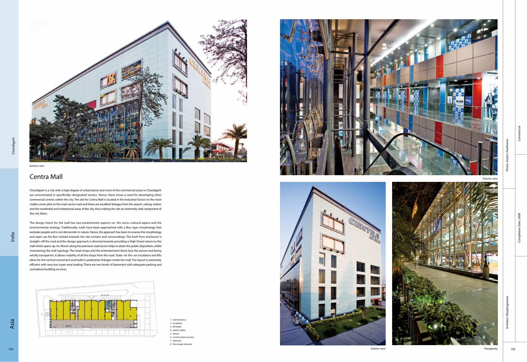
Asi
a
194 195
Chan
diga
rhIn
dia
Centra Mall
Chandigarh is a city with a high degree of urbanisation and most of the commercial areas in Chandigarh are concentrated in specifically–designated sectors. Hence, there arises a need for developing other commercial centres within the city. The site for Centra Mall is located in the Industrial Sector on the most visible corner plot on the main sector road and there are excellent linkages from the airport, railway station and the residential and institutional areas of the city, thus making the site an extremely vital component of the city fabric.
The design intent for the mall has two predominant aspects viz. the socio–cultural aspect and the environmental strategy. Traditionally, malls have been approached with a Box–type morphology that excludes people and is not democratic in nature. Hence, the approach has been to reverse this morphology and open up the Box instead towards the site context and surroundings. The built form enclosure is straight–off the road and the design approach is directed towards providing a High Street nature to the mall which opens up. An Atrium along the premium road access helps to attain the public disposition, whilst maintaining the mall typology. The retail shops and the entertainment block face the atrium and being wholly transparent, it allows visibility of all the shops from the road. State–of–the–art escalators and lifts allow for the vertical movement and build in pedestrian linkages inside the mall. The layout is extremely efficient with very low super area loading. There are two levels of basement with adequate parking and centralised building services.
Exterior view
1. mall entrance2. escalators3. lift lobby4. public toilets5. atrium 6. cinema ticket counter7. staircase8. fire escape staircase
Com
mer
cial
Com
plet
ion
Dat
e: 2
008
Phot
o: A
ndré
J Fa
ntho
me
Arc
hite
ct: M
orph
ogen
esis
Exterior view
Exterior view Passageway
2
7 4
1
5
6
3
8
7

Asi
a
196 197
Corp
orat
eCo
mpl
etio
n D
ate:
200
9
Phot
o: E
dmun
d Su
mne
rA
rchi
tect
: Prin
cipa
l Arc
hite
ct: S
AN
JAY
BHA
RWA
J (m
orph
ogen
esis
)
Gre
ater
Noi
daIn
dia
India Glycols Limited
The office design for the corporate office for India Glycols embodies the issues concerning the workplace today, and explores the paradigm of the office space as a social activity. Sited in a non–contextual suburban area of Delhi, the setting led to the development of an introverted scheme that would address environmental and socio–economic issues from first principles.
As is the nature of most bespoke corporate developments, the building had to exemplify the brand identity and corporate ideology of equity and transparency in the workplace as an integral part of the architectural vocabulary. Conceived as a solid perimeter scheme with a more fluid interior, the morphology blurs the interface between the inside and outside. The built form optimises the natural day lighting and helps to define the programmatic requirements of the office. A stacking system is used to generate a variety of open spaces; such as courtyards, verandahs, terraces etc. that help to structure the office spaces. A central spine traversing the built volume serves as the common activity zone, with other departments branching out. The design’s conceptual strength comes from the spatial organisation which creates overlaps between the exterior and the interior and between the various programmatic requirements, hence creating a vibrant and creative work environment.
External spaces
Shaded outer façade with small slit windows Exterior shot
Reception area
1. workstation2. workstation3. common spine4. workstation5. workstation6. landscape greens7. landscape greens8. deck below9. landscape greens
2
7
4
1
5
6
3
8
9
Night view of the inner courtyard

Asi
a
198 199
Resi
dent
ial
Com
plet
ion
Dat
e: 2
009
Phot
o: H
appy
Lim
Pho
togr
aphy
Arc
hite
ct: A
BOD
AY( w
ww
.abo
day.
com
)
Jaka
rta
Indo
nesi
a
Avana Apartment
This 16–storey apartment project is located in Kemang area in South Jakarta, an established neighbourhood famous for its collection of mature trees and vast greeneries. The initial concept of an 8 storey apartment with balconies was abandoned for half a year in 2006 before the client decided to appoint Aboday Architects (Indonesia) to revive the project. As its first project in Indonesia, Aboday decided to retain only the project’s internal modular unit plan, while changing the rest of external design, including rising it to 16 storeys as a result of intense negotiation with local building regulator.
Living in an apartment unit way above ground is some kind of new experience for local people who used to the idea of staying in landed property, hence the introduction of extensive balcony surrounding each unit, mimicking a "yard" in "normal" house. Comprising 64 units ranging between 180 sqm to 460 sqm (for the penthouse), with each spacious private space and service area, this apartment is an epitome of landed house that stacked on top of each other creating a home in the sky. The idea of a fluid internal–external space is also explored in every space creation on this building. A 6 meter height lobby, which opens directly to its public pool and garden, starts this experience on the ground floor when people enter the building, leading to a glass–enclosed private lobby. This concept of internal–external space is further explored in each unit above. There is almost no visible boundary between internal unit, balcony (and even the sky…), as a result of extensive use of tempered clear glass panel for door, window and balcony’s railing.
General View
Details Façade
Interior
1. bedroom2. living & dining room3. study room4. service area5. kitchen6. master bathroom
2
4
1
5 6
3
11
2
4 1
11
4
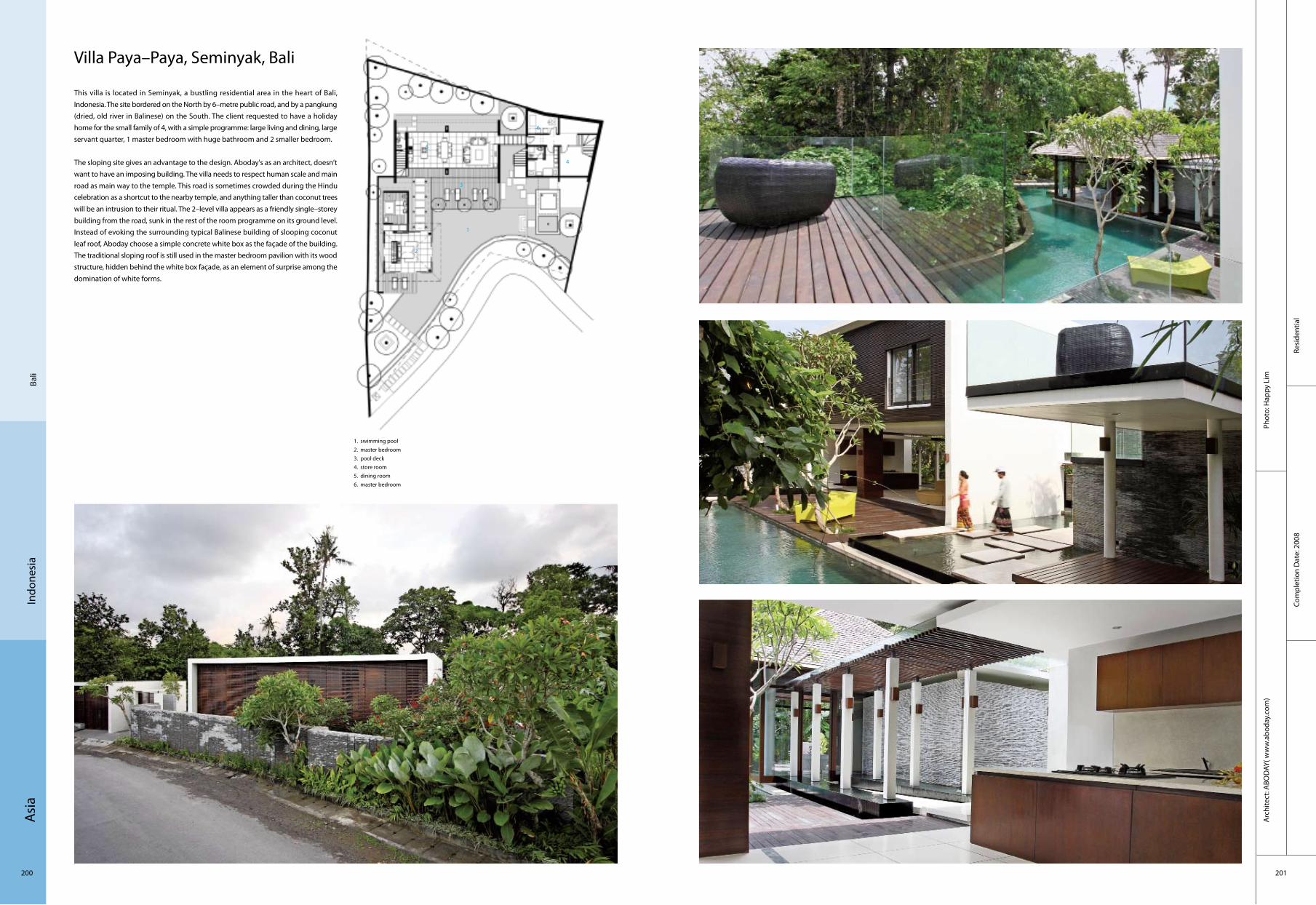
Asi
a
200 201
Resi
dent
ial
Com
plet
ion
Dat
e: 2
008
Phot
o: H
appy
Lim
Arc
hite
ct: A
BOD
AY( w
ww
.abo
day.
com
)
Indo
nesi
aBa
li
Villa Paya–Paya, Seminyak, Bali
This villa is located in Seminyak, a bustling residential area in the heart of Bali, Indonesia. The site bordered on the North by 6–metre public road, and by a pangkung (dried, old river in Balinese) on the South. The client requested to have a holiday home for the small family of 4, with a simple programme: large living and dining, large servant quarter, 1 master bedroom with huge bathroom and 2 smaller bedroom.
The sloping site gives an advantage to the design. Aboday's as an architect, doesn’t want to have an imposing building. The villa needs to respect human scale and main road as main way to the temple. This road is sometimes crowded during the Hindu celebration as a shortcut to the nearby temple, and anything taller than coconut trees will be an intrusion to their ritual. The 2–level villa appears as a friendly single–storey building from the road, sunk in the rest of the room programme on its ground level. Instead of evoking the surrounding typical Balinese building of slooping coconut leaf roof, Aboday choose a simple concrete white box as the façade of the building. The traditional sloping roof is still used in the master bedroom pavilion with its wood structure, hidden behind the white box façade, as an element of surprise among the domination of white forms.
1. swimming pool2. master bedroom3. pool deck4. store room5. dining room6. master bedroom
2
1
5
6
3
4
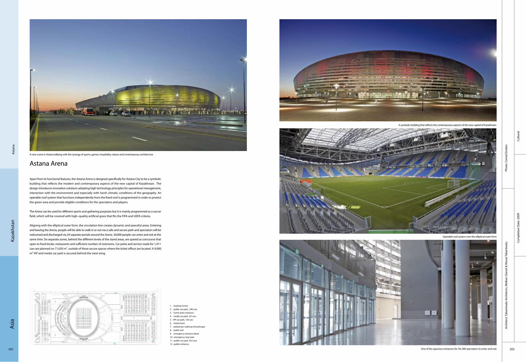
Asi
a
202 203
Cultu
ral
Com
plet
ion
Dat
e: 2
009
Phot
o: C
emal
Em
den
Arc
hite
ct: T
aban
lıoal
u A
rchi
tect
s, M
elka
n G
ürse
l & M
urat
Tab
anlıo
alu
Ast
ana
Kaza
khst
an
Astana Arena
Apart from its functional features, the Astana Arena is designed specifically for Astana City to be a symbolic building that reflects the modern and contemporary aspects of the new capital of Kazakhstan. The design introduces innovative solutions adopting high technology principles for operational management, interaction with the environment and especially with harsh climatic conditions of the geography. An operable roof system that functions independently from the fixed roof is programmed in order to protect the green area and provide eligible conditions for the spectators and players.
The Arena can be used for different sports and gathering purposes but it is mainly programmed as a soccer field, which will be covered with high–quality artificial grass that fits the FIFA and UEFA criteria.
Aligning with the elliptical outer form, the circulation line creates dynamic and peaceful areas. Entering and leaving the Arena, people will be able to walk in or out via a safe and secure path and spectators will be welcomed and discharged via 24 separate portals around the Arena. 30,000 people can enter and exit at the same time. Six separate zones, behind the different levels of the stand areas, are spared as concourse that open to food kiosks, restaurants and sufficient number of restrooms. Car parks and service roads for 1,411 cars are planned on 71,650 m2, outside of these secure spaces where the ticket offices are located. A 9,000 m2 VIP and media car park is secured behind the west wing.
A new scene in Astana tallying with the synergy of sports, games, hospitality, nature and contemporary architecture
A symbolic building that reflects the contemporary aspects of the new capital of Kazakhstan
Operable roof system over the elliptical outer form
One of the spacious entrances for 30, 000 spectators to enter and exit
1. heating Centre 2. public car park , 340 cars3. home team entrance4. media car park , 65 cars5. VIP car park, 136 cars6. mixed zone7. pedestrian walkway & landscape 8. public exit9. emergency entrance &exit 10. emergency ring road11. public car park, 532 cars 12. public entrance
2
5
6
3
10
3
3
7
9
8
10
4
11
11
1 12

Asi
a
204 205
Com
plex
Com
plet
ion
Dat
e: 2
008
Phot
o: S
hin
Taka
mat
su +
Shin
Tak
amat
su A
rchi
tect
and
Ass
ocia
tes
Co.,L
td.
Tbili
siG
eorg
ia
Business Centre Tbilisi
A successful businessman in Georgia planned to build a "business centre" as the base of his business in a hill overlooking Tobilisi city, and held an international architectural design competition. As the result, Shin Takamatsu was designated. The business centre is not a mere office building. It consists of guest house, multipurpose hall, large and small conference room, fitness gym, pool, dance hall, indoor tennis court, relaxation space, and the owner’s enormous residence. Besides, the client required the best security system and the best existence of architecture. It is a kind of a fortress. The architect is strong at creation of architecture as fortress. Though sizes are different, the architect replied to the requirements with all cultivated methods. The method was said "to be the Strengthening method of Forms". The effect is proved by the metallic dignified appearance which suddenly appeared on the hill.
1. entrance2. WC3. lobby
2
3
1
Arc
hite
ct: S
hin
Taka
mat
su +
Shin
Taka
mat
su A
rchi
tect
and
Ass
ocia
tes C
o.,L
td.
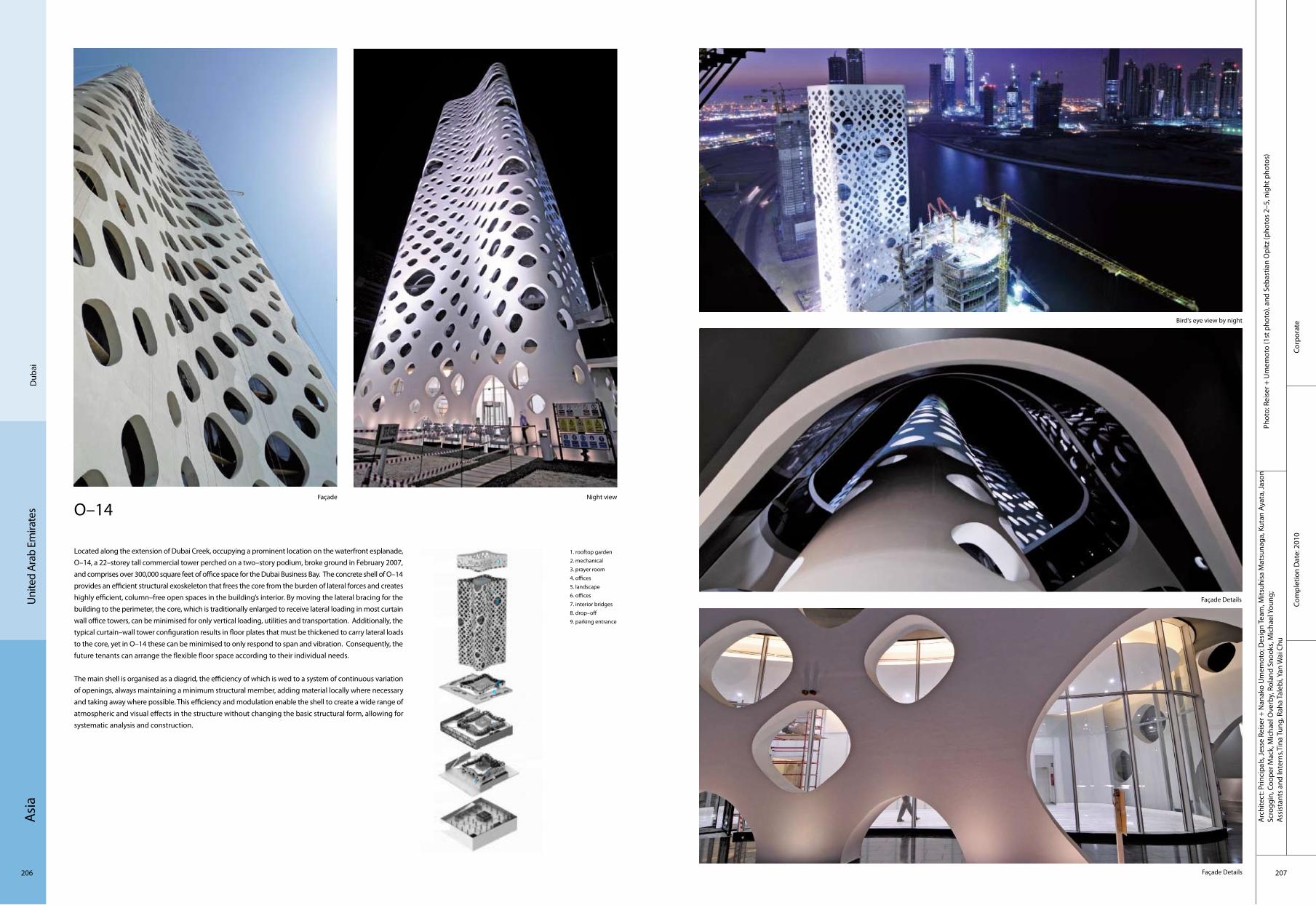
Asi
a
206 207
Corp
orat
eCo
mpl
etio
n D
ate:
201
0
Arc
hite
ct: P
rinci
pals
, Jes
se R
eise
r + N
anak
o U
mem
oto;
Des
ign
Team
, Mits
uhis
a M
atsu
naga
, Kut
an A
yata
, Jas
on
Scro
ggin
, Coo
per M
ack,
Mic
hael
Ove
rby,
Rol
and
Snoo
ks, M
icha
el Y
oung
;A
ssis
tant
s an
d In
tern
s,Tin
a Tu
ng, R
aha
Tale
bi, Y
an W
ai C
hu
Phot
o: R
eise
r + U
mem
oto
(1st
pho
to),
and
Seba
stia
n O
pitz
(pho
tos
2–5,
nig
ht p
hoto
s)
Dub
aiU
nite
d Ar
ab E
mira
tes O–14
Located along the extension of Dubai Creek, occupying a prominent location on the waterfront esplanade, O–14, a 22–storey tall commercial tower perched on a two–story podium, broke ground in February 2007, and comprises over 300,000 square feet of office space for the Dubai Business Bay. The concrete shell of O–14 provides an efficient structural exoskeleton that frees the core from the burden of lateral forces and creates highly efficient, column–free open spaces in the building’s interior. By moving the lateral bracing for the building to the perimeter, the core, which is traditionally enlarged to receive lateral loading in most curtain wall office towers, can be minimised for only vertical loading, utilities and transportation. Additionally, the typical curtain–wall tower configuration results in floor plates that must be thickened to carry lateral loads to the core, yet in O–14 these can be minimised to only respond to span and vibration. Consequently, the future tenants can arrange the flexible floor space according to their individual needs.
The main shell is organised as a diagrid, the efficiency of which is wed to a system of continuous variation of openings, always maintaining a minimum structural member, adding material locally where necessary and taking away where possible. This efficiency and modulation enable the shell to create a wide range of atmospheric and visual effects in the structure without changing the basic structural form, allowing for systematic analysis and construction.
Night view
Façade Details
Façade Details
Bird's eye view by night
Façade
1. rooftop garden2. mechanical3. prayer room4. offices5. landscape6. offices7. interior bridges8. drop–off9. parking entrance
2
56
7
9
8
3
4
1

Asi
a
208 209
Corp
orat
eCo
mpl
etio
n D
ate:
200
7
Phot
o: H
.G. E
sch
Arc
hite
ct: K
ohn
Pede
rsen
Fox
Ass
ocia
tes
(Inte
rnat
iona
l) PA
Uni
ted
Arab
Em
irate
sA
bu D
habi
Abu Dhabi Investment AuthorityHeadquarters (ADIA)
ADIA’s future requirements demand a large single floor plate with a large central common zone on each floor for meeting and social interaction. This central zone has become the vertical atrium garden, the heart of the scheme unifies the whole building and represents the organisation and its openness. The design concept further refines the idea of creating an indigenous form, a form inspired by the special character of this waterfront site and the buildings importance as an international headquarters. The key to the design is the acknowledgement of the profound importance of the sea in the development of the site and of the urban plan as a garden city. The growth of the city begun at the old fort besides the headquarter.
The gardens of the fort and those adjacent to them create a wide green zone with further reinforces the seaward connection. The site is incorporated into this garden zone. The scheme has two great arms or fingers reaching into the sea; the extensive ground floor planting reinforces the original urban landscape strategy, tying the site to the urban plan. The success of this urban design strategy for landscaping has earned Abu Dhabi the title “Garden of the Gulf”.
General view
Corridor and countyardFront view
Stairs and courtyard Stairs
1. stairs 2. office3. meeting room
2
3
1

Asi
a
210 211
Com
mer
cial
Com
plet
ion
Dat
e: 2
008
Phot
o: A
tkin
sA
rchi
tect
: Atk
ins
Man
ama
Bahr
ain
Bahrain World Trade Centre
The Bahrain World Trade Centre forms the focal point of a master plan to rejuvenate an existing hotel and shopping mall on a prestigious site overlooking the Arabian Gulf in the downtown central business district of Manama, Bahrain. The concept design of the Bahrain World Trade Centre towers was inspired by the traditional Arabian "Wind Towers" in that the very shape of the buildings harness the unobstructed prevailing onshore breeze from the Gulf, providing a renewable source of energy for the project.The two 50 storey sail shaped office towers taper to a height of 240 m and support three 29 metre diameter horizontal–axis wind turbines. The towers are harmoniously integrated on top of a three–storey sculpted podium and basement which accommodate a new shopping centre, restaurants, business centres and car parking.
The elliptical plan forms and sail–like profiles act as aerofoils, funnelling the onshore breeze between them as well as creating a negative pressure behind, thus accelerating the wind velocity between the two towers. Vertically, the sculpting of the towers is also a function of airflow dynamics. As they taper upwards, their aerofoil sections reduce. This effect, when combined with the increasing velocity of the onshore breeze at increasing heights, creates a near equal regime of wind velocity on each of the three turbines. Understanding and utilising this phenomenon has been one of the key factors that has allowed the practical integration of wind turbine generators in a commercial building design.
Night view
Entrance
Hall
Connection
General view

Asi
a
212 213
Educ
atio
nal
Com
plet
ion
Dat
e: 2
009
Phot
o: F
ares
Jam
mal
, Cle
men
t Tan
nour
i, M
acha
do a
nd S
ilvet
ti A
ssoc
iate
sD
esig
n A
rchi
tect
: Mac
hado
and
Silv
etti
Ass
ocia
tes,
Bost
on, M
assa
chus
etts
Exec
utiv
e A
rchi
tect
: Bui
lder
s D
esig
n Co
nsul
tant
s, Be
irut,
Leba
non
Beiru
tLe
bano
n
Sul iman S. Olayan School of Business, American University of Beirut
The building includes, first, a large green oval carefully located on the axis of existing steps that will become a major access to the sea, connecting students from the Faculty of Engineering and Architecture, and beyond to the Corniche’s elevated edge. Second, the design creates an L–shaped four–storey building with a traversable ground plane consisting of four enclosed pieces. These are grouped around the School’s central space, a triangular open courtyard. Porous and transparent, the ground floor promotes collegiality, containing the school’s lobby, auditorium, café and terrace, as well as student facilities, mailboxes and related social programmes.
To clarify wayfinding and the building’s legibility, the undergraduate education facilities are located on the first floor, graduate education, the MBA programme on the second, and the Executive Education programme on the third floor, which also contains the Dean’s Office in its corner. The triangular courtyard joins these three levels, and each overlooks the space, enriching it with their different lives.
The image of the building is one of vernacular precedent and contemporary vision. The "hanging" façade, made of pre–cast blocks replicates the warmth of the local Forni limestone present in the campus, while the openings of the screen–like skin recall the wooden mashrabiya that are characteristic of the region.
Corniche view from northwest
Building entrance from west with corniche below
View of auditorium with courtyard beyond
View of ground–floor glass volumes with interior courtyard beyondSection through atrium
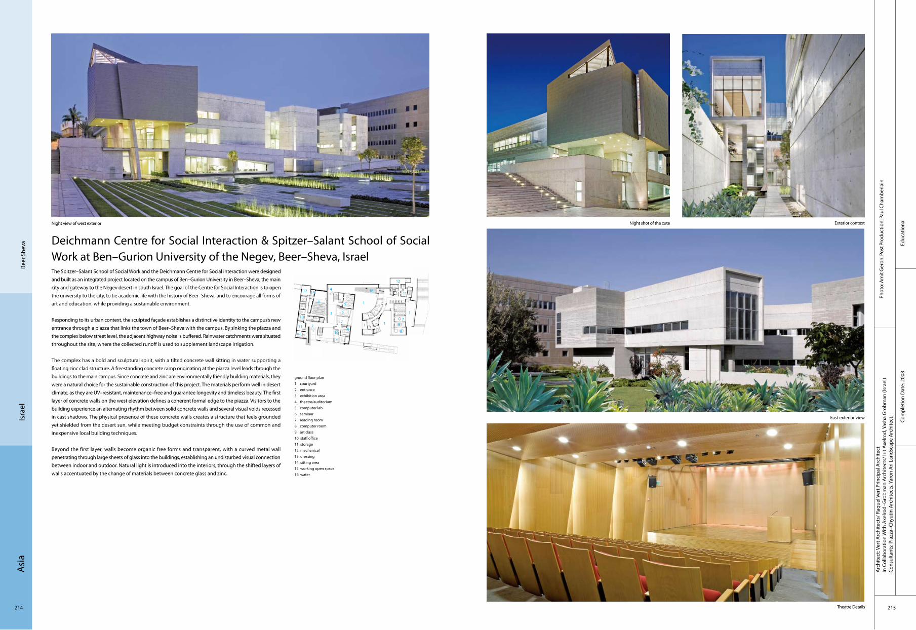
Asi
a
214 215
Educ
atio
nal
Com
plet
ion
Dat
e: 2
008
Phot
o: A
mit
Ger
on. P
ost P
rodu
ctio
n: P
aul C
ham
berla
inA
rchi
tect
: Ver
t Arc
hite
cts/
Raq
uel V
ert,P
rinci
pal A
rchi
tect
In C
olla
bora
tion
With
Axe
lrod–
Gro
bman
Arc
hite
cts/
Irit
Axe
lrod,
Yas
ha G
robm
an (I
srae
l)Co
nsul
tant
s: P
iazz
a–Ch
yutin
Arc
hite
cts.
Yaro
n A
ri La
ndsc
ape
Arc
hite
ct.
Beer
She
vaIs
rael
Deichmann Centre for Social Interaction & Spitzer–Salant School of Social Work at Ben–Gurion University of the Negev, Beer–Sheva, IsraelThe Spitzer–Salant School of Social Work and the Deichmann Centre for Social interaction were designed and built as an integrated project located on the campus of Ben–Gurion University in Beer–Sheva, the main city and gateway to the Negev desert in south Israel. The goal of the Centre for Social Interaction is to open the university to the city, to tie academic life with the history of Beer–Sheva, and to encourage all forms of art and education, while providing a sustainable environment.
Responding to its urban context, the sculpted façade establishes a distinctive identity to the campus’s new entrance through a piazza that links the town of Beer–Sheva with the campus. By sinking the piazza and the complex below street level, the adjacent highway noise is buffered. Rainwater catchments were situated throughout the site, where the collected runoff is used to supplement landscape irrigation.
The complex has a bold and sculptural spirit, with a tilted concrete wall sitting in water supporting a floating zinc clad structure. A freestanding concrete ramp originating at the piazza level leads through the buildings to the main campus. Since concrete and zinc are environmentally friendly building materials, they were a natural choice for the sustainable construction of this project. The materials perform well in desert climate, as they are UV–resistant, maintenance–free and guarantee longevity and timeless beauty. The first layer of concrete walls on the west elevation defines a coherent formal edge to the piazza. Visitors to the building experience an alternating rhythm between solid concrete walls and several visual voids recessed in cast shadows. The physical presence of these concrete walls creates a structure that feels grounded yet shielded from the desert sun, while meeting budget constraints through the use of common and inexpensive local building techniques.
Beyond the first layer, walls become organic free forms and transparent, with a curved metal wall penetrating through large sheets of glass into the buildings, establishing an undisturbed visual connection between indoor and outdoor. Natural light is introduced into the interiors, through the shifted layers of walls accentuated by the change of materials between concrete glass and zinc.
East exterior view
Night shot of the cute
Theatre Details
Exterior contextNight view of west exterior
ground floor plan1. courtyard2. entrance3. exhibition area4. theatre/auditorium5. computer lab6. seminar7. reading room8. computer room9. art class10. staff office11. storage12. mechanical13. dressing14. sitting area15. working open space16. water
5
6
3
10
7
98
4
11
1
12
1
1 1
5
6
7
10
12 1314
11
10
2
16
9
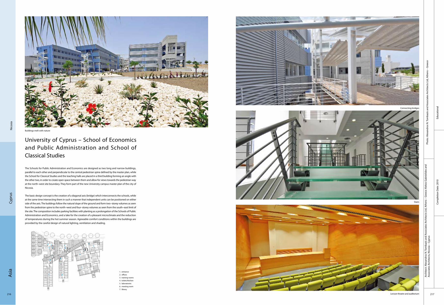
Asi
a
216 217
Educ
atio
nal
Com
plet
ion
Dat
e: 2
010
Phot
o: A
lexa
ndro
s N
. Tom
bazi
s an
d A
ssoc
iate
s A
rchi
tect
s Lt
d, A
then
s –
Gre
ece
Arc
hite
ct: A
lexa
ndro
s N
. Tom
bazi
s an
d A
ssoc
iate
s A
rchi
tect
s Lt
d, A
then
s –
Gre
ece
Ale
kos
Gab
rielid
es a
nd
Ass
ocia
tes
Arc
hite
cts,
Nic
osia
– C
ypru
s
Nic
osia
Cypr
us
University of Cyprus – School of Economics and Public Administration and School of Classical Studies
The Schools for Public Administration and Economics are designed as two long and narrow buildings, parallel to each other and perpendicular to the central pedestrian spine defined by the master plan, while the School for Classical Studies and the teaching halls are placed in a third building forming an angle with the other two, in order to create open space between them and allow for views towards the pedestrian way at the north–west site boundary. They form part of the new University campus master plan of the city of Nicosia.
The basic design concept is the creation of a diagonal axis (bridge) which interconnects the schools, while at the same time intersecting them in such a manner that independent units can be positioned on either side of the axis. The buildings follow the natural slope of the ground and form two–storey volumes as seen from the pedestrian spine to the north–west and four–storey volumes as seen from the south–east limit of the site. The composition includes parking facilities with planting as a prolongation of the Schools of Public Administration and Economics, and a lake for the creation of a pleasant microclimate and the reduction of temperatures during the hot summer season. Agreeable comfort conditions within the buildings are provided by the careful design of natural lighting, ventilation and shading.
Buildings melt with nature
1. entrance 2. offices3. training rooms 4. toilets/kitchen 5. laboratories 6. meeting room 7. library
Connecting bridges
Stairs
Lecture theatre and auditorium
1
2
3
4
3
26
7
6
2
2
4
4
4
41
11
5

Asi
a
218 219
Tran
spor
tatio
n Co
mpl
etio
n D
ate:
200
6
Phot
o: A
li Be
kman
and
Tho
mas
May
erA
rchi
tect
: EA
A–E
mre
Aro
lat A
rchi
tect
s
Mug
laTu
rkey
Dalaman International Airport Terminal
The project which strived to deal with the boredom and feeling of emptiness created by the standardness of terminal buildings, aimed to problematise the international airport conventions in the project by making use of the region’s rich landscape, climatic characteristics and the specificity of its tourism activities.
The plan was developed by differing from the customary massive orders of terminal buildings, which are conditioned by the disproportionate sizes of the narrow and long piers and the relatively shorter and wider halls; the design formed man–made valleys of the gaps between the interior spaces and the fragmented exterior masses. These gaps enabled the continuity of the region’s landscape using its natural form outside and its abstraction inside. Other significant inputs were the fact that the terminal, which has a capacity of 5 million passengers, would almost only be used during the summer, and that the circulation of arriving and departing passengers were envisaged to be on different floors, the visual fluidity between the interior spaces and different levels, ensuring that the commercial units be attractive.
Façade
Bridge Hall
Back view

Asi
a
220 221
Indu
stria
lCo
mpl
etio
n D
ate:
200
6
Phot
o: A
li Be
kman
and
Tho
mas
May
erA
rchi
tect
: EA
A–E
mre
Aro
lat A
rchi
tect
s
Edirn
eTu
rkey
Ipekyol Textile Factory
The service entrance leads into the building from the road to Kırklareli and pedestrian access from the busy E–5 Highway on the other side. The sales unit, situated close to the road, again in the direction of the E–5, was connected to the main building by an overhang which covered and thus defined the walkway.
As are usually used in similar buildings, here too the main components were the vertical reinforced concrete load–bearing systems, a lightweight steel structure cover placed on top of them and the coffered system on the façades; the exterior surface took shape through a grammar established by the clear distinction between areas open or closed to the exterior.
The administrative section, which commonly is visually detached from the production building through the use of different surface languages, due to the conventional approach to such facilities, was more directly associated with production in this project and thus, instead of different buildings a large mass took shape. This mass, which reaches the outer borders of the lot, because of the constraints of the land, was implicitly loosened thanks to linear gardens located between sections. The main purpose of these gardens was that they be used by the staff during breaks and that natural light and air enter work places; it was intended that the gardens separate areas and that thanks to their transparent frames visual fluidity would be achieved. And due to the limitations of local production possibilities, innovative experimentations in building materials and production methods were especially avoided.
External view
Building detail
Exterior Detail
Interior
Looking down the whole interior
1. production area 2. inner garden 3. entrance hall 4. cafeteria 5. offices 6. staff entrance 7. changing room 8. service entrance
3
8
7
2
4
1
5
2
5
6
2
Asi
a
222 223
Cultu
ral
Com
plet
ion
Dat
e: 2
007
Phot
o: e
mre
aro
lat (
eaa)
, nev
zat s
ayın
(nsm
h)
Ista
nbul
Turk
ey
Arc
hite
ct: e
mre
aro
lat (
eaa)
, nev
zat s
ayın
(nsm
h)
Santral Istanbul Museum of Contemporary Arts
Istanbul Bilgi University seeked for the renovation of Silahtaraga Power Plant, a typical modern industrial setting to be transformed into a museum, recreational and educational centre. Among the various buildings that were dealt with in this context, the two large boiler houses were handled with an interpretation that implied to their new function, in a way of abstraction in the design. The two buildings, that were detached but stood very close to each other to complete the surrounding building mass, were planned in a way proper to the volumetric existence of their older functions, but with a kind of "timeless" approach on surface qualities.
Just like the old buildings, new structures are composed of a dense and heavy inner core and a light, semi–transparent exterior sheathing that covers the core without touching to the possible extend. Instead of the punced state created by the walls and windows on the surfaces of the old buildings, a metal mesh that this time homogenises the sense of the whole building is simply placed on the concrete base. In this sense, it was considered that the buildings should evoke a kind of insignaficance by intervening into the aura of the environment at daytime, but should turn out to be a simple lighthouse with the interior lighting of the museum that makes the metal mesh invisible at night time.
1. entrance 2. hall 3. stairs
3
1
2

Asi
a
224 225
Com
plex
Com
plet
ion
Dat
e: 2
007
Phot
o: T
unce
r Çak
mak
li, A
ziz
Safi,
Gür
kan
Aka
y, F
ehm
i Fer
it, S
eyfe
ttin
Bal
Arc
hite
ct: T
unce
r Çak
mak
li
Burs
a Tu
rkey
Bursa Wholesale Greengrocers andFishmongers Market
The municipality of Bursa required a new, modern facility for the wholesale trade of fruits and vegetables, as well as separate facility for fish and other seafoods. The building would consolidate these commercial activities, providing the city with a centralised control point from which to monitor the Bursa’s food supply.The design of Bursa’s wholesale greengrocer’s and fishmonger’s market maintains the idiom of the high, vaulted bazaar, connecting the new buildings symbolically and functionally with long–standing Central Asian architectural and cultural traditions. The complex patterns of vehicle, material, and pedestrian traffic are carefully coordinated within fluid, elliptical shapes, which in turn are bordered by brokers’ offices. The ra–tional form of the 350–metre–long greengrocer’s market is designed to facilitate easy orientation, efficient exchange and optimal routing of foodstuffs from suppliers to retailers and restaurateurs – all of then keep down transaction costs. But it is also a good place to work: an animated space and architecture that is representative of the energy and productivity of the labourers, as well as of the city of Bursa.
At the same time, the configuration of the naturally–ventilated spaces allows the municipality to ensure the efficient, safe distribution of food products to its citizens. By consolidating the wholesale trade of produce and fish for the city of Bursa in a single location, the municipality is able to monitor the goods for quality and also to ensure that health regulations are followed.
General view
Bird 's eye view
External view
Interior view

Asi
a
226 227
Hot
elCo
mpl
etio
n D
ate:
200
8
Phot
o: T
hom
as M
ayer
Arc
hite
ct: E
AA
–Em
re A
rola
t Arc
hite
cts
Cesm
e–Iz
mir
Turk
ey
7800 Cesme Residences & Hotel
Main mass of 7800 Cesme Residences & Hotel has been made close to the border of the road, so that the frontal large beach and the natural environment has left as it exists as possible. The linear block of 5 storeys, has been transformed double sided by an internal street on which both vertical and horizontal circulation are organised.
Instead of being self–centralised and prominent by visual structural form, attractive and awaiting to gain its power by this kind of attention, what is aimed in the project is a kind of structure that tends to hide behind the landscape layer which covers it and in this way chooses to get rid of all the burden of concepts that might be defined as style, taste and genre of architecture.
Two different blind systems were designed in order to prevent the north and south façades that constitute the units’ point of view, from sunlight and wind. Both of these systems, which are made as simplified as possible, became the most important elements of the exterior perception.
General view
Bridge View of sunset
Façade
1. dock2. landscape3. hotel
3
1
2

Asi
a
228 229
Den
izli
Turk
ey
Forum Çamlik
Forum Çamlik, in the city of Denizli (Çamlık), has a 3,420 m2 supermarket and 32,000 m2 lease able areas. It has a total construction area of 73,000 m2 . In the mall exist 7,700 m2 Anchor, 600 m2 MSU, 9,700 m2 shop, 2,355 m2 restaurants and food court, 800 m2 leisure area and 2,140 m2 cinemas.
Mall has four main entrances, one on the ground floor from "Democracy Square", two on the first floor and the last one on the second floor. The entrances and exits for the closed car park will be made on the side of "Democracy Square"; open car park entrances and exits will be positioned on the south of the building, where the food court is located. The Face Veneer is a colour combination of the materials of glass, metal, bricks and stones. The building has exciting movements within vertical and horizontal changes in placement. Especially the cinema side view has an artistic sculpture with its turquoise colour.
General view
Night view
External Detail
Interior view
Com
mer
cial
Com
plet
ion
Dat
e: 2
008
Phot
o: C
hapm
an T
aylo
r Esp
aña
Arc
hite
ct: C
hapm
an T
aylo
r Esp
aña
Euro
pe
230 231
Educ
atio
nal
Com
plet
ion
Dat
e: 2
007
Phot
o: M
arko
Hut
tune
nA
rchi
tect
: K2S
Arc
hite
cts
Ltd.
Finl
and
Sipo
o
Enter
Enter is an IT college in the town of Sipoo, close to Helsinki. The L–shaped pavilion–like building forms the last corner of an existing school campus.
The urban setting is dominated by two curved yards: a larger one towards the campus garden and a smaller courtyard connected to the main road. The two curved glass façades open up the school towards the community. The students and teachers see the community and are seen. The campus garden serves as learning area, featuring a wireless network and green islands. Fruit trees with white flowers celebrate the graduation in the end of May.
The street–side façade is broken up in smaller volumes to relate to the scale of the surrounding villas. The warm tone of the wooden surfaces is reminiscent of early–20th–century school buildings.
A cast on site concrete stair forms the Centre of action in the building. It is topped by a large conical top light. A small mediatheaque and a café in the southern wing open up towars the central lobby. The class rooms are reduced in their material palette into industrial IT workshops.
1. IT classroom2. library3. café4. lobby5. hall / languages6. theory classroom7. janitor8. IT laboratory9. servers10. mechanics11. welding12. electrical laboratory13. storage14. facilities15. dressing rooms16. technical facilities17. teachers‘ room
Exterior view 01
Exterior view 02
Exterior view 03
View from window
Staircase
4
1
2
3
1
6 5
11
5
5
66
7
8
9
101112
1314
1516
17
151616
16

Euro
pe
232 233
Cultu
ral
Arc
hite
ct: J
KMM
Arc
hite
cts
Phot
o: A
rno
de la
Cha
pelle
pho
tos,
Kim
mo
Räis
änen
pho
tos
Com
plet
ion
Dat
e: 2
005
Hel
sink
iFi
nlan
d
Viikki Church
The church is located at the termination point of a narrowing landscape space, along the edge of a new square. The architecture evokes impressions of the Finnish forest. The eaves following the roof shapes reflect the forms of the treetops surrounding them. The approach to the church from the square takes a route past the bell tower and arrangements of vines. In the halls of the building the rising lines of the timber structures, resembling foliage, meet the systems of beams that define the space with light filtering through the structural members. The spaces, made of a single material, are hollowed out within the building like clearings in a forest.
The church design is based on the winning entrance to an architectural competition for the Latokartano Centre in Viikki, organised in 2000. The competition aimed to find suitable townscape and functional concepts for the civic and public service buildings of the area. The design brief also included proposals for the organisation of a public square, a park and commercial buildings on the competition site. In the chosen entrance the public buildings form rectangular shapes that delineate the square and the park, their light–coloured brick surfaces differentiating them from the wooden church rising in their midst.
Exterior
1. church hall2. parish hall3. entrance hall4. sacristy 5. hall porter6. office7. meeting room8. club room9. kitchen 10. waiting room11. storage12. bell tower13. technical facilities
4
1
2
3
5
6
7 86
10
11
11
12
9 13
9
13
66
7
8
11
2
11
1313
Altar and art work
View to landscape
Axial view church hall
wall
Euro
pe
234 235
Cultu
ral
Com
plet
ion
Dat
e: 2
009
Phot
o: Iw
an B
aan
Arc
hite
ct:
Stev
en H
oll A
rchi
tect
s
Ham
arøy
Nor
way
Knut Hamsun Centre
Dedicated to Norway’s most inventive 20th–century writer and recipient of the Nobel Prize in Literature, the 2,700 m2 Knut Hamsun Centre is located above the Arctic Circle by the village of Presteid of Hamaroy, near the farm where Hamsun grew up. The building includes exhibition areas, a library and reading room, a café, and a 230–seat auditorium for museum and community use.
The concept for the museum, "Building as a Body: Battleground of Invisible Forces," is realised from both inside and out. The wood exterior is punctuated by hidden impulses piercing through the surface. The concrete structure with stained white interiors is illuminated by diagonal rays of sunlight calculated to ricochet through the section on certain days of the year. Strange, surprising and phenomenal experiences in space perspective and light will provide an inspiring frame for the exhibitions.
The tarred black wood exterior skin alludes to Norwegian Medieval wooden stave churches, and in the roof garden, long chutes of bamboo refer to traditional Norwegian sod roofs. The spine of the building body, constructed from perforated brass, is the central lift, providing handicapped and service access to all parts of the building. The building includes a community auditorium which is connected to the main building via a passageway accessed through the lower lobby, which takes advantage of the topography, allowing for natural light along the circulation route.
1. entrance2. lobby3. reception4. café5. kitchen
Outside view
Outside view Interior
4
1
3
5
2
Outside view Outside view

Euro
pe
236 237
Hot
el
Arc
hite
ct: H
elen
& H
ard
Phot
o: H
elen
& H
ard
Com
plet
ion
Dat
e: 2
007
Suld
alN
orw
ay
The Energy Hotel
The power plant and adjacent dining hall, designed by the renowned ar¬chitect Geir Grung in the 1960s is listed among the 12 most significant modern buildings in Norway. New owners took over the dining hall to transform it into an exclusive hotel in 2006. Its generally good condition led to a philosophy of minimal intervention. Only non–origi¬nal or elements added later have been replaced or modified. New elements have been designed by re–using mate¬rials from the power plant e.g. cables, wires and ceramic insulators. Helen & Hard invited 3 artists to develope parts of the interior with the intention to add more layers of exquisite value; the light¬wait, moveable reception by Marli Mul, a flexible textile roomdivider of Yngve Holen and furniture in the conference room of Randy Naylor. In this process Helen & Hard had the role of a curator and negotiated between the artists and the clients interests.
General view
Part view
Moveable reception
Lobby
1. entrance2. washing room3. dining4. stairs5. reception
1
4
3
52
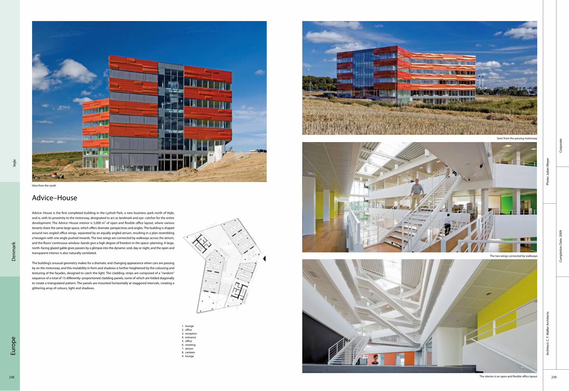
Euro
pe
238 239
Corp
orat
eCo
mpl
etio
n D
ate:
200
9
Phot
o: Ju
lian
Wey
erA
rchi
tect
: C. F
. Møl
ler A
rchi
tect
s
Den
mar
kVe
jle
Advice–House
Advice–House is the first completed building in the Lysholt Park, a new business–park north of Vejle, and is, with its proximity to the motorway, designated to act as landmark and eye–catcher for the entire development. The Advice–House interior is 5,000 m2 of open and flexible office layout, where various tenants share the same large space, which offers dramatic perspectives and angles. The building is shaped around two angled office wings, separated by an equally angled atrium, resulting in a plan resembling a hexagon with one angle pushed inwards. The two wings are connected by walkways across the atrium, and the floors’ continuous window–bands give a high degree of freedom in the space–planning. A large, north–facing glazed gable gives passers by a glimpse into the dynamic void, day or night, and the open and transparent interior is also naturally ventilated.
The building’s unusual geometry makes for a dramatic and changing appearance when cars are passing by on the motorway, and this mutability in form and shadows is further heightened by the colouring and texturing of the façades, designed to catch the light. The cladding–strips are composed of a "random" sequence of a total of 13 differently–proportioned cladding panels, some of which are folded diagonally to create a triangulated pattern. The panels are mounted horizontally at staggered intervals, creating a glittering array of colours, light and shadows.
View from the south
Seen from the passing motorway
The two wings connected by walkways
The interior is an open and flexible office layout
1. lounge2. office3. reception4. entrance5. office6. meeting7. atrium8. canteen9. lounge
4
1
2
3
7
5
9
6
8
2

Euro
pe
240 241
Educ
atio
nal
Com
plet
ion
Dat
e: 2
009
Phot
o: A
dam
Moe
rk
Arc
hite
ct: C
hris
tens
en &
Co.
Cope
nhag
enD
enm
ark
Green LighthouseGreen Lighthouse is Denmark’s first CO2–neutral public building is home to the Faculty of Science at the University of Copenhagen. The building’s circular shape and the adjustable louvres of the façade mirror the course of the sun. The sun being the predominant source of energy is the overriding design concept behind the new building. Green Lighthouse is based on a whole new experiment with an energy concept, consisting of a supply combination of district heating, photovoltaics, solarheating and cooling and seasonal storage.
To achieve carbon neutrality, many green design features were incorporated to reduce energy use and provide a holistic and healthy indoor environment for students and faculty. The building itself was oriented to maximise its solar resources, while windows and doors are recessed and covered with automatic solar shades to minimise direct solar heat gain inside the building. Plentiful daylight and natural ventilation are provided by means of the carefully–placed VELUX skylights, Velfac windows and the generous atrium. Finally, sensibly–integrated state–of–the–art technology has been applied: heat recovery systems, photovoltaic panels, solar heating, LED lighting, phase change materials, geothermal heat are just some of the technologies that are seamlessly integrated into the building. 70% of the reduction of the energy consumption is the direct consequence of architectural design.
4
1
2
3
7
5
9
6
8
10
11
12
13
6
5
5
5
1. main stairs2. students‘ lounge/working area3. students’ lounge/quiet area4. reception5. meeting rooms6. fire escapes7. printing room8. auditorium9. plant room10. garderobe11. lavatory12. WC13. disabled WC
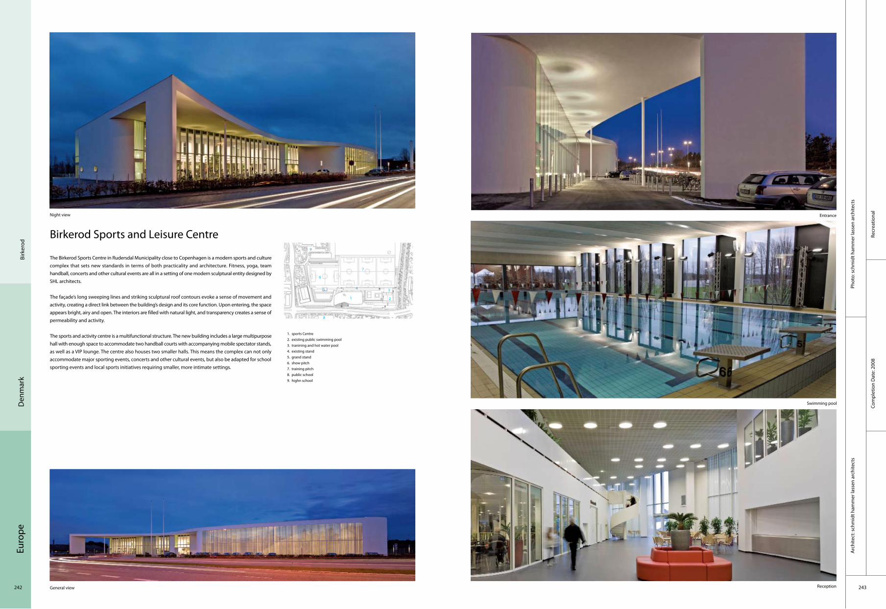
Euro
pe
242 243
Recr
eatio
nal
Com
plet
ion
Dat
e: 2
008
Phot
o: s
chm
idt h
amm
er la
ssen
arc
hite
cts
Arc
hite
ct: s
chm
idt h
amm
er la
ssen
arc
hite
cts
Birk
erod
Den
mar
k
Birkerod Sports and Leisure Centre
The Birkerod Sports Centre in Rudersdal Municipality close to Copenhagen is a modern sports and culture complex that sets new standards in terms of both practicality and architecture. Fitness, yoga, team handball, concerts and other cultural events are all in a setting of one modern sculptural entity designed by SHL architects.
The façade’s long sweeping lines and striking sculptural roof contours evoke a sense of movement and activity, creating a direct link between the building’s design and its core function. Upon entering, the space appears bright, airy and open. The interiors are filled with natural light, and transparency creates a sense of permeability and activity.
The sports and activity centre is a multifunctional structure. The new building includes a large multipurpose hall with enough space to accommodate two handball courts with accompanying mobile spectator stands, as well as a VIP lounge. The centre also houses two smaller halls. This means the complex can not only accommodate major sporting events, concerts and other cultural events, but also be adapted for school sporting events and local sports initiatives requiring smaller, more intimate settings.
Night view Entrance
Swimming pool
ReceptionGeneral view
1. sports Centre2. existing public swimming pool3. tranining and hot water pool4. existing stand5. grand stand6. show pitch7. training pitch8. public school9. highn school
4
1 2
3
7
9
6
8
5
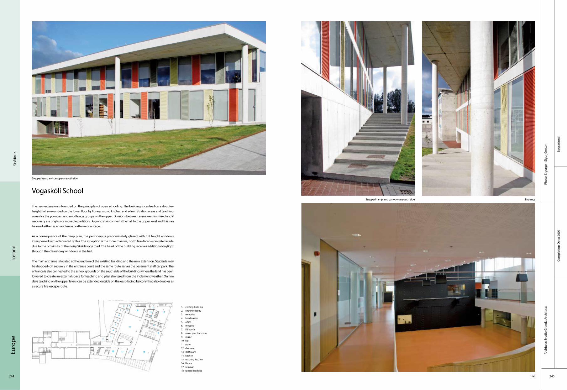
Euro
pe
244 245
Educ
atio
nal
Com
plet
ion
Dat
e: 2
007
Phot
o: S
igur
geir
Sigu
rjóns
son
Arc
hite
ct: S
tudi
o G
rand
a A
rchi
tect
s
Reyk
javí
kIc
elan
d
Vogaskóli School
The new extension is founded on the principles of open schooling. The building is centred on a double–height hall surrounded on the lower floor by library, music, kitchen and administration areas and teaching zones for the youngest and middle age groups on the upper. Divisions between areas are minimised and if necessary are of glass or movable partitions. A grand stair connects the hall to the upper level and this can be used either as an audience platform or a stage.
As a consequence of the deep plan, the periphery is predominately glazed with full height windows interspersed with attenuated grilles. The exception is the more massive, north fair–faced–concrete façade due to the proximity of the noisy Skeidavogs road. The heart of the building receives additional daylight through the clearstorey windows in the hall.
The main entrance is located at the junction of the existing building and the new extension. Students may be dropped–off securely in the entrance court and the same route serves the basement staff car park. The entrance is also connected to the school grounds on the south side of the buildings where the land has been lowered to create an external space for teaching and play, sheltered from the inclement weather. On fine days teaching on the upper levels can be extended outside on the east–facing balcony that also doubles as a secure fire escape route.
Stepped ramp and canopy on south side
Stepped ramp and canopy on south side Entrance
Hall
1. existing building2. entrance lobby3. reception4. headmaster5. office6. meeting7. DJ booth8. music practice room9. music10. hall11. store12. cleaners13. staff room14. kitchen15. teaching kitchen16. library17. seminar18. special teaching
4
1
23
7 9
6
8
5
4
5
6 2
10
11
1213
14
15
11
161718 17
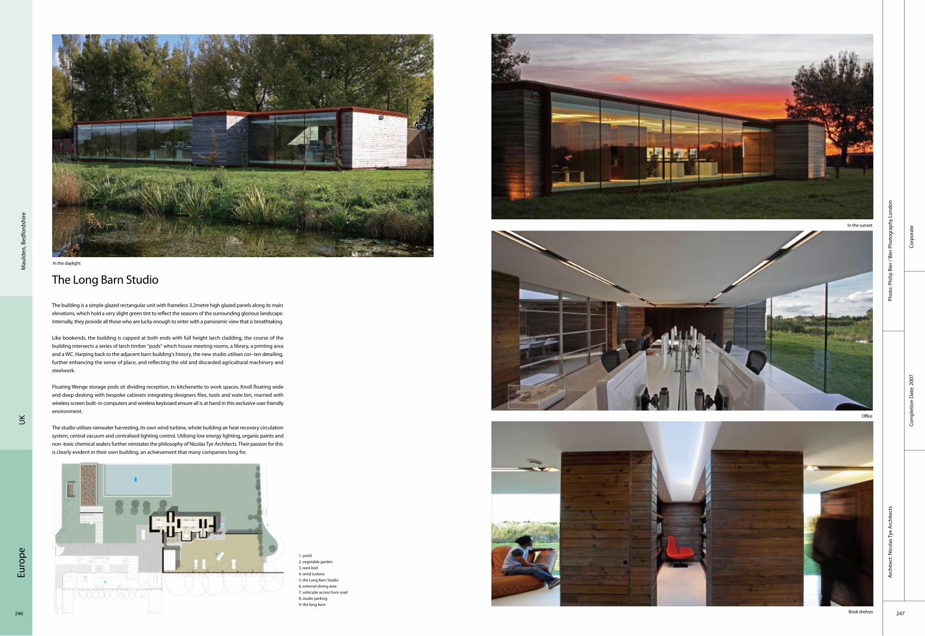
Euro
pe
246 247
The Long Barn Studio
The building is a simple glazed rectangular unit with frameless 3.2metre high glazed panels along its main elevations, which hold a very slight green tint to reflect the seasons of the surrounding glorious landscape. Internally, they provide all those who are lucky enough to enter with a panoramic view that is breathtaking.
Like bookends, the building is capped at both ends with full height larch cladding, the course of the building intersects a series of larch timber "pods" which house meeting rooms, a library, a printing area and a WC. Harping back to the adjacent barn building's history, the new studio utilises cor–ten detailing, further enhancing the sense of place, and reflecting the old and discarded agricultural machinery and steelwork.
Floating Wenge storage pods sit dividing reception, to kitchenette to work spaces, Knoll floating wide and deep desking with bespoke cabinets integrating designers files, tools and wate bin, married with wireless screen built–in computers and wireless keyboard ensure all is at hand in this exclusive user friendly environment.
The studio utilises rainwater harvesting, its own wind turbine, whole building air heat recovery circulation system, central vacuum and centralised lighting control. Utilising low energy lighting, organic paints and non–toxic chemical sealers further reinstates the philosophy of Nicolas Tye Architects. Their passion for this is clearly evident in their own building, an achievement that many companies long for.
Corp
orat
eCo
mpl
etio
n D
ate:
200
7
Phot
o: P
hilip
Bie
r / B
ier P
hoto
grap
hy L
ondo
nA
rchi
tect
: Nic
olas
Tye
Arc
hite
cts
Mau
lden
, Bed
ford
shire
UK
1. pond 2. vegetable garden3. reed bed4. wind turbine5. the Long Barn Studio6. external dining area7. vehicular access from road8. studio parking9. the long barn
4
12
3
7
9
6
8
5
In the sunset
Office
In the daylight
Book shelves

Euro
pe
248 249
University of Oxford New Biochemistry Building
The distinctive 12,000 m2 facility with its glass façades and coloured glass fins brings together 300 lecturers, researchers and students previously based in a number of separate buildings. Inside, a 400 m2
atrium with breakout spaces and specially commissioned artworks encourages collaboration between the researchers.
The Biochemistry Department at Oxford University is the largest in the UK and is internationally renowned for its research in the understanding of DNA, cell growth and immunity. Previously the department’s scientists have had to conduct research in outmoded buildings spread across the Science Area in the centre of Oxford.
The brief for the new building was to achieve a new ethos of "interdisciplinary working" where the exchange of ideas is promoted in a large collaborative environment. At the same time space was required to enable the research groups to focus on their cutting–edge work in state–of–the–art laboratories.
Exterior view
Coloured glass fins fixed vertically within the mullions wrap the full perimeter of the building The exterior glass façade around the entrance courtyard, with Nicky Hirst's artwork The Glass Menagerie.
Nicky Hirst's artwork Portal features on the glazed wall of the atrium The Atrium with the installation, 10,000,000 by Annie Cattrell
Educ
atio
nal
Com
plet
ion
Dat
e: 2
009
Phot
o: T
im C
rock
er (o
ppos
ite, t
op–l
eft)
, Kei
th C
ollie
(top
righ
t, bo
ttom
left
, bot
tom
righ
t)A
rchi
tect
: Haw
kins
\Bro
wn
Oxf
ord
UK
1. main laboratory2. write up spaces3. support/specialist laboratory4. atrium5. plant6. ancilliary space7. seminar/ meeting room8. café9. offices
4
1
2
3
7
9
68
5
13
2
3
5 56 6
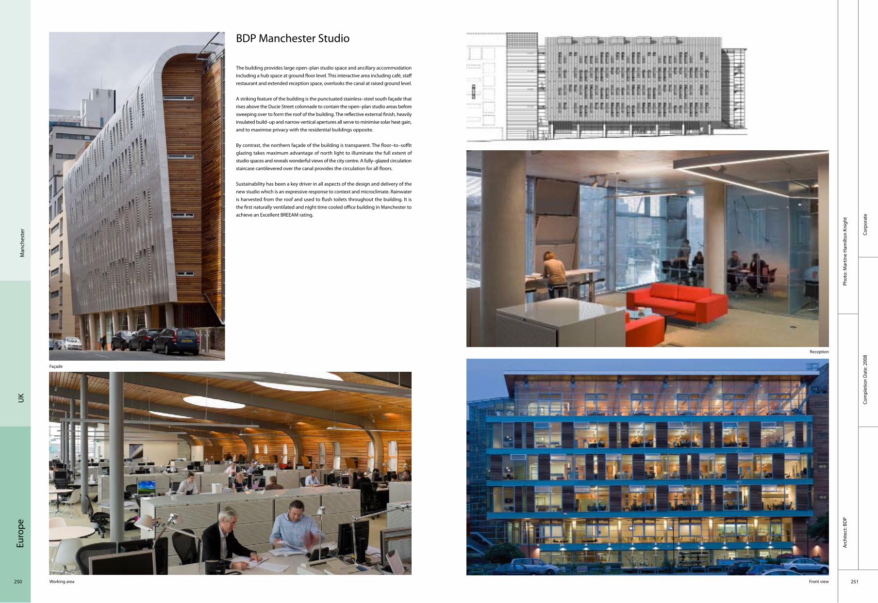
Euro
pe
250 251
Corp
orat
eCo
mpl
etio
n D
ate:
200
8
Phot
o: M
artin
e H
amilt
on K
nigh
tA
rchi
tect
: BD
P
UK
Man
ches
ter
BDP Manchester Studio
The building provides large open–plan studio space and ancillary accommodation including a hub space at ground floor level. This interactive area including café, staff restaurant and extended reception space, overlooks the canal at raised ground level.
A striking feature of the building is the punctuated stainless–steel south façade that rises above the Ducie Street colonnade to contain the open–plan studio areas before sweeping over to form the roof of the building. The reflective external finish, heavily insulated build–up and narrow vertical apertures all serve to minimise solar heat gain, and to maximise privacy with the residential buildings opposite.
By contrast, the northern façade of the building is transparent. The floor–to–soffit glazing takes maximum advantage of north light to illuminate the full extent of studio spaces and reveals wonderful views of the city centre. A fully–glazed circulation staircase cantilevered over the canal provides the circulation for all floors.
Sustainability has been a key driver in all aspects of the design and delivery of the new studio which is an expressive response to context and microclimate. Rainwater is harvested from the roof and used to flush toilets throughout the building. It is the first naturally ventilated and night time cooled office building in Manchester to achieve an Excellent BREEAM rating.
Façade
Working area
Reception
Front view

Euro
pe
252 253
Hos
pita
lCo
mpl
etio
n D
ate:
200
7
Arc
hite
ct: B
DP
Phot
o: D
avid
Bar
bour
Brig
hton
UK
Royal Alexandra Children’s Hospital
The site was a very tight handkerchief of land wedged between two roads and a number of existing buildings. Planning constraints dictated a maximum height. The very steep hill overlooking the Channel was the location’s great saving grace, affording a sunny panoramic sweep over the sea and historic Brighton. The introduction of an atrium at the heart of the hospital initially seemed unfeasible as it sacrificed a significant amount of area. Addressing this shortfall the designers generated the idea of bowing the building out as it grew upwards, which chimed nicely with the desirability of shallower plan spaces on the lower levels.
As the design began to take shape, it soon became known amongst the team as the "Children’s Ark", an image that crystallised a number of important themes: from the idea of a "sustainable" community centred around the family to the nautical spirit of Brighton and the boat–like form of the building. With its soft, rounded corners and sheltering roof, it projected a reassuring and optimistic image, around which the designers could integrate all the elements of the brief in a coherent and appealing way that would resonate with children, families and staff. At the centre of the hospital, the atrium binds all levels together, ensures good day–lighting throughout the building and creates a strong sense of the whole, which is immediately perceived by anyone entering the Alex or moving up through it in the public lifts.
4
1
2 3
5
1. main entrance2. café3. stairs4. adjoining main Hospital theatre block5. outpatients department
5

Euro
pe
254 255
Institute Of Cancer Studies, UCL
Conceptually, the building design was influenced by its role as a cancer institute and the relationship between science and the study of cancer. In particular there was an interest in the images that have been generated by the processes used in modern medical research and which have now become part of the culture. Images of cells, wave patterns and the chromosome permeate the forms of the building. For example, the terracotta louvre–bank suspended across the main façade has a rhythm that can not only be read as a vertical "bar code" configuration or genetic sequence image, but also reflect the waveform that is so significant to modern science. Likewise, concrete soffits are left exposed, retaining the details of their own construction and revealing points of reinforcement reflective of the mechanisms and cellular structures of biology: they are literally scooped out where the material serves no structural purpose.
The main entrance is located at the juncture between the reinstated wall flank of the Grade II listed building and the new Institute. This gap is glazed with a single glass sheet spanning from the new structure to the old. It reveals a highly engineered staircase that provides the main circulation core and an architectural focal point. The transparency of this circulation area articulates it as an open, shared space that is visually accessible from the street. This emphasises the Institute as a live and active building. The staircase itself consists of cast stainless steel treads cantilevered from a structural spine of pre–cast concrete to create a dramatic feature.
General view
Front view
Stairway
Corridor
Ground plan Section
Educ
atio
nal
Com
plet
ion
Dat
e: 2
007
Arc
hite
ct: G
rimsh
aw A
rchi
tect
sPh
oto:
Mar
k H
umph
ries
Lond
onU
K

Euro
pe
256 257
Educ
atio
nal
Com
plet
ion
Dat
e: 2
009
Phot
o: R
ós K
avan
agh
Arc
hite
ct: D
TA A
rchi
tect
sTe
am :
Colin
Mac
kay,
Der
ek T
ynan
, Der
mot
Rey
nold
s ,D
avid
Gra
ham
Sand
ford
UK
Multi–Purpose Hall, Sandford Park School
The Multi–Purpose Hall creates a new identity for the school from Sandford Road, advantageously reinforcing the school within its suburban context of Ranelagh. Located at the middle ground between the gate lodge and school house, it allowed for the insertion of a contemporary architectural volume to mediate between the different generations of school appendages.
The brief was to provide a multi–purpose hall for use by various school departments including sport; music; recitals, theatrical performance, examinations, assembly, and ancillary presentations. The space was for an equivalent Department of Education and Science 406m2 sports hall allowing for three badminton / single basketball court, with ancillary storage and changing facilities. Due to the context and functions, the quality of both internal and external acoustics was critical. Noise penetration onto neighbouring properties required an increase in the mass of internal walls and roof, and reverberation times internally were reduced through the softening of internal finishes.
Externally the expression of materiality has been reduced to enhance the juxtaposition between the hall and the immediate context. The use of a fibre cement cladding meant the entire form could be homogenously wrapped with only the entrance screen and Profilit glazing of the hall being inserted into the skin. A visual connection is created between the footpath and the hall through the suppression of the internal floor level. It is through this separation of ground that an enhanced spatial arrangement is made between the external school environment and the new hall.
Ground Floor Plan 1. plant 2. store 3. multipurpose hall 4. foyer
Upper Floor Plan 1. changing 12. changing 23. sports office
View form Sandford
Front elevation's night view
Entrance foyer exterior Exterior + interior connection
Foyer, assembly space
4
1
2
3
1
23
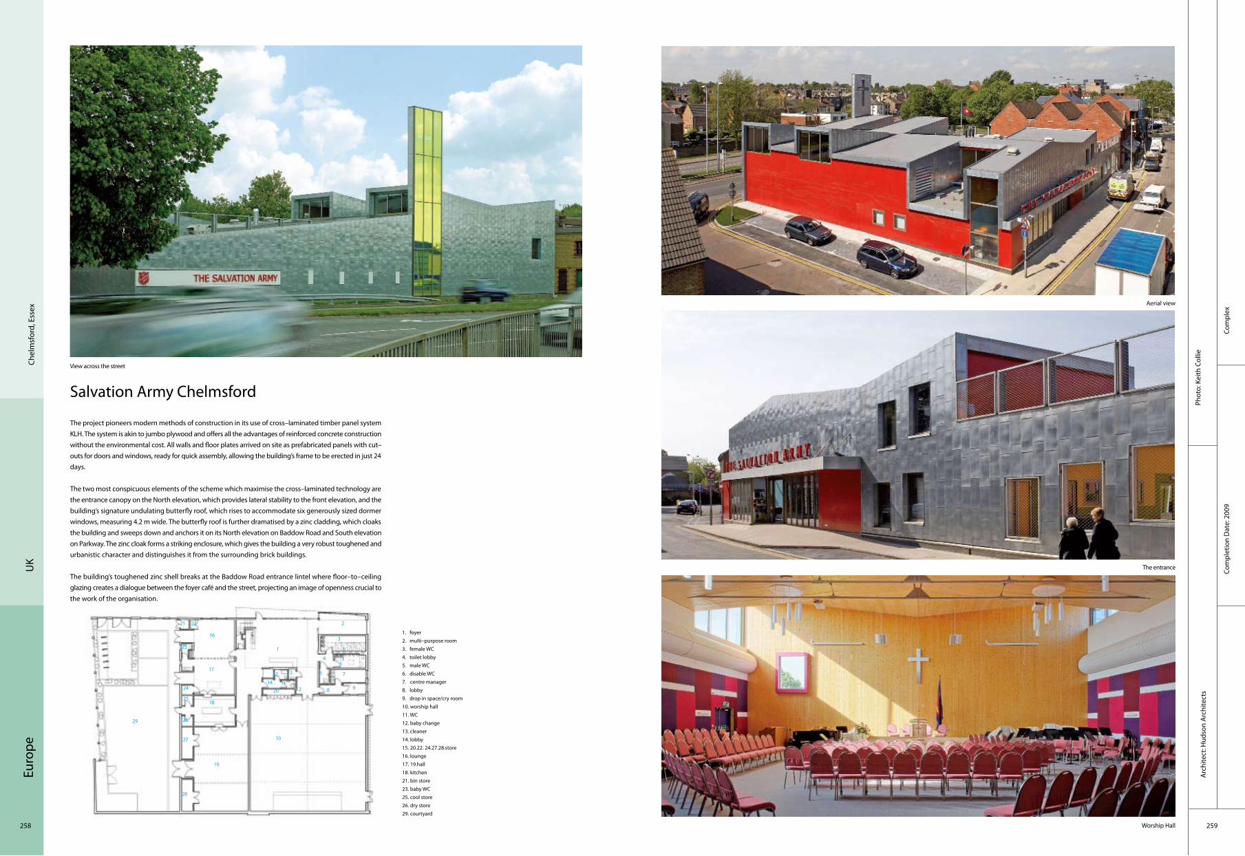
Euro
pe
258 259
Salvation Army Chelmsford
The project pioneers modern methods of construction in its use of cross–laminated timber panel system KLH. The system is akin to jumbo plywood and offers all the advantages of reinforced concrete construction without the environmental cost. All walls and floor plates arrived on site as prefabricated panels with cut–outs for doors and windows, ready for quick assembly, allowing the building’s frame to be erected in just 24 days.
The two most conspicuous elements of the scheme which maximise the cross–laminated technology are the entrance canopy on the North elevation, which provides lateral stability to the front elevation, and the building’s signature undulating butterfly roof, which rises to accommodate six generously sized dormer windows, measuring 4.2 m wide. The butterfly roof is further dramatised by a zinc cladding, which cloaks the building and sweeps down and anchors it on its North elevation on Baddow Road and South elevation on Parkway. The zinc cloak forms a striking enclosure, which gives the building a very robust toughened and urbanistic character and distinguishes it from the surrounding brick buildings.
The building’s toughened zinc shell breaks at the Baddow Road entrance lintel where floor–to–ceiling glazing creates a dialogue between the foyer café and the street, projecting an image of openness crucial to the work of the organisation.
View across the street
Aerial view
The entrance
Worship Hall
Chel
msf
ord,
Ess
exU
K
1. foyer2. multi–purpose room3. female WC4. toilet lobby5. male WC6. disable WC7. centre manager8. lobby9. drop in space/cry room10. worship hall11. WC12. baby change13. cleaner14. lobby15. 20.22. 24.27.28.store16. lounge17. 19.hall18. kitchen21. bin store23. baby WC25. cool store26. dry store29. courtyard
Com
plex
Com
plet
ion
Dat
e: 2
009
Phot
o: K
eith
Col
lieA
rchi
tect
: Hud
son
Arc
hite
cts
4
11
2
3
7
9
6
8
5
1
10
2
3
12
14
13
19
20
18
17
16
29
21 22
23
24
25
26
27
28
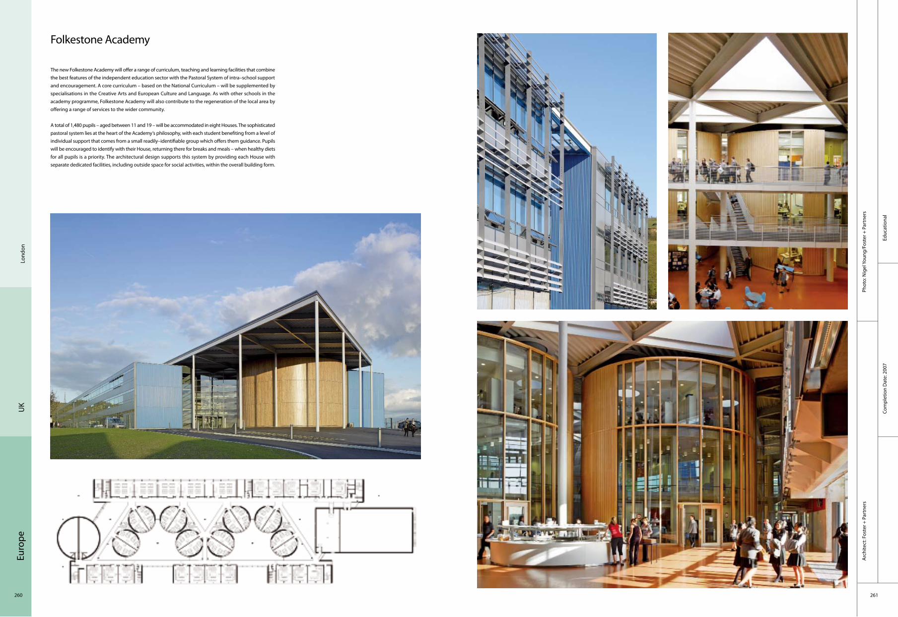
Euro
pe
260 261
Educ
atio
nal
Com
plet
ion
Dat
e: 2
007
Phot
o: N
igel
You
ng/F
oste
r + P
artn
ers
Arc
hite
ct: F
oste
r + P
artn
ers
Lond
onU
K
Folkestone Academy
The new Folkestone Academy will offer a range of curriculum, teaching and learning facilities that combine the best features of the independent education sector with the Pastoral System of intra–school support and encouragement. A core curriculum – based on the National Curriculum – will be supplemented by specialisations in the Creative Arts and European Culture and Language. As with other schools in the academy programme, Folkestone Academy will also contribute to the regeneration of the local area by offering a range of services to the wider community.
A total of 1,480 pupils – aged between 11 and 19 – will be accommodated in eight Houses. The sophisticated pastoral system lies at the heart of the Academy‘s philosophy, with each student benefiting from a level of individual support that comes from a small readily–identifiable group which offers them guidance. Pupils will be encouraged to identify with their House, returning there for breaks and meals – when healthy diets for all pupils is a priority. The architectural design supports this system by providing each House with separate dedicated facilities, including outside space for social activities, within the overall building form.

Euro
pe
262 263
Educ
atio
nal
Com
plet
ion
Dat
e: 2
007
Phot
o: A
ndre
w L
eeA
rchi
tect
: gm
+ad
arch
itect
s
Gla
sgow
UK
Hazelwood School
Hazelwood School is an education facility for up to 60 students with multiple disabilities. The students are aged between 3 and 19 and the school provides education from nursery through to secondary stages. The school itself and the Life Skills House (an independent facility used for life learning and respite) have a combined area of 2,665 m2 and are set within a landscaped green adjacent to Bellahouston Park.
The design of the building has focused on creating a safe, stimulating environment for its pupils and staff. The focus and ambition from both client and architect at the outset was to develop a building that would eliminate as much as possible the institutional feel that a project of this nature inherently possesses. The designers worked to avoid conventional/standard details, creating a solution bespoke to the project requirements and developing a building that entirely embodied the users’ needs.
The existing site was surrounded by mature lime trees and had a large lime tree and three beach trees in the centre. The building snakes through the site, curving around the existing trees. Its form creates a series of small garden spaces suitable to the small class sizes and maximises the potential for more intimate external teaching environments. Internally the curved form of the building reduces the visual scale of the main circulation spaces and helps remove the institutional feel that one long corridor would create – in addition, this also significantly reduces visual confusion by limiting the extents of the space.
Aerial view of school
North elevation
Aerial view of school
Sensory wall designed to aid mobility training
1. hydrotherapy pool2. shower3. gym4. physiotherapist room5. disabled WC6. doctors room7. kitchen8. depute head teacher9. head teacher10. staff entrance11. dining/multi–purpose space/assembly12. staff room
1
2
3
4
5
7
10
9812
6
11

Euro
pe
264 265
Educ
atio
nal
Com
plet
ion
Dat
e: 2
008
Phot
o: N
igel
You
ng/F
oste
r + P
artn
ers
Arc
hite
ct: F
oste
r + P
artn
ers
Lond
onU
K
Langley Academy
The Langley Academy is an exemple of sustainable design, a theme which is showcased by the building itself. The Academy’s curriculum highlights rowing, cricket and science and is the first academy to specialise in museum learning. As well as running its own museum, ancient artefacts and objects are brought into the classroom to spark questions, debate, analysis and provide connections across the curriculum. The scheme also provides unparallelled access to significant cultural institutions across the country, involving hundreds of students.
With an enclosed full–height atrium at the heart of the three–storey building, the social life of the school revolves around this assembly space for 1,100 students. A recurrent element in several other Foster + Partners’ academy buildings, the atrium is defined by a sense of transparency and openness – like a gallery of learning – which in this case also resonates with the museum theme. Inside the atrium there are three yellow drums raised above the floor on circular columns. These two–storey pods house the Academy’s ten science laboratories, reinforcing the importance of science teaching. A dedicated sports and culture block contains specialist facilities for music and drama including a fully–equipped theatre, a TV and sound recording studio, soundproof practice rooms and a rehearsal space, sports hall and lecture theatre. The academy’s two light and airy covered streets extend from the atrium and are lined with 38 classrooms.
Ground Floor Plan 1. stairs 2. WC3. multi–purpose hall
1
2
3
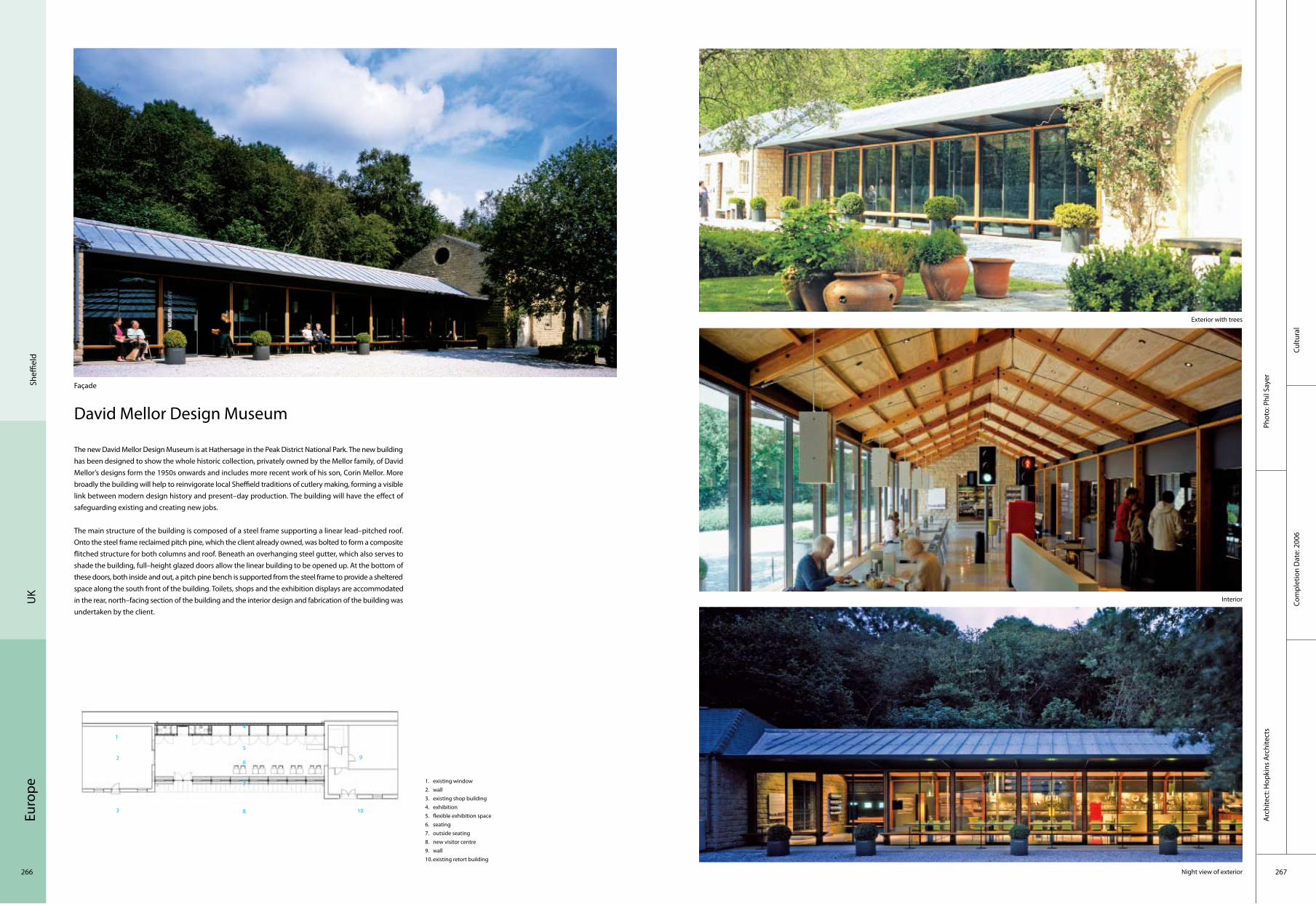
Euro
pe
266 267
Cultu
ral
Com
plet
ion
Dat
e: 2
006
Phot
o: P
hil S
ayer
Arc
hite
ct: H
opki
ns A
rchi
tect
s
Sheffi
eld
UK
David Mellor Design Museum
The new David Mellor Design Museum is at Hathersage in the Peak District National Park. The new building has been designed to show the whole historic collection, privately owned by the Mellor family, of David Mellor’s designs form the 1950s onwards and includes more recent work of his son, Corin Mellor. More broadly the building will help to reinvigorate local Sheffield traditions of cutlery making, forming a visible link between modern design history and present–day production. The building will have the effect of safeguarding existing and creating new jobs.
The main structure of the building is composed of a steel frame supporting a linear lead–pitched roof. Onto the steel frame reclaimed pitch pine, which the client already owned, was bolted to form a composite flitched structure for both columns and roof. Beneath an overhanging steel gutter, which also serves to shade the building, full–height glazed doors allow the linear building to be opened up. At the bottom of these doors, both inside and out, a pitch pine bench is supported from the steel frame to provide a sheltered space along the south front of the building. Toilets, shops and the exhibition displays are accommodated in the rear, north–facing section of the building and the interior design and fabrication of the building was undertaken by the client.
Façade
Exterior with trees
Interior
Night view of exterior
1. existing window2. wall3. existing shop building4. exhibition5. flexible exhibition space6. seating 7. outside seating8. new visitor centre9. wall10.existing retort building
1
2
3
4
5
7
10
9
8
6

Euro
pe
268 269
Educ
atio
nal
Com
plet
ion
Dat
e: 2
005
Phot
o: A
lan
Lai o
f Als
op D
esig
n Lt
d , R
oder
ick
Coyn
e of
Als
op D
esig
n Lt
d.A
rchi
tect
: Als
op
Lond
onU
K
Fawood Children’s Centre
The Fawood Children’s Centre is an integral part of the overall masterplan for the Stonebridge estate, in Harlesden North London. Planned demolition of the neighbouring housing blocks took place in 2007 and a new park was developed. The Fawood Children’s Centre is sited within the new parkland where acts as a focal point in the landscape. It was proposed that the new park will include nature trails and adventure play areas, and that the play areas within the park be located adjacent to the Children’s Centre for shared use.
The Children’s Centre is located adjacent to the site for a proposed new Health and Community building, also designed by Alsop, which is intended to be an important community focus within the overall regeneration of Stonebridge.
The brief from Stonebridge Housing Action Trust (HAT) was for a nursery school that would replace and expand existing nursery and community facilities on the Estate. The new Fawood Children’s Centre, was to provide, under one roof a nursery for 3–5 year olds: nursery facilities for autistic and special needs children, and a Children’s Centre with adult learning services – a base for community education workers and consultation services. This brief was in line with the Government’s Sure Start proposals, which advocate combining, within one facility, play and educational experiences for nursery age children, with supporting amenities for the local community, parents and childcare workers.
1
2
3
45
7
10
9
8
6
11
12
1. entrance deck2. reception lobby3. administration/deputy head teacher office4. head teacher office5. meeting / office6. kitchen 7. cloarkroom /children WC8. unisex disabled WC9. nurserry accommodetion10.existing retort building11. bin store12. nursery accommodation: yurt
SouthWest DayView
Yurt
South elevation Stage

Euro
pe
270 271
Educ
atio
nal
Com
plet
ion
Dat
e: 2
007
Phot
o: A
ntho
ny W
elle
rA
rchi
tect
: Hop
kins
Arc
hite
cts
Dor
set
UK
Bryanston School
The New Science School is located within the picturesque grounds of Bryanston School. It houses the three main science disciplines, part of the maths department, and a shared lecture theatre.
The semi–circular plan for the building grew out of the aspiration to conclude the formal axis of the Norman Shaw main building and its later additions, whilst addressing the informal series of individual buildings along the route of the main drive. The three–storey building makes use of the naturally sloping landscape by having the main entrance on the middle floor so that only two levels are visible from the main school courtyard. The building focuses on a central south–facing science garden that features a pond and geodesic greenhouse.
The building has a simple construction of load–bearing brick and block walls, concrete floor slabs and a zinc–clad pitched roof. The main façade to the inner courtyard is solid load–bearing brickwork in English Bond using a high lime–content mortar. The concrete floors bear via pads onto brickwork piers, and flat arches span above window openings.
1. new science school2. main building3. CDT4. Coade hall5. arts and drama6. art school7. music school8. estates9. future music school
Main façade
External view
External walkway
External view
1
2
3
4
5
7
9
8
6

Euro
pe
272 273
Educ
atio
nal
Com
plet
ion
Dat
e: 2
008
Phot
o: G
aret
h G
ardn
erA
rchi
tect
: Urb
ansa
lon
Arc
hite
cts
Corn
wal
lU
K
Falmouth School Design & Technology Building
Designed by Urban Salon, the project came out of the Sorrell Foundation’s ‘joined up design for school programme where pupils are given control and responsibility as clients. The 95 m2 extension is a solid prefabricated cross–laminated timber construction with the timber exposed to the interior and standing seam pre–weathered zinc to the exterior. The timber structure was chosen for its environmental performance and was designed with half lap joints and has no visible fixings in the building. The ceiling within the extension rises from 3.2 m to 5.2 m, allowing even north light to flood the space, and creates the distinctive saw–tooth form of the building. The only steel structural elements are T–sections that support the ridge of the roof panels from the timber beams below. Specialist contractor KLH manufactured the timber structure off site. This modular construction method meant that the structure was assembled on site within two weeks.
The existing Design & Technology studio was upgraded as part of the scheme. The refurbishment rather than wholescale removal of the existing workshops had the added benefit of less waste and lower embodied energy in building materials required. Coupled with the use of the prefabricated elements, this led to less construction time and less disruption to students and their education. The existing block now has a new roof, wood–fibre insulation, double glazing to prevent heat loss in winter and solar shading to the south of the building to prevent summer overheating. 1. design studio extension
2. original design technology block a3. original design technology block b4. main school buildings5. pedestrian entrance6. polycarbonate canopy above7. new pathway with markings8. new disabled toilet9. existing covered walkway
1
2 3
5
6
7
8
9
4
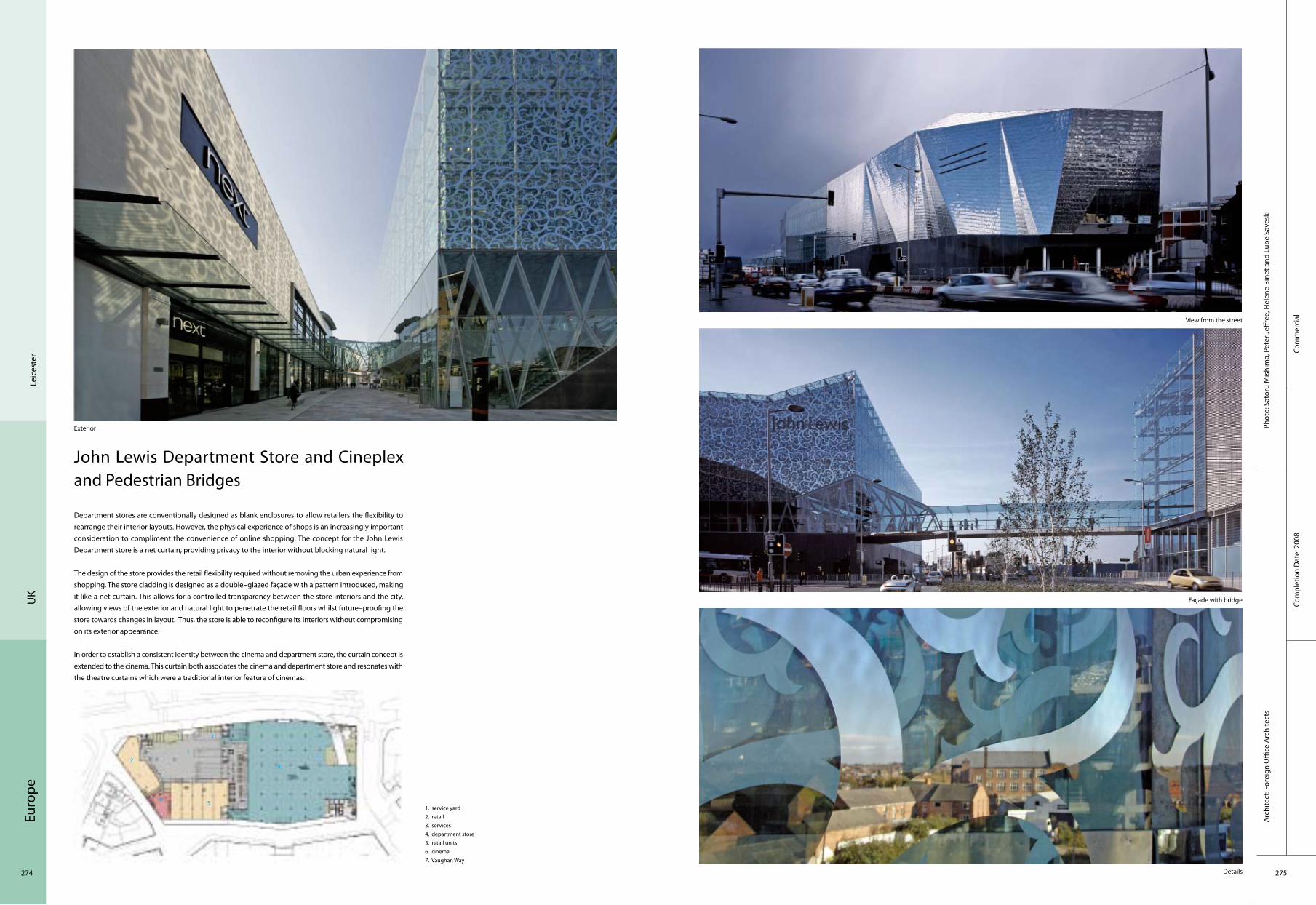
Euro
pe
274 275
Com
mer
cial
Com
plet
ion
Dat
e: 2
008
Phot
o: S
ator
u M
ishi
ma,
Pet
er Je
ffree
, Hel
ene
Bine
t and
Lub
e Sa
vesk
iA
rchi
tect
: For
eign
Offi
ce A
rchi
tect
s
Leic
este
rU
K
John Lewis Department Store and Cineplex and Pedestrian Bridges
Department stores are conventionally designed as blank enclosures to allow retailers the flexibility to rearrange their interior layouts. However, the physical experience of shops is an increasingly important consideration to compliment the convenience of online shopping. The concept for the John Lewis Department store is a net curtain, providing privacy to the interior without blocking natural light.
The design of the store provides the retail flexibility required without removing the urban experience from shopping. The store cladding is designed as a double–glazed façade with a pattern introduced, making it like a net curtain. This allows for a controlled transparency between the store interiors and the city, allowing views of the exterior and natural light to penetrate the retail floors whilst future–proofing the store towards changes in layout. Thus, the store is able to reconfigure its interiors without compromising on its exterior appearance.
In order to establish a consistent identity between the cinema and department store, the curtain concept is extended to the cinema. This curtain both associates the cinema and department store and resonates with the theatre curtains which were a traditional interior feature of cinemas.
1. service yard2. retail3. services4. department store5. retail units6. cinema7. Vaughan Way
Exterior
View from the street
Façade with bridge
Details
12
3
4
5
7
6

Euro
pe
276 277
Educ
atio
nal
Edin
burg
hU
K
Com
plet
ion
Dat
e: 2
009
Phot
o: R
icha
rd M
urph
y A
rchi
tect
s Lt
d.
Arc
hite
ct: R
icha
rd M
urph
y, Ja
mes
Mas
on, D
omin
ik G
eorg
e
Edinburgh Academy – New Nursery and After School Facility
The nursery is arranged entirely on the ground floor and the main teaching accommodation is in three linked rooms, one of which, for the two to three–year–old group, is capable of sub–division. Each of these rooms gives onto landscaped play terraces and also has external covered space and internal bay window spaces. In the centre of the plan are all the necessary services and storage and on the entrance elevation is a large cloakroom arrival point for distributing the children to the different classrooms. The entrance lobby is supervised by the staff room for security. A small dining room and kitchen is also shown for the use of the two to three year olds; the remainder of the children use the junior school’s refectory facilities.
The After School and Holiday Care facilities for older children are also to be relocated on the first floor above the new nursery school and these consist of a series of linked rooms for group and individual activities. A floating roof covers the whole building with a line of roof light illuminating the circulation in the middle of the plan.
1. park2. landscape3. dining4. entrance5. WC
1
2
3
4
5

Euro
pe
278 279
Hos
pita
lCo
mpl
etio
n D
ate:
200
9
Phot
o: R
icha
rd M
urph
y A
rchi
tect
s Lt
d.
Arc
hite
ct: R
icha
rd M
urph
y A
rchi
tect
s Lt
d.
Stratheden 18 Bed Dementia and Mental Health Unit
The proposal is to provide a low security residential dementia unit in the grounds of Stratheden Hospital. The accommodation consists of 18 single bedrooms with en–suite shower rooms and associated accommodation for both patients and staff. The building is single storey with a U–shaped plan. Bedrooms are split into the two wings and the communal facilities located centrally. The whole building focuses on a south–facing secure garden for patients with the southern edge of the garden walled and framing the view south towards Walton Hill and White Hill. The design allows for patients to wander freely around the building and into the secure sensory garden. The circulation around the garden has small alcoves with built–in seating for patients to stop and sit and look out into the garden.
Each bedroom has a bay window with views out into the grounds of Stratheden. Secondary light comes into each individual room via a roof light located below the pitched roof ridge line. Each bedroom is identifiable by individual pitched roofs giving the patients a sense of their own identity within the building. All the other accommodation and circulation areas have flat roofs at different heights.
Exterior
Courtyard
Garden
Reception
1. bedroom2. patient areas3. staff/consulting4. services
1
2
3
4
3
3
3
3
3
33
3
3
33
3
3
1 1 1
1
1
1
2 2
2
2 2
Scot
land
U
K

Euro
pe
280 281
Educ
atio
nal
Com
plet
ion
Dat
e: 2
009
Phot
o: R
icha
rd M
urph
y A
rchi
tect
s Lt
d.A
rchi
tect
: Ric
hard
Mur
phy
Arc
hite
cts
Ltd.
UK
Kirkintilloch Adult Learning Centre
The aim of the project was to provide an open learning environment which draws in potential students from all sectors of society and to provide a new home for the classes already located within Kirkintilloch by Strathkelvin Further Education Centre.
The building is laid out as a linear plan with a two–storey block to the south side housing classrooms and offices. Against this sits a lean–to structure which houses the open learning facilities and projects out onto the canal bank.
The entrance to Phase 1 (previously to one end of the linear plan) is now positioned in the centre of the completed building. The reception orientates the visitor and first–time student within the main double–height space, allowing a clear reading of the building to be made with the majority of the classrooms and computer resource space to the left and the café and other administration offices to the right. A void behind the reception, through which the stair descends past a seated area, which protrudes out over the canal, makes connection to the lowest level which houses the open resource areas.
General view
Exterior detail Entrance
Adult Learning space
Edin
burg
h
1. entrance2. WC3. services4. stair
1
2
3
4

Euro
pe
282 283
Cultu
ral
Com
plet
ion
Dat
e: 2
009
Phot
o: N
ikhi
lesh
Hav
alA
rchi
tect
: Jes
tico
+ W
hile
s
Lond
onU
K
Wakering Road Foyer
Wakering Road Foyer provides 116 bedsits for disadvantaged young people. The foyer tackles social exclusion among vulnerable 16 to 25–year–old through housing and training programmes that transform their lives. It accommodates young people with a range of support needs, including young parents, ex–drug users, wheelchair users and those with minor mental–health difficulties. Residents spend up to two years there to gain independence before moving on to a home of their own.
The massing allows sunlight into all of the dwellings, distances the dwellings and offices from the noise of Northern Relief Road, and reinforces the street edges. The L–shaped building, made up of a two– and a nine–storey block, creates a sheltered garden at ground level and a sunny roof garden. The interaction of the two– and nine–storey blocks is expressed by two distinct materials. Fibre–reinforced–concrete rainscreen cladding dresses the taller wing, while curtain walling defines the low–lying wing.
The landscaped garden is for residents and staff, with a secure play area reserved for the adjacent crèche. Trees and an existing embankment screen the garden from Northern Relief Road. The second–floor roof garden, for the young parents and their babies, includes a lawn and "living roof" to encourage biodiversity, as well as a pavilion for all–weather use. The landscaping promotes sustainable urban drainage, reducing surface–water run–off with planting and permeable paving.
General view
View from street Main entrance
Main entrance of outside
1. reception2. refuse room3. office for partner organizations4. public WC5. crèche
1
2
34
5

Euro
pe
284 285
Cultu
ral
Arc
hite
ct: C
harle
s Ba
rcla
y A
rchi
tect
sPh
oto:
Dav
id G
rand
orge
Com
plet
ion
Dat
e: 2
008
Kiel
der F
ores
tU
K
Kielder Observatory
The design brief called for an inexpensive building, not only suitable to house two telescopes and a warm room, primarily intended for amateurs and outreach work, but also suitable for scientific research. The design had to achieve a positive relation to the exposed setting on top of Black Fell overlooking Kielder Water and had to include both the facilities needed in this remote site and a "social space" for interaction and presentations, while being accessible both literally and culturally.
Timber was chosen as the material for the observatory early in the design process. Besides being a low carbon material and the obvious relation to its forest setting, the architects wanted a low–tech engineering aesthetic for the observatory, the opposite of the NASA–inspired world of high tech, high–expense and exclusive science. Instead, the architects wanted to evoke the curious, ad hoc structures that have served as observatories down the ages, and to the timber structures of the rural/industrial landscape at Kielder, the pit props of small coal mines and the timber trestle bridges of the railway that served them. The architects felt that a beautifully handcrafted timber building with "Victorian" engineering would be more inspiring in this setting than seamless, glossy domes.
North view
Southwest view
RotatedTelescope
1. forestry plantation2. parking3. wind turbine4. observatory
1
2
3 4
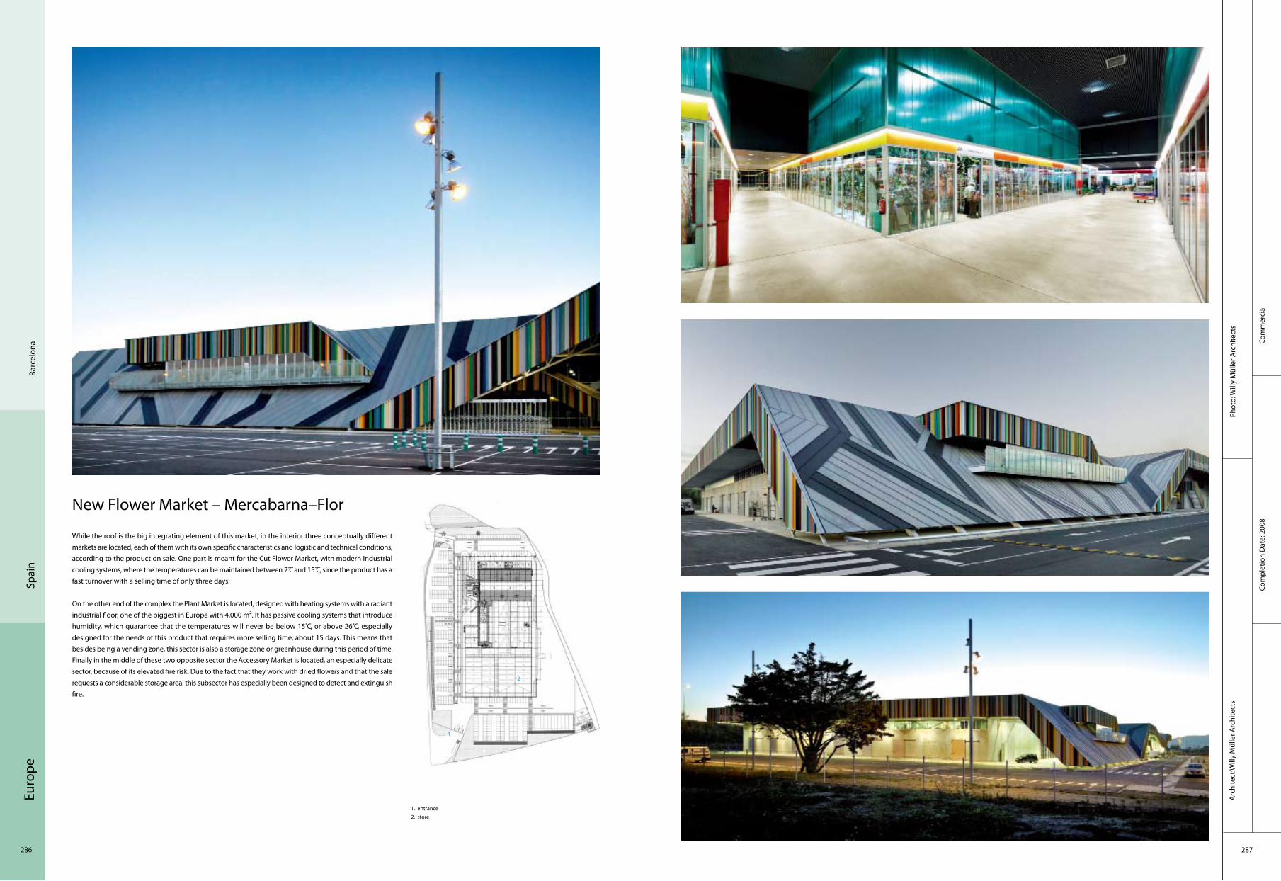
Euro
pe
286 287
Com
mer
cial
Phot
o: W
illy
Mül
ler A
rchi
tect
sA
rchi
tect
:Will
y M
ülle
r Arc
hite
cts
Com
plet
ion
Dat
e: 2
008
Spai
nBa
rcel
ona
New Flower Market – Mercabarna–Flor
While the roof is the big integrating element of this market, in the interior three conceptually different markets are located, each of them with its own specific characteristics and logistic and technical conditions, according to the product on sale. One part is meant for the Cut Flower Market, with modern industrial cooling systems, where the temperatures can be maintained between 2 C̊ and 15 C̊, since the product has a fast turnover with a selling time of only three days.
On the other end of the complex the Plant Market is located, designed with heating systems with a radiant industrial floor, one of the biggest in Europe with 4,000 m². It has passive cooling systems that introduce humidity, which guarantee that the temperatures will never be below 15 C̊, or above 26 C̊, especially designed for the needs of this product that requires more selling time, about 15 days. This means that besides being a vending zone, this sector is also a storage zone or greenhouse during this period of time.Finally in the middle of these two opposite sector the Accessory Market is located, an especially delicate sector, because of its elevated fire risk. Due to the fact that they work with dried flowers and that the sale requests a considerable storage area, this subsector has especially been designed to detect and extinguish fire.
1. entrance2. store
1
2

Euro
pe
288 289
Corp
orat
eCo
mpl
etio
n D
ate:
200
9
Phot
o: R
afae
l de
La–H
oz C
asta
nys
Arc
hite
ct: R
afae
l de
La–H
oz C
asta
nys
Spai
nCa
diz
Torres de Hércules
Located in the Bay of Algeciras (Cadiz), the new construction, which is surrounded by a man–made lake, is comprosed of two identical 20–storey cylindrical towers, joined by a crystalline prism which houses the hallways connecting the two buildings. Its outer appearance is configured by the structure of the building, a gigantic lattice which completely surrounds the perimeter. There are the giant letters of the legend "Non Plus Ultra". Their job is to protect the inside of the building from excess solar radiation while providing panoramic views of the Bay of Algeciras, the Rock of Gibraltar, and the Serrania. This grid extends past the building’s limits, as a "unique element" protecting the terrace roof–top deck, while at the same time acting as a base for possible energy collecting and telecommunications systems. On the top floor, 80 metres up, will be a lookout restaurant. Above this, a panoramic roof–top deck will boast unique views over the Straight of Gibraltar, Mount Musa and the Alcornocales Natural Park. The building has a main entrance for pedestrians and cars which provides a clear view of the towers. The 200–spot ground–level parking lot is located on the other side of the towers and is organised around a landscaped area.
Overall view Side look Details Stairs
Inside view
1. main entrance/canopy2. entrance lobby3. side entrance/bridges4. reception5. lift lobby6. cafeteria/bar7. commercials8. terrace9. water
1
2
3
4
57 65
3
33
89

Euro
pe
290 291
Corp
orat
eCo
mpl
etio
n D
ate:
200
9
Phot
o: A
lejo
Bag
uéA
rchi
tect
: Car
los
Ferr
ater
– N
úria
Aya
la
Cast
elló
nSp
ain
The Azahar Group Headquarters
The parent company originated from Castellón and, given its growth and expansion, was eager to have a corporate headquarters that would reflect its environmental and artistic commitment. With this as a framework and with the availability of a 5.6–hectare piece of land next to the N–340 highway, Half way between Castellón and Benicàssim, the project contemplates three interventions: the covered greenhouses and exterior nursery plantations; a building for services complementary to the activities developed by the company; and the group’s corporate headquarters.
The headquarters is erected as an icon building maintaining a close relationship with the landscape. To both the north and west, the topography of the mountains serves as a backdrop for the building, against which the geometrical roofs repeatedly stand out. From a distance their facetted shape and outline help situate the building in the landscape. Orientated on the east–west axis, the building is structured as two wings united by a central body around two open patios of a very different sort. The first as a "parade ground" or external reception area for users and visitors, and the rear one landscaped and for more private use. The four wings that accommodate the company’s different departments converge in a main hall which, as well as acting as a distributor, is a large exhibition space.
An important environmental feature of the building is the channelling of water from all the roofs and the outside areas to a cistern–reservoir, the latter being used in the watering of exteriors and nursery plantings on the plot of land.
Azahar Groupground floor–plan1. office2. toilet
Exterior
Exterior
Night view of the exterior
Outside view of interior office
Interior lobby
1
2

Euro
pe
292 293
Corp
orat
eCo
mpl
etio
n D
ate:
200
7
Phot
o: C
arlo
s Ca
sarie
goA
rchi
tect
: Ric
ardo
Bofi
ll Ta
ller D
e A
rqui
tect
ura
Barc
elon
aSp
ain
Abertis Headquarters
The brand–new building for Abertis, the second phase of Barcelona’s "Logistic Parc", a 11,000 m2 office building accommodates in its 5 floors the different business areas of the company.
The Abertis building is a part of a whole new–edge landscape, and three buildings with a continuous façade to the Ronda Litoral, form an interior plaza that conforms a patio protected from the highway. In this new phase three buildings conform an angled façade towards the highway, a dynamic, solid and transparent façade, in an attempt to capture the paradoxes of a new urban landscape.
It is an optimised ground plan with a feature, central greek cross–shaped open space. This space allows access from the lobby to the flexible working zones. It has some elements in common. The efficiency ratios exist from the beginning, reflecting the relationship between the gross and the usable space as ratio, the result of studies on economical and architectural functionality for a building.
There is a strong tendency to reduce price and quality. Of course, ask some of them, for example, Dior, Cartier, Rochas, Shiseido, Parisbas, Swift, JP Morgan, AXA and Chateau Lafitte Rothschild: all these companies have multiplied the final value of their buildings. The double skin façade was proposed some years ago, and has been used in many projects. Even though it was inspired, only ideally, in the great Egyptian or Medieval historical walls, the double glass façade has in common with these walls the element of thickness, acting as container, as barrier. We don’t find these components in the single glass walls.
General night view
General day time view
Façade details Interior view
1. local control system2. installation mechanism3. installation electricity4. local maintenance5. installation telecommunications
1 2 34
5

Euro
pe
294 295
Recr
eatio
nal
Com
plet
ion
Dat
e: 2
008
Phot
o: P
edro
Peg
enau
te, R
olan
d H
albe
Arc
hite
ct: F
ranc
isco
José
Man
gado
Bel
oqui
Ore
nse
Spai
n
Orense Swimming Pools for Vigo University
The plot chosen is at the highest point of the university campus, a location that gives it a special value in the relationship between the city of Orense and the campus, currently encumbered by the presence of a busy road between them. Opting for a programme orientated towards leisure, and that may thereby serve both the university community and the people of Orense, it will help to heighten the value of the building as an element of urban interaction.
This special location has inspired the main conceptual and formal decisions of the project. The proposal is drawn up as a vast platform that looks onto the campus, and the whole organisation of functions is indebted to this idea. The users will be able to see the campus and its buildings from this raised platform containing the swimming pools. The platform is designed with bold projections supported by a strong base that, aside from spanning the existing drops, shapes the pools and contains all the water treatment services and necessary systems for the correct performance of the programme. The contrast between this massive, topographic base and the cantilevering light glass surfaces surrounding the public level of swimming pools is one the basic formal arguments of the project.
Exterior
General view
Exterior
Swimming pool
Swimming pool
1. swimming pool a2. swimming pool b3. rest room4. ladder5. personnel room6. administration office7. men’s room and showers8. women’s room and showers9. rest hall
1
2
3
4
7
65
8
9
4

Euro
pe
296 297
Cultu
ral
Com
plet
ion
Dat
e: 2
009
Phot
o: P
edro
Peg
enau
te, C
esar
San
Mill
ánA
rchi
tect
: Fra
ncis
co M
anga
do /
Man
gado
y A
soci
ados
Vito
riaSp
ain
Archeological Museum of Álava
The building adjoins the Palace of Bendaña, today the Naipes Fournier museum. Access to the building is through the same courtyard that leads to the Palace and conveys the full scope of the project. The proposal includes extending the courtyard surface area in order to upgrade the access area. This does not encroach on the whole court, however, taking only a narrow strip for an appendix perpendicular to the main building. As well as housing auxiliary programmes, this addition provides a more attractive access façade than the current party walls of the neighbouring constructions. Thanks to the sloping terrain, the courtyard is reached through a bridge over a garden that allows light to penetrate to the lower areas that otherwise would be permanently in shadow.
The areas housing the various activities, including the library and workshops, are located on the ground level orientated towards the street, and have an independent access. The assembly hall and galleries for temporary exhibitions are on the same level as the public entrance shared with the Naipes Fournier museum. The permanent exhibition halls are on the upper levels. The stairs linking the different levels define part of the façade onto the access courtyard. The outer walls comprise a series of different layers. The façade facing the access courtyard is bronze grilles, a material with clear archaeological references. In the middle, a double–layered wall of silkscreen printed glass contains the stairs that offer visitors views of the courtyards. In contrast, the façade fronting the street is more hermetic, comprising an outer layer of opaque prefabricated bronze louvres, with openings where needed, and an inner layer formed by a thick wall containing the display cabinets and systems. In this way the internal exhibition spaces are unencumbered and only traversed by translucent light prisms.
General view
Cast bronze pieces configure the outer façades that define the access court
Access Interior view
1. entrance foyer2. entrance –reception3. mul–tipurpose hall–auditorium 4. coat check5. simultaneous translation room6. circulation7. toilets8. stair shaft9. hvac 10.temporary exhibition hall11. foyer
1
23
10
7
6
5
8
94
1
11

Euro
pe
298 299
Spor
tCo
mpl
etio
n D
ate:
200
7
Phot
o: A
MP
Arq
uite
ctos
Arc
hite
ct: A
MP
Arq
uite
ctos
Tene
rife
Spai
n
Insular Athletics Stadium
The sports building's location produces a large entrance square under which the indoor facilities are housed. The Elite Performance Centre is placed beneath a large horizontal platform set midway up the slope, using the existing incline. A repetitive construction system of concrete screens reduces the budget for a project in which the structural component is extremely important. High–resistance materials will permit intense public usage of the facilities with minimal upkeep. The Elite Performance Centre will have natural ventilation and lighting through patios and skylights. The athletics track meets the dimensions and guidelines required by the National Sports Council, with perimeter training belts. The inner track will have flexible usage, including partial usage for gymnastics. A linear network of services and dressing rooms separates the athletics field from the EPC, permitting alternate usage by both. An amenities block and a small canteen with independent access are placed in line in the top section of the tiers. The living quarters set in the southeast part of the allotment make the most of the slopes, aspects and views. There are four distinct entrances: the main public entrance, the athletes entrance, the direct entrance for marathons and external events and the service entrances.

Euro
pe
300 301
Resi
dent
ial
Phot
o: P
ablo
Ser
rano
Elo
rduy
Com
plet
ion
Dat
e: 2
009
Arc
hite
ct: P
ablo
Ser
rano
Elo
rduy
Ciut
adel
la d
e M
enor
caSp
ain
Private House in Menorca
Being a summer house, the main idea is not only to create the interior spaces of the house, but to distribute all outer space. The interior spaces seek good relations with the outside world, colonising their surroundings and their views.
Inspired by the typical Menorca "tanca", stone walls divisions of the realm, the plot is organised from a space frame, fully passable, based on a trace orthogonal, combining floors, platforms, water, trees, plants, tanca, pergolas, walls and the house itself. By combining these elements the architects are encountering this approach in which each piece is delimited and acquires its own identity within a harmonious whole. The diversity of outdoor stays provides the site with a space balanced richness.
The house is situated in the centre of the outer solar stays divided in two, front and rear. The hall of the house with two large openings on each side operates as a mixed external–internal transition. Falls outside the pavement creat a passage that connects the backyard with the front porch.
1. entrance2. living room3. bedroom4. wc5. stair
1
2
3
4
5

Euro
pe
302 303
Tran
spor
tatio
nCo
mpl
etio
n D
ate:
200
7
Phot
o: C
arlo
s Ca
sarie
goA
rchi
tect
: Ric
ardo
Bofi
ll Ta
ller D
e A
rqui
tect
ura
Barc
elon
aSp
ain
Terminal 1 Of Barcelona Airport
Bird view
Front view
Service areas
Inside view of service areas
Lounge of an airport
Designed by Ricardo Bofill, Barcelona Airport's new Terminal 1 is one of the best projects in his long career history.
The impressive infrastructure created stands out for its spaciousness and functional nature, the spaces inside it interrelating in a clear and orderly manner, offering the visitor great ease of movement. The general design, simple and minimalist, is the ideal framework for Nu benches, located in several of the terminal's spaces. The Bicilínea bicycle racks (designed by Beth Galí), situated outside the terminal, are also based on a design with well–defined lines.
Supply and installation of curtain wall tilted 12 degrees, with dual structural silicone skin and general modulation of 2,500 x 200 mm, comprising the following elements:
Forged anchors galvanised steel 10 mm thick dimensional control equipped and provided with expansive blocks M-16 and stainless hardware. Primary structure uprights and beams extruded aluminum, alloy 6063, adequately sized to withstand a wind load of 110 kg/m2, bearing joints in both directions. Double glazed skin externally with 12 mm tempered glass, restrained by structural silicone independent portavidrios frameworks for each hole. Inner skin consists of two glass sheets colourless practicable, which shall be operated and kept open with shock gas. The intermediate ventilation chamber shall have 70 mm holes for inlet and outlet ventilation.
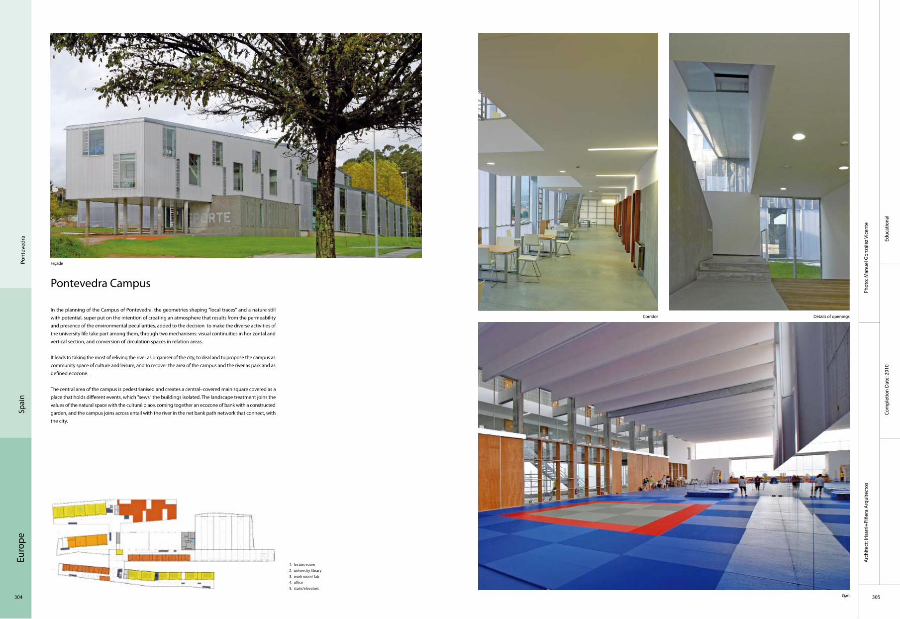
Euro
pe
304 305
Pont
eved
raSp
ain
Educ
atio
nal
Com
plet
ion
Dat
e: 2
010
Phot
o: M
anue
l Gon
zále
z Vi
cent
eA
rchi
tect
: Iris
arri+
Piñe
ra A
rqui
tect
os
Pontevedra Campus
In the planning of the Campus of Pontevedra, the geometries shaping "local traces" and a nature still with potential, super put on the intention of creating an atmosphere that results from the permeability and presence of the environmental peculiarities, added to the decision to make the diverse activities of the university life take part among them, through two mechanisms: visual continuities in horizontal and vertical section, and conversion of circulation spaces in relation areas.
It leads to taking the most of reliving the river as organiser of the city, to deal and to propose the campus as community space of culture and leisure, and to recover the area of the campus and the river as park and as defined ecozone.
The central area of the campus is pedestrianised and creates a central–covered main square covered as a place that holds different events, which "sews" the buildings isolated. The landscape treatment joins the values of the natural space with the cultural place, coming together an ecozone of bank with a constructed garden, and the campus joins across entail with the river in the net bank path network that connect, with the city.
Façade
Gym
Details of openingsCorridor
1. lecture room 2. university library3. work room/ lab4. office 5. stairs/elevators
1 2
3 4
5

Euro
pe
306 307
Corp
orat
eCo
mpl
etio
n D
ate:
200
9
Phot
o: P
edro
Peg
enau
teA
rchi
tect
: Mag
én A
rqui
tect
os (
Jaim
e M
agén
, Fco
. Jav
ier M
agén
)
Zara
goza
Spai
n
Headquarters of the Environment Service and Public Spaces
The building houses the Forestry and Natural Areas Departments of Zaragoza City Council. Situated in the centre of the city, next to the Almozara bridge, the site has considerable differences in level, about five metres between the avenue and the square at the upper level and the Ebro riverbank park. The relationship with the adjacent urban spaces and the topographic features of the site become active conditions for the implementation of the building; it can clearly be seen in the project section that the extension of the public space of the entrance is also expresed, via the roof and the configuration of the building as a platform–viewpoint onto the Ebro river.
Given the differences in level of the site, the main entrance to the building is on the upper floor, which houses the administrative spaces and the environmental hall. The main hall joins and separates spaces, enabling them to be used independently. The restricted access offices of the Forestry and Natural Areas Departments are located below the entrance level, in the basement. This lower floor has pedestrian and vehicle access from the Riverbank Park.
General view
Open–air
View from Europe Square
Offices
1. garage 2. warehouse3. locker room
4. staff rooms 5. installations6. utility room
Elevation from Europe Square
1
2
34
5
2
3
4
5
6

Euro
pe
308 309
Educ
atio
nal
Com
plet
ion
Dat
e: 2
009
Phot
o: Je
sús
Gra
nada
Arc
hite
ct: M
agén
Arq
uite
ctos
( Ja
ime
Mag
én, F
co. J
avie
r Mag
én)
Zara
goza
Spai
n
Kindergarten in Rosales Del Canal
The Kindergarten in Rosales del Canal is located in an area of residential growth in the southwest of Zaragoza. The two main ideas that existed at the start of the project are based on children’s special perception of the constructed environment. The first idea tries to combine the general volumetrics of the public facility with the domestic scale that must accompany the child. The second has to do with the sensorial relationship between children and architecture.
The basic unit of the school is the classroom. Its form responds both to the primary identification of the sloping roofing and to the advantages of height and additional lighting in the classrooms. The shape of the roofing of the classrooms is repeated to cover significant spaces that occupy a larger surface area such as the multipurpose hall and the dining–room.
The general configuration of the building clearly responds to organisational criteria, placing the classrooms around the patio, with service spaces situated between them and communicated on the inside with the corridor and on the outside with the patio, via the continuous exterior porch. The lobby, the multipurpose hall and an administrative area comprosed of the reception,the teachers’ room and the administration complete the functional programme.
General vew
Courtyard
Wall
Classroom
Interior
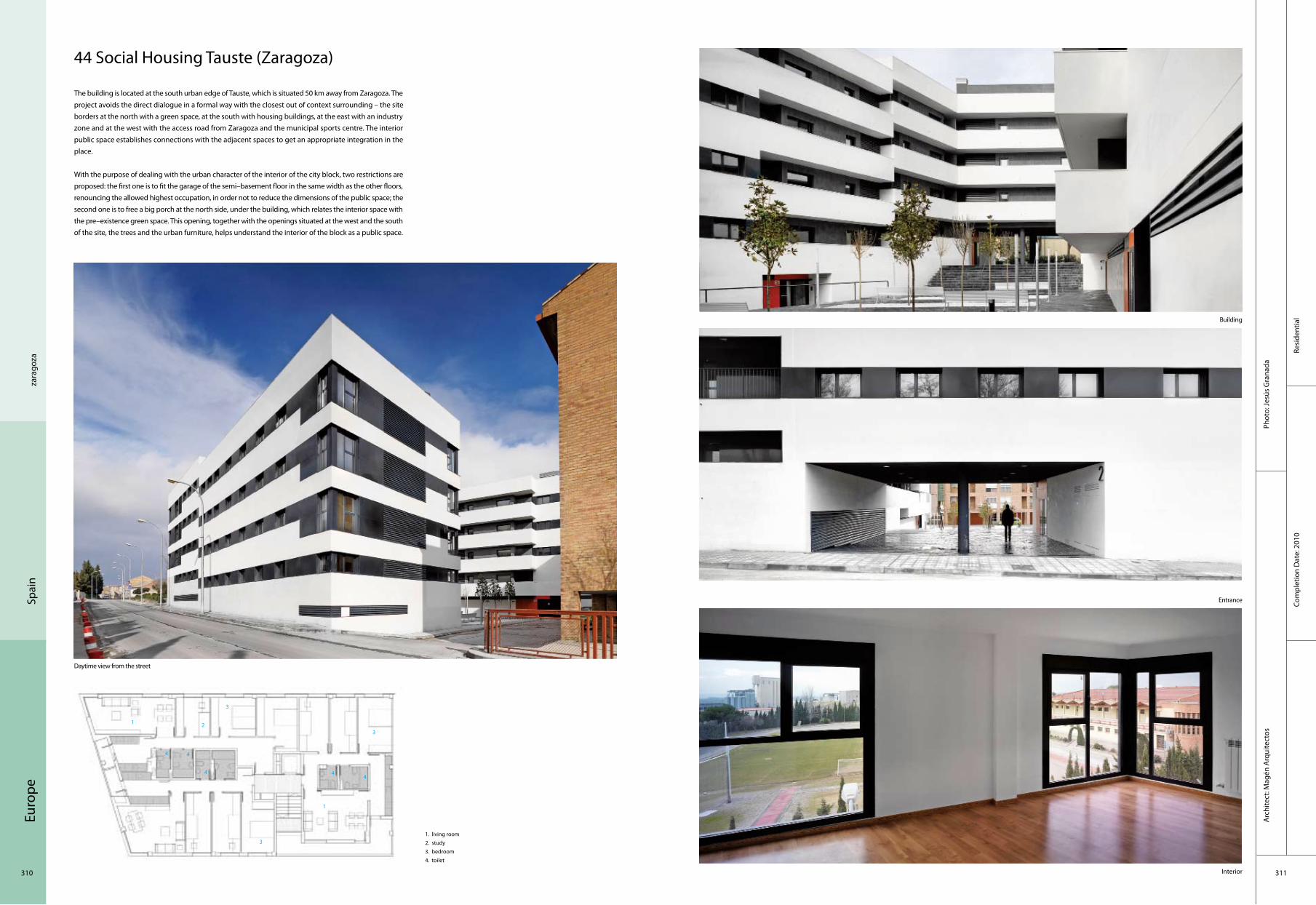
Euro
pe
310 311
Resi
dent
ial
Com
plet
ion
Dat
e: 2
010
Phot
o: Je
sús
Gra
nada
Arc
hite
ct: M
agén
Arq
uite
ctos
zara
goza
Spai
n
44 Social Housing Tauste (Zaragoza)
The building is located at the south urban edge of Tauste, which is situated 50 km away from Zaragoza. The project avoids the direct dialogue in a formal way with the closest out of context surrounding – the site borders at the north with a green space, at the south with housing buildings, at the east with an industry zone and at the west with the access road from Zaragoza and the municipal sports centre. The interior public space establishes connections with the adjacent spaces to get an appropriate integration in the place.
With the purpose of dealing with the urban character of the interior of the city block, two restrictions are proposed: the first one is to fit the garage of the semi–basement floor in the same width as the other floors, renouncing the allowed highest occupation, in order not to reduce the dimensions of the public space; the second one is to free a big porch at the north side, under the building, which relates the interior space with the pre–existence green space. This opening, together with the openings situated at the west and the south of the site, the trees and the urban furniture, helps understand the interior of the block as a public space.
Daytime view from the street
1. living room2. study3. bedroom4. toilet
Building
Entrance
Interior
1 2
3
4
1
3
4
3
4
44
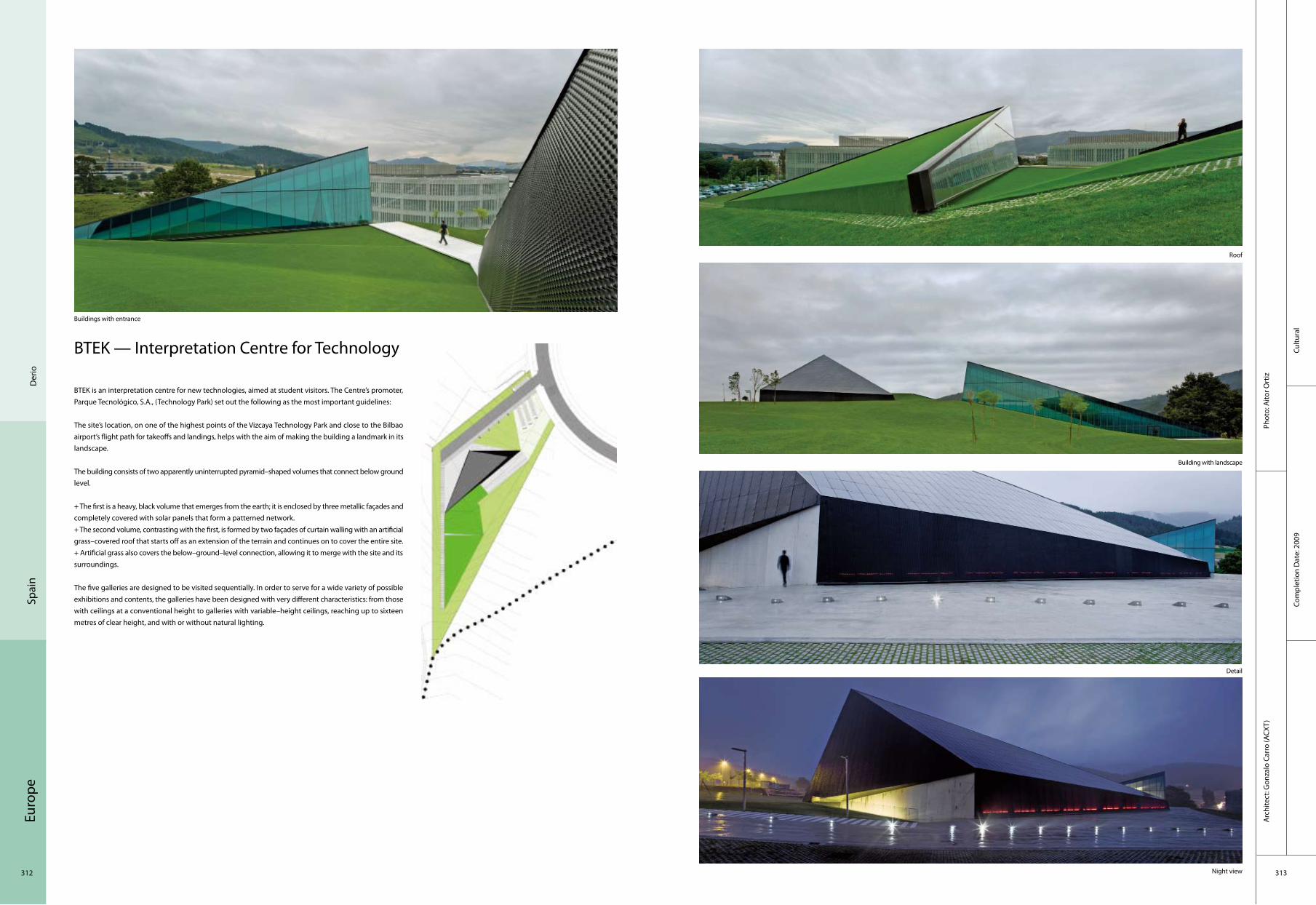
Euro
pe
312 313
Cultu
ral
Arc
hite
ct: G
onza
lo C
arro
(ACX
T)Ph
oto:
Aito
r Ort
iz
Com
plet
ion
Dat
e: 2
009
Der
ioSp
ain
BTEK — Interpretation Centre for Technology
BTEK is an interpretation centre for new technologies, aimed at student visitors. The Centre’s promoter, Parque Tecnológico, S.A., (Technology Park) set out the following as the most important guidelines:
The site’s location, on one of the highest points of the Vizcaya Technology Park and close to the Bilbao airport’s flight path for takeoffs and landings, helps with the aim of making the building a landmark in its landscape.
The building consists of two apparently uninterrupted pyramid–shaped volumes that connect below ground level.
+ The first is a heavy, black volume that emerges from the earth; it is enclosed by three metallic façades and completely covered with solar panels that form a patterned network. + The second volume, contrasting with the first, is formed by two façades of curtain walling with an artificial grass–covered roof that starts off as an extension of the terrain and continues on to cover the entire site. + Artificial grass also covers the below–ground–level connection, allowing it to merge with the site and its surroundings.
The five galleries are designed to be visited sequentially. In order to serve for a wide variety of possible exhibitions and contents, the galleries have been designed with very different characteristics: from those with ceilings at a conventional height to galleries with variable–height ceilings, reaching up to sixteen metres of clear height, and with or without natural lighting.
Buildings with entrance
Night view
Detail
Building with landscape
Roof

Euro
pe
314 315
Recr
eatio
nal
Arc
hite
ct: P
rom
onto
rio A
rchi
tect
sPh
oto:
Sér
gio
Gue
rra
and
Fern
ando
Gue
rra
Com
plet
ion
Dat
e: 2
006
Mor
aPo
rtug
al
Mora River Aquarium
Given the blazing Alentejo sun and the need to create shade, the building was devised as a compact and monolithic volume with a pitched shelter of thin white pre–cast concrete porticos with single spans of 33 metres, evoking the profile of the canonical Alentejo whitewash barns known as "montes". The shading and cross ventilation systems along with the water circuits foster the reduction of cooling energy, the sustainable increase of humidity and the wellbeing of animal and plant life.
Standing on a massive concrete plinth with a built–in stairway–cum–ramp entrance, the pitched shed veils a set of mute boxes that contain the programme, namely reception, ticketing and shop, cafeteria, changing exhibits hall, documentation centre, research and education, live exhibits, multimedia and a small auditorium. Inside, the exhibition spaces tend to be dark, in order to minimise UV impact on the live exhibits and allow visitors an in–depth viewing of the aquariums. The outdoor void between these programme boxes and the pitched shed generates not only accelerated viewpoints onto the outside but also a promenade that culminates in the passage through a bridge over the lake which, in itself, is also a live exhibit of animals and plants collected and nurtured in the region. The live exhibits, the main feature of an aquarium, reproduce, through complex life support systems, the habitat conditions of different regions allowing to exhibit side–by–side the various animals and plants. On the basement, these support systems guaranty stability of water temperature, pH, quality control and filtering for each habitat parameter, including a duct gallery below each exhibit to supply and monitor the water.

Euro
pe
316 317
Arc
hite
ct:
AVA
– A
rchi
tect
s
Educ
atio
nal
Port
oPo
rtug
al
Antas Educative Centre
The spatial and architectural design of the building of the new Antas Education Centre were formalised in several bodies, each containing part of the programme in accordance with principles of internal organisation, functionality, form and image, given the type of building and its specificity. This conception took into account the morphology of the terrain, solar orientation, access and links to surrounding bodies. It’s a building consisting of several bodies expressed by a "simple architecture" that will build a close relationship with the exterior spaces. It was intended to create in the spaces between the various bodies the visual relationship between interior and exterior reducing relations with the urban surroundings.
There was an intention to turn into how the building relates to the exterior. However, there are some links to the outside also. The settlement found answers to a matrix that structuralise a functional organiasation of the school as a function of the planned programme and constraint imposed by various land levels.
South East outside school
Perspective of children's outdoor play
circulation space to classroomsNight view of Perspective of children's outdoor play
Phot
o: B
arbo
sa &
Ben
igno
Com
plet
ion
Dat
e: 2
010
General plan1. entrance2. gym3. atrium4. playing field5. kindergarten6. classrooms / kitchen and dining7. outdoor recreation8. classrooms / covered playground
1
2
3
854
6
7
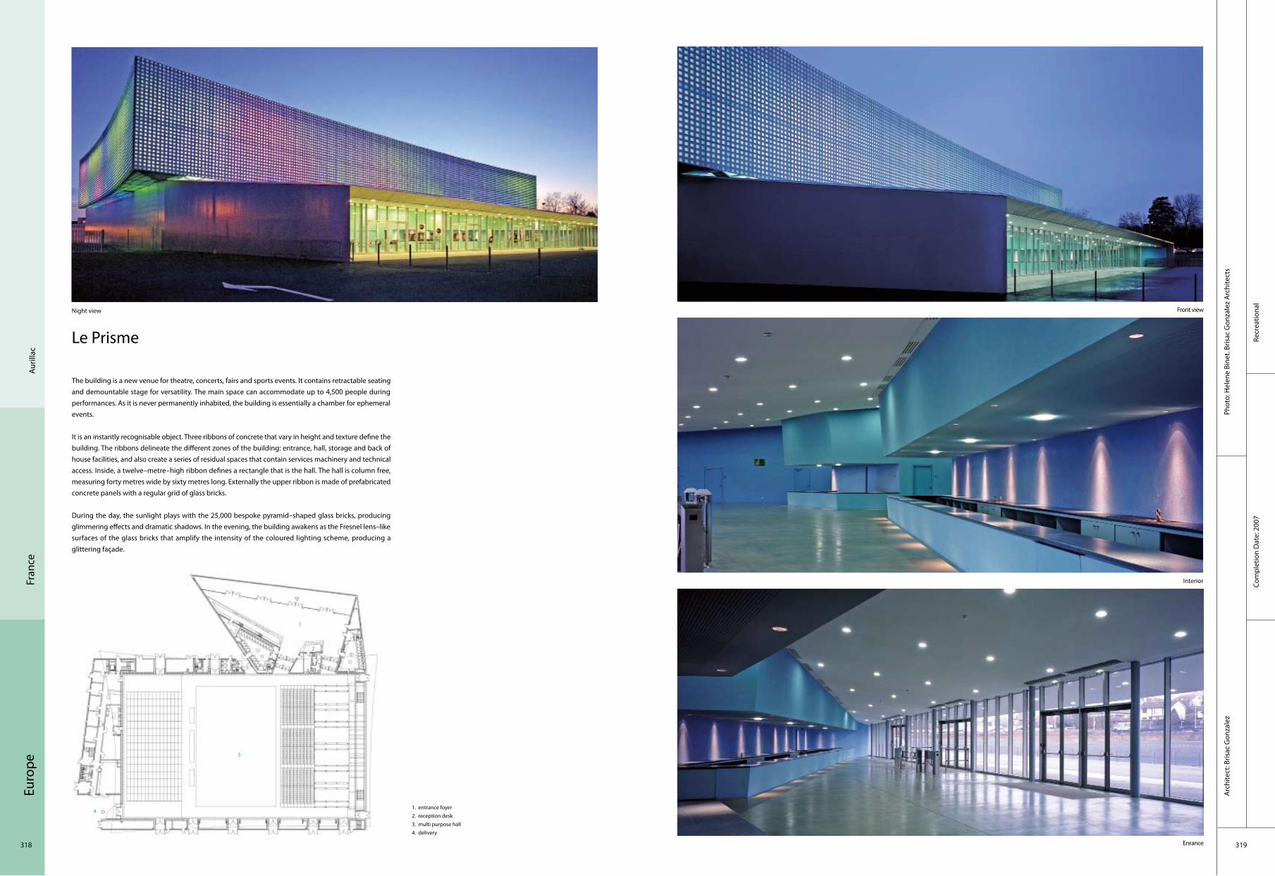
Euro
pe
318 319
Recr
eatio
nal
Com
plet
ion
Dat
e: 2
007
Phot
o: H
elen
e Bi
net.
Bris
ac G
onza
lez
Arc
hite
cts
Arc
hite
ct: B
risac
Gon
zale
z
Auril
lac
Fran
ce
Le Prisme
The building is a new venue for theatre, concerts, fairs and sports events. It contains retractable seating and demountable stage for versatility. The main space can accommodate up to 4,500 people during performances. As it is never permanently inhabited, the building is essentially a chamber for ephemeral events.
It is an instantly recognisable object. Three ribbons of concrete that vary in height and texture define the building. The ribbons delineate the different zones of the building: entrance, hall, storage and back of house facilities, and also create a series of residual spaces that contain services machinery and technical access. Inside, a twelve–metre–high ribbon defines a rectangle that is the hall. The hall is column free, measuring forty metres wide by sixty metres long. Externally the upper ribbon is made of prefabricated concrete panels with a regular grid of glass bricks.
During the day, the sunlight plays with the 25,000 bespoke pyramid–shaped glass bricks, producing glimmering effects and dramatic shadows. In the evening, the building awakens as the Fresnel lens–like surfaces of the glass bricks that amplify the intensity of the coloured lighting scheme, producing a glittering façade.
1. entrance foyer2. reception desk3. multi purpose hall4. delivery
Night view Front view
Interior
Enrance
1
2
3
4
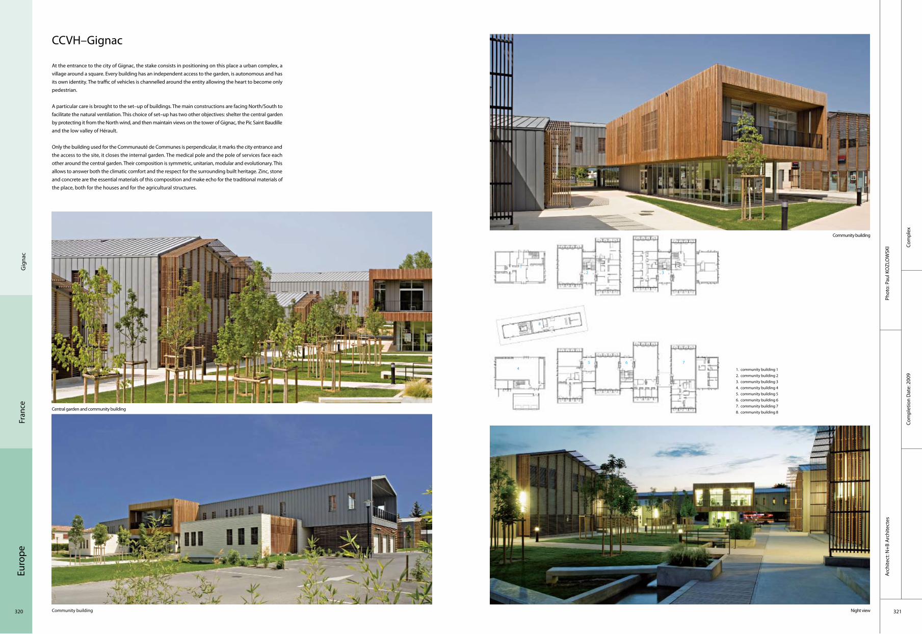
Euro
pe
320 321
Com
plex
Com
plet
ion
Dat
e: 2
009
Phot
o: P
aul K
OZL
OW
SKI
Arc
hite
ct: N
+B A
rchi
tect
es
Gig
nac
Fran
ce
CCVH–Gignac
At the entrance to the city of Gignac, the stake consists in positioning on this place a urban complex, a village around a square. Every building has an independent access to the garden, is autonomous and has its own identity. The traffic of vehicles is channelled around the entity allowing the heart to become only pedestrian.
A particular care is brought to the set–up of buildings. The main constructions are facing North/South to facilitate the natural ventilation. This choice of set–up has two other objectives: shelter the central garden by protecting it from the North wind, and then maintain views on the tower of Gignac, the Pic Saint Baudille and the low valley of Hérault.
Only the building used for the Communauté de Communes is perpendicular, it marks the city entrance and the access to the site, it closes the internal garden. The medical pole and the pole of services face each other around the central garden. Their composition is symmetric, unitarian, modular and evolutionary. This allows to answer both the climatic comfort and the respect for the surrounding built heritage. Zinc, stone and concrete are the essential materials of this composition and make echo for the traditional materials of the place, both for the houses and for the agricultural structures.
1. community building 12. community building 23. community building 34. community building 45. community building 56. community building 67. community building 78. community building 8
Central garden and community building
Night viewCommunity building
Community building
12 3
8
54
6 7

Euro
pe
322 323
Cultu
ral
Com
plet
ion
Dat
e: 2
007
Phot
o: C
hris
tian
Rich
ter
Arc
hite
ct: B
erna
rd T
schu
mi A
rchi
tect
s
Lim
oges
Fran
ce
Limoges Concert Hall
The Concert Hall in Limoges’ outer envelope is made of wood arcs and translucent rigid polycarbonate sheets and the inner envelope of wood.
The use of wood was suggested by the location of the hall, in a clearing within a large forest surrounded by trees over 200 years old. The region also has an active timber industry. In addition, the soft translucency of the polycarbonate complemented the wooden frame by allowing light to filter in and out of the building. The strategy establishes reciprocity between concept and context.
The configuration of the double envelope with circulation in–between is a scheme that is advantageous for both acoustical and thermal reasons. The detached and fragmented envelope opens in two directions, towards both the forest and the road. Between the two envelopes are the movement vectors: two ramps, one extending downward toward the lower tiers of the auditorium, and the other upward toward the upper tiers. Additionally, two straight "flying" staircases extend directly toward the top row of seats.
1. local engine 2. boiler room 3. local CTA 4. local TGBTS 5. local TGBTS 6. local transformer
General view
Night view
Exterior view
Interior
12 3
54
6

Euro
pe
324 325
Corp
orat
eCo
mpl
etio
n D
ate:
200
8
Phot
o: F
oste
r+ P
artn
ers
Arc
hite
c: F
oste
r+ P
artn
ers
Paris
Fran
ce
Boulogne Billancourt
The first building within the Trapeze masterplan at Boulogne Billancourt, in the southeast of Paris, this seven–storey office development occupies a prime position within the mixed–use development. The building has an expressed white concrete structure, with a steel and glass façade. It is divided between two volumes, connected by a glazed, full–height atrium containing a café and two restaurants for staff. This dynamic space incorporates panoramic lifts and suspended walkways, which appear to float at double–height intervals to allow uninterrupted views out to the river or the park. Above the entrance, giant translucent brise–soleils filter daylight down into the atrium, while a wave–formed geometric façade on the east and west elevations comprise curved vertical panels of alternate translucent and fritted glass.
A rooftop pavilion to the east and the expansive south–facing balconies are accessible from the office floors and take advantage of the riverside location. The 22,000 square metres of interior floor space provides a mixture of cellular and open–plan configurations. The internal arrangement is flexible – the floor plates can be split either vertically or horizontally to accommodate multiple tenants. A fringe of shops enlivens the ground level and the boulevard between the river and the building has been landscaped to provide a waterside promenade.
1. office2. lounge3. staircase
Whole scene of the exterior
Whole scene
Interior
Hall
12
3

Euro
pe
326 327
Cultu
ral
Com
plet
ion
Dat
e: 2
007
Phot
o: Je
an M
arie
MO
NTH
IERS
Arc
hite
ct: D
omin
ique
Cou
lon
et A
ssoc
iés
Mon
treu
il Fr
ance
Centre Dramatique National de Montreuil
The building complex, closed like a fist, has its correspondence in a series of spaces which expand and contract on the interior, reminiscent of the implausible spaces Alice in Wonderland traversed.
In the entrance area, the ceiling above the reception desk has multiple folds, similar to a geological zone of convergence, where tectonic plates are on a collision course but manage to slide past each other. In the stairway, gyrating concrete volumes are bathed in Caravaggioesque light. Dark and light, empty and full, this red space expands horizontally, ultimately leading to the auditorium, and then contracts until it becomes lost in the darkness of the foyer. Breaches in the building envelope occasionally offer up views to the city and allow daylight to penetrate deep into the space.
General view
Interior
Entrance Salle
1. salle2. toilet3. stairs
1
2
3
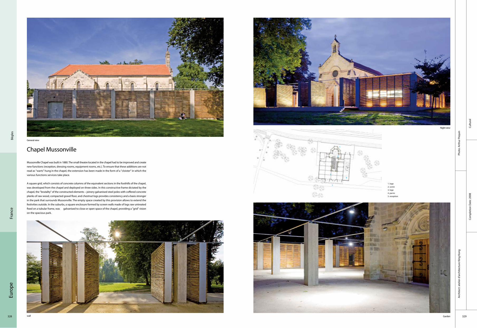
Euro
pe
328 329
Cultu
ral
Com
plet
ion
Dat
e: 2
008
Phot
o: A
rthu
r Peq
uin
Arc
hite
ct: a
telie
r d’a
rchi
tect
ure
King
Kon
g
Chapel Mussonville
General view
1. loge 2. scene 3. loge 4. parvis 5. reception
Mussonville Chapel was built in 1880. The small theatre located in the chapel had to be improved and create new functions (reception, dressing rooms, equipment rooms, etc.). To ensure that these additions are not read as "warts" hung in the chapel, the extension has been made in the form of a "cloister" in which the various functions services take place.
A square grid, which consists of concrete columns of the equivalent sections in the foothills of the chapel, was developed from the chapel and deployed on three sides. In this constructive frame dictated by the chapel, the "brutality" of the constructed elements – joinery galvanised steel poles with coffered concrete planks of raw wood, compacted gravel floor, and chestnut logs provides consistency and a basis stronger in the park that surrounds Mussonville. The empty space created by this provision allows to extend the festivities outside. In the suburbs, a square enclosure formed by screen walls made of logs raw untreated fixed on a tubular frame, was galvanised to close or open space of the chapel, providing a "grid" vision on the spacious park.
Night view
Garden wall
Bègl
esFr
ance
1
2
3
5
4
1

Euro
pe
330 331
Corp
orat
eCo
mpl
etio
n D
ate:
200
8
Phot
o: In
genh
oven
Arc
hite
cts
Arc
hite
ct: I
ngen
hove
n A
rchi
tect
s
Luxe
mbo
urg
European Investment Bank
The new headquarters building for the European Investment Bank (EIB), with its compelling 13,000 square–metre glass roof, extends Sir Denys Lasdun’s existing buildings on Luxembourg’s Kirchberg plateau. It provides 72,500 square metres of office space and other facilities for up to 750 employees.
The striking tubular glass roof spans the entire, 170–metre–long and 50–metre–wide structure. In combination with an extremely lightweight glass and steel superstructure, it offers a maximum of daylight and transparency. In addition, the building’s zigzag plan encourages a non–hierarchical office layout that promotes interaction and communication. This unrivalled office environment is carried by an environmental programme that reflects a progressive approach towards sustainability in architecture.
Key to the new headquarters’ ecological concept is the glass roof which curves around the floor plates to create the atriums in the V–shaped "gaps" of the building wings. The landscaped winter gardens on the valley side are unheated and act as climate buffers. In contrast, the atriums on the boulevard side serve as circulation spaces; hence temperatures have to be kept at a comfortable level. Both winter gardens and "warm" atriums are naturally ventilated through openable flaps in the shell to draw fresh air into the building and to reduce heat gain especially in the summer months.
Kirc
hber
g

Euro
pe
332 333
Hot
elCo
mpl
etio
n D
ate:
200
9
Phot
o: Ja
kub
Kacz
mar
czyk
, Ovo
tz d
esig
n La
b, w
ww
.ovo
tz.p
lA
rchi
tect
: J. M
AYER
H. A
rchi
tect
s, G
D&
K Co
nsul
ting
Sp. z
o.o
. and
OVO
TZ D
esig
n LA
B
Krak
owPo
land
SOF Park Inn Hotel Complex
October 8th 2009 marks the opening of SOF, the new Hotel Park Inn, Krakow, Poland designed by the architects team of J. MAYER H. architects, GD&K Consulting Sp. z o.o. and OVOTZ Design LAB. The hotel is being constructed in the city centre, at the intersection of important transport routes. The hotel is located in the vicinity of the planned Congress Centre as well as near to the Wawel Castel and the historical Jewish district. It offers splendid views onto the old city centre. The new porperty is characterised by clear horizontal lines, picking out the panorama view as a central theme. The façade is emphasized by black and white aluminium stripes, seperated by dark glass windows.
General view of hotel
Side view
Park inn Park Inn and entrance
1.restaurant 2. kitchen 3. bar 4. lobby 5. reception 6. canteen 7. waste8. service 9. delivery 10. toilet 11. office
Details
2
3
5 4
1
8
10
679
11

Euro
pe
334 335
Ksia
nice
Resi
dent
ial
Com
plet
ion
Dat
e: 2
007
Phot
o: K
wk
Prom
esA
rchi
tect
: Kw
k Pr
omes
Pola
nd
Aatrial House
One–hectare site near the forest, where the building is designed has only one weak point: south–west access. An obvious conflict developed between the driveway and the garden. The idea arose to lower the driveway in order to separate it from the garden. This prompted another idea of a driveway leading inside to the ground floor level, from underneath the building, which became possible thanks to the creation of an inner atrium with the driveway in it. New type of the houseAs a result, the building opens up onto all sides with its terraces in an unrestricted manner, and the only way to get into the garden is through the atrium and the house.
Structure and materialsThe gateway is situated in the highest point of the site sloping to the east side. The 10–metre–wide driveway follows slope’s declivity. The building was situated on the garden level. For the sake of neighbouring buildings, typical polish "cube – houses" arisen in 1970’s, the structure of the house results from various transformations of a cube.
As a result of stretching and bending particular surfaces of the cube, all the walls, floors and ceilings were defined, together with inner atrium and terraces. This principle of formation has not only created the structure of the house, but also defined interior and exterior architecture, including use of materials. The building is a reinforced concrete monolith, and concrete is at the same time the finishing material of the transformed cube, while all additional elements are finished with dark ebony.
A view of the house from the driveway
Backyard façade
A view of the driveway leading inside to the ground floor level
A view of the atrium
Kitchen and dining room
2 3
5
418
10
67
9
1. entrance2. toilet3. wardrobe4. storage5. study6. television room7. living area8. dining area9. kitchen10. garage

Euro
pe
336 337
Resi
dent
ial
Com
plet
ion
Dat
e: 2
007
Phot
o: K
WK
PRO
MES
Arc
hite
ct: K
wk
Prom
es
Ksia
nice
Pola
nd
Outrial House
The context and investor's expectations made designers to treat grass as a material. One part of the grassy plot is cut out and treated as the roof for basic functions. At the end of design work the investor wished to find a place for an orangery and a small recording studio. Due to "cutting a notch and bending" to inside, the roof became an atrium reached from the inside of the house. The smooth roof created space similar to bandstand that can be used to outdoor jam sessions. The very similar process was used to design the recording studio.
OUTrium– the New type of spaceThe green space smoothly penetrates into the interior which joins the merits of a traditional atrium with the outdoor garden. OUTrium– as it was called – lets inhibitants be pleased with the outside and stays the inside of the house strictly joined with the living room at the same time.
TechnologyThe selection of technologies was based on the investor's principles who wanted a simple house. The house is built in white plaster inside and outside walls. The green roof is a good isolation that reduces the loss of heat in winter and cools the house in summer. It assures a very positive microclimate inside the house.
A view of the house from the road
The stairs leading to the roof with one mesh across which grows the grass
Living room with stairs leading to the green roof
Main entrance to the house
The southwest façade
1. entrance 2. hall 3. kitchen with dining area 4. living area 5. bathroom 6. bedroom 7. bedroom 8. bedroom 9. bathroom 10. storage 11. garage 12. stairs to the green roof
2
3
5
4
1
810 67911

Euro
pe
338 339
Resi
dent
ial
Com
plet
ion
Dat
e: 2
009
Phot
o: K
wk
Prom
esA
rchi
tect
: Kw
k Pr
omes
War
saw
Po
land
Safe House
LocationThe house is situated in a small village at the outskirts of Warsaw. The surroundings are dominated with usual "Polish cubes" from the 1960's and old wooden barns.
IdeaThe clients' top priority was to gain the feeling of maximum security in their future house, which determined the building's outlook and performance. The house took the form of a cuboid in which parts of the exterior walls are movable. When the house opens up to the garden, eastern and western side walls move towards the exterior fence creating a courtyard.
After crossing the gate, one has to wait in this safety zone before being let inside the house. In the same time, there is no risk of children escaping to the street area in an uncontrolled way while playing in the garden.
Movable elements interfering with the site layout The innovation of this idea consists in the interference of the movable walls with the urban structure of the plot. Consequently, when the house is closed (at night for example), the safe zone is limited to the house's outline. In the daytime, as a result of the walls opening, it extends to the garden surrounding the house.
New type of buildingThe sliding walls are not dependent on the form of the building. That is why this patent can be applied to both modern and traditional, single– and multi – storeyed houses covered with roofs of different geometry.This universal solution gives a new type of building where not the form but the way of functioning is the most important. The name: "safe house" gains a new meaning now.
Façade
Open shutters show widely open inner space
Open house
South terrace
2
3
5
4
1
8
106
7
9
11
1
1. entrance2. living area3. dining area 4. kitchen5. toilet6. wardrobe7. television space8. fireplace9. garage10. storage11. swimming pool

Euro
pe
340 341
Resi
dent
ial
Com
plet
ion
Dat
e: 2
008
Phot
o: To
mek
Pik
ula
Arc
hite
ct: P
eter
Pio
tr K
uczi
a
Lake
Lak
aPo
land
Sustainable House at Lake Laka
This simple sustainable house – like a chameleon – blends with its surrounding area on Laka Lake. Colourful planks within the timber façade reflect the tones of the landscape. The window reveals, clad in fibre cement, framed images of the countryside. Analogical to most creatures, the building is symmetrical outside, although the internal zones – according to function – are arranged asymmetrically.
The built form is designed to optimise the absorbance of solar energy. Approximately 80% of the building envelope is facing to the sun. The single–storey living space on the ground floor is externally clad with untreated larch boarding. Solar energy is gained there by the set–in glazed patio. Solar collection panels are located on the roof and a photovoltaic system is planed for the future. The dark façade of the "black box" – a three–storey structure clad with charcoal coloured fibre cement panels – is warmed by the sun, reducing heat loss to the environment. The passive and active solar energy concepts and a high standard of thermal insulation are enhanced by a ventilation plant with thermal recovery system.
The design of the project was determinated by the twin goals of low life cycle costs and a reduction in construction costs. All details are simple, but well thought out. The house did not cost more than a conventional one in Poland. Cost–saving was made by the application of traditional building techniques and the use of local materials and recycled building elements.
1. green roofs2. solar "black box"3. Winter garden4. terrace5. parking space6. garden
23
5
4
6
1
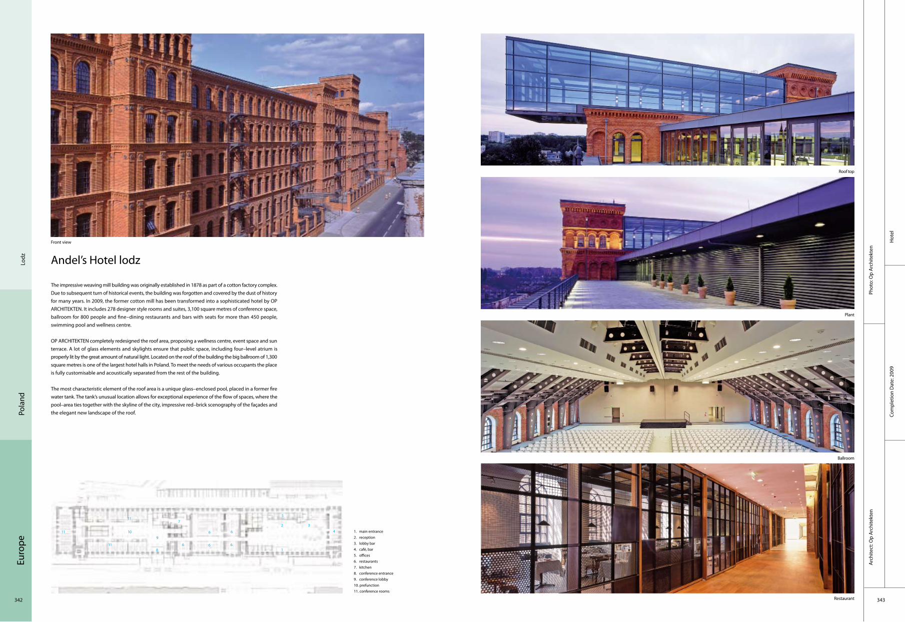
Euro
pe
342 343
Lodz
Pola
nd
Hot
elCo
mpl
etio
n D
ate:
200
9
Phot
o: O
p A
rchi
tekt
enA
rchi
tect
: Op
Arc
hite
kten
Andel’s Hotel lodz
The impressive weaving mill building was originally established in 1878 as part of a cotton factory complex. Due to subsequent turn of historical events, the building was forgotten and covered by the dust of history for many years. In 2009, the former cotton mill has been transformed into a sophisticated hotel by OP ARCHITEKTEN. It includes 278 designer style rooms and suites, 3,100 square metres of conference space, ballroom for 800 people and fine–dining restaurants and bars with seats for more than 450 people, swimming pool and wellness centre.
OP ARCHITEKTEN completely redesigned the roof area, proposing a wellness centre, event space and sun terrace. A lot of glass elements and skylights ensure that public space, including four–level atrium is properly lit by the great amount of natural light. Located on the roof of the building the big ballroom of 1,300 square metres is one of the largest hotel halls in Poland. To meet the needs of various occupants the place is fully customisable and acoustically separated from the rest of the building.
The most characteristic element of the roof area is a unique glass–enclosed pool, placed in a former fire water tank. The tank’s unusual location allows for exceptional experience of the flow of spaces, where the pool–area ties together with the skyline of the city, impressive red–brick scenography of the façades and the elegant new landscape of the roof.
Front view
Roof top
Plant
Ballroom
Restaurant
2 3
5
4
8
10 6
7
9
11
1
6
6 6611
11 1. main entrance2. reception3. lobby bar4. café, bar5. offices6. restaurants7. kitchen8. conference entrance9. conference lobby10. prefunction11. conference rooms
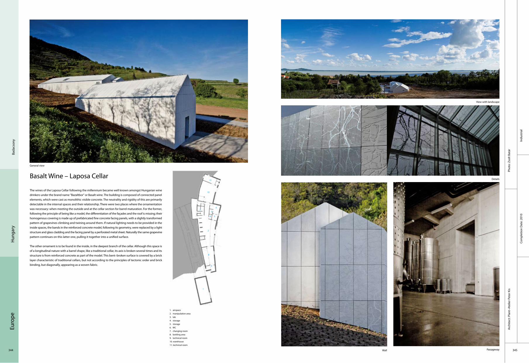
Euro
pe
344 345
Indu
stria
lCo
mpl
etio
n D
ate:
201
0
Phot
o: Z
solt
Batá
rA
rchi
tect
: Pla
nt–A
telie
r Pet
er K
is
Bada
cson
yH
unga
ry
Basalt Wine – Laposa Cellar
The wines of the Laposa Cellar following the millennium became well known amongst Hungarian wine drinkers under the brand name "Bazaltbor" or Basalt wine. The building is composed of connected panel elements, which were cast as monolithic visible concrete. The neutrality and rigidity of this are primarily detectable in the internal spaces and their relationship. There were two places where the ornamentation was necessary: when meeting the outside and at the cellar section for barrel maturation. For the former, following the principle of being like a model, the differentiation of the façades and the roof is missing; their homogenous covering is made up of prefabricated fine concrete facing panels, with a slightly transformed pattern of grapevines climbing and twining around them. If natural lighting needs to be provided in the inside spaces, the bands in the reinforced concrete model, following its geometry, were replaced by a light structure and glass cladding and the facing panel by a perforated metal sheet. Naturally the same grapevine pattern continues on this latter one, pulling it together into a unified surface.
The other ornament is to be found in the inside, in the deepest branch of the cellar. Although this space is of a longitudinal nature with a barrel shape, like a traditional cellar, its axis is broken several times and its structure is from reinforced concrete as part of the model. This bent–broken surface is covered by a brick layer characteristic of traditional cellars, but not according to the principles of tectonic order and brick binding, but diagonally, appearing as a woven fabric.
General view
View with landscape
Wall Passageway
1. airspace2. manipulation area3. lab4. storage5. storage6. WC7. changing room8. bottling area9. technical room10. warehouse11. technical room
Details
2
3
5
4
8
10
6
7
9
11
1
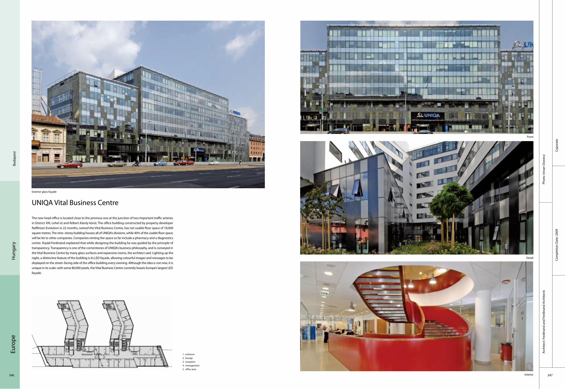
Euro
pe
346 347
Copo
rate
Com
plet
ion
Dat
e: 2
009
Phot
o: Is
tvan
Ora
vecz
Arc
hite
ct: F
erdi
nand
and
Fer
dina
nd A
rchi
tect
s
Buda
pest
Hun
gary
UNIQA Vital Business Centre
Exterior glass façade
1. entrance2. lounge3. reception4. management5. office area
The new head office is located close to the previous one at the junction of two important traffic arteries in District XIII, Lehel út and Róbert Károly körút. The office building constructed by property developer Raiffeisen Evolution in 22 months, named the Vital Business Centre, has net usable floor space of 18,000 square metres. The nine–storey building houses all of UNIQA’s divisions, while 40% of the usable floor space will be let to other companies. Companies renting the space so far include a pharmacy and a diagnostics centre. Árpád Ferdinánd explained that while designing the building he was guided by the principle of transparency. Transparency is one of the cornerstones of UNIQA’s business philosophy, and is conveyed in the Vital Business Centre by many glass surfaces and expansive rooms, the architect said. Lighting up the night, a distinctive feature of the building is its LED façade, allowing colourful images and messages to be displayed on the street–facing side of the office building every evening. Although the idea is not new, it is unique in its scale: with some 80,000 pixels, the Vital Business Centre currently boasts Europe’s largest LED façade.
Front
Detail
Interior
23
5
4
1
5

Euro
pe
348 349
Com
plet
ion
Dat
e: 2
009
Cultu
ral
Phot
o: M
assi
mo
Mar
iani
Arc
hite
ct: M
assi
mo
Mar
iani
Italy
Vi
a Te
sta
Ferr
ata
Benozzo Gozzoli Museum
The new design of this building, which has a total area of about 400 square metres, closely follows the ground traces of the old building and it is luckily detached from the buildings around because it is located in an empty space which is a sort of square.
The building is rooted to the ground through a functional island–shaped base which solves the problem of urban furnishing meant in the classical sense (benches, flower pots etc.). The curvilinear base takes over the space around the building and, at the same time, people take over a little of the museum’s space: the base becomes a bench, a play area for children and adults, a theatre for small outdoor events. The building had to be entirely coated with cotto; in this way, it refers to materials and finishes of some of the local churches.
Inside, the museum is spread over 4 floors, three above ground and one underground. The ground floor is partly characterised by a low ceiling: a shaded area which quickly runs to the full–height space where the "Tabernacolo della Visitazione" is placed. This is illuminated by a cascade of natural light coming from the skylight in the ceiling. On the first floor, recessed into the corner–wall, we find the "Tabernacolo della Madonna della Tosse" which looks like a television screen. The staircase linking the floors, becomes a kind of visual path which frames the Tabernacles (now lacking their original context), according to new and constantly changing perspectives. It stops on the first floor, and then starts again on the opposite side thus reaching a room on the second floor, a naturally suitable space for small exhibitions and educational workshops.
1. landscape2. 6 exibition room3. staircase4. toilet5. entrance
It‘s island–shaped base closely follows the floor plan of the preceding building
Exterior Façade Night view
2
3
5
4
6
1

Euro
pe
350 351
Corp
orat
e
Co
mpl
etio
n D
ate:
200
7
Phot
o: A
lber
to P
iova
noA
rchi
tect
: Stu
dio
KUA
DRA
(ww
w.k
uadr
a.it
)
Foss
ano
Italy
New Branch of the Cooperative Credit Bank 11 Kilometres of Chain....
General view
1. office2. toilet3. kitchen4. waiting area5. storage6. meeting room7. office
A cascade of chains on the façade, dynamic space, mobile, changing, is not what you would expect from a bank, especially in a province at the foot of the Maritime Alps. The branch of this Credit Agency, winner of a close competition, brings a breath of lightness and a levity that would be more common in a completely different sort of building; an exhibition centre or a performance venue, for example.
This bank is stripped of that entire traditional image which characterises an institution of this type and instead presents a new unedited image of itself. Surprising and innovative outside, intimate and welcoming inside.
Although made up mainly of young people, the KUADRA Studio of architects knows how to obtain the very best from the materials they use with rigour and finesse. Glass, metal and stainless steel are all combined in a clever alchemy that highlights consistency, form, quality and singularity, while never neglecting composition, which remains precise and clean.
The best way to fulfill the needs of the future customers and employees are constantly taken into consideration during the process of the project.
Details Profile
Detail Landscape deck
2 3
54
7
1
6

Euro
pe
352 353
Indu
stria
lCo
mpl
etio
n D
ate:
200
7
Arc
hite
ct: b
ergm
eist
erw
olf A
rchi
tekt
enPh
oto:
Gün
ter R
icha
rd W
ett
Girl
an It
aly
Schreckbichl
The existing façade of the winery „Kellerei Schreckbichl“ remains unaltered in its shape and its windowcases. A new structure will be suspended in front of this at a horizontal distance of 50 cm – a timber and metal structure.
The façade is a playful mix of spacings, colours, openings and shadows. This results in a rhythmic assemblage of 45 metres total length and 9 metres height. The black and red steel plates accentuate the window openings through their tilts and depths, focusing the views on production facilities, entrance, offices, reception and the sky. In contrast with the previous flat appearance of the façade, the differently sized openings produce a surprising and vivacious plasticity. The timber surfaces are inspired by the oak barrels, recreating a theme which adds a warm, inviting character to the building. At night the dynamic façade is immersed in light, again in a playful combination of colour and shadow.
The central element is a tilted plane, which represents the backbone of the staircase, the stairs themselves being integrated in this plane. A glass railing and the lighting from below create the impression that the staircase leads upward, beyond the printed image, in a seemingly weightless manner. A visitors’ sofa has also been accommodated in the tilted plane, which bends and continues as a horizontal feature, thus rendering the reception and presentation area a unique visual entity.
1. ladder2. office3. meeting room4. storge5. entrance
External view
Front view
Interior wine shelf
2
3
14
5
2
2
External detail

Euro
pe
354 355
Resi
dent
ial
Com
plet
ion
Dat
e: 2
008
Phot
o: Jü
rgen
Ehe
imA
rchi
tect
: ber
gmei
ster
wol
f Arc
hite
kten
Boze
nIta
ly
Matzneller
Three buildings are integrated among themselves. The areas of contact are forming the terraces. Different materials meet in a harmony of colours. The dihedral of the bodies is creating a tunnel–like atmosphere towards the green interior courtyard.
The plaster emphasises the individual volumes: brownish and strongly structured beneath, the admixed copper vitriol (bluestone) creating a bluish colouring, an association to the vine that used to grow here. A wooden slatted frame is connecting the individual buildings as well as the inside and outside. The glassy cube, separated from the living area, is planned to be the library, the office and the guestroom all in one. Windows in the shape of a belt allow the daylight to penetrate the underlying sports room.
The main bodies are connected by a staircase, the central element of this residence. A slot arises, a gorge made of glass panels, in which the wooden stairs are slotted and which are connecting everything from the upstairs until the cellar. The staircase is leading upstairs in a decorative way, right between the frameless glass panels and the OBS–panels painted with white varnish.
Building in normal environment
Interior Corridor
Interior
1. entrance 2. toilet 3. dining 4. bedroom 5. bathroom
2
3
1
4
54
2
Exterior corridor
Ladder

Euro
pe
356 357
Lein
iIta
ly
Corp
orat
eCo
mpl
etio
n D
ate:
200
7
Phot
o: E
nric
o M
urar
o fo
togr
afo
Arc
hite
ct: U
AU o
ffice
Hi–tech Systems Headquarters
The new directional building has been designed to abstract itself from the common building scheme, rejecting analogies and mimesis, while intended to assume technology and innovation as its essence.
The traditional building techniques make room to the use of innovative materials or the different exploitation of the old ones, and, at the same time, to the overcoming of conventional building schemes. Through the opposition between the sculptural concrete shapes and the lightness of the glass and steel structures, the designers have chosen to characterise the internal and external space, pointing out a clear and essential architectural language.
The façade is mainly conceived to go between the aesthetic and conceptual definition of the architecture. Built totally in steel and structural glass and closed among big concrete walls the front is both like an optical and material screen of the building, both its external projection; the aim is to symbolise the Company’s talent to be always in search of innovative and new solutions.
1. entrance2. access to upper floor3. reception4. waiting room5. purchase office6. office7. toilet8. area café9. delivery access10. production area11. technical office
Hi–tech External
Hi–tech External
Interior
Interior
Interior
2
3
1
4
5
7
6
7
8

Euro
pe
358 359
Educ
atio
nal
Com
plet
ion
Dat
e: 2
008
Phot
o: L
uigi
File
tici
Arc
hite
ct: D
AP
Stud
io /
Elen
a Sa
cco
– Pa
olo
Dan
elli
Vare
seIta
ly
Elsa Morante Library
The pre–existing building for the new Lonate Ceppino Public Library already belonged to Lonate Ceppino’s historical heritage. On a rectangular plan, the two–level buildings housed the Civic Library on the ground floor, while the first floor had been left unused. From the outside, the main entrance façade has a higher decorative part which is independent from the roof structure. The design of the fronts is organised in horizontal bands at different heights, while on the north, south and west fronts a system of vertical pilasters apportions the windows on both floors.
Besides the east front, a new well–balanced volume has been built. The new volume’s architecture is marked by a narrower profile on its top, with a sloping side that restrains to give more space to the historical building pitches. The dialogue between the volumes is the key and main theme leading the whole intervention. The relationship between the two is nourished by juxtaposition between matterness and lightness, solidity and instability, opaque and reflecting materials. The highlighting of differences underlines the peculiarities of both volumes, in a mutual figure–background relationship. The two buildings are connected through a glazed roofed little volume. The entrance is on the left side and a further wooden connection goes to the first floor.
Front view
Window Side view
Open–space library Staircase
1. entrance hall 2. open–space library 3. reference office4. stairscase 5. lift 6. technical room7. vestibule 8. bathroom 9. hall10. study hall 11. raised walk 12. flexible room
2
3
1
45
7
6
9
8
10
11
12
5

Euro
pe
360 361
Resi
dent
ial
Com
plet
ion
Dat
e: 2
007
Phot
o: G
ünte
r Ric
hard
Wet
tA
rchi
tect
: ber
gmei
ster
wol
f Arc
hite
kten
Alb
eins
Italy
Sloschek
The image of the concept is characterised by the landscape: three differently positioned cubes, connected by a levitating, protecting roof, are giving birth to an interplay of openings, insights and views and interspaces. Great stress is put on a good view of the steeples, the orchards in the valley and the mountain scenery. An excellent view towards the village, the vicinity and vice versa arises as a result of the spaces between the bodies and the roof. A "centre" emerges, a central location which opens itself towards the countryside and communicates with it. Different sizes of windows arise depending on the direction of view, which are defining the façade design.
Side view of the exterior
Interior lounge
Building rooftop
Rooftop connection
1. ladder2. relaxing area3. bathroom4. dining table5. entrance
2
3
1
4
5
2
3
14
5
2
1
5

Euro
pe
362 363
Educ
atio
nal
Com
plet
ion
Dat
e: 2
007
Phot
o: P
ica
Ciam
arra
Ass
ocia
ti
Tow
n of
Pis
toia
Italy
Arc
hite
ct: P
ica
Ciam
arra
Ass
ocia
ti W
ith F
ranc
o A
rchi
diac
ono,
Fed
eric
o Ca
labr
ese,
Ang
elo
Verd
eros
a
San Giorgio Library
Apart from functional requirements, the building is designed to give shape to the urban space around it: the issue was to inject and express a sense of modern–day culture in this kind of context while making only minor alterations: how to provide a "library" while introducing in the new architecture a sense of both the old factory and the idea of being the research instrument inherent in a library; bringing together past and future, well aware that there is no conceptual difference between designing something new and recovering the past, just in the number of constraints to be faced.
The structure involves three vaulted aisles covering 4,000 square metres. The competition called for its conversion into a library containing 350,000 books, 600 readers, 100 multimedia stations, a conference room for 100 seats, a children’s space with outdoor spaces, offices and a coffee bar. It is re–designed keeping the old vertical structures while introducing wide floors, changing the vaulted roof into laminated wooden ribbing, setting a compact image on the longitudinal fronts, stripped down at the north and south terminals. The result is an overall image of a skeleton which draws out the old features and breaks them down.
Architectural relation between the library and the water and power plant
From the road on the south, the skeleton of the roof gives evidence of the history of the building
The main hall on the ground floor, looking toward the large closed lecture hall, on the second floor
The space for the children's library
1. entrance 2. conference hall 3. central hall 4. book shop 5. coffee shop 6. children’s library 7. mediateca 8. patio
2
3
1
4
7
6
8
5

Euro
pe
364 365
Educ
atio
nal
Com
plet
ion
Dat
e: 2
009
Phot
o: P
ica
Ciam
arra
Ass
ocia
tiA
rchi
tect
: Pic
a Ci
amar
ra A
ssoc
iati
Mol
ise
Italy
The Central Library of the University of Molise
The scheme of the Library and the main lecture Theatre of the University of Molise includes the design of external spaces with a sheltered pedestrian path and new parking areas. The main hall has two entrance spaces, one from the public open connection system of the University and the other directly from the Faculty of Social Sciences and has been designed for 480 seats and is used by the whole university.
The scheme is grafted onto the morphology of the site with two main blocks, the first being used for the offices and the second for the library, connected by two service and security stairs.
Architectural unity, in relation to the existing buildings, is granted by typological features and the use of materials like bricks and iron windows, yet used for the main buildings.
The block is connected to the University complex and to the parking area through a grid of pedestrian paths and a future pedestrian bridge that overcomes the main street in the University area.
Side façade
The inner space
The main façade
The main entrance
1. entrance stairs 2. entrance path 3. reading hall 4. study and research 5. administration
2
3
1
4
5

Euro
pe
366 367
Corp
orat
e
Phot
o: O
scar
Fer
rari
Arc
hite
ct: P
roge
tto
CMR
Mas
sim
o Ro
j Arc
hite
cts
Com
plet
ion
Dat
e: 2
007
Italy
Mila
n
Entrance Side view
Entrance & stairs Stairs&corridor
Officine Maccaferri and Seci Energia
The new headquarters of Officine Maccaferri and Seci Energia is a building designed from the inside out. One of the unique features of this project was bringing two of the group’s companies to share one building and finding the right balance between the independence of the individual companies and the group as a whole. The interior space was divided with fitted mobile walls that are partly glazed and partly opaque with a wood finish. This made it possible to make open spaces, closed offices, shared areas, meeting rooms and toilet areas, depending on the needs of the various work teams and different kinds of activities. Progetto CMR designed brightly lit, invigorating offices for about 160 people, focusing on the functional aspects and flexible solutions in anticipation of possible future changes. It optimised the division, arrangement and fitting out of each area and work station to ensure that every user has the highest level of comfort and wellbeing as well as providing optimal efficiency.
General view
1. entrance 2. conference hall 3. office4. WC
2
3
1
4

Euro
pe
368 369
Educ
atio
nal
Com
plet
ion
Dat
e: 2
008
Phot
o: W
erne
r Hut
hmac
her
Arc
hite
ct:
Hub
er S
taud
t Arc
hite
kten
Berli
n G
erm
any
Birken–elementary School and School "am Grüngürtel": Nursery Building
In the borough of Spandau, Berlin, the existing schools, Birken–elementary school and school "am Grüngürtel" will be extended to open–all–day schools with a capacity of 155 pupils within a national funding scheme. The project is cofinanced by EFRE–funds. The spacious sports–and playgrounds in the heart of a heterogeneous urban block will be reorganised within the design concept.
Under a firm protecting roof made of exposed concrete the new building offers plenty of space for the extension of the Birken elementary school and the school "am Grüngürtel" to a open all day school with a capacity of 155 pupils. The new building with two floors in the Berlin borough of Spandau (total construction costs about 2.2 millions ) was financed from funds of the programme"future, education and mentoring" (IZBB) and the "european fund for regional development"(EFRE).
Placed in the extension of a picturesque Berlin "Gründerzeit" street–scape, the building mediates between the classical block housing on the south side and the open urban structure with four–storey–high housing slabs from the 1950's in the north. Within the building scheme the extensive sport and recreation areas were rearranged inside the large heterogeneous urban block.
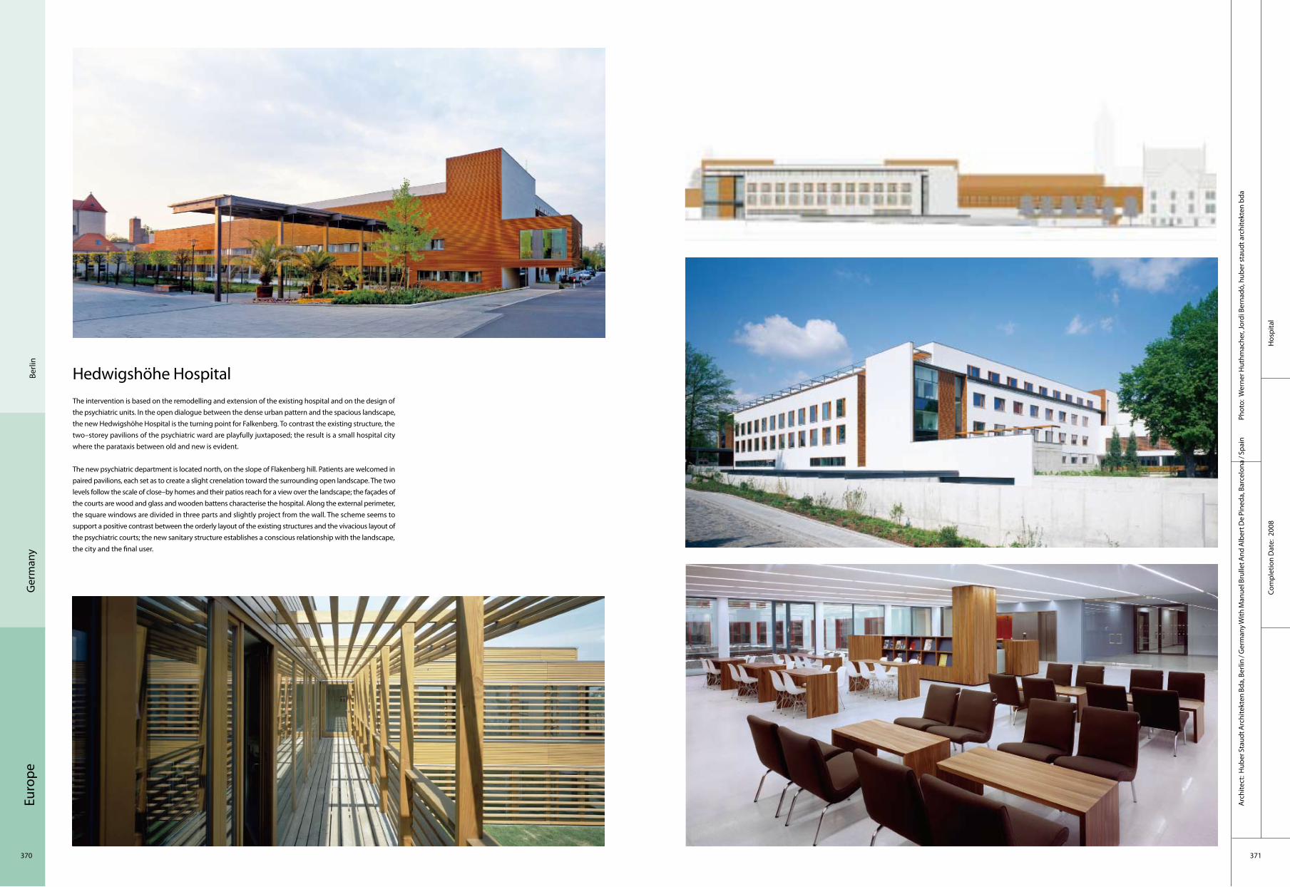
Euro
pe
370 371
Hos
pita
lCo
mpl
etio
n D
ate:
200
8
Phot
o: W
erne
r Hut
hmac
her,
Jord
i Ber
nadó
, hub
er s
taud
t arc
hite
kten
bda
A
rchi
tect
: Hub
er S
taud
t Arc
hite
kten
Bda
, Ber
lin /
Ger
man
y With
Man
uel B
rulle
t And
Alb
ert D
e Pi
neda
, Bar
celo
na /
Spai
n
Berli
nG
erm
any
Hedwigshöhe HospitalThe intervention is based on the remodelling and extension of the existing hospital and on the design of the psychiatric units. In the open dialogue between the dense urban pattern and the spacious landscape, the new Hedwigshöhe Hospital is the turning point for Falkenberg. To contrast the existing structure, the two–storey pavilions of the psychiatric ward are playfully juxtaposed; the result is a small hospital city where the parataxis between old and new is evident.
The new psychiatric department is located north, on the slope of Flakenberg hill. Patients are welcomed in paired pavilions, each set as to create a slight crenelation toward the surrounding open landscape. The two levels follow the scale of close–by homes and their patios reach for a view over the landscape; the façades of the courts are wood and glass and wooden battens characterise the hospital. Along the external perimeter, the square windows are divided in three parts and slightly project from the wall. The scheme seems to support a positive contrast between the orderly layout of the existing structures and the vivacious layout of the psychiatric courts; the new sanitary structure establishes a conscious relationship with the landscape, the city and the final user.
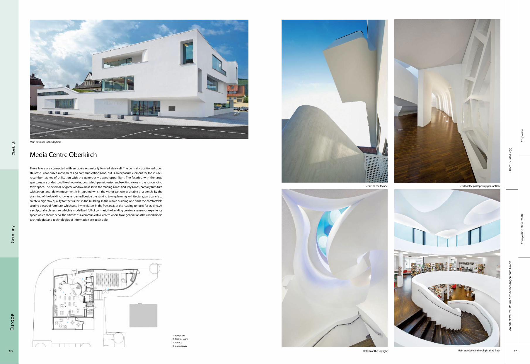
Euro
pe
372 373
Corp
orat
eCo
mpl
etio
n D
ate:
201
0
Phot
o: G
uido
Geg
gA
rchi
tect
: Wur
m+W
urm
Arc
hite
kten
Inge
nieu
re G
mbh
Ger
man
yO
berk
irch
Media Centre Oberkirch
Three levels are connected with an open, organically formed stairwell. The centrally positioned open staircase is not only a movement and communication zone, but is an exposure element for the inside–recumbent zones of utilisation with the generously glazed upper light. The façades, with the large apertures, are understood like shop–windows, which permit varied and exciting views in the surrounding town space. The external, brighter window areas serve the reading zones and stay zones, partially furniture with an up–and–down movement is integrated which the visitor can use as a table or a bench. By the planning of the building it was respected beside the striking town planning architecture, particularly to create a high stay quality for the visitors in the building. In the whole building one finds the comfortable seating pieces of furniture, which also invite visitors in the free areas of the reading terraces for staying. As a sculptural architecture, which is modellised full of contrast, the building creates a sensuous experience space which should serve the citizens as a communicative centre where to all generations the varied media technologies and technologies of information are accessible.
Main entrance in the daytime
Details of the passage way groundfloor
Details of the toplight Main staircase and toplight third floor
Details of the façade
1. reception2. festival room3. terrace4. passageway
2
3
4
1

Euro
pe
374 375
Com
mer
cial
Com
plet
ion
Dat
e: 2
008
Phot
o: B
loch
er B
loch
er P
artn
ers,
Stut
tgar
t and
Man
nhei
mA
rchi
tect
: Blo
cher
Blo
cher
Par
tner
s
Ham
burg
Ger
man
y
Shopping Centre Stadtgalerie
Directly located at Heilbronn’s pedestrian zone, the new shopping centre "Stadtgalerie" strengthens the inner–city location. The architectural sumptuously–designed building integrates itself well into the town–space as a two–split building presenting different body languages. The Stadtgalerie Heilbronn consists of three levels which invite to stroll, a sales area of 13,000 sqm, and an attractive offer of approximately 75 shops and stores, cafés, and restaurants. The underground car park offers 600 parking spaces.
The cubic building with its straight and hard edge and the rounded building with the curved and soft façade melt into each other and are well integrated in the existing town–space. The independence of the buildings is especially highlighted via the façade concept. Backlit light–slits are crossing the wall area in an erratic way and thereby open the building alignment in an optical way. In the darkness the alleyway suddenly becomes a light creation. The shape softens the bulk of the building, integrateing itself in a smooth way into the surrounding building structure. A penthouse with a filigree projecting roof marks the end of the arched building shell. Vertical coloured glass lamellae accentuate the outline. Due to the different day and night impressions, the building offers varying appearances.
The building at night
Interior
Entrance
Front view
1. entrance2. dining area3. roof
231

Euro
pe
376 377
Corp
orat
eCo
mpl
etio
n D
ate:
200
9
Phot
o: A
rchi
med
iala
b / B
ernd
Led
erle
Arc
hite
ct:
Arc
him
edia
lab
Schw
ando
rf
Ger
man
y
ZMS Administration Building
The task to design a new administration building, reorganise the power station compound and create a new noise protection barrier offers the chance to dissolve the dichotomy of landscape and building to realise the deconstruction of those categories into one designed environment, to be experienced in a dynamic and curious fashion. 450 m long and up to 13 m high, the central part of a noise protection wall with a 45 degree incline simultaneously constitutes a new administration building for over 140 m. The superimposition of building and earth wall allows one to explore and experience the landscape of this entire ensemble on various levels.
An auditorium with a visitor Centre unfolds from this landscape and opens up towards the power station compound. It separates from the earth wall on the upper level, resting on two radial supporting walls and cantilevers up to 20 m over the landscape. A long panoramic glass façade leans towards the power station. The administration building underneath is sculpted into the earth wall. Meeting rooms and common areas penetrate through the wall to establish a relationship with the bordering village.
The main structural challenges arose from the fact that they had to create an earth wall of up to 13 m high that is capable of supporting not only itself at a 45 degree slope, but also to accommodate a building within it, situated at about 6 meters above grade. It was very important to cover the building in landscape and vegetation that appear to be continuous, without indication of the shape of the building underneath.
Main entrance Corridor
Courtyard
Lower foyer and stairs
1. start in the lecture hall2. historical trench3. garages' views over the roof4. waste bunker
2
3
1
4

Euro
pe
378 379
Cultu
ral
Co
mpl
etio
n D
ate:
200
6
Phot
o: C
hris
toph
Kra
nebu
rgA
rchi
tect
: MEI
XNER
SCH
LÜTE
R W
END
T A
rchi
tect
en
Fran
kfur
t G
erm
any
Dornbusch Church
Dornbusch church is situated in a residential area in the north of Frankfurt. Due to the poor condition of this 60–year–old church and the extreme decline in attendance at church services, a complete demolition and the new construction of a small "prayer room" as a replacement were under discussion. Planning studies were able to show, however, that the best choice is only a partial demolition. From a town planning point of view, a spatially and functionally intact ensemble remains – consisting of a community centre, "residual church" and tower: a new churchyard, with an attractive potential for public use, is created. The spacious area round the altar and the choir remains as the old / new church.
Reconstruction/ New construction The open side of the building, caused by the demolition work, is closed with a new wall or façade. The special nature of this location and the reduction process are made evident in that this new wall is marked with outlines and moulds of the "old" church, i.e. the structures which have been removed – such as the old entrance façade, altar and gallery – now form a sculpted structure out of the flat wall surface. Further factors contributing to the final form are room light exposure, completing construction features, the remaining building and the access to it.
The new wall is a mixed construction (reinforced concrete, masonry)–the plasterwork surface corresponds with the plasticity of the concept. The new wall / entrance façade and the tranquil north wall as a counterpart are contrasted in light colours.
1. sitting area 2. reception 3. sitting area 4. platform
Exterior view Side view
FaçadeNew churchyard with new façade
2
3
1
4

Euro
pe
380 381
Corp
orat
eCo
mpl
etio
n D
ate:
200
9
Phot
o: E
ster
Hav
lova
Arc
hite
ct: W
urm
+ W
urm
Arc
hite
kten
Inge
nieu
re G
mbh
Cosw
ig n
ear D
resd
enG
erm
any
GFC Antriebssysteme GmbH Transfiguration and New Construction of a Production Hall with Service and Socialtract
GFC Antriebssysteme GmbH is looking back on more than 100 years history of developing and manufacturing of worm gear and hydraulic gear units at its enterprise location Coswig near Dresden. The existing production hall was established a faceless, simple box in standardised construction way from precast concrete parts. The existing building did no longer meet the requirements to modern jobs and the increased space requirement within the logistics area.
The designers decided to use the structure of armoured concrete, which was in a good condition, and to extend the original building with a two–storey administration building, logistics and stock area. The spatial connection between administration and production is made by wide glazings in both levels.
Different materials signify different functions. The administrative tract is coated by walls from exposed concrete, and production and logistics are characterised by the use of shingles from stainless steel and translucent boards from polycarbonate. The particular, large, calm surfaces stress the sculptural character of the whole body. The carrying structure of the office area is done as a grid from columns and beams from exposed concrete.
The support structure is slanting in two directions, forward and sidewise and thereby the façade along the railway line Dresden–Berlin creates a motion–impelling model. The movement arising from this skew is continued in the façade around the entire structure.
1. high–bay racking loading area2. production hall3. existing building4. administration5. 78 parkplatze6. fahrrader7. p3– 23 parkplatze
Façade
Night view
Back view
Entrance
2
3
1
4
5
6
7

Euro
pe
382 383
Bad
Mar
ienb
erg
Ger
man
y
Evangelical Grammar School
The project comprises a two–storey grammar school with refectory and sports hall as a full–time school. The site for the new Evangelical Grammar School is located in the northeast outskirts of Bad Marienberg. To the west it borders on an area with other schools such as a primary school, a secondary modern and a junior high school. To the east and north begins open land, while to the south there is a youth hostel and a special school.
Both sections of the building – the angled school building in the north and the second building with the arts rooms, the sports hall and the refectory in the south – circumscribe a schoolyard that is open to the west. The school thus has a relationship with the other schools, while on the other hand pupils are welcomed symbolically "with open arms" due to the positioning of the building.
In general, natural materials are used which radiate warmth, brightness and lightness while still remaining sturdy. The choice of colours and materials, openness, generosity, freshness and colourfulness form the basis of a relaxed atmosphere for learning.
The great entrance hall can also be used as an assembly hall
Striking wingExterior view of the canteen and sports hall Exterior view on the angled school building
1 staff rooms2 meeting room 3 entrance hall 4 playground5 classroom 6 arts rooms7 artisanry room 8 music room 9 sports hall
2
3
1
45
6 7 8
9
Educ
atio
nal
Com
plet
ion
Dat
e: 2
007
Phot
o: G
uido
Kas
per,
Cons
tanc
e, G
erm
any
A
rchi
tect
: 4a
Arc
hite
kten
Gm
bH, S
tutt
gart
, Ger
man
y; M
atth
ias
Burk
art,
Ale
xand
er v
. Sal
mut
h, E
rnst
Ulri
ch T
illm
anns
; Pro
ject
team
: And
reas
Beh
ringe
r, Ri
ke H
anne
s, Bi
rgit
Wäl
din,
Lar
s G
oose

Euro
pe
384 385
Cultu
ral
Com
plet
ion
Dat
e: 2
009
Phot
o: R
olan
d W
eege
nA
rchi
tect
: Pet
er L
oren
z A
telie
rs
Mun
ich
Ger
man
y
Ener(gie)nger – Energy and Sustainability
The architect has named the project Ener(gie)nger – a coinage of the words Energie (Energy) and the name Gienger, the well established domestic engineering wholesale business. The geometry of a "band–spiral" creates a unique tunnel–like area, which by means of the side intersection surfaces exposed to light, throws a fascinating ray of light onto the slanting walls. The spiral begins at entrance of the Fa. Gienger showroom at the east of the building by means of a wide open projecting roof – opposite at the west side a similar opening is put to use for the cash–and–carry wholesale store.
The vibrant energy spiral stands for the energy within a fascinating area, with this area expressing the dynamics of new types of energy: The slanting external surfaces are fitted with both solar–thermal and photovoltaic panels – the latter of these could in the course of new developments, be fitted with products, which at the moment are still being devised. The outer shell is made up of solar panels, photovoltaic panels and metal and glass elements.
The core of the exhibition hall is not only the various bathrooms on display, but also the "educational energy trail" – an exhibition of current installations and equipment belonging to the energy–saving sector. Since its introduction, this "trail" has been accepted very quickly and intensively: it plays an important role in the understanding of technology, which in turn means that such technologies can actually be put to use.
Night view
Entrance
Façade
Interior
1. extension level2. café3. event4. energy trail
2
3
1
4

Euro
pe
386 387
Altd
orf n
ear N
urem
berg
Ger
man
y
Sipos Aktorik GmbH
The new building of the Sipos Aktorik GmbH is designed as a compact volume, embedded into the easily hilly landscape at Altdorf, which in its spatial effect, is more similar to a large mansion than a factory.
The building is divided into three parts: the assembly hall with attached automated store room, a two–storey administrative tract in front of that and a storage hall with goods receipt and goods issue afterwards to both ranges. The proximity of the individual operating ranges is to make possible a maximum of internal communication. The roof of the production hall is occupied with skylights shaped as a bar, so the lighting of the work stations reaches thereby daylight quality. This light impression on the inside is still strengthened by the bright colour of the construction.
On two sides ground–same, high window fronts with integrated glass doors enable contact wih the external space. The steel structure of the production hall is modular developed, whereby the manufacturing area is optionally expandable up to the double size. The functional separation between assembly area and the two–storey office area is abrogated by space–high glass walls. This conveys internal communication between these different working environments.
1. high–bay racking2. production hall3. administration4. loading area
Corp
orat
eCo
mpl
etio
n D
ate:
200
9
Phot
o: E
ster
Hav
lova
Arc
hite
ct: W
urm
+ W
urm
Arc
hite
kten
Inge
nieu
re G
mbH
2
3
1
4

Euro
pe
388 389
Resi
dent
ial
Com
plet
ion
Dat
e: 2
009
Phot
o: L
isa
Rast
l A
rchi
tect
: Jos
ef W
eich
enbe
rger
arc
hite
cts
Aust
riaVi
enna
Residential Area at Pelargonienweg
The lot of the residential area is characterised by a newly created gently–waved topography which through the redeployment of excavations on the site can be styled like dunes. So emerges a landscape on the outskirts of the town with a special identity: the houses are embedded in a space sequence of soft hills and troughs, in a grove of apple, pear, cherry and nut trees. There are also common spaces in this gentle hilly landscape which could be used, for example, for green houses, must cellars and playgrounds. The architects obtain the opportunity to develop their buildings "on the slope" through the newly created three–dimensional landscape. The construction "plays" with the slopes in the landscape and a number of configurations through various combinations of the two basic types, each bringing its own particular qualities. They thereby achieve a differentiated and rhythmical building typology which in a sequence of linked and free standing combinations of the buildings creates ever–changing townscapes. In doing so, particular attention is paid to a relaxed ground–floor zone, the contact areas of the building are reduced, and a visual connection of the transportation spaces with the garden landscape through the construction is made possible.

Euro
pe
390 391
Educ
atio
nal
Com
plet
ion
Dat
e: 2
006
Phot
o: A
ndre
w P
help
s A
rchi
tect
: Rec
hena
uer A
rchi
tect
s, M
unic
hLi
ghtin
g D
esig
n: G
abrie
le A
llend
orf –
ligh
t ide
ntity
, Mun
ich
Aust
riaSa
lzbu
rg
University Mozarteum
The University was named after Wolfgang Amadeus Mozart and is a worldwide acknowledged training Centre for artists now for more than 160 years. Situated directly next to the Mirabell Gardens in Salzburg, the Mozarteum is part of the inner city ambience.
A stony solitaire is situated at the entrance and the Mirabellplatz Square is visually being led into the building. Entering the doorway of the hall is a special moment created by illumination effects through the floor. The hall is being illuminated with down lighter from the shed–roof–construction. The lights are being arranged in bunches and can be activated as light isles in between which the students and concert guests might move animated by the light. A perron leads to the institute’s areas. Open–access balconies with integrated light channels serve as attractive lounge zones. The walls appear to glow from cherry tree wood and therewith create a warm and festive character.
To make this outer illumination more visible, the façade of the solitaire is being shaded. The remaining three walls create an edged and bright solitaire. The light concept in context with the building makes a varied but calm and reserved impression. It wants to inspire and give room to the creativity of the occupants.

Euro
pe
392 393
Inns
bruc
kAu
stria
Tran
spor
tatio
nCo
mpl
etio
n D
ate:
200
4
Phot
o: N
ikol
aus
Schl
ette
rer
Arc
hite
ct: R
iegl
er R
iew
e A
rchi
tect
s Pt
y. L
td. A
rch.
DI F
loria
n Ri
egle
r, Pr
of. A
rch.
DI R
oger
Rie
we
Main Railway Station Innsbruck
Although for the most part the trains travel on viaducts above street level, the station represents a real barrier across the main orientation of the valley. The reaction to this sharply defined urban situation that is further complicated by the long, narrow railway station forecourt was a relatively low and very long building with an extremely open and regular lattice–like façade that is placed at the east side of the forecourt but shifted six metres further back. This means that it moves out of the existing street line and – employing a classic way of shaping space – can assert itself as a liberated, freestanding building against the rest of the dense high–rise development on Südtiroler Platz. The building measures are grouped in detail around the theme of permeability.
All the important functions, such as travel centre, waiting and retail areas are placed in the central, lowered part of the railway station concourse. On the one hand this allows a direct approach from the underground car park to the concourse and thus to the trains, while on the other it also permits an uninterrupted view of the platforms from the city and vice versa.
1. main entrance2. access hall3. access shops4. hall5. offices6. bus stop
Western Elevation Southern elevation
Platform 1 at night
Station forecourt at night
23 1
4
5
6
2
2

Euro
pe
394 395
Com
mer
cial
Com
plet
ion
Dat
e: 2
008
Phot
o: T
hom
as Ja
ntsc
her
Arc
hite
ct: P
eter
Lor
enz
Ate
liers
Nie
dern
dorf
Aust
ria
Niederndorf Supermarket
Niederndorf is a small, rural village at the border between Austria and Germany. On the periphery of this village, there is a chance to realise a supermarket – urgently needed. The site lies between farmhouses, feedlots for cows and some residential areas. The client asked for a "cool marketplace" – protected from sun and heat.
Wood is the favourite building material in the Alps. Wood means homeland, cosiness and identity. The wooden stables do provide a clear local building identity. So the idea was to use decorticated pine trunks of the area: directly from the sawmill without any further treatment. This filter has several functions. It turned out to be the cheapest solution for sun protection, and is creating a public space and in some parts represents a curtain–wall façade.
The humanistic approach leads to the ideas of offering extra communicative areas for the clients. The "trunks" do separate an open space from the actual shopping area. Here the farmers can sell their X–mas trees, the local brass–band can play, and sometimes they offer some mulled wines, etc.
Extra view with canopied access
Sales area
General view
Canopied access
1. food market/ sales area 2. bakery3. store4. canopied access
3 1
4
2
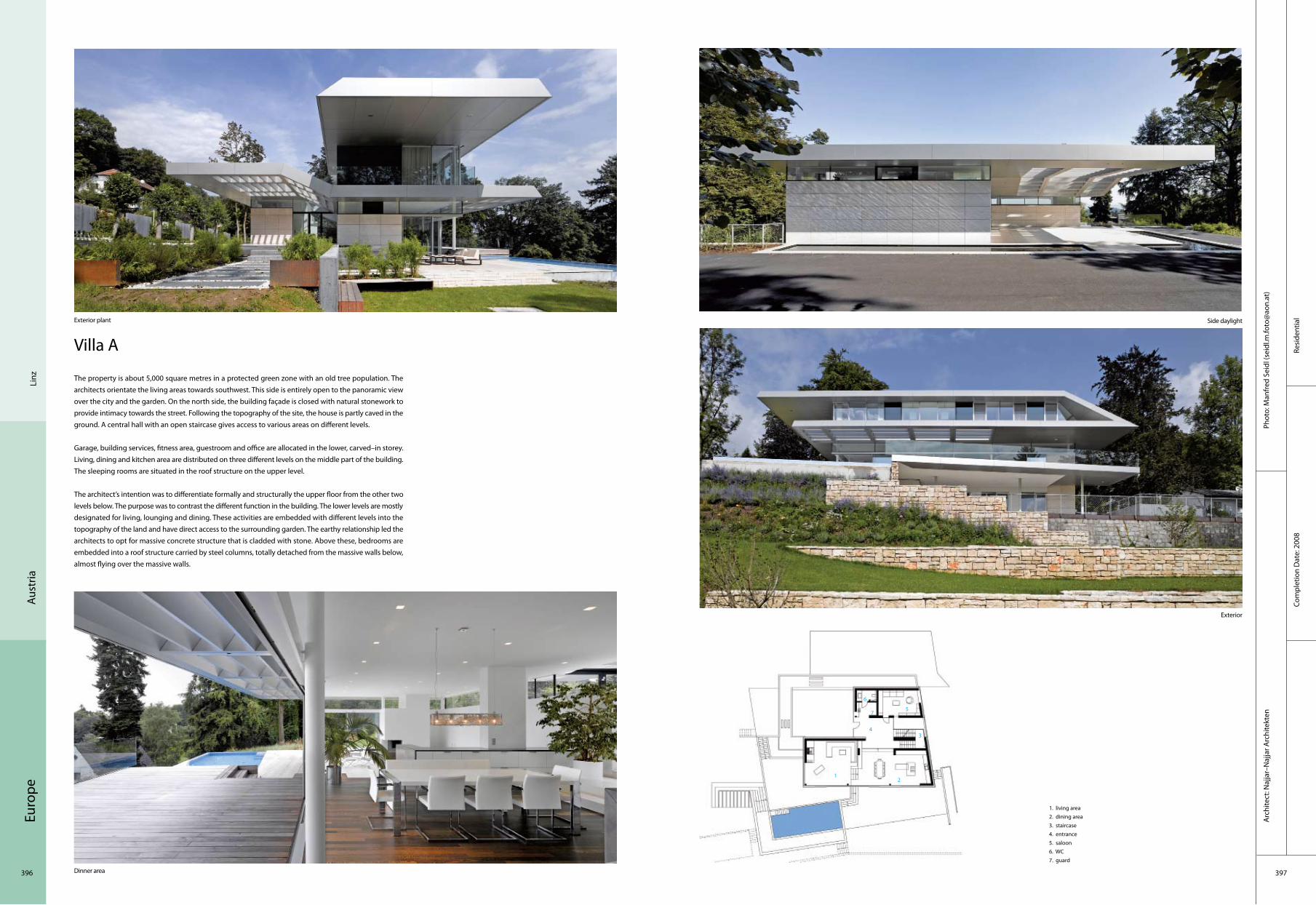
Euro
pe
396 397
Resi
dent
ial
Com
plet
ion
Dat
e: 2
008
Phot
o: M
anfr
ed S
eidl
(sei
dl.m
.foto
@ao
n.at
)A
rchi
tect
: Naj
jar–
Naj
jar A
rchi
tekt
en
Linz
Aust
ria
Villa A
The property is about 5,000 square metres in a protected green zone with an old tree population. The architects orientate the living areas towards southwest. This side is entirely open to the panoramic view over the city and the garden. On the north side, the building façade is closed with natural stonework to provide intimacy towards the street. Following the topography of the site, the house is partly caved in the ground. A central hall with an open staircase gives access to various areas on different levels.
Garage, building services, fitness area, guestroom and office are allocated in the lower, carved–in storey. Living, dining and kitchen area are distributed on three different levels on the middle part of the building. The sleeping rooms are situated in the roof structure on the upper level.
The architect’s intention was to differentiate formally and structurally the upper floor from the other two levels below. The purpose was to contrast the different function in the building. The lower levels are mostly designated for living, lounging and dining. These activities are embedded with different levels into the topography of the land and have direct access to the surrounding garden. The earthy relationship led the architects to opt for massive concrete structure that is cladded with stone. Above these, bedrooms are embedded into a roof structure carried by steel columns, totally detached from the massive walls below, almost flying over the massive walls.
1. living area2. dining area3. staircase4. entrance5. saloon6. WC7. guard
Exterior plant Side daylight
Exterior
Dinner area
2
3
1
4
5
6
7
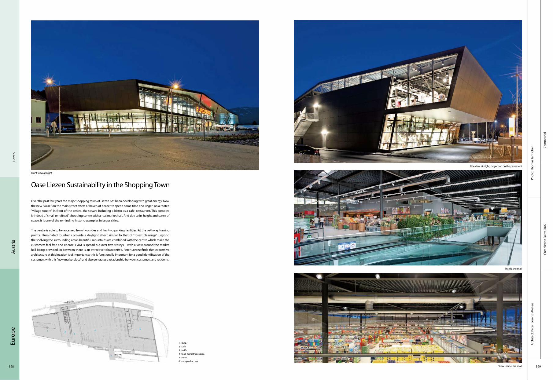
Euro
pe
398 399
Com
mer
cial
Com
plet
ion
Dat
e: 2
009
Phot
o: T
hom
as Ja
ntsc
her
Arc
hite
ct: P
eter
Lor
enz
Ate
liers
Liez
enAu
stria
Oase Liezen Sustainability in the Shopping Town
Over the past few years the major shopping town of Liezen has been developing with great energy. Now the new "Oase" on the main street offers a "haven of peace" to spend some time and linger: on a roofed "village square" in front of the centre, the square including a bistro as a café–restaurant. This complex is indeed a "small or refined" shopping centre with a real market hall. And due to its height and sense of space, it is one of the reminding historic examples in larger cities.
The centre is able to be accessed from two sides and has two parking facilities. At the pathway turning points, illuminated fountains provide a daylight effect similar to that of "forest clearings". Beyond the shelving the surrounding area’s beautiful mountains are combined with the centre which make the customers feel free and at ease. H&M is spread out over two storeys – with a view around the market hall being provided. In between there is an attractive tobacconist’s. Peter Lorenz finds that expressive architecture at this location is of importance: this is functionally important for a good identification of the customers with this "new marketplace" and also generates a relationship between customers and residents.
Side view at night, projection on the pavement
Inside the mall
View inside the mall
Front view at night
1. shop2. café3. traffic4. food market/sales area 5. store 6. canopied access
23
1 4 5
6

Euro
pe
400 401
Com
mer
cial
Com
plet
ion
Dat
e: 2
008
Phot
o: P
ia O
diriz
iA
rchi
tect
: Pet
er L
oren
z A
telie
rs
Aust
riaVi
enna
Q19
Metaphors must always be used carefully in architecture. However, approaching Peter Lorenz’s new local shopping centre in Döbling quarter, in Vienna, from the north side, the associations of ideas spontaneously come out: a stranded ship, a rusted tanker. Actually, it is just with these images that the architect has introduced this work to his client: ships corroded by time, standing still and quiet, as waiting that something would happen.
This image is proper only when one observes the building from the north side and far off. Thus one can see the long and powerful hull, flanked by two protruding spiral ramps to the south and the north side, leading to the covered parkings on the upper floors. The "rusty" façade is made of corten steel. One can also see the domes diffusing the light, which are porthole–shaped elements of different dimensions.
On the entrance side, the scene is completely different. Here the continuum is created between the old and the new building. The old building is the Samum cigarettes paper factory. It is joined by the new one all along its length and, on the north side, even beyond. To the northwest there is the main entrance, with a large forecourt (which has been extended to include an urban public space too) and the glass front structure with uprights and crossbars. The façade is covered by a second skin, made of blinds, working either as solar control device or as dynamic advertising LED panel, which is 22 metres wide and 7.5 metres high.
1. gross shop2. dining area3. shop 4. traffic zone 5. auxiliary area
Façade Night view – entrance, connecting the old and the new part of the shopping Centre
Façade – LED façade, entrance
Inside q19 upper floor
2
3
1
4
5
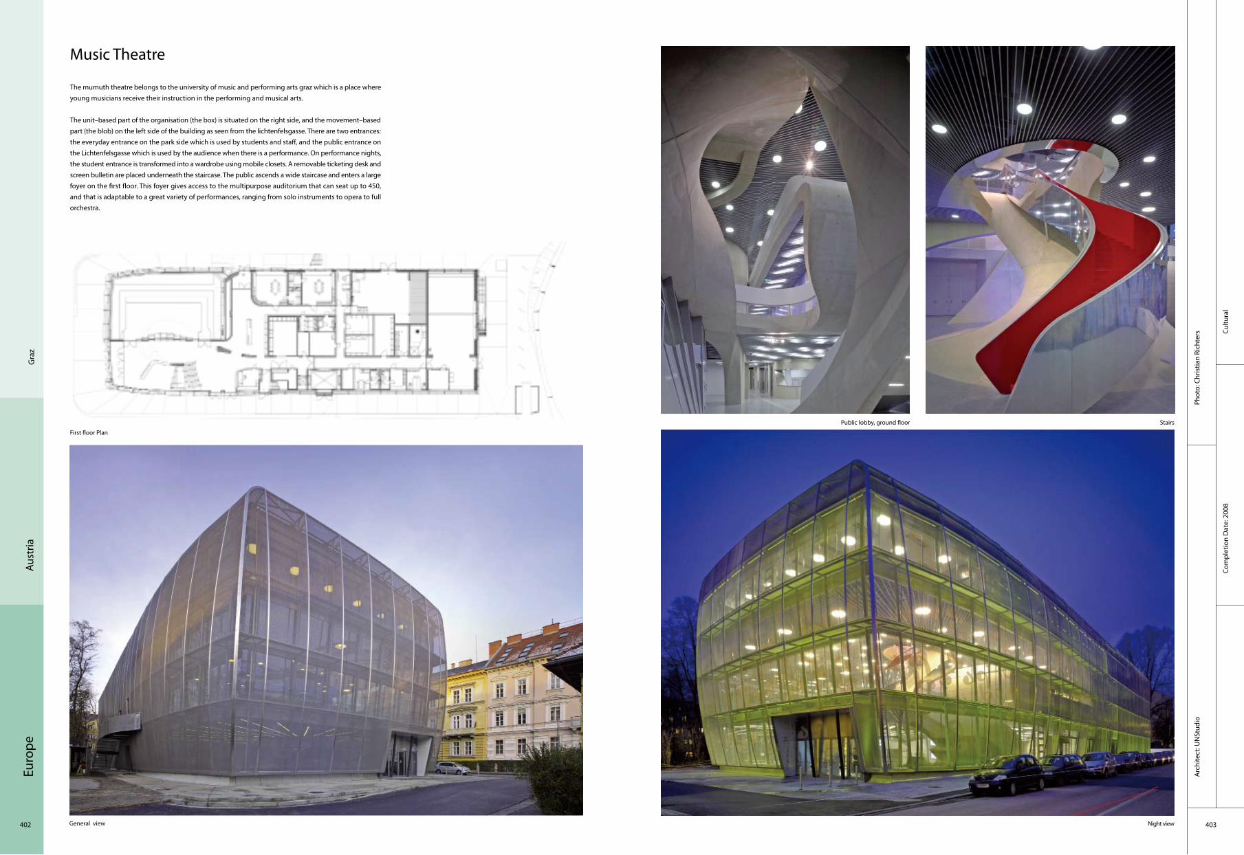
Euro
pe
402 403
Cultu
ral
Com
plet
ion
Dat
e: 2
008
Phot
o: C
hris
tian
Rich
ters
Arc
hite
ct: U
NSt
udio
Gra
zAu
stria
Music Theatre
The mumuth theatre belongs to the university of music and performing arts graz which is a place where young musicians receive their instruction in the performing and musical arts.
The unit–based part of the organisation (the box) is situated on the right side, and the movement–based part (the blob) on the left side of the building as seen from the lichtenfelsgasse. There are two entrances: the everyday entrance on the park side which is used by students and staff, and the public entrance on the Lichtenfelsgasse which is used by the audience when there is a performance. On performance nights, the student entrance is transformed into a wardrobe using mobile closets. A removable ticketing desk and screen bulletin are placed underneath the staircase. The public ascends a wide staircase and enters a large foyer on the first floor. This foyer gives access to the multipurpose auditorium that can seat up to 450, and that is adaptable to a great variety of performances, ranging from solo instruments to opera to full orchestra.
Night view
Stairs
General view
Public lobby, ground floor
First floor Plan

Euro
pe
404 405
Cultu
ral
Arc
hite
ct: E
rwin
Stä
ttne
rPh
oto:
Erw
in S
tätt
ner
Com
plet
ion
Dat
e: 2
008
Carin
thia
Aust
ria
Ml Museum Liaunig
The museum entrance zone is orientated towards both the centre of Neuhaus and the nearby historical castle. The substantial viewing storage depot, where visitors are accompanied by a "wine cellar of art", is one of the main areas of the museum, stretching the whole length of the gently sloping approach to the main exhibition hall. This underground volume offers the possibility to organise a variety of exhibitions by virtue of flexible screens and lighting arrangements. The building’s core is a 160–metre long, fully daylit exhibition hall, with protected terraces at each end. The continuous 13–metre–wide, 7–metre–high room is covered by a translucent curved skin – an industrial element permitting daylight. The hall is organised with mobile exhibition panels. In the exhibition hall are separately sited the graphic collection and the gold collection.
Besides, the museum claims efficiency and sustainability by its utility of the excavated soil for its construction. Industrial materials like concrete, glass and sheet metal dominate the visible portion of the building. Moreover, set into the hill, the building benefits from the constant temperature of the ground. Rooflight is adopted to substitute artificial light as much as possible.
Buildings with entrance
Details
Building with landscape
Roof
Entrance
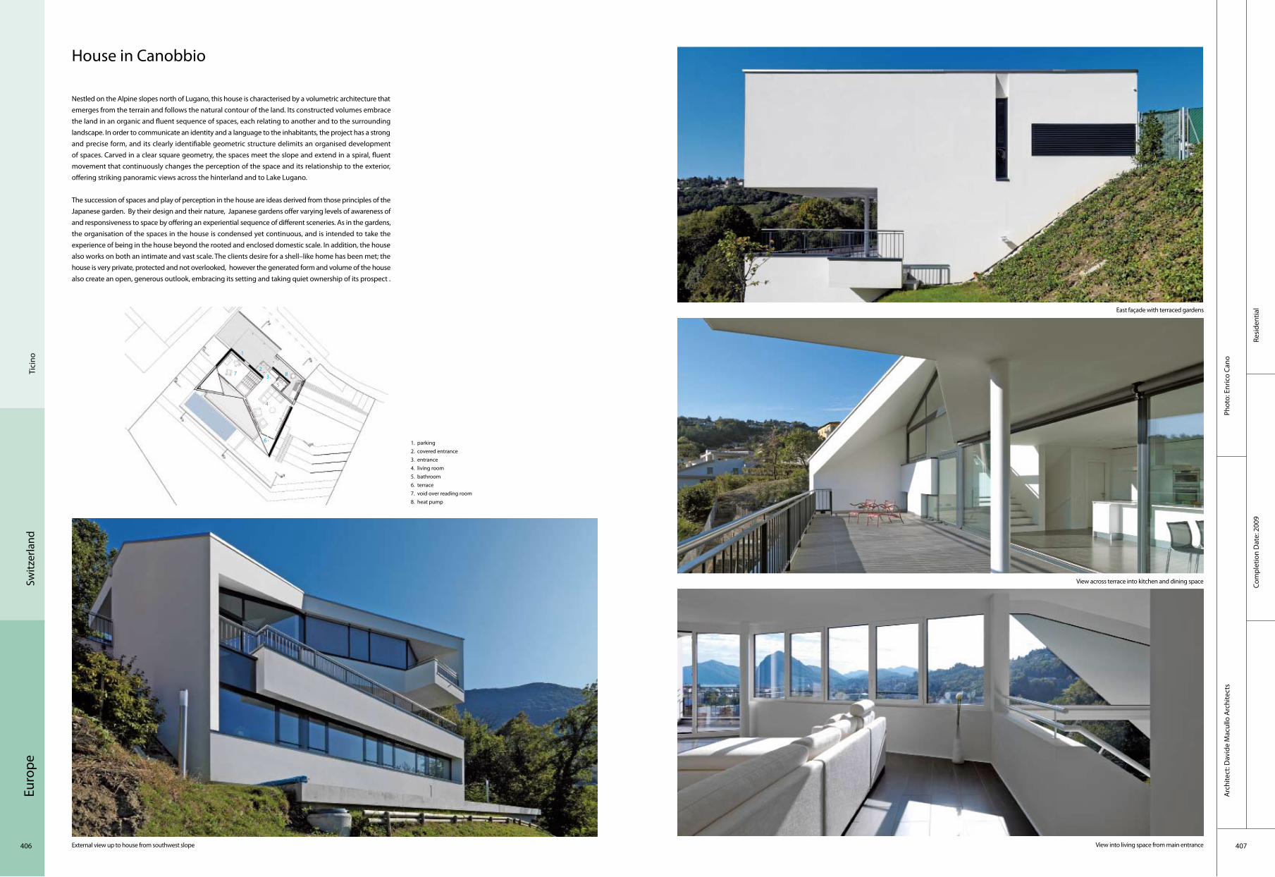
Euro
pe
406 407
Resi
dent
ial
Com
plet
ion
Dat
e: 2
009
Phot
o: E
nric
o Ca
noA
rchi
tect
: Dav
ide
Mac
ullo
Arc
hite
cts
Tici
no
Switz
erla
nd
House in Canobbio
Nestled on the Alpine slopes north of Lugano, this house is characterised by a volumetric architecture that emerges from the terrain and follows the natural contour of the land. Its constructed volumes embrace the land in an organic and fluent sequence of spaces, each relating to another and to the surrounding landscape. In order to communicate an identity and a language to the inhabitants, the project has a strong and precise form, and its clearly identifiable geometric structure delimits an organised development of spaces. Carved in a clear square geometry, the spaces meet the slope and extend in a spiral, fluent movement that continuously changes the perception of the space and its relationship to the exterior, offering striking panoramic views across the hinterland and to Lake Lugano.
The succession of spaces and play of perception in the house are ideas derived from those principles of the Japanese garden. By their design and their nature, Japanese gardens offer varying levels of awareness of and responsiveness to space by offering an experiential sequence of different sceneries. As in the gardens, the organisation of the spaces in the house is condensed yet continuous, and is intended to take the experience of being in the house beyond the rooted and enclosed domestic scale. In addition, the house also works on both an intimate and vast scale. The clients desire for a shell–like home has been met; the house is very private, protected and not overlooked, however the generated form and volume of the house also create an open, generous outlook, embracing its setting and taking quiet ownership of its prospect .
1. parking 2. covered entrance 3. entrance 4. living room 5. bathroom 6. terrace 7. void over reading room 8. heat pump
External view up to house from southwest slope
East façade with terraced gardens
View across terrace into kitchen and dining space
View into living space from main entrance
23
1
4
5
7
6
8

Euro
pe
408 409
Com
plex
Com
plet
ion
Dat
e: 2
007
Phot
o: A
dria
n St
reic
h A
rchi
tekt
en A
G, Z
uric
hA
rchi
tect
: Adr
ian
Stre
ich
Arc
hite
kten
AG
, Zur
ich,
Rog
er F
rei
Zuric
hSw
itzer
land
Corridor View from far away
Inner courtyard
Lienihof Residential and Business Complex
The Lienihof complex, situated between Albis and Heinrich–Federer streets in Zurich–Wollishofen, Switzerland, is incorporated into a virtually similar building site. Its complex sequence of 20 corners in the structure reflects respect for the building regulations in force as well as for the polygonal form of the plot. The building shape, determined by necessity, is balanced by the courtyard which opens up towards the south, thus constituting an architectural force of its own. Surrounding balustrades express the character of this meandering visually horizontal construction. The pine–wood panelling of the balustrades painted in dark red is a reference to the traditional carpenter’s workshop which once stood on the site. Following the sophisticated form of the building, the different apartments are designed as complex figures, closely interwoven with each other so that together they build but a single form. This organic adjustment of the ground plans to the outer structure generates inner spaces which offer a variety of perspectives, views and insights – an architectural approach which leads to interesting inner promenades continuously changing their orientation while moving through the apartments.
Each of the upper floors comprises 11 different apartments which are accessed by three stairscases. The ground floor accomodates both business premises and an apartment for persons with nursing needs. A long hall linking streets, courtyard and the three staircases, creates a community space.
General view
1. bedroom2. washing room3. bedroom4. loggia5. living6. kitchen7. bedroom
2
3
1
4
57
6

Euro
pe
410 411
Resi
dent
ial
Com
plet
ion
Dat
e: 2
009
Phot
o: E
nric
o Ca
noA
rchi
tect
: Dav
ide
Mac
ullo
Arc
hite
cts
Lum
ino
Switz
erla
nd
House in Lumino
Located in the Swiss Alpine village of Lumino, just north of Bellinzona, this house stands as a monolithic element, quietly complementing and echoing its context. The surrounding area is characterised by traditional stone built houses, many of which date back centuries and are marked by their use of this single construction material. The new house acts as a sort of bastion between the old core and the modern residential expansion.
In addition to the local scale references and material cues siphoned from the physical context, the concept and approach to the project was further influenced by the clients’ expressed desire for a minimalist aesthetic. As such, the quality of the spaces in the house would be defined explicitly by the architecture and not by objects placed within it. The idea of the "minimalist monolith" was adopted as the conceptual generator of the project and became a principle applied to all elements of both the functional and construction programme, from the foundations up to the smallest finishing details.
The geometry of the plan is generated by two shifted parallelepipeds and follows the fall of the site. The double system of vertical connections, one internal and one external, relates all the spaces of the house in a spiral movement, and is in a constant play with its new inhabitants’ perception of time and scale. What is interesting about the house is the ability of the spaces to expand and extend into the landscape, allowing the external become part of the composition. While the individual spaces may be defined geometrically, each space flows into the next and continues to the external.
1 entrance2 living3 kitchen4 bedroom5 bathroom6 guest bedroom7 terrace8 laundry9 mechanical room10 storage11 parking
External view of the house in its Alpine context from the southeast
View from west to parking and entrance
View from kitchen through dining and out to terrace
View into living space
45
1
4
511 6
8
910
5

Euro
pe
412 413
Corp
orat
eCo
mpl
etio
n D
ate:
200
9
Phot
o: T
hom
as Ja
ntsc
her
Arc
hite
ct: G
enin
asca
Del
efor
trie
SA
Neu
chât
elSw
itzer
land
Night view of the south façade Details of the industrial glass
Inside view of the open zone
New Industrial Development Centre
To the west of Neuchatel, the landfill from the early 20th century spread over the lake is occupied by a centre of industrial production of Philip Morris. The project resulted in a cuboid of 106 metres long, 33 metres wide and 20 metres high. This particular configuration made of solid work on several levels is due to lack of space. The challenge of this realisation is simple: to provide the user with a tool capable of adapting to any new configuration of use and at a price of a conventional plant.
The proposal is based on a structural system capable of delivering significant ranges (16 metres) and integrating in its thickness and frame all the techniques necessary for the activity of this sophisticated development centre, namely the ventilation, electricity, gas, compressed air, dust removal related to the building, clean rooms and machinery.
Beyond its technical interest, this device offers a particular spatial quality and a quiet environment. The building envelope consists of a single material, namely the glass industry. This choice can optimally manage the confidentiality of the activity, quality natural light and indoor climate.
South Façade,took from the Neuchâtel Lake
1. WC2. lift3. airlock4. lift5. heating distribution6. informatics7. power transformer8. power distribution9. airing +water treatment10. technical11. sprinkler12. compressed air13. stocking14. south–west workshop15. meeting room16. CAD office17. prototype zone18. hallway + freezers19. break room20. meeting room21. supervisor’s office22. cubbyhole23. emergency power
9
214
5
11
6
5 6 10
3 78
17
131312
1615
142019
18117 8 9
3
2323
21

Euro
pe
414 415
Werdwies Residential Complex
The course of the river Limmat and the motorway represent two antipodes forming the boundaries of the insular microcosm of the Grünau Quarter in Zurich, Switzerland. The Werdwies Residential Complex provides the Quarter with an open centre characterised by the density of an inner space. The complex consists of seven rhythmically positioned prism–like constructions creating a sequence of built and open spaces. This leads to the emergence of several smaller and larger squares, each with its own character. A hard covering with integrated lawn areas forms the ground area of the exterior space and allows free movement within the residential complex. The planting of about 100 trees underlines the park–like character of the complex.
Each building comprises seven residential floors, having a total of 152 apartments in three different house types. The houses are distinguished by their staircases with loggias and stairwells. The spacious loggias create a dense relationship between interior and exterior spaces. At the same time, they mark the beginning of a principle of layers, generating a comprehensive modularity. Each apartment includes a sequence of rooms lighted from different directions, with areas for living, eating and sleeping. Simple layouts with long rooms and built–in cupboards extending over the whole length of the wall give the apartments a robust character.
Front view
Landscape
Dining
Courtyard
Resi
dent
ial
Com
plet
ion
Dat
e: 2
007
Phot
o: A
dria
n St
reic
h A
rchi
tekt
en A
G, Z
uric
hA
rchi
tect
:Adr
ian
Stre
ich
Arc
hite
kten
AG
, Zur
ich
Zuric
hSw
itzer
land
1. bedroom2. washing room3. living4. kitchen and dining
2
1
43

Euro
pe
416 417
Recr
eatio
nal
Com
plet
ion
Dat
e: 2
007
Phot
o: W
alte
r Mai
r, Ch
risto
ph R
einh
ard
Arc
hite
ct: S
mol
enic
ky &
Par
tner
Arc
hite
ktur
Sim
on K
rähe
nbüh
l, D
irk–O
liver
Hai
d, Ju
an–C
arlo
s Sm
olen
icky
–Mun
oz
Sem
pach
Switz
erla
nd
Sempachersee Golf Club
This is the largest golf course in Switzerland. The architectural office Smolenicky & Partner was commissioned to design two new buildings in connection with the enlargement of the course – the clubhouse and restaurant building and the new maintenance building.
The clubhouse is situated precisely on the topographical crest where the level plateau of the golfing green breaks into a steeply falling slope. At exactly this point, the vista opens out into a view over the lake and the Alps of inner Switzerland. The public footpath that transverses the golf club also runs along this topographical ridge.
Both the architecture and the interior design of the new building aim to combine two distinct atmospheric phenomena of the site into a single effect. This new manifestation is moulded, on the one hand out of the country character of the golfing culture of the Sempachersee course, and on the other hand out of its worldly sophistication. To this end the appearance oscillates between the rural warmth of a timber barn and the clear lines of a Masserati sports car. This is the attempt to embody both the reality of the dualism of the site and its potential within the building itself.
South view
1. maintenance building–new building 2. reception– add–on 3. clubhouse – new building
West view
Veranda clubhouse Restaurant entrance
2
1
3

Euro
pe
418 419
Educ
atio
nal
Bonn
ard
Woe
ffray
Arc
hite
ctes
Phot
o: H
anne
s H
enz
Com
plet
ion
Dat
e: 2
009
Visp
Switz
erla
nd
BSV College for Further Education
The new class building of the Viège/Visp College of Further Education achieves a transformation in terms of context and enables the linking of the neighbourhood’s schools, the creation of a training campus, and the integration of the future workshops and gyms. Associated with the new building, the former school playground becomes the benchmark public space of the campus.
The new building’s composition of volumes takes its cue from that of the schools in the area. The typology maker reference to that of the building with its central distribution hall, yet radicalises it into a plan featuring three strata, the central layer serving both as distributive and group–work space. The transparency of the lightweight partitions allows this space to benefit from natural light. The use of materials within the building is confined to the bare load–bearing concrete and to the aluminium combined with the coloured glass of the lightweight partitions. The materiality of the exterior confirms the volumetric character – the mirror–finish stainless steel frames of the glazing and the bare aluminium cladding applied to the section cut away from the base quadrilateral. The fragmentation of the reflections created by the bevelling of the façades generates a new context.
Southwest
East Stairs
Foyer level 2
1. entrance2. foyer3. refectory4. kitchen5. classroom6. preparatory room
2
1
4
56
3
5

Euro
pe
420 421
Tran
spor
tatio
n
The
Net
herla
nds
Arc
hite
ct: G
rimsh
aw A
rchi
tect
sPh
oto:
Jan
Scho
uten
Am
ster
dam
Euro
pe
Com
plet
ion
Dat
e: 2
007
Station Amsterdam Bijlmer ArenA
The station is designed to provide a high level of social security both during the day and at night. Long voids are cut into the platforms to break down the overshadowed sections of the 100m wide area below the viaducts. These voids improve the sense of safety through visual contact and improved transparency between the platform and ground–level areas.
To avoid a dark 100m long tunnel, the concrete structures were spaced apart. Each 20m span was supported at each end on just one column via an integrated cantilevered saddle. Arrays of columns were then aligned on an axis with the boulevard to maximise visual connectivity from east to west. The base–element of the roof structure is a "V" shaped continuous hollow steel boom with steel arms cantilevered on either side to support all the roof glazing. The combined assembly is supported on a series of tubular "A" frames with only a single deep longitudinal stabiliser near the south end. Beyond their last supports these booms cantilever up to 18m, thereby enhancing the sense of linearity and direction. The timber lined elements straddle each track–bed, and are open at ridge level to assist natural ventilation, and allow areas for pressure release in respect of 200k/h trains.
1. LUN bus 2. station
2
1
5
1
1

Euro
pe
422 423
Recr
eatio
nal
Phot
o: J
ohn
Lew
is M
arsh
all
Arc
hite
ct:
MIII
arc
hite
cten
The
Net
herla
nds
Ijsse
l
Vuykpark, Capelle a/d IJssel
For the site of the former shipyard "Vuyk" in Capelle aan den IJssel, MIII designed a restaurant. The design of MIII was inspired by the history of this site, a shipyard where craftsmanship was at a highly competitive level. Marine lining, carpentrance, and wood constructions were starting point for the design in which lopside and vigour refer at navigation (shipping).
The outside, visible construction hints at the old craftsmanship of the ship's carpenter. The idea was to envelop the building, so to speak, in a wooden coat. Characteristic of these designs is the sharp contrast between the often introvert exterior and the open and transparant interior. A smooth wooden sheet around its outline makes a connection with the carpentrance of the past. The open–front coping has several advantages above a closed one. Most prominent is the feature that the wind can freely blow alongside the wooden front parts and by doing so, dehydrate these parts in a natural way. Thus, the backside can be ventilated.
1. wind bracing2. lobby
21

Euro
pe
424 425
Indu
stria
lCo
mpl
etio
n D
ate:
200
6
Phot
o: D
igid
aan
Arc
hite
ct: M
aart
en v
an B
rem
en, J
aap
van
Dijk
, Fol
kert
van
Hag
en, A
dam
Vis
ser,
Jasp
er H
erm
ans
The
Net
herla
nds
Am
ster
dam
Booster Station–South
Booster Station–South in Amsterdam is primarily a utility building which contains a technical plant and a pumping–engine for sluicing out sewage. The hidden technology of the sewage–system of the Dutch capital emerges in the public realm as an intriguing object. The location in the public realm asks for a careful design that will appeal to the public now as well as in the future, all the more because Booster is located next to a busy traffic junction where different types of transport intersect.
The programme for the pumping–station consists of a high and a low voltage space, an overhead crane, three pumps, a bypass and an entrance. The Booster Station–South can be seen as a metaphorical reference to a streamlined engine. The clinging, aerodynamic skin forms an envelope for the building's technical program. It also emphasises the relation between form and function the building reveals. The constant stream of passengers by car, metro, train or bicycle perceive the Booster Station as a futuristic sculpture. With its cladding of stainless steel panels, it reflects the movements, shapes and colours of the environment. At night the illuminated seams in the steal skin make the building look like a mesh model.
1. entrance2. pumps3. stairs
2
1
3
Front
Interior Detail
Evening side
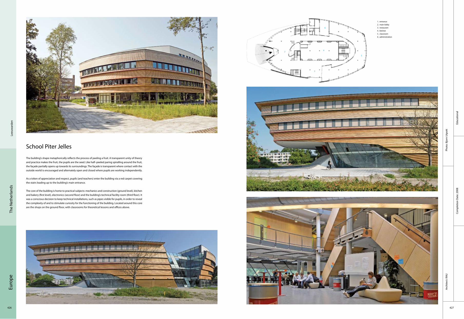
Euro
pe
426 427
Educ
atio
nal
Com
plet
ion
Dat
e: 2
008
Phot
o: B
jorn
Utp
ott
Arc
hite
ct: R
AU
Leeu
war
den
The
Net
herla
nds
School Piter Jelles
The building’s shape metaphorically reflects the process of peeling a fruit. A transparent unity of theory and practice makes the fruit, the pupils are the seed. Like half–peeled paring spiralling around the fruit, the façade partially opens up towards its surroundings. The façade is transparent where contact with the outside world is encouraged and alternately open and closed where pupils are working independently.
As a token of appreciation and respect, pupils (and teachers) enter the building via a red carpet covering the stairs leading up to the building’s main entrance.
The core of the building is home to practical subjects: mechanics and construction (ground level), kitchen and bakery (first level), electronics (second floor) and the building’s technical facility room (third floor). It was a conscious decision to keep technical installations, such as pipes visible for pupils, in order to reveal the complexity of and to stimulate curiosity for the functioning of the building. Located around this core are the shops on the ground floor, with classrooms for theoretical lessons and offices above.
1. entrance2. main lobby3. restaurant4. kitchen5. classroom6. administration
214
6
3
5

Euro
pe
428 429
Resi
dent
ial
Com
plet
ion
Dat
e: 2
008
Phot
o: M
iche
l Kie
vits
Arc
hite
ct: G
rosf
eld
van
der V
elde
Arc
hite
cten
Prin
senb
eek
The
Net
herla
nds
Woonhuis VdB, Prinsenbeek
Located in the outskirts of the city of Breda, on the edge of the urban and rural zone, this house is provided with great views. The clients preferred a maximum volume on this plot and asked the Dutch architects Grosfeld van der Velde to turn this desire into reality. They designed a house with a square floor plan of 15 x 15 meters, stacked up over 3 levels. The ground floor is raised above the surrounding land so that daylight can enter the half–sunken basement. By lifting the ground floor, the view from the living area of the natural environment is astonishing.
Exterior
Exterior view Living room
Glass doorStaircase
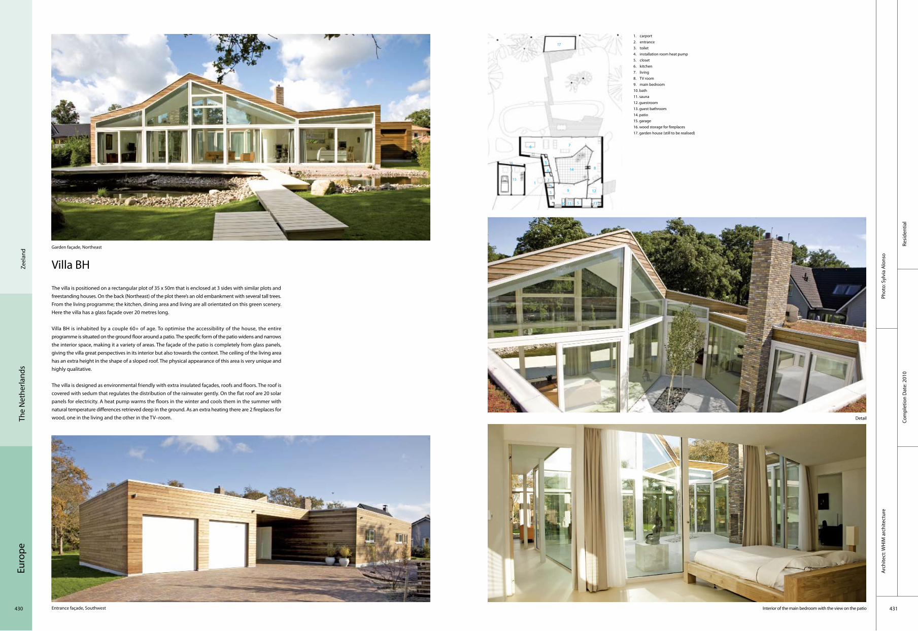
Euro
pe
430 431
Resi
dent
ial
Com
plet
ion
Dat
e: 2
010
Arc
hite
ct: W
HIM
arc
hite
ctur
ePh
oto:
Syl
via
Alo
nso
Zeel
and
The
Net
herla
nds
Villa BH
The villa is positioned on a rectangular plot of 35 x 50m that is enclosed at 3 sides with similar plots and freestanding houses. On the back (Northeast) of the plot there’s an old embankment with several tall trees. From the living programme; the kitchen, dining area and living are all orientated on this green scenery. Here the villa has a glass façade over 20 metres long.
Villa BH is inhabited by a couple 60+ of age. To optimise the accessibility of the house, the entire programme is situated on the ground floor around a patio. The specific form of the patio widens and narrows the interior space, making it a variety of areas. The façade of the patio is completely from glass panels, giving the villa great perspectives in its interior but also towards the context. The ceiling of the living area has an extra height in the shape of a sloped roof. The physical appearance of this area is very unique and highly qualitative.
The villa is designed as environmental friendly with extra insulated façades, roofs and floors. The roof is covered with sedum that regulates the distribution of the rainwater gently. On the flat roof are 20 solar panels for electricity. A heat pump warms the floors in the winter and cools them in the summer with natural temperature differences retrieved deep in the ground. As an extra heating there are 2 fireplaces for wood, one in the living and the other in the TV–room.
Interior of the main bedroom with the view on the patio
Garden façade, Northeast
Entrance façade, Southwest
1. carport2. entrance3. toilet4. installation room heat pump5. closet6. kitchen7. living8. TV room9. main bedroom10. bath11. sauna12. guestroom13. guest bathroom14. patio15. garage16. wood storage for fireplaces17. garden house (still to be realised)
Detail
9
21
4
5
6
5
5
10
3
7
8
17
13
12
16
15
14
11

Euro
pe
432 433
Resi
dent
ial
Com
plet
ion
Dat
e: 2
009
Phot
o: B
urea
u Ira
Koe
rsA
rchi
tect
: Bur
eau
Ira K
oers
ww
w.ir
akoe
rs.n
l
Ruin
enTh
e N
ethe
rland
s
Merry–Go–Round
Although ideas about recreation and the design of the landscape have changed over the years, the typology of the holiday cottage has hardly altered at all. Ever since the recreational outing of several days or more came into vogue in the 1960's, we have seen the same mini–version of the standard home.
Whereas the confined space of a boat or caravan has led to clever design solutions, the country cottage has never developed an identity of its own. The design of the Merry–Go–Round gives new meaning to the holiday cottage by taking the traditional floor plan with its rooms opening onto a central hallway and turning it inside out. The rooms are replaced by eight open alcoves in which furniture, colour, light, material, lines of sight and views of the outdoor surroundings are bundled into one compact, fixed interior. The alcoves are connected by a corridor that runs all around the perimeter of the dwelling and opens onto the landscape. By adjusting the façade, which is comprosed of shutters, the vacationing residents of the Merry–Go–Round can determine the view and their privacy themselves.
1. bedroom 2. bedroom 3. bathroom 4. living room 5. kitchen
Exterior view by day
Exterior by night
Sofa Corridor
Toilet
21
4
5
3

Euro
pe
434 435
Corp
orat
eCo
mpl
etio
n D
ate:
200
6
Phot
o: H
ans
Lebb
e, K
uste
rs F
otog
rafie
, RAU
Arc
hite
ct: R
AU
Zeis
tTh
e N
ethe
rland
s
WWF Netherlands Head Office
RAU transformed a former 1950’s agricultural laboratory into the first CO2–neutral and (almost entirely) self–sustaining office in the Netherlands. By breaking through the rigidity of the existing structure and adding an organic blob at the centre, the rejuvenated building got a friendly and inviting appearance. Natural materials have replaced bare concrete; what used to be grey and confronting is now in harmony with the surrounding natural reserve. RAU’s intervention not only give a the building a new face, but fundamentally changed the user experience. Natural ventilation and the use of natural materials offer a balanced and healthy indoor environment.
Energy and EnvironmentThe use of renewable energy is not the only environment–friendly aspect of the building. Energy and construction materials were saved by keeping the concrete skeleton of the former laboratory. All used wood is FSC–certified. The doormat is made of old car tires, and the flooring is made from recycled carpets. All used materials are child labour free. Bats have access to an especially prepared area of the basement and birds can nest in the façade.
Flexibility and Efficient Use of SpaceThe building is divided into two zones. All public functions such as the reception, the call centre, a shop and meeting rooms are grouped around the central staircase in the blob. Glass walls emphasise the open atmosphere in this part of the building.
The non–public functions are accommodated in the two wings of the complex. A smaller–scale floor plan creates a more calm environment, allowing employees to focus on their work without distraction. The first floor of the complex has a flexible layout so that it can partly or entirely be let to third parties.
1. entrance2. main lobby3. call Centre4. office space5. restaurant6. messenger room7. storage and archives8. info centre
Main entrance
General view Exterior
Stairway
Main stair
2
14
6
44
7
58

Euro
pe
436 437
Cultu
ral
Phot
o: Jo
hnLe
wis
Mar
shal
l.com
Arc
hite
ct: H
VDN
Arc
hite
cten
Com
plet
ion
Dat
e: 2
008
The
Net
herla
nds
Am
ster
dam
The 4th Gymnasium
The façade has two effects that intensify the character of the building. The plinth is made of flat, coloured aluminium panels and continuously follows through into the façade of the courtyard; as a foretoken of the colour explosion in the court. The wooden façade has been developed more spatially and in depth and gives the building plasticity. This expressive modular built façade is hard to distinguish from a traditional façade because of a number of innovations, which prevents the monotonous picture of piled up units. By choosing a relative deep outside façade, it was possible to bring on relief. Under the frame, the façade withdraws 20 cm through which the image of two piled up arcades is created. And the seams between the modules are hidden; the wooden front parts are built from narrow planks, which are placed vertically and on small distance from each other. Through the number of artificial seams that arises, the real seams become invisible. At the plinth and the façade of the courtyard, the seams are hidden behind the rhythmically placed coloured aluminium boards of different widths. These creative solutions give the gymnasium a permanent and nevertheless dynamic charisma.
Façade
Inner court
Inner court & façade Façade
Auditorium
1. section A–A2. ground3. 1st floor4. 2nd floor
2
4
1
3

Euro
pe
438 439
Resi
dent
ial
Com
plet
ion
Dat
e: 2
008
Phot
o: lu
uk k
ram
er a
nd Jo
hn L
ewis
Mar
shal
lA
rchi
tect
: HVD
N A
rchi
tect
en
Am
ster
dam
The
Net
herla
nds
Het Kasteel
Its location adjacent to the railway lines necessitates a high level of sound insulation and it is this that defines the external expression of the "Kasteel". The building is enveloped in a glazed skin that stands free from the apartment block behind. In order to give the skin a tactile quality, the panels are angled slightly to each other; this artifice lends the building the appearance of a gigantic crystal.
The "Kasteel" consists of a 45 metre–high tower standing on a four to five–storey base. It is surrounded by water and pedestrians and cyclists access the internal courtyard via a bridge. The car parking, storage spaces and some of the ground floor dwellings’ living spaces are positioned underneath the courtyard’s half–open wooden deck. The dwellings vary in size: those on the ground floor include a living space just above the water level while those above contain either a balcony or a terrace. The interaction between the apartment block’s recessed elevation and the glazed panels of the building’s skin ensures the entrance building acts as an icon for the Science Park.
General view
Courtyard on the roof Details
Interior Exterior

Euro
pe
440 441
Com
plex
Com
plet
ion
Dat
e: 2
008
Phot
o: A
rchi
tect
enbu
reau
Cep
ezed
Arc
hite
ct: A
rchi
tect
enbu
reau
Cep
ezed
Hag
ueTh
e N
ethe
rland
s
Waldorpstraat
The building is more than 165 metres in length and its total surface area of more than 5,500 m2 is divided among the ground floor and the entresols. One of the units accommodates a wholesaler in paint accessories. Another houses an innovative, environment–friendly carwash, no less than 50 metres long, in which ten cars can be washed at the same time and waiting times are short. After the wash, customers can vacuum–clean their cars at one of the 38 indoor vacuuming points. Because the carwash is bounded by a side wall of perforated steel, there is always a light, sight and climate relationship with the outside world.
With its fixed grid pattern, the building has been fully designed according to the principles of industrial, flexible and sectional building, and it is easy to extend or to add extra floor surface on the inside. Because it is partly sunken in the railway embankment, the building is equipped with a curving roof that does not disrupt the view of the engine drivers and train passengers. At the front, the building is eight metres high, and at the rear it is only four. As the train occasionally spreads sparks and dust, the roof of the building is coated with sedum vegetation, which also offers a pleasant view to the residents of the neighbouring apartment block.
1. elevation wall2. stairs
Façade
Main entrance
Bird’s–eye view
Interior
2
1
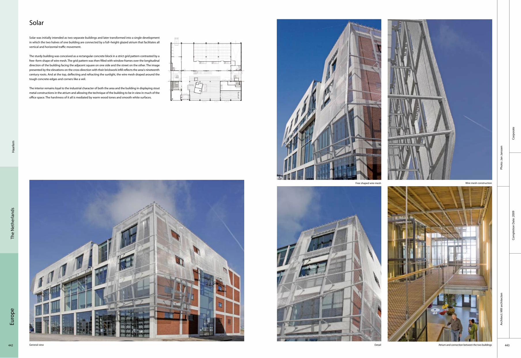
Euro
pe
442 443
Corp
orat
eCo
mpl
etio
n D
ate:
200
9
Phot
o: Ja
n Ja
nsse
nA
rchi
tect
: MIII
arc
hite
cten
Haa
rlem
The
Net
herla
nds
Solar
Solar was initially intended as two separate buildings and later transformed into a single development in which the two halves of one building are connected by a full–height glazed atrium that facilitates all vertical and horizontal traffic movement.
The sturdy building was conceived as a rectangular concrete block in a strict grid pattern contrasted by a free–form shape of wire mesh. The grid pattern was then filled with window frames over the longitudinal direction of the building facing the adjacent square on one side and the street on the other. The image presented by the elevations on the cross direction with their brickwork infill reflects the area‘s nineteenth century roots. And at the top, deflecting and refracting the sunlight, the wire mesh draped around the tough concrete edges and corners like a veil.
The interior remains loyal to the industrial character of both the area and the building in displaying stout metal constructions in the atrium and allowing the technique of the building to be in view in much of the office space. The harshness of it all is mediated by warm wood tones and smooth white surfaces.
General view
Free shaped wire mesh Wire mesh construction
Detail Atrium and connection between the two buildings

Euro
pe
444 445
Corp
orat
eCo
mpl
etio
n D
ate:
200
9
Phot
o: Ji
m E
rnst
Arc
hite
ct: Y
ushi
Ueh
ara
Gro
ning
enTh
e N
ethe
rland
s
Shaken Office
Yushi Uehara search form that shines soul and energy, builds with user’s dynamism, the Super Functionalism with the combination of subtle differences, and pursues the concept that innovate utilitarian aspects. Obviously, the intention to this "Super Functionalism" urged to stacked–up boxes of diverse dimensions, the minimalist floor plans with single cores, with which he created the workspaces with varied dimensions. He reached even to a building system. A light–body concrete on steel plates prefabricated timber sub construction façade are sealed by a sheet of black corrugated steel plates that shield the rain frills where façade panels are screwed on finely perforated, folded steel plates that let only the half of openings open. The monolith overshadows over these sensual openings. Lightness creates large impression: that is the rhetoric.

Euro
pe
446 447
Cultu
ral
Co
mpl
etio
n D
ate:
200
7
Phot
o: C
hris
tian
Rich
ters
Arc
hite
ct: U
NSt
udio
, Am
ster
dam
Lely
stad
The
Net
herla
nds
Agora Theatre
The Agora Theatre is an extremely colourful, determinedly upbeat place. The building is part of the masterplan for Lelystad, which aims to revitalise the pragmatic, sober town centre. The theatre responds to the ongoing mission of reviving and recovering the post–war Dutch new towns by focusing on the archetypal function of a theatre: that of creating a world of artifice and enchantment. Both inside and outside walls are faceted to reconstruct the kaleidoscopic experience of the world of the stage, where you can never be sure of what is real and what is not. In the Agora Theatre drama and performance are not restricted to the stage and to the evening, but are extended to the urban experience and to daytime.
Inside, the colourfulness of the outside increases in intensity. A handrail executed as a snaking pink ribbon cascades down the main staircase, winds itself all around the void at the centre of the large, open foyer space on the first floor and then extends up the wall towards the roof, optically changing colours all the while from violet, crimson and cherry to almost white.
Ground floor plan1. Entrance2. Ticket desk3. Reception counter4. Cloakroom5. Foyer 6. Stage main hall7. Restaurant8. Machinery9. Dressing rooms10. Loading bay
Stage main hall
Exterior view
Façade
Foyer with skylight
2
1
3
6
5
4
7
8 9
10

Euro
pe
448 449
Com
mer
cial
Com
plet
ion
Dat
e: 2
008
Phot
o: V
an P
ol b
ehee
r, A
rjen
Schm
itz, H
ans
Patt
ist,
Hen
nie
Rete
raA
rchi
tect
: NIO
arc
hite
cten
Roer
mon
dTh
e N
ethe
rland
s
Betty Blue
As unambiguous as this shopping machine is lying here on its doorstep, waiting for visitors, as ambiguous it is in relation to its shape and colour, it is sometimes straight and other times round, from the one side purple and from the other side blue. In the shelter of this enormous lifted and stretched drop of water, an inner square with almost exotic conditions has been shaped. It is as if a whole life of its own has been able to develop itself inside this inner space, in which façade openings, bill boards, lampposts, wastebaskets, bicycle sheds and road markings have gone through a joint and balanced growth.
That exclusivity does not necessarily mean an extraordinary budget. In the task the designers set themselves by making something with a modular, and therefore efficient building system is specific and thus unique. Where modular systems usually result in all too predictable shapes, the designers managed, within the regime of recurring façade elements, to put up a system of façade openings with such variation that a seemingly much bigger variety of windows, shop windows and entrance doors can be made.
Bird's–eye view
General view
Interior
Night view
Entrance
1. supermarket2. home electronics3. dieren4. 5. home electronics6. speelgoed7. PDV8. outdoor9. woonwarenhuis10. 11. 13. PDV12. Sport14. fitness15. disco16. 17. fast food
2
1
3
6 5
4
7
1716
15
1
2
146
5
3
4
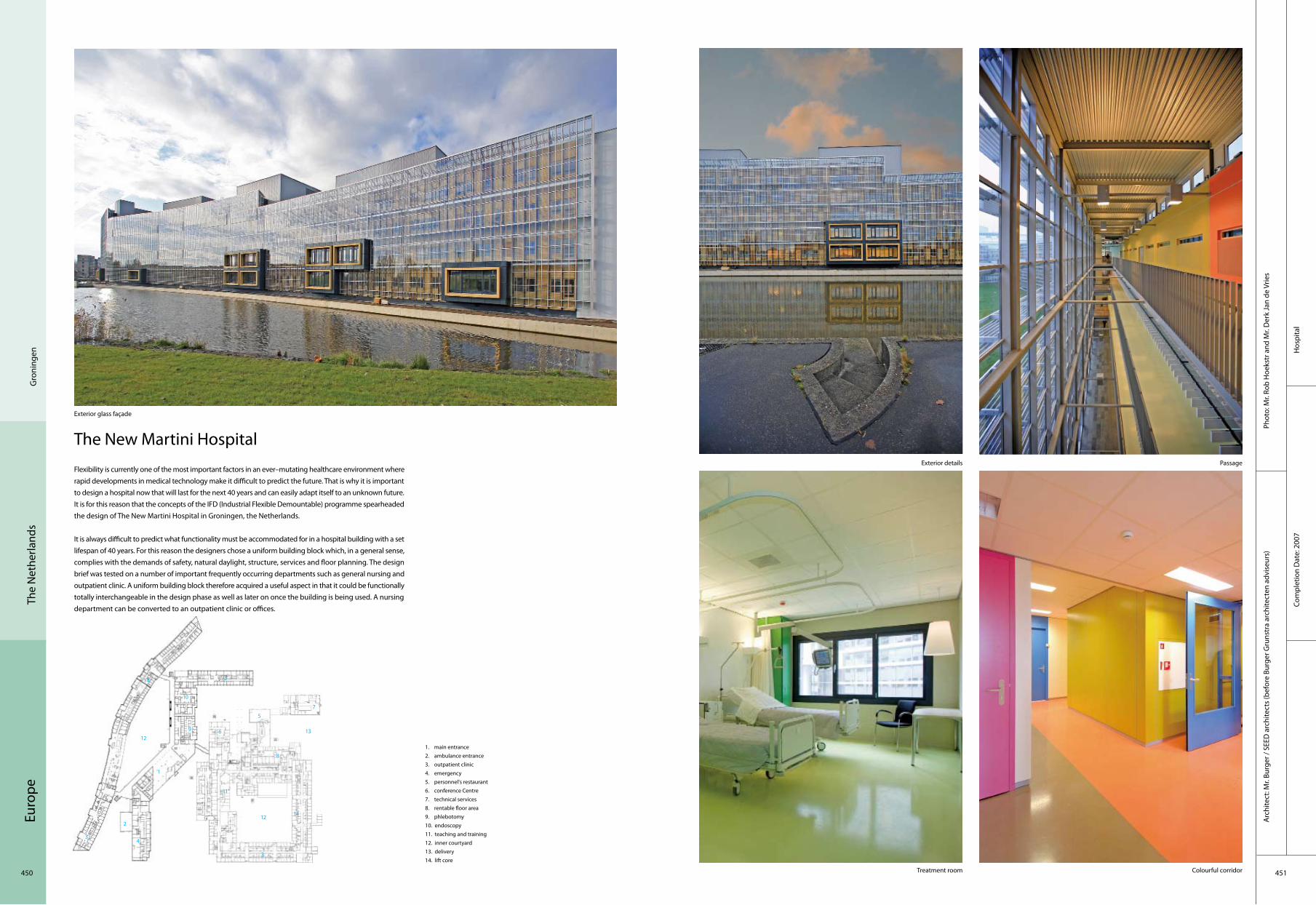
Euro
pe
450 451
The
Net
herla
nds
Hos
pita
lCo
mpl
etio
n D
ate:
200
7
Phot
o: M
r. Ro
b H
oeks
tr a
nd M
r. D
erk
Jan
de V
ries
Arc
hite
ct: M
r. Bu
rger
/ SE
ED a
rchi
tect
s (b
efor
e Bu
rger
Gru
nstr
a ar
chite
cten
adv
iseu
rs)
Gro
ning
en
The New Martini Hospital
Exterior glass façade
Exterior details Passage
Treatment room Colourful corridor
1. main entrance2. ambulance entrance3. outpatient clinic4. emergency5. personnel's restaurant6. conference Centre7. technical services8. rentable floor area9. phlebotomy10. endoscopy11. teaching and training12. inner courtyard13. delivery14. lift core
Flexibility is currently one of the most important factors in an ever–mutating healthcare environment where rapid developments in medical technology make it difficult to predict the future. That is why it is important to design a hospital now that will last for the next 40 years and can easily adapt itself to an unknown future. It is for this reason that the concepts of the IFD (Industrial Flexible Demountable) programme spearheaded the design of The New Martini Hospital in Groningen, the Netherlands.
It is always difficult to predict what functionality must be accommodated for in a hospital building with a set lifespan of 40 years. For this reason the designers chose a uniform building block which, in a general sense, complies with the demands of safety, natural daylight, structure, services and floor planning. The design brief was tested on a number of important frequently occurring departments such as general nursing and outpatient clinic. A uniform building block therefore acquired a useful aspect in that it could be functionally totally interchangeable in the design phase as well as later on once the building is being used. A nursing department can be converted to an outpatient clinic or offices.
9
2
1
4
6
5
10
3
7
8
1312
14
11
12
3
14 3

Euro
pe
452 453
Com
plex
Phot
o: C
hris
tian
Rich
ters
Arc
hite
ct: U
NSt
udio
, Am
ster
dam
Com
plet
ion
Dat
e: 2
006
Vree
land
The
Net
herla
nds
Tea House on Bunker
The project involves the reprogramming of a historical and derelict building through renovation and addition. The original bunker is part of an intricate water management system that enabled the inundation of land situated in a classic, Dutch polder landscape.
Stables and polo fields now surround the building and the new addition is intended as a large space with facilities to support a meeting space or business retreat. The existing 1936 bunker remains intact except for a portion of the concrete roof where the new structure connects whilst the new addition is like an umbrella, an addition that could be removed and does not damage or permanently influence the historic structure. The metallic addition appears to have grown out of the still visible concrete façades of the bunker, cantilevering out towards the sports fields with its large single window. In fact the space is designed with steel structures within its two main walls which act as one–storey–high beams. These beams are balanced off centre on two columns that land directly in front of the existing bunker. Stability is achieved by using the massive concrete shell of the bunker as a counterweight.
First floor plan
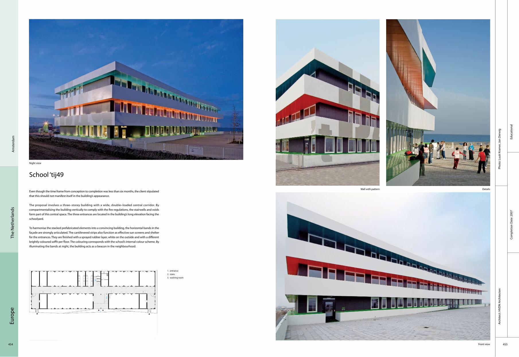
Euro
pe
454 455
Educ
atio
nal
Arc
hite
ct: H
VDN
Arc
hite
cten
Phot
o: L
uuk
Kram
er, J
an D
erw
ig
Com
plet
ion
Dat
e: 2
007
Am
ster
dam
The
Net
herla
nds
School ‘tij49
Even though the time frame from conception to completion was less than six months, the client stipulated that this should not manifest itself in the building’s appearance.
The proposal involves a three–storey building with a wide, double–loaded central corridor. By compartmentalising the building vertically to comply with the fire regulations, the stairwells and voids form part of this central space. The three entrances are located in the building’s long elevation facing the schoolyard.
To harmonise the stacked prefabricated elements into a convincing building, the horizontal bands in the façade are strongly articulated. The cantilevered strips also function as effective sun screens and shelter for the entrances. They are finished with a sprayed rubber layer, white on the outside and with a different brightly coloured soffit per floor. The colouring corresponds with the school’s internal colour scheme. By illuminating the bands at night, the building acts as a beacon in the neighbourhood.
Night view
Front view
DetailsWall with pattern
1. entrance2. stairs3. washing room
2
1
3

Euro
pe
456 457
Att
ica
Gre
ece
Indu
stria
lCo
mpl
etio
n D
ate:
200
5
Phot
o: P
saro
s Vla
ssis
Arc
hite
ct: Y
anni
otis
Yan
nos–
Yann
ioti
Vasi
liki–
Nile
nt P
aul A
rchi
tect
s;Ci
vil E
ngin
eer:
Karo
ukis
Pan
agio
tis–P
olix
rono
poul
os K
osta
sM
echa
nica
l Eng
inee
r: Kl
issi
ouni
s D
imitr
is, Y
anni
otis
Con
stan
tinos
Sup
ervi
sion
:
Warehouse – Refrigerators & Office Building
The issue in the architectural composition was to provide, in morphological terms, for the co–existence and unification of two main functions (office building and warehouse – preservation refrigerators) so that the structure was a uniform one. This objective was achieved by including the following morphological elements: The office building’s sides were covered in Etalbond panels and passive metallic systems (blinds) because of the unsuitable orientation. The warehouse – refrigerators’ sides were covered in aluminium panels and, in morphological terms, an attempt was made to include the functional areas of the warehouse, loading – unloading bay with their special requirements into the overall scheme. Metal frames in the warehouse were repeated, spaced at 30 m intervals, covering blank spaces and assisting in integration with the office building. The metallic decorative elements (in the form of netting) and partial covering with inclined panels demarcate the entrance area in the form of a niche.
The partition walls between offices are panels covered in plasterboard. The floors are covered in granite tiles. The suspended ceilings are made of mineral fibre tiles. All facilities including lighting and air–conditioning for the building are hidden behind the suspended ceiling.
A view of the warehouse cargo unloading area
A general view of the entire complex: warehouse, cold storage, and office facilities
Warehouse unloading area A view of the office building facility entrance 01
A view of the office building facility entrance 02 Reception area on the ground floor of the office building facility
1. the warehouse cargo unloading area2. the office building facility entrance3. main building4. Warehouse loading area
2
4
3
1

Euro
pe
458 459
Resi
dent
ial
Com
plet
ion
Dat
e: 2
009
Phot
o: P
saro
s Vla
ssis
Arc
hite
ct: Y
anni
otis
Yan
nos
Arc
hite
ct; C
ivil
Engi
neer
: Ret
zepi
s Io
anni
s;M
echa
nica
l Eng
inee
r: Kl
isso
uris
Dim
itris
, Yan
niot
is C
onst
antin
os; S
uper
visi
on: M
avris
Chr
isto
s A
rchi
tect
Cons
truc
tion
Firm
: Str
uctu
ra A
ete;
Ow
ner:
Elef
ther
iado
u A
rgiro
Mar
piss
aG
reec
e
Houses At Paros Island
The compositional objective Two residences to be integrated, in terms of volume and shape, into a single building but retaining their difference. In morphological terms, the composition had to refer to traditional Cycladic architecture in other words small sized one or two–floor volumes blending into the natural terrain, arrayed around courtyards, and a strong presence for the colour white.
Choices made Uniformity in terms of volume was achieved by an intermediate semi–outdoor area which led from the parking area to a well–proportioned inner courtyard that allowed access to the residences and the pool area. The detached houses were laid out horizontally with one section extending to a second floor, and the roofs were flat in the style of local Cycladic architecture. Each was different because of the layout of the guest houses, one being located around the inner courtyard and the other just beside the pool and its grounds. All walls and ceilings were white. The floors were the same colour laid with squared–off artificial stone tiles in a light grey colour. In addition to natural light, lighting is provided with sconces or standard lamps.
A view of the stairwell leading to the swimming pool from the main yard
A view of the residence from the nearby road
A view of the guest house entrance and courtyard of the residence from the semihypaethral area
Living room
1. garage2. gate house3. room1( dinner room and bedroom)4. room 2( dinner room and bedroom)5. garden 6. swimming pool
2
1
3
6
5
4

Euro
pe
460 461
Phot
o: C
hara
lam
bos
Loui
zidi
sA
rchi
tect
: Ale
xand
ra K
allir
i and
Ass
ocia
tes
Arc
hite
cts
Ath
ens
Gre
ece
Office Building in The Centre of Athens
The building is situated in the old centre of Athens on a main street. It has a total surface of 1,634 m2 on six floors with two basements for electromechanical equipment and parking area. The building makes use of all the depth of the site and the interference of two patios, and two gardens bring natural light and air to all the offices. All the façades to the patios are enclosed by glass partitions which give a visual connection between all the offices. The curtain wall of the main façade is divided in horizontal strips which recess into the building and project over the street providing a fluid border between the urban and private space. At the same time they offer a play of shadows during the day and a play of light at night.
On the ground floor the urban space penetrates into the private. Only a small part of the ground is covered for the building entrance, and the rest, the arcade, the two patios and a terrace are open to the city. Through the open patios on the ground floor, the urban space penetrates also into the building. The patios are planted with Mediterranean plants offering a garden to the city and a different value to the urban space.
Bird‘s–eye view
Entrance road
Main view Detailsof façade
Entrance
1. arcade2. pavement3. garden4. entrance5. outdoor sitting area
2
1
3
5
4
Corp
orat
eCo
mpl
etio
n D
ate:
200
8

Euro
pe
462 463
Slov
enia
Ljub
ljana
Com
mer
cial
Com
plet
ion
Dat
e: 2
008
Phot
o: To
maž
Gre
goric
Arc
hite
ct: O
FIS
Arh
itekt
i
Dot Envelope
The existing site is listed as an industrial historical area with buildings of an old butchery complex, which included the water–tower and old butcher hall. Demand of National heritage was to rebuild the tower as it was originally and to integrate the main façade portal of old hall in front of the planned new shopping mall.
The client's permission and expected plan was prefabricated concrete hall of 46x42x7 metres. After detailed calculation the budget for covering all elevations was at 60,000 EUR. The pattern was based on different stepped elevations in order to soften basic cube shell.
The surface which could fit into the budget for the façade used of basic metal sheets which painted in bronze structured colour. After cost evaluation only 20% of the concrete shell could be covered with the metal sheets. So the sheets were perforated with holes in different sizes. Furthermore, the cut metal circles from the sheets were used and arranged on the rest of the façade surface. The new shopping mall has parking facilities and customer approach on 3 sides of the building. Therefore it was important to cover 3 sides with final decorative finishing with the budget of 1 side only.
1. entrance2. washing room3. stairs4. roof
2
13 4

Euro
pe
464 465
Slov
enia
Ljub
ljana
Resi
dent
ial
Com
plet
ion
Dat
e: 2
006
Phot
o: To
maž
Gre
goric
Arc
hite
ct: O
FIS
Arh
itekt
i
650 apartments, Ljubljana
To make planning and construction simple and to allow for the use of such prefabricated elements as bathrooms, windows and façade panels, the buildings were designed in module form. Each building is divided into four identical modules, each with its own vertical communications core. There are 42 apartments in each module, varying from small 30 m2 studios to 1.5–bedroom 60 m2 apartments on four identical floors, and larger duplex apartments from 85 to 105 m2 on the top two floors. The module is repeated four times with slight variations at the far ends of the building.
The façade is designed in two layers, the inner façade and outdoor space being formed by items such as glazed loggias, balconies, terraces and verandas. The second skin is constructed with pre–formed wooden panels, glass and metal rails. The structure of the apartments is such that each apartment gets at least one balcony and loggia that connects outdoor and indoor spaces. Like the modules, the façade layer is also repeated four times, but given the different geometry of the elements and the repetition passes virtually unnoticed.
There are two parking levels beneath the site. The landscape provides a contrast to the geometrical façade through the use of gently curving rails and other features. It breaks up the sightlines through the complex and creates a difference between public and private spaces.
1. entrance2. living room3. kitchen4. washing room5. bedroom
2
1
3 4
5

Euro
pe
466 467
Resi
dent
ial
Com
plet
ion
Dat
e: 2
008
Phot
o: To
maž
Gre
goric
Arc
hite
ct: O
FIS
Arh
itekt
i
Nov
a G
oric
aSl
oven
ia
Lace Apartments
The Lace Apartments are located in Nova Gorica in the west of Slovenia, on the Slovene–Italian border. Situated 92 metres above sea level, the town is said to be the hottest town in summer, while in winter it suffers from very strong winds. The climate, vegetation and way of life of Nova Gorica are very Mediterranean, with a strong emphasis on outdoor living, making external shady areas an important feature of the town’s architecture.
The client of this project requested rich external spaces with different characters. The client was also very specific about the apartments’ size and typology, which needed to be simple and repeated. Because of the fixed urban plot, the building had to be an orthogonal block of 48 by 16 metres and five levels. The architects studied the external spaces of the area’s existing house and proposed balconies and terraces, which can both be opened and covered with a roof or pergola, and loggias that are closed from the side and fully or partly glazed, with different type of fences – transparent with glass or metal, full or of varying heights. This second skin of terraces gives each apartment a different character and allows the buyer to choose a space that responds to his/her lifestyle.
Though the façade’s colour pattern is inspired by the area’s typical colour elements, such as the valley’s soil and the wine and brick roof tops, the locals soon nicknamed the building "pyjamas", as it reminded them of a pattern on a man’s nightwear.

468 469
Euro
peSl
oven
iaLj
ublja
na
Tetris Apartments
The building stands on the edge of the "650 apartments" development which was finished a year ago. By urban regulation the block is 65 metres long, in width 15 metres and 3 floors high. Since the orientation of the building is towards the busy highway, the apartment opening together with balconies is shifted as 30 degrees window–wings towards the quieter and south orientated side. Long after the elevations were planned, many people associated them to Tetris game. And so the building got its name.
Resi
dent
ial
Com
plet
ion
Dat
e: 2
007
Phot
o: To
maž
Gre
goric
Arc
hite
ct: O
FIS
Arh
itekt
i
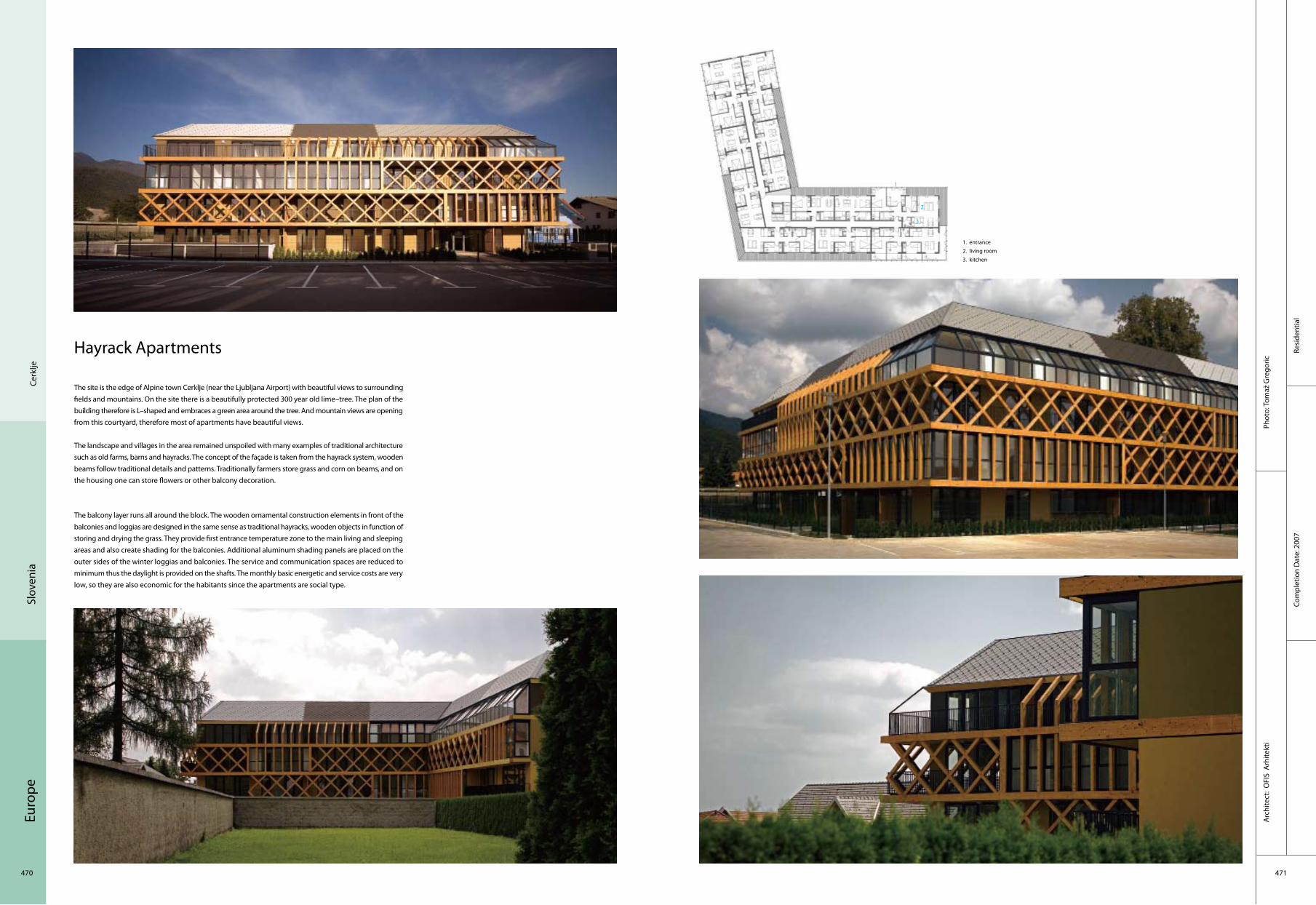
Euro
pe
470 471
Com
plet
ion
Dat
e: 2
007
Resi
dent
ial
Arc
hite
ct:
OFI
S A
rhite
kti
Phot
o: To
maž
Gre
goric
Cerk
ljeSl
oven
ia
Hayrack Apartments
The site is the edge of Alpine town Cerklje (near the Ljubljana Airport) with beautiful views to surrounding fields and mountains. On the site there is a beautifully protected 300 year old lime–tree. The plan of the building therefore is L–shaped and embraces a green area around the tree. And mountain views are opening from this courtyard, therefore most of apartments have beautiful views.
The landscape and villages in the area remained unspoiled with many examples of traditional architecture such as old farms, barns and hayracks. The concept of the façade is taken from the hayrack system, wooden beams follow traditional details and patterns. Traditionally farmers store grass and corn on beams, and on the housing one can store flowers or other balcony decoration.
The balcony layer runs all around the block. The wooden ornamental construction elements in front of the balconies and loggias are designed in the same sense as traditional hayracks, wooden objects in function of storing and drying the grass. They provide first entrance temperature zone to the main living and sleeping areas and also create shading for the balconies. Additional aluminum shading panels are placed on the outer sides of the winter loggias and balconies. The service and communication spaces are reduced to minimum thus the daylight is provided on the shafts. The monthly basic energetic and service costs are very low, so they are also economic for the habitants since the apartments are social type.
1. entrance2. living room3. kitchen
2
1
3

Euro
pe
472 473
Resi
dent
ial
Com
plet
ion
Dat
e: 2
006
Phot
o: To
maž
Gre
goric
Arc
hite
ct: O
FIS
Arh
itekt
i
Izol
aSl
oven
ia
Social Housing on The Coast
This project located on the Adriatic coast in the south–western tip of Slovenia is the winner of a competition organised by the Slovenia Housing Fund, a government–run programme which provides low–cost apartments for young families. The winning points of this project were economic, rational and functional issues, but more importantly, the ratio between gross versus saleable surface area and the flexibility of floor plans.
The residential blocks are built on a hill with a view of Izola Bay on the one side and the surrounding hills on the other. Each block sits on a 60 by 28–metre plot. The brief required 30 apartments of different sizes and structures, ranging from studio flats to three–bedroom apartments. There are no structural elements inside the small apartments in order to provide plenty of flexibility and the possibility of reorganising the space.
Considering the Mediterranean climate, each apartment has a veranda, partly connected to the interior, which provides an outdoor space for the tenants as well as shading and natural ventilation inside thanks to perforated side panels, which allow the summer breeze to ventilate the space. Semi–transparent textile shades block direct sunlight and help accumulate an "air buffer" zone. In the summer the hot air is naturally ventilated through the 10 cm holes in the side panels, while in the winter the warm air provides additional heating for the apartments.

Euro
pe
474 475
Com
mer
cial
Com
plet
ion
Dat
e: 2
007
Phot
o: T
omaž
Gre
goric
Arc
hite
ct:
OFI
S A
rhite
kti
Bist
rica
Slov
enia
Shopping Roof Apartments
The initial task from the client was to build a new shopping mall on the plot of the existing one. Furthermore, the new project proposed use of the shopping roof for additional volume as new apartments.
The stepped volume of the building follows the silhouette of surrounding landscape. On top of the shopping mall apartments are set in the form of stepped L–volume. From the west where strong wind and snow arrives, the façade is opened only towards enclosed balconies and its material is grey slate–it is designed as a vertical roof. L–shape volume encloses inner communal garden that is the roof of the shopping mall. The front and courtyard façade is warm and open, made of wooden verticals with different rhythm.
The organisation of the housing and the envelope of the apartments open towards mountain views and the sun. Therefore the front, wooden façade is mostly transparent with panoramic windows. From side windows views also open to the mountains. Local larch is used and slates in diagonal pattern are traditional materials used for roof and façade. Play of transparency formed by wooden verticals that form balcony fences, façade panels or mask characterizes the north and south part of the building. On the east and west, pitched rhomboid–textured roof interpolates into vertical surfaces that protect apartments from snow and wind. Shopping mall façade is combination of steel and glass panels.
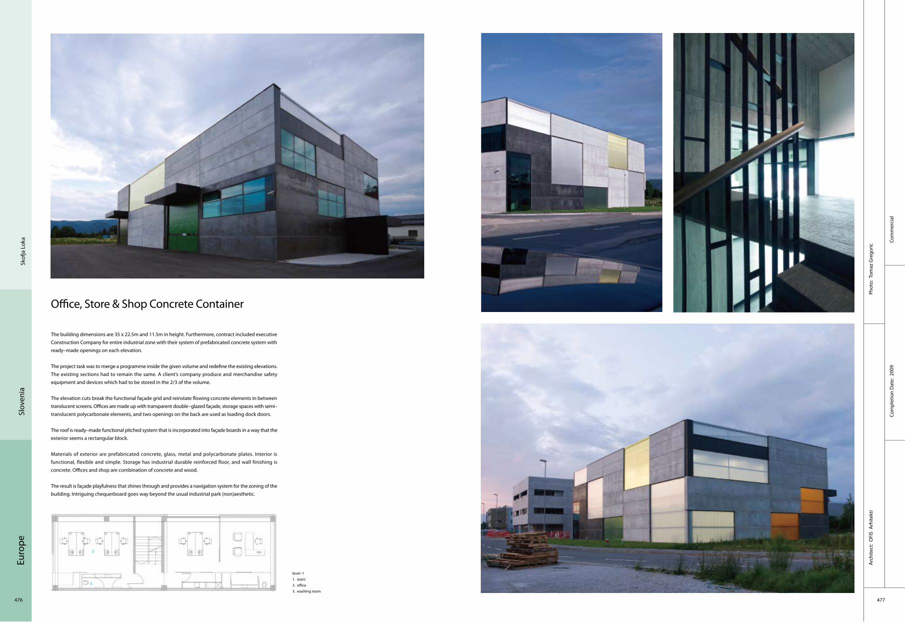
Euro
pe
476 477
Com
mer
cial
Phot
o: T
omaz
Gre
goric
Com
plet
ion
Dat
e: 2
009
Arc
hite
ct:
OFI
S A
rhite
kti
Skofj
a Lo
kaSl
oven
ia
Office, Store & Shop Concrete Container
The building dimensions are 35 x 22.5m and 11.5m in height. Furthermore, contract included executive Construction Company for entire industrial zone with their system of prefabricated concrete system with ready–made openings on each elevation.
The project task was to merge a programme inside the given volume and redefine the existing elevations. The existing sections had to remain the same. A client’s company produce and merchandise safety equipment and devices which had to be stored in the 2/3 of the volume.
The elevation cuts break the functional façade grid and reinstate flowing concrete elements in between translucent screens. Offices are made up with transparent double–glazed façade, storage spaces with semi–translucent polycarbonate elements, and two openings on the back are used as loading dock doors.
The roof is ready–made functional pitched system that is incorporated into façade boards in a way that the exterior seems a rectangular block.
Materials of exterior are prefabricated concrete, glass, metal and polycarbonate plates. Interior is functional, flexible and simple. Storage has industrial durable reinforced floor, and wall finishing is concrete. Offices and shop are combination of concrete and wood.
The result is façade playfulness that shines through and provides a navigation system for the zoning of the building. Intriguing chequerboard goes way beyond the usual industrial park (non)aesthetic.
level–11. stairs2. office3. washing room
2 1
3
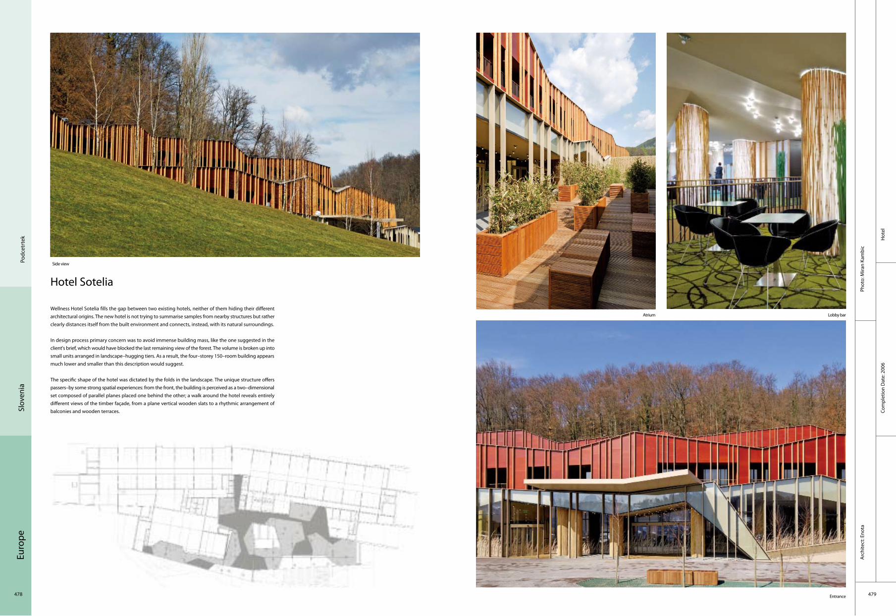
Euro
pe
478 479
Phot
o: M
iran
Kam
bic
Hot
el
Arc
hite
ct: E
nota
Com
plet
ion
Dat
e: 2
006
Podc
etrt
ekSl
oven
ia
Hotel Sotelia
Wellness Hotel Sotelia fills the gap between two existing hotels, neither of them hiding their different architectural origins. The new hotel is not trying to summarise samples from nearby structures but rather clearly distances itself from the built environment and connects, instead, with its natural surroundings.
In design process primary concern was to avoid immense building mass, like the one suggested in the client's brief, which would have blocked the last remaining view of the forest. The volume is broken up into small units arranged in landscape–hugging tiers. As a result, the four–storey 150–room building appears much lower and smaller than this description would suggest.
The specific shape of the hotel was dictated by the folds in the landscape. The unique structure offers passers–by some strong spatial experiences: from the front, the building is perceived as a two–dimensional set composed of parallel planes placed one behind the other; a walk around the hotel reveals entirely different views of the timber façade, from a plane vertical wooden slats to a rhythmic arrangement of balconies and wooden terraces.
Side view
Atrium Lobby bar
Entrance

Euro
pe
480 481
Cultu
ral
Com
plet
ion
Dat
e: 2
009
Phot
o: To
maz
Gre
goric
Arc
hite
ct: A
utho
r:ofis
Arc
hite
cts;
Pro
ject
Lea
ders
:rok
Om
an, S
pela
Vid
ecni
k;
Proj
ect T
eam
:and
rej G
rego
ric, J
anez
Mar
tinci
c, M
agda
lena
Lac
ka,K
atja
Alja
z, M
artin
a Li
pice
r
Kras
nja
Slov
enia
Farewell Chapel
A farewell chapel is located in a village close to Ljubljana. The site plot is next to the existing graveyard. The chapel is cut into the rising landscape. The shape is following the lines of the landscape trajectories around the graveyard. Three curved walls are embracing and dividing the programmes. External curve is dividing the surrounding hill from chapel plateau, and also reinstates the main supporting wall. Services such as storages, wardrobe restrooms and kitchenette are on the inner side along the wall. Internal curve is embracing the main farewell space. It is partly glazed and it is opening towards outside plateau for summer gatherings. Roof is following its own curvature and forming an external porch. The cross as catholic sign is featured as laying feature positioned on the rooftop above the main farewell space. It also functions as a luminous dynamic element across the space during the daytime and lighting spark at a night time.
1. main space2. kitchen3. storage4. washing room
21
34
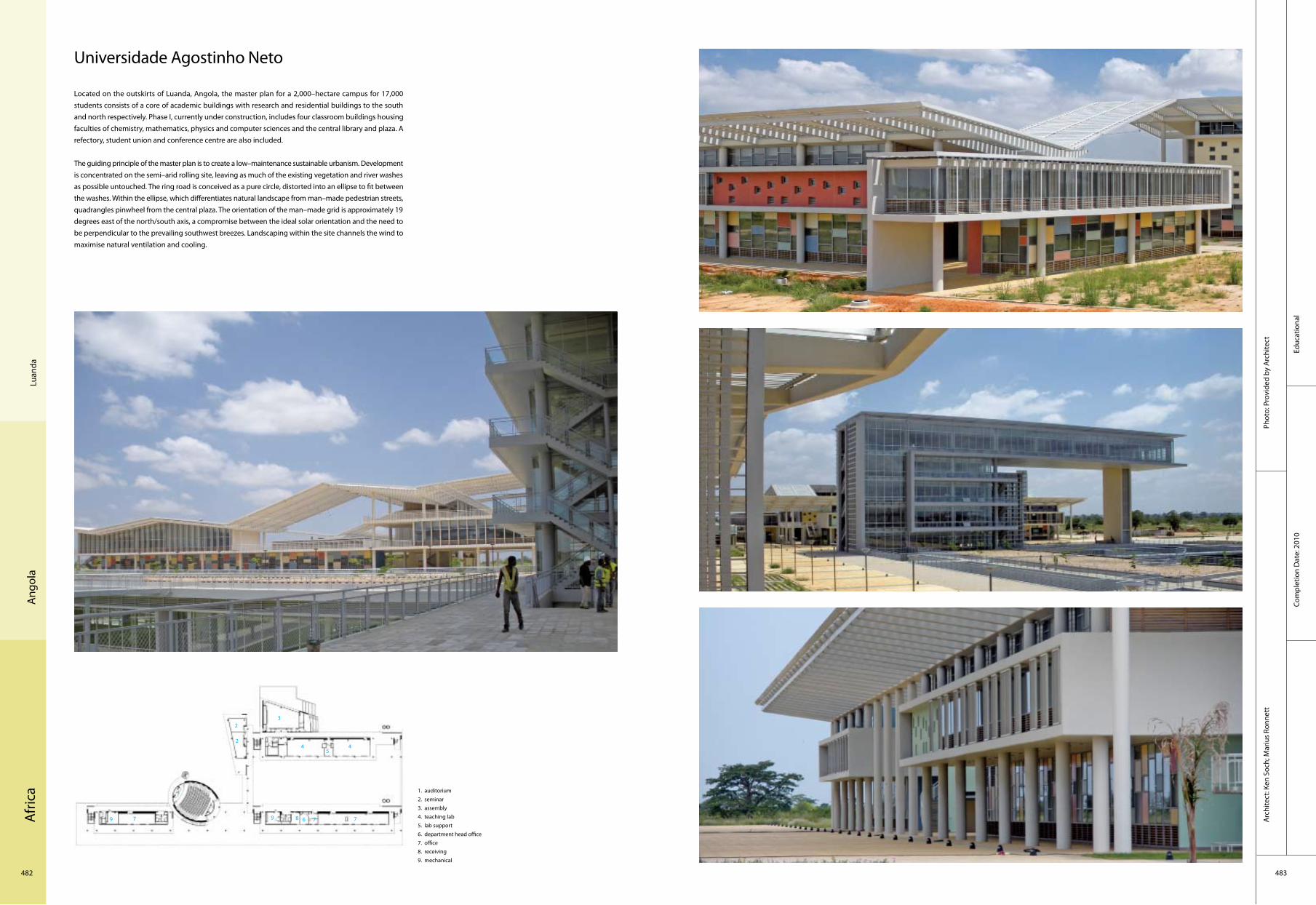
Afr
ica
482 483
Com
plet
ion
Dat
e: 2
010
Arc
hite
ct: K
en S
och;
Mar
ius
Ronn
ett
Luan
daA
ngol
a
Universidade Agostinho Neto
Located on the outskirts of Luanda, Angola, the master plan for a 2,000–hectare campus for 17,000 students consists of a core of academic buildings with research and residential buildings to the south and north respectively. Phase I, currently under construction, includes four classroom buildings housing faculties of chemistry, mathematics, physics and computer sciences and the central library and plaza. A refectory, student union and conference centre are also included.
The guiding principle of the master plan is to create a low–maintenance sustainable urbanism. Development is concentrated on the semi–arid rolling site, leaving as much of the existing vegetation and river washes as possible untouched. The ring road is conceived as a pure circle, distorted into an ellipse to fit between the washes. Within the ellipse, which differentiates natural landscape from man–made pedestrian streets, quadrangles pinwheel from the central plaza. The orientation of the man–made grid is approximately 19 degrees east of the north/south axis, a compromise between the ideal solar orientation and the need to be perpendicular to the prevailing southwest breezes. Landscaping within the site channels the wind to maximise natural ventilation and cooling.
1. auditorium2. seminar3. assembly4. teaching lab5. lab support6. department head office7. office8. receiving9. mechanical
2
1
3
6
54
2
78
4
7 79 9
Educ
atio
nal
Phot
o: P
rovi
ded
by A
rchi
tect

Afr
ica
484 485
Trip
oli
Corp
orat
eCo
mpl
etio
n D
ate:
201
0
Phot
o: C
emal
Em
den
Arc
hite
ct: T
aban
liogl
u A
rchi
tect
s
Liby
a
Tripoli Convention Hall
Tripoli Convention Hall signifies the spirit of its homeland and claims to establish a physical relation with the global community. As an outcome of intensive urban and architectural movement in Libya, new innovative and prestigious buildings in Tripoli started to signify the power and contemporary style.
Open to the world cultures and where diverse languages meet up, the Convention Hall is a strong element of high representation and welcomes presidents of the world in the texture of the natural environment and as a source of pride for the nation it represents. Surrounded by the woods, the rectangular two–storey "block" is nestled in a metal envelop that opens up to the external landscape with a wide portico that defines the main entrance.
A semi–transparent perimeter "shield" of designed bronze mesh application flows around the building, protecting the inner glass walls; an 8–metre corridor encircles all three sides; the main building is flanked by a 4–metre–wide reflection pool and another 4–metre is left as a semi–open shady circulation area. The metal mesh walls carry incise patterns that are inspired by the trees that surround the site, permitting controlled daylight to diffuse into the central space.
Main entrance or night view–a source of pride for the nation it represents
Semi–open shady circulation area Controlled daylight to diffuse into the central space
Meeting room–transitivity
1. presidential entrance 2. main foyer 3. store 4. security office5. minister lounge 6. front office/cloak room7. minister entrance 8. minister lounge 9. cold storage 10. staff entrance 11. technical area 12. service entrance 13. service kitchen 14. press hall 15. cold storage16. meeting room 17. storage 18. VIP security19. VIP Lounge20. VIP suite21. president lounge 22. president salon23. VIP meeting room24. VIP entrance
10
1
3
6
5
4
11
2
8
1715
7
9
1
12 13 18 19 20
21 22
23
16 14
24
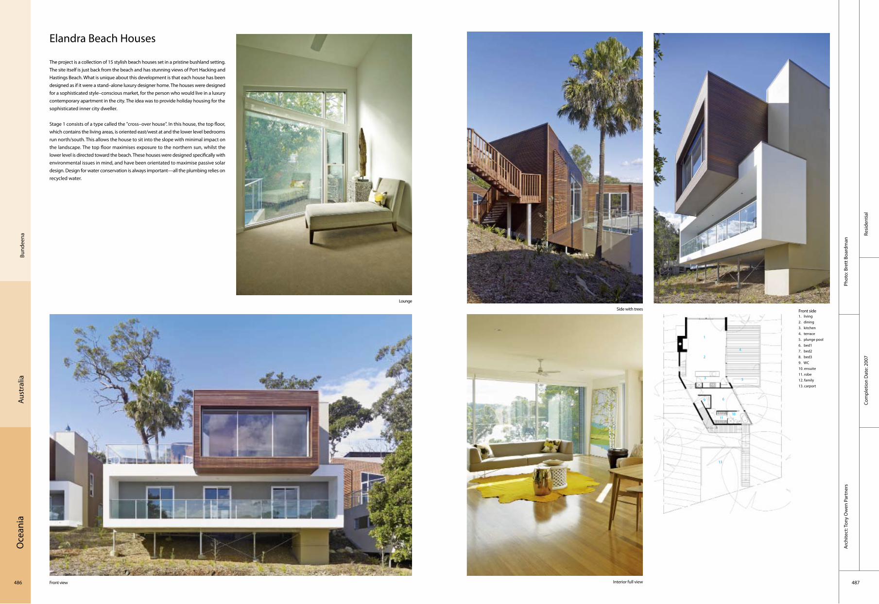
Oce
ania
486 487
Resi
dent
ial
Com
plet
ion
Dat
e: 2
007
Phot
o: B
rett
Boa
rdm
anA
rchi
tect
: Ton
y O
wen
Par
tner
s
Aust
ralia
Bund
eena
Elandra Beach Houses
The project is a collection of 15 stylish beach houses set in a pristine bushland setting. The site itself is just back from the beach and has stunning views of Port Hacking and Hastings Beach. What is unique about this development is that each house has been designed as if it were a stand–alone luxury designer home. The houses were designed for a sophisticated style–conscious market, for the person who would live in a luxury contemporary apartment in the city. The idea was to provide holiday housing for the sophisticated inner city dweller.
Stage 1 consists of a type called the "cross–over house". In this house, the top floor, which contains the living areas, is oriented east/west at and the lower level bedrooms run north/south. This allows the house to sit into the slope with minimal impact on the landscape. The top floor maximises exposure to the northern sun, whilst the lower level is directed toward the beach. These houses were designed specifically with environmental issues in mind, and have been orientated to maximise passive solar design. Design for water conservation is always important—all the plumbing relies on recycled water.
Front view
Side with trees Front side
Interior full view
Lounge
1. living2. dining3. kitchen4. terrace5. plunge pool6. bed17. bed28. bed39. WC10. ensuite11. robe12. family13. carport
10
1
3
6
5
4
11
2
9
13
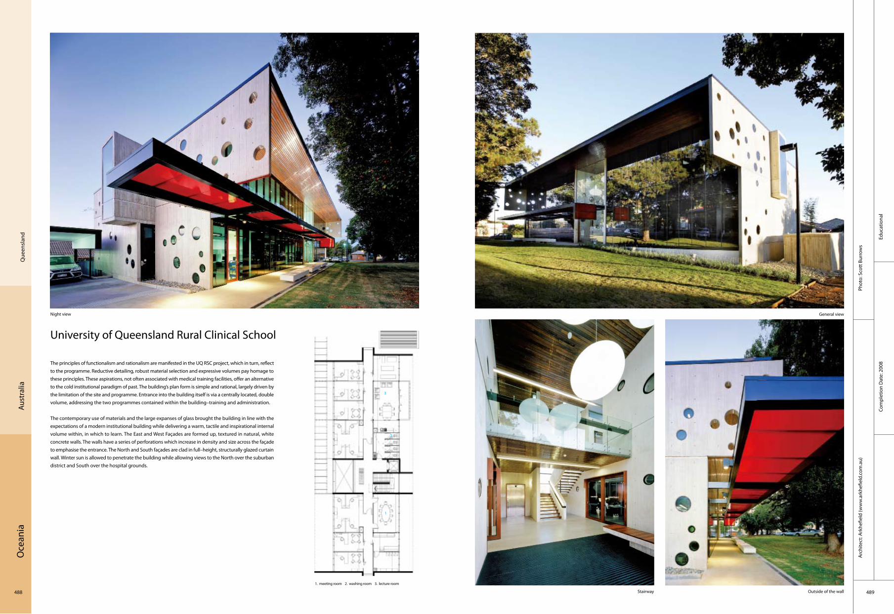
Oce
ania
488 489
Educ
atio
nal
Com
plet
ion
Dat
e: 2
008
Phot
o: S
cott
Bur
row
sA
rchi
tect
: Ark
hefie
ld (w
ww
.ark
hefie
ld.c
om.a
u)
Que
ensl
and
Aust
ralia
University of Queensland Rural Clinical School
The principles of functionalism and rationalism are manifested in the UQ RSC project, which in turn, reflect to the programme. Reductive detailing, robust material selection and expressive volumes pay homage to these principles. These aspirations, not often associated with medical training facilities, offer an alternative to the cold institutional paradigm of past. The building’s plan form is simple and rational, largely driven by the limitation of the site and programme. Entrance into the building itself is via a centrally located, double volume, addressing the two programmes contained within the building–training and administration.
The contemporary use of materials and the large expanses of glass brought the building in line with the expectations of a modern institutional building while delivering a warm, tactile and inspirational internal volume within, in which to learn. The East and West Façades are formed up, textured in natural, white concrete walls. The walls have a series of perforations which increase in density and size across the façade to emphasise the entrance. The North and South façades are clad in full–height, structurally glazed curtain wall. Winter sun is allowed to penetrate the building while allowing views to the North over the suburban district and South over the hospital grounds.
Night view General view
Stairway Outside of the wall
1. meeting room 2. washing room 3. lecture room
1
3
2
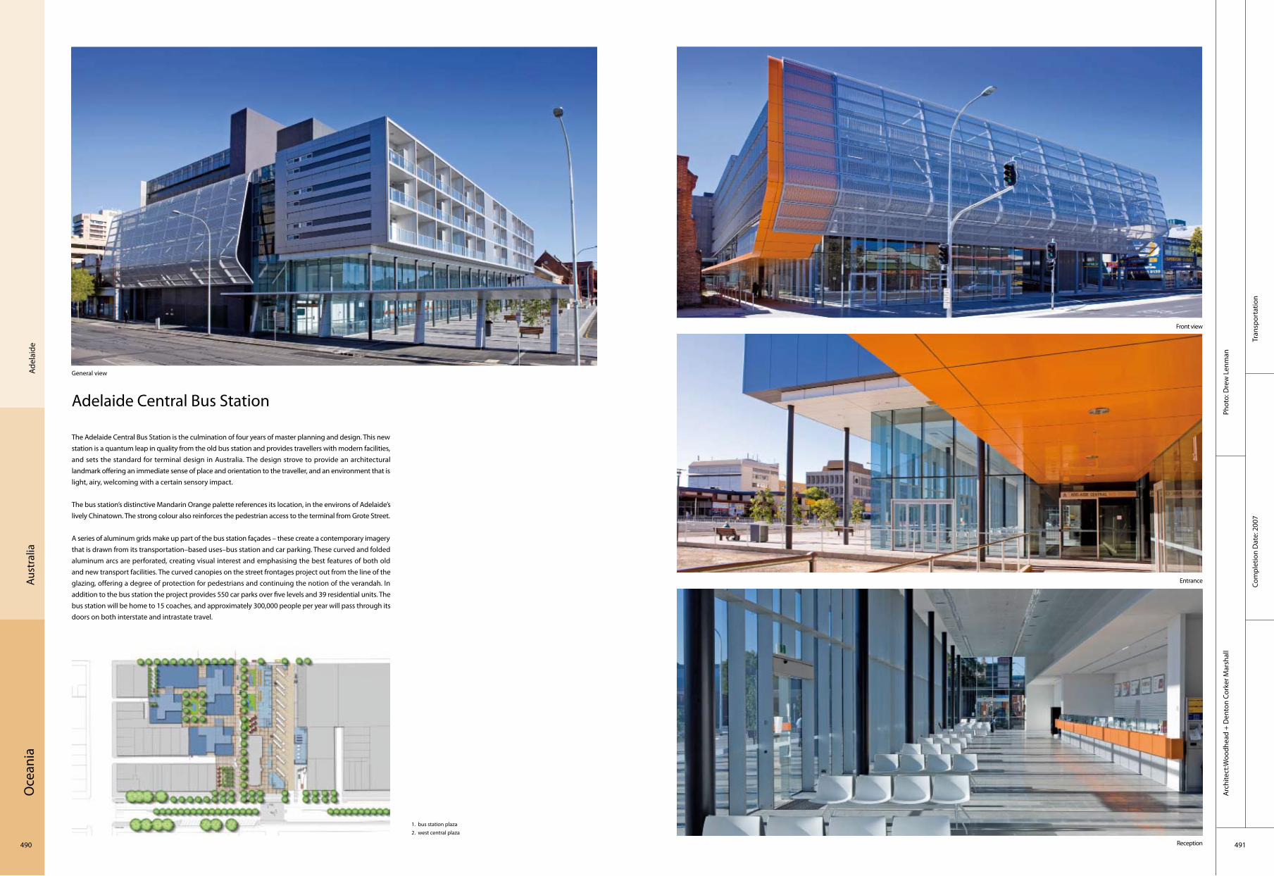
Oce
ania
490 491
Tran
spor
tatio
nCo
mpl
etio
n D
ate:
200
7
Phot
o: D
rew
Len
man
Arc
hite
ct:W
oodh
ead
+ D
ento
n Co
rker
Mar
shal
l
Adel
aide
Aust
ralia
Adelaide Central Bus Station
The Adelaide Central Bus Station is the culmination of four years of master planning and design. This new station is a quantum leap in quality from the old bus station and provides travellers with modern facilities, and sets the standard for terminal design in Australia. The design strove to provide an architectural landmark offering an immediate sense of place and orientation to the traveller, and an environment that is light, airy, welcoming with a certain sensory impact.
The bus station’s distinctive Mandarin Orange palette references its location, in the environs of Adelaide’s lively Chinatown. The strong colour also reinforces the pedestrian access to the terminal from Grote Street.
A series of aluminum grids make up part of the bus station façades – these create a contemporary imagery that is drawn from its transportation–based uses–bus station and car parking. These curved and folded aluminum arcs are perforated, creating visual interest and emphasising the best features of both old and new transport facilities. The curved canopies on the street frontages project out from the line of the glazing, offering a degree of protection for pedestrians and continuing the notion of the verandah. In addition to the bus station the project provides 550 car parks over five levels and 39 residential units. The bus station will be home to 15 coaches, and approximately 300,000 people per year will pass through its doors on both interstate and intrastate travel.
General view
Front view
Entrance
Reception
1. bus station plaza2. west central plaza
1
2

Oce
ania
492 493
Tran
spor
tatio
nCo
mpl
etio
n D
ate:
200
6
Phot
o: S
hann
on M
cGra
thA
rchi
tect
: Grim
shaw
Arc
hite
cts
Mel
bour
neAu
stra
lia
Southern Cross Station
The commission for the redevelopment of Melbourne’s Southern Cross Station (previously known as Spencer Street Station) arose out of the need for an upgraded terminus to accommodate the anticipated rise in demand for public rail services in the future. The brief required a fully–integrated transport interchange, which would also provide essential public transport upgrades as well as pedestrian connections between Melbourne’s Central Business District (CBD) and the developing Docklands area. This increased connectivity would encourage regeneration and improve commercial growth locally.
While the design approach endeavoured to create a visually inspiring structure, the key generators for the station were always practical performance, ease of passenger circulation and an improved working environment for staff. The newly refurbished Southern Cross Station provides 15 million users per annum with fully sheltered, high–quality ticketing, baggage–handling, waiting and retail services, all equipped with comfortable seating, lighting and passenger information display systems. Internally it is a vast hall, with uninterrupted vistas in every direction so that the interconnection of different streets surrounding the station can be easily understood. Pods of accommodation beneath the roof, house administrative functions as well as providing a defined retail space below. By their nature, stations must work across many different levels to enable passengers to access the various train lines. At Southern Cross Station, the ground plane itself changes, with Bourke and Collins Street rising in parallel to either side of the building. The concourses rise in response to the street plan so that level change with the station is almost imperceptible.
Aerial view
Entrance area
Escalator
Platforms
1. terminal areas2. control centre3. lounge area4. activity space
1
3 4 2

Oce
ania
494 495
Hot
el
Aust
ralia
Kang
aroo
Isla
nd
Com
plet
ion
Dat
e: 2
008
Phot
o: S
am N
oona
n, G
eorg
e A
post
olid
isA
rchi
tect
: Max
Prit
char
d A
rchi
tect
Southern Ocean Lodge
Southern Ocean Lodge, perched on a 40–metre–high cliff with panoramic views over the wild Southern Ocean. The Lodge houses 21 spacious guest suites and restaurant/bar/lounge, primarily for international visitors seeking a unique Australian experience.
The architecture has a close relationship with the dramatic site. The Main Lodge is tucked back into the cliff top, with large sweeping window walls capturing the expansive views of the ocean, rugged coastal cliffs and pristine bush. A strong sculptural element is the 100–metre–long curving Kangaroo Island Limestone wall, which weaves from a covered entrance, through the largely untouched bush and into the Main Lodge/restaurant. It provides a textured backdrop for the refined details of the guest areas with recesses accommodating desks, seating and reception facilities for guests and staff.
Guest suites cascade down the slope from the Main Lodge, with access from a breezeway ramp. Roofs follow the slope of the land, but with a gentle upward, wave–like curve every fourth suite. The curves define the rainwater collection system with gutters extending out to galvanised iron rainwater tanks. Such tanks are ubiquitous iconic structures in dry rural Australia, and here they emphasise the sustainability principles of the project, with all rainwater collected for use within the Lodge.
1. staff village2. service yard3. reception4. guests office5. disabled6. departure lounge7. family suite8. deluxe9. standard10. family suite11. deluxe12. standard13. standard14. standard15. premium suite16. rocky cliffs17. beach18. sub premium19. spa retreat
View of main lodge View of main lodge and suites stepping down the slope
Entrance to the Lodge
The Great Room
10
1
3 654
11
2
8
17
15
7
9 1213
18
19
16
14
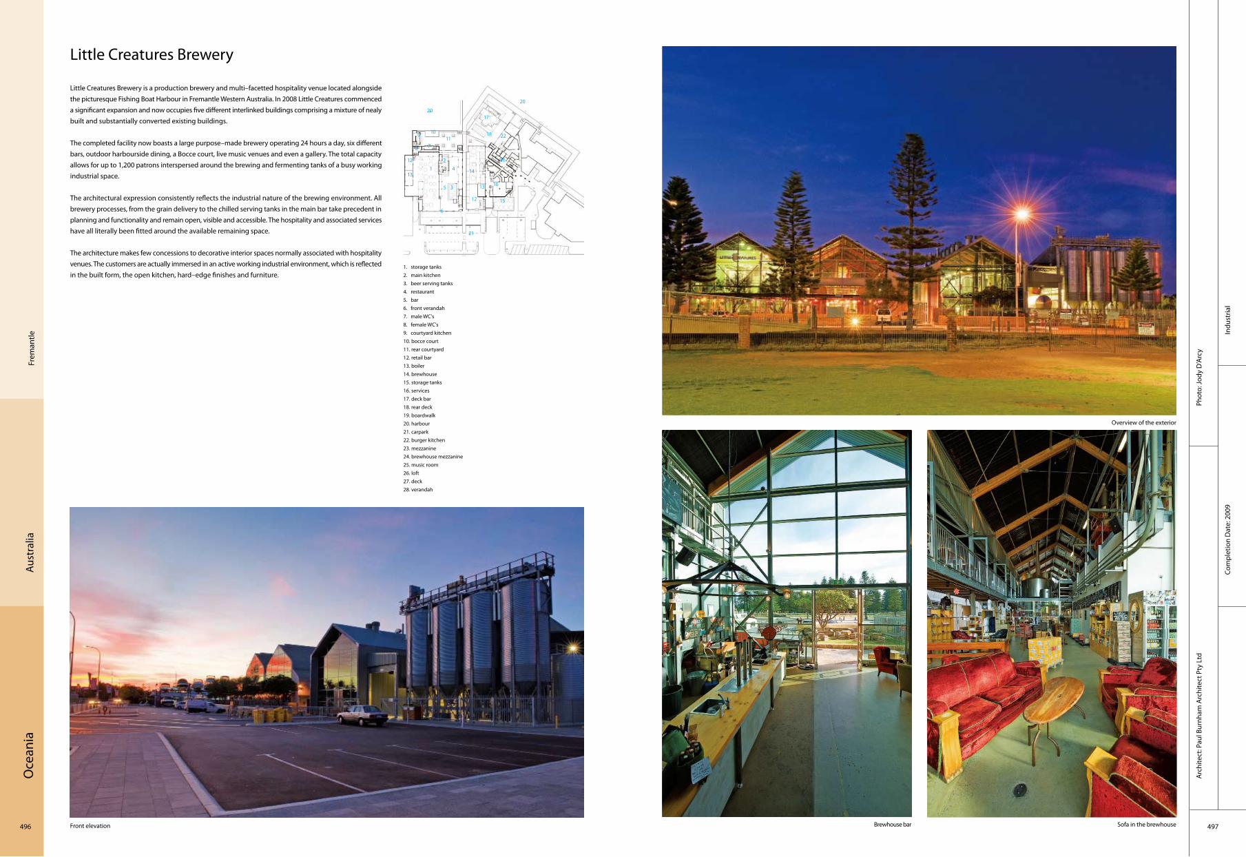
Oce
ania
496 497
Com
plet
ion
Dat
e: 2
009
Phot
o: Jo
dy D
’Arc
yA
rchi
tect
: Pau
l Bur
nham
Arc
hite
ct P
ty L
td
Frem
antle
Aust
ralia
Little Creatures Brewery
Little Creatures Brewery is a production brewery and multi–facetted hospitality venue located alongside the picturesque Fishing Boat Harbour in Fremantle Western Australia. In 2008 Little Creatures commenced a significant expansion and now occupies five different interlinked buildings comprising a mixture of nealy built and substantially converted existing buildings.
The completed facility now boasts a large purpose–made brewery operating 24 hours a day, six different bars, outdoor harbourside dining, a Bocce court, live music venues and even a gallery. The total capacity allows for up to 1,200 patrons interspersed around the brewing and fermenting tanks of a busy working industrial space.
The architectural expression consistently reflects the industrial nature of the brewing environment. All brewery processes, from the grain delivery to the chilled serving tanks in the main bar take precedent in planning and functionality and remain open, visible and accessible. The hospitality and associated services have all literally been fitted around the available remaining space.
The architecture makes few concessions to decorative interior spaces normally associated with hospitality venues. The customers are actually immersed in an active working industrial environment, which is reflected in the built form, the open kitchen, hard–edge finishes and furniture.
Front elevation Brewhouse bar Sofa in the brewhouse
1. storage tanks2. main kitchen3. beer serving tanks4. restaurant5. bar6. front verandah7. male WC's8. female WC's9. courtyard kitchen10. bocce court11. rear courtyard 12. retail bar13. boiler14. brewhouse15. storage tanks16. services17. deck bar18. rear deck19. boardwalk20. harbour21. carpark22. burger kitchen23. mezzanine24. brewhouse mezzanine25. music room26. loft27. deck28. verandah
Indu
stria
l
1011
17
15
3
6
5
4
8 7
9
1
12
13
18
20
21
22
20
16
14
12
13
162
Overview of the exterior
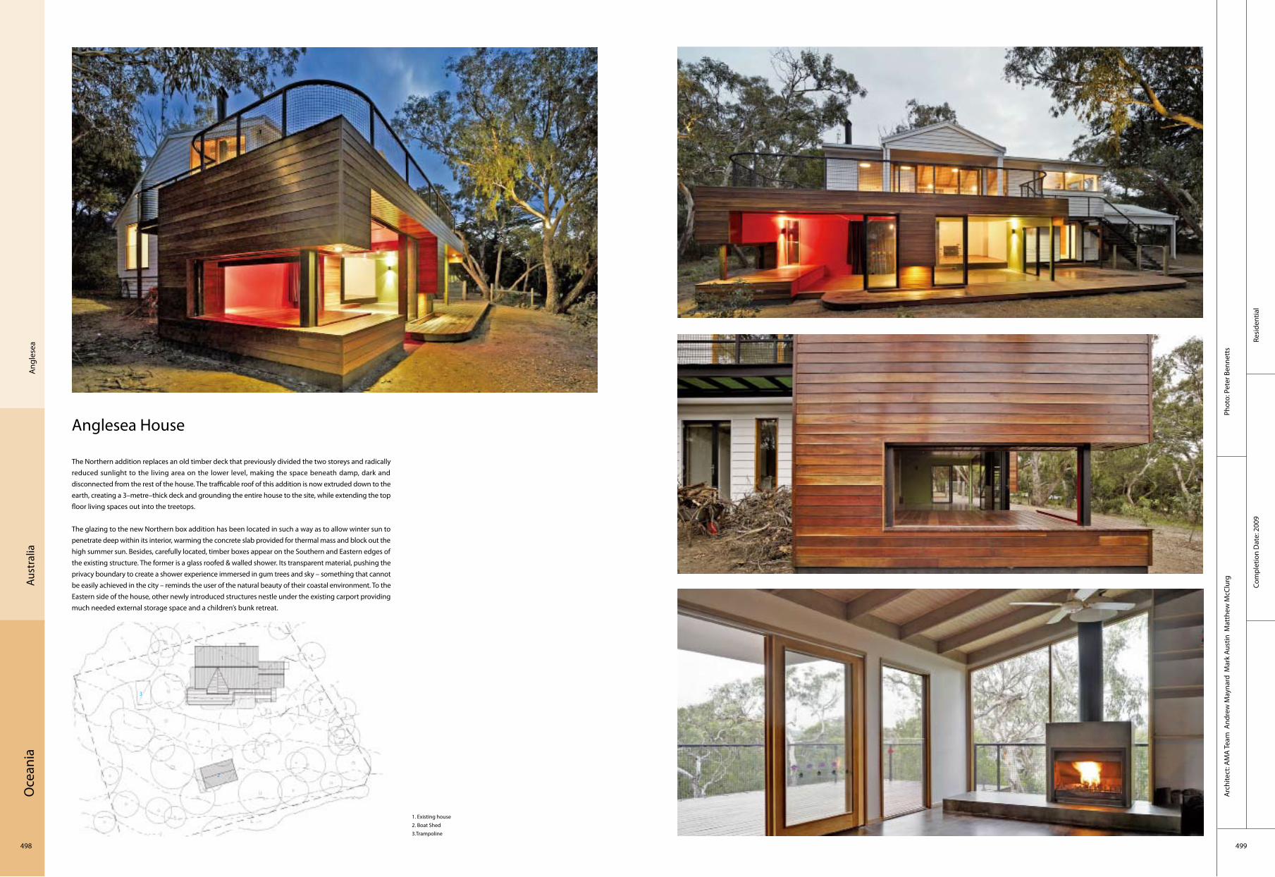
Oce
ania
498 499
Resi
dent
ial
Com
plet
ion
Dat
e: 2
009
Phot
o: P
eter
Ben
nett
sA
rchi
tect
: AM
A Te
am A
ndre
w M
ayna
rd M
ark
Aust
in M
atth
ew M
cClu
rg
Ang
lese
aAu
stra
lia
Anglesea House
The Northern addition replaces an old timber deck that previously divided the two storeys and radically reduced sunlight to the living area on the lower level, making the space beneath damp, dark and disconnected from the rest of the house. The trafficable roof of this addition is now extruded down to the earth, creating a 3–metre–thick deck and grounding the entire house to the site, while extending the top floor living spaces out into the treetops.
The glazing to the new Northern box addition has been located in such a way as to allow winter sun to penetrate deep within its interior, warming the concrete slab provided for thermal mass and block out the high summer sun. Besides, carefully located, timber boxes appear on the Southern and Eastern edges of the existing structure. The former is a glass roofed & walled shower. Its transparent material, pushing the privacy boundary to create a shower experience immersed in gum trees and sky – something that cannot be easily achieved in the city – reminds the user of the natural beauty of their coastal environment. To the Eastern side of the house, other newly introduced structures nestle under the existing carport providing much needed external storage space and a children’s bunk retreat.
1. Existing house2. Boat Shed3.Trampoline
1
3
2

Oce
ania
500 501
Resi
dent
ial
Com
plet
ion
Dat
e: 2
006
Phot
o: E
xter
nal p
hoto
grap
hy b
y P
eter
Ben
nett
sIn
tern
al p
hoto
grap
hy b
y D
an M
ahon
Arc
hite
ct: A
ndre
w M
ayna
rd A
rchi
tect
s
Aust
ralia
Mel
bour
ne
Essex Street House
It is a residential alteration and extension to an existing double–fronted weatherboard house. The brief required 2 bathrooms, a bedroom, living area, kitchen and increased connection with outside areas.
The context is typical of inner suburban Melbourne. The site is double–fronted with a deeper than usual block running east–west. The initial brief asked for an extension along the full width of the existing house. The response to the brief was that any addition should run along a southern boundary to maximise solar access to new and existing spaces and to bring external space into the middle of the living areas.
The original house has been restored to its simple four–room square plan. The new structure sits lightly beside it like a loyal companion. Rather than build a hard–edged or strongly defined object, the new structure has a blurred or vague edge. The recycled grey iron bark portal frames are of a larger, non–domestic scale. They were envisaged as an old relic of a pre–industrial age, an old, wise element to a new and vibrant addition. Within the robust portals is the delicate layered box. The use of screening and the glazed garage doors creates a soft edge that allows the internal spaces to spill into the outdoor spaces. Within this structure are the small, colourful boxes of the bedroom and kitchen. These objects separate functions and act as a bridge between the original house and the extension.
1. custom orb roofing2. clear polycarbonate roof sheeting3. bathroom & laundry & WC
Open room
Bathroom Outside view
Interior
1 3
2

Oce
ania
502 503
Sydn
ey
Aust
ralia
Beresford Hotel
Thomas Jacobsen, has had a hand in crafting every aspect of the heritage hotel’s transformation: from the new architecture’s sweeping curves finished in bespoke green Spanish tiles to the sculpted olive oil vessels in the 130–seat bistro.
Phase one of The Beresford hotel, now completed, is the ground floor public bar wrapped in tile and Tasmanian oak, the bluestone–clad bistro and a spacious garden where films can be projected under the stars. Upstairs is a 1,000–square–metre ballroom, a live music venue and function room that will open soon. Glamorous balconies lined with custom–made stainless steel tiles and faced with rusted steel panels lend the new external elements a tough elegance.
Little expense has been spared on this beautifully–finished project which Jacobsen calls "New Deco" for the way it takes traditional values and craftsmanship and give them a funky twist that is undoubtedly of our time. Even the hidden elements to the design have integrity. In the front bar, for instance, the lighting concealed behind new polished stucco deco cornices is neon rather than the usual fluoro to ensure just the right light colour tone. There are 60 individual pieces of neon subtly intalled into the back bar alone.
1. staff access2. gaming3. fire service4. kitchen
Front exterior
External with courtyard
Exterior at night
Restaurant
Hot
elCo
mpl
etio
n D
ate:
200
8
Phot
o: R
oss
Hon
eyse
ttA
rchi
tect
: Tho
mas
Jaco
bsen
1
32
4

Oce
ania
504 505
Resi
dent
ial
Com
plet
ion
Dat
e: 2
009
Phot
o: S
cott
Bur
row
s (A
pert
ure
Phot
ogra
phy)
Arc
hite
ct: A
rkhe
field
(ww
w.a
rkhe
field
.com
.au)
Bris
bane
Aust
ralia
The Village at Yeronga
The Village at Yeronga is the master planned and integrated retirement village development located in the inner city Brisbane suburb of Yeronga on a 28,000 m2 site previously occupied for light industrial building use. The first two stages of the village have now been completed comprising 91 independent living apartments and associated community facilities. On completion of all stages this medium density project will house 240 independent living apartments, 60 assisted living apartments and a 110 bed full aged care nursing home facility. This integrated retirement project is designed to respond to the Australian Government’s "Ageing in Place" policy which encourages developments to cater for all three levels of care (i.e. independent, assisted and aged care) within the one facility.
The buildings were constructed predominantly in precast concrete which was chosen for its long–term low maintenance properties. The building uses different panel colours to assist the elderly residents to find their way within the project, such as the strong ochre colour which is used to accentuate the building entrance points.
The feature of the building is undoubtedly the resort–style communal facilities provided within the development. These facilities include a fully–equipped commercial kitchen and restaurant for residents and their visitors, cinema, club lounge and bar, library, lobby lounge and café, indoor swimming pool, gymnasium, beauty salon and wellness centre, billiards room, medical centre and administration. These facilities also assist the residents in building valuable social networks within the retirement village community.
Panorama of the village
Buildings
Entrance of the village
Interior details
Lobby
1. bedroom2. bedroom3. bedroom4. corridor5. lobby
1
3
2
5
4
5
1 1 1 1 1 1
2
2
2

Oce
ania
506 507
Com
plet
ion
Dat
e: 2
008
Phot
o: N
ic B
aile
yA
rchi
tect
: Alle
n Ja
ck &
Cot
tier
New
Sou
th W
ales
Au
stra
lia
Berry Sports and Recreation Hall
Set on 60 hectares of rolling countryside in Berry, three hours' ride south of Sydney in Australia, the site was originally an experimental dairy farm and has made way for a magical and innovative multipurpose hall for basketball, netball, rock climbing, dance and theatre.
Reminiscent of a modern farm shed, the building comprises two long sides of precast concrete panels, each pierced by 500 shards of glass in amoeba–like windows, allowing natural light to flood the halls in the day and interior lights to shine through at night, illuminating the building and making it "disappear" into the night sky.
The building also features environmentally sustainable design (ESD), with a dozen wind turbines combining with panels of louvers to create a natural ventilation system which cools the structure in summer and creates an insulation blanket in winter. Roof water is tracked back from the 3.5 metre cantilevered composite roof via a steel beam to provide water for irrigation tanks.
Recr
eatio
nal

Inde
x of
Pro
ject
s
508
20th St. Offices 16
41 Cooper Square 24
44 Social Housing Tauste (Zaragoza) 310
77/32, Gurgaon 192
322 A Street Office and Manufacturing Facility 26
650 apartments, Ljubljana 464
2010 Shanghai EXPO – Shanghai Corporate Pavilion 114
7800 Cesme Residences & Hotel 226
Aatrial House 334
Abertis Headquarters 292
Abu Dhabi Investment Authority 208
Adelaide Central Bus Station 490
Advice–House 238
Agora Theatre 446
Akasaka Phoenix 170
ALSACIA 74
A.M. Celaya 64
Andel’s Hotel lodz 342
Anglesea House 498
Antas Educative Centre 316
Archeological Museum of Álava 296
Arizona State University Walter Cronkite School of Journalism & Mass Communication 18
Astana Arena 202
Avana Apartment 198
Bahrain World Trade Centre 210
Basalt Wine – Laposa Cellar 344
BDP Manchester Studio 250
Beijing Nexus Centre 108
Benavides Drugstore and Warehouse 72
Benozzo Gozzoli Museum 348
Beresford Hotel 502
Berry Sports and Recreation Hall 506
Betty Blue 448
Bill Winspear Opera House 30
Birken–elementary school and school "am Grüngürtel": nursery building 368
Birkerod Sports and Leisure Centre 242
Business Centre Tbilisi 204
Booster Station–South 424
Boulogne Billancourt 324
Bridge School 118
Bryanston School 270
BSV College for Further Education 418
BTEK — Interpretation Centre for Technology 312
Bursa Wholesale Greengrocers and Fishmongers Market 224
Canadian Diplomatic Complex 140
Cat Building 176
CCVH–Gignac 320
Centra Mall 194
Centre Dramatique National de Montreuil 326
Chapel Mussonville 328
Cohen Levine Residence 44
Crockett Residence 48
Dalaman International Airport Terminal 218
David Mellor Design Museum 266
Deichmann Centre for Social Interaction & Spitzer–Salant School of Social Work at Ben–Gurion
University of the Negev, Beer–Sheva, Israel. 214
Detached Holiday Homes on Paros Island 458
Dornbusch Church 378
Dot Envelope 462
Edinburgh Academy – New Nursery and After School Facility 276
Elandra Beach Houses 486
Elsa Morante Library 358
Enclosed Open House 184
Ener(gie)nger – Energy and Sustainability 384
Enter 230
Essex Street House 500
European Investment Bank 330
Evangelical Grammar School 382
Evans House 14
EX 174
Experimental Media and Performing Arts Centre 12
Falmouth School Design & Technology Building 272
Farewell Chapel 480
Fawood Children’s Centre 268
Flower Shop H 162
Folkestone Academy 260
Ford Assembly Building 58
Forum Çamlik 228
FUJITEC"Big Wing" Headquarters/Product Development Centre 152
GFC Antriebssysteme GmbH Transfiguration and New Construction of a Production
Hall with Service and Socialtract 380
Green Circle Shopping Centre 36
Green Lighthouse 240
Hassayampa Academic Village, Arizona State University 32
Hayrack Apartments 470
Hazelwood School 262
Headquarters (ADIA) 208
Headquarters of the Environment Service and Public Spaces 306
Hedwigshöhe Hospital 370
Het Kasteel 438
Hilton Baltimore Convention Centre Hotel 10
Hi–tech Systems Headquarters 356
Hong Kong Polytechnic University – Hong Kong Community College (Hung Hom
Bay Campus) 126
Hong Kong Polytechnic University – Hong Kong Community College (West
Kowloon Campus) 124
Hotel Sotelia 478
House 53 80
House in Canobbio 406
House in Lumino 410
House in Yugawara 164
Iidabashi Subway Station 178
India Glycols Limited 196
Institute of Cancer Studies, UCL 254
Insular Athletics Stadium 298
Ipekyol Textile Factory 220
Jishou University Research and Education Building and Huang Yongyu
Museum 94
John Lewis Department Store and Cineplex and Pedestrian Bridges 274
Kaohsiung Metro Station 128
Kerry Plaza, Futian, Shenzhen 84
Kielder Observatory 284
Kindergarten in Rosales Del Canal 308
Kirkintilloch Adult Learning Centre 280
Knut Hamsun Centre 234
Kumho Culture Complex – Kring 144
Lace Apartments 466
Langley Academy 264
Laranjeiras House 78
Lausd William J.Clinton Middle School 28
Le Prisme 318
Liangzhu Museum 104
Liberal Art Department, Dongguan Institute of Technology 98
Library and Media Centre of the University of Guadalajara 62
Lienihof Residential and Business Complex 408
Limoges Concert Hall 322
Little Creatures Brewery 496
Location of the selected projects of Atlas of World Interiors 4
Luxehills Chengdu, China 120
LV Taipei 130
Main Railway Station Innsbruck 392
Manantiales de Espejo Apartment Building 66
Matzneller 354
Media Centre Oberkirch 372
Merry–Go–Round 432
Miyasaka Residence 168
Ml Museum Liaunig 404
Model House 134
Mora River Aquarium 314
Mt. Crested Butte Residence 52
Multipurpose Building For Auroville Papers 188
Multi–Purpose Hall, Sandford Park School 256
Museum of Memory and Human Rights 70
Museum Shanghai–Pudong, China 90
Music Theatre 402
Myeongdong Theater 136
Namba Hips 166
Namics Techno Core 160
New Branch of the Cooperative Credit Bank 11kilometers of Chain.... 350
New Flower Market – Mercabarna–Flor 286
New Industrial Development Centre 412
Niederndorf Supermarket 394
Ninetree Village 96
Nokia China Campus 86
Northern Arizona University 20
O–14 206
Oase Liezen Sustainability in the Shopping Town 398
Office building in the centre of Athens 460
Office, Store & Shop Concrete Container 476
Officine Maccaferri and Seci Energia 366
Omegablock, Colegio Anglo Colombiano (Omega Block, Anglo Colombiano College) 68
One Island East, TaiKoo Place 122
Orange Memorial Park Recreation Centre 60
Ordos Protestant Church 102
Orense Swimming Pools for Vigo University 294
Outrial House 336
Pontevedra Campus 304
Post Tower 142
Private House in Menorca 300
Q19 400
Qingcuiyaun Club House 116
Raffles City Beijing 112
Residential Area at Pelargonienweg 388
Rooftecture O–K 172
Royal Alexandra Children’s Hospital 252
Safe House 338
Salvation Army Chelmsford 258
San Giorgio Library 362
Santral Istanbul Museum of Contemporary Arts 222
School Piter Jelles 426
School ‘tij49 454
Schreckbichl 352
Sempachersee Golf Club 416
SESC 76
Shaken Office 444
Shin–Marunouchi Towers 146
Shopping Centre Stadtgalerie 374
Shopping Roof Apartments 474
SIEEB (Sino–Italian Ecological and Energy Efficient Building) 100
Silent Office 156
Sipos Aktorik GmbH 386
Sloschek 360
Social Condenser for Superior 40
Social Housing On The Coast 472
SOF Park Inn Hotel Complex 332
SOHO Shangdu 92
Solar 442
Southern Cross Station 492
Southern Ocean Lodge 494
Spertus Institute Of Jewish Studies 46
Star Place 82
Station Amsterdam Bijlmer ArenA 420
“Steel” House 150
Stratheden 18 Bed Dementia and Mental Health Unit 278
Strauchaus 50
Studio M Hotel 186
Suliman S. Olayan School of Business, American University of Beirut 212
Sungkyunkwan University’s Samsung Library 138
Suntory Museum of Art 154
Sustainable House at Lake Laka 340
Sustainable Residence – 3716 Springfield 42
Taubman Museum of Art 22
Tea House on Bunker 452
Terminal 1 Of Barcelona Airport 302
Tetris Apartments 468
The 4th Gymnasium 436
The Azahar Group Headquarters 290
The Belleville Public Library and John M Parrott Art Gallery 8
The Central Library of the University of Molise 364
The Energy Hotel 236
The Long Barn Studio 246
The New Martini Hospital 450
The Village at Yeronga 504
Tianjing Bridge Culture Museum 106
Torres de Hércules 288
Towada City Hospital 148
Triose Food Court 190
Tripoli Convention Hall 484
UF Soft R&D Centre, Beijing, China 110
UNIMAS Golf Resort Club 180
UNIQA Vital Business Centre 346
Universidade Agostinho Neto 482
University Mozarteum 390
University of Cyprus – School of Economics and Public Administration and
School of Classical Studies 216
University of Oxford New Biochemistry Building 248
University of Queensland Rural Clinical School 488
Uwajima City Hospital 158
Viikki Church 232
Villa A 396
Villa BH 430
VilLA NM 34
Villa Paya–Paya, Seminyak, Bali 200
Virginia Museum of Fine Arts 38
Vogaskóli School 244
Vuykpark, Capelle a/d IJssel 422
Wakering Road Foyer 282
Waldorpstraat 440
Warehouse – Refrigerators & Office Building 456
Weiss Residence 56
Werdwies Residential Complex 414
Whitten House 54
Woonhuis VdB, Prinsenbeek 428
WWF Netherlands Head Office 434
Xi Gallery 132
Yeoman's Bungalow 182
Zhongguancun Christian Church 88
ZMS Administration Building 376
Inde
x of
Arc
hite
cts
510
5 Plus Design 121
ABODAY( www.aboday.com) 199, 201
ACXT Architects 313
AD+RG Architecture Design and Research Group Ltd. 125, 127
Adrian Streich Architekten AG, Zurich 415
Adrian Streich Architekten AG, Zurich, Roger Frei 409
Alexandra Kalliri and Associates Architects 461
Alexandros N. Tombazis and Associates Architects Ltd, Athens – Greece Alekos Gabrielides and
Associates Architects, Nicosia – Cyprus 217
Allen Jack & Cottier 507
Alsop 269
AMA Team Andrew Maynard Mark Austin Matthew McClurg 499
AMP Arquitectos 299
Andrew Maynard Architects 501
Archimedialab 377
Architectenbureau Cepezed 441
Arkhefield (www.arkhefield.com.au) 489, 505
ARUP 87
atelier d’architecture King Kong 329
Atelier Feichang jianzhu 95, 115
Atkins 211
Atsushi Kitagawara 171
Author:ofis Architects; Project Leaders:rok Oman, Spela Videcnik 481
AVA – Architects 317
BDP 251, 253
Beijing Sunlay Architectural Design Co.Ltd. 103
Belzberg Architects 17
Architect: bergmeisterwolf Architekten 353, 355, 361
Bernard Tschumi Architects 323
Bittoni design studio 15
blank studio, architect 41
Blocher Blocher Partners 375
Brisac Gonzalez 319
Bureau Ira Koers www.irakoers.nl 433
Carlos Ferrater – Núria Ayala 291
C. F. Møller Architects 239
Chapman Taylor España 229
Charles Barclay Architects 285
Christensen & Co. 241
Daniel Bonilla 69
DAP Studio / Elena Sacco – Paolo Danelli 359
David Chipperfield Architects 97, 105,
Davide Macullo Architects 407, 411
David Jameson Architect 45
Deshaus Studio 99
Design Network Architects Sdn Bhd. 181, 183
DeStefano and Partners, Ltd. 143
Dominique Coulon et Associés 327
DTA Architects 257
EAA–Emre Arolat Architects 219, 221, 227
Ehrlich Architects (www.ehrlicharchitects.com) 19, 29
emre arolat (eaa), nevzat sayın (nsmh) 223
Enota 479
Erwin Stättner 405
Estudio America 71
Ferdinand and Ferdinand Architects 347
FGMF 77
Foreign Office Architects 275
Foster + Partners 31, 261, 265, 325
Francisco José Mangado Beloqui 295
Francisco Mangado / Mangado y Asociados 297
Geninasca Delefortrie SA 413
GH+A Arquitectos 73, 75
gm+ad architects 263
Gmp Architekten 89
Gmp – Von Gerkan, Marg And Partners Architects 91
Goettsch Partners 109
Grimshaw Architects 13, 421, 493
Grosfeld van der Velde Architecten 429
Hawkins\Brown 249
Helen & Hard 237
Hopkins Architects 147, 267, 271
Hopkins Architects with Burns Wald and Executive Architects 21
Huber Staudt Architekten 369
Huber Staudt Architekten Bda, Berlin / Germany With Manuel Brullet And
Albert De Pineda, Barcelona / Spain 371
Hudson Architects 259
Hufft Projects, LLC/ Matthew Hufft 37
HVDN Architecten 437, 439, 455
Ingenhoven Architects 331
Irisarri+Piñera Arquitectos 305
Jestico + Whiles 283
Jia Lianna, Chen Long , Liu Yang 111
JKMM Architects 233
J. MAYER H. Architects, GD&K Consulting Sp. z o.o. and OVOTZ Design
LAB 333
Josef Weichenberger architects 389
K2S Architects Ltd. 231
Kazuhiko Kishimoto / acaa 165
Kengo Kuma & Associates 151
Kengo Kuma & Associates + Nikken Sekkei 155
Ken Soch; Marius Ronnett 483
KlingStubbins 27
Kohn Pedersen Fox Associates (International) PA 209
KRUECK+SEXTON 47
Kumiko Inui 131, 163
Kwk Promes 335, 337, 339
Lab Architecture 93
Laboratorio en Arquitectura Progresiva S. C. 63
Li Xiaodong 119
Maarten van Bremen, Jaap van Dijk, Folkert van Hagen, Adam Visser, Jasper
Hermans 425
Machado and Silvetti Associates+ Gould Evans, LLC. 33
Magén Arquitectos 311
Magén Arquitectos ( Jaime Magén, Fco. Javier Magén) 307, 309
Makoto Sei Watanabe, Architects’ Office 179
Marcy Wong Donn Logan Architects 61
Mario Cucinella Architects 101
Massimo Mariani 349
Mass Studies 133
Max Pritchard Architect 495
MEIXNER SCHLÜTER WENDT Architecten 379
MIII architecten 423, 443
Mikio Chikusa 159
Mikio Chikusa, Norihiro Sawa, Moriki Matsuguma/Showa–Sekkei,Inc 149
Morphogenesis 193, 195
Morphosis Architects 25
Mr. Burger / SEED architects (before Burger Grunstra architecten
adviseurs) 451
Mr.Sanjay Puri /Ms.Mamata Shelar 191
Myung–Gi Sohn, Jong–R. Hahn 137
Najjar–Najjar Architekten 397
N+B Architectes 321
Nicolas Tye Architects 247
NIO architecten 449
OFIS Arhitekti 463, 465, 467, 469, 471, 473, 475, 477
ONG&ONG Pte Ltd 187
Op Architekten 343
Pablo Serrano Elorduy 301
Paul Burnham Architect Pty Ltd 497
Pb Elemental Architecture, Dave Biddle, Chris Pardo 49
Peter Lorenz Ateliers 385, 395, 399, 401
Peter Piotr Kuczia 341
Pica Ciamarra Associati 365
Pica Ciamarra Associati With Franco Archidiacono, Federico Calabrese, Angelo
Verderosa 363
PIQUE llc 51
Plant–Atelier Peter Kis 345
Principal Architect: SANJAY BHARWAJ (morphogenesis) 197
Principals, Jesse Reiser + Nanako Umemoto; Design Team, Mitsuhisa Matsunaga,
Kutan Ayata, Jason Scroggin, Cooper Mack, Michael Overby, Roland Snooks, Michael
Young 207
Progetto CMR Massimo Roj Architects 367
Promontorio Architects 315
Rafael de La–Hoz Castanys 289
Randall Stout Architects, Inc. 23
RAU 427, 435
Rechenauer Architects, Munich 391
Ricardo Agraz 65
Ricardo Bofill Taller De Arquitectura 293, 303
Richard Murphy Architects Ltd 279, 281
Richard Murphy, James Mason, Dominik George 277
Rick Mather Architects 39
Riegler Riewe Architects Pty. Ltd. Arch. DI Florian Riegler, Prof. Arch. DI Roger
Riewe 393
Riken Yamamamoto & Field Shop 161
Robert Harvey Oshatz 57
Robert Oshatz, Architect 53, 169
RTKL Associates Inc./Mckissack & Mckissack; Interiors: Daroff Design; 11
Samoo Architects & Engineers 139
SATOH Hirotaka Architects 175
schmidt hammer lassen architects 243
Sherilcastelino, C&M Architects 189
Shin Takamatsu +Shin Takamatsu Architect and Associates Co.,Ltd. 129, 167, 205
Architect: Shuhei Endo 173
SLVK: Arq. Gustavo Slovik, Arq Daniel Dickter, Arq Emanuel Teohua. 67
Smolenicky & Partner Architektur Simon Krähenbühl, Dirk–Oliver Haid, Juan–Carlos
Smolenicky–Munoz 417
Steven Holl Architects 235
Studio 804, Inc. 43
Studio Granda Architects 245
Studio KUADRA (www.kuadra.it ) 351
Studio MK27 79, 81
Sunlay Architecture Design Co., Ltd. 117
Sunlay Architecture Design Co., Ltd. Zhang Hua, Fan Li 107
Sunlay Design 113
SUPERVISION – BUILD 457
Tabanlioglu Architects 485
Tabanlıoalu Architects, Melkan Gürsel & Murat Tabanlıoalu 203
Takashi Yamaguchi & Associates 157
Taketo Shimohigoshi/A.A.E. 177
Thomas Jacobsen 503
Tony Owen Partners 487
Tuncer Çakmakli 225
UAU office 357
Unsangdong Architects 145
UNStudio 35, 83, 135, 403
UNStudio, Amsterdam 447, 453
Urbansalon Architects 273
Vert Architects/ Raquel Vert,Principal Architect 215
Wallflower Architecture + Design 185
WHIM architecture 431
Willy Müller Architects 287
Wong & Ouyang (HK) Limited 123
Wong & Tung International Ltd. 85
Woodhead + Denton Corker Marshall 491
Wurm + Wurm Architekten Ingenieure Gmbh 373, 381, 387
Yanniotis Yannos architect 459
Yoshihiro Matsuda, Hideaki Takagi/Showa Sekkei, Inc 153
Yushi Uehara 445
Zeidler Partnership Architects 9, 141
Assistants and Interns,Tina Tung, Raha Talebi, Yan Wai Chu 207
Bonnard Woeffray Architectes 419
Consultants: Piazza–Chyutin Architects. Yaron Ari Landscape
Design Architect: Machado and Silvetti Associates, Boston,
Massachusetts 213
Design: PIQUE llc 55
Executive Architect: Builders Design Consultants, Beirut, Lebanon 213
In Collaboration with AGC Design Ltd and Wang Weijen Architecture 125,
127
In Collaboration With Axelrod–Grobman Architects/ Irit Axelrod, Yasha
Grobman (Israel) 215
Landscape Architects: Mahan Rykiel Associates Inc. 11
Lighting Design: Brandston Partnership Inc. 11
Lighting Design: Gabriele Allendorf – light identity, Munich 391
Marcy Wong Donn Logan Architects 59
Project Team:andrej Gregoric, Janez Martincic, Magdalena Lacka,Katja
Aljaz, Martina Lipicer 481
Team : Colin Mackay, Derek Tynan, Dermot Reynolds ,David Graham 257
Transportation 421


![Archway [1966] - Internet Archive](https://static.fdokumen.com/doc/165x107/632711976d480576770d17bd/archway-1966-internet-archive.jpg)