AP Biology 2022-2023 1. Chemistry of Life 2. Cell Structure ...
16
AP Biology 2022-2023 Mrs. Schlussel [email protected] Welcome to AP Biology! I am excited that you decided to take this class. AP Biology is all about living systems. This includes everything from the molecules inside cells, to the workings of whole organisms to the interactions in ecosystems. The course is organized in 8 units: 1. Chemistry of Life 2. Cell Structure and Function 3. Cellular Energetics 4. Cell Communication and Cell Cycle 5. Heredity 6. Gene Expression and Regulation 7. Natural Selection 8. Ecology In the course, we will also focus on mastery of 6 scientific practices (skills). The exam at the end of the year will ask you to demonstrate that mastery. The scientific practices are: 1. Concept Explanation – being able to explain biological concepts in writing 2. Visual Representations – being able to analyze visual representations of biological concepts 3. Questions and Methods – being able to determine scientific questions and experimental methods 4. Representing and Describing Data – being able to describe data and construct graphs and charts 5. Statistical Tests and Data Analysis – being able to perform statistical tests on data 6. Argumentation – being able to develop and justify scientific arguments using evidence AP Biology is designed to cover material that would be covered in a two-semester college-level introductory biology course for biology majors. In order to be successful, you will need to put in a lot of time and effort. This class is not about simply memorizing information, but you will be asked to think critically, read, write well, do math (eek!) and formulate your own ideas about the living world. To do well in the class, you need to ask lots of questions and think about what you are learning. Laboratory exercises will be an integral part of the course. You will need to maintain a laboratory notebook. It must be a composition style notebook (bound not spiral) with grid paper inside (graph paper) not lined paper. Please do not hesitate to contact me if you are unsure about anything. I will check my MVA email regularly over the summer.
-
Upload
khangminh22 -
Category
Documents
-
view
5 -
download
0
Transcript of AP Biology 2022-2023 1. Chemistry of Life 2. Cell Structure ...

AP Biology 2022-2023
Mrs. Schlussel [email protected]
Welcome to AP Biology! I am excited that you decided to take this class. AP Biology is all about living
systems. This includes everything from the molecules inside cells, to the workings of whole organisms to the
interactions in ecosystems. The course is organized in 8 units:
1. Chemistry of Life
2. Cell Structure and Function
3. Cellular Energetics
4. Cell Communication and Cell Cycle
5. Heredity
6. Gene Expression and Regulation
7. Natural Selection
8. Ecology
In the course, we will also focus on mastery of 6 scientific practices (skills). The exam at the end of the year
will ask you to demonstrate that mastery. The scientific practices are:
1. Concept Explanation – being able to explain biological concepts in writing
2. Visual Representations – being able to analyze visual representations of biological concepts
3. Questions and Methods – being able to determine scientific questions and experimental
methods
4. Representing and Describing Data – being able to describe data and construct graphs and
charts
5. Statistical Tests and Data Analysis – being able to perform statistical tests on data
6. Argumentation – being able to develop and justify scientific arguments using evidence
AP Biology is designed to cover material that would be covered in a two-semester college-level introductory
biology course for biology majors. In order to be successful, you will need to put in a lot of time and effort.
This class is not about simply memorizing information, but you will be asked to think critically, read, write
well, do math (eek!) and formulate your own ideas about the living world. To do well in the class, you need
to ask lots of questions and think about what you are learning.
Laboratory exercises will be an integral part of the course. You will need to maintain a laboratory notebook.
It must be a composition style notebook (bound not spiral) with grid paper inside (graph paper) not lined
paper. Please do not hesitate to contact me if you are unsure about anything. I will check my MVA email
regularly over the summer.
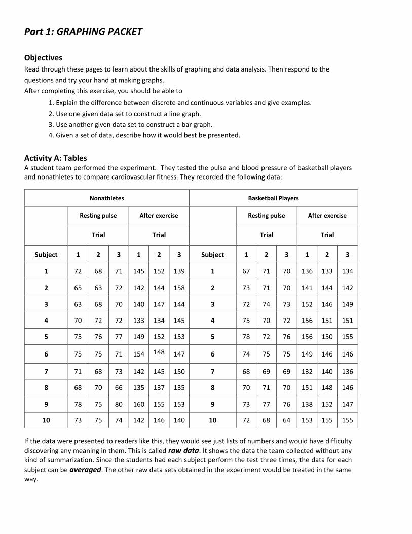
Part 1: GRAPHING PACKET Objectives
Read through these pages to learn about the skills of graphing and data analysis. Then respond to the
questions and try your hand at making graphs.
After completing this exercise, you should be able to
1. Explain the difference between discrete and continuous variables and give examples.
2. Use one given data set to construct a line graph.
3. Use another given data set to construct a bar graph.
4. Given a set of data, describe how it would best be presented.
Activity A: Tables A student team performed the experiment. They tested the pulse and blood pressure of basketball players and nonathletes to compare cardiovascular fitness. They recorded the following data:
Nonathletes Basketball Players
Resting pulse After exercise
Resting pulse After exercise
Trial Trial Trial Trial
Subject 1 2 3 1 2 3 Subject 1 2 3 1 2 3
1 72 68 71 145 152 139 1 67 71 70 136 133 134
2 65 63 72 142 144 158 2 73 71 70 141 144 142
3 63 68 70 140 147 144 3 72 74 73 152 146 149
4 70 72 72 133 134 145 4 75 70 72 156 151 151
5 75 76 77 149 152 153 5 78 72 76 156 150 155
6 75 75 71 154 148 . 147 6 74 75 75 149 146 146
7 71 68 73 142 145 150 7 68 69 69 132 140 136
8 68 70 66 135 137 135 8 70 71 70 151 148 146
9 78 75 80 160 155 153 9 73 77 76 138 152 147
10 73 75 74 142 146 140 10 72 68 64 153 155 155
If the data were presented to readers like this, they would see just lists of numbers and would have difficulty
discovering any meaning in them. This is called raw data. It shows the data the team collected without any kind of summarization. Since the students had each subject perform the test three times, the data for each
subject can be averaged. The other raw data sets obtained in the experiment would be treated in the same way.

Table. Average Pulse Rate for Each Subject (Average of 3 trials for each subject; pulse taken before and after 5-min step test)
Nonathletes Basketball Players
Resting pulse
After exercise
Resting pulse
After exercise
Subject Average Average Subject Average Average
1 70 145 1 70 134
2 67 148 2 70 142
3 67 144 3 73 149
4 71 139 4 72 151
5 76 151 5 76 155
6 74 150 6 75 146
7 71 146 7 69 136
8 68 136 8 70 146
9 78 156 9 76 147
10 74 143 10 68 155
These rough data tables are still rather cumbersome and hard to interpret. A summary table could be used to convey the overall averages for each part of the experiment. For example: Table. Overall Averages of Pulse Rate (10 subjects in each group; 3 trials for-each subject; pulse taken before and after 5-min step test)
Pulse Rate (beats/min)
Before
exercise After
exercise
Nonathletes 71.6 145.8
Basketball players 71.9 146.1
Notice that the table has a title above it that describes its contents, including the experimental conditions and the number of subjects and replications that were used to calculate the averages. In the table itself, the units
of the dependent variable (pulse rate) are given and the independent variable (nonathletes and basketball players) is written on the left side of the table.
Tables should be used to present results that have relatively few data points. Tables are also useful to display
several dependent variables at the same time. For example, average pulse rate before and after exercise, average blood pressure before and after exercise, and recovery time could all be put in one table.
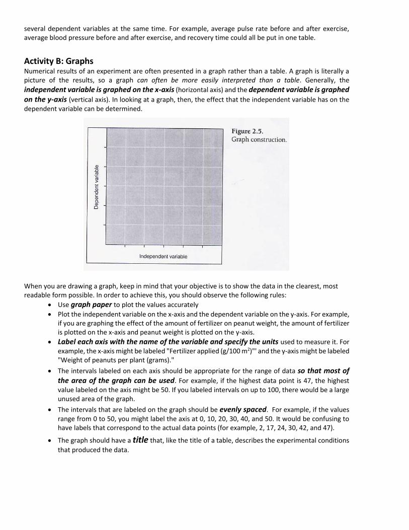
Activity B: Graphs Numerical results of an experiment are often presented in a graph rather than a table. A graph is literally a picture of the results, so a graph can often be more easily interpreted than a table. Generally, the
independent variable is graphed on the x-axis (horizontal axis) and the dependent variable is graphed on the y-axis (vertical axis). In looking at a graph, then, the effect that the independent variable has on the dependent variable can be determined.
When you are drawing a graph, keep in mind that your objective is to show the data in the clearest, most readable form possible. In order to achieve this, you should observe the following rules:
• Use graph paper to plot the values accurately
• Plot the independent variable on the x-axis and the dependent variable on the y-axis. For example, if you are graphing the effect of the amount of fertilizer on peanut weight, the amount of fertilizer is plotted on the x-axis and peanut weight is plotted on the y-axis.
• Label each axis with the name of the variable and specify the units used to measure it. For example, the x-axis might be labeled "Fertilizer applied (g/100 m2)"' and the y-axis might be labeled "Weight of peanuts per plant (grams)."
• The intervals labeled on each axis should be appropriate for the range of data so that most of the area of the graph can be used. For example, if the highest data point is 47, the highest value labeled on the axis might be 50. If you labeled intervals on up to 100, there would be a large unused area of the graph.
• The intervals that are labeled on the graph should be evenly spaced. For example, if the values range from 0 to 50, you might label the axis at 0, 10, 20, 30, 40, and 50. It would be confusing to have labels that correspond to the actual data points (for example, 2, 17, 24, 30, 42, and 47).
• The graph should have a title that, like the title of a table, describes the experimental conditions
that produced the data.

Figure 2.6 illustrates a well-executed graph
The most commonly used forms of graphs are line graphs and bar graphs.
*While this assignment does not give any examples of Pie Charts, they are also very useful tools for presenting data that represents percentages or relative amounts of something. They are not considered graphs because they do not plot independent and dependent variables against each other.
The choice of graph type depends on the nature of the independent variable being graphed.
Continuous variables are those that have an unlimited number of values between points. Line graphs are used to represent continuous data. For instance, time is a continuous variable over which things vary. Although the units on the axis can be minutes, hours, days, months, or even years, values can be placed in between any two values. Amount of fertilizer can also be a continuous variable. Although the intervals labeled on the x-axis are 0, 200, 400, 600, 800, and 1000 (g/100 m2), many other values can be listed between each two intervals.
In a line graph, data are plotted as separate points on the axes, and the points are connected to each other. Notice in Figure 2.7 that when there is more than one set of data on a graph, it is necessary to provide a key indicating which line corresponds to which data set.

Discrete variables, on the other hand, have a limited number of possible values, and no values can fall between them. For example, the type of fertilizer is a discrete variable: There are a certain number of types which are distinct from each other. If fertilizer type is the independent variable displayed on the x-axis, there is no continuity between the values.
Bar graphs, as shown in Figure 2.8, are used to display discrete data.
In this example, before- and after-exercise data are discrete: There is no possibility of intermediate values. The subjects used (basketball players and nonathletes) also are a discrete variable (a person belongs to one group or the other).
1) What is the difference between these two graphs (figures 2.8 and 2.9)?
2) Which way would be better to convey the results of the experiment (in references to figures 2.7-2.9)? Explain why.

3) What can you infer from these results?
Activity C: Graphing Practice
Use the temperature and precipitation data provided in Table 2.6 on the next page to answer the following
questions:
1) Compare monthly temperatures in Fairbanks with temperatures in San Salvador.
Can data for both cities be plotted on the same graph?
What will go on the x-axis?
Table 2.6 Average Monthly High Temperature and Precipitation for Four Cities
(T = temperature in °C; P = precipitation in cm)
Jan. Feb. Mar. Apr. May June July Aug. Sept. Oct. Nov. Dec.
Fairbanks, Alaska
T -19 -12 -5 6 15 22 22 19 12 2 -11 -17
P 2.3 1.3 1.8 0.8 1.5 3.3 4.8 5.3 3.3 2.0 1.8 1.5
San Francisco, California
T 13 15 16 17 17 19 18 18 21 20 17 14
P 11.9 9.7 7.9 3.8 1.8 0.3 0 0 0.8 2.5 6.4 11.2
San Salvador, El Salvador
T 32 33 34 34 33 31 32 32 31 31 31 32
P 0.8 0.5 1.0 4.3 19.6 32.8 29.2 29.7 30.7 24.1 4.1 1.0
Indianapolis, Indiana
T 2 4 9 16 22 28 30 29 25 18 10 4
P 7.6 6.9 10.2 9.1 9.9 10.2 9.9 8.4 8.1 7.1 8.4 7.6
Source: Pearce, E. A., and G. Smith. Adapted from The Times Books World Weather Guide. New York: Times Books, 1990.
How should the x-axis be labeled?
What should go on the y-axis?
What is the range of values on the y-axis?

How should the y-axis be labeled?
What type of graph should be used?
2) Compare the average September temperature for Fairbanks, San Francisco, San Salvador, and Indianapolis.
Can data for all four cities be plotted on the same graph?
What will go on the x-axis?
How should the x-axis be labeled?
What should go on the y-axis?
What is the range of values on the y-axis?
How should the y-axis be labeled?
What type of graph should be used?

Interpreting Information on a Graph
Once you understand how graphs are constructed, it is easier to get information from the graphs in your textbook as well as to interpret the results you obtain from laboratory experiments. For the graphs below answer the questions that follow.
1) Interpret this graph: What patterns or trends to you see?
2) What was the world's population in 1900?
3) Predict the world's population in 2000. 4) Why does this graph change from a solid line to a dashed line at the end?

Please note that the y-axis is given as a “range” of temperatures, not actual temperatures.
8) Interpret this graph: What patterns or trends do you see?
9) At what latitude does the least variation in temperature occur?
10) Miami is at approximately 26° N latitude. From the information on the graph, what is the range in mean monthly temperature there? 11) Minneapolis is at approximately 45° N latitude. From the information on the graph, what is the range in mean monthly temperature there? 12) Sydney, Australia is at approximately 33° S latitude. From the information on the graph, what is the range in mean monthly temperature there? 13) Look at any map or photographs of the world to try and explain the temperature patterns in the graph.

Please note that the y-axis has no “units”. Absorbance is a type of measurement used in spectroscopy that we
will discuss later this year.
14) Interpret this graph: What patterns or trends to you see?
15) At what wavelengths does Pr phytochrome absorb the most light?
16) At what wavelengths does Pfr phytochrome absorb the most light?

Part 2: DESIGN AN EXPERIMENT USING PLANTS
For the second part of your summer assignment, you will design and conduct an experiment using plants. You
may choose to investigate something to do with plant growth, light, fertilizer, root development, pollination,
or seed germination. Any topic about plants is okay.
Go online and search for ideas. Don't stress about this, instead have fun while learning! It is okay if everything
doesn't turn out perfectly. This assignment is meant for you to begin to think like a scientist, ask questions,
and try to find answers.
I suggest that you choose plants or seeds that you can commonly find at a local nursery or Home Depot. If you
choose to germinate seeds, try to choose some that germinate and grow quickly so you can get quick results.
If you have any problems accessing the plants you need please let me know and I can help you brainstorm
ideas. I will be answering email and Teams messages throughout the summer.
For this assignment, you will be designing your own experiment. An experiment is an organized series of steps
used to test a theory or an idea. Experimental design is a specific set of steps that is organized such that the
results are as valid as possible. The purpose of experimental design is to eliminate experimental error and to
ensure that the results are due to the factor or factors being tested. The experiment, based on a testable
hypothesis that was inferred from research, must be repeatable.
To complete this assignment, please follow these experimental steps:
Step 1: Stating the Problem or Question What do you want to find out? Write a statement that describes what you want to do. It should be as
specific as possible. It is important to also do some background research on the Internet. Scientists
always read relevant information pertaining to their experiment beforehand.
The purpose/problem will most likely be stated as a question such as: "What are the effects of______
on________?”
Step 2: Defining Variables INDEPENDENT VARIABLE (IV) (also called the manipulated variable) — the variable that is changed
on purpose for the experiment; you may have several levels of your independent variable.
DEPENDENT VARIABLE (DV) (also called the responding variable) — The variable that acts in response
to or because of the manipulation of the independent variable.
CONSTANTS (C) — All factors in the experiment that are not allowed to change throughout the entire
experiment. Controlling constants is very important to assure that the results are due only to the
changes in the independent variable; everything (except the independent variable) must be constant
in order to provide accurate results.
CONTROL GROUP - For some experiments, a control (standard of comparison for checking or verifying
the results of an experiment) is necessary. All variables must be held constant in the control group.
EXPERIMENTAL GROUP — The group(s) being tested with the independent variable; each
experimental group has only one factor different from each other, everything else must remain
constant.
REPEATED TRIALS — The number of times that the experiment is repeated. The more times you
repeat the experiment, the more valid your results will be. Repeated trials can be done
simultaneously or sequentially.

Step 3: Forming a Hypothesis A hypothesis is an inferring statement that can be tested. The hypothesis describes how you think the
dependent variable will be affected by the independent variable. It is based on research and is written
before you conduct the experiment. It may include an explanation such as the example below.
For example: When given the option of staying in the light or the dark, crickets will spend more time
in the dark because their natural habitat is under fallen logs and brush where it is dark.
In order to write a reasonable hypothesis, you will need to do some research on the Internet. Do not
skip this step, as you want your experiment to make sense.
Step 4: Designing an Experimental Procedure You should select only one thing to change in each experimental group (independent variable).
Change a variable that will help test the hypothesis.
The written procedure must tell how the variable will be changed (very specifically what you are
doing). The procedure must explain how the change in the variable will be measured.
The procedure should indicate how many trials would be performed (the more the better).
It must be written in a way that someone can replicate your experiment.
Step 5: Data Analysis and Results Before analyzing your data, you will need to write down all your observations and measurements. You
may have both qualitative observations (non-numerical such as texture or color) and quantitative
observations (measurements using numbers such as height in centimeters or number of leaves). Be
sure to include both.
The results of your experiment will then need to be compiled into a table or chart for easy
interpretation.
You will also need to prepare an appropriate graph of the quantitative data to observe trends more
easily. Use graph paper for this. It should be drawn by hand; do not use a graphing program for this
step.
Step 6: Conclusion For your conclusion, you will write (in sentences) what have you discovered from this experiment.
Describe the conclusions you can make about the results. How does your data specifically support this
conclusion? Refer to your hypothesis and write about whether the data you collected supports your
original idea. We do not refer to hypotheses as “right” or “wrong”, but instead we talk about whether
the data agrees with the hypothesis. You should also indicate any flaws in the research and errors or
problems that were encountered. How could this experiment be improved? What ideas do you have
for future study?

I would like you to complete the experiment and the write up before school starts in the fall. This does not
need to be perfect, but it should be your own original idea and the data and graphs should be original as well.
Be sure to include the following in your write up:
• Background research about plant topic is included
• Question / problem is clearly stated
• Hypothesis is clearly stated
• Independent variable(s), dependent variable(s), and controls are clearly stated
• Procedures are clearly listed including materials; drawings or photos are included as needed
• Data has been recorded in a chart or table and graphed appropriately
• Analysis of data is described
• Errors or problems encountered are described
• Conclusions are clearly stated
Part 3 - Free Response Question
An integral part of the AP Biology class is to prepare you to take the AP Biology exam which takes place at the
end of the year. The exam consists of both multiple-choice questions and free response questions. To help
you get a head start, please carefully read through this sample free response question. The original question
is highlighted. Please answer the associated (not highlighted) questions.
TABLE 1. EFFECT OF 0.1 mM CAFFEINE ON MEMORY IN BEES
Treatment Memory
(Average probability of revisiting a nectar source)
10 minutes 24 hours
Control 0.72 0.41
Caffeine 0.83 0.78
In flowering plants, pollination is a process that leads to the fertilization of an egg and the production of seeds.
Some flowers attract pollinators, such as bees, using visual and chemical cues. When a bee visits a flower, in
addition to transferring pollen, the bee can take nectar from the flower and use it to make honey for the
colony.
Nectar contains sugar, but certain plants also produce caffeine in the nectar. Caffeine is a bitter-tasting
compound that can be toxic to insects at high concentrations. To investigate the role of caffeine in nectar, a
group of researchers studied the effect of 0.1 mM caffeine on bee behavior. The results of an experiment to
test the effect of caffeine on bees’ memory of a nectar source are shown in Table 1.
(a) On the axes provided, construct an appropriately labeled graph to illustrate the effect of caffeine on
the probability of bees revisiting a nectar source (memory).
What is the dependent variable (what is the responding variable)? ___________________________
That should go on the X-axis.
What is the independent variable (what is the manipulated variable)? __________________________
That goes on the Y- axis.
Check your scale. Make sure it makes best use of the space and has equal steps between numbers.
Label your axes.

Now go ahead and plot the data on your graph.
(b) Based on the results, describe the effect of caffeine on short-term (10 minute) memory of a nectar
source.
Use the information from your own graph to describe what happened to the bee memory with and
without caffeine after 10 minutes. Was there any real difference?
(c) Based on the results, describe the effect of caffeine on long-term (24 hour) memory of a nectar
source.
Use the information from your own graph to describe what happened to the bee memory with and
without caffeine after 24 hours. What happened and how was this different from the results after
10 minutes?
(d) Design an experiment using artificial flowers to investigate potential negative effects of increasing
caffeine concentrations in nectar on the number of floral visits by bees. Identify the hypothesis, an
appropriate control treatment, and the predicted results.
Think of an experiment in which you could use artificial flowers, added nectar (its just sugar water
after all), and added caffeine in different amounts to control everything.
Write out your hypothesis:
What will you use for your controls (similar but without caffeine, since that will be your IV)?

Describe the results you would expect from this experiment – just make it up but use your
understanding of the sample experiment to guide your thoughts.
(e) Researchers found that nectar with caffeine tends to have a lower sugar content than nectar without
caffeine. Plants use less energy to produce the caffeine in nectar than they do to produce the sugar
in nectar. Propose one benefit to plants that produce nectar with caffeine and a lower sugar content.
How do plants produce sugar? What does it cost the plant to go through that process? Is it better for
the plant to make less sugar and caffeine or more sugar and no caffeine?
Why does the plant make the nectar in the first place (what is the benefit for the plant)?
Propose one cost to bees that visit the flowers of plants that produce nectar with caffeine and a lower
sugar content.
What is the drawback to bees if they get less sugar?
What is the cost to the entire hive?