An integrated QAP-based approach to visualize patterns of gene expression similarity
12
An integrated QAP-based approach to visualize patterns of gene expression similarity Mario Inostroza-Ponta, Alexandre Mendes, Regina Berretta, and Pablo Moscato Centre for Bioinformatics, Biomarker Discovery and Information-based Medicine The University of Newcastle Callaghan, NSW, 2308, Australia. [email protected] Abstract. This paper illustrates how the Quadratic Assignment Prob- lem (QAP) is used as a mathematical model that helps to produce a visualization of microarray data, based on the relationships between the objects (genes or samples). The visualization method can also incorpo- rate the result of a clustering algorithm to facilitate the process of data analysis. Specifically, we show the integration with a graph-based clus- tering algorithm that outperforms the results against other benchmarks, namely k-means and self-organizing maps. Even though the application uses gene expression data, the method is general and only requires a sim- ilarity function being defined between pairs of objects. The microarray dataset is based on the budding yeast (S. cerevisiae ). It is composed of 79 samples taken from different experiments and 2,467 genes. The pro- posed method delivers an automatically generated visualization of the microarray dataset based on the integration of the relationships coming from similarity measures, a clustering result and a graph structure. 1 Introduction The analysis of gene expression data coming from microarray technologies has become an important challenge for computer scientists working in bioinformatics. Among the techniques available, the visualization of microarray data is crucial to assist the analysis. Currently, it is mainly carried out by the use of heat maps of the gene expression, which give the user a clear appreciation of how a set of genes are expressed along a set of samples, experiments or conditions. An- other approach is the use of graph visualization algorithms. After modeling the microarray data as a graph (which is generally obtained with different ad hoc procedures), different graph layout algorithms are applied, like the force-direct [1] or the circular layout [2, 1]. An important step in these visualization methods is the definition of the graph, since the result of the graph layout algorithms will depend on the structure of the graph, which in general disregard any other information from the dataset. For example, a generally employed method to build such a graph is to define a distance or similarity between genes and then
Transcript of An integrated QAP-based approach to visualize patterns of gene expression similarity
An integrated QAP-based approach to visualizepatterns of gene expression similarity
Mario Inostroza-Ponta, Alexandre Mendes,Regina Berretta, and Pablo Moscato
Centre for Bioinformatics,Biomarker Discovery and Information-based Medicine
The University of NewcastleCallaghan, NSW, 2308, [email protected]
Abstract. This paper illustrates how the Quadratic Assignment Prob-lem (QAP) is used as a mathematical model that helps to produce avisualization of microarray data, based on the relationships between theobjects (genes or samples). The visualization method can also incorpo-rate the result of a clustering algorithm to facilitate the process of dataanalysis. Specifically, we show the integration with a graph-based clus-tering algorithm that outperforms the results against other benchmarks,namely k−means and self-organizing maps. Even though the applicationuses gene expression data, the method is general and only requires a sim-ilarity function being defined between pairs of objects. The microarraydataset is based on the budding yeast (S. cerevisiae). It is composed of79 samples taken from different experiments and 2,467 genes. The pro-posed method delivers an automatically generated visualization of themicroarray dataset based on the integration of the relationships comingfrom similarity measures, a clustering result and a graph structure.
1 Introduction
The analysis of gene expression data coming from microarray technologies hasbecome an important challenge for computer scientists working in bioinformatics.Among the techniques available, the visualization of microarray data is crucialto assist the analysis. Currently, it is mainly carried out by the use of heat mapsof the gene expression, which give the user a clear appreciation of how a setof genes are expressed along a set of samples, experiments or conditions. An-other approach is the use of graph visualization algorithms. After modeling themicroarray data as a graph (which is generally obtained with different ad hocprocedures), different graph layout algorithms are applied, like the force-direct[1] or the circular layout [2, 1]. An important step in these visualization methodsis the definition of the graph, since the result of the graph layout algorithmswill depend on the structure of the graph, which in general disregard any otherinformation from the dataset. For example, a generally employed method tobuild such a graph is to define a distance or similarity between genes and then
a threshold value such that a graph will be constructed with a one-to-one mapbetween vertices and genes; an edge connects a pair of genes if, and only if, theyare at a distance smaller than the threshold value. A force-direct layout algo-rithm can subsequently be applied with forces that attract vertices connectedby these edges, and in some cases the pairs of vertices not connected tend to beseparated via ad hoc repulsion forces. As a result, it is expected that the layoutof the graph will have the elements with similar expression pattern linked by anedge, and consequently closer in the layout.
In this work we propose a different visualization method for microarray databased on the modeling of the layout problem as an instance of the QuadraticAssignment Problem (QAP). Briefly, the QAP considers a set of objects to be as-signed on a set of available locations, considering the flow between all the objectsand the distance between all the locations, aiming to minimize the overall flowcost. The layout solution will provide a visualization of the objects (representinggenes or samples) where the position of each will depend on the relationshipsbetween them in the dataset. Moreover, we combine our visualization techniquewith a graph-based clustering algorithm that uses a combination of k NearestNeighbors and Minimum Spanning Tree, showing the versatility of our visual-ization method to display the components with the integration of several levelsof information. In order to illustrate the method’s performance, we considereda dataset used by Eisen et al. [3] composed of the expression of 2,467 genesover 79 samples from time courses during different experiments on the buddingyeast S. cerevisiae. We use the visualization method proposed on both genesand samples. The output shows the ability of the method to produce a layoutbased on the integration of different levels of information: a) similarity be-tween objects (genes or samples), b) a representative graph structureand c) a clustering result. Also, because of the formulation of the problem,we can mathematically guarantee that all the relationships will be considered inthe generation of the layout.
The paper is organized as follows: first we present the mathematical formu-lation of the layout problem as an instance of the QAP. Next, the graph-basedclustering method is described. Furthermore, we show the computational resultson the microarray dataset and the comparison with two other clustering algo-rithms: k-Means [4] and self organizing maps (SOM) [5]. Finally, the analysisand conclusions are drawn.
2 QAP-based layout method
The Quadratic Assignment Problem (QAP) belongs to the NP-hard class and itis a well-studied combinatorial optimization problem [6–8]. In this problem, thetask is to assign a set of n objects to m locations (m ≥ n). A matrix L = {lij}of distances between the m locations is given as input, as it is also given amatrix F = {fij} of flows between the n objects. The objective is to minimizethe overall transportation cost between all the objects considering both the flowbetween each pair of them and the distances between the locations in which

objects are being assigned. Formally, the objective function to be minimized isthe following:
Cost(S) =n∑
i=1
n∑
j=1
fij lS(i)S(j), (1)
where S(i) represents the assigned location of the object i in solution S. In thispaper, we are using a mathematical formalization of the visualization problemin which we have QAP instances with n objects and m >> n available locations.In order to create one of these instances we use the following procedure:
1. each of the n objects represents either a sample or a gene;2. a matrix D of distances between each pair of objects is computed using a
distance metric, for example based on Pearson Correlation, Euclidean orCosine distances, among others;
3. the flow fij (matrix F ) between any pair of objects i and j is defined asfij = 1
dij(∀ i 6= j, 0 otherwise);
4. a grid of m locations (m >> n) is defined;5. the distance between each pair of locations in the grid (matrix L) is calcu-
lated using Euclidean distance.
Clearly, higher flow values will be assigned to objects that are very similar andlower flow values to samples that are dissimilar. A good solution for the QAPwill put the objects with a high flow closer in the layout, which is exactly ourgoal.
2.1 Proximity graph clustering method
As we mentioned in the introduction, there are several alternatives to define agraph that represents the most important proximity relationships in the dataset.Our ad-hoc proximity graph is built using information from a minimum spanningtree (GMST ) and a k-nearest neighbors (GkNN ) graphs. A minimum spanningtree is a connected, acyclic subgraph GMST (V, EMST ) containing all the nodesof G and whose edges total sum has minimum weight. On the other hand, a k-nearest neighbors correspond to the graph GkNN (V, EkNN ), where eij ∈ EkNN
iff j is one of the k nearest neighbors of i.Initially, we create a complete undirected weighted graph G(V, E,w) using
the distance matrix D, such that the weight wij = dij . We define our proximitygraph, namely Gcluster(V,Ecluster), such that Ecluster = EMST ∩ EkNN . Thistype of proximity graph was also used in Gonzalez-Barrios and Quiroz (2003) [9].In their paper, the authors fixed k = d ln(n) e as the parameter for the kNNgraph, where n represents the number of vertices in the graph G. After manytests, we adopted a variant of that expression for the value of k, which is shownin expression 2.
k = min {d ln(n) e ;min k / GkNN is connected} (2)

The graph Gcluster has c ≥ 1 disconnected subgraphs (G1cluster, ..., G
ccluster).
The process is applied recursively on each subgraph of Gcluster until no furtherpartition is found. In Figure 1 we show the algorithm of this process.
MST-kNN (D: distance matrix)compute G.compute GMST .compute GkNN according to expression 2.Gcluster = {Vcluster = V, Ecluster = EMST ∩ EkNN}if (# of subgraphs of Gcluster > 1) then
for each subgraph Gicluster ∈ Gcluster
Gcluster =⋃
i MST -kNN(submatrix(D, Gicluster))
end forend ifreturn Gcluster
Fig. 1. Pseudo-code of the proximity graph based clustering method.
The final output is a partition of the set of elements based only on thedata provided (the distance matrix D between the elements) and with no user-determined parameter. However, it is also possible to provide a maximum valuefor k and thus have more control over the algorithm. In addition to the clustersthemselves, the edges of the graph Gcluster represent elements that are close toeach other.
2.2 Integration of proximity graph clustering with the visualizationmethod.
In order to integrate the result of the graph-based clustering presented in 2.1 withthe visualization method proposed, we consider each subgraph Gi
cluster ∈ Gcluster
as a QAP instance that it will be independently optimised. In addition, for eachof them, we also redefine the flow for each pair of samples (or genes) in thecluster as show in 3, since the edges that belong to the Gcluster are responsiblefor keeping the cluster together. After several tests, we define 1000 as the multi-plicative factor for those edges, because it allows the method to better representthe graph structure on the layout.
fij =
{1000dij
, if eij ∈ Ecluster;1
dij, otherwise.
(3)
Following the creation of several QAP instances, one for each cluster, we have toplace all clusters in a single layout. To do so, another QAP instance is created.In this case, each object represents one of the clusters Gi
cluster. This instanceis created by building a fully connected graph GC(VC , EC , wC) where |VC | = c
(number of subgraphs in Gcluster) and the weight wCijcorresponds to the average
flow between the subgraphs Gicluster and Gj
cluster, calculated as:
wCij =
∑
p∈Gicluster
∑
q∈Gjcluster
dpq
|V icluster| ∗ |V j
cluster|(4)
From GC , the new QAP instance is created as was describe in section 2. Totackle the QAP problem, we use a memetic algorithm described in [10]. Thememetic algorithm will produce a solution for the QAP, which will correspondto the layout of the data. The method produces a layout in two stages: first,the samples (or genes) are located according to the relationships between all thecomponents of each cluster and finally, the position of each cluster is determinedby the relationships between different clusters, considering the average distancesamong all components of each pair of clusters.
3 Experiments
3.1 Data description
The dataset used in this work originates from the yeast (Saccharomyces cere-visiae) gene expression microarray used by Eisen et al. [3]. The original yeastwhole-genome data contains the cDNA sequences associated to 9,800 ORFs(open reading frames) and 79 samples. The samples are divided into eight ref-erence groups associated to experiments on the budding yeast S. cerevisiae,namely alpha factor - 18 samples (alpha factor arrest and release); CDC15 -15 samples (cdc15 arrest and release); cold shock - 4 samples; diauxic shift -7 samples; DTT shock - 4 samples; elutriation - 14 samples; heat shock - 6samples; and sporulation - 11 samples. We use the freely available data (fromhttp://www.pnas.org/cgi/content/full/95/25/14863/DC1) corresponding to theFig. 2 of the work presented by Eisen et al. [3]. It contains a subset of 2,467genes with functional annotations.
3.2 Computational experiments
The experiments were performed on samples and genes separately. Firstly, wecalculate the distance matrix D, using as distance metric the Pearson Correlationas shown in 5, where ρij represents the Pearson correlation either between apair of genes or a pair of samples. This produces a distance matrix with valuesbetween 0 (if the elements are perfectly correlated) and 2 (if the elements areperfectly anti-correlated).
dij = 1− ρij . (5)
To find a solution to the QAP instances, we used the Memetic Algorithm de-scribed in [10]. The methods were coded in Java, and run in a Pentium IV (2,3GHz) workstation. The program generates a GML file with the location of each

sample in a grid. To visualize the file, we use the yEd Graph Editor, freelyavailable at http://www.yworks.com/.
In the case of samples, since they are from eight different experiments onyeast, it is supposed that samples belonging to the same experiment, shouldhave similar expression patterns, consequently they should be put closer in thefinal layout. We performed two tests: first, we applied the visualization methodon the complete dataset without the use of the graph-based clustering method,to illustrate its ability to produce a layout with the samples with similar expres-sion patterns together, and second, we combined the output of the graph-basedclustering algorithm presented in 2.1 with the visualization method.
In the case of genes, we expect that genes with similar functional annota-tion have a similar expression profile, so, they should be assigned closer in thevisualization. We present the result for the 2,467 genes in the dataset using thecomplete method proposed (visualization + clustering) to show how it performsin a larger dataset. We show how the method is capable of place closer geneswith similar functional annotation even if they are in different clusters.
Results: In the first experiment, we applied the visualization method on the79 samples, without the use of any extra parameter. In Figure 2 we show thelayout produced by the memetic algorithm. The samples have different shapesto indicate the experiment to which they belong. It is clear in the figure that
Fig. 2. QAP-based visualization of the 79 samples of yeast, considering the expressionsimilarity between the samples.
the organization of the samples shows elements with a similar gene expressionpattern (with higher correlation) located closer, giving to the user an informativedisplay of the data.
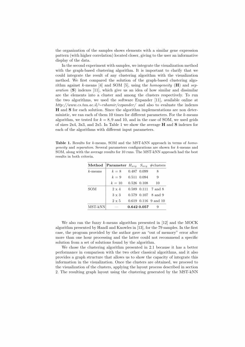
In the second experiment with samples, we integrate the visualization methodwith the graph-based clustering algorithm. It is important to clarify that wecould integrate the result of any clustering algorithm with the visualizationmethod. We first compared the solution of the graph-based clustering algo-rithm against k-means [4] and SOM [5], using the homogeneity (H) and sep-aration (S) indexes [11], which give us an idea of how similar and dissimilarare the elements into a cluster and among the clusters respectively. To runthe two algorithms, we used the software Expander [11], available online athttp://www.cs.tau.ac.il/∼rshamir/expander/ and also to evaluate the indexesH and S for each solution. Since the algorithm implementations are non deter-ministic, we ran each of them 10 times for different parameters. For the k-meansalgorithm, we tested for k = 8, 9 and 10, and in the case of SOM, we used gridsof sizes 2x4, 3x3, and 2x5. In Table 1 we show the average H and S indexes foreach of the algorithms with different input parameters.
Table 1. Results for k -means, SOM and the MST-kNN approach in terms of homo-geneity and separation. Several parameters configurations are shown for k -means andSOM, along with the average results for 10 runs. The MST-kNN approach had the bestresults in both criteria.
Method Parameter Havg Savg #clusters
k -means k = 8 0.487 0.099 8
k = 9 0.511 0.094 9
k = 10 0.526 0.108 10
SOM 2 x 4 0.589 0.111 7 and 8
3 x 3 0.579 0.107 8 and 9
2 x 5 0.619 0.116 9 and 10
MST-kNN — 0.642 0.057 9
We also ran the fuzzy k-means algorithm presented in [12] and the MOCKalgorithm presented by Handl and Knowles in [13], for the 79 samples. In the firstcase, the program provided by the author gave an “out of memory” error aftermore than one hour processing and the latter could not recommend a specificsolution from a set of solutions found by the algorithm.
We chose the clustering algorithm presented in 2.1 because it has a betterperformance in comparison with the two other classical algorithms, and it alsoprovides a graph structure that allows us to show the capacity of integrate thisinformation in the visualization. Once the clusters are obtained, we proceed tothe visualization of the clusters, applying the layout process described in section2. The resulting graph layout using the clustering generated by the MST-kNN

is shown in Figure 3. We emphasize that the layout algorithm arranges firstthe objects within each cluster according to the similarity between them, andthen the position of the clusters relative to each other taking into account thesimilarity between their components.
From a computational cost point of view, the method took less than 30 secto produce the layout, including the clustering algorithm (which for this datasettakes less than one second).
The final experiment corresponds to the visualization of the 2,467 genes inthe dataset, as a proof of the scalability of the method. The result is showed inFigure 4. In this case, the clustering algorithm took 27 seconds and the layoutless than 10 minutes, running 30 generations of the MA for each QAP instancescreated (52 for clusters, plus one for the clusters layout).
4 Discussion
Figures 2 and 3 show that the layout correlates well with the type of experimentto which the individual samples belong to. However, there is one particular sam-ple (spo-0 ), that seems to be close to samples of other type. In both figuressample spo-0 is closer to alpha experiments. At first sight this may indicatean error, as in general the correlation with sample type is strong, however theexpression pattern of sample spo-0 is closer to alpha than sporulation exper-iments with an average gene expression correlation of 0.112 to alpha samplesand -0.010 to sporulation samples. In Fig. 5 we show the heatmap of the geneexpression of alpha and sporulation experiments. The hierarchical tree on theleft also has spo-0 in the same subtree that contains all alpha samples as leaves.The most similar sporulation sample to spo-0 corresponds to spo5 2 and it isthe 23rd nearest neighbor of spo-0 , indicating that indeed spo-0 should not beassigned close to the other sporulation samples. On the other hand, one of theissues of clustering algorithms is that they show different degrees of sensitiv-ity, separating in more classes than necessary (showing probable subclasses) orkeeping elements from different classes together. Both situations are covered bythis visualization method. In the first case, if a cluster is split the layout methodmanages to put them together as can be seen in Fig. 3. The clustering algorithmsplit the experiment cdc-15, but the layout method put them together in theresult. In the second case, the layout method manages to put together samplesfrom different experiments closer (see middle-bottom cluster in Fig. 3).
For genes, we use the functional annotation of genes to show the main char-acteristics of the method: when a group is split the visualization manages to putit together in the grid (Protein Degradation and Protein Synthesis) and, into acluster, it manages to organize similar genes together (Glycolysis). This resultconfirms the ability of the visualization method to layout together clusters withsimilar components, and arrange elements within a cluster according to theirsimilarity. The groups mentioned are the main groups found by Eisen et al. [3],but with our method, we are able to find larger groups of genes with the samefunctional annotation than in the original work.

Fig. 3. QAP-based visualization of the clusters identified by the MST-kNN method.One can see that the result of the clustering method is mainly according with theexperiments from which the samples come. Important, is that even when the MST-kNN approach assigns samples from the same reference group to two or more clusters,the QAP-based layout puts them in adjacent positions, e.g. cdc15 (enclosed clusters),evidencing their similarity.

PROTEIN
PROTEIN
PROTEIN
PROTEIN
DEGRADATION
DEGRADATION
DEGRADATION
DEGRADATION
PROTEIN
SYNTHESIS
GLYCOLYSIS
Fig. 4. Visualization of the 2,467 genes using the QAP-based approach presented. Thesame groups highlighted by Eisen et al in [3] are found here, but our method alsoput together clusters composed with a majority of genes with the same functionalannotation.

Fig. 5. Expression profiles of the samples in the sporulation and alpha factor exper-iments. It shows that the expression of spo0 is more similar to alpha factor samplesthan to other sporulation samples (see arrow).
5 Conclusions
We have presented a visualization method for the analysis of gene expressiondata coming from microarray technology. The method is based in a mathematicalformulation of the visualization problem as instances of the QAP. The proposalis competitive with others and it provides a novel visualization approach. Themain advantages are:
1. The position of the objects are decided according to the relationships amongall the objects (either samples or genes) in the dataset, giving to the user alayout based on the whole information provided by the dataset.
2. The combinatorial optimization approach proposed here is novel, and can besynergistically “seeded” by other algorithms, like a force-directed approachallowing it to have a better starting point.
3. The ability to integrate the result of a clustering technique with the visual-ization method provides an easily interpretable positioning of the elements,with optimization for the layout within a cluster, and a global optimizationof the layouts of the clusters.
4. Finally, the method can integrate a graph structure in the visualization byincreasing the flows of some relationships.
Most of the software packages that are available for gene expression analy-sis lack of visualization systems that provide a reliable and information-basedlayout that can assist the interpretation of the datasets. Most of them consideronly some graph-layout algorithms and generally they only use heatmaps. Themethod proposed arises as a good alternative to be integrated in the current soft-ware packages for microarray data analysis, because it has a good performance,it is scalable and its characteristics make it unique.
Acknowledgment - This work has been supported in part by an ARC Dis-covery Project (DP0559755, Evolutionary algorithms for problems in functionalgenomics data analysis) and the ARC Centre in Bioinformatics. Mario Inostroza-Ponta also acknowledges the support of the Department of Informatics Engineer-ing, University of Santiago of Chile and the Newcastle Bioinformatics Inititative.
References
1. Shannon, P., Markiel, A., Ozier, O., Baliga, N., Wang, J., Ramage, D., Amin, N.,Schwikowski, B., Ideker, T.: Cytoscape: A software environment for integratedmodels of biomolecular interaction networks. Genome Research 13 (2003) 2498–2504
2. Kohler, J., Baumbach, J., Taubert, J., Specht, M., Skusa, A., Ruegg, A., Rawlings,C., Verrier, P., Philippi, S.: Graph-based analysis and visualization of experimentalresults with ondex. Bioinformatics 22(11) (2006) 1383–1390
3. Eisen, M., Spellman, P., Brown, P., Botstein, D.: Cluster analysis and display ofgenome-wide expression patterns. Proc Natl Acad Sci U S A 95 (December 1998)14863–14868
4. Tavazoie, S., Hughes, J., Campbell, M., Cho, R., Church, G.: Systematic determi-nation of genetic network architecture. Nat Genet (22) (1999) 281–285
5. Tamayo, P., Slonim, D., Mesirov, J., Zhu, Q., Kitareewan, S., Dmitrovsky, E.,Lander, E., Golub, T.: Interpreting patterns of gene expression with self-organizingmaps: methods and application to hematopoietic differentiation. Proc Natl AcadSci (1999)
6. Burkard, R., Cela, E., Pardalos, P., Pitsoulis, L.: The quadratic assignment prob-lem. In Pardalos, P., Du, D., eds.: Handbook of Combinatorial Optimization.Kluwer Academic Publishers (1998) 241–338
7. Taillard, E.: Robust taboo search for the quadratic assignment problem. ParallelComputing 17(4-5) (1991) 443–455
8. Oliveira, C., Pardalos, P., Resende, M.: Grasp with path-relinking for the quadraticassignment problem. In Ribeiro, C., Martins, S., eds.: Lecture Notes in ComputerScience. Volume 3059. Springer-Verlag (2004) 356–368
9. Gonzalez-Barrios, J., Quiroz, A.: A clustering procedure based on the comparisonbetween the k nearest neighbors graph and the minimal spanning tree. Statistics& Probability Letters 62(1) (2003) 23–34
10. Inostroza-Ponta, M., Berretta, R., Mendes, A., Moscato, P.: An automatic graphlayout procedure to visualize correlated data. In Bramer, M., ed.: Artificial In-telligence in Theory and Practice: Ifip 19th World Computer Congress. Volume217 of IFIP International Federation for Information Processing., Springer (2006)179–188
11. Shamir, R., Maron-Katz, A., Tanay, A., Linhart, C., Steinfeld, I., Sharan, R.,Shiloh, Y., Elkon, R.: Expander-an integrative program suite for microarray dataanalysis. BMC Bioinformatics 6(232) (2005)
12. Gasch, A., Eisen, M.: Exploring the conditional coregulation of yeast gene expres-sion through fuzzy k-means clustering. Genome Biology 3(11) (2002)
13. Handl, J., Knowles, J.: Multiobjective clustering with automatic determinationof the number of clusters. Technical Report TR-COMPSYSBIO-2004-02, UMIST,Manchester, UK (2004)