AIC Abstracts 2013
306
AIC Colour 2013 12th Congress of the International Colour Association 8-12 July, 2013 Newcastle upon Tyne, UK Book of Abstracts Editors: Lindsay MacDonald, Stephen Westland, Sophie Wuerger Bringing Colour to Life International Colour Association Internationale Vereinigung für die Farbe Association Internationale de la Couleur The Colour Group (Great Britain)
-
Upload
independent -
Category
Documents
-
view
0 -
download
0
Transcript of AIC Abstracts 2013
AIC Colour 201312th Congress of the International
Colour Association 8-12 July, 2013
Newcastle upon Tyne, UK
Book of AbstractsEditors:
Lindsay MacDonald, Stephen Westland,
Sophie Wuerger
Bringing Colour to Life
International Colour AssociationInternationale Vereinigung für die FarbeAssociation Internationale de la Couleur
The Colour Group (Great Britain)
Lit & PhilAIC Executive Committee Meeting
Sund
ay 7
th J
uly
BALTIC TerraceWelcome Drinks + Registration Open
CO
FFE
E
Hall OneSymposium: MCS2013
Hall TwoColour and
Music
Hall TwoColourNaming
07:3
0
07:0
0
Foye
rLU
NC
H, P
oste
rs a
nd E
xhib
ition
Reg
istra
tion
and
Exh
ibiti
on O
pen
Reg
istra
tion
and
Exh
ibiti
on
Ope
nR
egis
tratio
n an
d E
xhib
ition
O
pen
The
Aln
wic
k G
arde
nsO
ffici
al C
ongr
ess
Banq
uet
Coa
ches
dep
art f
or A
lnw
ick
Hall OneSymposium: Human Colour Vision: From
Retina to Cortex
Northern Rock Interior Design and
Lighting
Hall TwoColour Printing
Northern Rock Colour Vision
Hal
l One
Clo
sing
Cer
emon
y
Hal
l One
AIC
Gen
eral
Ass
embl
y
Dur
ham
City
Excu
rsio
n
CO
FFE
E
Reg
istra
tion
and
Exh
ibiti
on
Ope
nR
egis
tratio
n an
d E
xhib
ition
Ope
n
Hall OneSymposium: Colour
Harmony
12:0
0
Hall OneSymposium: LED Lighting
Hall TwoArchitectural Colour
15:3
0
12:3
0
13:0
0
13:3
0
14:3
0
15:0
0
15:3
0
Foye
rP
oste
rs a
nd E
xhib
ition
Registration and Exhibition Open
Hal
l One
Keyn
ote:
Ste
phen
Pal
mer
Hal
l One
Keyn
ote:
Fio
na J
enve
yH
all O
neJU
DD
Aw
ard
Hal
l One
Keyn
ote:
Hila
ry D
alke
07:0
0
07:3
0
08:0
0
08:3
0
09:0
0
09:3
0
12:3
0
12:0
0
15:0
0
15:3
0
16:0
0
Coa
ches
dep
art f
or c
ity e
xcur
sion
CO
FFE
E
Northern Rock The Colour of Culture
Hall TwoFashion
Hall TwoProduct Design and Branding
Northern Rock Interdisciplinary Colour
Hall TwoColorimetry
Hall TwoColour
Difference
Registration and Exhibition Open
Hall TwoColour Education
17:0
0
17:3
0
13:3
0
14:0
0
14:3
0
17:0
0
17:3
0
14:0
0
14:3
0
Hall OneSymposium: Aesthetics
LUN
CH
CO
FFE
E
14:0
0
10:0
0
10:3
0
11:0
0
11:3
0
20:0
0
19:3
0
16:0
0
15:3
0
17:0
0
16:3
0
19:0
0
18:3
0
18:0
0
17:3
0
11:3
0
15:0
0
14:3
0
15:0
0
15:3
0
Hall TwoColour and
Food
Hall TwoColour and Wellbeing
Foye
rPo
ster
s an
d Ex
hibi
tion
Barbour RoomSymposium:
Sustainable Coloration
Northern Rock Colour Imaging
Registration and Exhibition Open
AIC Study Groups
Northern Rock Colour Technology
LUN
CH
Hall OneSymposium: Fashion
LU
NC
H*
11:0
0
10:3
0
10:0
0
09:3
0
08:0
0
08:3
0
09:0
0
13:3
0
13:0
0
19:0
0
19:3
0
20:0
0
20:3
0
21:0
0
21:3
0
19:0
0
19:3
0
20:0
0
18:3
0
Hal
l One
Ope
ning
Cer
emon
y
Hal
l One
Keyn
ote:
And
rew
Par
ker
07:0
0
07:3
0
08:0
0
08:3
0
09:0
0
09:3
0
10:0
0
10:3
0
11:0
0
07:0
0
07:3
0
08:0
0
08:3
0
09:0
0
09:3
0
10:0
0
10:3
0
11:0
0
11:3
0
12:0
0
12:3
0
13:0
0
11:3
0
12:0
0
12:3
0
13:0
0
13:3
0
14:0
0
14:3
0
16:0
0
The
Hat
ton
Gal
lery
Offi
cial
Con
gres
s O
peni
ng
16:3
016
:30
17:0
0
17:3
0
18:0
0
18:3
0
Registration and Exhibition Open
18:0
0
Registration and Exhibition Open
21:3
0
22:0
0
18:0
0
18:3
0
12:3
0
13:0
0
13:3
0
15:0
0
11:3
0
12:0
0
12:3
0
13:0
0
13:3
0
14:0
0
14:3
0
15:0
0
15:3
0
07:0
0
07:3
0
08:0
0
08:3
0
09:0
0
09:3
0
10:0
0
10:3
0
11:0
0
18:0
0
16:0
0
14:0
0
Northern Rock Colour in Art
CO
FFE
E
22:3
0
Foye
rPo
ster
s an
d Ex
hibi
tion
Hall OneSymposium:
Environmental Colour
16:0
0
16:3
016
:30
17:0
0
17:3
0
18:3
0
19:0
0
19:3
0
20:0
0
20:3
0
21:0
0
16:0
0
16:3
0
Tues
day
9th
July
Wed
nesd
ay 1
0th
July
Thur
sday
11t
h Ju
lyFr
iday
12t
h Ju
lyM
onda
y 8t
h Ju
ly
The
Sage
Gat
eshe
adC
once
rt
* 13:
00-1
4:15
- SD
C N
etw
orki
ng L
unch
(in
vite
es o
nly)
Hal
l One
: Ca
pston
e Pre
senta
tion
Hall One Symposium:
Museum Lighting
Hall TwoColour Ergonomics
Northern Rock Colour Aesthetics
07:0
0
07:3
0
08:0
0
08:3
0
09:0
0
09:3
0
10:0
0
10:3
0
11:0
0
11:3
0
12:0
0
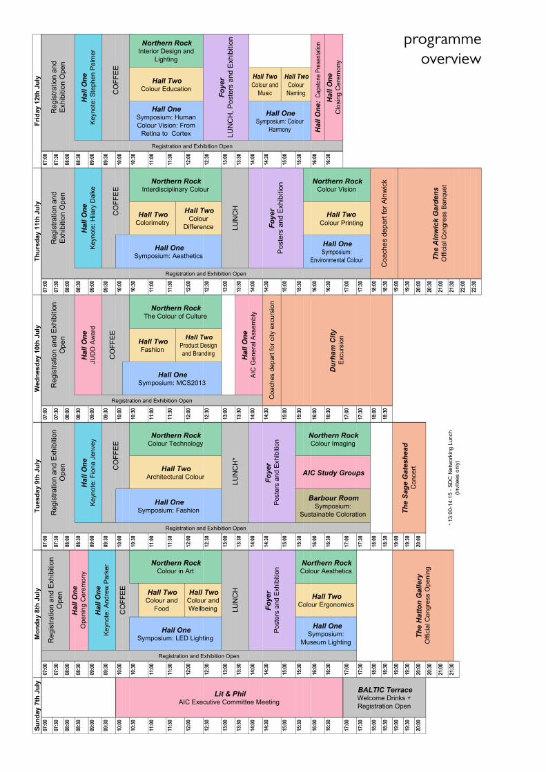
programme overview
AIC Colour 201312th Congress of the International
Colour Association 8-12 July, 2013
Newcastle upon Tyne, UK
Book of AbstractsEditors:
Lindsay MacDonald, Stephen Westland,
Sophie Wuerger
Bringing Colour to Life
ContentsAIC, International Colour Association 4The Colour Group (GB) 9Social Programme 11Abstracts 13Author Index 277Sponsors, Supporters and Exhibitors 293
4 AIC2013 – 12th International AIC Congress
AIC President’s ForewordIt is with great pleasure that AIC is coming here to Newcastle. It is the second time that the Colour Group, Great Britain have organised a congress. Forty years ago, the second AIC Con-gress was held at the University of York from 2-6 July, 1973. That congress gathered together 431 participants from 26 coun-tries and had 115 papers. This time we have in excess of 500 participants from 37 countries and we will listen to 146 oral presentations and we will study 256 different poster presenta-tions. The AIC congresses are truly international events and gather together participants from all corners of the globe which is clearly evident in this congress.
Today there are 26 regular members and within the AIC executive committee we are con-tinuously working to attract new AIC member’s countries. Another important task for AIC is to engage young researchers to contribute to the AIC meetings with paper presentations. We have to ensure that the already established colour society will be able to convince young students about the possibilities in colour science. These are really important activities to strengthen the position of AIC. I also think that our five AIC Study Groups are an important key to attracting new interest for the colour science community as well for AIC as a powerful colour organisation.
Now we are looking forward to the five coming days of this AIC congress, and I would like to thank especially the Co-chairs for this congress Lindsay MacDonald and Stephen Westland, the Colour Group of Great Britain and their team for the great organisation of this congress. I also would like to express my appreciation to the members of the international scientific committee who reviewed so many abstracts whose presentations we will be able to listen to and to study in the poster sessions.
After the very successful and memorable meeting in Taipei, Taiwan last year, we are now working on the forthcoming meetings. Next year’s will be the AIC Interim Meeting 2014 “Colors, Culture and Identity: Past, Present and Future” and will take place in Oaxaca, Mexico, 21-24 October. The AIC Midterm Meeting 2015 “Color and Image” will be held in Tokyo, Japan from 19-22 May. The Interim Meeting 2016 “Color in Urban Life: Usabil-ity in Images, Objects and Space” will be in Santiago, Chile, 18-22 October. The 13th AIC Congress will be held at Jeju Island, Korea from 16-20 October, 2017.
I know that the members of the organising committee have done their best to ensure that this congress will work out under the best possible conditions, that the proceedings will be interesting and that it will be exciting to learn about the latest developments in all aspects of colour. I am sure there will be many memorable moments and fruitful meetings to remember in the coming years and that this congress will bring more colours into our lives.
Berit Bergström, AIC president Stockholm, June 2013
AIC2013 – 12th International AIC Congress 5
AIC International Colour Association
AIC EXECUTIVE COMMITTEE
President: Berit Bergström // Vice President: Javier Romero // Secretary/Treasurer: Nick Harkness // Committee Members: Lindsay MacDonald, Shoji Tominaga, Verena M. Schindler, María Luisa Musso.
MEMBER COUNTRIES
Argentina: Grupo Argentino del Color Japan: Color Science Association of JapanAustralia: Colour Society of Australia Korea: Korean Society of Color StudiesBrazil: Associação Pró-Cor do Brasil Mexico: Asociación Mexicana de
Investigadores del ColorBulgaria: Colour Group – Bulgaria Netherlands: Nedrlandse Vereniging voor
KleurenstudieCanada: Colour Research Society of Canada Poland: Glówny Urzad MiarChile: Asociación Chilena del Color Portugal: Associação Portuguesa da CorChina: Color Association of China Slovenia: Drustvo Koloristov SlovenijeFinland: Suomen Väriyhdistys Svy Ry Spain: Comité Español del ColorFrance: Centre Français de la Couleur Sweden: Stiftelsen Svenskt FärgcentrumGermany: Deutscher Verband Farbe Switzerland: Pro/ColoreGreat Britain: The Colour Group (GB) Taiwan: Color Association of TaiwanHungary: Hungarian National Colour Committee
Thailand: The Color Group of Thailand
Italy: Gruppo del Colore United States: Inter-Society Color Council
ASSOCIATE MEMBERS
International Association of Color Consultants/Designers, North America
Color Marketing Group, USA
AIC STUDY GROUPS
Color Education (CE): Robert Hirschler // Environmental Color Design (ECD): Verena M. Schindler // Visual Illusions and Effects (VIE): Osvaldo da Pos // Color Perception of the Elderly (CPE): Katsunori Okajima // The Language of Color (LC): Jin-Sook Lee.
www.aic-colour.org
6 AIC2013 – 12th International AIC Congress
AIC2013 Chairs’ ForewordIt is with great pleasure that we welcome you to the 12th Congress of the International Co-lour Association, AIC2013, at the Sage Gateshead, 8-12 July 2013. The AIC Congress is held every four years, and is the only colour conference in the world that promotes all facets of colour. Since the first Congress in Stockholm, Sweden in 1969, the Congress has been hosted at locations all over the world including the USA, Germany, Japan, Spain and most recently in 2009 in Sydney, Australia. The Colour Group (Great Britain) was host for the second Congress in York in 1973 and now it is again our turn to host this magnificent and im-portant event. The Congress provides a unique forum bringing together colour practitioners, researchers, academics, designers, architects, lighting experts, artists and business leaders from all over the world with the aim of sharing ideas, interacting and learning about recent advances in their fields of expertise.
The objectives of the AIC are to encourage research in all aspects of colour, to dissemi-nate the knowledge gained from this research, and to promote its application in science, art, design and industry. The main theme of the AIC2013 Congress is ‘Bringing Colour to Life’. This theme is developed throughout the week in several complementary directions: first in the practical sense of colour production and reproduction; second in the sense of colour in nature; and third in the sense of how colour can be used sustainably now and in the future. Beyond these worldly aspects the theme also alludes to the inspirational ability of colour to lift the human spirit to new heights.
The Congress received around 600 abstract submissions from 59 countries. A Technical Programme Committee was assembled co-led by Dr Sophie Wuerger (University of Liver-pool) and Professor Stephen Westland (University of Leeds), consisting of over 120 colour experts drawn from around the world. A total of 1377 reviews were conducted by members of the Technical Programme Committee to help organise and rank the submissions. We would like especially to thank all of the reviewers who gave their valuable time as volunteers to undertake this critical task. The accepted papers have been organised into oral sessions and poster sessions. The oral sessions include the following topics: colour in art, colour and food, colour and well-being, colour aesthetics, colour ergonomics, colour technology, archi-tectural colour, colour imaging, the colour of culture, fashion, product design and branding, interdisciplinary colour, colorimetry, colour difference, colour printing, colour vision, inte-rior design and lighting, colour education, colour naming, and colour and music.
We are particularly pleased also to offer, embedded within the programme, nine high-quality Special Symposia with internationally renowned speakers. The Symposia topics include: LED lighting (sponsored by VeriVide), museum lighting, fashion, sustainable col-oration (sponsored by the Society of Dyers and Colourists), multispectral colour science (MCS2013), aesthetics, colour and environments (sponsored by RAL Colours), human co-lour vision from the retina to the cortex, and colour harmony.
Each day of the conference begins with a plenary session featuring a speaker of particular significance and we are proud to present Andrew Parker, Fiona Jenvey, Roy Berns, Hilary Dalke and Stephen Palmer as our keynote speakers. Roy Berns is also the recipient of the prestigious AIC Judd Award. Additionally, John McCann will present the important cap-stone lecture, drawing together the chromatic threads of the week, just before the closing ceremony on Friday afternoon.
In addition to the Technical Programme we hope you will enjoy the AIC Study Group
AIC2013 – 12th International AIC Congress 7
meetings on Tuesday afternoon and the exciting social events that we have planned around the conference, including a reception at the Hatton Gallery, a symphony concert of chromo-synaesthetic music at the Sage, an excursion to Durham Cathedral, and the congress banquet at Alnwick Castle Gardens. We hope too that you will delight in the wonderful architecture of the Sage, visit the gallery at Baltic Mill, walk across the Millennium Bridge, and take in the city of Newcastle which is renowned for its many attractions and facilities.
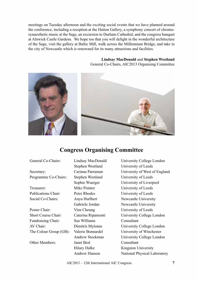
Lindsay MacDonald and Stephen Westland General Co-Chairs, AIC2013 Organising Committee
Congress Organising Committee
General Co-Chairs: Lindsay MacDonald University College LondonStephen Westland University of Leeds
Secretary: Carinna Parraman University of West of EnglandProgramme Co-Chairs: Stephen Westland University of Leeds
Sophie Wuerger University of LiverpoolTreasurer: Mike Pointer University of LeedsPublications Chair: Peter Rhodes University of LeedsSocial Co-Chairs: Anya Hurlbert Newcastle University
Gabriele Jordan Newcastle UniversityPoster Chair: Vien Cheung University of LeedsShort Course Chair: Caterina Ripamonti University College LondonFundraising Chair: Sue Williams ConsultantAV Chair: Dimitris Mylonas University College LondonThe Colour Group (GB): Valerie Bonnardel University of Winchester
Andrew Stockman University College LondonOther Members: Janet Best Consultant
Hilary Dalke Kingston UniversityAndrew Hanson National Physical Laboratory
8 AIC2013 – 12th International AIC Congress
Technical Programme Committee MembersYuki Akizuki Markku Hauta-Kasari Huw OwensSeyed Hossein Amirshahi Philip Henry Ondrej PanakUlrich Bachmann Javier Hernández-Andrés Galina ParameiBerit Bergstrom Bernard Hill C. Alejandro ParragaRoy Berns Robert Hirschler Carinna ParramanJanet Best Rafael Huertas Mike PointerMonica Billger John Hutchings Peter RhodesRichard Blackburn Francisco Imai Muriel RigoutMarina Bloj Hossein Izadan Caterina RipamontiValerie Bonnardel Gabriele Jordan Alessandro RizziKaren Braun Erica Kanematsu Allan RodriguesRob Buckley Ajit Khare Marisa RodriguezcarmonaJose Caivano Eric Kirchner Javier RodriguezcarmonaJoaquín Campos-Acosta Youngshin Kwak Tetsuya SatoEllen Carter Derry Law Hui-Liang ShenTracy Cassidy Wen-Yuan Lee Meong Jin ShinTom Cassidy Reiner Lenz Cecilia Sik LanyiQiao Chen Joanne Leonard David SimmonsVien Cheung Yazhu Ling Hannah SmithsonPatrick Chong Ronnier Ming Luo Wenwen SongAsim Choudhury Wen Luo Andrew StockmanMatthew Clarke Lindsay MacDonald Shalini SudColin Clifford Eric Mahers Hyeon-Jeong SukTracy Cochrane Forough Mahyar Peili SunOsvaldo Da Pos Laurence Maloney Kulthida TeachavorasinskunHillary Dalke Gabriel Marcu Shoji TominagaAndrew Deadman John McCann Sophie TriantaphillidouMaria João Durão Manuel Melgosa Philipp UrbanTarek Elmaaty John Mellerio Eva M. ValeroReiner Eschbach Jack Moreland Françoise ViénotIvar Farup Judith Mottram Ingrid VogelsAndrew Filarowski Dimitris Mylonas Roger WangKaren Fleming Sergio Nascimento Kate WellsKarin Fridell Anter Jose Navas Stephen WestlandPedro García Juan Luis Nieves Sophie WuergerAlexis Gatt Jim Nobbs Kaida XiaoDerek Grantham Peter Nussbaum John XinPaul Green-Armytage Tomoko Obama Haisong XuShinson Guan Leonhard Oberascher Hirohisa YaguchiHelen Gurura Katsunori Okajima Guanrong YeAndrew Hanson Satoko Okubayashi Joanne YipJon Hardeberg Li-Chen Ou Dazun Zhao
AIC2013 – 12th International AIC Congress 9
The Colour Group (Great Britain)Originally founded in 1940 as part of the Institute of Physics (IoP), the nascent Colour Group was made up mainly of colour vision scientists. The Colour Group of the IoP soon expanded and broadened its interests. In the 1950’s it separated from the IoP and added the suffix (GB) to differentiate itself from other colour groups around the world. The Group is a company limited by guarantee and a registered charity.
Since its origin the purpose of the Colour Group has been to promote the study of colour in all its aspects, to disseminate colour knowledge and to provide opportunities for all those concerned with the various aspects of colour to meet and share ideas and insights.
COLOUR GROUP ACTIVITIES
Meetings
The Colour Group organises monthly meetings from October to July each year either in-dependently or in collaboration with other national or international partner organisations. Meetings cover colour-related topics from science, technology and art in their applied or fundamental aspects with the goal of fostering cross-disciplinary interactions.
Awards
Three awards are available from the Colour Group to assist UK-based individuals in the early stages of their career to attend conferences:-
1. The WD Wright Awards1 intended for Post Graduate students are made in even calendar years.
2. The Palmer Awards2 intended for both Post Graduate students and Post Doctoral Fellows (or equivalent) are made in odd calendar years.
3. The CRS Award3 for scientific presentations is made every year.
Two medals, the Newton Medal and the Turner Medal are awarded in alternate years to dis-tinguished recipients in, respectively, the domains of Science and Art for contributions in the field of colour.
Every year, the Colour Group invites a distinguished vision expert to deliver the annual Palmer Lecture in January at its colour vision meeting.
Teaching Fellowships
For four consecutive years the Colour Group has sponsored two Teaching Fellows (Dr Ben Craven and Prof. Ron Douglas) successfully with an outreach of more than 4700 people.
1 http://www.colour.org.uk/wdwaward.html2 http://www.colour.org.uk/palmeraward.html3 http://www.colour.org.uk/CRSaward.html
10 AIC2013 – 12th International AIC Congress
Newsletters
Colour Group newsletters are published monthly. They are provided to Colour Group mem-bers and include meeting reports, information about upcoming events, and national and in-ternational colour news.
Occasional Publications
The Colour Group publishes a series of Occasional Publications from invited speakers’ talks which are available on the CG website. Two publications are currently available:-
1. Emulous of Light: Turner’s Colour Revisited by John Gage (PDF4, 698 kb), a version of the 2009 Turner lecture.
2. Chevreul’s Colour Theory and its Consequences for Artists by Georges Roque, CNRS, Paris (PDF5, 828 kb).
Website
The Colour Group website keeps updated information, information about past and upcoming events, awards details, membership information and archives about its activities. Please visit the site: http://www.colour.org.uk.
KEY EVENTS IN 2013
8th - 12th July: AIC 2013 Congress, Gateshead, UK
As a member of the AIC the Colour Group underwriting and helping to organise the 12th AIC International Congress at the Sage, Gateshead. The AIC Congress is held every four years, and is the only colour conference in the world that promotes all facets of colour. The congress provides a unique forum bringing together colour practitioners, researchers, academics, designers, lighting experts, and business leaders from all over the world in the aim of sharing ideas, interacting and learning of recent advances in their field of expertise. Further details can be found at: http://www.aic2013.org.
14th July: Colour Neurophysiology Symposium, University of Winchester, UK
In association with the International Colour Vision Society (ICVS), the Colour Group is co-organising a symposium to celebrate the retirement of Prof. Barry Lee, who will present an historical lecture sponsored by the Cambridge Research Systems. Information about the meeting can be found on the Colour Group website.
4 http://www.colour.org.uk/John%20Gage%20-%20Turner%20Medal%20Lecture%202009%20-%20Emulous%20of%20Light.pdf5 http://www.colour.org.uk/Chevreuls%20Law%20F1%20web%20good.pdf
AIC2013 – 12th International AIC Congress 11
Welcome to NewcastleGatesheadThis year AIC2013 is being hosted in the North East of England in NewcastleGateshead. Known for its warm hospitality, stunning natural beauty and its depth of history, AIC2013 will be your gateway to the North. With historic neighbours such as Hadrian’s Wall, Durham Cathedral and Alnwick Castle there is plenty for you to explore during your conference visit.
SOCIAL EVENTS PROGRAMME
The congress social programme commences on Sunday 7th June, continuing throughout the week to Friday 12th July. This extensive programme provides delegates with an opportunity to relax, and network with other delegates in an informal environment, whilst experiencing the culture the North East region has to offer.
Registration and Welcome Reception Sunday 7th July
The congress officially begins with event registration. Delegates will register for the con-gress, then attend the waterside drinks reception at The BALTIC Centre for Contemporary Art, on the banks of the glorious River Tyne, home to world famous landmarks the Tyne Bridge and the Millennium Bridge.
Reception at the Hatton Gallery Monday 8th July
The official opening reception of the congress will take place at the Hatton Gallery, one of Newcastle upon Tyne’s most impressive exhibition spaces. The reception will be accompa-nied by a spectacular exhibition of colour artworks by international artists, such as Simon Payne, Susan Hiller and Angela Bulloch.
Orchestral Concert at The Sage Gateshead Tuesday 9th July
An orchestral concert themed on colour-music synaesthesia by the renowned Northern Sin-fonia, one of Europe’s most exciting orchestras, is to be performed at The Sage Gateshead, an international home for music and discovery.
Excursion to Durham City Wednesday 10th July
A full afternoon excursion to Durham City, home to the iconic Durham Cathedral, a build-ing steeped in history as one of Britain’s first World Heritage sites, described as ‘one of the great architectural experiences of Europe’.The Cathedral is to host the Lindisfarne Gospels exhibition, a must-see contemporary interpretation of the North East’s most enduring story.
The Official Congress Banquet at The Alnwick Garden Thursday 11th July
The Official Congress Banquet is to be held at The Alnwick Garden, one of Northumber-land’s finest contemporary gardens and tourist attractions. Enjoy an evening of cultural in-sight, the finest locally-sourced dining and traditional Northumbrian entertainment, show-casing Northumberland’s supreme heritage.
12 AIC2013 – 12th International AIC Congress
ACCOMPANYING PERSON PROGRAMME TOURS
Local tours for accompanying persons are to take place throughout the congress week. Giv-ing accompanying persons the opportunity to explore and experience some of the region’s world famous landmarks and areas. These tours include:
Walking Tour Monday 8th July
A walking tour of Newcastle upon Tyne and Gateshead, witnessing famous landmarks that the area has to offer, such as the Tyne Bridge and Millennium Bridge. This not to be missed tour also gives a fantastic insight into the city’s diverse culture.
Excursion to Lindisfarne and Bamburgh Tuesday 9th July
A full memorable day excursion to Lindisfarne, also known as Holy Island. This focal point of the Celtic faith is an important centre of early Christianity which was home to St. Aiden and his successor St. Cuthbert. This superb excursion also includes the iconic Bamburgh Castle, a part of the unspoilt coastal area of Northumberland, one of the largest inhabited castles in the country.
Free Time Wednesday 10th July
Free time for accompanying persons to spend exploring the city and area, with a range of activities give at registration. Additionally, visit Eldon Square Shopping Centre within the heart of Newcastle upon Tyne, home to over 150 high street stores.
Excursion to Angel of the North and Beamish Museum Thursday 11th July
A full day excursion to the Angel of the North, the breathtaking 20 meter tall contemporary sculpture of modern art, designed by Antony Gormley – one of the most talked about pieces of public art ever produced. This excursion also includes Beamish Museum, the world fa-mous 300 acre living and working museum. Beamish gives the fantastic opportunity to expe-rience what life in the region was like during the Georgian, Victorian and Edwardian times, providing you with a real sense of history.
Excursion to Hexham Friday 12th July
A half-day excursion to local market town Hexham in Northumberland. The town is home to Hexham Abbey, the historic centrepiece of the town, built around 675 AD. It also boasts two medieval towers – the 14th century Hexham Old Goal (the oldest purpose-built prison in England) and the 14th-15th century Moot Hall.
THE VENUE
The Sage Gateshead is a centre for conferences, musical education, and performance, locat-ed in Gateshead on the south bank of the River Tyne, in the North East of England. Already established as a Tyneside landmark, The Sage Gateshead forms the heart of the Newcastle-Gateshead Quayside alongside the Stirling Prize-winning Gateshead Millenium Bridge and the Tyne Bridge.
AIC2013 – 12th International AIC Congress 13
Abstractskeynotessymposia
oral papersposter papers
14 AIC2013 – 12th International AIC Congress
keyn
ote The Cole of Colour in the Evolution of
Plants, Animals and VisionAndrew PARKER
Natural History Museum, UK
BIOGRAPHY
Born in 1967 in England, Professor Andrew Parker moved to Australia in 1990 where he spent ten years studying marine biology and physics. On returning to the UK as a Royal Society University Research Fellow at Oxford University in 1999, he worked on colour, vi-sion, biomimetics and evolution. In 2000, based on his ‘Light Switch Theory’ for the cause of the Big Bang in evolution, he was selected as one of the top eight scientists in the UK as a ‘Scientist for the New Century’ by The Royal Institution (London).
The Light Switch Theory holds that the Big Bang of evolution, 520 million years ago, was triggered by the evolution of the eye. This is the preferred solution to the most dramatic event in the history of life, most famously supported by Francis Crick (co-discoverer of the structure of DNA).
Today he works at Green Templeton College (University of Oxford). He is also Research Leader at The Natural History Museum, London and a Professor at Shanghai Jiao Tong Uni-versity – China’s foremost material science institution. Most recently he has been made a Professor at the Institute of Life Sciences in Swansea.
Andrew Parker’s scientific research centres on the evolution of vision and on biomimetics – extracting good design from nature. He has copied the natural nanotechnology behind the metallic-like wings of butterflies and iridescence of hummingbirds to produce commercial products such as security devices (that can’t be copied) and non-reflective surfaces for solar panels (providing a 10% increase in energy capture). The water capture device he discov-ered on Namibian beetles is under development as a commercial device and to collect clean drinking water in Africa.
He wrote the popular science books In the Blink of an Eye and Seven Deadly Colours (Simon & Schuster), and regularly speaks at literary/arts festivals as well as scientific in-stitutions. He has given the annual Hewlett-Packard lecture on evolution and the Stanford University annual physics lecture on optical biomimetics, and has held an honorary position at MIT on biomimetics.
In 2003 the US Assistant Secretary for Defence and other senior Pentagon officials set up a team to produce predictive software based on the subject of In the Blink of an Eye. It was believed that the Light Switch Theory, which covers the sudden introduction of the great-est weapon of all (vision), could be converted to a computer programme to analyse defence scenarios. This “systems biomimetics” project is ongoing.
AIC2013 – 12th International AIC Congress 15
sym
posi
um: L
ED
ligh
tingThe Colour Quality of Light Sources:
Alternatives to the CIE Colour Rendering Index Michael R. POINTER
Colour, Imaging and Design Research Centre, University of Leeds, UK
ABSTRACT
The CIE recommended method to quantify the colour rendering capability of a white light source is to use the CIE Colour Rendering Index. Over recent years however, there has been some criticism of index when it is applied to narrow-band light sources, especially some LED-based device. This led to the formation of a CIE technical committee, TC1-69 Colour Rendition of White Light Sources, to investigate new methods for assessing the colour rendi-tion properties of these sources. During the course of its work, the members of this commit-tee conducted a number of experiments that attempted to verify a colour fidelity-based index similar to the CIE Index, that is, an index defined as a function of the colour differences of a set of standard colour samples under a test source and a reference illuminant. In addition, a number of experiments were conducted that sought an alternative approach, to provide an index that attempts to measure colour quality explicitly. This index might include elements such as preference, flattery, attractiveness, etc. and will almost certainly not be based on comparison with a reference illuminant. A number of such indices have been proposed and they will be described. CIE now has two new technical committees, TC1-90 Colour Fidelity Index and TC1-91 New Methods for Evaluating the Colour Quality of White-Light Sources that are working towards appropriate recommendations.
E-mail: [email protected]
Visibility of Color Differences in LEDs Pieter SEUNTIENS
Visual Experiences, Philips Research, The Netherlands
ABSTRACT
New form factors in luminaire design show multiple LEDs in one module and multiple modules in one luminaire. Negative side effects of these new designs are visible color differ-ences within and between luminaires. In my presentation, I will discuss several experiments in which the visibility threshold for color differences is determined. The outcomes are com-pared to current standards on color consistency.
E-mail: [email protected]
16 AIC2013 – 12th International AIC Congress
sym
posi
um: L
ED
ligh
ting Brightness, Luminance and Colourfulness
of Light Sources Peter HANSELAER
Light and Lighting Laboratory, ESAT/ELECTA, KU Leuven
ABSTRACT
Luminance can be considered as the photometric quantity most closely related to brightness of a light source, but several other parameters such as the colourfulness of the stimulus are involved as well. Highly saturated colours appear brighter than those of low saturation, even when they are equal in luminance (Helmholtz-Kohlrausch effect). With the implementation of LEDs in indoor and outdoor signalization and architectural lighting applications, satura-tion levels are reaching much higher values than before. The predictive power of the few existing models to describe the brightness of self-luminous stimuli is rather poor. A tentative solution to increase the prediction accuracy of the colour appearance model CAM97u is presented.
E-mail: [email protected]
Identifying Optimum Qualities for Lamp Spectra Steve FOTIOS
School of Architecture, The University of Sheffield
ABSTRACT
Empirical evidence from laboratory trials and field observations suggest that the spectral power distribution (SPD) of light sources affects visual perception and visual performance. This gives an opportunity to improve these visual benefits, or, to adopt a lower illuminance when using ‘better’ SPD to maintain the same visual benefits but at reduced energy con-sumption, and LEDs give us better opportunity for tuning lamp SPD than do fluorescent and other types of lamp. Recent research has focused on identifying metrics for characterising the optimum SPD. Road lighting for pedestrians needs to meet the needs of spatial brightness (a proxy for perceived safety), peripheral detection of pavement obstacles and interpersonal judgements: recent guidance has used the S/P ratio and Ra to determine the amount by which illuminance can be reduced. For interior lighting at photopic levels a recent from the IESNA demonstrates the benefits of high S/P ratio for aiding visual effort; work is on-going to es-tablish an appropriate metric for the effect of SPD on spatial brightness at photopic levels.
E-mail: [email protected]
AIC2013 – 12th International AIC Congress 17
sym
posi
um: L
ED
ligh
tingTo LED or Not to LED-up a Store
Katelijn QUARTIER PHL University College
ABSTRACT
This presentation offers a wide talk about LEDs and retail lighting. Questions like “what might be its benefits regarding store experience”, “how do consumers experience LED-lit stores”, “is the use of coloured lighting in stores just a hype or is it a new condition” will be answered. Good and bad examples are used to illustrate the answers.
E-mail: [email protected]
18 AIC2013 – 12th International AIC Congress
colo
ur in
art Analysis of a Red Color on Nishiki-e Printings
Takuzi SUZUKI1,2, Misaki KAN’NO3, Yoshitsugu MANABE2, Noriko YATA2
1 National Museum of Japanese History 2 Graduate School of Advanced Integration Science, Chiba University
3 Faculty of Engineering, Chiba University
ABSTRACT
Nishiki-e (Japanese traditional polychrome woodblock print) is one of the leading products of color culture in Japan. We tried to detect new vivid red colorants (a kind of aniline dye) that are used on Nishiki-e printings in 1860s explosively. First, red colors of 1566 Nishiki-e printings made from 1838 to 1900 were analyzed. These printings are owned by the National Museum of Japanese History, and digital images have taken by a digital imaging system with a color chart since 2003. We developed an automatic extraction software program of color chart image for color correction. From color-corrected CIELAB images, strong red colors (0°≤h≤50°, C*≥20) were extracted, and frequency of use of hue was visualized as a histogram. It is clearly observed that the use of pure red hues (0°≤h≤25°) are increased ex-plosively after 1869. Next, 24 Nishiki-e printings made from 1852 to 1873 were chosen, and UV-VIS-NIR spectral reflectance data of red colors were analyzed. Two kinds of character-istic spectral reflection density curve are observed. 9 Nishiki-e printings made from 1868 to 1873 have possibility of the use of the red aniline dye. These two results indirectly show the usage of the red aniline dye.
Imagination, Hallucinations, Visions, Dreams and Drugs – Perception of Colour without External Visual Stimuli
Leonhard OBERASCHER leoncolor
ABSTRACT
Colour research and science in general is confined to visual sensations caused by external light stimuli. But don’t we quite frequently “see” colour also in absence of external light stimuli? Should these phenomena not be included in the field of colour research as well? Are “inwardly” perceived colours identical, similar, or perhaps different from those we see under normal circumstances? What methods can be used to investigate and describe them?
AIC2013 – 12th International AIC Congress 19
colo
ur in
artSerpentine Gallery Pavilions:
Essays on Colour EnvironmentJoaquim SANTOS
Faculty of Architecture and Arts, Lusíada University, Lisbon, Portugal Architect, Docent in History of Art and Theory of Architecture.
Researcher at the Research Centre in Territory, Architecture and Design, Colour Laboratory (CITAD) at the same university.
Doctor of Philosophy, Tampere University of Technology, Faculty of Architecture, Finland
ABSTRACT
The bounded magnitude of time that a pavilion-like structure displays makes use of impres-sive experimental language where colour may have a strong role by attaching our attention to the materiality of architecture and environment. Thus, pavilions as temporary arts works – would this be a suitable concept! – are acts of freedom that may combine all together human relations to colour that other kind of works may eventually not have.
Architects have made great colour exercises on these Serpentine Gallery Pavilions. Their options go from smooth colours to strong colours, transparency to opacity, day to night. These pavilions set forward arguments of naturalness and artificialness and how they meet and combine. Certainly, colour is a major plastic argument that expresses both figurative and abstract characteristics on a fertile material basis.
Zaha Hadid, Daniel Libeskind, Toyo Ito, Oscar Niemeyer, MDRVD, Alvaro Siza and Edu-ardo Souto de Moura, Rem Koolhaas and Cecil Balmond, Olafur Eliasson and Kjetil Thord-sen, Frank O. Gehry, Sanaa, Jean Novel, Peter Zumthor, Herzog & de Meuron, and Sou Fujimoto, may have made a contemporary history of man environment colour approach and tendencies that combine, for instance, camouflage-like effects, spot arguments, all around-effects, colour-framing environment, openness, closeness, colour resemblance or contrast, that invite and sometimes «impose» a colour experience.
Conceptual Art and the Liberation of ColourPaul GREEN-ARMYTAGE, Curtin University
ABSTRACT
For conceptual artist Sol LeWitt, “the idea or concept is the most important aspect of the work …. What the work of art looks like isn’t too important” (LeWitt 1967). By switching the emphasis from form as an aim to form as the result of working through an idea, concep-tual artists paved the way for the liberation of colour from its traditional roles in description, symbolism and expression. Colours could be set free to be nothing but themsleves – just colours.
20 AIC2013 – 12th International AIC Congress
colo
ur in
art Who’s Not Afraid of Displaying
Kurt Schwitters’ Collages? A Microfadometry Study to Determine
the Sensitivity to Light of Five ExamplesJoyce H. TOWNSEND,1 Bruce FORD,2 Piers TOWNSHEND1
1 Conservation Dept, Tate, London 2 Art & Archival Pty Ltd & National Museum of Australia
ABSTRACT
A technical study was undertaken of paper-based ephemera used in Germany 1920s-30s by Kurt Schwitters to create mixed-media, sometimes three-dimenional, collages. Microfadom-etry, a rapid and non-destructive accelerated light-fading method for informing display du-ration decisions, was carried out on all distinct paper-based elements in 5 of Schwitters’ and 2 contemporary collages by Raoul Hausmann and by Julian Trevelyan. Many coloured components in this small sample were more lightfast than had been feared.
A New Approach to the Debate between Color and Form in Relation to the Chromatic Circles and Models
from the Early Nineteenth CenturyIngrid CALVO
Área Plástica, Departamento de Diseño, Universidad de Chile.
ABSTRACT
For many centuries in art, color had a secondary place in relation to drawing. It was only considered as an application or an element of the appearance of the form. Historically, draw-ing and line were the protagonists of fundamental moments of Art History and the great art-ists of drawing were brought to the level of genius. It didn’t happen the same with the great colorists. However, in the nineteenth century, with the rise of Romanticism and the inner revelation of man, color, became the main resource for expression and was elevated to the status of substance of light and painting, in the work of artists such as P.O. Runge or J.W.M. Turner. In an unprecedented moment in the unceasing debate between color and line, the balance tipped toward the chromatic matters. Intellectuals of the most diverse disciplines (Goethe, Otto Runge, Schopenhauer, von Helmholtz, Chevreul, Maxwell, among others) attempted to explain the phenomenon of color through numerous theories and by creating various color models and systems, denoting the importance given to color in this moment of human knowledge. These color models, nevertheless, pose an interesting paradox because, from the moment of their conception, most of them are presented as geometric drawings, drawn in a strict way in their formal proposals. This could make us think that the growing as-sertion of the place of color as more important than drawing (and even the place of drawing as more relevant than color) can never be considered as a total separation of both resources.

AIC2013 – 12th International AIC Congress 21
colo
ur in
artDisplaying Artwork with Tuneable Colour Quality
Arūnas TUZIKAS,1 Anqing LIU,2 Artūras ŽUKAUSKAS,1 Rimantas VAICEKAUSKAS,3 Pranciškus VITTA,1,3 Andrius PETRULIS,1 Michael S. SHUR2,4
1 Institute of Applied Research, Vilnius University 2 Smart Lighting Engineering Research Center and Department of Physics,
Applied Physics, and Astronomy, Rensselaer Polytechnic Institute 3 Department of Computer Science, Vilnius University
4 Department of Electrical, Computer and System Engineering, Rensselaer Polytechnic Institute
ABSTRACT
We report on a tuneable quadrichromatic (red-amber-green-blue, RAGB) solid-state lighting device (colour rendition engine) with the following functions implemented: i) control of co-lour rendition by balancing metameric RAGB spectra between the colour saturation, colour fidelity, and colour desaturation ability of light; ii) variation of correlated colour temperature and luminance with the photochemical damage potential maintained at a constant value; and iii) generating quasi-white light for chromatic correction. We demonstrate several applica-tions of the engine for advanced display of artwork.
The Material of ColourHelen BAKER
Department of Arts, Faculty of Arts, Design and Social Sciences, Northumbria University
ABSTRACT
This presentation seeks to explore how colour and material communicate and the ways con-temporary painters are continuing a dialogue and craft that is both medieval and of current significance.
22 AIC2013 – 12th International AIC Congress
colo
ur a
nd fo
od Consumer Expectation on Preference and Taste of Fresh-Cut Fruit Influence by Package Colours
Somporn JENKUNAWAT,1 Pratoomtong TRIRAT2
1 Faculty of Agricultural Technology, 2 Faculty of Mass Communication Technology,
Rajamangala University of Technology Thanyaburi
ABSTRACT
This study was aimed to investigate the effects of package colours on consumers’ expecta-tion on the product taste and preference, as well as purchasing decision. Data were collected by questionnaire from two groups of participants of ≤ 25 and >25 years old. Two groups of fresh-cut fruits were packed in packages of various colours for testing. The first group included three kinds of fruit: orange, pineapple and green apple; all of which the fruit-cut tastes ranged from sweet to sour. The second was watermelon, green cantaloupe and dragon fruit; all of which the fruit-cut tastes ranged from sweet to tasteless or not sweet at all. The results showed that fresh-cut fruit with sweet to sour tastes packed in pink packages were rated as very sweet and more preferred by both groups while most of the purchasing decision was influenced by the taste rated as sweet – sour, except for the green apple which was rated as very sweet and more preferred by participants of >25 years old. For fruit with sweet to not sweet tastes at all, it was found that fresh-cut fruit packed in pink packages were rated at very sweet and most of the preference rating was for pink packages as well. Most par-ticipants’ purchasing decision was influenced by the packages rated as very sweet and more preferred.
Sensory Evaluation of Preference of Baked Food ColorHideki SAKAI,1 Hiroyuki IYOTA2
1 Graduate School of Human Life Science, Osaka City University 2 Graduate School of Engineering, Osaka City University
ABSTRACT
We conducted sensory tests to determine the preference of baked food color of a plain cookie and sliced bread. They are initially white (L* is about 90), which is the color of wheat flour, and become darker (browning) as baking progresses. A total of 93 Japanese subjects (40 males and 53 females, average 31.8 years old) evaluated the browning colors from raw to overcooked and answered the most preferred color, and the upper (not too raw) and lower (not overcooked) limits as a food to eat. The results were highly individual. There is, how-ever, only one peak in each frequency distribution. Thus, we can determine the range of browning color that most (eg. 75 percent) people can accept. That is between L*=77.5 and 62.5 for plain cookies and between L*=81.2 and 63.5 for sliced bread.
AIC2013 – 12th International AIC Congress 23
colo
ur a
nd fo
odBanana Ripening: Colour, Physical and Sensory Changes
Wei JI1, Mahmood AKHTAR2, Georgios KOUTSIDIS3, Ronnier LUO4, John HUTCHINGS4, Francisco MEGIAS5, Mick BUTTERWORTH6
1 College of Physics & Electronic Information Engineering, Wenzhou University, Wenzhou, PR China
2 School of Food Science and Nutrition, University of Leeds, Leeds, UK 3 School of Life Sciences, Northumbria University, Newcastle upon Tyne, UK
4 Colour Imaging and Design Centre, University of Leeds, Leeds, UK 5now of the Wm Morrison Supermarkets Plc, Bradford, UK
6VeriVide Limited, Enderby, Leicester, UK
ABSTRACT
We recently reported a novel digital imaging methodology for determining the colour of banana hands and fingers with the aim of using such methodology to routinely determine fruit ripening stages (Ji et al, 2010, 2012). In the present investigation, a number of physi-cochemical and sensory assessments were performed to evaluate relationships between ap-pearance and biochemical traits related to fruit quality. A clear correlation trend with ripe-ness was observed for colour (green and yellow) and degree brix (sugar content). Sensory evaluation also revealed that greenness, yellowness, gloss, sweetness, sourness, bitterness (astringency) and texture were related with the ripening stage as defined by digital imaging. The ripening life of the banana can be followed and defined in terms of colour, physical and chemical properties, the digital imaging performing as well as the presently used hard copy colour chart.
Color Change with Thickness in Liquid Foods: Dichromism
Rafael HUERTAS,1 Luis GOMEZ-ROBLEDO,1 Alejandro LAPRESTA-FERNÁNDEZ,2 José Antonio GARCÍA,1 Javier ROMERO1
1 Department of Optics. Campus Fuentenueva, Faculty of Sciences, University of Granada, E-18071 Granada, Spain
2 Solid Phase Spectrometry Research Group, Department of Analytical Chemistry. Campus Fuentenueva, Faculty of Sciences, University of Granada, E-18071 Granada, Spain.
ABSTRACT
Some materials show the property of change in color with thickness. Kreft and Kreft (2009) have called this property dichromatism. However, this term is used to define a kind of col-orblindness long since. Thus, we propose the new term dichromism to name the mentioned property. On the other hand, Kreft and Kreft have developed a method to quantify the di-chromism based on the Bouger-Lambert-Beer law, defining two dichromism factors. These factors are not related with the perceived visual hue difference. In this work theirs method is applied to 20 liquids samples. The results show that any transparent substance will result dichromic because of the Bouger-Lambert-Beer law, which is not always valid as has been reported by Gómez-Robledo et al. (2008).
24 AIC2013 – 12th International AIC Congress
colo
ur a
nd fo
od Psychophysical Assessment of Best Lighting for Naturalness and Preference by Monitor Viewing of
Commercial Food CountersOsamu MASUDA, Sergio NASCIMENTO
Centre of Physics, Gualtar Campus, University of Minho, 4710-057 Braga, Portugal
ABSTRACT
We studied spectral optimization of illumination for commercial food counters containing a variety of fruits, vegetables, meat, and fish. The scenes were simulated with high chromatic precision on a calibrated computer monitor with hyperspectral images obtained in a local supermarket. The illuminants were daylight-like and their metamers with nearly arbitrary spectra. Six color normal observers, all but one of the authors were naïve, participated in the experiments. In the first experiment, only daylight-like illuminants were used and the observers adjusted the chromaticity on and around the Planckian locus such that the scenes looked the most natural or the most preferable. The most natural scenes were produced with illuminants with an average correlated color temperature (CCT) of 4400 K and the most preferred scenes 6040 K. In the second experiment, spectral metamers with almost arbitrary spectra at five chromaticities at and around the chromaticity obtained for each scene in the first experiment were tested for the same criteria. The CCT of the optimized metamers were a little higher and the spectra were considerably different from daylight. It was hypothesized that naturalness may be affected by the symmetry of the color distribution rendered by the illuminant and that the preference by the volume of the distribution in a color space.
AIC2013 – 12th International AIC Congress 25
colo
ur a
nd w
ellb
eingColour in the Cause of Emotion
Diane HUMPHREY, Monica RIVAS , Connie HERMSEN
Department of Psychology, King’s University College at The University of Western Ontario
ABSTRACTColour-emotion associations show typical use of specific colour ranges to express specific named emotions in both free-hand drawings and in colouring books. Red is most often used to show anger, love and embarrassment. Orange is typically used for surprise and pride. Yellow usually depicts happiness or pride. Green is used for disgust, blue for sadness and empathy, purple for empathy and guilt and black is used to depict fear. We have obtained these results in abstract drawings, painting, pointing to colours, drawings of emotional situations, and colouring books using both animal and human “characters”. Most recently we have used colouring books to depict emotional situations in which both an “Actor” and a “Cause” (see Parkinson, 1996) of each emotion are depicted in drawings of anger, surprise, happiness, disgust, sadness, fear, love, embarrassment, pride, guilt and empathy. In most of the colouring books clothing and body features showed expressive use of colour while backgrounds were not coloured in as frequently. Generally both “Actor” and “Cause” were coloured in colour ranges similar to those used in our previous studies. In an analysis of CIE variables of colours used it was found that more red (X) components were present in colours used to depict the “Actor” of the emotion. The “Cause” of the emotion had higher luminance colours on average and more yellow-green (Y) components on average. It is suggested that these associations may have biological bases, likely coming together in orbito-frontal activity in the cerebral cortex as well as in other areas connected to the frontal lobes in an “aesthetic” network (see Vartarian, 2009). These common associations may be the basis of the aesthetic and emotional significance of colours in representations.
Colour Energy and Wellbeing: the Lessons of the OrientInes KLEMM
University of Edinburgh, Latrace GmbH
ABSTRACTColour, with a particular focus on its latent energy, has not yet been sufficiently explored, and although continuously researched and discussed, colour remains one of the great mysteries of perception. Our body records millions of impressions per minute across all five senses. The five senses keep us alive; they warn, nurture, and alert us, and human perception is based on receiving the vibrations caused by energy fields. These sensory vibrations are directly linked with the human body and it is through them that experiences like “I am feeling good in this space”, and even unconscious memory are triggered. Architecture, however, in most academic programs allows little or no time for the in-depth study of perception, psychology, colour energy, or wellbeing.
26 AIC2013 – 12th International AIC Congress
colo
ur a
nd w
ellb
eing Colour and Well-being in Occupational Therapy
Vanessa VOLPE, Jacqueline H. PARKES School of Health, University of Northampton
ABSTRACTThis evaluation was undertaken to explore the therapeutic application of colour within community mental health intervention. A series of classes designed and facilitated by an occupational therapist aimed to raise awareness of mood and behavior in response to colour, and to utilise colour as a therapeutic medium. One year after the colour for well-being course was completed a focus group evaluation with 4 participants found that individuals extended their range and use of coloured items in order to improve mood and introduce new aspects of identity and associated behaviors. However, introducing new, previously unthought-of coloured accessories could also be challenging and remain unused. The colour for well-being program introduces a potential framework for health and social care professionals to utilise colour as a therapeutic medium with adults who are experiencing mild to moderate mental health symptoms.
AIC2013 – 12th International AIC Congress 27
post
er s
essi
on o
neUsing B-phycoerythrin from Microalgae as a Natural Colorant to Reproduce the Color
in Commercial Strawberry YogurtsRuperto BERMEJO,1 Piedad LIMÓN,1 F. Gabriel ACIÉN-GERNÁNDEZ,2
J. María FERNÁNDEZ-SEVILLA,2 Manuel MELGOSA3
1 Department of Physical and Analytical Chemistry, High Politechnical School of Linares, University of Jaén, Jaén (Spain)
2 Department of Chemical Engineering, University of Almería, Almería (Spain) 3 Department of Optics, University of Granada, Granada (Spain)
ABSTRACT
In order to study the usefulness of B-phycoerythrin as a natural colorant, an extract of this phycobiliprotein was obtained from the microalga called Porphyridium cruentum by expanded bed adsorption chromatography, and this extract was used to generate pink colorations in white (natural) yogurts. As expected from the intense pink color of the B-phycoerythrin extract, by adding increasing amounts of B-phycoerythrin to white yogurts, the CIELAB a* coordinate increased, while b* and L* decreased, following almost asymptotic trends (in particular the a* coordinate). We analyzed whether the color of four different commercial strawberry yogurts with pink synthetic dyes can be also achieved using the B-phycoerythrin natural colorant. For one of these four commercial yogurts, the addition of a small amount of B-phycoerythrin extract (0.05 ml) to the white yogurt led to a minimum color difference of 2.9 CIELAB units with respect to the strawberry yogurt with synthetic dyes, which means an acceptable color reproduction. However, for the other three commercial yogurts, we needed to add to the white yogurts 0.125, 0.175 and 0.200 ml of B-phycoerythrin extract to obtain color-differences below 5.0 CIELAB units. Current results are encouraging about the usefulness of B-phycoerythrin as a natural colorant in some industrial applications.
28 AIC2013 – 12th International AIC Congress
post
er s
essi
on o
ne Role and Functions of Colour in the Drawings of Portuguese Architects
Maria João DURÃO,1 Natacha MOUTINHO,2 1 Faculdade de Arquitectura da Universidade Técnica de Lisboa
2 Escola de Arquitectura da Universidade do Minho
ABSTRACTDrawings made by architects have been the object of several studies and publications, however, usually focused on themes that encompass skills, methods, conventions, or representations. This paper addresses drawings done by Portuguese architects, from a completely different standpoint: an enquiry directed to the role of colour. It is generally accepted that colour is a very significant tool and a powerful means of expression, operating at many perceptive levels that can add information and meaning to an image. However, specifically when related to drawings made during the development of an architectural project, how significant is colour in the actual ‘making of the drawing’ and what meanings are attached to it when part of a range of steps and different stages of this complex process? These were the leading research questions that initiated an ongoing investigation within a PhD program in Fine Arts – specialization in Drawing that responds to more overarching issues such as how colour triggers the imagination and thinking process. From the analysis of drawings and discussion with their authors, significant functions and uses of colour began to emerge. Some applications of colour are more straightforward and illustrative in essence than other more personal interpretations and explorations of colour. In fact, this research demonstrates how colour is used for conceptualization of the architectural project; the extent to which colour can operate as an organizational tool; how it can complement the use of only one colour such as black; or even how colour helps disentangle the drawing, as Le Corbusier put it.
The project for the Silesian ParkAnna KMITA, Ph.D
Academy of Fine Arts Katowice, Poland The Design Department, Color design studio
ABSTRACT“The project for the Silesian Park” is a creation of the strategic image, color, corporate identity and wayfinding system for one of the largest downtown-city parks in Europe (640 hectares).
One of the main aspects of the project was to develop a comprehensive color schemes for the Park and all entities subordinate to it. The color project was based on the colors of nature, inspired by the colors of the four seasons, preceded by studies and photographs of nature and architecture of the Park. The research was conducted on the semantics of colors of the seasons, in accordance with the place and the Silesian region characteristic.
The project was developed as a color manual, a set of promotional posters and a set of instructions for the staff making promotional graphic elements for the Park. The implementation of the system of identification, color and visual information was accompanied by training courses in color design, typography, and conscious, ecological and sustainable management of the visual side of the Silesian identity Park.
AIC2013 – 12th International AIC Congress 29
post
er s
essi
on o
nePerceptions and Emotions of Urban Coloured Lighting Atmospheres
Daria CASCIANI, Maurizio ROSSI Politecnico di Milano, Design Department, Laboratorio Luce
ABSTRACT
The development of LEDs based lighting technology has brought a wider range of possibilities in terms of coloured lighting in the design practice. An example of this is the increased and slightly disordered use of coloured lighting in the outdoor environment that is transforming, both positively and negatively, the nocturnal image of cities. The aim of this research was to test the perception of users towards different coloured lighting atmospheres using a double image-based questionnaire. Results identify three contrasted perceived atmospheres: warm lighting for safety, comfort and orientation; coloured lighting for positive, interesting and pleasurable experiences; lighting from shopping windows experienced both safe and positively impacting the image of the city. Understanding the role of coloured urban lighting toward people is an important challenge for an extensive user oriented approach in the lighting design practice.
Colour, Time, Architecture and Urban EnvironmentJoão Carlos de Oliveira CESAR
Faculdade de Arquitetura e Urbanismo da Universidade de São Paulo
ABSTRACT
The objective of this work is to make a connection between the way colour changes over time and the changes in the perception of architecture and the urban space.
The passage of time leaves its imprint on architecture by changing the chromatic characteristics of surfaces and volumes of the urban space. The processes of inserting new buildings and the maintenance (or not) of the existing ones provide the city with some dynamics that can alter not only the way its inhabitants perceive it, but also the sense of the passage of time itself. The white and voluptuous curves of Oscar Niemeyer’s works in downtown São Paulo quickly interact with pollution, therefore demanding constant maintenance. What once stood out, over time becomes camouflaged, hidden by the same grime that covers the dingy and dirty buildings of the region.
Likewise, the vegetation changes rapidly, generating new chromatic relations in the city. In some urban landscape interventions, such as the ones by Roberto Burle Marx, colours change and renew themselves as if they were anticipated in the design.
The intended chromatic insertions in architectural and urban designs may go astray over time or acquire new characteristics, anticipated or not.
30 AIC2013 – 12th International AIC Congress
post
er s
essi
on o
ne Recovering Color in the Historic Urban Landscape Rua da Junqueira in Lisbon
Ana TORRES,1 Jorge LLOPIS,1 Juan SERRA,1 Ángela GARCÍA, 1 Mª Isabel BRAZ DE OLIVEIRA 2
1 School of Architecture, Polytechnic University of Valencia (Spain) 2 Lusíada University of Lisbon (Portugal)
ABSTRACTIn this paper we discuss on some studies and recovery actions on architectures made in European historic centres, showing the techniques and research methodologies performed. The solutions and strategies used in colour plans were operated by various interdisciplinary work groups. As an example, we gather the works carried out by the Group of Colour in Architecture at the Polytechnic University of Valencia (Institute of Heritage Restoration) during over twenty years with some of the interventions in historic centres of great heritage value in Eastern Spain, this allows knowing some similarities with related methodologies. The scientific methods and technologies used during the colour recovery process makes clear the participation of interdisciplinary teams sensitive to expectations of recovery, management and appraisal of colour topics and to possibilities for intervention in the urban landscape. Architectures are the cultural landmark of a city and an example of its built value.
Kansei Engineering: a Tool for Evaluating Chromatic Integration of Architecture in Landscape
Susana IÑARRA1, Carmen LLINARES 1, Juan SERRA2, Ana TORRES 2 1 Lab Human Institute, Universitat Politècnica de València (Spain). 2 Color Research Group, Escuela Técnica Superior de Arquitectura,
Universitat Politècnica de València (Spain).
ABSTRACTKansei Engineering was developed by Professor Nagamachi at the Kure Institute of Technology (Hiroshima, Japan). This methodology aims to relate product design with the sensations it awakens in users. Study of observers’ emotional responses to variations in product attributes enables this information to be included in the design process in order to create products that satisfy users’ needs. This communication aims to analyse the application of Kansei methodology as a tool for evaluating the chromatic integration of architecture in landscape. Given that chromatic integration of architecture with its surroundings is aimed at improving the sensations perceived by observers, the sensations associated with the concept of integration need to be defined and quantified. When this set of impressions or emotions has been defined they can be related to the different chromatic parameters in the architecture. Kansei Engineering applications are mainly found in the field of product design, where colour is studied as a product attribute, and variations can influence the observer’s emotional response. Several works apply Kansei Engineering in the urban space to determine citizens’ perceived impressions, such as the relationship between pedestrians’ impressions of certain areas of the city and the neighbourhood they choose to live in. The communication begins with the state of the art on Kansei Engineering applications, for evaluating urban and landscape spaces and product evaluation, considering colour as the study attribute. After this analysis, an action protocol is proposed for application to studies on the chromatic integration of architecture in urban and natural environments.
AIC2013 – 12th International AIC Congress 31
post
er s
essi
on o
neColour and Light in the Requalification, Regeneration and Valorisation of Residential Buildings
Pietro ZENNARO, Katia GASPARINI, Alessandro PREMIER
Dept. of Design and Planning in Complex Environments, University Iuav of Venice
ABSTRACT
A PRIN research (Research Program of National Interest) which involved four Italian universities: University of Ferrara, Turin Polytechnic, University of Chieti-Pescara, Iuav University of Venice, has just been completed. The theme of the research concerned the “Requalification, regeneration and valorization of intensive social housing settlements built in the suburbs in the second half of the Twentieth Century”. Within the Venetian Research Unit, the three authors have dealt with the “Environmental quality as result of requalification, regeneration and valorization of the building envelope skin”, focusing their attention on how environmental regeneration is achieved through technological, chromatic and lighting interventions, aimed at improving the last physical frontier of the building. The case study used as a reference for the test and the validation of the obtained results is a medium-large scale intervention, located in the city of Verona, in Zancle street. The authors carried out on the intervention all the required simulations to verify as the only chromatic and lighting improvement of the last physical frontier of the buildings is capable of generating a significant environmental improvement that reverberates, as well as on the building itself, on the surrounding areas and on the entire neighborhood.
Colour Revival of Residential Estates Built of Prefabricated Large Panels in Poland:
between Art and KitschJustyna TARAJKO-KOWALSKA,
Faculty of Architecture, Cracow University of Technology Cracow University of Economics
ABSTRACT
The aim of this article is to present the problem of the revival of post-communist prefabricated blocks of flats in Poland. The process of thermal efficiency improvement entails a chance for the aesthetic renovation of these blocks, which is sometimes actually implemented but in many cases unfortunately abandoned. Successful projects of colour revival will be presented on selected examples. There will also be negative examples shown that give rise to a range of social initiatives promoting the aesthetic renovation of large-panel blocks.
32 AIC2013 – 12th International AIC Congress
post
er s
essi
on o
ne URBAN SIGNALS: Smart Technology and System for Contemporary Landmarks
Katia GASPARINI Dept. of Design and Planning in Complex Environments, University Iuav of Venice
ABSTRACT
Historically a Landmark identified a geographical place, a reference point for seafarers and explorers to find the way back or their way in the middle of nowhere. Lighthouses could be Landmarks for sailors as pyramids could be for explorers. They acquired a geographical or historical importance by identifying a place through their shape, but, above all, through the visibility conferred to them by the emitted light or colours. Nowadays the role of Landmarks and their relationship with the landscape they identify have completely changed: from urban signals to symbolising themselves. The Landmarks are now the place for the most inventive experimentations of the latest colour and light technologies: multi-coloured or mirrored materials, new materials or innovative materials tested in buildings. The Agbar Tower in Barcelona is now a Landmark with the coloured pixels of its envelope in contrast with the Sagrada Familia. Also the “Alba di Milano” installation by Ian Ritchie, covered with 120 km of coloured fibre optics, was a Landmark.
The paper will describe the analysis carried out at Università Iuav di Venezia on new light and colour smart technologies available nowadays for the cladding of architectural surfaces and with visibility and communication purposes. It will deal with media systems realised using low-environmental impact smart technologies and materials, possibly energy self-sufficient (from Zero-Energy to Energy-Plus). The paper will describe the research results and the possible fallouts that a Zero-Energy intervention may have on the local area and the landscape.
Colour and Townscape: Experimental Intervention Methodology in Historic AreasAna COSTA, Joana CARVALHO, Maria NETO
Colour Lab, Lusíada University of Lisbon
ABSTRACT
This article aims to focus on the ways colour study can address the problem of the façades covered with tiles. Taking Lisbon as a case study this article argues that tiles could be at the forefront of a colour study of the surrounding buildings due to its influence on colour perception and to the impact of its historical ballast.
AIC2013 – 12th International AIC Congress 33
post
er s
essi
on o
neEnvironmental Colour Assessment and the Creation of Local Palettes
Jem WAYGOOD Waygood Colour Associates
ABSTRACT
Designing with colour for the exterior environment is little understood in the UK. New building developments at the higher end are subject to international architectural trends, and in the mass market by the marketing campaigns of the large paint companies. The result is a more homogenised environment with a dispiriting similarity between towns and cities that are miles apart. The UK however, despite its modest size is a country of great variation and regional distinctiveness. Environmental colour assessment builds on that distinctiveness by developing colour palettes for exterior application that relate strongly to the indigenous and unique colours of different parts of the country, such that new developments feel fully grounded within the context of their site.
Light and Colour as the Genesis of a Daily Metamorphosis:
NIGHT AND DAY in Urban Landscape Perception João PERNÃO
CIAUD - Research Centre for Architecture, Urban Planning and Design Faculty of Architecture, TU Lisbon, Portugal
ABSTRACT
The city is a complex texture of happenings, derived from human needs and wills. This network, a multitude of single life’s intertwined in a 24-hour cycle, keeps cities alive, but with huge differences in the way its inhabitants live and feel the experience of day and night. These two sides of the same coin coexist but usually with no sense of continuity concerning urban landscape perception. Most of the times there is a complete metamorphosis from day to night, with different outputs in meaning and emotional atmosphere perception. Colour and light are the two main actors in this act of transfiguration. This paper aims to define parameters for a better knowledge of day/night urban space perception through colour and light analysis, and how it can promote continuity or difference, tensions and even complete transfigurations, taking as case study the city of Lisbon, Portugal. The conclusions state the importance of the day/night differences in urban perception, suggesting the necessity of include this line of research in the strategies of urban planning, for a better continuity, unity, permanence and significance of the city memory in its inhabitants and visitors.
34 AIC2013 – 12th International AIC Congress
post
er s
essi
on o
ne The Chromatic Identity of the Ancestral Architecture of the Ksour of Bechar
Racha GHARIRI Department of Civil Engineering and Architecture, University of Mostaganem-Algeria
ABSTRACTIn this paper I present a part of my research on the colors of the city of Bechar (Algeria). It is about a chromatic study of the ancient architecture of the Ksour. Being a subject of intervention, regarding their degradable state, the Ksour are the case of my study, especially that the subject of color does not occupy, virtually, the involved on these heritage sites. This research aims to put the basics for methods which allow to know what to preserve as a color and how to do so, especially during a restoration, and to understand the evolution of the chromatic state of the city.
A Study of Color Emotion and Color Preference of Up-holstery Fabrics in (Damietta) Egypt
Eman ABDELAZIZ, Tarek ABOU ELMAATY
Faculty of Applied Arts, Damietta University, Egypt
ABSTRACTIn interior design, color is seen as the easiest material to change the characteristics of the environment and dominantly visible. Despite giving character to space, color is also useful in influencing human behavior, decision making, health and much more with or without our realization. In other word color is a subtle stimulation with striking impact has been highly affecting human lives physically, psychologically, and sociologically every day, and has been now widely accepted. Every individual sees color differently depending how one sees the phenomenon. According to Fehrman (2004), color is peoples’ illusions where the world is believed to be colorless. Relating the above facts with the importance of Damietta gover-norate which lies in the north of Egypt and famous for furniture industry that comprises 25% of the enterprises operating in the furniture manufacturing, as well as 25% of the workers in this field and this gives upholstery textiles manufacturing an important value and interest, however, to our knowledge the effect of color emotion related to this industry has not been studied in Egypt. This study explores how upholstery color used in living rooms has an ef-fect on perceived emotion and behavioral intentions. Also, the effect of the fabric material on the color emotion has been studied. Three types of material have been used, mainly, natural, synthetic and blended. The study classifies color emotions for upholstery textiles produced in Damietta. In a psychophysical experiment, 36 observers from Egypt assessed 20 colors on 10 emotion scales: warm-cool, heavy-light, modern-classic, clean-dirty, active-passive, hard-soft, tense-relaxed, fresh-stale, masculine-feminine and like-dislike. The factor analy-sis identified three-color emotion factors: color activity, color weight and color heat. Four color-emotion models were developed including warm-cool, heavy-light, active-passive and hard-soft. These models were compared with those developed by Sato et al. and the results were analyzed and reported.
AIC2013 – 12th International AIC Congress 35
post
er s
essi
on o
neColour goes 3DVeronica BRUSTOLON, Roberta DE MONTE
Faculty of Architecture, IUAV University of Venice
ABSTRACT
The use of colour undoubtedly identifies and defines an object or a space and is often one of the main elements for the development of an architectural project. Colour is taken into consideration in conceiving and realising every architectural project since it is an inevitable presence in everyone’s life. Therefore, the choice concerning the envelope is of key importance both in terms of architectural language and environmental quality.
It is interesting to note how the colour applied on façades is now considered as a “designed” colour, a means of expression, separated from the rest of the building both in terms of culture and use and requiring a specific design, since it is deeply related to people and the surrounding environment. Nowadays colour is one of the main elements in designing new architectural envelopes. It is used to convey a specific message or as part of a certain layout, becoming a distinguishing feature of the surrounding area. Precisely by using light and colour on the architectural envelope of d’Ancap s.r.l., an internationally renowned chinaware manufacturer, it was possible to give the company a new identity, renovating both its look and function.
Colour Injection in Vessels of CityMahmood MAZAHERI TARI
Formino Art & Design Studio
ABSTRACT
The contents of this paper are part of an ongoing research about thematic of street art and graffiti and different aspects of art in underground space in modern communication. These serial researches started five years ago as a theoretic part of my dissertation in Tehran University.
This article as a section of my serial researches about, regards colourful presence of graffiti and street art and its visual effects as a principal side of this modern social phenomenon. It is a dialectical comparison between graffiti artworks and other aspects of art and design in colour utilization. In this paper I survey main reasons of graffiti grace and try to find a rational relationship between visual tastes of mankind and this modern appetite. Finally I regards to graffiti in different cultures specialy in eastern countries and focuse on effects of persian culture in colour harmony in iranian graffiti.
36 AIC2013 – 12th International AIC Congress
post
er s
essi
on o
ne Color and Place: New Ways of Expression in the Contemporary City
Darío SUÁREZ Institute of Color. Faculty of Architecture, Town Planning and Design
National University of Córdoba, Argentina
ABSTRACT
The clear trend towards the global city, a virtual city of flows, as the expression of the contemporary city makes us focus our attention on the Urban Place and its insertion in the present urban condition. The urban exteriors display new expressive and communicative functions of color that facilitate the promotion of pleasant experiences and contribute to the construction of urban places. Light, color and sound are sensory effects with the relevance of new ways of expressions established by present technologies (Bahamón 2010).
In the unique Latin-American context, and especially in the city of Córdoba, the intervention of color is essential. The iconic-linguistic potential of color, which has been enhanced by new production ways, boosts its capacity to communicate by creating atmospheres that go beyond materiality into new perceptive dimensions. This experience of the city and the resulting promotion of urban life are very important for the production of the urban place.
Analyzing Vivid Polychromy in Contemporary Architecture: Overview of the Coloured Sequence
Method Anne PETIT,1 Daniel SIRET,1 Nathalie SIMONNOT2
1 CERMA, Graduate School of Architecture of Nantes, France 2 LEAV, Graduate School of Architecture of Versailles, France
ABSTRACT
The purpose of this paper is first to question vivid polychromy as a new component of contemporary architecture and then to present the research of an approriate method of surveys to analyze this new phenomenon. To this end, we particulary present the exploratory method of the Coloured sequences based on drawings and graphic analysis.
AIC2013 – 12th International AIC Congress 37
post
er s
essi
on o
neColour-Light-Concerts: Experience – Close to Our Senses
Gisela MEYER-HAHN atelier farbton, D-Pinneberg
ABSTRACT
My colour-light compositions are my manifestation about the relationship between light, colour and sound to space and human perception. I focus on two fields: science and cognitive ability. My fundamental work consists of watching, researching, perception and the knowledge about colour and light as nature phenomena and its effects on human senses. The term ‘nature’ for me also implies ‘space’. Space has its own resonance and sound, its breathing. Thus for every performance/concert I create a colour-light arrangement which refers to the musical composition. But it also includes my impressions of the spatial conditions. I realise that in these concerts the audience feels the relationship between seeing, hearing and space. Body and psyche react, while the attendees are becoming aware of their own perceptual processes. Although we have to take into account that our brain basically stores all our learnt individual cultural background.
Spiritual Dimension of Design and Architecture: Utopia or Necessity?
Helena SOARES 1 PhD Researcher of Faculty of Architecture, The Technical University of Lisbon
2 Portuguese Colour Association (APCor), Portugal
ABSTRACT
This study analyzes the multisensory atmospheres in architecture and interior design, bringing some of the values Ghandi brought to the West via that which Satish Kumar refers to as Reverential Ecology (Kumar, 2010). It is an attempt to reflect on the holistic model of the continuum matter / life / mind (Smuts, 1926), questioning the importance of humanizing spaces through their spiritual dimension, where multisensory atmospheres of light and colour have a crucial role.
In recent years, the global human discontent has opened space to questioning the exclusively material well-being that leads to the impoverishment of life in the midst of wealth, instead of a good life, with its psychological and spiritual dimensions. Assuming that our balance as human beings on planet earth comes from the realization of the world as non-dual, the study is based on the paradox that it is dealing with the world’s duality that we can be aware of its non-duality.
Through the appropriation of the concept of “Reverential Ecology” by design and architecture, we intend to demonstrate how the spiritual dimension of space is more a necessity than an utopia, contributing to a truly sustainable practice.
38 AIC2013 – 12th International AIC Congress
post
er s
essi
on o
ne Methodology for the Elaboration of a Colour Plan in Urban Environment
Isabel OLIVEIRA,1 Ángela GARCÍA,2 Joana CARVALHO3
1 Colour Lab, CITAD, Faculty of Architecture, Lusíada University of Lisbon 2 Departamento de Expresión Gráfica, Universitat Politècnica de València
3 Colour Lab, Faculty of Architecture, Lusíada University of Lisbon
ABSTRACT
With the aim of preserving the cultural value of Junqueira street, in Lisbon, an investigation project was created about the historical and scientific study of colour in this street, called “Methodology for the Elaboration of a Colour Plan in Urban Environment”, presented and approved in 2009 by the Foundation for Science and Technology, FCT, to be developed by two investigation groups, one from the Lusíada University and one from the Polytechnic University of Valencia. The main goal of this project is to develop a study methodology for the intervention in the Lisbon’s historic city heritage buildings, in the scientific area of colour, from the point of view of the compatibility between the new materials and the traditional construction techniques, so as not to alter the parameters of the historical colour and texture, which represent a key part in the cohesion of the urban space, in order to pre-serve the aesthetic and anthropological aims of architecture in each historical period. This project involves a meticulous and rigorous study that will become an effective instrument to know and to better understand the historical, architectural and urbanistic evolution of this place. The colour Plans are instruments recognized for the qualification of the urban space which must be integrated on the strategies of development or rehabilitation of the territory by the local autarchies or other entities with leadership and liability in public decision. The establishment of rules and a methodology for the elaboration of colour plans will bring more accuracy and sustainability to the obtained results, as well as more predictability to its final quality, after the implementation of the proposals. It is expected to draw up a complete and comprehensive documentation to compile the information needed for a proper architectural intervention at an urban level, and which can be translated into a specific working normative which will serve as a model for future interventions in the city.
A Study on the Evaluation Model of Color Image in Architectural Space
Eunmi YU Faculty of Interior Design, Semyung University, Korea
ABSTRACT
This paper investigates human being’s affective responses on the artificially made architectural space through empirical methodology used by environmental psychologists. Controlling for various space attributes, experiment is carried out by changing wall colors with the largest stimulating effect.
AIC2013 – 12th International AIC Congress 39
post
er s
essi
on o
neBringing Colours to Urban Nightscapes: Spotlights on the Built Environment
Pauline ROBERT,1 Georges FARHAT,2 1 Laboratoire de l’Ecole d’Architecture de Versailles (LéaV),
Université de Versailles Saint-Quentin, ENSAV, France. 2 JH Daniel’s Faculty, University of Toronto, Canada, LéaV, Versailles, France.
ABSTRACT
Spectrometric data on nocturnal illumination (LED) has been gathered at the parks of La Villette, Paris and Gerland, Lyon to assess intracellular and physiological responsiveness of Acer saccharus (sugar maple) and Betula pendula (birch tree) to the EMR in the red and blue spectral regions. The methodology consisted of incorporating the data collected in situ into a series of graphical plates concerning each case study and consisting of: a hemispheric photograph taken by night under an assigned angle; recorded measures of the radiant existence; and the latter’s location within the visible spectrum. Next, the same data were cross-examined with relevant intracellular parameters of light inhibition in plants, with a focus on cryptochromes and phytochromes. The plates described above were eventually re-used to verify how the spectral data collected correlates with microbiological markers. The study isolated two patterns of night-time chromatic interventions into the built environements, and suggested that these can lead to numerous structural and functional alterations in floristic populations. The changes were found to depend on light quality and spectra, and span from parenchymal enhancement to canopy shrinkage. These suggest impending opportunities and challeges for architectural and landscape architectural praxes, and calls for further explorations of landscape’s cultural-byophysical dichotomy.
Chromatictownscape – Colour Concepts for Urban Space: Case Study of Neyron
Michel CLER,1 France CLER,1 Verena M. SCHINDLER2
1 Atelier Cler Etudes Chromatiques, Paris 2 Faculty of Philosophy, University of Zurich
ABSTRACT
In this paper the authors first describe ‘Chromatictownscape’, a colour manifesto published by the authors (Cler 2005), and then present the methodology and its application of Atelier Cler, which promote an understanding of the cultural significance of chromatic expression in the design and development of contemporary urban space. The current paper extends the work of Atelier Cler featuring a colour concept for urban space completed in 2011 for Neyron in the department of Ain in France.
40 AIC2013 – 12th International AIC Congress
post
er s
essi
on o
ne The Implementation of New “Colour and Light” Urban Scenarios through
New Lighting Technologies and Design MethodsHenriette JARILD-KOBLANCK,1 Jan EJHED,2 Monica MORO,3
Siddharta DELLA SANTINA,4
1 LTU Luleå University of Technology, Sweden 2 KTH Royal Technological University and LNU Linnaeus University, Sweden
3 Polytechnics of Milan, Italy 4 UBC The University of British Columbia, Canada
ABSTRACT
The following Lighting Design research project is collocated inside the ongoing larger research named LCS-Light, Colour and Space. It has been carried out in China, at the Shanghai-based University Campus, the ATDF (Aalto-Tongji Design Factory), the Sino-Finnish Centre part of the Tongji University and of the Aalto University Design Factory. The course was a collaboration between the Swedish Linnaeus University LNU, the Swedish Royal Technological University KTH, the Swedish Faculty of Design Research and Research Education and the Sino-Finnish Tongji University.
The idea behind the workshop was to further test the ITK - Identity Tool Kit - design method in a different social and cultural environment in order to consider the value of this tool in communicating beyond language and culture, making thus efficient communication bridges. In particular the course was intended to give the students a greater knowledge of lighting design and modern light sources such as LEDs. The participants were guided to learn more about how to work in groups as a stake holder, about testing ideas in full scale and developing deeper knowledge through reflections on the meaning and employ of light, colour and shape.
AIC2013 – 12th International AIC Congress 41
post
er s
essi
on o
neStudy on the Emotional Color Characteristics of Reflectance and Transmittance
of Exterior Glass ArchitectureJiyun CHEON, Gyoun-sil CHOI, YungKyung PARK School of Art and Design, Ewha Womans University
ABSTRACTGlass facades of modern architecture are appearing very prominently in major cities in Asia, and the Americas as well as in domestic properties. This is due to advantages such as ease of processing glass ash exterior materials, light weight, high specification, as in the creation of the modern space that have been used extensively. In this study, glass facades of buildings which were completed in Republic of Korea since 2007 were carefully selected and grouped in four by the reflectance and transmittance physical properties of glass. The brightness and saturation values were analyzed through clustering of images taken and hue was excluded. Then a survey was conducted to correlate emotional adjectives to the physical attributes. The results of this study are as follows. Reflectance affects the saturation, and transmittance affects the lightness and this is due to the amount of sunshine. Therefore, for the actual planning of the glass facade of a building color saturation should be considered to change the reflectivity of the glass and brightness for the transmittance. High reflectivity-low transmittance of buildings reveals a tendency of high brightness-low saturation while, low reflectivity-high transmittance reveals high saturation-low brightness. From the results of the survey, emotional adjectives associated with reflectance sum up to modern, sleek, and perfect and the most closely related to the transmittance is crisp.
TAPOS: A Tactile Pattern Order System for Blind People
Shuo-Ting WEI School of Design, TransWorld University, Taiwan
ABSTRACT
This paper describes the results of a pilot study to test the learnability of the TAPOS, i.e. the Tactile Pattern Order System. The TAPOS used bulged patterns to systematically label hues and tones, which can be used to convey graphic information through touching. A training session, two post-training sessions and a generalisation session were designed to test the learnability of the TAPOS. As a result, subjects required about 15 minutes to learn the struc-ture of the system. 45 minutes were required to associate bulged patterns with colours. The accuracy of the two post-training sessions was 100%. However, both subjects spents more time to complete the second post-training session (8.5 mins) than the first one (7 mins). The generalisation session is still in progress. According to the experimenter’s observation, the required time to detect graphic information varies across samples of different shapes and bulged patterns. Samples with more complicated patterns required more time to detect the graphic information.
42 AIC2013 – 12th International AIC Congress
post
er s
essi
on o
ne Alvar Aalto and Kazimir Malevich: Second Thoughts on Colour Environment
Joaquim SANTOS Faculty of Architecture and Arts, Lusíada University, Lisbon, Portugal
Architect, Docent in History of Art and Theory of Architecture. Researcher at the Research Centre in Territory, Architecture and Design,
Colour Laboratory (CITAD) at the same university. Doctor of Philosophy, Tampere University of Technology, Faculty of Architecture, Finland
ABSTRACTKazimir Malevich’s painting Black and White (1915) is an intellectual statement in colour, that is, in it he made colour precise, in other words, he gave colour an infinitesimal precision, a mathematical precision that colour has never lost. Alvar Aalto made the whiteness of snow and ice an active part of his architectural designs, which he would combine either with other white matter or other colours of architecture. Northern environments, perhaps due to what is regarded as the eight seasons that have been modulating culture for thousands of years, pay special attention to the colour of the natural environment where white may be so objective or enigmatic and thus become central to the artistic act. Among his works, Villa Mairea, Muuratsalo Experimental House, Seinäjoki Town Centre, Säynatsalo Town Hall, Vuosenniska Church, Finlandia Hall and the often criticized Enso-Gutzeit Headquarters certainly reveal a precise work in the white-colourful-environment. It could be said that Malevich provided the selective intellectual framework, a perfect geometrical-mathematization of colour, whereas Aalto provided a sensitive interpretation of the environment. Nonetheless, both meet at the end because white nature seems more accurate than the painting. There is no such thing called white, but whites, and they change according to the intensity and direction of light. Thus one may claim that there is a certain white discourse in Aalto’s oeuvre that is not the common discourse often associated with some modern architecture but a careful discourse of a white-colourful environment.
Color Bound: Book Artists Seek Inspiration from Color Theory
Jae ROSSMAN The Robert B. Haas Family Arts Library, Yale University
ABSTRACTThis exhibition took place at the Robert B. Haas Family Arts Library, Yale University, New Haven, Connecticut, United States, from January 2 through April 12, 2013. The materials presented are part of the Faber Birren Collection of Books on Color, part of The Robert B. Haas Family Arts Library Special Collections. The exhibition is a distillation of an ongoing research project about how artists have explored color theory in the book format. Rossman theorizes there are three recurring themes in bookworks made in this vein: 1) embracing systems of color, often in homage to well-known figures in the history of color theory, 2) referencing color nomenclature or identification, 3) conceptual.
AIC2013 – 12th International AIC Congress 43
post
er s
essi
on o
neColour, Art & FashionLarissa NOURY
« Couleur-Espace-Culture » / « Colour-Space-Culture » Paris, FRANCE
ABSTRACTBeginning from the XIXth century major changes both emerge in the role of fashion and in the place of art in society. Growing affluence and new social structures gradually turned art, colour and fashion into ways of expressing personal taste and identity.Our study raises a historic panorama of the colour in the fashion design during the XXth century, highlighting certain symbolic movements such as the Art nouveau, the Russian avant-garde, the modernism, pop art or the kinetic art. It lists the colour’s harmonies for modern fashion design and describes the tools, ranges, palettes, techniques which allow personalizing a dress with fantasy and subtlety.
Art and design were more closely tied at the turn of the twentieth century than they are today. Artists did not see the difference between creating an original work of art, such as a painting, and designing a textile pattern that would be reproduced many times over. Each was a valid creative act in their eyes. We have a lot of vivid illustrations of the centuries-long love affair between fashion and art of colour. Couturiers are past masters at capturing the contemporary zeitgeist in their designs, while artists have frequently used clothing as a way to give all-round expression to their aesthetic ideas.
The Role of Outlines and the Relationship between Art and Psychology
Andrej SKRBINEK, Vojko POGACAR University of Maribor, Faculty of Mechanical Engineering, Engineering Design Lab
ABSTRACTWhen we evaluate outlines in painting by Gestalt psychology, we agree that in addition to imaginary world, a symbolic world exists. The difference between art and Gestalt psychology in symbolic field is determined by mutual relationship, but many unanswered questions remain. Symbolic structures can be illustrated by a series of fundamental symbolic elements and different relationships by trans-disciplinary comparisons or confrontations. Our aim was to find a common point between Art and Gestalt psychology and to redefine the essence of psychology in art in particular within the structure of technological unconsciousness.
According to Gestalt psychology our minds simplify visual environmental perceptions to understand and explain the complex environmental forms by geometrically regular shapes (triangles, squares, circles etc.) faster and better by using simple primary forms – to extract the essences by basic forms.
In conclusion the outlines have an important role in shape-forming, enabling in cooperation with colours in a wide-range of expressions in design and visual art. In this sense outlines are explained by the gestalt theory as having an important role in shape-forming that enables, in cooperation with colours, a wide-range of dramaturgical expressions in design or in all kinds of visual arts generally.
44 AIC2013 – 12th International AIC Congress
post
er s
essi
on o
ne Serial Imagery: the Continuing Capacity of Painting to Reveal the Colours of the World
Ken SMITH Faculty of Art Design and Architecture, Monash University
ABSTRACT
This paper describes a process of colour analysis using methods of perceptual painting and reports on findings made through this inquiry. Specific landscape sites have been painted multiple times over many days and the range of colour variation revealed through this pro-cess is very large. Presenting these paintings together in serial formats attempts to make clear the continual change of colour that occurs in and because of natural phenomena. These variations may not be so clear without the mechanisms of simultaneous appraisal and com-parison that serial imagery provides.
About the Colour of an Antique Cypriot Bronze, Modeling, Computing, Molding and CastingPatrick CALLET,1 Kyprianos KOUNTOURIS,2 Philippe DENIZET,3
1 Lab. MAS, Ecole Centrale Paris, France 2 Local History Society Kypros, Dali, Cyprus
3 AAVEC, Ecole Centrale Prais, France
ABSTRACT
The presented work was realized in the framework of an international and interdisciplinary project France-Cyprus. The tablet of Idalion, an antique bronze (480-470 BC) found around 1850 in the antique city of Idalion (city of Dali today) was studied in detail. As the origi-nal archaeological piece is absent from the collections of the Museum in Dali, we decided to physically replicate the famous tablet. To do this we used 3D digitisation for creating a virtual replica of the tablet shape. With these data, we realised by rapid prototyping a physi-cal copy of the tablet in wax, and cast the final copy in bronze. Exploiting some previously acquired results in virtual metallurgy we rendered, based upon its physical composition, the optical appearance of the tablet of Idalion. We present in this article the realisation of a ”per-fect” virtual copy of the tablet of Idalion, with the same shape and the same visual aspect as it was when the famous tablet was cast the first time. Spectral rendering requires the optical constants of the material to render ; these were measured by spectroscopic ellipsometry on several physical samples. Optical constants allow to compute the BRDF of the alloy for a given roughness. We realised the virtual copy with the data of the 3D digitisation, and by using our free spectral software Virtuelium. As the project was very original and unique, a didactic movie (28 min) relating the whole aspects of the project was produced and recorded in 6 european languages (french, greek, polish, german, italian and english).
AIC2013 – 12th International AIC Congress 45
post
er s
essi
on o
neEffects of Colour and Emotion in IllustrationChung-Yun CHEN, Dian LI, Tom CASSIDY and Vien CHEUNG
School of Design, University of Leeds
ABSTRACT
Colour and illustration have intimate and indiscrete influence to our experience. Under-standing the associations, symbolic meanings and emotional impact of colour is important for creating successful illustration. To create a resonance illustration, in particular, colour plays an important role in emphasising the atmosphere and enabling the story to be coherent. More often, colour is used to enhance the expression of emotional feelings such as excite-ment, happiness and calmness. This enhancement can help the illustration elements to be more memorable or impressive and, hence, effectively increase the readers’ engagements to the story. This study aimed to create a story using illustration book to reflect the loneliness phenomenon in modern urban cities. The story comprised of a main character who lives in a city with rapid changes for urbanisation. The challenge of this study was to demonstrate the behaviours and emotional expressions through illustrations with limited text. Changes of the character’s colour were made with the intention to emphasise the emotion of the characters in illustration from being passionate to be discouraged.
Colours of Luminescent Glasses for ArtworksAndreia RUIVO,1,2 Teresa ALMEIDA,1,3 Fernando QUINTAS,1,4 Robert WILEY,1 Magda TROEIRA,1 Nuno PAULINO,5 César A.T. LAIA,2 Carlos A. QUEIROZ,1
António PIRES de MATOS1
1 Vicarte, Faculdade de Ciências e Tecnologia, Universidade Nova de Lisboa 2 Requimte, Faculdade de Ciências e Tecnologia, Universidade Nova de Lisboa
3 i2ads, Faculdade de Belas-Artes, Universidade do Porto 4 Faculdade de Belas-Artes, Universidade de Lisboa
5 DEE-FCT-UNL/CTS-UNINOVA, Faculdade de Ciências e Tecnologia, Universidade Nova de Lisboa
ABSTRACT
Lanthanide ions display intense photoluminescence under UV light. When incorporated in glass they are used not only in technological applications, but in artworks as well. Lumines-cent glasses with compositions similar to those used in utilitarian, decorative and architec-tural applications, doped with small amounts of several lanthanide oxides, namely europium, terbium, cerium, dysprosium, samarium and thulium, have been prepared in our laboratories. A few examples of their application in artworks will be presented.
46 AIC2013 – 12th International AIC Congress
post
er s
essi
on o
ne Silent Colour Film Restoration: From Dyes and Grains to Digital
Ulrich RUEDEL, Kieron WEBB BFI National Archive, JP Getty Conservation Centre, United Kingdom
ABSTRACT
The colours of the silent era, most predominantly tinting and toning, have been rediscovered and revisited in film restoration since Alfred Hitchcock’s The Lodger has first been restored in 1984 by authentic chemical tinting and toning on modern black and white materials. Recently, the flexibility of digital methods have allowed to arguably even more closely ap-proximate the original colours, if only in the digital realm. Yet knowledge of the original chemistries remains essential, to inform digital restorations where no comparison materials survive, or for the use of authentic chemistry for selected special projects to preserve the moving image experience in their original, material-chemical form and colour.
Faber Birren Collection of Books on Color: at the Robert B. Haas Family Arts Library,
Yale University, New Haven, Connecticut, USAJae ROSSMAN
The Robert B. Haas Family Arts Library, Yale University
ABSTRACT
Open to researchers from around the world, the Faber Birren Collection of Books on Color is part of the Yale University Library. Faber Birren was a consultant in the color industry in the early to mid-twentieth century. He advised on topics such as product color, environmental safety, and staff morale. In 1971, he donated a collection of historic books on color theory to Yale University and an endowment to aid the growth of the collection. Currently, the Bir-ren Collection consists of over 3,000 titles on color systems, standards, and nomenclature as well as color in artists’ manuals and treatises, vision, psychology, printing and the graphic arts, textiles, music, religion, biology, medicine, heraldry, and the occult. An image database is available on the Internet to assist researchers who wish to explore the collection from afar.
AIC2013 – 12th International AIC Congress 47
post
er s
essi
on o
neRealm Art-Science: By Colour We ThinkJoaquim SANTOS
Faculty of Architecture and Arts, Lusíada University, Lisbon, Portugal Architect, Docent in History of Art and Theory of Architecture.
Researcher at the Research Centre in Territory, Architecture and Design, Colour Laboratory (CITAD) at the same university.
Doctor of Philosophy, Tampere University of Technology, Faculty of Architecture, Finland
ABSTRACT
Could the possible adherence of colour-like-thought to conceptualization give a new per-ception of the world we live in? Could it take us to a new approach towards environment? Would such phenomena give new colours to the world? Would either literal objective mean-ing or metaphor be able to construct colour-like-thought on a matter-word-concept? Would such conceptualization be properly root in both western scientific and artistic traditions?
Segmentary colour arrangements taken from natural environments could be seen as repre-sentations and, as far as they can be basic isolate elements, they may mean chaos or order, reason or metaphor, creative tools to art and science. A peculiar difficulty arises in terms of complexity of thought and the object of thought. Would it be possible to talk about an inner complexity on «representational» or abstract colour thought that may express complex ideas such as those we fashion from the philosophical world, or there will be some kind of bound-edness that confines colour to basic approaches? Or, does the process of colour-thought run fast on the opposite direction? Twenty century explorations on expressionist-figurative-abstract art have given way to what might be a colour-like-thought as such.
How to Show Colours in a Museum?Natacha LE DUFF, Éléonore HAVAS
International Association of the Museum of Colours
ABSTRACT
To the best of our knowledge, there is no institution such as a museum proposing apluri-disciplinary approach for colours: this presentation aims at going further in the forms of a museum for the Colours. As museum, we think of an institution which walls and spaces will be entirely dedicated to the presentation of colours considering the diversity of their cultural and scientific aspects. Linked to many disciplines and sciences, colours can be seen as a social and cutlural referent as well as a working tool. Thus, setting colours in a museum requires to treat them with the diversity of their aspects, arts and sciences enlighting one another. We will pay a particular attention to the objects selected, regarding their capacity to illustrate and support the story of the exhibition. We will also sketch museographic and scenographic possibilities and ways to break the top-down institutionnal functionning.
48 AIC2013 – 12th International AIC Congress
post
er s
essi
on o
ne Medieval Glass and Natural Lighting Rendered by Spectral Simulation
Remi CERISE,1 Patrick CALLET,1 Frederic MAGOULES,1
Jerome JOHNSON,2 Nathalie LE GONIDEC 2
1 Ecole Centrale Paris, Applied Mathematics and Systems Laboratory 2 Fondation Royaumont
ABSTRACTColour and the optical properties of material are studied for many years in the cultural heri-tage field. Here is presented a set of results of researches leading to the expression of the visual appearance of medieval glasses (XIIIth century). A multidisciplinary approach was successful for having the main parameters of materials, shapes and symbolism of the use of colours in the cistercian church of Royaumont. Simulations of visual appearances can be obtained from a set of complementary scientific methods, experiments and modeling, including spectral measurements of real samples, visual matching and texturing of a 3D shape. These results lead to the exposed methodology “Spectral Calibration by Textures”, using a combination of two parameters: strict spectral measurements, plus a distribution map built from hypotheses. The computed images inserted in the text are obtained with the free and opensource spectral software Virtuelium, designed and developed by our team at Ecole Centrale Paris.
Study of the Use of the Colour Blue in Byzantine and Early Post-Byzantine Church Decoration in the Context
of the Presumed Contemporary Interior LightingElza TANTCHEVA,1 Vien CHEUNG,2 Stephen WESTLAND2
1 Department of History of Art, School of Humanities, University of Sussex (UK) 2 School of Design, University of Leeds (UK)
ABSTRACTThis explores the effect of interior lighting on the perception of the colour blue, produced from three different pigments (lapis lazuli, azurite, and smalt) in post-Byzantine churches where the interior illumination was low and dominated by incandescent light. Moreover, the background to the church decoration at the time was painted black. Our hypothesis is that the blue obtained from lapis lazuli would have conferred no perceptual advantages over the cheaper pigments. To test the hypothesis the closest Munsell matches were selected for the colours of azurite, smalt and lapis lazuli, using CIECAM02 and for both, illuminant D65 and the candlelight illuminant (~1800K). Each Munsell match was presented on a black back-ground. In the case of the lighter blues, such as lapis lazuli and azurite, the closest Munsell notation found using CIECAM02 did not depend on the illuminant. This supports the notion that lapis lazuli was not used in the post-Byzantine church decoration because under the con-temporary incandescent illumination the same visual result could have been achieved with the cheaper pigments. This notion challenges the view of the traditional art historical schol-arship on the matter, where the reason for non-use was considered to be purely economic.
AIC2013 – 12th International AIC Congress 49
post
er s
essi
on o
nePainting the Pixel: How Digital Media is Changing How Colour is Used in Art
Rachel SHARP School of Arts and Sciences, Northumbria University
ABSTRACT
This paper examines the influence of digital technologies on approaches to colour in contem-porary painting practices. Evidence is drawn from my Practice-led PhD research, developed through a program of collaborations and group exhibitions at venues including Baltic 39 (Newcastle upon Tyne), Gallery North (Newcastle upon Tyne) and Trestle Gallery (Brook-lyn, NY).
A Quantitative Analysis on the Effect on the Understanding of the Contents of the Article by
Character, Subjected to Color Schemes, Used Sports Papers’ Headline
Hiroshi IZAWA, Tatsunori MATSUI, Kazuaki KOJIMA, Keiichi MURAMATSU Faculty of Human Sciences, Waseda University
ABSTRACT
Japanese sports-papers often express headlines using unique color schemes to unique charac-ters called “Toppan”. Sports papers’ creators choose color schemes in case that they want to express contents. The color schemes are known as “know-how” and it is frequently said that it is able to convey to the reader the contents efficiently by this color scheme. So, we carried out 3 experiments to check whether the impression of readers really match the impression of editors. Experiment1, we investigated the difference of impression between character and figure subjected to color by Semantic Differential Method. Experiment2, we researched the impressions of how the color scheme is affected by the context. Experiment3, we checked whether the color scheme list is really suitable in case that like sports papers. As a result of this study, it is clarified that editors have been able to give readers accurate impression which editors want to give and that know-how which editors have learned is accurate.
50 AIC2013 – 12th International AIC Congress
post
er s
essi
on o
ne Synergies of Colour in SculptureClaudia H. STERN
Partners of the Americas Rio Grande do Sul – Indiana Associação de Artistas Plásticos Francisco Lisboa
ABSTRACT
Synergy is defined as the work or coordinated effort of several systems in the accomplish-ment of a complex task or function. The lecture refers to the intellectual production of the sculptress Claudia H. Stern from Brazil. She intends to observe the relationships between Art and Science establishing a link among the use of colour and the human being evolution. Co-lour has a significant psychological influence over the human being and the three-dimension-al aspect reinforces the idea of harmony of form and content. It is a rich and visual example of creative thought and ideas rendered in an artistic career in Brazil and exterior. The sculp-tress uses concepts of astronomy and principles of physics in her more recent creations. She has created works where the light falls onto the object producing shade; the light falls onto the surface and is reflected by it; the light goes from one medium to another suffering devia-tion or even the decomposition of the white light through the prisms formed by the folds in a transparent material. In this exhibition, the new concepts that she has been employing in the art, through her 49 constructed public works will be commented on by audio-visual means.
Vertical LandscapesMelanie YONGE Isis Colour, Paris
ABSTRACT
ISIS COLOUR studio practices a craft of weaving colour, texture and light in architecture. The scale of colour expressed through planes and volumes to guide people though space. Constructing careful colour conversations between applied paint, architectural material and light to allow the spaces within building forms to become part of a greater language con-nected to their surrounding environment with a sense of identity and culture and place.
ISIS COLOUR has developed made-to-measure colour and material palettes for a Parisian entrance hall and a private home in New Zealand. The colour palettes are constructed as architectural sections creating a vertical landscape that may be read as a colour keyboard, a harmony, or a colour chart. The resulting harmonies bring colours from an external environ-ment inside. The paint pigment recipes and material palettes are created for specific spaces to take into account natural and artificial light. The colours and their material aspect are carefully selected so that each tone carries the right properties for its placement in the spatial context. Interior spaces have been transformed into vertical landscapes them-selves: a majestic staircase rewritten as a vertical keyboard, floor planes inspired by earth textures and ceiling planes echoing light in the forest.
AIC2013 – 12th International AIC Congress 51
post
er s
essi
on o
neThe Visual WeightRaúl PARADA, Joaquín CASADO
E.T.S. Arquitectura, Universidad de Granada (España)
ABSTRACT
This research presents the development of a method and software to calculate the visual weight of an image.We define the visual weight as the result of visual forces that convey an image when interacting basic sensory qualities of colour and shape due to the feeling of gravity. Also, this method calculates the position where the force stands on the visual image or the visual center of gravity. The determination of the centre of gravity becomes a useful tool in the analysis of the balance of an image because it determines their geometric relation-ships with the center and with the framework in which it is inserted. Since the appearance of an image varies constantly due to changes in lighting and position, the method enables the analysis of variability, studying the extent of image weights over a time or following the route taken by the center gravity along this.
More than Nature’s ColoursKate WELLS
School of Art, Design and Technology, University of Derby
ABSTRACT
Is it feasible that the chemicals present in the natural dyes and colours of both plants and insect, which in the past have been exploited for their colour, could exhibit other properties that in the future will be understood and exploited for the health and wellbeing of mankind?
In this paper, I will discuss this and other questions as to the possibilities that may exist within the chemical nature of certain natural dyes to help with healing and well-being and if in the future we will be wearing clothes dyed with such colours from nature that we will be able to enhance our well being as well as being fashionable?
Historically many dye plants were once regarded to possess ‘magical properties’ with the power to heal and to keep evil away. Today many of these plants that can be used for dye extraction are classified as medicinal and in recent studies have been shown to process re-markable anti-microbial activity. The cosmetic industry now employs many natural dyes due to the fact they will cause fewer side affects than the employment of synthetic dye stuffs and but they also provide extra properties such as UV protection and anti-aging. Chengaiah et al (2010:1).
52 AIC2013 – 12th International AIC Congress
post
er s
essi
on o
ne The Role of Outline upon Design TransformationVojko POGACAR
University of Maribor, Faculty of Mechanical Engineering, Engineering Design Lab
ABSTRACT
Gestalt psychology confirms the conclusion that our mind tends to simplify visual perception of our environment in order to be perceived and understood faster and better. All complex forms in our environment we are trying to explain by more geometrically regular shapes, such as Triangle, Square, Circle etc. The simplier the form, the easier is to perceive and un-derstand it. A Triangle and a Circle represent a fundamental opposite shapes in design and all other shapes in between are just variable transformations of these two geometrical extremes.
But, how are the shapes described? The colours cover the entire surface, but the edges of the shape are defined by the outlines. And, if we change the outline thickness, the general appearance would slowly changing. The size of points influences on line thickness and, that way can be performed transition from one type of the shape to another. Moreover, changing colours of the outlines, we gain a lot of different variables. In art are used outlines as a dra-maturgical element for pcychological interpretation of pictorial subject.
We conclude that Gestalt theory has an strong influence on pictorial design, its dramaturgy of paintings composition and semantic dualism of colours and shapes.
Colour and the Lighting Application of TomorrowDr Monica SÄTER
Department of Architecture, Chalmers University of Technology
ABSTRACT
To get more knowledge about the lighting design process a literature review was performed and common knowledge of lighting design was written down within a Thesis project and in a still unpublished post doc. project (Säter 2012). In this paper is the lighting design process (LDP) seen in relation to colours. To be able to handle colour for the indoor environment of tomorrow, it is important to picture the way the future lighting applications will be designed. As a result of the findings about melanopsin and the intrinsic photosensitive ganglion cell (ipRGC) the light of tomorrow will be designed more physiologically supportive by an in-creased use of daylight (Brainard et al. 2001). To be able to work in an efficient way, daylight needs to be combined with a complementary lighting application. This can be designed from a template and as a solitary technical application performed with no contact with the space or the user. But the complementary artificial lighting can also be designed in contact with the space and the user’s senses, by the use of the four basic steps in the lighting design process.
AIC2013 – 12th International AIC Congress 53
post
er s
essi
on o
nePalettes of Divine LightGérson JUNIOR,1 Sílvia PINTO,2
1 Faculdade de Letras, Universidade de Lisboa 2 Departamento de Ciências da Comunicação, Universidade do Minho
ABSTRACT
Nowadays we know that light and colour are perceived optically but its meaning is funda-mentally anthropological (Pastoureau 1997). Since time immemorial, art bears witness to and records the light as a metaphor of transcendence. In the beginning of semiotics of light, God is the Light. Therefore, a question is imposed on us: “What is the colour of divine light” (Reutersward, 1971) or, in other words, how has the history of representation made “visible the invisible”? (Kessler 2000).
With this study we aim to show an overview of the evolution of divine colour representation, from proto-history to Baroque – periods among which one can speak of a conception of light and colour inseparable from manifestations of the sacred or devotional practice.
We hope, at the end of this brief journey, to be able to verify if in the course of the history of sacred art there are recurrent palettes of divine light, identify them and present plausible hypotheses of explanation of these tendencies, thereby contributing to the historiography of colour representation, specific to devotional art.
Color in Art and Design: Painting “Eco-Friendly Hand Painted Silks”
Sandhya RAVI KLE Fashion Technology and Apparel Institute
ABSTRACT
The growing concerns about environmental issues are playing an increasingly important role in the textile industry. The use of eco-friendly dyes as one of the means to create hand painted silks to protect the environment. The study aims at painting silks with eco-friendly dyes with different solvents/buffers with limitless variety of exciting designs. The tech-niques used here are easy, simple and can be finished at home which do not cause harm to the environment and ecology. While hand painting silks care was taken to convert the dyes into paints which were not carcinogenic. The objective was to study the effects of different solvents/buffer medium with eco friendly dyes, its visual effect on the fabric. The consumer acceptance was carried out through a survey, the tool being questionnaire. 14 samples were hand painted with different techniques and were tested for colour fastness to washing, rub-bing (dry and wet), sunlight and perspiration. Under privileged women were trained and it was found that the method was easy and they could earn a living to support their family. These hand painted eco-friendly products with sustainable designs have created awareness among people to protect the environment. This led to the principle of REDUCE-REUSE-RECYCLE. Eco-Fashion is not a FAD anymore.
54 AIC2013 – 12th International AIC Congress
post
er s
essi
on o
ne The Transposition from Colour to Volume by means of Digital Fabrication: Op Art Case Study
Juliana Harrison HENNO,1 Monica TAVARES,1 Henrique STABILE2
1 School of Communication and Arts, University of São Paulo 2 Architecture and Urbanism College, University of São Paulo
ABSTRACTThis article is about the transposition of digital images by means of automated production, using the immaterial quality of colour from a light source as a parameter for recoding. In order to understand how the contemporary processes of digital fabrication can enable the conversion into a physical and three-dimensional image, some artworks by Vasarely were chosen, as their colour is a determining factor for obtaining volumetry. In Vasarely’s art-works, the form-and-colour combination results from abstract compositions of serial and dynamic patterns, and it causes a multidimensional illusion in the human visual perception. The investigative approach will take into account how the concepts of colour definition can be converted into three-dimensional form. It will also identify the steps of the creative pro-cess and the heuristic methods adopted, which are seen as the creative routes for planning and accomplishing the discussed artworks. Moreover, the analysis will highlight how the dialectic between the immaterial versus the material is developed. Both of them determine new ways of creation. Thus, we start from the assumption that the artist who can use CAD / CAM technologies can also access tools that allow him to overcome limitations in his artistic and poetic propositions.
Fiction Book Cover Colour AnalysisFrancis WILD1,2, Clyde WILD3, Charles HACKER4
1 School of Information and Communication Technology, Griffith University 2 Queensland College of Art, Griffith University
3 Environmental Futures Centre, Griffith University 4 Griffith School of Engineering, Griffith University
ABSTRACTThis study investigated whether a particular palette of colours is used by graphic designers for fiction book covers in the Romance, Science Fiction, and Mystery/Thriller genres.
The results show that in the Romance genre the predominant cover colours were skin tone (43%), peach (20%), brown/black (18%), and mid red/brown (10%). In the Science Fiction genre there were five predominant colours: almost black (35%), light off-pink (20%), mid-off grey (15%), light grey blue (15%), and mid brown/orange (10%). The Mystery/Thriller genre covers had four predominant colours: skin tone (40%), almost black (20%), mushroom (10%), and mid grey (10%). Overall, for all genres, the statistical analysis revealed that there were numerous significant differences between the genres for these predominant colours and that the predominant colours included both the low and high lightness colours, but very few high saturation colours.
AIC2013 – 12th International AIC Congress 55
post
er s
essi
on o
neChromatic Darkness: The Color Sequences in A.S. Byatt’s Little Black Book of Stories
Jada SCHUMACHER School of Art and Design, Fashion Institute of Technology
ABSTRACT
To analyze the impact of color in A.S. Byatt’s Little Black Book of Stories, I note each color word in the text, choose Pantone Matching System colors to represent each color word, and line the colors into even vertical strips. The resultant works become charts depicting the colors in the exact order they arose in one short story. Study of these charts in relation to archetypal color in fairytales, literary criticism on Byatt, and color theory illustrates the crucial importance of color words to plot and universal meaning in Byatt’s storytelling.
Colour Preference – Colour FidelityJanos SCHANDA,1 Agnes NÉMETH-VIDOVSZKY2
1 University of Pannonia, Hungary 2 Budapest Technical University, Hungary
ABSTRACT
Colour rendering is a subject that has been debated since its very first conception. First test methods were based on spectral differences, later a method based on the colour difference of test samples illuminated by the test source and a reference illuminant has been accepted. Ever since its official recommendation by the CIE both within the CIE and independently the question how colour rendering should be better defined has been discussed.
Early in this debate the question of a flattery index (now colour preference index) was raised, and discussed in CIE together with the updating of the current test method. CIE has recently formed two technical committees: one for colour fidelity and one for colour preference.
Present paper recommends methods, how a combined index could be elaborated that uses – as far as possible – best up to date colorimetric techniques and is adjusted to conform to visual observations. Starting from a modern colour fidelity program it is shown how this could be adjusted to general lighting requirements, and how it could be extended to provide a secondary index of preference.
A caveat is also expressed not to overemphasize the preference, as in mixed illumination situations this might lead to unexpected large colour distortions.

56 AIC2013 – 12th International AIC Congress
post
er s
essi
on o
ne Colour Harmony: from Dualism to Living Perception Harald ARNKIL
Department of Art, Aalto University School of Arts, Design and Architecture
ABSTRACT
The period from about 1700 to the beginning of the 20th century saw a succession of remark-able inventions in the systematic ordering of colours, often accompanied by theories of their harmonies combinations. This development came to a climax when Albert Henry Munsell and Wilhelm Ostwald almost simultaneously published their colour order systems, later edi-tions of which contained detailed instructions on colour harmony. Munsell and Ostwald were preceded by an impressive lineage of scientists and philosophers writing on colour harmony. Many artists, particularly at the turn of the 19th and 20th centuries, became inter-ested in what scientists had to say about the aesthetics of colour. Interest towards concepts of harmony among artists has waned markedly since the 2nd World War, but among scientists it remains stronger than ever. However, today’s colour scientists express their ideas in the form of algorithms, which has further alienated artists from the subject. This paper explores why present-day concepts of colour harmony fail to motivate artists and designers and suggests some alternative directions for research in this important subject.
Colour Emotion: Dimensions and Relations: A Case Study among Iranian StudentsMinoo ROSTAMI,1 Hossein IZADAN,1 Forough MAHYAR2
1 Department of Textile Engineering, Isfahan University of Technology 2 Department of Color Image Processing, Institute for Color, Science and Technology
ABSTRACT
A psychophysical experiment is being conducted to ascertain the relationship between differ-ent scales in colour emotion for single colours in CIELAB colour space. The current work, in which ten word pairs is going to be used, is a development of Ou’s study among Middle East observers. The applied word pairs in this paper are “Warm-Cool”, “Tense-Relaxed”, “Active-Passive” and “Modern- Classical” which were translated into Persian, accordingly. Due to doing the psychophysical experiment in Isfahan, one of the metropolitan cities in Iran, all of the observations were divided into two groups of “from Isfahan (or Isfahani)” and ‘not from Isfahan or (other Iranian)”. The effect of gender and culture were investigated. The results show that there is no significant disparity between male and female responses; and thus, there is no statistically significant effect of gender in all applied scales. In comparison between different Iranian cultures, there seems to be a good agreement between Isfahani’s and other Iranian. The values of correlation coefficients of the research are equal or more than the ones in the Ou’s research, which were carried out among British and Chinese ob-servers for all applied word pairs. Further investigation on the other colour emotional scales will be required.
AIC2013 – 12th International AIC Congress 57
post
er s
essi
on o
neA Study on Individual and Classroom Color Preferences of Children between the Ages of 8-10
Fazıla DUYAN, Rengin UNVER Faculty of Architecture, Yıldız Technical University
ABSTRACT
The functions and locations of schools, specifically classrooms, carry extraordinary value. Classrooms are spaces that have significant impact on students’ lives. Based on the “color” component of the physical environment elements, a pilot study is realized to define the in-dividual and classroom color preferences of children between the ages of 8-10, studying in educational buildings in Istanbul/Turkey. In this context, a two-staged study has been con-ducted. The first stage aims to collect data on the individual color preferences of children, and the second stage to spot their predilection on their classrooms’ colors.
The Relation between Colorimetric Quantities of Three-Color Combinations and the Image Scales of
“warm-cool” and “soft-hard”
Younjin LEE 1 and Mituo KOBAYASI 2 1 Ewha Color Design Research Institute
2 K Color Laboratory / Professor Emeritus, the University of Electro-Communications
ABSTRACT
The purpose of this study is to find the relation between colorimetric quantities of three-color combinations and the axes of warm-cool and soft-hard on the color image scale. The colori-metric quantities were calculated from CIELAB values of three constituents of a combina-tion. These values are the mean of lightness, the mean of chroma, and the centroid of the color quality, as well as the differences in lightness, the differences in chroma, and the dif-ferences in color qualities. A multiple regression analysis was performed to find the relation of these quantities with the image scales. As a result, the warm-cool image has the strongest relation with the centroid of the color quality . When becomes larger, the image of color combinations becomes warmer, while becomes smaller the image becomes cooler. On the other hand, the soft-hard image has the strongest relation with the mean of lightness . When becomes larger, the image becomes more soft.
58 AIC2013 – 12th International AIC Congress
post
er s
essi
on o
ne Complementary Colour Harmony in Different Colour Spaces
Forough MAHYAR,1 Stephen WESTLAND,2 Vien CHEUNG2
1 Department of Color Image Processing, Institute for Color, Science and Technology 2 School of Design, University of Leeds
ABSTRACTThis research investigates hue complementarity in different colour spaces namely CIELAB, CIELUV, Kuehni LAB, OSA-UCS, and Hunter Rdab colour spaces. A psychophysical exper-iment has determined the hue of colours that are deemed complementary to twenty standard fixed hues. The data were then analysed in CIELAB space and the other applied ones to ex-plore in which colour space opposite hues best describe visual complementary relationships. In each space the opposite hues were calculated as 180 degrees from the standard fixed hues and compared with the psychophysically derived complementary hues. The results show that none of the five colour spaces can exactly predict complementary relationships; however, OSA-UCS colour space performed better than the other four colour spaces. For OSA-UCS colour space, apart from a few hues, each complementary hue was within 1.0±4.5 degrees of the opposite hue. The computations were carried out under CIE illuminant D65 and for the 1964 standard observer. Previous investigations (Mahyar et al. 2011) was carried out in the other colour spaces, namely CIELAB, Munsell and Kuehnie LAB, under different conditions of CIE illuminant C and 1931 standard observer. Psychophysical experiment in CIELAB colour space were presented at a previous AIC meeting (Mahyar et al. 2007).
Catching the Aesthetic Dimension: On Aesthetic Experience of Colour and Light
Ulf KLARÉN Colour & Light Research Group, Konstfack – University College of Arts,
Crafts and Design, Stockholm, Sweden
ABSTRACTThis paper springs from a project about concept formation in the field of colour and light. It is based on own reflections and on scientific and scholarly references. It is an attempt to describe a conceptual approach to aesthetic experiences of colour and light relating them to different levels of experience: categorical perception, direct experience and indirect – cultural – experience. Art and design have a special and complex relation to the different levels of experience. Artistic works can serve as ”models” or “examples” – indirect experi-ences – for how we may attend to light and colour in our direct approach to the world. They are also, as appearances, direct experiences. The emotional content we can experience in a piece of art or a designed object is symbolic in a special way; perceptual patterns of colour, light and form, abstracted from their normal context in life, can be used as symbols for felt life in pieces of art and in designed objects. What we are used to calling formal aesthetics belongs primarily to the categorical – basic – perception. Adopting a reflective attitude we consciously attend to this perceptual process of understanding and open up for reflection on experiences as such.
AIC2013 – 12th International AIC Congress 59
post
er s
essi
on o
neColor: A Crucial Factor for Aesthetic Quality Assessment in a Subjective Dataset of Paintings
Seyed Ali AMIRSHAHI,1,2 Gregor Uwe HAYN-LEICHSENRING,2 Joachim DENZLER,1 Christoph REDIES2
1 Chair of Digital Image Processing, Department of Computer Science, Friedrich Schiller University, Jena, Germany
2 Experimental Aesthetics Group, Institute of Anatomy I, University of Jena School of Medicine, Jena University Hospital, Jena, Germany
ABSTRACTComputational aesthetics is an emerging field of research which has attracted different re-search groups in the last few years. In this field, one of the main approaches to evaluate the aesthetic quality of paintings and photographs is a feature-based approach. Among the dif-ferent features proposed to reach this goal, color plays an import role. In this paper, we intro-duce a novel dataset that consists of paintings of Western provenance from 36 well-known painters from the 15th to the 20th century. As a first step and to assess this dataset, using a classifier, we investigate the correlation between the subjective scores and two widely used features that are related to color perception and in different aesthetic quality assessment ap-proaches. Results show a classification rate of up to 73% between the color features and the subjective scores.
Application of Autoassociative Artificial Neural Networks for Compression of Total Radiance Factor
of Fluorescent ColorantsMarjan BARAKZEHI,1 Seyed Hossein AMIRSHAHI,1 Shahram PEYVANDI1,2
1 Department of Textile Engineering, Amirkabir University of Technology (Tehran Polytechnic), No 424 Hafez Avenue, Tehran 15914, Iran
2 Department of Psychology, Rutgers, The State University of New Jersey, Newark, New Jersey 07102, USA
ABSTRACTThe nonlinear principal component analysis (NLPCA) technique is employed in order to reduce the spectral total radiance factor (TRF) of a set of 358 fluorescent samples. Two nonlinear versions of PCA, including the public domain version of Matlab code as well as those of autoassociative feedforward artificial neural networks (ANNs) are examined for the compression and reconstruction purposes. The classical PCA technique is also applied on the database. The TRFs spectra of samples are compressed in different dimensional spaces and the root mean square errors (RMS), the goodness-fitting coefficient (GFC) and the color dif-ference values under D65 and A illuminants and CIE 1964 standard observer are calculated. Results show that both NLPCA Matlab code and the designed networks perform significant-ly better than the classical linear PCA particularly in the lower dimension of spectral space.
60 AIC2013 – 12th International AIC Congress
post
er s
essi
on o
ne Light Spectrum and Sensuous Design of the Fluorescent Light Applied to the Aramid Fabric
Jung Yeon CHOI, Youngin KIM Dept. of Human Environment and Design, Yonsei University
ABSTRACTIn this study, the sensuous characteristics of light were examined and the combination case studies between textile and light were analyzed. Based on this characterization and analysis, a novel design applying the sensitivity of light for the aesthetic value of functional textile was proposed. The general properties of light and sensitivities were theoretically considered, and sensuous characteristics of artificial light and general characteristics of fluorescence were examined by the combination cases of textile and light through literature studies. Also, to figure out the possibility of the combination between fluorescent light and functional textile, aramid textile was selected as a potential commodity textile. The suitability between Aramid fabric and fluorescent dye was also investigated through the physical property test of Aramid textile, wave spectrum test of fluorescent dye, solvents for fluorescent dye and lighting test, dyeing affinity test of between Aramid fabric and fluorescent dye, and test of colors change of fluorescent dyes according to the source of light by experimental studies. Subsequently, sensuous words on the fluorescent colors were selected and the sensuous char-acteristics of light were by survey study.
This study was focused to grant aesthetic sensitivity to diverse materials oriented from the development of industries by the base of amalgamative thought. For this purpose, it was investigated that the sensuous characteristics of light affects the human sensitivity signifi-cantly. Additionally, it was investigated that industrial textiles with the functional purpose has a potential as an commodity textile applying to interior and the fluorescent light could be combined to this functional textile as the sensuous element. Conclusively, a new design was proposed by supplementing new sensitivity of light to high functions.
Colour Theory as Subject Matter for ArtPaul GREEN-ARMYTAGE
Curtin University
ABSTRACT
A painting may represent an object or scene, but before that, as Maurice Denis famously said, it is “a surface covered with colours arranged in a certain order.” (Weston 1996: 62). The implied argument is that the value of a painting as a work of art depends on how coloured shapes are arranged on its surface, irrespective of what, if anything, those shapes might represent. ‘Colours arranged in a certain order’ are the best way to illustrate many aspects of colour theory. In this paper I will show examples of my own work, as well as describing that of a number of artists whose paintings can be seen as illustrations or demonstrations of colour theory.
AIC2013 – 12th International AIC Congress 61
post
er s
essi
on o
neDISMECOR: A Device and a Methodology for Perceptual Colour Analysis
João PERNÃO CIAUD – Research Centre for Architecture, Urban Planning and Design
Faculty of Architecture, TU Lisbon, Portugal
ABSTRACT
This device was conceived, developed and built by the author, as part of the research for the PhD dissertation titled: Colour as the Perceived Form of Space Defined by Time (2012). The device was also submitted to INPI (Portuguese National Institute for Industrial Property) and patented.
The creation of this device was induced from the difficulty of discussing issues related to colour application in architecture, due to the differences between the perception of colour samples as seen in the architect’s offices, where the design choices are made, and the final colour perception after they were applied to a surface, in a specific environment and with a specific lighting. The aim is to make possible the recording, analysis and comparison of the perceived colours variation according to the circumstances of their observation, in order to enable better forecasting results at the design stage.
The field of application of this device, and the inherent methodology, is the research, teach-ing and practice concerning the use of colour in Architecture, in Design, and in the artistic areas in general. The findings will also be useful to some relevant areas in industry such as lighting, paints and coatings.
Lightfastness and Kubelka-Munk Characterization of Hybrid Nanopigments
Bàrbara MICÓ,1,2 Ernesto BAENA-MURILLO,1 Omar GÓMEZ,1 Esther PERALES,1 Eduardo GILABERT2, Francisco M MARTÍNEZ-VERDÚ1
1 Colour and Vision Group, University of Alicante-Spain 2 Universitat Politécnica de València
ABSTRACT
Hybrid nanopigments are intercalation compounds formed by cationic organic dyes adsorbed on the surface of smectite clay mineral hosts. In this study, the nanopigment properties were tested by UV-VIS spectroscopy and by Kubelka-Munk theory. Three nanopigments were synthesized using three cationic dyes and a montmorillonite clay. The nanopigments were mixed in a translucent white paint for the characterization tests. To improve the dispersion, two low-viscosity dispersing agents with different densities were added. In conclusion, the reinforcement of the dye as nanopigment was clearly confirmed, and significant displace-ments in K(λ) and S(λ) peaks were found between the pure dye and nanopigments due to interactions between the dye molecules and clay.
62 AIC2013 – 12th International AIC Congress
post
er s
essi
on o
ne Hyper-light Carbon Dioxide Colorant Physics Properties
Lev VOZCHIKOV Laboratory Selena, USA
ABSTRACT
The light nature of color was discovered in an experiment with a warming semiconductor. This method told us that the absorbent warming continues in the right light spectrum part. Color of a light known color is a result of selective light absorption. Formerly absorption energy – warming – is the result of light spreading in an environment. The warming effect provides evidence of light energy transport. The aperture concentration method was devel-oped to achieve an effective way of measuring the quantities of detected hyper-light energy. Atmospheric environment substances are gas substances that actively absorb, emit, and re-flect selective spectrum energy light. The physical properties of carbon dioxide (CO2) were examined using a gas colorant approach. The hyper-light method describes absorption, and transmitting energy transparently given in terms of the theory of the light color-mixing sur-face. Industrial demand is pushing technological improvements to satisfy the requirements of fast response and the ability to measure the integral area. The hyper-light aperture method has competitive results that are comparable with results of alternate methods. Research work has achieved results, contributing to the application of color surface theory. The profiles of the CO2 colorant aperture and apertures splitting are presented for the first time.
Application of Kubelka-Munk-Theory on Carpet ColourTanja KLIETZING1,2, Jacqueline LEMM1, Gunnar SEIDE1, Thomas GRIES1,
Christian GOETZ2, Jens-Christian WINKLER2, Ernst SCHRÖDER2, Uwe HEITMANN3
1 Institut für Textiltechnik der RWTH Aachen University, Aachen, Germany 2 TFI – Institut für Bodensysteme an der RWTH Aachen e. V., Aachen, Germany
3 DITF Denkendorf Institut für Textil- und Verfahrenstechnik (ITV), Denkendorf, Germany
ABSTRACT
This paper deals with an application of Kubelka-Munk-theory on carpet colour. In cut pile carpets the colour depends on the fibre cross sectional colour. Most of the known papers cover textiles where the textile colour depends on the fibre length sectional colour. In addi-tion, the transfer from research to industry is considered.
AIC2013 – 12th International AIC Congress 63
post
er s
essi
on o
neIdentification of Natural Dyes in the Historical Textiles from Dubrovnik
Đurđica PARAC-OSTERMAN1, Ana SUTLOVIC1, Danijela JEMO2, Matthieu BODART3
1 University of Zagreb, Faculty of Textile Technology 2 University of Dubrovnik. Department for Restoration and Conservation
3 Erasmus student on University of Zagreb, Faculty of Textile Technology
ABSTRACTThis paper describes an approach to the identification of natural dyes in the historical textile from Dubrovnik: “19th century Velum sample”. Analytical methods confirmed that the fibres taken from a velum are made from a silk in red and green tone color. Two extraction methods were evaluated: the classical methanol / hydrochloric acid extraction and the gently extrac-tion using 5% formic acid in methanol. In both cases, an additional step was an extraction with methanol / dimethylformamide. After the treatment UV-VIS, FTIR-ATR and HPCL, detection was carried out. The results showed that the larger amount of dye was removed from the red and green fibres using mixture of 5% formic acid. Extracted dyestuff analysis indicated mixture of compounds in it. In narrowest and sharpest HPLC peak at 21,627 min retention time, presence of alizarine was confirmed, while peaks at 29,183 min and 32,191 min confirmed purpurine and pseudopurpurine. Moreover, it is known that red hues were ob-tained using madder (Purpura Peregrina) or sea snails (Murex Purpura or Trunculus). Also, FTIR– ATR of dyed samples revealed a peak at 1741,41 nm, which presented >C=O group. It can be confirmed that the red coloration on “19th century Velum sample” was proved to be the result of dyeing by natural dye extracted from the madder or Murex Purpura or Trun-culus, characteristic for the Dubrovik surrounding. UV-VIS spectrophotometric analysis of green colored fibre showed two peaks in yellow and blue waveband. These results indicated mixture of natural dyestuff. Further research using describe methods will give more infor-mation about the source of the dye.
64 AIC2013 – 12th International AIC Congress
post
er s
essi
on o
ne Effect of Background Colour on Monitor Characterisation
Marjan VAZIRIAN, Stephen WESTLAND, Vien CHEUNG School of Design, University of Leeds
ABSTRACTA common solution for transferring images from one device to another without loss of co-lour fidelity is to characterise each device in terms of CIE tristimulus values. For example, it would be possible with appropriate characterisation procedures to convert the LCD RGB values to CIE XYZ values and vice versa. Characterisation of devices into a standard colour space that is independent of the device reduces the number of transformations which may be required for adequate performance. The first stage in characterisation is to linearise the data termed “gamma correction” for certain devices and then transform the linearised values in CIE XYZ tristimulus values. In order to determine the non-linearity of the characterisation and the matrix for linear conversion between RGB and XYZ it is normal to make colour measurements of certain colour patches displayed on the system. However, it is known that the colour measurements of the patches may vary with the colour and luminance of the back-ground against which they are displayed. Lack of spatial independence is one of the factors that can cause this phenomenon. This raises the question of what the nature of the back-ground should be for an optimal characterisation of a display system. It is likely that what is optimal will depend upon the intended application of the characterised display (for example, is it being used to display simple images in a psychophysical experiment or more complex images in some other setting). This research considers characterisation with four background conditions (white, grey, black and a new Mondrian-like coloured background) and explores the effect of these background effects on the characterisation model’s parameters and on the usefulness of the characterisation in various imaging scenarios.
Cross-media Colour Reproduction in Mobile Devices Maria GEORGOULA, Ronnier LUO, Vien CHEUNG
School of Design, University of Leeds
ABSTRACTAccurate and preferred cross-media colour reproduction is a topic of constant interest and research as technology advances and new media are introduced. In recent years, the massive production of advanced mobile devices has spread the usage of high quality mobile displays to more consumers. Therefore, the question whether these displays can be successfully co-lour managed arose. This study anticipates to explore both the possible methods of achieving successful colour management for mobile displays as well as the weaknesses and the con-straints of this area. Potentially, the factors that affect colour appearance in mobile devices will be identified and modelled. Psychophysical experiments comparing variations of soft-copies against a referential hardcopy were conducted. The observers rated the unmodified and some of the modified softcopies as accurate reproductions of the referential hardcopies. This suggests that successful cross-media reproduction is achievable with appropriate image processing and colour management.
AIC2013 – 12th International AIC Congress 65
post
er s
essi
on o
neObjective Evaluation of Fabric Pilling Using Digital Image Processing
Min-Ho JUNG,1 Peter A. RHODES,1 Matthew CLARK2 1 School of Design, University of Leeds
2 Society of Dyers and Colourists, United Kingdom
ABSTRACT
This study aimed to develop and evaluate a new objective pilling assessment method. Visual grading was carried out by non-experts and two expert groups. The proposed system for im-age acqusition utilised three linear LED sources to obtain good pill-background contrast. Pill measurement was then computed from a statistical analysis of the image. The performance of this new objective technique was verified by comparison with subjective observer grad-ing.
A New Image Enhancement Approach for Seamless Image Stitching
Jin-Ling LIN, Mei-Chun LO, Yui-Liang CHEN, and Cheng-Yen WU Department of Information Management, Shih Hsin University
ABSTRACT
The objective of this study was to propose an image-stitching system which can be used to enhance the functionality and the resolution quality of panorama in image-stitching process. Moreover, the proposed approach could speed up the image-stitching process via a paral-leled approach. This proposed system was modularized into four modules, including image stitching, image expansion, image cutting, and color fusion. To evaluate the performance of the proposed approach, a computer system was developed and applied into images via the parallel processing of both image expansion and color fusion. Simulation results showed that the proposed image-stitching system can produce a segmented seamless and high-reso-lution panorama for a satisfactory applicability in the real world.
66 AIC2013 – 12th International AIC Congress
post
er s
essi
on o
ne Emphasis on Gloss appearance by Combination of 2D and 3D Projection Images
Shoji YAMAMOTO,1 Natsumi HOSOKAWA,2 Zui KAKU,2 Norimichi TSUMURA2
1 Tokyo Metropolitan College of Industrial Technology 2 Graduate School of Advanced Integration Science, Chiba University
ABSTRACTWe developed a display system for realistic gloss appearance by combining 2D and 3D pro-jection images. For the realistic reproduction of gloss appearance, it is necessary to display the gloss of the object with high radiance and depth perception. A superimposing of 2D images with several projectors is useful for enhancement of radiance range. Same superim-posing of 3D projectors has possibility to enhance the radiance range with depth perception. However, it is necessary to synchronize the right and left images at all projectors in super-imposing 3D projection images, which is not practical for commercial use. Therefore, in this paper, we propose the combination of 2D and 3D projector system with controlling the depth information of gloss appearance in 3D projection image. By setting the 3D position of gloss appearance to the screen, it is possible to support the superimposing for enhancement of ra-diance range and stereoscopic reproduction for depth perception. The subjective evaluation was performed to confirm the effect of high radiance and depth perception in our system. As the results, we found that our system is effective to emphasize the reality of gloss appearance compared with conventional display.
Constructing the Predict Model for Perceptual Image Quality using Non-Linear Models
Cheng-Min TSAI,1 Shing-Sheng GUAN,1 Wang-Chin TSAI2
1 Graduate School of Design, National Yunlin University of Sci. and Tech., Taiwan 2 Department and Graduate School of Product and Media Design, Fo Guang University,
Taiwan
ABSTRACTThis study established the predict model for perceptual image quality, and compared the non-linear and linear analysis method to assess perceptual image quality. This study focused on constructing a predict model of perceptual image quality. Ninety participants joined the visual assessment experiment. Four images were carefully selected from the ISO standard image by the focus group in the colour and image lab of NYUST. Each image was modu-lated by four physical attributes including lightness, chroma, hue angle, and contrast. All images were processed according to colour conversion and physical adjustment based on CIECAM02 function.
The results showed that lightness and chroma directly influenced the subjective feelings of the test subjects toward brightness and Colorfulness, respectively. The three criteria of image quality, preference, and naturalness are not easily directly influenced by the single variables of the four physical image attributes but rather by the interactive effect of the combination of these attributes.
AIC2013 – 12th International AIC Congress 67
post
er s
essi
on o
neColour Pattern Detection: Evaluation from the Mitosis Detection Contest in Histological Images
A. LEDOUX, N. RICHARD, A.S. CAPELLE-LAIZÉ, C. FERNANDEZ-MALOIGNE XLIM-SIC laboratory, University of Poitiers
ABSTRACTRecently, a contest was posted to compare pattern detection system for mitotic cells detec-tion in breast tumor tissues. The hit-or-miss transform is a mathematical morphological pro-cess designed to find objects in images. From existing approaches, only one method allows to extract objects with some variations in shape and contrast: the MOMP requiring non-flat structuring elements use. Actually only the color morphological approaches based on dis-tances function and convergence coordinates allows this possibility. Due to this original con-struction, the “Color MOMP” allows to extract specified objects trough a spatio-colorimetric templates.
Visual Perception of Fluorescent and Neon Colors on an LCD Monitor
Midori TANAKA, Takahiko HORIUCHI, Shoji TOMINAGA Graduate School of Advanced Integration Science, Chiba University
ABSTRACT
The terms “fluorescent color” and “neon color” (hereafter, F-N colors) are widely used to describe vivid colors. F-N colors are produced by a luminous phenomenon and are unlike the object colors produced by reflection; however, human color perception of such light has not been fully investigated. In this study, we investigate the color perception of F-N colors through psychophysical experiments using color patches displayed on an LCD monitor. In our experiments, 135 color patches from the Pantone Color Chart with different luminance levels L* are displayed on an LCD monitor. We ask 10 Japanese subjects to name each color and describe its appearance mode. Each subject respond with an appropriate color name for each patch from among a set of 15 color names that were found to be common among modern Japanese people. The subjects also respond as to whether each patch is of a fluo-rescent/neon color. Subsequently, an appropriate color appearance mode for each patch is also selected from the aperture or object color modes. On the basis of responses, it becmes clear that the visual perception of F-N colors essentially differs from that of the aperture and object colors.
68 AIC2013 – 12th International AIC Congress
post
er s
essi
on o
ne Interrelationships of Different Image Quality Attributes for Smart-phone Displays
Rui GONG, Haisong XU State Key Laboratory of Modern Optical Instrumentation, Zhejiang University, China
ABSTRACTRevealing the critical factors that affect the image quality (IQ) is of great importance for the widely used smart-phone displays. In this study, psychophysical evaluation was carried out on two smart-phone displays with the technologies of In-Plane Switching (IPS) and Active Matrix Organic Light Emitting Diode (AMOLED), respectively. Twenty test images were selected from several application categories for smart-phones, and they were rendered using different manipulation methods, involving changes in lightness, chroma, hue, and spactial frequency. Eight perceptual attributres, i.e. naturalness, colourfulness, brightness, contrast, sharpness, clearness, preference and overall IQ, were evaluated via categorical judgment technique using a 9-point numerical category scale. The correlation analysis on the experi-mental data indicates that overall IQ presents the strongest dependency on the preference attribute, and clearness is the most important factor to influence the overall IQ, followed by naturalness, sharpness, colourfulness, contrast, and brightness. Herefrom, the relevant perceptual attributes which are proved to impact overall IQ evidently could be chosen for modeling the overall IQ. Furthermore, there are also strong correlations between brightness and contrast, and sharpness and clearness. Hence, some of these attributes may be screened or combined in the next-stage IQ modelling for smart-phone displays.
Extension of Dynamic Range of Camera System based on Multi-band image Capturing
Masaru TSUCHIDA, Takahito KAWANISHI, Ryo MUKAI, Kunio KASHINO, and Junji YAMATO
Communication Science Laboratories, NTT Corporation
ABSTRACTThis paper proposes a novel method for extending the dynamic range of a camera system based on multi-band image capturing. In the color reproduction process, saturated pixel val-ues cause pseudo color in resultant color images. The proposed method focuses on the fact that spectral reflectance of target objects can be estimated by using only unsaturated pixel values even when the pixel values of several band images are saturated. In order to recover the saturated pixel values, image capturing simulation is conducted. The estimated spectral reflectance is multiplied by the illumination spectrum and the spectral sensitivity of the multi-band camera, which enables us to obtain unsaturated pixel values of saturated image-bands. In experiments, the proposed method was applied to a two-shot six-band camera system consisting of a commercially available digital single-lens reflex camera and a custom interference filter whose spectral transmittance was comb shaped and A woven fabric was used as a target object. These results indicate that the proposed method can extend the dy-namic range of a camera system.
AIC2013 – 12th International AIC Congress 69
post
er s
essi
on o
neStudy on Perceptible and Acceptable Colour Ranges of Blue Primary Colour of Displays
Yoojin KANG, SeungHyun KIM, Sungjin BANG, Jungsub HWANG, Yu Hoon KIM, Jang-Un KWON, Jang Jin YOO and Moojong LIM
Image Quality Development Department, LG Display Co., Ltd.
ABSTRACT
This paper aims to analyze the blue primary’s perceptible and acceptable ranges since the blue material of a three-primary display generally affects its lifetime mainly. Test images were emulated depending on coordinates of blue primaries. On the other hand, red and green primaries’ colour coordinates remain the same as those of Rec. 709. To find perceptible and acceptable range, the test images and a Rec. 709 image as a reference were compared. As a result, visually perceptible and acceptable blue primaries were found so that the blue primary of Rec. 709 can be replaced.
Preserving Scene Texture Perception in Colour Image Enhancement: Luminance-based
Monotonic NormalisationStuart O J CRICHTON,1,2 Anya HURLBERT,2 Gui Yun TIAN1
1 School of Electrical and Electronic Engineering, Newcastle University 2 Institute of Neuroscience, Newcastle University
ABSTRACT
Incorrectly exposed images and those taken under strong colour casts have reduced visible information. Many histogram equalisation approaches have been proposed to combat this problem by enhancing contrast using both local and global areas of an image. Most of these methods ignore the contents of an image whilst assuming specific scene statistics to guide alterations in the characteristic shape of an image histogram. This paper proposes a new method of enhancement for under- and over- exposed images, which preserves important features of histogram shape and monotonicity across the channel(s) by using its luminance skew, a perceptual indicator of surface quality. This approach thereby also preserves per-ceived texture properties.
70 AIC2013 – 12th International AIC Congress
post
er s
essi
on o
ne The Influence of High Luminance Levels on Perceived Colour and Texture Differences
Eric KIRCHNER,1 Pina MÜLLER,2,3 Lan NJO,1 1 AkzoNobel Automotive & Aerospace Coatings, Sassenheim
2 Hochschule Esslingen, Esslingen 3 AkzoNobel Decorative Coatings, Sassenheim
ABSTRACT
Perceived colour and texture differences are expected to change depending on illuminance level. For illumination darker than reference conditions (1000 lux), earlier studies have in-deed reported such changes. However, there are hardly any studies for illuminance levels higher than 1000 lux, although color difference equations are often used for those conditions as well. We studied perceived colour and texture differences between pairs of metallic coat-ings, at two illumination levels: 1500 and 14.000 lux. Our results show in that range, there is no noticeable effect from illuminance level. This result is compared to results obtained in previous studies, and explanations for the new results are presented.
Perception-based Accurate Colour Calibration of Electronic Displays
Eric KIRCHNER, Ivo VAN DER LANS, Lan NJO AkzoNobel Automotive & Aerospace Coatings, Sassenheim, the Netherlands
ABSTRACT
The use of electronic displays is increasingly popular. Many applications would benefit from increased color fidelity, with colors shown as images on a digital display better matching the perceived colors of physical objects. Our results show that current low-cost methods for improving color fidelity do not provide electronic displays with sufficient color accuracy for highly critical tasks such as color matching. We introduce a new method for color calibration of electronic displays. In contrast to the vast majority of current methods, the new method is completely based on appearance rather than on physical measurements. Results from visual tests show that the new color calibration method results in more accurate color representa-tion on digital displays than with current methods, and achieve almost the maximum achiev-able calibration.
AIC2013 – 12th International AIC Congress 71
post
er s
essi
on o
neColour Correction Calculus (CCC): From Digital Intermediates towards New Paradigms
Walter ARRIGHETTI Technicolor Creative Services
ABSTRACT
To date, the digital world of still and moving pictures for video is almost essentially based on the RGB colour model. When it comes to creative or technical colour manipulations done digitally (be it either as part of a on-location workflow, during a post-production pipeline in a Digital Intermediate (di) theatre, or in the finishing phase for a home/Tv master) controls available to artists and engineers range from very intuitive up to completely disorienting. At the same time, fidelity in colour reproduction is mandatory, especially as content is moved from one capturing/viewing device to another (each often implemented in different colour spaces). The di colour correction phase is also an interesting blend of artistry and photosce-nic abilities, as well as deep technical mastery of digital colour, in order to get at what is often referred to as the film’s “look” (Arrighetti 2012). Technical features (like the so-called “log” colour spaces) will be explained, envisioning everything under a new and unified mathematical formalism (ibid. 2007), which starts from the basic Colour Science formulæ (Westland 2012).
3D Image Quality Improvement Technique Based on the Contrast Characteristic of the Input ImageJi Young HONG,1 Yang Ho CHO,2 Ho Young LEE,3 Du Sik PARK,2 Chang Yeong KIM3
1 Department of Visual Communication Design, Kyung Min College 2 Advanced Media Lab., Samsung Advanced Institute of Technology
3 Digital Media & Communications R&D Center, Samsung Electronics
ABSTRACT
To maintain the perceived depth of three-dimensional (3D) images, minimize their degra-dation, and limit the visual fatigue associated with 3D viewing, we propose a new method for 3D image depth adjustment. Based on just noticeable difference in depth (JNDD – Just Noticeable Depth Difference) testing of the contrast of the input 3D image and the depth of the pictured object relative to its background, we found that the perceived 3D effect can be achieved by controlling the depth according to the contrast characteristic of the input image. We formulate an algorithm for depth adjustment based on this finding, and describe its inte-gration with image display systems.
72 AIC2013 – 12th International AIC Congress
post
er s
essi
on o
ne New HDR-type Imaging Methods Based on LCH(CIELAB) and JCH(CIECAM02) Color Spaces
Mei-Chun LO, Jin-Ling LIN and Wen-Bin LI Dept. of Information Management, School of Management, Shih Hsin University
ABSTRACT
The objective of this research was to develop effective HDR-type imaging methods which can be applied to get satisfactorily pleasing appearance-rendition results, close to HDR but without the need to take multiple images (or carry a tripod) as done in a normal HDR imaging software. Three methods were implemented with the incorporation of different color space transformers, mainly including RGB, LCHCIELAB and JCHCIECAM02. These modules were vari-ants of the CLAHE (Contrast Limited Adaptive Histogram Equation) algorithm, including a standard (uniform), a hyperbolic with cube root, and a modified hyperbolic. Parameters had to be optimally modulated and refined in each of CLAHE methods to achieve good quality of desirable results. Additionally, two pre-processing forms of an auto gamma (histogram mod-ification/equation) and a smoothing filter were also optimally derived and performed on the channels of RGB of test images. With the optimal choice of parameters used, it was found that the CLAHEs derived based on the mode of JCHCIECAM02 or LCHCIELAB increased more contrast and gave better satisfactory results than those based on RGB color space. Overall, the modified hyperbolic type of CLAHE based on JCHCIECAM02, rendered much pleasing and convincing enhancement/detail results than the one based on the LCHCIELAB space.
Determination of Background Color on Color Appearance on Monitor
Lidija MANDIĆ, Maja Strgar KUREČIĆ, Ante POLJIČAK University of Zagreb Faculty of Graphic Arts
ABSTRACT
The aim of this study was to determine the influence of simultaneous color contrast on color appearance in real world. Fourty students took part in experiment. The task was to adjust color appearance on different backgrounds to be equal. Three conditions were predefined: experiment was conducted in dark room, the white point of monitor was set to D65 and the workspace was sRGB. Blue and green color were chosen because human perceived this colors different. The results show large discrepancies in visual judgment caused by different display characteristics. The difference in lightness appearance is visible, but it could be eas-ily adjust. The problem was to achieve saturation, specially for blue.
AIC2013 – 12th International AIC Congress 73
post
er s
essi
on o
neStudy on Image Filtering using Visual CSF Model of LCH Color Space
Yang JIN 1, Yujie OUYANG 1, Zhen LIU 2 1 Beijing Institute of Graphic Communication, Beijing, 102600, China
2 Nanjing Forestry University, Nanjing, 210037, China
ABSTRACT
As description of visual frequency response, CSF (Contrast Sensitivity Function) shows the relationship between spatial frequency of image and its visual sensitivity.
Under LCH (Lightness/Chroma/Hue) color space, which stems from CIE 1976 L*a*b* color system with uniformed scale, LCH-CSF are tested under a by OSA Modelfest recommended conditions. 24 groups of LCH-CSF data are obtained. Based on the test data, LCH-CSF model is constructed.
An image filtering and data-reduction processing flow is founded and realized, wherein the generation of the filters is based on the LCH-CSF model. Images in LAB model are trans-formed to LCH color space and then into spectral domain. The spectral data are filtered with the LCH-CSF filter. After a threshold processing, many filtered spectral data can be set to zero and can be reduced. The filtered data are then reverse transformed back to spatial LCH and finally to LAB image. The color error between the original and CSF filtered images are computed and evaluated.
ICC Color Management from Digital Still Cameras to Displays based on Self-made Color Chart
Xiandou ZHANG1, Qiang WANG1, Xiongzhong ZHENG1, Tingting ZHANG1, Haisong XU2
1School of media & design, Hangzhou Dianzi University, Hangzhou 310018, China 2State Key Laboratory of Modern Optical Instrumentation,
Zhejiang University, Hangzhou 310027, China
ABSTRACT
In order to improve the color consistency between the object captured by digital cameras and the corresponding image displayed on computer screens, the ECI color chart was designed and printed based on the ECI data set, and the corresponding colorimetric data file was de-signed according to the ISO 12640 standard. Then two ICC profiles were generated based on the self-made and Color Checker SG color chart. An experiment was designed to implement the color management from camera to display based on the generated ICC profiles. The vi-sual experiment results indicated that the displayed images were most similar to the original object with the ICC profile generated by the self-made color chart comparing to the ICC generated by Color Checker SG color chart and the default sRGB ICC.
74 AIC2013 – 12th International AIC Congress
post
er s
essi
on o
ne Creating Colour Compositions that Allow Calculating the CIELAB Values of Each Component Colour from
Pictures Taken with a Digital CameraTeesit VARAPASKUL,1 Pichayada KATEMAKE,1 Razvan Ion PREDA2
1 Faculty of Science, Chulalongkorn University 2 National Research Council of Thailand
ABSTRACT
Most digital cameras use Charge-Coupled Device or Complementary Metal Oxide Semi-conductor sensors and a red-green-blue colour filter array. The colour signal that enters the sensor is controlled through the aperture, exposure time and International Organization for Standardization sensitivity value, then is handled by colour processing algorithms and stored as a colour number in the camera’s memory. Obtaining colorimetric data from this colour number means to reverse the camera’s process of producing it from the colour signal that entered initially the sensor. There are several factors that make this difficult: 1) factors re-lated to camera settings, 2) environmental factors including, but not limited to, the angle of incident light on a colour object, type of light source, distance and angle of the camera towards the colour object 3) factors related to the camera processing algorithms which are usually proprietary and 4) factors related to brightness fall on the image frame. In this paper we show that CIELAB values of colours can be calculated from digital pictures with a colour difference less than 5 ∆E00 units towards the spectrophotometric measurements of the cor-responding colours in the real scene, if the scene contains specific colours and the picture is taken under determined conditions.
Evaluation of Unique Hue Predictions in CIECAM02 using NCS Unique Hue Data
Kaida XIAO1, Michael POINTER2, Guihua CUI3, Tushar CHAUHAN1 and Sophie WUERGER1
1 Department of Psychological Sciences, University of Liverpool, UK 2 School of Design, University of Leeds, UK
3 School of Physics & Electronic Information Engineering, Wenzhou University
ABSTRACT
In this study, unique hue predictions in CIECAM02 were evaluated using NCS unique hue data. The colour appearance of 108 NCS unique hue stimuli was predicted using CIECAM02. All four unique hue loci were represented by a linear function and fitted using two-way least squares analysis in the CIECAM02 uniform colour appearance space. Comparison of these predicted unique hue loci with the default unique hue loci in CIEAM02 revealed large dis-crepancies in both unique yellow and unique blue. The same tendency was found in hue uniformity evaluation, where the performance for unique yellow and unique blue was not as good as that for unique red and unique green.
AIC2013 – 12th International AIC Congress 75
post
er s
essi
on o
neColorimetric Characterization of Camera for Colour Measurement of Printed Images
Xinyi LI1, *Qingmei HUANG1, Nanbo LIU2, Aimin LU2, Ningfang LIAO1, Weigui HU1 1National Laboratory of Colour Science and Engineering, Beijing Institute of Technology
2SINOMV Technology Co. Ltd
ABSTRACT
In this paper, an IT8.7/3 colour checker was used as printed sample sets, and colour charac-terization based on digital camera responses for measuring colour values of printed image was studied. Three methods, polynomial, look-up-table and neural networks model, were compared. A quantitative evaluation of their performance was performed for a typical cam-era system. The result showed that the two models, look-up-table and BP neural networks, were approximately comparable and performed better amongst three models. In order to ensure the reliability for application, look-up-table model and inverse distance weighting was chosen. Further, to improve the accuracy of colour measurement of the system more samples in the particular gamut were added into the look-up-table. The result indicated that the colour difference between the estimated XYZ data from the proposed model and the measured XYZ data using a colorimeter was less than 3△E*
ab by using this detection system. Experimental result and test result in the printing application are reported and discussed.
Analysis of the Features of Color Correction in the Movie Industry Based on the Pattern of Viewing Pictures
Alexander A. AMBALOV1, Anna A. KHOLINA2, Paul A. ORLOV3 1 Saint-Petersburg State Polytechnical University
2 Aalto University, School of Art, Design and Architecture 3 East Finland Graduate School in Computer Science and Engineering,
University of Eastern Finland
ABSTRACT
This paper looks at the phenomenon of presence of colour in a motion picture. The research was based on the theory of trichromatic colour vision which regards colour as a subjective feature, perceived individually by people. We clarify the process of artistic colour correction or color-grading based on different colour wheels (RYB and HSB). An eye-tracking study is made to prove the idea that using complementary colors in cinema can catch the attention of a viewer and highlight main subject of a scene.
76 AIC2013 – 12th International AIC Congress
post
er s
essi
on o
ne Gender Influences on Subjective Evaluations in ImagesSyntyche GBEHOUNOU, François LECELLIER, Christine FERNANDEZ-MALOIGNE
Department SIC of XLIM Laboratory, UMR CNRS 7252; Poitiers, France
ABSTRACT
This paper proposes to study gender influences on subjective evaluations in images. Our goal is to verify if some common conclusions in psychology experiences are confirmed dur-ing the subjective evaluations we organized.
Our database and our test strategy are the main originalities of this work. We built a new low semantic images database, composed of 350 natural images. The tests were accessible via the Internet and each participant rated 24 randomly selected images. 1741 participants, including 848 men (48.71%) and 893 women (51.29%) assessed our 350 images according to the nature and the power of the emotion. We also ask them to quick evaluate each image (under10 seconds) to have really their “primary” emotions.
During the analysis of the results of the tests, we observed that women tend to associate more often positive or negative emotions to images than men who consider those images as neutral. The additional neutral ones scored by men are generally classified positive or nega-tive by women. In fact, women scored positive with the low power some images men scored neutral. These results confirm potential differences in gender emotion evaluations and also the common conclusion that women express more emotions than men.
Research on Color Vision Object TrackingWei YE, Chao WANG, Tianrong YOU
Department of Control Science and Engineering, Zhejiang University
ABSTRACT
Image information is the most intuitive pattern that reflects the objective world. The color images with more vision information than gray ones are becoming increasingly concerned. With the development of computer and signal processing technologies, vision object track-ing based on image processing attracts more and more attention. Image segmentation is an essential and critical process of object tracking. This article describes the background of the color object segmentation and tracking firstly. Then we provide a summary of color image segmentation techniques. Finally, the summary of this paper was made and the future re-search trends were prospected.
AIC2013 – 12th International AIC Congress 77
post
er s
essi
on o
neResolving the Ambiguity of Colour Fidelity IndicesArtūras ŽUKAUSKAS,1 Rimantas VAICEKAUSKAS,2
Pranciškus VITTA,1,2, Michael SHUR3
1 Institute of Applied Research, Vilnius University 2 Department of Computer Science, Vilnius University
3 Department of Electrical, Computer and System Engineering and Department of Physics, Applied Physics, and Astronomy, Rensselaer Polytechnic Institute
ABSTRACT
An ambiguity of the general colour rendering index and other colour-fidelity indices is re-vealed using a tuneable red-amber-green-blue LED cluster, which allows for continuously traversing all possible metameric tetrachromatic blends. Our research shows that a set of light sources can be unambiguously ranked in colour rendition quality using a single index, which is a colour-fidelity index supplemented by a symbol indicating the dominant type of chroma distortion (saturating or dulling).
Hue Correlate Stability using a Gaussian versus Rectangular Object-Colour Atlas
Hamidreza MIRZAEI and Brian FUNT School of Computing Science, Simon Fraser University
ABSTRACT
The perceptual correlate to hue and the stability of its representation in the coordinates of Logvinenko’s illumination-invariant object-colour atlas (Logvinenko, 2009) are investigat-ed. Logvinenko’s object-colour atlas represents the colours of objects in terms of special rectangular reflectance functions defined by 3-parameters, α (chromatic purity), δ (spectral bandwidth) and λ (central wavelength) describing the rectangular reflectance to which it is metameric. These parameters were shown to be approximate perceptual correlates in terms of chroma, whiteness/blackness, and hue, respectively. When the illumination changes, the mapping of object colours to the rectangular atlas coordinates is subject to a phenomenon re-ferred to as colour stimulus shift. The perceptual correlates shift as well. The problem of co-lour stimulus shift is exacerbated by the fact that the atlas is based on rectangular functions. This paper explores the benefits of using the Gaussian parameterization of the object-colour atlas (Logvinenko, 2012) in terms of its robustness to colour stimulus shift and in terms of how well it maps to the perceptual correlate of hue.
78 AIC2013 – 12th International AIC Congress
post
er s
essi
on o
ne Temporal Stability of Ranks for Image PreferenceMichael HARRIS, Graham FINLAYSON
School of Computing Sciences, University of East Anglia
ABSTRACTWhen evaluating preference of image processing algorithms, we are often interested in as-signing a rank order to a collection of competing algorithms. Given the administrative over-head of performing preference experiments, it is desirable to have a metric of the stability of the ranking obtained from those observers that have completed the experiment to date, in order to satisfy the question of sufficient sample size.
In this work, we use the data from existing preference experiments to show that a metric of the stability of a ranking can be determined solely from its current state. To derive this metric we use a novel perturbation analysis of the score matrix constructed during paired comparison experiments. We determine the minimum number of anomalous observers (i.e. those who are, for each comparison, voting contrary to the current consensus) which would be required to change the current ranking to a significant degree.
Importance and Possibilities of Objective Colour Values Usage in Colour Contrast and Colour Harmony Setting
Martinia Ira GLOGAR,1 Đurđica PARAC-OSTERMAN,1 Iva Hrvatina PRESEČAN1
1 University of Zagreb Faculty of Textile Technology
ABSTRACT
In this paper, examination has been performed in order to give some answers on question could the objective colour evaluation be used as a guideline in positive colour contrast and harmonious relations setting in a process of designing coloured patterned textiles. The ex-perimental work was based on theoretical thesis that says how knowing and understanding of scientific besides artistic nature of colour, is essential in artistic creation of a designer. The aim was to show that considering the colour in its precise, objective parameters, could assure achieving the exact wanted contrasts and relations among colours, which would be much more complicated and non precise if it would be performed based on pure subjective experience and intuitive reaction. So, the possibility of numerical (computer) colour evalu-ation in aim of colour placement in harmonious relations was analysed. Analysis was based on two of seven basic Johannes Itten’s methodologies for colour coordination: complemen-tary contrast and contrast of saturation. The computer base was used that contains objective numerical information of colour parameters based on CIELAB system of precise, numerical colour evaluation and position of chosen colour hues in CIELAB space (L*a*b* diagram) obtained by instrumental measurement.
AIC2013 – 12th International AIC Congress 79
post
er s
essi
on o
neA Method for Picture Colour Content DescriptionNijoo DUBEY1, Romain BACHY2, Naina JAIN1 and Valérie BONNARDEL1,3
1AP-NID Colour Research Lab, National Institute of Design, Ahmedabad, India 2 Graduate Center for Vision Research, SUNY College of Optometry, New York, USA
3 University of Winchester, Winchester, United Kingdom
ABSTRACT
This paper describes two methods used to determine colour identity of a categorically homo-geneous set of pictures (e. g. Indian’s markets). From a picture set, the 3S method involves visual selection while the computational method consists in the digital processing of pic-tures’ colour content. Both methods extract dominant colour categories with their represen-tativity and derive a colour palette. The speed of processing of the computational method, while providing similar results to the 3S method, will be usefull to professionals who seek an easy and rapid way to determine the picture set colour identy.
Colouring of the Surfaces of Three-dimensional Polytopes (The Four-Colour Theorem)Kholoud BARTAFI, Stephen WESTLAND, Vien CHEUNG
School of Design, University of Leeds
ABSTRACT
The four-colour map theorem states that, given any separation of a plane into contiguous regions, producing a figure called a map, no more than four colours are required to colour the regions of the map so that no two adjacent regions have the same colour. Two regions are considered to be adjacent if they share a common boundary that is not a corner (a point shared by three or more regions). The theorem was proposed in the 1850s and became the first theorem to be proved by computational methods in the 1970s. Despite the theorem being true, some geopolitical maps require more than four colours (if, for example, some regions are not contiguous) and the theorem has never been of great interest to mapmakers. This paper describes the theorem and explores how it could be extended to three dimen-sions. We restrict our study to the colouring of the surfaces of three-dimensional polytopes or polyhedra, specifically those that are convex. An analysis of the relationship between two-dimensional maps and three-dimensional surfaces is presented with regard to the minimum number of colours required. Visual examples are provided for regular polyhedral of increas-ing number of polygonal faces.
80 AIC2013 – 12th International AIC Congress
post
er s
essi
on o
ne Colour Selection Strategies in Colour DesignPhilip HENRY, Stephen WESTLAND, Vien CHEUNG
School of Design, University of Leeds
ABSTRACTOur evolving hypothesis is that a colour-picker interface designed to challenge the novice user will better connect with their creative abilities and help develop their understanding of the interrelated digital colour challenges. An interface approach underpinned by a philoso-phy of engaging-in-use rather than ease-of-use may help to better rationalize a new user’s colour-selection process, thus improving their initial productivity and creativity within the digital design environment. This study challenges the established HCI (Human Computer Interaction) convention that consistently prescribes to a user-interface-strategy embracing ease-of-use. It considers if this ideal is necessarily the right approach for creative software application, assessing colour-pickers as the primary example. Interesting results are emerg-ing from experimental work with an early prototype colour-picker tool that exploits our on-going research into intuitive understanding of colour. The focus of this work is the creative colour selection process and not colour management per se, however it is recognised that the relationship between these two design and technical processes is not always mutually exclusive.
Feasibility of Developing a Universal Imagery Model in Predicting Color Imagery for Color-Apparel Images
Wen-Guey KUO1, Jeng-Jong LIN2, Yuh-Chang WEI3, Chung-Kan LEE3 1 Department of Textile Engineering, Chinese Culture University, Taipei, Taiwan
2 Department of Information Management, Vanung University, Taipei, Taiwan 3 Institute of Information Communications, Chinese Culture University, Taipei, Taiwan
ABSTRACTColor imagery has been investigated using specific pattern samples but not textile specimens for about six decades since the semantics differential theory proposed by Torgerson. And, so far, there have existed three celebrated color imagery models, two proposed by Ou et al. (abbreviated as the Ou1 and Ou2 for single color and two color-combinations respectively), and the third considered as a universal one and developed by Kuo (as the Kuo). A color psychophysical experiment with 186 fashion-apparel images containing 141 ones in which the fashion apparels are with two-color combinations was conducted in this study, and the experimental visual results were used to examine the performance of these three models in predicting visual color imagery with the value in the unit of performance factor PF. The re-sults indicates that all three color-imagery models tested have better performance in predict-ing the visual color imagery in the unit of Heavy-Light imagery scale than those in another two units of Beautiful-Ugly and Various-Steady imagery scales respectively. Meanwhile, the Kuo model has the best performance in predicting the visual color imagery among the three ones tested having the mean values of 164 in the unit of PF. It is obvious that the Kuo model can be a universal color-imagery model in predicting color imagery for all the color-apparel specimens with single color or multicolor-combination. Finally, more field trials may be needed to verify this finding.
AIC2013 – 12th International AIC Congress 81
post
er s
essi
on o
neFunction-oriented Color Selection Technique using Subjective Estimation (paired comparison of images) and Psychophysical Evaluation (reaction time measurement)
Keizo SHINOMORI,1 Taka-aki SUZUKI,2 Naoki MURAI,3 Yuji OZAKI,3 Shigeki NAKAUCHI4
1 School of information, Kochi University of Technology 2 Industrial Research Institute of Shizuoka Prefecture, 3 Aronkasei Co. Ltd.
4 Department of Computer Science and Engineering, Toyohashi University of Technology
ABSTRACT
We propose one technique to help selecting a product color, which was used practically for a bathroom handrail. Its color should be highly noticeable for easy detection and immedi-ate gripping, meaning shorter reaction time to find it in a bathroom. In addition, the color should be in categorical red as the company’s brand color. This function-oriented color se-lection technique consists of two measurements; subjective estimation (paired comparison of product images) and psychophysical evaluation (reaction time measurement). We used the computergraphics image of the handrail in popular bathroom environments; all colors were controlled using spectral surface reflectance and illumination’s radiance. On twenty-one elderly subjects, the subjective estimation stably indicated the order of noticeable colors. ‘Blue’ had the worst score, even on elderly observers. ‘Orange’ and ‘Pink’ had almost the same score. The score of ‘Green’ was better than these colors. All ‘Red’ colors indicated the best score in all colors, although showing some variant for different illuminants. These tendencies correspond well with our reaction time measurement (Suzuki et al., 2013). Our proposed technique provides the rational method in function-oriented color selection, at least for the noticeable color. It is effectively and quantitatively adopted on various illuminant and material conditions.
MOBIL’COLOR’ART // the PSI’COLORJacqueline CARRON
Atelier Recherche Couleur
ABSTRACT
This research is based on interplay between the rational and the intuitive. A desire that yields to the subtle and ephemeral games of this mobile world, which is unstable, in a constant state of change and renewal, open to multiple and infinite combinations and what I call MOBIL’COLOR’ART. It’s incarnation is the PSI’COLOR, both a playful chromatic art-work and a tool for painting.
82 AIC2013 – 12th International AIC Congress
post
er s
essi
on o
ne Metagrass or a Tail of a Green Future EnvironmentJoaquim SANTOS
Faculty of Architecture and Arts, Lusíada University, Lisbon, Portugal Architect, Docent in History of Art and Theory of Architecture.
Researcher at the Research Centre in Territory, Architecture and Design, Colour Laboratory (CITAD) at the same university.
Doctor of Philosophy, Tampere University of Technology, Faculty of Architecture, Finland
ABSTRACT
In 2005, in an interview published in the book The Top Architects of the World, Dominique Perrault put forward an impressive argument that characterizes the way how we experience architecture and environment at the present day and that seems to trace our future. Accord-ing to him, there is no relation between natural and artificial. Nature is a material because is, indeed, a material. We can manipulate it and, therefore, it becomes an artificial element. And the same is valid to the way we live in the world. We live in cities and there is no country-side any longer. We live in an urban society. Consequently, the eighteenth century romantic reference to nature is no longer valid. The only things we cannot control are phenomena like cyclones, earthquakes, forest fires. For him, nature is a material such as concrete, glass or metal.
Within a world searching for its sustainability new materials are not discovered but invented by combining atomic and molecular structures that determine their outstanding properties – perfect alloys of a near future that combine atom-on-atom. Natural versus artificial is under inquiry. What would the natural colour of artificialness be?
Graphics and Colour: Tradition and ModernityAna SILVA1,2
1 Faculty of Architecture, Technical University of Lisbon 2 Portuguese Colour Association (APCor)
ABSTRACT
Actually, the innovation of certain crafts expressions and place them in other contexts as a way of preserving an endangered art is one of the biggest challenges in the world. Through industrialization and the gradual disappearance of the artisans, the future may involve the ad-aptation of traditional crafts for the textile industry and as innovators in fashion collections. A work that is already visible in some brands and designers of Portugal.
In this context, we intend to explore and analyze how Lenços dos Namorados (Valentine Handkerchiefs) originated from a craft tradition integrates meanings that are shared and recognized as a symbol of identity and creative force. In this process graphics and colour adopt new meanings to reach the consumer, perpetuating time, memories and traditions in modernity.

AIC2013 – 12th International AIC Congress 83
post
er s
essi
on o
neApplication of the Planetary Colour System
Michel ALBERT-VANEL
ABSTRACT
A vast study, that has been entitled “Collection Privée”, was undertaken for Keria Peintures, a company which is manufacturing industrial pigments. The study was aimed to the obtain-ing of colour palettes and nuanciers (colour charts) based onto Impressionist paintings. We were hoping, while doing that, to relate the aesthetic and cultural aspect to the industrial field, considering the reputation enjoyed currently by Impressionist paintings amongst the vast public worldwide.
However we have faced multiple challenges:
To determine the most representative works of these painters;
To find a method allowing to extract palettes of colours from these works;
To gather these palettes in order to create an overall nuancier of almost 1000 tones;
To be able to transmit this information by Internet, and to print it accurately;
To show to the user what he/she can do with.
Natural Colours and its Connection to HumanIbrahim ELHADY,1 Reham MOHSEN2
1 Consultant Architect Saudi Arabia, Madinah 2 College of Applied Arts, Helwan University, Egypt
ABSTRACT
This paper investigates the relation between what we call harmony in natural colors and human beings. From our point of view this is an important study as it will have number of practical implications in the fields of architecture, printing, textile and other industrial ap-plications. To do that the researchers made a number of technical assumptions in relation to colors organizations and pooling as well as relation to numbers. To test the research hypoth-esis we carried out an empirical study. The results of this study pointed to certain conclusions regarding the basic relation we are exploring which will help us understand better color pref-erences of human beings. This paper is composed of four parts; the first is the introduction which is concerned with the context of this research as well as the main assumptions. The second part outlines the methodology and procedure of the research. Third part points to the most important results and finally the conclusion.
84 AIC2013 – 12th International AIC Congress
post
er s
essi
on o
ne Chromatic Differences Introduced by Microscope OpticsJuan MARTINEZ-GARCIA,1,3 Roshanak ZAKIZADEH,2,3
Kiran B. RAJA,1,3 Christos SIAKIDES1,3
1 Gjøvik University College, The Norwegian Colour Research Laboratory, Gjøvik, Norway 2 University of Eastern Finland, School of Computing, Joensuu, Finland
3 Erasmus Mundus Master “Color in Informatics and Media Technology” (CIMET)
ABSTRACT
In this study we determined the chromatic difference introduced by the optics of two differ-ent microscopes: Olympus SZX10® and Nikon ECLIPSE MA200®, by carefully measur-ing the 24 different colours of the GretagMacbeth ColorChecker® with a spectroradiometer through the observation eyepiece of the microscopes and computing the chromatic and co-lour differences with the measured values of the patches without the microscope.
The results obtained for the Olympus SZX10® microscope show a mean chromatic differ-ence of 6.52, 4.45, 5.56, 3.52, 3.85, 4.22, and 4.48 units; and a mean colour difference of 7.56, 5.60, 9.55, 4.99, 4.98, 5.48, and 5.69 units for CIELAB, CMC, BFD, CIE94, CIE-DE2000, DIN99d and DIN99b, respectively.
On the other hand the results obtained for the Nikon ECLIPSE MA200® microscope show a mean chromatic difference of 10.34, 6.48, 8.30, 5.28, 6.15, 3.72, and 6.86 units; and a mean colour difference of 13.31, 9.45, 17.19, 9.22, 9.04, 7.87, and 10.24 units for CIELAB, CMC, BFD, CIE94, CIEDE2000, DIN99d and DIN99b, respectively.
AIC2013 – 12th International AIC Congress 85
post
er s
essi
on o
neEffects of Rhizosphere Microorganisms Drench on Growth Development and Flower Color
of Cyclamen Neon Rose Yoosun KIM1, Chaeyun MOON2
1Professor, Dept. of Environmental Green Design, Sahmyook University 2Adjunct Professor, Dept. of Environmental Green Design, Sahmyook University
The doctor’s course, Dept. of Space Design, Hongik University
ABSTRACT
In recent times, the use of microorganisms is on the rise in the pharmaceutical industry, genetic engineering industry as well as in the home for the prevention of disease and pests, treatment of livestock excretion, and odor removal. With regard to agriculture, the utilization of microorganisms is already being established as an indispensable technology. However, there are still almost no reports of the examples of its use in the floricultural area, and there are only a few research cases except for several cases. Hence, this study was conducted to perform drenching on Cyclamen persicum Mill ‘Salmon with Eye’ with Photosynthetic bac-terium, Bacillus subtilis, Lactobacillus plantarum, which are known as effective microor-ganisms 7 times in 2 week intervals, and examine its effects on the growth development and flower color, and provide a baseline data for the production of high quality potted cyclamen. The summary of the results are as follows. In growth and development, the microorganism treated plot received less high temperature damage or quickly recovered. Even the flower color of cyclamen was clearer in the untreated plot compared to that of the microorganism treated plot. However, there was somewhat of a difference by the type of microorganisms, and since there were differing effects for each area of the plant body depending on the con-centration treated plot, the researchers judged that experiments for seeking the appropriate microorganism type and concentration should continue. Furthermore, it is expected to be able to be grafted to various flowering plants in a number of ways.
Origin and spreading of Ṭūsī’s ideas on color orderingEric KIRCHNER
Leiden, the Netherlands
ABSTRACT
In a previous publication, we discussed the color ordering proposed by Nasīr al-Dīn al-Ṭūsī (Maragha, d. 1274). Here, we investigate some of the origins of the color terms used in this ordering. We also show how the new color ordering spread in the Islamic world during the next four centuries by including them in the most well-known book on optics of the period, the Tanqīḥ al Manāẓir of Kamāl al-Dīn al-Farīsī (d.1319).
86 AIC2013 – 12th International AIC Congress
post
er s
essi
on o
ne An Effective Method for Analyzing the Human’s Region of Interest
Cheng-Min TSAI,1 Shing-Sheng GUAN,2 Ming Ronnier LUO,3 Stephen WESTLAND3
1 Department of Creative Product Design and Management, Far East University, Taiwan 2 Graduate School of Design, National Yunlin University of Sci. and Tech., Taiwan
3 Schoold of Design, University of Leeds, United Kingdom.
ABSTRACT
The aim of this study is to develop an effective method to analyze Regions of interest (ROI). A psychophysical experiment was conducted in this study. The observer’s eye movement data were accumulated. The fixation map was established in terms of CIELAB L* values. The delta L* values between two maps were used to express the difference of visual fields, counting methods. Thirty observers participated in visual experiment (19 females and 11 males whose average age was 23). The experimental images were were categorized into three groups, portraits, landscapes with architectural images, indoor multiple objects images. The results showed that the fixation map can be effectively used to analyze the distribution of eye movements between images. The delta L* value calculated between two fixation maps is easy to understand and is more effective by computing the difference only based on ROIs than that based on entire image. The results also showed that eye-tracking data is robust for evaluating image quality study.
Colour Lighting Influence on the Efficiency of Emotional Recognition Tasks
Vincent C. SUN,1 Tien-Rein LEE,2 and Jun-Hung CHEN2 1 Department of Mass Communication, Chinese Culture University
2 Department of Information Communications, Chinese Culture University
ABSTRACT
This research explores if environmental color lighting affects the efficacy of task perfor-mance by examining emotional recognition response under different color lighting condi-tions. Recent developments of LED lighting technology give rise to creative environmental illuminations of different color choices, but also to concerns about their possible positive or negative emotional effects. The present research focuses on the effects of environmental color lighting on emotional recognition response.
AIC2013 – 12th International AIC Congress 87
post
er s
essi
on o
neRed Colour Does Not Have a Negative Effect on Intellectual Performance of Japanese Students
Shin’ya TAKAHASHI
Graduate School of Environmental Studies, Nagoya University
ABSTRACT
A negative effect of red colour in an achievement context, which was reported by Elliot et al. (2007) and Maier et al. (2008), was retested by four experiments using Japanese participants. In each experiment, participants took numeric subtest of the Intelligence Structure Test (Be-auducel et al., 2010), the same test as used in the previous studies. Before starting the test, participants briefly looked at red or grey colour without an awareness of being manipulated; by this procedure, participants were divided into red and grey conditions. In experiments 1, 2, and 3, in which a total of a hundred and forty high school or university students were tested, the results showed no effects of colour condition on the test performance. Finally, in experiment 4, in which thirty university students were tested with an additional procedure adopted for elevating their avoidance motivation, the results showed an inverse effect of those of the previous studies; red had a positive effect on the test performance. These con-tradictory results were discussed from the viewpoint of various associations red colour can have; it may trigger positive approaching motivation in some condition or for some people, as well as negative avoidance motivation as the previous authors argued.
The Notion of Colour in Human-computer Interaction Studies
Johanna SILVENNOINEN, 1 Hannakaisa ISOMÄKI, 2 1 Department of Information Systems and Computer Science, University of Jyväskylä
2 Department of Mathematical Information Technology, University of Jyväskylä
ABSTRACT
The majority of current human-computer interaction studies dealing with visual elements in user interfaces have focused on colour, but the definitions of colours have not gained much attention. In order to enhance the inner validity of the research area it is necessary to clarify the definitions in relation to colour theories. In our study we analyse in relation to main co-lour theories how colour has been defined in current human-computer interaction studies. Results of this study will provide new insights to research of colour in human-computer interaction and help in further construction of analysis frameworks.
88 AIC2013 – 12th International AIC Congress
post
er s
essi
on o
ne Colour Influence on User’s Motivation to Press an Input Button
Daisuke NISHIYAMA,1 Hyojin JUNG,2 Saori KITAGUCHI,3 Tetsuya SATO1
1 Department of Design Engineering and Management, Kyoto Institute of Technology 2 Venture Laboratory, Kyoto Institute of Technology
3 Center for Fiber and Textile Science, Kyoto Institute of Technology
ABSTRACTThe aim of this study is to understand the colour influence on user’s motivation to press an input button on touch screen equipment. An experiment was conducted using mobile equip-ment which is operated through touch screen by forty-nine Japanese university students. Sixty input button colours consisted of twelve hues by five colour tones on the screen. White and black are used as background colours for the colour buttons, accordingly all of 120 but-tons were arranged on the screen. The subjects were asked to press colour buttons freely by their finger doing to scroll the screen by themselves. There were no time and number restrictions to the subjects. The motivation level to press of each colour button is calculated based on the frequency of pressing a button. The obtained results indicated that there was tendency for selection of input button within the subjects. There was not strong direct cor-relation between button’s colour properties and the motivation level. However, there was a slight tendency to press a button by hue of button colour.
Colour, Typography and Aged Vision: An Inclusive Design approach
Maria Cristina PINHEIRO1 Fernando MOREIRA DA SILVA2
1, 2 CIAUD - Research Centre in Architecture, Urban Planning and Design Faculty of Architecture, Technical University of Lisbon
1UNIDCOM/IADE- Design and Communication Research Centre, Lisbon.
ABSTRACTThis paper presents a PhD Research Project - Visual Communication and Inclusive Design-Colour, Legibility and Aged Vision, developed at FAUTL, Lisbon. The research aimed to determine specific design principles to be applied to visual communication design (printed) objects, in order they could be easily read and perceived by all. We overlapped different ar-eas of study such as colour, vision, typography and legibility in an inclusive design perspec-tive, bringing the knowledge to the design community, in an acessible and simple language. When designers apply colour to visual communication design projects, they must assume that the anatomic changes occurred in the normal aging process, vision loss, and deficient colour perception of older people must be taken into account. This study target group con-sisted on a selection of socially active individuals aged between 67 and 77 years. We devel-oped a qualitative mixed methodology, using Focus Groups and direct observation. In the end, it was produced a manual with guidelines and recommendations to be applied to visual communication design printed objects, in order to improve the design process and to contrib-ute for a conscious, informed, inclusive and efficient design projectual practice.
AIC2013 – 12th International AIC Congress 89
post
er s
essi
on o
neThe Iris of Fashion: “A Method of Colour to Create an Identity in Fashion”
Nallely RANGEL
MOSEUA, Chief Designer
ABSTRACT
The fashion artist propels the colour to inhabit its creations freely. It is necessary to create a method, to increase the capacity of the artist to make colours his own. Until now, we do not have a systematic investigation of the best way for the fashion artist to achieve this goal. The creative process in fashion consists of two missions: the first corresponds to the textiles and the second to the intervention of the material. From these it is configured the typology of the clothes. I add a third and essential mission: the mission of colours. Some fashion art-ists have achieved a personal appropriation of the colours they used, so we associated those colours to them. I propose a method based on the reverse process of colour and optics. The mind of the artist must nourish itself to the point of create a personal chromatic universe. Combining instinct and the systematic, the artist can manipulate colour as a material in itself, exteriorizing from his or her imagination and creative invention.
Comparative Colorimetric Study of Scotdic Colour Specifiers
Asim Kumar ROY CHOUDHURY, Biswajit NASKAR Govt College of Engineering and Textile Technology, Serampore – 712201 (W.B.) India
ABSTRACT
The object of the present extended study was to study and compare CIELAB and Mun-sell system colorimetrically for SCOTDIC cotton and Polyester sets. For SCOTDIC cotton, the correlation coefficients for respective CIELAB and Munsell parameters for lightness, hue and chroma are 0.9921, 0.8217 and 0.8754 respectively. The respective coefficients for polyester set are 0.9889, 0.7433 and 0.8295. Hence, the polyester samples, in general, have poorer correlation as compared to cotton set. Constant hue and constant chroma loci in CIELAB diagram deviated from radial lines and circles respectively especially at higher chroma and higher lightness.
90 AIC2013 – 12th International AIC Congress
post
er s
essi
on o
ne The Colour Perception in Shop Window and the Emotional Design: A Contribution
Simone Thereza A. MAFFEI,1 Maria João DURÃO,2 Marizilda dos Santos MENEZES3
1 Faculty of Architecture, Arts and Communication, State University of São Paulo / Colour Lab, Faculty of Architecture, Technical University of Lisbon
2 Colour Lab, Faculty of Architecture, Technical University of Lisbon 3 Faculty of Architecture, Arts and Communication, State University of São Paulo
ABSTRACT
The window of a store is a modulator of emotions of the viewer. Through awareness ele-ments, driven primarily by the colour, the store takes the user to the desired object observed. That’s the power of emotion in a shopping environment. The emotional message is per-ceived, carried to the brain by the vision and cognitively interpreted by the neural network. The result is the desire to purchase. Based on this thought, we propose a case study in shop-ping centres in Lisbon, Portugal. In today’s period of political and financial turmoil, it is important to have knowledge of the visual result that the set of windows of a shopping centre may cause the consumer. During the months of December/12 and January/13 – the New Year festivities – windows of five shopping centres were observed and photographed from the perspective of emotional design. This study is part of the Research Doctorate in Design from the author, whose objective was to identify how colours were used during that period and what the possible effects on the emotional level, might cause the observers. The generated data corroborated the emotional design and fashion market in Lisbon.
Change in Food Color During Cooking with Steam OvenHiroyuki IYOTA1, Hideki SAKAI2, Yusuke MAMIYA1
1 Graduate School of Engineering, Osaka City University 2 Graduate School of Human Life Science, Osaka City University
ABSTRACT
Steam ovens heated with hot air and/or superheated steam are becoming popular for domes-tic and commercial use. These ovens are known as “superheated steam ovens” or “steam convection ovens.” Food color is one of the most important metrics of an oven-cooking process. However, conventional colorimetric equipment cannot be used for measurement of color during food processing because such processes usually involve high temperatures and wet surfaces. Thus, in the present study, the change in food color during oven heating was measured. A spectrometer and a glass fiber probe were used for continuous measurements during heating under the temperature of 200 °C. Two types of food materials were used as samples: a crumb of sliced bread, and a raw meat pate. In the case of the bread sample, the baking time was shorter under the high humidity (the high dew point temperature) condition. In the case of the raw meat sample, rapidly increasing humidity caused the denaturation of meat protein, and this changed the meat’s color in a short period of time. These results, and the color-measurement techniques used in this study, could contribute to the technological advancement of oven design, and to the optimization of oven operation.

AIC2013 – 12th International AIC Congress 91
post
er s
essi
on o
neOnline Consumer Expectation of Fresh-Cut Fruit and Vegetables Preference on Different Types of Monitor
Pratoomtong TRIRAT,1 Somporn JENKUNAWAT2
1 Faculty of Mass Communication Technology 2 Faculty of Agricultural Technology
Rajamangala University of Technology Thanyaburi
ABSTRACT
This research was aimed to study consumers’ expectation on preference and purchasing de-cision of the fresh-cut fruit and vegetables in packages of different colours displayed through CRT, LCD and LED monitors. The results showed that the ≤25 year-old consumers rated at most preferred and more preferred for green packages (L* 84.38, a* -43.85, b* 86.76) displayed on LCD and LED monitors while the >25 year-old consumers rated at moderate preferred and more preferred for green packages on LED monitor. Concerning the purchas-ing decision of the >25 year-old group, the highest percentage was on green packages of all kinds of fresh-cut fruits and vegetables displayed on all types of monitors. The green pack-ages showed major influence on preference and purchasing decision on fresh-cut fruit and vegetables.
Effect of plate color on visual palatability of food dishesShino OKUDA,1 Katsunori OKAJIMA2
1 Faculty of Life and Science, Doshisha Women’s College of Liberal Arts 2 Faculty of Environment and Information Sciences, Yokohama National University
ABSTRACT
Visual palatability of food dishes is influenced by many factors, such as the color of food, the material of the plate, the table coordination, the lighting condition and so on. To reveal the effect of plate color on visual palatability of food dishes, we conducted a subjective experi-ment by modifying the color of the plate rim with image processing. We prepared 4 kinds of food dishes, and acquired the chromaticity values of these dishes on a white plate with a rim under the standard illuminant D65. The rim color was replaced with one of 17 target colors. Participants evaluated the “visual palatability” of the modified images of the food dishes ac-cording to a categorical scale, and evaluated the image using a semantic differential method. As a result, it was revealed that visual palatability was higher on the plates with yellow-red rims, and lower on the plates with blue and blue-green rims. Also it was shown that visual palatability of the lettuce salad on the plates with the red rim was lower than that of the other dishes on the same plate. In conclusion, the plate color significantly affects the visual palat-ability of food dishes.
92 AIC2013 – 12th International AIC Congress
post
er s
essi
on o
ne Banana Ripening: Ethylene and Chill Effects on ColourWei JI1, Mahmood AKHTAR2, Georgios KOUTSIDIS3, Ronnier LUO4,
John HUTCHINGS4, Francisco MEGIAS5, Mick BUTTERWORTH6 1 now of the College of Physics & Electronic Information Engineering,
Wenzhou University, Wenzhou, PR China 2School of Food Science and Nutrition, University of Leeds, Leeds, UK
3 School of Life Sciences, Northumbria University, Newcastle upon Tyne, UK 4 Colour Imaging and Design Centre, University of Leeds, Leeds, UK
5 now of the Wm Morrison Supermarkets Plc, Bradford, UK 6 VeriVide Limited, Enderby, Leicester, UK
ABSTRACTIn another paper (Ji, et al., 2013) to be published in this conference, the authors studied ba-nana ripening using different assessment technologies including colour imaging, physical, and sensory. The present paper reports the use of robust technology based on colour imaging to investigate different conditions applied to banana ripening with different storage treat-ments. The conditions included are the introduction of ethylene gas as a ripening catalyst, and the effect of chilling prior to storage. Altogether, four conditions were studied. The re-sults showed that the colour imaging technology successfully quantified banana ripeness. It was found that ethylene treatment had a great effect in accelerating the process of ripening, indicated by a more rapid colour change. The chilling treatment, however, slowed down the ripening process of the samples even after treatment with ethylene, but the effect of ethylene addition still can be distinguished. The digital imaging methods can be used for detailed colour analysis of the banana.
Study on How Different Indoor Colors Influence Human Body:
Focus on Munsell Color Wheel B LineJi-seon RYU,1 Hanna KIM,2 Eun-ji SEO,3 Jin-Sook LEE4
1 Doctor Course, Dept. Architectural Engineering, Chungnam National University, Korea 2 Doctor Course, Dept. Architectural Engineering, Chungnam National University, Korea 3 Master Course, Dept. Architectural Engineering, Chungnam National University, Korea
4 Professor, Dept. Architectural Engineering, Chungnam National University, Korea
ABSTRACTIn order to explore the effects of colors on physiological and emotional reactions of humans by changing the brightness and chroma, using the B line of Munsell Color System that boosts concentration, this study measured the fluctuation in brain waves of humans using 7.5B line of Munsell Color System, as a basis of this study. During the experiement on the subjects, their brain waves were recorded to analyze the occurrence of concentration-related Sensory motor Rhythm and Mid beta waves and relaxation–related Alpha waves. The results showed that higher brightness and chroma led to higher level of concentration, and lower brightness and chroma led to relaxation. Such finding will be useful as a critical basic data for planning human-friendly environmental designs in a scientific and systematic manner in future interior space color planning and helpful for color arrangement.
AIC2013 – 12th International AIC Congress 93
post
er s
essi
on o
neStudy of Chromatic Variables in Long-stay Spaces for the Elderly
Ana TORRES, Jorge LLOPIS, Juan SERRA, Ángela GARCÍA Colour Research Group, Institute of Heritage Restoration,
Universitat Politècnica de València, Spain
ABSTRACT
Social concern about the aging population in recent years has allowed architects and de-signers to work on new models for housing, living units or hospitals facilities, not only to facilitate the accessibility and remove architectural barriers, but to create spaces with more sustainable design innovations. This contribution deals with the analysis and study of the chromatic possibilities in geriatric architectures, with spaces specifically designed for the elderly. The aim is to reflect on the color design possibilities that help to ensure the improve-ment and welfare of the elderly according to studies related to dependence and quality of life, as well as the special characteristics of these types of architectural spaces, whose vari-ables are not exactly those of the hospitals. The color should interact with the activities to be developed in these places in order to make them more livable.
Preferable Color of Wall and Lighting in Dining Room for Migrainers
Akari KAGIMOTO,1 Shino OKUDA2
1 Graduate School, Doshisha Women’s College, Japan 2 Doshisha Women’s College of Liberal Arts, Japan
ABSTRACT
This study aims to reveal the preferable color of wall and lighting in a dining room for migrainers. We conducted an experiment on subjective evaluations in a dining room with a kitchen with changing color of wall and correlated color temperature (CCT) of lighting. Subjects evaluated “Preference” and “Impression” of a dining room. As a result, migrainers prefer a dining room where wall color in both dining and kitchen space were yellow (5Y9/4) under all lighting conditions. It was also shown that migrainers tended to prefer the dining room where the light color was low CCT when wall color in both space was white (N9.25). Additionally, impression of a dining room between migrainers and non-migrainers was dif-ferent.
94 AIC2013 – 12th International AIC Congress
post
er s
essi
on o
ne The Influence of the Extreme Thick Applied Layers of Varnish on Colour Properties of LED UV Curing Inkjet
PrintsIgor MAJNARIC, Ivana BOLANCA MIRKOVIC,
Aleksandra BIRTA, Sandra MUSTAC Universty of Zagreb Faculty of Graphic Arts
ABSTRACT
The increase of the aesthetic value of the printed products is often performed so that the ex-isting layers are covered with the additional ones. By thicker application of LED UV drying varnish based on acrylates and on two component polyurethane it is possible to create the ad-ditional effect, not considerably losing the original tonal value of the prints at the same time. Unfortunately the existing of the thicker layer results in the change of original tonal values. In this work the prints on the self-adhesive vinyl material which were printed on the LED UV Inkjet printer Roland LEC 300 were analyzed. With the aim of achieving better mechanical and optical properties the prints were additionally refined with the transparent polyurethane resin and with UV drying varnish. Based on the measurement (X-rite DTP 20) the gamuts of reproductions were created. The additional analysis of the reproduction of CMYK_RGB patches in the area of 100% and 50% tone value. With the intention to eliminate influence of the applied layers, with application of Techon spectrophotometer and densitometric and spectrophotometric correction factors. In this way the prints with the added embossing effect with UV varnish and DOOM effect with polyurethane would be more natural.
Night PhotographyChavdar TSVETKOV
St. Clement of Ohrid, University of Sofia, Bulgaria
ABSTRACT
During the development of the photography as art there are a few different streams in its advance. Hers biggest and closest examinatend field is maybe its technological aspect. In its progress others fields of the methods of influence upon the publics were underrated and moistly overlooked. For example like the games with natural and the public lightings in the field of the night photography. The main purpose of this study is to examine the role of the color change of the light from natural and artificial lighting sources by the night photography as an instrument for drawing the attention of the publics using successfully the cultural pat-terns of the different cultural groups
AIC2013 – 12th International AIC Congress 95
post
er s
essi
on o
neColour Emotion and Colour Image Association of Black and White: A Study among Indian Urban Youth
Kaustav SENGUPTA and Anitha M. MANOHAR National Institute of Fashion Technology, Chennai, India
ABSTRACTColour is an integral part of individual’s visual interaction. The colour preference and emo-tion depends on demographic factors, such as age, gender, ethnicity and socio-economic level. Current proportion of population in India under 25 years is 51% and the proportion under 35 is about 66%. This predominance of youth in the population is expected to last until 2050 which is considered as the demographic dividend for the country. This study explores the colour emotion and colour-image association of Black and white among Indian urban youth. A survey was conducted with 201 young respondents from 11 urban cities of India. The results pointed that most of the colour emotions are positive and the youth (male and female) preferred black as one of the most preferred colours ( among other preferred chroma saturations ie Grey, Blue, Purple, Red, Pink, Orange, Yellow, Green, Brown and White) and it was associate with positive emotions. The socio-psychological reasons for such associa-tion were also discussed.
The Effect of Coloured Lightings on the Judgment of Spontaneous Facial Expressions
Hyensou PAK, 1 Chan-Su LEE2 1 LGE Advanced Research Institute, LG Electronics
2 Department of Electronic Engineering, Yeungnam University
ABSTRACTIn this study, we investigated the effect of coloured LED lightings on the judgment of spon-taneous facial expressions. For this purpose, we used 22 photographs of New Guineans’ facial expressions and 12 Korean affective words translated from English ones which were used for describing the facial expressions of the primitive tribe in previous studies (Ekman, 1980; Naab & Russell, 2007). Also, two types of LED lightings, red coloured and blue coloured, in an experimental room and fluorescent lightings in the university lecture room were used as experimental lightings. University students and young people in the similar age group participated in an emotion rating on the facial expressions using the affective words under the lighting conditions. The results showed that the average rating scores of the af-fective words were higher under the red coloured LED lighting compared to other lighting conditions. By analyzing the affective words into positive group (‘happy’, ‘relaxed’, ‘inter-ested’), negative one (‘afraid’, ‘angry’, ‘disgusted’, ‘sad’, ‘contemptuous’, ‘surprised’) and neural one (‘embarrassed’, ‘perplexed’, ‘hesitant’), we have found a tendency that the rating scores of some positive affective words were a bit higher under green LED lighting but those of negative affective words were higher under red one. These results suggest that coloured LED lightings are likely to influence to the interpretation of spontaneous facial expressions and the resulting our understanding of emotions.
96 AIC2013 – 12th International AIC Congress
post
er s
essi
on o
ne Analysis of Brain Activity to Varying LED Lightings Accompanied by Affective Audio Stimuli
Jongwoo NAM,1 Chan-Su LEE,2 Jiyea SHIN,2 Jasoon JANG2
1 LED-IT Fusion Technology Research Center, Yeungnam University 2 Department of Electronic Engineering and LED-IT Fusion Technology Research Center,
Yeungnam University
ABSTRACT
LED (Lighting Emitting Diode) lighting system is easier to control illumination and color temperature than conventional lighting device. The change of color temperature or chroma-ticity of lighting affects human emotional response. This paper analyzes brain activity by statistical analysis of frequency domain sub-band signals. We performed two experiments to analyze the effect of LED lighting condition on human emotion: one for color temperature, the other for chromaticity. For affective stimulus, IADS (International Affective Digitized Sounds) audio signals are used. The audio signals have predefined valence level and arousal level, which is used to evaluate brain signals. In the first experiment, we controlled color temperature by 2700k, 4500k, and 7000k under the affective audio stimulus. Ten subjects participated in the primary experiment. FFT (Fast Fourier Transformation) is applied for frequency domain analysis. Average power in subdivied frequency bands are analyzed for different lighting conditions. Experimental results show that alpha band signal is increased under a lower color temperature like 2700K, which implies that subject is more relaxed. High-band alpha rhythms (10~12Hz) relative power of blue and green LED chromatic light-ing is larger than that of white LED lighting for high arousal positive valence audio stimulus and high-band alpha relative power of red lighting is smaller than that of white lighting for low arousal positive stimulus.
Colour Appearance Differences for Self-luminous Unrelated Colours with 2º and 10º Field of View
Martijn WITHOUCK, Jeroen WATTEZ, Wouter R. RYCKAERT, Kevin SMET, Geert DECONINCK, Peter HANSELAER
Light & Lighting Laboratory, ESAT/ELECTA, KU Leuven
ABSTRACT
The difference in visual perception of hue and amount of white (related to colourfulness) of unrelated self-luminous colours with a field of view of 2° and 10° is investigated. For a group of ten observers no differences in hue perception, except for yellow-green, were found. Stimulus size also had no effect on the amount-of-white perceived.
AIC2013 – 12th International AIC Congress 97
sym
posi
um: m
useu
m li
ghti
ngColour Change in Old Master Paintings: How Serious is the Problem of Light?
Ashok ROY
National Gallery, London
ABSTRACT
In his compendium for painters written at the end of the 14th-century, Il Libro dell’Arte, Cennino Cennini alludes frequently to the colours of paintings fading through exposure to light and air. His concern was to guide young painters to eschew fugitive colours so as to produce works that would stand the test of time, and in that way ‘gain great honour’ for the creator and his future reputation. In the contemporary world, our responsibility has be-come the long-term care of works of art in collections, so as to continue to acknowledge the achievements of the original creators by passing their works on as little diminished as possible to future generations. All paintings change with time in various ways, and for this particular category of work of art, change is profoundly undesirable, particularly continuing deterioration. It is unfortunate that there is an innate contradiction between showing pic-tures to a large public, and the requirements of future preservation, since light, whatever its wavelength and whatever its intensity, is to some degree cumulatively damaging, even if that damage is incrementally small. It is therefore a challenge to lighting scientists and engineers, working with curators and conservators, to devise methods of lighting for picture display to meet these contradictory aims. The best solutions combine aesthetic success with conserva-tion safety, the first requirement of which often involves an element of controllable daylight as well as artificial illumination. The second condition, by definition, must require relatively low levels of cumulative light exposure.
The fading of sensitive pigments in easel paintings and other painted surfaces and objects required for display is a well known phenomenon: it has been of concern to generations of collectors, it is well-researched for individual materials and is extensively documented both for real paintings and test samples. Quite aside from other factors that may be involved, loss of colour in pigments involves light as a key damaging factor in the great majority of cases. Considerably less attention has been given to other types of discoloration, particularly the darkening of the materials of painting, both pigments and binding media, and even less to the synergistic factors, chemical and environmental, that are also implicated in colour change in paintings. A wide range of pigments both of organic and inorganic constitutions are affected. This talk will survey some of the many types of colour change to which Old Master paintings are subject, where light alone and combinations with other factors must be considered a very serious problem in our aim of long-term preservation.
98 AIC2013 – 12th International AIC Congress
sym
posi
um: m
useu
m li
ghti
ng The Difficult Partnership between Energy Efficiency, Viewability and Conservation
Charles E. HUNT
University of California
ABSTRACT
In the process of preservation of historical treasures and artwork, the ideal would be an envi-ronment of darkness, unchanging temperature and humidity and absolute cleanliness. These same items for preservation, however, are typically highly desired for viewing, and this cre-ates an immediate conflict in the Conservation effort. It is possible to maximize preserva-tion by understanding the materials of the artifacts and omitting certain damaging spectral content from the illumination sources. This typically means filtering out all of the invisible ultraviolet and infrared content, and often includes removing narrow bands within the vis-ible spectrum as well. This process of spectral-content filtering is typically neither energy efficient, nor convenient, especially if ordinary broad-band sources, such as halogen lamps, are used. The inefficiency problem is compounded by the wasted heat from these sources, which has to be managed as well. The new, energy-efficient artificial light sources, notably fluorescent (FL), Light-Emitting Diode (LED) and Organic LED (OLED) offer some solu-tions; but they introduce new difficulties in viewability. FL and LED sources have mediocre color rendering and difficulties in dimming. OLEDs suffer from poor illuminance and high maintenance due to short lifetime. The least expensive sources also undergo spectral shift during their effective lifetime. A newer solution is the “Light Engine:” an array of multi-colored monochromatic LEDs producing tunable illumination. The Light Engine offers an ideal for control of spectral content, illuminance, and lifetime, as well as other advantages. Unfortunately, at this time, the Light Engine is also a higher-cost solution upon installa-tion, and although energy savings are immediately realized, the total cost of ownership can present a challenge except when amortized over an extended period. This presentation will overview the present options available for use in museums and facilities where conservation needs to be balanced with appearance, energy efficiency and overall costs.
Address: Department of Electrical and Computer Engineering, California Lighting Technology Center, University of California,
One Shields Avenue, Davis CA 95616 USA E-mail: [email protected]
AIC2013 – 12th International AIC Congress 99
sym
posi
um: m
useu
m li
ghti
ngPresenting Colour Science to Conservators and Curators: Measuring and Comparing Light Sources
at the National GalleryJoseph PADFIELD
Scientific Department, The National Gallery, London
ABSTRACT
For years specialists within museums and galleries have been relying on published CT (Colour Temperature) and CRI (Colour Rendering Index) values to select appropriate light sources to illuminate works of art and measuring Lux values to help limit their overall light exposure. However more recently it has become apparent that additional information is re-quired to effectively compare and evaluate the growing number of alternative lights source.
In 2010 the Scientific Department of the National Gallery began developing a web-based solution to store and display SPD (Spectral Power Distribution) curves measured from a variety of light sources. This provides a platform for specialists in other museums and gal-leries to compare SPD curves and begin to explore how these measured curves are used to calculate CT, CRI and the newer CQS (Colour Quality Scale) value, a probable successor to the CRI value. A new Relative Exposure value is also calculated which provides an overall light energy exposure percentage for a given light source relative to daylight. This value takes into account the need to normalise the data for a fixed level of brightness and corrects for increasing energy of light with decreasing wavelength.
This talk will introduce this growing web-resource and use the data stored within it to dem-onstrate some of the difficulties in selecting light sources for Museum applications, showing that it is no longer a simple issue of picking a light source with a particular CT and CRI. All light sources, even those using the same basic technology, are not equal. Different examples of Tungsten, LED and or Fluorescent lamps etc. can be “appropriate” and “not appropriate” for a given application in Museums. Time just needs to be taken to select the right one for the right job. Also the basic published data for a given light source may not be enough, expected batch variations need to be considered along with control strategies, long term maintenance and technical support.
100 AIC2013 – 12th International AIC Congress
sym
posi
um: m
useu
m li
ghti
ng Using Light Engines in the Optimization of Illumination in Museums: the Sistine Chapel Lighting Retrofit Project
Josep CARRERAS1, Charles E. HUNT1, Ferenc SZABÓ2, Janos SCHANDA2
1 Catalonia Institute for Energy Research (IREC), Lighting Group, Barcelona, Spain. 2 University of Pannonia, Dept. of Electrical Engineering and Information Systems, Vesz-
prém, Hungary.
ABSTRACT
The mandate for transitioning to energy-efficient lighting poses conflicting challenges, par-ticularly in developing sources which produce high-quality light for differing applications, while achieving the required efficiency.
The illumination of art certainly belongs to one of the most ambitious tasks in interior light-ing regarding the strict constraints over light quality. Thus, in many museums today, the existing lighting installations lack energy efficiency as it is considered less important as compared to light quality or lighting design attributes. The EU-funded (CIP program) pilot project LED4Art, is a demonstration that both a superior light quality and high energy ef-ficiency can be simultaneously achieved. This paper will describe, in particular, its applica-tions to lighting design in the Sistine Chapel.
E-mail: [email protected]
AIC2013 – 12th International AIC Congress 101
sym
posi
um: m
useu
m li
ghti
ngVirtual Restoration of Faded Colours of Museums Artefacts using LED Lighting
Françoise VIÉNOT
Centre de Recherche sur la Conservation des Collections, Muséum national d’Histoire naturelle, Paris, France
ABSTRACT
Whereas, for museum exhibition, it is recommended to illuminate artifacts with a distribu-tion of light that covers the full spectrum to achieve fine discrimination of shades, it may be of interest to enhance the colourfulness of some faded artefacts. A procedure is presented to enhance the colourfulness of faded artefacts, based on adjusting the spectral profile of the light while maintaining a given white colour of the illumination.
The intensity of the three components of four feasible colour LED clusters was computed in order to produce white illumination metameric to a white LED light source taken as a reference. Colorimetric calculations were performed to model the colour changes undergone by target colour samples using illumination based on colour LED association with respect to the white LED reference. The model was based on CIELAB specification and allowed to optimize the choice of three colour LED associations that modify the hue and the saturation of a few target colour areas of illuminated samples while other areas are left moderately desaturated.
An experimental visual validation was practically obtained by adjusting the intensity of five calibrated colour LED, blue, cyan, green, amber and red, accommodated in a light booth. The visual validation was conducted asking twenty observers to rate the colourfulness ap-pearance of a series of aged inkjet prints under every LED cluster with respect to the co-lourfulness of their original counterparts under the reference white LED source. The visual assessments agreed with the colorimetric predictions.
The demonstration could be made of the feasibility of the method by simulating in a light booth the rejuvenated appearance of a natural history specimen of which the museum pos-sesses two differently aged items.
102 AIC2013 – 12th International AIC Congress
colo
ur a
esth
etic
s Units and Filters in the Human Mind: to construct a color harmony theory
that can be applied to the real environmentKiwamu MAKI
Faculty of Human Life Sciences, Jissen Women’s University
ABSTRACT
The results of the experiments the auther executed, in which the impressions of color-simu-lated images or models of streetscapes, interiors, products were rated, couldn’t be explained by a color harmony theory. The relations between the preference or harmony ratings and the variables that express the features of color compositions had a large variety. This variety in-dicates the necessity to introduce plural evaluation units or filters into color harmony theory to apply it into the real environment.
A Study of Color Harmony for Three-Dimensional Color Configuration
Shi-Min GONG1 Wen-Yuan LEE2
1 The Graduate Institute of Design Science, University of Tatung 2 Department of Media Design, University of Tatung
ABSTRACT
Current study aims to understand the color harmony on 3D color configuration. Thirty-two observers were invited to take part in a psychophysical experiment. Each observer was asked to assess 141 experimental samples on “harmonious-disharmonious” scale. The results showed that white color can produce harmonious feeling regardless of what color was used as secondary color. Two colors with higher lightness sum and smaller hue difference tend to be more harmonious. The phenomenon of color harmony was found to be different between 2D and 3D configurations.
AIC2013 – 12th International AIC Congress 103
colo
ur a
esth
etic
sProposal for Selecting Two- and Three-color Combinations with Various Affections
Hideki SAKAI,1 Motonori DOI2
1 Graduate School of Human Life Science, Osaka City University 2 Department of Telecommunications and Computer Networks,
Osaka Electro-Communication University
ABSTRACT
A method is proposed for selecting two- and three-color combinations with various feel-ings. Feelings used are pleasantness, contrast, floridness, warmth, and their combinations. These feelings were extracted from 38 adjective pairs (harmonious-disharmonious, pleasant-unpleasant, unified-separate, beautiful-ugly, strong-weak, florid-sober, bright-dark, light-heavy, warm-cool, etc.) by the factor analysis. The prediction formulas are given for esti-mating the degree of each feeling for any two- and three-color combinations. Munsell H V/Cs of constituent colors are necessary for prediction.
Investigation on Various Color-Harmony Models in Pre-dicting Color Harmony for Color-Apparel Images
Wen-Guey KUO,1 Yuh-Chang WEI,2 Shang-Ming LIN,3 Chung-Kan LEE,2 Chi-Chu HONG4
1 Department of Textile Engineering, Chinese Culture University, Taipei, Taiwan2 Institute of Information Communications, Chinese Culture University, Taipei, Taiwan
3 Department of Materials and Textiles, Oriental Institute of Technology, Taipei, Taiwan4 Mei Cha Mei Finishing Co., Ltd., Tauyuan, Taiwan
ABSTRACT
Color harmony has been systematically investigated since 1956 at Budapest using specific pattern samples with the exception of textile specimens. And, so far, there are two known color harmony models proposed by Ou et al. (abbreviated as the Ou) and Szabó et al. (as the Szabó) separately, and these two models as well as the pilot color harmony model derived by Kuo (as the Kuo) was estimated on the performance in predicting visual color harmony for fashion apparel images using performance factor (PF/4). According to the experimental results proposed by Kuo, the color harmony might be influenced by the types of sample pat-tern. Therefore, the performance of those three models in predicting visual color harmony for samples of fashion apparel is discussed in this article using 162 color images of fashion apparel containing 141 and 21 ones in which the fashion apparels are with two-color and three-color combinations respectively. The results indicate that the model Szabó has the best performance in predicting the visual color harmony among the three ones tested having the mean values of 126 in the unit of PF/4.
104 AIC2013 – 12th International AIC Congress
colo
ur a
esth
etic
s Color Preference Style for Twelve Basic ColorsTakashi HANARI,1 Shin’ya TAKAHASHI 2
1 School of Culture–Information Studies, Sugiyama Jogakuen University 2 Graduate School of Environmental Studies, Nagoya University
ABSTRACT
Hanari and Takahashi (2009) named individual profile of the preference for various colors ‘color preference style,’ that ranges from the most to the least preferred color. This study ex-amined the color preference style for twelve basic colors presented as color names. A thou-sand, two hundred and twenty four undergraduates answered the degree of preference for the twelve colors by marking a slash on visual analog scales (VAS). We calculated several indices of the color preference style in each participant; the average, the standard deviation, and so on. When the high-average group and the low-average group were compared, it was found that the high-average group had less choosy color preference style. The low-average group showed choosier color preference style with larger differences among VAS scores. In addition, the large-deviation group was found to have the color preference style marked by clearer discrimination of the least preferred color than the most preferred color. Contrast-ingly, the small-deviation group showed the style having few disliked colors, with most col-ors being rated positively (above the neutral point). It was also found that the large-deviation group preferred monochromatic colors more prominently than the small-deviation group.
Exploring the Relations between Color Lighting and Reading Accuracy
Tien-Rein LEE,1 Vincent C. SUN,2 Yuh-Chang WEI1 1 Department of Information Communications, Chinese Culture University
2 Department of Mass Communication, Chinese Culture University
ABSTRACT
While the development of LED lighting technology offers different color choices for cre-ative environmental illuminations, it also raises concerns about the possible positive or negative effects on related task performance. This research explores the possible relations between environmental color lighting and reading performance. It has been confirmed that color lighting has effects on mood, performance, and human well-being (Hoonhout, Knoop and Vanpol 2009). Various responses of human exposure to colored light have been nves-tigated in recent years, among these also by Lee and Sun (2011), especially exploring the psychological and physiological effects, including title text legibility of different color com-binations (Sun, Chao and Lee 2012). Research findings confirm that color lighting evokes physiological responses, and that changing text colors can also affect the reading perfor-mance. However, the possible extent of the effect of color lighting on reading performance has not yet been examined.
AIC2013 – 12th International AIC Congress 105
colo
ur a
esth
etic
sThe Usage of Color in Advertising Over Time: A Content Analytical Study Exploring
Whether Economic Fluctuations are ReflectedEllen VAN DROOGENBROECK, Malaika BRENGMAN
Vrije Universiteit Brussel
ABSTRACT
The aim of this paper is to examine whether or not economic fluctuations are reflected in the usage of color in advertising. Specifically, this study seeks to investigate whether there is a difference in the use of color in magazine advertisements between times of recession and economic growth. For this purpose the usage of color was examined carefully in a sample of 315 magazine advertisements, pertaining either to an episode of economic growth or eco-nomic downturn. The findings of this study confirm that different colors are used in maga-zine advertisements depending on the economic situation. Statistical comparisons of the color usage between the economic periods investigated reveal that the hues ‘purple-blue’, ‘blue’ as well as ‘orange’ are used more frequently during economic growth. Also more saturated colors appear to be used during economic growth than during times of recession. On the contrary, the hues ‘black’, ‘green’, ‘green-yellow’ and ‘yellow’ turn out to be applied more during an economic downturn. The colors of products displayed in the ads also appear to differ depending on the economic situation. Our findings illustrate that advertising can not only be regarded as a mirror of society, but also as a colorful mirror of the economic circumstances at the time.

106 AIC2013 – 12th International AIC Congress
colo
ur e
rgon
omic
s Age Effects on Visual Comfort for Viewing Coloured Document Layout Shown on a Tablet Computer
Hsin-Pou HUANG,1 Yi-Ho BAI,2 Li-Chen OU2 1 Graduate Institute of Color and Illumination Technology, National Taiwan University of
Science and Technology, Taiwan 2 Graduate Institute of Applied Science and Technology, National Taiwan University of
Science and Technology, Taiwan
ABSTRACT
Two psychophysical experiments were carried out to investigate the effect of observer age on visual comfort for reading coloured text-background combinations displayed on a tablet computer. Twenty young observers and twenty older observers participated in the study. Each observer was presented with 444 pairs of document layouts on an iPad 2, and was asked to pick one of the two layouts, of which the observer felt more comfortable to read the text. Results of Experiment 1 show that for achromatic text-background combinations, the higher lightness difference between text and background, the higher visual comfort for older observers. For young observers, on the other hand, the visual comfort values for achromatic text-background combinations remain unchanged or even start to decline for CIE lightness difference over 80. Results of Experiment 2 show that for document layouts containing achromatic text and coloured background, the higher CIELAB colour difference between text and background, the higher visual comfort for older observers. For young observers, however, the visual comfort values remain unchanged or even start to decline when CIELAB colour difference gets larger than 60.
The Suitable Relation between Correlated Color Tem-perature and Illuminance for Life Activities
and those Control Speeds Considering Visibility Decrease with Age
Youko INOUE, Yuki OE
Dept. of Residential Architecture and Environmental Science, Nara Women’s University
ABSTRACT
This paper investigates the suitable relation between illuminance and correlated color tem- investigates the suitable relation between illuminance and correlated color tem-the suitable relation between illuminance and correlated color tem-perature (CCT) for life activities and control speeds of illuminance or CCT considering visibility decrease with age to create a comfortable and energy-saving lighting environment by utilizing LED based on subjective experiment. The subjects are 31 young people and 26 elderly people without color blindness. Then, we clarify following relationships on the two age groups. It is clear that there is significant age difference in the noticeable, the comfort-able and the acceptable in the lighting environment.
AIC2013 – 12th International AIC Congress 107
colo
ur e
rgon
omic
sThe Impact of ‘Blue’ and ‘Red’ Lights on Alertness in the Afternoon
Mariana G. FIGUEIRO, Levent SAHIN
Lighting Research Center, Rensselaer Polytechnic Institute
ABSTRACT
Most studies to date have associated the alerting effects of light, particularly short-wave-length light, to its ability to suppress nocturnal melatonin production, which signals night-time to the body. Recent studies, however, have shown alerting effects of long-wavelength (red) light, which does not suppress melatonin. Moreover, other studies showed that white or narrowband short-wavelength light during daytime, when melatonin levels are low in-crease measures of alertness. The aim of the current study was to investigate how exposures to short-wavelength (blue) light (40 lux, 40.2 µW/cm2, λmax = 470 nm) and long-wavelength (red) light (40 lux, 18.9 µW/cm2, λmax = 630 nm) close to the post-lunch dip hours affect electroencephalogram measures in participants with regular sleep schedules. Power in the alpha, alpha theta, and theta ranges was significantly lower (p < 0.05) after participants ex-perienced red light than after they remained in darkness. Blue light reduced alpha and alpha theta power compared to darkness, but these differences did not reach statistical significance (p > 0.05). The present results extend those performed at night and demonstrate that light can be used to increase daytime alertness. These results also suggest that acute melatonin suppression is not needed to elicit an alerting effect in humans.
Evaluation of Visibility of Color under a Range of Spectral Illumination using Physically Based
Spectral Rendering Images: Comparison of Reaction Times for Colored Handrail in the Bathroom
Taka-aki SUZUKI,1 Keizo SHINOMORI,2 Naoki MURAI,3 Yuji OZAKI,3 Shigeki NAKAUCHI4
1 Industrial Research Institute of Shizuoka Prefecture 2 School of Information, Kochi University of Technology, 3 Aronkasei Co., Ltd.
4 Department of Computer Science and Engineering, Toyohashi University of TechnologyABSTRACT
We measured the reaction time (RT) for subjects exposed to stimuli in the form of for colored handrail images as stimuli on a LCD display. The stimulus images were generated using physically based spectral rendering under types of lighting: a fluorescent lamp with a color temperature of 5,000 K (FL_D condition), and a LED lamp with color temperatures 3,200 K and 5,000 K (LED_A and LED_D conditions). Seventeen elderly subjects (64-84 years, mean ages: 72.2 years) participated in the experiment. The results for the three lighting sources indicated that RTs in the case of blue and orange handrails under LED_A condition were significantly longer than those under LED_D and FL_D conditions, respectively. In addition, RTs to orange handrails were not significantly longer than those for pink and red under FL_D condition, but were significantly longer for LED_A and LED_D conditions. The results indicate that this evaluation approach is effective in quantitatively evaluating the noticeability of color design under various types of lighting, e.g., fluorescent lamps and LEDs, quantitatively.
108 AIC2013 – 12th International AIC Congress
colo
ur e
rgon
omic
s Task-Based Accessibility Measurement of Daltonization Algorithms for Information Graphics
Joschua Thomas SIMON-LIEDTKE, Jon Yngve HARDEBERGThe Norwegian Colour and Video Computing Laboratory, Gjøvik University College
ABSTRACT
Color deficient people make up about eight percent of the male population and they are often confronted with problems when retrieving information from color information graph-ics like transportation or geographic maps. So-called daltonization algorithms to improve images for color deficient people have been widely discussed, but it has been difficult to compare and analyze the different strategies with psycho-physical experiments due to the vast time consumption of such setups and the somewhat rarity of color deficient observers. Thus, we propose a framework that compares different algorithms based on a task-fulfilling experiment and the use of simulation algorithms in order to use normal sighted observers as “virtual” color deficient observers. We found out that both the accuracy and the variation of the reaction time can be used as an indicator for good or bad algorithms. We also related it to the color differences among the colors in the graphic and propose an objective measure-ment based on lightness and chroma as starting point for future measurement methods and daltonization algorithms.
The Correlation between Colour Associated Thermal Perception and Human Activity Preferred:
Associations Emerged via Seeing Computer Generated Projected Colour Slides
Anishka HETTIARACHCHI, Nimal DE SILVA
Department of Architecture, University of Moratuwa
ABSTRACT
Theory of colour explains the association between colour and human’s thermal perception (TP), distinguishing warm colours, cools colours and neutral colours. This preliminary in-vestigation emphasizes that every human activity demands a unique thermal milieu for its optimum performance. The current study hypothesized that colours could be potentially used to manipulate human thermal milieu as demanded by the activity intended in any built space via its unique ability to alter human TP. A group of normal sighted, healthy undergraduates (n=72, age= 20-23) were shown computer generated projected slides of an identical room in seven different hues as specified by RGB colour model within a controlled studio environ-ment. Participants were exposed to each slide for two minutes. They spontaneously rated their thermal perception of each room on a 5-point Likert scale and selected activities they would prefer to perform in each room out of a list of activities provided to them, imagining that they were actually experiencing each coloured room shown in the slides. The study af-firmed the colours’ ability to alter human’s thermal perception via scientific investigation. Supporting the hypotheses, the participants preferred active functions in the rooms which they rated to have a warm TP and vice versa.
AIC2013 – 12th International AIC Congress 109
colo
ur e
rgon
omic
sEffect of Font Sizes and Colors upon Visual Perceptions of Young and Elderly People under Different Lights
Haruyo OHNO1 and Shigeharu TAMURA2
1 Faculty of Media and Arts, Otemae University 2AIST Kansai
ABSTRACT
Visual perception of colors used in the living environment is affected by various factors, whose psychological effects have conventionally been studied. It is difficult to predict actual color visions and the psychological and physiological effects of color targets applied to liv-ing environments based on the results of such studies.
This paper looks at the visual perception by the young and the elderly people .The authors obtained data from evaluations of colors, and the visual ease of printed papers from the young and elderly people.
Reading from Tablet and Paper: A Study on Preference and Reading Rate
Suchitra SUEEPRASAN,1 Tongta YUWANAKORN,1 Tetsuya SATO2 1 Department of Imaging and Printing Technology,
Faculty of Science, Chulalongkorn University 2 Department of Design Engineering and Management, Kyoto Institute of Technology
ABSTRACT
This study compared differences in preference and reading rate between reading from tablet and paper. Participants completed a questionnaire about their familiarity with electronic me-dia and reading media preference. Visual experiments whereby participants read one docu-ment on paper and the other one with the same type on a tablet were conducted. Three types of document were included: health information, political news and short story. Participants read all three types of document on both tablet and paper, but different contents for each type were read on different media. All documents were in Thai language and had the same level of difficulty. They were of the same appearance (text size, line and spacing) on tablet and paper. Each document contained seven misspelled words and the participants’ task was to find them while reading through the content. Participants were 50 university students. After completing the visual experiments, they were asked to answer a questionnaire about visual stress symptoms that they might have experienced during the experiments. It was found that the document type did not affect the reading rate, but the type of reading media yielded significant effects. Most participants preferred reading from paper to a tablet. Reading from tablet tended to incur higher visual stress than reading from paper.
110 AIC2013 – 12th International AIC Congress
keyn
ote Colour Trend Forecasting Intelligence
Fiona JENVEY
CEO, Mudpie Ltd www.mudpie.co.uk
BIOGRAPHYFiona Jenvey is one of the world’s best known forecasters of fashion, lifestyle and business trends, Fiona established and developed one of industry’s leading forecasting organisations that now operates in over 50 countries. Fiona has worked as a consultant to some of the world’s largest consumer goods companies internationally.
As CEO of Mudpie, which she founded in 1992, Fiona is a respected analyst on fashion and lifestyle trends. She is also a regular speaker at conferences and exhibitions around the world, providing globally respected trend insights. Under Fiona’s leadership, Mudpie has become a well known trend partner to many companies through the sale of the companies online trend service mpdclick.com, trend books and the provision of creative consultancy services. Mudpie is a pioneer in establishing collaborations and initiatives throughout the industry and has led the field in knowledge sharing and establishing community networks, including the industry’s largest business to business LinkedIn group.
“Fashion interests me, not because of the short term influence it has on the retail in-dustry but because of its wider influence on the consumer. Cars, consumer electronics, personal care, food, entertainment, media and every other product or service should be viewed as a fashion product. A crucial element of our success is appreciating this connection and combining it with an understanding of the commercial product devel-opment processes of our clients. Mudpie is not just a trend publisher but is a strategic creative partner for businesses.” – Fiona Jenvey.
‘BLURRED REALITIES’– F/W 14/15Between the digital and the real lies a new state of consciousness – a parallel world led by the vivacious Alpha Generation. Contemplating the reality of disaster in fantasy futures ignites a super-charged spirit, powering innovation and creativity. Colour and consumer trends are explored in the three trends below.
Future TribesIn a dystopian vision of the future, a colourful warrior tribe with the ‘can-do’ attitude of the Alpha Generation ignites a super-charged spirit.
Parallel WorldsConsumers look to a new state of consciousness, with parallel worlds providing intrigue, comfort and contemplation. Here, space sci-fi films and retro superheroes inspire.
Digi-PunkA new generation of creatives are heralding nostalgia for 1990s internet kitsch, marking the return of animated gifs, memes and net art, alongside the emergence of 2.0 hashtag subcul-tures.

AIC2013 – 12th International AIC Congress 111
sym
posi
um: f
ashi
onThe Digital Challenges Ahead for Accurate Colour Forecasting
Julie KING De Montfort University
ABSTRACT
The trend forecasting industry was valued at $36bn in 2011, and was tipped to be a new fu-ture growth business (Barnett, 2011). The industry encompasses the important area of colour forecasting, with colour acknowledged as the initial stage in the development of any new fashion trend by many academics and practitioners (McKelvey & Munslow, 2008, Kim & Johnson, 2009). Each season companies involved in the fashion forecasting industry publish a new colour trend book suggesting a range of seasonal themes and colour palettes suitable for a diverse range of markets and demographics. The importance of colour selection in the fashion and textile industry in particular cannot be underestimated: ‘Colour is usually the starting point of each season and often acts as a springboard for materials/fabric direction and trend research’ (Mete, 2006:278). Mete’s findings underline the importance of early, ac-curate colour communication, ensuring the whole supply chain is able to react to new colour trends. Research indicates the role of the increasing globalisation and homogenization of the international fashion industry, coupled with the ever increasing pace of production has created substantial pressure on the garment supply chain (Ekwall et al, 2006). The pace of electronic communications has contributed to not only the homogenization, but also the dis-semination of trend information.In recent years a new wave of trend forecasting has emerged, with established forecasters and newcomers developing a range of apps which are changing the way in which colour is communicated and used by trend forecasters, their clients and the general public. In paral-lel a new range of designers and creative are now working within the fashion industry; the Millenials, also known as generation Y and born between 1981 and 1999. This group now numbers over 70 million in the US alone, and they have very different priorities and working practices to previous generations (The Doneger Group, 2012).The paper aims to investigate the use of multichannel methods of accessing information, how they impact on colour accuracy, and the implications for traditional forecasting formats, such as trend books, in the future. It will aim to suggest solutions to the potential challenges ahead.Barnett, E., 2011. Trend spotting is the new $36bn growth business, http://www. telegraph.
co.uk/finance/newsbysector/mediatechnologyandtelecoms/8482964/Trend-spotting-is-the-new-36bn-growth-business.html, accessed 4.5.11
Ekwall, D., T. Ottoson, and J. Peterson, J., Adding cost demand information – a method for increasing the sell through factor in fast fashion, PLAN Annual Conference 2006, Con-ference Proceedings, 84-106.
Kim, E., and K.K.P. Johnson, 2009. Forecasting the US Fashion Industry with Industry Pro-fessionals – Part 1: Materials and Design, Journal of Fashion Marketing and Manage-ment, 13(2), 256-267.
McKelvey, K., and J, Munslow, 2008. Fashion Forecasting, Wiley-Blackwell, OxfordMete, F. (2006) The Creative role of sources of inspiration in clothing design, International
Journal of Clothing Science and Technology, 18(4), 278-293.
112 AIC2013 – 12th International AIC Congress
sym
posi
um: f
ashi
on Color at Lululemon: Neons to NamasteAndrea CILONA
Colour specialist at Lululemon athletica, Canada
ABSTRACT
In less than 14 years, Lululemon athletica has become over a billion-dollar Yoga inspired athletic apparel retailer. Our original intent is to “elevate the world from mediocrity to great-ness” and in doing this we align our business around our core values of: product, quality, integrity, balance, entrepreneurship, greatness and fun. These values are directly correlated to our approach on color and overall success of our brand.
At lululemon we create key components designed by athletes for athletes. A key driver of our product is our color architecture. There is a unique art to how color merchandises in our stores and the balance of one seasonal color palette flowing into the next.
We celebrate and promote the entrepreneurial spirit by experimentation and innovation. In this, we embrace the idea of failing. At lululemon, failing is an essential part of our develop-ment process enabling us to move from mediocrity to greatness. We create the possibility of greatness in others and it makes us great as well.
As a company, we lead by being focused on product and guest facing, not just an apparel retailer. We educate and goal set in order to deliver the best quality products to our guests. We will continue to take risks and challenge the market. This is who we are. This is why our guests keep coming back.
Integrity for lululemon is hosting a one of kind Color Workshop with our entire supply base, where we are authentic in sharing ideas as a community. We champion our partnerships with our mills to align on common goals. Yoga is a metaphor for how we work. It is a union, in-tegration or wholeness. It is not competitive. We tackle projects together and support each other in our daily practice.
Lastly, we have fun! Color surprises and delights us each and every day.
AIC2013 – 12th International AIC Congress 113
sym
posi
um: f
ashi
onFrom Analogue to Digital – the future...?Ian MORRIS
Head of Technical Services, Marks & Spencer plc
LEGACY
Colour and Marks and Spencer goes back many decades – our company archive proves that we promoted colour to our customers from as early the early 1930’s. The big ‘game-changer’ was in the nineteen-sixties: M&S saw great opportunities to sell suits as two-part products, where you could be sure the jacket and trouser would match exactly, even if you bought them on different dates, and in different Stores and sizes – so precise colour matching systems became a necessity, and not a luxury.
Computerised colour technology took another leap forward in the 1980’s with a true co-lour measurement system being developed with ICS, and rolled out across our mainly UK and European based suppliers – we won the Queen’s Award for Technology in 1984. For the first time, colours could be accurately matched and delivered remotely without reference to a visual standard.
NOW
Colour measurement and communication has moved on massively since those early days – we have moved forward to 31-point data from the less precise 16-point data that served us well in the past – and using the ‘global standard’ CMC equation that all our dye houses and suppliers are familiar with. Despite this, we still have a mix of working with material samples as the ‘first step’, as well as existing standards from a library of many thousands. It is still very much a world dominated by physical samples to represent colour – trend analysis boards, design briefs, together with digital standards for the technical delivery of the finished product across our many dye houses.
What is the future – will it remain largely in the ‘physical sample’ world, or become in-creasingly digital?
THE FUTURE
The future is digital – at least for our customers and in the workplace!
Our customers increasingly use their computers and mobile technology to explore and shop in the digital world – how far can we go to replacing fabric standards with their ‘digital’ equivalent? Approving off screen – how good are today’s calibrated colour screens, and can we persuade designers and buyers to substitute the light cabinet for an ultra sharp precision screen? Can the better use of digital technology provide a better and more responsive deliv-ery of fast moving fashion colours?
114 AIC2013 – 12th International AIC Congress
sym
posi
um: f
ashi
on Made Here, Made PossibleKeith HOOVER
VP Colour and Sourcing, UnderAmour
ABSTRACT
The late twentieth century saw the migration of the apparel manufacturing industry from developed to undeveloped nations (notably in Asia), based on preferential trade agreements, cheap labor costs, and a reduced regulatory burden. In the US, apparel and textile related jobs plummeted from approximately 2,500,000 in 1973 to 703,000 in 2004. The pain of losing these entry- and mid-level American jobs has continued over the past five years, con-tributing to sustained high unemployment. Although remnants of the textile industry remain in the US and Europe (for different reasons), a fundamental change has taken place impact-ing not only employment in the West, but garment design, development, and manufacturing processes, as well.
Prior to this shift, technical competence had been required of all players in the garment de-velopment process, due to the interlocking relationship between product design and the local supply chain. However, as manufacturing moved offshore, designers no longer had the edu-cational benefit of direct interaction with the mills and factories to ensure that designs were feasible. “Out of sight, out of mind” added a virtual angle to a literal divide with the supply chain that created a technical as well as logistical challenge to producing garments quickly.
Novel technology – most notably in color communication – was developed to expedite meaningful communication across continents. Numerical specifications, such as spectral data, replaced more general “go-by’s” thus eliminating confusion and the excess time neces-sary to move from inspiration to production. This same technology will serve as the foun-dation for “Proximity Sourcing”, a new manufacturing paradigm shifting manufacturing to markets where products will be sold.
The introduction of the assembly line by Henry Ford in 1913 revolutionized manufacturing a century ago. “Made Here, Made Possible” provides a glimpse into the logic, methods, and technology behind the next manufacturing Black Swan event.
AIC2013 – 12th International AIC Congress 115
sym
posi
um: f
ashi
onColor is Strategic: How Transparent Partnerships in Global Supply Chains Changes the Landscape of Manu-
facture to Deliver Ultrafast ColourMagnus KANHOLT
CEO natific AG, Switzerland
ABSTRACT
Good design and especially colour are the reasons today why consumers buy garments. The expectation for constant newness and excitement is now an everyday requirement of the customer and must be consistently delivered by brands to drive sales.
The rapid shift in the world centres of fashion production over the past two decades has been well documented in how it has dramatically changed the way the fashion industry works and this process is still evolving. To days shoppers are educated with ever increas-ing access to sophisticated multi media. Complex data from around the globe is quickly transformed into simple meaningful graphics that give clear easy to understand information including the textile industry. This allows immediate insight into how every brand conducts its business as well as their latest styles on offer.
The challenges to create a profitable garment are many: complex global supply chains for materials garment construction, environmental, sustainability, health and social compli-ance must all be taken into consideration and actively included. These are additional to new designs, fabrics, colors and performance.
Most international brands have invested in head office inventory management and pro-cessing software and the global dyeing and finishing industry in state of the art equipment, computer driven processes and digital colour is now an established technology. Collectively the millions of dollars of investment have disappointingly not fully delivered the time and cost saving expected. These island solutions have now reached the optimum of their perfor-mance capability and are now costing many thousands of dollars to support each year.
Fashion retail brands who want to capitalise on their investment in design originality with speed to market and lower manufacturing costs are taking a lead form their customers by switching to new communication media. They now use simple and easy to use specialist color systems and tools which link everything and every one together in the manufacturing supply chain. Huge complex data flows are made simple with clear easy to understand re-ports and graphics providing clarity of what is happening in real time to drive good decision making.
The only way to deliver faster to market and consistently deliver the requirements of the customer and remain profitable is through a supply chain working in partnership. This need was identified by the natific team of experienced industry color specialists who worked with communication and system data specialists to develop systems that are able to create total transparency of the supply chain for maximum efficiency.
The new technology software and processes developed are now able to overcome many of the supply chain challenges including: flexibility to mange every type of color specifica-tion, manage spectral reflectance data exchange, on screen color and physical swatches, support digital and physical/visual color data management processes, include designers, gar-
116 AIC2013 – 12th International AIC Congress
sym
posi
um: f
ashi
onment makers and trims suppliers in the process, capability to link to existing PLM and other systems, be simple and easy to use, reduce administration for every supply chain partner, deliver capability for professional proactive decision making at the point of manufacture, increase skills, provide globally recognised reliable in depth color certification for lab/bulk production, colorist and restricted substance list compliance.
Through a textile fashion industry case study we are able to see the transition from tra-ditional ways of communicating color through the steps to a connected transparent supply chain partnership that really manages color, moving from fast to the capability to deliver ultrafast fashion color.
E-mail: [email protected]
AIC2013 – 12th International AIC Congress 117
sym
posi
um: f
ashi
onThe Colour of Supply Chain Partnerships: Education, Manufacture in the High-tech Industry, Artisans and
Brands Coming Together Making Colour HappenNikhil HIRDARAMANI
Director Hirdaramani, Sri Lanka / International Chair – SLDF 2013 Design for Sustainable Development Foundation – Island Craft
ABSTRACT
Sri Lanka an exotic destination and part of a region that is rich in the use of colour and a source for colour inspiration globally, situated in a tropical range with a long history of culture, diversity and an artistically rich history. The Sri Lankan colour palette is one that embraces the entire colour sphere from black to white to unusually expanded hues of colour. The Sri Lankan creative design expertise with easy access to colour sources are established as creating trends as well bringing fresh, innovative, global trend driven colour concepts easily to market.
The “Island Craft” project initially started with the use of “locally” invented colour stories for self-invented products /traditional crafts or for contemporary craft production as a value addition for a local context. These colour inspirations are drawn from natural sources, such as coral reefs, rain forests, indigenous flora and fauna, or manmade resources, such as an-cient ruins, traditional or religious murals, traditional motifs, and from multinational cultural heritage. Resulting in local creative’s contributing new inspirational colour stories for a vari-ety of product ranges, such as hand crafts and textiles. This has now brought us to a turning point of creating “local trends” in the global market.
Special to the region is how the local but international mass scale export apparel companies embrace the cottage industry trends to apply in mass production to some of their textile and fashion ranges. It is still at an experimental level but becoming well established for future growth. Currently in Sri Lanka we have big apparel manufacturing companies for using ex-perimental batik techniques and colour affects to develop largely producible digital prints for swimwear to be exported globally. Some yarn dyeing plants use their own locally sourced colour palettes. The integration goes deep with both “cottage craft” and “mass” industries using shared concepts and even raw materials to achieve innovative local colour palettes. “Natural dye” will be the most prominent part in this process since Sri Lanka has a wide range of “natural colour sources” like minerals and indigenous plants. This invention is ap-plied by many textile based industries for their “unique” and eco friendly product ranges. The textile printing industry widely uses local based colour stories to develop innovative print patterns to bring to the world. Some textile/dye plants use the same colour concepts to develop their raw materials (yarn/ textile). “Natural dye” is taking place in a special manner and in eco friendly production and process in the country at the moment.
Sri Lanka has developed a dynamic design education sector working with leading interna-tional design universities to keep students up to date with the latest educational techniques. Uniquely young creative professionals are also encouraged to contribute to “local trends” globally, including colour stories and colour sources. Design students have access to the rich infrastructure to achieve and explore colours in many ways. Inspiration and technically well equipped workshops (domestic/in cottage industries), colour developing laboratories(in
118 AIC2013 – 12th International AIC Congress
sym
posi
um: f
ashi
onmass industries), creative and technical expertise. The access to be purely inspired and cre-ative combined with hands on start OF THE ART commercial industrial experience has placed Sri Lankan design students with many of the world’s leading fashion retail brands.
Sri Lanka’s important geographical location, investment in industry, skills, while respecting culture and the natural environment are steadily growing their contribution and influence to powerful colour trends/sources and materials to the global market. Through this case study we are able to examine a country, a culture and industry of partnerships that is an important part of the evolution that reflects the world’s zeitgeist.
AIC2013 – 12th International AIC Congress 119
sym
posi
um: f
ashi
onColour Dyeing and Sustainability: How the Fashion Industry has Responded to Pressure to Clean Up Its Wet Processes
Allanna MCASPURN CEO Made-By, UK
ABSTRACT
This presentation will focus on how the fashion industry has begun to focus its attention beyond the first tier of their supply chains in order to control costs and reduce their environ-mental impact.
This talk will look at how brands have dealt with the rising costs of raw materials, along with the pressure on them from NGO’s to eliminate certain chemicals from the washing and dyeing process. It will also examine the environmental challenges brands still face, the kinds of new wet processes they are now experimenting with and an insight into what the future holds.
Address: MADE-BY, 2nd Floor, 3-4 Bywell Place, London W1T 3DN, UK E-mail: [email protected]
120 AIC2013 – 12th International AIC Congress
sym
posi
um: f
ashi
on The Life ChromaticPtolemy MANN
weaver, artist and architectural designer, UK
ABSTRACT
In July 2011 I began writing a blog under the title ‘Significant Colour’. It has become a plat-form for my thoughts and feelings about all things related to colour. After 20 years of work-ing with colour everyday in a myriad of ways I have found there are no rules or formulas where colour is concerned. Colour is intuitive, emotional, complex, intelligent, surprising, accidental and impossible to categorise; as much as we try to.
I will talk about colour in terms of scale and materials. A telescopic review of my approach to using colour from the hand dyed threads of a one-off woven artwork to the facade of a NHS hospital. I will stress the importance, for me, of Bauhaus colour theory, which under-pins everything I know about colour. Wearing colour, walking on it, looking at it on a wall, feeling it; colour is everywhere and everything and there is a real art to getting it right. The significance of colour is profound, it has a far bigger impact on our everyday life than we consciously imagine. The Life Chromatic will be a quick visual gallop through architecture, art, design and craft seen through my own work and kaleidoscopic philosophy.
E-mail: [email protected]
AIC2013 – 12th International AIC Congress 121
colo
ur t
echn
olog
yTesting the Performance of Whiteness Formulas using the PF/3 and STRESS Indices
Manuel MELGOSA,1 Ichiro KATAYAMA,2 María D. HUETE,3 Pedro A. GARCÍA3
1 Department of Optics, Faculty of Sciences, University of Granada, Spain 2 Faculty of Biology-Oriented Science and Technology, Kinki University, Japan
3 Department of Statistic and Operational Research, Faculty of Sciences, University of Granada, Spain.
ABSTRACT
We have tested the performance of 19 whiteness formulas using 4 experimental datasets and 3 different indices: Pearson’s linear correlation coefficient r, PF/3 (Performance Factor divided by 3), and STRESS (Standardized Residual Sum of Squares). Our results indicate that the ranking of best to worst whiteness formulas was considerably different using r than using PF/3 or STRESS. This result was confirmed from principal component analyses. Some differences were also found among results from each one of the 4 experiments. Thus, using STRESS there were no statistical significant differences among the 19 tested whiteness for-mulas for the CSMW-I experiment, but for the 3 remaining experiments, Uchida, Grum and Stenius whiteness formulas achieved statistically significant improvements with respect to other formulas. From the median of rankings of the 4 experiments together, the 3 best white-ness formulas were (in this order): Uchida, Grum and Y10 from r; Uchida, Grum, and Stenius from PF/3; and Grum, Stenius and Uchida from STRESS. Current CIE whiteness formula is ranked in positions 9, 4, and 3 using r, PF/3, and STRESS indices, respectively. By the moment we can conclude that testing the performance of different whiteness formulas using only the Pearson’s linear correlation coefficient r may lead to incomplete conclusions. We would recommend the use of the STRESS index, mainly because of the possibility of testing whether two whiteness formulas are or not statistically significant different with respect to perceived whiteness of a set of samples in a given experiment.
3D Facial Scanner using True Colour Reproduction Technology
Soon-Young KWON, Song-Woo LEE, Jae Woo KIMM, Jin-seo, KIM Electronics and Telecommunications Research Institute (ETRI)
ABSTRACT
In this paper, we present a 3D facial model reproduction system that can represent accurate skin colour using multi-camera characterizaion. The system takes pictures using a set of three DSLR cameras and performs cameras characterization and multi-stereo reproduction. 3D facial scanner produced with continuous light source for multi camera shooting and with darkroom for exactly skin colour reproduction. We verify quality of colour of texture and geometric of 3D facial model through many actor’s 3D facial models using scanner system.
122 AIC2013 – 12th International AIC Congress
colo
ur t
echn
olog
y Evaluation of Color Discrimination Property for Sun-glasses Based on the Color Gamut Area Ratio
Ichiro KATAYAMA,1 Masahiko OKAMOTO,2 Kimio MATSUMOTO,2 Kenta NODA2
1 Faculty of Biology-Oriented Science and Technology, Kinki University, Japan 2 Technology Development Department, Yamamoto Kogaku Co.,Ltd, Japan
ABSTRACT
An index for evaluation of color discrimination property for sunglass lenses was calculated by taking the ratio of the color gamut area, which was formed by the eight CIE-1974 test-color samples for the general color rendering index, on the CIECAM02 colorfulness plane under standard illuminant D65 after passing through the lens being tested, to the color gamut area, which was formed by the test-color samples on the plane under standard illuminant D65. The validity of the index for quantitative evaluation of color discrimination property for sunglass lenses was verified by the very high simple correlation coefficient between the visual evaluation results and the indices of color discrimination property. In addition, it was shown that blocking the spectral component around 565nm is effective in improving the color discrimination property of sunglass lenses.
Modeling the Effects of Vat Dyes and Aloe Vera on the UV Protective properties on Cotton Fabric
Neha SINGH1*, Suman PANT2, Pankaj GILL3 and M.S. PARMAR4
1Textile Design Dept., National Institute of Fashion Technology, New Delhi.; 2 Faculty of Home Science, Banasthali University, Rajasthan;
3 Govt. College Karnal, Haryana; 4 NITRA, Ghaziabad (U.P.)
ABSTRACT
The incidence of skin cancer has been rising worldwide due to excessive exposure to sun light. Elevated exposure to ultraviolet radiation component of sunlight results in skin damag-es; such as sunburn, premature skin aging, allergies and skin cancer. Medical experts suggest several means of protection of human skin against ultraviolet radiation; use of sunscreens, avoidance of the sun at its highest intensities, wearing clothing that covers as much of the skin surface. However, this paper gives an insight about how textile material specially cotton can be efficiently utilized for protecting human skin from the harmful ultraviolet radiations by combining vat dyes with aloe Vera.
Key Words: Fabric construction, Vat dyes, Aloe vera, UV protection, Protective clothing, sustainability.
AIC2013 – 12th International AIC Congress 123
colo
ur t
echn
olog
yMobile Phone Camera Characterization for Soil Colour Measurements
under Controlled Illumination ConditionsLuis GOMEZ-ROBLEDO1 Nuria LOPEZ-RUIZ2, Manuel MELGOSA1
Alberto J. PALMA2, Luis F. CAPITAN-VALLVEY3 Manuel SANCHEZ-MARAÑON4
1 Department of Optics. University of Granada 2 ECsens, Department of Electronics and Computer Technology. University of Granada
3 Department of Analytical Chemistry, University of Granada 4 Department of Soil Science and Agriculture Chemistry. University of Granada
ABSTRACTThe general purpose of this work is to investigate the potential of a mobile phone to capture soil colour images and process them, returning the corresponding Munsell colour coordi-nates from the digital RGB captured images, and also estimate the tristimulus values from the same images. A mobile phone HTC Desire HD, which runs Android 2.2, has been used to take and process images of a Munsell Soil Colour Chart under fixed illumination conditions. To obtain tristimulus values of each sample a Konica Minolta CS2000d spectroradiometer has been used under the same conditions. Penrose’s pseudoinverse method has been used to compute relationship between RGB coordinates from digital images and tristimulus values. Once the model has been computed it was implemented in the mobile phone. Results of this calibration show that more than 90% of the samples used in the calibration (238 chips) were measured by our mobile phone application with accuracy below 2.03 CIELAB units and a mean correlation coefficient equal to 0.9972. In case of Munsell models mean correlation coefficient is equal to 0.9407. This points to the idea that a conventional mobile device can be used to determine the colour of a soil under controlled illumination conditions.
Thermochromic Dyes and Sunlight Activating Systems: an Alternative Means to Induce Colour Change Marie LEDENDAL,1 Robert CHRISTIE,1 Samantha VETTESE FORSTER2
1 School of Textiles and Design, Heriot-Watt University 2 School of Art and Creative Industries, Edinburgh Napier University
ABSTRACT
Thermochromic leuco dyes may be applied to textiles substrates to provide colour change when the temperature is raised. These materials have been used previously by designers in interesting ways, activated with a variety of heat sources. This paper presents the outcome of research developing a set of ‘design variables’ appropriate for textile designers, for use with thermochromic textiles when activated by sunlight. Sunlight has the potential to pro-vide a sustainable alternative means to induce colour change compared with the variety of electrical heating mechanisms that have previously been explored which are more control-lable but energy intensive. The use of sunlight as the direct heat source was investigated for sun-screening textiles, for use either externally in an urban environment or in indoor window applications. Observations of sunlight-activated textiles led to identification of the signifi-cant colour change design variables as: amount of sunlight, time interval, rhythm, contact surfaces, ambient temperature and distribution of sunlight.
124 AIC2013 – 12th International AIC Congress
colo
ur t
echn
olog
y Dimensional Property of Textile DyestuffsMina ABDOLSAMADI,1 Seyed Hossein AMIRSHAHI,1 Shahram PEYVANDI1,2
1 Department of Textile Engineering, Amirkabir University of Technology 2 Department of Psychology, Rutgers, The State University of New Jersey
ABSTRACT
The spectral dimensionality of a set of 4827 colored textiles including of 1050 individual textile dyestuffs and their combinations on different fibers is investigated. The principal component analysis technique is employed to determine the significance importance of different principal directions of spectral data of desired dataset. The accumulated energies known as percentage cumulative variance (CV%) of the first 3 to 18 eigenvectors are firstly calculated and considered a criterion for the evaluation of the reduced spaces. Samples are then presented in compressed spectral spaces with different sizes (3 to 18 dimensions) and the efficiencies of compacted spaces are evaluated by the spectral and colorimetric differ-ences between the actual and the reconstructed spectra. The dimensional property of desired dataset is compared to the Munsell spectral data and it is found that both datasets converge to identical results when 14 eigenvectors are employed.
Simulation of Blue Skin Color Caused by Melanin Concentration
Motonori DOI 1, Akira KIMACHI 2, Shogo NISHI 2 and Shoji TOMINAGA 3 1 Department of Telecommunications and Computer Networks,
Osaka Electro-Communication University 2 Department of Engineering Informatics, Osaka Electro-Communication University
3 Graduate School of Advanced Integration Science, Chiba University
ABSTRACT
Color simulation of human skin is one of the most important topics in many research areas. Skin color appearance is changed by the concentration of pigments in the skin. In some cas-es, melanin concentrations make pale blue spots, such as Mongolian spots. Blue skin color is caused by melanin contained in the dermis. The present paper proposes a method for color simulation of blue melanin spots as well as brown spots on skin by considering melanin con-centrations in either the epidermis or dermis. We present an algorithm to estimate skin colors by using a skin model and the Kubelka-Munk theory. In experiments, the L*a*b* coordinates of skin colors with the increase of melanin density are estimated for evaluating the relation-ship between skin color and the layer melanin contained. Moreover, a skin image with blue spots is synthesized based on the estimates to confirm the visual effect of color contrast on skin. The experimental results show that the synthesized color image with melanin spots in the dermis appears pale blue as expected.
AIC2013 – 12th International AIC Congress 125
colo
ur t
echn
olog
yPhotonic Textiles for SMART Mood Changing Gar-ments; MoodWear
Danying YANG,1 George K STYLIOS2
1, 2 School of Textiles and Design, Heriot-Watt University, UK
ABSTRACT
Wearable electronics, textile photonics and mood changing technologies are integrated to explore the concept of smart ambience in this paper. Stimulated by the wearer’s voice, a re-sponsive colour changing fabric has been designed and developed for SMART garments by integrating aesthetics and functionality. By establishing the ability of expressing the mood states of the wearer, colour changing reacts sound changing characteristics of the wearer, to create a mood changing smart clothing system.
New Measurement System for Characterizing the Total Color Impression of Effect Coatings
Gabriele KIGLE-BÖCKLER, Sandra WEIXEL
BYK-Gardner GmbH, Geretsried, Germany
ABSTRACT
Color harmony, is an important quality criterion and essential to achieve the impression of a high quality finish. Effect finishes can change their total color impression not only with viewing angle but also with lighting conditions. Dependent on the pigment type an addi-tional sparkling effect can be created under direct illumination. These new generations of special effect pigments can no longer sufficiently be described with traditional multi-angle color spectrophotometers quantifying the diffused light reflection at 3 or 5 angles. This paper presents a new technology which was developed to objectively describe the total impression of effect coatings focusing on flake characterization by measuring with a camera the visual impression of “sparkling” and “graininess” simulating the effect changes under direct and diffused lighting conditions.
126 AIC2013 – 12th International AIC Congress
arch
itec
tura
l col
our Cultural Influence on Psychological Impact of Colour
in Interior Design – Preliminary ResultsZoran MARKOVIC1, Slobodanka RADANOVIC2
1 University of Botswana, Dep. of Industrial Design and Technology, Gaborone, Botswana 2 RS Studio, Zrenjanin, Serbia
ABSTRACT
Colour has the biggest impact on final users in design, including architectural and interior design. This impact is sometimes even greater then impacts of all others tools and techniques combined together (shape, form, dimension, balance, symmetry, scale, accent, focus, etc.). This impact depends on many factors - cultural background of final users is one of them. The main research questions are whether colours affect final users and how strong cultural influence affects the impact which colours make on final users.
The paper presents preliminary results of the research regarding influence of cultural back-ground on psychological impact of colour in interior design. The Research started in 2012 and has been conducted on numerous locations worldwide. Preliminary results (obtained from the first three countries) support the research hypothesis.
The Research intends to describe and present current situation regarding cultural influence on colour impact in interior design, and aims to revisit previous works in this area, but in-cluding a multi-cultural background (e.g. Kaya/Epps, etc.). It conducts analyses both on psychological (personal) and sociological (group) level.
Key words: Colour Psychology, Psychological impact, Culture, Cultural Background.
The City Colour Planning, between Instances of Conservation and Needs for Renewal
Cristina BOERI Colour Lab, Design Department, Politecnico di Milano
ABSTRACT
The colour plans since their appearance, in Italy at the end of the Seventies, were a response to the need to protect and regulate, but also to enhance the colour identity of the historic city. The colour plans, then, have been assuming diversified objectives and intervention methods, which partly reflect and partly fuel the issue of the city chromatic identity poised between past, present and future. Starting from a reading of the various approaches and methods, objectives and results, characterising the colour plans, especially in Italy and in Europe, the aim of this paper is to present a summary of the main orientations the urban colour planning and design have been assuming.
AIC2013 – 12th International AIC Congress 127
arch
itec
tura
l col
ourCultural Discourse, Colour Heritage
and Communication Judith MOTTRAM,1 Carinna PARRAMAN2
1 School of Art & Design, Coventry University 2 Centre for Fine Print Research, University of the West of England, Bristol
ABSTRACT
Our current digital technologies are as much a part of the cultural heritage of tomorrow as are the material objects we create and the discourses and narratives that bind theory and practice. In this fast moving technological environment, with increasing specialisation in those fields of practice engaged with colour, how do different disciplines in art, design and the sciences communicate theories and practice across their boundaries?
We propose colour as a meta-discipline, sitting above all and across many subjects, and by this definition as multi-disciplinary. Colour measurement, specification and replication bring challenges, but communication across colour fields also has conceptual barriers. This challenge of communicating different concepts, viewpoints, tools and methods, languages, terminology, and cultures cannot be avoided. We will suggest a framework for tackling the translation between natural language systems, matter and colour specification in the digital domain, which re-articulates how the science, practice and theory of colour can be used.
Social Spectrum: Colour, Meaning and FuzzinessKen DEVINE
Artist, Senior Lecturer, School of Art Design and Media, University of Portsmouth
ABSTRACT
Recent years have seen the emergence of participatory and contributory arts practice identi-fied most notably by Nicolas Bourriaud in 1998 as relational aesthetic. The impetus may be seen as emanating from the ideals of late 19th and early 20th Century European radical movements; its importance rising and waning corresponding to changing political climates. The constant throughout has been to work with and create artefacts relevant to wider social groups, other than the ‘usual suspects’. Artist have taken up this cause from a variety of political positions but the present-day need for publicly funded arts organisation to prove ‘value for money’ has giving added impetus to the development of a cultural agenda that reaches beyond the traditional elite and aims at widened audiences. In response artists have developed practices that incorporate a widening cultural spectrum coinciding with the in-formation processing ability of digital technology. Social data gathered to prove compli-ance with widening participation and as contributory content is a rich sources of contextual research into a contemporary societal landscape. Inadvertently many artists have become collectors, albeit chaotic ones at times, in an ethnographic study. This is an exploration of relationships in of one of these haphazard, fuzzy collections.
128 AIC2013 – 12th International AIC Congress
arch
itec
tura
l col
our
Colour traditions in Lower Silesia ArchitectureKarolina BIALOBLOCKA
Faculty of Architecture, Wroclaw University of Technology
ABSTRACT
The research on original colour schemes in architecture of Wroclaw and Lower Silesia, Po-land began on a bigger scale in the mid 90s. Since then we have noticed increased interest in restoring façades and interiors to their original colours. Examinations of many important historic buildings have been conducted and their results have brought new and significant information. This paper focuses on original colour schemes characteristic of Lower Sile-sian architecture. Selected examination results of both exteriors and interiors from different époques are briefly presented in three case studies.
Teaching Color to Architecture StudentsRalf WEBER, Thomas KANTHAK
Faculty of Architecture, Institute for Spatial Design, Dresden University of Technology
ABSTRACT
Teaching principles of color to architecture students requires a different kind of approach from teaching color to art students. In the education of architects, the aspect of color plays rather a marginal role and in the architectural planning process it is often considered a com-ponent that is secondary to the design of the plans or the shape and structure of the building.
In the actual experience of architecture however, color is experienced via the materials that make up the surfaces of buildings and spaces, and therefore, an integral part of the percep-tual process. How can this dichotomy between reception and production of architecture be resolved? How can students of architecture be taught to incorporate thinking about materials in the initial design phase of creating architectural shape and space, instead of merely drap-ing a finished design with color, texture and lighting at the end of the design process and thus disregarding their role as intrinsic components of that process..How can this integrative approach be realized in teaching? What can we learn from other disciplines about the inte-gration of color, light and material into architectural design from the beginning phase and possibly generate new innovative ideas for design?
AIC2013 – 12th International AIC Congress 129
arch
itec
tura
l col
ourTrees of Buenos Aires Changing the Colour of the City
Maria Luisa MUSSO Facultad de Arquitectura, Diseño y Urbanismo, Universidad de Buenos Aires
ABSTRACT
Buenos Aires is well known for the cultural value of its trees, part of the urban ecosystem in-timately related to the inhabitants life. According to recent studies, in the streets and squares of Buenos Aires there are more than 420,000 trees, equivalent to one tree every seven inhab-itants.
For the inhabitants of city centre in particular, the trees are the most conspicuous elements of the vegetable kingdom. They grow for the ornamentation of our public spaces and for shade and shelter, differing in size, shape and colour, but also in the type and number of leaves and flowers, in the form and texture of their trunks and branches. This paper refers only to the trees from its ornamental point of view, from the colour of its flowers that modifies the colour of the city during the long spring and summer time.
Present Condition of Landscape Color in Kyoto City in Japan
Masako MIYAMOTO,1 Ryuichi NAKAMURA,2 Yasuto WATANABE ,3 Kozaburo MURAKAMI 4
1 School of Human Culture, The University of Shiga Prefecture 2 Otemae University, 3 Archetype Koubou, 4 Murakami Design Office
ABSTRACT
The number of modern buildings has increased in present-day Kyoto City. As a result, it can be assumed that the landscape itself has changed. However, it is necessary to think about the landscape color in the future that does not deny, but is based on, the current state. Therefore, we investigated the present condition of landscape color in Kyoto.
Twenty four typical areas are chosen from the areas shown in “Limitation of the form design of the building provided in the city planning” as the targets of our investigation. In each area, color quality was evaluated, visual colorimetry was performed, and a photograph was taken.
The color of the natural landscape district has high brightness. The bright colors of mud walls and plaster, and the dark colors of the red oxide, the bricks, and the antiquated wooden boards received an evaluation of “excellent” in the historical district. The color with high brightness is evaluated in the route district compared with other districts. From now on, it is necessary to think the landscape color of Kyoto for the characteristic in each area to be made the best use of.
130 AIC2013 – 12th International AIC Congress
sym
posi
um: s
usta
inab
le c
olor
atio
n Novel Design Opportunities when Using Ink-jet PrintingDavid M. LEWIS1, Peter J. BROADBENT2, Muriel L. RIGOUT2,
Carl HAUSER3, Chris SUTCLIFF4
1The University of Leeds, Department of Colour Science, Leeds LS2 9JT, UK2Department of Textile and Paper, School of Materials, The University of Manchester,
Manchester M13 9PL, UK3TWI Technology Centre, Rotherham, S60 5TZ, UK
4School of Engineering, University of Liverpool L69 3GH
ABSTRACT
Ink-jet printing has generated a true technological revolution in such diverse fields as paper printing, electronic device printing, textile printing, micro-fabrication and even printing liv-ing tissue. Not all of these areas are fully mature and some such as the tissue engineering area can only be described as fledgling.
This paper will firstly describe the status of textile printing using ink-jet, along with a de-scription of some new studies in our laboratories into ways to use new pre-treatments to ac-tivate cotton and wool towards ink-jet printing with reactive dyes, the possible development of ‘all-in’ inks which may avoid the necessity to pre-treat fabrics and to use ink-jet to print discharge/resist styles.
The second aspect will deal with the role of ink-jet printing in the security industry; there is demand for variable data printing of both covert and overt features to prevent or deter coun-terfeiting of high value textiles.
The Role of Dye and Pigment Colorants in the Genera-tion, Storage and Output of Digital Still Images
Algy KAZLAUCIUNAS
Colour Science Analytical, Department of Colour Science, School of Chemistry, University of Leeds
ABSTRACT
Colorants in the form of dyes and pigments play an integral part in the digital still imaging process, from the initial conversion of the original grey-scale image into a full-colour RGB additive image, followed by electronic image storage and finally to hard copy output via non-impact printing technologies such as inkjet and thermal dye transfer. In addition, both dyes and pigments are also utilised for image generation in electronic paper display technologies.
AIC2013 – 12th International AIC Congress 131
sym
posi
um: s
usta
inab
le c
olor
atio
nEnvironmental Stimuli-responsive Inkjet Ink Printed Textiles for Self-indicating Radiation Alert System and
their Potential Multi-purpose ApplicationsShah M. Reduwan BILLAH1, 2
1 Department of Chemistry, Durham University, Durham DH1 3LE, UK2 School of Textiles and Design, Heriot-Watt University, Galashiels TD1 3HF, UK
ABSTRACT
Environmental stimuli responsive materials (such as, photochromic, thermochromic, iono-chromic materials) were used to formulate inkjet inks to produce stimuli-responsive inkjet-printed textiles (such as, cotton, wool, silk, nylon). The printed textiles were responsive to UV light (when printed with photochromic dye based inks), temperature (when printed with thermochromic dye based inks) and ionic environment (when printed with ionochromic material based inks). The technical performances (such as, light fastness and washfastness) of the inkjet printed photochromic, thermochromic and ionochromic textiles were evaluated using specifically developed methodologies. Some of the printed textiles showed very high technical performances which made them suitable for various potential applications, includ-ing, self-indicative UV alert system, adaptive and active camouflage, fashion and design, protective security systems. This current paper very briefly illustrates different characteristic features of stimuli-responsive materials based inkjet inks, printed textiles and some their potential applications.
Determining the Environmental Impact of Dyes and Pigments in Construction Products
Andrew DUTFIELD
Centre for Sustainable Products, Building Research Establishment (BRE), Watford, WD25 9XX, UK
ABSTRACT
Colour is an important factor in giving a building its atmosphere and character. The dyes and pigments used to colour construction products may be of organic or inorganic origin and may be combined to achieve the desired shade, and then blended with the material or printed onto the material’s surface. However, what is the environmental impact of dyes and pigments in the construction of a building? Work done by BRE using Life Cycle Assessment (LCA) to assess the environmental impact of construction products for the compilation of the Green Guide to Specification included the assessment of dyes and pigments. This paper specifically compares the environmental impacts of dyes and pigments within typical build-ing elements to their contribution to total mass and the results show that their impact is dis-proportionately high. The datasets used for this analysis were compiled from both literature and industrial sources, but some were of variable geographical origins and time periods. It is in dye and pigment producer’s interests to provide data that reflects current practice so that informed decisions on the use of dyes and pigments can be made in the construction industry from an environmental perspective.
132 AIC2013 – 12th International AIC Congress
sym
posi
um: s
usta
inab
le c
olor
atio
n Biomedical Imaging using Dyes and Fluorochromes (“stains”): why, how and what has been achieved?
Richard W. HOROBIN School of Life Sciences, University of Glasgow
ABSTRACT
In the mid-19th century three transitions occurred. Synthetic dyes largely replaced natural products as colourants of textiles. Microscopes became items of commerce, not one-off spe-cialist devices. A new vision arose of medicine as a science, not only a healing art. These transitions, occurring in the same timeframe, transformed our view of the lifeworld, both literally and metaphorically. Cells became visible as colourful, colour-coded, microscopic entities — such images allowing the indentifying of multiple cell types, the specifying of their localisations, and the clarification of changes of cells and tissues in development and disease. Later, the chemical character and content of cells became demonstrable using dyes and microscopes. Still later, many properties of living cells could be assessed — including physical properties such as acidity or viscosity, and biological properties such as transporta-tion within cells, and indeed viability itself. In the 21st century, selective colouration with dyes and fluorochromes continues to advance biomedical knowledge. So imaging of the switching on and off of genes, visualising single molecules within a cell, and detection of infective foci or metastasized tumours within intact creatures are all now possible.
AIC2013 – 12th International AIC Congress 133
colo
ur im
agin
gEvaluating Complexity in Photographic Images using Perceptual, Eye-tracking, and Segmentation Methods
Susan FARNAND and Mark FAIRCHILD Munsell Color Science Lab, Rochester Institute of Technology
ABSTRACTThe complexity of pictorial scenes was examined in three ways. An experiment was con-ducted to perceived complexity by asking observers to identify the important areas of picto-rial scenes by circling those areas. The scenes were then segmented electronically using an algorithm developed at RIT. Finally, eye movements of observers examining the images in the context of a perceptual experiment were evaluated. Observers’ verbal descriptions of the images were also collected.
The data generated in these experiments indicated that the circling and segmentation results generally correlated extremely well. The top three-quarters of the scenes had an average cor-relation coefficient of about .9. For half of the scenes evaluated, the fixation data correlated well with both the circling and segmentation results. For the scenes having low correlations, there seemed to be an issue of scale. In these scenes, the gaze data indicated that the full scene had one object of interest. In the close-cropped renditions, in which only this object appeared, the observers did not have a single point of focus.
The results of the experiments in this study indicate that perceptual methods (circling and descriptors), segmentation, and eye-tracking generally provided consistent results with re-gard to image complexity. The exceptions involved issues of scale such that scenes viewed from afar could blend into one significant object while this one ‘object’ viewed up close could result in the lack of a point of focus for attracting gaze.
An Automatic Gamma Adjustment OperatorJakkarin SINGNOO,1 Graham D. FINLAYSON2
1 School of Science and Technology, University of the Thai Chamber of Commerce 2 School of Computing Science, University of East Anglia
ABSTRACTGamma adjustment probably is one of the simplest tone reproduction operators since the operator only requires one ‘gamma’ parameter. By applying a gamma to an image, the output image can be made brighter or darker. To achieve optimum results without the need of the manual parameter tuning, in the previous study, the user’s choice of gamma parameter has been investigated by conducting a double staircase psychophysical experiment. The goal was to investigate the relationship between the theoretic derived gamma that maximizes the entropy of image and the preferred gamma obtained from the experiment. The result indicat-ed that there was a linear relationship between the two gammas. In this work, this relation-ship has been revised. The revised version was found to be a logistic function, which more reflected the experimental data. In fact, the combination of entropy calculation together with the revised function we effectively provide an automatic algorithm for gamma adjustment operator. Finally, to validate the image quality of the proposed operator, a paired-comparison psychophysical experiment has been conducted on a large image dataset. The result indicates that the gamma adjusted images are preferred over their original counterpart suggesting that gamma adjustment is proportional to the gamma that maximizes entropy. Put another way our work indicates that the observer is behaving in as an ‘optimal information processor’.
134 AIC2013 – 12th International AIC Congress
colo
ur im
agin
g Segmentation of Multispectral Textile Images Based on Fuzzy C Means and Kernel-based Clustering Analysis
Si-Jie SHAO1, John H. XIN1, and Hui-Liang SHEN2 1 Institute of Textiles & Clothing, the Hong Kong Polytechnic University
2 Department of Information and Electronic Engineering, Zhejiang University
ABSTRACT
In this paper, we present a kernel-based fuzzy C-means clustering (KFCM) methodology for the multispectral textile image segmentation. By introducing kernel function into FCM algorithms, the proposed KFCM algorithms provide a new effective and flexible method to fuse different pixel information in the textile image segmentation. In addition, a spectral extension method is proposed to incorporate the geometric features of spectra into similarity measures. It is shown that the algorithm can more accurately segment spectral colour regions of multispectral textile images when compared with traditional fuzzy C-means clustering algorithms.
The Dichromatic Object Colour SolidAlexander LOGVINENKO1, Pouya BASTANI2, and Brian FUNT2
1 Department of Life Sciences, Glasgow Caledonian University 2 School of Computing Science, Simon Fraser University
ABSTRACT
The set of all possible cone excitation triplets from reflecting surfaces under a given illumi-nant forms a volume in cone excitation space known as the object-colour solid (OCS). An important task in Color Science is to specify the precise geometry of the OCS as defined by its boundary. Schrödinger claimed that the optimal reflectances that map to the boundary of the OCS take on values of 0 or 1 only, with no more than two wavelength transitions. Although this popularly accepted assertion is, by and large, correct and holds under some restricted conditions (e.g., it holds for the CIE colour matching functions), as far as the number of transitions is concerned, it has been shown not to hold in general. As a result, the Schrödinger optimal reflectances provide only an approximation to the true OCS. For the case of dichromatic vision, we compare the true and approximate OCS by computing the set of true optimal reflectances, and find that they differ significantly.
AIC2013 – 12th International AIC Congress 135
colo
ur im
agin
gVisual effects of Real Light Sources of Arbitrary Spectra on Real Objects and Scenes
Sérgio NASCIMENTO, Osamu MASUDA Centre of Physics, Gualtar Campus, University of Minho, 4710-057 Braga, Portugal
ABSTRACT
The goal of this study was to investigate how real light sources of adjustable spectral com-position affect the visual perception of natural objects and complex scenes. Scenes with a diversity of real fresh fruits and vegetables were mounted inside a light box. A spectrally tunable light source based on the Digital Light Processor (DLP) technology was used as the illumination. The spectral composition of the illumination could be tuned very fast with a spectral resolution of 20 nm. Daylight-like spectra were used as testing illuminants. These were synthesized from Judd’s daylight spectral basis functions for a grid of chromaticities on and around the Planckian locus with correlated color temperatures (CCT) ranging 2,222 - 20,000 K. Two conditions were tested in different randomized sessions, naturalness and preference. In each trial, the observers adjusted the illumination on the grid to obtain the best impression for each condition and scene. Six color normal observers did the experi-ments. It was found that CCT for naturalness was on average about 3400 K and the CCT for preference was on average about 4900 K. Both these values were a little lower than similar experiments carried out using a calibrated monitor screen and suggest that the perception of naturalness and preference may be influenced by the viewing media used, producing higher CCT for monitor screens.
Testing the Recursive Rejection Method for Training Set Selection in Spectral Reflectance Estimation:
Performance Evaluation when Few Data are Provided as Input
Eva M. VALERO, Timo ECKHARD, Javier HERNÁNDEZ-ANDRÉS, Javier ROMERO Optics Department, University of Granada, SPAIN
ABSTRACT
We have previously developed a global training set selection approach for spectral estima-tion called Recursive Rejection method, which needs some application reflectances as input. In this study, we test how critical is this necessity by performing several experiments with few or none measured reflectances fed to the algorithm. The results show that our method is able to provide a good selection of samples for training even if only an estimation of the application data is provided.
136 AIC2013 – 12th International AIC Congress
colo
ur im
agin
g Achromatic Adjustment Outdoors and Indoors using the Mirasol Reflective Display
Michal MACKIEWICZ,1 Bradley PEARCE,2 Stuart CRICHTON,2 Anya HURLBERT,2 Graham FINLAYSON1
1 School of Computing Sciences, University of East Anglia, UK 2 Institute of Neuroscience, Newcastle University, UK
ABSTRACT
Achromatic adjustment (AA) in psychophysics refers to a procedure in which a participant is asked to adjust the colour of a surface so that it appears neutral. AA is typically used to measure colour constancy, or the degree to which object colours are perceived as stable un-der varying illumination conditions. To date, most such experiments have been confined to the lab environment. The emergence of new display technologies now offers the possibility to perform such experiments outdoors under natural illumination. Here, we report a series of experiments utilising the recent Qualcomm Mirasol display which uses interferometric modulation (IMOD) technology. Unlike other common display technologies (CRT, LCD), the IMOD display is purely reflective, i.e. it does not have its own light source. Therefore the IMOD display reflected light depends not only on the RGB setting, but also on the illumina-tion spectrum. This feature allows for using the display outdoors as its screen radiance varies with the amount of incident light and thus tracks changes in brightness adaptation of the hu-man visual system. The paper will compare the results of AA using this method for outdoor natural daylights and for indoor artificial lights with typical and atypical spectra.
Observer Variability Experiment using a Four-primary Display
Yuta ASANO,1, 2 Mark D. FAIRCHILD,1 Laurent BLONDÉ2
1 Munsell Color Science Laboratory, Rochester Institute of Technology 2 Technicolor
ABSTRACT
We conducted a paired comparison experiment involving color difference judgments using four nearly-metameric spectra pairs to see the observer variability and the performance of CIEPO06 and Sarkar’s observers. At least two different observer groups were found. The field size had a significant effect on the prediction.
AIC2013 – 12th International AIC Congress 137
colo
ur im
agin
g
Image Quality Assessment Using a High Dynamic Range Display
Iris SPROW,1 Dennis KUEPPER,1 Zofia BARANCZUK,1 Peter ZOLLIKER1,2 1 Laboratory for Media Technology,
2 Laboratory for Electronics/Metrology/Reliability, Swiss Federal Laboratories for Materials Science and Technology (Empa), Switzerland
ABSTRACT
In High Dynamic Range imaging (HDR), a remarkable range of compression algorithms has been provided in recent years. With the emergence of new HDR display technology, HDR content can now be displayed directly. We develop a colorimetrically calibrated viewing en-vironment to evaluate the perceived quality of HDR and compressed LDR images. The goal is to use an HDR display instead of the original scenes. Our results give judgment agreement between the original scene and its HDR image version on a HDR display. Furthermore, we investigate whether visual comparisons of simultaneously displayed HDR and LDR content are feasible. We confirm that this set-up is of great use in the development of Tone Mapping Operators on the basis of an applied visual experiment.
Display Image Brightness Matching across Dark and Average Surround Condition
Ye Seul BAEK,1 Youngshin KWAK,1 Jiyong PARK,2 Sangkyun IM2 1 School of Design and Human Engineering, UNIST
2 Visual Display Division, Samsung Electronics
ABSTRACT
The brightness of image is changed by surround condition. The phychophysical experiment was performed to find the correponding luminance between dark and average surround con-ditions using ten test images displayed on LCD monitor. Based on 20 observers’ reponses, it is found that images with 150 cd/m2 peak white in a dark room look similar to the images with 170 cd/m2 peak white in a room lighting condition when the measured illuminance on a monitor surface is 540 lux. Performance of CIECAM02 is evaluated and found that CIECAM02 over-predicts the brightness changes between dark and average surround condi-tion. This study implies that the further color appearance researches are required for display industries to display the images under wide range of surround conditions without color dis-tortion or image quality deterioration.
138 AIC2013 – 12th International AIC Congress
Judd
aw
ard Conversations with an Artist
Roy S. BERNS Munsell Color Science Laboratory, Rochester Institute of Technology
ABSTRACT
Color science requires knowledge of chemistry, physics, psychology, physiology, mathemat-ics, statistics, engineering, and computer science: a true interdisciplinary experience. Many fellow color scientists are applied scientists, using their knowledge to advance color tech-nology. My passion is to use color science to enhance how artwork is created, conserved, displayed, reproduced, and documented. I imagine a conversation with an artist where I posit the usefulness of color science. Color-order systems have long been a popular com-munication tool. They can also be used to help teach how to achieve visual effects such as shading, shadows, and atmospheric effects. Understanding whether blue and yellow mix to form a gorgeous green or offal olive can help a painter select a more efficient palette. Many artists produce editions using inkjet printing where the goal is to match an original work. Understanding color management basics may save much grief (and consumables). The dis-play of artwork is a balance between maintaining the artist’s intent, the viewing experience, and damage from light exposure. Computer graphics can provide new tools to understand the tradeoffs. The sobering effects of how some colors can change over time cannot be over-stated. How will the conversation end?
1. INTRODUCTION
Applying colorants to surfaces including cave walls, our bodies, architecture, manufactured products, and visual art predates color science by millennia. Color technologists know how to achieve a specific color without knowing why the colorants produce the specific color. A painter purchases tube paints, brushes, solvents, and canvas and can take the step from materials to masterpiece seemingly without a hitch or stumble. Can a color scientist offer anything of value to the painter? Several examples are presented in this paper using the common color technology tools of CIE colorimetry and Kubelka-Munk (K-M) turbid-media theory along with the Saunderson equations.
2. DEFINING COLOR USING CIELAB
Let’s face it, CIELAB is not going away. It is used for specification, setting tolerances, color encoding, and color management. Can it be taught in a way that is more palatable to an art-ist? To me this means avoiding XYZ and using visual aids.
A target was produced using artist acrylic dispersion paints (see Figure 1). Observers with normal color vision have three cone receptors, LMS, and images can be produced represent-ing each cone type. These images are false color where LMS maps to RGB or where the individual cones map to orange, green, and blue. Similar images can be produced to explain adaptation and compression. Finally, CIELAB can be explained using LMS cones as input (Figure 2). There are three important observations. The first is that only the L and M signals contribute to lightness. The second is that all three cone signals contribute to a*. The third is that the scaling is unequal when signals are combined (e.g., L* and the positive component of b*). As such, CIELAB is not a strict representation of opponent two-stage theory, in which
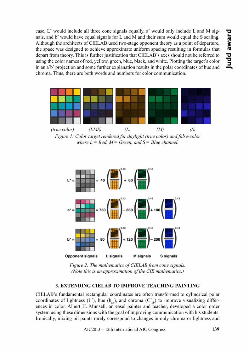
AIC2013 – 12th International AIC Congress 139
Judd
aw
ardcase, L* would include all three cone signals equally, a* would only include L and M sig-
nals, and b* would have equal signals for L and M and their sum would equal the S scaling. Although the architects of CIELAB used two-stage opponent theory as a point of departure, the space was designed to achieve approximate uniform spacing resulting in formulas that depart from theory. This is further justification that CIELAB’s axes should not be referred to using the color names of red, yellow, green, blue, black, and white. Plotting the target’s color in an a*b* projection and some further explanation results in the polar coordinates of hue and chroma. Thus, there are both words and numbers for color communication.
(true color) (LMS) (L) (M) (S)Figure 1: Color target rendered for daylight (true color) and false-color
where L = Red, M = Green, and S = Blue channel.
Figure 2: The mathematics of CIELAB from cone signals. (Note this is an approximation of the CIE mathematics.)
3. EXTENDING CIELAB TO IMPROVE TEACHING PAINTING
CIELAB’s fundamental rectangular coordinates are often transformed to cylindrical polar coordinates of lightness (L*), hue (hab), and chroma (C*
ab) to improve visualizing differ-ences in color. Albert H. Munsell, an easel painter and teacher, developed a color order system using these dimensions with the goal of improving communication with his students. Ironically, mixing oil paints rarely correspond to changes in only chroma or lightness and
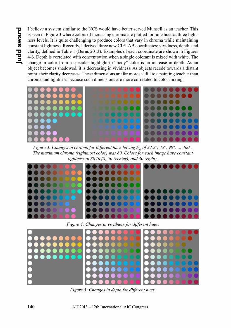
140 AIC2013 – 12th International AIC Congress
Judd
aw
ard I believe a system similar to the NCS would have better served Munsell as an teacher. This
is seen in Figure 3 where colors of increasing chroma are plotted for nine hues at three light-ness levels. It is quite challenging to produce colors that vary in chroma while maintaining constant lightness. Recently, I derived three new CIELAB coordinates: vividness, depth, and clarity, defined in Table 1 (Berns 2013). Examples of each coordinate are shown in Figures 4-6. Depth is correlated with concentration when a single colorant is mixed with white. The change in color from a specular highlight to “body” color is an increase in depth. As an object becomes shadowed, it is decreasing in vividness. As objects recede towards a distant point, their clarity decreases. These dimensions are far more useful to a painting teacher than chroma and lightness because such dimensions are more correlated to color mixing.
Figure 3: Changes in chroma for different hues having hab of 22.5°, 45°, 90°,…, 360°. The maximum chroma (rightmost color) was 80. Colors for each image have constant
lightness of 80 (left), 50 (center), and 30 (right).
Figure 4: Changes in vividness for different hues.
Figure 5: Changes in depth for different hues.
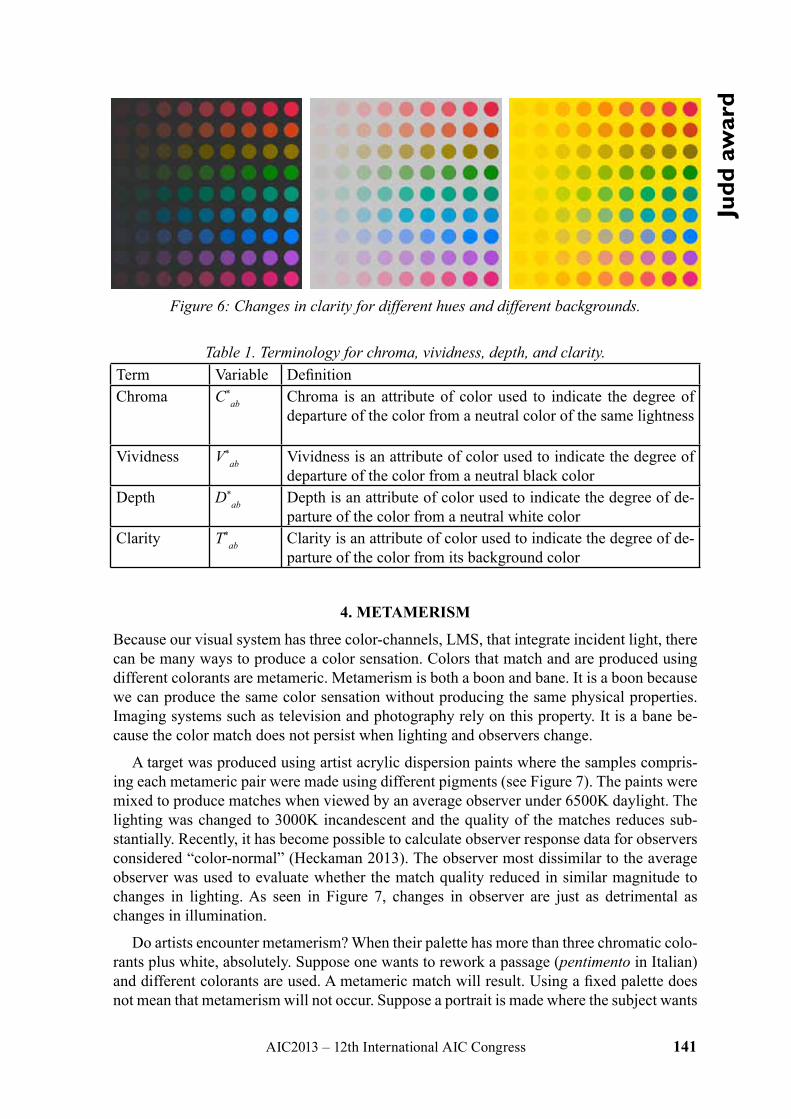
AIC2013 – 12th International AIC Congress 141
Judd
aw
ard
Figure 6: Changes in clarity for different hues and different backgrounds.
Table 1. Terminology for chroma, vividness, depth, and clarity.Term Variable DefinitionChroma C*
ab Chroma is an attribute of color used to indicate the degree of departure of the color from a neutral color of the same lightness
Vividness V*ab Vividness is an attribute of color used to indicate the degree of
departure of the color from a neutral black colorDepth D*
ab Depth is an attribute of color used to indicate the degree of de-parture of the color from a neutral white color
Clarity T*ab Clarity is an attribute of color used to indicate the degree of de-
parture of the color from its background color
4. METAMERISM
Because our visual system has three color-channels, LMS, that integrate incident light, there can be many ways to produce a color sensation. Colors that match and are produced using different colorants are metameric. Metamerism is both a boon and bane. It is a boon because we can produce the same color sensation without producing the same physical properties. Imaging systems such as television and photography rely on this property. It is a bane be-cause the color match does not persist when lighting and observers change.
A target was produced using artist acrylic dispersion paints where the samples compris-ing each metameric pair were made using different pigments (see Figure 7). The paints were mixed to produce matches when viewed by an average observer under 6500K daylight. The lighting was changed to 3000K incandescent and the quality of the matches reduces sub-stantially. Recently, it has become possible to calculate observer response data for observers considered “color-normal” (Heckaman 2013). The observer most dissimilar to the average observer was used to evaluate whether the match quality reduced in similar magnitude to changes in lighting. As seen in Figure 7, changes in observer are just as detrimental as changes in illumination.
Do artists encounter metamerism? When their palette has more than three chromatic colo-rants plus white, absolutely. Suppose one wants to rework a passage (pentimento in Italian) and different colorants are used. A metameric match will result. Using a fixed palette does not mean that metamerism will not occur. Suppose a portrait is made where the subject wants
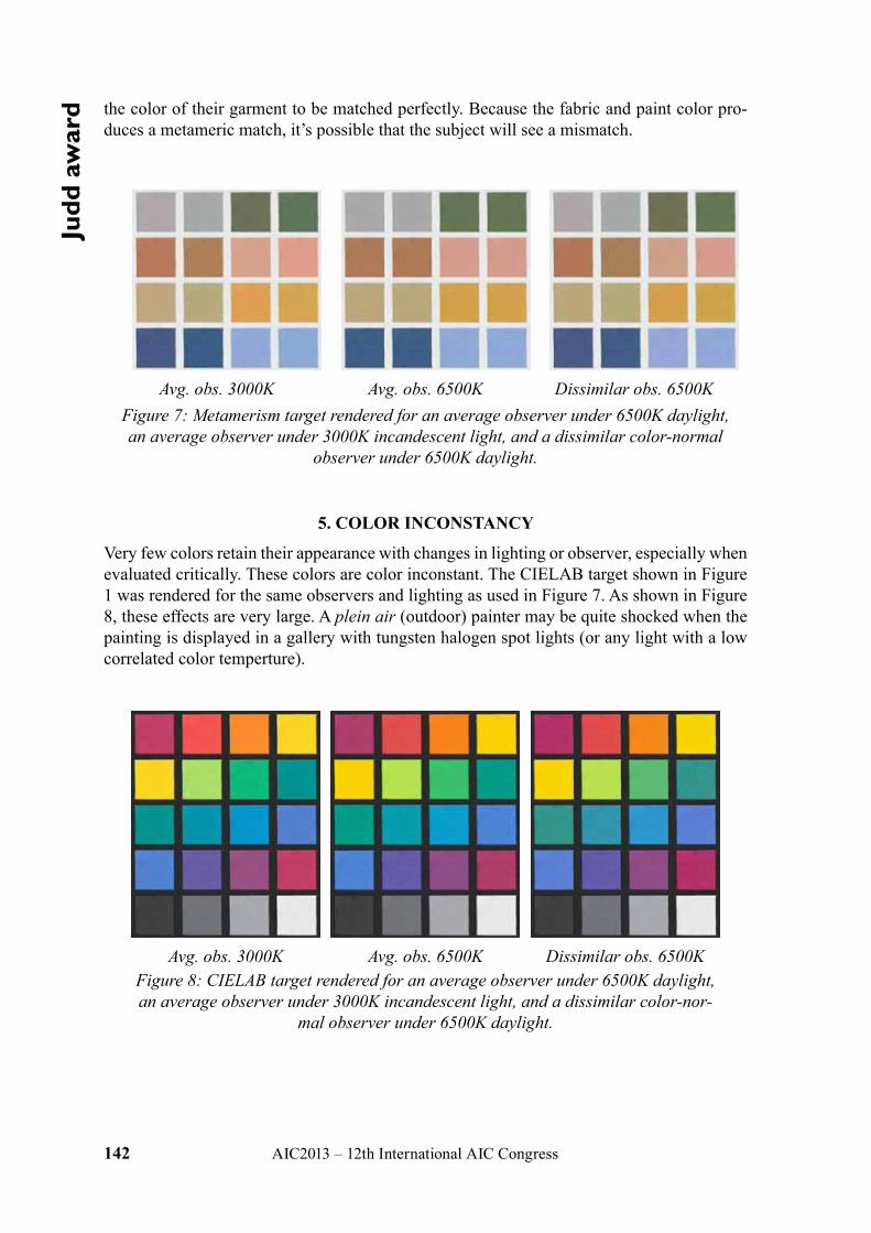
142 AIC2013 – 12th International AIC Congress
Judd
aw
ard the color of their garment to be matched perfectly. Because the fabric and paint color pro-
duces a metameric match, it’s possible that the subject will see a mismatch.
Avg. obs. 3000K Avg. obs. 6500K Dissimilar obs. 6500KFigure 7: Metamerism target rendered for an average observer under 6500K daylight, an average observer under 3000K incandescent light, and a dissimilar color-normal
observer under 6500K daylight.
5. COLOR INCONSTANCY
Very few colors retain their appearance with changes in lighting or observer, especially when evaluated critically. These colors are color inconstant. The CIELAB target shown in Figure 1 was rendered for the same observers and lighting as used in Figure 7. As shown in Figure 8, these effects are very large. A plein air (outdoor) painter may be quite shocked when the painting is displayed in a gallery with tungsten halogen spot lights (or any light with a low correlated color temperture).
Avg. obs. 3000K Avg. obs. 6500K Dissimilar obs. 6500KFigure 8: CIELAB target rendered for an average observer under 6500K daylight, an average observer under 3000K incandescent light, and a dissimilar color-nor-
mal observer under 6500K daylight.
AIC2013 – 12th International AIC Congress 143
Judd
aw
ard6. VARNISH EFFECTS
Picture varnishes are often characterized by their ability to “saturate” a painting. A conversa-tion reveals that they are referring to color saturation. As a color scientist, I want to relate this to physical aspects of the painting. In this case, it is a change in surface roughness and the light propagation of the first-surface reflection caused by the refractive index discontinuity between air the the varnished painting. This effect is shown in Figure 9 where three different glosses were simulated by changing the amount of first-surface reflection that reaches the viewer for a tint ladder of dioxizine purple and titanium white acrylic dispersion paints. As gloss increases, the maximum chroma increases and minimum lightness decreases. Using the terminology defined above, depth increases with glossier varnishes.
Figure 9: The effect of varnishing tint ladders of dioxizine purple and titanium white using a matte (top), semi-gloss (middle), and gloss (bottom) varnish.
6. CONCLUSIONS
These are just a few examples where color science can help explain why color-related visual effects occur. I have used K-M theory to “produce” these targets and the Saunderson correc-tion to simulate varnishing. Colorimetry was used to color manage these images. CIECAT02 was used to calculate corresponding colors to simulate the effects of lighting on metamerism and color inconstancy. Only through continued conversations with artists will I know if this type of information is useful for artists.
ACKNOWLEDGEMENTS
This paper accompanies the AIC Judd Lecture. I am grateful to the Natural Color System for sponsoring the 2013 Judd Award. The irony is appreciated since my laboratory was estab-lished by the Munsell Foundation.
REFERENCES
Berns, R.S., 2013. Extending CIELAB: Vividness, V*ab, Depth, D*
ab, and Clarity, T*ab, sub-
mitted, Color Research and Application.Heckaman, R.L., and M.D. Fairchild, 2013. Written communication.
Address: Professor Roy S. Berns, Munsell Color Science Laboratory, Rochester Institute of Technology,
54 Lomb Memorial Drive, Rochester, NY 14623, USA, E-mail: [email protected]
144 AIC2013 – 12th International AIC Congress
sym
posi
um: M
CS2
013 Estimation of Surface Properties for Art Paintings
Using a Six-band ScannerShoji TOMINAGA, Suguru NAKAMOTO, Keita HIRAI, Takahiko HORIUCHI
Graduate School of Advanced Integration Science, Chiba University
ABSTRACT
The imaging sytems using cameras to archive art paintings have essential problems like image resolution and lens distortion. A scanner is considered as a precise imaging device, which can acquire images with high resolution and without camera lens distortion. The pres-ent paper proposes a method to estimate the surface properties of art paintings for digital archiving using the six-band scanner. The surface properties include surface-spectral reflec-tance, surface height, and reflection model parameters. The performance of the proposed method is compared with the previous studies that used the multiband camera system. The current method has not only found to be as precise as the multiband imaging method in esti-mation accuracy, but also accompanied with several additional advantages.
Behind the Surface – Hyperspectral Image Spectroscopy for Artist Authentication
Cristina MONTAGNER1,2, Pedro ALMEIDA4, Rui JESUS6, Nuno CORREIA4, Maria J. MELO1,2, Marcia VILARIGUES1,3, Rita MACEDO1,5,
Helena DE FREITAS7, Sérgio NASCIMENTO81
Department of Conservation and Restoration, Faculdade de Ciências e Tecnologia, Univer-sidade Nova de Lisboa, Caparica, Portugal; 2REQUIMTE-CQFB, idem; 3VICARTE, idem; 4CITI, Dep. de Informática, idem; 5 IHA- Universidade Nova de Lisboa; 6MMLG, Instituto Superior de Engenharia de Lisboa, Portugal; 7Casa das Histórias Paula Rego, Cascais, Por-
tugal; 8Centre of Physics, Campus de Gualtar, University of Minho, Portugal
ABSTRACT
The identification of authorship of an important Portuguese artist, Amadeo de Souza-Car-doso (1887-1918), by image processing techniques based both on spectral UV-VIS data and elemental analysis will be presented. Despite his youth, Amadeo was internationally acclaimed, and very successful at the most important International exhibitions, side by side with Brancusi, Cézanne, Delaunay, Gauguin, Matisse, Picasso, van Gogh, and others. Since he was rediscovered, at the end of the fifties, the value of his works increased and forgeries appeared in the art market. Here we develop hyperspectral image processing algorithms for pigment characterization and mapping, which combines molecular information (reflectance UV-VIS spectral data) with the identification of the chemical elements present. The data was obtained by hyperspectral imaging and X-ray Fluorescence spectrometry (EDXRF). Finally, we combine molecular information with computer based image processing to explore its potentiality as a routine tool in authentication studies of Amadeo’s work.
AIC2013 – 12th International AIC Congress 145
sym
posi
um: M
CS2
013Development of a Low-resolution Spectral Imager and
Its Application to Hybrid-resolution Spectral ImagingYuri MURAKAMI,1 Asami TANJI,2 Masahiro YAMAGUCHI1
1 Global Scientific Information and Computing Center, Tokyo Institute of Technology 2 Interdisciplinary Graduate School of Science and Engineering, Tokyo Institute of Tech-
nology
ABSTRACT
We developed a low-spatial-resolution spectral sensor (LRSS) which realized real-time cap-ture of 68-pixel spectral images. In addition, as an application of the LRSS, a prototype of hybrid-resolution spectral imaging system was developed by combining with a high-resolu-tion RGB camera. In this prototype, high-resolution RGB images are combined with the data acquired by the LRSS to generate high-resolution spectral image data. Through the experi-ment to capture spectral images of a color chart and flowers, it was confirmed that spectral images can be accurately acquired by the developed prototype system.
Material Sensing based on Spectral DecompositionFrancisco IMAI
Innovation Center, Canon U.S.A. Inc.
ABSTRACT
This paper shows a method for material sensing based on spectral signatures calculated us-ing components related to sensor channels and the residual components not contributing to the sensor channels. The method was tested on a set of representative spectral reflectances, and it was shown that the proposed method has a better performance in material discrimina-tion compared to a spectral signature dervied from the measured spectral information with-out decomposition, especially for man-made objects, since it removes the color component.
146 AIC2013 – 12th International AIC Congress
sym
posi
um: M
CS2
013 Design of a Multispectral System based on
Transverse Field DetectorsMiguel Ángel MARTÍNEZ-DOMINGO,1 Eva VALERO,1
Ville HEIKKINEN,2 Giacomo LANGFELDER3
1 Color Lab, Department of Optics, Faculty of Sciences, University of Granada (Spain). 2 University of Eastern Finland.
3 Polytechnic University of Milano (Italy).
ABSTRACTTransverse Field Detector (TFD) sensors are tunable, full spatial resolution, color sensors, currently still under development (Langfelder 2009). One of their main advantages over common imaging systems is that their spectral sensitivities can be modulated by applied voltage and also that they can achieve full spatial resolution by exploiting the wavelength-dependency of the penetration depth of photons in silicon (Langfelder 2012). Some previ-ous works have studied their properties, functionality, and some limitations arising when they are used as part of a multispectral imaging system (Langfelder 2011). This work aims to improve TFD performance beyond its initial ‘raw’ capabilities by narrowing down their spectral sensitivities with additional color filters added to the sensor matrix, and so achieving better quality of estimated spectra trading off full spatial resolution to some extent. Results show that decreasing spatial resolution by 1/6 using a Color Filter Array (Murakami 2012) (CFA) with 6 different transmittances and tuning alternate pixels to two different biasing conditions, we can get 18 channels in one shot, significantly outperforming existing tradi-tional imaging capture devices both spectrally and colorimetrically.
Chromatic Maps of Portuguese Roman Mosaics Ob-tained by Hyperspectral Imaging
João LINHARES,1 Sérgio NASCIMENTO2 1 Faculty of Science and Technology, Anglia Ruskin University;
2 Centre of Physics, University of Minho
ABSTRACTChromatic characterization of Roman mosaics is typically done by observation and compari-son against a color chart or by measuring locally with a colorimeter. With these methods, however, the complexity of the chromatic pattern is partially lost. This limitation can be overcome by using spectral imaging, by recording both the spectral and spatial data over an extended area. Two sets of samples of Portuguese Roman mosaics were digitalized by hyper-spectral imaging over the range of 400-720 nm at 10 nm intervals and the spectral reflectance estimated. The color of each pixel was computed from the spectral reflectance assuming the CIE Illuminant D65 and represented in the CIELAB color space. For the chromatic analy-sis they were then divided into cumulative bins of 10% of the volume assuming a JND of CIEDE=1. It was found that the colors of the mosaics show large variations in lightness, low saturation and a tendency to the red-yellow on all sets. On the first set 50% of the volume includes almost all the chromatic information and on the second set only about half. Such results are made possible by resorting to spectral imaging and may be applied on the conser-vation or display of the mosaics analyzed.
AIC2013 – 12th International AIC Congress 147
sym
posi
um: M
CS2
013Feasibility Study for Textile Colour Simulation
with Multichannel Printing TechnologyRadovan SLAVUJ, Kristina MARIJANOVIC, Jon Yngve HARDEBERG
The Norwegian Colour and Visual Computing Laboratory, Gjøvik University College
ABSTRACT
This study has investigated how the growing technology of multichannel printing in the graphic arts could help textile industry to convey accurate colour information. In order to reduce the cost there is an increased need for printed samples that serves for colour judgment and decision in the design process. With the increased colour gamut of multichannel printing systems we are expecting to include most of the colours from textile samples. The results show that with careful control of ink limits and with bypassing the colour management limi-tations imposed on printing system; we are able to include more than 90% of colour textile samples into the multichannel printer gamut. We also conclude that there must be agreement between used measurement geometries and to account for differences in methodology in or-der to have a better match. How the texture of such materials influences colour and spectral reproduction is jet to be discovered, and this will be our aim in the future.
Segmentation of Natural Scenes: Clustering in Colour Space v Spectral Estimation
and Clustering of Spectral DataJia SONG, Eva M. VALERO, Juan L. NIEVES
Optics Department, Faculty of Science, University of Granada, Spain
ABSTRACT
In this paper, we implemented and compared two approaches for clustering-based colour image segmentation of natural scenes: one is finding the best colour space for colour-based segmentation, and the other is segmenting by using the spectral data obtained by estimation from sensor responses. Results show that using estimated spectral data for colour image segmentation of natural scenes can achieve better or equally good results as the best colour space among the tested eight colour spaces.
148 AIC2013 – 12th International AIC Congress
the
colo
ur o
f cul
ture Color and Altruism: the Architecture of Background
Galen MINAH, College of Built Environments, Department of Architecture, University of Washington
ABSTRACT
According to E.O. Wilson, human evolution comes from progress in activities that support groups of individuals rather than those solely centered on kin. Altruism is the tendency to make sacrifices for the survival of the group at a sacrifice to individual gain. Individual gain is a characteristic of architectural culture today. The attention given to originality, visibility, and recognition by the architectural institutions and media, the ‘kin’ in Wilson’s paradigm, is a prime motivator in the design professions. Re-focusing this attention to work that is still creative and exciting, but has altruistic value is indeed the challenge. This study proposes two paths for achieving this goal. The first involves giving more attention to the contex-tual factors in building projects relative to larger communal and civic goals. This involves bringing a new attention to the role of background architecture, as well as giving more sta-tus to the design of interior space. Color and form are co-dependent in these pursuits. The second would include experimental research into the role that color can play in achieving new altruistic goals in the built environment. These studies could include any facet involv-ing color and background including camouflage, color constellations, color field analysis, gaming strategies involving color fragmentation, and color mapping and modeling of urban environments. In all of these the relationship between color patterns and ordering strategies would be the emphasis.
Color me HappyMarcelo SILVA RAMOS,1 Mônica QUEIROZ,2 Paloma CARVALHO SANTOS3
1 Unit of study and research on behaviour and consumption, SENAI CETIQT 2 Art and design Institute, The Federal University of Juiz de Fora
3 Faculty of Arts, SENAI CETIQT
ABSTRACT
This paper derived from a comparative study on the relationship between color and the “ma-terial culture of happiness” in two large Brazilian cities: Rio de Janeiro and São Paulo. Those are, in the current representation, opposite cities: Rio, exuberant in nature and, hence, a more laid back, relaxed and outdoor way of life; São Paulo, the most important metropolis in the country, cosmopolitan and indoor. In this study, utilizing the data base and, more important-ly, the photographic records of a study on the “Material culture of happiness” conducted by the Observatory of Behavior and Consumption of SENAI CETIQT, we sought to analyze the distance between the colors involved in the daily happiness of the inhabitants of these cities. Serving as basis for the study, individuals from both places were asked to capture, through writing and through photographs, at least three everyday moments of pleasure, well-being or happiness experienced in each day of the week. From approximately 1600 moments of hap-piness described and photographed, we intend to enrich the debate, through the perspective of anthropology of emotions and of the study of colors, about the relationships between local material culture, happiness and colors.
AIC2013 – 12th International AIC Congress 149
the
colo
ur o
f cul
tureColourful Stories:
Exploring the Transformative Potential of Colour Culture in a Northumbrian Mining Town
John STEVENS,1 Stephanie KRANEVELD2 1 Department of Design, Northumbria University
2 AkzoNobel Decorative Paints
ABSTRACT
2014 will see the opening of a new £100m factory in Ashington, a former mining town in Northumbria, UK. The global paint manufacturer AkzoNobel wants to ensure its invest-ment creates not only regeneration through employment but also broader, long-term health and wellbeing improvements, through the life-enhancing qualities of colour. Committed to transforming lives through colour, they are continually striving for innovative ways to en-gage local communities in transformative application of colour to the built environment. This paper describes successes of the firm’s global Let’s Colour programme, as well as the Northumberland project, its methodology, preliminary findings and proposals. The best will be developed and implemented over three years from 2014.
Colour Culture Preservation of the Historical CityTatiana SEMENOVA
The City Colour Centre
ABSTRACT
Artistic appearance of the city is closely connected with the preservation of the colour cul-ture of the past and its development at present. Moscow as a polychromic city unifies colours of various historical styles. In order to preserve cultural and historical heritage of the city, we have studied facade colour palettes typical of different construction periods and developed basic palettes for each architectural style. These palettes are divided into five colour areas. Thus, it makes it possible to compare the same colour area in different style palettes and give recommendations on their colour differences and interpretation. This analysis helps identify a hue of the same colour in different style palettes and show the colour evolution from the historical point of view.
Features of façade colours depend on cultural progress in society, tastes of customers, finan-cial potential and, of course, building and finishing materials used in construction. It is vital that those materials could contribute to the preservation of the historic city colour identity. This can be achieved by creating new palettes considering special features of historical co-lours. For this purpose modern palettes, matching traditional façade coloring, have been developed for ceramic granite and architectural glass.
150 AIC2013 – 12th International AIC Congress
the
colo
ur o
f cul
ture One island, Three Neighborhoods,
Three Identities, Three ColorsElisa CORDERO1, Francisca POBLETE2, Marcia EGERT3
1Instituto de Arquitectura y Urbanismo, Facultad de Ciencias de la Ingeniería, Universidad Austral de Chile
2Facultad de Filosofía y Humanidades, Universidad Austral de Chile 3Facultad de Filosofía y Humanidades, Universidad Austral de Chile
ABSTRACT
This study explores the relationship between chromatic atmospheres and territorial identity in three neighborhoods in Isla Teja, Valdivia. In spite of their shared island nature, they have different features, including unique ways to practice space. Such differences are expressed in the color patterns of the facades. The practices are explored based on the perceptions of the dwellers, revealing the deep differences in the ways they understand their neighborhood.
The research establishes a dialogue among architecture, design and anthropology, develop-ing a case study that combines ethnographic background information and chromatic com-parisons. The findings suggest a relationship between materiality and territorial identity, revealing chromatic patterns that –from an apparently technical view– constitute a much less visible dimension in discourses, strongly remitting to elements that are typical of the con-struction of a neighborhood identity. We hope to contribute to the further analysis of topics of interest for color and urban space researchers.
Red and White as Expressions of National Identity: A Study on the History and Meaning of
Polish National Colours and an Attempt at Recording Them in Selected Systems of Colours
Agata KWIATKOWSKA-LUBANSKA, PhD
Faculty of Design, Academy of Fine Arts in Krakow
ABSTRACT
My presentation is aimed at seeking the origins and historical conditions of particular sym-bolism of white and red in Poland. It is also an attempt at answering the question: to what extent may such a common and universal combination of colours as white and red become an expression of specific values and the history of one nation? The following factors will be analysed: the meaning of colour in heraldics, the symbolism of the national emblem and coat of arms of the Polish state, traditional methods of obtaining various shades of red in Poland, the colours of a national costume of a nobleman and military uniforms, the role of white and red during famous historical events and attempts to formalise the notation of Polish national colours by the Polish authorities.
AIC2013 – 12th International AIC Congress 151
the
colo
ur o
f cul
tureColour Expectations of Fiction Genre Book Covers
Francis WILD1,2, Clyde WILD3
1 School of Information and Communication Technology, Griffith University 2 Queensland College of Art, Griffith University
3 Environmental Futures Centre, Griffith University
ABSTRACT
This research identified the colours people expected to find on the book covers of three fic-tion genres: Romance, Science Fiction, and Mystery/Thriller. A survey of 180 participants assessed their colour expectations. The results confirmed a number of popularly-held co-lour-genre associations, while also highlighting some unexpected associations. The colours nominated most often for Romance covers were in the red to pink range leaning towards purple; these colours were inversely related to the colours most often chosen for the Science Fiction colours. The colours nominated for the Science Fiction and Mystery/Thriller covers were very similar: black, white, greys and dark blue. Significantly, the nominator’s gender appears to have no bearing on the colours nomination for each genre. Additionally, there was no link between whether the nominator read the genre or not.
Colour Harmony or Not?Berit BERGSTROM,1 Lars SIVIK2
1 Swedish Colour Centre Foundation, 2 Gothenburg University
ABSTRACT
When studying colour combinations you always ask: What is a beautiful colour combination and what is not? Can anyone tell? This question is of interest to almost everyone today but especially for architects and designers creating environments or products for people whether at work, in public spaces or in our homes. Choosing the right colour combination is a neces-sity to achieving desired effects in colour-scheming and design. There are of course no given rules concerning what is right or wrong and what is beautiful or not, but some guidance can still be offered on the subject of colour-scheming. There is knowledge to be gained from our colour research and theories. A lot of different theories have been developed to find the beautiful colour combination. Some of them have their background in pigment mixtures like Goethe, Itten, Chevreul and some in visual properties like Kobayashi, Nemcsics, Munsell, Ostwald, and NCS. However colour harmony or not depends first of all on the actual context.
152 AIC2013 – 12th International AIC Congress
fash
ion Cobalt or Cerulean? Interpreting Colour Trends
for the Fashion Industry in Smaller Markets Julia GUESTRIN, Alice CHU
School of Fashion, Ryerson University
ABSTRACT
The Canadian apparel industry faces many difficult decisions during product development, and selecting a colour palette for an upcoming season can be a significant challenge. With no specific Canadian colour forecasting services available, Canadian trend directors must rely on European and American forecasts for their colour trends. This study on colour trends and preferences demonstrated how colours that are forecast for the United States and Europe are adapted for Canada and the diverse target markets within it. Six case studies based on interviews with trend directors from Canadian retailers explore the methods used to develop seasonal colour palettes. These case studies reveal each retailer’s customers’ attitudes to-wards colour trends and colour preferences, and then compare them to the rest of the retail market. The results will allow Canadian fashion professionals – and those working in small markets anywhere – to better understand how to develop seasonal palettes for their custom-ers, thereby increasing sales and profit.
Sustainable Colours and Biotechnology in the Fashion and Textile Industry
Gabriela SANTOS, Cristina CARVALHO CIAUD – Centro de Investigação em Arquitectura, Urbanismo e Design,
Universidade Técnica de Lisboa
ABSTRACT
Textile sustainability problems are often associated with the dyeing methods applied by the fashion and textile industry. These issues are strongly related to the usage of non-renewable resources as well as the effluents of such finishing processes that present high levels of tox-icity and risk for the entire ecosystem. Through an extensive study on various fields such as Biotechnology History, Ethnography, Biology, Archaeology, amongst many others we gathered information regarding natural coloured compounds, colour sources (plants, animals and microorganisms), ancient and modern techniques of extraction and application as well as advantages and disadvantages of dyes (natural and synthetic), etc. This study shows the evolution of colour in the textile industry. It also reveals that the revival of natural dyes in addition to cutting edge technologies such as biotechnology allows for an industrial feasibil-ity. Results indicate significant reduced environmental impact and strategies for sustainable development.
AIC2013 – 12th International AIC Congress 153
fash
ionColours in Nature as a Source of Fashion Designers’ In-
spiration during the 21st CenturyNessreen A. ELMELEGY
Lecturer of Fashion design, Ready Made Garments Dept. – Faculty of Applied Arts, Damietta University. Egypt
ABSTRACT
Colour is one of the most important elements in Fashion Design, It affect in the consumer’s first response about the fashion collection. Colour in Nature is one of the most important sources of inspiration for the Fashion designers. This research based on studying the colour in nature as a rich source of inspiration; how fashion designers adopted the colours in nature in their collections during the 21st Century, what are the common colour schemes in Fashion Design, Also how can we create illusion by colours to increase or decrease the visual size to the body, and to show the aesthetic features of the body and draw the eyes away from the body defects. The research also presents how we can use colours to achieve the principles of design like Rhythm, Contract, Harmony, and Emphasis in the apparel. The research presents some of the fashion designers collections who depends on colour in Nature as a main source of inspiration; analyze the fashion collections for the international fashion designers and de-fine the colour schemes which they used and how it relates to the source of inspiration. The research also includes applied study, by inspiring Haute couture collection contains of seven (7) outfits ; using different themes from Nature and use their silhouettes and colour schemes as sources of inspiration, and applies colour schemes to find out the most successful schemes for consumers.
Dedicated Follower of FashionVictoria WALKER
ABSTRACT
The Kinks created a hit single with a “Dedicated Follower of Fashion” and they aren’t the only pop group to realise the importance of fashion. The Rogue Traders’ song became syn-onymous with the Gok Wan’s Fashion Fix series. If you think of the likes of Madonna and Lady Gaga who were voted style icons by Time, they have both had hit songs about fashion. When clothing designers set the scene for what colours and textures grace the catwalk and ultimately the high street, do they realise just what an impact they are making on other indus-tries? The seamless flow from designers creating clothing that influences colour cosmetics is in no doubt; top fashion magazines Vogue and Cosmopolitian glamourize fashion whilst highlighting the beauty industry. The connection between other industries may not be so obvious. However, if you think of the cupcake craze and the use of them as wedding cakes then the link to food becomes apparent. The colour scheme of bridesmaids dresses is often coordinated with the detailing on the cake. Producing stunning cakes often requires relying on niche icing suppliers whose specialism originates from a broad spectrum of technologies from industries as diverse as Pharmaceuticals.
154 AIC2013 – 12th International AIC Congress
prod
uct
desi
gn a
nd b
rand
ing Dimensionality of the Perceived Value of Product Colour
Hanna KIEHELÄ Department of Marketing, Hanken School of Economics
ABSTRACT
Scholars agree that product colour is an important factor in product success, yet colour is an under-studied element in marketing research. In particular, there is a paucity of research on the perceived value of product colour, although studies show that product colour is im-portant in consumer perceived value. This paper addresses the issue by showing that 1) the perceived value of colour is three-dimensional and 2) the outcomes of consumers’ colour consideration processes fit to at least one dimension at a time, but are likely tradeoffs be-tween two or all three dimensions.
Colour Words in Everyday EnglishJohn HUTCHINGS
Colour Imaging and Design Centre, School of Design, University of Leeds
ABSTRACT
Colour words bring day to day language to life often as adjectives, sometimes as nouns, less frequently as verbs and rarely as adverbs. Data has been obtained from approximately 200 dictionaries and other sources such as newsprint and the media in general. Such words are used for different purposes, most commonly as a general descriptor of colour appearance, as an immediate identifier recognisable to a specific human population, and as a symbolic descriptor.
Sections of the assemblage will be devoted to black, blue, red, white, green, yellow, brown, grey, pink, orange, metal colours and purple with violet and indigo. The proposed work will not be a dictionary as data will be presented in themes for each colour. These themes include fauna, flora, food, colours, sayings, dress or oral tradition. For example, the section devoted to blue presently consists of 18,000 words containing approx 700 blue terms in 38 such themes. It will be possible to access individual entries using an index. In this paper examples will be given from the compendium with examples of the many colour word order systems used in daily life, together with examples of colour word perversity and colour patterns.
Key words: colour names, English language, terminology
AIC2013 – 12th International AIC Congress 155
prod
uct
desi
gn a
nd b
rand
ingColor Communication in Brand Revitalization
In Kyung SEO,1 Young In KIM,1 Jeffrey KIM,2 Young Joong CHANG1
1 Human Environment and Design, Yonsei University 2 SKKU and University of London
3 Korean Federation of Design Associations
ABSTRACT
The brand is constantly making efforts to communicate with consumers. This is because the brand is an evolving organism, with the goal of being ‘customer-oriented’. The brand revi-talization is required due to the influx of new customers. Therefore, the brand is faced with dilemma in balance between sustenance brand heritage and refreshment of brand. This study seeks the clues to the dilemma focusing meaning and color of package design. The perfect pair of meaning and color shows a customer the way to access to the brand identity. After the formula of brand and color (like a Coca-Cola Red), brand identity can move flexible, and finally retain brand freshness.
156 AIC2013 – 12th International AIC Congress
keyn
ote Colour: Influence on Environment,
Behaviour, Well-being, Sensory Design and Special Needs
Hilary DALKE Kingston University London, UK
The remit and scope of our research has been colour design and the built environment, both acknowledging and understanding the users of spaces who may have special needs. We needed to find the tools that can be used to address these issues for colour design specifica-tion for architects, designers, access consultants, lighting designers and occupational thera-pists. Domestic & public spaces have different agendas; domestic environments may need to be comfortable as a priority, whereas public spaces are very much determined by regulations such as Part M Building Regulations. It is a complex territory designing and incorporating all the variable factors of special needs for the human interface with environments. There is a lack of accessible information for designers or architects on methods to establish these user needs.
Methods and results presented will cover the use of the following: Audits; Focus Groups; Interviews; Lab testing colour preferences/acceptability; ‘Real World’ Testing; Post Occu-pancy Evaluation; Measuring the impossible; SurveyMonkey.
We will present examples of some colour design research methods employed by us to come to an understanding of the broader subtle issues to do with colour and environments for people with autism, dementia, vision impairment and long-term or mental health patients. Alongside the research we will be showing evidence of best practice from some of our work on major design projects for NHS, Docklands Light Railway, Age Concern, Audi Design Foundation, Thomas Pocklington Trust, Kingston Hospital, Hill-ROM, ICI and Home Office NOMS.
BIOGRAPHY
Professor Dalke is Director of the Design Research Centre at Kingston University London and a leading designer in the fields of environmental and sensory design. Previous experi-ence in the fashion and car industry, and her innovative Colour Design Research Centre at London South Bank University, established Dalke as a leading colour designer. Architects, local government bodies, manufacturers and developers worldwide, seek her professional advice specifically on technical and aesthetic usage of colour design in the built environ-ment.
Dalke is an expert in accessibility, visual impairment and special needs designing for healthcare, retail, long-term care and prison environments. She has pioneered research on contrast and vision, is the founder of CROMOCON Ltd. and is a member of two BSi task groups: BS 8300 to develop guidance for people with neuro-diversity and cognitive impair-ment, and the built environment, as well as BS 8493 Light Reflectance Values.
Professor Dalke has initiated collaborations with Oxford University Experimental Psy-chology, Cambridge University Engineering Department, Portsmouth University, UCL, St George’s and London South Bank University Knowledge Transfer Centre and is on the Pro-gramme Committee at Cambridge University for CWUAAT.
AIC2013 – 12th International AIC Congress 157
sym
posi
um: a
esth
etic
sHuman Color Preferences: An Ecological Approach
Stephen E. PALMER,1 Karen B. SCHLOSS2
1 University of California, Berkeley, USA 2 Brown University, USA
ABSTRACT
Color preference is an important aspect of human behavior, but little is known about why people like the colors they do. Recent results from the Berkeley Color Project (BCP) provide an answer. We will report measurements of preference for 32 colors and the fit of several models to these data, including ones based on physiology (cone contrasts), phenomenology (color appearances and color-emotion associations), and ecological preferences based on the statistics of people’s emotional reactions to colored objects (Palmer & Schloss’s ecological valence theory, or EVT). The EVT postulates that color serves an adaptive “steering” func-tion, analogous to taste preferences, biasing people to approach advantageous objects and avoid disadvantageous ones in their quest to “thrive” (i.e., maximize joy and well-being). The EVT predicts that people will like a given color to the extent that they like the objects that are characteristically associated with that color. Within this theoretical framework, we have measured the Weighted Affective Valence Estimates (WAVEs) of the 32 colors as de-fined by the average ratings of how much people like all the objects associated with a given color, weighted by how similar the color of each object is to the color with which it was associated. The average WAVEs of the 32 colors predicts 80% of the variance (r = +.89) in group average preference ratings, which is much more variance than any of the other models. Further results show that the same framework, in a within-subjects design, captures reliable amounts of variance in individual differences in color preferences. We will also describe how preferences for single colors differ as a function of gender, social institutions (e.g., preferences for the colors of rival universities among students at those universities), and experiences with affectively biased images (e.g., images in which all of the red objects are liked and all of the green objects are disliked, or vice versa). We will discuss how these effects can be explained by the EVT.
158 AIC2013 – 12th International AIC Congress
sym
posi
um: a
esth
etic
s Infant Colour Preferences: Origins of an Aesthetic Response to Colour?
Anna FRANKLIN University of Sussex
ABSTRACT
It is well established that adults have systematic and reliable preferences for some colours (e.g., blue) over others (e.g., green-yellow). One important question is where these colour preferences originate from and if they change across development. It has previously been proposed that some aspects of adult colour preference can be traced back to infancy (e.g., Bornstein, 1975; Palmer & Schloss, 2010). Here, I consider this proposal, first by review-ing previous studies which have measured young infants’ preferential looking at colours (e.g., Bornstein, 1975; Adams, 1987; Zemach, Chang & Teller, 2007; Franklin, Pitchford, Mahoney, Clausse, Davies & Jennings, 2008; Franklin, Bevis, Ling & Hurlbert, 2010). The review establishes that infants ‘prefer’ to look longer at some colours than others from birth, and there is some evidence that infants look longer at hues that adults commonly like. For example, several infant studies found that infants looked longer at blue, a commonly liked hue in adults, relative to other colours. However, other infant studies report an order of ‘pref-erence’ that matches adult hue preferences less well. I also present data from a new study, where infant and adult colour preferences are directly compared using the same stimulus set, task and measure (Taylor, Schloss, Palmer & Franklin, 2012). In that study, both infant and adult looking times were measured to all possible pairs of four hues (red/yellow/green/blue) at two lightness levels. A separate group of adults also rated how much they liked the colours. Adult looking times across the 8 colours had a strikingly similar pattern to adults’ explicit preferences, showing for the first time that adults look longer at colours that they like. Like adults, infants’ hue preferences interacted with lightness, potentially explaining inconsistencies across previous infant studies. However, infants’ pattern of hue preference was actually strikingly different to that of adults. Potential reasons for these differences be-tween infants and adults are discussed. The findings are also discussed in relation to current theories on the origins of colour preference.
AIC2013 – 12th International AIC Congress 159
sym
posi
um: a
esth
etic
sColour Preference through a Century and across a Lifespan
Anya HURLBERT Newcastle University
ABSTRACT
Colour is important for many vital behavioural tasks: visual search, object recognition, and social signalling, for example. There is strong evidence that human colour vision has evolved specifically to optimise certain behavioural tasks: for example, finding reddish fruit against green backgrounds or detecting the blush of a human face. Humans also have emo-tional associations to colour, ranging from mild colour preferences in particular contexts to deeper dislikes or attachments. Although a review of the past century of preference studies indicates an underlying universality in patterns of human colour preference (liking for blue, dislike for yellow and yellow-green), it is also clear, especially from more recent results, that these responses vary across individuals, sexes, ages and cultural populations. I will describe the results of experiments based on two paradigms (two-alternative-forced-choice with computer-based stimuli and ranked-choice with paper stimuli) that demonstrate the influence of individual factors on colour preference. Across ages, colour preferences are weakest in younger (< 9 years) and older (> 60 years) individuals, compared with adoles-cents and young adults. Sex differences in colour preference are also most pronounced in these latter age groups. Inter-individual variations are more pronounced, and sex differenc-es less pronounced, in colour preference patterns of children and adolescents with autistic spectrum disorder (ASD), compared to age-matched typically developing (TD) children and adolescents. In the latter group, low-level chromatic discrimination ability (measured with two different tasks, the Farnsworth-Munsell and a computer-based detection task) correlates negatively with the strength of colour preference. Overall, the results indicate that the natural tendency to associate emotional responses directly to colour is modulated by developmental stage and, we hypothesise, by the ability to use colour in behavioural tasks.
160 AIC2013 – 12th International AIC Congress
sym
posi
um: a
esth
etic
s Cross-cultural Color Preferences in AsiaMiho SAITO
Faculty of Human Sciences, Waseda University, Japan
ABSTRACT
Throughout my research career, the study of human color preferences has been the most central topic. I have conducted a series of studies, which include both social surveys and experiments on cross-cultural differences in color preference. The results have shown two things. First, a strong preference for white was common to Asian areas, which have both geographical and cultural proximity. Not only Japanese, but also Chinese, Korean and In-donesian participants showed a strong preference for white. However, the reasons for pre-ferring white were somewhat different. In Japan, for instance, white was mostly preferred because of its associative images of being clean, pure, harmonious, refreshing, beautiful, clear, gentle and natural. In China, the reasons for the choice were mainly associations with chastity or purity. The Chinese also liked white because it was elegant, clean, beautiful, and “pure white”, some of which are common to Japanese. It is also a symbol of sacredness for them. Several subjects in the survey study mentioned that white was the source of every color so that it was substantial and unique. In Indonesia, white was mostly preferred for its images of being clean, chaste, neutral and light. Second, preferences have remained rela-tively unchanged over twenty years. There are also preferences that are common universally and those that seem to be distinctive to a specific region. For example, blue tended to be preferred very highly in all the regions and in all the years that were surveyed. The reasons suggested by the subjects for preferring certain colors tended to be that these colors were closely connected with feelings of the pleasantness and unpleasantness regardless of time or place. A diagram of the general structure of color preference was suggested based on cogni-tive implementation. It was described with a three-layered structure with preference due to feelings of “pleasant” and “unpleasant” forming the nucleus, or the inner-most first layer; preference due to individual factors composing the surrounding second layer; and preference due to environmental factors the outermost third layer. The closer the preference is to the center of this structure, the more stable and universal it is, being relatively unaffected by dif-ferences in geographical area of residence or year of survey. The further away the preference is from the center, the more liable it is to change with the individual and the environment surrounding that individual.
AIC2013 – 12th International AIC Congress 161
sym
posi
um: a
esth
etic
sColour Aesthetics in Relation to Colour EmotionsMing Ronnier LUO1,2,3
1 State Key Lab of Modern Optical Instrumentation, Zhejiang University, Hangzhou, China
2 Colour, Imaging and Design Centre, University of Leeds, UK 3 Colour, Imaging, Illumination Centre
ABSTRACT
Aesthetics is a branch of philosophy dealing with the nature of art, beauty, taste, and the cre-ation and appreciation of beauty. In broad terms, we can define it is as ‘critical reflection on art, culture and nature’. It can be studied scientifically to investigate the relationship between sensory responses and physical stimuli using the methodology known as psychophysics. This discipline is called Affective Engineering.
Recently, researchers have worked on several related topics concerning associations with colour. My colleagues and I have published a number of articles and developed a theory of colour emotion and colour harmony. We started the research with single colour patches and extended it to colour combinations to develop mathematical models to link colour expecta-tions with colour measurement data [e.g., CIELAB lightness (L*), Chroma (Cab
*) and hue an-gle (hab)]. The model explains the underlying data well. The colour emotion model has three generic terms: colour-heat, colour-activity and colour-weight. Different rules, which govern the law of colour harmony, were combined to build a model of color combinations. Later, the same methodology was used to generate data in different applications including textiles, decorative, museum paintings, and lighting. These models were tested in real life situations.
In the presentation, I will explain the methodologies and their performance in different ap-plication areas. Finally, I will introduce a workflow approach, which transforms a product from physical terms, to the psychophysical terms, to the emotion terms, and finally to cus-tomer expectations. These concepts and their interrelations are powerful tools to bridge the gap between science and design.
162 AIC2013 – 12th International AIC Congress
sym
posi
um: a
esth
etic
s Aesthetic Response to Color CombinationsKaren B. SCHLOSS1, Stephen E. PALMER2
1 Brown University, USA 2 University of California, Berkeley, USA
ABSTRACT
Colors are rarely experienced in isolation. In nature, yellow daffodils are seen against green grass; in the built environment, a dark-brown couch is viewed against a light-beige wall; in Van Gogh’s Starry Night, the golden moon is luminous against a deep blue sky. In all of these examples, the aesthetic experience of a given color is strongly influenced by its interac-tion in combinations with nearby colors. We will present a framework for understanding the aesthetics of color combinations that resolves many confusions in the existing literature by distinguishing among three types of judgments about color pairs: (a) pair-preference (degree of liking the pair as a whole), (b) pair-harmony (degree to which the colors appear to “belong together”), and (c) figural-preference (degree of liking the figural color when viewed against a colored background). Empirical evidence supports these distinctions. Pair-preference and pair-harmony both increase with hue similarity, but pair-preference depends more strongly on preferences for the component colors and higher lightness contrast than pair-harmony. Although pairs with highly contrastive hues are generally judged to be neither preferable nor harmonious, figural color preference ratings increase as hue contrast increases relative to the background. All of the aforementioned results were obtained in judgments of preference for “context-free” color combinations (i.e., colored squares on a computer monitor with no additional information). Subsequently, we found that these “default” preferences for color combinations are strongly violated in favor of “good fit” within a meaningful context. When participants were asked to judge preference for color pairs within the context of colors on a band’s album cover, their preferences shifted radically toward the color combination that “fit best” with the different bands’ music: i.e., they preferred harmonious color combinations (e.g., light purple with dark purple) for harmonious bands but dissonant color combina-tions (e.g., saturated purple with saturated yellow-green) for dissonant bands. Indeed, color preference judgments in these contexts were strongly correlated with explicit judgments of goodness-of-fit between the colors and the bands (r = .95). These results support the hypoth-esis that aesthetic preferences are largely governed by “goodness-of-fit” (belongingness), whether it be good-fit between the colors themselves in a general (default) setting or good-fit within the specific context of a meaningfully constrained setting.
AIC2013 – 12th International AIC Congress 163
inte
r-di
scip
linar
y co
lourThe Blind and the Interpretation of Colors
Flávia MAYER Faculty of Letters, Pontifícia Universidade de Minas Gerais
ABSTRACT
A lot has been said about the analysis of the world we picture from our eyes as well as of how we perceive and experience the space, time and action around us. But what happens when, in the midst of this context, we think of those who do not decode visual information? How is their relationship with the universe of colors? They actually have access to them, their meanings and expressiveness, or as a result of their disability, can’t they see anything? It is true that our mental images are formed by the information we receive from all our senses. Thus, each one in its own way, we all see. The central discussion of this article relates to the different ways of looking at and dealing with the colors. Underlying this proposal is the tenet that the sense of sight is only one of these multiple paths.
Inbetween Light and Shadow: (In)visibilityZélia SIMÕES 1,2
1 The Research Centre for Architecture, Urban Planning and Design (CIAUD), Faculty of Architecture of the Technical University of Lisbon
2 Portuguese Colour Association (APCOR)
ABSTRACT
The relationship of the individual with light and shadow is ancestral and reflects itself in the history of mankind. This relationship, of a collective or personal nature, has meanings which are associated to culture, memory, imagination and the individual’s attitude towards life. As the complexity of relationships and referrals increases, these structural, figurative and / or expressive elements of dematerialization and materialization of space tend to create effects, sensory experiences or perceptual codes that lead to the discovery of new spatial dimensions.
Bringing together some examples of works of contemporary authors, we propose an exercise of reflection on new ways of understanding the interaction between matter, light and shadow and the effects produced in the individual, whose sensitivity coexists with spontaneity of colour, movement and image. By alluding to the senses and imagination stimuli, regardless of technological advancement, it appears that many of the old functional and spiritual needs still remain and are crucial in the creative process of formal, functional and perceptual defi-nition of a space.

164 AIC2013 – 12th International AIC Congress
inte
r-di
scip
linar
y co
lour Kolormondo:
A New Tool for Colour Understanding in Daily LifeNicoline KINCH
Kolormondo AB, Stockholm
ABSTRACTThe world is not two-dimensional like a flat map. It is a globe, and thus in 3D. The same goes for colours. However, colour is often presented flat – in colour charts or colour fans. And just like a map is not an accurate representation of the world, these colour charts and fans are confusing. This might seem trivial for somebody who is well oriented in the world of colours, but to most people, it is a problem. The subject of colour, although important to everybody, soon becomes very complicated.
Kolormondo visualises colours in 3D; in a globe. It is thereby systematizised, logical, easy to understand and intuitive. It gives an overview and can be used by the beginner. It is complete and can hold any number of colours. It facilitates communication by enabling use of everyday words like “up/down” instead of “value” / ”brightness” and “in/out” rather than “saturation”. The beginner and the expert can thus talk to each other.
The first product launched is physical; a 3D colour puzzle. It is primarily sold in Museum shops and to schools. It serves as an introduction to the subject of colour for both children and adults. The first digital product is an app for Apple iOS and Android devices. Kolor-mondo will soon introduce a third product; a web based tool. Kolormondo is patent pending.
How the Colour Affects System Compares with Other Approaches to Colour Harmony
Angela WRIGHT, Colour Affects, London, UK.
The successful application of colour psychology depends entirely on colour harmony. In a similar way to music, individual notes or colours are neither ‘good’ nor ‘bad’ in isolation and, whilst each has its own individual properties, very little emotional response is evoked until the notes or colours are combined to create a musical piece, or a colour scheme. We are rarely, if ever confronted by one colour, and the emotional response is not necessarily being caused by the colour the observer is consciously considering. Response to colour (and indeed all aesthetic influences) was found, by the late Professor Hans Eysenck, to be 80% unconscious 1. Disharmonious combinations of colours (or notes) produce generally nega-tive feelings and can create the false perception that the individual colours or notes are in-nately unattractive.
The Colour Affects System of Applied Colour Psychology includes a systematic approach to colour harmony, borne of a conviction that something as fundamental to life as light (colour) could not be random: there must be patterns. Over several years of searching and empiri-cally testing colour groups, more than 90% of observers consistently agreed that each colour group was harmonious (regardless of preference).Most of the research was original. When the harmony groups were subsequently subjected to serious scientific scrutiny, and scanned into a computer, the colours in each group were found to have mathematical relationships that did not occur between colours drawn from different groups – i.e. the System is algorith-mic. Objective colour harmony is now a reality.
AIC2013 – 12th International AIC Congress 165
inte
r-di
scip
linar
y co
lourThe Planetary Colour System
Michel ALBERT-VANEL
ABSTRACT
When I was teaching the various systems of colour classification, such as the Munsell, the NCS… at the National Higher School of Decorative Arts (ENSAD) of Paris, my students inevitably asked me about the use thereof, since these colours changed radically due to contrasts between juxtaposed colours. And it seemed necessary to move from the field of ab-solute certainty to that of relativity, which corresponded more to the spirit of the time. More-over, their work: painting, design, architecture, textile… was always based on combinations of colours, and not on isolated colours. I wondered how to establish a system functioning on the combinations of colours. But all my colleagues said it was impossible, because, accord-ing to them, the number of these combinations was infinite… However, on my way back from a conference in Berlin, in 1981, I foresaw a solution, in the shape of a galaxy of colours, which was, to tell the truth, rather shapeless. And several decades were needed to concretise this intuition. The research ended up with success, and received a mathematical confirma-tion. But shall we pretend that the problem of the combinations of colours is completely solved? That is the question addressed in this article.
Colour and the Creative Process in Contemporary Practices: Connecting Pictorial and Architectonic
Languages through Chromatic RelationsAna PAIS OLIVEIRA
Research Institute in Art, Design and Society (i2ADS), School of Fine Arts, University of Porto
ABSTRACTThis paper belongs to a developing practice-based research on the use of colour as ground-work in the creative process of contemporary painting, analysing specifically its influence and significance in the artistic practice that somehow connects pictorial and architectonic languages, mainly in the field of expanded painting.
The study is a consequence of the author’s experience as a painter, whose work always privileged colour as an element that transforms spaces, their representations and the way we perceive and experiment them. Besides an appropriation of architectonic language to paint-ing, the author is interested in the distension of painting to real space, which causes new preoccupations with the relation between colour and space and between the spectator and the perceived work, a relation that can be more physical and interactive.
The research aims to conduct a reinterpretation and contextual redeployment of the act of composing and creating through colour in artistic contemporary practices, emphasizing the cases of artistic works that represent an abolishment of the frontiers between painting and architecture. It is a fundamental objective to explore, experiment and analyse the transfor-mative potential of colour in those projects, approaching colour subject trough the artistic object and valuing the experimental component of the investigation.

166 AIC2013 – 12th International AIC Congress
inte
r-di
scip
linar
y co
lour Colour in Medicine and Architecture:
An Interdisciplinary Pre-pilot Research ProjectMaud hårleman
Arc•plan research group, School of Architecture and the Built Environment Royal Institute of Technology, Stockholm
ABSTRACT
A pilot study was planned at the Medical Faculty at Lund University with the intention to map out colour discrimination (CD) in persons with Parkinson’s disease (PD). A pre-pilot was made preparing research methodology including a colour test developed to meet de-mands from subjects with motor deficiencies as PD.4 The overall goal for the project was to develop colour guidelines that can help patients to achieve increased life quality.
Changes in contrast sensitivity and impaired CD are considered to be established signs of PD, yet no consensus has been achieved on problematic colour areas. Problems may cause disturbances in the visuospatial orientation. Farnsworth-Munsell 100 Hue was used in most of the previous studies, despite severe difficulties for the subjects to handle the colour test.
The newly developed colour test, using three nuances, was found easy to handle for PD. Instructions were easy to understand and the test examination was not exhausting. It does not seem meaningful to use three nuances as scored errors did not differ significantly between the used nuances. Different kinds of errors needed scoring. The long colour sequence enables sudden discontinuation in colour sequence. Preliminary test results divide in two groups.
An Overview of Using Colour Clinically in Optometric Practice
Ian JORDAN, Beatrice JORDAN Jordans Ayr
ABSTRACT
There has been a long history of using colour in clinical practice although the assessment and prescribing techniques to date have been largely unscientific with the consequence of vari-able and unpredictable results. Using instrumentation that allows precise control of colour in both lighting and lens prescribing has enabled us to develop a model in which interventions can have predictable results. There are a wide range of conditions that can be addressed at this time and it is likley that more will be found as techniques develop. We will be using videos to illustrate the range of conditions that are affected by colour.
AIC2013 – 12th International AIC Congress 167
colo
rim
etryBlacks’ Colorimetric Boundaries
based on the Perceived BlacknessRazieh JAFARI,1 Seyed Hossein AMIRSHAHI,2
Seyed Abdolkarim HOSSEINI RAVANDI1
1 Department of Textile Engineering, Isfahan University of Technology, Isfahan, 84156, Iran
2 Department of Textile Engineering, Amirkabir University of Technology (Tehran Polytechnic), Tehran, 15914, Iran
ABSTRACT
In this study, the occupied volume of 216 black fabrics is defined in a 3D colorimetric space based on the perceived blackness of a group of observers. Samples which have been detected by the majority of observers as blacks within a series of deep gray-black samples generate the desired volume. Results show that samples with high lightness values and low chromas are perceived as blacks if their hue angles lie in the third hue area of CIELAB color system from 180-270 degrees. This would be true for greenish to bluish blacks with low lightness and high chroma values. Besides, there is not any greenish-bluish black sample that none of observers evaluate it as black. Moreover, samples with high lightness and chroma values won’t be assessed as blacks if their hue angles do not lie in the third hue area.
The Extent of Metamer MismatchingAlexander D. LOGVINENKO1, Hamidreza MIRZAEI2, and Brian FUNT2
1 Glasgow Caledonian University, UK 2 Simon Fraser University, Vancouver, Canada
ABSTRACT
Metamer mismatching refers to the fact that two objects reflecting light causing identical colour signals (i.e., cone response or XYZ) under one illumination may reflect light causing non-identical colour signals under a second illumination. As a consequence of metamer mis-matching, two objects appearing the same under one illuminant can be expected to appear different under the second illuminant. To investigate the potential extent of metamer mis-matching, we calculated the metamer mismatching effect for 20 Munsell papers and 8 pairs of illuminants (Logvinenko & Tokunaga, 2011) using the recent method (Logvinenko, Funt, & Godau, 2012) of computing the exact metamer mismatch volume boundary. The results show that metamer mismatching is very significant for some lights. In fact, metamer mis-matching was found to be so significant that it can lead to the prediction of some paradoxi-cal phenomena, such as the possibility of 20 objects having the same colour under a neutral (“white”) light dispersing into a whole hue circle of colours under a red light, and vice versa.
168 AIC2013 – 12th International AIC Congress
colo
rim
etry The Need for Negative Tristimulus Values
Changjun LI,1 M. Ronnier LUO,2 Sophie WUERGER3 1 School of Electronics and Information Engineering,
University of Science and Technology, Liaoning, Anshan, China 114051 2 Colour, Imaging and Design Centre, University of Leeds, Leeds LS2 9JT, UK
3 Department of Psychological Sciences, University of Liverpool, Liverpool L69 7ZA, UK
ABSTRACT
This paper will first describe the cases where negative tristimulus values (TSV) are involved. With negative TSVs, most of the colour transformations are failing. Secondly, proposals will be made to colour transforms such as between XYZ and L*a* b*, between XYZ and L*u*v*, and CIECAM02 to cope with negative tristimulus values.
The Effect of Calibration on the Inter-instrument Agreement in Whiteness Measurements:
CIE or Ganz-Griesser?Robert HIRSCHLER, Danielle F. OLIVEIRA, Alexandre F. AZEVEDO
Colour Institute, SENAI/CETIQT
ABSTRACT
In order to contribute to the work of the CIE Technical Committee TC1-77 we investi-gated the effect of the instrument setup (SPEX or SPIN) and UV calibration method (CIE or Ganz-Griesser) on the inter-instrument agreement in whiteness measurements. For the experiments we used 46 samples (Spectralon, plastic, ceramic tile, textile and paper) which can be considered commercially white or near white, i.e. they fall within or just slightly out-side the limits established for the CIE formula. All the samples have so far been measured on four industrial spectrophotometers; we here report the results of inter-instrument agreement for these in whiteness measurements for four calibration and measurement modes (SPEX – SPIN / CIE – Ganz-Griesser).
Colour Rendering Metrics – Do They Reflect Real Life?Peter RAYNHAM,1 Barry PRESTON,2 Stuart MUCKLEJOHN2
1 The Bartlett School of Graduate Studies, University College London 2 Ceravision Limited
ABSTRACT
Various colour rendering metrics were tested using a food selection test. If was found that the subjects were able to select the food item of choice equally well under all of the different light souces tested, however the flourescent 840 lamp was the prefered source.
AIC2013 – 12th International AIC Congress 169
colo
ur d
iffer
enceA Comparison of Different Psychophysical
Methods for Color-Difference EvaluationMin HUANG,1 Gaowen CHEN,1 Haoxue LIU,1 Guihua CUI,2 M. Ronnier LUO,3
Ningfang LIAO,4 Manuel MELGOSA,5 Yaoju ZHANG,2 Chongwei ZHENG2
1School of Printing & Packaging, Beijing Institute of Graphic Communication 2School of Physics & Electronic Information Engineering, Wenzhou University
3School of Design, University of Leeds 4School of Optoelectronics, Beijing Institute of Technology
5Departamento de Óptica, Universidad de Granada
ABSTRACT
A study was conducted to investigate the relationships among visual data obtained from three different psychophysical methods (gray-scale, ratio and constant-stimuli) usually em-ployed in color-difference evaluation. 50 printed color pairs (10 pairs surrounding 5 centers, including gray, yellow, blue, purple and magenta colors), with a good coverage in lightness, hue and chroma differences, were used in the study. The mean color difference of the 50 pairs was 3.88 CIELAB units. A total of 42 observers judged the same 50 pairs using the three psychophysical methods. The results from the three visual experiments were found to be equivalent, but the results of ratio are closer to gray-scale than to constant stimuli.
Calculating Verbal Descriptions of Color Difference ComponentsEric KIRCHNER,1 Lan NJO,1 Marcel LUCASSEN,2
1 AkzoNobel Automotive & Aerospace Coatings, Sassenheim 2 Lucassen Colour Research
ABSTRACT
For many applications, it would be helpful if the various components of an observed color difference could be described verbally, based on reflection measurements. However, ear-lier studies show that existing descriptor methods are difficult to understand even for well trained observers. We propose a new system for describing the components of color and texture differences. It includes a modification of Hansen’s method to distinguish main color categories. The new method also uses a variation of Cooper’s description of hue-differences, which is better understandable for painters. In the proposed system, the components of the difference are specified as differences in four parameters: lightness, colorfulness, hue (using the three primary colors of traditional artists) and texture. The new system was shown to pro-vide correct descriptors of observed color and texture differences in 73 to 94 percent of the cases, when compared to judgments by observers. This is comparable to assessments by an average observer, and equal or even slightly better than results from previous publications.
170 AIC2013 – 12th International AIC Congress
colo
ur d
iffer
ence Perceptual Color-Difference Thresholds for Images
under Different Viewing ConditionsHaoxue LIU,1 Min HUANG,1 Guihua CUI,2 M. Ronnier LUO,3 Manuel MELGOSA4
1 School of Printing & Packaging, Beijing Institute of Graphic Communication 2 School of Physics & Electronic Information Engineering, Wenzhou University
3 Department of Optical Engineering, Zhejiang University 4 Departamento de Óptica, Universidad de Granada
ABSTRACT
A psychophysical experiment has been conducted to measure the color-difference thresholds in displayed images under different viewing conditions. The four ISO SCID 400 images N2, N3, N5 and N7 were used as original images, whose colors were systematically altered in CIELAB lightness, chroma and hue attributes to form the test images to be compared with the original ones. The average CIELAB color difference in our image pairs ranged from 0 to 4.18 CIELAB units. The test image pairs were displayed on a carefully calibrated EIZO CG19 LCD color monitor either in ascending or descending order according to the magni-tudes of each CIELAB color-difference component. The test image pairs were assessed by 14 normal color-vision observers using a pass/fail method under D50 and D65 simulators, and the illuminance levels were controlled in 5 grades ranging from about 200 lx to 3000 lx for each simulator. The average CIELAB color-difference thresholds under our condi-tions ranged from 0.44 to 1.04 with average thresholds of 0.90, 1.00, and 0.51 for CIELAB lightness, chroma, and hue differences, respectively. In general, thresholds under D50 were slightly higher than under D65.
Analysis of Three Euclidean Color-Difference Formulas for Predicting the Average RIT-DuPont Color-Difference
EllipsoidsDibakar Raj PANT,1 Ivar FARUP,1 Manuel MELGOSA2
1 Gjøvik University College, Norway 2 University of Granada, Spain
ABSTRACT
The RIT-DuPont data set is used to investigate the Euclidean color-difference formulas DIN99d, DIN99o and IPT. The coordinates of the metrics as well as the metrics themselves are transformed to the CIELAB color space, the latter by means of the Jacobians of the coor-dinate transformations. The RIT-DuPont ellipsoids in the CIELAB space are compared to the Euclidean metrics using two different methods. First, the predicted ellipsoid cross sections in the principal planes of the CIELAB space are compared to the observed data using the ratio of the union to the cross section of the ellipses, giving a single match ratio. Secondly, the full ellipsoids are compared by the method proposed by Schultze. Neither of the methods show a significant difference in the behaviour of the three different color-difference formulas.
AIC2013 – 12th International AIC Congress 171
colo
ur d
iffer
enceRelationship between Subjective Contrast
and Color Difference based on CAM02-UCSMasami KONO, 1 Naoya HARA, 2 Haruyo OHNO 1
1 Faculty of Media and Arts, Otemae University 2 Faculty of Environmental and Urban Engineering, Kansai University
ABSTRACT
The aim of this paper is to examine whether the color differences matches the equivalent col-or differences in CAM02-UCS by Luo et al. under the same combination of lighting colors and illuminance levels. The equivalent color difference is an index of the subjective contrast between colored patches and their backgrounds. It is defined as a difference of achromatic color pair whose subjective contrast is the same as a difference of chromatic and achromatic color pair in each color space. Two pairs which have the same equivalent color difference were obtained as a result of our experiment comparing achromatic or chromatic patches and their achromatic backgrounds. The color difference for two color pairs should match in the uniform color space. Then it was examined for J-C and Q-M color spaces in CIECAM02.
Under lower illuminance levels, the correspondence between the color difference and the equivalent color difference in CAM02-UCS is better than that in J-C and Q-M color spaces. However, regarding lighting colors, there isn’t much difference between the range that can be used with CAM02-UCS, and that which is used with J-C and Q-M color spaces.
172 AIC2013 – 12th International AIC Congress
post
er s
essi
on t
wo Quality Evaluation in Spectral Imaging – A Brief Review
Raju SHRESTHA, Sony GEORGE, Jon Y. HARDEBERG
The Norwegian Colour and Visual Computing Laboratory, Gjøvik University College
ABSTRACT
Despite many benefits and applications of spectral imaging, and different techniques being proposed, not much attention has been given to the evaluation of the quality of spectral im-ages and imaging systems. There are some studies being done in the area of spectral image quality, however in specific application domains only. This paper provides a comprehensive and critical literature review on existing research in the area of spectral image quality. The quality of a spectral image, unlike a color image, depends on different factors like character-istics of scene, sensor used and algorithms applied. Most of the spectral quality works so far done are based on the final spectral image only. However, one or more attributes in different stages in the spectral imaging workflow may influence, directly or indirectly, the quality of the spectral image. We try to identify important attributes, which we believe would be useful in describing the quality of a spectral image.
The Importance of Colour in Atmosphere Characterisation
Noëlle VON WYL,1 Josef SÜTTERLIN2
1 Faculty of Design, University of Art, Braunschweig and 2 Dept. Interior Design & Scenography, Academy of Art and Design, Basel
ABSTRACT
The perception of atmosphere is a function of various dimensions, like colour, illumination, surface, sound, odour, temperature as well as room structure, where colour is one of the key factors. Colour is a natural phenomenon and there are various categories and systems avail-able describing quality and quantity of colour. In the work presented here the perception of colour on the atmospheric quality of a landscape has been analysed in a longitudinal setting. Parameters of the colour space were correlated with psychometric dimensions (human per-ception). An analytical tool has been used which was developed in an earlier design research project allowing the characterisation of atmosphere with six independent dimensions. Two test candidates did observe bi-weekly over a period of a year from a fixed position a specific view into nature. The natural change of light and colours through the seasons and different weather conditions led to a continuous change of the observed environmental situation. The result of this research demonstrates an unexpected correlation between colour attributes and their perception, especially relating to the opulence of the colour space. The primary attri-bute was the complexity of the colour variance and not the colour saturation.
AIC2013 – 12th International AIC Congress 173
post
er s
essi
on t
woMakeup Design Suggestions by Face Image Types
Based on an Analysis of Skin Colors and Makeup Colors of Korean Women
Kyoung Jin BAEK1, Young In KIM2
1 Researcher, Symbiotic Life-TECH Institute, Yonsei University 2 Professor, Dept. of Human Environment & Design, Yonsei University
ABSTRACT
The purpose of this study is to categorize the facial image of Korean women and to propose makeup designs by analyzing the effects of skin color and makeup color on facial image. Document studies and 2 questionnaire-type surveys were employed in the research. The subjects of the surveys were 220 students attending 20 universities in Korea.
The subjects of the study were Korean women ages 20 to 24. The SPSS 12.0 statistics pro-gram was used as the analyzing method, and frequency analysis, ANOVA, MANOVA, Scheffe test, T-test, main component analysis, factor analysis using Varimax orthogonal ro-tation method and Cronbach’s α reliability test were executed. According to the data, the effects of makeup to achieve a specific image differed according to the types of facial image, and the factors that help convey a specific image appeared to be different, too.
The results of this study can be used in practice as groundwork data for image consulting and can also be applied in beauty, fashion, marketing, advertisement, entertainment and other fields that require knowledge of the standards of Korean facial image.
Colour Analysis of Degraded ParchmentLindsay MACDONALD, Alejandro GIACOMETTI,
Tim WEYRICH, Melissa TERRAS and Adam GIBSON University College London
ABSTRACT
Multispectral imaging was employed to collect data on the degradation of an 18th century parchment by a series of physical and chemical treatments. Each sample was photographed before and after treatment by a monochrome digital camera with 21 narrow-band filters. A template-matching technique was used to detect the circular holes in each sample and a four-point projective transform to register the 21 images. Colour accuracy was verified by comparison of reconstructed spectra with measurements by spectrophotometer.
174 AIC2013 – 12th International AIC Congress
post
er s
essi
on t
wo How the Surface Texture of a Textile Affects its Colour
Lin LUO,1 Ka Man TSANG,1 Si Jie SHAO,1 John H. XIN1
1 Institute of Textiles & Clothing, the Hong Kong Polytechnic University
ABSTRACT
In this paper, the question of how the surface texture of a textile affects its colour is explored using 268 knitted yarn dyed fabric samples in 67 texture structures ( including single jersey as the standard) and 4 colour centers (red, yellow, green and blue). Experiments show that the colour difference between the standard samples and other samples ranges from 0.09 to 1.38 with the mean of 0.57 CIELAB units. By analyzing the colour data in the CIEXYZ and CIELAB colour spaces, it is found that the colours of these samples with different texture structures in each colour center are constant in x and y channels but vary in L*, a*, b* and Y channels, i.e., the luminance values vary for samples with different texture structures but their chromaticity values are identical. It can be concluded that colour difference between textiles with different texture structures stems mainly from their variable luminance values (the CIEXYZ space) and thus lightness values (the CIELAB space).
A Comparative Study of the Recipe Prediction Perfor-mance of Single Constant Kubelka-Munk Derivative
Models on Textiles Mbonea H. MRANGO, 1 Huw OWENS2
1 College of Engineering and Technology, University of Dar es Salaam, Tanzania 2 Textiles and Paper, School of Materials, University of Manchester, United Kingdom
ABSTRACT
One limitation of the single constant Schuster-Kubelka-Munk theory is its poor linearisation performance when relating the dyed fabric absorption properties to the applied dye concen-tration, particularly at higher levels of dye concentration as the fabric becomes saturated with dye. The Mrango-Owens (M-O) model, based on a modified version of the single con-stant Kubelka-Munk theory, improves the linearity between the fabric absorption properties and the applied dye concentration at all wavelengths across the visible spectrum, especially at higher depths of shade. This leads to a significant improvement in the accuracy of dye recipe prediction when compared to single constant Kubelka-Munk based equations (Pineo, Derbyshire-Marshall and McDonald equations). The accuracy of the predicted dye concen-tration from low depths of shade (e.g. 0.5%, o.w.f) to heavy depths of shade (e.g. 10%, o.w.f) is significantly improved with the majority of predicted samples having a of less than 1. The overall error of prediction for the applied dye concentration levels (o.w.f %) was reduced by 65% when compared to the single constant Kubelka-Munk based equations. This improve-ment in the accuracy of dye recipe prediction saves both time and resources contributing to the sustainability of the textile industry in minimizing its environmental impact.
AIC2013 – 12th International AIC Congress 175
post
er s
essi
on t
woSkin Color Analysis based on
Pigments and Moisture PropertiesRie OHTSUKI,1 Takeshi SAKAMAKI,1 Shoji TOMINAGA2
1 Kanebo Cosmetics Inc. 2 Graduate School of Advanced Integration Science, Chiba University
ABSTRACT
The principal factors that determine the human skin color are investigated using the surface spectral reflectance of human skin. In daily life, the skin color often changes owing to the variable moisture content in the stratum corneum (SC). We propose a new method for esti-mating the moisture properties (including the thickness of the SC, and the keratin concentra-tion). We define a model equation representing the surface spectral reflectance of skin by considering the light transmission in the SC. By fitting the model euqation to the measured reflectances of skin, we estimate the moisture properties and the pigment concentrations. From the results of multiple linear regression analysis, we find that the b* value of the L*a*b* chromaticity coordinates of the skin color is determined by not only the concentration of melanin pigment but also the SC properties.
Estimation of Skin Color under Various Illuminants using Spectrum Data
Ju-Yeon YOU, In-Su JANG, and Jin-Seo KIM Electronics and Telecommunications Research Institute (ETRI),
Daejeon, Korea
ABSTRACT
Rapid development in virtual reality and visualization technologies makes it possible to pro-duce numerous virtual simulation systems. In these types of systems, color representation is very important to reproduce the realistic result, and especially in virtual makeup simula-tion system, color representation is crucial because humans are very sensitive to skin color. Although CIELAB or CIEXYZ standard color spaces are widely used for color image pro-cessing, limitations in representing true color can occur because those are established from perceived colors by human perception under standard illuminant conditions (Jang 2013). To overcome these limitations, spectral reflectance can be used to analyze and represent true color information, where spectral reflectance represents color characteristics of a material and determines the specral distribution of reflected light that represent the color of the mate-rial (Mansouri 2008, Mansouri 2005). In this paper, we proposed a novel approach to predict and reproduce skin colors under various illuminants using spectrum data. The estimated re-sult by using the proposed modeling method is compared to the pictures taken under actrual lightings, and the experimental result shows that the proposed method can satisfactorily estimate the perceived color of human skin when various illuminants are applied by using spectrum data.
176 AIC2013 – 12th International AIC Congress
post
er s
essi
on t
wo The Study of the Relationship among Preferable Skin
Colors of Animation Films, Real Skin, and Color ChipsHyejin HAN, Takayoshi FUCHIDA
Graduate School of Joshibi University of Art and Design
ABSTRACTMakeup expression on skin colors has become important even on animations, because many kinds of high definition media (smart phone, 2k/4k monitors and others) have developed recently. In this study, (1) the difference between preferred skin colors of the animation’s facial images and the rectangle color chip without facial information, (2) the appearance of makeup skin colors on animation images, (3) the skin color appearance with point makeup colors on animation images, and (4) the comparison between the skin color appearance of animation facial images with point makeup and those of the mosaic pattern including skin color, were investigated.
The results of the experiments showed that (1) preferable skin colors were affected by the existence of facial shape, (2) in spite of the animation’s facial images, appropriate coloring could seem to be makeup face, (3) the skin color appearance was changed according to point makeup colors, and (4) the appearance of the skin colored mosaic patterns was almost un-changed with partial chromatic expression.
Creation of Colour Chart Database of Disaster Victim’s Skin:
Measurement of Quasi-skins in Shock and Congested State by Healthy Young Subjects
Yuki AKIZUKI1, Junko TOMOHIRO1, Masahiro WAKASUGI2, Akiko YOSHIMURA3 and Kenichiro TAKASHINA4
1 Faculty of Human Development, University of Toyama 2 Faculty of Medicine, University of Toyama
3 Graduate School of Engineering, Kyoto University 4 Medical Emergency Center, Japanese Red Cross Kyoto Daiichi hospital
ABSTRACTOur research aims to perceive the real visual environment for rescue activity and emergency medication in night time, to extract negative factors of lighting and visual objects for rescue and medical staffs, and to point out important problems to create more effective rescue and medical care at the disaster areas in the future. This paper reports collecting the spectral re-flectance data and creating the colour chart database of quasi-skins in shock and congested state by healthy young subjects, in order to determine the visual conditions of disaster vic-tim’s skin under a situation like buried in rubble.
AIC2013 – 12th International AIC Congress 177
post
er s
essi
on t
woA Method to Determine the Minimum Number of Colour
or Texture Measurements in Gonio-apparent PanelsElísabet CHORRO,1 Esther PERALES,1 Omar GÓMEZ,1 Francisco J. BURGOS,2
Valentín VIQUEIRA,1 Francisco M. MARTÍNEZ-VERDÚ,1 Jaume PUJOL,2
1 Department of Optics, Pharmacology and Anatomy, University of Alicante 2 Center for Sensors, Instruments and Systems Development (CD6),
Technical University of Catalonia (UPC)
ABSTRACTFor gonio-aparent panels it is important to measure both colour and texture at different mea-surement geometries. Nowadays, there is only an instrument, the BYK-mac multiangle spec-trophotometer, which is able to simultaneously measure six colour measurement geometries and three ones for sparkle. On the other hand, there are studies that recommend a minimum number of measurements to characterize solid colour samples with texture. However, no previous studies give recommendations to the minimum number of measurements needed to characterize the colours with special-effect pigments.
Our hypothesis is that colour panels incorporating special-effect pigments in their colour recipes will require a minimum number of measurements higher than in solid pigments pan-els. The objective of this work is to check our hypothesis using a BYK-mac. Therefore, we made a study of the minimum number of necessary measurements, both colour and texture, to optically characterize three types of samples (solid, metallic and interference). The param-eters studied were the colourimetric values L*a*b*, which characterize the colour sample, and sparkle values SG that characterize the directional texture of the samples.
For the study, thirty samples were chosen for each type of colour recipe (a set of ninety sam-ples). The colours were selected to cover all possible colour space. Twenty measurements were made for each sample, from which it was calculated and represented the cumulative mean value for L*, a*, b* and SG. Finally, we determined the minimum number of measure-ments when the cumulative mean value become constant.
The results show that the minimum number of measurements depends on both colour and texture of the sample as well as the measurement geometry.In addition, it also seems that the number of measurements depends on the lightness of the sample. However, this new hypoth-esis will be discussed more thoroughly in a future work.
178 AIC2013 – 12th International AIC Congress
post
er s
essi
on t
wo Custom Colour Reference Target for
Chronic Wound PhotographyMaja STRGAR KURECIC,1 Davor ANTONIC,2 Ivana VRANJKOVIC3
1 Faculty of Graphic Arts, University of Zagreb 2 Antonic Ltd., Zagreb
3 Outpatient clinic for dermatology Zeljko Pavicic, Zagreb
ABSTRACTThis paper addresses the problem of colour constancy in chronic wound photography. It investigates the possibilities of colour accurate digital imaging of chronic wounds and dis-cussing the practical considerations for using digital images as reliable photo documentation and source for automated wound image analysis. The problem is how to achieve a consistent and accurate colour reproduction of wounds captured under realistic conditions with differ-ent digital cameras and various lighting conditions. In order for a wound images to be useful for clinical evaluation, they need to be colour calibrated and independent of camera settings and illumination. This device-independent colour reproduction can be achieved by means of a calibrated colour reference target. For this purpose a custom colour target was developed, used and tested. To evaluate the colour correction in real conditions, the custom target was captured together with the standard Macbeth ColorChecker during a patient examination in three different clinics. Validation of color correction by custom target was carried out by calculating the colour errors and comparing against the standard target. Another validation was performed by analyzing original wound images and images corrected using custom and standard colour reference target using application for wound image analysis and consulting clinician to compare results.
AIC2013 – 12th International AIC Congress 179
post
er s
essi
on t
woSystematic Error Impact in Colour Determination of
Special Effect Coatings from sBRDF MeasurementAna M. RABAL, Alejandro FERRERO, Joaquín CAMPOS,
Alicia PONS, M. Luisa HERNANZ Institute of Optics, Spanish National Research Council (CSIC)
ABSTRACT
How a systematic error in spectral Bidirectional Reflectance Distribution Function (sBRDF) measurement affects colour determination of special effect coatings is studied in this work. From experimental sBRDF measurements of three special effect coatings (Arctic Fire, Lapis Sunlight and Light Yellow & Solaris Red), other spectral BRDFs were simulated by adding to the measurement a proportional systematic error ranging from 0.1 % to 10 %. Afterwards, the colour differences between the simulated sBRDF and the experimental sBRDF were cal-culated in CIELAB space. The parameters lightness difference (DL*), total colour difference (DEab
*), chroma difference (DCab*), hue angular difference (∆hab), and hue difference (DHab
*) were evaluated for a combination of incidence angle (θi) and viewing angle (θs) within the incidence plane, from 0º to 70º every 10º. It was observed that systematic errors in sBRDF lead to significant changes in L*, Eab
* and Cab*, whereas hab and Hab
* can be considered neg-ligible.
Discrepancy of Whiteness in Wet State Ana Marija GRANCARIC, Anita TARBUK, Lea BOTTERI
University of Zagreb, Faculty of Textile Technology
ABSTRACT
In the Western culture, white is the colour most often associated with innocence, perfection, cleanliness, the good and honesty. Nowadays, it is relatively easy to accomplish great white-ness and brightness of white textiles applying the FWA’s, but discrepancy in hue due to ap-plied blue or violet FWA, and wet or dry fabric indicate the need for further research in that area. The wetting and wicking have important role in textile dyeing and finishing. Textile colourists require a substrate which wets uniformly for efficient, level dyeing and printing, while in finishing good absorbency and wettability are necessary. In wet state fabrics are transparent, what change the whiteness and UV protection as well. Therefore, in this paper the discrepancy of whiteness of textiles in wet state as well as its transparency of UV light was researched.
180 AIC2013 – 12th International AIC Congress
post
er s
essi
on t
wo Evaluation and Computer Graphics Reproduction
Way of Effect Coatings Applied Gonio-Photometric Spectral Imaging
Masayuki OSUMI Office Color Science Co., Ltd.
ABSTRACT
In this study, a gonio-photometric spectral imaging system was applied to measure colour and texture of effect coatings. It was composed of white LED illuminations, a liquid crys-talline tuneable filter (LCTF), and CCD imaging device. Illuminations angle were 20, 45 and 70 degrees from normal direction, and detective direction was normal against sample, and the CCD device captures the images via the LCTF, and inside parts of the images were related with aspecular angle. This system could get highly accurate gonio-photometric imag-ing reflectance spectrum and colour values with various optical dimension.
The effect coating test panels for measurement were coated aluminium flake and interference micas. The CIELAB colour value, the information entropy, the number of colour occurrence, the distribution in CIELAB colour space, and sparkle, graininess index were calculated from measured spectral imaging. The analysis shows that each value was related with characteris-tic of effect material. Also the computer graphics reproduction images were calculated from these values of each effect material. Developed gonio-photometric spectral imaging is quite useful for evaluation and computer graphics reproduction of effect coatings.
Colorimetric Calibration of a Display Device under a Room Illumination
Kousuke MASTUO, Ryo IKEDA and Noriyuki SHIMANO Interdisciplinary Graduate School of Science and Engineering, Kinki University
ABSTRACT
The colorimetric calibration of a display device is an important technology to reproduce a color image accurately on it. Although the influence of the internal flare, which comes from internal scattering or the output from other channels at the same pixel location, on the colo-rimetric calibration has been studied and the reproduced color was measured in a completely darkened room, however little report have been appeared for the influence of the external flare, which comes from the reflection of the room illumination at the monitor surface, on the accuracy of the reproduced color under the room illuminations. In this paper the direct experimental evidences which show that the colorimetric characterization of a monitor by taking into account the external flare is very effective to reproduce an accurate color image under a room illumination.
AIC2013 – 12th International AIC Congress 181
post
er s
essi
on t
woInstrumental and Visual Correlation
between a Multiangle Spectrophotometer and a Directional Lighting booth
Fco. Javier BURGOS,1 Esther PERALES,2 Omar GÓMEZ,2 Elísabet CHORRO,2
Valentín VIQUEIRA,2 Francisco Miguel MARTÍNEZ-VERDÚ,2 Jaume PUJOL1
1 Centre for Sensors, Instruments and Systems Development, Technical University of Catalonia (Terrassa, Barcelona, Spain)
2 Department of Optics, Pharmacology and Anatomy, Universidad de Alicante (San Vicente del Raspeig, Alicante, Spain)
ABSTRACTColour differences between what we see and what we measure entail a very complex topic. In this work, we deal with this issue for the case of special effect pigments. With this pur-pose, the instrumental and simulated visual results obtained for the same pairs of samples were compared. Instrumental evaluation was performed by the BYK-Gardner’s multiangle spectrophotometer, BYK-Mac, and simulated visual evaluation was simulated with a gonio-spectrophotometric system composed by the tele-spectroradiometer PR-650 from Photo Re-search, Inc. and the directional lighting booth, Byko-spectra effect from BYK-Gardner. The set of samples were constituted by 13 pairs of three different kinds of pigment: solid, metal-lic and pearlescent. They were analysed at six geometries: 45as-15, 45as15, 45as25, 45as45, 45as75 and 45as110. The colour differences between samples of the same pair were quanti-fied by means of AUDI2000 colour difference formula. In general, both devices behave very similar, although the set formed by the tele-spectroradiometer and the lighting booth shows higher colour differences and in some cases unacceptable from an industrial point of view. Despite the observed similarity, these two instruments do not show any firm correlation. Therefore, more goniochromatic samples must be analysed in order to strengthen the tenden-cies revealed by this study.
Collecting Color Evaluation Words to Develop the Analysis Model of Color Image for Color Cosmetics
Hanna KIM, Heewon LEE, Jinsook LEE Department of Architectural Engineering, Chungnam National University, Korea
ABSTRACTThis study is a basic research for developing color image analysis model for color cosmetics and intended to collect the colors of color cosmetics and color evaluation words. A total of 140 colors of color cosmetics were studied for the following four areas of face: 29 face col-ors; 55 eye colors; 37 lip colors; and 19 cheek colors. In addition, the colors were arranged freely and a total of 43 words associated with the color images were collected, including ‘Calm’, ‘Feminine’, ‘Strong’, ‘Gorgeous’, ‘Lively’, ‘Cute’, ‘Conservative’, ‘Lovely’, and ‘Come-Hither’. This study is meant to be used for future research by selecting words ap-proporate to be used as color image words for color cosmetics after verification of experts in related fields.
182 AIC2013 – 12th International AIC Congress
post
er s
essi
on t
wo Basic and Advanced Colorimetry Methods for
Displaying Microscope Image AppearancePanagiotis-Alexandros BOKARIS, Oriel FRIGO, Ailin CHEN,
Irina CIORTAN, Antonio PELEGRINA Faculty of Science and Technology, University of Jean Monnet
ABSTRACT
The reproduction of image appearance in cross media is a challenging task due to the in-herently different nature of different media. When it comes to medical microscopy this im-age matching becomes critical since an inaccurate reproduction might lead to an erroneous interpretation. In this paper, a new color management solution is proposed for displaying microscope images preserving the image appearance observed through the eyepiece of the microscope and via the display. For this purpose, the 24 samples of the Macbeth Color-Checker were measured through the eyepiece of the microscope and their appearance was reproduced to an LCD display. A basic calibration procedure was tested and compared with more complex solutions implementing different chromatic adaptation transforms or color appearance models. For the evaluation, a psychophysical experiment and different advanced colorimetry metrics were used. The results yield that there is a clear improvement in the im-age appearance when advanced colorimetry methods are included in the workflow.
Study on the Skin Color of Cable Home Shopping based on Six Domestic Broadcasters
Yunah CHO,1 YungKyung PARK2 1 The master’s course, Dept. of Color Design, Ewha Womans University
2 Professor, Dept. of Color Design, Ewha Womans University
ABSTRACT
This research is a study on skin color for domestic cable home shopping broadcasters. We analyzed five product families; household goods, home appliances, foods, fashions, and cos-metics; for six home shopping channels; Home and Shopping, GS Home Shopping, CJ O Shopping, NS Home Shopping, Hyundai Home Shopping, Lotte Home Shopping. Skin color analysis is a very important element for image quality estimation method. The current broad-casting video is captured for the skin color experiment. After then, the female host forehead and the both cheeks skin color is extracted for skin analysis. The result of the comparison of the colors of the broadcasters is ‘Home&Shopping’, ‘GS Home Shopping’ is located in the YR-family, ‘CJ O Shopping’ is located in Y and YR that is mainly used the yellow color family. ‘NS home shopping’ and ‘Lotte Home Shopping’ has been seen in the distribution of R-family and YR-family, which use red color family. ‘Hyundai Home Shopping’ is Y, YR, and shows broad distribution R series. The results in comparing among the product family did not show a distinctive difference between them.
AIC2013 – 12th International AIC Congress 183
post
er s
essi
on t
woColour Emotional Visualisation
Sea-hwa WON, Stephen WESTLAND School of Design, University of Leeds
ABSTRACTThis work is concerned with visualisation of colour emotion. Colour emotion relates to psy-chological responses and symbolic meanings of colour. However, which colours explicitly are relevant to certain emotions such as warm and cool is difficult to gauge because every-body owns different feelings and various cultural backgrounds. Nevertheless, the emotional effect of colour is important to achieve successful designs. In this work, the definition and the importance of colour emotion in design are illustrated. Specifically, which colours are actually associated with certain emotional words is explored through experimental work. This paper will present the result of a colour survey conducted within one cultural context. A total of 16 participants were given a task to draw freely using a set of coloured paints that were provided to represent 6 word terms (constituting 3 bi-polar characteristics: warm-cool, heavy-light, and masculine-feminine). Previous experiments in this field used scaling to ob-tain participants’ responses to colours displayed on a screen or asked participants to choose one of several colour patches (such as munsell or pantone) to correspond to a word. How-ever, this work is not constrained by a small number of samples and engages the participant in a creative task which might allow a closer relationship between colour and emotional response. Moreover, the drawings produced provide interesting visualisations per se of the semiotic (or emotional) responses. The colours of the drawings were analysed using MAT-LAB software to extract quantitative colorimetric data and with respect to previous models of colour emotion (e.g. those of Ou et al. 2004). Broadly speaking this new work supported the models of Ou et al.
The Impact of Color and Lighting Combination on Perceived Brand Identity:
A Case Study of Bank Branches in ThailandWarakul TANTANATEWIN and Vorapat INKAROJRIT
Faculty of Architecture, Chulalongkorn University, Bangkok, 10330 Thailand
ABSTRACTThis research examines the impact of color and lighting combinations on the perception of bank’s brand identity and built environmental quality. A total of 144 architecture students participated as research participants. Computer visualizations of bank branches interior space with a total of six color and lighting combinations were randomly shown to each re-search participant. The simulated spaces were evaluated in terms of room impression, mental concept, and brand identity using the seven-point scale semantic differential technique. An analysis of quantitative data showed that perception of brand identity and environmental quality changes due to color and lighting combinations. A significant difference was found between interior space with general lighting and accent lighting, especially on unique-com-mon (t(143)=2.29, p<.05) and dramatic-relaxed (t(143)=4.05, p<.001) scale. The results also showed that interior space with “cool” lighting system installation decreases the percep-tion of uniqueness and gives the feeling of low budget. In addition, the results showed that uniqueness score of interior space with yellow and purple theme is significantly higher than space with blue and no color (white) theme (F(3,429)=18.95, p<.001).
184 AIC2013 – 12th International AIC Congress
post
er s
essi
on t
wo Colour Emotion and Product Category
Ya-Chen LIANG,1 Chia-Chi CHANG,1 Li-Chen OU2 1 Graduate Institute of Color and Illumination Technology,
National Taiwan University of Science and Technology, Taiwan 2 Graduate Institute of Applied Science and Technology,
National Taiwan University of Science and Technology, Taiwan
ABSTRACT
The present study aims to investigate colour emotion in various categories of product design, including food, clothing, housing and transportation. Images of these four categories, each manipulated in colour, were presented as the stimuli in a psychophysical experiment using the categorical judgement method. The experimental results show that the food images had the most different trend than the other product categories in terms of colour emotion responses, especially the like/dislike response.
The Impact of Colour on the Effectiveness of Threat Appeals in Social Marketing Campaigns
Birgit WAUTERS, Malaika BRENGMAN, Fuseina MAHAMA Vrije Universiteit Brussel
ABSTRACT
Research has established that colours can influence the effectiveness of ads. The current study focuses on a specific type of ads, namely threat appeals, which are often used in so-cial marketing campaigns to inform people about possible (health) risks and to convince them to adopt the recommended behaviour or to take preventive measures. The objective is to examine how the colour used in the background of such a threat appeal can influence its effectiveness. More specifically, we want to find out whether the usage of less or more pleasure-evoking colours will affect threat and efficacy appraisals, evoked fear and the be-havioural intention to do something to avert the threat. Moreover, we want to test whether the impact of the background colour on the effectiveness of threat appeals is moderated by the threat level presented in the threat appeal. To this aim an experimental study is conducted with a 2×2 full factorial design, manipulating the level of threat and the background colour (yellow versus blue) in a flu awareness campaign promoting preventive flu shots. The find-ings confirm that the background colour of the threat appeal does indeed have an impact on its effectiveness, regardless of the level of threat presented in the message.
AIC2013 – 12th International AIC Congress 185
post
er s
essi
on t
woComparison and Analysis of Expressive Methods
of Identity Color (Image Color) between Global Prestigious Brands and Contemporary Brand
Seung-Hee HAN, Hea-Yeon KIM
Fashion Design, Ewha Womans University (Korea)
ABSTRACTHaving a concern for brand standardization due to the flood of trends, contemporary fashion needs a color scheme fit for a brand identitty, which in turn needs a color identity to make people remember the brand. This study thus set out to investigate color identity establishment for fashion brands based on the importance of image and color schemes to exhibit a brand identity in color schemes of brands. The study examined the characteristics, color images, and recent collections of prestigious and contemporary brands that seemed to succeed in im-age and color schemes and further compared and analyzed their methods to express identity colors. A fashion brand can display its color identity only with one color or establish its color identity by expressing its image colors through certain color tones and arrangements. There are differences in methods of expressing an identity according to the backgrounds, histories, and approaches toward consumers of brands. Color schemes can develop according to the brand characteristics.
Relationship between Color Design of Package and Consumers’ Image:
In the Case of Shampoo Container in JapanIkuko OKAMOTO,1 and Masashi KOBAYASHI,2
1 Faculty of Education, Osaka Kyoiku University 2 Faculty of Liberal Arts and Sciences, Osaka-Shoin Women’s University
ABSTRACTWe suggest in this paper color combination of shampoo container which contributes to the transmission of brand image to consumers. First of all we picked out words which indicate features of existing shampoos and its brand image and considered the relation between those words and colors concerned to them. In the second place we measured the colors of sham-poo containers which are sold currently in Osaka and Nara Prefecture of Japan by the visual colorimetry and classified the result of the visual colorimetry into the base color, the assorted color and the accent color. We showed then the words to the subjects whose each evokes image and searched the imaged color of the words. The result of the research was as follows and it was very interesting. The image of the base color of shampoo containers approximated to the image which the subjects expected for a shampoo. The subjects liked the base color of the similar value and chroma as for assorted color and accent color. The same hue was liked when an accent color and an assorted color made contrast tone. The color combination of as-sorted color and accent color affected the image of a shampoo container. The way to transmit product’s concept and image effective to the consumers was clarified in the consideration of the relationship between product’s brand image and color of the products. This result is use-ful for marketing of putting new shampoo as a product on the market.
186 AIC2013 – 12th International AIC Congress
post
er s
essi
on t
wo The Influence of Colour on the Consumer Perception of a
Brand, through its use in Logo Design and Packaging Christine HOLDSTOCK, Josef MURGATROYD
Department of Colour Science, University of Leeds
ABSTRACTThis study concerned an investigation of the extent to which consumer perceptions of brands, based on packaging and brand logos, can be influenced by colour alone, as predicted by theo-ries of colour psychology. Consumers are surrounded by/influenced by brands on a daily basis. The research attempted to discover the extent to which colour can be used in branding as a tool by which one might influence consumer perception through effective logo design and efficient packaging.
An experiment was designed to establish the extent to which colour might influence observer perceptions of both a packaged product (a chocolate bar) and a brand (based on the logo). Analysis of the resulting data revealed that strong connections could be made between exist-ing theories of colour harmony and psychology, and consumer perception.
Factor of Brand and Packaging Has Effect the Selection of Cosmetics for Male
Piyapong INGTHAISONG Faculty of mass communication technology, Rajamangala
University of Technology Thanyaburi
ABSTRACTThis research aims to show the main influences that attract the consumers who are making their decision on buying the cosmetics for men through considering on brand and packaging. The result of study has found that the cosmetics for men that mostly the sample have used to using is face cleaning. The main factors of the decision on buying the cosmetics for men are the differences of the physical condition between male and female for example facial skin, hair etc. The proper brand on the cosmetics for men is able to represent to the identity of male and it has to avoid the symbol that can be related to or to show the femininity. The label of the cosmetics for men product should be in the color of black, dark blue, brown, white, light blue, grey, silver and green, owing to the indication of masculinity, firmness and calmness. On the other hand, the color of pink, purple, gold, beige, red, orange, green and yellow, the sample recognizes that they are the symbol of obviously femininity. Branding is the most important thing to persuade the male consumers. In case there is “For Men” on the label which is the mental suitability on their mind. The sample has agreed that the package of the cosmetics for men product has not affected to their buying decision (70.8%) because of non senses in usage. On the other hand, the sample has realized that the package is im-portant to their buying decision. In their opinion, the proper package should be indicate the masculine image and emphasize the personal care product “For Men” exclusively. Also, the package can be the indication of personality and the characteristic of consumers which sup-port their confidence.
AIC2013 – 12th International AIC Congress 187
post
er s
essi
on t
woA Design of Color Space of Volumetric Display System
(CSVDS)Ting-Wei HUANG,1 Yi-Ting KUO,2, 3 Ming Ronnier LUO,4 Mang OU-YANG1
1 Department of Electrical and Computer Engineering, National Chiao-Tung University, TAIWAN, Hsinchu city, Taiwan.
2 Institute of Applied Arts, National Chiao-Tung University, Taiwan 3 Department of Early Childhood Care and Education & Department of General Education,
Jen-Teh Junior College of Medicine, Nursing and Management, Taiwan 4 The Colour, Imaging and Design Centre, University of Leeds, United Kingdom
ABSTRACT
The color space like CIELAB that has 2 dimensions color and luminance perception is a three dimensional space. In color education, teachers can’t show the volumetric color space on a plane display because a plane display can only display two-dimensional plane image. This paper propose a design of color space of volumetric display system (CSVDS) to show a volumetric color volume of a display. CSVDS we designed in this paper contains a color sensor system, a personal computer (PC), a microcontroller unit, and a LED (Light-emitting diode) volumetric display system. The LED volumetric display system contains FPGA, LED driver IC, and 213 LEDs that are tri-primary color LED. FPGA will allot the signal to LED driver IC separately that can driver LED for different brightness steadily by Pulse-width modulation (PWM). Finally, the colors of display color volume can be shown in the volu-metric display system. CSVDS not only can show a volumetric color volume of a display, but also is proposed to applied for the color appearance model of lighting. This device can make us see the color perception of the lighting, and provide a good media display platform for the color teaching and the color space showing.
A Study of Relationship between Pitch of Pure Sound and Lightness and Saturation of Color
Tadayuki WAKATA1 and Miho SAITO2
1 Graduate School of Human Sciences Waseda University 2 Faculty of Human Sciences, Waseda University
ABSTRACT
This study investigates whether the pitch of a sound correlates with color lightness and satu-ration. Eight sounds were used as the sound stimuli, and 17 achromatic and 32 chromatic colors were used as the color stimuli. The subjects were asked to evaluate the pitch of sound and the lightness and saturation of the color stimuli. The results showed that they chose the color which hears sound and suits an image. On the basis of these results, we conclude that lightness and saturation are strongly correlated. Sound pitch was highly correlated to light-ness and saturation individually, and a bright color and a vivid color correlated to a high pitched sound.
188 AIC2013 – 12th International AIC Congress
post
er s
essi
on t
wo Measurement of Colour Matching Region to Infer Indi-
vidual Colour Matching FunctionsYasuki YAMAUCHI,1 Minoru SUZUKI,1 Taka-aki SUZUKI,2 Katsunori OKAJIMA3
1 Graduate School of Science and Engineering, Yamagata University 2 Industrial Research Institute of Shizuoka Prefecture
3 Department of Environment and Information Sciences, Yokohama National University
ABSTRACT
Colour Matching Functions (CMFs) among people with normal colour vision are known to have individual differences. However, it is possible these individual differences in CMFs merely represent the non-discriminable range. In order to verify this hypothesis, we mea-sured the non-discriminable colour range. The test colours presented to the subjects were expressed in RGB colour space of the primaries. 27 colours were represented inside a cube with R, G, and B Cartesian coordinates. The size of the cube was enlarged until all the re-sponses from a subject reached an incomplete match.
An experiment was conducted for 8 different monochromatic lights. 5 subjects participated in the experiment. The obtained range were well-fit by an ellipsoid body and we could find individual differences in each ellipsoid. When reflected to u’v’ space they showed similar trends with that of MacAdam ellipse. However, the size of the ellipsoid did not show big differences among subjects. This supports that individual differences in CMFs do exist and do not arise from an experimental artifact. Most of the results obtained with an adjustment method were included in the ellipsoid, but it did not locate at the center of the ellipsoid.
Spectral Optimizations of White Illuminants under Changes to Standard Observer
Andrew CHALMERS and Snjezana SOLTIC Manukau Institute of Technology, Auckland, New Zealand
ABSTRACT
Experimental optimizations have been carried out using synthetic spectra to assess the effect of different colour matching functions (CMFs) on the optimization of multi-band white-light spectra. The results indicate that the choice of CMFs has a significant influence on the num-ber and nature of the optimized spectra returned by the process.
AIC2013 – 12th International AIC Congress 189
post
er s
essi
on t
woExtraction of Optimal Primaries Based on Maximum
Possible Volume Technique in Colorimetric SpaceSyamak FARAJIKHAH, Seyed Hossein AMIRSHAHI
Department of Textile Engineering, Amirkabir University of Technology (Tehran Polytechnic)
ABSTRACT
A novel method for selection of optimal primaries is introduced. The method is based on the selection of maximum available space in CIEXYZ color space. To verify the performance of selected spectra, the reflectance spectra of 1269 Munsell chips are spectrally reconstructed using the reflectance spectral of the extracted primaries. Results are then compared with the method that was basically designed on the maximum independencies of spectral vectors. Both spectral metrics (RMS and GFC) between the original and the reconstructed spectra are used to evaluate the performances of methods. The CIELAB color difference values between the actual and the synthesized spectra are also reported under D65, A and F11 illuminants and the 1964 standard observer. Based on results, both colorimetric and spectrophotomet-ric criteria prove that the new method performs significantly better than the method which extracts the most independent primaries in reconstruction of 1269 color chips of Munsell patches.
Categorical Colour Rendering Index based on the CIECAM02
Hirohisa YAGUCHI1, Yoshika TAKAHASHI2, Yoko MIZOKAMI1
1 Graduate School of Advanced Integration Science, Chiba University 2 Graduate School of Engineering, Chiba University
ABSTRACT
The current CIE color rendering index is based on the color differences between the objects under different illuminants. In 1999, we proposed a method to evaluate the colour rendering performance of illuminant based on the colour name categorization instead of the colour dif-frence. We call it the categorical colour rendering index (CCRI). Since the 1999-CCRI was based on the CIECAM97s, we update the CCRI based on the CIECAM02 in this study. We have evaluated the colour rendering of various types of light sources including white LEDs with the CCRI based on CIECAM02.
190 AIC2013 – 12th International AIC Congress
post
er s
essi
on t
wo Actual Retroreflectance Measurement of
White Diffuse Reflectance StandardsAna M. RABAL, Alejandro FERRERO, Joaquín CAMPOS,
Alicia PONS, M. Luisa HERNANZ Institute of Optics, Spanish National Research Council (CSIC)
ABSTRACT
Actual retroreflection at normal incidence of four white diffuse reflectance standards (Spec-tralon, matte white Russian opal glass, matte white ceramic and pressed barium sulphate) is presented in this work. The results obtained, reveal a BRDF increase between 10% and 30%, compatible with the coherent backscattering of light (CBS) model. Fitting functions are given for the studied standards in order to allow extrapolation around that direction to be done and to minimize the error.
Assessing Color Differences in a Wide Range of Magnitudes
Min HUANG,1 Haoxue LIU,1 Guihua CUI,2 M. Ronnier LUO,3 Ningfang LIAO,4 Manuel MELGOSA,5 Yaoju ZHANG,2 Chongwei ZHENG2
1 School of Printing & Packaging, Beijing Institute of Graphic Communication 2 School of Physics & Electronic Information Engineering, Wenzhou University
3 School of Design, University of Leeds 4 School of Optoelectronics, Beijing Institute of Technology
5 Departamento de Óptica, Universidad de Granada
ABSTRACTIn order to investigate the effect of color-difference magnitude on the evaluation of color difference, Stevens’ power law was applied in assessing color difference with the structure of ∆E’=a∆Eb. The a and b coefficients were optimized from 16 color-difference datasets, which were divided into three groups according to different magnitudes of color difference, threshold, small and large color difference, with average ∆E*
ab ranged from 0.55 to 1.10, from 1.36 to 3.03, and from 8.9 to 14.3, respectively. In statistics, the modified formulae per-formed better than their original forms for all 16 tested datasets or even significantly better than their original forms for most of 16 datasets in terms of F-test at a 95% confidence level. Especially the modified formulae significantly improved all threshold datasets. In general, the proposed formulae may be used to evaluate color differences for a very wide range of color-difference magnitudes.
AIC2013 – 12th International AIC Congress 191
post
er s
essi
on t
woEstimating CRIs using a Calibrated Digital Camera
Pei-Li SUN, Hung-Chung LI and Phil GREEN Graduate Institute of Color and Illumination Technology, National Taiwan University of Science and Technology
ABSTRACTA method which uses widespread ColorChecker Color Rendering Chart to estimate CIE Color Rendering Index (CRI) is proposed. The camera has to be calibrated initially un-der illuminant D65 and A. After linearization, color correction, CCT estimation, chromatic adaption, CRI calculation and CRI fitting, the general CRI can be estimated roughly without knowing the spectral information of the light source.
The Influence of Keywords on Image Quality Preferences
Kristyn FALKENSTERN
Océ Print Logic Technologies S.A., France
ABSTRACTAn increasing number of images are being posted online and are often personalized by tag-ging them with semantic keywords. The goal of this work is to gain an understanding of how these words impact image quality preferences. We conducted a psychophysical evaluation which consisted of a set of 20 observers. The observers were asked to judge the image qual-ity of two printed reproductions and choose the one they most prefer. This task was done once with a keyword present and once without, for 26 digital originals. The reproductions were printed with two different ICC color rendering intents, the perceptual and media-rela-tive colorimetric rendering intents. The media-relative intent aims for colorimetric accuracy, while the perceptual intent aims for pleasing reproductions. The visual impact of the media-relative intent is likely to result in the reproductions appearing to be more colorful and with more global contrast and the perceptual will often prioritize the details over other qualities. The keywords were selected from the MIR Flickr database. All of the selected keywords oc-curred in the database for at least 500 images.
Our preliminary results lead us to believe that when there are many selection changes and they are all in the same direction, the keyword is causing the change in preference (old, soft). When there are a few consistent changes and all of the observers have chosen the same re-production, (details and trees), the keyword has had a significant impact. The words colors and text have impacted many observers but in both directions. One explanation might be that these keywords were interpreted differently between the observers.
192 AIC2013 – 12th International AIC Congress
post
er s
essi
on t
wo The Assessment of Uncertainty in Spectrometry
Hugh FAIRMAN,1 Hideo KITA,2 Jack LADSON,3
1 Resource III Tatamy, PA, USA 2 Suga, Shinjuku, Japan
3 Colour Science Consulting, Yardley, PA, USA
ABSTRACT
Ideally, manufacturer specifications provide performance characteristics and specifications that can be used to evaluate the suitability of colorimeter and spectrometer measuring and test equipment for a given application. However, understanding specifications and using them to compare; a) equipment from different manufacturers, b) the quality of products and adherence of colour measuring equipment and c) products to specifications can be a perplex-ing task. This primarily results from inconsistent definitions, terminology, units, and meth-ods used to develop and report equipment performance specifications. This paper discusses how to; a) determine if manufacturer equipment specifications are adequate for the intended purpose, and b) interpret & assess colorimeter & spectrometer performance & reliability. A new approach that quantifies uncertainty in the field of colorimetry is presented. Derivations of the component values of uncertainty are presented. Recommended practices are present-ed and illustrative examples are given for obtaining appropriate data and then combining that data as components values of uncertainty into a specification. These component values, which are Chi distributions, are combined in such a manner so that the result is the combined expanded uncertainty. This value represents the 95% confidence interval. An international standards organization adopted this approach. This standard enables colorimeter and spec-trometer users to be in compliance with the uncertainty requirements of international stan-dards; such as, ISO/IEC 17025.
An Effective Formula for Munsell Lightness FunctionMituo KOBAYASI
K-Color Laboratory / Professor Emeritus, University of Electro-communications
ABSTRACT
In this paper a simple and effective formula for Munsell lightness function is proposed. The proposed function f is designed to be continuous and smooth within the whole domain Y≥0. The function includes only simple arithmetic operation, so that the inverse function is also simple. As an application of the formula, observing condition of Munsell color chart is in-ferred quantitatively.
AIC2013 – 12th International AIC Congress 193
post
er s
essi
on t
woPreparation Human and Machine Metamer Sets and
Their Reciprocal ResponsesShirin CHARMCHI AVAL,1 Seyed Hossein AMIRSHAHI,1 Shahram PEYVANDI,1,2
1 Department of Textile Engineering, Amirkabir University of Technology (Tehran Polytechnic), No 424 Hafez Avenue, Tehran 15914, Iran
2 Department of Psychology, Rutgers, The State University of New Jersey, Newark, New Jersey 07102, USA
ABSTRACT
The modern color recording devices are increasingly used for color measurement and re-production purposes. Nevertheless, some practical problems occur due to the different re-sponses of human and machine to identical colors. While such an issue can simply cause different responses for a given sample when detected by human and machine, the problem is more pressing for metameric pairs. The present paper deals with the problem of meta-meric pairs in human and machine vision systems. In this research, different sets of human and device metameric pairs were prepared by using different combinations of colorants on identical textile substrates. The responses of each system, i.e. human versus device, for the metameric pairs of the other system were colorimetrically evaluated. Based on the results, the human metameric pairs are recognized by the device with large color differences and likewise, the device-metameric pairs showed significant color differences when assessed by human observer under a given set of illumination. This finding highlights the basic differ-ences of human and machine visions and reconfirms the imperfection of such instruments in color control of metameric samples.
Rendering the CIE 1931 Chromaticity DiagramPeter A. RHODES
School of Design, University of Leeds, UK
ABSTRACT
Widely used in scientific and educational applications, this iconic colour chart consists of a two-dimensional projection of colour coordinates specified by CIE tristimulus values. It is frequently to be found in text books and on posters promoting colour-measuring instruments and related products. Despite its ubiquity, little attention seems to have been paid to cor-rectness of reproduction. On the contrary, most versions simply strive to create a “pleasing” representation which both precludes the diagram being employed for colour identification tasks and also gives a misleading impression of colour relationships.
In this paper, an approach is described through which an improved rendering of the chroma-ticity diagram may be created in print or other media. The goal is to create a colorimetrically accurate reproduction (given the colour gamut constraints of the medium) whilst preserv-ing hue and chroma smoothness and continuity. In addition, the chart needs to include both white point and also the technically correct depiction of colours close to the spectrum locus.
194 AIC2013 – 12th International AIC Congress
post
er s
essi
on t
wo Bringing Traditional Thai Colours to Life using
an Original Developed Software SystemPichayada KATEMAKE,1 Razvan Ion PREDA2
1 Faculty of Science, Chulalongkorn University 2 National Research Council of Thailand
ABSTRACT
In 2008, the Department of Imaging and Printing Technology initiated a project, within the Faculty of Science in Chulalongkorn University, called Traditional Thai Colour Naming Project. Toward the end of 2010 we imagined a method for identifying and analyzing the traditional Thai colours based on Siripant’s work. In January 2011 we assumed full responsi-bility for this project with only two years left to finalize a four year project. While describing the methodology in a first article, we already realized that it is impossible to finish the project using that method. The problems are outlined in the first article we wrote. In the second stage of our research we improved the methodology and created a software to be used as a tool. We mentioned it in a second article but, due to different review speed and editing time, the second article was published first. The present paper is a short description of the software system itself, of its usage in traditional colour identification and of the context of its creation. This paper is written after submitting the complete study on traditional Thai colours and the Traditional Thai Colour Name Dictionary to Color Research and Application.
Colour as Heritage: Chromatic Dynamics in the Requali-fication Process of Historic Centers of
Fortaleza and AlmadaRoselane BEZERRA, 1, 3 Zélia SIMÕES 2, 3
1 Centre for Social Studies (CES), University of Coimbra 2 The Research Centre for Architecture, Urban Planning and Design (CIAUD), Faculty of
Architecture of the Technical University of Lisbon 3 Portuguese Colour Association (APCOR)
ABSTRACT
In the search for elements that can contribute to the renewal of urban spaces, colour is be-coming a key component, especially in the intervention at historic centers. We developed a chromatic record from the observation and analysis of requalification projects in the cities of Almada and Fortaleza, in order to see how colour is being used in the intervention of urban spaces. The analysis showed that colour is recognized in the speeches of policymakers as an important element in this process of patrimonialization or ennoblement of cities, although the lack of a Plan of Colour can compromise the idea of urban renewal.
AIC2013 – 12th International AIC Congress 195
post
er s
essi
on t
woThe Use of Color in Theater and Film
Ivan MAGRIN-CHAGNOLLEAU, artist-researcher Sorbonne Paris 1 & C.N.R.S.
Head of the Aesthetics of Performing and Spectacular Arts Department
ABSTRACT
In this paper, I propose a brief overview on the use of color in theatre and film and point to some references that I consider as seminal on this topic. How is color used in theatre and Film? How is it different and why? What is used on stage and on screen in terms of colors (props, costumes, make ups, sets, lights)? Are there any aesthetic rules and conventions, and how can they be questioned? I relate these rules and conventions to other color theories. In particular, what is the impact of certain colors in terms of meaning and in terms of emotions? I discuss the following questions: how do color choices participate in the aesthetic choices of a stage or screen director? Are these choices conscious or unconscious? How do color im-pact on the viewer? Is it cultural or universal? I share some of my experience as a stage and screen director in terms of using colors. Finally, I explain how I articulate my own artistic practice with theory, and how my status as an artist-researcher allows me to do so.
Indian Bride in White: A Visual Investigation of Colour Perceptions in Bridal Wear
Swati RAO¹, Shalini SUD² ¹ Independent Design Researcher, Bangalore, India
2 Professor, Department of Design Space, NIFT, New Delhi, India
ABSTRACT
The study investigates bride’s conduct of attire to analyse and synthesise the effective so-cio cultural shifts that have been the driving the evident changes in colour perceptions of bridal fashion in India. In a culture led society -India, colours and their connotations play a very important role in deciding and designating the nature of an event, occasion; they also are signifiers of identity, religion and bring a certain sense of belonging or cohorts (Russel, 1923; Kumar, 1999; Mukherjee, 2001; Diane & Cassidy, 2009). The study is aimed to map acceptance of white as a colour in Indian bridal wear through the diffusion process using frameworks defined by Rogers and Robertson (Brannon, 2007) and adoption process defined Sproles Model (Forsythe, Butler and Kim, 1991). The connotation of white colour in India is generally in the context of mourning and grief as opposed to the Western understanding of white as pure and a good omen. Visual abstraction and trend spotting methods were em-ployed to identify the evident paradigm shifts or radical trends. Reportage scan and wed-ding photographs were used as a mode of inquiry for the study (Lynch & Strauss, 2009). The identified changes in preferences illustrate the values and perception of the present society.
196 AIC2013 – 12th International AIC Congress
post
er s
essi
on t
wo Study on Color Variation of Randoseru
Masashi KOBAYASHI1, Ikuko OKAMOTO2
1 Faculty of Liberal Arts and Sciences, Osaka-Shoin Women’s University 4 Faculty of Education, Osaka Kyoiku University
ABSTRACT
A questionnaire survey on randoserus with color chart had been conducted with Japanese parents who has child(ren) go to the municipal kindergarten to reveal the modern intentions or manner of their selection and their color. The color chart includes three kinds of color circle consisted of twelve hue in different tone to investigate the color suitability for ran-doseru. The result shows the statistical significance in gender of children, namely boys or girls who uses the randoseru. Many respondents selected black, blue, or green for boys, and red for girls. The refused colors, on the other hand, are red or purplish red for boys, and blue or green for girls. Although the diversification of the color of children’s fashion advanced, there still is stereotype as black randoseru for boys and red one for girls.
Surface Structure and Color of Chogin- and Mameitagin-coins Used in the Edo Period
Satoko TAGUCHI,1 Masayuki OSUMI,2 Fumiyoshi KIRINO1 1 Graduate School of Arts, Tokyo University of the Arts
2 Office Color Science Co., Ltd.
ABSTRACT
Chogin and Mameitagin are coins manufactured from an Ag–Cu alloy that was used in the Edo period. These coins are believed to have been manufactured by a treatment referred to as Iroage, which enables the formation of an Ag-rich layer on the surface of a coin. Two types of Chogin and Mameitagin coins manufactured in the Genbun and Ansei eras were studied by spectrophotoscopy. Because the surface colors of the Chogin coins are varied, we evaluated the colors of each coin by gonio-photometric spectral imaging. The spectra of the Chogin coins were typical of that of a coin subjected to the Iroage treatment, without the characteristic copper absorption edge at 600 nm. Microstructural and compositional analy-ses are important in evaluating the colors of coins. Therefore, the coins were studied by scan-ning electron microscopy (SEM), energy-dispersive X-ray spectroscopy (EDS), and X-ray diffraction (XRD) analysis. The results indicated that the surface structures of the obverse and reverse sides of the Chogin coins were different. These results suggest that the Chogin and Mameitagin coins were subjected to the Iroage treatment and that the observed color change was caused by their surface structure and preservation environment.
AIC2013 – 12th International AIC Congress 197
post
er s
essi
on t
woNew Geographies of Colour:
The Emotional Politics of Urban Colour InterventionsHayley PEACOCK
School of Geography, Queen Mary, University of London
ABSTRACT
Since Jean Phillipe Lenclos’ (1989) The Geography of Color, the place of the ‘geographic’ in colour studies has become almost synonymous with Lenclos’ mappings of the chromatic characters of places and the identities that arise. However, few geographers themselves have contributed to the study of colour, particularly in urban settings, where colouring practices such as Dulux’s Let’s Colour project are often used as an interventionist strategy to (re)instate emotions in grey city spaces. Rapidly growing fields in geography have animated sustained critical interest in urban art, the site, practice and emotions; affirming the place and value of colouring practices within key geographic concerns.
This paper is a vignette of ongoing doctoral research on the spatial practice, lived experi-ence and emotional politics of urban colour interventions. Rejecting the often discursive and representational tendencies of scholarship on colour and emotions, my PhD research seeks to investigate the fluid, embodied and relational nature of both colour and human emotions. Complimenting a poster presentation, this paper introduces the research framework, intents and approach taken in my geographical investigation of the emotional politics of urban co-lour interventions.
A Study on the Modernized Korea Traditional ColorSeolkyung JUNG,1 Yungkyung PARK,2
1 The master’s course, Dept. of Color Design, Ewha Womans University 2 Professor, Dept. of Color Design, Ewha Womans University
ABSTRACT
Modernized application of traditional colors through reinterpreting is shown from various fields including architecture, products, fashion and media. There are many studies on the method to analyze such actual applicative cases and extract modernized traditional colors. However, there are few studies for actual application through research on the range of mod-ernized traditional colors. So, this study aims at setting a range of traditional colors gener-ally regarded by people, traditional colors reinterpreted as modern with modern colors and future colors. And then, its secondary aim is to conduct comparative analysis of the color range in the real cases. As for the method of the first research, comparative analysis was done by item, traditional colors, modernized traditional colors, modern colors and future colors through the questionnaire. As the result, the range of modernized traditional colors shows various color areas including light grayish, grayish, dark grayish, soft, dull. In addition, while representative traditional colors have vivid Y-series tone, modernized traditional col-ors have soft YR-series tone. The saturation of modernized traditional colors is lower than that of traditional colors so there has been a change of recognition.
198 AIC2013 – 12th International AIC Congress
post
er s
essi
on t
wo Harmonizing Mosque Prayer Hall by Using Light
to Create a Sacred AtmosphereMostafa FOROUGHMAND, Sumarni Binti ISMAIL
Faculty of Design and Architecture, University Putra Malaysia
ABSTRACT
The appropriate design and mixture of daylighting techniques can significantly help in im-proving the interior space design. Light plays an important role in famous mosques around the world but it is ignored in new built mosques of Malaysia to make a dynamic feeling and sense of God in the religious space. It is proved that natural daylight design with light hier-archy and harmony has an important role in interior environment which is be able to make the human to reach the sense of serenity and concentration. The main aim of this study is to investigate and review the fundamental aspects of daylighting for evaluating how daylight as a sacred element was used in implicated mosques. For this reason mosque prayer hall was analysed the by collected data from literature and observation to evaluate the current situ-ation. The results indicate that the openings for daylight entrance should be designed in a way to achieve hierarchy, harmony and designed patterns with daylight during the pray time in the prayer hall. Methods, techniques and designs which have discussed in this paper are suggested solutions to enhance the sense of sacred by using natural daylighting in mosque prayer hall.
The Color Complexity of Interior and Intimate Cultural Experience in Rumah Bapang
Destiana RITANINGSIH, Valencia TANDY Faculty of Engineering, University of Indonesia
ABSTRACT
The aim of this paper is to know the influence of color in Rumah Bapang, the traditional house of Betawi Tribe in Indonesia. Rumah Bapang has grown since hundreds years ago in Jakarta. The things are never missed in the house is the touch of decorative elements with colorful. Rumah Bapang’s interior elements with the culture of Betawi Tribe are affected by Indonesian, European, Chinese, Arab, and Indian culture. Those cross cultural create a unique blend of colors from Betawi tribe. It is due to the influence of Chinese and Indian culture with yellow and red, the Arabic with green, and light blue which is identical with the Netherlands. The color has the aesthetic and the psychological affect. Furthermore, the colors are used to describe the characteristic of Betawi society which is very welcome to people. The society also adjusts the color selection in the interior of this house with tropical Indonesian context. In addition to create an atmosphere of space, color is also an important element of interior in intimate experience between the culture and its users. Therefore, color is not simply related to the aesthetics of the room, but also comfortable, cultural values, contextual, and intimacy.
AIC2013 – 12th International AIC Congress 199
post
er s
essi
on t
woDual Role of Gold Color
in Frescoes of Safavid Palaces in Iran
Maryam DASHTIZADEH1 and Ali Reza KHAKPOOR2
1 Phd Candidate, School of Art History, Art University of Isfahan 2 Faculty of Architecture, Islamic Azad University of Darab
ABSTRACT
In the survey of the motifs of Mithraism and Manichaeism, it is considered that colors had semiotic dominations and every color represents a group, character and special meaning.
The use of gold color as a sign of sacred is quite common. In the next era of Persian painting, gold color kept its divine identity beside other colors that has reflected in Iranian literature and myths.
In Safavid era the processing use of color techniques was in its peak and golden color was applied in book layout, painting, clothing and architecture. But an additional functionality was added, the show of ambition, power and nobility by means of golden color. This study applied semiotic to modify gold color in Persian painting and ultimately with the help of survey methods to search for the reasons for such dual- use –between frescos and paper paintings- in Safavid era.
The Role of Colour in Iranian Architecture and Environment
Alireza BAGHCHESARAEI1, Omid Reza BAGHCHESARAEI2
1 Disa consultant engineers 2 Islamic Azad University,Parand branch,Parand,Iran
ABSTRACT
The colour is an important aspect of our daily lives.In school of architecture and urban design,particularly in Iran,colour is rarely a subject of serious inquiry in design studioes.In addition,in practical designinig,colour often appears in the last phase of design process and the reasoning for the colour choices is almost never questioned. I started designing an eleva-tion of a tower to observe colours effects on people’s attitude and I exhibited my works level by level for 100 Iranian people that I selected them randomly and they answered patiently to my questions. In the first and second steps: most of the people could not acquaintanced the project well.In the third one,I saw a huge advance in their opinion about the project.In the last step:the issues were wonderfull and 88% of people appraised the project praiseworthy. This article has been intended that from the genesis of idea to the final representation of a planning process concluded, the colour is an essential character of the language of contem-porary stresses in iran.My abstarct has proved that the colour plays an important role in at-tracting iranian visitors and also clients.
200 AIC2013 – 12th International AIC Congress
post
er s
essi
on t
wo Harmonies of Colour in Chinese Architecture:
A Reflection of the Symbolic use of Colour in West and East
Mário S. Ming KONG, Maria do Céu Ferreira RODRIGUES, Maria João Pereira NETO, Pedro Miguel JANUARIO Faculty of Architecture – Technical University Lisbon
ABSTRACT
Colour is an inseparable element of our daily lives, generating emotions and sensations. We can say that the wish to reproduce the colours of nature in everything that surrounds us is an ancient concern of mankind.
However, predilection for certain harmonies of colour has been changing throughout history, according to cultural factors, to evolution of taste and especially the influence and guidance of fashion and art. Man’s reaction to colour is subject to his physical condition and his cul-tural influences, which are specific to each society.
Although the transcendental thought on the symbolic value of colour is reflected in all cul-tures from East to West, it is our intention with this study to highlight the importance of colour in Chinese culture and how it is reflected in its architecture, in light of the theories based on Feng Shui, an aesthetic philosophy that values the importance of the harmonization of spaces through colour.
With this our project, we aim to foster the academic reflection on the importance of har-mony and proportion of colour present in the memory and the cultural identity of places as elements that will encourage and develop avenues for the development of a modern, global architectonical understanding.
Cultural Traditions of Colour Designing in Urban Space: The Case Study of Smolensk
Yulia GRIBER
Smolensk State University, Russia
ABSTRACT
The article is devoted to the analysis of the chromatic peculiarities of the external decoration of Smolensk architecture. On the basis of this analysis the colour layers of the architectural objects were reconstructed and defined on samples. The descriptions and the colour schemes of the architecture of Smolensk in the period of the Middle Ages (the 12-17th centuries), the Pre-Revolutionary period (the 18-19th centuries) and the Soviet period (the 20th century) were developed.

AIC2013 – 12th International AIC Congress 201
post
er s
essi
on t
woThe Study on Environmental Color Features Analysis
for Preservation of Regional Image Identity - Focused on #47, Okin-dong, Jongro-gu –
Misun LEE,1 Gyoungsil CHOI,2 1 Ewha Color Design Research Institute
2 School of Art and Design, Ewha Womans University
ABSTRACTOkin-dong is in danger of mass extinction under the pretense of redevelopment by lack of awareness as cultural assets. In this study, the color practical information was established for the preservation of regional images by surveying and analyzing the status of environmen-tal color focusing on #47, Okin-dong. Total 122 structures are investigated and roof, wall, fence, street floor, window frame and door which are considered having a major influence on landscape image were colorimetric targets. Investigated color were reproduced as digital color for analysis by NCS digital palette [NCS Palette 2[1].0 Creative] and classified by constituents of landscape and analyzed by being divided into information on single color and color arrangement respectively by using an analytical frame, NCS color circle and triangle for analysis of solid color, Ostwald’s and Chevreul’s color harmony theory for analyzing color arrangement. As a result, the area to be investigated showed the status of using very similar colors overall, it had an uniformed landscape image. The solid color palette could be arranged into total 46 units and the coloration palette could be arranged into total 65. In addition, it could be known that the coloration of buildings in the area to be investigated had probability of coloration visually.
202 AIC2013 – 12th International AIC Congress
post
er s
essi
on t
wo Assessing Colour Differences near the Neutral Axis
Guihua CUI,1 Ronnier LUO,2 Min HUANG,3 Haoxue LIU,3 Yuxin GAO,3 Yaoju ZHANG,1 Chongwei ZHENG1
1 School of Physics & Electronic Information Engineering, Wenzhou University 2 School of Design, University of Leeds
3 School of Printing & Packaging, Beijing Institute of Graphic Communication
ABSTRACT
The performance of colour-difference formulae for assessing colour differences near the neutral axis were studied by retrieving neutral colours from existing colour-difference da-taset BFD. The results showed that all tested formulae predicted the hue difference near the neutral axis better than that of other differences on lightness, chroma and chroma-hue inter-action. Comparing two weighting parameters kL and kC, the lightness parameter kL had more influences on the balance of total difference than the kC.
Preliminary Comparative Performance of the AUDI2000 and CIEDE2000 Color-difference Formulas by Visual
Assessments in a Directional Lighting BoothOmar GOMEZ1, Francisco J. BURGOS2, Esther PERALES1, Elísabet CHORRO1,
Valentín VIQUEIRA1, Francisco M. MARTÍNEZ-VERDÚ1, Jaume PUJOL2 1 Department of Optics, Pharmacology and Anatomy, University of Alicante, Spain
2 Center for Sensors, Instruments and Systems Development, Technical University of Catalonia, Spain
ABSTRACT
The calculation of color differences has been developing over the years with the aim of get-ting robust and adapted models for new colorimetric challenges. A clear example is found in the special-effect pigments. For this type of materials is not enough to measure the color in a single measurement geometry but different measuremet geometries are needed to study their complete behavior. For this reason, the aim of this study is to compare two color differ-ence formulas commonly used in the automotive sector (CIEDE2000 and AUDI2000). Pre-liminary results indicate that, for measurement geometries closer to the specular direction, AUDI2000 performs better than CIEDE2000 with STRESS rates of 55, 34.21 and 46.33 respectively; on contrast, for measurement geometries away from the specular direction, CIEDE2000 performs better than AUDI2000 with STRESS rates of 34.27, 39.97 and 39.19 respectively.
AIC2013 – 12th International AIC Congress 203
post
er s
essi
on t
woColour-Discrimination Ellipses
in the ULAB Colour SpaceDong-Ho KIM Cybercolor.info
ABSTRACT
A new colour space ULAB was developed for industrial colour-difference evaluation. The Luo and Rigg’s chromaticity-discrimination ellipses were transformed to ULAB. The pa-rameters of ellipses in ULAB were calculated and analysed.
Dependency of Visual Color Difference to Background Lightness
Atena GHOLAMI,1 Saeideh GORJI KANDI, 2 Mohammad Amani TEHRAN,1 Faezeh SAEDI1
1 Textile Engineering Department, Amirkabir University of Technology 2 Polymer Engineering & Color Technology Department,
Amirkabir University of Technology
ABSTRACT
One of the parametric effects which influence visual assessment of color difference is the color of background. In our previous research (Gorji 2011), the effect of background light-ness was evaluated for four color centers using printed samples. In the present study, we car-ried out more completed test with 28 polyester sample pairs prepared in seven color centers. The visual assessment experiments were conducted by 20 observers using gray scale method in three separated phase. In each phase, the observers assessed the color difference between the pairs on one of the three neutral background included black, gray and white.
It was found that for yellow and orange samples the perceived color differences on white background had the largest values and the black background showed the smallest ones. For the other samples, white background led to the smallest values of the perceived color differ-ence and gray background led to the largest values. It is somewhat because of the Crispening effect. In the other part of this study, the correlation between the visual color difference and the computed color difference using CIELAB 1967 was investigated for each background. It was found that increasing the lightness of background leads to decrease the degree of cor-relation between the perceived and computed color difference. The best correlation between visual and computed color difference was obtained for black background.
204 AIC2013 – 12th International AIC Congress
post
er s
essi
on t
wo Analysis of Color Difference
Depending on Fabric through Digital Media: Focusing on the Color in Blue Series
Sarah Hiwon CHUNG, YungKyung PARK Dept. of Color Design, Ewha Womans University
ABSTRACT
This study deals with color difference between object color and color shown through digital media. Ultimate objective is to reduce the color difference between real object color and color shown through digital media. As the basis for the development of digital color correc-tion theory, the aim of this study is to investigate correlation of the color difference on digital media screen with color elements. The samples are ranged blue hue series in fabric material according to received wisdom that blue is more different than red or green. . Digital media devices are LCD TV and computer monitor. The research have been divided into four steps: sample collecting, photographing, measurement and analysis.Resultingly, there is significant difference between object color and color shown through digital media. Result shows The more red-purple than green-blue is, the larger color difference is. the higher chroma is, the larger color difference is. In follow research, it is demanded to supplement material theory and widen the spectrum of the color, so that for development of correction method. This is further expected to be able to prevent the loss of the cost of the digital media industries.
Which Delta E? A Review of the OptionsNick HARKNESS
Nick Harkness Pty Ltd, Sydney Australia
ABSTRACT
This paper is a review of the colour difference equations which have been developed to best suit industry requirements for the quality control of colour and appearance. Colour sells and companies spend considerable sums of money ensuring that the colour of the products which they produce and their corporate branding is consistently of a high quality. To control colour quality it needs to be measured and quantified and the preferred instrumental method to use is CIELAB L*a*b* colour space, published in 1976 and which was based on the work of many researchers including Adams, Hunter, Judd, MacAdam, Muller, Nickerson, Billmeyer and Saltzmann. Since the original CIELAB 1976 ΔE* derived from the differences for L*a*b* a number of colour difference equations have been developed for example ΔECMC, ΔE2000 and DIN6175-2. A number of delta E values based on three of these colour difference equations will be compared and discussed.
AIC2013 – 12th International AIC Congress 205
post
er s
essi
on t
woCourse “Nordic Light and Colours”
held at NTNU in April 2012Karin FRIDELL ANTER,1,2 Barbara MATUSIAK,2
1 University College of Arts, Crafts and Design (Konstfack), Stockholm 2 Light & Colour Group, Norwegian University of Science and Technology
ABSTRACT
This paper presents and discusses an intense six day PhD course held in 2012. One of its aims was to contribute to the formation of colour and light as a coherent field of knowledge. Both lecturers and participants represented a variety of professional and disciplinary ap-proaches, and to create a common platform for fruitful interchange there was a pre-course reading task and test. The course included lectures, workshops, and an essay task. It gave a broad interdisciplinary understanding of colour and light and their spatial interaction, as well as a network for possible future collaboration.
Teaching to Use Color in Design and Textile Engineering: Between Technique and Sensitivity
Gabriela NIRINO School of Architecture, Design and Urbanism. University of Buenos Aires
ABSTRACT
How should color be taught to students of textile design and textile engineering? How should technical aspects and industrial requirements be combined with the non-transferable feeling that comes from color as pleasure and emotion? I will not attempt to solve these issues, but only expound my experience in teaching color included as a topic in design courses for textile engineering and in the Textile Design degree at university in the hope that rethinking about this matter will contribute to the discussion and to improving our educational proposal.
In this revision of the teaching methodology, the solution of three priority needs has been identified:
to create a common communication space among designers, engineers, commercial agents, and users.
to provide the tools related to the most technical characteristics of the topic, directly related to professional requirements.
to guide the student to accomplish the transfer of theoretical knowledge to the actual development of a project.
Taking these three aspects into account, a product design exercise students usually do has been redesigned, whose objective is the use of dye as added value in textile design.
206 AIC2013 – 12th International AIC Congress
post
er s
essi
on t
wo LED Lighting for Educational Environment:
Focusing on Math and Multimedia Based Tasks for 4th Grade Elementary School Students in South Korea
Jeongmin LEE, Nooree NA, Kyungah CHOI, Hyeon-Jeong SUK Department of Industrial Design, KAIST
ABSTRACT
This study investigates the effects that variations in illumination and color temperature have towards creating an optimal domestic educational environment. A field experiment was con-ducted with two groups of fourth graders, a control group (N=32) and an experimental group (N=35), that lasted for two weeks. In week 1, students evaluated learning conditions for math and multimedia sessions under fluorescent lighting (approx. 5000 K–500 lx). In week 2, the same experiment was repeated; however, the experimental group was exposed to four variations of lighting conditions using LEDs. Quantitative analyses on the students’ math performance and surveys showed that 1) although both groups improved in math scores, the improvement was significantly higher for the experimental group, particularly under 6500 K–600 lx, and 2) students significantly preferred dimmed lighting conditions for mul-timedia-based learning. A supplementary long-term observation was conducted to confirm the two-week experiment results. However, the surveys for multimedia sessions showed inconsistencies from the two-week experiment, indicating a need for more extensive study. As such, the empirical findings of this research can be used as basis for further research in educational lighting development.
The Creation of an Artwork with Simultaneous ContrastAilin CHEN1, Eric DINET2, Jon Yngve HARDEBERG1
1The Norwegian Colour and Visual Computing Laboratory, Gjøvik University College 2Laboratoire Hubert Curien UMR CNRS 5516, University Jean Monnet
ABSTRACT
The project described in this paper aims to illustrate the phenomenon of simultaneous con-trast through a piece of artwork. The artwork is created with painted gomito pasta and Can-son paper of different colours to exemplify the perception of small image elements (pixels) on different coloured backgrounds. Two colours, side by side, interact with one another and change our perception of the colours accordingly. The effect of this interaction is generally called simultaneous contrast. The colours in terms of physics and colorimetry are not altered; only human perception of them changes. Furthermore, the artwork also displays other phe-nomena; variations of simultaneous contrast, such as colour induction and colour assimila-tion. In real life, the colours we perceive generally do not remain the same when the back-ground and viewing geometry changes, the proposed artwork provides a thought-provoking illustration of this to fact to the viewer.

AIC2013 – 12th International AIC Congress 207
post
er s
essi
on t
woThe Development of Web-based Training on
Color Perception for Industrial Production in Thailand Wanchanok SUNTHORN,
Faculty of Mass Communication Technology, Rajamangala University of Technology Thanyaburi
ABSTRACT
Knowledge of color perception and color measurement are important for variety of indus-tries. Moreover, Specialist in color perception and color measurement are limited resource when comparing with trainee membership. But normal training program always fact of the problems such as training cost or employee can not repeat the training lesson because of training with limited time. So Web-Based Training (WBT) of color p and color measurement for industrial will be fulfill knowledge for employees, reduce training cost, flexible learning, self-learning and support lifelong learning.
The purposes of this study were: 1) compare learning achievement of trainees between pre-test and post-test. 2) evaluate efficiency of Web-Based Training. The sample con-sisted of randomly sampling 30 of RMUTT students. Trained by using Web-Based Train-ing on Color perception for Industrial. The results of study indicated that 1) Web-Based Training on Color Perception for Industrial had the efficiency on criteria of 80.15/82.43 2) The post-test training achievement of teachers was significantly higher than the pre-test learning achievement at the .05 level.
The conclusion was WBT of color perception and color measurement for industrial was a successful training program. So it could be used for an efficiency training to increase the capability of the trainees.
208 AIC2013 – 12th International AIC Congress
post
er s
essi
on t
wo Envision Design Thinking Process
through Color TheoryLi ZENG
Department of Art, University of Central Arkansas
ABSTRACT
Graphic designers, like all designers, are dedicated in the thinking process until the very last moment of final production. During the design process, designers engage in brainstorming, researching, analyzing, and applying imaginative skills, using their logic and critical skills to create ideas. However, the process can be peculiar to distinct designers, which will lead to totally varied results. So, does that mean design thinking is random and unpredictable? Can we actually record the process and visualize it? If we could, would it be clearer for us to view the relationships between ideas and lead us to a better result?
Through the exploration of reverse/correlative thinking, and Yin Yang philosophy, I found it possible to relate the color theoretical components that could contribute to the design think-ing process. Color theory is a perfect model for generating new visual structures and build-ing relationships in the thinking process. This paper will focus on analyzing Yin & Yang and color theories that can contribute to building a diagram, which may provide a new way of viewing design problems within a co-relationship context and gain adjacent or opposite views to the original problem. The paper will provide a detailed analysis on three main aspects: 1) Using complementary color to define the relationship between two extreme ele-ments. 2) Visualizing possibilities to connect elements/ideas in a system via analogous color. 3) Applying saturation and value from color theory to form a diagram that can analyze com-plicated and comprehensive thinking process at all levels.
AIC2013 – 12th International AIC Congress 209
post
er s
essi
on t
woEffect of Publications Design Learning from
Virtual Classroom upon Metacognition and Learning Potential for Undergraduates
Pratoomtong TRIRAT1, Nirat SOODSANG2, Jirawat PIRAWAT2, Suparug SUWANNAWAJ2
1 Graduate Student, Degree of Doctor of Philosophy in Department of Art and Design, Faculty of Architecture, Naresuan University, Phitsanlok
2 Lecturer, Faculty of Architecture, Norseman University, Phitsanulok
ABSTRACT
This research aimed to develop a virtual classroom model using connectivism learning upon meta cognition and learning potential in design publication. There were 3 phases of this re-search and development: to design virtual classroom model, to study the results of using the virtual classroom model upon meta cognition and learning potential, and to propose the vir-tual classroom model using connectivism learning. The samples consisted of 30 undergradu-ate students from Rajamangala University of Technology Thanyaburi. The first step was to indentify the factors that influence virtual classroom, Then colour alphabet, background and technique. The second and third steps weren’t developed because of limited time. The virtual classroom evaluated by undergraduate students had a quality of 5.00 on average. The research results from the first step revealed that a white alphabet on solid background can be seen more than a coloured alphabet on a coloured background on a computer monitor. They highly agreed, with an average score of 3.63. The best quality was for the virtual classroom through internet network linked to other appropriate learning resources (3.75). Learners can learn in virtual classrooms by themselves (3.73). Images and Texts are in a suitable and neat Layout. The lessons have suitable and neat images and Texts. (3.70)
210 AIC2013 – 12th International AIC Congress
post
er s
essi
on t
wo Basic Colour Terms (BCTs) and Basic Colour Categories
(BCCs) in Three Different Versions of the Spanish Language: Similarities and Differences
Julio LILLO,1 Lilia PRADO,2 Fernando GONZÁLEZ,3 Humberto MOREIRA,1 Leticia ÁLVARO,1 Carlos LIBISH3
1 Faculty of Psychology, Complutense University of Madrid, Spain 2 Ergonomics Research Center, University of Guadalajara, Mexico
3 Center for Basic Research in Psychology, University of la República, Montevideo, Uruguay
ABSTRACT
Two experiments were performed to identify and compare the Basic Colour Terms (BCTs) and the Basic Colour Categories (BCCs) of three versions of the Spanish language used in Spain (Castilian), Mexico (Mexican) and Uruguay (Uruguayan). Results are commented in the universalism-relativism debate framework. First experiment recorded a list of mono-lexemic colour terms for each participant. Frequency (number of lists including it) and list relative position, were computed for each term. Main results were: (a) the three versions of Spanish shared nine BCTs; (b) several BCTs didn’t appear in all three Spanish versions but rather in two or one and (c) primary BCTs appeared more frequently than derived BCTs, with the exception of white for the Mexican version. In the second experiment 34 between-colour categories transitions were used. Participants named the colours presented at the two transition’s extremes. The results indicated that (a) the nine BCTs shared by the three ver-sions of Spanish in Experiment 1 labelled similar BCCs; (b) two BCCs were named using different BCTs in different Spanish versions and (c) the BCT sky-blue (celeste) was used by Uruguayan speakers to name a BCC that does not exist in Castilian or Mexican.
Colourful Language: Searching for the RainbowEleanor MACLURE
London College of Communication, University of the Arts London
ABSTRACT
The aim of the project was to produce a visual investigation into the relationship between co-lour and language. The methodology for the project involved a generative approach, where the eleven basic colour terms were inputted into Google Image Search. The first thirty im-ages from the search results were used as a foundation to analyse using digital manipulation. The results of the project present a visual representation of each colour term, showing not only the variety of responses to the names of colours but also the degree of consensus across the range of images.
AIC2013 – 12th International AIC Congress 211
post
er s
essi
on t
woHow Are Custom Color Names Valuable?
Tendency in Color Naming in Custom Color Names of JIS Z 8102
Yosuke YOSHIZAWA Evolutional Blue (Independent Designer in Japan)
ABSTRACT
Color strategy for industrial product design and some information media make new color and its name increase. In this situation, how are Japanese custom color names in Japan In-dustrial Standard (JIS Z 8102) used ?
This paper aims to examine the usage of custom color names in JIS Z 8102 “Names of non-luminous objective colors” from color naming task with PCCS color cards. At the “Blue” (hue number : 18) in PCCS color system, color naming “Ao” (“Blue” in Japanese name) as a basic color name appears in high and part of middle range. In terms of usage condition of JIS custom color names, only 14.1% JIS custom color names appear in “GB”, “B”, “PB” and “P” in Munsell hue area, and only 13.4% appear in “GB”, “B” and “PB”. That result imply to room for the consideration to usage or existence of JIS Z 8102 custom color names.
Colour Naming Ability of Chinese College StudentsPan GUO, Qingmei HUANG, Dazun ZHAO
National Laboratory of Colour Science and Engineering School of Optoelectronics, Beijing Institute of Technology
ABSTRACT
The purpose of this investigation was trying to explore the colour naming ability of Chinese college students, meanwhile, the relationship between colour terms and colour cognition of Chinese college students was also discussed. Most former researches focused on colour naming ability of children. There were 144 Chinese college students with normal colour vi-sion and normal or corrected-to-normal spatial vision and matured colour cognition in the experiments, and they were asked to name, in Chinese, all colours in four series (i.e. pink, blue, orange, and cyan series). To determine whether the colour naming abilities are different for Chinese college students from different regions (southern and northern) and in different genders (female and male), t-tests were conducted. The results indicated that: (1) the total mean percentages of successful colour naming of Chinese college students in the four series from high to low were as follows: b (blue) series; p (pink) series; o (orange) series; c (cyan) series; (2) further t-tests showed that in the four series colour naming abilities of Chinese college students from different regions and in different genders were not significantly differ-ent. (3) females used more elaborate colour names than males did.
212 AIC2013 – 12th International AIC Congress
post
er s
essi
on t
wo ‘Grapheme Synaesthesia – A Coloured Alphabet’
Gwen FEREDAY Department of Fashion/Textiles, Middlesex University, London
ABSTRACT
The condition called synaesthesia occurs when information that is normally processed sep-arately in the brain is manifested simultaneously, producing visual and haptic sensations concurrently (Robertson & Sagiv 2005; Dann 1998; Cytowic 1993; Cytowic & Eagleman 2009). Some synaesthetes experience particular colours when presented with the alphabet or text and it is this category of synaesthesia called grapheme synaesthesia (Robertson & Sagiv 2005; Dann 1998; Cytowic & Eagleman 2009; Ward 2008),that I have chosen to focus on.
This paper presents an investigation into the possibilities of translation of previously private internal colour perceptions of a small group of synaesthetes into a collection of external analogue letter/colours of the alphabet. I will order and re-order the letter/colours, make comparisons with other letter/colours and begin a systematic series of configurations and re-configurations, to induce different colour experiences. Taking colour through into a different ‘vocabulary’ in the communication of a perceptual experience to externalise a previously personal, unique and private experience, and contribute to the discussion of colour and per-ception. At each stage the collaborative nature of the project will be identified and articulated and the individual input to this study will be acknowledged, ensuring a continuous symbiotic association and dialogue.
Colourful Language: Survey of Colour Naming Eleanor MACLURE
London College of Communication, University of the Arts London
ABSTRACT
This paper presents the results of a survey examining the relationship between colour and language, investigating the way we use our vocabulary of colour terms to communicate the colours we see. The survey was conducted over a period of approximately ten weeks, using a number of online channels to solicit responses from a random sample of the general public. The analysis of results included completed surveys from 194 participants and demonstrates a substantial breath and depth to colour naming, alongside a breakdown in understanding as colour terms become more obscure.
AIC2013 – 12th International AIC Congress 213
post
er s
essi
on t
woShades of Gray: an Experiment in the Context of
Illuminant Spectrum RecoveryPerla A. TRONCOSO REY, Graham D. FINLAYSON
School of Computing Sciences, University of East Anglia
ABSTRACT
Much research has been done in the field of colour constancy. Even though recent algorithms achieve reasonable good estimation, it is yet not clear how relevant computational algorithms are in the context of human vision. Research has been made to determine this relationship, for instance, the organisers of the OSA 2011 Fall Vision Meeting launched a contest which main goal was to recover the illuminant spectrum of 10 cone-based generated images by means of computational algorithms. In this paper, we investigate how computational illuminant estimation can be adapted to this human vision experiment. Specifically, how Shades of Gray, a recent algorithm based on a Minkowski norm estimator, performs in this context of illuminant spectrum recovery. We also describe the principles of Spectral Sharpening and show why it is crucial to include it to ensure more accurate estimation. Results show that Shades of Gray and its constrained version, not only deliver good performance for the task at hand but also outperforms other approaches.
Rod, Cone and Melanopsin Interactions in Color Perception
Sei-ichi TSUJIMURA,1 Naoshi HAMAZONO,1 Yusuke SAITO,1 Katsunori OKAJIMA2
1 Department of Information Science and Biomedical Engineering, Kagoshima University 2 Faculty of Environment and Information Sciences, Yokohama National University
ABSTRACT
The recent discovery of intrinsically photoreceptive retinal ganglion cells (ipRGCs) has led to a fundamental reassessment of non-image forming processing, such as circadian photoen-trainment and the pupillary light reflex as well as visual perception. This study is intended to present an investigation of color perception in human vision in relation to ipRGC, cone and rod stimulations. A four-primary stimulation system that enables independent stimulation of each receptor class was used to control stimulation of the three cone types, rods and ipRGCs in the human eye. We applied these stimuli for backgrounds at intense photopic light level and at dim mesopic light level for cone, rod and ipRGC stimulations. Thresholds for change detection were measured. It was found that there was a weak interaction between ipRGC and M-L cone-opponent signals at the photopic light level where both cones and ipRGCs are activated. On the other hand, there was a strong interaction between rod and M-L cone-opponent signals at the mesopic light level where both rods and cones are activated. These results indicated that there is a small contribution of ipRGCs to color perception.
214 AIC2013 – 12th International AIC Congress
post
er s
essi
on t
wo A Novel Colour Discrimination Test
Suitable for Low Vision ObserversCaterina RIPAMONTI, Sarah KALWAROWSKY, Marko NARDINI
Institute of Ophthalmology, University College London
ABSTRACT
Normal colour vision relies on the absorption of light by the short-, medium-, and long-wavelength-sensitive cones. If one or more cone types are absent, or their function is com-promised (e.g., diabetic retinopathy, macular degeneration, Leber Congenital Amaurosis), colour vision is affected. Most of the available colour vision tests (with some exceptions, e.g. Simunovic et al. 1998; Arden and Wolf 2004; Barbur 2004) can only assess the degree of colour vision in observers with visual acuity better than 1.0 logMAR. To measure the residual colour vision retained by observers with lower visual acuity, we have developed a new test which uses a large 5-degree target. The test is a promising tool for measuring and monitoring changes in colour vision due to the progression of a disease or its improvement after a clinical treatment.
Bezold Effect Produced in the Vision of a Sequence Rectangular Neutral Interleaved in a
Monochromatic Grating (red, green or blue)Ignacio TORTAJADA, Jorge MONTALVÁ, Mariano AGUILAR
Escuela Técnica Superior de Ingeniería del Diseño Universitat Politécnica de Valencia
ABSTRACT
The Bezold effect produced in the vision of a rectangular sequence embedded in a grating neutral monochrome (red, green or blue) is proportional to the angular frequency of the same. It may represent the relationship between the two variables like a straight line, type “ay = bx + c” where the variable “y” refers to the Bezold effect (eB) and the variable “x” to the angular frequency of the grating (fa).
AIC2013 – 12th International AIC Congress 215
post
er s
essi
on t
woCategorical Colour Constancy
during Colour Term AcquisitionChristoph WITZEL, Zoe FLACK, Anna FRANKLIN
The Sussex Colour Group, School of Psychology, University of Sussex
ABSTRACT
To elucidate the relationship between colour constancy and colour categorisation we inves-tigated categorical colour constancy at the stage when toddlers are learning colour terms. In adults there is a robust pattern of categorical constancy across different colour shades. If this pattern has a perceptual origin in colour constancy, category development should follow this pattern. In contrast, if the pattern is the result of categorisation it should emerge when toddlers learn the categorical concepts that correspond to colour terms. For this purpose, we focused on toddlers who are just developing linguistic colour categories (39-42 months). We asked them to categorise 160 Munsell chips under different illuminations. For each toddler, we determined how consitently each chip was categorised across illuminations, resulting in a consistency map. The consistency map of toddlers was positively correlated to the typical consistency map of adults, indicating that the pattern of consistencies across colours was highly similar between toddlers and adults. These results show that category development follows the pattern of categorical colour constancy found in adults. These findings support the idea that categories develop around colours that are perceived as particularly constant.
Colour Shift: Perceived and MeasuredBarbara MATUSIAK,1 Karin FRIDELL ANTER,1,2 Peter NUSSBAUM3,
Kine ANGELO1, Aditya SOLE3 1 Norwegian University of Science and Technology, Light & Colour Group, Trondheim
2 University College of Arts, Crafts and Design (Konstfack), Stockholm 3 Gjøvik University College, The Norwegian Colour and Visual Computing Laboratory
ABSTRACT
This paper presents further results from the research project “Translucent facades” that was initially presented at AIC 2012. In the present paper the results of the colorimetric measure-ments are presented and compared to the results from visual matching carried out by observ-ers. Interestingly, those two methods lead to the same results for all colour samples examined in the project. Both methods, the visual matching and the colorimetric measurements, may be used in the examination of colour appearance, particularly in research projects dealing with glazing solutions.
216 AIC2013 – 12th International AIC Congress
post
er s
essi
on t
wo The Effect of Age on Observer Variability
Chrysiida KITSARA1, M Ronnier LUO1, Vien CHEUNG1 and Guihua CUI2
1 School of Design, University of Leeds, UK 2 School of Physics & Electronic Information Engineering, Wenzhou University, China
ABSTRACT
The present experiment investigated observer metamerism between four stimuli sizes (2°, 6°, 10° and 20°) and between 2 age groups (average age of 26 and 61 years old respectively). The intra- and inter-observer variations of eight experimental phases in cross-media colour-matching were reported. Twenty observers were divided into 2 age groups. Sixteen printed colours were matched three times on a calibrated LCD monitor.EAch stimulus was matched three times by each observer. The samples were mounted on a neutral grey background wall with a reference white having the chromaticity close to D50 Illuminant and a luminance of 100cd/m2. The results showed that young observers had a slightly lower intra- and inter-ob-server variability than the elder observers. The fitted 95% confidence ellipse plots reflecting the intra and inter variations, indicated that the orientation for certain colour-stimuli varied between the young and old group. It was suggested that the known physiological changes of the eye that occur with aging were more likely to induce inter-variation for certain stimuli colours than others.
Use Digital Colour Vision Test Plate to Judge the Degrees of Colour Vision Deficiency
Yi-Chen TSAI,1 Hung-Shing CHEN,2 Ronnier LUO3 1 Graduate Institute of Applied Science and Technology,
National Taiwan University of Science and Technology, Taiwan 2 Graduate Institute of Engineering,
National Taiwan University of Science and Technology, Taiwan
3 Department of Colour Science, University of Leeds, UK
ABSTRACT
A method named Digital Colour Vision Test Plate (DCVTP) was developed to examine deu-teranomalous vision in the authors’ previous studies. It was operated on a colour calibrated LCD monitor. The software based on the experiment of just-noticeable chromatic difference (JNCD) were established by normal colour vision subjects and deuteranomalous subjects. The aim of the present study is to further develop colour vision analytical method to predict the degrees of colour vision deficiency. To judge the degrees of severity of deuteranomalous colour vision, the four parameter based on a deuteranomalous JNCD ellipse are used , i.e., length of major axis, length of minor axis, eccentricity and the angle (between tilt angle of ellipse and confusion line). Additionally, the test accuracy of developed DCVTP was compared with Farnsworth-Munsell Dichotomous D-15 Test and Heidelberger Multi Colour Anomaloscope (HMC-MR).
AIC2013 – 12th International AIC Congress 217
post
er s
essi
on t
woColour Space to Express Colour Attributes
of Dichromatism: A Trial StudyTakashi SAKAMOTO
National Institute of Advanced Industrial Science and Technology (AIST)
ABSTRACTDichromatic colour vision defects are often characterised through the illustration of confu-sion lines radiating outward from the copunctal point on the xy chromaticity diagram. When such an illustration is used, the dichromatic character seems to be understood easily, and the people who see this illustration presume that two different colours placed on the same con-fusion line on the xy chromaticity diagram are always indistinguishable for dichromats, but this presumption is false. It is better to use the LMS colour space to avoid drawing such a false conclusion; nevertheless, the LMS colour space may not be suitable for expressing the colour attributes of dichromatism, because the lightness and chromaticness perceived by di-chromats are not explicit and are scaled separately in the LMS colour space. For solving this problem, the construction of a two-dimensional colour plan has been attempted in the pres-ent study. The colour plan has two orthogonal axes, one for the lightness scale and the other for the chromatic scale. The lightness scale has been derived from the LMS colour space in accordance with an analogy to CIE 1976 L*. Conversely, the chromatic scale has been derived from the ratio of the two axes of the LMS colour space. The proposed colour plan enables independent handling of the two colour attributes. It is also expected to help in the construction of a uniform colour space (colour differences are calculable) for dichromacy.
Evaluation of Neutral Grey SettingsTushar CHAUHAN, 1 Esther PERALES, 2 Kaida XIAO, 1 Emily HIRD, 1
Dimos KARATZAS, 3 Sophie WUERGER 1
1 Department of Experimental Psychology, University of Liverpool 2 University Institute of Physics Applied to Sciences and Technologies (IUFACyT),
University of Alicante 3 Computer Vision Centre, Universidad Autónoma de Barcelona
ABSTRACTDespite the theoretical importance of neutral grey (unique white), there is little agreement on its precise chromaticity. An equal-energy white (CIE x=0.33; y=0.33) is employed for modern colour appearance models, whereas ecologically relevant illuminations, such as the sun’s disk (x= 0.331; y = 0.344) and daylight (D65: x = 0.313; y = 0.329) have also been adopted widely for colour reproduction and imaging.
The objective of this study was to evaluate neutral grey settings under various luminance levels. The stimuli were displayed against a black background on a calibrated CRT screen in a dark room and neutral grey settings were recorded by 30 participants for three different luminance levels.
The average neutral grey in these conditions was located at CIE x=0.286; y=0.302. Observer variation was evaluated and results showed that the inter-observer variability was less than twice the intra-observer variability, indicating a fair amount of reliability.
218 AIC2013 – 12th International AIC Congress
post
er s
essi
on t
wo Electrophysiological Correlates of Focality
Joni KIRK
Faculty of Design, Swinburne University
ABSTRACT
This article investigates focal colour perception. The aim of the research is to use a combina-tion of behavioural, physiological, and neurological methods to investigate focality. A brief introduction explores the two main theories of categorical colour perception, and the shift towards prototype theory. Finally, stimuli and proposed experiments for investigating focal-ity are outlined.
LED Lighting for Educational Environment: Focusing on Math and Multimedia Based Tasks for
4th Grade Elementary School Students in South KoreaJeongmin LEE, Nooree NA, Kyungah CHOI, Hyeon-Jeong SUK
1 Department of Industrial Design, KAIST
ABSTRACT
This study investigates the effects that variations in illumination and color temperature have towards creating an optimal domestic educational environment. A field experiment was con-ducted with two groups of fourth graders, a control group (N=32) and an experimental group (N=35), that lasted for two weeks. In week 1, students evaluated learning conditions for math and multimedia sessions under fluorescent lighting (approx. 5000 K-500 lx). In week 2, the same experiment was repeated; however, the experimental group was exposed to four variations of lighting conditions using LEDs. Quantitative analyses on the students’ math performance and surveys showed that 1) although both groups improved in math scores, the improvement was significantly higher for the experimental group, particularly under 6500 K-600 lx, and 2) students significantly preferred dimmed lighting conditions for multimedia-based learning. A supplementary long-term observation was conducted to confirm the two-week experiment results. However, the surveys for multimedia sessions showed inconsisten-cies from the two-week experiment, indicating a need for more extensive study. As such, the empirical findings of this research can be used as basis for further research in educational lighting development.
AIC2013 – 12th International AIC Congress 219
post
er s
essi
on t
woA Study on the Measurement of Color Appearance under
Illumination of a Given Color TemperatureEun Jung LEE,1 Mituo KOBAYASI2
1 Department of Fashion Design, Sejong University 2 K-color Laboratory
ABSTRACT
In this study, we made an experiment to determine the transition of the apparent color of sev-eral colored fabrics under different illuminations by means of a visual comparison method using Munsell color chart. From the obtained results, it was suggested that the proposed method of visual color matching can be applied to the measurement of the color appearance under illumination of a given color temperature.
Introducing Modern Memory ColorMinh Hiep LY, Jon Yngve HARDEBERG
The Norwegian Colour and Visual Computing Laboratory, Gjøvik University College
ABSTRACT
Long-term memory color has been studied extensively in the literature. Traditionally, the colors used in such experiments of memory matching are often color chips from Munsell Color Atlas or familiar objects such as green grass, blue sky, or skin tones. In this work, we investigate long-term memory color in a more contemporary real-world context, hereby referred to as modern memory color. Our target is memory colors of popular commercial logos and brand names, something that observers are exposed to frequently and therefore we hypothesize that memory color is formed in a similar manner as with traditional memory colors. The effect of image context on modern memory color is also explored.
220 AIC2013 – 12th International AIC Congress
post
er s
essi
on t
wo Color Terms and Perception in a Cortical Model
Alessio PLEBE, Vivian M. DE LA CRUZ Department of Cognitive Science, Education, and Cultural Studies,
University of Messina, Italy
ABSTRACT
A neurocomputational model of the integration of vision and language has been developed in order to investigate categorical perception in three different environments and languages: English, Berinmo, and Himba. It is based on a simulation of cortical processes in human visual and auditory perception, and develops its functions through exposure to stimuli that are provided in a sequence that parallels those of human development.
A Study on the Identification of Representative Memory Colours
M. Ronnier LUO,1 Shao-Tang HUNG,2 Hung-Shing CHEN3
1 School of Design, University of Leeds, UK 2 Graduate Institute of Color and Illumination Technology,
National Taiwan University of Science and Technology, Taiwan 3 Graduate Institute of Electro-Optical Engineering,
National Taiwan University of Science and Technology, Taiwan
ABSTRACT
The study investigated colour preference of the familiar objects on a display. These objects were captured by a digital camera, and then displayed on a LCD monitor. Each image was then rendered to cover a limited range. Observers were asked to choose one to be the closest to their memory colour. The experimental results showed the culture difference between the European (Smet et al. 2010) and the present Oriental observers, and between the female and male observers in this experiment.
AIC2013 – 12th International AIC Congress 221
post
er s
essi
on t
woDifferential Colour Perception Theory
Shahin ALDHAHIR Alkindy for Research and Development
ABSTRACTTrichromatic and Opponent-process color theories has introduced some complicated sys-tems for color mixing and color perception. Both theories has assumed three color recep-tors as principle color sensors for generating any colored scene; one receptor for shortwave called Blue and another for medium wavelength called green and another one for long wave length called Red.
Our approach to this inspiring phenomena has different simple assumption and distinct pro-posal for color mixing and perceiving. Human color sight vision can be distinguished only by two color receptors, Red and Green. Each receptor gain signal has its own value and polarity with respect to each incident electromagnetic wavelength through the whole visible spectrum. ±(Red+Green) is a differential color relation which can express any specific color on the visible spectrum. Accordingly; Blue is only a color summation of (negative Red) and (negative Green) stimulus, or it is just as – (Red + Green). Blue sensitive cones with rods surrounding the fovea of our retina work together for night vision and dim light perceiving. According to the color differential relation mentioned above color sense is now analogous to the other four known human senses since it has only two relative variables, i. e Posi-tive (Red+Green) and negative (Red+Green). After-image phenomena and simultaneous contrast explain the color polarity for the same receptor as well. Logically; Since we have accepted Yellow as (Red+Green) also we have to accept Blue to be -(Red+Green). Also it is very clear that cones topography on the retina coincide with our principle assumption, i.e. blue cones is absent from the fovea spot (the most color sensitive part of our retina) and they spread with relatively very small population around the fovea in between rods.
Towards a Psychology of Normal and Iridescent ColoursOsvaldo DA POS, Valeria DEL DEGAN, Dario PULTRONE, Isabella CIRACI
Department of Applied Psychology, University of Padua Via Venezia 8, 35131 Padova, Italy
ABSTRACTDo people react in a different way when looking at normal or at iridescent colours? We studied the different impact that uniformly coloured and shot silks exercise on observers. We used cloths of changeable and normal colours, with four colours (cyan, blue, orange and pink), and two sizes (small and large disc) for a total of 16 objects. They were rotated at slow speed under an A source of light, in an otherwise dark room, and observed at a distance from which texture was not discriminable. Therefore the perceivable variations were only in colour and size. A new semantic differential was used in which three verbal scales (activity, power, evaluation) and seven intersensory (visual, auditory, tactile and haptic) scales were intermixed. It resulted that evaluations in all scales significantly discriminate the normal from the changeable colours; a number of interactions put in evidence very interesting dif-ferences in perceiving changeable and normal colours. From a factorial analysis we found that one factor could be identified with colour heat, as normally happens in this kind of re-search; two more factors included a hard-soft, and a heavy-light components; the last factor quite interestingly comprehended the three verbal scales.
222 AIC2013 – 12th International AIC Congress
post
er s
essi
on t
wo Influence of Cognitive Factor on Lightness Perception
Katsuaki SAKATA Joshibi University of Art and Design
ABSTRACT
Lightness perception of a target can be affected by its surroundings. A representative in-stance of this phenomenon is White’s illusion, in which the apparent lightness of a gray target is incompatible with the predicted lightness according to the contrast of the target with the surroundings that are most prominent in its background. White’s illusion is frequently explained with the help of previously proposed theories, such as the theory of local spatial filters, which explains the low-level mechanisms occurring on the retina that are respon-sible for sensing the border contrast and orientation of viewed objects; the theory of the middle level perceptual transparency or figure-ground organization, which are composed of the spatial configuration of the stimulus; and the theory of the higher cognitive perception of luminance relationships between two spaces divided by gratings. I present here a new type of spatial configuration, which is characterised by no differences in the magnitude of borders between lighter and darker areas, no perceptual organization of transparency, and no illumi-nant space with the T-junction of gratings. Four observers participated in the experiment, in which the apparent lightness of the gray target area was determined using the method of ad-justment and the constancy method. Results for all participants engaged in the experiments showed that the paradoxical apparent lightness of White’ illusion was perceived without any difference in the edge length between two different borders, without the perceptual phenom-enon of transparency, and without the cognition of different illuminated spaces between grat-ings. Data showed that the apparent lightness depended on the cognition of the background rather than on the actual background. The experimental results were consistent with the results predicted with the theory that emphasizes the perceptual figure-ground organization.
AIC2013 – 12th International AIC Congress 223
post
er s
essi
on t
woEvaluation of Visual Impressions of a Space
Illuminated by a Colored Light Selected from a Wide Range of the Chromaticity Diagram
Taiichiro ISHIDA and Masaya NAKAGAWA Department of Architecture and Architectural Engineering
Graduate School of Engineering, Kyoto University
ABSTRACTWe examined visual impressions of a space illuminated by a colored light selected from a wide range of the color space. In the experiment, subjects viewed the inside of the test space illuminated uniformly by colored light and evaluated its visual impressions; bright-ness, comfort, openness, activity, warmth, naturalness and stimulation. We chose 36 test color of light from the u’v’ chromaticity diagram and set three illuminance levels of 30, 100, 300 lx. The results were mapped on the chromaticity diagram for each of three illuminance levels. It was shown that the sense of brightness of the space was mainly determined by the illuminance levels. On the other hand, the sense of warmth was strongly influenced by the colors of lighting. The naturalness and the comfort were highly evaluated when the color of lighting was close to white. The comprehensive data obtained in this study will be expected to provide a scientific basis for lighting design and useful information to connect our percep-tion of practical lighting environment and human color vision.
Can a Hybrid Methodology Facilitate a Collaborative Approach in the Assistance of Establishing How Colour
Can Support a Healthy Interior Space for the Ageing Population including People with Dementia?
Professor Karen FLEMING, Pamela TOPPING University of Ulster, Belfast. Northern Ireland
ABSTRACTColour produces powerful sensory responses, yet its role in Interior Design for the ageing population is poorly researched. This paper interprets the phenomena of colour in interiors for older people through review of metadata and visual analysis of case studies in Northern Ireland and Amsterdam. Innovative investigations will seek to explore how a hybrid meth-odology facilitates a collaborative approach in the assistance of establishing how colour can support a healthy interior space for the ageing population. Colour is not passive; it is a functional component of the environment that can induce powerful sensory responses. The ageing population is a global research priority and there is demand for active and fluid functionality from all elements of the designed environment. Therefore by necessity, the complexity of interior design and colour research for the ageing population has had to bridge disciplines and in doing so not only opens up possibilities for interior designers, but begins a relationship with a process of enquiry that is intensely human, capturing how colour can shape space connecting one environment to another.
224 AIC2013 – 12th International AIC Congress
post
er s
essi
on t
wo Lighting Effects on Visual Impression
of a Real-Room SpaceHsing-Ju HUNG,1 Jau-Yi WU,1 Li-Chen OU2
1 Graduate Institute of Color and Illumination Technology, National Taiwan University of Science and Technology, Taiwan
2 Graduate Institute of Applied Science and Technology, National Taiwan University of Science and Technology, Taiwan
ABSTRACT
A psychophysical experiment was carried out in a “shooting studio” to investigate visual impression of a real-room space. A total of 36 experimental conditions were adopted, gener-ated by two correlated colour temperatures, three lighting directions and six wall colours. Nineteen Taiwanese observers participated in the study. Each observer was asked to sit in the room and rated for each experimental condition using 10 scales. The experimental results show that the observers liked the room most when the room appeared warmth and spacious. The 6500K light source tended to induce bright or cool impression, while the 2700K tended to induce warm or dark feelings. Female observers tended to be more sensitive than male ob-servers to changes in wall colours and lighting conditions, while the male observers tended to be more stringent when rating the experimental rooms.
Investigation and Evaluation of Interior Lightings of Recently Launched Express Bus
Jinsook LEE,1 Jiyoung PARK,1 Soyeon KIM,1 Kyungjin KIM,2 Seungho MOON2
1 Chungnam National University 2 Hyundai Motor Group
ABSTRACT
In this study, investigation about interior lighting items, illuminated characteristics and design characteristics was carried out targeting the recently released 14 express buses. Moreover, sensitivity and preference assessment for the same vehicle were performed. After analysis, all of the 14 sruveyed vehicles had room lamp and reading lamp. Regarding the room lamp, 5 of the vehicles direct illumination approach, 7 of the vehicles employ indirect lighting method, 1 of the rest 2 vehicle had half indirect lighting system and the other vehicle had direct light-ing system and indirect lighting system were mixed and applied. In addition, 9 vehicles were in the line type in the form of lighting fixtures. As for mood lamp, gangway lamp, bracket lamp and panorama lamp have been applied; blue and purple are mainly used for accent lighting. As for the emotion image assessment, In the image “Comfortable•Luxurious”, the vehicles which had a low color temperature with indirect lighting system were highly rated. In the image “Exciting•Fancy”, the vehicles with varied lighting colors were highly rated. In the “Simple•Modern” image, the vehicles with high color temperature and a small number of illumination were highly rated.
AIC2013 – 12th International AIC Congress 225
post
er s
essi
on t
woColor Preference of the Interior Color Schemes
Among Ages Azusa YOKOI1, Miho SAITO2
1 Graduate School of Human Sciences, Waseda University 2 Faculty of Human Sciences, Waseda University
ABSTRACT
This study shows the similarities and differences between the color preferences for interiors among different age groups. We generated computer graphic stimuli with different door and floor color combinations based on actual colors used in interior spaces. Subjects were asked to select their most and least preferred interior color, preferred color for a private room, pre-ferred color for a common room, and the reasons for their choices. This study comprised a total of 291 subjects aged 18-25, 26-40, and 41-55. As the results of simple tabulation and correspondence analysis, all age groups preferred light brown color schemes. Moreover, the choices of the most preferred color and the preferred color for a private room were similar in each age group. However, subjects aged 18-25 chose, as a different feature of their choice, a preference for black, despite the fact that the least preferred colors across all age groups were dark, inharmonious shades, which were bicolor schemes and color schemes using black, gray or dark brown. Furthermore, it was considered that a general preference was chosen for the common room unlike the private room, which reflected their personal preferences.
CHROMO-ARCHITECTURE: The Art of Building in Colour
Marie-Pierre SERVANTIE
ABSTRACT
During the twentieth century, architecture has largely ignored the color, and nowadays if this contempt is no longer appropriated, there is still ignorance in respect of its possibilities and conditions to optimize its use. Indeed, color is not insignificant, it is a full matter: it can transform the architectural space and the value if it meets a real awareness of the natural and constructed environment in which it operates, the interactions of lights and the challenges it faces. Widely illustrated with examples from projects, construction site references, concrete achievements, “Chromo-architecture” offers a reflection of both theoretical and practical ap-plication of color in the environment, urban planning and architecture.
Chromo-architecture is coming into being: how, and why? What are the methods and means of achieving and succeeding in the art of building with color?
The concept of color cannot be dissociated from the light, the one from a different place from morning to evening, the one from an orientation, the one from a perspective, the one related to the games of shadows in the organization of spaces, forms, openings, proportions, the architectural moldings, etc. Recall that the materials are collected only through the light that illuminates, their colorful appearances depend on the aspect of surface reflecting light rays differently and thus changing the overall synthesis of architecture perception.
226 AIC2013 – 12th International AIC Congress
post
er s
essi
on t
wo Using Abstract Color Paintings Expressing Feelings to
Design Textile Prints showing Emotional Human Factors of Design and Considering Differences of
Color Perception between HumansReham MOHSEN,1 Sahar AHMED2
1 Decoration Department, College of Applied Art 2 Textile Printing, Dyeing and Finishing Department, College of Applied Art
ABSTRACT
This research is a Practice led research. It is made of two parts. First some experimental art paintings were made by the artist, based on abstract style, and using colors expressing various emotional feelings. These art paintings are made with power of human feelings and with the spiritual concentration to express these feelings especially into colors. The artist is a painter and a designer, also a PhD. Associate Professor who teaches color theory in art and design for over a decade. These art paintings are made with the intention to express and also to transfer the spiritual mood of the concept in each case, to the viewers of art and the users of the final product. Next, these art paintings are being used to design textile prints that will keep, and even exaggerate these human emotional factors, that would provide emotional se-mantics to the users of the product. The designer of the textile prints will consider the slight differences between the colors on the canvas of the paintings, and the colors on the computer screens, and also the final colors on the output fabric material; as a PhD. in Textile Printing Design, and also as an expert of the changes that will occur to the colors through the steps of achieving the design. All stages of the work will be revised by both the designer expert and the painting artist to make sure the massage will be delivered to the user exactly as it was created at the first step. The designer and the artist will also consider in the computer stage of design the differences of perception of colors between humans in order to avoid any wrong interpret of color or group of colors that might lead to expressing a different mood, semantic massage, to the user. This experiment will include a final comparison between the colors in the art paintings and the colors on the final textile print products to measure how accurate the stages of production went, and also a comparison between the concept of the art painting and the different concept of the textile print design.
AIC2013 – 12th International AIC Congress 227
post
er s
essi
on t
woAnalysis of Black Fabric Texture Recognition
by Comparison between Observer Groups: Influence of Fabric Drape Complexity and Window Size
Tomoharu ISHIKAWA1, Kou SATO1, Ryouta TSUJI1, Kazuya SASAKI2, Hiroko SHIMIZU2, and Miyoshi AYAMA1
1 Graduate School of Engineering, Utsunomiya University 2 Faculty of Education, Utsunomiya University
ABSTRACT
This study aims to investigate the effect of knowledge and experience on one’s ability to identify fabrics using visual and tactile information and to explore the key visual factors that affect fabric texture recognition. We conducted questionnaire surveys and a fabric-identifi-cation experiment using two groups: engineering observers (EOs) and clothing observers (COs). In the fabric-identification experiment, observers were asked to select a real fabric by blind tactile perception while looking at the fabric’s image on a display. The experimental results were compared in terms of three points: fabric drape complexity, window size, and accuracy of light-source position estimation. The results of the questionnaire surveys show that the COs had significantly greater fabric knowledge and experience than the EOs. Ad-ditionally, the number of corret answers furnished by the COs was higher than the number of correct answers furnished by the EOs. Especially, when the window size effect is removed, drape complexity affects the number of correct answers, but the effect of drape complexity on fabric texture recognition is weaker than that of the window size. However, the COs num-ber of correct answers for light-pattern recognition was slightly lower than that of the EOs.
Colour Movements Elizabeth GASTON
School of Design, University of Leeds
ABSTRACT
Colour Movements is a collaborative project between The University of Leeds and the Phoe-nix Dance Theatre, using dance and design methodologies to explore the relationship be-tween colour and pattern perception in Fair Isle knitted fabrics.
Producing coloured stripes in Fair Isle knit creates complex colour interactions where chang-ing one colour in a design can dramatically change the viewer’s perception of the pattern. Colour change was produced through the use of coloured filters designed for stage lighting. Following the initial tenet of the research it was important that the design of costume and performance were as successful as the lighting experiment. The methodology used is a fu-sion of theoretical and practical and could have interesting application in further research in design.
228 AIC2013 – 12th International AIC Congress
post
er s
essi
on t
wo Evaluation of Colour Effects on Knitted Fabrics
using Marl Yarns
Yiting DUAN, Vien CHEUNG, Tom CASSIDY, Bruce W. CARNIE
School of Design, University of Leeds (UK)
ABSTRACT
Marl yarn, consists of combining two or more coloured yarns, has been commonly used by knit designers for creating innovative knitwear over decades. It is observed that different types of yarn parameters and knitting techniques can lead to a variety of colour effects (or, often, referred to as marl effects). However, there is relatively little literature discussing the formation of such marl effects in details. Therefore, exploring and unifying standard of marl effects is valuable as it could help knit designers to present their ideas faithfully and the fashion industry to diversify knitted fashion for the growing needs in the market. This study is aimed to investigate the relationship of yarn parameters and knitting techniques with marl effects. Four factors – yarn colours, yarn type, knitting machine gauge, and knitting structure – have been considered. In a psychophysical experiment, a set of 36 knitted samples were assessed according to the degree of marl effect. The results allow a better understanding on how to prepare knited fabrics to achieve different degrees of marl effect. This understanding would particularly be useful for knit designers to achieve their predetermined requirements and could also contribute towards quality control.
Class A Color Classification for Light Sources used in General Illumination
Mark REA, Jean Paul FREYSSINIER Lighting Research Center, Rensselaer Polytechnic Institute
ABSTRACT
Consumers who care about color expect electric light sources used for general illumination to provide consistently “white” light that reveals “true” object colors. Presently, the metrics used by the lighting industry, color rendering index (CRI) and correlated color temperature (CCT) poorly meet the expectations of consumers. CRI is poorly correlated with the ability of a light source to provide “true” colors and CCT does not guarantee that illumination from the source will look “white” or even that illumination from two of the same CCT will appear the same. Proposed here is the Class A color designation for sources of general illumination for the consumer market that would serve as an industry seal of approval. Light sources with this designation would provide “white” light that “looks the same” and would provide “true” object colors. More specifically, light sources having the Class A color label (Figure 1) would (a) have a chromaticity on the line of minimum tint, (b) have narrow chromatic-ity tolerances, and (c) meet the two-metric (CRI≥80; 80≤GAI≤100) criterion for good color rendering.
AIC2013 – 12th International AIC Congress 229
post
er s
essi
on t
woReconstruction of CIE Standard Illuminants
with an LED-based Spectrally Tuneable Light SourceFco. Javier BURGOS,1 Esther PERALES,2 Jorge A. HERRERA-RAMÍREZ,1
Meritxell VILASECA,1 Francisco Miguel MARTÍNEZ-VERDÚ,2 Jaume PUJOL1
1 Centre for Sensors, Instruments and Systems Development, Technical University of Catalonia
2 Department of Optics, Pharmacology and Anatomy, University of Alicante (San Vicente del Raspeig, Alicante, Spain)
ABSTRACT
Solid-state lighting is reaching a really good position on the market and replacing traditional light sources. For this reason, a LED-based spectrally tunable source with high spectral reso-lution has been developed. The aim of this light source is the generation of spectra of CIE standard illuminants (D65, D50, A, E, F2, F11 and HP1) in the visible range (400-700nm) by means of 31 spectral channels. First, Gauss’s equations were applied for finding the weight-ing values for each LED. This method shows very good results in terms of goodness of fit coefficient (GFC) and root-mean square error (RMSE). In addition, the colorimetric prop-erties, such as correlated colour temperature (CCT), colour rendering indexes (Ra and Rb) and the colorimetric coordinates in the CIE-xy system are quite similar to CIE standard illuminants. Secondly, a minimization routine designed for offering transferable (positive) weights to the light source was applied. The fitting and colorimetric parameters are not as good as in Gauss’s equations but, despite that, they are experimentally better. In conclusion, a minimization method which is able to simulate spectra of standard illuminants by means of a LED-based light source has been developed but it needs further work to reach higher levels of accuracy.
Colour Palettes in Healthcare Brand LogosMeong-Jin SHIN and Stephen WESTLAND
School of Design, University of Leeds
ABSTRACT
Colour plays a part in strategic decisions related to brand communication and differentia-tion; it is central to creating and sustaining corporate image, it can stimulate emotional and cognitive consumer responses and influence persuasiveness. Healthcare logos represent par-ticular companies or brands and can carry forward messages for the respective companies or brands. In this work an overview of the general understanding of colour in brand logos and for the healthcare logos is carried out. Cluster analysis is used to identify the colours that are used in UK healthcare brands. For cold, cough and flu products, in particular, the ten most prevalent colours used were identified and their ability to represent concepts that were identified by consumers as important was explored. Generally, the colours were found to represent the concepts with the orange, dark blue and bluish green colours being particu-larly effective. Other colours (yellow, blue and red) were less effective and resulted in more varied responses from the participants and the poorest scores were found for black and pink.
230 AIC2013 – 12th International AIC Congress
post
er s
essi
on t
wo Spectral Distribution of Daylight in Tehran, Iran
Azade RADMANESH,1 Seyed Hossein AMIRSHAHI,1 Shahram PEYVANDI,1, 2 1 Department of Textile Engineering,
Amirkabir University of Technology (Tehran Polytechnic) 2 Department of Psychology, Rutgers, the State University of New Jersey
ABSTRACTIn this research, the dimensional property of received daylight in Tehran is investigated in the visible spectrum of electromagnetic radiation. The measurement site was located in the cen-tral zone of Tehran metropolitan area. The measurements were carried out within a period of 9 months, i.e. from September to May 2011, from early in the morning to late in the evening under very different weather conditions including clear sky, partly and mostly cloudy, misty, overcast, dusty and industrial pollution environment. The measurements were also contin-ued in snow and rainfall weather. Totally, 12396 daylight spectra were measured and used for spectral analysis. The collected data were analyzed colorimetrically as well as spectrally. In the color domain, the results showed that the chromaticity of Tehran daylight spectra is significantly more reddish in comparison to those reported in literatures. In fact, some mea-surements were extended to the reddish part of chromaticity diagram while such extension has not been reported by previous measurements in other regions. The principal component analysis technique was used to study the spectral characteristics of dataset. Unlike the pre-vious reports, the global spectral irradiance functions in Tehran cannot be accurately fitted over the visible range by using only a few basis vectors, i.e. 5 to 6 eigenvectors. In fact, the first 12 most important eigenvectors of the spectral dataset were required for accurate spec-tral recovery of the daylight spectra. Based on results, 97% of the spectral information could be reconstructed by using 12 basis functions with an appropriate goodness-fitting coefficient (GFC) greater than 0.9999. However, 3% of spectral information still needs more eigenvec-tors to be recovered sufficiently.
Colour Rendering of Solid-State Sources of Light under Mesopic ConditionsArtūras ŽUKAUSKAS,1 Rimantas VAICEKAUSKAS2
1 Institute of Applied Research, Vilnius University 2 Department of Computer Science, Vilnius University
ABSTRACTSeveral approaches to the quantification of colour rendition properties of light sources under the conditions of mesopic vision were considered. The CIE general colour rendering index and statistical metric, which yields the percentage of a large number of colours rendered with high fidelity and different distortions, were rescaled with the reduced colour discrimination ability of human vision under low adaptation luminances taken into account. The results of the assessment of the colour rendition properties of different light sources, such as common phosphor converted (pc) light-emitting diodes (LEDs), RGB LED cluster, dichromatic “fire-light” LED, and high-pressure sodium (HPS) lamp, are presented for adaptation luminances relevant to street lighting (0.1-2 cd/m2).
AIC2013 – 12th International AIC Congress 231
post
er s
essi
on t
woSpectral Opponency in Human Circadian Phototrans-
duction: Implications for Lighting PracticeMariana G. FIGUEIRO, Mark S. REA
Lighting Research Center, Rensselaer Polytechnic Institute
ABSTRACT
Regulation of circadian functions by light in mammals is mediated through the retina by intrinsically photosensitive retinal ganglion cells (ipRGCs) containing the photopigment melanopsin as well as distal photoreceptors, rods and cones. Utilizing conventional retinal neurophysiology and incorporating all photoreceptors, a model of human circadian photo-transduction was proposed in 2005 and with minor refinements for pre-retinal absorption in 2012. This model incorporates a spectral opponent, blue versus yellow (b-y), retinal mecha-nism that implies a non-linear response by the circadian system to some types of polychro-matic light stimuli. Three experiments were conducted to test whether there was evidence for a subadditive response to polychromatic light by the human circadian system, as measured by acute melatonin suppression. Subadditivity was demonstrated in all three studies suggest-ing that the human circadian system may respond to color information.
A Study of Atmosphere Perception of Dynamic Colored Light
H.H. WANG1, M. Ronnier LUO1 2, Peng LIU1 , Y. YANG1, Zhenrong ZHENG1, Xu LIU1
1 State Key Laboratory of Modern Optical Instrumentation, Zhejiang University, Hang Zhou 310027, China
2 School of Design, University of Leeds, Leeds, United Kingdom
ABSTRACT
A psychophysical experiment was carried out to investigate the impact of dynamic lighting physical parameters on the atmosphere perception. The experiment was conducted in a pur-posely built LED lighting lab, where the lights can be spatially and dynamically changed, and colorimetric specifications such as SPD, CCT, CIE xy, CIELAB values can be con-trolled. In this study, the influence of chroma and changes of speed was investigated. Twenty native Chinese observers participated in the experiment, each assessing the environment under dynamic lighting conditions using 21 atmosphere terms. 21 scales can be grouped into four categories: coziness, liveliness, tenseness and detachment, which were consistent with results under static lighting environment. Living room-like atmosphere evaluation is consistent with coziness and office-like atmosphere was highly correlated with detachment. Both chroma and speed have significant influence on the atmosphere perception. A higher saturated LED light would lead to less tense, more cosy, more lively and less detached. By increasing the speed, it will generate more tense, less cosy and less detached atmosphere. Medium speed (8s) offers the most lively and preferred atmosphere. A more saturated and a slower speed will produce more living room-like environment, but it seems that such dy-namic lighting is not suitable for office-like environment.
232 AIC2013 – 12th International AIC Congress
post
er s
essi
on t
wo High Color-rendering Tunable Light Source Fufilling
the ENERGY STAR Requirments by 4-color LEDsNeng-chung HU, Yeng-cheng FENG, and Chin-chuan WU
Dept. of Electronic Engineering, National Taiwan University of Science and Technology, 43, Sec. 4, Keelung Road, Taipei, Taiwan
ABSTRACT
The dynamic lighting using only 4-color LED set to fulfill the eight nominal CCTs of the Energy Star plus two extra spectra 9000K and 12000K each with color rendering indexes greater than 96 is presented. It is based on finding each spectrum with optimal synthesis coefficients for the four LEDs to maximize the general color rendering index and to keep the chromaticity coordinates located in the tolence zone. This dynamic lighting is not only using for general lighting such as smart lighting but also possible for alleviating afternoon sleepiness with less energy consumption and mood converting for major depressive disorder (MDD).
A Study on Appropriate Illuminance and Color Temperature for Reading
(Focused on visual age of 25 years and under)Jiyoung PARK, Chanung JEONG, Soyeon KIM, Jinsook LEE
Chungnam National University
ABSTRACT
In this study, targeting Koreans whose ‘visual ages’ were under the age of 25, the range of appropriate illumination per color temperature was derived and compared with the il-lumination standards of IESNA and KS. And also evaluations of readability, comfort, and preference were performed. As results, the illumination standard of 150 lx which was indi-cated from IESNA turned out to be dark in brightness for reading. This trend was consistent throughout all ranges of color temperature. In addition, as a result of the analysis to iden-tify the range of appropriate brightness for reading at individual color temperature ranges, 5000K of color temperature corresponds to 300 – 400 lx, 4000K to 400 – 600 lx, and 3200K to 600 – 1000 lx. Readability, at all ranges of color temperature, becomes easier as the il-lumination is higher. As for comfort and preference, with the illumination of 400 lx or less, the color temperature of 5000K was observed to be the highest while 4000K was assessed to be the highest with 600 lx or more.
AIC2013 – 12th International AIC Congress 233
post
er s
essi
on t
woUsing LED Technology to Build up
Museum Lighting EnvironmentHung-Wen LUO1, Ching-Ju CHOU1, Hung-Shing CHEN1, and M. Ronnier. LUO1,2
1 Color, Imaging and Illumination Center, National Taiwan University of Science and Technology, Taiwan
2 School of Design, University of Leeds, UK
ABSTRACT
In 1941, Kruithof proposed a method to achieve the “pleasantness” effect based on a plot of correlated color temperature (CCT) against illumination level for indoor lighting design, in which a pleasing region was identified. This paper describes an experiment to verify the method using modern LED sources.
In this study, six original paintings were reproduced by hand-painting by artists including three categories: oil paintings, watercolors and oriental paintings. There are two paintings for each category including one indoor and the other outdoor scenes. Thirty observers took part in the experiment. A light replicator, including 16 narrow band LEDs was used. Fifteen sets of illuminants were generated using a light replicator, including 5 CCTs (2700, 3500, 4000, 5000, 6500 K), and 3 illumination levels (50, 150 and 300 lx). A category judgment method was used to scale 11 visual attributes, which fell into two categories: physics of lighting including colorful, bright, clear, and psychological perception on painting including warm, relax, soft, pleasant, natural, active, old, comfort. The results showed that these scales can be divided into two components: warmth and visibility which are associated with CCTs and illuminance level of the light source respectively.
A Study on the Usage of Both White LEDs and Daylight in Art Galleries
N. TSUKADA,1 N. YOSHIZAWA,1 T. FUJIWARA2, T. MIYASHITA3
1 Tokyo University of Science 2 Tokosya Ltd.
3 CCS Inc.
ABSTRACT
LED lighting systems have been recently introduced in the field of museum displays. Their controllability of colour and intensity have great advantages in using them together with daylighting, which varies from moment to moment. However, there is not enough informa-tion available to know what is the acceptable range of the balance between LEDs and day-lighting. In this study we focuses on white LEDs using phosphors stimulated by violet LEDs (CCS Inc. “Natural Light LED”) which emit light with better spectral distribution and are higher at colour rendering. The appropriate balance between white LEDs and daylighting to obtain the good appearance of artworks has been examined.
234 AIC2013 – 12th International AIC Congress
post
er s
essi
on t
wo Texture Effect on Color Difference Evaluation
by Spectrophotometric and Multi-spectral Imaging Measurement
Ka Man TSANG, Lin LUO, Si-Jie SHAO, John H. XIN
Institute of Textiles & Clothing, The Hong Kong Polytechnic University
ABSTRACT
One of the most important parameters which influence the color appearance of a textile fabric is its surface texture. The texture effect has significant impact on color quality con-trol. The influence of surface texture of fabric samples on color differences measured by a spectrophotometer and a multi-spectral digital imaging color measurement system was in-vestigated in this paper. 105 physical textile samples were knitted with 21 texture structures distributed in 5 different color centers. The CMC color difference between the jersey sample set as the standard and 20 other texture samples was evaluated by using spectrophotometer and imaging system. The texture level was represented by the histogram, which indicated that an increasing of complexity of the texture would cause an increase in imaging color dif-ference. The results revealed that the average color difference value obtained from imaging system was consistently higher than that from spectrophotometer by 0.2 CMC (2:1) units. This effect is dependent on the color centers and type of texture structures of the samples.
LED Matrix Design for Multispectral ImagingRaju SHRESTHA, Jon Y. HARDEBERG
The Norwegian Colour and Visual Computing Laboratory, Gjøvik University College
ABSTRACT
We propose a new method of LED matrix/panel design for use as active illumination in a multispectral acquisition system. The number and types of LEDs are first determined. The desired probability of appearance of different LEDs are then determined based on their lu-minous intensity profiles. The spectral sensitivity of the camera has also been accounted for. The method determines the number of different types of LEDs to form a smallest block (usu-ally a square) in the LED matrix, and distributes them so that the LED matrix fulfills the two important design requirements: spatial uniformity and consistency of LED distribution, and that it leads to the generation of an optimal or suboptimal arrangement of the LEDs. A LED panel of any size can then be constructed by repeating the block. We confirm the effective-ness of our proposal by simulation, and also validate with real LEDs.
AIC2013 – 12th International AIC Congress 235
post
er s
essi
on t
woA Study on the Impact of Spectral Characteristics of Fil-
ters on Multispectral Image AcquisitionXingbo WANG,1,2 Jean-Baptiste THOMAS,1
Jon Yngve HARDEBERG,2 Pierre GOUTON1
1 Laboratoire Electronique, Informatique et Image, Université de Bourgogne, France 2 Norwegian Colour and Visual Computing Laboratory, Gjøvik University College, Norway
ABSTRACT
In every aspect, filter design plays an important role in an image acquisition system based on a single image sensor and a colour filter array (CFA) mounted onto the sensor. Comple-mentary CFAs are used by some colour cameras in the interest of higher sensitivity, which motivated us to employ filters of wide pass bands in the effort to adapt CFA for multispectral image acquisition. In this context, filter design has an effect on the accuracy of spectrum reconstruction in addition to other aspects. The results show that wider bandwiths in general result in more faithful spectrum reconstruction and higher signal-to-noise performance.
An Estimation Method of Spectral Reflectance from a Multi-band Image using Genetic Programming
Noriko YATA, Ryotaro MIWA, Yoshitsugu MANABE Graduate School of Advanced Integration Science, Chiba University
ABSTRACT
The measurement of spectral reflectance conducted using a multi-band cameras are imple-mented in estimations from several images, which are captured through multiple filters. Therefore, the measurement of a spectral video using multi-band cameras is difficult. To resolve these, we propose a multi-band camera system that uses a special optical element in real time. We also present a method for estimating the spectral distribution from a 12-band image captured using the multi-band camera system. The reconstruction of spectral distri-bution curves is an inverse problem, one in which even a tiny variation in the input data completely distorts the expected results. Thus, a robust reconstruction operator is required. As a result, many learning-based algorithms have been proposed. In this paper, we pres-ent a robust method that utilizes cartesian genetic programming (CGP). CGP is one of the representations using a graph based genetic programming (GP). The proposed method achieves the construction of unknown functions that convert the 12-band sensor values into spectral distribution based upon CGP. The proposed method is then applied to 24 colors of a color chart image, and spectral distributions are obtained. The accuracies of the proposed method are confirmed by comparing the results with conventional methods.
236 AIC2013 – 12th International AIC Congress
post
er s
essi
on t
wo Characterization of a Liquid-Crystal Tunable Filter
Based Hyperspectral CameraBenjamin RUGGABER,1 Udo KRÜGER,2 Franz SCHMIDT,1, 2
1 Graduate School on Image Processing and Image Interpretation, Ilmenau Technical University, Germany
2 TechnoTeam Bildverarbeitung GmbH, Ilmenau, Germany
ABSTRACT
The present study investigates the influence of pixel dependent spectral responsivity on colour measurements. Examplarily measurements of a white LED are shown to evaluate whether the pixel dependent spectral responsivity should be considered or not.
Skin Feature Estimation Using a Filter-based Multispectral Imaging SystemPei-Li SUN1, Wei-Chin HSU2, M. Ronnier LUO3
1 Graduate Institute of Color and Illumination Technology, National Taiwan University of Science and Technology, Taiwan
2 Graduate Institute of Applied Science and Technology, National Taiwan University of Science and Technology, Taiwan
3 School of Design, University of Leeds, UK.
ABSTRACT
A simple approach for estimating camera sensitivites by multiple LED illuminations is pro-posed first. Afterward, a filter-based multi-spectral imaging system was optimized for esti-mating spectral reflectances of human skin. The system perfermed well in both virtual test using ISO SOCS database and in real test with a calibrated camera.
AIC2013 – 12th International AIC Congress 237
post
er s
essi
on t
woEstimation of Spectral Reflectance from Six-band Images
based on Partial Least-squares Regression Masaru TSUCHIDA,1 Aki TAKAYANAGI ,2 Yoshiyuki SAKAGUCHI,2 Ryo MUKAI,1
Kunio KASHINO,1 Junji YAMATO,1 and Hiromi T. TANAKA2
1 Communication Science Laboratories, NTT Corporation 2 College of Information Science and Engineering, Ritsumeikan University
ABSTRACT
This paper reports experimental results of estimating spectral reflectance from six-band im-ages based on partial least-squares (PLS) regression. PLS regression is a statistical method that bears some relation to principal components regression; instead of finding hyper-planes of minimum variance between the response and independent variables, it finds a linear re-gression model by projecting the predicted variables and the observable variables to a new space. Experimental results show that the PLS method is superior to the Wiener estimation method in terms of spectral and colorimetric error metrics, and that the PLS method can work well even when the number of color channels is six.
Harmonious Relationship between Color and Music Focusing on Psychological Evaluation of Key and Tempo
Miho SAITO,1 Tadayuki WAKATA,2 Ryo SENGA,1
1 Faculty of Human Sciences, Waseda University 2 Graduate School of Human Sciences, Waseda University
ABSTRACT
The purpose of this study was to analyze the harmonious relationship between tones of PCCS (Practical Color Co-ordinate System) and music by impressionistic evaluation of hu-man beings, focusing on key (tonality) and tempo as components of music. One hundred and twelve university students participated in psychological evaluation by the SD method (with 13 adjective pairs) for Satie’s Gymnopédies and a musical composition of our own, both of which were modulated into 3 different keys, and the evaluation of our own compo-sition in 5 different tempos by the same SD method along with the degree of harmonious evaluation in a 7-scale measurement evaluation of music and color with 11 different PCCS tones (arranged in a hue-circle) as color stimuli. These tones were also evaluated by the same SD method. The results were analyzed by Factor analysis which extracted 3 factors named Activity, Potency and Evaluation respectively. As a result, when focusing on Potency, key and lightness are in accordance, and when focusing on Activity, tempo is in accordance with saturation. However, we found a tendency for tempo to correspond not only to saturation but also to lightness. According to our analysis mentioned above, it can be considered that tempo has a multi-dimensional relationship with lightness and saturation. That is, a faster tempo was more likely to correspond to higher lightness and higher saturation, and a slower tempo was more likely to correspond to lower lightness and lower saturation.
238 AIC2013 – 12th International AIC Congress
post
er s
essi
on t
wo Application of Color Coding
in Color-music CompositionYi-Ting KUO1,2, Ming-Chuen CHUANG2
1 Jen-Teh Junior College of Medicine, Nursing and Management, Taiwan 2 Institute of Applied Arts, National Chiao-Tung University, Taiwan
ABSTRACT
Color coding used specific colors to represent the identification. From the view point of synesthesia of vision and audition, color coding in music application have been usually employed to identify notes of music scores or positions of music instruments by vision. The color coding method recently promoted to music teaching, music analyzing and mu-sic composition. In this paper, the authors compose the color-music composition according to the color coding method and the twelve-tone technique. The twelve pitches have been chosen corresponding to the twelve colors of Itten’s color wheel. The pitch-classes sets of trichords and tetrachords are coding three colors and four colors. Based on the applications of trichords and tetrachords, a color-music composition, “Kaleidoscope”, has been com-posed and demonstrated. Through the music design of color coding, we could hopefully provide musicians or music professionals a new music composition method. Furthermore, music educators with the aid of the proposed color coding method would teach music learn-ers to analyze the structures of music compositions. In future, the color coding may be a vehicle to investigate the human’s health and spirit when human’s emotion is agitated by color (vision) and music (audition).
Outstanding Colour in Printing TechniquesCorrado MUSMECI,1 Giancarlo MIGLIAVACCA,2 Lia LUZZATTO,3
1 CEO, Fontegrafica 2 Technical Director, Fontegrafica
3 Fondazione Accademia di Comunicazione
ABSTRACT
In today’s printing, the correct chromatic reproduction of an image is possibly the most important and yet the most challenging aspect. In order to achieve excellence in this field, technology and human creativity must work together to recreate not only the formal chro-matic features of a subject, but also the emotions associated to the original image. When we consider the chromatic dimension of an image in offset printing, quality is mostly measured by the degree of chromatic correspondence between the original and the print. Superior re-sults can only be achieved by creating a product that, within the limits imposed by the means used, covers the biggest possible range of the visible spectrum. This paper will briefly illus-trate how scientific research and practical experimentation helped overcoming the chromatic limitations of the current offset printing techniques.
AIC2013 – 12th International AIC Congress 239
post
er s
essi
on t
woDevelopment of Skin Colour Reproduction
using 3D Colour PrintingKaida XIAO,1 Faraedon ZARDAWI,1,2 Richard van NOORT,1 Julian M YATES3
1 School of Clinical Dentistry, University of Sheffield, UK 2 School of Dentistry, University of Sulaimani, Iraq
3 School of Dentistry, University of Manchester, UK
ABSTRACTA colour reproduction system for the advanced manufacture of facial prostheses was pro-posed and implemented for a 3D colour printing system. The process involved the produc-tion of a 3D silicone infiltrated powder construct to produce facial soft tissue prosthesis. A colour profile was developed to manage colour output for a Zcorp 3D printign system in which 240 traing colours were adopted and modelled using a polynomial regression with least square fitting. The results demonstrated that the system can be effectively used to re-produce a range of human skin colours for the application of facial prostheses.
Obtaining Individual Chromatic Sensitivity Thresholds in Case of Congenital Red-green Color Deficiency
Kaiva LUSE
Department of Optometry and Vision Science, University of Latvia
ABSTRACTThe golden standard for color vision diagnostics is an anomaloscope testing procedure. It is the only procedure in color vision testing that results in the characterization of the abnormal-ity whit a quantitative value. Although the anomaloscope is a precise instrument, it is less economic and less mobile than other color vision testing methods. It would be convenient to clarify individual color discrimination threshold in terms of color saturation value (∆E). The aim of the study is to provide a psychophysical test method for such ∆E determination using pseudoisochromatic (PIC) plates. In future the results might clarify wheatear the perception of color in color deficient individuals can be described by limited number of models or is a more individual and complicated mechanism.
A psychophysical test set containing 38 plates of various ∆E values was created. A study involving 800 school-aged children was conducted to assess the performance of the test. Additionally, 40 individuals with congenital red green color deficiency were tested and their individual ∆E thresholds obtained. The results were compared with the set of recommended color vision tests (HRR (2002, 4th edition), Farnsworth D15 and in some cases HMC anom-aloscope). From the results it can be concluded:
1. The newly developed color vision test plate set is valid for screening congenital red-green color vision deficiencies (sensitivity and specificity can be compared to those of HRR (2002, 4th edition)).
2. Psychophysical test design can be used to assess color vision deficiencies and obtain individual color saturation discrimination threshold in case of anomalous trichromates.
3. Early study results suggest that there might be an individual color saturation discrimina-tion threshold differences in anomalous trichromate population.
240 AIC2013 – 12th International AIC Congress
post
er s
essi
on t
wo Put on That Colour, It Fits Your Emotion: Colour
Appropriateness as a Function of Expressed EmotionNele DAEL1, Marie-Noëlle PERSEGUERS2, Cynthia MARCHAND2,
Jean-Philippe ANTONIETTI1, Christine MOHR1
1 University of Lausanne, Switzerland 2 École Polytechnique Fédérale de Lausanne, Swizterland
ABSTRACT
People readily associate affective meaning to colours as a result of either intrinsic or learned processes. Despite various colour parameters, hue is considered the most salient descriptor of colour and colour-emotion associations. Yet, brightness is another colour property with strong affective connotations, especially of pleasantness or valence. Furthermore, colour ap-propriateness judgment has been found to depend not only on the objective or functional fea-tures of an object but also on its subjectively perceived affective properties. To test whether such affectively driven colour-matching can be elicited by nonverbally expressed emotion, we investigated in a first experiment whether i) colour hue and brightness are systemati-cally associated with bodily expressions of positive (joy) or negative (fear) emotions, and ii) expressions of joy are associated with brighter colours than are expressions of fear. The dy-namic whole body emotional expressions were selected from the Geneva Multimodal Emo-tion Portrayals corpus (GEMEP, Bänziger, Mortillaro, & Scherer, 2012). Pixels belonging to the actor’s upper body clothing were extracted and fully desaturated to a mid level grey. Twenty-five non-colour blind participants (13 females) viewed these videos and selected for each video the most appropriate values of hue, brightness, and saturation using colour sliders. Results confirmed the prediction on brightness, i.e. colours selected for the joy ex-pressions were brighter than those for the fear expressions. Regarding hue selection, initial results from multinominal regression analyses indicate that colours along the red-yellow spectrum were deemed more appropriate for joy expressions and blue-ish hues for fear ex-pressions. In an ongoing, second set of experiments, we are establishing the stability of these findings by testing a larger population and sample of emotions, allowing more comprehen-sive statistical analyses on hue. If we can demonstrate stable colour choices for non-verbal emotion expressions, we can also conjecture that colour in clothing can be used to convey and infer emotions and intentions.
AIC2013 – 12th International AIC Congress 241
post
er s
essi
on t
woTeaching Colour Theory Online:
Challenges, Opportunities and ExperiencesMarisha MCAULIFFE, Penelope MARTIN
School of Design, Queensland University of Technology
ABSTRACT
Over the past decade, various paradigm shifts and challenges have rapidly changed learning and teaching in higher education including meeting student expectation for more engaging, more interactive learning experiences, the increased focus in the tertiary sector to deliver content online, and dealing with the complexities of fast-changing technologies. Rising to these challenges and responding to them is a complex and multi-faceted task. This paper discusses a case study undertaken applying a framework drawn from engineering educa-tion teaching and learning methods using the concept of academagogy, which is learner-centric, actively empowering students in building effective learning and engages facilitators in meaningful teaching and delivery methods.
CHROMO-ARCHITECTURE: The Art of Building in Colour
Marie-Pierre SERVANTIE ACADEMIE de la COULEUR, France
ABSTRACT
During the twentieth century, architecture has largely ignored the color, and nowadays if this contempt is no longer appropriated, there is still ignorance in respect of its possibilities and conditions to optimize its use. Indeed, color is not insignificant, it is a full matter: it can transform the architectural space and the value if it meets a real awareness of the natural and constructed environment in which it operates, the interactions of lights and the challenges it faces. Widely illustrated with examples from projects, construction site references, concrete achievements, “Chromo-architecture” offers a reflection of both theoretical and practical ap-plication of color in the environment, urban planning and architecture. Chromo-architecture is coming into being: how, and why? What are the methods and means of achieving and suc-ceeding in the art of building with color?
The concept of color cannot be dissociated from the light, the one from a different place from morning to evening, the one from an orientation, the one from a perspective, the one related to the games of shadows in the organization of spaces, forms, openings, proportions, the architectural moldings... Recall that the materials are collected only through the light that illuminates, their colorful appearances depend on the aspect of surface reflecting light rays differently and thus changing the overall synthesis of architecture perception.
242 AIC2013 – 12th International AIC Congress
post
er s
essi
on t
wo Color in Educational thought of Rudolf Steiner,
Maria Montessori and Josephine PizzigoniFranca ZUCCOLI
Human Sciences for Education Department, University of Milano Bicocca
ABSTRACT
This paper aims to explore the theme of color in the thought of three distinguished schol-ars: Rudolf Steiner (1861-1925), Maria Montessori (1870-1952) and Josephine Pizzigoni (1870-1947). They were all united by a passionate interest in pedagogical issues which led each of them to create special schools where they directly implemented their teaching meth-ods. These figures were chosen due to their diversity of approaches to the theme of color. For Rudolf Steiner (Steiner R., 1919, 1970), color was a key element which permeated his whole thought. Maria Montessori (M. Montessori, 1909, 1935, 1951) made it into a concrete component of her materials, while for Josephine Pizzigoni (Pizzigoni G. 1914, 1922, 1931) it became a precise corollary of the school building and furnishings. In each of their ap-proaches/methods, color takes on different roles, leading to specific educational activities (J. Dewey 1949, 1951, 1995) which highlight the great potential that this aspect can and must have within the different schools of pedagogical thought and education. The paper concludes with a series of interviews on the theme of color with teachers who currently work in schools based on the thought of these three authors, to see whether the original premises are still cur-rent or which ones have been changed and why.
AIC2013 – 12th International AIC Congress 243
sym
posi
um: e
nvir
onm
enta
l col
ourThe Dichotomy of Colour in
Mechanistic and Organic Modernist ArchitectureEskild Narum BAKKEN, Anders BJØRNFOT
Gjøvik University College
ABSTRACTEarly modernism in architecture was separated in two branches regarding theory and building morphology, a materialistic and mechanistic side as opposed to another humanistic and organic side. The application of colour makes this dichotomy clearly evident. The mechanistic approach is manifested in either pure white or saturated, uniform colors with strong contrasts conforming to an abstract or formal architectural composition. The organic approach, on the other hand, is manifested in multi-faceted colour palettes and transparent layers, chosen according to specific sites and personal demands and aiming for environmental richness and human inspiration. The analysis perfomed is based on an hierarchical decomposition specified as physical-practical, emotional, mental and spiritual consciousness, unifying classical architectural theory and modern research on human health and well-being. The paper is based on a literature review of a selection of architects and works representing the two branches of modernism.
Colour Vision and Communication Design: Older People – Problems of Legibility
and the Readability of Analogical SupportsFernando MOREIRA DA SILVA
CIAUD, Faculty of Architecture, Technical University of Lisbon
ABSTRACT
This paper presents the results of a research project which implemented a systematic approach to an overlap between Colour Vision, Visual Communication Design, Printed Colour, Legibility, Readability and Inclusive Design, for older people, with the aim to develop of a set of research-based communication design guidelines and recommendations for the use of Colour in printed material (analogical displays). The initial literature review included a critical synthesis crossing different areas and the second part of the project focused in the implementation of an experiment to measure the different colour experiences of the participants in four sample groups (two in UK and two in Portugal), using printed material, to find out the colours one should use in analogical communication material, being aware of the colour contrast importance (foreground versus background) and the difficulties experienced by older people to read and understand lettering, signs. After crossing the results from the two phases, and as main contribution of this research project, we developed a set of guidelines based on the reviewed literature and the sample groups’ findings, trying to demonstrate the importance of these guidelines when conceiving communicational design projects, achieving vision comfort and understandability, especially for older people, in an inclusive design perspective, underlining the importance of having colour and colour vision knowledge to develop such projects.
244 AIC2013 – 12th International AIC Congress
sym
posi
um: e
nvir
onm
enta
l col
our Effects of Accent Colour on Apparent Distance to a Front
Wall and Apparent Volume of an Interior SpaceMasato SATO, Miho GOTO
Division of Environmental Science, Kyoto Prefectural University
ABSTRACT
This study was conducted to evaluate the effects of an accent colour on a wall, based on the apparent distance to the wall and the apparent volume of the interior space. Psychological experiments were conducted using room models scaled at one-tenth the size of the actual room. Based on the presence of the accent colour on the wall, the apparent distance to the wall and apparent volume of the interior space may vary. They depend on the size of the the accent colour area, as well as its hue and chroma. If the wall contains a greater amount of accent colour, the wall will appear to advance and the interior space will appear cramped. Alternatively, if the wall contains a lesser amount of accent colour, the wall will appear to recede and the interior space will appear larger.
How to Evaluate the Chromatic Integration of Architectures with Visual Impact on the Landscape
by using Objective and Subjective Indicators: State of the Art
Juan SERRA,1 Ana TORRES,1 Jorge LLOPIS,1 Ángela GARCÍA-CODOÑER1
1 Color Research Group, Escuela Técnica Superior de Arquitectura, Universitat Politècnica de València (Spain).
ABSTRACT
We analyze the main indicators, both objective and subjective, that specialists have proposed to assess the visual integration degree of an architecture which has a high level of impact on urban or natural landscape. So far, most of the legislation on this issue mainly concerned industrial and energy installations in natural environments. However, more recent Spanish legislation (LOTPP 2004, RPCV 2006, etc.), like many others in the European Union do, demands considering some other architectural settings, such as the urban edges, the roads into city, or the cultural heritage environments. This requires developing a ‘landscape integration study’ with civil participation, in which color has to be evaluated as a conditioning aesthetic fact, but regulations do not give specific guidance on how to evaluate such a feature. Research on visual integration developed for industry; usually assess in an objective manner the impact of color by calculating an index based on the difference between the average color of the element to be integrated and the one of the background. However, the work of artists and architects demonstrate that there exist many other visual integration strategies which are worthy and are not based on color matching.
AIC2013 – 12th International AIC Congress 245
sym
posi
um: e
nvir
onm
enta
l col
ourColour Harmony in an Architecture Environment
Larissa NOURY « Couleur-Espace-Culture » / « Colour-Space-Culture »
Paris, FRANCE
ABSTRACTThe aim of our work is a strategic method for development of colour conception (architectural and urban complex, environment design projects). Every architectural complex or group of buildings is an integral part of the existing landscape, natural and urban environment, which means it participates actively in the creation of the colour ambiance. We develop the colour environmental concept as a synthesis of the quantitative, qualitative and structural interaction of the spatial components, including chromatic and artificial light characteristics. Each architectural, constructive, technological or “gestalt” element of exterior design has its own form and size, texture and material feature, spatial disposition and function, all of which define specific requirements of colour treatment. Thus we aim to understand the colour conception of the building and its surrounding area as a dynamic system. We offered to develop a strategy of colour in multiple cities, combining all colours and materials, architectural elements and landscape, urban art and design. All these components which create a dynamic space and characterized by three aspects (structure, chromatic contents, and dynamism) should be balanced and harmonized. We developed specific Software “Harmony of Colours” which proves to be useful tool for a systematic design approach.
Smart Shading: Colours for the Environmental Quality of the Architectural Surfaces
Alessandro PREMIER,1 Pier Paolo RIU2
1 Dept. of Design and Planning in Complex Environments, University Iuav of Venice 2 Façade and Construction R&D, Materis Parints Italia S.p.A.
ABSTRACTThe colours of the architectural surfaces can make an important contribution to improve the environmental quality of manmade spaces. The perception of places, but also the psychophysical state of the users are influenced by the presence of certain colours. The colours of the architectural surfaces can also make an important contribution to the environmental sustainability of the built environment. Lighter colours seem to be more suitable to be used in the surfaces that are most exposed to solar radiation (during the summer), as they have a low absorption coefficient of the light radiation and a high reflection coefficient. Darker colours seem to be more suitable for the less irradiated walls because their absorption coefficient is higher. Furthermore, the reflection degree of a material depends on its surface quality. The research entitled “Smart shading” conducted within Iuav University of Venice, “Colour and Light in Architecture” Research Unit, Veneto Region, Materis Paints Italia S.p.A. (a company that produces colours and finishes for the building industry) and CERT-Treviso Tecnologia (product certification company), wanted to show that it is possible to improve the thermal performance of an external wall by the application of a particular thin layer of finish.
246 AIC2013 – 12th International AIC Congress
sym
posi
um: e
nvir
onm
enta
l col
our Colour in Architecture: Teaching, Research and Applica-
tion at the Oxford School of ArchitectureByron MIKELLIDES
Oxford School of Architecture
ABSTRACTThe importance of teaching colour, and linking it with research and application has been fun-damental to all the teaching programs at the Oxford School of Architecture from 1969-2009. Training tomorrow’s architects in the manipulation of spaces, forms, and colour on emotions and people has involved a considerable amount of planning, and the school has held a special international profile on this subject.
Oxford has explored the way in bringing awareness of the power of colour in architecture to the forefront of education in this sector. Innovative strategies have shaped the architecture programs and students have been able to bridge any gaps between theory and practice by doing their own research projects in the UK and abroad. Colour explored with architectural practices as well as organizations have fed into students’ research projects and interests over the years. Colour has been part of the subject studied and integrated thoroughly into the un-dergraduate and postgraduate courses in Architecture.
Mapping colour preference over four decades has revealed a continuous popularity of certain colours on a longitudinal basis both in the context of architectural spaces and general ab-stract preferences. These findings were related to existing theories on the subject byleading researchers.
In research carried out using psychophysiological method such as EEG and EKG were com-pared to cognitive approaches on the emotional effects of colour and light.
A major contribution to the study of colour in architecture started in 1976 when Tom Porter and I asked both scientists, artists and architects to inform in a non-technical language their work so that designers could use it, and resulting in two books on Colour for Architecture in 1976 and Colour for Architecture Today in 2009.
This paper will provide a critical reflection over the past 40 years of the most significant milestones in research practice and teaching colour to designers.
AIC2013 – 12th International AIC Congress 247
sym
posi
um: e
nvir
onm
enta
l col
ourColour in Environments: The Impact of Fragrance
and Colour Congruency on Emotional AppraisalAlessio CORSO, Laura STOTT, Hilary DALKE
Kingston University, London
ABSTRACT
The Design Research Centre responded to questions on the potential use of colour and fra-grance, to positively affect the behaviour of males from: a local council about stress from visitors to housing offices; police dealing with people in holding cells; Age Concern’s needs for participation from elderly males. The research team investigated congruency of eight new room fragrances donated by fragrance manufacturer (Givaudan) with wall colours (ICI); all focused on elderly males in blind tests at an Age Concern site (Activity Room). Colour hues were found that were a congruent match to a fragrance preferred by males (aged between 21 and 44 years) in laboratory tests. Research has shown that any olfactory impact can be faster when odours appear in the context of congruent visual cues (Gottfried & Dolan, 2003).
Age Concern, an organisation that supports elderly people, had an underused Activity Room that needed refurbishment, and male service users were not making use of this space. It was chosen because a positive emotional response to the room would be desirable. Visual and olfactory cues can affect physiology, pulse rates and mood (Fryer, 2008), and smells have a powerful affect not just to the higher cortex, but to the part of the brain that handles thought and, significantly, also to the limbic system, which generates emotion as researched by Buck and Axel (Howarth, 2004). The management team at Age Concern agreed to support and im-plement any research findings from Kingston University’s research. Four card sort tasks Test A, B, C, D, (Russell & Lanius, 1984) were carried out with four different groups of service users and staff members, to evaluate emotional appraisal of the Activity Room pre and post refurbishment. The main purpose was to increase a sense of a welcoming, enticing, calming and relaxing space, through the use of congruent colour and fragrance; participants were not made aware of the fragrance’s presence. People’s emotional responses to the environment before and after the design interventions – wall colour and upholstery (sponsored by John Lewis) – using a congruent colour with a fragrance were evaluated.
Test A. Before refurbishment and No Fragrance in the Activity Room
Test B. Before refurbishment but with the introduction of congruent Fragrance C in the Activity Room
Test C. After refurbishment with colour, and with the introduction of congruent Fra-grance C in the Activity Room
Test D After the refurbishment with but with congruent Fragrance C removed
The results revealed negative responses to the Activity Room pre-refurbishment (Test A). Then introduction of chosen Fragrance C to the Activity Room before refurbishment had a slightly positive affect on people (Test B). Following the refurbishment, and use of Fra-grance C there was a more dramatic and positive change on responses (Test C). However participants responded negatively again to the environment when Fragrance C was removed post-refurbishment (Test D). This research could prove useful in emotionally challenging real-world scenarios.
248 AIC2013 – 12th International AIC Congress
sym
posi
um: e
nvir
onm
enta
l col
our Nature’s Horizons and Well-being
Laura MERCURIO Deubler Mercurio Color Design
ABSTRACTImagine gazing at the sun setting on the waves at sunset. Visualize dappled light falling on the grasslands by a river at sunrise. Bask in the myriad of colors as they reflect upon the clouds, sky and water. Now imagine you are in a hospital bed…. surrounded by cloth.
A new collection for healthcare privacy fabrics explores nature’s horizons, pattern and color in full width and floor-to-ceiling vistas. The horizon lines that form a natural landscape are also associated with a more harmonious, and therefore healthful, state of being, which makes them preferable in healthcare interiors.
The theory goes that, through our DNA, we are pre-adapted to prefer natural surround-ings such as horizons. E.O. Wilson described this affinity as “Biophilia” in his 1984 book Biophilia: The Human Bond with Other Species. James A. Wise, Ph.D., CEO of the design research consulting firm Eco·Integrations, Inc. (Richland, WA), contends that “We are thus deeply connected in our biochemistry, senses and the structure of our nervous systems to patterns and energies of the natural world.”
One pattern in the healthcare privacy fabric collection, Tropical Ocean incorporates dappled sunlight on the ocean where sky, water and land meet. Uniting the four elements – Air, Wa-ter, Earth and Fire as they meet, the ocean waves evoke a fractal pattern. The elements in the vista are in golden ratio phi.
Color in textiles for a healthcare environment, especially patient’s rooms involves the emo-tional and psychological components of color to be fully utilized and appraised for impact. An understanding of all these aspects of color psychological, physiological, visual, aesthetic, and technical function are important. In the hospital setting the patient’s well being is fore-most.
AIC2013 – 12th International AIC Congress 249
colo
ur p
rint
ingExploration of Alternative Print Methodology for
Colour Printing Through the Multi-Layering of InkMelissa OLEN, Carinna PARRAMAN
Centre for Fine Print Research, University of the West of England
ABSTRACT
This paper explores the application of artist driven colour mixing and multi-layering of pigments using inkjet printing. A standardised colour management workflow is essential for predictable and repeatable colour for inkjet printing. With the correct implementation of a print methodology, input colour values are rendered through the print driver in order to determine the combinations of ink channels from which the colours will be constructed. Through this automation, the user surrenders control in the colour mixing process. From an artists’ perspective this is counter-intuitive to artistic colour mixing methods, this research considers possibilities for colour printing by approaching the inkjet printing process from a more traditional colour mixing methodology. This research investigates the implementation of multi-layering for inkjet printing by reflecting on photomechanical art historical processes from the 19th century and the application of layering of pigments as demonstrated in old master paintings. By mixing inks in ways that are considered to be non-conventional for inkjet printers, but instead by implementing a layering process similar to traditional printing and painting processes, we aim to improve colour output when printing inkjet reproductions of original artworks.
Reproduction of Texture in Digitally Printed Artworks Carinna PARRAMAN, Peter MCCALLION, Claire COHEN, Stephen HOSKINS
Centre for Fine Print Research, University of the West of England, Bristol, UK
ABSTRACT
This paper considers alternative approaches to image making and printing that moves from the on-screen representation of images and painting applications, to the physical generation and methods for surface deposition or 2.5D printing. The research investigates the application of new materials and print processes, as an alternative to four-colour separation and halftoning. This paper describes two routes: the development of photographic continuous tone prints by varying the depth of pigment to create a surface topology, and secondly, the application of pigments that emulates a painting method to create a physical textured surface. Both methods differ from traditional halftoning screening in as much they incorporate a vector approach to image construction. In both cases, the objective is not just to apply an image to an extruded or textured surface, but where the relationship of surface deposition and image are integral.
250 AIC2013 – 12th International AIC Congress
colo
ur p
rint
ing Determination of a Reduced and Non-redundant
Measurement Geometry Set to Completely Characterize Colour Shift of Special Effect CoatingsAlejandro FERRERO,1 Ana M. RABAL,1 Joaquín CAMPOS,1
Esther PERALES,2 Francisco M. MARTÍNEZ-VERDÚ,2 Alicia PONS,1 Elísabet CHORRO,2 María Luisa HERNANZ1
1 Instituto de Óptica, Consejo Superior de Investigaciones Científicas (CSIC), Spain 2 Department of Optics, Pharmacology and Anatomy, University of Alicante, Spain
ABSTRACTA reduced set of measurement geometries allows the spectral reflectance of special effect coatings to be predicted for any other geometry. A physical model based on flake-related parameters was used to determine non-redundant measurement geometries for the complete description of the spectral BRDF. The analysis of experimental spectral BRDF was carried out by means of Principal Component Analysis (PCA). Resulting from this analysis, a set of nine measurement geometries is proposed to characterize special effect coatings. It was shown that, for two different special effect coatings, these geometries provide a good prediction of their complete colour shift.
Color Reproduction Accuracy of Digital Printing in Oman
Adel KHODEIR,1 Ahmed Ben Jomaa AL-REYAMI2 1 Design Department, College of Applied Sciences-Ibri
2 College of Applied Sciences-Ibri, Dean
ABSTRACTThis work is concerned with process of color management in digital printing for propose of realization of high accuracy in color printing process with the aim to realize what you see is what you get. Studying of color deterioration problems should help better to correct the process of color reproduction. It’s known that the color deterioration through process of digital printing strongly affects the precision of color printing. This work manly aims to study the problem of color deference between input and output in the college print-lab. One of the major causes of such a problem is that the different students have to process of device color profiling differently. Normally the end product should deviate slightly from the original design. Our aim is develop a method to minimize such differences between final outputs of the individuals. A reference profile maybe created to deal with such a problem. Each student should refer to such a profile as a final reference to those of the designs made by different students. The second factor, which affects the accuracy of color reproduction, is the difference between individuals concerned with their monitor color settings at the stage of color judgment of the final Design or Artwork. Comparison between the color differences ΔE before and after correction is determined and corrected ICC standards. Also our research project is to look at what is currently being done with regard to color matching between media in higher education and to develop a resource that can be used to raise students’ teaching process of all aspects of color in the digital print process, as a result of better equipping them to work productively with digital printing.
AIC2013 – 12th International AIC Congress 251
colo
ur p
rint
ingColour and Texture Appearance Modelling
of 2.5D PrintsTeun BAAR,1,2 Maria V. ORTIZ SEGOVIA1
1 OCE Print Logic Technologies S.A., Créteil, France 2 Institut Mines-Télécom; Télécom ParisTech; CNRS LTCI, Paris, France
ABSTRACT Printing images with details on relief (2.5D or relief prints) is an upcoming area in digital printing. The appearance of such 2.5D prints depends on the angle of illumination and orientation with respect to the observer. Understanding the changes on the perception of colour and textures of relief prints when they are lit or viewed from different directions is important to model their overall appearance. Such information can be captured by reflection distribution functions. Devices currently used for measuring local surface texture and reflection functions are not easily available and they often lack of colour information. Previous studies showed how a flatbed scanner can be used to measure 3D structures (Pintus et al. 2009). Our study demonstrates how Pintus’ method can be applied to scan the surface texture of relief prints. As an extension of the setup proposed by Pintus, a case study is presented where the glossiness of different samples was estimated based on the specularity of the measured reflection distribution functions. By capturing a sample of the reflection distribution function, this method would allow an estimation of the Bidirectional Reflectance Distribution Function (BRDF). Furthermore, the reflection data can be used for print quality evaluation and colour apperance modelling.
The Effect of Media Interactions in Predicting Spectral Reflectance by Color Prediction Models
G M Atiqur RAHAMAN, Ole NORBERG, Per EDSTRÖM Department of Applied Science and Design, Mid Sweden University
ABSTRACTExisting semi-empirical color prediction models (CPMs) are based on color measurements and mathematical optimization of model parameters. But little efforts have been spent on relating the influence of the actual physical properties such as lateral light scattering, ink spreading and absorption. The aim of this study is to relate the modelling to actual physical properties of the printed samples. By this approach, a more comprehensive understanding of the interaction between light, paper and ink is obtained. Furthermore, by building models on physical properties not only the performance of a particular system is achieved, but also the influence of the components used. In addition to Murray Davies model, the most important dot gain effect was included through actual determination of the physical printed dot size by analyzing transmitted and reflected halftone microscale images. For the experimental part a multichannel inkjet printer, a set of different color inks and paper grades were used. Finally the reflectance prediction accuracy of some common CPMs was evaluated. The results show a relation between model parameters and print media. The advantage by determining the physical dot size is a closer relation between print result and physical properties, as well as opportunities to develop alternative modelling approaches.
252 AIC2013 – 12th International AIC Congress
colo
ur p
rint
ing Multi-channel Printing by Orthogonal and
Non-orthogonal AM Halftoning Paula ZITINSKI ELIAS, Daniel NYSTRÖM, Sasan GOORAN Department of Science and Technology, Linköping University
ABSTRACT
Multi-channel printing with more than the conventional four colorants brings numerous advantages, but also challenges, like implementation of halftone algorithms. This paper concentrates on amplitude modulated (AM) halftoning for multi-channel printing. One difficulty is the correct channel rotation to avoid the moiré effect and to achieve colour fidelity in case of misregistration. 20 test patches were converted to seven-channel images and AM halftoning was applied using two different approaches in order to obtain a moiré-free impression. One method was to use orthogonal screens and adjust the channels by overlapping the pairs of complimentary colours, while the second was to implement non-orthogonal halftone screens (ellipses). By doing so, a wider angle range is available to accommodate a seven-channel impression. The performance was evaluated by simulating misregistration in both position and angle for a total of 1600 different scenarions. ΔE values were calculated between the misregistered patches and the correct ones, for both orthogonal and non-orthogonal screens. Results show no visible morié and improvement in colour fidelity when using non-orthogonal screens for seven-channel printing, producing smaller colour differences in case of misregistration.
Novel Reactive Colorants and Their Application onto Textile Substrates by Inkjet Printing
Saira FAISAL,1 Long LIN,1 Matthew CLARK2
1 Colour Science, School of Chemistry, University of Leeds 2 Society of Dyers and Colourists, Bradford
ABSTRACT
The paper describes the synthesis and evaluation of magenta, yellow and blue reactive dyes based on dichloro-s-triazine reactive systems. The dyes were synthesised stepwise from specially synthesised dichloro-s-triazine dyes. The mono and di substituted modified dyes were synthesised by reacting one or both of the labile chlorine atom(s) in the parent dyes with “selected leaving group” under specific parameters of pH and temperature. Capillary electrophoresis and thin layer chromatography were used to monitor both the course of the above reactions. Inks containing the modified dyes were printed on wool fabrics through inkjet printing and fixation achieved by ‘batching’ the prints at 65° C; high fixation values were obtained for all modified dyes. These prints exhibited excellent colour fastness to light.
AIC2013 – 12th International AIC Congress 253
colo
ur v
isio
nAre Colour Constancy Mechanisms Biased for Typical Illuminations?
Bradley PEARCE1, Michal MACKIEWICZ2, Stuart CRICHTON1, Graham FINLAYSON2, Anya HURLBERT1
1 Institute of Neuroscience, Newcastle University, UK 2 Computing Sciences, University of East Anglia, UK
ABSTRACT
Human colour vision has evolved under an ever-varying yet constrained subset of illumina-tions. Despite changes in the ambient illuminations of our environment, the visual system keeps surface colours constant, whether these variations are due to natural or artificial light; this perceptual phenomenon is defined as colour constancy. Methods for investigating colour constancy typically involve discriminations of surface colours, rather than the illuminations themselves, using simulated scenes. Here we demonstrate a new method of investigating co-lour constancy by illumination matching, with real scenes. Participants observed a variety of scenes inside a viewing box, and selected which of two sequentially presented illuminations best matched an initially presented target illumination. Scene illuminations were metamers of typical daylight spectra or were atypical, sharing a correlated colour temperature with a central daylight chromaticity (D67). Illuminations were produced in real time by a 10-chan-nel LED illuminator. Change detection was poorest between illuminations along the daylight chromaticity locus, suggesting that colour constancy mechanisms are biased for illumina-tions and illumination changes to which we are typically exposed.
Colorfulness Adaptation to Scenes through Optical HazeYoko MIZOKAMI,1 Yukari IKI,2 Hirohisa YAGUCHI1
1 Graduate School of Advanced Integration Science, Chiba University 2 Faculty of Engineering, Chiba University
ABSTRACT
It would be important for us to obtain the same appearance of objects and scenes even when the saturation of visual environment changes due to natural causes, such as fog or the aging of lens. Are we actually able to compensate those saturation changes and maintain a stable appearance of an image? We examine whether the colorfulness perception of a scene is stable after adaptation to scenes through optical haze. Observers adapted to a series of natural images through foggy filters, then judged the colorfulness of a test image. The metric chroma of the test image was modified by multiplying a modulation coefficient to control its saturation. Three haze levels were examined as well as a condition with no foggy filters. Results showed that the range of natural colorfulness was different among five test images we tested. However, the range showed little change depending on the haze levels of foggy filters. This means that observers perceived the similar colorfulness to the test images even when they looked the images through the different levels of optical haze after the adaptation. These suggest that the colorfulness perception of natural scenes is stable under its saturation change in due to optical haze.
254 AIC2013 – 12th International AIC Congress
colo
ur v
isio
n The Role of Colour, Shape and Texture in Natural Object Identification
Angela OWEN and Anya HURLBERT Institute of Neuroscience, University of Newcastle upon Tyne NE2 4HH
ABSTRACTThe relative role of shape, colour and texture in guiding object recognition when all cues are diagnostic is unclear. We assessed shape, colour and texture diagnostic cues using speeded 3-alternative forced choice classification paradigms. Target objects were familiar fruits and vegetables, presented singly in seven different image types, consisting of each cue in isolation and all possible cue combinations. The first experiment compared different stimulus presentation times without masking and the second experiment compared different stimulus onset asynchronies (SOAs) of a backward mask to assess relative temporal processing requirements.
Target object recognition was significantly better for images containing diagnostic chromatic information compared to luminance-only images. Performance was higher for single-cue colour than shape or texture image types. For combined-cue images performance was better for images containing colour information. Varying the SOA of the mask revealed that shape cues are extracted faster than surface cues, that colour combines more effectively with shape than texture, and that texture cues are slowest to drive classification. Collectively, the results suggest that shape is more effective than colour in driving object identification only at the earliest stages of visual processing.
Chromatic Discrimination across the Lifespan Assessed by the Cambridge Colour Test
Galina PARAMEI, Beata OAKLEY Department of Psychology, Liverpool Hope University
ABSTRACTEffects of ageing on chromatic discrimination were assessed using the Cambridge Colour Test (CCT) in healthy normal trichromats (N=250), aged 20–89. The CCT Trivector test estimated thresholds along the Protan, Deutan and Tritan confusion lines and the Ellipses test parameters of three MacAdam Ellipses (major axis, major-to-minor axis ratio and major axis angle). Both tests showed a significant correlation (ρ=.30–.72) between age and all chromatic discrimination parameters (except Ellipses angle). Post-hoc comparisons between life decades revealed a significant increase of thresholds after the age 60, with dramatic acceleration of Tritan discrimination loss, in particular. The present findings are consistent with the notion of parallel decline in sensitivity in all chromatic systems with advancing age and greater vulnerability of the Tritan system (J. Werner et al. 1990; Knoblauch et al. 2001). Our earlier findings for a 20-59 y.o. cohort (Paramei 2012) indicated initial benign deterioration of colour discrimination: an incremental loss of Deutan discrimination, in the 40+, and of Tritan discrimination, in the 50+. Results of the present study of the extended age range single out the 60+ decade as displaying substantial discrimination loss in all chromatic systems, with prevailing Tritan senescence.
AIC2013 – 12th International AIC Congress 255
colo
ur v
isio
n
Chromatic Adaptation in an Immersive Viewing Environment
Lindsay MACDONALD and Tania ROQUE University College London
ABSTRACT
A hollow fibreglass sphere of 750 mm diameter was used to create an immersive mesopic viewing environment. Light was projected through a series of 20nm-bandwidth filters to illuminate the interior of the sphere with a near-monochromatic adapting field. The task of the observer was to set a target to appear neutral grey, using two interactive slider controls. The results suggest that chromatic adaptation is continuing even after an hour, suggesting the influence of retinal mechanisms with a very long time period.
Colour Constancy across the Life Span: Effect of Ambient Illumination
Sophie WUERGER Department of Psychological Sciences, IPHS, University of Liverpool
ABSTRACT
It is well known that the peripheral visual system declines with age: the yellowing of the lens causes a selective reduction of short-wavelength light and sensitivity losses occur in the cone receptor mechanisms. At the same time, our subjective experience of colour does not change with age. The main purpose of this large-scale study was to assess the extent to which the human visual system is able to compensate for the changes in the optical media. Our main finding is that supra-threshold colour perception remains largely unaffected by the age-related changes in the optical media (yellowing of the lens). Significant changes in colour appearance are only found for unique green settings under daylight viewing condi-tion which is consistent with the idea that the yellow-blue mechanism is most affected by an increase in age due to selective attenuation of short-wavelength light.
256 AIC2013 – 12th International AIC Congress
keyn
ote Colour, Music, and Emotion in
Synesthetes and Non-SynesthetesStephen E. PALMER
University of California, Berkeley
ABSTRACT
Cross-modal associations from music to colours were investigated in US participants for several kinds of music, including classical orchestral pieces (by Bach, Mozart, and Brahms), single-line piano melodies (by Mozart), and 34 different genres of popular music (from jazz to heavy metal to salsa to country western). When non-synesthetes chose the 3 colours (from 37) that “went best” with each selection, they showed highly systematic patterns, e.g., faster music in the major mode was strongly associated with more saturated, lighter, yel-lower colours, whereas slower music in the minor mode was associated with less saturated (grayer), darker, bluer colours. Further results strongly suggest that these music-to-colour associations are mediated by emotion; people hear the music, have emotional responses, and then pick the colours that best fit those emotional responses. For example, the rated hap-piness/sadness of the music was highly correlated by the happiness/sadness of the colours they chose as going best with the music (r = .91 for the classical orchestral music). Cross-cultural data from Mexican participants for the same classical music were virtually identical to those from US participants (Palmer, Schloss, Xu, & Prado-León, PNAS, 2013). Equally strong emotional effects were present for two-note musical intervals, and weaker emotional effects for the timbre (or tone colour) of individual instruments. Similar experiments were conducted with 12 music-to-colour sysnesthetes, except that they chose the 3 colours (from the same 37) that were most similar to the colours they actually experienced while listening to the same musical selections. Synesthetes showed clear evidence of emotional effects for some musical variables (e.g., major versus minor) but not for others (e.g., slow versus fast tempi). The nature of similarities and differences between synesthetes’ colour experiences and non-synesthetes’ colour associations will be discussed.
BIOGRAPHY
Stephen E. Palmer (BA: Princeton, 1970; PhD: UCSD, 1975) has been Professor of Psychol-ogy at UC Berkeley since 1974 and served as Director of the Institute of Cognitive Studies from 1990 to 2000. He is well known for both his classic research on perceptual organization and his more recent studies of visual aesthetics, as well as his seminal, interdisciplinary text-book, Vision Science: Photons to Phenomenology (MIT Press, 1999). He recently co-edited a volume titled, Aesthetic Science: Connecting Minds, Brains, and Experience (Oxford Uni-versity Press, 2011) and is currently writing an interdisciplinary book about color, tentatively titled, Reversing the Rainbow: Reflections on Color and Consciousness.
AIC2013 – 12th International AIC Congress 257
sym
posi
um: h
uman
col
our
visi
onCone Fundamentals, Postreceptoral Processing, and the New CIE Colour Matching Functions: LMS and XYZ
Andrew STOCKMAN UCL Institute of Ophthalmology, London, UK
ABSTRACT
The trichromacy of human colour vision depends initially on the long, middle- and short-wavelength-sensitive (L, M and S) cones and, in particular, on their spectral sensitivities. These functions are also known as the “fundamental” colour matching functions (CMFs) or cone fundamentals: 𝑙𝑙(̅𝜆𝜆) , 𝑚𝑚�(𝜆𝜆) and �̅�𝑠(𝜆𝜆) . They are the physiological determinants of colour matching, and thus of all other CMFs (which are linear transformations of them).
The cone fundamentals of Stockman & Sharpe (2000) have been adopted by CIE TC 1-36 as the “physiologically-relevant” international standard for colorimetry. They rely upon psychophysical measure ments made in both normal trichromats and colour deficient observers, and upon a direct analysis of the 10° CMF data of Stiles & Burch (1959). The measurements and analysis guided the linear combinations of the Stiles & Burch 10° CMFs that define the cone fundamentals for 2° or 10° viewing conditions. As a subsidiary function, the committee have also adopted the luminous efficiency [V(λ) or 𝑦𝑦�(𝜆𝜆) ] proposed by Sharpe et al. (2005; 2011), which is a linear combination of 𝑙𝑙(̅𝜆𝜆) and 𝑚𝑚�(𝜆𝜆) .
By making a few simple assumptions, the cone fundamental CMFs can be linearly transformed to the more familiar color imetric variants: �̅�𝑥(𝜆𝜆) , 𝑦𝑦�(𝜆𝜆) and 𝑧𝑧̅(𝜆𝜆) , a form still in common use. First, the 𝑦𝑦�(𝜆𝜆) CMF is assumed to be the luminous efficiency function proposed by Sharpe et al. (2005; 2011). Second, the 𝑧𝑧̅(𝜆𝜆) CMF is assumed to be the �̅�𝑠(𝜆𝜆) cone fundamental scaled to have an equal integral to the 𝑦𝑦�(𝜆𝜆) CMF for an equal energy white. Lastly, the definition of the �̅�𝑥(𝜆𝜆) CMF, which owes much to the efforts of Jan Henrik Wold for TC 1-36, is based on a series of requirements: (i) like the other CMFs, the values of �̅�𝑥(𝜆𝜆) are all positive; (ii) the integral of �̅�𝑥(𝜆𝜆) for an equal energy white is identical to the integrals for 𝑦𝑦�(𝜆𝜆) and 𝑧𝑧̅(𝜆𝜆) ; and (iii) the coefficients of the transformation that yields �̅�𝑥(𝜆𝜆) are optimized to minimize the Euclidian differences between the resulting 𝑥𝑥(𝜆𝜆) , 𝑦𝑦(𝜆𝜆) and 𝑧𝑧(𝜆𝜆) chromaticity coordinates and the CIE 1931 𝑥𝑥(𝜆𝜆) , 𝑦𝑦(𝜆𝜆) and 𝑧𝑧(𝜆𝜆) chromaticity coordinates.
The 2° transformation is given by:
�̅�𝑥(𝜆𝜆) = 1.94735469 𝑙𝑙(̅𝜆𝜆) − 1.41445123 𝑚𝑚�(𝜆𝜆) + 0.36476327 �̅�𝑠(𝜆𝜆) ,𝑦𝑦�(𝜆𝜆) = 0.68990272 𝑙𝑙(̅𝜆𝜆) + 0.34832189 𝑚𝑚�(𝜆𝜆) ,𝑧𝑧̅(𝜆𝜆) = 1.93485343 �̅�𝑠(𝜆𝜆) ,
where 𝑙𝑙(̅𝜆𝜆) , 𝑚𝑚�(𝜆𝜆) and �̅�𝑠(𝜆𝜆) are the cone fundamentals of Stockman & Sharpe (2000).
One of the many advantages of using physiologically-relevant functions is that they can be easily extended to represent the postreceptoral transformation of the cone signals to chromatic (L-M and S-[L+M]) and achromatic (L+M) signals, as, for example, in the transformation that yields the Luther-MacLeod-Boynton chromaticity diagram.
Further details, including the 10° transformations from 𝑙𝑙1̅0(𝜆𝜆) , 𝑚𝑚�10(𝜆𝜆) and �̅�𝑠10(𝜆𝜆) to �̅�𝑥10(𝜆𝜆) , 𝑦𝑦�10(𝜆𝜆) and 𝑧𝑧1̅0(𝜆𝜆) , can be found at http://www.cvrl.org.
258 AIC2013 – 12th International AIC Congress
sym
posi
um: h
uman
col
our
visi
on Virtual Dissection of the Visual System with Electroretinograms and Evoked Potentials
Neil PARRY Manchester Royal Eye Hospital and University of Manchester
ABSTRACT
The past half century or so of vision research has given us a good understanding how the various components of the visual system, from the retina to the cortex, come together to give us a percept of colour. Much of our knowledge comes from animal studies. To ex-trapolate this to the human vision system, there is an armoury of non-invasive techniques such as psychophysics, imaging (fMRI etc.) and electrophysiology. In this talk I will review developments in two electrophysiological techniques, the electroretinogram (ERG) and the visual evoked potential (VEP), which together give us information about the way colour is processed as it leaves the retina and arrives at the cortex. One advantage of these techniques is that they have very high temporal resolution, and so much of this work focuses on the temporal properties of the chromatic visual system. The overall theme of the talk will be to see how, using electrophysiology, we can functionally and structurally ‘dissect’ the intact visual system. By studying these sub-units in the healthy and diseased visual system we can, in partnership with imaging and other techniques, develop a better understanding of human colour vision, our aim being to provide sharper tools for basic scientists and clinicians alike.
AIC2013 – 12th International AIC Congress 259
sym
posi
um: h
uman
col
our
visi
onEstimating Limits on Colour Vision Performance
in Natural ScenesDavid H. FOSTER
School of Electrical and Electronic Engineering, University of Manchester
ABSTRACT
The aim of this work was to estimate some of the basic limits on human colour vision perfor-mance over a range of natural scenes. Computational simulations of colour processing were carried out with 50 hyperspectral images of rural and urban scenes under different daylights. For each scene, three limits were estimated: the number of discriminable coloured surfaces under a single daylight, the relative frequency of metamerism across two daylights, and the mean error in colour matches across two daylights. All three limits were found to vary over scenes by 1–2 orders of magnitude. Some or all of the variation could, however, be explained by a measure of the randomness of the colours in each scene.
Contributions of Cone-opponent Mechanisms to Colour-based Attentional Selection
Jasna MARTINOVIC1, Sophie M. WUERGER2, Matthias M. MÜLLER3, Steven A. HILLYARD4 and Søren K. ANDERSEN1
1 School of Psychology, University of Aberdeen 2 School of Psychology, University of Liverpool 3 Institute of Psychology, University of Leipzig
4 Department of Neurosciences, University of California, San Diego
ABSTRACT
A recent study has shown that selection of colour operates on cone-opponent signals (Lind-sey et al., 2010, Psychological Science). Previous evidence, while acknowledging the rel-evance of such low-level inputs, emphasised the importance of multiple narrowly-tuned higher-level chromatic mechanisms. Thus the question of colour space that attentional selec-tion operates on remains unresolved. In two electroencephalographic (EEG) experiments, we used four fully overlapping, flickering RDKs and measured behavioural performance and steady-state visual evoked potentials (SSVEPs). Participants were cued to attend to two of the four colours simultaneously and then detected brief coherent motion translations of these colours while ignoring such events in the other colours. In the first experiment, we used four unique hues (red, green, blue and yellow) and in the second experiment, we used two unique and two intermediate hues (red, purple, blue and lime). Thus, participants could attend to two colours whose chromatic proximity differed, from more to less adjacent. Cone-opponent model would predict worse performance and lack of SSVEP enhancement by attention for colours with largest S-cone increment (blue and purple) while hue-based model would pre-dict worse performance for colours that are non-adjacent in hue-space (e.g., red and green, blue and yellow in the first experiment). We find that data partly supports both models, re-flecting that in multi-coloured displays both low-level salience and chromatic proximity are likely to contribute to attentional selection.
260 AIC2013 – 12th International AIC Congress
sym
posi
um: h
uman
col
our
visi
on The Contribution of Molecular Genetics in the Investigation of Individual Differences in Colour Vision
Gabriele JORDAN1 and John MOLLON2 1 Institute of Neuroscience, Newcastle University
2 Department of Psychology, University of Cambridge
ABSTRACT
Since Nathans and colleagues (1986, Science 232, (a) 193-202, and (b) 203-210) identi-fied and sequenced the genes coding for the cone photopigments, the typically observed individual differences in both normal and deficient colour vision could be explained by the mechanism of homologous unequal recombination. The two seminal papers started a new era of molecular genetic studies of human colour vision refining the genotype – phenotype relationships in identifying molecular sites that contribute to the spectral tuning of L and M cone pigments and therefore colour matching and colour discrimination behaviour (e.g. Neitz et al, 1991, Science 252, 971-974; Winderickx et al, 1992, Nature 356, 431-433; Asen-jo et al, 1994, Neuron 12, 1131-1138). Significant advances were also made regarding the expression of cone photopigment genes (e.g. Hayashi et al, 1999, Nature Genetics 22, 90-93; Smallwood et al, 2002, PNAS 99, 1008-1011), although the estimate of L:M cone ratios in the retinal mosaic through genetic markers is still undecided.
More recently we have used molecular genetic techniques (long-range PCR) to predict the potential of a limited sample of carriers of red/green hybrid photopigment genes to express and use this fourth type of cone for discriminating colours in the middle- to long-wave spec-tral range (Jordan et al, 2010, J. Vis. 10(8):12, 1-19). We identified three carriers of deuter-anomaly whose hybrid gene should have expressed a cone photopigment with a maximum spectral sensitivity at 551 nm, i.e. about half way between normal M and normal L. Only two of the three carriers were able to use the signal transmitted by this type of cone and demon-strated colour discrimination of acrylic pigment mixtures using an L’/(L+L’) colour channel. Two additional carriers of deuteranomaly with hybrid pigment spectra peaking at 555 and 559 nm respectively could also make discriminations although the spectral separation be-tween their cone pigments was not optimal. At present, it is not clear what the factors are, that determine tetrachromatic discriminations, but the genotypic estimates of cone pigments spectra are not sufficient. The talk will focus on the contributions and pitfalls of genetic techniques to guide us in our predictions of possible tetrachromacy.
AIC2013 – 12th International AIC Congress 261
sym
posi
um: h
uman
col
our
visi
onThe Objectivity of Subjective TruthsSemir ZEKI
University College London
ABSTRACT
In his book on colour vision, the philosopher Arthur Schopenhauer wrote that “A better understanding and a firmer conviction of the wholly subjective nature of colour is a very good introduction to the Kantian doctrine of the likewise subjective, intellectual forms of all knowledge”. The theme of my lecture will be that the only truths we can be certain of are subjective truths, be they of colour, or of love or beauty. I will illustrate this by describing how the brain constructs constant colours through which we stabilize our world and thus ob-tain knowledge about it; I will also describe how the brain constructs coloured after-images after it constructs colours. I will continue by describing other subjective truths which we can be sure of – such as the experience of beauty and desire – and the strong, objectively verifi-able, relationship that exists between the declared intensity of such subjective experiences and the intensity of activity in specific brain areas that correlates with these subjective states. I will end by showing some un-usual lighting effects which are constructed in the brain, namely coloured shadows, which I have used to prepare art exhibits at the Pecci Museum of Contemporary Art in Milan, entitled White on White: Beyond Malevich. In these, brilliant (subjective) colours are produced when a white sculpture is presented against a white back-ground and illuminated by white light and light of different colours.
262 AIC2013 – 12th International AIC Congress
inte
rior
des
ign
and
light
ing Psychological Effects of White or Off-white
Base Colours of a House Interior: A Comparative Study of the Elderly and the Young
Masato SATO, Marie NIO
Division of Environmental Science, Kyoto Prefectural University
ABSTRACT
This study was conducted on the elderly and the young to evaluate the psychological effects of white or off-white base colours on residents of houses by using computer-generated (CG) images. As a result of the factor analysis, extracted factors were shown to be common to the two generations. Warm-coloured walls are comfortable while too white or too bright a space is uncomfortable and intolerable. However, with regard to the relationships between psychological and physical factors, evaluations differ between the two generations: The elderly needed lower valued floors for comfort. The young are tolerant towards walls coloured in variety of hues and in higher chroma.
Effects of Coloured Lighting on the Perception of Interior Spaces
Seden ODABAŞIOĞLU,1 Nilgün OLGUNTÜRK,2
1 Faculty of Fine Arts, Marmara University 2 Faculty of Art, Design and Architecture, Bilkent University
ABSTRACT
This study compares different coloured lightings (red, green and white) in order to understand their effects on interior space perception. Participants evaluated the experiment room according to a questionnaire that was prepared for testing six main evaluative factors: pleasantness, spaciousness, aesthetics, use, comfort and lighting quality. It was found that coloured lighting (red and green) affects the perception of an interior space and space perception differs according to the colour of lighting for some of the evaluative factors. For instance, under coloured lightings the space was found more aesthetic than under white lighting. On the other hand, under white lighting the space was found more useful than under coloured lightings.
AIC2013 – 12th International AIC Congress 263
inte
rior
des
ign
and
light
ingColour Planning in Urban Furniture:
Development of a Project MethodologyMargarida GAMITO, Fernando MOREIRA DA SILVA
Faculty of Architecture, Technical University of Lisbon; Portuguese Colour Association; CIAUD – Research Centre in Architecture, Urban Planning and Design
ABSTRACT
This paper presents a Post-Doctoral research which investigates a new methodology for urban furniture colour planning, giving continuity to the research topics from a former project. The aim of the methodology is to establish the importance of a pertinent and structured colour application to urban furniture, which will make possible to create colour plans for urban environments, allowing urban furniture to stand out from its background, contributing for their better legibility, and transforming them in identification elements that will improve the orientation within the cities. The development and implementation of the new methodology will allow the determination, with a higher scientific approach and rigor, of the colour planning to be applied to urban furniture in each district or urban area, of a city.
White Lighting: a Theoretical and Empirical FrameworkMark REA, Jean Paul FREYSSINIER
Lighting Research Center, Rensselaer Polytechnic Institute
ABSTRACT
Recently, Rea and Freyssinier were able to define a line of minimum tint in chromaticity space for sources of illumination of different correlated colour temperatures (CCTs). They noted that chromaticities along the line of minimum tint were not metamers but, rather, that they should represent, for a given CCT, chromaticities where the neural signals from the two spectral opponent channels were minimized. Recently, Wuerger and colleagues provided a framework for interpreting the four unique hues in terms of differential absorptions by the three cone photopigments. Using their theoretical framework for interpreting unique hues, it was possible to represent the empirically derived line of minimum tint for sources of illumination of different CCTs. In a follow-up experiment, Wuerger’s framework was used to model the amount of tint perceived in six different sources of illumination. That study, presented here, in conjunction with the studies by Rea and Freyssinier and by Wuerger and colleagues provide empirical as well as theoretical support for an industry-sanctioned line of minimum tint in chromaticity space that could be used as a basis for characterizing sources of “white lighting” and ones of a specific tint as they might be used in architectural applications.
264 AIC2013 – 12th International AIC Congress
inte
rior
des
ign
and
light
ing Investigation of Spectral Power Distributions of LED Light
Sources to Provide Preferred Colors of Natural ObjectsWataru NAKASHIMA,1 Shoji SUNAGA,2 Takeharu SENO,2 Naoyuki OI 2
1 Graduate School of Design, Kyushu University 2 Faculty of Design, Kyushu University
ABSTRACT
This paper reports the results of psychophysical investigation of the SPDs that provide preference colors to natural objects illuminated by a LED light source system with eight-primary colors. Observers evaluated six kinds of impression for color appearances of natural objects illuminated by lights with different SPDs. The results showed that moderate high saturation in color appearance of the natural object provided observers with a preference color. However, an excessively high saturated color reproduced by an illumination reduced subjective impression scores except for vividness.
Colour Performance of a Mixed-LED White Light Source
Andrew CHALMERS1, Christopher CUTTLE2
1 Manukau Institute of Technology, Auckland, 2241, New Zealand 2 16 McHardy Street, Havelock North, 4130, New Zealand
ABSTRACT
A subjective viewing experiment was performed to provide empirical evidence of the colour-rendering performance of a mixed-LED white light source by comparison with conventional (tungsten-halogen) museum lighting. It can be inferred from the results of the experiment that the observers in general were unable to make a clear distinction between the performance of the two light sources.
AIC2013 – 12th International AIC Congress 265
inte
rior
des
ign
and
light
ingDevelopment of Dimensional Model of Lighting
Affectiveness and its Application to Orchestra LightingSeunghyun WOO, Donghyun KIM,
Yeonhong JUNG, Jeongsoo LEE, Hyeonsou PAK
LGE Advanced Research Institute, LG Electronics Inc., Seoul, Korea
ABSTRACT
As a pursuit of theoretical basis of affective lighting, we have established a dimensional model of lighting affectiveness which is based on Korean affective words describing various lighting experience and feelings. We collected 2,194 Korean affective words from previous studies on the classification of universal human emotion and the sensibility evaluation of lightings conducted in diverse disciples including psychology, linguistics, design, architecture and so on. We chose 264 candidate words for a rating task on the appropriateness as the lighting affective word and finally selected 40 words related to the lighting affectiveness. Based on the results, we had a similarity rating on every word pairs consisted of the 40 affective words carried out to examine the relations among the words and conducted a multi-dimensional scaling (MDS) analysis which found out dimensions of lighting affectiveness in the Euclidian distance model. Through the analysis, we identified two dimensions of lighting affectiveness, ‘Natural’-‘Artificial’ and ‘Warm’-‘Cool’. After MDS, we tried to apply the model to our newly developed floor-standing lighting, the Orchestra, which was experimentally combined with several IT-technologies. The result of this study will provide a useful methodology for the development of affective lighting in the future.
266 AIC2013 – 12th International AIC Congress
colo
ur e
duca
tion CDES - Colour Design Edu.System:
An Educational Tool for a Creative, Systematic and Interdisciplinary Colour Knowledge
Valentina VEZZANI Colour Lab, Design Department, Politecnico di Milano
ABSTRACTThe PhD research “Colour Design Edu.System. For a systematic and creative approach to an interdisciplinary colour education in design” (2009-2012) identifies in education and Design Thinking the opportunity to develop a shared colour culture in step with the complexity and interdisciplinarity of today’s knowledge. The context of design education has been chosen to develop and test the CDES Toolkit, conceived both as propaedeutic and supplemental tool and method for the colour design activity, supporting students and teachers from research to the meta-design phase. The toolkit is made of two sets of cards of which one was tested through action research strategy at three European design schools. Both as educational toolkit and online service, the CDES is going to be subject of new workshops and test phases, to contribute to the development of those “colour design communities” in which each type of expertise and discipline can participate creatively and “designerly” to the knowledge sharing in the huge colour scenario.
The Virtual Colour Laboratory: The Development of an Interactive Web Application for Colour Education
Beata STAHRE WÄSTBERG,1 Monica BILLGER,1 Karin FRIDELL ANTER,2 Maud HÅRLEMAN 3
1 Department of Architecture, Chalmers University of Technology, Gothenburg 2 University College of Arts, Crafts and Design (Konstfack), Stockholm
3 Research group Arc•Plan, Royal Institute of Technology, Stockholm
ABSTRACTThis paper presents the development of the popular science project The Virtual Colour Laboratory (VCL), and the problems connected to translating spatial colour phenomena to a digital spatial context, from the viewpoint of practice based architectural research. The original idea was to create an application where users could explore colour phenomena while walking around in a photorealistic 3D-environment. Eventually it became apparent that the problems connected to visualisation of colour appearance and spatial experience could not be solved without simplifying the concept. So instead of modelling in 3D, the application was based on 2D-images, derived from thorough studies of colour phenomena in real life situations. VCL, in its current form, is an interactive web based application for visual presentation and demonstration of existing research results on spatial colour phenomena. It currently contains eight different stations, presenting and demonstrating either a spatial colour phenomenon or a principle for simultaneous contrast. We now want to expand the application to demonstrate more colour phenomena. In this development we invite other researchers to contribute with new stations.
AIC2013 – 12th International AIC Congress 267
colo
ur e
duca
tionKnowledge Development in Colour Education
Based on Practical-oriented Projects Alain TRÉMEAU,1 Eric DINET,2 Markku HAUTA-KASARI3
1 Faculty of Sciences, University Jean Monnet 2 University Jean Monnet
3 University of Eastern Finland
ABSTRACT
The objective of this paper is to show how to enhance the interest of students to learn colour in the fields of Computer Vision and Computer Graphics. As illustration we will consider the example of the master program CIMET (Color in Informatics and Media Technologies). We will see how some subjective concepts can be taught to scientific students thanks to practical-oriented projects and a systematic use of concrete and illustrative examples. We will also see how some fundamental skills, such as interaction between light and matters, interaction between light and visual appearance, can be taught to students thanks to the use of interactive materials and practice-oriented examples.
The Influence of Colour on Learning in University Libraries
Aseel AL-AYASH,1 Dianne SMITH,1 Robert KANE,2 Paul GREEN‐ARMYTAGE3
1 School of Built Environment, Curtin University 2 School of Psychology & Speech Pathology, Curtin University
3 School of Design and Art, Curtin University
ABSTRACT
In this study, six environmental colours (pure red, pure blue, pure yellow, light red, light blue and light yellow) were manipulated in a simulated study environment to determine their effects on adult students’ learning performance, emotions and physiology. It was hypothesized that learning, physiological and emotional states would be affected by different colours in individual study spaces within university libraries. A total of 24 undergraduate and postgraduate students participated in this study. The dependent variables were reading performance, emotional responses, and changes in heart rate. The results showed that, although participants felt more relax, calm and pleasant in the light colour conditions, reading scores were significantly higher in the pure colour conditions. Heart rates were significantly affected by hue; they increased in the red and yellow conditions. In addition, the results suggested that, regardless of whiteness, the hue had a significant impact on participants’ emotions; blue had increased relaxation and calmness feelings of participants. Implications of these findings and suggestions for further research are discussed.
268 AIC2013 – 12th International AIC Congress
colo
ur e
duca
tion Colors of Schools in the Learning Intensive Society
Pietro ZENNARO Department of Design and Planning in Complex Environments, University Iuav of Venice
ABSTRACTIn the next years, the teaching methods will have to undergo radical changes as a result of the information society consolidation. The citizens having access to advanced information and communication technologies will grow up more and more. This situation will deeply change the ways to use, create and learn information, knowledge and skills.
It means also that technologies or techniques having a long history must change for reducing the time and cost of information diffusion putting learners in direct contact with teachers. In parallel our physical spaces will blend material, informational and communicative structures with functionality, same as the work will change becoming knowledge-intensive. Productive activities will be concentrated in some geographical regions and become globally distributed. This is to be intended as what we experiment in today life, being not so far from what many of us have predicted some years ago.
In this new world the schools designers have many problems on how imagine the school of the future. How to give to schools the better adequacy for the new way of teaching and learning? Which colors will represent the new learning spaces? In this field we are experiencing some solutions both in interior of schools and to the exterior.
Development of the Colour Slider – a Visual Tool to Demonstrate Metamerism
James NOBBS,1 Algy KAZLAUCIUNAS,1 Christine HOLDSTOCK,1 Andrew FILAROWSKI2
1 Department of Colour Science, School of Chemistry, University of Leeds 2 Society of Dyers and Colourists, Bradford
ABSTRACTThe Colour Slider is intended to be a tool to demonstrate and assess metamerism (observer and illuminant). It will assist those involved in colour education to carry out visual colour observations that illustrate metamerism to designers and colour matchers etc. The design is similar to the Davidson and Hemmendinger Color Rule (D&H), which was based on a concept developed by James Glenn in the 1940s. The D&H Rule has 21 coloured areas on the letter scale (A to U) and on the number scale (1 to 21). A user slides the scales against each other until a visual match is observed between the adjacent “letter” and “number” scale regions visible in a small window. Three examples of the D&H rule (1967 edition) have been characterised and the matching points under various illuminants determined.
The Colour Slider has scales with a reduced length (A4, 29.7 cm) compared to the D&H Rule and the casing is grey (L* ≈ 50) instead of white/cream. A method of production that uti-lises digital printing techniques is being developed with the objective of reducing the cost of production and encouraging wide scale distribution. The results show that a 21 area design digitally printed onto a uniformly-coloured substrate can produce scales that have similar metamerism demonstrating properties to those of the “number” and the “letter” scales of the D&H rule.
AIC2013 – 12th International AIC Congress 269
sym
posi
um: c
olou
r ha
rmon
y
Aesthetic Quality of Colour CombinationsOsvaldo DA POS, Giorgio DAL MAS, Francesco STELLUTO
Department of Applied Psychology, University of Padua Via Venezia 8, 35131 Padova
ABSTRACT
Colour harmony seems to involve some higher cognitive processes, which can fuse sensorial characteristics, expressive attributes, and abstract meanings (for instance mathematic relations). We studied how colour combinations set up in accordance with two different theories are evaluated by using a multisensory semantic differential. Results show that aesthetic evaluations in terms of pleasantness are enriched by a number of synaesthetic qualities which can finely differentiate various colour combinations.
The Content of the Notion Color Harmony in Western and Chinese Cultures
Tien-Rein LEE,1 Monica KUO2 1 Department of Information Communications, Chinese Culture University
2 Department of Landscape Architecture, Chinese Culture University
ABSTRACT
The sun shines above earth and down on all continents, bringing to light nature’s unlimited colors. No matter if in the East or West, North or South: all the people in the world have shared the same sunshine and colorful environment for thousands of years. Understanding color in its countless variations, and in its role for a life in harmony, remains a common goal, starting from regional perspectives and including cultural and traditional characteristics. Un-like Western cultures, where logical concepts have been developed in search for color har-mony, harmony in Chinese culture aims to achieve balance, and a life in harmonic balance. Color as a distinct factor of the Chinese Five Elements Theory, providing color choices meant to contribute to a life in harmony, becomes a central factor for humans to understand nature and the rules that govern life and existence. While Western science pursued accuracy and precise ways to describe color harmony, the Chinese concept of color harmony is a com-prehensive theory based on philosophical thoughts, providing reference for people in using color to achieve a natural, joyful and balanced life.
270 AIC2013 – 12th International AIC Congress
colo
ur n
amin
g Colour Naming: a Multilingual and Multicultural StudyAntti RAIKE, Harald ARNKIL, Timo HONKELA, Jyrki MESSO
Aalto University
ABSTRACT
It is generally accepted that there are cross-linguistic universal tendencies in the naming of colours. This is due in large part to the findings of Berlin and Kay. Recently, however, these universalist findings have been challenged, on both methodological and substantive grounds. Nisbett’s research on cultural cognition offers another interesting theory and provides a theoretical framework for our cross-cultural study. Through observation of how people from diverse cultures view images, Nisbett has defined two different cognitive styles: holistic and analytic. He combines cultural and cognitive perspectives that enrich the understanding of cultural influence in web usability research, thus creating a new approach in this field. Research in the field of online communication has previously focused on the consistency of the cognitive styles of people within the same cultural context. In this paper we report results of an experiment in which participants (N=67), representing 15 different languages as mother tongues, name the colours of the same photograph. An eye-tracking device was used in the experiment to record eye fixation and saccades. This information with the colour namings was analysed using the self-organizing map algorithm.
AIC2013 – 12th International AIC Congress 271
colo
ur n
amin
gColournamer – a Synthetic Observer for Colour Communication
Dimitris MYLONAS,1 Jonathan STUTTERS,1 Valero DOVAL, Lindsay MACDONALD1
1 University College London
ABSTRACT
Colour specification is not only the domain of colour technologists but also an important process used by large audiences, who increasingly need to communicate about colour in the multilingual internet environment. We have been running an online colour naming experi-ment, where we gather colour names and their corresponding colour coordinates in eleven languages. The online application Colournamer is a synthetic observer ‘trained’ by the par-ticipants’ responses to facilitate colour communication within and between different cultures and different natural languages. At this stage of development it supports English, Greek, Spanish and German.
Various methodologies for developing colour-naming models derived from experimental data have been proposed. However, in most cases, these models are constrained to a small number of colour names and assume a ‘universal’ colour categorisation. In such models the use of each colour name is restricted to a unique corresponding colour category. This means that colour names can be translated into other languages but the colour categories remain the same. This design has the advantage that it requires partitioning the colour space only once and then translating the words to each language. However, for universal colour naming mod-els to work, it has to be assumed that the chosen colour name represents that colour category in a global scale with a firm commitment of all the involved cultures. This is inaccurate, and it also results in a colour space that is only partially mapped by colour language.
Colournamer adopts an alternative methodology which supports the development of an on-line colour-naming model that is distributed worldwide. It is composed by multiple, ‘culture dependent’, lexical sub-models, each one of which is based on the same numerical ‘culture independent’ colour model. In this global but relativistic framework that supports more sub-tle colour identifications, each colour name is bound to a colour category in a particular cul-tural context. This is in agreement with recent scientific findings that support the influence of language on categorical perception. This synthetic observer is able to predict a colour name with the highest probability of agreement with thousands of participants in our ongo-ing colour naming experiment. This applies both when a user enters a colour name to return the most likely colour sample and, conversely, when a user is choosing a colour sample to respond with the most likely names.
A flexible colour naming architecture adapted to the communication needs in each language/culture has significant advantages over universal models, since it is able to represent more accurately and consistently the native colour concepts of its users.
272 AIC2013 – 12th International AIC Congress
colo
ur n
amin
g
A Model of Colour Naming in Normals and Anomalous Trichromats
Ian R. MOORHEAD sciVision, Ashford, Kent
ABSTRACT
This paper presents a simulation of colour naming. The model incorporates early retino-cortical processes – pre-retinal filters, photoreceptors, chromatic adaptation, post-receptoral opponent processing and a neural classifier. This enables an assessment of the optimal classification performance that may be achieved in the absence of non-visual factors such as culture, language and experience. We demonstrate how the model performs the task of asigning names to Munsell colours when simulating normal trichromatic vision in the under different illuminants, and also dichromatic vision. The model produces estimates of colour classification performance potentially achievable by colour normals and also by individuals with specific forms of defective colour vision.
Colourful Language: Say What You See Eleanor MACLURE
London College of Communication, University of the Arts London
ABSTRACT
Say What You See is a research project that uses photography to create a visual record of descriptive colour terms in English. It forms part of a larger investigation in to the relationship between colour and language produced for my MA Graphic Design Major Project.
It presents photographs of objects that lend their names to descriptive colour terms to create a visual connection between the words we use and the colours we see. The objects are documented through simply presented still life photographs. The images aim to encourage reflection on our habitual use of colour terms, consideration for the relationship between colour and object and potentially a wider and more varied colour vocabulary.
AIC2013 – 12th International AIC Congress 273
colo
ur a
nd m
usicCollision: Studio Practice, Score Analysis and
Interpretation through Painting and Digital MediaKevin LAYCOCK
School of Design, University of Leeds
ABSTRACT
Historically much of the activity in the area of visual music has been focused on the creation of visual compositions stimulated by musical performance. I suggest that the intuitive act of painting to live and or recorded music is flawed in its interpretation of the musical intentions of a composers score. For the purpose of this investigation the studio practice concentrates on the shared systems and language of composition, what Zilcer identifies as the ‘application of formal compositional elements of music to painting’. In part, the project will draws on the expertise of British composer Michael Berkeley and conductor Peter Manning. The premise for the research is to identify the presence of process and system in each of the practitioner’s work. Also through collaboration with a composer and conductor the project offers a further opportunity to consider the effects of music found in contemporary painting practice. The initial findings of the research are used to establish an intellectual framework where neither the audible or visual elements of the disciplines take precedence over each other.
Hidden Colours Recovered by Light and SoundTerence S. LEUNG, Shihong JIANG
Department of Medical Physics & Bioengineering, University College London
ABSTRACT
Colour is defined by the amount of light that an object reflects over a range of wavelengths in the visible light spectrum. When an object is blocked by a highly scatteing medium, the colour of the hidden object may not be distinguishable by human eyes or cameras. We introduce a technique, known as the acoustically modulated laser speckle technique, to recover colours hidden behind an opaque scattering slab (5 mm thick with a transmittance of 0.24%). The technique exploits the interaction between light and sound to increase the sensitivity of colour detection of the hidden object, and can classify 25 colours with 72% accuracy. This technique has the potential to be translated into clinical applications such as measuring the oxygneation of the brain hidden behind the skull.
274 AIC2013 – 12th International AIC Congress
colo
ur a
nd m
usic The Colour of Music: Trans-domain Mapping of Sound
Kia NG, Joanne ARMITAGE, Alex MCLEAN ICSRiM − University of Leeds, Schools of Music and Computing, Leeds LS2 9JT, UK
ABSTRACT
Multimodality is integrated into the majority of our multimedia experiences, most commonly with intent. However, some experience an unintentional and subjective perceptual response to a stimulus in another sensory domain due to the neurological phenomena synaesthesia. This paper discusses the application of music-colour synaesthetic mappings in live instrumental and choral performance. A succinct discourse on literature related to synaesthesia scientifically and creatively is presented, followed by an overview of the design and development of the system. Exemplification of the mapping strategies is offered through an illustration of one potential output. Finally, the paper concludes with a brief summary alongside on-going developments.
Why is Classical Music Yellow: A Colour and Sound Association Study
Margiori TSIOUNTA, Michael STANILAND, Marianne PATERA School of Computing, Science and Engineering, University of Salford
ABSTRACT
The aim of this paper is to expand the knowledge on the subject of colour and sound association. This research investigates the correlation between colours and music, and the mental processes that people from different cultures and occupational backgrounds apply when making these connections. A subjective test was developed in order to examine whether there is an agreement between non-synaesthetic people in their individual colour-music associations. Twenty different music genres were offered to the participants, from Jazz and Blues to Classical and Byzantine, and a palette of 36 colours. A similar test was performed using 20 movie and TV series soundtracks. The results of both tests suggest that some genres generate high level of colour agreement amongst the participants. The soundtracks’ test demonstrated an even higher level of agreement due to the connection people were able to make with the movies’ genre, look and environment setting. This paper will present and discuss the findings of both tests.
AIC2013 – 12th International AIC Congress 275
caps
toneCapstone Presentation
John MCCANN
McCann Imaging, USA www.mccannimaging.com
BIOGRAPHY
John McCann received a B.A. degree in Biology from Harvard University in 1964. He worked in, and later managed, the Vision Research Laboratory at Polaroid from 1961 to 1996. He currently consults and continues to do research on color. He has studied human col-or vision, digital image processing, large format instant photography and the reproduction of fine art. His 130 publications have studied Retinex theory, color from rod/Lcone interactions at low light levels, appearance and intraocular scatter, and HDR imaging.
He is a Fellow of the Society of Imaging Science and Technology (IS&T) and the Opti-cal Society of America (OSA). He received the SID Certificate of Commendation and is the IS&T/OSA 2002 Edwin H. Land Medalist, and IS&T 2005 Honorary Member. He is past President of IS&T and the Artists Foundation, Boston. He served as Secretary of the Inter-Society Color Council, the USA Member body of AIC. In 2012 with Alessandro Rizzi, he published The Art and Science of HDR Imaging, a Wiley / I&ST book.
276 AIC2013 – 12th International AIC Congress
caps
tone
AIC2013 – 12th International AIC Congress 277
Author IndexAABDELAZIZ, Eman 34ABDOLSAMADI, Mina 124ABOU ELMAATY, Tarek 34ACIÉN-GERNÁNDEZ, F. Gabriel 27AGUILAR, Mariano 214AHMED, Sahar 226AKHTAR, Mahmood 23, 92AKIZUKI, Yuki 176AL-AYASH, Aseel 267ALBERT-VANEL, Michel 83, 165ALDHAHIR, Shahin 221ALMEIDA, Pedro 144ALMEIDA, Teresa 45AL-REYAMI, Ahmed Ben Jomaa 250ÁLVARO, Leticia 210AMBALOV, Alexander A. 75AMIRSHAHI, Seyed Ali 59AMIRSHAHI, Seyed Hossein 59, 124, 167, 189, 193, 230ANDERSEN, Søren K. 259ANGELO, Kine 215ANTONIC, Davor 178ANTONIETTI, Jean-Philippe 240ARMITAGE, Joanne 274ARNKIL, Harald 56, 270ARRIGHETTI, Walter 71ASANO, Yuta 136AYAMA, Miyoshi 227AZEVEDO, Alexandre F. 168
BBAAR, Teun 251BACHY, Romain 79BAEK, Kyoung Jin 173BAEK, Ye Seul 137BAENA-MURILLO, Ernesto 61BAGHCHESARAEI, Alireza 199BAGHCHESARAEI, Omid Reza 199BAI, Yi-Ho 106BAKER, Helen 21BAKKEN, Eskild Narum 243BANG, Sungjin 69BARAKZEHI, Marjan 59BARANCZUK, Zofia 137BARTAFI, Kholoud 79BASTANI, Pouya 134BERGSTROM, Berit 151BERMEJO, Ruperto 27BERNS, Roy S. 138BEZERRA, Roselane 194BIALOBLOCKA, Karolina 128BILLAH, Shah M. Reduwan 131BILLGER, Monica 266
278 AIC2013 – 12th International AIC Congress
Binti ISMAIL, Sumarni 198BIRTA, Aleksandra 94BJØRNFOT, Anders 243BLONDÉ, Laurent 136BODART, Matthieu 63BOERI, Cristina 126BOKARIS, Panagiotis-Alexandros 182BOLANCA MIRKOVIC, Ivana 94BONNARDEL, Valérie 79BOTTERI, Lea 179BRAZ DE OLIVEIRA, Isabel 30BRENGMAN, Malaika 105, 184BROADBENT, Peter J. 130BRUSTOLON, Veronica 35BURGOS, Francisco J. 177, 181, 202, 229BUTTERWORTH, Mick 92
CCALLET, Patrick 44, 48CALVO, Ingrid 20CAMPOS, Joaquín 179, 190, 250CAPELLE-LAIZÉ, A.S. 67CAPITAN-VALLVEY, Luis F. 123CARNIE, Bruce W. 228CARRERAS, Josep 100CARRON, Jacqueline 81CARVALHO, Cristina 152CARVALHO, Joana 32, 38CARVALHO SANTOS, Paloma 148CASADO, Joaquín 51CASCIANI, Daria 29CASSIDY, Tom 45, 228CERISE, Remi 48CESAR, João Carlos de Oliveira 29CHALMERS, Andrew 188, 264CHANG, Chia-Chi 184CHANG, Young Joong 155CHARMCHI AVAL, Shirin 193CHAUHAN, Tushar 74, 217CHEN, Ailin 182, 206CHEN, Chung-Yun 45CHEN, Gaowen 169CHEN, Hung-Shing 216, 220, 233CHEN, Jun-Hung 86CHEN, Yui-Liang 65CHEON, Jiyun 41CHEUNG, Vien 45, 48, 58, 64, 79, 80, 216, 228CHOI, Gyoungsil 201CHOI, Gyounsil 41CHOI, Jung Yeon 60CHOI, Kyungah 206, 218CHORRO, Elísabet 177, 181, 202, 250CHOU, Ching-Ju 233CHO, Yang Ho 71CHO, Yunah 182CHRISTIE, Robert 123CHU, Alice 152CHUANG, Ming-Chuen 238
AIC2013 – 12th International AIC Congress 279
CHUNG, Sarah Hiwon 204CILONA, Andrea 112CIORTAN, Irina 182CIRACI, Isabella 221CLARK, Matthew 65, 252CLER, France 39CLER, Michel 39COHEN, Claire 249CORDERO, Elisa 150CORREIA, Nuno 144CORSO, Alessio 247COSTA, Ana 32CRICHTON, Stuart 69, 136, 253CUI, Guihua 74, 169, 170, 190, 202, 216CUTTLE, Christopher 264
DDAEL, Nele 240DALKE, Hilary 156, 247DAL MAS, Giorgio 269DA POS, Osvaldo 221, 269DASHTIZADEH, Maryam 199DECONINCK, Geert 96DE FREITAS, Helena 144DE LA CRUZ, Vivian M. 220DEL DEGAN, Valeria 221DELLA SANTINA, Siddharta 40DE MONTE, Roberta 35DENIZET, Philippe 44DENZLER, Joachim 59DE SILVA, Nimal 108DEVINE, Ken 127DINET, Eric 206, 267DOI, Motonori 103, 124DOVAL, Valero 271DUAN, Yiting 228DUBEY, Nijoo 79DURÃO, Maria João 28, 90DUTFIELD, Andrew 131DUYAN, Fazıla 57
EECKHARD, Timo 135EDSTRÖM, Per 251EGERT, Marcia 150EJHED, Jan 40ELHADY, Ibrahim 83
FFAIRCHILD, Mark D. 133, 136FAIRMAN, Hugh 192FAISAL, Saira 252FALKENSTERN, Kristyn 191FARAJIKHAH, Syamak 189FARHAT, Georges 39FARNAND, Susan 133FARUP, Ivar 170
280 AIC2013 – 12th International AIC Congress
FENG, Yeng-cheng 232FEREDAY, Gwen 212FERNANDEZ-MALOIGNE, Christine 67, 76FERNÁNDEZ-SEVILLA, J. María 27FERRERO, Alejandro 179, 190, 250FIGUEIRO, Mariana G. 107, 231FILAROWSKI, Andrew 268FINLAYSON, Graham D. 78, 133, 136, 213, 253FLACK, Zoe 215FLEMING, Karen 223FORD, Bruce 20FOROUGHMAND, Mostafa 198FOSTER, David H. 259FOTIOS, Steve 16FRANKLIN, Anna 158, 215FREYSSINIER, Jean Paul 228, 263FRIDELL ANTER, Karin 205, 215, 266FRIGO, Oriel 182FUCHIDA, Takayoshi 176FUJIWARA, T. 233FUNT, Brian 77, 134, 167
GGAMITO, Margarida 263GAO, Yuxin 202GARCÍA, Ángela 30, 38, 93, 244GARCÍA, José Antonio 23GARCÍA, Pedro A. 121GASPARINI, Katia 31, 32GASTON, Elizabeth 227GBEHOUNOU, Syntyche 76GEORGE, Sony 172GEORGOULA, Maria 64GHARIRI, Racha 34GHOLAMI, Atena 203GIACOMETTI, Alejandro 173GIBSON, Adam 173GILABERT, Eduardo 61GILL, Pankaj 122GLOGAR, Martinia Ira 78GOETZ, Christian 62GÓMEZ, Omar 61, 177, 181, 202GOMEZ-ROBLEDO, Luis 23, 123GONG, Rui 68GONG, Shi-Min 102GONZÁLEZ, Fernando 210GOORAN, Sasan 252GORJI KANDI, Saeideh 203GOTO, Miho 244GOUTON, Pierre 235GRANCARIC, Ana Marija 179GREEN-ARMYTAGE, Paul 19, 60, 267GREEN, Phil 191GRIBER, Yulia 200GRIES,Thomas 62GUAN, Shing-Sheng 66, 86GUESTRIN, Julia 152GUO, Pan 211
AIC2013 – 12th International AIC Congress 281
HHACKER, Charles 54HAMAZONO, Naoshi 213HANARI, Takashi 104HAN, Hyejin 176HANSELAER, Peter 16, 96HAN, Seung-Hee 185HARA, Naoya 171HARDEBERG, Jon Yngve 108, 147, 172, 206, 219, 234, 235HARKNESS, Nick 204HÅRLEMAN, Maud 166, 266HARRIS, Michael 78HAUSER, Carl 130HAUTA-KASARI, Markku 267HAVAS, Éléonore 47HAYN-LEICHSENRING, Gregor Uwe 59HEIKKINEN, Ville 146HEITMANN, Uwe 62HENNO, Juliana Harrison 54HENRY, Philip 80HERMSEN, Connie 25HERNÁNDEZ-ANDRÉS, Javier 135HERNANZ, María Luisa 179, 190, 250HERRERA-RAMÍREZ, Jorge A. 229HETTIARACHCHI, Anishka 108HILLYARD, Steven A. 259HIRAI, Keita 144HIRDARAMANI, Nikhil 117HIRD, Emily 217HIRSCHLER, Robert 168HOLDSTOCK, Christine 186, 268HONG, Chi-Chu 103HONG, Ji Young 71HONKELA, Timo 270HOOVER, Keith 114HORIUCHI, Takahiko 67, 144HOROBIN, Richard W. 132HOSKINS, Stephen 249HOSOKAWA, Natsumi 66HOSSEINI RAVANDI, Seyed Abdolkarim 167HSU, Wei-Chin 236HUANG, Hsin-Pou 106HUANG, Min 169, 170, 190, 202HUANG, Qingmei 75, 211HUANG, Ting-Wei 187HUERTAS, Rafael 23HUETE, María D. 121HUMPHREY, Diane 25HU, Neng-chung 232HUNG, Hsing-Ju 224HUNG, Shao-Tang 220HUNT, Charles E. 98, 100HURLBERT, Anya 69, 136, 159, 253, 254HUTCHINGS, John 92, 154HU, Weigui 75HWANG, Jungsub 69
I
282 AIC2013 – 12th International AIC Congress
IKEDA, Ryo 180IKI, Yukari 253IMAI, Francisco 145IM, Sangkyun 137IÑARRA, Susana 30INGTHAISONG, Piyapong 186INKAROJRIT, Vorapat 183INOUE, Youko 106ISHIDA, Taiichiro 223ISHIKAWA, Tomoharu 227ISOMÄKI, Hannakaisa 87IYOTA, Hiroyuki 22, 90IZADAN, Hossein 56IZAWA, Hiroshi 49
JJAFARI, Razieh 167JAIN, Naina 79JANG, In-Su 175JANG, Jasoon 96JANUARIO, Pedro Miguel 200JARILD-KOBLANCK, Henriette 40JEMO, Danijela 63JENKUNAWAT, Somporn 22, 91JENVEY, Fiona 110JEONG, Chanung 232JESUS, Rui 144JIANG, Shihong 273JIN, Yang 73JI, Wei 23, 92JOHNSON, Jerome 48JORDAN, Beatrice 166JORDAN, Gabriele 260JORDAN, Ian 166JUNG, Hyojin 88JUNG, Min-Ho 65JUNG, Seolkyung 197JUNG, Yeonhong 265JUNIOR, Gérson 53
KKAGIMOTO, Akari 93KAKU, Zui 66KALWAROWSKY, Sarah 214KANE, Robert 267KANG, Yoojin 69KANHOLT, Magnus 115KAN’NO, Misaki 18KANTHAK, Thomas 128KARATZAS, Dimos 217KASHINO, Kunio 68, 237KATAYAMA, Ichiro 121, 122KATEMAKE, Pichayada 74, 194KAWANISHI, Takahito 68KAZLAUCIUNAS, Algy 130, 268KHAKPOOR, Ali Reza 199KHODEIR, Adel 250
AIC2013 – 12th International AIC Congress 283
KHOLINA, Anna A. 75KIEHELÄ, Hanna 154KIGLE-BÖCKLER, Gabriele 125KIMACHI, Akira 124KIM, Chang Yeong 71KIM, Dong-Ho 203KIM, Donghyun 265KIM, Hanna 92, 181KIM, Hea-Yeon 185KIM, Jeffrey 155KIM, Jin-Seo 121, 175KIM, Kyungjin 224KIMM, Jae Woo 121KIM, SeungHyun 69KIM, Soyeon 224, 232KIM, Yoosun 85KIM, Young In 60, 155, 173KIM, Yu Hoon 69KINCH, Nicoline 164KING, Julie 111KIRCHNER, Eric 70, 85, 169KIRINO, Fumiyoshi 196KIRK, Joni 218KITAGUCHI, Saori 88KITA, Hideo 192KITSARA, Chrysiida 216KLARÉN, Ulf 58KLEMM, Ines 25KLIETZING, Tanja 62KMITA, Anna 28KOBAYASHI, Masashi 185, 196KOBAYASI, Mituo 57, 192, 219KOJIMA, Kazuaki 49KONG, Mário S. Ming 200KONO, Masami 171KOUNTOURIS, Kyprianos 44KOUTSIDIS, Georgios 23, 92KRANEVELD, Stephanie 149KRÜGER, Udo 236KUEPPER, Dennis 137KUO, Monica 269KUO, Wen-Guey 80, 103KUO, Yi-Ting 187, 238KUREČIĆ, Maja Strgar 72KWAK, Youngshin 137KWIATKOWSKA-LUBANSKA, Agata 150KWON, Jang-Un 69KWON, Soon-Young 121
LLADSON, Jack 192LAIA, César A.T. 45LANGFELDER, Giacomo 146LAPRESTA-FERNÁNDEZ, Alejandro 23LAYCOCK, Kevin 273LECELLIER, François 76LEDENDAL, Marie 123LEDOUX, A. 67
284 AIC2013 – 12th International AIC Congress
LE DUFF, Natacha 47LEE, Chan-Su 95, 96LEE, Chung-Kan 80, 103LEE, Eun Jung 219LEE, Heewon 181LEE, Ho Young 71LEE, Jeongmin 206, 218LEE, Jeongsoo 265LEE, Jinsook 92, 181, 224, 232LEE, Misun 201LEE, Song-Woo 121LEE, Tien-Rein 86, 104, 269LEE, Wen-Yuan 102LEE, Younjin 57LE GONIDEC, Nathalie 48LEMM, Jacqueline 62LEUNG, Terence S. 273LEWIS, David M. 130LIANG, Ya-Chen 184LIAO, Ningfang 75, 169, 190LIBISH, Carlos 210LI, Changjun 168LI, Dian 45LI, Hung-Chung 191LILLO, Julio 210LIM, Moojong 69LIMÓN, Piedad 27LINHARES, João 146LIN, Jeng-Jong 80LIN, Jin-Ling 65, 72LIN, Long 252LIN, Shang-Ming 103LIU, Anqing 21LIU, Haoxue 169, 170, 190, 202LIU, Nanbo 75LIU, Peng 231LIU, Xu 231LIU, Zhen 73LI, Wen-Bin 72LI, Xinyi 75LLINARES, Carmen 30LLOPIS, Jorge 30, 93, 244LOGVINENKO, Alexander D. 134, 167LO, Mei-Chun 65, 72LOPEZ-RUIZ, Nuria 123LU, Aimin 75LUCASSEN, Marcel 169LUO, Hung-Wen 233LUO, Lin 174, 234LUO, M. Ronnier 23, 64, 86, 92, 161, 168, 169, 170, 187, 190, 202, 216, 220, 231, 233, 236LUSE, Kaiva 239LUZZATTO, Lia 238LY, Minh Hiep 219
MMACDONALD, Lindsay 173, 255, 271MACEDO, Rita 144MACKIEWICZ, Michal 136, 253
AIC2013 – 12th International AIC Congress 285
MACLURE, Eleanor 210, 212, 272MAFFEI, Simone Thereza A. 90MAGOULES, Frederic 48MAGRIN-CHAGNOLLEAU, Ivan 195MAHAMA, Fuseina 184MAHYAR, Forough 56, 58MAJNARIC, Igor 94MAKI, Kiwamu 102MAMIYA, Yusuke 90MANABE, Yoshitsugu 18, 235MANDIĆ, Lidija 72MANN, Ptolemy 120MANOHAR, Anitha M. 95MARCHAND, Cynthia 240MARIJANOVIC, Kristina 147MARKOVIC, Zoran 126MARTÍNEZ-DOMINGO, Miguel Ángel 146MARTINEZ-GARCIA, Juan 84MARTÍNEZ-VERDÚ, Francisco M. 61, 177, 181, 202, 229, 250MARTINOVIC, Jasna 259MARTIN, Penelope 241MASTUO, Kousuke 180MASUDA, Osamu 24, 135MATSUI, Tatsunori 49MATSUMOTO, Kimio 122MATUSIAK, Barbara 205, 215MAYER, Flávia 163MAZAHERI TARI, Mahmood 35MCASPURN, Allanna 119MCAULIFFE, Marisha 241MCCALLION, Peter 249MCCANN, John 275MCLEAN, Alex 274MEGIAS, Francisco 92MELGOSA, Manuel 27, 121, 123, 169, 170, 190MENEZES, Marizilda dos Santos 90MERCURIO, Laura 248MESSO, Jyrki 270MEYER-HAHN, Gisela 37MICÓ, Bàrbara 61MIGLIAVACCA, Giancarlo 238MIKELLIDES, Byron 246MINAH, Galen 148MIRZAEI, Hamidreza 77, 167MIWA, Ryotaro 235MIYAMOTO, Masako 129MIYASHITA, T. 233MIZOKAMI, Yoko 189, 253MOHR, Christine 240MOHSEN, Reham 83, 226MOLLON, John 260MONTAGNER, Cristina 144MONTALVÁ, Jorge 214MOON, Chaeyun 85MOON, Seungho 224MOORHEAD, Ian R. 272MOREIRA DA SILVA, Fernando 88, 243, 263MOREIRA, Humberto 210
286 AIC2013 – 12th International AIC Congress
MORO, Monica 40MORRIS, Ian 113MOTTRAM, Judith 127MOUTINHO, Natacha 28MRANGO, Mbonea H. 174MUCKLEJOHN, Stuart 168MUKAI, Ryo 68, 237MÜLLER, Matthias M. 259MÜLLER, Pina 70MURAI, Naoki 81, 107MURAKAMI, Kozaburo 129MURAKAMI, Yuri 145MURAMATSU, Keiichi 49MURGATROYD, Josef 186MUSMECI, Corrado 238MUSSO, Maria Luisa 129MUSTAC, Sandra 94MYLONAS, Dimitris 271
NNAKAGAWA, Masaya 223NAKAMOTO, Suguru 144NAKAMURA, Ryuichi 129NAKASHIMA, Wataru 264NAKAUCHI, Shigeki 81, 107NAM, Jongwoo 96NA, Nooree 206, 218NARDINI, Marko 214NASCIMENTO, Sérgio 24, 135, 144, 146NASKAR, Biswajit 89NETO, Maria 32NETO, Maria João Pereira 200NG, Kia 274NIEVES, Juan L. 147NIO, Marie 262NIRINO, Gabriela 205NISHI, Shogo 124NISHIYAMA, Daisuke 88NJO, Lan 70, 169NOBBS, James 268NODA, Kenta 122NOORT, Richard van 239NORBERG, Ole 251NOURY, Larissa 43, 245NUSSBAUM, Peter 215NYSTRÖM, Daniel 252
OOAKLEY, Beata 254OBERASCHER, Leonhard 18ODABAŞIOĞLU, Seden 262OE, Yuki 106OHNO, Haruyo 109, 171OHTSUKI, Rie 175OI, Naoyuki 264OKAJIMA, Katsunori 91, 188, 213OKAMOTO, Ikuko 185, 196
AIC2013 – 12th International AIC Congress 287
OKAMOTO, Masahiko 122OKUDA, Shino 91, 93OLEN, Melissa 249OLGUNTÜRK, Nilgün 262OLIVEIRA, Danielle F. 168OLIVEIRA, Isabel 38ORLOV, Paul A. 75ORTIZ SEGOVIA, Maria V. 251OSUMI, Masayuki 180, 196OU, Li-Chen 106, 184, 224OU-YANG, Mang 187OUYANG, Yujie 73OWEN, Angela 254OWENS, Huw 174OZAKI, Yuji 81, 107
PPADFIELD, Joseph 99PAIS OLIVEIRA, Ana 165PAK, Hyensou 95, 265PALMA, Alberto J. 123PALMER, Stephen E. 157, 162, 256PANT, Dibakar Raj 170PANT, Suman 122PARAC-OSTERMAN, Đurđica 63, 78PARADA, Raúl 51PARAMEI, Galina 254PARK, Du Sik 71PARKER, Andrew 14PARKES, Jacqueline H. 26PARK, Jiyong 137PARK, Jiyoung 224, 232PARK, YungKyung 41, 182, 197, 204PARMAR, M.S. 122PARRAMAN, Carinna 127, 249PARRY, Neil 258PATERA, Marianne 274PAULINO, Nuno 45PEACOCK, Hayley 197PEARCE, Bradley 136, 253PELEGRINA, Antonio 182PERALES, Esther 61, 177, 181, 202, 217, 229, 250PERNÃO, João 33, 61PERSEGUERS, Marie-Noëlle 240PETIT, Anne 36PETRULIS, Andrius 21PEYVANDI, Shahram 59, 124, 193, 230PINHEIRO, Maria Cristina 88PINTO, Sílvia 53PIRAWAT, Jirawat 209PIRES de MATOS, António 45PLEBE, Alessio 220POBLETE, Francisca 150POGACAR, Vojko 43, 52POINTER, Michael R. 15, 74POLJIČAK, Ante 72PONS, Alicia 179, 190, 250PRADO, Lilia 210
288 AIC2013 – 12th International AIC Congress
PREDA, Razvan Ion 74, 194PREMIER, Alessandro 31, 245PRESEČAN, Iva Hrvatina 78PRESTON, Barry 168PUJOL, Jaume 177, 181, 202, 229PULTRONE, Dario 221
QQUARTIER, Katelijn 17QUEIROZ, Carlos A. 45QUEIROZ, Mônica 148QUINTAS, Fernando 45
RRABAL, Ana M. 179, 190, 250RADANOVIC, Slobodanka 126RADMANESH, Azade 230RAHAMAN, G M Atiqur 251RAIKE, Antti 270RAJA, Kiran B. 84RANGEL, Nallely 89RAO, Swati 195RAVI, Sandhya 53RAYNHAM, Peter 168REA, Mark 263REA, Mark S. 228, 231REDIES, Christoph 59RHODES, Peter A. 65, 193RICHARD, N. 67RIGOUT, Muriel L. 130RIPAMONTI, Caterina 214RITANINGSIH, Destiana 198RIU, Pier Paolo 245RIVAS, Monica 25ROBERT, Pauline 39RODRIGUES, Maria do Céu Ferreira 200ROMERO, Javier 23, 135ROQUE, Tania 255ROSSI, Maurizio 29ROSSMAN, Jae 42, 46ROSTAMI, Minoo 56ROY, Ashok 97ROY CHOUDHURY, Asim Kumar 89RUEDEL, Ulrich 46RUGGABER, Benjamin 236RUIVO, Andreia 45RYCKAERT, Wouter R. 96RYU, Ji-seon 92
SSAEDI, Faezeh 203SAHIN, Levent 107SAITO, Miho 160, 187, 225, 237SAITO, Yusuke 213SAKAGUCHI, Yoshiyuki 237SAKAI, Hideki 22, 90, 103SAKAMAKI, Takeshi 175
AIC2013 – 12th International AIC Congress 289
SAKAMOTO, Takashi 217SAKATA, Katsuaki 222SANCHEZ-MARAÑON, Manuel 123SANTOS, Gabriela 152SANTOS, Joaquim 19, 42, 47, 82SASAKI, Kazuya 227SÄTER, Monica 52SATO, Kou 227SATO, Masato 244, 262SATO, Tetsuya 88, 109SCHANDA, Janos 55, 100SCHINDLER, Verena M. 39SCHLOSS, Karen B. 157, 162SCHMIDT, Franz 236SCHRÖDER, Ernst 62SCHUMACHER, Jada 55SEIDE, Gunnar 62SEMENOVA, Tatiana 149SENGA, Ryo 237SENGUPTA, Kaustav 95SENO, Takeharu 264SEO, Eun-ji 92SEO, In Kyung 155SERRA, Juan 30, 93, 244SERVANTIE, Marie-Pierre 241SEUNTIENS, Pieter 15SHAO, Si-Jie 134, 174, 234SHARP, Rachel 49SHEN, Hui-Liang 134SHIMANO, Noriyuki 180SHIMIZU, Hiroko 227SHIN, Jiyea 96SHIN, Meong-Jin 229SHINOMORI, Keizo 81, 107SHRESTHA, Raju 172, 234SHUR, Michael S. 21, 77SIAKIDES, Christos 84SILVA, Ana 82SILVA RAMOS, Marcelo 148SILVENNOINEN, Johanna 87SIMÕES, Zélia 163, 194SIMON-LIEDTKE, Joschua Thomas 108SIMONNOT, Nathalie 36SINGH, Neha 122SINGNOO, Jakkarin 133SIRET, Daniel 36SIVIK, Lars 151SKRBINEK, Andrej 43SLAVUJ, Radovan 147SMET, Kevin 96SMITH, Dianne 267SMITH, Ken 44SOARES, Helena 37SOLE, Aditya 215SOLTIC, Snjezana 188SONG, Jia 147SOODSANG, Nirat 209SPROW, Iris 137
290 AIC2013 – 12th International AIC Congress
STABILE, Henrique 54STAHRE WÄSTBERG, Beata 266STANILAND, Michael 274STELLUTO, Francesco 269STERN, Claudia H. 50STEVENS, John 149STOCKMAN, Andrew 257STOTT, Laura 247STRGAR KURECIC, Maja 178STUTTERS, Jonathan 271STYLIOS, George K. 125SUÁREZ, Darío 36SUD, Shalini 195SUEEPRASAN, Suchitra 109SUK, Hyeon-Jeong 206, 218SUNAGA, Shoji 264SUN, Pei-Li 191, 236SUNTHORN, Wanchanok 207SUN, Vincent C. 86, 104SUTCLIFF, Chris 130SUTLOVIC, Ana 63SÜTTERLIN, Josef 172SUWANNAWAJ, Suparug 209SUZUKI, Minoru 188SUZUKI, Taka-aki 81, 107, 188SUZUKI, Takuzi 18SZABÓ, Ferenc 100
TTAGUCHI, Satoko 196TAKAHASHI, Shin’ya 87, 104TAKAHASHI, Yoshika 189TAKASHINA, Kenichiro 176TAKAYANAGI, Aki 237TAMURA, Shigeharu 109TANAKA, Hiromi T. 237TANAKA, Midori 67TANDY, Valencia 198TANJI, Asami 145TANTANATEWIN, Warakul 183TANTCHEVA, Elza 48TARAJKO-KOWALSKA, Justyna 31TARBUK, Anita 179TAVARES, Monica 54TEHRAN, Mohammad Amani 203TERRAS, Melissa 173THOMAS, Jean-Baptiste 235TIAN, Gui Yun 69TOMINAGA, Shoji 67, 124, 144, 175TOMOHIRO, Junko 176TOPPING, Pamela 223TORRES, Ana 30, 93, 244TORTAJADA, Ignacio 214TOWNSEND, Joyce H. 20TOWNSHEND, Piers 20TRÉMEAU, Alain 267TRIRAT, Pratoomtong 22, 91, 209TROEIRA, Magda 45
AIC2013 – 12th International AIC Congress 291
TRONCOSO REY, Perla A. 213TSAI, Cheng-Min 66, 86TSAI, Wang-Chin 66TSAI, Yi-Chen 216TSANG, Ka Man 174, 234TSIOUNTA, Margiori 274TSUCHIDA, Masaru 68, 237TSUJIMURA, Sei-ichi 213TSUJI, Ryouta 227TSUKADA, N. 233TSUMURA, Norimichi 66TSVETKOV, Chavdar 94TUZIKAS, Arūnas 21
UUNVER, Rengin 57
VVAICEKAUSKAS, Rimantas 21, 77, 230VALERO, Eva M. 135, 146, 147VAN DER LANS, Ivo 70VAN DROOGENBROECK, Ellen 105VARAPASKUL, Teesit 74VAZIRIAN, Marjan 64VETTESE FORSTER, Samantha 123VEZZANI, Valentina 266VIÉNOT, Françoise 101VILARIGUES, Marcia 144VILASECA, Meritxell 229VIQUEIRA, Valentín 177, 181, 202VITTA, Pranciškus 21, 77VOLPE, Vanessa 26VON WYL, Noëlle 172VOZCHIKOV, Lev 62VRANJKOVIC, Ivana 178
WWAKASUGI, Masahiro 176WAKATA, Tadayuki 187, 237WALKER, Victoria 153WANG, Chao 76WANG, H.H. 231WANG, Qiang 73WANG, Xingbo 235WATANABE, Yasuto 129WATTEZ, Jeroen 96WAUTERS, Birgit 184WAYGOOD, Jem 33WEBB, Kieron 46WEBER, Ralf 128WEI, Shuo-Ting 41WEIXEL, Sandra 125WEI, Yuh-Chang 80, 103, 104WELLS, Kate 51WESTLAND, Stephen 48, 58, 64, 79, 80, 86, 183, 229WEYRICH, Tim 173WILD, Clyde 54, 151
292 AIC2013 – 12th International AIC Congress
WILD, Francis 54, 151WILEY, Robert 45WINKLER, Jens-Christian 62WITHOUCK, Martijn 96WITZEL, Christoph 215WON, Sea-hwa 183WOO, Seunghyun 265WRIGHT, Angela 164WU, Cheng-Yen 65WU, Chin-chuan 232WUERGER, Sophie M. 168, 217, 255, 259WU, Jau-Yi 224
XXIAO, Kaida 74, 217, 239XIN, John H. 134, 174, 234XU, Haisong 68, 73
YYAGUCHI, Hirohisa 189, 253YAMAGUCHI, Masahiro 145YAMAMOTO, Shoji 66YAMATO, Junji 68, 237YAMAUCHI, Yasuki 188YANG, Danying 125YANG, Y. 231YATA, Noriko 18, 235YATES, Julian M. 239YE, Wei 76YOKOI, Azusa 225YONGE, Melanie 50YOO, Jang Jin 69YOSHIMURA, Akiko 176YOSHIZAWA, N. 233YOSHIZAWA, Yosuke 211YOU, Ju-Yeon 175YOU, Tianrong 76YU, Eunmi 38YUWANAKORN, Tongta 109
ZZAKIZADEH, Roshanak 84ZARDAWI, Faraedon 239ZEKI, Semir 261ZENG, Li 208ZENNARO, Pietro 31, 268ZHANG, Tingting 73ZHANG, Xiandou 73ZHANG, Yaoju 169, 190, 202ZHAO, Dazun 211ZHENG, Chongwei 169, 190, 202ZHENG, Xiongzhong 73ZHENG, Zhenrong 231ZITINSKI ELIAS, Paula 252ZOLLIKER, Peter 137ZUCCOLI, Franca 242ŽUKAUSKAS, Artūras 21, 77, 230
AIC2013 – 12th International AIC Congress 293
AIC2013 Sponsors, Supporters and Exhibitors
SPONSORS
Society of Dyers and Colourists – Symposium Sponsor
SDC is the world’s leading independent, educational charity ded-icated to advancing the science and technology of colour. Our mission is to communicate the science of colour in a changing world. SDC is a professional, chartered society. Founded in 1884, we became a registered educational charity in 1962. In 1963 SDC was granted a Royal Charter and became the only organisation in the world that can award the Chartered Colourist status. We are a global organisation. With our Head Office in Bradford, UK, we have an international network of regions and activities.
VeriVide – Symposium Sponsor
For approaching five decades COLOUR has been at the centre of all VeriVide’s activities. Their Light Cabinets are used through-out the globe for the visual assessment of COLOUR in a diverse range of industries. The company also offer bespoke assessment lighting solutions to meet specific needs. DigiEye is non-contact imaging and COLOUR measurement system with many proven applications for an increasingly wide selection of industry sec-tors and products. VeriVide are a Master Distributor of Pantone COLOUR products and the sole UK stockist of Pantone SMART Swatches. They also market ChromaShare Technology, the in-tegrated web-based COLOUR management and quality control software.
Ral – Symposium Sponsor
RAL is the global language of colour. With its RAL CLASSIC and RAL EFFECT colour collections, the RAL DESIGN System and the RAL PLASTICS colour standard for plastics, RAL pro-vides colour users in architecture, industry, the trades and design with a selection of colour samples. The palette contains a total of 2,328 colours. RAL DIGITAL is a software basis for profes-sional digital colour design. Thanks to the RAL iColours app, professionals and amateurs can colour their photos in the entire range of RAL colours. With its books ‘Colour Master’, ‘The Co-lour Dictionary’, ‘Colours of Health & Care’ and ‘Colour Feel-ing 2012+’, RAL supplies essential planning tools for designs, suggestions, insights and trends.
294 AIC2013 – 12th International AIC Congress
The Worshipful Company of Dyers – Supporting Sponsor
The Dyers’ Company has encouraged and supported the Craft since the 12th century; its present day activities centre on the continuing development of colour chemistry and the use of co-lour in textile design through strong educational connections. Promoting the use of colour across the many different fields of human activity, the Company’s long term aim is to attract new talent into the commercial and academic sectors, and to support the continuing quest for excellence among industry practitioners.
NCS Colour AB – Judd Award Sponsor
NCS Colour AB exists since 1946. Until 1979 we only worked with colour research and colour education. In 1979, the colour language of NCS – Natural Color System was launched. Since then we help professional and industries to work and learn about colour. If colour is important, we can help.
Kolormondo – Gift Sponsor
Kolormondo visualises colours in a 3D globe. It is thereby sys-tematic, logical, easy to understand and intuitive. It gives an overview and can be used by the beginner as well as the expert. It is complete and can hold any number of colours. It facilitates communication by enabling use of everyday words like up/down and in/out instead of value/brightness and saturation. With easy-to-use tools, Kolormondo changes the way colour is organized, presented and understood. Knowledge about colour is no longer a secret for a select few. And with knowledge comes ability and passion. Kolormondo is a patent pending Swedish innovation. We are inspired by colour pioneers like Runge, Goethe, Munsell and Itten.
Technicolor – Poster Competition Sponsor
Technicolor, a worldwide technology leader in the media and en-tertainment sector, is at the forefront of digital innovation. The Company’s world class research and innovation laboratories and creative talent pool lead the market in delivering advanced ser-vices to content creators and distributors. Technicolor also ben-efits from extensive intellectual property portfolio focused on imaging and sound technologies.
AIC2013 – 12th International AIC Congress 295
Digital Projection – Projector Sponsor
A digital imaging pioneer and industry leader, Digital Projection manufactures and distributes an extensive and expanding line of ultra high-performance 3-chip and single-chip DLP® projection systems. These projectors are the reference standard for demand-ing applications such as large-venue, live-event staging, educa-tion, medical and scientific research, command and control, digi-tal cinema, commercial entertainment, houses of worship and elite home cinema.
Newcastle University – Hatton Gallery Reception Sponsor
Newcastle University is a world-class civic university, interna-tionally recognised for its research excellence, especially in sci-ence, engineering and medicine. It ranks overall in the top 20 UK universities, and 12th in the world for student satisfaction levels. Newcastle’s research spearheads three major societal challenges: Ageing and Health, Sustainability, and Social Renewal.
SUPPORTERS AND EXHIBITORS
Datacolor
Datacolor is a global leader in colour management solutions and colour communication technology. The world’s leading brands, manufacturers and creative professionals have been choosing Datacolor’s innovative technology to consistently achieve the right colour for over 40 years. Industries served include textiles, paint, coatings, automotive, plastics, ink, print, photography and others.
Konica Minolta
Konica Minolta measuring instruments are widely used in prod-uct development, manufacturing and quality control. Konica Mi-nolta spectrophotometers and colorimeters are used for essential colour management in a diverse range of industries. Our light and display products include spectroradiometers and Illuminance meters aimed at measuring the characteristics of light sources or displays.
296 AIC2013 – 12th International AIC Congress
Unison Colour
Unison Colour is a manufacturer of high quality Artists pastels. We are based in the Northumberland National park. We have been hand rolling our pastels for 25 years, and we sell all over the world. It was started by the Artist John Hersey, who strove for perfection in his pastels, and created over 400 vibrant and ‘uni-fied’ colours. They will be available to buy.
Wiley
Wiley publishes scientific, technical, medical, and scholarly (STMS) journals, encyclopaedias, books, online products and services and are proud to publish books and a journal in partner-ship with the Society of Dyers and Colourists (SDC). In addition, Wiley publish professional/trade books, subscription products, training materials, online applications and websites; and educa-tional materials for students and lifelong learners.
Spectral Edge
Spectral Edge delivers colour clarity for all. Our visual accessi-bility product enhances colours for the colourblind while produc-ing images that are preferred by colourblind and colour-normal alike. Our image fusion product merges multispectral images seamlessly, naturally and without artefacts into a normal colour reproduction, revealing details otherwise invisible to the human eye. Spectral Edge makes the invisible visible.
Color Marketing Group
Color Marketing Group is the premier international association for color design professionals. Our mission is to create color fore-cast information for professionals who design and market color. CMG’s Color Forecasting Workshops, held throughout the world, offer color design experts forecast colors that have not yet been applied to a particular product and are under consideration for fu-ture product introductions for all industries, manufactured prod-ucts and services.
AIC2013 – 12th International AIC Congress 297
Lovibond Tintometer
Lovibond® innovation in colour measurement for the analysis of liquids and solids. The product range incorporates: visual and au-tomated instruments; ISO 17025 certified reference materials and coloured glass standards; and precision fused cells. Lovibond® spectrophotometers for transmission and refl ectance, colorime- for transmission and reflectance, colorime-ters and colour comparators are used internationally in industries ranging from: edible, industrial and fuel oils; chemicals; petro-chemical; pharmaceutical; medical; foodstuffs and beverages.
The Colour Group (GB)
The Colour Group (Great Britain), founded in 1940, is an inter-disciplinary society that draws together people interested in all aspects of colour - its perception, measurement, reproduction and artistic expression. Monthly meetings are held from October to May and provide a unique forum for the exchange of information and contacts.
Mudpie
Mudpie is one of the world’s leading trend forecasting services which continues to deliver accurate trends for creative profes-sionals worldwide. Mudpie’s three brands include Consultancy, which provides companies with bespoke design solutions, a range of Trendbooks providing ready-made ideas for complete garment ranges, and MPDClick, a leading commercial online fashion forecasting service.
Bentham Instruments
Bentham has been manufacturing instrumentation for the study and measurement of light and colour since 1975. We offer a com-prehensive range of spectroradiometer and spectrophotometer systems and accessories including monochromators, integrating spheres, light sources, calibration standards, photometers and ra-diometers. The accurate measurement of LED products will be featured.
The Colour Ministry
The colour ministry offers insight into colour and light from a wellbeing perspective. This could be getting to know more about your own identity or the identity of others by colour profiling, or understanding the beneficial physical and psychological effects of colour and light to enhance your home, working environment and general everyday life.
298 AIC2013 – 12th International AIC Congress
Organising Committee of AIC2017JEJU
KSCS (Korea Society of Color Studies) has hosted the 13th Inter-national AIC congress in 2017 to Jeju Island which is the only lo-cation in the world to be honoured with UNESCO Triple Crown in nature. KSCS will promote this quadrennial event during the 12th ACI congress to help potential participants understand Ko-rea and Jeju by introducing its convention infrastructure as well as culture.
AIC2017 JEJUColor & Health
Sign up to our Colour Ministry Community and receive a FREE e‐book on ‘Ge�ng to Know Colour’
Visit our stand at the AIC Conference for further informa�on
www.thecolourministry.com
The COLOUR Ministry ‘Not just a delight for our sight but a tool for healing and regenera�on’ On‐line Training Get to know colour
Colour Proling ‘Get to know your colour’
Prac��oner Training Colour & Light Treatments
Colour Ministry Bou�que – Colour Products
The Colour Ministry offers insight into colour and light from a wellbeing perspec�ve. Get to know more about your own iden�ty or the iden�ty of others by colour proling, or understanding the benecial physical and psychological effects of colour and light to enhance your home, working environment and general everyday life. For more informa�on e‐mail us at [email protected]
SPECTRAL EDGE colour clarity for all
Without Spectral Edge With Spectral Edge
From image fusion to accessibility
For collaboration and licensing visit www.spectraledge.co.uk email [email protected] call +44 (0)1603 591576 or come and see us at our stand.
Without Spectral Edge
With Spectral Edge
Without Spectral Edge
With Spectral Edge
Simulated colour blindnessMultichannel images rendered in full real colour
THE Kolormondo 3d Colour WEb Tool
In the Kolormondo 3D Colour Web Tool you can flip, zoom and travel into the Kolormondo 3D Colour Globe. It can be sliced horizontally and vertically. Any two colours can be seen in a mini-palette. You can also opt for a globe with very few colours, or, as illustrated here, with an endless amount of colours.
A World oF ColourS
WWW.Kolormondo.Com
Dear Fellow Congress Participants,
The purpose of the Kolormondo concept is to open a door for beginners to the complex world of colours, and thereby inspire to a more advanced understanding.
We present the Kolormondo 3D Colour Puzzle, the Kolormondo App and the Kolormondo Colour Web Tool. The web tool is not yet official but is shown as a special courtesy during the AIC 2013 Congress.
Nicoline Kinch, Founder and Award Winning Inventor of Kolormondo
Kolormondo_adv_conf_handbook.indd 1 2013-06-03 10:00:18
The COLOUR GROUP (GB)
Since 1940 the Colour Group (GB) has promoted the study of colour in all its aspects and sought to disseminate colour knowledge and to provide opportunities for all those concerned with the various aspects of colour to meet and share ideas and insights.
I t holds regular events ranging from discussions on the lastest ideas on how retinal photoreceptors work, the best ways to use indigo to make blue denim, what colours should be used for restful restaurants, the laws governing simultaneous colour contrast and what makes jewellery attractive and flowers pretty.
It makes awards to those early in their careers working in colour to help them spread details of their work. It has had teaching fel lows lecturing in schools about colour and issues occasional publications on various aspects of colour.
Two medals, the Newton Medal and the Turner Medal, are awarded in alternate years to
distinguished recipients in, respectively, the domains of Science and Art for contributions in the field of colour.
Every year, the Colour Group invites a distinguished vision expert to deliver the annual Palmer Lecture in January at its colour vision meeting.
perception, measurement, reproduction, artistic expression
THE Kolormondo 3d Colour WEb Tool
In the Kolormondo 3D Colour Web Tool you can flip, zoom and travel into the Kolormondo 3D Colour Globe. It can be sliced horizontally and vertically. Any two colours can be seen in a mini-palette. You can also opt for a globe with very few colours, or, as illustrated here, with an endless amount of colours.
A World oF ColourS
WWW.Kolormondo.Com
Dear Fellow Congress Participants,
The purpose of the Kolormondo concept is to open a door for beginners to the complex world of colours, and thereby inspire to a more advanced understanding.
We present the Kolormondo 3D Colour Puzzle, the Kolormondo App and the Kolormondo Colour Web Tool. The web tool is not yet official but is shown as a special courtesy during the AIC 2013 Congress.
Nicoline Kinch, Founder and Award Winning Inventor of Kolormondo
Kolormondo_adv_conf_handbook.indd 1 2013-06-03 10:00:18

Communicating the science of colourin a changing world.
Established in 1884, in 2013 we arecelebrating 50 years since we wereawarded our Royal Charter. SDC is theonly organisation in the world that canaward the Chartered Colourist status.
Become a member of the world’s leadingeducational charity dedicated to colour.
Proud sponsors of theAIC Congress 2013
Knowledge, networking, support and educationto enable you, your career and yourbusiness to grow.
Cha
rity
RegistrationNo.2
12331T: +44 (0)1274 725138
F: +44 (0)1274 392888E: [email protected]: www.sdc.org.uk
Colour Index
Colour Experience
Competitions/Awards
Events
Membership
Publications
Qualifications
Standards
Training
Join us today
Come and visit us on our stand and join us at ourSustainable Coloration symposium (Tuesday afternoon)!
FINAL SDC ADVERT MAY 2013:Layout 1 26/05/2013 12:35 Page 1
®
Lift
Lift
STAG
E
STAG
E
LIFT
LIFT
HA
LL T
WO
HA
LL O
NE
NO
RTH
ER
NR
OC
KFO
UN
DAT
ION
HA
LLU
psta
irs to
Leve
l 2an
d po
ster
s
CA
FÉ
Dow
nsta
irs to
low
er g
roun
dC
onfe
renc
ere
gist
ratio
nde
sk
Exi
t to
BA
LTIC
Gal
lery
and
Mill
enni
um B
ridge
Exi
t to
bus
stop
Ups
tairs
toLe
vel 3
Ups
tairs
toLe
vel 2
The
Bar
bour
Roo
m
Ups
tairs
toLe
vel 1
and
post
ers
Ups
tairs
toLe
vel 1
Lift
THE
BA
RB
OU
R R
OO
MLE
VEL
2
GR
OU
ND
FLO
OR
(LE
VE
L 0)
LEVE
L 1
BA
LCO
NY
SE
ATIN
GB
ALC
ON
Y S
EAT
ING
Spe
aker
spo
wer
poin
tro
om
Lift
STAG
E
STAG
E
All
floor
s
All
floor
s
Key Le
vel 0
Leve
l 1Le
vel 2
Leve
l 3
Bringing Colour to Life
© 2013 The Colour Group (Great Britain) www.colour.org.uk All rights reserved.
DISCLAIMERMatters of copyright for all images and text associated with the papers within the AIC2013 Conference Pro-ceedings and Book of Abstracts are the responsibility of the authors. The AIC and Colour Group do not accept responsibility for any liabilities arising from the publication of any of the submissions.
COPYRIGHTReproduction of this document or parts thereof by any means whatsoever is prohibited without the written permission of The Colour Group (Great Britain). All copies of the individual articles remain the intellectual property of the individual authors and/or their affiliated institutions.
ISBN 978-0901623027
Editors: Lindsay MacDonald, Stephen Westland and Sophie Wuerger
9 7 8 - 0 9 0 1 6 2 3 0 2 7