Proceedings of the International Colour Association (AIC ...
570
Proceedings of the International Colour Association (AIC) Conference 2020 20, 26-27 November 2020 Sponsored by le Centre Français de la Couleur (CFC) Published by International Colour Association (AIC) NATURAL COLOURS - DIGITAL COLOURS
-
Upload
khangminh22 -
Category
Documents
-
view
25 -
download
0
Transcript of Proceedings of the International Colour Association (AIC ...

Proceedings of the International Colour Association (AIC) Conference 2020
20, 26-27 November 2020
Sponsored by le Centre Français de la Couleur (CFC)Published by International Colour Association (AIC)
NATURAL COLOURS - DIGITAL COLOURS

AIC2020 Symposium Natural Colours - Digital Colours 20, 26-27 November 2020 aic2020.org 2
This publication includes abstracts of the invited talks, oral and poster papers presented in the International Colour Association (AIC) Conference 2020. The theme of the conference was Natural Colours - Digital Colours. The conference, organised by the Centre Français de la Couleur (CFC), was held online, on 20, 26-27 November 2020 and should have been held in Avignon, France at the Popes'Palace. That conference, for the first time, was managed online only due to the sanitary conditions provided by the COVID-19 pandemic.
More information in: www.aic2020.org.
© 2020 International Colour Association (AIC) International Colour Association IncorporatedPO Box 764Newtown NSW 2042Australiawww.aic-colour.orgAll rights reserved.
DISCLAIMER
Matters of copyright for all images and text associated with the papers within the Proceedings of the International Colour Association (AIC) 2020 and Book of Abstracts are the responsibility of the authors. The AIC does not accept responsibility for any liabilities arising from the publication of any of the submissions.
COPYRIGHT
Reproduction of this document or parts thereof by any means whatsoever is prohibited without the written permission of the International Colour Association (AIC).
All copies of the individual articles remain the intellectual property of the individual authors and/or their affiliated institutions.
ISSN: 2617-2410eISSN: 2617-2429ISBN: 987-0-6484724-2-1
How to cite this book AIC (International Colour Association). 2020. Proceedings of the International
Colour Association (AIC) Conference 2020. Avignon, France. AIC.
How to cite an article included in this bookAuthor’s name. 2020. Title of the article. In: Proceedings of the International
Colour Association (AIC) Conference 2020. Avignon, France. AIC, page numbers of the article.
Graphic design I Stéphanie Cormier I Le Studio d’exées I lestudiodexees.fr

AIC2020 Symposium Natural Colours - Digital Colours 20, 26-27 November 2020 aic2020.org 3
COMMITTEES
AIC Executive Committee 2019-2020
President Vien Cheung I UK
Past President Tien-Rein Lee I Taiwan
Vice President Leslie Harrigton I USA
Secretary/Treasurer Ralf Weber I Germany
Committee Members Maurizio Rossi I Italy Paula Csillag I Brazil Takahiko Horiuchi I Japan Robert Hirschler I Hungary
AIC 2020 Organizing Committee
Chair Patrick Callet I France
Exhibition Laurence Tardy I France
Posters Sessions Barbara Blin-Barrois and Vincent Duveiller I France
Finances & Sponsorship Jacqueline Boutin I France
Legals Affairs Claude Riffé I France
Web Design & Communication Maryvonne Pellay I France
Communication Kévin Bideaux I France
Communication & Dissemination Natacha Le Duff I France & Germany
Connection with Avignon Catherine Vieillescazes I France
AIC 2020 Publications Committee
Proceedings Editor Patrick Callet and Jean-Marc Vallet I France
Graphic Design Stéphanie Cormier I France
Aic 2020 Website Maryvonne Pellay I France
Book Of Abstracts Patrick Callet and Jean-Marc Vallet I France
AIC2020 Program Jean-Marc Vallet I France

AIC2020 Symposium Natural Colours - Digital Colours 20, 26-27 November 2020 aic2020.org AIC2020 Symposium Natural Colours - Digital Colours 20, 26-27 November 2020 aic2020.org 4
Program Committee
Chair Jean-Marc Vallet Ingénieur de recherche au Centre Interdisciplinaire Conservation Restauration du Patrimoine à Marseille, chercheur au LABCOM MAP-CICRP I France
Dominique Vingtain Directrice du musée du Petit Palais Conservatrice en chef du Palais des Papes I France
Cathy Viellescazes Professeure émérite, UMR IMBE CNRS 7263 / IRD 237 Ingénierie de la restauration des patrimoines naturel et culturel Avignon Université I France
Livio de Luca Directeur de Recherche au CNRS Directeur du MAP-CNRS I France
Dominique Cardon Directrice de recherche émérite au CNRS, CIHAM/UMR 5648, Lyon I France
Roland May Directeur du Centre Interdisciplinaire Conservation et Restauration du Patrimoine à Marseille CICRP I France
Laurence Tardy-Jaccard Secrétaire Générale du Centre Français de la Couleur Historienne de l’art Professeure à l’École du Louvre I France
Patrick Callet Président du Centre Français de la Couleur Chercheur associé au CAOR-Centre de Robotique Mines-Paristech I France
Barara Blin-Barrois Vice-Présidente du Centre Français de la Couleur Administatrice de Culture Couleur I France
Jacqueline Boutin Trésorière du Centre Français de la Couleur Ancienne élève de l’École Nationale d’Administration Ex-administratrice civile à la Direction Générale du Trésor, Ministère de l’Économie et des Finances I France

AIC2020 Symposium Natural Colours - Digital Colours 20, 26-27 November 2020 aic2020.org AIC2020 Symposium Natural Colours - Digital Colours 20, 26-27 November 2020 aic2020.org4 5
Aic 2020 Scientific Committee
1 Doreen Balabanoff I Canada
2 Valérie Bonnardel I UK
3 Nicolas Bonnier I USA
4 Kadi Bouatouch I France
5 Jose Luis Caivano I Argentina
6 Patrick Callet I France
7 Dominique Cardon I France
8 Ellen Carter I USA
9 Céline Caumon I France
10 Emilie Chalmin I France
11 Hung-Shing Chen I Taïwan
12 Vien Cheung I UK
13 Alain Colombini I France
14 Paula Csillag I Brazil
15 Hélène de Clermont-Gallerande I France
16 Livio de Luca I France
17 Christian Degrigny I France
18 Vincent Detalle I France
19 Maria-João Durão I Portugal
20 Christine Fernandez-Maloigne I France
21 Christoph Franzen I Germany
22 Brian Funt I Canada
23 Margarida Gamito I Portugal
24 Adeline Grand-Clément I France
25 Philip John Green I Norway
26 Yulia Griber I Russia
27 Aran Hansueb-Sai I Thailand
28 Jon Yngve Hardeberg I Norway
29 Nick Harkness I Australia
30 Robert Hirschler I Hungary
31 Takahiko Horiuchi I Japan
32 Tsuie-Ju Hsieh I Taïwan
33 Sophie Jost I France
34 Pichayada Katemake I Thailand
35 Katrien Keune I Netherlands
36 Dominique Lafon-Pham I France
37 Wen-Yuan Lee I Taïwan
38 Mohamed-Chaker Larabi I France
39 Mei-Chun Lo I Taïwan
40 Anahi Lopez I Argentina
41 Henri Maître I France
42 Manuel Melgosa Latorre I Spain
43 Daniel Meneveaux I France
44 Michel Menu I France
45 Juan Luis Nieves I Spain
46 Larissa Noury I France
47 Zena O’Connor I Australia
48 Gaël Obein I France
49 Kazim Hilmi Or I Turkey
50 Maria-Valezzka Ortiz Segovia I France
51 Marius Pedersen I Norway
52 Marcello Picollo I Italy
53 Wu Ray Chain I USA
54 Christophe Renaud I France
55 Anamaria Rezende I Portugal
56 Juliette Rollier I France
57 Javier Romero I Spain
58 Holly Rushmeier I USA
59 Jana Sanyova I Belgium
60 Luis Ricardo Sapaico I France
61 Marie-Anne Sarda I France
62 Verena M. Schindler I Switzerland
63 Robert Sève I France
64 M. James Shyu I Taïwan
65 Camila Silva I Brazil
66 Lionel Simonot I France
67 Jean-Baptiste Thomas I Norway
68 Shoji Tominaga I Japon
69 Andrea Urland I Slovakia
70 Jean-Marc Vallet I France
71 Anne Varichon I France
72 Cathy Vieillescazes I France
73 Françoise Viénot I France
74 Ralf Weber I Germany
75 Yuh-Chang Wei I Taïwan

AIC2020 Symposium Natural Colours - Digital Colours 20, 26-27 November 2020 aic2020.org 6
Organizing Institutions
The International Colour Association (AIC) is a learned society whose aims are to encourage research in all aspects of color, to disseminate the knowledge gained from this research, and to promote its application to the solution of problems in the fields of science, art, design and industry on an international basis. The AIC also aims for a close cooperation with other international organizations, regarding issues concerned with color. In 2009 the AIC agreed on the creation of an International Colour Day, which is celebrated in many countries around the world.
www.aic-color.org
Centre Français de la Couleur
www.centrefrancaisdelacouleur.fr

AIC2020 Symposium Natural Colours - Digital Colours 20, 26-27 November 2020 aic2020.org AIC2020 Symposium Natural Colours - Digital Colours 20, 26-27 November 2020 aic2020.org 7
AIC Regular Members
GRUPO ARGENTINO DEL COLOR I Argentina
COLOUR SOCIETY OF AUSTRALIA I Australia
INTERDISCIPLINARY COLOUR ASSOCIATION - BELGIUM I Belgium
ASSOCIAÇÃO PRÓ-COR DO BRASIL I Brazil
COLOUR GROUP – BULGARIA I Bulgaria
COLOUR RESEARCH SOCIETY OF CANADA I Canada
ASOCIACIÓN CHILENA DEL COLOR I Chile
COLOR ASSOCIATION OF CHINA I China
HRVATSKA UDRUGA ZA BOJE I Croatia
SUOMEN VÄRIYHDISTYS SVY RY I Finland
CENTRE FRANÇAIS DE LA COULEUR I France
DEUTSCHER VERBAND FARBE I Germany
THE COLOUR GROUP (GREAT BRITAIN) I Great Britain
HUNGARIAN NATIONAL COLOUR COMMITTEE I Hungary
GRUPPO DEL COLORE - ASSOCIAZIONE ITALIANA COLORE I Italy
COLOR SCIENCE ASSOCIATION OF JAPAN I Japan
KOREAN SOCIETY OF COLOR STUDIES I Korea
ASOCIACIÓN MEXICANA DE INVESTIGADORES DEL COLOR I Mexico
FORUM FARGE I Norway
ASSOCIAÇÃO PORTUGUESA DA COR I Portugal
SLOVENSKO ZDRUZENJE ZA BARVE I Slovenia
COMITÉ ESPAÑOL DEL COLOR I Spain
STIFTELSEN SVENSKT FÄRGCENTRUM I Sweden
PRO/COLORE I Switzerland
COLOR ASSOCIATION OF TAIWAN I Taiwan
COLOR SOCIETY OF THAILAND I Thailand
STICHTING KLEURENVISIE I The Netherlands
INTER-SOCIETY COLOR COUNCIL I United States
AIC Associate Members
INTERNATIONAL ASSOCIATION OF COLOR CONSULTANTS / DESIGNERS I North America
COLOR MARKETING GROUP I United States
AIC Individual Members
Zena O’Connor I Australia
Lia Margarita Tapis I Colombia
Martina Vikova I The Czech Republic
Jaqueline Carron I France
Yannis Skarpelos I Greece
Yulia Griber I Russia
Andrea URLAND I Slovakia
Kazim Hilmi Or I Turkey

AIC2020 Symposium Natural Colours - Digital Colours 20, 26-27 November 2020 aic2020.org AIC2020 Symposium Natural Colours - Digital Colours 20, 26-27 November 2020 aic2020.org 8
AIC 2020 Sponsors

AIC2020 Symposium Natural Colours - Digital Colours 20, 26-27 November 2020 aic2020.org 9
ACKNOWLEDGEMENTS
The organization and the scientific contributions have been mainly managed by Jean-Marc Vallet, president of the program committee and Researh engineer at CICRP in Marseille, whom I thank here for his important work. The organizing committee has also made a great work for making a more real meeting in Avignon… Laurence Tardy-Jaccard our secretary, Jacqueline Boutin our Treasurer, Etienne Trouvers and Larissa Noury both visual artists were very involved and therefore contributed to the success of this first AIC virtual conference. In Avignon Catherine Vieillescazes, emerita professor at the University of Avignon, ensured the permanent link between local and national structures.
Valérie Bonnardel also member of the Colour Group of Great Britain in the UK and Nathalie Carnec, CFC member living in Ireland have been valuable advisers and correctors. The support of the Institute of Optics Graduate School in Saint-Etienne and mainly Mathieu Hébert and Vincent Duveiller contributions made it possible to successfully organize the technical dimension of the conference, albeit virtual. The research group GDR-CNRS (research federation) Appamat (Material Appearance) led by Lionel Simonot also allowed young researchers to attend the symposium. To broaden and deepen our subject, Molly Yu, Christine Kelly and obviously Ellen Carter from Color Research and Application offered to participate in a special issue of the journal. We thank them for this great and very rewarding initiative.
Finally, our two honorary presidents, Mrs Dominique Cardon and Mr Livio de Luca, each a prestigious reference in their field, gave an orientation in which cultural heritage was important. Unfortunately Dominique Cardon was unable to participate in the conference. Sophie Nadot made herself available to provide the opening conference and we warmly thank her for her personal talent and responsiveness.
Other invited talks delivered by reknown speakers, Laure Bonnaud-Ponticelli, France Lavergne-Cler and Melanie Yonge, Laurent Urban and Jean-Ronan Le Pen were very attractive and largely merit our congratulations.
CFC members, but not only, played the chairperson’s role during the sessions, and I want to warmly thank all of them for that personal involvement. Thus Barbara Blin-Barrois, Sonia Ovarlez, Sébastien Giorgis, Sandrine Huyard, Delphine Talbot, Jean-Baptiste Thomas, Anne Varichon and Jean-Philippe Farrugia gave their time for managing the sessions.
A very big thank you to Françoise Viénot who accepted to give the concluding remarks and gave a remarkable synthesis of the 3 days of that first AIC virtual conference. A very very very big thank you and many kisses to our doyenne Jacqueline Carron (born in 1920) for having so stimulately encouraged us to realize that great event.
Patrick CalletPrésident du Centre Français de la Couleur
February 2021

INDEX OF CONTENTS
AIC2020 Symposium Natural Colours - Digital Colours 20, 26-27 November 2020 aic2020.org 10

AIC2020 Symposium Natural Colours - Digital Colours 20, 26-27 November 2020 aic2020.org 11
INTRODUCTION 17
Vien CheungAIC President’s Message ........................................................................................................................................................... 19
Jean-Marc ValletPreface.................................................................................................................................................................................................20
Patrick CalletIntroduction ....................................................................................................................................................................................... 21
INVITED SPEAKERS 23
Laure Bonnaud-PonticelliNatural colours of living environment ..............................................................................................................................25
Sophie NadotThe colourful life of flowers ....................................................................................................................................................28
Livio de LucaColors, materials, shapes, structures, and knowledge. Twenty years of research on the semantically-enriched 3D digitisation of the built heritage ...............................................................39
Melanie Yonge, France Lavergne-ClerLight of the future_Lyndarum North_chromatic design ..................................................................................... 40
Laurent Urban, Bernard Orsal, Dounyazade Chabane Sari, Salah Fgaïer, Hugo Goncaves, Loïc Ledermann, Yves Matton, Monica Lopes, Jawad AarroufThe amazing potential of flashes of UV-C light and pulsed light for driving biological changes in plants ..........................................................................................................................................................................45
Jean-Ronan Le PenJean-Ronan Le Pen...................................................................................................................................................................... 57
SPECIAL GUEST 58
Robert SèveWhiteness evaluation: A review with new proposals ............................................................................................. 60
STUDENT PAPER AWARDS 72
2020 Student Paper Awards Recipients ........................................................................................................................ 73
CONCLUSION 74
Françoise ViénotConclusion......................................................................................................................................................................................... 75
AIC2020 Symposium Natural Colours - Digital Colours 20, 26-27 November 2020 aic2020.org 10
C78
M30
J32
N5
R46
V13
7 B1
57

AIC2020 Symposium Natural Colours - Digital Colours 20, 26-27 November 2020 aic2020.org AIC2020 Symposium Natural Colours - Digital Colours 20, 26-27 November 2020 aic2020.org
COLOUR, ENVIRONMENT AND SUSTAINABILITY 86
Hélène de Clermont-GallerandeFrom the design of the shades to the sale of make-up products: the contribution of the expertise of colourists during research and development .................................................................88
Riikka Räisänena, Gerardo A. Montero, Harold S. FreemanBioColour – Bio-based colourants for sustainable material markets: a fungal-based anthraquinone for PLA and PET in supercritical carbon dioxide (SC-CO2) dyeing.............................94
Yumi Awano, Masayuki OsumiGonio-photometric spectrum analysis and texture evaluation of structural color design — Considerations on “Peacock feather weave” by Kondaya Genbey ................................................................99
Zoriana LotutOrganic Paint: Anthocyanins at the Service of Contemporary Artist ........................................................ 105
Delia Dumitrescu, Marjan Kooroshnia, Jessica Carolina Cornelia RijkersThe influence of colour mixtures on the textural perception of surface design: deciphering textile methodology in the field of bio-plastic design ............................................................ 114
Jie XuPolychrome or monochrome? An interpretation of morphological approach to urban colour in a Chinese context ...............................................................................................................................119
Zena O’ConnorTactical Urbanism: Colour interventions with purpose ........................................................................................ 120
Zena O’ConnorLegendary pigments: Bridging the gap between natural world and the digital world ....................125
Matthieu Ménager, Patricia Fernández, Esquivel, Paula SibajaSlip and pigment layers of pre-Columbian ceramics of Guanacaste and Central Valley of Costa Rica ................................................................................................................................................................................ 130
Camila Assis Peres Silva, Adriana Fátima de Meira VitalArt with soil: Geotinta Project and its contribution to the teaching and using of colors in Design .......................................................................................................................................................................131
Rosellina CilanoNatural colour as a resource for textile production chain in Italy ..................................................................137
Delphine TalbotColor design research and developments with vegetables dyes ................................................................. 144
COLOUR AND HERITAGE 157
Alexia RaimondoColor in the archives or color archives .......................................................................................................................... 159
Yves MorvanWhite paint and black color in the Middle Ages ..................................................................................................... 165
Zena O’ConnorColour design and dementia: Evidence-based strategies to enhance environmental visual literacy ..................................................................................................................................................................................173
Aurélie Mounier, Hortense de la Codre, Charlotte Marembert, Pauline Claisse, Floréal DanielRediscover the faded colours of an 18th century tapestry kept in the Cité Internationale de la tapisserie in Aubusson (France). ........................................................................................................................................178
Claudia Lombardi, Klarissa PicaColour Planning in Cilento: project and methodology ........................................................................................ 186
Victor de Seauve, Alexandre Semerok, Olivier Grauby, Vincent Detalle, Jean-Marc ValletModelling and IR thermal monitoring of the laser reconversion of blackened pigments ................191
12

AIC2020 Symposium Natural Colours - Digital Colours 20, 26-27 November 2020 aic2020.org 13
Changying Xiang, Phil Green, Barbara Szybinska MatusiakThe Impact of Surface Properties on Photovoltaics’ Colour Angular Sensitivity- A Comparison Study for Façade Integration .................................................................................. 196
Haruno Tsuda, Azusa Takei, Nozomu Yoshizawa, Kaoruko KitamuraVerification of the validity of the perceived colour measurement method using tablet devices in architecture .............................................................................................................................................202
Emilie Chalmin, Bernard Schmitt, Claire Chanteraud, Aurélie Chassin de Kergommeaux, Fayçal Soufi, Hélène SalomonThe contribution of diffuse reflectance spectroscopy to the knowledge of prehistoric red colouring matter ................................................................................................................................................................208
Jeremie Berthonneau, Paola Scaramuzza, Philippe BrombletRelationships between natural color, mineralogy, and decay of the ashlars of the Palace of the Popes (Avignon, France) ...........................................................................................................215
Zena O’ConnorReframing colour within the context of design education: Applying Q-methodology to enhance insight and learning .........................................................................................................................................221
Camila Assis Peres SilvaThe teaching of color applied to design: a didactic sequence proposal for a reflexive process of selection and use of colors in projects. ............................................................... 226
Louis Fagbohoun, Carole Mathe, Fernand Gbaguidi, Marc Ayedoun, Cathy VieillescazesCharacterization of cultural heritage objects from South Benin. What do we know about the natural dyes used in their manufacture? ................................................................................................231
Barbara DiethelmLess is more – a new approach to colour ....................................................................................................................237
Marie-Anne Sarda, Clémence Lescuyer, Alexia RaimondoÀ la recherche des sources techniques de la teinture ........................................................................................ 242
Jean-Philippe Farrugia, Christian DegrignyOptimized visualization of Château de Germolles’ wall paintings using mobile augmented reality with co-lighting ................................................................................................................................ 248
M. James Shyu, Yuan-Feng ChangAn application of hyper-spectral color technique in finding proper color pigment for painting conservation ...................................................................................................................................................... 254
PERCEPTION, CAPTATIONAND COLOUR CREATION 261
Yun Chen, Jianan Zhao, Stephen WestlandA general colour selection approach modelling by new research data of designers ..................... 263
Carla Pereira The meaning of colors in Brazilian food packaging ............................................................................................. 268
Pablo Fontoura, Michel Menu, Jean-Marie SchaefferVisual perception of natural colours in paintings: an eye-tracking study of Grünewald’s Resurrection ................................................................................................................................................273
John S. Werner, Brennan Marsh-Armstrong, Kenneth R. KnoblauchLong-term adaptation to color filters in anomalous trichromats ................................................................ 278
J.L. Nieves, Luis Gomez Robledo, Javier RomeroExperimental determination of relevant colors that describe the color palette of paintings .................................................................................................................................................................................... 279
Karin Bieske, Christoph Schierz, Nicole StubenrauchPerception and Evaluation of Luminous Colour Differences .......................................................................... 283
Katia GaspariniaThe colour of emerging textile for urban regeneration ...................................................................................... 289
Agata Kwiatkowska-Lubańska, Marta OsipczukColor analysis of the Old Town district in Cracow ................................................................................................ 296
AIC2020 Symposium Natural Colours - Digital Colours 20, 26-27 November 2020 aic2020.org
AIC2020 Symposium Natural Colours - Digital Colours 20, 26-27 November 2020 aic2020.org AIC2020 Symposium Natural Colours - Digital Colours 20, 26-27 November 2020 aic2020.org 14
Nozomi Tobaru, Noriko Yata, Yoshitsugu ManabeAnalysis of mechanism in material estimation by CNN ..................................................................................... 297
Min-Ho Jung, Jean Baptiste Thomas, Marius Pedersen, Vien Cheung, Peter A. RhodesEffect-coating glint according to binocular and monocular vision ............................................................302
DeepshikhaCultural probe into colour preferences for home interiors amongst Indian youth ...........................307
Lourdes García UreñaYērāqôn, a natural colour: ‘the colour of the fear’ (Jer 30.6) ...........................................................................312
John L Barbur, Benjamin EW Evans, Elisabetta Baldanzi, Regina Comparetto, Alessia Fava, Alessandro FariniBlue-blocking lenses – how much short wavelength light can be removed from daylight illuminants without significantly affecting colour vision? .................................................................................. 316
DIGITAL COLOUR AND VIRTUAL WORLD 317
Kai BergerA fractal polyhedron packing of the RGB space for intuitive high-dimensional data visualization ........................................................................................................................................................................ 319
Ichiro Katayama, Kin’nosuke Yamaji, Shogo Nishi, Motonori DoiEffect of texture on whiteness perception ................................................................................................................ 324
Morgane Gerardin, Nicolas Holzschuch, Alain Ibanez, Bernard Schmitt, Pauline MartinettoCorrelation between micro-structural features and color of nanocrystallized powders of hematite..................................................................................................................................................................................... 329
Mahshid BanianiThe Association Between Color Preference and Everyday Products ....................................................... 335
Anaïs Genty-Vincent, Ruven Pillay, Marie-Amélie Senot, Michel MenuThe color of Modigliani’s paintings in France (1908-1919) ................................................................................. 341
Youko Inoue, Yoko Ikegami, Haruka Hamana, Ayana KishimaStudy on dynamic adaptation properties under the chromatic colored light and the glare source ................................................................................................................................................................ 347
Shino Okuda, Satoko Taguchi, Katsunori Okajima, Luis Gómez-Robledo, Manuel MelgosaEffect of lighting on visual appearance of Japanese woodblock print painting (Ukiyo-e) for Spanish observers ................................................................................................................... 352
Anne PetitThe “Haut de Jaurès” project in Brest: the collective reconquest of a street identity - from the former sailors’district to 3D colour modelling .............................................................. 356
Hermine Chatoux, Noël Richard, François Lecellier, Christine Fernandez-MaloigneCan fixation-point and key-point coincide on cultural heritage color paintings? .............................. 362
Federico Grillini, Jean-Baptiste Thomas, Sony GeorgeMixing models in close-range spectral imaging for pigment mapping in Cultural Heritage .......372
Clarisse Chavanne, Arnaud Daret, Pascal Buléon, Clémentine Berthelot, Antoine Verney, Philippe WalterMeasuring and mapping the colours of the Bayeux Tapestry using hyperspectral imaging .......377
Raza Aiman, Jost Sophie, Dubail MarieDominant color and image color palette retrieval from complex images .............................................. 378
Laura Rey-Barroso, Mónica Roldán, Francisco J. Burgos-Fernández, Ignacio Isola, Anna Ruiz-Llobet, Susanna Gassiot, Meritxell VilasecaMultispectral imaging of healthy and diseased red blood cells using confocal microscopy ...... 383
Yu-Zhi Oua, Hung-Shing ChenColor Quality Effects of White Light LEDs for Illuminating Color Proof in Comparison with Soft Proof ............................................................................................................................................................................389

AIC2020 Symposium Natural Colours - Digital Colours 20, 26-27 November 2020 aic2020.org AIC2020 Symposium Natural Colours - Digital Colours 20, 26-27 November 2020 aic2020.org 15
Tzuhao Liu, John Hutchings, Ming Ronnier LuoIs colour associated with musical emotion? .............................................................................................................. 395
Candong He, Janlong Zhang, Ronnier LuoA Design Tool: Appearance simulator based on spectrum tunable LED lightings ............................401
Lev VozchikovInfrared measurement of CO2 to determine post-dormant seed viability ..............................................405
POSTERS SESSIONS 410
Delphine DejeanColors of a territory in a honey pot ................................................................................................................................. 412
Midori Tanaka, Minami Adachi, Takahiko HoriuchiAn experimental consideration of the perception of color and brightness for a point light source ............................................................................................................................................................ 416
Barbara Blaznik, Sabina BračkoCan you remember colour correctly? ...........................................................................................................................420
Ana Rabal, Guillaume Ged, Arnaud Richard, Gaël ObeinEffect of the size and shape of the measurement area on BRDF measurements on glossy samples .....................................................................................................................................................................426
Kosuke Wakabayashi, Hiroshi TakahashiEffects of LED lighting color on work efficiency and alertness ..................................................................... 431
D. Lafon-Pham, S. Konik, J. MonneyA contribution of on-site spectroradiometric analysis to the study of prehistoric cave art: the case of Points cave (Aiguèze, Gard, France) ..............................................................................435
Yuh-Chang Wei, Monica Kuo, Yen-Ching Tseng, Wei WangComparison of Environmental Landscape Color Harmony Strategies between Keelung ZhengBin Finishing Port and Dongyin Nanao Villages Color Schemes ...................................................436
Etienne Trouvers, Laurence Tardy, Jean-Marc SteyaertEvaluation and control of the properties and mutations of the pictorial visible ................................442
Kazushi Ohshima, Hiroyuki Sugimoto, Masatoshi Sugimori, Emika SawadaEffect of painting treatment on color change considering cellular structure Inside of wood .............................................................................................................................................................................459
Yuan Tian, Jean-Baptiste Thomas, Fereshteh MirjaliliThe Impact of Individual Observer Color Matching Functions on Simulated Texture Features .........................................................................................................................................................................465
Camille LandreauThe narrative pattern: a creative gesture in children’s book illustrations through natural and digital colours ...................................................................................................................................................................... 471
Yulia KovanovaColour out of place: Extinction explored through art practice ..................................................................... 477
Noora E. Yau, Konrad W. Klockars, Blaise L. Tardy, Orlando J. RojasThe Highlight effect in structural color from cellulose nanocrystals .........................................................483
Sae Miyata, Shino OkudaVisual appearance of wood materials under various lighting colour conditions ...............................489
Ítalo José de Medeiros Dantas, Camila Assis Peres SilvaThe importance of the semiotic development of a color chart in a fashion collection ..................493
DeepshikhaTextile crafts: The middle path .......................................................................................................................................... 497
Irena Iljaž, Klementina MožinaWhat connects graphic design of Japan and Denmark? ...................................................................................501
Shunta Sugiyama, Yoshitsugu Manabe, Noriko YataAnalysis of color feature extraction processing in color constancy network by CNN ...................506

AIC2020 Symposium Natural Colours - Digital Colours 20, 26-27 November 2020 aic2020.org AIC2020 Symposium Natural Colours - Digital Colours 20, 26-27 November 2020 aic2020.org 16
Kaoruko Kitamura, Haruno Tsuda, Azusa Takei, Nozomu YoshizawaVariation and Classification of White in Architecture based on Field Survey ........................................512
Jessica El KhouryThe impact of noise estimation on dehazing ............................................................................................................ 518
Bárbara Silva, João PernãoThe authenticity in the visual and chromatic identity of the historical center of Tiradentes ...... 519
Sophie LapègueA sensory colouration of the territory: between reality and fiction for the creation of an identity ................................................................................................................................................................................ 524
Jongmyoung Choi, Sang Hee Lee, Eunjou YiCross-cultural comparison of color emotions and preference of cotton fabrics dyed with persimmon and indigo ....................................................................................................................................527
Harumi KawamuraRecovering reflectance of a partially shaded image under colored scene illuminant..................... 533
Joaquim SantosArtificial rainbow and beyond ............................................................................................................................................ 538
Jimena Vanina Odetti, Rebeca Isadora Lozano CastroColor and discursive meaning in historical facades of the Tampico city, Mexico ..............................543
Pedro J. Molina-Fuentes, Miguel A. Martínez-Domingo, Eva M. Valero, Juan L. Nieves, Javier Romero, Javier Hernández-AndrésMultispectral dehazing versus color dehazing ........................................................................................................544
Amalia Siatoua, Marvin Nurit, Laura Brambilla, Alamin Mansouri, Gaëtan Le Goïc, Christian DegrignySurface appearance assessment as a tool for characterizing silver tarnishing ...................................548
Estelle Berger, Estelle LeblancQualifying the perception of fineness in luxury watchmaking ......................................................................549
Luis Gómez-Robledo, Javier Hernández-Andrés, Rafael Huertas, Miguel A. Martínez-Domingo, Eva M. ValeroEffect of Colorlite filters on colorblind observers ..................................................................................................550
Nikta Arya, Maryam Khalili, Mohammad ZarbiFragram: A visual-olfactory experience design using odor, color and light ..........................................554
Maggie Maggio, Robert Hirschler, Harald Arnkil, David Briggs, Paul Green-Armytage, Robin Kingsburgh,Luanne Stovall, Andreas Schwarz, Stephan WestlandThe Colour Literacy Project: Proposing an Experience-Based Colour Learning Model................. 555
Mete KutluTime-traveling colors: artisanal dreams and digital realization ..................................................................... 556
Juha Jordan, Roosa Helander, Päivi LaaksonenApplication and long-term durability of natural indigo on pine wood coatings and thermoplastic PLA .................................................................................................................................................................... 565
INDEX OF AUTHORS 566

AIC2020 Symposium Natural Colours - Digital Colours 20, 26-27 November 2020 aic2020.org 17
INTRODUCTION

AIC2020 Symposium Natural Colours - Digital Colours 20, 26-27 November 2020 aic2020.orgAIC2020 Symposium Natural Colours - Digital Colours 20, 26-27 November 2020 aic2020.org 18
INTRODUCTION
Vien CheungAIC President
Jean-Marc ValletGeneral Chair of the Programme Committee
Patrick CalletPrésident du Centre Français de la Couleur
C56
M27
J47
N00
R130
V16
0 B1
44

AIC2020 Symposium Natural Colours - Digital Colours 20, 26-27 November 2020 aic2020.org
AIC PRESIDENT’S MESSAGE
Vien Cheung
Welcome to the AIC 2020 Natural Colours – Digital Colours Interim Meeting
19
As much as the debate on whether black and white are colours, it is equally arguable whether 2020 is a start of a new decade. However, it is no doubt colour is a distinctive and yet unifying theme bridging numerous disciplines, industries as well as movements and 2020 is a year of challenge to new perspectives and accommodation of changes.
Little did we know that the meeting proposal Centre Français de la Couleur presented in 2016 would display Natural Colours – Digital Colours in such a critical way this year. The coronavirus pandemic has caused difficulties but, perhaps, the lockdowns also brought us to rediscover the colours of the nature.
In response to the exceptional circumstances, AIC 2020 has taken up the online format to deliver its dual-topic programme featuring discussion on: colour, environment and sustainability; colour and heritage; perception, capitation and colour creation; and digital colour and virtual world.
The City of Avignon, cradle of European History, Art and Culture with its historic ochre production center (Bruoux Mines in Lubéron, Okhra eco-museum) is a location of prime choice for discussion on colours from natural to digital. It is hoped that the colour community will have the opportunity to visit the colourful Avignon when more favorable times will come.
I would like to offer my sincere gratitude to the diligence and devotion of the AIC 2020 Organising and Programme Committees – both led by Patrick Callet, President of the Centre Français de la Couleur. Their effort, commitment, enthusiasm and flexibility to hold the AIC 2020 Interim Meeting enable the continuity of the valuable annual opportunities for all our regular and new participants to learn from colleagues worldwide.
Moreover, the meeting would not be possible without the support of the AIC community. I would like to thank the authors for submitting and presenting their papers, the Scientific Committee for their help with the review process, the Session Chairs for the smooth running of the programme and the many Co-operating Societies for their assistance.
I hope you enjoy the programme. Have a productive time at AIC 2020!
Vien CheungAIC President
November 2020

AIC2020 Symposium Natural Colours - Digital Colours 20, 26-27 November 2020 aic2020.org AIC2020 Symposium Natural Colours - Digital Colours 20, 26-27 November 2020 aic2020.org 20
PREFACE
Jean-Marc Vallet
I am happy to welcome you virtually and physically to AIC2020’s Congress, Nov. 20, 26-27, 2020.
Thanks to the pugnacity of “le Centre Français de la Couleur” and his President, Dr P. Callet, who is General Chair of the congress, the International Colour Association Interim Meeting has been able to hold one month only after the forecast date.
AIC2020 congress had focus on Natural and Digital Colours.
148 abstracts coming from 32 countries from all the continents with a majority in Europe have been submitted. They were reviewed by 82 experts coming from 23 countries despite the pandemic and the confinement period which affected many countries at the beginning of 2020. Most of these abstracts were accepted because of their quality and their originality. Thank you to the whole authors who have been offer new visions of their work and new aspects of the color world and thank you to the 82 reviewers for carefully reviewing them!
Unfortunately and because of the complications imposed by the pandemic, some authors and teams finally had to cancel their participation. So 47 colleagues have not been able to present their poster for some, finalize their article or their communication for others.
Nevertheless, 60 oral communications and 41 posters that represent 64 articles were sent in their final version. You will find them here thanks to the huge editorial work of P. Callet and his collaborators.
Each day of AIC2020 starts with the conference of international recognized experts, Mrs Pr. Dr. Laure Bonnaud-Ponticelli, Mrs Dr. Dominique Cardon, Mrs France Cler, Mrs Melanie Yonge, Mr Dr. Livio de Luca, and Mr Pr. Dr. Laurent Urban. Then, oral communications run in two parallel sessions and each half a day conclude with a poster session. The best communication
and the best poster for the quality of the research and the quality of the presentation are awarded as well as the best student work among 20 competitors for the AIC Student Awards.
The articles of this book deal with the various themes proposed for the congress. These themes touch on many aspects of the vast world of color. So, you will find highlights on the ”green” approach of the colour, the importance of the colour in the city and the architecture, the impacts of the physical and chemical properties of materials on the colour and its changes that notably concern cultural heritage, the role of the colour in the design and manufactured products. You will also be able to discover the most recent developments on the perception and the measure of the colour, some thoughts on different approaches to teaching color. Some presentations concern also the contribution of digital technologies such as dedicated to virtual restorations at different scales and show the close connections that exist now between the color matter or color materials and digital colors. A strong link between virtual world and real world, like the holding of AIC2020...
Jean-Marc ValletAIC Avignon 2020
General Chair of the Programme Committee

AIC2020 Symposium Natural Colours - Digital Colours 20, 26-27 November 2020 aic2020.org 20 AIC2020 Symposium Natural Colours - Digital Colours 20, 26-27 November 2020 aic2020.org 21
INTRODUCTION
Patrick Callet
Dear reader, dear color friend,
It was a real pleasure and a wonderful souvenir for our French community of color specialists to have organized the AIC2020 conference on "Natural Colours - Digital Colours". Although it was not possible to really meet all the participants from all over the world, the first AIC virtual meeting gathered around 250 people. Among all these participants, we had 130 authors of full articles and posters.
Many of you followed the evolution of the AIC2020 project and hoped to see it come true "for good" in Avignon. We had to successively abandoned the Popes’ Palace and the exhibition project in the Great Audience Room (XVth century), the preparatory workshops, the AIC Study Groups meetings, the dinner cruise on the Rhône river and all other social events. The Coronavirus, which was still advancing faster than us, forced us to imagine a hybrid conference. We hoped, even with a reduced number of participants, to organize the conference at the Théâtre des Halles... Avignon, after having been the capital of madder, became in the 20th century the capital of the theater. I would like to thank all those who supported us in this project and, like us, considered that the entirely virtual conference was the worst solution but the only one, in fine, achievable. The constant support and advice of the AIC and especially of her President, Vien Cheung, was invaluable and contributed to the final achievement which some, among us, no longer believed…
As explained in the video presentation I made as introduction to the AIC2020 conference, the title we chose “Natural Colors - Digital Colors” raised many questions. What exactly does “Natural Colors” mean? It is nonsense but everyone understands it as the colors of natural materials. It is a broad subject that carries a lot of level of complexity in many areas. This largely explains the number of contributions relating to this first theme of the conference. But we live in an era where digital transformations and all fields of research are invaded by digital technologies. How to talk about natural colors, natural or synthetic materials in a visualization and lighting environment so different for all the participants? The visual rendering of natural materials, transformed by time and various alterations, the evolution of lighting, including natural lighting itself becomes a very complex set of subjects which involves historical and archaeological knowledge, history of art and technology in particular. The fire in April 2019 at Notre-Dame de Paris cathedral unfortunately contributed to this heritage dimension of the conference program.
While major international conferences are dedicated to digital images, color and visual appearance, our subject placed the AIC2020 conference at the crossroads of several worlds. Digital image processing, image synthesis and virtual reality were also concerned by all fields of research involving material rendering in several lighting and viewing conditions on digital displays.

AIC2020 Symposium Natural Colours - Digital Colours 20, 26-27 November 2020 aic2020.org 22AIC2020 Symposium Natural Colours - Digital Colours 20, 26-27 November 2020 aic2020.org 21
That situation made us reflect on the color and appearance to be found and restored in monuments and works of art, most of which being part of world heritage.
The six invited conferences made it possible to widen the field of color in the sense that they concerned the environment and its modifications induced by climate change. The hidden colors of the ocean, UV rays and plants, architecture and built heritage, the color of flowers and that of cephalopods, have also indicated to us the role of humans and civilizations in the very transformations of the living world. The digital technologies presented could help heal the wounds of our planet Earth.
To deepen your knowledge on a selection of topics presented in the virtual symposium “Natural Colors - Digital Colors”, you can refer to the special issue of Color Research and Application. This famous journal proposed to ask all contributors to AIC2020 if they wanted to submit an extended version of the paper they presented at the first virtual meeting of the AIC. Some of you are already preparing a paper for AIC2021 and I'm sure it will also gather more “colored” people within the framework of the quadrennial congress of the AIC.
You have probably seen the video recordings of the symposium. These precious archives have been edited, corrected and completed thanks to the hard work of our CFC member Philippe Denizet.
The document you are currently reading is due to the important work and skills of another CFC member, Stéphanie Cormier.
Patrick CalletPrésident du Centre Français de la Couleur
February 2021

AIC2020 Symposium Natural Colours - Digital Colours 20, 26-27 November 2020 aic2020.org 23
INVITED SPEAKERS

AIC2020 Symposium Natural Colours - Digital Colours 20, 26-27 November 2020 aic2020.orgAIC2020 Symposium Natural Colours - Digital Colours 20, 26-27 November 2020 aic2020.org 24
INVITED SPEAKERS
Laure Bonnaud-PonticelliProfesseure Museum National d’Histoire Naturelle
Sophie NadotProfessor at Université Paris-Saclay
Livio de LucaAIC2020 Honorary President
Melanie Yonge University of Auckland in New Zealand, isis_colour
France Lavergne-ClerColor consultant in Urbanism, Architecture and Design
Laurent UrbanProfessor at the University of Avignon, Head of the TERSYS Federative Research Group
Jean-Ronan Le PenJournalist and environmental activist for the protection of the Ocean
C56
M27
J47
N00
R130
V16
0 B1
44

AIC2020 Symposium Natural Colours - Digital Colours 20, 26-27 November 2020 aic2020.org
Natural colours of living environment
Laure Bonnaud-PonticelliProfesseure Museum National d’Histoire NaturelleLaboratoire BOREA UMR MNHN 7208 CNRS/SU/UCN/IRD/[email protected]
ABSTRACT
Living organisms, plants and animals, have specific colours resulting from pigments and structural colours assembling. Animals do not synthetize carotenoids or chlorophyll but are able, by plant feeding, to re-use them. Colours have been selected during evolution as they confer to organisms an adaptive advantage in a specific environment. Acclimatization, short adaption by temporary changes are observed: passive as in a fruit maturation or active as in change pattern of an octopus. Colours have crucial role in different life traits: in reproduction, camouflage, protection, communication. Nevertheless, the function of some colours remains still a mystery for our human vision (and understanding). Plant and animals’ natural pigments are used from antiquity essentially for fabrics dying or artistic purpose. They have now their synthetic forms, cheaper to produce and are used for numerous food industry applications.
A pumpkin showing various colours by association of different pigments, chlorophyll (green) and carotenoids (orange) © S.Raffray
25
INVITED TALKS Laure Bonnaud-Ponticelli Natural colours of living environment

AIC2020 Symposium Natural Colours - Digital Colours 20, 26-27 November 2020 aic2020.org 26
NATURAL COLOURS IN PLANTS
Among natural colours, the main important colour in the world is the green of plants. The green is due to the chlorophyll, a pigment present in small cell organites, the chloroplastes. Chlorophyll is responsible of the photosynthesis process and the transformation, by the light, of inorganic matter to organic matter. Without this essential physiological pigment there will be no more life. Other pigments present in plant belong to carotenoids or phycoerythrin: in leaves (with chlorophyll), but also in roots and many fruits, they are responsible of a large range of colours from yellow to red. Flavonoids (anthocyanins) are also responsible of colors of some fruit and flowers from red to deep blue and yellow, depending, among other factors, of the acidity (the pH) of the ground. It is mainly by the artificial modifications of these chemicals that many different colours of the flowers issued from horticulture have been obtained. Melanins are responsible of the black colour. The colours of flowers result from an addition of pigmentary colours and structural colours issued from microstructures in the surface of the petals that guide differently the wavelength.
NATURAL COLOURS IN ANIMALS
Animals are not able to produce pigments as much as plants but some (rare) animals appear green by a symbiotic association with photosynthetic microorganisms: a small marine worm without digestive tube can live thanks to a microalgae present in its body. Animals take advantages from plant when they re-use carotenoids from plants they eat. They produce other pigments such as porphyrin, ommochromes and phaeomelanins given yellow, red, to brown colours, and melanin given black colours. They are included in the cuticle of insects, in the shell of molluscs, in feathers of birds, in hairs of mammals. Melanin, in different proportion in human skin, leads to different colours as an adaptation during evolution to the environment . In addition to pigments, structural colours issued from different organization of micro-and nanostructures are also present : blue iridescence of Morpho wings, green metallic cuticle of beetle, iridescence of nacreous layer of oyster shell. The feathers of the birds are a nice illustration of the combination of pigments and structural colours.
CHANGING COLOURS
The colours of plant change with season such as the leaves turning from green to yellow or red by the progressive disappearance of green chlorophyll. Some animals change their colours during biological cycle, with different colours at juvenile or adult stage, or depending of the season with a change in hairs or feathers in winter, turning from brown to white. The coloration may change with physico-chemical factors: the cuticle of some insects changes of colour with a change in humidity rate. The colour change may be controlled directly by the animals: after a neuro-hormonal stimulation, chameleo changes progressively its colour skin by a modification of scales organisation and pigment distribution. The most amazing animals are cephalopods that adapt rapidly their coloured pattern with environment. Different cells, pigmentary and structural cells, are located in their skin. The most superficial, the chromatophores, with pigments located in an elastic sac, are directly linked (and controlled) to the brain, resulting in changes occurring in less than 1/100eme sec. Chromatophores are relaxed or extended leading to modification of the incident light reaching the iridophores (iridescent colors) and leucophores (white) below. The resulting pattern depends of the interaction of light with these three cells.
AIC2020 Symposium Natural Colours - Digital Colours 20, 26-27 November 2020 aic2020.org
INVITED TALKS Laure Bonnaud-Ponticelli Natural colours of living environment

AIC2020 Symposium Natural Colours - Digital Colours 20, 26-27 November 2020 aic2020.org AIC2020 Symposium Natural Colours - Digital Colours 20, 26-27 November 2020 aic2020.org26 27
A cuttlefish, Sepia officinalis with a pattern resulting from pigments of chromatophores (brow, yellow), structural colours of iridophores (green, pink, blue) and leucophores (white). ©Y.Bassaglia
ROLE OF COLOURS
Colours have been selected during evolution in plants and animals as they confer an advantage for several functions, among them the reproduction. Flower colours attract insect for pollination process. There is a co-evolution mechanism between the vision of insects (not the same than humans!) and the petal colours. In animals, the male is often more coloured than the female in order to attract her, but he is also more attractive for predators… The colours are used also for the protection against predators, with specific repulsive/alert patterns (bright colours, red or blue) or with invisibility of camouflage. In cephalopods, the camouflage is an active and very efficient process whereas they cannot see colours. They use contrast, intensity, brightness and polarized light to analyse environment. It is supposed also that they could use their colours to communicate with congenerics.
USE OF COLOURS
Natural pigments were, and are still used by humans. They are essentially extracted from plants, leaves, roots or flowers. They were extensively used to dye tissues or woods such as alizarin in middle-age extracted from roots of Rubia peregrina (dyer’s madder; garance des teinturiers in French). The purple (indigo) extracted from marine snails was used in the antiquity by romans to dye clothes of very important figures. They are still used in agroalimentary as a food colouring with the chlorophyll (of plants) for green of sweets, and the red carmin extracted from cochineal for pink coloration of meats or sweets but also for red of beauty and make-up accessories. Most of the natural pigments have been progressively replaced by synthetic pigments, cheaper to produce.
INVITED TALKS Laure Bonnaud-Ponticelli Natural colours of living environment

AIC2020 Symposium Natural Colours - Digital Colours 20, 26-27 November 2020 aic2020.org
The colourful life of flowers
Sophie NadotEcologie Systématique Evolution, AgroParisTech, CNRS, Univ. Paris-Sud, Université Paris-Saclay, Orsay, France
ABSTRACT
Flowers are the flagship structure of angiosperms (flowering plants). This spectacular innovation has probably contributed in a significant way to the extraordinary success of angiosperms, which today make up 90% of land plant species. Flowering plants display a beautiful and spectacular diversity of floral forms that results largely from the diversification of reproductive strategies, including co-adaptation with pollinators. One of the most spectacular variations concerns flower colour, with an almost endless range of shades varying from pure white to near black. In many plants, floral colours contrast with the rest of the plant, and are generally produced by the presence of pigments other than chlorophyll, although in some cases colour is created by light-reflecting structures. The biosynthetic pathways of carotenoids, anthocyanins and betalains, the three main classes pigment, have been deciphered. In many species, flower colour plays a key role in pollination as a visual cue to attract biotic pollinators. Although petals are often the most colourful and showy part of the flower, there are many exceptions, including examples where bracts are showier than the flowers themselves. Colour is usually stable within a species, resulting from adaptive processes linked to plant-pollinator relationships. The evolutionary and genetic mechanisms involved in flower colour shifts have been described in several taxa, providing insights into some of the processes that have shaped the diversity of flowering plants.
WHAT IS A FLOWER
Flowers are ephemeral, beautiful, complex structures. They are the defining feature of angiosperms (flowering plants), which today make up approximately 90% of land plant biodiversity in terms of species number (Fiz-Palacios et al. 2011). This spectacular innovation has certainly contributed in a significant way to the extraordinary success of angiosperms, which have colonized almost all terrestrial, as well as several aquatic, environments. However, even today, the rapid emergence and diversification of angiosperms remain what Darwin had called more than a century and a half ago “an abominable mystery” (Davies et al. 2004). While the floral ground plan is similar across nearly all angiosperms in terms of general organization (see Nadot and Dodinet 2016 for a short review), an amazing diversity of floral forms has evolved resulting largely from the diversification of strategies to ensure reproduction, including co-adaptation with pollinators (see Selosse 2016 for a short review). One variable trait, which has been widely exploited in horticulture, is flower colour, with shades ranging from pure white to near black, as well as green as a result of the presence of chlorophyll, the pigment present in the vegetative aerial parts of plants that is directly involved in photosynthesis. The colour contrast between flowers and the rest of the plant is primarily due to the presence of pigments that belong to three main classes: carotenoids, anthocyanins and betalains (Miller et al. 2011). In some cases, colour is also produced by the presence of particular light-reflecting structures on the surface of perianth (Moyroud and Glover 2017). This colour contrast between vegetative and floral structures produces visual cues that attract biotic pollinating agents; showy flowers are therefore generally pollinated by animals, whereas small inconspicuous flowers, as found in grasses, sedges, nettle, oak and hazel, tend to be wind pollinated. Interestingly, comparisons with coloured reproductive structures of extant gymnosperms suggest that the coloured petals of early-diverging angiosperms may have evolved more for thermoregulation than for insect attraction (Rudall, 2020)
28
INVITED TALKS Sophie Nadot The colourful life of flowers

AIC2020 Symposium Natural Colours - Digital Colours 20, 26-27 November 2020 aic2020.org 29
INVITED TALKS Sophie Nadot The colourful life of flowers
AIC2020 Symposium Natural Colours - Digital Colours 20, 26-27 November 2020 aic2020.org
Figure . A glimpse at the amazing diversity of floral colour shades. From left to right and top to bottom: Kadsura japonica, Pusatilla vulgaris, Caltha palustris, Anemone coronaria, Delphinium elatum, Sisyrinchium scariosum, Dietes bicolor, Gynandrisis sisyrinchium, Eichhornia crassipes, Commelina sp., Ecballium elaterium, Geum urbanum, Passiflora caerulea, Albizia julibrissin, Ruta graveolens, Tropaeolum majus, Gaura lindheimeri, Leptospermum scoparium, Mirabilis jalapa, Bougainvillea spectabilis, Sarracenia purpurea, Borago officinalis, Melittis melissophyllum, Sylibum maritimum. Photographs: S. Nadot
AIC2020 Symposium Natural Colours - Digital Colours 20, 26-27 November 2020 aic2020.org AIC2020 Symposium Natural Colours - Digital Colours 20, 26-27 November 2020 aic2020.org29 30
INVITED TALKS Sophie Nadot The colourful life of flowers
COLOUR LOCATION WITHIN FLOWERS
The most colourful part of the flower, i.e. where the major pollinator attracting signal is found, varies between different species. Hereafter, colour will refer to all colours except green, following de Candolle (1813) who considered colour as applying only to the non-green parts of a plant. In the majority of angiosperm species, petals are the most colourful (hence showy) floral organs. However, many species have developed other strategies where other floral organs are co-opted for pollinator attraction. For example, the small flowers of Albizia julibrissin Durazz. have long pink stamens producing attractive pompon-like inflorescences. In Helleborus orientalis Lam. and in larkspurs, sepals are large and colourful (i.e. petaloid) whereas petals are small and function as nectar-storing organs. In other species, the visual signal is displayed not in the flowers but in bracts, such as anthuriums, which have a large spathe surrounding inconspicuous flowers packed on a spadix, and Bougainvillea spectabilis Willd. where three brightly coloured bracts, surrounding three tiny white flowers, mimic a corolla. In some species all floral organs are brightly coloured, such as fuchsias whose many shades of pink are exclusively due to anthocyanins (Crowden et al. 1977) and whose pollen, despite being less visible at first, may also be coloured (Webby and Bloor 2000). Pollen grains are usually yellow, but red, white or blueish-purplish pollen are also found (Rose and Barthlott 1994, Lunau 1995), probably as a means to increase pollen transfer efficiency. In Cactaceae, bird-pollinated species produce red pollen, probably as part of the bird-flower syndrome (Rose and Barthlott 1994). Species with exposed anthers are more likely to produce coloured pollen than those with concealed anthers, to reduce the contrast between pollen and corolla and make pollen grains less visible to pollen thieves (Xiong et al. 2019). For instance, Trigona and Apis bees mostly act as pollen thieves by foraging for pollen while depositing negligible amounts of pollen on conspecific stigmas (Hargreaves et al. 2009). Pollen grains within a species may vary in colour. In Campanula americana, a herbaceous plant growing at the edge of forests in eastern USA, variation in pollen colour (with a prevalence of white and light purple in eastern populations and deep purple in western populations) was shown to be maintained by the specialist pollinator of this plant, Megachile campanulae (Ison et al. 2019). Lastly, coloured nectar has been recorded in several species, contributing to the visual cues involved in pollination systems (Hansen et al. 2007), as in Capsicum pubescens Ruiz & Pav. where yellow nectar contrasts with a purple corolla.
COLOUR AS A SIGNAL FOR POLLINATORS
The colourful signals displayed by flowers indicate to pollinators (predominantly insects) the presence of nutritional resources and function as a guiding system towards the reproductive organs in order to ensure that pollen is transferred from the stamens of one flower to the pistils of a different flower, borne either on the same or on a different individual. This is the reason why many flowering plants have developed a system for guiding pollinators towards the centre of the flower, where the reproductive organs, and the resources sought by pollinators (mostly nectar and/or pollen), are located, promoting the involuntary transfer of pollen by the animal. The guiding system may involve scents and/or colours. Floral organs may be uniformly but differentially coloured, creating a strong contrast, or there may be a colour contrast within a floral organ. In many species, the perianth organs (usually the petals) present a more or less complex pattern of marks, spots, lines or dots often called “nectar guides” (Lunau 2000), which are not always visible to the human eye but are visible to many pollinating insects that can perceive colours towards the ultraviolet end of the spectrum. The perception of colour depends on the number of photoreceptors and the spectral range covered by these receptors, which varies considerably among species (Briscoe and Chttika 2001). Almost all Hymenoptera, the most important group of insect pollinators, have trichromatic colour vision with UV, blue and green photoreceptors that allow them to distinguish between leaves and flowers (Chittka et al. 1994). As shown by a study conducted on a community of neotropical plants mainly pollinated by bees and hummingbird (which have an additional red photoreceptor compared to Hymenoptera), the reflectance spectra of bee- and hummingbird-pollinated flowers differ significantly. Hummingbird-flowers predominantly reflected long wavelengths and were less conspicuous to bees, and bee-flowers presented more UV patterns, demonstrating that bees have colour preferences (de Camargo et al. 2019).

AIC2020 Symposium Natural Colours - Digital Colours 20, 26-27 November 2020 aic2020.org AIC2020 Symposium Natural Colours - Digital Colours 20, 26-27 November 2020 aic2020.org30 31
INVITED TALKS Sophie Nadot The colourful life of flowers
Several studies have demonstrated experimentally that these nectar guides increase pollinator attraction and play a major role in the reproductive success of plants by increasing pollen transfer (de Jager et al. 2017, Hansen et al. 2012, Thomas et al. 2009). In addition to the signal created by chemical colours, the conical epidermal cells found on the petals of many angiosperm species also play a role in the visual signals perceived by pollinators by enhancing light absorption in perianth organs (Moyroud and Glover 2017). This has been shown experimentally in snapdragon (Antirrhinum majus L.), where flowers of a mutant with altered conical cell development appeared paler and duller than the wild-type, even though pigment composition was unaffected (Noda et al. 1994). Furthermore, some species may have elaborate perianth structures, such as the labellum of bee, spider and fly orchids, and the dark spots on the petals of Gorteria diffusa Thunb. that mimic the small bee-fly that pollinates this species (Johnson and Midgley 1997). These spots are produced by an elaborate iridescent three-dimensional structure composed of several cell types that differ in size, shape and pigmentation, contrasting with the orange background (Thomas et al. 2009).
PRODUCING FLORAL COLOURS
Chemical colours
Floral pigments are organic molecules that have the ability to absorb light energy and retain it during a fraction of a second. These molecules absorb specific wavelengths of light and reflect others, producing different colours according to their chemical nature. There are three main classes of floral pigments, each with different properties: carotenoids, anthocyanins and betalains (Tanaka et al. 2008, Miller et al. 2011).
Anthocyanins (from Ancient Greek ‘ἄνθος’ - anthos, flower, and ‘κύανος’ - kuanos, blue) are hydrophilic pigments that belong to the large flavonoid family (non-ketone polyhydroxy polyphenol compounds). They are specific to flowers and fruits to which they confer colours ranging from orange to blue, including red. They are synthesized in the cytosol and accumulate in the vacuoles of plant cells. Their biosynthetic pathway is well-known (Grotewold 2006) starting with phenylalanine and ending with the glycosylation of anthocyanidins as a last step, and the genes involved in this pathway have been characterized and are conserved across seed plants (Piatkowski et al. 2020). In addition, the genetic basis of pigment variation in horticultural varieties has also been deciphered in certain species such as lilies (Lilium L.) (Yamagishi 2013). The colour produced by anthocyanins can change over time or can be affected by the pH of the cell, and by soil composition and pH. Hydrangeas are a well-known example of how vacuolar pH, determined in part by the complex interaction between pigments, co-pigments and metal ions, affects flower colour (Yoshida 2013). Anthocyanins, although extremely common, are not the only flavonoids that are present in flowers. Chalcones are responsible for many pale-yellow flowers, such as yellow carnations (Dianthus caryophyllus L.) and chrysanthemums (Chrysanthemum x morifolium Ramat.) (Tanaka et al. 2008). In horticultural plants naturally lacking the blue delphinidin-based anthocyanin, blue flowers have been obtained by genetically manipulating the flavonoid biosynthesis pathway, resulting in blue roses, carnations and chrysanthemums (Tanaka 2006, Noda et al. 2013). The spatial distribution of pigment biosynthesis may vary within a flower, as in spotted petals. In Clarkia xantiana A.Gray, each petal has a red-purple spot produced by cyanidin-based and peonidin-based anthocyanins that contrasts with the pink background produced by malvidin-based anthocyanins. This spot results from the specific expression of genes involved in the cyanindin and peonidin biosynthesis pathways (Martins et al. 2013).

AIC2020 Symposium Natural Colours - Digital Colours 20, 26-27 November 2020 aic2020.org AIC2020 Symposium Natural Colours - Digital Colours 20, 26-27 November 2020 aic2020.org 32
INVITED TALKS Sophie Nadot The colourful life of flowers
Betalains are tyrosine-derived pigments whose name comes from the Latin name for beetroot (Beta vulgaris L.). These pigments are only found in the order Caryophyllales, although they are synthesized in certain fungi (Tanaka et al. 2008, Gandia-Herrero and Garcia-Carmona 2013). Betalains produce colours ranging from yellow, orange-red to violet, and give four o’clocks (Mirabilis jalapa L.), bougainvilleas and cacti their bright attractive colour. Like anthocyanins, these pigments are hydrophilic and accumulate in the vacuole. They replace anthocyanins in several families of this order. Both classes of pigments are mutually exclusive, although they can each combine with carotenoids. Betalains and anthocyanins share part of their biosynthetic pathway. It has been suggested that a shift in this pathway occurred in the ancestor of the core Caryophyllales, resulting in the production of betalains, followed by multiple reversals towards the production of anthocyanins notably in Caryophyllaceae and Molluginaceae (Brokington et al., 2011), although the alternative hypothesis with multiple origins of betalain pigmentation cannot be ruled out (Timoneda et al. 2019). Shifts between phenylalanine-rich and tyrosine-rich metabolism may be responsible for the shifts between anthocyanin and betalain pigmentation (Timoneda et al. 2019).
The colours yellow (e.g. dandelions), orange (e.g. marigolds) and orange-red (e.g. pheasant’s eyes) are produced by carotenoids, which are lipophilic molecules with long chains of carbon (mostly 40 carbons). In flowers, carotenoids are synthesized in chromoplasts (Zhu et al. 2010) and sequestered in plastoglobules, which are lipid droplets (Brehelin and Kessler 2008). The carotenoid biosynthesis pathway begins with isopentenyl pyrophosphate and takes place entirely in plastids. Carotenoid colour is influenced by the number of double bonds in the carbon chain (Miller et al. 2011). Most carotenoids found in flowers are xanthophylls, which are responsible for colours that range from pale to deep yellow (Tanaka et al. 2008). Beyond their role as floral pigments, carotenoids play a major role in photosynthesis and are vital to plants.
Structural colours
Structural colours result from the physical properties of surfaces that reflect light in a specific way. Such colours have long been known in butterflies, which have scales on their wings that are organized in such a way that coloured patterns can be obtained, mimicking pigments. In plants, scientists have focused on the chemical signals produced to attract pollinators (chemical colours or scents for example) and have neglected the role of structural colours. Only recently have the physical characteristics involved in the production of visual cues in certain flowers, where petal colour varies with the angle of observation, gained attention, and have been deciphered (reviewed in Moyroud and Glover 2017). In these flowers, the petal surface is covered partly or entirely with nanostructures that reflect light in different ways, creating colour by diffraction and resulting in an effect called “iridescence”. This so-called structural colour can be superimposed over chemical colours. Structural colours have been observed in Hibiscus trionum L. (Vignolini et al. 2015) and in the spectacular black tepals of the tulip cultivar “Queen of the night” (Vignolini et al., 2013). It has been shown that the way in which nanostructures are organised on the surface has an effect on pollinator attraction (Moyroud et al., 2017). Some species combine structures and pigments to enhance the visual signals produced to attract pollinators. For instance, the glossy yellow petals of buttercups and lesser celandine have a very thin epidermis filled with yellow carotenoid pigments and innermost layers containing starch granules. The thin epidermis acts as a film that reflects light, and the backscattering starch layer enhances brilliance, the two combined creating a gloss effect (van der Kooi et al. 2017). A similar phenomenon is observed in the California poppy (Eschscholzia californica Cham.) whose petals owe their bright orange colour to carotenoids and their silky aspect to the dense network of thin parallel ridges striating the epidermis (Wilts et al. 2018). In addition to facilitating pollinators’ physical handling of the flower (Whitney et al. 2009), conical cells can also play a role in the perception of colour by pollinators by creating a three-dimensional surface on the epidermis, as mentioned above. Their presence increases light absorption by the pigments, thus enhancing colour saturation in the petals as seen in the Antirrhinum mixta mutant, which may provide stronger cues to pollinators (Gorton and Vogelmann 1996).

AIC2020 Symposium Natural Colours - Digital Colours 20, 26-27 November 2020 aic2020.org AIC2020 Symposium Natural Colours - Digital Colours 20, 26-27 November 2020 aic2020.org 33
INVITED TALKS Sophie Nadot The colourful life of flowers
COLOUR AND POLLINATION
The relationship between floral phenotype and pollination has been recognized since the 18th century and numerous botanists, including Charles Darwin, acknowledged the idea that particular combinations of floral characters indicate specialized pollination (Fenster et al. 2004). The concept of pollination syndrome was introduced in the 19th century by Federico Delpino and was defined as a combination of floral traits that have evolved as a response to selective pressures exerted by various categories of pollen vectors, whether abiotic (wind, water) or biotic (insects, mammals, birds) (Fenster et al. 2004). When biotic vectors are involved, these floral traits are directed towards attracting animals that feed on floral resources or use flowers to breed. Floral characters that are involved in pollination syndromes are essentially form, scent, reward such as nectar, oils and resins (although pollen may also play a role (Saunders 2012)), and colour (Fenster et al. 2004). For example, scentless red flowers that produce large amounts of nectar are likely to be pollinated by nectar-feeding birds like hummingbirds. Nectarivorous birds are particularly common in tropical and subtropical regions and are absent from the Palearctic realm (Cronk and Ojeda 2008), which accounts for the absence of red flowers from European and Asian floras. Shifts from insect pollination towards bird pollination have occurred in many lineages during the evolutionary history of angiosperms and are associated with modifications of the anthocyanin biosynthesis pathway (Rausher 2008, Thompson and Wilson 2008), resulting in significant differences in the chromatic cues provided by flowers (Shrestha et al. 2013). Scented white flowers with a long floral tube that open at night are likely to be pollinated by moths, which are attracted from a long distance by the scent, and when close by the reflection of light on the corolla (Fenster et al. 2004). Large scented white to pale yellow cup-shaped flowers producing nectar have evolved repeatedly in several tropical lineages of flowering plants as an adaptation to pollination by nectarivorous bats (Fleming et al. 2009). The pollination syndrome concept has been challenged by Ollerton et al. (2009) using plant communities from various geographical origins. They found that relatively few plant species corresponded to the floral syndromes as traditionally described, advising that it would be risky to rely solely on floral traits to infer the pollination system. However, a recent comprehensive review of the pollination syndrome literature (Dellinger 2020) showed that the concept is in fact fairly robust, and that floral traits such as colour, shape and reward are reliably predictive, especially reward and corolla width.
Several studies have highlighted the major role of pollinator-mediated selection in the evolution of flower colour. Shifts in flower colour can take place abruptly, as they can be induced by a limited number of mutations, because the preferential attraction of certain pollinators can have a major effect on reproduction. This has been shown in Bradshaw & Schemske’s landmark experiment (2003) on Mimulus. They performed reciprocal interspecific crosses between Mimulus lewisii Pursh, with yellow flowers pollinated by bumblebees, and M. cardinalis Douglas ex. Benth, with red flowers pollinated by hummingbirds. In both species, the presence or absence of carotenoids is controlled by a single locus, YELLOW UPPER (YUP). The introduction of the YUP allele of M. lewisii in M. cardinalis resulted in dark pink flowers, which received significantly more bee visits than the wild type. By contrast, the introduction of the yup allele of M. cardinalis in M. lewisii resulted in yellow-orange flowers, which received more visits by hummingbirds than the wild form. Thus, a single mutation resulting in colour change can lead to a shift in pollinator preference. A similar result was obtained when crossing Petunia integrifolia (Hook.) Shinz & Tell. and P. axillaris (Lam.) Britton, Sterns & Poggenb., two species whose difference in corolla colour is due to the absence or presence of anthocyanin pigmentation (Hoballah et al. 2007).
Pollination is not the only factor that influences the presence and diversity of floral colour in angiosperms. Abiotic factors and species richness also play a role in the structuration of colour diversity within and among plant communities: in communities where solar radiation is high and precipitation and net primary production are low, floral colours are more chromatic. Surprisingly, greater species richness is associated with less chromatically contrasted flowers (Dalrymple et al. 2020). At the macro-evolutionary scale, reconstructing the ancestral states of flower colour at the deepest nodes of the angiosperm phylogenetic tree is challenging, because this character is highly labile. However, it is possible to study the evolution of pollination syndromes at this large scale and thus make hypotheses on the evolution of flower colour.

AIC2020 Symposium Natural Colours - Digital Colours 20, 26-27 November 2020 aic2020.org AIC2020 Symposium Natural Colours - Digital Colours 20, 26-27 November 2020 aic2020.org 34
INVITED TALKS Sophie Nadot The colourful life of flowers
Since bird pollination, associated with red flowers, and moth pollination, associated with pure-white flowers, are derived pollination syndromes within angiosperms (Cronk and Ojeda 2008, Rosas-Guerrero et al. 2014), it seems unlikely that the flowers of the earliest angiosperms were either red or white. At the genus level, several studies have shown that major transitions in pollinator type were correlated with changes in flower shape and colour, which are two components of the pollination syndrome, as in Aquilegia L. (Whittal and Hodges 2007) and Schizanthus Ruiz & Pav. (Perez et al. 2006) for example, where shifts from bee to moth or hummingbird pollination involved a transition in flower colour and spur length. Reversals from specialised pollination by hummingbirds, moths or bats towards less specialised insect pollination have been shown in Ruellia L. (Tripp and Manos 2008), indicating that specialization is not necessarily an evolutionary dead end. The transition from blue to red pigmentation is nevertheless more common than the reverse because the former often involves mutations resulting in the inactivation of branches of the anthocyanin pathway (Rausher 2008). This is the case in the genus Penstemon Schmidel, where the evolutionary transition from blue to red flowers involves the functional inactivation and degeneration of an enzyme from the anthocyanin pathway, resulting in the biosynthesis of pelargonidin-based anthocyanins instead of the delphinidin-based pigments that give blue flowers their colour (Wessinger and Rausher 2014).
COLOUR POLYMORPHISM
A number of plant species are polymorphic for flower colour, which has long intrigued botanists. Several studies have revealed the major role of pollinator-mediated selection in maintaining flower colour polymorphism within a species. This was shown experimentally in populations of Mimulus aurantiacus Curtis from south-western California, which present a heritable colour polymorphism (Streisfeld and Kohn 2005). Coastal populations are red-flowered and hummingbird-pollinated, whereas inland populations have yellow flowers pollinated by hawkmoths. Hawkmoths showed a strong preference for yellow flowers even when these were transplanted to a coastal environment (Streisfeld and Kohn 2007). Floral colour polymorphism is particularly common in orchids, and the means by which this is maintained differ among species. In Orchis mascula L., the low level occurrence of white-flowered or light pink-flowered individuals has been shown to increase the reproductive success of the dominant purple-flowered morph, probably through kin selection (Schatz et al. 2013). Another mechanism is involved in maintaining flower colour polymorphism in the elder-flowered orchid (Dactylorhiza sambucina (L.) Soó), which is common in European subalpine and alpine grasslands. Here, the spectacular colour polymorphism (pale yellow-flowered and purple-flowered individuals coexist in most natural populations) is maintained by negative frequency-dependent selection through pollinator preference for rare morphs. The reproductive success of one morph increases as its relative frequency decreases, because its attractiveness towards pollinators (bumblebees) increases compared to the other morph (Gigord et al. 2001). A similar mechanism has been described in Clarkia xantiana A. Gray where natural populations are polymorphic for the presence or absence of red and white spots on the pink petals. Among the various bee species that pollinate these flowers, two species showed negative frequency-dependent foraging, preferring to visit the morph (spotted or unspotted) that was in the minority within a population (Eckhart et al. 2005). In Lysimachia arvensis (L.) U.Manns & Anderb., the blue-flowered form is better adapted to xeric conditions than the red-flowered form, which accounts for its high frequency in the Mediterranean region compared to the red form (Ortiz et al. 2015). A difference in herkogamy between these morphs was recently described, blue flowers showing approach herkogamy while red flowers showed reverse herkogamy, with an effect on pollen deposition (Jiménez- López et al. 2020). Colour polymorphism is frequent in species with deceptive pollination, and this may be due to disruptive selection caused by inaccurate discrimination by pollinators (Kagawa and Takimono 2016). Floral colour polymorphism may also be driven by selection via non-pollinating agents, genetic drift or gene flow, as shown by a survey of this phenomenon in the Mediterranean basin where it is found in many species belonging to several unrelated angiosperm families (Narbona et al. 2017).

AIC2020 Symposium Natural Colours - Digital Colours 20, 26-27 November 2020 aic2020.org AIC2020 Symposium Natural Colours - Digital Colours 20, 26-27 November 2020 aic2020.org 35
INVITED TALKS Sophie Nadot The colourful life of flowers
A rare example of colour polymorphism concerning reproductive organs (instead of the perianth) has been described in Butomus umbellatus L., in which morphs with a white gynoecium contrasting with the common bright pink gynoecium were found in natural populations of China (Huang ant Tang 2008). This polymorphism is possibly maintained through asymmetric pollen-pistil interactions between the two morphs (Yang et al. 2013). In general, colour changes can be due to changes in pigment concentration or composition, and in the vast majority of cases anthocyanins are involved (Narbona et al. 2017).
It has to be noted that the role of selection in the evolution of floral traits, including flower colour, may vary according to species, and phenotypic selection is not necessarily the main driver (Harder and Johnson 2009). Many factors, such as herbivory (the same pigments may be involved both in floral display and leaf protection against herbivores), nutrient availability and vegetation context may influence selection on floral traits (Sletvold 2019). A recent study on Erica coccinea subsp. coccinea suggested that the yellow/red colour polymorphism of flowers is associated with regeneration mode and flowering phenology. Pollinators show no preference for red or yellow flowers, the lack of anthocyanins being responsible for the yellow colour, which has pleiotropic effects (Ojeda et al. 2019).
COLOUR CHANGE IN TIME
Several species of angiosperms have flowers that change colour during anthesis from the bud opening to wilting (Lunau 1996), a phenomenon that has been exploited for ornamental purposes. Spectacular examples of colour changes in garden plants include Weigela coraeensis Thunb. whose corolla turns from pale yellow to pink, or Lantana camara L., also turning from yellow to pink but with much brighter shades, and Aesculus hippocastanum L.. In the aforementioned examples, as in other species, colour change takes place right after pollination and has been interpreted as a visual cue for pollinators, allowing them to save energy by distinguishing flowers that have not been visited and have intact resources from flowers that have been visited and whose reward is depleted (Suzuki and Ohashi 2014, Ram and Mathur 1984). In Lantana, pollination triggers the rapid biosynthesis of delphinidin monoglucoside (anthocyanin), which masks the carotenoids already present and creates a shift from yellow to pink (Ram and Mathur 1984). The change in colour may also enhance male reproductive success by reducing geitonogamous pollination, as shown experimentally in the hemiparasitic species Pedicularis monbeigiana Bonati (Sun et al. 2005). Physiological constraints may also be involved in colour change, as evidenced in Fuchsia exorticata (G.Forst.) L.f. whose flowers turn from red to blue depending on age rather than pollination (Delph and Lively 1989). Age is also responsible for the change from blue to red observed in Lungwort flowers (Oberrath et al. 1995). Both blue and red flowers, play a role in the long-distance attractiveness of plants in Pulmonaria collina Sauer, although the blue flowers are less rewarding than the young red flowers, suggesting that colour change could be a mechanism to enhance the plant reproductive success (Oberrath and Bohning-Gaese 1999). Although temporal changes in flower colour have evolved repeatedly in flowering plants, its relatively low occurrence could be due to the complex balance of ecological factors that are involved in its emergence and maintenance (Ruxton & Schaefer, 2016).

AIC2020 Symposium Natural Colours - Digital Colours 20, 26-27 November 2020 aic2020.org AIC2020 Symposium Natural Colours - Digital Colours 20, 26-27 November 2020 aic2020.org35 36
INVITED TALKS Sophie Nadot The colourful life of flowers
MIMICRY
This adaptive strategy is found not only in plants but across many living organisms and refers to species that mimic other species to ensure their survival. It was first described by Bates (1861) in the seminal case study of butterflies where a harmless species mimics a toxic one. This phenomenon was later called Batesian mimicry. In plants, mimicry relying on colour is widespread in orchids where it is associated with pollination (Johnson and Schiestl 2016). Flowers of the red helleborine Cephalanthera rubra (L.) Rich. resemble those of the bellflower Campanula persicifolia L., without the reward (nectar). The bellflower is pollinated by two species of Megachilidae bees that shelter and nest within the flowers, harvesting pollen to feed their larvae. The insects are misled by the colour the orchid flowers, which they visit by mistake in addition to those of the bellflower (Nilsson, 1983). Numerous other cases of mimicry between non-rewarding and rewarding species from the same community have been described in various regions of the world (for example Jerzaskova et al. 2006, Lunau and Wester 2017, Newman et al. 2012).
FACING GLOBAL CHANGES
The environmental changes that are induced by anthropogenic activities (climate change, rapidly increasing urbanization) may induce in turn accelerated responses from plants. A survey of UV pigmentation (mainly due to flavonoid pigments such as flavonols and flavones) in flowers of herbarium specimens has shown an effect of ozone decline across the second half of the 20th century on UV pigmentation (Koski et al. 2020). A few studies have yet examined the effect of urbanization on flower morphology or colour. A study conducted on ivy toadflax (Cymbalaria muralis), a small creeping plant growing on rocks and walls, widespread in urban environments, has shown that individuals issued from urban environments tend to have more numerous but duller flowers that individuals issued from rural environments (Desaegher et al. unpublished). Global changes may therefore affect the interaction with major pollinators such as bees.
CONCLUSION
The infinite colour palette that flowers display is the result of more than 150 million years of evolution, tightly linked to the evolution of pollination systems, which guarantee reproduction. Selective pressures coming from pollen vectors, whether biotic or abiotic, have driven the emergence of multiple strategies to attract animals using pigments and microstructures. However, although the molecular, chemical, physical and evolutionary processes at the origin of colour diversity have been more or less elucidated, there is one remaining question that has yet to find an answer: what was the colour of the ancestral angiosperm flower?

AIC2020 Symposium Natural Colours - Digital Colours 20, 26-27 November 2020 aic2020.org AIC2020 Symposium Natural Colours - Digital Colours 20, 26-27 November 2020 aic2020.org 37
INVITED TALKS Sophie Nadot The colourful life of flowers
REFERENCES
Bates HW. 1861. Contributions to an insect fauna of the Amazon valley. Lepidoptera: Heliconidae. Trans. Linn. Soc. Lond. 23:495-566.Bradshaw HD, Schemske DW. 2003. Allele substitution at a flower colour locus produces a pollinator shift in monkeyflowers. Nature. 426:176-178.Bréhélin C, Kessler F. 2008. The Plastoglobule: A Bag Full of Lipid Biochemistry Tricks. Photochem. Photobiol. 84:1388–1394.Briscoe AD, Chittka L. 2001. The evolution of color vision in insects. Annu. Rev. Entomol. 46:471–510Brockington SF, Walker RH, Glover BJ, Soltis PS., Soltis DE. 2011. Complex pigment evolution in the Caryophyllales: Research review. New Phytol. 190:854-864.Brockington SF, Yang Y, Gandia-Herrero F, Covshoff S, Hibberd J M, Sage RF, Wong GKS, Moore MJ, Smith SA, 2015. Lineage-specific gene radiations underlie the evolution of novel betalain pigmentation in Caryophyllales. New Phytol. 207:1170-1180.de Camargo MGG, Lunau K, Batalha MA Brings S, de Brito VLG, Morellato LPC. 2019. How flower colour signals allure bees and hummingbirds: a community‐level test of the bee avoidance hypothesis. New Phytol. 222:1112-1122.Chittka L, Shmida A, Troje N, Menzel R. 1994. Ultraviolet as a component of flower reflections, and the colour perception of Hymenoptera. Vision Res. 34:1489-1508.Cronk Q, Ojeda I. 2008. Bird-pollinated flowers in an evolutionary and molecular context. J. Exp. Bot. 59:715-727.Crowden RK, Wright J, Harborne JB. 1977. Anthocyanins of Fuchsia (onagraceae). Phytochemistry 16:400-402.
Dalrymple RL, Kemp DJ, Flores‐Moreno H, Laffan SW, White TE, Hemmings FA, Moles AT. 2020. Macroecological patterns in flower colour are shaped by both biotic and abiotic factors. New Phytol. DOI: 10.1111/nph.16737.Dellinger A. 2020. Pollination syndromes in the 21st century: where do we stand and where may we go? New Phytol. DOI: 10.1111/nph.16793Davies TJ, Barraclough TG, Chase MW, Soltis PS, Soltis DE, Savolainen V. 2004. Darwin’s abominable mystery: insights from a supertree of the angiosperms. Proc. Natl. Acad. Sci. 101:1904-1909.de Jager ML, Willis-Jones E, Critchley S., Glover BJ. 2017. The impact of floral spot and ring markings on pollinator foraging dynamics. Evol. Ecol. 31:193-204.de Candolle AP. 1813. Théorie élémentaire de la botanique. Paris: Déterville.Eckhart VM, Rushing NS, Hart GM, Hansen JD. 2006. Frequency–dependent pollinator foraging in polymorphic Clarkia xantiana ssp. xantiana populations: implications for flower colour evolution and pollinator interactions. Oikos. 112:412-421.Fenster CB, Armbruster WS, Wilson P, Dudash MR, Thomson JD. 2004. Pollination Syndromes and Floral Specialization. Ann. Rev. Ecol. Evol. Syst. 35:375-403.Fiz-Palacios O, Schneider H, Heinrichs J, Savolainen V. 2011. Diversification of land plants: insights from a family-level phylogenetic analysis. BMC Evol Biol 11: article number 341.Fleming TH, Geiselman C, Kress WJ. 2009. The evolution of bat pollination: a phylogenetic perspective. Ann. Bot. 104:1017-1043.Gandia-Herrero F, Garcia-Carmona F. 2013. Biosynthesis of betalains: yellow and violet plant pigments. Tr. Pl. Sci. 18:334-343.Gigord LDB, Macnair MR, Smithson A. 2001. Negative frequency-dependent selection maintains a dramatic flower color polymorphism in the rewardless orchid Dactylorhiza sambucina (L.) Soo. Proc. Natl. Acad. Sci. 98:6253-6255.Gorton H, Vogelmann TC. 1996. Effects of epidermal cell shape and pigmentation on optical properties of Antirrhinum petals at visible and ultraviolet wavelengths. Plant Physiol. 112:879-8238.Grotewold E. 2006. The genetics and biochemistry of floral pigments. Ann. Rev. Plant Biol. 57:761-780.Hansen DM, Olesen JM, Mione T, Johnson SD, Müller CB. 2007. Coloured nectar: distribution, ecology, and evolution of an enigmatic floral trait. Biol. Rev. 82:83-111.Hansen DM, Van der Niet T, Johnson SD. 2012. Floral signposts: testing the significance of visual ‘nectar guides’ for pollinator behaviour and plant fitness. Proc. R. Soc. B: Biological Sciences 279:634-639.Harder LD, Johnson SD. 2009. Darwin’s beautiful contrivances: evolutionary and functional evidence for floral adaptation. New Phytol. 183:530-545.Hargreaves AL, Harder LD, Johnson SD. 2009. Consumptive emasculation: the ecological and evolutionary consequences of pollen theft. Biol. Rev. 84:259–276.Hoballah ME, Gubitz T, Stuurman J, Broger L, Barone M, Mandel T, Dell’Olivo A, Arnold M, Kuhlemeier C, 2007. Single Gene-Mediated Shift in Pollinator Attraction in Petunia. Plant Cell. 19:779-790.Huang SQ, Xiao-Xin Tang XX. 2008. Discovery of Gynoecium Color Polymorphism in an Aquatic Plant. J. Integr. Plant Biol. 50:1178–1182.Ison JL, Tuan ESL, Koski MH, Whalen JS, Galloway LF. 2019. The role of pollinator preference in the maintenance of pollen colour variation. Ann. Bot. 123:951–960.Jersáková J, Johnson SD, Kindlmann P. 2006. Mechanisms and evolution of deceptive pollination in orchids. Biol. Rev. 81:219-235.Jiménez-López FJ, Ortiz PL, Talavera M, Pannell JR, Arista M. The role of lateral and vertical herkogamy in the divergence of the blue- and red-flowered lineages of Lysimachia arvensis. Ann. Bot. 125:1127–1135.Johnson SD, Midgley JJ. 1997. Fly pollination of Gorteria diffusa (Asteraceae), and a possible mimetic function for dark spots on the capitulum. Am. J. Bot. 84:429-436.Johnson SD, Shiestl F. 2016. Floral mimicry. Oxford: Oxford University Press.Kagawa K, Takimoto G. 2016. Inaccurate color discrimination by pollinators promotes evolution of discrete color polymorphism in food-deceptive flowers. Am. Nat. 187:194-204.Koski MH, MacQueen D, Ashman TL. 2020. Floral pigmentation has responded rapidly to global change in ozone and temperature. Curr. Biol. 30:1-7.Lunau K. 1995. Notes on the colour of pollen. Plant Syst. Evol. 198:235-252.Lunau K. 1996. Unidirectionality of floral colour changes. Pl. Syst. Evol. 200:125-140.Lunau K, Wester P. 2017. Mimicry and Deception in Pollination. In Adv. Bot. Res. Elsevier, 259-279.Martins TR, Berg JJ, Blinka S, Rausher MD, Baum DA. 2013. Precise spatial- temporal regulation of the anthocyanin biosynthetic pathway leads to petal spot formation in Clarkia gracilis (Onagraceae). New Phytol. 197: 958–969.Miller R, Owens SJ, Rørslett B. 2011. Plants and colour: Flowers and pollination. Optics & Laser Technology. 43:282-294.Moyroud E., Glover BJ. 2017. The physics of pollinator attraction. New Phytol. 216:350-354.Moyroud E, Wenzel T, Middleton R, Rudall PJ, Banks H, Reed A, Mellers G, Killoran P, Westwood MM, Steiner U, Vignolini S, Glover BJ. 2017. Disorder in convergent floral nanostructures enhances signalling to bees. Nature. 550:469-474.Nadot S, Dodinet E. 2016. Letters to the twenty-first century botanist: “What is a flower?”. Botany Letters. 163: 9-10.Narbona E, Wang H, Ortiz PL, Imbert E. 2017. Flower colour polymorphism in the Mediterranean Basin: occurrence, maintenance and implications for speciation. Plant Biol. 20(Suppl. 1):8-20.Newman E, Anderson B, Johnson SD. 2012. Flower colour adaptation in a mimetic orchid. Proc. Royal Soc. B: Biol. Sci. 279:2309-2313.Nilsson LA.,1983. Mimesis of bellflower (Campanula) by the red helleborine orchid Cephalanthera rubra. Nature. 305:799-800.Nisar N, Li,L, Lu S, Khin NC, Pogson BJ. 2015. Carotenoid metabolism in plants. Molecular plant 8:68-82.

AIC2020 Symposium Natural Colours - Digital Colours 20, 26-27 November 2020 aic2020.org 38
INVITED TALKS Sophie Nadot The colourful life of flowers
Noda K, Glover BJ, Linstead P, Martin C. 1994. Flower colour intensity depends on specialized cell shape controlled by a Myb-related transcription factor. Nature. 369: 661–664.Oberrath R, Zanke C, Bohning-Gaese K. 1995. Triggering and ecological significance of floral color change in Lungwort (Pulmonaria spec.). Flora 190:155-159.Oberrath R, Bohning-Gaese K. 1999. Floral color change and the attraction of insect pollinators in lungwort (Pulmonaria collina). Oecologia 121:383–391.Ojeda F, Midgley J, Pauw A, Lavola A, Casimiro-Soriguer R, Hattas,D, Segarra-Moragues JG, Julkunen-Tiitto R. 2019. Flower colour divergence is associated with post-fire regeneration dimorphism in the fynbos heath Erica coccinea subsp. coccinea (Ericaceae). Evol. Ecol. 33:345-367.Ollerton J, Alarco R, Waser NM, Price MV, Watts S, Cranmer L, Hingston A, Peter CI, Rotenberry J. 2009. A global test of the pollination syndrome hypothesis. Ann. Bot. 103:1471–1480.Ortiz PL, Berjano R, Talavera M, Rodríguez-Zayas L, Arista M. 2015. Flower colour polymorphism in Lysimachia arvensis: how is the red morph maintained in Mediterranean environments? PPEES. 17:142-150.Piatkowski BT, Imwattana K, Tripp EA, Weston DJ, Healey A, Schmutz J, Shaw AJ. 2020. Phylogenomics reveals convergent evolution of red-violet coloration in land plants and the origins of the anthocyanin biosynthetic pathway. Mol. Phyl. Evol. 151:106904.Ram HYM, Mathur G. 1984. Flower colour changes in Lantana camara. J. Exp. Bot. 35:1656-1662.Rausher MD. 2008. Evolutionary transitions in floral color. Int. J. Plant Sci. 169:7-21.Rosas‐Guerrero V, Aguilar R, Martén‐Rodríguez S, Ashworth L, Lopezaraiza‐Mikel M, Bastida JM, Quesada M. 2014. A quantitative review of pollination syndromes: do floral traits predict effective pollinators? Ecol. Letters. 17:388-400.Rose MJ, Barthlott W. 1994. Coloured pollen in Cactaceae: a mimetic adaptation to hummingbird-pollination? Bot. Acta. 107: 402-406.Rudall PJ. 2020. Colourful cones: how did flower colour first evolve? J. Exp. Bot., 71:759–767.Ruxton GD, Schaefer HM. 2016. Floral colour change as a potential signal to pollinators. Curr. Op. Pl. Biol. 32:96-100.Saunders RMK. 2012. The diversity and evolution of pollination systems in Annonaceae. Bot. J. Lin. Soc. 169: 222-244.Schatz B, Delle-Vedove R, Dormont L. 2013. Presence, distribution and effect of white, pink and purple morphs on pollination in the orchid Orchis mascula. Eur. J. Env. Sci. 3:119-128.Selosse MA. 2016. Letters to the twenty-first century botanist: “What is a flower?” (3) The flower as an evolutionary arms race: was Linnaeus’ choice misleading? Botany Letters. 163: 231-235Shrestha M, Dyer A, Boyd-Gerny S, Wong BBM, Burd M. 2013. Shades of red: bird-pollinated flowers target the specific colour discrimination abilities of avian vision. New Phytol. 198:301-310.Sletvold N. 2019. The context dependence of pollinator-mediated selection in natural populations. Int. J. Plant Sci. 180:934–943.Streisfeld MA, Kohn JR. 2005. Contrasting patterns of floral and molecular variation across a cline in Mimulus aurantiacus. Evolution. 59:2548-2559.Streisfeld MA, Kohn JR. 2007. Environment and pollinator-mediated selection on parapatric floral races of Mimulus aurantiacus. J. Evol. Biol. 20:122-132.Sun SG, Liao K, Xia J, Guo YH. 2005. Floral colour change in Pedicularis monbeigiana (Orobanchaceae). Pl. Syst. Evol. 255:77-85.Suzuki MF, Ohashi K. 2014. How does a floral colour-changing species differ from its non-colour-changing congener? – a comparison of trait combinations and their effects on pollination. Funct. Ecol. 28:549-560.Tanaka Y, Sasaki N, Ohmiya A. 2008. Biosynthesis of plant pigments: anthocyanins, betalains and carotenoids. Plant J. 54:733-749Thomas MM, Rudall PJ, Ellis AG, Savolainen V, Glover BJ. 2009. Development of a complex floral trait: The pollinator-attracting petal spots of the beetle daisy, Gorteria diffusa (Asteraceae). Am. J. Bot. 96:2184-2196.Timoneda A, Feng T, Sheehan H, Walker‐Hale N, Pucker B, Lopez‐Nieves S, Guo R, Brockington S. (2019). The evolution of betalain biosynthesis in Caryophyllales. New Phytol. 224:71-85.Tripp EA, Manos PS. 2008. Is floral specialization an evolutionary dead-end? Pollination system transitions in Ruellia (Acanthaceae). Evolution. 32:1712-1737.van der Kooi CJ, Elzenga JTM, Dijksterhuis J., Stavenga DG. 2017. Functional optics of glossy buttercup flowers. J. R. Soc. Interface. 14:20160933.Vignolini S, Thomas MM, Kolle M, Wenzel T, Rowland A, Rudall PJ, Baumberg JJ, Glover BJ, Steiner U. 2012. Directional scattering from the glossy flower of Ranunculus: how the buttercup lights up your chin. J. R. Soc. Interface. 9:1295-1301.Vignolini S, Moyroud E, Glover BJ, Steiner U. 2013. Analysing photonic structures in plants. J. R. Soc. Interface. 10:20130394.Vignolini S, Moyroud E, Hingant T, Banks H, Rudall PJ, Steiner U, Glover BJ. 2015. The flower of Hibiscus trionum is both visibly and measurably iridescent. New Phytol. 205:97-101.Webby R, Bloor S. 2000. Pigments in the Blue Pollen and Bee Pollen of Fuchsia excorticata. Z. Naturforsch. 55:503-505.Wessinger CA, Rausher MD. 2014. Ecological transition predictably associated with gene degeneration. Mol. Biol. Evol. 32:347-354.Whitney HM, Chittka L, Bruce TJA. 2009. Conical Epidermal Cells Allow Bees to Grip Flowers and Increase Foraging Efficiency. Curr. Biol. 19:948–953.Whittall J, Hodges S. 2007. Pollinator shifts drive increasingly long nectar spurs in columbine flowers. Nature. 447:706–709.Wilts BD, Rudall PJ, Moyroud E, Gregory T, Ogawa Y, Vignolini S, Steiner U, Glover BJ. 2018. Ultrastructure and optics of the prism-like petal epidermal cells of Eschscholzia californica (California poppy). New Phytol. 219:1124-1133.Xiong YZ, Jia LB, Zhang C, Huang SQ. 2019. Color-matching between pollen and corolla: hiding pollen via visual crypsis? New Phytol. 224:1142-1150.Yamagishi M. 2013. How genes paint lily flowers: Regulation of colouration and pigmentation patterning. Sci. Hort. 163:27-36.Yoshida K, Toyama-Kato Y, Kameda K, Kondo T. 2003. Sepal color variation of Hydrangea macrophylla and vacuolar pH measured with a proton-selective microelectrode. Plant Cell Physiol. 44 :262-268.

AIC2020 Symposium Natural Colours - Digital Colours 20, 26-27 November 2020 aic2020.org
Colors, materials, shapes, structures, and knowledge. Twenty years of research on the semantically-enriched 3D digitisation of the built heritage
Livio de Lucaa•
AIC2020 Honorary President aCNRS (Centre National de la Recherche Scientifique), MAP Laboratory, Marseille, France•Corresponding author: [email protected]
ABSTRACT
Over the past decade, interest and enthusiasm for emerging technologies have inspired a large number of digital documentation projects, which have demonstrated the potential of digitising heritage objects at different scales. In particular, the use of 3D digitisation technologies (and digital imaging in the broad sense) within the framework of the scientific and dissemination programs has enabled the introduction of a new generation of visual supports, useful for the daily production of knowledge on cultural heritage related to several spheres: scientific analysis, conservation, restoration, dissemination.
These topics are today fully considered, not only in the sphere of computer science but also in the humanities and social sciences as well as in the material sciences. The approaches developed by the CNRS-MAP laboratory are based on knowledge hybridisation paths between these disciplinary fields. The aim is to address the design and the informatics implementation of innovative systems for analysing the state of conservation of heritage buildings, studying their temporal transformations, discovering the morphological similarity of their elements with other elements far in space and in time.
In this conference, I’ll try to retrace 20 years of research on the semantically-enriched 3D digitisation of the built heritage, by crossing scientific, methodological, and technological issues relating to the acquisition of multidimensional data, their semantic enrichment, as well as the construction of digital environments for the collaborative analysis and co-production of multidisciplinary knowledge. In particular, my conference will focus on some achieved results on the spatial localisation and fusion of metric and visual data, the knowledge-driven geometric modelling of architectural elements, as well as the semantic annotation and interconnection of heterogeneous representations.
Then, I’ll try to draw some research perspectives at the crossroads of a few trends that shape the contemporary landscape of digital humanities: the democratisation of 3D digitisation means, the emergence of new approaches for the massive cross-analysis of digitised content, the on-going harmonisation of heritage information systems through the formalisation of multidisciplinary knowledge.
This scientific and methodological trajectory will be narrated by going through several research experiments carried out in those years on emblematic examples of architectural heritage: from the Avignon bridge to Notre-Dame de Paris.
KEYWORDS
Scientific imaging I 3D digitisation I semantics I information systems
39
INVITED TALKS Livio de Luca Twenty years of research on the semantically-enriched 3D digitisation of the built heritage…

AIC2020 Symposium Natural Colours - Digital Colours 20, 26-27 November 2020 aic2020.org
Light of the future_Lyndarum North_chromatic design
Melanie Yongea•, France Lavergne-Clerb•
aUniversity of Auckland in New Zealand, isis_colourbEcole des Beaux Arts, Aix-en-Province & Marseille in France, Atelier F&M_CLER•[email protected] author : Melanie Yonge for France Lavergne-Cler
ABSTRACT COLOUR-SONG-LINE-CHROMOVOYAGE©
The impermanence of the climate modifies the play of appearances and creates the dynamic light-shadow-reflections which sculpts the depth of the sites and animates the perception of the qualities of the atmospheres. Chromatic aspects are never inert, the «colour daughter of light» activates metamorphosis and exteriorizes expression through fugitive bursts of energy appearing and disappearing.1
Figure 1. Chromatic-design© by isis-colour© signed FLC_&_MCLY© in 2020 for AIC-AVIGNON
This paper presents chromatic landscapes studies for sites, territories, cities, ports, bridges, and villages starting in Melbourne Australia followed by a colour-song-line or chromovoyage to Brisbane and then to Hobsonville Point in New Zealand, New Caledonia, Guadeloupe, Mexico - Isa Mujeres, Martinque, Hong Kong, Taipei- China, Vietnam - Hue, Swede, Malaga - Spain, Corsia, the south of France: Nice, Salon de Provence, Valbonne, Berre Shell, Etang de Berre, Frejorgeus, Marseilles Estaque and the Port, Menton, Sainte Marie de la Mer, Sete Port, the centre of France: Ain, Chesnes, Sainte Bonnet, Ville Fointaine, the Ille de France: Cergy Pointoise, Garonor, Paris, Saint Quetin-en-Yvelines, Bois d’Arcy, the north of France: Lille Est, Berck, Saint Omer, the west of France: Hérouville Saint Clair and Sandouville Renault.
40
INVITED TALKS Melanie Yonge & France Lavergne-Cler Light of the future_Lyndarum North_chromatic design

AIC2020 Symposium Natural Colours - Digital Colours 20, 26-27 November 2020 aic2020.org
KEYWORDS
Geochromie© I Biochromie© I Spatiochromie© I Chromatic-design© I Chromatic-harmony-chart©
INTRODUCTION LYNDARUM NORTH CHROMATIC HARMONY CHART
Urban property developer AV Jennings commissioned isis colour© to create an Urban Chromatic Mood Study© for Lyndarum North. The Chromatic Harmony Chart© reinforces the urban design of the master planned community.2 isis colour©, consultants in urban planning, architecture and design, create Regional Chromatic Charts, Urban Chromatic Mood Studies©, Chromatic Harmony Charts©, and Chromatic Treatments for external spaces and buildings. Eight site locations around Lyndarum North were studied over the changing seasons to analyse the relationships between light, material, colour and culture. The spirit of place, the geographical and urban landscape, orientation, light and the mood of the site structured the creation of each neighbourhood’s colour material identity.
Figure 2: LYNDARUM NORTH CHROMATIC HARMONY CHART by isis-colour©
Poised in the Australian landscape notating with the naked eye, observations expressed in watercolour, NCS codes and the written word transformed to print and digital tools rendering the language of colour-mapping fluent for all tongues and eyes. Colour-tools enable every home owner to have a colour voice understanding the implications of how their “personal home colour-material palette” or vocabulary writes itself into greater story or song-line, a reading of a street-scape, an urban-scape, a land-scape and a city-scape. First land owners proud to contribute to the local cultural and environmental identity though their colour-language expression of colour-material relationships. They are excited to feel part of the creation of their neighbourhood community knowing that their colour-material choices set them apart from the next “hood”. They know the colour-materials strengthen the relationship between the buildings, the spaces they create connecting them to the spirit of place of Wollert, North Melbourne, Australia.
AN AWAKENING OF CONSCIOUSNESS; THE DAWN OF A NEW POST-MODERNIST ERA, «GEOCHROMIE OR THE SPIRIT OF PLACE »3
The symbolic and synthetic representation of these aspects which France Lavergne-Cler entitled « Geochromie© » (from the Greek geo «earth» and chromia «colour») are a perceptual transposition of our environment.
Cultural influences and the fundamental « spirit of place » engrave a specific identity into each civilization, each territory, each society and each individual. Urban mutation, the growing evolutionary trend orientates itself towards changes in use and innovative appearance; increasingly significant migratory flows generate environmental scalability diversified by miscegenation. These changes channel communal transfers and promote multicultural exchanges of thought and action. Interactive digital networks accelerate the flow of information and cooperative exchange. Beyond ideological divisions, sharing and energizing the development of new solutions must be adapted to the many pending challenges.
41
INVITED TALKS Melanie Yonge & France Lavergne-Cler Light of the future_Lyndarum North_chromatic design
AIC2020 Symposium Natural Colours - Digital Colours 20, 26-27 November 2020 aic2020.org

AIC2020 Symposium Natural Colours - Digital Colours 20, 26-27 November 2020 aic2020.org AIC2020 Symposium Natural Colours - Digital Colours 20, 26-27 November 2020 aic2020.org
Figure 3: LYNDARUM NORTH CHROMATIC HARMONY CHART- the city of Melbourne by isis-colour©
SPATIOCHROMIE, THE «WORLD VIEW» AND COLOURS OF TIME
The chromatic polyphony of light and materiality responds to variations in time, the alliance between ephemerality and remanence. The link to nature and listening to climate change encourages the preservation of the planet and its biological wealth to be protected or discovered. In an urban environment, the buildings are adorned with organic layers where the evolution of “Bio-chromie©” (living colour) nestles.
“Nativa-chrome” green, green is an influential city chromo-appearance, chlorophyllian, regenerating green, green vertigo! ... vegetal wall hangings using variations in seasonal chromatic transformations to animate facades. Ecological and economic reasons lead us to rediscover adapting natural materials into the built fabric, inserting plant fibers into new architectural concepts: bamboo, clay, lime, straw and recycled and sustainable products from the expanding wood industry.
Figure 4: LYNDARUM NORTH CHROMATIC HARMONY CHART- vegetation Melbourne by isis-colour©
41 42
INVITED TALKS Melanie Yonge & France Lavergne-Cler Light of the future_Lyndarum North_chromatic design

AIC2020 Symposium Natural Colours - Digital Colours 20, 26-27 November 2020 aic2020.org AIC2020 Symposium Natural Colours - Digital Colours 20, 26-27 November 2020 aic2020.org
NEW EXPRESSIONS OF MATERIALITY, LIGHT AND COLOUR
Interpenetration of the inside and outside, of shadow and light, of subtle exchanges between breath and sensation are the new vocabulary. The alliance of beauty and ecology, the atmosphere of immanent colour acting by nature and energetic force radiates on our balance. The interplay of opacity-transparency-light interferences creates transient tones emerging from mysteries of darkness activate nuanced chiaroscuro effects conducive to dreaming. Colourful, fleeting and subtle appearances, vibratory effects of movement, colour and sound responding to each other by multisensory synaesthetic stimulation, awaken our individual and collective creative antennas.
Colour energy and wave vibrations are intimately linked to our psyche, its physiological perception also belongs to the field of the highly sensitive and the emotional. The physiological effect of colour is decisive, its spatiality is a force activating energetic powers stimulating our neurons. Its universal character is not only geographical, but participates at all levels of being and knowledge. With breathe we can feed our microbes, all thirty million of them. Think white light, sparkles on the sea and send them to your cells, fellow beings have healed all types of virus_C….c;;;a::::n,,,,e----r&others…..
THE SPACE OF LIGHT
The notion of comfort or awakening and qualities of light influence our sensations and the depth of our states of consciousness. Primordial and essential light, natural or artificial light, punctuate the rhythm of time; its diurnal and nocturnal alternations animate our life cycle and our perception of the environment. The register of new materials is moving more and more towards motivity of use and appearance multiplied by technology and robotic assistance; deployment of industrial processes covering the diversity of constructive and visual resources.
Within the many spatiochromie applied research studies, we can mention:• The fluidity and movement of dichroic facets, windows, which capture atmospheric waves in the
colours of the spectrum.• Variegated screens with diaphanous double layers in which shimmering fluids circulate.• Neo-concrete, lighter in weight, smooth or textured, translucent, tinted in the mass or stained in
iridescent shades. Shape memory concrete adapting to use and thermal variation.• Metameric paints with interference aspects.• Modular and efficient metal alloys with chameleon reflective properties.• Technical screens and breathable fabrics to prevent and protect against external and climatic
assaults.• Innovative, ultra-transparent, self-cleaning glass materials transformed into protective screens, by
opacity and changes in chromatic appearance, depending on the desired degree of comfort.• Mirror effects with multiple reflections, sometimes endlessly moving between the real and virtual,
reflecting perspectives and urban sequences in vis à vis ... sometimes narcissistically gazing at each other.
• Photovoltaic cells powered by solar energy integrated more and more discreetly into buildings.3
43
INVITED TALKS Melanie Yonge & France Lavergne-Cler Light of the future_Lyndarum North_chromatic design

AIC2020 Symposium Natural Colours - Digital Colours 20, 26-27 November 2020 aic2020.org AIC2020 Symposium Natural Colours - Digital Colours 20, 26-27 November 2020 aic2020.org
CONCLUSION LIGHT OF THE FUTURE
The digitization of our society involves far-reaching changes. High-tech feats are developing in many fields, notably in medical, scientific and industrial research. Everything changes ... the earth, stars and sun are the main factors influencing transformation. The fluctuation of the elements is decisive, we cannot stop time passing from day to day and year to year. With the majority of the world’s population living in cities; urbanisation, demographics and adaption to climate change are the strategic issues of today. Chromatic landscape studies created for the development of urban spaces and the integration of buildings bring environmental and social revaluation, circulation, communication, connection and distance. The role of the colour consultant, working at the scale of town planning and architecture, in collaboration with architects, urban and landscape designers, will contribute to a greater vision in the making and re-making of today’s cites and those of tomorrow.4
Figure 5: « Eloge de la Couleur: Design, Architecture, Graphic Design » the 40th birthday exhibition of the Centre Pompidou, PITIOT, C. & GUIBERT.M ( curators for the Pompidou Centre in 2017.
ACKNOWLEDGEMENTS
France LAVERGNE-CLER, Color Consultant in Urbanism, Architecture and Design
France LAVERGNE-CLER born: 13.06.1940. French, lives in Paris, and had artistic training in painting and decoration at the Schools of Fine Arts in Aix-en Provence and Marseille. Laureate-Resident at the LAURENT VIBERT Multidisciplinary Cultural Foundation at the Château de Lourmarin, in Provence. Integrated in the Parisian architectural agencies of André GOMIS as well as Jean FAUGERON. A 6-month internship with the Colourt Consultiant Jacques FILLACIER.
France LAVERGNE-CLER created in 1970 Atelier F. et M. CLER with Michel CLER architect. The numerous studies and achievements of Atelier F. et M. CLER may be seen in various geographic regions: Asia, Oceania, West Indies and Europe.Consultants to material manufacturers Atelier CLER has developed new industrial ranges for the building industry. In April 2011, Atelier CLER participated in a group exhibition «Polychrome Environments» at the National Museum of Modern Art G. Pompidou in Paris and in March 2017 «Eloge de la Couleur» at the Musée de la Piscine in Roubaix.
France LAVERGNE-CLER is an active member of associations: the French Center for Color, Okhra in Roussillon in Provence, the French Committee for Color and Archinov (association for innovation in architecture). Atelier CLER has also participated in the publications of APCI (Agency for the Promotion of Industrial Creation)
REFERENCES
1LAVERGNE_CLER, F. 2014 « Ambiances Chromatic Urbaines, Relations Lumière-Matière-Couleur-Culture », Couleurs-Espaces, Primaires no 174, Published by the Centre Français de la Couleur, ISBN 978-2-9543661-1-12 YONGE, M. & LAVERGNE_CLER, F. 2016, « Urban Chromatic Moods, Relationships between Light – Material – Colour – Culutre AIC 2016 Interim Meeting : Color in Urban Life ; Images, Objects and Space. Edited by Calvo Ivanavic.I. Published by the Association Chile del Color in Santiago de Chile3 LAVERGNE_CLER, F. 2016, « Lumières Futur or Light of the Future » in Couleurs Plurielles, Published by Couleurs Vagabondes, ISBN 978-2-7466-9946-54 YONGE.M, 2017, Article for the CFC –The French Centre of Colour, referencing the writings of Cloé Pitiot and Marion Guibert in the exhbition catalogue “Éloge de la Couleur”, PITIOT, C. & GUIBERT.M (curators of the Pompidou Centre) 2017, « Eloge de la Couleur : Design, Architecture, Graphic Design: 40th Birthday Exhibition of the Centre Pompidou », Catalogue Edited for the exhibition at Roubaix, La Piscine Museum Art and Industrie Andre Diligent (Bruno Gaudichon and Sylvette Bottela- Gaudichon, Published by the Centre Pompidou Co- publication: ateliergaleriedtions, Éditions Centre Pompidou et La Piscine, 2017, ISBN:978-2-916601-14-4
44
INVITED TALKS Melanie Yonge & France Lavergne-Cler Light of the future_Lyndarum North_chromatic design

AIC2020 Symposium Natural Colours - Digital Colours 20, 26-27 November 2020 aic2020.org
The amazing potential of flashes of UV-C light and pulsed light for driving biological changes in plants
Laurent Urbana, Bernard Orsalb, Dounyazade Chabane Sarib, Salah Fgaïerc, Hugo Goncavesd, Loïc Ledermannd, Yves Mattond, Monica Lopese, Jawad Aarroufa•
aAvignon Université, FrancebUniversité de Montpellier 2, FrancecNovagenetic, Longué-Jumeaux, FrancedUV Boosting, Boulogne-Billancourt, FranceeFederal University of Ceara, Fortaleza, Brazil•Corresponding author: [email protected] author: [email protected]
ABSTRACT
We present here results demonstrating that pulsed light (PL) and flashes of UV-C light have the potential for stimulating the secondary metabolism of plants, their defenses against pathogens and possibly even photosynthesis, paving the way for agronomical applications in field or greenhouse conditions, either for increasing crop performance or for reducing pesticide use.
We used three types of lamps, 1) a xenon lamp, capable of supplying 0.8 J cm-2 in 500 μs on a 50 cm2 surface, in a 185 to 1100 nm range, with up to 15% light in the UV-C range (PL), b) a LEDs based device, specifically designed for delivering UV-C light up to 100 mW cm-2 on a 5 cm2 surface, in either 1 mn or 1 s, while maintaining wavelengths and energy equal, and 3) a field device using amalgam lamps, capable to deliver 0.8 J cm-2 in less than 2 s, on a 0.5 m2 surface. For all lamps, the hormetic doses of light were determined beforehand as the doses that are efficient for driving desirable physiological changes without any visual negative effects on plants.
In a first trial, lettuce plants grown in greenhouse conditions were submitted to one single PL treatment consisting of one or more pulses. 6 days after the PL treatments, total flavonols were increased by 312% and by 525% in the 3 pulses and the 4 pulses treatments, respectively, in comparison to the untreated control. Moreover, 3 pulses resulted 8 days after the PL treatment in a 38.4% increase in maximal net photosynthesis, which is an indication of positive long-term adaptation of the photosynthetic capacity.
In a second trial, leaves of lettuce, pepper, tomato and grapevine plants grown in greenhouse conditions were treated by UV-C light either under the form of 1 minute or 1 second irradiations, using the LEDs-based device. Lettuce plants were inoculated with Botrytis cinerea, pepper plants with Phythophtora capsici, tomato plants with Botrytis cinerea and grapevine with Plasmopara viticola. In some experiments we investigated the effect of the repetition of light treatments. All plants were inoculated 48 hours after exposure to the last UV-C treatment. Lesion surfaces were measured up to ten days after inoculation. Results show that UV-C light stimulates plant resistance and that an irradiation exposure of 1 second is more effective than the prolonged irradiation exposure of 1 minute. A systemic effect was moreover observed.
45
INVITED TALKS Laurent Urban The amazing potential of flashes of UV-C light and of pulsed light…

AIC2020 Symposium Natural Colours - Digital Colours 20, 26-27 November 2020 aic2020.org 46
INVITED TALKS Laurent Urban The amazing potential of flashes of UV-C light and of pulsed light…
In a third trial, a strawberry crop was treated using the portable mercury vapour device, during a whole cropping season, every 10 days. Light treatments were compared with an untreated control, with flashes of UV-C light, with a treatment program based on laminarine, an elicitor of plant defenses, and with a treatment consisting of a combination of flashes of UV-C light and laminarine. In all treatments, we observed a decrease in Podosphaera aphanis symptoms on the leaves and Botrytis cinerea symptoms on the fruits. However, it is the combination of treatments of flashes of UV-C light and laminarine which gave the best results. We observed a decrease of 97% in severity and of 83% in incidence of Podosphaera aphanis and of 91% in severity and of 89% in incidence of Botrytis cinerea when compared to the control.
We discuss briefly results, notably the role of UV-C light in PL, the links between the secondary metabolism and plant defenses, the importance of flashes of light vs. prolonged irradiations, and the physiological mechanisms triggered by flashes of UV-C light.
KEYWORDS
plant resistance I pulsed light I secondary metabolites I UV-C light
INTRODUCTION
Life on earth ultimately depends on energy derived from the sun (Taiz and Zeiger 2006). Photosynthesis is the only process of biological importance that can harvest this energy. Only photons of wavelengths from 400 to 700 nm are utilized in photosynthesis, but the pigments involved, chlorophylls and carotenoids, absorb more strongly in the blue and the red regions of the spectrum than in any others. Light is not only the primary environmental factor that determines plant growth; it also regulates plant growth and development. Blue and red radiations as well as UV- A and UV-B radiations are involved in diverse morphogenetic responses such as seedling development, vegetative growth, flowering and branching (Huché-Thélier et al. 2016). The photoreceptors identified so far are the phytochromes for red light, the cryptochromes for blue light, UVR8 for UV-B light, and the phototropins and the Zeitlupe/Flavin-binding Kelch/LOV Kelch proteins for UV-A and blue lights. Besides the well-documented effects of UV and visible lights on growth and development of plants, there is increasing evidence that light can also stimulate the plant metabolism, notably the secondary metabolism, and plant defenses against a broad range of biotic and abiotic stressors before and after harvest (Huché-Thélier et al. 2016 ; Urban et al. 2016, 2018a). Secondary metabolites (terpenoids, phenolic compounds, alkaloids, sulfur-containing compounds…) are defined as metabolites deriving from primary metabolites (amino-acids, nucleotides, sugars, acyl lipids). Secondary metabolites have important ecological functions in plants: some serve as attractants for pollinators and seed-dispersing animals or in plant-plant competitions and plant- microbe symbioses, others protect plants against herbivores and microbial pathogens (Taiz and Zeiger 2006). So there is clearly a strong link between the secondary metabolism and plant defenses. Many secondary metabolites found in plants, notably among the ones that are involved in plant defenses, are endowed with biological effects on human or animal consumers, ranging from negative to positive for health, depending on doses. Among the secondary metabolites of interest to human consumers, some are vitamins or provitamins, others have protective properties against chronic diseases (Poiroux-Gonord et al. 2010), and others even have pharmaceutical properties. There is in short a strong link between the secondary metabolism, plant defenses and health benefits of plant products. Considering that light has a strong potential for stimulating the secondary metabolism, plant defenses and health benefits of plant products, it seems very tempting to exploit light as an environment-friendly, pollutant-free lever in agriculture. What is at stakes here is the reduction in the use of pesticides, better adaptation of plants to stressing conditions and improved people’s health status.
AIC2020 Symposium Natural Colours - Digital Colours 20, 26-27 November 2020 aic2020.org

AIC2020 Symposium Natural Colours - Digital Colours 20, 26-27 November 2020 aic2020.org AIC2020 Symposium Natural Colours - Digital Colours 20, 26-27 November 2020 aic2020.org 47
INVITED TALKS Laurent Urban The amazing potential of flashes of UV-C light and of pulsed light…
The idea that light can be used as a lever in agriculture is gaining momentus indeed but only in post-harvest conditions, and in greenhouses where high densities of lamps in stationary positions are economically acceptable. Then to exploit the potential of light for stimulating the secondary metabolism and protecting crops under field conditions, light treatments must necessarily be delivered by a moving tractor or a robot. They must therefore meet four requirements: 1) they must be delivered swiftly, not slower than at normal tractor speed; 2) they must not need to be supplied to all plant parts; 3) the frequency of light treatments must be reasonable, similar to the frequency of tractor trips in the field as the ones observed for pesticide treatments; and 4) light treatment must not entail negative effects on photosynthesis, yield and quality of production. Recently we demonstrated that flashes of UV-C light of 1 s are effective for stimulating plant defenses (Urban et al. 2018b). It was even observed that 1 s flashes are more effective than 1 min exposures for the same (cumulated) amount of energy (J m-2). Systemic effects were observed in addition, therefore paving the way for crop treatments by UV-C light under field conditions (Aarrouf and Urban 2020). Besides flashes of UV-C light, pulsed light (PL) could be considered for similar uses. PL is provided by xenon or xenon-mercury lamps and supplies high-intensity light, in the 185 to 2000 nm range, which encompasses UV radiation, notably UV-C radiation (200-280 nm), radiation in the visible domain and near infrared radiation. Based on the decontaminating properties of UV radiation, PL was originally developed for surface sterilization purposes.
Our objective is to present here some of the results we obtained with PL and with flashes of UV-C light. The first set of results presented is about PL light on crops (effect on the secondary metabolism and photosynthesis), the second about the discovery we made about flashes of UV-C light (effect on plant defenses in lab conditions), and the third one about the potential of flashes of UV-C light for stimulating plant defenses in real cropping conditions.
EXPERIMENT 1
The first trial was conducted in the greenhouse facilities of Avignon University (France). Lettuce seeds (Lactuca sativa L. cv Joviale) were sown in seedling plates for one week at 25°C ±2°C. Then, seedlings were transplanted into pots (9 cm in diameter) and raised for 15 days in greenhouse conditions. The substrate was a typical horticulture mixture (Klasmann Deilmann Gmbh, Bremen, Germany) containing 80 % organic matter, at pH 6. A regular water and fertilizing regime was applied for all of the plants every two days. Ten control plants and 10 plants for each of the four PL treatments were randomly distributed in the greenhouse.
The PL system consisted of a FX-DB xenon lamp (Phoxène-Lumix S.R.L., Dardilly, France), capable of supplying 0.8 J cm-2 in 500 μs on a 50 cm2 surface at a distance of 5 cm. The energy dose was measured using a Joulemeter Integra detector (Gentec Electro-optics Inc., Québec city, Canada). The PL system of Phoxène-Lumix is different from other existing systems because it can be operated using 220 instead of 380 V. Treatments were performed on the top of the rosettes. PL treatments were performed on June 12th, 2018 (D0). Treatments were derived from the standard procedures for fruit surface sterilization; they consisted of either one (1P), two (2P), three (3P) or four (4P) successive pulses, each of 500 μs, separated by periods of 15 s.
To evaluate the contents of total hydroxycinnamic acids (trial one) and total epidermal flavonols (trials one and two), we used nondestructive techniques based on the ChlF excitation ratio method. We used the Dualex® HCA for hydroxycinnamic acid contents and the Dualex® Flav Force-A (Orsay, France) for flavonol contents. The latter also takes measurements of chlorophyll by transmittance and provides an index for anthocyanins. Following Zickac et al. (2017), the flavonoid index serving as an estimate of UV-absorbing compounds (at 375 nm), mostly flavonols, was calculated as the logarithm of the ratio of red-light induced far-red ChlF to UV-induced far-red ChlF. For all measurements of ChlF using the Dualex® systems, n = 20 (two leaves per plant). Each measurement per leaf was the mean of three measurements taken on the upper surface, avoiding major veins.

AIC2020 Symposium Natural Colours - Digital Colours 20, 26-27 November 2020 aic2020.org 47 AIC2020 Symposium Natural Colours - Digital Colours 20, 26-27 November 2020 aic2020.org 48
INVITED TALKS Laurent Urban The amazing potential of flashes of UV-C light and of pulsed light…
The net CO2 assimilation rate (Anet) and leaf stomatal conductance of water vapor (gs) were measured every two days, between 10 am and noon, using an infrared CO2/H2O gas analyzer and leaf chamber system with an external light source in the 400-700 nm range (LI 6800, Li-Cor, Lincoln, NE). Photosynthetic photon flux density (PPFD) was set at 500 μmol photons m– 2 s–1 and partial pressure of ambient CO2 (Ca) at 40 Pa. Leaf temperature was not controlled for the sake of measurement speed, and ranged from 30.5 to 33.8 °C. In addition to Anet, we calculated gs and the internal partial pressure of CO2 (Ci). The maximal rate of net photosynthesis in conditions of non limiting PPFD and CO2 (Amax) was measured at the end of the trial, as an indicator of photosynthetic capacity. For Amax measurements, PPFD was set at 1500 μmol photons m– 2 s–1 and Ca at 200 Pa. Single leaf gas exchange measurements were generally less than 2 mn. For all gas exchange measurements, n = 10.
For each measurement date of the different measured parameters, the Kruskal-Wallis nonparametric statistical test was applied. When the difference was significant between the treatments at the same measurement date, a multiple comparison with the Dunnett test was performed. All statistical analyses were performed using R software.
EXPERIMENT 2
Experiments were conducted in the greenhouses of Avignon University, between October 2016 and May 2017. Lettuce, tomato and pepper seeds were sown in 1 cm3 rockwool cubes in a glasshouse at 25 ± 2°C. One week after sowing, the cubes, each containing one plantlet, were transferred into plastic pots (5 L), filled with a commercial growing medium (Klasmann Deilmann Gmbh, Bremen, Germany). The plants were then grown for 4 weeks at 24/16 °C (day/night temperatures) at ambient CO2. For grapevines, rooted cuttings, cv. Cabernet Sauvignon, were cultivated in plastic pots (10 L), filled with a commercial growing medium (Platinium, Avignon, France) containing 85 % organic matter (pH = 6.5). Plants were grown for 10 weeks under controlled conditions at 25/20 °C (day/night temperatures) at ambient CO2. Regular water and fertilizing regime was applied for all of the plants every two days. No pesticides were applied during the whole period of the trials. Control and treated plants were randomly distributed on part of a bench that was selected for being homogeneous in terms of light and temperature.
The lamp used for the trials was made of 15 light emitting diodes (LEDs) on a printed circuit board fitted inside an integrating sphere (Labsphere Inc., North Sutton, NH, USA). The LEDs consisted of SMD LEDs (Crystal IS Inc., Green Island, NY, USA). These LEDs are made of an alloy between gallium nitride (3.6 eV) and aluminium nitride (6.2 eV) and generate photons at 265 nm. They are capable of delivering more than 20 mW each in the pulse mode, depending on the temperature. A specific power supply and Peltier cooling systems were designed to maximize the light output of the LEDs. Calculation and direct measurement (Hera spectrophotometer, Pro-Lite, Marcillac, France) showed that it was possible to reach 100 mW cm-2 (1 kW m-2, corresponding to 2214 μmol photons m-2 s-1) at the level of the 5cm2 window at the bottom of the integrating sphere. There were five plants per UV- C light treatment and five plants served as untreated controls. Three tagged leaves per plant, of similar age and exposure to light, were submitted to UV-C treatments or used as controls (n = 15). UV-C treatments consisted in exposing one single 5 cm2 spot per leaf for either 1 or 60 s. Beforehand we determined the doses of UV-C light that are effective for stimulating plant defences without any negative effects on plants. The dose of UV-C light used in this study is the highest dose that can be delivered in 1 s by the LEDs system described above, i.e.1 kJ m-2. The absence of negative effects on plants was assessed visually and by measurements of chlorophyll fluorescence, ChlF.
In a first experiment, 15 lettuce plants, 15 tomato plants and 15 pepper plants were used in this experiment between October and December 2016. After four weeks of cultivation, leaf spots of 5 cm2 were treated by single exposures to UV-C light at 1 kJ m-2 supplied over 1 s (1 kW m-2) or at the same cumulative dose supplied over 60 s. Two days later, leaves were detached and placed separately in plastic Petri dishes on moistened filter paper for inoculation.

AIC2020 Symposium Natural Colours - Digital Colours 20, 26-27 November 2020 aic2020.org AIC2020 Symposium Natural Colours - Digital Colours 20, 26-27 November 2020 aic2020.org 49
INVITED TALKS Laurent Urban The amazing potential of flashes of UV-C light and of pulsed light…
In another experiment 10 lettuce plants, 10 tomato plants, 10 pepper plants and 10 grapevine plants were used in this experiment between March and May 2017. After either four weeks of culture (lettuce, tomatoes, peppers) or ten weeks (grapevines), leaf spots of 5 cm2 were exposed to UV-C light at 1 kJ m-2 for 1 s (1 kW m-2). UV-C flashes were repeated three times on different spots of the same leaves, at 48 h intervals. Two days after the last UV-C treatment, the 15 tagged leaves exposed to flashes of UV-C light were detached. 15 untreated leaves of similar age were also taken randomly among the treated plants, and 15 leaves from the five control plants. Leaves were placed separately in plastic Petri dishes on moistened filter paper for inoculation.
Botrytis cinerea inoculum was produced in three days on a medium made of potato dextrose agar (39 g l−1 Difco, Detroit, USA), in a growth chamber at 21 °C, with a 14 h/10 h photoperiod. Phytophthora capsici mycelium was grown over 8 days on V8 juice agar medium in a growth chamber at 22°C, with a 12 h/12 h photoperiod. Plasmopara viticola inoculum was produced from sporangia derived from a susceptible cultivar of Vitis vinifera. The leaves were maintained under moist conditions overnight to induce maximal sporulation. Sporangia were recovered by soaking infected leaves in cold (4 °C) distilled water, and the dilution was adjusted to reach a concentration of 5 × 10⁵ sporangia ml−1 using a Malassez haemocytometer. Leaves were inoculated by depositing either a mycelium plug of Botrytis cinerea on the middle of the leaf (lettuce and tomato), or a mycelium plug of Phytophthora capsici (pepper). Grapevine leaves were inoculated by depositing a drop of 20 μl suspension of sporangia of Plasmopara viticola on the middle of the leaf. The leaves were photographed from two to 12 days after inoculation, depending on the species, and the lesion areas were assessed with an image analysis software (ImageJ, US National Institutes of Health, Bethesda, MD, USA).
For each experiment, the Kruskal-Wallis non-parametric statistical test was applied (n = 15). The data were expressed as the means ± standard error, and statistical significance was set at P < 0.05. All statistical analyses were performed using XLSTAT software (Addinsoft, Deutschland, Andernach, Germany).
EXPERIMENT 3
The experiment was conducted from February to June 2019 at Chateaurenard (France), in the Mediterranean EPPO climatic zone. Treatments and pathological tests were carried out on plants grown in soilless conditions, on coconut fiber slabs placed on the ground. The experimental design consisted of 4 plots treated with flashes of UV-C light, 4 plots treated with a biocontrol solution based on laminarine at 2 l ha-1 ((1->3)-béta-D-glucane, Vacciplant®, Goëmar, Saint-Malo, France), 4 plots treated with a combination of UV-C light and laminarine (Vacciplant® at 2 l ha-1) and 4 untreated plots, randomly distributed. The area of each plot was 3.42 m2 with planting density of 20.8 plants m-2.
The UV-C light was produced by a system made of ten UV-C amalgam lamps (OSRAM HNSL, 95 W, 254 nm) in a 60 x 60 cm aluminium frame, specifically designed to supply 1 s flashes (UV Boosting, Boulogne-Billancourt, France). The spectrum was measured by a UV sensor (OSI UV-20 TO-8 photodiode) and confirmed a major peak at 254 nm. The crop was treated during a whole cropping season, every 10 days. In the case of the combination UV-C light and laminarine, each treatment type of treatment was carried out every other time.
Incidence and severity of disease symptoms were assessed on leaves and fruits contaminated naturally by Erysiphe necator and Botrytis cinerea, respectively. Incidence represents the percentage of leaves or fruits with symptoms, whereas severity represents the percentage of leaf or fruit area covered by disease. Incidence and severity were assessed by the same expert throughout the trial and expressed as a percentage. The incidence and severity of plants treated with flashes of UV-C light, of plants treated with laminarine and of plants treated with a combination UV-C light+laminarine were assessed on fruits on 25 May 2019 and on leaves on 14 June 2019.

AIC2020 Symposium Natural Colours - Digital Colours 20, 26-27 November 2020 aic2020.org AIC2020 Symposium Natural Colours - Digital Colours 20, 26-27 November 2020 aic2020.org 50
INVITED TALKS Laurent Urban The amazing potential of flashes of UV-C light and of pulsed light…
RESULTS AND DISCUSSION
Results
The results shown here were taken from three selected papers by our team dealing with the effects of LP and UV-C light on plant metabolism and defences (Fgaïer et al. 2019, Aarrouf and Urban 2020, Aarrouf et al. 2020).
In experiment 1, lettuce plants grown in greenhouse conditions were submitted to one single PL treatment consisting of one or more pulses. 6 days after the PL treatments, total flavonols were increased by 312 % and by 525 % in the 3 pulses and the 4 pulses treatments, respectively, in comparison to the untreated control (Fig. 1). Moreover, 3 pulses resulted 8 days after the PL treatment in a 38.4 % increase in maximal net photosynthesis (Fig. 2), which is an indication of positive long-term adaptation of the photosynthetic capacity. Our results show that hormetic doses of PL can be defined for crop conditions, i.e., doses that, in this case, are capable of driving the secondary metabolism without causing negative side effects to photosynthesis.
Fig. 1. Effet of PL treatments (1P, 2P, 3P, 4P) on flavonols index at different dates after PL application (12 June). Error bars represent ± standard deviation of mean (n = 20). Different letters indicate significant differences at p < 0.05 (Dun Test).
Fig. 2. Effet of PL treatments (1P, 2P, 3P, 4P) on maximal leaf net photosynthesis (Amax) at different dates after PL application (12 June). Error bars represent ± standard deviation of mean (n = 20). Different letters indicate significant differences at p < 0.05 (Dun Test).

AIC2020 Symposium Natural Colours - Digital Colours 20, 26-27 November 2020 aic2020.org 50 AIC2020 Symposium Natural Colours - Digital Colours 20, 26-27 November 2020 aic2020.org 51
INVITED TALKS Laurent Urban The amazing potential of flashes of UV-C light and of pulsed light…
Single flashes of UV-C light reduced lesion areas by 41 % and 17 % in tomato, two and three days, respectively, after inoculation with Botrytis cinerea, by 42 % and 35 % in lettuce, two and three days, respectively, after inoculation by Botrytis cinerea, and by 39 % and 37 % in pepper, three and four days, respectively, after inoculation by Phytophthora capsici (Fig. 3). For the three pathosystems, single flashes of UV-C light had a more pronounced positive effect than a single 60 s irradiation (Fig. 3). A systemic effect was observed in all pathosystems (Fig. 4). The reduction of lesion areas was of similar magnitude in untreated leaves close to treated leaves than in treated leaves, in all pathosystems with the exception Phytophthora capsici/pepper (Fig. 4).
Fig 3. Effect of UV-C light at 1 or 60 s irradiations on plant defenses. Leaves were exposed to a single dose of UV-C light of 1 kJ m−2, for either 1 or 60 s. Two days after UV-C treatments, tomato and lettuce leaves were inoculated with Botrytis cinerea, and pepper leaves were inoculated with Phytophthora capsici. Lesion areas (cm2) of tomato (A), lettuce (B) and pepper (C) leaves were measured. DAI stands for days after inoculation. Error bars represent ± standard deviation of mean (n = 15). Different letters indicate significant differences at p < 0.05 (Kruskal-Wallis Test).

AIC2020 Symposium Natural Colours - Digital Colours 20, 26-27 November 2020 aic2020.org 51 AIC2020 Symposium Natural Colours - Digital Colours 20, 26-27 November 2020 aic2020.org 52
INVITED TALKS Laurent Urban The amazing potential of flashes of UV-C light and of pulsed light…
Fig 4. Effect of flashes of UV-C light repeated four times on defenses of treated and of nearby untreated leaves. Tomato (A), lettuce (B), pepper (C) and grapevine (D) leaves were exposed to flashes of UV-C light of 1 kW m−2, repeated four times. Two days after UV-C treatments, tomato and lettuce leaves were inoculated with Botrytis cinerea, pepper leaves with Phytophthora capsici and grapevine leaves with Plasmopara viticola. Lesion areas were measured on exposed leaves and on nearby unexposed leaves, after three days for tomatoes, lettuce and peppers, and after 10 days for grapevines. Error bars represent ± standard deviation of mean (n = 15). Different letters indicate significant differences at p < 0.05 (Kruskal-Wallis Test).
In experiment 3, we observed that UV-C light was responsible of a decrease of 57 % in incidence of Podosphaera aphanis on leaves when compared to the control (Fig. 5). A decrease in severity of Podosphaera aphanis of 80 % and of 47 %, respectively, was also observed in plants treated with UV- C light alone and plants treated with laminarine alone. When the two treatments were combined (UV-C flashes+ laminarine) we observed a decrease in severity and incidence of 97 % and 83 %, respectively (Fig. 5). Results on fruits confirm the observations on leaves (Fig. 6). We observed a strong decrease in incidence (- 89 %) and severity (- 91 %) of Botrytis cinerea on fruits from plants treated with a combination of UV-C flashes+laminarine compared to untreated control fruits. Reduction in incidence and severity was only of 21 % and 15 % in fruits from plants treated only by UV-C flashes, whereas laminarine alone reduced severity by only 53 % when compared to untreated plants.
Fig. 5. Effect of flashes of UV-C light, laminarine and UV-C light + laminarine on severity and incidence of Podosphaera aphanis on leaves of strawberry plants. Data represent means, and bars represent ± standard deviation of mean. Different letters indicate significant differences at p < 0.05 (Kruskal- Wallis Test).

AIC2020 Symposium Natural Colours - Digital Colours 20, 26-27 November 2020 aic2020.org 52 AIC2020 Symposium Natural Colours - Digital Colours 20, 26-27 November 2020 aic2020.org 53
INVITED TALKS Laurent Urban The amazing potential of flashes of UV-C light and of pulsed light…
Fig. 6. Effect of flashes of UV-C light, laminarine and UV-C light + laminarine on severity and incidence of Botrytis cinerea on fruits of strawberry plants. Data represent means, and bars bars represent ± standard deviation of mean. Different letters indicate significant differences at p < 0.05 (Kruskal-Wallis Test).
The prospects of PL
As far as PL is concerned, Fgaïer et al. (2019) observed that this technique could be used not only for disinfecting purposes or for stimulating the production of phytonutrients in harvested organs, but also for treating plants during their development phase. This is the very first time that the positive effect of hormetic doses of PL light on the synthesis of phytonutrients was demonstrated on crops, paving the way for the use of PL in field conditions. Recently, Filho et al. (2020) observed that PL could be used to stimulate plant defenses against Fusarium pallidoroseum in stored melon fruits. Therefore it seems tempting also to study in the future the potential of PL, besides flashes of UV-C light, for reducing plant and crop susceptibility towards microbial diseases, notably fungal diseases. The biological effects of PL have been attributed principally to the UV radiation it supplies, notably the UV-C radiation. But the other components of PL may play a role as well. Complementary, synergetic or antagonist effects could exist between the different wavelengths making the PL spectrum. It would therefore also be of interest to analyze in the future the specific roles of all these wavelengths and their combinations, with the objective of defining the most efficient ones.
Achievements of techniques based on flashes of UV-C light
Whereas PL for field treatments still has some way to go, UV-C light appears now as a lever with firm grounding and bright prospects among all the techniques that can be used to stimulate the secondary metabolism and plant defenses in cropping conditions. The major reason why UV-C has now an established potential for utilization in the field or in commercial greenhouses is that we have demonstrated that it is possible to use flashes of UV-C light instead of conventional exposures of 1 minute or more, rendering it possible to supply UV-C light at normal tractor speed (Aarrouf and Urban 2020). We have moreover demonstrated that flashes of UV-C light are more effective than conventional exposures for the same amount of supplied energy. Eventually, we have found 1) that there is a systemic effect, which entails that there is no need to expose the full canopy, and 2) that the recommended frequency of treatments by flashes of UV-C light is similar to the frequency of fungicide treatments usually applied by farmers and growers (data not shown). A start-up, UV Boosting, was created in 2017. UV Boosting has designed lamp devices that have been tested over several places and years in vineyards and strawberry fields, and are now entering the commercial phase.

AIC2020 Symposium Natural Colours - Digital Colours 20, 26-27 November 2020 aic2020.org 54
INVITED TALKS Laurent Urban The amazing potential of flashes of UV-C light and of pulsed light…
Scientific challenges around UV-C light
At this stage our scientific ambition is to unravel the mysteries of UV-C light perception, signal transduction and control of the regulatory and metabolic pathways associated with the stimulation of the secondary metabolism and plant defenses. Was it stakes here is the capacity to improve lamps and their use for even better performance.
It is reasonable to hypothesize that the high energy levels supplied by UV-C light are at the origin of the production of reactive oxygen species (ROS) by either the photosynthetic machinery in the chloroplasts, NADP(H) oxidase activity at the membrane level, xanthine oxidase activity in peroxisomes or NADP-malic enzyme activity in mitochondria (Urban et al. 2018). Even though ROS are generally efficiently dealt with by the antioxidants, antioxidant enzymes and antioxidant systems existing in all compartments of the cell, they can be at the origin of oxidative signaling resulting in the triggering or the upregulation of signaling and metabolic pathways associated with the production of secondary defence compounds. In addition, direct lipid damage or peroxidation by ROS can be at the origin of linolenic acid oxidation products, which serve as precursors in the synthesis of jasmonic acid, an hormone playing important roles in plant responses to biotic stressors. In addition to the ROS hypothesis, photoreceptors could be involved, notably UVR8 (Favory et al. 2009). The latter protein has a demonstrated role in UV-B perception and an action spectrum overlapping largely over the UV-C domain. In addition, UV-C light was recently found to alleviate transcriptional gene silencing in Arabidopsis (Xu et al. 2016), an indicator that UV-C light has epigenetic effects. We should certainly pay more attention to the latter in the future considering that there is growing evidence for the role played by epigenetic mechanisms in the control of plant immunity.
The systemic effect of flashes of UV-C light we observed and the efficacy against several pathogens are consistent with what we know about systemic acquired resistance (SAR). Systemic immune responses, notably SAR, can be activated in plants in response to local pathogen infection, and they typically confer broad and long lasting resistance at the whole plant level, even against unrelated pathogens (Gao et al. 2014, 2015; Shine et al. 2019).
Several chemical inducers have been identified as being directly or indirectly involved in SAR. So far the focus has mainly been on salicylic acid and jasmonic acid, which are still believed to be the key-players in SAR. There have been many attempts to induce SAR by applications of chemical, biological or, more rarely, physical treatments. There are not many studies about the effects of UV-C light on SAR but UV-C light was found to stimulate salicylic acid accumulation in tobacco leaves (Yalpani et al. 1994). Therefore, future studies should investigate whether the stimulating effect on plant defenses of flashes of UV-C light involves the salicylic acid pathway. From a practical point of view, assessing the systemic effects of UV-C light treatments is needed to define the efficient size and position of lamps for crop treatments. Similarly, there is the need to investigate the role of repetition of UV-C light treatments over time, keeping in mind that the running cost of frequent crop treatments is probably not economically acceptable for farmers and growers. If salicylic acid and SAR are proven to be key players in the immunity conferred by flashes of UV-C light to plants, long-lasting effects are to be expected, which could represent an incentive for investigating the possibility of increasing the time between treatments.

AIC2020 Symposium Natural Colours - Digital Colours 20, 26-27 November 2020 aic2020.org AIC2020 Symposium Natural Colours - Digital Colours 20, 26-27 November 2020 aic2020.org 55
INVITED TALKS Laurent Urban The amazing potential of flashes of UV-C light and of pulsed light…
CONCLUSION
There is a strong bias among biologists and agronomists in favor of chemical solutions to a large range of problems affecting crops. And it is not to be denied that chemistry is powerful. Fungicides and insecticides, among others, have a strong record of proven efficacy. Then consumers and citizens express since several decades serious concern about the health and environmental issues associated with the massive use of pesticides in agriculture. Organic farming is relying a lot on sulfur and copper as fungicides. Since both are far from being innocuous for the environment, start-ups but also major companies are coming up with chemical elicitors of plant defenses, notably against fungal diseases, of natural origin or not. Unfortunately, these chemical elicitors are sensitive to the environmental conditions prevailing at the time of application; they may also be at the origin of toxicity for consumers or the environment. We have supplied evidence here that UV-C light under the form of flashes and PL can be used on crops for stimulating plant defenses, and also for improving quality of produces in terms of concentrations of phytonutrients. These techniques are truly environment- and consumer-friendly since they do not leak any chemicals in the soil and do not leave any residues on plants. We express here the hope that these results will play a role in the reduction of fungicides in agriculture even though we believe that techniques of crop stimulation by light will coexist with the use of chemicals in the future; but then we also believe that they have the potential to contribute to a substantial reduction in use of the latter. Eventually we express here the hope that our results will contribute to a change in paradigm with more attention paid in the future to the use of light in agronomy for improving quality of production, crop performance and resilience, which may be crucial in the context of increasing pressure by biotic and abiotic factors associated with global change.
FUNDING
The studies were conducted with the financial support of the European Regional Development Fund, the French Goverment, the Sud Provence-Alpes-Côte d’Azur Region, the Departmental Council of Vaucluse and the Urban Community of Avignon.
ACKNOWLEDGMENTS
The authors thank the Phoxène company of Dardilly, France, for supplying the Pulsed Light system used for plant treatments in this study.

AIC2020 Symposium Natural Colours - Digital Colours 20, 26-27 November 2020 aic2020.org AIC2020 Symposium Natural Colours - Digital Colours 20, 26-27 November 2020 aic2020.org 56
INVITED TALKS Laurent Urban The amazing potential of flashes of UV-C light and of pulsed light…
REFERENCES
Aarrouf, J., Goncalves, H., Ledermann, L., Matton, Y., Lizzi, Y. Junglee, S., Suchail, S. and L. Urban.2020. Stimulation des défenses du fraisier par les flashs d’UV-C. Phytoma 732: 48-51.Aarrouf, J. and L. Urban. 2020. Flashes of UV-C light: An innovative method for stimulating plant defences. Plos one 15: e0235918.ACTA. Fiche 24. Stimulateurs de défense des plantes (SDP), technique à l’étude. Guide pour la conception de systèmes de production fruitière économes en produits phytosanitaires. 2014. Pages 104-106.Favory, J.J., Stec, A., Gruber, H., Rizzini, L., Oravecz, A., Funk, M. et al. 2009. Interaction of COP1 and UVR8 regulates UV-B induced photomorphogenesis and stress acclimation in Arabidopsis. EMBO Journal 28: 591-601.Fgaïer, S., de Almeida Lopes, M. M., de Oliveira Silva, E., Aarrouf, J. and L. Urban. 2019. Xenon lamps used for fruit surface sterilization can increase the content of total flavonols in leaves of Lactuca sativa L. without any negative effect on net photosynthesis. PloS one 14: e0223787.Filho, F. O., Silva, E. D. O., Lopes, M. M. D. A., Ribeiro, P. R. V., Oster, A. H., Guedes, J. A. C., ... and G.J. Zocolo. 2020. Effect of pulsed light on postharvest disease control-related metabolomic variation in melon (Cucumis melo) artificially inoculated with Fusarium pallidoroseum. Plos one 15: e0220097.Gao, Q. M., Kachroo, A. and P. Kachroo. 2014. Chemical inducers of systemic immunity in plants.Journal of experimental botany 65: 1849-1855.Gao, Q. M., Zhu, S., Kachroo, P. and P. Kachroo. 2015. Signal regulators of systemic acquired resistance. Frontiers in plant science 6: e228.Huché-Thélier, L., Crespel, L., Le Gourrierec, J., Morel, P., Sakr, S. and N. Leduc, N. 2016. Light signaling and plant responses to blue and UV radiations—Perspectives for applications in horticulture. Environmental and Experimental Botany 121: 22-38.Poiroux-Gonord, F., Bidel, L. P., Fanciullino, A. L., Gautier, H., Lauri-Lopez, F. and L. Urban, L. 2010. Health benefits of vitamins and secondary metabolites of fruits and vegetables and prospects to increase their concentrations by agronomic approaches. Journal of Agricultural and Food Chemistry 58: 12065-12082.Shine, M. B., Xiao, X., Kachroo, P. and A. Kachroo. 2019. Signaling mechanisms underlying systemic acquired resistance to microbial pathogens. Plant Science 279: 81-86.Taiz, L., & Zeiger, E. (2006). Plant Physiology Sinauer Associates. Inc., Publishers, 764p.Xu, W., Wang, T., Xu, S., Li, F., Deng, C., Wu, L. et al. 2016. UV-C-Induced alleviation of transcriptional gene silencing through plant–plant communication: Key roles of jasmonic acid and salicylic acid pathways. Mutation Research 790: 56-67. Urban, L., Charles, F., de Miranda, M. R. A. and J. Aarrouf. 2016. Understanding the physiological effects of UV-C light and exploiting its agronomic potential before and after harvest. Plant Physiology and Biochemistry 105: 1-11.Urban, L., Sari, D. C., Orsal, B., Lopes, M. M. D. A., Miranda, R. and J. Aarrouf, J. 2018a. UV-C light and pulsed light as alternatives to chemical and biological elicitors for stimulating plant natural defenses against fungal diseases. Scientia Horticulturae 235: 452-459.Urban, L., Aarrouf, J., Sari, D. C. ad B. Orsal. 2018b. U.S. Patent Application No. 15/760,744.Yalpani, N., Enyedi, A. J., León, J. and I. Raskin. 1994. Ultraviolet light and ozone stimulate accumulation of salicylic acid, pathogenesis-related proteins and virus resistance in tobacco. Planta 193: 372-376.Zivcak, M., Brückova, K., Sytar, O., Brestic, M., Olsovska, K. and S.I. Allakhverdiev, S. I. 2017. Lettuce flavonoids screening and phenotyping by chlorophyll fluorescence excitation ratio. Planta 245: 1215-1229.

AIC2020 Symposium Natural Colours - Digital Colours 20, 26-27 November 2020 aic2020.org 57
INVITED TALKS Jean-Ronan Le Pen
Jean-Ronan Le Pen
Ocean and Climate Platform www.ocean-climate.orgZEA association www.zea.earth
Jean-Ronan Le Pen is a journalist and environmental activist for the protection of the Ocean. After ten years in media groups (Les Echos and Ouest-France) on maritime activities, he participated in the creation for the COP21 and coordinated the Ocean and Climate Platform bringing together NGOs and scientists with the aim to raise awareness and warn about the need to protect the Ocean and the climate. This international mobilization resulted in the integration of the Ocean into the Paris climate agreement and an IPCC special report on the Ocean. In 2017, he co-founded the ZEA association. Its objective is to have the Ocean recognized as a Common to fight against its pollution, its colonization by States and its exploitation by extractive industries (oil&gas, minerals, etc.). One of the association’s campaigns focuses on the fight against historic red mud pollution in the Mediterranea

AIC2020 Symposium Natural Colours - Digital Colours 20, 26-27 November 2020 aic2020.org 58
SPECIAL GUEST

AIC2020 Symposium Natural Colours - Digital Colours 20, 26-27 November 2020 aic2020.org AIC2020 Symposium Natural Colours - Digital Colours 20, 26-27 November 2020 aic2020.org 59
SPECIAL GUEST
Robert SèveCIE-France - Centre Français de la Couleur
C56
M27
J47
N00
R130
V16
0 B1
44

AIC2020 Symposium Natural Colours - Digital Colours 20, 26-27 November 2020 aic2020.org
Whiteness evaluation: A review with new proposals
Robert SèveCIE-France - Centre Français de la Couleur
ABSTRACT
A great deal of work concerning whiteness has been published, covering a large period of time, more than three-quarters of a century. However, several aspects of this subject have not been solved satisfactorily. For this reason, this publication carries out an in-depth study of methods of numerical evaluation of whiteness, methods considered as an essential problem of that matter.
The publication first introduces the basic principle of whiteness evaluation formulae from the work of Judd and Selling around 1950, then those of Ganz in the 1970s and finally those of the CIE from 1969 to 1986. The defects of the Judd and Selling formulae appeared with the use of fluorescent whitening agents, as well as the inability of the CIE linear formula to predict an optimum in the optical whitening process, explain the reasons justifying the interest for whiteness hyperbolic formulae.
The publication presents the hyperbolic formula of Ganz, analyzes the whiteness values obtained and makes a comparison with CIE whiteness, which reveals the qualities and defects of the method. The hyperbolic formulae, despite their qualities, have never been used
For this reason it is important to develop a new appropriate whiteness formula. We present such a formula derived from that of the CIE. The new formula takes into account all the limitations of the white domain; when the blue saturation becomes too great, or when a hue deviation towards green or towards red is too noticeable. This formula is much simpler than the hyperbolic formulae. Thus, the formula can predict an optimal whiteness in the optical bleaching with very good capabilities of modification in order to be adapted to observer’s judgments. The formula also adapts easily to particular individual shade preferences and gives results identical to those of the CIE formula when the evaluated materials are far from commercial whiteness limits. In addition, the formula can be very easily adapted to the CIELAB system and so, gives promising results.
KEYWORDS
whiteness formula I CIE whiteness I hyperbolic whiteness formulae I CIELAB
INTRODUCTION
White, one colour among others, is also a very singular colour. The societal significance of white, its importance in the field of marketed materials, explains much of this character.
But when we look at the scientific aspects of colour, we first see that it is the only colour that can be evaluated by a specific numerical scale. It can still be observed that the white colours are arranged in a particular way in the chromaticity diagram, forming a very elongated zone, on both sides of the neutral point.
From about 1950, the singularity of whiteness took on a new aspect, as fluorescent brightening agents appeared in industry and trade. Colorimetry had to deal with the difficult problem of radiation sources including ultraviolet radiation, suitable measuring devices, new measuring conditions, new calibration procedures, etc.
Whiteness is therefore a very vast subject, which has been extensively studied in many already ancient works, works which are called to be continued (Zwinkels 2009, Hirschler 2011, Wei 2019).
60
SPECIAL GUEST Robert Sève Whiteness evaluation: A review with new proposals

AIC2020 Symposium Natural Colours - Digital Colours 20, 26-27 November 2020 aic2020.org AIC2020 Symposium Natural Colours - Digital Colours 20, 26-27 November 2020 aic2020.org
I – ASSESSMENT OF SATURATION AND TINT
The white materials which are placed in the chromaticity diagram in an elongated zone, including the reference illuminant, lead to the use of a new coordinate system where the saturation in yellow or in blue plays an essential role. One carries out a translation of Ox and Oy axes from the origin O to the point Ω of the reference illuminant D65, then by a rotation in the counterclockwise direction by an angle υ close to 55 ° to define two new orthogonal axes ΩS and ΩT.
The ΩS axis replaces the x-axis. Oriented according to the angle υ of the most frequent dominant wavelengths of the whites, it allows to define a saturation S of the materials, positive for the materials of yellow shade, negative for those of blue shade. The ΩT axis perpendicular to the ΩS axis replaces the y-axis. It allows defining a tint T which evaluates the deviation from the ideally neutral line of the ΩS axis, positive for a greenish tint, negative for a reddish one. The quantities S and T are equal to zero for the reference illuminant, and for a neutral material.
For the rotation angle, Berger chooses υ = 54.5°, Ganz, υ = 55.1°, Vaeck υ = 55.2° and the CIE υ = 57°. Using the angle chosen by Ganz, the two quantities of saturation S and tint T are given by the relations below, where the factor 1000 avoids the decimals of the x and y coordinates:
S = 1000 [ 0,572 (x – xn) + 0,820 (y – yn)] (I.1)
T = 1000 [– 0,820 (x – xn) + 0,572 (y – yn) ] (I.2)
x – xn = (0,572 S – 0,820 T) / 1000 (I.3)
y – yn = (0,820 S + 0,572 T) / 1000 (I.4)
x, y, and xn, yn, colorimetric coordinates of the material and of the reference illuminant D65, xn = 0,31272 yn = 0,32903Note: CIE relations are using quantities (xn – x) and (yn – y) instead of quantities (x – xn) and (y – yn) of opposite sign, used in this document.
Saturation had already been taken into account for a long time (Friele 1959), but often evaluated by the excitation purity (Vaeck 1979), which is not easily computed.
The great interest of the use of quantities S and T is to allow very interesting graphical representations by using, in the plane T = 0, the two quantities Y and S, of major importance in the evaluation of whiteness. They also lead to more general and more explicit computational relations than with trichromatic coordinates.
II – PRINCIPLE OF WHITENESS FORMULAE
Independently, Judd (Judd 1945) and Selling (Selling, Friele 1949) published similar formulae defining whiteness from the difference in colour between the material studied and an ideal white, the perfect diffuser usually being considered this ideal white. Several formulae were thus proposed, using uniform colour spaces. By presenting only their principle, they can be reduced to a quadratic relation, of elliptical type, which can be written:
W= 100-√((100-Y)²+γ Δ S² ) (II.1)
W whiteness and Y luminance factor of the material, ΔS chromaticity difference between the material and a neutral one having the same lightness, in a uniform chromaticity system, γ being defined by this system.
The square root quantity is the colour difference between the perfect diffuser and the material when the value given to γ is convenient.
This method has made it possible to very satisfactorily evaluate the whiteness of natural materials and of materials that have been treated with dyes, predicting optimal saturation for the optical bleaching process. However, these formulae are based on the incorrect idea that whiteness should be evaluated against an ideal neutral white and were found to be totally lacking with the use of fluorescent products which began shortly after World War II (Friele 1959).
61
SPECIAL GUEST Robert Sève Whiteness evaluation: A review with new proposals

AIC2020 Symposium Natural Colours - Digital Colours 20, 26-27 November 2020 aic2020.org AIC2020 Symposium Natural Colours - Digital Colours 20, 26-27 November 2020 aic2020.org
From a very different point of view, many whiteness formulae, some of which are quite old, have been proposed. The whiteness was then evaluated by a linear combination of the A, G and B measurements obtained with three filters of the colorimeters of the time (Amber, Green, Blue) simulating the colorimetric functions. On this principle, or on a similar one, a large number of formulae have been published: Stephansen 1935, Harrison 1938, TAPPI 1948, Hunter 1958, Croes 1959, Berger 1959, Taube 1960, Stensby 1973, etc. (see Sève 1963, Sève 2009)
Later on, Ganz formalized the principle of these formulae (Ganz 1976) using the already known idea that whiteness is related to a linear combination of lightness and blue saturation, with a compensation of one by the other. (see Ganz in Berglund & Stenius, 1977-p 31, Ganz 1979). From this fact established in principle, Ganz wrote the whiteness formulae W in the linear form:
W = 100 - (100-Y) ∂W + SG ∂W (II.2) ∂Y ∂SG
W whiteness, Y luminance factor, SG saturation given by the relation:
SG = 0,572 (xn – x) + 0,820 (yn – y) = -S/1000 (II.3)
The partial derivative ∂W/∂Y of whiteness W versus the luminance factor Y is most often arbitrarily taken to unity. In this case, when the material studied is strictly neutral (SG = 0), its whiteness is equal to the luminance factor: W = Y. This choice, now unanimously respected in the whiteness formulae, has the advantage of leading to a simple definition of whiteness as a quantity:
The value of the whiteness of a surface is the value of the luminance factor of a neutral surface having the same perceptual whiteness.
The partial derivative ∂W/∂SG must be evaluated by visual observations. It depends on the formula defining the saturation.
All whiteness formulae define surfaces of equal whiteness in colour space. In the CIE system, sections are represented either by a plane passing through the neutral axis, oriented at the usual wavelength of whites, or by planes perpendicular to this axis. Linear whiteness formulae give straight lines in the representative planes used. They cannot assess the best whiteness, which can always be exceeded by a higher blue saturation, which obviously cannot be. MacAdam noted this, already in 1955 (MacAdam 1955).
Taking this fact into account, Friele, also drawing in 1959 the conclusion that formulae based on the evaluation of whiteness by comparison to the perfect diffuser for fluorescent materials had failed, judged that they should be left in favor of quadratic hyperbolic formulae, previously suggested by Judd (Judd 1935) and of which Friele (Friele 1959) gave a few examples but which he did not develop. In principle, the formula considered differs from Ganz’s principle by its quadratic form, and by its extension to a third dimension. Its interest results from the fact that by choosing a suitable expression of the saturation, thanks to the quadratic form, one can evaluate an optimal saturation.
III – CIE WHITENESS FORMULA
The large number of empirical whiteness formulae that were available around the 1970s usually left the user confused. As a result, in 1969, a “Subcommittee on Whiteness” (TC–1.3 Colorimetry) was created by the CIE to deal with this situation. Its objective was to study the problem of a perceptual estimation of whiteness and to express the results by a numerical evaluation formula (Wyszecki 1977). A set of 56 paper samples was made for this perceptual study (Berger-Schunn 1977). The final report of the subcommittee (Stenius 1977a) did not propose a formula for evaluating whiteness and left this responsibility to individual publications. An extensive bibliography on white materials and how to evaluate them was published as part of this CIE work (Sève 1977).
61 62
SPECIAL GUEST Robert Sève Whiteness evaluation: A review with new proposals
AIC2020 Symposium Natural Colours - Digital Colours 20, 26-27 November 2020 aic2020.org AIC2020 Symposium Natural Colours - Digital Colours 20, 26-27 November 2020 aic2020.org
In 1986, long after the end of the sub-committee, CIE published in its technical report on colorimetry (CIE 1986) a formula for calculating WCIE whiteness, valid for the two CIE colorimetric standard observers (visual fields of 2 ° and 10 °) as well as two relations evaluating the tint TCIE. The basis for these formulae had been published long before (Ganz 1979, Brockes 1982, Ganz & Griesser 1981).
WCIE = Y + 800 (xn – x) +1700 (yn –y) (III.1)
TCIE = 1000 (xn – x) – 650 (yn – y) (III.2)
The validity of the relation (III.1) is limited by the CIE to values imposed on whiteness and tint,
40 < WCIE < 5 Y – 280 3< TCIE < 3 (III.3 and 4)Note : CIE whiteness and CIE tint are written W and Tw, but, in this document, in order to avoid confusion with other similar quantities we are writng WCIE and TCIE.
Although not fundamentally different from existing formulae, the CIE whiteness formula represents an important clarification to them. Taking into account the advance of knowledge and methods, it first has the advantage of replacing the approximate colorimetry of the previous formulae.
Relations (III.1 and III.2) can also be written
WCIE = Y – 1878,83 [(x – xn ) cos (64,80) + (y – yn ) sin (64,80)] (III.5)
TCIE = 1192,69 [– (x – xn ) sin (56,98) + (y – yn ) cos (56,98)] (III.6)
By introducing the saturation and tint previously defined for θ = 55,1° with the use of relations (I.3 and 4) the CIE formulae become:
WCIE = Y + 1851 SG – 316 HG = Y–1,851 (S + 0,171 T) (III.7)
TCIE = 1193 HG + 39,0 SG = 1,193 (T – 0,0327 S) (III.8)
The CIE whiteness formula is therefore roughly consistent with the linear type defined by Ganz, despite the fact that the two axes involved in the CIE formula are not orthogonal. It is also necessary to note the differences of sign between S and SG, which involve opposite signs for ∂W/∂S and ∂W/∂SG.
The CIE whiteness formula (III.1) defines, for a given whiteness, a set of planes in the x, y, Y coordinate system and these give straight lines in the lightness-saturation diagram for which T = 0 their equation being defined by relation (III.7) from which one draws the value of their slope equal to 1,851. When the whiteness increases, the representative lines, and the corresponding planes, move from yellow to blue, remaining parallel, because the coefficients of the coordinates are constant. The differences between lines and planes, and hence the effect on the whiteness of a variation in saturation, is fixed by the partial derivative of the whiteness ∂W/∂S with respect to the saturation, that is –1,851. The whiteness increases if S decreases, i.e. when the saturation changes from yellow to blue.
Figure 1 represents in a lightness-saturation diagram the lines of constant CIE whiteness and the papers of the CIE work as well as another set of optically bleached papers, selected here in reason of their luminance factor much lower than those of papers of the CIE work.
IV – HYPERBOLIC WHITENESS FORMULAE
Friele’s proposals for hyperbolic formulae were widely present in our discussions at the CIE Whiteness Subcommittee around 1970 - 1975 but were not addressed by this committee. It was Ganz who subsequently developed this subject by giving it a concrete solution (Ganz 1976).
Formulae of this type are complex and the publications relating to them are not easily usable. This is what emerged when the CIE TC 1.77 technical committee was created in 2010 (Sève 2010).
63
SPECIAL GUEST Robert Sève Whiteness evaluation: A review with new proposals

AIC2020 Symposium Natural Colours - Digital Colours 20, 26-27 November 2020 aic2020.org 64
Ganz’ hyperbolic formulae
Without going into the details of purely mathematical aspect we are only given the solution published by Ganz (Ganz 1976). Other solution are known and some were published, but are not described in this publication (Sève 1996).
The numerical values used in the formulae are taken from a document CIE TC1-77: Improvement of the CIE Whiteness and Tint Equations (Dr R. Hirschler chairman) : Ganz’ Hyperbolic whiteness formula (R. Sève, 10 juin 2010) : Slope of asymptotes : 2 and –2; line of optimal saturation :Ym = – 4Sm – 60; tint coefficient k = 100.
The lightness-saturation diagram of figure 1, makes it possible to compare the results of this whiteness formula with those of the CIE formula.
Whiteness, according to the luminance factor Y, the saturation S and the tint T
W=YA+√((YA/2+35)2 +100) (IV.1)
YA=2/3 (2 Y+2S+35)-2/3 √((Y+4S+70)2+300+300 T2) (IV.2)
Set of whiteness hyperbolae in the plane T = 0
Y=YA+√((YA/2+2S+35)2 +100) (IV.3)
YA=2/3(2W+35)-2/3 √((W+70)2+300) (IV.4)
Set of ellipses in a plane of constant luminance factor Y
T2=[(Y-YA)²-(YA/2+2S+35)² -100] / 100 (IV.5)
YA is obtained from the formula (IV.2)
Figure 1 shows a great similarity between Ganz hyperbolae and CIE lines in the useful domain. The slope of the CIE lines is equal to 1,851 according to formula (III.7). The asymptotes of the hyperbolae with a slope 2 therefore have a steeper slope, but the curvature of the hyperbolae in the vicinity of the minima, attenuates the slope in the zone concerned. The line of optimal saturation is placed in a zone of very high saturation in blue for which the existence of corresponding materials is doubtful. Therefore the choice of Ganz gives relations which, in practice, differ only very little from those of the CIE. The hyperbolic character of the relations is in fact useless which appears well in figure 1.
Effect of tint variation on whiteness
Figure 2 gives, in the chromaticity diagram, a representation of the ellipses of Ganz’s hyperbolic formulae, each corresponding to a whiteness W. When the representative point of a material, first located on the neutral line, is displaced towards the greenish side or towards the reddish side, we can see how the whiteness is decreasing quickly from its first value. The behavior of the CIE whiteness formula is totally different, the whiteness remaining constant until it breaks suddenly when the tint value exceeds the limit set by the CIE.
Moreover the whiteness loss for the hyperbolic formula increases when the blue saturation increases also. One can have doubts about the perception of such a loss in perceptual whiteness in these cases. Finally, due to the fact that the value of the angle ‐ chosen by Ganz is different from that chosen by the CIE, it will be noted in figure 2 that the CIE shade deviation lines do not coincide with the major axes of the ellipses. For these various reasons, the solution of ellipses which has been developed so far does not appear to be a satisfactory solution.
SPECIAL GUEST Robert Sève Whiteness evaluation: A review with new proposals

AIC2020 Symposium Natural Colours - Digital Colours 20, 26-27 November 2020 aic2020.org AIC2020 Symposium Natural Colours - Digital Colours 20, 26-27 November 2020 aic2020.org 65
V – NEW SOLUTION
Hyperbolic formulae have never been used and are therefore only of theoretical interest. The development of a new formula seems necessary.
We propose a modification of the CIE formula by using a function of the saturation K(S) which reduces the increase in whiteness when the blue saturation exceeds a given limit, and a function of the tint H(T) which decreases the whiteness when a difference in hue appears in relation to a fixed neutrality. By this choice, the continuity of the whiteness values with those obtained by the CIE formula is ensured, which represents an essential result for industry and trade.
The proposed formula is
(V.1)
S’0, S’1, TCIE,0 et TCIE,1 are various parameters described later on.
The quantity K(0) in the whiteness formula, that is the function K for a zero saturation, is used to give, as usual, W = Y for S’ = 0 and for TCIE = TCIE, 1.
In order to obtain a satisfactory decay when the blue saturation exceeds its optimal value, the best value for S’0 is 50. The chosen exponents 6 and 8 can be changed, but must remain even so that the corrective functions always remain positive.
The function of saturation K(S) = [(S – S1) / S0]6 is zero for S = S1, but the whiteness is not maximum for this value because saturation occurs in WCIE. In addition, the optimal saturation is dependent from the luminance factor Y. So the parameter S1 is necessarily linked to it. It is therefore necessary to modify the value of S1 to match this saturation with a maximum of whiteness. The expression of S1 is determined using the equation of the optimal saturation line, according to a complex procedure not described in this publication. Then, the function K(S) will depend on three parameters, which determine the optimal saturation line and the amount of the decrease in whiteness as the blue saturation increases.
All calculations done, we propose for the function K(S) two numerical options
Option 1 :
Line of optimal saturation : S’m=-31-0,6 (Y-100) or Y=(5/3)(29- S’m)
K(S)=[0,020 S’+0,0149 Y-1.496]6 (V.2)
Option 2 :
Line of optimal saturation : S’m=-32-0,8 (Y-100) or Y=1,25 (48- S’m)
K(S)=[0,020 S’+ 0.0197 Y-1,949]6 (V.3)
An important question is whether the optimal saturation line agrees with the visual observations.
The study of CIE papers (Berglund & Stenius, 1977) appears to show that, for a luminance factor close to 92 to 95, the optimal saturation, as can be deduced from the data published by the CIE, would be towards a blue saturation S’m = –28. The formulae of options 1 and 2 both give S’m = –28 for Y = 95. These results provide a serious justification for the values of our options and also confirm our negative judgment for the parameters chosen by Ganz which, for the same values of the luminance factor, give an optimal saturation of– 38 to –39, which absolute value is much higher.
Moreover, from the second set of papers already mentioned and for a luminance factor of 85 to 90, the optimal saturation observed could be situated towards a saturation of –20, and for a luminance factor of 70 to 75 , towards a saturation of –5 to –10. The formulae of options 1 and 2 give respectively S’m1 = –22 and S’m2 = –20 for Y = 85 and S’m = –13 and S’m2 = –8 for Y = 70. These values show that the slope of the optimal saturation line must be, in absolute value, slightly greater than unity, less than the slope of option 1, a value which cannot be obtained with the hyperbolic model, and much less than the slope chosen by Ganz with an absolute value of 4.
SPECIAL GUEST Robert Sève Whiteness evaluation: A review with new proposals

AIC2020 Symposium Natural Colours - Digital Colours 20, 26-27 November 2020 aic2020.org AIC2020 Symposium Natural Colours - Digital Colours 20, 26-27 November 2020 aic2020.org65 66
In addition, Vaeck (Vaeck 1979) published a long study on this subject, which led us to choose our option 2. This however represents a borderline situation. Indeed for S’ = 0 the curve of whiteness W = 60 must at the same time pass through Y = 60 and present a minimum there, while the line CIE already passes through this value Y = 60 (see figure 3) and in this case the curve of constant whiteness is very different from the hyperbolic form.
By choosing for the angle θ the value of 57° to be in agreement with the CIE, although this value seems excessive to us, especially for materials with a yellow tone, saturation and tint must be expressed by the following relations:
S’ = 1000 [0,545 (x – xn) + 0,838 (y – yn)] (V.4)
TCIE = 1000 (xn – x ) + 650 (yn – y ) = 1193,3 [ –0,838 (x – xn) + 0,545 (y – yn)] (V.5)
CIE whiteness becomes:
WCIE= Y – 1,861 S’ – 0,215 TCIE
With A = 1,861 B = 0 TCIE = 5 TCIE,1 = 0 and according to our options, whiteness formulae are :
Wn,1= (Y-1,861 S’) [1+(0,0149 Y-1,496)6] [1+(0,020 S’+0,0149 Y-1,496)6] [1+(TCIE⁄5)8 ] (V.6)
Wn,2= (Y-1,861 S’) [1+(0,0197 Y-1,949)6] [1+(0,020 S’+0,0197 Y-1,949)6] [1+(TCIE⁄5)8 ] (V.7)
The use of the second formula should be limited to a luminance factor greater than 65.
Figures 3 and 4 represent, in a lightness-saturation diagram, the results obtained with these two formulae. The drawing of these figures requires a special process since they are unresolved relations with respect to S or Y. It was obtained with the software Maple. Although the lines of equal whiteness linked to these formulae are quite complex, in the useful field, the similarity of these curves with hyperbolae is remarkable and, which was not the case with hyperbolic formulae, the plots are in perfect identity with the lines representative of the CIE formula when the reduction in whiteness by the function K(S) is negligible. This similarity with hyperbolic plots, but with much simpler formulae, is a very important result.
Tables 1 and 2 show that the whiteness obtained by these relations is very close to the CIE whiteness, but it deviates therefrom for three reasons. Firstly by the intervention of the reduction factor related to the hue on the one hand and that related to the saturation on the other hand, while the CIE whiteness does not take them into account, then due to the fact that the CIE whiteness does not depend only on the saturation S’ but also on the TCIE tint as shown previously.
The preferences of the observers can be taken into account for greenish or pink tints, as had been foreseen by Ganz (Ganz 1979), by adapting the values of the parameters B and TCIE,1 Appropriate values for these two parameters should be based on visual observations, but one can suggest for a pink preference B = 1 and TCIE,1 = –2 and for a greenish preference B = –1 and TCIE,1 = 2 while a value zero is needed for a neutral preference. Moreover, if we want to replace the limits of TCIE equal to 3 in absolute value by the values 2 and –4 currently adopted, we will take TCIE = –1.
Figure 5 shows the effect of the tint on whiteness, by the method already used in figure 2 for Ganz ellipses. In the left part of figure 5, the contours of constant whiteness look like rectangles with rounded corners. This result is interesting because if we refer to the contours of constant whiteness traced in the study of Berglund and Stenius (Berglund, Stenius 1977) we see that they are not ellipses, but that they approximate rectangles. The new formula shows that the whiteness varies only slightly when the change in tint remains moderate, and compares well, in this case, to the CIE formula, but rapidly decreases the whiteness when the tint value exceeds set limits. Ganz’s formula behaves in an entirely different way, giving a loss of whiteness even for a light tint variation. For this reason we believe that the new formula is much more in agreement with perceptual judgments
In fact for the new formula cited these curves are strongly dependent on the exponent used in the function H(T). A high exponent, for example equal to 12, results in contours with an increased rectangular appearance. On the contrary, a value of 2, illustrated by the right part of figure 6 presents curves similar to Ganz ellipses (figure 3).
All these comments prove the very great interest of the proposed formula.
SPECIAL GUEST Robert Sève Whiteness evaluation: A review with new proposals

AIC2020 Symposium Natural Colours - Digital Colours 20, 26-27 November 2020 aic2020.org AIC2020 Symposium Natural Colours - Digital Colours 20, 26-27 November 2020 aic2020.org 67
7 - CONCLUSION
The CIE formula for evaluating whiteness, although widely used and despite several qualities has major defects. It does not allow the consideration of limits to the whiteness value, both for excess saturation in blue and for tint differences, either greenish or reddish. As a result, the CIE formula cannot predict an optimal saturation in the optical whitening process.
Already very old publications have put forward alternative proposals for formulae, known as hyperbolic, for evaluating whiteness, by solving the problem of a limitation for too strong saturations in blue and thus providing access to an evaluation of optimal saturation. But for various reasons their real influence has remained nil.
A new whiteness formula, derived from the CIE formula, combining simplicity with proper consideration of all aspects of whiteness assessment has been described. This formula has a very simple structure, whose parameters can be easily adapted to the results of visual observations and to various preferences.
REFERENCES
Berger-Schunn, A. (1977) – Description of samples and their colorimetric measurement. Die Farbe, 26, 1977, p 7-16Berglund B., Stenius A.S. (1977) – A methodological study on the evaluation of perceptual Whiteness, Die Farbe, 26, 1977, p 17-45Brockes A. (1982) – The evaluation of Whiteness. CIE Jl, 1 1982, p 38-39CIE (1986) – Colorimetry. CIE Technical report 15-2, 1986, p 36-38 CIE (2018) – Colorimetry. CIE Technical report 15-2018CIBA-GEIGY (1973) – Set of 12 white standards.Coppel L, Lindberg S and Rydefalk S (2007), Whiteness assessment of paper samples at the vicinity of the upper CIE whiteness limit, Proceedings CIE 26th Session, Vol. 1, D1 - 10–14, BeijingEvans R. (1973) – Chromatic Notes : White, Jl Color & Ap. II, 1, 1973, p 2Friele L.F.C. (1959) – Measurement and grading of whiteness of optical bleached materials. Die Farbe, 8, 1959, p 171-186Ganz E. (1972) - Whiteness measurement. Jl Color & Ap. 1, 1972, p 33-41Ganz E. (1976) - Whiteness : photometric specification and colorimetric evaluation. Appl. Opt. 15,N 9, 1976, p 2039-2058Ganz E. (1979) -– Whiteness perception : individual differences and common trends. Appl. Opt. 18, 1979, p 2963-2970Ganz E., Griesser R. (1981) – Whiteness : assessment of tint. Appl. Opt. 20, 1981, p 1395-1396Hirschler R and Zwinkels J (2008), Use of CIE colorimetry in the pulp, paper, and textile industries, in: Schanda J (ed.), Colorimetry: Understanding the CIE System, New York, Wileys, 427–428Hirschler R (2010), Visual and instrumental evaluation of whiteness and yellowness, in: Gulrajani ML (ed.): Colour measurement: Principles, advances and industrial applications, Woodhead Textiles Series No. 103, Woodhead Pub. Ltd., Cambridge.Hirschler R (2011) TC1-77 Improvement of the CIE Whiteness and Tint Equations Judd D.B. (1935) – A method for determining whiteness of papers, Paper Trade Jl. 100, 1935, p 266-268Judd D.B. (1936) – Paper Trade Jl. 103, 1936, T.S. 154Judd D.B. (1941) – Whiteness of light surface colors, J. Opt. Soc. Amer. 31, 1941, p 462-463Judd D.B. (1950) – Index of whiteness. In Colorimetry NBS Circular N°478, 1950, p 31-32Judd D.B. (1968) – The 1964 supplementary observer applied to the Colorimetry of rutile and anatase from a titanium dioxyde J. Opt. Soc. Amer. 58, 1968, p 1638-1649MacAdam D.L. (1955) – Color measurement and whiteness. TAPPI, 38, 1955, p 78-87Selling H.J., Friele L.F.C. (1949) – Whiteness relations and their applications. Appl. Sci. Res. Vezelinstituut T.N.O. B1, 1949, p 453-476Sève R. (1963) – Contribution à un rapprochement de diverses méthodes de mesure de la blancheur des papiers. Die Farbe, 12, 1963, p 187-198Sève R. (1976) – Bibliographie des publications relatives au problème de blancheur. Centre Français de la couleur, Paris, 1976.Sève R. (1977) – A bibliography on whiteness. Die Farbe, 26, 1977, p 89-104Sève R. (1981) – Monte-Carlo study of errors in the tristimulus colorimetry of white papers. AIC, Berlin, 1981 – Color R & A, 9, 1984, p 89-97Sève R. (1995) – Blanc et blancheur. Double liaison, Physique, Chimie et économie des peintures et adhésifs, 42, 1995, p 478Sève R. (1996) – Physique de la couleur – De l’apparence colorée à la technique colorimétrique. Masson, Paris, 1996, Chapitre 6.5 : Blancheur et azurage, p 225-240 Sève R. (2009) – Science de la couleur – Aspects physiques et perceptifs. Chalavoux, Marseille, 2009, Chapter 6 : Blancheur et azurage, p 205-222 and references about whiteness p.363-364.Sève R. (2010) – Correspondence with Dr Robert Hirschler, chairman TC 1.77 Whiteness. Mails on February 4, 2010 - June 1, 2010. Report : Ganz : Hyperbolic whiteness formula, R. Sève, 10 juin 2010.Stenius A.S. (1977 a) – Activity report of the CIE TC-1-3 (Colorimetry) Subcommittee on Whiteness. Die Farbe, 26, 1977, p 4-6Stenius A.S. (1977 b) – Results of the visual assessment of the whiteness samples by pair comparison and ranking. Die Farbe, 26, 1977, p 63-88Vaeck S.V. (1975) – On the topology of whiteness in colour space. Ann. Sc.i Belge, 2, 1975, p 184-200Vaeck S.V. (1979) – Some new experiments on the colorimetric evaluation of whiteness. JSDC, 1979, p 262-269Wei M.(2019) – TC 1-95 The Validity of the CIE Whiteness and Tint Equations.Wyszecki G. (1977) –. Die Farbe, 26, 1977, p 3 - PrefaceZwinkels J (2009), Evaluation of Whiteness, Report presented to the CIE Division 1 meeting, Budapest, 2 June 2009.
SPECIAL GUEST Robert Sève Whiteness evaluation: A review with new proposals

AIC2020 Symposium Natural Colours - Digital Colours 20, 26-27 November 2020 aic2020.org
FIGURE 1 – Ganz’ hyperbolae and CIE whiteness in a lightness-saturation diagram (T= 0 ) CIE whiteness: brown broken lines Whiteness hyperbolae : green linesCIE subcommittee papers: Triangles, blue for fluorescent papers, red for dyed papers.Second set of papers: Squares, blue for fluorescent papers, red for dyed papers.CIE whiteness limits: W = 5Y–280 (left side) and W = 40 (right side), Line of optimal saturation : blue dotted line
FIGURE 2 – Tint ellipses according to the whiteness WGanz’ formulae with k = 100 and for a luminance factor Y = 95: green lines CIE tint limits TCIE = 3 et –3 : Black lines
FIGURE 3 – Lines of whiteness according to formula (V.6) in a lightness-saturation diagram (TCIE = 0) Curves of constant whiteness W : blue lines - WCIE CIE whitenessLine of optimal saturation blue dotted line,Other lines and symbols as in figure 1
68
SPECIAL GUESTSPECIAL GUEST Robert Sève Whiteness evaluation: A review with new proposals

AIC2020 Symposium Natural Colours - Digital Colours 20, 26-27 November 2020 aic2020.org AIC2020 Symposium Natural Colours - Digital Colours 20, 26-27 November 2020 aic2020.org
FIGURE 4 – Lines of whiteness according formula (V.7) in a lightness-saturation diagram (TCIE = 0)Curves of constant whiteness W: blue lines - WCIE CIE whitenessLines and symbols as in figure 3
FIGURE 5 – Lines of hue deviation for a luminance factor Y = 95Left side : Lines according to relation (V.6) with TCIE,0 = 5 for various whiteness WRight side : Lines according to the same relation (V.6) but with an exponent value 2,Broken black lines are giving the tint limits TCIE = 3 and –3.
69
SPECIAL GUEST Robert Sève Whiteness evaluation: A review with new proposals

AIC2020 Symposium Natural Colours - Digital Colours 20, 26-27 November 2020 aic2020.org AIC2020 Symposium Natural Colours - Digital Colours 20, 26-27 November 2020 aic2020.org
Table 1 : Whiteness of CIE 1977 Subcommittee papers with S > 0 (yellow saturation)Papers are ordered according to a decreasing saturation S’ ( from yellow to blue)Y luminance factorS’ and TCIE saturation and tint parameters - relations (V.4) and (V.5)WCIE CIE whiteness. The * sign denotes a tint TCIE out of the CIE limitsWG Whiteness according Ganz’ relations (IV.1 and IV.2) with k = 100Wn.1 Whiteness according to relation (V.6) with TCIE,0 = 5Wn.2 Whiteness according to relation (V.7) with TCIE,0 = 5
Table 2 : Whiteness of CIE 1977 Subcommittee papers with S < 0 (blue saturation)
69 70
SPECIAL GUEST Robert Sève Whiteness evaluation: A review with new proposals

AIC2020 Symposium Natural Colours - Digital Colours 20, 26-27 November 2020 aic2020.org 71
STUDENT PAPER AWARDS RECIPIENTS

AIC2020 Symposium Natural Colours - Digital Colours 20, 26-27 November 2020 aic2020.orgAIC2020 Symposium Natural Colours - Digital Colours 20, 26-27 November 2020 aic2020.org 72
STUDENT PAPER AWARDS RECIPIENTS
C56
M27
J47
N00
R130
V16
0 B1
44

AIC2020 Symposium Natural Colours - Digital Colours 20, 26-27 November 2020 aic2020.org AIC2020 Symposium Natural Colours - Digital Colours 20, 26-27 November 2020 aic2020.org 73
2020
Student Paper Awards Recipients
FIRST PRIZE
Federico GrilliniaNorwegian University of Science and Technology I Norway Mixing models in close-range spectral imaging for pigment mapping in cultural heritage
SECOND PRIZE
Aiman RazaUniversité de Lyon I FranceDominant color and Image color composition retrieval from complex images
THIRD PRIZE
Yuan TianNorwegian University of Science and Technology I Norway The impact of individual observer color matching functions on simulated texture features
HONORABLE MENTION
Morgane Gerardin Université Grenoble Alpes I FranceCorrelation between micro-structural features and color of nano-crystallized powders of hematite
Zoriana Lotut University of Warsaw I Poland Organic paint: Anthocyanins at the service of contemporary art
Haruno Tsuda Tokyo University of Science I JapanVerification of the validity of the perceived colour measurement method using tablet devices in architecture
The goal of the AIC Student Paper Awards scheme is to encourage students to present their work at the AIC meetings and to benefit from interaction with the international colour community. Applications must be substantially related to the subject of colour, but may be based in any discipline or mix of disciplines. Both research-based and practice-based work will be considered. There are six awards given, with a prize of $1,000 AUD for the winning submission, $600 AUD for the first runner-up and $400 AUD for the second runner-up. Three papers will be awarded honorable mention. All winner will be AIC guest at the Conference Gala Banquet and will have their papers published in a special issue of the JAIC. For more details please refer to the AIC guidelines.
On Nov 27, 2020 Vien Cheung, AIC President, presented the Student Paper Awards at the AIC 2020 Symposium in Avignon, France. This is the second time running of the AIC Student Paper Awards. We had 12 reviewers this year that we appointed from the AIC Executive Committee, members of the Study Group on Colour Education and Editorial Panel of the Journal of the AIC. All the student papers are of high quality and thus it was a tough competition amongst the final 19 Student Papers to come up only 6 as the finalists for this Awards scheme.

AIC2020 Symposium Natural Colours - Digital Colours 20, 26-27 November 2020 aic2020.org 74
CONCLUSION

AIC2020 Symposium Natural Colours - Digital Colours 20, 26-27 November 2020 aic2020.org AIC2020 Symposium Natural Colours - Digital Colours 20, 26-27 November 2020 aic2020.org 75
CONCLUSION
Françoise ViénotEmerita professor at Muséum National d’Histoire Naturelle, Paris, France
C56
M27
J47
N00
R130
V16
0 B1
44

AIC2020 Symposium Natural Colours - Digital Colours 20, 26-27 November 2020 aic2020.org 76
International Colour Association (AIC) Conference 2020
Françoise ViénotEmerita professor at Muséum National d’Histoire Naturelle, Paris, France
CONTEXT
Dear colleagues, Dear friends,
It is a great honour, and a real pleasure, to deliver the concluding remarks of the AIC2020 meeting originally planned in Avignon. I thank the organising committee for the invitation.
First of all, I would like to congratulate all speakers and poster presenters for the high quality of the work that they have completed. Most of the topics that the organisers invited you to address have been covered.
When I was invited to deliver the concluding remarks, I wondered if two approaches, as different as Natural Colours and Digital Colours could be dealt with in a single speech. Anyhow, I will give it a try.
My conclusion is in three parts.
In the first part, I will summarize the research work, results and messages delivered from the presentations, through a thematic approach. The many themes that have been addressed can be grouped around three themes. About one third refers to cultural heritage and material appearance. Another third deals with perception and emotion. The final third covers various aspects, among them are urban design and architecture, etc.
The second part will highlight transdisciplinary issues that encourage progress in the field of colour. It includes the following. • Questions of methodology have been emphasized in various fields, including interdisciplinary
research. • Sustainable practice and public benefit have marked various fields of research.
In the third part, a return to the objective of the conference, I will raise the question: Have the authors succeeded in bringing together “natural colours” and “digital colours”? Have they succeeded in reconciling the real and the virtual realm of colour? I will mention three positive responses.
CULTURAL HERITAGE AND MATERIALS
Cultural heritage investigation has largely dominated the conference.
ID055 Registering and documenting the sources of natural pigments and dyes is a preoccupation of cultural institutions.
ID011 The F/12 collection of the French Archives Nationales keeps the archives of the administration of commerce and industry from the 17th century to the mid-1960s. These archives illustrate the state’s action on colour: how the textile materials were produced, inspected and verified. Their conservation is an essential issue.
CONCLUSION Françoise Viénot

AIC2020 Symposium Natural Colours - Digital Colours 20, 26-27 November 2020 aic2020.org 77
CONCLUSION Françoise Viénot
As a starting point, materials and pigments included in artefacts need to be identified.
Identification relies on a variety of analytical techniques: chromatography, infrared spectroscopy, mineralogy composition, in parallel with the spectral signature.
ID145 ID045 The diversity of the spectral reflectance of the ferruginous rock in the Ardèche caves, measured in the visible and the infrared range, could be correlated with the diversity of mineral phases association, grain size, density and texture.
ID046 Being able to reconstruct dye recipes has motivated museum researchers. Hyperspectral imaging is an efficient tool for collecting numerous spectral signatures. Thus, spectral unmixing obtained after modelling a series of pigment mixtures has allowed the scientists to reconstruct the hypothetical pigment palette of famous artists with its likely formulation.
Curators and restorers are greatly concerned with material degradation. Often, their approach consists of the reproduction of the ageing process in the laboratory.
ID052 ID013 An example has been given about mural paintings that have been darkened by atmospheric gas. The possible reconversion of darkened lead white and cinnabar by the Nd:Yag neodymium :YAG laser irradiation has been successfully achieved in laboratory experiments.
ID023 The restoration of an Aubusson tapestry is in progress, offering the opportunity to understand the mechanism of alteration of dyes. The complementarity of the production of samples dyed after old recipes, in situ hyperspectral imaging measurement, the identification of the fibres, and a fading protocol in the laboratory should help the digital reconstruction of a fresh coloured tapestry.
ID084 Hyperspectral technique is capable of revealing the dissimilarity of spectral reflectance in near-infrared regions. When retouching empty sections of an artefact, the technique has assisted the restorer to document and retouch Asian glue paintings with invisible but traceable pigments.
ID126 Artificial tarnishing of silver coupons, due to fingerprint corrosion, has helped to understand, monitor, and oppose the loss of brilliance and the colour changes of artefacts.
ID147 Mechanistic studies of clay spalling of the Palace of the Popes in Avignon have shown how hydric dilation has affected the ashlars.
Not only materials and dyes have been studied in a cultural heritage perspective, but they have been studied per se or with respect to acquiring a comprehensive knowledge of their manufacture, behaviour and appearance.
ID061 Microstructural features of hematite powders have been systematically analysed through scanning electron microscopy in order to correlate the hue of the powder and the grain size of the nanocrystals. Simulations of different scattering models including Mie model should help to predict the changes in hue.
ID094 Structural colours create appealing effects. Peacock feathers are a popular example. The regular arrangement and the micro-architecture of melanin granules causes light interference. Whereas this optical phenomenon/mechanism has been known from a long time, recording gonio-spectro reflectance has made it possible to evaluate the spectacular visual impression and interpret the beauty of the “Peacock feather wave” Japanese (Peacock feather ) Obi belt.
AIC2020 Symposium Natural Colours - Digital Colours 20, 26-27 November 2020 aic2020.org 76

AIC2020 Symposium Natural Colours - Digital Colours 20, 26-27 November 2020 aic2020.org AIC2020 Symposium Natural Colours - Digital Colours 20, 26-27 November 2020 aic2020.org 78
CONCLUSION Françoise Viénot
Additionally, glittering effects, highlights, and glossiness supplement visual appearance and give access to material identification. These perceptual attributes originate from specific angular distributions of reflectance.
ID031 The bidirectional reflectance distribution function, the so-called BRDF, defines how much light is reflected from a surface in all directions. Precise measurement of the BRDF is necessary to study the shape of the specular peak of very glossy surfaces.
ID066 From the observers’ point of view, although empirically known/suspected, the reproduction of glint on 2D&3D displays has made it possible to verify that binocular vision helps the perception of glint better than monocular vision.
While glossiness originates from non-visible roughness, sub-millimetre visible texture can be created in order to produce directional effects of light reflection.
ID109 Laser cutting technology has been used to create visual colour mixtures, similar to the pointillist technique. It has been applied to textural bio-plastics and offers new possibilities for textile design.
Wood as a natural material presents an ecological value. Its polish rendering makes it attractive for decoration. Lighting impacts on the sheen.
ID060 When protected by transparent paint, the brightness of the Japanese Hinoki Cypress changes, due to the penetration of paint into the cells of some types of grains, which modifies the interface and changes the optical properties.
ID076 The naturalness of 12 kinds of wood has been rated in a subjective experiment.
ID141 In terms of durability, wooden samples coloured with natural indigo that have been exposed to cyclic UV irradiation maintained an even colour.
The pictorial technique is sometimes hidden.
ID108 Results from a multi-analytical protocol and hyperspectral recording have been entered into a clustering algorithm to explore Modigliani’s painting. It has been revealed that the areas that appear black at first glance were made with bone black pigment, often mixed with a large variety of pigments of different colours, and that the pictorial technique of this skilled painter evolved over his artistic life.
This reminds me of the poster of a charming young girl which decorated outdoor walls in Paris on the occasion of an exhibition about Modigliani. In the painting entitled “The angel with the grave face”, the blue shades were distributed along the daylight locus, the blue iris of the eye taking the colour of the clear sky.
PERCEPTION & EMOTION
Is colour a universal communication system ?
INVITED TALK In a captivating lecture, Laure Bonnaud-Ponticelli has offered us a panorama of colours in plants and animals. She has explained how animals mostly capture the pigments from animals. She has introduced the octopus, a cephalopod which changes colour as a chameleon. Among many examples, she has shown the juxtaposition of microplates that yield the iridescence observed in the inner layer of abalone.
AIC2020 Symposium Natural Colours - Digital Colours 20, 26-27 November 2020 aic2020.org AIC2020 Symposium Natural Colours - Digital Colours 20, 26-27 November 2020 aic2020.org 79
CONCLUSION Françoise Viénot
Capture the stimulus
A great many presentations have addressed the questions of perception and emotion. Indeed, a continuum may be forged from the first steps in seeing, that is the capture of light by the eye, up to the highest outcome of vision in terms of emotion.
ID029 In a museum, eye-tracking efficiently reveals the details that catch the visitor’s attention. Eye movements of individuals have been studied on one panel of the German Renaissance Isenheim altarpiece. Comparison with interviews of the same 62 subjects has contributed to understanding the appreciation and the interpretation of the painting.
ID136 Nevertheless, the correspondence between fixation point location and what can be considered as a key point location; that is the edge between paint areas or the centre of a uniform area is only partially consistent.
Metamerism
Light is the stimulus for vision. To be visible, surfaces must be illuminated, and the quality of illumination determines the colour appearance of the surface.
Rather few presentations addressed colour vision. Obviously metamerism is the dominant phenomenon worried about by researchers. Let us recall that metamerism occurs when colour-matched materials, viewed under one observational condition, no longer match under a different observational condition.
ID048 Not only metamerism is revealed when the observational conditions that adequately pair the light spectrum and the object spectral reflectance are modified, but the mismatch may be revealed when observers with different colour vision are assessing metameric colour matches. A set of colour-matching functions has been proposed to improve model colour vision and predict age-related changes of perception.
ID026 In an experiment showing white silk material on an LCD display, it has been shown that the anisotropy of the surface texture of the materials affects whiteness perception.
ID111 The choice of white lights produced with multi-band LED systems is so large that besides producing metameric effects and a variety of colour rendering, it impacts the preference and naturalness of judgment.
Adaptation to the illuminant
In a different way from metamerism, subtle changes of colour may be visible when a white illuminant is substituted for another of a different colour. Such a modification frequently occurs in the present time when a variety of LED light sources are available.
ID090 To grasp the variations of White in Japanese architecture, 50 field surveys were conducted and colours have been measured under actual lighting and under standard illumination. Perceived White varied with the adaptation and the lighting in the space.
ID115 In order to optimise the museum lighting for visitors, observers have been asked to scale on a display the appearance of two pictures of a Japanese Ukiyo-e actor, whose kimono and background are in different colours. The visual appearance is largely affected by the lighting conditions and the preferable illuminant depends on the specific colours of the paintings.
ID043 Recording EEG data while asking subjects to perform different tasks: calculation, concentration and creation, somehow indicates that light colour affects work efficiency and alertness.

AIC2020 Symposium Natural Colours - Digital Colours 20, 26-27 November 2020 aic2020.org 80
CONCLUSION Françoise Viénot
Colour constancy
A phenomenon which has not received a comprehensive explanation is colour constancy: when illumination changes, the light stimuli change but the perceived colours remain about the same.
Nevertheless, colour constancy is never totally achieved because the human visual system cannot totally discount changes in illumination.
ID117 Several valuable models have been proposed to account for colour constancy. The Retinex theory, which in its simplest form assumes that the ratio of nearby areas does not change under the change of illuminant, has been tested when shadows partially cover a scene. After the model, the reflectance of a Mondrian pattern that has shade on it, as well as the colour of the illuminant are correctly recovered.
Texture features
Is texture sensitivity dependent on human individual vision? The question somehow relates to the chromatic contrast sensitivity function.
ID062 Texture features have been extracted from 112 images of textile, wood, rocks and food, and processed along the colour channels of two models of normal colour vision observers. Similar and dissimilar texture features have been analysed.
Convolutional neural network
ID087 Colour constancy is controlled by several mechanisms. A proposal has been to construct a convolutional neural network to reproduce the colour constancy property. The network has been trained using chromatic graphic images via a physics-based rendering algorithm. The colour information of the highlights and the background that can be extracted from the feature maps is related to the colour constancy.
ID051 Many questions remain unsolved as to how the human brain retrieves material identification from the physical properties of a surface. A response is awaited from training a convolutional neural network to learn about specific materials. At this point, features should be learned for each material.
Identification
To achieve communication, not only coloured objects should be visible, but object colours should be correctly recognised and identified.
ID027 Technology students have been tested for memory. The colours of brand logos have been remembered less accurately compared to the colours of the primary printing colours.
Colour is a key indicator for identification. Intense consideration is paid to the colours of packaging.
ID022 The colours of 612 food packages sold in supermarkets in Sao Paulo, Brazil, were analysed along three semiotic functions to show the food colour, to signal objective characteristics of food products, and to represent psychological qualities: health, pleasure, natural, common, etc. The heterogeneity of colours and meanings can be represented within a structure based on opposite chromatic characteristics.
ID085 The root of a corporate identity is the specific history of the brand, displaying a visual language common to end users.
We are aware of colour, we can imagine colour.

AIC2020 Symposium Natural Colours - Digital Colours 20, 26-27 November 2020 aic2020.org AIC2020 Symposium Natural Colours - Digital Colours 20, 26-27 November 2020 aic2020.org 81
CONCLUSION Françoise Viénot
COLOUR IN CITY PLANNING
Attending the conference via the internet, we were invited to visit a large number of cities around the world…
INVITED TALK Working throughout the world, we specialise in CHROMATIC URBAN LANDSCAPE MOOD STUDIES at the scale of town planning and architecture for large-scale urban development and renewal projects.
In an invited lecture, Mélanie Yonge & France Lavergne-Cler have illustrated how material and colour are tools to construct space and shape the environment at the crossroads of architecture and design. The colours of the landscape are exploited to model urban and social environments. Taking into account climatic, seasonal, geographic, cultural and socio-economic aspects, a logical analysis and an aesthetic research found the concept of Geochromie. With the majority of the world’s population living in cities; urbanisation, demographics and adaptation to climate change are the strategic issues for the future.
One of the challenges of city colour planning is to respect historical, traditional and local particularities when interventions are needed to reconstruct urban areas.
ID047 How constructing a colour palette using a portable colorimeter in the Italian village of San Marco Cilento facilitates the legibility of the urban environement.
Besides the spatial dimension of urban design, the temporal dimension should be also considered.
ID100 Historical cities such as Tiradentes, in Brazil, face the risk of losing authenticity and traditional identity. It motivates widening knowledge of traditional coatings and techniques for establishing a bridge with todays materials.
ID095 The method of colour geography that takes into account in situ colour samples, the use of NCS colour charts and photographic documentation, has been explicitly exploited to analyse buildings in Old Krakow, Poland.
Legibility and pedestrian safety
Urban designers are concerned with the legibility of urban elements.
ID024 In Auckland, New Zealand, and other places, urban colour interventions have been planned to improve environmental visual literacy, to support orientation and wayfinding, to encourage traffic calming and pedestrian safety, as a response to community needs.
In applied research,
ID092 In applied research, the measurement of the gonio-chromatic properties of photovoltaic samples/panels should facilitate their integration into facades.
QUESTIONS OF METHODOLOGY
Moving to the second part of the conclusion,
A robust methodology
Many of you have stressed the need for a robust methodology to achieve a project or a study successfully. Whether in the field of cultural heritage or in the field of perception, a well-structured methodology seems to be recognised as essential for achieving a better understanding, a better maintenance, and goal achievement.

AIC2020 Symposium Natural Colours - Digital Colours 20, 26-27 November 2020 aic2020.org AIC2020 Symposium Natural Colours - Digital Colours 20, 26-27 November 2020 aic2020.org 82
CONCLUSION Françoise Viénot
Subjectivity needs to be investigated using scientific methods derived from social sciences. Quantifying and qualifying the emotions evoked by colour materials is often obtained by asking individuals to score emotional terms associated with colour. Results benefit from strict scoring protocols.
ID112 In a study of preference for a few naturally dyed fabrics by Korean and Chinese students, the colour emotion terms were split into two categories. Primary colour sensations, such as Warm, Light, Soft, Strong … on the one hand, and more complicated emotion terms including Natural, Dynamic, Elegant, Pleasant, Gentle, Comfortable, and Conservative on the other. Such clarification is favourable to the interpretation of the results. Both national groups felt similarly in terms of primary colour sensation, while they showed significant different responses/rating for the higher-order emotion terms. If these similarities/dissimilarities were verified among other communities, the origin could be compared with recent neuroscience exploration …
ID020 It is proposed to rely on the Q-methodology that allows art students to explore colour theoretical constructs and relationships between specified colour cards to inform a colour design application. It should help the students to be aware of correlations between colour attributes and gain insight into the range of variability of colour constructs and personal beliefs.
ID028 Using colour as a reflective process rather than an intuitive one is a motivation for having developed a methodology in which the student is guided from the chromatic selection of colour to its application in the project.
ID078 In Brazil, an Agro Ecology project proposes a course to disseminate concepts about the potential of non-agricultural land use. The Geotinta’s method oomprises 4 steps: soll collectlng in different environments; soil treatment; color Identification; and the packaging process and preparation for painting.
ID016 Twenty designers from different areas and countries were interviewed to collect their selection methods. Then a psychophysical experiment was conducted to understand the association with specific word and colour.
I would like here to mention a recent study by Christine Mohr and colleagues (2019) which is somehow related to the perception of colour.
Given that Yellow is associated with joy across the world, the authors analysed Yellow-Joy association collected in 55 countries to investigate how yellow-joy it varied geographically. They concluded that those who live further away from the equator and in rainier countries are more likely to associate yellow with joy.
ID005 In their laboratories, the colourists work hard before the fashion collection is launched to benchmark the pigments and adjust the formula in order to detect any deviation in colour and to present and promote the product on all forms of advertising.
ID079 In fashion, the chromatic information and its semiotic translation should guide a narrative concept.
Interdisciplinarity
Among all presentations, I have selected a few that illustrate the interdisciplinary approach to colour.
The interdisciplinary approach underpins studies where music and colour selection are associated.

AIC2020 Symposium Natural Colours - Digital Colours 20, 26-27 November 2020 aic2020.org AIC2020 Symposium Natural Colours - Digital Colours 20, 26-27 November 2020 aic2020.org82 83
CONCLUSION Françoise Viénot
ID119 Experiments have been conducted evaluating people’s emotion resulting from audio, images and lighting. Three of 30 songs were listened to while 32 students completed three tasks, the third one being rating the emotion elicited by colour and the emotion arisen from the song on qualitative opposite scales. Thirty word-pairs aim at describing the emotion of the songs including the physical attributes such as high-low (pitch), fast-slow (rhythm), colour emotion terms (warm-cool, active-passive, heavy-light), and the music emotion terms (happy-sad, agitated-calm, strong-weak). With all associations, the colour emotion term ‘Active’ is going with the music emotion terms ‘Happy’ and ‘Strong’. The ‘Like’ factor that includes ‘harmonious’ and ‘attractive’ is going with blues together with some more subtle shades. The music emotion term ‘strong’ is associated with red-yellow colours. A novel association is that the colour of the major key is brighter and more colourful than the colour of the minor key.
ID127 Defining the notion of fineness in luxury watch-making has built up the cross-disciplinary approach to a crescendo. Seeing, touching and wearing each watch interactively gives rise to visual, haptic and proprioceptive emotions. Given that fineness can be qualified over an axis from pureness to refinement of details as well as in the context of the relationship between the object and the body, watch amateurs had to position sensory parameters on a two-axis semantic differential scale: “pureness/refinement of details, fusion between the body and the object. They also had to qualify their feelings when seeing, touching and wearing a watch. Six criteria have been extracted from the analysis: spine, shape, weight, colour, curve and rigidity, being highly correlated, the balance of these needing to be harmonised to concur to fineness.
In cultural heritage studies, collecting information from several disciplinary fields allows for achieving a comprehensive documentation that goes beyond the object itself.
ID077 Analyses of pigments and sllp layers could allow to discríminate different sites of ceramic production according to their chemical compositions. An archaeological study and an ethnographic study of the pottery from the indigenous community of Guaitil, a village in Costa Rica, have complemented each other to fully document pre-Columbian ceramics. The Clustering mehod and Principal Component Analysis of infrared spectra showed the presence of three distinct clusters, in great accordance with actual knowledge on the ceramic production in the area. ln central valley, two different geomaterials were used in pigment and slip layers, thus validating the presence of a ceramic trade between the different archeological sites.
SUSTAINABLE PRACTICE AND PUBLIC BENEFIT
Environment and sustainability have been clearly promoted as a major subject of the AIC2020 conference.
Natural colorants and bio-inspired pigments
Indeed, as colour science traditionally encompasses the study of pigments and dyes, the increasing research on natural colorants and bio-inspired pigments is central to sustainable development.
INVITED TALK In her invited lecture, entitled “The colourful life of flowers”, Sophie Nadot has presented the fascinating colours of flowers. Flowers have a diversity of colours and morphology. They are pollinated by insects, and as you know, they are not the same colours to humans and bees. She concludes that: Flower colour diversity as we observe today is the result of a long history (>150 million years). Environmental factors have played a role in this diversification.
INVITED TALK In his invited lecture, Laurent Urban has demonstrated “The amazing potential of flashes of UV-C light and of pulsed light for driving biological changes in plants”. It is recognized that radiations can be used to increase micronutriment concentrations in plants and to stimulate plant defenses. Observations showed that one-second flashes were able to greatly reduce symptoms of gray rot in lettuce and tomato, symptoms of late blight in peppers and vines, etc. Best of all, the flashes are not only effective, they are also found to be substantially and significantly superior to conventional exposures.
AIC2020 Symposium Natural Colours - Digital Colours 20, 26-27 November 2020 aic2020.org 84
CONCLUSION Françoise Viénot
In addition, the observations showed very clearly a systemic effect: it is not necessary to subject the entire leaf surface of a plant to UV-C flashes to increase its resistance to fungal diseases.
ID131 In a series of innovative projects using natural pigments from lichens, ashes or vegetables, experiments are conducted to obtain a variety of colours. Each pigment has its own colour palette and its own process of extraction. Collaboration with textile industry or leather production can arise from this sustainable practice.
ID089 Mention has been made of fungal anthraquinone, a biocolourant that possess the required thermal stability, produces bright colours and gives uniform dying result on polylactide (PLA) and polyester (PET) fabric.
Community needs
When we extend our concern to public interest, we note that several presentations were crossed by concern for the community needs.
INVITED TALK From his boat, Jean-Ronan Le Pen has alerted us to the pollution in Ocean. He has been sharing his worry about climate change’s impacts on the ocean. With warmer and more acid waters, corals are stressed. They are whitening and cannot host and feed fish any more. In coastal areas, where most human beings are living close to the coast, the marine ecosystems are in danger. Jean-Ronan, with environment associations, actively fights against chemical industries that bring pollution in the Mediterranean and urges us to mobilise.
Health and territory
ID059 Red blood cells alterations can cause very severe syndromes. Multispectral imaging combined with confocal microscopy that scans the cells in 3D might serve to discriminate between diseased cells and healthy ones.
Another approach to respond to community needs is the enrolment of large populations. Whereas designers, students, stakeholders, scientists and all other experts are logically involved in architectural and urban design, inviting residents and inhabitants to participate in the program has proved to be fruitful to the project achievement.
ID107 In the territory of Argonne, France, which had been intensely bruised during the war, the population has been involved in creating a local identity and the perspective of revitalisation.
ID141 Indeed, the identification of specific molecules has helped Nigerian curators to determine the source of dyes and understand the history of craft objects from the Yoruba culture.
THE COLOUR DIGITAL WORLD
Finally, has this conference met the objective of achieving complementarity between ancient pigments and digital colours, between the real world and the digital world, the pigments and dyes colour community and the colour smart users? Yes, the goal has been achieved for at least two applications: heritage and architecture.
Heritage and digital colours
Obviously, digital colour is a challenge for digital communication. Colour designers, whether on their own or associated with industry, have engaged to provide colour systems in a digital version.

AIC2020 Symposium Natural Colours - Digital Colours 20, 26-27 November 2020 aic2020.org AIC2020 Symposium Natural Colours - Digital Colours 20, 26-27 November 2020 aic2020.org 85
CONCLUSION Françoise Viénot
ID001 A challenge is to map in two dimension colour and even higher dimensional data. It has been proposed to position the two most relevant dimensions, that are hue and saturation, on an octahedron, and further to assign other dimensions to fractal replica of the octahedron. In practice, the solution converges after a few iterations.
Heritage and Colour segmentation
Besides collection information on the material, another great advantage of hyperspectral imaging is that it allows localisation of every spectral signature, leading to the segmentation of an artefact in significant spatial elements.
ID053 A spectacular example has been given of such segmentation on the 14 meter long Bayeux Tapestry. Thus, natural dyes used in medieval times have been recorded.
ID039 Several segmentation algorithms have been built to select relevant chromatic areas. Interestingly, validation of the algorithm is not so positive. No full agreement between the CIElab set of colours selected in the psychophysical experiment and the colours automatically selected by the algorithm…
ID054 On the other hand, a simple classification algorithm has been able to segment the scene and identify the colours with the help of ISCC-NCS colour terminology that shows coherence with the results of a psycho-visual experiment.
Architecture
INVITED TALK Adrien de Luca has given an outstanding demonstration showing the virtual reconstruction of the Avignon’s Bridge. Nowadays, computer graphics has shifted from image synthesis to reality capture. It needs to collect the visual appearance of the architecture, not only the 3D-structure but also the properties of the materials. Collaboration around an archival project benefits to historical and archeological documentation.
The architectural heritage is a domain where 3D modelling can offer an immersive experience to museum experts and museum audiences.
ID138 In order to understand the principles of chromatic and spatial representation in Ottoman miniatures of the 16th century, origami models have been manufactured on the one hand, and 3D models have been produced for animation and mediation.
ID057 The painted decoration of the Chateau de Germolles, the residence offered by the Duke of Burgundy to his wife, displays unique wall paintings from the 14th century which includes metal decorations. An augmented reality application with co-lighting, is running on a tablet, on which the scenery can be visualized under different light atmospheres (rainy, overcast and sunny, artificial with a candle) in accordance with the reality of the site.
CONCLUSION AND ACKNOWLEDGEMENTS
It is time to conclude. Again, I would like to congratulate all speakers and poster presenters for the high quality of the work that they have completed. I apologise for having omitted many valuable presentations. It was our first AIC online meeting. Nevertheless, AIC2020 has brought its share of knowledge about the science of colour in the reality.
I would like to acknowledge the organizers, and especially Patrick, as well as Monique and Antony for providing documentation to prepare the conclusion.
Special thanks to Dr Katayama for charming us with the music of “Sur le Pont d’Avignon”.

SESSIONS 1 & 2
COLOUR, ENVIRONMENT AND SUSTAINABILITY
AIC2020 Symposium Natural Colours - Digital Colours 20, 26-27 November 2020 aic2020.org 86

SESSIONS 1 & 2
COLOUR, ENVIRONMENT AND SUSTAINABILITY
SESSION 1
Materials and applications Sciences and industries: structural colours, natural colorants, bio-inspired pigments (food, cosmetics, paints, textiles…)
005 I 089 I 094 I 106 I 109
SESSION 2
Sustainability, health, biodiversity, lifespace, landscape, urban planning, building materials, etc.
006 I 024 I 025 I 077 I 078 I 096 I 131
C65
M00
J87
N00
R99
V18
0 B7
5C
65 M
00 J
87 N
00R9
9 V
180
B75
AIC2020 Symposium Natural Colours - Digital Colours 20, 26-27 November 2020 aic2020.orgAIC2020 Symposium Natural Colours - Digital Colours 20, 26-27 November 2020 aic2020.org 87

SESSION 1
AIC2020 Symposium Natural Colours - Digital Colours 20, 26-27 November 2020 aic2020.org
From the design of the shades to the sale of make-up products: the contribution of the expertise of colourists during research and development
Hélène de Clermont-Gallerande•
Chanel Parfums Beauté, Make-up Formula Innovation and Development Laboratory, Pantin France •Corresponding author: [email protected] author: Hélène de Clermont-Gallerande
ABSTRACT
The designer who creates a seasonal make-up collection determines the shades one and a half year before the collection is launched. The colourists’ work begins: Tone, undertone, opacity, brightness, reflection. Each colour developed is studied in its colorimetric composition to meet the target. The proportions of each pigment needed to achieve the shade are determined. Regulatory constraints are respected. A spectrocolorimetric measurement is carried out to establish the industrial specifications for the manufacturing phase.
The pilot phase focuses on the impact of the increase in the quantity manufactured on the colour. The quality laboratory uses visual and instrumental methods to establish the conformity of pigments received and finished products. Architectural design is used to showcase the colour at the point of sale. During the whole processus, the colourists will check and validate the colours reproductibility.
KEYWORDS
make-up I colourists I research & development I design I cosmetics
INTRODUCTION
All make-up brands create collections of seasonal colours (spring, summer, fall, Christmas) to showcase textures that are already on the market using a range of shades in line with current trends. A colour collection relies on a subtle balance between a strong creative concept and the needs of the markets. Once this creative phase has been completed, the formulation phase takes place. It brings into being the colour concept established by the Creative department.
The know-how of colourists becomes the link that brings a creation into being while ensuring that it is industrially feasible. Their skills are once again called upon during industrial production to ensure that the shades can be reproduced and repeated batch after batch; a client who is loyal to a shade must be able to repurchase it without there ever being a variation in colour.
Aside from the product itself, the whole sales and marketing process involves colours: paper or digital colour charts that enable consumers to make an informed choice, coloured caps on items for demonstration in shops, in which case the plastic must be the exact colour of the finished product... This article describes the whole process of creating makeup product shades up to the point when they are put on the market. The focus is on the skills of the colourists, who make it possible for all the shades that are created to become a reality.
88
ID005

AIC2020 Symposium Natural Colours - Digital Colours 20, 26-27 November 2020 aic2020.org 89
ID005
SESSION 1
THE CREATION PHASE
The creation phase begins around 20 months before the products are launched. The colours Gabrielle Chanel liked to surround herself and adorn women are 5 iconic colours: red, black, white, beige and gold. During this creative phase, anything can become a source of inspiration: the heart of a flower can become a blusher shade, a tweed from a catwalk show can become a 4 Ombres eyeshadow shade, and even a ceramic tile can become a nail varnish. Some become ‘cult’ shades, such as the Rouge Noir nail polish in 1995, the Particulière or Rouge Puissant nail polishes in 2010 and the Candeur and Expérience 4 Ombres eyeshadows in 2016.
Figure 1: The iconic colours of Chanel: black, white, gold, beige and red – Makeup products in “cult” shades: Rouge Noir nailvarnish, Candeur and Expérience 4 Ombres, Particulière nailvarnish.
The choice of shades is finalised around 18 months before the launch of the collection. The inspiration is then produced in ‘brief’ format, i.e. in words and samples of materials: fabrics, wools, photos, etc. These are the specifications for the collection. It is essential that the colourists discuss ideas to capture the feel that the designer wants to convey and replicate it as faithfully as possible.
THE FORMULATION PHASE
This starts 15 months before the collection is launched. The formulation laboratory is the place where the designer’s fantasy comes up against the requirements of the brand. The work of the colourists begins based on the brief. Tone, subtone, opacity, glossiness, brightness, etc., the colorimetric composition of each colour developed is carefully designed to meet the target. The proportions of each pigment required to make the shade are determined, the behaviour of the pigment when diluted is anticipated. Making colour is not as simple as it may seem. For example, to lighten a shade, the colourist will add white. When added to a red shade, white adds a hint of blue: red turns to pink. Yellow must therefore also be added to lighten the shade without turning it blue. Conversely, to darken a shade, it seems obvious to add a touch of black. It will indeed, darken the color but it will also make it dirtier. The color loses its brightness and the risk is to obtain a dull shade. The addition of black tarnishes everything. This side effect is far from desirable, as the aim of makeup is to give customers a radiant complexion… Therefore, colourists will play with the pigments in the same way as impressionist painters do to darken a shade, they bring to the color a small amount of its complementary. Properly dosed, it darkens a color while keeping its brightness. Thus, to add a little subtlety to a beige foundation that is too vivid, the colourist might ‘darken’ it by adding a little purple or blue. They play around with the saturation without affecting the lightness.
During formulation, regulatory constraints are considered. The chemical nature of the pigments incorporated into the formula depends on where the product is to be used on the face. For example, only mineral pigments and cochineal carmine are authorised for makeup products applied in the eye area. It is therefore impossible to use an organic red, which will be used for blushers or products for the lips. Certain blues of mineral origin are equally not allowed in lipsticks. In the same way, legislation varies depending on the countries to which the products are exported as to whether it authorises the use of certain pigments. To comply with international regulations, the colourists have established a selection of pearls and pigments worldwide approved.
AIC2020 Symposium Natural Colours - Digital Colours 20, 26-27 November 2020 aic2020.org 88

AIC2020 Symposium Natural Colours - Digital Colours 20, 26-27 November 2020 aic2020.org AIC2020 Symposium Natural Colours - Digital Colours 20, 26-27 November 2020 aic2020.org 90
ID005
SESSION 1
From a technical point of view, it is not possible to make all colours in all textures. Some textures provide a white background while others have no impact on the masstone as explained Fioleau (2015). This depends on the raw materials in the composition of the excipient. It is not possible to make shades that have a saturated masstone in a texture that provides a white background. To illustrate the impact of the excipient on the masstone, there are 2 powders with strictly equivalent colorimetric formulas in Figure 2. One contains raw materials that give a desaturated effect to the shade. The other formula, which is much more transparent, gives a much more visually intense result. The saturation of the shade of a cosmetic product makes the range of cosmetics displayed on sales counters much more attractive as described by de Clermont-Gallerande (2019).
Figure 2: A - Reducing the saturation of a shade by adding black reduces lightness at the same time. Left product contains 0,1% Red Carmine and 0,2% Red Iron Oxide. Right product contains 0,1% Black Iron Oxide more. B - Impact of the background of the formula on the masstone: Comparison of two compact powders with the same pigments composition but a different fatty binding agent.
Some pigments destabilise the environment into which they are incorporated. As showed Pierron (2015), this is the case for D&C Red 30, which liquifies glosses, reducing the breakage rate of lipsticks meaning that they are likely to break. An alternative to D&C Red 30 therefore needs to be found for these textures to create saturated reds while preserving quality. Other pigments are unstable on contact with basic or acidic pH as exposed by Faulkner (2012). This applies to ultramarine blue, which is stable in an acidic environment, while ferrous ferrocyanide is unstable within this pH range. Colourists therefore select pigments that are more compatible with the pH of the formulas in which they must develop the shades. Despite the vigilance of the formulators when choosing the raw materials incorporated into a texture, colourists may still be met with an unpleasant surprise when they make the shades. A raw material may react with the pigments and randomly change the shade obtained. This applies to the preservative system added to the baked product shown Figure 3. Numerous combinations are then tested to find a stable and reproducible solution.
Figure 3: A - Impact of a preservative system on the shade of a baked eyeshadow. B – Impact of the use of D&C Red 30 on lipgloss rheological behavior. Top (left) and bottom (right) faces of a lipgloss stored horizontally.
Great care is also taken regarding the opacity desired by the designer. The colourist adapts the ratio of the pigments introduced into the formula according to the texture in which the shade is going to be made. It is not just a question of changing the aesthetics of an existing product range by introducing an additional shade. Whether it be for lipsticks, nail polishes, eyeshadows, mascaras or foundations, an aesthetic profile can be created if the shade is extreme and requires a formulation outside the established rules. To create the desired opacity, the colourist may choose to proportionally increase all the pigments to encourage a degree of opacity on application without desaturating the masstone. They may also choose to increase one of the pigments because they anticipate the way in which the pigments will evolve in the excipient.

AIC2020 Symposium Natural Colours - Digital Colours 20, 26-27 November 2020 aic2020.org AIC2020 Symposium Natural Colours - Digital Colours 20, 26-27 November 2020 aic2020.org 91
ID005
SESSION 1
In this case, the role of the colourist is therefore to know how the pigments behave in the various formulas used by the company for which they work to be able to duplicate the required shade as quickly as possible while complying with the criteria required by the design studio. Taking into consideration the difference between the masstone and the tone on application is crucial. Who would want to buy a foundation that is beige in the bottle that turns lobster-coloured when applied? Who would be happy having bought two eyeshadows, one dark blue and one burgundy, which both appear almost black once applied?
Figure 4: A - Adjustment of nailvarnish opacity. The more transparent nailvarnish contains a quarter of the pigments of the opaquer version (500 microns wet film on contrast card). B - Discoloration of a gloss after 48 hours exposure in a sun test. C - Pigment D&C Red 22 which tints and trace of residual colour on the nails after removing makeup.
Incorporating a new shade into an already established range can be a delicate process. For example, adding a classic red into a range of lipsticks that has existed for several years may be a delicate process in terms of differentiating it from the shades that already exist. This is where the know-how of the colourists comes in: a little less or a little more transparency, an addition of a subtle pearlescent highlight, a bluish subtone instead of an orangey subtone, a slight brick-red tinge that has not been there before… All these little details help to create a range and bring it to life while constantly refreshing it.
Each raw material, pearl or pigment is incorporated into the formulations in an appropriate way. The pigments are milled in wet blends (lipsticks, fluid foundations) or in dry blends (powders). This enables the shade to be developed to the maximum extent. It also means that the colour can be reproduced from one trial to another but on a large scale, which means that it can be reproduced on an industrial scale. The more the pigment is milled, the more intense the shade. Conversely, pearls are added at the end of production to preserve their particle size and therefore the sparkling effect that they bring to the shade. The methods for correcting shades at industrial level are refined and an operational procedure for adjustment is drawn up.
There is a great deal of communication back and forth between the design studio and the R&D laboratory. On average, 8 trial shades are made before acceptance. Several adjustments are required to obtain the desired colour. If the target cannot be achieved, alternative solutions are considered.
When the formulation is finalised, the product is shaped, poured or compacted, then tested in the laboratory. The laboratory ensures that the colour is perfectly homogeneous and that the pigments do not create clumps, swirls or residual specks in cosmetics. The colour must also not fade when exposed to the sun, which is not a simple matter as the chemical structures of some pigments are destroyed under U.V. light as explained. Finally, the pigments must not ‘tint’, which means leaving a stain on the skin after removal. The formulators then test the stability of the product and of the colour. The shades are always tested in a standardised environment, then tested directly on the skin in natural and artificial light, as these parameters can influence the perception of colour. A calculated measurement of the colour is conducted on a spectrocolorimeter to give it an objective value. This colorimetric measurement enables formulas to be compared and industrial specifications to be established with a view to the industrialisation phase, which may take place several months after the validation of the colour. At the latest 12 months before the launch, all the products are validated by the studio. The colourists in the R&D laboratory therefore have 3 months from receiving the collection brief containing around 20 shades and the complete finalisation of all the products.

AIC2020 Symposium Natural Colours - Digital Colours 20, 26-27 November 2020 aic2020.org AIC2020 Symposium Natural Colours - Digital Colours 20, 26-27 November 2020 aic2020.org 92
ID005
SESSION 1
THE INDUSTRIALISATION PHASE
The industrialisation studies begin one year before the launch. These preliminary phases aim to test the influence of the manufacturing material and the increase in quantity on the various characteristics of the product, including colour. During this phase, the pilot trials are compared with the formulation trials to ensure that the colour obtained is as required. They are validated by the colourists in the research and development laboratory. The rules for adjusting and rectifying the shade are established: throughout the life of the product, the formula can be adjusted to absorb the intrinsic variability of the components and particularly of the pigments. The colorant raw materials are organic or mineral pigments and pearls. Their manufacturing process does not enable their colour to be reproduced as precisely as is expected for the quality of CHANEL products. There is therefore a whole lot of work to be done in appropriating each of the deliveries of pigments, which is conducted by the colourists in the Quality laboratory. The batch received is compared to a benchmark and to the previous batches to detect any difference in colour and judge its impact on future production. The colour difference is evaluated and calculated using measurements made using the spectrocolorimeter. If the variability of the shade is greater than the company’s acceptability criteria, the formulas therefore must be readjusted. The pigments are then milled separately one by one in an excipient before being added to a formula. This is what we call a monochrome. Spectrocolorimetric measurements of the pigments and the milled substances are used to determine a coefficient for use called colour strength. The colourists in the industrial teams endeavour to reproduce the colour that was defined by carrying out reconstitution trials. The adjusted formula is then sent to the production workshops. The objective of these trials is prevention rather than cure, to thus guarantee a better quality of products over a respective production period by preventing colour rectifications at the end of the process. To evaluate whether a colour matches a benchmark, two testing methodologies are used: a visual measurement test and an instrumental measurement test.
The collection is produced up to 6 months before it is launched. Some colours are timeless, and their success is undeniable as they have been manufactured for decades. For example, since 2011, the year that the Allure Passion lipstick shade was created, dozens of batches of samples, demonstration items and finished products have been produced, reproducing the same shade for nearly 10 years. The factory’s quality department ensures the continuity of shades over time.
THE MARKETING PHASE
This starts 6 months before the launch of the finished products. At CHANEL, colour is both a legacy and a constant source of innovation, which means that every year there are around 350 new shades for customers to choose from. Our makeup range is divided into two parts: firstly, a core range including iconic shades that are found all over the world, and secondly the freedom to use colours that respond to the needs and specific characteristics of the markets.
Makeup is often the entry to point into the world of CHANEL: around 68% of customers who are new to the brand are recruited through makeup. By offering innovations in terms of colours, textures, formats and use, CHANEL is awakening the curiosity of a new generation of consumers.
While the marketing phase begins 6 months before launch in terms of items for sale, this stage has already been anticipated by all the support departments a few months before. Makeup is demonstrated to be sold; therefore, testers must be made so that customers can try the products at points of sale. These testers have a colour code to make them easy to find: the lipsticks have caps coloured in the colour of the lipstick, mascaras have plastic caps specifying the colour of the paste inside the bottle, etc. These duplications of shades are of course done in advance so that shop displays are ready when the products are launched. The colour is displayed to aid the user’s experience. The makeup counter is therefore specifically developed to enable them to easily access the products and handle them. The angles of the testers and the lighting are refined to give customers an extensive view of the colours under optimum conditions for perception. Colour charts, which are like catalogues containing all the colours offered by a brand, are printed and made available to consumers, de Clermont-Gallerande (2018). A digital version of the colour charts is also published.

AIC2020 Symposium Natural Colours - Digital Colours 20, 26-27 November 2020 aic2020.org AIC2020 Symposium Natural Colours - Digital Colours 20, 26-27 November 2020 aic2020.org 93
ID005
SESSION 1
As well as being showcased at points of sale, the colour is also given attention in digital media, as some customers prefer to make their choice online. The shades in makeup ranges are therefore translated into a digital code so that they appear as faithfully as possible. It is not a simple thing to convey the reality of a makeup shade digitally while maintaining all its attributes: gloss, matt finish, opacity, transparency, metallic, pearlescent or sparkle effect, etc. The richness, luminosity, depth and nuances of the colours desired by the designer must show through on all the communication media.
CONCLUSION
A seasonal makeup product only remains on sale for 2 or 3 months, while a core product from a range can remain for decades. However, whatever the longevity of a product, the same development work is required to bring it into being: careful choices of pigments and pearls, anticipation of the behaviour of the coloured raw materials in the selected texture, differentiation of the new shade within the existing range into which it is to be incorporated, appropriate operational procedure for adjusting shades at industrial level, monitoring of the colour stability of the product, establishing quality control specifications, amending formulas according to the variability of batches of pigments, correcting industrial batches to comply with the standard, duplicating the elements required to create demonstration samples, etc. Colourists are involved in all the stages of manufacturing makeup products from their design until they are put on the market. When a shade is being showcased in shop displays, the colourists are already working on products that will be under the spotlight 18 months later.
REFERENCES
de Clermont-Gallerande H., Rolland, N., Doucet, P., Deydier, J., Varichon, A., Blin-Barrois, B. 2018. The changing colour of CHANEL’s lipstick ranges from 1960 to 2015. Cultura e Scienza del Colore – Color Culture and Science 10: 21-29.de Clermont-Gallerande, H. 2019. Les colorants, les pigments et les nacres en maquillage. Matières premières cosmétiques : ingrédients sensoriels. Volume 1, 197-226. Cosmetic Valley Editions.Faulkner, E.B. 2012. Coloring the cosmetic world: Using pigments in decorative cosmetics formulations. Carol Stream: Alluredbooks.Fioleau, H., Grandvuinet, C., de Clermont-Gallerande, H., 2015. Color impact of pigments wetting ingredients on compact powder composition. In: Proceedings of the11th Conferenza del Colore, M. Rossi and D. Casciani, ed. Politecnico di Milano: 248-254.Pierron, C., Mauger, E., Baudouin, N., de Clermont-Gallerande, H. 2015. Understanding of lipgloss rheological behaviour according to their color composition. The case of sedimentation: focus on pearls and D&C red 30 lake. In: Proceedings of the 11th Conferenza del Colore, M. Rossi and D. Casciani, ed. Politecnico di Milano: 241-247.

SESSION 1
AIC2020 Symposium Natural Colours - Digital Colours 20, 26-27 November 2020 aic2020.org
BioColour – Bio-based colourants for sustainable material markets: a fungal-based anthraquinone for PLA and PET in supercritical carbon dioxide (SC-CO2) dyeing
Riikka Räisänena•, Gerardo A. Monterob Harold S. Freemanc
aUniversity of Helsinki, Helsinki, FinlandbGreen Consultant, Raleigh, NC, USAcNorth Carolina State University, Raleigh, NC, USA•Corresponding author: [email protected] author: Riikka Räisänen
ABSTRACT
Bio-based materials and new dyeing technologies have gained growing interest, as companies actively want to enhance products sustainability and remove environmental and hazardous pollutants. This paper focuses on waterless dyeing studies using supercritical carbon dioxide (SC-CO2) and a natural anthraquinone dye for polylactide (PLA) and polyester (PET) fabric coloration. The colour of the dyed materials was measured as CIELab values, and the K/S (λmax, abs) was reported. Colour fastness to rubbing was studied according to the ISO standard. The results show that the small size and hydrophobic nature of the anthraquinone dye resulted in a uniform dyeing on PLA and PET fabrics with SC-CO2 dyeing medium. The excellent rubbing fastness and the microscopic evaluation revealed that the dye had penetrated into the fiber structure completely. Increased usage of biodegradable and recycled materials in textiles would benefit from biocolourants, which are stable under end-use conditions, produce bright colours and have acceptable tinctorial strength.
KEYWORDS
biocolourant I anthraquinone I supercritical carbon dioxide dyeing I polylactide PLA I polyester PET
INTRODUCTION
Textile producing processes include many steps that employ great amounts of fresh water and chemicals, which have wide-ranging effects on the environment. Clean water resources, climate change and environmental conditions result in harsh droughts, making water scarcity critical for the future activities. Under the pressure of sustainability and material efficiency processes have been developed to decrease water and energy consumption. Also, alternative methods have been invented to displace water. Supercritical fluid dyeing technology is one of the developments towards waterless and more sustainable dyeing techniques, and supercritical carbon dioxide (SC-CO2) is one of the most environmentally acceptable solvents (Montero et al. 2000), because it is inexpensive, essentially nontoxic, nonflammable, recyclable, abundant, and chemically inert under most conditions (Bach et al. 2002, Montero et al. 2000). First steps in SC-CO2 dyeing technology have been taken already at the end of the 1980’s (Bach et al. 2002) and pilot plant machines were introduced in the mid 1990’s (Montero et al. 2000, Bach et al. 2002). Carbon dioxide has excellent dissolving properties for many hydrophobic substances under liquid and supercritical conditions. Because of its low critical point at a pressure of ca. 74 bar and a temperature of 31 °C (304 K) (Figure 1), it has found many applications in industry such as extraction and dyeing (Bach et al. 2002).
94
ID089

AIC2020 Symposium Natural Colours - Digital Colours 20, 26-27 November 2020 aic2020.org 95
ID089
SESSION 1
In textile dyeing processes SC-CO2 finds an application on providing hydrophobic dyes an advantage on dissolving, and is suitable for dyeing thermoplastic fibres such as polyethylene terephthalate (PET). PET has a glass transition temperature (Tg) in air between 68 and 80 °C and a melting point temperature between 252 and 265 °C. Solvents such as carbon dioxide offer a predominant advantage in applications to polymeric materials because CO2 can plasticize the polymer, reducing its glass transition temperature to about 45–55 °C, which provides an ideal opportunity to impregnate the polymer matrix with solutes (dyes). (Montero et al. 2020)
SC-CO2 dyeing provides shorter dyeing periods as well as usage of less energy and chemicals when compared to conventional water dyeing processes, and therefore lower process costs (Eren et al. 2017). SC-CO2 dyeing can even be carried out without any additional process chemicals and CO2 medium can be recycled in a closed loop process (Dyecoo 2020, Banchero 2020). CO2 dyeing is a dry process and therefore no drying for solvent evaporation is needed.
SC-CO2 exhibits densities and solvating powers similar to those of liquid solvents yet has extremely rapid diffusion characteristics and viscosity similar to those of a gas (Montero et al. 2000). In the supercritical stage carbon dioxide has a very high solvent power, allowing the dye to dissolve easily and because of the high permeability, dyes are transported easily and deeply into fibres, creating bright colours with good colour fastness properties (Banchero 2020).
In addition to dyeing, scouring, desizing and different finishing applications take the advantage of SC-CO2 technology (Eren et al. 2017, Banchero 2020).
Figure 1: Pressure - Temperature charts which show the different states of CO2 media (left) (Figure: Commons / B. Finney & M. Jacobs) and the conditions during our dyeing experiments.
EXPERIMENTS
Materials
Details of the textile materials used in dyeing experiments are shown in Table 1. The natural anthraquinone dye Emodin (1) was obtained from the fungus Cortinarius sanguineus with the procedure explained earlier by Hynninen et al. (2000) and Hynninen and Räisänen (2001) with purity of 99%. CO2 was obtained from Airgas USA, LLC.
AIC2020 Symposium Natural Colours - Digital Colours 20, 26-27 November 2020 aic2020.org

AIC2020 Symposium Natural Colours - Digital Colours 20, 26-27 November 2020 aic2020.org AIC2020 Symposium Natural Colours - Digital Colours 20, 26-27 November 2020 aic2020.org 96
ID089
SESSION 1
Methods
The schematic picture of the self-developed SC-CO2 dyeing equipment used in these experiments is shown in Figure 2. A 2 g sample of PET or PLA fabric was dyed with 1% (on the weight of the fiber) Emodin dye. The textile material was attached to the sample holder together with the dye which was placed on a stainless-steel mesh at the bottom of the holder. The sample holder was placed in the vessel. Vessel was closed tightly. The jacket of the vessel operated heating and CO2 was run to the dyeing vessel through a pipe. In the dyeing vessel there was a stirrer, which started turning at 30 minutes from the beginning of the dyeing. The total dyeing time was 70 minutes.
Table 1: Textile materials used in dyeings.
Fibre Source Fabric type Fabric density [g/m2] Dyeing medium
PLA Nature works Single knit 114 SC-CO2
PET NC State University Interloc knit 133 SC-CO2
PET* Finlayson 2/1 twill 157 H2O* Räisänen et al. 2001.
The CIE L*a*b* and K/S values were measured with an X-rite Color i7 model spectrophotometer with an operating system of X-rite Color iMatch software for color evaluations. A D65 light source was adopted with an observation angle of 10°. The K/S value was calculated by the Kubelka-Munk equation [2]:
K / S = (1− R )2 / 2R (2)
where K is the absorption coefficient of the object to be tested, S is the scattering coefficient of the object to be tested, and R is the % reflectance of the maximum absorption wavelengths.
Colour fastness to rubbing was performed according to the ISO 105-X12-2001. The numerical rating for dry and wet staining was given by the numbers 1-5, where 5 is the best value.
The high temperature high pressure disperse dyeing of PET with Emodin in aqueous medium, used as a reference for the SC-CO2 dyeing results, was carried out earlier and is explained by Räisänen et al. (2001).
Figure 2: SC-CO2 dyeing equipment.

AIC2020 Symposium Natural Colours - Digital Colours 20, 26-27 November 2020 aic2020.org AIC2020 Symposium Natural Colours - Digital Colours 20, 26-27 November 2020 aic2020.org96 97
ID089
SESSION 1
RESULTS AND DISCUSSION
The results of our SC-CO2 dyeing studies are collected to Table 2 and they show that the dyeing outcomes are dependent both on the fiber type and the dyeing medium. The final colour differences are reflected in the L* values, where it can be seen that the order of increasing shade depth was PET HT-H2O < PET SC-CO2 < PLA SC-CO2, indicating that the darkest shade was obtained on PLA. All dyed fabrics produced excellent rubbing fastness properties showing that the dye had penetrated fibers thoroughly. Also, the microscopic evaluation revealed uniform dyeing throughout the fibre both in SC-CO2 and aqueous media.
The K/S value indicates the depth of the color of the dyed fabric surface, which is the result of the uptake level of the dye on the fibre. PLA has slightly higher K/S value than PET in SC-CO2 dyeing which is due to its lower Tg and crystallinity level, allowing dye molecules to have more space in the fibres. The K/S values of Emodin in SC-CO2 dyed PET are typical for disperse dyed polyester at the dye concentration of 1% o.w.f. (Zheng et al. 2015, Özcan et al. 1998). This shows that bio-based anthraquinone dyes have great potential in textile colouration.
Table 2: The CIE L*a*b* and K/Sλmax values of the dyed samples as well as their rubbing fastness results.
Sample L* a* b* K/Sλmax Rubbing fastness
Dry Wet
PLA SC-CO2 64.45 -11.14 53.50 9.2 (435 nm) 4 4/5
PET SC-CO2 76.51 -8.65 73.86 8.2 (450 nm) 4/5 4/5
PET HT- H2O* 82.72 -2.53 87.99 10.4 (450 nm) 4/5 5* Räisänen et al. 2001.
CONCLUSION
It has been shown that SC-CO2 can be used as a waterless medium for applying the biocolourant Emodin to PET and PLA fibers. The shade depths and fastness properties obtained were comparable to those produced from aqueous media. These results help open the door to a resurgence in CO2 dyeing of textiles and the use of natural colourants as synthetic dye alternatives. Further, the use of dyes such as Emodin provides an opportunity for natural-on-natural products without using even a drop of water.
Even though the commercial technology for SC-CO2 dyeing has existed for a couple of decades, it is still fairly rare. A possible explanation for the limited usage lies in the high price of the final product, due to expensive machinery needed for the process, which does not accommodate consumer expectations regarding inexpensive clothing. This has probably prevented wider support of fashion brands to SC-CO2 and other waterless techniques (Banchero 2020). However, the greater need of sustainability in textile producing processes will increase the pressure for adopting alternatives for water in textile operations. And when the techniques spread and come mainstream the prices will also undoubtedly go down. And finally, there is also a growing number of consumers who are seeking for sustainably produced garments and accessories.
ACKNOWLEDGEMENTS
This work was supported by the Strategic Research Council at the Academy of Finland (funding decision no. 327178, 2019).

AIC2020 Symposium Natural Colours - Digital Colours 20, 26-27 November 2020 aic2020.org 98
ID089
SESSION 1
REFERENCES
Bach, E., E. Cleve, and E. Schollmeyer. 2002. Past, present and future of supercritical fluid dyeing technology: An overview. Coloration technology: 32(1), 88–102.Banchero, M. 2020. Recent advances in supercritical fluid dyeing. Coloration Technology: 136, 317– 335.DyeCoo. 2020. CO2 Dyeing. http://www.dyecoo.com/co2-dyeing/ (Accessed 5th Sep 2020).Eren, H. A., O. Avinc, and S. Eren. 2017. Supercritical carbon dioxide for textile applications and recent developments. IOP Conference Series: Materials Science and Engineering: 254, 082011. doi:10.1088/1757-899X/254/8/082011.Hynninen, P. H., and R. Räisänen. 2001. Stepwise pH-gradient elution for the preparative separation of natural anthraquinones by multiple liquid-liquid partition. Zeitschrift für Naturforschung: 56c, 719–725.Hynninen, P. H., R. Räisänen, P. Elovaara, and E. Nokelainen. 2000. Preparative isolation of anthraquinones from the fungus Dermocybe sanguinea using enzymatic hydrolysis by the endogenous β-glucosidase. Zeitschrift für Naturforschung: 55c, 600–610.Montero, G. A., C. B. Smith, W. A. Hendrix, and D. L. Butcher. 2000. Supercritical Fluid Technology in Textile Processing: An Overview. Industrial & Engineering Chemistry Research: 39, 4806.Räisänen, R., P. Nousiainen, and P. H. Hynninen. 2001. Emodin and dermocybin natural anthraquinones as high-temperature disperse dyes for polyester and polyamide. Textile Research Journal: 71(10), 922–927.Zheng, L., H. Zheng, B. Du, J. Wei, S. Gao, and J. Zhang. 2015. Dyeing Procedures of Polyester Fiber in Supercritical Carbon Dioxide Using a Special Dyeing Frame. Journal of Engineered Fibers and Fabrics: 10(4). doi:10.1177/155892501501000414.Özcan, A. S., A. A. Clifford, K. D. Bartle, and D. M. Lewis. 1998. Dyeing of cotton fibres with disperse dyes in supercritical carbon dioxide. Dyes and Pigments: 36(2), 103–110.
AIC2020 Symposium Natural Colours - Digital Colours 20, 26-27 November 2020 aic2020.org 97

SESSION 1
AIC2020 Symposium Natural Colours - Digital Colours 20, 26-27 November 2020 aic2020.org
Gonio-photometric spectrum analysis and texture evaluation of structural color design — Considerations on “Peacock feather weave” by Kondaya Genbey
Yumi Awano•a, Masayuki Osumib
aTokyo Zokei University, Tokyo, JapanbOffice Color Science Co., Ltd., Yokohama, Japan•Corresponding author: [email protected] author: Yumi Awano
ABSTRACT
Aimed to define the «beauty» of structural color in the artificial state for example the obi woven the peacock feather barbs by Kondaya-Genbey, we investigated the peacock feather with a gonio-photometric spectrum imaging system and microscope. It confirmed the hue changes with very high response to the geometrical condition in the zenith angle direction but has little dependence on the azimuth angle direction. Microscopically, the burble seems covered with metal folds, gave a hard and cold impression, but macroscopically it gave the impression of a warm, smooth, glossy. The colour, changes depending on the irradiation angle of light, gave a texture like a silk velvet to the support formed by the fluffy traits of the burbles. That obi can be evaluated as an excellent example of art groomed the characteristics of natural materials which hard to aware in natural condition.
KEYWORDS
peacock feather I spectrum imaging I texture I woven crafts I japanese culture
INTRODUCTION
We can find many expressions those using motifs a natural structural colour since ancient times around the world. Biomimicry materials and techniques that use natural structural colours utilize in industrial products as an added value that brings a sense of luxury and premium. Those facts appear the evidence of aesthetic empathy existence for the structural colour appearance. Peacock, as one of them, could be say popular around the world due to the optical characteristics of its appearance and its symbolic values based on biological properties. We had investigated the spectral characteristics and texture impression of silk fabrics that have taken root in Japanese culture, and we assumed the element of materials change the shape, gloss and shading depending on the subject’s behaviour in the light environment had a significant effect on the sensitivity of «beauty (Kirei)». The origin of the Japanese word of «Kirei» include tend to prefer to flip-flop as otherworldly graceful, and we speculate it is near as «ethereal» in English. In Japan, the existence of peacocks is known along with the introduction of Buddhism and overseas trade, and some special textile woven with feathers are preserved as a cultural asset. Above all, the total peacock feather weave obi (kimono sash belt) of the elaborate and innovative design, which manufactured by Kondaya-Genbey, the long-established obi factory, realized with too high weaving technology, is worth a glance.
To understand the susceptibility to artificial appearance as above, which is different from peacock as a creature, we investigated the actual condition of the appearance.
99
ID094

AIC2020 Symposium Natural Colours - Digital Colours 20, 26-27 November 2020 aic2020.org 100
ID094
SESSION 1
EXPERIMENTS
We measured optical characteristics on the below samples (Fig 1). Sample C is a part of a popular edition obi manufactured with the same technique as a premium edition (2008) by Kondaya-Genbey.A. Peacock tail feather in a natural condition (Around the eye pattern of an upper tail tube)B. Parallel arranged loose barbs (An outline sample of C) C. Part of the peacock feather weave obi (satin damask that the burbs wove into weft threads)
(1) Observation of microstructure using a microscope
The microstructure observes using a digital microscope (VHS-5000 manufactured by Keyence). This microscope can capture images under various illumination conditions such as vertical epi-illumination (bright-field image), ring illumination (dark-field image), and one-side epi-illumination. This time, we used two types: dark-field image by ring illumination and one-side epi-illumination. This device equipped with a full-depth focusing function that moves the lens position in the vertical direction and synthesizes the focus in the depth direction, and a D.F.D. (Depth from Defocus) function that obtains a three-dimensional image. These functions used together.
(2) Measurement using a gonio-photometric spectrum imaging system
A liquid crystal tunable filter (VeriSpec made by former CRi Co., USA) used as the spectroscopic method, and a CCD monochromatic camera equipped with a Peltier cooling and anti-blooming function used for the light reception. The spectral reflectance was measured every 10 nm between 420 and 700 nm. As the light source, we used a high colour rendering white LED (manufactured by CCS) that combines RGB phosphors with ultraviolet excitation. The illumination method combined with a light guide using a quartz glass optical fibre with a line-shaped emission end and measurements performed at three angles of 15°, 45°, and 75° from the vertical direction of the sample. It has made it possible to measure optical geometric conditions with high reproducibility. The imaging area is 6.5 cm × 4.9 cm with a resolution of 772 × 580 pixels. Also, the white matte surface was used for calibration while optimizing the exposure time to compensate for the difference in intensity and sensitivity at each wavelength in order to secure the dynamic range. Figure 2 shows the outline of the device.
Figure 1: Position of the samples. The right image is premium version obi manufactured by Kondaya-Genbey.
AIC2020 Symposium Natural Colours - Digital Colours 20, 26-27 November 2020 aic2020.org 99

AIC2020 Symposium Natural Colours - Digital Colours 20, 26-27 November 2020 aic2020.org AIC2020 Symposium Natural Colours - Digital Colours 20, 26-27 November 2020 aic2020.org 101
ID094
SESSION 1
Figure 2: Gonio-photometric Spectral Imaging System applied Liquid Crystal Tunable Filter.
RESULTS AND DISCUSSION
3-1. Microscopic observation result
(1) Sample A.
Figures 3.a to 3.e show microscopic images of the eye pattern. The centerpiece has a part that develops high saturation and a part that develops dark brown, and the surface condition of each part is slightly different. It has been known in previous studies that peacock feathers cause of melanin granules in the cortex. It is inferred that the low-lightness background due to melanin structural interference by causing light interference in the visible light region by the regular arrangement leads to high-saturation colour development. Since we confirmed the barbules from a barbs upper the eye pattern of Sample A is more delicate than the barbules from a loose barb in which sample B, but the structure is relatively close, the primary material of C identified as this position.
Figure 3: Digital Microscope Observation Result. (a) eye pattern of sample A. (b) cyanine green and brown boundary part of sample A. (c) D.F.D.(Depth From Defocus) calculation result of (b). (d) epi illumination image and (e) one-side epi-illumination image of cyanine green part. (f) digital microscopic observation of sample C.

AIC2020 Symposium Natural Colours - Digital Colours 20, 26-27 November 2020 aic2020.org AIC2020 Symposium Natural Colours - Digital Colours 20, 26-27 November 2020 aic2020.org 102
ID094
SESSION 1
(2) Sample C.
Figure 3.f shows the results of digital microscopic observation of sample C. It was confirmed from the observation image that this obi is composed of a peacock feather, a metal thread, a mother-of-pearl inlay, and a so-called lame material of a coloured metal foil that reflects in a highly saturated green in the specular direction, as materials related to the appearance on the front side. The white part on the right side of the figure is a mother-of-pearl inlay, and there are gold thread parts around it. The clear green area underneath is lame. The part on the left side is almost composed of the burbs upper the eye pattern. It appears a slightly green and brown colouration.
3-2. Measurement result by gonio-photometric spectrum imaging
(1) Sample A.
An image calculated in the D65 light source, 10° field of view and the distribution on the a*-b* plane in the CIELAB space from the measurement results of the spectral imaging at three angles from 15° to 75°, around of the eye pattern is shown in Figure 4.
Figure 4: Distribution in CIELAB color space of eye-shaped pattern of sample A measured by gonio-photometric spectrum imaging.
Figure 5: Photograph and CIELAB distribution measurement result of sample B arranged horizontally and vertically.

AIC2020 Symposium Natural Colours - Digital Colours 20, 26-27 November 2020 aic2020.org AIC2020 Symposium Natural Colours - Digital Colours 20, 26-27 November 2020 aic2020.org 103
ID094
SESSION 1
(2) Sample B
When the angle becomes 75°, the colour gamut of the distribution also widens, especially in the green area where a* is negative and b* is positive. The range is wider, and it is distributed over a wide area in the high lightness direction as well. Moreover, the azimuth dependence was confirmed by aligning the loose barbs in parallel and changing the imaging direction by 90°. As a result, it was confirmed that there was a strong dependence on the elevation angle change, but no strong dependence on the azimuth direction. At 15°, red-purple is often seen in all directions, but as it approaches 75°, vivid green increases. At this angle change of 15° to 75°, a hue change of the opposite colour is recognized.
(3) Sample C.
Figure 6 shows the same measurement results as for the peacock feather. In the entire obi, the colour gamut of 15° is wide, and the colour gamut of 75° is narrow. On the 15° image, the portion of the gold thread that framed around the part of the mother-of-pearl is brightly shining, and a strong clear green stripe-like shine is seen in the weft direction. This green stripe that strongly reflects in the specular reflection direction as with gold thread presumed to a flat tape-like shape lame material by microscopic observation. The wide colour gamut at 15° is thought to be due to such materials. At 75°, which is far from the specular reflection, there is almost no such reflection of gold thread and green lame. The other parts of the ground are shifted from reddish-brown to blue, which is characteristic of the cotton-like feather branch.
Figure 6: Photograph and CIELAB distribution measurement result of sample C.
We confirmed that for sample B, which leads to sample C, when the lighting geometrical condition changes from 15° to 75° in the vertical direction, it causes a hue change of the opposite colour from reddish to greenish, and it does not depend much on the change in the azimuth direction. The hue changes with a very high response to the geometrical condition in the zenith angle direction, and has little dependence on the azimuth angle direction. The spherical granules are regularly arranged, and the particle size interferes with the visible light region. It was accepted as a reason for the appearance of structural colour. We investigate in more detail about the colour development that depends on the results of interference according to the different undulations and pitches of actual particles melanin granules in the part of the cortex using a scanning electron microscope.
When the loose barbs of natural condition floating in the air, they show the granular glitter in bright copper-colour or yellowish-green by environmental light siege. In the case of samples B and C that have a fixed and arranged same direction, though the instability caused by the narrow shape with gaps is lost, the soft and glossy texture as like a silk carpet occurs (refer Figure 3 and Figure 5). When observed microscopically, each surface seems covered with metallic folds and occur a hard and cold impression but viewed in a totally; they feel a warm and smooth touch like velvet. This villus feeling is a texture that is difficult to feel with natural condition feathers.

AIC2020 Symposium Natural Colours - Digital Colours 20, 26-27 November 2020 aic2020.org AIC2020 Symposium Natural Colours - Digital Colours 20, 26-27 November 2020 aic2020.org 104
ID094
SESSION 1
Sample C (refer Figure 6) is woven includes lame material to enhance the colour effect when worn as obi, so sample B is more suitable for the evaluation of villus feeling. Even so, at 15 degrees irradiation close to the front light, the colour and brilliance of lame antagonize (opposite) the brilliance of the burbles’ copper-colour, resulting in a slightly stiff texture, but at 75 degrees irradiation, this conflict weakens, and soft texture has occurred. Moreover, since the part that corresponds to the stem of burbs has a triangular cross-section, it is daunting task to align them all in the same direction, especially when weaving. The loose barbs in their natural state are full of gaps and are unstable, but since they grow in the same direction, the shape and colour change gradually. Since it is irregular in samples B and C, it forms a surface with a mixture of brown, copper-coloured, and greenish streaks; therefore, it exhibits an intricate appearance as a unit. It is surmised that this ambivalence works recognition to wandering without static situation, attracts consciousness, and evokes the sense of «beauty».
CONCLUSION
A male peacock attracts females by spreading its shiny structural colour feathers and shaking. The change in a colour with restless involuntary movements, which flutters in a granular fashion while round trip the opposite colour around a dense and shiny eye pattern, is also appealing to humans. That is just state defined by the word «beauty», in which the texture of the support disappears, and the presence of brilliance and colour stand out.
On the other hand, on the artificial surface of arranged barbs, brilliant colour and its change function as an element that creates the texture of the support. In the case when human ware the all peacock feather obi (refer Figure 1), the weft is vertical on the abdominal side and horizontal on the drum knot on the backside as like as figure 5. Interestingly, when humans act in this state under the same lighting environment, the «beauty» of silk kimono and the «beauty» of a silk velvety obi by different spectral characteristics will create an aspect of cooperation and confrontation. It can be evaluated as an excellent example of art that groomed the characteristics of natural materials in which hard to aware in natural condition.
REFERENCES
Awano Y. 2017. A cultural consideration on the texture and aesthetic evaluation of silk «donsu» that warp yarn weft yarns of the same color which maximizes the characteristics of «donsu». Bulletin of Cultural Study on KATACHI 11:17-26.José M. Medina, José A. Diaz. Pate Vukusic.2015. Classification of peacock feather reflectance using principal component analysis similarity factors from multispectral imaging data. OPTICS EXPRESS Vol23, No.8.10198-10202. Yoshioka S and Kinoshita S.2002. Effect of macroscopic structure in iridescent color of the peacock feathers. Forma 17: 169-181. Museum of Nature and Human Activities, Hyogo. 2016. Handouts of the Symposium of the exhibition « When Culture Meets Nature».

SESSION 1
AIC2020 Symposium Natural Colours - Digital Colours 20, 26-27 November 2020 aic2020.org
Organic Paint: Anthocyanins at the Service of Contemporary Artist
Zoriana Lotut University of Warsaw, Warsaw, [email protected]
ABSTRACT
Anthocyans are organic pigments that are found in the leaves, petals and fruits of a variety of plants. Together with carotenoids and flavonoids, anthocyanins constitute the ‘palette’ of flora, and their functions are to attract pollinators, protect the plants from ultraviolet light and repel predators by their bitter taste or toxicity. These organic pigments create various chromatic effects in plants that aid their survival and are helpful for distinguishing the ripeness of fruits; they also cause the changing colours of foliage in the autumn. Nowadays, anthocyanins are widely used as a food colourant under the code E163. They are non-toxic to humans and have antioxidant properties.
Previously, anthocyanins were used as paints; they are mentioned in numerous historic colour recipes as a source of purple dyes or inks. However, these fragile, organic colourants could not withstand the rivalry of the constant evolution and improvement of other dyes and pigments. Anthocyanins were thus ousted from the domains of arts and textile dyeing because they could not provide sufficient colour stability, which is one of the most sought-after qualities in colourants. In contrast, nowadays, due to growing concerns about the environmental threats arising from the extensive use of synthetic dyes, many artists are looking for alternative colourants that are organic and environmentally friendly, even if they are impermanent.
This project revisits the use of anthocyanins as an artistic paint, using the red cabbage (Brassica oleracea) as a source of anthocyanin. Being natural indicators, i.e. substances that are sensitive to pH changes, anthocyanins can produce a variety of hues, ranging from red/pink/orange to purple/blue/green. This inherent capacity for chromatic metamorphosis is the focus of the given artistic project. By manipulating acidity and alkalinity, the full range of the ‘palette’ of anthocyanins will be highlighted in a variety of artworks. The aim is to question the long-existing obsession with the durability of colour by using one of the least colourfast types of paint to promote the artistic value of chromatic mutability and to support the potential of the impermanent organic colourant materials in contemporary art. Reference is also made to several artists whose work focuses on plant-based materials (Giuseppe Penone, José Maria Sicilia, Michel Blazy) and chromatic mutability (selected paintings by Andy Warhol).
KEYWORDS
colour materiality I plant-based paints I anthocyanins I pH I contemporary painting
105
ID106

AIC2020 Symposium Natural Colours - Digital Colours 20, 26-27 November 2020 aic2020.org 106
ID106
SESSION 1
INTRODUCTION
It is important to start by outlining several factors that inspired this project. When undertaking academic research on colour, a few issues quickly become obvious. The first of these is contained in the very definition of a colour. What is colour? Colour manifests itself in so many different ways that it is truly one of the most interdisciplinary phenomena. As the American art critic and colour historian John Gage states, art is one of the unique areas that unites all the aspects of colour:
La couleur joue un rôle dans la physique, la chimie, la physiologie et la psychologie, ainsi que dans le language et la philosophie. Cependant, seuls les arts visuels ont pu réunir la quasi-totalité des ces champs du savoir et d’expérience. Ainsi, la connaissance de l’art participe grandement à la connaissance de la couleur. (2009, 7)
Therefore, to avoid ambiguous interpretations of ‘colour’, it is important to clarify that the artistic practice described in the current paper focuses on the materiality of colour in the form of colour materials, i.e. material substances capable of creating chromatic effects. The colour material of interest in this project is the organic pigment called anthocyanin. The current study also aims to present this colour material as autonomous and self-sufficient subjects of artworks. Specific aspects of the colour material, including its mutability, metamorphosis, evolution, chemical and visual changes and, ultimately, the degradation caused by its instability and fragility, are also considered in the scope of this project.
Historically, colour materials were classified in categories of substances intended for fields other than paint. Pigments and dyes often have chemical characteristics that allow their use in other fields; for example, in medicine. Through the etymology of the Greek word representing the Platonic definition of colour – pharmakon – these materials are associated not only with paints but also with the concepts of both cure and poison. In the past, the making of images and colours was often seen as a kind of sorcery that, like manipulations linked to magic, operated based on seduction, thus deceiving the eye and the soul of the beholder. There are many examples of works that were purposefully produced using the ‘magic’ of the chemical interactions of colouring substances. Many colour-yielding substances can also be edible and even quite delicious, like the ones used in the artworks discussed further in this paper. However, in one way or another, the colour material was often taken as the sole basis for the definition of colour in the past:
Nous avons vu comment, avec des bases théoriques aussi incertaines, les auteurs classiques et médiévaux avaient fondé une discussion des couleurs pour artistes sur la substance matérielle des pigments. En principe, cela est louable, puisque le peintre ne se sert jamais du « bleu » mais de l’indigo, du bleu de cobalt, du bleu de Prusse ou de tel autre. (Ball 2010, 339)
This approach to colour has changed over time due to scientific discoveries concerning colour. The conceptualisation of colour words began as long ago as the Middle Ages. As Michel Pastoureau explains, at the start of the medieval period, colour words only existed in the form of adjectives. Thus, people communicated their colour preferences through descriptions of specified colours by providing examples of objects or material substances of the given colour, e.g. red like blood or white like milk. Another important shift in the perception of colour came with the industrialisation and accessibility of synthetic colours. An abundance of colour materials freed most people from the need to think about a colour’s material basis or its origin, let alone concerns about its stability. Today, we rarely think of colour as a material or in association with a specific material; we rarely question the material nature of the colours around us. Even painters who frequently make use of the materiality of colour often have a very superficial knowledge of their pigments. It is therefore of interest to focus on the material aspects of a specific colourant (anthocyanin). The term colour material is used throughout this paper to accentuate the importance of colour materiality.
AIC2020 Symposium Natural Colours - Digital Colours 20, 26-27 November 2020 aic2020.org

AIC2020 Symposium Natural Colours - Digital Colours 20, 26-27 November 2020 aic2020.org AIC2020 Symposium Natural Colours - Digital Colours 20, 26-27 November 2020 aic2020.org 107
ID106
SESSION 1
The second issue that inspired this project is the fact that, throughout the history of colour, we can clearly observe that the most sought-after quality in a colour is stability (i.e. colour fastness). The abovementioned industrialisation has considerably developed the desired quality of colour durability through the creation of an enormous quantity of well-saturated and long-lasting synthetic paint materials. However, while the production of synthetic pigments on an industrial scale has, on the one hand, finally satisfied the demand for ‘ideal colours’, it has, on the other hand, also created various problems in terms of the safety of these kinds of pigment and/or dye in terms of both health and the environment. This especially concerns the textile industry, which makes extensive use of artificial dyes in considerable quantities. Hence, the current artistic project, which makes use of an organic, non-toxic pigment, aims to raise ecological awareness alongside the main goal of questioning the idea that the utmost quality of colour should be its stability.
The choice of an appropriate organic colour material for this study was inspired by the dyes used in the tradition of the preparation of coloured eggs (pysanka [писанка]) for Easter in Ukraine. Pysanka is a pagan tradition that is part of the apotropaic magic culture of creating decorative items intended for the protection of houses and their inhabitants from evil forces. To perform this protective function, the eggs are covered with ornaments and decorated with stylised images of pagan animals, plants, stars, goddesses, objects of daily life and imaginary and fantastic creatures. Alongside the apotropaic symbolic language of pysanka, the practice also involves a colour language. A specific type of Easter egg decorated using only a single colour (monochrome) is called a krashanka. Thus, each apotropaic sign can be interpreted not only according to its form but also to its colour, and each colour carries its own unique meaning in both krashankas and pysankas. A series of silkscreens by Andy Warhol entitled Eggs (1982) is one of the rare examples of representations of krashankas in contemporary Western art. Warhol, who was a Ruthenian (also known as Rusyns or Rusniaks) by origin, was known for his attachment to the religion and traditions of his people, and he certainly knew the tradition of coloured Easter eggs. Some of his biographers even claim that Warhol’s primary silkscreen technique was directly inspired by the techniques of colouring pysankas (Colacello 2017, 53–54). Today, the tradition of coloured Easter eggs still exists, but it makes use of aniline-based artificial colours (Manko 2001, 34), while in the past, the dyes used to create pysankas were all of natural origin and, in most cases, came from plants. The blue colour, which is one of the most difficult to obtain in pysankas, and also one of the rarest in the chromatic language of coloured Easter eggs, was obtained from elderberry (Sambucus nigra) or other plants of dark violet colour. This information led me to learn about the colouring materials that are the focus of this paper: anthocyanins.
DEFINITION, FUNCTIONS AND HISTORIC USES OF ANTHOCYANINS
Anthocyanins (also known as anthocyanocides) (derived from combining the Greek words anthos ‘flower’ and kuanos ‘dark blue’) are organic plant pigments that are found in leaves, petals and fruits and are produced by the biosynthesis of flavonoids. Together with carotenoids and other flavonoids, anthocyanins are the main dyes on the ‘palette’ of plants.
One of the functions of colours, and therefore anthocyanins, in flowers and fruits is to attract pollinators; however, they also play an important role in protecting the plants. Alongside attracting pollinators with their colours, these dyes also protect plants from ultraviolet rays and repel predators through a bitter taste or toxicity (Vadon 2010, 69). There is a hypothesis that organic pigments like anthocyanins initially evolved in plants as protection against ultraviolet light from the sun, and that the colours of the plants then became a way of attracting pollinators when animals evolved. Different colours attract different animals: dark red flowers almost always attract birds (known for their perfect vision for shades of red); ultraviolet flowers are particularly attractive to bees, which are able to distinguish ultraviolet colours that are beyond the human visual range; pink and purple shades (like lavender) are favourites of butterflies; and strongly scented white or pale flowers most often attract bats and moths, which have poor vision but an excellent sense of smell. It is thanks to vegetable dyes such as anthocyanins that we can identify ripe fruits; however, this colouring also plays an important role in plant reproduction by making the fruits ‘visible and attractive to frugivorous species, especially to birds’ (Vadon 2010, 80). The brilliant colours of autumnal leaves are also explained by the presence of organic pigments in the leaves of plants.

AIC2020 Symposium Natural Colours - Digital Colours 20, 26-27 November 2020 aic2020.org AIC2020 Symposium Natural Colours - Digital Colours 20, 26-27 November 2020 aic2020.org107 108
ID106
SESSION 1
During the autumn, when natural light and temperature levels decrease, the activity of plants slows down, photosynthesis stops and chlorophyll degrades. Thus, the anthocyanins and other organic pigments present in the leaves that were previously hidden due to the chromatic prevalence of chlorophyll finally come to the fore and colour the leaves into shades of orange, yellow and red (Vadon 2010, 83).
Anthocyanins are water-soluble, non-toxic pigments with antioxidant characteristics. Most importantly for this project, anthocyanins can produce chromatic shades ranging from red/pink to purple/blue/green in the visible spectrum. This capacity for chromatic metamorphosis is related to the fact that anthocyanins are indicators; that is, substances sensitive to changes of hydrogen potential (pH).
All pigments used in painting can be roughly divided into two groups: organic and non-organic. Organic pigments, called lacquers, provide fairly saturated shades of colours, although they often lack stability. They are often used together with non-organic, usually mineral-based, colour materials. As Ball explains, ‘absorption of light by organic pigments is not fundamentally different from that by non-organic minerals: it causes a rearrangement of electrons’ (2010, 342). Anthocyanins exhibit the same ‘behaviour’ as mineral-based colour materials, but, like all organic colours, they are less stable and degrade faster. This is why artists often favour non-organic colour materials. Nevertheless, there is a long and ancient tradition of the use of anthocyanins in art.
François Perego’s Dictionnaire des Matériaux du Peintre (Dictionary of the Painter’s Materials) provides an account of the uses of anthocyanins in artistic practices dating back to periods preceding antiquity (2005, 136). Historically, it was observed that juices of certain fruits had strong colourings. It is likely that the juices of the blueberry (Vaccinium myrtillus) and elderberry (Sambucus nigra) plants were initially used as tinctures:
The Hebrews, Phoenicians and Gauls use anthocyanins for dyeing. Vitruvius says that a ‘distinguished’ purple color can be obtained from a decoction of blackberries (Vaccinium) and adding milk to it. Pliny quotes a purple made from blackberries produced in Gaul (PlinHN 16; 77). A recipe for dyeing Papyrus Holmiensis (c. 3rd century AD) recommends the use of blackberry juice to brighten a purple dye. (Perego 2005, 137)
The use of anthocyanins continued into the medieval period. Medieval sources such as Mappae Clavicula and the Lucca Manuscript speak of decoctions of the flowers fixed on gypsum. Theophilus speaks of elderberry juice (Succus sambuci), and, from the 15th century in Renaissance Italy, we can find records of the use of dyes based on blackberries and blueberries (Pezzette pavonazzo). In the same period, organic anthocyanin dye with added alum was also used for the manufacture of purple and blue inks for manuscripts. François Perego quotes recipes by T. de Mayerne from the 17th century that use anthocyanins:
Très beau bleu pour enlumineurs. Prenés de la fleur de pensées seulement ce qui est d’un veloux pourpré, coupant avec des ciseaulx tout le jaune, exprimés le jus, et iceluy espaississés, le guardant dans une vessie comme on faict le verd [de vessie]. C’est une couleur très orientale, excellente sur papier. Voyez s’il n’y fault point adjouster un peu d’Alun. » (MayerPS fol. 22) (…) « Les Bluets, qui se trouvent dans les blés, font une très belle couleur bleue, si sans addition quelconque on en exprime le suc, lequel en y meslant de l’Alun ne change point de couleur, autrement, sans addition est très beau quand on l’applique, mais estant sec devient blaffard. Si vous y adjoustés une goutte d’huile de tartre [carbonate de potassium], il se faict un très beau verd de mer, fort oriental à l’instant, mais qui peu après se flestrid, et devient d’un jaune sale, comme d’une ocre sale. (fol. 23) (as quoted in Perego 2005, 127)
Anthocyanin is found in a wide range of plants. Some of these plants, such as iris flowers (Iris germanica), were being used to prepare purple lacquers even at the beginning of the 19th century. The dye used in the works of the current artistic project was extracted from red cabbage plants (Brassica oleracea). This choice is justified by the accessibility of the vegetable and the ease with which it is possible to obtain considerable quantities of the concentrated extract of this organic dye in domestic conditions.

AIC2020 Symposium Natural Colours - Digital Colours 20, 26-27 November 2020 aic2020.org AIC2020 Symposium Natural Colours - Digital Colours 20, 26-27 November 2020 aic2020.org 109
ID106
SESSION 1
PREPARATION AND PAINTING WITH ANTHOCYANINS
There are several ways to obtain organic anthocyanin dye from red cabbage plants. Since this plant contains anthocyanins in large quantities, and since anthocyanins are a water-soluble type of dye, it is sufficient to cut the leaves into fine pieces and cover them with water in a bowl, which will release the anthocyanins. However, water coloured by red cabbage in this way cannot be used for painting; the colouring capacity of the solution is too low. It is therefore necessary to obtain a more concentrated solution. For this, I applied a method that I call ‘colour cooking’, which consists of boiling the cut red cabbage leaves. Through boiling the same cabbage several times, one can obtain an anthocyanin concentrate with increased colouring capacity, which can subsequently be mixed with various binders.
After finding a way of obtaining a suitable anthocyanin extract for organic paintings, I proceeded to experimenting with binders. Despite its fragility, the versatility of anthocyanin is quite impressive; for example, it is possible to use this organic pigment in the technique of egg tempera. The egg yolk does not seem to cause any considerable chromatic changes in the anthocyanins, which, as mentioned above, are natural indicators and vary in colour based on pH changes. Thus, while using the egg tempera technique, it is still possible to conduct experiments involving the addition of acids or alkalis to the anthocyanins. Interestingly, honey is another binder that is totally compatible with anthocyanins. However, anthocyanin purple mixed with honey as a binder gradually evolves into bluish shades of purple, which suggests that the pH of honey is slightly alkaline.
As well as the binder, the surface to which anthocyanin paint is applied can also play a role in the chromatic results. For example, when applied to the eggshell surface (Fig. 1), as it would have been used in the pysanka tradition, anthocyanin produces a blue shade. As the periodic table shows, Calcium is an alkaline earth metal. This explains why applying anthocyanin to the shells of eggs (which contain calcium) results in shades of blue. Interestingly, Pliny spoke of the decoction of violets fixed on chalk (PlinHN 35, 57) (cited in Perego 2005, 138).
Figure 1. Blue Egg, installation (2019) variable dimensions1
CHROMATIC MUTABILITY AS ARTISTIC VALUE
Through using anthocyanins as an artistic medium, this project aims to not only increase acceptance of the unstable nature of the organic pigment but also to valorise it. This involves the acceptance of ‘chance,’ or ‘randomness’ into the pictorial results. The concept of chance entered the field of the arts at the beginning of the 19th century, and it is highly relevant to the artistic practice presented by this project. In the realisation of organic paints with anthocyanin, chance is an inescapable, natural occurrence as a result of the unpredictable behaviour of the organic paint. As mentioned previously, the inspiration for this project comes from the idea of questioning the long-existing desire and need to control, or at least to predict, the metamorphosis of colours as chemical substances.

AIC2020 Symposium Natural Colours - Digital Colours 20, 26-27 November 2020 aic2020.org AIC2020 Symposium Natural Colours - Digital Colours 20, 26-27 November 2020 aic2020.org 110
ID106
SESSION 1
The introduction of chance into the artistic creation, as Denys Riout explains, contrasts with the idea of the perfect mastery of the technique, and even more so, with the idea of the artist having absolute control of the artwork (2000, 301). Chance introduces the notion of play and luck into painting. In this project, the results obtained by each instance of soaking a piece of paper or cotton fabric with the anthocyanin solution are hit and miss – they depend on a great number of factors, including the acidity of the pictorial surface itself. Instead of controlling or trying to predict the chromatic metamorphosis of colour material, these results are accepted as they are and emphasised. The random combination of objects, qualities and material elements represent the main characteristic of chance in organic painting, and they translate into random chemical interactions between components of the painting. Such changes occur not only during the realisation of the work but also as it dries. The following illustration (Fig. 2) shows the ‘before’ and ‘after’ of one of the organic paintings made with anthocyanin on cotton fabric. Here, we can observe not only chromatic changes but also changes in the forms of acidic and alkaline patches. The two images show the same organic painting: in the left-hand image, the painting is still wet, and in the right-hand image, it has dried. The drying process took approximately three hours, and the artwork was dried in the same horizontal position that it was in during painting.
Figure 2. Organic painting (detail), 2020, anthocyans on cotton fabric: before drying (left) and after drying (right)
Another example of the haphazard effect in organic painting is the so-called ‘blue border’ or ‘blue frontier’ (Fig. 3), referring to a fine line of blue colour that forms at the borders between patches of opposing pH, i.e. acid and alkali. Often, a greyish or purplish line forms between reddish (strong acidity) and greenish (strong alkalinity) areas. Sometimes, however, on this boundary between acid-induced and alkaline-induced colours, an intense light-blue line becomes visible after drying. This blue colour is part of the anthocyanin ‘palette’, but it is the most elusive shade of all. In theory, we can obtain this light-blue colour by adding a very weak alkaline solution to the anthocyanin or by adding a well-heated solution of baking soda. However, in practice, the blue obtained in this way only stays visible for a few minutes and changes to green during drying. Blue is also visible if we simply hold pieces of red cabbage under running water, but as we can only observe the bluish colour in a very weak solution of anthocyanin, it is not possible to paint with this small concentration of the dye, even on very absorbent surfaces. In most cases, the blue of the ‘blue frontier’ gradually forms over a period of a few days when anthocyanins are applied to cotton cloth.

AIC2020 Symposium Natural Colours - Digital Colours 20, 26-27 November 2020 aic2020.org AIC2020 Symposium Natural Colours - Digital Colours 20, 26-27 November 2020 aic2020.org110 111
ID106
SESSION 1
Figure 3. Organic painting (detail), anthocyans on cotton fabric: the so-called ‘blue frontier’ can be observed on the edges between the acidity-induced and alkalinity-induced patches
The challenge of imitating nature has always posed problems for artists as artistic materials are significantly limited compared to those of nature. This especially concerns the range of colours and the ways in which they can be reproduced. Through the experiments of this project, the idea of imitating nature has been taken literally; instead of being representations (i.e. reproducing the appearance) of nature, the artworks are intended to imitate the processes that take place in nature – the gestures of nature. In this, I am referring to Giuseppe Penone’s work Being a River (1981), an artwork that was intended ‘to enter into the sculptural gesture of water’ (Baumann 2010, 170). The artwork Hydrangea imitatio (Fig. 4) presents this kind of mimesis of a natural gesture. It consists of a collage of rice paper sheets that have been soaked in anthocyanin solutions with varying levels of acidity/alkalinity to obtain variations of colours. The sheets of paper have been cut and layered to mimic the sepals of a hydrangea plant (Hydrangea macrophylla). Hydrangea is one of the many plants coloured by anthocyanin. Chromatic mutability in hydrangeas occurs within the plants themselves depending on the acidity/alkalinity of the soil in which they grow. The chromatic variations sometimes manifest themselves within the same inflorescence, where some flowers are coloured in bluish shades and the others in purple or shades of pink. Thus, the aim of this artwork is the imitation of the natural gesture that takes place inside the plant; manual manipulations of the acidity/alkalinity of the solution create the chromatic changes in the components of the Hydrangea imitatio artwork by analogy to the biological processes that occur in the hydrangea plant in relation to the acidity of the soil. The word imitatio in the title emphasises the artificial and artistic aspect of the artwork, while the word Hydrangea refers to the actual plant.
Figure 4. Hydrangea imitatio, 2020, anthocyans, acid and alkali on cut up rice paper glued on paper, 30 x 37 cm

AIC2020 Symposium Natural Colours - Digital Colours 20, 26-27 November 2020 aic2020.org AIC2020 Symposium Natural Colours - Digital Colours 20, 26-27 November 2020 aic2020.org111 112
ID106
SESSION 1
The aim of this project is to highlight and valorise both voluntary and involuntary chromatic metamorphosis. Colour changes induced by various manipulations (e.g. addition of acids/alkali) can be controllable and predictable, while involuntary and unpredicted chromatic mutations (like the above-mentioned formation of the ‘blue frontier’) should be valorised. Manipulations inducing both voluntary and involuntary colour changes in an artwork or some of its components are abundant in the artistic world. Mark Rothko’s famous use of lithol red for his Seagram (1950s) and Harvard (1960s) murals is an example of unintentional colour changes that the artist did not predict. On the other hand, there are numerous cases of desired mutations deliberately induced by artists. A key example to refer to here is the series called Piss Paintings or Oxidation Paintings by Andy Warhol; these works were created through the oxidation of copper-based paint by uric acids. Warhol paid a great deal of attention to the artistic materials he used to make Piss Paintings, but, by accepting the unpredictable results that followed, he also gave the material ‘permission’ to take its own path, follow the laws of nature and paint in the place of the artist. Using the chemical reaction of oxidation was Warhol’s way of ‘painting without painting’ (Kethner 2014, 129). He retained his decisive position as an artist, acting like a ‘director’ by choosing the ‘actors’ but giving them the freedom to ‘perform’ according to their own abilities. Thus, the paintings were transformed into a place of unfolding action, where the artist still had a certain amount of control but also accepted the ‘freedom’ of the materials. In a similar respect, the artistic method of Michel Blazy is described as a ‘collaboration’ of the artist with his materials; Blazy grants the materials autonomy, and he describes artworks created in this way as being ‘choreographed’ rather than ‘produced’ (Blazy, 2015).
CONCLUSIONS
Colour is one of the primary characteristics of painting, and it is materialised in artworks by pigment. Prior to the invention of synthetic paints, most colour materials were of natural origin, linked to the mineral, organic, animal or vegetal world. In this sense, colour is an extraction from nature. Once extracted, colours are transferred towards their destination; in painting, this is the representation. Alongside this representational function, each colouring material carries additional meanings linked to its origin and brings these meanings to the artwork in which it is employed. In his artworks Verde del Bosco, which he has created since 1983, Giuseppe Penone uses a simple manner of ‘extracting’ the colour (chlorophyll) from nature. Rubbing and crushing of green leaves onto fabric placed against wood leaves traces of chlorophyll and the texture of tree trunks on the ‘canvas’. This technique, according to Penone, allows for creating images with colour without them being pure representations. The focus is thus shifted from representation to the visual and pictorial characteristics of the colour material itself. Penone has stated that Verde del Bosco ‘is like making an image of the sea, by using sea water’ (cited in Amblard 2016, 7). The long-searched-for quality of colour permanence is no longer relevant in this kind of artistic creation; on the contrary, the organic colour used by the artist integrates the artworks into the cycle of the gradual discolouration and fading of chlorophyll, which is a natural process that affects the green pigment in leaves. José Maria Sicilia’s artworks entitled En Flor (2000) seem to represent a similar attempt to literally extract the nature’s colour. En Flor was produced by crashing flowers onto Japanese paper in a way similar to printing, resulting in delicate traces of organic pigments being squeezed from the petals and leaves. Gradually, the traces of fresh organic pigments from the flowers oxidise and fade, thus visualising and highlighting the temporality of the artwork: ‘the colours like flowers fade away’ (Amblard 2016, 9).

AIC2020 Symposium Natural Colours - Digital Colours 20, 26-27 November 2020 aic2020.org AIC2020 Symposium Natural Colours - Digital Colours 20, 26-27 November 2020 aic2020.org112 113
ID106
SESSION 1
REFERENCES
Amblard, Élisabeth. February 8, 2016. ‘Pollen et chlorophylle: Picturalités végétales.’ Pratiques Picturales. http://pratiques-picturales.net/article18.html Accessed August 29, 2020Ball, Phillip. 2010. Histoire Vivante des Couleurs: 5000 Ans de Peinture Racontée par les Pigments. Paris: Hazan.Baumann, Pierre. 2010. ‘Giuseppe Penone, le Temps d’être Fleuve, le Temps d’être Arbre, le Temps d’être Paysage.’ La Pensée de Midi 2, no. 31: 169¬–172. https://www.cairn.info/revue-la-pensee-de-midi-2010-2-page-169.html.Bosseur, Jean-Yves. 2008. Vocabulaire des Arts Plastiques. Paris : Editions Minerve.Blazy, Michel. 2015. Catalogue d’Exposition. Paris : Manuella Editions Collacello, Bob. 2017. Holy Terror. Andy Warhol Close Up, An Insider’s Portrait. Translated from English by Laureen Parslow. Paris: Séguier.Doerner, Max. 1934. The Materials of the Artists and their Use in Painting with Notes on the Techniques of the Old Masters. San Diego: Harcourt Brace Jovanovich.Eckstut, Joann, and Eckstut, Arielle. 2013. The Secret Language of Color. New York: Black Dog & Leventhale Publishers.Eng Khoo, Hock Azrina Azlan, Sou Teng Tang, and See Meng Lim. 2017. Anthocyanidins and Anthocyanins: Colored Pigments as Food, Pharmaceutical Ingredients, and the Potential Health Benefits.’ Food & Nutrition Research 61, no. 1 (13 August): https://doi.org/10.1080/16546628.2017.1361779. Feller, Robert L., and Ashok, Roy (eds.). 1986. Artists’ Pigments. A Handbook of their History and Characteristics (3 vols). London: The National Gallery.Gage, John. 2008. Couleur et Culture. Usage et Signification de la Couleur de l’Antiquité à l’Abstraction. Translated from English by Anne Béchard-Léauté and Sophie Schvalberg. London: Thames & Hudson.Gage, John. 2009. La Couleur dans l’Art. Translated from English by Lucie Gourraud-Beyron. London: Thames & Hudson.Malynina, Anna. 2005. Velykodniy Souvenir. Ukrainska Narodna Pysanka. Kharkiv: Edition Skorpion. Manko, Vira. 2001. Ukrainska Narodna Pysanka. Lviv: Svichado. Onyshtshuk, Odarka. 1985. Symvolika Ukrainskoi Pysanky. Toronko: Harmony Printing Limited. Pastoureau, Michel. 2000. Bleu. Histoire d’une Couleur. Paris: Edition du Seuil.Pastoureau, Michel. 2008. Noir. Histoire d’une Couleur. Paris: Edition du Seuil. Pastoureau, Michel. 2013. Vert. Histoire d’une Couleur. Paris: Edition du Seuil. Pastoureau, Michel. 2019. Rouge. Histoire d’une Couleur. Paris: Edition du Seuil.Perego, François. 2005. Dictionnaire des Matériaux du Peintre. Paris: Éditions Belin.Riout, Denys. 2000. Qu’est-ce que l’Art Moderne? Paris : Gallimard.Souriau, Etienne. 1990. Vocabulaire d’Esthétique. Paris: PUF. Standeven, Harieth L. A. 2008. The History and Manufacture of Lithol Red, a Pigment Used by Mark Rothko in his Seagram and Harvard Murals of the 1950s and 1960s.’ Accessed 26 December 2019. https://www.tate.org.uk/research/publications/tate-papers/10/history-and-manufacture-of-lithol-red-pigment-used-by-mark-rothko-in-seagram-and-harvard-murals-1950s-and-1960s. Vadon, Catherine. 2010. ‘Le Rôle des Couleurs dans la Nature.’ In Lumière sur la Couleur, edited by Annie Mollard-Desfour. 67–86. Paris : Éditions de Monza.Vadon, Catherine. 2010. ‘Les Matériaux Naturels de la Couleur.’ In Lumière sur la Couleur, edited by Annie Mollard-Desfour. 87–96. Paris : Éditions de Monza.
NOTE
1 All photos in the article are made by the author.

SESSION 1
AIC2020 Symposium Natural Colours - Digital Colours 20, 26-27 November 2020 aic2020.org
The influence of colour mixtures on the textural perception of surface design: deciphering textile methodology in the field of bio-plastic design
Delia Dumitrescu, Marjan Kooroshnia•, Jessica Carolina Cornelia Rijkers The Swedish school of textiles, University of Borås, Sweden•Corresponding author: [email protected] author: Marjan Kooroshnia
ABSTRACT
By bringing DIY materials into the textile design field, this research questions how biomaterials can be further developed using textile surface design methodology, and how the relationship between texture and colours can be advanced in the design of complex textured surfaces. The results are a hybrid strategy for designing a new material category combining DIY and digital tools, and offer a more sustainable alternative to conventional textile materials. Moreover, the method proposed builds upon two major aspects: explorations of bioplastic materials and their impacts on colour design and selection, and an analysis of the changes in the visual perception of coloured surfaces with regard to differences in texture, the positioning of a light source, and angle of viewing. The results are methods of creating complex coloured textural surfaces using the intrinsic properties of bioplastics, such as transparency, smoothness, and flexibility.
KEYWORDS
bio-plastics I colour mixtures I textile methods I sustainability I design
INTRODUCTION
All surfaces have material attributes which influence the textural characteristics – from uniform and smooth to irregular and coarse – that can interact differently with light and affect our colour perception (Wong, 1993:119; Caivano, 1996). Kopacz (2003) argues that the quality of the colours that the eye sees are really determined by three conditions in combination: “the chromatic characteristics of the subtractive colour, the colour quality of the lighting applied to it, and the surface texture of the material containing the colour” (Kopacz, 2003:161). The ways in which light is reflected, absorbed or transmitted by surface textures causes a variation in the amount of light that reaches our eyes, influencing how colour is perceived. Although the impact of texture on perceived colour is subtle, it is important to understand this impact and, through making informed decisions in the design process, embrace or modify it.
In textile design, there are three techniques for manipulating colour in producing textiles: “visual mixing through weaving, colour management through the dyeing process, and manipulation of yarn orientation” (Ibid.:167). This occurs by working with the dimensions of the yarn, strength of dyes and pigments, orientation of dyed yarns in warp and weft (for weaving techniques), weaving and knotting techniques in carpets, and manipulation of yarns and fibres. By changing the position of coloured yarns in a warp or weft or the dimensions of the yarn during weaving, the perceived colour of the yarn can be changed slightly due to the corresponding change in light reflected by the fibre. With a woven carpet, subtle colour variation can be accomplished in several ways, including twisting as in a frieze, uneven loop height in a loop pile, or a combination of the two in a cut-and-loop pile. In each case, the direction of the yarn is changed to give a more textured effect through the appearance of subtle colour variation. In knotted carpets such as oriental rugs, the orientation of the fibres and the way the yarns are trimmed create an impression that they are leaning slightly, causing the pattern to be directional even when the graphical pattern is symmetrical. This effect causes the colour of a such a carpet to be perceived as darker when viewed from one end.
114
ID109

AIC2020 Symposium Natural Colours - Digital Colours 20, 26-27 November 2020 aic2020.org 115
ID109
SESSION 1
Over the last decade bioplastics have begun to be used in design disciplines, attracting the attention of design researchers and practitioners who are interested in experimental and conceptual design approaches based on rapidly renewable natural raw materials (Myers, 2012). A sea full of possibilities by the textile design researcher Carolyn Raff (2019) is an ongoing research project that seeks to explore the endless possibilities that red algae-based biopolymers offer in textile design. The agar bioplastics are coloured largely with leftover dye from other textile and fashion designers who only use natural dyes in their processes. By using embroidery and textile manipulation, the colourful biodegradable bioplastics are used in textile and fashion design. Another project, entitled Desintegra.me and produced by Talep (2017), has also developed an algae-based biodegradable plastic for food packaging. Talep uses natural dyes, which are extracted from fruits and vegetables such as blueberries, purple cabbage, beetroot, and carrots, to create new forms of packaging. Another project has been undertaken by Klarenbeek and Dros (2017), in which a bioplastic made from algae or other organic raw materials such as mycelium, potato starch, and cocoa bean shells is transformed into 3D-printed objects. These and other experimental research projects in this area have used natural and sustainable ingredients to make strong, flexible, and useful bioplastics that suggest functional objects with various aesthetic qualities. Hence, this research emphasizes on the need to question e.g. how this hybrid material territory can be further developed using textile surface design methodology, and how the relationship between texture and colours can be advanced in the design of complex textured surfaces. Accordingly, the project aims to present a hybrid design strategy that can facilitate complex surface designs that expand the aesthetic possibilities of bioplastics when DIY and digital tools are combined. It addresses two questions: i. how the character of bioplastic materials impacts colour design and selection, and ii. how the visual perception of coloured bioplastic surfaces changes according to differences in texture, the positioning of light sources, and the angle of viewing.
PROCESS
Material development
In this project, the materials that were used to create DIY bioplastics consisted of three main ingredients; glycerine, water, and either gelatine or agar. Often, all of the ingredients are mixed in a beaker, then heated on a hot plate to above 100°C. The mixture is stirred until the particles are dissolved and the solution becomes a transparent liquid. Finally, colour is added and the mixture is stirred until the solution has an even colour intensity. The solution is then poured onto a non-stick casting frame; after a couple of days, the film has dried and is ready to use. Previous experiments with both gelatine and agar indicated that it is possible to produce thin bioplastic films with different properties depending on the main material used in the solution. Agar resulted in translucency, a texture that was either smooth or had a noticeable grain, and a flexible and stretchy surface. A gelatine-based solution is to be recommended for the production of transparent and even, shiny, hard, and flexible but not stretchy bioplastic. It is noted that the surface texture and transparency of the bioplastic created in this way was affected by the characteristics of the gelatine or agar, the texture of the casting frame, and the string method e.g. creating foam through string.
Based on previous experimentation with gelatine and agar as biopolymers and 1% glycerol as plasticiser, two recipes using gelatine were chosen. The first was a combination of 2.25 g of gelatine and 120 ml of 1% glycerol solution used for making gradient-coloured surfaces; the second was a combination of 10 g of gelatine and 240 ml of 1% glycerol solution used for creating much harder surfaces (Stevens, 2002). Both recipes produced a robust film which was thin (1 mm), even, transparent, shiny, hard, and flexible. During the experimental process, smooth acrylic moulds (19 x 27.7 cm) were used as a casting frame to create a fine, regular texture pressed into the surface. It was decided to not use a textural casting frame as the casting texture would interfere with the designed three-dimensional texture. To enhance the three-dimensional surface texture, laser-cutting and straight-knife fabric cutting techniques were used to apply complex digital patterns to the surfaces.
AIC2020 Symposium Natural Colours - Digital Colours 20, 26-27 November 2020 aic2020.org 114

AIC2020 Symposium Natural Colours - Digital Colours 20, 26-27 November 2020 aic2020.org AIC2020 Symposium Natural Colours - Digital Colours 20, 26-27 November 2020 aic2020.org 116
ID109
SESSION 1
Colouring development
In order to find the right types of dyes and pigments for colouring the bioplastic, the bioplastic solution was mixed with different dyes and pigments such as reactive, disperse, acid, food, and natural dyes, and textile pigment paste, thermochromic inks, glow-in-the-dark pigment. The samples were analysed in relation to how the types of colourant influenced the transparency of the bioplastic. The results indicated that most of the tested dyes produced bright colours and transparent surfaces, while pigment-based materials such as thermochromic or glow-in-the-dark pigments created dull colours and opaque surfaces. There were subtle differences between the different types of dye in terms of their producing bright and vivid colours, and so it was decided to use red, yellow, blue, green, and black food dyes on the basis that they are organic colouring agents and, in comparison to natural dyes, create more transparent and vibrant colours. The principle of colour mixing was similar to the pigment-mixing methods described by Itten (1961:34), except that in order to make a high-value colour a very small proportion of colour was added to the solution, rather than mixing white with the desired colour.
Two methods were used to colour the bioplastics, which resulted in some monochromatic-coloured surfaces and some gradient-coloured surfaces. The gradient movements differed based on the angle from which the colour started and flowed into the next colour. The most common types of movement are parallel, concentric, and zigzag (Wong, 1993:79). In order to make soft, transitional gradients, the base colour was poured first; immediately after, drops of the second and third colours were slowly added. To determine which colours would be used for each type of gradient, a digital gradient pallet was created. The colours were based on the natural passage from primary to secondary colours; later, some contrasting colours were added. The results indicated that the softest transitive gradients are not easily achieved using bioplastics. By comparison, it was observed that bioplastics produce more clearly defined visual boundaries between colours. Colours such as yellow and red were used to define hard or distinct boundaries, while blue and green created juxtapositions at soft boundaries (see Fig. 1).
Figure 1: shows different gradient movements, as well as, how the bioplastic produces more clearly defined visual boundaries between colours.
When two layers of transparent material overlap or obscure one another, areas of overlap have the combined characteristics and colours of the two (MacArthur, 2017). A digital colour pallet was created and printed on transparent films to illustrate different colour combinations, as well as to demonstrate the interactions between colours when they overlapped (Albers, 2009). By stacking two layers of transparent, coloured bioplastic, the colours of the two layers mixed and made the eyes move between them. It was observed that it was better to use the high-value colours as the top layer and low-value and high-saturated colours as the background layer in order to achieve the most striking colour combination. In addition, stacking two coloured layers affects not only the colour relationships between the layers but the design’s visual weight and balance; yellow on a yellow background, for example, tends to dissolve into the background, producing a lighter visual expression, whereas when yellow is placed on a contrasting colour such as blue, a dark and heavy expression is achieved. The seven different ways of creating contrast, posited by Lluch (2019:60), were followed, except the contrast of proportion was tested by stacking two layers of transparent, coloured bioplastics. It was observed that some colour combinations, such as complementary, warm and cold, and dark and light, facilitated more intricate colour blends emerging in a single surface.

AIC2020 Symposium Natural Colours - Digital Colours 20, 26-27 November 2020 aic2020.org AIC2020 Symposium Natural Colours - Digital Colours 20, 26-27 November 2020 aic2020.org 117
ID109
SESSION 1
Three-dimensional surface texture development
In order to enhance the textural surface of the bioplastic, different repeated units were composed and applied to the bioplastics using laser cutting, and both engraving and cutting were tested. The results indicated that the impact of an engraved texture on perceived colour is subtle, while the impact of a cut texture on perceived colour is obvious. Three design strategies were used to achieve generative pattern gradations (Claghorn, 2015) and enable various cutting possibilities, i.e. to obtain a variety of gradated three-dimensional textures with multiple angularities. The directionality of the cutting of the patterns determined the diversity of the angularity of the light and surface expression. The surfaces designed exhibited between two and four intersecting faces, creating three-dimensional surfaces with an angularity of between 20 and 60°.
The first type of pattern was a linear composition with gradation which was cut in X direction. The composition is an example of proportional gradation in size and position in the x and y directions of the faces (Wong, 1993:213). The three-dimensionality of the surface built on two intersecting faces, meaning that light was re-directed by one of them. The second gradation of rectangular shapes was obtained using proportional gradation, which simultaneously affected both the size and rotation of the basic motifs in the x direction. The cut pattern divided the rectangular repeating shape into two identical triangular geometries. The three-dimensionality of the surface texture built on three intersecting faces, meaning that light was re-directed by two of them. The third type of pattern was a gradation of hexagonal shapes organised around two random points using proportional gradation, which affected the size and rotation of the basic motif in the x and y directions. The final design was cut in three directions parallel to the hexagon’s sides. The three-dimensionality of the surface texture built on four intersecting faces, meaning that light was re-directed by three of them.
For the first type of pattern, a transparent, dark violet-cyan gradient bioplastic was laser cut and placed on top of a transparent, magenta-cyan gradient bioplastic. These were placed on a white background so that the colour interactions could be clearly seen. For the second and third types of pattern, the same design strategy in terms of succession of layering was used. The patterns were rotated in relation to the light source (the sun with angel of 144.44°) in order to observe appearance changes, the sharpness of the geometrically 3D pattern, and subtle or vivid changes in colour. The result indicated that the coloured textural patterns have the ability to change in response to light, number of intersecting faces, and in relation to the perspective of the viewer. The shadows cast by the reliefs and the mirrored patterns created an enhanced illusion of depth. The angular light source created an additional pattern, and the position of the viewer influenced the expression with regard to the size of the shadow cast and the mirrored pattern, creating intricate colour mixtures. The colours of the bioplastic layers became more intense as a result of the exposure to light. In addition, with regard to the second and third types of pattern it was observed that the coloured folds yielded a coloured shadow on the opposite fold, making the colour appear to be more saturated. Furthermore, illuminating the surface from one side cast shadows on the opposite face, making the colour seem to be darker. Another effect noted was that the gradation of the 3D patterns on the surface created colour movement on the overall surface (see Fig. 2).
Figure 2: shows the three design strategies were used to achieve generative pattern gradations, as well as, how the coloured textural patterns have the ability to change in response to light, number of intersecting faces, and in relation to the perspective of the viewer. From left to right: the design, viewed from top (h; 1m) , viewed from side with the angel of 40° (h:1m), N 57°42’2.51’’, E 11°58’5.52’’, Gothenburg, Sweden

AIC2020 Symposium Natural Colours - Digital Colours 20, 26-27 November 2020 aic2020.org AIC2020 Symposium Natural Colours - Digital Colours 20, 26-27 November 2020 aic2020.org 118
ID109
SESSION 1
DISCUSSION
The method presented in this article expands the design possibilities of DIY plastics by taking advantage of the intrinsic properties of the material, such as transparency, smoothness, and flexibility, to create complex coloured textural surfaces.
The results introduce a hybrid method for textile designers that allows them to design complex textural expressions at the intersection of DIY methods and digital tools for surface fabrication. Compared to other fabrication processes such as moulding and casting, the use of straight-knife cutting technology is a robust strategy for embedding new layers of digital textural expressions on flat surfaces, or to create gradated effects on monochromatic-coloured sheets. Moreover, this technology enables the designer to accurately apply intricate patterns designed using complex digital processes onto surfaces. In this way, detailed expressions can be added to create endless surfaces, which can be later used as flexible partitions in interior design in a manner similar to textiles.
Furthermore, exploring the pliability of surfaces under natural lighting produced changes in the overall expression of the colour due to changes in the angularity of the surface. Thus, the flexibility and robustness of the textural qualities of bioplastics could be further explored at the level of the built environment in relation to fluid architectural geometries. Similarly, the transparency of the colours and angularity of the layers of the knife-cut patterns offer great possibilities for designers to create spatial separations that could interact with the light conditions in an environment. The effect on colour perception and the smooth, reflective surface of the bioplastic enable the design of rich, colourful expressions that would be possible to view from multiple angles and introduce a multitude of colour gradients to an architectural space (see Fig. 3).
Figure 3: shows different effects and possibilities that the transparency, flexibility and robustness of the textural qualities of bioplastics can offer for spatial design.
Bioplastics are natural materials that react differently to heat and moisture as compared to plastics. This versatile aspect of the material could be further developed, as could complex colour strategies for the design of kinetic façades or interior wall partitions. In this context, the design variables resulting from the atmospheric conditions, such as moisture, heat, and air flow, can trigger further changes in the overall colour, redirect light in a dynamic way through the opening of the surface, and affect the perception of the colour of a textured surface.
REFERENCES
Albers, J., 2006. Interaction color, London: Yale University Press, New Haven.Caivano, J., 1996, Cesia:Its relation to colour in terms of thrichromatic theory, Die Farbe 42(1/2), 51-63Claghorn, J., 2015, Generative Landscapes, Online: https://generativelandscapes.wordpress.com/index-of-examplesItten, J. 1961. The Art of Color, the subjective experience and objective rationale of color, United States of America: John Willey & sons, inc.Kopacz, J. 2003. Color in Three-Dimensional Design, United States of America: McGraw-Hill Klarenbeek, E., & Dros. M. 2017, Dutch designers convert algae into bioplastic for 3D printing. Online: https://www.dezeen.com/tag/eric-klarenbeek/Lluch, J.S. 2019, Color for Architects, Princeton Architectural PressMcArthur, G. 2017. Colour & 2-dimensional design, OCAD University, Toronto, CanadaMyers, W. (2012). Biodesign, London: Thames and Hudson Ltd, Raff, C. 2019. A sea full of possibilities. Online: https://carolynraff.de/algae-experiment-iiStevens, E. S. (2002). Green plastics: an introduction to the new science of biodegradable plastics. Princeton University PressTalep, M. 2017. Desintegra.me. Online: https://margaritatalep.com/Desintegra-me-desarrolloWong, W. 1993. Principles of form and design, United States of America: John Willey & sons, inc.
AIC2020 Symposium Natural Colours - Digital Colours 20, 26-27 November 2020 aic2020.org
Polychrome or monochrome? An interpretation of morphological approach to urban colour in a Chinese context
Jie Xua•
a Loughborough University, School of Design and Creative Arts, UK•Corresponding author: [email protected]
This article reviews a theoretical framework (Song, 2018) and the related concepts that explore an approach to urban colour. The aim of this research was to understand the complexity of urban colourscape and relation between urban spaces and colour in urban development. Drawing on a range of theories and studies from etymology, urban morphology, colour epistemology, the model of ‘urban colour’ response to building attributes provided a theoretical framework which to examine urban colour.
In particular, the framework provides four key concepts: urban landscape, marketplace, monochrome, and polychrome, which facilitates the understanding of Chinese urban form and guiding contemporary development in respect of traditional spatial qualities and colour relations. Consequently, the study examines the fourth criteria to urban colour including: colour theme for city, colour theme for marketplace, colour pattern for city, and colour pattern for marketplace, that suggests distinctive approaches to urban colour within the context of urban design and planning.
Based on the basic recognition of epistemology as an inquiry for methodology, the research brought the discussion into ‘zoning design’ and ‘toning design’, which further explored a new area and related process in urban colour design and planning. The colour plan and design thus are based on the principle of urban morphology that studies the characteristics of the place and the relationship between place and place. This should often be in the primary stage throughout the design process.
The study observes that an emerging revival of traditional wisdom has been implemented in China’s contemporary urban design practice. As a complex synthesis in any culture, urban colour plan is a product of local social, economy, political relationships. It finds out that the urban design and planning should be encouraged the local knowledge and intellectual to involved in the design revolution.
KEYWORDS
urban colour I urban colourscape I urban morphology I urban colour design and planning
119
ID006
SESSION 2

AIC2020 Symposium Natural Colours - Digital Colours 20, 26-27 November 2020 aic2020.org
Tactical Urbanism: Colour interventions with purpose
Zena O’Connor, PhDDesign Research Associates, Sydney, AustraliaCorresponding author: [email protected]
ABSTRACT
Evidence-based colour interventions in the urban landscape are becoming more common in many countries and some have garnered the term ‘tactical urbanism’, defined as relatively low-cost changes to the built environment intended to provide a quick solution to an urban environment challenge. This paper reports on small-scale colour interventions that aim to calm traffic, prioritize pedestrian traffic, support safety initiatives, and enhance the urban environment. The rationale for two proposed colour interventions in Sydney is described along with the findings of a survey conducted to evaluate the effectiveness of the proposed colour intervention designs.
KEYWORDS
tactical urbanism I colour intervention I evidence-based colour I urban design I urban colour
INTRODUCTION
Small-scale urban colour interventions provide a relatively low-cost approach to introducing change on a temporary basis. As such, these colour interventions often represent a proposed solution to a local urban design challenge and, while they may attract criticism in respect to subjective responses to colour design aesthetics, the many positive outcomes of these colour interventions often lead to the interventions becoming permanent. This paper reports on proposed colour interventions for two sites in Sydney. The proposal is underpinned by an evidence-based approach to the design of colour interventions and the way in which colour in an urban setting has the capacity to attract attention and enhance safety initiatives, revitalise and activate urban spaces, and encourage engagement.
URBAN COLOUR INTERVENTIONS
Deliberate, planned urban colour interventions aim to achieve specific goals beyond aesthetics and surface decoration. These colour interventions, which are usually site-specific and designed for café precincts, plazas, traffic/pedestrian shared zones, pedestrian/cyclist shared zones, pedestrian crossings, and urban ‘blank canvas’ sites, focus on one or more of the following aims: 1) Revitalise and activate urbans areas and encourage engagement; 2) Enhance safety by highlighting key urban design interventions; 3) Support orientation and wayfinding strategies by visually defining precincts, pedestrian/shared zones and key urban landmarks; 4) Improve environmental visual literacy for people with declining visual and cognitive capacity;5) Support cultural diversity by incorporating culturally-based colour and design motifs plus provide visual links to local cultural events.
Urban interventions usually require approval from government agencies responsible for urban planning and development. Hence, proposals for urban interventions generally include evidence-based information to support aims, intentions, and likely outcomes of proposed interventions. To this end, various organisations conduct research on urban interventions including the World Resources Institute and the Global Designing Cities Initiative (WRI, 2020; GDCI, 2020).
120
ID024
SESSION 2

AIC2020 Symposium Natural Colours - Digital Colours 20, 26-27 November 2020 aic2020.org 121
In this context, Malagi and Mehta (2020) report on interventions tagged ‘Tactical Urbanism’, the characteristics of which bring additional value to communities and government agencies alike: • Cost-effective, quick solutions aimed at regulating traffic flow, reclaim spaces for community
purposes and enhance safe-distancing provisions; • Capable of translating from ‘Pop-Up’ to permanent by providing in-situ testable solutions that bridge
that gap between concept and implementation; • Small-scale but scalable, immediate solutions which, if deemed successful can be adapted for
additional sites on a broader scale;• Community-City collaborations that provide opportunities to bring additional coherence between
public agencies and communities (Malagi & Mehta, 2020);
This paper highlights recent small-scale urban interventions that use colour to transform the urban environment and aim to elicit positive response. Many of these have been inspired by numerous large-scale projects such as Superkilen Park, Copenhagen, and ‘See and Sew’, designed by Steed Taylor and installed on 122m of roadbed on Broadway in the Garment District of New York, see Figure 1 (Realdania, 2012; Garment District Alliance, 2017). The Vice President of the Garment District Alliance, notes the positive response from business owners and pedestrians, and reports that the installation “has been very successful. It has received a lot of news and social media but the best result is seeing how it improves the look of the space and how people react to it” (Scupp, 2017).
Figure 1: Superkilen Park and ‘See and Sew’ colour intervention, Broadway, New York (2017). Images: Denmark Ministry of Foreign Affairs and Garment District Alliance, New York.
Recent small-scale urban colour interventions illustrate the ways in which colour coupled with design elements have been used to calm traffic, prioritize pedestrians and support safety initiatives are featured in Figure 2. For example, an initiative of the Auckland Design Office, features large dots painted on the roadbed of Shortland Street, Auckland (2017). The success of this initiative prompted further interventions in other locations (Auckland Design Office, 2019). Similar interventions that feature traffic calming dots were installed in Austin, TX (2016) and the Lincoln Street intersection in Chicago (2015), the latter of which was deemed successful despite early criticism (Vassilacos, 2017).
Figure 2: Traffic calming dots in Auckland New Zealand, Austin TX and Chicago IL.
AIC2020 Symposium Natural Colours - Digital Colours 20, 26-27 November 2020 aic2020.org 120
ID024
SESSION 2

AIC2020 Symposium Natural Colours - Digital Colours 20, 26-27 November 2020 aic2020.org AIC2020 Symposium Natural Colours - Digital Colours 20, 26-27 November 2020 aic2020.org121 122
Marginally larger-scale interventions featuring saturated, contrasting colours have been installed at crosswalks in various locations around the world. The aim of these is to calm traffic, prioritize pedestrians, and enhance the urban environment. Some of these installations are permanent while others are temporary, and recent examples featured in Figure 3 are Rionegro, Colombia, 2019; Jersey City, NJ, 2017; and St Petersburg, FL, 2016 (Acevedo, 2019; Street plans, 2017; SPAA, 2016).
Figure 3: Roadbed mural in St Petersburg FL; crosswalk design in Jersey City NJ; colour intervention at an intersection in Rionegro, Colombia.
It is these colour interventions that have inspired proposed interventions for Sydney, Australia. These proposed interventions, designed to feature saturated colour plus variations in colour contrast, were evaluated in a two-stage survey.
EXPERIMENTAL METHODOLOGY & RESULTS
To support proposed urban colour interventions in Sydney, two research studies were conducted to evaluate effectiveness of six colour intervention designs. A survey coupled with the Delphi technique was used to evaluate effectiveness of colour intervention designs and evaluations occurred in Melbourne (Colour Society of Australia conference, 9 September 2018) and Lisbon (Interim Meeting of the International Colour Association, 26 September 2018). The Delphi technique recommends participant groups comprised of people deemed to have knowledge and experience relevant to the aims of the research. In these two research studies, the participant group size totaled 98 (Melbourne 44; Lisbon 54) and represented a relatively even mix of males and females, predominantly over 30 years of age (for further details, see O’Connor, 2019, 2018).
Colour intervention designs were based on previous environmental visual literacy research conducted by the author (O’Connor, 2018, 2016). These papers focused on the way in which strong colour contrast impacts human visual attention in the built environment as per human visual detection studies as well as eye-tracking studies (for example, see McPeek, Maljkovic & Nakayama, 1999; Yarbus, 1967). Similarly, fixation reflex is the tendency for the human eye to notice and focus on an object that is bright relative to surroundings (Boynton, 1979). Fixation reflex is akin to the ‘Isolation Effect’, which is often applied in design and the built environment and is considered to support Intuitive Design and Universal Design by effectively highlighting key design details. Also known as the von Restorff effect, the Isolation Effect occurs when an object or text contrasts strongly with its surroundings in hue, saturation (chroma) and/or tonal value, making the object or text appear significant and thereby attracting attention (Van Dam, Peeck, Brinkerink, & Gorter, 1974).
ID024
SESSION 2

AIC2020 Symposium Natural Colours - Digital Colours 20, 26-27 November 2020 aic2020.org AIC2020 Symposium Natural Colours - Digital Colours 20, 26-27 November 2020 aic2020.org 123
The survey findings indicate a strong level of similarity of responses across two participant groups: Lisbon and Melbourne (O’Connor, 2019). Nominal group consensus reveals that high chroma contrasting colour dots were rated as attracting more attention and deemed more conspicuous: 97.8% (Melbourne) and 87% (Lisbon) participants. Photoluminescent white stripes were considered to attract more attention and stand out more: 94.6% Melbourne and 84.9% Lisbon; and high chroma contrasting colour stripes were also rated highly in attracting attention and conspicuousness: 84.8% Melbourne and 96.3% Lisbon. The colour intervention designs which rated highly and which also feature photoluminescent stripes are illustrated in Figure 3.
Figure 3: Colour intervention designs rated as highly conspicuous.
TACTICAL URBANISM – SITE SPECIFIC PROPOSALS IN SYDNEY AUSTRALIA
Two sites in Sydney are identified as proposed sites for small-scale urban colour interventions. These interventions use colour designs aimed at calming traffic and prioritizing pedestrians: saturated colours and strong colour/contrast interspersed with white stripes painted with Resene FX Nightlight, a photoluminescent paint. Designs are painted directly onto the roadbed using Resene Lumbersider paint, a tough, low VOC acrylic resin that ensures maximum durability in all exposed conditions.
Proposed site #1 is at the base of McLachlan Way, a pedestrian pathway located between 79 and 85 McLachlan Avenue, across the road from 80 McLachlan Avenue, Darlinghurst. The location is marked a 40km zone; however, this section of McLachlan Avenue has become a ‘rat race’ for cars.
Proposed site #2 is across Mount Street, North Sydney, at the junction with Miller Street and the Pacific Highway. This is a road intersection located in a high traffic pedestrian zone due to the proximity of North Sydney Post Office and Court House plus commercial office buildings, Australian Catholic University, Treehouse Hotel, and nearby Sydney Church of England Grammar School.
In conclusion, colour is known to enliven and ‘humanize’ the built environment. It is also an urban design element that can be used strategically to achieve aims aligned with ‘Tactical Urbanism’: calm traffic, prioritize pedestrians, encourage engagement as well as enhance and activate urban spaces. Two colour interventions are proposed for selected sites in Sydney, both of which are traffic-centric and, in the case of McLachlan Avenue, a ‘rat run’ where drivers clock speeds beyond the required 40km per hour endangering pedestrians in an area that lacks a pedestrian crossing.
ID024
SESSION 2

AIC2020 Symposium Natural Colours - Digital Colours 20, 26-27 November 2020 aic2020.org AIC2020 Symposium Natural Colours - Digital Colours 20, 26-27 November 2020 aic2020.org 124
REFERENCES
Acevedo, I. 2019. Tactical Urbanism: Rionegro, Colombia. Accessed 20 January from https://twitter.com/ivanacevedog/status/1193503958159024133/photo/2Auckland Design Office. 2019. The Tactical Urbanism Program, Auckland. Accessed 10 September 2019 from http://www.tacticalauckland.co.nz/Boynton, R.M. 1979. Human color vision. New York: Holt, Reinhart & Winston.Denmark Ministry of Foreign Affairs. 2012. Superkilen Public Park. Accessed 10 June 2018 from http://denmark.dk/en/lifestyle/architecture/superkilen-celebrates-diversity-in-copenhagenGarment District Alliance. 2017. ‘Sew and Sew’ Broadway plaza project. Accessed 12 November 2017 from http://garmentdistrict.nyc/arts/art-installations/sew-and-sew/ GDCI. 2020. Global Designing Cities Initative – Publications. New York, NY: Global Designing Cities Initiative. Accessed 12 May 2020 from https://globaldesigningcities.org/McPeek, R.M., Maljkovic, V., & Nakayama, K. 1999. Saccades require focal attention and are facilitated by a short-term memory system. Vision Research, 39(8), 1555-1566. Malagi, R. & Mehta, P. 2020. Tactical urbanism: An adaptive tool for safe distancing. Washington, DC: World Resources Institute. Accessed on 15 August 2020 from https://thecityfix.com/blog/tactical-urbanism-adaptive-tool-safe-distancing-rajeev-malagi-prerna-mehta/O’Connor, Z. 2019. Effective environmental visual literacy: Pedestrian crossing design and the key roles of colour and contrast. Plenary lecture in ‘Color and Landscape’ Proceedings of AIC2019, International Association of Colour Conference (ed. José Luis Caivano, Grupo Argentino del Color), pp41-47.O’Connor, Z. 2018. Environmental visual literacy: Examining the roles of colour and contrast. Proceedings of the AIC2018, Interim meeting of the International Colour Association, Margarida Gamito and Maria João Durão (Editors), AIC: Lisbon, pp151-157. O’Connor, Z. 2016. Colour/Contrast Strategies to Improve Environmental Visual Literacy, Universal Design Symposium, ANZ Viaducts Centre, Auckland.Realdania. 2012. Superkilen. Accessed on 10 August 2018 from ttps://realdania.dk/projekter/superkilenScupp, J. 2017. Private email communication, Jerry Scupp and Zena O’Connor, 22 June 2017.Shang, H, & Bishop, I.D. 2000. Visual thresholds for detection, recognition and visual impact in landscape settings. Journal of Environmental Psychology, 20(4), 125-140. SPAA. 2016. St Petersburg Arts Alliance: SHINE mural, corner of Central Avenue and 5th Street, St Petersburg FL. Accessed on 3 March 2018 from https://stpeteartsalliance.org/cecilia-lueza/Street Plans. 2017. JC Walks Pedestrian Enhancement Plan, Jersey City. Accessed 21 September 2017 from http://www.street-plans.com/jc-walks-pedestrian-enhancement-plan-jersey-city-nj/Times Square Alliance. 2017. About Times Square Alliance. http://www.timessquarenyc.org/index.aspxVan Dam, G, Peeck, J, Brinkerink, M, & Gorter, U. 1974. The isolation effect in free recall and recognition. The American Journal of Psychology, 87(3), 497-504. Vassilacos, F. 201). Retrofitting suburbia: How to better utilize and activate existing streetscapes. Melbourne: Municipal Engineering Foundation Victoria.Yarbus, A. 1967. Eye movements and vision. New York: Plenum Press.World Resources Institute. 2020. The City Fix – Urban Development. Accessed 20 June 2020 from https://wrirosscities.org/
ID024
SESSION 2

AIC2020 Symposium Natural Colours - Digital Colours 20, 26-27 November 2020 aic2020.org
Legendary pigments: Bridging the gap between natural world and the digital world
Zena O’Connora•
a Design Research Associates•Corresponding author: [email protected]
ABSTRACT
This paper explores pigments and dyes that have become pre-eminent over time. Some of these pigments and dyes achieved a ‘legendary’ status due to their cost and perceived value; while others have become highly familiar due to their ubiquity across art, architecture, and applied design.
A cluster of pigments and dyes are explored and identified with reference to works that feature these well-known pigments. Advances in digital technology have provided the means to visually identify these pigments and dyes using a relatively high level of specificity. In doing so, this paper aimed to document pigments and dyes, notating their colour data before they vanish or become defunct. The outcomes from this paper will enable digital artists and designers to identify and apply these legendary pigment and dyes colours using digital representations of their colours. In addition, curators, researchers and historians will have the information required to approximately replicate these pigment and dye colours across a range of digitally-based applications.
An unexpected outcome from this investigation revealed patterns of similarity between the colours of the cluster of pigments and dyes, and the repetition of these colours across applied design and in particular logo design and branding. These patterns of similarity and their continued manifestation in contemporary applications, albeit perhaps by coincidence, ensure a continued level of familiarity and ubiquity.
KEYWORDS
legendary pigments I pigments and dyes I natural colours I digital colours I colour application
IINTRODUCTION
This colour mapping study identifies a cluster of pigments and dyes that have achieved a high level of renown, distinction, and recognition. This cluster has enjoyed an elevated level of eminence, often due to their cost, associated connotations, and ubiquity. While this study began as a colour mapping survey aimed at identifying and documenting this cluster of pigments and dyes, it became clear during the course of this study, that there are patterns of similarity between the colours of these pigments and dyes, and their continued use beyond art in applied design. Identifying this cluster of pigment and dyes colours using digital technology has provided a means to bridge the gap between their origins in the natural world and the digital world.
125
ID025
SESSION 2

AIC2020 Symposium Natural Colours - Digital Colours 20, 26-27 November 2020 aic2020.org 126
ID025
SESSION 2
A SHORT HISTORY OF PIGMENTS
Ball notes that up until the late eighteenth century, most artists and tradespeople who used colour invariably ground and mixed their own pigments. This process, usually conducted in the workroom, involved methods passed down through the centuries. Specifically, grinding the natural source of a pigment (such as lapis lazuli) and mixing the ground pigment with some type of binding medium. Given that the mineral properties of pigments varied, finding the right binding medium was not always straightforward. That is, some binding media worked with certain ground pigments but not others. In respect to synthetic pigments, there was limited manufacture of these dating back to the ancient Egyptian civilisation and this generally involved intermixing chemical elements like copper and calcium and applying heat. However, up until the Middle Ages, the range and accessibility of pigment and dye colours was relatively limited due to trade constraints.
As trade across various parts of the world increased, the availability and accessibility of pigments also increased. Despite this expanding availability, the use of pigments in painting up to and during the Renaissance was dictated by power and influence. “Since classical times it had been usual for the patron to provide the most expensive and brightest pigments, such as ultramarine, a practice that survived occasionally as late as the eighteenth century” and, during this period, commission contracts often carefully specified the use and application of expensive pigments (Gage, 1990, p519).
In tandem with increases in scientific discoveries, changes wrought by the Industrial Revolution in the late nineteenth century witnessed an explosion in the supply and demand of pigments and dyes. Aside from these increases in the range and accessibility of coloured pigments, a select number have become ubiquitous due to their continued prominence in art and design. It is this select cluster of pigments which, due to their familiarity and ubiquity plus continued use in art, applied design and architecture, that is the focus of this study (Ball, 2008; Delamare & Guineau, 2000; Gage, 1990, 2000).
METHODOLOGY – DIGITAL COLOUR MAPPING
This study aimed to explore and identify a cluster of pigments. It is noted that, due to various factors, creating as well as identifying pigments is not an exact science resulting in standardised, identical hues and this is also the case when identifying pigments using digital technology.
The methodology used in this study was inspired by Lenclos (1982, 2009) and has been applied using digital technology by the author across a number of fields including environmental colour, graphic design and branding (O’Connor, 2003, 2009, 2011). Specifically, the methodology involved the following steps: 1) Survey key texts to identify a select cluster of pigments; 2) Identify artworks that feature the cluster of pigments; 3) Upload artworks that feature these pigments; 4) Identify pigment colours using digital technology.
To identify the cluster of pigments for this study, reference was made to experts in the field of pigments including Ball (2008), Delamare and Guineau (2000), Lipscher (2018, 2020) and Winsor and Newton (2020). Guidance from these sources was sought in tandem with desk research. Digital artworks were uploaded directly from gallery and museum collections, and it was assumed that these represented faithful reproductions of the original works. Individual pigments that featured in artworks were identified using a colour picker tool that identifies colour using hex (HTML) codes.
AIC2020 Symposium Natural Colours - Digital Colours 20, 26-27 November 2020 aic2020.org 125

AIC2020 Symposium Natural Colours - Digital Colours 20, 26-27 November 2020 aic2020.org AIC2020 Symposium Natural Colours - Digital Colours 20, 26-27 November 2020 aic2020.org126 127
ID025
SESSION 2
LEGENDARY PIGMENTS
For the purpose of this study, the cluster of pigments deemed to have acquired legendary status are defined as those that have been in existence for 200 years or more, are frequently cited in the literature on pigments and colour in art, and continue to feature in art, architecture and applied design. The cluster discussed herein (in alphabetical order) is not an exhaustive list but considerably reduced to meet the constraints of AIC2020 conference requirements.
Pigment analysis of colours used in paintings is an area of expertise among art conservators and is conducted and reported by experts at various institutes and galleries around the world (Lipscher, 2020). It is noted that pigment colour intensity and brightness varies somewhat depending on binding medium, background support (canvas, board, vellum, paper) and any other pigments that may be used to dilute pigment intensity to create tints and shades such as chalk and bone black.
Carmine Red1 is the name used for two similar pigments derived from different insects: Cochineal produced from (Dactylopius coccus) a scale insect living as a parasite on the cacti mainly in South America, and a deep crimson derived from another scale insect called kermes, a parasite that lives on the Scarlet oak. Cochineal was used in the Americas for dyeing textiles as early as 700 B.C. Carmine Red features in ‘Samson and Delilah’, 1609 by Peter Paul Rubens (The National Gallery, London), ‘The Ansidei Madonna’, 1505, by Raphael (The National Gallery, London) and ‘Noli me Tangere‘, ca 1514, by Titian (The National Gallery, London).
Cadmium Yellow was discovered in 1817 by German chemist Friedrich Stromeyer and has been used since as a hue substitute for Orpiment, which lacked stability and, due to its composition of yellow arsenic sulfide, was highly toxic. A saturated yellow with subtle orange undertones, Cadmium Yellow features in ‘Wheatfield with Cypresses’, 1889 and ‘Sunflowers’ 1888 by Vincent Van Gogh (Van Gogh Museum), ‘Water-Lilies’ (1916) by Claude Monet (National Gallery London).
Chrome Orange was introduced as a pigment in 1809 and became a substitute for Realgar which, despite being a highly toxic arsenic sulphide, was used until the 19th century. There are different variations of this pigment including a lighter version and a deeper orange version. A vibrant, saturated hue, Cadmium Orange features in ‘A Portrait of a Lady as Pomona’ c1716 by Jean Ranc (National Museum, Stockholm); ‘Flaming June’ (1895) by Sir Frederic Leighton (Museo de Arte de Ponce, Puerto Rico), and ‘La Yole’ 1875 by Pierre-Auguste Renoir (National Gallery London).
Indigo is one of the oldest dyes, dating back to ancient Mayan civilisations. The colour is named after the dye extracted from the plant indigofera tinctoria and in 1870 Adolf von Baeyer and Adolf Emmerling created a synthetic indigo pigment. Denim was traditionally coloured with indigo dye to make blue jeans, invented by Jacob W. Davis in partnership with Levi Strauss & Co. in 1871. Indigo features in ‘Lord John Stuart and his Brother, Lord Bernard Stuart’ by Anthony van Dyck, 1638 (The National Gallery, London); Cotton textile printed with indigo by Bromley Hall, 1790 (Cooper Hewitt, Smithsonian Design Museum) and jeans worn by Bruce Springsteen, Born in the USA (1984).
Ochre is a pigment used in artwork by many civilisations since Prehistory. An earthy, muted yellow-orange, Ochre features in numerous works including ancient cave paintings, frescos in ancient Roman villas and towns, paintings by Indigenous Australian artists including ‘Untitled’, 1996 by Rover Thomas. Rembrandt was renown for using earth pigments including ochre and this pigment features in many of his paintings including ‘Self-Portrait at Age 34’, 1640 (National Gallery London).
Figure 1: Digital colour mapping of Carmine, Cadmium Yellow, Chrome Orange, Indigo and Ochre.
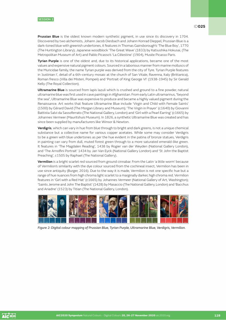
AIC2020 Symposium Natural Colours - Digital Colours 20, 26-27 November 2020 aic2020.org AIC2020 Symposium Natural Colours - Digital Colours 20, 26-27 November 2020 aic2020.org 128
ID025
SESSION 2
Prussian Blue is the oldest known modern synthetic pigment, in use since its discovery in 1704. Discovered by two alchemists, Johann Jacob Diesbach and Johann Konrad Dieppel, Prussian Blue is a dark-toned blue with greenish undertones, it features in Thomas Gainsborough’s ‘The Blue Boy’, 1770 (The Huntington Library); Japanese woodblock ‘The Great Wave’ (1833) by Katsushika Hokusai, (The Metropolitan Museum of Art) and Pablo Picasso’s ‘La Célestine’ (1904), Musée Picasso Paris.
Tyrian Purple is one of the oldest and, due to its historical applications, became one of the most values and expensive natural pigment colours. Sourced in a laborious manner from marine molluscs of the Muricidae family, the name Tyrian purple was derived from the city of Tyre. Tyrian Purple features in ‘Justinian I’, detail of a 6th-century mosaic at the church of San Vitale, Ravenna, Italy (Brittanica), Roman fresco (Villa dei Misteri, Pompeii) and ‘Portrait of King George VI’ (1938-1945) by Sir Gerald Kelly (The Royal Collection).
Ultramarine Blue is sourced from lapis lazuli which is crushed and ground to a fine powder, natural ultramarine blue was first used in cave paintings in Afghanistan. From early Latin ultramarinus, “beyond the sea”, Ultramarine Blue was expensive to produce and became a highly valued pigment during the Renaissance. Art works that feature Ultramarine Blue include ‘Virgin and Child with Female Saints’ (1500) by Gérard David (The Morgan Library and Museum); ‘The Virgin in Prayer’ (c1640) by Giovanni Battista Salvi da Sassoferrato (The National Gallery, London) and ‘Girl with a Pearl Earring’ (c1665) by Johannes Vermeer (Mauritshuis Museum). In 1826, a synthetic Ultramarine Blue was created and has since been supplied by manufacturers like Winsor & Newton.
Verdigris, which can vary in hue from blue through to bright and dark greens, is not a unique chemical substance but a collective name for various copper acetates. While some may consider Verdigris to be a green with blue undertones as per the hue evident in the patina of bronze statues, Verdigris in painting can vary from dull, muted forest green through to a more saturated emerald-like green. It features in ‘The Magdalen Reading’, 1438 by Rogier van der Weyden (National Gallery London), and ‘The Arnolfini Portrait’ 1434 by Jan Van Eyck (National Gallery London) and ‘St John the Baptist Preaching’, c1505 by Raphael (The National Gallery).
Vermilion is a bright scarlet red sourced from ground cinnabar. From the Latin ‘a little worm’ because of Vermilion’s similarity with the dye colour sourced from the cochineal insect, Vermilion has been in use since antiquity (Burger, 2016). Due to the way it is made, Vermilion is not one specific hue but a range of hue nuances from high chroma light scarlet to a marginally darker, high chroma red. Vermilion features in ‘Girl with a Red Hat’ (c1665) by Johannes Vermeer (National Gallery of Art, Washington); ‘Saints Jerome and John The Baptist’ (1428) by Masaccio (The National Gallery, London) and ‘Bacchus and Ariadne’ (1523) by Titian (The National Gallery, London).
Figure 2: Digital colour mapping of Prussian Blue, Tyrian Purple, Ultramarine Blue, Verdigris, Vermilion.

AIC2020 Symposium Natural Colours - Digital Colours 20, 26-27 November 2020 aic2020.org AIC2020 Symposium Natural Colours - Digital Colours 20, 26-27 November 2020 aic2020.org 129
ID025
SESSION 2
CONCLUSION
Pigments and dyes have been in constant use for centuries in art, design and architecture. Some of these have become highly desirable and assigned a level of prestige above others. It is this cluster of pigments and dyes that have been tagged ‘legendary’ for the purpose of this paper.
This colour mapping study focused on a limited range of ten legendary pigments and dyes. Works that feature these pigments and dyes were examined and hex codes that appeared closest to the colours were noted. The outcomes from this investigation provided a range of hex codes for each of the selected pigments and dyes. As such, this process attempted to bridge the gap between the natural world of pigment and dye colours, and their approximate manifestations in the digital world. The continued use of this range of pigment and dye colours in twenty-first century applications, albeit on a perhaps coincidental basis, enhance their ongoing legendary status.
REFERENCES
Ball, P. 2008. Bright earth: The invention of colour. London, UK: Vintage Books.Baty, P. 2017. The anatomy of colour: The story of heritage paints and pigments. Thames & Hudson: London.Brandcolors.net. 2020. Brand colors. Accessed 20 August 2020 from https://brandcolors.net/Burger, R. 2016. The dazzle of vermilion: Tracing the early cinnabar trade in the ancient Andes [video]. Yale University. Accessed 30 March 2020 from https://youtu.be/NLN_sNoVM5kDelamare, F. & Guineau, B. 2000. Colour: Making and using dyes and pigments. London: Thames & Hudson.Encycolorpedia. 2020. Brand colors. Accessed on 20 August 2020 from https://encycolorpedia.com/companiesGage, J. 1990. Colour in Western art: An issue? The Art Bulletin, 72 (4), pp518-541.Gage, J. 1995. Colour and culture. London: Thames & Hudson.Gage, J. 2000. Colour and meaning: Art, science and symbolism. London, UK: Thames & Hudson. Hills, P. 1999. Venetian colour: Marble, mosaic, painting and glass 1250 – 1550. Yale University Press: New Haven.Hughes, R. 1991. The shock of the new: Art and century of change. London: Thames & Hudson.Janson, H. W. (1995). The history of art (revised and expanded by A.F. Janson). New York: Thames & Hudson.Kuehni, R. G. & Schwarz, A. 2008. Color ordered: A survey of color order systems from antiquity to the present. Oxford: Oxford University Press. Lenclos, J-P. 2009. The geography of colour. In T. Porter & B. Mikellides (Eds.), Colour for architecture today (2nd edition) London: Taylor & Francis, pp39-44. Lenclos, J-P. 1982. Couleurs de la France: Maisons et paysages. Paris: Editions du Moniteur.Lipscher, J. 2020. Pigments: Properties, composition, preparation, history of use and identification. Accessed 10 April 2020 from https://colourlex.com/pigments/Lipscher, J. 2018. Chemistry and art, Chimia, 72 (1-2), pp27-31. Lowengard, S. 2008. The creation of color in eighteenth-century Europe. New York: Columbia University Press. Accessible at http://hdl.handle.net/2027/heb.99017.0001.001 O’Connor, Z. 2011. Logo colour and differentiation: A new application of environmental colour mapping. Color Research and Application, 36 (1), 55-60. O’Connor, Z. 2009. Digital colour mapping. In T. Porter & B. Mikellides (Eds.), Colour for architecture today (2nd edition) London: Taylor & Francis, pp45-47. O’Connor, Z. 2003. Pixel perfect? Environmental colour mapping using digital technology. In S. Hayman (Ed.) Proceedings of the 37th Australian and New Zealand Architectural Science Association Conference (pp 686-716). Sydney Australia: University of Sydney. Winsor & Newton, 2020. Spotlight on Colours. Accessed 30 June 2020 from https://www.winsornewton.com/na/articles/colours/
Note: Numerous art galleries and museums were used as sources of information about the pigments and dyes that feature in art works; however, due to the abundance of these sources of information, they have not been included in the above references.
NOTE
1 Carmine Red was one of eight exemplar colours (two reds, two yellows and two blues: Carmine Red, Vemilion, Cadmium Yellow, Lemon Yellow, Prussian Blue and Ultramarine Blue plus white and black) used to explore and apply colour using the RYB model in colour courses at institutions like the Ulm School of Design and the Shillito Design School.

AIC2020 Symposium Natural Colours - Digital Colours 20, 26-27 November 2020 aic2020.org
Slip and pigment layers of pre-Columbian ceramics of Guanacaste and Central Valley of Costa Rica
Matthieu Ménagerab•, Patricia Fernández Esquivelb, Paula Sibajac
a IMBE- Avignon University/ CNRS/ IRD/ Aix-Marseille University, Restoration Engineering of Natural and Cultural Heritage, Faculty of Sciences, Avignon, France.
b Centro de Investigaciones Antropológicas, Universidad de Costa Rica.c Escuela de Química, Universidad de Costa Rica.•Corresponding author: [email protected]
The pre-Columbian cultures of Costa Rica had great knowledge of the techniques of manufacture of ceramic objects. Most of artefacts present decorations, patterns and colours elaborated with natural pigments. Many types of ceramics from Guanacaste, (Jicote, Mora, Chircot, Altiplano, Birmania) were traded to others regions in Mesoamerica. The raw material of pigments were geomaterials (generally clays or metal oxides) from natural sites formerly chosen on empirical criteria for their optical and mechanical properties. The aims of this work were to identify the raw and archaeological materials and techniques used to produce ceramics, and to produce the first pigment study in this archaeological zone.
Firstly, we sampled and characterized 91 coloured Costa-Rican geomaterials by portable X-Ray Fluorescence, infrared and Raman spectroscopy to build a database of raw material in order to maximize the interpretation of analytical data. For the techniques of crafting, an ethnographic study of the potters from the indigenous community of Guaitil (Guanacaste, Costa Rica), which make ceramics using local materials and ancient techniques. This allowed us to observe the techniques currently used for the application of colours (slip and pigment layers).
In a second part, 139 archaeological ceramics, originally crafted in Guanacaste and Central Valley, were selected and sampled from various Costa-Rican sites localized in Guanacaste, Central and Caribbean regions. We used X-Ray Fluorescence, Scanning Electronic Microscopy, infrared and Raman spectrometry to analyse the red, black, grey and white pigments and slips applied on shreds. All these data were treated statistically (PCA, HCA, LDA) allowing to find specific chemical fingerprints and fabrication techniques according to the type of ceramic and the archaeological area. The colours of the slip and pigment layers were done using different clays, iron and manganese oxides. We also could observe the homogeneity of the coloured layers used for 2 important groups of Guanacaste ceramics, and the heterogeneity of composition for those of the central valley. Such result could be link to the social organizations in the two archaeological zones. The grey pigment of a type of ceramic from the central Valley was surprisingly make by mixing calcined bones, clay and iron oxides.
KEYWORDS
pigments I ceramics I raw materia I sourcing I Costa Rica
130
ID077
SESSION 2

AIC2020 Symposium Natural Colours - Digital Colours 20, 26-27 November 2020 aic2020.org
Art with soil: Geotinta Project and its contribution to the teaching and using of colors in Design
Camila Assis Peres Silva•, Adriana Fátima de Meira Vital Federal University of Campina Grande, Campina Grande, Paraíba •Corresponding author: [email protected] author: Camila Assis Peres Silva
ABSTRACT
This paper presents a sort of art with soil that has been developed in northeastern Brazil at Federal University of Campina Grande. We present Geotinta’s extension project executed by Agro Ecology course at the Center for Sustainable Development in the Semiarid Region. To do so, we present the four main steps: soil collecting; soil treatment; color identification; and the packaging process and preparation for painting. Moreover, we present the possibilities of interdisciplinarity with the field of design, with regard to teaching and the use of colors. So as to illustrate it, we present the initial results from the partnership establish between both courses, Agro Ecology (Sumé city university campus) and Design (Campina Grande city university campus). Finally, we discuss the possibilities of approach with regard to the use of color as an element for cultural identification.
KEYWORDS
soil education I color I agro ecology I design I Brazil
INTRODUCTION
The soil is a biodiverse natural resource and rich in colors and textures. Due to its ecosystem functions, it sustains life on Earth, but it is still unknown and little valued by the community in general, a fact that can aggravate misuse and degradation. Among the morphological characteristics of the soil, the color is the one that most stands out when the description study for soil classification are done. They can be presented in different colors, going from light to dark, indicating the presence of quartz, organic matter, and iron. This richness of tones is due to the factors of soil formation, such as the type of rock, relief, climatic factors, as well as to the uses and management adopted.
The soil is present in people’s daily lives. Certainly, using this resource in artistic activity is also part of the routine of many people, such as artisans and potters. Thus, combining art with soil and the proposal for the valorization of the soil can create a new possibility of knowing to conserve. Since the dawn of human history, painting practices that use the soil as natural pigments have been present and are still alive today and being used in the most varied places and, especially in the rural environment. The study of soil tones has already allowed the cataloging of many basic colors that can even be mixed together, resulting in infinity of colors and tones (Carvalho et al, 2007).
Of the morphological characteristics, the color is the easiest to visualize and identify. The color informs the presence of organic material, iron oxides, the presence of quartz, the drainage conditions. Its determination follows a worldwide standardization, by the Munsell Color System, or Munsell Color Chart (Lepsch, 2007). In addition to color, texture is another characteristic of the soil that relates to the presence of particles of different sizes: granulometric fractions or textural fractions, which can be estimated in the field by rubbing a moist, homogenized mass of soil between the fingers, to feel the feeling of roughness (sand), silkiness (silt) or softness (clay). In the laboratory, the determination is made by separating these particles in appropriate equipment (Lemos and Santos, 2001).
131
ID078
SESSION 2
AIC2020 Symposium Natural Colours - Digital Colours 20, 26-27 November 2020 aic2020.org 132
By using the soil as a resource that generates art, through painting with earth paint, is to enable dialogue on issues that are its own, disseminating sustainable practices of use and management in an attempt to popularize the knowledge of this natural resource, in addition to provide alternative income. Ecological earth-based paint can be an important alternative to broaden the debate about the use of alternative material that can add aesthetic value that promotes an improvement in the appearance of environments, as well as in artistic activities, especially because in recent years, technological development in the civil construction sector has been intense and the market has demanded from manufacturers more sustainable products with lower costs (Santos, 2010).
Geotinta is an ecological product based on earth, which lends itself to painting different materials. The soil can be considered as a cheap pigment, easily accessible and obtainable for paints, decreasing the cost of ink and contributing to product sustainability. Geotinta is part of a project of the Agro Ecology course at the Center for Sustainable Development in the Semiarid Region of the Federal University of Campina Grande. The course is taught at Sumé campus, located in Cariri Paraibano. The project arises from the opportunity to disseminate concepts about the potential of non-agricultural land use. The working environment is the Geotinta’s Studio, located in the Soil Education Space on the university campus. The studio has a collection of colors made up of soil samples from different locations and cities.
GEOTINTA’S DEVELOPMENT METHOD: FROM SOIL COLLECTING TO THE PAINTING
Geotinta’s development method comprises into 4 steps: (1) soil collecting; (2) soil treatment; (3) color identification; and (4) and the packaging process and preparation for painting. The formation of the soil color bank of Geotinta’s Studio, soil collection is carried out in different environments, such as ravines on the road, cliffs, excavations, taking care not to compromise the environment, taking advantage of bumpy places. During this first step, soil samples are collected in quantities that can supply the Studio’s demand, usually 1 to 2 kg of soil. The collection can be done in any environment, avoiding only places with anthill, termite mound, salinized or flooded areas.
After the collection, the second step occurs at the Soil Physics and Morphology Laboratory. According to Embrapa (Brazilian Agricultural Research Corporation), for soil analysis, samples must be air dried, ground and passed through a 20 cm diameter sieve and 2 mm mesh, giving rise to what is called “terra fina seca ao ar” (fine soil air-dried) - TFSA (Donagema et al., 2011). The sifting is done using sieve equipment called Yoder.
In the third step, the soil can be identified by the Munsell Soil Color Charts, which classifies the colors into three components: Hue, Value and Chroma. Such as “most soil survey organizations, including the National Cooperative Soil Survey in the United States, have adopted the Munsell soil color system for describing soil color” (Soil Science Division Staff, 2017). Following the instructions of Soil Survey Manual (chapter 3, Examination and Description of Soils), for the third step, it is used the Munsell Soil Color Charts, which classifies the colors into three components: Hue, Value and Chroma. The Chart consists of perforated pages, below each color notation, where the soil sample must be placed for observation with the dry and wet sample, placing them behind from the openings until a visual combination of the soil color with the color pattern is found. In soils the most common hues are R, Y and YR (red, yellow and red-yellow). The Munsell Book contains the following soil charts: 5R; 7.5R; 10R; 10YR; 2.5Y; 2.5YR; 5Y; 5YR; 7.5YR, 10Y – 5GY Colors (Olive greens); Gley 1 & Gley 2 (corresponding to grays); and White (Munsell Color, 2020).
AIC2020 Symposium Natural Colours - Digital Colours 20, 26-27 November 2020 aic2020.org 131
ID078
SESSION 2

AIC2020 Symposium Natural Colours - Digital Colours 20, 26-27 November 2020 aic2020.org AIC2020 Symposium Natural Colours - Digital Colours 20, 26-27 November 2020 aic2020.org 133
Figure 1: From soil collecting to color identification.
After the color is identified, in the fourth step, the containers are labeled and the samples are stored in the color bank. The color collection of Geotinta’s Studio consists of samples of land from different places and states and more than 40 shades of colors have been cataloged. In addition to the samples, the exhibition room for the canvases and pieces painted with Geotinta presents a wealth of colors and textures of the soil, expressed in different shapes and creations. The preparation of the soil paint consists of the mixture of equal parts of soil, water and PVA white glue, observing the texture of the soil, which may imply the need for greater dilution. The consistency for the ink is the same as for conventional ink. The soil paint can be applied outdoors or indoors, on wooden surfaces, masonry, clay, cotton canvas and does not embolize, peel or create cracks.
It is important to highlight that the soil paint produced with white glue based on polyvinyl acetate (PVA) has an expense for the production of 18 liters that does not exceed R$ 30.001. However, if more ecologically viable alternatives are used (in particular, if embedded energy is considered) as vegetable resin, this value will be null if it is considered that the extraction of the raw material for pigments is simple. These earth-based paints can be applied indoors or outdoors, on cement, lime, concrete substrates, etc. However, it should not be applied directly to walls that have already been painted with oil paint, enamel or acrylic paint. The wall must be sanded to remove the previous paint to create the necessary porosity for anchoring the new paint (Carvalho et al, 2007).
GEOTINTA APPLIED TO DESIGN
The use of soil colors as a raw material for the development of paints, in addition to the enhancement of the environmental resource, brings up important issues such as the feeling of identification and belonging of people with their environment. In addition to the scientific exercise of recognizing and cataloging colors from the soil, Geotinta covers symbolic aspects of color. It is a common sense the importance of psychological color effects (Goethe, 2013; Heller, 2013). On the other hand, the concept of design and territoriality has been discussed in the country for some years, based on works such as researcher Lia Kruchen (2009). The concept of identity and territory is evident from the Geotinta Project and, consequently, opportunities are opening for the field of design with regard to the use of color as an element for cultural identification. “Design, art and crafts have a lot in common and today, when design has reached a certain institutional maturity, many designers begin to realize the value of rescuing relationships with manual making” (Cardoso, 2010:21).
The paintings already prepared by the students of the project on the campus of Sumé (figure 2) can serve both as basic elements for project developments and to inspire designers in the possibilities of chromatic composition from the use of soil-based paints. Especially when it comes to the characterization of a particular local culture, the use of the soil and the colors of the landscape in general are placed as possible visual references.
ID078
SESSION 2

AIC2020 Symposium Natural Colours - Digital Colours 20, 26-27 November 2020 aic2020.org AIC2020 Symposium Natural Colours - Digital Colours 20, 26-27 November 2020 aic2020.org 134
Figure 2: Paintings made at the Geotinta’s Studio using earth-based tint.
In addition to the use of color in the elaboration of product designs, the project also brings two other possibilities. The first would be the approach to color theory (Munsell System) based on an example of local daily life, making learning contextualized to students’ experiences. In addition, such approach would allow the improvement of visual accuracy, as the cataloging process of soil samples involves close observation and comparison with Munsell’s samples. A second approach would be the joint work of students from both courses, where students of designers would seek to meet the demands for products that the project might require. It was from this second approach that the authors experimented a first contact between undergraduate students of Agro Ecology and Design.
INITIAL RESULTS: PARTNERSHIP BETWEEN DESIGN AND AGRO ECOLOGY COURSE
The first contact between both courses consisted on an activity in which students of Agro Ecology supervised by Professor Adriana Vital offered the workshop Art with soil to the students of design. The group of 21 students2 enrolled at Integrated Design Management subject, conducted by Professor Camila Silva, was in charge of identify project possibilities so design could help giving more visibility to Geotinta’s Project. The workshop it is a common practice of Agro Ecology’s course team. So the main purpose of that meeting at design academic department was to identify, by experiencing the activity of painting with soil, possibilities that could vary from visual identity to redesign of packaging. The figures bellows presents some registrations of workshop as well as the products developed by design students.
Figure 3: Workshop Art with Soil, held at the Academic Design Department.
Figure 4: Visual identity elaborated for the project.
ID078
SESSION 2

AIC2020 Symposium Natural Colours - Digital Colours 20, 26-27 November 2020 aic2020.org AIC2020 Symposium Natural Colours - Digital Colours 20, 26-27 November 2020 aic2020.org 135
Figure 5: Briefcase developed to assist Agro Ecology’s course team in the transportation of materials to carry out the workshops in the state of Paraiba.
Figure 6: Two packaging options developed: one for the transport of the raw materialfor a paint (the soil); and the other for transporting the tint ready for use in workshops with children.
CONCLUSION
This paper presents a multidisciplinary approach that color scholars cannot escape. In addition to speeches about teaching color that must go through technical and symbolic aspects, the work presented here demonstrates the potential of color in integrating courses from different fields of knowledge. Not only that, it is also about the approximation of two geographically distant courses (about 3 hours of travel between one campus and another). This experience aroused in both courses the different looks towards color. On the part of Agro Ecology, when soil becomes base for painting the colors contribute to enhancement of this environmental resource, bringing up important issues such as the feeling of identification and belonging of people with their environment. As for Design, teachers are usually more focus in color theory and practice in most of time oriented by the consecrated pigment primary colors (cyan/blue, magenta/red and yellow). However, designers can take much advantage exploring the concept of identity and territory highlighted from the Geotinta Project, as well as an approximation to Agro Ecology opens the possibility of an advance study on the origin of colors and sustainability emergent questions. We argue that the main contribution of this northeastern experience carried out between two different courses is the example that when interdisciplinary is experienced in practice, not only in the speeches in the classroom, the contributions to professional training can be very rich.
ID078
SESSION 2

AIC2020 Symposium Natural Colours - Digital Colours 20, 26-27 November 2020 aic2020.org AIC2020 Symposium Natural Colours - Digital Colours 20, 26-27 November 2020 aic2020.org 136
ACKNOWLEDGEMENTS
We thank the support of Federal University of Campina Grande for the financial support, as well as the students who were part of the construction process of this work.
REFERENCES
Cardoso, R. 2008. Uma Introdução à História do Design. São Paulo: Editora Edgard Blucher.Carvalho, A. F., Honório, L. de M., Almeida, M. R. de, Santos, P. C. dos, Quirino, P. E. Cores da Terra: fazendo tinta com terra. Universidade Federal de Viçosa. Programa TEIA. Programa Cores da Terra. Viçosa, 2007.Donagema, G. K., Campos, D. V. B. de, Calderano, S. B., Teixeira, W. G., and Viana, J. H. M. 2011. Manual de métodos de análise de solo. Rio de Janeiro: Embrapa Solos. Available at: https://www.embrapa.br/busca-de-publicacoes/-/publicacao/990374/manual-de-metodos-de-analise-de-solo (Accessed: 27 June 2020).Goethe, J. W. 2013. Doutrina das cores. São Paulo: Nova Alexandria.Heller, E. 2013. A psicologia das cores: como as cores afetam a emoção e a razão. São Paulo: GGili.Krucken, L. 2009. Design e território: valorização de identidades e produtos locais. São Paulo: Studio Nobel.Lemos, R. C., and Santos, R. D. 2001. Manual de descrição e coleta de solo no campo. Campinas: Sociedade Brasileira de Ciência do Solo.Lepsch, I. 2007. Formação e conservação dos solos. São Paulo: Oficina de textos.Munsell Color. 2020. Munsell Soil Color Charts. Available at: https://munsell.com/color-products/color-communications-products/environmental-color-communication/munsell-soil-color-charts/ (Accessed: 27 June 2020).Santos, M. T. P. Qualificação profissional na construção civil: estudo de caso. Trabalho de conclusão de curso (Engenharia Civil). Departamento de Tecnologia. Universidade Regional do Noroeste do Estado do Rio Grande do Sul, Ijuí, 2010.Soil Science Division Staff. 2018. Soil Survey Manual, Chapter 3: Examination and Description of Soils. USDA NRCS. Available at https://www.nrcs.usda.gov/wps/portal/nrcs/detail/soils/ref/?cid=nrcs142p2_054261(Accessed: 27 June 2020).
NOTES
1 The exchange rate of 7 September 2020 was: EUR 1 = BRL 6.2664, according to European Central Bank. Available at: https://www.ecb.europa.eu/stats/policy_and_exchange_rates/euro_reference_exchange_rates/html/eurofxref-graph-brl.en.html2 Alana Gabriela, André Dantas, Augusto Barbosa, Brenda Renny, Brenda Vasconcelos, Daniel Alves, Diego Lima, Geysla Bezerra, Gustavo José, Jéssica Pamplona, José Carlos, Laura Patrícia, Luana Moraes, Lucas Barros, Myllena Almeida, Rayanne Augusto, Valêssa Cruz, Victor Balbino, Williany Costa
ID078
SESSION 2

AIC2020 Symposium Natural Colours - Digital Colours 20, 26-27 November 2020 aic2020.org
Natural colour as a resource for textile production chain in Italy
Rosellina Cilanoa
a Associazione Colore e Tintura Naturale Maria Elda SaliceCorresponding author: [email protected]
ABSTRACT
This paper presents the results of an activity - which I carried out in Italy within a research and training institute - focusing on the issue of introducing natural dying in Textile and Fashion Industry. The aim of the proposal is to consider the potential for introducing colorants extracted from tinctorial plants in medium-craft and /or industrial production as an alternative or a complementary solution to synthetic dying, rather than prospecting the substitution of synthetic colors with natural dying – an unrealistic hypothesis in the light of the complexity of the present textile and fashion productive system.
Recently the textile industry has been undergoing a reconversion of its productive processes aimed to create products having a lower environmental impact and taking into account new health consumers’ needs. This has often required the identification of alternative materials and processes. It is within this innovative framework that textile industry has shown a growing interest in natural colorants.
Sustainability: As a matter of fact, natural colour may be actually considered as “more sustainable” under different aspects. It is strongly linked to natural environment and territory both physically (natural vegetation, agricultural products) and culturally (dying art craft, history of economic policies and costume). Its undoubtable strength point is its hybrid nature which enable contacts with different disciplines such as biology, chemistry, psychology, sociology etc... Nowadays natural colour is present in different productive sectors (food, cosmetics, art, architecture, textile and fashion).
Resource: Are therefore tinctorial plants and natural colorants an actual resource for present productive world? May they represent a resource, not only from scientific and theoretic research point of view, but in a productive approach in textile sector to be carried out on a large scale? In the last decade, Italy is witnessing the following trends.
At craftwork level: A multiplication of initiatives and attempts of development are inducing an optimistic perspective on the growing use of natural dyes in productive processes. The mapping of territorial presences linked to natural dye (cultivation and experimental production of tinctorial plants, small craft companies transforming raw materials into colorants, dyeing plants, laboratories of textile production, small tailoring companies for clothing) shows a situation characterized by micro-small craft companies quite fragmented on the territory, with some weak attempts of production chain.
At the industrial level: Companies are beginning to consider the possibility to introduce natural colorants to dye natural and organic fabrics linked to the re-use of farming waste and food manufacturing scraps. Within this framework, the idea is building a network including all the small productive entities and establishing a strong cooperation with training and research organizations, so to combine craft knowledge with new technologies and innovative communication strategies. Such an initiative may induce a key change giving birth to an innovative project where the dyeing practice is not just the reproduction of a traditional knowledge, but represents an incentive for product and process innovation in textile and fashion industry.
KEYWORDS
sustainability I terrritory I natural color I dyeing I textile
137
ID096
SESSION 2

AIC2020 Symposium Natural Colours - Digital Colours 20, 26-27 November 2020 aic2020.org 138
INTRODUCTION
Natural colour undoubtedly possesses, as a strong point, its hybrid nature, which links it to several disciplines: from botany to biology and to chemistry, up to psychology, ethnology and history. This report presents my reflections and the outcome of my forty years long experience on the value and feasibility of introducing natural dyes in production linked to fashion textiles.
Today we are witnessing a renewed interest worldwide regarding natural dyes as an alternative dyeing method, in several production sectors: food, cosmetics, architecture, textiles and fashion, art. Such a trend is also manifesting itself in Italy, through several initiatives and development trials, within the context of a progressive redeployment of production methods, which makes it necessary to identify eco-sustainable materials and e processes, for the creation of low environmental impact products, more respectful of consumers health needs.
Natural dyeing can be considered in many ways more sustainable than synthetic dye production, as we will see further on. In fact natural colour is connected to the natural environment and to the territory both physically (through wild plants and agricultural production)and culturally (think of its use through the centuries) and possesses characteristics which suggest its reintroduction, as an asset, in the context of a sustainable and eco-friendly textile production.
Nowadays we certainly could not consider it as a realistic hypothesis, on account of the current set up of the fashion textile production system, to completely replace synthetic dyes with natural ones, but rather we need to appreciate their potential use as alternative and integrative to synthetic dyeing, especially where natural organic fabrics are concerned.
PLANTS AND DYES
In their dual nature as electromagnetic waves and colouring substances derived from extracts, natural colours relate to plants but also directly to pleasure, to emotions and to beneficial therapeutic effects. They are an extraordinary product of naturally occurring biochemistry and represent the result of the interaction of the plant world with sun light and the mineral nature of the soil.
They form within plant tissue as pigmenting substances organised in water soluble chromophore groups and associated with each other in varying percentages, depending on the plant they originate from.
The extraction of a natural dye requires first and foremost that we relate to the plant that produced it and the environment in which it grew, that we consider the climate, seasonality, the vegetative needs and that we identify the balsamic phase.
As opposed to synthetic dyes which are composed of a single molecule, natural dyes are the result of a synergy of chromophores often belonging to different chemical groups and colourless substances, which during the extraction process produce a transformation into colouring matter.
They are easily extracted and able to lend colour to the support they come into contact with, through a process of inclusion or of chemical reaction.
The chromatic originality they bring derives precisely from their organic nature, which lends to hues particular and unique qualities of transparency, luminosity and vibration, making them stand out when compared to the characteristics of the synthetic ones.
Each dye is then identified and named according to the range of hues to which it belongs and the plant which has produced it. We can then talk about madder of the dyer red, as of campeachy wood red, woad blue, rather than Indian indigo blue, reseda luteola yellow, rather than yellow from pomegranate or barberry. In this way the composition and the chromatic characteristics are simultaneously defined.
AIC2020 Symposium Natural Colours - Digital Colours 20, 26-27 November 2020 aic2020.org 137
ID096
SESSION 2

AIC2020 Symposium Natural Colours - Digital Colours 20, 26-27 November 2020 aic2020.org AIC2020 Symposium Natural Colours - Digital Colours 20, 26-27 November 2020 aic2020.org 139
FROM NATURAL DYEING TO SYNTHETIC DYEING
In order for us to consider its possible current uses and assessing its potential as an asset from a production point of view, it seems worthy to me – beside evaluating its nature – to take into account the history of its employment over time.
It is no coincidence that the discovery of natural dyes dates back to Prehistory, when humankind had a very intimate relationship with the environment in which it lived and heightened observational skills for natural phenomena, combined with a yearning for decoration which found a powerful means of expression in the use of the dyes it accidentally stumbled upon. Decorating one’s body, painting it with juice obtained from the seeds of a fruit, affirming one’s identity by leaving one’s own handprint on a rock with damp clay , or covering oneself with skins that had come into contact with waters coloured by plants macerated in the rain, these are the gestures that have established an early form of relationship between humankind and colour.
As Franco Brunello points out, natural colouring was born as a decorative art even before becoming a dyeing technique, which drawing from nature’s resources has accompanied civilizations from every part of the world, through each phase of human history.
The coloured stripes that characterised ornamental motifs on the hems of Neolithic fabrics, speak of galium verum and bearberry; the blue, red, lilac and yellow of the textile finds discovered in the pile dwellings of Lake Ledro (TN) derive respectively from vaccinium myrtillus, sambucus nigra and cornus mas.
Textile finds from the Egyptian period show the use of madder of the dyer on the linen bandages utilised to embalm mummies, while textile finds of the ancient roman civilisation testify for us different uses for red, a colour symbol of the roman civilisation, where the choice of a more or less valuable type of dye took place according to the census: madder, tyrian red, kermes were synonyms of the status of those who wore them.
The history of woad blue (colorant of Asian origin, that came to Europe with the barbarian invasions) provides an example of the different cultural value given to the same colour: from cosmetic element to beautify the body (Germanic people) and antiseptic substance (Gauls) for the barbarians, to alien and disturbing colour for the Romans; from royal dye of the French court, to popular dye for work garments in Europe and prior to that, in Chinese and Japanese peasant civilisations, who combined medicinal and superstitious value.
After the Middle ages the dyeing of textiles has followed two paths: extraction from both cultivated local plants and exotic plants coming from India and Africa and subsequently from the New Continent, which were reserved to precious fabrics; and that of dyes destined to popular fabrics which mainly drew from local botanical heritage of wild plants and of some cultivated ones.
With the new commercial openings, the colouring of fabrics became richer and more varied and trade dyes became an important item in the budget of the various countries to the point of determining their economic policies.
This relevance was destined to endure until the introduction of synthetic colorants in the second half of the nineteenth century, when chemistry, urged by new economic and production needs, put a strain on their use and production, engendering their gradual demise. The replacement of natural raw materials used in the production of colourants caused in fact the collapse of the commercial value of pigments, levelling out their social value.
As a consequence dyeing methods also underwent a profound change from a technical and structural point of view, starting with the raw materials which were availed of (synthetic derivatives in place of organic products) determining a process of redeployment which would transform an age-old traditional craft into a new dyeing technique able to fulfil the rising textile industry needs, with colourants at a low economic price, but that were uniformed, homogenous and flat, just as the new industrial fabrics were flat and compact.
ID096
SESSION 2

AIC2020 Symposium Natural Colours - Digital Colours 20, 26-27 November 2020 aic2020.org AIC2020 Symposium Natural Colours - Digital Colours 20, 26-27 November 2020 aic2020.org 140
Nevertheless the use of natural colours, albeit confined to niche areas such as artistic crafts and the textile restauration sector, has never ceased to exist, alongside that of synthesis (even if undercurrent and with alternating fortunes) differentiating itself as “other colour”, with referential value in terms of aesthetic, artistic, therapy and health, historical and anthropological use.
Undoubtedly the dominant use of synthetic colours has considerably distanced us from the knowledge of natural colours and the art of their use, marking a passage of great change in the history of textile colouring. Change that has also led to a profound transformation in our cultural perception of colour, making it an abstract fact.
The use of natural dyes assumes a sensorial involvement, putting oneself, to begin with, in relationship with the plant that produced it and with the environment in which it grew. Furthermore, it implies a cultural experience that goes from the acquisition of knowledge of its nature to the recovery of a sensitivity which allows to appreciate its subtlety and luminosity (inimitable and irreplaceable), from its history to the value meanings acquired over time. Instead nowadays our chromatic choices are made on the basis of samples, where colours are defined by codes and numbers; the continuity thread which used to link the process to the result, the material to the finished product has disappeared.
RESEARCH ON THE TERRITORY
A radical change took place in Italy towards the middle of the last century, in a chronologically and
geographically heterogeneous manner. What kind of transformations has it brought and how was it managed by the actors of textile production? What transformations has it in turn generated on the local economy and in the organization of work?
In the nineties, prompted by some territorial requests, the Associazione Colore e Tintura Naturale hasactivated a project on botanical dyeing on the national territory, to study the phenomenon of the
transformation of the relationship between dye plants and colouring of locally produced fabrics in three Italian counties with strong textile tradition: Abruzzo, Sardinia and Friuli.
This activity highlighted – albeit with some differences due to the diversity of local situations – how after the introduction of synthetic dyes, the use of natural colour has never ceased to exist entirely, though limited to small artisan and artistic production. It has endured above all as a strong element of identity characterization and territorial ties, thus allowing its own persistence and the acknowledgement of its peculiarity as «other colour», with the consequent preservation of knowledge related to the art of dyeing that otherwise would have been lost.
Abruzzo
In Abruzzo the retrieval of the local territorial history linked to the use of artisan colouring has
highlighted the profound economic crisis generated around the 50s of the last century. In this region based on agro-pastoral production, traditionally structured at a manufacturing level, the introduction of aniline dyes, which begun in the early twentieth century, gradually led to the demise of dye plants cultivation as they were no longer required by the local and national market. Later this also led to the closure, due to bankruptcy, of several dye houses owing to the necessary redeployment and to competition from more technologically advanced textile industries in the North.
It is interesting in this regard, the testimony of the scholar Antonio Sautier, who in his “Essay on rustic rugs of Italy ”(1924) analyses the causes of the overall decay of local textile craftsmanship on the national market and identifies the reasons: the deficient quality of the colours and the corruption of taste by the new colour combinations made with synthetic dyes, a far cry from the previously harmonious shades.
Research on the territory has led to the recovery of ancient local recipes, thanks to their persistence in the memory of the elderly. It has also emphasized the great symbolic value of colour obtained in relationship to the territory and its resources.
ID096
SESSION 2

AIC2020 Symposium Natural Colours - Digital Colours 20, 26-27 November 2020 aic2020.org AIC2020 Symposium Natural Colours - Digital Colours 20, 26-27 November 2020 aic2020.org 141
The Mountain Green colour from Scanno village, where dyeing was done on the stone benches that used to be on some of the village streets, was produced once a year in a collective ritual where the community climbed the mountain overlooking the village to collect manna ash leaves which produce a yellow dye. Then the local recipe handed down orally was followed, with a comeback tincture(rimonta) done with woad leaves, grown in the surrounding fields to obtain ‘that green’, which distinguished the skirts of the women of the area.
Sardinia
While in Sardinia, the ‘colori rubino’ (ruby colour) of the sheep’s wool skirts called orbàce came from a skilful blend of three elements: wild madder root, walnut husk and alder bark, in variable proportions according to local recipes, created in different areas in the foothills of the Gennargentu.
On the island natural dyeing persisted for a long time, up to the 70s, justified by the absence of a substantial manufacturing sector. Weaving and dyeing took place prevalently within the home, on pedal looms using wool that was dyed with local wild plants, with some imported material such as campeachy wood dye, used by skilled weavers-dyers to ‘polish’ the black colour.
Even when out of curiosity “Superiride” aniline colour powder began to be used, thetendency was to reproduce the local vegetable dyes, or to increase their initial low solidity with tannins of local plants as additives: on the one hand a sign of the local colour’s deep introjection and of great ability in dyeing on the other.
Valcellina
In Valcellina processing of the blues testified to the skill of the master weavers. Here woad was cultivated and conjugated into many different shades, each named in the local language, to underline it as a conscious choice: it could be blo (dark blue) but also a torchino, blavo, latisino (shades of light blue), or majolica (azure), if extracted from blueberries. Tincture recipes were the subject of discussions and agreements and were reported by hand in the ‘Libri dei tacamenti’ ( Books of the Bindings), handwritten notebooks by the local tesser (weaver), together with the textile weaves used, the measurements of the fabrics and related costs agreed with the customer for each job. They were true compendia of knowledge and artisan secrets, where the originality and uniqueness of a fabric took form through the skill in weaving and dyeing. Back then it was dialogues, languages and times which determined a culture.
Even in textile factories, dyeing continued for a long time with synthetic dyes along with natural products, such as is testified by many sample catalogues of local manufacturing companies.
The dowry pacts of the Valley reveal the custom of bringing as dowry, in addition to household linen, also fine fabrics of national and foreign commercial origin, scrupulously noted in all their characteristics, from measurements, to the textile fibre used, to the weave, to the pigment used in dyeing, which contributed to a large extent in determining their value. Dyes like indigo blue rather than campeachy wood or cochineal red made the fabrics precious and therefore significantly determined their value.
Such custom saw its demise with the advent of synthetic dyes which, reducing the costs of raw materials for dye production, also levelled the commercial value of textiles, regardless of their colouring.
The work of reconstructing the culture of colour in local textiles, carried out by the Association in synergy with local populations, has led as a first result to a recognition of their cultural identity linked to colour.
ID096
SESSION 2

AIC2020 Symposium Natural Colours - Digital Colours 20, 26-27 November 2020 aic2020.org AIC2020 Symposium Natural Colours - Digital Colours 20, 26-27 November 2020 aic2020.org 142
TRANING INITIATIVES
The subsequent transfer of skills at a training level has therefore allowed the re-appropriation on behalf of the inhabitants of ancient knowledge, heritage of local craftsmanship and subsequently the start of an evolution of the situation on the territory in terms of production and employment. Thus the foundations were laid for the creation of training projects aimed at the enhancement of the territory, in which the introduction of natural colour, as innovative characterizing element, is linked not only to economic and employment motivations but also to environmental policy intervention. This is how the Tessart’è project in Abruzzo, the Tools Linea Parco project in the Cilento park and the La Robbia artisan dyehouse in Sardinia were born.
To encourage the development of the sector, the Association has implemented its training courses in collaboration with the Faculty of Fashion and Design of the Milan Polytechnic and with some students of IED, of NABA and Brera Academy.
SOME ARTISANAL REALITIES
The last decade has seen a proliferation of initiatives and development efforts in Italy that make a growing use of natural dyes in the textile-fashion production processes a real possibility. It concerns for the most part small local realities, which work on a strictly territorial basis linked to an entirely artisanal world, which still represent most of the production activity today.
Subsequently we’ve seen the rise of a number of small companies which base their production on the choice of natural and often organic materials, from fabric to pigments, making a statement for the health benefits and the aesthetics of the natural along with its ‘poetic’ dimension. They uphold respect for the environment and human resources, the enhancement of local cultures and traceability of the manufacturing process.
Arte e Natura uses natural dyes on silk from Nepalese and Indian cooperatives and produces scarves and throws which they distribute directly in Italy.
Dondup Naturals Colours employs yarn-dyed denim fabric coloured with natural woad dye and
Distribute it in 800 stores in Italy.
MeDea uses natural dyes on wool that is spun, woven, and dyed by hand, in collaboration with a cooperative of Bolivian women, and produces unique garments which they distribute in Italy, in some European countries and in Japan.
Biocouture NATHU uses natural dyes on ICEA certified organic fabrics and produces tailored suits and accessories that they distribute in Italy, in some European countries and in Japan.
NDJAXASS, an Italian Cambodian company, uses natural dyeing on recycled fabrics to create clothes that are distributed in Italy.
Le Tintine uses natural dyes on yarns to create knitwear for children, which they distribute in Italy.
Donne in Campo is the first attempt at a textile supply chain: from the cultivation of dye plants to the natural dyeing process, up to the creation of tailored garments. They created the Agritessuti brand.
Lalazoo Artelier use natural dye and ecoprint technique on organic fabrics, producing unique garments, which they distribute directly in Italy.
It is interesting to know that some important brands - including Moschino, Armani, Prada, Ratti, Loro Piana, H&M - have begun trials with natural dyes, creating unique garments, in order to verify the possibility of a wider production.
ID096
SESSION 2

AIC2020 Symposium Natural Colours - Digital Colours 20, 26-27 November 2020 aic2020.org AIC2020 Symposium Natural Colours - Digital Colours 20, 26-27 November 2020 aic2020.org142 143
CONCLUSION
Are dye plants and the dyes that derive from them a real asset for the current productive world? And above all can they really be so in a large-scale productive approach linked to textiles?
The mapping of initiatives involved in the production of natural colour on Italian territory –dye plants crop trials, small artisanal businesses for the transformation of raw materials into dyes, dye houses, textile manufacturing workshops and small garment manufacturing companies - show one very fragmented artisan reality, with a few weak efforts at creating supply chains. Therefore, we are talking about a resource currently limited to small production companies.
The launch of a national supply chain of natural fibres and colours, responding to current market needs would require a reorganization of the production processes and a redefinition of product quality.
Today large-scale production especially, continues to present some prominent critical issues regarding agronomy in the production phase of dyes: insufficient seed production for related crops combined with difficulty in sourcing organic weed control products. Extraction processes would also require the development of new plant equipment. Moreover the actual dyeing phase implies the solution of problems such as plant equipment design which enables control and scheduling of the different dyeing phases, new dye formulations along with dyeing techniques that adjust to the specificity of different dyes, to allow for industrial production of high quality products.
ID096
SESSION 2

AIC2020 Symposium Natural Colours - Digital Colours 20, 26-27 November 2020 aic2020.org
Color design research and developments with vegetables dyes
Delphine Talbota•
a Assistant Professor at the Institute Superior Color Image Design, LARA-SEPPIA, University of Toulouse, France
•Corresponding author: [email protected]
ABSTRACT
Young researchers in design are now working on new products using natural dyes. Moreover they study how colors made with plants can be used as effective materials. Sensory design and care design are innovative ways of design that think about new uses for human beings. Taking care, considering color materials as medicines or simply good for skin, unlike petrochemical dyes.
The author will show new developments made by young designers: natural dye process for leather, innovative vegetable leather and colors, development of color ranges made by local plants, archeology of colors for new patterns, extraction process for weak dyes...
The author will also introduce a new common program of research about «color & care», specifically questioning the color materials made with both medicinal and dye plants. From a corpus about symbolic and traditional ways of using colors (ancient practices and local know how), the idea is to prove the medicinal potential of some natural dyed samples, through collaboration with chemists, and to develop some new care and color materials made from plants.
KEYWORDS
vegetable dyes I natural colors I care design I slow fashion Keywords: .
INTRODUCTION
At the Institute Superior Color Image Design we study about color, color as an object to conceptualize, color as a material to create, to inspire futur fashion trends, even futur ways of making design, finally. Some workshops permit to explore, learn and experiment many different ways of making colors and materials. The lecture today will specifically talk about making colors with natural dyes, specifically from plants. Including thus some techniques of making dye stuffs but also how the colors made from plants are complex, vibrating and deep.
Unless making colors with plants is a kind of cultural adventure, the discovering of its shades can lead us to a profound understanding of what is color: more than a surface or a light reflecting support, color is a multi sensory material, a support of meanings, an imprint of memories and knowledge.
Working in color design requires to know about all the different parameters of this particular object of studies and makings that is the color. In the Master Creation Research & Innovation in Colors and materials (Master CRIC), we learn how to explore all the sides of the color by focusing on one chromatic domain and by making successive cultural, technical, linguistic explorations, while experimenting with some new ways of producing colors from the understanding of its materiality and/or its typical or contextual existence. Then a precise dialogue is established between research and creation around a common objective: to make visible, understandable and palpable a chromatic domain whose name evokes as many imaginations as collective and singular memories.
Also designing ranges of colors allows both to offer a common field of reference for designers, but also to inspire ideas for projects in architecture, textiles, cosmetics… all sectors, all environments where the color is called upon to distinguish or even support creations.
144
ID131
SESSION 2

AIC2020 Symposium Natural Colours - Digital Colours 20, 26-27 November 2020 aic2020.org 145
TEXT
Let’s discover now some recent creations and researches including some vegetable techniques into innovative color design or design of new materials.
From lichens to colors, for silk and wool
We will began this presentation with the precious work of Aurelie Couvrat (Master CRIC 2017-19), about the colors of lichens.
Figure 1: Aurelie Couvrat, Lichens, Workbook cover page, Master CRIC 2017-19, ISCID, University of Toulouse.
Real object of research in color, the workbook permits to discover a specific exploration of chromatic domains and to classify some samples and color materials. At first, understanding the lichens as a vegetal in its own environment by duplicating the observed colors with painting, as a first step in appropriation of the domain.
AIC2020 Symposium Natural Colours - Digital Colours 20, 26-27 November 2020 aic2020.org
ID131
SESSION 2

AIC2020 Symposium Natural Colours - Digital Colours 20, 26-27 November 2020 aic2020.org AIC2020 Symposium Natural Colours - Digital Colours 20, 26-27 November 2020 aic2020.org 146
Figure 2: Aurelie Couvrat, Lichens, «Evernia Prunastri, contretypes», Master CRIC 2017-19, ISCID, University of Toulouse.
Discovering all the tints of the material is the first step to understand color in all its variability. Duplicate the colors observed with some industrial tools, as Pantone or NCS color charts, is also part of the learning of the future colorist. It is a know-how. It is necessary to enable certain colors to be combined with others, to permet a graphic chain, to integrate industrial projects or mass production, or even to associate natural colors with some materials and/or a given industrial environment. Of course. Therefore, the colorist designer needs to be conscious that duplicate improve the delicate know-how of the translator: he will need to choose several shades from the color chart in order to indicate the complexity and the uniqueness of the specific color he choosed from the natural environment. Then, experiments will permit to explore the diversity of the tints from the lichens, inside, outside… And, at least, to extract the colors from the lichens, by different techniques of dyeing.
ID131
SESSION 2

AIC2020 Symposium Natural Colours - Digital Colours 20, 26-27 November 2020 aic2020.org AIC2020 Symposium Natural Colours - Digital Colours 20, 26-27 November 2020 aic2020.org146 147
Figure 3: Aurelie Couvrat, Lichens, «Xanthoria Parietina, dyed samples», Master CRIC 2017-19, ISCID, University of Toulouse.
The method, wether vat by decoction or maceration (in ammonia or urine) and other, depends of the type of lichen used. Besides, the action of UV rays, for example, are important factors. Indeed, some species of lichens can give different results depending on the method chosen, for example the case of Xanthoria Parietina which will offer a different rose by maceration, from the one obtained by decoction, but it does not stop there because this last rose is unstable. The UV action will gradually lead it to a grayish and more stable blue. This phenomenon will thus become a huge field of experimentation in the search for new colors. Indeed, if it is first possible to vary the pink by the time of maceration but also by carrying out successive soaking (after drying) to intensify the color, it is also possible to obtain intermediate colors in purple hues and turquoise. These variations related to UV exposure are more easily observed by slowing the reaction (by re-humidification or by placing the samples in transparent plastic bags for example …). It is in part thanks to this multitude of possibilities that the resulting palette is increasingly enriched.
ID131
SESSION 2

AIC2020 Symposium Natural Colours - Digital Colours 20, 26-27 November 2020 aic2020.org AIC2020 Symposium Natural Colours - Digital Colours 20, 26-27 November 2020 aic2020.org 148
The context of experiments also makes it possible to obtain two-tone yarns or fabrics, to bring out patterns… From coral to a grayish blue, the color designer rematerialize colors: from the model synthetic colors (one color / one tint) to re-descovering of the complex colors, by the natural dyes process, understanding the original complexity of colors, their vivacity, as they are again alive in the dyed textiles, and sometimes they move, according to different parameters (humid environment, PH variations, sunshine…). Some plants, particularly a lot of lichens, are reactive with the sun (photosensitive), or in the vat (PH sensitive), that would permit many different experimentations and ways of designing and thinking colors as alive and sensory materials.
Figure 4: Aurelie Couvrat, Lichens, «Xanthoria Parietina, chromatic circle», Master CRIC 2017-19, ISCID, University of Toulouse.
In addition, tinctorial research around Xanthoria Parietina sheds light on a phenomenon surprising: the latter sees its visible color vary depending on its exposure to the sun but also its color hidden (and revealed by dyeing), depending on UV. We therefore notice here an astonishing complementarity between visible color and hidden color, which form a rather complete chromatic circle. A Xanthoria lichen implanted in shaded area will turn to a greyish green, while if it is exposed to the sun, its color will turn yellow then will become more and more orange. At the same time, a fabric dyed by maceration of this lichen may turn a bright pink almost coral, to a grayish blue when dried outdoors. It is as if a rematerialization of color visible was operated by switching from one medium to another. During this transfer, the color almost becomes its own complement, as subject to an inverted mirror effect. The aromatic circle made up, on the one hand, of the visible colors of the Xanthoria Parietina lichen, and on the other hand of the dyeing colors resulting from the latter. Each semicircle reflects the evolution of color, depending on exposure to the sun.
All this research results in a very complete colored palette of colors from a practice experimental dye in the posture of a lichenologist colourist.
ID131
SESSION 2

AIC2020 Symposium Natural Colours - Digital Colours 20, 26-27 November 2020 aic2020.org AIC2020 Symposium Natural Colours - Digital Colours 20, 26-27 November 2020 aic2020.org 149
Figure 5: Aurelie Couvrat, Lichens, «Colors on silk», Master CRIC 2017-19, ISCID, University of Toulouse.
Figure 6: Aurelie Couvrat, Lichens, «Colors on wool», Master CRIC 2017-19, ISCID, University of Toulouse.
ID131
SESSION 2

AIC2020 Symposium Natural Colours - Digital Colours 20, 26-27 November 2020 aic2020.org AIC2020 Symposium Natural Colours - Digital Colours 20, 26-27 November 2020 aic2020.org149 150
From colors of ashes to vegetable color ranges and textile design
We will now discover another research in color design, this one from Chloe Prieur, (Master CRIC 2018-20), about the colors of ashes. She begun by observing different colors of different types of ashes (different woods were burnt), in order to make some collect of ashes materials, through photographies and samples of tints and duplicate colors.
Ash is an haptic color, very sensory, with a specific smell, texture, velvety… It reveals deep sensations of memories. Ashes do not have one specific color, but a great variety of shades, of colored grays. Ash is a delicate matter which is full of different colors. Between the serenity of browns, the softness of greens, the pearly of roses, the spirituality of violets, the coldness of blues, the evanescence of blacks…
Figure 7: Chloe Prieur, Ashes, «Colors of alive materials in it environment and duplicate with Pantone color chart», Master CRIC 2018-20, ISCID, University of Toulouse.
Figure 8: Chloe Prieur, Ashes, «Ash colors made with vegetable dyes -madder, isatis…- «, Master CRIC 2018-20, ISCID, University of Toulouse.
ID131
SESSION 2

AIC2020 Symposium Natural Colours - Digital Colours 20, 26-27 November 2020 aic2020.org AIC2020 Symposium Natural Colours - Digital Colours 20, 26-27 November 2020 aic2020.org150 151
From understanding ash in its environment, the wood in fire, Chloe did duplicate the tints she observed by using Pantone color chart and by vegetable dyeing process. Many plants did help her to create subtle hues of ashes on textiles, as linen, silk, coton… She classify also her tints according to their vivacity or brightness, thanks to some cartographies. Then she combined some materials sample, in order to show the specific velvety of the powders, with some images, color samples… to create some color ranges, precious for designers and for making projects with color, as a conceptual and material support.
Moreover, Chloe, during her work experience, collaborated with AHPY Creations from Pastel Blue, a textile finishing company in Toulouse. She created, in collaboration with Annette Hardouin (master dyer) and Yves Patissier (fashion designer) a color ranges and textile design, with blues made from Isatis tintoria (Pastel, the local plant for blue) and patterns inspired from Viola savis, both on the thematic «pastel & violet», two heritage plants of Toulouse.
Figure 9: Chloe Prieur & AHPY, Pastel & Violet, Master CRIC 2018-20, ISCID, University of Toulouse.
ID131
SESSION 2

AIC2020 Symposium Natural Colours - Digital Colours 20, 26-27 November 2020 aic2020.org AIC2020 Symposium Natural Colours - Digital Colours 20, 26-27 November 2020 aic2020.org151 152
Indigo dyeing for goat leather
Another exemple of collaboration would show us how color design can be at the center of a project. Thus would be between Kheira Terbah and Alran tannery in Mazamet, in France, a great exemple of a research and development on colors made by plants. Kheira, colorist designer, did explore the possibilities to color leather with indigo, in collaboration with an engineer, in order to find the best process to obtain stable and uniform colors on goat skin. It was a long exploration to find the good way to fix the color into the leather without alter the quality of the skin material, weak in water.
Figure 10: Kheira Terbah & Tannery Alran, Bluesoul: Isatis, Orient, Temple - three colors of leather dyed with indigo, Master CRIC 2016-18, ISCID, University of Toulouse.
This range of nubuck goat leathers dyed with vegetable indigo is kind of rare on the markets. Nevertheless, in Japan, some manufactures of leather work with vegetable indigo. In Tokushima, Kinuya Co. Ltd., and in Kyoto, Sukumo Leather, two tanneries perpetuate this ancient know-how rooted in Japanese culture. Hand dyed from traditional way thanks to the famous sukumo, dye substance produced from indigo fresh leaves, the craftsmen then unveil bovine leathers with shades majestic, surmounted or not by motifs, also made manually. As a great example of making stable colors with plants on leather.
Color design for vegetable leather
Understanding that color design is a great way to choose for innovative projects, the Institute Superior Color Image Design organize twice a year the Design Innovation Weeks (DIWE) in order to make some student groups, from the 6 different Masters, to work on specific projects submitted by local companies or institutions.
Recently some students in Master class worked on a project submitted by a young start-up, Mondin, to plant-color a leather made from grapes pomace. The start-up develop a new kind of leather, for luxe developments, around the patrimonial identity of their roots, the wine and the grapes cultures. For them we explored the potential of leathers as a multi sensory material, its textures, its softness, were observed and duplicate, in order to give to the new material a kind of alive aura and to instill recognition of it as « leather », with many possibilities of sensory variations. The tints of vegetable colors were thought through the material transparency and its specific golden shade. The main objective was to imagine how the natural dyes would evolve in a certain kind of transparency, playing with light, and a non-uniform colorful support.
ID131
SESSION 2
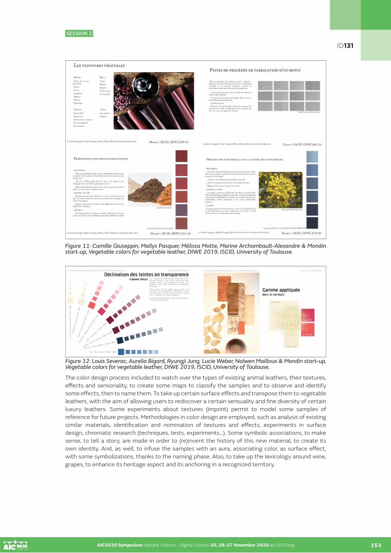
AIC2020 Symposium Natural Colours - Digital Colours 20, 26-27 November 2020 aic2020.org 153
Figure 11: Camille Giuseppin, Maïlys Pasquer, Mélissa Motte, Marine Archambault-Alexandre & Mondin start-up, Vegetable colors for vegetable leather, DIWE 2019, ISCID, University of Toulouse.
Figure 12: Louis Severac, Aurelia Bigard, Ryungji Jung, Lucie Weber, Nolwen Mailloux & Mondin start-up, Vegetable colors for vegetable leather, DIWE 2019, ISCID, University of Toulouse.
The color design process included to watch over the types of existing animal leathers, their textures, effects and sensoriality, to create some maps to classify the samples and to observe and identify some effects, then to name them. To take up certain surface effects and transpose them to vegetable leathers, with the aim of allowing users to rediscover a certain sensuality and fine diversity of certain luxury leathers. Some experiments about textures (imprint) permit to model some samples of reference for future projects. Methodologies in color design are employed, such as analysis of existing similar materials, identification and nomination of textures and effects, experiments in surface design, chromatic research (techniques, tests, experiments…). Some symbolic associations, to make sense, to tell a story, are made in order to (re)invent the history of this new material, to create its own identity. And, as well, to infuse the samples with an aura, associating color, as surface effect, with some symbolizations, thanks to the naming phase. Also, to take up the lexicology around wine, grapes, to enhance its heritage aspect and its anchoring in a recognized territory.
AIC2020 Symposium Natural Colours - Digital Colours 20, 26-27 November 2020 aic2020.org
ID131
SESSION 2

AIC2020 Symposium Natural Colours - Digital Colours 20, 26-27 November 2020 aic2020.org 154
Color & Care: an interdisciplinary and multisectoral program of research
After this exploration of researches and developments in color design, we will now introduce a specific research about color and care, through a corpus of specific uses of textiles dyed with vegetable colors, to protect, care for or even cure. Born in 2017 in Madagascar (Symposium «Naturally - Voajanahary», in collaboration with Dominique Cardon, emeritus reach director in archeology and history, CNRS), this interdisciplinary research project focus on identify plants that are both coloring (stable colors) and healing, by at first producing a corpus of dyed textiles uses for their symbolic (protection, hydratation…) or even their therapeutic purposes, and then to prove the efficiency of the healing capacities of plants inside the dyed fabric, one in contact with the skin. In other words, researching how to link the color of the plants to the therapeutic powers of the plants, in one material. And by extension, to imagine some materials (textiles or cosmetic) which take care of environment, and moreover, can heal people, or at least protect them. The main stake being to prove the real capacities of textiles dyed with plants to heal, more than symbolic uses as history or archeology could say about traditional practices observed in different parts of the world.
In Madagascar (2017), an exploration of the endemic flora was made by the identification of plants to the virtues coloring and therapeutic (double uses) thanks to some local botanists, by making some experimentations of coloring with plants thanks to some local craftswomen (traditional techniques), by visiting some places of production textile (dyeing and weaving with local plants).
In a second hand, from some tinctorial and medicinal plants, the production of a range of colors prescriptive for of uses in health beauty (cosmetic and care) and coloring textile mainly is proposed, made by some various natural dyed textiles samples, from different parts of the world. This tool can allow at all business wishing itself differentiate through the color, in adding a dimension ecological see therapeutic at her production, of develop his offer. This range can as well be a model, a support at launch of a color project investing in ecological or even therapeutic issues. A consultation or an advice adapted at some project would be so proposed in continuity of the support. It may allow some developments in industry of color, mainly textile.
Are put at honor in this project: of principles articulation between color and care; the combination approaches in sensory design and color design; the prescription colored for the environments industrial and the companies tours towards innovation (beauty-health, textile, habitat…); an intercultural and interdisciplinary posture for a project which concerns many fields of research (applied arts, arts and crafts, design, history, anthropology, archeology, health, chemistry) and different sectors of activities (beauty-health, textile, industry of the color in general).
ID131
SESSION 2

AIC2020 Symposium Natural Colours - Digital Colours 20, 26-27 November 2020 aic2020.org AIC2020 Symposium Natural Colours - Digital Colours 20, 26-27 November 2020 aic2020.org 155
Figure 13: Delphine Talbot (color designer) and Vanessa Causse (forecoast designer), Color & Care: Natural dyeing and medicinal virtues, «Color range - work in progress», Toulouse, Paris, 2019-21.
ID131
SESSION 2

AIC2020 Symposium Natural Colours - Digital Colours 20, 26-27 November 2020 aic2020.org AIC2020 Symposium Natural Colours - Digital Colours 20, 26-27 November 2020 aic2020.org155 156
Moreover, the development of a program of research in partnership with laboratories in pharmacognosis, chemistry, history and design, integrated at different universities based in France, Greece and Japan, is mainly expected. The integration of specialists keys in this program of research (craftswomen, master dyers, forecoast and color designers) is as well planned. A research of funding is currently at the study. In a second time, the goal would be to associate of companies for the bet in square applications developments in different sectors of industry (textile, cosmetic, medical, environnement…).
ACKNOWLEDGEMENTS
Color designers:
Aurelie Couvrat, color designer, lichenologist colourist.
Chloe Prieur, color designer, sp. natural dyeing.
Kheira Terbah, artisan designer colorist: http://dante.univ-tlse2.fr/5277/ + https://www.anellastudio.com
Camille Giuseppin, Maïlys Pasquer, Mélissa Motte, Marine Archambault-Alexandre, Louis Severac, Aurelia Bigard, Ryungji Jung, Lucie Weber, Nolwen Mailloux: students of the Master 1, promotion 2019-20, Institute Superior Color Image Design, University of Toulouse.
Collaborators:
AHPY, Créations bleu de pastel: https://www.ahpy.eu
Alran SAS, tanneur mégissier: https://www.alran.fr
Start up Mondin, cuir végétal de luxe: https://www.mondin.io
Forecoast designer:
Vanessa Causse: https://www.eurosima.com/orateur/vanessa-causse/
ID131
SESSION 2

AIC2020 Symposium Natural Colours - Digital Colours 20, 26-27 November 2020 aic2020.org 157
SESSIONS 3 & 4
COLOUR AND HERITAGE

AIC2020 Symposium Natural Colours - Digital Colours 20, 26-27 November 2020 aic2020.org AIC2020 Symposium Natural Colours - Digital Colours 20, 26-27 November 2020 aic2020.org 158
SESSIONS 3 & 4
COLOUR AND HERITAGE
SESSION 3
Material approach: past and future architecture, natural ligthing, materail and digital restoration, art materials, 3D digitization technologies…
011 I 013 I 019 I 023 I 047 I 052 I 092 I 143 I 145 I 147
SESSION 4
Cultural approach intangible heritage and knowhow, language, anthropology, teaching colour…
020 I 028 I 041 I 044 I 055 I 057 I 084
C8
M28
J89
N1
R235
V18
4 B4
2

AIC2020 Symposium Natural Colours - Digital Colours 20, 26-27 November 2020 aic2020.org
Color in the archives or color archives
Alexia Raimondoa•
a Archives nationales, Pierrefitte-sur-Seine, France •Corresponding author: [email protected]
ABSTRACT
The presentation of the F/12 collection, kept at the Archives nationales, is an opportunity to make known a unique collection about color.
The Archives nationales, memory of the French central administration, preserve through the files classified in F/12, the traces of the State’s action on color through the control of production and the encouragement of innovation. Thus, textile samples belonging to the different provinces of the kingdom at the 18th century , but also illustrating dyeing trials and dyeing experiments over nearly two centuries, have been preserved. They represent a rich and fragile heritage whose materiality is subject to particular conservation issues and challenges.
KEYWORDS
archives I textiles I samples I dyes
INTRODUCTION
The F/12 collection, entitled since its creation in the 19th century by the Archives nationales «Commerce and Industry», is composed of more than 13 000 references. Constituted by a superimposition of deposits since the Revolution, it forms a voluminous set covering trade policies from the end of the 17th century to the 1960s.
This collection is constituted, in its old part, by the Council of Commerce’s archives created in 1700, by a decree of the King’s Council which fixes to it for purpose «to know and procure all that could be more advantageous to the trade and the manufactures of the kingdom». On June 22, 1722, the Bureau of Commerce succeeded it and resumed its missions until the Revolution. At that time, commercial and industrial affairs were integrated into the very broad competences of the Ministry of the Interior, and this attachment lasted until the middle of the 19th century, with the creation of a ministry dedicated to trade and industry.
This archives are particularly interesting because they reflect the administration’s attention to innovation and invention. An interest that appeared as early as 1700 with the setting up of the Conseil du Commerce and its research missions to promote French trade, but which finally lasted throughout the 19th and 20th centuries. This interest explains the presence of many samples of various materials and mainly textile samples, illustrating the administrative action that was built around the control and encouragement of innovation. Both control and encouragement apply directly to color through the examination of the production of dyed textiles but also the attention given to dyeing discoveries and inventions.
159
ID011
SESSION 3

AIC2020 Symposium Natural Colours - Digital Colours 20, 26-27 November 2020 aic2020.org 160
I- COLOR CONTROL
Such control is exercised by the administration of Commerce since its purpose is to know the companies and the relays of the economic life in order to compete abroad and maintain a level of quality production.
In the 18th century, this information collection was made possible by the presence on the ground of factory inspectors, who sent the data back to the administration through reports and workshop descriptions. These inspectors ensure the application of the king’s industrial and commercial policy. They control the production, in particular, of fabrics (linen or hemp fabrics, woollen sheets, silk, cotton, hosiery) and repress any deviation from the rules of manufacture.
These states of manufacture deliver a real photography of the textile productions perfectly geolocalized and dated. Some of them, enriched with samples, are extremely precious documents for the history of colors, because they give the names, nature and composition of the textiles. There are also samples of beautifully dyed sheets, produced for export, whose colors dating back to 1762 are still vibrant today (figure 1).
Figure 1 : Bayettes for the Spanish trade, 1762. AN/F/12/553
In addition, control is also exercised more directly on the color with the dyes verification of grand teint and petit teint,that means the dyes quality made by the manufacturers.
Samples illustrate faux teint, such as these skeins of bad dye from the manufacturers in Rouen (figure 2), which are denounced and reported to the administration.
Figure 2 : Control of the blue dyes made in Rouen factories, 1779. AN/F/12/654
AIC2020 Symposium Natural Colours - Digital Colours 20, 26-27 November 2020 aic2020.org 159
ID011
SESSION 3
AIC2020 Symposium Natural Colours - Digital Colours 20, 26-27 November 2020 aic2020.org AIC2020 Symposium Natural Colours - Digital Colours 20, 26-27 November 2020 aic2020.org 161
This one also exercises its control by carrying out numerous examinations, particularly the débouilli examination, which tests the pigments resistivity and dyeing methods. The Archives nationales keep many reports of these experiments describing the methods used: alum debouilli from Rome, soap baths, etc. Results are illustrated by the addition of samples before the experiment and after these treatments, demonstrating dyes resistance.
So, for example, in 1754, inspector Brunet had a public examination of the black dyes solidity made by local manufacture in Le Mans. Result was a report with samples of dyed stamens and comments on the stains (AN/F/12/837).
Other examples of these débouilli examinations are illustrated by samples sent by the inspectors of Romorantin and Orléans (figure 3). The sample cards of deboiled sheets, attached to the inspectors’ reports in 1737, showed the manufacturers that their dye was not grand teint but faux teint.
Then, they must readjust their recipes or pay a fine. There are many examples of samples that have been tested and found to be fraudulent. Most often it is a scam that is played out between the name used for the sale: bon teint or grand teint while the textiles are actually faux teint or petit teint (witch means bad dye. Sometimes the fine is not enough and the dismissal of the master dyer is requested by the administration for non-compliance with the regulations. This is what happens to Mr. Lebrument in 1762, for having replaced the blue said bon teint by blue saxony allowing him to make dyes at lower cost (F/12/1334/A).
Figure 3 :Sheets of wool passed to the débouilli in Romorantin, 1737. AN/F12/1332
Finally, the administration tries to push the factories to imitate certain fabrications. A letter from John Holker, manufacturies inspector, dated 1762, and addressed to the intendant of commerce accompanies a sample of English blue. He asks him to send a portion of this sample to inspectors in several provinces so that factories in those regions could imitate the English blue dye fixed by a drug called sorrel. He suggests Trudaine, intendant of finance, to offer a reward to those who could provide the factories of the kingdom with sorrel of as good quality as that of the English. This document perfectly illustrates this thirst, this interest in everything that can improve French production and promote its trade, but also everything that can encourage innovation.
This thirst for invention and innovation focuses particularly on processes, recipes and dyeing materials.
ID011
SESSION 3

AIC2020 Symposium Natural Colours - Digital Colours 20, 26-27 November 2020 aic2020.org AIC2020 Symposium Natural Colours - Digital Colours 20, 26-27 November 2020 aic2020.org 162
II-INNOVATION AND INVENTION
Samples kept in this perspective generally belong to the files of applications for incentives, royal privileges or patents. They correspond to shipments from manufacturers, private citizens or are the result of studies by administrative offices for the use of new industrial processes.
These files illustrate, for example, the discoveries of new spinning methods, new materials to be used or new dyeing recipes.
When they are private discoveries, they are sent to the administration, sometimes just to serve the Kingdom, the Empire, or the Republic without asking anything in return. However, more often than not, the authors wish to obtain gratuities, incentives, or advantages.
For example, there are memoirs that detail recipes that have long remained secret, such as the one on Andrinople-style dyeing, or illustrating new processes such as those invented by Claude Verdier in 1780. Indeed, his memoir exposes his discovery that allowed strong dyeing of yarns in shades that had not been used in the factories until then.
Figure 4 : Claude Verdier’s memoir with samples, 1780. AN F/12/1331
Tests are sent to the chemists attached to the administration of Commerce, who must judge the relevance of the discoveries. Sometimes the files also preserve the main dyeing materials of recipes contained in simple envelopes, such as 19th century mealybugs or mid-18th century madder.
Figure 5 : Memoir for madder use, 1747. AN F/12/655/A
ID011
SESSION 3

AIC2020 Symposium Natural Colours - Digital Colours 20, 26-27 November 2020 aic2020.org AIC2020 Symposium Natural Colours - Digital Colours 20, 26-27 November 2020 aic2020.org 163
This research on new components is carried out in order to improve the resistance and depth of known colors. For example, the tests carried out by sieur Bertholet in 1785 tend to prove that Tobago turmeric is much more interesting than commercially available turmeric and he included samples of these experiments in his report (AN /F/12/1329).
Nevertheless, research on new dyeing materials often tries to cope with the shortage of products of exotic origin, as during the blockade against English imports imposed by Napoleon in 1806 until 1814. The challenge is then to replace indigo which became too rare and too expensive. It is necessary to find ways to substitute this material or to reduce its consumption by relaunching the culture of pastel or by adopting the Prussian blue. The archives of the Office of Arts and Manufactures, which has become the leading expert for the validation of discoveries, keep many files devoted to these subjects, once again proposing numerous coloring tests on textiles.
Figure 6 : Prussian blue dyeing test on wool, 1810. AN/F/12/2252
This innovation dynamic leads to a multiplicity of samples that must also be considered through the prism of their materiality and physical conservation.
III-CONSERVATION ISSUES
This collection of textile samples sweeps away almost two centuries of administrative control, of discoveries, of successful or unsuccessful trials and leads to a reflection on the stakes of the conservation of such a heritage.
The work of traking the items and their condition in the archive bundles has yet to be fully accomplished, but the importance of such perfectly geolocalized and dated documents is well understood. Their value is undeniable in the eyes of textile historians but also for conservators who can find examples of ancient techniques, materials used and know-how.
These samples can also be used to study the dyeing recipes of an era, a region or even the reflections about color and pigments used, so that we can recreate today recipes from the past.
However, their conservation in archives presents particular problems. Many of these samples are simply arranged in bulk, without any real packaging, others are slipped into containers unsuitable for conservation such as envelopes or simple folded sheets of paper inadequate for receiving powders and other pigments.
In addition, many items suffered from folds caused by poor arrangement in the bundles.
ID011
SESSION 3

AIC2020 Symposium Natural Colours - Digital Colours 20, 26-27 November 2020 aic2020.org AIC2020 Symposium Natural Colours - Digital Colours 20, 26-27 November 2020 aic2020.org 164
Finally, the diversity of materials encountered and sometimes the instability of colors due to tests and experiments leads to a plurality of conservation problems, as well as the mass of elements to be treated. One of the solutions would be to dissociate samples and papers to which they are associated in order to better preserve the textiles, but this would cruelly denature the documents and the collection. This is why the Archives nationales are currently working with other institutions (departmental archives, museums, libraries) facing the same problems of preventive conservation in order to propose a better preservation of these textiles.
CONCLUSION
The samples preserved in the F/12 collection perfectly illustrate the action of the State on the color. They show how much this question is at the heart of the concerns of the administration since 1700, through the acts of production control but also the examination of the quality of colors. In the same way, they make it possible to understand how much the dyeing stakes become administrative stakes through the attention and support given to inventions and innovations.
These samples, both archival documents and color archives, embody a precious heritage for contemporary research.
ID011
SESSION 3

AIC2020 Symposium Natural Colours - Digital Colours 20, 26-27 November 2020 aic2020.org
White paint and black color in the Middle Ages
Yves Morvana•
a Centre Français de la Couleur•Corresponding author: [email protected]
ABSTRACT
Many medieval pictures show saint characters with a black face. Yet this color is paradoxical as it is the Devil’s color, thus contrary to religious symbolism in the Middle Ages.
In the 1930s, several specialists came up with the opinion that dark color of Black Virgins was done by lead white oxidation. But this proposal was not taken seriously and considered to be not credible because they said that no chemical action could have caused such a deep darkness. However, it is this idea that I support in a book to be published by the Debaisieux editor. His provisional title is «Black Virgin. The enigma of their black color unveiled».
My talk is concerned with the causes of this unusual black color which are due to the very specific use of various colors including, primarily, lead white. Gold is usually kept for halos but can also become black, and this is one anomaly of which we have many examples.
I explain why so few Black Virgins were found before the 16th century, time when they were admitted such as Black Virgins and painted or repainted with deep black paint when they were white from the beginning or darkened by pollution. While there were already so many holy figures with black faces on the murals.
This presentation will be followed by the presentation of a dozen documents that I will comment on, while answering any questions from the audience.
KEYWORDS
middle ages I paint techniques I black virgins I mural painting
Small pilgrimage virgin brought back from the Puy-en Velay (Haute Loire. France). 18th century
In the Middle Ages, black was the symbol of death, sin and satan. The white color, on the other hand, was a symbol of purity and light. The search of this light was the permanent concern of the painters; because it was, for the Christian, the symbol of god.
It has been claimed that painters of the Middle Ages avoided to make mixtures of colors, except to obtain new ones. In fact, they avoided only mixtures whose result was less luminous than the colors taken separately. On the other hand, all mixtures with white, if they lost in colored intensity, gained much in brightness 1
165
ID013
SESSION 3
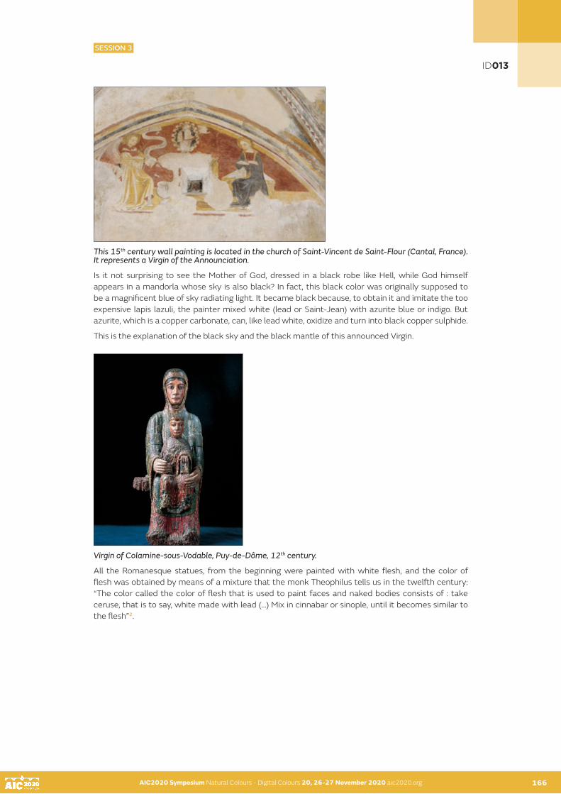
AIC2020 Symposium Natural Colours - Digital Colours 20, 26-27 November 2020 aic2020.org 166
This 15th century wall painting is located in the church of Saint-Vincent de Saint-Flour (Cantal, France). It represents a Virgin of the Announciation.
Is it not surprising to see the Mother of God, dressed in a black robe like Hell, while God himself appears in a mandorla whose sky is also black? In fact, this black color was originally supposed to be a magnificent blue of sky radiating light. It became black because, to obtain it and imitate the too expensive lapis lazuli, the painter mixed white (lead or Saint-Jean) with azurite blue or indigo. But azurite, which is a copper carbonate, can, like lead white, oxidize and turn into black copper sulphide.
This is the explanation of the black sky and the black mantle of this announced Virgin.
Virgin of Colamine-sous-Vodable, Puy-de-Dôme, 12th century.
All the Romanesque statues, from the beginning were painted with white flesh, and the color of flesh was obtained by means of a mixture that the monk Theophilus tells us in the twelfth century: “The color called the color of flesh that is used to paint faces and naked bodies consists of : take ceruse, that is to say, white made with lead (…) Mix in cinnabar or sinople, until it becomes similar to the flesh”2.
AIC2020 Symposium Natural Colours - Digital Colours 20, 26-27 November 2020 aic2020.org 165
ID013
SESSION 3

AIC2020 Symposium Natural Colours - Digital Colours 20, 26-27 November 2020 aic2020.org AIC2020 Symposium Natural Colours - Digital Colours 20, 26-27 November 2020 aic2020.org 167
Virgin of Marsat, Puy-de-Dôme, France, 12th century, remoulded and gilded at the romantic period in the 19th century.
In the Middle Ages, the two whites most used by painters were white of Saint-Jean and lead white. The white of Saint-Jean was a white of carbonate lime or chalk, known today as white of Meudon, Paris, Troyes or Spain. It was and is still widespread and very cheap. Matte in appearance, it had the great advantage of being unalterable; but it was very little covering and required the passage of several successive layers. They used also kaolin, white clay, equally little covering.
Lead white, which is a lead carbonate, is also called ceruse or silver white when pure. Very covering, it has a shiny and radiant aspect of light, clearly whiter than the white of Saint Jean. But it has the serious defect of blackening with time, especially in sulphide atmosphere3.
This wall painting was painted on the vault of the church of Léotoing in the Haute-Loire. France). It represents God the Father blessing. The blackening of the lead white gives it the appearance of a photographic negative.
Painters, since Antiquity knew how to remedy the serious defect of the white lead by protecting it with a varnish4. It was usually composed of oil and resin diluted with turpentine. This varnish was mainly used by easel painters and sculptors whose wearable works could be exposed to the sun to dry it. Because this varnish, being too fluid and took a very long time to cure; from one to several months, at least ! The risk of leakage of this oil varnish prohibited the use in wall paintings. Especially in the vault! Moreover, it was likely to cause harmful glosses to a good reading of the painted images. That is why the sacred figures of the wall paintings, supposed to be radiant with glory are now black as the devil.
The painters knew the brilliance of the extremely ephemeral lead white. They knew that this white would blacken more or less long term in wall paintings where its use was prohibited. But when the blackening had become intolerable, it was easily remedied by a new coat of paint and varnish ; at least on the statues and paintings, because they were easy to carry and expose to the sun. As for the wall paintings, there was no longer any question of putting up the scaffolding that had enabled them to be executed.
ID013
SESSION 3

AIC2020 Symposium Natural Colours - Digital Colours 20, 26-27 November 2020 aic2020.org AIC2020 Symposium Natural Colours - Digital Colours 20, 26-27 November 2020 aic2020.org 168
What I would like to draw attention to is a practice of medieval painters that I had the opportunity to discover in restoration of many paintings of that time.
Lead white was made from metallic lead sprayed with acid, that is, vinegar or fresh urine, and regular salt. The whole was covered with horse dung, whose heat released by fermentation accelerated the oxidation process. Yet easy to make, lead white was precious because the painters, who knew the recipe, jealously kept the secret. Secret that made their reputation.
That’s why they reserved it for the subjects to be highlighted. Cennino Cennini, in the fifteenth century, confirms this: «Whenever you have to make a body of a Christian or of a reasonable creature» ( … ) «Use good colors, especially in the figure of Our Lady»5.
This wall paintings are in the crypt of the church of Montmorillon-sur-Gartempe (Vienne France). It dates from the 15th century. In this crypt, the Virgin and Child are represented in majesty. But this was not the main subject of this chapel dedicated to Saint Catherine. This is why the flesh was painted in the white of Saint Jean, unalterable. On the other hand, the face of Catherine, to highlight, had been painted with the lead white which strongly blackened. But the hands, secondary parts, had been painted white of Saint Jean.
Here are more examples of what I am talking about. This building lintel dating from the twelfth century is located in Mozac (Puy-de-Dôme in France), in the courtyard of the former cloister. The faces of the Virgin and Child had been painted in lead white. Exposed to the weather, this white has blackened accrediting the origin of the Black Virgins6. But in the eyes of his contemporaries, recent or old, white or black, an image of the Virgin always represented Mary, the immaculate Mother of God.
The same phenomenon is visible at Moissac abbey (Tarn, France). The Christ (12th century) who is present on the fronton of the porch, shows the same blackened face.
ID013
SESSION 3

AIC2020 Symposium Natural Colours - Digital Colours 20, 26-27 November 2020 aic2020.org AIC2020 Symposium Natural Colours - Digital Colours 20, 26-27 November 2020 aic2020.org 169
The wall painting that we see now, represents a tomb of Christ and is located under the porch of the church of Moissat-Bas, in the Puy-de-Dôme (France) and dates from the very beginning of the sixteenth century. Here, the body of Christ was first painted with lead white, then covered with a flesh-colored velature. The lead white, by transparency, magnified the body of Christ.
In the absence of varnish, the lead white turned completely black.
Glaze is a thin layer of rare, expensive and transparent color painted above a first common and inexpensive layer. Velature or velide, is a veil of opaque color painted of translucent manner.
This wall painting is in Girona, Spain7. Only the faces of these holy figures have been painted in white lead. The rest of the flesh was painted with white of Saint Jean. A hand is blackened because it remained a little of the precious white lead, not to be wasted, on the painter’s palette.
ID013
SESSION 3

AIC2020 Symposium Natural Colours - Digital Colours 20, 26-27 November 2020 aic2020.org AIC2020 Symposium Natural Colours - Digital Colours 20, 26-27 November 2020 aic2020.org 170
This 13th century wall painting is located in Puy-en-Velay (Haute-Loire, France) on the western porch of the cathedral., the faces of the Virgin and the Child, painted in lead white, had become unbearable black. Any attempt at cleansing to eliminate this irreversible black having failed, a drastic abrading has overcome the features of the features of faces.8
Today, the black color of lead sulphide can be transformed into lead sulphate, which is white, using hydrogen peroxide. But until the end of the 19th century, the blackening of the lead white was considered irreversible9.
Reversibility formula for oxidized lead white and its derivatives: 8 parts of 30-volume hydrogen peroxide 40 parts distilled water 8 parts acetic acid
All applied in Japanese paper compresses. Duration, about 15 minutes. Then pass an ammonium carbonate solution to neutralize the acid. Be carefull First, protect the water-based colors with Paraloïd B 72 diluted in acetone and passed in two layers.
(Based on a letter from Géraldine Albers, received in 1992).
This miniature is the oldest representation of a Black Virgin. It is taken from the «Book of Hours «of Marguerite d’Autriche and represents «Nostre Dame du Pui en Auvergne». It dates from the extreme end of the 15th century and is in the library of Vienna, Austria.
It will be noticed that the faces, noble parts, had been painted with white lead which blackened. While the hands and feet of the Child, which had been painted with white of Saint Jean, remained white. The explanation, often given, of this particularity of the white hands with a black face is the fact that the Virgin was clothed with a ceremonial mantel that would have protected the hands from a deleterious atmosphere6. It was also said that the Virgin wore gloves. And yet the face could have painted black. The explanation of the use of two types of white seems more likely.
ID013
SESSION 3

AIC2020 Symposium Natural Colours - Digital Colours 20, 26-27 November 2020 aic2020.org AIC2020 Symposium Natural Colours - Digital Colours 20, 26-27 November 2020 aic2020.org170 171
I show you a detail of the Virgin of Colamine-sous-Vodable (Puy-de-Dôme, France). This document was taken during restoration. Between the original polychromy of the twelfth century and the coarse overpaint, later still remain the remains of an intermediate pictorial layer. Of black colour, this layer is visible on the half-free forehead of the Virgin and on a large part of the face of the Child.
The Virgin of Colamine was, at one point, repainted in black to be put in fashion of the sixteenth century. Fashion due to the visceral and persistent faith of the lower people of believers and despite the understandable reluctance of the religious hierarchy; when, finally, it ends up officially recognizing a sacred character to the Black Virgins.
This representation of the Trinity, dated from the 13th century, is in the choir of the church of Aigueperse (Puy de Dôme. France). This shows us that the oxidation of lead white was not the only phenomenon capable of modifying colors.
The haloes were, here, for lack of means doubtless, gilded with gold at low cost. The oxidation of the copper contained in this” half-gold” or «or de moitié», as they said in the Middle Ages, has blackened. Others symbolic subjects were painted with color mixed with lead white.
Sometimes, medieval craftsmen used silver or pewter sheets which they covered with a yellow varnish to imitate fine gold10.
These different types of black, to the naked eye, merge. And only a pigment analysis could identify them.
ID013
SESSION 3

AIC2020 Symposium Natural Colours - Digital Colours 20, 26-27 November 2020 aic2020.org AIC2020 Symposium Natural Colours - Digital Colours 20, 26-27 November 2020 aic2020.org171 172
CONCLUSION
If the colors of the Middle Ages regained their original freshness, one would have an entirely different idea of the vision that medieval parishioners could have by entering the house of God, that antechamber of Paradise which, according to the apocalyptic vision of Saint John, They were probably «adorned with pure gold and precious stones, pearls and crystal jasper.»
NOTES
1 « The colors are like gold that doesn’t want any other alloy ». Cennini P. 136 2 Theophile, “ Diversarum Artium Schedula”. See p.41 in “Vierges romanes, portraits croisés”. And Cennino Cennini P.131.3 Or in”lead dioxide and not sulphide, as previous thought”. Phillipot et Mora. 4 Cennino Cennini P.137 . 138.5 C . Cennini. P. 97 and 133 6 This is the thesis I defended in a book to be published by Editions Debaisieux. Provisional title: “ Vierges Noires. The riddle of
the black color finally solved”.7 Girona (Spain). Cathedral Archives. 10th century manuscript: Béatus. Folio 167v. Detail : Two holy figures look to heaven.8 According to the 1888 survey (De Léon Giron. Musée Crozatier. Le Puy), the faces are intact. According to that of 1944, more
reliable, executed by Paul-Albert Moras. (Museum of French Monuments ) they disappeared. But, on this last document, these faces seem to have been overpainted to mitigate the difference of «whiteness» with the flesh of their hands and that of the secondary characters. The last restorer, in 2004-2005, eliminated this pictorial layer “white”. The current state shows that the face of the main characters (Virgin and Child ) retains a grey, testifying to the blackening of the lead white. Even God, situated on a background of blue sky, was painted only to the white of Saint Jean.
9 Penderleith H.S. « La conservation des antiquités et des œuvres d’art. Eyrolles. 1966..P.95. And Mora et Philippot : « La conservation des peintures murales ». Bologne . 1977. P. 82.
10 Medieval painters had a predilection for surfaces with elevated sign of refraction: white lead, gold, silver ,pewter, brass, bronze, glass, etc.
The modern technique of oil painting dates back to the end of the 15th century, with the Van Eyck brothers who made it known. Until then the oil, too fluid, was used by rubbing the tempera paints in the manner of the icon painters, by making it penetrate with the dish of the hand. This gave the whole a depth of tones very appreciable. But this oil darkened with time, especially in the absence of light.It is the discovery of the production of a very thick oil that allowed the painters, from then on, to intimately mix the pigments. Then, these were protected from harmful atmospheres.The kohl of the ancient Egyptians was obtained by mixing lead white with sulfur. Lead sulfite ( or lead dioxide ( see note 2) rapidly obtained was of intense black.( see Sciences et Avenir #858. August 2018. P.63)The kohl of the Arab world consist of various kinds of black including charcoal and galena. Galena is a natural lead sulphide, mixed with grease.
REFRENCES
Cennini Cennino, « Traité de la peinture ». XVe siècle. Fac-similé Maxtor 2011
Leroy Hélène , Debaisieux Francis and Morvan Yves collaboration : « Vierges romanes, portraits
Croisés » Editions Debaisieux. 2009
Mora et Philippot : « La conservation des peintures murales ». Bologne. 1977
Penderleith H. S. « La conservation des antiquités et des œuvres d’art ». Eyrolles 1966
Varichon Anne, « Couleurs ». Seuil 2000.
AKNOWLEDGEMENTS
To anyone that as assisted with my researches. Specialy to Patrick Callet, CFC’s Président, Debaisieux éditions for beautifull images of this presentation and Jöel Randria who made this video.
ID013
SESSION 3

AIC2020 Symposium Natural Colours - Digital Colours 20, 26-27 November 2020 aic2020.org
Colour design and dementia: Evidence-based strategies to enhance environmental visual literacy
Zena O’Connor PhDDesign Research Associates, Sydney, [email protected]
ABSTRACT
An ineffective interface between the built environment and people living with dementia can be highly problematic. Recently, inappropriate environmental design was identified as one of the two most common triggers for severe, aggressive behaviours in people living with dementia, the other being unidentified pain issues (Judd, 2016). In light of this, effective interior design is an imperative for people living with dementia and evidence-based colour design strategies can support a number of key design aims relevant to this cohort: a) improve environmental visual literacy by maximising opportunities to ‘read’ and understand the built environment in a meaningful way; b) address the changes in visual perception often experienced by people living with dementia; c) encourage and improve engagement, and contribute to a sense of wellbeing among people living with dementia; and d) support strategies that address inclusivity and a user-centred approach to environmental design. This discussion focuses on evidence-based colour strategies that support environmental visual literacy and address changes in visual perception experienced by people living with dementia. These evidence-based colour strategies can elevate interior colour design beyond aesthetics to a meaningful and effective means of improving the experience, dignity, and quality of life for people living with dementia. Future in-situ research will explore the extent to which these aims are achieved for people living with dementia.
KEYWORDS
colour design I dementia design I environmental visual literacy I interior design
INTRODUCTION
Colour design in the built environment has the capacity to achieve a number of aims beyond aesthetics. In reference to the design of interior spaces for people living with dementia, colour design has the capacity to: a) improve environmental visual literacy with the aim of ensuring that the environment can be ‘read’ and understood in a meaningful way; b) address the changes and challenges experienced by older people and people living with dementia; c) encourage and improve engagement, and contribute to a sense of wellbeing; and, d) support initiatives that address inclusivity and a user-centred approach to environmental design.
This discussion focuses on evidence-based colour strategies that improve environmental visual literacy for people living with dementia. In doing so, these colour strategies also address the various changes and challenges in visual perception experienced by this cohort. In reference to evidence-based colour strategies that encourage and improve engagement, contribute to wellbeing, and support initiatives that address inclusivity and a user-centred-approach, these are reported in greater depth elsewhere (for example, see Chaudhury & Cooke, 2014; Day & Calkins, 2002; Swaffer, 2016).
173
ID019
SESSION 3
AIC2020 Symposium Natural Colours - Digital Colours 20, 26-27 November 2020 aic2020.org 174
ENVIRONMENTAL VISUAL LITERACY
Visual literacy is the ability to read and understand visual imagery. Environmental visual literacy extends the scope of visual literacy to a broader environmental context and refers to the ability to ‘read’ and make sense of visual cues embedded in design and the built environment in a meaningful, functional, and effective way. That is, ‘read’ and understand the placement of orientation and wayfinding markers, landmarks, pathways, boundaries, nodes, precincts, ingress/egress locations.
Environmental visual literacy depends on functional visual perception, effective cognitive processing and the capacity to perceive and interpret visual cues. Effective environmental visual literacy occurs when we can easily read and understand visual cues embedded in design and the built environment, thereby supporting or improving engagement, orientation, wayfinding, and the safe operation of daily activities (O’Connor, 2016, 2018).
Environmental visual literacy is negatively impacted by cognitive overload and this is of particular importance to people living with dementia. This cohort requires an optimal level of environmental stimuli that simultaneously supports them while minimizing visual distractions and unhelpful or unsafe levels of visual stimulation. For example, interior design that is characterized by excessive contrasts, patterning and design details translates into visual complexity, thereby adding to visual noise and unsafe levels of visual distraction, negatively impacting environmental visual literacy.
COLOUR, DESIGN AND ENVIRONMENTAL VISUAL LITERACY
Colour design is one of many design factors that have the capacity to influence the effectiveness of interface between the built environment and people living with dementia, and dovetail with strategies to enhance environmental visual literacy.
In this context, colour design includes all colour variations (in terms of hue, tonal value and saturation) inherent in construction materials, fixtures, finishes, furnishings, textures, painted surfaces and lighting. It is acknowledged that finishes and materials in these environments are often subject to regulations. However, these regulations do not necessarily need to hinder effective colour design except where the variety and range of finishes and material products is limited in supply.
Variations in design factors can support or hinder human evaluation of, and response to, the built environment. Lewin (1967) conceptualized the environment-behaviour interface as follows:
B = ƒ (P, E)
wherein behaviour (B) is considered a function (ƒ) of the interactions between personal factors (P) and the environment (E).
An extensive body of environment-behaviour research has emerged since the 1960s which focuses on environmental design factors and the related impact on human experience in terms of affective, cognitive and behavioural response (Rapoport, 2008). In respect to older people in general, an effective interface between the built environment and human response relies on the level of physical competency of an individual and environmental press – that is, the demands of a given environment or situation relative to an individual’s physical capacity (Lawton & Nahemow, 1973). A mismatch or shortfall on either side of this interface has an impact on users of that environment, especially those with declining visual or cognitive capacity.
Findings from EBS research have informed review of design factors as well as the development of Universal Design principles and user-centred design guidelines, including the ways in which colour and contrast enhance the environment-behaviour interface (Nasar, 1994; O’Connor, 2010).
An ineffective interface between the built environment and older people and people living with dementia can become highly problematic. Recently, inappropriate environmental design was identified as one of the two most common triggers for severe behaviours in people living with dementia, the other being unidentified pain issues (Judd, 2016).
In light of the above, effective environmental colour design is an imperative in respect to the design of
AIC2020 Symposium Natural Colours - Digital Colours 20, 26-27 November 2020 aic2020.org 173
ID019
SESSION 3

AIC2020 Symposium Natural Colours - Digital Colours 20, 26-27 November 2020 aic2020.org AIC2020 Symposium Natural Colours - Digital Colours 20, 26-27 November 2020 aic2020.org 175
spaces for people living with dementia. In addition, effective environmental colour design contributes to three of the ten design principles recommended for dementia-enabling environments (Fleming & Bowles, 1987; Fleming, Forbes & Bennett, 2003), in particular:
• Minimize unhelpful stimulation: Unnecessary visual and auditory stimulation may distress and confuse those with dementia. Reduce excessive signage, visual clutter and noise, and camouflage is recommended to obscure non-access doors.
• Optimize helpful stimulation: Environmental cues such as colour, visual landmarks, furniture and a view enable people with dementia to better find their way around and make environments more consistently meaningful.
• Create a familiar space: Interior design, furniture, furnishings, colours and fittings should be selected to provide a homelike and comfortable ambience.
Colour and especially colour/contrast play key roles in visual perception, and these in turn have the capacity to support or weaken environmental visual literacy. Theories of visual perception as well as Gestalt theories of perceptual organisation suggest that colour and especially variations in contrast play key roles in environmental perception and evaluation. Specifically, due to the mechanics of human vision, strong light-dark contrast as well as strong colour contrast (hue contrast plus saturation contrast relative to darker contextual colour) play critical roles in attracting attention, thereby enabling us to differentiate design details, depth and form. It is for these reasons, that colour/contrast and light-dark contrast have been noted as the major drivers for perceiving and evaluating contours and figure-ground distinctions as per Gestalt principles of perceptual organisation (see Hoffman, 1998; Koffka, 1935; Kolb, 2003; Livingstone, 2002; McPeek, Maljkovik & Nakayama, 1999; O’Connor, 2015; Shang & Bishop, 2000; Wertheimer, 1938).
In respect to the design of the built environment, Lynch noted that colour contrast was one of a number of visual design cues that help to identify spaces and boundaries, create unique zones, and support orientation and way-finding (Lynch, 1960). Similarly, across many areas of applied design, strong contrast is referred to as the Isolation Effect and used to draw attention to specific design details, boosting the effectiveness of intuitive design because it draws attention to key design elements quickly and overcomes language barriers (Van Dam, Peeck, Brinkerink, & Gorter, 1974).
An additional issue that impacts older people and people living with dementia in respect to environmental visual literacy are the various visual perception changes and challenges experienced by this cohort. Aside from specific issues such as macular degradation, glaucoma and cataracts, older people experience a decline in visual capacity due to reduced luminance contrast and colour contrast sensitivity. This is due to changes which occur in the human visual system from middle age onwards and are largely continuous (Fiorentini, Porciatti, Morrone & Burr, 1996; Newacheck, Haegerstrom-Portnoy & Adams, 1990; Werner, Peterzell & Scheetz, 1990).
In respect to people living with dementia, this cohort often experiences visual perception issues in addition to cognitive impairment. Agnes Houston, author and dementia campaigner, summarizes the visual issues experienced by people living with dementia as ‘your eyes see, but your brain doesn’t interpret the information immediately’ (Houston, 2016, p4). Some of these challenges include slower visual processing, misinterpreting visual information, sensory overload, and visual hallucinations.
ID019
SESSION 3

AIC2020 Symposium Natural Colours - Digital Colours 20, 26-27 November 2020 aic2020.org AIC2020 Symposium Natural Colours - Digital Colours 20, 26-27 November 2020 aic2020.org 176
EVIDENCE-BASED COLOUR STRATEGIES THAT SUPPORT ENVIRONMENTAL VISUAL LITERACY
Evidence-based colour strategies are one of a number of design factors that enhance environmental visual literacy and contribute to an improved interface between people living with dementia and the built environment (Chaudhury & Cooke, 2014; Pollock & Fuggle, 2013; Russell-Minda et al, 2007; Nini, 2006). Specific colour design strategies include:
1) Colour contrast that exhibits at least 30% but ideally up to 70% differential between the colour of design details/objects and contextual colour, as per Figure 1.
• Apply colour contrast to identify interior landmarks, precincts, zones, pathways, resident doors, unique interior locations to support orientation and wayfinding strategies.
• Apply colour contrast to design details to differentiate doors from walls; walls from flooring and hand rails; light switches and power-points from walls; toilet seats, taps and faucets.
2) Stronger, more saturated colours to compensate for declining visual capacity in respect to luminance and colour sensitivity, as per Figure2.
3) Where patterns or repetitive design details occur, minimise multiple colour variations to mitigate the potential for visual complexity and clutter, and visual noise which may lead to unsafe levels of visual distraction.
Figure 1: Optimal levels of colour contrast (Image: Z. O’Connor).
Figure 2: Optimal saturation levels (Image: Munsell colour chart).
In respect to colour strategies that encourage and improve engagement, contribute to wellbeing, and support initiatives that address inclusivity and a user-centred-approach, these are reported elsewhere (see above). However, research indicates that familiar, residential and homelike colour schemes are preferred (Chaudhury & Cooke, 2014; Lawton et al, 2000; Day & Calkins, 2002).
ID019
SESSION 3

AIC2020 Symposium Natural Colours - Digital Colours 20, 26-27 November 2020 aic2020.org AIC2020 Symposium Natural Colours - Digital Colours 20, 26-27 November 2020 aic2020.org 177
DISCUSSION
In conclusion, inappropriate environmental design is one of two key factors that may trigger severe, aggressive behaviours in people living with dementia, the other being unidentified pain issues (Judd, 2016). The onus therefore is on architects and designers of spaces for people living with dementia to ensure that design supports rather than inhibits their interface with the built environment.
Research indicates that specific colour strategies are more effective than others in respect to enhancing environmental visual literacy and providing users with an improved capacity to ‘read’ and understand the built environment. These colour strategies involve strong colour contrast, saturated colours and minimising the use of multiple colours in conjunction with excessive patterning and repetitive design details. These colour strategies also address the changes and challenges in visual perception often experienced by older people and people living with dementia.
REFERENCES
Chaudhury, H. & Cooke, H. (2014). Design matters in dementia care: The role of the physical environment in dementia care settings. In M. Downs and B. Bowers (Eds.), Excellence in dementia care (2nd Edition) (pp. 144-158). UK: Open University Press.Day, K. & Calkins, M.P. (2002). Design and dementia. In R. Bechtel & A. Churchman (Eds.). Handbook of Environmental Psychology. New York: John Wiley & Sons, 2–53.Elliott, A., Fairchild, M.D. & Franklin, A. (Eds.) Handbook of Color Psychology. Cambridge: Cambridge University Press.Fiorentini A, Porciatti M, Morrone MC, & Burr, DC (1996). Visual ageing: Unspecific decline of the responses to luminance and color. Vision Research, 36 (21), 3557-3566.Fleming R, Forbes I, Bennett K. (2003). Adapting the ward for people with dementia. Sydney: NSW Department of Health.Gilmore, G. C., & Levy, J. A. (1991). Spatial contrast sensitivity in Alzheimer’s disease: a comparison of two methods. Optometry and Vision Science, 68, 790–794.Grover C. Gilmore, Karen E. Groth & Cecil W. Thomas (2005) Stimulus Contrast and Word Reading Speed in Alzheimer’s Disease, Experimental Aging Research, 31 (1), 15-33.Gramegna, S. M. & Biamonti, A. (2017) Environment as non-pharmacological intervention in the care of Alzheimer’s disease. The Design Journal, 20 (1), S2284-S2292.Gowans, G., Dye, R., Alm, N., Vaughan, P., Astell, A. & Ellis, M. (2007). Designing the interface between dementia patients caregivers and computer-based intervention, The Design Journal, 20, (1), 12-23. Hartig, T., Mang, M., & Evans, G. W. (1991). Restorative effects of natural environment experiences. Environment and behavior, 23(1), 3-26.HCD (2018). White paper: Denmark – A dementia friendly society. Odense: Healthcare Denmark.Hoffman, D. D. (1998). Visual intelligence: How we create what we see. New York: WW Norton & Company.Houston, A. (2016). Dementia and sensory challenges. Glasgow: Life Changes Trust.Jackson GR, Owsley C, & McGwin G. (1999). Aging and dark adaptation. Vision Research 39 (23), 3975-3982.Judd, S. (2016). Mad, bad and dangerous to know. Opening address, International Dementia Care Conference, Sydney.Koffka K. 1935. Principles of Gestalt psychology. London: Routledge & Kegan Paul.Kolb H. 2003. How the retina works. American Scientist, 91(1), 28-35.Lawton, M. P., Weisman, G. D., Sloane, P., Norris-Baker, C., Calkins, M., & Zimmerman, S. I. (2000). Professional environmental assessment procedure for special care units for elders with dementing illness and its relationship to the therapeutic environment screening schedule. Alzheimer Disease and Associated Disorders , 14, 28–38.Lawton, M.P. & Nahemow, L. (1973). Ecology and the aging process. In Eisdorfer, C. and Lawton, M.P. (Eds.) The psychology of adult development and aging. Washington: American Psychological Association. Lewin, K. (1967). Field theory in social science: Selected theoretical papers. London: Social Science Paperbacks. Livingstone, M. (2002). Vision and art: The biology of seeing. New York: Abrams.Lynch, K. (1960). The image of the city. Cambridge: MIT Press.McPeek, R.M., Maljkovic, V., & Nakayama, K. (1999). Saccades require focal attention and are facilitated by a short-term memory system. Vision Research, 39(8), 1555-1566. O’Connor, Z. (2020). Colour design and dementia: Harnessing HCI to improve environmental visual literacy. Chapter 14. HCI and Design in the Context of Dementia. Rens G.A. Brankaert and Gail Kenning (editors). Heidelberg: Springer. O’Connor, Z. (2018). Environmental visual literacy: Examining the roles of color and contrast. Proceedings of the AIC2018, Interim meeting of the International Color Association, Margarida Gamito and Maria João Durão (Editors), AIC: Lisbon, pp151-157. O’Connor, Z. (2016). Color/contrast strategies to improve environmental visual literacy. Universal Design Symposium, ANZ Viaducts Event Centre, Auckland, New Zealand. O’Connor, Z. 2015. Colour, contrast and Gestalt theories of perception: The impact in visual communications design. Color Research and Application, 40 (1), 85-92. Pollock, A. & Fuggle, L. (2013). Designing for dementia: Creating a therapeutic environment. Nursing and Residential Care, 15 (6), 438-442. Rapoport, A. (2008). Environment-behavior studies: Past, present and future. Journal of Architectural and Planning Research, 25 (4), pp276-281. Shang, H, & Bishop, I.D. (2000). Visual thresholds for detection, recognition and visual impact in landscape settings. Journal of Environmental Psychology, 20(4), 125-140. Swaffer, K. (2016). What people with dementia want from residential care homes. Australian Journal of Dementia Care, June/July, 2016.Van Dam, G, Peeck, J, Brinkerink, M, & Gorter, U. (1974). The isolation effect in free recall and recognition. The American Journal of Psychology, 87(3), 497-504. Werner, J.S, Peterzell, D.H, & Scheetz, A.J. (1990). Light, vision, and ageing. Optometry and Vision Science, 67 (3), 214-229.
ID019
SESSION 3

AIC2020 Symposium Natural Colours - Digital Colours 20, 26-27 November 2020 aic2020.org
Rediscover the faded colours of an 18th century tapestry kept in the Cité Internationale de la tapisserie in Aubusson (France)
Aurélie Mouniera•, Hortense de la Codrea, Charlotte Marembertb, Pauline Claissea, Floréal Daniela
a IRAMAT-CRP2A (UMR 5060 CNRS - University of Bordeaux Montaigne, Pessacb Myrobolan, Teintures naturelles artisanales, Bruxelles•Corresponding author: [email protected]
ABSTRACT
Aubusson (France) is on the List of Intangible Cultural Heritage of Humanity by UNESCO since 2009 for its centuries-old tradition for the art of tapestry. The studied tapestry is a Verdure with the Brühl count’s coat of arms (18th C.), characterized by a very high quality dyeing and fine weaving. The restoration in progress allowed the removal of the lining of the back which protected the colours from light. Analyses done on each side of the tapestry showed the influence of natural degradation on colour and on hyperspectral data. These data are explained by experimental tests on wool model samples artificially aged. The fibres (silk & wool), dyes (weld, …) and mordants (tartar, alum) were identified. The experiments showed the influence of the recipe on the photodegradation rate and, for yellow dyes, the effect of the aging on the spectra’s shape and the disappearance of some compounds, such as chlorophyll ‘a’, as marker of the degradation.
KEYWORDS
“Grand teint” recipes of the 18th C I colour chart I fading I yellow dyes
INTRODUCTION
The tapestry studied is a «Verdure» (landscape representation), a specialty of Aubusson Royal Manufacture produced mainly for export at the 18th C (Bertrand, 2013). It was commissioned by the Count Brühl, Prime Minister of August III King of Poland. It was recently acquired by the Cité Internationale de la tapisserie in Aubusson. It has a very high and fine quality weaving and also a superior quality dyeing. It is of particular interest, as the lining of the back that protected it from light was removed in november 2018 pending restoration. The colours on the back less exposed to light are better preserved. This tapestry gives the rare opportunity to study the materials (fibres, dyes and mordants) in both faces, so at different degradation states, by non-invasive methods (Clementi et al. 2014; Melo & Claro, 2010).
A preliminary research of the techniques used in the 18th century lead to the construction of a reference database of dyes. The first step was to found old dying recipes through treaties and literatures practiced in the Aubusson Manufacture Royale. Information were found mainly in four treatises (Delormois, 1716; Hellot, 1750; Macquer, 1761; Berthollet, 1791) and according to them, the colours were divided into five main colours called “primitive”: red, yellow, blue, tawny and black. Based on this information and thanks to a collaboration with a dyer workshop in Brussels (Myrobolan), fifteen “grand teint” dyes were chosen to be fixed on wool and silk. More than 300 recipes varying the mordant and concentration were produced in order to understand the role of each component on the colour result.
178
ID023
SESSION 3

AIC2020 Symposium Natural Colours - Digital Colours 20, 26-27 November 2020 aic2020.org 179
In this paper, we have chosen to focus on yellow dyes. Five different plants were used to produce yellow tint in “Grand teint” tapestries: weld (Reseda luteola L.), broom (Genista tinctoria L.), old fustic (Chlorophora tinctoria L. Gaud.), sawwort (Serratula tinctoria L. Gaud.) and fenugreek (Trigonella foenum-graecum). The chromophores of these five organic dyes come from the same family, those of flavonoids, making the distinction between them difficult.
Although this identification by invasive separation methods such as HPLC has been established for several years (Degano et al. 2009; Tamburini & Dyer 2019), it remains challenging with non-invasive methods, as their reflectance or fluorimetry spectra are at first sight identical. The problem of degradation adds to this difficulty. Indeed, yellow dyes are known to be the most fragile to light, fading very quickly and resulting in a weak signal during analysis (Villela et al. 2019). However, our recent researches on yellow dyes show the band of chlorophyll a, present in certain yellows, which could act as an identification clue and a degradation marker.
To understand the fading of yellow dyes, some model samples have been artificially aged under light. The measure with fibre optic reflectance spectroscopy, hyperspectral imaging and fluorimetry were done on the experimental samples before and after aging and compared with those carried out in both faces of the tapestry.
EXPERIMENTS
Materials
Model samples dyed with the yellow dyes identified as those of the “Grand teint” were provided by a dyer workshop in Brussels (Myrobolan). As according to the treaties, the most commonly used recipe for weld in the 18th century (S17A, Table 1), it has therefore been used as a reference. The same recipe has been used for broom. The old fustic and fenugreek were made in the following proportions: 24 g of alum; 6 g of tartar for the mordant and 100 g of dyes (for 100g of wool).
Weld was chosen in order to study the influence of dyes (S20) and mordants (S21, S22) (Table 1).
Table 1: Recipes of model samples (for 100g of wool)
Methods
Hyperspectral Imaging (HSI)
Hyperspectral remote sensors collect image data simultaneously in hundreds of narrow, adjacent spectral bands giving a continuous spectrum for each image cell. This technique generates reflectance spectra which can be treated to obtain images (RGB, IRFC…). In this research, two CCD cameras, developed by SPECIM (Finland), were used.
The VNIR camera (HS-XX-V10E) has a 1600 x 840 pixels resolution (pixel size: 8 x 8 µm), a 2.8 nm spectral resolution and a wavelength range from 400 to 1000 nm.
The SWIR camera equipped with a cryogenically cooled MCT detector allows a 384 × 288 pixels resolution (pixel size: 24 x 24 µm), a 12 nm spectral resolution. The spectral range is 1000 - 2500 nm.
The objects were illuminated with two halogen lamps oriented at 45° from the sample. Spectral IDAQ software provided data acquisition, storage and calibration. The treatment of the data cube was performed with ENVI 5.2+IDL software. Spectra are the result of an average window of 10 x 10 pixels.
AIC2020 Symposium Natural Colours - Digital Colours 20, 26-27 November 2020 aic2020.org 178
ID023
SESSION 3

AIC2020 Symposium Natural Colours - Digital Colours 20, 26-27 November 2020 aic2020.org AIC2020 Symposium Natural Colours - Digital Colours 20, 26-27 November 2020 aic2020.org 180
Colorimetry
Colours coordinates (L*, a*, b*) of the CIEL*a*b* 1976 colour space, were measured in several points of the tapestry both on the recto & the verso to measure the loss of colour. A Minolta CM-2600d spectrophotometer was used (360-740 nm) with a spectral resolution of 10 nm and on a 3 mm diameter area. The standard illuminant was D65, using a CIE 1964 10° standard observer.
LED µ-spectrofluorimetry (LEDµSF)
The fluorescence emission spectra were acquired from 200 to 1000 nm with a low power LED at 375 nm (5 mW) filtered at 455 nm. The investigation area on the sample is about 2 mm for a working distance of 4 cm (Mounier et al., 2019). Typical analysis time is between 10 µs to 20 s.
Accelerated aging
The fading system for accelerated aging consists of a xenon arc lamp (OSRAM, model XBO 75 W/2) with a focused beam directed at 45° towards the sample. The power is adjusted to 75 W and the sample receives 60,000 lux. A Fibre Optic Reflectance Spectrophotometer (FORS), composed of a halogen lamp (HL2000, Ocean Optics, 20 W) combined with a 400 µm fibre optic and a Thorlabs spectrophotometer (CCS200/M- 200 to 1000 nm) is used for the acquisition of reflectance spectra with a resolution of less than 2 nm.
RESULTS & DISCUSSION
On the model samples
The reflectance spectra of the four yellow model samples studied (Figure 1) show a maximum absorption band around 450 nm. The fenugreek also shows a weak band at 550 nm and the weld and broom one at 670 nm. The latter band at 670 nm, attributed to chlorophyll “a”, will be studied in this paper (Favaro et al. 2007; Daveri et al. 2016).
For the rest of this paper, four wool samples dyed with different weld recipes (Table 1) are studied in order to get spectral characteristics before and after artificial degradation for the identification of the dye and to understand the influence of the recipe components on the colour.
Figure 1 : Reflectance spectra of samples of weld (S17A), broom, old fustic and fenugreek in the visible range.
ID023
SESSION 3

AIC2020 Symposium Natural Colours - Digital Colours 20, 26-27 November 2020 aic2020.org AIC2020 Symposium Natural Colours - Digital Colours 20, 26-27 November 2020 aic2020.org 181
Influence of the mordant & of the dye concentration on the colour and on hyperspectral data
The quantity of mordant plays a significant role on the colour obtained. The sample of the most common recipe for this period (S17A), and the sample with a very low dye concentration (S20), has L*a*b* coordinates (Figure 2) following the logic of a lower dye addition. Indeed, the higher L* of sample S20 does reveal a whiter colour, and the b* a less intense yellow. Sample S21, on the other hand, appears brighter and more yellow than S17A, which is unexpected as the proportion of alum has been reduced. This difference is due to the fact that the a* is lower, so the colour contains less red and therefore appears more yellow. Finally, sample S22, containing 0% alum, appears brown, which is correlated by its much lower b* than the others.
Reflectance spectra of these samples were compared in order to observe the influence of the mordant and dye concentration. Although the four spectra (Figure 2) have a similar appearance, the differences in composition result in a visible shift in the significant absorption band of the weld. Indeed, a lower dye concentration in the recipes shifts the absorption band towards the short wavelengths. While sample S17A shows a maximum absorption at 456 nm, sample S20 shows a shift by 20 nm (436 nm) and a higher intensity. To observe the influence of the mordant, samples S20, S21 and S22 are compared. The decrease in the percentage of alum also shifts the absorption maximum towards the short wavelengths (428 nm for sample S21 and 413 nm for sample S22), and shows a significant drop in intensity from 500 nm upwards compared to sample S20.
Finally, the band presents in all samples at 670 nm is attributed to the chlorophyll ‘a’, resulting from the presence of green leaf in the weld preparation (Favaro et al. 2007; Daveri et al. 2016). It is therefore logical to observe that the intensity of the band decreases as the proportion of dye and alum decreases. This observation results in the shift of the maximum absorption band observed around 450 nm.
Figure 2: Reflectance spectra of model samples S17A; S20; S21 and S22 before aging and S17A after 10,5 hours of aging. In the red squares of the model samples: the aging zones. Values of chromatic coordinates of samples of weld on wool before and after aging.
Influence of the artificial aging on the spectra
After undergoing artificial photo-degradation for 10.5 hours (red squares in the photographs in Figure 1), several observations were made. The chromaticity coordinates after degradation indicate for all samples a strong increase in the a* coordinate, i.e. a reddening of the sample. Reflectance spectra before and after degradation are compared, that of sample S17A is shown in Figure 1 (dotted line). The degradation of the sample induces a decrease in intensity from 470 nm, and a shift of the inflection point to 525 nm. This trend is found on all degraded samples.
ID023
SESSION 3

AIC2020 Symposium Natural Colours - Digital Colours 20, 26-27 November 2020 aic2020.org AIC2020 Symposium Natural Colours - Digital Colours 20, 26-27 November 2020 aic2020.org 182
In regards to the influence of the dye concentration on the photosensitivity of the samples, when the colorant is more concentrated (recipe S17A), the degradation is faster in the first minutes. This can be explained by the fact that the maximum number of complexes formed between the colouring molecules and the mordants has been reached and that a surplus of colouring molecules is still in the fibre. As the dye is in excess, the mordant could not fix it to the fibre will therefore be very fleeting to light upon exposure to light. Light oxidizes the excess dye molecules first before degrading the dye / mordant complexes formed which are more resistant to light (Villela et al., 2019).
The mordant plays an important role in the colour and in the resistance of the dye over time. Sample S21 (15 % alum / 15 % tartar) is more sensitive to light than S22 (0 % alum / 15 % tartar). The presence of alum weakens the lightfastness of the fair dye on wool. The aluminum ion increases the photo-degradation of weld and more particularly of luteolein (Villela et al., 2019). Furthermore, the measurement of the colorimetric coordinates clearly shows that the increase in the aluminum concentration strengthens the saturation of the yellow colour obtained (Villela et al., 2019). The dyers of the 18C. therefore made a compromise between the colour’s hold over time and the desired shade since alum was the most used mordant.
After light degradation, the intensity of the emission fluorescence spectra decreases in all samples indicating a degradation (Figure 3). The shifts of the λmax are not representative for S17A, S20; however, for S21 & S22 the shifts are more important of about 6 or 7 nm. This phenomenon can be explained by the disappearance of the band attributed to the chlorophyll ‘a’ and might be studied.
Another notable consequence of the degradation is to be observed. Indeed, the sensibility of the µfluorimetry makes it possible to see the degradation of the dye with the disappearance of the emission band at 670 nm attributed to the chlorophyll ‘a’ whatever the recipe employed (Figure 3). Concerning the model sample S22, a shoulder appears at about 730 nm, also corresponding to chlorophyll ‘a’. The two bands of chlorophyll ‘a’ show a higher intensity because of the absence of alum in this recipe, less dye being therefore fixed on the wool. As fluorimetry is known to be more sensitive when the chromophore concentration is weaker, intensity of chlorophyll ‘a’ is higher than in the other recipes (Mounier et al., 2019). This band disappears quickly, after only 10 minutes of exposure, which makes it a fragile & light sensitive dye.
Figure 3: Fluorescence emission of the 4 weld recipes before & after aging obtained with the LED at 375 nm. The intensity decreases after aging and the characteristic band of the chlorophyll ‘a’ disappears.
In the reflectance spectra, the absorption band attributable to chlorophyll at 670 nm is more or less visible on model sample before the tests. After degradation, on model samples, it is no longer present after degradation. The presence of this chlorophyll band in artefacts could then act as a degradation marker and help to the identification among all the “Grand teint” yellow dyes.
ID023
SESSION 3

AIC2020 Symposium Natural Colours - Digital Colours 20, 26-27 November 2020 aic2020.org AIC2020 Symposium Natural Colours - Digital Colours 20, 26-27 November 2020 aic2020.org 183
On the tapestry: Application on yellow dyes in two different natural degradation state
In situ colorimetric, hyperspectral imaging and spectrofluorimetric analyses on the Count of Brühl Tapestry were carried out. The colorimetric data obtained on the yellows of the tapestry (Figure 4 a) show a ∆E* of 9 and 14 between front and back. The colour difference being perceptible at a ∆E*=5 (Ezrati, 2013). The yellows in the recto side are in a visible state of degradation. The Figure 4 b) and c) illustrates the remarkable difference in colour between the front and the back of the tapestry. The original greens appear blue. The blues and yellows faded. Indeed, the colours of the back appear much more vivid while those of the front are dull, a phenomenon which is more noticeable on the yellows.
Hyperspectral imaging in the SWIR allowed us to identify the textiles used in the tapestry as wool and silk. Figure 3 d) shows their distribution, the RGB channels having been fixed on the significant bands of the silk: 6510 cm-1, 6349 cm-1 and 4535 cm-1 (Workman & Weyer 2012; Delaney et al., 2016). This cartography reveals that all light colours (beiges, ivories and yellows) are fixed on silk, as opposed to darker tones such as blues, reds or greens fixed on wool. This information is very important to an art historian point of view because the silk was used to give some light & brilliant colours and luminous glow in the darker colours.
Figure 4. Details of the tapestry at the arms of Count de Brühl. a) Front zone 1 b) Front zone 2 c) Back zone 2 d) Hyperspectral imaging in the SWIR range (R= 1536 nm; G=1575 nm; B=2205 nm). ∆E* graphic of the front/back of two yellow areas (red squares on a)).
The reflectance spectra of the yellows allowed us to observe the degradation comparing the data with those obtained on model samples. Although the latter are obtained on wool and the yellows of the tapestry are on silk, both fibres being protein textiles, the behaviour could be similar. Figure 5 shows the two-sided spectra of two yellows in different areas of the tapestry. Firstly, in accordance with what was observed in the laboratory, a shift of about 10 nm was avoided in the maximum absorption between the recto and verso spectra. In addition, the yellow of the centre of the flower (yellow curve) still shows the chlorophyll band on the back but not on the front. This disappearance of the chlorophyll band seems to indicate an advanced state of degradation of this yellow. On the contrary, the yellow of the leaves (green curve) shows the chlorophyll band on the back but also on the front, although the band is less intense there. Only one yellow zone was analysed by fluorimetry and no band of the chlorophyll was founded. Some possibilities appear and could be due to two things: a difference in exposure and therefore a less advanced state of degradation or a difference in colouring or recipes between the yellow of zone 1 and that of zone 2. The two areas of analysis being quite close on the tapestry, the hypothesis of the difference in dyeing seems more probable than that of the difference in exposure.
ID023
SESSION 3

AIC2020 Symposium Natural Colours - Digital Colours 20, 26-27 November 2020 aic2020.org AIC2020 Symposium Natural Colours - Digital Colours 20, 26-27 November 2020 aic2020.org183 184
Figure 5: Reflectance spectra of two yellows front and back.
Although the reflectance spectra of the yellows on the reverse side show the chlorophyll ‘a’ band well, it is difficult to imagine that these areas have not been degraded at all. The reflectance spectra obtained on the reverse side of the tapestry have the same characteristics as the spectra of the weld and broom, they nevertheless show shifts in the maximum absorption band making identification difficult.
CONCLUSIONS
The decrease in dye and mordant has the effect of shifting the absorption bands to the short wavelengths. The opportunity to study the recto/verso of the Tapestry has made it possible to observe evidence of a more or less advanced degradation according to the zones indicating a variation in the recipes used. The chlorophyll ‘a’ band, present only in certain yellows, is a good clue to distinguish them and a degradation marker. On our model samples, the chlorophyll band allows us to eliminate two yellows (old fustic and fenugreek), the mathematical treatments then allowing us to distinguish between the weld and broom and thus to refine the identification. The yellows of the tapestry being degraded. The significant bands present on the new samples have disappeared or have shifted. For the moment, it is therefore difficult to integrate the statistical treatments on the tapestry data with those of the colour chart. New spectral and statistical processing are therefore necessary to refine the results. Further study of photo-deterioration on silk and on the other yellows of the colour chart to observe whether the influence of the degradation is the same.
ID023
SESSION 3

AIC2020 Symposium Natural Colours - Digital Colours 20, 26-27 November 2020 aic2020.org AIC2020 Symposium Natural Colours - Digital Colours 20, 26-27 November 2020 aic2020.org184 185
ACKNOWLEDGEMENTS
Thanks to Emmanuel Gérard, director, and Bruno Ythier, curator, of the Cité Internationale de la Tapisserie in Aubusson, to authorize access to the collection. This project has received support from the French State managed by the National Research Agency under the program Future Investments bearing the reference ANR-10-LabX-52.
REFERENCES
Berthollet, Claude-Louis. 1791. Éléments de l’art de la teinture. Firmin Didot. Paris.Bertrand, Pascal. 2013. Aubusson, tapisseries des lumières : splendeurs de la manufacture royale, fournisseur de l’Europe au XVIIIe siècle. Corpus albuciense 2. Heule: Snoeck.Clementi, Catia, Gloria Basconi, Roberto Pellegrino, et Aldo Romani. 2014. « Carthamus Tinctorius L.: A Photophysical Study of the Main Coloured Species for Artwork Diagnostic Purposes ». Dyes and Pigments 103 (avril): 127-37. https://doi.org/10.1016/j.dyepig.2013.12.002.Daveri, A., M. Vagnini, F. Nucera, M. Azzarelli, A. Romani, et C. Clementi. 2016. « Visible-Induced Luminescence Imaging: A User-Friendly Method Based on a System of Interchangeable and Tunable LED Light Sources ». Microchemical Journal 125 (mars): 130-41. https://doi.org/10.1016/j.microc.2015.11.019.Degano, I., E. Ribechini, F. Modugno, et M. P. Colombini. 2009. « Analytical Methods for the Characterization of Organic Dyes in Artworks and in Historical Textiles ». Applied Spectroscopy Reviews 44 (5): 363-410. https://doi.org/10.1080/05704920902937876.Delaney, John K., Paola Ricciardi, et Lisha Glinsman. 2016. « Use of Near Infrared Reflectance Imaging Spectroscopy to Map Wool and Silk Fibres in Historic Tapestries ». Analytical Methods 8: 7886-90. https://doi.org/10.1039/C6AY02066F.Delormois, M. 1716. Le teinturier parfait. Claude Jombert. Paris.Ezrati J.-J., 2013, Les effets de la composition spectrale des sources électriques sur la conservation des objets du patrimoine, La lettre de l’OCIM, Musées, Patrimoine et Culture scientifiques et techniques, 146, mars avril 2013: 5-11.Hellot, Jean. 1750. L’art de la teinture des laines et des étoffes de laine en grand et petit teint , avec une instruction sur les déboüillis. Vve Pissot. Paris.Favaro, G., C. Clementi, A. Romani, et V. Vickackaite. 2007. « Acidichromism and Ionochromism of Luteolin and Apigenin, the Main Components of the Naturally Occurring Yellow Weld: A Spectrophotometric and Fluorimetric Study ». Journal of Fluorescence 17 (6): 707-14. https://doi.org/10.1007/s10895-007-0222-0.Macquer, Pierre-Joseph. 1761. Art de la teinture en soie. Desaint. Paris.Melo, Maria J., et Ana Claro. 2010. « Bright Light: Microspectrofluorimetry for the Characterization of Lake Pigments and Dyes in Works of Art ». Accounts of Chemical Research 43 (6): 857-66. https://doi.org/10.1021/ar9001894.Mounier, A., Daniel, F., & Lazare, S. (2019). LEDµSF : un nouveau système pour l’étude de la fluorescence UV des matériaux. Le cas des peintures anciennes à l’épreuve d’un spectrofluorimètre portable. In Instrumentation portable: quels enjeux pour l’archéométrie ? sous la dir. De Benech, Christophe ; Cantin, Nadia ; Languille, Marie-Angélique ; Mazuy, Arnaud ; Robinet, Laurianne ; Zazzo, Antoine (Editions des Archives Contemporaines, pp. p99-121). Doi: 10.17184/eac.9782813003294Tamburini, Diego, et Joanne Dyer. 2019. « Fibre Optic Reflectance Spectroscopy and Multispectral Imaging for the Non-Invasive Investigation of Asian Colourants in Chinese Textiles from Dunhuang (7th-10th Century AD) ». Dyes and Pigments 162 (mars): 494-511. https://doi.org/10.1016/j.dyepig.2018.10.054.Villela, Alexandre, Monique S.A. van Vuuren, Hendra M. Willemen, Goverdina C.H. Derksen, et Teris A. van Beek. 2019. « Photo-Stability of a Flavonoid Dye in Presence of Aluminium Ions ». Dyes and Pigments 162 (mars): 222-31. https://doi.org/10.1016/j.dyepig.2018.10.021.Workman, Jerry Jr., et Lois Weyer. 2012. Practical Guide and Spectral Atlas for Interpretive Near-Infrared Spectroscopy. CRC Press. London.
ID023
SESSION 3

AIC2020 Symposium Natural Colours - Digital Colours 20, 26-27 November 2020 aic2020.org
Colour Planning in Cilento: project and methodology
Claudia Lombardiab, Klarissa Picaa• a Kumea srl, Napoli, Italiab Universidad Politécnica de Madrid, ETSEM, Madrid, Españac Università IUAV di Venezia, Venezia, Italia•Corresponding author: [email protected] author: Claudia Lombardi & Klarissa Pica
ABSTRACT
This work talks about the experience of a colour planning, done by company Kumea srl, in the city of San Mauro Cilento. The purpose is to focus attention on the role assumed by Colour Planning as a tool aimed at protecting the identity and culture of places with particular attention to redevelopment and environmental enhancement. The municipality has decided to use this plan to regulate the interventions on the façades using local technologies and materials and adopting a color palette compatible with the colors of the historical settlements of the city.
The originalities of this plan are the methodology applied for definition of the colour palettes and the design of every single façade. The choice of colors is free within the color ranges but, at the same time, the color matching must respect a rigorous approach.
KEYWORDS
colour planning I Kumea I San Mauro Cilento I identity I palette
INTRODUCTION (KP)
The progressive interest taken by the historical environment of our cities has determined an increasing attention towards the elements characterizing the city, contributing to a deep transformation in terms of methodological, normative, and planning tools. For this reason, the knowledge of cities’ historical fabric (from the morphological, structural and typological point of view) is fundamental to plan the recovery of a place and its identity. Alongside the structural recovery of the buildings, it is necessary to support a chromatic project of the city, as a tool to enhance the architectural and typological characteristics of the buildings. The knowledge of the chromatic component plays a prominent role as a relevant element of the architectural project, Bisson & Boeri (2006), to be evaluated always in reference to the context in which it is inserted.
The first part of the article highlights the reflections on the development of urban awareness concerning the role and value of the color. In particular, it defines the role of this urban tool in triggering a process of redevelopment, recovery and environmental enhancement, Zennero & Garparini (2015). Urban color planning aims at giving back a new image of cities by defining not only the façades colors but, above all, rules for the existing building heritage conservation and protection. Throughout the analysis of the urban fabric, building typologies, architectural elements and colors used in the past, the color plan aims at defining new cities urban design, respecting their historical peculiarities and traditional elements, Amoroso (2007, 2009).
In a second part, the research reports the experience of the Piano Stralcio del Colore of the San Mauro Cilento, drawn up in accordance with the Campania Regional Law n. 26 of 18th October 2002 and the subsequent implementation of the regulation approved by Decreto del Presidente della G.R. Campania n. 376 of 11th June 2003. The city of San Mauro Cilento has witnessed a progressive alteration of the decorations of historic buildings. This has led to the loss of the peculiar signs of the place and of the original materials, determining a devaluation of the quality urban environment.
186
ID047
SESSION 3

AIC2020 Symposium Natural Colours - Digital Colours 20, 26-27 November 2020 aic2020.org 187
The plan, if on the one hand aims at researching the original colour ranges and original models of buildings, on the other hand at making a technological and compositional improvement of the façades. In this way, progress factors, environmental conditions and relations with contiguous and opposite façades are considered, formulating precise basic compositional criteria. The plan, which should not be understood as a single rule of colors derived from history, aims at recovering an overall vision of the historical building of the city, at safeguarding the characters and elements of recognizability. The plan, therefore, aims at the knowledge and transmission of traditional building techniques, the culture of materials, and the historical and environmental value of colors. In order to deepen the knowledge of the buildings and the colors used, interviews have been made with some local workers. The interviews, which are an important oral heritage to be handed down to future generations, have allowed to know details about the construction techniques and materials used in the past. In addition, an NCS tool, the ColourPin II, was used for further research. This was used to scan the colors present on the facades of buildings, paying attention to the search for colors not altered by external agents.
Finally, in the last part the research reports the methodology and the results of the plan, retracing its phases and the main works, underlining the interrelationship between physical materiality and digital means of setting up urban guidelines and tools.
COLOR AS IDENTITY (CL)
Today color takes on a multidisciplinary aspect. It is defined as the tool to inform, communicate, convince, shape people’s psychology; it becomes lights, shapes. The color of the cities is defined by the cars that pass through them, by billboards, neon and signs, by street furniture, by greenery, by people walking or running to work, by the shadows of buildings.
The vision of color is no longer static but becomes dynamic; it is transformed in time and space because of our point of view that is mobile, faster compared to one hundred and fifty years ago. Our society has completely altered the use of color, which used to represent the «flag» of the identity of a territory and today, due to globalization, it is only becoming a media tool. Cities are becoming almost the same, they are losing their typological and identity characters. The urban skylines change but the colors are always the same: the gray and black of steel, the red of brick, the blue of window pane. All this has determined a constant urban landscape throughout the world. Indiscriminately, it is built everywhere with the same techniques and materials even if each country has a territory with different characteristics and materials. This has led to a homologated perception of the cities because the colors are no longer the natural ones found on site, but they are the same colors used throughout the world, making them lose not only the identity of place but also altering the landscape. Article 1 of the «Convention on the Protection of the World Cultural and Natural Heritage», signed in Paris on 16th November 1972, defines cultural landscapes as «cultural heritage that represent the joint creations of man and nature». These illustrate the evolution of a society and urban fabric over time under the influence of opportunities presented by the natural environment and by cultural, economic and social pressures. This definition reminds us how in the past, man has stubbornly tried to anthropize the territory by transforming its often adverse nature to build houses. Think of the Val d’Orcia in Tuscany, where man has created hills and planted cypresses to create an aesthetically pleasing image; in Andalusia, men have created the pueblos blancos, Berber colonies built under Arab rule with characteristic white lime houses, perched on rocky spurs that reflect sunlight all year round. The colors of the city can be considered a cultural landscape, because they were created thanks to the intuitions of men who knew how to make the best use of what nature offered them. Unfortunately, today, the colors used on the facades of buildings are always the same and this makes its perception also homologated. In the 70s in Italy, the Color Plans for the historical centers of the cities were introduced, Fumo, (2007). These plans have never assumed great strategic value, especially because several Regions have given them a value of «project» or «regulation» (not as a plan) underestimating their «power» and their great intrinsic value. The color planes are in fact tools with a wider validity than only the color quality of historical centers, identifying themselves as processes aimed at the preservation of their characteristic architectural elements, Bertoldi et al. (2014). A few years ago, the Color Plans were also extended to the urban suburbs and recent settlements, areas without a very ancient history but which need color to find an identity and to improve urban livability.
AIC2020 Symposium Natural Colours - Digital Colours 20, 26-27 November 2020 aic2020.org 186
ID047
SESSION 3

AIC2020 Symposium Natural Colours - Digital Colours 20, 26-27 November 2020 aic2020.org AIC2020 Symposium Natural Colours - Digital Colours 20, 26-27 November 2020 aic2020.org187 188
The study of urban chromatic aspects can have a relevant value as color defines the identity of a city and territory and its recognizability worldwide. For this reason, the study of color, and its nature, help us understand how it is linked to the territory and how the landscape, determined by color, changes and determines the identity of a place.
THE COLOR PLAN OF SAN MAURO CILENTO (KP & CL)
The Municipality of San Mauro Cilento is located in the Province of Salerno (Campania) and has a total area of about 15 km2 occupied by a population of approximately 900 inhabitants. The territory orography is characterized by being crossed by a ridge on which the historic towns of Casalsoprano and Casalsottano rises. The third urban agglomeration of the municipality, located on the coastal strip, is represented by Mezzatorre.
Kumea s.r.l., the company appointed to draw up the color plan, has divided the work into three operational phases: acquisition of information, analysis of the status quo, and color project.
During the first phase, it was possible to collect all the information necessary to frame the Municipality in its territory, discovering the genius loci and its strong identity linked to the mountains, the terrain and agriculture, Crocamo (2012). The historical documentary research has allowed us to understand the evolution of the historical fabric and to identify two significant areas (Piazza Autari Mazzarella and Piazza San Nicola in Casalsoprano and Vicolo Piazza in Casalsottano) useful as illustrative cases for the drafting of the color plan. In this phase of general knowledge, moreover, interviews were carried out with local workers, about construction techniques and materials, allowing us to understand the reasons for some colors recurrence (the gray-brown of mountain sand, the red of clay). To analyze the existing and all characteristics, including dissonant elements that have been added or modified over time, a direct metric survey was performed. This first phase ended with the color survey realized with two complementary methods (figures 1): the «visual» method, through the juxtaposition of an NCS reference color chart that allowed the identification of the color code corresponding to the element under analysis; and the «instrumental» method, through the ColourPin II detection reader, through which the alpha-numeric code of the visually identified color was verified, always paying particular attention to the search for traces of the traditional colors still present.
Figure 1: Metric, visual and digital survey
The acquired data were post-processed by comparing the results of the two surveys with a precise photographic survey. The objective was to trace the most recurrent colors, for the backgrounds of the façades, for the bases, decorative elements, iron and wood elements. A palette was then drawn up containing the colors detected, divided into gray, yellow (G80Y - Y70R), red (Y80R - R70B), blue (R80B - B70G) and green (B80G - G70Y).
ID047
SESSION 3

AIC2020 Symposium Natural Colours - Digital Colours 20, 26-27 November 2020 aic2020.org AIC2020 Symposium Natural Colours - Digital Colours 20, 26-27 November 2020 aic2020.org 189
In the second phase, all the data have been scientifically studied and gathered in cognitive cards which have been compiled for every single building of the selection area. The data collected have been used to support the plan choices and have allowed the comprehension of the identity characters. The cards, created by Kumea srl (figure 2), is divided into two parts: the first contains information on building geometry, typological data and building analysis, while the other is dedicated exclusively to colors. For each element that makes up the façade, the NCS color code and its state of degradation have been indicated. This information is useful to understand the interventions that the owners of the buildings might want to do. In this way, the transformations that the façades of the historic center may undergo would be foreseen and, through the NTA, allow them to improve the aesthetic appearance without altering the historic building. Next, the color data was summarized in the Color Palette. This is a table divided by façade elements (façade, base, railings, shutters, windows). For each element, the colors have been divided into palettes so that all the identified nuances can be enclosed.
Finally, the third phase includes the definition of the color palette, the table of combinations and the technical implementing regulations. Starting from the colors that have been found several times on the historical fabric and, therefore, present in the «Color Palette» (drawn up in phase two) a new «Project Color Palette» (figure 2) has been composed by inserting nuances that respect the historical construction but are also close to current tastes and fashions.
The 138 colors chosen have been organized in palettes, a set of colors of the same shade of white, beige, yellow, gray, pink, brown and green, according to the NCS system: neutral greys, N; yellowish colors, between G80Y and Y70R; reddish colors between Y80R and R70B; bluish colors between R80B and B80G; greenish colors between B80G and G70Y.
Figure 2: Fact card of the buildings - Project Color Palette
The Color Palette, therefore, is a guide for possible colors to use in façade renovations. The special feature of this plan can be found in the color matching system. The procedure for selecting combinations starts with the choice of the color palette that could be used to paint the base or other elements of the facade. Depending on the first choice, the color palettes to be used for the other façade elements can be identified in cascade. So, while leaving the architects and property owners free to choose the colors identified in the palettes, they bind and limit the inappropriate combinations to the urban context of San Mauro Cilento. An example of using the Combination Table is Figure 3. Starting with the choice of the color of the white base, you have chosen between yellow, beige and grid, the yellow one for the base. Cascading, white for the railings, brown for the shutters and beige for the window frames.
ID047
SESSION 3

AIC2020 Symposium Natural Colours - Digital Colours 20, 26-27 November 2020 aic2020.org AIC2020 Symposium Natural Colours - Digital Colours 20, 26-27 November 2020 aic2020.org 190
Figure 3: Example of combination
Finally, the Technical Implementing Regulations (TIR) regulate the application of color charts and the matching system, as well as defining the objectives of conservation and safeguarding identity values, materials and traditional techniques. The color plans not only define the colors but regulate all the elements that make up the facade, so in the TIR are standard all elements such as signs, intercom plates or systems.
CONCLUSION (KP & CL)
The purpose of the Color Removal Plan of the Municipality of San Mauro Cilento can therefore be identified in wanting to give the urban scene the chromaticity and the materiality of the local tradition, identifying exactly rules of intervention appropriate to the protection and valorization of the identity characters. The adoption of the color palette, compatible with the historical colors, allows to make choices more appropriate to the urban context; and, the adoption of the technical implementation regulations, allows to regulate all future interventions in respect of the existing building and tradition.
The choice of creating the system of color combinations, at first sight bizarre, is helpful and very practical in the choice of color combinations of the elements of the façade. A wrong choice can cause disturbances or wrong perceptions of the spaces. This system, innovative and never used in other color plans, could be proposed for other cities, obviously changing the color system; these must always respect the local identity to ensure that the urban space is perceived by citizens as their own identity.
REFERENCES
Amoroso, G. 2007. Il piano del colore nei centri storici. In: Urbanistica Informazioni 214: 58-60.Amoroso, G. 2009. Sostenibile tradizione del costruire. La realizzazione del piano del colore per rigenerare il centro storico. In: Bioarchitettura 57/58: 38-43.Bertoldi, M., Bortolotto S., Toniolo L. 2014. Un progetto colore per Castiglione Olona (VA): buone pratiche per la valorizzazione. In: International Conference Preventive and Planned Conservation, Sguardi ed esperienze sulla conservazione del patrimonio storico architettonico, S. Della Torre, ed. Nardini: Milano, 2: 69-81.Bisson, M. and Boeri, C. 2006. Variazioni sul colore. Milano: Franco Angeli.Crocamo, C. 2012. Le tipologie di architettura rurale nel Parco Nazionale del Cilento, Vallo di Diano e Alburni: Comunità Montana Gelbison e Cervati, Arti grafiche Cecom: Salerno.Fumo, M. 2007. Dalla ricerca alla norma edilizia: il Piano del colore e della manutenzione della città di Napoli, Il progetto di riqualificazione dell’esistente, ISBN: 9788860490391Kumea srl 2017. Comune di San Mauro Cilento Preliminare di Piano – Relazione Preliminare. Kumea srl 2017. Comune di San Mauro Cilento Piano Stralcio del Colore – Relazione Preliminare e Norme Tecniche d’Attuazione.Zennero, P. and Gasparini, K. 2015. Il Piano colore di Storo. In: Colore e Colorimetria Contributi Multidisciplinari, a cura di Maurizio Rossi e Veronica Marchiafava, Atti della Undicesima Conferenza del Colore, Vol. XI A: 197-204.
ID047
SESSION 3

AIC2020 Symposium Natural Colours - Digital Colours 20, 26-27 November 2020 aic2020.org
Modelling and IR thermal monitoring of the laser reconversion of blackened pigments
Victor de Seauvea•, Alexandre Semerokb, Olivier Graubyc, Vincent Detalled, Jean-Marc Valleta
a Centre Interdisciplinaire de Conservation et Restauration du Patrimoine (CICRP), 21 rue Guibal, 13003 Marseille
b Des - Service d’Etudes Analytiques et de Réactivité des Surfaces (SEARS), CEA, Université Paris-Saclay, F-91191, Gif sur Yvette, France
c Aix-Marseille Université, CNRS – UMR 7325 CINaM, campus de Luminy, Case 913, 13288 Marseille Cedex 9, France
d C2RMF, Palais du Louvre – Porte des Lions, 14, quai François Mitterrand, 75001 Paris•Corresponding author: [email protected] author: Victor de Seauve
ABSTRACT
Some mural painting pigments tend to blacken with time due to their conversion to dark degradation products. An interesting approach of restauration involving continuous wave Nd:YAG lasers was suggested more than ten years ago, focusing on the reconversion of black plattnerite (β-PbO2) to red minium (Pb3O4). In the context of extending this approach to other pigments concerned by blackening (lead white and cinnabar), the laser heating of plattnerite was monitored by IR camera and modelled. An irradiance threshold (around 80 kW m-2) corresponding to the considered reaction temperature has been measured. A spectrocolorimetric study was conducted, which unravelled the reflectance changes occurring during the reconversion. Optical and thermal parameters of the plattnerite were measured or extrapolated to run the model. The latter was successful in reproducing the surface temperature evolution only in the first moments of the irradiation.
KEYWORDS
plattnerite I Nd:YAG I laser heating I mural paintings I restauration
INTRODUCTION
During the last few decades, Nd:YAG lasers have been increasingly used in the field of cultural heritage restauration due to their costs, portability and ease of use with an optical fibre. Q-switched lasers are mainly used for cleaning by ablation of artefacts (Siano et al., 2012) but continuous wave (CW) lasers have recently drawn attention for their ability to perform reconversion of blackened minium (Aze et al. 2007). If the same technique could be used for the reconversion of other degraded pigments used in mural paintings, such as lead white or red cinnabar, it could lead to the development of a new restauration tool, with the same advantages as Q-switched laser that are currently used for cleaning buildings. In that respect, the ability to monitor and model the laser heating of blackened pigments is a first step to evaluate the use of CW laser to other thermally-induced reconversion reactions.
Plattnerite (β-PbO2) is the black degradation product of red lead, or minium (Pb3O4) and of lead white (a mixture of hydrocerussite (2PbCO3∙Pb(OH)2) and cerussite (PbCO3)). These pigments were vastly used in mural paintings and yet blackening occurrences are numerous (Aze et al., 2008; Lussier and Smith, 2007). In air, plattnerite is reduced to minium above 375 °C (Clark et al., 1937) and minium is itself reduced to massicot (β-PbO) above 552 °C (Ciomartan et al., 1996). Aze et al. (2007) have shown that CW Nd:YAG or Ar+ laser heating of plattnerite induces the reconversion reaction to minium and even to massicot if the laser power is high enough. This phenomenon is also observed during Raman analysis of plattnerite samples (Burgio et al., 2001; Costantini et al., 2020).
191
ID052
SESSION 3

AIC2020 Symposium Natural Colours - Digital Colours 20, 26-27 November 2020 aic2020.org 192
Here, we demonstrate the importance of monitoring the temperature rise induced by the laser during reconversion experiment. The latter have been reproduced and the samples measured by spectrocolorimetry. The laser-induced heating was monitored by an IR camera. An attempt at modelling it to gain information inaccessible by standard measurements, for example in-depth or radial temperature profiles, is also described here.
EXPERIMENTS
Aze et al. (2007) experiments have been reproduced: a fibered Manlight ML50 CWR-TKS Nd:YAG laser, with a Gaussian-shaped beam of 1740 µm radius (1/e value), was directed onto plattnerite pellets. The latter have been obtained by pressing 97 % pure commercially available plattnerite at 100 kN for 10 min, resulting in ca. 400 µm thick pellets. The power of the laser (controlled with a Fieldmate laser power meter and a Coherent powermax PM30) was increased until changes of colours corresponding to the reconversion reactions yielding minium then massicot were observed. The mean laser irradiance was calculated on the 1/e beam surface. We monitored the surface temperature of the samples during laser irradiation with a FLIR SC640 IR camera equipped with a T197089 (f = 38 mm) objective, operated by the ThermaCam software and located 50 cm away from the sample. Its spectral measurement range is [7.5; 13] µm.
An Olympus SZX7 stereo microscope equipped with a UC30 camera run by the Stream Basic software was used to take pictures of the samples. A RUBY spectrocolorimeter was then used to acquire the specular reflectance spectra in the [400; 800] nm of the samples and to calculate their colorimetric coordinates in the CIE 1964 space with a D65 illuminant. A Labsphere certified white reflectance standard was used as the white reference and a black cardboard was used as the black reference. For each measurement, 100 spectra were acquired at an 840 Hz rate and averaged. Lastly, Internationale Beleuchtungskommission (2004) formula were used to calculated the RGB values of samples from the L*a*b* coordinates.
In order to model the laser heating, some thermal and optical properties of plattnerite must be known. Its thermal diffusivity was approximated from surface temperature falls measurements. Its specific heat capacity was measured by differential scanning calorimetry (DSC) with a Netzsch ST409PC device operating at 2°C min-1 and temperature- and sensitivity-calibrated with the following standard elements: In, Sn, Bi, Pb, Zn. Measurements were made on an empty crucible to establish a baseline, then on Al and PbO2. The specific heat capacity of PbO2 was then calculated according using the Cp value of Al at 300 °C given by Netzsch (ref. “TPRL books”). The reflectance of plattnerite at 1064 nm was determined with an integrating sphere (Labsphere), a low power Nd:YAG laser yielding a 12 mW beam and a photodiode connected to a Setaram 5702 oscilloscope. Lastly, these parameters were used to run a 3D analytical model of the heating of materials absorbing energy from an incident laser beam that was previously developed at the CEA Saclay (Semerok et al., 2007).
RESULTS AND DISCUSSION
We first determined the irradiance threshold at which the plattnerite-to-minium reconversion happens. A plattnerite pellet was irradiated in the [16; 106] kW m-2 range with 10 to 20 kW m-2 steps for around one minute for each step and cooled down until ambient temperature between two steps. Reconversion to minium was witnessed by observing the sample with the naked eye and noticing a colour change from black to red. It happened between 68 and 86 kW m-2, which is in the same order of magnitude than what was found by Aze et al. (2007): a threshold slightly above 87 kW m-2.
AIC2020 Symposium Natural Colours - Digital Colours 20, 26-27 November 2020 aic2020.org 191
ID052
SESSION 3

AIC2020 Symposium Natural Colours - Digital Colours 20, 26-27 November 2020 aic2020.org AIC2020 Symposium Natural Colours - Digital Colours 20, 26-27 November 2020 aic2020.org192 193
Figure 1: pictures of an irradiated polished plattnerite pellet (a and b, white balance has been performed with the Labsphere white standard) and specular reflectance spectra (c and d) of pristine (c) and irradiated (d) areas after laser irradiation at 103 kW m-2 for a few minutes. Insets in figures 1c and d display the RGB colours calculated according to the L*a*b* values.Figure 1a and b show pictures taken with the stereo microscope of an irradiated plattnerite sample. The reconverted area is clearly visible on figure 1b, appearing as a 830 µm radius quasi-circular homogeneous red/orange spot. The colour change can be appreciated by looking at the reflectance spectra and the colorimetric coordinates displayed on figure 1c and d. There is a clear reflectance increase above 570 nm for the reconverted sample (figure 1d), which is consistent with the spectrum of pure minium published by Aceto et al. (2014). On the other hand, the pristine sample’s spectrum is almost flat in the visible range (figure 1c). The spectrum’s flatness explains the very low chroma (C*, the coordinate in the equivalent cylindrical system L*C*h°, representing the relative saturation) of the black sample. Conversely the a* value has increased for the reconverted sample which reflects its redishing. However, the b* has also increased, reflecting a yellowing of the sample. Overall, these changes are well perceptible when looking at the insets of figures 1c and d showing the samples colours calculated from the spectrum.
ID052
SESSION 3

AIC2020 Symposium Natural Colours - Digital Colours 20, 26-27 November 2020 aic2020.org AIC2020 Symposium Natural Colours - Digital Colours 20, 26-27 November 2020 aic2020.org 194
Figure 2: Measured (black full lines) and modelled (red dashed lines) surface temperature rises during laser irradiation at a 68.4 kW m-2 irradiance (2a) and falls from maximum temperature reached during irradiation (2b) of a 317 µm thick plattnerite pellet.
We then monitored the temperature rises and falls during laser irradiation with the IR camera, with the emissivity set to 0.3, according to the value reported by Schmidt (1979). Black full lines in figure 2 show the evolution of the maximum temperature in the irradiated area during irradiation at a 68 kW m-2 irradiance, which is just below the reconversion threshold. The time origins of the rise (figure 2a) and of the fall (figure 2b) were taken respectively at laser’s on and off switching. On figure 2 we can see that the temperature rises to a max temperature of 342.8 °C, which is a few tenth of degrees below the PbO2 → Pb3O4 reaction temperature determined by Ciomartan et al. (1996). This result thus confirms that the reconversion takes place above a certain irradiance threshold associated to the reaction temperature, around 80 kW m-2. The characteristic time of the temperature rise is 6.6 s and that of the temperature fall is 3.6 s. These are coherent with the observation made by Aze et al. (2007) that at 87 kW m-2, the reconversion begins after 5 seconds of laser irradiation.
Plattnerite’s thermal diffusivity was roughly estimated from the pellet’s thickness (317 µm) and the temperature fall’s characteristic time and a value of 2.79 10-8 m2 s-1 was found. This is a coherent first approximation, although a bit low, that will later be validated by the novel photothermal radiometry technique described by Pham Tu Quoc et al. (2014). In order to model the laser heating using the code previously developed at CEA Saclay and described elsewhere (Semerok et al., 2007), the following data were also needed. DSC measurements on PbO2 gave a result of 0.490 J g-1 K-1 for the specific heat capacity. PbO2 density is 9.56 according to White (1933) and thus its thermal conductivity is 0.131 W m-1 K-1. Its absorption coefficient at 1064 nm was approximated from Zeyada and Makhlouf (2016) measurements on α-PbO2 and a value of 4.37 106 m-1 was taken. We measured a reflectance value at 1064 nm of 0.08 using the integrating sphere on a pure and polished PbO2 pellet.
The code was then used to model a 30 s irradiation, resulting in the temperature rise displayed in dashed red on figure 2a. During the first 5 s, the model describes accurately the evolution of surface temperature. However, the temperature stabilization that was measured experimentally is not reproduced by the theoretical modelling. This is likely due to the fact that this model does not take the conduction, convection and radiation phenomena into account and most likely the two formers, based on estimations of their relative contribution. These can be of great importance in the long timescale and large irradiated area considered here, as pointed out by Ready (1971). These are probably responsible for the temperature stabilization that is experimentally observed during temperature rise. The modelled temperature fall displayed on figure 2b in red dashed line was shifted so that both experimental and modelled origin temperature are the same. We observe that the modelled surface temperature is higher that the measured temperature. The same explanation can be applied, as conduction, convection and radiation would lower the temperature if they were taken into account.
ID052
SESSION 3

AIC2020 Symposium Natural Colours - Digital Colours 20, 26-27 November 2020 aic2020.org AIC2020 Symposium Natural Colours - Digital Colours 20, 26-27 November 2020 aic2020.org 195
CONCLUSION
We successfully reproduced Aze et al. (2007) experiment and results, and determined more accurately the laser irradiance threshold (around 80 kW m-2) at which the black plattnerite to red minium reaction takes place. We also characterized scrupulously the reflectance changes occurring during the reconversion. Knowledge on the irradiance dependence of the surface temperature is critical for our forthcoming experiments on the reconversion of plattnerite to lead white. Here we demonstrated the possibility of using an IR camera for such a determination. Then we measured or extrapolated some optical and thermal properties of plattnerite: its specific heat capacity and thermal conductivity, its reflectivity and absorption coefficient at 1064 nm. These were used to model the surface temperature rise and fall of a plattnerite pellet during irradiation. The model that we used reproduced successfully the temperature rise in the first 5 s of the laser irradiation. However, lacking taking into account conduction, convection and radiation phenomena, it does not reflect the temperature evolution after that. This points out the necessity of taking these terms into account for a proper modelling, which can be of great interest. As an example, calculating radial and in-depth temperature profile can explain some aspects of the reconversion experiments at positions that cannot be reached by IR camera monitoring.
ACKNOWLEDGEMENTS
The authors wish to acknowledge the financial support of the French Fondation des Sciences du Patrimoine to the RECONVERT project.
REFERENCES
Aceto, M., A. Agostino, G. Fenoglio, A. Idone, M. Gulmini, M. Picollo, P. Ricciardi, and J. K. Delaney. 2014. Characterisation of Colourants on Illuminated Manuscripts by Portable Fibre Optic UV-Visible-NIR Reflectance Spectrophotometry. Analytical Methods 6 (5): 1488–1500.Aze, S., P. Delaporte, J.-M. Vallet, V. Detalle, O. Grauby, and A. Baronnet. 2007. Towards the Restoration of Darkened Red Lead Containing Mural Paintings: A Preliminary Study of the β-PbO2 to Pb3O4 Reversion by Laser Irradiation. In: Proceedings of the International Conference LACONA VII, M. Castillejo et al., ed. Madrid: CRC Press, 11–13.Aze, S., J.-M. Vallet, V. Detalle, O. Grauby, and A. Baronnet. 2008. Chromatic Alterations of Red Lead Pigments in Artworks: A Review. Phase Transitions 81 (2–3): 145–154.Burgio, L., R. J. H. Clark, and S. Firth. 2001. Raman Spectroscopy as a Means for the Identification of Plattnerite (PbO2), of Lead Pigments and of Their Degradation Products. The Analyst 126 (2): 222–227.Ciomartan, D. A., R. J. H. Clark, L. J. McDonald, and M. Odlyha. 1996. Studies on the Thermal Decomposition of Basic Lead(II) Carbonate by Fourier-Transform Raman Spectroscopy, X-Ray Diffraction and Thermal Analysis. Journal of the Chemical Society, Dalton Transactions, 18: 3639–3645.Clark, G. L., N. C. Schieltz, and T. T. Quirke. 1937. A New Study of the Preparation and Properties of the Higher Oxides of Lead. Journal of the American Chemical Society 59 (11): 2305–2308.Costantini, I., P. P. Lottici, K. Castro, and J.M. Madariaga. 2020. Use of Temperature Controlled Stage Confocal Raman Microscopy to Study Phase Transition of Lead Dioxide (Plattnerite). Minerals 10 (5): 468–484.Internationale Beleuchtungskommission, ed. 2004. Colorimetry, Vienna: CIE, Central Bureau.Lussier, S. M., and G. D. Smith. 2007. A Review of the Phenomenon of Lead White Darkening and Its Conversion Treatment. Studies in Conservation 52 (sup1): 41–53.Pham Tu Quoc, S., G. Cheymol, and A. Semerok. 2014. New Contactless Method for Thermal Diffusivity Measurements Using Modulated Photothermal Radiometry. Review of Scientific Instruments 85 (5): 054903.Ready, J. F. 1971. Effects Caused by Absorption of Laser Radiation at Opaque Surfaces. In Effects of High-Power Laser Radiation, Elsevier. 67–125. Schmidt, F. J. 1979. Process for the electrolytic formation of lead dioxide solar absorption coating. US Patent N°4,139,426.Semerok, A., S. V. Fomichev, J.-M. Weulersse, F. Brygo, P.-Y. Thro, and C. Grisolia. 2007. Heating and Ablation of Tokamak Graphite by Pulsed Nanosecond Nd-YAG Lasers. Journal of Applied Physics 101 (8): 084916.Siano, S., J. Agresti, I. Cacciari, D. Ciofini, M. Mascalchi, I. Osticioli, and A. A. Mencaglia. 2012. Laser Cleaning in Conservation of Stone, Metal, and Painted Artifacts: State of the Art and New Insights on the Use of the Nd:YAG Lasers. Applied Physics A 106 (2): 419–446.White, J. S. Jr. 1933. Plattnerite, a Description of the Species from Natural Crystals. Master thesis, Tucson: University of Arizona.Zeyada, H. M., and M. M. Makhlouf. 2016. Role of Annealing Temperatures on Structure Polymorphism, Linear and Nonlinear Optical Properties of Nanostructure Lead Dioxide Thin Films. Optical Materials 54 (April): 181–189.
ID052
SESSION 3

AIC2020 Symposium Natural Colours - Digital Colours 20, 26-27 November 2020 aic2020.org
The Impact of Surface Properties on Photovoltaics’ Colour Angular Sensitivity- A Comparison Study for Façade Integration
Changying Xianga•, Phil Greenb, Barbara Szybinska Matusiaka
a Norwegian University of Science and Technology, Trondheim, Norwayb Norwegian University of Science and Technology, Gjøvik, Norway•Corresponding author: [email protected] author: Changying Xiang
ABSTRACT
Façade Integrated Photovoltaics (FIPVs) is a promising way to employ clear energy in built environment. The colours of FIPVs are essential to the overall aesthetic quality of buildings, especially in the urban context. Currently, several brands of coloured PVs are available on the market. To provide a foundation for further aesthetic research on FIPVs and to develop guidelines for architectural design with FIPV, a series of colour angular sensitivity experiments are carried out for testing of 6 different types of opaque coloured PVs. PV samples are measured at different viewing angles with a PR-655 spectroradiometer through a series of laboratory and outdoor experiments. The experimental results show that the surface properties including colour techniques, texture and finishing glossiness have a strong impact on PV’s colour angular sensitivity.
Based on experimental findings, the study proposes architectural design advice for integration of coloured PVs in accordance to their colour angular sensitivity.
KEYWORDS
FIPV I architectural design I goniochromism I colour difference I angular sensitivity
1. INTRODUCTION
Façade Integrated Photovoltaic (FIPV) belongs to one of the most promising strategies to employ clean energy in building environment and to reduce greenhouse gas emissions. Traditional PV panels are not ideal for façade integration in many circumstances due to their black or dark blue colors which are outside of the colour palette of most urban settlements. Recently developed advanced techniques can provide more colour options for opaque PVs at the market, including (a) coloured anti-reflective coatings on solar cells, (b) products with special solar filters, (c) products with spectrally selective coatings, (d) products with mineral coatings etc. (Eder et al. 2019). Opaque PV panels may be integrated at different locations and orientation on facades such that people will perceive them from different viewing angles and under different weather conditions. It is essential for architects to understand the colour properties of these potential façade materials in order to predict how their colour appearance may change with the viewing angle. To explore the colour angular sensitivity, six opaque coloured PV samples made with different techniques and having different colours (table 1 and figure 1) are examined in this study.
196
ID092
SESSION 3

AIC2020 Symposium Natural Colours - Digital Colours 20, 26-27 November 2020 aic2020.org 197
Name Manufacture region Colour technique Finishing Numbers in figure 1
ISSOL white Belgium Selective scattering an Low-medium glossy 1 reflection filter rough glass
Kromatix green Switzerland Spectrally selective Low glossy transparent 2 coating cover
LOF Metallic gold Taiwan, China Coloured anti-reflective High glossy glass 3 coatings showing metallic texture
LOF Tile red Taiwan, China Coloured anti-reflective High glossy glass 4 coatings hiding metallic texture
Sunage terracotta Switzerland Coloured mineral coating Low-medium glossy glass 5 glossy
Sunage terracotta Switzerland Coloured mineral coating Matte glass 6 matt
Table1. List of PV samples
Figure 1. PV samples
The ISSOL white PV employs a technology developed by the Solaxess company. Kromatix green from company Swissinso uses a multi-layered coating with the interference effect to obtain a greenish colour. Both LOF Metallic gold and Tile red PV-samples are from company LOF Solar, LOF Metallic gold exposes its metallic texture while the Tile red hides it. Sunage terracotta PVs have a matt or a glossy surface. They have been produced by the Sunage company using a mineral coating (Eder et al. 2019).
2. RESEARCH QUESTIONS
Choosing a PV-product for facades is a challenge for architects. The colours of FIPVs should harmonize with the urban colour context, especially in cities and in dense urban areas. Architects need also to know how the colour of PVs’ will be perceived in different viewing conditions. This study aims to answer the following research questions:
1. For the chosen opaque PV sample, how do the optical surface properties influence PVs angular colour sensitivities?
2. Is the angular colour sensitivity dependent on the viewing distance?
AIC2020 Symposium Natural Colours - Digital Colours 20, 26-27 November 2020 aic2020.org 196
ID092
SESSION 3

AIC2020 Symposium Natural Colours - Digital Colours 20, 26-27 November 2020 aic2020.org AIC2020 Symposium Natural Colours - Digital Colours 20, 26-27 November 2020 aic2020.org 198
3. RESEARCH METHODS
3.1 Literature review
Previous research shows that specular properties of a surface (gloss) can influence the colour appearance of traditional building materials like e.g. wood. A wooden surface with a glossy coating can appear as more saturated than a one with a rough surface (Choudhury 2014). Goniochromism (iridescence) is also an interesting phenomenon in which the observed colours of some surfaces’ colour change dramatically when the viewing angle changes. When a metallic flake pigment, pearlescent pigment, or light interference pigment is used in the material or coating, goniochromism can occur and may result in a variation of hue, lightness and saturation(McCamy 1996). Our review of the literature shows a severe lack of research specifically addressing the relationship between the surface optical properties and colour appearance of opaque coloured PVs for façade integration.
3.2 Experimental method
In the first stage a series of measurements were made in a well-controlled artificial sky of mirror box type at Norwegian University of Science and Technology (NTNU). In the second stage, measurements were made in overcast weather in the city of Trondheim, Norway.
In this study, the 1964 10° observer colour-matching functions were used due to their better accuracy than 1931 CIE 2° standard observer in large-field colour matching. The CIELUV colour space is chosen for colour difference analysis, since it is close to perceptually uniform in its chromaticity diagram and the saturation correlation was considered to be of benefit in subsequent aesthetic analysis. A PR-655 Spectroradiometer from Photo Research company is used as the main measurement device, it can conveniently obtain colorimetry values like X10, Y10, Z10, L10, u’ and v’ of PV samples. Then L*, u*, v*, and colour difference value ∆E* of 45-0 viewing degree in CIELUV colour space can be calculated with the equations below:
L* = 116f(Y/Yn) – 16; u* = 13L*(u’ – u’n); v* = 13L*(v’ – v’n) ;
∆E*uv = ((∆L*)2 + ∆u*)2 *)2)1/2
Where: L* represent lightness; f(Y/Yn) = (Y/Yn)1/3 for Y/Yn > (6/29)3
or f(Y/Yn) = (841/108) (Y/Yn) + 4/29 for Y/Yn ≤ (6/29)3;
u’n, v’n are values of u’, v’ for the reference white point.
When the colour difference ∆E*≤2, the colours are visually closely matching precisely. Colour difference can be perceived by unexperienced observers when ∆E* between 2 and 5. When ∆E* >5, the difference is noticeable and they can be perceived as two different colours (Mokrzycki and Tatol 2011).
4. EXPERIMENTS
4.1 NTNU Daylight Lab
A series of measurements in well-controlled conditions were carried out in the Daylight Laboratory in the department of Architecture and technology, NTNU, Trondheim. The Daylight Laboratory has a mirror box type artificial sky, which can mimic evenly illuminated overcast daylight conditions. This artificial skylight can simulate CCT skylight in the range of 2000-18000K with a good fit to the Planckian locus and possesses high Ra factor, i.e. Ra>85 in the range of 2000-10000K (Matusiak and Braczkowski 2014). In this study, the CCT condition was set at 6500K to simulate overcast daylight.
ID092
SESSION 3

AIC2020 Symposium Natural Colours - Digital Colours 20, 26-27 November 2020 aic2020.org AIC2020 Symposium Natural Colours - Digital Colours 20, 26-27 November 2020 aic2020.org 199
PV samples were mounted on a rotatable plane on top of the operation table under the artificial sky. The PR-655 was mounted on a tripod, pointed horizontally at the centre of the PV sample with a measurement distance of 0.55m. At this distance the instrument aperture was able to detect an area with approximately 8mm diameter. The colorimetry of the PV samples was measured from two angles (e.g. 0 degree/perpendicular to the panel, 45 degree). PV samples were rotated while PR-655 was fixed when measuring angles were changed). When comparing the colour data obtained from 45 degree and 0 degree measurements, Kromatix Green PV and LOF Metallic gold PV show the goniochromism phenomena with high colour angular sensitivity (colour difference ∆E* ≥ 10), while other PV samples are much more stable (colour difference ∆E* less or close to 2).
Figure 2. Daylight Lab 0.55m ∆E*45-0 at 6500K condition
4.2 Outdoor experiment under an overcast sky
The outdoor measurements were carried out to examine if the viewing distance and orientation may have an impact. They were performed at an open space near Kristiansten Festning in Trondheim city, Norway on 14th of July 2019 (figure 3). The measurements were made under an overcast sky from 11AM to 13:30PM (windspeed about 2m/s to 3m/s, horizontal illumination level gradually rising from 20100 lux to 37000 lux). PV samples were measured at different distances (0.55m, 1.75m, 3.5m, 7m) and from three different viewing angles (0 degree/perpendicular to the panel, 45 degree to the southwest, and 45 degree to the southeast).
Figure 3. Outdoor experiment measurement
In the 0.55m distance measurement, the experimental results under real overcast sky show a correlation with the results obtained in the daylight lab with the largest colour difference for Kromatix green and LOF Metalic gold, but the samples LOF Metalic gold and Sunage Terracota glossy have a ∆E* higher than 2 which means that they may be perceived as having a different nuance when observed from an angle. The data obtained from 45 degree southwest is similar to the 45 degree southeast data with the exception of Kromatix green (figure 4). When the measurement distance is increased to 7m, the angular colour difference of LOF Metallic gold PV was reduced (figure 5).
ID092
SESSION 3

AIC2020 Symposium Natural Colours - Digital Colours 20, 26-27 November 2020 aic2020.org AIC2020 Symposium Natural Colours - Digital Colours 20, 26-27 November 2020 aic2020.org 200
Figure 4. ∆E*45-0 in overcast condition at 0.55m Figure 5. ∆E*45-0 in overcast condition at 7m
5. DISCUSSION
Regarding the first RQ (do the optical surface properties influence PVs angular colour sensitivities?) the experimental results show that the surface properties like colour techniques, texture and finishing glossiness have a strong impact on PV’s colour angular sensitivity. Kromatix PV with spectrally selective coating technique and LOF Metallic PV with anti-reflective coatings showing metallic texture generate a strong goniochromism phenomena. The LOF Tile red PV shows a noticeable colour difference in outdoor overcast condition as well. Sunage PVs with mineral coating techniques show very low colour angular sensitivity. ISSOL white PV with selective filter technique and low glossy rough finishing shows colour angular insensitivity.
The answer for the second RQ (the impact of the viewing distance) is most clear for the samples having lowest or no angular colour sensitivity (ISSOL and Sunage Terracota) where the distance does not matter. On the other side, products which show high angular colour sensitivity may change the colour appearance with the viewing distance in a somewhat unpredictable way, and more research is needed to explore these phenomena.
Based on the ongoing discussions at NTNU between researchers, practicing architects and fine artists, we give the following advices regarding use of PVs with angular colour sensitivity:
• For a traditional urban context where colour harmony is essential (Booker and Angelo 2018,Cold 2014), the PVs should fit into the existing urban colour palette and preferably possess low colour angular sensitivity to obtain a more stable colour performance. PVs with goniochromism phenomena should be avoided and their surface glossiness should not be higher than the glossiness of façade materials used in the same context.
• For less sensitive urban context like a suburban area or a district of new developments (Florio, Roecker, and Munari Probst 2015), PVs with goniochromism phenomena could be a novel solution to create some ‘moderate complexity’(Nasar 2000) to arouse people’s aesthetic preferences.
ID092
SESSION 3

AIC2020 Symposium Natural Colours - Digital Colours 20, 26-27 November 2020 aic2020.org AIC2020 Symposium Natural Colours - Digital Colours 20, 26-27 November 2020 aic2020.org 201
CONCLUSION
The experimental results provide a useful knowledge basis of colour angular sensitivity of six types of modern PV products. Architects can utilize different PVs according to their design purposes and different urban context. Coloured PV for façade integration is still in its infancy, user participated perceptual experiment can be a future step to explore the relationship between specified colour angular difference and perceived colour angular difference.
ACKNOWLEDGEMENTS
This research received support from SINTEF industry. Acknowledge is given to Tore Kolås and Arne Karstein Røyset from Materials and Nanotechnology department of SINTEF, who gathered and provided the PV samples for the experiments.
REFERENCES
Booker, A., K, Angelo. 2018. Architectural Colour Design in Defense of Identity and Place ; the Challenges and Potential Strategies for the Future in Urban Colour in the Built Environment. In: AIC 2018 Colour & Human Comfort, Proceedings of the International Colour Association (AIC) Conference, 81–86.Choudhury, A.K.R. 2014. Principles of Colour and Appearance Measurement. Amsterdam: Elsevier.Cold, Birgit. 2014. A Visual Journey into Environmental Aesthetics. in Raw: Architectural Engagements with Nature. New York: Ashgate Publishing, 47–62.Eder, G., G. Peharz, R. Trattnig, P. Bonomo, E. Saretta, F. Frontini, C. S. P. López, H. R. Wilson, J. Eisenlohr, N. M. Chivelet, S. Karlsson, N. Jakica, and A. Zanelli. 2019. Coloured BIPV-Market, Research and Development. IEA PVPS Task 15, Report IEA-PVPS T15-07: 2019, 16-30. Online: https://iea-pvps.org/wp-content/uploads/2020/01/IEAPVPS_15_R07_Coloured_BIPV_report.pdfFlorio, P., C. Roecker, and M. C. Munari Probst. 2015. Urban Acceptability of Solar Installations: LESO-QSV GRID, a Software Tool to Support Municipalities. In: International Conference CISBAT 2015 Future Buildings and Districts Sustainability from Nano to Urban Scale. Lausanne, Switzerland, 981–86.Matusiak, B. S. and T. Braczkowski. 2014. Overcast Sky Simulator in the Daylight Laboratory at NTNU, Trondheim. In: Lumen V4. Visegrád,Hungary.McCamy, C. S. 1996. Observation and Measurement of the Appearance of Metallic Materials. Part I. Macro Appearance. Journal of the Color Research and Application 21: 292-304.Mokrzycki, W. and M. Tatol. 2011. Color Difference Delta E-A Survey. Journal of Machine Graphics and Vision 20: 383-411.Nasar, Jack L. 2000. The Evaluative Image of Places. In: W. B. Walsh, K. H. Craik, & R. H. Price (Eds.), Person-environment psychology: new directions and perspectives. Mahwah, NJ, US: L. Erlbaum.
ID092
SESSION 3

AIC2020 Symposium Natural Colours - Digital Colours 20, 26-27 November 2020 aic2020.org
Verification of the validity of the perceived colour measurement method using tablet devices in architecture
Haruno Tsudaa•, Azusa Takeia, Nozomu Yoshizawaa, Kaoruko Kitamurab
a Tokyo University of Science, Japanb Mukogawa Women’s University, japan•Corresponding author: [email protected] author: Haruno Tsuda
ABSTRACT
When we think of colour experience in architecture, the judgement of perceived colour, which is affected by the human perception system, is critically important. However, catching observers’ judgement of the perceived colour is not always easy in field survey. In this paper the validity of the method using portable tablet devices was verified by comparing with the conventional colour-matching method using colour charts. Experimental results showed that this method had enough validity for the judgement of perceived colour in spaces under sufficient light by first matching the CCT on the tablet display to the one of surrounding light.
KEYWORDS
perceived colour I architecture I colour measurement I tablet devices
INTRODUCTION
When we deal with colour in architectural design and research, there are generally three different ways of measuring or judging it as shown in Figure 1. The first one is the measurement method of psychophysical colour, whose tristimulus values can be measured in a contact state using a reflectance spectrophotometer or colorimeters (hereafter referred to as “Psychophsical colour” in this paper). The second one is the measurement way of the colour under actual lighting in architecture, where non-contact surface colour measurements are made using luminance and colour meters like CS-100 (hereafter referred to as “Colour under actual lighting”). The third one is the judgement of perceived colour in real architecture, which is affected by the human perception system, such as light adaptation and colour contrast (hereafter referred to as “Perceived colour”).
Figure1: Three types of colour measurement
202
ID143
SESSION 3

AIC2020 Symposium Natural Colours - Digital Colours 20, 26-27 November 2020 aic2020.org 203
The last type of colour judgement is the most important when we think of colour experience in architecture, which changes over time and takes on various appearances under variable sunlight. However, catching observers’ judgement of perceived colour is not always easy in field survey. Colour-naming methods (Okamoto and Sato (2002)) is yet unclear whether the subtle difference of colour perception by naïve observers could be fully grasped. Conventional colour-matching methods using colour charts (Takamatsu and Nakashima (2001)) need large-sized apparatus and it is sometimes difficult to bring it to measurement locations. We tried to use portable tablet devices (Huang et al. (2018)) instead of usual paper-made colour charts and verified the validity of this method for grasping perceived colour through a subjective experiment.
METHOD
The tablet device (Apple iPad Pro 10.5-inch) was covered by a black box to cut the surrounding light and observers see its screen through a small opening. Colour chart software was used and an observer moved HSB (Hue, Saturation, Brightness) slider bars and singled out the colour on the tablet which was judged to be the same as the perceived colour on the target in architecture. Theoretically more than 16 million different colours could be chosen by this method. All the operation was done using a touch pen to reach the screen from the small opening and avoid fingerprints on the screen. After the field survey the spectral distribution of the selected colours on the screen was measured using a spectroradiometer (KONIKA MINOLTA CS-2000) in a laboratory.
Figure2: Black box (Left) and Colour chart software on Display (Right)
EXPERIMENTS
In this research the differences among individuals as to the colour matching results by this method (hereafter referred to as “tablet method”) were compared with the one by the surface colour measurement method, prescribed in ISO/DIS 3668, in which colour chips are put next to the target as a reference (referred to as “conventional method”).
Figure 3 shows the section and plan of the experimental room and the target and background in both methods. An experimental dark room was 3000mm long, 3000mm wide and 2400mm high, and all the walls, floor and ceiling were painted with N9.5. A target to be evaluated was put on a wall and illuminated by a spotlight from a 45-degree angle. In the evaluation by the tablet method, observers evaluated the target from a distance of 500mm, and a 87mm-square colour chip, which subtended 10 degrees on the observers’ eye, was presented as evaluation colour on a 257mm-square background surface. In the conventional method, observers evaluated the target from the same distance, and a 18mm-square colour chip subtending 2 degrees was presented on the background.
AIC2020 Symposium Natural Colours - Digital Colours 20, 26-27 November 2020 aic2020.org 202
ID143
SESSION 3

AIC2020 Symposium Natural Colours - Digital Colours 20, 26-27 November 2020 aic2020.org AIC2020 Symposium Natural Colours - Digital Colours 20, 26-27 November 2020 aic2020.org 204
Figure3: Experimental Room (Left) and Target and Background in both methods (Right)
The experimental factors were (1)target colour, (2)background colour, (3)correlated colour temperature (CCT) of incident light when evaluating the target, (4)illuminance on the target, (5) CCT of incident light when entering the experimental room and (6) CCT of the display and the colour of display when starting the experiment. As shown in Table 1 (Upper), (1) evaluation targets were made of matte paper with N9.5, N7.0, 8YR9/2 and 9PB7.5/3.0 respectively. (2) Background surface colour had four levels, such as N5, 5B4/5, 3GY5.5/5.5 and 10R5/6.5. (3) CCT of incident light when evaluating the target was 6500K (SERIC SOLAX-iO LE-9ND65: Artificial Solar Lighting) and 3000K (Panasonic Dichro-cool halogen JDR110V30WKM/5E11-H). (4) Illuminances on the target were 1000lx and 50lx, where stainless wire mesh was used to reduce light not to change its CCT.
Table1: Factors and levels (Upper) and Experimental Indicators by blocking in Tablet Method (Bottom)
In the tablet method experiments, the following factors were also added. (5) When entering the experimental room, CCT of light was set to be 6500K or 3000K using the same luminaires above, and Illuminance on the wall where a target would be placed was kept at 1000lx. (6) At the beginning of the experiment, the display of the tablet device was set to be “white with 6500K”, “white with 3000K” or “Black”. Factor(5) and Factor(6) were blocking factors and Table 1 (Bottom) shows the indicators of the experimental blocks.
In 1-A (tablet method), 23 observers evaluated the colour of the 4 targets on the 4 background colours, whereas in 1-B, 1-C, 2-A, 2-B, 2-C (tablet methods), 19 observers evaluated 4 targets on the sole background whose colour was N5. In the conventional method experiments, CCT of light when entering the room was set to be always 6500K and 23 observers evaluated 4 targets on the sole background N5. All observers were aged early 20’s with normal colour vision and 14 observers of them evaluated all the conditions.
ID143
SESSION 3

AIC2020 Symposium Natural Colours - Digital Colours 20, 26-27 November 2020 aic2020.org AIC2020 Symposium Natural Colours - Digital Colours 20, 26-27 November 2020 aic2020.org 205
An observer entered the experimental room, and was seated at evaluation point and adapted for 10 minutes to the light environment whose CCT of light was set to be 6500K or 3000K. Experimental runs were randomized, in blocking in case of the tablet method experiments. The experimenter set a target and its surrounding conditions, then a subject evaluated the colour of the target after observing it for 20 seconds for the adaptation. The evaluations by the tablet and conventional methods were conducted on different days, and half the observers started the experiments by the tablet method.
RESULTS AND DISCUSSION
The results were analyzed on the CIE 1976 L’u’v’ as shown in Figure 4 on Experiment 1-A. There were three tendencies in individual evaluations. Figure 4 (Left) shows the result of observer 1 whose evaluation of “Perceived colour” was really close to “Colour under the actual lighting”. Figure 4 (middle) is for observer 2 who evaluated the “Perceived colour” close to the “Psychophysical colour”. Observer 3 in Figure 4 (Right) was similar to observer 1 but had not clear tendency. The majority of the subjects evaluated the colour like observer1 and observer3, and only two subjects fell into the category of observer2. Because there was a strong possibility that these subjects misunderstood the experimental instruction and tried to answer “Psychophysical colour” instead of “Perceived colour” itself, their results were excluded from the following analyses.
As shown in Figure 5, differences among individuals were compared based on the distances among the points of evaluated values described in CIE 1976 L’u’v’, instead of CIE DE2000 colour-difference formula, since the tablet screen presented light source colour. All the distances among the subjects’ evaluation under each condition were calculated, and the boxplots with their maximum, upper quartile, median, lower quartile and minimum values were presented in the graphs. When the average value is close to 0, it indicates that the difference in evaluation among subjects is small. The results of conventional method are shown in Orange, and the tablet methods in Green.
Figure4: Three types of individual evaluation on Experiment 1-A
ID143
SESSION 3

AIC2020 Symposium Natural Colours - Digital Colours 20, 26-27 November 2020 aic2020.org AIC2020 Symposium Natural Colours - Digital Colours 20, 26-27 November 2020 aic2020.org 206
Figure5: Individual differences of colour evaluation under each condition Graph1-4: Experiment 1-A, Graph5-8: Experimental results of the target colour N9.5 on background surfaces N5
ID143
SESSION 3

AIC2020 Symposium Natural Colours - Digital Colours 20, 26-27 November 2020 aic2020.org AIC2020 Symposium Natural Colours - Digital Colours 20, 26-27 November 2020 aic2020.org206 207
Graph1-4 in Figure5 show the results of the experiment 1-A. It indicates that differences among individuals of the colour evaluation by this new method using a tablet device were as small as the conventional visual colorimetry, only if CCT when evaluating the targets was 6500K and illuminance on the targets was 1000lx, in the case that CCT when entering the room was also 6500K and the display of the tablet device was set to be “white with 6500K” at the beginning of the experiment.
Graph5-8 in Figure5 show the results on the target colour N9.5 through all the experiments. It was found that differences among individuals by the tablet method were reduced and nearly the same as the conventional one when CCT of incident light when evaluating the target, CCT when entering the room and CCT setting on the display at the beginning of the experiment were all the same, only if the target illuminance was 1000lx. The same tendency appeared in all target colours, and there was no effect of the background colour on it.
CONCLUSION
These results indicated that the lighting setting just before the start of the evaluation, that is to say memory colour, had an effect on the colour evaluation by this method using a tablet device, and under the dark environment such as 50lx on the target, this method could not be applied at the moment. In actual measurement in the field study using this method, it is desirable to measure the perceived color in architecture under sufficient light by first matching the CCT on the tablet display to the one of surrounding light.
In future works we will investigate the method to measure the perceived colour in architecture under dark environment and also clarify the intra-individual differences by this method using a tablet device.
ACKNOWLEDGEMENTS
We are grateful to Yumi Asakura and Tetsuro Ito for their great cooperation in this study.
REFERENCES
CIE (Commission Internationale de l’Eclairage). 2018. CIE 015:2018 Colorimetry, 4th Edition.H. P. Huang, M. Wei, and L. C. Ou. 2018. White appearance of a tablet display under different ambient lighting conditions. Journal of Optical Society of America 26: 5018-5030Okamoto, Y., and Sato, T. 2002. Categorisation of colour naming and its analysis. Journal of Color Science Association of Japan 26: 36-37. (in Japanese)Takamatsu, M., and Nakashima, Y. 2001. Evaluation of Apparent Colors using Color-Matching Method -in Dense Fog-. Journal of Image Information and Television Engineers 55: 1207-1213.(in Japanese)
ID143
SESSION 3

AIC2020 Symposium Natural Colours - Digital Colours 20, 26-27 November 2020 aic2020.org
The contribution of diffuse reflectance spectroscopy to the knowledge of prehistoric red colouring matter
Emilie Chalmina•, Bernard Schmittb, Claire Chanterauda, Aurélie Chassin de Kergommeauxa, Fayçal Soufia, Hélène Salomona
a Univ. Savoie Mont Blanc, CNRS, EDYTEM (UMR 5204), Le Bourget du Lac, Franceb Univ. Grenoble Alpes, CNRS, IPAG (UMR 5274), Grenoble, France•Corresponding author: [email protected] author: Emilie Chalmin
ABSTRACT
Understanding archaeological colouring matter commonly found at prehistoric sites is not always easy, be-cause powdering, mixing and weathering blur the characteristics of its provenance. However, studying colouring and coloured artefacts enables the questioning of the processing techniques used to exploit them.
Various studies are interested in recognizing these red colouring matter through their mineralogy, chemistry and petrography. Here, we seek to understand to what extent it is possible to isolate a spectral fingerprint of a ferruginous raw materials by radiospectrometry whatever their physical state (cohesive rock, powder, applied mixture on limestone). By using two spectro-gonio radiometers, we characterized the visible and near-infrared reflectance spectra of six geological references, selected for their singular mineralogical and chemical composi-tions as well as their hues. We identified single spectral signature for each reference. Furthermore, these signa-tures can be identified even in powders and mixtures due to mineral phase associations.
KEYWORDS
red colouring materials I rock art I prehistory I diffuse reflectance I visible-infrared spectra
INTRODUCTION
The red colour is one of the most ancient one used to paint or draw on different kinds of sur-faces (wall, rock, skin, wood, shell…). Even if this red colour could be obtained easily with ferru-ginous rocks during prehistoric times, several questions still remain to identify these materials and their origins and to understand their transformation. Indeed, numerous remains of colour-ing matter, often referred to as ‘ochre’, have been found in the archaeological sequences. They come in the form of cohesive blocks of rock, powder or material applied to various supports. Beyond their colouring properties, use-wear analysis suggests other characteristics were consid-ered such as technical ones (e.g. hide processing, polishing) (Pradeau et al. 2014; Rifkin et al. 2015).
The interest of studying colouring matter used during Prehistory lies in the fact that this type of artefacts recorded stigmata related to practices and techniques performed by past societies. It is indeed possible to (i) identify the methods of preparation (scraping, grinding, crushing, abrasion...), (ii) recognize the type of the rocks exploited when they are still in the form of co-hesive blocks or (iii) access their chemical composition which can be very informative in the presence of specific trace elements (e.g. Zipkin et al. 2017; Beck et al. 2012). However, charac-terizing archaeological colouring matter requires to perform a wide range of observations at different scales (macro, meso, micro-scopic) and different analyses which are for the majority invasive or even destructive. Typically, when colouring materials were powdered and deposited on a substrate in the past, the characteristics of their provenance are blurred by eventual mix-ing and weathering.
208
ID145
SESSION 3

AIC2020 Symposium Natural Colours - Digital Colours 20, 26-27 November 2020 aic2020.org 209
Red colouring raw materials come from various types of ferruginous rock (sedimentary pro-cesses: e.g. Banded Iron Formation (BIF), Oolithic Iron Stones (OIS), iron-rich sandstone; mineral-isations: e.g. veins, lode, metasomatism; weathering processes: e.g. ochre, laterite, bauxite; volcanic and metamorphic processes) which present various mechanical, physical, chemical and colouring properties (Salomon et al. submitted). Our reference collection of ferruginous rocks encompasses the diversity of these rock types (Pigmentothèque project; Chassin de Kergom-meaux et al. 2021). It documents the potential resources available during Prehistory (from Pal-aeolithic to Neolithic) and even more recent historic periods.
The samples of this collection are subjected to petrographic, mineralogical, geochemical and physical descriptions and analyses. They are conducted on various preparations (fresh cut, pol-ished stud, powder sieved or not) based on a shared vocabulary (lexicon) documenting for-mation and evolution processes. Although it is quite obvious that red, orange and yellow col-ours are linked to the presence of iron oxides (red hematite α-Fe2O3) or ox(hydrox)ides (yellow goethite Symbol -FeO(OH)), it is more complicated to compare colours of different materials and even to access their composition. Simple spectrocolourimetric measurements make it possible to classify materials by colour quantitatively. Even if the Munsell chart may help classifying qualita-tively materials, the elaboration of a more objective and standardized method is required in order to give access not only to colour but also to the structure of the raw material and trans-formed matter. It is the reason why we used diffuse reflectance spectroscopy, which can scan over a wide spectral range from the visible to the mid-infrared, typically up to 0.3-5 µm (e.g. Bishop 2020), offering the possibility to objectively study the origin of the colour variability and the effects of texture. This method has also the advantage of being non-contact, non-invasive and can be used on any type of sample (powder, blocks, polished stud…) even on the field (Ko-nik and Lafon-Pham, 2018).
The objective of this paper is therefore to present the feasibility, under controlled laborato-ry conditions, of using spectroradiometry to distinguish a selection of ferruginous rock types presenting a variety of textures and compositions. Based on a series of measurements made at the spectro-gonio radiometer facility at IPAG (Institute of Planetology and Astrophysics of Gre-noble, UGA/CNRS), we look for correlation between reflectance variations and spectral signa-tures of the samples due to their mineralogical compositions. To do so, we started by analysing the six geological standards used in the framework of the Pigmentothèque project. As such, they have already been analysed thoroughly with several analytical tools, including some com-patible with the constraints related to archaeological artefacts and can be used for quantitative comparison between analytical methods. These samples have been selected to be sufficiently different in terms of petrography, mineralogy and chemistry in order to embrace the diversity of ferruginous rocks.
AIC2020 Symposium Natural Colours - Digital Colours 20, 26-27 November 2020 aic2020.org 208
ID145
SESSION 3

AIC2020 Symposium Natural Colours - Digital Colours 20, 26-27 November 2020 aic2020.org AIC2020 Symposium Natural Colours - Digital Colours 20, 26-27 November 2020 aic2020.org 210
MATERIALS AND METHODS
1. Geological samples selection
We present here the 6 rock samples selected for their clear-cut genetic and intrinsic character-istics to be used as standards in order to compare all the measurements made with different instruments on both geological and archaeological objects (see map on Fig. 1).
Figure 1: Location of the outcrops of the 6 reference samples (according to E. Camizulli)
Roussillon and Pierrerue samples are examples of weathering products displaying red col-ours. The sample from Roussillon (Vaucluse) is a ferricrete fragment from the top of the ochre profile which formed on top of a Cenomanian glauconite-rich sand/sandstone (Fig. 2e). The red irregular pisoids from Pierrerue (Béziers, Hérault) come from the ferricrete covering a Jurassic bauxitic weathering profile that has been silicified and ferruginised (Fig. 2b). It still contains kaolinite.
Bordezac (Gard) samples illustrate the case of a red hydrothermal hematite-rich vein (Fig. 2c). Huy (Belgium) samples are examples of a red iron-rich rock formed under sedimentary processes as they are Famennian Oolitic Iron Stones (OIS) from the Formation of Hodimont (Fig. 2a).
Two ferruginised limestones rich in crinoid fragments have been also selected because of their specific formation processes. The one of Beauregard (Thoste, Côte d’Or) is a Hettanginian biogenic limestone rich in crinoid fragments whose carbonate phases (aragonite, calcite) were altered by hydrothermal fluids (natif iron, fluorite and barytine), the fossil structures have been preserved during ferruginisation (Fig. 2f). The Callovian limestone at Pierremorte (Courry, Gard) is rich in crinoids fragments that was ferruginised during pedogenesis and by secondary hydro-thermal fluids along the Gagnière fault. In this case the original limestone is still present and the ferruginisation is heterogeneous (Fig. 2d).
Figure 2: Polished cross section pictures: A) Huy: Clinton-type Oolithic Iron Stone (OIS): well sorted ferruginous flax seeds ooids with bioclastic, quartz (100 µm) or rare lithoclastic nuclei, ooids are embedded in dolomite and ferruginous clayey matrix and cement. B) Pierrerue: Ferruginous pisoliths. Iron duricrust in a bauxitic profile containing mainly hematite. C) Bordezac: hydrothermal hematite: metallic vein composed of hematite and rare tabular micas (100 µm) and quartz inherited from the Triasic bedrock. D) Pierremorte: ferruginised limestone: partly ferruginised crinoid fragments in a ferruginised carbonated matrix. E) Roussillon: iron duricrust: corroded quartz grains (200-400 µm) in a kaolinitic and ferruginous matrix. F) Beauregard: limestone composed mainly of entirely ferruginised crinoid fragments (3 mm) in a ferruginised carbonated cement.
ID145
SESSION 3

AIC2020 Symposium Natural Colours - Digital Colours 20, 26-27 November 2020 aic2020.org AIC2020 Symposium Natural Colours - Digital Colours 20, 26-27 November 2020 aic2020.org 211
2. Preparation of samples
In addition to the raw blocks, sawn blocks and sieved powder below 160 µm (and in one case also > 160 µm) were prepared as well as paint layers applied on limestone blocks.
The powders are obtained by grinding rocks in an agate mortar followed by sieving below 160 µm. The density of the powder is accurately obtained from the measurement of its weight and volume in order to assess its porosity.
3. Petrographical observation
Macroscopic to microscopic observations (bare eye, binoculars, petrographic microscope, scan-ning electron microscope) are used to characterise all types of colouring matter. These observa-tion tools are used in complementarity in order to link the different observation scales and to guide the bulk analysis (sensu stricto) or analysis on selected or isolated spots. Geological refer-ences are described according to the criteria of description and determination of rocks.
4. Spectro-gonio radiometers: set-up and acquisition parameters
The Cold Surface Spectroscopy facility of the IPAG laboratory holds two homemade spectro-gonio radiometers, SHINE (Brissaud et al. 2004) and SHADOWS (Potin et al. 2018) that allow rec-ords of reflectance spectra in the visible and infrared ranges (0.35 - 4.8 µm) over a wide range of illumination (0-80°) and observation angles (emergence: 0-80°, azimuth 0-180°). They have been used to characterize the reflectance of the selection of standard ferruginous rocks.
Measurements were taken in a ‘standard’ illumination/observation geometry (incidence 0°, emergence 30°) and over spectral ranges between 0.36 and 4.8 µm according to samples. The measurement campaigns were carried out with resolution between 4 and 15 nm and a spectral sampling between 4 and 8 nm. Samples of the different types are placed under the monochro-matic illumination beam and their reflected light spectrum is acquired. The illumination spots are 5.2 mm (SHADOWS) and 7.5 mm (SHINE) in diameter. The measurements are calibrated in ‘reflectance factor’ using 2 reference targets (Spectralon® and Infragold®) characterized and cali-brated in absolute at IPAG and measured during each campaign. The absolute photometric accu-racy is better than 0.5%. Post processing is made in order to correct any residual spectral signa-ture of atmospheric water.
RESULTS AND DISCUSSION
1. Reflectance spectra of red colouring matter
The Visible-infrared spectra (400-4200 nm) of the six standard materials as powders with grain size < 160 µm (Fig. 3) are available on-line in the PIG database of the SSHADE solid spectroscopy infrastructure (www.sshade.eu). A number of features can be recognized in these spectra, char-acteristic of the oxidation state of iron, the presence of OH groups, water in various states (in the structure, adsorbed, bulk, …), and carbonate ions.
Figure 3: Vis-NIR reflectance spectra of the 6 standards: Pierremorte, Bordezac, Huy, Roussillon, Beauregard, Pierrerue (powders with grain size < 160 µm)
ID145
SESSION 3

AIC2020 Symposium Natural Colours - Digital Colours 20, 26-27 November 2020 aic2020.org AIC2020 Symposium Natural Colours - Digital Colours 20, 26-27 November 2020 aic2020.org 212
In the visible range (<1000 nm) there are 2 absorption edges and a band due to different electronic transitions of iron, the first edge being very strong around 580 nm and absorbs al-most all light (reflectance 3-5% below 550 nm) for all materials. The second edge around 700 nm giving rise to a shoulder between 600 and 750 nm. The third band is slightly variable in po-sition and is situated between 860 nm (Huy) and 870 nm (Roussillon), but displays only little difference in relative band depth between these materials.
The general shape between 1050 and 2600 nm is more variable and the origins of its varia-tions are poorly known. Roussillon is the brightest sample in this range with a maximum reflec-tance around 1850 nm close to 80%, a strong ‘red’ slope (increasing reflectance with wave-length) below 1600 nm, but a marked ‘blue’ slope (decreasing reflectance with wavelength) above 2050 nm, while Pierremorte, Bordezac and Huy have a very similar nearly flat, but slightly curved, reflectance with medium level (0.3-0.4, slight blue slope below 1500 nm and slight red slope above 1900 nm). On the other hand, Beauregard displays a clear ‘red’ slope over almost the whole range, while Pierrerue has a ‘blue slope’ at both ends of this range (1050-1400 nm and 2200-2600 nm). Over this ‘continuum infrared absorption’ there are mostly 3 groups of bands around 1400 nm (hydroxyl OH stretch overtone, H2O combinations), 1930 nm (H2O stretch + bend combination) and 2200 nm (OH stretch + bend combination). The 1400 and 2200 nm features frequently have a double peak around 1395 and 1415 nm, and 2165 and 2205 nm, respectively. They are present only in Pierrerue and Roussillon, and quite strong in the latter. The 1930 nm H2O band is wide and is clearly seen only in Roussillon, but is very weakly present (band depth < 0.004) in all other materials.
OH and H2O also express with their very strong fundamental vibrations in the 2650-2800 nm range with several components depending on the cation with which they interact. Both Pierrerue and Roussillon have 4 narrow components while all other materials have only a wide band with a weak shoulder. The band around 2930 nm is relatively similar in almost all materials except Pierrerue which seems to have a stronger band and shifted toward lower wavelength (2890 nm). The 3150 nm band is particularly strong for Roussillon, strong for Beauregard but present only as a very wide shoulder for all other materials.
Finally, Pierremorte and Huy display a series of strong bands above 3300 nm (3355, 3482, shoulder ~3880, 3979 nm) characteristics of carbonates (fundamental vibrations of the CO3
2- ion). A few weak combination bands of this ion are also barely seen at ~2340, ~2485 and 2534 nm in the spectra of these two materials that look very similar despite very different types of rocks and geologic histories.
2. The effect of the preparation
2.1 Effect of granulometry
In the case of Roussillon material, we measured two grain size ranges, below and above 160 µm with two different densities. The difference is mostly a decrease of about 12% of the overall reflectance when going from fine to larger grains, without any noticeable change in the occur-rence or relative intensity of the various absorption bands and slopes (Fig. 4).
Figure 4: Vis-NIR reflectance spectra of Roussillon: powders (with grain size < 160 µm, d=0.76 g/cm3 and > 160 µm, d=1.46 g/cm3) and 3 different raw blocks
ID145
SESSION 3

AIC2020 Symposium Natural Colours - Digital Colours 20, 26-27 November 2020 aic2020.org AIC2020 Symposium Natural Colours - Digital Colours 20, 26-27 November 2020 aic2020.org 213
2.2 Raw block versus powder
When comparing the spectrum of a powder with that of a raw block of the original material one generally observes an overall decrease in reflectance (except in the 500 nm band which satu-rates at the 0.06-0.13 reflectance level for blocks instead of 0.03-0.055 for powders) with exact-ly the same continuum slopes and absorption bands, sometimes with similar intensities such as for Beauregard, Pierrerue and block #1 of Pierremorte, or with increased intensities of some bands, such as for the iron bands in the visible and the carbonate bands in the mid-infrared (above 2.3 µm) of block #2 of Pierremorte, along with a change of the infrared continuum slope (more ‘red’) (Fig. 5).
However, in some cases the composition probed by the spot on a raw block is relatively dif-ferent from the global composition probed in well mixed grains of a powder. It should be noted that the depth of light penetration is typically of the order of the millimeter at ‘bright wave-lengths (reflectance > 0.7) but only a few tens of microns in the strong absorption bands, such as below 600 nm.
Figure 5: Vis-NIR reflectance spectra of the powder (grain size < 160 µm) and a raw block for Pierremorte, Bor-dezac, Huy, and Pierrerue.
CONCLUSION
With our geological surveys we systematically recorded and sampled ferruginous rocks with col-ouring properties and a wide range of mineralogical, chemical and petrographic characteristics. However, their simple colour is not sufficient to discriminate them, and the colour of the pow-der cannot inform on the origin of the rock, so the challenge was to find criteria linking pow-ders and applied powders to corresponding cohesive rocks and therefore geological formation. Thus, the use of visible and near-infrared reflectance data revealed to be useful to categorize these different rocks even in powder. We were able to show on a first set of geological refer-ences that it is possible to provide exact colour spectra, to identify various iron oxides (hema-tite, goethite, maghemite …) and additional minerals (carbonates, sulphates …). Near-infrared reflectance spectra show the presence of structural H2O and OH and the cations with which they interact. The direct comparison between raw blocks and powder show spectral signatures (bands and slopes) with little changes concerning band intensities and continuum level. Howev-er for some heterogeneous rocks the spectral signatures may be significantly different depend-ing on the grain size and mineral distribution.
These first results open up the potential to compare painting matter with reference powders or block spectra to identify at least the type of ferruginous rock used to paint. However, the spectral signature of the substrate must be known as it strongly interferes at all wavelengths where the paint is mostly transparent (high reflectance). So spectroscopic field measurements appear to be interesting to easily get first information on painting matter without contact.
ID145
SESSION 3

AIC2020 Symposium Natural Colours - Digital Colours 20, 26-27 November 2020 aic2020.org AIC2020 Symposium Natural Colours - Digital Colours 20, 26-27 November 2020 aic2020.org213 214
It emerges from this first study that using the position/width/intensity of all the bands, as well as the continuum slope and reflectance level in different wavelength ranges, it should be possible to classify all the spectra of the colouring matter within a defined set of classes or rock types with similar properties. These data will then be integrated into the PIG @ SSHADE data-base.
The detailed interpretation of the spectra of each class (bands and slopes), and its spectral variability, will then be necessary for a better understanding of the overall and specific spectral behaviours. In particular, it has recently been shown that the morphology and size of hematite nanocrystallites, which depend on the geological formation conditions of the ferruginous rocks and Fe-minerals, have a significant effect on the shape and position of its bands in the visible spectrum, thus modulating its colour (Gerardin et al. 2020). Spectra of pure mineral compo-nents as well as cross-correlation with the petrographic, chemical and structural characteristics obtained from the same samples will be most useful for this aim. This classification may then be used for feasible, practical and non-contact field identification of the type of the painting mat-ter.
ACKNOWLEDGEMENTS
This program takes advantage of the financial and scientific support of the Regional Archaeologi-cal Service of the Auvergne-Rhône-Alpes region and of the University of Savoie-Mont-Blanc (MASCARA and TRAnSFeRT projects). The SSHADE database infrastructure and the SHADOWS in-strument have been developed in the frame of the Europlanet 2020 RI programme which re-ceived funding from the European Union’s Horizon 2020 research and innovation programme under grant agreement No 654208. We warmly thank all colleagues involved in the PCR Pig-mentothèque.
REFERENCES
Beck, L., H. Salomon, S. Lahlil, M. Lebon, G. P. Odin, Y. Coquinot, and L. Pichon. 2012. Non-destructive provenance differentiation of prehistoric pigments by external PIXE. Nuclear In-struments and Methods in Physics Research B 273: 173-77.Bishop, J. L. 2020. Visible and Near-Infrared Reflectance Spectroscopy Laboratory Spectra of Geo-logic Materials. in “REMOTE COMPOSITIONAL ANALYSIS - Techniques for Understanding Spec-troscopy, Mineralogy, and Geochemistry of Planetary Surfaces” (Edited by Janice L. Bishop, James F. Bell, III, Jeffrey E. Moersch). Cambridge University press. pp. 68-101.Brissaud, O., B. Schmitt, N. Bonnefoy, S. Douté, P. Rabou, W. Grundy, Band M. Fily 2004. Spec-trogonio radiometer for the study of the bidirectional reflectance and polarization functions of planetary surfaces: I. Design and tests. Appl. Optics, 43 (9), 1926-1937 Chassin de Kergommeaux A., H. Salomon, J. Monney, C. Chanteraud, J.-V. Pradeau, E. Goemae-re, T. Leduc, and E. Chalmin. 2021. Référencement géologique des ressources en matières colorantes entre l’Ardèche et le Gardon - un outil pour appréhender les paysages vécus au cours du Paléolithique supérieur, Ardèche Archéologie : 38.Gerardin, M., N. Holzschuch, A. Ibanez, B. Schmitt, P. Martinetto. 2020. Correlation between micro-structural features and colour of nanocrystallized powders of hematite. Proceedings of the AIC Interim Meeting Natural Colours-Digital Colours, 26-28 November 2020, Avignon, France. Konik, S. and D. Lafon-Pham. 2018. Apports de la colorimétrie et de la spectroradiométrie à la caractérisation in situ des peintures paléolithiques de la grotte Chauvet (Ardèche, France). Comptes rendus de physique 19:7, 612-624. Pradeau, J.-V., H. Salomon, F. Bon, R. Mensan, M. Lejay, and M. Regert. 2014. Les matières colo-rantes sur le site aurignacien de plein air de Régismont-le-Haut (Poilhes, Hérault): Acquisi-tion, transformations et utilisations. Bulletin de la Société préhistorique française 111 (4): 631-58.Potin, S., O. Brissaud, P. Beck, B. Schmitt, Y. Magnard, J.-J. Correia, P. Rabou, and L. Jocou. 2018. SHADOWS: spectro-gonio radiometer for bidirectional reflectance studies of dark meteorites and terrestrial analogs. Design, calibrations and performances on challenging surfaces. Ap-plied Optics, 57 (28), 8279-8296Rifkin, R. F., L. Dayet, A. Queffelec, B. Summers, M. Lategan, and F. d’Errico. 2015. Evaluating the Photoprotective Effects of Ochre on Human Skin by In Vivo SPF Assessment: Implications for Human Evolution, Adaptation and Dispersal. Plos One 10 (9): e0136090Salomon, H., C. Chanteraud, A. Chassin de Kergommeaux, J. Monney, J.-V. Pradeau and E. Chalmin. submitted. A geological collection and methodology for tracing the provenance of Palaeolithic colouring matter. Lithic studies Zipkin, A. M., S. H. Ambrose, J. M. Hanchar, P. M. Piccoli, A. S. Brooks, and E. Y. Anthony. 2017. Elemental fingerprinting of Kenya Rift Valley ochre deposits for provenance studies of rock art and archaeological pigments. Quaternary International 430: 42–59.
ID145
SESSION 3

SESSION 3
AIC2020 Symposium Natural Colours - Digital Colours 20, 26-27 November 2020 aic2020.org
Relationships between natural color, mineralogy, and decay of the ashlars of the Palace of the Popes (Avignon, France)
Jeremie Berthonneaua•, Paola Scaramuzzabc, Philippe Brombleta a Centre Interdisciplinaire de Conservation et Restauration du Patrimoine, 21 rue Guibal, 13 003 Marseille, France
bFaccio Engineering S.R.L, Via Astichello 18, 35 133 Padova, ItalycAgence Pierre-Antoine Gatier, 30 rue Guynemer, 75 006 Paris, France•Corresponding author: [email protected]
ABSTRACT
The Palace of the Popes exhibits yellow limestone ashlars on its façades and alternating yellow and grey ashlars on the tower edges, bays, and vaults. However, the grey type systematically displays a significant loss of stone plates. The intensity of this decay pattern, called spalling, spans from aesthetic disorder to actual threat to the structure stability. As the natural color of geological materials is intimately related to their mineralogical composition, we experimentally compared the two stone types to pinpoint the mineral components explaining the sensitivity to spalling. The results highlight an interesting relationship between natural color, swelling clay minerals content, and hydromechanical behavior which corroborate the decay intensity. We thus extended this study to a large ensemble of sedimentary stones quarried in Provence, Switzerland, and Italy to identify the best candidates for integration plates or replacement of the grey ashlars in the ongoing restoration campaign.
KEYWORDS
building limestones I natural color I spalling decay I clay minerals I hydric dilation
INTRODUCTION
The architectural technique of alternating ashlars of light and dark colors originates from the Byzantine empire and has spread across the Mediterranean basin during the middle ages through Islamic, Romanesque, and Gothic architecture. The Palace of the Popes (Avignon, France), witness of the cultural exchanges of the 14th century (Vingtain 2015), exhibits yellow limestone ashlars on its façades and alternating yellow and grey ashlars on the tower edges, bays, and vaults. However, the grey type systematically displays a significant loss of stone plates (Figure 1A). The intensity of this decay pattern, called spalling, spans from aesthetic disorder preventing the reading of the alternation of colors, to actual threat to the structure stability. The ongoing restoration campaign, recognizing the stratified cultural and material values of the edifice, aims at maximizing the preservation of its materiality by paying close attention to the knowledge of the building materials and their evolution. A multidisciplinary team, led by Pierre-Antoine Gatier (ACMH), currently seeks to map the Old Palace’s ashlars and decay evolution from the origins to the last restoration that took place in the late twentieth century (Bernardi and Hartmann-Virnich 2005) through direct survey and archives researches. The identification of the grey ashlars’ provenance, the understanding of their decay mechanism, and the choice of integration or replacement stones are therefore at the heart of the scientific questions.
215
ID147

AIC2020 Symposium Natural Colours - Digital Colours 20, 26-27 November 2020 aic2020.org
Figure 1: Chromatic contrast of alternating yellow and grey limestone ashlars of the Palace of the Popes (Avignon, France). A/ Vault of the cloister courtyard with alternating yellow and grey ashlars displaying various sensitivity to spalling decay. B/ Corresponding reflectance curves measured on the stone surfaces.
The spalling decay pattern affects numerous stone types in Europe and is currently explained by the presence of swelling clay minerals within the mineralogical composition of the stones (Franzini et al. 2007; Colas et al. 2011; Berthonneau et al. 2016; Tiennot et al. 2019). As the natural color of geological materials is intimately related to their mineralogical composition, we designed an experimental study to understand the contrasting sensitivity to spalling of the alternating ashlars. The chromatic attributes of the two types of ashlar were first evaluated by spectrocolorimetry. Their mineralogical composition was then fully characterized with a focus on the quantification of the clay mineral species, especially those displaying swelling properties. In the meantime, the mechanical behavior was followed along water content variation by recording their dynamic deformation. Our results highlight an interesting relationship between natural color, swelling clay minerals content, and hydromechanical behavior corroborating the decay intensity. We therefore extended this study to the colorimetric, mineralogical, and hydromechanical properties of a large group of “Pierre du Midi” samples quarried in Provence, as well as some sedimentary stones from Switzerland and Italy. We thus compared the natural color and expected spalling sensitivity of these stones to identify the best candidates to be used as integration plates or replacement of the grey ashlars, i.e. those displaying comparable natural colors but with a lower expected sensitivity to spalling.
EXPERIMENTS
The nature and provenance of the two types of ashlars identified on the Palace were determined by a petrographic and mineralogical comparison with the stone collection of the institute. Macroscopic blocks were then sampled in their respective extraction quarries. As these two types of limestone belong to the “Pierre du Midi” lithotype originating from Burdigalian (20-16 Ma) sedimentary deposits extensively used for building in the Provence region since antiquity, a large ensemble of samples was constituted from the main documented quarries. This set of samples was completed with fragments of some sedimentary stones of comparable texture from Switzerland (Moliere, Magenwiller) and Italy (Maremma) in order to identify potential candidates for the integration or replacement of the decayed grey ashlars.
Color measurements were carried out on each stone surfaces with a Photon Lines NCS-RUBY contactless spectrocolorimeter, using the color-system CIE L*a*b* 1976. The variation in lightness L* and chromatic coordinates a* and b* were specifically characterized. These parameters were used to define the attributes of chroma C* and hue h*. In addition, the percentage of light reflectance of the considered surface was measured between 400 and 750 nm from the accumulation of 99 curves with a 1 nm resolution (Figure 1B).
216
SESSION 3
AIC2020 Symposium Natural Colours - Digital Colours 20, 26-27 November 2020 aic2020.org 215
ID147

AIC2020 Symposium Natural Colours - Digital Colours 20, 26-27 November 2020 aic2020.org 217
The overall mineralogical composition of the stones was defined by coupling calcimetry (NF X31–105) with X-ray diffraction (XRD, Bruker D8 Focus) on total and acid insoluble residue powders. As a noticeable clay fraction composes these stones, a clay mineral identification and quantification was performed. The procedure resulted from the combination of transmission electron microscopy (TEM, JEOL JEM 2011) coupled with an energy-dispersive X-ray spectrometer (EDX, X-Flash Silicon Drift Detector 5030, Bruker) and profile modelling of X-ray diffractograms. The crystal chemistry of each clay mineral composing the clay fraction was defined by TEM-EDX and their relative proportions were deduced from the fitting of the diffractograms acquired on oriented preparations after air drying at room temperature (AD) as well as after a 24h exposition to ethylene glycol (EG) vapor. The quality of the simulation, and thus the error associated with the quantitative data, was estimated with an unweighted parameter of fit quality Rp. The obtained clay minerals contents were compared with the methylene blue adsorption tests adapted from Yukselen and Kaya (2008).
The main petrophysical properties (density, effective porosity, Hirschwald coefficient, capillarity, and evaporation) were measured on three cores drilled perpendicularly to the bedding plane according to the French and European standards (NF B10-503, EN 13755, and NF B10-502). The hydric dilation experienced by the samples along capillary water intake was followed through time inside a climatic chamber (23.0 + 0.1°C) by LVDT sensors (Solartron® LE/12S, + 0.2 µm). The ultrasound velocities were calculated from the propagation of P waves through both dry and water saturated core samples.
Eventually, the correlations linking the 21 experimental parameters to one another were evaluated by the computation of the Pearson algorithm. This set of variables was then reduced by principal component analysis (OriginPro® 2016). The components displaying the maximal Eigenvalues were finally plotted against each other to evidence the main trends linking the variables.
RESULTS AND DISCUSSION
Contrasting spalling sensitivity of the alternating ashlars
The comparative petrographic and mineralogical study of the ashlars sampled on the Palace of the Popes with the stones collection of the institute allowed to identify their geological nature and respective extraction quarries, in agreement with the historical documentation (Gagniere 1966). Thereby, both types are bioclastic limestones belonging to the “Pierre du Midi” lithotype. While the bioclastic fragments are cemented by a calcareous matrix in the yellow type, a greyish marl matrix, some glauconites, and ferruginous coatings are noted in the grey type. The yellow type comes from the quarries of Villeneuve-lez-Avignon (VILL) located in front of the Palace, across the Rhone river, whereas the grey ashlars were extracted near Barbentane (BARB), a few kilometers south of Avignon.
The chromatic attributes measured on the respective surfaces (Table 1) denote the slight change in color, mainly expressed by higher values of lightness (L*) and chroma (C*) on the yellow type (VILL). This colorimetric variation may be compared with the overall mineralogical composition (Figure 2A), and specifically the variation of their carbonates (BARB: 89.5 and VILL: 94.7 wt. %) contents. In addition, the grey type presents a higher clay minerals content (5.80/1.32 wt. %) which, together with the presence of glauconite and ferruginous coatings, contributes to the attenuation of L* and C*.
Stone sample L* a* b* C* h* (°)
BARB 73.9 1.8 14.5 14.6 83.1
VILL 78.5 2.8 16.6 16.8 80.3Table 1: Mean values of the chromatic attributes measured on the grey (BARB) and yellow (VILL) ashlars.
AIC2020 Symposium Natural Colours - Digital Colours 20, 26-27 November 2020 aic2020.org 216
SESSION 3
ID147

AIC2020 Symposium Natural Colours - Digital Colours 20, 26-27 November 2020 aic2020.org AIC2020 Symposium Natural Colours - Digital Colours 20, 26-27 November 2020 aic2020.org 218
Because the nature and the quantity of the clay minerals impact the sensitivity to spalling decay (Berthonneau et al. 2016; Tiennot et al. 2019), we applied a quantification procedure based on profile modelling of the X-ray diffraction patterns (Figure 2B). It allowed identifying various phases among which swelling clay minerals were always present within mixed layers phases. Yet, their absolute proportions varied greatly between 1.7 + 0.2 wt. % for BARB and 0.3 + 0.1 wt. % for VILL. We further noted that these absolute values are rightfully sensed by the methylene blue absorption test (VBS = 9.9 + 1.6 and 3.2 + 1.8 mg.g-1 for BARB and VILL, respectively).
Figure 2: Quantitative mineralogy of the grey ashlars (BARB). A/ Quantitative representations of the mineralogical composition. B/ X-ray diffraction profile modelling allowing for the clay mineral quantification (Swelling clay mineral content = 5.80 x 0.68 x 0.43 = 1.7 ± 0.2 wt. %).
Eventually, the differences in natural color and mineralogy lead to contrasting hydromechanical behavior (Figure 3). In fact, for comparable water adsorption coefficients (C = 0.20 ± 0.02 g.cm-2.h-1/2 for BARB and C = 0.33 + 0.11 g.cm-2.h-1/2 for VILL), the two stone types display drastically different hydric dilation (λhyd = 1.34 + 0.16 mm.m-1 for BARB, see Figure 3A, and λhyd = 0.21 + 0.06 mm.m-1 for VILL, see Figure 3B). Numerous studies previously evidenced the impact of hydric dilation of stones on the development of the spalling decay (Franzini et al. 2007; Colas et al. 2011). Therefore, the contrasting natural color, mineralogy, and hydromechanical behavior corroborate the different decay intensity of the two types of ashlars of the Palace of the Popes (Figure 1A).
Figure 3: Hydric dilation (solid lines) of the grey (A/ BARB) and yellow (B/ VILL) limestone ashlars along water intake from capillary imbibition (diamonds).
SESSION 3
ID147

AIC2020 Symposium Natural Colours - Digital Colours 20, 26-27 November 2020 aic2020.org AIC2020 Symposium Natural Colours - Digital Colours 20, 26-27 November 2020 aic2020.org 219
Mechanistic relationship leading to spalling decay of the Pierre du Midi
The experimental procedure applied on the ashlars of the Palace of the Popes was extended to a large ensemble of 24 samples belonging to the “Pierre du Midi” lithotype. This ensemble contains 2 grey types extremely sensitive to spalling (e.g. BARB) and 22 yellowish (e.g. VILL) to whitish types displaying a moderate to low sensitivity to spalling on historical buildings. The statistical relationships between the experimental parameters measured on these stones were explored by computing the Pearson correlation coefficients (Figure 4A). Based on the results, the main colorimetric, mineralogical, and petrophysical parameters were identified (in bold on Figure 4A) and reduced by principal component analysis (Figure 4B). The first two principal components clearly evidence a mechanistic relationship between natural color, mineralogy, and hydromechanical behavior of the “Pierre du Midi” lithotype. In brief, the stones presenting low L* and high VBS contain a high swelling clay minerals content and experience significant hydric dilation. As a result, they are sensitive to the spalling decay.
Figure 4: A/ Heatmap of the Pearson correlation coefficients linking the colorimetric, mineralogical, and petrophysical variables. B/ Projection of the variables and the studied samples (with their spalling sensitivity) on the first two principal components (PC1 + PC2 = 83.1 % of the total variance).
Insights for the on-going restoration campaign
The original quarries of the decayed grey ashlars are no longer accessible (Gagniere 1966). However, the mechanistic relationship presented above may provide insights for the selection of stones to be used as integration plates or replacement in the ongoing restoration campaign. In brief, the best candidates should display comparable macroscopic texture and colorimetric attributes (similar L*, for example), while having as low swelling clay content as possible (low VBS). Accordingly, the stones belonging to the “Pierre du Midi” lithotype must be considered with caution (i.e. in this case, a low L* would generally lead to a high swelling clay mineral content, see Figure 4). We therefore measured the L* and VBS of some sedimentary stones still quarried in Switzerland (yellow and blue facies of Moliere and Mägenwiller stones) and Italy (Maremma stone). We found that some of these facies interestingly present colorimetric attributes close to BARB together with a low swelling clay mineral content (VBS < 4 mg.g-1). This approach seems promising and could easily be extended to a greater set of stones.
SESSION 3
ID147

AIC2020 Symposium Natural Colours - Digital Colours 20, 26-27 November 2020 aic2020.org AIC2020 Symposium Natural Colours - Digital Colours 20, 26-27 November 2020 aic2020.org 220
CONCLUSION
This comparative study of stones displaying contrasting spalling decay sensitivity allowed to draw an interesting relationship between natural color, swelling clay minerals content, and hydromechanical behavior. Collectively, our results evidence that the “Pierre du Midi” limestones exposing a natural grey color have lower L*, contain a high swelling clay mineral content, experience high hydric dilation, and are sensitive to the spalling decay. By extension, this relationship provides insights to identify the most durable materials for the integration or replacement of the decayed ashlars in the ongoing restoration campaign aiming at maximizing the preservation of the Palace of the Popes’ materiality.
REFERENCES
Bernardi P., A. Hartmann-Virnich. 2005. Fourniture et mise en œuvre de la pierre au Palais des Papes d’Avignon : le quotidien d’un chantier. Texte et archéologie monumentale, approches de l’architecture médiévale, 105-136, ed. P. Bernardi, A. Hartmann-Virnich, D. VingtainBerthonneau J., P. Bromblet, F. Cherblanc, E. Ferrage, J.-M. Vallet, O. Grauby. 2016. The spalling decay of building limestones of Provence (South East of France): From clay minerals swelling to hydric dilation. Journal of Cultural Heritage 17: 53-60Colas E., J.-D. Mertz, C. Thomachot-Schneider, V. Barbin, F. Rassineux. 2011. Influence of the clay coating properties on the dilation behavior of sandstones. Applied Clay Science 52: 245-252Franzini F., L. Leoni, M. Lezzerini, R. Cardelli. 2007. Relationships between mineralogical composition, water absorption and hydric dilation in the “Macignon” sandstones from Lunigiana (Massa, Tuscany). European Journal of Mineralogy 19: 113-123Gagniere S. 1966. Les pierres utilisées dans la construction du Palais des Papes. Extrait du Bulletin de la Société d’étude des Sciences Naturelles du Vaucluse 1963-1966, ed. Maison Aubanel, AvignonTiennot M., J.-D. Mertz, A. Bourgès. 2019. Influence of clay minerals nature on the hydromechanical and fracture behaviour of stones. Rock Mechanics and Rock Engineering 52: 1599-1611Vingtain D. 2015. Le Palais des papes d’Avignon, ed. Honore ClairYuklselen-Aksoy Y., A. Kaya. 2008. Suitability of the methylene blue test for surface area, cation exchange capacity and swell potential determination of clayey soils. Engineering Geology 102(1-2): 38-45
SESSION 3
ID147

AIC2020 Symposium Natural Colours - Digital Colours 20, 26-27 November 2020 aic2020.org
Reframing colour within the context of design education: Applying Q-methodology to enhance insight and learning
Zena O’Connor, PhDDesign Research Associates, Sydney, AustraliaCorresponding author: [email protected]
ABSTRACT
This paper describes a new approach to colour curriculum with the context of design education. Under this approach, students use Q-methodology to explore, compare, discuss and apply colour nuances in conjunction with visual stimuli. Q-methodology (including Q-sort and F-sort techniques) is frequently used in social and educational research, and in this instance, this methodology is used to explore colour constructs and colour relationships by sorting visual stimuli according to a set of self-generated (F-sort) colour classifications as well as pre-determined (Q-sort) colour constructs. The visual stimuli specified for this approach is a set of cards, which includes a range of colour nuances linked to common colour notation systems frequently used in applied design and the built environment. The colour card set features hues in a wide range of tonal values and saturation levels, as well as achromatic colours including white, black and a range of greys.
KEYWORDS
colour theory I colour education I colour constructs I conceptual colour models I colour application
INTRODUCTION
Exploring colour within the context of design education is challenging for a range of reasons. Firstly, the literature on colour features a plethora of academic studies and theories drawn from different fields of research and inquiry including phenomenology, psychology, linguistics, physics, art and design. These often include constructs, conceptual colour models, guidelines and formulae aimed at guiding or informing colour exploration and application. In addition to these theories, information available across mainstream media is highly variable and includes a jumble of theories that often lack consensus and peer-review, or which represents personal beliefs masquerading as theory.
Despite this jumble of theories, lecturers in higher education have an imperative to provide colour information and colour application insight that has relevance for applied design and architecture. This paper discusses a new approach to colour education that not only allows for the exploration of colour but also provides opportunities to explore, compare and discuss colour constructs and colour theories that are common in design and architecture. In this context, Q-methodology in conjunction with a set of coloured visual stimuli is proposed as a new way to explore and apply colour for design and architecture projects.
221
ID020
SESSION 4

AIC2020 Symposium Natural Colours - Digital Colours 20, 26-27 November 2020 aic2020.org 222
COLOUR CURRICULUM IN DESIGN EDUCATION
Colour is a complex phenomenon experienced across a range of manifestations and contexts. The academic study of colour comprises a large body of research that focuses on colour across multiple disciplines including art, design, physics, psychology, phenomenology, linguistics, semiotics, and digital technology. In respect to design and the built environment, many early colour research studies focused on aesthetics and preference, providing insight in respect to colour application (for example, Anter, 2001; Foote, 1983; Groat, 1992; Hard & Sivik, 2001; Hard, 1975; Kuller, 1992; Manav, 2007; Nasar, 1998; Porter & Mikellides, 2009; Stamps, 2000; Taft & Sivik, 1997; Tannenbaum & Osgood, 1952). In fact, key colour research that focused on affective appraisal and cognitive judgements about colour relevant to design and the built environment resulted in semantic differential research methodology that continues to be applied today (Osgood, Suci & Tannenbaum, 1957).
Academic research relating to colour in design and the built environment is extensive, wide-ranging and ongoing, and this provides opportunities for colour curriculum at design schools and universities in developing multiple colour course components applied via the scaffold learning framework. However, preliminary colour courses in the educational sector often commence with the approach devised by Itten (1961, 1975), Albers (1963) and the colour curriculum of the Bauhaus and the Ulm School of Design (Bayer, Gropius & Gropius, 1975; O’Connor, 2013). In this context, colour curriculum comprises colour theory and exploration (not necessarily in that order) and may include: • Constructs that relate to hierarchical colour classifications arising from the creation of colour using
pigments including ‘primary’ colour; ‘secondary’ colour, and ‘tertiary’ colour;• Conceptual colour models - two-dimensional hue circles and/or three-dimensional colour models
that illustrate hierarchical classifications and relationships between these;• Constructs relating to colour relationships between hierarchical colour constructs such as
‘contrasting colour’ and ‘simple harmonies’ (analogous colour); • Guidelines for colour exploration and application in design and architecture based on hierarchical
colour classifications and colour relationships.
The above reflects traditional colour theory, a branch of colour theory that has received criticism for a number of reasons: Firstly, the simplistic nature of conceptual colour models and colour constructs, and the often prescriptive nature of guidelines for colour exploration and application. Another criticism is the intermingling of subjective beliefs about colour which pre-empt responses to colour in applied design and the built environment. Finally, traditional colour theory has been criticized for lack of correlation with, or reference to, the science of colour (O’Connor, under review).
To encourage students to gain an understanding of the complexity of colour, the magnitude of colour nuances, and the impact of these on colour strategies for colour application, instructional design in higher education often follows a staged, ‘user friendly’ approach. That is, attempts are made to break down the process of understanding complex colour concepts by providing information within a scaffold learning framework, whereby simple concepts are explored before moving on to more complex colour concepts and effects (O’Connor, 2012; Rourke & O’Connor, 2010). However, this scaffold learning technique relies on determination by faculty to ensure continuity of colour education across the full length of a colour course and faculty decision-makers may not recognise the importance of this determination.
Another problematic issue for design and architecture students is the plethora of ubiquitous colour constructs that evolved from traditional colour theory and which have come to represent a lingua franca that is characterised by colour terminology commonly used and understood in applied design and architecture. These include hierarchical colour constructs such as ‘primary’ colour, ‘secondary’ colour and ‘tertiary’ colour as well as constructs that relate to colour relationships for application in design and architecture such as ‘contrasting colours’, ‘analogous colours’, ‘monotone’, and ‘monochrome’ (Gage, 1999, 1995; O’Connor, 2014, 2013).
AIC2020 Symposium Natural Colours - Digital Colours 20, 26-27 November 2020 aic2020.org 221
ID020
SESSION 4

AIC2020 Symposium Natural Colours - Digital Colours 20, 26-27 November 2020 aic2020.org AIC2020 Symposium Natural Colours - Digital Colours 20, 26-27 November 2020 aic2020.org222 223
The problem for lecturers charged with the task of developing and delivering colour curriculum in higher education is developing comprehensive content that is current, up-to-date, and relevant to colour application in design and architecture (O’Connor, 2010). Specifically, students are expected to have ‘working’ knowledge of colour after they graduate which they can apply in the workplace. However, the process of delivering valid, reliable content is hampered by a relative lack of appropriate knowledge, techniques, and methodologies in colour curriculum plus the limits on teaching timeframes for this purpose.
A NEW APPROACH TO COLOUR EDUCATION: Q-METHODOLOGY
A new approach to foundational colour curriculum in higher education and adult education is proposed which allows students to explore the complexity of colour and colour nuances within the context of a scaffold learning framework prior to applying colour in design and architectural projects.
Under this approach, students use Q-methodology to explore, discuss, compare, and contrast colour nuances as well as a range of colour classification constructs using visual stimuli, in the form of a set of colour cards. This process is designed as an exploratory step that occurs before opportunities to apply colour and exposure to theories of colour.
Q-methodology (which includes Q-sort and F-sort techniques) is frequently used in social and educational research. It is a qualitative research method which may or not be used in conjunction with quantitative research and in this context, the focus is only on the qualitative aspect. Developed by Stephenson, the Q-sort technique explores perceptions and judgments of a subjective nature by directing participants (in this context, students) to sort visual stimuli using categories that are pre-defined (Amin, 2000; Stephenson, 1953). The F-sort technique is a modification of the Q-sort technique and allows participants to cluster their own categories without direction when examining visual stimuli (Miller, Wiley & Wolfe, 1986). This methodology can be used to capture patterns of subjective responses to any kind of visual stimuli (Amin, 2000; Brown, 1986). Q-methodology has been used by the author in a series of research studies that focussed on design and visual literacy at two universities in Australia (see Rourke & O’Connor, 2013, 2012, 2010, 2009).
In applying Q-methodology, students have the opportunity to explore colour nuances, colour constructs and colour relationships by sorting coloured visual stimuli according to a set of self-generated (F-sort) as well as pre-determined (Q-sort) colour constructs. The former may include any kind of colour terminology or classification that the student may wish to use, and the latter may include constructs common in the literature on colour.
The visual stimuli specified for this approach is a set of colour cards, the colours of which reflects those found in colour notation systems frequently used in design and architecture (NCS and Munsell colour systems) and specified using hex codes. The colour card set features a range of colour nuances in variations of tonal value and saturation level plus achromatic colours including white, black and a range of greys. The use of hex codes allows students to further explore colour application using common design and architectural software programs. This approach, which has been used in higher education and adult education by the author since 2015, has a number of key benefits: • Students gain the opportunity to examine colour in an experiential, exploratory and non-judgmental
context; • Students become aware of variability of cognitive evaluations and affective appraisals in respect to
colour nuances among their peers;• Students discover and document their beliefs and potential biases about colour constructs and
colour relationship constructs as well as common colour application guidelines; • Students gain valuable insight when examining patterns of similarity and/or difference in respect to
colour construct clusters among their peers.
Q-methodology in this context provides students with insight into the possible magnitude of colour nuances, providing them with a greater depth of knowledge about colour complexity and its relevance to colour application projects. The use of hex codes allows students to communicate colour via digital colour and across a range of design software platforms.
ID020
SESSION 4

AIC2020 Symposium Natural Colours - Digital Colours 20, 26-27 November 2020 aic2020.org AIC2020 Symposium Natural Colours - Digital Colours 20, 26-27 November 2020 aic2020.org 224
COLOUR CARD SET
This new approach to foundational colour education employs a set of colour cards instead of pigment colours in the form of gouache paint or a similar medium. In the past, gouache paint was effectively used on an extensive basis in the delivery of colour curriculum in the many design schools and universities that adapted or were influenced by the colour curriculum of the Bauhaus.
The shift away from the use of gouache (or similar) paint is not due to the ineffectiveness of this approach. Rather, it is the result of reduction in face-to-face teaching time as well as decreases in higher education semester timeframes. Specifically, college and university terms were previously around sixteen weeks in length, and this has reduced to around twelve weeks over the years since the global financial crisis of 2008. These decrease in face-to-face teaching and semester timeframes prompted a review of teaching methodologies and, while some college and university colour courses continue to use paint to explore colour, others have shifted to “easier”, simplified methods to minimise time spent teaching students to mix and apply paint.
The set of colour cards was specifically developed in response to changes in colour curriculum in higher education colour courses for design and architecture. Specifically, the set features twelve hue clusters plus different levels of tints, shades, and greyed versions of each. In addition, the set includes white, black and variations of grey. Hue selection was informed by colour notations systems commonly used in design and architecture including the NCS system and the Munsell colour system. Given the impact of changing colour trends in design and architecture, the set of colour cards has the capacity to be reviewed and updated to reflect evolving colour trends.
DISCUSSION
This new approach to foundational colour curriculum features Q-methodology in conjunction with a set of colour cards to explore colour nuances relevant to colour application in design and architecture. However, the approach has some limitations and one of these is the reduced opportunity to fully explore the complexity of colour from a range of different perspectives, including those from various fields of research and inquiry including phenomenology, psychology, linguistics, and physics. In this respect, it is unlikely that any higher education or adult education colour course can fully cover this extensive range of colour knowledge and information.
Another limitation is the size of the colour card set which represents a minute fraction of the estimated discernible colour nuances, estimated to be between 1.8 million and ten million variations (Judd & Wyszecki, 1975; Pointer & Attridge, 1998).
A third limitation relates to the inability to fully explore the gamut of colour combinations for application in design and architecture. However, no methodology has the capacity to do this given that the possible number of colour combinations is “almost infinite” (Hard & Sivik, 2001, p4).
In conclusion, despite these limitations, this new approach has some benefits as a foundational colour curriculum stage in higher and adult education. Firstly, due to the scaffold learning technique, students have the capacity to acquire more complex knowledge about colour in subsequent courses. Secondly, it allows students to explore and apply colour in ways that are informed by self-directed and peer-informed colour classifications as well as colour constructs common in the literature on colour in tandem with intuitive colour application. Finally, the use of hex colour codes enables students to apply colour in common applied design and architectural design software programs.
ID020
SESSION 4

AIC2020 Symposium Natural Colours - Digital Colours 20, 26-27 November 2020 aic2020.org AIC2020 Symposium Natural Colours - Digital Colours 20, 26-27 November 2020 aic2020.org 225
REFERENCES
Albers, J. 1963. The interaction of color. New Haven, NY: Yale University Press.Amin, Z. 2000. Q methodology - A journey into the subjectivity of the human mind. Singapore Medical Journal, 41, 410-414. Anter, K.F. (1997) Inherent and perceived colour in exterior architecture. In Sivik, L. (Ed.) Colour Report: Colour and Psychology F50. Proceedings of the AIC Interim Meeting. Gothenburg: Scandinavian Colour Institute AB, 93-100. Anter, K.F. (2001). What colour is the red house? Nordic Journal of Architectural Research, 14 (2), 23-32. Bayer, H., W. Gropius, and Gropius, I. 1975. Bauhaus 1919 - 1928. London: Secker & Warburg.Brown, S. R. 1986. Q technique and method: Principles and procedures. In W. B. Berry & M. S. Lewis-Beck (Eds.), New tools for social scientists: Advances and applications in research methods. Newbury Park, CA: Sage. Foote, K.E. (1983). Color in public spaces: Toward a communication-based theory of the urban built environment. Research paper No. 205, Department of Geography, The University of Chicago. Gage, J. 1995. Colour and culture. London: Thames & Hudson.Gage, J. 2000. Colour and meaning: Art, science and symbolism. London: Thames & Hudson. Groat, L.N. (1992). Contextual compatibility in architecture: An issue of personal taste? In J.L. Nasar (Ed.) Environmental aesthetics: Theory, research and application. Cambridge: Cambridge University Press. Hard, A., & Sivik, L. (2001). A theory of colors in combination: A descriptive model related to the NCS color-order system. Color Research and Application, 26(1), 4-28. Hard, A., (1975). NCS: A descriptive order and scaling system for environmental design. Man-Environment Systems. 5 (3), 161-167.Itten, J. 1961. The art of color (Revised edition, 1973). New York: John Wiley & Sons.Itten, J. 1975. Design and form: The basic course at the Bauhaus and later (Revised edition, 1975). New York: John Wiley. Judd, D.B., & Wyszecki, G. 1975. Color in business, science and industry. New York: Wiley. Kuller, R. (1972). A semantic model for describing perceived environment (Document D12:1972). Stockholm, Sweden: Swedish Institute for Building Research. Manav, B. (2007). Color-emotion associations and color preferences: A case study for residences. Color Research and Application, 32 (2), 144-150. Miller, D. M., Wiley, D. E., & Wolfe, R. G. 1986. Categorisation methodology: An approach to the collection and analysis of certain classes of qualitative information. Multivariate Behavioral Research, 21(2), 135-167. Nasar, J.L. (1998). The evaluative image of the city. Thousand Oaks, CA: Sage. O’Connor, Z. (under review). Traditional colour theory: A review. Color Research and Application.O’Connor, Z. 2014. Colour as code: Lingua franca or obscure dialect? In A. Rourke and V. Rees (Eds.). Researching the visual: Demystifying “the picture that’s worth a thousand words” Champaign, IL: Common Ground Publishing, 144-164.O’Connor, Z. 2013. The Shillito Design School: Australia’s link with the Bauhaus. The International Journal of Design in Society, 6 (3), 149-159. O’Connor, Z. 2012. Learning style modalities and visual literacy (Chapter 4). In A. Rourke and Z. O’Connor, Effective use of visual materials in higher education. New York: Nova Science, pp51-70.O’Connor, Z. 2010. Black-listed: Why colour theory has a bad name in 21st century design education. ConnectED 2010: 2nd Int. Conference on Design Education, Sydney. Osgood, C.E., Suci, G.J. & Tannenbaum, P.H. (1957) The measurement of meaning. Chicago: University of Illinois Press. Pointer, M.R., & Attridge, G.G. 1998. The number of discernible colours. Color Research and Application, 23 (1), 52-54. Porter, T. & Mikellides, B. (Eds.) (1976). Colour for architecture. London: Studio Vista. Porter, T. & Mikellides, B. (Eds.) (2009). Colour for architecture today. London: Taylor & Francis.Rourke, A.J. & O’Connor, Z. 2013. Threshold concepts: Overcoming the stumbling blocks to learning design history and colour theory in higher education. International Journal of Design Education: An International Journal, Annual Review, 6, 23-31. Rourke, A. & O’Connor, Z. 2012. Effective use of visual materials in higher education. New York: Nova Science. Rourke, A. & O’Connor, Z. 2010. Improving Visual Teaching Materials. New York: Nova Science. ISBN: 978-1616682941.Rourke, A. & O’Connor, Z. 2010. Examining ways to improve visual materials: The role of visual literacy and predominate learning modality. In M.L. Albertson (Ed.) Developments in Higher Education. New York: Nova Science, 1-37. Rourke, A.J. & O’Connor, Z. 2009. Investigating visual literacy levels and predominant learning modality among undergraduate design students in Australia: Preliminary findings. International Journal of Design Principles and Practices 3 (2), 17-28. Stamps, A.E. (2000). Psychology and the aesthetics of the built environment. Boston: Kluwer. Stephenson, W. 1953. The study of behavior: Q-technique and its methodology. Chicago: University of Chicago Press.Taft, C. & Sivik, L. (1997). Color meaning and context. In Sivik, L. (Ed.) Colour Report: Colour and Psychology F50. Proceedings of the AIC Interim Meeting. Gothenburg: Scandinavian Colour Institute AB, 101-103. Tannenbaum, P.H. & Osgood, C.E. (1952) Effect of color on the meanings of advertised products. Cited in Osgood, C.E., Suci, G.J. & Tannenbaum, P.H. (1957) The measurement of meaning. Chicago: University of Illinois Press.
ID020
SESSION 4

AIC2020 Symposium Natural Colours - Digital Colours 20, 26-27 November 2020 aic2020.org
The teaching of color applied to design: a didactic sequence proposal for a reflexive process of selection and use of colors in projects
Camila Assis Peres SilvaFederal University of Campina Grande, Campina Grande, ParaibaCorresponding author: [email protected] author: Camila Assis Peres Silva
ABSTRACT
This paper is a result of a work both empirical and theoretical base, a methodology that has been developed and improved in the last five years. It is a didactic sequence in which the student is guided from the thematic selection of color to the possibilities of application in the project. It is demonstrated the relationship between theory and practice in order to propose that didactic sequence. As well as, it is briefly discussed some characteristics concerning to Brazilian teaching of colors and the academic trajectory of this author, which consequently affected this methodology proposition. This didactic sequence can be applied to students from basic levels such as technical courses to more advanced levels such as postgraduate. The final goal is that the process of selecting and using color is less intuitive and more reflective.
KEYWORDS
teaching I design I color I didactic sequence
INTRODUCTION
From this paper, it is discussed the teaching of color for design courses. Specifically, regarding training design students to select and use colors in their projects. After all, color is a fundamental visual element in the conception of products. Given the breadth of the field of knowledge of color, which runs through physics, chemistry, art and psychology, I understand that a challenge is imposed on those who teach about colors for design.
Considering design bachelors, the teaching of color occurs at the beginning of the course based on the premise that it is a basis for design, such as the teaching of visual language, art history and design, among others. The teaching of color usually covers the fundamentals, about color classification, color dimensions and the accuracy of the student’s gaze. They are stimulated to manipulate chromatic mixtures in order to recognize the different nuances of a color, as well as order them. In addition, the student learns to use color combinations and understands the psychological effects that a color can have on its viewer. This last topic is perhaps the most important in design practice.
In order to contribute to the optimization of the teaching of color applied to design, I present in this paper results of a work both empirical and theoretical base - a methodology that has been developed and improved in the last five years. It is a didactic sequence in which the student is guided from the thematic selection of color to the possibilities of application in the project. Along this path, students can explore the psychological aspects while evaluating possible color combinations based on understanding the relationships of clarity and hue. It is an attempted to promote more consciousness about the existent and need relationship between color theory and practice.
226
ID028
SESSION 4

AIC2020 Symposium Natural Colours - Digital Colours 20, 26-27 November 2020 aic2020.org 227
THEORY VERSUS EXPERIENCE
The teaching of color in higher education courses in Brazil usually starts with a resumption of the subjects covered in art education in early childhood and elementary education. The artist and color teacher Milena Quattrer when carrying out systematic review in her doctoral thesis (2019) points out questions such as art books being still poorly elaborated in the teaching of color theory, being most of time simplified and mistake when not the topic is ignored (2019: 168). Due to this, and the brief or lack of color teaching in high school Brazilian curriculum, the university professor has the mission of aligning the main concepts before go to a deep study into color science.
The work presented here is based on teaching experience between the years 2012 to 2018, in four colleges of design in Rio de Janeiro (Instituto Infnet, Senai Cetiq, Senac, and Estácio de Sá) both in the specific teaching of color, and in teaching it from other disciplines such as visual identity. Despite the importance of the study of color for designers, the curriculum of design courses in Brazil, especially in the institutions mentioned above, usually contemplate on average a discipline dedicated to the theme. Regarding the curriculum it is worth note that the proposed didactic sequence is based on the literature on color, especially the Brazilian one, under which the courses are elaborated. It is common to use Brazilian authors due to the language and availability for purchase in the market. Authors such as Israel Pedrosa (2003), Modesto Farina (2006), Luciano Guimarães (2002) are quite recurrent. Lilian Barros (2006) and Luciana Silveira (2011) are authors widely used due to academic research that have become books that compile the work of different color theorists. Authors such as Johann Wolfgang von Goethe (2013), Josef Albers (2009), Johannes Itten (1971) and Albert Munsell (2018), are approached although not always through the reading of these students from the original source. Therefore, based on this formative experience and practical experience in teaching color, I have been proposing programmatic content, compatible with the different design fields: digital (Instituto Infnet); fashion (Senai Cetiqt); graphic (Senac and Estácio de Sá); and more recently product design (UFCG).
Saying that, its argued that colors professors have the challenge to carry out both a rescue of the knowledge acquired in school education while demonstrating and training the student in the application of colors in terms of chromatic proportion and combination, as well as the chromatic effects on the perception of users. There is to be treated, the interaction of colors, aspects of luminance, metamerisms, sensorial correspondences, contents that are fundamental to the design for your professional practice. We must do so without forgetting to address the color technical specifications, from systems of ordination and color classification. Finally, in order to address such content, it is argued the importance of applying methodologies that condense such different approaches so that in an academic semester results are achieved beyond the mere review of content from previous series, in which the application practice is not superficial.
Didactic sequence:
In order to face the challenge previously mentioned, I propose an approach based on five main goals (steps): 1) training; 2) inhale; 3) integrate; 4) apply; and 5) defiance. Which means: 1) training the student in technical aspects of colors and in their visual accuracy; 2) inspiring them to deal with psychological and sensory approaches; 3) integrating color content with other course subjects; 4) applying color knowledge to enable specific design; 5) and finally, defying the student to extrapolate the knowledge developed over the course. It is a strategy that aims to address both technical and symbolic aspects of color, considering that color is a phenomenon at the same time physical, chemical and psychological.
Specifically in this paper, I present a didactic sequence that meets the goals 3 and 4, based on the knowledge acquired in the first two ones. In order to demonstrate the bases that the student must have to execute this proposed didactic sequence, I briefly describe how the previous contents are treated. In step 1, training, the first two classes are dedicated to theories of color addressing the aforementioned authors, and then the student performs the following activities: a) ordering exercise using magazine clippings; b) painting a brightness scale; c) painting a saturation scale; d) painting a chromatic circle of twelve colors from the combination of the three primary colors of the graphic arts - cyan, magenta and yellow (Figure 1). The student also receives a digital chromatic disc for use as a guide in subsequent activities and in other subjects (Figure 2).
AIC2020 Symposium Natural Colours - Digital Colours 20, 26-27 November 2020 aic2020.org 226
ID028
SESSION 4

AIC2020 Symposium Natural Colours - Digital Colours 20, 26-27 November 2020 aic2020.org AIC2020 Symposium Natural Colours - Digital Colours 20, 26-27 November 2020 aic2020.org227 228
Figure 1: Exercises for training using magazine clippings and gouache pigment.
Figure 2: Digital chromatic disc for student guidance.
In my longest experience in teaching color reaching 11 classes in a single semester in 2017 at Senai Cetiqt, the following exercise was proposed in order to execute goals 3 and 4. Entitled “Color applied to fashion: observation; catch; generation; ordering; and application of colors”, it consisted of an integrative exercise with other subjects in which students should: a) choose a reference image using content from another discipline such as art history or design for example; b) analyze the image, note the main colors that compose it, and reproduce them in Royal Talens or TGA gouache; c) draw up a color palette with the proportions identified in the image; d) order the colors of the palette considering the different hues and values; e) select different colors from the main palette to create two secondary palettes, describing the type of harmony and contrast obtained; f) finally, apply colors to objects in the discipline Drawing Laboratory.
Figure 3: Example of activity performed before the improvement of the didactic sequence.
In this activity, the reproduction of colors as faithfully as possible was a task that scared a good part of the students. How would it be possible, with just five colors, to reproduce something like gold, for example? The use of the mobile application like Adobe Capture (2020) is very opportune at this time. It is possible to capture the color palette and have an approximate value of the primary color combination that makes up each of the hues in the palette. From the exchange of students it was also possible to perceive the need to improve such activity in order to optmize the experience of color theory in practice. What I present below is the most recent version of the didactic sequence for the application of color in design.
ID028
SESSION 4

AIC2020 Symposium Natural Colours - Digital Colours 20, 26-27 November 2020 aic2020.org AIC2020 Symposium Natural Colours - Digital Colours 20, 26-27 November 2020 aic2020.org 229
RESULTS AND DISCUSSION
The didactic sequence is an activity in which the student is guided from the thematic selection of color to the possibilities of application in the project. Along this path, he explores the psychological aspects while evaluating possible color combinations based on understanding the relationships of clarity and hue. It is also a didactic sequence that can be applied to students of more basic levels as well as technical courses to more advanced levels such as postgraduate. The final goal is that the process of selecting and using color is less intuitive and more reflective.
The activity is divided in two main parts: 1) image analysis and color reproduction, demanding visual acuity and basic knowledge of primaries color and color mixture; 2) color naming; color proportion scaling; color ordination; color harmony definition and apply. In part 2 of the activity, it is expected that the student uses the context of the theme image as well as the knowledge of color psychology for nomenclature purposes. The definition of the proportion scale is freer and less mathematical, aiming to exercise visual perception. Regarding the ordination of colors, it uses the attributes defined by Munsell (Hue, Value and Chroma). It is in this aspect of ordination that the didactic sequence presented here has been improved. It was perceived the need to explore in students the observation of the attributes of value and chroma, as well as the arrangement of such colors in the chromatic wheel. Having obtained such an order, the student will be able to understand and reflect as a possibility of contrasts and chromatic harmonies.
Therefore, the following categories were defined for each color attribute. For hues, five color groups: pink and lilaceous as tones 1; yellowish to reddish as tones 2; greenish as tones 3; bluish as tones 4; and neutrals (black, white and grays) as tones 5 (figure 4). For values, it was define three categories: light colors; intermediate colors; and dark colors. And for chroma, it was also defined three categories: pale/grayish colors; intermediate colors; and vivid/brilliant colors.
Figure 4: Example of activity performed before the improvement of the didactic sequence.
Figure 5: Didactic sequence, part 1.
ID028
SESSION 4

AIC2020 Symposium Natural Colours - Digital Colours 20, 26-27 November 2020 aic2020.org AIC2020 Symposium Natural Colours - Digital Colours 20, 26-27 November 2020 aic2020.org 230
Figure 6: Didactic sequence, part 2.
CONCLUSION
The present work demonstrates the importance of the continuous search for teacher improvement. It is an experience that is based not only on teaching but on learning issues. The work presented here is the result of constant observation of the difficulties and suggestions from the students. The care in teaching color is fundamental. After all, color is a visual element of consecrated importance in design. As stated in the title of Luciano Guimarães’ work, color is information. Therefore, it is expected that the teaching sequence proposed here will be useful both for teachers of color and design, as well as for professionals in the field of design practice.
ACKNOWLEDGEMENTS
I thank for the support of Federal University of Campina Grande for the financial support, as well as the students who were part of the construction process of this work.
REFERENCES
Albers, J. 2009. A interação da cor. São Paulo: Martins Fontes.Barros, L. M. 2006. A Cor no Processo Criativo. São Paulo: SENAC.Farina, M. 2006. Psicodinâmica das cores em comunicação. São Paulo: Blucher.Fraser, T; Banks, A. 2012. O essencial da cor no design. Rio de Janeiro: Senac.Goethe, J. W. 2013. Doutrina das cores. São Paulo: Nova Alexandria.Guimarães, L. 2002. A cor como informação. São Paulo: Annablume.Heller, E. 2013. A psicologia das cores: como as cores afetam a emoção e a razão.São Paulo: GGili.Itten, J. 1971. The Elements of Color: A Treatise on the Color System of Johannes Itten Based on His Book the Art of Color. New York: Van Nostrand Reinhold.Munsell, A.H. 2018. A Color Notation. Franklin Classics Trade Press.Pedrosa, I. 2003. O universo da cor. Rio de Janeiro: Senac.Quattrer, M. 2019. “A cor no livro didático de arte”. Tese de doutorado. Instituto de Artes, Universidade Estadual de Campinas. http://repositorio.unicamp.br/bitstream/REPOSIP/341787/1/Quattrer_Milena_D.pdfSilveira, L. M. 2011. Introdução à teoria da cor. Curitiba: Ed. UTFPR.
ID028
SESSION 4

AIC2020 Symposium Natural Colours - Digital Colours 20, 26-27 November 2020 aic2020.org
Characterization of cultural heritage objects from South Benin. What do we know about the natural dyes used in their manufacture?
Louis Fagbohouna•, Carole Matheb, Fernand Gbaguidic, Marc Ayedounc, Cathy Vieillescazesb
a Higher Normal School of Natitingou, UNSTIM-Beninb Avignon University, UMR IMBE, CNRS 7263, IRD 237, Avignon-FrancecAbomey-Calavi University, IREMPT, CBRSI, Benin•Corresponding author: [email protected] Presenting author: Louis Fagbohoun
ABSTRACT
This work takes place in the context of museums and aims to identify dyes formerly used in the manufacture of painted objects from the Yoruba cultural area in order to help the work of restorers in order to better safeguard traditional values of these objects. About twenty dye samples from collections of museum objects were analyzed by infrared spectroscopy (FT-IR) and by liquid chromatography (HPLC-PDA). In addition to ochres and kaolin, these analytical techniques permit to characterize via the identification of specific molecules, such as 2-hydroxy-1,4-naphthoquinone, apigenin, epicatechin, indigotin etc., tinctorial plants such as Lawsonia inermis, Khaya senegalensis…, in red samples, as well as Philenoptera cyanescens, and Indigofera tinctoria, in some blue samples. In addition to these natural substances, synthetic pigments such as washing powder blue, Prussian blue, etc., used purely or as a cocktail in the making of certain objects, have been identified.
KEYWORDS
museum objects I dyes I analytical technique I Yoruba
INTRODUCTION
Dyes are almost ubiquitous in ethnic objects in the Yoruba cultural area. Observation of these objects from the past, especially those kept in museums and those of current life, shows that artisans and artists have associated various materials in order to achieve the desired end products (Fagbohoun et al, 2014). Apart from the usual ochres and kaolin, the layers of paint and the colors of the heritage sculptures are little known, particularly in terms of the plant dyes used. Indeed, when the sculpture is painted, the pictorial layer consists of a colored layer made from mineral, plant or animal materials, and a binder (oil, egg, wax, latex, resin, etc.). It can be tinted; in this case it is a colored liquid which the wood absorbs. This liquid comes from a dye solution and may have additives (alum, lime, various salts, etc.) or it is a coloring principle extracted directly from the plant and applied to wood (Fagbohoun et al. 2019a , 2019b). Their identification in old recipes is important, not only as an indicative technical element, but it also promotes knowledge of intentions artists, mixing or preparation systems, the quality of the pigments used, their origin and their supply points (de Balbín et al. 2009). Therefore, it provides important information for the application of appropriate treatment in modern conservation-restoration interventions. In addition, beyond the recognition of simple artistic technicality, it contributes to the revelation of their cultural and cult reference.
231
ID041
SESSION 4

AIC2020 Symposium Natural Colours - Digital Colours 20, 26-27 November 2020 aic2020.org 232
In southern Benin as in most parts of West Africa, each locality is likely to have a different technique. However, the raw materials, especially the most widely used plants, are those from the natural environment of sculptors who draw from them to create their tools and their works. Certain plants are used throughout a territory for their dyeing properties. This is the example of the liana indigo, Philenoptera cyanescens, and the indigo, Indigofera tinctoria, its closest alternate. On the other hand, the use of other species in dyeing turns out to be specific to a single cultural group, for which they constitute an essential source of a color particularly charged with symbolic powers and prestige. The coloring principles of the most widely used dye plants have been the subject of chemical characterization by spectrometric methods and by Liquid Chromatography (HPLC-UV-visible) in particular (Fagbohoun, 2014). This work has been applied to the study of museum collections in the interest of better planning their preservation.
Thus, this paper aims to identify the dyes historically used in the making of ethnic objects in order to know their matrix origin for better conservation-restoration of cultural heritage objects in southern Benin.
COLLECTION OF SAMPLED OBJECTS AND PRESENTED SPECIMEN
The collection of sampled objects belongs to the African and Confluences museums of Lyon (France). It consisted of Guèlèdè masks, fetishes, statuettes of «Ibéji» twins, divinity textiles. A specimen of each category of objects is presented in table below. Samples were collected following the methodology for sampling from materials of cultural property (ie, European Committee for Standardization EN 16085:2011-12). Due to the destructive nature of sampling, they were carefully chosen from areas that had no aesthetic or iconographic value for future reconstruction.
Table: Specimen of each category of objects studied
ANALYTICAL METHODS OF SAMPLED MATERIALS
Very small quantities of dye material, the size of a pinhead, are taken from the sampled objects. After stratigraphic binocular analysis, the sample is analyzed by infrared spectrometer, and by liquid chromatography.
AIC2020 Symposium Natural Colours - Digital Colours 20, 26-27 November 2020 aic2020.org 231
ID041
SESSION 4

AIC2020 Symposium Natural Colours - Digital Colours 20, 26-27 November 2020 aic2020.org AIC2020 Symposium Natural Colours - Digital Colours 20, 26-27 November 2020 aic2020.org 233
The FT-IR analysis consists in preparing translucent KBr pellets from the materials taken from the objects, which are subjected to the beam of a spectrometer (Nicolet AVATAR Thermo-360 FT-IR, DTGS KBr detector/OMNIC treatment version 6.0/ acquisition of 64 scans). Colored textiles are directly subjected to the infrared beam in ATR mode. FT-IR spectra were collected in the mid infrared (400–4000 cm−1).
Regarding the identification of organic dyes by HPLC, the samples were prepared according to the nature of the pigment, by using a no denaturing decomplexation method of Bourhis et al. (2011). Indeed, 0.5-1.5 mg of dyestuff was treated with 500 µL of acetate buffer solution (pH = 4.3) supplemented with 1.5 mL DMF-MeOH (1:1 vol/vol) and then sonicated (Solex prototype 180, R.E.U.S, France) during 10 minutes. The extract was filtered, evaporated to dryness, and then taken in 250 µL of methanol before injection in HPLC. The colored textiles samples were directly extracted with 2 mL of DMF-MeOH (1:1 vol/vol). The HPLC apparatus used includes a Waters 600 quaternary gradient pump, equipped with an autosampler and a Waters 2996 photodiode array detector (PDA). The stationary phase used is a C18-e column (Symmetry Shield RP-18, Waters 5 µm; 4.6 × 250 mm) and the mobile phase consists of a binary mixture of solvents, acetonitrile-water acidified with TFA (0.01%) in gradient mode. The compounds were detected between 190 and 800 nm and the data were processed under control of Empower 2 software.
RESULTS AND DISCUSSION
The stratigraphic study of the structure of the samples visualized with a binocular microscopy, showed that the mask referred 2013.7.1, as well as the statuette of Ibéji Twins ref. 501.931.002 have a thin layer of stain applied directly to the wood. That of the sample taken from the back of the fetish ref. 60003627 is constituted of two layers; a red lower layer topped by a blue upper layer. This observation testifies to a variety of techniques for dyeing ethnic objects.
The identification by LC of the constitutive dyes was made on the basis of the uniformity of their retention time (tR) and their UV-Vis spectrum to that of pure compounds or isolated from the dye plants studied upstream. Three dyes were characterized: 2-hydroxy-1,4-naphthoquinone (tR = 15.1 min) as well as two flavone aglycones; luteolin (tR = 19.7min) and apigenin (tR = 22.5 min) concerning the mask ref. 2013.7.1 (Figure 1).
Figure 1: Chromatogram at 350 nm and UV-visible spectra of compounds identified. Mask ref. 2013.7.1
Analysis of the dye composition of sample ref. 60003627 permit to identify indigotin (tR = 25.7 min), in addition to 2-hydroxy-1,4-naphthoquinone (Figure 2).
ID041
SESSION 4

AIC2020 Symposium Natural Colours - Digital Colours 20, 26-27 November 2020 aic2020.org AIC2020 Symposium Natural Colours - Digital Colours 20, 26-27 November 2020 aic2020.org 234
Figure 2: Chromatogram at 350 nm and UV-visible spectra of compounds identified. Fetish ref. 60003627
These compounds are characteristic of the Lawsonia inermis species, in particular 2-hydroxy-1,4-naphthoquinone (lawsone) which is the specific coloring principle of this species. Thus, the use of this plant in the tincture of the mask ref. 2013.7.1 is revealed by its color marker, lawsone (Afzal et al. 1980). Therefore, the identification of lawsone in the fetish sample ref. 60003627 denotes the use of henna in the making of the red pigment constituting the lower layer of the sample analyzed. In addition, the characterization of indigotin in this sample is the use indigo plant in the preparation of the dye recipe that was used to cover the dorsal hollow of this fetish.
It should be mentioned that two species of indigo plants, Indigofera tinctoria and Philenoptera cyanescens, are used in dyeing in Benin (Fagbohoun et al. 2014). The determination of the origin of the indigo plant was carried out through the study of the ratio of the relative content of indigoids (indirubin / indigotin) in the original matrix of the plant (Fagbohoun, 2014). In fact, the absence of indirubin (structural isomer of indigotin) and of degradation markers (isatin and anthranilic acid) of the two indigoids, show that the high content of indigotin of the species initially used in the preparation of this blue dye would come from the indigo liana.
Thus, the characterization by HPLC / UV-Visible of the only indigotin (tR = 7.33 min) in the blue samples of twins ref. 501.931.002 and vest textile from Sakpata ref. 2013.0.192.5, relates to the use of a dye supplied by P. cyanescens in the staining of these objects (Figure 3).
Figure 3: Chromatogram at 285 nm of blue dye Twins ref. 501.931.002 and textile ref. 2013.0.192.5
Moreover, apart from the bands at 3421 cm-1, 2922 cm-1 and 1630 cm-1, respectively characteristic of the bonds of organic groups O-H, C-H, and C = O of the samples analyzed by FT-IR, the study of the chemical composition of the sample ref. 501.931.002 shows a typical spectral profile of a cyan blue equivalent to Prussian blue Fe4 [Fe (CN) 6]3. It is characterized by a systematic elongation vibration of the CλN triple bond at 2095 cm-1 which appears in a very intense band in accordance with the work of de Feller et al. (1997) (Figure 4).
ID041
SESSION 4

AIC2020 Symposium Natural Colours - Digital Colours 20, 26-27 November 2020 aic2020.org AIC2020 Symposium Natural Colours - Digital Colours 20, 26-27 November 2020 aic2020.org 235
Figure 4 : FT-IR spectra of samples
It emerges from the characterization of blue dye taken from the twin head ref. 501.931.002, whether this sample consists either of a mixture of synthetic Prussian blue pigment and natural indigo dye solution, or of a natural indigo tint which subsequently received a pigment brush synthetic cyan blue.
Apart from the specimen presented and in a global way, the results of the museum analyzed samples made it possible to know the origin of the main materials used and to note the percentage of colors coming from plants compared to those coming from mineral origin on about twenty museum objects studied as summarized by the graph in Figure 5.
Figure 5: Percentage of dye plants and mineral pigments characterized in museum studied objects
More than 61 % of the use of coloring plants, of which the liana indigo contributes nearly 34 %, followed by henna, indigo (Indigofera tinctoria) and caïlcedrat/Senegal mahogany (Khaya senegalensis) in the manufacture of colored layers of objects studied. Ochres are the most used natural pigments in almost 24 % of samples, followed by synthetic pigments such as blue-ultramarine and Prussian blue.
CONCLUSION
Dyes formerly used in the manufacture of ethnic objects come largely from dye plants and colored earths in the natural environments of users. Their different use as well as their application to specific locations on objects denotes a coded know-how useful for their preservation. A more extensive study of plant species and an investigation of a larger sample of objects will make it possible to refine the databases, to specify geographic areas and to link plants to types of objects according to ritualized uses.
ID041
SESSION 4

AIC2020 Symposium Natural Colours - Digital Colours 20, 26-27 November 2020 aic2020.org AIC2020 Symposium Natural Colours - Digital Colours 20, 26-27 November 2020 aic2020.org 236
ACKNOWLEDGEMENTS
The authors thank the conservators of African and Confluences museums in Lyon and ethnographic object’s restorer, Camille Romeggio, for their kind collaboration in collecting the museum samples.
REFERENCES
Afzal, M., G. Al-oriquat, J. M. Al-Hassan and N. Muhammad. 1980. Flavone glycosides from Lawsonia inermis. Heterocycles 14: 1973-1976.Bourhis, K., S. Blanc, C. Mathe, J-C. Dupin and C. Vieillescazes. 2011. Spectroscopic and chromatographic analysis of yellow flavonoidiclakes : Quercetinchromophore. Apllied Clay Sciences 53: 598-607.Charlot, G. 1980. Analyse Qualitative Rapide des Cations et des Anions. 4th ed. Paris: Dunod; 96. de Balbín, R., R. Behrmann and J. J. Alcolea González. 2009. Les colorants de l’art paléolithique dans les grottes et en plein air. L’anthropologie 113 : 559–601.Feller, R. L., R. M. Johnston-Feller, V. B. Cologne, and K. earth. 1997. In: E.W FitzHugh, ed. Artists’ Pigments. A Handbook of Their History and Characteristics. Vol 3. Washington, DC: National Gallery of Art. Fagbohoun, L., C. Vieillescazes, C. Mathe, and C. Romeggio. 2019a. Couleurs et plantes colorantes dans l’art yoruba Enquête de terrain. CeROArt 11:1- 22. Fagbohoun, L., C. Mathe, F. A. Gbaguidi, M. A. Ayedoun, M. Moudachirou, and C. Vieillescazes. 2019b. Chemical characterization and origin of dyes used in the manufacture of Beninese cultural heritage objects” Color Research and Application 44 (2): 234-242.Fagbohoun, A., F. Gbaguidi, M. A. Ayedoun, C. Mathe, M. Moudachirou and C. Vieillescazes. 2014. Etudes ethnobotanique et phytochimique des plantes tinctoriales sources de colorants naturels et matériaux résineux traditionnels du Bénin dans le domaine artisanal (Ifangni/ Bénin). Ethnopharmacologia 52 : 56-66.Fagbohoun, L. 2014. Etude chimique de colorants naturels et matériaux résineux traditionnels du Bénin dans le domaine artisanal. Doctoral thesis. HAL Id: tel-01168469 https://tel.archives-ouvertes.fr/tel-01168469.
ID041
SESSION 4

AIC2020 Symposium Natural Colours - Digital Colours 20, 26-27 November 2020 aic2020.org 237AIC2020 Symposium Natural Colours - Digital Colours 20, 26-27 November 2020 aic2020.org
Less is more – a new approach to colour
Barbara DiethelmLascaux Colours & Restauro, Barbara Diethelm AG, CH-8306 Brüttisellen, SwitzerlandCorresponding author: [email protected]
ABSTRACT
Both as an artist and as a paint manufacturer, I am concerned with all aspects of colour – particularly its harmonies. In 1995, I developed an expanded colour system based on a set of five primary colours, instead of the traditionally accepted three. This Five-Colour-Theory was patented by the European Patent Office in 2001. A range of artist colours, based on this innovation and known as the Sirius Primary System, has been available for the past 25 years. The entire colour spectrum can be mixed using this unique concept, resulting in pure, lively, harmonious and vibrant colours which can be applied in all areas where an expressive, creative use of colour is defined as the primary task: Colour theory, Art and Design, Colour concepts and Architecture. The fact that the entire spectrum can be mixed from only five colours, results in a very pleasurable introduction to painting as well as a great economic advantage —THE USE OF LESS.
KEYWORDS
pigments I colour theory I colour harmonies I murals I art I design
INTRODUCTION
There is a set of questions that I am asked repeatedly: What are the most suitable primary colours? How can I mix a rich range from a few source colours? Why is there such a gap between colour theory and its practical application? These questions give me a sense of deja vu, not only because they are asked so often, but also because they reveal the very same concerns that confronted me during my school and academic years. Most painters can confirm that mixing with only three primary colours (either yellow, red and blue - or yellow, magenta and cyan) seldom leads to satisfactory results, let alone to the creation of an equal colour wheel. It was this dilemma, fueling my life-long wish for a colour system that was both theoretically convincing and practically effective, that finally led to the development of the Five-Colour-Theory and consequently the birth of the Sirius Primary System range of colours in 1995.
THE FIVE COLOUR THEORY
The five primary colours of the Sirius Primary System are: magenta, red, yellow, cyan and ultramarine. Primary colours are so called because they cannot be derived from any other colour; in other words, they are irreducible colours. These five primary colours yield a more differentiated colour system than those based on three primaries. The Sirius Primary System expands on the Three-Colour-Theories and the colour systems resulting therefrom, and leads to brilliantly clear harmonies due to the purity of its colours and their balanced frequencies.
Mixed in equal parts, the five primary colours; magenta, red, yellow, cyan and ultramarine, produce a vibrant neutral black. An additional White, rounds off the system. The colours maintain their chroma in unlimited ranges of mixtures: from secondary and tertiary colours to earth and pastel tones.
237
ID044
SESSION 4
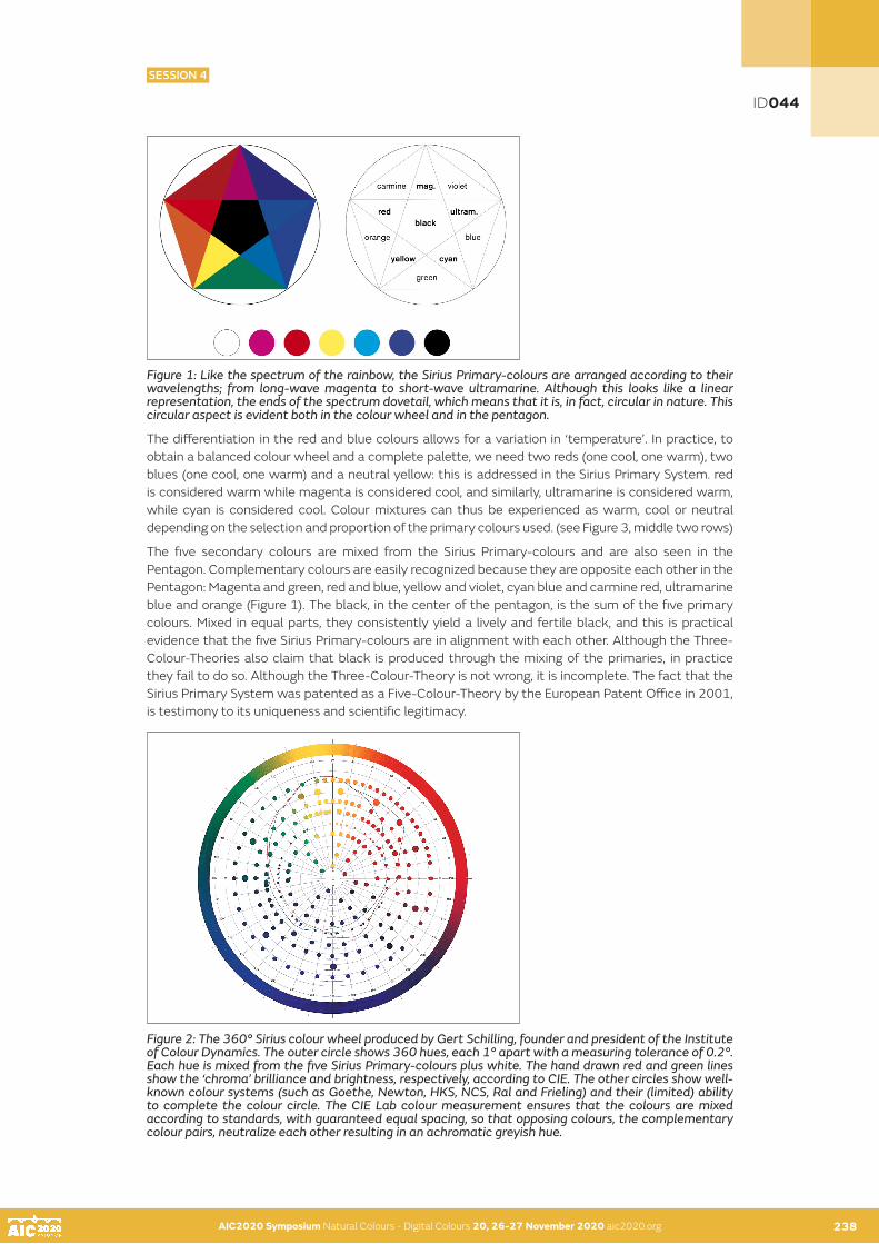
AIC2020 Symposium Natural Colours - Digital Colours 20, 26-27 November 2020 aic2020.org AIC2020 Symposium Natural Colours - Digital Colours 20, 26-27 November 2020 aic2020.org 238
Figure 1: Like the spectrum of the rainbow, the Sirius Primary-colours are arranged according to their wavelengths; from long-wave magenta to short-wave ultramarine. Although this looks like a linear representation, the ends of the spectrum dovetail, which means that it is, in fact, circular in nature. This circular aspect is evident both in the colour wheel and in the pentagon.
The differentiation in the red and blue colours allows for a variation in ‘temperature’. In practice, to obtain a balanced colour wheel and a complete palette, we need two reds (one cool, one warm), two blues (one cool, one warm) and a neutral yellow: this is addressed in the Sirius Primary System. red is considered warm while magenta is considered cool, and similarly, ultramarine is considered warm, while cyan is considered cool. Colour mixtures can thus be experienced as warm, cool or neutral depending on the selection and proportion of the primary colours used. (see Figure 3, middle two rows)
The five secondary colours are mixed from the Sirius Primary-colours and are also seen in the Pentagon. Complementary colours are easily recognized because they are opposite each other in the Pentagon: Magenta and green, red and blue, yellow and violet, cyan blue and carmine red, ultramarine blue and orange (Figure 1). The black, in the center of the pentagon, is the sum of the five primary colours. Mixed in equal parts, they consistently yield a lively and fertile black, and this is practical evidence that the five Sirius Primary-colours are in alignment with each other. Although the Three-Colour-Theories also claim that black is produced through the mixing of the primaries, in practice they fail to do so. Although the Three-Colour-Theory is not wrong, it is incomplete. The fact that the Sirius Primary System was patented as a Five-Colour-Theory by the European Patent Office in 2001, is testimony to its uniqueness and scientific legitimacy.
Figure 2: The 360° Sirius colour wheel produced by Gert Schilling, founder and president of the Institute of Colour Dynamics. The outer circle shows 360 hues, each 1° apart with a measuring tolerance of 0.2°. Each hue is mixed from the five Sirius Primary-colours plus white. The hand drawn red and green lines show the ‘chroma’ brilliance and brightness, respectively, according to CIE. The other circles show well-known colour systems (such as Goethe, Newton, HKS, NCS, Ral and Frieling) and their (limited) ability to complete the colour circle. The CIE Lab colour measurement ensures that the colours are mixed according to standards, with guaranteed equal spacing, so that opposing colours, the complementary colour pairs, neutralize each other resulting in an achromatic greyish hue.
AIC2020 Symposium Natural Colours - Digital Colours 20, 26-27 November 2020 aic2020.org 237
ID044
SESSION 4

AIC2020 Symposium Natural Colours - Digital Colours 20, 26-27 November 2020 aic2020.org AIC2020 Symposium Natural Colours - Digital Colours 20, 26-27 November 2020 aic2020.org238 239
A good theory must be reproducible in practice. The 360-part Sirius colour wheel (Figure 2) was a ground-breaking undertaking. Unachievable with conventional colour systems, this 360-part colour wheel was accomplished, for the first time, using the Sirius Primary System. In the words of this wheel’s creator, Gert Schilling, “Thanks to its pure, extraordinarily brilliant colours we achieved the finest possible, precisely defined colours, not found in any of the current systems. The 360-part Sirius colour wheel represents a unique advance in colour dynamics.” The 360 hues, mixed visually and painted by hand, were verified by colour measurement, guaranteeing that the sequence of all hues is highly similar in terms of brightness and intensity (chroma). The Sirius Primary System was shown to be the only colour system to cover the entire colour circle with regularity and without loss of chroma.
THE JOY OF MIXING
Colours activate personal expressiveness and, as a result, the practice of mixing and blending them brings us to the core of the creative process. This practice should be spontaneous, intuitive and effortless, resulting in a wide spectrum of brilliant hues. One of the main reasons people shy away from playing with paints, let alone mixing colours, is linked to their early experiences of producing dull and dirty colours. Luminous, pure colours allow a variety of hues to be differentiated in the simplest of manners and this guarantees an inspiring and satisfying painting experience, even for beginners. Because the frequencies of the five Sirius Primary-colours are precisely aligned to each other, they always yield pure and clear colour mixtures. This is especially noticeable when mixing subtle earth and pastel hues or when a colour is lightened with Sirius white or darkened with Sirius black (Figure 3). With just a few source colours anyone can create a rich and extensive palette, from glowing, warm yellows and fiery reds to cool juicy greens and icy blues as well as golden autumn and earth tones.
Figure 3: The two middle columns show how a differentiated range of warm and cool colours can be mixed. All these, when further mixed with white in a relatively high proportion, translate into pastel colours, and when mixed with the rich Sirius black produce lower values. All tints and shades remain vibrant and clean retaining their full colour constancy and chroma.
ID044
SESSION 4

AIC2020 Symposium Natural Colours - Digital Colours 20, 26-27 November 2020 aic2020.org AIC2020 Symposium Natural Colours - Digital Colours 20, 26-27 November 2020 aic2020.org 240
PRACTICAL APPLICATIONS
The sensual nature of colour reaches beyond the mere visual and a deep appreciation of this fact is important in all fields in which the expressive and creative use of colour is defined as the primary task. For example, use of colour in Architecture impacts on the full human experience of being within a built environment – physical, emotional and even spiritual. The transparency and luminosity of the Sirius Primary System’s colours make it ideal for glazing techniques which, in turn, offer an atmosphere of harmony, vibrancy and wholesomeness to every room. Furthermore, the intensity of the colour is so high that a little goes a long way and a thin coat of paint is often sufficient.
Figure 4: Scherr school, Zürich (Architecture by Patrick Gmür, colour scheme by artist Peter Roesch). Powerful colours are used in the schoolyard, the stairways and corridors: the painterly application of glazes bestows a sense of volume and air of joviality to the spaces. © photograph Georg Aerni
Figure 5: The differentiation of red tones is explored in my painting cycle “Epithets of Sekhmet”, 2005. © Barbara Diethelm, photograph Reto Pedrini
Due to their luminosity, purity and balanced frequencies they not only inspire, but also allow for, nuanced and precise mixing of an unlimited range of harmonious colour schemes - essential for the artistic exploration of colour harmonies (Figure 5 and 6). This nuanced differentiation, in turn, promotes subtly and discernment in perception, and offers great therapeutic benefits when applied in hospitals, clinics or other therapeutic contexts.
ID044
SESSION 4

AIC2020 Symposium Natural Colours - Digital Colours 20, 26-27 November 2020 aic2020.org AIC2020 Symposium Natural Colours - Digital Colours 20, 26-27 November 2020 aic2020.org 241
Figure 6: First Row: Renate Reifert, ceiling and wall object in the anesthetic recovery room in Wiesbaden, Germany © Renate Reifert. Second row: Urs Aeschbach, wall painting in hallway of a care center in Baden, Switzerland. The subtle colour mixtures bring the presence of the painted animals to life. The differentiated and rich colours offer the Alzheimer’s patients gentle inputs. © Urs Aeschbach, photograph Friedrich Zubler
CONCLUSION
The above are but a few of the remarkably successful projects which have made use of the Sirius Primary System. The range’s use in paintings, sculpture and architecture, reveal its diversity of application. The transparency and brilliance of the colours, often applied through glazing and washing techniques, lend volume to architectural spaces and convey an atmosphere of joy, beauty and harmony wherever used. They show how a coherent colour scheme can be achieved using shades and tints which retain their full chroma, and how maximum aesthetic value can be achieved through a minimal range of a few intense colours. LESS IS MORE.
REFERENCES
Stromer K. 2000. Idee Farbe: Farbsysteme in Kunst und Wissenschaft von Forsius bis Sirius , Konstanz, Edition Farbe
ID044
SESSION 4

AIC2020 Symposium Natural Colours - Digital Colours 20, 26-27 November 2020 aic2020.org
À la recherche des sources techniques de la teinture
Marie-Anne Sardaa•, Clémence Lescuyerb, Alexia Raimondob
a Institut national d’histoire de l’art, Paris, Franceb Archives nationales, Pierrefitte-sur-Seine cedex, France•Corresponding author: [email protected] author: Marie-Anne Sarda
INTRODUCTION
En 1916, Ethel Mairet publie A Book on Vegetable Dyes, manuel de teinture réédité plusieurs fois jusqu’au décès en 1952 de son auteur. Tisserande et teinturière reconnue, elle fait partie de la communauté d’artistes britanniques ayant régénéré dans la première partie du XXe siècle l’héritage et les idées de William Morris. Nourrissant sa pratique de rencontres lors de voyages en Inde et au Ceylan d’abord, ensuite en Europe, Ethel Mairet connaît la rigueur des procédés de teinture, qu’elle souhaite voir largement partagés.
Familière des riches fonds d’archives de l’Intendance de l’ancienne province française du Languedoc conservés aux Archives départementales de l’Hérault, Dominique Cardon a récemment entrepris la publication de traités de teinture du XVIIIe siècle (2013 et 2019). Par ailleurs, d’autres équipes de recherche étudient en Angleterre, dans les Pays-Bas, en Allemagne sur les manuels et traités de teinture qui ont été conservés, afin de documenter ces archives, d’en tester les recettes et de les publier. Au cours des travaux menés dans le cadre du programme de recherche consacré aux colorants utilisés de 1850 à 1914, programme initié en 2017 par l’Institut national d’histoire de l’art, et afin de procéder à une meilleure analyse critique des apports des premiers colorants de synthèse, est apparue la nécessité de disposer d’un recensement de l’ensemble des sources techniques de la teinture naturelle de la fin du Moyen Âge au début du XXe siècle.
Mené en partenariat avec les Archives nationales, ce recensement prend en compte les traités de teinture, manuels de teinturiers et tout document manuscrit abordant un ou plusieurs procédés de teinture. Éventuellement assorties d’échantillons de fibre ou de textile teint, les sources manuscrites retenues dans le recensement sont conservées dans les collections publiques françaises : centres d’archives, bibliothèques et musées.
KEYWORDS
manuscrit I procédé I colorant I teinturier
242
ID055
SESSION 4

AIC2020 Symposium Natural Colours - Digital Colours 20, 26-27 November 2020 aic2020.org 243
MÉTHODOLOGIE
Les chercheurs et praticiens d’aujourd’hui sont tous confrontés aux mêmes difficultés : l’absence d’un outil fédérant les ressources décrivant les procédés techniques de teinture à l’aide des ressources naturelles. La seule bibliographie des ouvrages publiés, due à Lawrie (1946), est d’une part très incomplète, notamment pour ce qui concerne les fascicules édités par les compagnies de colorants de synthèse ; d’autre part, elle nécessite cruellement une mise à jour. Enfin, cette bibliographie est introuvable dans les bibliothèques françaises. Concernant les documents manuscrits, le portail national des Archives de France (francearchives.fr) offre un premier accès aux richesses des fonds d’archives publiques françaises, la recherche pouvant être menée en plein texte, par exemple avec les mots teinture, colorant, garance, pastel, indigo. Toutefois, les résultats d’une telle interrogation sont issus du signalement des fonds d’archives, dont l’objectif est beaucoup plus large. Ainsi, des documents importants pour l’historique des procédés de teinture peuvent ne pas paraître au sein des résultats si le mot-clé teinture n’a pas été sélectionné lors de l’inventaire ; en outre, certains fonds restent en attente d’un inventaire détaillé. Enfin, seuls les services d’archives ont vocation à être fédérés par francearchives.fr, ce qui exclut les manuscrits conservés dans les fonds patrimoniaux des bibliothèques, souvent riches de documents d’obédience locale et régionale, et écarte également les archives conservées dans les musées textiles. Or, comme tout chercheur sur les colorants ou tout teinturier le sait, la teinture est un champ d’étude partagé entre histoire des arts, histoire industrielle et histoire des sciences et des techniques, requérant de fait une recherche élargie.
Le recensement français des sources techniques de l’histoire de la teinture est mené par les Archives nationales et l’Institut national d’histoire de l’art au terme d’une convention conclue pour trois ans. Lors des réunions préparatoires du groupe de travail, les principes suivants ont été mis au point, afin de cerner avec précision l’objet du recensement et d’en encadrer la réalisation.
Archives sélectionnées dans le recensement :- Manuscrits techniques, sans limite du nombre de feuillets- France, de la fin du Moyen Âge au début du XXe siècle (les documents concernant les colorants de
synthèse sont dans un premier temps écartés de ce recensement)- Exposé d’un procédé au moins de teinture naturelle (les documents manuscrits présentant des
installations spécifiques utilisées pour la teinture, telles qu’un moulin à garance, pourront être retenus)
Tableau d’indexation / de recensement :- Conformité de la cote et du titre au signalement effectué par le lieu de conservation ; URL - Indications complémentaires : auteur, date, volumétrie, présence d’échantillons textiles- Description sommaire dans le cadre de ce recensement- Sélection de mots-clé- Corrélation à un imprimé ou à un autre document d’archives
L’objectif de ce partenariat est de mettre en ligne sur la plateforme AGORHA administrée par l’Institut national d’histoire de l’art dans le courant du premier semestre 2022 un guide des sources techniques de l’histoire de la teinture conservées dans les collections publiques françaises. Composé d’un vade-mecum d’utilisation et d’un tableau de recensement, ce guide des sources sera complété d’une cartographie des fonds permettant une visualisation rapide de leur répartition territoriale. Ce recensement complétera la mise en ligne au premier semestre 2021 d’une bibliographie mise à jour des traités de teinture publiés jusqu’en 1914, cette bibliographie intégrant les colorants de synthèse et notamment les nombreux ouvrages publiés par les entreprises les commercialisant pour lesquels il n’existe pas de bibliographie à ce jour.
AIC2020 Symposium Natural Colours - Digital Colours 20, 26-27 November 2020 aic2020.org 242
ID055
SESSION 4

AIC2020 Symposium Natural Colours - Digital Colours 20, 26-27 November 2020 aic2020.org AIC2020 Symposium Natural Colours - Digital Colours 20, 26-27 November 2020 aic2020.org 244
MANUSCRITS SÉLECTIONNÉS : EXEMPLES
Le premier exemple présenté est un manuscrit isolé au sein des Archives départementales de l’Oise, acquis récemment à titre onéreux. L’industrie des indiennes s’est implantée dans la ville de Beauvais au milieu du XVIIIe siècle et a connu un développement relativement important à partir de 1775. En 1775 : un dénommé Baron né à Issoudun en 1751, titulaire de la charge de conseiller - secrétaire du Roi - maison, couronne de France et des finances, seigneur de Neuilly en Vexin, fait en 1775 l’acquisition de la manufacture de toiles peintes de Saint-Just-Les-Marais près de Beauvais, créée en 1765. Après l’avoir développée, il vend en 1890 la manufacture à son neveu, Claude Baron, qui s’associe à Pierre Salle ; la manufacture est alors exploitée sous le nom de Baron Neveu. Ce dernier décède en 1815 ; active jusqu’en 1828, la manufacture est alors vendue par sa veuve. Le manuscrit est en majeure partie de la main du Baron de Neuilly et est identifié comme Exposé des procédés de coloration et d’impression utilisés dans la manufacture d’indiennes (St Just des Marais De Claude Baron). Signé et daté pour la première partie le 24 avril 1784, qui a été rédigée à l’attention de son neveu afin de lui transmettre ses procédés de teinture, le manuscrit est complété par Baron Neveu jusqu’en 1795 d’autres procédés et de recettes diverses. Il s’agit d’un recueil in-8° de 116 feuilles, revêtu d’une feuille de musique, qui porte le titre « Lart de faire l’indiene » et est paginé partiellement (48-68). La première partie du recueil comporte des numéros l’exposé de 47 procédés, intitulés par exemple (dans leur orthographe d’origine) «Pacage en Bouze aven de garencre» (2), «Chamoix et Beaux nanquin» (18), «Rouge pour les Mordore et Mordore Eclatans» (19), «Double Rouge et Couleur de chaire» (21), «Beaux Verre» (24), «Composition du Bleu dangleterre» (35), «»Couleure de roze» (38)... 15 échantillons de tissus imprimé ont été insérés dans les textes documentant les procédés pour obtenir des fonds de différentes couleurs. Malgré son acquisition récente et sa rareté, il s’agit d’un manuscrit inédit.
Figure 1: Exposé des procédés de coloration et d’impression utilisés dans la manufacture d’indiennes (St Just des Marais De Claude Baron), 1784-1795 : manuscrit du au Baron de Neuilly, teinturier imprimeur (Beauvais, Archives départementales de l’Oise, 1 J 3267).
ID055
SESSION 4

AIC2020 Symposium Natural Colours - Digital Colours 20, 26-27 November 2020 aic2020.org AIC2020 Symposium Natural Colours - Digital Colours 20, 26-27 November 2020 aic2020.org 245
Le deuxième exemple, centré sur l’utilisation du pastel sous le Premier Empire, concerne une grande partie des fonds des Archives départementales, ainsi que les Archives nationales. Le travail de recensement est dans ce dossier encore en cours afin de localiser, non pas un manuel complet de teinture mais une ou plusieurs notices isolées témoignant des expérimentations de teinture menées avec le pastel en France entre 1810 et 1813.
A l’époque napoléonienne, les pouvoirs publics soutiennent l’innovation technique dans le domaine de la teinture, en lien avec le blocus continental de 1806 comme avec une volonté d’encourager le travail des manufactures impériales et le développement de l’industrie textile française. Le blocus continental résultant de l’interdiction de tout commerce avec les îles et colonies britanniques (décret du 21 novembre 1806) eut pour conséquence la hausse des prix des matériaux, particulièrement celui de l’indigo (multiplication par dix de son prix). Différentes mesures sont prises pour y remédier et relancer la culture du pastel sur l’ensemble du territoire français. Au cours du mois de septembre 1810, le gouvernement impérial envoie par ailleurs dans chacune des préfectures françaises des exemplaires de la notice sur le pastel rédigée par Jean-Pierre-Casimir de Marcassus, baron de Puymaurin (1810). Comportant 63 pages, il s’agit d’un exposé global sur le pastel et son utilisation, une attention particulière étant portée à la préparation de la pâte de pastel (p. 25-32), puis à l’extraction de l’indigo (p. 32-58). L’auteur a été sollicité par l’Empire, car le besoin de drap de laine bleu pour habiller les armées est criant ; le baron de Puymaurin est d’ailleurs bientôt nommé « Directeur de la Fabrique impériale de l’Indigo-pastel à Toulouse ».
Six mois après cet envoi aux préfets, des objectifs leurs parviennent : en Seine-et-Oise par exemple, 200 hectares sont à ensemencer (Archives départementales des Yvelines, 15 M 24). Des graines de pastel sont adressées en préfecture, pour être distribuées aux exploitants de janvier à mai 1812, de même que des exemplaires d’une nouvelle instruction dont les auteurs figurent parmi les plus éminents scientifiques ou teinturiers de l’époque : Chaptal, Bardel, Thénard, Gay-Lussac, H. Roard, et G.-L. Ternaux (1811). Des dossiers de correspondances relativement à ces cultures du pastel ont été conservées dans de nombreux départements français. Dans le cadre de notre recensement, nous entendons les parcourir afin de sélectionner les documents originaux présentant divers procédés d’extraction de l’indigotine du pastel, comme celui du Dr Henri, transmis le 21 août 1812 au Préfet de Seine-et-Oise pour remise à M. Gouby, propriétaire de terrains ensemencés à Chaville (Archives départementales des Yvelines, 15 M 24). M. Gouby est aussi destinataire, en mars 1813, d’un exemplaire de l’ouvrage de Giobert, professeur de chimie à Turin, est directeur de l’Ecole impériale pour la fabrication de l’indigo (1813). Imprimé en 1813 par ordre de sa Majesté impériale et royale « sur un sujet qui excite dans ce moment, l’attention de toute l’Europe » (1813: V), cet ouvrage est le plus complet de l’époque sur le pastel.
Figure 2: Projet d’un moulin à garance, aquarelle sur papier, seconde moitié du XVIIIe siècle (Saint-Quentin-en-Yvelines, Archives départementales des Yvelines, E 3072/1).
ID055
SESSION 4

AIC2020 Symposium Natural Colours - Digital Colours 20, 26-27 November 2020 aic2020.org AIC2020 Symposium Natural Colours - Digital Colours 20, 26-27 November 2020 aic2020.org 246
Le troisième et dernier exemple est d’une nature encore différente et a été sélectionné pour montrer tout l’intérêt d’une cartographie territoriale des sources.
Dès les années 1990 et notamment à l’occasion de l’exposition consacrée au Rouge dit turc organisée par Jacqueline Jacqué en 1993 et 1994 au Musée de l’impression sur étoffes de Mulhouse, une petite centaine de recueils, différents des livres d’échantillons courants, sont classés dans la bibliothèque du Musée de l’impression sur étoffes de Mulhouse car ils témoignent du travail dans les fabriques (1995). Comme Leprun l’a montré, ces recueils manuscrits renferment en effet des échantillons qui résultent du travail des chimistes, particulièrement impliqués dans les manufactures textiles à la partir de la fin du XVIIIe siècle (1995). La plupart de ces recueils, que l’on peut désigner sous le nom de «cahiers ou journaux de laboratoire», décrivent les essais de teinture effectués : les différents matériaux utilisés, les opérations à réaliser avant et après la teinture proprement dite. Les résultats obtenus, souvent enrichis d’échantillons textiles, sont en outre évalués par les teinturiers chimistes.
L’exposition consacrée aux cachemires imprimés alsaciens organisée par le Musée de l’impression sur étoffes de Mulhouse et coordonnée par Anne-Rose Bringel (2009) a permis d’exposer à nouveau quelques-uns de ces journaux de laboratoire, dont le contenu ne s’est pas limité en Alsace à l’impression du coton du rouge d’Andrinople. Attestées dans des textes en 1828, les impressions sur laine se généralisent en Alsace dans le courant des années 1830, pour être complètement établies en 1837. Au milieu du XIXe siècle, l’impression alsacienne sur sergé de laine atteint un niveau de qualité comparable à l’impression sur coton qui avait fait la réputation de Mulhouse : le châle imprimé sur laine est d’une très haute qualité, donnant de loin l’impression d’un jacquard.
Parmi les journaux de laboratoire conservés, ceux de Léonard Schwartz, qui devient en 1821 le teinturier et chimiste de Schlumberger, Grosjean & Cie, constituent une source exceptionnelle. Or, ceux-ci ont été dispersés : le Musée de l’impression sur étoffes de Mulhouse en conserve quelques-uns, qui ont été donnés au musée par la famille Koechlin. De manière plus étonnante mais qui s’explique par les relations de concurrence ayant existé entre Angleterre, Normandie et Alsace dans le domaine de l’impression sur étoffes au cours du XIXe siècle, relations qui virent la circulation d’une manufacture à une autre des teinturiers chimistes, deux autres journaux de laboratoire de Léonard Schwartz sont conservés au Musée industriel de la Corderie Vallois de Notre-Dame-de-Boneville : Léonard Schwartz, Preparation der Farben und Faerberey bey S.G.& Cie à Mulhouse, entre 1825 et 1828 ; Journal des épreuves du laboratoire, 1824 à 1828 (inv. 98.4.106 et 107). Ces deux manuscrits ont été donnés au musée par la Société Industrielle de Rouen.
Figure 3: Léonard Schwartz, Journal du laboratoire chez Isaac Schlumberger & Cie, 1839 à 1842 (Mulhouse, Musée de l’impression sur étoffes, Inv. 667KO.39.VI)
ID055
SESSION 4

AIC2020 Symposium Natural Colours - Digital Colours 20, 26-27 November 2020 aic2020.org AIC2020 Symposium Natural Colours - Digital Colours 20, 26-27 November 2020 aic2020.org246 247
CONCLUSION
Alors que nous travaillions cet été au recensement, une nouvelle importante nous parvint d’Angleterre, nous encourageant dans nos travaux. En 2020, les archives de la famille des teinturiers Crutchley, conservés à la bibliothèque et aux archives de Southwark, ont été retenues pour figurer au «Registre de la Mémoire du monde» tenu par l’UNESCO (au sein du programme de protection anglais, initié en 2010). Teinturiers en rouge installés sur la rive sud de la Tamise, la famille Crutchley a été active aux XVIIIe et XIXe siècles. Les archives offertes par leurs descendants en 2011 sont datées de 1716 à 1744 et composées de livres de teinture et de pièces comptables (les Crutchley avaient ainsi pour clients non seulement des particuliers mais aussi les compagnies britannique et hollandaise des Indes). Elles sont étudiées depuis 2014 par Dr. Balfour-Paul, Dr. Cardon et Dr. Quye, ce qui a permis la reconnaissance de leur intérêt exceptionnel.
Souvent dispersés, quelquefois négligés mais surtout méconnus, les documents d’archives manuscrits décrivant les procédés de teinture naturelle sont en France un patrimoine documentaire qu’il convient sans plus attendre de faire connaître afin d’en favoriser la conservation et l’étude.
REFERENCES
Bringel A.-R. (ed.). 2009. Rêve de Cachemire, cachemires de rêve. Le châle imprimé, un joyau textile alsacien. Bernardswiller et Mulhouse: I.D. l’Edition et Musée de l’impression sur étoffes.Cardon, D. 2013. Mémoires de teinture. Paris: Éditions du CNRS. Cardon, D. 2019. Des couleurs pour les Lumières. Antoine Janot, teinturier occitan – 1700-1778. Paris: Éditions du CNRS. Chaptal, Bardel, Thénard, Gay-Lussac, Roard H., Ternaux G.-L. 1811. Instruction sur l’art d’extraire l’indigo des feuilles de pastel. Publiée par ordre de S. Ex. Mgr de Montalivet, Comte de l’empire, Ministre de l’Intérieur. Paris: De l’Imprimerie de Mad. Huzard.Giobert G. A. 1813. Traité sur le pastel et l’extraction de son indigo. Paris: Imprimerie impériale.Jacqué J. (ed.). 1995. Andrinople, le rouge magnifique. De la teinture à l’impression, une cotonnade à la conquête du monde. Paris/Mulhouse: La Martinière/Musée de l’impression sur étoffes.Lawrie L. G. 1946. A Bibliography of Dyeing and Textile Printing. London: Chapman & Hall Ltd.Leprun S. 1995. Des cahiers d’Andrinople, Mulhouse: Musée de l’impression sur étoffes.Mairet, E. M. 1916. A Book on Vegetable Dyes. Hammersmith: Hampshire House Workshops. Puymaurin, Marcassus. J.-P.-C. de, baron de. 1810. Notice sur le pastel (Isatis tinctorum), sa culture et les moyens d’en retirer l’indigo. Paris: H. Agasse. Quye, A., Cardon D., Balfour Paul J. 2020. «The Crutchley Archive: Red Colours on Wool Fabrics from Master Dyers, London 1716-1744.» Textile History, 1-49.
ID055
SESSION 4

AIC2020 Symposium Natural Colours - Digital Colours 20, 26-27 November 2020 aic2020.org
Optimized visualization of Château de Germolles’ wall paintings using mobile augmented reality with co-lighting
Jean-Philippe Farrugiaab•, Christian Degrignyc
a IUT Lyon-1, département Informatique, F-01000 Bourg-en-Bresseb Université de Lyon, CNRS, université Lyon-1, LIRIS, UMR5205, F-69622 Lyonc Christian Degrigny, Haute Ecole Arc Conservation-Restauration, HES-SO Haute Ecole Spécialisée de Suisse Occidentale, 2000 Neuchâtel, Suisse
•Corresponding author: [email protected] authors: Jean-Philippe Farrugia and Christian Degrigny
ABSTRACT
This paper presents the design of an augmented reality visualization of the wall paintings (late 14th century) of the Château de Germolles. This visualization is done through a mobile application, does not require any external equipment, and considers the co-lighting: the decor can thus be visualized under several virtual ambient lightings, simulating different seasons, weather conditions and two times of the day as well as candle lighting. We present the methods and models that have enabled these simulations, as well as their results and limitations. We also briefly discuss the limitation of an approach based solely on physical plausibility in relation to the objective of a visit speech.
KEYWORDS
Château de Germolles I mural decorations I augmented reality I appearance rendering I co-lighting
INTRODUCTION
The Château de Germolles, offered to Margaret of Flanders by her husband Philip the Bold, Duke of Burgundy and brother of King Charles V of France, is both the best-preserved residence of these Valois princes, and the one that still displays unique wall paintings from the end of the 14th century. Rediscovered during World War II, they were partially conserved between 1989 and 1994. This intervention, although quite respectful, was not documented at the time. Thanks to archival documents and the in-depth analysis of the residual decorations (Degrigny et al. (2017)), the materials used and the painting technique could be better understood, especially for the metal decorations, which residues were partly masked during the conservation intervention. A partial de-restoration would make it possible to better visualize them, without however appreciably improving the global rendering.
In discovering these painted decorations, the public visiting the Château de Germolles is far from imagining the delicacy of the original rendering, despite the information transmitted. Therefore, the possibilities of augmented reality have been tested, based on newly acquired scientific knowledge, in order to propose hypotheses of rendering, evaluated by the site’s managers, who are also heritage professionals, and then readjusted (geometry, colour and luminosity) for better conformity. The developed application is adapted to the private nature of the site: it uses a light and nomadic support (tablet), is non-intrusive (no visible markers or locating devices) and easy to use. It is, moreover, entirely controlled by the person guiding the visitors: it is indeed an accompaniment to the speech (Degrigny et al. (2020)).
248
ID057
SESSION 4

AIC2020 Symposium Natural Colours - Digital Colours 20, 26-27 November 2020 aic2020.org 249
In order to be convincing, an augmented reality application must solve three problems: co-location, which is necessary to align real and virtual elements, co-occultation, which allows the virtual elements to be masked by the real ones (and vice versa), and co-lighting, which allows luminous interactions between virtual and real. In the framework of this project, the co-location is managed by environmental geometric markers materialized by the decor itself, and the co-occultation is not considered insofar as the virtual elements to be inserted are plane and directly visible without occultation. On the other hand, co-lighting required more advanced treatments which are the subject of this article.
In order to restore the original decor, it is necessary to enhance it with adequate models of materials and lighting. Three difficulties have to be reconciled: the limited computational capacities of the tablets, the complex models to obtain a satisfactory physical realism, and the adequacy with the visual expectations of those responsible for the monument. To satisfy these constraints, we have opted for the following solutions:
• A material model widely used in the industry, light and easily parameterizable while being physically plausible.
• An ambient lighting modelled with high dynamic range (HDR) environment maps.
• A daytime local lighting modelled by an area light source, approximated by a set of point sources obtained with importance sampling.
• A local night lighting modelled by animating the photometric solid of a candle.
The whole was integrated with Unity software and deployed on an Apple iPad Air 2 tablet.
After a state of the art around augmented reality and physical based rendering for heritage enhancement, this paper introduces the modelling of ambient lighting and the obtaining of HDR environment maps as well as the modelling of night lighting. The presentation of the results is accompanied by the appreciation by the public of the approach followed. Finally, we conclude by giving some perspectives for future development.
STATE OF THE ART
By modelling historical light sources (Chalmers et al. (2006), Gutierrez et al. (2008), Rodrigues et al. (2014)) to illuminate virtual archaeological sites (Devlin and Chalmers (2001)), it has been shown that lighting and, more generally, the ambient lighting has a significant impact on the perception and understanding of a historical or archaeological scene. The ambition is to restore the historical visual sensation of the site. Although it is rather difficult to formally validate these results, they seem convincing from an archaeological and perceptual point of view (Goncalves et al. (2009)).
Other work by Callet focuses on light-matter interaction, especially colour, metallic effects and spectral simulation (Cerise et al. (2012)). They concern both monuments (Callet et al. (2010)) and historical artefacts (Robin et al. (2010)). The method is very rigorous from a physical realism point of view, but is too complex to be implemented in an augmented reality application, where the computing power of the devices involved is often limited.
Concerning mobile applications for heritage enhancement, initiatives have multiplied since the advent of modern smartphones (Lesaffre et al. (2014)) but few of them offer realistic visualization functionalities with dynamic lighting. Among the most high-profile projects is the Gunzo project, which aims to reproduce the Abbey of Cluny (Père et al. (2013)), or the Abbey of Jumièges (Jumièges 3D (2018)). However, most of these applications are not in real time and present only pre-calculated images, inducing a strong constraint: the user can only observe around a fixed point without being able to move. Immersion, and therefore the impact on the visitor, is then limited.
AIC2020 Symposium Natural Colours - Digital Colours 20, 26-27 November 2020 aic2020.org 248
ID057
SESSION 4

AIC2020 Symposium Natural Colours - Digital Colours 20, 26-27 November 2020 aic2020.org AIC2020 Symposium Natural Colours - Digital Colours 20, 26-27 November 2020 aic2020.org 250
EXPERIMENTATIONS
Our goal was to create an application that removes the limitations of previous achievements. The heritage to be valued at Germolles is a courtly and bucolic wall decoration, that of the dressing-room of the dukes’ daughter-in-law, Margaret of Bavaria, alternating white letters (initials of the Dukes’ first names) and thistles (symbols of protection and fidelity) now of the same white colour but which were once metallic and golden in appearance, all on a green background. The application must be able to reproduce the supposed visual sensation of this decor, under different lighting conditions and without restricting the user’s freedom of movement. The main constraint is that the chosen platform, a tablet, does not allow physical calculations as advanced as those presented in the previous section, it is for example impossible to perform spectral calculations. It was therefore necessary to find a compromise between physically realistic results and real-time computations. At the same time, this project also allowed to test whether physical realism is a necessary condition for such a mediation.
In order to be convincing, the rendering of the virtual decor integrates three determining models: materials, ambient lighting, and night lighting detailed in the following.
Materials
The materials model we used is the one present in the Unity engine. It is a micro-facet reflectance function (based on Walter et al. (2007)) whose objective is not an exact physical reproduction of materials at the molecular scale, but only the reproduction of their visual appearance. It has the advantage of being very widespread, easily parameterizable, while being physically plausible. The different parameters of metallic character, colour, and roughness can be modulated by textures. This model also allows to alter the local geometry of the surface to add mesoscopic details. For ease of editing, we used the Substance Designer software to design the materials in collaboration with the managers of the château. Three materials were designed, for the letters, thistles, and background. There is no certainty about the composition of the original materials, only hypotheses. The model had to be parameterized to test these hypotheses visually and iteratively (Degrigny et al. (2020)).
Ambient lighting
The ambient lighting model is based on a well-known technique in image synthesis: Image-Based Lighting. This technique consists in using a panoramic HDR image from the real environment to illuminate the virtual decor to be enhanced (Debevec (1998)). In the application, we want to visualize the decor under four different weather conditions for each of the four seasons, at two times of the day, i.e. a total of 32 HDR images. These images were captured with a Canon Powershot 230S camera whose internal software has been modified to allow bracketing for HDR reconstruction. Multiple shots were taken using a photographic stand and then assembled into a panorama with the PTGui Pro software. Figure 1 shows examples of reconstructed panoramas, in spring and for two weather conditions.
a bFigure 1: An example of two HDR panoramic image in Margaret of Bavaria’s dressing-room taken on a rainy day (a) and on a sunny day (b), both in spring.
ID057
SESSION 4

AIC2020 Symposium Natural Colours - Digital Colours 20, 26-27 November 2020 aic2020.org AIC2020 Symposium Natural Colours - Digital Colours 20, 26-27 November 2020 aic2020.org 251
However, in this project, the HDR panorama alone does not faithfully render the lighting in the room. The main light source, the original open window of the north wall in figure 1, is under-represented and does not contribute sufficiently to the appearance of the decor. We have therefore added an additional rectangular light source to the scene, representing a virtual version of the window in the room. Unfortunately, Unity engine does not allow the use of non-uniform area light sources. We therefore chose to opt for an approximation based on point sources, positioned on the plane of the source and whose characteristics (colour and position) are defined by importance sampling an HDR image of the window. Figure 2 shows a representation of this sampling with the corresponding image.
a bFigure 2: An image of the window of the north wall (a) and point source sampling (b). The colour of the point light sources reflects the dominant blue colour of the window.
Night lighting
The application must also be able to simulate candlelight at night. In contrast to the ambient lighting in the previous section, in this case the light source is dynamic and cannot be simulated with HDR images. We have chosen to take up the work of Bridault-Louchez et al. (2008) and port it to the tablet. This technique is based on the use of a candle flame photometric solid applied to a point light source in order to modulate its intensity in a non-uniform manner. On the tablet used for the application, however, it is not possible to simulate the dynamics of air flow to obtain the flickering of the flame, which is an obvious clue of this type of lighting. In order to reproduce this effect, we chose to alter the photometric solid with small random rotations (Degrigny and Farrugia (2020)).
RESULTS
The application itself is a classical mobile augmented reality application. Depending on the season, outdoor weather conditions and time of day (32 options in total), the user chooses the most suitable ambient lighting conditions. The tablet is pointed towards the decor (only the west wall of the dressing-room is currently being considered). By pressing on the touch screen, the reconstructed virtual decor is gradually superimposed on the real decor (directly seen by the tablet camera). No placement is imposed in the room, the user is completely free to move around, the virtual view of the decor being calculated and adjusted in real time. Figure 3 shows an example of lighting with the environment map only (a), and with the environment map plus the light source of the window area (b), showing the addition of the latter. The chosen ambience is a sunny summer morning.
ID057
SESSION 4
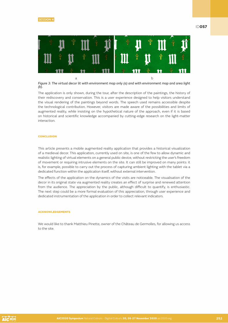
AIC2020 Symposium Natural Colours - Digital Colours 20, 26-27 November 2020 aic2020.org AIC2020 Symposium Natural Colours - Digital Colours 20, 26-27 November 2020 aic2020.org 252
a b Figure 3: The virtual decor lit with environment map only (a) and with environment map and area light (b).
The application is only shown, during the tour, after the description of the paintings, the history of their rediscovery and conservation. This is a user experience designed to help visitors understand the visual rendering of the paintings beyond words. The speech used remains accessible despite the technological contribution. However, visitors are made aware of the possibilities and limits of augmented reality, while insisting on the hypothetical nature of the approach, even if it is based on historical and scientific knowledge accompanied by cutting-edge research on the light-matter interaction.
CONCLUSION
This article presents a mobile augmented reality application that provides a historical visualization of a medieval decor. This application, currently used on site, is one of the few to allow dynamic and realistic lighting of virtual elements on a general public device, without restricting the user’s freedom of movement or requiring intrusive elements on the site. It can still be improved on many points: it is, for example, possible to carry out the process of capturing ambient lighting with the tablet via a dedicated function within the application itself, without external intervention.
The effects of the application on the dynamics of the visits are noticeable. The visualisation of the decor in its original state via augmented reality creates an effect of surprise and renewed attention from the audience. The appreciation by the public, although difficult to quantify, is enthusiastic. The next step could be a more formal evaluation of this appreciation, through user experience and dedicated instrumentation of the application in order to collect relevant indicators.
ACKNOWLEDGEMENTS
We would like to thank Matthieu Pinette, owner of the Château de Germolles, for allowing us access to the site.
ID057
SESSION 4

AIC2020 Symposium Natural Colours - Digital Colours 20, 26-27 November 2020 aic2020.org AIC2020 Symposium Natural Colours - Digital Colours 20, 26-27 November 2020 aic2020.org 253
REFERENCES
Bridault-Louchez, F., M. Leblond, and F. Rousselle. 2006. Enhanced illumination of reconstructed dynamic environments using a real-time flame model. In: Proceedings of the 4th international conference on Computer graphics, virtual reality, visualisation and interaction in Africa (AFRIGRAPH ‘06). Association for Computing Machinery, New York, NY, USA, 31–40. Callet, P., S. Dumazet, C. Leclercq, and C. Politi. 2010. Natural Lighting, Gilts and Polychromy of Notre-Dame de Paris Cathedral. In: VAST 2010 - Proceedings of the 11th International conference on Virtual Reality, Archaeology and Cultural Heritage, Springer, ed. Paris: Ecole du Louvre, 63-70. Cerise, R., F. da Graça, F. Magoulès, and P. Callet. 2012. Natural Lighting and Medieval Glass – Scientific Data Acquisition, Methodology and Physically Based Rendering. In: Euromed 2012, 4th International Conference, Springer, ed. Limassol, Cyprus, 636-643.Chalmers, A., I. Roussos, and P. Ledda. 2006. Authentic illumination of archaeological site reconstructions In: Conference on Colour in Graphics, Imaging, and Vision, Society for Imaging Science and Technology, 431-434.Debevec, P. 1998. Rendering synthetic objects into real scenes: Bridging traditional and image-based graphics with global illumination and high dynamic range photography. Computer Graphics (Annual Conference Series) 32: 189–198.Degrigny, C., F. Piqué, M. Cucchi, V. Detalle, J-P. Farrugia, G. Le Goïc, A. Mansouri, D. Martos-Levif, F. Mérienne, A. Mounier, A. Pamart, C. Tedeschi, J-M. Vallet, and S. Wefers. 2017. Wall Paintings in the Château de Germolles: An Interdisciplinary Project for the Rediscovery of a Unique Fourteenth Century Decoration. In: Digital techniques for Documenting and Preserving Cultural Heritage, A. Bentkowska-Kafel and L. MacDonald, eds. Croydon: Arc Humanities Press, Kalamazoo and Bradford, 67-86. Degrigny, C., and J-P. Farrugia. 2020. Réévaluation de la restauration des peintures murales médiévales du Château de Germolles (France). In: Journées d’étude APROA-BRK / La Charte « Restauré avec les meilleures intentions », M. Buyle, ed. Bruges, 63-69.Degrigny, C., J-P. Farrugia., F. Mérienne, and M. Pinette. 2020. Optimisation virtuelle d’un décor princier de la fin du XIVe siècle au château de Germolles (Saône-et-Loire). In Situ [En ligne], 42. URL: http://journals.openedition.org/insitu/27322 ; DOI : https://doi.org/10.4000/insitu.27322, consulted on September 9, 2020.Devlin, K., and A. Chalmers. 2001. Realistic visualisation of the Pompeii frescoes. In: Proceedings of the 1st international conference on Computer graphics, virtual reality and visualisation (AFRIGRAPH ‘01). Association for Computing Machinery, New York, NY, USA, 43–48. DOI:https://doi.org/10.1145/513867.513878.Gutierrez, D., V. Sundstedt, F. Gomez, and A. Chalmers. 2008. Modelling light scattering for virtual heritage. ACM Journal on Computing and Cultural Heritage, 1, 2, 8: 15 pages. DOI 10.1145/1434763.1434765.Lesaffre, G., A. Watremez, and É. Flon. 2014. Les applications mobiles de musées et de sites patrimoniaux en France : quelles propositions de médiation ?, La Lettre de l’OCIM [En ligne], 154 | 2014. URL : http://journals.openedition.org/ocim/1423 ; DOI : https://doi.org/10.4000/ocim.1423, consulted on September 9, 2020.. Rodrigues, N., L. Magalhães, J. Moura, and A. Chalmers. 2014. Reconstruction and generation of virtual heritage sites. Digital Applications in Archaeology and Cultural Heritage 1, 3–4: 92-102.Gonçalves, A., L. Magalhães, J. Moura, and A. Chalmers. 2009. High dynamic range—a gateway for predictive ancient lighting. J. Comput. Cult. Herit. 2, 1, Article 3 (July 2009), 20 pages.Jumièges 3D, https://www.seinemaritime.fr/vos-services/culture-et-patrimoine/sites-et-musees-departementaux/jumieges-3d-remontez-le-temps.html, consulted on September 9, 2020.Père, C., and J. Rollier-Hanselmann. 2013. Le projet Gunzo reconstruit (virtuellement) l’église abbatiale de Cluny. ESPACES tourisme et loisirs 314: 36–39.Robin, B., T. Hilpert, K. Miyazawa, P. Callet, F-X. de Contencin, and A. Zymla. 2010. Virtual Replication of the Idalion Tablet. In: VAST 2010 - Proceedings of the 11th International conference on Virtual Reality, Archaeology and Cultural Heritage, Springer, Ed. Paris : Ecole du Louvre, 17-20.Walter B., S.R. Marschner, H. Li, and Torrance K.E. 2007. Microfacet models for refraction through rough surfaces. In: Proceedings of the 18th Eurographics conference on Rendering Techniques. Eurographics Association, 195-206.
ID057
SESSION 4

AIC2020 Symposium Natural Colours - Digital Colours 20, 26-27 November 2020 aic2020.org
An application of hyper-spectral color technique in finding proper color pigment for painting conservation
M. James Shyua•, Yuan-Feng Changb•
a Chinese Culture University, Taipei, Taiwan b National Taiwan Normal University, Taipei, Taiwan •Corresponding author: [email protected] Presenting author: M. James Shyu
ABSTRACT
A new application of hyper-spectral imaging system is explored to assist the color compensation process in the conservation of Asia glue painting. During the color compensation process, it is necessary to fill in a missing spot with material of the similar color around it and yet be identifiable as required by the conservation guideline. In the experiment, a hyper-spectral imaging system was used to gather the spectral reflectance information in both the visible and the near infrared regions. The spectral information in the visible region was used to calculate the colorimetric values to predict the color similarity between two pigments. The spectral information in the near infrared region was used to distinguish the difference and processed into monochromatic images for visual comparison. The results indicate that with some expansion in the hyper-spectral imaging system this proposed method is useful in such application for Asia glue painting.
KEYWORDS
heritage science, painting conservation, non-invasive analysis, spectral color, hyper-spectral color imaging
INTRODUCTION
Finding matching color material for certain color sample is a very common task. It can be done by visual observation or by the aid of colorimetric measurement. For painting restoration and conservation, a similar task is performed when a missing or broken section is mended by using an infill of the matching color. This process is referred as ìcolor compensationî (Chang 2015).
There are special considerations for the color matching criteria regarding the infill in the color compensation process. Appropriateness, identifiability and reversibility are required to make the infill match the color visually while it must be traceable for possible reverse process in the future. Therefore, when analyzing the color characteristics of the infill material for painting conservation purpose, it is necessary to obtain more information other than just for visual color matching. Usually, a database is formed to collect all the information.
There are various sets of databases that collect color information about color materials (Kohonen 2006). Standard Object Colour Spectra Database for Colour Reproduction Evaluation (SOCS) is a collection of 50,000 samples from textiles, human skin, flowers, leaves, paints, photographic materials, and computer color prints (ISO 2003). It contains spectral data with wavelength range from 400 to 700 nm in 10 nm intervals. Other databases are for the commonly used color charts, like Munsell, NCS, Macbeth (now X-rite) Color Checker and Pantone. The spectral data are collected in various ranges, yet at most 380 to 780 nm at 1 nm interval. Databases for artist paints are also developed for scientific study of culture heritage objects. A database of acrylic paints including one grey scale and 23 hues with 770 unique spectra was developed by Berns (2016A). It records the spectral information of the samples from 380 to 750 nm in 10 nm increments. All these databases collect the spectral data within the visible band range from 380 to 780 nm. Therefore, only the colorimetric color difference can be assessed.
254
ID084
SESSION 4

AIC2020 Symposium Natural Colours - Digital Colours 20, 26-27 November 2020 aic2020.org 255
On the other hand, the advancement of spectral imaging technology has opened a wider perspective to apply digital imaging to culture heritage (MacDonald 2006, Berns et al. 2006). Imaging spectroscopy has been applied to works of art in various aspects (Delaney et al. 2016). Hyper-spectral cameras have been used to collect spectral image cubes from various paintings (Berns 2016B). Imaging spectroscopy was further used for definitive identification of restoration. Both the visible and the near-infrared (VNIR, 400-1000nm) were used for these applications (Kirchner et al. 2017).
In this study, two kinds of color pigments commonly used in Asian glue painting are the primary objects in this study. One kind is traditional mineral pigments found in natural world. Another kind is artificial pigments. These two kinds of pigments have similar color appearance and they are used as the replica to each other in the color compensation process. Therefore, it is desirable to find a specific pigment of the other kind that appears in similar color to a certain pigment, yet still is identifiable as the infill. A hyper-spectral imaging system and a colorimeter were used to record the spectral information of pigment samples. This study explores an approach where the colorimetric value is used as the index for similarity in visible band, and the narrow-band spectral reflectance difference in near-infrared region is used to reveal the difference. With both criteria, the goal of finding a visually similar color material to fill the restored area and yet preserve the identity is achieved for these kinds of pigments used in Asia glue painting.
HYPER-SPECTRAL IMAGING SYSTEM
A hyper-spectral imaging system was used to gather the spectral information of the pigment samples. A grating-based device (V10E spectrograph by Specim) and a monochrome 2-D CMOS camera (Andor Zyla 5.5) were deployed to form this imaging system.
Two optical fibers guide the illumination from both sides to form a 45/0 geometry. With a scanning platform, the object is scanned line-by-line manner through a lens, spectrograph and digital camera. Every pixel on the line is dispersed by the spectrograph into a series of spectrum (Shyu 2015). The spectral signals of the samples were gathered in both visible and near-infrared (NIR) bands at 400 ñ 1000 nm. A pair of Labsphere reference targets (2% and 99%) were used to calibrate the raw spectral signals into spectral reflectance factors for every pixel.
EXPERIMENTS
Two kinds of color pigments commonly used in Asian glue painting are the primary objects in this study. One kind is mineral pigments found in the natural world. Another kind is artificial pigments. These two kinds of pigments were painted on base paper and mounted on cardboard to become color swatches as shown in Figure 1. Other than the color varieties, it is hard to distinguish by bare eye which kind it is.
Figure 1: The color swatches for Asia glue painting made for this study.
AIC2020 Symposium Natural Colours - Digital Colours 20, 26-27 November 2020 aic2020.org 254
ID084
SESSION 4

AIC2020 Symposium Natural Colours - Digital Colours 20, 26-27 November 2020 aic2020.org AIC2020 Symposium Natural Colours - Digital Colours 20, 26-27 November 2020 aic2020.org 256
These color swatch samples were prepared in a way such that artists would usually use them in Asian glue painting. Six layers (one at a time after drying) were applied for each pigment sample as shown in Figure 2 to assure the proper evenness and thickness. This also creates the possibility to gather the spectral characteristics of the sparse paint simulating the condition of wearing or fading. Two sets of color swatches are made from these two kinds of pigments. Each set contains color samples of 7 hues in 5 particle sizes (#7, #9, #10, #12, #14) for each hue. A total of 70 color samples are prepared for this study.
Figure 2: Part of the painted samples. Each sample is painted six layers to ensure the evenness on the surface.
To achieve the goal of finding a visually similar color material and yet to preserve the identity of the object, not only the colorimetric value but also spectral reflectance information is investigated in this study. The colorimetric value is used as the index for color similarity in the visible spectrum and the narrow-band spectral reflectance difference in the near-infrared region is used to reveal the difference. Currently, the common color measurement tool is hand-held colorimeter. However, colorimeter only operates in the visible band since its main function is to reveal the visible color appearance on a single spot. A spectral imaging system can not only capture 2-D image but also reveal the spectral information on each pixel. An X-rite iOne Pro 2 colorimeter (spectral sensitivity from 380 to 730 nm) and above-mentioned hyper-spectral imaging system (spectral sensitivity from 400 to 1000 nm) were used in this study to retrieve colorimetric values and spectral information in visible and near-infrared regions from 380 to 1000 nm at 10 nm intervals.
RESULTS AND DISCUSSION
Seventy color pigments commonly used in Asia glue painting were prepared and measured for this study. They are from two kinds of material: natural mineral and artificial colored glass particle. The color distribution of the measured samples in CIELAB a* and b* coordinates is shown in Figure 3. It can be seen that they are scattered into certain groups. A further analysis in lightness and hue angle shows that these colors are ranged in between 20 to 100 in CIELAB lightness and around 3 sections of hue angles as shown in Figure 4.
Figure 3: The color distribution of the measured samples in CIELAB a* vs. b* coordinates.
ID084
SESSION 4

AIC2020 Symposium Natural Colours - Digital Colours 20, 26-27 November 2020 aic2020.org AIC2020 Symposium Natural Colours - Digital Colours 20, 26-27 November 2020 aic2020.org 257
It is noted that these two kinds of pigments are shown in similar locations on the a*/b* coordinates, which means having similar appearance of color. The spectral reflectance factors are then used to explore the difference between these two kinds of pigments beyond the visible region. The spectral reflectance factors for these pigments are plotted in the range from 380 to 1000 nm in 10 nm intervals for both kinds of pigments (solid line for natural pigments, dotted line for artificial pigments). For better viewing purpose, they are shown in separated figures as four groups for different hue angles (0-60, 60-120, 120-200 and 200-360 degrees) shown in Figures 5-8.
Figure 4: The distribution of the color samples in CIELAB L* / hue angle.
Figure 5: The spectral reflectance factors of the color samples ranged from CIELAB 0 to 60 hue angles (reddish colors). The solid lines represent natural pigments. The dotted lines represent artificial pigments.
Figure 6: The spectral reflectance factors of the color samples ranged from CIELAB 60 to 120 hue angles (yellowish colors). The solid lines represent natural pigments. The dotted lines represent artificial pigments. Noted that in the curves with higher reflectance factors, the solid lines and dotted lines are overlapping.
Figure 7: The spectral reflectance factors of the color samples ranged in CIELAB 120 to 200 hue angles (greenish colors). The solid lines represent natural pigments. The dotted lines represent artificial pigments.
ID084
SESSION 4

AIC2020 Symposium Natural Colours - Digital Colours 20, 26-27 November 2020 aic2020.org AIC2020 Symposium Natural Colours - Digital Colours 20, 26-27 November 2020 aic2020.org 258
Figure 8: The spectral reflectance factors of the color samples ranged in CIELAB 200 to 360 hue angles (around bluish region). The solid lines represent natural pigments. The dotted lines represent artificial pigments.
Fundamentally, colorimetric values are computed based on the CIE standard color matching functions ranged from 380 to 780 nm. The spectral reflectance information above 780 nm is not related to the appearance of visible color. However, it can be used to reveal certain characteristics after certain processing. Observing Figures 5 to 8, one can find that the spectral reflectance factors for dotted lines (artificial pigments) are usually higher than the solid lines (natural pigments) in the near infrared region (for example, around 950 nm) for colors of similar hues.
A closer analysis is performed between an artificial Malachite green pigment (particle size #7) and a natural Malachite pigment (particle size #7). The actual images of these two color swatches in sRGB encoding are shown in Figure 9. Their corresponding spectral reflectance factors are shown in Figure 10.
Figure 9: The actual images of two color samples: (a) artificial Malachite green pigment (#7), (b) natural Malachite pigment (#7). Noted, the gradation is due to the layers from painting over 6 times.
Figure 10: The spectral reflectance factors for artificial Malachite green pigment and natural Malachite pigment. Both are in particle size #7.
It is noticed that the spectral reflectance factors of these two green pigments are almost of similar shape around 380 to 680 nm. However, there is a significant difference in the near infrared region, which can be processed to identify the difference for viewing purpose. To verify this observation, the narrow band signals collected by the hyper-spectral imaging system at 950 nm are processed by scaling the reflectance factors to between 0 to 255 as monochromatic image in sRGB encoding as shown in Figure 11. Comparing with Figure 9, it can be seen that these two kinds of pigment samples of the similar green color can be distinguished clearly when the near infrared spectral data are available and turned into monochromatic images.
ID084
SESSION 4

AIC2020 Symposium Natural Colours - Digital Colours 20, 26-27 November 2020 aic2020.org AIC2020 Symposium Natural Colours - Digital Colours 20, 26-27 November 2020 aic2020.org 259
Figure 11: The monochromatic images processed from the spectral data captured by the hyper-spectral imaging system: (a) artificial Malachite green pigment (#7), (b) natural Malachite pigment (#7). The narrow band signals at 950 nm for each pixel were used to generate these two images.
In this study the spectral information is analyzed from 380 to 1000 nm. The common hyper-spectral imaging system used here only generates signals from 400 to 1000 nm. The spectral data in the shorter wavelength region of the visible band were from an X-rite iOne Pro 2 this time. If the hyper-spectral imaging device can be enhanced to the range from 380 to 1000 nm, the spectral information in the visible range (380 to 780 nm) can be used to generate the regular appearance of the visible image as well as the colorimetric values, and the spectral information in the near infrared region (790 to 1000nm) can also be gathered at the same time. For painting conservation processes, if such spectral image is captured in advance, the selection of pigment in the color compensation process can be done by matching the color in the visible band region, yet predicting the identifiability by checking the spectral characteristics in the near infrared region between the original pigment and the possible infill material. With a proper user interface and sufficient collection of the pigmentsí information in a database, the color compensation process can be performed efficiently with the aid from hyper-spectral imaging system.
CONCLUSION
Seventy color swatches were prepared from two kinds of color pigments commonly used in Asia glue painting. These two kinds are from natural mineral and artificial material. It is desirable to find the complement pigment between these two kinds in which having similar appearance of visible color, yet being distinguishable for color compensation purpose in art conservation process. A hyper-spectral imaging system and a colorimeter were used in the study to capture the spectral information between 380 to 1000 nm of color samples.
The results indicate that the combination of colorimetric values and spectral reflectance values in and beyond visible bands can be a useful index for this purpose. For this type of Asia glue painting, a hyper-spectral imaging system capable in 380 to 1000 nm can be an ideal device to capture the spectral information to aid the color compensation process. However, there is a limitation for the white and black colors as well as some reddish colors since the spectral information in the near infrared is very flat.
For conservation purpose, this study indicates that it is not enough to record the color characteristics of the material in the visible band only. For these pigments used in Asia glue painting, this study shows the feasibility to use hyper-spectral technology to capture proper spectral information and the advantage of potential usage of a spectral database for the color compensation process. This can be a good example for the reason why to study color processing beyond the colorimetric approach into spectral domain.
ID084
SESSION 4
AIC2020 Symposium Natural Colours - Digital Colours 20, 26-27 November 2020 aic2020.org AIC2020 Symposium Natural Colours - Digital Colours 20, 26-27 November 2020 aic2020.org259 260
ACKNOWLEDGEMENTS
This study is funded by the Ministry of Science and Technology (MOST) of Taiwan for projects 107-2410-H-034-039 and 109-2410-H-034-015. The authors would also like to express their appreciation to Eva Lin, Alton Mao, Ying-Chen Chen and Yung-Chen Liao for the assistance.
REFERENCES
Berns, R. S., S. Byrns S, F. Casadio, I. Fiedler, C. Gallagher, F. H. Imai, A. Newman, L. A. Taplin. 2006. Rejuvenating the color palette of George Seuratís A Sunday on la Grande Jatteó1884: A simulation. Color Research and Application, 31(4), 278ñ293.Berns, R. S. 2016A. Artist Paint Spectral Database [online]. Rochester: Rochester Institute of Technology, Program of Color Science, Studio for Scientific Imaging and Archiving of Cultural Heritage, [cited 6 August, 2020]. Available from: https://www.rit.edu/cos/colorscience/mellon/ Publications/Artist_Spectral_Database_CIC2016.pdf.Berns, R. S. 2016B. Color science and the visual arts. Los Angeles: Getty Conservation Institute. CHANG, Y. 2015. The Reversibility and Identification of Color Compensation ñ Case study of a Glue Color Painting on Silk by CHENG, Yi-rang: Turkey. Journal of Art Forum, Vol. 9, 1~30. Dept. of Fine Arts, National Taiwan Normal University.Delaney, J. K., M. Thoury, J. G. Zeibel, P. Ricciardi, K. M. Morales and, K. A. Dooley. 2016. Visible and infrared imaging spectroscopy of paintings and improved reflectography. Heritage Science, 4(6), 1-10, DOI 10.1186/s40494-016-0075-4. ISO (International Organization for Standardization). 2003. Graphic technologyñstandard object colour spectra database for colour reproduction evaluation (SOCS), ISO Norm 16066.Kirchner, E., I. van der Lans, F. Ligterink, E. Hendriks, J. Delaney. 2017. Digitally reconstructing Van Goghís Field with Irises near Arles. Part 1: Varnish. Color Research and Application, 43(2), 150-157.Kohonen, O., J. Parkkinen, and T. Jaaskelainen. 2006. Database for Spectral Color Science, Color Research and Application, 31(5), 381-390.MacDonald, L. 2006. Digital Heritage: Applying Digital Imaging to Cultural Heritage. Oxford: Butterworth-Heinemann.Shyu, M. J., and T. Lin. 2015. Benchmarking a Grating-Based Spectral Imaging System, AIC2015 Tokyo Proceedings, 1333-1338.
ID084
SESSION 4

AIC2020 Symposium Natural Colours - Digital Colours 20, 26-27 November 2020 aic2020.org 261
SESSIONS 5 & 6
PERCEPTION, CAPTATION AND COLOUR CREATION

AIC2020 Symposium Natural Colours - Digital Colours 20, 26-27 November 2020 aic2020.orgAIC2020 Symposium Natural Colours - Digital Colours 20, 26-27 November 2020 aic2020.org 262
SESSIONS 5 & 6
PERCEPTION, CAPTATION AND COLOUR CREATION
SESSION 5
Scientific Dimension and economical impact Human, animal and machine Vision ; economic impacts ; design, marketing, packaging…
016 I 022 I 029 I 035 I 039 I 048 I 068 I 095
SESSION 6
Social and cultural extents, New kind of knowledge and cultural dissemination (sound and light show, digital devices and human interaction), artwork reproduction, new fields of creation and digital colour fidelity to natural colours, ethics and virtual or real artwork restoration, virtual/real make-up, etc.
051 I 066 I 080 I 105 I 130
C11
M55
J18
N00
R223
V14
1 B1
66

AIC2020 Symposium Natural Colours - Digital Colours 20, 26-27 November 2020 aic2020.org
A general colour selection approach modelling by new research data of designers
Yun Chena, Jianan Zhaob•, Stephen Westlanda
aUniversity of Leeds, Leeds, United KingdombShanghai Jiao Tong University, Shanghai, China•Corresponding author: [email protected] author: Yun Chen
ABSTRACT
Although many design process studies and design theories were presented, in reality, designers have rarely followed standard rules. A design process is a form of personal self-expression. The type of approach that designers use in their design work depends on their preference, experience and education background. Therefore, this work focused on the design process and colour selection understanding by collecting new research data from the designers and gathering the ideas from their design process to summarise a general colour selection method. This work employs a semi-structured interview approach in a one-to-one interview format to investigate the process of design and collect their colour selection method. A total of twenty designers were interviewed from different design areas, working experience, age groups, cultural background and workplace around Korea, China, South Africa, Mexico and the United Kingdom. Ground Theory method and TF-IDF data analysis method were carried out in interview data analysis. A three-step approach was summarised in this study.
KEYWORDS
colour choosing I design process I designer I approach
INTRODUCTION
Although many design process studies and design theories were presented, in reality, designers have rarely follow standard rules (Bengtsson, 2013:89); the design process is often more like a form of personal self-expression. The type of approach that designers use in their careers depends on their personal preference, experience and educational background (Muratovski, 2015:2-3); for example, it has been suggested that colour use in architecture is influenced by the designers prejudices towards colour use and their level of colour education (Motamed and Tucker, 2018). Some studies have explored the relationship between colour use and the design process more generally (Smith and Whitfield, 2005). However, in this study, the focus is on how designer choose colour within the context of their design practice and it is explored through an interview research.
This work in this paper employs a semi-structured interview approach, in a one-to-one interview format to investigate the process of design and designers’ colour-selection methods. Both quantitative and qualitative data are collected. A total of twenty designers were interviewed from different design areas, working experience, age groups, cultural background and places of work around Korea, China, South Africa, Mexico and the United Kingdom. Ground Theory method and TF-IDF data analysis method were carried out in interview data analysis. A three-step approach was summarised in this study.
New research data about the designers’ working process is presented in this work. It is important to note here that the design category was not restricted while recruiting the participants because this work focuses on collecting data about the general design process and colour-selection methods. In addition, cultural differences were not considered. Note, however, that all participants/designers had a Western design knowledge (they all had Western education background) and the majority of them had been involved with multinational projects (especially involving Western countries) in their career.
263
ID016
SESSION 5

AIC2020 Symposium Natural Colours - Digital Colours 20, 26-27 November 2020 aic2020.org 264
EXPERIMENTS
This work uses a semi-structured interview method, in a one-to-one interview format, to investigate the virtual process of colour-selection of designers. Structured interviews, semi-structured interviews and unstructured interviews are the three main types of interviews (Robson, 2011). Structured interviews use predetermined questions in a fixed order and additional irrelevant conversation is not recorded. For semi-structured interviews, the list of questions also needs to be prepared but it is flexible and any valuable extended information could be included. Unstructured interviews are rarely used in information collection, but can be used to assist in consulting services (Mark et al., 2011:246). The semi-structured interview approach was chosen in this study to collect an in-depth understanding from designers and the extended response (Muratovski, 2015:61) will be included following the research structure.
To understand the individual colour-selection method for each participant, a one-to-one interview format was selected rather than a group interview. In addition, face-to-face was chosen as the communication type. Although there are some limitations of face-to-face communication (the location is fixed, participant recruitment is usually from one city, etc.), participants may be more cooperative than those engaged by telephone or other electronic media (Holbrook et al., 2003).
Due to the study focus on collecting from designers about their design process, the target participants were required to have design working experience and/or a design educational background. Guest et al. (2006) suggested that six participants are sufficient for an interview study to collect valuable data. Since this study involves three groups of designers ( junior, intermediate and senior), eighteen participants would be appropriate. A total of 20 participants were actually used for this interview. The duration of interview was between forty to ninety minutes for each interviewee. It consisted of two parts: collection of participants’ personal information and the main questions in the interview. Both parts were printed to record the interview notes.
Table 1: Interview Questions.
RESULTS AND DISCUSSION
In this study, the purpose is to understand the virtual process colour selection method of designers. Both quantitative and qualitative data were collected in the interview. Nvivo 12, a qualitative data analysis software tool, was used to code the text data. Grounded Theory Method is used in data organizing. This method helps to build the main idea or the explanation around a theme from the research data (Saunders at el., 1997:398). Besides, the Tf-idf statistical method was used to translate the qualitative data into an analytical visual result. Tf-idf stands for term frequency-inverse document frequency, and the Tf-idf weight is a weight often used in information gathering and text mining, Eqn:
AIC2020 Symposium Natural Colours - Digital Colours 20, 26-27 November 2020 aic2020.org 263
ID016
SESSION 5

AIC2020 Symposium Natural Colours - Digital Colours 20, 26-27 November 2020 aic2020.org AIC2020 Symposium Natural Colours - Digital Colours 20, 26-27 November 2020 aic2020.org264 265
This weight is a statistical measure method specialised for evaluating the importance level of a word to a document in a collection or corpus. Therefore, the high frequency of the words in a particular file and the low frequency of the words in the whole file set can produce a high-weight Tf-idf. In the data analysis part, this method helps filter out common words (for example: a, I, are) and retain important words. It is easy to find out the main words for each cluster and summarize the main opinions.
Figure 2: An example of hierarchical coding scheme
Participants introduced their normal approach of colour choosing in detail and the answers were organized into concrete steps by open coding. First, the number of steps in colour selection is collected for each one: 20% participants (N=4) have two steps; 45% participants (N=13) have three steps and 15% participants (N=3) have four steps. All the answer data has been clustered by steps and three steps clusters are collected. For the four participants who have two design steps, the first steps were categorized in step 1, but the second step was categorized in step 3 instead of step 2, because the last step cluster is step 3. Thus, three steps of colour selection were collected. The high-frequency words of each step were calculated TF-IDF weight, for example, Table 2 shows the results which collected from step 1.
ID016
SESSION 5

AIC2020 Symposium Natural Colours - Digital Colours 20, 26-27 November 2020 aic2020.org AIC2020 Symposium Natural Colours - Digital Colours 20, 26-27 November 2020 aic2020.org 266
Table 2: Main Words list of Step 1 of Colour Decision
The typical words were collected for each step. ‘Design’, ‘topic’, ‘collect’, ‘requirements’, ‘decide’ and ‘analysis’ were marked in the Step 1 of colour-selection (Table 2), which shows the main idea is : collecting and analysis the requirements and choosing a topic. In the Step 2 cluster, ‘related’, ‘collect’, ‘decide’, ‘concepts’, ‘design’ and ‘topic’ were marked. The main idea of Step 2 is: collecting the related concepts according to design topic. ‘Colour’, ‘choose’, ‘meaning’ and ‘experience’ are the represented words in Step 3 of colour-selection, they present the main idea is: According to the personal experience to choose colour by colour meanings. As a result, the three steps colour-selection method were concluded as : 1) topic decision; 2) related concepts; 3) colour selection. (As Figure 2 shows that, three-step colour selection approach)
Figure 2: Three-step colour selection method
ID016
SESSION 5

AIC2020 Symposium Natural Colours - Digital Colours 20, 26-27 November 2020 aic2020.org AIC2020 Symposium Natural Colours - Digital Colours 20, 26-27 November 2020 aic2020.org 267
CONCLUSION
Some research has identified that colour is considered rather late in the design process (Pile, 2007). However, the findings in this study are more consistent with other findings that colour is considered by designers at all stages in the design process from the very beginning (Attiah et al., 2014). It is possible that a more detailed analysis involving many more participants might reveal differences in this regard between different design disciplines but such an analysis was not possible using the number of participants upon which this study was based.
In this study, the colour selection process was gathered in a clear method. Twenty designers described their personal approach but the answers carried many associations and could be summarized into a three-step-method: 1) topic decision - collecting and analysis the requirements and choosing a topic; 2) related concepts - collecting the related concepts according to design topic; 3) colour selection - according to the personal experience to choose colour by colour meanings. For the people who has difficulty in colour selection, this method could help people selecting colour directly and effective. In addition, new research data about the designers’ colour selection process is presented in this work. Although it was collected from 20 designers, it could provide some new ideas in colour selection investigation.
ACKNOWLEDGEMENTS
Appreciations are given to all participants who offered time and shared their experience voluntarily and my friend Gyeonghwa Lee who helped me in participants recruitment.
REFERENCES
Attiah, D.Y., Cheung, T.L.V., Westland, S. and Bromilow, D., 2015, May. Colour terms in the interior design process. In Proceeding of AIC 2015 (pp. 482-487). The Color Science Association of Japan.Guest, G., Bunce, A. and Johnson, 2006. How Many Interviews Are Enough? An Experiment with Data Saturation and Variability. Field Methods. 18(1), pp.59 82.Holbrook, A.L., Green, M.C. and Krosnick, J. 2003. Telephone versus Face-To-Face Interviewing of National Probability Samples with Long Questionnaires: Comparisons of Respondent Satisficing and Social Desirability Response Bias. American Association for Public Opinion Research . 67, pp.79 125.Lawson, B., 2006. How designers think: The design process demystified. Routledge.Merrell, P., Schkufza, E., Li, Z., Agrawala, M. and Koltun, V., 2011. Interactive furniture layout using interior design guidelines. ACM transactions on graphics (TOG), 30(4), pp.1-10.Motamed, B. and Tucker, R., 2018. Colourful practice: Is design education informing architects’ use of colour? International Journal of Technology and Design Education, 28(4), pp.1001-1017. Muratovski, G., 2015. Research for designers: A guide to methods and practice. Sage.Smith, G. and Whitfield, T.A., 2005. Profiling the designer: A cognitive perspective. The Design Journal, 8(2), pp.3-14.Thornhill, A., Saunders, M. and Lewis, P., 2009. Research methods for business students. Essex: Pearson Education Ltd.Tracy, S.J., 2019. Qualitative research methods: Collecting evidence, crafting analysis, communicating impact. John Wiley & Sons.
ID016
SESSION 5

AIC2020 Symposium Natural Colours - Digital Colours 20, 26-27 November 2020 aic2020.org
The meaning of colors in Brazilian food packaging
Carla Pereira Universidade Federal de Campina Grande, Paraíba, Brazil Corresponding author: [email protected]
ABSTRACT
Currently, packaging needs to communicate material and immaterial qualities of food. For this, the design combine texts, images and plastic signs, including colors. This research aims to explain the system of color meanings in Brazilian food packaging, and demonstrate that the color of designs reflects ideological and cultural concepts of contemporary society. Based on semiology/semiotics concepts, the colors of 612 food packages sold in Brazil were analyzed. In the analyzed corpus, colors played iconic, indicative and symbolic functions. It was found that the system is organized based on color attributes (hue, lightness and chroma), through differences and oppositions. It is concluded that the colors of the packaging reflect the heterogeneity of consumption groups - such as ‘healthy’, ‘refined’, ‘women’, ‘ecological’ - and, in this sense, function as identity markers.
KEYWORDS
color symbolism I food packaging I semiotics
INTRODUCTION
It is known that food is not only a source of nutrients for the body; it acquires meaning and performs symbolic and social functions. According to Fischler (2001), food seems to transfer its immaterial characteristics to consumers, being linked to the feeling of collective identity. In this sense, Peri (2006) demonstrates that, in the current complexity and diversity of the production of goods, the quality of the food involves the satisfaction of psychological, emotional and cultural needs. In this context, since most of the food is packaged for consumption, the packaging not only conveys material characteristics of the products, but it also needs to communicate their intangible qualities.
Considering that packaging design also represents the content inserted in the advertising discourse used to promote brands and products, it plays a role in a broader process of spreading values and symbols. Composing global communication strategies, packaging is added to other media in the diffusion of models and stereotypes, and in the influence they exert on lifestyles (Cathelat, 1968).
As stated by Bucchetti (2002), over time, packaging has developed a language capable of building increasingly complex discourses to provide products with communicative self-sufficiency. In this communication, designs use multimodal texts, associating verbal and visual language to reach specific audiences. Kress and Van Leeuwen (2006) point out that in this type of language, the meaning is expressed not only by words and paragraphs, but also by the graphic composition and the different uses of color.
This research investigates the system of color meanings in the context of Brazilian food packaging, aiming to explain the structure of this system, and demonstrate that the colors of the packaging reflect ideological and cultural concepts spread in contemporary society. The study examined the recurrence and variety of meanings, identifying the links between the packaging system and other color signification systems. It also sought to make explicit the construction of meaning in the context of use, and to identify the representation functions that colors have in design.
268
ID022
SESSION 5

AIC2020 Symposium Natural Colours - Digital Colours 20, 26-27 November 2020 aic2020.org 269
EMPIRICAL STUDY
This was an empirical study carried out with a qualitative approach, in which the colors of 612 food packages (including food and non-alcoholic beverages) sold in supermarkets in the city of São Paulo, Brazil, were analyzed. The study was based on the following colors: white, black, red, green, yellow, blue, brown, violet, pink and orange. The packages that were selected were the ones in which these ten colors were used predominantly (occupying the largest area) or as the second most predominant color (the second largest area) in the principal display panel (PDP) of packaging.
The analysis tools used come from semiology/semiotics. Based on Saussure’s theory (1916), the language of colors was investigated as a system of signs, whose structure is formed by relations of identity, association, differentiation and opposition between its elements. The study was also based on classification and analysis models proposed by Peirce (1958) and by Groupe μ (1992). From the analysis model developed by Groupe μ (1992), colors were considered as plastic signs, in which hue, lightness and chroma are signifier units. Based on Peirce’s theory of signs (1958), chromatic signs were categorized by similarity, connection or convention (icon, index and symbol).
The color analysis was based on the assumption that the visual communication of packages has three main purposes: (1) to provide visibility, (2) to inform what is inside the package, and (3) to create positive expectations regarding the content. It was considered that the signs used are intentional and their meanings concern these general objectives of communication, which points to certain possibilities of interpretation. Another principle that limited the reading potential was the identification of color meanings based on the shared repertoire within the cultural scope — as described by authors such as Heller (2000) and Pastoureau (2000, 2007, 2008, 2013, 2016) — which excludes individual impressions; and the specificity of the system in which they are inserted (food packaging design).
Bearing in mind that the different elements of a design converge towards the same communication objectives, the colors of the packages were interpreted alongside other significant elements — photographs, drawings, graphic and typographic styles, texts, formats and materials — that worked as indicators of the meaning that colors convey in the designs. Finally, although the same color can acquire several meanings, to register the recurrences of meaning, it was decided to compute only one meaning for each of the colors in each package, to which we refer as ‘primary meaning’. In the scope of this research, the ‘primary meaning’ was the color meaning that was made most explicit by the design, the one that fulfilled a more direct function in communication. For counting purposes, subjective meanings were only registered when the color did not play a primarily informative role.
RESULTS AND DISCUSSION
The ‘primary meaning’ with an incidence greater than 5% for each of the ten colors are shown in Figures 1 and 2. For brown, pink and orange, the meanings were mainly dependent on the similarity with the color of the food (Figure 1). Red, yellow and violet represented the color of the food in approximately half of the packages in which they were predominant colors, with a balanced distribution of motivated and conventional meanings for these colors (Figures 1 and 2). The incidence of representation by similarity was lower for green and white (1/3 of the packages), which conveyed conventional meanings in a greater proportion (Figure 2). Finally, for blue and black, the meanings were essentially conventional (Figure 2).
AIC2020 Symposium Natural Colours - Digital Colours 20, 26-27 November 2020 aic2020.org 268
ID022
SESSION 5

AIC2020 Symposium Natural Colours - Digital Colours 20, 26-27 November 2020 aic2020.org AIC2020 Symposium Natural Colours - Digital Colours 20, 26-27 November 2020 aic2020.org 270
Figure 1: ‘Primary meanings’ with an incidence greater than 5% for brown, pink, orange, red and yellow.
As can be seen in Figure 1, in addition to representing the color of the food, yellow and red were associated with the idea of ‘traditional’ cuisine in 22.4% and 8% of the packages, respectively. These hues also represented ‘energy’ (16.5% and 6.9%), as well as orange (10.8%). The color pink, in addition to representing foods of that color, translated the idea of ‘feminine’ (12.3%) in food products intended for women (Figure 1).
The most frequent meanings of blue were restriction or reduction of nutrients (27.7%) in ‘zero’ and ‘light’ products, association with dairy products (17.7%), and the concept of excellence (12.3%) of certain brands (Figure 2). Excellence or superior quality was the most frequent meaning of black (63.3%) in products identified as ‘premium’ or ‘gourmet’ (Figure 2). Black also indicated reduction or restriction of nutrients (10%), and the intense flavor of foods (10%).
In the analyzed packages, green, in addition to representing foods or ingredients of that color (33.3%), conveyed the concept of healthy eating (31%), both in the reduction or restriction of nutrients and in functional food packaging (Figure 2). Green also represented the idea of ‘fresh’ ingredients (15.5%) and the concept of ‘ecology’ in organic food (10.9%). Often combined with green, white packaging was associated with ‘healthy’ eating (24%), suggested ‘fresh’ ingredients (14.8%) and also represented reduction or restriction of nutrients (10.6%). Another color associated with nutritional control was violet, which identified ‘light’, ‘lactose-free’, and ‘zero’ foods in 17.6% of the packages in which it was a predominant color; and in 7.8%, it represented the idea of a nutritious or functional food (Figure 2).
Figure 2: ‘Primary meanings’ with an incidence greater than 5% for violet, green, white, blue and black.
These results show that in the analyzed corpus, colors performed different semiotic functions.
ID022
SESSION 5

AIC2020 Symposium Natural Colours - Digital Colours 20, 26-27 November 2020 aic2020.org AIC2020 Symposium Natural Colours - Digital Colours 20, 26-27 November 2020 aic2020.org 271
When showing or representing the color of the food through a relation of similarity, the color of the packaging had an iconic function, as shown in the juice packages in Figure 3 (left). By signaling objective attributes of the food, such as nutritional characteristics, the color of the packaging had an indicative function, as in the milk cartons shown in Figure 3 (center). Finally, in the representation of subjective characteristics of the food (psychological or cultural qualities), the color had a symbolic function, as shown in the labels of ‘premium’ products in Figure 3 (right). It was observed that the same color can perform more than one of these functions simultaneously.
Figure 3: Examples of iconic (left), indicative (center) and symbolic (right) functions of color in food packaging. Photos © Carla Pereira, 2020.
During the analyzes, it was verified that the system of color meanings in food packaging is organized based on the attributes of color (hue, lightness and chroma) through differences and oppositions. The representation of flavors was often based on the similarity of hue between the color of the packaging and the color of the food, which may or may not include similarity in lightness or chroma (Figure 3, left). In the indicative function, different hues in the packaging indicated differences in nutritional composition, recipe, way of consumption or another particularity of the products (Figure 3, center). In the symbolic function in several examples, the representations also rely on variations in meaning determined by the semantic fields of different hues. Clear differences in lightness between the colors were also important for determining the meaning. In addition to the recurrent use of black (Figure 3, right), the characterization of ‘premium’ or ‘gourmet’ food was made by the low lightness of the color, regardless of the hue. Similarly, ‘light’ products and various health-related foods used light colors in addition to white (Figure 4, right).
In the corpus packages, the representation of ‘organic’, ‘no preservative’ or ‘natural’ flavor suggestion was related to low or medium chroma (Figure 4, right). High chroma proved to be typical of food packaging whose colors and flavors are admittedly artificial. High chroma colors characterized food packaging that is based on the idea of fun, especially in product packaging aimed at young people or children (Figure, left). In this context, ‘fun’ corresponded to intense color, regardless of hue.
The relation of opposition between warm and cool hues was significant in the packaging, representing a conceptual opposition on the symbolic level. While cool colors often functioned as indicators of ‘healthy’ and ‘light’ food, warm colors were used to represent ‘tasty’ food and the ‘pleasure’ of eating. The predominantly white or black packaging was also significant due to the differentiation they establish with the intense color – common to most Brazilian packages. In different examples, this achromatic/chromatic opposition corresponded, on semantic level, to opposite concepts.
Figure 4: Examples of high chroma characterizing ‘fun’ foods aimed at young audiences (left); and low or medium chroma colors associated with white (right) to represent the concept of ‘healthy’ food. Photos © Carla Pereira, 2020.
ID022
SESSION 5

AIC2020 Symposium Natural Colours - Digital Colours 20, 26-27 November 2020 aic2020.org AIC2020 Symposium Natural Colours - Digital Colours 20, 26-27 November 2020 aic2020.org 272
CONCLUSION
In the designs of the analyzed packages, colors performed three semiotic functions: (1) showing the color of the food (iconic function), (2) signaling objective characteristics of food products (indicative function), and (3) representing psychological and cultural qualities (symbolic function). The system of color meanings in the food packaging was articulated based on the attributes of color (hue, lightness and chroma). In several examples, differences and chromatic oppositions corresponded, on semantic level, to differences in meaning and opposite concepts.
Different hues corresponded to different meanings — this basic principle distinguished the variety of products and brands. On the other hand, differences in lightness and chroma corresponded to differences in meaning, mainly related to the image of food products. Concepts seen as opposites in the food system were represented in the design by opposite chromatic characteristics: cool hues for ‘health’ and warm hues for ‘pleasure’; low chroma for ‘natural’ and high chroma for ‘artificial’; achromatic for ‘refined’ and colorful for ‘common’.
Finally, this research found that the most frequent symbolic meanings of colors in Brazilian food packaging correspond to the different discourses that guide contemporary eating practices. It is possible to conclude that the colors of the packaging reflect the heterogeneity of consumption groups – such as white for the ‘healthy’, black for the ‘refined’, pink for ‘women’, green for the ‘ecological’ – and, in this sense, they work as identity markers. Colored packaging is the visual translation of a concept that represents the food and, at the same time, the one that consumes it. In this context, its colors symbolize choices, aspirations, expectations, values, impulses and patterns of behavior.
ACKNOWLEDGEMENTS
The author thanks CAPES and UFCG, whose support allowed this research to happen.
REFERENCES
Bucchetti, V. 2002. La messa in scena del prodotto, packaging: identità e consumo, 2ª ed. Milano: Franco Angeli.Cathelat, B. 1968. Publicité et societé. Paris: Éditions Payot.Fischler, C. 2001. L’homnivore: le goût, la cuisine et le corps. Paris: Odile Jacob.Groupe μ. 1992. Traité du signe visuel. Paris: Seuil. Spanish translation, Tratado del signo visual.Madrid: Cátedra, 1993.Heller, E. 2000. Wie Farben auf Gefühl und Verstand wirken. Múnich: Droemer Verlag. Spanish translation, Psicología del color: cómo actúan los colores sobre los sentimientos y la razón. Barcelona: Gustavo Gili, 2004.Kress, G., and T. Van Leeuwen. 2006. Reading images: the grammar of visual design, 2nd ed. London: Routledge.Pastoureau, M. 2000. Bleu: histoire d’une couleur. Paris: Seuil.——. 2007. Dictionnaire des couleurs de notre temps: symbolique et société. Paris: C. Bonneton.——. 2008. Noir, histoire d’une couleur. Paris: Seuil.——. 2016. Rouge, histoire d’une couleur. Paris: Seuil.——. 2013. Vert, histoire d’une couleur. Paris: Seuil.Peirce, C. S. 1958. The collected papers of Charles Sanders Peirce. Cambridge: Harvard University Press. Portuguese translation, Semiótica, 2ª ed. São Paulo: Perspectiva, 1995. Peri, C. 2006. The universe of food quality. Food quality and preference 17: 3-8. Online: http://www.sciencedirect.com.Saussure, F. 1916. Cours de linguistique générale. Paris: Payot. Portuguese translation, Curso de lingüística geral, 27ª ed. São Paulo: Cultrix, 2006.
ID022
SESSION 5

AIC2020 Symposium Natural Colours - Digital Colours 20, 26-27 November 2020 aic2020.org
Visual perception of natural colours in paintings: an eye-tracking study of Grünewald’s Resurrection
Pablo Fontouraabc•, Michel Menubcd, Jean-Marie Schaefferac
a Ecole des Hautes Etudes en Sciences Sociales (EHESS), Paris, France.b C2RMF, Centre de Recherche et de Restauration des Musées de France (C2RMF), Paris, France.c Paris Sciences et Lettres, PSL Research University, Paris, France.d Chimie-ParisTech, Institut de Recherche de Chimie-Paris (IRCP), Paris, France•Corresponding author: [email protected]
ABSTRACT
This article aims to reveal aspects of the visual perception of the natural colours of Matthias Grünewald’s Resurrection panel, part of the Isenheim Altarpiece (1512-1516). To identify which colours are mostly perceived, we have performed an eye-tracking study with 52 participants at the Unterlinden Museum, in Colmar, France, in which we recorded the participant’s eye movements and their spontaneous comments when looking at Grünewald’s work. Results indicate that although orange and red colours are perceived faster, yellows and browns are focused for a longer period and visited more frequently. The Resurrection’s colours are perceived by participants as containing strong emotional content, being explicitly important for the whole understanding of the painting. Yellow remains the most salient colour of the painting for the observers, and it is associated with light and with a transcendent content.
KEYWORDS
eye tracking I natural colors I visual perception I Matthias Grünewald I Isenheim altarpiece
INTRODUCTION
Colour in paintings has long been approached from multiple perspectives: Pastoureau (2008) explored its social and anthropological meaning; Gage (1993) analysed its cultural history; Roque (2009) addressed its semiotic reading. At the same time, philosophers and scientists have studied the effects of colours on people from a subjective to an objective standpoint, like Le Grand (1961), Zeki (1999), and Helmholtz (2000). But even though research in art history that uses multidisciplinary scientific approaches to investigate visual perception in art is increasing, notably with the work of Lanthony (2009), and Rosenberg et al. (2015), few have focused on the influence of natural colours on the visual behaviour of painting oservers.
To address the question of how observers look at natural colours perceived directly from original paintings, we aim to present an extract of a broader eye-tracking case study we performed on the remarkable German Renaissance Isenheim Altarpiece (1512-1516) by Matthias Grünewald, kept at the Unterlinden Museum in Colmar, France. This article is focused on one specific panel of this polyptych: the Resurrection (Height: 269 cm/105.9 in; Width: 141 cm/55.5 in). This specific panel is widely recognized for the qualities of its pictorial representation, and it was described by several scholars. For example, the writer Joris-Karl Huysmans (1905: 24-25) mentions Grunewald’s ability to transit from the poverty of earthly colours to the apotheosis of flames; in the same manner, art historians also focused on this subject: Lorenz Dittmann (2007) tried to understand Grunewald’s chromatic system and associate his colours to expressiveness, and Roman Thomas (2007) puts Grunewald’s colours, especially his system of lights and shadows, in a historical and symbolic context. The Resurrection has thus a historical and a religious content that enhances the complexity of the meanings of its colour palette and the effect it provokes on observers; it makes of this panel an ideal case study of natural colour visual perception.
273
ID029
SESSION 5

AIC2020 Symposium Natural Colours - Digital Colours 20, 26-27 November 2020 aic2020.org 274
EXPERIMENT
We invited 52 participants from different backgrounds to freely look at the altarpiece wearing eye-tracking glasses, which recorded the exact position and time people spent on each part of the canvas (Image 1). Participants were invited to freely look at the painting wearing a Tobii’s Pro Glasses 2 eye-tracking mobile device (100Hz), with no time limit of observation. A one-point calibration procedure was performed before each observation to ensure the quality of eye-tracking data. Manual calibration verification was also performed by asking participants to look at specific points on the paintings before observation. Participants commented on their visual observations, and the transcription of their interviews was treated using text mining and qualitative discourse analysis techniques to deepen the qualitative understanding of what people see.
Image 1: participant wearing eye-tracking glasses at Unterlinden Museum.
The colours in Grünewald’s Isenheim Altarpiece are mostly composed of mineral pigments. The palette used by the artist for this work, identified by Menu et al. (2007: 54) employing the combination of various physical-chemical analysis with photographic and radiographic examinations, is mostly composed of 15 different colours. In the present study, we will focus on the identification of visual perception of 9 natural pigments used by Grünewald, described by Principaud (2005), especially the ones employed on the Resurrection: Black: carbon black; Blue: azurite; Brown: iron earths (ochre), umber; Green: copper-based pigments; Grey: stibnite, lead white; Orange: ochre, lead-tin yellow, vermillion; Red: red lacquer, ochre, vermillion; White: lead white; Yellow: lead-tin-yellow (type I, Pb2SnO4). Each of the above-mentioned colours was mapped on distinct Area of Interest (AOI), and drawn on the respective zones of the Resurrection where it was detected (Image 2, A and B). The AOI’s margins were designed according to the shape of the representational figure presenting each colour, respecting accuracy, and precision quality data.
AIC2020 Symposium Natural Colours - Digital Colours 20, 26-27 November 2020 aic2020.org 273
ID029
SESSION 5

AIC2020 Symposium Natural Colours - Digital Colours 20, 26-27 November 2020 aic2020.org AIC2020 Symposium Natural Colours - Digital Colours 20, 26-27 November 2020 aic2020.org 275
Image 2: (A) Table: colour AOI elements and zones represented on the Resurrection; (B) Position of AOIs on the painting.
Finally, two main types of eye movements are used in this article to understand how people look at the natural colours displayed on the Resurrection: saccades and fixations. Saccades, as described by Leigh et al. (2015), are fast tracking eye movements that help us broadly explore the visual scene, and shift the line of sight directing the central zone of the retina, the fovea (about 1° to 2° of vision), to specific areas to extract details from pre-identified targets, resulting in fixations. Fixations, also described by Leigh et al (2015), are an ocular motor balancing act that stabilizes images on the retina, either from head movements or moving objects. Fixations allow people to get high definition and detailed aspects of images that are of their interest; and it is important to identify which visual information is deepened by observers after previous stages of general visual exploration. In this research, the fixation threshold is set at 100°/s.
RESULTS AND DISCUSSION
Saccadic amplitude results indicate a detailed visual exploration of the Resurrection, ranging at a median of approximately 4° (Graphic 1, A). This means attention on the Resurrection is usually directed to concentrated zones, people exploring the image in a focused manner. The number of saccades per colour AOI (Graphic 1, B) indicates that general attention on the Resurrection is predominantly triggered first by yellow, followed by brown, grey, blue, and black. As the number of saccades in yellow is notably higher than in the others colours, this suggests that yellow probably operates not only as an attention trigger, but also as a resting colour for the eyes after fixations in other zones.
Graphic 1: A) Saccadic amplitude; B) Number of saccades per colour AOI.
ID029
SESSION 5

AIC2020 Symposium Natural Colours - Digital Colours 20, 26-27 November 2020 aic2020.org AIC2020 Symposium Natural Colours - Digital Colours 20, 26-27 November 2020 aic2020.org 276
Contrastingly, time to first fixation medians indicate that fast attention attracting colours are orange, red, green, and blue (Graphic 2, A). The median number of times people visit each colour (all types of eye movements included) and the median time they stay on it indicate that people do not necessarily remain longer on the colours they look at first. Observers look more frequently to yellow, brown, and grey; green and orange are visited less and for a shorter period (Graphic 2, B, and Graphic 2, C).
In the median fixation count graphic (Graphic 2, D), it is possible to identify that people stare more often at yellow and brown, followed by red, grey, and blue. Similarly, the median of total fixation duration (the sum of all micro fixations on an AOI combined) indicates yellow and brown as the colours visualized for a longer time, followed by grey, red, and blue (Graphic 2, E).
Graphic 2: A) Time to first fixation per colour AOI; B) Visit count per colour AOI; C) Total visit duration per colour AOI; D) Fixation count per colour AOI; E) Total fixation duration per colour AOI.
Heat maps are the representation of data in which different eye tracking values are plotted as colours, and where the intensity of occurrences is represented in a scale ranging from red (high occurrences) to green (low occurrences), revealing the focus of visual attention plotted on an image. In the case of the Resurrection (Image 3, A), the heat maps contribute to identifying that the zones that are focused more frequently are more spread out throughout the image (Image 3, B) than the zones focused for a longer period (Image 3, C). The visual salience displayed on both heat maps indicates a predominance of visual interest on the upper part of the Christ, where yellow is predominant, as well as on the bottom left and right of the image, where brown is more frequent, as well as grey and blue. The size of the AOIs, which correspond to the proportion of colour present on each zone of the painting, does not seem to influence the visual perception of colours, as black and red are very present and little observed, and yellow is less represented but still very salient.
Image 3: A) Image of the Resurrection; B) Absolute count heat map; (C) Absolute fixation duration heat map.
Qualitative interviews indicate that, on the Resurrection, visitors identify contrasts and gradients. They also strongly relate their colour perception and interpretation to light and brightness. Light is associated mostly with the Christ, and it contributes to the transmission of emotions. When participants talk directly about colour, they spontaneously mention yellow, white, and blue, and associate these colours with calmness, abundance, comfort, joy, movement, and metamorphosis. Even though blue and white are not among the most fixated colours, they seem to contribute to the overall impression and interpretation of the painting, which indicates that even brief fixations on colours are capable of causing an important impact on people’s general perceptions and feelings.
ID029
SESSION 5

AIC2020 Symposium Natural Colours - Digital Colours 20, 26-27 November 2020 aic2020.org AIC2020 Symposium Natural Colours - Digital Colours 20, 26-27 November 2020 aic2020.org 277
CONCLUSION
The most focused colour on the Resurrection is yellow, highly present in the most salient area of the painting, which according to the heat maps is the Christ’s face and its immediate surroundings. We enlighten a possible relation between the most focused colours and the way people read and interpret this image, as according to observers, the Christ’s yellow upper part is the most impressive part of this painting. Therefore, we may conclude that yellow plays a major role in this work. It remains to investigate people’s perception of colours when looking at a digital reproduction of the same image: this can help to identify singular effects of natural colours and that of material aspects on the way people experience paintings visually.
ACKNOWLEDGEMENTS
This work is funded by PSL Research University as part of the IRIS–CCS, in association with EHESS and the C2RMF. We also would like to thank the Musée Unterlinden’s Director, Mrs. Pantxika De Paepe, and her team for kindly supporting this study.
REFERENCES
Dittmann, L. 2007. Die Farbe bei Grünewald, in La technique picturale de Grünewald et de ses contemporains, edited by Béguerie-De Paepe, P. and Menu, M. Paris: C2RMF-CNRS-UMR171.Gage, J. 1993. Colour and culture: Practice and meaning from antiquity to abstraction. London: Thames and Hudson.Helmholtz, H. 2000. Helmholtz’s Treatise on physiological optics ed. by James P. C. Southall. Bristol: Thoemmes press.Huysmans,J. K. 1905. Trois primitifs : les Grünewald du musée de Colmar, le maître de Flémalle et la Florentine du musée de Francfort-sur-le-Mein. Paris: Léon Vanier. Lanthony, P. 2009. Lumière, vision et peinture. Paris: Citadelles & Mazenod. Le Grand, Y. 1961. Vision des couleurs. Paris: Palais de la découverte.Leigh R. John, Zee D. S. 2015. The neurology of eye movements. Oxford, New York: Oxford University PressMenu, M., Ezrati, J.J., Laval, E., Pagès, S ., Principaud, A., Rious, J.P., Walter, P., Welcomme, E., and Nowik, W. 2007. Analyse de la palette des couleurs du Retable d’Issenheim par Matthias Grünewald, in La technique picturale de Grünewald et de ses contemporains, edited by Béguerie-De Paepe, P. and Menu, M. Paris: C2RMF-CNRS-UMR171.Pastoureau, M. 2008. Couleurs : le grand livre. Paris: Panama.Principaud, A. 2005. The Isenheim altarpiece by Mathias Grünewald: a chemical analysis of the artist’s palette (master’s thesis in chemistry, available for public consultation at Bibliothèques des Musées Nationaux, C2RMF). Paris: ENS/UPMC/C2RMF.Roque, G. 2009. Art et science de la couleur : Chevreul et les peintres, de Delacroix à l’abstraction, nouvelle édition revue et augmentée. Paris: Gallimard.Rosenberg, R., Klein, C. 2015. The moving eye of the beholder: Eye tracking and the perception of paintings. Oxford, New York: Oxford University Press.Thomas, R. 2007. Couleur, lumière, matière. Une contribution à l’étude de la couleur dans l’œuvre de Grünewald. Technè 26: 7-19.Zeki, S. 1999. Inner vision: an exploration of art and the brain. Oxford, New York: Oxford University Press.
ID029
SESSION 5

AIC2020 Symposium Natural Colours - Digital Colours 20, 26-27 November 2020 aic2020.org
Long-term adaptation to color filters in anomalous trichromats
John S. Wernera•, Brennan Marsh-Armstronga, Kenneth R. Knoblauchbc
a University of California, Davisb Université Lyon, Claude Bernard 1c University of South-Eastern Norway, Kongsberg•Corresponding author: [email protected]
Spectrally selective filters have been proposed for more than a century in an attempt to modify the spectral distribution of light reaching the retina in order improve color discrimination of observers with color vision deficiencies. Here, we tested sex-linked, anomalous trichromats, the most common form of congenital color vision deficiency, affecting ~6% of Caucasian males and <1% of females. Commonly proposed broad-band filters may modify the illuminant to defeat standardized tests, but to create robust differential stimulation of middle- (M-) and long-wave (L-) cone signals in anomalous trichromats, a notch filter is needed. We tested a notch filter (Enchroma) designed for this purpose. Maximum Likelihood Difference Scaling (MLDS) was used to estimate suprathreshold contrast response functions for Gabor patterns (1 c/deg, 4 deg diameter envelope) modulated along luminance or L-M color directions. Baseline data from normal, protanomalous, and deuteranomalous observers using this technique are described elsewhere. Based on a signal detection model, perceptual scale values (parameterized as d’) were fitted by a Michaelis-Menten function so that response maxima and contrast gain parameters could be estimated for each subject. Among these observers, 2 protanomalous and 5 deuteranomalous observers were tested following at least 60 prior tests conducted over three two- hour sessions that established a stable baseline that was confirmed on day one of this experiment. Subjects then wore the test glasses for approximately two weeks and were tested on days 2, 4 and 11. All subject testing was performed without the glasses. For all subjects there was no change in response gain along the luminance axis. Increases in response gain along the L-M axis occurred with increasing usage of the filters. We quantified performance in terms of the ratio of L-M to luminance response gain and found that the ratio for anomalous observers after wearing the Enchroma glasses approached the value of normal trichromats. On average, the difference in this ratio between anomalous and normal trichromats was decreased by 50% by day 9. Another protanomalous observer wore neutral density filters and was tested on the same schedule as the test group. He showed no change in response gain at any time point for either axis of stimulus modulation. In addition, two normal trichromats were tested with Enchroma glasses but showed no changes in response gain over the same time course. Taken together, these findings indicate that increases in LM response over time with the Enchroma glasses must be attributed to something other than practice effects, possibly perceptual learning because the gains persisted when the filters were not worn.
KEYWORDS
color vision deficiency I color filters
278
ID035
SESSION 5

AIC2020 Symposium Natural Colours - Digital Colours 20, 26-27 November 2020 aic2020.org
Experimental determination of relevant colors that describe the color palette of paintings
J.L. Nievesa•, Luis Gomez Robledoa, Javier Romeroa
a University of Granada, Granada, Spain•Corresponding author: [email protected] author: Juan Luis Nieves
ABSTRACT
In a previous work (Nieves et al. 2020) we heuristically introduced the so-called “relevant colors” in a painting to describe the number of colors that would stand out for an observer when just glancing at a painting. These relevant colors would characterize the color palette of a scene as being obtained on the basis of the discernible colors that were colorimetrically different within the scene. The purpose of this work is to check if that computation agrees with an experimental determination (i.e. by means of a psychophysical estimation) of relevant colors describing a painting. To do so, a set of image paintings is presented to different observers who has to find the set of colors that better describe each painting. Preliminary results suggest an average number of subjective colors of 21 colors (with 8 standard deviation. This number is in close agreement with the computational number of relevant colors if we apply the previous algorithm to those paintings (19 ± 6 relevant colors). Nevertheless, there is no full agreement between the CIEL*a*b* set of colors selected in the psychophysical experiment and the automatic relevant colors selected by the computational algorithm.
KEYWORDS
color perception I color preference I color imaging
INTRODUCTION
Different studies have characterized the properties of the natural images with the aim to understand our visual coding (Simoncelli and Olshausen, 2001). Among those properties the chromatic diversity has been recently introduced to analyze the color gamut and color volume expanded by natural and artificial images (Linhares et al., 2008). The estimation of chromatic diversity is quantified through the computation of the number of discernible colors in images and has devised also great attention because of the different applications and implications it has (e.g. gamut computation in displays, color reproduction and rendering in museums, etc.). The general principle to estimate the number of discernible colors is to segment the color space in just noticeable sub-volumes and to count the number of these volumes containing the color representation of one pixel minimum. Being a classical problem with a long history it can be stated that there are around 2 million distinguishable colors under illuminant D65 (see Masaoka et al. (2013) for a further review). But the relationship between that number and the number of colors that really attracts the attention from an observer is still not clear and devise little attention.
279
ID039
SESSION 5
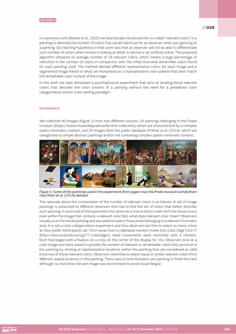
AIC2020 Symposium Natural Colours - Digital Colours 20, 26-27 November 2020 aic2020.org 280
In a previous work (Nieves et al., 2020) we heuristically introduced the so-called “relevant colors” in a painting to describe the number of colors that would stand out for an observer when just glancing at a painting. Our starting hypothesis in that work was that an observer will not be able to differentiate such number of colors when he/she is looking at either a natural or an artificial scene. The proposed algorithm obtained an average number of 18 relevant colors, which means a huge percentage of reduction in the number of colors in comparison with the initial thousand discernible colors found for each painting used. The method derived different representative colors for each image and a segmented image linked to what we interpreted as a representative color palette that best match the remarkable color content of the image.
In this work we have developed a psychophysical experiment that aims at locating those relevant colors that describe the color content of a painting without the need for a predefined color categorization and/or color naming paradigm.
EXPERIMENTS
We collected 40 images (Figure 1) from two different sources: 20 paintings belonging to the Prado museum (https://www.museodelprado.es/en/the-collection), which are characterized by a complex spatio-chromatic content, and 20 images from the public database of Khan et al. (2014), which are categorized as simple abstract paintings and/or not containing complex spatio-chromatic content.
Figure 1: Some of the paintings used in the experiment from (upper row) the Prado museum and (bottom row) Khan et al. (2014) dataset.
The rationale about the computation of the number of relevant colors is as follows. A set of image paintings is presented to different observers who has to find the set of colors that better describe each painting. In each trial of the experiment the observer is instructed to mark with the mouse every pixel within the image that contains a relevant color. But, what does relevant color mean? Observers visually scan the whole painting and are asked to select those pixels belonging to a relevant chromatic area. It is not a color categorization experiment and thus observers are free to select as many colors as they prefer. Participants sat 70cm away from a calibrated monitor model Eizo Color Edge CG277 (https://eizo.es/producto/cg277-coloredge/); head movements were restricted with a chinrest. Each trial began with a fixation on a cross at the center of the display for 10s. Observers look at a color image and were asked to provide the number of relevant or remarkable colors they perceive in the painting by clicking at representative locations within the painting that are considered as valid instances of those relevant colors. Observers were free to select equal or similar relevant colors from different spatial locations in the painting. There was no time limitation per painting to finish the task although no more than 60s per image was recommend to avoid visual fatigue.
AIC2020 Symposium Natural Colours - Digital Colours 20, 26-27 November 2020 aic2020.org
ID039
SESSION 5

AIC2020 Symposium Natural Colours - Digital Colours 20, 26-27 November 2020 aic2020.org AIC2020 Symposium Natural Colours - Digital Colours 20, 26-27 November 2020 aic2020.org280 281
RESULTS AND DISCUSSION
Figure 2 shows on the left side an example of the colors selected as relevant colors for one image from the Prado museum. Each magenta circle signals all colors that better describe the color content of the image according to the subjective impression of this observer. Some colors seem to be quite similar but spatial locations are different (e.g. black and grey colors in the dress of the Queen Johana The Mad, in the coffin and behind figures in that image). Figure 2 (on the right side) also plots all CIE a*b* colors in that paintings versus the a*b* color components of the selected relevant colors for one of the observers. The color gamut (illustrated by the red points in the figure) expanded by all painting colors is greater than the color gamut expanded by the subjective colors selected (blue crosses in the figure). Nevertheless, experimental colors spread around almost all main areas of the original color gamut of the image. This means that observer was able to subjectively select which reduced number of colors was representative of the remarkable colors describing the painting (amongst the thousand discernible colors in the image).
Figure 2: (Left) Example of the colors selected as relevant colors (magenta circles) for one image from the Prado museum. (Right) CIE a*b* color coordinates of all colors within the image and the relevant colors chosen by one observer according to the subjective impression of him.
Figure 3 shows the average number of subjective relevant colors (NSRC) found for all observers and the two image datasets used. Preliminary results suggest that there is almost no difference between the number of subjective colors obtained for the Prado museum’s set (21 colors with 5 standard deviation) and the Khan’s set (22 colors with 11 standard deviation). Curiously standard deviations obtained for the Khan’s dataset was larger than the corresponding values for the Prado museum paintings. The number of subjective relevant colors found are in close agreement with the computational number of relevant colors found if we apply the previous algorithm to those paintings (19 relevant colors with 6 standard deviation). Nevertheless, there is no full agreement between the CIEL*a*b* set of colors selected in the psychophysical experiment and the automatic relevant colors selected by the computational algorithm.
ID039
SESSION 5

AIC2020 Symposium Natural Colours - Digital Colours 20, 26-27 November 2020 aic2020.org AIC2020 Symposium Natural Colours - Digital Colours 20, 26-27 November 2020 aic2020.org 282
Figure 3: Average number of relevant colors (i.e. subjective colors) obtained for all image paintings and all observers.
As the Figure 4 shows, it seems that depending on the painting the constraints imposed by the early algorithm proposed in Nieves et al. (2020) are too restrictive and should be relaxed and optimized someway. In addition, salient areas could influence observers’ choice and should be taken into account someway (Nieves et al., 2018). Most of the subjective colors are closed to the computational relevant colors although some reddish colors (which were characterized by large a* values) were selected by observers and not by the algorithm.
Figure 4: Comparison between the computational colors and relevant colors obtained for the same painting and observer shown in Fig.2.
ACKNOWLEDGEMENTS
The Ministry for Economy, Industry and Competitiveness (MINECO, grant number FIS2017-89258-P); Spanish Ministry of Science Innovation and Universities (MICINN, grant number RTI2018-094738-B-I00); Junta de Andalucía A-TIC-050-UGR18; all of them financed with FEDER Funds.
REFERENCES
J.L. Nieves, L. Gomez-Robledo, Y-J. Chen, J. Romero, “Computing the relevant colors that describe the color palette of paintings”, Applied Optics, vol. 59, 1732-1740 (2020).E.P. Simoncelli and B.A. Olshausen, “Natural images statistics and neural representation”, Annual Review of Neuroscience 24, 1193–1215 (2001).J.M.M. Linhares, P.D. Pinto and S.M.C. Nascimento, «The number of discernible colors in natural scenes,» J.Opt. Soc. Am. A 25, 2918-2924 (2008).K. Masaoka, R. S. Berns, M. D. Fairchild and F. M. Abed, «Number of discernible object colors is a conundrum,» Journal of the Optical Society of America A 30, 264-277 (2013).Prado museum (https://www.museodelprado.es/en/the-collection). F. S. Khan, S. Beigpour, J. van de Weijer, and M. Felsberg, “Painting-91: A large scale database for computational painting categorization,” Machine Vision and Applications 25, 1385–1397 (2014).Eizo Color Edge CG277 (https://eizo.es/producto/cg277-coloredge/). J.L. Nieves and J. Romero, “Heuristic Analysis influence of Saliency in the Color Diversity of Natural Images”, Color Research and Applications, 43(5), 713-725. (2018).
ID039
SESSION 5

AIC2020 Symposium Natural Colours - Digital Colours 20, 26-27 November 2020 aic2020.org
Perception and Evaluation of Luminous Colour Differences
Karin Bieske•, Christoph Schierz, Nicole StubenrauchTechnische Universität Ilmenau, Ilmenau, Germany•Corresponding author: [email protected]
ABSTRACT
Metamerism is the phenomenon whereby different spectral distributions have the same chromaticity coordinates and observers have the same colour perception under identical viewing conditions. However, studies have revealed inconsistency in metamerism, especially with narrow-band spectral distributions like those of LEDs. The perception of 119 subjects (61 younger and 58 older people) was investigated in relation to this fact. In homogeneously backlit light boxes under defined viewing conditions ten LED spectra were tested in 23 different combinations. The subjective judgements of the test persons enabled the calculated luminous colour differences to be evaluated for different colour-matching functions (CIE1931, CIE1964, CIE2006, 2006-TUIL). The influence of age, ambient luminous colours and viewing angles was also considered. The results show that the CIE colour-matching functions have weaknesses and that the age and the observer field size are important factors for predicting perception of luminous colour differences correctly.
KEYWORDS
luminous colour perception I metamerism I LED I colour-matching functions I age-related effects
INTRODUCTION
LEDs (Light Emitting Diodes) have established themselves as a new light source in interior lighting. Luminaires with variable luminous colours being used increasingly. The application of the CIE colour-matching functions (CMF) (CIE 1931 and CIE 1964) can lead to incorrect evaluations of LED spectra for certain spectral distributions. In some cases, equally perceived spectra are mapped to different colour coordinates. In other cases, spectra with identical colour coordinates are perceived visually differently [Bieske et al. (2006), Csuti and Schanda (2008), Polster (2014), Bieske et al. (2016)]. Polster found colour differen¬ces between visually matched LED spectra and the calculated results based on the CIE 1931 CMFs up to ∆u’v‘ = 0.0165 [Polster (2014)]. Kramer investigated which differences in chromaticity are just noticeable. The threshold values he found are in the range between ∆u’v‘ = 0.0004 and ∆u’v‘ = 0.0018 [Kramer and Schierz (2016)]. In some cases, the visible differences in luminous colour are so clearly perceptible that users find them unacceptable.
On the one hand, there are problems with the control of LED lighting systems which are used for homogeneous surface lighting. Due to variations in the LED manufacturing process, LEDs have slightly different spectral distributions when combined in a luminaire. However, if these are not measured correctly, inhomogeneities within the illuminated areas will result. On the other hand, when LEDs of a single luminous colour are used, there are problems with the correct selection of the light sources to be combined (LED binning). In luminaires that allow free selection of luminous colour within a defined gamut, the individual LED-module cannot be characterized correctly. This presents challenges to controlling of specific colour coordinates.
283
ID048
SESSION 5

AIC2020 Symposium Natural Colours - Digital Colours 20, 26-27 November 2020 aic2020.org 284
THEORY
The CIE colour-matching functions of CIE 1931 standard colorimetric observer (CIE 1931) and of CIE 1964 supplementary standard colorimetric observer (CIE 1964) were derived from empirical in¬vestigations. Only the viewing field size was considered, age-related effects were not studied. New CMFs (CIE 2006-2° and CIE 2006-10°) were published by CIE in 2006 on the basis of physiological data. This technical report also established age-related CMFs [CIE 170-1 (2006)]. Between individuals, there is variation in lens and macular pigment properties, the photopigment density, and the number and the distribution of receptors in the retina [Stockman and Sharpe (1999), Webster and MacLeod (1988)].
After carrying out numerous colour-matching experiments, Polster has suggested new CMFs (2006 TUIL-2° and 2006 TUIL-10°) that are based on the CIE 2006 CMFs. However, the z-function of Polster CMFs is shifted by -3 nm [Polster (2014)]. Early exploration of the suggestions showed a good correlation between the calculated colour differences based on the CMFs recommended by Polster and the perceived luminous colour differences by subjects [Polster (2014), Bieske et al. (2016)]. As the investigations were limited to young subjects with an average age of 30 ± 6 years, generalization for different age groups cannot take place. The influence of age and observer field size was therefore considered in further investigations.
Experiments with different luminous colours in the environment (CCT of 2700 K, 3500 K, 6500 K or without additional lighting) failed to prove any influence of the ambient luminous colour and thus of the adaptation conditions on the perception of luminous colours differences. Although the colour perception of the test surfaces changed depending on the ambient luminous colour, this had no significant influence on the evaluation of the degree of perceived luminous colour difference [Bieske (2017)].
EXPERIMENTS
The aim of the present investigation was to test a variety of CMFs for their capacity to model colour perception. Younger and older people were included in the investigations. Comparing subject’s rating with the calculated colour differences ∆u’v’ shows how suitable the CMFs are in this respect. “Good” CMFs will deliver a high correlation between the observed and the calculated luminous colour differences.
Using simulation to establish the possibility of variation in the spectral distribution due to the manufacturing procedure, we selected 10 types of LED with CCT = 4000 K which were likely to be relevant in a study of inconsistency of metamerism. We used chip-on-board phosphor converted LEDs fitted onto a cooling unit. We fitted them into boxes with diffusors for which the luminous surface was 30 cm by 30 cm. The mean luminance L was 800 cd/m² with a CCT of 3500 K. Two adjacent boxes were presented to the subjects in a room at a viewing distance of 1.7 m, i.e. at a viewing angle of 10°. We used an aperture of 10 cm by 10 cm for the 2° viewing angle and a viewing distance of 3.8 m. A background projection screen (2 m by 2 m, viewing angle of ~40°) had a mean luminance of 200 cd/m² and a luminous colour of 3500 K. Figure 1 shows the experimental setup, the spectral distributions of the LEDs and the colour coordinates using CIE 1931 CMFs. Figures 2 represents samples of spectral distributions of different LED-combinations (see Figure 1).
Figure 1: Left: experimental setup, schematic drawing. Centre: spectra of the ten types of LEDs. Right: colour coordinates using CIE 1931 CMFs.
AIC2020 Symposium Natural Colours - Digital Colours 20, 26-27 November 2020 aic2020.org 283
ID048
SESSION 5

AIC2020 Symposium Natural Colours - Digital Colours 20, 26-27 November 2020 aic2020.org AIC2020 Symposium Natural Colours - Digital Colours 20, 26-27 November 2020 aic2020.org 285
Figure 2: Samples of spectral distributions of different LED-combinations.
Figure 3: Top: CMFs tested in the investigation. Below: Method of investigation.
The light boxes were evaluated by 61 young people (< 35 years, Ø 24 ± 4 years) and 58 older people (> 60 years, Ø 70.5 ± 6 years), who rated 23 luminous colour differences they perceived. The subjects were 57 men and 62 women. A semantic scale between 0 (no difference) and 8 (very large difference) was used. The CMFs that were included in the investigation were the standard CMFs CIE 1931 and CIE 1964 [DIN EN ISO 11664-1], plus the CMFs CIE 2006-2° and CIE 2006-10° [CIE 170-1 (2006)] and the CMFs 2006 TUIL-2° and 2006 TUIL-10° recommended by Polster [Polster (2014)]. An additional calculation was carried out using the CIE 170-1: 2006 recommendation in respect of older people. These are the CMFs shown in Figure 3 (top). For each LED the colour coordinates were determined from its spectrum and the different CMFs. From these data the colour difference u’v’ for each combination of LEDs was calculated [DIN EN ISO 11664-5]. Besides comparing the calculated colour differences with the subjective ratings of the participants in the experiment, we also focussed on the changes in colour perception attributable to ageing. The methodology we used is shown in Figure 3 below.
We analysed the data by linear regression of the subjective ratings versus calculated colour differences ∆u’v’ for each CMFs. High correlation in the data is associated with a high coefficient of determination R² and a high goodness of fit.
ID048
SESSION 5

AIC2020 Symposium Natural Colours - Digital Colours 20, 26-27 November 2020 aic2020.org AIC2020 Symposium Natural Colours - Digital Colours 20, 26-27 November 2020 aic2020.org 286
RESULTS
Table 1 summarises the mean ratings and the intervals of confidence 95% for the LED-combinations shown in Figure 2 for the investigation at 10° viewing angle and at CCT = 3500 K.
Table 1: Mean subjective ratings (mean ± confidence interval) of N subjects for selected LED-combinations shown in Figure 2 for 10° and 3500 K and its colour differences ∆u’v’ in dependence of the CMFs.
Table 2: Coefficient of determination R² for the linear regression of the data for 10°/ 3500 K (see Figure 4).
ID048
SESSION 5

AIC2020 Symposium Natural Colours - Digital Colours 20, 26-27 November 2020 aic2020.org AIC2020 Symposium Natural Colours - Digital Colours 20, 26-27 November 2020 aic2020.org 287
Figure 4: Results of the investigations: mean and confidence interval and linear regression function (dotted line) for 10°/ 3500 K. Coeffi¬cient of determination R² (see Table 2).
Clear inconsistences become apparent when using the standard CMFs. Where the colour dif-fe¬rence is small it is not perceived as such by the observers and ditto for larger differences. There is also a clearly age-related effect. Figure 4 shows relevant results diagrammatically. A summary of coef¬fi¬cients of determination R² for the linear regression is given in Table 2. The results in dependents of the viewing field size are shown in Table 3.
Table 3: Coefficient of determination R² for the linear regression of the data for 10° und 2°/ 3500 K.
ID048
SESSION 5

AIC2020 Symposium Natural Colours - Digital Colours 20, 26-27 November 2020 aic2020.org AIC2020 Symposium Natural Colours - Digital Colours 20, 26-27 November 2020 aic2020.org 288
CONCLUSION
The results show that the CIE colour-matching functions are less then perfect and that the age and the viewing angle size are important factors for predicting luminous colour differences precisely. For the subjects as one group, without age differentiation, not even moderate correlation was found between the calculated luminous colour differences and those perceived, for any of the CMFs tested. The best compromise is achieved by the 2006 TUIL-2° proposal. There are significant differences between the two age groups. For younger people, the CMFs recommended by Polster model the colour perception better than the standard procedure used to date. For older people, the colour-matching functions of CIE 1931 and those recommended by Polster (2006 TUIL-10°A70) and by the CIE (CIE 2006-10°A70) model colour perception best (A70 denotes the age correction in the respective CMFs). For smaller test fields higher coefficients of determination R² were found (Table 3).
REFERENCES
Bieske, K., P. Csuti, J. Schanda. 2006. Colour appearance of metameric lights and possible colo¬ri-me¬tric description. In: Proceedings of the CIE Expert Symposium on Visual Appea¬rance, CIE 032:2007, 137-139.Bieske, K., J. Michl, N. Stubenrauch, C. Schierz, A. Frohnapfel, A. Wilm. 2016. Ansätze zur Optimierung des Binnings weißer LEDs? In: Proceedings of the Licht 2016 conference, 709-716.Bieske, K., J. Michl, J. Kolmer, N. Stubenrauch, C. Schierz, A. Frohnapfel, A. Wilm. 2017. Testing Colour-Matching Functions - Perception of Luminous Colour Differences of white LEDs in Relation to Ambient Luminous Colour and Age of Observers. In: LUX EUROPA 2017 Proceedings of the European Lighting Conference, 378-383.CIE 170-1. 2006. CIE Fundamental Chromaticity Diagram with Physiological Axes – Part 1.Csuti, P., and J. Schanda. 2008. Colour Matching Experiments with RGB-LEDs. Color Res Appl 33: 108-112.DIN EN ISO 11664-1. 2011. Farbmetrik - Teil 1: CIE farbmetrische Normalbeobachter.DIN EN ISO 11664-5. 2017. Farbmetrik - Teil 5: CIE 1976 L*u*v* Farbenraum und gleichabständige u’, v’-FarbtafelKramer, G., and C. Schierz. 2016. Color discrimination subject to illuminant and color transition. Color Res Appl 41: 457-467Polster, S., and K. Bieske. 2013. Neue spektrale Empfindlichkeitsfunktionen zur Erfassung visueller Farbgleichheit bei LED-Spektren. In: Proceedings of the 2013 Lux junior conference, 1-14.Polster, S. 2014. Neue Spektralwertfunktionen für die korrekte Bewertung von LED-Spektren und Ein¬führung eines Metamerie-Index für Beobachterfeldgrößenabhängigkeit. Uelvesbüll: Der Andere Verlag.Stockman, A., and L. Sharpe. 1999. Cone spectral sensitivities and color matching. In: Gegenfurt-ner, K. (Hrsg.); Sharpe, L. (Hrsg.): Color vision: from genes to perception. Cambridge University Press, 53–87.Webster, M. A., and D. I. A. MacLeod. 1988. Factors underlying differences in the color matches of normal observers. In: Journal of the Optical Society of America 5: 1722–1735.
ID048
SESSION 5

AIC2020 Symposium Natural Colours - Digital Colours 20, 26-27 November 2020 aic2020.org
The colour of emerging textile for urban regeneration
Katia Gaspariniaa• a IUAV University of Venice, Venice (Italy)•Corresponding author: [email protected]
ABSTRACT
This paper aims to study the role of coloured installation in the urban regeneration processes. The urban colour designs are fundamental for many reasons: the environmental quality and the human wellbeing, the space valorization and the wayfinding. In this focus the colour, the material and the interaction play an important role. Some of most interesting installations in the world are made by generative design and emerging technologies, in a multidisciplinary design approach. The research methodology is based on the analysis of international case studies about interactive coloured installations, to define the role of colour in relation with the urban scene. The results seem to show that emerging technologies are still hardly applied to urban installations. The role of the colour is fundamental, in particular the one of warm colours or multicolour installations.).
KEYWORDS
emerging technologies I urban design I colour textile I urban place
INTRODUCTION
In the contemporary Age the urban scene changes appearance and space perception through innovative design approaches: new shapes and paths, interactive installations, connected spaces and so on. Some of the most famous projects of urban design in the world, where the colour plays a key role, are for example: the historical project in Rotterdam of Topotek 1 called “Superkilen”; some projects of Martha Schwartz Architect; the Red Ribbon Park in China; the Millenium Park in Chicago; several projects of the Serpentine Gallery Pavilions, and many others. In these installations the colour and light become the most important design tool, especially in experimental projects designed by some young architects and designers using emerging technologies and coloured effects.
Actually, inside some urban spaces around the world, in some cases we can report of interesting innovative pavilions or urban spaces covered with fluid, dynamic and coloured shapes that attract people’s attention, as landmarks. According to Januchta-Szostak (2010) we could affirm that in the 20th century, the time of unification of mass building and cultural patterns, art in the public domain took on a very responsible role of creating the important spatial tags and building identity of the place. Parametric design and emerging materials as responsive textile and emerging technologies make some of the most interesting projects. In some cases, the objects are made with textile materials and the interaction is conceived thanks to the cooperation of the designer with lighting and digital engineering companies, in a multidisciplinary approach. The research makes understand that the most common features of some urban installations are: the use of digital technologies, the human interaction, the use of innovative materials, the changing colours thanks to the light effect, the generative design concept. These urban installations look like moving sculptures, made with interactive systems that change the urban space perception and colours. In particular, the colour is the most important design tool for a Human Centred Design in the urban scene: it’s important for people’s way-finding and for the space regeneration. The initial research assumption was to study the relationship between the colour and the responsive proprieties of the urban installation compared to the involved technologies. In the urban design the requirement of visibility, well-being, wayfinding, etc. are fundamental. The research output will be useful to define the guideline to a Human Centred Design approach to the urban regeneration by means of the emerging technologies and their colours.
289
ID068
SESSION 5

AIC2020 Symposium Natural Colours - Digital Colours 20, 26-27 November 2020 aic2020.org 290
THE COLOUR VISIBILITY IN THE URBAN SPACE
The “colour” choice is fundamental to define the role and the interactive potentiality of the urban installations. Actually, according to Gamido, “colour is not a simple element for the environment definition and unification; it is a visual characteristic that stands out from the chaos and the complexity of the visual field. It is, also, an easy way to achieve the identification of the different city zones and to promote the orientation of the population, because colour is the object’s characteristic which the eye first perceives, even before form or texture” (Gamido, Moreira da Silva, 2015).
Indeed, in many situations the urban installations could become an urban signal that can be useful for urban way-finding or they could identify a specific urban place or valorise an abandoned area or a building. An interesting example of these applications is the installations of the Quintessenz artists. They play with the colour effects in the open space. As they wrote, « their installations play with the spectator: they invite the spectators to walk around and experience their artworks from different angles» (Quintessenz, 2020). Or is interesting “Into the Edge” installation of SO-IL, 2019, a colourful site-specific made with textile strips. The environmental quality depends also on the environmental colours and their applications on urban design may improve human wellbeing. Indeed, the recent research about the relationships between landscape colour and user satisfaction in urban parks (Saeedi & Dabbagh, 2020) explain the different role of colour on urban perception. The colour chosen can create a high impact on the emotion of visitors (McLellan & Guaralda 2014; Babakhani 2017) and, as we know, there is a great difference between the use of cool and warm colours. The warm colours, in particular the different red chroma levels, are often applied to identify a direction in urban space (Red Ribbon Park project, for example, or Martha Schwartz project for Gran Canal Square in Dublin, etc.). The studies of Robinson (2004), Pederson (2012) and Emitz (2006) states that warm colours can enhance the quality perception in the space and also create a sense of happiness, enjoyment and satisfaction for visitors. Also, the research of Saeedi & Dabbagh (2020) and other studies conducted in four urban parks of Tehran (Taghvaie and Saniei, 2008) found that the use of natural colours like green in park furniture lead to users’ satisfaction. The different research results, here described, show that the colour choice in urban space and its effects are very different one from the other. These different approaches and results might depend on the latitude (in particular the natural day lighting) and on the cultural traditions of places analysed, as well on specific research objectives. In this research, a defined place has not been chosen, because the objectives were linked to the colour, technologies and to the urban regeneration concept.
METHODOLOGY
In order to achieve the predefined objectives, the research process has been developed as follows:
- Review of the objectives of chromaticness compared to environmental and human interaction (see 2);- Explanation of the concept of emerging textile (3.1); - Definition of the criteria for the analysis of case studies (3.2);- Selection of case studies of coloured urban installation (3.3);- Comparison of the results of the analysis (3.4).
AIC2020 Symposium Natural Colours - Digital Colours 20, 26-27 November 2020 aic2020.org 289
ID068
SESSION 5
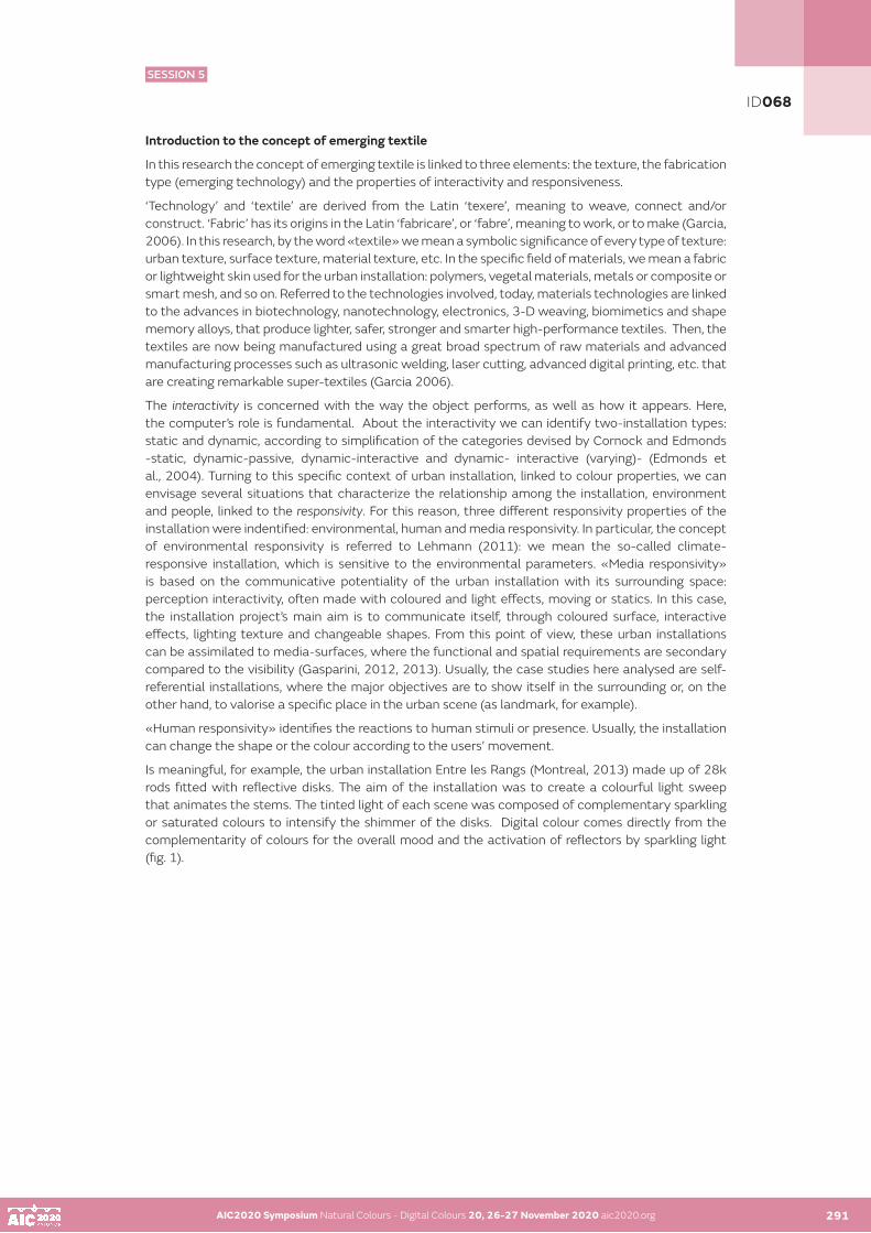
AIC2020 Symposium Natural Colours - Digital Colours 20, 26-27 November 2020 aic2020.org AIC2020 Symposium Natural Colours - Digital Colours 20, 26-27 November 2020 aic2020.org 291
Introduction to the concept of emerging textile
In this research the concept of emerging textile is linked to three elements: the texture, the fabrication type (emerging technology) and the properties of interactivity and responsiveness.
‘Technology’ and ‘textile’ are derived from the Latin ‘texere’, meaning to weave, connect and/or construct. ‘Fabric’ has its origins in the Latin ‘fabricare’, or ‘fabre’, meaning to work, or to make (Garcia, 2006). In this research, by the word «textile» we mean a symbolic significance of every type of texture: urban texture, surface texture, material texture, etc. In the specific field of materials, we mean a fabric or lightweight skin used for the urban installation: polymers, vegetal materials, metals or composite or smart mesh, and so on. Referred to the technologies involved, today, materials technologies are linked to the advances in biotechnology, nanotechnology, electronics, 3-D weaving, biomimetics and shape memory alloys, that produce lighter, safer, stronger and smarter high-performance textiles. Then, the textiles are now being manufactured using a great broad spectrum of raw materials and advanced manufacturing processes such as ultrasonic welding, laser cutting, advanced digital printing, etc. that are creating remarkable super-textiles (Garcia 2006).
The interactivity is concerned with the way the object performs, as well as how it appears. Here, the computer’s role is fundamental. About the interactivity we can identify two-installation types: static and dynamic, according to simplification of the categories devised by Cornock and Edmonds -static, dynamic-passive, dynamic-interactive and dynamic- interactive (varying)- (Edmonds et al., 2004). Turning to this specific context of urban installation, linked to colour properties, we can envisage several situations that characterize the relationship among the installation, environment and people, linked to the responsivity. For this reason, three different responsivity properties of the installation were indentified: environmental, human and media responsivity. In particular, the concept of environmental responsivity is referred to Lehmann (2011): we mean the so-called climate-responsive installation, which is sensitive to the environmental parameters. «Media responsivity» is based on the communicative potentiality of the urban installation with its surrounding space: perception interactivity, often made with coloured and light effects, moving or statics. In this case, the installation project’s main aim is to communicate itself, through coloured surface, interactive effects, lighting texture and changeable shapes. From this point of view, these urban installations can be assimilated to media-surfaces, where the functional and spatial requirements are secondary compared to the visibility (Gasparini, 2012, 2013). Usually, the case studies here analysed are self-referential installations, where the major objectives are to show itself in the surrounding or, on the other hand, to valorise a specific place in the urban scene (as landmark, for example).
«Human responsivity» identifies the reactions to human stimuli or presence. Usually, the installation can change the shape or the colour according to the users’ movement.
Is meaningful, for example, the urban installation Entre les Rangs (Montreal, 2013) made up of 28k rods fitted with reflective disks. The aim of the installation was to create a colourful light sweep that animates the stems. The tinted light of each scene was composed of complementary sparkling or saturated colours to intensify the shimmer of the disks. Digital colour comes directly from the complementarity of colours for the overall mood and the activation of reflectors by sparkling light (fig. 1).
ID068
SESSION 5
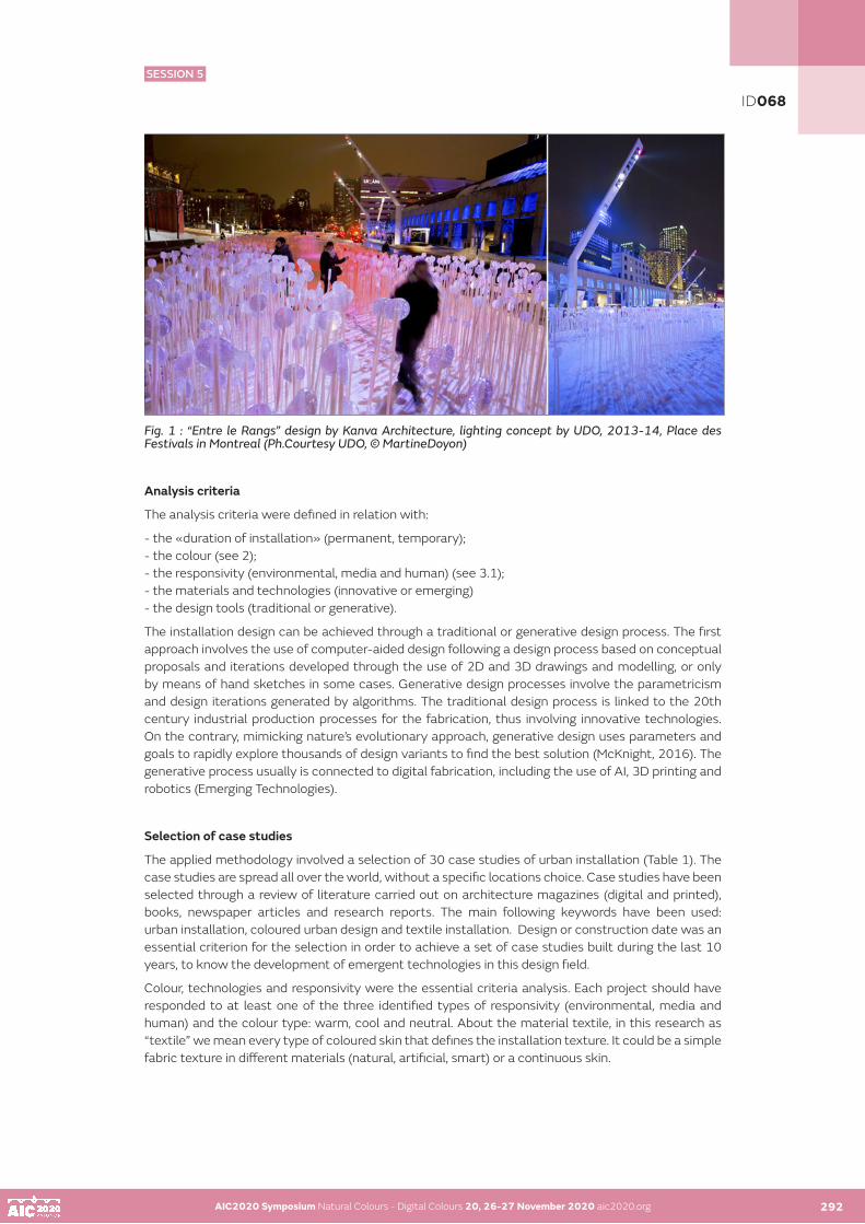
AIC2020 Symposium Natural Colours - Digital Colours 20, 26-27 November 2020 aic2020.org AIC2020 Symposium Natural Colours - Digital Colours 20, 26-27 November 2020 aic2020.org 292
Fig. 1 : “Entre le Rangs” design by Kanva Architecture, lighting concept by UDO, 2013-14, Place des Festivals in Montreal (Ph.Courtesy UDO, © MartineDoyon)
Analysis criteria
The analysis criteria were defined in relation with:
- the «duration of installation» (permanent, temporary); - the colour (see 2); - the responsivity (environmental, media and human) (see 3.1); - the materials and technologies (innovative or emerging)- the design tools (traditional or generative).
The installation design can be achieved through a traditional or generative design process. The first approach involves the use of computer-aided design following a design process based on conceptual proposals and iterations developed through the use of 2D and 3D drawings and modelling, or only by means of hand sketches in some cases. Generative design processes involve the parametricism and design iterations generated by algorithms. The traditional design process is linked to the 20th century industrial production processes for the fabrication, thus involving innovative technologies. On the contrary, mimicking nature’s evolutionary approach, generative design uses parameters and goals to rapidly explore thousands of design variants to find the best solution (McKnight, 2016). The generative process usually is connected to digital fabrication, including the use of AI, 3D printing and robotics (Emerging Technologies).
Selection of case studies
The applied methodology involved a selection of 30 case studies of urban installation (Table 1). The case studies are spread all over the world, without a specific locations choice. Case studies have been selected through a review of literature carried out on architecture magazines (digital and printed), books, newspaper articles and research reports. The main following keywords have been used: urban installation, coloured urban design and textile installation. Design or construction date was an essential criterion for the selection in order to achieve a set of case studies built during the last 10 years, to know the development of emergent technologies in this design field.
Colour, technologies and responsivity were the essential criteria analysis. Each project should have responded to at least one of the three identified types of responsivity (environmental, media and human) and the colour type: warm, cool and neutral. About the material textile, in this research as “textile” we mean every type of coloured skin that defines the installation texture. It could be a simple fabric texture in different materials (natural, artificial, smart) or a continuous skin.
ID068
SESSION 5

AIC2020 Symposium Natural Colours - Digital Colours 20, 26-27 November 2020 aic2020.org AIC2020 Symposium Natural Colours - Digital Colours 20, 26-27 November 2020 aic2020.org 293
Table 1: Case studies of the research Case study Year Status Designer Place ColourUrban Studio Ecoc1 2011 Temp Florian Tuercke Tallin YellowPortal Da Consciência 2012 Perm Rojkind Arquitectos Cidade Do México RedUrban Shade 2013 Perm Hq Architects Israel Red/PinkPolymorph 2013 Temp Jenny Sabin Orléans WhiteEntre Le Rangs 2013 Temp Udo Design Montreal WhiteFashions Fishing Rope 2013 Temp Orly Genger Madison Square P. Red/Blu/Yel.Warde 2014 Perm Hq Architects Jerusalem RedAarau Bus Station Canopy 2014 Perm Vehovar&Jauslin Arch. Aarau (Ch) BlueDelirious Frites 2014 Temp Les Astronautes Quebec City RedEphemeral Pavillion 2015 Temp John Wardle Architects Melbourne Red/PinkIcd/Itke Research Pavillon 2016 Perm Stuttgard University Stuttgard Grey/WhiteLes Volumes Sourds 2016 Temp Atelier Yokyok Massy (Fr) Blue/GreenUrban Tree Lounge 2016 Temp Stefano Boeri Arch. Milan (It) MulticolourThe Giant Squid 2016 Temp Moradavaga Island Of São Miguel (Azores) RedLumen 2017 Temp Jenny Sabin New York (Usa) MulticolourAbwab Pavilion 2017 Temp Fahed+Architects Dubai BrownTeflon Pavilion 2017 Temp Un Studio Amsterdam (Nl) WhiteElytra Filament Pavilion 2017 Temp Stuttgard University Vitra Campus Grey/WhiteGaiamotherthree 2018 Temp Ernesto Neto Zurigh (Ch) Multicolour1.78 Madrid 2018 Temp Janet Echelman Madrid (Es) RedBlue Print 2018 Perm Urban Matter Denver (Usa) Blue/PurpleUrban Inprint 2019 Temp Studio Ini New York (Usa) RedCobalt Muffin Installation 2019 Temp Atelier Yokyok Shangai BlueInto The Hedge 2019 Perm So-Il Architects Columbus (Usa) MulticolourEastern Lights 2019 Temp Quintessenz Bucharest (Ro) MulticolourThe Catenary And 2019 Temp Manuel Bouzas Palma De Mallorca (Es) Red The Arc Installation + Santiago Del Aguila Prismatic 2019 Temp Hou De Sousa Ghent (Usa) MulticolourAtomic 2019 Temp Hou De Sousa Georgetown (Usa) MulticolourBending Arc 2020 Perm Janet Echelman Florida (Usa) Blue/GreenMurmuration’ Installation 2020 Temp SO-IL Architects Atlanta (Usa) Green
Results and discussion
Most of the analysed case studies are referred to temporary installations (22 out of 30). They are usually designed and built for artistic or cultural events; otherwise they are designed to valorise the urban place. The results linked to the design tools and technologies involved in their construction are interesting: there are very few case studies designed with generative design tools and fabricated with the support of emerging technologies (8 out of 30). In contrast with the held assumption, the emerging technology is not widely used. The artists seem to prefer the art-craft or a low technology approach. Therefore, many urban projects are realized with simple components as, for example, polymer or fabric or metal strips, mesh or with recycled object as plastic, glass, textile, etc., connected by mean metal cable or plates.
ID068
SESSION 5

AIC2020 Symposium Natural Colours - Digital Colours 20, 26-27 November 2020 aic2020.org AIC2020 Symposium Natural Colours - Digital Colours 20, 26-27 November 2020 aic2020.org 294
The projects that have an active and dynamic responsivity with surrounding are complex system, designed and realized thanks to the cooperation among multidisciplinary teams, composed by artists, architects and engineering firms. In this sense, famous examples are the installations of Jenny Sabin and Janet Echelman.
Regarding the interaction and responsivity relationship, the active interactivity is linked only to human (60%) and environmental responsivity (40%). The passive interaction is more connected to media responsivity (50%). In this research the media responsivity is specifically about the colour and the visibility (indifferently compared to the immobility or dynamism properties).
According to the survey carried out on the selected case studies, the warm colour seems to prevail over the cold and neutral colour textiles (36%). The warm colours were: yellow, red and the different red’s chromas and values (orange, pink, etc.). The visibility power of red colour in urban scene seems to prevail and it seems to be linked to human and environmental responsivity of the projects. The cold colours are connected more to the media responsivity. A third of the installations are multicolour (27%) and most of these are related to passive interaction.
CONCLUSION
The research has involved the analysis of 30 case studies of coloured urban installation. Case studies have been investigated according to a set of criteria including: the colour, the interactivity (static or dynamic), type of responsivity (environmental, human and media); the duration (permanent or temporary) the use of innovative or emerging technologies and their relationship with the design process (traditional or generative). According to the statistical analysis, we convey two pieces of important information about the colour and the technologies involved.
Regarding the colour, the warm colours prevail over the cold and neutral colour installation, with an interesting perceptual of multicolour projects. Therefore, the visibility concept of the installations prevails in urban space and their environmental and human responsivity is important.
In addition, the emerging technologies are still hardly applied to urban installations.
In conclusion, we might affirm that the visibility concept of the installations in urban space prevails and their environmental and human responsivity is considered important. Moreover, it seems that the artists have a low level of knowledge of emerging technologies and they prefer the art craft design in contrast with a multidisciplinary and digital approach to the contemporary urban design.
ID068
SESSION 5

AIC2020 Symposium Natural Colours - Digital Colours 20, 26-27 November 2020 aic2020.org AIC2020 Symposium Natural Colours - Digital Colours 20, 26-27 November 2020 aic2020.org 295
REFERENCES
BooksEmitz, B. (2006). Pink: The exposed color in contemporary art and culture. Ostfildern: Hatje Cantz. Robinson, N. (2004). The planting design handbook (2nd ed.). Aldershot: Ashgate.
Articles in journalsBabakhani, R. (2017), Color and Light in Architecture and its Effects on Spirits of Space Users in a Psychological View, Journal of Architectural Engineering Technology. https://pdfs.semanticscholar.org Garcia, M. (2006), Architecture + Textiles = Architextiles. Archit Design, 76: 5-11. doi:10.1002/ad.345Taghvaie, M., & Saniei, R. (2008). An analysis of the present situation of urban structure in Tehran parks. Journal of Humanities the University of Isfahan., 30, 91–111. Gasparini, K., (2013). “Media architecture: origin, synonyms and interpretations”, Screencity journal, n.1 jan-april 2013, ISSN 2281-1516
Articles in anthologies or proceedingsAhmed S.A. (2018), “Interaction and Interactivity: In the Context of Digital Interactive Art Installation”, in Human computer interaction, Editors: Kurosu, Masaaki (Ed.) 19th International Conference, HCI International 2017, Vancouver, BC, Canada, July 9-14, 2017, ProceedingsEdmonds, E. (2011). Interactive Art. In L. Candy & E. Edmonds (Eds.), Interacting: art, research and the creative practitioner. (pp. 18–32). Faringdon: Publishing Ltd. Gamito M., Moreira da Silva F. (2015), “Color Ergonomic Function in Urban Chromatic Plans” . 6th International Conference on Applied Human Factors and Ergonomics (AHFE 2015) and the Affiliated Conferences, AHFE 2015. Elsevier, doi:10.1016/j.promfg.2015.07.901 Gasparini, K., Premier, A. (2019). “The future of Responsive Surfaces in the Liquid Modernity”. In Future Talks 019. Surfaces - Lectures and workshops on technology and conservation of the modern, November 11 to 13, 2019. Munich, Germany: The Design Museum (in print). Lehmann, S. (2011). “Energy-Efficient Building Design: Towards Climate-Responsive Architecture”. In Built Environment, UNESCO, Encyclopedia of Life Support Systems (EOLSS). McLellan G and Guaralda M. (2014). “Environmental color and well-being, past present and future of public space”. In: International Conference on Art, Architecture and Urban Design, Bologna, Italy. McNight M. (2016), “Generative Design: What it is? How is it Being Used? Why it’s a Game Changer!”, in DesTech Conference Proceedings, KnE Publishing, DOI: 10.18502/keg.v2i2.612Pederson, C. B. (2012). “Examining the use of urban colour in the hardscape of outdoor public spaces” (Master of Landscape Architecture Guelph, Ontario, Canada), in Saeedi I., Dabbagh E. (2020 Premier, A., (2019). “Solar shading devices integrating smart materials: an overview of projects, prototypes and products for advanced façade design”, in Architectural Science Review, Taylor & FrancisSaeedi I., Dabbagh E. (2020), “Modeling the relationships between hardscape color and user satisfaction in urban parks”. In: Environment Development and Sustainability · July 2020 , © Springer Nature B.V. Januchta-Szostak (2010). “The Role of Public Visual Art in Urban Space Recognition”, in Cognitive Maps, edited by: Karl Perusich, ISBN 978-953-307-044-5, pp. 140, January 2010, INTECH, Croatia , www.intechopen.com Edmonds, E., Turner, G., & Candy, L. (2004). Approaches to interactive art systems. 2nd international conference on Computer graphics and interactive techniques, Proceedings, Australasia and South East Asia, Singapore.
ACKNOWLEDGEMENTS
This research has been conducted by the authors at the ‘Eterotopie. Colour, Light and Communication’ Research Centre in Italy. Thanks to Ludovic Lefévère and SO-IL for photos and technical information.
ID068
SESSION 5

AIC2020 Symposium Natural Colours - Digital Colours 20, 26-27 November 2020 aic2020.org
Color analysis of the Old Town district in Cracow
Agata Kwiatkowska-Lubańskaa, Marta Osipczukb
a Jan Matejko Academy of Fine Arts in Cracowb Jan Matejko Academy of Fine Arts in Cracow
Krakow is a significant city for Polish culture, the historic centre (the Old Town district) attracts over 15 million tourists every year. The Old Town district is largely under conservation protection, but strict colouring recommendations exist only for the part of the buildings situated between the Main Market Square and the line of the former city walls. In the rest of the district, the colours are chosen in a chaotic way, not taking into account the importance of colour for the image of the city.
In the academic year 2019/2020, a group of 30 second-year students of the Academy of Fine Arts in Krakow, under the direction of the lecturers, analysed the colour schemes of 300 buildings in the Old Town district. The analysis made use of Jean-Philippe Lenclos’ method of colour geography, taking into account in situ colour samples, the use of NCS colour charts and photographic documentation.
A separate colour palette was created for each of the buildings, taking into account the colours of the facade, windows and doors, as well as the notation of the colours in the NCS system. On this basis, a colour map of the Old Town district was created, which was analysed for such features as hue, chromaticness, whiteness and blackness. As a result of the analysis, conclusions concerning the local colour palette were formulated, which is to be followed by the creation of a colour chart dedicated to the architecture of Krakow.
KEYWORDS
environmental colour I colour and heritage I colour in education
296
ID095
SESSION 5

AIC2020 Symposium Natural Colours - Digital Colours 20, 26-27 November 2020 aic2020.org
Analysis of mechanism in material estimation by CNN
Nozomi Tobarua•, Noriko Yataa, Yoshitsugu Manabea
a Chiba University, Japan•Corresponding author: [email protected] author: Nozomi Tobaru
ABSTRACT
Humans can perceive texture from the physical properties of the surface of an object. The texture is a perception caused by differences in the properties of materials, which also affects the appearance of a color. However, it is still unclear how humans process vision and from what features they infer materials. On the other hand, the Convolutional Neural Network (CNN), a model that imitates the hierarchical information processing process in the brain, has been used to study vision. The purpose of this study is to analyze the mechanism in material estimation CNNs. We propose a method to construct a relationship between intermediate features and materials by optimizing the combinations of arithmetic nodes. We are also constructing a network that realizes input-output relations that match the training data, using Cartesian Genetic Programming (CGP) which is a type of evolutionary computation and to analyze the importance of intermediate features in a particular texture.
KEYWORDS
convolutional neural network I evolutionary computation I material estimation
INTRODUCTION
Humans can perceive a texture from the physical properties of an object’s surface. However, it is still unclear how humans process visual images and estimate texture based on physical properties. On the other hand, visual research using the Convolutional Neural Network (CNN) (Kobayashi et al. 2016), model that imitates the hierarchical information processing process in the brain, is in progress. Kobayashi et al. analyzed the mechanism of texture estimation using CNN. They constructed texture estimation CNNs that recognize texture with sufficient accuracy and whose patterns of misrecognition are similar to those of humans by training models such as GoogLeNet (Szegedy et al. 2015) and VGG16 (Simonyan et al. 2014), which were pre-trained on the object recognition task by ImageNet, on the material estimation task.
We also visualized the intermediate layer. In this study, we propose a method to analyze the importance of intermediate features in a particular texture by constructing the formula that represents the relationship between intermediate features and texture using evolutionary computation for analyzing the mechanism of the material estimation CNN.
PROPOSED METHOD
In this chapter, we describe a method for constructing the material estimation CNN and a proposed method for analyzing the importance of intermediate features by constructing the relationship between intermediate features and texture using evolutionary computations.
297
ID051
SESSION 6

AIC2020 Symposium Natural Colours - Digital Colours 20, 26-27 November 2020 aic2020.org 298
2.1. Construction of the material estimation CNN
We construct the relationship between CNN features and texture using the material estimation CNNs constructed in section 2.1 as a feature extractor.
2.1.1. Preparing a Dataset
One of the texture datasets available for texture research is Materials in Context Database (MINC) (Bell et al. 2015). They also published the MINC-2500 dataset, which is a collection of 2500 images per category from MINC. In this study, MINC-2500 is used for the experiments.
Here, MINC-2500 is composed of wood, water, wallpaper, tiles, stones, sky, skin, plastered stone, plastic, paper, painted, mirror, mirror, metal, metal, leather, hair, glass, food, and a sample image of MINC-2500 is shown in Figure 1.
Figure 1: Sample image of MINC-2500
2.1.2. Architecture and finetuning
Also, we discuss the relationship between the most important features and the most accurate estimation equations for each texture. To generate accurate CNN models even with a small number of images, we finetune the pre-trained models for an object recognition task. For the architecture of the CNN model, we use VGG16, which has a good record in the image recognition task, to train with the ILSVRC 2012 Dataset (1000 categories of object recognition tasks). The parameters of the model are used as the initial values. For finetuning, we change the number of neurons in the final layer to 23, which is the number of classes of MINC-2500.
2.2. Construct a formula for the relationship between CNN features and texture
The material estimation CNN constructed in section 2.1 is used as a feature extractor and to construct a formula for the relationship between CNN features and texture.
2.2.1. CNN features
Kobayashi et al. showed that the shallow, intermediate layer captures the features of the object itself (Kobayashi et al. 2016). In contrast, the deep layer generates filters corresponding to the features of the individual textures. CNN has the convolutional layer, the pooling layer, and the fully-connected (FC) layer. In the convolutional layer, the weighted sums are computed by multiplying the kernels by the input image (or the feature map of the previous layer), and the convolution process is performed by sliding the kernels. We also compute a weighted sum of the outputs of the neurons in the previous layer in FC layers. In this study, we input the images in the MINC-2500 dataset to the material estimation CNN constructed in section 2.1, and the output values in the intermediate layers, such as the convolutional layer and the FC layer, are defined as CNN features.
AIC2020 Symposium Natural Colours - Digital Colours 20, 26-27 November 2020 aic2020.org 297
ID051
SESSION 6

AIC2020 Symposium Natural Colours - Digital Colours 20, 26-27 November 2020 aic2020.org AIC2020 Symposium Natural Colours - Digital Colours 20, 26-27 November 2020 aic2020.org 299
2.2.2. Method of constructing the formula
In this study, we formulate the objective variable using Cartesian Genetic Programming (CGP) (Miller et al. 2000), a type of evolutionary computation.
Evolutionary computation is a method of deforming, synthesizing, and selecting data structures to imitate the mechanism of biological evolution. Genetic programming, a typical example, uses data structures as genotypes and searches for better genes by repeatedly crossing and mutating them at a certain probability.
In CGP, a node structure consisting of input nodes, operation nodes and output nodes is used as a genotype, and learning is performed by optimizing the connections and operations of operator nodes so that the values output from the output nodes are made close to the correct answer data. And it is possible to construct a formula by tracing the constructed node structure from the output.
The CNN features obtained from the images in the material dataset are used as input values, and the values of the correct labels converted into one-hot vectors are used as the correct data, and CGP is trained as a classifier to formulate the relationship. To construct the formula that is not only accurate but also small in size and easy to understand the relationship between features and textures, we perform a multi-objective optimization using SPEA2 (Zitzler et al. 2002) as the search method. This allows us to obtain the relationship between the CNN features and each texture.
2.2.3. Analysis of Relational formulas
Evolutionary computation is a probabilistic method, and therefore, it is necessary to perform the training multiple times. In the analysis of the relational formulas, we consider the features that are commonly used in the relational formulas for each texture to be of high importance. For the features that are judged to be of high importance, we visualize the intermediate layer of the CNN in order to understand the process of calculating the features and analyze on what kind of image features they are calculated. In addition, we discuss the relationship between the most important features and the most accurate estimation equations for each texture.
3. EXPERIMENT AND DISCUSSION
In this chapter, we describe the construction of the material estimation CNN and the results of the relational formulas.
3.1. Construction of the material estimation CNN
The number of neurons in the final layer of the pre-trained VGG 16 was changed to 23, and Momentum SGD (lr = 0.01, momentum = 0.9) was used as the optimization method using the MINC-2500 dataset. The results of the ten epochs training are shown in Table 1.
Table 1: Accuracy for material estimation CNN.
Because multiple textures are reflected in the images, the accuracy is considered to be lower than the value in the normal object recognition task.
To analyze this, we visualize the intermediate features: in Max Pooling layer 2 (56 x 56 x 128), the feature map with the largest average activation value (56 x 56) out of 128 images, and in Max Pooling layer 5 (7 x 7 x 512), the feature map with the largest average activation value (7 x 7) out of 512 images, was found to be Each of the larger feature maps is visualized as a heat map. In this case, a larger pixel value indicates a larger activation value. Figures 2 and 3 show the results of the visualization for the correct and incorrect answer examples.
ID051
SESSION 6

AIC2020 Symposium Natural Colours - Digital Colours 20, 26-27 November 2020 aic2020.org AIC2020 Symposium Natural Colours - Digital Colours 20, 26-27 November 2020 aic2020.org 300
Figure 2 shows that the activation values increase at the chair part of plastic, which conforms with the correct label. In contrast, as shown in Figure 3, the activation values for the wrong answer are higher at the location that is different from the label. Therefore, it is considered that the network judges it as wrong material by looking at the other parts of the image where are more conspicuous than the target objest. In this way, MINC-2500 often contains multiple objects of different textures in its images, and therefore the classification accuracy is considered to be lower than usual. However, it is expected that humans also give the same kind of wrong answers, so the model is worth analyzing.
Figure 2: Example of correct answers. (Ground truth: plastic, output: plastic)
Figure 3: Example of incorrect answers. (Ground truth: plastic, output: metal)
3.2. Constructing a formula for the relationship between CNN features and textures
The output of the FC7 layer in the CNN formed in section 3.1 was used as the CNN feature. Since the number of outputs of the FC7 layer is 4,096, which is too many to be trained by CGP, we trained 300,000 generations 30 times, using the top 50 neurons, which have a large average activation value, as the input and 23 classes of materials as one-hot vectors as the output. The fitness function was optimized by SPEA2 using the mean square error for the fitness function. This results in 30 formulas for each category being estimated. Examples of constructed plastic estimators are shown in equations (1)-(3). The x21, x25, and x29 in the equation are part of the selected CNN features, and the average values of these features are shown in Table 2.
Table 2: The mean value for CNN features.
ID051
SESSION 6

AIC2020 Symposium Natural Colours - Digital Colours 20, 26-27 November 2020 aic2020.org AIC2020 Symposium Natural Colours - Digital Colours 20, 26-27 November 2020 aic2020.org 301
In Table 2, the features used in equations (1)-(3) show that the mean value for plastic is smaller than the mean value for the whole. Therefore, in the case of equations (1) and (2), the smaller the value, the larger the value of the plastic estimation equation, and therefore we can assume that the estimation is appropriate. On the other hand, equation (3) could not be properly estimated. The reason for this is that there are 50 different inputs, while the number of output features is 23, which is considered to because we have not been able to optimize the combination of operation nodes. Therefore, we can extract 50 CNN features for each category separately and construct an equation for each category.
4. SUMMARY
In this study, we proposed a method for analyzing the mechanism of material estimation CNN by constructing CNN for material estimation task and formulating the relationship between the CNN features and textures.
As a result, we were able to construct a CNN of sufficient significance to analyze and to construct a formula by CGP. However, the estimated equation is not precise enough.
Also, in the present study, we have constructed the equation for the FC7 layer and the output. Still, we would like to investigate the learning method for shallower layers where the relationship with the output is more complicated. In the shallower layers, not only is it more challenging to represent but also the number of outputs per layer increases and we need to reduce the number of outputs in a larger proportion. Therefore, it is necessary to study more about reduction methods.
In the future, we will consider measures to improve accuracy, such as reducing the number of classes from 23 to 2. In addition, we will also examine ways to reduce the number of CNN features, not only by using the average activation value but also by using other statistics such as the 90th percentile.
ACKNOWLEDGEMENTS
This work was supported by JSPS KAKENHI Grant Number JP17K00334.
REFERENCE
Daisuke Kobayashi, Noriko Yata, Yoshitsugu Manabe. 2016. Acquisition of image features for material perception from fine-tuned convolutional neural networks. pp.545-550: 2016 International Joint Conference on Neural Networks. Christian Szegedy, Wei Liu, Yangqing Jia, Pierre Sermanet, Scott Reed, Dragomir Anguelov, Dumitru Erhan, Vincent Vanhoucke, and Andrew Rabinovich. 2015. Going deeper with convolutions. pp. 1-9: In Proceedings of the IEEE Conference on Computer Vision and Pattern RecognitionSean Bell, Paul Upchurch, Noah Snavely, and Kavita Bala. 2015. Material recognition in the wild with the materials in context database. Pp. 2479-3487: In Proceedings of the IEEE conference on computer vision and pattern recognitionKaren Simonyan and Andrew Zisserman. 2014. Very deep convolutional networks for large-scale image recognition: arXiv preprint arXiv:1409.1556, 2014.Julian F. Miller, Peter Thomson. 2000. Cartesian Genetic Programming. pp. 121-132: Proc. Genetic Programming Lecture Notesin Computer Science Volume 1802. E. Zitzler, M. Laumanns, and L. Thiele. 2002. SPEA2: Improving the Strength Pareto Evolutionary Algorithmfor Multi-objective Optimization. pp.95-100: Proc. of EUROGEN’02
ID051
SESSION 6

AIC2020 Symposium Natural Colours - Digital Colours 20, 26-27 November 2020 aic2020.org
Effect-coating glint according to binocular and monocular vision
Min-Ho Junga•, Jean Baptiste Thomasa, Marius Pedersena, Vien Cheungb, Peter A. Rhodesb
a Norwegian University of Science and Technology, Gjovik, Norway b University of Leeds, Leeds, United Kingdom•Corresponding author: [email protected] Presenting author: Min-Ho Jung
ABSTRACT
This study investigates the impact of two kinds of viewing conditions in glint perception for physical samples. The first aim is to verify how perceptual glint is influenced by two visual modes of observers: binocular and monocular vision. The second is to identify the difference in glint perception between two kinds of surface finishing: rough and smooth. A psychophysical experiment was conducted using 11 glint samples. They were assessed under four conditions which are the combinations of two visual modes and two physical conditions. The data of experiment results was statistically analysed by interpreting the box plot and verifying the results using sign test. The perceptual glint was assessed highly when a sample has bigger glint flake size on smooth surface by binocular vision rather than on rough on monocular.
KEYWORDS
glint I monocular vision I binocular vision
INTRODUCTION
Over the past few decades, the texture of visible pigment particles, known as glint, has been one of the most important features for attracting customers in the automobile industry. Therefore, quantifying the effect of glint has become essential for product development and quality control. Research-led understanding of glint has been expanded gradually. The majority of earlier research has been focused on effect coatings according to only external factors such as the illumination and viewing conditions, (Kirchner et al. 2008). There is insufficient information about how glint is influenced by not only viewing conditions but also by the material surface properties itself. This study attempted to verify the effect of glint according the combined conditions with the two viewing modes and different surface types under the same viewing condition.
SAMPLE PREPARATION
A set of 11 plastic panels produced by the «Silberline» manufacturing company which exemplifies the visual appeal of coatings, paints, inks, plastics and textiles. The samples used have different sized particles ranging from 9 to 650 microns, as shown in Table 1. Each sample used in the experiment was specially designed so that half of it is rough and another half is smooth while maintaining the same glint level across the entire surface. They were 7 × 4.5 cm silver panels and a reference sample used a particle size of 70 microns. Figure 1(a) shows the one of plastic panels.
302
ID066
SESSION 6
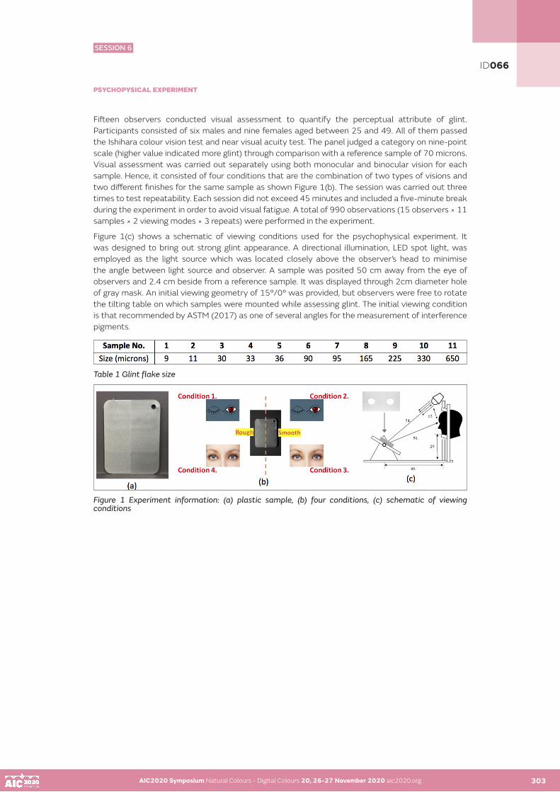
AIC2020 Symposium Natural Colours - Digital Colours 20, 26-27 November 2020 aic2020.org 303
PSYCHOPYSICAL EXPERIMENT
Fifteen observers conducted visual assessment to quantify the perceptual attribute of glint. Participants consisted of six males and nine females aged between 25 and 49. All of them passed the Ishihara colour vision test and near visual acuity test. The panel judged a category on nine-point scale (higher value indicated more glint) through comparison with a reference sample of 70 microns. Visual assessment was carried out separately using both monocular and binocular vision for each sample. Hence, it consisted of four conditions that are the combination of two types of visions and two different finishes for the same sample as shown Figure 1(b). The session was carried out three times to test repeatability. Each session did not exceed 45 minutes and included a five-minute break during the experiment in order to avoid visual fatigue. A total of 990 observations (15 observers × 11 samples × 2 viewing modes × 3 repeats) were performed in the experiment.
Figure 1(c) shows a schematic of viewing conditions used for the psychophysical experiment. It was designed to bring out strong glint appearance. A directional illumination, LED spot light, was employed as the light source which was located closely above the observer’s head to minimise the angle between light source and observer. A sample was posited 50 cm away from the eye of observers and 2.4 cm beside from a reference sample. It was displayed through 2cm diameter hole of gray mask. An initial viewing geometry of 15°/0° was provided, but observers were free to rotate the tilting table on which samples were mounted while assessing glint. The initial viewing condition is that recommended by ASTM (2017) as one of several angles for the measurement of interference pigments.
Table 1 Glint flake size
Figure 1 Experiment information: (a) plastic sample, (b) four conditions, (c) schematic of viewing conditions
AIC2020 Symposium Natural Colours - Digital Colours 20, 26-27 November 2020 aic2020.org 302
ID066
SESSION 6

AIC2020 Symposium Natural Colours - Digital Colours 20, 26-27 November 2020 aic2020.org AIC2020 Symposium Natural Colours - Digital Colours 20, 26-27 November 2020 aic2020.org 304
RESULTS AND DISCUSSION
The reliability of the psychophysical experiments was examined by analysing observer variability. Observer variability of glint was quantified by computinginter-observer (accuracy) and intra-observer agreement (repeatability) respectively. The statistical measures used for data analysis were the coefficient of variation, CV, and coefficient of determination, R2. Table 2 shows two kinds of observer agreement for glint measures in terms of mean, median, max and min from all the samples and from the samples in four conditions. The results show that the coefficient of variation of two kinds of observer agreement, CV, for all the samples was 13.4 and 12.0 on median with a range from 10.1 to 32.5 and 8.9 and 16.5 respectively. Similarly, the coefficient of determination of two kinds of observer agreement, R², for all the samples was 0.97 and 0.97 on median with a range from 0.80 to 0.98 and 0.94 to 0.98 respectively. The worst result of inter-observer agreement, 5 kinds of maximum values of CV and 5 kinds of minimum of R², came from only one observer. The results of all other observers were close to the means of those results. Therefore, we concluded that the reliability of the visual assessments is acceptable due to the high level of correlations.
Table 2 A summary of inter- and intra-observer agreement from all conditions and from conditions 1, 2, 3 and 4.
In terms of statistical values for the four conditions, the CV of mean and median for condition 3 and 4 were relatively lower than those values for conditions 2 and 1 respectively regardless of inter- and intra-observer agreement. This indicates that the reliability of binocular vision for condition 3 and 4 is higher than that of monocular vision for conditions 2 and 1. In the same way, the CV of mean and median of inter- and intra-observer agreement for conditions 2 and 3 were relatively lower than those values for conditions 1 and 4 respectively. It signifies that the reliability of glint perception on smooth surface under conditions 2 and 3 is higher than that on matt surface (conditions 1 and 4). For reference, all of R² of mean and median of inter- and intra-observer agreement for four conditions were excellent and have two similar trends with CV, which is explained above.
The results of the visual assessment are depicted by the boxplot shown in Figure 2, based on the minimum, maximum, median, and the first and third quartiles. The median was marked as the red line between the first and third quartiles. The blue line through the red lines of 11 samples represents the median of the data set for each sample on each condition assigned by observers. The imaginary line in the center of each box can be regarded as the average for analysis. Here, it can be predicted that the distribution for glint perception is skewed because the imaginary lines of average hardly coincide with the median lines. In comparison between monocular and binocular vision from Figure 2, there is no significant difference between the two upper and bottom graphs. However, compared to the two types of surface, a clear tendency of scaled glint from observers can be seen. The graphs for conditions 2 and 3 show smaller values in low sample numbers than those for conditions 1 and 4, while they have relatively higher values in high sample numbers. This indicates that the results corresponding to smooth surfaces have lower grades for small sample numbers and higher grades for high sample numbers than those corresponding to rough surfaces.
ID066
SESSION 6

AIC2020 Symposium Natural Colours - Digital Colours 20, 26-27 November 2020 aic2020.org AIC2020 Symposium Natural Colours - Digital Colours 20, 26-27 November 2020 aic2020.org 305
Figure 2 Boxplot and median for four conditions: (a) Condition 1 monocular rough, (b) Condition 2 monocular smooth, (c) Condition 3 binocular smooth, (d) Condition 4 binocular rough.
The sign test was used to testify whether the analysis obtained from boxplot graphs is appropriate for all of the data set. This test was performed twice for each pair of low sample number (sample 1 to 5) and high sample number (sample 6 to 11) group, which is indicated as the green and purple boundaries in Figure 3. For the green data set consisting of 150 samples (15 observers × 5 samples × 2 condition), the hypothesis is explained below.
Figure 3 grouping for sign test
Table 3 shows the results from the two sign tests. From these results, two null hypotheses H0 for both the green and purple data sets were rejected and two alternative hypotheses H1 were accepted with statistical significance at p-values < 0.001. Therefore, it was verified that the results corresponding to the smooth surface have lower grade for small sample numbers and higher grade for high sample numbers than those corresponding to the rough surface.
Table 3 The result of sign test
Figure 2 was plotted on a scale according to sample numbers in which the samples were not ordered using an equal interval of glint flake size. Therefore, it is necessary to examine the effect of flake-size interval on the results from the psychophysical experiment. The results of observation from condition 3 were selected because this condition best represents the typical experience in terms of viewing mode and glint finishing. In addition, its reliability was the highest among the four conditions. In Figure 4, the graph tends to increase regardless of any small interval of glint particle size.
ID066
SESSION 6

AIC2020 Symposium Natural Colours - Digital Colours 20, 26-27 November 2020 aic2020.org AIC2020 Symposium Natural Colours - Digital Colours 20, 26-27 November 2020 aic2020.org 306
However, two points are close together on the scale 6 which indicates that two samples with 90 and 95 microns of 11 particle sizes were assessed as being the same glint grade. In other words, it can be concluded that the 5 microns interval of glint flake size cannot be distinguished. However, unlike this case, three samples with 3 microns interval (30, 33 and 36 microns) could be clearly distinguished as different glint grades. To find the reason for this, we focused on a 90-microns sample which can be expected to lie on the 5-scale point because of the lowest interval size, 20 microns, with a reference defined as grade 5. In reality, glint samples with 36-microns flakes were assessed as the same grade to a reference even though they have the second lowest interval (34 microns). In same way, the sample with 90-microns flake size must be assigned grade 5, not grade 6.
Figure 4 Assessed grade according to 11 glint flake size.
We suggest that this result is partly similar to the crispening effect, Gui (2002). This is a phenomenon whereby the apparent contrast between a pair of stimuli increases when they have similar colour to that of background between them. Similarly, glint increases when the stimuli have similar contrast to that of a reference. For reference, similar tendencies have been found in previous research by Jung (2015) and Kitaguchi (2008). However, since there have not been enough studies to fully explain this phenomenon, more research is needed.
CONCLUSIONS
We observed that the reliability of binocular vision is slightly higher than that for monocular. This means that the performance of glint judgment is improved by binocular vision as this helps to reduce the variance between observers. We also see that the perception of glint is affected by the surface finishing of the sample. The glint on a smooth finishing is perceived to be lower within the sample range of small flake size and higher for large flake size than that on a matt finishing compared to the glint of material with rough surface. It would add that this is probably due to the completion of equivalent effects created by the roughness. The perception of glint can increase when the stimuli have similar contrast to that of a reference.
REFERENCES
ASTM E2194-14. 2017. Standard Practice for multiangle color measurement of metal flake pigmented materials. ASTM International, West Conshohocken, PA, 2017Cui, G., Luo, R. Rigg, B. 2002. Crispening effect on lightness differences. 9th Congress of the International Colour Association, Rochester, NY, United StatesJung, M. 2015. Modelling the total appearance of gonio-apparent surfaces using stereo vision. PhD Thesis, University of Leeds, UK.Kirchner, E., van den Kieboom, G.-J. & Supèr, R. 2008. Accurate measurement of sparkle for effect coatings. In: AIC 2008 Effects and Affects, Proceedings of the Interim Meeting of the International Colour Association, Paper #012, Stockholm, Sweden.Kitaguchi, S. 2008. Modelling texture appearance of gonioapparent objects. PhD Thesis, University of Leeds, UK.
ID066
SESSION 6

AIC2020 Symposium Natural Colours - Digital Colours 20, 26-27 November 2020 aic2020.org
Cultural probe into colour preferences for home interiors amongst Indian youth
Deepshikhaa•
a Independent Researcher•Corresponding author: [email protected] author: Deepshikha
ABSTRACT
India has varied cross-cultural preferences for clothing, home interior and accessories. The first objective of the paper presents a brief study on color preferences of young respondents for home interiors in India – the existing color palette and a palette they would choose if they had the choice. The second objective enquires whether they would use naturally made colors, if they were commercially available for painting their homes, even if it were a bit expensive than the easily available chemical ones. It was found that young population was readily willing to use naturally made colors if available for painting home interior/exterior as that made them feel that they ‘cared for nature and its resources’. The third objective is a photo elicitation of existing lighting compared to digital lighting, respondents found digital effects ‘occasion specific’ and ‘artificial’. The data has been analyzed qualitatively with word count and categorization and descriptive statistics.
KEYWORDS
home interiors I colour preferences I cultural influences
COLOR PREFERENCES FOR HOME INTERIORS
Over a thousand images representing diverse culture of each state of India were browsed online and collated as 6 collages of 200 images (Figure plate 1). These collages were summarized into an 88-color palette which was used as tool for the user study conducted (Figure 2). The palette comprises 17 colors, their gradation as tints; white and 2 metallic colors (gold and silver). The demography of the user study comprises 30 male and 25 female respondents from various parts of India. The respondents were students studying in a national technical institution within the age group of 20-30 years.
Table 1 and 2 represent the existing and preferred color response for bed room, living room, dining room and kitchen. While female respondents preferred more of light pink and mauve, male respondents preferred light blue and white. Kitchen and dining area were preferred to be yellow, light yellow and white. The response was generated after word count and categorization into three categories as preferred.
307
ID080
SESSION 6
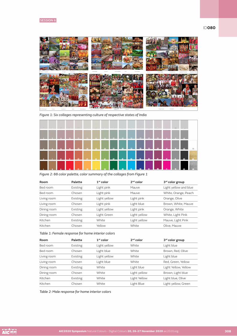
AIC2020 Symposium Natural Colours - Digital Colours 20, 26-27 November 2020 aic2020.org 308
Figure 1: Six collages representing culture of respective states of India
Figure 2: 88 color palette, color summary of the collages from Figure 1
Room Palette 1st color 2nd color 3rd color group
Bed room Existing Light pink Mauve Light yellow and blue
Bed room Chosen Light pink Mauve White, Orange, Peach
Living room Existing Light yellow Light pink Orange, Olive
Living room Chosen Light pink Light blue Brown, White, Mauve
Dining room Existing Light yellow Light pink Orange, White
Dining room Chosen Light Green Light yellow White, Light Pink
Kitchen Existing White Light yellow Mauve, Light Pink
Kitchen Chosen Yellow White Olive, Mauve
Table 1: Female response for home interior colors
Room Palette 1st color 2nd color 3rd color group
Bed room Existing Light yellow White Light blue
Bed room Chosen Light blue White Brown, Red, Olive
Living room Existing Light yellow White Light blue
Living room Chosen Light blue White Red, Green, Yellow
Dining room Existing White Light blue Light Yellow, Yellow
Dining room Chosen White Light yellow Brown, Light blue
Kitchen Existing White Light Yellow Light blue, Olive
Kitchen Chosen White Light Blue Light yellow, Green
Table 2: Male response for home interior colors
AIC2020 Symposium Natural Colours - Digital Colours 20, 26-27 November 2020 aic2020.org
ID080
SESSION 6

AIC2020 Symposium Natural Colours - Digital Colours 20, 26-27 November 2020 aic2020.org AIC2020 Symposium Natural Colours - Digital Colours 20, 26-27 November 2020 aic2020.org308 309
PREFERENCE FOR NATURAL COLORS
Painting walls with naturally available mud, clay or lime has existed since olden times. (Figure 3 and 4). Painting walls, floor and entrance with cow dung has also been practiced since long due to easy availability, auspiciousness and antiseptic properties. Different communities have wall decorations made out of lime or natural materials for aesthetic purposes. Sitaraman (2014) has elaborately mentioned that southern India has traditional significance for the rangoli or kollam made by women every morning at the entrance of the house. Apart from the mud painted interiors and exteriors, natural materials have been used in textiles as well, as stated by Teron and Borthakur (2012) and Arora, et al. (2017). The culture of dyeing textiles with natural colors such as red with madder, blues with indigo, colors obtained from insects, flowers and vegetables have existed since long and are still carried out in craft practices such as Kalamkari, Pichwai and Ikat dyeing, as stated in CBSE 2014 and by Chishti, 2010. Few companies have developed refined processes of manufacturing naturally obtained colorful pigment and paint sets that can be produced on a larger scale. Two such companies are Earthborn Paints, UK and Sinopia Pigments, USA. Although their process of manufacturing paints has not been disclosed but product portfolio is available on their respective official websites.
Figure 3: Woman mopping the entrance with cow dung, Village Khajuraho (Madhya Pradesh, India); Figure 4: A Santhal Tribal Village Recreation, Jharkhand (India)
Natural colors were obtained from various soil samples, indigo, charcoal and turmeric (Figure 5). The colors have been summarized in Figure 6. The colors samples were mixed and set in plaster of paris (Figure 6). The natural colour set was created for the user study only and has not been tested for medium or large scale application. The palette of Figure 6 was also available in Asian Paints (2018) and Pantone (2014, 2015 and 2016) color trends. 70% of respondents were readily willing to use natural material for painting home interiors. They also mentioned that it made them feel ‘cared for nature and its resources’, ‘were taking a small yet significant step towards sustainable development’, ‘it revived Indian traditional practice of using mud for home interior’, ‘could be trend setting’ and ‘was a responsible approach towards society they inhabit’.
Figure 5: Soil samples collected and indigo, turmeric and charcoal
ID080
SESSION 6

AIC2020 Symposium Natural Colours - Digital Colours 20, 26-27 November 2020 aic2020.org AIC2020 Symposium Natural Colours - Digital Colours 20, 26-27 November 2020 aic2020.org 310
Figure 6: Color chips set in plaster of paris
PREFERENCE FOR LIGHTING HOME INTERIOR
This was a photo elicitation study to compare artificial lighting controlled by a smart phone (like Philips hue, 2015) and CFL lighting (Compact Fluorescent Lamp) that typically exists in home interiors of respondents (Figure 7). The demography comprised of 20 young respondents (12 female, 8 male) between the age group 20-30 years. 75% of respondents liked smart lighting over CFL lighting but only 15% of them agreed to use smart lighting for their home interior (Figure 8). 55% of respondents mentioned that smart lighting can be used for festivals and various occasions, ‘it looked quite artificial and so cannot be used regularly’. Few respondents also suggested having both CFL and smart lighting installed in home interior so that could be used as per requirement of the users.
Figure 7: Photo elicitation images used as tool (Left – lighting controlled by a smart phone, like Philips hue; Right – existing CFL lighting illustrated for home interior)
Figure 8: (Left) Response for ‘liking’ the smart lighting and (Right) Response for ‘agreeing to use smart light regularly’
ID080
SESSION 6

AIC2020 Symposium Natural Colours - Digital Colours 20, 26-27 November 2020 aic2020.org AIC2020 Symposium Natural Colours - Digital Colours 20, 26-27 November 2020 aic2020.org 311
CONCLUSION
The present paper is a preliminary study to probe further into color preferences of youth not only for home interiors, but also, office, libraries, museums and art galleries, as lighting in each scenario is decided differently for a significant trend report. India being a culturally distinct population needs in-depth statistical studies with larger samples for comparison between the above-mentioned scenarios in further stages. The research aims to probe into three objectives: home interior color preferences, natural materials to be used for painting home interior and artificial lighting for home interior in India. Male respondents opted for light blue, light yellow and white; while, female respondents preferred for light pink, mauve, light yellow and white for bed room, living area, dining area and kitchen. Respondents were willing to use natural colors when available in India for painting home interior and exterior with optimism. Regarding artificial lighting, respondents ‘liked’ smart lighting but preferred contemporary CFL lighting home interiors as smart lighting made the interior sophisticated but artificial.
ACKNOWLEDGEMENT
PDPM Indian Institute of Information Technology, Design and Manufacturing Jabalpur, MP, India and Indian Institute of Technology, Guwahati, Assam, India.
REFERENCES
Arora J., Agarwal P. and Gupta G. 2017. Rainbow of Natural Dyes on Textiles Using Plants Extracts: Sustainable and Eco-Friendly Processes. Green and Sustainable Chemistry 7: 35-47. Asian Paints. 2018. ColourNext 2018: Amber, Mustard and some Introspection through Passion Flower, Asian Paints Colour of The Year. Online: https://www.asianpaints.com/colourquotient/showcase/colournext-2018-ambermustard-and-some-introspection-through-passion-flower-asian-paints-colour-of-theyear/Asian Paints. n.d. All about colors. Online: https://www.asianpaints.com/resources/tools/learn/all-about-colour.html CBSE. (2014). Traditional Indian Textiles- Student Handbook and Practice manual, Class XII. Delhi: Central Board of Secondary Education. Chishti R. K. 2010. Saris of India: Tradition and Beyond. New Delhi: Roli Books.Earthbornpaints. n.d. Online: http://earthbornpaints.co.uk/ Pantone. (2016). Online: https://www.pantone.com/downloads/pvh/Pantone-PANTONEVIEW-HomeInteriors- VH2016-Brochure.pdf Pantone. 2014. Online: http://www.pantone.com/images/download/PANTONEVIEW_home___interiors_201 4_c olor_palettes.pdfPantone. 2015. Online: http://www.pantone.com/downloads/pvh/PANTONEVIEW_home___interiors_2015. pdf Philips hue. 2015. Online: https://www.philips-hue.com/en-inSinopiapigments. 1995. Online: http://www.sinopia.com/Sitaraman, S. A. 2014. Follow The Hindu Moon. New Delhi: Random House IndiaTeron R. and Borthakur S. K. 2012. Traditional Knowledge on Herbal Dyes and Cultural
ID080
SESSION 6

AIC2020 Symposium Natural Colours - Digital Colours 20, 26-27 November 2020 aic2020.org
Yērāqôn, a natural colour: ‘the colour of the fear’ (Jer 30.6)
Lourdes García UreñaUniversity CEU – San Pablo, Madrid (Spain)Corresponding author: [email protected] author: Lourdes García Ureña
ABSTRACT
Although in the Hebrew Bible a specific term does not appear to refer to ‘colour’, unlike what happens in its Greek and Latin versions, colour terms are used in the different books that it is composed of to denote the various chromatic spectrum that nature shows. In the Semitic world colour is what is perceived on the objects and human beings through sight due to the presence of light. For this reason, the study of colour in the Bible is intrinsically joined to the study of the entity imbued by colour. In the most of the cases the modern reader can identify the tonality expressed by colour terms precisely through the entity mentioned. Indeed, sometimes, the objects of nature themselves are used to denote colour as occurs with precious stones, metals or cloths.
In the Book of Consolation the prophet Jeremiah uses the nominal lexeme yērāqôn to describe the faces of the soldiers terrified before the attack of the enemy (Jer 30.6). It is a peculiar use because yērāqôn appears 5 times in the Hebrew Bible joined to šidāpôn, ‘blight’, with the meaning of ‘mildew’ (Deut 28.22; 1 Kings 8.37; Jer 30.6; Amos 4.9; Hag. 2.17; 2 Chr. 6.28). In fact, the main dictionaries and studies about colour propose that yērāqôn has two different meanings: achromatic that is the most frequent (mildew) and the other one chromatic (paleness). Nevertheless, neither Greek neither Latin version, having colour terms that could be equivalents, use them and instead they resort to a term expressing a skin disease characterized by the fact that the person acquires a yellow hue as happens with mold: ἴκτερος ‘jaundice’ and aurugo ‘jaundice’. Thus, it is logical asking if yērāqôn denotes effectiveness ‘paleness’.
As it is mentioned, Jeremiah utilizes yērāqôn to describe the soldiers’ faces (Jer 30.6). As today, in Israel, the face reflects the emotions that the human being experiences, through gestures or a colour change on the face, as it can naturally turn red or pale. As it is known, one of the fear effects is the unexpected paleness. So it stands to set out that yērāqôn does indeed mean paleness. However, how can we explain the origin of this new meaning? Jer 30.6 appears in the context of divine punishment as occurs when it has the meaning of mildew. The mildew, attacking the plants, discolours them and they acquired a hue of low saturation between green and yellow. It seems that Jeremiah pays attention in the colour of the plants and, through a cognitive metonymy of kind ENTITY and SALIENT PROPERTY, uses yērāqôn to express only the colour acquired by a person, not ill as the plants, but terrified by fear. This explains that yērāqôn does not denote a plant illness, but the colour of fear.
KEYWORDS
colour I emotion I paleness I fear I Bible
312
ID105
SESSION 6

AIC2020 Symposium Natural Colours - Digital Colours 20, 26-27 November 2020 aic2020.org 313
INTRODUCTION
Although in the Hebrew Bible a specific term does not appear to refer to ‘colour’, unlike what happens in its Greek and Latin versions that use χρῶμα (4x: Exod 34.29-30; Esth 15.7; Wis 15.4) or χρόα (3x: Exod 4.7; 2 Mac 3.16; Wis 13.14) and color (31x: Gen 30.37.39; 31.10; Exod 39.3.5; Lev 13.2–4,10,21,26,32,36,39,42; 14.56; Num 11.7; Judg 5.30; 1 Chr 29.2; Esth 1.6; Job 28.16; Prov 23.31; Wis 13.14; 15.4; Sir 43.20; Lam. 4.1; Ezek 23.14; 27.18; 2 Mac 3.16; 2 Esdr 6.44; 14.39), colour terms are used in the different books to denote the various chromatic spectrum that nature reveals: green grass (Gen 1:30), white snow (Ps 51,7), etc. In the Semitic world, as also happens in the Greek and Latin, colour is what is perceived on the objects and human beings through sight due to the presence of light. For this reason, the analysis of colour in the Bible is intrinsically joined to the study of the entity imbued by colour. The colour terms are shown as ‘embodied’ on an entity (object, animal, human being). In many cases the modern reader can identify the tonality expressed by the colour terms precisely through the entity mentioned, for example yereq denotes green because it is embodied on ēśeb ‘grass’ (Gen 1.30). Indeed, sometimes, the objects of nature themselves are used to denote colour as occurs with precious stones, metals or cloths.
However, the study of the entity is not enough to determine the meaning of a color term in the Hebrew Bible, it is also necessary:
a) to acquire what cognitive linguistics calls ‘encyclopedic knowledge’, that is, the knowledge that the native speaker had. Since there is no native speaker, the way to access it today is to study, on the one hand, the information provided by the main dictionaries and specific studies on colours and, on the other hand, how the text was interpreted by the ancient versions of the Bible, since Hebrew was a living language at the time the Bible was translated into Greek and Latin.
b)The study of the context where the pericopes appears.
Following this methodology, we will study the use that Jeremiah makes of the nominal lexeme yērāqôn to describe the faces of the terrified soldiers before the imminent battle (Jer 30.6). As we will see below, yērāqôn is not a colour term and this is how the early versions of the Bible interpret it. It is therefore logical to ask whether yērāqôn denotes colour as proposed by the modern versions of the Bible (NRSV, ASV, Navarra Bible).
DISCUSSION
According to the main dictionaries and studies on colour, yērāqôn has two different meanings: achromatic, ‘mildew’, which is the most frequent (Deut 28.22; 1 Kings 8.37; Jer 30.6; Amos 4.9; Hag. 2.17; 2 Chr. 6.28) and the other chromatic, ‘paleness’ that appears only in Jer 30.6. Specific colour studies such as those by Athalya Brenner and Maria Bulakh, follow this same line. Robert Gradwohl, however, offers an interesting analysis of this particular nominal lexeme, in which he considers yērāqôn to be a term related to the world of plants, together with the rest of its lexical family. In any case, yērāqôn refers to a specific state that occurs during the process of constant change undergone by vegetation. While yereq expresses the phase of growth and maturity of cereal crops, yērāqôn refers to the phase of ageing and, therefore, yellowing. According to Gradwohl, yērāqôn is in fact the name of a crop disease. From this arises the meaning of ‘paleness’, as yērāqôn loses its original connection with plants and indicates, rather, the change in the colour of someone’s face as the result of fear.
Neither the Septuagint nor the Vulgate uses a colour lexeme to translate yērāqôn, which seems strange as both possess specific colour lexemes for similar contexts in their respective languages: χλωρός or χλωρότης, pallidus or pallor (indeed, the Vulgate uses this term to describe terrified faces: Jdth 6.5; Esth 15.10). Both versions use lexemes (ἴκτερος, aurugo) that denote both a disease of plants, as yērāqôn originally meant in Hebrew (1 Kings 8.37; Hag 2.18; 2 Chron 6.28), as well as human beings, i.e. jaundice, which is characterized by its yellow colour. Thus, it is logical to ask if yērāqôn in effect denotes ‘paleness’.
AIC2020 Symposium Natural Colours - Digital Colours 20, 26-27 November 2020 aic2020.org 312
ID105
SESSION 6

AIC2020 Symposium Natural Colours - Digital Colours 20, 26-27 November 2020 aic2020.org AIC2020 Symposium Natural Colours - Digital Colours 20, 26-27 November 2020 aic2020.org 314
Once the encyclopaedic knowledge has been obtained, we will delve deeper into the study of the context and the entity.
Jer 30.6 is part of a literary unit referred to as the ‘Book of Consolation’ (Jer 30.1-33.26), written during the late reign of Zedekiah (587 BC) or shortly after. The pericope under study here belongs to one of the sections focused on judgment and punishment, which describes the suffering and anguish of the people (Jer 30.5-7). Jer 30.6, specifically, establishes a parallel between soldiers and women in labour, an image used in this book (Jer 30.6; 48.41) and which is also found in Isaiah (Isa 13.8; 21.3):
Ask and see if a man has ever given birth. Why, then, do I see every man with his hands on his loins like a woman in labour, and all their faces turned yērāqôn?
Unlike the other pericopes in which the prophet uses the image of a woman giving birth to underscore the idea of physical pain (Jer 4.31; 22.23), on this occasion the image describes not only pain (the hands placed on the kidneys), but also the fear which characterizes childbirth, from not knowing when it will take place and because it is inevitable once labour has begun. Jeremiah compares the fear of childbirth to the fear felt by men faced with punishment. Paradoxically, it is they who must defend and protect their people militarily. However, the panic they feel is so great that it cannot be concealed, and so they shrink back.
In ancient Israel, as in our own time, a person’s face was felt to reflect emotions being experienced through its expressions or a change in colour, e.g. becoming red or pale. On repeated occasions, the Hebrew version of the Bible uses the language of colour to describe intense emotions expressed in one’s face. For this purpose, the authors employ a variety of terms to denote colour through the effect of metonymy; for example, the verbal lexeme hāmar, ‘to boil or burn’ (Job 16.16: ‘my face is burnt [is reddened]’) denotes a reddish colour in the face, the result of weeping, and expresses a feeling of sadness or grief; meanwhile, the nominal lexeme lahab, ‘flame’, while also denoting the colour red, expresses mistrust and suspicion (Isa 13.8: ‘their faces are faces of flame’). In contrast, white or paleness denote shame through the use of hūr, ‘to be or grow white, pale’ (Isa 29.22: ‘his face will no longer grow pale’). Jeremiah, for his part, heightens this feeling of terror by employing the nominal lexeme yērāqôn embodied in pānîm, ‘face’ from the cognitive domain of human beings.
Surprisingly, this lexeme is used in the MT 5x in a context similar to that of divine judgment, but in a different cognitive domain (plants-disease), in which the blights which ravage the fields and bring famine are enumerated. In all of these cases, yērāqôn is preceded by and coordinated with šidāpôn ‘blight’ (Deut 28.22; 1 Kings 8.37; Amos 4.9; Hag 2.17; 2 Chron 6.28). Both lexemes are included in the list of ‘unidentified plants’ elaborated by Harold and Alma Moldenke. According to these authors, the biblical writer does not bother to specify exactly what type of plants are attacked; rather, the terms are used to indicate diseases that can attack any type of plant. They therefore conclude that yērāqôn and šidāpôn were plant diseases caused by parasitic fungi such as occurs today. Indeed, the medieval exegete Rashi considered that yērāqôn was a disease that affected grain, a symptom of which is that the grain acquires a yellowish green tonality. Today we know that mildew is a disease characterized by the appearance of spots on the lower faces of plant leaves, ranging from light yellowish green to yellows and browns, while their upper faces may have a grey, downy coating. There is no certainty, however, that yērāqôn can be identified with this.
In any case, it does not appear that Jeremiah uses yērāqôn either to refer to a disease of plants or to any other type of affliction. Rather, he chooses the lexeme because it suits the context of divine punishment and because he focuses on the colour of yērāqôn, a hue of low saturation between green and yellow, which, when applied to a person, functions in a similar way as when applied to plants, as Gradwohl proposed. Fear produces a decrease in blood flow and the face becomes pale, yellowish. It is, then, a metaphor in which, just as a plant loses its natural colouring and acquires a tone of low saturation, the natural colour of the soldiers’ faces changes through fear to what we would call a ‘sickly’ tone. Jeremiah seems to be giving yērāqôn a new meaning through the use of a cognitive metonymy, ENTITY AND SALIENT PROPERTY, of the WHOLE FOR THE PART type, and of a metaphor that enables him to correlate domains: diseases of plants and diseases of human beings. Therefore, the meaning of yērāqôn is no longer one of illness, but rather ‘the colour acquired by the face of a person stricken with fear.’ As glosses, we propose ‘paleness’ and ‘yellowish green paleness’.
ID105
SESSION 6

AIC2020 Symposium Natural Colours - Digital Colours 20, 26-27 November 2020 aic2020.org AIC2020 Symposium Natural Colours - Digital Colours 20, 26-27 November 2020 aic2020.org 315
CONCLUSION
After the research carried out from the acquisition of encyclopaedic knowledge, the analysis of the context and the entity described, as well as the use of metaphor and cognitive metonymy, we can conclude that, in fact, yērāqôn is a polysemic term denoting, on one side, a disease of plants when it is used in a vegetal context and, on the other, a natural colour, that from a terrified face. Jeremiah uses yērāqôn ‘mildew’, the name of a plant disease that discolours plants in order to describe the the effect of fear on the soldiers. He uses the name of the disease because it provoked a colour change on the plants, indeed, the colour was a sign of the presence of illness. So, highlighting the colour of the diseased plant, the prophet chooses yērāqôn to describe the natural colour that the face acquires, not from the one who is sick, but from the one who experiences a strong and negative emotion, fear, causing a decrease in blood flow to the face. In this sense, there is a similarity of colour in the vegetation and in the face of the human being. Thus, yērāqôn in Jer 30.6 denotes the natural colour that fear causes/provokes in human beings.
ACKNOWLEDGEMENTS
This article has been prepared within the framework of the “Edición y estudio de textos bíblicos y parabíblicos” (FFI2017-86726-P) PROYECTO I + D, MINECO. I am grateful for the comments and suggestions offered by the members of my own research group “The language of Colour of the Bible” (PC06/0720) of the Universidad CEU San Pablo (https://www.uspceu.com/investigacion/grupos-investigacion).
REFERENCES
Barcelona, A. 2016. La metonimia conceptual. In Lingüística Cognitiva, I. Ibarretxe-Antuñano et al., eds. Barcelona: Anthropos, 123-146.Brenner, A. 1982. Colour Terms in the Old Testament. Sheffield: JSOT Press.Bulakh, M. 2006. Basic Color Terms of Biblical Hebrew in Diachronic Aspect. In Babel und Bibel 3. Annual of Ancient Near Eastern, Old Testament, and Semitic Studies, L. Kogan et al., eds. Indiana: Eisanbrauns, 181-216.Gradwohl, R. 1963. Die Farben im Alten Testament: Eine Terminologische Studie. Berlin: A. Töpelmann.Hartley, J. E. 2010. The Semantics of Ancient Hebrew Colour Lexemes. Louvain; Paris; Walpole, MA: Peeters.Keown, G. L. et al. 1995. Jeremiah 26–52. Grand Rapids: Zondervan.Langacker, R. W. 2003. Context, Cognition and Semantics: A Unified Dynamic Approach. In Job 28: Cognition in Context, E. J. Van. Wolde ed. Leiden; Boston: Brill, 179-230. Longman III, T. 2008. Jeremiah, Lamentations. Peabody, MS: Hendrickson. Lunceford, J. E. 1987. Mildew. In: Eerdmans Dictionary of the Bible, D. N. Freedman, ed. Grand Rapids, MI: W.B. Eerdmans Pub. (Electronic text hypertexted and prepared by OakTree Software, Inc. Version 3.7).Lundbom, J. R. 1992. Jeremiah, book of. In: The Anchor Bible Dictionary 3, D. Freedman, ed. New York: Doubleday. (Accordance electronic edition, version 4.1. New Haven: Yale University Press, 2008).Lundbom, J. R. 1964. Jeremiah 21–36: A New Translation with Introduction and Commentary. New York: Doubleday.Moldenke, H. N. and A. L. Moldenke, 1952. Plants of the Bible. Waltham MA: Chronica Botanica.Preuss, J. 1978. Biblical and Talmudic Medicine. New York: Sanhedrin Press. Ribera Coto, G. 2007. Conceptos introductorios a la Fitopatología. San José de Costa Rica: EUNED.Rosner, F. 1972. Yerakon in the Bible and Talmud: Jaundice or Anaemia?. American Journal of Clinical Nutrition 25: 626-628.Simkins, R. A. 1987. Locust. In: Eerdmans Dictionary of the Bible, D. N. Freedman, ed. Grand Rapids, Mich.: W.B. Eerdmans Pub. (Electronic text hypertexted and prepared by OakTree Software, Inc.Version 3.7).Sussman, M. 1992. Sickness and Disease. B. Infectious and Communicable Diseases, Yerāqōn. In: The Anchor Bible Dictionary 6, D. Freedman, ed. New York: Doubleday. (Accordance electronic edition, version 4.1. New Haven: Yale University Press, 2008).
ID105
SESSION 6

AIC2020 Symposium Natural Colours - Digital Colours 20, 26-27 November 2020 aic2020.org
Blue-blocking lenses – how much short wavelength light can be removed from daylight illuminants without significantly affecting colour vision?
John L Barbura•, Benjamin EW Evansa, Elisabetta Baldanzib, Regina Comparettob, Alessia Favab, Alessandro Farinib a Applied Vision Research Centre, School of Health Sciences, Northampton Square, City, University of London, UK
b CNR-Istituto Nazionale di Ottica, Largo Enrico Fermi 6 50125 Firenze, Italy•Corresponding author: [email protected]
Rods and S-cones respond best to short-wavelength light. Signals from rods feed directly into specialised, intrinsically photosensitive ganglion cells (ipRGCs) which contain melanopsin, a newly discovered visual pigment within the ganglion cell body. Melanopsin responds best to short wavelength light and signals from these cells in the retina are channeled to the midbrain nuclei involved in the control of circadian rhythms and other non-visual functions. High-intensity, blue light can enhance alertness and the use of blue-enhanced illuminants has been suggested as a possible treatment for daytime sleepiness. Blue-rich illuminants are used extensively, particularly in 3C products. At the same time, other studies also have shown that exposure to intense ‘blue’ light during the day leads to delayed sleep cycles and greater difficulty to fall asleep at night. It remains unclear as to whether induced sleepiness during the day is not due to a lack of good sleep at night, which may have been in turn caused by intense exposure to ‘blue’ light during the day!
There is no clear guidance as to how best one should balance the benefits of exposure to higher light levels of blue-rich white light that keeps us awake during the day and the disruption of normal sleep patterns that must, at least in part, be linked to tiredness and discomfort. ‘Blue-blocking’ spectacle and intraocular lenses, as well as sunglasses, are often designed to absorb short-wavelength light so as to control its abundant use, particularly in blue-enhanced, phosphor-coated, LED lights. Too great a reduction in short wavelength content may, however, affect yellow / blue (YB), and to some extent also red / green (RG) colour vision as well as other visual functions.
The purpose of this study was to examine the extent to which colour vision is affected by the selective filtering of short-wavelength light. Previous studies have attempted to produce a definitive answer to this question, however, in many of these studies the assessment of colour vision changes has been carried out using either arrangement tests such as the Farnsworth-Munsell 100-hue and D-15 tests or pseudoisochromatic plates tests such as Ishihara, Dvorin or HRR tests. Neither arrangement or pseudoisochromatic plate tests can achieve both high sensitivity and specificity, as even when used with the recommended illuminant, many subjects with congenital colour deficiency pass. Since the use of coloured filters is equivalent to a change of illuminant, which in turn affects the perceived luminance contrast signals for coloured objects, conventional colour vision tests are not suitable to investigate how the attenuation of blue light in the illuminant affects chromatic sensitivity.
A new method was developed for this study, based upon accurate measurements of RG and YB colour thresholds under multiple conditions of chromatic adaptation that correspond to simulated daylight (D65), on visual displays. The latter were viewed either directly, without any filter in front of the eye, or through typical, blue-blocking lenses. The third condition employed direct viewing with adapting backgrounds that were equivalent in chromaticity to D65, when filtered with selected blue-blocking filters. In addition, we have developed a model to predict how cone contracts relate to RG and YB colour signals at threshold and how threshold cone contrasts vary with the state of excitation of S-, M- and L-cones. The model makes it possible to predict how the filtering of short wavelength light affects the S-cone retinal illuminance and hence the corresponding YB thresholds.
KEYWORDS
colour vision I blue light I Ishihara I HRR I Dvorin I CAD test
316
ID130
SESSION 6
AIC2020 Symposium Natural Colours - Digital Colours 20, 26-27 November 2020 aic2020.org 317
SESSIONS 7 & 8
DIGITAL COLOUR AND VIRTUAL WORLD

AIC2020 Symposium Natural Colours - Digital Colours 20, 26-27 November 2020 aic2020.orgAIC2020 Symposium Natural Colours - Digital Colours 20, 26-27 November 2020 aic2020.org 318
SESSIONS 7 & 8
DIGITAL COLOUR AND VIRTUAL WORLD
SESSION 7
Technology, Colorimetry and instrumentation, spectral image synthesis, display devices (TV, video, mobilephone, overhead projector, Head Mounted Display, etc.), 2D and 3D digital printing, lighting, physics of colour, etc.
001 I 026 I 061 I 083 I 108 I 113 I 115 I 118 I 136
SESSION 8
Interaction between natural colours and digital colours, applications. Virtual Reality, Augmented Reality, Diminished Reality, image analysis, image synthesis, graphics creation and applications (movie industry, video games, medecine, odontology, prothesis fabrication, building and construction, etc.)
046 I 053 I 054 I 059 I 111 I 119 I 124 I 144
C37
M22
J20
N3
R171
V18
2 B1
91

AIC2020 Symposium Natural Colours - Digital Colours 20, 26-27 November 2020 aic2020.org
A fractal polyhedron packing of the RGB space for intuitive high-dimensional data visualization
Kai Berger•
•Visual-Data-Science, Los Angeles, United States. visual-data-science.org
ABSTRACT
In this paper I propose a new approach to visualizing data with up to 4 dimensions by sorting them by relevance and assigning the two most important dimensions to positions on a polyhedron that is fit in the RGB cube such that each corner touches a fully saturated primal colour (red, green blue, cyan, magenta, yellow). I then assign the next dimension to the saturation of the polyhedron by effectively interpolating between pure gray and the fully saturated polyhedron. Finally, the least relevant dimension is assigned to the fractal replica of the polyhedron, using an iterated function system, which is positioned at 1/(2+epsilon)^n and 1-(1/(2+epsilon))^n of the original polyhedron. This process can be repeated infinitely but in practice converges at pitch black and pitch white after 4 iterations. Further this dimension has to consist of integer data values in order to avoid interference between polyhedra. This way a visualization is achieved with the top two dimensions effectively mapping to a sphere, where at every 90 degrees a different primal colour is located. The other two dimensions then are visualized through saturation and brightness.
KEYWORDS
color space I color mapping I data visualization I fractal space packing
INTRODUCTION
Naïve color schemes for the orientation of a particular surface normal, e.g. a vertex normal in a mesh, rely on mean-shifting the normal and mapping it to RGB. Others may include a mapping into HSV space to account for the rotation of the surface normal. My approach maps the HUE circle from HSV onto the unit sphere in a way that every prime color is mapped to one octant of the sphere. I have tried several color assignment schemes for the problem to map an arbitrary surface normal rotation to an intuitively understandable color. While a normal vector is 3d, it can be reduced to a 2d rotation vector (azimuth and elevation). However mapping these remaining 2 dimensions to a regular color scheme fails with standard color spaces, like RGB, Lab, HSV, NTSC. Either the prime colors are unevenly distributed, or not visited at all. E.g., a RGB mapping equates certain unit axes to less saturated colors that are significantly distant from prime colors.
THEORY
The idea consists of mapping the unit sphere to a polyhedron. A paper describing the mapping process in detail suggests the polyhedron to be 8-faced (Roşca and Plonka 2012), and I rely on their mapping procedure.
However, once the mapping of sphere to the polyhedron is performed, I align the six corners of the polyhedron with the six prime colors, red, green, blue, cyan, magenta, yellow. This requires a solution for a rotation matrix and for a subsequent shear matrix. I have solved for those matrices and am now able to fit the polyhedron to all important corners of the color space. Note, that with this rotation and shearing the polyhedron avoids whitish and blackish colors. This way, I ensure that all colors in the mapping are maximally saturated.
319
ID001
SESSION 7
SESSION 7

AIC2020 Symposium Natural Colours - Digital Colours 20, 26-27 November 2020 aic2020.org 320
The key improvement is that each corner of the polyhedron is 90 degrees away from its neighboring/adjacent corner, when mapped to the unit sphere. This allows for a perfect segmenting of the unit sphere into 8 regions of equal size (an 1/8 of the sphere). Each region, following our shear-rotation in the color space then is exactly dominated by one prime color. The gradient between those prime colors is visually balanced and allows for an ad-hoc gauging of the overall rotation in 3d space of a visualized surface normal. Further it allows to gauge how distant in terms of rotation two surface normal are – again just by seeing how far away from each other the colors of the two surface normal are.
Following the procedures described by Roşca and Plonka [1], I map a point (x, y, z) on the unit sphere to a point (X, Y, Z) on the polyhedron using the transformation formulas:
Experimental
In order to make best use of the RGB space with the polyhedra, I use an iterated function system (refer to Barnsley and Demko (1985) for an introduction) to pack the unused volume of the RGB space. The iterated function to position the next polyhedron is 1/(2+epsilon)^n (closer to black) and 1-(1/(2+epsilon))^n (closer to white) of the original polyhedron. I use the least relevant dimension of the 4d data set. Note, that this dimension needs to be discretized in order to avoid overlap of color values. Figure 1 shows an example where the least relevant 4th dimension is discretized into 7 steps and assigned to seven polyhedra. The polyhedra are disjoint and thus don’t touch each other. The effects of varying the 3rd or 4th dimension on the coloring of the input mesh is shown in Figure 2.
Figure 1: This Visualization shows how a four dimensional data space can be mapped to RGB using the fractal polyhedron. Two dimensions (e.g. the surface on a sphere) are identified with surface areas on the polyhedron. The third dimension is identified by the scale/size of the polyhedron, with a zero volume polyhedron being placed on the grey level line. The fourth dimension is achieved by an iterated function system fractally rescaling the polyhedron and placing it in the unoccupied space of the RGB volume.
AIC2020 Symposium Natural Colours - Digital Colours 20, 26-27 November 2020 aic2020.org 319
ID001
SESSION 7
SESSION 7

AIC2020 Symposium Natural Colours - Digital Colours 20, 26-27 November 2020 aic2020.org AIC2020 Symposium Natural Colours - Digital Colours 20, 26-27 November 2020 aic2020.org 321
Figure 2: This Visualization shows the effect of the visualization color mapping on the positions of a unit sphere. Each cell of this table depicts the positions in the RGB color space (left subplot) and the colored points of the unit sphere. For comparison, the coloring for the 4th dimension at center and the third dimension fully saturated are also shown. The upper row shows the 3rd dimension at lower saturation, the bottom row shows it at even lower saturation. The left column depicts a scenario where the discrete values in the fourth dimension are higher and the right column depicts a scenario where the discrete values in the fourth column are lower.
RESULTS AND DISCUSSION
In the following I compare the polyhedron based mapping to other mapping methods. One simple approach to mapping 2 dimensions, for example the rotation angles of a surface normal, by looking at their cartesian coordinates and reading them as RGB values (referred to here, as rgbcart). A similar mapping can be done using HSV or yCrBr.
With the example of surface normals, a simple visualization can be done by viewing all possible surface normals as positions on a unit sphere.
The polyhedron mapping makes sure that the most saturated values are located at the poles/antipodes of such a unit sphere. Other mapping approaches fail to reach the poles/ antipodes of the sphere with their most saturated color values. This in turn makes it harder to intuitively grasp the 2d location of the datapoint from simply looking at its colour. In contrast, the method I presented ensures in this example, that the most saturated yellow is on North Pole and the most saturated blue is located at the South Pole of the unit sphere. Any 3d mesh whose vertices are colored according to their surface normal direction using this method would indicate to the viewer that the pitch yellow vertices face North and that the pitch blue vertices face South. In Figure 3, for the Stanford bunny I have colored the mesh with the proposed color mapping and with the naive color mapping. In addition the fully saturated HUE circle is traced on a virtual unit sphere around the colored mesh. Next, I queried geodetic information from the mesh in order to get 4 dimensions to colorize. In Figure 4, the surface normal directions, the curvature and the property of the mesh being convex or concave are being visualized.
ID001
SESSION 7

AIC2020 Symposium Natural Colours - Digital Colours 20, 26-27 November 2020 aic2020.org AIC2020 Symposium Natural Colours - Digital Colours 20, 26-27 November 2020 aic2020.org 322
Figure 3 : A comparison of the proposed polyhedral mapping (bunny placed at [0,0,0]) and a naive RGB mapping (bunny placed at [6,0,0]) and a tracing of the HUE color circle in 3d coordinates shows that saturated prime colors occur significantly more often in the polyhedral mapping and they are also identical with major directions in the object space (e.g. cyan aligns with positive y axis direction while blue aligns with negative z direction).
Figure 4: A visualization of 2, 3 and 4 dimensional data. Both plots, left bunny shows surface normals only. Upper plot, middle bunny shows surface normals and curvature (discretized), with the curvature levels indicated in the right bunny’s scatterplot. Lower plot, middle bunny also shows the concavities of the bunny in that convex areas with high curvature are shown with desaturated vertex colors. Again, the curvature levels are indicated in the right bunny’s scatterplot.
ID001
SESSION 7

AIC2020 Symposium Natural Colours - Digital Colours 20, 26-27 November 2020 aic2020.org AIC2020 Symposium Natural Colours - Digital Colours 20, 26-27 November 2020 aic2020.org 323
CONCLUSION
I have presented a method to map 4d data to RGB, using a fractal polyhedron packing. It relies on mapping the two most relevant dimensions to points on a polyhedron that is rotated so it touches the six primal color values with its corner points. The least relevant dimension is discretized and mapped to positions on smaller polyhedra. Those smaller polyhedra are located using an iterated function system. I have compared the mapping of the two most relevant dimensions to standard approaches and showed that the polyhedral mapping allows for the best mapping of primal colors to significant spots (poles/ antipodes) in the dataset.
REFERENCES
Roşca and Plonka 2012. Roşca, Daniela, and Gerlind Plonka. «An area preserving projection from the regular octahedron to the sphere.» Results in Mathematics 62.3-4 (2012): 429-444.Barnsley and Demko 1985. M. F. Barnsley and S. Demko. «Iterated function systems and the global construction of fractals» The Proceedings of the Royal Society of London (1985).
ID001
SESSION 7

AIC2020 Symposium Natural Colours - Digital Colours 20, 26-27 November 2020 aic2020.org
Effect of texture on whiteness perception
Ichiro Katayamaa•, Kin’nosuke Yamajia, Shogo Nishib, Motonori Doib aKindai University, Kinokawa, JapanbOsaka Electro-Communication University, Neyagawa, Japan•Corresponding author: [email protected] author: Ichiro Katayama
ABSTRACT
To describe the effect of texture on whiteness perception, we focused on and examined the luminance histogram and the anisotropy of texture. As a result, the whiteness of the approximate white stimulus with texture was equivalent to a uniform achromatic stimulus with 7% to 10% higher luminance. Also, this whiteness enhancement effect of texture changed depending on the shape of the luminance histogram and the degree of anisotropy.
KEYWORDS
texture I whiteness perception I luminance histogram I anisotropy
INTRODUCTION
The value of white paper and white clothing depends on the degree of whiteness. Therefore, many studies have been conducted on methods to enhance perceived whiteness and its quantitative evaluation: Katayama and Fairchild (2010). However, previous studies have focused only on color, and the effect of texture on whiteness perception has not been described. In this study, we focused on and examined the luminance histogram and the anisotropy of texture to describe the effect of texture on whiteness perception.
EXPERIMENT
The white point of an LCD (EIZO CG223-W) was adjusted to match the chromaticity of the standard illuminant D65. The LCD was used to present textured white stimuli (test stimuli) and uniform achromatic stimuli (comparison stimuli) without texture.
We prepared the following three texture patterns: “canvas,” which imitates a canvas created using Adobe Photoshop® CS5; “canvas_gf,” which incorporates a blur of the canvas pattern with an Adobe Photoshop® Gaussian filter (σ = 1.3 pixels); and “pure_silk,” which is a grayscale pattern of silk cloth with tie-dyed surface and was acquired with a digital camera (Canon EOS 30D). All three types of texture had regular patterns. Each stimulus was a square of 189 × 189 pixels (50 × 50 mm).
324
ID026
SESSION 7

AIC2020 Symposium Natural Colours - Digital Colours 20, 26-27 November 2020 aic2020.org 325
Figure 1 shows the presented texture images and the luminance histogram of each texture image. The horizontal axis of the histogram shows the luminance, whereas the vertical axis shows the relative frequency, and the red vertical line shows the average luminance of the image. We measured the average luminance of the texture image and a decoding gamma of the LCD using a 2D colorimeter (Konica Minolta CA-2500). We converted the pixel value to the luminance using the gamma value to draw the luminance histogram. In the luminance histogram of “canvas,” the frequency of the occurrence of luminance in the middle gradation was low, and approximately 50% of all pixels were concentrated on the maximum luminance (~85 cd/m2) of the white point of the LCD used in the experiment. The luminance histograms of “canvas_gf” and “pure_silk” approximately followed a normal distribution centered on the average luminance. When the maximum luminance of the LCD is Y = 100[%], the Y values of “canvas,” “canvas_gf,” and “pure_silk” are 80[%], 77[%], and 76[%], respectively, and the L* values are 92, 90, and 90, respectively.
Figure 1: Presented texture images and the luminance histogram of each texture image
We processed each texture image into 3 × 3 vertical and horizontal divisions, a 9 × 9 division, a 27 × 27 division, a 63 × 63 division, and a 189 × 189 division and rearranged them randomly while changing the texture anisotropy but without changing the luminance histogram. It should be noted that we did not rotate the divided area for rearranging. Figure 2 shows the change in the appearance after the divide-and-replace step using the presented image “pure_silk” as an example. Figure 3 shows the change in the image anisotropy after the divide-and-replace step. The horizontal axis shows the spatial frequency, whereas the vertical axis shows the logarithmic value of Ulichney’s anisotropy index: Ulichney (1988). The index is a function of spatial frequency. When the anisotropy decreases, the shape of the function becomes flat. It can be confirmed that the anisotropy of the texture decreases with an increasing number of divisions for all images.
AIC2020 Symposium Natural Colours - Digital Colours 20, 26-27 November 2020 aic2020.org 324
ID026
SESSION 7

AIC2020 Symposium Natural Colours - Digital Colours 20, 26-27 November 2020 aic2020.org AIC2020 Symposium Natural Colours - Digital Colours 20, 26-27 November 2020 aic2020.org325 326
Figure2: Change in the appearance after the divide-and-replace step using the presented image “pure_silk” as an example
The test and comparison stimuli were juxtaposed adjacent to each other on a gray background corresponding to N7. The luminance of the comparison stimulus was varied in the experiment.
Figure3: Change in the image anisotropy after the divide-and-replace step & Figure4: Equivalent luminance of the texture image in the whiteness evaluation
ID026
SESSION 7

AIC2020 Symposium Natural Colours - Digital Colours 20, 26-27 November 2020 aic2020.org AIC2020 Symposium Natural Colours - Digital Colours 20, 26-27 November 2020 aic2020.org 327
The observer was first given 1 minute to adapt to the achromatic background equivalent to N7, after which he/she observed the presented stimulus pair with a natural binocular vision at a distance of 60 cm; subsequently, the observer compared the whiteness of the textured stimulus (test stimulus) and the uniform achromatic stimulus without texture (comparison stimulus) and determined the whiter stimulus according to their perception. When the observer chooses the stimulus that appears whiter, the stimulus pair disappears, leaving only the background. Then, the next stimulus pair appears after 2 seconds. The number of stimulus pairs was 60 (6 types of test stimuli with different anisotropies and 10 types of comparison stimuli with different luminance values) for each texture image of “canvas,” “canvas_gf,” and “pure_silk.” The presentation order of the stimulus pairs was randomized. The observer also evaluated stimulus pairs in which the spatial arrangement of the test and comparison stimuli was interchanged between left and right. Thus, each observer made 360 judgments in total.
Sixteen observers (15 males and 1 female) in their 20s participated in the experiment. All observers had a normal color vision and a normal vision (including correction).
RESULTS AND DISCUSSION
From the visual evaluation results, the luminance of the comparison stimulus perceived as white as the texture image (the equivalent luminance of the texture image in the whiteness evaluation) was assessed. The result is shown in Figure 4. In Fig. 4, the horizontal axis represents the number of image divisions, whereas the vertical axis represents the luminance, and the red horizontal line represents the average luminance of the texture image. In the original state, without the divide-and-replace step, the whiteness of “canvas_gf” and “pure_silk” was equivalent to the comparison stimulus with approximately 7% higher luminance than the average luminance. Moreover, the whiteness of “canvas” was equivalent to the comparison stimulus that was approximately 10% higher than the average luminance.
Figure 5: Relationship between equivalent luminance of the texture image in the whiteness evaluation and the range of the anisotropy index
ID026
SESSION 7

AIC2020 Symposium Natural Colours - Digital Colours 20, 26-27 November 2020 aic2020.org AIC2020 Symposium Natural Colours - Digital Colours 20, 26-27 November 2020 aic2020.org327 328
Next, we examined the relationship between the visual evaluation results and the texture anisotropy. From the anisotropy function, we focused on the range of the anisotropy index (the difference between the maximum and minimum values) as a value that represents the anisotropy of texture. We examined the simple correlation coefficient between this range and the luminance of the comparison stimulus that produces a whiteness equivalent to the whiteness of the test stimulus. As shown in Figure 5, a significant positive correlation was found for “canvas_gf” and “pure_silk.”
These results showed that textured white stimuli were perceived brighter and whiter than uniform stimuli with the same luminance. Additionally, for the images “canvas_gf” and “pure_silk,” whose luminance histogram is normally distributed, it was also shown that a decrease in texture anisotropy reduced this whiteness enhancement effect. This may be due to the difference of whether they perceive the low-luminance region that constitutes the texture as a shadow caused by the unevenness of the white surface (lightness illusion) : Kingdom (2011) or whether they perceive the pixels with various luminance as irregularly existing stimuli (side-by-side intermediate color mixture). However, in the texture image “canvas,” in which the pixels with the displayable maximum luminance are approximately 50% of the whole image, the whiteness of the stimulus is equivalent to that of the uniform stimulus with approximately 10% higher luminance than the average luminance of the “canvas” regardless of the decrease of the anisotropy due to the divide-and-replace step of the image.
CONCLUSION
We reported that the whiteness of the approximate white stimulus with texture was equivalent to a uniform achromatic stimulus with 7% to 10% higher luminance. This whiteness enhancement effect decreased when the anisotropy of the texture decreased if the luminance histogram of the pixels that comprise the texture is distributed normally. This may occur because, when the anisotropy of the texture is high, the low-luminance area is perceived as a shadow (high reflectance surface under low illuminance) caused by the unevenness of the white surface. Also, when the anisotropy of the texture is low, pixels with various luminance are perceived as irregular stimuli. Conversely, this whiteness enhancement effect was observed in the texture image in which the pixels with the maximum luminance accounted for approximately 50% of the whole image despite the anisotropy of the texture. This indicates that high-luminance pixels strongly affect the whiteness perception of the image.
ACKNOWLEDGEMENTS
This work was supported by JSPS KAKENHI Grant Number JP18K11511.
REFERENCES
Katayama, I., and M. D. Fairchild. 2010. Quantitative Evaluation of Perceived Whiteness Based on a Color Vision Model. Color Research and Application 35-6: 410-418.Kingdom, F. A. A. 2011. Lightness, brightness and transparency: A quarter century of new ideas, captivating demonstrations and unrelenting controversy. Vision Research 51-7: 652-673.Ulichney, R. A. 1988. Dithering with blue noise, Proceedings of the IEEE 76-1: 56-79.
ID026
SESSION 7

AIC2020 Symposium Natural Colours - Digital Colours 20, 26-27 November 2020 aic2020.org
Correlation between micro-structural features and color of nanocrystallized powders of hematite
Morgane Gerardinab•, Nicolas Holzschucha, Alain Ibanezb, Bernard Schmittc, Pauline Martinettob
a Univ. Grenoble-Alpes, Inria, CNRS, Grenoble INP, LJKb Univ. Grenoble Alpes, CNRS, Institut Néel, 38000 Grenoble, FrancecUniv. Grenoble Alpes, CNRS, IPAG, 38000 Grenoble, France•Corresponding author: [email protected] author: Morgane Gerardin
ABSTRACT
Pigments are quite complex materials whose appearance involves many optical phenomena. Here, we focused on hematite as it is a traditional pigment, whose origin of coloration has been well discussed in the literature. Pure nanocrystallized ∝-Fe2O3 hematite powders have been synthesized using different synthesis routes. These powders have been characterized by X-ray powder diffraction and scanning electronic microscopy. The color of the samples has been studied by visible-NIR spectrophotometry. We obtained hematite with both various grain morphologies and noticeably different shades going from orange-red to purple. Colorimetric parameters in CIE L*a*b* color space and diffuse reflectance spectra properties were studied against the structural parameters. For small nanocrystals, hue is increasing with the grain size until a critical diameter of about 80 nm, where the trend is reversed. We believe a combination of multiple physical phenomena occurring at this scale may explain this trend.
KEYWORDS
hematite I pigment I reflectance I crystal structure
INTRODUCTION
Pigments are quite complex materials whose appearance involves many optical phenomena such as absorption and scattering. They are widely used in work of art and cosmetics among other things, for their coloring power. So, it is of great interest for digital representation to be able to predict the color of a pigment as a function of shape and size of its particles, or vice versa.
In this work, we have decided to focus on hematite as it is a traditional pigment, whose origin of coloration has been well discussed in the literature (Pailhé et al. (2008)). Moreover, we believe that this study can be adapted to any other inorganic pigment.
EXPERIMENTS
Synthesis of Hematite powders
As the preparation of hematite has been widely studied in the literature, it exists a lot of different routes to control the nucleation and growth of ∝-Fe2O3 crystallites in solution under standard or hydrothermal conditions. Our study has been done over thirteen samples, chosen to cover a wide range of morphologies and colors, and to mimic the color variations observed on archaeological rock paintings (Table 1).
Our samples numbered 1 to 6 have been respectively prepared following the methods 1 to 6 described by Schwertmann et al. (2008). The samples 12 and 13 are obtained following the same route as 1 with adding an aging of one month after synthesis. The authors also propose a route to obtain purple
329
ID061
SESSION 7

AIC2020 Symposium Natural Colours - Digital Colours 20, 26-27 November 2020 aic2020.org 330
hematite, but it resulted as goethite FeO(OH) which transformed to hematite after being annealed (here 16h at 270°C). It corresponds to the sample ‘Annealed Gœthite’ (AG). This production process is similar to the one of some hematite-based pigments used by Palaeolithic artists for rock paintings (Pomiès et al. (1998); Gialanella et al. (2011)). We generated peanuts-like hematite particles P1 and P2 following the routes proposed by Sugimoto et al. (1993). The sample HT has been prepared under hydrothermal conditions following the route of Sugimoto et al. (1993) for platelet particles. Finally, C is a commercial Iron(III) oxide powder sample purchased from Puratronic®.
Characterization
X-Ray powder diffraction (XRPD) data were collected on the dried powders with a Bruker Endeavour D8 diffractometer operated at Cu K∝ radiation (∝ = 1.5404 Å). DIFFRAC.EVA’s (Bruker) search/match module, which performs searches on the PDF4+ (2018) reference database, has been used for phase identification. All analyses of the X-ray powder diffraction patterns were performed with the FP_Suite softwares (Rodríguez-Carvajal, (1993)). Rietveld refinements (Rietveld, (1969)) were conducted to obtain the structural and micro-structural parameters of each powder and the mass proportion of hematite and goethite in case of mixture. Morphology (size and shape) of the grains composing the dried samples were studied by scanning electron microscopy (SEM, Zeiss Ultra+ microscope, Néel Institute, Grenoble, France).
The diffuse reflectance of the hematite powders was measured using the spectro-gonio radiometer SHADOWS developed by Potin et al. (2018). The measurements were performed on dried powder layer sample sufficiently thick so that the substrate does not contribute to the measured reflectance (>1mm), from 400nm to 1000nm with a step of 1 nm, with a normal incidence and an observation angle fixed at 30°. We used a Spectralon® as a white reference.
RESULTS AND DISCUSSION
XRPD: Hematite is identified in all of our samples (Figure 1). All samples are pure, except samples 5, 6 and HT, which contain a sufficiently small to be negligible amount of goethite (Figure 1 and Table 1). Crystallographic data and micro-structural parameters have been obtained from the Rietveld powder structure refinement analysis: unit cell parameters, atomic positions/occupancies and average crystallite size. Only the latter parameter seems to significantly distinguish the different samples. It is calculated from the width of diffraction lines and corresponds to the size of domains over which diffraction is coherent. If the powder consists of single-crystals, crystallite size and grain size (entities seen under the microscope) are identical.
Figure 1: Rietveld refinement results (experimental pattern: red data points, calculated pattern: black full line, difference: blue full line) for samples 5. The vertical ticks indicate the Bragg positions for hematite and goethite respectively.
AIC2020 Symposium Natural Colours - Digital Colours 20, 26-27 November 2020 aic2020.org 329
ID061
SESSION 7

AIC2020 Symposium Natural Colours - Digital Colours 20, 26-27 November 2020 aic2020.org AIC2020 Symposium Natural Colours - Digital Colours 20, 26-27 November 2020 aic2020.org 331
SEM: Except for 3 which is composed of two different size populations (a smaller one 3s and and a larger one 3l), the monodispersity of all the samples is well controlled. Various shapes and sizes going from few nanometers to microns are observed (see Figure 2). HT is of big interest because this hexagonal platelet shape is quite similar to the morphology of some natural hematite-based pigment found in Lascaux’s painting (Chalmin et al. 2004). 1, 12, 2, 5 and 6 all show a diamond shape of different but nanometric sizes. The observed grains also differ from one another from their surface appearance: some of them such as P1, P2 and 13 look quite rough. It may also be the case for 4 but the powder is too fine to confirm it. The description of the sample C is quite complex because it can be done at two different scales: small spheres seem to have been annealed so that they melted and assembled to form micrometric grains. The average dimensions of the grains were deduced from SEM images and reduced to only one dimensional parameter per sample by computing the radius of an equivalent sphere. In order to better take into account the shape anisotropy of certain samples (AG and HT), this radius has been computed so that the ratio of the surface over the volume of the grain remains constant. Results are listed in Table 1. Grain size and average crystallite size are in good agreement for all samples: it shows that the powders consist of single-crystals. Larger discrepancies are found for samples AG, C, P1 and P2 for which average crystallite size are very smaller than grain size. In this case, grains are therefore agglomerates of small single-crystals, as the SEM image of sample P2 seems to show (Figure 2f).
Reflectance: As all of our samples are quite pure hematite, they all have the same spectral signature: in the studied wavelength range, hematite has three major absorption bands at around 600nm, 700nm and 850nm whose origins are well described by Pailhé et al. (2008), and a fourth one near 430nm that is too saturated to be of such an interest. Depending on the sample under study, we either note a shift in wavelength, or a change of the intensity, the width and the slope of the bands (Figure 3). To achieve a colorimetric study and visualize the difference between the obtained colors, these spectra are converted into color coordinates in the CIE L*a*b* space.
Figure 2: SEM images of the different hematite powders. a) Crystals of samples 1, 12, 2, 5 and 6 show pretty similar morphology: same diamond shape and close sizes. Only 1 is shown here. b) Sample 3 presents two bi-pyramid shaped crystal populations different in size. c) Sample 4 is composed of very small spherical particles. d) Sample 13 consists of crystals with a rough surface e) Sample AG (flat needle shape whose thickness is much smaller than its width and its length). f) Samples P1 and P2 have the same shape and different sizes. They seem to consist of agglomerates of crystals, forming grains. Only P2 is shown here. g) Sample HT (large-sized hexagonal platelet shape). h) Sample C presents sticks composed of melted spheres of much smaller size.
ID061
SESSION 7
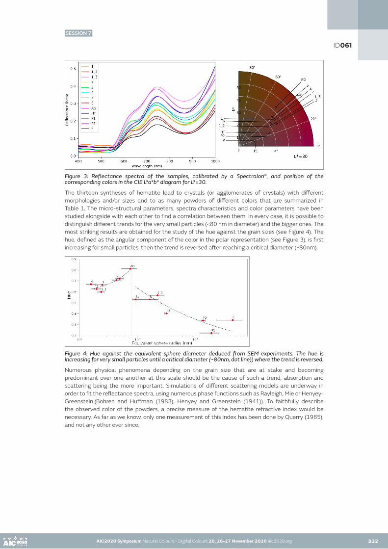
AIC2020 Symposium Natural Colours - Digital Colours 20, 26-27 November 2020 aic2020.org AIC2020 Symposium Natural Colours - Digital Colours 20, 26-27 November 2020 aic2020.org 332
Figure 3: Reflectance spectra of the samples, calibrated by a Spectralon®, and position of the corresponding colors in the CIE L*a*b* diagram for L*=30.
The thirteen syntheses of hematite lead to crystals (or agglomerates of crystals) with different morphologies and/or sizes and to as many powders of different colors that are summarized in Table 1. The micro-structural parameters, spectra characteristics and color parameters have been studied alongside with each other to find a correlation between them. In every case, it is possible to distinguish different trends for the very small particles (<80 nm in diameter) and the bigger ones. The most striking results are obtained for the study of the hue against the grain sizes (see Figure 4). The hue, defined as the angular component of the color in the polar representation (see Figure 3), is first increasing for small particles, then the trend is reversed after reaching a critical diameter (~80nm).
Figure 4: Hue against the equivalent sphere diameter deduced from SEM experiments. The hue is increasing for very small particles until a critical diameter (~80nm, dot line)) where the trend is reversed.
Numerous physical phenomena depending on the grain size that are at stake and becoming predominant over one another at this scale should be the cause of such a trend, absorption and scattering being the more important. Simulations of different scattering models are underway in order to fit the reflectance spectra, using numerous phase functions such as Rayleigh, Mie or Henyey-Greenstein.(Bohren and Huffman (1983), Henyey and Greenstein (1941)). To faithfully describe the observed color of the powders, a precise measure of the hematite refractive index would be necessary. As far as we know, only one measurement of this index has been done by Querry (1985), and not any other ever since.
ID061
SESSION 7

AIC2020 Symposium Natural Colours - Digital Colours 20, 26-27 November 2020 aic2020.org AIC2020 Symposium Natural Colours - Digital Colours 20, 26-27 November 2020 aic2020.org 333
CONCLUSION
Thirteen nanocrystallized hematite powders showing various morphologies and/or sizes of crystals (or agglomerates of crystals) and a wide range of colors have been synthesized. By comparing the micro-structural features, the characteristics of measured reflectance spectra and the color parameters in the CIE L*a*b space, it has been observed that some parameters are highly correlated. The study of the hue versus the grain size of the powders shows that the trend following by these parameters is reversed when reaching a critical diameter of about 80nm. We believe that the influence of different scattering phenomena at stake is changing at this scale causing this change of trend. Simulations of reflectance spectra with well described scattering models are needed to correctly understand the color of each sample according to the grain size and shape. An accurate measure of the refractive index would be useful to produce more reliable results. We will also aiming to model the bi-directional reflectance distribution function (BRDF), that would be of great interest for digital representation.
In the future we would like to extend this study to other inorganic pigments, like ochers, mixtures of hematite and clay.
Table 1: Features of the hematite crystals (or agglomerates of crystals) and colors of the powders. The samples have been organized by increasing crystallite size). Grain shapes and sizes are determined through SEM images. Average crystallite sizes and mass proportions of goethite are optimized through Rietveld refinements. Colors are calculated from the reflectance spectra in the CIE L*a*b* color space.
ID061
SESSION 7

AIC2020 Symposium Natural Colours - Digital Colours 20, 26-27 November 2020 aic2020.org AIC2020 Symposium Natural Colours - Digital Colours 20, 26-27 November 2020 aic2020.org 334
ACKNOWLEDGEMENTS
The authors would like to thank S. Pairis, S. Giraud (Insitut Néel) for their help in the manipulation of the scanning electron microscope, and the chemical syntheses respectively, as well as C. Félix (Institut Néel) and O. Brissaud (IPAG) for their help in the reflectance measurements. This work was financially supported by the French National Research Agency in the framework of the Investissements d’Avenir program (ANR-15-IDEX-02, Cross Disciplinary Program Patrimalp).
REFERENCES
Bohren, Craig F., and Donald R. Huffman. «Absorption and scattering of light by small particles» . John Wiley & Sons, 2008.Chalmin, Emilie, Michel Menu, Marie-Pierre Pomiès, Colette Vignaud, Norbert Aujoulat, and Jean-Michel Geneste. «Les blasons de Lascaux.» L’anthropologie 108, no. 5 (2004): 571-592.Gialanella, Stefano, R. Belli, G. Dalmeri, I. Lonardelli, M. Mattarelli, M. Montagna, and L. Toniutti. «Artificial or natural origin of Hematite-based red pigments in archaeological contexts: the case of Riparo Dalmeri (Trento, Italy).» Archaeometry 53, no. 5 (2011): 950-962.Henyey, Louis G., and Jesse L. Greenstein. «Diffuse radiation in the galaxy.» The Astrophysical Journal 93 (1941): 70-83.Pailhé, Nathalie, Alain Wattiaux, Manuel Gaudon, and Alain Demourgues. «Correlation between structural features and vis–NIR spectra of ∝-Fe2O3 hematite and AFe2O4 spinel oxides (A= Mg, Zn).» Journal of Solid State Chemistry 181, no. 5 (2008): 1040-1047.Pailhé, Nathalie, Alain Wattiaux, Manuel Gaudon, and Alain Demourgues. «Impact of structural features on pigment properties of ∝-Fe2O3 haematite.» Journal of Solid State Chemistry 181, no. 10 (2008): 2697-2704.Pomies, Marie-Pierre, Guillaume Morin, and Colette Vignaud. «XRD study of the goethite-hematite transformation: application to the identification of heated prehistoric pigments.» European Journal of solid state and Inorganic Chemistry 35, no. 1 (1998): 9-25.Potin, Sandra, Olivier Brissaud, Pierre Beck, Bernard Schmitt, Yves Magnard, Jean-Jacques Correia, Patrick Rabou, and Laurent Jocou. «SHADOWS: a spectro-gonio radiometer for bidirectional reflectance studies of dark meteorites and terrestrial analogs: design, calibrations, and performances on challenging surfaces.» Applied optics 57, no. 28 (2018): 8279-8296.Querry, Marvin R. Optical constants. MISSOURI UNIV-KANSAS CITY, 1985.Rietveld, Hugo M. «A profile refinement method for nuclear and magnetic structures.» Journal of Applied Crystallography 2 (1969): 65-71.Rodríguez-Carvajal, Juan. «Recent advances in magnetic structure determination by neutron powder diffraction.» Physica B 192, no. 1-2 (1993): 55-69.Schwertmann, Udo, and Rochelle M. Cornell. Iron oxides in the laboratory: preparation and characterization. John Wiley & Sons, 2008.Sugimoto, Tadao, Mohammad M. Khan, and Atsushi Muramatsu. «Preparation of monodisperse peanut-type ∝-Fe2O3 particles from condensed ferric hydroxide gel.» Colloids and Surfaces A: Physicochemical and Engineering Aspects 70, no. 2 (1993): 167-169.
ID061
SESSION 7

AIC2020 Symposium Natural Colours - Digital Colours 20, 26-27 November 2020 aic2020.org
The Association Between Color Preference and Everyday Products
Mahshid Baniani University of Tsukuba, Tsukuba, JapanCorresponding author: [email protected]
ABSTRACT
The purpose of this study is to investigate and identify the association between color, preferences, assessments and everyday objects. For this purpose, an experiment consisted of 3 steps was conducted among 115 Japanese university students. It was observed that blue hues were favorite colors of subjects followed by red hues. Black, blue and ultramarine blue (P<0.05) were considered masculine colors. Most beautiful color was ultramarine blue for male subjects (P<0.01), and burgundy and ultramarine blue for female subjects. It was observed that subjects preferred to use colors they considered bright (followed by beautiful) in their bedroom. Female subjects used colors considered masculine for the car while male subjects used their favorite color (P<0.01). In addition, subjects mainly used their favorite color for the clothing items.
KEYWORDS
color I characteristics I preferences I everyday objects
INTRODUCTION
Numerous studies have examined human preferences for simple patches of colors, but is not yet clear how these abstract color preferences generalize to different object contexts (Schloss et al., 2013).
The purpose of this study is to investigate and identify the association between color, preferences, assessments, and everyday objects. The aim is to identify whether personal color preferences extend to everyday products when there are numerous color choices, and to identify to what degree might an individual want personal color preference to feature in their everyday objects.
METHODOLOGY
PARTICIPANTS
115 Japanese university students (59 female and 56 male) between the ages of 19 to 22 (M=19.6) participated in this study.
PROCEDURE
An experiment consisted of 3 steps was conducted which was done randomly among the subjects. Before the experiment, each subject was provided with a set of 24-color pencils. The name of each color was written both on the color pencil and on the box.
335
ID083
SESSION 7

AIC2020 Symposium Natural Colours - Digital Colours 20, 26-27 November 2020 aic2020.org 336
The steps were as followings:
- Subjects were asked to choose most/least favorite, happiest/saddest, most beautiful/ugliest, masculine/feminine, warmest/coolest, brightest/darkest color among the color pencils. The name of each color was written on the box. They were advised to write the name of the color, as well as use the chosen color to write the answer.
- Subjects were presented with the color of each color pencil (24 in total) and were asked how they feel about it on a five-point Likert scale from very unhappy to very happy.
- Subjects were given detailed realistic drawings of bedroom, polo shirt, socks, and car and were asked to consider these as their own items and color them accordingly. (Figure 1)
Figure 1: Sample of drawings: bedroom, car, men’s polo shirt, ladies’ polo shirt, and sock.
RESULTS
COLOR PREFERENCES AND CHARACTERISTICS
This section focuses on the step where subjects had to choose a color for a specific character/adjective (i.e. bright, warm, beautiful and etcetera).
As it can be observed from Figure 2, blue hues are favorite colors of subjects followed by red hues. Masculine colors are considered to be black, blue and ultramarine blue among all subjects (P<0.05). Magenta and burgundy are considered feminine colors according to female subjects. 77% of male subjects consider magenta (P<0.01) to be a feminine color. Brightest colors are yellow, light yellow, and white. For male subjects, the most beautiful color is ultramarine blue (P<0.01), while it is ultramarine blue and burgundy for female subjects.
Although not pictured in this paper due to the limit of the number of graphs and pages, the least preferred color was beige (P<0.05) followed by ocher. Yellow hues (P<0.05) were considered happy colors. Gray was considered saddest color (P<0.01), followed by blue hues. Orange, gold and red were considered warm, while blue hues were considered cool followed by gray. Black was considered the darkest color among all subjects (P<0.01), and gray was considered the ugliest color (P<0.05), followed by brown and ochre.
AIC2020 Symposium Natural Colours - Digital Colours 20, 26-27 November 2020 aic2020.org
ID083
SESSION 7

AIC2020 Symposium Natural Colours - Digital Colours 20, 26-27 November 2020 aic2020.org AIC2020 Symposium Natural Colours - Digital Colours 20, 26-27 November 2020 aic2020.org 337
Figure 2: Colors and characteristics among female and male subjects
ID083
SESSION 7

AIC2020 Symposium Natural Colours - Digital Colours 20, 26-27 November 2020 aic2020.org AIC2020 Symposium Natural Colours - Digital Colours 20, 26-27 November 2020 aic2020.org 338
COLOR ASSESSMENTS
In this section, subjects had to look at all the 24 colors separately and rate how they feel towards each color from very unhappy to very happy. The results can be seen in Figure 3. The graphs are divided into “white to purple” and “ultramarine to black” among female and male subjects.
White, ochre, brown and dark brown are considered neutral among all subjects especially male subjects (P<0.05). These are the colors which were considered ugly or were amongst least preferred colors. Blue hues are considered unhappy colors which can be seen in other studies as well (Collier, 1996). Yellow, light yellow, gold, and orange were considered happy colors when looking at them.
Figure 3: Colors assessments among female (top two) and male (bottom two) subjects
ID083
SESSION 7

AIC2020 Symposium Natural Colours - Digital Colours 20, 26-27 November 2020 aic2020.org AIC2020 Symposium Natural Colours - Digital Colours 20, 26-27 November 2020 aic2020.org338 339
PREFERENCES FOR OBJECTS
Subjects were given realistic drawings (Figure 1), and were asked to consider those items as their own and color it accordingly. Later colors used in the drawings were compared with the results seen in Figure 2. The results are summed up in Figure 4.
As it can be observed subjects preferred to use colors they considered bright (followed by beautiful) in their bedroom. Female subjects used colors considered masculine for their car while male subjects used their favorite color (P<0.01). Male subjects used their favorite color followed by masculine colors in polo shirt; and their favorite colors followed by colors they considered beautiful for socks. Female subjects used favorite and beautiful colors for polo shirt; and they mainly used their preferred color for socks.
Figure 4: Preferences for bedroom, car, polo shirt, and socks
DISCUSSION
The purpose of this study was to identify whether personal color preferences extend to objects when there are numerous color choices. It was observed that subjects would rather use bright colors than their preferred colors in the bedroom. These bright colors were mainly used in the bedroom walls (P<0.05). The subjects of this study were Japanese and since Japanese houses are small, the walls are in bright colors to make the space look bigger. Therefore, it would be interesting to do this same project among subjects from other countries to see if same results will be obtained or not. The color used most in the bedroom walls was white (P<0.01). However, looking at Figure 3, interestingly it can be observed that subjects don’t necessarily feel happy when looking at white. This was observed in a previous research as well (Baniani, 2019).
Colors which were considered masculine such as black, ultramarine blue, and blue were popular colors for car perhaps due to the reason that the drawing given of the car was a sports car. If another type of car was given, the results might have been different.
Subjects seemed to use their favorite colors most in the clothing items. The subjects may have considered the clothes more personal than the bedroom or car. It would be interesting to do this research with more products and items.
ID083
SESSION 7

AIC2020 Symposium Natural Colours - Digital Colours 20, 26-27 November 2020 aic2020.org AIC2020 Symposium Natural Colours - Digital Colours 20, 26-27 November 2020 aic2020.org 340
REFERENCES
Baniani, M. 2019. Color preference and emotion among Japanese students. In: AIC 2019 Color and Landscape, Proceedings of the Interim Meeting of the International Colour Association, Buenos Aires, ArgentinaCollier, G. L. 1996. Affective Synesthesia: Extracting emotion space from simple perceptual stimuli. Motivation and Emotion 20: 183-221Schloss, K. B., E. D. Strauss, and S. E. Palmer. 2013. Object Color Preferences. Color Research and Application 38(6): 393-411
ID083
SESSION 7

AIC2020 Symposium Natural Colours - Digital Colours 20, 26-27 November 2020 aic2020.org
The color of Modigliani’s paintings in France (1908-1919)
Anaïs Genty-Vincentab•, Ruven Pillaya, Marie-Amélie Senotc, Michel Menuab a Centre de Recherche et de Restauration des Musées de France (C2RMF), Paris, FrancebChimie-ParisTech, PSL, Institut de Recherche de Chimie-Paris (IRCP), Paris, Francec LaM, Lille Métropole Musée d’art moderne, d’art contemporain et d’art brut, Villeneuve d’Ascq, France•Corresponding author: [email protected] author: Anaïs Genty-Vincent
ABSTRACT
Amedeo Modigliani (1884-1920) is a recognized and admired artist. The current ‘Modigliani and his Secrets’ project aims at studying the materiality of all Modigliani’s paintings and sculptures from the French public collection. The present article is dedicated to the color in Modigliani’s paintings. A representative color palette for each of the studied paintings was identified using K-means clustering on precise colorimetric data obtained from the visible near-infrared hyperspectral data. It highlights some interesting results regarding the lightness and the color of those paintings and outlines some evolution in the color he used within his short artistic career.
KEYWORDS
Amedeo Modigliani I pictorial technique I colorimetry I color palette I colorist
INTRODUCTION
Amedeo Modigliani (1884-1920) was a renowned Italian painter and sculptor, who developed a characteristic and unique style over the years. Only two technical research projects were previously undertaken on his paintings: one at the C2RMF in 1981 (Delbourgo and Faillant-Dumas, 1981) and another by the Tate in 2018 (Collective work, 2018). New scientific research is currently being undertaken through the ‘Modigliani and his Secrets’ project1, which was set up with the aim to acquire a better knowledge on the materiality of Modigliani’s masterpieces, as well as to acquire a better understanding of his studio practice and pictorial technique. To this goal, complementary exams and analyses (elemental and structural) have been performed at different scales. The corpus covers the entire work produced by Modigliani in France from 1908 to 1919 and consists of every work by Modigliani that is within a public museum collection in France.
The present paper focuses on the color palette of Modigliani’s paintings throughout his artistic carrier. An innovative data treatment has been set-up in order to visualize Modigliani’s palette evolution. The palette was extracted from colorimetric datas calcultated from hyperspectral imaging data through a K-means clustering algorithm. The sty is based on the results obtained on the 21 paintings that are mentioned in the Ceroni’s catalogue raisonné of the artist that is still a reference today (Ceroni, 1970) and on two additional paintings (labelled with a star (*) in the figure 2).
EXPERIMENTS
Hyperspectral imaging was carried out on all of the paintings using a visible near-infrared (VNIR) pushbroom camera (a Hyspex VNIR1600 from Norsk Elektro Optikk A/S, Norway). The camera was mounted on a X-Y translation stage with illumination supplied by a stabilized halogen light source that moved with the camera. The system automatically scans the painting in vertical strips resulting in spectral image cubes with a spatial resolution of 15 pixels/mm (60 µm).
341
ID108
SESSION 7

AIC2020 Symposium Natural Colours - Digital Colours 20, 26-27 November 2020 aic2020.org 342
Several paintings had varnish that was very reflective and highly irregular. In order to avoid excessive amounts of specular reflection in the resulting images, polarized lighting was used for these paintings. To avoid overly long acquisition times for these cases, spectral binning was used when necessary to reduce noise and reduce acquisition times. The final data cubes were, therefore, captured with either 40 or 80 bands over the full spectral range of 400 – 1000 nm. The resulting raw data was calibrated using a spectral reference standard and the data processed and mosaicked to produce a final high resolution spectral image cube of the entire painting normalized to absolute reflectance factor. For a full description of the hyperspectral acquisition, calibration and processing workflow, see Pillay et al. 2019.
In order to study and provide quantitative measurements of the color palette, the measured spectral reflectances within the painting were converted to colorimetric values to create an accurate and precise high resolution color map for each painting. This was done by first determining the CIE XYZ tristimulus values by multiplying the spectral reflectance curves by the CIE standard 2° observer color matching functions and by the spectral energy of the illuminant (D65 standard daylight). The values were summed and normalized for each of X,Y and Z. CIELAB coordinates were then calculated from the CIE XYZ coordinates. Conversion from spectral reflectance to CIELAB was carried out using the open source software hyper2color2.
The representative colors found within the palette were then automatically extracted from the colorimetric maps through a clustering algorithm in order to produce a palette of the different colors found within each painting. This was carried out on the CIE L*a*b* pixel values of each painting through k-means clustering (MacQueen, 1967), which essentially minimizes within-cluster variances to produce an optimal set of colors.
The clustering provides the L*a*b* coordinates of the centers of each cluster and each pixel can then be assigned to one of the clusters. K-means clustering, however, necessitates the manual initialization of the number of clusters. Various values for this number were tested and the results for the painting Paul Alexandre devant un vitrage (Ceroni 40) can be seen in Figure 1. In this painting, the colorist skills of Modigliani are well expressed with the use of a large number of colors. This form of clustering is similar to image color quantization and we can see that the use of 5, 10 or even 20 clusters is insufficient to render the complexity of the hues used by Modigliani. The green tones and the modeling of the skin tones are, for example, better depicted on the rendering with 25 clusters. It could of course be possible to use more clusters, but the clustering starts to separate colors that are highly similar with only a small difference in hue, which unnecessarily complicates the interpretation of the results. The use of 25 clusters appears to be a good compromise and was, therefore, used for all paintings of the corpus.
The color palettes shown in figure 2 are ordered by the number of pixels and then by hue. To determine hue, the CIE LChuv color space was used (Ihaka, 2003), which is a cylindrical transformation of CIELUV. The calculated hue, huv, values were used to order the colors within the palette. Clustering and color palette processing was carried out using Python and various standard libraries including scikit-learn3.
AIC2020 Symposium Natural Colours - Digital Colours 20, 26-27 November 2020 aic2020.org 341
ID108
SESSION 7

AIC2020 Symposium Natural Colours - Digital Colours 20, 26-27 November 2020 aic2020.org AIC2020 Symposium Natural Colours - Digital Colours 20, 26-27 November 2020 aic2020.org 343
Figure 1: Comparison between the visible light photography (© C2RMF/G. Parisse) and the rendering obtained for 5, 10, 20 and 25 clusters.
RESULTS AND DISCUSSION
The color palettes extracted from each painting (figure 2) give valuable information on the chromaticity and the lightness of Modigliani’s paintings and outlines some evolution throughout his carrier. The representation of the palette as color stripes enables to concentrate only to the color, as our gaze is not concerned by shapes and forms of distinctive elements neither by the surface roughness of the paint matter.
ID108
SESSION 7

AIC2020 Symposium Natural Colours - Digital Colours 20, 26-27 November 2020 aic2020.org AIC2020 Symposium Natural Colours - Digital Colours 20, 26-27 November 2020 aic2020.org 344
Figure 2: Visualization of the color palette (25 clusters) for each painting with the colors ordered by the number of pixels within the cluster (left) and by color hue in the CIE LCh colorspace (right) (colors with a L*<10 have grouped together for clarity).
ID108
SESSION 7

AIC2020 Symposium Natural Colours - Digital Colours 20, 26-27 November 2020 aic2020.org AIC2020 Symposium Natural Colours - Digital Colours 20, 26-27 November 2020 aic2020.org344 345
Regarding the brightness of the palette, a weighted average was calculated for each painting from the L* values of each cluster (Figure 3). As expected, the light of the Midi had an impact on his palette and the brightest paintings were executed in the later period of his life during and after his sojourn in the south of France at the end of World War I (1918-1919). Nevertheless, based on our corpus, there is not a real and strong evolution in the brightness of Modigliani’s paintings. Indeed, it would be incorrect to say that paintings are dark in the early period and bright in the last one.
Figure 3: Weighted average of the CIELAB lightness parameter (L*) of each painting based on the L* values obtained for each cluster. The paintings numbers used are those from Figure 2.
Regarding the color itself, it revealed a wide use of brown and orange tones throughout his works and even more during his Midi period. The muted blue or green tones are predominant in Modigliani’s paintings, in particular in the background. The joint use of those complementary colors (brown/orange and green/blue) is reminiscent of the color palette of Cézanne (1839-1906), who greatly influenced Modigliani’s pictorial technique. Some tones are almost absent in his palette, however. For example the purple tones (except in the painting Buste de jeune femme from 1908 (Ceroni 6)) or the pure yellows. The most significant evolution between the early and the late works of art is the use of a more restricted color palette only with small changes of shade.
Muted tones are frequent in Modigliani’s paintings but highly saturated colors are quite rare. The painting of Moïse Kisling (Ceroni 154), whose jacket was executed with deep and dense blue hues stands out here as an exception. The study of Modigliani color palette highlights that he used a wide variety of tonalities within the same color to obtain soft color variations. It confirms his skills as a colorist and suggests that he had rarely painted directly from the tube.
Complementary chemical analysis (macro-X-ray fluorescence, x-ray diffraction, scanning electron microscopy coupled with energy-dispersive X-ray spectrometry (SEM-EDS) on cross-sections….) were performed to identify the pigments and the materials he used. While some colors are not present in the identified color palette, they are, though, present in Modigliani’s pigment palette. Modigliani’s colors are mainly obtained using different pigments mixed together. Vermilion, red lake and red ochre are mainly used for red tones, Prussian blue, ultramarine blue and cobalt blue for the blue tones, chrome green and emerald green for green tones and earth ochre, as well as different yellow pigments such as cadmium yellow and chrome yellow in the yellow and brown hues. In the paint layers, pigments are mixed with a wide range of white pigments (lead white, zinc white, lithopone and barite) depending on the opacity he wanted. Moreover, paradoxically the virtuosity of Modigliani’s use of color is especially apparent in the dark areas. Those that appear black at first glance, were made with bone black pigment, often mixed with a large variety of pigments of different colors such as Prussian blue, cobalt blue, chrome green, emerald green, iron oxides, red or yellow, vermilion depending on the desired tone.
ID108
SESSION 7

AIC2020 Symposium Natural Colours - Digital Colours 20, 26-27 November 2020 aic2020.org AIC2020 Symposium Natural Colours - Digital Colours 20, 26-27 November 2020 aic2020.org 346
CONCLUSION
K-means clustering analysis proves to be a relevant tool for the analysis of the color palette of artists or artistic movements. Based on CIELAB images that were in our case processed from near-infrared visible hyperspectral data, the in-house developed python code enables to obtain a representation of the color palette for a given cluster numbers. Contrary to K-means function from commercial statistical or hyperspectral imaging softwares (such as ENVI®), the coded program was highly versatile. The color of the cluster is not randomly attributed in false color, but it corresponds to the real color in the CIELAB colorspace, which presents a great advantage for the cultural heritage issue. Moreover, it enables to order the clusters by color or by occurrence in the painting.
Colorimetric analysis performed on 23 paintings shed new light on Modigliani’s color palette over his short artistic life. His color palette is intrinsically related to the evolution of his pictorial technique. Over the years, the paint layers are becoming thinner and thinner to create an artistic style that become more refined. Moreover, even if the nature of the pigments may differ from one painting to another, his palette seems to become more restricted and brighter in his later portraits. It revealed that vivid colors are quite rare in Modigliani paintings and there is no or only few paint layers with pure yellow or purple tones. Nevertheless, if these colors are almost absent on his paintings they are present in his palette. It confirms that Modigliani was a painter with good coloristic skills. The colors, one observed on the paintings are not directly applied from the tube, but the result of a sound reflexion. It reveals to a certain extend how Modigliani perceived the colors and how he conveyed his feelings in his painting.
ACKNOWLEDGMENT
The research project was supported by the Service of the French Museums, Lille Metropole, LaM and DRAC Haut-de-France. The authors are grateful to the involved museums for allowing us to analyze all Modigliani’s paintings from the French public collection.
REFERENCES
Ceroni A., 1970, Il dipinti di Modigliani, Rizzoli, Milano. Collective work, 2018, ‘The Modigliani technical research study’, The Burlington Magazine, Vol. CLX, No 1380 pp. 181-195 / No 1381 pp. 311-324 / No 1392, 394-407.Delbourgo S. and Faillant-Dumas L., 1981, ‘L’étude au Laboratoire de Recherche des Musées de France’ in B. Contensou and D. Marchesseau: Amedeo Modigliani, Musée d’art Moderne de la Ville, 20-47.Ihaka R, 2003, Colour for Presentation Graphics. In K Hornik, F Leisch, A Zeileis (eds.), Proceedings of the 3rd International Workshop on Distributed Statistical Computing, Vienna, Austria. MacQueen, 1967, J. Some methods for classification and analysis of multivariate observations. Proceedings of the Fifth Berkeley Symposium on Mathematical Statistics and Probability, Volume 1: Statistics, 281--297, University of California Press, Berkeley, Calif.Pillay, R., Hardeberg, J. Y., & George, S, 2019. Hyperspectral imaging of art: Acquisition and calibration workflows. Journal of the American Institute for Conservation, 58(1-2), 3-15.
NOTES
1 The project is co-lead by the LaM (Lille Métropole Musée d’art moderne, d’art contemporain et d’art brut) museum and the Centre de Recherche et de Restauration des Musées de France (C2RMF), with the close collaboration of the CNRS through the UMR 8247 involving the C2RMF and Chimie ParisTech and the USR 3290 Miniaturisation pour la Synthèse, l’Analyse et la Protéomique (MSAP) at Lille University. The eleven museums involved in the project are : the LaM (Lille métropole musée d’art moderne, d’art contemporain et d’art brut, Villeneuve d’Ascq), the Musée de l’Orangerie (Paris), the Musée national d’art moderne – Centre Pompidou (Paris), the Musée national d’art moderne de la Ville de Paris, the Musée des beaux-arts de Rouen, the Musée des beaux-arts de Nancy, the Musée Picasso, the Musée d’art moderne de Troyes, the Musée de Grenoble, the Musée d’art et d’histoire du judaïsme (Paris), the Musée des beaux-arts de Lyon.2 https://github.com/hyperspectral-calibration/hyper2color.3 https://scikit-learn.org.
ID108
SESSION 7

AIC2020 Symposium Natural Colours - Digital Colours 20, 26-27 November 2020 aic2020.org
Study on dynamic adaptation properties under the chromatic colored light and the glare source
Youko Inouea•, Yoko Ikegamib, Haruka Hamanac, Ayana Kishimab
a The Open University of Japan, Nara, Japanb Nara Women’s University, Nara, JapancKyushu University, Fukuoka, Japan•Corresponding author: [email protected] author: Youko Inoue
ABSTRACT
This paper reports the influence of the light color and the glare source on adaptation status in the range of the luminance change to produce in everyday life. The experiment is the measurement of time until barely recognize a visual object. The subject is three young women with normal visual acuity. In all of five color of lighting used in this experiment, the decrease gradient of the luminance difference threshold with elapsed time is almost common to background luminance before or after change, and in each adaptation process. The relations between the luminance change ratio and the adaptation complete time is shown by a straight line. The regression line gradient is common to all five kind of light color. The influence of glare source on adaptation luminance is same regardless of during transient or steady. A prediction function of the adaptation luminance will be suggested by explanation variables as above.
KEYWORDS
dynamic adaptation properties I chromatic colored light I glare source I adaptation luminance I luminance change ratio
1. BACKGROUND AND PURPOSE
The luminance in the visual field, that is the light stimulation to eyes, changes frequently. However, a certain time is necessary for adaptation to the changing of visual field luminance, and a temporary deterioration of visibility may occur in the adaptation transition.
Such a situation should be evaded from the viewpoint of safety. Therefore, it is necessary to clarify adaptation properties for the visual environmental plans to be safe, and to be comfortable. In addition, there are various glare sources in the visual field. Furthermore, today, we can use various light colors because new light sources such as the LED have appeared.
An adaptation to light originated with cone cells and rod cells. In previous researches1), to research the effect of either cone cells or rod cells due to adaptation, the pupil diameter was kept constant and the visibility was measured when the luminance was changed significantly. On the other hand, in this paper, we report the effects of light color and glare source on the light adaptation process and the dark adaptation process in the range of changes in brightness observed in daily life.
347
ID113
SESSION 7

AIC2020 Symposium Natural Colours - Digital Colours 20, 26-27 November 2020 aic2020.org 348
2.METHOD
The experiment is the measurement of time until barely recognize a visual object. The time progress of luminance different threshold is determined by the results of the measurement time.
Figure 1 shows a cross-section of the experiment apparatus and the image of the target and the background. The size of the experiment booth is H1.7m× W1.5m × D2.4m. The interior color is white. The subject is three young women aged 21-23 and their binocular visual acuity is 1.34-1.48.
Table 1 shows the experiment condition. The visual object is circular shapes of the achromatic color, the size is four minutes in diameter and the contrast is from 0.01 to 0.80. The range of background luminance is 0-1000 cd/m2.
Figure 2 shows the spectral distribution of each lamp. The color of lighting is blue, green, yellow, red, and white. The color of glare sources is only white and their luminance is 30500 cd/m2.
The experiment is performed by the following procedure for each light color.
1) Just after the subject has finished wearing an eye mask for one minute, the background luminance L1 of before changing is presented, and at the same time, visual objects are presented.
2) The subject reports the visual object which she can barely recognize at every designated time.
3) Just after the scheduled time has passed, the background luminance changes into luminance L2 of after changing.
4) The subject informs a time when she is able to recognize a visual object sequentially by pushing the key.
AIC2020 Symposium Natural Colours - Digital Colours 20, 26-27 November 2020 aic2020.org 347
ID113
SESSION 7

AIC2020 Symposium Natural Colours - Digital Colours 20, 26-27 November 2020 aic2020.org AIC2020 Symposium Natural Colours - Digital Colours 20, 26-27 November 2020 aic2020.org348 349
3. THE VISIBILITY IN EACH ADAPTATION TRANSIENT STATE
3.1 Adaptation time to luminance L1 before change and Light color
Figure 3 shows the passage of time of luminance difference threshold in adaptation transient state. In the figure, the horizontal lines show the threshold values when completely adapted to background luminance L2 after change. It is a threshold value when adapted to L2 for 25 minutes.
For every condition, with time, it gradually approaches the value of completely adapted to L2. In all of light color used in this experiment, as with white light2), the luminance difference threshold decreased with progress at time in both of the transition to light adaptation or dark adaptation. Figures 3 (c) and 3 (d) show that the longer the adaptation time to the luminance L1 of before changing, the longer it takes to reach the same threshold value.
Moreover, Figure 3 (a) and (b) indicates that under blue light required more time than under the other color until the same visual sensitivity become.
ID113
SESSION 7
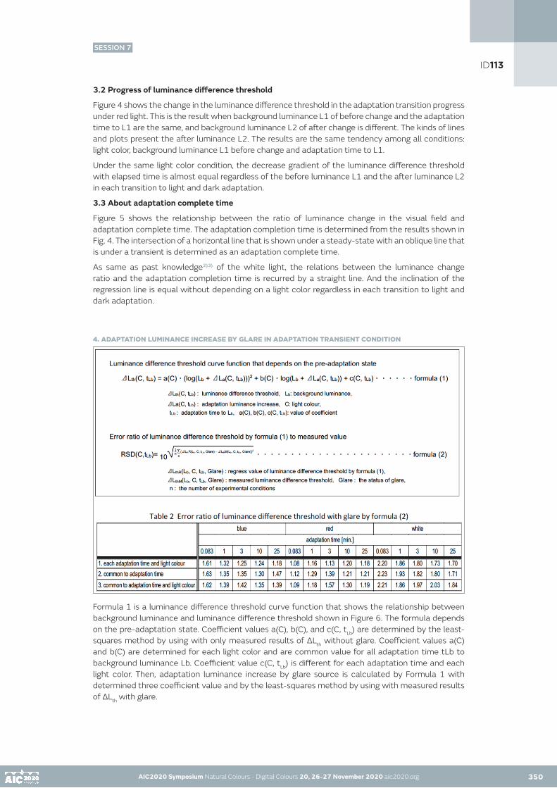
AIC2020 Symposium Natural Colours - Digital Colours 20, 26-27 November 2020 aic2020.org AIC2020 Symposium Natural Colours - Digital Colours 20, 26-27 November 2020 aic2020.org 350
3.2 Progress of luminance difference threshold
Figure 4 shows the change in the luminance difference threshold in the adaptation transition progress under red light. This is the result when background luminance L1 of before change and the adaptation time to L1 are the same, and background luminance L2 of after change is different. The kinds of lines and plots present the after luminance L2. The results are the same tendency among all conditions: light color, background luminance L1 before change and adaptation time to L1.
Under the same light color condition, the decrease gradient of the luminance difference threshold with elapsed time is almost equal regardless of the before luminance L1 and the after luminance L2 in each transition to light and dark adaptation.
3.3 About adaptation complete time
Figure 5 shows the relationship between the ratio of luminance change in the visual field and adaptation complete time. The adaptation completion time is determined from the results shown in Fig. 4. The intersection of a horizontal line that is shown under a steady-state with an oblique line that is under a transient is determined as an adaptation complete time.
As same as past knowledge2)3) of the white light, the relations between the luminance change ratio and the adaptation completion time is recurred by a straight line. And the inclination of the regression line is equal without depending on a light color regardless in each transition to light and dark adaptation.
4. ADAPTATION LUMINANCE INCREASE BY GLARE IN ADAPTATION TRANSIENT CONDITION
Formula 1 is a luminance difference threshold curve function that shows the relationship between background luminance and luminance difference threshold shown in Figure 6. The formula depends on the pre-adaptation state. Coefficient values a(C), b(C), and c(C, tLb) are determined by the least-squares method by using with only measured results of ΔLth without glare. Coefficient values a(C) and b(C) are determined for each light color and are common value for all adaptation time tLb to background luminance Lb. Coefficient value c(C, tLb) is different for each adaptation time and each light color. Then, adaptation luminance increase by glare source is calculated by Formula 1 with determined three coefficient value and by the least-squares method by using with measured results of ΔLth with glare.
ID113
SESSION 7

AIC2020 Symposium Natural Colours - Digital Colours 20, 26-27 November 2020 aic2020.org AIC2020 Symposium Natural Colours - Digital Colours 20, 26-27 November 2020 aic2020.org350 351
AS an example, Figure 6 shows the relationship between background luminance and luminance difference threshold in the light adaptation1 (shown in Table 1) in each adaptation time tLb under white light and in adaptation time tLb=25 minutes under three kind of light color. All curves in the figure are based on Formula 1. The pre-adaptation state is ‘wear eye mask for one minutes’.
Formula 2 is an error ratio of the luminance difference threshold by Formula 1 to the measured value. Table 2 shows error ratio of luminance difference threshold with glare by Formula 2. The color in Table 2 is light color to background. The glare source light is white only. For examination of the influence of glare source on adaptation luminance, in determined the coefficient of Formula 1, three types of restriction conditions are set as shown in Table 2. It is clear that there is not much difference in the error rate under each restriction condition. Even if adaptation luminance increase is determined as one value common to all light colors and all adaptation time (the third restriction condition), the error rate is not much difference from other condition.
Therefore, in a transient process of adaptation, the increase of adaptation luminance by the glare sources is equal to that of the steady adaptation. In other words, the influence of glare source on adaptation luminance is the same regardless of the adaptation state.
5.CONCLUTIONS
Examination and data analysis provided the following results.1) In all of chromatic colored light used in this experiment, the luminance difference threshold decreases with progress at time in both of the light adaptation process and the dark adaptation process.2) The gradient of decreases of the luminance difference threshold with elapsed time is almost equal regardless of the before luminance L1 and the after luminance L2, and in transient to each adaptation.3) As same as past knowledge of the white light, the relations between the luminance change ratio and the adaptation completion time is recurred by a straight line. And the gradient of the regression line is equal without depending on a light color.4) In a transient process of adaptation, the increase of adaptation luminance by the glare sources is equal to that of the steady adaptation. In other words, the influence of glare source on adaptation luminance is same regardless of transient or steady.
The experimental result is being successively analyzed. A prediction function of the adaptation luminance will be suggested by explanation variables which are the adaptation luminance of before changing, the luminance distribution of after changing visual field, the elapsed time after the change, et. al. And for safe life space creation, the dynamic evaluation method of adaptation luminance will be suggested with the function.
ACKNOWLEDGEMENTS
We acknowledge the Illuminating Engineering Institute of Japan for financial supports (Grant for Research and Education, No. 28CF002).
REFERENCES
1) SELIG HECHT, CHARLES HAIG, AND AURIN M: THE INFLUENCE OF LIGHT ADAPTATION ON SUBSEQUENT DARK ADAPTATION OF THE EYE, THE JOUMALOF GENERAL PHYSIOLOGY, pp.831-850,1937.4.2). INOUE Youko and ITOH Katsuzoh; VISUAL SENSITIVITY AT TRANSIENT ADAPTATION: Dynamic Evaluation Method of Visibility Utilizing Effective Luminance (Part 1), Journal of Architecture and Planning (Transactions of AIJ), pp. 11-16, No. 60, Vol. 468, 1995.2.3) INOUE Youko and ITOH Katsuzoh; RELATION BETWEEN VISIBILITY AND EFFECTIVE LUMINANCE RATIO AT TRANSIENT ADAPTATION : Dynamic evaluation method of visibility utilizing effective luminance (part 2), Journal of Architecture and Planning (Transactions of AIJ), pp. 1-6, No. 60, Vol. 474, 1995.8.4) Youko INOUE, Yoko IKEGAMI, Naoya HARA: Effects of chromatic light on visibility -Distinction threshold and Equivalent veiling luminance, Midterm Meeting of the International Colour Association (AIC), Zurich, Switzerland, pp.430-434, 2011.
ID113
SESSION 7

AIC2020 Symposium Natural Colours - Digital Colours 20, 26-27 November 2020 aic2020.org
Effect of lighting on visual appearance of Japanese woodblock print painting (Ukiyo-e) for Spanish observers
Shino Okudaa•, Satoko Taguchib, Katsunori Okajimac, Luis Gómez-Robledod, Manuel Melgosad a Doshisha Women’s College of Liberal Arts, Kyoto, Japanb Tokyo University of the Arts, Tokyo, Japanc Yokohama National University, Yokohama, Japand University of Granada, Granada, Spain• Corresponding author: [email protected] author: Shino Okuda
ABSTRACT
We conducted a subjective experiment on the visual appearance of Ukiyo-e, Japanese woodblock print painting, under different lighting conditions. For preparing the visual stimuli, we measured the spectral reflectance of two Ukiyo-e (a) and (b) using a 2D spectroradiometer and generated simulated digital images of each Ukiyo-e under 12 illuminants, including the CIE LED illuminants proposed by CIE, using three illuminance levels (50, 200 and 500lx). Spanish observers were asked to scale the appearance and the level of “preference of lighting”. The results showed that Ukiyo-e (a) including much red colors looked most vivid under the LED-RGB1 illuminant, while Ukiyo-e (b) consisting of blue colors looked most vivid under the D65 and LED-B5 illuminants. Both Ukyo-e were increasingly preferred with higher illuminance levels. Specifically, the most preferred illuminants were LED-B3 for Ukiyo-e (a) and LED-B5 for Ukiyo-e (b). In conclusion, visual appearance of Ukiyo-e for Spanish observers is affected by the lighting conditions.
KEYWORDS
light colour I museum lighting I Ukiyo-e I LED illuminant
INTRODUCTION
Recently, LEDs (Light-Emitting Diodes) are being used for museum lighting. There are some reports on surface properties of the paintings by Tominaga et al. (2016) and Luna et al. (2016). Nakajima and Fuchida (2015a) measured the color appearance of cultural properties exhibited under low illuminance and reported that subjective brightness and vividness of red colors were important. They also suggested that “color quality indices” Rx and Rxi may be proper evaluators for the new color rendering properties expressing illuminance and hue effects (2015b). In addition, Feltrin et al. (2020) reported that correlated color temperature (CCT) of spotlight was a more effective factor on the appearance of paintings than painting colors or existence of ambient lighting. Bhattacharjee and Pal (2019) reported that a 3500K LED illuminant was more pleasant than 2700K and 6500K LED illuminants under 100lx condition. However, how to achieve optimal lighting for museum visitors is still an open question.
The current paper investigates the preferred lighting conditions for the appearance of Ukiyo-e, which is a Japanese woodblock print painting. We conducted a subjective experiment on the visual appearance of Ukiyo-e under several kinds of lighting conditions for Spanish observers who are not familiar with this kind of paintings.
352
ID115
SESSION 7

AIC2020 Symposium Natural Colours - Digital Colours 20, 26-27 November 2020 aic2020.org 353
EXPERIMENT
We employed two kinds of Ukiyo-e, drawn by Toyohara Kunichika, who is a famous Ukiyo-e artist. Ukiyo-e (a) is entitled “Mitate hashi zukushi Nihonbashi”, Parody of Collection of Bridges / Nihonbashi Bridge (1873), and its dimensions are 335mm high x 235mm wide. An actor of Kabuki, Kawarazaki Sansho, wearing a kimono in violet and white was drawn on a red background, and a bridge is inserted into the picture. Ukiyo-e (b) is entitled “Edo meisho awase no uchi Osho Jiro No.7”, Famous Views of Edo / Osho Jiro (1867), and its dimensions are 355mm high x 240mm wide. An actor of Kabuki, Ichimura Kakitsu, wearing a kimono in blue-green and dark blue was drawn on a black background, and a landscape with a bridge is inserted into the picture.
For preparing the visual stimuli, we measured the spectral reflectance of these Ukiyo-e using a 2D spectroradiometer (UA-5000, Topcon Co. Ltd.). Next, we generated simulated digital images of each Ukiyo-e under 12 illuminants, nine CIE LED illuminants proposed in CIE 015:2018 (LED-B1, LED-B2, LED-B3, LED-B4, LED-B5, LED-BH1, LED-RGB1, LED-V1 and LED-V2) plus three conventional CIE illuminants (standard illuminant A, supplementary standard illuminant D50, and standard illuminant D65), considering three illuminance levels: 50lx, 200lx and 500lx. In total, we generated 78 images and each one was presented to observers using a calibrated display (LCD Color Monitor, Hewlett Packard 2510i). Figure 1 shows some of these generated digital images.
We showed each one of the digital images randomly to each observer. The observation time for each image was 60 seconds, with 10 seconds observation of a neutral grey between two consecutive images. Each observer performed two sessions. Half of the visual images were tested in a session which took about 75 minutes. Participants observed each Ukiyo-e in a visual distance of 455 mm which is equivalent to the situation where they observe the real-size Ukiyo-e. During the observation time observers were asked to scale the appearance of each image using 11 pairs of adjectives (“dull – vivid”, “heavy – light”, “muddy – clear”, “old – new”, “cold – warm”, “inactive – active”, “static – dynamic”, “traditional – modern”, “moderate – high-grade”, “uncomfortable – comfortable” and “ugly – beautiful”), using a 7-step scale. They also evaluated the level of “preference of lighting” with a numerical scale from 1 (not at all preferred) to 10 (absolutely preferred). Twenty Spanish people participated in the experiment (50% males).
Figure 1: Digital images of Ukiyo-e (a) and (b) under the lighting conditions indicated in the brackets.
RESULTS AND DISCUSSION
We analyzed the results using ANOVA and Tukey’s HSD. In all items of appearance, the evaluations depended on the illuminance levels (p<.005). In all items except “inactive – active” and “moderate – high-grade”, the evaluations were affected by the illuminant (p<.005). Also, in all items except “muddy – clear”, “inactive – active” and “ugly – beautiful”, the evaluations were affected by the kind of Ukiyo-e assessed (p<.05).
AIC2020 Symposium Natural Colours - Digital Colours 20, 26-27 November 2020 aic2020.org
ID115
SESSION 7

AIC2020 Symposium Natural Colours - Digital Colours 20, 26-27 November 2020 aic2020.org AIC2020 Symposium Natural Colours - Digital Colours 20, 26-27 November 2020 aic2020.org353 354
Figure 2 shows the average observers results for “dull – vivid” under each lighting condition, with illuminants in the x-axis in the order of their CCTs. As the illuminance was higher, both paintings looked more vivid. It was found that Ukiyo-e (a) including much red colors looked most vivid under the LED-RGB1 illuminant in 500lx, while Ukiyo-e (b) consisting of blue colors looked most vivid under the D65 and LED-B5 illuminants in 500lx.
Figure 2: Average observers results for “dull – vivid” under each lighting condition.
Figure 3 shows the average results for “uncomfortable – comfortable”. It was found that both Ukiyo-e images were considered uncomfortable for any illuminant under 50lx. Ukiyo-e (a) looked most comfortable under illuminants LED-B3 and LED-V2 (around 4100K) in 500lx, and most uncomfortable under the illuminant LED-B1 in 50lx. Ukiyo-e (b) looked very comfortable under illuminants with CCTs in the range 5000-6500K in 500lx, and most comfortable under the illuminant LED-B4. However, it looked uncomfortable for illuminants with CCTs lower than 3000K in 200lx and for illuminants of any CCT in 50lx.
Figure 3: Average observers results for “uncomfortable – comfortable” under each lighting condition.
Figure 4 shows the results for “preference of illumination”. Both Ukyo-e (a) and (b) were most preferred at higher illuminance levels. In the case of Ukiyo-e (a), it was found that most preferred illuminants were LED-B3, D65 and LED-B5 in 500lx while illuminants with high CCTs were preferred for Ukiyo-e (b).
The Pearson’s correlation coefficient between the results of “preference of illumination” and that of “uncomfortable – comfortable” and “ugly – beautiful” were both 0.97, indicating that the preference of illumination depends on the comfortableness and beautifulness in appearance.
Figure 4: Average results for “preference of illumination” under each lighting condition.
ID115
SESSION 7

AIC2020 Symposium Natural Colours - Digital Colours 20, 26-27 November 2020 aic2020.org AIC2020 Symposium Natural Colours - Digital Colours 20, 26-27 November 2020 aic2020.org 355
CONCLUSIONS
Visual appearance of Ukiyo-e for Spanish observers is affected by the lighting conditions, and the preferred illuminant depends on the specific colors of these paintings. It was cleared that the Ukiyo-e (a) including red colors was preferred under illuminants with CCTs in the range 4000-5000K, while the Ukiyo-e (b) with mainly blue colors was preferred under illuminants with CCTs in the range 5000-6500K. Preferences also increased with illuminance levels.
ACKNOWLEDGMENTS
This study was supported by JSPS KAKENHI Grant Number 18KK0282 and Ministry of Science and Innovation of Spain, project PID2019-107816GB-I00. We would like to thank Masato Nagata for generating the digital images of Ukiyo-e.
REFERENCES
Bhattacharjee, A., S. Pal. 2019. Effect of color temperature on appearance of paintings exhibited under LED lighting, Color Research and Application 44, 762-771CIE 015:2018. 2018. Colorimetry, 4th edition, ISBN: 978-3-902842-13-8, DOI:10.25039/TR.015.Feltrin, F., F. Leccese, P. Hanselaer, K. A. G. Smet, 2020. Impact of Illumination Correlated Color Temperature, Background Lightness, and Painting Color Content on Color Appearance and Appreciation of Paintings, LEUKOS 16(1), 25-44 Luna J. M., A. A. Fernandez-Balbuena, D. Vázquez, M. Melgosa, H. Durán, J. García, C. Muro. 2016. Accurate Measurements of Spectral Reflectance in Picasso’s Guernica Painting, Applied Spectroscopy 70(1), 147–155Nakajima, Y., T. Fuchida. 2015a. Study of Museum Lighting: Optimum Lighting and Color Environment (2) -Color Evaluations Structure for Low Illuminance Level-, Journal of Illuminating Engineering Institute of Japan, 99-2, pp.74-82 (written in Japanese)Nakajima, Y., T. Fuchida. 2015b. Study of Museum Lighting: Optimum Lighting and Color Environment (3) -New Calculation Method of Color Quality Index for Museum Lighting-, Journal of Illuminating Engineering Institute of Japan, 99-5, pp.263-269, 2015 (written in Japanese)Tominaga, S., S. Dozaki, Y. Kuma, K. Hirai, T. Horiuchi. 2016. Modeling and Estimation for Surface-Spectral Reflectance of Watercolor Paintings, Proceedings of IS&T Electronic Imaging, MMRMA-364
ID115
SESSION 7

AIC2020 Symposium Natural Colours - Digital Colours 20, 26-27 November 2020 aic2020.org
The “Haut de Jaurès” project in Brest: the collective reconquest of a street identity - from the former sailors’district to 3D colour modelling
Anne Petita•
a PhD, Colorist architect, independent researcher•Corresponding author: [email protected] author: Anne Petit
ABSTRACT
The “Haut de Jaurès” project is the collective search for a neighbourhood identity in Brest (a city in north-western France) through the colour enhancement of building façades. Aware of how colour can improve living surroundings and street re-appropriation by its inhabitants, the city of Brest mandated a team of colour architects (Atelier Chroma), architects specialising in citizen participation (Collectif Fil) and graphic designers from the city’s GIS department, to collaborate with neighbourhood residents, traders and users. A street colouring guide was jointly developed using various interactive methods and tools to test the colour schemes. The project combines citizen participation workshops (colour culture awareness, walking tours and mobile mapping, handling of coloured materials and discussions) and hands-on use of an immersive 3D model of the 700-meter-long street. The consultation phase resulted in the creation of a specific colour guide for the “Haut de Jaurès” street. This article describes how the project was developed and how the collective experience unfolded.
KEYWORDS
colour planning I urban landscape I 3D model I citizen participation I colouring schemes
INTRODUCTION
Located in western Brittany, France, the port city of Brest has had a close relationship with colour planning for thirty years. Heavily bombed and destroyed during the Second World War, the city has been mindful of its architecture, with numerous innovative colour projects including the «Haut de Jaurès» project, ongoing since 2016. Starting from the historic city centre of Brest, rue Jean Jaurès is a prominent, 1.8km-long public highway with a tram line.
Its upper part, called the «Haut de Jaurès», has been plagued by businesses’ closures and a perceived lack of safety. The aim was to swiftly renew the neighbourhood’s image in order to help improve its residential and economic attractiveness. Through the colour enhancement of façades, the project would aim to highlight Brest’s architectural heritage, create a positive and attractive identity for the neighbourhood, and promote collaborative approaches for the appropriation of public space and daily surroundings. This would be a two-step mission; first, set up a «users’ consultation» (involving residents, local actors, organisations, shop owners), then design an educational guide for colouring the façades ahead of launching the façade enhancement process.
356
ID118
SESSION 7

AIC2020 Symposium Natural Colours - Digital Colours 20, 26-27 November 2020 aic2020.org 357
EXPERIMENT
Figure 1: Project schedule
Both workshops took place on community-owned premises on rue Jean Jaurès (on 16/11/2016 and on 7/02/2017). We first met the participants around a welcome coffee and described the aim of the project. Then we went for a walk around the street for a “mobile mapping” exercise, under a grey sky. The idea was to invite participants to share with us how they perceived the current urban colours and atmospheres, to bring out elements linked to the district’s identity, and to tell us how they wished to transform the street. The survey was carried out through informal annotations on individual post-it notes, which were then stuck onto a large map of the area. The aim was to capture a detailed perception of the area as the group walked along. Many anecdotes and stories came about during the stroll. Comments from the walk were partially analysed using Catalogue of chromatic effects (Petit, 2015), outlining several sensitive effects related to colour.
This book is a continuation of the research on sensitive effects initiated in the 1980s by Jean-François Augoyard and Henry Torgue with their Répertoire des effets sonores (Augoyard et Torgue, 1995). Research on architectural and urban atmospheres has shown how these develop through a complex, simultaneous interaction between physical phenomena, the sites’ architecture, reception modes and social behaviour. The notion of sensitive effect has been put forward and tested for over thirty years as an interdisciplinary tool to analyse how we experience space.
The street’s colours and colour atmospheres were described in ways that expressed a general feeling of discomfort. The very lack of identifiable colours was noted, with colours described as “dirty”, “worn out”, or “grey”. The general lack of cohesion was “jarring” and “uninviting”. Closed down businesses produced black hole effects at street level. Words such as “forlorn”, “disused”, “sad”, and “dead area” were used. The street as a whole produced a dullness effect, making it off-putting, with “a stifling urban atmosphere”. The tour also allowed to pinpoint “little architectural gems with elegant lines” as well as many details hidden underneath the dirt. The presence of plants produced visual appeals and was described as “uplifting”.
Figure 2: Joint assessment of the street through mobile and commented mapping, “colour- handling” workshop on the façades, and discussion on shop signs and liveliness of ground floors.
Small groups’ discussions focused on the neighbourhood’s identity. We experienced a powerful projection of stories with a strong impact on the mental production of colourful atmospheres. Listening to users’ stories and anecdotes was captivating and invaluable. “It’s quite something, is Rue Jean Jaurès! «. Together we delved back into the site’s history via a joint, imaginary and virtual projection.
AIC2020 Symposium Natural Colours - Digital Colours 20, 26-27 November 2020 aic2020.org 356
ID118
SESSION 7

AIC2020 Symposium Natural Colours - Digital Colours 20, 26-27 November 2020 aic2020.org AIC2020 Symposium Natural Colours - Digital Colours 20, 26-27 November 2020 aic2020.org 358
Historically busy and vibrant, the neighbourhood acquired its identity back when sailors on leave would stay in the «Red Pillar» district, with its bars, clubs, restaurants and cinemas including the architecturally monumental «Le Celtic». Stories of the neighbourhood helped us build a mental image of atmospheres filled with colours, lights, sounds and scents. Everyone’s senses were awakened, their imagination stimulated. In the re-imagined street, colours returned in a lively, vibrant, sparkling way. Sailors in uniform walked the street again, among bustling bars and restaurants, noisy traffic and haphazard parking. Colourful neon signs attracted passers-by amidst a thriving shop trade. Over time and as the city evolved, the district gradually lost its liveliness, but there is now a strong wish for the street to get back its vibrancy and attractiveness. Colour becomes a tool to breathe life back into the place.
From the jointly redefined neighbourhood identity stemmed the colour project, now a plausible part of reality. Symbolism was used to give meaning to space. The “Red Pillar” found its place again as a neighbourhood icon. There was also a search for narratives in other forms of illustrations such as murals on blind walls. Time dedicated to the collective imaginary through neighbourhood stories is essential for users’ support and the relevance of the ensuing colouring project.
Figure 3: Past and present colour schemes from maritime and harbour backgrounds as well as the district’s iconic “red pillar” helped to develop the colour palette.
Before addressing the colour project, the colourist introduced participants to the notion of colour in built and landscaped environments. This allowed her to go through colour culture, explain how our colour perception fluctuates outdoors (time of day, seasons, weather conditions, etc.) (Lenclos, 1982) and to address the effects of colour in outdoor spaces (Albers, 1963), (Serra Lluch, 2013), (Petit, 2015). Colour -- and all the perceptual effects it implies--can transform the urban environment, making it look warm, unique, attractive, inviting, comfortable, enjoyable, and even safe. The idea is indeed to use colour as a powerful urban intervention tool, improving the quality of daily surroundings for many users.
Using a “reference wall”, which showcased various colourful urban projects, we identified an array of critical viewpoints, and a penchant for colourful, contrasting projects with warm, harmonious colours.
The first version of a 3D model, specifically created by the GIS service in Brest, was handled by participants via a screen and a video game controller (Stand Alone system). Showing the current state of the 700-meter-long street, the model is made up of smooth volumes on which were applied jpegs of all façades photographed from above and orthogonally readjusted.
ID118
SESSION 7

AIC2020 Symposium Natural Colours - Digital Colours 20, 26-27 November 2020 aic2020.org AIC2020 Symposium Natural Colours - Digital Colours 20, 26-27 November 2020 aic2020.org 359
Following the first workshop, two colouring possibilities or alternatives were studied internally. Colours that had been considered emerged on the one hand as effective agents on urban atmospheres, and on the other hand as a response to a search for meaning through a connection with more symbolic colours. For example, the maritime and harbour surroundings called for blue and blue-green hues. The Red Pillar -- the district’s icon, a medium-sized dressed stone painted in red which forbade sailors on leave to go any further -- brought in the colour red. Then bright, bold, warm colours such as red ochre or orange were tested to catch the eye, warm up urban atmospheres and bring renewed movement to the street. For façade backgrounds, coloured whites were an obvious choice in order to meet current regulations.
The challenge lay in working cohesively on the various architectural styles of the district, located in a protected historic area. On Haut Jaurès, the architecture is mostly comprised of post-war rebuilt buildings alongside a few pre-war ones, a motley collection of 2-to-6-storied, terraced buildings. Following the existing colour charts for the district or the city was considered (“Inter-war Architecture” colour chart for the rebuilt architecture and “Saint-Martin district” colour chart for pre-war architecture) as well as having the proposals approved by the Architect of “Bâtiments de France” and the architectural and urban council before presenting them to users.
Subsequently, an extended work of photomontage was carried out on each façade with the Adobe®Photoshop software. We graphically cleaned the 110 building façades (including shop signs), then applied the two colouring options. At the same time, the GIS department entered the data in the 3D model, alternating options with buttons (button 1/version 1, button 2/version 2).
During workshop 2, the 3D tool offered an interesting augmented reality dimension where you could change the time of day, amount of sunshine, weather conditions, and therefore the quality of coloured shadows. The model also made it possible to alternate views by activating or deactivating one of the lines for a more streamlined observation (see figure 4). However, a brightness issue prevented the colour proposals from being assessed properly. The façades looked very light. In the figure below, the bottom image for proposition 1 was the product of a photomontage and not the 3D model (whose latest version had little use). Using the 3D model, one could measure how complex it is to reproduce on-site perceptions, especially when projecting various colouring schemes on façades.
Figure 4: Mapping on the existing 3D model: above, the north line of the current street (image from the 3D model). Below, a Photoshop insertion of proposition 1 on the north line.
Both colouring proposals (option 1: a blend of mainly cold hues, option 2: a blend of mainly warm hues) were also displayed and printed out for comparison and discussion. Users eventually went for a mixture of the two options. Also, the positive effect of clean, white and colourful façades and shop signs had on the general atmosphere was striking. At the same time, participants tried colouring buildings with paint, markers and colour pencils.
ID118
SESSION 7

AIC2020 Symposium Natural Colours - Digital Colours 20, 26-27 November 2020 aic2020.org AIC2020 Symposium Natural Colours - Digital Colours 20, 26-27 November 2020 aic2020.org359 360
RESULTS AND DISCUSSION
This collaborative work resulted in a colouring guide specifically created for the façades of Haut de Jaurès. The colour chart retained very light colours for all the façade backgrounds. The details are what brought bright and warm touches of colour to liven up the street and restore its character. Colour schemes thus emerged on wooden shutters, masonry bands, aprons, windowsills and ironwork.
Figure 5: Colour chart of façades for Rue Jean Jaurès applied to pre- and post-war façades. Top right, colouring proposal in a mainly rebuilt area. Bottom right, colouring proposal for the older part of the district.
The complexity of real, on-site perception is difficult to transcribe with graphic tools. All graphic tools used aimed to show a virtual projection of the street transformed by colour application. Participants found it difficult to project themselves despite the various media used. Used on their own, these tools all have limits. Their accuracy tries to make up for the lack of perceptive data. The 3D projection we trialled reproduced perspective and passers-by movement accurately but was limited by luminosity, relief and realism issues. The vertical projection of the façades’ lines was an interesting overview but from a frontal point of view far removed from any on-site perception. Only the photomontages made for the colouring board reflected a more realistic perception of the site (framing, people, light, neighbourhood life, emphasis of details) but were so idealized that their effective realization is doubtful. Finally, the site tour and neighbourhood stories may have effected a stronger projection than graphic tools, by conveying powerful mental images of a street transformed by colour. The site tour (and consolidation of notes) was very much attached to a real perception of the surroundings (site layout, light, sound, temperature and colour-related atmospheres) but in the light of an upcoming colouring project, participants were driven to overlay a virtual colour projection on the street. “It would be nice to have blue shutters there,” or “If the cement strips here were painted in colour, it would look nicer.”
ID118
SESSION 7

AIC2020 Symposium Natural Colours - Digital Colours 20, 26-27 November 2020 aic2020.org AIC2020 Symposium Natural Colours - Digital Colours 20, 26-27 November 2020 aic2020.org 361
CONCLUSION
Adding colour to brighten up a city’s streets, emphasise its architecture, give its neighbourhoods more character, and improve daily surroundings... Colour can indeed alter the perception of a city and its neighbourhoods’ quality, since it is commonly seen as a carrier of positive image. Hence why this project combined an education on architecture and colouring, users’ participation (colour culture awareness, tours and mobile mapping, handling of coloured materials and discussions) as well as the immersive use of a 3D-model. In this particular case, the use of various graphic media including a 3D model helped measure the complexity of the reproduction of an in-situ perception, especially in the context of the projection of different colouring schemes on façades.
Discussing neighbourhood identity during workshops, we experienced a powerful projection of stories with a strong impact on the mental production of colourful atmospheres. From the jointly redefined neighbourhood identity stemmed the colour project, now a plausible part of reality. The consultation phase resulted in the creation of a specific colour guide for the “Haut de Jaurès” street. Since 2017, the city has led a subsidy campaign for the enhancement of buildings at the top of rue Jean Jaurès. Several façades have since been enhanced accordingly.
ACKNOWLEDGEMENTS
My thanks to Collectif Fil, the architectural and Urban Council of Brest metropole, the GIS department of Brest metropole, and to everyone who took part in the project.
REFERENCES
Albers, J. 1963. Interaction of Color. New Haven: Yale University Press.Augoyard, J.F., Torgue, H. 1995. A l’écoute de l’environnement : Répertoire des effets sonores. Marseille : éditions Parenthèses.Cler, M., Cler, F., Schindler, V.M. 2011. Colour and light in urban planning: Policy, palettes and the sense of place, mood and movement. In Procolore (ed.). Proceedings of AIC 2011 Midterm Meeting, Zurich. Interaction of Colour & Light In The Arts And Sciences, p. 348-351.Lenclos, J.P., Lenclos, D., and Riviere, G.H. 1982. Couleurs de la France : géographie de la couleur. Paris : éditions du Moniteur.Petit, A. 2015. Effets chromatiques et méthodes d’approche de la couleur dans la démarche de projet architectural et urbain. PhD Thesis in architecture, école d’architecture de Nantes.Serra Lluch, J. 2013. La arquitectura contemporánea y el color del paisaje; entre el mimetismo y la singularidad. Expresión Gráfica Arquitectónica. Universitat Politician de València, p. 110-205.
ID118
SESSION 7

AIC2020 Symposium Natural Colours - Digital Colours 20, 26-27 November 2020 aic2020.org
Can fixation-point and key-point coincide on cultural heritage color paintings?
Hermine Chatoux, Noël Richard, François Lecellier, Christine Fernandez-MaloigneUniv. Poitiers, XLIM, CNRS UMR 7252, F-86000 Poitiers, FrancePresenting author: Hermine Chatoux
ABSTRACT
This article compares the key-point extracted with a colour key-point detector and the location of fixation point thanks to an eye-tracking experiment. We hypothesize the first fixation points should correspond to key-points with the most significant gradients. The colour detector is based on Harris and Stephens corner detector extended to colour. The eye-tracking experiment was realised on medieval art work. We compare the location of both the detected key-points and the fixation points observed. Between 30% to 50% of the key-points coincide with fixation points. A second analysis display the number of matching key-points over the number of fixation points at a given time. The ratio decreases with the observation time which concur our initial hypothesis. Overall, several of the first fixation points correlate with high response key-points detected with our method.
KEYWORDS
eye-tracker I key-point I fixation point I saliency
INTRODUCTION
Several eye-tracking experiment have been conducted to estimate saliency maps. Borji and Itti (2012) offered a wide survey of the different methods used to compare an estimated saliency map. The estimation can focused on top-down analysis (task related) or bottom-up exploration (pre-attentive step). Borji et al. (2011) proposed classification tasks to extract top-down saliency maps. On the contrary Le Meur (2005) used low-level features to perform bottom-up saliency maps. These maps are based on the location of fixation points: a point focused by a human eye for sufficiently long time.
It is important to define what represent a key-point: it is a point or an area allowing to characterize the analysed image. Two major family extract key-point, the corner point detection and the blob detection. The most used detector is the Difference of Gaussian (DoG) presented by Lowe (1999) belongs the the blob family. It is based on the second derivative and extract uniform areas. Bay et al. (2008) proposed an adaptation that was computationally faster. The corner detection family can be decomposed in two group: one based on the first derivative and based on pixel comparison. The derivative based group was introduced by Moravec (1980) and generalized by Harris and Stephens (1988). They rely on the spatial auto-correlation matrix and study the eigenvalue to determine which pixels are key-points. The second group compares a value set as the centre with values at a given radius from the centre. It was introduced by Smith and Brady (1997). Rosten and Drummond (2006) accelerated the computation with the FAST detector which is often used.
In this article, we wonder about a possible relation between detected key-points and salient fixation point. Key-point detection is based on low-level features. Therefore we expect a better match between key-points and fixation point in the pre-attentive phase. The rest of the observation is linked to the brain analysis reading of the image. So, low-level features are not the main criteria. However, our goal is not to prove both detected key-points and fixation point coincide. But we are interested in estimating what matching we can expect.
362
ID136
SESSION 7

AIC2020 Symposium Natural Colours - Digital Colours 20, 26-27 November 2020 aic2020.org
The next section will present the two colour key-point detectors used in the comparison. Section 3 presents the eye-tracking experiment: device, images and observers group. The fourth section compares the detected key-points with the fixation points obtained during the experiment. We conclude in the last section.
COLOUR KEY-POINT DETECTOR
This vector-key-point detector is based on the same steps as the Harris and Stephens (1988) corner detector. The figure 1 presents these steps which are separated in three phases. First, the gradient needs to be measured, then the corner informations are extracted and finally the key-point decision is made.
Figure 1: Steps to obtain full-vector key-point.
Gradient extraction
As an image contains corners at different scale, we used multi-scale derivatives filters. Mikolajczyk and Schmid (2001) proposed multi-scale binomial derivative filter. To be more generic, we construct our filter with a Gaussian and its derivative.
The Gaussian function is centred, the spatial filter size (SF) depends only on the standard deviation σ selected: SF = 6σ+1 × 6Sσ +1.
We selected eight following scales form σ=1 to 8. Usually, the scales are selected with a constant size ratio. We chose a constant six pixels difference between each scale. It allows a redundancy in certain key-point location. The more scale detected at a key-point, the stronger it is.
These filters allows to measure, marginally, the gradient on every channel. The next step is to combine these gradients.
363AIC2020 Symposium Natural Colours - Digital Colours 20, 26-27 November 2020 aic2020.org
ID136
SESSION 7

AIC2020 Symposium Natural Colours - Digital Colours 20, 26-27 November 2020 aic2020.org 364
Inspired form Di Zenzo (1986), Koschan and Abidi (2005), we proposed the full-vector gradient in Chatoux et al. (2019) to extract gradients in the sensor space. We calculate a spatial correlation matrix (MSC) depending on all the hyper-spectral channels and their inter-correlations from the Jacobian:
with
The Gram matrix G uses the scalar products defined for the integrable functions. The functions used are the Spectral Sensitivity Functions (SSF) of each channel:
The correlation matrix will allows us to extract key-point as presented by Harris and Stephens (1988).
Shaping
An intermediate step is necessary to extract the strongest gradients represented by corners. The gradient rate extraction consist in a simple integrative filter. It is often considered as a denoising step in other algorithms Harris and Stephens (1988), Mikolajczyk and Schmid (2001). With the filters we proposed, the smoothing step is already realized. Yet, an integrative filter adds all the gradients from its window. A corner area contains more edges than an edge one, therefore after the integrative filter, the response from the corner area will be stronger than the edge one. This step allows to increase the response on corner areas.
For the appropriate response function, we based our analysis on the principle given by Harris and Stephens (1988):
• 2 small eigenvalues represents uniform area,• 1 strong eigenvalue represents edge,• 2 strong eigenvalues imply a corner area.
The response proposed by Harris and Stephens (1988) depends on both matrix invariants: the determinant and the trace. The proposed response function is RH(k)=det(MSC)+k tr(MSC)2, k being an empirical constant.
To free ourselves from the instability implied by the constant k, we propose a new response:
AIC2020 Symposium Natural Colours - Digital Colours 20, 26-27 November 2020 aic2020.org 363
ID136
SESSION 7

AIC2020 Symposium Natural Colours - Digital Colours 20, 26-27 November 2020 aic2020.org AIC2020 Symposium Natural Colours - Digital Colours 20, 26-27 November 2020 aic2020.org364 365
Decision criteria
Corner areas will give high value on the response function. To select only the corner, we extract the local maxima of high responses. These maxima are labelled corners. Once the key-point have been selected, several informations are attached to it apart from its location: the response value and an angle.
The spatial direction σ of the gradient is defined by Jin et al. (2012) lifting the imprecision of from the initial Di Zenzo expression.
Another step can be added to merge key-points. A corner can be detected at several filter sizes. It is not relevant to keep each size for the same location. Therefore, we propose two different extractions of the key-point.
Figure 2: Examples of key-points extracted by both detectors.
The first one is based on suppressing overlapping key-points. We keep the key-point with the strongest response function when there is a large overlap between two key-points. It will be called HarrisS2 on the rest of the paper.
The second detector consider the set of key-points associated to the same location with different scales. We hypothesize that the more scale are detected the stronger the corner is. This detector, HarrisME, will keep a key-point if it has been detected on 3 scale or more and associate the number of detected scales as the response function. The figure 2 presents the results of both detector on the same image. We observe that the detector HarrisME is more selective than the other. The constraint of several scale of detection allows in this image to remove all key-point associated to a mosaic tile.
EYE-TRACKING EXPERIMENT
To compare the detectors with the human eye, we realized a psycho-visual experiment allowing to eye-track the user during the reading of an image.
The eye-tracker
An eye-tracker and its associated software analysed the fixation point of each observer. An eye-tracker is a device that allow to follow the eye movement of a user. The device measured the eye movement observing a screen. It is based on infra-red that will be reflected by pupils only.
ID136
SESSION 7

AIC2020 Symposium Natural Colours - Digital Colours 20, 26-27 November 2020 aic2020.org AIC2020 Symposium Natural Colours - Digital Colours 20, 26-27 November 2020 aic2020.org 366
The eye-tracking device used id the Tobii X-120. It allows to measure two majors eye-movements. Firstly, there is the saccades and then fixation points. The saccades are high speed movements (<50 ms pause between movement). There is no apparent pattern to their trajectory. These saccades allows to create a first image that will allows the brain to extract the area of interest that will be modelled by the fixation points. These points are obtained when the eye is still for a sufficiently long time (>300 ms). It allows the brain to analyse the area. The fixation points are the one we want to compare with key-points detected with the detectors.
The eye-tracking device needs to be calibrated to precisely localise where the observer is looking. The figure 3 presents the experimental diagram and a photo of the settings during the experiment.
Figure 3: Experimental protocol for eye-tracking on medieval works.
As the experiment was to be held in two different environments, we chose to display the images on a 17 inches screen. The eye-tracking devices used was created for larger screens. Therefore, observers were watching small images considering the perception distance forbidding a great sensitivity in the details.
Figure 4: Examples of images used for the experiment.
ID136
SESSION 7

AIC2020 Symposium Natural Colours - Digital Colours 20, 26-27 November 2020 aic2020.org AIC2020 Symposium Natural Colours - Digital Colours 20, 26-27 November 2020 aic2020.org 367
The images
We chose to set the test duration short (12 to 15 min) in order to keep the observers attention focused during all the experiment. We selected 20 images of medieval works.
Among these, half of it came from the Romane database created by the CESCM (Centre d’Études Supérieur de la Civilisation Médiévale) where come most of our observers. These images are defined as known by the observers.
Ten other images have been extracted on other medievals work databases. These are considered unknown for the “experts”.
Most of the images are wall paintings but there are also mosaics, wood paintings… Some of them present a religious theme but other themes have been selected. Images are well preserved other are very degraded. The figure 4 presents some of the used images.
Each images is presented for 30 secondes with 5 secondes of neutral grey in between to rest the eyes. The oberver has to describe the seen image to identify the scene when possible.
Sample group
One of the experiment objectives was to verify how different the analysis is done depending on the knowledge of the observer. We have selected two groups to realise the experiment.
The first one is constituted of students from BD to PhD, researchers specialised in the medieval history. 21 observers are in this group.
The second are members of the XLIM laboratory (researchers, administrative or IT personnels). This sample group is unfamiliar with medieval images even if some are image processing users. 16 persons realised the experiment in this group.
Unfortunately some users cannot be kept in the study. Indeed, glasses or moving during the experiment prevented the eye-tracker device to measure sufficiently the eye movement. We kept 31 observers.
COMPARING DETECTORS KEY-POINTS AND SALIENCY POINTS
In this study, we are looking for a relation between detectors key-points and saliency points. We have extracted key-points with the colour detectors HarrisS2 and HarrisME on some of the images experiment. To compare as close as possible from the human eye, we have transformed the images in the LMS colour space thanks to the standard matrix CIECAM02 and used the Gram matrix presented in Chatoux et al. (2019)associated with the LMS curves from Shrestha (2016).
First results and works hypothesis
The figures 5 presents results on fixation points for an observer compared to the detected key-points for two images. On the first image (fig. 5a), points seems dispersed on the central area (coloured apse). On this image other observers focused less on the frieze inducing larger difference with the detector (fig. 5b). On the second observed image (fig. 5c), fixation points are focused in the remaining painted area avoiding the degraded areas while the detectors (fig. 5d) extracts mostly in the edges between painted and plaster areas as they present strong gradients. This shows a first limits in the analysis of a relation between detected key-points ans salient points. A strong gradient does not necessarily induce high saliency. The number of key-point being superior with the other detector, the percentage of key-point on an edge painting/plaster is smaller hence the correlation with saliency point is better.
ID136
SESSION 7

AIC2020 Symposium Natural Colours - Digital Colours 20, 26-27 November 2020 aic2020.org AIC2020 Symposium Natural Colours - Digital Colours 20, 26-27 November 2020 aic2020.org367 368
Figure 5: Examples of extracted key-points for an observer and the key-point detector.
It is worth noting, that the saliency central bias is not considered in this study. The detected key-points are extracted on the whole image while human looks preferably at the centre of the image. Considering the observation duration, the observer should have time to watch the whole image.
Table 1: Numbers of key-points detected by our proposition. The matching percentage is the number of key-point looked by an observer divided by the total key-point number.
The table 1 gives a first results of the relation between detected key-points and fixation points. It presents the percentage of detected key-points located near (less than 10 pixels radius) of a fixation point. Overall 35% of the detected key-points are scrutinize by observers. It gives us a first limits to the expected relation, even if four images are insufficient to draw a conclusion.
Figure 6: Preliminary results. The figure 6a presents the relation between the number of fixation point and time. The second one (fig. 6b) presents the expected relation between key-points and fixation point.
The figure 6a presents the number of fixation points over time. These curves corresponds the visual course presents in figures 5a and 5c. With the description task given to the observer they observed the scene with an almost constant frequency of 3 to 4 fixation points per second.
ID136
SESSION 7

AIC2020 Symposium Natural Colours - Digital Colours 20, 26-27 November 2020 aic2020.org AIC2020 Symposium Natural Colours - Digital Colours 20, 26-27 November 2020 aic2020.org368 369
To compare this visual course to the extracted key-points, we hypothesize the observation order can vary from and observer to another but a similar set of fixation point is observed after a certain duration. We need to consider the different level of perception from pre-attentive vision to semantic driven vision. Therefore, only a part of key-point is observed by humans. We expect a theoretical curve as presented in figure 6b.
Correlation between detected key-points and fixation points
The curves from figures 7a and 7b shows the our initial hypothesis (expected results from figure 6b) seems consistent. Nevertheless, these curves does not allow to define the pre-attentive duration. As the detector HarrisS2 is less selective, it offers higher correspondence rate between key-points and fixation points. Nonetheless, if some key-points are observed by several observers some are never observed.
Figure 7: Match between key-point and saliency depending on the detector. The figures 7a and 7b present the number of key-point observed depending on the time (fixation points number × observers). Figures 7c and 7d present the number of key-point observed over the number of fixation point.
The figures 7c and 7d present the ratio of observed key-points over all the observers fixation points depending on the time ordered fixation points. The curves decreases with time. The decrease vary in speed and tends toward zero as the number of fixation points increases indefinitely with time while the number of key-points is finite. It reinforces our hypothesis that mainly the pre-attentive phase will match with detected key-points.
The previous figures showed the first fixation points have a higher match rate than the later ones. We can ask ourselves, if the matching key-points corresponds to the stronger ones. The figures 8a and 8b presents the sum of the response functions of the matching key-points depending on the time ordered fixation points. If a relation is difficult to extract form the detector HarrisME, it is clear for HarrisS2: stronger key-points are observed on the pre-attentive phase.
ID136
SESSION 7

AIC2020 Symposium Natural Colours - Digital Colours 20, 26-27 November 2020 aic2020.org AIC2020 Symposium Natural Colours - Digital Colours 20, 26-27 November 2020 aic2020.org 370
Figure 8: Harmony between key-point and saliency points depending on the intensity of the point. The figures 8a and 8b present the sum of the response function depending on the chronologically ordered fixation point. Figures 8c and 8d present the number of observation ordered by decreasing response function.
From another point of view, figures 8c and 8d present the number of observation of a key-point depending on the key-point ordered by decreasing response functions. For the detector HarrisME, the number of observation is overall constant whatever the response function. On the contrary, for the detector HarrisS2, the higher response functions key-point have a slightly higher probability of being observed by humans. We cannot extract a definite tendency with these two figures. It corroborates our initial caution when comparing key-points and fixation points, After the pre-attentive phase, the analysis is brain driven to extract the semantic meaning that was pronounced during the experiment.
ID136
SESSION 7

AIC2020 Symposium Natural Colours - Digital Colours 20, 26-27 November 2020 aic2020.org AIC2020 Symposium Natural Colours - Digital Colours 20, 26-27 November 2020 aic2020.org370 371
CONCLUSION
Overall, several of the first fixation points correlate with high response key-points detected with our method. This comparison supports our conjecture based on strong correlation between the first fixation points corresponding to the pre-brain analysis and the corner key-points extracted with our detector.
The comparison should be more developed to better understand the link between fixation points and key-points detection. In fine, this could guide the future key-point detector to a better harmony with the visual perception and brain analysis.
The fixation points analysed were obtained by looking the images for a long time. Moreover, the task was to identify the scene when possible which is a top-down approach. As said in the introduction key-points are low-level features not immediately related to these approaches. Comparing key-points and fixation points associated to another task such as looking for details could induce a better matching rate.
Another limit of this analysis is that the key-points are selected to be corners while fixation points can be a corner or the centre of a uniform area. Therefore, this study should be completed with a one comparing a blob detector and the fixation point. This can be a response on the battle corner/blob detection: both are of interest in regard to human vision!
REERENCES
Bay, Herbert, Andreas Ess, Tinne Tuytelaars, and Luc Van Gool. 2008. “Speeded-up Robust Features (SURF).” Computer Vision and Image Understanding 110 (3): 346–59.Borji, Ali, and Laurent Itti. 2012. “State-of-the-Art in Visual Attention Modeling.” IEEE Transactions on Pattern Analysis and Machine Intelligence 35 (1): 185–207.Borji, Ali, Dicky N Sihite, and Laurent Itti. 2011. “Computational Modeling of Top-down Visual Attention in Interactive Environments.” In BMVC, 85:1–12.Chatoux, Hermine, Noël Richard, François Lecellier, and Christine Fernandez-Maloigne. 2019. “Gradient in Spectral and Color Images: From the Di Zenzo Initial Construction to a Generic Proposition.” JOSA A 36 (11): C154–C165.Chatoux, H., N. Richard, F. Lecellier, and C. Fernandez-Maloigne. 2019. “Full-Vector Gradient for Multi-Spectral or Multivariate Images.” IEEE Transactions on Image Processing 28 (5): 2228–41.Di Zenzo, Silvano. 1986. “A Note on the Gradient of a Multi-Image.” Computer Vision, Graphics, and Image Processing 33 (1): 116–25.Harris, Chris, and Mike Stephens. 1988. “A Combined Corner and Edge Detector.” In Alvey Vision Conference, 15:50. Citeseer.Jin, Lianghai, Hong Liu, Xiangyang Xu, and Enmin Song. 2012. “Improved Direction Estimation for Di Zenzo’s Multichannel Image Gradient Operator.” Pattern Recognition 45 (12): 4300–4311.Koschan, Andreas, and Mongi Abidi. 2005. “Detection and Classification of Edges in Color Images.” IEEE Signal Processing Magazine 22 (1): 64–73.Le Meur, Olivier. 2005. “Attention Sélective En Visualisation d’images Fixes et Animées Affichées Sur écran : Modèles et évaluation de Performances - Application.” PhD thesis.Lowe, David G. 1999. “Object Recognition from Local Scale-Invariant Features.” In Computer Vision, 1999. The Proceedings of the Seventh IEEE International Conference on, 2:1150–7.Mikolajczyk, Krystian, and Cordelia Schmid. 2001. “Indexing Based on Scale Invariant Interest Points.” In Computer Vision, 2001. ICCV 2001. Proceedings. Eighth IEEE International Conference on, 1:525–31.Moravec, Hans P. 1980. “Obstacle Avoidance and Navigation in the Real World by a Seeing Robot Rover.” STANFORD UNIV CA DEPT OF COMPUTER SCIENCE.Rosten, Edward, and Tom Drummond. 2006. “Machine Learning for High-Speed Corner Detection.” In Computer Vision ECCV 2006, 430–43. Springer.Shrestha, Raju. 2016. “Simulating Colour Vision Deficiency from a Spectral Image.” Studies in Health Technology and Informatics 229: 392–401.Smith, Stephen M., and J. Michael Brady. 1997. “SUSAN: A New Approach to Low Level Image Processing.” International Journal of Computer Vision 23 (1): 45–78.
ID136
SESSION 7

AIC2020 Symposium Natural Colours - Digital Colours 20, 26-27 November 2020 aic2020.org
Mixing models in close-range spectral imaging for pigment mapping in Cultural Heritage
Federico Grillini•, Jean-Baptiste Thomas, Sony GeorgeThe Norwegian Colour and Visual Computing Laboratory, NTNU-IDI, Gjøvik, Norway•Corresponding author: [email protected]
ABSTRACT
Pigment mapping is a fundamental tool in the field of conservation of cultural heritage paintings. It allows the identification of the pigments, their estimation of their relative concentrations, and their monitoring. In this work, we propose and analyze the spectral unmixing performances of seven optical mixing models, in order to understand which one is the most suited in a possible real-case application. Using a pigments palette inspired by the Renaissance period, we realize a set of mock-ups to test the models. The best results are obtained with models with a subtractive nature. The purely subtractive model is then tested on a case-study painting performed with the same set of pigments, in order to produce concentration maps related to each one of the primaries.
KEYWORDS
pigment mapping I cultural heritage I optical model I spectral unmixing
INTRODUCTION
The conservation of Cultural Heritage (CH) is considered paramount by modern society since it enables the communities to learn from the past and transmit the important values of traditions and arts to the next generations. CH artefacts are to be preserved in the best conditions as possible, but also they have to be studied, to understand the techniques and procedures that the Old Masters were adopting. During the inspection of such sensitive objects, non-invasive and non-destructive techniques must be prioritized. Many non-contact analytical and imaging techniques have been deployed for the study of CH artefacts. García-Bucio et al. (2016) exploited Raman Spectroscopy to assess the material composition of the pictorial layer of paintings. Particles Induced X-ray Emission (PIXE) can be used to investigate the layered structures of paintings, as demonstrated by Grassi et al. (2005). The composition of an artefact can also be studied via X-Ray Fluorescence (XRF), as in the work of Mantler and Schreiner (2000). The properties of the binding media commonly used in oil painting can be investigated using Fourier Transform Infra-Red (FTIR), as Sotiropoulou et al. (2016) report in their research. Optical Coherence Tomography (OCT) is an imaging technique that enables the analysis of scarcely opaque objects and can find applications in the field of CH, as demonstrated by Targowski and Iwanicka (2012).
In this study we focus on oil paintings, using as imaging technique Hyper Spectral Imaging (HIS), which allows the user to reach high levels of resolution in the spatial and spectral dimensions. HSI can be helpful in tackling several applications regarding oil painting, such as the monitoring of artefacts and the assessment of the pictorial technique. Strojnik et al. (2011) showed how HSI can be used to investigate the presence of hidden layers or pentimenti in paintings, exploiting the transparency properties of pigments in the Infra-red region of the electromagnetic spectrum. By combining the spectral information obtained at a quasi-microscopic level, it is possible to study tiny areas of the painting in order to learn their composition in terms of pigments used. This task is known as Pigment Mapping (PM). Deborah et al. (2014) performed pigment identification and PM on the renowned painting The Scream. The task of PM is a specific application of what in remote sensing is known as Spectral Unmixing (SU). An exhaustive review of SU methods is proposed by Bioucas-Dias et al. (2012).
372
ID046
SESSION 8

AIC2020 Symposium Natural Colours - Digital Colours 20, 26-27 November 2020 aic2020.org 373
The aim of SU is to decompose a spectrum into several pure spectra, denominated endmembers or primaries. Each endmember is also associated with a concentration ratio, included in the interval [0,1]. When a spectrum is decomposed, the resulting concentrations must add up to the unit, besides being all positive numbers. Lastly, in order to decompose a spectrum, a mixing model needs to be defined and inverted. The aim of this research work is to define a series of mixing models and to invert them on oil painting targets prepared for the occasion (mock-ups). The model that results the best in estimating the concentrations of the mock-ups is then inverted and validated on a case-study painting to perform pigment mapping.
Optical Mixing Models
The reflectance factors ρ(λ) of several materials can be combined in order to output a resulting reflectance factor that carries information about each component. The interaction between reflectance spectra is modulated by an optical mixing model. Such a model also requires the knowledge of a concentration vector C = {α
1, α
2, …, α
n} in which all elements comply with non-
negativity and sum-to-one constraints. The endmembers are stored in a matrix E of dimensions λ (number of spectral bands) by q (number of endmembers) and are combined with C to produce a resulting vector Y:
Y[λ·1 =f(E[λ·q] ,C[q·1] ) (1)
The investigated mixing models are a subset of those studied by Grillini et al. (2020) and are reported in Tab. 1. In order to retrieve the concentration vector, the models are inverted using the optimization process for non-linear constrained functions introduced by Nelder and Mead (1965). The adopted cost function aims to maximize the Peak Signal-to-Noise Ratio (PSNR) between the reference spectrum and the target one Y. The assumption we formulate is that if the produced spectrum is very close to the reference, then the concentration vector would approach the ground truth as well.
EXPERIMENTS
A set of 175 mock-ups (Fig. 1a) is realized using a palette of pigments provided by Kremer Pigmente GmbH \& Co.KG Inc. that included: Kremer White (W), Ultramarine Blue (B), Naples Yellow (Y), Gold Ochre DD (O), Viridian Green (G), Novoperm Carmine Red (C) and Vermilion (V). The support used for the occasion was canvas, primed with a layer of Kremer Gesso, while the binding medium was linseed oil. For each patch, the pigments were weighted to obtain an accurate concentration ground truth. Only mixtures containing up to 3 pigments were included in this study. With the same set of pigments, a case-study painting depicting the famous Baby Yoda meme (Fig. 1b), was realized for the occasion. In this painting, 12 areas with a known concentration vector, are identified and used as targets for the unmixing task.
AIC2020 Symposium Natural Colours - Digital Colours 20, 26-27 November 2020 aic2020.org
ID046
SESSION 8

AIC2020 Symposium Natural Colours - Digital Colours 20, 26-27 November 2020 aic2020.org AIC2020 Symposium Natural Colours - Digital Colours 20, 26-27 November 2020 aic2020.org373 374
Tab. 1 Studied optical mixing models divided into three main categories: additive (A), subtractive (S) and hybrid (H). The models M6 and M7 are indeed hybrid but have strong additive and subtractive tendencies, respectively. Models M3 and M4 are obtained adapting M1 and M2 to the rules of the Logarithmic Image Processing developed by Jourlin and Pinoli (2001).
(a) (b)Fig. 1 (a): Set of mock-ups realized for the experiment. 175 patches report different concentration ratios for 7 pigments. Each mock-up has a size of 2x2 cm, a dimension that is easily captured by the HS camera at a high resolution. (b): RGB image of the painting. The image is obtained after HS scanning, computing the RGB colors assuming a standard illuminant D65. 12 macro-areas with approximated known concentrations are highlighted.
All the targets presented in this study were captured with a push-broom HySpex VNIR-1800 hyperspectral camera produced by Norsko Elektro Optikk. This line scanner deploys a diffraction grating and results in generating 186 images across the electromagnetic spectrum, from 400nm to 1000nm, at steps of approximately 3.19nm. The focus of the optics is set to 30cm. At each acquisition, a Spectralon® calibration target with a known wavelength-dependent reflectance factor is included in the scene. The target will serve to estimate the illuminant spectrum and to compute the reflectance factor at the pixel level.
We understand that this process assume a linear optical mixing model, which may not describe well our object, but this is a very accepted process and in our case the working with normalized radiance or reflectance factors is equivalent. Radiometric correction and flat field corrections are performed as post-processing steps, following the recommendations of George et al. (2018) and Pillay et al. (2019).
ID046
SESSION 8

AIC2020 Symposium Natural Colours - Digital Colours 20, 26-27 November 2020 aic2020.org AIC2020 Symposium Natural Colours - Digital Colours 20, 26-27 November 2020 aic2020.org 375
RESULTS AND DISCUSSION
We opted to use a new metric that could combine the accuracies of spectral reconstruction and concentration to evaluate the unmixing performances when the mockups are used as targets. The new metric w is defined as follows:
w=100/PSNR Δα (2)
in which Δα represents the Euclidean distance between the ground truth concentration vector and the estimated one. As w takes on smaller values, the accuracy increases. Tab.2 reports some statistics concerning this newly introduced metric for each one of the proposed models. From this data, we can state that the model that describes best the mixing of pigments in oil painting is the purely subtractive model M2.
Tab. 2. Results of the new metric w. Smaller values indicate better estimation, therefore subtractive-based models (highlighted in bold) are to be preferred.
Case - study
The case-study painting of Baby Yoda is captured in the HS set-up and then processed with the SuperPixel SLIC algorithm developed by Achanta et al. (2012), in order to reduce the number of data-points that need to be investigated. Amongst the 2000 super-pixels, 12 of them are selected to represent the 12 macro-areas in which the pigments and their relative ratios are known. Tab. 3 reports the analysis of such areas. The estimated labels are assigned with the following rules: a letter appears if the relative concentration is at least 15%, while a capital letter is given with concentrations ≥ 30%. Some pigments are harder to detect (Naples Yellow, Carmine), making the labeling task a complex problem with room for improvement. Fig. 2 shows the concentration maps for each pigment, when the subtractive model M2 is inverted. From a visual standpoint, the maps are a quite faithful representation of reality, except for some instances. Ultramarine Blue is used only for the sky portion of the painting, but was nonetheless detected in significative amounts in other areas. There is probably a difficulty in differentiating between Gold Ochre DD and Naples Yellow, with the former being largely selected. Viridian Green is also detected in the sky, where only Blue and White are used. On the other hand, the mapping of Vermilion, Kremer White and Novoperm Carmine Red produced promising results.
Tab. 3. Analysis of 12 relevant areas in the case-study painting. The first two rows of the table report the ground truth and estimated labels, respectively. The highlighted columns refer to instances where the estimated labels approaches the ground truth. It is hard to correlate high values of PSNR, low values of ΔE, and accurate estimated labels.
ID046
SESSION 8

AIC2020 Symposium Natural Colours - Digital Colours 20, 26-27 November 2020 aic2020.org AIC2020 Symposium Natural Colours - Digital Colours 20, 26-27 November 2020 aic2020.org 376
Fig. 2. Concentration maps for the case-study painting obtained inverting the purely subtractive model M2. From left to right: Vermilion, Ultramarine Blue, Kremer White, Gold Ochre DD, Naples Yellow, Novoperm Carmine Red, Viridian Green.
CONCLUSION
This research work proposed to analyze the behavior of several mixing models for pigments in an indirect fashion, by investigating their performances in a task of spectral unmixing. A set of oil painted mock-ups and a case-study painting were realized for the occasion. All the models were tried in the unmixing task of the mock-ups, and the purely subtractive model M2 resulted the best. Such a model was later used to perform a pigment mapping task on our case-study painting, confirming its validity but also highlighting a few shortcomings in the detection of specific pigments. Our hypothesis that put in correlation a good spectral reconstruction with an accurate pigment detection was proved to stand in most of the analyzed instances, thank to the newly introduced metric w, which combines PSNR (spectral accuracy) and concentration error (concentration accuracy).
REFERENCES
Achanta, Radhakrishna, Appu Shaji, Kevin Smith, Aurelien Lucchi, Pascal Fua, and Sabine Süsstrunk. 2012. «SLIC superpixels compared to state-of-the-art superpixel methods.» IEEE transactions on pattern analysis and machine intelligence 34, no. 11 2274-2282.Bioucas-Dias, José M., Antonio Plaza, Nicolas Dobigeon, Mario Parente, Qian Du, Paul Gader, and Jocelyn Chanussot. 2012. «Hyperspectral unmixing overview: Geometrical, statistical, and sparse regression-based approaches.» IEEE journal of selected topics in applied earth observations and remote sensing 5, no. 2 354-379.Burns, Scott Allen. 2017. Subtractive Color Mixture Computation. preprint arXiv:1710.06364 , arXiv.Deborah, Hilda, Sony George, and Jon Yngve Hardeberg. 2014. «Pigment mapping of The Scream (1893) based on hyperspectral imaging.» International Conference on image and Signal processing. Springer, Cham. pp. 247-256.García-Bucio, María Angélica, Edgar Casanova-González, José Luis Ruvalcaba-Sil, Elsa Arroyo-Lemus, and Alejandro Mitrani-Viggiano. 2016. «Spectroscopic characterization of sixteenth century panel painting references using Raman, surface-enhanced Raman spectroscopy and helium-Raman system for in situ analysis of Ibero-American Colonial paintings.» Philosophical Transactions of the Royal Society A: Mathematical, Physical and Engineering Sciences 374, no. 2082. George, Sony, Jon Y. Hardeberg, João Linhares, Lindsay MacDonald, Cristina Montagner, Sérgio Nascimento, Marcello Picollo, R. Pillay, T. Vitorino, and E. K. Webb. 2018. «A study of spectral imaging acquisition and processing for cultural heritage.» Digital Techniques for Documenting and Preserving Cultural Heritage pp. 141-158.Grassi, Novella, Alessandro Migliori, PierAndrea Mandò, and Helena Calvo Del Castillo. 2005. «Differential PIXE measurements for the stratigraphic analysis of the painting Madonna dei fusi by Leonardo da Vinci.» XσRay Spectrometry: An International Journal 34, no. 4 306-309.Grillini, Federico, Jean Baptiste Thomas, and Sony George. 2020. «Linear, Subtractive, and Logarithmic Optical Mixing Models in Oil Painting.» CVCS 2020 - Colour and Visual Computing Symposium. Gjøvik, Norway.Jourlin, Michel, and Jean Charles Pinoli. 2001. «Logarithmic image processing: the mathematical and physical framework for the representation and processing of transmitted images.» Advances in imaging and electron physics, vol. 115 129-196.Mantler, Michael, and Manfred Schreiner. 2000. «X-ray fluorescence spectrometry in art and archaeology.» XσRay Spectrometry: An International Journal 29, no. 1 3-17.Naumann, Annette, Sudhakar Peddireddi, Ursula Kües, and Andrea Polle. 2007. «Fourier Transform Infrared Microscopy in Wood Analysis.» Wood production, wood technology, and biotechnological impacts 179.Nelder, John A., and Roger Mead. 1965. «A simplex method for function minimization.» The computer journal 7, no. 4 308-313.Pillay, Ruven, Jon Y. Hardeberg, and Sony George. 2019. «Hyperspectral imaging of art: Acquisition and calibration workflows.» Journal of the American Institute for Conservation 58, no. 1-2 3-15.Simonot, Lionel, and Mathieu Hébert. 2014. «Between additive and subtractive color mixings: intermediate mixing models.» JOSA A 31, no. 1 58-66.Sotiropoulou, Sophia, Zoi Eirini Papliaka, and Lisa Vaccari. 2016. «Micro FTIR imaging for the investigation of deteriorated organic binders in wall painting stratigraphies of different techniques and periods.» Microchemical Journal 124 559-567.Strojnik, Marija, Gonzalo Paez, and Antonio Ortega. 2011. «Near IR diodes as illumination sources to remotely detect under-drawings on century-old paintings.» 22nd Congress of the International Commission for Optics: Light for the Development of the World. International Society for Optics and Photonics. vol. 8011, p. 801177.Targowski, Piotr, and Magdalena Iwanicka. 2012. «Optical coherence tomography: its role in the non-invasive structural examination and conservation of cultural heritage objects—a review.» Applied Physics A 106, no. 2 265-277.Yule, J. A. C., and W. J. Nielsen. 1951. «The penetration of light into paper and its effect on halftone reproduction.» Proc. TAGA, vol. 3 pp. 65-76.
ID046
SESSION 8

AIC2020 Symposium Natural Colours - Digital Colours 20, 26-27 November 2020 aic2020.org
Measuring and mapping the colours of the Bayeux Tapestry using hyperspectral imaging
Clarisse Chavannea•, Arnaud Daretb, Pascal Buléonc, Clémentine Berthelotd, Antoine Verneyd, Philippe Waltera
a Sorbonne Université, CNRS, Laboratoire d’archéologie moléculaire et structurale, Paris, France b Université de Caen Normandie, Centre de ressources technologiques pour les TIC (CERTIC), Direction du système d’information, Caen, France
c Université de Caen Normandie, CNRS, Maison de la Recherche en Sciences Humaines, MRSH, Caen, France
d Musées de Bayeux, Bayeux, France•Corresponding author: [email protected]
The Bayeux Tapestry, deposited by the French State at the Museum of Bayeux, is an embroidery of woollen threads on a linen canvas of almost 70m long. This object is a masterpiece of Roman art and a unique source for understanding the creation of the Anglo-Norman kingdom. It is an extremely discussed topic of study, despite the lack of resources providing information on its origin. However, few studies related to the scientific analysis of the Bayeux Tapestry as a textile object were conducted until now. The most important one was carried out in 1982 with a sampling of woollen thread and chemical analyses, allowing the identification of the dyes used during the making of the Tapestry. One objective of our research on the colours of the Bayeux Tapestry, started in January 2020, is to obtain information on the colours through non-invasively analyses, using hyperspectral imaging.
Hyperspectral imaging makes it possible to capture the reflected light of a sample lit by known light in an absolute manner. For the analyses of the Tapestry, we used VNIR (Visible-near infrared – 400-1000nm) camera (Specim, Oulu, Finland) built with a CCD detector. This camera allows for a spectral resolution of 2.8 nm and the experimental device has been adapted to have a spatial resolution of 150 µm at any point in the scan.
This communication will present the first results obtained on 14 m of the Bayeux Tapestry. By comparing the spectra measured with those obtained from woollen threads dyed in the laboratory with natural substances used in medieval times (indigo, madder and weld), we will show that it is possible to obtain spatial information on the nature and concentration of the dyes and to represent them in the form of distribution maps. These data will then be added to the Spatialized Document Information System (SDIS) developed at the University of Caen Normandy. It will allow the visualization of the complete representation of the Tapestry with the data on the colours spatially referenced.
KEYWORDS
natural dyes I wool I hyperspectral imaging I SDIS
377
ID053
SESSION 8
AIC2020 Symposium Natural Colours - Digital Colours 20, 26-27 November 2020 aic2020.org
Dominant color and image color palette retrieval from complex images
Raza Aimanab•, Jost Sophiea, Dubail Marieb
a Laboratoire Génie Civil et Bâtiment, Ecole Nationale des Travaux Publics de l’Etat, Université de Lyon, 69120 Vaulx en Vélin, France
b Essilor International, Paris, France •Corresponding author: [email protected] author: Aiman Raza
ABSTRACT
A fast and simple color classification algorithm was developed based on k-means++ algorithm for quick color analysis of complex images. The algorithm treats Gaussian blurred CIELAB version of the original image to segment the scene in clusters of six colors with the highest representation in the image. It identifies the colors with the help of ISCC-NBS color terminology and locate them on the scene. The accuracy of the algorithm was evaluated with a psycho-visual experiment. The results show a coherent dominant color classification with human visual perception. The algorithm is simple yet effective for quick analysis of complex color images to retrieve automatically the color composition.
KEYWORDS
dominant color I color palette I image segmentation
INTRODUCTION
The color composition of a scene (natural or synthetic) tries to describe it in terms of the significant colors that will dictate the visual perception of the observers. The color that will dominate the visual cue of the image is the dominant color, and along with other significant colors, it forms the color composition of the image. Humans with normal color vision can easily identify the dominant colors in a scene whereas it is not such a simple task to do it computationally. With the advent of ultra-high resolution cameras, HDR screens with high color bit depths, the amount of visible colors on digital screens has also increased. This has made the autonomous identification of the color composition of an image more and more challenging. This rise in image color quality standards also provides an impetus to develop newer methodologies for color descriptors that are efficient, fast and accurate.
Various domains would benefit from a robust system of automatic color palette identification. In Computer Vision, image retrieval is the technique to browse, organize and/or search images within a large database based on their content or text (Datta et al. 2008). It predominantly uses the color content, and directly employs color composition of images to define digital cues that can be used for their retrieval (Belongie et al. 1998; Gevers and Smeulders 2000). In cultural heritage management, for art-work restoration and conservation, color descriptors are significant for studying paintings, statues and stone structures (Bradley 2009). An efficient color descriptor can effectively render the process much reliable by reducing the human subjectivity of color perception. A prior knowledge of the color composition of a scene is thus important for any industry that relies heavily on colors, like printing, digital screens, sunglasses, window glazing etc.
378
ID054
SESSION 8

AIC2020 Symposium Natural Colours - Digital Colours 20, 26-27 November 2020 aic2020.org 379
EXISTING METHODS
Numerous methods exist for determining the color composition of images, the most common being a color histograms (Julie Delon et al. 2007; Stricker and Orengo 1995). An image color histogram identifies the pixels in the image in terms of a probability density functions of the pixel information, which are the color coordinates in a certain color space like RGB, HSV, XYZ etc. (Worring and Gevers 2001). Apart from color histograms, image segmentation techniques have their own substantial share in finding the image color composition. Unsupervised clustering techniques have been used to identify color palettes for various needs (Chang et al. 2015; Ciocca et al. 2019; J. Delon et al. 2005). Studies have shown successful implementation of region growing (Jianping Fan et al. 2001; Tremeau and Borel 1997), in which initial seeds become a region by adding similar neighboring pixels if they pass the pre-determined threshold (Adams and Bischof 1994). Combination of various techniques provides significant improvement in the final results by using techniques that complete each other, for example image segmentation combined with histograms (Sural, Gang Qian, and Pramanik 2002), or even two stage hierarchical artificial neural networks maps based on Kohonen self-organizing maps (Ong et al. 2002). The major problem in such applications is the increasing complexity of the mixed approach which hinders smooth adaptation in other domains.
OUR METHODOLOGY
We implemented the kmeans++ algorithm for image segmentation to provide a simple but efficient color descriptor of a complex image (Arthur and Vassilvitskii 2007). Kmeans++ algorithm determines the first seed by random assignment but the rest of the seeds are carefully determined to maximize the distance between the centroids. This approach takes longer in initializing, but the clustering process has been proved to be much faster than the original kmeans clustering, thus globally reducing the time taken to converge the k clusters (Aubaidan 2014).
The first step of the algorithm is to undo any gamma correction on the input image, thus the sRGB image is converted to a linear version. This linear image is further transformed into the CIELAB color space. CIELAB color space was chosen as the base color space not only because of simple, homogenous, and uniform color distribution but also because of the perceived effectiveness of CIELAB color difference. The LAB color space requires the knowledge of the white point of the illuminant which poses a problem for images with unknown illuminant. Illuminant estimation methods do exist that provide an approximation of the illuminant white-point from an image. The more common ones being the White Patch Retinex algorithm and the Gray world algorithm (Buchsbaum 1980; Land 1977). Both of the algorithms, though quite effective, are prone to large estimation errors (Hordley 2006). Another method that exists uses the Principal Component Analysis (PCA) to rank the intensity values of the bright and dark pixels in the scene to determine their deviation from the statistical mean of the data. The PCA based illuminant estimation method has been shown to produce significantly better results than many other methodologies (Cheng, Prasad, and Brown 2014).
With the illuminant white-point, the linear RGB image is converted into LAB values which is then treated with a Gaussian blur (σ= 8). A blurring is essential for our approach to facilitate faster convergence of the k-means++ algorithm. Blurring with a relatively high standard deviation gives less importance to the edges and local differences and bring out the global color tendencies of the image. A Discrete Fourier transform is used to interpret the effects of the sigma value visually with the help of the shift theorem. Figure 1 shows the effective reduction in the spatial frequency components of an image as the filter size increases.
AIC2020 Symposium Natural Colours - Digital Colours 20, 26-27 November 2020 aic2020.org
ID054
SESSION 8

AIC2020 Symposium Natural Colours - Digital Colours 20, 26-27 November 2020 aic2020.org AIC2020 Symposium Natural Colours - Digital Colours 20, 26-27 November 2020 aic2020.org379 380
Figure 1, Gaussian blurs on the original image (open source) and their corresponding spatial frequency maps
The image is then ready for the clustering process and kmeans++ with six initial seeds is applied on the blurred LAB image. The resulting six color clusters are used to identify the spatial location of the untouched RGB color clusters and to calculate the pixel percentage distribution of each color cluster. A median RGB triplet is calculated for each cluster, converted to LAB values, then compared with the ISCC-NBS color palette for the closest color triplet and its name through the CIEDE2000 formula (Cobeldick 2019; Judd and Kelly 1939). The ISCC-NBS color dictionary was chosen because it is a recognized standard color dictionary and it is based on the Munsell color system. Once the color names are identified, they are checked for redundancy, i.e. if color names appear more than once. This could happen in images which have an abundance of a particular hue and thus forms less than six actual clusters. The repeating clusters, if any, are merged to form a new cluster and the proportion of color distribution is updated. As output, the program gives a labelled image per each color cluster, a bar plot with the color name and proportions, a CIE a*b* plot with color proportions and an MS Excel file with the CIE LAB values, the color name and its proportions. Figure 2 presents the color palette and their pixel locations for an open source candy image.
Figure 2, Output of the algorithm: color palette histogram and pixels location
VALIDATION
The color descriptor was tested on more than 50+ open source no attribution required photos found on www.pexels.com, and 50+ photos taken by the authors. The resulting solutions were in agreement with authors’ visual perception.
To further validate the results in terms of color perception, the data from a previously conducted psycho-visual experiment was analyzed (Cauwerts and Jost 2018). Twelve people (age ∈ [23, 62]) with normal color vision, and normal-to-corrected vision performed this experiment in a dark room. Six images (five natural and one urban scene) were presented on a color calibrated monitor (EIZO ColorEdge CG277) in a controlled Latin square sequence. The images were acquired from a hyperspectral camera and converted to Adobe sRGB for 2D visualization. The participants were asked to name the dominant colors and estimate their proportions in each image. They were further asked to allocate each color to a specific color category: Purple, Blue, Green, Yellow, Orange, Red, Black, White and Gray. The results from our algorithm were also similarly categorized for a comparative evaluation.
ID054
SESSION 8

AIC2020 Symposium Natural Colours - Digital Colours 20, 26-27 November 2020 aic2020.org AIC2020 Symposium Natural Colours - Digital Colours 20, 26-27 November 2020 aic2020.org 381
RESULTS
The objective and subjective results show agreement in the overall color distribution, and particularly in the dominant color finding for all six images. The Figure 3 illustrates the similarity/dissimilarity of the objective results and the subjective evaluation for each color category and two images. The objective results are similar in proportion to the subjective color distribution. Overall, a correlation of 93.2% was calculated between the objective and subjective color proportions for the six images.
Figure 3, Objective results vs subjective evaluations on Color distribution of two images
DISCUSSION AND CONCLUSION
The aim of the developed algorithm is to propose a simplified methodology to automatically determine color distribution of 2D images. Our tool achieves a reasonable precision with a simple method of clustering. The pre-processing steps identifies the parameters which directly impact the clustering results. In particular, the choice of CIELAB color space influenced the results positively by determining clusters closer to human visual perception. A Gaussian blur improves the processing time and the accuracy of the clustering process. It removes the highest spatial frequencies and thus the small details that do not represent the global color composition of the image. The took about 3 seconds to process on an average for the 100+ images tested by the author.
One limit of the developed algorithm is its inability to automatically determine the relevant number of clusters and their accuracy regarding the image content. By choosing k=6 as the seed value, about 5-10% of images had a cluster that could be further segmented in terms of color. This might lead to erroneous color naming, even if the sRGB triplets correspond to the dominant visual perception. Evaluation methods like Silhouette index, Davies-Boudin, Calinski Harabasz etc exist to check if the number of seeds (k) is appropriate (Caliński and Harabasz 1974; Desgraupes 2013). However, the validation process is long for images; a Calinski Harsbasz Cluster Evaluation takes around 2-5 minutes for images of a Macbeth Color Chart images, and more than 10 minutes and 400 iterations for the image in Figure 2 on a fairly powerful computer (32 Gb of Ram). From the possible k values tested ∈ [3, 9], the optimum k was found to be 6, thus validating our empirically determined value. Silhouette Index failed to converge even after 10 minutes of evaluation and 400 iterations, and thus was ruled out as well.
The results from the psycho-visual experiment were in agreement with the results predicted by the algorithm. The algorithm gives reasonable accuracy and a very good correlation with visual perception. The k-means++ algorithm guarantees the repeatability of the results and that the image will be segmented in the same manner if no parameter is changed.
The application is simple and reliable enough for fast application by people who are interested in a quick colorimetric analysis of complex scenes through imaging without calibrated monitors or sophisticated measuring instruments. For example, in building and lighting engineering, color palettes could be used as an important graphic tool to analyze objectively the final rendered color of a scene under a new type of lighting system. The direction of hue change could be easily identified with the change of dominant colors in the scene. Similarly for glazing/tinted film applications on window, the final rendered color of the outside view could easily identify the colorimetric distortion of a scene with and without glazing.
ID054
SESSION 8

AIC2020 Symposium Natural Colours - Digital Colours 20, 26-27 November 2020 aic2020.org AIC2020 Symposium Natural Colours - Digital Colours 20, 26-27 November 2020 aic2020.org 382
REFERENCES
Adams, R., and L. Bischof. 1994. ‘Seeded Region Growing’. IEEE Transactions on Pattern Analysis and Machine Intelligence 16 (6): 641–47. https://doi.org/10.1109/34.295913.Arthur, David, and Sergei Vassilvitskii. 2007. ‘K-Means++: The Advantages of Careful Seeding’. In , 1027–35. Society for Industrial and Applied Mathematics.Aubaidan. 2014. ‘COMPARATIVE STUDY OF K-MEANS AND K-MEANS++ CLUSTERING ALGORITHMS ON CRIME DOMAIN’. Journal of Computer Science 10 (7): 1197–1206. https://doi.org/10.3844/jcssp.2014.1197.1206.Belongie, S., C. Carson, H. Greenspan, and J. Malik. 1998. ‘Color- and Texture-Based Image Segmentation Using EM and Its Application to Content-Based Image Retrieval’. In Sixth International Conference on Computer Vision (IEEE Cat. No.98CH36271), 675–82. Bombay, India: Narosa Publishing House. https://doi.org/10.1109/ICCV.1998.710790.Bradley, Mark. 2009. ‘THE IMPORTANCE OF COLOUR ON ANCIENT MARBLE SCULPTURE’. Art History 32 (3): 427–57. https://doi.org/10.1111/j.1467-8365.2009.00666.x.Buchsbaum, Gershon. 1980. ‘A Spatial Processor Model for Object Colour Perception’. Journal of the Franklin Institute 310 (1): 1–26.Caliński, T., and J. Harabasz. 1974. ‘A Dendrite Method for Cluster Analysis’. Communications in Statistics 3 (1): 1–27. https://doi.org/10.1080/03610927408827101.Cauwerts, Coralie, and Sophie Jost. 2018. ‘A Color Graphic Informing on the Impact of Electric Lighting and Coated Glazing in Complex Architectural Scenes’. Color Research & Application 43 (6): 885–98. https://doi.org/10.1002/col.22267.Chang, Huiwen, Ohad Fried, Yiming Liu, Stephen DiVerdi, and Adam Finkelstein. 2015. ‘Palette-Based Photo Recoloring’. ACM Transactions on Graphics 34 (4): 1–11. https://doi.org/10.1145/2766978.Cheng, Dongliang, Dilip K. Prasad, and Michael S. Brown. 2014. ‘Illuminant Estimation for Color Constancy: Why Spatial-Domain Methods Work and the Role of the Color Distribution’. Journal of the Optical Society of America A 31 (5): 1049. https://doi.org/10.1364/JOSAA.31.001049.Ciocca, Gianluigi, Paolo Napoletano, Raimondo Schettini, Isabella Gagliardi, and Maria Teresa Artese. 2019. ‘Analyzing Color Harmony of Food Images’. Color and Imaging Conference 2019 (1): 369–74. https://doi.org/10.2352/issn.2169-2629.2019.27.66.Cobeldick, Stephen. 2019. Convert between RGB and Color Names (version 4.0.1). https://www.mathworks.com/matlabcentral/fileexchange/48155-convert-between-rgb-and-color-names.Datta, Ritendra, Dhiraj Joshi, Jia Li, and James Z. Wang. 2008. ‘Image Retrieval: Ideas, Influences, and Trends of the New Age’. ACM Computing Surveys 40 (2): 1–60. https://doi.org/10.1145/1348246.1348248.Delon, J., A. Desolneux, J.L. Lisani, and A.B. Petro. 2005. ‘Automatic Color Palette’. In IEEE International Conference on Image Processing 2005, II–706. Genova, Italy: IEEE. https://doi.org/10.1109/ICIP.2005.1530153.Delon, Julie, Agns Desolneux, Jos-Luis Lisani, and Ana Beln Petro. 2007. ‘A Nonparametric Approach for Histogram Segmentation’. IEEE Transactions on Image Processing 16 (1): 253–61. https://doi.org/10.1109/TIP.2006.884951.Desgraupes, Bernard. 2013. ‘Clustering Indices’. University of Paris Ouest-Lab Modal’X 1: 34.Gevers, T., and A.W.M. Smeulders. 2000. ‘PicToSeek: Combining Color and Shape Invariant Features for Image Retrieval’. IEEE Transactions on Image Processing 9 (1): 102–19. https://doi.org/10.1109/83.817602.Hordley, Steven D. 2006. ‘Scene Illuminant Estimation: Past, Present, and Future’. Color Research & Application 31 (4): 303–14. https://doi.org/10.1002/col.20226.Jianping Fan, D.K.Y. Yau, A.K. Elmagarmid, and W.G. Aref. 2001. ‘Automatic Image Segmentation by Integrating Color-Edge Extraction and Seeded Region Growing’. IEEE Transactions on Image Processing 10 (10): 1454–66. https://doi.org/10.1109/83.951532.Judd, Deane B, and Kenneth L Kelly. 1939. ‘Method of Designating Colors’. Contributions to Color Science, 219–30.Land, Edwin H. 1977. ‘The Retinex Theory of Color Vision’. Scientific American 237 (6): 108–29.Ong, S.H, N.C Yeo, K.H Lee, Y.V Venkatesh, and D.M Cao. 2002. ‘Segmentation of Color Images Using a Two-Stage Self-Organizing Network’. Image and Vision Computing 20 (4): 279–89. https://doi.org/10.1016/S0262-8856(02)00021-5.Stricker, Markus A., and Markus Orengo. 1995. ‘Similarity of Color Images’. In , edited by Wayne Niblack and Ramesh C. Jain, 381. San Jose, CA. https://doi.org/10.1117/12.205308.Sural, S., Gang Qian, and S. Pramanik. 2002. ‘Segmentation and Histogram Generation Using the HSV Color Space for Image Retrieval’. In Proceedings. International Conference on Image Processing, 2:II-589-II–592. Rochester, NY, USA: IEEE. https://doi.org/10.1109/ICIP.2002.1040019.Tremeau, Alain, and Nathalie Borel. 1997. ‘A Region Growing and Merging Algorithm to Color Segmentation’. Pattern Recognition 30 (7): 1191–1203. https://doi.org/10.1016/S0031-3203(96)00147-1.Worring, Marcel, and Theo Gevers. 2001. ‘INTERACTIVE RETRIEVAL OF COLOR IMAGES’. International Journal of Image and Graphics 01 (03): 387–414. https://doi.org/10.1142/S0219467801000244.
ID054
SESSION 8

AIC2020 Symposium Natural Colours - Digital Colours 20, 26-27 November 2020 aic2020.org
Multispectral imaging of healthy and diseased red blood cells using confocal microscopy
Laura Rey-Barrosoa•, Mónica Roldánbe, Francisco J. Burgos-Fernándeza, Ignacio Isolace, Anna Ruiz-Llobetd, Susanna Gassiotcd, Meritxell Vilasecaa
a Centre for Sensors, Instruments and Systems Development, Technical University of Catalonia, Terrassa, Spain
b Unit of Confocal Microscopy, Service of Pathological Anatomy, Pediatric Institute of Rare Diseases, Hospital Sant Joan de Déu, Esplugues de Llobregat, Spain
c Laboratory of Hematology, Service of Laboratory Diagnosis, Hospital Sant Joan de Déu, Esplugues de Llobregat, Spain
d Service of Pediatric Hematology, Hospital Sant Joan de Déu, Esplugues de Llobregat, Spain eInstitute of Pediatric Research, Hospital Sant Joan de Déu, Esplugues de Llobregat, Spain•Corresponding author: [email protected] author: Laura Rey-Barroso
ABSTRACT
Red blood cell disorders represent the most common single-gene defects and pose a major public health problem, particularly in tropical countries, occurring with high frequency. Their diagnose can sometimes be difficult due to the coexistence of different causes of anemia, such as thalassemia and iron deficiency, and blood transfusions, among other factors, and requires expensive and complex molecular tests. In this work, blood samples from patients with different syndromes of alpha-thalassemia and iron deficiency (including anemia) as well as healthy (control) subjects were analyzed under a Leica TCS SP8 confocal microscope Samples exhibited autofluorescence when excited at 405 nm and three experimental descriptors calculated from the mean emission intensities at 502 nm, 579 nm, 628 nm, and 649 nm allowed us to discriminate between diseased and healthy cells. According to the results obtained, spectral confocal microscopy could serve as a tool in the diagnosis of thalassemia.
KEYWORDS
multispectral imaging I confocal microscopy I thalassemia I red blood cell I autofluorescence
INTRODUCTION
Red blood cells (RBCs) are specialized cells in charge of oxygen transportation throughout the body. They contain a tetramer called hemoglobin that is able to bind oxygen and carbon dioxide molecules. In thalassemia, hemoglobin is known to have alterations in the globin chains that form its quaternary structure. An unbalanced production of either one of the two globin chains (alpha or beta) produces a quantitative alteration in hemoglobin. This can cause very variable manifestations, from none in asymptomatic carriers, to serious abnormalities that include severe anemia, extramedullary hematopoiesis, skeletal and growth deficits and iron overload, with a significantly shortened life expectancy in the absence of treatment. According to Provan et al. (2015), the severity of the clinical features correlates with the number of functioning globin genes that are lost. Iron deficiency is the other major cause of microcytic anemia besides thalassemia, and this can be associated with a markedly abnormal RBC morphology. The diagnosis of thalassemia is based on RBC morphology under conventional optical microscopy and RBC indices. These techniques are sometimes not sufficiently specific enough to distinguish between mild forms of the disease, which show no symptoms or very mild ones and have similar RBC indices; additionally, thalassemia can also be confused with other causes of anemia such as iron deficiency.
383
ID059
SESSION 8

AIC2020 Symposium Natural Colours - Digital Colours 20, 26-27 November 2020 aic2020.org 384
Complex and expensive genetic studies are often required to diagnose individuals with this disease. For this reason, diverse studies have been conducted under experimental and commercial spectroscopic systems to establish reflectance, emission and/or absorption differences in the ultraviolet (UV), visible (VIS) and near infrared (NIR) ranges between healthy and unhealthy RBCs. Gunasekaran et al. (2008) proved that there are statistically significant optical density differences in the range from 200 to 700 nm between RBCs of patients with leukemia, anemia, liver cirrhosis, thalassemia and diabetes with respect to healthy individuals. Alsalhi et al. (2014) used a spectrofluorometer for the spectral detection of thalassemia and observed two peaks at 580 nm and 630 nm, mostly due to the basic and neutral forms of porphyrin, a type of nitrogenous biological pigment that forms the heme group. Nevertheless, in all of the aforementioned studies, the spectral differences that may underlie different clinical presentations of thalassemia (especially mild forms) were not reported. This might have been due to a lack of spectral differences, or because the integrated spectroscopic information provided was not spatially accurate enough to reveal such differences.
The use of spectral imaging improves RBC analysis since it adds spatial resolution to spectroscopic data. Dai et al. (2013) used a molecular hyperspectral imaging system to identify blood cells. This system was developed according to a push-broom approach covering the 400–860 nm range; spectral pattern traits were obtained from the background, red cells, lymphocytes, nuclei, and plasma of tumor cells. Kurtuldu et al. (2018) developed a hyperspectral microscope based on a liquid crystal tunable filter to detect by image classification the different elements in a RBC from 420 nm to 730 nm. Other authors have analyzed RBCs under confocal microscopy, which, unlike traditional microscopy, allows the sample to be scanned at different depths obtaining axial cuts of the sample with autofluorescence or reflectance information. Reflectance confocal microscopy (RCM) has been demonstrated to be useful for obtaining information about the physiological properties of RBCs at high resolution and without the need for fluorescence labeling according to Golan and Yelin (2010) and Zeidan and Yelin (2015). Khairy et al. (2008) obtained tridimensional (3D) confocal microscope images of RBCs labeled with fluorescent dyes and compared them to mathematical simulations of the shapes by means of spherical harmonic series expansions. Rappaz et al. (2008) compared the morphological values obtained from different imaging techniques, including confocal microscopy. In order to perform a volume assessment of RBCs under confocal laser scanning microscopy (CLSM), cells were labeled with a fluorescent dye and excited at 561 nm, and the emission was collected from 580 nm to 700 nm.
As can be inferred from the state-of-the-art, the use of spectral imaging techniques together with CLSM could provide spectroscopic information in 3D of the functional and metabolic state of the cell, collecting the reflectance, autofluorescence, or even fluorescence arising from the staining of different cellular components with the use of extrinsic fluorescent probes. The purpose of the present work is to analyze the spectral and morphological characteristics of healthy and diseased RBCs from pediatric patients with thalassemia, under a spectral confocal microscope, a powerful imaging instrument that has not yet exploited as a diagnostic tool for RBC diseases. In addition, blood samples from patients with iron deficiency are also studied and compared to thalassemia samples.
AIC2020 Symposium Natural Colours - Digital Colours 20, 26-27 November 2020 aic2020.org 383
ID059
SESSION 8

AIC2020 Symposium Natural Colours - Digital Colours 20, 26-27 November 2020 aic2020.org AIC2020 Symposium Natural Colours - Digital Colours 20, 26-27 November 2020 aic2020.org 385
EXPERIMENTS
Blood samples from 17 pediatric patients between 1 and 17 years old were evaluated, including patients with different forms of alpha-thalassemia, patients with different degrees of iron deficiency and healthy individuals as controls. They were carefully loaded into container dishes, CELLviewTM (Greiner Bio One GmbH, Courtaboeuf, France), which incorporate a cell-adhesion layer preventing the movement of cells during the measurements. For the living RBCs to remain under the same conditions as inside the human body, neither the addition of solvents, such as saline solution, nor the centrifugation of the sample to remove other cellular types and components in blood was considered. Samples were not labeled with extrinsic fluorescent probes to avoid overlying spectral information. Blood samples were collected in tubes containing lithium heparin, a frequently used anticoagulant agent to avoid sample corruption. RBC indices were analyzed using an ADVIA 2120i hematology analyzer (Siemens Healthcare Diagnostics Inc., Erlangen, Germany).
The study group consisted of eight healthy subjects, labeled TC1–TC8, including one patient with HbH alpha-thalassemia (homozygous for a HbA2 c.*93_*94delAA mutation), which is considered severe, labeled T1; a patient with alpha-thalassemia minor (Southeast Asian [SEA] heterozygous deletion), identified as T2; and four asymptomatic alpha-thalassemia carriers (3.7 kb heterozygous deletion), labeled T3–T6. In addition, the samples of the three patients suffering from different degrees of iron deficiency were analyzed and labeled TA1–TA3.
The samples were analyzed under a Leica TCS SP8 confocal microscope with stimulated emission depletion (STED) at 3x super resolution (Leica Microsystems GmbH, Mannheim, Germany), equipped with a detection unit of hybrid detectors capable of detecting signals arising from RBCs from 400 nm to 790 nm. It incorporates two lasers for excitation, a diode laser with an emission of 405 nm and a white laser that emits from 470 nm to 670 nm, combined with an acoustic-optic tunable filter (AOTF). To collect the spectral emission of RBCs produced by autofluorescence, a 63x (NA 1.4, oil) plan-apochromatic objective was used. The confocal microscope could focus at several depths within the volume of blood, where RBCs were clearly differentiated and displaced throughout the sample, acquiring several fields to evaluate emission uniformity. Samples were excited at 405 nm with a blue diode laser line and the AOTF was set at 65%. Emission images from 425 nm to 790 nm were acquired with a spectral window of 20 nm and in steps of 7 nm. The variation in intensity of a particular spectral component was represented on the screen using a pseudo-color look-up table.
RESULTS AND DISCUSSION
Figure 1 contains sequences of confocal emission images captured at different wavelengths for some samples when excited at 405 nm. For each sample, spectral emission images at 453 nm, 502 nm, 579 nm, 628 nm, and 649 nm of a given imaged field are included, as well as the average emission curves considering the cellular structures (RBCs, surrounded by a dashed white contour).
ID059
SESSION 8

AIC2020 Symposium Natural Colours - Digital Colours 20, 26-27 November 2020 aic2020.org AIC2020 Symposium Natural Colours - Digital Colours 20, 26-27 November 2020 aic2020.org 386
Figure 1: Intensity vs. wavelength (top) and images from autofluorescence RBCs (bottom) corresponding to 453 nm, 502 nm, 579 nm, 628 nm, and 649 nm wavelengths, for the following samples: (a) TC1, from a control patient; (b) T1, HbH (severe alpha-thalassemia); (c) T2, SEA heterozygous deletion (mild); (d) TA3 iron-deficiency anemia.
They all present a peak around 502 nm created by all sample emission, background and cellular structures. Paying attention to the spectral images collected at 579 nm, 628 nm and 649 nm, it can be inferred that, for samples corresponding to HbH disease (T1), SEA deletion (T2) and iron deficiency (TA3), some cellular structures appear brighter. Sometimes, one of the latter peaks of emission is greater than that at 502 nm (T1 and TA3). Emission images were captured for different areas of the samples where a sufficiently large number of RBCs were visible.
ID059
SESSION 8

AIC2020 Symposium Natural Colours - Digital Colours 20, 26-27 November 2020 aic2020.org AIC2020 Symposium Natural Colours - Digital Colours 20, 26-27 November 2020 aic2020.org 387
The populations of cells that were found to emit differently that the background were especially high in the samples of the diseased groups. In order to obtain a general overview of the emission, circular regions of 4 µm were sketched on top of one to 10 RBCs as regions of interest on every field using the Leica Application Suite X (LAS X) software (Leica Microsystems GmbH, Mannheim, Germany). Finally, T4 and TC2 were not included due to the insufficient number of evaluated fields for their analysis. Studies using the state-of-the-art approaches have obtained similar emission spectra for normal and diseased RBCs. Distinct and well-defined bands beyond 600 nm are generally attributed to porphyrins and a heme-altered metabolism. Liu et al. (2003) detected a peak around 628 nm produced in the emission curves of some samples, which was attributed to porphyrin. This compound is a nitrogenized biological pigment whose derivative products include hemoproteins, which are made of a combination of porphyrin, metals and proteins. Porphyrin provides RBCs with their characteristic red color. It is thought that the amount of free porphyrin in blood is greater in patients suffering from alpha-thalassemia and iron-deficiency anemia than in healthy individuals Meloni et al. (1982), which is consistent with the findings of our study.
CONCLUSIONS
The combination of CLSM with spectrofluorometry techniques is a powerful tool that allows the direct analysis of fluorescent pixels and their 3D location ex-vivo in the whole specimen, minimizing the artefacts associated with sample processing. Other techniques may allow the imaging of the specimen at specific depths from which the signal of interference arises, but they do not provide sufficient excitation wavelengths as well as spectral windows of detection to explore the different spectral traits in depth. Since thalassemia has unspecific imaging characteristics, of the few described state-of-the-art approaches that we tried to reproduce, the best tool to work with is confocal imaging and the super-resolution provided by the microscope used. The intensities measured at 502 nm, 628 nm and 649 nm when exciting RBCs at 405 nm allowed a discrimination between healthy and diseased individuals that presented with anemia (thalassemia or iron deficiency) and between different degrees of influence in alpha-thalassemia, with less accuracy due to the small sample size. The difference in fluorescence resulting from these parameters may reside in heme group degradation, which is associated to oxidative stress. Nagababu et al. (2008) have found heme degradation products in thalassemic mice, which share with humans the gene clones that might be affected in this and other hemoglobinopathies. In this case, authors excited samples with a 321 nm laser wavelength and obtained two fluorescent emission bands, with a predominant peak at 480 nm. It would have been interesting to excite our samples with shorter wavelengths than 405 nm without compromising the viability of the cells; however, with commercial confocal microscopes, this is the shortest wavelength available. In addition, the authors suggested that the cell membrane might be affected due to the release of iron from the heme group degradation, for instance, membrane skeletal spectrin according to Datta et al. (2003). An imbalance in the bilipid membrane affects the cytoadherence; thus, these diseased RBCs have difficulties circulating through certain vessels—for instance, the ones in the spleen, causing splenomegaly. It would be interesting to carry out another type of assay, referred to as the immuno-labeling of the cell membrane, which can only be carried out with the cells fixated; this would be helpful for detecting affectations in the structure of the cell membrane, which are not currently clearly determined. Nevertheless, another advantage of the combined use of the imaging techniques described in this work, is that it does not necessarily require reactives or the use of markers and fixating substances used to capture absorption spectra. Thus, tests can be carried out in normal physiological conditions without the need to prepare hemolyzed serums and with a relatively low volume of RBCs. Future work will consist of expanding the set of samples to corroborate the effectiveness of the ratios described. We will also need to corroborate the results by trying to reproduce the same experiments in a different hospital. Open source neural network models will be used to analyze our set of images in further detail, and thus we will obtain better screening results. The current and future research may offer hematologists with a new approach to improving diagnostic strategies and searching for involved genes.
ID059
SESSION 8

AIC2020 Symposium Natural Colours - Digital Colours 20, 26-27 November 2020 aic2020.org AIC2020 Symposium Natural Colours - Digital Colours 20, 26-27 November 2020 aic2020.org 388
ACKNOWLEDGEMENTS
We would like to thank the Spanish Ministry of Economy and Competitiveness, grant number DPI2017-89414-R.
REFERENCES
Alsalhi, M.S., F.H. Algahtani, S. Devanesan, V.T. Vijmasi, K. Jeyaprakash, A.H. Alsaeed, and V. Masilamani. 2014. Spectral detection of thalassemia: A preliminary study. J. Biomed. Sci. 21: 1–8.Dai, C., Q. Li and J. Liu. 2013. Blood cells classification using hyperspectral imaging technique. J. Bioinform. Biol. Eng. 1: 27–33Datta, P., S.B. Chakrabarty, A. Chakrabarty, A. Chakrabarti. 2003. Interaction of erythroid spectrin with hemoglobin variants: Implications in σ-thalassemia. Blood Cells Mol. Dis. 30: 248–253.Golan, L. and D. Yelin. 2010. Flow cytometry using spectrally encoded confocal microscopy. Opt. Lett. 35: 2218.Gunasekaran, S., R.K. Natarajan, and V. Renganayaki. 2008. UV visible spectrophotometric approach and absorption model for the discrimination of diseased blood. Asian J. Chem. 20: 48–54.Khairy, K., J. Foo, and J. Howard. 2008. Shapes of Red Blood Cells: Comparison of 3D Confocal Images with the Bilayer-Couple Model. Cell. Mol. Bioeng. 1: 173–181.Kurtuldu, H., A.D. Oktan, H. Candan and B.S. Cihangiroglu. 2018. Red Blood Cell Analysis by Hyperspectral Imaging. Nat. Appl. Sci. J. 2, 1: 9–15.Liu, K.Z., K.S. Tsang, C.K. Li, R.A. Shaw, and H.H. Mantsch. 2003. Infrared spectroscopic identification of σ-thalassemia. Clin. Chem. 49: 1125–1132.Meloni, T., D. Gallisai, M. Demontis, and S. Erre. 1982. Free erythrocyte porphyrin (FEP) in the diagnosis of σ-thalassaemia trait and iron deficiency anaemia. Haematologica 67: 341.Nagababu, E., M.E. Fabry, R.L. Nagel, and J.M. Rifkind. 2008. Heme degradation and oxidative stress in murine models for hemoglobinopathies: Thalassemia, sickle cell disease and hemoglobin C disease. Blood Cells Mol. Dis. 41: 60–66.Provan, D., T. Baglin, I. Dokal, and J. de Vos. 2015. Oxford Handbook of Clinical Haematology. Oxford: Oxford University Press.Rappaz, B., A. Barbul, Y. Emery, R. Korenstein, C. Depeursinge, P.J. Magistretti, and P. Marquet. 2008. Comparative study of human erythrocytes by digital holographic microscopy, confocal microscopy, and impedance volume analyzer. Cytom. Part A 73: 895–903.Zeidan, A. and D. Yelin. 2015. Reflectance confocal microscopy of red blood cells: Simulation and experiment. Biomed. Opt. Express 6: 4335.
ID059
SESSION 8

AIC2020 Symposium Natural Colours - Digital Colours 20, 26-27 November 2020 aic2020.org
Color Quality Effects of White Light LEDs for Illuminating Color Proof in Comparison with Soft Proof
Yu-Zhi Ouaa•, Hung-Shing Chenb
a Graduate Institute of Color and Illumination Technology, National Taiwan University of Science and Technology, Taipei, Taiwan.
b Graduate Institute of Electro-Optical Engineering, National Taiwan University of Science and Technology, Taipei, Taiwan.
•Corresponding author: [email protected] author: Yu-Zhi Ou
ABSTRACT
To clarify the psychological effects of illuminants in terms of similarity, preference, vividness and naturalness, the combined colour shift indexes and gamut orientation index are designed in this study. Experiment 1 is designed to compare the same image on the screen and the test light source at the same correlated colour temperature (CCT), and then basing on the result, no significant difference at different CCT, Experiment 2 is designed to compare the same image on the different Spectral power distributions (SPD) light sources. The light source was same at CCT, luminous, Duv, but difference at colour fidelity index (Rf), gamut index (Rg), colour vector graphic (CVG) of IES TM-30-18. The results show that vividness is positive correlation with Rg and CVG, and Rf is high correlation with similarity, preference and naturalness. Experiments have proved that people can have certain feelings by changing the particular indexes of the light source.
KEYWORDS
correlated color temperature I spectral power distributions I IES TM-30
INTRODUCTION
Because of the flexibility of LED, it can be modified to adapt to difference workspaces freely, and users can easier catch the ideals of designer. At present, it still tends to adopt 5000 K illuminant in the printing industry. However, the white point on general desktop computer monitor is designed based on 6500 K. Is the 5000 K white light LED a good light source used in colour image comparison between hardcopy and softcopy? It needs to verify by further inspection.
Directly assessing colour quality of an illuminant is not easy. Conversely, it is relatively convenient to quantify lighting qualities by means of objective colourimetric properties or the following psychological indexes: similarity (i.e. fidelity),1–3 vividness (i.e. colour gamut size),4–7 and the specific (or average) chroma or hue change of objects.6–7 Several recent studies have identified the importance of gamut shape on subjective impressions.8,9
Important impressions including preference,7,10 vividness4,11,12 and naturalness,13,14 and colour fidelity have been correlated to impressions of naturalness.12,15 Several studies have suggested that colour preference is related to both saturation and fidelity.5,6,11 Vividness are considered to correlated to colour gamut area.5,19 This study employed a large number of sources with systematic variation in colour fidelity, colour gamut size and colour gamut shape of the test spectra. To clarify the link between colour rendition performance parameters and human visual perceptions, Duv values and illuminance levels of test light sources were keep the same.
389
ID111
SESSION 8

AIC2020 Symposium Natural Colours - Digital Colours 20, 26-27 November 2020 aic2020.org 390
METHODOLOGY
Aiming at whether D65 can be used in the printing industry, we designed Experiment 1 to discuss if the changes in CCT will affect psychological responses. According to the results of Experiment 1, the fixed white point of D65 is chosen for Experiments 2, and 4 kinds of indexes (colour fidelity index, colour gamut index, gamut orientation index, and combined chroma shift index) are introduced to discuss psychological responses.
Indexes design
Combined colour shift indexes corresponding to red, yellow, green and blue colour regions on the Colour Vector Graphic (CVG) (denoted Acs,R , Acs,Y, Acs,G, Acs,B) and gamut orientation index (denoted RRG/YB) are designed and introduced in this study. According to IES TM-30, the chroma shift bin Rcs,i (i=1~16), which are quantified the average relative chroma shifts for the samples in each of the 16 hue-angle bins. Acs,R for red colour region is defined by the sum of area of bin 1, bin 2, bin 15 and bin16 (Equation 1). Acs,Y for yellow colour region is defined by the sum of area of bins 3, 4, 5, 6 (Equation 2). Acs,G for green colour region is defined by the sum of area of bins 7, 8, 9, 10 (Equation 3). Acs,B for blue colour region is defined by the sum of area of bins 11, 12, 13, 14 (Equation 4). Moreover, gamut orientation index (denoted RRG/YB) is defined according to Equation 5. When the RRG/YB value is larger than 1, it means colour gamut shape has red - green tendency in the CVG. Otherwise, the one larger than 1 means colour gamut shape with yellow - blue tendency.
Where Rcs,i (i=1,2,…,16) represent the chorma shift bin of the corresponding colour hue for the specific test source.
Figure 1 Concept of the combined colour shift index for red colour region
AIC2020 Symposium Natural Colours - Digital Colours 20, 26-27 November 2020 aic2020.org 389
ID111
SESSION 8

AIC2020 Symposium Natural Colours - Digital Colours 20, 26-27 November 2020 aic2020.org AIC2020 Symposium Natural Colours - Digital Colours 20, 26-27 November 2020 aic2020.org 391
Apparatus
Figure 2 demonstrates the experimental apparatus, which consist of the viewing booth (colour proof on paper media) on the left side and the display media (soft proof) on the right side. Light spectra were created using the multi-spectral 16-channel LED system (Telelumen Light Replicator, Saratoga, CA, USA) and presented in a viewing booth (0.41 m # 0.60 m # 0.66 m). The luminaire was controlled via software from a laptop connected to the luminaire by an Ethernet cable. Illuminance at the bottom center of the booth was held constant at 500 ± 10 lux, and Dvu on CIE xy chromaticity diagram was held constant at 0 ± 0.002. A sRGB-calibrated LED monitor (EIZO CG246) was placed on the side of the booth, and its luminance was held constant at 160 ± 5 cd/m2. Note that white point and luminance level between paper media and display media were adjusted to match as nearly as possible.
Figure 2: Experimental apparatus showing viewing booth (left side) and monitor (right side)
Test images
The chosen test images include 3 objects (Figure 3(b), (c), (e)) and 2 paintings (Figure 3(a), (d)). The ICC colour profile was introduced to the inkjet printer system using the automatic measuring of a spectrophotometer (X-rite i1 pro and i1iO). Then the test images were printed through Adobe Photoshop, where the appropriate printer profile, colour-proof simulated profile (ISO 12647-2) and rendering intent (absolute colourimetric) were set up. In addition, the same image contents were displayed on a sRGB-calibrated monitor by means of Adobe Photoshop, where the appropriate monitor profile, soft-proof simulated profile (ISO 12647-2) and rendering intent (absolute colourimetric) were also set up.
Figure 3: Test images: (a) Chinese ancient painting , (b) landscape, (c) women, (d) still life, (e) wools.
Lighting conditions
In Experiment 1, all of the target Rf values were set at 95, and 4 levels of CCT included 5000 K, 5500 K, 6000 K and 6500 K. In Experiment 2, the nominal target Rf values were 75 and 95. The target Rg values were set at 85, 100 and 110. Consequently, 4 kinds of (Rf, Rg) index combinations are designed as follows: (75, 85), (75, 100), (75, 110) and (95, 100). Table 1 arranges all of the metrices in Experiment 1 and Experiment 2.
ID111
SESSION 8

AIC2020 Symposium Natural Colours - Digital Colours 20, 26-27 November 2020 aic2020.org AIC2020 Symposium Natural Colours - Digital Colours 20, 26-27 November 2020 aic2020.org 392
Table 1 Metrics in Experiment 1 and Experiment 2Note: ‘ID’: Identification number for light source; ‘Lm:’ Luminous efficacy of radiation; ‘CCT’: Correlated Colour Temperature measured in Kelvin; ‘Duv’: Delta uv; ‘Rf, Rg’: IES TM-30-18 average fidelity and average gamut index; ‘Acs,R ,Acs,Y, Acs,G, Acs,B’: combined colour shift indexes; ‘RRG/YB’: gamut orientation index.
Figure 4 Colour Vector Graphics for all SPDs: (a) Experiment 1, (b) Experiment 2
Experimental design
The independent variables include CCT, fidelity index (Rf), gamut index (Rg), gamut orientation index (RRG/YB), and combined colour shift indexes (Acs,R , Acs,Y, Acs,G, Acs,B). All spectra were designed to match to CIE daylight at 6500 K in Experiment 2. The dependent variables in the experiments are treated as the overall subjective ratings along 6 scales of psychological indexes: ‘similarity’ (unsimilar (score 1) – similar(score 6)), ‘preference’ (dislike (score 1) – like (score 6)), ‘vividness’ (desaturated (score 1) – saturated (score 6)) and ‘naturalness’ (score unnatural (score 1) – natural (score 6)). As a result, a total of 3,960 ratings were recorded (5 images * 18 subjects* 11 SPDs * 4 psychological indexes).
ID111
SESSION 8

AIC2020 Symposium Natural Colours - Digital Colours 20, 26-27 November 2020 aic2020.org AIC2020 Symposium Natural Colours - Digital Colours 20, 26-27 November 2020 aic2020.org 393
A total of 18 subjects, 11 males and 7 females, participated in the experiments. Ages ranged from 22 to 51 years, with a mean age of 32 years. All subjects are with normal colour visions, and they completed the informed consent form and Ishihara colour vision test. After completing paperwork, the subjects read orienting materials aloud about the purpose and procedure of the study. Subjects were then shown three extreme lighting conditions: L3, L4 and L5 in Experiment 2 (Figure 4) to help make their emotional response boundaries. The 15-second interval was set to ensure substantial chromatic adaptation. Subjects closed eyes when the light condition was changed, and then they opened eyes and answered the scores.
RESULTS
Overall Responses
In Experiment 1, the result indicated that 4 psychological indexes have not changed significantly under the changes of CCTs (5000 K to 6500 K) totally (Figure 5(a)). The coefficients of determination of similarity, preference and naturalness are 0.804, 0.924, 0.777, respectively, but the coefficient of determination of vividness are 0.261 (Figure 5(a)). In Figure 5(b, c, d) of Experiment 2, the rating scores of vividness increase positively when Rg and RRG/YB values increase, similarity, preferences and naturalness have no change under the changes of Rf, Rg and RRG/YB values.
Figure 5 Overall responses of 4 psychological indexes: subfigure (a) is for Experiment 1, where Rf is used as the predictor. Subfigures (b)-(d) are for Experiment 2, where Rf, Rg and RRG/YB are used as the predictors.
Correlation analysis
A summary of the correlations between 7 CVG metrics (Rf, Rg RRG/YB, Acs,R, Acs,Y, Acs,G and Acs,B) and 4 psychological indexes (similarity, preference, vividness and naturalness) are arranged in Figures 6(a) and 6(b), respectively. The results in Figure 6(a) indicated that the pairs of (Rf, Preference), (Rf ,naturalness), (Rg, vividness) and (Rg, RRG/YB) have high correlation coefficients (>0.7). The pairs of (Rf, similarity) and (RRG/YB, similarity) show medium correlations (0.3-0.7). In addition, the correlations of 3 psychological indexes (similarity, preference and naturalness) and the combined colour shift indexes are smaller averagely. Besides, the results in Figure 6(b) indicated that the correlations of vividness and 3 combined colour shift indexes (Acs,R, Acs,G, Acs,B) are larger relatively. The relationships between vividness and (Acs,R, Acs,G) have highly positive correlations, while the one between vividness and Acs,B has highly negative correlation.
ID111
SESSION 8

AIC2020 Symposium Natural Colours - Digital Colours 20, 26-27 November 2020 aic2020.org AIC2020 Symposium Natural Colours - Digital Colours 20, 26-27 November 2020 aic2020.org393 394
Figure 6 Correlation analysis in Experiment 2: (a) Correlations between Rf, Rg, RRG/YB and 4 psychological indexes. (b) Correlations between Acs,R, Acs,Y, Acs,G, Acs,B and 4 psychological indexes.
CONCLUSIONS
To clarify the psychological effects of illuminants in terms of similarity, preference, vividness and naturalness, the combined colour shift indexes corresponding to red, yellow, green and blue colour regions (denoted Acs,R, Acs,Y, Acs,G, Acs,B) and gamut orientation index (denoted RRG/YB) are designed. They were used to predict 4 psychological indexes (similarity, preference, vividness and naturalness) for the images between paper media and display media in this study. Consequently, the correlations between 7 CVG metrics (Rf, Rg, RRG/YB, Acs,R, Acs,Y, Acs,G and Acs,B) and the 4 psychological indexes were analyzed.
People do not feel different by different CCTs (5000 K, 5500 K, 6000 K and 6500 K), as long as the light sources remain consistent with monitor white. According to this result, we suggest comparing simultaneously the image on the monitor with the printed image at the same time. You can adjust the monitor white due to the standard light source of the printing industry (D50), or you can change the light source for viewing the printed images to the standard light source of the monitor (D65) .
Besides, we found that vividness is strongly affected by the combinations of gamut index (Rg) and combined colour shift indexes (Acs,R, Acs,Y, Acs,G, Acs,B). The Acs,R and Acs,G values are larger, the vividness is higher. In contrast, the Acs,B value is larger, the vividness is lower. When the colour gamut shape with stronger red-green tendency (RRG/YB>1), higher vividness people feel.
REFERENCES
1 Wei M, Houser K, David A, Krames M. 2014. Perceptual responses to LED illumination with colour rendering indices of 85 and 97. Lighting Research and Technology 47: 810–827. 2 Smet KAG, Whitehead L, Schanda J, Luo RM. 2015. Toward a replacement of the CIE color rendering index for white light sources. Leukos 12: 61–69. 3 Royer MP. 2017. What is the reference? An examination of alternatives to the reference sources used in IES TM-30-15. Leukos 13: 71–89. 4 Rea MS, Freyssinier-Nova JP. 2008. Color rendering: A tale of two metrics. Color Research and Application 33: 192–202. 5 Rea MS, Freyssinier JP. 2010. Color rendering: Beyond pride and prejudice. Color Research and Application 35: 401–409. 6 Illuminating Engineering Society on North America. 2015. IES TM-30-15. Method for Evaluating Light Source Color Rendition. New York: IESNA, 7 David A, Fini PT, Houser KW, Ohno Y, Royer MP, Smet KA, Wei M, Whitehead L. 2015. Development of the IES method for evaluating the colour rendition of light sources. 23: 15888–15906. 8 Ohno Y, Fein G, Miller C. 2015. Vision experiment on chroma saturation for color quality preference: Proceedings of the 28th CIE Session. Manchester, UK, Vienna: CIE. 9 Royer MP, Wilkerson A, Wei M. 2017. Human perceptions of colour rendition at different chromaticities. Lighting Research and Technology.10 Judd DB.1967. Flattery index for artificial illuminants. Illuminating Engineering 62: 593–598.11 Smet KA, Ryckaert WR, Pointer MR, Deconinck G, Hanselaer P.2010. Memory colours and colour quality evaluation of conventional and solid-state lamps. Optics Express 18: 26229–26244.12 Jost-Boissard S, Avouac P, Fontoynont M. 2014. Assessing the colour quality of LED sources: Naturalness, attractiveness, colourfulness and colour difference. Lighting Research and Technology 47: 769–79413 Bouma PJ. 1937. Colour reproduction in the use of different sources of ‘white’ light. Philips Technical Review 2: 1–7. 14 Bouma PJ. 1948. Physical Aspects of Colour: An Introduction to the Scientific Study of Colour Stimuli and Colour Sensations. Eindhoven: Philips Gloeilampenfabrieken (Philips Industries) Technical and Scientific Literature Dept.15 Zukauskas A, Vaicekauskas R, Vitta P, Tuzikas A, Petrulis A, Shur M. 2012. Color rendition engine. Optics Express 20: 5356–5367.
ID111
SESSION 8

AIC2020 Symposium Natural Colours - Digital Colours 20, 26-27 November 2020 aic2020.org
Is colour associated with musical emotion?
Tzuhao Liua, John Hutchingsb, Ming Ronnier Luoab•
a Zhejiang University, Hangzhou, China bSchool of Design, University of Leeds, UK•Corresponding author: [email protected] author: Tzu Hao Liu
ABSTRACT
There are strong emotional associations between music and colour (Sebba 1991). This article presents the results of experiments evaluating people’s emotions resulting from music and display colour. The aim of this study was to determine the colour distribution area for different emotions, and to understand the influence of display colour on our emotions.
The experimental results clearly divided the music into 2 categories, ‘Active’ and ‘Passive’, which also have different colour space distribution ranges. The colours corresponding to these 2 categories of music were drawn in Kobayashi (1984) 2D colour space, and are consistent with the colours plotted in CIELAB L*C* plane.
Two types of colour region were used to design 4 modes of colour sequence on a display. The results revealed the impact of display colours on emotional feelings when listening to music. The results also showed that different modes of display colour sequence had an influence on the corresponding music emotion categories.
KEYWORDS
colour emotion I musical emotion I music cognition
INTRODUCTION
In past research on music and colour, many different methods have been used to try to find the relationship between the 2 types of stimuli. Barbiere et al. (2007) use colour names to understand the connection between colours and different musical emotions. Caivano (1994) compiled theories supporting the connection between music and colour from past research, that is, the tone of music corresponds to hue, the loudness of the brightness, and the timbre of the saturation. Palmer et al. (2013) use the consistency of people’s perception of music and colour to support the assumption that there is a common emotional connection between the 2 types of stimuli.
Past research in this field have many results in common. Studies by Sebba (1991), Bresin (2005) and Palmer et al. (2013), showed that colours associated with major keys having a ‘Happy’ musical emotion usually were of higher saturation and brightness with warmer (yellowish and reddish) colour hues. Music in a ‘Sadder’ minor key was associated with darker, less saturated, and cooler (bluish) hues These authors discovered associations between music and colour, but did not discuss the impact of colour on the generation of music emotion. This study was an investigation of the multi-media effect, i.e. the impact of music and coloured light on emotion.
395
ID119
SESSION 8
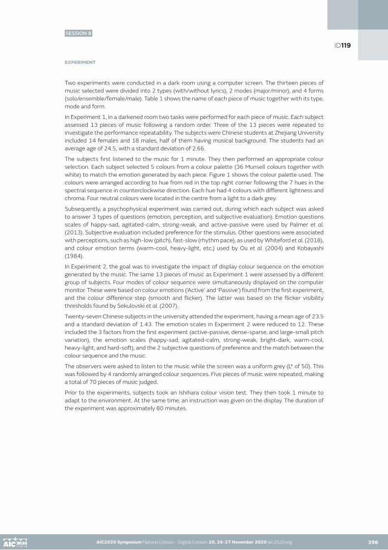
AIC2020 Symposium Natural Colours - Digital Colours 20, 26-27 November 2020 aic2020.org 396
EXPERIMENT
Two experiments were conducted in a dark room using a computer screen. The thirteen pieces of music selected were divided into 2 types (with/without lyrics), 2 modes (major/minor), and 4 forms (solo/ensemble/female/male). Table 1 shows the name of each piece of music together with its type, mode and form.
In Experiment 1, in a darkened room two tasks were performed for each piece of music. Each subject assessed 13 pieces of music following a random order. Three of the 13 pieces were repeated to investigate the performance repeatability. The subjects were Chinese students at Zhejiang University included 14 females and 18 males, half of them having musical background. The students had an average age of 24.5, with a standard deviation of 2.66.
The subjects first listened to the music for 1 minute. They then performed an appropriate colour selection. Each subject selected 5 colours from a colour palette (36 Munsell colours together with white) to match the emotion generated by each piece. Figure 1 shows the colour palette used. The colours were arranged according to hue from red in the top right corner following the 7 hues in the spectral sequence in counterclockwise direction. Each hue had 4 colours with different lightness and chroma. Four neutral colours were located in the centre from a light to a dark grey.
Subsequently, a psychophysical experiment was carried out, during which each subject was asked to answer 3 types of questions (emotion, perception, and subjective evaluation). Emotion questions scales of happy-sad, agitated-calm, strong-weak, and active-passive were used by Palmer et al. (2013). Subjective evaluation included preference for the stimulus. Other questions were associated with perceptions, such as high-low (pitch), fast-slow (rhythm pace), as used by Whiteford et al. (2018), and colour emotion terms (warm-cool, heavy-light, etc.) used by Ou et al. (2004) and Kobayashi (1984).
In Experiment 2, the goal was to investigate the impact of display colour sequence on the emotion generated by the music. The same 13 pieces of music as Experiment 1 were assessed by a different group of subjects. Four modes of colour sequence were simultaneously displayed on the computer monitor. These were based on colour emotions (‘Active’ and ‘Passive’) found from the first experiment, and the colour difference step (smooth and flicker). The latter was based on the flicker visibility thresholds found by Sekulovski et al. (2007).
Twenty-seven Chinese subjects in the university attended the experiment, having a mean age of 23.5 and a standard deviation of 1.43. The emotion scales in Experiment 2 were reduced to 12. These included the 3 factors from the first experiment (active-passive, dense-sparse, and large-small pitch variation), the emotion scales (happy-sad, agitated-calm, strong-weak, bright-dark, warm-cool, heavy-light, and hard-soft), and the 2 subjective questions of preference and the match between the colour sequence and the music.
The observers were asked to listen to the music while the screen was a uniform grey (L* of 50). This was followed by 4 randomly arranged colour sequences. Five pieces of music were repeated, making a total of 70 pieces of music judged.
Prior to the experiments, subjects took an Ishihara colour vision test. They then took 1 minute to adapt to the environment. At the same time, an instruction was given on the display. The duration of the experiment was approximately 80 minutes.
AIC2020 Symposium Natural Colours - Digital Colours 20, 26-27 November 2020 aic2020.org 395
ID119
SESSION 8

AIC2020 Symposium Natural Colours - Digital Colours 20, 26-27 November 2020 aic2020.org AIC2020 Symposium Natural Colours - Digital Colours 20, 26-27 November 2020 aic2020.org 397
Table 1. The details of the music selection.
RESULTS
1. Factor analysis
Factor analysis was conducted on the Experiment 1 results. It was found that there were 6 factors resulting from all the 25 perceptions from Experiment 1 (the subjective questions were not included in this first analysis). The top 3 factors, named ‘Active’, ‘Dense’ and ‘Large pitch variation’ (hereafter referred to as ‘LPV’) contributed 22.3%, 17.4%, and 7.1% respectively of variances. The ‘Active’ factor included ‘Bright’, ‘Happy’, ‘Warm’ and ‘Strong’. The ‘Dense’ factor included ‘Agitated’, ‘Fast’, ‘Hard’ and ‘Heavy’. While the ‘LPV’ included ‘High pitch’, ‘Spatial’, ‘Far’, and ‘Loud’. Figure 2 shows the factor analysis results of the 25 scales. This in general agrees with the factors found in the study of Whiteford et al. (2018). They studied 34 pieces of music using 10 emotion-related scales by 30 observers.
Figure 1. Figure 2. The 36 Munsell colour palette Scales in component space for Experiment 1 results
ID119
SESSION 8

AIC2020 Symposium Natural Colours - Digital Colours 20, 26-27 November 2020 aic2020.org AIC2020 Symposium Natural Colours - Digital Colours 20, 26-27 November 2020 aic2020.org 398
2. Data analysis
Using the above results, the 13 pieces of music were divided into 4 groups located in each quadrant formed by the factor loading scores in the factor analysis. The axes of the quadrant were Factor 1 (named ‘Active’) and Factor 2 (named ‘Dense’). The scales are active-passive, and dense-sparse. Hence, all the pieces fell into one of the 4 quadrants. The active-dense quadrant included the pieces F major, B major, badinerie, solo major, autumn; The active-sparse quadrant contained 人间西湖, 告白气球, and 甜蜜蜜; passive-dense quadrant included rondeau and solo minor, while the passive-sparse quadrant contained 梁祝, 秋意浓, and 柿子. All the 5 pieces of pop music were classified in the ‘Sparse’ side of the quadrant.
A clear distinction was found between the colours associated with ‘Active’ and ‘Passive’ pieces of music, but there was little difference associated with the ‘Dense’ and ‘Sparse’ pieces of music. Hence, only ‘Active’ and ‘Passive’ perceptions were used to design colour sequences. Figure 3(a) shows the colours associated with ‘Active’ and ‘Passive’ pieces of music as plotted in the Kobayashi’s colour imaging plane (1984). Its distribution fitted well with the colours plotted in CIELAB L*C* as shown in Figure 3(b). Note that the values of warm-cool and hard-soft were calculated by Ou et al’s colour emotion equations (2004). A clear pattern can be seen that ‘Active’ music pieces felt softer and warmer, while ‘Passive’ music pieces felt harder and cooler.
Figure 3. Colours of ‘Active’ and ‘Passive’ music pieces in Kobayashi space(a) and CIELAB L*C* space(b)
For the ‘Active’ pieces of music, colours were located in the hue region ranging from red, orange, yellow to yellow-green, while colours associated with Passive pieces were located in neutral, and from cyan, blue to violet, having Cab* value generally less than 35. In addition, the CIELAB L* values for most of the colours of ‘Active’ music were greater than 50, while Passive pieces were less than 58.
Four colour sequences were designed within 2 colour regions defined by the boundaries in terms of CIELAB L*, Cab*, and ΔH*ab. This was used by Lin et al. (2010) who incorporated 2 thresholds defined by a colour difference for each sequence step. The 2 colour regions were named warm and cool, and the boundaries were based on the colour selection results of ‘Active’ and ‘Passive’ music pieces found in Experiment 1. The 2 thresholds were named smooth and flicker. So, the 4 modes were named warm and smooth (W-S), warm and flicker (W-F), cool and smooth (C-S), and cool and flicker (C-F). For the warm colour region, the lightness and chroma were greater than 50 and 40 respectively, and the hue angles were ranged between 20o and 90o. For the cool colour region, the lightness and chroma were less than 55 and 65 respectively, and the hue angle values were ranged between 200° and 300°.
In both colour regions, the hue was changed continuously with a constant hue difference (ΔH*ab) at a frequency of 10 Hz. For smooth modes (W-S and C-S), the ΔL* and ΔCab* were set at 0.85 and 2.5 units respectively, and the ΔH*ab in warm and cool colour regions were set at 2.1 and 1.3 units respectively. This setting ensured that subjects did not have any conscious sensation of flickering. For flicker modes (W-F and C-F), ΔL*, ΔCab*, and ΔH*ab values were set twice larger than that of smooth modes.
ID119
SESSION 8

AIC2020 Symposium Natural Colours - Digital Colours 20, 26-27 November 2020 aic2020.org AIC2020 Symposium Natural Colours - Digital Colours 20, 26-27 November 2020 aic2020.org 399
3. The display colour effect
Figure 4 shows the 9 scales in each of the 4 modes. Each bar was the raw data subtracted by the base-line results (grey uniform screen). It was found that warm colour sequences made subjects feel ‘Strong’, ‘Active’, ‘Agitated’, ‘Happy’, ‘Warm’, and ‘Active’. Also, when warm colours were displayed simultaneously with ‘Active’ music, the ‘Matching degree’ and ‘Preference’ were also increased. The F test was performed on the original value of each scale for different modes. The results showed a significant difference between the modes of warm and cool, but little difference between smooth and flicker. The 9 out of the 12 scales plotted in Figure 4 were significantly different when comparing warm and cool modes (reject the null hypothesis at 5% level of significance).
The results above indicated that the effect of colour regions (warm and cool) had strong effect on music perceptions to the subjects. However, the 2 settings of thresholds seem to have little effect.
Figure 4. The impact of different modes on the music emotions
CONCLUSIONS
The main findings of the present study are summarized below:
Two experiments were conducted to study emotions generated by 13 pieces of music. Experiments 1 and 2 were conducted with the exclusion and inclusion of colour sequences displayed on screen. The results clearly showed that display colour sequence can greatly affect the perception of music. The main findings are summarized below:
1. Experiment 1 results found that 3 factors can be used to reduce the 25 perceptions:• Factor 1, labeled ‘Joy’, comprises active-passive, happy-sad, bright-dark, fresh-stale, warm-cool,
strong-weak, harmonious-disharmonious, serious-whimsical, clean-dirty, attractive-unattractive, many-few instruments.
• Factor 2, labeled ‘Intensity’, comprises agitated-calm, dense-sparse, fast-slow, hard-soft, tense-relax, complex-simple, masculine-feminine, complex-simple rhythm, heavy-light.
• Factor 3, labeled ‘Music Quality’, comprises high-low pitch, spatial-narrow, large-small pitch variation, far-near, loud-quiet.
2. Also, from Experiment 1 it was found that colours can be divided into 2 groups (warm and cool) to represent music. The 2 groups were used to design 2 dynamic colour sequences within the colour boundaries defined in Experiment 1. Each sequence had 2 sets of thresholds (smooth and flicker).
3. In Experiment 2, the above reduced perceptions together with the 5 display modes (steady grey surround and the 4 colour sequences) were used to assess the same 13 music pieces from Experiment 1.
4. The results clearly showed that dynamic display colour sequence can significantly affect the emotion perception of the music. Main effects resulted from warm and cool colours, rather than the colour difference of each step.
ID119
SESSION 8

AIC2020 Symposium Natural Colours - Digital Colours 20, 26-27 November 2020 aic2020.org AIC2020 Symposium Natural Colours - Digital Colours 20, 26-27 November 2020 aic2020.org 400
REFERENCES
Kobayashi, S. 1981. The aim and method of the colour image scale. Colour Res Appl 6(2): 93-107.Barbiere, J. M., A. Vidal, D. A. Zellner. 2007. The colour of music: Correspondence through emotion. Empir Stud Arts 25(2):193–208.Caivano, J. L. (1994) Colour and sound: Physical and psychophysical relations. Colour Res Appl 19(2): 126–133.Palmer, S. E., K. B. Schloss, Z. Xu, R. Prado-Leon. 2013. Music–colour associations are mediated by emotion. In: PNAS 2013, Proceedings of the National Academy of Sciences, D. Purves, ed. Singapore: Duke-National University of Singapore Graduate Medical School, 110(22): 8836–8841.Sebba, R. 1991. Structural correspondence between music and colour. Colour Res Appl 16(2): 81–88.Bresin, R. 2005. What is the colour of that music performance? In: ICMC 2005, Proceedings of the International Computer Music Conference, Barcelona, 367–370.Whiteford, K. L., K. B. Schloss, N.E. Helwig, S.E. Palmer. 2018. Colour, music, and emotion: bach to the blues. i-Perception 9(6).Ou, L. C., M. R. Luo, A. Woodcock, A. Wright. 2004. A study of colour emotion and colour preference. Part I: Colour emotions for single colours. Colour Res Appl 29(4):232-240.Sekulovski, D., I. M. Vogels, M. Beurden, R. Clout. 2007. Smoothness and flicker perception of temporal colour transitions. In: CIC 2007, Proceedings of the 15th Colour Imaging Conference, New Mexico, 112-117.Lin, H., M. R. Luo, L. Macdonald, A.W.S. Tarrant. 2010. A cross-cultural colour-naming study. part III: a colour-naming model. Colour Res Appl 26(4): 270-277.
ID119
SESSION 8

AIC2020 Symposium Natural Colours - Digital Colours 20, 26-27 November 2020 aic2020.org
A Design Tool: Appearance simulator based on spectrum tunable LED lightings
Candong Hea, Janlong Zhanga, Ronnier Luob
a Thousand Lights Lighting (Changzhou) Limited, Chinab Zhejiang University, China•Corresponding author: [email protected] author: Ming Ronnier Luo
ABSTRACT
A system, named LEDSimulator, for colour communication and colour reproduction of total appearance has been developed to serve the supply chain industry. The system can simulate not only colour but also texture in a virtual sample. The key technologies of the system include spectral tunable LED lighting systems to provide accurate standard viewing conditions, to colour virtual samples within a large colour gamut, and to reproduce virtual into real surface samples.
KEYWORDS
LEDSimulatior I spectral tunable LED lighting system I virtual samples I cross-media colour reproduction.
INTRODUCTION:
The total appearance of a product can be divided into colour, texture, gloss, translucency. It is highly desired to represent the product before its production. The technology will greatly shorten the design cycle and reduce the waste of materials. However, the success of the technology is to make the virtual product to simulate the appearance of the final product.
Conventionally, typical tools used by the designers are physical specifiers such as Pantone, RAUL, Munsell, NCS for colour specification. They are in the form of fan deck or booklet. However, they only consider the colour appearance but not the others, such as texture. There are two technologies on the market based on digital imaging technology: TAC® from X-Rite and DigiEye® from VeriVide (Cui et al. 2003). The TAC® includes three parts, a) a capturing device to scan the surface, b) a computer system to edit, manage, store the images, and c) a virtual booth to visualize the simulated 3D images on a display and physical samples. It provides great realism but has a high price to pay. The latter is a digital imaging system to capture appearance in terms of colour and texture. It can simulate the sample in different colour ways in 2D. However, in many circumstances, the samples presented on displays have unrealistic texture.
The trend of supply chain management in recent years has been globalization. The trend means three components in the chain, designers, retailers and manufacturers concentrate on their work in different locations. For colour reproduction, the colour communication tools were used to communicate information by numbers and images. Since December 2019, the COVID-19 outbreak has been quickly spread all over the world. There is no sign that it can be diminished in the near future. During this period, almost entire supply chain has been shut down and most of the workforce worked at home. This situation has resulted in a breakdown of the global supply chain. The designers had problems to communicate their design including colour palette to the retailers and manufacturers, who could not obtain real swatch samples to make critical decisions for proofing. This problem makes a strong desire of new technology to produce virtual samples with great accuracy in total appearance. Although the new digital design tools such as TAC, DigiEye could be useful, however, they could be expensive, bulky, difficult to operate, and to generate unsatisfactory appearance results. There are still rooms to develop new systems to serve the supply chain management industry.
401
ID124
SESSION 8

AIC2020 Symposium Natural Colours - Digital Colours 20, 26-27 November 2020 aic2020.org 402
The goal of this study is to show accurate colour and texture reproduction from a colour reproduction system using multichannel LED lightings. An experiment was conducted to produce colour match between the virtual and real testing samples.
THE DESIGN TOOL
A system, LEDSimulator, for surface simulation has been built. Figures 1(a) and 1(b) show the system in actual operation and an engineering drawing of the system, respectively. It applies two spectrum tunable LED systems. One system including 11 LED channels provides a typical viewing cabinet having a grey background for sample inspection, under a range of CIE daylight simulators (D75, D65, D55 and D50) together with Illuminant A. It is a high-quality viewing cabinet to have tight tolerances on colour quality parameters (Luo, 2011), i.e. CCT ±100K, Duv ±0.002, Ra>97 for daylight illuminants, MIvis of <0.5 and uniformity >85%. There is a window on the rear wall and a substrate is placed behind the window. Different window sizes can be provided. A range of substrates can be selected from a standard set including 6 textile samples. The substrate is illuminated by the second LED system to produce ‘virtual colours’ from a wide range of colour gamut. The other lighting system consistes of two flat panel light sources. Each of them have three LED channels inside, including Red(620nm), Blue(475nm), Green(545nm) LEDs. These LED channels are specially selected so that it covers an gamut wide enough to cover most surface color samples from DIN, MUNSELL and CNCS.
The virtual coloured sample can be visually adjusted via colour selection software by designers until a satisfactory colour is created. The information is stored in terms of CIELAB values (CIE, 2018) via a colour transformation between the intensity of LED channels and CIE XYZ values such as that proposed by Berns et al. (1993). For users to have non-contact colour measuring instruments, such as XYZ colorimeter or tele-spectroradiometer (see Fig. 1(a)), the measurement result can be directly calculated to CIELAB. A profile is established for colour communication including the sample ID, substrate ID, illuminant, L*, a*, b*. The appearance of the virtual samples can be accurately reproduced between LEDSimulator systems. The real physical samples can be reproduced via widely used computer formulation software.
Figure 1(a). The LEDSimulator in operation Figure 1(b). The illustration of full LEDSimulator
Figures 2(a) and 2(b) show the two operations for a designer, i.e. to adjust the virtual colour to match a target colour and to create a colour in their mind, respectively.
Figure 2(a). Designers matching the top Figure 2(b). Designers creating a fashion colour left colour on the chart
AIC2020 Symposium Natural Colours - Digital Colours 20, 26-27 November 2020 aic2020.org 401
ID124
SESSION 8

AIC2020 Symposium Natural Colours - Digital Colours 20, 26-27 November 2020 aic2020.org AIC2020 Symposium Natural Colours - Digital Colours 20, 26-27 November 2020 aic2020.org402 403
EXPERIMENT
A colour matching experiment was performed using the LEDSimulator system. Then normal colour vision observers were asked to match the 24 colours on an X-Rite ColorChecker Chart (McCamy, 1976) (Figure 2(a)).
Each observer was asked to entre a darkened room with a LEDSimulator system in full function. Each was first trained to use the colour selection system for colour adjustment on a computer. They were then asked to adapt in the grey background of the viewing cabinet for a minute. In the real experiment, they were asked to match the 24 colours in a random order. The results for each observer were measured by a JETI Specbos 1211 spectroradiometer (see Figure 1(a)) in the same position as observers.
The result of each colour was computed to CIELAB L*, a* and b* values for each observer. The mean was worked out from all observers. The colour difference between the mean and individual was computed. The mean value of these values represents the typical observer uncertainty. This is called MCDM, mean colour differences from the mean (Billmeyer, 1981).
The MCDM result was 4.8 CIEDE2000 units (CIE 2018), ranged from 1.8 to 9.8. This performance is reasonable and agreed with those reported by Oicherman et al. (2007); Huang et al. (2019); Cho et al.., (2019) doing matching between the surface and display colours. Note CIEDE2000 was used because it had more accurate performance than CIELAB (Luo et al., 2001).
APPLICATIONS
Nowadays, most of the designers create colours still using conventional colour specifiers. These are heavy, easy to change colour, and have poor colour reproduction, limited colours, fixed material. LEDSimulator allows them to communicate colour scheme information via virtual samples to retailor for approval. The final proofed colours will be sent to the manufacturers for colour reproduction. The LAB values will be used to obtain recipes via computer formulation systems. Manufacturers can also compare the produced surface samples with the virtual samples in a LEDSimulator system (see Figure 2(a)). For samples having multi-coloured patterns, cameras can be used to capture target in terms of images which can be characterized in terms of CIE specifications for accurate colour reproduction, such as the method proposed by Hong et al. (2001).
CONCLUSION
LEDSimulator has been developed to serve the supply chain industries. It is the first time a system can show colour and texture in a virtual sample. It is aimed to deliver virtual samples by electronic communication. The system includes the following technologies: spectral tunable LED lighting systems to provide accurate standard viewing condition and to cover a large colour gamut to colour virtual samples, to present not only colour but also texture information to simulate the total colour appearance. It is expected that the system can greatly contribute to supply chain management for appearance specification.
ID124
SESSION 8

AIC2020 Symposium Natural Colours - Digital Colours 20, 26-27 November 2020 aic2020.org AIC2020 Symposium Natural Colours - Digital Colours 20, 26-27 November 2020 aic2020.org 404
REFERENCES
R. S. Berns, M.E. Gorzynski, and R.J. Motta, «CRT colorimetry, part II: metrology,» Color Res. Appl. 18, 315-325 (1993).F. W. Billmeyer, Jr. and P.J. Alessi, Assessment of color-measuring instruments, Col. Res. Appl. 6, 195-202 (1981). Y. J. Cho, G. Cui, M. R. Luo and K. Sohn, The impact of viewing conditions on observer variability for cross-media colour reproduction, 135(2019)234-243. G. H. Cui, M. R. Luo, B. Rigg, P. A. Rhodes and J. Dakin, Grading textile fastness. Part 1. Using a digital camera system, Coloration Technology, 119 212-218 (2003).CIE 015:2018 Colormetry, 4th Edition, CIE Vienna, Austria. G. Hong, M. R. Luo and P. A. Rhodes, A Study of Digital Camera Colorimetric Characterisation Based on Polynomial Modelling, Color Res. Appl.. 26 (2001) 76-84.M. Huang, R. He, C. Shi, G. Cui, M. R. Luo and M. Melgosa, Influence of viewing conditions on cross-media colour matching, Optica Applicata XLIX(2019), DOI:10.37190/oal19408.M. R. Luo, G. Cui and B. Rigg, The development of the CIE 2000 colour difference formula, Color Res. Appl. 26 (2001) 340-350. M. R. Luo, The quality of light sources, Coloration Technology, 127(2011) 75-87.C. S. McCamy, H. Marcus, and J. G. Davidson,. Journal of Applied Photographic Engineering 2(1976)95–99.B Oicherman, M. R. Luo, Effects of colorimetric additivity failure and of observer metamerism on cross-media colour matching, Ph.D. thesis. University of Leeds, (2007) 99.
ID124
SESSION 8

AIC2020 Symposium Natural Colours - Digital Colours 20, 26-27 November 2020 aic2020.org 405
Infrared measurement of CO2 to determine post-dormant seed viability
Lev Vozchikova•
aLab. Selena, Stamford, USA •Corresponding author: [email protected] Presenting author: Lev Vozchikov
ABSTRACT
Infrared measurements of carbon dioxide (CO2) concentrations we can use to determine the impact of environmental pollutions on the day-night cycle of plants. Several chemical approaches are currently known. Meanwhile, image reconstruction has studied as a method to approximate the colorant geometrical profile of vehicle emission. Here, infrared CO2 color surface reconstruction of exhaust aperture was applied to carry out thermography of dormant Cucumis sativus, and Lycopersicon seeds to determine seeds quality. Sprouting and germination, together with thermographic testing of CO2 concentration released by seed specimens, were used to assess a post-dormant viability distribution. Pregermination selection of Eriogonum, Zea Mays samples there in contingent exhibited a stable seeds sprouts vigor increase. The CO2 diffusion method was applied to compile distribution of viability for dormant seeds. Analysis of experimental data revealed that the concentration of released CO2, a significant factor in respiratory, metabolic processes in dormant seeds, is indicative of viability.
KEYWORDS colorant I CO2 I dormant I infrared I seeds I viability
INTRODUCTION
Post-dormant germination methods Capon (1990), require control specimens to calculate viability and quality of representative plant seeds in a sample of dried seeds maintained in the second dormant stage Santos et al. (2017), Kranner et al. (2010). Sampling processes can provide a means for classifying seed quality and improving germination rates. Seed viability can be affected by both environmental and biological factors. Imaging of gas concentrations using colorant and an appropriate aperture is a relevant way to test CO2 respiration metabolism of dormant seeds. Respiration of dormant seeds Ransom (1932), Dodds (2007), during the pre-photosynthesis phase is a factor in the germination process and contributes to the likelihood of effective sprouting and viability of seed specimens. Carbon dioxide, adenosine triphosphate, and water are products of dormant cell respiration. Metabolism of carbohydrates and oxygen release carbon dioxide into the atmosphere according to the formula:
C6H12O6+6O2 = 6CO2+6H2O+38ATP (1)
The CO2 concentration is proportional to seed viability. Therefore, viable seeds can be selected from specimen tenders after elimination of inactive seeds that have low CO2 levels. Such selection procedures thus require use of a contingent mass testing method. Longwave infrared image monitoring of CO2 levels represents a progressive, nondestructive method for evaluating seed viability.
ID144
SESSION 8

AIC2020 Symposium Natural Colours - Digital Colours 20, 26-27 November 2020 aic2020.org
However, longwave radiance measurements of seed viability can be limited by the sensitivity of instruments used to construct thermal images. This work describes the development of a contrast lighting process based on the titration of a halogen quartz light stream that eliminates light flow irregularities. This method involves actual scalable, measurable parameters that are based on a previously developed colorant concentration method Vozchikov (2013). CO2 gas was used as an image contrast agent to visualize seed embryo metabolism. Exposure of the specimen to a longwave spectrum provides high-quality radiometric data. The performance of this technique was used to examine germination cycles of Cucumis sativus (CS) and Lycopersicon (LP) seeds whereby radiometric data comprising 50, 75, and 100 units were gathered for dormant seed specimens. Selection viable of Eriogonum (EM) , Zea Mays (ZM) seeds samples there in contingent of 50%, 75% increase seeds vigor upon germination. Radiometric data and the sprouting lengths, sprouts weights of a single seed unit were collected and entered into an Excel spreadsheet to calculate the standard linear regression error in the distribution offset. The experimental data showed a stochastic characteristic, indicating the correlation between radiance activity of dormant seeds and germination viability. This new technology could also be applied to monitor the effects of carbon dioxide pollution of seed viability Men et al. (2017), Neema and Jahan (2014). Nontoxic, biologically inert carbon dioxide chemically actively isolate atmospheric oxygen.
THEORY
Laboratory observation of CO2 emissions during seed germination and sprouting requires precision equipment and a calibration technique to validate the measurements. The contrast thermal image apparatus used in this study included a quartz halogen lamp, a motorized light titration turntable, and a thermal imager (The Testo 875). During testing, specimens were exposed to a light radiation beam and the thermal imager was used to record the resulting thermal output. For the measurement, seeds were first secured with starch glue onto a perforated grid covered with perforated paper having 0.98 emissivity before placement on a motorized gyration turntable that allowed light titration to eliminate shadows and spots in the light beam. The seed specimens were rotated in identical tracks at a constant rotation velocity of one cycle/70 sec. A linear diffusion model was used to calibrate the CO2 band spectrum of The Testo 875 imager. In the calibration model, the identical cell row superposition of the diffusion metallic surface geometry can be expressed as given by Equation (2):
(2)
Where denotes the hot end pressure, represents the cell gas pressure, refers to the cell in a particular row, and is the cell row number.
Fig. 1 The micro diffusion surface of the CO2 pipe is used there as a model to measure its concentration profile.
406AIC2020 Symposium Natural Colours - Digital Colours 20, 26-27 November 2020 aic2020.org 405
ID144
SESSION 8

AIC2020 Symposium Natural Colours - Digital Colours 20, 26-27 November 2020 aic2020.org AIC2020 Symposium Natural Colours - Digital Colours 20, 26-27 November 2020 aic2020.org
During the calibration test, the thermographic instrument was exposed separately to O2 (atmospheric air oxygen) and to CO2 diffusion cycles. The long-wave radiance image of the CO2 diffusion aperture depicts the concentration of a volume of colorant surface CO2 to obtain the infrared colorant CO2 model profile given by Equation (2). The O2 radiometric data in the resulting image are digitally subtracted from the CO2 data to obtain the pipe gas concentration scaling profile. During the calibration process, technical grade CO2 was pumped through the 2.5 µm surface of diffusion pipe walls and the established gas concentration pipe profile Urone (2017) model Y = 1-kX was used (Fig. 1). The gas spreading concentration calibration model is based on the assumption that the pressure profile is linear across the cross-sectional area of the diffusion pipe (from the hot to the cold end) and that the CO2 concentration is 1.0 at the hot end. Once calibrated, the camera imager is certified for integration in the process apparatus. High-quality images are needed to minimize instrumental error arising from the thermal imager and to obtain a consistent thermal contrast profile for single seeds. CO2 radiance Ronald K. Hanson et al. (2016) measurements of specimens require instrumental image contrast, whereby the accuracy of the measurement determines the amount of light radiation to which the sample is exposed. The contrast σ within a radiometric image cluster of radiant intensity I is given by Equation (3):
(3)
where σ (W/µm cm2) represents total radiant intensity, σ σ max (L) and σ σ min (L) denote inbound radiant intensity, T min (°C) and T max (°C) represent image cluster temperature, and L is specimen thickness (cm).
A thermal profile of a specimen seed must be generated in order to reconstruct how the concentrations of the metabolic product CO2 gas are distributed. The resulting radiance profiles describe the thermal geometry of the layer, seed, and embryo. Sprouting stations can be used to stabilize humidity and temperature to verify the reproducibility of measurements of germination viability and vigor. The resulting data were used to calculate viability as a proportion of active embryo in a specimen, and in terms of the average embryo intensity in a distribution of seed samples. Mathematical interpretation of the experimental results was carried out using Microsoft Office Excel software functional operators CORREL and STEYX, AVERAGE. Test results were summarized using distribution data values for the thermal radiance contrast and sprouting gain of the seeds. Statistical calculations include the first and second probability moments, standard linear regression error, and correlation, which are required to visualize data distribution. Experimental data distributives were stochastic in graphical representations and regression observation of correlations between infrared radiance values of CO2 concentration and post-dormant seed viability.
RESULTS AND DISCUSSION
The analytical technique described here uses integrated equipment and infrared radiation to compile an infrared reconstruction of CO2 concentration that allows assessment of dormant seed quality. This thermal imaging apparatus generates color reconstructions Vozchikov (2017) of the CO2 concentration profile that approximate the natural spherical seed shape, and showed that the radiance-thermal and geometric seed profiles are practically identical (Fig.3 ). Following calibration, this thermal imaging apparatus was used to record data for radiometric CO2 spectral bands. Diffusion modeled surfaces of Cucumis sativus (CS) and Lycopersicon (LP) seeds are shown in (Fig. 2) and diffusion calibration could be used to determine the choice of specimen. Contrast thermal imaging from a longwave CO2 spectrum allowed visualization of the embryo and representation of the embryo as a pictogram. Obtaining high-quality thermal images is necessary to confirm instrument accuracy. Here, the thermal profile of the seed could be measured with respect to a background layer, and in turn be used to identify viable seeds based on positive values relative to the background.
406 407
ID144
SESSION 8
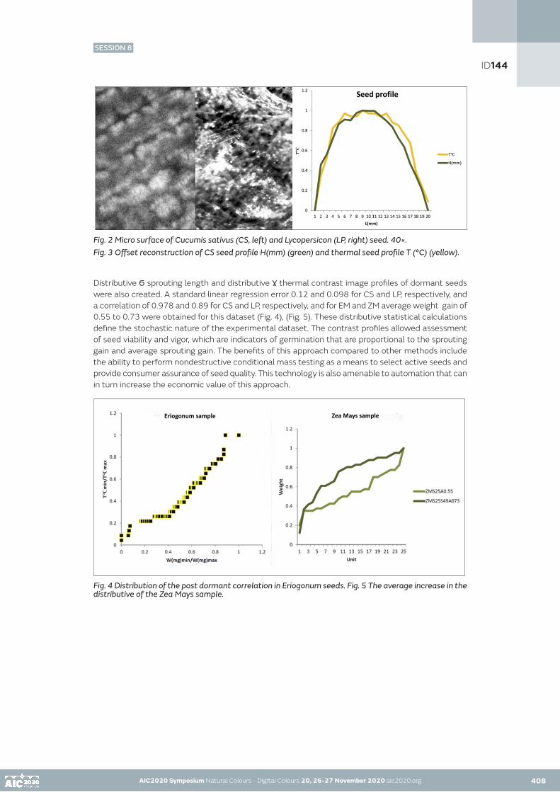
AIC2020 Symposium Natural Colours - Digital Colours 20, 26-27 November 2020 aic2020.org 408
Fig. 2 Micro surface of Cucumis sativus (CS, left) and Lycopersicon (LP, right) seed. 40×. Fig. 3 Offset reconstruction of CS seed profile H(mm) (green) and thermal seed profile T (°C) (yellow).
Distributive Ϭ sprouting length and distributive Ɣ thermal contrast image profiles of dormant seeds were also created. A standard linear regression error 0.12 and 0.098 for CS and LP, respectively, and a correlation of 0.978 and 0.89 for CS and LP, respectively, and for EM and ZM average weight gain of 0.55 to 0.73 were obtained for this dataset (Fig. 4), (Fig. 5). These distributive statistical calculations define the stochastic nature of the experimental dataset. The contrast profiles allowed assessment of seed viability and vigor, which are indicators of germination that are proportional to the sprouting gain and average sprouting gain. The benefits of this approach compared to other methods include the ability to perform nondestructive conditional mass testing as a means to select active seeds and provide consumer assurance of seed quality. This technology is also amenable to automation that can in turn increase the economic value of this approach.
Fig. 4 Distribution of the post dormant correlation in Eriogonum seeds. Fig. 5 The average increase in the distributive of the Zea Mays sample.
AIC2020 Symposium Natural Colours - Digital Colours 20, 26-27 November 2020 aic2020.org
ID144
SESSION 8

AIC2020 Symposium Natural Colours - Digital Colours 20, 26-27 November 2020 aic2020.org AIC2020 Symposium Natural Colours - Digital Colours 20, 26-27 November 2020 aic2020.org 409
CONCLUSION
Infrared color-CO2 image contrast measurement technology is based on reconstruction of radiometric data. The goal of this research is to develop a nondestructive application involving contrast stimulation imaging of CO2 concentration to assess the quality of dormant plant seeds. Analysis of experimental data revealed that concentration of released CO2, an important factor in respiratory metabolic processes in dormant seeds, is indicative of germination viability. This study describes an infrared colorant-gas diffusion calibration model to measure CO2 concentrations. Pre-germination examination of CO2 thermographic images of seed specimens offers a new technique for measuring seed quality, post-dormant seed viability. This unique method enables infrared imaging of dormant seed embryos to determine the likelihood of germination.
AKNOWLEDGEMENTS
Data set Fig. 4, Fig. 5, the CS and LP, EM and ZM seeds and sprouts metadata, available in the National Center for Biotechnology Information (NCBI) BioSample database under accession numbers CS: SAMN11167038-SAMN11167095, SAMN11167096-11167153, LP: SAMN11243836-SAMN11243937, SAMN11243938-SAMN11244039, CS: SAMN11263248-SAMN11263328, SAMN11263329-SAMN11263409. The EM and ZM seeds samples data collected under numbers respectively EM: SAMN13829074-SAMN13829287, SAMN13829328- SAMN13829507, EM: SAMN14911684-SAMN14911830, SAMN14912036-14912135 ZM: SAMN14912243- 14912316, SAMN14912321-14912520.
REFERENCES
Brian Capon, Botany for gardeners, Timber Press c2010, 1st ed. 1990, London NW6 6RJ, Timber Press, Portland, Oregon 97204-3527, ISBN-13:978-1-60469-095-8.Judy Dodds, Brampton College, London, BIOLOGY at a Glance, third edition, pp. 92 Manson Publishing 2007, ISBN: 978-1-84076-086-6Ronald K. Hanson, R. Mitchel Spearrin, Christopher S. Goldstein, Spectroscopy and Optical Diagnostics for Gases, first edition, c2016 Springer, ISBN 978-3-319-23251-5, e-ISBN 978-3-319-23252-2, Springer International Publishing, Switzerland, 2016.Ilse Kranner, Gerald Kastberger, Manfred Hartbauer, and High W. Pritchard, Noninvasive Diagnosis of Seed Viability Using Infrared Thermography. Proc Natl. Acad. Sci. U.S.A. 2010 Feb 23; 107(8): 3912-3917Sen Men, Lei Yan, Jiaxin Liu, Hua Qian and Qinjuan Luo, A Classification Method for Seed Viability Assessment with Infrared Thermography, Sensors 2017, MDPI, St. Alban-Anlage 66, 4052 Basel, Switzerland, 17(4), 845; https://doi.org/10.3390/s17040845 Received: 9 January 2017 / Revised: 3 April 2017 / Accepted: 10 April 2017 / Published: 12 April 2017M. Nigar Neema and J. Jahan, «An Innovative Approach to Mitigate Vehicular Emission through Roadside Greeneries: A Case Study on Arterial Roads of Dhaka City,» Journal of Data Analysis and Information Processing, Vol. 2 No. 1, 2014, pp. 32-39. DOI: 10.4236/jdaip.2014.21005Elizabeth Ruth Ransom, B.S. State College of Washington, 1927, Kansas State College of Agriculture and Applied Science 1932, The Inter-Relation of Catalase, Respiration, After – Ripening, and Germination in Some Dormant Seeds of the Polygonaceae, FB & Ltd, Forgotten Books, Dalton House, London, 2017, SW192RR, ISBN 978-0-260-30645-6Dos Santos, H., Silva Botelho, F., Amorim Fonseca, A., Kenji Ueno, R., Pedroso Mendes, M., and Resende Von Pinho, E. (2015) Quality of Seeds of Upland Rice Lines Adapted to the State of Minas Gerais, Brazil. American Journal of Plant Sciences, 6, 1920-1927. Doi: 10.4236/ajps.2015.612193.Paul Peter Urone, California State University at Sacramento, Roger Hinrichs, Roger Hinrichs, SUNY College at Oswego, Openstax, College physics, Rice University, Houston, 2017, Texas 77005, ISBN-10 1-938168-00-3.Lev Vozchikov, Lab. Selena, U.S.A., Hyper-light Carbon Dioxide Colorant Physics Properties, Proceedings AIC2013, 12th International AIC Congress, 2013, Jul 8-12; Newcastle upon Tyne, UK, p. 1013 – p. 1016.Lev Vozchikov, Lab. Selena, U.S.A., Color Design Research, Proceedings AIC2017 [SDC], 13th International AIC Congress, 2017, Oct 16-20; Jeju, Korea, PS03-73.
ID144
SESSION 8

POSTERS SESSIONS
AIC2020 Symposium Natural Colours - Digital Colours 20, 26-27 November 2020 aic2020.org 410

POSTERS SESSIONS
SESSION 1007 I 050 I 070 I 072 I 082 I 120 I 141
SESSION 2045 I 065 I 090 I 107 I 122 I 132
SESSION 3012 I 043 I 079 I 085 I 087 I 100 I 112 I 117
SESSION 4027 I 031 I 058 I 127 I 128
SESSION 5060 I 062 I 076 I 097 I 123 I 126 I 138
AIC2020 Symposium Natural Colours - Digital Colours 20, 26-27 November 2020 aic2020.orgAIC2020 Symposium Natural Colours - Digital Colours 20, 26-27 November 2020 aic2020.org 411
C78
M30
J32
N5
R46
V13
7 B1
57

POSTER
AIC2020 Symposium Natural Colours - Digital Colours 20, 26-27 November 2020 aic2020.org
Colors of a territory in a honey pot
Delphine Dejeana•
aUniverty of Toulouse, LARA-SEPPIA EA4154 (UT2J)•Corresponding author: [email protected]
ABSTRACT
Honey is a natural sweet commodity produced by bees that man has been able to transform into a food-processing activity by favouring lands being cultivated in order to places to set up hives. A typical and localised honey production highlights flavours, colours and textures that bring out the environmental characteristics of a territory. In this context, the approach of a designer-colourist consists in considering colour as constituting the intellectual content and matter of the territory. Colour clues, perceived through optical or haptic vision, are likely to define the spatial and temporal interactions that lead to the formation of proactive localities in honey cultivation. Thus, when the beekeeper intervenes in the collection and potting of honey, he defends above all the distribution of his land and presents his product as a witness to the biodiversity of his land. A syrupy or crystallised food, almost colourless or very brown, the chromaticity of honey alone sums up the process of collecting pollen from the flowers of the bee's foraging until it is transformed into nectar. So, the poetic metaphor of the colours of a territory contained in a honey pot goes beyond the importance of sampling and the production of a territorial image, since it is a question of rediscovering the floral, geographical and landscape origins of the colour, whose traceability and taste education is today a strong social, economic and cultural heritage issue for many regions.
The practical case of the chromatic culture of honey is an approach at the origin of wider reflections concerning the valorisation of territories by chromatic cultures, which are, like honey, a digest of the landscape, or at the origin of the landscape aesthetic itself. When the colour becomes the ambassador of a terrors, isn't it essential to no longer just provide communicating image-territories (marketing) to translate collective representations of localities, but it’s fundamental to undertake production of a colorama, (tool about a digital representation based on the functioning of chromatic cultures as well as the honey pot). It’s a way to highlight the potential of colour as a cultural heritage with high added value for the knowledge and know-how identified in the territories.
So, this scientific poster proposes to question the way in which the designer-colourist’s approach consist in noting a set of natural colours that characterize a space, and how can they be referenced in a colorama in order to create a digital modelling tool that qualifies and valorises the products coming from a territory ?
KEYWORDS colour design I chromatic cultures I geography of colour I colorama I terroir
412
ID007
POSTER

AIC2020 Symposium Natural Colours - Digital Colours 20, 26-27 November 2020 aic2020.org 413
POSTER
INTRODUCTION
The outstanding nature and diversity of the beekeeping activities practiced in France makes it possible to reference categories of honeys and above all to guarantee the durability of these local tastes. Indeed, the peculiarities of colours, textures and flavours are at the origin of a local taste. If we take the example of acacia honey, one of the honeys most consumed by the French people, it can be very different from one locality to another. The archetype of acacia honey is close to a sweet, liquid, pale yellow. Nevertheless, this colour shows a certain impurity in the honey which is produced just about everywhere in France and differs in the characteristic green reflections it has. A pure acacia honey, from the Gironde region, is indeed completely limpid, almost colourless. Clear, almost transparent or on the contrary golden yellow, the species of trees are not the cause of these differences in colour (and flavour). But it is the surrounding vegetation, typical of a territory, and the bees that are responsible for these chromatic variations. By analogy, the geography of the apiary locations represents a real kitchen for the bees, which accommodate their honey in places that they select for the variety of its honey-bearing plants. But the bee does not only collect pollen, it also collects the tastes and colours of the honey which are at the origin of the construction of an "image-territory" and endow the honey pot with a metaphorical faculty to deliver an imaginary, even a poetry of the place.
ISSUES
How can a culinary experience, of honey tasting, be transformed into a landscape experience, of discovery of the territories of production? The work of a colour designer consists in taking note of a set of colours, images, sounds, smells and emotions that glimpse mass colourings (identities). He operates sensitive chromatic collections, as the painter could do. Nevertheless, it is not a question of depicting, representing or reciting a landscape: the challenge is to characterise it with the aim of making colour the intellectual content and the matter of a territory
Identification of honey typologies by colour has nowadays been lost in the honey sector to the benefit of scientific techniques of molecular analysis of pollen particles. By talking to the colourists in the hive products analysis laboratories, I realised that colour expertise is now only used to stabilise an expectation of conformity emanating from the consumer. Now, legally, a chestnut tree honey can be labelled as such if the laboratory in question identifies more than 50% of this essence in its composition. Of the remaining 50%, a multitude of honey-bearing plants can be found in the honey, which will also condition the taste, colour and texture of the product. Chestnut trees, for example, are cultivated in Occitanie on the arid, siliceous soils at medium altitudes in the foothills of the Massif Central. Whether it comes from the Cevennes, the Montagne Noire or the Quercy, chestnut tree honey will have a very different chromatic and aromatic profile. And in addition to the geographical and botanical specificities of these territories, beekeeping also has its share of imponderables, which is a real added value for the honey producing territories and the identity of their products.
AIC2020 Symposium Natural Colours - Digital Colours 20, 26-27 November 2020 aic2020.org
ID007

AIC2020 Symposium Natural Colours - Digital Colours 20, 26-27 November 2020 aic2020.org AIC2020 Symposium Natural Colours - Digital Colours 20, 26-27 November 2020 aic2020.org413 414
POSTER
METHOD
Phase one.
In order to create a link between the product and the territory of production, the challenge of this research project was to elaborate a methodology of chromatic investigation. During the phase one, I kept a field notebook as well as chromatic description and experiment. This system is concentrated around three areas, which radiate around the hives : bee activity zone, harvesting zone and landscape zone. These three perimeters are fundamental for understanding the network that forms the elements collected by the bees and the chromatic indices of a territory. All these data are then synthesised around the design of hybrid colour ranges.
Fig a. Practice of sensory-chromatic surveys and field ratings
Phase two.
At the same time, the phase two consists in analyse and create a chromatic profile of honeys. In total, more than thirty honeys were analysed as follows. On the one hand, in 1cm thick pots, and on the other hand, in a thin layer of 3mm, corresponding to a spoonful of honey. Chromatic surveys were carried out using the Lovibond degrees and Pantone colour charts. Each sample was observed in white light. Colour ranges are then identified for each honey according to the observations made previously.
Fig b. Study of the sunflower honey’s colour, from pollen to honey pot.
ID007

AIC2020 Symposium Natural Colours - Digital Colours 20, 26-27 November 2020 aic2020.org AIC2020 Symposium Natural Colours - Digital Colours 20, 26-27 November 2020 aic2020.org 415
POSTER
Phase three.
Colours have a significant impact to establish a dialogue between product and production area. Chromatic cultures, whose spatial and temporal interactions are at the origin of the formation of proactive localities in the cultivation of honey, is a form of self-management allows for an approach that invests a process of creation-research allowing the designer-colourist to elaborate, in fine, some portraits of territories in the shape of wheels.
Fig c. Sensory-chromatic profiles of chestnut honey in the Occitanie, France.
Senso-chromatic wheels are then elaborated in order to reference the typologies of honey (chestnut) and map their production territories. This tool is then declined, on the one hand in a digital version for laboratories (database of occitan honeys) and on the other hand in a physical version for beekeepers and consumers, to enable them to communicate about their products and their particular characteristics.
This tool has yet to lead to a proof of concept and be used by the actors and structures concerned.
CONCLUSION
Behind each tasting experience lies a place of production (a landscape, a climate, a soil quality, relief, amenities but also plants and insects) as well as the knowledge and know-how of the man behind the product. The image-territory at stake in this project is the result of field experience without falling into the cliché of a communicating image resulting from marketing. It is an experience of diversity that allows us to envisage colour as a new terroir or even a local heritage with high added value.
REFERENCES
DE CERTEAU Michel, L’invention du quotidien. 1.arts de faire, Paris, Gallimard, 1990, Folio Essais.ETCHEVERRIA Olivier, « Existe-t-il un goût de l’Aubrac ? » in Géographie des saveurs, Paris, l’Harmattan, coll. Géographie et Cultures, n°50, été 2014.INDERGAND Michel, « De l'expérience matérielle à l'expérience immatérielle de la couleur. Manière d'agir, manière de penser, évolutions et ruptures », in, La couleur. Regards croisés sur la couleur du Moyen-Âge au XXème siècle, dir. par JUNOD Philippe, PASTOUREAU Michel, Paris, Cahiers du Léopard d'Or, 1994, Actes du colloque, Université de Lausanne, 25-27 juin 1992.LENCLOS Jean-Philippe, LENCLOS Dominique, Les couleurs de la France. Géographie de la couleur, Paris, Le Moniteur, 1990SAGOT Stéphanie, « Les balises ostréicoles de Marennes-Oléron. Une poïétique du paysage » in Couleur mouvement, couleurs locales, Seppia, n°2, Rodez, Rouergue, 2003.
ID007

POSTER
AIC2020 Symposium Natural Colours - Digital Colours 20, 26-27 November 2020 aic2020.org
An experimental consideration of the perception of color and brightness for a point light source
Midori Tanaka•, Minami Adachi, Takahiko Horiuchi Chiba University, Japan•Corresponding author: [email protected] author: Midori Tanaka
ABSTRACT
Color perception can be affected by several factors, such as the surrounding environment and human vision characteristics. For example, it is well known that color and brightness perceptions change depending on the surrounding luminance conditions. Moreover, studies on color perception have been conducted under various conditions to evaluate the effects of the visual angle. In this study, to investigate the small-field perception on a consumer display under scotopic vision conditions, we analyzed the limits of perceived color and brightness for point light sources by conducting psychophysical experiments using human observers. This experiment used colored point light sources with varying luminances displayed on an OLED display as experimental stimuli. Experimental results demonstrated that the color of a point light source on the OLED display can be perceived even in scotopic vision, and the dynamics of small-field tritanopia were observed.
KEYWORDS color perception I point light source I scotopic vision I small-field tritanopia
INTRODUCTION
Color perception has been deeply studied for a long time. Several factors influence both color and brightness perception, such as the surrounding environment and human vision characteristics. Color appearance is particularly affected by the surrounding luminance conditions as observed in the perception differences in photopic, mesopic, and scotopic visions. Additionally, the effect of the visual angle is an essential factor as human vision exhibits different characteristics depending on the viewing field size such as central and peripheral visual fields. Carter and Silverstein (2010, 2012) investigated the effect of field size on color appearance using different sized stimuli to reconsider color appearance models.
In this study, we investigated the limits of perceived color and brightness for point light sources on an OLED display under scotopic vision conditions. In the field of vision science, König (1984) was the first to point out that normal trichromats experience similar visual perception as tritanopes when they view very small stimuli foveally. The finding has subsequently been confirmed by Willmer (1944, 1949). This effect is termed small-field tritanopia. These studies investigated object colors using color chips and did not consider the illuminant colors that the present study focuses on. In recent years, studies on small-field tritanopia using light sources have been conducted; however, they used narrow band light sources, while a display having a broad band, the object of this study, has not been used till date. Moreover, the rods contribute to the scotopic vision, which is our focus. Volbrecht (2016) investigated the contribution of rods in small-field tritanopia; however, their function has not been fully clarified. Based on the above situation, we expect to provide new contributions in small-field tritanopia through our work.
416
ID012
POSTER

AIC2020 Symposium Natural Colours - Digital Colours 20, 26-27 November 2020 aic2020.org 417
POSTER
EXPERIMENTS
In this experiment, the visual angle of the experimental stimuli was set at 1.0 minute by considering both the observer’s visual acuity and the experimental environment because the viewing target had to be resolute with 20/20 vision. To investigate the limits of perceived color and brightness, the point light sources with different colors and luminance were prepared as experimental stimuli using an OLED display (ALIENWARE, R3 13 inch). The minimum output luminance of the display was lower than 0.003 cd/m2; this figure was the dark measurement limit of the spectrophotometer used (Konica Minolta, CS-2000). The size of one pixel was 0.115 mm. The viewing distance was set to 40 cm equal to 1 minute of the visual angle as shown in Fig. 1a. All experiments were conducted in a darkroom, with illuminance 0.00 lx measured with an illuminance spectrophotometer (Konica Minolta, CL-500A). The OLED display has typical characteristics of the spectral distribution (Fig. 1b). To the observers, only the experimental stimuli was visible.
Observers answered questions about the limits of their color and brightness perceptions in scotopic vision. Ten observers participated in the experiment. All were confirmed to have normal color vision using the Ishihara test. Each observer also demonstrated an average visual acuity—for both eyes—that was better than 20/20 vision. Two experiments were conducted.
Experiment A: The experimental stimuli consisted of a single colored point light source (red, green, or blue) that appeared with a gradual increase or decrease in luminance.
Experiment B: The experimental stimuli consisted of a colored point light source (red, green, or blue) paired with a monochromatic point light source with the same luminance. Both light sources appeared with a gradual increase or decrease in luminance. The distance between both the point light sources was empirically set to 3 minutes in visual angle. This experiment was conducted to investigate changes in visual perception of the experimental target when an additional light source was included.
(a) Viewing arrangement (b) Spectral distribution of light sourcesFigure 1: Experimental setup.
AIC2020 Symposium Natural Colours - Digital Colours 20, 26-27 November 2020 aic2020.org
ID012

AIC2020 Symposium Natural Colours - Digital Colours 20, 26-27 November 2020 aic2020.org AIC2020 Symposium Natural Colours - Digital Colours 20, 26-27 November 2020 aic2020.org 418
POSTER
RESULTS AND DISCUSSION
The perception bands of color and brightness perception were calculated using average luminance values from the observers’ responses after excluding the outlier data using the Smirnov-Grubbs test. Experimental results revealed that the color of a point light source can be perceived even in scotopic vision. This indicates that the cones partially function during scotopic vision. Our results from Experiment A indicate that the luminance of the perceptual limits differed depending on the color of the stimulus, as shown in Fig.2. Furthermore, we observed that there were color stimuli whose perceived luminance limits were not equivalent to color and brightness. The perception bands for red and blue point light sources, in Fig. 2(a, c), demonstrate that the observer struggled to perceive the colors under about 3 cd/m2. For the green point light source, the perception band was significantly wider. In Experiment B, we observed that having paired light sources improved the accuracy of the observers’ responses and reduced the incidence of misperception of color (in comparison to Experiment A, where the observers could not correctly perceive the color for the blue point light source). The perception bands with standard error bars are summarized in Fig. 3. The inter-variances for the green point light source, in both experiments, were significantly larger than those observed for other colors.
(a) Red point light source
(b) Green point light source
(c) Blue point light sourceFigure 2: Experimental result of luminance and color perception bands for Experiments A (left) and B (right).
ID012

AIC2020 Symposium Natural Colours - Digital Colours 20, 26-27 November 2020 aic2020.org AIC2020 Symposium Natural Colours - Digital Colours 20, 26-27 November 2020 aic2020.org418 419
POSTER
Fig. 3 Fig. 4Figure 3: Comparison of brightness and color perception bands with standard error bars (left error bar: brightness perception, right error bar: color perception).Figure 4: Relative values according to the sensitivity of LMS cones, K(λ), K’(Symbol ), and spectral distributions of RGB light sources.
To examine the relationship between each cone’s sensitivity and experimental stimuli, we prepared Figure 4 that shows the relative values according to the sensitivity of LMS cones, spectral luminosities for photopic vision K(Symbol ) and scotopic vision K’(Symbol ), and spectral distributions of RGB light sources. The red, green, and blue point light sources definitively stimulated each cone. However, the perception bands for green were broader and brighter than the other colors. This means that the perception of green was attenuated. This result shows that the phenomenon of small-field tritanopia caused by absence of S-cone was confirmed in our experiment using a consumer OLED display. Furthermore, in our results, a loss of perception for the blue colored light was not noticeable.
The green stimulus might be affected by the surrounding stimulus like in Experiment B. By further investigating the effect of the surrounding, it may be possible to identify the condition that can prevent the phenomenon of small-field tritanopia in scotopic vision. Further investigations are needed to explore individual differences in color perception.
CONCLUSION
In this study, we investigated the limits of perceived color and brightness for point light sources by conducting psychophysical experiments using human observers. This experiment used colored point light sources with varying luminance displayed on an OLED display as experimental stimuli for scotopic vision. Experimental results illustrate that the color of a point light source was perceived even in scotopic vision. Finally, we confirmed the phenomenon of small-field tritanopia on a consumer OLED display. The phenomenon was remarkable for green, while it was much lower for blue. Further investigation on this topic is needed in the future.
REFERENCES
Carter, R. C., L. D. Silverstein. 2010. Size matters: Improved color‐difference estimation for small visual targets. Journal of the Society for Information Display 18(1): 17-28.Carter, R. C., L. D. Silverstein. 2012. Perceiving color across scale: great and small, discrete and continuous. Journal of the Society for Information Display 29(7): 1346-1355.König, A. 1894. Über den menschlichen Sehpurpur und seine Bedeutung für das Sehen. Akad. Wissenschaf 30: 577–598.Volbrecht, V. J. 2016. Small field tritanopia in the peripheral retina. Journal of the Optical Society of America A 33(7): 1226-1235.Willmer, E. N. 1944. Colour of small objects. Nature 153: 774–775.Willmer, E. N. 1949. The monochromatism of the central fovea in red-green-blind subjects. J. Physio. 110: 377–385.
ID012

POSTER
AIC2020 Symposium Natural Colours - Digital Colours 20, 26-27 November 2020 aic2020.org
Can you remember colour correctly?
Barbara Blaznik, Sabina Bračko•
University of Ljubljana, Faculty of Natural Sciences and Engineering, Ljubljana, Slovenia•Corresponding author: [email protected] author: Barbara Blaznik
ABSTRACT
Our study aimed to evaluate the long-term colour memory ‐ the ability of the observer to remember the primary printing colours and the colours of some well-known symbols or brand logos.
Each observer was asked to select the remembered colour from a given set of colours, namely the Pantone colour system. Colour differences between the standard and selected colour were calculated and evaluated using the CIELAB colour space and the CIEDE2000 equation.
According to the results, the brand colours were remembered less accurately comparing to the primary printing colours. Blue colour tones were remembered less accurately in comparison to the red and yellow ones. The total colour difference was predominantly the consequence of the differences in chroma or hue. We can conclude that the colour, stored in our memory, significantly differs from the real colour. Nevertheless, no significant differences were found between the male and female observers.
KEYWORDS colour memory I colour perception I colour differences I CIEDE2000
INTRODUCTION
Human memory is considered to be including the short-term/working and long-term memory storage. However, some researchers also include sensory register storage (Karpicke and Lehman 2013). Despite a large amount of information that can be stored in the sensory register storage, the information is not retained for long. The information for which we have had a certain amount of attention is moved to short-term, i.e. working memory storage. Therefore, the stimuli need to activate our attention to be better remembered. Colours have the potential to increase the individual’s awareness, which contributes to better colour memory (Dzulkifli and Mustafar 2013: 3).
Perception and memory are closely related to learning, which represent interlinked processes controlled by the coordinated activity within the brain. Therefore, it is an extremely complex process that interconnects various factors that directly or indirectly affect our colour memory.
(Witzel and Gegenfurtner 2015: 641) define memory colour in Encyclopedia of Color Science and Technology. According to the definition, the memory colour is a typical colour of an object that observers acquire through experience with that object. However, the memory colour is not only associated with the object but also includes perception, colour memory, colour constancy as well as colour appearance (Witzel and Gegenfurtner 2015: 641, Witzel et al. 2011).
Although, the memory colour is primarily associated with the colour of objects (Witzel et al. 2011). It is considered as a mental process (Dzulkifli and Mustafar 2013: 3). Colours are ubiquitous and are often used in a variety of purposes such as learning, motivation, learning difficulties, marketing, communication as well as in various sports disciplines (Morton 2019, Wilkins 2003). Therefore, it is believed that colour is the most important visual experience of an individual (Adams and Osgood 1973, Dzulkifli and Mustafar 2013: 3).
420
ID027
POSTER

AIC2020 Symposium Natural Colours - Digital Colours 20, 26-27 November 2020 aic2020.org 421
POSTER
Given that human perception of colour comes from the natural environment, which played an essential role in the evolution of human being (Witzel et al. 2011), we wanted to study the colour memory of unnatural, human-made objects. According to the idea that memory colours represent the knowledge about the typical colour of an object which is acquired through the frequent visual experience we investigated the long-term memory colour effect for primary printing colours as well as some well-known brand colours. Therefore, to perform testing, students of graphic arts and technology were called, who daily encounter colour and exploit it for different purposes with which they arouse various emotions and feelings in the observer. Can we expect that this group of observers would recognize the primary printing colours as well as some typical well-known brand colours better? In what way this subjective perception and description of colour can be evaluated? All of these questions are related to the long-term colour memory, colour perception, as well as colour appearance, which refers to a subjective description of colour.
EXPERIMENTS
All participants (n = 42) were undergraduate students of graphic arts and technology (F = 31 and M = 11) who received a course-related credit in exchange for participation. The selected group of students represent the well-trained observers in the field of colour. Therefore, they know how to exploit colour for different purposes and they should remember colours well. All participants had a normal colour vision which was identified by the Farnsworth-Munsell 100 Hue test.
The experiment took place under the constant lightning conditions of the light booth with controlled D50 illumination in a room with standard neutral grey walls with no light in the surrounding area.
The assignment for all participants was to find the standard colour from a set of Pantone colour patches (n = 1733). They were searching for three primary printing colours (cyan (C), magenta (M) and yellow (Y)) and for three popular brand colours (Coca-Cola red (CC), European Union blue (EU) and Milka violet (MV)) and time was not limited. On average, the observers needed approximately 10 minutes for all colours.
The measurements of the CILEB values for the selected Pantone colour patches were performed with a spectrophotometer iOne (X-Rite, USA) according to the ISO 13655 standard (ISO 2017), with (45°a:0°) measurement geometry and a white backing, using D50 illuminant and 2° standard observer for the computation of the colourimetric values from the spectral reflectance measurements. The CIELAB values of selected colour samples represent the average of three measurements. The colour differences (ΔE*00) between a selected colour sample and standard colour sample were calculated according to the CIEDE2000 equation (ISO/CIE 2014).
RESULTS AND DISSCUSION
The perception of colour is a complex procedure, and memorizing colour is affected by the individual’s perception and their ability to observe and remember as well by the viewing conditions. All together represent an immense challenge for the observers as well as for the researchers (Bae et al. 2015: 744). Therefore, the purpose of the present research was to study to what extent the participants can memorize and recognize characteristic colours.
The perception of colour samples of participants compared to the standard primary printing and brand colours is represented in Figure 1. The representation of the results is based on colourimetry, which is a non-destructive and user-friendly method, which proved to be efficient.
AIC2020 Symposium Natural Colours - Digital Colours 20, 26-27 November 2020 aic2020.org 420
ID027

AIC2020 Symposium Natural Colours - Digital Colours 20, 26-27 November 2020 aic2020.org AIC2020 Symposium Natural Colours - Digital Colours 20, 26-27 November 2020 aic2020.org 422
POSTER
Figure 1: Primary printing colours (C – cyan; M – magenta; Y – yellow) and brand colours (CC – Coca-Cola red; EU – European Union blue; MV – Milka violet) selected by the observers (in the middle), comparing to the standard (surrounding colour).
Figure 2 shows the CIELAB colour space and scattering of the samples of participants compared to the standard primary printing colours (C – cyan; M – magenta; Y – yellow) and brand colours (CC – Coca-Cola red; EU – European Union blue; MV – Milka violet). With cyan and magenta, we found out notable scatter of perceived colour samples. Perceived cyan colour samples were progressing towards the red colour tone. For magenta colour samples participants have chosen less red magenta colour, and for the yellow, the observers have chosen darker yellow colour. For brand colours, a different distribution of scattering was observed (Figure 2b). In comparison to the CIELAB of primary colours, the scattering of the selected samples for each brand colours extends much more over the CIELAB colour space. The participants made several very different choices for each colour, which may be due to their perception as well as due to the working memory (Bae et al. 2015: 744).
Figure 2: CIELAB values of (a) primary printing colours (C – cyan; M – magenta; Y – yellow) and (b) brand colours (CC – Coca-Cola red; EU – European blue; MV – Milka violet).
ID027

AIC2020 Symposium Natural Colours - Digital Colours 20, 26-27 November 2020 aic2020.org AIC2020 Symposium Natural Colours - Digital Colours 20, 26-27 November 2020 aic2020.org 423
POSTER
Table 1 shows CIELAB lightness (ΔL*), chroma (ΔC*ab) and hue (ΔH*ab) differences for primary printing and brand colours. According to results, the chroma (ΔC*ab) of the colour prevailed the changes in hue (ΔH*ab) and lightness (ΔL*), especially for the cyan and Coca-Cola red. However, for the other colours, we ascertain that saturation and hue differences had somewhat the same influence on colour memory.
According to gender, no significant changes in colour memory for lightness (L*), chroma (C*) and hue (H*) were observed. Except in the case of Milka violet, it can be noticed that the females much more precisely described the particular violet colour.
Table 1: Average CIELAB lightness (ΔL*), chroma (ΔC*ab) and hue (ΔH*ab) differences and significance of the differences between the long-term colour memory of female (F) and male (M) observers. (C – cyan; M – magenta; Y – yellow; CC – Coca-Cola red; EU – European Union blue; MV – Milka violet) (Note: Standard deviation of all observers are shown in brackets. Bold numbers show significant differences at the p = 0.05).
The calculated colour differences (Table 2) between desired and selected colour are pretty much revealing. We found that the most significant colour differences were detected in blue colour tones. For colours which represent mixtures of red and blue in different proportion and with different saturation (magenta and Milka violet), ΔE*00 values are only slightly lower. We conclude that the easiest and more natural colours for observers to remember were the primary yellow and Coca-Cola red, which are incredibly apparent and highly saturated.
Value ΔE*00 relates to the visual perception, which means when ΔE*00 < 1, the observer could not see the difference between the colours. If value ΔE*00 is higher than 1 and lower than 3, the observer can notice small colour differences and when ΔE*00 is greater than 6, the observer can notice considerable colour differences (Loos 1989: 111). The question we had asked ourselves was how many of our participants had achieved a colour difference of less than 6, so we came to interesting findings, that were consistent with the colourimetric measurements above. For the EU blue only 17% of participants achieved value ΔE*00 lower than 6. For cyan and Milka violet, only a quarter of participants achieved value ΔE*00 < 6. For yellow and Coca-Cola red, more than a half of the participants achieved value ΔE*00 < 6.
According to the calculated CIELAB lightness differences (ΔL*) all observers, regardless the gender, chose darker colour tones. From values (L*) one might mistakenly assume that females generally remember darker colours. This phenomenon is especially evident in blue and yellow colour tones. However, according to the p-value (Table 1 and 2), there are no significant differences between the sexes.
From the calculated ΔE*00 values, it can be concluded that the females remembered the Milka violet and yellow colour more accurately. Furthermore, according to the calculated p-value, in the case of these two colours, we noticed significant differences between the sexes (pMV = 0,001 and pY = 0,080).
ID027

AIC2020 Symposium Natural Colours - Digital Colours 20, 26-27 November 2020 aic2020.org AIC2020 Symposium Natural Colours - Digital Colours 20, 26-27 November 2020 aic2020.org 424
POSTER
Table 2: CIELAB, CIEDE2000 values and significance of the differences between the long-term colour memory of female (F) and male (M) observers. (C – cyan; M – magenta; Y – yellow; CC – Coca-Cola red; EU – European Union blue; MV – Milka violet) (Note: Standard deviation for all observers are shown in brackets. Bold numbers show significant differences at the p = 0.05).
CONCLUSION
The ability to remember colour correctly depends on several factors. Despite the multitude of different colours that the human eye can distinguish, colour memory is greatly simplified. The study focused on selected primary and brand colours. The observation was performed by the graphic arts students who can be considered as a group of well-trained observers.
In general, the colours were restored from long-term memory with a significant error. The most evident differences were detected at blue tones (cyan, EU blue). The saturation of the colours was remembered the least accurately. On the other hand, yellow as one of the primary printing colours was remembered the most accurately, and it was recalled as slightly darker.
According to the results, there were no significant differences between the genders, with the exception of recalling two samples: primary yellow and Milka violet.
ACKNOWLEDGEMENTS
Authors would like to thank all the undergraduate students of graphic arts and technology (year 2018/2019) who participated in this survey.
ID027
AIC2020 Symposium Natural Colours - Digital Colours 20, 26-27 November 2020 aic2020.org AIC2020 Symposium Natural Colours - Digital Colours 20, 26-27 November 2020 aic2020.org 425
POSTER
REFERENCES
Adams, F. M. and C. E. Oskgood. 1973. A cross-cultural study of the affective meaning of color. J Cross Cult Psychol 4 (2): 135–156.Bae, G.-Y., M. Olkkonen, S. R. Allred and J. I. Flombaum. 2015. Why some colors appear more memorable than others: A model combining categories and particurals in color working memory. Journal of experimental psychology: General 144 (4): 744–763.Dzulkifli, M.A., and M. F. Mustafar. 2013. The influence of colour on memory performance: A review. Malays J Med Sci 20 (2): 3–9.CIE (Commission Internationale de l’Éclairage). 2014. ISO/CIE 11664-6:2014. Colorimetry – Part 6: CIEDE2000 Colour-difference formula. CIE (Commission Internationale de l’Éclairage). 2017. ISO 13655:2017. Graphic technology – Spectral measurement and colorimetric computation for graphic arts images.Karpicke, J. D., M. Lehman. 2013. Human memory. Accessed online on 27 May 2020 from http://learninglab.psych.purdue.edu/downloads/2013_Karpicke_Lehman_Oxford.pdf. Loos, H. 1989. Farbmessung: Grundlagen der Farbmetrik und ihre Anwendungsbereiche in der Druckindustrie. Itzehoe, Verl. Beruf u. Schule. Morton, J. 2019. Why color matters. Accessed online on 25 May 2020 from https://www.colorcom.com/research/why-color-matters.Wilkins, A.J. 2003. Reading through colour: How Coloured Filters Can Reduce Reading Difficulty, Eye Strain, and Headaches. Chichester (EG): Wiley.Witzel, C. And K. Gegenfurtner. 2013. Memory Color. Encyclopedia of Color Science and Technology. Accessed online on 21 May 2020 from http://imbs.uci.edu/~kjameson/ECST/Witzel_Gegenfurtner_MemoryColor.pdf.Witzel, C. and K. Gegenfurtner. 2015. Memory effects on color perception. Handbook of Color Psychology. Cambridge University Press.Witzel, C., H. Valkova, T. Hansen, K. R. Gegenfurtner. 2011. Object knowledge modulates colour appearance. Accessed online on 15 June 2020 from https://www.ncbi.nlm.nih.gov/pmc/articles/PMC3485772/.
ID027

POSTER
AIC2020 Symposium Natural Colours - Digital Colours 20, 26-27 November 2020 aic2020.org
Effect of the size and shape of the measurement area on BRDF measurements on glossy samples
Ana Rabal, Guillaume Ged, Arnaud Richard, Gaël Obein•
LNE-CNAM, La Plaine St Denis, France•Corresponding author: [email protected] author: Ana Rabal
ABSTRACT
This work is about optical measurements of the BRDF of glossy surfaces, with focus on the values in the specular area. It is composed by two studies: the first is the measurement of the BRDF with variations of the size of the measurement area and the second is the measurement of the BRDF with modifications of the shape of the measurement area. Both studies, size and shape, have been done for three levels of gloss and using our goniospectrophotometer ConDOR (Conoscopic Device for Optical Reflectometry) for data acquisition. Results in the first study show that the specular peak does not change when the size of the illuminated area varies, whatever the gloss of the sample is. Results in the second study show that the glossier the sample, the more differences we have found between motifs in the central area of the specular peak.
KEYWORDS BRDF I gloss I specular peak I goniospectrophotometer
INTRODUCTION
Bidirectional Reflectance Distribution Function (BRDF) is defined by Nicodemus (1977) as the ratio of the radiance in a given direction R(θR,ϕR) by the irradiance along a given direction I(θI,ϕI). Radiance and irradiance are infinitesimal quantities, that means they are defined for infinitely small surfaces.
Figure 1: BRDF is the ration of radiance along R by irradiance along I, its measurement implicates finite surfaces SI, SR and A that are chosen by the user and may influence the BRDF.
In practice, we need to put light in the setup. Infinitesimal surfaces become regular surfaces that are defined by the user. Illumination and detection aperture stops, SI and SR, define respectively solid angles ΩI and ΩR, and surface A is used as both illumination and detection field stop (figure 1).
426
ID031
POSTER

AIC2020 Symposium Natural Colours - Digital Colours 20, 26-27 November 2020 aic2020.org 427
POSTER
ΩR and A are both directly implicated in the calculation of the BRDF value. ΩI is also of importance because it will be able to limit the angular resolution of the measurement if it is higher than ΩR (for this reason ΩI is usually adjusted to be lower than ΩR).
In order to get a “correct” BRDF measurement, A and SR have to be chosen “small enough” to guaranty that the variation of the BRDF is negligible within these surfaces. But what means “small enough” in practice? The answer depends mainly on the sensitivity of the BRDF to the variation of these parameters. In our study, we decided to investigate the sensitivity of the BRDF according to the variation of the size and of the shape of the measurement area A.
In order to get a better sensitivity to these parameters, it is necessary to use a BRDF that has strong variations. As a matter of fact, a “flat” BRDF, as the one of a matt colored sample, will not be sensitive to variation of geometrical parameters of setup. Therefore, we decided to use glossy samples and we focused on the specular region, that is the part in the hemisphere where BRDF variations are maximum.
EXPERIMENTS
Both studies (influence of size and shape of measurement area) have been done on the three glossiest samples of the commercial gloss scale provided by NCS. These samples are made of inked paper. Their appearance is isotropic and homogenous (figure 2). Thus, assumption is that there should be no local variation of the BRDF when measurement surface A varies. We selected the black scale to avoid volume reflection from the surface of the material. The 60° specular gloss of these samples are 50 gloss units (G.U.), 75 gloss units (G.U.) and 95 gloss units (G.U.).
Figure 2: Picture of the three glossiest samples of the black commercial NCS gloss scale.
We have used our goniospectrophotometer ConDOR (Conoscopic Device for Optical Reflectometry) for data acquisition, Obein (2014) and Rabal (2019). ConDOR is composed of a mobile illumination system embedded on a ring of 2 m of diameter, a 6-axis robot arm as a sample holder and a Fourier optic-based system combined with a cooled camera as detection (figure 3). It allows measuring in few seconds the BRDF of the surface in more than 200 thousand directions of observation, within a cone of ± 1° of the reflected space. Its spectral sensitivity matches V(λ) curve. Thus, ConDOR measures a “photopic BRDF”, that could be defined as the ration of the luminance in direction R by the illuminance along direction I. Because we are measuring here only the specular reflection, the spectral analysis is not relevant.
Variation of the size and shape of the measurement area is simply controlled by modifying the field stop in the illumination optical system.
AIC2020 Symposium Natural Colours - Digital Colours 20, 26-27 November 2020 aic2020.org 426
ID031

AIC2020 Symposium Natural Colours - Digital Colours 20, 26-27 November 2020 aic2020.org AIC2020 Symposium Natural Colours - Digital Colours 20, 26-27 November 2020 aic2020.org427 428
POSTER
Figure 3: General view of ConDOR, our goniospectrophotometer devoted to the characterization of the specular reflection. ConDOR can reach an angular resolution on 0.015°. It uses unpolarized light and its spectral sensitivity matches V(λ). ConDOR does photopic BRDF measurement.
For the study on the size of the measurement area, we used circular field with a diameter varying from 10 mm to 4 mm with a step of 2 mm for each sample. The angular resolution of our measurement is 0.7°. In this configuration, the resolution is defined by the divergence of the illumination beam ΩI.
For the study on the shape of the measurement area, we used different motifs that are all included in a 10 mm diameter circular field diaphragm. Three shapes have been tested: a disk, a ring and a cross (figure 4). Incident flux is kept at the same level whatever is the shape, in order to avoid linearity and straylight corrections. The angular resolution for this experiment is 0.14°. Here again, the resolution is defined by the divergence of the illumination beam ΩI.
Figure 4: Different shapes of the measurement area tested in this experiment. A disk (left), a ring (middle) and a cross (right). Incident flux is kept the same level whatever is the shape.
For the three samples, the seven shapes and sizes of the measurements area, the BRDF have been measured for one direction of illumination I(θI,ϕI), with θI= 30° and ϕI = 0°. The full specular peak is recorded and studied.
ID031

AIC2020 Symposium Natural Colours - Digital Colours 20, 26-27 November 2020 aic2020.org AIC2020 Symposium Natural Colours - Digital Colours 20, 26-27 November 2020 aic2020.org 429
POSTER
RESULTS
Study on the size of the measurement area
Figure 5 shows the BRDF obtained for the three samples when modified the size of the measurement area from 10 mm diameter to 4 mm diameter with a step of 2 mm, in sr-1. Each graph presents four lines, that are a cut of the BRDF in the plane of incidence around specular direction.
Results in this study show that the BRDF does not change when the size of the illuminated area varies, whatever the gloss of the sample is.
Figure 5: Cut of the BRDF in the plane of incidence for 4 different measurement areas : 10 mm diameter (blue line), 8 mm diameter (red line), 6 mm diameter (green line) and 4 mm diameter (purple line). Left, sample “semi-glossy 50 G.U.”. Middle, sample “glossy 75 GU”. Right sample “high gloss 95 GU”. Width of the peak is limited by our angular resolution and is not reflecting the “true” of these samples. No effect is observed.
Study on the shape of the measurement area
For the second study, to observe if there is an effect on the BRDF measurement considering the shapes of the measurement area, we computed the differences between them for each sample. Figure 6 presents the behavior of these differences around the specular direction.
Figure 6: Cut of the BRDF in the plane of incidence for different shapes of measurement area. Line red : difference between disk and cross (D-C). Blue line : difference between disk and ring (D-R). Green : difference between cross and ring (C-R). Left, sample “semi-glossy 50 G.U.”. Middle, sample “glossy 75 GU”. Right sample “high gloss 95 GU”. No influence is observed of semi-glossy and glossy samples. Significant difference is observed for high gloss sample.
Results show that the BRDF has no significant variations when the shape of the illuminated area varies, except for the full gloss sample.
ID031

AIC2020 Symposium Natural Colours - Digital Colours 20, 26-27 November 2020 aic2020.org AIC2020 Symposium Natural Colours - Digital Colours 20, 26-27 November 2020 aic2020.org 430
POSTER
CONCLUSION
We studied here the influence of the measurement area on the BRDF of glossy samples. One study was focused on the influence of the size of the measurement area. One study was focused on the influence of the shape of the measurement area.
For the variation of the size, results show that the specular peak does not change when the size of the illumination area varies from 10 mm to 4 mm, whatever the gloss of the sample is. This conclusion might not be valid for smaller beams and higher angular resolution. Further investigations are carried on at this moment in our lab to reach submillimeter illumination sizes and to observe the behavior of the BRDF.
For the variation of the shape, results show that the specular peak does not change when the shape of the illumination area varies, except for high gloss samples (specular gloss at 60° higher than 90 GU). No clear explanation could be formulated at the moment to explain this behavior.
ACKNOWLEDGEMENTS
This study has received funding from the EMPIR Programme co-financed by the Participating States from the European Union’s Horizon 2020 research and innovation programme in the frame of JRP 16NRM08 Bidirectional Reflectance Definitions (BiRD).
REFERENCES
Nicodemus, F. E., Richmond, J. C., Hsia, J. J., Ginsberg, I. W., & Limperis, T. 1977. Geometrical considerations and nomenclature for reflectance 160. Washington, DC: US Department of Commerce, National Bureau of Standards.Obein, G., Ouarets, S., Ged, G. 2014. Evaluation of the shape of the specular peak for high glossy surfaces (invited paper). Measuring, Modeling, and Reproducing Material Appearance, Proceedings of SPIE 9018.Rabal, A. M., Ged G., Obein, G. 2019. What is the true width and height of the specular peak according to the level of gloss ?. Proceedings of the 29th Quadriennal Session of CIE, CIE x046:2019, OP88
ID031

POSTER
AIC2020 Symposium Natural Colours - Digital Colours 20, 26-27 November 2020 aic2020.org
Effects of LED lighting color on work efficiency and alertness
Kosuke Wakabayashi, Hiroshi Takahashi•
Kanagawa Institute of Technology, Atsugi, Japan•Corresponding author: [email protected] author: Kosuke Wakabayashi
ABSTRACT
It has been reported that rapid changes in the color and pattern on the body of fish are triggered by light absorbing and reflecting chromatophores in the skin. However, the exact relationship between light color and other living organisms, such as humans, remains unclear. The present study investigates how work efficiency and alertness levels can be affected by light color. White (W), red (R), green (G), blue (B), yellow (Y), cyan (C) and magenta (M), lights were used. Test subjects were asked to perform three different tasks: a calculation task, a concentration task, and a creative task. Electroencephalogram (EEG) data were recorded from the test subjects throughout the experiments. The beta/alpha ratio was used as an index of alertness level. The results suggest that chromatic light produces a higher work efficiency than white light. For the creative task, work efficiency under yellow light was found to increase the most.
KEYWORDS lighting color I LED I work efficiency I alertness
INTRODUCTION
Light-emitting diodes (LEDs) were first developed in 1962, but it wasn’t until 1989 that blue LEDs were developed, enabling access to the full range of visible light. Light color is closely related to living organisms, and in particular, fish. It has been reported that rapid changes in the color and pattern on the body of fish are triggered by light absorbing and reflecting chromatophores in the skin (Oshima 2016). However, the exact relationship between light color and other living organisms, such as humans, remains unclear. Some studies have reported that long-wavelength (red) light increases alertness in the daytime (Sahin et al. 2013, Sahin et al. 2014). Other studies have reported that chromatic colour lighting influences cognitive performance (Kojima et al. 2012, Takahashi et al. 2016, Takahashi et al. 2019). The present study investigates how work efficiency and alertness levels can be affected by light color.
EXPERIMENTS
Table 1 shows the experimental conditions. The work surface illuminance was set to 400 lx and white (W), red (R), green (G), blue (B), yellow (Y), cyan (C) and magenta (M), lights were used. Test subjects were asked to perform three different tasks: a calculation task, a concentration task, and a creative task. Each task was carried out after the subjects were given 25 min to adapt to each lighting condition. The calculation task comprised of a simple mathematics test. The numbers of correct answers was used to measure performance. The concentration task comprised of threading a needle. The number of successfully threaded needles was used to measure performance. The creative task comprised of a clue association test. In this test, the subject was given a topic, and was asked to generate as many related ideas as possible within the span of 5 min. The number of answers given, as well as whether or not the answers fell under daily use, was used to measure performance.
431
ID043
POSTER

AIC2020 Symposium Natural Colours - Digital Colours 20, 26-27 November 2020 aic2020.org 432
POSTER
Electroencephalogram (EEG) data were recorded from the test subjects throughout the experiments. Electrodes were placed on each subject’s scalp according to the International 10-20 system at C3 and C4. An additional electrode was attached at A1 to serve as a reference electrode for those attached to the subject’s scalp. Data were grouped into the following two frequency ranges: 8-12.5 Hz (alpha) and 13-30 Hz (beta). The beta/alpha ratio was used as an index of alertness level. Within both frequency ranges, the EEG power measured as each task was performed was normalized with respect to the power obtained during the initial light color adaptation.
The following procedure was used in this experiment:
(1) The subjects were given 25 min to adapt to the chromatic lighting of the experimental environment and EEG data was recorded during this adaptation period.(2) The subjects performed the calculation task, and EEG data was recorded during this period.(3) The subjects performed the concentration task, and EEG data was recorded during this period.(4) The subjects performed the creative task, and EEG data was recorded during this period.
Steps (1) to (4) were repeated for each light color, with the order of the colors selected at random.
Table 1: Experimental conditions.
RESULTS AND DISCUSSION
Figure 1 shows the alertness levels observed during each period. The alertness levels were higher during all task periods than during the adaptation period. When comparing the results for white and chromatic light, alertness levels were found to be higher under chromatic light, except for cyan, and green during the concentration task period.
Figure 2 shows the average rate of change of the normalized work efficiency for calculation tasks and concentration tasks. The averages of the scores for each light color were normalized by the overall average. The results suggest that chromatic light produces a higher work efficiency than white light. For the calculation task, work efficiency under blue light was found to increase the most. For the concentration task, work efficiency under green light was found to increase the most.
Figure 3 shows the scores for the creative task. Fluency indicates the number of answers and concreteness indicates the number of answers that fall under daily use. The scores for chromatic light colors were higher than those for white light, and the highest score for both fluency and concreteness occurred under yellow light.
Figure 4 shows the relationship between work efficiency and alertness for the calculation task. Here, work efficiency increased as alertness level increased. Figure 5 shows the relationship between work efficiency and alertness for the concentration task. In contrast, here, work efficiency decreased as alertness level increased. This suggests that work using the brain, such as the calculation task, has a positive correlation between alertness level and work efficiency, and that simple work, such as threading a needle, has a negative correlation between alertness level and work efficiency.
AIC2020 Symposium Natural Colours - Digital Colours 20, 26-27 November 2020 aic2020.org 431
ID043

AIC2020 Symposium Natural Colours - Digital Colours 20, 26-27 November 2020 aic2020.org AIC2020 Symposium Natural Colours - Digital Colours 20, 26-27 November 2020 aic2020.org 433
POSTER
Figure 1: Alertness levels of each period.
Figure 2: Work efficiency of calculation and concentration tasks.
Figure 3: Scores for the creative task.
Figure 4: Relationship between work efficiency and alertness for the calculation task.
ID043

AIC2020 Symposium Natural Colours - Digital Colours 20, 26-27 November 2020 aic2020.org AIC2020 Symposium Natural Colours - Digital Colours 20, 26-27 November 2020 aic2020.org 434
POSTER
Figure 5: Relationship between work efficiency and alertness for the concentration task.
CONCLUSION
In this study, we conducted experiments to clarify the influence of light color on work efficiency and alertness levels. The results can be summarized as follows:(1) Chromatic light may produce higher working efficiency than white light.(2) Yellow light may have a positive influence on creative work.(3) There is a positive or negative correlation between the alertness level and the work efficiency depending on the content of the work.
This study was approved by the Ethical Review Board for the use of human subjects of Kanagawa Institute of Technology (No. 20190723-10).
REFERENCES
Oshima, N. 2016. Fish Skin Color and its Changes: Mechanisms and Ethological Significance. Journal of the Japan Society of Colour Material, 89(6), 178-183.Sahin, L. & Figueiro, MG. 2013. Alerting effects of short-wavelength (blue) and long-wavelength (red) lights in the afternoon. Physiology & Behavior, 116-117, 1-7.Sahin, L., Wood, BM., Plitnick, B., Figueiro, MG. 2014. Daytime light exposure: Effects on biomarkers, measures of alertness, and performance. Behavioural Brain Research, 274, 176-185.Kojima, H. and Miura, H. 2012. Examining the Effect of Illumination Color on Cognitive Performance. J. Illum. Engng.Inst. Jpn., 96( 2), 95-99.Takahashi, H., Uetsuhara, T., Kohama, S. 2016. Effects of chromatic colour lighting on work efficiency. Proceedings of the 4th CIE Expert Symposium on Colour and Visual Appearance, 476-479.Takahashi, H. and Watanabe, S. 2019. Effects of light colour on work efficiency and alertness. Proceedings of the 29th Session of the CIE, 1031-1034.
ID043

POSTER
AIC2020 Symposium Natural Colours - Digital Colours 20, 26-27 November 2020 aic2020.org
A contribution of on-site spectroradiometric analysis to the study of prehistoric cave art: the case of Points cave (Aiguèze, Gard, France)
D. Lafon-Phama•, S. Konikb, J. Monneyc
aEuroMov Digital Health in Motion, Univ. Montpellier, IMT Mines Ales, Alès, France b Ministère de la Culture / Sous-direction de l’Archéologie / Centre National de la Préhistoire et UMR 5199 – PACEA, Périgueux, France
cLaboratoire EDYTEM – Université de Savoie, CNRS, Chambéry, France •Corresponding author: [email protected]
Points cave (Aiguèze; Gard; France) is located in the middle of the Ardèche river gorges, not far from Chauvet cave. This cave contains rock art attributed to the Upper Palaeolithic. Its walls show 72 rock paintings and drawings distributed in spatially distinct subsets: 5 animal figures, 5 indeterminate lines, 2 bilobed signs, 1 angular sign and 4 clusters of punctuation marks (made by coloring the palm with colored mater and applying it as a stamp to the cave wall). The present work addresses the in situ study of the Palaeolithic rock art colors. It is part of a multidisciplinary research project studying the cave since 2011. The vast majority of the coloring matter used for the drawings is red. By considering the rock art’s color on a purely visual point of view, two color subsets appear: purplish red and beige red. An in situ radiometric measurement campaign was carried out to obtain objective data regarding the colors of the rock art and its spatial distribution. Our aim was to obtain objective quantified color information in order to complete the already existing archaeological analysis and interpretation about the spatial organization of the rock art. Color quantification allows an objective inter-comparison not only between the different rock paintings and drawings of the cave, but also with rock art measured in other caves.
Measurements in the visible range were carried out, using a spectroradiometer (CS2000-Konica Minolta). This fieldwork had been done in compliance with the preservation rules (contactless). The measuring angles and distances were adapted on a case by case basis according to the characteristics of the painted surface to be measured. The accessibility of each measured area and its state of preservation i.e. ability of the colored matter in its actual state to hide the rock surface were taken into account. A lighting system spectrum with a spectral power distribution close to the standard illuminant D50 was used. We were thus able to record the entire optical behavior of all the paintings and drawings (around 150 measurement points). A precise survey of each measured zone allowed us to record its state of preservation: The main information concerns the more or less good covering of the rocky support by the coloring matter applied by the Paleolithic artists as well as the possible presence of calcite, either in the form of more or less translucent veils, or in the form of opaque concretions of very small sizes. The known data about the drawing technics employed by the Paleolithic artist(s) were also considered.
Analyzes carried out on the spectral measurements aimed to answer one question. What are the color criteria allowing to compare different rock paintings and drawings, taking into account their proper surface’s states (impact of the different technics of application and/or state of preservation on the measured values)? We were thus able to establish and/or confirm the existence of different clusters of graphic entities on the base of identified causalities which fall under:- The nature of the coloring matters, and the influence of theirs mineralogical compositions - The state of the coloring matters on the rock walls.
These elements contribute to a more in-depth understanding of the chronocultural consistence of the iconographic project.
KEYWORDS natural coloring matter I palaeolithic rock art I spectrophotometry
435
ID045
POSTER

POSTER
AIC2020 Symposium Natural Colours - Digital Colours 20, 26-27 November 2020 aic2020.org
Comparison of Environmental Landscape Color Harmony Strategies between Keelung ZhengBin Finishing Port and Dongyin Nanao Villages Color Schemes
Yuh-Chang Weia•, Monica Kuob, Yen-Ching Tsengc, Wei Wangd
abcd Chinese Culture University, Taipei, Taiwan•Corresponding author: [email protected] author: Yuh-Chang Wei
ABSTRACT
The concept of environmental landscape color harmony is highly dependent on the balance among nurture environment, urban landscape and local culture. The aim of this study is to compare environmental landscape color harmony strategies between Keelung Zhengbin Finishing Port and Dongyin Nanao Villages color schemes in order to better understand how a suitable color scheme to be determined. Both of color schemes are, based on Jean-Philippe Lenclos’s methodology of color geography, to adopt NCS environmental color survey tool for the regional colors investigation and to develop a color plan with the color harmony strategy. An in-depth analysis conducted to compare both color schemes with a systematic color analysis process. The approval of both projects is according to the consensus among stakeholders, administrators, experts, scholars and the color planner. The results of the study indicated that the local culture heritage and residents’ color preferences proved to be the most significant factors influencing the outcome of color scheme.
KEYWORDS
color scheme I NCS environmental color survey I color harmony strategy I culture heritage I color preference
INTRODUCTION
The purpose of the study aimed to investigate the color harmony strategy for its effectiveness and visual impact to the region. Both of the Keelung Zhengbin Fishing Port and Dongyin Nanao Villages Color Schemes were selected and compared. The objective of both color schemes was to achieve and enhance regional characteristics and cultural style, and to maintain the color imagery between target site and the region [3].
Figure 1 has shown the geographical location of both color projects, described as followed: (1) Zhengbin Fishing Port, located in Keelung city harbor, northern Taiwan, was built in 1929. With the changes over the decades, the current urban environment was affected by the wet and rainy weather result in the rusted, mottled and faded color imagery. A multi-color combinations façade of the seafront architecture complex at the Zhengbin Fishing Port was chosen as the target color scheme.(2) Nanao Villages, located in Dongyin township, Matsu island, one of the outlying islands of Taiwan. Due to the geographical environment, inconvenient transportation, and a long-time military site, the restricted social and economic development has not changed much since then. The façade of the buildings at the Nanao Villages was chosen as the target color scheme.
436
ID050
POSTER

AIC2020 Symposium Natural Colours - Digital Colours 20, 26-27 November 2020 aic2020.org 437
POSTER
Figure 1: Zhengbin Fishing Port (left) located in Keelung city, northern Taiwan. A multi-color combinations façade of the seafront architecture complex is the target color scheme. Nanao Villages (Right), located in Dongyin island, Matsu, one of the outlying islands of Taiwan. The façade of the buildings at the Nanao Villages is the target color scheme.
METHOD
Both color schemes conducted a scientific environmental color survey, based on Jean-Philippe Lenclos’s color geography methodology [1], to collect regional colors information for the environmental color analysis. The investigation was through a systematic process using photography, color patch mapping, color measurement, sampling, coding, and classification. The color planner has developed a color planning strategy and design by the systematic environmental color analysis along with the consensus of stakeholders. See figure 2.
Figure 2: The flowchart shows the workflow of the development of color planning strategy and color design.
Environmental Color Survey & Data Analysis
NCS color system [2] was used for the survey. The use of NCS environmental color survey tools included digital camera, NCS color ticket, NCS colorimeter, NCS color software and NCS Chromatography Set. NCS colorimeter and color ticket comparison used for the measurements of color sampling. PhotoShop software is used for auxiliary analysis to establish the environmental color database. The collected color data were analyzed, classified, and presented by means of chart chromatography.
Two environmental color databases consisted of 269 and 129 color chromatograms, which extracted from the regions of Keelung city harbor and Dongyin township respectively. The color analysis in both regions found that the regional colors mainly consisted of large-area natural color, blue-green tone, supplemented by secondary area artificial color and warm embellishment color. The overall color image in both regions appeared in a turbid tone with the medium-high lightness and medium-low chroma. The classification analysis of environmental landscape colors of Keelung city harbor and Dongyin township, Matsu, in natural environment color, urban landscape color and local humanistic color was shown in Table 1.
AIC2020 Symposium Natural Colours - Digital Colours 20, 26-27 November 2020 aic2020.org 436
ID050

AIC2020 Symposium Natural Colours - Digital Colours 20, 26-27 November 2020 aic2020.org AIC2020 Symposium Natural Colours - Digital Colours 20, 26-27 November 2020 aic2020.org 438
POSTER
Table 1: The classification analysis of environmental landscape colors for the Keelung city harbor and Dongyin township, Matsu, regions.
ID050

AIC2020 Symposium Natural Colours - Digital Colours 20, 26-27 November 2020 aic2020.org AIC2020 Symposium Natural Colours - Digital Colours 20, 26-27 November 2020 aic2020.org 439
POSTER
RESULTS AND DISCUSSION
In accordance with the color selection from the color dataset, both proposed color schemes were designed by the color planner, based on color harmony scheme principles. The design of both environmental color schemes was developed by arranging an orderly key tone to visually enhance the regional characteristics. A series of collaborative discussions were held by the stakeholders, administrators, experts, scholars and the color planner to reach the consensus of regional color imagery. The comparison of the outcomes of both projects described as follow:
(1) Zhengbin Fishing Port color harmony schemeThe color planner proposed the medium-high lightness (*L25~50) and chroma (*C40~80) of colors with higher contrast, as the key tone for the façade of seafront architecture complex at Zhengbin Fishing Port (See Figure 3). The color design was based on the color harmony principles in two, three, and multi-color combinations, including analogous, complementary, split-complementary, triadic, and rectangle color design. The final approval of target color selection was decided by the residents and community. In the previous study, Zhengbin Fishing Port color scheme has been identified as a successful accredited project [4].
(2) Nanao Villages color harmony schemePrior to the color project, there were some houses repainted with high chroma colors by the owners (See Figure 4) resulted in a public criticism of the deconstruction of regional cultural heritage and imagery. In accordance with the consensus of regional color imagery and characteristics raised by the local community and administrators, the color planner proposed the medium-high lightness (*L10~50) and medium-low chroma (*C0~50) of colors with lower contrast, as the key tone for the façade of selected buildings at Dongyin Nanao Villages (See Figure 4) to retain the regional color imagery and cultural heritage. The color design was based on the analogous color harmony principle. The final approval of target color selection was decided by the local community and administrators.
Figure 3: The result of the implementation of Zhengbin Fishing Port color scheme showed as above. The color plan consists of the medium-high lightness (*L25~50) and chroma (*C40~80) of colors with higher contrast in comply with various color harmony principles (below).
ID050

AIC2020 Symposium Natural Colours - Digital Colours 20, 26-27 November 2020 aic2020.org AIC2020 Symposium Natural Colours - Digital Colours 20, 26-27 November 2020 aic2020.org 440
POSTER
Figure 4: The result of the implementation of Nanao Villages Color Scheme showed as above. The color plan consists of the medium-high lightness (*L10~50) and low chroma (*C0~50) of colors with low contrast, based on the analogous color harmony design (below).
Further improvements of regional color imagery and characteristics to assist Dongyin in promoting tourism require an in-depth dialogue to reach the balance between the local culture and public interest.
The results of the study discussed as follow:
(1) Environmental color scheme is a complex and comprehensive work. The analysis of environmental landscape colors needs a multi-dimensional viewpoint. It is necessary through a scientifically systematic process to investigate the overall appearance, characteristics and cultural heritage of the geographical region objectively. A good color planning strategies must look into both the macro and micro levels, including nature environment color, urban landscape color and local humanistic color, etc.
(2) The environmental landscape color harmony needs to concern the important factors as to maintain continuity and order with adjacent colors, to keep color harmony with the surround spatial environment, and to utilize the regional landscape characteristics in accordance with background architectural colors.
(3) Environmental landscape color scheme contains the strong publicity. The approval of both projects is according to the collaborative discussions among stakeholders, administrators, experts, scholars and the color planner. Indeed, the residents’ culture heritage and color preferences proved to be the most significant factors influencing the outcome of color scheme. It is crucial to obtain the color consensus between the stakeholders and color planner that requires an in-depth dialogue among them.
ID050

AIC2020 Symposium Natural Colours - Digital Colours 20, 26-27 November 2020 aic2020.org AIC2020 Symposium Natural Colours - Digital Colours 20, 26-27 November 2020 aic2020.org 441
POSTER
CONCLUSION
Zhengbin Fishing Port has become a new landmark and tourist attraction after the implementation of color project, but Nanao Villages hasn’t. Both color projects perceived quite harmonious with the regional environmental landscape colors. Indeed, Zhengbin Fishing Port was successfully renovated with its new regional color characteristics and cultural style. Nanao Villages has retained its own cultural heritage and color identity. It is to suggest that further studies on environmental color scheme planning need to continue focusing on the balance strategy among nurture environment color, urban landscape color, resident color preference, local cultural heritage and public interest.
ACKNOWLEDGEMENT
It is highly appreciated that all the information and materials of the government funded color projects provided for this research is overwhelmingly.
REFERENCE
Lenclos, J. 1999. Couleurs du monde. Moniteur, Paris.Natural Color System, https://en.wikipedia.org/wiki/Natural_Color_System1/Versaci, A. and A. Cardaci. 2016. The restoration of color in the French historic cities: approaches, methods and experiences, Cultura e Scienza del Colore - Color Culture and Science Journal, 06, pp. 23-36, DOI:10.23738/ccsj.i62016.02 Tseng, Y.C., Y.C.Wei, M. Kuo, Y.P. Kuo, and W.G. Kuo. 2019. A case study on environmental landscape color harmony via the Zhengbin Fishing Port color scheme, In: Proceedings of the International Colour Association (AIC) conference 2019. Newtown, NSW, Australia: AIC, pp.434-440.
ID050

POSTER
AIC2020 Symposium Natural Colours - Digital Colours 20, 26-27 November 2020 aic2020.org
Evaluation and control of the properties and mutations of the pictorial visible (Monitor with target white dot at 5144k - Monitor avec le point blanc cible à 5144k)
Etienne Trouversa•, Laurence Tardyb, Jean-Marc Steyaertc•
aVisual artist, painter, [email protected], CFC memberbHistorian of Art, teacher at Ecole du Louvre, France, [email protected], CFC secretaryc Professor emeritus at Ecole Polytechnique, France, Laboratoire d’Informatique (LIX) [email protected], CFC member
•Corresponding authors:[email protected], [email protected]
At a time when the fixed image is diffused at every turn, it would be necessary to put in perspective the charged qualities of the Painting to better observe its aesthetic specificities.
The goal is to elaborate a numerical visual approach of paintings, structured and coherent, which would allow to express their palette harmonies of colours, to recover them in case of deterioration and to propose virtual restorations. The concrete outputs are fine digital prints integrating pigment hues perception, in 2D to begin, then in 3D or pedagogical materials for numerical communication.
Furthermore, experts and practitioners of artistic legacy (artists, restorers, researchers, mediators, curators, art collector, etc.) could appreciate to use a numerical expert system dedicated to the comparative and evolutionary analysis of pictorial and graphic masterpieces. This experimental system will allow a comprehensive reading of the harmonies of works of art: search and identification of forms, drawings, intensities and colours. On this basis of primitives, we aim at building a set of software tools able to perform comparative and differential analyses of states before/after restoration, after various damages or natural time decay for instance, but also able to modify an original on the basis of real, reported or even imaginary data… These situations contribute to put in light very deep plastic properties - visual and differential - of the works in an approach both resultant and prospective.
Until now, the reasoning behind the interventions has been essentially based on the stratigraphic study, which “makes it possible to determine the nature and thickness of the different layers of paint” or of a sample. We were thus in the invisible supposed original of Painting for sorting operation. But this type of material analysis did not give the possibility to fully consider an overall elaboration process and its formal nuances: that is to say a pictorial project with glaze, colourless or amber varnish, with autograph finishes, subtle resumes of the doubt of the author whose best painters are customary in their quest for absolute, or even repentance or errata sometimes surprising, or subsequent contributions which are hardly appreciable. For example, how can we understand the colourful game of the intendant coat at the Marriage of Cana in Veronese, held at Musée du Louvre? As a school case, it was necessary to decipher its successive steps: a sophisticated green dress, modulated with moirage, can be obtained by sanding and ‘masticage gris’, then a varnish to be retouched, before the character is coated with a sleeveless caftan, brick red flattened and matte, with glazes in the varnish? Another example, in L'Atelier du peintre de Courbet, Musée d'Orsay, how to perceive the fundamental need for the climate of the central landscape in the global and spatial system of the large painting, as well as other complex formal qualities of this painting? This requires a virtual tool for interpretation, analysis and visual demonstrations.
As a matter of fact, we aim to revitalize the critical mind of one who scrutinizes and questions the objective differences of the visible in order to better catch the aesthetic subtleties, not only accordingly to the present norm and taste or fashion, but also with tolerance and scope of view; therefore having in mind what mankind memory remains can teach us through Fine Arts.
The experimental system is not described however. And a solely numerical approach is not efficient. A team with chemist, digital heritage scientist, conservator and aesthetic specialist has to be built in order to answer the important question. For this research to have a good scientific basis, documentary and photographic sources should be accessible with, for the shots, calibration pattern, references to the material used and lighting conditions. On the Internet any research on a work, by the multiplicity of the proposed visuals, metamorphoses the remembrance that one has so much the memory of the colours is versatile.
442
ID058
POSTER

AIC2020 Symposium Natural Colours - Digital Colours 20, 26-27 November 2020 aic2020.org 443
POSTER
CONTRÔLE ET ÉVALUATION DES MUTATIONS ET DES PROPRIÉTÉS DU VISIBLE PICTURAL
A l’heure où l’image fixe est diffusée à tout va, force serait de remettre en perspective les qualités chargées de la Peinture pour mieux en observer les spécificités esthétiques. L’objectif serait d’élaborer une approche visuelle numérique des peintures pour en retrouver l’harmonie et proposer des restaurations virtuelles. Celles-ci pourraient être soit imprimées comme équivalant à la perception des couleurs pigmentaires, en 2D pour commencer, puis en 3D ; soit adaptées à divers supports pédagogiques de communication numérique.
Les praticiens et les acteurs du Patrimoine (artistes, restaurateurs, chercheurs, médiateurs, conservateurs, amateurs d’art, etc.) apprécieraient de disposer d'un système expert numérique dédié à l'analyse comparative et évolutive des œuvres picturales et graphiques.
Ce système expérimental permettra une lecture de la visibilité harmonique des œuvres d’art : reconnaissance et recherche de forme, dessin, valeur et couleur. Avec de telles primitives, fut imaginé de construire un ensemble d'outils logiciels afin d'effectuer des analyses comparatives et différentielles d’états avant/après restauration, voire de dégradations diverses, de vieillissement naturel, d’usures, etc. ; données réelles, documentées ou imaginaires. Ce sont autant de mises en évidence très fines des propriétés plastiques différentielles et visuelles des œuvres – approche résultante et prospective.
Jusqu’ici le raisonnement des interventions se fondait essentiellement sur l’étude stratigraphique qui « permet de déterminer nature et épaisseur des différentes couches de peinture » ou d’un échantillon. Nous étions donc dans l’invisible supposé originel de la Peinture pour y opérer des tris. Mais ce type d’analyse matérielle ne donnait pas la possibilité de considérer pleinement un processus d’élaboration d’ensemble et de ses nuances formelles. C’est-à-dire un projet pictural avec glacis, vernis incolore ou ambré, avec finitions autographes, subtiles reprises du doute de l’auteur dont les meilleurs peintres sont coutumiers dans leur quête d’absolu, voire aussi les repentirs ou errata parfois surprenants, ou apports ultérieurs difficilement appréciables.
Par exemple, comment comprendre le jeu coloré – porteur de sens – de l’intendant dans les Noces de Cana de Véronèse, conservé au musée du Louvre ? Cas d’école, il fallait déchiffrer ses étapes successives : une robe verte sophistiquée, modulée à moirage, peut être obtenue par ponçage et ‘masticage gris’, puis un vernis à retoucher, avant que le personnage soit revêtu d’un caftan sans manches, rouge brique en aplats et mat, avec des glacis intégrés dans le vernis ? Autre exemple, dans L’Atelier du peintre de Courbet, musée d’Orsay, comment percevoir le besoin fondamental du climat du paysage central dans un système global et spatial du grand tableau, ainsi que d’autres qualités formelles complexes de cette peinture ? Il y faut donc un outil virtuel d’interprétation, d’analyse et de démonstrations visuelles.
En l’occurrence, il s’agit de revivifier le sens critique de celui qui scrute et interroge les différences objectives du visible, afin de mieux percevoir les finesses esthétiques, non seulement par la norme et le goût actuel, mais aussi, avec tolérance et latitude ; donc selon ce que les traces de la mémoire ont à nous apprendre par les Beaux-Arts.
Le système expérimental numérique n’est pas encore finalisé et la seule approche matérielle ne peut suffire. Une solide équipe composée de chimistes, de scientifiques travaillant sur la numérisation du patrimoine, de conservateurs, d’artistes et de spécialistes en esthétique devrait se constituer pour répondre à cet important questionnement. Pour que cette recherche ait de bonnes assises rationnelles, les sources documentaires et photographiques devraient être accessibles avec, pour les prises de vue, une mire d’étalonnage, les mentions du matériel utilisé et des conditions d’éclairage. A cet égard, la spectrophotométrie est-elle coutumière et accessible ? Sur Internet toute recherche sur une œuvre, par la multiplicité des visuels proposés, métamorphose le souvenir que l’on en a tant la mémoire des couleurs est versatile.
KEYWORDS visual approach I color I digital restoration I comparative system
AIC2020 Symposium Natural Colours - Digital Colours 20, 26-27 November 2020 aic2020.org 442
ID058

AIC2020 Symposium Natural Colours - Digital Colours 20, 26-27 November 2020 aic2020.org AIC2020 Symposium Natural Colours - Digital Colours 20, 26-27 November 2020 aic2020.org 444
POSTER
The Turkish bath, Jean-Dominique Ingres (1780-1867) - Paris, Louvre MuseumCanvas on wood, signed and dated 1862 - 110x110cm ©E.T. /SAIF1984Le Bain turc, Jean-Dominique Ingres (1780-1867) - Paris, Musée du LouvreToile marouflée sur bois, signée et datée de 1862 - 110x110cm ©E.T. /SAIF1984
©E.T. /SAIF1984
ID058

AIC2020 Symposium Natural Colours - Digital Colours 20, 26-27 November 2020 aic2020.org AIC2020 Symposium Natural Colours - Digital Colours 20, 26-27 November 2020 aic2020.org 445
POSTER
Montage of the transformation of the work by the artist. Painted between 1852 and 1859 in an almost square format, The Turkish bath was modified into tondo , dated 1862. Some parts were sacrificed, others added.
Ingres asked Charles Marville (1816-1878) and other photographers to photograph his works at the Paris Universal Exhibition in 1855, but also afterwards. The cliché of the Turkish Bath is from 1859. It makes it possible to compare the two states of the work. The tondo gives a more intimate, more secret atmosphere to this scene.
Under the gilded wood frame, Ingres did not leave the removed parts visible. Would it be legitimate to try to recover the aspect of the first painting from the cliché Marville and the tondo by an artificial intelligence software?
The principle of shifting the work and analysing the subsurface and repentant archeologically can correspond to the curiosity of the history of art today. However, these are aesthetic and ethical choices that, materially, must be all the more modest since the tools of manipulation and image processing allow a wide range of effects, or artistic filters to reset a vision.
Montage de la transformation de l’œuvre par l’artiste. Peinte entre 1852 et 1859 dans un format quasi carré, Le Bain turc a été modifié en tondo et daté de 1862. Certaines parties ont été sacrifiées, d’autres ajoutées.
Ingres a demandé à Charles Marville (1816-1878) ainsi qu’à d’autres photographes, de garder la trace de ses œuvres lors de l’Exposition universelle de Paris en 1855, mais aussi après. Le cliché du Bain turc est de 1859. Il permet de comparer les deux états de l’œuvre. Le tondo donne une atmosphère plus intimiste, plus mystérieuse à cette scène.
Sous le cadre de bois doré, Ingres n’a pas laissé visibles les parties enlevées.
Serait-il légitime pour mieux suivre la création artistique d’essayer de retrouver l’aspect de l’œuvre première à partir du cliché Marville et du tondo par un logiciel en intelligence artificielle ? Le principe de décadrer l’œuvre et d’analyser archéologiquement les sous-couches et repentirs peut correspondre à la curiosité de l’histoire de l’art d’aujourd’hui. Toutefois, ce sont des choix esthétiques et éthiques qui, matériellement, doivent être d’autant plus modestes que les outils de manipulation et de traitement d’image permettent une large palette d’effets, ou de filtres artistiques pour réinitialiser une vision.
Moreover, we were consulted by Japanese heritage officials to measure the relevance and method of a colorful restitution of a painting by Claude Monet. From a NB data and an AI software, the aim was to reconstruct the parts that had been ruined or even missing, with the sole guide being a glass plate by photographer Pierre Choumoff. This large-scale painting of the Water Lilies series, dating from 1916, acquired by the Japanese collector Kojiro Matsukata, was found in 2016 in very poor condition. A Japanese team wanted to propose numerical restoration hypotheses. We would need to understand the AI methods developed. It would be interesting to compare them with the results of other interpretive studies.
Par ailleurs, nous avons été consultés par des responsables du patrimoine japonais pour mesurer la pertinence et la méthode d’une restitution colorée d’une peinture de Claude Monet. A partir d’une donnée NB et d’un logiciel d’IA, il s’agissait de reconstituer les parties ruinées, voire manquantes, avec pour seul guide une plaque de verre du photographe Pierre Choumoff. Ce tableau de grande taille de la série des Nymphéas, datant de 1916, acquis par le collectionneur japonais Kojiro Matsukata a été retrouvé en 2016 en très piteux état. Une équipe japonaise souhaitait proposer des hypothèses de restaurations numériques. Il faudrait comprendre les méthodes d’IA développées. Il serait intéressant de les comparer aux résultats d’autres études d’interprétation.
ID058

AIC2020 Symposium Natural Colours - Digital Colours 20, 26-27 November 2020 aic2020.org AIC2020 Symposium Natural Colours - Digital Colours 20, 26-27 November 2020 aic2020.org 446
POSTER
D’où Venons Nous Que Sommes Nous Où Allons Nous ? - 1897W561 (Where do we come from, who are we, where are we going ?) oil/canvas 139 x 375 cm Boston, USA, Museum of Fine ArtInterpretive digital art print made by Etienne TROUVERS for the Paul Gauguin’s Cultural Center -2003- Hiva Oa – Marquises ©E.T. /SAIF2003Estampe d’interprétation en impression numérique par Etienne TROUVERS pour le Centre culturel Paul Gauguin -2003- Hiva Oa – Marquises ©E.T. /SAIF2003
©E.T. /SAIF2002
From a Ektachrome whose chemistry was very altered, provided in 2001 by the Boston Museum of Fine Art, chromatic research from pigments and colors similar to those used by Paul Gauguin, for a tuning in tune. For that, natural or chemical pigments were applied to a digital print during one of the adjustment steps.
A partir d’un Ektachrome dont la chimie était très altérée, fourni en 2001 par le Museum of Fine Art de Boston, recherche chromatique à partir de pigments et couleurs proches de ceux utilisés par Paul Gauguin, pour une mise au diapason. Pour ce faire des pigments naturels ou chimiques ont été posés sur un tirage numérique durant une des étapes d’ajustement.
ID058

AIC2020 Symposium Natural Colours - Digital Colours 20, 26-27 November 2020 aic2020.org AIC2020 Symposium Natural Colours - Digital Colours 20, 26-27 November 2020 aic2020.org 447
POSTER
Fig.1 Fig.2
Fig.1bis Fig.2bis
Four details, of the same framing, to be compared:
At the top, Fig.1, the black and white reference of the past allowed an appreciation of the light-dark balances, thus of the plastic forces of an image. Apart from the seduction of the coloured effect, the gradation and suggestion of the space provided the amateur with a critical perception. Below, in colour, Fig.1bis, detail of the digital interpretive print according to the painting before 2001.
Quatre détails, de même cadrage, à comparer :
En haut, Fig.1, la référence noir et blanc d’autrefois permettait une appréciation des équilibres clair-obscur, donc des forces plastiques d’une image. Hors de la séduction de l’effet coloré, la gradation et la suggestion de l’espace fournissait à l’amateur une perception critique. Dessous, en couleur, Fig.1bis, détail de l’estampe numérique d’interprétation d’après le tableau en 2001.
Fig.2, while for the sake of presentation state, many museums restore the paintings for their readability, to make the reproductions of the works viewable on various screen profiles, currently, they desaturate the images of the paintings on their public sites. This square detail is an example. Fig.2bis, detail of the work, restored for the exhibition Gauguin-Tahiti, l'atelier des tropiques (2003-2004) in Paris and then in Boston. However, for this comparative test a weighting was necessary. Clarity, brightness were increased by 0.12%; saturation by 0.05%, contrast by 0.09%. This is a first colorful approach, a compromise, to move towards an equivalence in temperature and clarity of the interpretation print.
ID058

AIC2020 Symposium Natural Colours - Digital Colours 20, 26-27 November 2020 aic2020.org 448
POSTER
Fig.2, alors que dans un souci d’état de présentation, nombre de musées restaurent les peintures pour leur lisibilité, pour rendre regardables les reproductions des œuvres sur divers profils d’écrans, présentement, ils désaturent les images des tableaux sur leurs sites publics. Ce détail carré en est un exemple. Fig.2bis, détail de l’œuvre, restaurée pour l’exposition Gauguin-Tahiti, l’atelier des tropiques (2003-2004) à Paris puis à Boston. Toutefois pour cet essai comparatif une pondération a paru nécessaire. La clarté, la brillance ont été montées de 0,12% ; la saturation de 0,05%, le contraste de 0,09%. Ceci est une première approche colorée, un compromis, pour tendre vers une équivalence en température et clarté de l’estampe d’interprétation.
On this first color comparison, let us observe the formal mutations, the optical feelings, thus of construction and meaning between these two states. The spatial illusion founded by vertical figures, inserted in the horizontal elements, seems to have required a simultaneous play of contrasts. For example, Fig.1bis, on either side of the base of the idol, the clear surfaces are modulated by a final step of gradations to give it a quality of mystery. So, there are repaints of the painter? It is necessary to be able to appreciate the character and the plastic importance.
Sur ce premier comparatif couleur, observons les mutations formelles, les ressentis optiques, donc de construction et de sens, entre ces deux états. L’illusion spatiale fondée par des figures verticales, insérées dans les éléments horizontaux, paraît avoir requis un jeu simultané de contrastes. Par exemple, Fig.1bis, de part et d’autre du socle de l’idole, les surfaces claires sont modulées par une étape finale de gradations pour lui conférer une qualité de mystère. Il existerait donc des repeints du peintre ? Il faut pouvoir en apprécier le caractère et l’importance plastique.
Fig. 3 Fig. 4 Fig. 5
Fig.3 and 4, after a more homogeneous conversion to black and white, an elementary look can notice that the legs of the idol are honored by the stigmas of adoration gestures. Precursors to analytical cubism? Certainly, Gauguin has the experience of Cezanian modulations while the aesthetics resulting from mechanical reproducibility is simplifying. Perhaps this is what induces impoverishing choices putting the work back on the easel through a restoration? In Fig. 5, an elementary tool for graphic designer proposes a global differential of the two images. It does reveal significant disparities, but by aggregating the dark and medium tones. So that’s just a hint. The identification of anomalies is indicated by certain dark surfaces. For example, the symmetrical regularity of a setting of the woman in profile, with folded arm, by two pink spots, questions by its asymmetrical. Hence, in fact, a huge number of mutations, perhaps repaints of Gauguin that could be better analyzed before making such choices of irreversible erasure on the reference masterpiece.
Fig.3 et 4, après une conversion en noir et blanc plus homogène, un regard élémentaire peut remarquer que les jambes de l’idole sont honorées par les stigmates des gestes d’adoration. Éléments précurseurs d’un cubisme analytique ? Assurément Gauguin a le vécu des modulations cézaniennes alors que l’esthétique issue de la reproductibilité mécanique est simplificatrice. C’est peut-être ce qui induit des choix appauvrissants dans une remise sur le métier par une restauration ? En Fig. 5, un outil élémentaire pour graphiste propose un différentiel global des deux images. Certes il révèle des disparités importantes, mais en agrégeant les tons foncés et moyens. Cela n’est donc qu’un indice. La mise en évidence d’anomalies est désignée par certaines surfaces foncées. Par exemple, la régularité symétrique d’un sertissage de la femme de profil, au bras replié, par deux tâches roses, interroge par son asymétrique. D’où en fait, une foultitude de mutations, peut-être de repeints de Gauguin qui pourraient être mieux analysées avant d’opérer de tels choix d’effacements irréversibles sur l’œuvre de référence.
ID058

AIC2020 Symposium Natural Colours - Digital Colours 20, 26-27 November 2020 aic2020.org AIC2020 Symposium Natural Colours - Digital Colours 20, 26-27 November 2020 aic2020.org448 449
POSTER
This first approach would benefit from a better quantitative and qualitative appreciation by dissociating light, medium and dark tones. With this essay, we already see that it would be necessary to rely on a complex digital tool in order to better designate the aspect that this painting could have when Paul Gauguin completed it. Namely, such an expert digital tool would make it possible to propose and compare several hypotheses of digital restorations.
Cette première approche bénéficierait d’une meilleure appréciation quantitative et qualitative en dissociant les tons clairs, les tons moyens et les tons foncés. Avec cet essai, nous voyons déjà qu’il serait nécessaire de s’appuyer sur un outil numérique complexe afin de mieux désigner l’aspect que cette peinture pouvait avoir lorsque Paul Gauguin l’a achevée. A proprement parler, un tel outil numérique expert permettrait de proposer et de confronter plusieurs hypothèses de restaurations numériques.
Extracts from the preface of the portfolio « A Paul Gauguin par E. Trouvers »
Pascal Torres Guardiola, Conservateur du Patrimoine au Cabinet des Dessins du Musée du Louvre en 2003
Published in 2003 on the occasion of the centenary of Gauguin’s death
A few words on the colour of prints
The question of colour in the history of the art of reproductions was raised at the birth of print making towards the end of the XIVth century. Convention required that with a radical absence of any feeling for the need to imitate the visible, colour would structure the image- and its application on the page, admirable from the very first incunabular xylographic taken from the methods of illumination. The hand applies, with the paintbrush, pigment chosen for its iconological meaning which is what defined its use. The paint is applied quite roughly, inside the marks printed on the white paper by the relief of the woodcut: (The blue robe of the Virgin, the red fixed with gum Arabic on the contorted features of the Leviathan in l’Apocalypsis Johannes, the golden yellow of the Holy Ghost’s halo …). Four colours structure the image, four colours whose elementary balance provides the drawing’s harmony. Yellow throbs next to blue, red brings out all the subtleties of green, the subtleties particular to each pigment, whether mineral or vegetable and creating, through their origins and through their constant use, distinct syntactic groups that the beginnings of the history of art will establish into “schools”. Colour, a fundamental element in Western representation, an original element too, was also a component in the architecture of Athens, and was an integral part of all graphic production.
This brief refresher on the birth of prints is not meant to summarize to a matter of lines a complex historical process nor is the technical development out-lined to replace the certainty of an historical thesis. We are simply drawing attention here, to the fact that the question of colour is intrinsic to the art of the reproduction. Vasari, in his Life of Marc Antonio, emphasizes the genius of the polychrome woodcutters such as Ugo da Carpi, for whom the ultimate praise lies in the public contempt that these imitations provoked in that they were taken, by the public, to be paintings. The pleasure in all that is equivocal, here understood at one remove, is no less found in the very principle of the art of imitation. Because one of the first questions arising from print making is the question of reproduction, transcription and multiplication of an original. Within the dialectic movement proper to each rational activity, there is also the questioning of the notion of originality and the question of endowing the reproduction with a new criterion of originality.
This constant to-ing and fro-ing between the reference (painting, sculpture, architecture, drawing or original engraved plate where the drawing is magnified through the art of incision) and the « Other Graphic » comprises the foundation of printing as well as the central nerve of all critical reflection relating to it.
The phenomenon of colour as opposed to black and white is simply one of the accidents of civilisation. The association of graphic art with the asceticism of monochrome ink carries within it the seeds of the condemnation of classicism (which, actually will not exclude but will cry out for colour). Vasari declared “ Florentin Maso Finiguerra was the originator of engraved copper plates c. 1460. He took the mould in clay of all the silver plates which he engraved to niello them and then covered them in liquid sulphur, making, in this way, a new plate which he coated in a sort of smoke paste of charcoal diluted in oil and this is how he made a perfect reproduction of the silver plate. Having dyed it in black
ID058

AIC2020 Symposium Natural Colours - Digital Colours 20, 26-27 November 2020 aic2020.org AIC2020 Symposium Natural Colours - Digital Colours 20, 26-27 November 2020 aic2020.org 450
POSTER
he had the idea of pressing a piece of damp paper to it using an utterly smooth cylinder and the sheet appeared not only printed but ink-drawn. This mythical birth of engraving makes one think of the no less mythical birth of painting. The printing directly of an original onto something that embraces its form gives birth to a mastery destined for the reproduction of line. From this was born a print which seemed to have been drawn not printed. […]
What do computer generated techniques specifically bring to the evolution in reproduction art? The digital conservation of image printable by inkjet printer, had not, until now, found a technique that allowed reproduction to once more lay claim to its right as an art. The way Etienne Trouvers employs this art rips it clear of its association with banal contemporary use. He plants it firmly back in the fertile soil of the inventive and inspirational 18th C where technique grew from creative energy. A painter has returned the interpreted image to « the field of art » and in doing so has revealed unexpected perspectives of which this homage to Gauguin, a quite understandable homage owed to the origin of colour- is the first step in the initiation of eye and mind. What can we expect in reaction to this process which has reformed the language of both print interpretation and imaginative work? (And where are the other artistic forays into this medium today?) We can expect astonishment, certainly, at the fidelity of the reproductions which have a quasi-inexistent deterioration of quality (a level never before achieved) but also, and maybe even more so, we can expect admiration for the rich sensuality and near nobility of this medium. In fact, the emotion is nothing short of joy, that special feeling incited by the awareness that one is accessing the utter individuality that every genuine work of art contains. In this portfolio, the “REPRODUCTIONS NUMÉRIQUES ARTISTIQUES (RNA)” (Digital Artistic Reproductions), thanks to the plasticity of digital imagery and to newly available equipment, have made possible a real response to the complex chromatic modulations of a Gauguin. Now we too can, through this digitally printed work, experience the fresh innocence and capacity to be surprised, discovering the work of this “savage blessed with the torment of the infinite”, Jules Huret wrote in L’Echo de Paris of 23rd February 1891.[…]
Extraits de la préface du portfolio « A Paul Gauguin par E. Trouvers »
Pascal Torres Guardiola, Conservateur du Patrimoine au Cabinet des Dessins du Musée du Louvre en 2003
Édité en 2003 à l’occasion du centenaire de la mort de Gauguin
Quelques lignes sur la couleur de l’estampe
La question de la couleur dans l’histoire des arts de reproduction s’est posée dès la naissance de l’estampe vers la fin du XIVe siècle. Fait de la convention, absence radicale d’un quelconque sentiment de la nécessité de l’imitation du visible, la couleur structure l’image - et son application sur la feuille, admirable dès les premiers incunables xylographiques, relève de la pratique de l’enluminure : la main appose au pinceau, plus ou moins grossièrement à l’intérieur des cernes imprimés dans le blanc du papier par le relief du bois gravé, tel pigment dont le sens iconologique définit l’emploi (le manteau bleu de la Vierge, le rouge fixé à la gomme arabique sur les traits révulsés de Léviathan dans l’Apocalypsis Johannes, le jaune doré de l’aura de l’Esprit Saint…). Quatre couleurs structurent l’image, quatre couleurs dont l’équilibre élémentaire sera la règle de l’harmonie du dessin. Le jaune vibre à côté du bleu et le rouge révèle le vert avec de multiples variantes dues aux propres pigments, minéraux ou végétaux, et créant, par l’origine de leur production et la constance de leur usage, des groupes syntaxiques distincts que l’histoire de l’art naissante instituera en “ écoles ”. La Couleur, élément fondamental de la représentation en Occident, élément originaire aussi, qui fut l’une des composantes de l’architecture à Athènes, était indissociable de toute production graphique.
Ce rappel succinct de la naissance de l’estampe n’a pas la prétention de réduire en quelques lignes un processus historique complexe et dont la vraisemblance du développement technique se substitue à la certitude de l’exposé des faits historiques : on rappelle ici seulement que la question de la couleur demeure intrinsèque à l’art de la reproduction. Vasari, dans la Vie de Marc Antoine, souligne le génie des auteurs de bois polychromes, tel Ugo da Carpi, et son éloge majeur repose sur la méprise du public suscitée par ces productions d’imitation que l’on prendrait pour des peintures… Cette jouissance de l’équivoque, prise ici au second degré, n’en demeure pas moins le principe même de l’art de l’imitation.
ID058

AIC2020 Symposium Natural Colours - Digital Colours 20, 26-27 November 2020 aic2020.org AIC2020 Symposium Natural Colours - Digital Colours 20, 26-27 November 2020 aic2020.org 451
POSTER
Car l’une des questions premières de l’estampe est bien là : reproduire, transcrire, multiplier un original, et, dans ce mouvement dialectique propre à toute activité rationnelle, interroger à la fois la notion d’originalité et doter la reproduction d’un nouveau critère d’originalité. Ce va et vient constant, entre la référence (peinture, sculpture, architecture, dessin, ou planche gravée originale où le dessin est magnifié par l’art de l’incision) et son “ Autre graphique ”, constitue le fondement de l’estampe ainsi que le nerf central de toute la réflexion critique qui s’y rapporte.
Le phénomène de la couleur, opposée au noir sur blanc, n’est qu’un accident de la civilisation : l’association du graphisme à l’ascèse de l’encre monochrome porte en elle-même les germes de la condamnation du classicisme (qui par ailleurs n’excluait pas, mais appelait, la couleur). Vasari exposait que “ c’est le Florentin Maso Finiguerra qui est à l’origine de la gravure sur cuivre aux environs de 1460 ; il prenait l’empreinte en terre glaise de toutes les planches d’argent qu’il ciselait pour les nieller et les recouvrait de soufre liquéfié, obtenant ainsi une nouvelle planche qu’il enduisait de noir de fumée dilué dans l’huile ; il avait ainsi une parfaite reproduction de la plaque d’argent. Après l’avoir teintée de noir, il eut l’idée d’y appliquer une feuille de papier humide et de la presser à l’aide d’un cylindre parfaitement lisse ; et la feuille ne paraissait pas seulement imprimée, mais dessinée à la plume. ” Cette naissance mythique de la gravure rappelle la naissance, non moins mythique, de la peinture. L’empreinte directe de l’original sur une matière, qui en épouse la forme, donne naissance à une matrice destinée à la reproduction des traits. De là naît une impression qui semble elle-même dessinée et non pas imprimée. […]
Que réserve la technologie numérique ? La conservation immatérielle de l’image, son impression par l’imprimante, n’avaient pas jusqu’à ce jour trouvé une voie où l’art de reproduction recouvrît ses droits. L’application qui en est faite par Etienne Trouvers nous restitue au cœur de ce XVIIIe siècle inventif et débordant d’inspiration où la volonté créatrice engendrait la technique. Cette récupération par l’artiste de l’image et de son médium “ dans le champ de l’art ” ouvre des perspectives inattendues dont cet hommage à Gauguin - dette bien compréhensible envers l’origine de la couleur - ne fait qu’initier le regard et l’esprit. De cette possibilité, qui nous est offerte, de reformer le langage de l’estampe d’interprétation, sans exclure (mais où sont les autres tentatives actuelles ?) l’œuvre d’imagination, que devons-nous attendre ? A l’heure présente, sans doute l’admiration suscitée par la noblesse d’un médium inattendu et surprenant. Dans ce portfolio, les reproductions numériques artistiques (RNA), rendues possible par la plasticité du traitement numérique de l’image et par le nouveau seuil qualitatif des matériaux, paraissent répondre à la complexité des modulations chromatiques de Paul Gauguin. L’estampe numérique néanmoins n’en est qu’à son acte de naissance : pour reprendre le ton enthousiaste de Jules Huret, dans L’Écho de Paris du 23 février 1891, il faut garder intacte, en entrant dans cet œuvre gravé numériquement d’après Paul Gauguin, l’innocence de la capacité à se surprendre. […]
ID058

AIC2020 Symposium Natural Colours - Digital Colours 20, 26-27 November 2020 aic2020.org AIC2020 Symposium Natural Colours - Digital Colours 20, 26-27 November 2020 aic2020.org 452
POSTER
L’Offrande (The Offering-Maori) 1902W624, oil/canvas 68.5 x 79.2 Zurich Switzerland, Fondation E.G. BürlheInterpretive digital art print made by Etienne TROUVERS for the Paul Gauguin’s Cultural Center -2003- Hiva Oa – Marquises ©E.T. /SAIF2003Estampe d’interprétation en impression numérique par Etienne TROUVERS pour le Centre culturel Paul Gauguin -2003- Hiva Oa – Marquises ©E.T. /SAIF2003
Fig.6 Fig.7©E.T. /SAIF2003
ID058

AIC2020 Symposium Natural Colours - Digital Colours 20, 26-27 November 2020 aic2020.org AIC2020 Symposium Natural Colours - Digital Colours 20, 26-27 November 2020 aic2020.org 453
POSTER
The Ektachrome provided by the Foundation showed pits and colour deterioration. The expression of interdependence between two women to evoke Polynesian adoption was extinguished by a loss of luminance and harsh desaturation. This alteration was materially debilitating in an analog system; now customary image software can deal with such defects with a digital toolbox. The exercise of more or less sophisticated choices makes it possible to imagine visual hypotheses without intervening on the reference witness. E. Trouvers sought the best harmony according to the meaning of the painting and his knowledge of Paul Gauguin’s craft. Between shooting, scanning crude and visual balance, interpretation requires hours of fine adjustments and skill.
L’Ektachrome fourni par la Fondation montrait des embues et une détérioration des couleurs. L’expression d’interdépendance entre deux femmes pour évoquer l’adoption polynésienne était éteinte par une perte de luminance et une désaturation âpre. Cette altération était matériellement rédhibitoire dans un système analogique ; maintenant les logiciels d’images coutumiers peuvent traiter avec une boîte à outils numériques ce type de défauts. L’exercice de choix plus ou moins sophistiqués permettent de forger des hypothèses visuelles sans pour autant intervenir sur le témoin de référence. E. Trouvers a cherché la meilleure harmonie en fonction du sens de l’œuvre et de ses connaissances du métier de Paul Gauguin. Entre la prise de vue, le brut de scan et l’équilibre visuel, l’interprétation nécessite des heures de réglages fins et de compétences.
Vault of the Sistine Chapel, 1508-1512. Was Michelangelo betrayed? The restoration claimed to have eliminated the soiling of the candles during centuries and the dry recovery work of the seventeenth century.
The main idea being that according to Vasari, painter and first art historian (1511-1574), Michelangelo Buonarroti painted all the vault a buon fresco. That is to say, in a single fast layer, prisoner of the fresh mortar. But for half a century, oil painting, by successive layers, established the capture of appearances, mimesis, with particular attention to the play of shadows, the drawing of volumes; technique and vision which thus question the constraints of water painting. Could this genius not rework his overall elaboration by harmonizing the dry surfaces painted during the fresco stages (painting on a fresh mortar)? Can we ask today the question of whether the restoration has upset the monumental chiaroscuro play of hues in their design and architecture?
Two theses clashed in 1980 : that of the historians of restoration Alessandro Conti and James Beck who supported the tradition of complex creativity, that of a coloured phase taken up with glue and black of smoke placed with a brush, as it goes in the elaboration of the greys on the stained glass windows; or the thesis of those who started from the principle of colour in itself for an emotional effect, the cleansing restoring the altered original.
Voûte de La Chapelle Sixtine, 1508-1512. Michel-Ange a-t-il été trahi ?
La restauration dit avoir fait disparaître des siècles de salissures dues aux chandelles et le travail de reprise à sec du XVIIe siècle. L’idée fondamentale étant que, selon Vasari, peintre et premier historien d’art 1511-1574, Michel-Ange Buonarroti ait peint toute la voûte a buon fresco. C’est-à-dire, en une seule couche rapide, prisonnière du mortier frais. Or la peinture à l’huile, depuis un demi-siècle, fondait la capture des apparences, la mimesis, avec une attention particulière au jeu des ombres, au dessin des volumes, par des couches successives ; technique et vision qui interrogent donc les contraintes de la peinture à l’eau. Ce génie pouvait-il ne pas retravailler son œuvre en harmonisant à sec les surfaces des journées peintes lors des étapes à fresque ? Peut-on poser aujourd’hui la question de savoir si la restauration a bouleversé le monumental jeu clair-obscur des teintes en leur dessin et architecture ?
Deux thèses se sont affrontées en 1980 : celle des historiens de la restauration Alessandro Conti et James Beck qui soutenaient la tradition d’une créativité complexe, celle d’une phase colorée reprise avec colle et noir de fumée posés au pinceau, telle qu’il en va dans l’élaboration des grisailles sur les vitraux ; ou la thèse de ceux qui partaient du principe de la couleur en soi pour un effet émotionnel, le nettoyage restituant l’original altéré.
ID058

AIC2020 Symposium Natural Colours - Digital Colours 20, 26-27 November 2020 aic2020.org AIC2020 Symposium Natural Colours - Digital Colours 20, 26-27 November 2020 aic2020.org 454
POSTER
Sistine Chapel Fall of Adam and Eve 1509-1510Chapelle Sixtine La chute de l’humanité, Adam et Ève chassés du Paradis terrestre
Fig.8 large detail focused on the Justice Angel in redVaste détail centré sur l’ange justicier en rouge
Fig.9 Wider detail focused on the tree of Tempter Détail plus large centré sur l’arbre du Tentateur
This comparison relates two visions of the same scene. Between the aspect of before and the one below, after cleaning-restoration, does this confrontation bear witness, Fig.8, to subtle realities and important recoveries? That is to say of artistic choices implemented?
However, mutations can be observed. For example, each arm and forearm of the characters suggest some kind of dialogue more or less related to the climate of the sky. Its more or less ‘dirty’ or luminous appearance, does it not seem painted with an uneven layer, because swept by streaks? Dismal descent, greyness in the clarity to present the fall of humanity. In spite of cracks and cracks, let us emit the hypothesis of modulations of a glue juice that suggest a twilight half-tint.
ID058

AIC2020 Symposium Natural Colours - Digital Colours 20, 26-27 November 2020 aic2020.org 455
POSTER
In this respect, if one follows the arm of the angel of justice, armed with a sword, the luminous and red power is without break from the arm to the index finger, without marking the wrist. In reply, Adam’s muscular arm seems powerless. In this view, note that to the left of the tree of the forbidden fruit, the man has the face in ‘Chinese’ shadow, while to the right, he is a being of distraught conscience who casts a shadow on Eve whose face is designated by a strident, hyper-clear accent. On the other side, on Eve’s face, a stream of clear tears had formed in the grayness. So many pictorial choices? Fig.9, the hip of this woman has no morphological unity, nor pictorial wrapping. This impression of finish, finished but without mystery, seems to be of a coldness foreign to non finito, philosophical principle and style that characterize sculptures and drawings of Michelangelo at this time.
Is the principle of global soiling compatible with clear and luminous reserves: in the area of the golden snake’s tendril, between the bodies of Adam and Eve, and below the couple on the architectural bay in trompe l'oeil? Before restoration, according to Alessandro Conti, there were clear and pictorial reserves (glacis, glue juice, varnish used by colourists), or especially dark covers including games of shadows brought to the ground; for example as a lying Y to associate Adam and Eve, driven out of Paradise, to the cracks of the earth. These are a number of anomalies that we should be able to better question, analyse and understand.
With the same elementary tool to highlight an image differential, there are too many disparities between these two faces of Adam in black and white not to wonder. The third image, on the right, clearly indicates that the design of the dark ones of the ear is erased as well as an obscure part of the sky.
Ce rapprochement relate deux visions d’une même scène. Entre l’aspect d’avant et celui, dessous, d’après nettoyage-restauration, cette confrontation témoigne-t-elle, Fig.8, de réalités subtiles et de reprises importantes ? C’est-à-dire de choix artistiques mis en œuvre ?
Quoiqu’il en soit des mutations peuvent être observées. Par exemple, chaque bras et avant-bras des personnages suggèrent une forme de dialogue plus ou moins lié au climat du ciel. Son aspect plus ou moins ‘sale’ ou lumineux, ne paraît-il pas peint d’une couche inégale, car balayée de stries ? Descente lugubre, grisaille dans la clarté pour présenter la chute de l’humanité. Malgré fissures et craquelures, émettons l’hypothèse de modulations d’un jus de colle qui suggèrent une demi-teinte crépusculaire.
A cet égard, si l’on suit le bras de l’ange justicier, armé d’une épée, la puissance lumineuse et rouge est sans rupture du bras à l’index, sans marquer le poignet. En réplique, l’avant-bras musclé d’Adam paraît sans force. Dans cette vue, notons qu’à gauche de l’arbre du fruit défendu, l’homme a le visage en ombre ‘chinoise’, alors qu’à droite, c’est un être de conscience éperdue qui projette une ombre sur Ève dont le visage est désigné par un accent strident, hyper-clair. De l’autre côté, sur le visage d’Ève une coulée de larmes claires s’était formée dans la grisaille. Autant de choix picturaux ? Fig.9, la hanche de cette femme n’a pas d’unité morphologique, ni d’enveloppement pictural. Cette impression de fini, achevé mais sans mystère, paraît être d’une froideur étrangère au non finito, principe philosophique et style qui caractérisent sculptures et dessins de Michel-Ange à cette époque.
Le principe d’une salissure globale est-il compatible avec des réserves claires et lumineuses : dans la zone de la vrille du serpent d’or, entre les corps d’Adam et Ève, et dessous le couple sur la travée architecturale en trompe l’œil ? Avant restauration, selon Alessandro Conti, il existait des réserves claires et picturales (glacis, jus de colle, vernis des coloristes), voire surtout des reprises sombres dont les jeux d’ombres portées au sol ; par exemple, comme en Y couché associant, dans les craquelures de la terre, Adam et Ève chassés du Paradis. Voilà un certain nombre d’anomalies qu’il conviendrait de mieux pouvoir interroger, analyser, comprendre.
Avec le même outil élémentaire de mise en évidence d’un différentiel d’image, il y a trop de disparités entre ces deux visages d’Adam en noir et blanc pour ne pas s’interroger. La troisième image, à droite, marque nettement que le dessin des foncés de l’oreille est effacé ainsi qu’une part obscure du ciel.
ID058

AIC2020 Symposium Natural Colours - Digital Colours 20, 26-27 November 2020 aic2020.org AIC2020 Symposium Natural Colours - Digital Colours 20, 26-27 November 2020 aic2020.org 456
POSTER
Fig.10
Even if the two shots were taken in dissimilar conditions of light and technical media, a human expression so altered remains a question, a test to be deepened. Such deviations of drawing, interpreted numerically in percentage: white of the eye, shaped flesh and contrasts, would be worthy of a more nuanced objectification.
Même si les deux prises de vue ont été réalisées dans des conditions dissemblables de lumière et de supports techniques, une expression humaine si altérée reste une interrogation, un test à approfondir. De tels écarts de dessin, interprétés numériquement en pourcentage : blanc de l’œil, modelé des chairs et contrastes, seraient dignes d’une objectivation plus nuancée.
CONCLUSION
In conclusion, four reference paintings were evoked for a problem related to the digital visual approach of the paintings. It is the formal harmony of their plastic balance: colors and drawing, which is the object of aesthetic attention. There is some irony that at the very moment when digital tools for processing images facilitate the arbitrary and the relative without always being aware of it, museums, guarantors of the visual heritage of the artistic creation of humanity, seem more interventionist than conservative. The communication around the major international exhibitions may induce an impulse of scientific curiosity, but that would have to be revisited by an even more conscious relativity of optical complexity. The issue of the communication of works merits a sensitive, subtle and informed approach if there is a guarantee of impartial observation of artistic correctness. For example, Patrick Callet, president of the CFC, experimented with spectrophotometric measurements on Claude Monet’s La rue pavoisée in 2008 at the Musée des Beaux-Arts in Rouen.
The evocations of the problem of a change in the colours of the Marriage of Cana by Paul Veronese would require a rich comparative study on the metamorphoses of the view. L’atelier du peintre of Gustave Courbet, also restored on site and in public, can question the final result of such an operation. The Turkish Bath by Jean-Dominique Ingres is so perfectly linked to its gilded frame that it also demonstrates that the repentance or repaint from the painter itself are a customary form of the idea that a work of art is accomplished when no perfection can be added to it. This first life of painting succeeds that of time, with its perfectibilities or its hazards. From then on, a principle of restraint, or even of intangibility or relativity is established, the object of Paul Gaugin’s painting, Where do we come from What are we Where do we go? However, digital artificial intelligence quickly meets its limits in its encounter with the norm, taste and human opinion. For is it enough to spot, analyze and serif, for example a repaint, to appreciate its relevance as on the blue idol? The problem posed by Pascal Torres Guardiola provides avenues for reflection on the color accuracy to nourish the human eye. This conquest of aesthetic transmission is perhaps in the image of Gauguin’s offering. The stigmata of time and the regular maintenance of the vault of La Chapelle Sistine are a fact.
ID058

AIC2020 Symposium Natural Colours - Digital Colours 20, 26-27 November 2020 aic2020.org AIC2020 Symposium Natural Colours - Digital Colours 20, 26-27 November 2020 aic2020.org456 457
POSTER
But before its restoration, surprising modulations in the hypothesis of a black patina of smoke veiling the whole are they, more or less, significant pictorial choices, or even the signature of the master’s creative doubt? The right to err, to do it better to perfect and visually signify the idea…
A new discipline in the history of the restoration of works of art is therefore to be found, with colorimetry as focus, to better study the difficult question of the work of nuances, finalizations, repaints, mutations, etc. This research would revive the perception of works and the observation of our links between artistic creation, the life of paintings and that of humans.
En conclusion, quatre peintures de référence ont été évoquées pour une problématique liée à l’approche visuelle numérique des peintures. C’est l’harmonie formelle de leur équilibre plastique : couleurs et dessin, qui est l’objet de l’attention esthétique. Il y a quelque ironie qu’au moment même où les outils numériques de traitement des images facilitent l’arbitraire et le relatif sans en avoir toujours conscience, les musées, garants du patrimoine visuel de la création artistique de l’humanité, paraissent plus interventionnistes que conservateurs. La communication autour des grandes expositions internationales induit peut-être un élan de curiosité scientifique, mais qui serait à revisiter par une relativité encore plus consciente de la complexité optique. L’enjeu de la communication des œuvres mérite une approche sensible, subtile et informée s’il y a une garantie d’observation impartiale de la justesse artistique. Par exemple, Patrick Callet, président du CFC, fit l’expérience de mesures spectrophotométriques sur La rue pavoisée de Claude Monet, en 2008, au musée des Beaux-Arts de Rouen.
Les évocations de la problématique d’une mutation de couleurs des Noces de Cana de Paul Véronèse demanderait une étude comparative riche d’enseignement sur les métamorphoses du regard. L’atelier du peintre de Gustave Courbet, lui aussi restauré sur place et en public, peut interroger sur le résultat final d’une telle opération. Le Bain turc de Jean-Dominique Ingres est si parfaitement lié à son cadre doré qu’il démontre aussi que les repentirs ou reprises des peintres sont une forme coutumière de l’idée qu’une œuvre d’art est accomplie lorsque l’on ne peut y ajouter aucune perfection. A cette première vie de tableau succède celle du temps, avec ses perfectibilités ou ses aléas. Dès lors se pose un principe de retenue, voire d’intangibilité ou de relativité, objet du tableau de Paul Gaugin, D’où venons-nous Que sommes-nous Où allons-nous ? Toutefois l’intelligence artificielle numérique rencontre vite ses limites dans sa rencontre avec la norme, le goût et l’opinion humaine. Car suffit-il de repérer, d’analyser et de sérier, par exemple un repeint, pour en apprécier la pertinence comme sur l’idole bleue ? La problématique posée par Pascal Torres Guardiola fournit des pistes de réflexions quant à la justesse colorée pour nourrir l’œil humain. Cette conquête de la transmission esthétique est peut-être à l’image de L’offrande de Gauguin. Les stigmates du temps et l’entretien régulier de la voûte de La Chapelle Sixtine sont un fait. Or avant sa restauration, des modulations surprenantes dans l’hypothèse d’une patine de noir de fumée voilant l’ensemble sont-elles, plus ou moins, des choix picturaux significatifs, voire la signature du doute créatif du maître ? Le droit de se tromper, de s’y reprendre mieux encore afin de parfaire et de signifier visuellement l’idée…
Une discipline nouvelle de l’histoire de la restauration des œuvres d’art est donc à fonder, avec comme foyer la colorimétrie, pour mieux étudier la question difficile du travail des nuances, des finalisations, des repeints, des mutations, etc. Cette recherche permettrait de revivifier la perception des œuvres et l’observation de nos liens entre la création artistique, la vie des peintures et celle des humains.
ID058

AIC2020 Symposium Natural Colours - Digital Colours 20, 26-27 November 2020 aic2020.org AIC2020 Symposium Natural Colours - Digital Colours 20, 26-27 November 2020 aic2020.org 458
POSTER
SOME ADDITIONAL REFERENCES: QUELQUES RÉFÉRENCES COMPLÉMENTAIRES :
CONTI Alessandro, Storia del restauro et del conservazione del opera d’arte, Milano, Biblioteca Et Electa, 1988, BECK James and DALEY Michael, Art Restauration: the culture, the business and the scandal, Columbia University, 1993CALLET Patrick, Couleur mesurée, couleur numérisée, couleur calculée, La rue Saint-Denis pavoisée, fête du 30 juin 1878, Musée des Beaux-Arts de Rouen, Lutopix, Patick CALLET, président du CFC. Étude d'un peinture de chevalet Mesures spectrophotométriques en quelques parties du tableau pour suivre l'évolution des couleurs dans le temps, https://www.dailymotion.com/video/xraed3E. TROUVERS, L. TARDY, Approche visuelle de la peinture, Direction des Musées de France, Dossier d’action culturelle, 1989COTTE Pascal, Monna Lisa dévoilée, les vrais visages de la Joconde, 2019, Paris, éditions Télémaque ; il existe une version en anglais-Liens sur l’essai de restauration numérique des Saules - Nymphéas de Claude Monet, musée des Arts occidentaux, Tokyohttps://www.francetvinfo.fr/culture/arts-expos/peinture/une-toile-de-monet-disparue-apres-la-guerre-a-ete-retrouvee-au-louvre-et-rendue-au-japon_3278161.htmlhttps://mediatheque-patrimoine.culture.gouv.fr/evenement/collection-matsukata-tokyo-japon-La Chapelle Sixtine, les illustrations produites sont choisies et réglées en RVB d’après la confrontation de plusieurs sources photographiques :CONTI Alessandro, Michelangelo e la pittura a fresco: tecnica e conservazione della Volta Sistina, La Casa Usher, 1986, traduction en français, 1987Michel-Ange, Paris, Grange Batelière, introduction par Marcel Brion, 1969Michel-Ange, Tout l’œuvre peint, Paris, Flammarion, 1967 Collectif d’auteurs, La Chapelle Sixtine, Editions Citadelles et Mazenod, 2 volumes,1989 et 1990Wikipedia. https://fr.qaz.wiki/wiki/Restoration_of_the_Sistine_Chapel_frescoesWarning: To date, this article does not mention the scholarly, critical and scientific work of A. Conti. The illustrations before this contested cleaning would benefit from the following patch: for example, with the black dot at 0.10, + 0.70 saturation, + 0.06 contrast, 0.45 temperature; this profile completed with an appropriate curve in RGB. Therefore, comparisons could be more objective .Avertissement : à ce jour, cet article ne mentionne pas le travail érudit, critique et scientifique d’A. Conti. Les illustrations d’avant ce nettoyage contesté bénéficieraient du correctif suivant : par exemple, avec le point noir à 0,10, + 0,70 de saturation, + 0,06 de contraste, 0,45 en température ; ce profil complété d’une courbe appropriée en RVB. Dès lors, les comparatifs pourraient être plus objectifs .Essai comparatif en NB : https://www.etienne-trouvers.com/uploads/Michel-Ange.pdf-Les Noces de Cana de Paul Véronèse :https://centrefrancaisdelacouleur.fr/actualite/noces-de-cana-corriger-veronese-objection-s/
« A Paul Gauguin par E. Trouvers » portfolio de 16 planches couleur en estampes numériques, préface de Pascal Torres Guardiola, Conservateur du Patrimoine au Cabinet des Dessins du Musée du Louvre en 2003, édité à compte d’auteur en 2003 à l’occasion du centenaire de la mort de Gauguin, [email protected]
ID058

POSTER
AIC2020 Symposium Natural Colours - Digital Colours 20, 26-27 November 2020 aic2020.org
Effect of painting treatment on color change considering cellular structure Inside of wood
Kazushi Ohshimaa•, Hiroyuki Sugimotoa, Masatoshi Sugimoria, Emika Sawadab aEhime-University Graduate School of Agriculture, Matsuyama, Japan.bEhime-University, Matsuyama, Japan.•Corresponding author: [email protected] author: Kazushi Ohshima
ABSTRACT
To clarify the mechanism of how the color of wood changes after being painted with oil, we measured the internal structure and optical properties in the visible light region of end-grain linseed oil–painted hinoki (Chamaecyparis obtusa) by X-ray CT and spectrophotometry, respectively. To compare the color measurements of different types of incident light, the color changes were measured with a spectral colorimeter. Quantitative analysis using CT images showed a positive correlation between oil penetration and the amount of oil applied. Optical property measurements showed that the largest change in reflectance was in the 430–480 nm region, which was affected by both absorption and transmission. We also inferred from a lack of increment in the absorption with increasing amounts of applied oil that the increase in the absorption was influenced by the increase in light passing through the walls of the wood cells.
KEYWORDS
wood I oil-painted I X-ray CT I spectrophotometry I spectral colorimeter
1. INTRODUCTION
Environmental issues, such as global warming, have become an increasing concern in recent years. As a result, wood is attracting attention as an environmentally friendly material in terms of carbon fixation. Wood is no longer limited to its traditional use for furniture; this situation has given rise to new applications, such as car interiors, smartphone cases, and lighting equipment. In particular, the use of wood in design has become popular because wood has a unique appearance, such as its grain. For these applications, to not only increase its durability but also take advantage of its appearance, transparent penetrating paintings are applied to wood, such as oil, which enhances the wood grain rather than concealing it with film-forming coatings. However, a major factor hindering the industrial use of wood in terms of design is a lack of understanding of how such paintings change its appearance.
Past studies on the appearance of wood have examined in detail the relationships between surface roughness and glossiness (Sato and Nakamura 2011) and wood density and light absorption (Kataoka 2008). However, we have recently focused our studies (Sugimoto et al. 2018; Sugimoto et al. 2018) on the light-reflecting wood interface described by Fresnel’s equation (see Macleod 2010). To investigate the relationship between changes in the interface and the brightness of the wood, we have applied various amounts of linseed oil to hinoki (Chamaecyparis obtusa) and measured changes in the reflection and transmission of the visible light. We showed that the mechanism for the reduction in reflectance after painting with linseed oil was affected by an increase in transmittance resulting from different levels of oil penetration, and the effect of the transmittance was smaller at shorter wavelengths (see Ohshima et al. 2020).
459
ID060
POSTER

AIC2020 Symposium Natural Colours - Digital Colours 20, 26-27 November 2020 aic2020.org 460
POSTER
In this study, we determined the effects of different amounts of oil paintings on the appearance of wood and discussed this in detail with reference to visible light wavelengths. We aimed at elucidating the mechanism of how oil paintings change the appearance of wood. Using hinoki end-grain samples treated with various amounts of oil, we observed the internal structure of the wood by X-ray CT, measured the optical properties of visible light by spectrophotometry, and measured color change by spectral colorimetry. We used the SCI method, which includes the influence of specularly reflected light because it was difficult to standardize the surface roughness of the samples for the measurements.
2. EXPERIMENTS
2.1 Material
Rod-shaped specimens with a cross-sectional dimension of at least 35.0 × 40.0 mm and a length of ~200 mm were prepared using a circular saw from a heartwood plank of hinoki from Ehime Prefecture, Japan. It had a specific gravity density of 0.34 g/cm3 and a moisture content of 11%. Fifteen radial (R) and tangential (T) parallel end-grain samples were successively prepared from the rod-shaped specimens parallel to the grain (L) direction determined by visual inspection. The prepared samples were 1.0 mm thick and had a cross-section of at least 35.0 × 40.0 mm.
Linseed oil (refractive index 1.479511; “Physical properties of linseed oil” n.d.) was used as a pigment-free penetrating painting because it was easy to handle under the experimental conditions.
2.2 Measurement of the total reflectance(ρ) and total transmittance(τ)
The total reflectance(ρ) and total transmittance(τ) of the samples in the 380–780 nm wavelength range were measured by an ultraviolet-visible spectrophotometer (V-670; Nippon Spectroscope Co., Ltd.) with an integrating sphere. First, the total ρ and τ of the samples before treatment were measured. Second, (1) the samples were weighed, (2) the oil was applied, and (3) measurements of τ and ρ made. These measurements were repeated as quickly as possible to prevent the oil from penetrating the wood from surfaces other than the desired surface (i.e. the RT). Each measurement cycle took about 30 minutes to complete, and four repeat cycles were undertaken. Before the measurements, it was confirmed that there was no change in the weight of the applied oil due to evaporation during the measurements. The oil was uniformly applied to 20.0 × 20.0 mm with a flat wide brush, which was wider than the 15.0 × 15.0 mm light irradiation window of the spectrophotometer. Based on the density of the oil (0.93 g/ml at 1 atm and 25°C) and the porosity of the hinoki, the maximum amount of oil that could penetrate the 20.0 x 20.0 mm surface of the 1.0 mm thick end grain was estimated to be about 0.3 g. The energy of the light irradiation in the visible light region with a bandwidth of 5 nm was about 1 µW, and the spot size was about 5 mm. A white barium sulfate plate was used as a reference sample. The Incident light condition was 8:di.
2.3 Measurement of the internal structure of the samples
The wood tissue structure of the oil-treated samples was observed by X-ray CT (skyscan 1272; Bruker microCT). Three different amounts of oil (0.05, 0.10, and 0.20 g) were applied to the untreated samples described in section 2.1. The samples were then cut with a knife in the R direction to form ~20 mm strips as the measurement samples. The application area was the same as for the spectrophotometer area, and one sample was measured for each amount of oil. The observations were performed in a room with a temperature of 20°C and 60% relative humidity. The spectrophotometer had a voxel size of 3.0 µm, a tube voltage of 50 kV, a tube current of 200 µA, and a 0.2° rotation. The obtained data were reconstructed using NRecon software. In addition, 3D visualization was performed using CTVO software to resolve misalignments between the sample and the observation axes and to obtain a cross-sectional view parallel to the coated surface. For the image analysis, ImageJ was used to visually determine the lightness thresholds for the cell walls, oil, and air. These thresholds were used to determine the area of the lumen and the oil. The lightness values were found to be cell wall > oil > air.
AIC2020 Symposium Natural Colours - Digital Colours 20, 26-27 November 2020 aic2020.org 459
ID060

AIC2020 Symposium Natural Colours - Digital Colours 20, 26-27 November 2020 aic2020.org AIC2020 Symposium Natural Colours - Digital Colours 20, 26-27 November 2020 aic2020.org 461
POSTER
2.4 Measurement of the color of the samples
The values of L*, a*, and b*(CIE) were measured by a spectral colorimeter (CM-5; Konica Minolta, Inc.) using an integrating sphere and the SCI method. The L*, a*, and b* were first measured on the untreated samples. The samples were then (1) weighed, (2) the oil was then applied, and (3) L*, a*, and b* measured again. The measurements were repeated as quickly as possible for the same reason as discussed in section 2.2. The application area was set at 35.0 × 35.0 mm, which was wider than the 30.0 mm light window diameter. The maximum amount of oil that could penetrate the 35.0 × 35.0 mm area of the 1.0 mm thick end-grain sample was estimated to be about 0.9 g. Therefore, to investigate the relationship between the gradual increase in the amount of applied oil and the optical properties, the amount of oil applied per cycle was set at 0.15 g. One measurement cycle took about 30 minutes, and the measurements were repeated two times. Before the measurements, it was confirmed that there was no change in the weight of the oil due to evaporation. The Incident light condition was di:8.
3. RESULTS AND DISCUSSION
3.1 X-ray CT observations
Fig. 1 shows the LR and RT cross-sectional views of the samples. In the LR cross-sectional view, the cells on the surface of the sample were torn and rough because the sample had been cut with a circular saw. As detailed by Ohshima et al. (2020), the RT cross-sectional view indicates that as the amount of oil applied increased from 0.05 g to 0.10 g, the area of lightness in the lumen increased; the number of cells filled with oil increased.
Fig 1 LR and RT cross-sectional views of the sample. a) LR cross-sectional view and b) and c) RT cross-sectional view with 0.05 g and 1.10 g of oil, respectively.
3.2 Changes in the optical properties after painting
Fig. 2 shows the untreated and treated sample wavelength dependence on ρ, τ, and absorptance(α) in the visible light region. The α was calculated by subtracting the ρ and τ from unity. Fig. 2 shows that ρ in the visible region decreased after painting. Conversely, the τ increased after painting in the medium to long wavelengths, and the α increased in the short to medium wavelengths. These results indicate that the reflections were affected by absorption in the short wavelengths, absorption and transmission in the medium wavelengths, and transmission in the long wavelengths. To investigate the effect of the painting on the wavelength dependency, we subtracted the spectral distribution of the untreated samples from the spectral distribution of the treated samples, as shown in Fig. 3. This shows that the change in the ρ value after painting gradually increased from the long-wavelength side to the short wavelength side, reaching a maximum of 430–480 nm and then decreasing thereafter. Change in τ due to the painting was not observed in the short wavelengths, but it gradually increased from ~430 nm and reached a maximum of 580–680 nm, continuing to 780 nm.
ID060

AIC2020 Symposium Natural Colours - Digital Colours 20, 26-27 November 2020 aic2020.org AIC2020 Symposium Natural Colours - Digital Colours 20, 26-27 November 2020 aic2020.org 462
POSTER
A change in α was not observed in the long-wavelength side, but it gradually increased from around 600 nm to the short wavelengths, reaching a maximum of 430 nm and then decreasing thereafter. Because the α did not increase as the amount of oil applied increased, this suggested that the increase in α was not only due to the oil painting; it might have occurred because of an increase in light passing through the cell walls as a result of the penetration of the oil.
Fig 2 Wavelength dependence of reflectance(ρ), transmittance(τ), absorptance(α) by the coating. Solid line : no oil, dashed dotted line : 0.05 g, dotted line : 0.10 g, and dashed line : 0.20 g.
Fig 3 Effect of the coating on wavelength dependence. Δρ, Δτ, Δα: treatedρ - untreatedρ, treatedτ – untreatedτ, treatedα – untreatedα, respectively. Dashed dotted line : 0.05 g, dotted line : 0.10 g, and dashed line : 0.20 g.
For the samples where the penetration of the oil had been confirmed (see Fig. 1), the ρ decreased in the medium- to long-wavelength range of visible light only due to the increase in τ, not in α. This supported the hypothesis that the increase in τ due to the air/cell wall to oil/cell wall interface changed, is causing a decrease in ρ. For the short-wavelength side, the ρ decreased with an increase in absorption without an increase in τ because the short-wavelength side was in the absorption wavelength range of the wood, as shown in Fig. 2. The penetration of the oil may have changed the light path and increased the amount of light passing through the walls of the wood cells. The effect of this absorption would have been greater than the increase in τ due to the newly created oil/cell wall interface.
3.3 Color change calculated from the optical properties
As presented in section 3.2, the wavelength dependence was effected by the oil painting. Therefore, the effect of color was considered. Changes in color were calculated for the L*, a*, and b* color systems. In Fig. 4, the brightness of the ρ decreased and the brightness of the τ increased as the amount of oil applied increased. For the relationship between the amount of oil applied and the color change, both the a* and b* values increased as more oil was applied (i.e., the color became reddish yellow). For the τ, the value of a* decreased, and the value of b* after initially increasing significantly decreased with 0.20 g of oil.
ID060

AIC2020 Symposium Natural Colours - Digital Colours 20, 26-27 November 2020 aic2020.org AIC2020 Symposium Natural Colours - Digital Colours 20, 26-27 November 2020 aic2020.org 463
POSTER
Fig 4 Color change as measured by spectrophotometer. Solid circles : ρ and open circles : τ. For the amount of oil, o : 0 g, Δ : 0.05 g, ◇ : 0.10 g, □ : 0.15 g, and – : 0.20 g).
3.4 Color change measured by spectral colorimeter
To observe the actual change in appearance, colorimeter measurements were carried out in a condition close to incident light. The relationship between the painting and the change in brightness and color as shown by the L*, a*, and b* color system was determined by spectral colorimetry. To compare this with the results presented in sections 3.1, 3.2 and 3.3 the amount of oil applied in Fig. 5 was calculated as the amount that would have been applied to a 20 × 20 mm area and used as the abscissa. In Fig. 5, the brightness of the ρ decreased as the amount of oil applied increased, and the brightness of the τ increased. In Fig. 5, both the a* and b* values increased with increasing amounts of applied oil (i.e., the color became reddish yellow). For the τ, there was little change in the b* value, but the a* value decreased with less chroma. These results showed the same trend as the values calculated from the spectrophotometer measurements.
Fig 5 Color change as measured by spectral colorimetry. Solid circles : ρ and open circles : τ. For the amount of oil, o : 0 g, Δ : 0.05 g, and ◇ : 0.10 g.
ID060

AIC2020 Symposium Natural Colours - Digital Colours 20, 26-27 November 2020 aic2020.org AIC2020 Symposium Natural Colours - Digital Colours 20, 26-27 November 2020 aic2020.org 464
POSTER
4. CONCLUSION
The mechanism for how the appearance of hinoki end-grain wood samples changed after applying various amounts of linseed oil painting in terms of the wavelength of visible light was elucidated. This was determined by X-ray CT observations of the internal structure of the wood, the measurement of the optical properties of visible light by a spectrophotometer, and the measurement of the color change by a spectral colorimeter.
A decrease in ρ was affected by an increase in τ in medium to long wavelengths and an increase in αin short to medium wavelengths due to the penetration of the oil. Furthermore, the effect of the oil for each wavelength was examined in terms of the amount of change compared to untreated samples. It was found that the effect differed for each wavelength, with the largest change at 480 nm, where both transmission and absorption were affected. It was also found that the penetration of the oil resulted in a color change in response to structural changes in the wood. Differences in the incident light had no effect on the color under the present experimental conditions. These results suggest that controlling the penetration of a wood painting can be effectively used to design the brightness and color of wood veneers for products such as automotive interiors and flooring.
5. ACKNOWLEDGMENTS
This work was supported by JSPS KAKENHI Grant Number 19K06169.
6. REFERENCES
Kataoka,Y. 2008. Photodegradation of wood and depth profile analysis. Mokuzai Gakkaishi 54, No4, 165-173.Macleod, H .A. 2010 The simple boundary. “Thin-Film Optical Filters”, CRC Press, Tucson, Arizona, 21-26Ohshima, K. ,Sugimoto, H., Sugimori, M. and Sawada, E. 2020. Effect of painting treatment on visible light reflection considering cellular structure inside wood. Mokuzai Gakkaishi 66, No4, 202-208.Sato,M. and Nakamura,M. 2011. Gloss property of radial surface of Japanese Cypress(Chamaecyparis obtusa) : Relationship between goniometrical gloss measurement and image analyses. Journal of the Society of Material Science,Japan 60, No.4, 282-287.Sugimoto, H., Kawabuchi, S., Sugimori M., Gril, J. 2018. : Reflection and transmission of visible light by sugi wood: effects of cellular structure and densification. Journal of Wood Science. 64, 738–744Sugimoto, H., Rikitake, T., Sugimori, M. 2018. Optical reflection and transmission of sugi wood in visible light. Mokuzai Gakkaishi 64, No2, 66-71.“ChemicalBook”: “Physical properties of linseed oil” accessed November 27, 2019, https://www.chemicalbook.com/ChemicalProductProperty_JP_CB4292618.htm
ID060

POSTER
AIC2020 Symposium Natural Colours - Digital Colours 20, 26-27 November 2020 aic2020.org
The Impact of Individual Observer Color Matching Functions on Simulated Texture Features
Yuan Tian•, Jean-Baptiste Thomas, Fereshteh MirjaliliDepartment of Computer Science, Norwegian University of Science and Technology, Gjøvik, Norway•Corresponding author: [email protected] Author: Yuan Tian
ABSTRACT
We investigated the impact of simulating individual observer color matching functions (CMF) on texture features. Our hypothesis is that most people perceive texture in a similar manner, thus a texture indicator that is least dependent on individual physiology of human vision would be most likely a potential fit to visually perceived texture. To this end, the following strategy was implemented: Hyper-spectral images were converted into XYZ images for individual observer CMFs, estimated by an individual observer colorimetric model. Contrast sensitivity function (CSF) filtering was applied to the XYZ images for visual simulation. Two types of texture features were extracted from the filtered images. Finally, the difference between the texture features computed for two observer groups with different variance in CMFs was analyzed. The results obtained for this two simulated texture features could explain our hypothesis, however this is a preliminary investigation and requires further test and analysis to develop stronger observations.
KEYWORDS
texture features I color matching functions I hyper-spectral images
INTRODUCTION
The way we perceive, measure and model colour textures has been largely investigated, yet we still do not fully understand texture perception, e.g. Julez (1975), Tamura et al (1978), or Gibson and Bridgeman (1987). There are several texture such indicators that can be computed from a texture image, and the relation between those indicators and human judgement is a current topic of research at several institutes, e.g. Benco et al (2014), or Mirjalili and Hardeberg (2019). In this work, we propose to investigate the impact of individual Color Matching Functions (CMFs) on texture feature. The motivation of this work is based on the following hypothesis: If we can communicate about appearance, including texture, it means that, despite our individual differences, we have a similar representation of material appearance in our brain. In case of texture, this implies that the texture features that are consistent across various parameters of vision models, are more likely to be good candidate features to correlate better with visually perceived texture. If this hypothesis is verified, then we could investigate different features automatically based on simulation, assuming we have access to vision models. In this article we propose a method to investigate texture features following this procedure. We apply this method on two classes of texture features. The vision model we use is based on individual CMFs and a Contrast Masking method. The comparison between features is based on the measurement of differences between two clusters of individual observers.
465
ID062
POSTER

AIC2020 Symposium Natural Colours - Digital Colours 20, 26-27 November 2020 aic2020.org 466
POSTER
SIMPLIFIED INDIVIDUAL VISION MODEL
Individual Observer Colorimetric Model
We recall here the individual observer color matching functions model by Asano (2015). The creation of the model involved three steps: color matching experiments, estimation of physiological parameters with an optimisation process using the individual observer colorimetric model, and generating the individual observer color matching functions. In the color matching experiment, the stimuli were made of four LEDs and there were 151 color-normal observers involved. For each observer, five color matches were implemented, and each match was repeated three times. The observers' ages ranged from 20 to 69 years old, and their inter-variability was tested by the Mean Color Difference from the Mean (MCDM). The results of the color matching experiments were fed to the individual observer colorimetric model, according to Equation 1:
(1)
The input to the model was the ten physiological parameters: age, field size, deviation from an average for lens pigment density, deviation from an average for macular pigment density, deviations from averages for peak optical densities of L-, M-, S-cone photopigments, deviations [nm] from averages for shifts of L-, M-, S-cone photopigments. The outputs were the cone fundamentals. A nonlinear optimisation was used to obtain the model. . The eight parameters were optimised by minimising the color difference between the results from the observers and the predicted CMFs by the model. After this step, the individual observer color matching functions could be reconstructed by the estimated parameters and ages. Each Individual lms-CMF was converted into the corresponding xyz-CMF (Figure 1) by a linear transform obtained from a linear regression between the CIE 1964 standard colorimetric observer and the average lms-CMFs.
Figure 1 (Left) the 151 individual observer color matching functions used in our experiment. The black line is the average CMFs from those data. (Right) We plot the histogram of RMSE of the 151 observers CMFs compared to the average CMFs. This provides a visualisation of the dispersion of the individual observers CMFs. Note that no instance is exactly at the average position.
Contrast Sensitivity Function Filtering
Before the filtering, a color space transformation from XYZ into YCbCr is performed. The conversion follows the method by Pedersen and Farup (2012). They proposed a series of transformations by defining a specific set of primaries as follows: sRGB → XYZ → RGB → YCbCr → sRGB. In the study, the transformation from XYZ to YCbCr is adopted.
Next, the YCbCr images are decomposed into a set of low pass bands and several sets of high pass bands by the shearlets tool. The high pass bands are filtered by CSF from Barten (2003), with separate luminance Y channel, and chrominance Cb and Cr channels. The filtering method by Nadenau (2000) is used for considering local activity in the intra channel masking.
AIC2020 Symposium Natural Colours - Digital Colours 20, 26-27 November 2020 aic2020.org 465
ID062

AIC2020 Symposium Natural Colours - Digital Colours 20, 26-27 November 2020 aic2020.org AIC2020 Symposium Natural Colours - Digital Colours 20, 26-27 November 2020 aic2020.org 467
POSTER
Texture Features
We calculate several texture features of luminance and chromatic channels. Feature extractions are implemented on YCbCr images after CSF filtering.
Gray Level Co-occurrence Matrix (GLCM) is used for calculating texture features for luminance channel of the images (Y in YCbCr), by: computing the co-occurrence matrix and calculating the feature vectors. The co-occurrence matrix is computed by counting the number of neighbouring pair of pixels having the same intensities. Five texture features including energy, contrast, correlation, homogeneity, and entropy of the images are subsequently calculated from the co-occurrence matrices using the MATLAB function graycoprops. Additionally, for all luminance and chrominance channels of the images, the mean and standard deviation of the pixel values are computed as the first-order statistical texture features. The Mean-Standard Deviation feature represents the distribution of intensity of pixels in an image, while GLCM features indicate the spatial relationship of pixels.
EXPERIMENT
Data Processing
We conducted our experiment on the HyTexiLa dataset by Khan et al (2018), including 4 types of hyper-spectral images, textile, wood, stone, food, and vegetation. The images are obtained by a line-scan hyper-spectral camera (HySpex VNIR-1800, Norsk Elektro Optikk). We select five textile images and two images from each other category. The RGB rendering of the hyperspectral images used in this experiment are shown in Figure 2. The HyTexiLa dataset provides the reflectance factors of image pixel, within the range of 405.37 to 780 nm with a 3.19 nm interval. The pixel size of the hyper-spectral camera is 5~6x10⁻³ cm.
The individual observer color matching functions of 151 observers are obtained through Asano (2015), and their average are calculated. Half of them are training set and half of them are testing set when estimating the parameters through the model. The Root Mean Square Error (RMSE) of each CMF from the average of CMFs are determined. The histogram of such RMSE values are depicted in Figure 1.
Before performing CSF filtering, the reflectance images are first converted into individual observer XYZ images using the corresponding individual xyz-CMFs. The equal-energy illuminant is used as the reference white point. The XYZ images are then converted into RGB images by linear transformation. The individual RGB images are finally converted into the corresponding individual observer YCbCr images using a specific set of RGB stimulus. The variability of the CMFs between individual observers is assumed to be maintained in the YCbCr color space because we use linear transforms. The sRGB images shown in Figure 2 are not used in the experiment, only used for display. They are converted from individual observer YCbCr image whose CMF is the closest to the average CMF in the observer dataset.
In order to reduce the computational time, the images are downsampled to 205 × 205 pixels before CSF filtering, which are originally 1024x1024 in the dataset. If we display images in 10cmx10cm, the dot per inch for the filtering is 52 dpi. The viewing distances that has been experimented are 50cm (common reading distance) and 200cm (remote observation in a real scene). The illuminance of the screen and the surround illumination as the input of the filtering are set into 80 cd/m2 and 20 cd/m2, respectively. Thus, in total, with 13 images, 151 CMFs, and 2 viewing distances, 3926 CSF filtering are conducted.
ID062

AIC2020 Symposium Natural Colours - Digital Colours 20, 26-27 November 2020 aic2020.org AIC2020 Symposium Natural Colours - Digital Colours 20, 26-27 November 2020 aic2020.org 468
POSTER
Figure 2 the HyTexiLa images with CSF filtered in viewing distances (VD) of 50cm and 200cm
Before extracting the features, the output YCbCr images from the CSF filtering are linear tone-mapped into [0,255] and rounded into integers, in order to build the co-occurrence matrix. For each YCbCr image, the GLCM feature vector is an array of five features, including energy, contrast, correlation, homogeneity, and entropy. The Mean-Standard Deviation feature vector is an array of six features including the mean and standard deviation of three channels.
Comparison of Texture Features
In order to test the hypothesis, a comparison of the texture features is implemented between two observer groups, one with lower RMSE in CMFs as the average observers, and the other containing all observers with the most variance in CMFs. The criteria to consider the average observers’ group is that they have CMFs with RMSE smaller than the 50th percentile. Then, the volume of the feature vectors in their vector spaces is calculated by convnhull function in MATLAB, for both groups. The volume ratio of equation (2) between the two groups represents the comparison.
(2)
ID062

AIC2020 Symposium Natural Colours - Digital Colours 20, 26-27 November 2020 aic2020.org AIC2020 Symposium Natural Colours - Digital Colours 20, 26-27 November 2020 aic2020.org 469
POSTER
RESULTS AND DISCUSSION
When computing the volumes of the texture feature vectors in their vector spaces, the results have the order of magnitude of from -15 to -31. Thus, the study used the logarithm with the base 10 to obtain the difference between the order of the magnitude of the volumes. The factor 10 in equation (2) is used to visualize one more digit of the values and makes it easier to analyze the results with a figure.
Figure 3 shows the volume ratios of the two texture features, i.e. GLCM feature and Mean-Standard Deviation features, separately for each image at 50cm and 200cm viewing distances. A volume ratio near zero indicates that there is no difference between the two observer groups in terms of their corresponding simulated texture features, while volume ratios greater than 10 indicate that there is at least one order of magnitude difference between volumes of texture feature vectors of the two observer groups. In the graph of volume ratio of GLCM features, 7 out of 13 images have the volume ratios greater than 10, 6 of which correspond to the smaller viewing distance i.e. 50cm. And 6 out of that 7 images have lower volume ratios down to less than 10, with the higher viewing distances. That could be explained by GLCM takes into account only luminance channel where the most textures information of the image is preserved. With higher viewing distance, textures are blurred and the disparity of individual observers in higher spatial frequency information also decreases. Because the texture perception depends on the intensity gradient perception. For image 1, 8 and 12 in viewing distance of 200 cm, the values of the volume ratio are -13.80, -14.16 and -13.50. They are not showing in the graph because they are negative, meaning that the volumes of the average observer groups are bigger. That indicates that the feature vectors between two observer groups are similar enough so that the noise through the computation makes the results fluctuated. Image 1, 6, 9, 11 and 13 shows similar GLCM feature between two observer groups in both viewing distances. If combining the assumption that GLCM features represent human observer texture feature perception and the assumption of individual observers tend to have similar texture perception although various with color matching functions, the results of the GLCM graph can infer that the similar texture perception trend depends on the images and viewing distances.
Figure 3 the volume ratio between two observers groups in Gray-level Cooccurrence Matrix and Mean-Standard Deviation feature vectors. The two observer groups have different variance in color matching functions. The feature vectors are extracted by the images with contrast sensitivity function filtered in two viewing distances.
In the graph of volume ratios of Mean-Standard Deviation feature, most of images have the volume ratios around 10 while image 2 and 3 have the volume ratio below 10. Mean-Standard Deviation features’ volume ratios of all images in 200 cm except #4 and of some images in 50cm are bigger than the GLCM’s. The one order of magnitude difference in texture feature volumes appear to be small compared to their original orders of magnitude. But the definition of the similar texture features needs to be further explored. However, there are no obvious difference in volume ratio when increasing the viewing distance. The reason is that the contrast sensitivity function filtering with different viewing distances does not change the intensity distribution of the images.
ID062

AIC2020 Symposium Natural Colours - Digital Colours 20, 26-27 November 2020 aic2020.org AIC2020 Symposium Natural Colours - Digital Colours 20, 26-27 November 2020 aic2020.org469 470
POSTER
CONCLUSION
The study explores a methodology to investigate the impact of the individual observer color matching function on the simulated texture features. With the hypothesis that individual observers with various color matching functions tend to have similar perceives textures, the results by the two simulated features can be explained in the view of our hypothesis, however this is preliminary and require further test and analysis to develop strong observations. GLCM features are better representatives for visual texture perception than Mean-Standard Deviation Features. For the particular images we have studied, and for the particular set of CMFs, texture features are more similar in larger viewing distance.
Future work includes the verification of the hypothesis. It is important to develop also the test of several texture features on huge databases.
REFERENCES
Barten, Peter G. J. 2003. “Formula for the Contrast Sensitivity of the Human Eye.” In: Image Quality and System Performance, Proc. of SPIE-IS&T Electronic Imaging, Yoichi Miyake, D. René Rasmussen, ed. San Jose, California, 231–238. Pedersen, Marius, and Ivar Farup. 2012. “Simulation of Image Detail Visibility Using Contrast Sensitivity Functions and Wavelets.” In: 2012 Society for Imaging Science and Technology, 20th Color Imaging Conference Final Program and Proceedings - IS and T/SID. 70–75.Nadenau, Marcus. 2000. “Integration of Human Color Vision Models Into High Quality Image Compression.” ECOLE POLYTECHNIQUE FEDERALE DE LAUSANNE. https://infoscience.epfl.ch/record/32772?of=HBJulesz, Bela. "Experiments in the Visual Perception of Texture." Scientific American 232, no. 4 (1975): 34-43. Pedersen, Marius. 2014. “An Image Difference Metric Based on Simulation of Image Detail Visibility and Total Variation.” In: 2014 Society for Imaging Science and Technology, 22nd Color and Imaging Conference Final Program and Proceedings and 2nd Congress of the International Academy of Digital Pathology. 37–42.Asano, Yuta. 2015. “Individual Colorimetric Observers for Personalized Color Imaging.” Rochester Institute of Technology. https://scholarworks.rit.edu/theses/8777/; https://www.rit.edu/cos/colorscience/re_AsanoObserverFunctions.php Khan, Haris Ahmad, Sofiane Mihoubi, Benjamin Mathon, Jean Baptiste Thomas, and Jon Yngve Hardeberg. 2018. “HyTexiLa: High Resolution Visible and near Infrared Hyperspectral Texture Images.” Sensors (Switzerland) 18 (7): 1–30. H. Tamura, S. Mori and T. Yamawaki, "Textural Features Corresponding to Visual Perception”, IEEE Transactions on Systems, Man, and Cybernetics, vol. 8 (1978): 460-473.Gibson, James J., and Bruce Bridgeman. 1987. “The Visual Perception of Surface Texture in Photographs.” Psychological Research 49 (1): 1–5. Mirjalili, Fereshteh, and Jon Yngve Hardeberg. 2019. “Appearance Perception of Textiles: A Tactile and Visual Texture Study.” In: Color and Imaging Conference 2019 (1): 43–48. Benco, Miroslav, Robert Hudec, Patrik Kamencay, Martina Zachariasova, and Slavomir Matuskal. 2014. “An Advanced Approach to Extraction of Colour Texture Features Based on GLCM.” International Journal of Advanced Robotic Systems 11 (1). ShearLab 3D: https://www3.math.tu-berlin.de/numerik/www.shearlab.org/software
ID062

POSTER
AIC2020 Symposium Natural Colours - Digital Colours 20, 26-27 November 2020 aic2020.org
The narrative pattern: a creative gesture in children’s book illustrations through natural and digital colours
Camille Landreaua•
aLARA-SEPPIA, Allph@, University Toulouse Jean Jaures, UT2J, Toulouse, France. •Corresponding author: [email protected]
ABSTRACT
The purpose of this study is to understand a poietic creation process through the dialogue between natural and digital colours in order to develop a pertinent plastic practice.
I want to reflect the thought process (interpretation) and invention (illustration) of a graphic and plastic pattern (colouring).
We will see through my research in the specific field of children’s book, my methodology and my personal experience in pedagogical artistic workshops, the perceptions of a sensitive universe under the prism of the imagination, the tale, the narrative pattern in illustration.
The establishment of a new graphic experience through the use of colour and pattern, allows me to emancipate myself from conventions and artistic codes and to reveal a creative identity throughout the project.
KEYWORDS pattern I colouring I illustration I design project I children book
INTRODUCTION
Focusing research on creation and in creative situations, the reflection carried out throughout my thesis Poietic of colouring: from the gleaning in design to the creative experience of the pattern in illustration, is to invent, design methodologies specific to the creation of illustration, while appropriating, transferring and expanding the design project under the prism of other reference areas such as plastic arts and fashion.
How to think the convergence of studies on illustration, tale, design and colour in the fields of illustration and children's book investigations?
The purpose is to explore in depth the chromatic perceptions of illustrations, to develop exploratory processes thus allows a reflection between theoretical thought, creative process and the artistic technique. How does the notion of “work in progress” ensue from the research? What is the relation between the drawing, intention and design? What is the contribution of handmade work?
471
ID065
POSTER

AIC2020 Symposium Natural Colours - Digital Colours 20, 26-27 November 2020 aic2020.org 472
POSTER
THEORY
Children’s illustration: a research field towards the imagination and own creative methodology
“In the book, the image depicts a scene of the story in a space limited to the page, while it frees itself in the album, invading the text and competing with it in its narrative and didactic functions. It no longer merely illustrates but completes, clarifies, explains, or provides counterpoint.” (BNF Classes, L’album : emblème de l’évolution du livre pour enfants, Paris: BNF.)
Figure 1: Landreau Camille, Children’s album analysis schema (2015).
Children’s illustration has become a field of literary and artistic creation of extraordinary wealth with all its graphic variations. We can see that the album takes the reader into an imaginary world while making him discover the power of words and images. It arouses curiosity and carries messages. It becomes a tool of cultural enrichment and an educational instrument to build a mental library. Each image can be discovered either within a narrative or isolated sequence. It thus obtains its own entity reflecting the complexity of the relations between support, text and image in the album.
METHODOLOGY
The common thread is the establishment and questioning of working methods, researches that results in the gleaning of heteroclite plastic elements until the collection, experimentations where the development of chromatic experiments and models is discussed materialize the inspiration and project oriented towards the colouring of the pattern in illustration.
I made an artistic workshop to perceive a sensitive approach of the children to the landscape through the narrative of the tale. Children have acquired an education in art through knowledge related to artistic culture and education through art through techniques of plastic practice. I discussed with the children this theme of the forest through the patterns, the colors, their perceptions and their experiments. I was able to distinguish the process of creation and the plurality of interpretations through the same request.
AIC2020 Symposium Natural Colours - Digital Colours 20, 26-27 November 2020 aic2020.org 471
ID065

AIC2020 Symposium Natural Colours - Digital Colours 20, 26-27 November 2020 aic2020.org AIC2020 Symposium Natural Colours - Digital Colours 20, 26-27 November 2020 aic2020.org 473
POSTER
Figure 2: Landreau Camille, Artistic Workshops with Courbessac’s 1st year of primary school, Hansel and Gretel’s Forest (2018).
As for, I set up my own methodology in my workshop-laboratory that leads me to analyse images, create moodboards, lexical fields, experiment colours, classify them through colour charts, chromatic and sensory cartographies, to design narrative patterns and a colour lexicon of children book.
This allows to offer experiments to poetize and reconsider the very form of modelling with the introduction of new plastic schemes.
Figure 3: Landreau Camille, Personal work methodology schema (2018).
ID065

AIC2020 Symposium Natural Colours - Digital Colours 20, 26-27 November 2020 aic2020.org AIC2020 Symposium Natural Colours - Digital Colours 20, 26-27 November 2020 aic2020.org 474
POSTER
EXPERIMENTS AND RESULTS
Exploration, perception, interpretation and plastic representations: the graphic colour and the narrative pattern
“A colour is never neutral; it always reflects an impression, a persistent image. A colour is never total, never fixed; it is mutable, elusive, perceived differently depending on the other colours around it, the nature of the light that renders it visible, the eye of the beholder: Colours, like words, are always fleeting.” (Panton, Verner. 1991. Notes on Coulour, Copenhagen: Danish Design Center.)
As an illustrator, colourist, designer, the use of colours, in its multiple ways, is very important and is a real added value. How can the vocabulary of the colorist designer be used in a construction of an illustrator’s work?
The challenge is to approach the image differently through interpretations and reappropriation regimes. It is about perceiving the fabrication of the illustrated image.
What is design by the colorist designer in the fields of illustration children's book? How does gleaning become a method and a creative process of awakening? How can we classify these collections into representations?
It emerges when reading a tale, magical places, fantastic landscapes, enigmatic characters, mysterious textures and disturbing atmospheres. Moodboards enable me to picture and make the emotions and feelings of the story palpable.
Figure 4: Landreau Camille, Moodboard Hansel and Gretel (2020).
By designing patterns and associated them with words, I interpret the poetic space of the forest in order to conceive a lexicon for the future illustrations. The forest has a particular importance in the tale since it is the place where many adventures take place resulting from the narrative scheme.
In the drawings, we find an irregularity. What is interesting with this technique of hand drawing is the beauty of imperfection. The tremors of the line give the drawing a sensitivity.
This calligraphic line that we observe in the drawings gives a very special attraction that the color through different techniques magnifies.
ID065
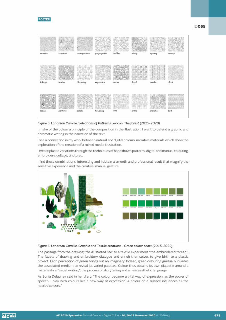
AIC2020 Symposium Natural Colours - Digital Colours 20, 26-27 November 2020 aic2020.org AIC2020 Symposium Natural Colours - Digital Colours 20, 26-27 November 2020 aic2020.org 475
POSTER
Figure 5: Landreau Camille, Selections of Patterns Lexicon: The forest (2015-2020).
I make of the colour a principle of the composition in the illustration. I want to defend a graphic and chromatic writing in the narration of the text.
I see a connection in my work between natural and digital colours: narrative materials which show the exploration of the creation of a mixed media illustration.
I create plastic variations through the techniques of hand drawn patterns, digital and manual colouring, embroidery, collage, tincture...
I find those combinations, interesting and I obtain a smooth and professional result that magnify the sensitive experience and the creative, manual gesture.
Figure 6: Landreau Camille, Graphic and Textile creations - Green colour chart (2015-2020).
The passage from the drawing “the illustrated line” to a textile experiment “the embroidered thread”. The facets of drawing and embroidery dialogue and enrich themselves to give birth to a plastic project. Each perception of green brings out an imaginary. Indeed, green colouring gradually invades the associated medium to reveal its varied palettes. Colour thus obtains its own dialectic around a materiality a “visual writing”, the process of storytelling and a new aesthetic language.
As Sonia Delaunay said in her diary: “The colour became a vital way of expression, as the power of speech. I play with colours like a new way of expression. A colour on a surface influences all the nearby colours.”
ID065

AIC2020 Symposium Natural Colours - Digital Colours 20, 26-27 November 2020 aic2020.org AIC2020 Symposium Natural Colours - Digital Colours 20, 26-27 November 2020 aic2020.org 476
POSTER
CONCLUSION
As we have seen, through a methodical and sensitive study, it’s to understand the stakes of illustration and their importance in our visual culture as well as in their teaching.
We perceive the natural and digital colours dialogue that emanates from the construction of a narrative pattern, the highlighting of an atmosphere in the illustration.
By its polysensoriality, the color is impression, sensation when it becomes movement and here illustration.
Like Ettore Sottsass mentioned it “Colours are a language. They are a powerful, magical, ineffable, flexible, permanent material through which existence, the existence that pulses in time and space, makes itself seen.”
This develops a manufacture of ways of seeing and undertaking this particular mode of expression that’s illustration.
REFERENCES
Alary, Viviane. 2012. L’album : le parti pris des images. Clermont-Ferrand: Presses Universitaires Blaise Pascal.Albers, Josef. 2008. L’interaction des couleurs. Paris: Hazan.Aumont, Jacques. 2020. Introduction à la couleur : des discours aux images. Paris: Armand Colin.Brusatin, Manlio. 1986. Histoire des couleurs. Paris: Champs-Flammarion.Hors Cadres(s). 2011. L’illustration des contes, N.9. Le Puy-en-Velay: L’atelier du Poisson soluble.Lorant-Jolly, Annick. 2006. Images des livres pour la jeunesse : lire et analyser. Créteil: CRDP. Loske, Alexandra. 2019. Couleur : une histoire visuelle. Paris: Pyramyd.Maja, Daniel. 2004. Illustrateur jeunesse : comment créer des images sur les mots ?. Paris: Editions du Sorbier. (Coll. La littérature de jeunesse).Mollard Desfour, Annie. 2012. Le vert : dictionnaire de la couleur : mots et expressions d’aujourd’hui : XXe-XXIe (siècles). Paris: CNRS éd.Nieres-Chevrel, Isabelle. 2009. Introduction à la littérature de jeunesse. Paris: Didier Jeunesse. (Coll. Passeurs d’histoires). Pastoureau, Michel. 2013. Vert : histoire d’une couleur. Paris: Seuil.Poslaniec, Christian. 2008. (Se) former à la littérature de jeunesse. Paris: Hachette Education.Van der Linden, Sophie. 2006. Lire l’album. Le Puy-en-Velay: L’atelier du Poisson soluble.Wallon, Philippe. 2012. 5ème édition. Le dessin d’enfant. Paris: PUF. (Coll. Que sais-je ?).
ID065

POSTER
AIC2020 Symposium Natural Colours - Digital Colours 20, 26-27 November 2020 aic2020.org
Colour out of place: Extinction explored through art practice
Yulia Kovanova Edinburgh College of Art, The University of Edinburgh [email protected]
ABSTRACT
This paper proposes the concept of ‘colour extinction’, which, when explored through contemporary art practice, offers a way to think through the current ecological situation, specifically the ongoing sixth mass extinction. The concept of ‘entanglements’ in environmental humanities is used as a method to approach colour through art practice, in considering the disappearance of colour from natural landscapes through extinction. With the loss of colour in the natural world, digital preservation becomes a way of keeping colours and specific colour combinations alive. The paper concludes that colour ‘extinction’ approached through art practice offers a powerful entryway into the consideration of ongoing mass extinction, inviting us to tap into an emotional connection. It suggests that combining the natural and digital approaches to colour, through interdisciplinary art practice, can help develop colour attunement to the environment, as a step towards positive future action.
KEYWORDS
art I colour I extinction I loss I multispecies studies
INTRODUCTION
Mass extinction, provoked largely through anthropogenic actions, it is one of the most devastating consequences of our industrialised age. Scientists now consider that we have entered a period defined as the sixth mass extinction (Barnosky et al, 2011). Nearly two thirds of animal and plant life has vanished in the last half-century (Simon and Maslin, 2018: 4). Beyond the direct ecological harm, this loss of variety results inevitably in a loss of the particular colours and colour patterns of those species, leading to a less polychromatic natural world.
Multispecies studies is an emergent area within the wider field of environmental humanities, which aims to reconsider the existing divisional categorisation of species. Through increased attentiveness and a “passionate immersion” into the lives of nonhumans, multispecies studies reconsiders the notion of species itself and proposes new ways of engaging with the world (van Dooren et al, 2016).
‘Entanglements’ is a particular approach within multispecies studies, one which looks at how species interact, how they coexist and how they may go into coextinction, as well as the consequences of these events. The focus of this approach is on the interdependencies between species as the paramount requirement for mass survival and shared livelihood (Tsing et al, 2017). The entanglements approach is useful when dealing with extinction, an entangled event whereby the loss of a species is likely to be provoked by the disappearance of something they cannot survive without and could result in further extinctions through a similar process.
Colour, even considered purely in chromatic terms, outside of the notion of ecology, is in itself always relative to its surrounding environment. The artist and colour theorist Josef Albers demonstrates the relational quality of colour, describing such relativity with the phrase “A colour has many faces” (Albers, 1963: 8). Through a number of practical experiments proposed by Albers, one can easily see how a single colour is dependent or relative to what it is surrounded by. There is a link between the relational nature of multispecies entanglements and that of colour.
477
ID070
POSTER

AIC2020 Symposium Natural Colours - Digital Colours 20, 26-27 November 2020 aic2020.org 478
POSTER
What can entanglements reveal to us in the midst of our current mass extinction? Extinction studies scholars engage with these processes of loss and focus on the possible futures of life beyond extinction. Through an interdisciplinary approach, they look for creative responses to ecological collapse and mass extinction. They believe extinction is not a singular isolated phenomenon and, through case studies and the use of evocative writing and storytelling, they explore the “entangled significance” of extinctions, generate engagement and build new paradigms where the human is decentered (Rose et al, 2017: 2-3).
Broken ecological entanglements result in the disappearance of species and resultant loss of colour diversity in our environment, inevitably leading to a less polychromatic world. My proposed concept of colour ‘extinction’ is a way to think through the current ecological situation, specifically the sixth mass extinction, and considers extinction in temporal terms - from deep time, through to today, and on to possible futures. I use the concept of entanglements as a method, which I apply to colour within my art practice, working with both natural and digital colour.
COLOUR EXTINCTION
Colour has evolved as an essential structure to support life processes: “Once the balance of natural colour is altered, the affected forms of life adjust or disappear” (Buether and Anke Augsburg, 2014: 7-8). Colour and its distribution within natural environments developed over millennia and can be a signifier of an environment’s livelihood.
Over recent decades - a fractional moment in evolutionary terms - this natural balance of colours has suffered a dramatic shift. Humanity has been altering the landscape chromatically: through anthropogenic species extinction, natural colours and colour combinations are vanishing from our landscapes. We have, at the same time, introduced other kinds of colour. Through the production of petrochemical materials, such as plastics, or concrete, the land and oceans have acquired a radically different chromatic composition than when we arrived as a species. Grey urban patches have replaced green natural woodlands, multicoloured plastics litter the surface of ocean blue, and monochromatic expanses overpower delicate varying natural shades.
We can witness ecological losses through colour: once one participant in a specific relationship disappears, the colour of the other might be calling for the ghosts, trying to summon them through their special hues. Through these colour codes, we can experience the absence of those already gone. Rather than simply forgetting the past, or accepting ongoing loss, through these evolved colour relationships we can attune ourselves to the connections in ecology.
I propose the concept of ‘colour extinction’ as a way to think through the current ecological situation artistically. How can colour be considered extinct? After all, it is not a physical body which became vulnerable, struggled to survive and eventually disappeared. Yet, I propose to think about colour, and especially specific colour combinations present in specific landscapes, as a living aesthetic experience. Once organisms vanish, their unique colours and colour combinations are removed from that landscape, and the aesthetic composition of the space changes. In everyday experience, colour cannot be experienced in isolation - all colour is experienced in interaction with other colours. To think this through ecologically, we can say that colour extinction exposes the connection between an organism and its environment, which is paramount to the livelihood of both parties.
AIC2020 Symposium Natural Colours - Digital Colours 20, 26-27 November 2020 aic2020.org 477
ID070

AIC2020 Symposium Natural Colours - Digital Colours 20, 26-27 November 2020 aic2020.org AIC2020 Symposium Natural Colours - Digital Colours 20, 26-27 November 2020 aic2020.org 479
POSTER
CHROMATICALLY ENTANGLED THROUGH ART PRACTICE
Taking on the concept of ‘entanglements’ and using it as a method within my art practice, I focus on colour as another way of approaching the notion of extinction. In doing so, I work with both digital and natural colour, to create experiences of entanglement and through this develop attunement to our surrounding environment. Within this paper, I would like to discuss two artworks which I created for the Edinburgh Art Festival 2019, dealing with the idea of extinction through colour, and working with both natural pigments and digital imagery. The two pieces consider extinction through deep time, so looking at species lost thousands of years ago, yet these extinctions still resonate today.
The Avocado | Giant Sloth sculptural installation (Figures 1 and 2) considers the entanglement between an avocado fruit and a giant ground sloth. The work consists of two sculptural pieces: a pile of soil studded with lifesize sculptures of avocado stones (Figure 1) and a triptych of coloured plaster plates (Figure 2). On entering the exhibition space, we see a pile of real soil spanning almost six metres, studded with casts of avocado stones of different shapes and sizes. The sculptures are absolutely white; their hue missing to reflect the extinct large mammals, who would swallow and distribute the avocado stones. Thousands of years ago, these great giants, such as the six-metre tall giant sloth, would be attracted by the ripe avocados, swallowing the entire fruit with its stone and helping to disperse its progeny far and wide. Those animals are long gone, yet the fruit hasn’t caught up to this reality, and continues to call for its lost partners. These are what biologists call “evolutionary anachronisms” (Barlow, 2000: 155).
I first chose to remove colour from the avocado stone plaster casts to convey extinction. Instead of the natural brown, the stones casts were left pure white, the colour of the plaster. This removal of colour allowed me to achieve an uncannily sterile, lifeless quality when applied to the recognisably organic shape of the avocado stone. This creates an eerie feeling: the avocado stones, taken for white eggs from a distance, produce simultaneous thoughts of life and death. The obliteration of hue produces the experience of absence, and also a ‘blank slate’. The pile of soil can also be associated with either a growth medium or a burial site. The actual soil, with its smell and texture, is a site for rebirth and regeneration, and a point for reconsideration. After a few days, tiny green shoots began to sprout from the soil. This unexpected addition to the work brought with them small spots of green colour. This sculptural installation took on a life of its own, demonstrated through this unplanned development.
As the hue left the avocado stones, during the process of dye making, the avocado dye became one of the components of the three plaster casts (Figure 2) which were exhibited on the wall overlooking the soil. A dye, which ranges from light salmon to a deep wine colour, can be produced from boiling avocado stones. A different amount of dye produces a different shade, which can also be subject to the particular variety of avocado.
ID070

AIC2020 Symposium Natural Colours - Digital Colours 20, 26-27 November 2020 aic2020.org AIC2020 Symposium Natural Colours - Digital Colours 20, 26-27 November 2020 aic2020.org 480
POSTER
Whereas in Avocado | Giant Sloth I worked with the materiality of colour, as well as used a natural avocado dye, in Mango | Stegomastodon (Figures 3 and 4) I chose to work with colour digitally, through photography, and focused on the transformation of colour through decay as a way to approach the idea of loss. The mango fruit and Stegomastodon are also anachronistic evolutionary partners. Stegomastodon, a type of a prehistoric elephant, lived in the Americas until around 10,000 years ago. Mango - one of the favourite foods - was swallowed whole, together with the large stone, aiding the dispersion of the mango tree.
The hues of the mango range from greens, oranges and reds, to maroons and browns as the mango ages. Out of around 500 varieties of mango that exist around the world, I chose the American variety of mango fruit called ‘Haden’, which featured all these colours over time. The basis of this piece became the change of hue during the process of ripening and rotting. This colour change evokes the idea of a mango growing and rotting without being eaten by its evolutionary partner; a state of loss. The loss became more pronounced when some of the visual information - in this case sharpness and detail - was removed. I photographed the mango fruit with in-camera blur, as it ripened and aged over time. This led to a removal of details of the mango skin but allowed me to focus on colour and its gradual change.
The final piece consisted of 54 instant images (Figure 3), suspended from the ceiling of the gallery in a vertical line, which continued onto the floor. The top of the piece began with images of greens, and continued through yellows and reds, reaching browns and even whites as the fruit was rotting. A focus on colour has been achieved through blurring, whereby the natural colours present are averaged out mathematically into representations of the colours. The removal of detail from the mango skin allowed an abstraction that connected more directly to colour and its living progression. The vertical procession traced the unwanted ripe fruit falling and rotting, no longer needed by its long-lost evolutionary companion.
ID070

AIC2020 Symposium Natural Colours - Digital Colours 20, 26-27 November 2020 aic2020.org AIC2020 Symposium Natural Colours - Digital Colours 20, 26-27 November 2020 aic2020.org 481
POSTER
DISCUSSION
Often thought as opposites, digital/natural are linked to nature/culture, and therefore the human/nature divide. Such a divide is challenged by environmental humanities, suggesting that humans are inextricably a part of nature. Multispecies studies argues that such a divisional approach to ecology forms part of the causal cycle that leads to species extinction. Applying this non divisional approach to digital and natural colours, I would like to consider how digital and natural can work together towards the common goal. In this case, the loss of colour and colour combinations from our landscapes through extinction. Tackled together and through disciplines, these can offer a link into what was once lost, paving the way for future positive action. Rather than arguing that digital is an ersatz representation of the natural colours lost, I would argue that digital means can offer a link into that past and provide an emotional connection to the losses. Through art practice, I want to see how both digital and natural colour can help us to think through, or better yet feel through, the connections both lost and present.
Colour is always changing, always in flux. It can only be understood in relation to other colours it is surrounded by. Paying attention to colour and colour changes within our landscapes opens into an entangled world. It traces a path to noticing, reconnecting, and then responding. This is the basis of an ethical consideration of ecological colour, which requires the development of colour attentiveness. Albers proposed attentiveness to colour by deeper observation can contribute towards developing a stronger relatedness to the world through colour (Albers, 1963).
Colour extinction explored through art practice can offer an embodied experience of a confluence of complex ideas, spread across time, space and modes of perception and help generate an embodied and emplaced state of interconnection. At the time of ‘data dump mode’, as Timothy Morton describes our current age of information overload without the outlet of positive action, these experiences may allow us to ‘live’ the data; another way of perceiving the entangled world we live in and experience what cannot be touched or seen directly (Morton, 2018).
CONCLUSION
Broken multispecies entanglements ensure the disappearance of species and the resultant loss of colour diversity in our environment, inevitably leading to a less polychromatic world. The concept of colour ‘extinction’ offers a productive way to think through our current ecological situation, the sixth mass extinction. Both natural and digital colours, explored through the idea of colour extinction and art practice, could help develop attentiveness and attunement to the colour within our landscapes, to consider how different parts of these landscapes are interconnected.
I see art as a platform where the idea of relatedness can be examined through the creation of embodied experiences. Paying attention to colour and colour changes within our landscapes opens into an entangled world. Attentiveness and attunement towards the changing colour of our surroundings can be seen as an entry point into a better understanding of the relational nature of the natural world.
ACKNOWLEDGEMENTS
Many thanks to Edinburgh College of Art, the University of Edinburgh, Edinburgh Art Festival and the Hope Scott Trust for supporting the development, production and presentation of the work for the exhibition. In planning and developing the installations, the author worked in collaboration with architects Yipei Tan and Xinren Zhou.
ID070

AIC2020 Symposium Natural Colours - Digital Colours 20, 26-27 November 2020 aic2020.org AIC2020 Symposium Natural Colours - Digital Colours 20, 26-27 November 2020 aic2020.org 482
POSTER
REFERENCES
Albers, J. 1963. Interaction of Color. New Haven, CT: Yale University Press.Barlow, C. 2000. The Ghosts of Evolution: Nonsensical Fruit, Missing Partners, and Other Ecological Anachronisms. New York: Basic Books.AIC (Association Internationale de la Couleur). 2018. Barnosky, A. D., N. Matzke, S. Tomiya, G. O. U. Wogan, B. Swartz, T. B. Quental, and C. Marshall. 2011. “Has the Earth’s Sixth Mass Extinction Already Arrived?” Nature 471, no. 7336 (2011): 51–57. Buether A. and A. Augsburg. 2014. Colour: Design Principles, Planning Strategies, Visual Communication. Munich: Institut Für Internationale Architektur-Dokumentation.Lewis, S. L. and M. Maslin. 2018. The Human Planet: How We Created the Anthropocene. UK: Penguin Random House.Morton, T. Being Ecological. 2018. UK: Penguin Random House.Rose, D. B. , T. van Dooren, and M. Chrulew. 2017. Extinction Studies: Stories of Time, Death, and Generations. New York: Columbia University Press.Tsing, A. L., H. Swanson, E. Gan, and N. Bubandt, eds. 2017. Arts of Living on a Damaged Planet: Ghosts of the Anthropocene. Minneapolis: University of Minnesota Press.van Dooren, T., E. Kirksey, and U. Münster. 2016. "Multispecies Studies," Environmental Humanities 8, no. 1
ID070

POSTER
AIC2020 Symposium Natural Colours - Digital Colours 20, 26-27 November 2020 aic2020.org
The Highlight effect in structural color from cellulose nanocrystals
Noora E. Yaua•, Konrad W. Klockarsb, Blaise L. Tardyc, Orlando J. Rojasa a Department of Design, School of Arts, Design and Architecture, Aalto University, FI-00076 Aalto, Finland
b Department of Bioproducts and Biosystems, School of Chemical Engineering, Aalto University, 00076 Aalto, Finland
c Department of Chemical & Biological Engineering, Vancouver Campus, University of British Colombia, 2360 East Mall, Vancouver
•Corresponding author: [email protected]
ABSTRACT
Structural color arising from nanostructures of cellulose nanocrystals has been studied for some time already. However, well-founded practical applications for these visually enchanting colors have not been realized yet. The focus in the development of nanocellulose -based structural colors has been on advanced materials applications, for example, tunable reflective filters or various sensors. In contrast, our research aims to bring nanocellulose -based structural color into the fields of design and art.
There is a great need for eco-structural colors, as iridescent and glittering effect colors are commonly used in various visual industries. However, these colors are currently produced using environmentally harmful materials and toxic pigments. Cellulose nanocrystal structural color could potentially offer an alternative for these harmful colorants.
Cellulose nanocrystals (CNC) give rise to the so-called coffee ring effect (CR) when they assemble into the nanostructure responsible for the structural color. The effect refers to a rainbow-like border-color appearing on dry films. Scientists have generally considered this effect a problem to be solved since it prevents uniform color films. However, the same phenomenon could create visually and esthetically appealing effects. In the design and art field, this effect could be used as a "highlight -effect" since it can bring up the shapes and forms of the colored area. CNCs do this naturally, and as far as we know, no other coloring method can achieve this.
This conference paper is the first encounter with this phenomenon of coffee ring effect with structural colors that focuses on the effect’s visual properties. We present how the effect can be implemented into designs as a highlighter through prototypes and experiments. Methods used to execute this comes from research through design. Prototyping and experimenting with the material are used together with material science to discover the pattern making potential of CNC structural color.
We present design experiments in which the visuality of the CR effect has been utilized in design. By combining the open-minded methods of design with high-quality materials science, we can learn about the visuality of the material and possibly speed up the process that the new material requires to find its way to the use of designers and artists (and industry).
KEYWORDS structural color I cellulose nanocrystals I coffee-ring effect I design I multidisciplinary
483
ID072
POSTER

AIC2020 Symposium Natural Colours - Digital Colours 20, 26-27 November 2020 aic2020.org 484
POSTER
INTRODUCTION
Shimmering and glittering colors have interested people since prehistoric times. Some scientists believe this is because shiny colors resemble water, which is essential for our species' survival (Meert et al. 2014). Today, holographic, pearlescent, and iridescent colors - keywords for structural color effects - are among the rising color trends in various visual fields in design and art, including cosmetics, fashion and furniture design according to trend forecasts from the Worth Global Style Network (WGSN) (Bailey et al. 2018). Structural color arises from specific light reflection by a nanostructure, rather than from scattering and absorption (S Kinoshita et al 2008). However, these colors are often implemented using plastic-based, lead-based, or metal-containing materials (Maile et al., 2005), which are considered problematic since they have a negative impact on the environment. There is a growing interest in ecological materials and responsible consumption in the field of design and art and the need for sustainable color effects has increased. A structural dye processed from cellulose nanocrystals could be an alternative to existing environmentally harmful dyes.
Since the 90s, cellulose nanocrystals have been known to form a nanostructure that leads to structural color, when a suspension of the nanocrystals is allowed to dry into a coating (Klockars et al. 2019). However, most scientific studies have focused on developing this material towards technical applications, such as optical sensors (Tran et al. 2020, Ganguly et al. 2020) In our work, we utilize cellulose-based structural color with a different focus. We aim to bring this colorant into design and art applications – into the fields of furniture design, product design, architecture, and fashion. We implement design methods in the material development process, leading to a broader perspective for studying the experiential features of the material. Work in design and art is not expected to lead to quantitative technical data in the same way as chemistry and material science work is.
Materials may have properties that seem irrelevant or insignificant for technical applications. However, the same feature may be of great visual interest in design. In recent work, (Klockars et al., 2019) we explored a certain property of structural coloration from cellulose nanocrystals, the coffee ring effect. This feature leads to inhomogeneous color, and therefore it has been largely perceived as a burden in materials science. According to the coffee ring effect, (Deegan et al., 1997) suspensions of colloidal particles, in this case CNCs, dries faster at the edges of the coated area. This leads to a capillary flow of particles towards the edges and therefore a thicker coating at the edges compared to the center. Interestingly, in the case of CNCs, the coffee ring effect also affects the structural color, where the color gradually redshifts towards the coating edges (Mu and Gray 2015). Previous work on the CR effect from CNCs always used circular coatings, (Mu and Gray 2015, Gencer et al. 2017, Gencer et al. 2018) as this leads to homogeneous CRs that are easy to study. However, in our previous work, (Klockars et al. 2019) we suggested using the CR effect as a visual tool to emphasize the shape of logos, forms, and patterns. In order to study the CR effect on more arbitrarily shaped coatings, often encountered in actual designs, we used angular shapes, such as squares, rectangles & triangles, to predict the behavior of the coffee rings on coatings of any lateral shape.
The purpose of this paper is to take this idea further and explore the possibilities of the coffee ring effect in the fields of arts and design. Here, we create a coating of the structural color in a specific pattern to enhance the CR effect and to showcase its possibilities to highlight certain shapes, using it as a design tool.
AIC2020 Symposium Natural Colours - Digital Colours 20, 26-27 November 2020 aic2020.org 483
ID072

AIC2020 Symposium Natural Colours - Digital Colours 20, 26-27 November 2020 aic2020.org AIC2020 Symposium Natural Colours - Digital Colours 20, 26-27 November 2020 aic2020.org 485
POSTER
RESEARCH DESIGN
CNC based structural color is still in the development stage, meaning that all its properties or behavior with other materials are not yet fully known. Our approach to developing CNC structural color has been an interdisciplinary collaboration, combining design with methods from colloid chemistry and materials science. In constructive design research building things like prototypes and mockups, are in the center of constructing knowledge. The designers are imagining new realities and building them to see whether they work or not (Koskinen et al. 2011). In our research we have combined laboratory experiments with prototyping and material tinkering to gain understanding on the properties of the colorant and its material identity. In this paper we focus on the CR effect as a design tool that - instead of being a burden – inspires and guides the design work. The idea is to show how this kind of unique feature of a material/ colorant can be identified to be a part of the material experience of the CNC structural color.
Studies by Karana et al. (Karana & Kestener 2008, Karana et al. 2015) introduced the concept of including material experience research into the material development process. Their work emphasizes that when new materials are launched, their functional aptness is often only considered. However, functional properties alone may not guarantee the commercial success of new materials. Therefore, industrial manufacturers turn to designers, who are tasked with developing both the experiential and functional properties of the material. (Karana et al. 2015).
Materials used in product design must meet both the consumer´s functional and esthetic needs, meaning that the material must function in its technical context, but also on an emotional level: to captivate people’s attention and appreciation, to make sense (Karana et al. 2015). Karana et al. argue that materials development process should not focus solely on the functionality of the material but also consider its other properties. In order to find better understanding about the possibilities of the material (potential applications, performance effect & unique user experience) the designers should, rather than asking “what is it?” to ask, “what does it do?”. The purpose of this is to try to bring understanding not only to the functional qualities of the material, but also to the experience involved; to create a holistic, meaningful user experience (Karana et al. 2015).
Karana and Kestener noticed in their article Materials affect: the role of materials in product experience (2008) that the sensorial characteristics of materials appear to be the most important descriptive category in the experiences of the material (Karana & Kestener 2008). Thus, a more holistic approach to material development would make sense. The holistic material development should include both the development of the technical properties, as well as the emotional and sensorial features of the material. The technical properties are linked to the experience the material creates, and experiences of the material can inspire the technical development of the material. The various features of a material should not be considered separately, but instead how they work together to create a holistic experience. Properties like water resistance, roughness, behavior with light and color all lead to a material’s unique identity. In this study we did experiments with different shaped CNC coated test pieces and used them to help us to understand the behavior of the CR effect in visual context. The results of these experiments were used as guidelines for the design work and helped us to create three different pattern design outcomes with CNC structural color.
DESIGN EXPERIMENTS
The cellulose-based structural color varies towards the edges of a coated area, due to the CR effect. Here, the visual appearance of the color around the edges was studied by preparing coatings with different planar shapes. The behavior of the CR was examined in detail especially when sharp and rounded edges were compared, where a large contrast was found. Since we study coatings of more complex shapes, instead of round ones, the term coffee “ring” does not describe the situation well. Therefore, we prefer to name it the coffee “rim” instead, also abbreviated as CR.
ID072

AIC2020 Symposium Natural Colours - Digital Colours 20, 26-27 November 2020 aic2020.org AIC2020 Symposium Natural Colours - Digital Colours 20, 26-27 November 2020 aic2020.org 486
POSTER
In the first experiment, differently shaped samples were coated, and the behavior of CR was observed. The materials used for the samples were 3D-printed wood filament, 3D-printed PLA -plastic and textile (nylon). In the second experiment a prototype of a shoe was covered with CNC coated textiles (nylon). Third experiment included prototyping with embossed patterns and wood: patterns were drilled on solid wood and then coated with CNC. The last experiment was done by coating charred wood planks with CNCs to create a pattern.
RESULTS
In samples A, B and C (Figure 1.), the coffee ring effect “follows” and highlights the shape of the sample quite well. However, in sample C the CR effect does not repeat the shape of the edges sharply – instead, it is creating more rounded curve with the rim color. Samples D and E (Figure 1.) show how the CR effect has difficulties in repeating sharper shaped patterns. Sample F is an example of a shape that was too complicated for the CR to “follow” and even made it difficult to the CNC color to appear. The edge color reproduced more easily the colored area´s profile in rounder and softer shapes. In our design work this realization has been one of the main drivers when designing patterns from CNC.
Figure 1. Sample A: CNC on textile, B and C: CNC on 3D-printed wood filament, D: CNC on textile, E: CNC on 3D-printed PLA, E: CNC on textile
Our first attempt to use the CR effect as a visual feature in pattern design was done already in 2017. The task was to create a prototype of a shoe containing structural color from CNCs. Interestingly, the idea for the pattern came from a mistake. A textile was coated with CNCs in the laboratory, and the experiment yielded an unexpected outcome: the sample resembled a vague camouflage pattern and the result inspired us to play around with the CR effect (Figure 2A). The main idea was to use the rim color to our advantage, and to create interesting iridescent visual effects that can arise naturally only using CNCs. The result was a camouflage pattern on a shoe (Figure 2B) where the CR effect was engineered to enhance the visual appearance of the shape. We produced the complete pattern by combining coated textile pieces with rounded shapes, where the CR behaved in a manner that we could predict based on results shown in Figure 1.
ID072

AIC2020 Symposium Natural Colours - Digital Colours 20, 26-27 November 2020 aic2020.org AIC2020 Symposium Natural Colours - Digital Colours 20, 26-27 November 2020 aic2020.org 487
POSTER
In 2020, we explored this idea of pattern design with the CR effect even further and brought the idea of a camouflage pattern into a different medium (Figure 2C). We designed an art piece by coating wood, where the same idea of a rim-colored pattern was implemented. A large wooden sheet was CNC milled to provide elevated rounded shapes that were subsequently coated with the CNCs. Applying the coating on an elevated surface was both a technical choice, to enhance the quantifiable intensity of the coffee-ring effect, but it was also a qualitative esthetic consideration.
The red-shifted edges of the colored area delicately highlighted the wooden embossed pattern and created a beautiful gradual change from the natural color of the wood to the iridescence of the CNC structural color (Figure 2C).
In 2020, we applied the structural color onto planks that were charred with the japanese shou sugi ban technique, in order to create extremely intense colors for the pattern (Figure 2D). The dark background enhances the intensity of the reflected structural colour, due to optical effects.
Figure 2. A) A textile coated with CNCs in the laboratory yielded an unexpected outcome: the sample resembled a vague camouflage pattern that inspired us to design with that pattern. B) Prototype of a shoe, covered with different shaped textiles with CNC. C) Embossed pattern on wood, coated with CNCs D) Pattern design using CNC coating on charred wood.
CONCLUSION
The coffee ring effect, arising from structural color coatings of CNCs, can be used to emphasize shapes and to design patterns. However, it is important to note that in order to achieve a controlled highlight effect or to create patterns utilizing the CR effect, round or soft shapes seem to work better than angular or sharp shapes. The design of the pattern should consider the drying process of the CNC nanocrystals in order to fully emphasize the desired shape. For material development and commercialization, it is crucial to investigate how to achieve uniform colors from nanocellulose, which would greatly expand the possibilities of using these colors. At the same time, an undesirable feature could also be a competitive advantage. Border colors could, for example, emphasize the shape of objects and be used to design different patterns and this way work as a highlighting color effect. With the material still in its development stage, tools and techniques for applying CNC structural color onto large surfaces have not yet been developed. However, using smaller coated areas to create pattern designs makes it possible to bring the colorant to large surfaces relatively easy.
ID072

AIC2020 Symposium Natural Colours - Digital Colours 20, 26-27 November 2020 aic2020.org AIC2020 Symposium Natural Colours - Digital Colours 20, 26-27 November 2020 aic2020.org487 488
POSTER
ACKNOWLEDGEMENTS
FinnCERES, ERC grant BioElCell, Tuyen Nguyen, Kirsi Niinimäki, Hannu Paajanen, Valeria Azovskaya and Esa Naukkarinen
REFERENCES
Bailey EG, Palmer H, Barnes O et al (2018) Beauty innovations: Korean packaging; surface and materials forecast S/S 20: code create; food and drink bites: April 2018; decorative accessories A/W 19/20: light magic. In: WGSN. https://www.wgsn.com. Accessed 30 Aug 2018Deegan R, Bakajin O, Dupont T et al. (1997) Capillary flow as the cause of ring stains from dried liquid drops. Nature 389:827–829. https://doi.org/10.1038/39827Gencer A, Schütz C, Thielemans W (2017) Influence of the particle concentration and marangoni flow on the formation of cellulose nanocrystal films. Langmuir 33:228–234. https://doi.org/10.1021/acs.langmuir.6b03724 Gencer A, Van Rie J, Lombardo S et al (2018) Effect of gelation on the colloidal deposition of cellulose nanocrystal films. Biomacromolecules 19:3233–3243. https://doi.org/10.1021/acs. biomac.8b00493Karana, E., Bahareti, B., Rognoli, V., van der Laan, A. (2015). Material Driven Design (MDD): A Method to Design for Material Experiences, International Journal of Design, 9(2), 35-54. Karana E. & Kesteren I (2008) Materials affect: The role of materials in product experience.Kinoshita S, Yoshioka S, Miyazaki J (2008) Physics of structural colors. Reports on Progress in Physics 71:076401. https://doi.org/10.1088/0034-4885/71/7/076401Klockars, KW, Yau NE, Tardy BL et al. (2019) Asymmetrical coffee rings from cellulose nanocrystals and prospects in art and design. Cellulose 26:491–506. https://doi.org/10.1007/s10570-018-2167-7Koskinen I, Zimmerman J, Binder T, Redström J, Wensveen S (2011). Design Research through Practice: From the Lab, Field, and Showroom, Morgan Kaufmann: USA: ElsevierMaile FJ, Pfaff G, Reynders P (2005) Effect pigments—past, present and future. Prog Org Coat 54:150–163. https://doi.org/10.1016/J.PORGCOAT.2005.07.003Meert K, Pandelaere M, Patrick VM (2014) Taking a shine to it: how the preference for glossy stems from an innate need for water. Journal of Consumer Psychology 24:195–206. https://doi.org/10.1016/J.JCPS.2013.12.005Mu X, Gray DG (2014) Formation of chiral nematic films from cellulose nanocrystal suspensions is a two-stage process. Langmuir 30:9256–9260. https://doi.org/10.1021/ la501741rGanguly, Keya & Patel, Dinesh & Dutta, Sayan & Shin, Woo-Chul & Lim, Ki-Taek (2020) Stimuli-responsive self-assembly of cellulose nanocrystals (CNCs): Structures, functions, and biomedical applications. International Journal of Biological Macromolecules. 155. 10.1016/j.ijbiomac.2020.03.171.Tran A, Boott CE, MacLachlan MJ (2020) Understanding the Self‐Assembly of Cellulose Nanocrystals—Toward Chiral Photonic Materials. Advanced Materials 1905876. https://doi.org/10.1002/adma.201905876
ID072

POSTER
AIC2020 Symposium Natural Colours - Digital Colours 20, 26-27 November 2020 aic2020.org
Visual appearance of wood materials under various lighting colour conditions
Sae Miyataa•, Shino Okudab
aGraduate School of Doshisha Women’s College, Kyoto, JapanbDoshisha Women’s College of Liberal Arts, Kyoto, Japan•Corresponding author: [email protected] author: Sae Miyata
ABSTRACT
This study aims to clarify the visual texture of wood materials under various lighting conditions. We conducted the subjective experiment using twelve kinds of wood materials, Japanese cedar, Japanese cypress, chestnut, white oak, beech, teak, Chinese quince, walnut, rose wood, pine, maple, and black cherry. Twenty-four kinds lighting conditions were set using LED light source above was equipped on the top of the experimental space. Participants observed each wood plate and evaluated four items, ‘cold – warm’, ‘rough - smooth’, ‘dry - wet’, and ‘hard - soft’. They also rated the naturalness of color appearance and the preference of lighting. According to the results, the lighting in 4000K-5000K is looked natural and preferred in whitish wood material, whereas the lighting in 3300K-4000K is looked natural and preferred in reddish wood material. Therefore, light colour affects visual appearance of wood materials.
KEYWORDS visual texture I wood material I light colour
INTRODUCTION
The impression of the room is determined by the colour and texture of interior materials. Lighting is also one of the factors is determining the impression of a room. Recently, LED lighting has become very popular, hence various kinds of light colour have been designed according to the intended purpose or the atmosphere of a room. Also, the colour appearance of interior materials depends on the light colour.
The previous study indicated that some fruits and vegetables looked natural under the lighting conditions of 2700K and duv=-0.015 (Ohno,2014). It was also reported that the interior material in cold hue was preferred on cold light, while that in warm hue was preferred in warm light (Schüpbach, 2015). Also, in the research on the appearance of interior material using scale model of a room, wooden walls and wooden floor looked natural and preferred under the lighting in 3000K- 4000K and duv=-0.01.(Okuda, 2018). From the above background, this study aims to clarify the visual texture of wood materials under various lighting conditions.
489
ID076
POSTER

AIC2020 Symposium Natural Colours - Digital Colours 20, 26-27 November 2020 aic2020.org 490
POSTER
EXPERIMENTAL
We prepared twelve kinds of wood materials, Japanese cedar, Japanese cypress, chestnut, white oak, beech, teak, Chinese quince, walnut, rose wood, pine, maple, and black cherry. Each size of wood plate is 100 mm (width), 80 mm (depth), and 4 mm (thickness). Figure 1 shows the photos of twelve kinds of wood materials. We used a LED lighting equipment [LEDCube, THOUSLITE] which has 15 channels of LED spectra (from 365 nm to 670 nm peak) and could control spectral distribution. And we set 20 kinds of lighting conditions with four levels of CCT (3300 K, 4000 K, 5000 K 6500 K) and five kinds of duv (-0.02, -0.015, -0.01, -0.005, 0) in each CCT condition, plus four kinds of CIE illuminants proposed in CIE 015:2018 (standard illuminant A, LED-V2, supplementary standard illuminant D50 and standard illuminant D65). Table 1 shows twenty-four kinds of lighting conditions.
Figure 1: twelve kinds of wood materials.
Table 1: Lighting conditions.
Wood plates in an observation box were illuminated by a LED lighting equipment above mentioned. This box has a variety of objects in different colour and its inside in white. Each observer performed two sessions, and six kinds of the wood plates randomly selected were evaluated in one session. They observed each wood plate and evaluated four items, ‘cold – warm’, ‘rough - smooth’, ‘dry - wet’, and ‘hard - soft’ with a seven-steps scale. They also rated the naturalness of color appearance and the preference of lighting with a numerical scale from -3 to +3. Fifteen females participated in this experiment voluntarily, and they were in all twenties and have normal colour vision.
AIC2020 Symposium Natural Colours - Digital Colours 20, 26-27 November 2020 aic2020.org
ID076
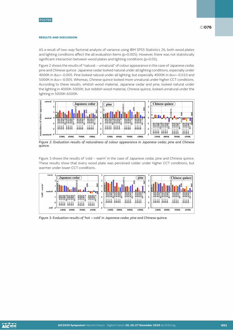
AIC2020 Symposium Natural Colours - Digital Colours 20, 26-27 November 2020 aic2020.org AIC2020 Symposium Natural Colours - Digital Colours 20, 26-27 November 2020 aic2020.org490 491
POSTER
RESULTS AND DISCUSSION
AS a result of two-way factorial analysis of variance using IBM SPSS Statistics 26, both wood plates and lighting conditions affect the all evaluation items (p<0.005). However, there was not statistically significant interaction between wood plates and lighting conditions (p>0.05).
Figure 2 shows the results of “natural – unnatural” of colour appearance in the case of Japanese cedar, pine and Chinese quince. Japanese cedar looked natural under all lighting conditions, especially under 4000K in duv=-0.005. Pine looked natural under all lighting, but especially 4000K in duv=-0.010 and 5000K in duv=-0.005. Whereas, Chinese quince looked more unnatural under higher CCT conditions. According to these results, whitish wood material, Japanese cedar and pine, looked natural under the lighting in 4000K-5000K, but reddish wood material, Chinese quince, looked unnatural under the lighting in 5000K-6500K.
Figure 2: Evaluation results of naturalness of colour appearance in Japanese cedar, pine and Chinese quince.
Figure 3 shows the results of ‘cold – warm’ in the case of Japanese cedar, pine and Chinese quince. These results show that every wood plate was perceived colder under higher CCT conditions, but warmer under lower CCT conditions.
Figure 3: Evaluation results of ‘hot – cold’ in Japanese cedar, pine and Chinese quince.
ID076

AIC2020 Symposium Natural Colours - Digital Colours 20, 26-27 November 2020 aic2020.org AIC2020 Symposium Natural Colours - Digital Colours 20, 26-27 November 2020 aic2020.org 492
POSTER
Figure 4 shows the results of ‘preference of lighting’ in Japanese cedar, pine and Chinese quince. It was found that all lighting conditions for Japanese cedar were relatively preferable particularly, 4000K in duv=-0.015 and 5000K in duv=-0.005 were much preferred. The lighting conditions for pine excluding standard illuminant D65 were preferable, particularly 3300K in duv=-0.005 and 4000K in duv=-0.005 were favored. In the case of Chinese quince, standard illuminant A and all lighting conditions in 3300K were preferred, and 4000K in duv=-0.015 was most preferable lighting condition. On the contrary, the lighting conditions in 6500K were not so preferable, also supplementary standard illuminant D50 and standard illuminant D65 were not preferred. According to these results, the lighting in 4000K was preferred in whitish wood material, Japanese cedar and pine, but the lighting in 6500K was not so preferred in reddish wood material, Chinese quince.
Figure 4: Evaluation results of preference of lighting in Japanese cedar, pine and Chinese quince.
Moreover, the relationships between the evaluation of ‘preference of lighting’ and that of ‘naturalness of color appearance’, ‘cold – warm’, ‘rough - smooth’, ‘dry - wet’, and ‘hard - soft’ were examined through multi-regression analysis. According to this analysis, the standardized partial regression coefficient (β) of naturalness of colour appearance, ‘cold – warm’, ‘rough - smooth’, ‘dry - wet’, and ‘hard - soft’ were β=0.514, 0.128, 0.074, 0.058 and 0.058, respectively. It was clear that preference of lighting is most influenced by naturalness of color appearance.
CONCLUSION
In conclusion, the lighting in 4000-5000K is especially preferred in whitish wood material. However, the lighting in 3300-4000K is preferred in reddish wood material. And, a more natural wood plate would be more preferred. Therefore, light colour affects visual appearance of wood materials.
ACKNOWLEDGEMENTS
This study was supported by JSPS KAKENHI Grant Number 17H01947.
REFERENCES
CIE 015:2018. 2018. Colorimetry, 4th edition, ISBN: 978-3-902842-13-8, DOI:10.25039/TR.015.Ohno, Y., M, Fein., 2014. Vision Experiment on Acceptable and Preferred White Light Chromaticity for Lighting, CIE x039:2014, 192-199.Okuda, S. 2018. Effects of Light Colour on Appearance of Interior Material and Preference of Lighting, Proceedings of the International Colour Association (AIC) Conference 2018, 437-440.Schüpbach, R. L., M, Reisinger., and, B, Schrader. 2015. Influence of lighting conditions on the appearance of typical interior materials, Colour Research and Application 40(1) 50-61.
ID076

POSTER
AIC2020 Symposium Natural Colours - Digital Colours 20, 26-27 November 2020 aic2020.org
The importance of the semiotic development of a color chart in a fashion collection
Ítalo José de Medeiros Dantasa•, Camila Assis Peres Silvaa
aFederal University of Campina Grande, Campina Grande, Paraiba, Brazil•Corresponding author: [email protected]
ABSTRACT
This study aims to clarify the visual texture of wood materials under various lighting conditions. We conducted the subjective experiment using twelve kinds of wood materials, Japanese cedar, Japanese cypress, chestnut, white oak, beech, teak, Chinese quince, walnut, rose wood, pine, maple, and black cherry. Twenty-four kinds lighting conditions were set using LED light source above was equipped on the top of the experimental space. Participants observed each wood plate and evaluated four items, ‘cold – warm’, ‘rough - smooth’, ‘dry - wet’, and ‘hard - soft’. They also rated the naturalness of color appearance and the preference of lighting. According to the results, the lighting in 4000K-5000K is looked natural and preferred in whitish wood material, whereas the lighting in 3300K-4000K is looked natural and preferred in reddish wood material. Therefore, light colour affects visual appearance of wood materials.
KEYWORDS visual texture I wood material I light colour
INTRODUCTION
The impression of the room is determined by the colour and texture of interior materials. Lighting is also one of the factors is determining the impression of a room. Recently, LED lighting has become very popular, hence various kinds of light colour have been designed according to the intended purpose or the atmosphere of a room. Also, the colour appearance of interior materials depends on the light colour.
The previous study indicated that some fruits and vegetables looked natural under the lighting conditions of 2700K and duv=-0.015 (Ohno,2014). It was also reported that the interior material in cold hue was preferred on cold light, while that in warm hue was preferred in warm light (Schüpbach, 2015). Also, in the research on the appearance of interior material using scale model of a room, wooden walls and wooden floor looked natural and preferred under the lighting in 3000K- 4000K and duv=-0.01.(Okuda, 2018). From the above background, this study aims to clarify the visual texture of wood materials under various lighting conditions.
493
ID079
POSTER
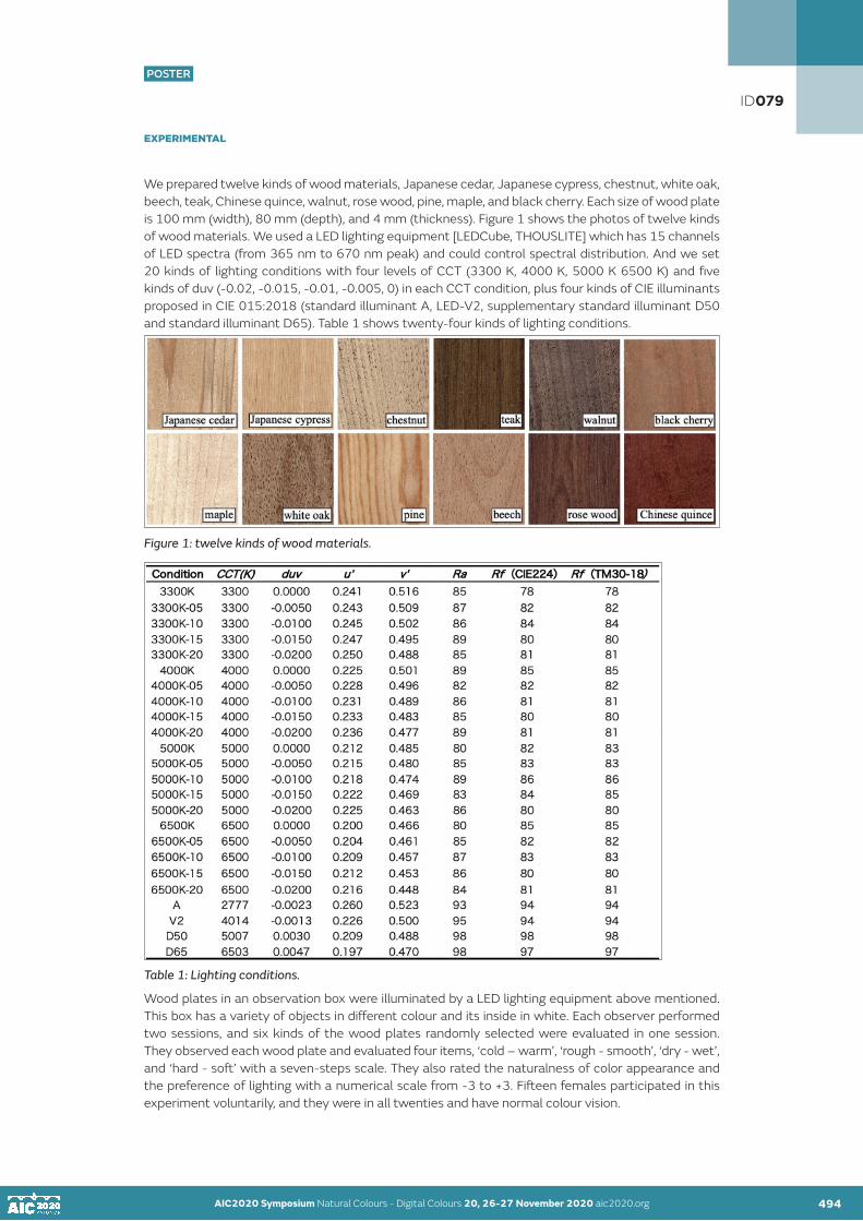
AIC2020 Symposium Natural Colours - Digital Colours 20, 26-27 November 2020 aic2020.org 494
POSTER
EXPERIMENTAL
We prepared twelve kinds of wood materials, Japanese cedar, Japanese cypress, chestnut, white oak, beech, teak, Chinese quince, walnut, rose wood, pine, maple, and black cherry. Each size of wood plate is 100 mm (width), 80 mm (depth), and 4 mm (thickness). Figure 1 shows the photos of twelve kinds of wood materials. We used a LED lighting equipment [LEDCube, THOUSLITE] which has 15 channels of LED spectra (from 365 nm to 670 nm peak) and could control spectral distribution. And we set 20 kinds of lighting conditions with four levels of CCT (3300 K, 4000 K, 5000 K 6500 K) and five kinds of duv (-0.02, -0.015, -0.01, -0.005, 0) in each CCT condition, plus four kinds of CIE illuminants proposed in CIE 015:2018 (standard illuminant A, LED-V2, supplementary standard illuminant D50 and standard illuminant D65). Table 1 shows twenty-four kinds of lighting conditions.
Figure 1: twelve kinds of wood materials.
Table 1: Lighting conditions.
Wood plates in an observation box were illuminated by a LED lighting equipment above mentioned. This box has a variety of objects in different colour and its inside in white. Each observer performed two sessions, and six kinds of the wood plates randomly selected were evaluated in one session. They observed each wood plate and evaluated four items, ‘cold – warm’, ‘rough - smooth’, ‘dry - wet’, and ‘hard - soft’ with a seven-steps scale. They also rated the naturalness of color appearance and the preference of lighting with a numerical scale from -3 to +3. Fifteen females participated in this experiment voluntarily, and they were in all twenties and have normal colour vision.
AIC2020 Symposium Natural Colours - Digital Colours 20, 26-27 November 2020 aic2020.org 493
ID079

AIC2020 Symposium Natural Colours - Digital Colours 20, 26-27 November 2020 aic2020.org AIC2020 Symposium Natural Colours - Digital Colours 20, 26-27 November 2020 aic2020.org 495
POSTER
RESULTS AND DISCUSSION
AS a result of two-way factorial analysis of variance using IBM SPSS Statistics 26, both wood plates and lighting conditions affect the all evaluation items (p<0.005). However, there was not statistically significant interaction between wood plates and lighting conditions (p>0.05).
Figure 2 shows the results of “natural – unnatural” of colour appearance in the case of Japanese cedar, pine and Chinese quince. Japanese cedar looked natural under all lighting conditions, especially under 4000K in duv=-0.005. Pine looked natural under all lighting, but especially 4000K in duv=-0.010 and 5000K in duv=-0.005. Whereas, Chinese quince looked more unnatural under higher CCT conditions. According to these results, whitish wood material, Japanese cedar and pine, looked natural under the lighting in 4000K-5000K, but reddish wood material, Chinese quince, looked unnatural under the lighting in 5000K-6500K.
Figure 2: Evaluation results of naturalness of colour appearance in Japanese cedar, pine and Chinese quince.
Figure 3 shows the results of ‘cold – warm’ in the case of Japanese cedar, pine and Chinese quince. These results show that every wood plate was perceived colder under higher CCT conditions, but warmer under lower CCT conditions.
Figure 3: Evaluation results of ‘hot – cold’ in Japanese cedar, pine and Chinese quince.
Figure 4 shows the results of ‘preference of lighting’ in Japanese cedar, pine and Chinese quince. It was found that all lighting conditions for Japanese cedar were relatively preferable particularly, 4000K in duv=-0.015 and 5000K in duv=-0.005 were much preferred. The lighting conditions for pine excluding standard illuminant D65 were preferable, particularly 3300K in duv=-0.005 and 4000K in duv=-0.005 were favored. In the case of Chinese quince, standard illuminant A and all lighting conditions in 3300K were preferred, and 4000K in duv=-0.015 was most preferable lighting condition. On the contrary, the lighting conditions in 6500K were not so preferable, also supplementary standard illuminant D50 and standard illuminant D65 were not preferred. According to these results, the lighting in 4000K was preferred in whitish wood material, Japanese cedar and pine, but the lighting in 6500K was not so preferred in reddish wood material, Chinese quince.
ID079

AIC2020 Symposium Natural Colours - Digital Colours 20, 26-27 November 2020 aic2020.org AIC2020 Symposium Natural Colours - Digital Colours 20, 26-27 November 2020 aic2020.org 496
POSTER
Figure 4: Evaluation results of preference of lighting in Japanese cedar, pine and Chinese quince.
Moreover, the relationships between the evaluation of ‘preference of lighting’ and that of ‘naturalness of color appearance’, ‘cold – warm’, ‘rough - smooth’, ‘dry - wet’, and ‘hard - soft’ were examined through multi-regression analysis. According to this analysis, the standardized partial regression coefficient (β) of naturalness of colour appearance, ‘cold – warm’, ‘rough - smooth’, ‘dry - wet’, and ‘hard - soft’ were β=0.514, 0.128, 0.074, 0.058 and 0.058, respectively. It was clear that preference of lighting is most influenced by naturalness of color appearance.
CONCLUSION
In conclusion, the lighting in 4000-5000K is especially preferred in whitish wood material. However, the lighting in 3300-4000K is preferred in reddish wood material. And, a more natural wood plate would be more preferred. Therefore, light colour affects visual appearance of wood materials.
ACKNOWLEDGEMENTS
This study was supported by JSPS KAKENHI Grant Number 17H01947.
REFERENCES
CIE 015:2018. 2018. Colorimetry, 4th edition, ISBN: 978-3-902842-13-8, DOI:10.25039/TR.015.Ohno, Y., M, Fein., 2014. Vision Experiment on Acceptable and Preferred White Light Chromaticity for Lighting, CIE x039:2014, 192-199.Okuda, S. 2018. Effects of Light Colour on Appearance of Interior Material and Preference of Lighting, Proceedings of the International Colour Association (AIC) Conference 2018, 437-440.Schüpbach, R. L., M, Reisinger., and, B, Schrader. 2015. Influence of lighting conditions on the appearance of typical interior materials, Colour Research and Application 40(1) 50-61.
ID079

POSTER
AIC2020 Symposium Natural Colours - Digital Colours 20, 26-27 November 2020 aic2020.org
Textile crafts: The middle path
Deepshikhaa•
aIndependent Researcher•Corresponding author: [email protected] author: Deepshikha
ABSTRACT
Textile traditions of India are wide and varied cultural transmitters of the rich heritage since ancient times. The present research presents a brief case study of four textile crafts – Woven (Maheshwari), Printed (Block prints), painted (Kalamkari) and embroidery (Zardozi) from Central (Madhya Pradesh), West (Rajasthan), Southern (Tamil Nadu) and Northern (Uttar Pradesh) parts of India, respectively. Possibilities for technological intervention which is seamless, while retaining essence of craftsmanship in a contemporary digital craft have been presented further. The propositions hence follow a middle path balancing the ethos of craft enthusiasts while integrating minimal technology from the wearable researchers’ viewpoint. The challenges in terms of digital evolution have also been mentioned. The research encourages researchers to work on similar lines and chalk possibilities for creating novel brand identities.
KEYWORDS textile heritage I digital textiles I trends
TRADITIONAL TEXTILE 1: MAHESHWARI WEAVING
History narrates that the ruler of Indore (a city in Madhya Pradesh, India) designed the Maheshwari sarees to be presented as gifts to the Peshwa Kings. Several weavers were summoned from different parts of the country and established in the small town of Maheshwar, thus naming the craft Maheshwari (Figure 1). Products include sarees, scarves, salwar kameez fabrics, among others. Saree is a 5.5 mtr. long fabric draped by women, while salwar kameez is a two-piece tunic-bottom combined with a long rectangular 2-2.5 mtr. scarf termed as dupatta.
Motifs have largely been drawn from architectural elements from the Fort of Maheshwar which are primarily inspired from flora, fauna and Mughal-style jaalis (architectural screens). The various elements form different parts of textile (sarees, scarves, etc.). Some common motifs include the brick pattern (linth), woven mat pattern (chatai), flowers (chameli, bel, etc.), elephant, peacocks, etc. Material used is cotton threads of 100 count, silk of 20/22 denier for border and 2/100 for the body of the textile. Textiles may be woven as single ply, two ply or three ply according to the design. The weight of the saree could be as low as 175 gms. Although initially only natural dyes were used, synthetic dyes are common these days. Colors used have local terms, like, light green (angoori), dark green (dhaani), pink (rani), magenta (gul bakshi), purple ( jaamla), teal (chintamani), etc.
Figure 1 (L-R): Woman weaver; Extra weft design on loom; and, architectural elements that inspire motifs
497
ID082
POSTER

AIC2020 Symposium Natural Colours - Digital Colours 20, 26-27 November 2020 aic2020.org 498
POSTER
TRADITIONAL TEXTILE 2: KALAMKARI PAINTING
Kalamkari (Figure 2) is painting with natural dyes on silk or cotton fabric with a bamboo pen (kalam). There are two styles prevalent in India – Kalahasti (design includes Indian mythology, gods, epic stories) and Masulipatnam (Persian designs with florals and creepers). Colors used are pastel maroon, ochre yellow, indigo blue, brown and black, primarily. Dyes used are obtained from natural sources – bark, flowers, roots, etc. Maroon is obtained from madder, yellow from pomegranate peel or mango bark, blue from indigo, black by fermenting iron with jaggery in a solution or other preparations. The fabric is whitened with cow dung or mud, treated in myrobalan solution and milk is added to avoid colours from spreading. Black outlines are made first and then the fabric is washed. Mordant is applied on areas to be painted maroon, other colors are painted gradually. Sometimes, wax is applied as resist and fabric is dipped in indigo solution for all the areas to be painted blue. Wax resist and sequence of painting colors is decided according to the design.
Figure 2 (L-R): Painting on fabric; washing and drying of fabric; and, finally painted fabric
TRADITIONAL TEXTILE 3: BLOCK PRINTED FABRIC
Block printing is popularly done at Rajasthan and Gujarat, and, also at other parts of India – Madhya Pradesh, Andhra Pradesh, Tamil Nadu, Uttar Pradesh and West Bengal. Types of Block Printing include – Sanganeri, Bagh and Bagru, Dabu, Ajrakh. Each type of block print has its own elaborate process of preparing the fabric, printing the different colors on designs, washing and drying the fabric. Making the Blocks – Block of required size is cut from a seasoned wood and smoothened to level the plane. The surface is dipped in water; a layer of clay is added and rubbed against stone surface to create a whitish layer. Area is marked and design is transferred through a stencil prepared earlier. A kalam (needle/pen) is used for carving, the size of the needle is decided according to the level of intricacy required. Mustard oil or sometimes water is used to clean the blocks before and after use. Motifs include varied forms of flora and fauna in isolated butis (isolated design elements in straight or alternate repeat pattern), floral patterns, creepers, animal motifs, narratives, etc. Textile material is mostly cotton, sometimes silk. Although, initially natural colors were used, synthetic colors of a wide range are being used contemporarily.
There are three techniques of printing – direct, resist and discharge. In Direct printing, the base fabric is bleached; the fabric is dyed to a base color if required or left un-dyed. Printing is done using carved blocks and color mixtures as per the design. The outlines are printed first and the colors are filled light to dark. In resist printing, wax or clay resist is applied on areas to be protected from dye. The fabric is dyed and washed and later designs are printed through blocks where required. Ajrakh and Kalamkari with block prints use this technique. In discharge technique, fabric is first dyed and then areas with designs are treated with chemical to remove the dye applied and re-printed with required designs with blocks. In general, fabric to be printed is washed and bleached according to the design, if needed. Then the fabric is stretched on a long table and held in position with several pins. Colors are mixed with glue and pigment binder and kept separately in trays and evened out for smoothness of application. Block is dipped into the lighter colors and pressed firmly on the fabric with hand. Darker colors follow the lighter colors. Prints are allowed to dry, steamed, washed in water, dried and ironed. Figure 3 represents blocks and block printing.
AIC2020 Symposium Natural Colours - Digital Colours 20, 26-27 November 2020 aic2020.org 497
ID082

AIC2020 Symposium Natural Colours - Digital Colours 20, 26-27 November 2020 aic2020.org AIC2020 Symposium Natural Colours - Digital Colours 20, 26-27 November 2020 aic2020.org498 499
POSTER
Figure 3 (L-R): Wooden blocks; Printing with block; and, printed fabric
TRADITIONAL TEXTILE 4: ZARDOZI EMBROIDERY
It emerged under the patronage of Mughals who brought the technique from Persia. Originally gold threads were used with precious and semi-precious stones for embellishing the fabric. In recent times, it is one of the most popular crafts retained on contemporary and traditional styles of apparels and accessories. The karigar (craftsman) sits on the floor with a square adda (frame for embroidering). An aari (V-shaped needle with hook) is used for the purpose from the top surface, while thread is pulled from the bottom surface and gems are added according to the design from the top surface. Figure 4 represents a zardozi embroidered fabric with floral design.
Figure 4 (L-R): Zardozi embroidered fabric
RELEVANT EXAMPLES OF WEARABLE TECHNOLOGY
Figure 5, Living wall is Leah Buechley’s (2010) interactive wallpaper to enrich environment in a beautiful and unobtrusive manner. Olikrom has developed a range of thermo-chromic material that change its color with application of heat. Agy Lee has developed a pad that demonstrates various ways in which Lilypad Arduino can function with sensors embroidered onto fabric. Figure 6, Priya Ganpati reports how Emma Ferguson (2009), a graphic artist, has designed a motherboard by embroidering units neatly on fabric. Blecha et al. (2019) have demonstrated another embroidered circuit with capacitive buttons with a control unit. IDTechEx USA (2017) has developed a series of e-textiles and sensors that can be integrated in textiles.
ID082

AIC2020 Symposium Natural Colours - Digital Colours 20, 26-27 November 2020 aic2020.org AIC2020 Symposium Natural Colours - Digital Colours 20, 26-27 November 2020 aic2020.org 500
POSTER
Figure 5 (L-R): Living wall; Thermochromic paint by Olikrom; and, Lilypad Arduino embroidery
Figure 6 (L-R): Embroidered circuits; and E-textiles from IdTechEx USA
DISCUSSION
Digital crafts are textile or other crafts embedded with electronic elements for a particular purpose. Textile crafts of India, such as those described in the earlier section of this research, provide immense opportunities of embedding LED, sensors, capacitive buttons, resistors, embroidering with conductive thread, painting with thermo-chromic and photo-chromic paints, etc. to create novel interfaces. Examples of wearable technology as shown in the previous section are only a glimpse of what textile crafts can neatly integrate within itself. There are many disadvantages as well, such as battery source could be non-portable, heavy and inefficient to be integrated to power circuits, conductive thread may wear out in case of embroidering, thermo-chromic inks may be sensitive to UV light, could have low coloring power, toxic formulation, may lose properties with time and increased usage, and so on. Textile enthusiasts on the other hand may need to take care of design elements, color, battery source power and placement, color identities of crafts, portability, wash-ability, etc. when integrating electronic elements. Integrating wearable technology in crafts can then generate unique surfaces that can be used for home interiors, apparels, edutainment, education, health wearables among other possibilities as textile offers a useful and reliable medium to integrate technology within its folds.
ACKNOWLEDGEMENT
National Institute of Fashion Technology, Chennai, TN, India; PDPM Indian Institute of Information Technology, Design and Manufacturing, Jabalpur, MP, India; Indian Institute of Technology, Guwahati, Assam, India.
REFERENCES
Leah Buechley. 2010. Online: http://highlowtech.org/?p=27Olikrom. N.d. Online: https://www.olikrom.com/en/les-revetements-thermochromes/Agy Lee. N.d. Online: https://atmelcorporation.wordpress.com/2014/08/20/creating-an-interactive-pad-with-arduino-lilypad/Priya Ganpati. 2009. Online: https://www.wired.com/2009/06/gallery-embroidery/Blecha T., Soukup R., Reboun J. and Tichy M. 2019. Online: https://passive-components.eu/conductive-hybrid-threads-and-their-applications/IDTechEx USA. 2017. Online: https://www.deviceplus.com/events/latest-new-sensors-e-textiles-batteries-from-idtechex-usa/
ID082

POSTER
AIC2020 Symposium Natural Colours - Digital Colours 20, 26-27 November 2020 aic2020.org
What connects graphic design of Japan and Denmark?
Irena Iljaž, Klementina Možina•
University of Ljubljana, Slovenia•Corresponding author: [email protected] author: Irena Iljaž
ABSTRACT
The aim of our study was to connect two distant cultures, and to present the differences and similarities found both in the Japanese and Danish art and design, displayed visually in the form of corporate identities for a botanical garden. Corporate identities (consisting of a logotype and various applications) are much more accessible to the masses and can thus through time become a part of a nation’s culture. The analysis of topics provided not only the reasons for choosing specific colours, typefaces and usage of white space, but also the meaning behind all these elements. Despite the design solutions being based on similar shapes, previously mentioned principles altered the way the Japanese and Danish corporate identities communicate and look. The results show subtle or great differences between the Japanese and Danish design without using either language, thus displaying the visual language of each nation.
KEYWORDS aesthetic I colour I Denmark I graphic design I Japan
INTRODUCTION
Culture represents a part of each one of us. The main parts being habits, norms and beliefs, as well as art (including architecture, interior, graphic and media design). Art has been influenced by culture as much as was culture by art. Worldwide exploration has allowed us to gain new knowledge; however, it has also changed our perception and provided a new insight into our own cultural identities. It is thus not surprising to find similar art styles in faraway locations. Art has been shaped not only with a specific culture in mind, but with the help of foreign influences. We have noticed similarities in aesthetics and their primary cultural habits of two remote countries, namely Japan and Denmark.
Japanese culture: The special location of Japan enabled the country to develop art forms, language, culture and society that is independent of Western paradigms (Katzumie, 1968). The weather with frequent precipitation, earthquakes, typhoons and floods in combination with the geographical position surrounded by the sea commanded the sustainable use of available natural materials, which in turn impacted the development of handcrafts (Hara, 2014; Saito, 1999; Steinberg Gould, Miller, 2013). These impacted the Japanese people to learn from nature, instead of trying to control it (Bestor, 2018). The region has four seasons, which are extremely important in the Japanese culture; hence, the Japanese design is based on the changes of seasons (Hara, 2009).
The most important time for developing the Japanese style was the period of isolation (Edo period, 1603–1868), during which the Japanese art forms, such as kabuki theatre, ukiyo-e and geisha culture, flourished in the urban society. The following period, known as the Meiji (1868–1912) period, was a period of modernisation and mutual exchange with foreign nations (Bestor, 2018). Despite the Japanese people wanting to be technologically equal to the West (Katzumie, 1968), they did not want to change the eastern values (Bestor, 2018). The modern Japan is thus a combination of different cultures (Hara, 2009), the values of which were adapted by the Japanese to fit their own needs (Bestor, 2018). It was not until after the World War II that the influences of the West began to reflect in the daily lives of the Japanese (Bestor, 2018; Saito, 1999). Today, the Japanese culture is one of the few that has paid special attention to aesthetics and enabled the coexistence of the old and the new (Steinberg Gould, Miller, 2013).
501
ID085
POSTER

AIC2020 Symposium Natural Colours - Digital Colours 20, 26-27 November 2020 aic2020.org 502
POSTER
The Japanese aesthetics was influenced by the Buddhist religion, together with the influences from Shintoism, Confucianism and Taoism (Steinberg Gould, Miller, 2013). The wabi-sabi philosophy is at the heart of the Japanese design (Koren, 2008). Wabi represents something imperfect and asymmetrical, simple beauty (Tanizaki, 2002), while sabi represents rusticity and imperfection that happens naturally, intuitively (Wabi and Sabi, 2004). The European constructivism, modernism and Bauhaus were softened by the essence of the East, allowing for the modernisation of the Japanese design (Hara, 2014; Katzumie, 1968; Meggs, Purvis, 2006). The modern Japan is imbued with design, not only in urban, but also rural areas, that is available to all Japanese people (Asian Graphics Now, 2010). The Japanese design remains simple, yet dynamic with the use of white space. It allows the designs to be subtle, elegant, poetic, contemporary and traditional at the same time (Asian Graphics Now, 2010). The Japanese script allows the use of serifs (i.e. mincho) and sans-serif (i.e. gothic) letter types (Nagase, 2018). They can achieve bilingualism and greater usability by combining both Japanese and Latin scripts. The Japanese traditional colours (red, black, blue and white) are based on the power they have over the human imagination (Hara, 2009). White, in particular, occupied a special place in the Japanese tradition, as the existence of perfect white in nature is only short-lived (Hara, 2009). The seasonal changes found in nature are at the core of the Japanese system of traditional colours (Hara, 2009). The environment dictated a culture of appreciating natural, muted tones, i.e. the colour of the sky, the sea, the landscape and the colours of fruit, vegetables and flowers (Gelfer-Jørgensen, 2013). The above-mentioned are even today seen as much as saturated, vibrant colours and monochrome colours (Asian Graphics Now, 2010) brought by the Bauhaus (Meggs, 2006).
Danish culture: The geographical location and weather conditions (rapid changes and frequent precipitation) have influenced the design awareness and a deep respect for nature, which are crucial for the Danish design (Swann, 1995). The slow change of seasons allows for warm, but short summers and long, cold and dark winters (Dickson, 2008). It is exactly the four seasons that have influenced the need for objects that are both quality made and aesthetically pleasing throughout the year (Skou, Munch, 2016). The area with limited raw materials and cold winters also influenced the development of handcrafts (Fiell et al., 2017). At the same time, they dictated a responsible and a highly skilled use of materials (Dickson, 2008). Especially in the cold part of the year, the Danish concept of hygge comes into focus. The word hygge describes the atmosphere, rusticity and imperfection, mostly in connection with non-material items (Fiell et al., 2017; Wiking, 2016). The philosophy of simplicity and modesty of the protestant religion suited well to the Danish character, which aspired to organisation and purity, religion thus being one of the key elements of shaping a simple and pure culture (Swann, 1995).
The image of modern Denmark was influenced by foreign nations (Stockmarr, 2018), foreign elements being skilfully incorporated into the rich Nordic tradition (Olsen, 2016). A holistic approach to design (Engholm et al., 2017) has influenced the well-designed public buildings in both urban and rural areas (Swann, 1995). Due to the influence of modernism, the use of Helvetica prevailed for a long time (Dickson, 2008). The organic designs of Engelhardt and Bindesbøll influenced the appreciation of unique typefaces and serif typefaces in design (Dickson, 2008; Olsen, 2016). Traditional colours were dictated by the Danish landscape, i.e. white (colour of snow), yellow (colour of straw), grey-blue (colour of sky) and dark blue (colour of the sea) (Olsen, 2016). Natural shades are combined with dark, rustic and smoky colours typical of hygge (Wiking, 2016). The modern Danish design adds warmth with natural colours and goes beyond the use of the dominant black and white of modernism (Gelfer-Jørgensen, 2013). Saturated colours create a contrast with the landscape through all four seasons, which is also noticeable in Danish homes (Eyþórsdóttir, 2011; Olsen, 2016).
Japanese-Danish relations: The first formally recorded agreement between the two countries was signed in 1876 (Japan-Denmark Relations, 2015), while certain Japanese products have found their way to Denmark even earlier (Gelfer-Jørgensen, 2013). The Japanese art was already seen in the European art and furniture of the 17th and 18th century (Gelfer-Jørgensen, 2013). In the late 19th century, japonisme emerged and influenced the impressionists and later periods, e.g. Art Deco (Meggs, Purvis, 2006). Danish artists used Japanese motifs as their greatest inspiration until 1910. These were transferred to the local space, and a boundary between the rusticity and abstraction was created; this combination is today defined as the Danish style (Breunig, 2015). The parallel between the two can be seen in the home aesthetics of the 20th century, which is characterised by simplicity, asymmetry, absence of colours and restraints in decoration (Gelfer-Jørgensen, 2013).
AIC2020 Symposium Natural Colours - Digital Colours 20, 26-27 November 2020 aic2020.org
ID085

AIC2020 Symposium Natural Colours - Digital Colours 20, 26-27 November 2020 aic2020.org AIC2020 Symposium Natural Colours - Digital Colours 20, 26-27 November 2020 aic2020.org502 503
POSTER
The geographical location, as the way of life was dictated by the raw materials of the scarce landscape, represented the greatest influence on the aesthetics of both countries (Bestor, 2018; Dickson, 2008). Throughout history, skills have been honed and optimal use was made of materials, resulting in handcraft skills still being highly valued (Bestor, 2018; Dickson, 2008; Meggs, Purvis, 2006; Wiking, 2016). It is nature that influenced the choice of colour shades, e.g. the colour of the sea, sky and vegetation, especially in connection with the four seasons (Fahr-Becker, 2007; Hara, 2009; Jose, 2018). Many times, the aesthetics of both are presented minimalistically, influenced by modernism, hence using white space and grids in graphic design (Engholm et al., 2017; Eyþórsdóttir, 2011; Fiell et al., 2017; Skou, Munch, 2016). In both, simplicity and perfection were greatly influenced by religion (Fiell et al., 2017; Swann, 1995; Wabi and Sabi, 2004). Cultural heritage is a treasure for both and today, they skilfully combine old forms and habits with modern technologies (Dickson, 2008; Steinberg Gould, Miller, 2013; Stockmarr, 2018).
The aim of our study was therefore to connect distant cultures, and to present differences and similarities found in the graphic design of both countries. The above mentioned characteristics of Japan and Denmark were visually displayed in the form of corporate identities for a botanic garden.
RESULTS AND DISCUSSION
Corporate identities, consisting of a logotype and various applications, e.g. business cards, correspondence letters, envelopes and posters, are accessible to population and can thus through time become a part of the nation’s culture.
Japanese and Danish logotypes: The basis for the Japanese logotype is a distorted letter for the tree (木) that was reduced into the shape of a flower and an imperial seal (cf. Figure 1). On the other hand, the basis for the Danish version of the logotype was a stylised shape of a botanical garden with paths, which was simplified into the geometric shape of a flower (cf. Figure 1). The two logotypes are therefore connected by a floral shape and four segments. These segments indicate not only the nature but also the importance of all four seasons in both cultures. The main difference between the two is in the colour and style – floral shapes are in both instances accentuated with certain colours derived from natural shades (eggplant colour and green colour); while the Japanese logotype is imperfect, asymmetrical and organic (inspired by wabi-sabi), the Danish logotype is geometric and symmetrical (inspired by modernism and functionalism). Both logotypes can be used in combination with a title. The title in the serif typeface in the Japanese logotype could also be written vertically. It always appears to the left side of the logotype (cf. Figure 2). Both the title and the Danish logotype are hierarchical in a similar relationship. The chosen sans-serif typeface emphasises the roundness of the logotype and its modernist characteristic.
Figure 1: Logotype made on Japanese (left) and Danish (right) principles of design.
Japanese and Danish business cards: Business cards differ the most in the orientation of the format (vertical/horizontal) and the quality of the background (light/dark) (cf. Figure 2). The vertical orientation of the Japanese business card focuses the view on the vertically written title in the back and emphasises the free position of the logotype on a light background in the front, which can act as a fingerprint. The Danish business card has a centrally positioned title in the front in white colour on a green background. The central position of the title seems strict and serious, while the green background softens it. The logotype is placed in the upper left corner. The empty space in both business cards again highlights the key information.
Japanese and Danish correspondence letters: The elements are mostly arranged along the top and bottom edges, which seemingly define the format and create an edge (cf. Figure 2). At the same time, an empty space for other information is formed in the centre of the format. The information on the Japanese correspondence letter is gathered at the extreme left and right edges, while the logo breaks the strictness of the layout by floating in the lower right quadrant. Such element placement visually opens the format of the Japanese correspondence letter.
ID085

AIC2020 Symposium Natural Colours - Digital Colours 20, 26-27 November 2020 aic2020.org AIC2020 Symposium Natural Colours - Digital Colours 20, 26-27 November 2020 aic2020.org 504
POSTER
On the Danish correspondence letter, the information is evenly distributed between the left and right edge, evoking a sense of order and visually closing the format at the top. All key information is collected in the header of the Danish correspondence letter, which allows for easy use. The position of the elements on the Japanese correspondence letter is asymmetrical and seemingly random. On the other hand, the Danish correspondence letter follows a logical positioning, i.e. the format is equally divided into four parts, and suggests the influence of modernism. Folding both correspondence letters into thirds results in seeing only the key information that serves as a welcome to a reader.
Japanese and Danish envelopes: Similarly as in earlier application, the most important element on the envelopes is the logotype and empty space, i.e. on the Japanese envelope, it is placed to the right of the title, and on the Danish envelope, it is located in the upper left corner, as in previous solutions (cf. Figure 2).
Japanese and Danish posters: The elements on all the posters are leaves, logotypes and scientific names for plants in Latin (cf. Figure 2). We chose to present the leaves as they visually change during the year, emphasizing the importance of four seasons in both cultures. We used scanned dried leaves of ginkgo and pear tree. To highlight the imperfections and asymmetries of the leaves, we processed the scanned images to give them the feeling of hand-drawn images. The motif from nature, which is as such imperfect, creates a parallel with the Japanese principle of wabi-sabi and the Danish way of hygge. The differences between the Japanese and Danish posters are distinct: quality of the background (light/dark), size of leaves (small/big) and use of empty space (empty/full). Despite the leaves being centrally placed on Japanese posters, the position of the logotype to the image softens the static layout. Such a position allows for tensions between individual elements, which only expose the shapes of leaves. The main features of the Danish design are dynamic and playful solutions; thus, the leaves on Danish posters are enlarged, placed asymmetrically on the format and dark coloured backgrounds. The logotype in the upper left corner and the title in the upper right corner take into account the previous placement and allow for the leaves to come out of the poster. The chosen colours (dark green and dark brown) create a contrast with the Danish landscape.
Figure 2: Applications made on Japanese (top) and Danish (bottom) way include, from left to right, business card, correspondence letter, front and back of envelope, and poster design.
ID085

AIC2020 Symposium Natural Colours - Digital Colours 20, 26-27 November 2020 aic2020.org AIC2020 Symposium Natural Colours - Digital Colours 20, 26-27 November 2020 aic2020.org 505
POSTER
CONCLUSION
The study discusses the connection between the graphic design of Japan and Denmark by highlighting several parallels that have guided the development of the Japanese and Danish design in such a way that certain design principles overlap. The research includes a study of available sources on the topic of the Japanese and Danish (graphic) design, the synthesis of both forming a link between the aesthetics. The findings of the theoretical research were taken into account when designing corporate identities for a botanical garden in the Japanese or Danish way. The results are presented as an analysis of design solutions, highlighting the presented similarities and differences.
The in-depth study of cultural, aesthetic and historical ways in the Japanese and Danish design has enriched the understanding of the theme. The design principles of one or the other nation dictated a specific way of designing corporate identities. Although the designs of both can be interpreted as minimalistic, the basic principles of the Japanese and Danish design are simplicity, subtraction and the use of white space, all together forming a similar visual impression. The simplicity of the design was influenced by a specific geographical location, nature, intertwining of religions and international styles, primarily modernism, and a successful integration of foreign influences into national styles.
REFERENCES
Asian Graphics Now! 2010. Köln: Taschen. Bestor, T. C. 2018. Culture of Japan-history, people, traditions, women, beliefs, food, family, social, marriage. Available online: http://www.everyculture.com/Ja-Ma/Japan.html (accessed 23 March 2020).Breunig, M. 2015. Influences from Japan in Danish Art and Design 1870–2010. Journal of Design History 28: 108–110. Dickson, T. 2008. Dansk Design. Sydney: Murdoch Books. Engholm, I., Holmsted Olesen, C., Kjelms, S., and Melander, C. 2017. The Danish Design DNA. Kopenhagen: Danish Design Council.Eyþórsdóttir, K. 2011. The Story Of Scandinavian Design: Combining Function and Aesthetics. Smashing Magazine. Available online: https://www.smashingmagazine.com/2011/06/the-story-of-scandinavian-design-combining-function-and-aesthetics/ (accessed 19 February 2020).Fahr-Becker, G. 2007. Japanese prints. Köln: Taschen. Fiell, C., Fiell, P., and Englund, M. 2017. Modern Scandinavian design. London: Laurence King. Gelfer-Jørgensen, M. 2013. Influences from Japan in Danish art and design: 1870–2010. Kopenhagen: Arkitektens Forlag. Hara, K. 2009. White. Zürich: Lars Müller. – –. 2014. Designing Design. Baden: Lars Müller. Japan-Denmark Relations. 2015. Embassy of Japan in Denmark. Available online: http://www.dk.emb-japan.go.jp/itpr_en/bilateral.html (accessed 2 March 2020).Jose, M. 2018. Graphic Design From Around the World: Scandinavian Design. Available online: https://www.canva.com/learn/scandinavian-design/ (accessed 20 February 2020).Katzumie, M. 1968. Introducing this Special Issue. Graphis 24: 296–297.Koren, L. 2008. Wabi-Sabi: for Artists, Designers, Poets & Philosophers. Point Reyes: Imperfect Publishing. Meggs, P. B., and Purvis, A. W. 2006. Meggs’ History of Graphic Design. New Jersey: John Wiley & Sons, 190–523. Nagase, E. 2018. Seven rules for perfect Japanese typography. Slanted 31: 233– 236. Olsen, G. 2016. How Scandinavian Graphic Design Is Perceived by Graphic Designers Around the Globe, Bachelor thesis. Falun: Dalarna University. Available online: http://www.diva-portal.se/smash/get/diva2:942211/FULLTEXT01.pdf (accessed 3 March 2020).Saito, Y. 1999. Japanese Aesthetics of Packaging. The Journal of Aesthetics and Art Criticism 57: 257–265. Skou, N. P., and Munch, A. V. 2016. New Nordic and Scandinavian Retro: reassessment of values and aesthetics in contemporary Nordic design. Journal of Aesthetics & Culture 8: 1–12. Steinberg Gould, C., and Miller, M. 2013. Japanese Aesthetics. Available online: http://aesthetics-online.org/?page=GouldMiller&hhSearchTerms=%22japanese%22 (accessed 20 March 2020).Stockmarr, P. 2018. Er der en dansk designæstetik?. Available online: http://strandbergpublishing.dk/wp-content/uploads/2016/05/DKD_totalPresse_190916-kopi-trukket-2.pdf (accessed 20 February 2020). Swann, C. 1995. DK = Design Kultur. Design Issues 11: 3–14.Tanizaki, J. 2002. Hvalnica senci. Ljubljana: Študentska založba. Wabi and Sabi: the Aesthetics of Solitude. 2004. Available online: http://www.hermitary.com/solitude/wabisabi.html (accessed 20 February 2020). Wiking, M. 2016. The little book of hygge: the Danish way to live well. London: Penguin Books.
ID085

POSTER
AIC2020 Symposium Natural Colours - Digital Colours 20, 26-27 November 2020 aic2020.org
Analysis of color feature extraction processing in color constancy network by CNN
Shunta Sugiyamaa•, Yoshitsugu Manabea, Noriko Yataa
aChiba University, Japan•Corresponding author: [email protected] author: Shunta Sugiyama
ABSTRACT
Color constancy is a human visual characteristic that can recognize the color of an object correctly, even when the color of illumination light changes. The mechanism of the visual characteristic still has not been elucidated completely. A convolutional neural network (CNN) is used in various fields, such as image recognition. Therefore, we think that we can get a clue to clarify of color constancy mechanism by analyzing the color constancy network after learning. In this paper, we analyze the color constancy network and investigate how the color information is related to the color constancy by extracting the color information in the image based on the visualized feature maps of the network. We visualize the feature maps of the learned network, and analyze the color information extraction process of the color constancy network by paying attention to the highlight part of the object and the background existing in the CG image.
KEYWORDS color constancy I convolutional neural network I feature map
INTRODUCTION
Color constancy is the human visual characteristic that the color of an object can be recognized correctly, even when the color of the illumination light changes. The light from the object is determined by the spectral distribution of the illumination light and the spectral reflectance of the object. Therefore, when the spectral distribution of the illumination light changes, the spectral distribution of reflected light transmitted to the visual system also changes. However, humans can perceive the color of an object regardless of the color of the illumination light. Therefore, it is considered that the color constancy occurs before the brain recognizes the color from the light entering the eye, but the mechanism still has not been clarified.
In this study, we try to analyze the mechanism of the human brain by creating a color constancy network using a convolutional neural network (CNN). CNN is a machine learning method that modeled the human brain structure. An image under a colored light source is given as an input to the color constancy network. Then the network generates an image under a white light source. For learning, it is necessary to prepare a large number of images under a colored light source and a white light source, but it is difficult to prepare these images in the real world. Therefore, we create many CG images under various colored light sources and use them for network learning. We visualize the feature maps of the network and examine what process is performed to reproduce the color constancy in each layer of the network.
506
ID087
POSTER

AIC2020 Symposium Natural Colours - Digital Colours 20, 26-27 November 2020 aic2020.org 507
POSTER
THEORY
We analyze the mechanism by constructing and visualizing a network that reproduces the color constancy based on a convolutional neural network. We construct a color constancy network that can generate an image under a white light source from an image under a colored light source. As the network, we consider the use of Generative Adversarial Network (GAN) (Courville et al. 2014). GAN is a generative model that can generate new data based on the input data by learning it, and it consists of a generator and a discriminator. The generator generates a new fake image data by input image data. In a discriminator, the fake data generated by the generator and the real data are input, and it is discriminated whether the data generated by the generator is fake. By repeating this process, the generator performs learning so that it can generate a fake that is close to the real image, and the discriminator can also identify a fake that is close to the real thing. Thereby the accuracy of the output data is improved. In this research, we construct a network based on pix2pix (A.Efros et al. 2016) which is a kind of GAN. Pix2pix uses a mechanism called U-NET that conveys common features for input and output to the later layer. Pix2pix can generate the image to paired from an input image by learning a pair of two images. Therefore, we can build a color constancy network by learning images under a colored and a white light source. Since it is difficult to prepare a large number of images for learning while changing the illumination light in the real world, we use CG images that are rendered by Physically Based Rendering from Theory To implementation (PBRT) (Humphreys et al. 2016). These CG images are used for learning and experiments.
The image under a colored light source is input to the learned color constancy network, and this network outputs the image under a white light source. Then, we obtain feature maps of color constancy network by a method based on Zeiler’s method (Zeiler et al. 2014) and Dosovitskiy’s method (Dosovitskiy et al. 2014). First, a filter in the layer is selected for visualizing. The filter is initialized to 0 except the maximum value of the filter. This makes it possible to visualize the effect of each pixel in the input image for the activity of the filter corresponding to the remaining maximum value pixel. Next, the initialized feature map is restored up to the input layer. For the feature map after convolution, we create a map in which the padding of the size corresponding to the stride is inserted around the pixels and perform convolution on the map. When performing the above processing, all the pixel values of the feature map that are 0 or less will be 0.
From the visualized feature maps, we obtain feature maps of highlight or background part. For the highlight part, we obtain an image with the only highlight under a white light source by setting the reflectance to 0 except highlight part, and the feature map of the highlight part can be generated by product of the obtained image and the feature map. Similarly, a feature map of the background part can be generated by the product the feature map, and the image with the only background under a white light source. Figure 1 shows an example of generating only highlight or background feature maps. Images of highlight part or background part are binary images. Images of highlight part have white highlights and black others. Images with only backgrounds have white backgrounds and black others. We use these images that are only two colors in the experiment.
Using the feature map of the highlight part and the background part, we investigate the relationship between the color of highlight or background and the color of illumination light. The color information has used the hues in the HSV color space. The hues of all the pixels in the feature map are acquired, and the mode in them is compared with the color temperature of the illumination light.
AIC2020 Symposium Natural Colours - Digital Colours 20, 26-27 November 2020 aic2020.org 506
ID087

AIC2020 Symposium Natural Colours - Digital Colours 20, 26-27 November 2020 aic2020.org AIC2020 Symposium Natural Colours - Digital Colours 20, 26-27 November 2020 aic2020.org 508
POSTER
Figure 1. Example of generating the feature maps of the highlight or the background.
EXPERIMENTS
First, we conduct a learning color constancy network. The color constancy network is learned by using 4500 pairs of input and correct image, the batch size is 1, the epoch number is 200, and the step size is 0.00023. Then, we input a randomly generated CG images for testing to a learned color constancy network and evaluate color constancy network. We input 198 images under a colored light source with random color temperature for testing the learned network, and obtain the RMSE value of the output image and the correct answer image. Figure 2 shows that the examples of input images, output images, and correct images. We can show the color is corrected by the color constancy network. However, some images show a high RMSE value.
Figure 2. Example of RMSE values of input, output, and correct answer images
Next, we investigate the change in the color of the entire feature maps when the color temperature is high or low. In a certain scene, we prepare color temperatures of 2963K and 27354K and obtain images under a white light source by a color constancy network. Figure 3 shows feature maps for different color temperatures. Figure 4 is a hues histogram of the first layer feature maps in the network. Figure 4 shows the hues change greatly depending on the color temperature. In the first layer, when the color temperature is higher, the values of the hue are closer to 0 overall, and there are more red pixels. Also, it is found that the hue values of the first layer of the feature maps change by illumination light.
ID087

AIC2020 Symposium Natural Colours - Digital Colours 20, 26-27 November 2020 aic2020.org AIC2020 Symposium Natural Colours - Digital Colours 20, 26-27 November 2020 aic2020.org 509
POSTER
Figure 3. Feature maps for different color temperature.
(a) 2963K (b) 27354KFigure 4. Histogram of the hues of the 1st layer feature maps
We investigate the relationship between the mode of the hues of the feature maps and the color temperature of the input by using the highlight part or the background part extracted from the feature maps. The scene using the experiment is the same as the image in the above experiment, and the color temperature for input is set randomly. Figure 5 shows feature maps of the highlight part and the background part. It is considered that the role of feature extraction is different for each layer because each feature maps different colors in both the highlight part and the background part. However, the feature maps show similar colors regardless of color temperature for each layer except for the first layer. Figure 6 shows a graph of the hues and the saturation of the illumination light and the mode of the hues of the first layer feature maps of the highlight or background part. Both the highlight part and the background part, the change in hue decrease as the color temperature increased in the first layer. Also, it is found that the hue of the first layer of the feature maps changes significantly when the color temperature of the illumination light is close to the white light source, and there is a correlation between the hue and saturation of the illumination light.
RESULTS AND DISCUSSION
From the experiment, in the first layer, it was found that there is a correlation mainly between the hues of the feature maps, the hues of illumination light, and the saturation of the illumination light close to the white light source. Therefore, it is considered that the first layer obtains the color changes due to the illumination light, the difference of the illumination light influences the color information extraction process of the network.
ID087

AIC2020 Symposium Natural Colours - Digital Colours 20, 26-27 November 2020 aic2020.org AIC2020 Symposium Natural Colours - Digital Colours 20, 26-27 November 2020 aic2020.org 510
POSTER
(a) highlight
(b) backgroundFigure 5. An example of highlight and background feature maps.
(a) Highlight (b) backgroundFigure 6. Relationship between the hues of the feature maps of the first layer and the hue and the saturations of the illumination lights.
In this experiment, we used the mode of the hues as color information to observe the relationship with the color temperature of the illumination light and feature maps of color constancy network. Using the mode of the hues, it was found that there is a change in the feature maps due to the illumination light. However, there are problems that are the inability to observe slight color changes in the feature maps because of using one value, which is appeared many pixels of feature map. It is necessary to consider how to take color values that can solve these problems. Also, in this research, we used pix2pix to construct a color constancy network. Pix2pix has the property that common features in network layer are skipped to the later layer. Therefore, it is considered that we will obtain different results using a network different from pix2pix.
ID087

AIC2020 Symposium Natural Colours - Digital Colours 20, 26-27 November 2020 aic2020.org AIC2020 Symposium Natural Colours - Digital Colours 20, 26-27 November 2020 aic2020.org 511
POSTER
CONCLUSION
In this research, we aim to analyze the color information extraction process from the feature maps to clarify the mechanism of color constancy. We used pix2pix to construct a color constancy network, and we created a large number of CG images under a colored and white light source by PBRT. Their images were used the network learning. By inputting the image under the colored light source into the learned network, we obtained an image corrected to image under white light source and feature maps of the network. We conducted an experiment to analyze how the color information of the highlight part and background part of feature maps influence the color constancy network. Both the highlight part and the background part, we obtained results that the mode of the hues of the feature maps are related with color temperature of illumination light in the first layer. Also, there is a correlation between the hues of the feature maps, the hues of illumination lights, and the saturation of the illumination light close to the white light source. It was found that the role of feature extraction is different for each layer. The future work is to consider obtaining the values instead of the mode of hues from the feature maps and to utilize an experiment with other networks which is not pix2pix. Therefore, by analyzing the mechanism of the color constancy network, we want to elucidate human visual characteristics.
REFERENCES
Aaron Courville, Bing Xu, David Warde-Farley, Ian J. Goodfellow, Jean Pouget-Abadie, Mehdi Mirza, Sherjil Ozair, Yoshua Bengio. 2014. Generative adversarial nets. In Advances in neural information processing systems, pp.2672-2680Alexei A.Efros, Jun-Yan Zhu, Phillip Isola, Tinghui Zhou. 2016. Image-to-Image Translation with Conditional Adversarial Networks. arXiv:1611.07004Greg Humphreys, Matt Pharr, Wenzel Jakob. 2016. Physically Based Rendering, Third Edition: From Theory to Implementation 3rd Edition. Massachusetts: Morgan Kaufmann, BurlingtonMatthew D Zeiler, Rob Fergus. 2014. Visualizing and understanding convolutional networks. In: European Conference on Computer Vision, pp.818-833Alexey Dosovitskiy, Jost Tobias Springenberg, Thomas Brox, Martin Riedmiller. 2014. Striving for simplicity: The all convolutional net. arXiv preprint arXiv:1412.6806
ID087

POSTER
AIC2020 Symposium Natural Colours - Digital Colours 20, 26-27 November 2020 aic2020.org
Variation and Classification of White in Architecture based on Field Survey
Kaoruko Kitamuraa•, Haruno Tsudab, Azusa Takeib, Nozomu Yoshizawab
aMukogawa Women’s University, Hyogo, JapanbTokyo University of Science, Chiba, Japan•Corresponding author: [email protected] author: Kaoruko Kitamura
ABSTRACT
To consider the historical variations in colour, this research focuses on "white" in architecture. The purpose is to grasp the appearance of white through field surveys of architects’ works and clarify the variations in white that influence on the perceived colour. We listed 50 works completed from 1932 to 2019 for field surveys. The target surfaces were whitish finish in architecture. We measured in three different ways for one target surface: the psychophysical colour under standard illuminant, the colour under actual lighting, and the perceived colour. With these measurements, L’u’v’ values were plotted to compare mutually. As a result, the colours under actual lighting were distributed along yellowish-bluish direction. the perceived colours were ranged between the psychophysical colours and the colours under actual lighting. It is thought that the perceived colours are similar depend on the use of light in the actual space.
KEYWORDS white I architecture I field survey I lighting I perceived colour
INTRODUCTION
Colour and finish in architecture have changed with the architectural style throughout the ages. It is well known that the use of white, especially, had changed remarkably across the age of Modern Architecture. In that age, white expressed a characteristic meaning for architects. Even now, the white colour may insist on a unique meaning (Kitagawa 2014), and on the contrary, it may make other colours stand out as a background. In addition, white may amplify the effects of light in architecture.
To consider the historical variations of colours, this research focuses on "white" in architecture. The purpose of this research is to grasp the appearance of white and to clarify its variations that influence human perceived colour and expression of light through field surveys of architects’ works. We consider not only the whiteness as an attribute of the surface, but also the changes of white influenced by the colour of light in the architectural space, and the appearance of white that a person actually perceives in that space.
512
ID090
POSTER

AIC2020 Symposium Natural Colours - Digital Colours 20, 26-27 November 2020 aic2020.org 513
POSTER
Works Architect Completion year 1 Kimura Industrial Laboratory Kunio Maekawa 19322 Head office, Japanese Red Cross Society Kisho Kurokawa 19773 Hokkaido Museum of Modern Art Minoru Ota 19774 Tomakomai Citizen Hall Shinichi Okada 19795 Mori Studio Hiroshi Hara 19816 The Tasaki Museum of Art Hiroshi Hara 19867 The National Museum of Modern Art, Kyoto Fumihiko Maki 19868 School A Kikou Mozuna 19889 Libraly B Takenaka Co. 198810 TEPIA Fumihiko Maki 198911 Office C Takenaka Co. 199012 Yatsushiro Municipal Museum Toyo Ito 199113 Kuga East Community Center Yasunori Murashige 199314 White Blue Black Daigo Ishii 199615 Akino Fuku Museum Terunobu Fujimori 199716 Sendai Literature Museum Neotide Architets Inc. 199917 Big Heart Izumo Cultural Hall Kazuhiro Kojima 199918 Office D Akira Sakamoto 200019 Dormitory, Prefectural College of Agriculture Terunobu Fujimori 200020 Station E Ken Yokogawa 200021 School F Kazuhiro Kojima 200122 Hospital G Kazuhiro Kojima 200323 Suifu-en, Imabari City Crematorium AXS Satow Inc. 200424 Matsumoto Performing Arts Center Toyo Ito 200425 Karuizawa Hotel Bleston Court Rie Azuma 200526 Lamune Onsen Terunobu Fujimori 200527 Aomori Museum of Art Jun Aoki 200528 Office H Jun Aoki 200529 Eternity Jun Aoki 200630 Crematorium I Toyo Ito 200631 Nemukoni Children’s Museun of Art Terunobu Fujimori 200632 Okinawa Prefectural Museum and Art Museum Ishimoto Arch&Eng and Niki Arch. 200733 Yellow room Taku Sakaushi 200834 Commercial bld. J Kumiko Inui 200935 Roku Museum Hiroshi Nakamura 201036 Teshima Art Museum Ryue Nishizawa 201037 Yoko Kawagoe Museum Toyo Ito 201138 Kiya Ryokan Yuko Naagyama 201239 Kyoai Commons Kumiko Inui 201240 Public bld. K Fumihiko Maki 201241 Commercial bld. L Yuko Naagyama 201442 Shodo, Shinsho-ji Terunobu Fujimori 201443 Hospital M Kohki Hiranuma 201444 Kitchenhouse Fukuoka Showroom Katsufumi Kubota 201445 Shin-hakushima Station Kazuhiro Kojima 201546 Aoyama House Kumiko Inui 201647 Mosaic Tile Museum Tajimi Terunobu Fujimori 201648 La Collina Omihachiman Terunobu Fujimori 201649 Taichung Metropolitan Opera House (TAIWAN) Toyo Ito 201650 Kagurazaka house Taku Sakaushi 2019
Table 1: Architectural works for field surveys.
AIC2020 Symposium Natural Colours - Digital Colours 20, 26-27 November 2020 aic2020.org 512
ID090

AIC2020 Symposium Natural Colours - Digital Colours 20, 26-27 November 2020 aic2020.org AIC2020 Symposium Natural Colours - Digital Colours 20, 26-27 November 2020 aic2020.org 514
POSTER
METHOD
Selection of architectural works for field surveys:
We investigated and extracted 337 articles which referred to as white from Japanese representative architectural magazines and books published between 1965 and 2019. These included public, commercial, and residential buildings, shown in Table 1.
Of these, as existing and measurable works, 50 architectural works completed from 1932 to 2019 were selected. We conducted field surveys of these 50 works from Hokkaido to Okinawa in Japan. The period of field surveys was from October 2017 to September 2019, from 7 a.m. to after sunset. Examples of targeted architectural works are shown in Figure 1.
7 The National 29 Eternity 2006 15 Akino Fuku Museum 1997 39 Kyoai Commons 2012 Museum of Modern Art, Kyoto 1986
Figure 1: Examples of architectural works for field survey
Measurement methods of colours in the field surveys
The target surfaces to be measured were whitish finish in architecture. We measured colour in three different ways for one target surface: (1) the psychophysical colour under standard illuminant, (2) the colour under actual lighting in the architectural space, and (3) the perceived colour judged by a person in the architectural space. The measurement methods and measuring instruments are shown in Figure 2. There was a case under indoor artificial lighting only, daylight only, or both.
The first is (1) the colour under standard illuminant. This is sometimes called to be the psychological colour or the object colour. It was measured by a contact-type spectral colorimeter (KONICA MINOLTA CM-700d or CM-2600d) with D65 light source in our field surveys. Each target surface was measured three times, and the average value was used as the colour under standard illuminant.
The appearance of surface colour varies with the surrounding light. Therefore, as a measurement method of the second type, (2) the colour under actual lighting was measured by non-contact type luminance and colour measurement devices (Building research institute L-cept or Canon G12) from a typical observation position in the space. Combining multiple images taken at different shutter speeds, L’u’v’ value of the target surface was calculated as the colour under actual lighting.
The third is (3) perceived colour of the surface judged by a person in real architecture. It varies in lighting, adaptation, and colour contrast. It is considered to be the most important colour in the architectural experience, but it is often difficult to measure on site. In general, it is measured in visual colorimetry method using paper colour charts. However, to grasp the minute changes in perceived whitish colour in our field survey, the steps of colour on the printed colour charts were rough for the visual judgement. Therefore, we used colour chart application software for tablet devices (Apple iPad Pro® 10.5 inch) that allowed to select colour differences in more detail. We used two types of software. One (Pelette® (available until 2018)) displayed 81 colours of 9x9 squares centered on achromatic colour on one screen, and when one of them was selected, more detailed 81 colours of 9x9 squares were displayed. The observer could judge and select a colour in these two steps. The other (Tokyo Cartographic flat palette®) displayed one colour that could be adjusted by three sliders of hue, saturation, and brightness. The tablet device was covered by a black matte box with a small opening to look inside, and a skilled observer selected the same colour on the tablet screen as the perceived colour on the target surface in architecture.
ID090

AIC2020 Symposium Natural Colours - Digital Colours 20, 26-27 November 2020 aic2020.org AIC2020 Symposium Natural Colours - Digital Colours 20, 26-27 November 2020 aic2020.org 515
POSTER
Lighting environment in the space was also measured. Spectral illuminance, correlated colour temperature, and colour rendering properties were measured by illuminance spectrophotometer (KONICA MINOLTA CL-500A or CL-70F) on the target surface and the observer’s eyes position.
After the measurements on site, L’u’v’ values of the selected colours on the tablet screen were measured by a spectral radiance meter in a darkroom and plotted in CIE 1976 UCS diagram to compare mutually.
Figure 2: Three types of measuring methods (Left) and colour chart app on tablet device (Right)
RESULTS AND DISCUSSION
As an overall tendency of colours in the field surveys, results of colours of all 540 target surfaces are shown in Figure 3. (1) Colour under standard illuminant was slightly yellowish as the completion year was old. To verify the influence of aging, we measured standard colour samples for painting of 1954-2015 in safekeeping by the same contact-type spectral colorimeter (KONICA MINOLTA CM-700d) with D65 light source. Shown in Figure 4, it was found that white of the standard colour samples turned very slightly yellowish depending on the age. Since the tendency of the colour change was similar, it can be said that the change of the psychophysical colour in this field survey includes the change according to the aging.
Graph in the center of Figure 3 shows that (2) colours under actual lighting were distributed along yellowish-bluish direction. It is thought that white on the target surface was distributed to yellowish white under actual lighting such as indoor artificial lighting with low correlated colour temperature, and to bluish white under the daylight with high correlated colour temperature. In addition, it was sometimes distributed in greenish white by reflecting the colour of grass and leaves outside the window.
Figure 3: “White” in three different measurement method and its changes in age
ID090

AIC2020 Symposium Natural Colours - Digital Colours 20, 26-27 November 2020 aic2020.org AIC2020 Symposium Natural Colours - Digital Colours 20, 26-27 November 2020 aic2020.org 516
POSTER
Figure 4: Colour changes of Japanese standard colour samples for painting in safekeeping
The right graph of Figure 3 shows (3) perceived colour of the target surface where its colour under actual lighting distributed as (2). Perceived colour ranged between colour under standard illuminant and colour under actual lighting. We can say that the perceived “white” showing similarity to psychophysical colour under standard illuminant is emphasized its whiteness by observer’s adaptation. However, whether the perceived colour is similar to psychophysical colour or not depends on the use of light in the actual architectural space.
In order to grasp the differences in perceived “white”, we selected typical architecture for each age group. As shown in (a), (c), and (d) of Figure 5, perceived colours and psychophysical colours almost overlapped even though colours under actual lighting is in various colours. In the museum (b), perceived colour did not overlap with psychophysical colour, but it hardly overlapped with the colour under actual lighting. These are due to the influences that the eyes had adapted to the lighting in the space. On the other hand, as shown in (e), (f), (g), and (h), perceived colour was judged along colour under actual lighting away from psychophysical colour. This is because the eyes did not adapt to the lighting in the space and perceived the target surface as if it had been coloured.
These difference between the two perception types can be explained by the completion years and the generation of architects. In many architectural works before the 1990s like (a), (b), (c), and (d), perceived colour was often similar to psychophysical colour. In contrast, perceived colour in several works after 2010s like (e), (f), (g), and (h), was similar to colour under actual lighting. This means that observers perceive the white or whitish colour highly influenced by the actual lighting without adaptation. It is thought that this perceived white was not whiteness emphasized as colour, but white to project light onto itself.
Figure 5: differences of perceived colour in typical architecture for each age group
ID090

AIC2020 Symposium Natural Colours - Digital Colours 20, 26-27 November 2020 aic2020.org AIC2020 Symposium Natural Colours - Digital Colours 20, 26-27 November 2020 aic2020.org 517
POSTER
CONCLUSION
To grasp the variations in white in architecture and the perceived “white”, we conducted 50 field surveys of architects’ works completed from 1932 to 2019. We measured in three different ways for one target whitish surface: psychophysical colour under standard illuminant, colour under actual lighting, and perceived colour. Perceived colours were judged to be close to psychophysical colours, and on the contrary, they were judged close to colours under actual lighting. Whether the perceived colour is similar to psychophysical colour or not depends on the use of light in the actual architectural space. These difference between the two types can be explained by the completion years and the generation of architects.
ACKNOWLEDGEMENTS
We are grateful to Japan Paint Manufacturers Association for the permission to measure the valuable samples. We wish to thank Yumi Asakura, Tetsuro Ito, and Yuika Tanaka for their great cooperation. This work was supported by LIXIL foundation No. 17-62 and JSPS KAKENHI Grant No. JP17K00804.
REFERENCES
Kitagawa, K., Yonezawa, T., and Yamanashi, T. 2014. Polysemy of white in text description of buildings. Journal of Architecture and Planning 79(698): 923-932. (in Japanese)CIE (Commission Internationale de L’eclairage). 2004. Colorimetry, 3rd edition. Vienna: CIE Central BureauJIS (Japanese Industrial Standards Committee). 2000. Methods for visual comparison of surface colours. JIS Z 8723. Tokyo: JSA GroupThe color Science Association of Japan. 2011. Handbook of Color Science, 3rd edition. Tokyo: University of Tokyo Press
ID090

POSTER
AIC2020 Symposium Natural Colours - Digital Colours 20, 26-27 November 2020 aic2020.org
The impact of noise estimation on dehazing
Jessica El KhouryImViA Laboratory, Université Bourgogne Franche-Comté, Dijon, FranceCorresponding author: [email protected]
The reduction of outdoor visibility is usually caused by the presence of particles in the atmosphere. The nature and the concentration of these particles define the resulting phenomenon: it could be haze, fog, smoke or pollution. Images captured in these atmospheric conditions suffer from poor contrast and bad visibility. This obstructs the performance of many vision understanding applications, such as monitored driving, video surveillance and satellite imaging.
To remove haze and improve the quality of degraded images, many dehazing methods have been developed in the last decade. Recent methods require only a hazy image provided by simple and affordable imaging systems. Among these numerous methods, only a few ones handle noise, which is always present in hazy images and is amplified through dehazing when it is ignored.
Noise in images is mainly due either to environment (extrinsic noise) or sensor (intrinsic noise). As the transmission of light coming from scenes’ objects is exponentially attenuated and comes quickly down to zero in presence of haze, the noise is greatly amplified at high haze densities and long distances.
When the noise is ignored or inaccurately estimated, this prevents dehazing methods from providing images of high quality standards.
In order to investigate the importance of the accurate estimation and the removal of noise in hazy images, we used the CHIC (Color Hazy Image for Comparison) database, which provides, for a given scene, the fog-free image and a set of images with different fog densities. For each scene, a number of parameters are available like the distance from the camera of known objects such as Macbeth Color Checkers, their radiance, and the fog level through transmittance. Using these data, we measured the noise in foggy images across fog densities and we calculated dehazed images while incorporating the accurate noise value in the corresponding model. We estimated also dehazed images using noise values diverged from the accurate one. The biased values were calculated by adding and subtracting small ratio from the accurate value to simulate over estimation and under estimation of noise, respectively.
To evaluate the quality of dehazed images and investigate the impact of noise estimation accuracy on the recovered features, we used some quality and color difference metrics. It was not surprising that when the estimated value of noise is closer to the real value, the colors are closer to the original ones and the overall quality of dehazed images is higher.
To the best of our knowledge, the quantification of color and quality degradation caused by the lack of the accuracy in noise estimation, has never been addressed before. Through this study, we point out the importance to stimulate researchers’ awareness of the need to include denoising as a mandatory treatment into dehazing and to focus on the proper modelling of noise that will guarantee an accurate estimation.
KEYWORDS
dehazing I denoising I image quality I color
518
ID097
POSTER

POSTER
AIC2020 Symposium Natural Colours - Digital Colours 20, 26-27 November 2020 aic2020.org
The authenticity in the visual and chromatic identity of the historical center of Tiradentes
Bárbara Silvaa•, João Pernãoa
aCIAUD, Lisbon School of Architecture; Universidade de Lisboa, Lisbon, Portugal•Corresponding author: [email protected] author: Bárbara Silva
ABSTRACT
This paper aims to present a study, which is part of an ongoing PhD research, with the purpose to characterise the chromatic identity of the historical centre of Tiradentes, Minas Gerais. It is intended to discuss the authenticity in its current visual and chromatic identity, by enlarging the knowledge about materials, coating techniques and colours used nowadays and in the past periods in the history of the city. To develop this investigation, different methods were used to collect data, including literature review and field research, where were performed exploratory interviews, photographic records, direct observation, chromatic readings and collection of materials and colour samples. With the results of the proposed study, it was possible to initiate an important discussion. Among the conclusions, the authenticity of the chromatic image of Tiradentes was questioned and was highlighted the importance to provide data for help ruling the conservation of the city`s historical centre in the future.
KEYWORDS
visual identity I chromatic identity I tiradentes I architecture I heritage conservation
INTRODUCTION
Tiradentes is part of an important group of historical cities in Brazil, which emerged in the early 18th century, due to the discovery of gold in the region named “Minas Gerais”. The classification of these cities in national level was related to the introduction of heritage conservation policies in Brazil, at the beginning of the 20th century, when they were considered a symbol of traditional culture, because they had remained isolated, without major interventions for a period of time close to a century.
Tiradentes is considered one of the most harmonious and preserved cities in this context, and its historical centre is composed of 3 extremely important visual elements: the architecture, the urban layout and the natural environment. The architecture of the city, which will be the theme addressed in this work, is composed of one-story buildings, few two-story constructions and some churches. The characteristic details of the facades are simple and remarkable, determined mainly through the contrast of materials and colours. In contrast to the white walls, the coloured elements of the facades, commonly the doors, windows, frames and roof eaves, express with intensity their visual identity, as demonstrates in the following figure:
Figure 1: Câmara Street in Tiradentes, Minas Gerais. Source: Author, 2019.
519
ID100
POSTER

AIC2020 Symposium Natural Colours - Digital Colours 20, 26-27 November 2020 aic2020.org 520
POSTER
Despite the importance of the aesthetic aspect to its heritage value, it is possible to affirm that the visual identity of the city faces constant risks of de-characterisation: in the one hand, it is known that the conservation of built heritage in Brazil has faced technical, economic and political problems, and in the other hand, the lack of systematised information on the construction techniques in colonial Brazil and the scarcity of information about colours and coating materials in Minas Gerais are also relevant threats to its identity. In Tiradentes, there are also risks related to the impacts arising from the intense touristic activities. These activities are known for having negative effects over the characteristic and diversity of sites, trying to "sell" an image that tends to transform and standardize their unique identity.
Considering this problem, this study aims to discuss the authenticity in its current visual and chromatic identity, by enlarging the knowledge about materials, coating techniques and colours used nowadays and in the past periods in the history of the city.
MATERIALS AND METHODS
Until the industrial revolution, materials and coating techniques depended on and expressed the culture of regional construction through its geographic and geological context: a "geography of colour" existed. From the 20th century, that condition changed: many countries in the world became aware of the impact caused by chromatic alterations in architectural ensembles, especially in environments and landscapes with heritage value, due to the endless possibilities of chemically synthesized pigments that de-characterize their regional context.
Since the emergence of the field of study in the 1970s, multiple methods for investigating the chromatic identity of architectural ensembles have been developed and applied in academic and non-academic works. In both cases, the researchers are generally motivated by the need to guide decisions and create recommendations for the protection of visual and aesthetic features of buildings, regarding their colours and coatings.
Sharing this same motivation, this paper is part of an ongoing doctoral thesis, which benefits from different research methods applied in previous works, from authors such as Lenclos (1982, 1999), Aguiar (2005), Duarte (2009), Pernão (2012) and Providência (2014).
To discuss the authenticity of the chromatic identity of Tiradentes, methods that allowed to know the materials, colours and coating techniques used in the construction of the city, in its different historical moments (in the past and in the present) were applied, namely: literature review; direct observation with photographic records in loco; collection of materials and samples; chromatic readings and exploratory interviews.
The literature review sought, in addition to the collection of information on the object of study, a critical view on the conservation of colonial cities of Minas Gerais. The exploratory interviews included the main local experts: the historian Olinto Rodrigues dos Santos Filho and the master craftsman José Trindade da Costa. In addition, interviews were also conducted with residents, sellers and other local professionals. The chromatic readings were performed with the aid of a colourimeter (model NCS Colourpin II) and the other methods were applied with an exploratory and intuitive approach. The application of the described methods proved satisfactory for the purpose of this paper, as will be explained below.
AIC2020 Symposium Natural Colours - Digital Colours 20, 26-27 November 2020 aic2020.org
ID100

AIC2020 Symposium Natural Colours - Digital Colours 20, 26-27 November 2020 aic2020.org AIC2020 Symposium Natural Colours - Digital Colours 20, 26-27 November 2020 aic2020.org 521
POSTER
RESULTS AND DISCUSSION
The literature review provided important information about the chromatic identity of Tiradentes and its conservation. Firstly, it was verified that the main references on the subject, who wrote about the physical characteristics and construction systems of the colonial cities of Minas Gerais, such as Sylvio de Vasconcellos (1977, 1979), Lucio Costa (2006) and Paulo Santos (2015), were also largely responsible for their conservation. They were related to technical and advisory staff of National Historical and Artistic Heritage Institute (IPHAN, Brazil) and were literally part of the formation of heritage policies in Brazil, from the creation of the mentioned institution in 1938.
This means that the information provided for such references demonstrates a very specific and homogeneous way of thinking and seeing the colonial cities of Minas Gerais, which reflected directly in the conservation of their chromatic identity, after their classification, in 1938. Since then, the policies promoted by IPHAN, despite their undeniable importance, were not exempt from criticism. Among the main ones, are highlighted the tendency to facadism and the valorisation of stylistic over historical and documentary values of the buildings, as is argued by several authors, such as Motta (1987) and Aguiar (2016).
It is also worth mentioning that the writings by the authors related to IPHAN (as well as most of other bibliographic references) were strongly based on reports by foreign travellers who were in Brazil in the 19th century, after the transfer of the Portuguese Court to Rio de Janeiro in 1808.
The reports of the travellers, however, proved to be subjective and contradictory, as it was possible to verify in the second stage of the literature review, in which the main references in this context were analysed, through the consultation of dozens of historical documents.
In coherence with the information provided by traditional Brazilian literature, the first travellers emphasized the whitewashed houses and the whiteness of the buildings, and reported, less often, the colour contrasts from the white walls and the colourful elements of the windows and doors, usually yellow, red, grey or green. On the other hand, the colour blue, considered traditional, was not mentioned within the group of documents analysed from the early 19th century.
Authors such as Mendes et. al. (2007) relate the "traditional colours" of the facades to the great availability of vegetal resources to produce dyes in Brazil. Indeed, these materials could produce any hue. However, it is known that dyes are unsuitable for painting buildings because they are very sensitive to light, radiation and heat (Duarte, 2009).
On the other hand, mineral resources are compatible and were used for this purpose, as evidenced by the reports of José Vieira Couto (1842), from 1801. These materials provide paintings mainly in yellow and red tones, considering the natural characteristics of the soil of Minas Gerais. For this reason, it is very likely that green hues, and especially the blue ones, came from imported pigments, and therefore were more commonly used in noble buildings and churches. It is possible that these shades have become popular over time, as the access to these materials has been facilitated, especially with the arrival of industrial paints in Brazil, already in the 20th century.
Also in opposition to the traditional literature and IPHAN, that in general neglected the importance of this material, travellers often mentioned the use of tabatinga (an indigenous technique used for painting and coating walls) to replace the whitewashing. According to the reports, lime was not an abundant material in Minas Gerais, where cities were built mainly with local materials.
Finally, in the literature review stage, it is important to highlight Burton's (2001) reports from 1868, which demonstrate the occurrence of a major change in the chromatic identity of the colonial cities: the traveller mentions, on several occasions, the existence of buildings with coloured walls in Minas Gerais.
It is not yet possible to confirm whether this coloured phase occurred at the same time in Tiradentes. However, according to information provided by the interviews, a painting technique that used lime with the addition of local mineral pigments was widely used in facade walls and in artistic paintings inside the buildings, at least until the 1980s. At this time, when the IPHAN technical staff was established in Tiradentes, the buildings were whitewashed and their details were painted in the “traditional” colours: yellow, grey, red, blue and green, creating a chromatic identity close to their current aesthetic aspect.
ID100

AIC2020 Symposium Natural Colours - Digital Colours 20, 26-27 November 2020 aic2020.org AIC2020 Symposium Natural Colours - Digital Colours 20, 26-27 November 2020 aic2020.org 522
POSTER
An example of the artistic paintings mentioned by the interviewees was observed in a building that was under rehabilitation, in the historical centre of Tiradentes (Direita Street). Despite the great interest by the responsible architect in conserving the paintings, their removal was authorized by IPHAN.
According to the interviews conducted to the IPHAN staff in Tiradentes, there are no detailed recommendations for the colours to be used in the buildings. The guidelines are limited to the requirement of white colour on the walls, and for other elements, the use of "existing chromatic patterns", with a matte appearance. There are also no specifications for the types of paint and mortar to be applied.
Through direct observation and interviews, it was possible to confirm that currently synthetic paints on the walls (latex and acrylic) predominate, applied over cement-based industrial mortar. The most frequent colour reading in the NCS system is 0300-N (Neutral White). This hue is only possible by using Titanium Dioxide in modern paints, being too reflective for historical buildings. For the coloured elements, mostly in wood, synthetic enamel paints with satin finishing (little gloss) are predominant.
As there are no specific recommendations for the colours of these elements, owners tend to repeat the existing chromatic patterns in neighbouring buildings and often consult local paint stores to find such patterns. About this, it is very interesting to mention that it was found, through interviews with local paint sellers the existence of colour patterns very frequently sold in Tiradentes, whose commercial names make clear reference to colonial cities, such as "Del Rey Blue", "Colonial Yellow", "Colonial Green" and "Baroque Brown". During interviews, samples of these colours were collected as exemplified in the figure bellow. These chromatic patterns, or similar, are repeated in the catalogues of the main paint brands in Brazil (Coral, Suvinil, Lukscolor and Sherwin Williams). The same colours are also used in elements such as the roof eaves and walls basis and corners, often combining two different hues.
Figure 2: Colour samples from Sherwin Williams, Brazil. Source: Author, 2019.
Finally, it is worth mentioning that, despite the predominance of industrial and synthetic materials in the buildings in Tiradentes, the fieldwork carried out demonstrated that local specialists still retain a lot of knowledge about the traditional materials and construction techniques.
The greatest example is the IPHAN`s restoration and construction atelier, a site that preserves tools and traditional construction materials. Among these relics, knowledge and old coating techniques are materialized, such as the mortars made from local materials (clay, sand and manure) and the old oil painting techniques for wood, made with local soil, collected by the IPHAN artisans themselves.
The place described, as well as its last craftsmen, represent what is left of the local constructive tradition. All this knowledge, however, tends to disappear. This situation proves the need to study and document this knowledge, so that the conservation and preservation of this historical and cultural heritage can be sustained in the context of contemporary challenges and problems.
ID100

AIC2020 Symposium Natural Colours - Digital Colours 20, 26-27 November 2020 aic2020.org AIC2020 Symposium Natural Colours - Digital Colours 20, 26-27 November 2020 aic2020.org 523
POSTER
CONCLUSIONS
The development of this work made possible to conclude that the conservation of Tiradentes was influenced by ideals of valorisation of style and facadism, which culminated in the difficulty of interpreting the various chromatic moments of the city.
These conservation practices still exist today and can be seen in the lack of criteria for the use of colours and coatings in Tiradentes, and in the persistent lack of interest for 19th century techniques and for the interiors of the buildings, which certainly still hold a lot of unknown historical and cultural information.
The touristic character acquired by the city aggravated this problem: the availability of resources and the need to present an attractive image to tourists increased the frequency of maintenance and rehabilitation interventions on buildings. In addition, there is also the contemporary problem of the "geography of colours", much represented by the case of Tiradentes, where the easy access and use of industrial and synthetic materials inhibited the use of local techniques and materials and extinguished important constructive traditions of the city.
For all these facts, it is possible to affirm that the authenticity of the chromatic identity of Tiradentes is questionable. It is not intended to question the value of the visual and chromatic image attributed to the city today, but rather to question whether this image is a conscious result, in a close approach to the concept of authenticity defined by the Charter of Krakow (2000), which means “the sum of substantial, historically ascertained characteristics: from the original up to the current state, as an outcome of the various transformations that have occurred over time” and what is stated in the Charter of Brasilia (IPHAN, 1995): “authentic is what is true, what is given as certain, about which there is no doubt (...) we are faced with an authentic heritage when there is a correspondence between the material object and its meaning”.
Thus, it is clear the relevance of the theme discussed in this paper, as well as the need to continue the proposed investigation, in order to provide data for help ruling the renovation and preservation of the historical centre of Tiradentes in the future.
REFERENCES
Aguiar, J. 2005. A Cor e a Cidade Histórica. Porto: Publicações FAUP.Aguiar, L.B. 2016. Desafios, permanências e transformações na gestão de um sítio urbano patrimonializado: Ouro Preto, 1939-1975. Estudos Históricos (Rio de Janeiro) 29.57: 87-106.Burton, R. 2001. Viagem do Rio de Janeiro a Morro Velho. Brasília: Senado Federal.Costa, L. 2006. Arquitetura. Rio de Janeiro: Editora José Olímpio Ltda.Couto, J.V. 1842. Memoria sobre as minas da capitania de Minas Geraes, suas descripções, ensaios e domicilio proprio; à maneira de itinerário. Com um appendice sobre a nova lorena diamantina, sua descripção, suas producções mineralógicas, e utilidades que d`este paiz possam resultar ao estado. Rio de Janeiro: Casa dos Editores Eduardo e Henrique Laemmert.Duarte, M. G. C. 2009. “A Conservação e Restauro da pintura mural nas fachadas alentejanas: estudo científico dos materiais e tecnologias antigas da cor”. P.h.D. thesis, Universidade Nova de Lisboa. Available at: http://hdl.handle.net/10362/50252.International Conference on Conservation. 2000. Charter of Krakow. Krakow. IPHAN. 1995. Charter of Brasilia. Brasilia. Lenclos, J.P.; Lenclos, D. 1982. Les couleurs de la France: maisons et paysages. Paris: Editions Le Moniteur.Lenclos, J.P.; Lenclos, D. 1999. Couleurs de L'Europe: Geographie de La Couleur. Paris: Editions Le Moniteur.Mendes, C.; Veríssimo, C.; Bittar, W. 2007. Arquitetura no Brasil: de Cabral a D. João VI. Rio de Janeiro: Imperial Novo Milênio.Motta, L. 1987. A SPHAN em Ouro Preto: uma história de conceitos e critérios. Revista do Patrimônio Histórico e Artístico Nacional 22: 108-122.Pernão, J. 2012. “A cor como forma do espaço definida no tempo: princípios estéticos e metodológicos para o estudo e aplicação da cor em arquitectura e nas artes”. P.h.D. thesis, Universidade Técnica de Lisboa. Available at: http://hdl.handle.net/10400.5/7388.Providência, P.F.M.P.C. 2014. “Bases para um Plano de Acção da Salvaguarda dos Revestimentos e Acabamentos Tradicionais em Centros Históricos: O caso de estudo do Plano de Cor do Centro Histórico de Coimbra”. P.h.D. thesis, Universidade de Coimbra. Available at: http://hdl.handle.net/10316/25282.Santos, P. 2015. Formação de cidades no Brasil colonial. Rio de Janeiro: Editora UFRJ/ IPHAN.Vasconcellos, S. 1977. Vila Rica – Formação e desenvolvimento – residências. São Paulo: Perspectiva.Vasconcellos, S. 1979. Arquitetura no Brasil: Sistemas construtivos. Belo Horizonte: Rona Editora.
ID100

POSTER
AIC2020 Symposium Natural Colours - Digital Colours 20, 26-27 November 2020 aic2020.org
A sensory colouration of the territory: between reality and fiction for the creation of an identity
Sophie LapègueLARA-SEPPIA, Allph@, University Toulouse II Jean-Jaurès, FranceCorresponding author: [email protected]
INTRODUCTION
Today, territories represent major challenges in terms of their socio-economic development. While some have managed to maintain their dynamism and their capacity for attraction, many are showing signs of loss of vitality.
The method presented is the direct result of a field study. Indeed, this research project is being implemented in the geographical area of the Argonne in the Marne (51). This territory is one of those with strong past roots. As history shows, it was a source of conflict and occupation. The war has redrawn its landscape, leaving behind it a bruised space, living in memory, on the fringe of reality and its development. This heavy past has now become an economic struggle. How can the territory reinvent itself and become a vector of innovation? This issue has been the main source of questioning for territorial policy, seeking to keep its identity and its economic and tourist potential afloat.
The landscapes of this region are a fundamental element of the local identity and the quality of life of the population. In order to revitalise these territories, which are losing vitality economically, culturally, socially and in terms of tourism, the sensory designer relies on a senso-chromatic analysis of the landscapes forming these spaces. It is a question of questioning what connects us to a landscape on a sensory and chromatic level, and to bring out new systems of interpretation: a new way of entering into resonance with one's environment (Rosa,H - 2018).
The sensorial is defined here as an identity-based entry to the territory. Colour becomes a tool of valorisation in this process, raising a problem: Can colour create identity?
KEYWORDS
colouration I sensory I identity I territory I fiction
FIELD EXPERIENCE
It is a question of experiencing colouring, not defined here as a pictorial approach (Lecerf,G - 2014), but as a model for the construction of the territory towards a multi-sensorial opening.
By questioning the perceptive process of sensation, this research invests the fields of experience in an attempt to bring to light an immersive poetics in the construction of a territorial imaginary. This approach implies that the sensorial has the capacity to reveal a specific character of a territory, here represented by colour.
The basis of this research is therefore based on the hypothesis that the sensory has the capacity to reveal a specific character to a territory, here represented by colour.
Like the history or politics of a territory, colour is movement and is inked in a perceptive process of sensation. It is a question of experimenting with it, through the process of colouring. The designer then puts himself into action by breaking down the territory into movement. Based on digital photography, combined with chromatic readings identifying sensations and emotions in the field, the designer seeks to retranscribe the particularity of the place through singular sensory colourings. His body is then used as a tool of capture, his camera as a conservation device. All his data is recorded in his notebook, between diagrams, colour codes (NCS) and sensorial annotations.
524
ID107
POSTER

AIC2020 Symposium Natural Colours - Digital Colours 20, 26-27 November 2020 aic2020.org 525
POSTER
The field is a place of experience and analysis. Indeed, in the practical research phase, the designer designs portraits of the territory by drawing inspiration from his chance encounters and sensations experienced. This set is combined under different categories, classified, also serving as an axis of development for a crossed analysis of the elements composing a territory: - Sensory elements aimed at searching for a form of intangible heritage, revealing the invisible.- Seasonal elements, anchored in temporal cycles often linked to the seasons, inducing periods of
attractiveness or inactivity in certain sectors of activity.- Heritage elements, telling the history, the memory of territories. This involves studying buildings,
cultures, sometimes even specific languages from archives, but also from popular narratives.- Symbolic elements, representing the specific link between the territory and its population, expected
moments of sharing, multi-generational and instructive.
Fig 1 Colour palette, photographic samples and colour countertypes - Palette 7 : April-May 2018 - Clay and cultivation – Brassicaceae - Agriculture (2018) - © Sophie Lapegue
NEW CREATION PROCESS - METHOD
In the workshop phase, the designer relates the data related to the landscape (natural formation, culture, history, etc.) to poetic identity statements. Like a painter, he composes and breaks down palettes, between colours and sensations, giving rise to colour charts of unique landscape atmospheres, with multiple applications. All the relevance and tension of his work can be found here: preserving an observed reality, while exploiting digital tools as the gateway to a fiction. The execution thus oscillates between space-time issues.
A return to the sources is necessary in order to take the time to cultivate the colours of the territory through field and studio work. However, this research is confronted with economic constraints and a territorial constraint in rapid demand for results and output, often dictated by digital technology, in its communication phase.
AIC2020 Symposium Natural Colours - Digital Colours 20, 26-27 November 2020 aic2020.org 524
ID107

AIC2020 Symposium Natural Colours - Digital Colours 20, 26-27 November 2020 aic2020.org AIC2020 Symposium Natural Colours - Digital Colours 20, 26-27 November 2020 aic2020.org 526
POSTER
A committed coexistence between a creative stance through design thinking, and political development stakes carried by a territory in perpetual movement.
Fig 2 Sensory and chromatic ambience palette. Ploughing - Errance - Sunset - Agricultural fields - Autumn 2018 - Light and precariousness - © Sophie Lapegue
Although based on a creative reality, this practice of colour gradually gives rise to dreams, immersing the territory in a new identity. These systems are mainly based on the colourist's methods (colour charts, cartography, etc.) and those of the sensory (language, categorisation, etc.).These are measured and integrated into a combinatorial cartography in order to produce models of ambiences, serving as a support for identification and allowing the designer to make a link between sensation and colouring.
CONCLUSION
The framework of this research is oriented towards a plural approach, highlighting the porosity between the intellectual, creative and multidisciplinary process of the designer and the field on which he takes a new look at the economic, social and even environmental issues that form his imposed framework. For the whole issue of project design is here, in the field: between creation, research, action and design. This broad spectrum of execution highlights both the experience and skills of the designer, in a process of observation, analysis and creation.
REFERENCE
Lecerf,G. 2014. Le coloris comme expérience poétique. L’harmattan, ParisRosa,H. 2018. Remède à l’accélération : impressions d’un voyage en chine et autres textes sur la résonance. Broché, ParisMacquart-Moulin,F. Aumasson,L. Dalmagiono,D. sous la direction de Marcel,O. 2008. Paysage visible, paysage invisible – la construction poétique du lieu. Champ Vallon, ParisGélard, M-L. 2017. Entretiens avec Joël Candau, Alain Corbin, David Howes, François Laplantine, David Le Breton et Georges Vigarello. Pétra, collection Univers sensoriels et sciences sociales, Paris
ID107

POSTER
AIC2020 Symposium Natural Colours - Digital Colours 20, 26-27 November 2020 aic2020.org
Cross-cultural comparison of color emotions and preference of cotton fabrics dyed with persimmon and indigo
Jongmyoung Choia, Sang Hee Leeb, Eunjou Yib•
aChungbuk National University, KoreabJeju National University, Korea •Corresponding author: [email protected] author: Eunjou Yi
ABSTRACT
This cross-cultural study was purposed to describe color emotional aspects of fabric dyed with persimmon and indigo in order to enhance the range of products employed in fashion and textile design in global market. Precisely, we attempted to compare Koreans and Chinese focusing on deriving significant physical colorimetric attributes to quantify their color emotion and preference of the dyed fabrics. As results, some significant cross-cultural differences for color emotions and preference were found including that persimmon-dyed cotton were perceived as more traditional in color by Koreans than by Chinese while indigo-dyed one was felt by Chinese as coloring more pleasant. Color emotions and preference for each nation were quantified by colorimetric attributes, which could be utilized to design more sensible naturally dyed fabric for international consumers.
KEYWORDS cross-cultural comparison I color emotion and preference I persimmon dye I indigo dye I cotton fabric
INTRODUCTION
Persimmon and indigo have been main traditional natural dyeing stuffs in Korea. Persimmon-dyed fabrics are unique traditional textiles in some areas of Korea including Jeju and their color ranges, in hue, from yellow to red with toning grayish or dull generally. They have been known as their practical properties for work clothes with antimicrobial activity and wear comfort and their color which signifies a cultural meaning in Korean regional history, and reminds modern consumers of its end use as well as its perceived eco-friendly dyeing procedure. As well as indigo is one of worldwide natural dyes, it has been also applied for Korean traditional textiles for a long time owing to its excellent dyeing properties and colorfastness. It provides a diversity of colors ranging from light to dark blue which let people stabilized emotionally due to its unique color image.
527
ID112
POSTER
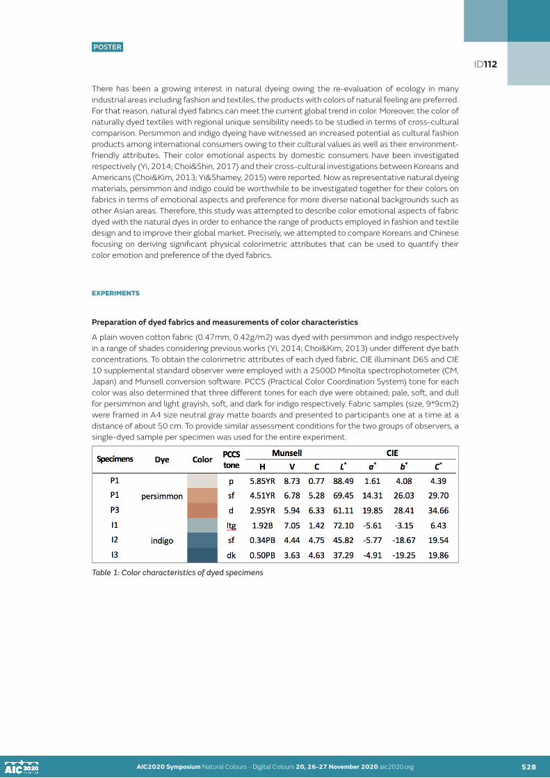
AIC2020 Symposium Natural Colours - Digital Colours 20, 26-27 November 2020 aic2020.org 528
POSTER
There has been a growing interest in natural dyeing owing the re-evaluation of ecology in many industrial areas including fashion and textiles, the products with colors of natural feeling are preferred. For that reason, natural dyed fabrics can meet the current global trend in color. Moreover, the color of naturally dyed textiles with regional unique sensibility needs to be studied in terms of cross-cultural comparison. Persimmon and indigo dyeing have witnessed an increased potential as cultural fashion products among international consumers owing to their cultural values as well as their environment-friendly attributes. Their color emotional aspects by domestic consumers have been investigated respectively (Yi, 2014; Choi&Shin, 2017) and their cross-cultural investigations between Koreans and Americans (Choi&Kim, 2013; Yi&Shamey, 2015) were reported. Now as representative natural dyeing materials, persimmon and indigo could be worthwhile to be investigated together for their colors on fabrics in terms of emotional aspects and preference for more diverse national backgrounds such as other Asian areas. Therefore, this study was attempted to describe color emotional aspects of fabric dyed with the natural dyes in order to enhance the range of products employed in fashion and textile design and to improve their global market. Precisely, we attempted to compare Koreans and Chinese focusing on deriving significant physical colorimetric attributes that can be used to quantify their color emotion and preference of the dyed fabrics.
EXPERIMENTS
Preparation of dyed fabrics and measurements of color characteristics
A plain woven cotton fabric (0.47mm, 0.42g/m2) was dyed with persimmon and indigo respectively in a range of shades considering previous works (Yi, 2014; Choi&Kim, 2013) under different dye bath concentrations. To obtain the colorimetric attributes of each dyed fabric, CIE illuminant D65 and CIE 10 supplemental standard observer were employed with a 2500D Minolta spectrophotometer (CM, Japan) and Munsell conversion software. PCCS (Practical Color Coordination System) tone for each color was also determined that three different tones for each dye were obtained; pale, soft, and dull for persimmon and light grayish, soft, and dark for indigo respectively. Fabric samples (size, 9*9cm2) were framed in A4 size neutral gray matte boards and presented to participants one at a time at a distance of about 50 cm. To provide similar assessment conditions for the two groups of observers, a single-dyed sample per specimen was used for the entire experiment.
Table 1: Color characteristics of dyed specimens
AIC2020 Symposium Natural Colours - Digital Colours 20, 26-27 November 2020 aic2020.org 527
ID112

AIC2020 Symposium Natural Colours - Digital Colours 20, 26-27 November 2020 aic2020.org AIC2020 Symposium Natural Colours - Digital Colours 20, 26-27 November 2020 aic2020.org 529
POSTER
Subjective evaluation of color emotion and preference
Two groups of observers consisting of 37 Koreans and 30 Chinese took part in the subjective visual evaluation to give scores of color emotion terms and color preference of six single colors of dyed fabric samples. Korean observers were college students in dept. of Fashion and Textiles at Jeju National University, Korea while Chinese observers were also college students in college of Human Ecology at Chungbuk National University, Korea. Each participant was then instructed to sit in front of a viewing booth (Judge II GretagMacbeth in Korea and SpectraLight III in USA) illuminated by a D65 simulator. They were asked to fill out the questionnaire dealing with twelve aspects of color emotion including (a) warm, (b) soft, (c) light, (d) strong, (e) natural, (f) pleasant, (g) dynamic, (h) elegant, (i) traditional, ( j) comfort, (k) gentle, and (l) modern. Finally color preference was assessed for each dyed fabric using the descriptor of (m) like. The descriptors were investigated on 7-point scales respectively using semantic differential methods by numbering from −3 to +3.
Data analysis
For quantifying the analysis, t-test, correlation coefficients, and linear regression were employed using PASW (SPSS) version 18. An independent t-test to test the differences in responses between two national groups, Pearson’s correlation coefficient to relate each color term and preference with colorimetric attributes were applied. Color preference was predicted using regression models to assess the relationship between the objective measurement and subjective responses.
RESULTS AND DISCUSSION
Comparison of color emotion terms between two nations
Two both nations were compared in terms of color emotions for each dye. Table 2 shows that both groups felt differently more for colors of persimmon-dyed cotton fabrics (PDC) than for indigo-dyed one (IDC) in that most of color emotion terms. PDC were perceived as more natural, more traditional, and more comfort by Koreans than by Chinese, which might be resulted from that Korean students have more knowledge of the naturally dyed fabric than Chinese people have. As for colors of IDC there were also some significant emotional differences between nations in that Chinese seemed to feel them as less warm and less natural while more pleasant and more dynamic than Koreans did.
Table 2: Comparison of color emotion terms between Koreans and Chinese for each dye.
ID112

AIC2020 Symposium Natural Colours - Digital Colours 20, 26-27 November 2020 aic2020.org AIC2020 Symposium Natural Colours - Digital Colours 20, 26-27 November 2020 aic2020.org 530
POSTER
Despite the differences in responses among Korean and Chinese observers for many aspects of color emotion, for the trend among the dyed fabric specimens two national groups gave very high correlations. Among them, the term ‘Warm’ and ‘Pleasant’ were shown for the correlations between Koreans Chinese with higher correlation coefficients in Figure 1.
Figure 1: Correlations between Koreans and Chinese. (a) ‘Warm’ (b) ‘Light’
Relationships between color emotion and colorimetric attributes
Primary color emotions for both naturally dyed fabrics were revealed as significantly correlated with colorimetric attributes in CIE color system as given in Table 3. Both national groups seemed to feel the naturally dyed fabrics were softer and lighter in color as physical color lightness, CIE L values were higher while color saturation, CIE C values were lower. On the contrary color emotion ‘Strong’ was found that both Koreans and Chinese responded higher rates as color shades were less light and more colorful in terms of colorimetric attributes. In general, Korean and Chinese people tended to have similar relationships between physical attributes and primary color emotion including ‘Soft’ and ‘Light’. On the contrary, complex color emotion terms like ‘Natural’, ‘Pleasant’, ‘Comfort’, and ‘Traditional’ were correlated with color attributes differently depending on both nations and dyes. For examples, correlation coefficients between some of color emotional aspects such as ‘Pleasant’ and ‘Comfort’, and colorimetric attributes were showed differently depending on nations and dyes.
Table 3: Correlation coefficients between colorimetric attributes and color emotion terms.
ID112

AIC2020 Symposium Natural Colours - Digital Colours 20, 26-27 November 2020 aic2020.org AIC2020 Symposium Natural Colours - Digital Colours 20, 26-27 November 2020 aic2020.org 531
POSTER
These trends were precisely described as given in Figure 2. As for ‘Pleasant ’ (Figure 2(a)), Chinese exhibited stronger relations between CIE L and subjective evaluation ratings than Korean counterparts did for both dyes, which agree with Table 3. Especially Chinese showed much higher rates of ‘Pleasant’ for IDS than Koreans did. Figure 2(b) explains ‘Comfort’ related with CIE C for each specimen, which agree with the results in Table 3 in that CIE C had statistically significant correlations only for PDS by Chinese.
(a) (b) Figure 2: Relationships between color attributes and color emotion terms depending on nations and specimens. (a) CIE L & ‘Pleasant’ (b) CIE C & ‘Comfort’
Comparison of color preference related with colorimetric attributes and color emotion terms
In terms of color preference of persimmon-dyed fabric, both national groups gave the highest rates to pale-toned fabric (P1), which showed agreement with a previous study performed by Yi and Shamey (2015: 602) reporting more weakly dyed fabric with persimmon was preferred by both Koreans and Americans. Significant differences between nations was found only for the most deeply IDS (I3) in that Koreans preferred it more than Chinese did (t=3.246). In general, Koreans preferred colors of IDS more significantly than PDS (t=-4.08) while Chinese did not show any difference between the two dyes for ‘Like’. It need to be noted that Chinese preferred lightly dyed PDS than any other specimens even though there was no significant difference from the other specimens.
(a) (b) Figure 3: Comparison of color preference depending on nations and dyes
ID112
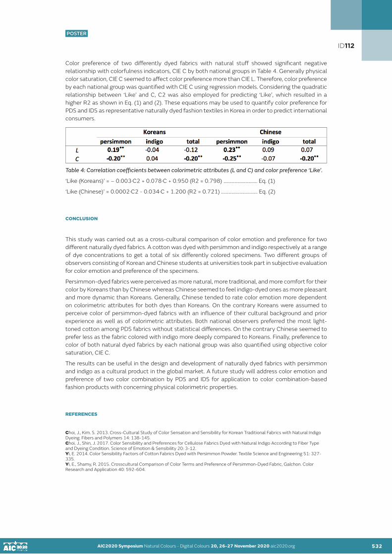
AIC2020 Symposium Natural Colours - Digital Colours 20, 26-27 November 2020 aic2020.org AIC2020 Symposium Natural Colours - Digital Colours 20, 26-27 November 2020 aic2020.org 532
POSTER
Color preference of two differently dyed fabrics with natural stuff showed significant negative relationship with colorfulness indicators, CIE C by both national groups in Table 4. Generally physical color saturation, CIE C seemed to affect color preference more than CIE L. Therefore, color preference by each national group was quantified with CIE C using regression models. Considering the quadratic relationship between ‘Like’ and C, C2 was also employed for predicting ‘Like’, which resulted in a higher R2 as shown in Eq. (1) and (2). These equations may be used to quantify color preference for PDS and IDS as representative naturally dyed fashion textiles in Korea in order to predict international consumers.
Table 4: Correlation coefficients between colorimetric attributes (L and C) and color preference ‘Like’.
‘Like (Koreans)’ = – 0.003·C2 + 0.078·C + 0.950 (R2 = 0.798) ………………………. Eq. (1)
‘Like (Chinese)’ = 0.0002·C2 - 0.034·C + 1.200 (R2 = 0.721) ………………..………. Eq. (2)
CONCLUSION
This study was carried out as a cross-cultural comparison of color emotion and preference for two different naturally dyed fabrics. A cotton was dyed with persimmon and indigo respectively at a range of dye concentrations to get a total of six differently colored specimens. Two different groups of observers consisting of Korean and Chinese students at universities took part in subjective evaluation for color emotion and preference of the specimens.
Persimmon-dyed fabrics were perceived as more natural, more traditional, and more comfort for their color by Koreans than by Chinese whereas Chinese seemed to feel indigo-dyed ones as more pleasant and more dynamic than Koreans. Generally, Chinese tended to rate color emotion more dependent on colorimetric attributes for both dyes than Koreans. On the contrary Koreans were assumed to perceive color of persimmon-dyed fabrics with an influence of their cultural background and prior experience as well as of colorimetric attributes. Both national observers preferred the most light-toned cotton among PDS fabrics without statistical differences. On the contrary Chinese seemed to prefer less as the fabric colored with indigo more deeply compared to Koreans. Finally, preference to color of both natural dyed fabrics by each national group was also quantified using objective color saturation, CIE C.
The results can be useful in the design and development of naturally dyed fabrics with persimmon and indigo as a cultural product in the global market. A future study will address color emotion and preference of two color combination by PDS and IDS for application to color combination-based fashion products with concerning physical colorimetric properties.
REFERENCES
Choi, J., Kim. S. 2013. Cross-Cultural Study of Color Sensation and Sensibility for Korean Traditional Fabrics with Natural Indigo Dyeing. Fibers and Polymers 14: 138-145.Choi, J., Shin, J. 2017. Color Sensibility and Preferences for Cellulose Fabrics Dyed with Natural Indigo According to Fiber Type and Dyeing Condition. Science of Emotion & Sensibility 20: 3-12. Yi, E. 2014. Color Sensibility Factors of Cotton Fabrics Dyed with Persimmon Powder. Textile Science and Engineering 51: 327-335. Yi, E., Shamy, R. 2015. Crosscultural Comparison of Color Terms and Preference of Persimmon-Dyed Fabric, Galchon. Color Research and Application 40: 592-604.
ID112

POSTER
AIC2020 Symposium Natural Colours - Digital Colours 20, 26-27 November 2020 aic2020.org
Recovering reflectance of a partially shaded image under colored scene illuminant
Harumi KawamuraSalesian Polytechnic, Machida, TokyoCorresponding author: [email protected]
ABSTRACT
A method for recovering surface reflectance from a partially shaded image under colored scene illuminant is proposed. At the region boundary occurred by shades in an image, colors around the boundary change sharply, therefore the region is regarded as two different colors. The proposed method estimates color of the scene illuminant and the objects on the assumption there are shades in the image. Retinex theory is used for estimating region of the objects, however, it can’t be distinguish the region between object’s boundary and shades. Therefore modified retinex theory which uses hue component to judge whether the boundary is occurred by shades or not is used. In the estimation of scene illuminant color, gray-world assumption is used. Experimental results using simulated images with shades under colored illuminants show that colors of objects can be estimated by removing illuminant colors and using hue as judgement of the region’s boundary.
KEYWORDS
color constancy I Retinex theory I illuminant color estimation I shaded image
INTRODUCTION
In image processing, the effect of the scene illuminant is inevitable because the pixel values in the image include colors of the objects, scene illuminants and characteristics of input devices such as camera. In order to avoid the above effects, features independent from scene illuminants have been investigated for years in the image processing. Thus, when segmentation is applied for images including these shade and shadow, shade and non-shade region are regarded as different one even if they have same surface reflectance.
The purpose of this paper is to propose the method for recovering colors of the objects in the image which includes shades and is illuminated by colored scene illuminants. Thus the proposed method needs to remove the effects of colored scene illuminants and also the effects of shades.
The conventional methods for estimating colors of scene illuminants in the image are proposed using physical and psychological properties such as specular, color gamuts, statistical features of object’s or illuminant’s regarding to colors. Examples of these methods are G. J. Klinker et al. (1987, 1988), R. Gershon et al. (1989), G. D. Finlayson et al. (2006), E.H. Land et al. (1971) and E.H. Land (1983). By applying these methods to the images, colors of objects, which means the colors under white illuminant, are estimated. However, when there are shades or shadows in the image, estimated object’s colors in the regions are different from those which are directly illuminated. The proposed method can estimate colors of the scene illuminants and recover the colors of objects even if there are shades and shadows in the image. The method uses the properties that the hue component of both shade and non-shade regions is similar each other. Therefore, when retinex theory is applied for recovering the colors of the objects, it is needed for considering the hue component around the edge. While object’s region will be estimated by retinex theory, colors of the objects under white illuminant will be derived by converting illuminant’s color using the estimated color of the scene illuminant.
In the next section, proposed method is explained in detail and in the following section experiments I conducted and the results obtained are described. The last section concludes the results of experiments and some comments with the future work.
533
ID117
POSTER

AIC2020 Symposium Natural Colours - Digital Colours 20, 26-27 November 2020 aic2020.org 534
POSTER
THEORY
The proposed method consists of two parts; one is estimation of scene illuminant colors and the other estimates objects’ region. The mechanism of estimation of both colors and color regions are explained in the following.
Retinex theory is used for estimating region of objects in the image. The theory assumes that spatial color change of illuminants is smaller than that of the objects. Therefore regions of objects can be derived by eliminating small color change between neighboring pixels. The basic idea of estimating the region of the objects from the image in this theory is illustrated in Fig. 1 (a). In the figure, two different color regions, presented in light blue and orange region, are shown. The two colors of upper pair are judged as color from different regions because the difference of two colors is large while in case of the lower pair, the two colors are judged as identical one because of the small color difference. However, in case where the image includes shade or shadow shown in Fig. 1 (b), the colors in the lower pair are judged as color from different color region. The reason of this is that the judgement of two colors’ difference depends on the luminance or strength of the pixel values. The proposed method modifies original retinex theory by changing the way in judging where the object’s region boundary is. As shown in Fig. 1 (c), hue component of HSV color space is used, i.e., if difference of hue (h1 and h2) in the two colors is small, they are judged as colors from the same object’s region even if the difference of value (v1 and v2) is large.
However, it is not enough to recover the colors of the objects. When the color of the scene illuminant is almost the same throughout the scene but the strength of illuminant changes gradually, the derived image by the above mentioned technique includes color of the scene illuminant. Because color of the illuminant is constant over the scene, thus this is not eliminated by the above technique like the strength of illuminant. It means that the pixel values in the derived image include scene illuminant color. Therefore another method is needed to remove the effect of scene illuminant color from the image.
In estimating the color of the scene illuminant, gray-world assumption is used here. This assumption hypothesis that the average color of all objects in the scene is gray. Using this hypothesis, averaging all colors of the image denotes the color of the scene illuminant. Equation (1) expresses the calculation of pixel values in an image, ρi (λ), E(λ) and CamC (λ) are surface reflectance of the i-th object, spectral power distribution of illuminant, camera sensitivity of a color channel (C denotes R or G or B) respectively, λ represents wavelength, C_i denotes the pixel value of the i-th object’s region.
Figure 1: Concept of the proposed theory regarding to estimating of object’s region is shown here; (a) illustrates the basic idea of the conventional retinex theory, the region boundary is judged by difference of two neighboring colors, (b) shows the case where there are shades or shadows in the image. Two colors from the same color region are judged as different one because the difference of the two colors are large. The concept in judgement of region boundary in the proposed method is shown in (c). Using the difference of hue component in HSV color space, in case where one of the two colors is inside of the shade or shadow region, these two colors are judged as color from the same object region.
AIC2020 Symposium Natural Colours - Digital Colours 20, 26-27 November 2020 aic2020.org 533
ID117

AIC2020 Symposium Natural Colours - Digital Colours 20, 26-27 November 2020 aic2020.org AIC2020 Symposium Natural Colours - Digital Colours 20, 26-27 November 2020 aic2020.org 535
POSTER
(1)
(2)
(3)
Equation (2) shows the calculation of average color of all objects in the scene. When the image satisfies the hypothesis, that is, the average color of all objects in the scene is gray, the following equation (3) is derived. In the equation (3), the derived reflectance, which corresponds to gray, is represented as constant scalar k for all wavelength in visible light. By substitute equation (3) for equation (2), following equation (4) is derived. This equation means that average color of the image expresses color of illuminant.
(4)
EXPERIMENTS
In the experiments, simulated images with shades are used and applied for the proposed method and the typical retinex theory as the conventional one. Experimental images are simulation of the scene which half of the left is illuminated by the colored illuminant and the remaining half is shade region which is generated by illuminating the scene as the same scene illuminant color but weak strength. The spatial distribution of strength of the illuminant is illustrated in Fig.2 (a). The images used in the experiments are 512*512 pixels and strength of the illuminants changes linearly on the left side depending on the position of the pixel in the image while the strength of the illuminants is constant (nearly half of the full strength of the illuminant) throughout the right side of the image.
The image is consisted of several patches called Mondrian pattern and the color of each patch is calculated by using the data of surface reflectance, spectral power distribution of the illuminant, and camera sensitivity which are cited on Simon Fraser University’s home page (Computational Vision Lab). In generating Mondrian pattern, data of surface reflectance is randomly selected from the data on the site and three illuminants, whose colors are tungsten bulb, 3500 K daylight with blue filter and 4700 K daylight with blue filter, are used. These illuminants correspond to twilight, white illuminant and bluish illuminant respectively and colors of them as normalized color vector is shown in “color of white patch”, the 2nd column from the left in Table 1. Camera sensitivity derived from the site is adjusted to have each color’s sensitivity’s amount is almost same each other. Experimental settings are shown in Fig. 2; (a) the spatial distribution of illuminant’s strength, (b) spectral power distribution of three illuminants, (c) experimental image simulated under tungsten light. In Fig.2 (b), distribution of three illuminants; tungsten bulb as blue line, 3500 K daylight with blue filter as gray line and 4700 K daylight with blue filter as orange line are shown here. Fig.2 (c) shows an example image generated to simulate the scene under the tungsten bulb on the left side and shades on the right side whose strength of illuminants are shown in Fig. 2(a). The vertical center line occurred by the shades can be seen in the experimental image.
ID117

AIC2020 Symposium Natural Colours - Digital Colours 20, 26-27 November 2020 aic2020.org AIC2020 Symposium Natural Colours - Digital Colours 20, 26-27 November 2020 aic2020.org 536
POSTER
Figure 2: Experimental settings are shown here; (a) illustrates the spatial distribution of illuminant’s strength showed as blue line. The horizontal axis represents the position of horizontal direction in the image which is 512*512 pixels and vertical axis represents the relative strength of the illuminant. Relative strength of the illuminant of the left side changes linearly depending on the horizontal position while the strength is constant throughout the right side of the image. Spectral distribution of three illuminants used in the experiments is shown in (b). Blue line, gray line, and orange line represents tungsten bulb, 3500 K daylight with blue filter and 4700 K daylight with blue filter for each. Lastly (c) is an example of the experimental images. The image is generated to simulate the scene under tungsten bulb on the left side and shades on the right side.
RESULTS AND DISCUSSION
Results of using image shown in Fig. 2 (c) are shown here. In Fig. 3 (a) is a result of applying retinex theory, (b) shows a result of applying gray-world assumption (expressed as G.W.) and convert the image under white illuminant using the estimated scene illuminant color, (c) is the result of applying retinex theory to the image (b), (d) is the result of modified retinex theory which uses hue as the judge of object’s region boundary. The result shown in Fig.3 (a) with Fig.2 (c) is compared, effect of spatially biased illuminant, which is the linear change of the illuminant strength on the left half of the image and shade or shadow on the right half of the image, is disappeared. However, the colors of the image are orange-shifted on the whole because the illuminant color is included in each pixel values and the vertical line which shows the region boundary of shade and non-shade can be seen. While applying G.W. to image shown in Fig.2 (c), orange-biased color is removed, however, vertical line still remains. Fig3. (c) and (d) represent the results of applying retinex theory or modified retinex theory to the image (b) respectively. Compared (d) with (c), the vertical line which can be seen in (c) is disappeared. Also in case of other images illuminated by 3500 K daylight with blue filter and 4700 K daylight with blue filter, same results are derived. According to these results, object regions are properly derived by using hue component in judging the object’s region boundary even if there are shades or shadows in the images.
Figure 3: Experimental results using image appeared in Fig.2 (c) are shown; (a) result of applying retinex theory, (b) result of converted image appeared in Fig.2 (c) by estimating color of scene illuminant based on G.W. under white illuminant, (c) and (d) are results of applying retinex theory or modified retinex theory to the image (b) respectively. In the image (a), each object region is recovered, however, colors in the image are effected by the scene illuminant and vertical line can be seen. As for applying G.W., orange-like color is removed in the image (b). Vertical line which denotes the boundary of shade or shadow can be seen in (c) while the corresponding line is disappeared in (d).
ID117

AIC2020 Symposium Natural Colours - Digital Colours 20, 26-27 November 2020 aic2020.org AIC2020 Symposium Natural Colours - Digital Colours 20, 26-27 November 2020 aic2020.org 537
POSTER
The results of estimating colors of scene illuminants using gray-world assumption are shown in Table 1. The estimation error is calculated by the angle between the estimated color and color of the white patch under each illuminant. According to Table 1, the angle of two color vectors are around 11 degree not depending on the color of scene illuminants.
Table 1: Results of estimated colors of scene illuminants based on gray-world assumption are shown. The data shown in the column ”color of white patch” and “estimation of illuminant” are colors (R, G, B) which are normalized as the norm of color vector set to be 1. The angle of two color vectors is almost 11 degree.
CONCLUSION
A method for estimating color of the objects in the shaded image under colored illuminant is proposed. The method is consisted of two parts; one is for estimating color of the objects based on the modified retinex theory which judges the region boundary using hue component in HSV color space, the other is for estimating color of the scene illuminant based on gray-world assumption. According to the experimental results using simulated images, object regions with shades or shadows are regarded as identical one and effect of colored illuminant is removed.
In the images derived by applying the retinex theory, there are noisy area which the pixel values of the same colored region are not recovered perfectly. The reason of the above results should be investigated. Also the method for estimating color of the scene illuminant is needed to be considered in order to improve the estimation accuracy. Furthermore, applying the proposed method to the actual images will be investigated in the future.
REFERENCES
Computational Vision Lab. “Synthetic Data for Computational Colour Constancy Experiments.” School of Computing Science, Simon Fraser University. https://www2.cs.sfu.ca/~colour/data/colour_constancy_synthetic_test_data/index.html.Finlayson, G. D., S. D. Hordley and I. Tastl. 2006. Gamut constrained illuminant estimation. International Journal of Computer Vision 67:93-109.Gershon, R., and A. D. Jepson. 1989. The computation of color constant descriptors in chromatic images. Color Research and Application 14:325-334.Klinker, G. J., S. A. Shafer, and T. Kanade. 1987. Using a color reflection model to separate highlights from object color. In: ICCV 1987, Proceedings of the first international conference on computer vision, London, 145-150.Klinker, G. J., S. A. Shafer, and T. Kanade. 1988. The measurement of highlights in color images. International Journal of Computer Vision 2:7-32.Land, E. H. and J. J. McCann. 1971. Lightness and retinex theory. Journal of the Optical Society of America 61:1-11.Land, E. H. 1983. Recent advances in retinex theory and some implications for cortical computations: color vision and the natural image. In: National Academy of science, Proceedings of the annual meeting of the National Academy of Science, Washington, 5163-5169.
ID117

POSTER
AIC2020 Symposium Natural Colours - Digital Colours 20, 26-27 November 2020 aic2020.org
Artificial rainbow and beyond
Joaquim SantosLusiada University, Faculty of Architecture and Arts, Lisbon, PortugalLusiada Institute of Investigation and Development. CITAD, Research Center for Territory, Architecture and Design. Corresponding author: [email protected]
ABSTRACT
Natural colours versus digital colours seem to have crossed the Rubicon. The end of the classical world performed by Picasso and Einstein was to be taken further to abstraction. Modern Art would emphasize experience of psychic freedom rather than beauty taken from nature. A source of pleasure died. A new one is born. Thus, figurative versus abstract suffers a deep transformation and moves beyond that which a classical understanding could convey. Also, mimesis conceived either as an imitation of nature, or as a combined imitation of the great masters and nature, becomes meaningless. Death of History arrived.
Twentieth century art has emphasized colour as a deep source of psychic freedom. From Expressionism to Abstract Expressionism and other art expressions, colour more than anything else emphasized and expressed the boundary free realm of psychical freedom. In this sense, the rise of colour expresses the end of History. Thus, Kandinsky’s Cossacks rainbow is nature free, digital…
KEYWORDS natural I artificial I mimesis I digital I aesthetics
INTRODUCTION
Psychical freedom lives at the acme of being human. Creativity, experience and perception intricately mingle at the core of imagination. The act of imagination is a magical act as Sartre puts it; Sartre (2010: 125). An inner world where all external and internal experiences become vivid like colours which may be as natural or as artificial as we wish, and which we may conceive as structures. The twentieth century brought a new idea, as Wendy Steiner explains, “Art was to be an experience of psychic freedom rather than a seduction, a freedom guaranteed by the purity of form”; Steiner (2001: 72).
Psychical experience was emphasized in Modern Art but also in Modern Architecture. However, there were subtle aspects that conveyed a great difference. Form criticism regarding function was central to ethics and thus there had to be some boundaries to be respected despite of the heuristic work on function. Thus, ethical dilemmas at the core of the creator could not be avoided. However, those seemed different in art and architecture.
Art could be emphasized by itself alone, or, either, could be a vehicle of ethical criticism regarding, civilization, cultural establishment, or society. Thus, creator’s psychism was free in all places where art could be participated in and expressed. In this sense, from its earlier stages, art and the artist were settled to be free. Yet, as Bayer puts it, this freedom, even when aimed at a criticism arises from “une finalité sans fin” in opposition to architecture that is a compromised art in which Le Corbusier’s “machine à habiter” synthesizes an ethical compromise and an idea of methodology to achieve such compromise; Bayer (1956: 135,136).
Art could engage the natural and the artificial world we experience in a cubist collage where everything external to art could be brought in into an aesthetic play. Natural-artificial as actual ontological things showed to be boundary free. However, Modern Architecture was permeable to a distinction between the natural and the artificial in which the latter would be consistent with a rational approach and the former with the sensible world of nature. Certainly, this opposition would have consequences on the notion of natural and artificial colours in architecture.
538
ID120
POSTER

AIC2020 Symposium Natural Colours - Digital Colours 20, 26-27 November 2020 aic2020.org 539
POSTER
RATIONAL AND SENSIBLE. LEGACY OF MODERN ART AND ARCHITECTURE.
As early as 1941, Sigfried Gideon left his legacy in Space, Time and Architecture. The Growth of a New Tradition to be followed by others. From that time on, Modern Architecture would be widely understood by the combinations of two major parallel aesthetic worlds, one symbolized by Le Corbusier and the other by Alvar Aalto and Frank Lloyd Wright; Gideon (1982: 396-428, 618-667). The former being rational and the latter being sensible, or organic, embracing nature. This had serious consequences for the understanding of Modern Architecture and Wright’s roofs could be adopted despite the fact of not participating in the International Style.
Although Gideon provided exhaustive clues to approach both architects, this approach may have created some problems such as opacity regarding Aalto’s and Wright’s rational minds and reduced our ability to find remarkable aspects in their works and also gave way to a chiasm between natural and artificial, between proceeding through the order or nature and the order of technology, of machine and rationalization of form – theory dictates perception, a phenomenon characterized by Patrick Heelan; Heelan (1983: 98). This position was rather new and different from a classical posture. As far as classical orders are metaphors of human body all architecture is therefore humanized; Klotz (1990: 11). Abstract formulae shaped by geometry combine natural and artificial forms. Proportion, number and natural forms are there and are unquestionable and rationality is the single way to express embodiment of human beings and nature; Wittkower (1988: 104-137).
Such aesthetic formulation had consequences in colour. Once we have natural and artificial materials, we must have natural and artificial colours, too. And nature as object of our experiences implies readings that we have to find, somehow, in architectural conception and composition. Natural colours and artificial colours seemed to have been settled apart in architecture whereas in painting – and also sculpture in some respects – colour has had an impressive capacity of uniting and being a revelation by itself. By focusing artist’s attention in psychism, Art could proceed thought a process of liberation that seemed impossible to be reliable in architecture, Art could liberate colour in a way that Architecture could not. Colour could even proceed beyond a natural-artificial discourse that architecture would hardly meet.
At best, we may imagine that the classical world would have seen digital colours as a perfect and ultimate expression of what nature is in terms of inner hidden geometric-mathematical processes and how they are displayed to our senses into the world we fashion. From classical basis we may conceive digital colours as a metaphor of natural colours and in fact metaphor is there and the order as metaphor of human body has given way to colour. That is, digital is not a separate concept from natural and it cannot live separate from artificial either. They partake each other like a metaphor; Engstrøm (1999: 151-175). Yet, then, there must be a compromise between natural and artificial that should be dynamic, or subjective due to the extent we can understand either what is natural and what is artificial.
NATURAL AND ARTIFICIAL FRACTALS
Fractals are known and attractive by their digital colours and yet nature and colour might not combine. Brownian motion is a known fractal which is colour free, nonetheless, perhaps one of the most natural fractals. On the other end, we may find fractals that resemble mountains and planets that are artificial and would be attractive in their colours. But we also have other particular abstractions that display impressive colours and follow shapes we may hardly find in nature. But we also have fractals that display the constructive structure of trees which are natural structures; Mandelbrot (1983).
Natural versus digital displays a reality which is new which seems alien to the classical sense of mimesis and yet keeps a cosmological sense of mathematic order that has released imagination from both natural and artificial forms. Mathematics is a vehicle to creativity and extends human senses and thus what it is to be human. Regarding Gideon’s postulate we have to bring Le Corbusier into this mathematical environment and we could even agree that mathematical rationality, more than a natural given thing, improves what it is to be human and a parallel to Modern Art would be easily find found here and emphasizes psychism. In fact, this psychism that we are talking about is Freud’s psychism, Picasso’s psychism, Einstein’s psychism; Miller (2001).
AIC2020 Symposium Natural Colours - Digital Colours 20, 26-27 November 2020 aic2020.org 538
ID120

AIC2020 Symposium Natural Colours - Digital Colours 20, 26-27 November 2020 aic2020.org AIC2020 Symposium Natural Colours - Digital Colours 20, 26-27 November 2020 aic2020.org 540
POSTER
Nature and human beings are understood as systems of processes that deal either with physical reality where energy combines them all, or with mental processes that also find their own rules and are able to define what a human being is as human – the meaning of being human. Thus, progressively we start to feel that natural colours versus artificial colours may embody a deep humanistic sense rather a «mechanical» thing.
DARWIN, TURNER, ROTHKO AND GAUGIN
Romanticism takes human beings close to nature, a nature that was object of scientific investigation and of sensible experiences. We may easily imagine how both can combine thinking about Charles Darwin and His Voyage Aboard H.M.S. Beagle. From the huge oceans to a small bird in Galapagos we are able to find a perfect symbiosis that we find in the opposition between the picturesque and the sublime. Where we encounter an equivalent symbiosis in the art of William Turner, a master of picturesque sublime, as Kenneth Clark remarks (2005: 199-200). Matter, light and colour mingled from the solid to the fog to a matter free consistency. Thus, and simultaneously the artwork, the landscape can be a source of bodily stimulus but can also lead us to think that colour is used everywhere on an impressive way. And can makes us reflect deeply into human nature in us and the natural world we may experience all around us. In western intellectual culture, where philosophy has ever been dominant, it is particularly interesting that humanism could be rooted deeply in colour.
A great characteristic of Turner’s paintings seems to be the way in which he continuously move from tactile space to illusory space. Mark Rothko would put clear artist’s challenge such as Turner’s impressive achievements in his reflection “Different Kinds”:
“Tactile space (…) is painted so that it gives the sensation of a solid.”
“The artist who created illusory space, on the other hand, is interested in conveying the illusion of appearance. In his very attempt to capture the beauty of appearances, however, he cannot manifest the actual existence of air, for the gas cannot be seen. Hence, we have an appearance of weight for objects themselves and none for the air that surrounds them. In other words, there is no way to represent the appearance of all-pervasive substance which we know has a pressure of fifteen pounds per square inch. As a result, the appearance that the illusory artist achieves is of things moving about in an emptiness. The only way in which the air can even be hinted at as a solid is by the introduction of certain apparent gases into the picture. As a result, we have the introduction of such things as clouds, smoke, or mist and haze as the only means by which the appearance of existence can be imparted to the atmosphere. Another method is the knowledge of atmospheric perspective. By this science we know that objects of a certain color become grayer in color as they recede in space. So if we paint objects at various spatial intervals into the canvas, we can imply the existence of air through the visible effects upon these objects by the intervening air.”; Rothko (2004: 56).
We may be quite sure that Gaugin was perfectly aware of the complexity of these phenomena. However, his advice would be “do not paint too much after nature” and exemplifying “How do you see these trees? They are yellow. Well then, put down yellow. And the shadow is rather blue. Render it with pure ultramarine. Those leaves? Use vermilion.”; Dempsey (2002: 53, 51). Thus, in his own way he did not give up of the atmospheric perspective and could combine psychism with atmospheric perspective by means of colour but that implied some solidness of colour that would be of high importance to future valorization of colour as symbol of psychical freedom.
Gaugin created a particularly analytical process of observation versus expression where the former was natural in opposition to the latter that had to be an artificial statement at the core of the subject, an aesthetic judgement. And this method came at the end of the ninetieth century that gave birth to spectroscopy and put colour at the centre of scientific discovery, inquiry and judgement. Perhaps spectroscopy was the scientific achievement that put us on track to contemporary digital colour in which Turner-Gaugin established a strong basis for future aesthetic judgement regarding the same digital colour. Besides, digital colour would necessarily need to go under trial that Rothko explains comprehensively.
ID120

AIC2020 Symposium Natural Colours - Digital Colours 20, 26-27 November 2020 aic2020.org AIC2020 Symposium Natural Colours - Digital Colours 20, 26-27 November 2020 aic2020.org 541
POSTER
THE MAGESTIC COLOUR CLOCKWORK OF NATURE
The natural forms of things that we find in Gideon came especially from Romanticism and the attention played into medieval achievements, society and morale and influences the Arts & Craft Movement. Yet Gideon seems not to have paid much attention to the fact that iron structures of Railway stations were marvelous to Pugin and in this sense he was particularly close to Violet-le-Duc and to the structural based rationalism that was being developed in France after the French Revolution; Aldrich (1995: 162). Therefore, there was a strong rational component centered in the structure of the base stone of the Arts & Cratfs Movement that can explain facts such as Phillip Webb’s Red House and the display of an impressive variety of either brick or timber-based structures.
As a product of Romanticism, nature sets in as a source of stimulus, and of experiences. The idea presented at Webb-Morris’ Red House is to bring nature into livings spaces. Morris’ wall papers already carry some degree of abstraction regarding natural forms, but they were intended to be accurate representations of nature. In this sense, they were also scientific statements regarding the understanding of growing processes of plants according to their different parts; Jill (1998).
The praise of the natural seems to fulfil much of the architectural discourse by emphasizing sense experiences. After all, to bring nature in and to live within nature were highly soughtafter desires. Colours of nature seem to impose to artificial colours. Even natural colours and textures can be experienced on a perfect square, or round surface of a flat polished surface table. Nature seems to display characteristics strong enough to overtake any artificial colour and artificial processes of craftsmanship and manufacture. Thus, nature lies beyond the machine.
Natural and artificial were to be firmly grounded as perfect territories of freedom. But there was a criterion to sense nature and, perhaps, what best illustrates this criterion is Webb-Morris’ Red House. Morris carefully selected all botanical species for the garden and thus he took into account seasons. Therefore, there is not a garden, but there are several gardens that grow and flourish all through the year following the natural clockwork of seasons. But a further detail is impressive. Morris chooses all species of creepers in order to forecast the way in which they would climb the walls and thus having an aesthetic idea of what the house would appear in the future. Thus, there is indeed a natural argument regarding architecture. That is, nature will be the outer skin of architecture and thus would be embodied with what nature can provide at its best, diversity of colours and shapes that display metamorphosis as a clockwork is precise given time.
Nature is as primary as the ultimate machine. And it is perfect. From sow to harvest, a colour clockwork of nature was found early at the dawn of civilization. And both art and science arose.
PROTAGORAS AND PLATO AND KANDINSKY’S RAIN-BOW
Being natural or, either, being artificial may be taken to the core of the subject-object problem regarding the question of the ontological authenticity of things. It is interesting that we the natural, artificial and digital because we were able to give those notions a categorization that even translate the ontological validity of objects that have properties we have created and defined. Thus, we may think that there must be some limitation to the acquaintance with those objects. And if this is to be true, perhaps we have to look further on and far away in space and time.
Protagoras seems to stand for the idea that there is not absolute true. All arguments might be man centered, however, experience of things may vary due to different people and different circumstances; Grayling (2019: 53). This view seems to stand for relativism and to the views we later encounter in phenomenology when looking for the ontological identity of things, namely according to Husserl’s eidetic reduction.
ID120
AIC2020 Symposium Natural Colours - Digital Colours 20, 26-27 November 2020 aic2020.org AIC2020 Symposium Natural Colours - Digital Colours 20, 26-27 November 2020 aic2020.org 542
POSTER
However, this view was strongly criticized by Plato to whom there was an absolute ontological character of things; Grayling (2019: 67). Thus, perception could betray us and therefore we always needed to proceed beyond what is conveyed by perception. This view was perfect to support cosmos as number, as geometric-mathematical in its essence and we owe this idea to remarkable developments in art and science. Certainly, spectroscopy and digital colour would have been impossible without this view. Yet, Turner-Gaugin-Rothko would need a Protagoras-Plato symbiosis. Also, we could say that the rainbow in Wassily Kadinsky’s Cossacks combines the best of these two worlds two different philosophical traditions.
BIOLUMINESCSCE: THE ULTIMATE DIGITAL COLOUR – A CONCLUSION
Bioglyphs is an artwork created by the Faculty from the Center for Biofilm Engineering and Montana State University School of Art in 2002. It is a self-illuminated painting created by using bioluminescent bacteria as an artistic medium. “The creators note that the ‘pale blue glow produced by these bacteria evokes an aura of the mystery of life in the remote depths of the ocean’”; Wilson (2012: 47). Bioglyphs appearances suggest a matter free substance that we may find in most sophisticated digital colour graphics and are fully natural and yet they were certainly inspired by the age of digital colour. Can we see appearances and see it all? Would digital versus digital colours be a vehicle to combine most important chiasms that western philosophic tradition has presented to us throughout history to the twenty first century? Or, would digital-natural versus colours be involved by an aura of mysticism?
ACKNOWLEDGEMENTS
This work is financed by national funds of FCT, Foundation for Science and Technology, under the Project UIDB/04026/2020. Lusiada University and CITAD.
REFERENCES
Bayer, Raymond. 1956. Traité d’Esthétique. Paris: Librairie Armand Colin.Clark, Kenneth. 2005. Civilization. A personal view. London: John Murray.Dempsey, Amy. 2002. Art in the Modern Era. London: Thames & Hudson.Engstrøm, Anders. 1999. The Anatomy of Metaphor. Copenhagen: University of Copenhagen.Giedion, Siegfried. 1995. Space, Time and Architecture. Cambridge (Mass.): Harvard University Press.Grayling, A. C. 2019. The History of Philosophy. Australia: Viking (Penguin Random House UK).Heelan, P. 1983. Space-Perception and the Philosophy of Science. Berkeley: Univ. of California Press.Klotz,H. 1990. Filippo Brunelleschi. The Early Works and the Medieval Tradition. London: Academy Ed.Kruft, H-W. 1994. A History of Architectural Theory. London: Princeton Architectural Press.Mandelbrot, Benoit B.1983. The Fractal Geometry of Nature. New York: W.H. Freeman and Company.Miller, Arthur I. 2001. Space, Time, and the Beauty that Causes Havoc. New York: Basic Books.Rothko, Mark. 2004. The Artist’s Reality. Philosophies of Art. London: Yale University Press.Sartre, Jean-Paul. 2010. The Imaginary. London: Routledge.Steiner, Wendy. 2001. Venus in Exile. The rejection of Beauty in 20th-Century Art. N.Y.: The Free Press.Wilson, Stephen. 2012. Art and Science Now. London: Thames & HudsonWittkower, R. 1998: Architectural Principles in The Age of Humanism. London: St. Martin’s Press.
ID120

POSTER
AIC2020 Symposium Natural Colours - Digital Colours 20, 26-27 November 2020 aic2020.org
Color and discursive meaning in historical facades of the Tampico city, Mexico
Jimena Vanina Odettia•, Rebeca Isadora Lozano Castrob
aInstituto Tecnológico Mario Molina Pasquel y Henríquez, Campus Puerto Vallarta, México. bUniversidad Autónoma de Tamaulipas, Facultad de Arquitectura, Diseño y Urbanismo.México.•Corresponding author: [email protected]
This work deals with the study of color and the discursive means of the identifying graphics on facades of historical buildings in Tampico city, Mexico. The study has detected the presence of 104 facades of historical buildings that contain identifying graphics with the presence of certain colors that characterize the symbolic image of these buildings. These buildings, such as large multi-family buildings (three to five floors) with shops on the first floor, or smaller ones as a house (one or two floors) are scattered in the first sector of the historic down town and contribute to the Chromatic conformation of Tampico’s urban landscape. The ancient architectural design considered space, location in its planning, but also the color that fully coincided with the time, the architectural trend (style) and the construction materials in its choice, as well as the social imaginaries corresponding to the foreign cultures. (American, English, Belgian, Dutch, German, among others) preferably (Ortiz and Ortiz, 2015). In this sense, the architecture, the identifying graphic and its colors were not included in the local structure, but rather the culture and foreign identity was respected and became part of the local context. The value of memory accumulated through color was discursively re signified in the exposed facade as part of the architecture; and this changed its media coverage on public roads. In other words, it maintained a symbolic representation with the notion of hierarchical discursive significance by social power of the ruling class. The dominant colors correspond to: light brown or beige with discreet intensity; red on earthy yellow, but also gold; the blue color attenuated and related to the clothing of the time; the gray color corresponding to the epochal texture; the natural color of construction materials (gray for concrete or reddish for brick); the attenuating pink (or rosewood) color; white with bourgeois or political symbolism (occasionally); among others. The observed tones warn not to be of the brilliance and saturation that the current ones in the construction. Color appears in this project, as a device to study from the social construction of a visual discourse, but also from the configuration of a set of elements that helped to found the identity of a social sector at the time these buildings were built, and particularly these identifying graphics. In this sense, it is proposed that the study of the selected graphics and their colors make up a cultural legacy for the city of Tampico, worthy of highlighting and rescuing, as part of its history and its configuration of cultural identity. From the methodology, a photographic survey of the facades and the identifying graphics is carried out, to generate with the selected sample, the chromatic palettes identified with the Natural Color System, to then link them with the visual discourse analysis, from the era and towards the present time of the urban environment in which they are found.
KEYWORDS cultural identity and color I architecture and color I identifying graphic I visual discourse
543
ID122
POSTER

POSTER
AIC2020 Symposium Natural Colours - Digital Colours 20, 26-27 November 2020 aic2020.org
Multispectral dehazing versus color dehazing
Pedro J. Molina-Fuentes, Miguel A. Martínez-Domingo, Eva M. Valero, Juan L. Nieves, Javier Romero, Javier Hernández-Andrés•
Color Imaging Lab, University of Granada, SPAIN•Corresponding author: [email protected] author: Javier Hernández-Andrés
ABSTRACT
Under fog or haze images are degraded due to scattering and attenuation of atmospheric particles, reducing the contrast and visibility and changing the color. This degradation depends on the distance, the density of atmospheric particles and on the wavelength. Are single image dehazing algorithms able to deal with spectral images? Would they better perform in particular wavelengths? To answer to these questions four single dehazing algorithms, originally developed to work on RGB images, have been tested on hazy hyperspectral images in the visible range from the Spectral Hazy Image database for Assessment (SHIA) [El Khoury et al. (2020)]. The algorithms were selected among many others because they do not require user interaction or prior knowledge about the images. The evaluation has been done based on the analysis of two image quality metrics: e descriptor and Structural Similarity (SSIM). We analyze here how these algorithms perform over different wavelengths and on the haze level and if there is any correlation between the metrics and the subjective evaluation.
KEYWORDS dehazing I defogging I color imaging I multispectral imaging I hyperspectral imaging
INTRODUCTION
Under fog or haze, images are degraded due to scattering and attenuation of atmospheric particles, reducing the contrast and visibility, changing the color and making the object features difficult to identify by humans and by computer vision systems. This degradation depends on the distance between the object and the acquisition device, the density of atmospheric particles and also on the wavelength. The techniques to eliminate this degradation, named as dehazing (or defogging), are crucial in many applications such as air and maritime transport, surveillance, driver assistance systems, remote sensing, agronomy, archaeology, astronomy, etc.
Dehazing methods can be divided [Wang and Yuan (2017)] into three categories: image enhancement, image fusion and image restoration based methods. Another classification is according to how many images are used: single image methods or multiple image methods. Here we focus on four different single image dehazing color based methods because they provide very good results according to many surveys [Li et al. (2017)] and also because they do not require user interaction nor additional information (such as depth maps, or some prior knowledge about the images).
Due to the wavelength dependence of the attenuation and scattering of the atmosphere it is essential to determine the most adequate spectral bands given a set of visibility conditions in order to maximize the performance of dehazing methods. Recently technological advances in image sensors and spectral filtering have allowed the proliferation of multispectral and hyperspectral systems for image capture in a wide range of applications. However, they have not yet been extensively used in dehazing methods despite their potential.
544
ID123
POSTER

AIC2020 Symposium Natural Colours - Digital Colours 20, 26-27 November 2020 aic2020.org 545
POSTER
Are dehazing algorithms able to deal with spectral images? Would they perform better for particular wavelengths? Four single image dehazing algorithms have been tested (DCP (Dark Channel Prior) [He et al. (2009)], Meng [Meng et al. (2013)], Tarel [Tarel and Hautiere (2009)], DehazeNet [Cai et al. (2016)]) on the SHIA database (Spectral Hazy Image database for Assessment) [El Khoury (2016), El Khoury et al. (2020)] which consists of hyperspectral images (from 450 to 720nm, every 10nm) of a scene (M1) under ten different levels of fog (levels 0 to 9, level 0 corresponds to the maximum level of fog, whereas level 9 to the minimum) generated with a fog machine, besides a haze-free image (ground-truth). All images have the same size of 1312 × 1082 pixels. Here we have restricted our analysis to fog level 9 (low level) and 5 (high level) because for higher levels of fog (below 5) the signal to noise ratio was too high in most wavelengths across the visible range.
These four dehazing algorithms were originally designed to run over RGB images. In order to analyze their performance on spectral images we have run them assuming that the R, G and B channels correspond to the same wavelength from the spectral image. Therefore if we test the DCP algorithm on 550 nm the R, G and B channels are the spectral haze image on that particular wavelength.
The efficiency of the four dehazing methods on the SHIA images has been evaluated through two image quality metrics: e descriptor (this metric accounts for the new amount of visible edges [Hautiere et al. (2008)]) and Structural Similarity (SSIM) (this metric was proposed in order to assess image quality from a perceptual point of view, taking into account that human visual perception is highly adapted to extracting structural information from a scene [Wang et al. (2004)]). Using these metrics we have analyzed the effect of the wavelength on the quality of the dehazed images, the effect of the haze level and also we have made a comparison between the four algorithms tested.
Figure 1: Images for the haze level 9 (low haze).
AIC2020 Symposium Natural Colours - Digital Colours 20, 26-27 November 2020 aic2020.org
ID123

AIC2020 Symposium Natural Colours - Digital Colours 20, 26-27 November 2020 aic2020.org AIC2020 Symposium Natural Colours - Digital Colours 20, 26-27 November 2020 aic2020.org 546
POSTER
RESULTS AND CONCLUSIONS
Figure 1 shows images for three wavelengths (450 nm, 580 nm and 720 nm) for haze level 9 (low level of haze). These images correspond to the haze-free (ground trouth), the hazy image, and the dehazed images obtained by running the DCP, DehazeNet, Meng and Tarel dehazing algorithms, respectively. Figure 2 is similar to Figure 1 but it corresponds to a high level of haze (level 5).
All images shown in figures 1 and 2 have been contrast-stretched just to better visualize the details present on them. The stretching was done both saturating and underexposing 1% of the pixels.
Figure 2: Images for the haze level 5 (high haze).
For the hazy images (images affected by haze) there is a noticeable decrease in quality for the wavelength range between 450 and 500 nm due to the acquisition device of the SHIA database and in general the image quality increases when the wavelength increases.
Figure 3: Top: Wavelength-wise ‘e’ metric. Bottom: wavelength-wise SSIM metric. Both for all methods in the two levels of haze.
ID123

AIC2020 Symposium Natural Colours - Digital Colours 20, 26-27 November 2020 aic2020.org AIC2020 Symposium Natural Colours - Digital Colours 20, 26-27 November 2020 aic2020.org 547
POSTER
For the dehazed images (obtained by applying the four dehazing algorithms tested here) we find similar trends in the metrics behavior than for the original hazy or haze-free image, regarding the wavelength dependence, although there are some variations depending on the haze condition and the algorithm applied. This may be explained if we consider that the dehazing techniques tend to produce more artifacts for the lower wavelengths because of the inherent difficulty of the dehazing problem, which is high in this range.
Regarding the haze level DCP is clearly not able to cope with the higher haze conditions, according to SSIM metric results (figure 3), whereas Meng produce better results in the e descriptor in comparison with the other three methods. In general it can be noticed that the images have more artifacts or lower quality as the haze level increases. In general all metrics are rather flat as a function of wavelength (except for Meng method evaluated with the e descriptor for high haze). SSIM shows that DehazeNet and DCP relatively improve as the wavelength increases for low level of haze.
ACKNOWLEDGEMENTS
This research was supported by the Spanish Ministry of Science, Innovation, and Universities (MICINN, grant number RTI2018-094738-B-I00) and Junta de Andalucía (grant number A-TIC-050-UGR18), both with support from the European Regional Development Funds (FEDER).
We are grateful to Jean-Baptiste Thomas and Jessica El Khoury for providing the database used here.
REFERENCES
Cai, B., Xu, X., Jia, K., Qing, C., & Tao, D. 2016. Dehazenet: An end-to-end system for single image haze removal. IEEE Transactions on Image Processing 25: 5187-5198.El Khoury, J. 2016. Model and quality assessment of single image dehazing (Doctoral Dissertation), Université de Bourgogne Franche-Comté.El Khoury, J., Thomas, J. B., Mansouri, A. 2020. A Spectral Hazy Image Database. In: International Conference on Image and Signal Processing, Springer, Cham. 44-53. Hautière N., Tarel J-P., Aubert D., Dumont E., 2008. Blind contrast enhancement assessment by gradient ratioing at visible edges, Image Analysis & Stereology Journal, 27: 87–95.He K. M., Sun J., Tang X. O., 2009. Single image haze removal using dark channel prior. In: Proc. IEEE Conf. Computer Vision and Pattern Recognition, New York, USA, 1956−1963.Li, Y., You, S., Brown, M. S., & Tan, R. T., 2017. Haze visibility enhancement: A survey and quantitative benchmarking. Computer Vision and Image Understanding, 165: 1-16.Meng G. F., Wang Y., Duan J. Y., Xiang S. M., Pan C. H., 2013. Efficient image dehazing with boundary constraint and contextual regularization. In: Proc. IEEE Int. Conf. Computer Vision, Sydney, 617−624.Tarel J. P., Hautiere N., 2009. Fast visibility restoration from a single color or gray level image. In: Proc. IEEE 12th Int. Conf. Computer Vision. 2201−2208.Wang, Z., Bovik, A. C., Sheikh, H. R., Simoncelli, E. P. 2004. Image quality assessment: from error visibility to structural similarity. IEEE Transactions on Image Processing. 13: 600-612.Wang, W., Yuan, X. 2017. Recent Advances in Image Dehazing. IEEE/CAA Journal of Automatica Sinica 4: 410-436.Li, Y., You, S., Brown, M. S., & Tan, R. T. (2017). Haze visibility enhancement: A survey and quantitative benchmarking. Computer Vision and Image Understanding, 165, 1-16.
ID123

POSTER
AIC2020 Symposium Natural Colours - Digital Colours 20, 26-27 November 2020 aic2020.org
Surface appearance assessment as a tool for characterizing silver tarnishing
Amalia Siatouab•, Marvin Nuritb, Laura Brambillaa, Alamin Mansourib, Gaëtan Le Goïcb, Christian Degrignya•
a Haute Ecole Arc Conservation Restauration, HES-SO University of Applied Sciences and arts Western Switzerland, Neuchâtel, Switzerland
bLaboratoire ImViA EA 7535- Université de Bourgogne Franche-Comté, Dijon, France •Corresponding author: [email protected], christian.degrigny@he-arc-ch
In historical collections containing silver artefacts, exposed to uncontrolled museum environments, the most common form of corrosion is tarnishing. Even though tarnishing creates a passive film on the metal surface [1], it also generates alterations to the surface appearance, which are characterized by loss of shininess and color changes [2,3]. Additionally, the improper handling of silver objects with bare hands can lead to the appearance of fingerprints on the surface as a result of localized corrosion [4].
In the field of Cultural Heritage most research on tarnishing is focused on understanding its formation mechanism [5,6,7] and proposing cleaning treatments [2,8]. The aim of this study is to create a methodology based on imaging techniques and computer vision that can be used as a tool for characterizing silver tarnishing. Additionally, geometrical and statistical indicators of change were examined for the classification of the degrees of tarnishing. Pure silver coupons, some with fingerprints on the surface, were artificially tarnished with a newly developed protocol, based on the use of sulfur deriving from egg proteins. This method allows to reproduce the natural tarnishing of historical silver collections. Various degrees of tarnishing were achieved corresponding to different color changes. Surface alterations were assessed using gloss measurements, colorimetry and an in-house Reflectance Transformation Imaging (RTI). In order to validate the results of the differences in tarnish layers Scanning Electron Microscopy equipped with Energy Dispersive X-rays Spectroscopy (SEM-EDS) and Linear Scanning Voltammetry (LSV) was implemented.
This research is performed in the framework of the European Union’s Horizon 2020 research and innovation programme under the Marie Skłodowska-Curie Innovative Training Networks grant agreement No 813789 with the acronym “CHANGE”. The main objective of this interdisciplinary project, is to assess, understand and monitor the modifications to which artworks are subjected over time and take cultural heritage digitization to a new level, by exploring digital datasets for deeper analysis and interpretation.[1] P. Schweitzer, “Fundamentals of Metallic Corrosion”,CRCPRess, 2007.[2] V. Costa, “The deterioration of silver alloys and some aspects of their conservation,” Stud. Conserv., vol. 46, no. sup1,
pp. 18–34, 2001, doi: 10.1179/sic.2001.46.supplement-1.18.[3] Y. Wan, X. Wang, X. Wang, Y. Li, H. Sun, and K. Zhang, “Determination and generation of the corrosion compounds on silver
exposed to the atmospheres,” Int. J. Electrochem. Sci., vol. 10, no. 3, pp. 2336–2354, 2015.[4] D. Stevens, “The effects of fingerprints on silver,” Conserv. Journal, V&A Museum, vol. 59, 2011.[5] G. Ingo et al., “Indoor environmental corrosion of Ag-based alloys in the Egyptian Museum (Cairo, Egypt),” Appl. Surf. Sci.,
vol. 326, pp. 222–235, 2015, doi: 10.1016/j.apsusc.2014.11.135.[6] H. A. Ankersmit, N. H. Tennent, and S. F. Watts, “Hydrogen sulfide and carbonyl sulfide in the museum environment - Part 1,”
Atmos. Environ., vol. 39, no. 4, pp. 695–707, 2005, doi: 10.1016/j.atmosenv.2004.10.013.[7] P. Storme, O. Schalm and R. Wiesinger, “The sulfidation process of sterling silver in different corrosive environments: Impact of
the process on the surface films formed and consequences for the conservation-restoration community,” Herit. Sci., vol. 3, no. 1, pp. 1–15, 2015, doi: 10.1186/s40494-015-0054-1.
[8] T. Palomar, B. Ramírez Barat and E. Cano, “Evaluation of cleaning treatments for tarnished silver: The conservator’s perspective,” Int. J. Conserv. Sci., vol. 9, no. 1, pp. 81–90, 2018.
KEYWORDS silver tarnishing I colorimetry I RTI I surface characterization
548
ID126
POSTER

POSTER
AIC2020 Symposium Natural Colours - Digital Colours 20, 26-27 November 2020 aic2020.org
Qualifying the perception of fineness in luxury watchmaking
Estelle Bergera•, Estelle Leblancb
aStrate École de Design, Sèvres, FrancebStrate École de Design, Sèvres, France •Corresponding author: [email protected]
Perceived fineness is paramount for watch amateurs, and thus a subject of sensory perception studies for luxury brands. Those often lead to recommendations merely regarding thickness of the components. This contribution presents a 6-months project associating a French design research team and the client perception pole of a Swiss group. It aimed at enriching the understanding of fineness, so as to identify the key parameters impacting its perception and include them into an inspirational tool for watch designers. The research combined different approaches in order to address such cross-disciplinary issue, acknowledging the interdependencies between concepts, language and sensory perception.
The state-of-the-art phase allowed better qualifying the notion of fineness, with insights from multidisciplinary fields. We highlighted that it extends over an axis from pureness to refinement of details. Analogical domains allowed scoping back new sensory and/or emotional criteria into the field of watchmaking. Typography refines the grammar of lines and proportions, whereas make-up and tattoo stress out the relationship between the object and the body, oscillating between fusion and friction. This second axis was retained to study perceived fineness. In addition, contextual factors were identified: imaginary attached to each brand, male or female user, steps from seeing to wearing the watch.
Iterations supported by intermediary objects allowed to verify the relevance of the two axis and to identify a set of sensory parameters potentially impacting perceived fineness. This framework was then used for testing 12 watch models with 13 male and female watch amateurs, in a qualitative and semi-quantitative approach. Evaluators had to position each parameter on a 2-axis semantic differential scale (pureness/refinement and fusion/friction). They could also evaluate perceived fineness and qualitatively precise their feelings when seeing, touching, and wearing each watch.
Different types of results were achieved. First, the complete profile of each watch was established. Then, the impact of each parameter on perceived fineness was assessed, and correlations observed between some of them. This allowed singularizing 6 key criteria: spine, shape, weight, color, curve and rigidity. Generally, pureness and low friction are in line with high perceived fineness. Finally, the balance between parameters appears more important than any of them isolated. Consequently, design recommendations should aim at harmonization rather than optimization.
These insights led us to design a tool for the watch designers of the group, with a twofold objective. Used individually in the design studio, the device should inspire them to experiment with parameters, and feed the rationale of their choices. Used at stage-gate meetings, it should serve as a translation tool, in order to bridge the language gap frequently observed between design and marketing functions, and eventually support decision-making in the project process. The tool was designed by the design researchers’ team, tested and refined with a few designers from one of the brands of the group. It takes the form of a set of 6 easel booklets, one for each of the key parameters impacting the perception of fineness. Designers’ attention is drawn to the five areas created by the pureness/refinement and fusion/friction matrix. According to their positioning, each page provides multisectoral inspirational images on the front side, and watchmaking-oriented recommendations on the back.
This communication proposes to present the conceptual frameworks and methods used throughout the project, and their articulation into an abductive and iterative design research approach.
KEYWORDS sensory perception I perceived fineness I design research I design tool I luxury watchmaking
549
ID127
POSTER

POSTER
AIC2020 Symposium Natural Colours - Digital Colours 20, 26-27 November 2020 aic2020.org
Effect of Colorlite filters on colorblind observers
Luis Gómez-Robledoa•, Javier Hernández-Andrésa, Rafael Huertasa, Miguel A. Martínez-Domingoa, Eva M. Valeroa
aUniversity of Granada, Spain•Corresponding author: [email protected]
ABSTRACT
The idea of correcting Color Vision Deficiencies (CVD) through color filters goes back to 1837, with the paper of Seebeck [1]. Later on, Maxwell [2] designed a pair of spectacles for red-green CVD in 1857. Since then, many papers have dealt with this idea of enriching the vison of CVD subjects by passive and active helps. In the last times, several color filters are marketed claiming to improve some CVD [EnChroma, VINO, etc.]. However, simultaneously, many studies have been proving the limitations of these implementations, and even demonstrating the inability of any filter to overcome the CVD.
In 1998 a new set of filters, called Colorlite, was presented as another correction for CVD. This set is formed by 10 filters, divided in two groups designed for protan and deutan observers respectively. Each group contains 5 different filters intended for different color vision deficiency severities. These filters are implemented in lenses sold by optometrists, who select the proper one using a pseudoisochromatic test developed by Colorlite. This technology has also been implemented in some smart TVs as a solution for colorblindness.
Spectral transmittance of the the whole set of Color Lite filters has been measured and analyzed. The effects of these selected filters has been analyzed using Lucassen’s model to simulate the anomalous observers’ perception. This simulation has been applied to different color stimuli sets: Munsell Atlas, NCS atlas and Pantone set and Optimal colors. . For both sets, the volume of the L*a*b* clouds as well las the number of discernible colors (NODC) have been calculated with and without the filters as a parameter to evaluate the performance of Colorlite filters.
KEYWORDS color vision deficiencies I vision I color filter
INTRODUCTION
John Dalton conjectured the cause of colour vision deficiency (CVD) in 1798 as “…one of the humorous of me eye must be a transparent, but coloured, medium, so constituted as to absorb red and green rays” (Dalton 1948), the idea as colorblindness as a filter was sowed. And this idea is still in use in all the CVD simulation. In 1837 the idea of correcting CVD through color filters was proposed by Seebeck (Seebeck 1837, 177-233) by using different red and green filters, he noticed that patients could differentiate in these cases not by hue, by brightness.
Klara Wenzel invented in 1998 a set of filters that follow Seebeck’s ideas claiming that “Colorlite color vision correction glasses are personalized” (Colorlite webpage) (Anonymous) in this sense these filters are slightly different than the others, because their buying goes through the prescription of an optometrist or any eye care professional. This fact makes “more formal” the corrective effect of the filters.
The basis of almost all this kind of filters is to remove the L and M cones overlapping “enhancing” CVD colour vision. The objective of this work is, through transmittance measurements and CVD simulations analyze the effect of these set of Colorlite filters.
550
ID128
POSTER
AIC2020 Symposium Natural Colours - Digital Colours 20, 26-27 November 2020 aic2020.org 551
POSTER
MATERIAL AND METHOD
A full set of trial lenses has been used, they are divided in two groups of five lenses and labeled as D10, D15, D20, D25 and D30 for Deutan and P10, P15, P20, P25 and P30 for Protan filters. Their spectral transmittance has been measured by using a Photo Research PR-745 spectroradiometer, a Sphere Optics reference white tile and a 500 W tungsten lamp. The white tile was illuminated with the tungsten lamp at 45 degrees, and the radiance coming from the tile’s surface was measured at 0 degrees with the spectroradiometer, at a distance of 40 cm, both without and with each filter set before the optics of the spectroradiometer (5 measurements each). The spectral transmittance was calculated as the wavelength-wise ratio between the spectral radiance measured through the filter over the spectral radiance measured without the filter. The final measurement ranged from 384 nm to 1014 nm in 2 nm steps. However, for the colorimetric purposes aimed in this study, the data was cropped to the spectral range [400, 700] nm.
Different CVD observers’ conditions were simulated using Lucassen’s model (Lucassen and Alferdinck 2006, 355-358). Both anomalous trichromats and dichromats were simulated for both protan and deutan conditions, as well as the normal observer. The model requires a severity parameter as input which was set to 1 for dichromats and 0.7 and 0.9 for protan and deutan anomalous trichromats respectively. These values control the overlap between L and M cones responses, setting a full overlap for dichromats (absence of on of the cones), and a spectral separation of 3 nm between L and M maximum spectral sensitivies (Martínez-Domingo et al. 2020, 2023) .
CIELab colour coordinates of the of Munsell Book of Color(Nickerson 1940, 575-586), Natural Color System (Hård and Sivik 1981, 129-138), Pantone (Sutton and Whelan 2017) and Agfa color charts (4227 spectral reflectances) and the corresponding minimum volume of the L*, a*, b* clouds have been calculated for each filter and all observer conditions (including the coordinates of the no-filter condition). For this computation D65 illuminant and CIE31 standard observer has been assumed. Volume enclosed by optimal colors for CIE31 standard observer has been computed as well.
RESULTS
Figure 1 and 2 show color volume for each of the colour sets, red bar is for normal observer without filter, green bars for trichromat observers and blue bars for dichromat observers (first bar in each case is for no-filter condition), in order to make easier to visualize the data this volume is shown in logarithmic scale. It is obvious that in all the cases, the volume of the computed color is bigger for normal observers than for CVD observers without filters, and also it is expected that these values are smaller for dichromats than for trichromats.
More remarkable results can be obtained If we compare the values for each observer with and without filter. The volume is smaller always when the simulated observers are using a filter, these results suggest that the use of the filter for the simulated observer will not give improvement in colour vision by means of expanding the perceived gamut. An intriguing behavior is seen in filters D15 and P20, these filters have minimum volume but they do not have neither highest nor lowest transmittances
AIC2020 Symposium Natural Colours - Digital Colours 20, 26-27 November 2020 aic2020.org 550
ID128

AIC2020 Symposium Natural Colours - Digital Colours 20, 26-27 November 2020 aic2020.org AIC2020 Symposium Natural Colours - Digital Colours 20, 26-27 November 2020 aic2020.org551 552
POSTER
Figure 1: Volume of colour coordinates (CIELab3 Units) for deutan (left) and protan (right) simulations for the Atlas colour set. Green is for trichromat and blue for dichromat simulations with each one of the filters. First bar corresponds to normal observer in both cases.
Figure 2: Volume of colour coordinates (CIELab3 Units) for deutan (left) and protan (right) simulations for optimal colour set. Green is for trichromat and blue for dichromat simulations with each one of the filters. First bar corresponds to normal observer in both cases.
Finally if we use the number of discernible colours (NOCD) instead of the volume of colours, we can find results that agree with showed before (figure 3). This parameter can be only measured for the set of reflectances, the optimals colors create a hollow volume and NOCD has no sense in this case.
Figure 3: Number of Discernible colors for deutan (left) and protan (right) simulations for set of reflectances. Green is for trichromat and blue for dichromat simulations with each one of the filters. First bar corresponds to normal observer in both cases.
ID128

AIC2020 Symposium Natural Colours - Digital Colours 20, 26-27 November 2020 aic2020.org AIC2020 Symposium Natural Colours - Digital Colours 20, 26-27 November 2020 aic2020.org 553
POSTER
CONCLUSIONS
In all studied cases there is not an increase of the size of the volume of colors when the filters are used. These results suggest that Colorlite filters will not give an improvement in CVD observers color vision in terms of increasing the size of their gamut. But it is true that in our computation a lot of hypothesis were necessary to be assumed, i.e. it is not clear that the CIELab colour space can be used for CVD observers. We have to assume standard observer colour matching functions and then modify the LMS color space for colorblindness, there is no information of CVD observers adaptation etc. In order to have a more complete and conclusive results maybe psychophysical experiences with real CVD observers must be carried out.
AKNOWLEDGEMENTS
This research would not have been possible without selfless help of Natural Vision (Malaga, Spain), they let us use their filters.
This research was supported by the Spanish Ministry of Science, Innovation, and Universities (MICINN, grant number RTI2018-094738-B-I00) and Junta de Andalucía (grant number A-TIC-050-UGR18), both with support from the European Regional Development Funds (FEDER).
REFERENCES
"Colorlite Color Blindness Correction.", accessed Sep 10, 2020, https://www.colorlitelens.com/.Dalton, John. 1948. "Extraordinary Facts Relating to the Vision of Colours: With Observations, 1798."Hård, Anders and Lars Sivik. 1981. "NCS—Natural Color System: A Swedish Standard for Color Notation." Color Research & Application 6 (3): 129-138.Lucassen, Marcel and Johan Alferdinck. 2006. "Dynamic Simulation of Color Blindness for Studying Color Vision Requirements in Practice."Society for Imaging Science and Technology, .Martínez-Domingo, Miguel Ángel, Eva M. Valero, Luis Gómez-Robledo, Rafael Huertas, and Javier Hernández-Andrés. 2020. "Spectral Filter Selection for Increasing Chromatic Diversity in CVD Subjects." Sensors 20 (7): 2023.Nickerson, Dorothy. 1940. "History of the Munsell Color System and its Scientific Application." Josa 30 (12): 575-586.Seebeck, A. 1837. "Ueber Den Bei Manchen Personen Vorkommenden Mangel an Farbensinn." Annalen Der Physik 118 (10): 177-233. doi:10.1002/andp.18371181002. https://onlinelibrary.wiley.com/doi/abs/10.1002/andp.18371181002.Sutton, Tina and Bride M. Whelan. 2017. The Complete Color Harmony, Pantone Edition: Expert Color Information for Professional Color Results Rockport Publishers.
ID128

POSTER
AIC2020 Symposium Natural Colours - Digital Colours 20, 26-27 November 2020 aic2020.org
Fragram: A visual-olfactory experience design using odor, color and light
Nikta Aryaa, Maryam Khalilib•, Mohammad ZarbiaUniversity of Tehran, Tehran, BA Student in Department of Industrial DesignbUniversity of Tehran, Tehran, Assistant Professor in Department of Industrial Design•Corresponding author: [email protected]
The human brain has a symbolizing system for storing items in his memory, meaning a symbol is assigned to every item in order to recognize it. These associations are some forms of cross-modal correspondences such as structural, statistical and semantically- mediated reasons. Recognizing odors follows the same pattern. Odors don’t have any visual elements, so people usually synthesize them with different colors, patterns, and shapes. For color-odor association and colorimetry, both perceptual and semantic factors seem to play a role; color brightness correlates with perceptual attributes of odors (odors that are more irritating and intense are associated with brighter colors) and semantic attributes (more familiar and identifiable odors are associated with more saturated colors), though the role of hedonics was also important. Indeed, the congruency of color-odor pairs is reflected in the activity of brain areas associated with the hedonics of smell. In conclusion, color influences odor identification, discrimination, intensity, and even pleasantness. The aim of this study is to review and design of a product-service system of aroma application in association with colors and light. This application called Fragram is a social network that allows users to make their own fragrance playlist for everyday use as they do now with their music player enables them to brows among different perfumes that are presented with color frames associated with the perfume. It also allows them to follow their favorite perfumers or perfume brands, search and save movie fragrance tracks or perfumes created based on books or songs in order to increase their emotional intelligence. This device creates the perfume using the capsules located beneath its stand and transmits the perfume with a chromatic light related to the odor’s sense, enhancing the user’s experience. This visual language of odors using digital colors increases the emotional intelligence of people and it could lead to a color categorized display in perfume shops and a tremendous change in packaging and retail industry.
KEYWORDS color-odor association I emotional intelligence I olfactory experience I light I social media
554
ID132
POSTER

POSTER
AIC2020 Symposium Natural Colours - Digital Colours 20, 26-27 November 2020 aic2020.org
The Colour Literacy Project: Proposing an Experience-Based Colour Learning Model
Maggie Maggioa•, Robert Hirschlerb, Harald Arnkilc, David Briggsd, Paul Green-Armytagee, Robin Kingsburghf, Luanne Stovallg, Andreas Schwarzh, Stephan Westlandi
aChair, ISCC/AIC Joint Colour Literacy Project bCo-chair, ISCC/AIC Joint Colour Literacy Project cAalto University, Helsinki, FinlanddJulian Ashton Art School, the National Art School and the University of Technology, Sydney, AustraliaeCurtin University, Perth, AustraliafYork University, Toronto, CanadagUniversity of Texas, Austin, USAhUniversity Duisburg-Essen, Essen, GermanyiUniversity of Leeds, Leeds, UK •Corresponding author: [email protected]
The complex topic of «Colour» can be approached from many angles, but the academic study of colour has been relegated primarily to art education, where the information is often oversimplified, inaccurate and fossilized. Previous attempts at launching an integrated approach to the study of colour have had limited success due in part to the compartmentalization of subject areas, the high cost of materials and demonstration tools, and the lack of a broad communications network. We are now at a crossroads where colour research is expanding and technological advances in lighting, printing, computers, VR and AI are becoming an integral part of our daily lives. The time is ripe to radically rethink basic colour education by introducing an experience based colour learning model and recast colour as a collaborative arts and science subject at the elementary and secondary school level in STEAM programs and at the professional level across art, science, and industry.
This poster will present the goals and objectives of the recently formed Joint Team on Colour Literacy of the Inter-Society Color Council (ISCC) and the International Colour Association (AIC). The team is in the early stages of a four-year project to create an online, foundational colour education resource center that will be hosted by that AIC Study Group on Colour Education (SGCE) and be available for free to colour educators at all levels and across all disciplines.
KEYWORDS colour education I foundational concepts I STEM to STEAM
555
ID137
POSTER

POSTER
AIC2020 Symposium Natural Colours - Digital Colours 20, 26-27 November 2020 aic2020.org
Time-traveling colors: artisanal dreams and digital realization
Mete KutluUniversité Paris-Est, Paris, FranceCorresponding author: [email protected]
ABSTRACT
In the 15th century, the miniaturists of the Timurid court in Herat conceive colors that seem to be made of pure light, without weight and volume. Their luminous colors synthesize a unique worldview from the anti-materialistic teachings of Mani, the Sufi “world of imagination” and the alchemists’ principles of transmutation. Five centuries later, our digital technologies seem to offer us such disembodied colors which used to be the artistic dream of an artisanal culture. Pixels replace pigments, light-colors replace matter-colors. With the booming animation and game cultures, Tokyo becomes one of the first places that pixels invade in the 80s. A group of Japanese architects and artists seeks to express in their creations the ethereal dimension of the pixels’ electronic light. Through a spatio-temporal leap, the miniatures, as a historical reference point, reveals the emerging chromatic trends in contemporary architecture and visual culture. Could the invention of pixels be after all, stemming from an ancestral aspiration of mankind based on the sensorial and intelligible duality of his nature?
KEYWORDS miniature I pixel I luminous color I alchemical transmutation I world of imagination
LUMINOUS COLORS
In the 15th century, the history of colors is marked by two equally glorious renaissances, the Italian Renaissance in Florence and the Timurid Renaissance in Herat (modern-day Afghanistan). Under the patronage of Sultan Husayn Bayqara Mirza, a Turkic prince of the Timurid dynasty, colors evolve in a different direction than at the court of the Magnificent Lorenzo de Medici. It is during the Timurid Renaissance that the intellectual conception of the Islamic miniatures is established. In the 16th
century, the artists of the three major Islamic Empires, the Ottomans, the Safavids and the Mughals, continue and reinterpret the artistic tradition of the Timurids. Even though these three schools develop progressively their own particularities, both in terms of form and color, their creations all reveal a striking “luminosity” of vivid colors. This radiance is achieved through the extensive use of gold paint and the process of burnishing as detailed in Qadi Ahmad’s The Rose Garden of Talent (1606). Pigments made of metals and precious stones are used to paint over shiny tan-colored papers burnished with an agate stone. The variegated compositions of the miniatures unravel themselves inside gold frames. Their luster overflows into the margins of the folio as gold splatters and stenciled figures. Knowledge seems as pure light in the calligraphic writings that appear as floating clouds over gold surfaces. A gold sky illuminates the world (Figure 1). Palaces and gardens shine with gold outlines. Battles are fought with gold armors, canons and swords. Joyful banquets are held with gold thrones, harps and wine pitchers. Together with gold turbans, scarves and belts, the princely cloths glitter with gold embroideries of curling figures. The unearthly dimension of saintly figures appears as halos of gold flames, the blessing divine light. The gold sheen of the sky is echoed below by the silver waters filling meandrous rivers and royal fountains.
556
ID138
POSTER

AIC2020 Symposium Natural Colours - Digital Colours 20, 26-27 November 2020 aic2020.org 557
POSTER
The fundamental role of luminosity in the visual experience of the miniatures is evidenced in the Ottoman and Safavid literature of the 16th century. The miniaturists’ talents are often complimented with elaborate vocabularies related to light. For example, the Ottoman historian Mustafa Ali expresses in The Legend of the Talented (1587) his appreciation of certain miniatures with adjectives, such as radiant, luminous, shining, illuminating and bright. This particular attention to luminosity reveals its intellectual background in the teachings of Mani, a pre-Islamic figure that he describes as the ideal miniaturist. The influence of Manichaeism on the intellectual background of the miniatures is identified in contemporary scholarship by Louis Massignon and Youssef Ishaghpour. As a pre-Islamic prophet, Mani founds in the 3rd century an influential religion named Manichaeism. In order to promote his religion, he makes paintings that reflect his ideology. Calling his teachings as the “Religion of Light”, he elaborates a dualistic worldview based on the struggle between the good spiritual world of light and the evil material world of darkness. In the Manichaean cosmology, everything in the universe is made of light, but imprisoned in matter. The Manichaeans seek to liberate those particles of light from their obscuring material parts in order to deliver them back to the divine light. As the physical world is seen inferior to the world of light, Mani deliberately avoids in his paintings the optical realism which would emphasize the material world of the evil.
Ali explains the anti-materialistic vision of Mani that is at work in the miniatures with a fictional anecdote from Mani’s life, originally elaborated by Nizami Ganjavi in his Khamsa (12th century). According to the story, Mani defeats in a competition three arrogant painters who used to trick people with three-dimensional illusionistic images. The superiority of Mani’s painting, for Ali, is due to its “excellent burnish” that is “more transparent than water”. The burnishing refers here both to a technique that the miniaturists use to increase the metallic brilliance of their paintings and to a fundamental notion of Sufism that is recurrently illustrated in the miniatures. In the Sufi cosmology, the universe is described as a reflection of the divine light over a burnished mirror. The burnish of an individual’s heart would imply his ascension towards the divine light and exploration of his inner world. In a similar way, the burnish of a painting describes its success in revealing the lights hidden behind the forms, and its beauty depends on the burnish of the artist’s heart.
Doust Muhammed, the renowned miniaturist of Shah Tahmasp’s court, insists on the artists’ quest to reveal the intrinsic meanings in the world rather than the forms. In 1544, he assembles several miniatures in an album for the Safavid Prince Bahram Mirza. In the Album’s preface, he points out to the “hidden meanings” by reciting a sacred dictum about the creation of the universe: “I [God] was a hidden treasure. I wanted to be known, so I created the universe in order to be known” (1544: 335). He further describes the miniaturists as “depicters of the gallery of intrinsic meaning [who] decorate the assemblies of creativity and invention” (1544: 335). The desire to reveal the hidden divine light is expressed in the luminous and reflective nature of the miniatures. The rich use of gold aims at dissolving both the corporeality of the scene and the surface of the folio. Turning the paper into an otherworldly radiant surface, the gold areas impregnate the pictorial surface with the reflections of light. This unique luminosity is experienced only with the original folio of the miniature, as the homogenous white light of the scanner eliminates its glittering nature.
The revelatory transmutation of matter into light is further enhanced by the miniaturists’ unique way of coloring their creations. In order to conceive a world without weight and thickness, surfaces are covered with flat colors without any shadow. Each color is pure, without gradation and tint. The uniformly applied colors eliminate any corporeality. Using unrealistic colors, the miniatures explore a world of dreams and describe the unseen parts of another world that is yet to be imagined. Earthly and heterogeneous colors are replaced by vivid and homogenous colors. In the world of the miniatures, cavalries ride azurite horses in fantastical landscapes made of mauve, emerald and orange hills; and sultans conquer peach pink castles with pale turquoise towers (Figures 2-3). These colors reflect the phantasmal world of the miniaturists, rather than the sensorial world. The miniatures, according to the Iranian philosopher Hussein Nasr, express the colors of the “world of imagination” which constitutes a fundamental part of the Sufi cosmology. As an intermediary realm that connects the physical and the divine worlds, the world of imagination allows man to free himself from the physical limitations of the tangible world and access divine knowledge. Ahmad describes the artists’ power of imagination as a “wonderful phantasy and strange native force” (1606: 175), and compliments its originality: “the image that the miniaturist reveals on the tablets of the mind cannot be reflected in everybody’s mirror of beauty” (1606: 175).
AIC2020 Symposium Natural Colours - Digital Colours 20, 26-27 November 2020 aic2020.org
ID138

AIC2020 Symposium Natural Colours - Digital Colours 20, 26-27 November 2020 aic2020.org AIC2020 Symposium Natural Colours - Digital Colours 20, 26-27 November 2020 aic2020.org 558
POSTER
In a similar way, Ali describes the creations of Mani as “a varicolored chameleon which the Artist of Imagination did not impart on the tablet of the mind” (1587: 279). The otherworldly colors of Mani’s paintings appear to him as “evident signs of the adornments that God made manifest in the highest paradise which He embellished with miraculous colors” (1587: 279). This transcendental dimension of the miniatures leads Ahmad and Ali to describe the them as miraculous and wondrous works, and the miniaturists as wizards and magicians.
The miniaturists obtain their pigments mostly from naturally occurring minerals, such as orpiment for yellow, cinnabar for red and lapis lazuli for blue, as well as from synthetic compounds, such as lead carbonate for white and verdigris for green. With the help of these minerals, they transform the physical world into an imaginary world. These magical colors, for Titus Burckhardt, represent a realm with an Edenic vibration that is “between an earthly heaven and a heavenly land” (2009: 37). This intellectual transmutation is enhanced and reflected with a technical one. The metallic brilliance of gold and silver surfaces diminishes the thickness of the pictorial surface, as if to metamorphose matter into light, to sublimate minerals into luminous colors. This double metamorphosis that connects mineral and intellectual worlds corresponds to the process of alchemical transmutation. Even though alchemists are known mostly for their quest to transform base metals into noble ones, such as gold, they seek to bring both matter and soul into a higher level of being. Their ascensions towards the divine realm are connected and depend on each other. Pierre Lory, the French specialist of Islamic mysticism, describes the alchemical transmutation as a means to reproduce the stages of a cosmogenesis through a contemplation on the specular qualities of mineral elements (2003: 35). His description resonates with the miniaturist’s quest to get a glimpse into the transcendental through the mineral sheen of their creations. Evoking the alchemical nature of the miniatures, Ali begins his treatise with a description of the esoteric practices of Hermes Trismegistus, the founder of alchemy. He places the miniatures in the realm of hermetical arts, and describes them as talismanic creations that require occult knowledge. In contemporary scholarship, the alchemical nature of the miniatures is identified by Ishaghpour, Massignon and Nasr. The miniature art, for Massignon, “without atmosphere, without perspective, without shadow and without volume, testifies, by the metallic splendor of its inherent polychromy, that its initiators sought to accomplish a kind of alchemical sublimation of the divine light that is included in the pictorial paste” (2009: 57).
The particularity of the Timurid Renaissance lies in these luminous colors which are fundamentally different from the material colors of the Florentine Renaissance. Rediscovering the geometrical vision of the Ancient Greek philosophers in understanding Nature, the Florentine artists express man’s outward curiosity to explore his sensorial world. Using shadows, gradients and depth, they represent the colors of the tangible world. Light, simulated in the painting, is used to bring out the corporeality of the scenes. Unlike their Florentine counterparts, the Timurid artists depict a world without depth, volume, shadow or weight. Rediscovering the knowledge of the Ancient Persians, they visualize an inward curiosity to explore man’s imaginary world. Their colors represent a luminous reflection of the physical world. In Herat, the paint becomes, as the French Turcologist Jean-Paul Roux says, “ethereal, idealist and diaphanous” (2002).
FROM PIGMENTS TO PIXELS
During five centuries of modernity, the mechanical technologies of information privileged the sensorial attention of the Florentines, whereas the digital technologies seem to encourage an aspiration for the ethereal which, in the 15th century, was emphasized by the Timurid artists. The Manichean dream of a bodiless world that is made of light seems to have come true with the invention of the virtual space. Existing only as an image, the virtual world, unlike our previous images, is not made of pigments, but pixels. The pixel signifies “picture element”. It is the elementary unit of our screens that generates the colors of the virtual world.
Covering all of our digital displays, pixels replace pigments which used to be our immemorial building blocks of images. Pigments are prepared as nebulous piles of powdered organic or inorganic materials. Unlike tangible pigments, pixels have neither weight, nor thickness. Made of pure luminous colors, they accomplished the ancestral dream of colors that do not belong to the physical world.
ID138

AIC2020 Symposium Natural Colours - Digital Colours 20, 26-27 November 2020 aic2020.org AIC2020 Symposium Natural Colours - Digital Colours 20, 26-27 November 2020 aic2020.org558 559
POSTER
The liberation of colors from the monopoly of man’s tangible world marked, in the history of images, the transition from “matter-color” to “light-color”. In a way that reminds the miniaturists’ aspirations, the French scholar and artiste Sandrine Maurial (2004) describes this phenomenon as an alchemical sublimation of pigments into pixels. This sublimation echoes the miniaturists’ transmutation of matter into light. The metallic paints or the techniques of burnishing are no longer required to metamorphose the pictorial surface into pure light. Our digital screens have their own light source included in them. The pixels produce colors from their own backlighting made of a thin sheet of light-emitting diodes, LEDs that transform the electric current into light. This electronic light is the internal breath that gives life to our images. The self-lit images have changed fundamentally the nature of human sight. Neither a physical body nor an external light source is required to produce colors. We have passed from the reflected light of the outside to the emitted light of the screen. Light is no longer only the messenger of the tangible world, but it constituted an intangible world made of luminous colors.
LUMINOUS ARCHITECTURE
One of the first places that the pixels invade is the world’s biggest megalopolis, Tokyo. The luminous colors flourish in Tokyo during the golden age of arcade games in the 1980s. The CRT screens of entertainment machines fill arcade venues and shine with the bright colors of Namco’s Pac-Man (1980) and Nintendo’s Mario Bros (1983). Nintendo launches handheld game consoles the Game and Watch (1980) and the Game Boy (1989). With the light-colors the Japanese animation sector sees its golden age. Hayao Miyazaki founded Studio Ghibli in 1985. Major animations were launched, such as Mobile Suite Gundam and Akira. One of these animations, Dragon Ball (1986), reintroduced, in its light-colors, the emblematic Chinese curly clouds that float in radiant gold skies of the miniatures (Figure 4). The electronic light proliferates not only in gadgets and arcade venues but also in the urban space. Covered in LED screens, the light-colors transmutated the city at night.
Light-colors fundamentally change the traditional relationship between colors and the physical space. The technologically inspired Metabolist architect Kiyonori Kikutake’s apprentice Toyo Ito seek to express this new chromatic condition of human existence. With his assistant Kazuyo Sejima, he designs in 1985 a project called Pao Dwelling for Tokyo Nomad Girl. Connected to the booming information network in Tokyo, the tent-like structure is clad in colorless, translucent materials and filled with transparent and light furnitures. The structure seems without weight, thickness and color, almost as an architecture without material presence. Ito seeks to express in physical space the immaterial world of the digital light. His research on a space that expresses the ephemeral dimension of human life culminates in the Sendai Mediatheque (2001, Figure 5). Designed as a transparent cube of glass, the floors seem to float in a fountain of pure electronic light which seems to dissolve the hollow columns. Two years later, Kazuyo Sejima and Ryue Nishizawa (Sanaa) follow a similar disposition in the design of Dior’s store in Omotesando. However, inside the glass façade, a second layer of undulating acrylic screens is added to transform the building at night into an ephemeral glowing box made of light. Sublimating the monolith of Kubrick into pure light, their design resonates with Guattari’s remark on the emergence of “luminous cubes that interpellate the gods” in the urbanscape of Tokyo (2015: 13). In an attempt to reveal the end of physical matter’s monopoly of colors, they show an unwavering predilection for the ever-thinner white surfaces and volumes filled with light which construct the impression of an ethereal space. Their revelatory acceptation results in a weightless and dematerialized architecture of light that seeks to avoid the expression of any color which would anchor it into the tangible realm of earth.
In order to transform matter into light, Sanaa constitutes an architectural vocabulary of reflective surfaces with polished metal, glass and acrylic panels. Metallic surfaces are polished to blur the reflections; whereas glass surfaces are curved irregularly to scramble them. With the large façades covered in polished aluminum panels, Sanaa renders the massive architectural volumes of the Louvre Lens Museum (2012) and the Sumida Hokusai Museum (2016) as pure glares of light and reflection. The Serpentine Pavilion’s (2009) roof made of a thin sheet of aluminum with high specularity seems to disappear into undulating reflections of its surroundings. Just as the miniaturists used the reflective properties of gold and silver paint to dissolve matter into light, Sanaa also achieves an otherworldly experience through the extended use of reflective surfaces which play with natural light.
ID138

AIC2020 Symposium Natural Colours - Digital Colours 20, 26-27 November 2020 aic2020.org AIC2020 Symposium Natural Colours - Digital Colours 20, 26-27 November 2020 aic2020.org 560
POSTER
As a consequence, similar fundamental concepts of visual experience emerge between the qualities of the miniatures based on Sufi notions and Sanaa’s architecture, such as polish, metal, reflection and mirror.
The miniaturists enhance this effect by avoiding the representation of depth over their two-dimensional workspace and dissolving it with the rich use of colors. However, in the three-dimensional art of architecture, the depth is unavoidable and the color is the reminder of its material presence. Therefore, the vision of an ethereal world is achieved in architecture through the banishment of colors and dissolution of volumes under the metallic reflections of natural light. In the images, the ethereal is expressed through colors without matter, in architecture through matter without colors. Sanaa’s banishment of colors stems from a different vision than that of the Modernist architecture of the 20th century. While in the hands of the Modernists, it expresses the rational control of the tangible world, for Sanaa it is a means to construct an evanescent condition in which mankind gets lost in an immaterial otherworld.
According to the dualistic theory of Japanese architecture formulated by the historian of architecture Terunobu Fujimori (1998), these creations would be part of the White School which seeks abstraction and lightness. The White School’s creations are in contrast with the Red School that evokes a sense of physical existence and emphasizes earthiness and mass. A notable architect of this school is Kengo Kuma who uses textured and colored materials such as bricks, stones, tiles and different woods such as bamboo, cedar, cypress. Even in his rare projects of technological inspiration, unlike the weightless pixels that drive Ito to imagine ethereal spaces, Kuma brings out the tangible framework of the virtual world. In Tetchan Yakitori Bar (2014), he covers a whole part of the space, from the roof to the walls, including the tables and the chairs, with climbing and hanging ethernet cables in many different colors. The plastic jumble of vivid colors looks like a scene from an advertisement of Sony Bravia that introduce their latest technology of color display with powdered pigments and liquid paints, an attempt to give corporeal existence to pixels.
The division between the Red and the White corresponds to that between the light-color and matter-color, and even to the fundamental duality of the human nature. As such, these trends emerge well beyond the borders of Japan. Architecture of the Digital Age seems to be split between our sensorial and imaginary worlds, between pigments and pixels. Urban installations of projection mapping offer unique experiences that express the coexistence of matter-color and light-color in our urban environments. Animations with vivid colors are projected over iconic buildings to recompose them as architectural creations from a fantasy world. The projected artificial light replaces the reflected natural light. Light-colors take over matter-colors. Such moments of lucid dreaming seem to share with the miniatures a certain desire for an alchemical transmutation. However, luminous colors of the digital age are increasingly going under the control of Artificial Intelligence (AI). As a pioneer in the field, Refik Anadol, a Turkish artist from Los Angeles, collaborates with UCLA’s research laboratory to explore images that are “conceived” and painted by Artificial Intelligence. In a series of work that he names Machine Hallucinations (Figure6), he uses “machine learning algorithms” to let the AI learn on its own from a series of images, and then create new ones from scratch. The luminous colors of his immersive installations invite us to explore what he calls “the imagination, hallucination and dreams from the mind of a machine”. The pigments of the miniaturists used to reveal, over glittering folios, the fantastical colors of mankind’s dreams and imagination, his inner beauty, whereas Anadol’s pixels show us the calculated colors of an external and artificial logic. The former liberates through self-exploration, the latter traps in technological sedation.
ID138

AIC2020 Symposium Natural Colours - Digital Colours 20, 26-27 November 2020 aic2020.org AIC2020 Symposium Natural Colours - Digital Colours 20, 26-27 November 2020 aic2020.org 561
POSTER
REFERENCES
Ahmad, Q., T. Minorsky, V. Minorsky, B. N. Zakhoder. (1606) 1959. Calligraphers and Painters: a Treatise by Qadi Ahmad, Son of Mir-Munshi, circa A.H. 1015/A.D. 1606. Washington: Smithsonian Institution.Ali, M., and E. Akın-Kıvanç. (1587) 2011. Mustafa Ali's Epic Deeds of Artists: a Critical Edition of the Earliest Ottoman Text about the Calligraphers and Painters of the Islamic World (Literal translation of the title: The Legend of the Talented). Leiden: Brill. Burckhardt, T. 2009. Art of Islam, Language and Meaning. China: World Wisdom.Fujimori, T. 1998. Y'avant-Garde Architecture. Tokyo: TOTO Shupan. Guattari Félix. 2015. Machinic Eros: Writings on Japan. Minneapolis: Univocal Publishing. Ishaghpour, Y. 2009. La Miniature Persane: Les Couleurs De La lumière: Le Miroir Et Le Jardin. Lagrasse: Verdier. Lory, Pierre. 2003. Alchimie Et Mystique En Terre D'Islam. Paris: Gallimard.Maurial Sandrine. 2004. Une alchimie lumineuse : le pigment sublimé en pixel. Communication et langages 142: 97-108.Massignon, L. 2000. Les Allusions Instigatrices. Saint-Clément-de-Rivière: Fata Morgana.Muhammad, D. (1544) 1989. Preface to the Bahram Mirza Album. A Century of Princes: Sources on Timurid History and Art, selected and translated by W. M. Thackston. Cambridge: Aga Khan Program for Islamic Architecture.Nasr, S.H. 1969. The World of Imagination and the Concept of Space in the Persian Miniature. Islamic Quarterly. Vol XIII. 3: 129-134.Roux, Jean-Paul. 2002. La miniature iranienne, un art figuratif en terre d’islam. Clio: https://www.clio.fr/BIBLIOTHEQUE/la_miniature_iranienne_un_art_figuratif_en_terre_d_islam.asp.
ILLUSTRATIONS
Figure 1. Luminosity of gold surfaces. Top: Gold phoenix figures, from a manuscript of Djami, Qazvin, 1557 (DMA, K.1.2014.140); Left column: Gold splatters on margins, folio from late 16th century, (DMA, K.1.2014.753); Curly clouds in the gold sky, Isfahan, late 16th century (CMA, 1944.494); Right column: Riza Abbasi, (Art and History Trust LTS1995.2.78); Shining palace of Shirin, Khamsa, late 15th century, Tabriz (K.1.2014.738).
ID138

AIC2020 Symposium Natural Colours - Digital Colours 20, 26-27 November 2020 aic2020.org AIC2020 Symposium Natural Colours - Digital Colours 20, 26-27 November 2020 aic2020.org561 562
POSTER
Figure 2. Variegated and transfigured landscapes from the Shahnameh of the Shah Tahmasp (Safavid period, ca. 1525). Top: “Tahmuras Defeats the Divs” by Sultan Muhammed (The Met, 1970.301.3, f.23v), “Zal is Sighted by a Caravan” by Abd al-Aziz (Freer Gallery of Art, LTS1995.2.46, f.63v). Bottom row: “The Feast of Sada” by Sultan Muhammed, (The Met, 1970.301.2, f.22v).
Figure 3. Architectural colors from Ottoman miniatures Top: Székefehérvar (Hungary), 1588, Hünername II (TSMK H1524, f.268b); Tabriz (Iran), ca. 1605, Sehname-i Nadiri (TSMK H1124, f.14a); Bottom row: Kars (Turkey) Nusretname, TSMK H1365; Rumelia (Turkey) Hünername I, TSMK H1523.
ID138

AIC2020 Symposium Natural Colours - Digital Colours 20, 26-27 November 2020 aic2020.org AIC2020 Symposium Natural Colours - Digital Colours 20, 26-27 November 2020 aic2020.org562 563
POSTER
Figure 4. Japanese golden age of arcade and anime in the 80s. Left column: Game machines in an arcade venue in Osaka. Neo Tokyo, Akira (Tokyo Movie Shinsa, 1988). Right column: Son Goku and his magic cloud, Dragon Ball (Toei Animation, 1986).
Figure 5. Luminous architecture.Left column: Sendai Mediatheque, Toyo Ito (Sendai, 2001), Credit: Naoya Hatakeyama. Sumida Hokusai Museim, Sanaa (Tokyo, 2016), Credit: Kakidai, Wikimedia Commons. Right column: Dior Flagship Store, Sanaa (Tokyo, 2003), Credit: Dezeen. Tetchan Yakitori Bar, Kengo Kuma (Tokyo, 2014), Credit: Erieta Attali.
ID138

AIC2020 Symposium Natural Colours - Digital Colours 20, 26-27 November 2020 aic2020.org AIC2020 Symposium Natural Colours - Digital Colours 20, 26-27 November 2020 aic2020.org563 564
POSTER
Figure 6. Transmutation by light-colors in Refik Anadol’s works of spatial augmented reality works: Machine Hallucination (2019), WDCH Dreams (2018), Seoul Haemong (2019).
ID138

POSTER
AIC2020 Symposium Natural Colours - Digital Colours 20, 26-27 November 2020 aic2020.org
Application and long-term durability of natural indigo on pine wood coatings and thermoplastic PLA
Juha Jordana, Roosa Helandera, Päivi Laaksonena•
aHäme University of Applied Sciences, Finland•Corresponding author: [email protected]
Synthetic dyes are commonly used for coloring consumer products such as textiles and packages. In general, dyes are designed to be very stable and thus tend to accumulate in the environment after the product is disposed. To be able to design products with good performance, but lesser environmental impact, we suggest application of natural colorants that have natural degradation routes. In this study, we investigate materials presenting applications on various time scales: a coating that should protect the surface for a long time under demanding conditions and a biodegradable plastic that is anticipated to be disposed after use. Besides conventional colorimetric and chemical analysis, we aim at developing new testing methods for coloured products employing hyperspectral imaging. As the colorant, we have chosen natural indigo extracted from woad that has been cultivated in Finland. Even though indigo is among the most used natural dyes, the Nordic indigo is a novelty product that whose industrial scale production and uses are currently under investigation.
Experiments of woad-based natural indigo for coloration of pine wood and polylactic acid (PLA) thermoplastic were carried out. The wooden samples were coated with uncolored paint using only natural indigo as the pigment and exposed to UV radiation. As reference samples, we employed synthetic indigo and commercial inorganic pigments. The changes in the color were studied and the samples were studied with hyperspectal imaging. The purpose of the experiments were to study the applicability of natural indigo in coatings in demanding conditions. Natural indigo is actually a mixture of many compounds, which may also play a role in the coating properties, such as UV stability.
Colored plastic samples were mixed from virgin polylactic acid granules and colorants through extrusion. The resulting filament was then formed into sample sticks through injection molding. All samples were exposed to cyclic UV-irradiation and condensation inside an UV-chamber. The changes in color and hyperspectra were measured in a similar way to the wood coatings. According to the obtained results, woad-based natural indigo pigment produces an even color suitable for both decorative wood coating and colored PLA filament production.
KEYWORDS natural indigo I wood coatings I biodegradable plastics I spectral changes I long-term durability
565
ID141
POSTER

INDEX OF AUTHORS
AIC2020 Symposium Natural Colours - Digital Colours 20, 26-27 November 2020 aic2020.org 566

INDEX OF AUTHORS
AIC2020 Symposium Natural Colours - Digital Colours 20, 26-27 November 2020 aic2020.org 567AIC2020 Symposium Natural Colours - Digital Colours 20, 26-27 November 2020 aic2020.org

INDEX OF AUTHORS
AIC2020 Symposium Natural Colours - Digital Colours 20, 26-27 November 2020 aic2020.org
Aarrouf Jawad 45Adachi Minami 416Aiman Raza 378Arnkil Harald 555Arya Nikta 554Assis Peres Silva Camila 131, 226, 493Awano Yumi 99Ayedoun Marc 231Baldanzi Elisabetta 316Baniani Mahshid 335Barbur John L 316Berger Kai 319Berger Estelle 549Berthelot Clémentine 377Berthonneau Jeremie 215Bieske Karin 283Blaznik Barbara 420Bonnaud-Ponticelli Laure 25Bračko Sabina 420Brambilla Laura 548Briggs David 555Bromblet Philippe 215Buléon Pascal 377Burgos-Fernández Francisco J. 383Carolina Jessica 114Chabane Sari Dounyazade 45Chalmin Emilie 208Chang Yuan-Feng 254Chanteraud Claire 208Chassin de Kergommeaux Aurélie 208Chatoux Hermine 362Chavanne Clarisse 377Chen Yun 263Chen Hung-Shing 389Cheung Vien 302Choi Jongmyoung 527Cilano Rosellina 137Claisse Pauline 178Clermont-Gallerande Hélène de 88Codre Hortense de la 178Comparetto Regina 316Daniel Floréal 178Daret Arnaud 377Deepshikha 307, 497Degrigny Christian 248, 548Dejean Delphine 412Detalle Vincent 191Diethelm Barbara 237Doi Motonori 324Dumitrescu Delia 114El Khoury Jessica 518Evans Benjamin EW 316Fagbohoun Louis 231Farini Alessandro 316Farrugia Jean-Philippe 248Fava Alessia 316Fernández Esquivel Patricia 130Fernandez-Maloigne Christine 362Fgaïer Salah 45Fontoura Pablo 273Freeman Harold S. 94García Ureña Lourdes 312
Gasparinia Katia 289Gassiot Susanna 383Gbaguidi Fernand 231Ged Guillaume 426Genty-Vincent Anaïs 341George Sony 372Gerardin Morgane 329Gómez-Robledo Luis 352, 550Goncaves Hugo 45Grauby Olivier 191Green Phil 196Green-Armytage Paul 555Grillini Federico 372Hamana Haruka 347He Candong 401Hee Lee Sang 527Helander Roosa 565Hernández-Andrés Javier 544, 550Hirschler Robert 555Holzschuch Nicolas 329Horiuchi Takahiko 416Huertas Rafael 550Hutchings John 395Ibanez Alain 329Ikegami Yoko 347Iljaž Irena 501Inoue Youko 347Isola Ignacio 383Jordan Juha 565Jung Min-Ho 302Katayama Ichiro 324Kawamura Harumi 533Khalili Maryam 554Kingsburgh Robin 555Kishima Ayana 347Kitamura Kaoruko 202, 512Klockars Konrad W. 483Knoblauch Kenneth R. 278Konik S. 435Kooroshnia Marjan 114Kovanova Yulia 477Kuo Monica 436Kutlu Mete 556Kwiatkowska-Lubańska Agata 296Laaksonen Päivi 565Lafon-Pham D. 435Landreau Camille 471Lapègue Sophie 524Lavergne-Cler France 40Le Goïc Gaëtan 548Leblanc Estelle 549Lecellier François 362Ledermann Loïc 45Lescuyer Clémence 242Liu Tzuhao 395Lombardi Claudia 186Lopes Monica 45Lotut Zoriana 105Lozano Castro Rebeca Isadora 543Luca Livio de 39
568

AIC2020 Symposium Natural Colours - Digital Colours 20, 26-27 November 2020 aic2020.org 569
INDEX OF AUTHORS
Luo Ronnier 401Maggio Maggie 555Manabe Yoshitsugu 297, 506Mansouri Alamin 548Marembert Charlotte 178Marie Dubail 378Marsh-Armstrong Brennan 278Martinetto Pauline 329Martínez-Domingo Miguel A. 544, 550Mathe Carole 231Matton Yves 45Medeiros Dantas Ítalo José de 493Meira Vital Adriana Fátima de 131Melgosa Manuel 352Ménager Matthieu 130Menu Michel 273, 341Mirjalili Fereshteh 465Miyata Sae 489Možina Klementina 501Molina-Fuentes Pedro J. 544Monney J. 435Montero Gerardo A. 94Morvan Yves 165Mounier Aurélie 178Nadot Sophie 28Nieves J.L. 279Nieves Juan L. 544Nishi Shogo 324Nurit Marvin 548O’Connor Zena 120, 125, 173, 221Obein Gaël 426Odetti Jimena Vanina 543Ohshima Kazushi 459Okajima Katsunori 352Okuda Shino 352, 489Orsal Bernard 45Osipczuk Marta 296Osumi Masayuki 99Oua Yu-Zhi 389Pedersen Marius 302Pereira Carla 268Pernão João 519Petit Anne 356Pica Klarissa 186Pillay Ruven 341Rabal Ana 426Raimondo Alexia 159, 242Räisänena Riikka 94Rey-Barroso Laura 383Rhodes Peter A. 302Richard Noël 362Richard Arnaud 426Rijkers Cornelia 114Robledo Luis Gomez 279Rojas Orlando J. 483Roldán Mónica 383Romero Javier 279, 544Ronnier Luo Ming 395Ruiz-Llobet Anna 383Salomon Hélène 208Santos Joaquim 538Sarda Marie-Anne 242
Sawada Emika 459Scaramuzza Paola 215Schaeffer Jean-Marie 273Schierz Christoph 283Schmitt Bernard 208, 329Schwarz Andreas 555Seauve Victor de 191Semerok Alexandre 191Senot Marie-Amélie 341Sève Robert 60Shyu James 254Siatoua Amalia 548Sibaja Paula 130Silva Bárbara 519Sophie Jost 378Soufi Fayçal 208Steyaert Jean-Marc 442Stovall Luanne 555Stubenrauch Nicole 283Sugimori Masatoshi 459Sugimoto Hiroyuki 459, 506Szybinska Matusiak Barbara 196Taguchi Satoko 352Takahashi Hiroshi 431Takei Azusa 202, 512Talbot Delphine 144Tanaka Midori 416Tardy Laurence 442Tardy Blaise L. 483Thomas Jean Baptiste 302, 372, 465Tian Yuan 465Tobaru Nozomi 297Trouvers Etienne 442Tseng Yen-Ching 436Tsuda Haruno 202, 512Urban Laurent 45Valero Eva M. 544, 550Vallet Jean-Marc 191Verney Antoine 377Vieillescazes Cathy 231Vilaseca Meritxell 383Vozchikov Lev 405Wakabayashi Kosuke 431Walter Philippe 377Wang Wei 436Wei Yuh-Chang 436Werner John S. 278Westland Stephen 263, 555Xiang Changying 196Xu Jie 119Yamaji Kin’nosuke 324Yata Noriko 297, 506Yau Noora E. 483Yi Eunjou 527Yonge Melanie 40Yoshizawa Nozomu 202, 512Zarbi Mohammad 554Zhang Janlong 401Zhao Jianan 263
AIC2020 Symposium Natural Colours - Digital Colours 20, 26-27 November 2020 aic2020.org 568

Proceedings of the International Colour Association (AIC) Conference 2020
NATURAL COLOURS I DIGITAL COLOURS
C65
M00
J87
N00
R99
V18
0 B7
5
COLOUR, ENVIRONMENT AND
SUSTAINABILITY
C65
M00
J87
N00
R99
V18
0 B7
5
PERCEPTION, CAPTATION AND
COLOUR CREATION
C65
M00
J87
N00
R99
V18
0 B7
5
COLOUR AND HERITAGE
C65
M00
J87
N00
R99
V18
0 B7
5
DIGITAL COLOUR AND VIRTUAL WORLD