
2011 URISA Journal Vol 23 Issue 1 1
56
Transcript of 2011 URISA Journal Vol 23 Issue 1 1


GIS-Pro 2011: URISA’s 49th Annual Conference for GIS Professionals
November 1-4, 2011Indianapolis, Indiana
Volume 23 • No. 1 • 2011
Journal of the Urban and Regional Information Systems Association
Contents
RefeReed
5 West Nile Virus in the Greater Chicago Area: A Geographic Examination of Human Illness and Risk from 2002 to 2006 Jane P. Messina, William Brown, Giusi Amore, Uriel D. Kitron, and Marilyn O. Ruiz
21 Cadastral Boundaries: Benefits of Complexity Gerhard Navratil
31 Geospatial Analysis of Tree Root Damage to Sidewalks in Southeastern Idaho Mansoor Raza, Keith T. Weber, Sylvio Mannel, Daniel P. Ames, and Robin E. Patillo
35 Public Participation Geographic Information Systems for Redistricting A Case Study in Ohio Mark J. Salling
43 The Development and Deployment of GIS Tools to Facilitate Transit Network Design and Operational Evaluation Stephanie Simard, Erica Springate, and Jeffrey M. Casello

2 URISA Journal • Vol. 23, No. 1 • 2011
Journal
EDITORIAL OFFICE: Urban and Regional Information Systems Association, 701 Lee Street, Suite 680, Des Plaines, Illinois 60016; Voice (847) 824-6300; Fax (847) 824-6363; E-mail [email protected].
SUBMISSIONS: This publication accepts from authors an exclusive right of first publication to their article plus an accompanying grant of non-exclusive full rights. The publisher requires that full credit for first publication in the URISA Journal is provided in any subsequent electronic or print publications. For more information, the “Manuscript Submission Guidelines for Refereed Articles” is available on our website, www.urisa.org, or by calling (847) 824-6300.
SUBSCRIPTION AND ADVERTISING: All correspondence about advertising, subscriptions, and URISA memberships should be directed to: Urban and Regional Information Systems Association, 701 Lee Street, Suite 680, Des Plaines, Illinois 60016; Voice (847) 824-6300; Fax (847) 824-6363; E-mail [email protected].
URISA Journal is published two times a year by the Urban and Regional Information Systems Association.
© 2011 by the Urban and Regional Information Systems Association. Authorization to photocopy items for internal or personal use, or the internal or personal use of specific clients, is granted by permission of the Urban and Regional Information Systems Association.
Educational programs planned and presented by URISA provide attendees with relevant and rewarding continuing education experience. However, neither the content (whether written or oral) of any course, seminar, or other presentation, nor the use of a specific product in conjunction there-with, nor the exhibition of any materials by any party coincident with the educational event, should be construed as indicating endorsement or approval of the views presented, the products used, or the materials exhibited by URISA, or by its committees, Special Interest Groups, Chapters, or other commissions.
SUBSCRIPTION RATE: One year: $295 business, libraries, government agencies, and public institutions. Individuals interested in subscriptions should contact URISA for membership information.
US ISSN 1045-8077
Publisher: Urban and Regional Information Systems Association
Editor-in-Chief: Jochen Albrecht
Journal Coordinator: Jennifer Griffith
Electronic Journal: http://www.urisa.org/urisajournal

URISA Journal • Vol. 23, No. 1 • 2011 3
URISA Journal Editor
Editor-in-Chief
Jochen Albrecht, Department of Geography, Hunter College, City University of New York
Article Review Board
Peggy Agouris, Center for Earth Observing and Space Research, George Mason University, Virginia
David Arctur, Open Geospatial Consortium
Michael Batty, Centre for Advanced Spatial Analysis, University College London (United Kingdom)
Kate Beard, Department of Spatial Information Science and Engineering, University of Maine
Yvan Bédard, Centre for Research in Geomatics, Laval University (Canada)
Itzhak Benenson, Department of Geography, Tel Aviv University (Israel)
Al Butler, GISP, Milepost Zero
Barbara P. Buttenfield, Department of Geography, University of Colorado
Keith C. Clarke, Department of Geography, University of California-Santa Barbara
David Coleman, Department of Geodesy and Geomatics Engineering, University of New Brunswick (Canada)
Paul Cote, Graduate School of Design, Harvard University
David J. Cowen, Department of Geography, University of South Carolina
William J. Craig, GISP, Center for Urban and Regional Affairs, University of Minnesota
Robert G. Cromley, Department of Geography, University of Connecticut
Michael Gould, Environmental Systems Research Institute
Klaus Greve, Department of Geography, University of Bonn (Germany)
Daniel A. Griffith, Geographic Information Sciences, University of Texas at Dallas
Francis J. Harvey, Department of Geography, University of Minnesota
Richard Klosterman, Department of Geography and Planning, University of Akron
Jeremy Mennis, Department of Geography and Urban Studies, Temple University
Nancy von Meyer, GISP, Fairview Industries
Harvey J. Miller, Department of Geography, University of Utah
Zorica Nedovic-Budic, School of Geography, Planning and Environmental Policy, University College, Dublin (Ireland)
Harlan Onsrud, Spatial Information Science and Engineering, University of Maine
Zhong-Ren Peng, Department of Urban and Regional Planning, University of Florida
Carl Reed, Open Geospatial Consortium
Claus Rinner, Department of Geography, Ryerson University (Canada)
Vonu Thakuriah, Department of Urban Planning and Policy, University of Illinois Chicago
Mary Tsui, GISP, Land Systems Group
David Tulloch, Department of Landscape Architecture, Rutgers University
Stephen J. Ventura, Department of Environmental Studies and Soil Science, University of Wisconsin-Madison
Barry Wellar, Department of Geography, University of Ottawa (Canada)
Lyna Wiggins, Department of Planning, Rutgers University
F. Benjamin Zhan, Department of Geography, Texas State University-San Marcos
editoRs and Review BoaRd

Check out the projects section on the GISCorps website
(www.giscorps.org) for a comprehensive look at past
projects, current projects, and future project needs.

URISA Journal • Messina, Brown, Amore, D. Kitron, O. Ruiz 5
BackgroundWest Nile virus (WNV) is a mosquito-borne disease agent pri-marily associated with the Culex genus of mosquito as vectors and several species of birds as reservoir hosts. First introduced to North America in New York in 1999, it has since emerged as a major zoonotic pathogen. Human cases of illness from WNV now have been reported throughout the continental United States, as well as in Canada and Mexico, and it is expected that the virus cycle will continue with occasional human and animal outbreaks (CDC 2009, Elizondo-Quiroga et al. 2005, Petersen and Hayes 2004, Public Health Agency of Canada 2009). Although the disease often presents only mild flu-like symptoms in humans, it can manifest itself in a more severe neuroinvasive form, which may result in death (Hayes and Gubler 2006). Because of the absence of a vaccine for WNV, reduction in the abundance of mosquito vectors and personal protection from mosquito bites remain the primary options for WNV prevention in humans (Zeller and Schuffenecker 2004).
Since 1999, 47 states have reported human illness from WNV. During the period from 1999 to the end of 2009, nearly 29,000 human WNV infections have been reported in the United States, four percent of which have resulted in death (CDC 2010). Illinois consistently experienced high numbers of cases of human illness and deaths between 2002 and 2006, ranking first in 2002, second in 2005, and sixth in 2006 (Hamer et al. 2008). When the first large outbreak was experienced in Illinois in 2002, 686 of the total 884 cases of human illness were reported in the greater Chicago area, with some neighborhoods exhibiting significantly higher rates than did others (Ruiz et al. 2004). Although 2002 was
the largest outbreak year to date, 362 more cases were reported in this area during the years 2003 to 2006, with the second larg-est outbreak (182 cases) occurring in 2005. Our objective is to determine the environmental risk factors associated with human illness in the Chicago area from 2002 to 2006 through an ecologi-cal statistical analysis that accounts for any spatial autocorrela-tion. This area has had enough cases of illness to allow for spatial statistical analysis of the data and has been the subject of other studies of transmission of the virus, allowing for a more in-depth discussion of the results of the ecological analysis.
Risk of illness from WNV has been estimated using a vari-ety of approaches. Case data and individual characteristics and behaviors point to higher rates of severe illness in older people and male patients and to greater risk among those who do not use insect repellent or who are outdoors during peak mosquito hours (O’Leary et al. 2004, Komar 2003, Gujral 2007, Warner et al. 2006). Surveillance of birds to predict human risk has yielded mixed results. Yiannakoulias et al. (2006) found that infected bird data contributed little to their model of geographic variations of human WNV illness in Alberta, Canada, while others have reported successful prediction of human risk with this approach (Theophiledes et al. 2002, Theophiledes et al. 2006, Guptill et al. 2003). Other risk studies focus on mosquito infection or mosquito habitat (Gibbs et al. 2006, Ozdeneral et al. 2008, Trawinski and MacKay 2008, Zou et al. 2006, Diuk-Wasser et al. 2006, Tachiiri et al. 2006), and through combinations of approaches (DeGroote et al. 2008, Bell et al. 2006, Neilsen et al. 2008, Winters et al. 2008). Evaluations of environmental risk factors for human illness from WNV have included considering the amount or types of
West nile Virus in the greater chicago area:a geographic Examination of Human Illness and risk
from 2002 to 2006Jane P. Messina, William Brown, Giusi Amore, Uriel D. Kitron, and Marilyn O. Ruiz
Abstract: The state of Illinois experienced a large outbreak of illness from the West Nile virus in 2002, with the majority of human infections occurring in the greater Chicago area. Although an outbreak as large as the first has not occurred since then, transmission of the virus to humans has persisted, and relatively large outbreaks of human illness occurred again in 2005 and 2006. During the larger outbreaks, some neighborhoods exhibited significantly higher rates of infection than did oth-ers. This study first examines the changing spatial distribution of West Nile virus outbreaks in this area from 2002 to 2006. Multivariate statistical analysis with a spatial dependence term then is used to explore the relationship between rates of human WNV infection and potential explanatory environmental and socioeconomic factors and to compare the risk of WNV across years. Several environmental and socioeconomic characteristics were found to be associated with increased risk for human West Nile virus infection, but differences were found in different years. Overall, predominantly white neighborhoods with lower housing density and a greater amount of post–World War II housing were particularly at risk. This research provides a useful example of how aggregated disease data may be mapped and spatial patterns characterized, as well as how these data may be combined with sociodemographic and environmental variables to analyze risk factors in a spatially explicit manner.
6 URISA Journal • Vol. 23, No. 1 • 2011
vegetation, the density of human settlement, the neighborhood housing and socioeconomic characteristics, the bird diversity, and the dynamic weather-related conditions (Landesman et al. 2008, Platonov et al. 2008, Allan et al. 2009). Equine illness from WNV also has been considered as a potential marker of risk to humans (Corrigan et al. 2006, Ward and Scheurmann 2007).
Considering the variety of results from these studies, we note that differences in the behavior and the habitat of the mosquito vectors are found in different places, which make direct comparisons difficult. Principal vectors for WNV are ornithophilic (preferring birds for their blood meal) members of the Culex mosquito genus, but they also will bite humans. The Culex pipiens mosquitoes are common to the Chicago area and strongly implicated as a key vector of WNV to humans (Kunkel 2006, Hamer et al. 2008, Hamer et al. 2009). They are known to choose small standing water bodies with high organic matter for oviposition and are evening feeders tending to inhabit urban areas (Savage and Miller 1995). DeGroote’s analysis of human incidence in Iowa illustrates the importance of the local vector on the assessment of risk. Iowa straddles the east-west range between the dominance of Culex pipiens (eastern) and Culex tarsalis (western) mosquitoes and, correspondingly, the eastern and western parts of the state gave opposite results for association between WNV illness and several factors, including the amount of urban area, precipitation, and temperature.
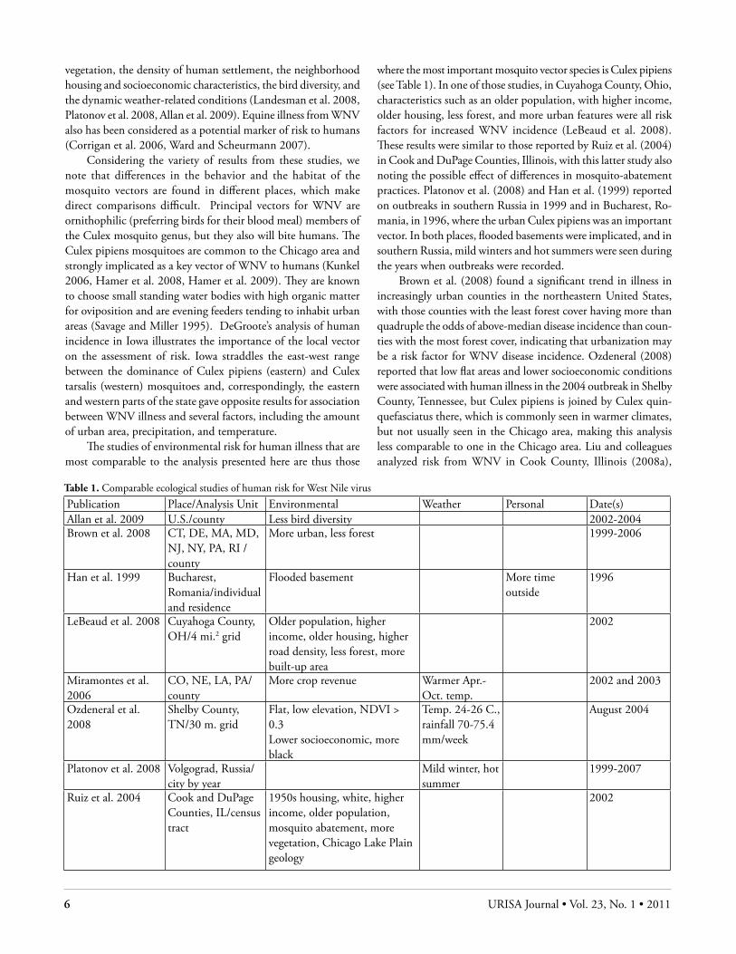
The studies of environmental risk for human illness that are most comparable to the analysis presented here are thus those
where the most important mosquito vector species is Culex pipiens (see Table 1). In one of those studies, in Cuyahoga County, Ohio, characteristics such as an older population, with higher income, older housing, less forest, and more urban features were all risk factors for increased WNV incidence (LeBeaud et al. 2008). These results were similar to those reported by Ruiz et al. (2004) in Cook and DuPage Counties, Illinois, with this latter study also noting the possible effect of differences in mosquito-abatement practices. Platonov et al. (2008) and Han et al. (1999) reported on outbreaks in southern Russia in 1999 and in Bucharest, Ro-mania, in 1996, where the urban Culex pipiens was an important vector. In both places, flooded basements were implicated, and in southern Russia, mild winters and hot summers were seen during the years when outbreaks were recorded.
Brown et al. (2008) found a significant trend in illness in increasingly urban counties in the northeastern United States, with those counties with the least forest cover having more than quadruple the odds of above-median disease incidence than coun-ties with the most forest cover, indicating that urbanization may be a risk factor for WNV disease incidence. Ozdeneral (2008) reported that low flat areas and lower socioeconomic conditions were associated with human illness in the 2004 outbreak in Shelby County, Tennessee, but Culex pipiens is joined by Culex quin-quefasciatus there, which is commonly seen in warmer climates, but not usually seen in the Chicago area, making this analysis less comparable to one in the Chicago area. Liu and colleagues analyzed risk from WNV in Cook County, Illinois (2008a),
Table 1. Comparable ecological studies of human risk for West Nile virus
Publication Place/Analysis Unit Environmental Weather Personal Date(s)Allan et al. 2009 U.S./county Less bird diversity 2002-2004Brown et al. 2008 CT, DE, MA, MD,
NJ, NY, PA, RI /county
More urban, less forest 1999-2006
Han et al. 1999 Bucharest, Romania/individual and residence
Flooded basement More time outside
1996
LeBeaud et al. 2008 Cuyahoga County, OH/4 mi.2 grid
Older population, higher income, older housing, higher road density, less forest, more built-up area
2002
Miramontes et al. 2006
CO, NE, LA, PA/county
More crop revenue Warmer Apr.-Oct. temp.
2002 and 2003
Ozdeneral et al. 2008
Shelby County, TN/30 m. grid
Flat, low elevation, NDVI > 0.3Lower socioeconomic, more black
Temp. 24-26 C., rainfall 70-75.4 mm/week
August 2004
Platonov et al. 2008 Volgograd, Russia/city by year
Mild winter, hot summer
1999-2007
Ruiz et al. 2004 Cook and DuPage Counties, IL/census tract
1950s housing, white, higher income, older population, mosquito abatement, more vegetation, Chicago Lake Plain geology
2002

URISA Journal • Messina, Brown, Amore, D. Kitron, O. Ruiz 7
and Indianapolis, Indiana (2008b), but the results are related to mosquito infection rather than focused on human illness. Infected mosquitoes are required for human illness but are not sufficient to account for outbreaks of illness. In a review of WNV ecological studies, LaDeau et al. (2008) explain that climatic factors such as precipitation play prominent roles in driving the spatiotemporal dynamics of WNV, and that land-use patterns and suburban sewer networks may be related to WNV vector and disease amplification. Temporally, infection occurs predominantly in the warmer months of the year, with transmission activity peaking from July through October (Hayes and Gubler 2006). Shaman et al. (2005) found specifically that the occurrence of WNV illness in humans in Florida was associated with drought two to six months prior for the years 2001 to 2003. While not dealing with the same climate or vector species as in Illinois, this work along with other evidence emphasizes the importance of changing weather patterns on the increased risk for infection (Ruiz et al. 2010). Kronenwetter-Koepel et al. (2005) mention that the presence of impervious surfaces also may be related to greater WNV risk, for these surfaces may have higher volumes of water flowing to them during rainfall and less green space for absorption, thus supporting mosquito habitat.
The Chicago region offers an opportunity to evaluate the potential drivers of WNV transmission to humans at a fine spatial scale. The research presented here draws on the study by Ruiz et al. (2004) that found that the human cases of illness in the 2002 WNV outbreak exhibited a nonrandom pattern in the Chicago area—specifically two large clusters and one smaller one. The pat-terns of illness and risk factors are investigated over subsequent years to determine if the same patterns were found in 2002 as in the next largest outbreak years of 2005 and 2006. These patterns are explored using a variety of statistical and spatial analytical methods. In this analysis, we also include the important factors of precipitation and mosquito infection, which were not available for earlier analyses.
MEtHodsGeographic Information Systems DatabaseA GIS database was compiled to include the locations of all cases of illness from WNV in Cook and DuPage Counties, Illinois, for the years 2002 to 2006, as well as potential risk factors for the two-county study area (see Figure 1).
Data came from a variety of sources and were aggregated into the two counties’ 1,479 census tracts as a common spatial unit that balances spatial detail and statistical stability of rates of illness. We used ArcGIS 9.2. (ESRI) for data processing.
Human Cases of Illness from WNV in ChicagoHuman WNV case data were obtained from the Illinois De-partment of Public Health for the years 2002 through 2006. Geocoding was performed from the addresses of the cases using StreetMap USA in ArcGIS 9.2 and Google Earth (to find un-matched addresses), with 95.7 percent of the addresses ultimately
matched. The data included both cases of West Nile fever and the more serious West Nile meningoencephalitis, but the sever-ity of illness was not available in this data set so all cases were considered together.
PotEntIal rIsk Factors: Environmental and Socioeconomic DataBased on a review of the literature and the past work in the area, human WNV infections tend to occur in census tracts with lower elevation ranges, greater amounts of vegetated surface, and lower overall land-cover diversity, and in areas having experienced lower April-August precipitation. Drier conditions may enhance contact between vectors and bird reservoirs in the small, wetter patches during dry times, favoring virus amplification between vectors and birds and thus indirectly influencing the transmission to humans. More infection was expected to occur in census tracts with more impervious surfaces, a greater percentage of post–World War II housing, and overall lower housing density. Greater amounts of post–World War II housing were expected to be found in areas with high incidence of human WNV, because of the characteristics of the storm water drainage system, which could support vector production. Culex mosquito larvae thrive in city storm drains and catch basins characteristic of post–World War II neighborhoods, especially in the organically rich water that forms during drought
Figure 1. Cook and DuPage Counties, Illinois, with physiographic regions and topography
8 URISA Journal • Vol. 23, No. 1 • 2011
(Spielman 1976). Lower population density was expected to be related to greater incidence of human WNV illness, for densely populated areas tend to contain less vegetated habitat for WNV reservoirs and vice versa. The socioeconomic variables of the percent of the population that is white, with a median household income and of median age were all expected to exhibit positive relationships with human WNV illness.
Physical environmental data obtained from the seamless data server of the U.S. Geological Survey (USGS) included digital elevation models and the National Land Cover Dataset, both from 2001. The range of elevation, percent of vegetated land cover, and overall land-cover diversity were summarized for all census tracts in the study area. Areas with slightly higher ranges in elevation compared to flatter areas may have fewer potential areas for the accumulation of the standing water necessary for Culex oviposition. Land-cover diversity was computed as the Shannon Diversity Index (Shannon and Weaver 1949), which measures diversity in categorical data based on the information entropy of the distribution. The index (H’) can be computed using the following formula:
where S is equal to the total number of land-cover classes and pi is equal to the proportion of cells of a particular land-cover class within each census tract to the total number of cells within the tract. Finally, precipitation levels from Cook, DuPage, and five surrounding counties’ weather stations were obtained from the USGS Water Resources Center for Illinois (http://waterdata.usgs.gov/il/nwis), the Illinois State Water Survey (http://www.sws.uiuc.edu/data/ccprecipnet), and the National Oceanic and Atmospheric Association (NOAA) National Climate Data Center (http://www.ncdc.noaa.gov). Monthly values were estimated from average weekly precipitation for the months of April through August calculated from those stations among the total stations for which data were available for all seven days of that week to provide weekly average precipitation estimates by gauge. These values then were interpolated using inverse distance weighting (IDW) interpolation and summarized by census tract.
The percentage of housing that was built between the years 1950 and 1959 (“post–World War II housing”) and the number of housing units per square kilometer were obtained from the U.S. Census Bureau (http://www.census.gov) for the year 2000. The percentage of land cover made up of impervious surfaces also was calculated for census tracts from the 2001 National Land Cover Dataset obtained from the USGS seamless data server.
Locations of traps and results of mosquito testing for WNV were provided by the Illinois Department of Public Health (IDPH) from the statewide surveillance database for the years 2004 to 2006. The number of pools of Culex mosquitoes tested each year within the counties of Cook and DuPage varied from 7,000 to more than 9,000. The mosquitoes were collected at 345, 354, and 397 different locations in 2004, 2005, and 2006, respectively. Trapping locations were geocoded from the trap ad-dress information when it was available. We used a combination
of geocoding methods, starting with ESRI StreetMapUSA and ESRI geocoding as described for human illness cases previously, with a 99 percent success rate.
The mosquito infection rate was calculated using a CDC Excel add-in (downloadable at http://www.cdc.gov/ncidod/dvbid/westnile/software.htm) that calculates the Maximum Likelihood estimate of the Minimum Infection Rate (MIR) using the fol-lowing formula:
Early (pre-August) and late (August to October) season rates, as well as rates for the entire year, were calculated for each year 2004 to 2006 and then interpolated using IDW and summarized by census tract. It was anticipated that overall higher rates of mosquito infection with WNV, and particularly in the later part of the year (during peak human infection months), would be associated with greater rates of human WNV infection.
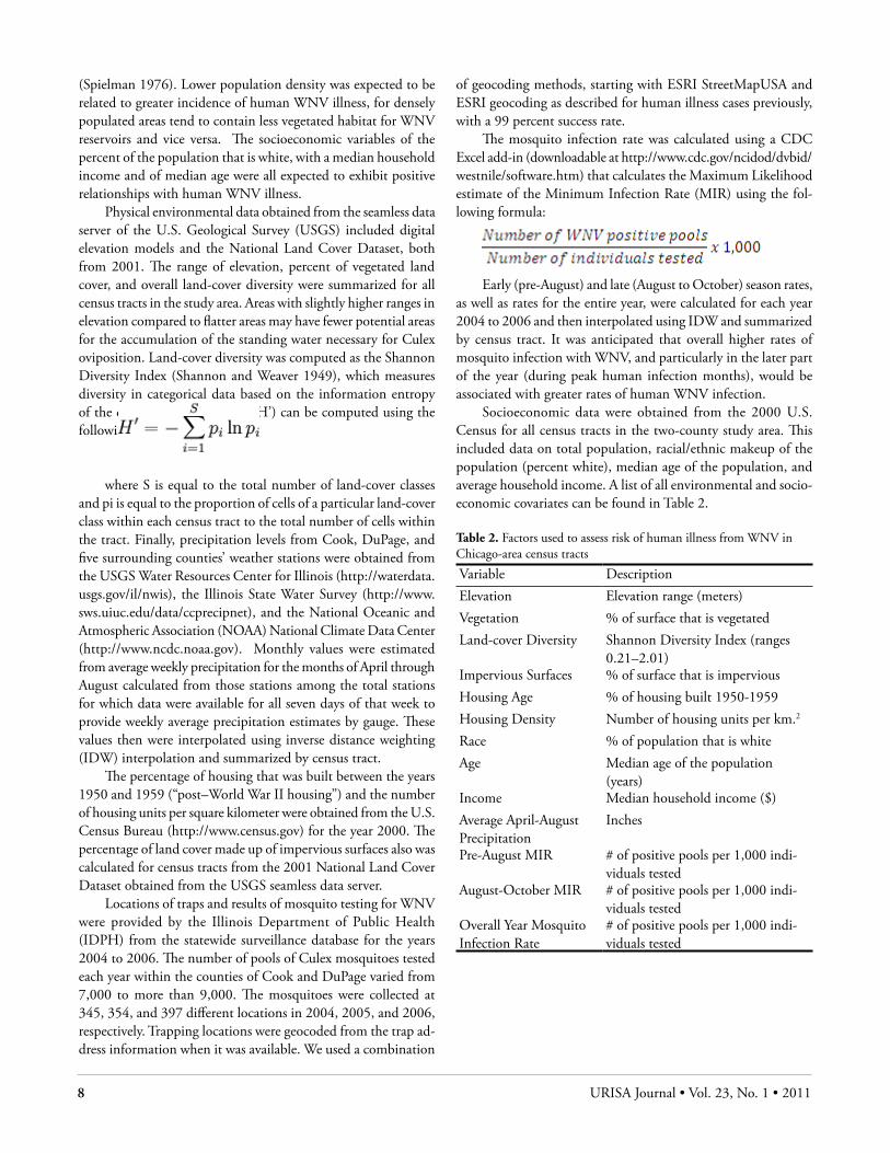
Socioeconomic data were obtained from the 2000 U.S. Census for all census tracts in the two-county study area. This included data on total population, racial/ethnic makeup of the population (percent white), median age of the population, and average household income. A list of all environmental and socio-economic covariates can be found in Table 2.
Table 2. Factors used to assess risk of human illness from WNV in Chicago-area census tracts
Variable DescriptionElevation Elevation range (meters)Vegetation % of surface that is vegetatedLand-cover Diversity Shannon Diversity Index (ranges
0.21–2.01)Impervious Surfaces % of surface that is imperviousHousing Age % of housing built 1950-1959Housing Density Number of housing units per km.2
Race % of population that is whiteAge Median age of the population
(years)Income Median household income ($)Average April-August Precipitation
Inches
Pre-August MIR # of positive pools per 1,000 indi-viduals tested
August-October MIR # of positive pools per 1,000 indi-viduals tested
Overall Year Mosquito Infection Rate
# of positive pools per 1,000 indi-viduals tested
URISA Journal • Messina, Brown, Amore, D. Kitron, O. Ruiz 9
sPatIal and statIstIcal analysIs MEtHodsSpatial and Space-Time Cluster Analysis of Human WNV Outbreaks Spatial patterns of human case data as well as age-adjusted incidence rates per 10,000 population were examined using global as well as local cluster-analysis methods. Global methods were employed first to determine if the observed overall spatial patterns of human WNV illness were significantly different from a random distribu-tion. For case point locations, Ripley’s K function (a second-order analysis) with a 30-kilometer maximum search distance was applied using the software Point Pattern Analysis v. 1.0b (Chen, Aldstadt, and Getis, San Diego, CA; Boots and Getis 1988). The observed distances and confidence interval were calculated in ten increments, or for every three kilometers. For the age-adjusted rates for tracts, we used the global Moran’s I test in GeoDa v. 0.9.5-i5 Beta, using a queen contiguity spatial weights matrix. Moran’s I provides a metric to determine if positive spatial autocorrelation of the rates (either high or low) occurs anywhere within the study area.
For local cluster detection, Kulldorff’s space-time permuta-tion scan was applied using SatScan v. 7.0.1 to individual case locations to determine the existence of any space-time clusters using days as the temporal unit of analysis. This method does not require any population-at-risk data (Kulldorff et al. 2005). It does, however, make minimal assumptions about the time, geographic location, and size of the outbreak, as well as adjusting for natural purely spatial and purely temporal variation. Local spatial clus-ters of age-adjusted rates by tract were measured with the local Moran’s I or Local Indicator of Spatial Autocorrelation (LISA) in GeoDa. The LISA statistic measures the association between the value of a particular area and the values for nearby or adjacent areas, with positive values indicating tracts with similar rates to those adjacent, and negative values indicating tracts with rates dissimilar to those adjacent (Anselin et al. 2006).
rIsk Factors: nEgatIVE BInoMIal rEgrEssIon and sPatIal dEPEndEncEMultivariate analysis was conducted to determine which factors may be attributable to the observed spatial patterns. Observations included the 1,479 census tracts within the two-county study area, and the dependent variable consisted of the counts of human cases of illness from WNV within each tract. The natural logarithm of the total population within each census tract also was included as an offset variable for the count data to be interpreted as a rate. Covariates included the four physical environmental variables, three built environmental variables, and three socioeconomic variables described previously, as well as the early- and late-season mosquito infection rates for all census tracts (shown in Table 2).
While count data such as the number of infections per given unit often follow a Poisson distribution (Marshall 1991), this distribution assumes that the mean is equal to the variance,
a condition that often is violated. When the variance is much larger than the mean, the distribution can be referred to as “extra-Poisson” (Breslow 1984). Values for the variance and mean of case counts within census tracts thus were compared for each year, 2002 to 2006, as well as for all years pooled, to determine for which models an extra-Poisson distribution was indicated to most accurately infer the effects of the parameters on disease outcome. A negative binomial distribution provides such a generalization of the Poisson distribution by adding an overdispersion parameter (K) to account for a variance that is greater than the mean:
var(Y) = μ + K*μ2,
where var(Y) is the variance in the measured count Y, μ is the mean of that count, and K is the overdispersion parameter.
Six generalized linear regression models (GLMs) were com-puted in SPSS 15.0 (SPSS, Inc.): one for each of the five outbreak years and one for all years pooled. Generalized linear regression is a generalization of ordinary least-squares regression that relates the distribution of the dependent variable to the linear predictor through a link function. The distribution function was determined by comparing the variances and means of the dependent variables (case counts by census tract). All six dependent variables followed either a Poisson or negative binomial distribution, so the logarith-mic link function was appropriate for all models. The distribution of all parameters (including the overdispersion parameter – k, for negative binomial models) was estimated using the maximum likeli-hood method. Akaike’s information criterion (AIC), a commonly used model evaluation statistic that favors parsimonious models by accounting for the number of estimated parameters, was used to determine which parameters to preserve in each model (Burnham and Anderson 2002). A lower AIC value indicates a “better” model and is calculated by the following formula:
AIC = 2k – 2[ln(L)],
where k is equal to the number of parameters and L is equal to the maximized value of the likelihood function for the estimated model. Multicollinearity was tested for by computing Pearson’s r correlations between parameters retained in the models and adjustments were made if necessary.
Because WNV is an infectious disease, the rate in one area is likely related to rates in surrounding areas, and regression models might be prone to skewed parameter estimation and spatially auto-correlated error terms. However, because generalized linear models that use a maximum likelihood estimate cannot naturally handle simultaneous dependence in a multivariate form, the employment of typical spatial lag and spatial error models used in ordinary least-squares regression and suggested by Anselin (2002) was not possible. Therefore, the counts themselves were not modeled as being directly spatially autocorrelated; rather, their correlation followed from the spatial structure of the random error effects. This approach followed the one used by Linard et al. (2007) and is discussed in further detail below.
10 URISA Journal • Vol. 23, No. 1 • 2011
Once parameters were chosen for the model using a nonspa-tial model and AIC, a preliminary regression model was performed using the number of human WNV infections in surrounding census tracts as the dependent variable. Independent variables in this preliminary model included all variables from the nonspatial model, as well as a second set computed for the surrounding census tracts. This model resulted in the computation of a linear predictor output variable ŶEj in each census tract, which then was added as a potential explanatory parameter in the original regression model using case counts in each census tract as the dependent variable. Endogenous spatial dependence, therefore, is accounted for in the final regression model:
log(Yi) = α + β1xi1 + β2xi2 + ... + βnxin + λŶEj + σεi,
where Yi is the expected value of the dependent variable for the census tract i, xin are the independent variables, βn are their associated regression coefficients, ŶEj is the linear prediction of the dependent variable in neighboring census tracts, and σεi is the error term.
A global Moran’s I test was performed on the raw residuals of each of the six original nonspatial models to determine if such
a two-stage spatial model should be employed (when Moran’s I was significantly positive at p < 0.01). AIC values of the nonspa-tial and spatial models then were compared to determine if the spatial dependence variable improved the model. The predicted number of human WNV infections per census tract for each year was saved to create and compare risk maps for the larger outbreak years (2002, 2005, and 2006), as well as for all years pooled, in ArcGIS 9.2.
rEsults and dIscussIonCluster Patterns of 2002 to 2006 WNV OutbreaksFrom 2002 to 2006, the largest outbreak of WNV in Cook and DuPage Counties occurred in 2002, with 686 human cases of illness from WNV, followed by 2005 with 172 human cases of illness, and 2006 with 127 cases. For the years 2003 and 2004, the region experienced minor outbreaks, with 23 and 27 cases, respectively. Of the total 1,004 cases from all years, 55 percent were female and 78 percent were Caucasian, with an average age of 57 years. In each year, 2 to 26 percent of all census tracts reported cases of human WNV infection, with a total of 36 per-cent of census tracts having experienced human WNV infection at some point during the five-year study period.
The Ripley’s K test showed global spatial clustering of indi-vidual case locations in 2002, 2005, and 2006 across all distances up to 30 kilometers. No significant global clustering of individual case locations was indicated for 2003 or 2004. Results for the global Moran’s I statistic (see Appendix Table A1) show global spatial clustering of age-adjusted rates for census tracts in 2002 and 2005, as well as of the rates for all years combined. Significant global clustering of age-adjusted rates did not occur in 2003, 2004, or 2006.
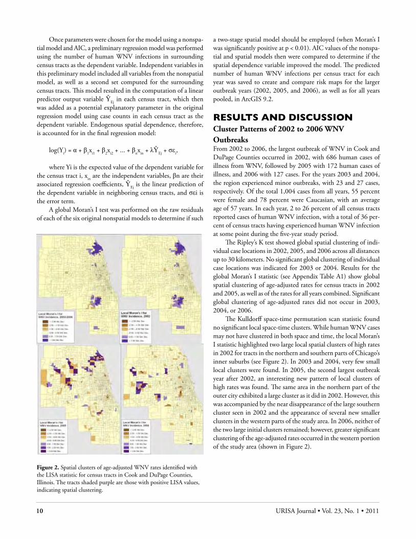
The Kulldorff space-time permutation scan statistic found no significant local space-time clusters. While human WNV cases may not have clustered in both space and time, the local Moran’s I statistic highlighted two large local spatial clusters of high rates in 2002 for tracts in the northern and southern parts of Chicago’s inner suburbs (see Figure 2). In 2003 and 2004, very few small local clusters were found. In 2005, the second largest outbreak year after 2002, an interesting new pattern of local clusters of high rates was found. The same area in the northern part of the outer city exhibited a large cluster as it did in 2002. However, this was accompanied by the near disappearance of the large southern cluster seen in 2002 and the appearance of several new smaller clusters in the western parts of the study area. In 2006, neither of the two large initial clusters remained; however, greater significant clustering of the age-adjusted rates occurred in the western portion of the study area (shown in Figure 2).
Figure 2. Spatial clusters of age-adjusted WNV rates identified with the LISA statistic for census tracts in Cook and DuPage Counties, Illinois. The tracts shaded purple are those with positive LISA values, indicating spatial clustering.
URISA Journal • Messina, Brown, Amore, D. Kitron, O. Ruiz 11
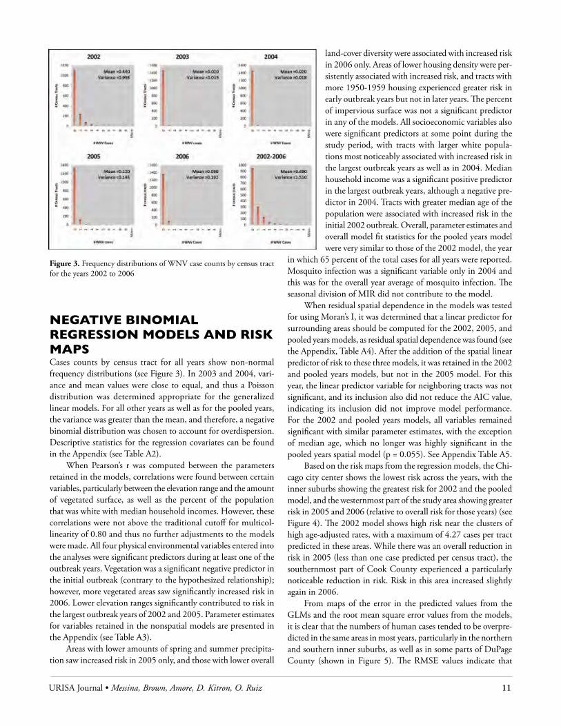
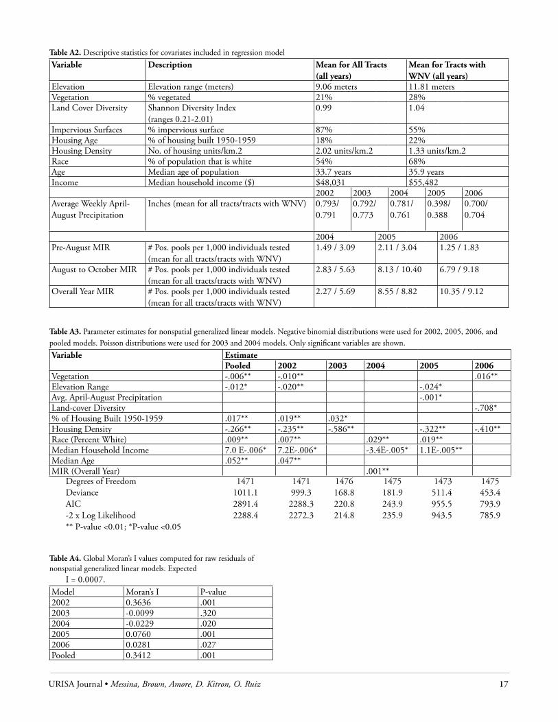
nEgatIVE BInoMIal rEgrEssIon ModEls and rIsk MaPsCases counts by census tract for all years show non-normal frequency distributions (see Figure 3). In 2003 and 2004, vari-ance and mean values were close to equal, and thus a Poisson distribution was determined appropriate for the generalized linear models. For all other years as well as for the pooled years, the variance was greater than the mean, and therefore, a negative binomial distribution was chosen to account for overdispersion. Descriptive statistics for the regression covariates can be found in the Appendix (see Table A2).
When Pearson’s r was computed between the parameters retained in the models, correlations were found between certain variables, particularly between the elevation range and the amount of vegetated surface, as well as the percent of the population that was white with median household incomes. However, these correlations were not above the traditional cutoff for multicol-linearity of 0.80 and thus no further adjustments to the models were made. All four physical environmental variables entered into the analyses were significant predictors during at least one of the outbreak years. Vegetation was a significant negative predictor in the initial outbreak (contrary to the hypothesized relationship); however, more vegetated areas saw significantly increased risk in 2006. Lower elevation ranges significantly contributed to risk in the largest outbreak years of 2002 and 2005. Parameter estimates for variables retained in the nonspatial models are presented in the Appendix (see Table A3).
Areas with lower amounts of spring and summer precipita-tion saw increased risk in 2005 only, and those with lower overall
land-cover diversity were associated with increased risk in 2006 only. Areas of lower housing density were per-sistently associated with increased risk, and tracts with more 1950-1959 housing experienced greater risk in early outbreak years but not in later years. The percent of impervious surface was not a significant predictor in any of the models. All socioeconomic variables also were significant predictors at some point during the study period, with tracts with larger white popula-tions most noticeably associated with increased risk in the largest outbreak years as well as in 2004. Median household income was a significant positive predictor in the largest outbreak years, although a negative pre-dictor in 2004. Tracts with greater median age of the population were associated with increased risk in the initial 2002 outbreak. Overall, parameter estimates and overall model fit statistics for the pooled years model were very similar to those of the 2002 model, the year
in which 65 percent of the total cases for all years were reported. Mosquito infection was a significant variable only in 2004 and this was for the overall year average of mosquito infection. The seasonal division of MIR did not contribute to the model.
When residual spatial dependence in the models was tested for using Moran’s I, it was determined that a linear predictor for surrounding areas should be computed for the 2002, 2005, and pooled years models, as residual spatial dependence was found (see the Appendix, Table A4). After the addition of the spatial linear predictor of risk to these three models, it was retained in the 2002 and pooled years models, but not in the 2005 model. For this year, the linear predictor variable for neighboring tracts was not significant, and its inclusion also did not reduce the AIC value, indicating its inclusion did not improve model performance. For the 2002 and pooled years models, all variables remained significant with similar parameter estimates, with the exception of median age, which no longer was highly significant in the pooled years spatial model (p = 0.055). See Appendix Table A5.
Based on the risk maps from the regression models, the Chi-cago city center shows the lowest risk across the years, with the inner suburbs showing the greatest risk for 2002 and the pooled model, and the westernmost part of the study area showing greater risk in 2005 and 2006 (relative to overall risk for those years) (see Figure 4). The 2002 model shows high risk near the clusters of high age-adjusted rates, with a maximum of 4.27 cases per tract predicted in these areas. While there was an overall reduction in risk in 2005 (less than one case predicted per census tract), the southernmost part of Cook County experienced a particularly noticeable reduction in risk. Risk in this area increased slightly again in 2006.
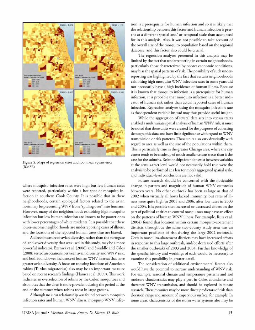
From maps of the error in the predicted values from the GLMs and the root mean square error values from the models, it is clear that the numbers of human cases tended to be overpre-dicted in the same areas in most years, particularly in the northern and southern inner suburbs, as well as in some parts of DuPage County (shown in Figure 5). The RMSE values indicate that
Figure 3. Frequency distributions of WNV case counts by census tract for the years 2002 to 2006

12 URISA Journal • Vol. 23, No. 1 • 2011
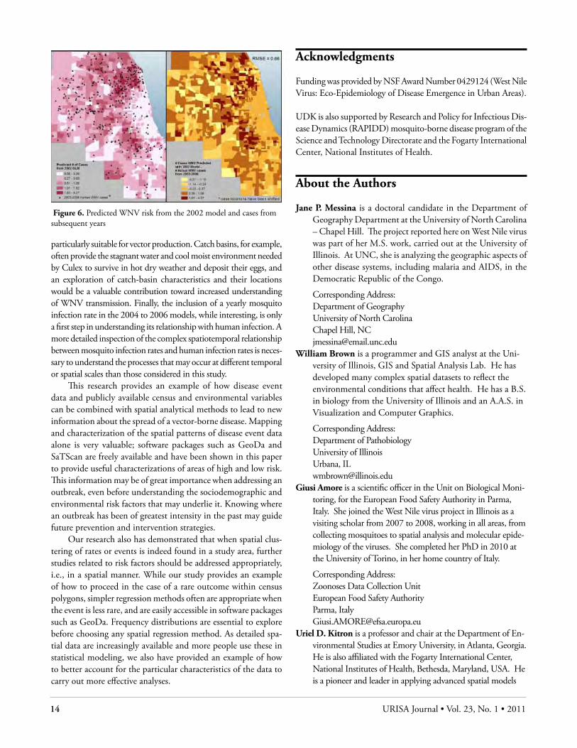
the 2002 to 2006 pooled model did the best job of predicting the numbers of human cases in each tract, followed by the 2002 model. Based on a comparison of the number of cases predicted from 2002 and the actual numbers seen in later years, it can be seen that the model based on the large 2002 outbreak did a fairly good job of predicting the locations of later cases of illness, with about 64 percent of the cases from 2003 to 2006 located in areas predicted to have one or more cases of human WNV illness by the 2002 model (see Figure 6). The relatively low RMSE value of 0.66 indicates that on average, the prediction in the number of cases from the 2002 model was off by less than one count per census tract for later years, although the difference between the two counts ranged from -4.51 to 4.27.
dIscussIonThe model based on the largest outbreak year of 2002 did a fairly good job of predicting the locations of later cases of illness, with few cases from 2003 to 2006 located in areas predicted to have low risk in the 2002 model and a relatively low RMSE when case counts from the later years were subtracted from the predicted counts from the 2002 model. Comparing all six regression models revealed that while risk for human WNV infection has persisted in predominantly white and less densely populated areas since 2002, a different combination of factors was found to be signifi-
cant in each of the subsequent outbreak years. Areas with more post–World War II housing and a higher median population age experienced greater risk in the first two outbreak years, and drier, less diverse areas experienced greater risk in later years. Neighbor-hoods with lower elevation ranges were at increased risk in the largest outbreak years of 2002 and 2005, signifying that while overall elevation range for the two-county study area is small (a total difference of only 270 meters), census tracts that are relatively flatter than others may have more places for the accumulation of standing water needed for Culex breeding. This may have been more important in the very dry year of 2005. The amount of impervious surface in an area is not an important predictor of risk for human WNV illness in the Chicago area when measured at this scale.
The relationships between WNV risk and vegetation and median household income are not clear. While a negative rela-tionship existed between vegetation and human WNV risk in the original 2002 outbreak, more vegetated areas saw greater risk in the 2006 outbreak. This is complicated by the extreme difference in vegetation in large parts of downtown Chicago and the outer suburban areas and those neighborhoods near forest preserves. It is possible that a different study design by which only areas with some minimum amount of vegetation are included would offer a better understanding of this relationship. Increased risk occurred in wealthier neighborhoods in the large outbreak years but in poorer neighborhoods in 2004. However, because 2004 was an extremely small outbreak year, more attention should be given to the significant positive relationship between median income and WNV risk that existed in 2002 and 2005.
More vegetation means increased habitats for WNV bird reservoir hosts, with urban green areas having the necessary tree cover to support bird populations and contact between migratory and residential bird species, which has been found to be impor-tant in WNV amplification (Peterson et al. 2003, Rappole et al. 2003). Lower overall land-cover diversity may indicate greater concentration of bird species that are efficient hosts for the virus, and thus the potential for higher incidence of WNV in humans. While race and income are not considered to have a direct effect on WNV transmission, higher-income whites may be more likely to live in more vegetated areas (Ruiz, unpublished data), which could indirectly explain this relationship. Reporting bias of cases of illness may result in underreporting of cases in lower income areas. Having more vegetation in one’s backyard could increase the abundance of WNV bird reservoirs. Greater median age in a census tract was hypothesized to be associated with increased incidence of human WNV illness. Older people are known to be more susceptible to infection with the virus and more often have more severe forms of illness. The more obvious manifestation of symptoms may receive more medical scrutiny, which would likely increase the number of infections that actually are reported.
Finally, higher rates of mosquito WNV infection were as-sociated with increased risk for human infection in 2004 only. This was not expected, for we know that mosquitoes must be infected for humans to be infected. Neighborhoods were found
Figure 4. Risk maps for human WNV infection derived from generalized linear model outputs
URISA Journal • Messina, Brown, Amore, D. Kitron, O. Ruiz 13
where mosquito infection rates were high but few human cases were reported, particularly within a hot spot of mosquito in-fection in southern Cook County. It is possible that in these neighborhoods, certain ecological factors related to the avian hosts may be preventing WNV from “spilling over” into humans. However, many of the neighborhoods exhibiting high mosquito infection but low human infection are known to be poorer ones with lower percentages of white residents. It is possible that these lower-income neighborhoods are underreporting cases of illness, and the locations of the reported human cases thus are biased.
A direct measure of avian diversity, rather than the surrogate of land-cover diversity that was used in this study, may be a more powerful indicator. Ezenwa et al. (2006) and Swaddle and Calos (2008) tested associations between avian diversity and WNV risk, and both found lower incidence of human WNV in areas that have greater avian diversity. A focus on roosting locations of American robins (Turdus migratorius) also may be an important measure based on recent research findings (Hamer et al. 2009). This work indicates an overselection of robins by the Culex mosquitoes and also notes that the virus is more prevalent during the period at the end of the summer when robins roost in large groups.
Although no clear relationship was found between mosquito infection rates and human WNV illness, mosquito WNV infec-
tion is a prerequisite for human infection and so it is likely that the relationship between this factor and human infection is pres-ent at a different spatial and/ or temporal scale than accounted for in this analysis. Also, it was not possible to take account of the overall size of the mosquito population based on the regional database, and this factor also could be crucial.
The regression analyses presented in this analysis may be limited by the fact that underreporting in certain neighborhoods, particularly those characterized by poorer economic conditions, may bias the spatial patterns of risk. The possibility of such under-reporting was highlighted by the fact that certain neighborhoods exhibiting high mosquito WNV infection rates in some years did not necessarily have a high incidence of human illness. Because it is known that mosquito infection is a prerequisite for human infection, it is probable that mosquito infection is a better indi-cator of human risk rather than actual reported cases of human infection. Regression analyses using the mosquito infection rate as the dependent variable instead may thus provide useful insight.
While the aggregation of several data sets into census tracts enabled a multivariate spatial analysis of human WNV risk, it must be noted that these units were created for the purposes of collecting demographic data and have little significance with regard to WNV transmission or risk patterns. These units also vary drastically with regard to area as well as the size of the populations within them. This is particularly true in the greater Chicago area, where the city center tends to be made up of much smaller census tracts than is the case for the suburbs. Relationships found to exist between variables at the census-tract level would not necessarily hold true were the analysis to be performed at a less (or more) aggregated spatial scale, and individual-level conclusions are not valid.
Future research should be concerned with the noticeable change in pattern and magnitude of human WNV outbreaks between years. No other outbreak has been as large as that of 2002 when virtually all hosts lacked immunity, but rates of ill-ness were quite high in 2005 and 2006, after low rates in 2003 and 2004. It is possible that increased or decreased efforts on the part of political entities to control mosquitoes may have an effect on the patterns of human WNV illness. For example, Ruiz et al. (2004) found that location within certain mosquito-abatement districts throughout the same two-county study area was an important predictor of risk during the large 2002 outbreak. Certain mosquito-abatement districts may have increased efforts in response to this large outbreak, and/or decreased efforts after the smaller outbreaks of 2003 and 2004. Further knowledge of the specific history and workings of each would be necessary to examine this possibility in greater detail.
The consideration of additional environmental factors also would have the potential to increase understanding of WNV risk. For example, seasonal climate and temperature patterns and soil moisture characteristics may play a part in Culex abundance and therefore WNV transmission, and should be explored in future research. These measures may be more direct predictors of risk than elevation range and amount of impervious surface, for example. In some areas, characteristics of the storm water systems also may be
Figure 5. Maps of regression error and root mean square error (RMSE)
14 URISA Journal • Vol. 23, No. 1 • 2011
particularly suitable for vector production. Catch basins, for example, often provide the stagnant water and cool moist environment needed by Culex to survive in hot dry weather and deposit their eggs, and an exploration of catch-basin characteristics and their locations would be a valuable contribution toward increased understanding of WNV transmission. Finally, the inclusion of a yearly mosquito infection rate in the 2004 to 2006 models, while interesting, is only a first step in understanding its relationship with human infection. A more detailed inspection of the complex spatiotemporal relationship between mosquito infection rates and human infection rates is neces-sary to understand the processes that may occur at different temporal or spatial scales than those considered in this study.
This research provides an example of how disease event data and publicly available census and environmental variables can be combined with spatial analytical methods to lead to new information about the spread of a vector-borne disease. Mapping and characterization of the spatial patterns of disease event data alone is very valuable; software packages such as GeoDa and SaTScan are freely available and have been shown in this paper to provide useful characterizations of areas of high and low risk. This information may be of great importance when addressing an outbreak, even before understanding the sociodemographic and environmental risk factors that may underlie it. Knowing where an outbreak has been of greatest intensity in the past may guide future prevention and intervention strategies.
Our research also has demonstrated that when spatial clus-tering of rates or events is indeed found in a study area, further studies related to risk factors should be addressed appropriately, i.e., in a spatial manner. While our study provides an example of how to proceed in the case of a rare outcome within census polygons, simpler regression methods often are appropriate when the event is less rare, and are easily accessible in software packages such as GeoDa. Frequency distributions are essential to explore before choosing any spatial regression method. As detailed spa-tial data are increasingly available and more people use these in statistical modeling, we also have provided an example of how to better account for the particular characteristics of the data to carry out more effective analyses.
Acknowledgments
Funding was provided by NSF Award Number 0429124 (West Nile Virus: Eco-Epidemiology of Disease Emergence in Urban Areas).
UDK is also supported by Research and Policy for Infectious Dis-ease Dynamics (RAPIDD) mosquito-borne disease program of theScience and Technology Directorate and the Fogarty International Center, National Institutes of Health.
About the Authors
Jane P. Messina is a doctoral candidate in the Department of Geography Department at the University of North Carolina – Chapel Hill. The project reported here on West Nile virus was part of her M.S. work, carried out at the University of Illinois. At UNC, she is analyzing the geographic aspects of other disease systems, including malaria and AIDS, in the Democratic Republic of the Congo.
Corresponding Address: Department of Geography University of North Carolina Chapel Hill, NC [email protected]
William Brown is a programmer and GIS analyst at the Uni-versity of Illinois, GIS and Spatial Analysis Lab. He has developed many complex spatial datasets to reflect the environmental conditions that affect health. He has a B.S. in biology from the University of Illinois and an A.A.S. in Visualization and Computer Graphics.
Corresponding Address: Department of Pathobiology University of Illinois Urbana, IL [email protected]
Giusi Amore is a scientific officer in the Unit on Biological Moni-toring, for the European Food Safety Authority in Parma, Italy. She joined the West Nile virus project in Illinois as a visiting scholar from 2007 to 2008, working in all areas, from collecting mosquitoes to spatial analysis and molecular epide-miology of the viruses. She completed her PhD in 2010 at the University of Torino, in her home country of Italy.
Corresponding Address: Zoonoses Data Collection Unit European Food Safety Authority Parma, Italy [email protected]
Uriel D. Kitron is a professor and chair at the Department of En-vironmental Studies at Emory University, in Atlanta, Georgia. He is also affiliated with the Fogarty International Center, National Institutes of Health, Bethesda, Maryland, USA. He is a pioneer and leader in applying advanced spatial models
Figure 6. Predicted WNV risk from the 2002 model and cases from subsequent years

URISA Journal • Messina, Brown, Amore, D. Kitron, O. Ruiz 15
to the eco-epidemiology of vector-borne diseases. Besides West Nile virus, he has studied the spatial dynamics of disease transmission of Chagas disease in Argentina, malaria and schistosomiasis in Kenya and dengue in Peru and Australia.
Corresponding Address: Department of Environmental Studies Emory University Atlanta, GA [email protected]
Marilyn O. Ruizis an associate clinical professor in the Depart-ment of Pathobiology at the University of Illinois College of Veterinary Medicine, where she also directs the GIS and Spatial Analysis Laboratory. Her teaching and research fo-cus on the spatial aspects of health. She has been involved with URISA since 1995 and helped plan and organize URISAs GIS in Public Health conference, of which she was conference co-chair in 2007 and chair in 2009.
Corresponding Address: Department of Pathobiology University of Illinois Urbana, IL [email protected]
References
Anselin, L. 2002. Under the hood: Issues in the specification and interpretation of spatial regression models. Agricultural Economics 27(3): 247-67.
Anselin, L., I. Syabri, and Y. Kho. 2006. GeoDa: An introduction to spatial data analysis. Geographical Analysis 38(1): 5-18.
Boots, B. N., and A. Getis. 1988. Point pattern analysis. In Sage University Paper series on Quantitative Applications in the Social Sciences Series No. 07-001. Beverly Hills, CA: Sage Publications.
Breslow, N. E. 1984. Extra-poisson variation in log-linear models. Applied Statistics 33(1): 38-44.
Brown, H. E., J. E. Childs, M. A. Diuk-Wasser, and D. Fish. 2008. Ecological factors associated
with West Nile virus transmission, Northeastern United States. Emerging Infectious Diseases 14(10): 1,540-45.
Burnham, K. P., and D. R. Anderson. 2002. Model selection and multimodel inference: A practical information-theoretic ap-proach. New York: Springer Publishing.
Centers for Disease Control and Prevention. West Nile virus statistics, surveillance, and control, May, 2009, http://www.cdc.gov/ncidod/dvbid/westnile/surv&control.htm.
Diuk-Wasser, M. A., H. E. Brown, T. G. Andreadis, and D. Fish. 2006. Modeling the spatial distribution of mosquito vectors for West Nile virus in Connecticut, USA. Vector-Borne and Zoonotic Diseases 6(3): 283-95.
Dobson, A., I. Cattadori, R. D. Holt, R. S. Ostfeld, F. Keesing, K. Krichbaum, J. R. Rohr,
S. E. Perkins, and P. J. Hudson. 2006. Sacred cows and sympa-thetic squirrels: The importance of biological diversity to human health. PLoS Medicine 3(6): e231.
Elizondo-Quiroga, D., C. T. Davis, I. Fernandez-Salas, R. Escobar-Lopez, D. Velasco Olmos, L. C. S. Gastalum, et al. West Nile virus isolation in human and mosquitoes, Mexico. Emerging Infectious Diseases Journal [serial on the Internet], September, 2005 [August 23, 2009], http://www.cdc.gov/ncidod/EID/vol11no09/05-0121.htm.
Ezenwa, V. O., M. S. Godsey, R. J. King, S. C. Guptill. 2006. Avian diversity and West Nile virus: Testing associations between biodiversity and infectious disease risk. Proceedings Biological Sciences 273(1,582): 109-17.
Hamer, G. L., E. D. Walker, J. D. Brawn, S. R. Loss, M. O. Ruiz, T. L. Goldberg, A. M.
Schotthoefer, W. M. Brown, E. R. Wheeler, and U. D. Kitron. 2008. Rapid amplification of West Nile virus: The role of hatch year birds. Vector-borne and Zoonotic Diseases 8(1): 57-68.
Hamer, G. L., U. D. Kitron, T. L. Goldberg, J. D. Brawn, S. R. Loss, M. O. Ruiz, D. B. Hayes, and E. D. Walker. Host selection by Culex pipiens and West Nile virus amplification. (In press. 2009 American Journal of Tropical Medicine and Hygiene).
Hayes, E. B., and D. Gubler. 2006. West Nile virus: Epidemiology and clinical features of an emerging epidemic in the United States. Annual Review of Medicine 57: 181-94.
Illinois State Water Survey. Water and Atmospheric Resources Monitoring Program weather data, March, 2008, http://www.sws.uiuc.edu/warm/weatherdata.asp.
Johnson, G. D., M. Edison, K. Schmit, A. Elis, and M. Kulldorf. 2005. Geographic prediction of human onset of West Nile virus using dead crow clusters: An evaluation of year 2002 data in New York state. Practice in Epidemiology 163(2): 171-80.
Komar, N. 2003. West Nile virus: Epidemiology and ecology in North America. Advances in Virus Research 61: 185-234.
Kronenwetter-Koepel, T. A., J. K. Meece, C. A. Miller, and K. D. Reed. 2005. Surveillance of above- and below-ground mos-quito breeding habitats in a rural midwestern community: Baseline data for larvicidal control measures against West Nile virus vectors. Clinical Medicine and Research 3(1): 3-12.
Kulldorff, M., R. Heffernan, J. Hartman, R. Assuncao, and F. Mostashari. 2005. A space-time permutation scan statistic for disease outbreak detection. PLoS Medicine 2(3): e59.
La Deau, S. L., P. P. Marra, A. M. Kilpatrick, and C. A. Calder. 2008. West Nile virus revisited: Consequences for North American ecology. BioScience 58(10): 937-46.
Linard, C., P. Lamarque, P. Heyman, G. Ducoffre, V. Luyasu, K. Tersago, S. O. Vanwambeke, and F. Lambin. 2007. De-terminants of the geographic distribution of Puumala virus and Lyme borreliosis infections in Belgium. International Journal of Health Geographics 6(15).

16 URISA Journal • Vol. 23, No. 1 • 2011
Marshall, R. J. 1991. A review of methods for the statistical analysis of spatial patterns of disease. Journal of the Royal Statistical Society 154(3): 421-41.
Meyer, T. E., L. M. Bull, K. C. Holmes, R. F. Pascua, A. T. da Rosa, C. R. Gutierrez, T. Corbin, J. L. Woodward, J. P. Taylor, R. B. Tesh, and K. O. Murray. 2007. West Nile virus infection among the homeless, Houston, Texas. Emerging Infectious Diseases 13(10): 1,500-3.
National Oceanic and Atmospheric Association. National Cli-matic Data Center, March, 2008, http://www.ncdc.noaa.gov/oa/ncdc.html.
Nielsen, C. F., and W. K. Reisen. 2007. West Nile virus-infected dead corvids increase the risk of infection in Culex mosqui-toes (diptera: culicidae) in domestic landscapes. Journal of Medical Entomology 44(6): 1,067-73.
Nielsen, C. F., M. V. Armijos, S. Wheeler, T. E. Carpenter, W. M. Boyce, K. Kelley, D. Brown, T. W. Scott, and W. K. Reisen. 2008. Risk factors associated with human infection during the 2006 West Nile virus outbreak in Davis, a residential community in northern California. American Journal of Tropical Medical Hygiene 78(1): 53-62.
O’Leary, D. R., A. A. Marfin, and S. P. Montgomery. 2004. The epidemic of West Nile virus in the United States, 2002. Vector Borne Zoonotic Diseases 4:61-70.
Openshaw, S. 1984. The modifiable areal unit problem: Concepts and techniques in modern geography. Norwich, England: Geo Books.
Petersen, L. R., and E. B. Hayes. 2004. Westward ho? The spread of West Nile virus. New England Journal of Medicine 351: 2,257-59.
Peterson A. T., D. A. Vieglais, and J. K. Andreasen. 2003. Migra-tory birds modeled as critical transport agents for West Nile virus in North America. Vector Borne Zoonotic Diseases 3:27-37.
Public Health Agency of Canada. 2009. West Nile virus national surveillance reports, August 25, 2009, http://www.phac-aspc.gc.ca/wnv-vwn.
Rappole, J. H., and Z. Hubalek. 2003. Migratory birds and West Nile virus. Journal of Applied Microbiology 94 Suppl: 47S-58S.
Ruiz, M. O., C. Tedesco, T. McTighe, C. Austin, and U. D. Kitron. 2004. Environmental and social determinants of human risk during a West Nile virus outbreak in the greater Chicago area, 2002. International Journal of Health Geo-graphics 3: 8-18.
Ruiz, M. O., E. D. Walker, E. S. Foster, L. D. Haramis, and U. D. Kitron. 2007. Association of West Nile virus illness and urban landscapes in Chicago and Detroit. International Journal of Health Geographics 6(10).
Ruiz, M .O., L. F. Chaves, G. L. Hamer, T. Sun, W. M. Brown, E. D. Walker, L. Haramis, T. L. Goldberg, and U. D. Kitron. 2010. Local impact of temperature and precipitation on West Nile virus infection in Culex species mosquitoes in northeast Illinois, USA. Parasites and Vectors 3(19).
Shaman, J., J. F. Day, and M. Stieglitz. 2005. Drought-induced amplification and epidemic transmission of West Nile virus in southern Florida. Journal of Medical Entomology 42(2): 134-41.
Shannon, C. E., and W. Weaver. 1949. The mathematical theory of information. Urbana, IL: University of Illinois Press.
Spielman A. 1967. Population structure in the Culex pipiens complex of mosquitoes. Bulletin of the WHO 37: 271-76.
Swaddle, J. P., and S. E. Calos. 2008. Increased avian diversity is associated with lower incidence of human West Nile infection: Observation of the dilution effect. PLoS One 3(6): e2488.
Tachiiri, K., B. Klinkenberg, S. Mak, and J. Kazmi. 2006. Pre-dicting outbreaks: A spatial risk assessment of West Nile virus in British Columbia. International Journal of Health Geographics 5(21).
U.S. Geological Survey. Illinois Water Science Center Data, March, 2008, http://il.water.usgs.gov/data/index.html.
U.S. Geological Survey. National Map Seamless Server, March, 2008, http://seamless.usgs.gov.
Yiannakoulias, N. W., D. P. Schopflocher, and L. W. Svenson. 2006. Modelling geographic variations in West Nile virus. Canadian Journal of Public Health 97(5): 374-78.
Zeller, H. G., and I. Schuffenecker. 2004. West Nile virus: An overview of its spread in Europe and the Mediterranean basin in contrast to its spread in the Americas. European Journal of Clinical Microbiological Infectious Diseases 23: 147-56.
Zou, L., S. N. Miller, and E. T. Schmidtmann. 2006. Mosquito larval habitat mapping using remote sensing and GIS: Im-plications of coalbed methane development and West Nile virus. Journal of Medical Entomology 43(5): 1,034-41.
URISA Journal • Messina, Brown, Amore, D. Kitron, O. Ruiz 17
Table A2. Descriptive statistics for covariates included in regression model
Variable Description Mean for All Tracts(all years)
Mean for Tracts with WNV (all years)
Elevation Elevation range (meters) 9.06 meters 11.81 metersVegetation % vegetated 21% 28%Land Cover Diversity Shannon Diversity Index
(ranges 0.21-2.01)0.99 1.04
Impervious Surfaces % impervious surface 87% 55%Housing Age % of housing built 1950-1959 18% 22%Housing Density No. of housing units/km.2 2.02 units/km.2 1.33 units/km.2Race % of population that is white 54% 68%Age Median age of population 33.7 years 35.9 yearsIncome Median household income ($) $48,031 $55,482
2002 2003 2004 2005 2006 Average Weekly April-August Precipitation
Inches (mean for all tracts/tracts with WNV) 0.793/ 0.791
0.792/ 0.773
0.781/ 0.761
0.398/ 0.388
0.700/ 0.704
2004 2005 2006Pre-August MIR # Pos. pools per 1,000 individuals tested
(mean for all tracts/tracts with WNV)1.49 / 3.09 2.11 / 3.04 1.25 / 1.83
August to October MIR # Pos. pools per 1,000 individuals tested (mean for all tracts/tracts with WNV)
2.83 / 5.63 8.13 / 10.40 6.79 / 9.18
Overall Year MIR # Pos. pools per 1,000 individuals tested (mean for all tracts/tracts with WNV)
2.27 / 5.69 8.55 / 8.82 10.35 / 9.12
Table A3. Parameter estimates for nonspatial generalized linear models. Negative binomial distributions were used for 2002, 2005, 2006, and pooled models. Poisson distributions were used for 2003 and 2004 models. Only significant variables are shown.
Variable EstimatePooled 2002 2003 2004 2005 2006
Vegetation -.006** -.010** .016**Elevation Range -.012* -.020** -.024*Avg. April-August Precipitation -.001*Land-cover Diversity -.708*% of Housing Built 1950-1959 .017** .019** .032*Housing Density -.266** -.235** -.586** -.322** -.410**Race (Percent White) .009** .007** .029** .019**Median Household Income 7.0 E-.006* 7.2E-.006* -3.4E-.005* 1.1E-.005**Median Age .052** .047**MIR (Overall Year) .001**
Degrees of Freedom 1471 1471 1476 1475 1473 1475Deviance 1011.1 999.3 168.8 181.9 511.4 453.4AIC 2891.4 2288.3 220.8 243.9 955.5 793.9-2 x Log Likelihood 2288.4 2272.3 214.8 235.9 943.5 785.9** P-value <0.01; *P-value <0.05
Table A4. Global Moran’s I values computed for raw residuals of nonspatial generalized linear models. Expected
I = 0.0007.Model Moran’s I P-value2002 0.3636 .0012003 -0.0099 .3202004 -0.0229 .0202005 0.0760 .0012006 0.0281 .027Pooled 0.3412 .001

18 URISA Journal • Vol. 23, No. 1 • 2011
Appendix: Results
Table A1. Global Moran’s I values computed for age-adjusted rates of human WNV illness in census tracts, 2002 to 2006. Expected I = 0.0007
Year I Sig.2002 0.2611 0.0012003 0.0072 0.2372004 0.0046 0.2792005 0.1002 0.0012006 0.0190 0.067
All years 0.3045 0.001
Table A5. Parameter estimates for spatial generalized linear models for 2002, 2005, and pooled years. Only significant variables are shown.
Variable EstimatePooled 2002 2005
Vegetation -.006* -.009*Elevation Range -.012* -.017* -.025*Avg. April-August Precipitation -.001% of Housing Built 1950-1959 .013** .014**Housing Density -.209** -.186** -.258*Race (Percent White) .006** .005* .014*Median Age .019 .038**Median Household Income 7.1E-006* 7.4E-006* 9.9E-006*Linear Predictor for Neighboring Tracts .249** .243** .230
Degrees of Freedom 1470 1470 1472Deviance 1003.4 992.5 509.5AIC 2885.6 2283.6 955.5-2 x Log Likelihood 2867. 2265.6 00000 941.5 ** P-value <0.01; *P-value <0.05
URISA Journal • Navratil 19
IntroductIonLand administration is an important aspect of public administra-tion and private business (Dale and McLaughlin 1988). Sensible use of land is necessary for its amount cannot be increased. This makes land a good candidate for investments because it cannot be destroyed and, generally, prices increase with time. Both public administration and private ownership need data on land and systems to keep the available data up-to-date. The basic building block used for this is the land parcel as identified in the cadastre (Enemark et al. 2005). European systems typically show the parcels on maps and thus not only the parcel’s size is known but also its shape, the position in relation to other parcels, and where the parcel is located within the country. These maps originally were created as paper maps, but many countries moved to using digital versions in the past decades. This digitization process includes the creation of coordinates with a specified precision that then are managed by the information system used to run the cadastre.
The coordinates add a new dimension to the parcel descrip-tion. The graphical representations typically are interpreted only locally and the scale of the representation stipulates its precision. Coordinates, however, frequently are interpreted in a global way and the orientation and the exact location within the reference frame are assumed to be accurately defined. The next step—already discussed in several countries—is the three-dimensional cadastre where parcels are not represented by two-dimensional areas but by three-dimensional volumes (Stoter and van Oosterom 2006). This allows nesting volumes with different ownership, e.g., dif-ferent constructions.
Each development step leads to new utilizations of the cadas-tral data. The costs for the development must be in accordance with the benefits received from the added utilizations. The prob-lem when designing a cadastral system for an arbitrary country is searching the system with the best setup, given the current economic and social situation of this country. This is possible only if the relation between the extensions to the system and the
cadastral BoundarIEs: BEnEFIts oF coMPlEXIty
Gerhard Navratil
Abstract: A cadastre is a parcel-based system for the administration of land. It thus requires a definition of the spatial extent of the parcels. Various approaches are used to define the extent with different complexity, which translates into different techni-cal and educational prerequisites. Approaches range from a pair of coordinates and a parcel size to an elaborate mathematical definition. The increasing complexity of the definition leads to additional costs for the data collection and the maintenance. This is only economically acceptable if additional benefits justify the expenses. This paper shows the connection between the complex-ity of the definition and the social benefits, starting from the simplest form of the definition and then gradually increasing the complexity of the definition. For each step added, the benefits are shown and the beneficiaries are specified.
additional types of utilization are clear. This paper discusses this relation with a focus on the complexity of the boundary definition.
cadastral systEMsLand is different from other physical objects such as books or cars where possession is easy to prove. Proof is more difficult for possession and (as an extension) ownership of land against third parties (Bogaerts and Zevenbergen 2001). Cadastral systems solve this dilemma by creating a connection between the land and the persons (Twaroch and Muggenhuber 1997, van Oosterom et al. 2006).
The cadastre consists of several elements (compare, for ex-ample, Jeyanandan and Williamson 1990):• a piece of land (a parcel) in the real world,• an unambiguous identifier for each parcel,• a description of the spatial extent of the parcel (i.e., the
boundary), and• attributes for the parcels.
The piece of land itself is seemingly the most important element. However, in some cases, “virtual” pieces of land are introduced to model specific situations. Parcels must fulfill (at least) one condition: They must not overlap. Otherwise, a piece of land may have different identifiers, which could lead to ambiguous ownership situations. If the system is managed in two dimensions only, it is not possible to model situations where ownership is divided horizontally (for example, where the basement, ground floor, and first floor of a building have different owners). Such a situation could be modeled by parcels attached to points or lines—they then have no area and thus are not “pieces” of land.
Identifiers are necessary to address specific parcels. The identi-fier must be unique to avoid ambiguities in the spatial reference. Data is connected to parcels by specifying the identifier of the parcel. This connection is unique only if the identifier itself is unique. Ambiguous identifiers would lead to situations where
20 URISA Journal • Vol. 23, No. 1 • 2011
parcels (and their data) cannot be separated from each other. Additional data describes specific aspects of the parcel. Some attributes describe geometric aspects of the parcel, for example, the size or perimeter of the parcel. Other attributes—such as the land use—are connected to activities based on the parcel or the legal status, e.g., the ownership situation.
Attributes typically result from a process. This may be either the process of observing a physical property or a social process resulting in a stipulation of a property value. Observations may be registered directly (e.g., the land use is determined by observa-tion and the result then recorded) or indirectly (e.g., coordinates are measured with GPS receivers and then the area of the parcel is computed from the coordinates). In both cases, gross errors and random deviations are possible. This topic is discussed in the spatial data community (e.g., Guptill and Morrison 1995, Devillers and Jeansoulin 2006). Social processes result in social facts. They are attributes describing the social reality (Searle 1995). Social facts do not contain random deviations and typically are designed to prevent fraud (compare, for example, Navratil et al. 2005). An area of groundwater protection, for example, may have an uncertain outline, but the fact of protection itself is still unquestionable. Thus, some attributes have a higher reliability than do others.
Errors in attributes from social processes can arise only in the case of human error during processing of the result. Processing frequently is performed by governmental agencies. Governments typically take full responsibility for mistakes by their employees. In this case, the government absorbs the risk of erroneous values for these kinds of attributes (Bédard 1987). The data then can be assumed correct by the citizens, although the data may be incor-rect. Any harm resulting from incorrect data will be compensated by the government. A typical case is the protection of good faith in a parcel purchase: The name of the owner in the land register may be misspelled and somebody who is not the owner but has the seemingly correct name sells the parcel. The buyer is in good faith and will be protected. On the other hand, the rights of the rightful owner also have to be protected. The government can solve this situation by granting the right of ownership to one person and providing financial compensation to the other person.
Some attributes in a cadastral system have characteristics of both types of processes. Boundaries emerge from the definition processes because the landowners define where the boundary is. The documentation of the boundary, on the other hand, and the reestablishment from documents is based on observations. The boundary between two parcels may, for example, be in the middle of a river. The definition is clear but the position in the real world must be determined by observations and may even change with time.
A frequent question in land administration is “Who owns this parcel?” There are two different approaches to answer this question: In a title-registration system, the answer is “The person registered as the owner.” In a deed-registration system, the legality of the documents must be checked and a title search is necessary (Onsrud 1989). With both systems, the documents have to be
checked for correctness and the major difference is the time when this is done (Frank 1996). Thus, in the following, this difference is ignored.
dEFInIng tHE sPatIal coMPonEntThe spatial component of the parcel consists of the location and the spatial extent. The location determines where the parcel is situated. This usually is based on a national reference frame. The spatial extent describes the shape and size of the parcel. This may be accomplished using a precise boundary survey, but other methods can be used as well (van der Molen 2001). The descrip-tion should include neighborhood relations or allow extracting them. The starting point is the simplest possible description of the spatial component and, stepwise, the description is precisiated. The description becomes more complex with each step, i.e., the personnel needs more training than in the previous description. A list of the possible use of the precisiated data shows the added benefit.
tHE sIMPlEst tyPE oF sPatIal dEFInItIonThe specification of location requires a single point only. Nowa-days, GPS as a standalone system provides an easy-to-use technical means to determine a set of coordinates and, thus, the location of such a point. The benefits of these coordinates are limited. They provide a point where other data can be attached. However, because there are no data on the extent of the parcel, relating the data set to other geographic knowledge is at least difficult or impossible. It is, for example, not possible to definitely answer questions such as the following:• Has the parcel access to the river?• Do two parcels share a common piece of boundary?
Statistical estimates for the parcel size can be determined if each parcel is registered as a point. An estimate for the parcel size can be derived from the point density within a specified area. The variability of the parcel sizes in the area determines the quality of the estimates.
Even this primitive spatial definition can be used for land administration. Each parcel has a spatial reference, which can be used for identifying land objects. This allows registering at-tributes, e.g., land rights. The missing spatial extent prevents the computation of land taxes and market value. Thus, a single set of coordinates is not sufficient for tasks such as mortgaging.
An obvious extension is adding the size of the parcel. The size can be determined in different ways but always requires a bound-ary. Even a rough estimate of the parcel size can be obtained only if there is at least an approximate definition of the boundary. The determination of the size then can be based on measurements, coordinates, or a scaled graphical representation (see, for example, Navratil and Feucht 2009).

URISA Journal • Navratil 21
The size of the parcel can be stored as an attribute to the coordinates. This allows for simple checks on data integrity. As-sume that the size of a specific administrative area is known and a collection of parcels forms this unit, i.e., each parcel is either completely within or outside the extent of the administrative area. Then the sum of the parcel sizes should—within the limits of uncertainty propagation—match the size of the administrative unit. A mismatch may have different causes:• Missing areas: Some areas may not be covered by parcels
because they were either not registered or the registration is not necessary (e.g., for land owned by the community). In this case, the sum will be smaller than the size of the administrative unit.
• Overlapping areas: Owners of neighboring parcels may have contradicting opinions about the position of the boundary. This leads to overlapping parcels and overestimation of the parcel area.
• Systematic falsification of the area values: Some landowners may find it suitable to falsify the size of their parcels. Smaller parcels may lead to lower land tax and bigger parcels to higher governmental aid or increased prices in case of sales.
Apart from this integrity check, the parcel size is useful to compute:• Land tax: A major source of income for government is tax
revenue, which includes land tax. Land tax may be based on different parameters such as productivity or intended use, but knowing the size of the parcel is inevitable because owners of bigger parcels should pay more land tax than the owners of small parcels. Thus, the tax authority is a typical user of the parcel size.
• Parcel value: The value of a parcel is based on a variety of factors, including the geographical position, existing improvements such as buildings or supply lines, and the shape of the parcel. These factors determine the value of a square meter of land and the parcel size then acts as a multiplier. The value of a parcel is important in a variety of cases:• Sale: The price usually is based on the market value
of the parcel. Although there may be reductions or surcharges, the market value typically is the starting point for determining the price.
• Inheritance: In many jurisdictions, taxes have to be paid for inherited property. The taxes generally are based on the value of the heritage.
• Mortgage: Credit institutes loaning money need an alternative way to get back the money in case the debtor cannot pay back the loan. In this case, the creditor auctions off the parcel and the revenues are used to fulfill the obligations. Therefore, when loaning the money, the credit institute needs an estimate of the market value of the parcel to determine a credit limit.
tEXtual dEscrIPtIon oF tHE BoundaryUp to this point, the boundary is not defined. Although a bound-ary is necessary to assess the parcel size, the boundary is neither defined in detail nor documented. Thus, when assessing the size of the neighboring parcels, different boundary definitions may be used and this may go unnoticed. The obvious extension is to document the boundaries. The following text is a short extract from the definition of the municipality Bad Gleichenberg (a spa, then called Curort Gleichenberg) in Austria as written in the 19th century:
The boundary of the municipality Curort Gleichenberg starts at the northern side of the road leading to Bairisch Kölldorf where the road enters the municipality Bairisch Kölldorf. The exact starting point of the boundary is a boundary stone 8.5 m east of the south-eastern end of the inn of the wine-grower Anton Hölzel sen., which represents the intersection point between the municipalities Bairisch Kölldorf, Gleichenberg and Curort Gleichenberg.Starting from this point the northern side of the road forms
the boundary with the municipality Gleichenberg to the point where the roads intersects with the “Eichenwaldweg” . . . (Zabel et al. 1876, 1-2, translation by Navratil)
Although this example is rather old, similar systems still are in use, e.g., in Brazil (Mueller 2008).
The text usually refers to landmarks, which, in this context, are objects that mark a site or location and are used as points of reference (Nichols 2001). Landmarks often are used to describe routes and these landmarks must have salient features to be eas-ily recognized (Raubal and Winter 2002). This recognition must be possible even after years when using landmarks for boundary descriptions. Typical examples for such landmarks are buildings, roads and road intersections, rivers, and sometimes even promi-nent trees. However, even the best landmarks may disappear after some time. The “inn of the wine-grower” in the previous example still may exist as a building, but it is possible that it is not an inn anymore, and it is a certainty that the owner changed since the creation of the description.
The advantage of textual boundary descriptions is that lay-people can create and check them. Finding landmarks in a familiar surrounding usually is not a problem as is the comparison of the description with the owner’s belief about the position of the boundary. In addition, it can be easily used by courts because the description can be treated like any other text document.
The textual description also allows checking for overlaps or gaps between neighboring parcels. The previous description specifies that the boundary is formed by “the northern side of the road.” The description of the neighboring area—in this case, the municipality of Gleichenberg—must use the same description. If the other description uses a different definition, e.g., the southern side of the road, then the road is either part of both communities or belongs to neither.

22 URISA Journal • Vol. 23, No. 1 • 2011
Adaptation of the description quality to the actual require-ments is possible. Increased quality requirements lead to more detailed descriptions. Adding dimensions for segments or offsets from landmarks can provide information that can be checked and restored. These descriptions then can be used to create at least sketch maps from the boundary descriptions (Mueller 2008).
The improved boundary definition can be used to settle boundary disputes. An unambiguous boundary description can be used to reconstruct the original boundary as long as the landmarks used in the description exist and have not been relocated. Such relocation can be either a willful act by one of the landowners or part of the changing topology of the earth. The first case usually is handled in the courts because the relocation must be detected, an eventual loss of land compensated, the description updated, and—in case of an unlawful relocation—the originator punished. There also may be lawful relocations, e.g., in the previous case, an annex to the inn could be lawful and still cause a problem for the description if it affects the southeastern end of the building. The case of changing topology includes problems such as mov-ing soil or changing riverbeds. Soil may move if the inclination of the topology is large enough and the soil layers have only a weak vertical connection. The movement may be slow, but even a few centimeters per year add to significant amounts during the time frame given by land administration. The movement usually affects landmarks, too, and thus changes the absolute position of the described boundary. Moving soil usually affects larger areas and not single landmarks. Thus, either whole parcels will move or at least larger parts of their boundaries and the boundary description often will still be applicable even in case of dispute. This usability makes boundary descriptions a valuable tool for both landowners and courts.
Boundary descriptions are not only used in case of dispute. They also serve as a confirmation for undisputed boundaries. Even if there are no disputes about the boundary, the exact position of the boundary may be unknown. This knowledge is necessary when creating a fence or placing a building at the boundary. The boundaries of inherited land especially often are not precisely known. In such cases, a textual description may inspire trust and may even prevent possible boundary disputes.
The costs are limited. All documentation is performed in textual form. Simple measurements such as the distance between the boundary and a landmark can be taken by laypeople if the distance is short. The costs thus are based on the time it takes to define and document the boundary and the involved persons typically are the landowners and an objective observer who guarantees that the definition and documentation process was performed correctly.
graPHIcal rEPrEsEntatIon oF tHE BoundaryThe next step is to collect graphical representations of the bound-ary. The result is either a scaled image of each parcel or a map showing all parcels within a specific area (e.g., a whole country).
The second type is more complicated because it needs an appropri-ate map projection even for small countries such as Austria. The discussion starts with the graphical representation of single parcels.
Unlike the textual description, the graphical representation cannot be easily produced by laypeople. Deliberate measurements are necessary to allow the reproduction of the parcel geometry. This requires two kinds of knowledge:• knowledge about measuring and• knowledge about geometric reconstruction.
Taking measurements is simple in regular environments, e.g., within buildings. A distance simply can be taken using a tape measure. The problems in the field are manifold, but the major issues are that distances are much longer and the terrain usually is not flat. Larger distances require either better equipment than just tape measures or sophisticated methods to avoid sources of error, for example, a tape measure that sags in the middle. Better equipment may not be at hand and may require training. Training also is necessary for more sophisticated measurement methods. The problem with the terrain is that usually horizontal distance measurements are necessary to reconstruct the boundary. This is possible for laypeople in flat terrain, but slopes may lead to deviations from the correct distance of up to three percent of the observed distance even in moderately steep terrain (Navratil and Hackl 2008). Thus, at least basic training is necessary to take the measurements with appropriate accuracy independent of terrain and vegetation.
Landowners benefit from a graphical representation of their parcels. The graphical representation can be used as a basis for mapping the contents of the parcel. It simplifies the planning of the land use for the landowner because the graphical representa-tion provides a starting point for the planning procedure. This is especially true if dimensions such as the width of a parcel are documented in the representation as it was done traditionally in Israel (Fradkin and Doytsher 2002).
The public administration will only benefit if the graphical representations of all parcels are collected and integrated in a set of maps. These maps then can serve as a basis for spatial planning for the country or parts of it. To avoid unnecessary distortion, a suitable map projection must be selected. This is, in general, not necessary for single parcels because they are too small to cause significant (i.e., perceptible when using the map) distortions. The distortions for larger areas such as countries, however, will grow too much. Examples for suitable systems are universal transversal Mercator (UTM), Gauss-Krüger, or even an arrangement of plane coordinate systems. The map projection then is used to collect the graphical representations of the parcels.
Simple tests can be performed if every piece of land within the country must be covered by parcels. The parcels then must not overlap or have gaps between them. This is easy to check while creating the maps. Only in the transition areas between different coordinate systems (e.g., at the boundary between two stripes of a UTM projection) the check is more difficult because the testing of neighboring parcels in different systems requires a
URISA Journal • Navratil 23
reprojection of one of them. This reprojection is influenced by observation errors and thus is imprecise. This may lead to identity problems. Therefore, the number of coordinate systems should be minimized.
The coordinate system needs a definition and a representa-tion. The representation typically is provided by a set of reference points with known coordinates. The creation of the set causes ad-ditional costs. The set is necessary for both the initial creation of the graphical representation and the maintenance of the system. However, because the reference points usually are represented by stone monuments in the field, which rarely are destroyed by accident or influences of the weather, the maintenance costs for the reference points are low.
The benefits of such a set of maps are manifold. The resulting maps will cover the whole country and provide large-scale maps that may otherwise not exist. Regional planning, for example, can use the maps for strategic planning of transportation and nature preservation. The maps also will show if land-consolidation efforts are necessary. However, the maps are only beneficial for processes that require overview over large areas. The benefits of such a mapping effort for finding the boundary between two parcels are small because the mapping only guarantees that the graphical representations of the two parcels coincide.
The maps also may be available in digital form, either as raster data sets or in vector format. The advantage of the raster format is that it implicitly contains scale information. Graphical boundary representations are produced in a specific scale by using adequate observations. This determines the quality of the result (Frank 2009). A mapping scale of 1:1000, for example, results in a definition accuracy of at best ten centimeters. A scan of the map produces a raster data set where the color of the pixels depends on the color of the map. The boundary lines will cause such a coloring and the width of the line and the scanning resolution determine the number of pixels necessary to represent the line. Scanning with a higher resolution results in a data set where the line is represented by more pixels. This directly connects the digital data set to the quality of the original source. Vector data sets tend to lose this connection because the lines in CAD systems are infinitesimally thin and zooming creates the illusion of arbitrarily high quality.
Digitally available vector data sets can be beneficial because they simplify the use of the data, e.g., via the Internet. The data then can be included in various systems and used as a base map or as a spatial reference. Planning of future development, for example, requires such a basic data set.
rEPrEsEntatIon oF tHE Boundary By coordInatEsWhile in the section titled “Graphical Representation of the Boundary,” the boundary is defined by drawing a line on a map, the definition here is based on coordinates. This allows a math-ematical description of the boundary, e.g., neighboring points of the boundary are connected by straight-line segments and the
resulting figure constitutes the boundary of the parcel. Such a definition has an impact on the possible quality of the boundary definition. While in the case of a graphical representation, quality was determined by the obtainable mapping precision and thus de-termined by the mapping scale, the required coordinate accuracy can be stipulated arbitrarily and is limited only by the technical ability to determine stable coordinates and the available budget.
This may not be mixed with digital versions of graphical representations. Digital versions of graphical representations de-fine boundaries graphically and only change the storage medium. In the coordinate-based approach, the boundaries are defined mathematically and these results then are stored in digital form. However, this is only an improvement if the added quality is used in the administrative and legal procedures. A coordinate-based approach is useless if only evidence found in the real world (e.g., boundary stones, fences, walls, etc.) is legally valid to determine parcel boundaries. In this case, the determination of coordinates would be useless because the coordinates are no improvement over a digital version of the graphical boundary definition.
The investments for creating a coordinate-based representa-tion of boundaries are much higher than that for a graphical representation. In the case of graphical representation, parcels can be combined for small areas and these areas later merged. This may be done based on a stable implementation of a national reference system, but this is not compulsory. Other approaches are possible, e.g., updating based on neighborhood relations. The mathematical representation, however, does require a stable implementation of the reference system to define the boundary points within this system. Using Global Navigation Satellite Systems (GNSS) such as GPS as a reference system may be tempting but1. effects of plate tectonics must be considered and2. what should be done if selective availability or a similar
measure of quality reduction is turned on?
The standard strategy to eliminate the movement of the earth is a twofold solution. In a first step, a set of fixed points is defined and then the positions of boundary points are defined relative to these fixed points. A GNSS-based solution thus requires a network of reference stations. This eliminates the problem of plate tectonics and provides the precision necessary for bound-ary surveys. However, the creation and maintenance of such a network causes significant costs. Several of the Austrian power suppliers maintain their own network of reference stations. En-ergie AG estimates costs of € 30,000 to 35,000.- for the basic setup and annual maintenance costs of € 1,500.- per reference station (Draxler 2010). This does not include the costs for the data transfer of the creation or the rent of the required buildings. The density of the network of reference stations determines the quality of the coordinate determination. The official Austrian system consists of approximately 70 stations to cover the national territory of 80,000 square kilometers. These numbers provide rough estimates only for the costs of such a network: € 30.- per square kilometer for the basic setup and € 1.5 per year for the maintenance. Not included are, for example, costs for buildings,
24 URISA Journal • Vol. 23, No. 1 • 2011
data transfer, replacement of old equipment, and the required computer center. In addition, the figures are Austrian estimates and may not be correct for other countries because of different salaries, transportation costs, disaster protection, etc.
It is also necessary to use better equipment in the measure-ment process. GNSS do not work everywhere because GNSS need at least four visible satellites. In all places where this condition is not met, terrestrial surveying equipment such as total stations must be used. The operation of such equipment again requires training, increasing the costs of data capture. The same is valid for the analysis of the observations where consistency checks have to be performed to guarantee the quality of the result. In general, the use of the equipment needed for coordinate-based boundary descriptions requires more training because the equipment itself is more complex and the data evaluation is based on mathematics. The equipment may require knowledge that is not available and must be built during the training (e.g., understanding automatic data processing or operating a computer).
The added benefit of a coordinate-based boundary definition is the possibility to increase the accuracy. The actual accuracy depends on the processes and the equipment used, but it can be much higher than the accuracy of the graphical representation. This can be used to secure the rights of the landowners. However, legal relevance of these coordinates must be defined. There are two possibilities:1. The coordinates, though having higher precision, are treated
like verbal or graphical descriptions. The court can use this document like any other document within the judgment process, i.e., the court may ignore it if it contradicts all other sources of information or if the real world significantly changed.
2. The coordinates are defined as fixed. The boundary described by fixed coordinates is undisputable and any desired change requires a change in the coordinate description.
The first system is easier to implement because errors in the definition process can be easily corrected (not necessarily by a court). Typically, natural features take priority over these coordinate-based descriptions and thus changes in reality or errors in the data provide no problems in the reconstruction procedure (Zevenbergen 2002, 68). The second system has an advantage in case of a boundary dispute because there is little room for arguments (only within the measurement precision), but a more thorough definition process is necessary. The new Austrian cadastral system, for example, is based on the second system (Kollenprat 2003). The points defining the boundary can always be reconstructed. The boundary is represented by these points and the problem of a gradual shift of boundaries discussed in the last section is solved. While the graphical representation adapts to the new situation, the fixed coordinates protect the parcel’s shape and position. Spatial planning also benefits from the added quality of the data because the planners have reliable data available in digital form.
tHrEE-dIMEnsIonal oBjEct rEgIstratIonIn the past decade, several publications addressed the problem of three-dimensional cadastral registration (e.g., Lemmen and Oosterom 2003, Stoter and van Oosterom 2006). Scarcely available space for new constructions in modern city centers led to overlapping and interlocked constructions. The goal was an increased efficiency of the utilization of land. Registration of such interlocked rights in traditional two-dimensional cadastral systems poses a new problem: The footprints of these rights into the two-dimensional system overlap and this typically is prohibited. The solution is the construction of three-dimensional objects (Stoter and Salzmann 2003; Stoter and van Oosterom 2006, 3; Navratil and Hackl 2007; Aydin 2008).
Three-dimensional cadastral systems raise a number of new questions. The topics include conceptual discussion (Stoter et al. 2004), geometric modeling issues (Coors 2003, Tse and Gold 2003), topologic considerations (Billen and Zlatanova 2003), legal issues (Onsrud 2003), and implementation issues (Benhamu and Doytsher 2003, Aydin et al. 2004, Hassan et al. 2008). There are several prototypical systems for three-dimensional cadastral systems. Several countries, including Turkey, have stated that they strive for the introduction of a three-dimensional system. These systems should solve the unclear registration issues within the cities.
Apart from the possibility to model otherwise ambiguous situations, three-dimensional cadastral models have no obvi-ous benefits yet. City planners may use the additional three-dimensional information and integrate them in their planning. However, they are more interested in physical rather than in legal objects and thus currently prefer using three-dimensional city models (e.g., Benner et al. 2009). New approaches to develop integrated tools use two-dimensional data only (e.g., Pereslegin 2010) or ignore cadastral data at all (e.g., Czerkauer-Yamu and Frankhauser 2010). Architects may be encouraged to include available space to combine different types of usage (compare Stoter and van Oosterom 2006, 37-41). However, these benefits are not granted because three-dimensional city models already exist, are used, and may be sufficient for the needs of architects and city planners. Significant additional costs for acquiring all data necessary for a three-dimensional registration, however, can be taken for granted.
dIscussIon and conclusIonsThe complexity of a boundary definition can be increased in several steps. Each of these steps demands more knowledge from the persons providing the boundary definitions and requires more and more expensive equipment. On the other hand, the defini-tions also become more useful because they can serve additional
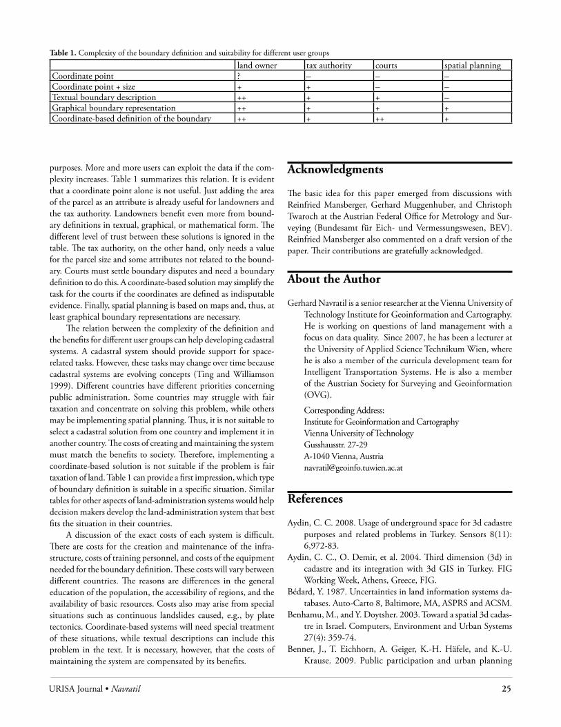
URISA Journal • Navratil 25
purposes. More and more users can exploit the data if the com-plexity increases. Table 1 summarizes this relation. It is evident that a coordinate point alone is not useful. Just adding the area of the parcel as an attribute is already useful for landowners and the tax authority. Landowners benefit even more from bound-ary definitions in textual, graphical, or mathematical form. The different level of trust between these solutions is ignored in the table. The tax authority, on the other hand, only needs a value for the parcel size and some attributes not related to the bound-ary. Courts must settle boundary disputes and need a boundary definition to do this. A coordinate-based solution may simplify the task for the courts if the coordinates are defined as indisputable evidence. Finally, spatial planning is based on maps and, thus, at least graphical boundary representations are necessary.
The relation between the complexity of the definition and the benefits for different user groups can help developing cadastral systems. A cadastral system should provide support for space-related tasks. However, these tasks may change over time because cadastral systems are evolving concepts (Ting and Williamson 1999). Different countries have different priorities concerning public administration. Some countries may struggle with fair taxation and concentrate on solving this problem, while others may be implementing spatial planning. Thus, it is not suitable to select a cadastral solution from one country and implement it in another country. The costs of creating and maintaining the system must match the benefits to society. Therefore, implementing a coordinate-based solution is not suitable if the problem is fair taxation of land. Table 1 can provide a first impression, which type of boundary definition is suitable in a specific situation. Similar tables for other aspects of land-administration systems would help decision makers develop the land-administration system that best fits the situation in their countries.
A discussion of the exact costs of each system is difficult. There are costs for the creation and maintenance of the infra-structure, costs of training personnel, and costs of the equipment needed for the boundary definition. These costs will vary between different countries. The reasons are differences in the general education of the population, the accessibility of regions, and the availability of basic resources. Costs also may arise from special situations such as continuous landslides caused, e.g., by plate tectonics. Coordinate-based systems will need special treatment of these situations, while textual descriptions can include this problem in the text. It is necessary, however, that the costs of maintaining the system are compensated by its benefits.
Acknowledgments
The basic idea for this paper emerged from discussions with Reinfried Mansberger, Gerhard Muggenhuber, and Christoph Twaroch at the Austrian Federal Office for Metrology and Sur-veying (Bundesamt für Eich- und Vermessungswesen, BEV). Reinfried Mansberger also commented on a draft version of the paper. Their contributions are gratefully acknowledged.
About the Author
Gerhard Navratil is a senior researcher at the Vienna University of Technology Institute for Geoinformation and Cartography. He is working on questions of land management with a focus on data quality. Since 2007, he has been a lecturer at the University of Applied Science Technikum Wien, where he is also a member of the curricula development team for Intelligent Transportation Systems. He is also a member of the Austrian Society for Surveying and Geoinformation (OVG).
Corresponding Address: Institute for Geoinformation and Cartography Vienna University of Technology Gusshausstr. 27-29 A-1040 Vienna, Austria [email protected]
References
Aydin, C. C. 2008. Usage of underground space for 3d cadastre purposes and related problems in Turkey. Sensors 8(11): 6,972-83.
Aydin, C. C., O. Demir, et al. 2004. Third dimension (3d) in cadastre and its integration with 3d GIS in Turkey. FIG Working Week, Athens, Greece, FIG.
Bédard, Y. 1987. Uncertainties in land information systems da-tabases. Auto-Carto 8, Baltimore, MA, ASPRS and ACSM.
Benhamu, M., and Y. Doytsher. 2003. Toward a spatial 3d cadas-tre in Israel. Computers, Environment and Urban Systems 27(4): 359-74.
Benner, J., T. Eichhorn, A. Geiger, K.-H. Häfele, and K.-U. Krause. 2009. Public participation and urban planning
Table 1. Complexity of the boundary definition and suitability for different user groups
land owner tax authority courts spatial planningCoordinate point ? – – –Coordinate point + size + + – –Textual boundary description ++ + + –Graphical boundary representation ++ + + +Coordinate-based definition of the boundary ++ + ++ +
26 URISA Journal • Vol. 23, No. 1 • 2011
supported by OGC Web services. In Schrenk, M., V. V. Popovich, D. Engelke, and P. Elisei, Eds. International Conference on Urban Planning and Spatial Development in the Information Society (REAL CORP 2009), Sitges, Spain, April 2009, 431-38.
Billen, R., and S. Zlatanova. 2003. 3d spatial relationships model: A useful concept for 3d cadastre? Computers, Environment and Urban Systems 27(4): 411-25.
Bogaerts, T., and J. Zevenbergen. 2001. Cadastral systems—al-ternatives. Computers, Environment and Urban Systems 25(4-5): 325-37.
Czerkauer-Yamu, C., and P. Frankhauser. 2010. A multi-scale (multi-fractal) approach for a systemic planning strategy from a regional to an architectural scale. In Schrenk, M., V. V. Popovich, and P. Zeile, Eds. International Conference on Urban Planning and Spatial Development in the Informa-tion Society (REAL CORP 2010), Vienna, Austria, May 2010, 17-26.
Coors, V. 2003. 3d-GIS in network environments. Computers, Environment and Urban Systems 27(4): 345-57.
Dale, P. F., and J. D. McLaughlin. 1988. Land information management—An introduction with special reference to cadastral problems in third world countries. Oxford: Oxford University Press.
Devillers, R., and R. Jeansoulin, Eds. 2006. Fundamentals of spatial data quality. London: ISTE.
Draxler, K. 2010. E-mail communication.Enemark, S., I. P. Williamson, et. al. 2005. Building modern
land administration systems in developed economies. Spatial Science 50(2): 51-68.
Fradkin, K., and Y. Doytsher. 2002. Establishing an urban digital cadastre: Analytical reconstruction of parcel boundaries. Computers, Environment and Urban Systems 26(5): 447-63.
Frank, A. U. 2009. Scale is introduced in spatial datasets by ob-servation. In Devillers, R., and H. Goodchild, Eds. Spatial data quality. Boca Raton: CRC Press, 17-29.
Frank, A. U. 1996. An object-oriented, formal approach to the design of cadastral systems. In Kraak, M. J., and M. Mo-lenar, Eds. 7th International Symposium on Spatial Data Handling, SDH ‘96, Delft, The Netherlands, August 1996, 5A.19-5A.36.
Guptill, S. C., and J. L. Morrison, Eds. 1995. Elements of spatial data quality. Oxford: Elsevier.
Hassan, M. I., M. H. Ahmad-Nasruddin, et al. 2008. An inte-grated 3d cadastre—Malaysia as an example. The Interna-tional Archives of the Photogrammetry, Remote Sensing and Spatial Information Sciences 37(B4): 121-26.
Jeyanandan, D., and I. P. Williamson. 1990. A cadastral model for developing countries. In Proceedings of the National Conference on Cadastral Reform, Melbourne, Australia.
Kollenprat, D. 2003. Grundsteuerkataster—Grenzkataster. Gemeinde-Info 6.
Lemmen, C., and P. v. Oosterom. 2003. 3d cadastres (Editorial). Computers, Environment and Urban Systems 27(4): 337-43.
Mueller, M. 2008. Transformations of cadastral descriptions with incomplete information into maps. Transactions in GIS 12(1): 83-101.
Navratil, G., and R. Feucht. 2009. An example for a comprehen-sive quality description—The area in the Austrian cadastre. In Devillers, R., and H. Goodchild, Eds. Spatial data quality. Boca Raton: CRC Press, 197-209.
Navratil, G., and M. Hackl. 2008. Genauigkeit der von Laien durchgeführten horizontalen Seitenmessung. VGI (Vermes-sung und Geoinformation) 96(1): 27-36.
Navratil, G., and M. Hackl. 2007. 3d-kataster. In Schrenk, M., V. V. Popovich, and J. Benedikt, Eds. 12th International Conference on Urban Planning and Spatial Development in the Information Society (CORP 2007), Vienna, Austria, May 2007, 621-28.
Navratil, G., F. Twaroch, and A. U. Frank. 2005. Complexity vs. security in the Austrian land register. In Schrenk, M., Ed. 10th International Conference on Urban Planning and Spatial Development in the Information Society (CORP 2005), Vienna, Austria, February 2005, 161-66.
Nichols, W. R., Ed. 2001. Random House Webster’s college dictionary. New York: Random House.
Onsrud, H. 2003. Making a cadastre law for 3d properties in Norway. Computers, Environment and Urban Systems 27(4): 375-82.
Onsrud, H. J. 1989. The land tenure system of the United States. Zeitschrift des Bundes der öffentlich bestellten Vermes-sungsingenieure.
Pereslegin, A. 2010. The city planning cadastre system of the city of Moscow as a tool for sustainable urban development. In Schrenk, M., V. V. Popovich, and P. Zeile, Eds. International Conference on Urban Planning and Spatial Development in the Information Society (REAL CORP 2010), Vienna, Austria, May 2010, 1,315-16.
Raubal, M., and S. Winter. 2002. Enriching wayfinding instruc-tions with local landmarks. In Egenhofer, M. J., and D. M. Mark, Eds. Geographic information science. Berlin: Springer, 243-59.
Searle, J. R. 1995. The construction of social reality. New York: The Free Press.
Stoter, J., and M. Salzmann. 2003. Towards a 3d cadastre: Where do cadastral needs and technical possibilities meet? Comput-ers, Environment and Urban Systems 27(4): 395-410.
Stoter, J., and P. van Oosterom. 2006. 3d cadastre in an interna-tional context. Boca Raton: Taylor and Francis.
Stoter, J., P. van Oosterom, H. D. Ploeger, and H. J. G. L. Aalders. 2004. Conceptual 3d cadastral model applied in several countries. In Proceedings of the FIG Working Week 2004, Athens, Greece.
URISA Journal • Navratil 27
Ting, L., and I. P. Williamson. 1999. Cadastral trends: A synthesis. The Australian Surveyor 4(1): 46-54.
Tse, R. O. C., and C. M. Gold. 2003. A proposed connectivity-based model for a 3-d cadastre. Computers, Environment and Urban Systems 27(4): 427-45.
Twaroch, C., and G. Muggenhuber. 1997. Evolution of land registration and cadastre—Case study: Austria. In Proceed-ings of the Joint European Conference on Geographical Information.
van der Molen, P. 2001. The importance of the institutional context for sound cadastral information management for sustainable land policy. In Proceedings of the International Conference on Spatial Information for Sustainable Develop-ment, Nairobi, Kenya.
van Oosterom, P., C. Lemmen, et al. 2006. The core cadastral domain model. Computers, Environment and Urban Sys-tems 30(5): 627-60.
Zabel, A., G. Höflinger, et al. 1876. Grenzbeschreibung der Gemeinde Curort Gleichenberg.
Zevenbergen, J. 2002. Systems of land registration. Ph.D., Tech-nical University, Delfts, Netherlands.


URISA Journal • Raza, Weber, Mannel, Ames, Patillo 29
IntroductIonUrban forests can be defined as ecosystems that emerge because of the presence of trees and other vegetation in association with human development (Nowak et al. 2001). They are an important asset in the urban areas where 80 percent of the U.S. population lives (Dwyer et al. 1992, U.S. Census Bureau 2000). Urban dwellers may plant trees for a number of reasons. Some plant trees because they are motivated by personal and environmental value systems. Others are motivated by more practical reasons, such as noise reduction, shading to reduce watering costs, and increased property values (Westphal 1993). Sommer et al. (1994) demonstrated that people plant trees because trees were perceived to improve neighborhood interaction and empower residents to improve their own surroundings. A more recent study by Lohr and Pearson-Mims (2002) showed that urban residents held positive attitudes toward trees. These attitudes were even more positive if the homeowners took part in gardening and tree planting.
Despite the advantages of having trees, Lohr et al. (2004) identified a number of problems associated with trees, including allergies, obstructing street signs, damaging power lines, increasing concealment for criminal behavior, and causing sap damage to automobile finishes, and the perceptions that trees are unsightly when not maintained, that trees cost cities too much money, and that tree roots are the principal cause of cracked sidewalks. This study focused on quantitatively assessing the latter perception.
Different species of trees possess varied types and extents of root systems. The majority of trees, however, have root systems that extend down and outward in balance with the top growth of the tree (Kohut 2007). As a rule of thumb, roots extend just a little further than the tree canopy (i.e., drip line) (Kohut 2007).
Wagar and Barker (1983) found that tree roots can cause major damage to sidewalks and curbs each year and that repair costs represent a large expense in any city’s budget. Hamilton et
al. (1975) found that annual repair costs because of root-damaged sidewalks were $27,000 each within 22 northern California cities. Sidewalk damage was especially serious for cities were increasingly liable when citizens were injured because of damaged sidewalks (Samuel and Radkov 1977, Edgar 1962). More than two decades later, McPherson (2000) reported approximately $70.7 million was spent annually by 18 California cities on “tree-root related costs” (sidewalk repair [$23 million], curb and gutter repair [$11.8 million], trip and fall liability payments and legal costs [$10.1 million]). Their study was based on a mailed questionnaire.
On the other hand, Sandfort and Runck (1986) and Sandfort (1997) suggested that other factors, such as soil characteristics, may be more important relative to sidewalk failure. In addition, Sydnor et al. (2000) found that only one of their three study sites exhibited sidewalk damage attributable to tree roots. They concluded that trees appear to play only minor roles in sidewalk service life. Further results suggested that sidewalks older than 20 years failed at a higher rate regardless of any other factors. Sidewalks that were less than 20 years old and built on fine silt or fine loam soils appeared more stable and less prone to failure compared to those constructed on coarse or mixed soil complexes. Newly built sidewalks that were less than five years old were not affected by trees in any type of soil examined. Sydnor et al. (2000) concluded that trees may have less of an impact than previous studies suggest. Sydnor et al. (2000) acknowledged that trees can displace sidewalks but may not be the principle cause.
D’Amato et al. (2002) related that sidewalk engineers in Cincinnati, Ohio, considered that sidewalks should last a period of 20 to 25 years, but not indefinitely. Furthermore, it was pointed out that sidewalk construction methods have changed over the years. In the past, engineers were required to build sidewalks that were 13 centimeters thick, using a gravel base that was inspected during and after installation. Currently, sidewalks are constructed
geospatial analysis of tree root damage to sidewalks in southeastern Idaho
Mansoor Raza, Keith T. Weber, Sylvio Mannel, Daniel P. Ames, and Robin E. Patillo
Abstract: Trees often are considered the primary cause of sidewalk damage in urban settings. This study compared existing side-walk damage areas to the location of trees in the cities of Pocatello and Chubbuck, Idaho. Locations of sidewalks and sidewalk cracks were collected in the summer of 2007 using a handheld GPS receiver. QuickBird satellite imagery was acquired for the study area in April of 2008. Using Hot Spot Analysis, the areas having the highest sidewalk crack density were identified and a five-block area was subset from both old (average home construction age > 20 years) and new neighborhoods (average home construction age < ten years). Tree canopies were digitized manually and the drip-line perimeter was used to determine the percent of sidewalk cracks intersecting these polygon features. The results revealed that only 17 percent of cracks in old neighborhoods were directly associated with existing tree roots, while, in new neighborhoods the percent incidence dropped to 3.5 percent. Our findings indicate that trees were not the primary cause of sidewalk damage in the study area and provide potential implications for the management of municipalities beyond the study area.
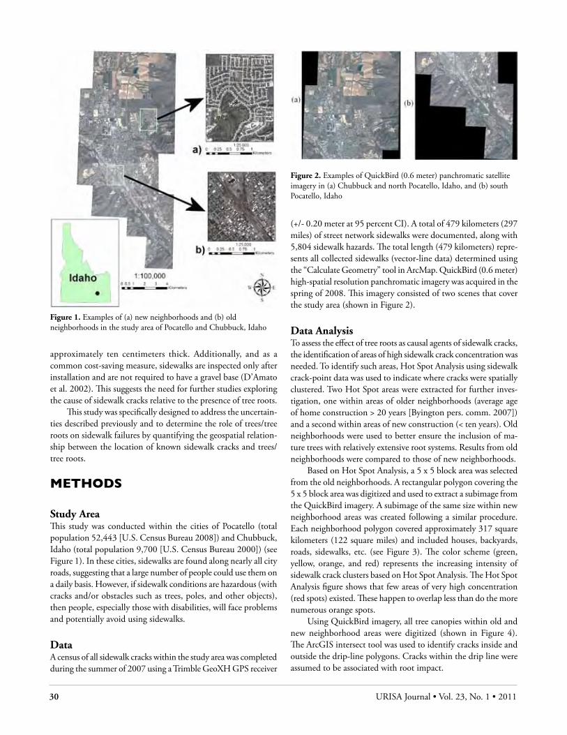
30 URISA Journal • Vol. 23, No. 1 • 2011
approximately ten centimeters thick. Additionally, and as a common cost-saving measure, sidewalks are inspected only after installation and are not required to have a gravel base (D’Amato et al. 2002). This suggests the need for further studies exploring the cause of sidewalk cracks relative to the presence of tree roots.
This study was specifically designed to address the uncertain-ties described previously and to determine the role of trees/tree roots on sidewalk failures by quantifying the geospatial relation-ship between the location of known sidewalk cracks and trees/tree roots.
MEtHods
Study AreaThis study was conducted within the cities of Pocatello (total population 52,443 [U.S. Census Bureau 2008]) and Chubbuck, Idaho (total population 9,700 [U.S. Census Bureau 2000]) (see Figure 1). In these cities, sidewalks are found along nearly all city roads, suggesting that a large number of people could use them on a daily basis. However, if sidewalk conditions are hazardous (with cracks and/or obstacles such as trees, poles, and other objects), then people, especially those with disabilities, will face problems and potentially avoid using sidewalks.
DataA census of all sidewalk cracks within the study area was completed during the summer of 2007 using a Trimble GeoXH GPS receiver
(+/- 0.20 meter at 95 percent CI). A total of 479 kilometers (297 miles) of street network sidewalks were documented, along with 5,804 sidewalk hazards. The total length (479 kilometers) repre-sents all collected sidewalks (vector-line data) determined using the “Calculate Geometry” tool in ArcMap. QuickBird (0.6 meter) high-spatial resolution panchromatic imagery was acquired in the spring of 2008. This imagery consisted of two scenes that cover the study area (shown in Figure 2).
Data AnalysisTo assess the effect of tree roots as causal agents of sidewalk cracks, the identification of areas of high sidewalk crack concentration was needed. To identify such areas, Hot Spot Analysis using sidewalk crack-point data was used to indicate where cracks were spatially clustered. Two Hot Spot areas were extracted for further inves-tigation, one within areas of older neighborhoods (average age of home construction > 20 years [Byington pers. comm. 2007]) and a second within areas of new construction (< ten years). Old neighborhoods were used to better ensure the inclusion of ma-ture trees with relatively extensive root systems. Results from old neighborhoods were compared to those of new neighborhoods.
Based on Hot Spot Analysis, a 5 x 5 block area was selected from the old neighborhoods. A rectangular polygon covering the 5 x 5 block area was digitized and used to extract a subimage from the QuickBird imagery. A subimage of the same size within new neighborhood areas was created following a similar procedure. Each neighborhood polygon covered approximately 317 square kilometers (122 square miles) and included houses, backyards, roads, sidewalks, etc. (see Figure 3). The color scheme (green, yellow, orange, and red) represents the increasing intensity of sidewalk crack clusters based on Hot Spot Analysis. The Hot Spot Analysis figure shows that few areas of very high concentration (red spots) existed. These happen to overlap less than do the more numerous orange spots.
Using QuickBird imagery, all tree canopies within old and new neighborhood areas were digitized (shown in Figure 4). The ArcGIS intersect tool was used to identify cracks inside and outside the drip-line polygons. Cracks within the drip line were assumed to be associated with root impact.
Figure 1. Examples of (a) new neighborhoods and (b) old neighborhoods in the study area of Pocatello and Chubbuck, Idaho
Figure 2. Examples of QuickBird (0.6 meter) panchromatic satellite imagery in (a) Chubbuck and north Pocatello, Idaho, and (b) south Pocatello, Idaho

URISA Journal • Raza, Weber, Mannel, Ames, Patillo 31
Figure 3. An example of subimage extraction along with sidewalk cracks and Hot Spot results for (a) old and (b) new neighborhoods. Concentration of cracks increases from green to yellow to red.
ResultsSidewalks in old neighborhoods had 4.5 times more canopy cover (12.4 square kilometers [4.8 square miles]) than did sidewalks in new neighborhoods (2.7 square kilometers [1.0 square mile]). In addition, old neighborhoods had 2.3 times as many cracks (n = 262) as did new neighborhoods (n = 112) (see Table 1). While the results of these analyses showed an increased number of hazards associated with tree roots within old neighborhoods relative to that found in new neighborhoods (Table 1), the proportion of sidewalk hazards attributable to tree roots was low in all cases.
Table 1. Sidewalk hazards and results of tree drip-line intersection analyses
Neighborhood TypeOld New
Total area of neighborhood polygon (km2)
317 317
Tree canopy cover (km2) 12.4 2.7Sidewalk cracks (total) 262 112Sidewalk hazards intersecting tree canopies
44 (17%) 4 (3.5%)
While only six percent of all sidewalk cracks located in the study area (n = 5,804) were included in the old and new neighborhood subset areas, these areas represented the highest concentration of sidewalk cracks and are believed to represent the larger study area. However, this assumption was not tested and results may vary if the study were repeated on a larger scale.
dIscussIon and conclusIonsResults of this study indicate that tree roots were not the primary cause of sidewalk failures in the study area. Using the most critical estimates, less than four percent of sidewalk cracks were located within tree drip lines in new neighborhoods. Similarly, in old neighborhoods, only 17 percent of cracks were located within tree drip lines. Our results suggest that other factors, such as those discussed by Sydnor et al. (2000), contributed to the sidewalk cracks observed in the Pocatello and Chubbuck study area. Some
of these factors may include soil type, sidewalk construction techniques, freeze-thaw patterns, and the effects of time and use. Our work confirms the Sydnor et al. study (2000). Additionally, our findings are of particular interest for these results demonstrate consistency across relatively different geographies (Cincinnati, Ohio, and Pocatello/Chubbuck, Idaho) exhibiting different soil types, climates, and ecoregions, even though very different analysis techniques were used. Further analysis still is needed, however, to determine the primary cause of sidewalk cracks, but the fusion of GPS and remote-sensing data, coupled with GIS analysis, may help answer this question as well as other issues related to urban land management.
Acknowledgments
This study was made possible by a grant from the Bannock Transportation and Planning Organization and the National Aeronautics and Space Administration Goddard Space Flight Center (NNG06GD82G). Idaho State University would like to acknowledge the Idaho congressional delegation for its assistance in obtaining this grant.
About the Authors
Mansoor Raza earned his Master’s degree in geographic informa-tion science from the Department of Geosciences at Idaho State University, Pocatello. He currently is working as a GIS Technician II in Canada. His research interests include municipal applications of remote sensing, GIS for urban and rangeland management, GIS application/analysis for asset management, QA/QC of map documents, Web GIS mapping, object-oriented GIS, and feature extraction.
Keith T. Weber is the GIS Director at Idaho State University, Pocatello, where he leads the GIS Training and Research Center. A certified GIS professional (GISP), he has pub-lished 30 papers in peer-reviewed professional journals with a focus on remote sensing and geospatial analysis of semiarid ecosystems.
Figure 4. Digitized tree canopies in (a) old and (b) new neighborhoods are shown in cyan
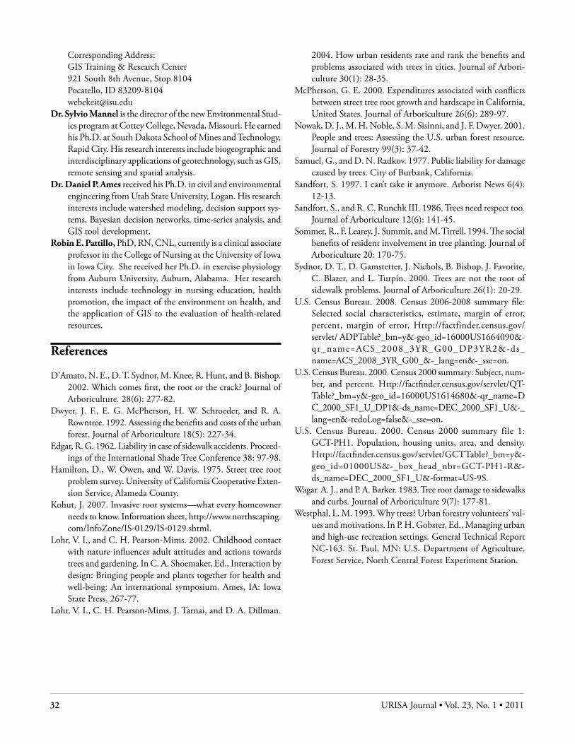
32 URISA Journal • Vol. 23, No. 1 • 2011
Corresponding Address:GIS Training & Research Center 921 South 8th Avenue, Stop 8104Pocatello, ID [email protected]
Dr. Sylvio Mannel is the director of the new Environmental Stud-ies program at Cottey College, Nevada, Missouri. He earned his Ph.D. at South Dakota School of Mines and Technology, Rapid City. His research interests include biogeographic and interdisciplinary applications of geotechnology, such as GIS, remote sensing and spatial analysis.
Dr. Daniel P. Ames received his Ph.D. in civil and environmental engineering from Utah State University, Logan. His research interests include watershed modeling, decision support sys-tems, Bayesian decision networks, time-series analysis, and GIS tool development.
Robin E. Pattillo, PhD, RN, CNL, currently is a clinical associate professor in the College of Nursing at the University of Iowa in Iowa City. She received her Ph.D. in exercise physiology from Auburn University, Auburn, Alabama. Her research interests include technology in nursing education, health promotion, the impact of the environment on health, and the application of GIS to the evaluation of health-related resources.
References
D’Amato, N. E., D. T. Sydnor, M. Knee, R. Hunt, and B. Bishop. 2002. Which comes first, the root or the crack? Journal of Arboriculture. 28(6): 277-82.
Dwyer, J. F., E. G. McPherson, H. W. Schroeder, and R. A. Rowntree. 1992. Assessing the benefits and costs of the urban forest. Journal of Arboriculture 18(5): 227-34.
Edgar, R. G. 1962. Liability in case of sidewalk accidents. Proceed-ings of the International Shade Tree Conference 38: 97-98.
Hamilton, D., W. Owen, and W. Davis. 1975. Street tree root problem survey. University of California Cooperative Exten-sion Service, Alameda County.
Kohut, J. 2007. Invasive root systems—what every homeowner needs to know. Information sheet, http://www.northscaping.com/InfoZone/IS-0129/IS-0129.shtml.
Lohr, V. I., and C. H. Pearson-Mims. 2002. Childhood contact with nature influences adult attitudes and actions towards trees and gardening. In C. A. Shoemaker, Ed., Interaction by design: Bringing people and plants together for health and well-being: An international symposium. Ames, IA: Iowa State Press, 267-77.
Lohr, V. I., C. H. Pearson-Mims, J. Tarnai, and D. A. Dillman.
2004. How urban residents rate and rank the benefits and problems associated with trees in cities. Journal of Arbori-culture 30(1): 28-35.
McPherson, G. E. 2000. Expenditures associated with conflicts between street tree root growth and hardscape in California, United States. Journal of Arboriculture 26(6): 289-97.
Nowak, D. J., M. H. Noble, S. M. Sisinni, and J. F. Dwyer. 2001. People and trees: Assessing the U.S. urban forest resource. Journal of Forestry 99(3): 37-42.
Samuel, G., and D. N. Radkov. 1977. Public liability for damage caused by trees. City of Burbank, California.
Sandfort, S. 1997. I can’t take it anymore. Arborist News 6(4): 12-13.
Sandfort, S., and R. C. Runchk III. 1986. Trees need respect too. Journal of Arboriculture 12(6): 141-45.
Sommer, R., F. Learey, J. Summit, and M. Tirrell. 1994. The social benefits of resident involvement in tree planting. Journal of Arboriculture 20: 170-75.
Sydnor, D. T., D. Gamstetter, J. Nichols, B. Bishop, J. Favorite, C. Blazer, and L. Turpin. 2000. Trees are not the root of sidewalk problems. Journal of Arboriculture 26(1): 20-29.
U.S. Census Bureau. 2008. Census 2006-2008 summary file: Selected social characteristics, estimate, margin of error, percent, margin of error. Http://factfinder.census.gov/servlet/ ADPTable?_bm=y&-geo_id=16000US1664090&-qr_name=ACS_2008_3YR_G00_DP3YR2&-ds_name=ACS_2008_3YR_G00_&-_lang=en&-_sse=on.
U.S. Census Bureau. 2000. Census 2000 summary: Subject, num-ber, and percent. Http://factfinder.census.gov/servlet/QT-Table?_bm=y&-geo_id=16000US1614680&-qr_name=D C_2000_SF1_U_DP1&-ds_name=DEC_2000_SF1_U&-_lang=en&-redoLog=false&-_sse=on.
U.S. Census Bureau. 2000. Census 2000 summary file 1: GCT-PH1. Population, housing units, area, and density. Http://factfinder.census.gov/servlet/GCTTable?_bm=y&-geo_id=01000US&-_box_head_nbr=GCT-PH1-R&-ds_name=DEC_2000_SF1_U&-format=US-9S.
Wagar. A. J., and P. A. Barker. 1983. Tree root damage to sidewalks and curbs. Journal of Arboriculture 9(7): 177-81.
Westphal, L. M. 1993. Why trees? Urban forestry volunteers’ val-ues and motivations. In P. H. Gobster, Ed., Managing urban and high-use recreation settings. General Technical Report NC-163. St. Paul, MN: U.S. Department of Agriculture, Forest Service, North Central Forest Experiment Station.
URISA Journal • Salling 33
IntroductIonA geographic information system (GIS) is an important redis-tricting tool that is used to create the database required to draw boundaries, build district plans, and evaluate alternative plans based on a set of criteria.1 These functions are achieved as a result of the recent availability of great desktop computational power, more easily learned and usable software, and publicly available databases that are necessary for drawing boundaries of political districts that meet multiple criteria. Thus, the development of GIS has greatly automated the political process of redistricting. Internet application of these GIS tools now offers new oppor-tunities for public-interest groups and citizens to be engaged in determining their political landscape.
Traditionally, redistricting often takes place in political backrooms, involving politicians and consultants in making partisan political decisions. Today, more than ever, many “good government” advocates argue that the process should be brought into the open and use widely accepted criteria that are thought to improve the “fairness” of the outcome. Although much attention is paid to the importance and measurement of various criteria of fairness, advances in GIS-related technologies promise the greatest potential for democratization of the redistricting process for it offers the way in which more people can recommend, propose, and evaluate redistricting plans. The issue of who has the ability to make recommendations for district boundary plans and who can evaluate such plans is as important as the criteria and the plans themselves.
A GIS with added decision support tools for redistricting offers the user the ability to build a set of districts through an easy-to-operate graphic interface, while seeing the resulting statistical measures of the redistricting objectives. Although the statistical results of a districting plan can be achieved through a single submis-sion of information and decisions, the more useful and interesting aspect of the GIS application is the way in which the user can adjust boundary decisions one-at-a-time as the results become ap-
parent after each such decision in the process. The interaction of the map with the statistical measures of the redistricting criteria is dynamic. Thus, when customized for redistricting, GIS provides a spatial decision support system (SDSS) for the interactive drawing of political districts that meet target criteria.
Internet delivery of redistricting GIS tools to the electorate and public-interest groups could give them a say in how districts are drawn. This democratization of the process would represent a strong example of the impact of public participation GIS (PPGIS) on society. The public, defined as the stakeholders in the politi-cal process, includes almost everyone—including public-interest organizations, grassroots communities, political parties, the electorate, and, indeed, every person who is affected by political representation that is in any part determined by the districting of electoral districts.2 The type and level of the public’s participation is controlled by institutional, statutory, and cultural conditions rather than technical ones (de Man 2003). Regardless of who is statutorily responsible for redistricting, this PPGIS applica-tion provides to the public the resources necessary to construct alternative plans and to compare and evaluate them, and thus to challenge the decision makers in ways never possible before.
This paper summarizes the use of GIS in the redistricting process for political election districts, including congressional districts, state legislatures, and local wards.3 First, the paper dis-cusses the criteria that are said to be important in creating political districts that are fair and competitive. Second, the paper discusses how GIS is used to construct the redistricting database that pro-vides the measures of those criteria. Third, the paper describes a case study in which the Ohio Secretary of State and others tested the feasibility and merits of using a public participation GIS redistricting system to develop alternative district plans aimed at meeting several objectives concerning fair and competitive elec-tions. Finally, the paper concludes with ideas about how GIS will and should play a role in future redistricting.
Public Participation geographic Information systems for redistricting
a case study in ohio
Mark J. Salling
Abstract: A geographic information system (GIS) is an important redistricting tool that is used to create the database required to draw boundaries, build district plans, and evaluate alternative plans based on a set of criteria. When augmented with spe-cialized functions, a GIS is a spatial decision support system (SDSS) for redistricting, and when made available to the public through the Internet, it is a public participation GIS (PPGIS). Such a system was implemented in Ohio in 2009 to evaluate how to improve the redistricting process in the state after release of the 2010 census.

34 URISA Journal • Vol. 23, No. 1 • 2011
crItErIa For draWIng ElEctIon dIstrIctsRedistricting is carried out to achieve a set of political objectives and outcomes. Those outcomes are determined by the geographic configuration of the district plan. Before considering how GIS plays a role in drawing district boundaries, certain concepts that are used as the criteria for meeting the political objectives of drawing election districts must be defined.
Population equality: The U.S. Constitution, as interpreted by federal case law, requires that districts be as equal in popula-tion as possible.4 State legislative districts have been given more leeway with regard to this criterion.5
National Voting Rights Act: Federal courts also have held that state district plans must provide for majority-minority con-gressional districts where feasible to avoid creating districts that deny minorities their legislative representation.6
Contiguity: Every part of a district must be reachable from every other part without crossing the district’s borders. Geo-metrically, election districts are polygons and this criterion states that such district polygons must share sides with other district polygons. “Point contiguity,” where districts touch at only a geometric point, may or may not be acceptable.
Compactness: This criterion seeks to limit gerrymandering, which captures or excludes certain populations to benefit one party over another through the use of irregularly shaped districts.
Communities of interest: In the context of redistricting, the term community refers to those geographic regions whose iden-tities merit keeping them in one district. These regions may be counties, municipalities, wards, or other areas that give residents a sense of place and shared interests. This criterion is based on a rationale similar to that for majority-minority districts and seeks to minimize the number of districts that divide such communities.
Competitiveness: An alternative approach to the one offered by communities of interest is a criterion that values diversity within districts and is based on the notion that democracy thrives when the marketplace of political ideas is competitive. This mea-sure seeks to maximize the number of legislative districts that could be won by either party, thus providing each individual voter with a stronger voice in choosing representatives.
Representational fairness: Another approach to competitive-ness is ensuring that a redistricting plan does not unfairly favor one party over another. This measure seeks to minimize the dif-ference between a party’s representation in the state’s total votes and its representation in the legislature.
Each of these criteria has merit but deciding how to use them in combination remains a political challenge.
It is also a technical challenge. Using GIS does not provide an “objective” or maximizing solution to the process of redistricting, though some researchers have tried. Morrill (1976) provided an early analysis of using computers to improve on manual methods using population equality and travel minimization as criteria. In addition to reducing aggregate travel times within districts, the computer-produced district plans were found to provide more
compact districts. Nagel (1965) demonstrating that three fac-tors—population equality, compactness, and political balance of power—could be optimized using computer-generated methods, but only after assigning arbitrary weights to these three factors.
Despite these and other early calls for computational dis-tricting solutions that maximize some assumed universal set of objectives, some argue that optimal solutions are intractable, given the computational difficulties of using multiple criteria and the large numbers of possible outcomes.
“In practice, a redistricting plan must simultaneously satisfy several, often conflicting criteria, such as equal popu-lation, compactness, the Voting Rights Act, and (depending on each state’s constitution) other goals such as respect for existing political boundaries and communities of interest. Current commercially available automated software can only maximize one criterion and cannot balance between competing criteria . . . Our selected trials of these packages, as well as anecdotal reports by users and software developers, suggests that even with regard to a single criterion, software performance fell well short of what an expert could achieve.” (Altman 1997)7
More importantly, decisions about which criteria to use and how to weigh these criteria are political in nature. But GIS does offer the promise of uncomplicating and providing transparency to multiple criteria solutions.
crEatIng tHE rEdIstrIctIng dataBasE—tHE usE oF gIs and EstIMatIonGIS plays a particularly important role in developing databases that combine demographic information from the decennial cen-sus with election results from state or local sources. Noting that census data alone are insufficient for redistricting, Altman et al. (2005) point out, “Redistricting often involves integration and analysis of additional data including voter registration statistics and election returns. In many cases, there is no direct relation-ship between census and electoral geography, and election data may be collected within two separate geographies: registration and election precincts.”
Thus, understanding conceptually how a redistricting data-base is created is important when considering the requisite preci-sion of the measures that are used as criteria for redistricting, such as compactness, competitiveness, and representational fairness. How the database is created also affects the accuracy of popula-tion equality and majority-minority district criteria. Therefore, accuracy and precision of the data affect the accuracy and preci-sion of the criteria metrics and, in turn, the plan that is selected.
At one level, the Census Bureau uses GIS to build geographic and population databases. The Census Bureau’s geographic da-tabase—TIGER8—was developed to assist both data-collection operations and reporting. The smallest geographic unit of data

URISA Journal • Salling 35
collection and reporting is the census block. Blocks are polygons that are built from linear features such as roads, rivers, rail lines, topographic ridges, as well as other polygonal features such as lakes, Indian reservations, and municipal, township, county, and state boundaries. The characteristics of housing units and popu-lation found within the area bounded by the streets and other features around them are tallied to the census block summary level. Typically, census blocks correspond to what most people understand as a city block.
Although the Census Bureau creates the census blocks, de-lineation of precincts is the purview of local boards of elections (BOE).9 For the census to include population data by precinct, the Census Bureau must collect precinct geography from each state. The state must collect precinct boundaries from the local BOE, compile them using the TIGER base map, and submit them to the Census Bureau more than a year before a census is taken. The 2010 census marks the first time that the Census Bureau has allowed the states to submit precinct boundaries that split existing census blocks. New blocks will be created when precincts split existing blocks. Thus, precinct geography will figure into the creation of new census blocks. The Census Bureau provided specialized GIS software to assist the states and to ensure that the data meets the bureau’s specifications.
Before this decennial census, states could only supply voting district boundaries that incorporated whole census blocks. When such voting districts do not reflect actual voting districts, they are termed pseudo districts and their use means that population counts are inaccurate for such voting districts. Even though the Census Bureau now permits block splitting, some states did not have the time nor the resources to fully participate in the program and submitted pseudo districts for at least portions of their state.10 To the extent that populations in split blocks are substantial, census data for pseudo precincts will not accurately reflect their population.
Furthermore, because the 2010 census program required submission of precinct boundaries a year and a half before the taking of the census, some precincts changed by the time of the census. States that wish to use more current election results and election geography will have to continue maintaining more cur-rent precinct geography and estimating the census data for those precincts that change after the time that the Census Bureau acquired the precinct boundary data from the states. Precinct geography was provided to the Census Bureau based on the fall of 2008 elections. However, at least some states will use both 2008 and 2010 election results for decision making concerning political competitiveness. Precinct-level census data delivered by the Census Bureau will not reflect the 2010 precinct geography. Therefore, states will adjust the census data at the precinct level through estimation methods, after the census data have been delivered by the bureau in early 2011.
For example, Ohio will develop a statewide precinct bound-ary database current as of the fall of 2010 general elections. The state will estimate the populations of precincts that have changed since the fall of 2008 elections or were submitted to the Census
Bureau as pseudo districts. Election results for both the fall of 2008 and 2010 also will be estimated for census blocks. The result-ing database, including geographic boundary layers, population by race and voting age, and the election results, is referred to as the “Ohio Common and Unified Redistricting Database.”11 The use of GIS will facilitate this estimation. To estimate population in precincts that have changed boundaries between 2008 and 2010, census populations that are in a split block are apportioned between precincts sharing those blocks based on proportions of the block’s street length found in each precinct.12 Meanwhile, the voting results for precincts are distributed to the block level using the block-level voting-age population. This is performed for both the 2008 and 2010 election precincts. Thus, the data to be used for redistricting in Ohio and other states is estimated using GIS and assumptions about the geographic distribution of population and election results within census blocks. The effect of producing data for redistricting that are subject to estimation error may be an important issue, potentially affecting the various criteria used to draw the lines.13 Research should be conducted on this issue.
tHE oHIo sEcrEtary oF statE’s rEdIstrIctIng coMPEtItIonIn partnership with several interested organizations and experts,14
Ohio’s Secretary of State (SOS) undertook a project in the spring of 2009 to test and evaluate a presumably fairer process of redis-tricting that would be open to the public.
In Ohio’s existing process of redistricting, congressional districts are drawn by the General Assembly through legislation. There are no rules or criteria to meet, other than federal case law on equal population15 and minority representation.16 State legisla-tive districts are drawn by an Apportionment Board consisting of the governor, secretary of state, state auditor, and a member of each of the two major parties in the state legislature. There are limited rules in the state’s constitution regarding compactness, equal population, and maintaining county, municipal, and ward boundaries. For simplicity, the SOS’s project addressed only congressional redistricting.
The project provided for open competition to see if a process could be implemented in which persons with access to software and data and some limited training could create a districting plan that achieved a number of goals concerning criteria thought to contribute to a fair districting plan. It was assumed that a “good” redistricting process would seek to preserve Ohio communities, promote political competition, result in an accurate reflection of the political leanings of the electorate, and provide an open and transparent process. The purpose was to enable stakeholders, as represented by public-interest groups, grassroots community organizations, or just any voter or citizen, to participate in testing a decision-making process that would affect the political geography of the state and, therefore, the political outcomes of many future elections.
Because data for 2010 were not available, the competition used a precinct-level database from the state’s 2001 redistricting
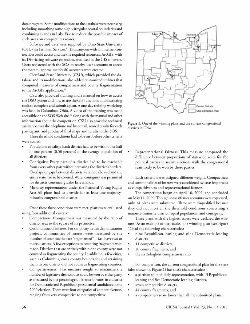
36 URISA Journal • Vol. 23, No. 1 • 2011
data program. Some modifications to the database were necessary, including smoothing some highly irregular coastal boundaries and combining islands in Lake Erie to reduce the possible impact of such areas on compactness scores.
Software and data were supplied by Ohio State University (OSU) via Terminal Services.17 Thus, anyone with an Internet con-nection could access and use the required resources. ArcGIS, with its Districting software extension, was used as the GIS software. Users registered with the SOS to receive user accounts to access the system; approximately 80 accounts were created.
Cleveland State University (CSU), which provided the da-tabase and its modifications, also added customized utilities that computed measures of compactness and county fragmentation to the ArcGIS application.18
CSU also provided training and a manual on how to access the OSU system and how to use the GIS functions and districting tools to complete and submit a plan. A one-day training workshop was held in Columbus, Ohio. A video of the training was made accessible on the SOS Web site,19 along with the manual and other information about the competition. CSU also provided technical assistance over the telephone and by e-mail, scored results for each participant, and produced final maps and results to the SOS.
Three threshold conditions had to be met before other criteria were scored:• Population equality: Each district had to be within one half
of one percent (0.50 percent) of the average population of all districts.
• Contiguity: Every part of a district had to be reachable from every other part without crossing the district’s borders. Overlaps or gaps between districts were not allowed and the entire state had to be covered. Water contiguity was permitted for districts containing Lake Erie islands.
• Minority representation under the National Voting Rights Act: All plans had to provide for at least one majority-minority congressional district.
Once these three conditions were met, plans were evaluated using four additional criteria:• Compactness: Compactness was measured by the ratio of
district area to the square of its perimeter.• Communities of interest: For simplicity in this demonstration
project, communities of interest were measured by the number of counties that are “fragmented”—i.e., have two or more districts. A few exceptions to counting fragments were made. Districts that are entirely within one county were not counted as fragmenting the county. In addition, a few cities, such as Columbus, cross county boundaries and retaining them in one district did not count as fragmenting counties.
• Competitiveness: This measure sought to maximize the number of legislative districts that could be won by either party as measured by the percentage difference in votes in a district for Democratic and Republican presidential candidates in the 2000 election. There were four categories of competitiveness, ranging from very competitive to not competitive.
• Representational fairness: This measure compared the difference between proportions of statewide votes for the political parties in recent elections with the congressional seats likely to be won by those parties.
Each criterion was assigned different weight. Compactness and commonalities of interest were considered twice as important as competitiveness and representational fairness.
The competition began on April 10, 2009, and concluded on May 11, 2009. Though some 80 user accounts were requested, only 14 plans were submitted. Three were disqualified because they did not meet all the threshold conditions concerning a majority-minority district, equal population, and contiguity.
Three plans with the highest scores were declared the win-ners. As an example of the results, one winning plan (see Figure 1) had the following characteristics:• nine Republican-leaning and nine Democratic-leaning
districts,• 11 competitive districts, • 20 county fragments, and • the sixth-highest compactness ratio.
For comparison, the current congressional plan for the state (also shown in Figure 1) has these characteristics:• a partisan split of likely representation, with 13 Republican-
leaning and five Democratic-leaning districts, • seven competitive districts, • 44 county fragments, and • a compactness score lower than all the submitted plans.
Figure 1. One of the winning plans and the current congressional districts in Ohio

URISA Journal • Salling 37
According to these criteria, the winning plans were superior to the current congressional district plan. In fact, even the worst-scoring plan submitted in the competition was quantitatively “better” than the redistricting plan implemented in 2001.
The competition was judged by the SOS, its partners, and others to be successful, though it also was acknowledged that improvements would be necessary should a similar redistricting process be put into practice for the state.
HoW WIll gIs BE usEd In tHE nEXt round oF rEdIstrIctIng—WHat MorE nEEds to BE donE?At this writing, the next round of redistricting is imminent. By April 1, 2010, the Census Bureau released the redistricting data-base for each state. States such as Ohio are using GIS to prepare election results databases that will be merged with the census data—but only after adjusting for geographic discrepancies and estimating some data. Several PC-based software systems exist that enable the building of district geography while summing population and election results data. Web-based systems offer the possibility for greater public participation in the process.
Significant advances in redistricting have occurred over the past two decades. The Census Bureau, for example, now allows states to provide precinct boundaries even if they split previously established census blocks. GIS facilitates estimating data where necessary. GIS-based districting software advanced significantly between 1990 and 2000 and has continued to improve in func-tionality and ease of use. Web-based application of the technology is a major improvement over the possibilities offered ten years ago when public participation was limited to the few who had access to a PC loaded with the necessary software and data.
So what more is there to be done? Four areas need improve-ment: the user interface to the software, integration of the com-putations of criteria metrics with the district drawing function, Web-based availability, and changes in how the data are produced.
usEr IntErFacESoftware is the most obvious area for improvement. The user interface determines how easily the application can be used by a nonexpert in GIS. Most of the software systems have been designed as extensions of GIS software for which users require several days of workshop training to become minimally proficient. The number and complexity of functions that may be useful for districting are daunting to the novice.
The Ohio competition experience proved that with the proper tools and training, a novice can produce a redistricting plan. But it also showed that the task was very difficult, took many hours, and caused considerable frustration among even the most proficient participants. While 14 plans were submitted by 12 persons, approximately 80 accounts were set up, possibly indicating that many persons who wanted to participate could
not. CSU also provided approximately eight hours of telephone and e-mail consulting with participants to clarify steps and func-tions, and another 24 hours making corrections to submitted plans with minor errors attributable to user inexperience. These corrections included adding omitted areas to districts where they obviously were intended.20
The districting software extension could be mastered by GIS professionals with a few hours of practice because of their familiar-ity with the concepts of data layering, spatial queries and selection, spatial topology, proximity analysis, thematic mapping, and more. For others, however, training in the specific tasks that constitute the minimal steps to create a plan, along with a well-detailed and specific set of instructions, are required—and still do not make the process sufficiently easy for the public. GIS-based software systems other than the one chosen for the Ohio demonstration may be more easily learned and navigated by novices, but there is a long way to go before almost anyone can participate in the process with just a reasonable degree of difficulty. A more equitable PPGIS application would enable more stakeholder participation.
IntEgratIon oF tHE crItErIa MEtrIcs The Ohio competition required adding specialized tools to com-pute compactness scores and community fragmentation counts. Though the Ohio competition did not do it, competitiveness for each district also could have been calculated interactively, in much the same way that the percent of the minority population in each district was reported as districts were built. These measures can be calculated within the GIS software because they involve computations on data for each district. But putting these metrics into a final set of scores for evaluating an entire plan required ex-porting the data from the GIS software to a spreadsheet in which final measures for the plan were calculated. Another operation was required to merge all the plans, rank them on each criterion, weight each criterion rank, and sum the weighted ranks to deter-mine which plans were judged better than others.
Other software systems may supply tools without the need for special programming to calculate metrics for each district,21 but the author knows of none that output a set of overall mea-sures such as average or median competitiveness, the number of districts within specified competitiveness ranges, or the number of Republican-leaning or Democratic-leaning districts resulting from a plan.
The next generation of districting software and data systems should provide the overall plan’s results on such criteria as degree of representational fairness, number of fragmented communities, and number of majority-minority districts. Furthermore, the ideal system would offer the user a choice of standard methods for measuring compactness, competitiveness, and other criteria. Cus-tomization of these measures also could be offered to those users wanting to use nonstandard or newer methods. These calculations should be provided by a districting software system both as the plan is being built and for the final plan. The integration of these
38 URISA Journal • Vol. 23, No. 1 • 2011
functions and tools will further the use of GIS as a true SDSS.Another step in the right direction of making the process
transparent would be the ability to see other plans and compare their results. A clearinghouse for redistricting plans would make alternative proposals publicly accessible. This is technically pos-sible and is receiving attention because of the availability of the Internet.
aVaIlaBIlIty VIa tHE IntErnEtThe Internet is important for making the political redistricting process more democratized and transparent. Making alternative proposed plans available over the Internet is a critical step in bringing the redistricting process out into the open.
The Ohio experience was successful in making proprietary vendor software available on the Internet via a terminal server. The cost of the project might have been prohibitive had it required leasing computer laboratories around the state with the neces-sary PC-based software to give participants access to the required resources. Districting software specifically designed as a Web application should further reduce costs and expand accessibility.
The Internet offers more than just access to the software and data; it can provide easy and economic access to training and con-sulting services as well as enable sharing and discussion of plans. Some GIS redistricting venders already provide published plans on the Internet, but envisioning a software system that easily imports alternative plans, enables others to revise them, and then runs comparative analyses based on alternative criteria selected by the user seems easily enough developed. Even though such exchange of ideas and suggestions might be seen as potentially disruptive to the decision-making process, this process would facilitate the transparent selection of a final plan. This exchange of ideas also could be channeled into discussions about future improvements to the redistricting process.
data IMProVEMEntsBefore concluding this discussion of how GIS will and should improve how redistricting is accomplished, the grist with which the redistricting software does its work must be considered—the data. The data to be used for redistricting in Ohio and other states will be estimated using GIS and assumptions about the geographic distribution of population and election results within census blocks and precincts. The effect of producing data for redistricting that are subject to estimation error may be an important issue, potentially affecting the various criteria used to draw the lines. A number of ways exists to reduce the potential for data discrepan-cies. First, because the data needed for redistricting include both the population data from the census and recent election results from the local elections offices, it is essential that the Census Bureau, state and local BOEs work more closely and effectively to make the data consistent.
The Census Bureau should improve its Boundary and An-nexation (BAS) program so that its geographic database is more
current and is consistent with the boundaries that local elections officials recognize. In Ohio, it was found that the boundaries recognized locally are too often not the ones used by the Census Bureau in collecting and reporting population data. That may be because of incomplete or poor participation by the local en-gineers who are asked to participate in the BAS program. These local engineers are periodically asked to inform the bureau about annexation or corrections to local political boundaries, but the boards of elections are not part of that dialogue. As a result, the boundaries recognized by the Census Bureau may be incorrect or out-of-date, and may not agree with precinct geography. Indeed, the boards of elections may assign some voters to incorrect election districts, and, thus, for the wrong candidates and issues. Greater involvement by the boards in the early buildup to the decennial census would help reduce many of these errors and inconsistencies.
An improved process, including better use of the Internet to collect local boundary data, would improve the data and limit the degree to which population estimation would be required once the census data are released. The technology offered by Internet map-ping and map editing eventually could make this suggestion for precinct boundary data collection through the Internet a reality.
Another improvement in data for redistricting would be in using neighborhood-level socioeconomic and housing data col-lected through the American Community Survey (ACS). These data will become more readily available and provide important alternative definitions of communities of interest. For example, redistricting programs that choose to use small-area data (such as census blocks, block groups, and tracts) will provide the geo-graphic specificity needed to carve out either very homogeneous or very heterogeneous districts.
Unfortunately the ACS data for census tracts and block groups will not be in the 2010 geography until late 2011 and therefore may not be available in time for the current redistrict-ing process.
In summary, this paper suggests that improvements in GIS as a SDSS technology for redistricting with public participation requires significant improvement in its user interface, Web ac-cessibility, inclusion of alternative and flexibly computed criteria metrics, and more accurate, current, comprehensive, and inte-grated data. Some of these improvements may be developed and implemented in time for the 2011 redistricting process, but others will have to await redistricting in 2021.
PostscrIPtDespite proposals in 2010 from both Democratic and Republi-can leadership in the Ohio legislature to modify the redistricting process in Ohio that would make it less partisan and would use criteria such as those discussed in this paper, the two sides could not agree on a final version to put before the electorate. The re-districting process in Ohio will continue, though probably with much more public scrutiny than before.
URISA Journal • Salling 39
About the Author
Mark J. Salling is a Research Fellow and director of the Northern Ohio Data & Information Service (NODIS) in the Maxine Good-man Levin College of Urban Affairs at Cleveland State University. NODIS provides data dissemination, demographic analysis, and urban and GIS applications. He also serves as the research director of the Center for Community Solutions, a nonprofit organization in Cleveland, managing a team of researchers conducting applied social and health issue research projects.
He is the State of Ohio’s liaison to the Census Bureau for its redistricting data programs and represents higher education on the Council of the Ohio Geographically Referenced Information Program (OGRIP). A past URISA board member, Salling served as editor of the URISA Conference Proceedings from 1986 to 2004. He is a member of the Core Committee of GISCorps and a recipient of URISA’s 1988 and 2000 Service Awards.
He has a B.A. and Ph.D. in geography from Kent State University, Kent, Ohio, and an M.A. in geography from the University of Cincinnati.
Corresponding Address:Maxine Goodman Levin College of Urban AffairsCleveland State University1717 Euclid Avenue, Room 30Cleveland, Ohio 44115Phone: (216) 687-3716Fax: (216) [email protected]
References
Altman, M., K. MacDonald, and M. MacDonald. 2005. From crayons to computers: The evolution of computer use in re-districting. Social Science Computer Review 23(3): 334-46.
Altman, M. 1997. Is automation the answer? The computational complexity of automated redistricting. Rutgers Computer and Technology Law Journal 23(1): 81-142.
De Man, W. H. Erik. 2003. Cultural and institutional conditions for using geographic information; access and participation. URISA Journal 15(APA I): 29-33.
Nagel, S. S. 1965. Simplified bipartisan computer redistricting. Stanford Law Review 17(5): 863-99.
Morrill, R. L. 1976. Redistricting revisited. Annals of the Associa-tion of American Geographers 6: 548-56.
O’Loughlin, J., and A. M. Taylor. 1982. Choices in redistricting and electoral outcomes: The case of Mobile, Alabama. As-sociation of American Geographers 8: 118-22.
Schlossberg, M., and E. Shuford. 2005. Delineating “public” and “participation” in PPGIS. URISA Journal 16(2): 15-26.
(Endnotes)
1 Redistricting is the process of changing existing geographic boundaries. In the context of political boundaries in the United States, redistricting of congressional, state legisla-tive, or local (ward) districts generally results from changing demographic distributions and the requirement to establish electoral districts that are similar in total population. As noted in this paper, other criteria also are often included among the requirements concerning newly configured geographic districts.
2 Using Schlossberg and Shuford’s (2005) techniques-oriented matrix of public and participation, the domain of public that this PPGIS application pertains to is the “affected individu-als” and the participation technique is the interactive Web page.
3 Other districts such as special districts for libraries, schools, taxation, policing, and even precincts, for example, also can benefit from the application of GIS tools, but this paper concerns districts for which candidates for federal, state, or local office are designed.
4 Wesberry v. Sanders, 376 U.S. 1, 18 (1964).5 Reynolds v. Sims, 377 U.S. 533, 577 (1964).6 Shaw v. Reno, 509 U.S. 630, 657 (1993) (“Racial gerryman-
dering, even for remedial purposes, may balkanize us into competing racial factions; it threatens to carry us further from the goal of a political system in which race no longer matters—a goal that the Fourteenth and Fifteenth Amend-ments embody, and to which the Nation continues to aspire. It is for these reasons that race-based districting by our state legislatures demands close judicial scrutiny.”).
7 See also Micah Altman, et al., From Crayons to Computers: The Evolution of Computer Use in Redistricting, 23 Social Sci. Comp. Rev., 334, 8 (2005).
8 TIGER stands for Topologically Integrated Geographically Encoded Reference database. See U.S. Census Bureau, TI-GER Overview, at http://www.census.gov/geo/www/tiger/overview.html (last visited April 5, 2010). The Census Bureau used this geographic database to locate housing units and aggregate data on them to various units of geography, such as census blocks and tracts.
9 Though not the subject of this paper, we note that the draw-ing of precincts, if performed as a partisan process, could affect the redistricting of federal, state, or local (ward) elec-tion districts if precincts are used as the building blocks of those districts. The same holds true for wards as well. They could be gerrymandered to concentrate voters of one party or another and thus affect how the larger election districts are created. The impact of the selection of geographic units is the modifiable areal unit problem. The issue also applies to the use of census blocks, though the potential for partisan influence on their creation is nil and the scale of measure-ment is too large to have much of an influence on political
40 URISA Journal • Vol. 23, No. 1 • 2011
districting for congressional and statewide geographies.10 Because of delays in initiating the effort in Ohio, for example,
the state submitted 67 of its 88 counties as pseudo districts.11 Though the research has not been done to confirm it, it is
likely that many if not all states face a similar problem and will be taking steps to develop their own redistricting data-bases.
12 Other methods to estimate population for split blocks and precincts were considered, including counting registered vot-ers and their designated precincts in each part of a split block. Voters were located by geocoding their addresses. However, geocoding is imperfect and often incomplete, especially in rural areas.
13 How the data are collected and the errors in and the static nature of the census population data also could be impor-tant issues, though they are not the focus of this paper. For example, a particularly heated controversy exists over where prison populations are counted. They have been and will continue to be enumerated at the site of the prison, though a decision has been made by the Census Bureau to flag census blocks that include such populations. See Advocates Commend Census Bureau for Enhancing States’ Access to Data on Prison Populations in 2010 Census, Prisoners of the Census News, Feb. 10, 2010, available at http://news.prisonpolicy.org/T/ViewEmail/r/6B7E1876801298F9/99E6DC117A524C84F6A1C87C670A6B9F. On a practical level, other geographic issues also are potentially important to consider, including errors in the Census Bureau’s geographic database. Possibly the most egregious potential for error is in the delineation of municipal boundaries. The experience in Ohio is that county boards of elections sometimes use some municipal boundaries that are different than the ones shown on census maps. This most often happens in areas of annexation that the Census Bureau has not included in its geographic database. The Census Bureau tries to keep current and accurate information through its Boundary
and Annexation (BAS) program, in which local officials are asked to report updates of municipal boundaries. If there is a populated area bounded differently on local and census maps, the problem can either be that the board of elections is assigning voters to the wrong elections or the Census Bureau is incorrectly reporting the populations of those places.
14 Partners included former State Representative Joan Lawrence, the League of Women Voters of Ohio, State Representative Dan Stewart, Ohio State Political Science Professor Richard Gunther, Ohio Citizen Action, and Common Cause Ohio.
15 Baker v. Carr, 369 U.S. 186 (1962), and Reynolds v. Sims, 377 U.S. 533 (1964).
16 Shaw v. Reno, 509 U.S. 630 (1993).17 Terminal Services is Microsoft’s implementation of thin-
client terminal-server computing. Windows applications are made accessible to a remote client machine.
18 Early planning of the project included counting fragmenta-tion of municipalities, but this was later dropped from the competition criteria.
19 Ohio Redistricting Competition, http://www.sos.state.oh.us/SOS/redistricting.aspx (last visited Apr. 1, 2010).
20 In one case, the SOS asked CSU to convert a contestant’s paper maps of the designed plan to the software system and run all the required functions to produce resulting measures. In communications with the user, it was clear that he un-derstood the districting process well but, despite attempts, could not use the software.
21 Caliper’s Maptitude for Redistricting, for example, computes compactness and reports which communities are fragmented.
URISA Journal • Simard, Springate, Casello 41
IntroductIonWith the widespread growth of geographic information systems (GIS) and greater application of GIS to transportation analysis, opportunities exist to utilize GIS functionality in transit planning. This paper presents two integrated GIS tools that were developed in conjunction with and have been successfully applied in the regional municipality of Waterloo, Ontario, Canada.
The first tool formalizes the so-called “desire line” meth-od—matching transportation facilities to existing or predicted major demand corridors—to solve the transportation network design problem (TNDP) for a transit network. First, GIS is used to identify transit-supportive land uses at the Traffic Analysis Zone (TAZ) level based on a user-defined combination of total population, total employment, or their densities. Next, the tool allows the user to interactively merge TAZs to create activity centers between which statistically meaningful travel volumes are expected. In the third step, the tool allows the user to merge travel data to create a visual representation of major flows between the activity centers generated. From these visual representations, trunk transit routes can be readily identified and input. Finally, the GIS application estimates the operating costs associated with candidate transit networks.
The second tool also is designed to analyze travel patterns between activity centers concentrating on the need for and user costs of transfers. For any origin-destination pair (OD), the tool utilizes GIS functions to determine where transfers are required. The quality of the transfer then is evaluated by measuring the physical distance as well as the expected travel delay (based on scheduled times) to complete the transfer. The methodology may be automated to scan a series of origins and destinations to develop a range of transfer penalties associated with a given network layout and service schedule.
The GIS tools were built using VBA scripting in ArcMap 9.3, part of ESRI’s general ArcGIS suite. The tools incorporate specific GIS functionality, including spatial query, feature dis-solve, and overlay functions, in addition to the use of the network analyst extension.
The remainder of the paper is organized as follows. It re-views the literature focusing on technical methods to solve the TNDP, the concepts of transit-supportive land uses, and the issue of transfers in transit system performance. Next it presents the transit network design and transfer cost tools. Then it shows the application of these tools to the region of Waterloo. The conclu-sion presents comments on the transferability of these methods and means to improve these approaches.
lItEraturE rEVIEWThis paper documents a method by which the TNDP may be addressed using GIS. Many methodologies have been proposed to solve the TNDP without the application of GIS; these methods are reviewed briefly here. Other researchers have posited meth-ods by which GIS may be applied to the TNDP; these methods are reviewed as well. While nearly all approaches to solving the TNDP involve some level of spatial aggregation to reduce com-plexity, this paper suggests an aggregation method that emphasizes transit-supportive land uses. As such, it also briefly reviews the literature surrounding spatial aggregation and the development of activity centers.
solVIng tHE tndP WItHout gIsNon-GIS methods used to solve the TNDP can be classified into three categories: (1) constrained optimization models; (2) heuris-
the development and deployment of gIs tools to Facilitate transit network design and operational
Evaluation
Stephanie Simard, Erica Springate, and Jeffrey M. Casello
Abstract: With the growth of geographic information systems (GIS) in transportation analysis, opportunities exist to utilize GIS functionality specifically in transit planning. This paper presents two GIS tools that now are in use in the regional municipal-ity of Waterloo, Ontario, Canada. The first tool addresses the transit network design problem. The approach utilizes GIS to identify desire lines or major travel demand corridors from which trunk transit routes are proposed and evaluated. The second tool also is designed to analyze travel patterns between activity centers concentrating on the need for and user costs of transfers. For any origin-destination pair, the tool utilizes GIS functions to determine where transfers are required as well as the physical distance and expected travel delay (based on scheduled times) to complete the transfer. The tools offer proven methodologies for use within transit network design and evaluation at a level of resource requirement that is consistent with most transit agencies. The tools have been customized to minimize the need for GIS training and to maximize their adaptability for application in multiple cities. The analyst applying the tools must have substantial knowledge of local conditions.
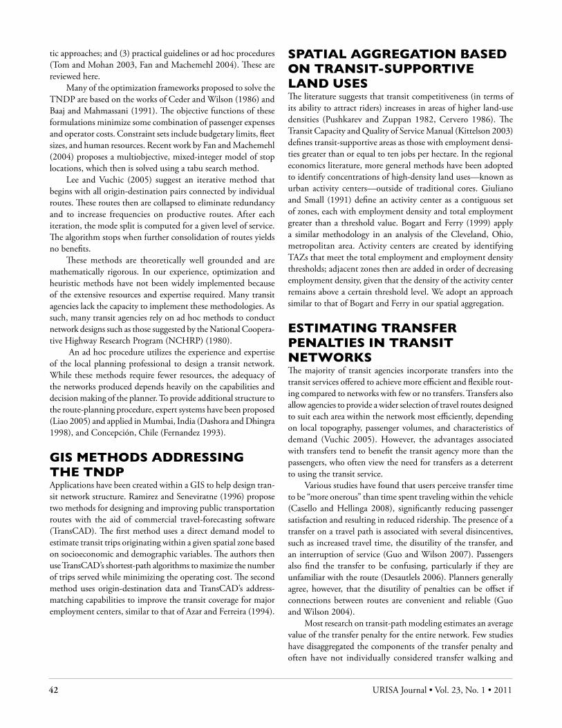
42 URISA Journal • Vol. 23, No. 1 • 2011
tic approaches; and (3) practical guidelines or ad hoc procedures (Tom and Mohan 2003, Fan and Machemehl 2004). These are reviewed here.
Many of the optimization frameworks proposed to solve the TNDP are based on the works of Ceder and Wilson (1986) and Baaj and Mahmassani (1991). The objective functions of these formulations minimize some combination of passenger expenses and operator costs. Constraint sets include budgetary limits, fleet sizes, and human resources. Recent work by Fan and Machemehl (2004) proposes a multiobjective, mixed-integer model of stop locations, which then is solved using a tabu search method.
Lee and Vuchic (2005) suggest an iterative method that begins with all origin-destination pairs connected by individual routes. These routes then are collapsed to eliminate redundancy and to increase frequencies on productive routes. After each iteration, the mode split is computed for a given level of service. The algorithm stops when further consolidation of routes yields no benefits.
These methods are theoretically well grounded and are mathematically rigorous. In our experience, optimization and heuristic methods have not been widely implemented because of the extensive resources and expertise required. Many transit agencies lack the capacity to implement these methodologies. As such, many transit agencies rely on ad hoc methods to conduct network designs such as those suggested by the National Coopera-tive Highway Research Program (NCHRP) (1980).
An ad hoc procedure utilizes the experience and expertise of the local planning professional to design a transit network. While these methods require fewer resources, the adequacy of the networks produced depends heavily on the capabilities and decision making of the planner. To provide additional structure to the route-planning procedure, expert systems have been proposed (Liao 2005) and applied in Mumbai, India (Dashora and Dhingra 1998), and Concepción, Chile (Fernandez 1993).
gIs MEtHods addrEssIng tHE tndPApplications have been created within a GIS to help design tran-sit network structure. Ramirez and Seneviratne (1996) propose two methods for designing and improving public transportation routes with the aid of commercial travel-forecasting software (TransCAD). The first method uses a direct demand model to estimate transit trips originating within a given spatial zone based on socioeconomic and demographic variables. The authors then use TransCAD’s shortest-path algorithms to maximize the number of trips served while minimizing the operating cost. The second method uses origin-destination data and TransCAD’s address-matching capabilities to improve the transit coverage for major employment centers, similar to that of Azar and Ferreira (1994).
sPatIal aggrEgatIon BasEd on transIt-suPPortIVE land usEsThe literature suggests that transit competitiveness (in terms of its ability to attract riders) increases in areas of higher land-use densities (Pushkarev and Zuppan 1982, Cervero 1986). The Transit Capacity and Quality of Service Manual (Kittelson 2003) defines transit-supportive areas as those with employment densi-ties greater than or equal to ten jobs per hectare. In the regional economics literature, more general methods have been adopted to identify concentrations of high-density land uses—known as urban activity centers—outside of traditional cores. Giuliano and Small (1991) define an activity center as a contiguous set of zones, each with employment density and total employment greater than a threshold value. Bogart and Ferry (1999) apply a similar methodology in an analysis of the Cleveland, Ohio, metropolitan area. Activity centers are created by identifying TAZs that meet the total employment and employment density thresholds; adjacent zones then are added in order of decreasing employment density, given that the density of the activity center remains above a certain threshold level. We adopt an approach similar to that of Bogart and Ferry in our spatial aggregation.
EstIMatIng transFEr PEnaltIEs In transIt nEtWorksThe majority of transit agencies incorporate transfers into the transit services offered to achieve more efficient and flexible rout-ing compared to networks with few or no transfers. Transfers also allow agencies to provide a wider selection of travel routes designed to suit each area within the network most efficiently, depending on local topography, passenger volumes, and characteristics of demand (Vuchic 2005). However, the advantages associated with transfers tend to benefit the transit agency more than the passengers, who often view the need for transfers as a deterrent to using the transit service.
Various studies have found that users perceive transfer time to be “more onerous” than time spent traveling within the vehicle (Casello and Hellinga 2008), significantly reducing passenger satisfaction and resulting in reduced ridership. The presence of a transfer on a travel path is associated with several disincentives, such as increased travel time, the disutility of the transfer, and an interruption of service (Guo and Wilson 2007). Passengers also find the transfer to be confusing, particularly if they are unfamiliar with the route (Desautlels 2006). Planners generally agree, however, that the disutility of penalties can be offset if connections between routes are convenient and reliable (Guo and Wilson 2004).
Most research on transit-path modeling estimates an average value of the transfer penalty for the entire network. Few studies have disaggregated the components of the transfer penalty and often have not individually considered transfer walking and

URISA Journal • Simard, Springate, Casello 43
waiting times (Guo and Wilson 2004). This study proposes to assign a penalty value to the travel routes based on the spatial and temporal proximity of each transfer location.
MEtHodology
transIt nEtWork dEsIgnThe objective of the first tool is to address the TNDP. The ap-proach is to utilize GIS to identify travel desire lines from which trunk transit routes are proposed and evaluated. Figure 1 outlines the major components of the methodology; the shaded boxes indicate steps that are completed within a GIS framework. Each of the steps is described in detail in the following sections.
IdEntIFyIng transIt-suPPortIVE land usEsAs described previously, regional land areas (neighborhoods) with higher population or employment densities are considered transit-supportive—that is, a higher-than-average proportion of trips originating from or destined for these areas are made by transit. For this research, we identify transit-supportive areas at the TAZ level. Using current or forecast data, the GIS tool developed in this research allows the user to query TAZs to identify zones that meet or exceed threshold levels of popula-tion, employment, or their densities. The tool also provides the user with means and standard deviations of each data series to provide guidance on the range of observed local values and, therefore, appropriate threshold levels. The tool allows for logic operations such as “AND” (meeting all thresholds) and “OR” (meeting any threshold).
Zonal aggrEgatIon ProcEdurEHaving identified transit-supportive land uses, we next agglomer-ate individual transit-supportive TAZs to create activity centers to reduce complexity and aggregate flows so that major desire lines become more obvious. The process we employ is to aggre-gate adjacent TAZs so long as the average density of the cluster remains above the criterion threshold. The GIS tool allows the user to select interactively zones to be merged into an activity center. Once the zones forming an activity center have been selected, the GIS tool prompts the user for a unique identifier and then dissolves the zones to create a single spatial entity with the aggregated characteristics of the individual zones. These data are stored as a layer in the GIS. The tool also writes a text file with the list of TAZs contained in that activity center for use in the subsequent step.
The method by which TAZs are aggregated to create mega-zones requires additional discussion. While the overall goal of this research is to automate the transit-planning process, this step requires significant user input and substantial local knowledge regarding transportation facilities and land uses. Our approach
in this effort was to generate megazones that met the following qualitative criteria:• Each megazone contains homogenous land uses—for
example, predominantly residential, commercial, or industrial;
• Limits of megazones match with existing physical or topographical boundaries, including major freeways, rivers, etc.; and
• Megazones correspond to catchment areas for major transportation routes.
Quantitative methods by which limits on aggregation can be automated is an opportunity for future research.
aggrEgatIng FloWsWe want to identify those activity centers within and between which the travel demand is highest in the study area. To this end, we estimate total travel demand between activity centers in the following way. Metropolitan regions develop travel-forecasting models that estimate inter-TAZ travel demand for various time periods of the day. While we recognize that travel-forecasting models contain significant weaknesses (Boyce 2002), we suggest that these models offer very positive characteristics as well. First, these models are widely available. In the United States, every metropolitan planning organization (MPO) maintains a travel-forecasting model from which travel demands can be derived; in Canada, the authors are utilizing travel-forecasting models devel-oped for various cities, some with populations of approximately 100,000. Travel-forecasting models also utilize the TAZ level of spatial disaggregation.
The trip data of the travel-forecasting models are stored in what is known as trip tables—matrices of total travel demand from all origins to all destinations. For these tables to provide value in our analysis method, two modifications are made. First, the travel demand between each TAZ is included in the appropriate
Figure 1. Flowchart summarizing the proposed methodology

44 URISA Journal • Vol. 23, No. 1 • 2011
activity centers’ demands or eliminated if the TAZ is not part of an activity center. Second, the data have to be formatted so that they can be used by the GIS tool to display desire lines.
We automate the process of agglomerating the travel demand between individual TAZs to travel between activity centers using the Visual Basic code. The exported text files from the previous step are used to identify the activity centers and their constituent TAZs from which we are able to generate a matrix of intra-activity and interactivity center travel demand. We next convert the data from a matrix to two columns. The first column contains a unique “from_to” (origin to destination) identifier and the sec-ond contains the flow. Formatting the data in this way provides a common field by which the travel-demand data may be joined to the spatial activity center data in the GIS.
Major FloW rEPrEsEntatIonTo generate visual representations of major flows, the network analyst extension in ArcMap is used. We begin by converting the activity centers layer to a point layer. We then use ESRI’s built-in origin-destination (OD) cost-matrix function to generate graphic connections to and from the centroid of every activity center. The resulting attribute table for the OD cost matrix contains origin-destination ID fields. We create a new field to concatenate the two fields together. This field matches the “from_to” field created in the travel-demand table.
We now join the tables together using the common field in both attribute tables. This assigns the flow to each corresponding cost in the matrix. We employ the GIS proportional symbology to display the relative value of flows between OD pairs in conjunc-tion with definition queries that set a threshold of flow below which flows are not displayed.
routE dEsIgn The desire lines provide input into OD pairs for which direct-service connection is logical. To input new routes, the network analyst extension is used. The user specifies a new alignment by identifying stops along the road network. Network analyst then creates a route from the stops by developing a direction alignment that connects the stops between the first and last nodes. Modifica-tions may be made interactively by the user to satisfy local route limitations (for example, roadway geometries). Once satisfied with the new route, the user exports the alignment data; it then is saved as a layer file containing the total length and number of stops.
routE EValuatIonThe GIS tool then allows the user to estimate the operational cost as one evaluation measure for the newly created routes. The GIS tool uses ArcMap’s overlay function to extract the segment length, the posted speed, and the number of signalized intersections for each route alignment from which an approximate travel time can be generated. The tool allows the user to specify the average delay for each component.
To convert travel time to operational costs, the scheduling
method described by Casello and Vuchic (2009) is employed. The GIS tool allows the user to specify a policy headway or to compute a required headway based on a maximum load section and transit unit capacity. The user also inputs the hours of service for weekdays, Saturdays, and Sundays. The tool then computes the necessary fleet size and the number of operators for each time period.
The GIS tool allows the user to convert the operating charac-teristics to a monetary cost in two ways. The first model computes the cost based on a user-defined hourly rate ($ per vehicle-hour); the second option is to compute costs based on both time and distance ($ per vehicle-hour + $ per vehicle-kilometer).
Table 1 summarizes the methodology, identifying the output, the level of automation, and the role of the GIS tool in complet-ing each step. Figure 2 and Figure 3 display the graphical user interface for the GIS tool.
transFEr PEnaltIEs In transIt nEtWorksThe second tool presented in this paper evaluates travel patterns between activity centers to determine if transit travel between OD pairs is direct or if one or more transfers are involved. If a transfer is present, a penalty is quantified based on the disutility of walking and waiting times. Transfer walking time is defined as the time it takes to walk from the bus stop of the alighting vehicle to the stop for the connecting transfer vehicle. It is cal-culated based on a walking speed of one meter per second along the street network. Stops located within 200 meters of each other are considered potential transfer locations. Transfer waiting time is the difference between the A.M. peak period scheduled arrival times of the vehicles involved in the transfer.
The analysis utilizes bus stop locations, route patterns, a modified street network, and scheduled arrival and departure times for each stop and route. A multimodal network is created using the network analyst in ArcGIS to model transit and pedes-trian travel to calculate total travel time between OD pairs. The analysis uses a shortest-path algorithm to identify the travel path with the lowest cost between locations within the network, based on in-vehicle travel time, and, if necessary, the transfer penalty associated with the trip. In-vehicle travel time is represented by arcs within the transit network that hold the scheduled travel time along each section of a route. The transfer penalty is represented by transfer nodes that connect the bus and pedestrian networks and transfer arcs that hold walking times and the waiting time between buses. These values then are combined, resulting in a total transfer penalty for the trip. The algorithm can calculate a route between a single origin and destination, a skim tree between a single origin to all destinations, or an OD matrix between all origins and destinations within the network.
casE study: tHE rEgIon oF WatErlooThe region of Waterloo, located approximately 100 kilometers west of Toronto in southern Ontario, is composed of three cit-

URISA Journal • Simard, Springate, Casello 45
Table 1. Summary of methodological steps, outputs, and GIS functions
Step Transit-supportive Land Uses
Merging TAZs to Create Activity Cen-ters (Megazones)
Trip Aggregation Flow Display Cost Evaluation
Criteria PopulationEmploymentDensitiesAND/OR logic
Semiautomatically doneMaintain neighbor-hood cohesivenessAggregation reduces complexity
List of TAZs in activ-ity centers
Sorted major flowsDisplay threshold % of activity center total
Frequency of service: policy or maximum load section
Output TAZs meeting thresholds
Activity centers with consolidated statisticsList of TAZs con-tained in activity centers
Column of activity center flows
Graphical representa-tion of subset of all flows
Cycle timeFleet sizeOperating speedTotal operating costs
GIS/VB Code Identifies TAZsProvides guidance on criteria statistics
Allows for manual creation of activity centersDissolves and stores activity center infor-mationExports to text file
Fully automated Network analyst con-nects centroids of activity centersJoin with flowsDisplay thresholdsProportional symbol-ogy to show impor-tance
Network analyst tool to input new routesOverlay functions to perform calculations
Graphical In-terface
See Figure 2 See Figure 2 See Figure 3
Figure 2. Graphical interface for transit-supportive land uses and merging TAZs to create activity centers (megazones)
Figure 3. Graphical interface for cost evaluation

46 URISA Journal • Vol. 23, No. 1 • 2011
ies—Kitchener, Waterloo, and Cambridge—and four rural town-ships. The region has a population of approximately 500,000 but is expected to grow to 720,000 by 2031. In anticipation of this growth, the regional government has implemented a series of policies and programs to ensure the functioning of the transpor-tation system. In 2005, Grand River Transit (GRT), the region’s transit provider, introduced an express bus service, known as the iXpress, to connect the three urban centers. The iXpress currently has approximately 9,000 daily boardings. Recently, the Regional Council has approved plans for a $790 million (CDN) Light Rail Transit and Adapted Bus Rapid Transit to upgrade iXpress service along a similar corridor. A map of the region showing both the iXpress and the proposed rapid transit routes is shown in Figure 4. To support the implementation of the rapid transit system, the region and the University of Waterloo have been engaged in a redesign of the conventional bus service. It is this network redesign that motivated the development of the GIS tools presented here.
rEdEsIgnIng tHE rEgIon’s conVEntIonal Bus nEtWork’s trunk routEsThe regional municipality land-use model contains a total area of approximately 1,382 square kilometers subdivided into 576 TAZs. Characteristic data for the region’s TAZs are shown in Table 2.
Table 2. Characteristics of regional TAZ
Characteristic Maximum MeanStandardDeviation
Regional TotalsTAZ size (ha.) 2,210 240 390Employment per TAZ (employees) 8,910 468 718Population per TAZ (persons) 6,919 684 1,157Employment density (employees/ha.)
228.4 10.4 20.0
Population density (persons/ha.) 140.4 13.3 17.6Excluding Rural TownshipsTAZ size (ha.) 1,000 110 150Employment per TAZ (employees) 8,910 562 776Population per TAZ (persons) 6,919 1,027 1,234Employment density (employees/ha.)
22,840 13.5 22.1
Population density (persons/ha.) 14,044 17.1 18.6
Using 2006 socioeconomic and demographic data, we iden-tify TAZs with transit-supportive land use. As shown in Table 2, the average employment density (using regional totals) is 10.4 jobs per hectare with a standard deviation of about 20 jobs per hectare. We elected to use a threshold value of one standard deviation from the mean, or 30 jobs per hectare. Coincidentally, the population density threshold (also one standard deviation from the mean) is (13.3 + 17.6), also approximately 30 persons per hectare. In our analysis, 60 TAZs met the employment density threshold and 112 met the population density limit. The results of aggregating the TAZs together produced 33 population activity centers and
14 employment centers. The employment activity centers are found along the central transit corridor of the region, while the population activity centers are concentrated to the east and west of the transit corridor (as shown in Figure 5).
To generate desire lines, we aggregate the estimated travel between and within the activity centers from the region’s travel-forecasting model. The region of Waterloo model has been devel-oped and is calibrated for the A.M. peak hour. It estimates a total of 118,000 trips in the peak hour (between 8 and 9 A.M.) for the 576 x 576 OD pairs. After our aggregation, we develop a 47 x 47 matrix of travel flows between and within the 33 population and 14 employment activity centers. The total number of trips between and within activity centers is 72,100, or 61 percent of the total peak-hour trips. Thus, through our amalgamation process, we have eliminated 400 TAZs from the analysis (70 percent) and only eliminated 39 percent of trips; furthermore, the eliminated trips are those that begin or end in zones of lower population or employment density and are, therefore, much less likely to be adequately served by transit.
Even after the aggregation of zones and flows, we still are left with 2,209 (47 x 47) travel flows between activity centers. It is difficult to display this much data in a meaningful way. In the GIS, we sort the activity center flows and set a display threshold to ensure that sufficient trip volumes are represented graphically to create meaningful desire lines, but the display is sufficiently limited so that appropriate analyses can be made. In our case, we elected to display 50 percent of all activity center travel demand. This resulted in approximately 35,000 trips—approximately 29 percent of the total regional trips—between only 135 OD pairs. The aggregation procedure has resulted in obvious demand cor-ridors throughout the study area. These trips serve as the input into our desire-line graphical representations, shown in Figure 6, which then inform the route generation. In addition to the desire lines showing trip demand between zones, we represent the magnitude of intrazonal flows by the diameter of the circle containing the megazone identifier.
From the desire lines, there are two approaches that can be
Figure 4. Map of the region of Waterloo showing the iXpress and the proposed rapid transit
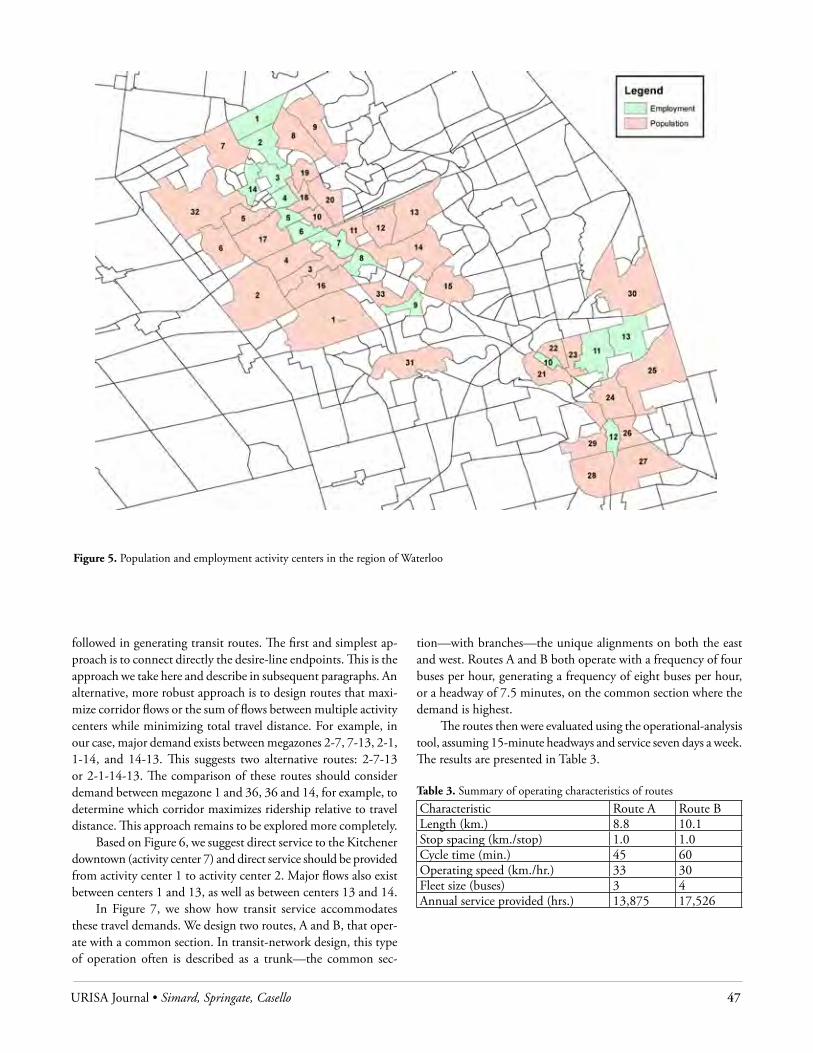
URISA Journal • Simard, Springate, Casello 47
followed in generating transit routes. The first and simplest ap-proach is to connect directly the desire-line endpoints. This is the approach we take here and describe in subsequent paragraphs. An alternative, more robust approach is to design routes that maxi-mize corridor flows or the sum of flows between multiple activity centers while minimizing total travel distance. For example, in our case, major demand exists between megazones 2-7, 7-13, 2-1, 1-14, and 14-13. This suggests two alternative routes: 2-7-13 or 2-1-14-13. The comparison of these routes should consider demand between megazone 1 and 36, 36 and 14, for example, to determine which corridor maximizes ridership relative to travel distance. This approach remains to be explored more completely.
Based on Figure 6, we suggest direct service to the Kitchener downtown (activity center 7) and direct service should be provided from activity center 1 to activity center 2. Major flows also exist between centers 1 and 13, as well as between centers 13 and 14.
In Figure 7, we show how transit service accommodates these travel demands. We design two routes, A and B, that oper-ate with a common section. In transit-network design, this type of operation often is described as a trunk—the common sec-
tion—with branches—the unique alignments on both the east and west. Routes A and B both operate with a frequency of four buses per hour, generating a frequency of eight buses per hour, or a headway of 7.5 minutes, on the common section where the demand is highest.
The routes then were evaluated using the operational-analysis tool, assuming 15-minute headways and service seven days a week. The results are presented in Table 3.
Table 3. Summary of operating characteristics of routes
Characteristic Route A Route BLength (km.) 8.8 10.1Stop spacing (km./stop) 1.0 1.0Cycle time (min.) 45 60Operating speed (km./hr.) 33 30Fleet size (buses) 3 4Annual service provided (hrs.) 13,875 17,526
Figure 5. Population and employment activity centers in the region of Waterloo
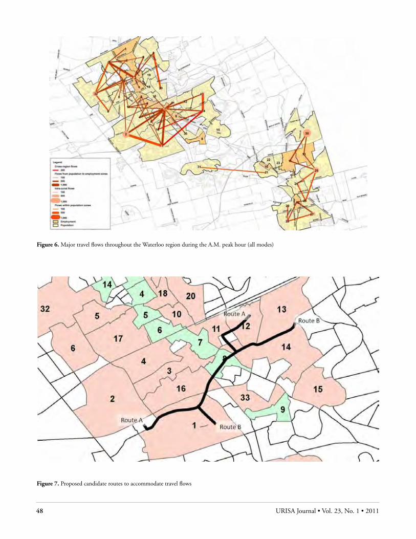
48 URISA Journal • Vol. 23, No. 1 • 2011
Figure 6. Major travel flows throughout the Waterloo region during the A.M. peak hour (all modes)
Figure 7. Proposed candidate routes to accommodate travel flows

URISA Journal • Simard, Springate, Casello 49
EValuatIng transFEr PEnaltIEs on grt In tHE rEgIon oF WatErlooCurrent transit service within the region of Waterloo operates along approximately 60 routes. Using bus stop and route shape files for the region as well as the schedule data for the A.M. peak period, travel between the various activity centers is analyzed to determine the convenience of travel in relation to the quantity and quality of transfers, based on spatial and temporal proximity. Travel paths are analyzed as having direct travel or travel requiring one or two transfers.
For simplicity, we eliminate access time and waiting times. Total travel time is computed beginning with the departure time of a bus stop from the origin zone and ending with the arrival time of the final stop within the destination zone. For this purpose, the bus stop located closest to the center of the zone was used as the original departure point. If a transfer is involved in the trip, then the difference in time between the arrival and departure of transferring vehicles is calculated, as well as the walking distance between stops. These values then were combined to create a transfer penalty or cost for the trip.
We selected 20 origin zones and estimated the travel costs to each of the three downtown cores. We computed the percent of total cost attributable to transfers—including both time and distance—for each of these 60 travel combinations. The output of the transfer penalty model is essentially a table that identifies origin zone, destination zone, total travel time from origin to destination, transfer walking time, transfer waiting time, and total transfer time. This output can be easily joined to an existing shape file using the origin (or destination) zones as a common field to display “high-cost”—in terms of transfers—origins or destinations. Figure 8 displays histograms of walking times, waiting times, and the total transfer penalty as a percentage of the overall travel time for the 20 zones in the region of Waterloo.
Using the results of Figure 8, we can identify those transfer loca-tions in the network for which walk time exceeds a certain threshold, in our case greater than three minutes (for which one such transfer exists). We also can identify those transfers for which long schedule delays occur. We suggest a threshold of greater than six minutes (360 seconds); in our case, 29 of the 60 (48 percent) connections exceed the threshold and should be examined for service changes.
transFEraBIlIty and lIMItatIons oF MEtHodsThe data required to employ the network design tool are popula-tion and employment at a sufficiently disaggregate level (typically TAZs) and a travel-demand matrix that shares the same spatial disaggregation. These data should be readily available in most municipalities.
In our approach, we make several assumptions to man-age the complexity of the problem. These include establishing thresholds on population and employment density for inclusion
in the analysis, assessing the appropriate level of TAZ aggregation, and evaluating the quantity of activity center flows to be used in generating desire lines. The scalability of our approach depends somewhat on the values we choose in these assumptions.
If the same approach with similar thresholds were taken in larger cities, the total number of qualifying TAZs probably would increase linearly as a function of the total number of TAZs in the metropolitan region. This increase comes at very little cost be-cause identifying qualifying TAZs is a fully automated procedure. Converting the TAZs to megazones is semiautomated. While the process is relatively straightforward, it does require some time and local knowledge to generate appropriate megazones from the qualifying TAZs.
Figure 8. Transfer costs in relation to total travel time

50 URISA Journal • Vol. 23, No. 1 • 2011
The processes of aggregating individual zonal flows to mega-zone flows, as well as sorting and displaying these flows, also are fully automated. As such, the costs associated with producing trip tables and displaying desire lines for a larger number of OD pairs (between megazones) are not substantial.
We do recognize that the robustness of our approach depends heavily on the presence of high-density land uses and concentrated travel demands. We are able to capture nearly 30 percent of the re-gional travel demand in 135 OD pairs because the region of Waterloo has a central employment corridor to which many trips are destined.
Care should be taken, however, to analyze two key variables to determine the suitability of our approach to other metropolitan areas. First, it is desirable that the trips associated with megazones represent a significant portion of total trips—certainly higher than 50 percent. Next, it is beneficial that a high percentage of megazone trips be concentrated between a relatively small subset of the megazone OD pairs. This represents concentrated demand for which transit service competes well.
To compute the operating characteristics of proposed routes, the data required are GIS layers that contain the roadway network, the posted speeds on each link, and the location of signalized intersections. This process is fully automated and the computing times to generate results are negligible.
The data required to apply the second tool include a repre-sentation of the transit network and the system schedule. One challenge is that the transit stop locations may or may not be associated directly with a route and typically are not associated with a specific route direction (i.e., northbound or southbound). As such, some data manipulation may be necessary.
The limits of the transit network design tool include a trade-off in spatial aggregation. We lose representativeness of travel patterns by aggregating all origins and destinations to an activity-center centroid. In the aggregation, however, we develop more meaningful flow lines without a substantial loss in data quality. In estimating the operational times associated with routes, the method presented could be greatly improved if actual travel delays (based on link v/c ratios) were available in GIS format. These data typically are output from travel-forecasting models but in our case did not contain a common link identifier to facilitate a join.
Limitations with the transfer tool include the definition of the transfer penalty, which only considers spatial and temporal prox-imity, while additional attributes, such as the pedestrian environ-ment, also can affect users’ perception of transfers. Furthermore, the tool would be enhanced if it took into account the passenger demand between the origins and the destinations considered.
conclusIonsThis paper presents two integrated GIS tools that have been suc-cessfully applied in the regional municipality of Waterloo. The first tool facilitates land-use analysis and network design in transit planning. The second tool determines transfer penalties associated with OD pairs to target travel paths with high-transfer penal-ties where service changes may improve passenger convenience
through better coordination of transfers. The tools presented offer flexible methodologies in GIS that are sufficiently rigorous in their methods but that require resources available to most transit agencies and are customizable to local conditions.
Acknowledgments
Research presented in this paper is sponsored by the regional municipality of Waterloo and the National Science and Engi-neering Research Council (NSERC) of Canada. The authors also wish to acknowledge the constructive comments made by the anonymous reviewers.
About the Authors
Stephanie Simard is a transportation planner at Dillon Consult-ing Limited. She received her Master’s of Applied Science in Civil Engineering from the University of Waterloo. Her interest is in using GIS as a spatial-analysis tool to inform transit network design.
Corresponding Address: Dillon Consulting Limited 5335 Canotek Road, Suite 200 Ottawa, ON Canada K1J 9L4 [email protected]
Erica Springate is a Master’s student in the School of Planning at the University of Waterloo. Her research work involves automating the process of quantifying the cost of transfers in transit network as part of an overall generalized cost formulation.
Corresponding Address: School of Planning University of Waterloo 200 University Avenue West
Waterloo, ON Canada N2L 3G1 [email protected]
Jeffrey Casello is an associate professor in the School of Planning and the Department of Civil and Environmental Engineering at the University of Waterloo. His primary research interest is in the development and application of quantitative models of transportation (particularly transit) system performance. He also is interested in and researching the impacts of transpor-tation investments on land-use patterns. He has published extensively on these topics.
Corresponding Address: School of Planning and Department of Civil and Environmental Engineering University of Waterloo 200 University Avenue West Waterloo, ON Canada N2L 3G1 Phone: (519) 888-4567 [email protected]
URISA Journal • Simard, Springate, Casello 51
References
Azar, K. T., and J. Ferreira. 1994. Using GIS tools to improve transit ridership on routes serving large employment centers: The Boston south end medical area case study. Computers, Environment, and Urban Systems 18: 205-31.
Baaj, M. H., and H. S. Mahmassani. 1991. An AI-based approach for transit route system planning and design. Journal of Advanced Transportation 25(2): 187-210.
Bogart, W., and W. Ferry. 1999. Employment centres in greater Cleveland: Evidence of evolution in a formerly monocentric city. Urban Studies 36(12): 2099-110.
Boyce, D. 2002. Is the sequential travel forecasting paradigm counterproductive? Journal of Urban Planning and Develop-ment 128(4): 169-83.
Casello, J., and V. R. Vuchic. 2009. Urban transit. In M. Meyer, Ed., Transportation planning handbook, 3rd Ed. Washing-ton, DC: Institute of Transportation Engineers, 16.
Casello, J., and B. Hellinga. 2008. Impacts of express bus service on passenger demand. Journal of Public Transportation 11(4).
Ceder, A., and N. H. M. Wilson. 1986. Bus network design. Transportation Research, Part B: Methodology 20(1): 331-44.
Cervero, R. 1986. Suburban gridlock. New Brunswick, NJ: Cen-ter for Urban Policy Research, Rutgers University.
Dashora, M., and S. L. Dhingra. 1998. Expert system for bus routing and scheduling. Computers in Urban Planning and Urban Management 2: 841-53.
Desautlels, A. 2006. Improving the transfer experience at inter-modal transit stations through innovative dispatch strate-gies. Unpublished Master’s thesis, University of Arizona, Tucson, AZ.
Fan, W., and R. D. Machemehl. 2004. Optimal transit route network design problem: Algorithms, implementations, and numerical results. Technical Report 167244-1, University of Texas at Austin.
Fan, W., and R. B. Machemehl. 2004. A Tabu search based heu-ristic method for the transit route network design problem. Ninth International Conference on Computer Aided Sched-uling of Public Transport, San Diego, California.
Fernandez, R. 1993. An expert system for the preliminary design and location of high capacity bus stops. Traffic Engineering and Control 34: 533-39.
Giuliano, G., and K. Small. 1991. Subcenters in the Los Ange-les region. Regional Science and Urban Economics 21(2): 163-82.
Guo, Z., and N. Wilson. 2007. Modeling effects of transit system transfers travel behavior: Case of commuter rail and subway in downtown Boston, Massachusetts. Transportation Re-search Record: Journal of the Transportation Research Board of the National Academies, Washington, DC 2006: 11-20.
Guo, Z., and N. Wilson. 2004. Assessment of the transfer penalty for transit trips: Geographic information system-based disag-gregate modeling approach. Transportation Research Record: Journal of the Transportation Research Board of the National Academies, Washington, DC 2004: 10-18.
Kittelson and Associates, Inc. 2003. Transit capacity and quality of service manual (TCQSM), 2nd Ed. Prepared for Transit Cooperative Research Program, Transportation Research Board, Washington, DC.
Lee, Y.-J., and V. R. Vuchic. 2005. Transit network design with variable demand. ASCE Journal of Transportation Engineer-ing 131(1): 1-10.
Liao, S. H. 2005. Expert system methodologies and applica-tions—a decade review from 1995 to 2004. Expert Systems with Applications 28: 93-103.
Liu, R., R. Pendyala, and S. Polzin. 1998. Simulation of the effects of intermodal transfer penalties on transit use. Trans-portation Research Record: Journal of the Transportation Research Board of the National Academies, Washington, DC 1623: 88-95.
National Cooperative Highway Research Program (NCHRP). 1980. Bus route and schedule planning guidelines. Synthesis of Highway Practice 69, Transportation Research Board, National Research Council, Washington, DC.
Pushkarev, B., and J. Zuppan. 1982. Where transit works: Urban densities for public transportation. In H. S. Levinson and R. A. Weant, Eds., Urban transportation: Perspectives and prospects. Westport, CT: Eno Foundation.
Ramirez, A., and P. Seneviratne. 1996. Transit route design applications using geographic information systems. Trans-portation Research Record: Journal of the Transportation Research Board of the National Academies, Washington, DC 1557: 123-39.
Tom, V. M., and S. Mohan. 2003. Transit route network design using frequency coded genetic algorithm. Journal of Trans-portation Engineering 129(2): 186-95.
Vuchic, V. 2005. Transit lines and networks. In Urban transit: Operations, planning, and economics. Hoboken, NJ: John Wiley & Sons.

ATTEND THE GEOSPATIAL SUMMIT to learn about strategies and best practices for implementing GIS technologies in your agency and enterprise operations. Hear about the successful geospatial solutions being applied today to boost productivity and respond to government initiatives.
Customize your program today and choose from focused sessions on:
■ Case Study: How DHS & DoT Designed Successful User Experiences for Decision Makers
■ Open Source GIS Support to the Deepwater Horizon Oil Spill Response
■ Next Generation 9-1-1
■ GIS Integrating and Sharing Data: Lessons Learned from the EPA
Register by August 12
and SAVE $200!Use Discount Code: GSAD3
KEYNOTE SPEAKER
Michael ByrneNational Incident Management Assistance Team, FEMA
GIS to the Rescue: The Critical Role of Geospatial Technology in Disaster Response
SEPTEMBER 13–14, 2011HYATT DULLES HERNDON, VA
SPONSORED BY PRODUCED BY
GeospatialSummit.comFor more information and to register, visit:
Geo11_Ad_bw_0711_Urisa.indd 1 7/14/11 1:52 PM

Learn more about
GIS Professional Certification at
www.gisci.org

Your Decisions Affect TheirsGovernment decisions affect more than 300
million Americans a year. With Esri® Technology,
you can connect with your entire constituency.
Esri helps you demonstrate accountability, foster
collaboration, and make the effective decisions
that keep your constituents happy.
Copyright © 2011 Esri. All rights reserved.
Learn more at esri.com/urisanews
G48827_URISA-News_MayJun11.indd 1 6/16/11 9:55 AM