20 CHAPTER IV DATA COLLECTING AND PROCESSING 4.1 ...
34
20 CHAPTER IV DATA COLLECTING AND PROCESSING 4.1. Data Collection This research uses a fictious company provided by Microsoft namely Adventure Works Bicycles, Inc. Adventure Works is a fictional bicycle wholesaler. The company has 97 different brands of bikes that grouped into three categories: mountain bikes, road bikes, and touring bikes. Moreover, Adventure Works also manufacture some of its own components. Several components, accessories and clothing are purchased from outside from vendors. 4.1.1. Adventure Works Profile Adventure Works is not only selling bicycles, but it also provides accessories, clothing, and components. The accessories available such as bottles, bike racks, brakes, etc. The available clothing such as caps, gloves, jersey, etc. For the components, Adventure Works sells brakes, chains, derailleurs, etc. Many of those things are made by vendors, so Adventure Works stand as a reseller. Adventure Works serve the customer globally, including Australia, Canada, France, and Germany, United Kingdom, and United States. There are 2 business models in Adventure Works which are retail stores that sell bikes, and internet sales that serve individual customers. Usually Adventure Works sells in bulk to retail stores, which acts as resellers for its products.
-
Upload
khangminh22 -
Category
Documents
-
view
1 -
download
0
Transcript of 20 CHAPTER IV DATA COLLECTING AND PROCESSING 4.1 ...

20
CHAPTER IV
DATA COLLECTING AND PROCESSING
4.1. Data Collection
This research uses a fictious company provided by Microsoft namely Adventure Works
Bicycles, Inc. Adventure Works is a fictional bicycle wholesaler. The company has 97
different brands of bikes that grouped into three categories: mountain bikes, road bikes,
and touring bikes. Moreover, Adventure Works also manufacture some of its own
components. Several components, accessories and clothing are purchased from outside
from vendors.
4.1.1. Adventure Works Profile
Adventure Works is not only selling bicycles, but it also provides accessories, clothing,
and components. The accessories available such as bottles, bike racks, brakes, etc. The
available clothing such as caps, gloves, jersey, etc. For the components, Adventure Works
sells brakes, chains, derailleurs, etc. Many of those things are made by vendors, so
Adventure Works stand as a reseller.
Adventure Works serve the customer globally, including Australia, Canada, France,
and Germany, United Kingdom, and United States. There are 2 business models in
Adventure Works which are retail stores that sell bikes, and internet sales that serve
individual customers. Usually Adventure Works sells in bulk to retail stores, which acts
as resellers for its products.

21
To run the business activities, Adventure Works has a total of 290 employees that
included in some functions such as sales, production, purchasing, engineering, finance,
information services, marketing, shipping and receiving, and R&D. The customers of
Adventure Works include over 700 stores and over 19000 individuals worldwide and its
vendors are quantified around 100 vendors companies that supply raw materials,
accessories, clothing, and components.
Even tough Adventure Works is fictional, it is designed as a realistic case as the
same as real company in industry. Adventure Works provide database and data warehouse
that covers business process from sales, material management, production, finance, and
human capital management. Therefore, the researcher uses this fictional company as the
case study to develop Self-service BI system.
4.1.2. Adventure Works and Adventure Works Data Warehouse (DW)
There are 2 databases provided by Microsoft for Adventure Works, which are Adventure
Works and Adventure Works Data Warehouse (DW). Researcher uses the updated
version of Adventure Works which is for Adventure Works 2017. Adventure Works 2017
database is an Online Transaction Processing (OLTP) database, which is rich in structure,
content, and variety. While Adventure Works DW 2017 is a data warehouse, which is
targeted for Online Analytical Processing (OLAP) and data mining.
The OLTP database consists of 68 tables that are grouped into different
classification such as Sales, Purchasing, Production, Human Resources, and Person. The
database (in its raw state) contains data of almost 20,000 people (employees, customers,
store contacts, vendor contacts, and general contacts). It also contains data of over 31,000
sales transactions to customers and over 4000 purchasing transactions from suppliers. The
data in Adventure Works’s OLTP database is very comprehensive compared with data
volume in a typical textbook’s sample database. There are also several advanced data
types that are demonstrated in Adventure Works’s OLTP database, including bitmapped
product photographs, XML, and hierarchy id fields to representing hierarchical data
relationships.

22
The Adventure Works DW is a centralized warehouse architecture consisting of
fact tables, dimension tables, and containing data obtained from the OLTP database and
other data sources via a traditional extract/transform/load (ELT) process. There are total
of 10 fact tables, with subject areas ranging from internet and reseller sales to financials
to product inventory. These fact tables are surrounded by 16 dimension tables,
representing customers, product lines, accounts, employees, departments, geographic
regions, and time. Thus, Adventure Works DW is a useful venue for discussing many key
data warehousing topics, and serves as a springboard for OLAP cube building and data
mining.
Indeed, this research will use AdventureWorks 2017 (OLTP) database instead of
AdventureWorksDW2017 (OLAP). The reason of choosing AdventureWorks2017
(OLTP) because the scope of this research is the development of self-service BI, so it is
necessary to process all of the things from raw (OLTP) into structured data warehouse.
4.1.3. Adventure Works 2017
This database contains 68 tables from company transactions. There are several tables that
grouped into different area such as sales, human resources, person, purchasing, and
production. Table 4.1 shows the list of tables stored in Adventure Works 2017.
Table 4.1. Adventure Works 2017 table lists
No. Table Name Description
1 Address Street address information for customers, employees,
and vendors
2 AddressType Types of addresses stored in the Address table.
3 BillOfMaterials Items required to make bicycles and bicycle
subassemblies.
4 BusinessEntity Source of the ID that connects vendors, customers,
and employees with address and contact information
5 BusinessEntityAddress Cross-reference table mapping customers, vendors,
and employees to their addresses.
6 BusinessEntityContact Cross-reference table mapping stores, vendors, and
employees to people
7 ContactType Lookup table containing the types of business entity
contacts.
8 CountryRegion Lookup table containing the ISO standard codes for
countries and regions.

23
No. Table Name Description
9 CountryRegionCurrency Cross-reference table mapping ISO currency codes to
a country or region.
10 CreditCard Customer credit card information
11 Culture Lookup table containing the languages in which some
AdventureWorks data is stored
12 Currency Lookup table containing standard ISO currencies.
13 CurrencyRate Currency exchange rates.
14 Customer Current customer information. Also see the Person
and Store tables
15 Department Lookup table containing the departments within the
Adventure Works Cycles company.
16 Document Product maintenance documents.
17 EmailAddress Where to send a person email
18 Employee Employee information such as salary, department, and
title.
19 EmployeeDepartmentHist
ory
Employee department transfers.
20 EmployeePayHistory Employee pay history.
21 Illustration Bicycle assembly diagrams
22 JobCandidate Resumes submitted to Human Resources by job
applicants.
23 Location Product inventory and manufacturing locations
24 Password One-way hashed authentication information
25 Person Human beings involved with AdventureWorks:
employees, customer contacts, and vendor contacts
26 PersonCreditCard Cross-reference table mapping people to their credit
card information in the CreditCard table
27 PersonPhone Telephone number and type of a person.
28 PhoneNumberType Type of phone number of a person.
29 Product Products sold or used in the manfacturing of sold
products.
30 ProductCategory High-level product categorization.
31 ProductCostHistory Changes in the cost of a product over time.
32 ProductDescription Product descriptions in several languages.
33 ProductDocument Cross-reference table mapping products to related
product documents.
34 ProductInventory Product inventory information
35 ProductListPriceHistory Changes in the list price of a product over time.
36 ProductModel Product model classification.
37 ProductModelIllustration Cross-reference table mapping product models and
illustrations. 38 ProductModelProductDes
criptionCulture
Cross-reference table mapping product descriptions
and the language the description is written in.
39 ProductPhoto Product images.
40 ProductProductPhoto Cross-reference table mapping products and product
photos.
41 ProductReview Customer reviews of products they have purchased.
42 ProductSubcategory Product subcategory classification

24
No. Table Name Description
43 ProductVendor Cross-reference table mapping vendors with the
products they supply.
44 PurchaseOrderDetail Individual products associated with a specific
purchase order. See PurchaseOrderHeader.
45 PurchaseOrderHeader Individual products associated with a specific
purchase order. See PurchaseOrderHeader.
46 SalesOrderDetail Individual products associated with a specific sales
order. See SalesOrderHeader.
47 SalesOrderHeader General sales order information.
48 SalesOrderHeaderSalesRe
ason
Cross-reference table mapping sales orders to sales
reason codes
49 SalesPerson Sales representative current information.
50 SalesPersonQuotaHistory Sales representative current information.
51 SalesReason Lookup table of customer purchase reasons.
52 SalesTaxRate Tax rate lookup table.
53 SalesTerritory Sales territory lookup table
54 SalesTerritoryHistory Sales representative transfers to other sales territories.
55 ScrapReason Manufacturing failure reasons lookup table.
56 Shift Work shift lookup table.
57 ShipMethod Shipping company lookup table.
58 ShoppingCartItem Contains online customer orders until the order is
submitted or cancelled.
59 SpecialOffer Sale discounts lookup table.
60 SpecialOfferProduct Cross-reference table mapping products to special
offer discounts
61 StateProvince State and province lookup table.
62 Store Customers (resellers) of Adventure Works products
63 TransactionHistory Record of each purchase order, sales order, or work
order transaction year to date
64 TransactionHistoryArchive Transactions for previous years.
65 UnitMeasure Unit of measure lookup table.
66 Vendor Companies from whom Adventure Works Cycles
purchases parts or other goods.
67 WorkOrder Manufacturing work orders.
68 WorkOrderRouting Work order details.
Table 4.1 shows the list of tables stored in Adventure Works database. These
data consist of several classification such as sales, purchasing, product, human resources,
and person. These tables will be used as a main source to create OLAP cube contains
several dimensions with 1 fact table.
25
4.2. Data Processing
To develop Self-service Business Intelligence System, this research uses 6 phases method
introduced by Sherman (2015) that consist of: scope and plan phase, analyze and define
phase, architect and design phase, built test and refine phase, implement phase, deploy
and roll-out phase. However, for the last 2 phases which are implement phase and deploy
and roll-out phase will not be covered in this research because the data source used is
derived from fictional company and these 2 phases are impossible to be performed.
4.2.1. Scope and Plan
After analysing the company and the business operations of Adventure Works, the
researcher defines the scope of this project as follow:
1. Product sales analysis
2. Sales analysis by location
3. Sales analysis by customer
The scope of this development is only in Adventure Works company. The
dashboard will be built in order to be used by Executive General or Sales Manager.
4.2.2. Analyze and Define
A. Data Sources
The data source used to develop BI system is Adventure Works DW 2017. This is an
OLAP database. However, this database still needs to be organized by using data
warehousing because this OLAP database still need to be configured in order to match
and answer the project scope.
Initially, the data will be stored in Microsoft SQL Server. After that, the data will
be imported to Power BI Desktop and the data warehousing activity will be conducted
using power query editor and data view in Power BI.

26
4.2.3. Architect and Design
A. Data Warehouse Model
In this phase, the researcher begins to lay the foundations for the BI solutions. As defined
in subchapter 4.2.1, there are 3 analysis needs to be constructed, and those analyse the
same thing which is sales performance, thus the researcher just needs to make 1 fact table
surrounded by several dimensions. The design of data warehouse is shown in Figure 4.1.
Figure 4.1 Data warehouse model design
DimProduct
DimDate
FactAllSalesFactAllSales
DimCustomer
DimLocation
DimSalesTerritory
ProductIDPK
ProductName
ProductCategory
ProductSubcategory
StandardCost
ListPrice
DateKeyPK
Year
Month
Month Name
Quarter
Week of Month
Day of Week
Day Name
SalesOrderIDPK
ProductID
OrderQty
OrderDate
UnitPrice
CustomerID
SalesAmount
SalesPersonID
StandardCost
AddressID
OrderChannel
BusinessEntityIDPK
AddressID
Name
PhoneNumber
EmailAddress
BirthDate
AdressIDPK
AddressLine
City
StateProvinceID
PostalCode
Province
MaritalStatus
YearlyIncome
Gender
Education
Occupation
NumberCarsOwned
TotalChildren
CountryRegionCode
CountryName
TerritoryID
TerritoryPK
Region
CountryRegionCode
Country
Group

27
Figure 4.1 shows the data warehouse model design. There are star-schema model
applied with 7 dimensions and 1 fact table. The dimensions are DimCustomer, DimDate,
DimLocation, DimProduct, DimReseller, DimSalesPerson, DimSalesTerritory. The fact
table is FactAllSales. This data warehouse design will be used as a guidance to convert
the database from the source into OLAP database using Microsoft Power BI.
B. Visualization Design
There are 5 analysis need to be performed and the researcher will make 5 visualization
pages as well as the analysis.
1. Product sales analysis dashboard design
Figure 4.2 shows the design of dashboard for product performance. There are
stacked chart to figure out the sales volume and sales revenue by single product.
On the other hands, the pie chart is used to show the sales volume and sales
revenue by product category. This dashboard also complements with slicer in
order to make business users able to perform data exploration.
Figure 4.2 Design of dashboard for product performance
Product Performance
25%25%
25% 25%
SLICER
100 90 80 70 60
100 90 80 70 60 25%25%
25% 25%
Sales Volume by Product
Sales Revenue by Product
Sales Volume by Product Category
Sales Revenue by Product Category
No of
Transaction
No of
Products
Sales
Volume
Sales
Revenue
Margin

28
2. Sales analysis by location dashboard design
Figure 4.3 shows the design of dashboard for sales analysis by location. This
dashboard will be used to explore the data visualize by geographical things. There
are several visualizations that used in this dashboard. To present sales revenue,
this dashboard provides two visualizations which are stacked bar chart and filled
map.
Figure 4.3 Design of sales analysis by location dashboard
Furthermore, this dashboard also uses area chart and heat map to visualize
margin. This visualization is helpful to view the trend of the margin and can be used
as forecasting using linear trend.
In order to make user a freedom to perform data exploration, the slicer is
applied. The slicers consist of several items such as date slicer, product slicer,
country slicer, and order channel. Date slicer can be started from month until year
and product slicer could be consisting of product category and product subcategory.
Slicer
Sales Analysis by Location
10090
8070
60
Sales Revenue by Region Margin perdate by Country
Order Channel
Year
Month
Y-A
xis
X-Axis
Sales Revenue by Region Margin by Country
Country
Product Category
Product Subcategory

29
3. Sales analysis by customer
Figure 4.4 shows the design of dashboard for sales analysis by customer. There
are several visualizations show in this dashboard. This dashboard is aimed to
identify the customer behaviour with their background such as with their
education, occupation, and so on.
Several visualizations are used such as pie chart to figure out the sales revenue
filtered by education. On other hands, on bottom centre there is a stacked bar chart
that present the sales revenue grouped by occupation.
Slicer
Sales Analysis - Customer
100 90 80 70 60
Top Category by Slicer Margin perdate by Slicer (+Forecast)
Occupation
No of
Transaction
Product Category
Product Subcategory
Top Sales Revenue by Occupation Sales Revenue by Education
10%
10%100 90 80 70 60
Yearly Income
Education
Sales
Volume
Sales
RevenueMargin
Figure 4.4 Design of dashboard for sales analysis by customer.

30
4.2.4. Built & Test
A. Importing Data
In order to develop a BI solution system, the first thing that the developer needs to do is
importing the data. In this research, the researcher only uses single source database which
is AdventureWorks2017. The database stored in SQL Server.
The data warehousing will be processed in Power BI Desktop. Power BI Desktop
provide great tools for modelling. Power query and power pivot from Excel is already
embedded in Power BI desktop so that it does not need other softwares to build data
warehouse.
Figure 4.5 shows the BI structure used in this research. Based on Figure 4.5, it can
be seen that there are only SQL Server used as a data source. The process of importing
data is done by using import data feature in Microsoft Power BI. Because not all of the
data is imported to the model, so the researcher choose only table that relate to the data
warehouse design that imported to Power BI.
Extraction
Transformation
Loading
ETL ToolSource SystemBI Analysis
BI Structure
Data Warehouse
Figure 4.5 BI Structure

31
B. Transform and Enrich Data
After the data already imported, the next step is to perform ETL process. According to
data warehouse model, there are 5 dimensions with 1 fact table that would be created. All
of these table will be created using power query editor and data view designer in Power
BI Desktop. The pseudo code and the output of tables are shown as follows:
1. DimDate
DimDate is created manually without importing any date data from another source.
Figure 4.6 shows the pseudo code to create date dimension.
Figure 4.6 Pseudocode of DimDate table
Result of DimDate table is shown in Figure 4.7. This figure displays the date
dimension consist of 8 columns which are FullDateAlternateKey, Year, Month, Month
Name, Quarter, Week of Month, Day of Week, Day Name.
Figure 4.7 DimDate data view
32
2. DimProduct
DimProduct is created using the combination of imported tables from SQL Server
such as ProductCategory, ProductSubcategory, and Product table. The script of
creating DimProduct in power query editor is attached in attachment sheet. The
pseudo code of creating product dimension is shown in Figure 4.8.
Figure 4.8 Pseudocode of DimProduct table
The result of data model to create product dimension is shown in Figure 4.9. As shown
in Figure 4.9, there are several columns in DimProduct table such as ProductID,
Product Name, Product Category, Product Subcategory, Standard Cost, and List
Price.
Figure 4.9 DimProduct data view

33
3. DimLocation
DimLocation is created using the imported data. This table will contain the
information that useful to relate the sales transaction and customer location. The
pseudocode of creating DimLocation is shown in Figure 4.10.
Figure 4.10 Pseudocode of DimLocation table
The result of data model is designed to create location dimension as shown in Figure
4.11. Based on Figure 4.11, there are several columns stored in this table such as
AddressID, AddressLine, City, StateProvinceID, PostalCode, StateProvinceCode,
Province, CountryRegionCode, CountryName, and TerritoryID.
Figure 4.11 DimLocation data view

34
4. DimSalesTerritory
DimSalesTerritory is created in order to be used as a lookup table for territory ID in
dimlocation. This dimension contains 10 rows that are used for dimlocation to lookup
columns such as region, country, and country group. The pseudocode of
DimSalesTerritory table is shown in Figure 4.12.
Figure 4.12 Pseudocode of DimSalesTerritory table
The data view of sales territory dimension is shown in Figure 4.13. Based on
Figure 4.13, there are several columns stored in Sales Territory table such as
TerritoryID, Region, CountryRegionCode, Country, and Group.
Figure 4.13 DimSalesTerritory data view
35
5. DimCustomer
DimCustomer is created by grouping some tables from the imported database. This
dimension will be used as an essential dimension to analyse the customer related with
the sales performance. The pseudocode of DimCustomer table is shown in Figure
4.14.
Figure 4.14 Pseudocode of DimCustomer table
The result of data model for customer dimension is shown in Figure 4.15. Based
on Figure 4.15, it is apparent that there are several columns stored in DimCustomer
table such as BusinessEntityID, AddressID, Name, PhoneNumber, BirthDate,
MaritalStatus, YearlyIncome, Gender, NumberOfChildren, Education, Occupation,
NumberOfCarsOwned.

36
Figure 4.15 DimCustomer data view

37
6. FactAllSales
FactAllSales is the only fact table in this data warehouse model. This table will be used
in all of the analysis because the sales data are only available here. The pseudocode of
FactAllSales Table is shown in Figure 4.16.
Figure 4.16 Pseudocode of FactAllSales Table
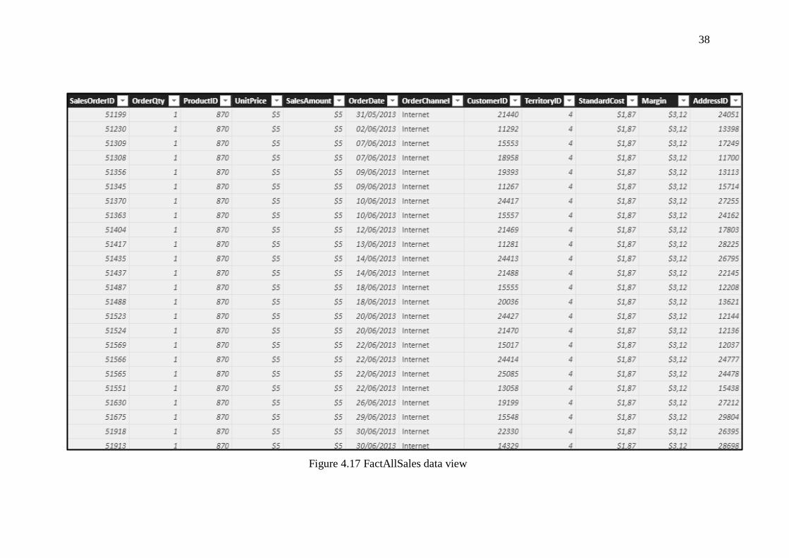
The data created for FactAllSales table is shown in Figure 4.17. There are several columns
in this table such as SalesOrderID, OrderDate, ProductID, CustomerID, OrderQty,
UnitPrice, SalesAmount, OrderChannel, TerritoryID, StandardCost, AddressID, and
Margin.
38
Figure 4.17 FactAllSales data view
39
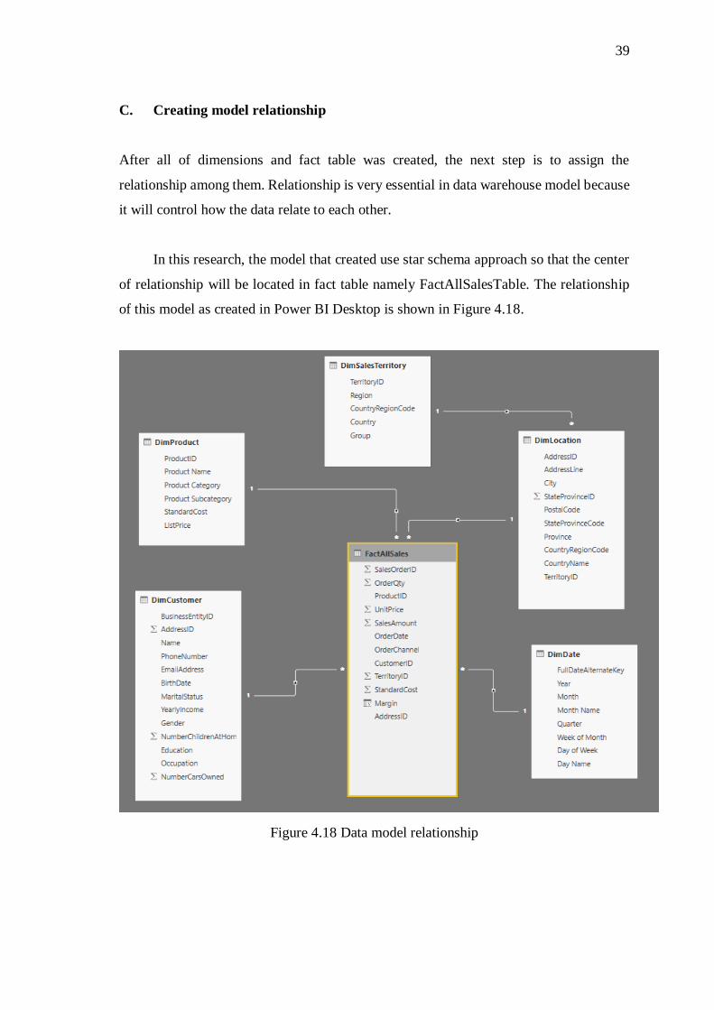
C. Creating model relationship
After all of dimensions and fact table was created, the next step is to assign the
relationship among them. Relationship is very essential in data warehouse model because
it will control how the data relate to each other.
In this research, the model that created use star schema approach so that the center
of relationship will be located in fact table namely FactAllSalesTable. The relationship
of this model as created in Power BI Desktop is shown in Figure 4.18.
Figure 4.18 Data model relationship

40
Table 4.2 Relationships in data warehouse model
No From To Relationship
Type
1 DimLocation (TerritoryID) DimSalesTerritory (TerritoryID) Many to One
2 FactAllSales (AddressID) DimLocation (AddressID) Many to One
3 FactAllSales (CustomerID) DimCustomer (BusinessEntityID) Many to One
4 FactAllSales (OrderDate) DimDate (FullDateAlternateKey) Many to One
5 FactAllSales (ProductID) DimProduct (Product ID) Many to One
The relationships created in this research are summarized in Table 4.2. Based on
Table 4.2, there are 5 relations with all of them that considered as an active relationship.
D. Creating Measure
After all of the dimension table and fact table already created, the next step is to explore
the data analysis by creating the measure. In data warehouse, a measure is a property on
which calculations can be made. There are several measures created such as No of
Products, No of Transaction, Sales Revenue, Sales Volume, and Margin. The DAX
formulas to create those measures are:
1. No of Products = DISTINCTCOUNT(FactAllSales[ProductID])
2. No of Transaction = DISTINCTCOUNT(FactAllSales[SalesOrderID])
3. SalesRevenue = SUM(FactAllSales[SalesAmount])
4. SalesVolume = SUM(FactAllSales[OrderQty])
5. Margin = SUM(FactAllSales[SalesAmount])-SUM(FactAllSales[StandardCost])
E. Building Report with Dashboard4
After ETL process and creating data relationship, the next step is to build report using
dashboard that shows the measure, dimension, and fact table together. There are 3
dashboards that will be built in this research which are:
1. Product sales analysis dashboard
Figure 4.19 shows the dashboard of product sales analysis. It contains interactive
chart, card, and slicer so that it makes easy to use.

41
Figure 4.19 Dashboard of product sales analysis

42
Based on Figure 4.19, there are several slicers displayed such as slicer for order
channel, product category, product subcategory, product name, country, and time slicer
including year, month and quarter. Slicer is used to trace the data easily by specific
desired. For example, if the business users want to analyse the transaction only in year
2014, then the business users can select only year 2014 in year slicer.
By using this dashboard, the business user can view the performance of the product
counted vary from several values such as by number of transactions, volume sold, revenue
obtained, and margin accumulated from the product itself. By default, this dashboard will
show all of the transactions ignoring each slicer. Indeed, the slicer is not sliced by all of
its different values.
For all order channels and all time, the top selling product category goes to Bikes
category with contribute to $94.65 million (86.17 % of total sales revenue) and 90.27 k
units sold (32.83 % of total products sold). Besides, the number of all transactions counted
is 31 thousand transaction with 266 different products and accumulate $64.51 million in
margin.
2. Sales analysis by location
Second dashboard that created in this research is dashboard of sales analysis by location.
Figure 4.20 shows the dashboard of sales analysis by location. Based on this figure, there
are several slicers displayed such as slicer for product category, product subcategory,
product name, country, and time slicer including year and month. Slicer is used to trace
the data easily by specific desired.
This dashboard more focussed on the location or geographical view so that the chart
or visualization tools displayed in this dashboard is dominantly displayed about the values
by location.

43
Figure 4.20 Dashboard of Sales Analysis by Location

44
Based on dashboard of sales analysis by location, for all order channels and for all
transactions, United States becomes country that contributes to the highest sales revenue
as well as highest margin contribution with total revenue more than $60 million and
margin $38.99 million.
3. Sales analysis by customer
The third dashboard created in this research is sales analysis by customer dashboard. This
dashboard visualizes the chart or diagram related with customer data in order to get easily
read the customer differentiation.
Figure 4.21 shows the dashboard of sales analysis by customer. Based on Figure
4.21, it is apparent that there are several slicers available in this dashboard such as time
slicer including year and quarter, customer slicer including occupation, gender, education,
and also product slicer such as product category and product subcategory.
In this dashboard, there are several visualization charts that used such as bar chart
and pie chart for displaying sales revenue of product category or sales revenue by
customer profile such as by occupation and education. Furthermore, this dashboard is
equipped with forecasting feature in line chart located in right-top of this dashboard. This
feature is used to interpret the margin that can be sliced by the product slicer and/or
customer slicer.
Based on dashboard of sales analysis by customer, it can be seen that the customer
education “bachelors” contribute to the most sales revenue. On other hands, the customer
with “professional” occupation is placed as the most contribution in sales revenue.

45
Figure 4.21 Dashboard of Sales Analysis by Customer

46
F. Uploading the Result
This section will discuss how to upload and share the result from Power BI Desktop into
Power BI Service. First of all, it is a must to login with Power BI account in Power BI
Desktop.
Once the user log on to the system in Power BI Desktop and all the works in Power
BI Desktop started from data import until report creation already finished, it is apparent
that the next step is publishing to the Power BI service. Simple step is required to publish,
just click on Publish icon under Share group in Power BI Desktop Home and select where
the destination of the workspace is. In this research, the researcher just use default
workspace namely MyWorkspace because there is no other users used this model. Figure
4.22 shows the process of publishing to Power BI.
Figure 4.22 Process of publishing to Power BI Service
Power BI service is a cloud-based business analytics service that enables anyone to
visualize and analyze data with greater speed, efficiency, and understanding. It connects
users to a broad range of data through easy-to-use dashboards, interactive reports, and
compelling visualizations that bring data to life. However, in this research there is no
other person or collaboration so that all of the function of Power BI Service is not
completely performed.

47
G. Power BI Service Quick Insight
Once the model is published to Power BI Service, there is a great feature there called as
Quick Insights. Figure 4.23 shows the interface when model successfully published to
Power BI Service. Based on this figure, it can be seen that there are 2 options, and it is
apparent that quick insights are available to click.
Figure 4.23 Interface when model successfully published to Power BI Service
To get quick insights, just click the link. This research demonstrates this feature and
gets several insights. Some of them are shown in Figure 4.24 – Figure 4.27. Figure 4.24
shows the product subcategory quantity owned by the product. Based on Figure 4.24, it
can be seen that product subcategory “Misc” is counted as the highest quantity to product.
Figure 4.24 ProductSubcategory outliers

48
Figure 4.25 shows the pie chart of margin differentiates by group. Based on this
figure, it can be seen that North America accounts for the majority region that contribute
to the overall margin for the company. Moreover, Pacific becomes the region with less
contribution to company’s margin.
Figure 4.25 Margin by Group insight
Figure 4.26 shows the line chart that figure out the correlation between sales amount
and order quantity. Based on Figure 4.26, it can be seen that there is a correlation between
sales amount and order quantity. The correlation is linearly positive, means that higher
order quantity will lead to higher sales amount.
Figure 4.26 Correlation between Sales Amount and Order Quantity.
49
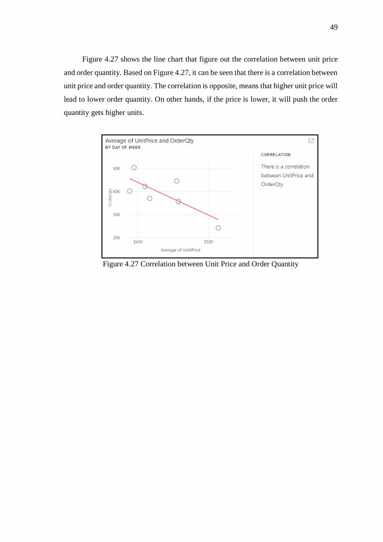
Figure 4.27 shows the line chart that figure out the correlation between unit price
and order quantity. Based on Figure 4.27, it can be seen that there is a correlation between
unit price and order quantity. The correlation is opposite, means that higher unit price will
lead to lower order quantity. On other hands, if the price is lower, it will push the order
quantity gets higher units.
Figure 4.27 Correlation between Unit Price and Order Quantity

50
H. System Testing on Customer Report
After all of the process to create the system finished, in this section the researcher will
explore the customer report dashboard to get insights.
Figure 4.28 Default view of dashboard – sales analysis by customer
The scenario of this test is to answer several questions related with customer data.
The questions need to answered are:
1. What is the customer education with contribute in most in margin from 2010-
2014?
2. How is the profile of answer no. 1?
3. Does this customer still spend as the most margin in 2016?
The first question is descriptive analytics. It can be answered by configuring the
slicer as the question. The easier way to figure out is by changing the value of pie chart
located in bottom-right from sales revenue into margin. By using this step, the result
would be very easy to read. Figure 4.25 shows the result.

51
Based on Figure 4.25, it shows that the highest margin is contributed by customer
with education degree is Bachelors with 29.11 % compared with Partial College in the
second place with 26.7 %.
To answer the question number 2, just use education slicer in the bottom left and
only click on Education. The same approach applied with 1st question which is
adding/changing the value of the chart into desired value such as occupation, gender,
marital status, and yearly income.
Figure 4.29 Margin by Education (2010-2014)
Figure 4.30 Customer profile filtered by education “bachelors”

52
Figure 4.26 shows the customer profile filtered by education as the result of 1st
questions. Based on that figure, it is stated that from the occupation, professional is
ranking as number 1 with 1888 peoples. Besides, in yearly income bachelor degree’s
customer dominantly have income range from 500001 – 750000. Lastly, from gender it
is not shows significant different between male and female as well as married or single.
The last question is identifying the predictive analytics because it is talked about
the analytics for the future. In order to answer the 3rd question, just use the line chart on
top right that shows the margin per date and make sure that the year slicer is apply from
2010 – 2014.
Figure 4.31 Forecast for margin filtered by bachelor degree education
Based on Figure 4.27, it is stated that the customer with bachelor degree still
perform as the most margin with 1,106,271.37 in 2016. While the other such graduate in
633,518, high school 635,210, partial college 1,014,695, and partial high school 338,488.

53
I. System Testing on Business User Customization
Another example of testing SSBI solution proposed in this research is on business user
customization. For example, the business user can create another dashboard referenced
by previous dashboards created. In this example, the business user wants to identify the
difference between customers profile among Top 5 products and Bottom 5 products that
ranked by margin contribution in internet order channel.
Figure 4.26 shows the customized dashboard created for Top 5 vs Bottom 5
products ranked by margin contribution in Internet Sales.
Based on Figure 4.26, it can be seen that there are 2 main sections in this dashboard
which are Top 5 products section located at the top of dashboard and Bottom 5 products
section located at the bottom. Both of the sections are separated by “customer profile
comparison” textbox.
This dashboard contains several slicers such as product category, product
subcategory, product name, country, time slicer including year, month and quarter.
Furthermore, this dashboard contains visualization such as card to show the total margin
contributed from both Top 5 and Bottom 5 products.
Figure 4.32 Dashboard of Top 5 vs Bottom 5 products