Prinsip desain dasar interaksi · PDF filePersona (karakter) Menjelaskan ... desain yang...
45
PRINSIP DASAR DESAIN INTERAKSI
Transcript of Prinsip desain dasar interaksi · PDF filePersona (karakter) Menjelaskan ... desain yang...
PRINSIP DASAR DESAIN INTERAKSI
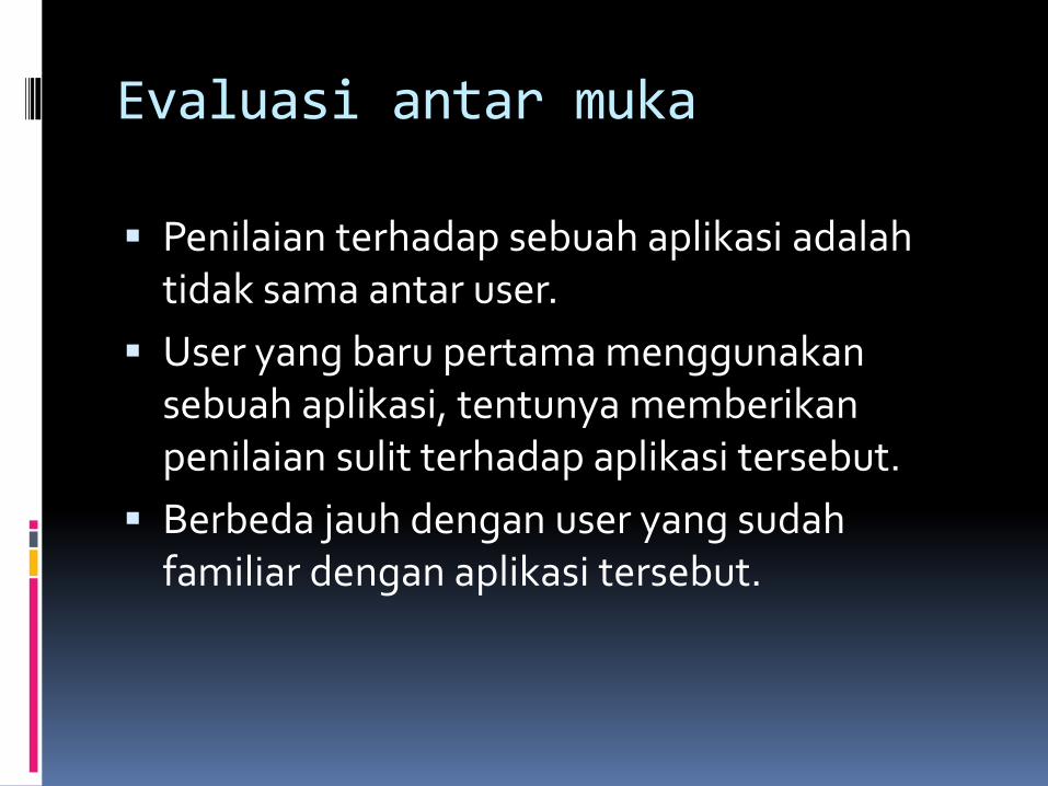
Evaluasi antar muka
Penilaian terhadap sebuah aplikasi adalah tidak sama antar user.
User yang baru pertama menggunakan sebuah aplikasi, tentunya memberikan penilaian sulit terhadap aplikasi tersebut.
Berbeda jauh dengan user yang sudah familiar dengan aplikasi tersebut.
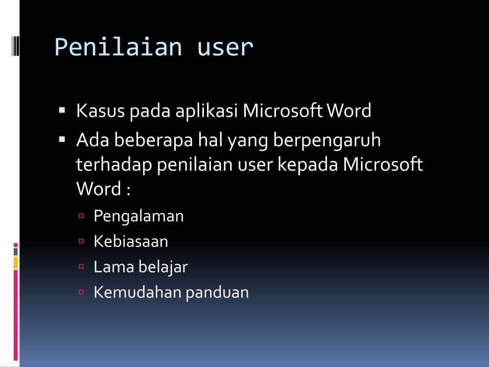
Penilaian user
Kasus pada aplikasi Microsoft Word
Ada beberapa hal yang berpengaruh terhadap penilaian user kepada Microsoft Word :
Pengalaman
Kebiasaan
Lama belajar
Kemudahan panduan
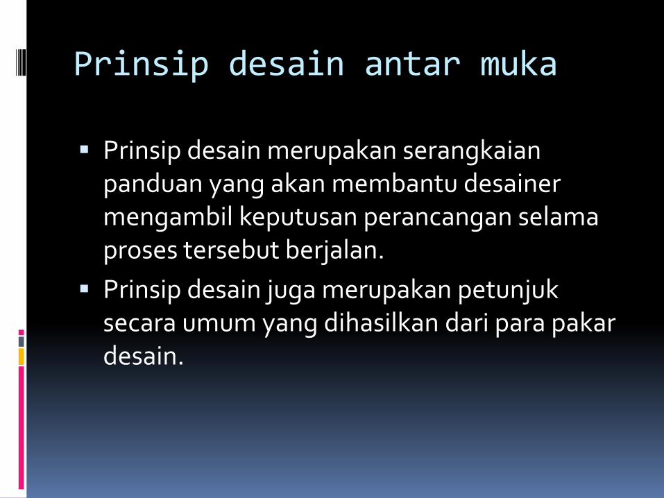
Prinsip desain antar muka
Prinsip desain merupakan serangkaian panduan yang akan membantu desainer mengambil keputusan perancangan selama proses tersebut berjalan.
Prinsip desain juga merupakan petunjuk secara umum yang dihasilkan dari para pakar desain.
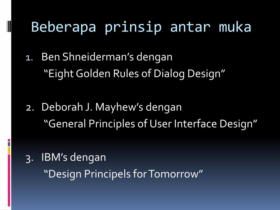
Beberapa prinsip antar muka
1. Ben Shneiderman’s dengan
“Eight Golden Rules of Dialog Design”
2. Deborah J. Mayhew’s dengan
“General Principles of User Interface Design”
3. IBM’s dengan
“Design Principels for Tomorrow”
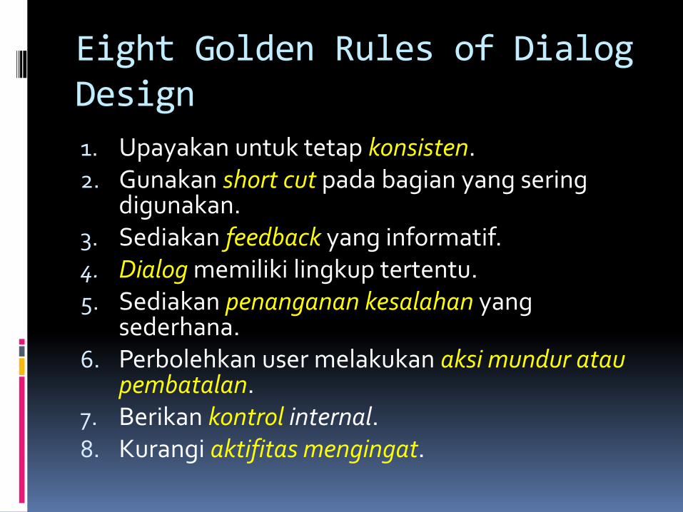
Eight Golden Rules of Dialog Design
1. Upayakan untuk tetap konsisten.2. Gunakan short cut pada bagian yang sering
digunakan.3. Sediakan feedback yang informatif.4. Dialog memiliki lingkup tertentu.5. Sediakan penanganan kesalahan yang
sederhana.6. Perbolehkan user melakukan aksi mundur atau
pembatalan.7. Berikan kontrol internal.8. Kurangi aktifitas mengingat.
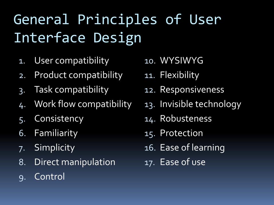
General Principles of User Interface Design
1. User compatibility
2. Product compatibility
3. Task compatibility
4. Work flow compatibility
5. Consistency
6. Familiarity
7. Simplicity
8. Direct manipulation
9. Control
10. WYSIWYG
11. Flexibility
12. Responsiveness
13. Invisible technology
14. Robusteness
15. Protection
16. Ease of learning
17. Ease of use
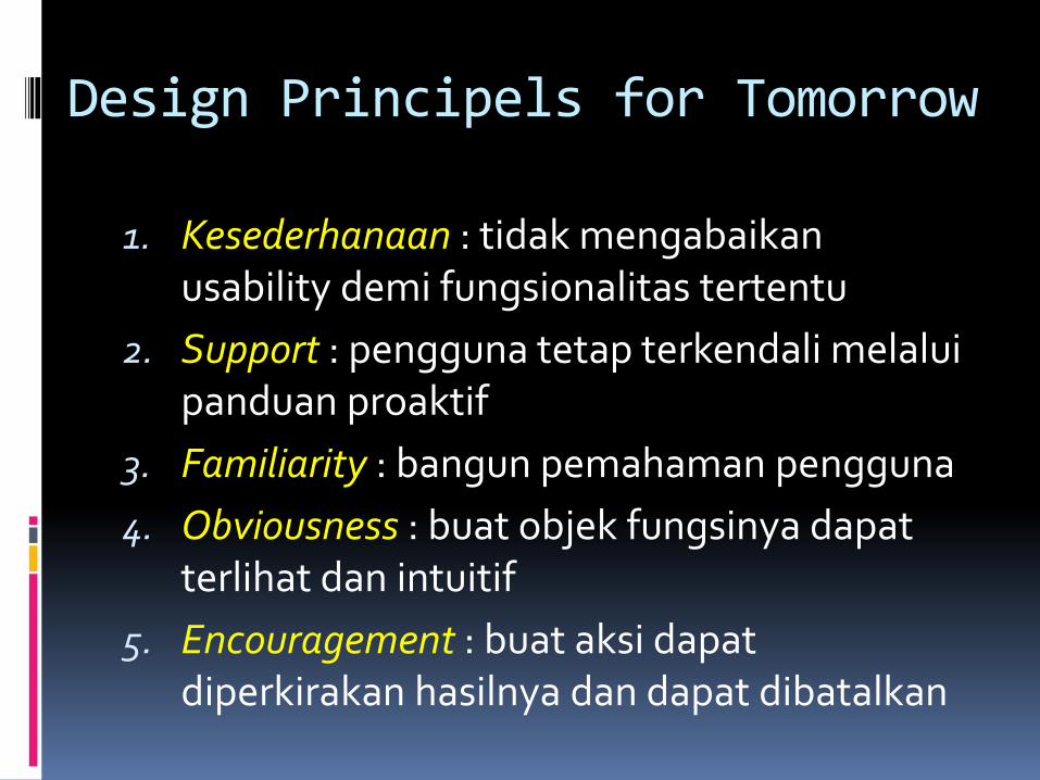
Design Principels for Tomorrow
1. Kesederhanaan : tidak mengabaikan usability demi fungsionalitas tertentu
2. Support : pengguna tetap terkendali melalui panduan proaktif
3. Familiarity : bangun pemahaman pengguna
4. Obviousness : buat objek fungsinya dapat terlihat dan intuitif
5. Encouragement : buat aksi dapat diperkirakan hasilnya dan dapat dibatalkan
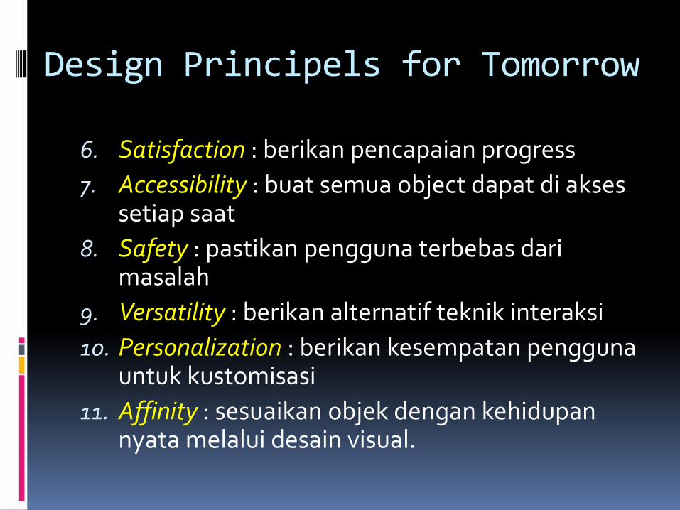
Design Principels for Tomorrow
6. Satisfaction : berikan pencapaian progress
7. Accessibility : buat semua object dapat di akses setiap saat
8. Safety : pastikan pengguna terbebas dari masalah
9. Versatility : berikan alternatif teknik interaksi
10. Personalization : berikan kesempatan pengguna untuk kustomisasi
11. Affinity : sesuaikan objek dengan kehidupan nyata melalui desain visual.
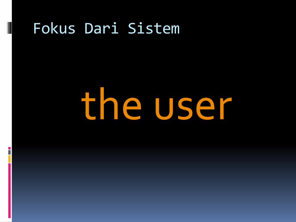
Fokus Dari Sistem
the user
Fokus ke User
Ketahui siapa pemakainya
Persona (karakter)
Cari tahu kebiasaan/budayanya
Ketahui Siapa Pemakainya
siapa mereka?
mungkin dia tidak seperti Anda!
berbicara dengan mereka
mengawasi mereka
menggunakan imajinasi Anda
Persona (karakter)
Menjelaskan contoh user
Tidak diperlukan user yang nyata
Digunakan sebagai pengganti user
Apa yang dipikirkan Joni
Rincian masalah
Dibuat se-nyata mungkin
Cari tahu Kebiasaan/Budayanya
Mencari tahu kebiasaan user bisa dengan melakukan pengamatan langsung.
Pengamatan seperti ini bisa di lakukan dimana saja user berinteraksi, baik dengan komputer maupun hal-hal yang lain.
Tingkat usia juga sangat mempengaruhi user dalam berinteraksi dengan komputer.
design
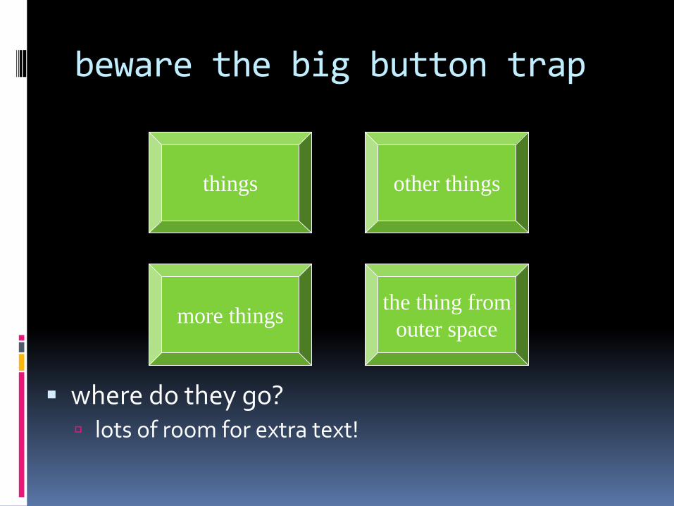
beware the big button trap
where do they go? lots of room for extra text!
things
the thing from
outer spacemore things
other things
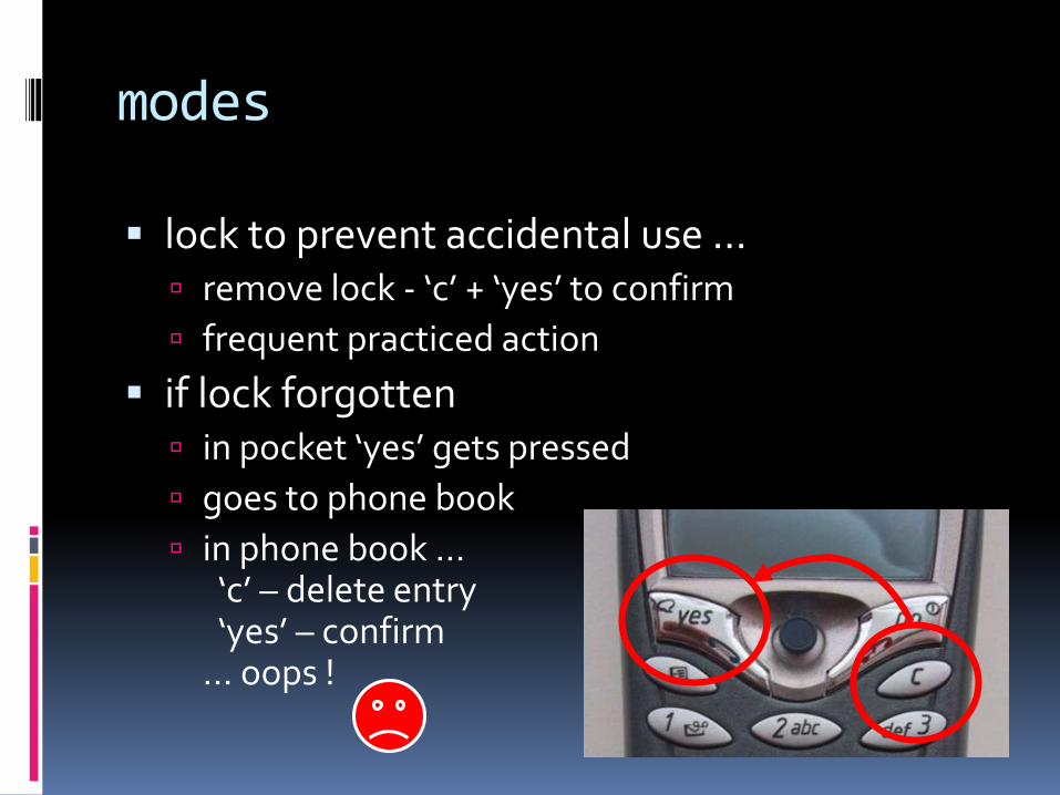
modes
lock to prevent accidental use … remove lock - ‘c’ + ‘yes’ to confirm
frequent practiced action
if lock forgotten in pocket ‘yes’ gets pressed
goes to phone book
in phone book …‘c’ – delete entry‘yes’ – confirm
… oops !
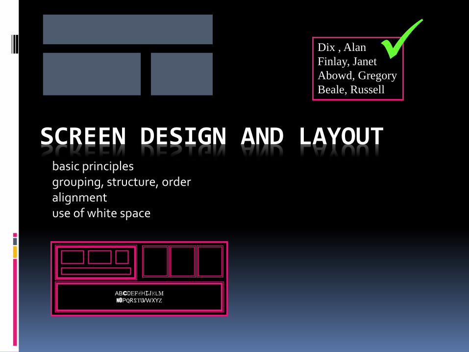
SCREEN DESIGN AND LAYOUTbasic principlesgrouping, structure, orderalignmentuse of white space
ABCDEFGHIJKLMNOPQRSTUVWXYZ
Dix , Alan
Finlay, Janet
Abowd, Gregory
Beale, Russell
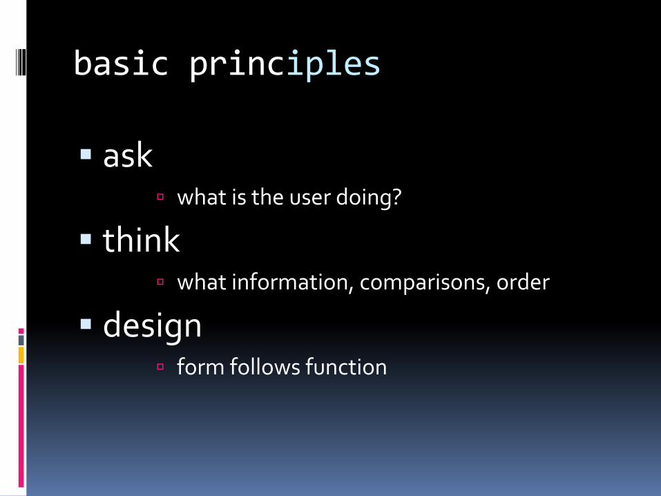
basic principles
ask what is the user doing?
think what information, comparisons, order
design form follows function
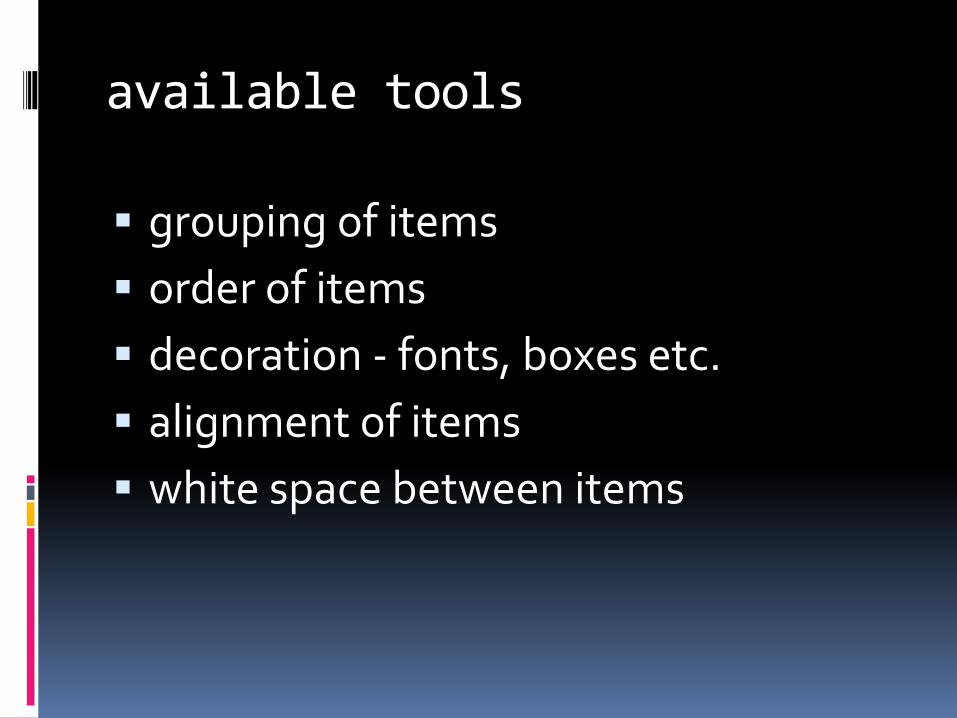
available tools
grouping of items
order of items
decoration - fonts, boxes etc.
alignment of items
white space between items
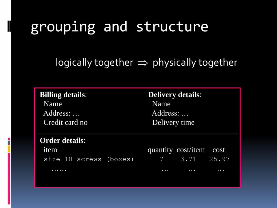
grouping and structure
logically together physically together
Billing details:
Name
Address: …
Credit card no
Delivery details:
Name
Address: …
Delivery time
Order details:
item quantity cost/item cost
size 10 screws (boxes) 7 3.71 25.97
…… … … …
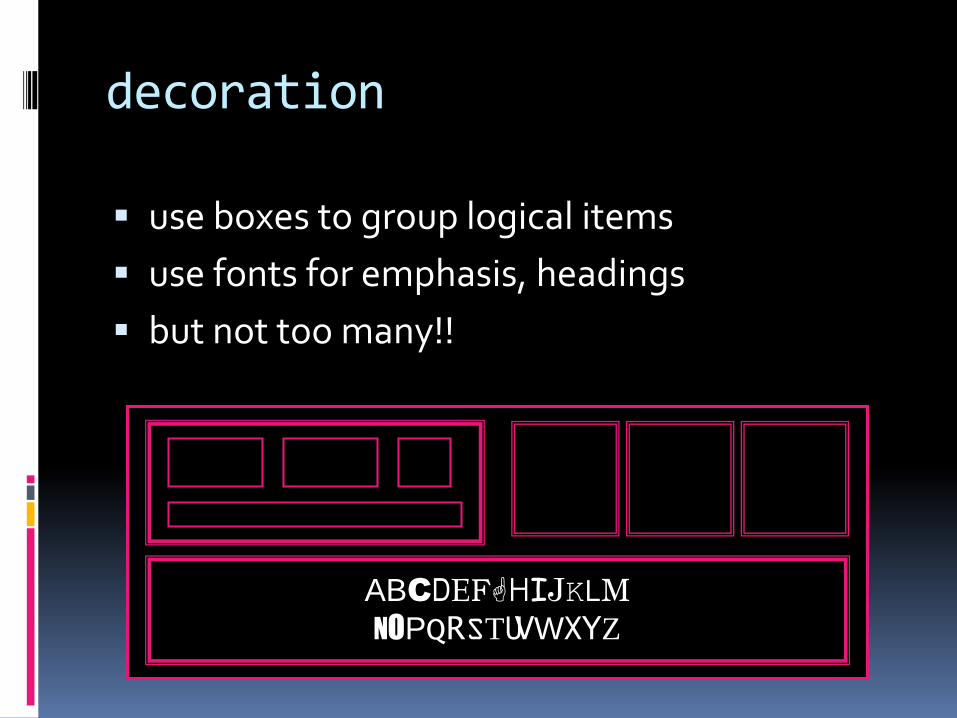
decoration
use boxes to group logical items
use fonts for emphasis, headings
but not too many!!
ABCDEFGHIJKLMNOPQRSTUVWXYZ
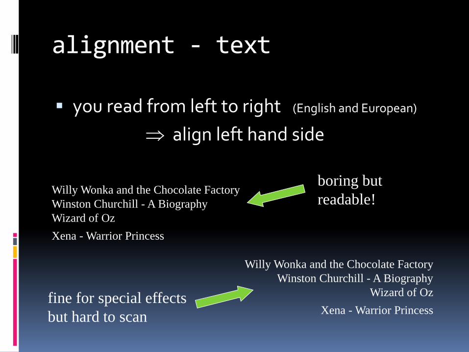
alignment - text
you read from left to right (English and European)
align left hand side
Willy Wonka and the Chocolate Factory
Winston Churchill - A Biography
Wizard of Oz
Xena - Warrior Princess
Willy Wonka and the Chocolate Factory
Winston Churchill - A Biography
Wizard of Oz
Xena - Warrior Princessfine for special effects
but hard to scan
boring but
readable!
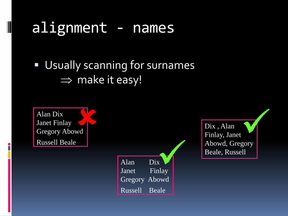
alignment - names
Usually scanning for surnames make it easy!
Alan Dix
Janet Finlay
Gregory Abowd
Russell Beale
Alan Dix
Janet Finlay
Gregory Abowd
Russell Beale
Dix , Alan
Finlay, Janet
Abowd, Gregory
Beale, Russell
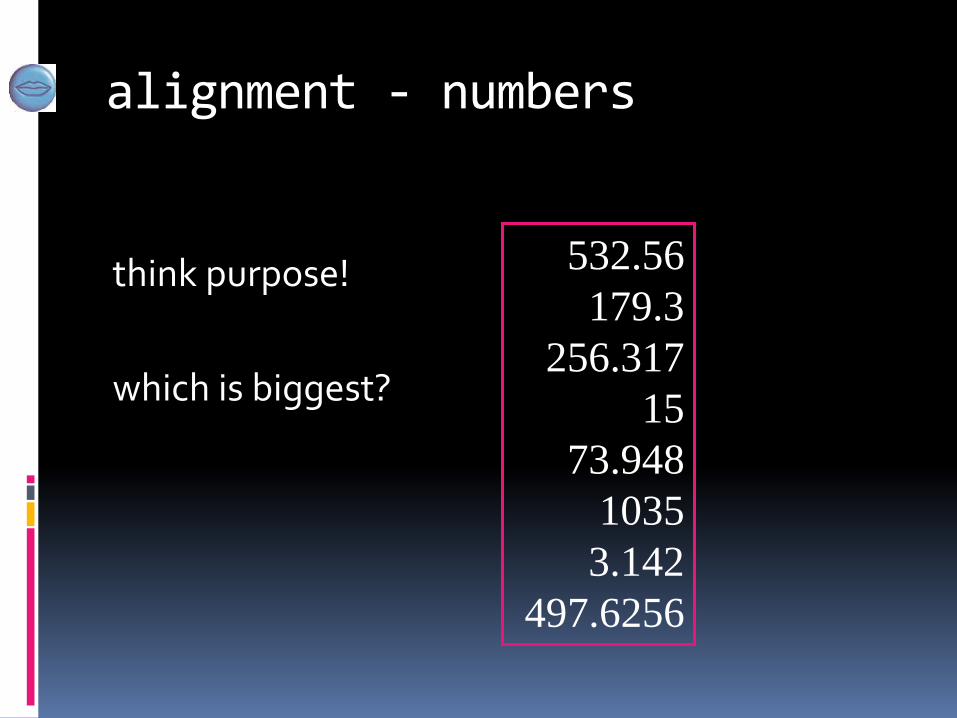
alignment - numbers
think purpose!
which is biggest?
532.56
179.3
256.317
15
73.948
1035
3.142
497.6256
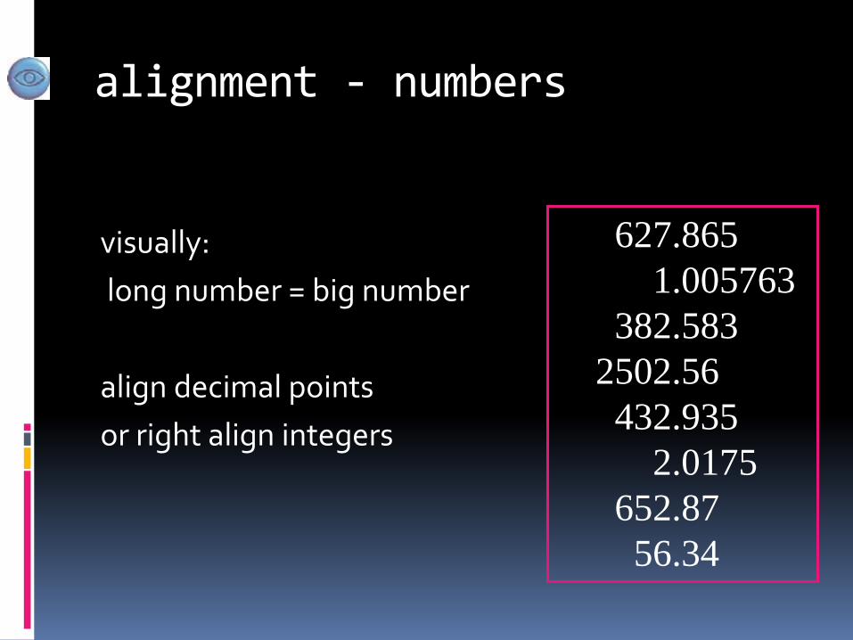
alignment - numbers
visually:
long number = big number
align decimal points
or right align integers
627.865
1.005763
382.583
2502.56
432.935
2.0175
652.87
56.34
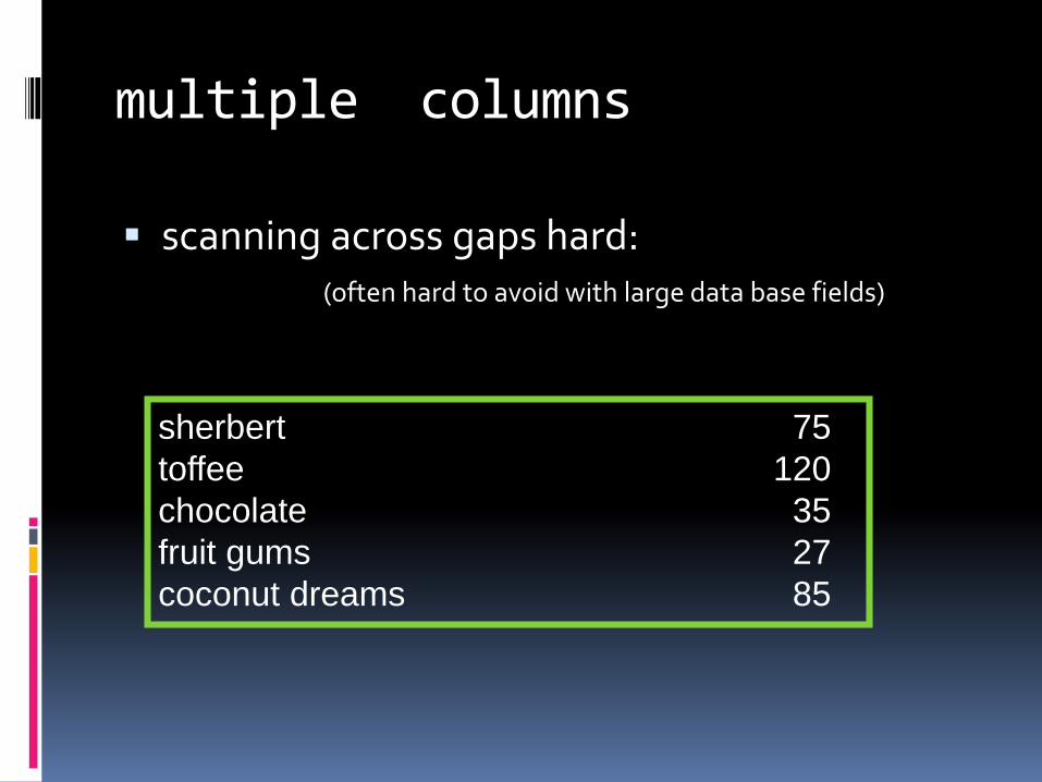
multiple columns
scanning across gaps hard:(often hard to avoid with large data base fields)
sherbert 75
toffee 120
chocolate 35
fruit gums 27
coconut dreams 85
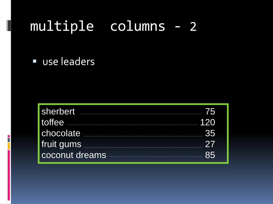
multiple columns - 2
use leaders
sherbert 75
toffee 120
chocolate 35
fruit gums 27
coconut dreams 85
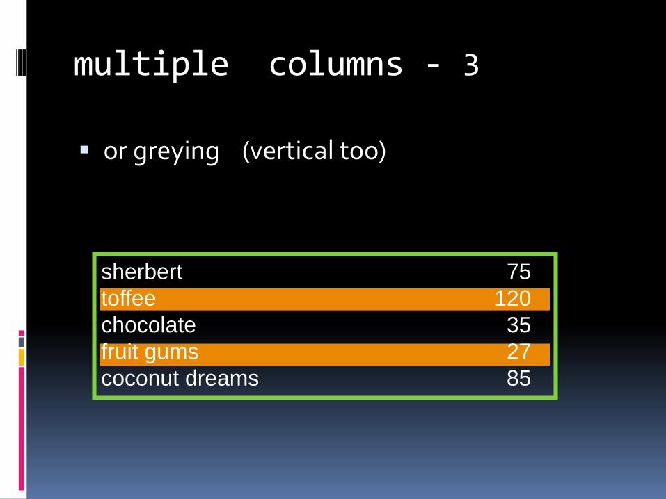
multiple columns - 3
or greying (vertical too)
sherbert 75
toffee 120
chocolate 35
fruit gums 27
coconut dreams 85
sherbert 75
toffee 120
chocolate 35
fruit gums 27
coconut dreams 85
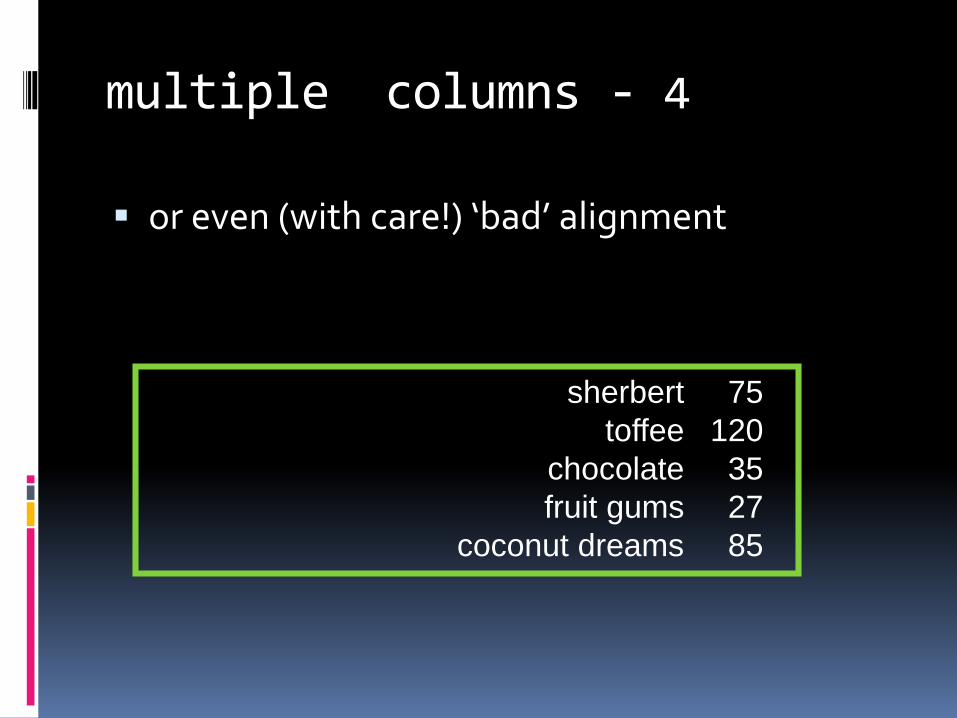
multiple columns - 4
or even (with care!) ‘bad’ alignment
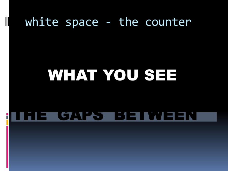
white space - the counter
WHAT YOU SEE
THE GAPS BETWEEN
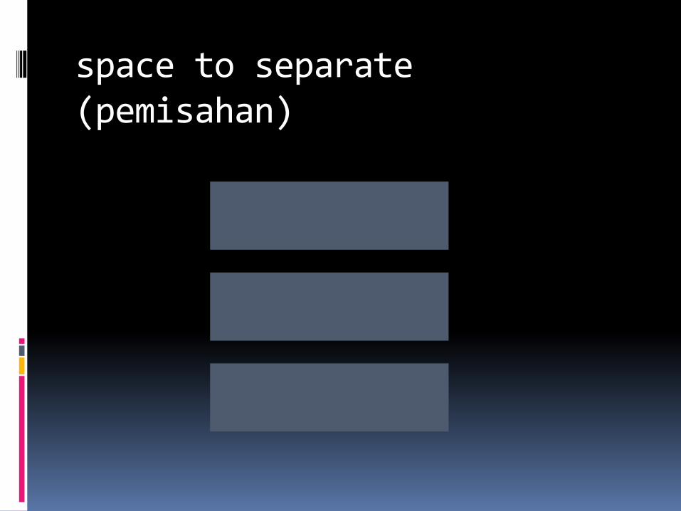
space to separate (pemisahan)
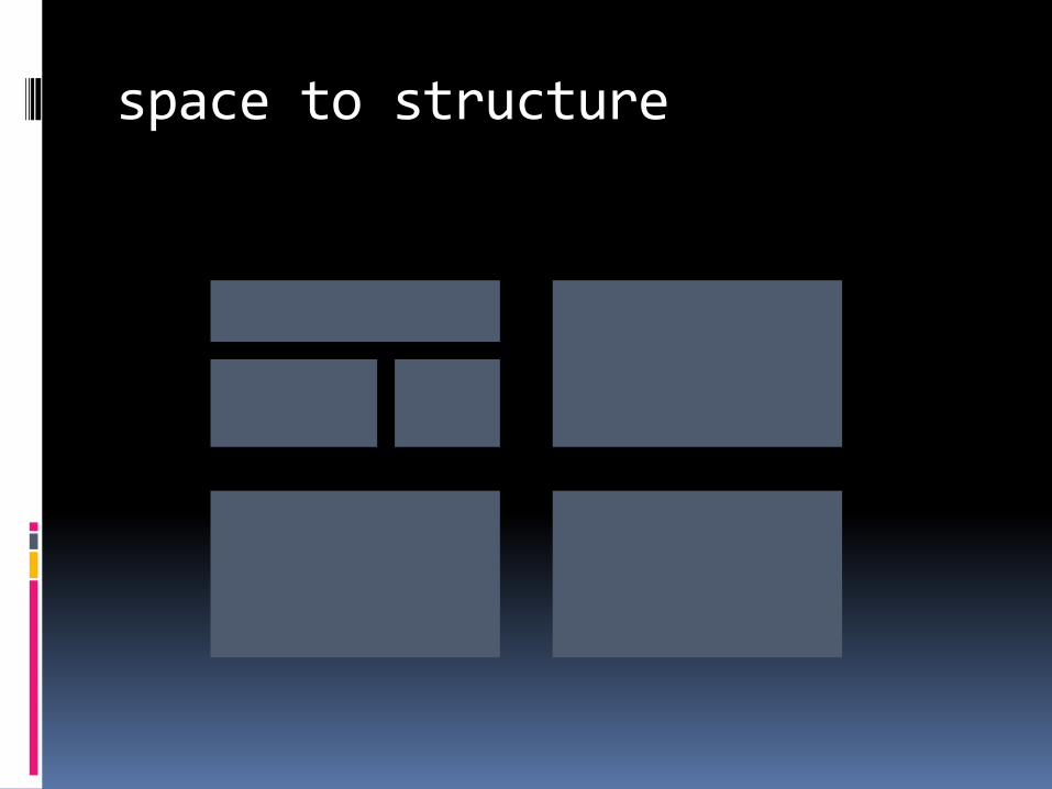
space to structure
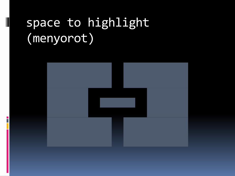
space to highlight (menyorot)
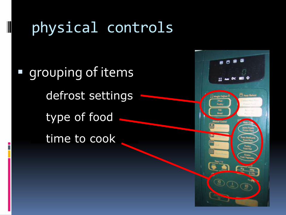
physical controls
grouping of items
defrost settings
type of food
time to cook
type of food
time to cook
defrost settings
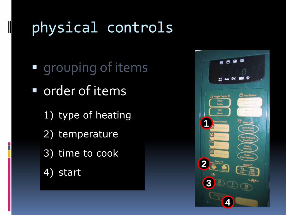
physical controls
grouping of items
order of items
1) type of heating
2) temperature
3) time to cook
4) start
4
4) start2
2) temperature
3
3) time to cook
11) type of heating
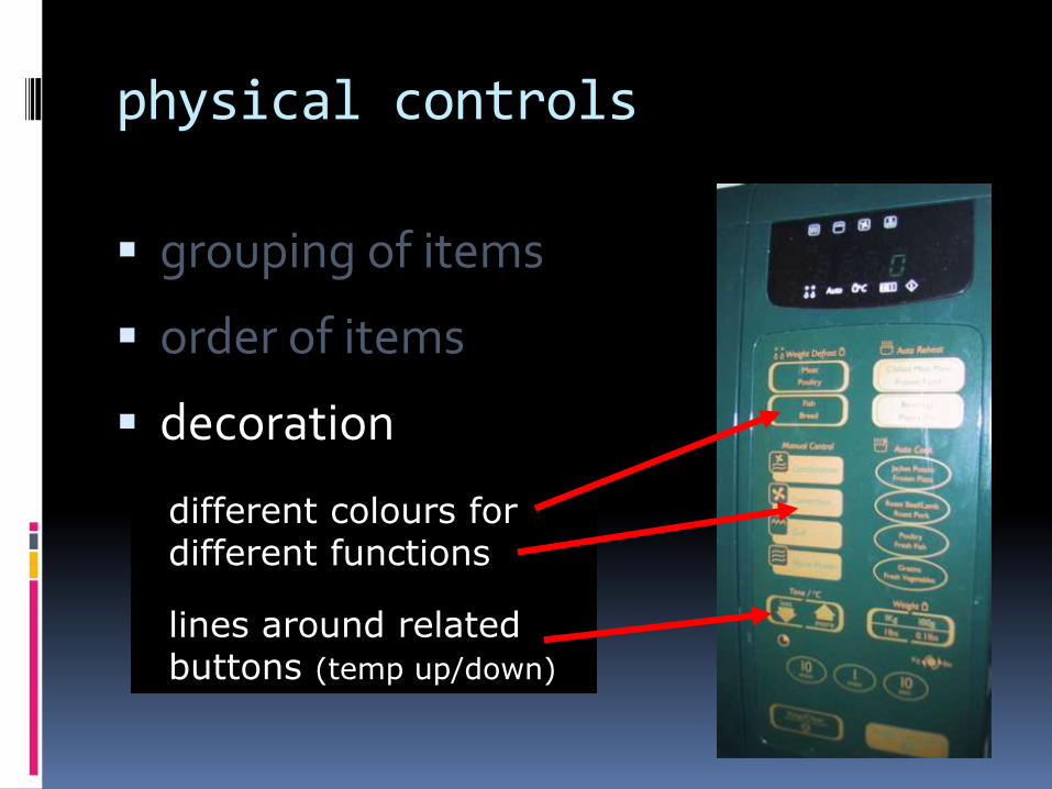
physical controls
grouping of items
order of items
decoration
different colours
for different functions
lines around related
buttons
different colours for different functions
lines around related buttons (temp up/down)
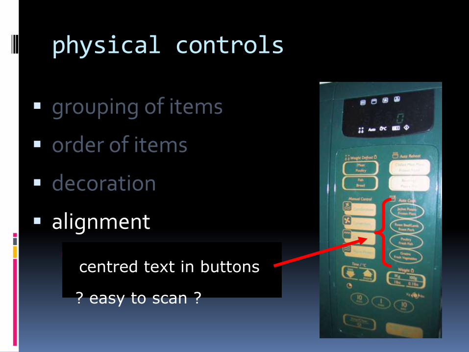
physical controls
grouping of items
order of items
decoration
alignment
centered text in buttons
? easy to scan ?? easy to scan ?
centred text in buttons
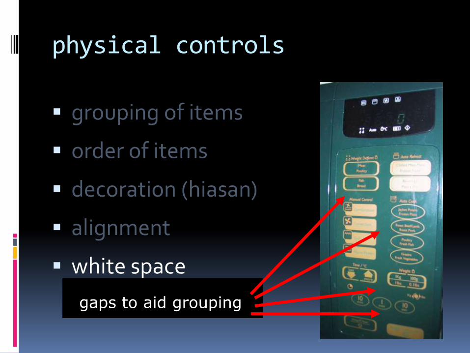
physical controls
grouping of items
order of items
decoration (hiasan)
alignment
white space
gaps to aid groupinggaps to aid grouping
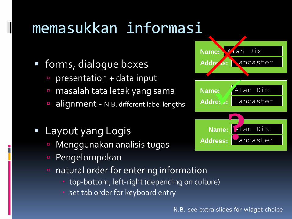
memasukkan informasi
forms, dialogue boxes presentation + data input
masalah tata letak yang sama
alignment - N.B. different label lengths
Layout yang Logis Menggunakan analisis tugas
Pengelompokan
natural order for entering information top-bottom, left-right (depending on culture)
set tab order for keyboard entry
N.B. see extra slides for widget choice
Name:
Address:
Alan Dix
Lancaster
Name:
Address:
Alan Dix
Lancaster
Name:
Address:
Alan Dix
Lancaster
?
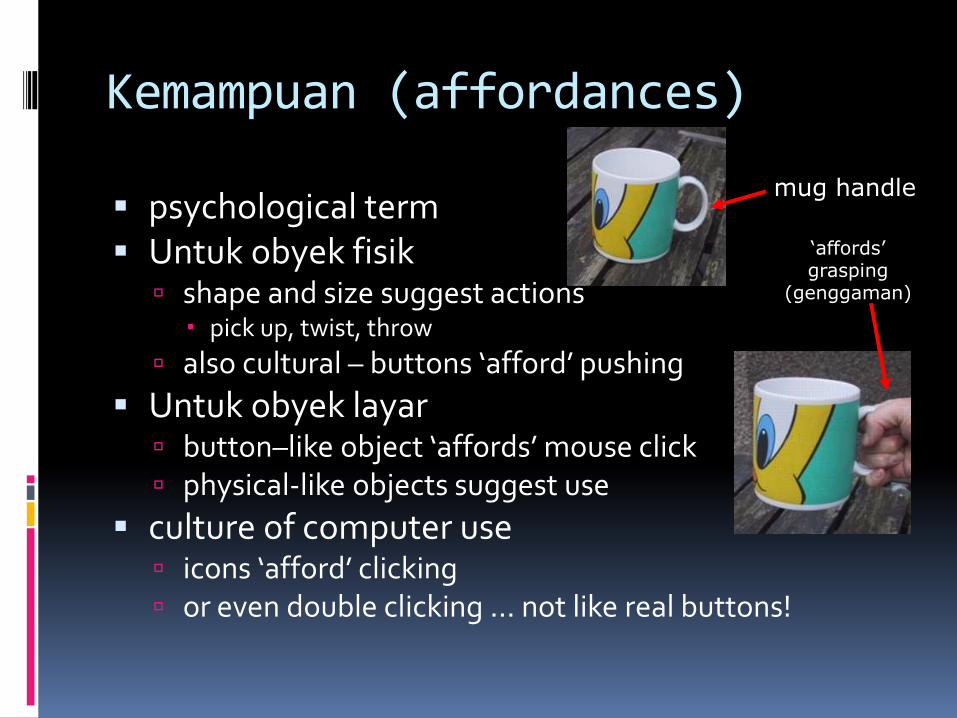
Kemampuan (affordances)
psychological term Untuk obyek fisik
shape and size suggest actions pick up, twist, throw
also cultural – buttons ‘afford’ pushing
Untuk obyek layar button–like object ‘affords’ mouse click physical-like objects suggest use
culture of computer use icons ‘afford’ clicking or even double clicking … not like real buttons!
mug handle
‘affords’grasping
(genggaman)
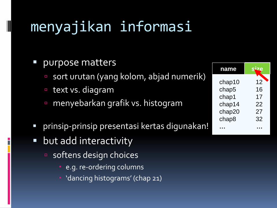
menyajikan informasi
purpose matters
sort urutan (yang kolom, abjad numerik)
text vs. diagram
menyebarkan grafik vs. histogram
prinsip-prinsip presentasi kertas digunakan!
but add interactivity
softens design choices e.g. re-ordering columns
‘dancing histograms’ (chap 21)
chap1
chap10
chap11
chap12
chap13
chap14
…
17
12
51
262
83
22
…
sizename size
chap10
chap5
chap1
chap14
chap20
chap8
…
12
16
17
22
27
32
…
name size
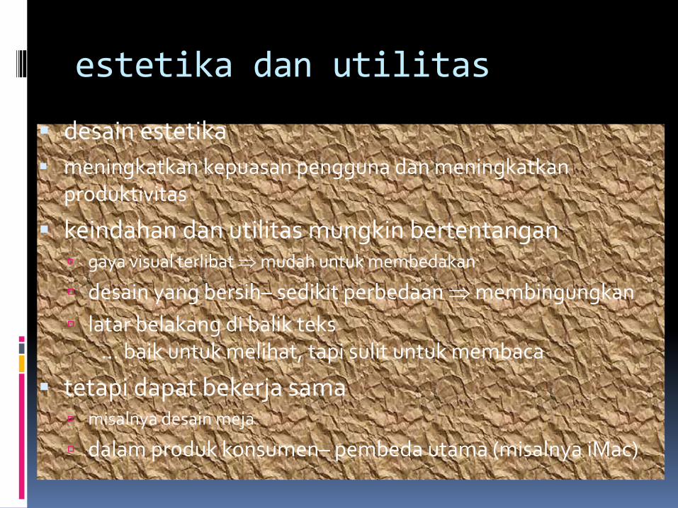
estetika dan utilitas
desain estetika
meningkatkan kepuasan pengguna dan meningkatkan produktivitas
keindahan dan utilitas mungkin bertentangan gaya visual terlibat mudah untuk membedakan
desain yang bersih– sedikit perbedaan membingungkan
latar belakang di balik teks… baik untuk melihat, tapi sulit untuk membaca
tetapi dapat bekerja sama misalnya desain meja
dalam produk konsumen– pembeda utama (misalnya iMac)
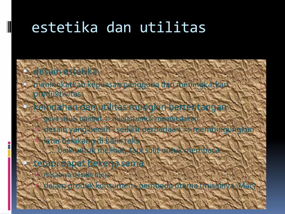
estetika dan utilitas
desain estetika meningkatkan kepuasan pengguna dan meningkatkan
produktivitas
keindahan dan utilitas mungkin bertentangan gaya visual terlibatmudah untuk membedakan
desain yang bersih– sedikit perbedaanmembingungkan
latar belakang di balik teks… baik untuk melihat, tapi sulit untuk membaca
tetapi dapat bekerja sama misalnya desain meja
dalam produk konsumen– pembeda utama (misalnya iMac)
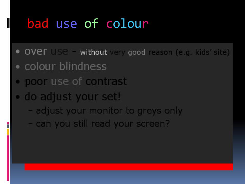
bad use of colour
over use - without very good reason (e.g. kids’ site)
colour blindness
poor use of contrast
do adjust your set!
adjust your monitor to greys only
can you still read your screen?